awesome-design-md 1.0.0
This diff represents the content of publicly available package versions that have been released to one of the supported registries. The information contained in this diff is provided for informational purposes only and reflects changes between package versions as they appear in their respective public registries.
- package/LICENSE +21 -0
- package/README.md +172 -0
- package/bin/cli.mjs +126 -0
- package/design-md/airbnb/DESIGN.md +246 -0
- package/design-md/airbnb/README.md +23 -0
- package/design-md/airbnb/preview-dark.html +234 -0
- package/design-md/airbnb/preview.html +233 -0
- package/design-md/airtable/DESIGN.md +89 -0
- package/design-md/airtable/README.md +23 -0
- package/design-md/airtable/preview-dark.html +165 -0
- package/design-md/airtable/preview.html +164 -0
- package/design-md/apple/DESIGN.md +313 -0
- package/design-md/apple/README.md +24 -0
- package/design-md/apple/preview-dark.html +422 -0
- package/design-md/apple/preview.html +416 -0
- package/design-md/bmw/DESIGN.md +180 -0
- package/design-md/bmw/README.md +23 -0
- package/design-md/bmw/preview-dark.html +211 -0
- package/design-md/bmw/preview.html +210 -0
- package/design-md/cal/DESIGN.md +259 -0
- package/design-md/cal/README.md +23 -0
- package/design-md/cal/preview-dark.html +449 -0
- package/design-md/cal/preview.html +575 -0
- package/design-md/claude/DESIGN.md +312 -0
- package/design-md/claude/README.md +24 -0
- package/design-md/claude/preview-dark.html +803 -0
- package/design-md/claude/preview.html +826 -0
- package/design-md/clay/DESIGN.md +304 -0
- package/design-md/clay/README.md +23 -0
- package/design-md/clay/preview-dark.html +318 -0
- package/design-md/clay/preview.html +317 -0
- package/design-md/clickhouse/DESIGN.md +281 -0
- package/design-md/clickhouse/README.md +24 -0
- package/design-md/clickhouse/preview-dark.html +834 -0
- package/design-md/clickhouse/preview.html +786 -0
- package/design-md/cohere/DESIGN.md +266 -0
- package/design-md/cohere/README.md +24 -0
- package/design-md/cohere/preview-dark.html +810 -0
- package/design-md/cohere/preview.html +814 -0
- package/design-md/coinbase/DESIGN.md +129 -0
- package/design-md/coinbase/README.md +23 -0
- package/design-md/coinbase/preview-dark.html +164 -0
- package/design-md/coinbase/preview.html +163 -0
- package/design-md/composio/DESIGN.md +307 -0
- package/design-md/composio/README.md +24 -0
- package/design-md/composio/preview-dark.html +958 -0
- package/design-md/composio/preview.html +933 -0
- package/design-md/cursor/DESIGN.md +309 -0
- package/design-md/cursor/README.md +24 -0
- package/design-md/cursor/preview-dark.html +395 -0
- package/design-md/cursor/preview.html +385 -0
- package/design-md/elevenlabs/DESIGN.md +265 -0
- package/design-md/elevenlabs/README.md +23 -0
- package/design-md/elevenlabs/preview-dark.html +254 -0
- package/design-md/elevenlabs/preview.html +253 -0
- package/design-md/expo/DESIGN.md +281 -0
- package/design-md/expo/README.md +24 -0
- package/design-md/expo/preview-dark.html +536 -0
- package/design-md/expo/preview.html +536 -0
- package/design-md/figma/DESIGN.md +220 -0
- package/design-md/figma/README.md +24 -0
- package/design-md/figma/preview-dark.html +831 -0
- package/design-md/figma/preview.html +841 -0
- package/design-md/framer/DESIGN.md +246 -0
- package/design-md/framer/README.md +23 -0
- package/design-md/framer/preview-dark.html +904 -0
- package/design-md/framer/preview.html +885 -0
- package/design-md/hashicorp/DESIGN.md +278 -0
- package/design-md/hashicorp/README.md +24 -0
- package/design-md/hashicorp/preview-dark.html +1206 -0
- package/design-md/hashicorp/preview.html +1195 -0
- package/design-md/ibm/DESIGN.md +332 -0
- package/design-md/ibm/README.md +24 -0
- package/design-md/ibm/preview-dark.html +445 -0
- package/design-md/ibm/preview.html +430 -0
- package/design-md/intercom/DESIGN.md +146 -0
- package/design-md/intercom/README.md +23 -0
- package/design-md/intercom/preview-dark.html +185 -0
- package/design-md/intercom/preview.html +184 -0
- package/design-md/kraken/DESIGN.md +125 -0
- package/design-md/kraken/README.md +23 -0
- package/design-md/kraken/preview-dark.html +169 -0
- package/design-md/kraken/preview.html +168 -0
- package/design-md/linear.app/DESIGN.md +367 -0
- package/design-md/linear.app/README.md +24 -0
- package/design-md/linear.app/preview-dark.html +385 -0
- package/design-md/linear.app/preview.html +375 -0
- package/design-md/lovable/DESIGN.md +298 -0
- package/design-md/lovable/README.md +24 -0
- package/design-md/lovable/preview-dark.html +351 -0
- package/design-md/lovable/preview.html +350 -0
- package/design-md/minimax/DESIGN.md +257 -0
- package/design-md/minimax/README.md +24 -0
- package/design-md/minimax/preview-dark.html +1267 -0
- package/design-md/minimax/preview.html +1253 -0
- package/design-md/mintlify/DESIGN.md +326 -0
- package/design-md/mintlify/README.md +24 -0
- package/design-md/mintlify/preview-dark.html +411 -0
- package/design-md/mintlify/preview.html +400 -0
- package/design-md/miro/DESIGN.md +108 -0
- package/design-md/miro/README.md +23 -0
- package/design-md/miro/preview-dark.html +174 -0
- package/design-md/miro/preview.html +173 -0
- package/design-md/mistral.ai/DESIGN.md +261 -0
- package/design-md/mistral.ai/README.md +24 -0
- package/design-md/mistral.ai/preview-dark.html +813 -0
- package/design-md/mistral.ai/preview.html +812 -0
- package/design-md/mongodb/DESIGN.md +266 -0
- package/design-md/mongodb/README.md +23 -0
- package/design-md/mongodb/preview-dark.html +262 -0
- package/design-md/mongodb/preview.html +261 -0
- package/design-md/notion/DESIGN.md +309 -0
- package/design-md/notion/README.md +24 -0
- package/design-md/notion/preview-dark.html +374 -0
- package/design-md/notion/preview.html +366 -0
- package/design-md/nvidia/DESIGN.md +293 -0
- package/design-md/nvidia/README.md +24 -0
- package/design-md/nvidia/preview-dark.html +376 -0
- package/design-md/nvidia/preview.html +368 -0
- package/design-md/ollama/DESIGN.md +267 -0
- package/design-md/ollama/README.md +24 -0
- package/design-md/ollama/preview-dark.html +678 -0
- package/design-md/ollama/preview.html +678 -0
- package/design-md/opencode.ai/DESIGN.md +281 -0
- package/design-md/opencode.ai/README.md +24 -0
- package/design-md/opencode.ai/preview-dark.html +368 -0
- package/design-md/opencode.ai/preview.html +359 -0
- package/design-md/pinterest/DESIGN.md +230 -0
- package/design-md/pinterest/README.md +23 -0
- package/design-md/pinterest/preview-dark.html +233 -0
- package/design-md/pinterest/preview.html +232 -0
- package/design-md/posthog/DESIGN.md +256 -0
- package/design-md/posthog/README.md +23 -0
- package/design-md/posthog/preview-dark.html +701 -0
- package/design-md/posthog/preview.html +751 -0
- package/design-md/raycast/DESIGN.md +268 -0
- package/design-md/raycast/README.md +23 -0
- package/design-md/raycast/preview-dark.html +608 -0
- package/design-md/raycast/preview.html +690 -0
- package/design-md/replicate/DESIGN.md +261 -0
- package/design-md/replicate/README.md +24 -0
- package/design-md/replicate/preview-dark.html +828 -0
- package/design-md/replicate/preview.html +831 -0
- package/design-md/resend/DESIGN.md +303 -0
- package/design-md/resend/README.md +23 -0
- package/design-md/resend/preview-dark.html +357 -0
- package/design-md/resend/preview.html +356 -0
- package/design-md/revolut/DESIGN.md +185 -0
- package/design-md/revolut/README.md +23 -0
- package/design-md/revolut/preview-dark.html +234 -0
- package/design-md/revolut/preview.html +233 -0
- package/design-md/runwayml/DESIGN.md +244 -0
- package/design-md/runwayml/README.md +24 -0
- package/design-md/runwayml/preview-dark.html +664 -0
- package/design-md/runwayml/preview.html +665 -0
- package/design-md/sanity/DESIGN.md +357 -0
- package/design-md/sanity/README.md +24 -0
- package/design-md/sanity/preview-dark.html +995 -0
- package/design-md/sanity/preview.html +1140 -0
- package/design-md/sentry/DESIGN.md +262 -0
- package/design-md/sentry/README.md +24 -0
- package/design-md/sentry/preview-dark.html +628 -0
- package/design-md/sentry/preview.html +953 -0
- package/design-md/spacex/DESIGN.md +194 -0
- package/design-md/spacex/README.md +23 -0
- package/design-md/spacex/preview-dark.html +223 -0
- package/design-md/spacex/preview.html +222 -0
- package/design-md/spotify/DESIGN.md +246 -0
- package/design-md/spotify/README.md +23 -0
- package/design-md/spotify/preview-dark.html +231 -0
- package/design-md/spotify/preview.html +230 -0
- package/design-md/stripe/DESIGN.md +322 -0
- package/design-md/stripe/README.md +24 -0
- package/design-md/stripe/preview-dark.html +430 -0
- package/design-md/stripe/preview.html +421 -0
- package/design-md/supabase/DESIGN.md +255 -0
- package/design-md/supabase/README.md +24 -0
- package/design-md/supabase/preview-dark.html +977 -0
- package/design-md/supabase/preview.html +955 -0
- package/design-md/superhuman/DESIGN.md +252 -0
- package/design-md/superhuman/README.md +23 -0
- package/design-md/superhuman/preview-dark.html +975 -0
- package/design-md/superhuman/preview.html +953 -0
- package/design-md/together.ai/DESIGN.md +263 -0
- package/design-md/together.ai/README.md +24 -0
- package/design-md/together.ai/preview-dark.html +892 -0
- package/design-md/together.ai/preview.html +897 -0
- package/design-md/uber/DESIGN.md +295 -0
- package/design-md/uber/README.md +24 -0
- package/design-md/uber/preview-dark.html +1164 -0
- package/design-md/uber/preview.html +1163 -0
- package/design-md/vercel/DESIGN.md +310 -0
- package/design-md/vercel/README.md +24 -0
- package/design-md/vercel/preview-dark.html +370 -0
- package/design-md/vercel/preview.html +369 -0
- package/design-md/voltagent/DESIGN.md +323 -0
- package/design-md/voltagent/README.md +24 -0
- package/design-md/voltagent/preview-dark.html +487 -0
- package/design-md/voltagent/preview.html +766 -0
- package/design-md/warp/DESIGN.md +253 -0
- package/design-md/warp/README.md +23 -0
- package/design-md/warp/preview-dark.html +502 -0
- package/design-md/warp/preview.html +535 -0
- package/design-md/webflow/DESIGN.md +92 -0
- package/design-md/webflow/README.md +23 -0
- package/design-md/webflow/preview-dark.html +147 -0
- package/design-md/webflow/preview.html +146 -0
- package/design-md/wise/DESIGN.md +173 -0
- package/design-md/wise/README.md +23 -0
- package/design-md/wise/preview-dark.html +230 -0
- package/design-md/wise/preview.html +229 -0
- package/design-md/x.ai/DESIGN.md +257 -0
- package/design-md/x.ai/README.md +24 -0
- package/design-md/x.ai/preview-dark.html +358 -0
- package/design-md/x.ai/preview.html +409 -0
- package/design-md/zapier/DESIGN.md +328 -0
- package/design-md/zapier/README.md +24 -0
- package/design-md/zapier/preview-dark.html +382 -0
- package/design-md/zapier/preview.html +374 -0
- package/package.json +33 -0
|
@@ -0,0 +1,356 @@
|
|
|
1
|
+
<!DOCTYPE html>
|
|
2
|
+
<html lang="en">
|
|
3
|
+
<head>
|
|
4
|
+
<meta charset="UTF-8">
|
|
5
|
+
<meta name="viewport" content="width=device-width, initial-scale=1.0">
|
|
6
|
+
<title>Design System Preview: Resend (Light)</title>
|
|
7
|
+
<link rel="preconnect" href="https://fonts.googleapis.com">
|
|
8
|
+
<link rel="preconnect" href="https://fonts.gstatic.com" crossorigin>
|
|
9
|
+
<link href="https://fonts.googleapis.com/css2?family=Inter:wght@400;500;600&family=DM+Serif+Display&family=Commit+Mono&display=swap" rel="stylesheet">
|
|
10
|
+
<style>
|
|
11
|
+
:root {
|
|
12
|
+
--void: #000000;
|
|
13
|
+
--near-white: #f0f0f0;
|
|
14
|
+
--white: #ffffff;
|
|
15
|
+
--silver: #a1a4a5;
|
|
16
|
+
--dark-gray: #464a4d;
|
|
17
|
+
--mid-gray: #5c5c5c;
|
|
18
|
+
--orange-10: #ff801f;
|
|
19
|
+
--orange-11: #ffa057;
|
|
20
|
+
--green-4: #11ff99;
|
|
21
|
+
--blue-10: #3b9eff;
|
|
22
|
+
--yellow-9: #ffc53d;
|
|
23
|
+
--red-5: #ff2047;
|
|
24
|
+
--frost-border: rgba(214, 235, 253, 0.19);
|
|
25
|
+
--frost-border-alt: rgba(217, 237, 254, 0.145);
|
|
26
|
+
--ring-shadow: rgba(176, 199, 217, 0.145) 0px 0px 0px 1px;
|
|
27
|
+
--font-serif: 'DM Serif Display', Georgia, serif;
|
|
28
|
+
--font-sans: 'Inter', ui-sans-serif, system-ui, sans-serif;
|
|
29
|
+
--font-mono: 'Commit Mono', ui-monospace, SFMono-Regular, Menlo, monospace;
|
|
30
|
+
}
|
|
31
|
+
* { margin: 0; padding: 0; box-sizing: border-box; }
|
|
32
|
+
body {
|
|
33
|
+
background: var(--void);
|
|
34
|
+
color: var(--near-white);
|
|
35
|
+
font-family: var(--font-sans);
|
|
36
|
+
font-size: 16px; font-weight: 400; line-height: 1.50;
|
|
37
|
+
-webkit-font-smoothing: antialiased;
|
|
38
|
+
}
|
|
39
|
+
|
|
40
|
+
.nav {
|
|
41
|
+
position: sticky; top: 0; z-index: 100;
|
|
42
|
+
display: flex; align-items: center; justify-content: space-between;
|
|
43
|
+
padding: 12px 32px;
|
|
44
|
+
background: rgba(0,0,0,0.85);
|
|
45
|
+
backdrop-filter: blur(16px);
|
|
46
|
+
border-bottom: 1px solid var(--frost-border);
|
|
47
|
+
}
|
|
48
|
+
.nav-brand { font-family: var(--font-sans); font-size: 14px; font-weight: 500; color: var(--near-white); text-decoration: none; letter-spacing: 0.35px; }
|
|
49
|
+
.nav-links { display: flex; gap: 24px; list-style: none; }
|
|
50
|
+
.nav-links a { font-size: 14px; font-weight: 500; color: var(--silver); text-decoration: none; letter-spacing: 0.35px; transition: color 0.15s; }
|
|
51
|
+
.nav-links a:hover { color: var(--near-white); }
|
|
52
|
+
.nav-cta {
|
|
53
|
+
display: inline-block; background: var(--white); color: var(--void);
|
|
54
|
+
padding: 5px 14px; border-radius: 9999px; font-size: 14px; font-weight: 500;
|
|
55
|
+
text-decoration: none; transition: opacity 0.15s;
|
|
56
|
+
}
|
|
57
|
+
.nav-cta:hover { opacity: 0.85; }
|
|
58
|
+
|
|
59
|
+
.hero {
|
|
60
|
+
padding: 100px 32px 80px; text-align: center;
|
|
61
|
+
position: relative; overflow: hidden;
|
|
62
|
+
}
|
|
63
|
+
.hero::before {
|
|
64
|
+
content: ''; position: absolute; top: -60px; left: 50%; transform: translateX(-50%);
|
|
65
|
+
width: 600px; height: 400px;
|
|
66
|
+
background: radial-gradient(ellipse, rgba(255,128,31,0.08) 0%, rgba(0,0,0,0) 70%);
|
|
67
|
+
pointer-events: none;
|
|
68
|
+
}
|
|
69
|
+
.hero-content { position: relative; z-index: 1; max-width: 800px; margin: 0 auto; }
|
|
70
|
+
.hero h1 {
|
|
71
|
+
font-family: var(--font-serif); font-size: 88px; font-weight: 400;
|
|
72
|
+
line-height: 1.00; letter-spacing: -0.96px; margin-bottom: 20px;
|
|
73
|
+
}
|
|
74
|
+
.hero p { font-size: 20px; font-weight: 400; line-height: 1.30; color: var(--silver); max-width: 500px; margin: 0 auto 32px; }
|
|
75
|
+
.hero-buttons { display: flex; gap: 12px; justify-content: center; flex-wrap: wrap; }
|
|
76
|
+
.btn-white {
|
|
77
|
+
display: inline-block; background: var(--white); color: var(--void);
|
|
78
|
+
padding: 8px 20px; border-radius: 9999px; border: none;
|
|
79
|
+
font-family: var(--font-sans); font-size: 14px; font-weight: 500;
|
|
80
|
+
text-decoration: none; cursor: pointer; transition: opacity 0.15s;
|
|
81
|
+
}
|
|
82
|
+
.btn-white:hover { opacity: 0.85; }
|
|
83
|
+
.btn-frost {
|
|
84
|
+
display: inline-block; background: transparent; color: var(--near-white);
|
|
85
|
+
padding: 8px 20px; border-radius: 9999px;
|
|
86
|
+
border: 1px solid var(--frost-border);
|
|
87
|
+
font-family: var(--font-sans); font-size: 14px; font-weight: 500;
|
|
88
|
+
text-decoration: none; cursor: pointer; transition: background 0.15s;
|
|
89
|
+
}
|
|
90
|
+
.btn-frost:hover { background: rgba(255,255,255,0.08); }
|
|
91
|
+
.btn-ghost {
|
|
92
|
+
display: inline-block; background: transparent; color: var(--near-white);
|
|
93
|
+
padding: 8px 14px; border-radius: 4px; border: none;
|
|
94
|
+
font-family: var(--font-sans); font-size: 14px; font-weight: 500;
|
|
95
|
+
text-decoration: none; cursor: pointer;
|
|
96
|
+
}
|
|
97
|
+
|
|
98
|
+
.section { padding: 64px 32px; max-width: 1100px; margin: 0 auto; }
|
|
99
|
+
.section-label { font-family: var(--font-mono); font-size: 12px; font-weight: 500; color: var(--mid-gray); text-transform: uppercase; margin-bottom: 8px; }
|
|
100
|
+
.section-title { font-family: var(--font-sans); font-size: 28px; font-weight: 500; line-height: 1.30; letter-spacing: -1.4px; margin-bottom: 32px; }
|
|
101
|
+
.section-divider { border: none; border-top: 1px solid var(--frost-border); margin: 0; }
|
|
102
|
+
|
|
103
|
+
.color-grid { display: grid; grid-template-columns: repeat(auto-fill, minmax(150px, 1fr)); gap: 12px; margin-bottom: 24px; }
|
|
104
|
+
.color-swatch { border-radius: 12px; overflow: hidden; border: 1px solid var(--frost-border); }
|
|
105
|
+
.color-swatch-block { height: 72px; width: 100%; }
|
|
106
|
+
.color-swatch-info { padding: 10px 12px; }
|
|
107
|
+
.color-swatch-name { font-size: 13px; font-weight: 500; margin-bottom: 2px; }
|
|
108
|
+
.color-swatch-hex { font-size: 11px; color: var(--silver); font-family: var(--font-mono); }
|
|
109
|
+
.color-swatch-role { font-size: 10px; color: var(--mid-gray); margin-top: 3px; }
|
|
110
|
+
.color-group-label { font-size: 14px; font-weight: 500; color: var(--silver); margin: 24px 0 10px; }
|
|
111
|
+
|
|
112
|
+
.type-sample { margin-bottom: 28px; padding-bottom: 24px; border-bottom: 1px solid rgba(214,235,253,0.1); }
|
|
113
|
+
.type-sample:last-child { border-bottom: none; }
|
|
114
|
+
.type-meta { font-family: var(--font-mono); font-size: 11px; color: var(--mid-gray); margin-top: 8px; }
|
|
115
|
+
|
|
116
|
+
.button-row { display: flex; gap: 16px; flex-wrap: wrap; align-items: center; }
|
|
117
|
+
.button-item { text-align: center; }
|
|
118
|
+
.button-label { font-size: 11px; font-weight: 500; color: var(--mid-gray); margin-top: 8px; }
|
|
119
|
+
|
|
120
|
+
.card-grid { display: grid; grid-template-columns: repeat(auto-fit, minmax(300px, 1fr)); gap: 16px; }
|
|
121
|
+
.card { background: transparent; border: 1px solid var(--frost-border); border-radius: 16px; padding: 24px; transition: border-color 0.2s; }
|
|
122
|
+
.card:hover { border-color: rgba(214,235,253,0.35); }
|
|
123
|
+
.card h3 { font-size: 18px; font-weight: 500; margin-bottom: 8px; }
|
|
124
|
+
.card p { font-size: 14px; color: var(--silver); line-height: 1.50; }
|
|
125
|
+
.card-badge { display: inline-block; font-size: 12px; font-weight: 500; padding: 2px 10px; border-radius: 9999px; margin-bottom: 12px; }
|
|
126
|
+
|
|
127
|
+
.form-group { margin-bottom: 20px; max-width: 400px; }
|
|
128
|
+
.form-label { display: block; font-size: 14px; font-weight: 500; color: var(--near-white); margin-bottom: 6px; }
|
|
129
|
+
.form-input {
|
|
130
|
+
width: 100%; background: transparent; color: var(--near-white);
|
|
131
|
+
border: 1px solid var(--frost-border); padding: 8px 12px; border-radius: 4px;
|
|
132
|
+
font-family: var(--font-sans); font-size: 14px; outline: none; transition: border-color 0.15s;
|
|
133
|
+
}
|
|
134
|
+
.form-input:focus { border-color: var(--blue-10); }
|
|
135
|
+
.form-input--focus { border-color: var(--blue-10); }
|
|
136
|
+
.form-input--error { border-color: var(--red-5); box-shadow: 0 0 0 1px rgba(255,32,71,0.3); }
|
|
137
|
+
.form-textarea {
|
|
138
|
+
width: 100%; min-height: 80px; background: transparent; color: var(--near-white);
|
|
139
|
+
border: 1px solid var(--frost-border); padding: 8px 12px; border-radius: 4px;
|
|
140
|
+
font-family: var(--font-sans); font-size: 14px; resize: vertical; outline: none;
|
|
141
|
+
}
|
|
142
|
+
.form-state-label { font-size: 10px; color: var(--mid-gray); margin-top: 4px; }
|
|
143
|
+
|
|
144
|
+
.spacing-row { display: flex; align-items: flex-end; gap: 10px; flex-wrap: wrap; margin-bottom: 24px; }
|
|
145
|
+
.spacing-item { text-align: center; }
|
|
146
|
+
.spacing-block { background: var(--orange-10); border-radius: 3px; margin-bottom: 6px; height: 28px; }
|
|
147
|
+
.spacing-value { font-family: var(--font-mono); font-size: 10px; color: var(--mid-gray); }
|
|
148
|
+
|
|
149
|
+
.radius-row { display: flex; gap: 14px; flex-wrap: wrap; align-items: center; }
|
|
150
|
+
.radius-item { text-align: center; }
|
|
151
|
+
.radius-box { width: 60px; height: 60px; border: 1px solid var(--frost-border); margin-bottom: 6px; }
|
|
152
|
+
.radius-label { font-family: var(--font-mono); font-size: 10px; color: var(--mid-gray); }
|
|
153
|
+
.radius-context { font-size: 9px; color: var(--dark-gray); }
|
|
154
|
+
|
|
155
|
+
.elevation-grid { display: grid; grid-template-columns: repeat(auto-fit, minmax(200px, 1fr)); gap: 16px; }
|
|
156
|
+
.elevation-card { background: transparent; border-radius: 12px; padding: 20px; text-align: center; }
|
|
157
|
+
.elevation-label { font-size: 14px; font-weight: 500; margin-bottom: 4px; }
|
|
158
|
+
.elevation-desc { font-family: var(--font-mono); font-size: 10px; color: var(--mid-gray); }
|
|
159
|
+
|
|
160
|
+
.footer { padding: 32px; text-align: center; border-top: 1px solid var(--frost-border); font-size: 13px; color: var(--silver); }
|
|
161
|
+
.footer a { color: var(--orange-10); text-decoration: underline; }
|
|
162
|
+
|
|
163
|
+
@media (max-width: 600px) {
|
|
164
|
+
.hero h1 { font-size: 56px; letter-spacing: -0.56px; }
|
|
165
|
+
.nav-links { display: none; }
|
|
166
|
+
.section { padding: 48px 20px; }
|
|
167
|
+
.card-grid { grid-template-columns: 1fr; }
|
|
168
|
+
}
|
|
169
|
+
</style>
|
|
170
|
+
</head>
|
|
171
|
+
<body>
|
|
172
|
+
|
|
173
|
+
<nav class="nav">
|
|
174
|
+
<a class="nav-brand" href="#">awesome-design-md</a>
|
|
175
|
+
<ul class="nav-links">
|
|
176
|
+
<li><a href="#colors">Colors</a></li>
|
|
177
|
+
<li><a href="#typography">Typography</a></li>
|
|
178
|
+
<li><a href="#buttons">Buttons</a></li>
|
|
179
|
+
<li><a href="#cards">Cards</a></li>
|
|
180
|
+
<li><a href="#forms">Forms</a></li>
|
|
181
|
+
<li><a href="#spacing">Spacing</a></li>
|
|
182
|
+
</ul>
|
|
183
|
+
<a class="nav-cta" href="#">Get Started</a>
|
|
184
|
+
</nav>
|
|
185
|
+
|
|
186
|
+
<section class="hero">
|
|
187
|
+
<div class="hero-content">
|
|
188
|
+
<h1>Design System<br>Inspired by Resend</h1>
|
|
189
|
+
<p>A design token catalog generated from DESIGN.md. Every color, font, component, and spacing value — visualized.</p>
|
|
190
|
+
<div class="hero-buttons">
|
|
191
|
+
<a class="btn-white" href="#">Get Started</a>
|
|
192
|
+
<a class="btn-frost" href="#">Documentation</a>
|
|
193
|
+
</div>
|
|
194
|
+
</div>
|
|
195
|
+
</section>
|
|
196
|
+
|
|
197
|
+
<hr class="section-divider">
|
|
198
|
+
|
|
199
|
+
<section class="section" id="colors">
|
|
200
|
+
<div class="section-label">01 / Colors</div>
|
|
201
|
+
<h2 class="section-title">Color Palette</h2>
|
|
202
|
+
|
|
203
|
+
<div class="color-group-label">Primary</div>
|
|
204
|
+
<div class="color-grid">
|
|
205
|
+
<div class="color-swatch"><div class="color-swatch-block" style="background:#000000"></div><div class="color-swatch-info"><div class="color-swatch-name">Void Black</div><div class="color-swatch-hex">#000000</div><div class="color-swatch-role">Page background</div></div></div>
|
|
206
|
+
<div class="color-swatch"><div class="color-swatch-block" style="background:#f0f0f0"></div><div class="color-swatch-info"><div class="color-swatch-name">Near White</div><div class="color-swatch-hex">#f0f0f0</div><div class="color-swatch-role">Primary text</div></div></div>
|
|
207
|
+
<div class="color-swatch"><div class="color-swatch-block" style="background:#ffffff"></div><div class="color-swatch-info"><div class="color-swatch-name">Pure White</div><div class="color-swatch-hex">#ffffff</div><div class="color-swatch-role">Maximum emphasis</div></div></div>
|
|
208
|
+
</div>
|
|
209
|
+
|
|
210
|
+
<div class="color-group-label">Accent Scale</div>
|
|
211
|
+
<div class="color-grid">
|
|
212
|
+
<div class="color-swatch"><div class="color-swatch-block" style="background:#ff801f"></div><div class="color-swatch-info"><div class="color-swatch-name">Orange 10</div><div class="color-swatch-hex">#ff801f</div><div class="color-swatch-role">Primary orange accent</div></div></div>
|
|
213
|
+
<div class="color-swatch"><div class="color-swatch-block" style="background:#ffa057"></div><div class="color-swatch-info"><div class="color-swatch-name">Orange 11</div><div class="color-swatch-hex">#ffa057</div><div class="color-swatch-role">Light orange</div></div></div>
|
|
214
|
+
<div class="color-swatch"><div class="color-swatch-block" style="background:#11ff99"></div><div class="color-swatch-info"><div class="color-swatch-name">Green 4</div><div class="color-swatch-hex">#11ff99</div><div class="color-swatch-role">Success / green accent</div></div></div>
|
|
215
|
+
<div class="color-swatch"><div class="color-swatch-block" style="background:#3b9eff"></div><div class="color-swatch-info"><div class="color-swatch-name">Blue 10</div><div class="color-swatch-hex">#3b9eff</div><div class="color-swatch-role">Interactive blue</div></div></div>
|
|
216
|
+
<div class="color-swatch"><div class="color-swatch-block" style="background:#ffc53d"></div><div class="color-swatch-info"><div class="color-swatch-name">Yellow 9</div><div class="color-swatch-hex">#ffc53d</div><div class="color-swatch-role">Warning / gold</div></div></div>
|
|
217
|
+
<div class="color-swatch"><div class="color-swatch-block" style="background:#ff2047"></div><div class="color-swatch-info"><div class="color-swatch-name">Red 5</div><div class="color-swatch-hex">#ff2047</div><div class="color-swatch-role">Error / destructive</div></div></div>
|
|
218
|
+
</div>
|
|
219
|
+
|
|
220
|
+
<div class="color-group-label">Neutral Scale</div>
|
|
221
|
+
<div class="color-grid">
|
|
222
|
+
<div class="color-swatch"><div class="color-swatch-block" style="background:#a1a4a5"></div><div class="color-swatch-info"><div class="color-swatch-name">Silver</div><div class="color-swatch-hex">#a1a4a5</div><div class="color-swatch-role">Secondary text</div></div></div>
|
|
223
|
+
<div class="color-swatch"><div class="color-swatch-block" style="background:#5c5c5c"></div><div class="color-swatch-info"><div class="color-swatch-name">Mid Gray</div><div class="color-swatch-hex">#5c5c5c</div><div class="color-swatch-role">Muted labels</div></div></div>
|
|
224
|
+
<div class="color-swatch"><div class="color-swatch-block" style="background:#464a4d"></div><div class="color-swatch-info"><div class="color-swatch-name">Dark Gray</div><div class="color-swatch-hex">#464a4d</div><div class="color-swatch-role">Tertiary text</div></div></div>
|
|
225
|
+
</div>
|
|
226
|
+
|
|
227
|
+
<div class="color-group-label">Border & Surface</div>
|
|
228
|
+
<div class="color-grid">
|
|
229
|
+
<div class="color-swatch"><div class="color-swatch-block" style="background: rgba(214,235,253,0.19); border: 1px solid rgba(214,235,253,0.3)"></div><div class="color-swatch-info"><div class="color-swatch-name">Frost Border</div><div class="color-swatch-hex">rgba(214,235,253,0.19)</div><div class="color-swatch-role">Signature icy border</div></div></div>
|
|
230
|
+
<div class="color-swatch"><div class="color-swatch-block" style="background: rgba(255,255,255,0.28)"></div><div class="color-swatch-info"><div class="color-swatch-name">White Hover</div><div class="color-swatch-hex">rgba(255,255,255,0.28)</div><div class="color-swatch-role">Button hover</div></div></div>
|
|
231
|
+
</div>
|
|
232
|
+
</section>
|
|
233
|
+
|
|
234
|
+
<hr class="section-divider">
|
|
235
|
+
|
|
236
|
+
<section class="section" id="typography">
|
|
237
|
+
<div class="section-label">02 / Typography</div>
|
|
238
|
+
<h2 class="section-title">Typography Scale</h2>
|
|
239
|
+
|
|
240
|
+
<div class="type-sample"><div style="font-family:var(--font-serif); font-size:88px; font-weight:400; line-height:1.00; letter-spacing:-0.96px;">Display Hero</div><div class="type-meta">Display Hero — 96px / 400 / 1.00 / -0.96px / Domaine Display</div></div>
|
|
241
|
+
<div class="type-sample"><div style="font-family:var(--font-sans); font-size:48px; font-weight:400; line-height:1.20; letter-spacing:-2.8px;">Section Heading</div><div class="type-meta">Section Heading — 56px / 400 / 1.20 / -2.8px / ABC Favorit</div></div>
|
|
242
|
+
<div class="type-sample"><div style="font-family:var(--font-sans); font-size:20px; font-weight:400; line-height:1.30;">Sub-heading text</div><div class="type-meta">Sub-heading — 20px / 400 / 1.30 / ABC Favorit</div></div>
|
|
243
|
+
<div class="type-sample"><div style="font-family:var(--font-sans); font-size:24px; font-weight:500; line-height:1.50;">Feature Title</div><div class="type-meta">Feature Title — 24px / 500 / 1.50 / Inter</div></div>
|
|
244
|
+
<div class="type-sample"><div style="font-family:var(--font-sans); font-size:18px; font-weight:400; line-height:1.50;">Body Large — Email for developers. Build, test, and deliver transactional emails at scale.</div><div class="type-meta">Body Large — 18px / 400 / 1.50 / Inter</div></div>
|
|
245
|
+
<div class="type-sample"><div style="font-family:var(--font-sans); font-size:16px; font-weight:400; line-height:1.50;">Body — The best way to reach humans instead of spam folders. Deliver transactional and marketing emails at scale.</div><div class="type-meta">Body — 16px / 400 / 1.50 / Inter</div></div>
|
|
246
|
+
<div class="type-sample"><div style="font-family:var(--font-sans); font-size:14px; font-weight:500; line-height:1.43; letter-spacing:0.35px;">Nav Link</div><div class="type-meta">Nav Link — 14px / 500 / 1.43 / +0.35px / ABC Favorit</div></div>
|
|
247
|
+
<div class="type-sample"><div style="font-family:var(--font-sans); font-size:14px; font-weight:500; line-height:1.43;">Button / Link</div><div class="type-meta">Button — 14px / 500 / 1.43 / Inter</div></div>
|
|
248
|
+
<div class="type-sample"><div style="font-family:var(--font-sans); font-size:12px; font-weight:500; line-height:1.33; text-transform:uppercase;">Small Uppercase</div><div class="type-meta">Small Uppercase — 12px / 500 / uppercase / Inter</div></div>
|
|
249
|
+
<div class="type-sample"><div style="font-family:var(--font-mono); font-size:16px; font-weight:400; line-height:1.50; color:var(--orange-10);">resend.emails.send({ to: 'user@example.com' })</div><div class="type-meta">Code Body — 16px / 400 / 1.50 / Commit Mono</div></div>
|
|
250
|
+
<div class="type-sample"><div style="font-family:var(--font-mono); font-size:12px; font-weight:400; line-height:1.33; color:var(--silver);">npm install resend</div><div class="type-meta">Code Small — 12px / 400 / 1.33 / Commit Mono</div></div>
|
|
251
|
+
</section>
|
|
252
|
+
|
|
253
|
+
<hr class="section-divider">
|
|
254
|
+
|
|
255
|
+
<section class="section" id="buttons">
|
|
256
|
+
<div class="section-label">03 / Buttons</div>
|
|
257
|
+
<h2 class="section-title">Button Variants</h2>
|
|
258
|
+
<div class="button-row">
|
|
259
|
+
<div class="button-item"><a class="btn-white" href="#">Get Started</a><div class="button-label">White Solid Pill</div></div>
|
|
260
|
+
<div class="button-item"><a class="btn-frost" href="#">Documentation</a><div class="button-label">Frost Pill</div></div>
|
|
261
|
+
<div class="button-item"><a class="btn-ghost" href="#">Learn more</a><div class="button-label">Ghost</div></div>
|
|
262
|
+
<div class="button-item"><span style="display:inline-block; background:rgba(255,128,31,0.15); color:var(--orange-10); padding:2px 10px; border-radius:9999px; font-size:12px; font-weight:500;">Email API</span><div class="button-label">Accent Badge</div></div>
|
|
263
|
+
<div class="button-item"><span style="display:inline-block; background:rgba(59,158,255,0.15); color:var(--blue-10); padding:2px 10px; border-radius:9999px; font-size:12px; font-weight:500;">Webhooks</span><div class="button-label">Blue Badge</div></div>
|
|
264
|
+
<div class="button-item"><span style="display:inline-block; background:rgba(17,255,153,0.12); color:var(--green-4); padding:2px 10px; border-radius:9999px; font-size:12px; font-weight:500;">Delivered</span><div class="button-label">Green Badge</div></div>
|
|
265
|
+
</div>
|
|
266
|
+
</section>
|
|
267
|
+
|
|
268
|
+
<hr class="section-divider">
|
|
269
|
+
|
|
270
|
+
<section class="section" id="cards">
|
|
271
|
+
<div class="section-label">04 / Cards</div>
|
|
272
|
+
<h2 class="section-title">Card Examples</h2>
|
|
273
|
+
<div class="card-grid">
|
|
274
|
+
<div class="card">
|
|
275
|
+
<div class="card-badge" style="background:rgba(255,128,31,0.12); color:var(--orange-10);">Email API</div>
|
|
276
|
+
<h3>First-class developer experience</h3>
|
|
277
|
+
<p>Build with a simple, elegant interface that gets out of your way. Send emails with just a few lines of code.</p>
|
|
278
|
+
</div>
|
|
279
|
+
<div class="card" style="border-color: rgba(214,235,253,0.35);">
|
|
280
|
+
<div class="card-badge" style="background:rgba(59,158,255,0.12); color:var(--blue-10);">Elevated</div>
|
|
281
|
+
<h3>Reach humans, not spam</h3>
|
|
282
|
+
<p>Deliver transactional emails at scale. Card shown with brighter frost border on hover.</p>
|
|
283
|
+
</div>
|
|
284
|
+
<div class="card" style="border-radius: 24px;">
|
|
285
|
+
<div class="card-badge" style="background:rgba(17,255,153,0.12); color:var(--green-4);">Section</div>
|
|
286
|
+
<h3>React Email</h3>
|
|
287
|
+
<p>Build beautiful emails using React components. 24px radius section panel variant.</p>
|
|
288
|
+
</div>
|
|
289
|
+
</div>
|
|
290
|
+
</section>
|
|
291
|
+
|
|
292
|
+
<hr class="section-divider">
|
|
293
|
+
|
|
294
|
+
<section class="section" id="forms">
|
|
295
|
+
<div class="section-label">05 / Forms</div>
|
|
296
|
+
<h2 class="section-title">Form Elements</h2>
|
|
297
|
+
<div class="form-group"><label class="form-label">API Key</label><input class="form-input" type="text" placeholder="re_123456789"><div class="form-state-label">Default (frost border)</div></div>
|
|
298
|
+
<div class="form-group"><label class="form-label">To Address</label><input class="form-input form-input--focus" type="email" value="user@example.com"><div class="form-state-label">Focus (blue border)</div></div>
|
|
299
|
+
<div class="form-group"><label class="form-label">Domain</label><input class="form-input form-input--error" type="text" value="invalid-domain"><div class="form-state-label">Error (red border)</div></div>
|
|
300
|
+
<div class="form-group"><label class="form-label">Email Body</label><textarea class="form-textarea" placeholder="Write your email content..."></textarea></div>
|
|
301
|
+
</section>
|
|
302
|
+
|
|
303
|
+
<hr class="section-divider">
|
|
304
|
+
|
|
305
|
+
<section class="section" id="spacing">
|
|
306
|
+
<div class="section-label">06 / Spacing</div>
|
|
307
|
+
<h2 class="section-title">Spacing Scale</h2>
|
|
308
|
+
<div class="spacing-row">
|
|
309
|
+
<div class="spacing-item"><div class="spacing-block" style="width:2px"></div><div class="spacing-value">2</div></div>
|
|
310
|
+
<div class="spacing-item"><div class="spacing-block" style="width:4px"></div><div class="spacing-value">4</div></div>
|
|
311
|
+
<div class="spacing-item"><div class="spacing-block" style="width:8px"></div><div class="spacing-value">8</div></div>
|
|
312
|
+
<div class="spacing-item"><div class="spacing-block" style="width:12px"></div><div class="spacing-value">12</div></div>
|
|
313
|
+
<div class="spacing-item"><div class="spacing-block" style="width:16px"></div><div class="spacing-value">16</div></div>
|
|
314
|
+
<div class="spacing-item"><div class="spacing-block" style="width:20px"></div><div class="spacing-value">20</div></div>
|
|
315
|
+
<div class="spacing-item"><div class="spacing-block" style="width:24px"></div><div class="spacing-value">24</div></div>
|
|
316
|
+
<div class="spacing-item"><div class="spacing-block" style="width:32px"></div><div class="spacing-value">32</div></div>
|
|
317
|
+
<div class="spacing-item"><div class="spacing-block" style="width:40px"></div><div class="spacing-value">40</div></div>
|
|
318
|
+
</div>
|
|
319
|
+
</section>
|
|
320
|
+
|
|
321
|
+
<hr class="section-divider">
|
|
322
|
+
|
|
323
|
+
<section class="section" id="radius">
|
|
324
|
+
<div class="section-label">07 / Radius</div>
|
|
325
|
+
<h2 class="section-title">Border Radius Scale</h2>
|
|
326
|
+
<div class="radius-row">
|
|
327
|
+
<div class="radius-item"><div class="radius-box" style="border-radius:4px"></div><div class="radius-label">4px</div><div class="radius-context">Inputs</div></div>
|
|
328
|
+
<div class="radius-item"><div class="radius-box" style="border-radius:6px"></div><div class="radius-label">6px</div><div class="radius-context">Menus</div></div>
|
|
329
|
+
<div class="radius-item"><div class="radius-box" style="border-radius:8px"></div><div class="radius-label">8px</div><div class="radius-context">Tabs</div></div>
|
|
330
|
+
<div class="radius-item"><div class="radius-box" style="border-radius:12px"></div><div class="radius-label">12px</div><div class="radius-context">Containers</div></div>
|
|
331
|
+
<div class="radius-item"><div class="radius-box" style="border-radius:16px"></div><div class="radius-label">16px</div><div class="radius-context">Cards</div></div>
|
|
332
|
+
<div class="radius-item"><div class="radius-box" style="border-radius:24px"></div><div class="radius-label">24px</div><div class="radius-context">Sections</div></div>
|
|
333
|
+
<div class="radius-item"><div class="radius-box" style="border-radius:9999px; width:60px; height:60px;"></div><div class="radius-label">9999px</div><div class="radius-context">Pills</div></div>
|
|
334
|
+
</div>
|
|
335
|
+
</section>
|
|
336
|
+
|
|
337
|
+
<hr class="section-divider">
|
|
338
|
+
|
|
339
|
+
<section class="section" id="elevation">
|
|
340
|
+
<div class="section-label">08 / Elevation</div>
|
|
341
|
+
<h2 class="section-title">Elevation & Depth</h2>
|
|
342
|
+
<div class="elevation-grid">
|
|
343
|
+
<div class="elevation-card" style="border: 1px solid rgba(214,235,253,0.08);"><div class="elevation-label">Level 0: Flat</div><div class="elevation-desc">No shadow — void background</div></div>
|
|
344
|
+
<div class="elevation-card" style="box-shadow: rgba(176,199,217,0.145) 0px 0px 0px 1px;"><div class="elevation-label">Level 1: Ring</div><div class="elevation-desc">Blue-tinted ring shadow</div></div>
|
|
345
|
+
<div class="elevation-card" style="border: 1px solid rgba(214,235,253,0.19);"><div class="elevation-label">Level 1b: Frost</div><div class="elevation-desc">Icy frost border</div></div>
|
|
346
|
+
<div class="elevation-card" style="box-shadow: rgba(0,0,0,0.1) 0px 1px 3px, rgba(0,0,0,0.1) 0px 1px 2px -1px;"><div class="elevation-label">Level 2: Subtle</div><div class="elevation-desc">Minimal card elevation</div></div>
|
|
347
|
+
<div class="elevation-card" style="box-shadow: rgb(0,0,0) 0px 0px 0px 8px;"><div class="elevation-label">Focus</div><div class="elevation-desc">Heavy black focus ring</div></div>
|
|
348
|
+
</div>
|
|
349
|
+
</section>
|
|
350
|
+
|
|
351
|
+
<footer class="footer">
|
|
352
|
+
Generated from <a href="https://resend.com/">resend.com</a> DESIGN.md — awesome-design-md
|
|
353
|
+
</footer>
|
|
354
|
+
|
|
355
|
+
</body>
|
|
356
|
+
</html>
|
|
@@ -0,0 +1,185 @@
|
|
|
1
|
+
# Design System: Revolut
|
|
2
|
+
|
|
3
|
+
## 1. Visual Theme & Atmosphere
|
|
4
|
+
|
|
5
|
+
Revolut's website is fintech confidence distilled into pixels — a design system that communicates "your money is in capable hands" through massive typography, generous whitespace, and a disciplined neutral palette. The visual language is built on Aeonik Pro, a geometric grotesque that creates billboard-scale headlines at 136px with weight 500 and aggressive negative tracking (-2.72px). This isn't subtle branding; it's fintech at stadium scale.
|
|
6
|
+
|
|
7
|
+
The color system is built on a comprehensive `--rui-*` (Revolut UI) token architecture with semantic naming for every state: danger (`#e23b4a`), warning (`#ec7e00`), teal (`#00a87e`), blue (`#494fdf`), deep-pink (`#e61e49`), and more. But the marketing surface itself is remarkably restrained — near-black (`#191c1f`) and pure white (`#ffffff`) dominate, with the colorful semantic tokens reserved for the product interface, not the marketing page.
|
|
8
|
+
|
|
9
|
+
What distinguishes Revolut is its pill-everything button system. Every button uses 9999px radius — primary dark (`#191c1f`), secondary light (`#f4f4f4`), outlined (`transparent + 2px solid`), and ghost on dark (`rgba(244,244,244,0.1) + 2px solid`). The padding is generous (14px 32px–34px), creating large, confident touch targets. Combined with Inter for body text at various weights and positive letter-spacing (0.16px–0.24px), the result is a design that feels both premium and accessible — banking for the modern era.
|
|
10
|
+
|
|
11
|
+
**Key Characteristics:**
|
|
12
|
+
- Aeonik Pro display at 136px weight 500 — billboard-scale fintech headlines
|
|
13
|
+
- Near-black (`#191c1f`) + white binary with comprehensive `--rui-*` semantic tokens
|
|
14
|
+
- Universal pill buttons (9999px radius) with generous padding (14px 32px)
|
|
15
|
+
- Inter for body text with positive letter-spacing (0.16px–0.24px)
|
|
16
|
+
- Rich semantic color system: blue, teal, pink, yellow, green, brown, danger, warning
|
|
17
|
+
- Zero shadows detected — depth through color contrast only
|
|
18
|
+
- Tight display line-heights (1.00) with relaxed body (1.50–1.56)
|
|
19
|
+
|
|
20
|
+
## 2. Color Palette & Roles
|
|
21
|
+
|
|
22
|
+
### Primary
|
|
23
|
+
- **Revolut Dark** (`#191c1f`): Primary dark surface, button background, near-black text
|
|
24
|
+
- **Pure White** (`#ffffff`): `--rui-color-action-label`, primary light surface
|
|
25
|
+
- **Light Surface** (`#f4f4f4`): Secondary button background, subtle surface
|
|
26
|
+
|
|
27
|
+
### Brand / Interactive
|
|
28
|
+
- **Revolut Blue** (`#494fdf`): `--rui-color-blue`, primary brand blue
|
|
29
|
+
- **Action Blue** (`#4f55f1`): `--rui-color-action-photo-header-text`, header accent
|
|
30
|
+
- **Blue Text** (`#376cd5`): `--website-color-blue-text`, link blue
|
|
31
|
+
|
|
32
|
+
### Semantic
|
|
33
|
+
- **Danger Red** (`#e23b4a`): `--rui-color-danger`, error/destructive
|
|
34
|
+
- **Deep Pink** (`#e61e49`): `--rui-color-deep-pink`, critical accent
|
|
35
|
+
- **Warning Orange** (`#ec7e00`): `--rui-color-warning`, warning states
|
|
36
|
+
- **Yellow** (`#b09000`): `--rui-color-yellow`, attention
|
|
37
|
+
- **Teal** (`#00a87e`): `--rui-color-teal`, success/positive
|
|
38
|
+
- **Light Green** (`#428619`): `--rui-color-light-green`, secondary success
|
|
39
|
+
- **Green Text** (`#006400`): `--website-color-green-text`, green text
|
|
40
|
+
- **Light Blue** (`#007bc2`): `--rui-color-light-blue`, informational
|
|
41
|
+
- **Brown** (`#936d62`): `--rui-color-brown`, warm neutral accent
|
|
42
|
+
- **Red Text** (`#8b0000`): `--website-color-red-text`, dark red text
|
|
43
|
+
|
|
44
|
+
### Neutral Scale
|
|
45
|
+
- **Mid Slate** (`#505a63`): Secondary text
|
|
46
|
+
- **Cool Gray** (`#8d969e`): Muted text, tertiary
|
|
47
|
+
- **Gray Tone** (`#c9c9cd`): `--rui-color-grey-tone-20`, borders/dividers
|
|
48
|
+
|
|
49
|
+
## 3. Typography Rules
|
|
50
|
+
|
|
51
|
+
### Font Families
|
|
52
|
+
- **Display**: `Aeonik Pro` — geometric grotesque, no detected fallbacks
|
|
53
|
+
- **Body / UI**: `Inter` — standard system sans
|
|
54
|
+
- **Fallback**: `Arial` for specific button contexts
|
|
55
|
+
|
|
56
|
+
### Hierarchy
|
|
57
|
+
|
|
58
|
+
| Role | Font | Size | Weight | Line Height | Letter Spacing | Notes |
|
|
59
|
+
|------|------|------|--------|-------------|----------------|-------|
|
|
60
|
+
| Display Mega | Aeonik Pro | 136px (8.50rem) | 500 | 1.00 (tight) | -2.72px | Stadium-scale hero |
|
|
61
|
+
| Display Hero | Aeonik Pro | 80px (5.00rem) | 500 | 1.00 (tight) | -0.8px | Primary hero |
|
|
62
|
+
| Section Heading | Aeonik Pro | 48px (3.00rem) | 500 | 1.21 (tight) | -0.48px | Feature sections |
|
|
63
|
+
| Sub-heading | Aeonik Pro | 40px (2.50rem) | 500 | 1.20 (tight) | -0.4px | Sub-sections |
|
|
64
|
+
| Card Title | Aeonik Pro | 32px (2.00rem) | 500 | 1.19 (tight) | -0.32px | Card headings |
|
|
65
|
+
| Feature Title | Aeonik Pro | 24px (1.50rem) | 400 | 1.33 | normal | Light headings |
|
|
66
|
+
| Nav / UI | Aeonik Pro | 20px (1.25rem) | 500 | 1.40 | normal | Navigation, buttons |
|
|
67
|
+
| Body Large | Inter | 18px (1.13rem) | 400 | 1.56 | -0.09px | Introductions |
|
|
68
|
+
| Body | Inter | 16px (1.00rem) | 400 | 1.50 | 0.24px | Standard reading |
|
|
69
|
+
| Body Semibold | Inter | 16px (1.00rem) | 600 | 1.50 | 0.16px | Emphasized body |
|
|
70
|
+
| Body Bold Link | Inter | 16px (1.00rem) | 700 | 1.50 | 0.24px | Bold links |
|
|
71
|
+
|
|
72
|
+
### Principles
|
|
73
|
+
- **Weight 500 as display default**: Aeonik Pro uses medium (500) for ALL headings — no bold. This creates authority through size and tracking, not weight.
|
|
74
|
+
- **Billboard tracking**: -2.72px at 136px is extremely compressed — text designed to be read at a glance, like airport signage.
|
|
75
|
+
- **Positive tracking on body**: Inter uses +0.16px to +0.24px, creating airy, well-spaced reading text that contrasts with the compressed headings.
|
|
76
|
+
|
|
77
|
+
## 4. Component Stylings
|
|
78
|
+
|
|
79
|
+
### Buttons
|
|
80
|
+
|
|
81
|
+
**Primary Dark Pill**
|
|
82
|
+
- Background: `#191c1f`
|
|
83
|
+
- Text: `#ffffff`
|
|
84
|
+
- Padding: 14px 32px
|
|
85
|
+
- Radius: 9999px (full pill)
|
|
86
|
+
- Hover: opacity 0.85
|
|
87
|
+
- Focus: `0 0 0 0.125rem` ring
|
|
88
|
+
|
|
89
|
+
**Secondary Light Pill**
|
|
90
|
+
- Background: `#f4f4f4`
|
|
91
|
+
- Text: `#000000`
|
|
92
|
+
- Padding: 14px 34px
|
|
93
|
+
- Radius: 9999px
|
|
94
|
+
- Hover: opacity 0.85
|
|
95
|
+
|
|
96
|
+
**Outlined Pill**
|
|
97
|
+
- Background: transparent
|
|
98
|
+
- Text: `#191c1f`
|
|
99
|
+
- Border: `2px solid #191c1f`
|
|
100
|
+
- Padding: 14px 32px
|
|
101
|
+
- Radius: 9999px
|
|
102
|
+
|
|
103
|
+
**Ghost on Dark**
|
|
104
|
+
- Background: `rgba(244, 244, 244, 0.1)`
|
|
105
|
+
- Text: `#f4f4f4`
|
|
106
|
+
- Border: `2px solid #f4f4f4`
|
|
107
|
+
- Padding: 14px 32px
|
|
108
|
+
- Radius: 9999px
|
|
109
|
+
|
|
110
|
+
### Cards & Containers
|
|
111
|
+
- Radius: 12px (small), 20px (cards)
|
|
112
|
+
- No shadows — flat surfaces with color contrast
|
|
113
|
+
- Dark and light section alternation
|
|
114
|
+
|
|
115
|
+
### Navigation
|
|
116
|
+
- Aeonik Pro 20px weight 500
|
|
117
|
+
- Clean header, hamburger toggle at 12px radius
|
|
118
|
+
- Pill CTAs right-aligned
|
|
119
|
+
|
|
120
|
+
## 5. Layout Principles
|
|
121
|
+
|
|
122
|
+
### Spacing System
|
|
123
|
+
- Base unit: 8px
|
|
124
|
+
- Scale: 4px, 6px, 8px, 14px, 16px, 20px, 24px, 32px, 40px, 48px, 80px, 88px, 120px
|
|
125
|
+
- Large section spacing: 80px–120px
|
|
126
|
+
|
|
127
|
+
### Border Radius Scale
|
|
128
|
+
- Standard (12px): Navigation, small buttons
|
|
129
|
+
- Card (20px): Feature cards
|
|
130
|
+
- Pill (9999px): All buttons
|
|
131
|
+
|
|
132
|
+
## 6. Depth & Elevation
|
|
133
|
+
|
|
134
|
+
| Level | Treatment | Use |
|
|
135
|
+
|-------|-----------|-----|
|
|
136
|
+
| Flat (Level 0) | No shadow | Everything — Revolut uses zero shadows |
|
|
137
|
+
| Focus | `0 0 0 0.125rem` ring | Accessibility focus |
|
|
138
|
+
|
|
139
|
+
**Shadow Philosophy**: Revolut uses ZERO shadows. Depth comes entirely from the dark/light section contrast and the generous whitespace between elements.
|
|
140
|
+
|
|
141
|
+
## 7. Do's and Don'ts
|
|
142
|
+
|
|
143
|
+
### Do
|
|
144
|
+
- Use Aeonik Pro weight 500 for all display headings
|
|
145
|
+
- Apply 9999px radius to all buttons — pill shape is universal
|
|
146
|
+
- Use generous button padding (14px 32px)
|
|
147
|
+
- Keep the palette to near-black + white for marketing surfaces
|
|
148
|
+
- Apply positive letter-spacing on Inter body text
|
|
149
|
+
|
|
150
|
+
### Don't
|
|
151
|
+
- Don't use shadows — Revolut is flat by design
|
|
152
|
+
- Don't use bold (700) for Aeonik Pro headings — 500 is the weight
|
|
153
|
+
- Don't use small buttons — the generous padding is intentional
|
|
154
|
+
- Don't apply semantic colors to marketing surfaces — they're for the product
|
|
155
|
+
|
|
156
|
+
## 8. Responsive Behavior
|
|
157
|
+
|
|
158
|
+
### Breakpoints
|
|
159
|
+
| Name | Width | Key Changes |
|
|
160
|
+
|------|-------|-------------|
|
|
161
|
+
| Mobile Small | <400px | Compact, single column |
|
|
162
|
+
| Mobile | 400–720px | Standard mobile |
|
|
163
|
+
| Tablet | 720–1024px | 2-column layouts |
|
|
164
|
+
| Desktop | 1024–1280px | Standard desktop |
|
|
165
|
+
| Large | 1280–1920px | Full layout |
|
|
166
|
+
|
|
167
|
+
## 9. Agent Prompt Guide
|
|
168
|
+
|
|
169
|
+
### Quick Color Reference
|
|
170
|
+
- Dark: Revolut Dark (`#191c1f`)
|
|
171
|
+
- Light: White (`#ffffff`)
|
|
172
|
+
- Surface: Light (`#f4f4f4`)
|
|
173
|
+
- Blue: Revolut Blue (`#494fdf`)
|
|
174
|
+
- Danger: Red (`#e23b4a`)
|
|
175
|
+
- Success: Teal (`#00a87e`)
|
|
176
|
+
|
|
177
|
+
### Example Component Prompts
|
|
178
|
+
- "Create a hero: white background. Headline at 136px Aeonik Pro weight 500, line-height 1.00, letter-spacing -2.72px, #191c1f text. Dark pill CTA (#191c1f, 9999px, 14px 32px). Outlined pill secondary (transparent, 2px solid #191c1f)."
|
|
179
|
+
- "Build a pill button: #191c1f background, white text, 9999px radius, 14px 32px padding, 20px Aeonik Pro weight 500. Hover: opacity 0.85."
|
|
180
|
+
|
|
181
|
+
### Iteration Guide
|
|
182
|
+
1. Aeonik Pro 500 for headings — never bold
|
|
183
|
+
2. All buttons are pills (9999px) with generous padding
|
|
184
|
+
3. Zero shadows — flat is the Revolut identity
|
|
185
|
+
4. Near-black + white for marketing, semantic colors for product
|
|
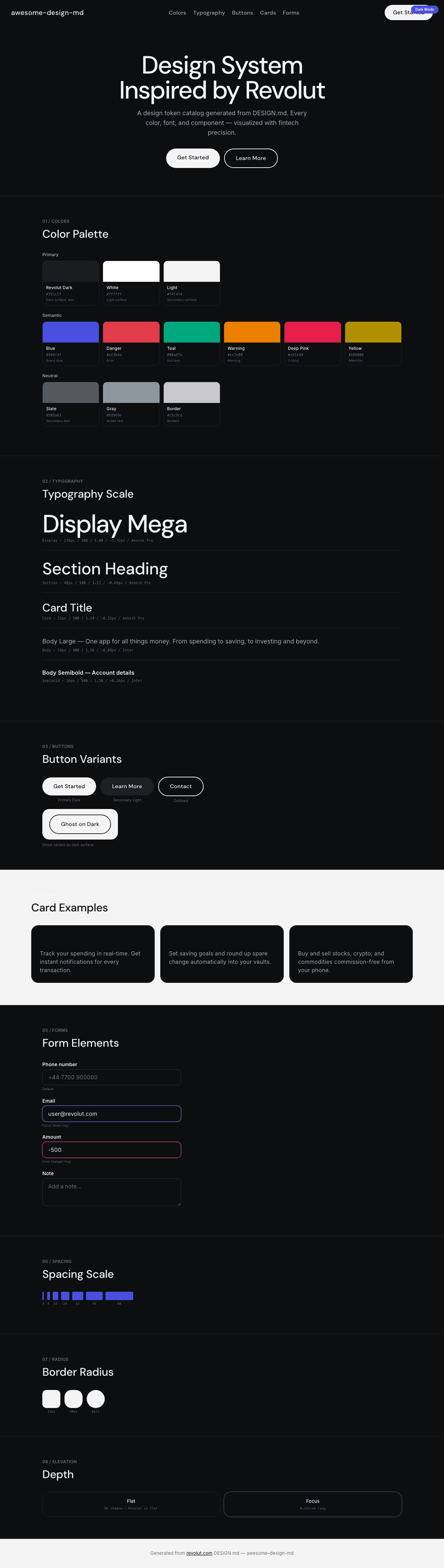
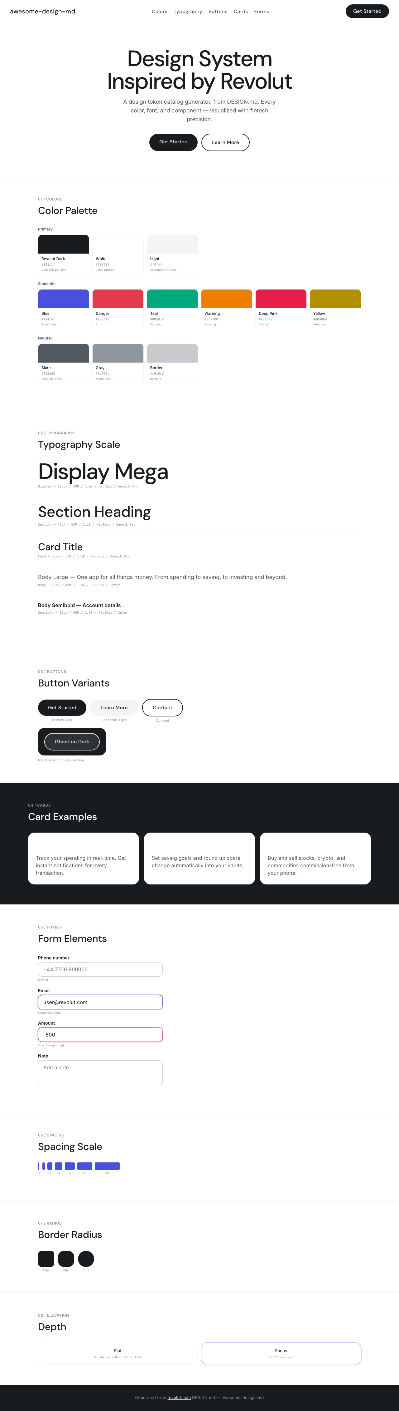
@@ -0,0 +1,23 @@
|
|
|
1
|
+
# Revolut Inspired Design System
|
|
2
|
+
|
|
3
|
+
[DESIGN.md](https://github.com/VoltAgent/awesome-design-md/blob/main/design-md/revolut/DESIGN.md) extracted from the public [revolut](https://revolut.com/) website. This is not the official design system. Colors, fonts, and spacing may not be 100% accurate. But it's a good starting point for building something similar.
|
|
4
|
+
|
|
5
|
+
## Files
|
|
6
|
+
|
|
7
|
+
| File | Description |
|
|
8
|
+
|------|-------------|
|
|
9
|
+
| `DESIGN.md` | Complete design system documentation (9 sections) |
|
|
10
|
+
| `preview.html` | Interactive design token catalog (light) |
|
|
11
|
+
| `preview-dark.html` | Interactive design token catalog (dark) |
|
|
12
|
+
|
|
13
|
+
Use [DESIGN.md](https://github.com/VoltAgent/awesome-design-md/blob/main/design-md/revolut/DESIGN.md) to use as a reference for AI agents (Claude, Cursor, Stitch) to generate UI that looks like the Revolut design language.
|
|
14
|
+
|
|
15
|
+
## Preview
|
|
16
|
+
|
|
17
|
+
A sample landing page built with DESIGN.md. It shows the actual colors, typography, buttons, cards, spacing, and elevation, all in one page.
|
|
18
|
+
|
|
19
|
+
### Dark Mode
|
|
20
|
+
|
|
21
|
+
|
|
22
|
+
### Light Mode
|
|
23
|
+
|