awesome-design-md 1.0.0
This diff represents the content of publicly available package versions that have been released to one of the supported registries. The information contained in this diff is provided for informational purposes only and reflects changes between package versions as they appear in their respective public registries.
- package/LICENSE +21 -0
- package/README.md +172 -0
- package/bin/cli.mjs +126 -0
- package/design-md/airbnb/DESIGN.md +246 -0
- package/design-md/airbnb/README.md +23 -0
- package/design-md/airbnb/preview-dark.html +234 -0
- package/design-md/airbnb/preview.html +233 -0
- package/design-md/airtable/DESIGN.md +89 -0
- package/design-md/airtable/README.md +23 -0
- package/design-md/airtable/preview-dark.html +165 -0
- package/design-md/airtable/preview.html +164 -0
- package/design-md/apple/DESIGN.md +313 -0
- package/design-md/apple/README.md +24 -0
- package/design-md/apple/preview-dark.html +422 -0
- package/design-md/apple/preview.html +416 -0
- package/design-md/bmw/DESIGN.md +180 -0
- package/design-md/bmw/README.md +23 -0
- package/design-md/bmw/preview-dark.html +211 -0
- package/design-md/bmw/preview.html +210 -0
- package/design-md/cal/DESIGN.md +259 -0
- package/design-md/cal/README.md +23 -0
- package/design-md/cal/preview-dark.html +449 -0
- package/design-md/cal/preview.html +575 -0
- package/design-md/claude/DESIGN.md +312 -0
- package/design-md/claude/README.md +24 -0
- package/design-md/claude/preview-dark.html +803 -0
- package/design-md/claude/preview.html +826 -0
- package/design-md/clay/DESIGN.md +304 -0
- package/design-md/clay/README.md +23 -0
- package/design-md/clay/preview-dark.html +318 -0
- package/design-md/clay/preview.html +317 -0
- package/design-md/clickhouse/DESIGN.md +281 -0
- package/design-md/clickhouse/README.md +24 -0
- package/design-md/clickhouse/preview-dark.html +834 -0
- package/design-md/clickhouse/preview.html +786 -0
- package/design-md/cohere/DESIGN.md +266 -0
- package/design-md/cohere/README.md +24 -0
- package/design-md/cohere/preview-dark.html +810 -0
- package/design-md/cohere/preview.html +814 -0
- package/design-md/coinbase/DESIGN.md +129 -0
- package/design-md/coinbase/README.md +23 -0
- package/design-md/coinbase/preview-dark.html +164 -0
- package/design-md/coinbase/preview.html +163 -0
- package/design-md/composio/DESIGN.md +307 -0
- package/design-md/composio/README.md +24 -0
- package/design-md/composio/preview-dark.html +958 -0
- package/design-md/composio/preview.html +933 -0
- package/design-md/cursor/DESIGN.md +309 -0
- package/design-md/cursor/README.md +24 -0
- package/design-md/cursor/preview-dark.html +395 -0
- package/design-md/cursor/preview.html +385 -0
- package/design-md/elevenlabs/DESIGN.md +265 -0
- package/design-md/elevenlabs/README.md +23 -0
- package/design-md/elevenlabs/preview-dark.html +254 -0
- package/design-md/elevenlabs/preview.html +253 -0
- package/design-md/expo/DESIGN.md +281 -0
- package/design-md/expo/README.md +24 -0
- package/design-md/expo/preview-dark.html +536 -0
- package/design-md/expo/preview.html +536 -0
- package/design-md/figma/DESIGN.md +220 -0
- package/design-md/figma/README.md +24 -0
- package/design-md/figma/preview-dark.html +831 -0
- package/design-md/figma/preview.html +841 -0
- package/design-md/framer/DESIGN.md +246 -0
- package/design-md/framer/README.md +23 -0
- package/design-md/framer/preview-dark.html +904 -0
- package/design-md/framer/preview.html +885 -0
- package/design-md/hashicorp/DESIGN.md +278 -0
- package/design-md/hashicorp/README.md +24 -0
- package/design-md/hashicorp/preview-dark.html +1206 -0
- package/design-md/hashicorp/preview.html +1195 -0
- package/design-md/ibm/DESIGN.md +332 -0
- package/design-md/ibm/README.md +24 -0
- package/design-md/ibm/preview-dark.html +445 -0
- package/design-md/ibm/preview.html +430 -0
- package/design-md/intercom/DESIGN.md +146 -0
- package/design-md/intercom/README.md +23 -0
- package/design-md/intercom/preview-dark.html +185 -0
- package/design-md/intercom/preview.html +184 -0
- package/design-md/kraken/DESIGN.md +125 -0
- package/design-md/kraken/README.md +23 -0
- package/design-md/kraken/preview-dark.html +169 -0
- package/design-md/kraken/preview.html +168 -0
- package/design-md/linear.app/DESIGN.md +367 -0
- package/design-md/linear.app/README.md +24 -0
- package/design-md/linear.app/preview-dark.html +385 -0
- package/design-md/linear.app/preview.html +375 -0
- package/design-md/lovable/DESIGN.md +298 -0
- package/design-md/lovable/README.md +24 -0
- package/design-md/lovable/preview-dark.html +351 -0
- package/design-md/lovable/preview.html +350 -0
- package/design-md/minimax/DESIGN.md +257 -0
- package/design-md/minimax/README.md +24 -0
- package/design-md/minimax/preview-dark.html +1267 -0
- package/design-md/minimax/preview.html +1253 -0
- package/design-md/mintlify/DESIGN.md +326 -0
- package/design-md/mintlify/README.md +24 -0
- package/design-md/mintlify/preview-dark.html +411 -0
- package/design-md/mintlify/preview.html +400 -0
- package/design-md/miro/DESIGN.md +108 -0
- package/design-md/miro/README.md +23 -0
- package/design-md/miro/preview-dark.html +174 -0
- package/design-md/miro/preview.html +173 -0
- package/design-md/mistral.ai/DESIGN.md +261 -0
- package/design-md/mistral.ai/README.md +24 -0
- package/design-md/mistral.ai/preview-dark.html +813 -0
- package/design-md/mistral.ai/preview.html +812 -0
- package/design-md/mongodb/DESIGN.md +266 -0
- package/design-md/mongodb/README.md +23 -0
- package/design-md/mongodb/preview-dark.html +262 -0
- package/design-md/mongodb/preview.html +261 -0
- package/design-md/notion/DESIGN.md +309 -0
- package/design-md/notion/README.md +24 -0
- package/design-md/notion/preview-dark.html +374 -0
- package/design-md/notion/preview.html +366 -0
- package/design-md/nvidia/DESIGN.md +293 -0
- package/design-md/nvidia/README.md +24 -0
- package/design-md/nvidia/preview-dark.html +376 -0
- package/design-md/nvidia/preview.html +368 -0
- package/design-md/ollama/DESIGN.md +267 -0
- package/design-md/ollama/README.md +24 -0
- package/design-md/ollama/preview-dark.html +678 -0
- package/design-md/ollama/preview.html +678 -0
- package/design-md/opencode.ai/DESIGN.md +281 -0
- package/design-md/opencode.ai/README.md +24 -0
- package/design-md/opencode.ai/preview-dark.html +368 -0
- package/design-md/opencode.ai/preview.html +359 -0
- package/design-md/pinterest/DESIGN.md +230 -0
- package/design-md/pinterest/README.md +23 -0
- package/design-md/pinterest/preview-dark.html +233 -0
- package/design-md/pinterest/preview.html +232 -0
- package/design-md/posthog/DESIGN.md +256 -0
- package/design-md/posthog/README.md +23 -0
- package/design-md/posthog/preview-dark.html +701 -0
- package/design-md/posthog/preview.html +751 -0
- package/design-md/raycast/DESIGN.md +268 -0
- package/design-md/raycast/README.md +23 -0
- package/design-md/raycast/preview-dark.html +608 -0
- package/design-md/raycast/preview.html +690 -0
- package/design-md/replicate/DESIGN.md +261 -0
- package/design-md/replicate/README.md +24 -0
- package/design-md/replicate/preview-dark.html +828 -0
- package/design-md/replicate/preview.html +831 -0
- package/design-md/resend/DESIGN.md +303 -0
- package/design-md/resend/README.md +23 -0
- package/design-md/resend/preview-dark.html +357 -0
- package/design-md/resend/preview.html +356 -0
- package/design-md/revolut/DESIGN.md +185 -0
- package/design-md/revolut/README.md +23 -0
- package/design-md/revolut/preview-dark.html +234 -0
- package/design-md/revolut/preview.html +233 -0
- package/design-md/runwayml/DESIGN.md +244 -0
- package/design-md/runwayml/README.md +24 -0
- package/design-md/runwayml/preview-dark.html +664 -0
- package/design-md/runwayml/preview.html +665 -0
- package/design-md/sanity/DESIGN.md +357 -0
- package/design-md/sanity/README.md +24 -0
- package/design-md/sanity/preview-dark.html +995 -0
- package/design-md/sanity/preview.html +1140 -0
- package/design-md/sentry/DESIGN.md +262 -0
- package/design-md/sentry/README.md +24 -0
- package/design-md/sentry/preview-dark.html +628 -0
- package/design-md/sentry/preview.html +953 -0
- package/design-md/spacex/DESIGN.md +194 -0
- package/design-md/spacex/README.md +23 -0
- package/design-md/spacex/preview-dark.html +223 -0
- package/design-md/spacex/preview.html +222 -0
- package/design-md/spotify/DESIGN.md +246 -0
- package/design-md/spotify/README.md +23 -0
- package/design-md/spotify/preview-dark.html +231 -0
- package/design-md/spotify/preview.html +230 -0
- package/design-md/stripe/DESIGN.md +322 -0
- package/design-md/stripe/README.md +24 -0
- package/design-md/stripe/preview-dark.html +430 -0
- package/design-md/stripe/preview.html +421 -0
- package/design-md/supabase/DESIGN.md +255 -0
- package/design-md/supabase/README.md +24 -0
- package/design-md/supabase/preview-dark.html +977 -0
- package/design-md/supabase/preview.html +955 -0
- package/design-md/superhuman/DESIGN.md +252 -0
- package/design-md/superhuman/README.md +23 -0
- package/design-md/superhuman/preview-dark.html +975 -0
- package/design-md/superhuman/preview.html +953 -0
- package/design-md/together.ai/DESIGN.md +263 -0
- package/design-md/together.ai/README.md +24 -0
- package/design-md/together.ai/preview-dark.html +892 -0
- package/design-md/together.ai/preview.html +897 -0
- package/design-md/uber/DESIGN.md +295 -0
- package/design-md/uber/README.md +24 -0
- package/design-md/uber/preview-dark.html +1164 -0
- package/design-md/uber/preview.html +1163 -0
- package/design-md/vercel/DESIGN.md +310 -0
- package/design-md/vercel/README.md +24 -0
- package/design-md/vercel/preview-dark.html +370 -0
- package/design-md/vercel/preview.html +369 -0
- package/design-md/voltagent/DESIGN.md +323 -0
- package/design-md/voltagent/README.md +24 -0
- package/design-md/voltagent/preview-dark.html +487 -0
- package/design-md/voltagent/preview.html +766 -0
- package/design-md/warp/DESIGN.md +253 -0
- package/design-md/warp/README.md +23 -0
- package/design-md/warp/preview-dark.html +502 -0
- package/design-md/warp/preview.html +535 -0
- package/design-md/webflow/DESIGN.md +92 -0
- package/design-md/webflow/README.md +23 -0
- package/design-md/webflow/preview-dark.html +147 -0
- package/design-md/webflow/preview.html +146 -0
- package/design-md/wise/DESIGN.md +173 -0
- package/design-md/wise/README.md +23 -0
- package/design-md/wise/preview-dark.html +230 -0
- package/design-md/wise/preview.html +229 -0
- package/design-md/x.ai/DESIGN.md +257 -0
- package/design-md/x.ai/README.md +24 -0
- package/design-md/x.ai/preview-dark.html +358 -0
- package/design-md/x.ai/preview.html +409 -0
- package/design-md/zapier/DESIGN.md +328 -0
- package/design-md/zapier/README.md +24 -0
- package/design-md/zapier/preview-dark.html +382 -0
- package/design-md/zapier/preview.html +374 -0
- package/package.json +33 -0
|
@@ -0,0 +1,359 @@
|
|
|
1
|
+
<!DOCTYPE html>
|
|
2
|
+
<html lang="en">
|
|
3
|
+
<head>
|
|
4
|
+
<meta charset="UTF-8">
|
|
5
|
+
<meta name="viewport" content="width=device-width, initial-scale=1.0">
|
|
6
|
+
<title>Design System Preview: OpenCode (Light)</title>
|
|
7
|
+
<link rel="preconnect" href="https://fonts.googleapis.com">
|
|
8
|
+
<link rel="preconnect" href="https://fonts.gstatic.com" crossorigin>
|
|
9
|
+
<link href="https://fonts.googleapis.com/css2?family=IBM+Plex+Mono:wght@400;500;700&display=swap" rel="stylesheet">
|
|
10
|
+
<style>
|
|
11
|
+
:root {
|
|
12
|
+
--oc-dark: #201d1d;
|
|
13
|
+
--oc-light: #fdfcfc;
|
|
14
|
+
--oc-gray: #9a9898;
|
|
15
|
+
--oc-dark-surface: #302c2c;
|
|
16
|
+
--oc-border-gray: #646262;
|
|
17
|
+
--oc-light-surface: #f1eeee;
|
|
18
|
+
--oc-input-bg: #f8f7f7;
|
|
19
|
+
--accent: #007aff;
|
|
20
|
+
--accent-hover: #0056b3;
|
|
21
|
+
--accent-active: #004085;
|
|
22
|
+
--danger: #ff3b30;
|
|
23
|
+
--danger-hover: #d70015;
|
|
24
|
+
--danger-active: #a50011;
|
|
25
|
+
--success: #30d158;
|
|
26
|
+
--warning: #ff9f0a;
|
|
27
|
+
--warning-hover: #cc7f08;
|
|
28
|
+
--warning-active: #995f06;
|
|
29
|
+
--text-primary: #201d1d;
|
|
30
|
+
--text-secondary: #9a9898;
|
|
31
|
+
--text-muted: #6e6e73;
|
|
32
|
+
--text-caption: #424245;
|
|
33
|
+
--border-warm: rgba(15, 0, 0, 0.12);
|
|
34
|
+
--border-tab: #9a9898;
|
|
35
|
+
--border-outline: #646262;
|
|
36
|
+
--font-mono: 'IBM Plex Mono', ui-monospace, SFMono-Regular, Menlo, Monaco, Consolas, 'Liberation Mono', 'Courier New', monospace;
|
|
37
|
+
}
|
|
38
|
+
* { margin: 0; padding: 0; box-sizing: border-box; }
|
|
39
|
+
body {
|
|
40
|
+
background: var(--oc-light);
|
|
41
|
+
color: var(--text-primary);
|
|
42
|
+
font-family: var(--font-mono);
|
|
43
|
+
font-size: 16px; font-weight: 400; line-height: 1.50;
|
|
44
|
+
-webkit-font-smoothing: antialiased;
|
|
45
|
+
}
|
|
46
|
+
|
|
47
|
+
/* NAV */
|
|
48
|
+
.nav {
|
|
49
|
+
position: sticky; top: 0; z-index: 100;
|
|
50
|
+
display: flex; align-items: center; justify-content: space-between;
|
|
51
|
+
padding: 12px 32px;
|
|
52
|
+
background: var(--oc-light);
|
|
53
|
+
border-bottom: 1px solid var(--border-warm);
|
|
54
|
+
}
|
|
55
|
+
.nav-brand { font-size: 14px; font-weight: 700; color: var(--text-primary); text-decoration: none; }
|
|
56
|
+
.nav-links { display: flex; gap: 24px; list-style: none; }
|
|
57
|
+
.nav-links a { font-size: 14px; font-weight: 500; color: var(--text-secondary); text-decoration: none; transition: color 0.15s; }
|
|
58
|
+
.nav-links a:hover { color: var(--accent); }
|
|
59
|
+
.nav-cta {
|
|
60
|
+
display: inline-block; background: var(--oc-dark); color: var(--oc-light);
|
|
61
|
+
padding: 4px 20px; border-radius: 4px; font-size: 14px; font-weight: 500;
|
|
62
|
+
text-decoration: none; font-family: var(--font-mono); transition: opacity 0.15s;
|
|
63
|
+
}
|
|
64
|
+
.nav-cta:hover { opacity: 0.85; }
|
|
65
|
+
|
|
66
|
+
/* HERO */
|
|
67
|
+
.hero { padding: 96px 32px 80px; text-align: center; }
|
|
68
|
+
.hero h1 {
|
|
69
|
+
font-size: 38px; font-weight: 700; line-height: 1.50;
|
|
70
|
+
color: var(--text-primary); margin-bottom: 16px;
|
|
71
|
+
}
|
|
72
|
+
.hero p { font-size: 16px; font-weight: 400; line-height: 1.50; color: var(--text-secondary); max-width: 600px; margin: 0 auto 32px; }
|
|
73
|
+
.hero-buttons { display: flex; gap: 12px; justify-content: center; flex-wrap: wrap; }
|
|
74
|
+
.btn-primary {
|
|
75
|
+
display: inline-block; background: var(--oc-dark); color: var(--oc-light);
|
|
76
|
+
padding: 4px 20px; border-radius: 4px; border: none;
|
|
77
|
+
font-family: var(--font-mono); font-size: 16px; font-weight: 500; line-height: 2.00;
|
|
78
|
+
text-decoration: none; cursor: pointer; transition: opacity 0.15s;
|
|
79
|
+
}
|
|
80
|
+
.btn-primary:hover { opacity: 0.85; }
|
|
81
|
+
.btn-secondary {
|
|
82
|
+
display: inline-block; background: transparent; color: var(--text-primary);
|
|
83
|
+
padding: 4px 20px; border-radius: 4px; border: 1px solid var(--border-outline);
|
|
84
|
+
font-family: var(--font-mono); font-size: 16px; font-weight: 500; line-height: 2.00;
|
|
85
|
+
text-decoration: none; cursor: pointer; transition: all 0.15s;
|
|
86
|
+
}
|
|
87
|
+
.btn-secondary:hover { border-color: var(--text-primary); }
|
|
88
|
+
.btn-accent {
|
|
89
|
+
display: inline-block; background: var(--accent); color: #ffffff;
|
|
90
|
+
padding: 4px 20px; border-radius: 4px; border: none;
|
|
91
|
+
font-family: var(--font-mono); font-size: 16px; font-weight: 500; line-height: 2.00;
|
|
92
|
+
text-decoration: none; cursor: pointer; transition: background 0.15s;
|
|
93
|
+
}
|
|
94
|
+
.btn-accent:hover { background: var(--accent-hover); }
|
|
95
|
+
.btn-danger {
|
|
96
|
+
display: inline-block; background: var(--danger); color: #ffffff;
|
|
97
|
+
padding: 4px 20px; border-radius: 4px; border: none;
|
|
98
|
+
font-family: var(--font-mono); font-size: 16px; font-weight: 500; line-height: 2.00;
|
|
99
|
+
text-decoration: none; cursor: pointer; transition: background 0.15s;
|
|
100
|
+
}
|
|
101
|
+
.btn-danger:hover { background: var(--danger-hover); }
|
|
102
|
+
|
|
103
|
+
/* SECTIONS */
|
|
104
|
+
.section { padding: 64px 32px; max-width: 1000px; margin: 0 auto; }
|
|
105
|
+
.section-label { font-size: 12px; font-weight: 500; color: var(--text-muted); text-transform: uppercase; margin-bottom: 8px; letter-spacing: 0.5px; }
|
|
106
|
+
.section-title { font-size: 38px; font-weight: 700; line-height: 1.50; margin-bottom: 32px; }
|
|
107
|
+
.section-divider { border: none; border-top: 1px solid var(--border-warm); margin: 0; }
|
|
108
|
+
|
|
109
|
+
/* COLORS */
|
|
110
|
+
.color-grid { display: grid; grid-template-columns: repeat(auto-fill, minmax(155px, 1fr)); gap: 12px; margin-bottom: 24px; }
|
|
111
|
+
.color-swatch { border-radius: 4px; overflow: hidden; border: 1px solid var(--border-warm); background: #ffffff; }
|
|
112
|
+
.color-swatch-block { height: 72px; width: 100%; }
|
|
113
|
+
.color-swatch-info { padding: 10px 12px; }
|
|
114
|
+
.color-swatch-name { font-size: 13px; font-weight: 700; margin-bottom: 2px; }
|
|
115
|
+
.color-swatch-hex { font-size: 12px; color: var(--text-secondary); }
|
|
116
|
+
.color-swatch-role { font-size: 11px; color: var(--text-muted); margin-top: 3px; }
|
|
117
|
+
.color-group-label { font-size: 14px; font-weight: 700; color: var(--text-caption); margin: 24px 0 10px; }
|
|
118
|
+
|
|
119
|
+
/* TYPOGRAPHY */
|
|
120
|
+
.type-sample { margin-bottom: 28px; padding-bottom: 24px; border-bottom: 1px solid var(--border-warm); }
|
|
121
|
+
.type-sample:last-child { border-bottom: none; }
|
|
122
|
+
.type-meta { font-size: 12px; font-weight: 500; color: var(--text-muted); margin-top: 8px; }
|
|
123
|
+
|
|
124
|
+
/* BUTTONS */
|
|
125
|
+
.button-row { display: flex; gap: 16px; flex-wrap: wrap; align-items: center; }
|
|
126
|
+
.button-item { text-align: center; }
|
|
127
|
+
.button-label { font-size: 12px; font-weight: 500; color: var(--text-muted); margin-top: 8px; }
|
|
128
|
+
|
|
129
|
+
/* CARDS */
|
|
130
|
+
.card-grid { display: grid; grid-template-columns: repeat(auto-fit, minmax(280px, 1fr)); gap: 20px; }
|
|
131
|
+
.card { background: #ffffff; border-radius: 4px; padding: 24px; border: 1px solid var(--border-warm); transition: border-color 0.15s; }
|
|
132
|
+
.card:hover { border-color: var(--border-outline); }
|
|
133
|
+
.card h3 { font-size: 16px; font-weight: 700; margin-bottom: 8px; }
|
|
134
|
+
.card p { font-size: 14px; color: var(--text-secondary); line-height: 1.50; }
|
|
135
|
+
.card-badge { display: inline-block; font-size: 12px; font-weight: 500; padding: 2px 8px; border-radius: 4px; margin-bottom: 12px; }
|
|
136
|
+
|
|
137
|
+
/* FORMS */
|
|
138
|
+
.form-group { margin-bottom: 20px; max-width: 400px; }
|
|
139
|
+
.form-label { display: block; font-size: 14px; font-weight: 500; color: var(--text-primary); margin-bottom: 6px; }
|
|
140
|
+
.form-input {
|
|
141
|
+
width: 100%; background: var(--oc-input-bg); color: var(--text-primary);
|
|
142
|
+
border: 1px solid var(--border-warm); padding: 20px; border-radius: 6px;
|
|
143
|
+
font-family: var(--font-mono); font-size: 14px; outline: none;
|
|
144
|
+
transition: border-color 0.15s;
|
|
145
|
+
}
|
|
146
|
+
.form-input:focus { border-color: var(--accent); }
|
|
147
|
+
.form-input--focus { border-color: var(--accent); }
|
|
148
|
+
.form-input--error { border-color: var(--danger); }
|
|
149
|
+
.form-state-label { font-size: 11px; color: var(--text-muted); margin-top: 4px; }
|
|
150
|
+
|
|
151
|
+
/* SPACING */
|
|
152
|
+
.spacing-row { display: flex; align-items: flex-end; gap: 10px; flex-wrap: wrap; margin-bottom: 24px; }
|
|
153
|
+
.spacing-item { text-align: center; }
|
|
154
|
+
.spacing-block { background: var(--oc-dark); border-radius: 2px; margin-bottom: 6px; height: 28px; }
|
|
155
|
+
.spacing-value { font-size: 11px; font-weight: 500; color: var(--text-muted); }
|
|
156
|
+
|
|
157
|
+
/* RADIUS */
|
|
158
|
+
.radius-row { display: flex; gap: 14px; flex-wrap: wrap; align-items: center; }
|
|
159
|
+
.radius-item { text-align: center; }
|
|
160
|
+
.radius-box { width: 64px; height: 64px; background: var(--oc-dark); margin-bottom: 6px; }
|
|
161
|
+
.radius-label { font-size: 11px; font-weight: 500; color: var(--text-muted); }
|
|
162
|
+
.radius-context { font-size: 10px; color: var(--text-muted); }
|
|
163
|
+
|
|
164
|
+
/* ELEVATION */
|
|
165
|
+
.elevation-grid { display: grid; grid-template-columns: repeat(auto-fit, minmax(200px, 1fr)); gap: 20px; }
|
|
166
|
+
.elevation-card { background: #ffffff; border-radius: 4px; padding: 20px; text-align: center; }
|
|
167
|
+
.elevation-label { font-size: 14px; font-weight: 700; margin-bottom: 4px; }
|
|
168
|
+
.elevation-desc { font-size: 11px; color: var(--text-muted); }
|
|
169
|
+
|
|
170
|
+
/* FOOTER */
|
|
171
|
+
.footer { padding: 32px; text-align: center; border-top: 1px solid var(--border-warm); font-size: 14px; color: var(--text-secondary); }
|
|
172
|
+
.footer a { color: var(--accent); text-decoration: underline; }
|
|
173
|
+
|
|
174
|
+
@media (max-width: 768px) {
|
|
175
|
+
.hero h1 { font-size: 28px; }
|
|
176
|
+
.nav-links { display: none; }
|
|
177
|
+
.section { padding: 48px 20px; }
|
|
178
|
+
.section-title { font-size: 28px; }
|
|
179
|
+
.card-grid { grid-template-columns: 1fr; }
|
|
180
|
+
}
|
|
181
|
+
</style>
|
|
182
|
+
</head>
|
|
183
|
+
<body>
|
|
184
|
+
|
|
185
|
+
<nav class="nav">
|
|
186
|
+
<a class="nav-brand" href="#">awesome-design-md</a>
|
|
187
|
+
<ul class="nav-links">
|
|
188
|
+
<li><a href="#colors">Colors</a></li>
|
|
189
|
+
<li><a href="#typography">Typography</a></li>
|
|
190
|
+
<li><a href="#buttons">Buttons</a></li>
|
|
191
|
+
<li><a href="#cards">Cards</a></li>
|
|
192
|
+
<li><a href="#forms">Forms</a></li>
|
|
193
|
+
<li><a href="#spacing">Spacing</a></li>
|
|
194
|
+
</ul>
|
|
195
|
+
<a class="nav-cta" href="#">Get Started</a>
|
|
196
|
+
</nav>
|
|
197
|
+
|
|
198
|
+
<section class="hero">
|
|
199
|
+
<h1>Design System<br>Inspired by OpenCode</h1>
|
|
200
|
+
<p>A design token catalog generated from DESIGN.md. Every color, font, component, and spacing value -- visualized in monospace precision.</p>
|
|
201
|
+
<div class="hero-buttons">
|
|
202
|
+
<a class="btn-primary" href="#">Install OpenCode</a>
|
|
203
|
+
<a class="btn-secondary" href="#">View on GitHub</a>
|
|
204
|
+
</div>
|
|
205
|
+
</section>
|
|
206
|
+
|
|
207
|
+
<hr class="section-divider">
|
|
208
|
+
|
|
209
|
+
<section class="section" id="colors">
|
|
210
|
+
<div class="section-label">01 / Colors</div>
|
|
211
|
+
<h2 class="section-title">Color Palette</h2>
|
|
212
|
+
|
|
213
|
+
<div class="color-group-label">Primary</div>
|
|
214
|
+
<div class="color-grid">
|
|
215
|
+
<div class="color-swatch"><div class="color-swatch-block" style="background:#201d1d"></div><div class="color-swatch-info"><div class="color-swatch-name">OpenCode Dark</div><div class="color-swatch-hex">#201d1d</div><div class="color-swatch-role">Background, buttons</div></div></div>
|
|
216
|
+
<div class="color-swatch"><div class="color-swatch-block" style="background:#fdfcfc"></div><div class="color-swatch-info"><div class="color-swatch-name">OpenCode Light</div><div class="color-swatch-hex">#fdfcfc</div><div class="color-swatch-role">Primary text</div></div></div>
|
|
217
|
+
<div class="color-swatch"><div class="color-swatch-block" style="background:#9a9898"></div><div class="color-swatch-info"><div class="color-swatch-name">Mid Gray</div><div class="color-swatch-hex">#9a9898</div><div class="color-swatch-role">Secondary text</div></div></div>
|
|
218
|
+
<div class="color-swatch"><div class="color-swatch-block" style="background:#302c2c"></div><div class="color-swatch-info"><div class="color-swatch-name">Dark Surface</div><div class="color-swatch-hex">#302c2c</div><div class="color-swatch-role">Elevated surface</div></div></div>
|
|
219
|
+
</div>
|
|
220
|
+
|
|
221
|
+
<div class="color-group-label">Surface & Border</div>
|
|
222
|
+
<div class="color-grid">
|
|
223
|
+
<div class="color-swatch"><div class="color-swatch-block" style="background:#f1eeee"></div><div class="color-swatch-info"><div class="color-swatch-name">Light Surface</div><div class="color-swatch-hex">#f1eeee</div><div class="color-swatch-role">Light background</div></div></div>
|
|
224
|
+
<div class="color-swatch"><div class="color-swatch-block" style="background:#f8f7f7"></div><div class="color-swatch-info"><div class="color-swatch-name">Input BG</div><div class="color-swatch-hex">#f8f7f7</div><div class="color-swatch-role">Form inputs</div></div></div>
|
|
225
|
+
<div class="color-swatch"><div class="color-swatch-block" style="background:#646262"></div><div class="color-swatch-info"><div class="color-swatch-name">Border Gray</div><div class="color-swatch-hex">#646262</div><div class="color-swatch-role">Outline borders</div></div></div>
|
|
226
|
+
<div class="color-swatch"><div class="color-swatch-block" style="background:#6e6e73"></div><div class="color-swatch-info"><div class="color-swatch-name">Text Muted</div><div class="color-swatch-hex">#6e6e73</div><div class="color-swatch-role">Muted labels</div></div></div>
|
|
227
|
+
</div>
|
|
228
|
+
|
|
229
|
+
<div class="color-group-label">Accent</div>
|
|
230
|
+
<div class="color-grid">
|
|
231
|
+
<div class="color-swatch"><div class="color-swatch-block" style="background:#007aff"></div><div class="color-swatch-info"><div class="color-swatch-name">Accent Blue</div><div class="color-swatch-hex">#007aff</div><div class="color-swatch-role">Primary accent</div></div></div>
|
|
232
|
+
<div class="color-swatch"><div class="color-swatch-block" style="background:#0056b3"></div><div class="color-swatch-info"><div class="color-swatch-name">Accent Hover</div><div class="color-swatch-hex">#0056b3</div><div class="color-swatch-role">Hover state</div></div></div>
|
|
233
|
+
<div class="color-swatch"><div class="color-swatch-block" style="background:#004085"></div><div class="color-swatch-info"><div class="color-swatch-name">Accent Active</div><div class="color-swatch-hex">#004085</div><div class="color-swatch-role">Active state</div></div></div>
|
|
234
|
+
</div>
|
|
235
|
+
|
|
236
|
+
<div class="color-group-label">Semantic</div>
|
|
237
|
+
<div class="color-grid">
|
|
238
|
+
<div class="color-swatch"><div class="color-swatch-block" style="background:#ff3b30"></div><div class="color-swatch-info"><div class="color-swatch-name">Danger</div><div class="color-swatch-hex">#ff3b30</div><div class="color-swatch-role">Error, destructive</div></div></div>
|
|
239
|
+
<div class="color-swatch"><div class="color-swatch-block" style="background:#30d158"></div><div class="color-swatch-info"><div class="color-swatch-name">Success</div><div class="color-swatch-hex">#30d158</div><div class="color-swatch-role">Success state</div></div></div>
|
|
240
|
+
<div class="color-swatch"><div class="color-swatch-block" style="background:#ff9f0a"></div><div class="color-swatch-info"><div class="color-swatch-name">Warning</div><div class="color-swatch-hex">#ff9f0a</div><div class="color-swatch-role">Caution, alerts</div></div></div>
|
|
241
|
+
<div class="color-swatch"><div class="color-swatch-block" style="background:#424245"></div><div class="color-swatch-info"><div class="color-swatch-name">Text Secondary</div><div class="color-swatch-hex">#424245</div><div class="color-swatch-role">Captions on light</div></div></div>
|
|
242
|
+
</div>
|
|
243
|
+
</section>
|
|
244
|
+
|
|
245
|
+
<hr class="section-divider">
|
|
246
|
+
|
|
247
|
+
<section class="section" id="typography">
|
|
248
|
+
<div class="section-label">02 / Typography</div>
|
|
249
|
+
<h2 class="section-title">Typography Scale</h2>
|
|
250
|
+
|
|
251
|
+
<div class="type-sample"><div style="font-size:38px; font-weight:700; line-height:1.50;">Heading 1 -- Hero</div><div class="type-meta">Heading 1 -- 38px / 700 / 1.50 / Berkeley Mono</div></div>
|
|
252
|
+
<div class="type-sample"><div style="font-size:16px; font-weight:700; line-height:1.50;">Heading 2 -- Section Title</div><div class="type-meta">Heading 2 -- 16px / 700 / 1.50 / Berkeley Mono</div></div>
|
|
253
|
+
<div class="type-sample"><div style="font-size:16px; font-weight:500; line-height:1.50;">Body Medium -- Navigation links, interactive text, and button labels live here.</div><div class="type-meta">Body Medium -- 16px / 500 / 1.50 / Berkeley Mono</div></div>
|
|
254
|
+
<div class="type-sample"><div style="font-size:16px; font-weight:400; line-height:1.50;">Body Regular -- Standard paragraph text for descriptions, documentation, and general content across the interface.</div><div class="type-meta">Body Regular -- 16px / 400 / 1.50 / Berkeley Mono</div></div>
|
|
255
|
+
<div class="type-sample"><div style="font-size:16px; font-weight:500; line-height:1.00;">Body Tight -- Compact Labels</div><div class="type-meta">Body Tight -- 16px / 500 / 1.00 / Berkeley Mono</div></div>
|
|
256
|
+
<div class="type-sample"><div style="font-size:14px; font-weight:400; line-height:2.00;">Caption -- Footnotes, metadata, and small supplementary text with relaxed line-height for readability.</div><div class="type-meta">Caption -- 14px / 400 / 2.00 / Berkeley Mono</div></div>
|
|
257
|
+
<div class="type-sample"><div style="font-size:14px; font-weight:400; line-height:1.50; font-family:var(--font-mono);">$ opencode --help</div><div class="type-meta">Code -- 14px / 400 / 1.50 / Berkeley Mono (monospace)</div></div>
|
|
258
|
+
</section>
|
|
259
|
+
|
|
260
|
+
<hr class="section-divider">
|
|
261
|
+
|
|
262
|
+
<section class="section" id="buttons">
|
|
263
|
+
<div class="section-label">03 / Buttons</div>
|
|
264
|
+
<h2 class="section-title">Button Variants</h2>
|
|
265
|
+
<div class="button-row">
|
|
266
|
+
<div class="button-item"><a class="btn-primary" href="#">Install OpenCode</a><div class="button-label">Primary Dark</div></div>
|
|
267
|
+
<div class="button-item"><a class="btn-secondary" href="#">View on GitHub</a><div class="button-label">Secondary Outline</div></div>
|
|
268
|
+
<div class="button-item"><a class="btn-accent" href="#">Learn More</a><div class="button-label">Accent Blue</div></div>
|
|
269
|
+
<div class="button-item"><a class="btn-danger" href="#">Delete</a><div class="button-label">Danger</div></div>
|
|
270
|
+
<div class="button-item"><span style="display:inline-block; background:var(--success); color:#ffffff; padding:4px 20px; border-radius:4px; font-size:16px; font-weight:500; font-family:var(--font-mono);">Success</span><div class="button-label">Success</div></div>
|
|
271
|
+
<div class="button-item"><span style="display:inline-block; background:var(--warning); color:#ffffff; padding:4px 20px; border-radius:4px; font-size:16px; font-weight:500; font-family:var(--font-mono);">Warning</span><div class="button-label">Warning</div></div>
|
|
272
|
+
</div>
|
|
273
|
+
</section>
|
|
274
|
+
|
|
275
|
+
<hr class="section-divider">
|
|
276
|
+
|
|
277
|
+
<section class="section" id="cards">
|
|
278
|
+
<div class="section-label">04 / Cards</div>
|
|
279
|
+
<h2 class="section-title">Card Examples</h2>
|
|
280
|
+
<div class="card-grid">
|
|
281
|
+
<div class="card">
|
|
282
|
+
<div class="card-badge" style="background:rgba(0,122,255,0.1); color:var(--accent);">AI Agent</div>
|
|
283
|
+
<h3>Terminal-Native Coding</h3>
|
|
284
|
+
<p>An open source AI coding agent that runs in your terminal. No IDE required -- just you, your code, and the command line.</p>
|
|
285
|
+
</div>
|
|
286
|
+
<div class="card" style="border-color: var(--border-outline);">
|
|
287
|
+
<div class="card-badge" style="background:rgba(48,209,88,0.1); color:var(--success);">Open Source</div>
|
|
288
|
+
<h3>Multi-Provider Support</h3>
|
|
289
|
+
<p>Works with Anthropic, OpenAI, and other LLM providers. Choose the model that fits your workflow and budget.</p>
|
|
290
|
+
</div>
|
|
291
|
+
<div class="card">
|
|
292
|
+
<div class="card-badge" style="background:rgba(255,159,10,0.1); color:var(--warning-hover);">CLI</div>
|
|
293
|
+
<h3>Context-Aware Editing</h3>
|
|
294
|
+
<p>Understands your entire codebase context. Make changes across multiple files with natural language instructions.</p>
|
|
295
|
+
</div>
|
|
296
|
+
</div>
|
|
297
|
+
</section>
|
|
298
|
+
|
|
299
|
+
<hr class="section-divider">
|
|
300
|
+
|
|
301
|
+
<section class="section" id="forms">
|
|
302
|
+
<div class="section-label">05 / Forms</div>
|
|
303
|
+
<h2 class="section-title">Form Elements</h2>
|
|
304
|
+
<div class="form-group"><label class="form-label">Email Address</label><input class="form-input" type="text" placeholder="you@example.com"><div class="form-state-label">Default (warm border, 20px padding)</div></div>
|
|
305
|
+
<div class="form-group"><label class="form-label">API Key</label><input class="form-input form-input--focus" type="text" value="sk-ant-..."><div class="form-state-label">Focus (accent blue border)</div></div>
|
|
306
|
+
<div class="form-group"><label class="form-label">Invalid Key</label><input class="form-input form-input--error" type="text" value="invalid-key-format"><div class="form-state-label">Error (danger red border)</div></div>
|
|
307
|
+
</section>
|
|
308
|
+
|
|
309
|
+
<hr class="section-divider">
|
|
310
|
+
|
|
311
|
+
<section class="section" id="spacing">
|
|
312
|
+
<div class="section-label">06 / Spacing</div>
|
|
313
|
+
<h2 class="section-title">Spacing Scale</h2>
|
|
314
|
+
<div class="spacing-row">
|
|
315
|
+
<div class="spacing-item"><div class="spacing-block" style="width:1px"></div><div class="spacing-value">1</div></div>
|
|
316
|
+
<div class="spacing-item"><div class="spacing-block" style="width:2px"></div><div class="spacing-value">2</div></div>
|
|
317
|
+
<div class="spacing-item"><div class="spacing-block" style="width:4px"></div><div class="spacing-value">4</div></div>
|
|
318
|
+
<div class="spacing-item"><div class="spacing-block" style="width:8px"></div><div class="spacing-value">8</div></div>
|
|
319
|
+
<div class="spacing-item"><div class="spacing-block" style="width:12px"></div><div class="spacing-value">12</div></div>
|
|
320
|
+
<div class="spacing-item"><div class="spacing-block" style="width:16px"></div><div class="spacing-value">16</div></div>
|
|
321
|
+
<div class="spacing-item"><div class="spacing-block" style="width:20px"></div><div class="spacing-value">20</div></div>
|
|
322
|
+
<div class="spacing-item"><div class="spacing-block" style="width:24px"></div><div class="spacing-value">24</div></div>
|
|
323
|
+
<div class="spacing-item"><div class="spacing-block" style="width:32px"></div><div class="spacing-value">32</div></div>
|
|
324
|
+
<div class="spacing-item"><div class="spacing-block" style="width:40px"></div><div class="spacing-value">40</div></div>
|
|
325
|
+
<div class="spacing-item"><div class="spacing-block" style="width:48px"></div><div class="spacing-value">48</div></div>
|
|
326
|
+
<div class="spacing-item"><div class="spacing-block" style="width:64px"></div><div class="spacing-value">64</div></div>
|
|
327
|
+
</div>
|
|
328
|
+
</section>
|
|
329
|
+
|
|
330
|
+
<hr class="section-divider">
|
|
331
|
+
|
|
332
|
+
<section class="section" id="radius">
|
|
333
|
+
<div class="section-label">07 / Radius</div>
|
|
334
|
+
<h2 class="section-title">Border Radius Scale</h2>
|
|
335
|
+
<div class="radius-row">
|
|
336
|
+
<div class="radius-item"><div class="radius-box" style="border-radius:4px"></div><div class="radius-label">4px</div><div class="radius-context">Default (buttons, cards)</div></div>
|
|
337
|
+
<div class="radius-item"><div class="radius-box" style="border-radius:6px"></div><div class="radius-label">6px</div><div class="radius-context">Inputs</div></div>
|
|
338
|
+
</div>
|
|
339
|
+
</section>
|
|
340
|
+
|
|
341
|
+
<hr class="section-divider">
|
|
342
|
+
|
|
343
|
+
<section class="section" id="elevation">
|
|
344
|
+
<div class="section-label">08 / Elevation</div>
|
|
345
|
+
<h2 class="section-title">Elevation & Depth</h2>
|
|
346
|
+
<div class="elevation-grid">
|
|
347
|
+
<div class="elevation-card" style="border: none; background: var(--oc-light-surface);"><div class="elevation-label">Level 0: Flat</div><div class="elevation-desc">No border, no shadow</div></div>
|
|
348
|
+
<div class="elevation-card" style="border: 1px solid var(--border-warm);"><div class="elevation-label">Level 1: Subtle</div><div class="elevation-desc">1px rgba(15,0,0,0.12)</div></div>
|
|
349
|
+
<div class="elevation-card" style="border-bottom: 2px solid var(--border-tab);"><div class="elevation-label">Level 2: Tab</div><div class="elevation-desc">2px solid #9a9898</div></div>
|
|
350
|
+
<div class="elevation-card" style="border: 1px solid var(--border-outline);"><div class="elevation-label">Level 3: Outline</div><div class="elevation-desc">1px solid #646262</div></div>
|
|
351
|
+
</div>
|
|
352
|
+
</section>
|
|
353
|
+
|
|
354
|
+
<footer class="footer">
|
|
355
|
+
Generated from <a href="https://opencode.ai/">opencode.ai</a> DESIGN.md -- awesome-design-md
|
|
356
|
+
</footer>
|
|
357
|
+
|
|
358
|
+
</body>
|
|
359
|
+
</html>
|
|
@@ -0,0 +1,230 @@
|
|
|
1
|
+
# Design System: Pinterest
|
|
2
|
+
|
|
3
|
+
## 1. Visual Theme & Atmosphere
|
|
4
|
+
|
|
5
|
+
Pinterest's website is a warm, inspiration-driven canvas that treats visual discovery like a lifestyle magazine. The design operates on a soft, slightly warm white background with Pinterest Red (`#e60023`) as the singular, bold brand accent. Unlike the cool blues of most tech platforms, Pinterest's neutral scale has a distinctly warm undertone — grays lean toward olive/sand (`#91918c`, `#62625b`, `#e5e5e0`) rather than cool steel, creating a cozy, craft-like atmosphere that invites browsing.
|
|
6
|
+
|
|
7
|
+
The typography uses Pin Sans — a custom proprietary font with a broad fallback stack including Japanese fonts, reflecting Pinterest's global reach. At display scale (70px, weight 600), Pin Sans creates large, inviting headlines. At smaller sizes, the system is compact: buttons at 12px, captions at 12–14px. The CSS variable naming system (`--comp-*`, `--sema-*`, `--base-*`) reveals a sophisticated three-tier design token architecture: component-level, semantic-level, and base-level tokens.
|
|
8
|
+
|
|
9
|
+
What distinguishes Pinterest is its generous border-radius system (12px–40px, plus 50% for circles) and warm-tinted button backgrounds. The secondary button (`#e5e5e0`) has a distinctly warm, sand-like tone rather than cold gray. The primary red button uses 16px radius — rounded but not pill-shaped. Combined with warm badge backgrounds (`hsla(60,20%,98%,.5)` — a subtle yellow-warm wash) and photography-dominant layouts, the result is a design that feels handcrafted and personal, not corporate and sterile.
|
|
10
|
+
|
|
11
|
+
**Key Characteristics:**
|
|
12
|
+
- Warm white canvas with olive/sand-toned neutrals — cozy, not clinical
|
|
13
|
+
- Pinterest Red (`#e60023`) as singular bold accent — never subtle, always confident
|
|
14
|
+
- Pin Sans custom font with global fallback stack (including CJK)
|
|
15
|
+
- Three-tier token architecture: `--comp-*` / `--sema-*` / `--base-*`
|
|
16
|
+
- Warm secondary surfaces: sand gray (`#e5e5e0`), warm badge (`hsla(60,20%,98%,.5)`)
|
|
17
|
+
- Generous border-radius: 16px standard, up to 40px for large containers
|
|
18
|
+
- Photography-first content — pins/images are the primary visual element
|
|
19
|
+
- Dark near-purple text (`#211922`) — warm, with a hint of plum
|
|
20
|
+
|
|
21
|
+
## 2. Color Palette & Roles
|
|
22
|
+
|
|
23
|
+
### Primary Brand
|
|
24
|
+
- **Pinterest Red** (`#e60023`): Primary CTA, brand accent — bold, confident red
|
|
25
|
+
- **Green 700** (`#103c25`): `--base-color-green-700`, success/nature accent
|
|
26
|
+
- **Green 700 Hover** (`#0b2819`): `--base-color-hover-green-700`, pressed green
|
|
27
|
+
|
|
28
|
+
### Text
|
|
29
|
+
- **Plum Black** (`#211922`): Primary text — warm near-black with plum undertone
|
|
30
|
+
- **Black** (`#000000`): Secondary text, button text
|
|
31
|
+
- **Olive Gray** (`#62625b`): Secondary descriptions, muted text
|
|
32
|
+
- **Warm Silver** (`#91918c`): `--comp-button-color-text-transparent-disabled`, disabled text, input borders
|
|
33
|
+
- **White** (`#ffffff`): Text on dark/colored surfaces
|
|
34
|
+
|
|
35
|
+
### Interactive
|
|
36
|
+
- **Focus Blue** (`#435ee5`): `--comp-button-color-border-focus-outer-transparent`, focus rings
|
|
37
|
+
- **Performance Purple** (`#6845ab`): `--sema-color-hover-icon-performance-plus`, performance features
|
|
38
|
+
- **Recommendation Purple** (`#7e238b`): `--sema-color-hover-text-recommendation`, AI recommendation
|
|
39
|
+
- **Link Blue** (`#2b48d4`): Link text color
|
|
40
|
+
- **Facebook Blue** (`#0866ff`): `--facebook-background-color`, social login
|
|
41
|
+
- **Pressed Blue** (`#617bff`): `--base-color-pressed-blue-200`, pressed state
|
|
42
|
+
|
|
43
|
+
### Surface & Border
|
|
44
|
+
- **Sand Gray** (`#e5e5e0`): Secondary button background — warm, craft-like
|
|
45
|
+
- **Warm Light** (`#e0e0d9`): Circular button backgrounds, badges
|
|
46
|
+
- **Warm Wash** (`hsla(60, 20%, 98%, 0.5)`): `--comp-badge-color-background-wash-light`, subtle warm badge bg
|
|
47
|
+
- **Fog** (`#f6f6f3`): Light surface (at 50% opacity)
|
|
48
|
+
- **Border Disabled** (`#c8c8c1`): `--sema-color-border-disabled`, disabled borders
|
|
49
|
+
- **Hover Gray** (`#bcbcb3`): `--base-color-hover-grayscale-150`, hover border
|
|
50
|
+
- **Dark Surface** (`#33332e`): Dark section backgrounds
|
|
51
|
+
|
|
52
|
+
### Semantic
|
|
53
|
+
- **Error Red** (`#9e0a0a`): Checkbox/form error states
|
|
54
|
+
|
|
55
|
+
## 3. Typography Rules
|
|
56
|
+
|
|
57
|
+
### Font Family
|
|
58
|
+
- **Primary**: `Pin Sans`, fallbacks: `-apple-system, system-ui, Segoe UI, Roboto, Oxygen-Sans, Apple Color Emoji, Segoe UI Emoji, Segoe UI Symbol, Ubuntu, Cantarell, Fira Sans, Droid Sans, Helvetica Neue, Helvetica, ヒラギノ角ゴ Pro W3, メイリオ, Meiryo, MS Pゴシック, Arial`
|
|
59
|
+
|
|
60
|
+
### Hierarchy
|
|
61
|
+
|
|
62
|
+
| Role | Font | Size | Weight | Line Height | Letter Spacing | Notes |
|
|
63
|
+
|------|------|------|--------|-------------|----------------|-------|
|
|
64
|
+
| Display Hero | Pin Sans | 70px (4.38rem) | 600 | normal | normal | Maximum impact |
|
|
65
|
+
| Section Heading | Pin Sans | 28px (1.75rem) | 700 | normal | -1.2px | Negative tracking |
|
|
66
|
+
| Body | Pin Sans | 16px (1.00rem) | 400 | 1.40 | normal | Standard reading |
|
|
67
|
+
| Caption Bold | Pin Sans | 14px (0.88rem) | 700 | normal | normal | Strong metadata |
|
|
68
|
+
| Caption | Pin Sans | 12px (0.75rem) | 400–500 | 1.50 | normal | Small text, tags |
|
|
69
|
+
| Button | Pin Sans | 12px (0.75rem) | 400 | normal | normal | Button labels |
|
|
70
|
+
|
|
71
|
+
### Principles
|
|
72
|
+
- **Compact type scale**: The range is 12px–70px with a dramatic jump — most functional text is 12–16px, creating a dense, app-like information hierarchy.
|
|
73
|
+
- **Warm weight distribution**: 600–700 for headings, 400–500 for body. No ultra-light weights — the type always feels substantial.
|
|
74
|
+
- **Negative tracking on headings**: -1.2px on 28px headings creates cozy, intimate section titles.
|
|
75
|
+
- **Single font family**: Pin Sans handles everything — no secondary display or monospace font detected.
|
|
76
|
+
|
|
77
|
+
## 4. Component Stylings
|
|
78
|
+
|
|
79
|
+
### Buttons
|
|
80
|
+
|
|
81
|
+
**Primary Red**
|
|
82
|
+
- Background: `#e60023` (Pinterest Red)
|
|
83
|
+
- Text: `#000000` (black — unusual choice for contrast on red)
|
|
84
|
+
- Padding: 6px 14px
|
|
85
|
+
- Radius: 16px (generously rounded, not pill)
|
|
86
|
+
- Border: `2px solid rgba(255, 255, 255, 0)` (transparent)
|
|
87
|
+
- Focus: semantic border + outline via CSS variables
|
|
88
|
+
|
|
89
|
+
**Secondary Sand**
|
|
90
|
+
- Background: `#e5e5e0` (warm sand gray)
|
|
91
|
+
- Text: `#000000`
|
|
92
|
+
- Padding: 6px 14px
|
|
93
|
+
- Radius: 16px
|
|
94
|
+
- Focus: same semantic border system
|
|
95
|
+
|
|
96
|
+
**Circular Action**
|
|
97
|
+
- Background: `#e0e0d9` (warm light)
|
|
98
|
+
- Text: `#211922` (plum black)
|
|
99
|
+
- Radius: 50% (circle)
|
|
100
|
+
- Use: Pin actions, navigation controls
|
|
101
|
+
|
|
102
|
+
**Ghost / Transparent**
|
|
103
|
+
- Background: transparent
|
|
104
|
+
- Text: `#000000`
|
|
105
|
+
- No border
|
|
106
|
+
- Use: Tertiary actions
|
|
107
|
+
|
|
108
|
+
### Cards & Containers
|
|
109
|
+
- Photography-first pin cards with generous radius (12px–20px)
|
|
110
|
+
- No traditional box-shadow on most cards
|
|
111
|
+
- White or warm fog backgrounds
|
|
112
|
+
- 8px white thick border on some image containers
|
|
113
|
+
|
|
114
|
+
### Inputs
|
|
115
|
+
- Email input: white background, `1px solid #91918c` border, 16px radius, 11px 15px padding
|
|
116
|
+
- Focus: semantic border + outline system via CSS variables
|
|
117
|
+
|
|
118
|
+
### Navigation
|
|
119
|
+
- Clean header on white or warm background
|
|
120
|
+
- Pinterest logo + search bar centered
|
|
121
|
+
- Pin Sans 16px for nav links
|
|
122
|
+
- Pinterest Red accents for active states
|
|
123
|
+
|
|
124
|
+
### Image Treatment
|
|
125
|
+
- Pin-style masonry grid (signature Pinterest layout)
|
|
126
|
+
- Rounded corners: 12px–20px on images
|
|
127
|
+
- Photography as primary content — every pin is an image
|
|
128
|
+
- Thick white borders (8px) on featured image containers
|
|
129
|
+
|
|
130
|
+
## 5. Layout Principles
|
|
131
|
+
|
|
132
|
+
### Spacing System
|
|
133
|
+
- Base unit: 8px
|
|
134
|
+
- Scale: 4px, 6px, 7px, 8px, 10px, 11px, 12px, 16px, 18px, 20px, 22px, 24px, 32px, 80px, 100px
|
|
135
|
+
- Large jumps: 32px → 80px → 100px for section spacing
|
|
136
|
+
|
|
137
|
+
### Grid & Container
|
|
138
|
+
- Masonry grid for pin content (signature layout)
|
|
139
|
+
- Centered content sections with generous max-width
|
|
140
|
+
- Full-width dark footer
|
|
141
|
+
- Search bar as primary navigation element
|
|
142
|
+
|
|
143
|
+
### Whitespace Philosophy
|
|
144
|
+
- **Inspiration density**: The masonry grid packs pins tightly — the content density IS the value proposition. Whitespace exists between sections, not within the grid.
|
|
145
|
+
- **Breathing above, density below**: Hero/feature sections get generous padding; the pin grid is compact and immersive.
|
|
146
|
+
|
|
147
|
+
### Border Radius Scale
|
|
148
|
+
- Standard (12px): Small cards, links
|
|
149
|
+
- Button (16px): Buttons, inputs, medium cards
|
|
150
|
+
- Comfortable (20px): Feature cards
|
|
151
|
+
- Large (28px): Large containers
|
|
152
|
+
- Section (32px): Tab elements, large panels
|
|
153
|
+
- Hero (40px): Hero containers, large feature blocks
|
|
154
|
+
- Circle (50%): Action buttons, tab indicators
|
|
155
|
+
|
|
156
|
+
## 6. Depth & Elevation
|
|
157
|
+
|
|
158
|
+
| Level | Treatment | Use |
|
|
159
|
+
|-------|-----------|-----|
|
|
160
|
+
| Flat (Level 0) | No shadow | Default — pins rely on content, not shadow |
|
|
161
|
+
| Subtle (Level 1) | Minimal shadow (from tokens) | Elevated overlays, dropdowns |
|
|
162
|
+
| Focus (Accessibility) | `--sema-color-border-focus-outer-default` ring | Focus states |
|
|
163
|
+
|
|
164
|
+
**Shadow Philosophy**: Pinterest uses minimal shadows. The masonry grid relies on content (photography) to create visual interest rather than elevation effects. Depth comes from the warmth of surface colors and the generous rounding of containers.
|
|
165
|
+
|
|
166
|
+
## 7. Do's and Don'ts
|
|
167
|
+
|
|
168
|
+
### Do
|
|
169
|
+
- Use warm neutrals (`#e5e5e0`, `#e0e0d9`, `#91918c`) — the warm olive/sand tone is the identity
|
|
170
|
+
- Apply Pinterest Red (`#e60023`) only for primary CTAs — it's bold and singular
|
|
171
|
+
- Use Pin Sans exclusively — one font for everything
|
|
172
|
+
- Apply generous border-radius: 16px for buttons/inputs, 20px+ for cards
|
|
173
|
+
- Keep the masonry grid dense — content density is the value
|
|
174
|
+
- Use warm badge backgrounds (`hsla(60,20%,98%,.5)`) for subtle warm washes
|
|
175
|
+
- Use `#211922` (plum black) for primary text — it's warmer than pure black
|
|
176
|
+
|
|
177
|
+
### Don't
|
|
178
|
+
- Don't use cool gray neutrals — always warm/olive-toned
|
|
179
|
+
- Don't use pure black (`#000000`) as primary text — use plum black (`#211922`)
|
|
180
|
+
- Don't use pill-shaped buttons — 16px radius is rounded but not pill
|
|
181
|
+
- Don't add heavy shadows — Pinterest is flat by design, depth from content
|
|
182
|
+
- Don't use small border-radius (<12px) on cards — the generous rounding is core
|
|
183
|
+
- Don't introduce additional brand colors — red + warm neutrals is the complete palette
|
|
184
|
+
- Don't use thin font weights — Pin Sans at 400 minimum
|
|
185
|
+
|
|
186
|
+
## 8. Responsive Behavior
|
|
187
|
+
|
|
188
|
+
### Breakpoints
|
|
189
|
+
| Name | Width | Key Changes |
|
|
190
|
+
|------|-------|-------------|
|
|
191
|
+
| Mobile | <576px | Single column, compact layout |
|
|
192
|
+
| Mobile Large | 576–768px | 2-column pin grid |
|
|
193
|
+
| Tablet | 768–890px | Expanded grid |
|
|
194
|
+
| Desktop Small | 890–1312px | Standard masonry grid |
|
|
195
|
+
| Desktop | 1312–1440px | Full layout |
|
|
196
|
+
| Large Desktop | 1440–1680px | Expanded grid columns |
|
|
197
|
+
| Ultra-wide | >1680px | Maximum grid density |
|
|
198
|
+
|
|
199
|
+
### Collapsing Strategy
|
|
200
|
+
- Pin grid: 5+ columns → 3 → 2 → 1
|
|
201
|
+
- Navigation: search bar + icons → simplified mobile nav
|
|
202
|
+
- Feature sections: side-by-side → stacked
|
|
203
|
+
- Hero: 70px → scales down proportionally
|
|
204
|
+
- Footer: dark multi-column → stacked
|
|
205
|
+
|
|
206
|
+
## 9. Agent Prompt Guide
|
|
207
|
+
|
|
208
|
+
### Quick Color Reference
|
|
209
|
+
- Brand: Pinterest Red (`#e60023`)
|
|
210
|
+
- Background: White (`#ffffff`)
|
|
211
|
+
- Text: Plum Black (`#211922`)
|
|
212
|
+
- Secondary text: Olive Gray (`#62625b`)
|
|
213
|
+
- Button surface: Sand Gray (`#e5e5e0`)
|
|
214
|
+
- Border: Warm Silver (`#91918c`)
|
|
215
|
+
- Focus: Focus Blue (`#435ee5`)
|
|
216
|
+
|
|
217
|
+
### Example Component Prompts
|
|
218
|
+
- "Create a hero: white background. Headline at 70px Pin Sans weight 600, plum black (#211922). Red CTA button (#e60023, 16px radius, 6px 14px padding). Secondary sand button (#e5e5e0, 16px radius)."
|
|
219
|
+
- "Design a pin card: white background, 16px radius, no shadow. Photography fills top, 16px Pin Sans weight 400 description below in #62625b."
|
|
220
|
+
- "Build a circular action button: #e0e0d9 background, 50% radius, #211922 icon."
|
|
221
|
+
- "Create an input field: white background, 1px solid #91918c, 16px radius, 11px 15px padding. Focus: blue outline via semantic tokens."
|
|
222
|
+
- "Design the dark footer: #33332e background. Pinterest script logo in white. 12px Pin Sans links in #91918c."
|
|
223
|
+
|
|
224
|
+
### Iteration Guide
|
|
225
|
+
1. Warm neutrals everywhere — olive/sand grays, never cool steel
|
|
226
|
+
2. Pinterest Red for CTAs only — bold and singular
|
|
227
|
+
3. 16px radius on buttons/inputs, 20px+ on cards — generous but not pill
|
|
228
|
+
4. Pin Sans is the only font — compact at 12px for UI, 70px for display
|
|
229
|
+
5. Photography carries the design — the UI stays warm and minimal
|
|
230
|
+
6. Plum black (#211922) for text — warmer than pure black
|
|
@@ -0,0 +1,23 @@
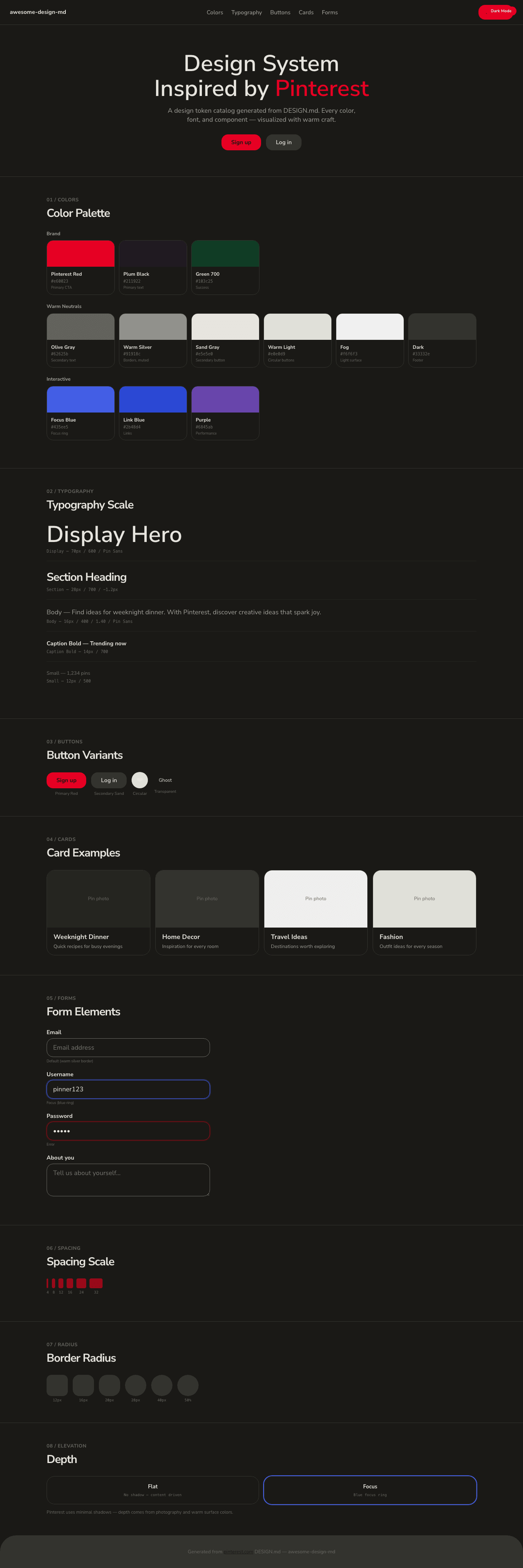
|
|
|
1
|
+
# Pinterest Inspired Design System
|
|
2
|
+
|
|
3
|
+
[DESIGN.md](https://github.com/VoltAgent/awesome-design-md/blob/main/design-md/pinterest/DESIGN.md) extracted from the public [pinterest](https://pinterest.com/) website. This is not the official design system. Colors, fonts, and spacing may not be 100% accurate. But it's a good starting point for building something similar.
|
|
4
|
+
|
|
5
|
+
## Files
|
|
6
|
+
|
|
7
|
+
| File | Description |
|
|
8
|
+
|------|-------------|
|
|
9
|
+
| `DESIGN.md` | Complete design system documentation (9 sections) |
|
|
10
|
+
| `preview.html` | Interactive design token catalog (light) |
|
|
11
|
+
| `preview-dark.html` | Interactive design token catalog (dark) |
|
|
12
|
+
|
|
13
|
+
Use [DESIGN.md](https://github.com/VoltAgent/awesome-design-md/blob/main/design-md/pinterest/DESIGN.md) to use as a reference for AI agents (Claude, Cursor, Stitch) to generate UI that looks like the Pinterest design language.
|
|
14
|
+
|
|
15
|
+
## Preview
|
|
16
|
+
|
|
17
|
+
A sample landing page built with DESIGN.md. It shows the actual colors, typography, buttons, cards, spacing, and elevation, all in one page.
|
|
18
|
+
|
|
19
|
+
### Dark Mode
|
|
20
|
+
|
|
21
|
+
|
|
22
|
+
### Light Mode
|
|
23
|
+
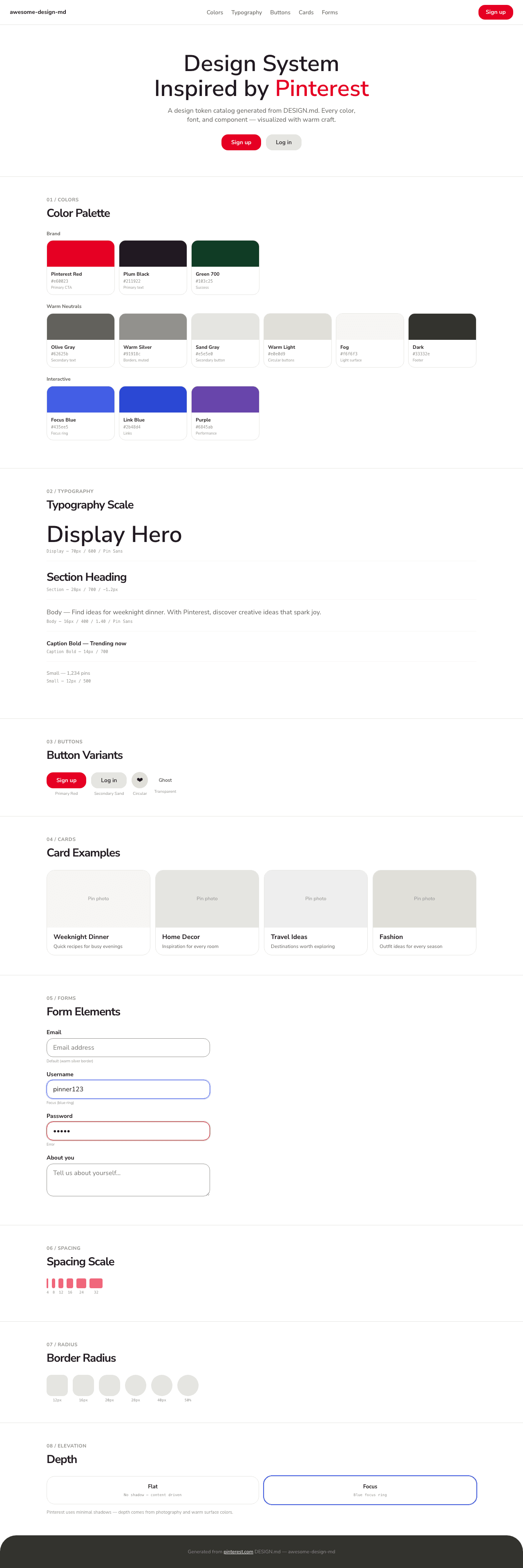
|