awesome-design-md 1.0.0
This diff represents the content of publicly available package versions that have been released to one of the supported registries. The information contained in this diff is provided for informational purposes only and reflects changes between package versions as they appear in their respective public registries.
- package/LICENSE +21 -0
- package/README.md +172 -0
- package/bin/cli.mjs +126 -0
- package/design-md/airbnb/DESIGN.md +246 -0
- package/design-md/airbnb/README.md +23 -0
- package/design-md/airbnb/preview-dark.html +234 -0
- package/design-md/airbnb/preview.html +233 -0
- package/design-md/airtable/DESIGN.md +89 -0
- package/design-md/airtable/README.md +23 -0
- package/design-md/airtable/preview-dark.html +165 -0
- package/design-md/airtable/preview.html +164 -0
- package/design-md/apple/DESIGN.md +313 -0
- package/design-md/apple/README.md +24 -0
- package/design-md/apple/preview-dark.html +422 -0
- package/design-md/apple/preview.html +416 -0
- package/design-md/bmw/DESIGN.md +180 -0
- package/design-md/bmw/README.md +23 -0
- package/design-md/bmw/preview-dark.html +211 -0
- package/design-md/bmw/preview.html +210 -0
- package/design-md/cal/DESIGN.md +259 -0
- package/design-md/cal/README.md +23 -0
- package/design-md/cal/preview-dark.html +449 -0
- package/design-md/cal/preview.html +575 -0
- package/design-md/claude/DESIGN.md +312 -0
- package/design-md/claude/README.md +24 -0
- package/design-md/claude/preview-dark.html +803 -0
- package/design-md/claude/preview.html +826 -0
- package/design-md/clay/DESIGN.md +304 -0
- package/design-md/clay/README.md +23 -0
- package/design-md/clay/preview-dark.html +318 -0
- package/design-md/clay/preview.html +317 -0
- package/design-md/clickhouse/DESIGN.md +281 -0
- package/design-md/clickhouse/README.md +24 -0
- package/design-md/clickhouse/preview-dark.html +834 -0
- package/design-md/clickhouse/preview.html +786 -0
- package/design-md/cohere/DESIGN.md +266 -0
- package/design-md/cohere/README.md +24 -0
- package/design-md/cohere/preview-dark.html +810 -0
- package/design-md/cohere/preview.html +814 -0
- package/design-md/coinbase/DESIGN.md +129 -0
- package/design-md/coinbase/README.md +23 -0
- package/design-md/coinbase/preview-dark.html +164 -0
- package/design-md/coinbase/preview.html +163 -0
- package/design-md/composio/DESIGN.md +307 -0
- package/design-md/composio/README.md +24 -0
- package/design-md/composio/preview-dark.html +958 -0
- package/design-md/composio/preview.html +933 -0
- package/design-md/cursor/DESIGN.md +309 -0
- package/design-md/cursor/README.md +24 -0
- package/design-md/cursor/preview-dark.html +395 -0
- package/design-md/cursor/preview.html +385 -0
- package/design-md/elevenlabs/DESIGN.md +265 -0
- package/design-md/elevenlabs/README.md +23 -0
- package/design-md/elevenlabs/preview-dark.html +254 -0
- package/design-md/elevenlabs/preview.html +253 -0
- package/design-md/expo/DESIGN.md +281 -0
- package/design-md/expo/README.md +24 -0
- package/design-md/expo/preview-dark.html +536 -0
- package/design-md/expo/preview.html +536 -0
- package/design-md/figma/DESIGN.md +220 -0
- package/design-md/figma/README.md +24 -0
- package/design-md/figma/preview-dark.html +831 -0
- package/design-md/figma/preview.html +841 -0
- package/design-md/framer/DESIGN.md +246 -0
- package/design-md/framer/README.md +23 -0
- package/design-md/framer/preview-dark.html +904 -0
- package/design-md/framer/preview.html +885 -0
- package/design-md/hashicorp/DESIGN.md +278 -0
- package/design-md/hashicorp/README.md +24 -0
- package/design-md/hashicorp/preview-dark.html +1206 -0
- package/design-md/hashicorp/preview.html +1195 -0
- package/design-md/ibm/DESIGN.md +332 -0
- package/design-md/ibm/README.md +24 -0
- package/design-md/ibm/preview-dark.html +445 -0
- package/design-md/ibm/preview.html +430 -0
- package/design-md/intercom/DESIGN.md +146 -0
- package/design-md/intercom/README.md +23 -0
- package/design-md/intercom/preview-dark.html +185 -0
- package/design-md/intercom/preview.html +184 -0
- package/design-md/kraken/DESIGN.md +125 -0
- package/design-md/kraken/README.md +23 -0
- package/design-md/kraken/preview-dark.html +169 -0
- package/design-md/kraken/preview.html +168 -0
- package/design-md/linear.app/DESIGN.md +367 -0
- package/design-md/linear.app/README.md +24 -0
- package/design-md/linear.app/preview-dark.html +385 -0
- package/design-md/linear.app/preview.html +375 -0
- package/design-md/lovable/DESIGN.md +298 -0
- package/design-md/lovable/README.md +24 -0
- package/design-md/lovable/preview-dark.html +351 -0
- package/design-md/lovable/preview.html +350 -0
- package/design-md/minimax/DESIGN.md +257 -0
- package/design-md/minimax/README.md +24 -0
- package/design-md/minimax/preview-dark.html +1267 -0
- package/design-md/minimax/preview.html +1253 -0
- package/design-md/mintlify/DESIGN.md +326 -0
- package/design-md/mintlify/README.md +24 -0
- package/design-md/mintlify/preview-dark.html +411 -0
- package/design-md/mintlify/preview.html +400 -0
- package/design-md/miro/DESIGN.md +108 -0
- package/design-md/miro/README.md +23 -0
- package/design-md/miro/preview-dark.html +174 -0
- package/design-md/miro/preview.html +173 -0
- package/design-md/mistral.ai/DESIGN.md +261 -0
- package/design-md/mistral.ai/README.md +24 -0
- package/design-md/mistral.ai/preview-dark.html +813 -0
- package/design-md/mistral.ai/preview.html +812 -0
- package/design-md/mongodb/DESIGN.md +266 -0
- package/design-md/mongodb/README.md +23 -0
- package/design-md/mongodb/preview-dark.html +262 -0
- package/design-md/mongodb/preview.html +261 -0
- package/design-md/notion/DESIGN.md +309 -0
- package/design-md/notion/README.md +24 -0
- package/design-md/notion/preview-dark.html +374 -0
- package/design-md/notion/preview.html +366 -0
- package/design-md/nvidia/DESIGN.md +293 -0
- package/design-md/nvidia/README.md +24 -0
- package/design-md/nvidia/preview-dark.html +376 -0
- package/design-md/nvidia/preview.html +368 -0
- package/design-md/ollama/DESIGN.md +267 -0
- package/design-md/ollama/README.md +24 -0
- package/design-md/ollama/preview-dark.html +678 -0
- package/design-md/ollama/preview.html +678 -0
- package/design-md/opencode.ai/DESIGN.md +281 -0
- package/design-md/opencode.ai/README.md +24 -0
- package/design-md/opencode.ai/preview-dark.html +368 -0
- package/design-md/opencode.ai/preview.html +359 -0
- package/design-md/pinterest/DESIGN.md +230 -0
- package/design-md/pinterest/README.md +23 -0
- package/design-md/pinterest/preview-dark.html +233 -0
- package/design-md/pinterest/preview.html +232 -0
- package/design-md/posthog/DESIGN.md +256 -0
- package/design-md/posthog/README.md +23 -0
- package/design-md/posthog/preview-dark.html +701 -0
- package/design-md/posthog/preview.html +751 -0
- package/design-md/raycast/DESIGN.md +268 -0
- package/design-md/raycast/README.md +23 -0
- package/design-md/raycast/preview-dark.html +608 -0
- package/design-md/raycast/preview.html +690 -0
- package/design-md/replicate/DESIGN.md +261 -0
- package/design-md/replicate/README.md +24 -0
- package/design-md/replicate/preview-dark.html +828 -0
- package/design-md/replicate/preview.html +831 -0
- package/design-md/resend/DESIGN.md +303 -0
- package/design-md/resend/README.md +23 -0
- package/design-md/resend/preview-dark.html +357 -0
- package/design-md/resend/preview.html +356 -0
- package/design-md/revolut/DESIGN.md +185 -0
- package/design-md/revolut/README.md +23 -0
- package/design-md/revolut/preview-dark.html +234 -0
- package/design-md/revolut/preview.html +233 -0
- package/design-md/runwayml/DESIGN.md +244 -0
- package/design-md/runwayml/README.md +24 -0
- package/design-md/runwayml/preview-dark.html +664 -0
- package/design-md/runwayml/preview.html +665 -0
- package/design-md/sanity/DESIGN.md +357 -0
- package/design-md/sanity/README.md +24 -0
- package/design-md/sanity/preview-dark.html +995 -0
- package/design-md/sanity/preview.html +1140 -0
- package/design-md/sentry/DESIGN.md +262 -0
- package/design-md/sentry/README.md +24 -0
- package/design-md/sentry/preview-dark.html +628 -0
- package/design-md/sentry/preview.html +953 -0
- package/design-md/spacex/DESIGN.md +194 -0
- package/design-md/spacex/README.md +23 -0
- package/design-md/spacex/preview-dark.html +223 -0
- package/design-md/spacex/preview.html +222 -0
- package/design-md/spotify/DESIGN.md +246 -0
- package/design-md/spotify/README.md +23 -0
- package/design-md/spotify/preview-dark.html +231 -0
- package/design-md/spotify/preview.html +230 -0
- package/design-md/stripe/DESIGN.md +322 -0
- package/design-md/stripe/README.md +24 -0
- package/design-md/stripe/preview-dark.html +430 -0
- package/design-md/stripe/preview.html +421 -0
- package/design-md/supabase/DESIGN.md +255 -0
- package/design-md/supabase/README.md +24 -0
- package/design-md/supabase/preview-dark.html +977 -0
- package/design-md/supabase/preview.html +955 -0
- package/design-md/superhuman/DESIGN.md +252 -0
- package/design-md/superhuman/README.md +23 -0
- package/design-md/superhuman/preview-dark.html +975 -0
- package/design-md/superhuman/preview.html +953 -0
- package/design-md/together.ai/DESIGN.md +263 -0
- package/design-md/together.ai/README.md +24 -0
- package/design-md/together.ai/preview-dark.html +892 -0
- package/design-md/together.ai/preview.html +897 -0
- package/design-md/uber/DESIGN.md +295 -0
- package/design-md/uber/README.md +24 -0
- package/design-md/uber/preview-dark.html +1164 -0
- package/design-md/uber/preview.html +1163 -0
- package/design-md/vercel/DESIGN.md +310 -0
- package/design-md/vercel/README.md +24 -0
- package/design-md/vercel/preview-dark.html +370 -0
- package/design-md/vercel/preview.html +369 -0
- package/design-md/voltagent/DESIGN.md +323 -0
- package/design-md/voltagent/README.md +24 -0
- package/design-md/voltagent/preview-dark.html +487 -0
- package/design-md/voltagent/preview.html +766 -0
- package/design-md/warp/DESIGN.md +253 -0
- package/design-md/warp/README.md +23 -0
- package/design-md/warp/preview-dark.html +502 -0
- package/design-md/warp/preview.html +535 -0
- package/design-md/webflow/DESIGN.md +92 -0
- package/design-md/webflow/README.md +23 -0
- package/design-md/webflow/preview-dark.html +147 -0
- package/design-md/webflow/preview.html +146 -0
- package/design-md/wise/DESIGN.md +173 -0
- package/design-md/wise/README.md +23 -0
- package/design-md/wise/preview-dark.html +230 -0
- package/design-md/wise/preview.html +229 -0
- package/design-md/x.ai/DESIGN.md +257 -0
- package/design-md/x.ai/README.md +24 -0
- package/design-md/x.ai/preview-dark.html +358 -0
- package/design-md/x.ai/preview.html +409 -0
- package/design-md/zapier/DESIGN.md +328 -0
- package/design-md/zapier/README.md +24 -0
- package/design-md/zapier/preview-dark.html +382 -0
- package/design-md/zapier/preview.html +374 -0
- package/package.json +33 -0
|
@@ -0,0 +1,312 @@
|
|
|
1
|
+
# Design System: Claude (Anthropic)
|
|
2
|
+
|
|
3
|
+
## 1. Visual Theme & Atmosphere
|
|
4
|
+
|
|
5
|
+
Claude's interface is a literary salon reimagined as a product page — warm, unhurried, and quietly intellectual. The entire experience is built on a parchment-toned canvas (`#f5f4ed`) that deliberately evokes the feeling of high-quality paper rather than a digital surface. Where most AI product pages lean into cold, futuristic aesthetics, Claude's design radiates human warmth, as if the AI itself has good taste in interior design.
|
|
6
|
+
|
|
7
|
+
The signature move is the custom Anthropic Serif typeface — a medium-weight serif with generous proportions that gives every headline the gravitas of a book title. Combined with organic, hand-drawn-feeling illustrations in terracotta (`#c96442`), black, and muted green, the visual language says "thoughtful companion" rather than "powerful tool." The serif headlines breathe at tight-but-comfortable line-heights (1.10–1.30), creating a cadence that feels more like reading an essay than scanning a product page.
|
|
8
|
+
|
|
9
|
+
What makes Claude's design truly distinctive is its warm neutral palette. Every gray has a yellow-brown undertone (`#5e5d59`, `#87867f`, `#4d4c48`) — there are no cool blue-grays anywhere. Borders are cream-tinted (`#f0eee6`, `#e8e6dc`), shadows use warm transparent blacks, and even the darkest surfaces (`#141413`, `#30302e`) carry a barely perceptible olive warmth. This chromatic consistency creates a space that feels lived-in and trustworthy.
|
|
10
|
+
|
|
11
|
+
**Key Characteristics:**
|
|
12
|
+
- Warm parchment canvas (`#f5f4ed`) evoking premium paper, not screens
|
|
13
|
+
- Custom Anthropic type family: Serif for headlines, Sans for UI, Mono for code
|
|
14
|
+
- Terracotta brand accent (`#c96442`) — warm, earthy, deliberately un-tech
|
|
15
|
+
- Exclusively warm-toned neutrals — every gray has a yellow-brown undertone
|
|
16
|
+
- Organic, editorial illustrations replacing typical tech iconography
|
|
17
|
+
- Ring-based shadow system (`0px 0px 0px 1px`) creating border-like depth without visible borders
|
|
18
|
+
- Magazine-like pacing with generous section spacing and serif-driven hierarchy
|
|
19
|
+
|
|
20
|
+
## 2. Color Palette & Roles
|
|
21
|
+
|
|
22
|
+
### Primary
|
|
23
|
+
- **Anthropic Near Black** (`#141413`): The primary text color and dark-theme surface — not pure black but a warm, almost olive-tinted dark that's gentler on the eyes. The warmest "black" in any major tech brand.
|
|
24
|
+
- **Terracotta Brand** (`#c96442`): The core brand color — a burnt orange-brown used for primary CTA buttons, brand moments, and the signature accent. Deliberately earthy and un-tech.
|
|
25
|
+
- **Coral Accent** (`#d97757`): A lighter, warmer variant of the brand color used for text accents, links on dark surfaces, and secondary emphasis.
|
|
26
|
+
|
|
27
|
+
### Secondary & Accent
|
|
28
|
+
- **Error Crimson** (`#b53333`): A deep, warm red for error states — serious without being alarming.
|
|
29
|
+
- **Focus Blue** (`#3898ec`): Standard blue for input focus rings — the only cool color in the entire system, used purely for accessibility.
|
|
30
|
+
|
|
31
|
+
### Surface & Background
|
|
32
|
+
- **Parchment** (`#f5f4ed`): The primary page background — a warm cream with a yellow-green tint that feels like aged paper. The emotional foundation of the entire design.
|
|
33
|
+
- **Ivory** (`#faf9f5`): The lightest surface — used for cards and elevated containers on the Parchment background. Barely distinguishable but creates subtle layering.
|
|
34
|
+
- **Pure White** (`#ffffff`): Reserved for specific button surfaces and maximum-contrast elements.
|
|
35
|
+
- **Warm Sand** (`#e8e6dc`): Button backgrounds and prominent interactive surfaces — a noticeably warm light gray.
|
|
36
|
+
- **Dark Surface** (`#30302e`): Dark-theme containers, nav borders, and elevated dark elements — warm charcoal.
|
|
37
|
+
- **Deep Dark** (`#141413`): Dark-theme page background and primary dark surface.
|
|
38
|
+
|
|
39
|
+
### Neutrals & Text
|
|
40
|
+
- **Charcoal Warm** (`#4d4c48`): Button text on light warm surfaces — the go-to dark-on-light text.
|
|
41
|
+
- **Olive Gray** (`#5e5d59`): Secondary body text — a distinctly warm medium-dark gray.
|
|
42
|
+
- **Stone Gray** (`#87867f`): Tertiary text, footnotes, and de-emphasized metadata.
|
|
43
|
+
- **Dark Warm** (`#3d3d3a`): Dark text links and emphasized secondary text.
|
|
44
|
+
- **Warm Silver** (`#b0aea5`): Text on dark surfaces — a warm, parchment-tinted light gray.
|
|
45
|
+
|
|
46
|
+
### Semantic & Accent
|
|
47
|
+
- **Border Cream** (`#f0eee6`): Standard light-theme border — barely visible warm cream, creating the gentlest possible containment.
|
|
48
|
+
- **Border Warm** (`#e8e6dc`): Prominent borders, section dividers, and emphasized containment on light surfaces.
|
|
49
|
+
- **Border Dark** (`#30302e`): Standard border on dark surfaces — maintains the warm tone.
|
|
50
|
+
- **Ring Warm** (`#d1cfc5`): Shadow ring color for button hover/focus states.
|
|
51
|
+
- **Ring Subtle** (`#dedc01`): Secondary ring variant for lighter interactive surfaces.
|
|
52
|
+
- **Ring Deep** (`#c2c0b6`): Deeper ring for active/pressed states.
|
|
53
|
+
|
|
54
|
+
### Gradient System
|
|
55
|
+
- Claude's design is **gradient-free** in the traditional sense. Depth and visual richness come from the interplay of warm surface tones, organic illustrations, and light/dark section alternation. The warm palette itself creates a "gradient" effect as the eye moves through cream → sand → stone → charcoal → black sections.
|
|
56
|
+
|
|
57
|
+
## 3. Typography Rules
|
|
58
|
+
|
|
59
|
+
### Font Family
|
|
60
|
+
- **Headline**: `Anthropic Serif`, with fallback: `Georgia`
|
|
61
|
+
- **Body / UI**: `Anthropic Sans`, with fallback: `Arial`
|
|
62
|
+
- **Code**: `Anthropic Mono`, with fallback: `Arial`
|
|
63
|
+
|
|
64
|
+
*Note: These are custom typefaces. For external implementations, Georgia serves as the serif substitute and system-ui/Inter as the sans substitute.*
|
|
65
|
+
|
|
66
|
+
### Hierarchy
|
|
67
|
+
|
|
68
|
+
| Role | Font | Size | Weight | Line Height | Letter Spacing | Notes |
|
|
69
|
+
|------|------|------|--------|-------------|----------------|-------|
|
|
70
|
+
| Display / Hero | Anthropic Serif | 64px (4rem) | 500 | 1.10 (tight) | normal | Maximum impact, book-title presence |
|
|
71
|
+
| Section Heading | Anthropic Serif | 52px (3.25rem) | 500 | 1.20 (tight) | normal | Feature section anchors |
|
|
72
|
+
| Sub-heading Large | Anthropic Serif | 36–36.8px (~2.3rem) | 500 | 1.30 | normal | Secondary section markers |
|
|
73
|
+
| Sub-heading | Anthropic Serif | 32px (2rem) | 500 | 1.10 (tight) | normal | Card titles, feature names |
|
|
74
|
+
| Sub-heading Small | Anthropic Serif | 25–25.6px (~1.6rem) | 500 | 1.20 | normal | Smaller section titles |
|
|
75
|
+
| Feature Title | Anthropic Serif | 20.8px (1.3rem) | 500 | 1.20 | normal | Small feature headings |
|
|
76
|
+
| Body Serif | Anthropic Serif | 17px (1.06rem) | 400 | 1.60 (relaxed) | normal | Serif body text (editorial passages) |
|
|
77
|
+
| Body Large | Anthropic Sans | 20px (1.25rem) | 400 | 1.60 (relaxed) | normal | Intro paragraphs |
|
|
78
|
+
| Body / Nav | Anthropic Sans | 17px (1.06rem) | 400–500 | 1.00–1.60 | normal | Navigation links, UI text |
|
|
79
|
+
| Body Standard | Anthropic Sans | 16px (1rem) | 400–500 | 1.25–1.60 | normal | Standard body, button text |
|
|
80
|
+
| Body Small | Anthropic Sans | 15px (0.94rem) | 400–500 | 1.00–1.60 | normal | Compact body text |
|
|
81
|
+
| Caption | Anthropic Sans | 14px (0.88rem) | 400 | 1.43 | normal | Metadata, descriptions |
|
|
82
|
+
| Label | Anthropic Sans | 12px (0.75rem) | 400–500 | 1.25–1.60 | 0.12px | Badges, small labels |
|
|
83
|
+
| Overline | Anthropic Sans | 10px (0.63rem) | 400 | 1.60 | 0.5px | Uppercase overline labels |
|
|
84
|
+
| Micro | Anthropic Sans | 9.6px (0.6rem) | 400 | 1.60 | 0.096px | Smallest text |
|
|
85
|
+
| Code | Anthropic Mono | 15px (0.94rem) | 400 | 1.60 | -0.32px | Inline code, terminal |
|
|
86
|
+
|
|
87
|
+
### Principles
|
|
88
|
+
- **Serif for authority, sans for utility**: Anthropic Serif carries all headline content with medium weight (500), giving every heading the gravitas of a published title. Anthropic Sans handles all functional UI text — buttons, labels, navigation — with quiet efficiency.
|
|
89
|
+
- **Single weight for serifs**: All Anthropic Serif headings use weight 500 — no bold, no light. This creates a consistent "voice" across all headline sizes, as if the same author wrote every heading.
|
|
90
|
+
- **Relaxed body line-height**: Most body text uses 1.60 line-height — significantly more generous than typical tech sites (1.4–1.5). This creates a reading experience closer to a book than a dashboard.
|
|
91
|
+
- **Tight-but-not-compressed headings**: Line-heights of 1.10–1.30 for headings are tight but never claustrophobic. The serif letterforms need breathing room that sans-serif fonts don't.
|
|
92
|
+
- **Micro letter-spacing on labels**: Small sans text (12px and below) uses deliberate letter-spacing (0.12px–0.5px) to maintain readability at tiny sizes.
|
|
93
|
+
|
|
94
|
+
## 4. Component Stylings
|
|
95
|
+
|
|
96
|
+
### Buttons
|
|
97
|
+
|
|
98
|
+
**Warm Sand (Secondary)**
|
|
99
|
+
- Background: Warm Sand (`#e8e6dc`)
|
|
100
|
+
- Text: Charcoal Warm (`#4d4c48`)
|
|
101
|
+
- Padding: 0px 12px 0px 8px (asymmetric — icon-first layout)
|
|
102
|
+
- Radius: comfortably rounded (8px)
|
|
103
|
+
- Shadow: ring-based (`#e8e6dc 0px 0px 0px 0px, #d1cfc5 0px 0px 0px 1px`)
|
|
104
|
+
- The workhorse button — warm, unassuming, clearly interactive
|
|
105
|
+
|
|
106
|
+
**White Surface**
|
|
107
|
+
- Background: Pure White (`#ffffff`)
|
|
108
|
+
- Text: Anthropic Near Black (`#141413`)
|
|
109
|
+
- Padding: 8px 16px 8px 12px
|
|
110
|
+
- Radius: generously rounded (12px)
|
|
111
|
+
- Hover: shifts to secondary background color
|
|
112
|
+
- Clean, elevated button for light surfaces
|
|
113
|
+
|
|
114
|
+
**Dark Charcoal**
|
|
115
|
+
- Background: Dark Surface (`#30302e`)
|
|
116
|
+
- Text: Ivory (`#faf9f5`)
|
|
117
|
+
- Padding: 0px 12px 0px 8px
|
|
118
|
+
- Radius: comfortably rounded (8px)
|
|
119
|
+
- Shadow: ring-based (`#30302e 0px 0px 0px 0px, ring 0px 0px 0px 1px`)
|
|
120
|
+
- The inverted variant for dark-on-light emphasis
|
|
121
|
+
|
|
122
|
+
**Brand Terracotta**
|
|
123
|
+
- Background: Terracotta Brand (`#c96442`)
|
|
124
|
+
- Text: Ivory (`#faf9f5`)
|
|
125
|
+
- Radius: 8–12px
|
|
126
|
+
- Shadow: ring-based (`#c96442 0px 0px 0px 0px, #c96442 0px 0px 0px 1px`)
|
|
127
|
+
- The primary CTA — the only button with chromatic color
|
|
128
|
+
|
|
129
|
+
**Dark Primary**
|
|
130
|
+
- Background: Anthropic Near Black (`#141413`)
|
|
131
|
+
- Text: Warm Silver (`#b0aea5`)
|
|
132
|
+
- Padding: 9.6px 16.8px
|
|
133
|
+
- Radius: generously rounded (12px)
|
|
134
|
+
- Border: thin solid Dark Surface (`1px solid #30302e`)
|
|
135
|
+
- Used on dark theme surfaces
|
|
136
|
+
|
|
137
|
+
### Cards & Containers
|
|
138
|
+
- Background: Ivory (`#faf9f5`) or Pure White (`#ffffff`) on light surfaces; Dark Surface (`#30302e`) on dark
|
|
139
|
+
- Border: thin solid Border Cream (`1px solid #f0eee6`) on light; `1px solid #30302e` on dark
|
|
140
|
+
- Radius: comfortably rounded (8px) for standard cards; generously rounded (16px) for featured; very rounded (32px) for hero containers and embedded media
|
|
141
|
+
- Shadow: whisper-soft (`rgba(0,0,0,0.05) 0px 4px 24px`) for elevated content
|
|
142
|
+
- Ring shadow: `0px 0px 0px 1px` patterns for interactive card states
|
|
143
|
+
- Section borders: `1px 0px 0px` (top-only) for list item separators
|
|
144
|
+
|
|
145
|
+
### Inputs & Forms
|
|
146
|
+
- Text: Anthropic Near Black (`#141413`)
|
|
147
|
+
- Padding: 1.6px 12px (very compact vertical)
|
|
148
|
+
- Border: standard warm borders
|
|
149
|
+
- Focus: ring with Focus Blue (`#3898ec`) border-color — the only cool color moment
|
|
150
|
+
- Radius: generously rounded (12px)
|
|
151
|
+
|
|
152
|
+
### Navigation
|
|
153
|
+
- Sticky top nav with warm background
|
|
154
|
+
- Logo: Claude wordmark in Anthropic Near Black
|
|
155
|
+
- Links: mix of Near Black (`#141413`), Olive Gray (`#5e5d59`), and Dark Warm (`#3d3d3a`)
|
|
156
|
+
- Nav border: `1px solid #30302e` (dark) or `1px solid #f0eee6` (light)
|
|
157
|
+
- CTA: Terracotta Brand button or White Surface button
|
|
158
|
+
- Hover: text shifts to foreground-primary, no decoration
|
|
159
|
+
|
|
160
|
+
### Image Treatment
|
|
161
|
+
- Product screenshots showing the Claude chat interface
|
|
162
|
+
- Generous border-radius on media (16–32px)
|
|
163
|
+
- Embedded video players with rounded corners
|
|
164
|
+
- Dark UI screenshots provide contrast against warm light canvas
|
|
165
|
+
- Organic, hand-drawn illustrations for conceptual sections
|
|
166
|
+
|
|
167
|
+
### Distinctive Components
|
|
168
|
+
|
|
169
|
+
**Model Comparison Cards**
|
|
170
|
+
- Opus 4.5, Sonnet 4.5, Haiku 4.5 presented in a clean card grid
|
|
171
|
+
- Each model gets a bordered card with name, description, and capability badges
|
|
172
|
+
- Border Warm (`#e8e6dc`) separation between items
|
|
173
|
+
|
|
174
|
+
**Organic Illustrations**
|
|
175
|
+
- Hand-drawn-feeling vector illustrations in terracotta, black, and muted green
|
|
176
|
+
- Abstract, conceptual rather than literal product diagrams
|
|
177
|
+
- The primary visual personality — no other AI company uses this style
|
|
178
|
+
|
|
179
|
+
**Dark/Light Section Alternation**
|
|
180
|
+
- The page alternates between Parchment light and Near Black dark sections
|
|
181
|
+
- Creates a reading rhythm like chapters in a book
|
|
182
|
+
- Each section feels like a distinct environment
|
|
183
|
+
|
|
184
|
+
## 5. Layout Principles
|
|
185
|
+
|
|
186
|
+
### Spacing System
|
|
187
|
+
- Base unit: 8px
|
|
188
|
+
- Scale: 3px, 4px, 6px, 8px, 10px, 12px, 16px, 20px, 24px, 30px
|
|
189
|
+
- Button padding: asymmetric (0px 12px 0px 8px) or balanced (8px 16px)
|
|
190
|
+
- Card internal padding: approximately 24–32px
|
|
191
|
+
- Section vertical spacing: generous (estimated 80–120px between major sections)
|
|
192
|
+
|
|
193
|
+
### Grid & Container
|
|
194
|
+
- Max container width: approximately 1200px, centered
|
|
195
|
+
- Hero: centered with editorial layout
|
|
196
|
+
- Feature sections: single-column or 2–3 column card grids
|
|
197
|
+
- Model comparison: clean 3-column grid
|
|
198
|
+
- Full-width dark sections breaking the container for emphasis
|
|
199
|
+
|
|
200
|
+
### Whitespace Philosophy
|
|
201
|
+
- **Editorial pacing**: Each section breathes like a magazine spread — generous top/bottom margins create natural reading pauses.
|
|
202
|
+
- **Serif-driven rhythm**: The serif headings establish a literary cadence that demands more whitespace than sans-serif designs.
|
|
203
|
+
- **Content island approach**: Sections alternate between light and dark environments, creating distinct "rooms" for each message.
|
|
204
|
+
|
|
205
|
+
### Border Radius Scale
|
|
206
|
+
- Sharp (4px): Minimal inline elements
|
|
207
|
+
- Subtly rounded (6–7.5px): Small buttons, secondary interactive elements
|
|
208
|
+
- Comfortably rounded (8–8.5px): Standard buttons, cards, containers
|
|
209
|
+
- Generously rounded (12px): Primary buttons, input fields, nav elements
|
|
210
|
+
- Very rounded (16px): Featured containers, video players, tab lists
|
|
211
|
+
- Highly rounded (24px): Tag-like elements, highlighted containers
|
|
212
|
+
- Maximum rounded (32px): Hero containers, embedded media, large cards
|
|
213
|
+
|
|
214
|
+
## 6. Depth & Elevation
|
|
215
|
+
|
|
216
|
+
| Level | Treatment | Use |
|
|
217
|
+
|-------|-----------|-----|
|
|
218
|
+
| Flat (Level 0) | No shadow, no border | Parchment background, inline text |
|
|
219
|
+
| Contained (Level 1) | `1px solid #f0eee6` (light) or `1px solid #30302e` (dark) | Standard cards, sections |
|
|
220
|
+
| Ring (Level 2) | `0px 0px 0px 1px` ring shadows using warm grays | Interactive cards, buttons, hover states |
|
|
221
|
+
| Whisper (Level 3) | `rgba(0,0,0,0.05) 0px 4px 24px` | Elevated feature cards, product screenshots |
|
|
222
|
+
| Inset (Level 4) | `inset 0px 0px 0px 1px` at 15% opacity | Active/pressed button states |
|
|
223
|
+
|
|
224
|
+
**Shadow Philosophy**: Claude communicates depth through **warm-toned ring shadows** rather than traditional drop shadows. The signature `0px 0px 0px 1px` pattern creates a border-like halo that's softer than an actual border — it's a shadow pretending to be a border, or a border that's technically a shadow. When drop shadows do appear, they're extremely soft (0.05 opacity, 24px blur) — barely visible lifts that suggest floating rather than casting.
|
|
225
|
+
|
|
226
|
+
### Decorative Depth
|
|
227
|
+
- **Light/Dark alternation**: The most dramatic depth effect comes from alternating between Parchment (`#f5f4ed`) and Near Black (`#141413`) sections — entire sections shift elevation by changing the ambient light level.
|
|
228
|
+
- **Warm ring halos**: Button and card interactions use ring shadows that match the warm palette — never cool-toned or generic gray.
|
|
229
|
+
|
|
230
|
+
## 7. Do's and Don'ts
|
|
231
|
+
|
|
232
|
+
### Do
|
|
233
|
+
- Use Parchment (`#f5f4ed`) as the primary light background — the warm cream tone IS the Claude personality
|
|
234
|
+
- Use Anthropic Serif at weight 500 for all headlines — the single-weight consistency is intentional
|
|
235
|
+
- Use Terracotta Brand (`#c96442`) only for primary CTAs and the highest-signal brand moments
|
|
236
|
+
- Keep all neutrals warm-toned — every gray should have a yellow-brown undertone
|
|
237
|
+
- Use ring shadows (`0px 0px 0px 1px`) for interactive element states instead of drop shadows
|
|
238
|
+
- Maintain the editorial serif/sans hierarchy — serif for content headlines, sans for UI
|
|
239
|
+
- Use generous body line-height (1.60) for a literary reading experience
|
|
240
|
+
- Alternate between light and dark sections to create chapter-like page rhythm
|
|
241
|
+
- Apply generous border-radius (12–32px) for a soft, approachable feel
|
|
242
|
+
|
|
243
|
+
### Don't
|
|
244
|
+
- Don't use cool blue-grays anywhere — the palette is exclusively warm-toned
|
|
245
|
+
- Don't use bold (700+) weight on Anthropic Serif — weight 500 is the ceiling for serifs
|
|
246
|
+
- Don't introduce saturated colors beyond Terracotta — the palette is deliberately muted
|
|
247
|
+
- Don't use sharp corners (< 6px radius) on buttons or cards — softness is core to the identity
|
|
248
|
+
- Don't apply heavy drop shadows — depth comes from ring shadows and background color shifts
|
|
249
|
+
- Don't use pure white (`#ffffff`) as a page background — Parchment (`#f5f4ed`) or Ivory (`#faf9f5`) are always warmer
|
|
250
|
+
- Don't use geometric/tech-style illustrations — Claude's illustrations are organic and hand-drawn-feeling
|
|
251
|
+
- Don't reduce body line-height below 1.40 — the generous spacing supports the editorial personality
|
|
252
|
+
- Don't use monospace fonts for non-code content — Anthropic Mono is strictly for code
|
|
253
|
+
- Don't mix in sans-serif for headlines — the serif/sans split is the typographic identity
|
|
254
|
+
|
|
255
|
+
## 8. Responsive Behavior
|
|
256
|
+
|
|
257
|
+
### Breakpoints
|
|
258
|
+
| Name | Width | Key Changes |
|
|
259
|
+
|------|-------|-------------|
|
|
260
|
+
| Small Mobile | <479px | Minimum layout, stacked everything, compact typography |
|
|
261
|
+
| Mobile | 479–640px | Single column, hamburger nav, reduced heading sizes |
|
|
262
|
+
| Large Mobile | 640–767px | Slightly wider content area |
|
|
263
|
+
| Tablet | 768–991px | 2-column grids begin, condensed nav |
|
|
264
|
+
| Desktop | 992px+ | Full multi-column layout, expanded nav, maximum hero typography (64px) |
|
|
265
|
+
|
|
266
|
+
### Touch Targets
|
|
267
|
+
- Buttons use generous padding (8–16px vertical minimum)
|
|
268
|
+
- Navigation links adequately spaced for thumb navigation
|
|
269
|
+
- Card surfaces serve as large touch targets
|
|
270
|
+
- Minimum recommended: 44x44px
|
|
271
|
+
|
|
272
|
+
### Collapsing Strategy
|
|
273
|
+
- **Navigation**: Full horizontal nav collapses to hamburger on mobile
|
|
274
|
+
- **Feature sections**: Multi-column → stacked single column
|
|
275
|
+
- **Hero text**: 64px → 36px → ~25px progressive scaling
|
|
276
|
+
- **Model cards**: 3-column → stacked vertical
|
|
277
|
+
- **Section padding**: Reduces proportionally but maintains editorial rhythm
|
|
278
|
+
- **Illustrations**: Scale proportionally, maintain aspect ratios
|
|
279
|
+
|
|
280
|
+
### Image Behavior
|
|
281
|
+
- Product screenshots scale proportionally within rounded containers
|
|
282
|
+
- Illustrations maintain quality at all sizes
|
|
283
|
+
- Video embeds maintain 16:9 aspect ratio with rounded corners
|
|
284
|
+
- No art direction changes between breakpoints
|
|
285
|
+
|
|
286
|
+
## 9. Agent Prompt Guide
|
|
287
|
+
|
|
288
|
+
### Quick Color Reference
|
|
289
|
+
- Brand CTA: "Terracotta Brand (#c96442)"
|
|
290
|
+
- Page Background: "Parchment (#f5f4ed)"
|
|
291
|
+
- Card Surface: "Ivory (#faf9f5)"
|
|
292
|
+
- Primary Text: "Anthropic Near Black (#141413)"
|
|
293
|
+
- Secondary Text: "Olive Gray (#5e5d59)"
|
|
294
|
+
- Tertiary Text: "Stone Gray (#87867f)"
|
|
295
|
+
- Borders (light): "Border Cream (#f0eee6)"
|
|
296
|
+
- Dark Surface: "Dark Surface (#30302e)"
|
|
297
|
+
|
|
298
|
+
### Example Component Prompts
|
|
299
|
+
- "Create a hero section on Parchment (#f5f4ed) with a headline at 64px Anthropic Serif weight 500, line-height 1.10. Use Anthropic Near Black (#141413) text. Add a subtitle in Olive Gray (#5e5d59) at 20px Anthropic Sans with 1.60 line-height. Place a Terracotta Brand (#c96442) CTA button with Ivory text, 12px radius."
|
|
300
|
+
- "Design a feature card on Ivory (#faf9f5) with a 1px solid Border Cream (#f0eee6) border and comfortably rounded corners (8px). Title in Anthropic Serif at 25px weight 500, description in Olive Gray (#5e5d59) at 16px Anthropic Sans. Add a whisper shadow (rgba(0,0,0,0.05) 0px 4px 24px)."
|
|
301
|
+
- "Build a dark section on Anthropic Near Black (#141413) with Ivory (#faf9f5) headline text in Anthropic Serif at 52px weight 500. Use Warm Silver (#b0aea5) for body text. Borders in Dark Surface (#30302e)."
|
|
302
|
+
- "Create a button in Warm Sand (#e8e6dc) with Charcoal Warm (#4d4c48) text, 8px radius, and a ring shadow (0px 0px 0px 1px #d1cfc5). Padding: 0px 12px 0px 8px."
|
|
303
|
+
- "Design a model comparison grid with three cards on Ivory surfaces. Each card gets a Border Warm (#e8e6dc) top border, model name in Anthropic Serif at 25px, and description in Olive Gray at 15px Anthropic Sans."
|
|
304
|
+
|
|
305
|
+
### Iteration Guide
|
|
306
|
+
1. Focus on ONE component at a time
|
|
307
|
+
2. Reference specific color names — "use Olive Gray (#5e5d59)" not "make it gray"
|
|
308
|
+
3. Always specify warm-toned variants — no cool grays
|
|
309
|
+
4. Describe serif vs sans usage explicitly — "Anthropic Serif for the heading, Anthropic Sans for the label"
|
|
310
|
+
5. For shadows, use "ring shadow (0px 0px 0px 1px)" or "whisper shadow" — never generic "drop shadow"
|
|
311
|
+
6. Specify the warm background — "on Parchment (#f5f4ed)" or "on Near Black (#141413)"
|
|
312
|
+
7. Keep illustrations organic and conceptual — describe "hand-drawn-feeling" style
|
|
@@ -0,0 +1,24 @@
|
|
|
1
|
+
# Claude Inspired Design System
|
|
2
|
+
|
|
3
|
+
[DESIGN.md](https://github.com/VoltAgent/awesome-design-md/blob/main/design-md/claude/DESIGN.md) extracted from the public [claude](https://claude.ai/) website. This is not the official design system. Colors, fonts, and spacing may not be 100% accurate. But it's a good starting point for building something similar.
|
|
4
|
+
|
|
5
|
+
## Files
|
|
6
|
+
|
|
7
|
+
| File | Description |
|
|
8
|
+
|------|-------------|
|
|
9
|
+
| `DESIGN.md` | Complete design system documentation (9 sections) |
|
|
10
|
+
| `preview.html` | Interactive design token catalog (light) |
|
|
11
|
+
| `preview-dark.html` | Interactive design token catalog (dark) |
|
|
12
|
+
|
|
13
|
+
|
|
14
|
+
Use [DESIGN.md](https://github.com/VoltAgent/awesome-design-md/blob/main/design-md/claude/DESIGN.md) to use as a reference for AI agents (Claude, Cursor, Stitch) to generate UI that looks like the Claude design language.
|
|
15
|
+
|
|
16
|
+
## Preview
|
|
17
|
+
|
|
18
|
+
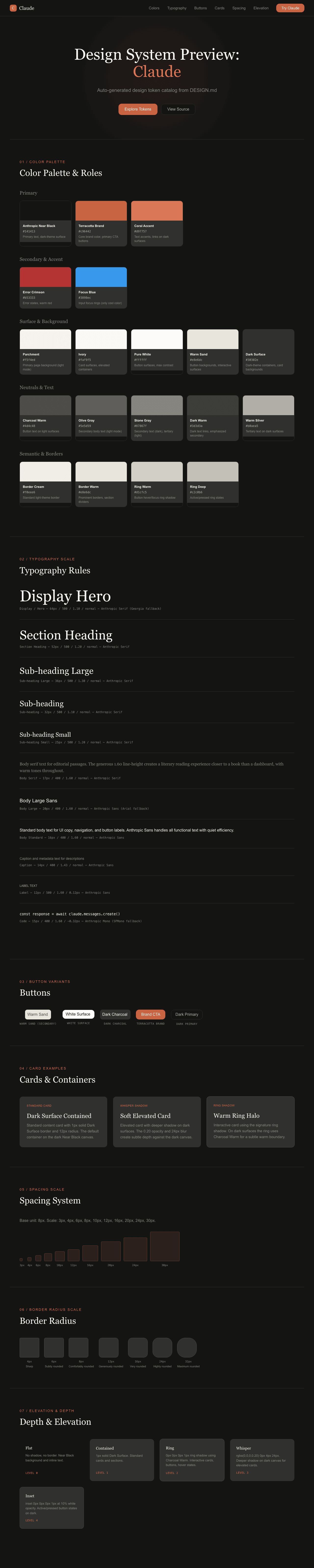
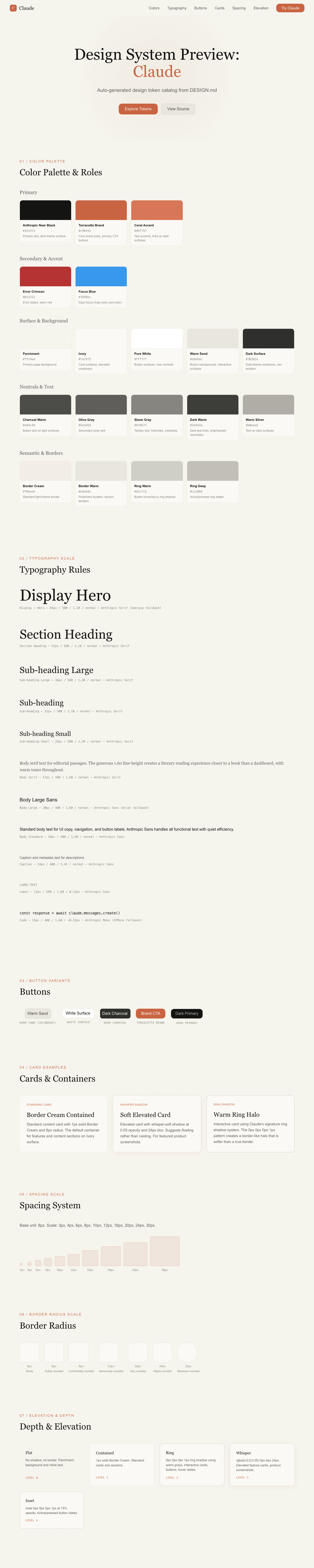
A sample landing page built with DESIGN.md. It shows the actual colors, typography, buttons, cards, spacing, and elevation, all in one page.
|
|
19
|
+
|
|
20
|
+
### Dark Mode
|
|
21
|
+
|
|
22
|
+
|
|
23
|
+
### Light Mode
|
|
24
|
+
|