awesome-design-md 1.0.0
This diff represents the content of publicly available package versions that have been released to one of the supported registries. The information contained in this diff is provided for informational purposes only and reflects changes between package versions as they appear in their respective public registries.
- package/LICENSE +21 -0
- package/README.md +172 -0
- package/bin/cli.mjs +126 -0
- package/design-md/airbnb/DESIGN.md +246 -0
- package/design-md/airbnb/README.md +23 -0
- package/design-md/airbnb/preview-dark.html +234 -0
- package/design-md/airbnb/preview.html +233 -0
- package/design-md/airtable/DESIGN.md +89 -0
- package/design-md/airtable/README.md +23 -0
- package/design-md/airtable/preview-dark.html +165 -0
- package/design-md/airtable/preview.html +164 -0
- package/design-md/apple/DESIGN.md +313 -0
- package/design-md/apple/README.md +24 -0
- package/design-md/apple/preview-dark.html +422 -0
- package/design-md/apple/preview.html +416 -0
- package/design-md/bmw/DESIGN.md +180 -0
- package/design-md/bmw/README.md +23 -0
- package/design-md/bmw/preview-dark.html +211 -0
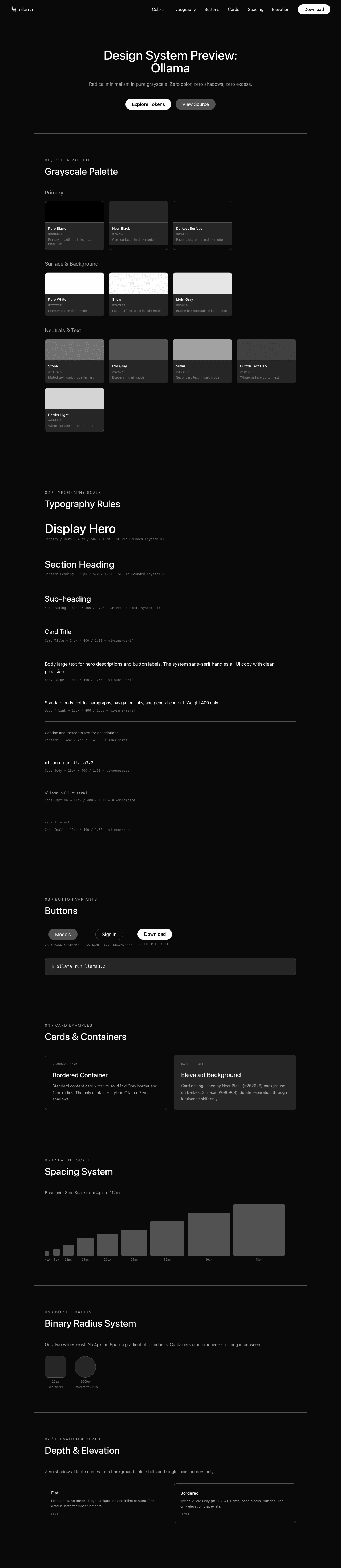
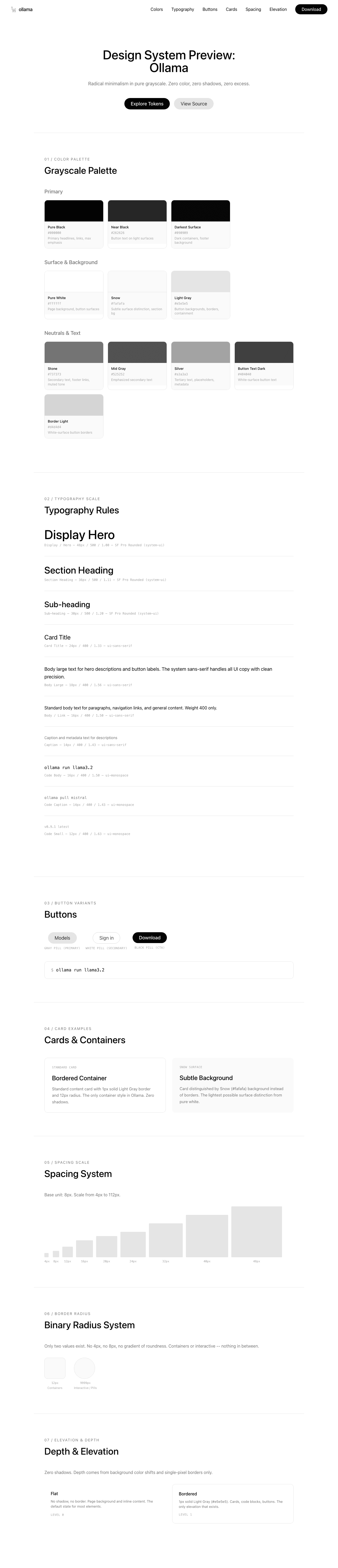
- package/design-md/bmw/preview.html +210 -0
- package/design-md/cal/DESIGN.md +259 -0
- package/design-md/cal/README.md +23 -0
- package/design-md/cal/preview-dark.html +449 -0
- package/design-md/cal/preview.html +575 -0
- package/design-md/claude/DESIGN.md +312 -0
- package/design-md/claude/README.md +24 -0
- package/design-md/claude/preview-dark.html +803 -0
- package/design-md/claude/preview.html +826 -0
- package/design-md/clay/DESIGN.md +304 -0
- package/design-md/clay/README.md +23 -0
- package/design-md/clay/preview-dark.html +318 -0
- package/design-md/clay/preview.html +317 -0
- package/design-md/clickhouse/DESIGN.md +281 -0
- package/design-md/clickhouse/README.md +24 -0
- package/design-md/clickhouse/preview-dark.html +834 -0
- package/design-md/clickhouse/preview.html +786 -0
- package/design-md/cohere/DESIGN.md +266 -0
- package/design-md/cohere/README.md +24 -0
- package/design-md/cohere/preview-dark.html +810 -0
- package/design-md/cohere/preview.html +814 -0
- package/design-md/coinbase/DESIGN.md +129 -0
- package/design-md/coinbase/README.md +23 -0
- package/design-md/coinbase/preview-dark.html +164 -0
- package/design-md/coinbase/preview.html +163 -0
- package/design-md/composio/DESIGN.md +307 -0
- package/design-md/composio/README.md +24 -0
- package/design-md/composio/preview-dark.html +958 -0
- package/design-md/composio/preview.html +933 -0
- package/design-md/cursor/DESIGN.md +309 -0
- package/design-md/cursor/README.md +24 -0
- package/design-md/cursor/preview-dark.html +395 -0
- package/design-md/cursor/preview.html +385 -0
- package/design-md/elevenlabs/DESIGN.md +265 -0
- package/design-md/elevenlabs/README.md +23 -0
- package/design-md/elevenlabs/preview-dark.html +254 -0
- package/design-md/elevenlabs/preview.html +253 -0
- package/design-md/expo/DESIGN.md +281 -0
- package/design-md/expo/README.md +24 -0
- package/design-md/expo/preview-dark.html +536 -0
- package/design-md/expo/preview.html +536 -0
- package/design-md/figma/DESIGN.md +220 -0
- package/design-md/figma/README.md +24 -0
- package/design-md/figma/preview-dark.html +831 -0
- package/design-md/figma/preview.html +841 -0
- package/design-md/framer/DESIGN.md +246 -0
- package/design-md/framer/README.md +23 -0
- package/design-md/framer/preview-dark.html +904 -0
- package/design-md/framer/preview.html +885 -0
- package/design-md/hashicorp/DESIGN.md +278 -0
- package/design-md/hashicorp/README.md +24 -0
- package/design-md/hashicorp/preview-dark.html +1206 -0
- package/design-md/hashicorp/preview.html +1195 -0
- package/design-md/ibm/DESIGN.md +332 -0
- package/design-md/ibm/README.md +24 -0
- package/design-md/ibm/preview-dark.html +445 -0
- package/design-md/ibm/preview.html +430 -0
- package/design-md/intercom/DESIGN.md +146 -0
- package/design-md/intercom/README.md +23 -0
- package/design-md/intercom/preview-dark.html +185 -0
- package/design-md/intercom/preview.html +184 -0
- package/design-md/kraken/DESIGN.md +125 -0
- package/design-md/kraken/README.md +23 -0
- package/design-md/kraken/preview-dark.html +169 -0
- package/design-md/kraken/preview.html +168 -0
- package/design-md/linear.app/DESIGN.md +367 -0
- package/design-md/linear.app/README.md +24 -0
- package/design-md/linear.app/preview-dark.html +385 -0
- package/design-md/linear.app/preview.html +375 -0
- package/design-md/lovable/DESIGN.md +298 -0
- package/design-md/lovable/README.md +24 -0
- package/design-md/lovable/preview-dark.html +351 -0
- package/design-md/lovable/preview.html +350 -0
- package/design-md/minimax/DESIGN.md +257 -0
- package/design-md/minimax/README.md +24 -0
- package/design-md/minimax/preview-dark.html +1267 -0
- package/design-md/minimax/preview.html +1253 -0
- package/design-md/mintlify/DESIGN.md +326 -0
- package/design-md/mintlify/README.md +24 -0
- package/design-md/mintlify/preview-dark.html +411 -0
- package/design-md/mintlify/preview.html +400 -0
- package/design-md/miro/DESIGN.md +108 -0
- package/design-md/miro/README.md +23 -0
- package/design-md/miro/preview-dark.html +174 -0
- package/design-md/miro/preview.html +173 -0
- package/design-md/mistral.ai/DESIGN.md +261 -0
- package/design-md/mistral.ai/README.md +24 -0
- package/design-md/mistral.ai/preview-dark.html +813 -0
- package/design-md/mistral.ai/preview.html +812 -0
- package/design-md/mongodb/DESIGN.md +266 -0
- package/design-md/mongodb/README.md +23 -0
- package/design-md/mongodb/preview-dark.html +262 -0
- package/design-md/mongodb/preview.html +261 -0
- package/design-md/notion/DESIGN.md +309 -0
- package/design-md/notion/README.md +24 -0
- package/design-md/notion/preview-dark.html +374 -0
- package/design-md/notion/preview.html +366 -0
- package/design-md/nvidia/DESIGN.md +293 -0
- package/design-md/nvidia/README.md +24 -0
- package/design-md/nvidia/preview-dark.html +376 -0
- package/design-md/nvidia/preview.html +368 -0
- package/design-md/ollama/DESIGN.md +267 -0
- package/design-md/ollama/README.md +24 -0
- package/design-md/ollama/preview-dark.html +678 -0
- package/design-md/ollama/preview.html +678 -0
- package/design-md/opencode.ai/DESIGN.md +281 -0
- package/design-md/opencode.ai/README.md +24 -0
- package/design-md/opencode.ai/preview-dark.html +368 -0
- package/design-md/opencode.ai/preview.html +359 -0
- package/design-md/pinterest/DESIGN.md +230 -0
- package/design-md/pinterest/README.md +23 -0
- package/design-md/pinterest/preview-dark.html +233 -0
- package/design-md/pinterest/preview.html +232 -0
- package/design-md/posthog/DESIGN.md +256 -0
- package/design-md/posthog/README.md +23 -0
- package/design-md/posthog/preview-dark.html +701 -0
- package/design-md/posthog/preview.html +751 -0
- package/design-md/raycast/DESIGN.md +268 -0
- package/design-md/raycast/README.md +23 -0
- package/design-md/raycast/preview-dark.html +608 -0
- package/design-md/raycast/preview.html +690 -0
- package/design-md/replicate/DESIGN.md +261 -0
- package/design-md/replicate/README.md +24 -0
- package/design-md/replicate/preview-dark.html +828 -0
- package/design-md/replicate/preview.html +831 -0
- package/design-md/resend/DESIGN.md +303 -0
- package/design-md/resend/README.md +23 -0
- package/design-md/resend/preview-dark.html +357 -0
- package/design-md/resend/preview.html +356 -0
- package/design-md/revolut/DESIGN.md +185 -0
- package/design-md/revolut/README.md +23 -0
- package/design-md/revolut/preview-dark.html +234 -0
- package/design-md/revolut/preview.html +233 -0
- package/design-md/runwayml/DESIGN.md +244 -0
- package/design-md/runwayml/README.md +24 -0
- package/design-md/runwayml/preview-dark.html +664 -0
- package/design-md/runwayml/preview.html +665 -0
- package/design-md/sanity/DESIGN.md +357 -0
- package/design-md/sanity/README.md +24 -0
- package/design-md/sanity/preview-dark.html +995 -0
- package/design-md/sanity/preview.html +1140 -0
- package/design-md/sentry/DESIGN.md +262 -0
- package/design-md/sentry/README.md +24 -0
- package/design-md/sentry/preview-dark.html +628 -0
- package/design-md/sentry/preview.html +953 -0
- package/design-md/spacex/DESIGN.md +194 -0
- package/design-md/spacex/README.md +23 -0
- package/design-md/spacex/preview-dark.html +223 -0
- package/design-md/spacex/preview.html +222 -0
- package/design-md/spotify/DESIGN.md +246 -0
- package/design-md/spotify/README.md +23 -0
- package/design-md/spotify/preview-dark.html +231 -0
- package/design-md/spotify/preview.html +230 -0
- package/design-md/stripe/DESIGN.md +322 -0
- package/design-md/stripe/README.md +24 -0
- package/design-md/stripe/preview-dark.html +430 -0
- package/design-md/stripe/preview.html +421 -0
- package/design-md/supabase/DESIGN.md +255 -0
- package/design-md/supabase/README.md +24 -0
- package/design-md/supabase/preview-dark.html +977 -0
- package/design-md/supabase/preview.html +955 -0
- package/design-md/superhuman/DESIGN.md +252 -0
- package/design-md/superhuman/README.md +23 -0
- package/design-md/superhuman/preview-dark.html +975 -0
- package/design-md/superhuman/preview.html +953 -0
- package/design-md/together.ai/DESIGN.md +263 -0
- package/design-md/together.ai/README.md +24 -0
- package/design-md/together.ai/preview-dark.html +892 -0
- package/design-md/together.ai/preview.html +897 -0
- package/design-md/uber/DESIGN.md +295 -0
- package/design-md/uber/README.md +24 -0
- package/design-md/uber/preview-dark.html +1164 -0
- package/design-md/uber/preview.html +1163 -0
- package/design-md/vercel/DESIGN.md +310 -0
- package/design-md/vercel/README.md +24 -0
- package/design-md/vercel/preview-dark.html +370 -0
- package/design-md/vercel/preview.html +369 -0
- package/design-md/voltagent/DESIGN.md +323 -0
- package/design-md/voltagent/README.md +24 -0
- package/design-md/voltagent/preview-dark.html +487 -0
- package/design-md/voltagent/preview.html +766 -0
- package/design-md/warp/DESIGN.md +253 -0
- package/design-md/warp/README.md +23 -0
- package/design-md/warp/preview-dark.html +502 -0
- package/design-md/warp/preview.html +535 -0
- package/design-md/webflow/DESIGN.md +92 -0
- package/design-md/webflow/README.md +23 -0
- package/design-md/webflow/preview-dark.html +147 -0
- package/design-md/webflow/preview.html +146 -0
- package/design-md/wise/DESIGN.md +173 -0
- package/design-md/wise/README.md +23 -0
- package/design-md/wise/preview-dark.html +230 -0
- package/design-md/wise/preview.html +229 -0
- package/design-md/x.ai/DESIGN.md +257 -0
- package/design-md/x.ai/README.md +24 -0
- package/design-md/x.ai/preview-dark.html +358 -0
- package/design-md/x.ai/preview.html +409 -0
- package/design-md/zapier/DESIGN.md +328 -0
- package/design-md/zapier/README.md +24 -0
- package/design-md/zapier/preview-dark.html +382 -0
- package/design-md/zapier/preview.html +374 -0
- package/package.json +33 -0
|
@@ -0,0 +1,267 @@
|
|
|
1
|
+
# Design System: Ollama
|
|
2
|
+
|
|
3
|
+
## 1. Visual Theme & Atmosphere
|
|
4
|
+
|
|
5
|
+
Ollama's interface is radical minimalism taken to its logical conclusion — a pure-white void where content floats without decoration, shadow, or color. The design philosophy mirrors the product itself: strip away everything unnecessary until only the essential tool remains. This is the digital equivalent of a Dieter Rams object — every pixel earns its place, and the absence of design IS the design.
|
|
6
|
+
|
|
7
|
+
The entire page exists in pure grayscale. There is zero chromatic color in the interface — no brand blue, no accent green, no semantic red. The only colors that exist are shades between pure black (`#000000`) and pure white (`#ffffff`), creating a monochrome environment that lets the user's mental model of "open models" remain uncolored by brand opinion. The Ollama llama mascot, rendered in simple black line art, is the only illustration — and even it's monochrome.
|
|
8
|
+
|
|
9
|
+
What makes Ollama distinctive is the combination of SF Pro Rounded (Apple's rounded system font) with an exclusively pill-shaped geometry (9999px radius on everything interactive). The rounded letterforms + rounded buttons + rounded containers create a cohesive "softness language" that makes a developer CLI tool feel approachable and friendly rather than intimidating. This is minimalism with warmth — not cold Swiss-style grid minimalism, but the kind where the edges are literally softened.
|
|
10
|
+
|
|
11
|
+
**Key Characteristics:**
|
|
12
|
+
- Pure white canvas with zero chromatic color — completely grayscale
|
|
13
|
+
- SF Pro Rounded headlines creating a distinctively Apple-like softness
|
|
14
|
+
- Binary border-radius system: 12px (containers) or 9999px (everything interactive)
|
|
15
|
+
- Zero shadows — depth comes exclusively from background color shifts and borders
|
|
16
|
+
- Pill-shaped geometry on all interactive elements (buttons, tabs, inputs, tags)
|
|
17
|
+
- The Ollama llama as the sole illustration — black line art, no color
|
|
18
|
+
- Extreme content restraint — the homepage is short, focused, and uncluttered
|
|
19
|
+
|
|
20
|
+
## 2. Color Palette & Roles
|
|
21
|
+
|
|
22
|
+
### Primary
|
|
23
|
+
- **Pure Black** (`#000000`): Primary headlines, primary links, and the darkest text. The only "color" that demands attention.
|
|
24
|
+
- **Near Black** (`#262626`): Button text on light surfaces, secondary headline weight.
|
|
25
|
+
- **Darkest Surface** (`#090909`): The darkest possible surface — barely distinguishable from pure black, used for footer or dark containers.
|
|
26
|
+
|
|
27
|
+
### Surface & Background
|
|
28
|
+
- **Pure White** (`#ffffff`): The primary page background — not off-white, not cream, pure white. Button surfaces for secondary actions.
|
|
29
|
+
- **Snow** (`#fafafa`): The subtlest possible surface distinction from white — used for section backgrounds and barely-elevated containers.
|
|
30
|
+
- **Light Gray** (`#e5e5e5`): Button backgrounds, borders, and the primary containment color. The workhorse neutral.
|
|
31
|
+
|
|
32
|
+
### Neutrals & Text
|
|
33
|
+
- **Stone** (`#737373`): Secondary body text, footer links, and de-emphasized content. The primary "muted" tone.
|
|
34
|
+
- **Mid Gray** (`#525252`): Emphasized secondary text, slightly darker than Stone.
|
|
35
|
+
- **Silver** (`#a3a3a3`): Tertiary text, placeholders, and deeply de-emphasized metadata.
|
|
36
|
+
- **Button Text Dark** (`#404040`): Specific to white-surface button text.
|
|
37
|
+
|
|
38
|
+
### Semantic & Accent
|
|
39
|
+
- **Ring Blue** (`#3b82f6` at 50%): The ONLY non-gray color in the entire system — Tailwind's default focus ring, used exclusively for keyboard accessibility. Never visible in normal interaction flow.
|
|
40
|
+
- **Border Light** (`#d4d4d4`): A slightly darker gray for white-surface button borders.
|
|
41
|
+
|
|
42
|
+
### Gradient System
|
|
43
|
+
- **None.** Ollama uses absolutely no gradients. Visual separation comes from flat color blocks and single-pixel borders. This is a deliberate, almost philosophical design choice.
|
|
44
|
+
|
|
45
|
+
## 3. Typography Rules
|
|
46
|
+
|
|
47
|
+
### Font Family
|
|
48
|
+
- **Display**: `SF Pro Rounded`, with fallbacks: `system-ui, -apple-system, system-ui`
|
|
49
|
+
- **Body / UI**: `ui-sans-serif`, with fallbacks: `system-ui, Apple Color Emoji, Segoe UI Emoji, Segoe UI Symbol, Noto Color Emoji`
|
|
50
|
+
- **Monospace**: `ui-monospace`, with fallbacks: `SFMono-Regular, Menlo, Monaco, Consolas, Liberation Mono, Courier New`
|
|
51
|
+
|
|
52
|
+
*Note: SF Pro Rounded is Apple's system font — it renders with rounded terminals on macOS/iOS and falls back to the system sans-serif on other platforms.*
|
|
53
|
+
|
|
54
|
+
### Hierarchy
|
|
55
|
+
|
|
56
|
+
| Role | Font | Size | Weight | Line Height | Letter Spacing | Notes |
|
|
57
|
+
|------|------|------|--------|-------------|----------------|-------|
|
|
58
|
+
| Display / Hero | SF Pro Rounded | 48px (3rem) | 500 | 1.00 (tight) | normal | Maximum impact, rounded letterforms |
|
|
59
|
+
| Section Heading | SF Pro Rounded | 36px (2.25rem) | 500 | 1.11 (tight) | normal | Feature section titles |
|
|
60
|
+
| Sub-heading | SF Pro Rounded / ui-sans-serif | 30px (1.88rem) | 400–500 | 1.20 (tight) | normal | Card headings, feature names |
|
|
61
|
+
| Card Title | ui-sans-serif | 24px (1.5rem) | 400 | 1.33 | normal | Medium emphasis headings |
|
|
62
|
+
| Body Large | ui-sans-serif | 18px (1.13rem) | 400–500 | 1.56 | normal | Hero descriptions, button text |
|
|
63
|
+
| Body / Link | ui-sans-serif | 16px (1rem) | 400–500 | 1.50 | normal | Standard body text, navigation |
|
|
64
|
+
| Caption | ui-sans-serif | 14px (0.88rem) | 400 | 1.43 | normal | Metadata, descriptions |
|
|
65
|
+
| Small | ui-sans-serif | 12px (0.75rem) | 400 | 1.33 | normal | Smallest sans-serif text |
|
|
66
|
+
| Code Body | ui-monospace | 16px (1rem) | 400 | 1.50 | normal | Inline code, commands |
|
|
67
|
+
| Code Caption | ui-monospace | 14px (0.88rem) | 400 | 1.43 | normal | Code snippets, secondary |
|
|
68
|
+
| Code Small | ui-monospace | 12px (0.75rem) | 400–700 | 1.63 | normal | Tags, labels |
|
|
69
|
+
|
|
70
|
+
### Principles
|
|
71
|
+
- **Rounded display, standard body**: SF Pro Rounded carries display headlines with its distinctive rounded terminals, while the standard system sans handles all body text. The rounded font IS the brand expression.
|
|
72
|
+
- **Weight restraint**: Only two weights matter — 400 (regular) for body and 500 (medium) for headings. No bold, no light, no black weight. This extreme restraint reinforces the minimal philosophy.
|
|
73
|
+
- **Tight display, comfortable body**: Headlines compress to 1.0 line-height, while body text relaxes to 1.43–1.56. The contrast creates clear hierarchy without needing weight contrast.
|
|
74
|
+
- **Monospace for developer identity**: Code blocks and terminal commands appear throughout as primary content, using the system monospace stack.
|
|
75
|
+
|
|
76
|
+
## 4. Component Stylings
|
|
77
|
+
|
|
78
|
+
### Buttons
|
|
79
|
+
|
|
80
|
+
**Gray Pill (Primary)**
|
|
81
|
+
- Background: Light Gray (`#e5e5e5`)
|
|
82
|
+
- Text: Near Black (`#262626`)
|
|
83
|
+
- Padding: 10px 24px
|
|
84
|
+
- Border: thin solid Light Gray (`1px solid #e5e5e5`)
|
|
85
|
+
- Radius: pill-shaped (9999px)
|
|
86
|
+
- The primary action button — understated, grayscale, always pill-shaped
|
|
87
|
+
|
|
88
|
+
**White Pill (Secondary)**
|
|
89
|
+
- Background: Pure White (`#ffffff`)
|
|
90
|
+
- Text: Button Text Dark (`#404040`)
|
|
91
|
+
- Padding: 10px 24px
|
|
92
|
+
- Border: thin solid Border Light (`1px solid #d4d4d4`)
|
|
93
|
+
- Radius: pill-shaped (9999px)
|
|
94
|
+
- Secondary action — visually lighter than Gray Pill
|
|
95
|
+
|
|
96
|
+
**Black Pill (CTA)**
|
|
97
|
+
- Background: Pure Black (`#000000`)
|
|
98
|
+
- Text: Pure White (`#ffffff`)
|
|
99
|
+
- Radius: pill-shaped (9999px)
|
|
100
|
+
- Inferred from "Create account" and "Explore" buttons
|
|
101
|
+
- Maximum emphasis — black on white
|
|
102
|
+
|
|
103
|
+
### Cards & Containers
|
|
104
|
+
- Background: Pure White or Snow (`#fafafa`)
|
|
105
|
+
- Border: thin solid Light Gray (`1px solid #e5e5e5`) when needed
|
|
106
|
+
- Radius: comfortably rounded (12px) — the ONLY non-pill radius in the system
|
|
107
|
+
- Shadow: **none** — zero shadows on any element
|
|
108
|
+
- Hover: likely subtle background shift or border darkening
|
|
109
|
+
|
|
110
|
+
### Inputs & Forms
|
|
111
|
+
- Background: Pure White
|
|
112
|
+
- Border: `1px solid #e5e5e5`
|
|
113
|
+
- Radius: pill-shaped (9999px) — search inputs and form fields are pill-shaped
|
|
114
|
+
- Focus: Ring Blue (`#3b82f6` at 50%) ring
|
|
115
|
+
- Placeholder: Silver (`#a3a3a3`)
|
|
116
|
+
|
|
117
|
+
### Navigation
|
|
118
|
+
- Clean horizontal nav with minimal elements
|
|
119
|
+
- Logo: Ollama llama icon + wordmark in black
|
|
120
|
+
- Links: "Models", "Docs", "Pricing" in black at 16px, weight 400
|
|
121
|
+
- Search bar: pill-shaped with placeholder text
|
|
122
|
+
- Right side: "Sign in" link + "Download" black pill CTA
|
|
123
|
+
- No borders, no background — transparent nav on white page
|
|
124
|
+
|
|
125
|
+
### Image Treatment
|
|
126
|
+
- The Ollama llama mascot is the only illustration — black line art on white
|
|
127
|
+
- Code screenshots/terminal outputs shown in bordered containers (12px radius)
|
|
128
|
+
- Integration logos displayed as simple icons in a grid
|
|
129
|
+
- No photographs, no gradients, no decorative imagery
|
|
130
|
+
|
|
131
|
+
### Distinctive Components
|
|
132
|
+
|
|
133
|
+
**Tab Pills**
|
|
134
|
+
- Pill-shaped tab selectors (e.g., "Coding" | "OpenClaw")
|
|
135
|
+
- Active: Light Gray bg; Inactive: transparent
|
|
136
|
+
- All pill-shaped (9999px)
|
|
137
|
+
|
|
138
|
+
**Model Tags**
|
|
139
|
+
- Small pill-shaped tags (e.g., "ollama", "launch", "claude")
|
|
140
|
+
- Light Gray background, dark text
|
|
141
|
+
- The primary way to browse models
|
|
142
|
+
|
|
143
|
+
**Terminal Command Block**
|
|
144
|
+
- Monospace code showing `ollama run` commands
|
|
145
|
+
- Minimal styling — just a bordered 12px-radius container
|
|
146
|
+
- Copy button integrated
|
|
147
|
+
|
|
148
|
+
**Integration Grid**
|
|
149
|
+
- Grid of integration logos (Codex, Claude Code, OpenCode, LangChain, etc.)
|
|
150
|
+
- Each in a bordered pill or card with icon + name
|
|
151
|
+
- Tabbed by category (Coding, Documents & RAG, Automation, Chat)
|
|
152
|
+
|
|
153
|
+
## 5. Layout Principles
|
|
154
|
+
|
|
155
|
+
### Spacing System
|
|
156
|
+
- Base unit: 8px
|
|
157
|
+
- Scale: 4px, 6px, 8px, 9px, 10px, 12px, 14px, 16px, 20px, 24px, 32px, 40px, 48px, 88px, 112px
|
|
158
|
+
- Button padding: 10px 24px (consistent across all buttons)
|
|
159
|
+
- Card internal padding: approximately 24–32px
|
|
160
|
+
- Section vertical spacing: very generous (88px–112px)
|
|
161
|
+
|
|
162
|
+
### Grid & Container
|
|
163
|
+
- Max container width: approximately 1024–1280px, centered
|
|
164
|
+
- Hero: centered single-column with llama illustration
|
|
165
|
+
- Feature sections: 2-column layout (text left, code right)
|
|
166
|
+
- Integration grid: responsive multi-column
|
|
167
|
+
- Footer: clean single-row
|
|
168
|
+
|
|
169
|
+
### Whitespace Philosophy
|
|
170
|
+
- **Emptiness as luxury**: The page is remarkably short and sparse — no feature section overstays its welcome. Each concept gets minimal but sufficient space.
|
|
171
|
+
- **Content density is low by design**: Where other AI companies pack feature after feature, Ollama presents three ideas (run models, use with apps, integrations) and stops.
|
|
172
|
+
- **The white space IS the brand**: Pure white space with zero decoration communicates "this tool gets out of your way."
|
|
173
|
+
|
|
174
|
+
### Border Radius Scale
|
|
175
|
+
- Comfortably rounded (12px): The sole container radius — code blocks, cards, panels
|
|
176
|
+
- Pill-shaped (9999px): Everything interactive — buttons, tabs, inputs, tags, badges
|
|
177
|
+
|
|
178
|
+
*This binary system is extreme and distinctive. There is no 4px, no 8px, no gradient of roundness. Elements are either containers (12px) or interactive (pill).*
|
|
179
|
+
|
|
180
|
+
## 6. Depth & Elevation
|
|
181
|
+
|
|
182
|
+
| Level | Treatment | Use |
|
|
183
|
+
|-------|-----------|-----|
|
|
184
|
+
| Flat (Level 0) | No shadow, no border | Page background, most content |
|
|
185
|
+
| Bordered (Level 1) | `1px solid #e5e5e5` | Cards, code blocks, buttons |
|
|
186
|
+
|
|
187
|
+
**Shadow Philosophy**: Ollama uses **zero shadows**. This is not an oversight — it's a deliberate design decision. Every other major AI product site uses at least subtle shadows. Ollama's flat, shadowless approach creates a paper-like experience where elements are distinguished purely by background color and single-pixel borders. Depth is communicated through **content hierarchy and typography weight**, not visual layering.
|
|
188
|
+
|
|
189
|
+
## 7. Do's and Don'ts
|
|
190
|
+
|
|
191
|
+
### Do
|
|
192
|
+
- Use pure white (`#ffffff`) as the page background — never off-white or cream
|
|
193
|
+
- Use pill-shaped (9999px) radius on all interactive elements — buttons, tabs, inputs, tags
|
|
194
|
+
- Use 12px radius on all non-interactive containers — code blocks, cards, panels
|
|
195
|
+
- Keep the palette strictly grayscale — no chromatic colors except the blue focus ring
|
|
196
|
+
- Use SF Pro Rounded at weight 500 for display headings — the rounded terminals are the brand expression
|
|
197
|
+
- Maintain zero shadows — depth comes from borders and background shifts only
|
|
198
|
+
- Keep content density low — each section should present one clear idea
|
|
199
|
+
- Use monospace for terminal commands and code — it's primary content, not decoration
|
|
200
|
+
- Keep all buttons at 10px 24px padding with pill shape — consistency is absolute
|
|
201
|
+
|
|
202
|
+
### Don't
|
|
203
|
+
- Don't introduce any chromatic color — no brand blue, no accent green, no warm tones
|
|
204
|
+
- Don't use border-radius between 12px and 9999px — the system is binary
|
|
205
|
+
- Don't add shadows to any element — the flat aesthetic is intentional
|
|
206
|
+
- Don't use font weights above 500 — no bold, no black weight
|
|
207
|
+
- Don't add decorative illustrations beyond the llama mascot
|
|
208
|
+
- Don't use gradients anywhere — flat blocks and borders only
|
|
209
|
+
- Don't overcomplicate the layout — two columns maximum, no complex grids
|
|
210
|
+
- Don't use borders heavier than 1px — containment is always the lightest possible touch
|
|
211
|
+
- Don't add hover animations or transitions — interactions should feel instant and direct
|
|
212
|
+
|
|
213
|
+
## 8. Responsive Behavior
|
|
214
|
+
|
|
215
|
+
### Breakpoints
|
|
216
|
+
| Name | Width | Key Changes |
|
|
217
|
+
|------|-------|-------------|
|
|
218
|
+
| Mobile | <640px | Single column, stacked everything, hamburger nav |
|
|
219
|
+
| Small Tablet | 640–768px | Minor adjustments to spacing |
|
|
220
|
+
| Tablet | 768–850px | 2-column layouts begin |
|
|
221
|
+
| Desktop | 850–1024px | Standard layout, expanded features |
|
|
222
|
+
| Large Desktop | 1024–1280px | Maximum content width |
|
|
223
|
+
|
|
224
|
+
### Touch Targets
|
|
225
|
+
- All buttons are pill-shaped with generous padding (10px 24px)
|
|
226
|
+
- Navigation links at comfortable 16px size
|
|
227
|
+
- Minimum touch area easily exceeds 44x44px
|
|
228
|
+
|
|
229
|
+
### Collapsing Strategy
|
|
230
|
+
- **Navigation**: Collapses to hamburger menu on mobile
|
|
231
|
+
- **Feature sections**: 2-column → stacked single column
|
|
232
|
+
- **Hero text**: 48px → 36px → 30px progressive scaling
|
|
233
|
+
- **Integration grid**: Multi-column → 2-column → single column
|
|
234
|
+
- **Code blocks**: Horizontal scroll maintained
|
|
235
|
+
|
|
236
|
+
### Image Behavior
|
|
237
|
+
- Llama mascot scales proportionally
|
|
238
|
+
- Code blocks maintain monospace formatting
|
|
239
|
+
- Integration icons reflow to fewer columns
|
|
240
|
+
- No art direction changes
|
|
241
|
+
|
|
242
|
+
## 9. Agent Prompt Guide
|
|
243
|
+
|
|
244
|
+
### Quick Color Reference
|
|
245
|
+
- Primary Text: "Pure Black (#000000)"
|
|
246
|
+
- Page Background: "Pure White (#ffffff)"
|
|
247
|
+
- Secondary Text: "Stone (#737373)"
|
|
248
|
+
- Button Background: "Light Gray (#e5e5e5)"
|
|
249
|
+
- Borders: "Light Gray (#e5e5e5)"
|
|
250
|
+
- Muted Text: "Silver (#a3a3a3)"
|
|
251
|
+
- Dark Text: "Near Black (#262626)"
|
|
252
|
+
- Subtle Surface: "Snow (#fafafa)"
|
|
253
|
+
|
|
254
|
+
### Example Component Prompts
|
|
255
|
+
- "Create a hero section on pure white (#ffffff) with an illustration centered above a headline at 48px SF Pro Rounded weight 500, line-height 1.0. Use Pure Black (#000000) text. Below, add a black pill-shaped CTA button (9999px radius, 10px 24px padding) and a gray pill button."
|
|
256
|
+
- "Design a code block with a 12px border-radius, 1px solid Light Gray (#e5e5e5) border on white background. Use ui-monospace at 16px for the terminal command. No shadow."
|
|
257
|
+
- "Build a tab bar with pill-shaped tabs (9999px radius). Active tab: Light Gray (#e5e5e5) background, Near Black (#262626) text. Inactive: transparent background, Stone (#737373) text."
|
|
258
|
+
- "Create an integration card grid. Each card is a bordered pill (9999px radius) or a 12px-radius card with 1px solid #e5e5e5 border. Icon + name inside. Grid of 4 columns on desktop."
|
|
259
|
+
- "Design a navigation bar: transparent background, no border. Ollama logo on the left, 3 text links (Pure Black, 16px, weight 400), pill search input in the center, 'Sign in' text link and black pill 'Download' button on the right."
|
|
260
|
+
|
|
261
|
+
### Iteration Guide
|
|
262
|
+
1. Focus on ONE component at a time
|
|
263
|
+
2. Keep all values grayscale — "Stone (#737373)" not "use a light color"
|
|
264
|
+
3. Always specify pill (9999px) or container (12px) radius — nothing in between
|
|
265
|
+
4. Shadows are always zero — never add them
|
|
266
|
+
5. Weight is always 400 or 500 — never bold
|
|
267
|
+
6. If something feels too decorated, remove it — less is always more for Ollama
|
|
@@ -0,0 +1,24 @@
|
|
|
1
|
+
# Ollama Inspired Design System
|
|
2
|
+
|
|
3
|
+
[DESIGN.md](https://github.com/VoltAgent/awesome-design-md/blob/main/design-md/ollama/DESIGN.md) extracted from the public [ollama](https://ollama.com/) website. This is not the official design system. Colors, fonts, and spacing may not be 100% accurate. But it's a good starting point for building something similar.
|
|
4
|
+
|
|
5
|
+
## Files
|
|
6
|
+
|
|
7
|
+
| File | Description |
|
|
8
|
+
|------|-------------|
|
|
9
|
+
| `DESIGN.md` | Complete design system documentation (9 sections) |
|
|
10
|
+
| `preview.html` | Interactive design token catalog (light) |
|
|
11
|
+
| `preview-dark.html` | Interactive design token catalog (dark) |
|
|
12
|
+
|
|
13
|
+
|
|
14
|
+
Use [DESIGN.md](https://github.com/VoltAgent/awesome-design-md/blob/main/design-md/ollama/DESIGN.md) to use as a reference for AI agents (Claude, Cursor, Stitch) to generate UI that looks like the Ollama design language.
|
|
15
|
+
|
|
16
|
+
## Preview
|
|
17
|
+
|
|
18
|
+
A sample landing page built with DESIGN.md. It shows the actual colors, typography, buttons, cards, spacing, and elevation, all in one page.
|
|
19
|
+
|
|
20
|
+
### Dark Mode
|
|
21
|
+
|
|
22
|
+
|
|
23
|
+
### Light Mode
|
|
24
|
+
|