awesome-design-md 1.0.0
This diff represents the content of publicly available package versions that have been released to one of the supported registries. The information contained in this diff is provided for informational purposes only and reflects changes between package versions as they appear in their respective public registries.
- package/LICENSE +21 -0
- package/README.md +172 -0
- package/bin/cli.mjs +126 -0
- package/design-md/airbnb/DESIGN.md +246 -0
- package/design-md/airbnb/README.md +23 -0
- package/design-md/airbnb/preview-dark.html +234 -0
- package/design-md/airbnb/preview.html +233 -0
- package/design-md/airtable/DESIGN.md +89 -0
- package/design-md/airtable/README.md +23 -0
- package/design-md/airtable/preview-dark.html +165 -0
- package/design-md/airtable/preview.html +164 -0
- package/design-md/apple/DESIGN.md +313 -0
- package/design-md/apple/README.md +24 -0
- package/design-md/apple/preview-dark.html +422 -0
- package/design-md/apple/preview.html +416 -0
- package/design-md/bmw/DESIGN.md +180 -0
- package/design-md/bmw/README.md +23 -0
- package/design-md/bmw/preview-dark.html +211 -0
- package/design-md/bmw/preview.html +210 -0
- package/design-md/cal/DESIGN.md +259 -0
- package/design-md/cal/README.md +23 -0
- package/design-md/cal/preview-dark.html +449 -0
- package/design-md/cal/preview.html +575 -0
- package/design-md/claude/DESIGN.md +312 -0
- package/design-md/claude/README.md +24 -0
- package/design-md/claude/preview-dark.html +803 -0
- package/design-md/claude/preview.html +826 -0
- package/design-md/clay/DESIGN.md +304 -0
- package/design-md/clay/README.md +23 -0
- package/design-md/clay/preview-dark.html +318 -0
- package/design-md/clay/preview.html +317 -0
- package/design-md/clickhouse/DESIGN.md +281 -0
- package/design-md/clickhouse/README.md +24 -0
- package/design-md/clickhouse/preview-dark.html +834 -0
- package/design-md/clickhouse/preview.html +786 -0
- package/design-md/cohere/DESIGN.md +266 -0
- package/design-md/cohere/README.md +24 -0
- package/design-md/cohere/preview-dark.html +810 -0
- package/design-md/cohere/preview.html +814 -0
- package/design-md/coinbase/DESIGN.md +129 -0
- package/design-md/coinbase/README.md +23 -0
- package/design-md/coinbase/preview-dark.html +164 -0
- package/design-md/coinbase/preview.html +163 -0
- package/design-md/composio/DESIGN.md +307 -0
- package/design-md/composio/README.md +24 -0
- package/design-md/composio/preview-dark.html +958 -0
- package/design-md/composio/preview.html +933 -0
- package/design-md/cursor/DESIGN.md +309 -0
- package/design-md/cursor/README.md +24 -0
- package/design-md/cursor/preview-dark.html +395 -0
- package/design-md/cursor/preview.html +385 -0
- package/design-md/elevenlabs/DESIGN.md +265 -0
- package/design-md/elevenlabs/README.md +23 -0
- package/design-md/elevenlabs/preview-dark.html +254 -0
- package/design-md/elevenlabs/preview.html +253 -0
- package/design-md/expo/DESIGN.md +281 -0
- package/design-md/expo/README.md +24 -0
- package/design-md/expo/preview-dark.html +536 -0
- package/design-md/expo/preview.html +536 -0
- package/design-md/figma/DESIGN.md +220 -0
- package/design-md/figma/README.md +24 -0
- package/design-md/figma/preview-dark.html +831 -0
- package/design-md/figma/preview.html +841 -0
- package/design-md/framer/DESIGN.md +246 -0
- package/design-md/framer/README.md +23 -0
- package/design-md/framer/preview-dark.html +904 -0
- package/design-md/framer/preview.html +885 -0
- package/design-md/hashicorp/DESIGN.md +278 -0
- package/design-md/hashicorp/README.md +24 -0
- package/design-md/hashicorp/preview-dark.html +1206 -0
- package/design-md/hashicorp/preview.html +1195 -0
- package/design-md/ibm/DESIGN.md +332 -0
- package/design-md/ibm/README.md +24 -0
- package/design-md/ibm/preview-dark.html +445 -0
- package/design-md/ibm/preview.html +430 -0
- package/design-md/intercom/DESIGN.md +146 -0
- package/design-md/intercom/README.md +23 -0
- package/design-md/intercom/preview-dark.html +185 -0
- package/design-md/intercom/preview.html +184 -0
- package/design-md/kraken/DESIGN.md +125 -0
- package/design-md/kraken/README.md +23 -0
- package/design-md/kraken/preview-dark.html +169 -0
- package/design-md/kraken/preview.html +168 -0
- package/design-md/linear.app/DESIGN.md +367 -0
- package/design-md/linear.app/README.md +24 -0
- package/design-md/linear.app/preview-dark.html +385 -0
- package/design-md/linear.app/preview.html +375 -0
- package/design-md/lovable/DESIGN.md +298 -0
- package/design-md/lovable/README.md +24 -0
- package/design-md/lovable/preview-dark.html +351 -0
- package/design-md/lovable/preview.html +350 -0
- package/design-md/minimax/DESIGN.md +257 -0
- package/design-md/minimax/README.md +24 -0
- package/design-md/minimax/preview-dark.html +1267 -0
- package/design-md/minimax/preview.html +1253 -0
- package/design-md/mintlify/DESIGN.md +326 -0
- package/design-md/mintlify/README.md +24 -0
- package/design-md/mintlify/preview-dark.html +411 -0
- package/design-md/mintlify/preview.html +400 -0
- package/design-md/miro/DESIGN.md +108 -0
- package/design-md/miro/README.md +23 -0
- package/design-md/miro/preview-dark.html +174 -0
- package/design-md/miro/preview.html +173 -0
- package/design-md/mistral.ai/DESIGN.md +261 -0
- package/design-md/mistral.ai/README.md +24 -0
- package/design-md/mistral.ai/preview-dark.html +813 -0
- package/design-md/mistral.ai/preview.html +812 -0
- package/design-md/mongodb/DESIGN.md +266 -0
- package/design-md/mongodb/README.md +23 -0
- package/design-md/mongodb/preview-dark.html +262 -0
- package/design-md/mongodb/preview.html +261 -0
- package/design-md/notion/DESIGN.md +309 -0
- package/design-md/notion/README.md +24 -0
- package/design-md/notion/preview-dark.html +374 -0
- package/design-md/notion/preview.html +366 -0
- package/design-md/nvidia/DESIGN.md +293 -0
- package/design-md/nvidia/README.md +24 -0
- package/design-md/nvidia/preview-dark.html +376 -0
- package/design-md/nvidia/preview.html +368 -0
- package/design-md/ollama/DESIGN.md +267 -0
- package/design-md/ollama/README.md +24 -0
- package/design-md/ollama/preview-dark.html +678 -0
- package/design-md/ollama/preview.html +678 -0
- package/design-md/opencode.ai/DESIGN.md +281 -0
- package/design-md/opencode.ai/README.md +24 -0
- package/design-md/opencode.ai/preview-dark.html +368 -0
- package/design-md/opencode.ai/preview.html +359 -0
- package/design-md/pinterest/DESIGN.md +230 -0
- package/design-md/pinterest/README.md +23 -0
- package/design-md/pinterest/preview-dark.html +233 -0
- package/design-md/pinterest/preview.html +232 -0
- package/design-md/posthog/DESIGN.md +256 -0
- package/design-md/posthog/README.md +23 -0
- package/design-md/posthog/preview-dark.html +701 -0
- package/design-md/posthog/preview.html +751 -0
- package/design-md/raycast/DESIGN.md +268 -0
- package/design-md/raycast/README.md +23 -0
- package/design-md/raycast/preview-dark.html +608 -0
- package/design-md/raycast/preview.html +690 -0
- package/design-md/replicate/DESIGN.md +261 -0
- package/design-md/replicate/README.md +24 -0
- package/design-md/replicate/preview-dark.html +828 -0
- package/design-md/replicate/preview.html +831 -0
- package/design-md/resend/DESIGN.md +303 -0
- package/design-md/resend/README.md +23 -0
- package/design-md/resend/preview-dark.html +357 -0
- package/design-md/resend/preview.html +356 -0
- package/design-md/revolut/DESIGN.md +185 -0
- package/design-md/revolut/README.md +23 -0
- package/design-md/revolut/preview-dark.html +234 -0
- package/design-md/revolut/preview.html +233 -0
- package/design-md/runwayml/DESIGN.md +244 -0
- package/design-md/runwayml/README.md +24 -0
- package/design-md/runwayml/preview-dark.html +664 -0
- package/design-md/runwayml/preview.html +665 -0
- package/design-md/sanity/DESIGN.md +357 -0
- package/design-md/sanity/README.md +24 -0
- package/design-md/sanity/preview-dark.html +995 -0
- package/design-md/sanity/preview.html +1140 -0
- package/design-md/sentry/DESIGN.md +262 -0
- package/design-md/sentry/README.md +24 -0
- package/design-md/sentry/preview-dark.html +628 -0
- package/design-md/sentry/preview.html +953 -0
- package/design-md/spacex/DESIGN.md +194 -0
- package/design-md/spacex/README.md +23 -0
- package/design-md/spacex/preview-dark.html +223 -0
- package/design-md/spacex/preview.html +222 -0
- package/design-md/spotify/DESIGN.md +246 -0
- package/design-md/spotify/README.md +23 -0
- package/design-md/spotify/preview-dark.html +231 -0
- package/design-md/spotify/preview.html +230 -0
- package/design-md/stripe/DESIGN.md +322 -0
- package/design-md/stripe/README.md +24 -0
- package/design-md/stripe/preview-dark.html +430 -0
- package/design-md/stripe/preview.html +421 -0
- package/design-md/supabase/DESIGN.md +255 -0
- package/design-md/supabase/README.md +24 -0
- package/design-md/supabase/preview-dark.html +977 -0
- package/design-md/supabase/preview.html +955 -0
- package/design-md/superhuman/DESIGN.md +252 -0
- package/design-md/superhuman/README.md +23 -0
- package/design-md/superhuman/preview-dark.html +975 -0
- package/design-md/superhuman/preview.html +953 -0
- package/design-md/together.ai/DESIGN.md +263 -0
- package/design-md/together.ai/README.md +24 -0
- package/design-md/together.ai/preview-dark.html +892 -0
- package/design-md/together.ai/preview.html +897 -0
- package/design-md/uber/DESIGN.md +295 -0
- package/design-md/uber/README.md +24 -0
- package/design-md/uber/preview-dark.html +1164 -0
- package/design-md/uber/preview.html +1163 -0
- package/design-md/vercel/DESIGN.md +310 -0
- package/design-md/vercel/README.md +24 -0
- package/design-md/vercel/preview-dark.html +370 -0
- package/design-md/vercel/preview.html +369 -0
- package/design-md/voltagent/DESIGN.md +323 -0
- package/design-md/voltagent/README.md +24 -0
- package/design-md/voltagent/preview-dark.html +487 -0
- package/design-md/voltagent/preview.html +766 -0
- package/design-md/warp/DESIGN.md +253 -0
- package/design-md/warp/README.md +23 -0
- package/design-md/warp/preview-dark.html +502 -0
- package/design-md/warp/preview.html +535 -0
- package/design-md/webflow/DESIGN.md +92 -0
- package/design-md/webflow/README.md +23 -0
- package/design-md/webflow/preview-dark.html +147 -0
- package/design-md/webflow/preview.html +146 -0
- package/design-md/wise/DESIGN.md +173 -0
- package/design-md/wise/README.md +23 -0
- package/design-md/wise/preview-dark.html +230 -0
- package/design-md/wise/preview.html +229 -0
- package/design-md/x.ai/DESIGN.md +257 -0
- package/design-md/x.ai/README.md +24 -0
- package/design-md/x.ai/preview-dark.html +358 -0
- package/design-md/x.ai/preview.html +409 -0
- package/design-md/zapier/DESIGN.md +328 -0
- package/design-md/zapier/README.md +24 -0
- package/design-md/zapier/preview-dark.html +382 -0
- package/design-md/zapier/preview.html +374 -0
- package/package.json +33 -0
|
@@ -0,0 +1,257 @@
|
|
|
1
|
+
# Design System: xAI
|
|
2
|
+
|
|
3
|
+
## 1. Visual Theme & Atmosphere
|
|
4
|
+
|
|
5
|
+
xAI's website is a masterclass in dark-first, monospace-driven brutalist minimalism -- a design system that feels like it was built by engineers who understand that restraint is the ultimate form of sophistication. The entire experience is anchored to an almost-black background (`#1f2228`) with pure white text (`#ffffff`), creating a high-contrast, terminal-inspired aesthetic that signals deep technical credibility. There are no gradients, no decorative illustrations, no color accents competing for attention. This is a site that communicates through absence.
|
|
6
|
+
|
|
7
|
+
The typographic system is split between two carefully chosen typefaces. `GeistMono` (Vercel's monospace font) handles display-level headlines at an extraordinary 320px with weight 300, and also serves as the button typeface in uppercase with tracked-out letter-spacing (1.4px). `universalSans` handles all body and secondary heading text with a clean, geometric sans-serif voice. The monospace-as-display-font choice is the defining aesthetic decision -- it positions xAI not as a consumer product but as infrastructure, as something built by people who live in terminals.
|
|
8
|
+
|
|
9
|
+
The spacing system operates on an 8px base grid with values concentrated at the small end (4px, 8px, 24px, 48px), reflecting a dense, information-focused layout philosophy. Border radius is minimal -- the site barely rounds anything, maintaining sharp, architectural edges. There are no decorative shadows, no gradients, no layered elevation. Depth is communicated purely through contrast and whitespace.
|
|
10
|
+
|
|
11
|
+
**Key Characteristics:**
|
|
12
|
+
- Pure dark theme: `#1f2228` background with `#ffffff` text -- no gray middle ground
|
|
13
|
+
- GeistMono at extreme display sizes (320px, weight 300) -- monospace as luxury
|
|
14
|
+
- Uppercase monospace buttons with 1.4px letter-spacing -- technical, commanding
|
|
15
|
+
- universalSans for body text at 16px/1.5 and headings at 30px/1.2 -- clean contrast
|
|
16
|
+
- Zero decorative elements: no shadows, no gradients, no colored accents
|
|
17
|
+
- 8px spacing grid with a sparse, deliberate scale
|
|
18
|
+
- Heroicons SVG icon system -- minimal, functional
|
|
19
|
+
- Tailwind CSS with arbitrary values -- utility-first engineering approach
|
|
20
|
+
|
|
21
|
+
## 2. Color Palette & Roles
|
|
22
|
+
|
|
23
|
+
### Primary
|
|
24
|
+
- **Pure White** (`#ffffff`): The singular text color, link color, and all foreground elements. In xAI's system, white is not a background -- it is the voice.
|
|
25
|
+
- **Dark Background** (`#1f2228`): The canvas. A warm near-black with a subtle blue undertone (not pure black, not neutral gray). This specific hue prevents the harsh eye strain of `#000000` while maintaining deep darkness.
|
|
26
|
+
|
|
27
|
+
### Interactive
|
|
28
|
+
- **White Default** (`#ffffff`): Link and interactive element color in default state.
|
|
29
|
+
- **White Muted** (`rgba(255, 255, 255, 0.5)`): Hover state for links -- a deliberate dimming rather than brightening, which is unusual and distinctive.
|
|
30
|
+
- **White Subtle** (`rgba(255, 255, 255, 0.2)`): Borders, dividers, and subtle surface treatments.
|
|
31
|
+
- **Ring Blue** (`rgb(59, 130, 246) / 0.5`): Tailwind's default focus ring color (`--tw-ring-color`), used for keyboard accessibility focus states.
|
|
32
|
+
|
|
33
|
+
### Surface & Borders
|
|
34
|
+
- **Surface Elevated** (`rgba(255, 255, 255, 0.05)`): Subtle card backgrounds and hover surfaces -- barely visible lift.
|
|
35
|
+
- **Surface Hover** (`rgba(255, 255, 255, 0.08)`): Slightly more visible hover state for interactive containers.
|
|
36
|
+
- **Border Default** (`rgba(255, 255, 255, 0.1)`): Standard border for cards, dividers, and containers.
|
|
37
|
+
- **Border Strong** (`rgba(255, 255, 255, 0.2)`): Emphasized borders for active states and button outlines.
|
|
38
|
+
|
|
39
|
+
### Functional
|
|
40
|
+
- **Text Primary** (`#ffffff`): All headings, body text, labels.
|
|
41
|
+
- **Text Secondary** (`rgba(255, 255, 255, 0.7)`): Descriptions, captions, supporting text.
|
|
42
|
+
- **Text Tertiary** (`rgba(255, 255, 255, 0.5)`): Muted labels, placeholder text, timestamps.
|
|
43
|
+
- **Text Quaternary** (`rgba(255, 255, 255, 0.3)`): Disabled text, very subtle annotations.
|
|
44
|
+
|
|
45
|
+
## 3. Typography Rules
|
|
46
|
+
|
|
47
|
+
### Font Family
|
|
48
|
+
- **Display / Buttons**: `GeistMono`, with fallback: `ui-monospace, SFMono-Regular, Roboto Mono, Menlo, Monaco, Liberation Mono, DejaVu Sans Mono, Courier New`
|
|
49
|
+
- **Body / Headings**: `universalSans`, with fallback: `universalSans Fallback`
|
|
50
|
+
|
|
51
|
+
### Hierarchy
|
|
52
|
+
|
|
53
|
+
| Role | Font | Size | Weight | Line Height | Letter Spacing | Transform | Notes |
|
|
54
|
+
|------|------|------|--------|-------------|----------------|-----------|-------|
|
|
55
|
+
| Display Hero | GeistMono | 320px (20rem) | 300 | 1.50 | normal | none | Extreme scale, monospace luxury |
|
|
56
|
+
| Section Heading | universalSans | 30px (1.88rem) | 400 | 1.20 (tight) | normal | none | Clean sans-serif contrast |
|
|
57
|
+
| Body | universalSans | 16px (1rem) | 400 | 1.50 | normal | none | Standard reading text |
|
|
58
|
+
| Button | GeistMono | 14px (0.88rem) | 400 | 1.43 | 1.4px | uppercase | Tracked monospace, commanding |
|
|
59
|
+
| Label / Caption | universalSans | 14px (0.88rem) | 400 | 1.50 | normal | none | Supporting text |
|
|
60
|
+
| Small / Meta | universalSans | 12px (0.75rem) | 400 | 1.50 | normal | none | Timestamps, footnotes |
|
|
61
|
+
|
|
62
|
+
### Principles
|
|
63
|
+
- **Monospace as display**: GeistMono at 320px is not a gimmick -- it is the brand statement. The fixed-width characters at extreme scale create a rhythmic, architectural quality that no proportional font can achieve.
|
|
64
|
+
- **Light weight at scale**: Weight 300 for the 320px headline prevents the monospace from feeling heavy or brutish at extreme sizes. It reads as precise, not overwhelming.
|
|
65
|
+
- **Uppercase buttons**: All button text is uppercase GeistMono with 1.4px letter-spacing. This creates a distinctly technical, almost command-line aesthetic for interactive elements.
|
|
66
|
+
- **Sans-serif for reading**: universalSans at 16px/1.5 provides excellent readability for body content, creating a clean contrast against the monospace display elements.
|
|
67
|
+
- **Two-font clarity**: The system uses exactly two typefaces with clear roles -- monospace for impact and interaction, sans-serif for information and reading. No overlap, no ambiguity.
|
|
68
|
+
|
|
69
|
+
## 4. Component Stylings
|
|
70
|
+
|
|
71
|
+
### Buttons
|
|
72
|
+
|
|
73
|
+
**Primary (White on Dark)**
|
|
74
|
+
- Background: `#ffffff`
|
|
75
|
+
- Text: `#1f2228`
|
|
76
|
+
- Padding: 12px 24px
|
|
77
|
+
- Radius: 0px (sharp corners)
|
|
78
|
+
- Font: GeistMono 14px weight 400, uppercase, letter-spacing 1.4px
|
|
79
|
+
- Hover: `rgba(255, 255, 255, 0.9)` background
|
|
80
|
+
- Use: Primary CTA ("TRY GROK", "GET STARTED")
|
|
81
|
+
|
|
82
|
+
**Ghost / Outlined**
|
|
83
|
+
- Background: transparent
|
|
84
|
+
- Text: `#ffffff`
|
|
85
|
+
- Padding: 12px 24px
|
|
86
|
+
- Radius: 0px
|
|
87
|
+
- Border: `1px solid rgba(255, 255, 255, 0.2)`
|
|
88
|
+
- Font: GeistMono 14px weight 400, uppercase, letter-spacing 1.4px
|
|
89
|
+
- Hover: `rgba(255, 255, 255, 0.05)` background
|
|
90
|
+
- Use: Secondary actions ("LEARN MORE", "VIEW API")
|
|
91
|
+
|
|
92
|
+
**Text Link**
|
|
93
|
+
- Background: none
|
|
94
|
+
- Text: `#ffffff`
|
|
95
|
+
- Font: universalSans 16px weight 400
|
|
96
|
+
- Hover: `rgba(255, 255, 255, 0.5)` -- dims on hover
|
|
97
|
+
- Use: Inline links, navigation items
|
|
98
|
+
|
|
99
|
+
### Cards & Containers
|
|
100
|
+
- Background: `rgba(255, 255, 255, 0.03)` or transparent
|
|
101
|
+
- Border: `1px solid rgba(255, 255, 255, 0.1)`
|
|
102
|
+
- Radius: 0px (sharp) or 4px (subtle)
|
|
103
|
+
- Shadow: none -- xAI does not use box shadows
|
|
104
|
+
- Hover: border shifts to `rgba(255, 255, 255, 0.2)`
|
|
105
|
+
|
|
106
|
+
### Navigation
|
|
107
|
+
- Dark background matching page (`#1f2228`)
|
|
108
|
+
- Brand logotype: white text, left-aligned
|
|
109
|
+
- Links: universalSans 14px weight 400, `#ffffff` text
|
|
110
|
+
- Hover: `rgba(255, 255, 255, 0.5)` text color
|
|
111
|
+
- CTA: white primary button, right-aligned
|
|
112
|
+
- Mobile: hamburger toggle
|
|
113
|
+
|
|
114
|
+
### Badges / Tags
|
|
115
|
+
**Monospace Tag**
|
|
116
|
+
- Background: transparent
|
|
117
|
+
- Text: `#ffffff`
|
|
118
|
+
- Padding: 4px 8px
|
|
119
|
+
- Border: `1px solid rgba(255, 255, 255, 0.2)`
|
|
120
|
+
- Radius: 0px
|
|
121
|
+
- Font: GeistMono 12px uppercase, letter-spacing 1px
|
|
122
|
+
|
|
123
|
+
### Inputs & Forms
|
|
124
|
+
- Background: transparent or `rgba(255, 255, 255, 0.05)`
|
|
125
|
+
- Border: `1px solid rgba(255, 255, 255, 0.2)`
|
|
126
|
+
- Radius: 0px
|
|
127
|
+
- Focus: ring with `rgb(59, 130, 246) / 0.5`
|
|
128
|
+
- Text: `#ffffff`
|
|
129
|
+
- Placeholder: `rgba(255, 255, 255, 0.3)`
|
|
130
|
+
- Label: `rgba(255, 255, 255, 0.7)`, universalSans 14px
|
|
131
|
+
|
|
132
|
+
## 5. Layout Principles
|
|
133
|
+
|
|
134
|
+
### Spacing System
|
|
135
|
+
- Base unit: 8px
|
|
136
|
+
- Scale: 4px, 8px, 24px, 48px
|
|
137
|
+
- The scale is deliberately sparse -- xAI avoids granular spacing distinctions, preferring large jumps that create clear visual hierarchy through whitespace alone
|
|
138
|
+
|
|
139
|
+
### Grid & Container
|
|
140
|
+
- Max content width: approximately 1200px
|
|
141
|
+
- Hero: full-viewport height with massive centered monospace headline
|
|
142
|
+
- Feature sections: simple vertical stacking with generous section padding (48px-96px)
|
|
143
|
+
- Two-column layouts for feature descriptions at desktop
|
|
144
|
+
- Full-width dark sections maintain the single dark background throughout
|
|
145
|
+
|
|
146
|
+
### Whitespace Philosophy
|
|
147
|
+
- **Extreme generosity**: xAI uses vast amounts of whitespace. The 320px headline with 48px+ surrounding padding creates a sense of emptiness that is itself a design statement -- the content is so important it needs room to breathe.
|
|
148
|
+
- **Vertical rhythm over horizontal density**: Content stacks vertically with large gaps between sections rather than packing horizontally. This creates a scroll-driven experience that feels deliberate and cinematic.
|
|
149
|
+
- **No visual noise**: The absence of decorative elements, borders between sections, and color variety means whitespace is the primary structural tool.
|
|
150
|
+
|
|
151
|
+
### Breakpoints
|
|
152
|
+
- 2000px, 1536px, 1280px, 1024px, 1000px, 768px, 640px
|
|
153
|
+
- Tailwind responsive modifiers drive breakpoint behavior
|
|
154
|
+
|
|
155
|
+
### Border Radius Scale
|
|
156
|
+
- Sharp (0px): Primary treatment for buttons, cards, inputs -- the default
|
|
157
|
+
- Subtle (4px): Occasional softening on secondary containers
|
|
158
|
+
- The near-zero radius philosophy is core to the brand's brutalist identity
|
|
159
|
+
|
|
160
|
+
## 6. Depth & Elevation
|
|
161
|
+
|
|
162
|
+
| Level | Treatment | Use |
|
|
163
|
+
|-------|-----------|-----|
|
|
164
|
+
| Flat (Level 0) | No shadow, no border | Page background, body content |
|
|
165
|
+
| Surface (Level 1) | `rgba(255,255,255,0.03)` background | Subtle card surfaces |
|
|
166
|
+
| Bordered (Level 2) | `1px solid rgba(255,255,255,0.1)` border | Cards, containers, dividers |
|
|
167
|
+
| Active (Level 3) | `1px solid rgba(255,255,255,0.2)` border | Hover states, active elements |
|
|
168
|
+
| Focus (Accessibility) | `ring` with `rgb(59,130,246)/0.5` | Keyboard focus indicator |
|
|
169
|
+
|
|
170
|
+
**Elevation Philosophy**: xAI rejects the conventional shadow-based elevation system entirely. There are no box-shadows anywhere on the site. Instead, depth is communicated through three mechanisms: (1) opacity-based borders that brighten on interaction, creating a sense of elements "activating" rather than lifting; (2) extremely subtle background opacity shifts (`0.03` to `0.08`) that create barely-perceptible surface differentiation; and (3) the massive scale contrast between the 320px display type and 16px body text, which creates typographic depth. This is elevation through contrast and opacity, not through simulated light and shadow.
|
|
171
|
+
|
|
172
|
+
## 7. Do's and Don'ts
|
|
173
|
+
|
|
174
|
+
### Do
|
|
175
|
+
- Use `#1f2228` as the universal background -- never pure black `#000000`
|
|
176
|
+
- Use GeistMono for all display headlines and button text -- monospace IS the brand
|
|
177
|
+
- Apply uppercase + 1.4px letter-spacing to all button labels
|
|
178
|
+
- Use weight 300 for the massive display headline (320px)
|
|
179
|
+
- Keep borders at `rgba(255, 255, 255, 0.1)` -- barely visible, not absent
|
|
180
|
+
- Dim interactive elements on hover to `rgba(255, 255, 255, 0.5)` -- the reverse of convention
|
|
181
|
+
- Maintain sharp corners (0px radius) as the default -- brutalist precision
|
|
182
|
+
- Use universalSans for all body and reading text at 16px/1.5
|
|
183
|
+
|
|
184
|
+
### Don't
|
|
185
|
+
- Don't use box-shadows -- xAI has zero shadow elevation
|
|
186
|
+
- Don't introduce color accents beyond white and the dark background -- the monochromatic palette is sacred
|
|
187
|
+
- Don't use large border-radius (8px+, pill shapes) -- the sharp edge is intentional
|
|
188
|
+
- Don't use bold weights (600-700) for headlines -- weight 300-400 only
|
|
189
|
+
- Don't brighten elements on hover -- xAI dims to `0.5` opacity instead
|
|
190
|
+
- Don't add decorative gradients, illustrations, or color blocks
|
|
191
|
+
- Don't use proportional fonts for buttons -- GeistMono uppercase is mandatory
|
|
192
|
+
- Don't use colored status indicators unless absolutely necessary -- keep everything in the white/dark spectrum
|
|
193
|
+
|
|
194
|
+
## 8. Responsive Behavior
|
|
195
|
+
|
|
196
|
+
### Breakpoints
|
|
197
|
+
| Name | Width | Key Changes |
|
|
198
|
+
|------|-------|-------------|
|
|
199
|
+
| Mobile | <640px | Single column, hero headline scales dramatically down |
|
|
200
|
+
| Small Tablet | 640-768px | Slight increase in padding |
|
|
201
|
+
| Tablet | 768-1024px | Two-column layouts begin, heading sizes increase |
|
|
202
|
+
| Desktop | 1024-1280px | Full layout, generous whitespace |
|
|
203
|
+
| Large | 1280-1536px | Wider containers, more breathing room |
|
|
204
|
+
| Extra Large | 1536-2000px | Maximum content width, centered |
|
|
205
|
+
| Ultra | >2000px | Content stays centered, extreme margins |
|
|
206
|
+
|
|
207
|
+
### Touch Targets
|
|
208
|
+
- Buttons use 12px 24px padding for comfortable touch
|
|
209
|
+
- Navigation links spaced with 24px gaps
|
|
210
|
+
- Minimum tap target: 44px height
|
|
211
|
+
- Mobile: full-width buttons for easy thumb reach
|
|
212
|
+
|
|
213
|
+
### Collapsing Strategy
|
|
214
|
+
- Hero: 320px monospace headline scales down dramatically (to ~48px-64px on mobile)
|
|
215
|
+
- Navigation: horizontal links collapse to hamburger menu
|
|
216
|
+
- Feature sections: two-column to single-column stacking
|
|
217
|
+
- Section padding: 96px -> 48px -> 24px across breakpoints
|
|
218
|
+
- Massive display type is the first thing to resize -- it must remain impactful but not overflow
|
|
219
|
+
|
|
220
|
+
### Image Behavior
|
|
221
|
+
- Minimal imagery -- the site relies on typography and whitespace
|
|
222
|
+
- Any product screenshots maintain sharp corners
|
|
223
|
+
- Full-width media scales proportionally with viewport
|
|
224
|
+
|
|
225
|
+
## 9. Agent Prompt Guide
|
|
226
|
+
|
|
227
|
+
### Quick Color Reference
|
|
228
|
+
- Background: Dark (`#1f2228`)
|
|
229
|
+
- Text Primary: White (`#ffffff`)
|
|
230
|
+
- Text Secondary: White 70% (`rgba(255, 255, 255, 0.7)`)
|
|
231
|
+
- Text Muted: White 50% (`rgba(255, 255, 255, 0.5)`)
|
|
232
|
+
- Text Disabled: White 30% (`rgba(255, 255, 255, 0.3)`)
|
|
233
|
+
- Border Default: White 10% (`rgba(255, 255, 255, 0.1)`)
|
|
234
|
+
- Border Strong: White 20% (`rgba(255, 255, 255, 0.2)`)
|
|
235
|
+
- Surface Subtle: White 3% (`rgba(255, 255, 255, 0.03)`)
|
|
236
|
+
- Surface Hover: White 8% (`rgba(255, 255, 255, 0.08)`)
|
|
237
|
+
- Focus Ring: Blue (`rgb(59, 130, 246)` at 50% opacity)
|
|
238
|
+
- Button Primary BG: White (`#ffffff`), text Dark (`#1f2228`)
|
|
239
|
+
|
|
240
|
+
### Example Component Prompts
|
|
241
|
+
- "Create a hero section on #1f2228 background. Headline in GeistMono at 72px weight 300, color #ffffff, centered. Subtitle in universalSans 18px weight 400, rgba(255,255,255,0.7), max-width 600px centered. Two buttons: primary (white bg, #1f2228 text, 0px radius, GeistMono 14px uppercase, 1.4px letter-spacing, 12px 24px padding) and ghost (transparent bg, 1px solid rgba(255,255,255,0.2), white text, same font treatment)."
|
|
242
|
+
- "Design a card: transparent or rgba(255,255,255,0.03) background, 1px solid rgba(255,255,255,0.1) border, 0px radius, 24px padding. No shadow. Title in universalSans 22px weight 400, #ffffff. Body in universalSans 16px weight 400, rgba(255,255,255,0.7), line-height 1.5. Hover: border changes to rgba(255,255,255,0.2)."
|
|
243
|
+
- "Build navigation: #1f2228 background, full-width. Brand text left (GeistMono 14px uppercase). Links in universalSans 14px #ffffff with hover to rgba(255,255,255,0.5). White primary button right-aligned (GeistMono 14px uppercase, 1.4px letter-spacing)."
|
|
244
|
+
- "Create a form: dark background #1f2228. Label in universalSans 14px rgba(255,255,255,0.7). Input with transparent bg, 1px solid rgba(255,255,255,0.2) border, 0px radius, white text 16px universalSans. Focus: blue ring rgb(59,130,246)/0.5. Placeholder: rgba(255,255,255,0.3)."
|
|
245
|
+
- "Design a monospace tag/badge: transparent bg, 1px solid rgba(255,255,255,0.2), 0px radius, GeistMono 12px uppercase, 1px letter-spacing, white text, 4px 8px padding."
|
|
246
|
+
|
|
247
|
+
### Iteration Guide
|
|
248
|
+
1. Always start with `#1f2228` background -- never use pure black or gray backgrounds
|
|
249
|
+
2. GeistMono for display and buttons, universalSans for everything else -- never mix these roles
|
|
250
|
+
3. All buttons must be GeistMono uppercase with 1.4px letter-spacing -- this is non-negotiable
|
|
251
|
+
4. No shadows, ever -- depth comes from border opacity and background opacity only
|
|
252
|
+
5. Borders are always white with low opacity (0.1 default, 0.2 for emphasis)
|
|
253
|
+
6. Hover behavior dims to 0.5 opacity rather than brightening -- the reverse of most systems
|
|
254
|
+
7. Sharp corners (0px) by default -- only use 4px for specific secondary containers
|
|
255
|
+
8. Body text at 16px universalSans with 1.5 line-height for comfortable reading
|
|
256
|
+
9. Generous section padding (48px-96px) -- let content breathe in the darkness
|
|
257
|
+
10. The monochromatic white-on-dark palette is absolute -- resist adding color unless critical for function
|
|
@@ -0,0 +1,24 @@
|
|
|
1
|
+
# xAI Inspired Design System
|
|
2
|
+
|
|
3
|
+
[DESIGN.md](https://github.com/VoltAgent/awesome-design-md/blob/main/design-md/x.ai/DESIGN.md) extracted from the public [xai](https://x.ai/) website. This is not the official design system. Colors, fonts, and spacing may not be 100% accurate. But it's a good starting point for building something similar.
|
|
4
|
+
|
|
5
|
+
## Files
|
|
6
|
+
|
|
7
|
+
| File | Description |
|
|
8
|
+
|------|-------------|
|
|
9
|
+
| `DESIGN.md` | Complete design system documentation (9 sections) |
|
|
10
|
+
| `preview.html` | Interactive design token catalog (light) |
|
|
11
|
+
| `preview-dark.html` | Interactive design token catalog (dark) |
|
|
12
|
+
|
|
13
|
+
|
|
14
|
+
Use [DESIGN.md](https://github.com/VoltAgent/awesome-design-md/blob/main/design-md/x.ai/DESIGN.md) to use as a reference for AI agents (Claude, Cursor, Stitch) to generate UI that looks like the xAI design language.
|
|
15
|
+
|
|
16
|
+
## Preview
|
|
17
|
+
|
|
18
|
+
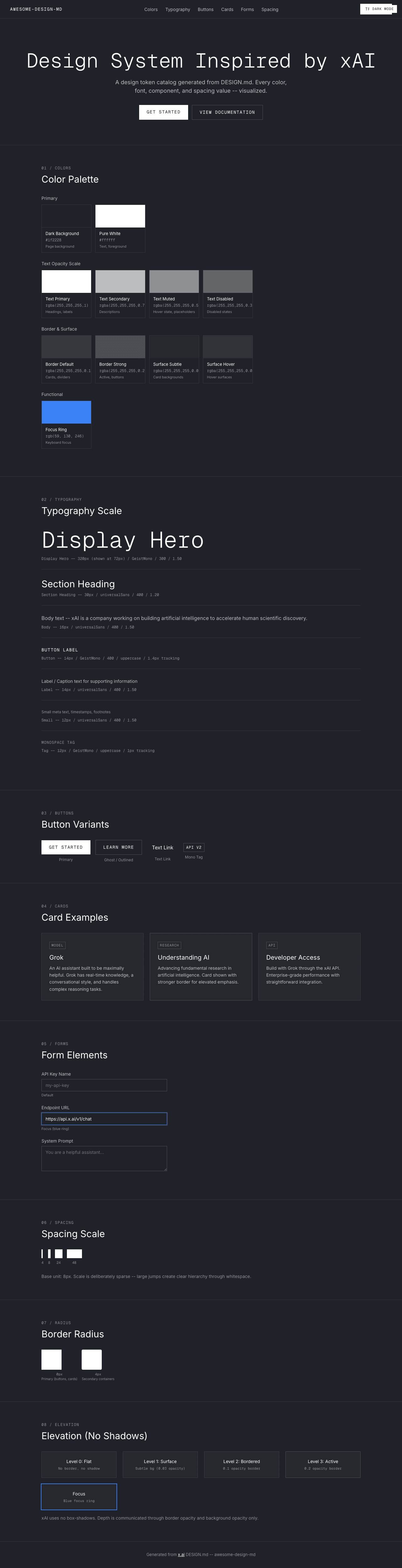
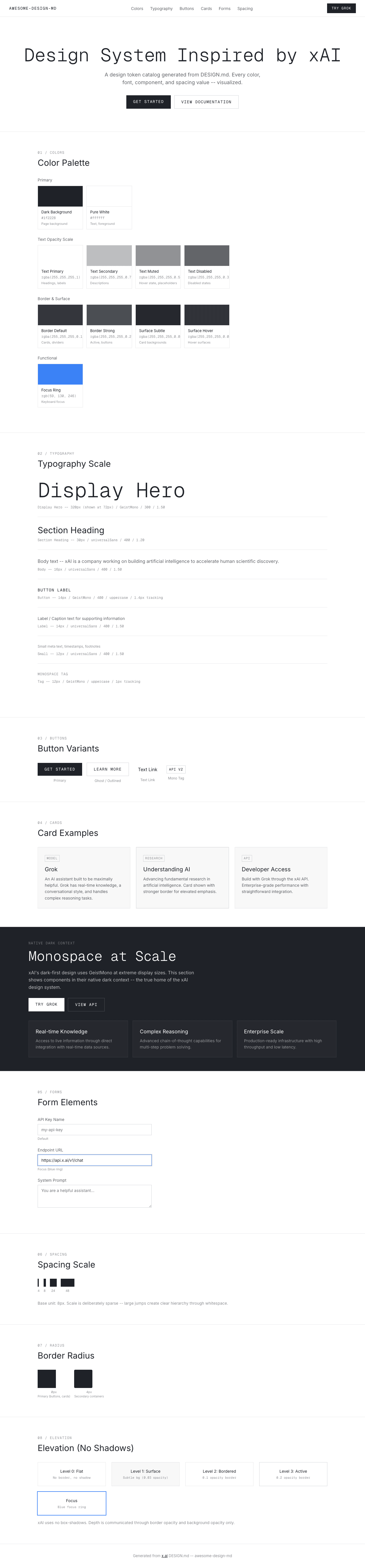
A sample landing page built with DESIGN.md. It shows the actual colors, typography, buttons, cards, spacing, and elevation, all in one page.
|
|
19
|
+
|
|
20
|
+
### Dark Mode
|
|
21
|
+
|
|
22
|
+
|
|
23
|
+
### Light Mode
|
|
24
|
+
|
|
@@ -0,0 +1,358 @@
|
|
|
1
|
+
<!DOCTYPE html>
|
|
2
|
+
<html lang="en">
|
|
3
|
+
<head>
|
|
4
|
+
<meta charset="UTF-8">
|
|
5
|
+
<meta name="viewport" content="width=device-width, initial-scale=1.0">
|
|
6
|
+
<title>Design System Preview: xAI (Dark)</title>
|
|
7
|
+
<link rel="preconnect" href="https://fonts.googleapis.com">
|
|
8
|
+
<link rel="preconnect" href="https://fonts.gstatic.com" crossorigin>
|
|
9
|
+
<link href="https://fonts.googleapis.com/css2?family=Geist+Mono:wght@300;400;500&family=Inter:wght@300;400;500;600&display=swap" rel="stylesheet">
|
|
10
|
+
<style>
|
|
11
|
+
:root {
|
|
12
|
+
--bg: #1f2228;
|
|
13
|
+
--bg-page: #1f2228;
|
|
14
|
+
--white: #ffffff;
|
|
15
|
+
--text-primary: #ffffff;
|
|
16
|
+
--text-secondary: rgba(255, 255, 255, 0.7);
|
|
17
|
+
--text-muted: rgba(255, 255, 255, 0.5);
|
|
18
|
+
--text-disabled: rgba(255, 255, 255, 0.3);
|
|
19
|
+
--border: rgba(255, 255, 255, 0.1);
|
|
20
|
+
--border-strong: rgba(255, 255, 255, 0.2);
|
|
21
|
+
--surface: rgba(255, 255, 255, 0.03);
|
|
22
|
+
--surface-hover: rgba(255, 255, 255, 0.08);
|
|
23
|
+
--ring-blue: rgb(59, 130, 246);
|
|
24
|
+
--font-display: 'Geist Mono', ui-monospace, SFMono-Regular, 'Roboto Mono', Menlo, Monaco, monospace;
|
|
25
|
+
--font-body: 'Inter', -apple-system, system-ui, sans-serif;
|
|
26
|
+
}
|
|
27
|
+
* { margin: 0; padding: 0; box-sizing: border-box; }
|
|
28
|
+
body {
|
|
29
|
+
background: var(--bg-page);
|
|
30
|
+
color: var(--text-primary);
|
|
31
|
+
font-family: var(--font-body);
|
|
32
|
+
font-size: 16px; font-weight: 400; line-height: 1.50;
|
|
33
|
+
-webkit-font-smoothing: antialiased;
|
|
34
|
+
}
|
|
35
|
+
|
|
36
|
+
/* NAV */
|
|
37
|
+
.nav {
|
|
38
|
+
position: sticky; top: 0; z-index: 100;
|
|
39
|
+
display: flex; align-items: center; justify-content: space-between;
|
|
40
|
+
padding: 12px 32px;
|
|
41
|
+
background: rgba(31,34,40,0.90);
|
|
42
|
+
backdrop-filter: blur(12px);
|
|
43
|
+
border-bottom: 1px solid var(--border);
|
|
44
|
+
}
|
|
45
|
+
.nav-brand { font-family: var(--font-display); font-size: 14px; font-weight: 400; color: var(--text-primary); text-decoration: none; text-transform: uppercase; letter-spacing: 1.4px; }
|
|
46
|
+
.nav-links { display: flex; gap: 24px; list-style: none; }
|
|
47
|
+
.nav-links a { font-family: var(--font-body); font-size: 14px; font-weight: 400; color: var(--text-secondary); text-decoration: none; transition: color 0.15s; }
|
|
48
|
+
.nav-links a:hover { color: var(--text-muted); }
|
|
49
|
+
.nav-cta {
|
|
50
|
+
display: inline-block; background: var(--white); color: var(--bg);
|
|
51
|
+
padding: 8px 16px; border-radius: 0px;
|
|
52
|
+
font-family: var(--font-display); font-size: 12px; font-weight: 400;
|
|
53
|
+
text-decoration: none; text-transform: uppercase; letter-spacing: 1.4px;
|
|
54
|
+
transition: opacity 0.15s;
|
|
55
|
+
}
|
|
56
|
+
.nav-cta:hover { opacity: 0.85; }
|
|
57
|
+
|
|
58
|
+
/* DARK MODE BADGE */
|
|
59
|
+
.dark-badge {
|
|
60
|
+
position: fixed; top: 16px; right: 16px; z-index: 200;
|
|
61
|
+
background: var(--white); color: var(--bg);
|
|
62
|
+
font-family: var(--font-display); font-size: 11px; font-weight: 400;
|
|
63
|
+
padding: 4px 10px; border-radius: 0px;
|
|
64
|
+
text-transform: uppercase; letter-spacing: 1px;
|
|
65
|
+
}
|
|
66
|
+
|
|
67
|
+
/* HERO */
|
|
68
|
+
.hero { padding: 96px 32px 80px; text-align: center; }
|
|
69
|
+
.hero h1 {
|
|
70
|
+
font-family: var(--font-display); font-size: 64px; font-weight: 300; line-height: 1.20;
|
|
71
|
+
color: var(--text-primary); margin-bottom: 16px;
|
|
72
|
+
}
|
|
73
|
+
.hero p { font-size: 18px; font-weight: 400; line-height: 1.50; color: var(--text-secondary); max-width: 560px; margin: 0 auto 32px; }
|
|
74
|
+
.hero-buttons { display: flex; gap: 12px; justify-content: center; flex-wrap: wrap; }
|
|
75
|
+
.btn-primary {
|
|
76
|
+
display: inline-block; background: var(--white); color: var(--bg);
|
|
77
|
+
padding: 12px 24px; border-radius: 0px; border: none;
|
|
78
|
+
font-family: var(--font-display); font-size: 14px; font-weight: 400;
|
|
79
|
+
text-decoration: none; text-transform: uppercase; letter-spacing: 1.4px;
|
|
80
|
+
cursor: pointer; transition: opacity 0.15s;
|
|
81
|
+
}
|
|
82
|
+
.btn-primary:hover { opacity: 0.85; }
|
|
83
|
+
.btn-ghost {
|
|
84
|
+
display: inline-block; background: transparent; color: var(--text-primary);
|
|
85
|
+
padding: 12px 24px; border-radius: 0px;
|
|
86
|
+
border: 1px solid var(--border-strong);
|
|
87
|
+
font-family: var(--font-display); font-size: 14px; font-weight: 400;
|
|
88
|
+
text-decoration: none; text-transform: uppercase; letter-spacing: 1.4px;
|
|
89
|
+
cursor: pointer; transition: opacity 0.15s;
|
|
90
|
+
}
|
|
91
|
+
.btn-ghost:hover { opacity: 0.6; }
|
|
92
|
+
|
|
93
|
+
/* SECTIONS */
|
|
94
|
+
.section { padding: 64px 32px; max-width: 1080px; margin: 0 auto; }
|
|
95
|
+
.section-label { font-family: var(--font-display); font-size: 12px; font-weight: 400; color: var(--text-muted); text-transform: uppercase; letter-spacing: 1.4px; margin-bottom: 8px; }
|
|
96
|
+
.section-title { font-family: var(--font-body); font-size: 30px; font-weight: 400; line-height: 1.20; margin-bottom: 32px; color: var(--text-primary); }
|
|
97
|
+
.section-divider { border: none; border-top: 1px solid var(--border); margin: 0; }
|
|
98
|
+
|
|
99
|
+
/* COLORS */
|
|
100
|
+
.color-grid { display: grid; grid-template-columns: repeat(auto-fill, minmax(155px, 1fr)); gap: 12px; margin-bottom: 24px; }
|
|
101
|
+
.color-swatch { overflow: hidden; border: 1px solid var(--border); }
|
|
102
|
+
.color-swatch-block { height: 72px; width: 100%; }
|
|
103
|
+
.color-swatch-info { padding: 10px 12px; }
|
|
104
|
+
.color-swatch-name { font-size: 13px; font-weight: 400; margin-bottom: 2px; color: var(--text-primary); }
|
|
105
|
+
.color-swatch-hex { font-size: 12px; color: var(--text-muted); font-family: var(--font-display); }
|
|
106
|
+
.color-swatch-role { font-size: 11px; color: var(--text-muted); margin-top: 3px; }
|
|
107
|
+
.color-group-label { font-size: 14px; font-weight: 400; color: var(--text-secondary); margin: 24px 0 10px; }
|
|
108
|
+
|
|
109
|
+
/* TYPOGRAPHY */
|
|
110
|
+
.type-sample { margin-bottom: 28px; padding-bottom: 24px; border-bottom: 1px solid var(--border); }
|
|
111
|
+
.type-sample:last-child { border-bottom: none; }
|
|
112
|
+
.type-meta { font-family: var(--font-display); font-size: 12px; font-weight: 400; color: var(--text-muted); margin-top: 8px; }
|
|
113
|
+
|
|
114
|
+
/* BUTTONS */
|
|
115
|
+
.button-row { display: flex; gap: 16px; flex-wrap: wrap; align-items: center; }
|
|
116
|
+
.button-item { text-align: center; }
|
|
117
|
+
.button-label { font-size: 12px; color: var(--text-muted); margin-top: 8px; }
|
|
118
|
+
.btn-text-link {
|
|
119
|
+
display: inline-block; background: none; color: var(--text-primary);
|
|
120
|
+
padding: 8px 16px; font-family: var(--font-body); font-size: 16px;
|
|
121
|
+
font-weight: 400; text-decoration: none; transition: opacity 0.15s;
|
|
122
|
+
}
|
|
123
|
+
.btn-text-link:hover { opacity: 0.5; }
|
|
124
|
+
.badge-mono {
|
|
125
|
+
display: inline-block; background: transparent; color: var(--text-primary);
|
|
126
|
+
padding: 4px 8px; font-family: var(--font-display); font-size: 12px;
|
|
127
|
+
text-transform: uppercase; letter-spacing: 1px;
|
|
128
|
+
border: 1px solid var(--border-strong);
|
|
129
|
+
}
|
|
130
|
+
|
|
131
|
+
/* CARDS */
|
|
132
|
+
.card-grid { display: grid; grid-template-columns: repeat(auto-fit, minmax(320px, 1fr)); gap: 20px; }
|
|
133
|
+
.card {
|
|
134
|
+
background: var(--surface); padding: 24px;
|
|
135
|
+
border: 1px solid var(--border);
|
|
136
|
+
transition: border-color 0.2s ease;
|
|
137
|
+
}
|
|
138
|
+
.card:hover { border-color: var(--border-strong); }
|
|
139
|
+
.card h3 { font-family: var(--font-body); font-size: 20px; font-weight: 400; margin-bottom: 8px; color: var(--text-primary); }
|
|
140
|
+
.card p { font-size: 14px; color: var(--text-secondary); line-height: 1.60; }
|
|
141
|
+
.card-tag { display: inline-block; font-family: var(--font-display); font-size: 11px; text-transform: uppercase; letter-spacing: 1px; padding: 2px 6px; border: 1px solid var(--border-strong); margin-bottom: 12px; color: var(--text-muted); }
|
|
142
|
+
|
|
143
|
+
/* FORMS */
|
|
144
|
+
.form-group { margin-bottom: 20px; max-width: 400px; }
|
|
145
|
+
.form-label { display: block; font-size: 14px; font-weight: 400; color: var(--text-secondary); margin-bottom: 6px; }
|
|
146
|
+
.form-input {
|
|
147
|
+
width: 100%; background: transparent; color: var(--text-primary);
|
|
148
|
+
border: 1px solid var(--border-strong); padding: 10px 12px; border-radius: 0px;
|
|
149
|
+
font-family: var(--font-body); font-size: 14px; font-weight: 400; outline: none;
|
|
150
|
+
transition: border-color 0.15s;
|
|
151
|
+
}
|
|
152
|
+
.form-input:focus { border-color: var(--ring-blue); box-shadow: 0 0 0 2px rgba(59,130,246,0.3); }
|
|
153
|
+
.form-input--focus { border-color: var(--ring-blue); box-shadow: 0 0 0 2px rgba(59,130,246,0.3); }
|
|
154
|
+
.form-textarea {
|
|
155
|
+
width: 100%; min-height: 80px; background: transparent; color: var(--text-primary);
|
|
156
|
+
border: 1px solid var(--border-strong); padding: 10px 12px; border-radius: 0px;
|
|
157
|
+
font-family: var(--font-body); font-size: 14px; font-weight: 400; resize: vertical; outline: none;
|
|
158
|
+
}
|
|
159
|
+
.form-state-label { font-size: 11px; color: var(--text-muted); margin-top: 4px; }
|
|
160
|
+
|
|
161
|
+
/* SPACING */
|
|
162
|
+
.spacing-row { display: flex; align-items: flex-end; gap: 14px; flex-wrap: wrap; margin-bottom: 24px; }
|
|
163
|
+
.spacing-item { text-align: center; }
|
|
164
|
+
.spacing-block { background: var(--white); margin-bottom: 6px; height: 28px; }
|
|
165
|
+
.spacing-value { font-family: var(--font-display); font-size: 11px; font-weight: 400; color: var(--text-muted); }
|
|
166
|
+
|
|
167
|
+
/* RADIUS */
|
|
168
|
+
.radius-row { display: flex; gap: 14px; flex-wrap: wrap; align-items: center; }
|
|
169
|
+
.radius-item { text-align: center; }
|
|
170
|
+
.radius-box { width: 64px; height: 64px; background: var(--white); margin-bottom: 6px; }
|
|
171
|
+
.radius-label { font-family: var(--font-display); font-size: 11px; font-weight: 400; color: var(--text-muted); }
|
|
172
|
+
.radius-context { font-size: 10px; color: var(--text-muted); }
|
|
173
|
+
|
|
174
|
+
/* ELEVATION */
|
|
175
|
+
.elevation-grid { display: grid; grid-template-columns: repeat(auto-fit, minmax(200px, 1fr)); gap: 20px; }
|
|
176
|
+
.elevation-card { background: var(--surface); padding: 20px; text-align: center; }
|
|
177
|
+
.elevation-label { font-size: 14px; font-weight: 400; margin-bottom: 4px; color: var(--text-primary); }
|
|
178
|
+
.elevation-desc { font-family: var(--font-display); font-size: 11px; color: var(--text-muted); }
|
|
179
|
+
|
|
180
|
+
/* FOOTER */
|
|
181
|
+
.footer { padding: 32px; text-align: center; border-top: 1px solid var(--border); font-size: 13px; color: var(--text-muted); }
|
|
182
|
+
.footer a { color: var(--text-primary); text-decoration: underline; }
|
|
183
|
+
|
|
184
|
+
@media (max-width: 768px) {
|
|
185
|
+
.hero h1 { font-size: 36px; }
|
|
186
|
+
.nav-links { display: none; }
|
|
187
|
+
.section { padding: 48px 20px; }
|
|
188
|
+
.card-grid { grid-template-columns: 1fr; }
|
|
189
|
+
}
|
|
190
|
+
</style>
|
|
191
|
+
</head>
|
|
192
|
+
<body>
|
|
193
|
+
|
|
194
|
+
<nav class="nav">
|
|
195
|
+
<a class="nav-brand" href="#">awesome-design-md</a>
|
|
196
|
+
<ul class="nav-links">
|
|
197
|
+
<li><a href="#colors">Colors</a></li>
|
|
198
|
+
<li><a href="#typography">Typography</a></li>
|
|
199
|
+
<li><a href="#buttons">Buttons</a></li>
|
|
200
|
+
<li><a href="#cards">Cards</a></li>
|
|
201
|
+
<li><a href="#forms">Forms</a></li>
|
|
202
|
+
<li><a href="#spacing">Spacing</a></li>
|
|
203
|
+
</ul>
|
|
204
|
+
<a class="nav-cta" href="#">TRY GROK</a>
|
|
205
|
+
</nav>
|
|
206
|
+
<div class="dark-badge">Dark Mode</div>
|
|
207
|
+
|
|
208
|
+
<section class="hero">
|
|
209
|
+
<h1>Design System Inspired by xAI</h1>
|
|
210
|
+
<p>A design token catalog generated from DESIGN.md. Every color, font, component, and spacing value -- visualized.</p>
|
|
211
|
+
<div class="hero-buttons">
|
|
212
|
+
<a class="btn-primary" href="#">GET STARTED</a>
|
|
213
|
+
<a class="btn-ghost" href="#">VIEW DOCUMENTATION</a>
|
|
214
|
+
</div>
|
|
215
|
+
</section>
|
|
216
|
+
|
|
217
|
+
<hr class="section-divider">
|
|
218
|
+
|
|
219
|
+
<section class="section" id="colors">
|
|
220
|
+
<div class="section-label">01 / Colors</div>
|
|
221
|
+
<h2 class="section-title">Color Palette</h2>
|
|
222
|
+
|
|
223
|
+
<div class="color-group-label">Primary</div>
|
|
224
|
+
<div class="color-grid">
|
|
225
|
+
<div class="color-swatch"><div class="color-swatch-block" style="background:#1f2228; border-bottom: 1px solid rgba(255,255,255,0.1)"></div><div class="color-swatch-info"><div class="color-swatch-name">Dark Background</div><div class="color-swatch-hex">#1f2228</div><div class="color-swatch-role">Page background</div></div></div>
|
|
226
|
+
<div class="color-swatch"><div class="color-swatch-block" style="background:#ffffff"></div><div class="color-swatch-info"><div class="color-swatch-name">Pure White</div><div class="color-swatch-hex">#ffffff</div><div class="color-swatch-role">Text, foreground</div></div></div>
|
|
227
|
+
</div>
|
|
228
|
+
|
|
229
|
+
<div class="color-group-label">Text Opacity Scale</div>
|
|
230
|
+
<div class="color-grid">
|
|
231
|
+
<div class="color-swatch"><div class="color-swatch-block" style="background:#1f2228"><div style="width:100%;height:100%;background:rgba(255,255,255,1);"></div></div><div class="color-swatch-info"><div class="color-swatch-name">Text Primary</div><div class="color-swatch-hex">rgba(255,255,255,1)</div><div class="color-swatch-role">Headings, labels</div></div></div>
|
|
232
|
+
<div class="color-swatch"><div class="color-swatch-block" style="background:#1f2228"><div style="width:100%;height:100%;background:rgba(255,255,255,0.7);"></div></div><div class="color-swatch-info"><div class="color-swatch-name">Text Secondary</div><div class="color-swatch-hex">rgba(255,255,255,0.7)</div><div class="color-swatch-role">Descriptions</div></div></div>
|
|
233
|
+
<div class="color-swatch"><div class="color-swatch-block" style="background:#1f2228"><div style="width:100%;height:100%;background:rgba(255,255,255,0.5);"></div></div><div class="color-swatch-info"><div class="color-swatch-name">Text Muted</div><div class="color-swatch-hex">rgba(255,255,255,0.5)</div><div class="color-swatch-role">Hover state, placeholders</div></div></div>
|
|
234
|
+
<div class="color-swatch"><div class="color-swatch-block" style="background:#1f2228"><div style="width:100%;height:100%;background:rgba(255,255,255,0.3);"></div></div><div class="color-swatch-info"><div class="color-swatch-name">Text Disabled</div><div class="color-swatch-hex">rgba(255,255,255,0.3)</div><div class="color-swatch-role">Disabled states</div></div></div>
|
|
235
|
+
</div>
|
|
236
|
+
|
|
237
|
+
<div class="color-group-label">Border & Surface</div>
|
|
238
|
+
<div class="color-grid">
|
|
239
|
+
<div class="color-swatch"><div class="color-swatch-block" style="background:#1f2228"><div style="width:100%;height:100%;background:rgba(255,255,255,0.1);"></div></div><div class="color-swatch-info"><div class="color-swatch-name">Border Default</div><div class="color-swatch-hex">rgba(255,255,255,0.1)</div><div class="color-swatch-role">Cards, dividers</div></div></div>
|
|
240
|
+
<div class="color-swatch"><div class="color-swatch-block" style="background:#1f2228"><div style="width:100%;height:100%;background:rgba(255,255,255,0.2);"></div></div><div class="color-swatch-info"><div class="color-swatch-name">Border Strong</div><div class="color-swatch-hex">rgba(255,255,255,0.2)</div><div class="color-swatch-role">Active, buttons</div></div></div>
|
|
241
|
+
<div class="color-swatch"><div class="color-swatch-block" style="background:#1f2228"><div style="width:100%;height:100%;background:rgba(255,255,255,0.03);"></div></div><div class="color-swatch-info"><div class="color-swatch-name">Surface Subtle</div><div class="color-swatch-hex">rgba(255,255,255,0.03)</div><div class="color-swatch-role">Card backgrounds</div></div></div>
|
|
242
|
+
<div class="color-swatch"><div class="color-swatch-block" style="background:#1f2228"><div style="width:100%;height:100%;background:rgba(255,255,255,0.08);"></div></div><div class="color-swatch-info"><div class="color-swatch-name">Surface Hover</div><div class="color-swatch-hex">rgba(255,255,255,0.08)</div><div class="color-swatch-role">Hover surfaces</div></div></div>
|
|
243
|
+
</div>
|
|
244
|
+
|
|
245
|
+
<div class="color-group-label">Functional</div>
|
|
246
|
+
<div class="color-grid">
|
|
247
|
+
<div class="color-swatch"><div class="color-swatch-block" style="background:rgb(59,130,246)"></div><div class="color-swatch-info"><div class="color-swatch-name">Focus Ring</div><div class="color-swatch-hex">rgb(59, 130, 246)</div><div class="color-swatch-role">Keyboard focus</div></div></div>
|
|
248
|
+
</div>
|
|
249
|
+
</section>
|
|
250
|
+
|
|
251
|
+
<hr class="section-divider">
|
|
252
|
+
|
|
253
|
+
<section class="section" id="typography">
|
|
254
|
+
<div class="section-label">02 / Typography</div>
|
|
255
|
+
<h2 class="section-title">Typography Scale</h2>
|
|
256
|
+
|
|
257
|
+
<div class="type-sample"><div style="font-family:var(--font-display); font-size:72px; font-weight:300; line-height:1.20; color:var(--text-primary);">Display Hero</div><div class="type-meta">Display Hero -- 320px (shown at 72px) / GeistMono / 300 / 1.50</div></div>
|
|
258
|
+
<div class="type-sample"><div style="font-family:var(--font-body); font-size:30px; font-weight:400; line-height:1.20; color:var(--text-primary);">Section Heading</div><div class="type-meta">Section Heading -- 30px / universalSans / 400 / 1.20</div></div>
|
|
259
|
+
<div class="type-sample"><div style="font-family:var(--font-body); font-size:16px; font-weight:400; line-height:1.50; color:var(--text-secondary);">Body text -- xAI is a company working on building artificial intelligence to accelerate human scientific discovery.</div><div class="type-meta">Body -- 16px / universalSans / 400 / 1.50</div></div>
|
|
260
|
+
<div class="type-sample"><div style="font-family:var(--font-display); font-size:14px; font-weight:400; line-height:1.43; text-transform:uppercase; letter-spacing:1.4px; color:var(--text-primary);">Button Label</div><div class="type-meta">Button -- 14px / GeistMono / 400 / uppercase / 1.4px tracking</div></div>
|
|
261
|
+
<div class="type-sample"><div style="font-family:var(--font-body); font-size:14px; font-weight:400; line-height:1.50; color:var(--text-secondary);">Label / Caption text for supporting information</div><div class="type-meta">Label -- 14px / universalSans / 400 / 1.50</div></div>
|
|
262
|
+
<div class="type-sample"><div style="font-family:var(--font-body); font-size:12px; font-weight:400; line-height:1.50; color:var(--text-muted);">Small meta text, timestamps, footnotes</div><div class="type-meta">Small -- 12px / universalSans / 400 / 1.50</div></div>
|
|
263
|
+
<div class="type-sample"><div style="font-family:var(--font-display); font-size:12px; font-weight:400; line-height:1.50; text-transform:uppercase; letter-spacing:1px; color:var(--text-muted);">MONOSPACE TAG</div><div class="type-meta">Tag -- 12px / GeistMono / uppercase / 1px tracking</div></div>
|
|
264
|
+
</section>
|
|
265
|
+
|
|
266
|
+
<hr class="section-divider">
|
|
267
|
+
|
|
268
|
+
<section class="section" id="buttons">
|
|
269
|
+
<div class="section-label">03 / Buttons</div>
|
|
270
|
+
<h2 class="section-title">Button Variants</h2>
|
|
271
|
+
<div class="button-row">
|
|
272
|
+
<div class="button-item"><a class="btn-primary" href="#">GET STARTED</a><div class="button-label">Primary</div></div>
|
|
273
|
+
<div class="button-item"><a class="btn-ghost" href="#">LEARN MORE</a><div class="button-label">Ghost / Outlined</div></div>
|
|
274
|
+
<div class="button-item"><a class="btn-text-link" href="#">Text Link</a><div class="button-label">Text Link</div></div>
|
|
275
|
+
<div class="button-item"><span class="badge-mono">API v2</span><div class="button-label">Mono Tag</div></div>
|
|
276
|
+
</div>
|
|
277
|
+
</section>
|
|
278
|
+
|
|
279
|
+
<hr class="section-divider">
|
|
280
|
+
|
|
281
|
+
<section class="section" id="cards">
|
|
282
|
+
<div class="section-label">04 / Cards</div>
|
|
283
|
+
<h2 class="section-title">Card Examples</h2>
|
|
284
|
+
<div class="card-grid">
|
|
285
|
+
<div class="card">
|
|
286
|
+
<div class="card-tag">MODEL</div>
|
|
287
|
+
<h3>Grok</h3>
|
|
288
|
+
<p>An AI assistant built to be maximally helpful. Grok has real-time knowledge, a conversational style, and handles complex reasoning tasks.</p>
|
|
289
|
+
</div>
|
|
290
|
+
<div class="card" style="border-color: var(--border-strong);">
|
|
291
|
+
<div class="card-tag">RESEARCH</div>
|
|
292
|
+
<h3>Understanding AI</h3>
|
|
293
|
+
<p>Advancing fundamental research in artificial intelligence. Card shown with stronger border for elevated emphasis.</p>
|
|
294
|
+
</div>
|
|
295
|
+
<div class="card">
|
|
296
|
+
<div class="card-tag">API</div>
|
|
297
|
+
<h3>Developer Access</h3>
|
|
298
|
+
<p>Build with Grok through the xAI API. Enterprise-grade performance with straightforward integration.</p>
|
|
299
|
+
</div>
|
|
300
|
+
</div>
|
|
301
|
+
</section>
|
|
302
|
+
|
|
303
|
+
<hr class="section-divider">
|
|
304
|
+
|
|
305
|
+
<section class="section" id="forms">
|
|
306
|
+
<div class="section-label">05 / Forms</div>
|
|
307
|
+
<h2 class="section-title">Form Elements</h2>
|
|
308
|
+
<div class="form-group"><label class="form-label">API Key Name</label><input class="form-input" type="text" placeholder="my-api-key"><div class="form-state-label">Default</div></div>
|
|
309
|
+
<div class="form-group"><label class="form-label">Endpoint URL</label><input class="form-input form-input--focus" type="text" value="https://api.x.ai/v1/chat"><div class="form-state-label">Focus (blue ring)</div></div>
|
|
310
|
+
<div class="form-group"><label class="form-label">System Prompt</label><textarea class="form-textarea" placeholder="You are a helpful assistant..."></textarea></div>
|
|
311
|
+
</section>
|
|
312
|
+
|
|
313
|
+
<hr class="section-divider">
|
|
314
|
+
|
|
315
|
+
<section class="section" id="spacing">
|
|
316
|
+
<div class="section-label">06 / Spacing</div>
|
|
317
|
+
<h2 class="section-title">Spacing Scale</h2>
|
|
318
|
+
<div class="spacing-row">
|
|
319
|
+
<div class="spacing-item"><div class="spacing-block" style="width:4px"></div><div class="spacing-value">4</div></div>
|
|
320
|
+
<div class="spacing-item"><div class="spacing-block" style="width:8px"></div><div class="spacing-value">8</div></div>
|
|
321
|
+
<div class="spacing-item"><div class="spacing-block" style="width:24px"></div><div class="spacing-value">24</div></div>
|
|
322
|
+
<div class="spacing-item"><div class="spacing-block" style="width:48px"></div><div class="spacing-value">48</div></div>
|
|
323
|
+
</div>
|
|
324
|
+
<p style="font-size:14px; color:var(--text-muted); margin-top:8px;">Base unit: 8px. Scale is deliberately sparse -- large jumps create clear hierarchy through whitespace.</p>
|
|
325
|
+
</section>
|
|
326
|
+
|
|
327
|
+
<hr class="section-divider">
|
|
328
|
+
|
|
329
|
+
<section class="section" id="radius">
|
|
330
|
+
<div class="section-label">07 / Radius</div>
|
|
331
|
+
<h2 class="section-title">Border Radius</h2>
|
|
332
|
+
<div class="radius-row">
|
|
333
|
+
<div class="radius-item"><div class="radius-box" style="border-radius:0px"></div><div class="radius-label">0px</div><div class="radius-context">Primary (buttons, cards)</div></div>
|
|
334
|
+
<div class="radius-item"><div class="radius-box" style="border-radius:4px"></div><div class="radius-label">4px</div><div class="radius-context">Secondary containers</div></div>
|
|
335
|
+
</div>
|
|
336
|
+
</section>
|
|
337
|
+
|
|
338
|
+
<hr class="section-divider">
|
|
339
|
+
|
|
340
|
+
<section class="section" id="elevation">
|
|
341
|
+
<div class="section-label">08 / Elevation</div>
|
|
342
|
+
<h2 class="section-title">Elevation (No Shadows)</h2>
|
|
343
|
+
<div class="elevation-grid">
|
|
344
|
+
<div class="elevation-card" style="border: 1px solid var(--border);"><div class="elevation-label">Level 0: Flat</div><div class="elevation-desc">No border, no shadow</div></div>
|
|
345
|
+
<div class="elevation-card" style="background: var(--surface); border: 1px solid var(--border);"><div class="elevation-label">Level 1: Surface</div><div class="elevation-desc">Subtle bg (0.03 opacity)</div></div>
|
|
346
|
+
<div class="elevation-card" style="border: 1px solid var(--border);"><div class="elevation-label">Level 2: Bordered</div><div class="elevation-desc">0.1 opacity border</div></div>
|
|
347
|
+
<div class="elevation-card" style="border: 1px solid var(--border-strong);"><div class="elevation-label">Level 3: Active</div><div class="elevation-desc">0.2 opacity border</div></div>
|
|
348
|
+
<div class="elevation-card" style="box-shadow: 0 0 0 2px rgb(59,130,246);"><div class="elevation-label">Focus</div><div class="elevation-desc">Blue focus ring</div></div>
|
|
349
|
+
</div>
|
|
350
|
+
<p style="font-size:14px; color:var(--text-muted); margin-top:16px;">xAI uses no box-shadows. Depth is communicated through border opacity and background opacity only.</p>
|
|
351
|
+
</section>
|
|
352
|
+
|
|
353
|
+
<footer class="footer">
|
|
354
|
+
Generated from <a href="https://x.ai/">x.ai</a> DESIGN.md -- awesome-design-md
|
|
355
|
+
</footer>
|
|
356
|
+
|
|
357
|
+
</body>
|
|
358
|
+
</html>
|