awesome-design-md 1.0.0
This diff represents the content of publicly available package versions that have been released to one of the supported registries. The information contained in this diff is provided for informational purposes only and reflects changes between package versions as they appear in their respective public registries.
- package/LICENSE +21 -0
- package/README.md +172 -0
- package/bin/cli.mjs +126 -0
- package/design-md/airbnb/DESIGN.md +246 -0
- package/design-md/airbnb/README.md +23 -0
- package/design-md/airbnb/preview-dark.html +234 -0
- package/design-md/airbnb/preview.html +233 -0
- package/design-md/airtable/DESIGN.md +89 -0
- package/design-md/airtable/README.md +23 -0
- package/design-md/airtable/preview-dark.html +165 -0
- package/design-md/airtable/preview.html +164 -0
- package/design-md/apple/DESIGN.md +313 -0
- package/design-md/apple/README.md +24 -0
- package/design-md/apple/preview-dark.html +422 -0
- package/design-md/apple/preview.html +416 -0
- package/design-md/bmw/DESIGN.md +180 -0
- package/design-md/bmw/README.md +23 -0
- package/design-md/bmw/preview-dark.html +211 -0
- package/design-md/bmw/preview.html +210 -0
- package/design-md/cal/DESIGN.md +259 -0
- package/design-md/cal/README.md +23 -0
- package/design-md/cal/preview-dark.html +449 -0
- package/design-md/cal/preview.html +575 -0
- package/design-md/claude/DESIGN.md +312 -0
- package/design-md/claude/README.md +24 -0
- package/design-md/claude/preview-dark.html +803 -0
- package/design-md/claude/preview.html +826 -0
- package/design-md/clay/DESIGN.md +304 -0
- package/design-md/clay/README.md +23 -0
- package/design-md/clay/preview-dark.html +318 -0
- package/design-md/clay/preview.html +317 -0
- package/design-md/clickhouse/DESIGN.md +281 -0
- package/design-md/clickhouse/README.md +24 -0
- package/design-md/clickhouse/preview-dark.html +834 -0
- package/design-md/clickhouse/preview.html +786 -0
- package/design-md/cohere/DESIGN.md +266 -0
- package/design-md/cohere/README.md +24 -0
- package/design-md/cohere/preview-dark.html +810 -0
- package/design-md/cohere/preview.html +814 -0
- package/design-md/coinbase/DESIGN.md +129 -0
- package/design-md/coinbase/README.md +23 -0
- package/design-md/coinbase/preview-dark.html +164 -0
- package/design-md/coinbase/preview.html +163 -0
- package/design-md/composio/DESIGN.md +307 -0
- package/design-md/composio/README.md +24 -0
- package/design-md/composio/preview-dark.html +958 -0
- package/design-md/composio/preview.html +933 -0
- package/design-md/cursor/DESIGN.md +309 -0
- package/design-md/cursor/README.md +24 -0
- package/design-md/cursor/preview-dark.html +395 -0
- package/design-md/cursor/preview.html +385 -0
- package/design-md/elevenlabs/DESIGN.md +265 -0
- package/design-md/elevenlabs/README.md +23 -0
- package/design-md/elevenlabs/preview-dark.html +254 -0
- package/design-md/elevenlabs/preview.html +253 -0
- package/design-md/expo/DESIGN.md +281 -0
- package/design-md/expo/README.md +24 -0
- package/design-md/expo/preview-dark.html +536 -0
- package/design-md/expo/preview.html +536 -0
- package/design-md/figma/DESIGN.md +220 -0
- package/design-md/figma/README.md +24 -0
- package/design-md/figma/preview-dark.html +831 -0
- package/design-md/figma/preview.html +841 -0
- package/design-md/framer/DESIGN.md +246 -0
- package/design-md/framer/README.md +23 -0
- package/design-md/framer/preview-dark.html +904 -0
- package/design-md/framer/preview.html +885 -0
- package/design-md/hashicorp/DESIGN.md +278 -0
- package/design-md/hashicorp/README.md +24 -0
- package/design-md/hashicorp/preview-dark.html +1206 -0
- package/design-md/hashicorp/preview.html +1195 -0
- package/design-md/ibm/DESIGN.md +332 -0
- package/design-md/ibm/README.md +24 -0
- package/design-md/ibm/preview-dark.html +445 -0
- package/design-md/ibm/preview.html +430 -0
- package/design-md/intercom/DESIGN.md +146 -0
- package/design-md/intercom/README.md +23 -0
- package/design-md/intercom/preview-dark.html +185 -0
- package/design-md/intercom/preview.html +184 -0
- package/design-md/kraken/DESIGN.md +125 -0
- package/design-md/kraken/README.md +23 -0
- package/design-md/kraken/preview-dark.html +169 -0
- package/design-md/kraken/preview.html +168 -0
- package/design-md/linear.app/DESIGN.md +367 -0
- package/design-md/linear.app/README.md +24 -0
- package/design-md/linear.app/preview-dark.html +385 -0
- package/design-md/linear.app/preview.html +375 -0
- package/design-md/lovable/DESIGN.md +298 -0
- package/design-md/lovable/README.md +24 -0
- package/design-md/lovable/preview-dark.html +351 -0
- package/design-md/lovable/preview.html +350 -0
- package/design-md/minimax/DESIGN.md +257 -0
- package/design-md/minimax/README.md +24 -0
- package/design-md/minimax/preview-dark.html +1267 -0
- package/design-md/minimax/preview.html +1253 -0
- package/design-md/mintlify/DESIGN.md +326 -0
- package/design-md/mintlify/README.md +24 -0
- package/design-md/mintlify/preview-dark.html +411 -0
- package/design-md/mintlify/preview.html +400 -0
- package/design-md/miro/DESIGN.md +108 -0
- package/design-md/miro/README.md +23 -0
- package/design-md/miro/preview-dark.html +174 -0
- package/design-md/miro/preview.html +173 -0
- package/design-md/mistral.ai/DESIGN.md +261 -0
- package/design-md/mistral.ai/README.md +24 -0
- package/design-md/mistral.ai/preview-dark.html +813 -0
- package/design-md/mistral.ai/preview.html +812 -0
- package/design-md/mongodb/DESIGN.md +266 -0
- package/design-md/mongodb/README.md +23 -0
- package/design-md/mongodb/preview-dark.html +262 -0
- package/design-md/mongodb/preview.html +261 -0
- package/design-md/notion/DESIGN.md +309 -0
- package/design-md/notion/README.md +24 -0
- package/design-md/notion/preview-dark.html +374 -0
- package/design-md/notion/preview.html +366 -0
- package/design-md/nvidia/DESIGN.md +293 -0
- package/design-md/nvidia/README.md +24 -0
- package/design-md/nvidia/preview-dark.html +376 -0
- package/design-md/nvidia/preview.html +368 -0
- package/design-md/ollama/DESIGN.md +267 -0
- package/design-md/ollama/README.md +24 -0
- package/design-md/ollama/preview-dark.html +678 -0
- package/design-md/ollama/preview.html +678 -0
- package/design-md/opencode.ai/DESIGN.md +281 -0
- package/design-md/opencode.ai/README.md +24 -0
- package/design-md/opencode.ai/preview-dark.html +368 -0
- package/design-md/opencode.ai/preview.html +359 -0
- package/design-md/pinterest/DESIGN.md +230 -0
- package/design-md/pinterest/README.md +23 -0
- package/design-md/pinterest/preview-dark.html +233 -0
- package/design-md/pinterest/preview.html +232 -0
- package/design-md/posthog/DESIGN.md +256 -0
- package/design-md/posthog/README.md +23 -0
- package/design-md/posthog/preview-dark.html +701 -0
- package/design-md/posthog/preview.html +751 -0
- package/design-md/raycast/DESIGN.md +268 -0
- package/design-md/raycast/README.md +23 -0
- package/design-md/raycast/preview-dark.html +608 -0
- package/design-md/raycast/preview.html +690 -0
- package/design-md/replicate/DESIGN.md +261 -0
- package/design-md/replicate/README.md +24 -0
- package/design-md/replicate/preview-dark.html +828 -0
- package/design-md/replicate/preview.html +831 -0
- package/design-md/resend/DESIGN.md +303 -0
- package/design-md/resend/README.md +23 -0
- package/design-md/resend/preview-dark.html +357 -0
- package/design-md/resend/preview.html +356 -0
- package/design-md/revolut/DESIGN.md +185 -0
- package/design-md/revolut/README.md +23 -0
- package/design-md/revolut/preview-dark.html +234 -0
- package/design-md/revolut/preview.html +233 -0
- package/design-md/runwayml/DESIGN.md +244 -0
- package/design-md/runwayml/README.md +24 -0
- package/design-md/runwayml/preview-dark.html +664 -0
- package/design-md/runwayml/preview.html +665 -0
- package/design-md/sanity/DESIGN.md +357 -0
- package/design-md/sanity/README.md +24 -0
- package/design-md/sanity/preview-dark.html +995 -0
- package/design-md/sanity/preview.html +1140 -0
- package/design-md/sentry/DESIGN.md +262 -0
- package/design-md/sentry/README.md +24 -0
- package/design-md/sentry/preview-dark.html +628 -0
- package/design-md/sentry/preview.html +953 -0
- package/design-md/spacex/DESIGN.md +194 -0
- package/design-md/spacex/README.md +23 -0
- package/design-md/spacex/preview-dark.html +223 -0
- package/design-md/spacex/preview.html +222 -0
- package/design-md/spotify/DESIGN.md +246 -0
- package/design-md/spotify/README.md +23 -0
- package/design-md/spotify/preview-dark.html +231 -0
- package/design-md/spotify/preview.html +230 -0
- package/design-md/stripe/DESIGN.md +322 -0
- package/design-md/stripe/README.md +24 -0
- package/design-md/stripe/preview-dark.html +430 -0
- package/design-md/stripe/preview.html +421 -0
- package/design-md/supabase/DESIGN.md +255 -0
- package/design-md/supabase/README.md +24 -0
- package/design-md/supabase/preview-dark.html +977 -0
- package/design-md/supabase/preview.html +955 -0
- package/design-md/superhuman/DESIGN.md +252 -0
- package/design-md/superhuman/README.md +23 -0
- package/design-md/superhuman/preview-dark.html +975 -0
- package/design-md/superhuman/preview.html +953 -0
- package/design-md/together.ai/DESIGN.md +263 -0
- package/design-md/together.ai/README.md +24 -0
- package/design-md/together.ai/preview-dark.html +892 -0
- package/design-md/together.ai/preview.html +897 -0
- package/design-md/uber/DESIGN.md +295 -0
- package/design-md/uber/README.md +24 -0
- package/design-md/uber/preview-dark.html +1164 -0
- package/design-md/uber/preview.html +1163 -0
- package/design-md/vercel/DESIGN.md +310 -0
- package/design-md/vercel/README.md +24 -0
- package/design-md/vercel/preview-dark.html +370 -0
- package/design-md/vercel/preview.html +369 -0
- package/design-md/voltagent/DESIGN.md +323 -0
- package/design-md/voltagent/README.md +24 -0
- package/design-md/voltagent/preview-dark.html +487 -0
- package/design-md/voltagent/preview.html +766 -0
- package/design-md/warp/DESIGN.md +253 -0
- package/design-md/warp/README.md +23 -0
- package/design-md/warp/preview-dark.html +502 -0
- package/design-md/warp/preview.html +535 -0
- package/design-md/webflow/DESIGN.md +92 -0
- package/design-md/webflow/README.md +23 -0
- package/design-md/webflow/preview-dark.html +147 -0
- package/design-md/webflow/preview.html +146 -0
- package/design-md/wise/DESIGN.md +173 -0
- package/design-md/wise/README.md +23 -0
- package/design-md/wise/preview-dark.html +230 -0
- package/design-md/wise/preview.html +229 -0
- package/design-md/x.ai/DESIGN.md +257 -0
- package/design-md/x.ai/README.md +24 -0
- package/design-md/x.ai/preview-dark.html +358 -0
- package/design-md/x.ai/preview.html +409 -0
- package/design-md/zapier/DESIGN.md +328 -0
- package/design-md/zapier/README.md +24 -0
- package/design-md/zapier/preview-dark.html +382 -0
- package/design-md/zapier/preview.html +374 -0
- package/package.json +33 -0
|
@@ -0,0 +1,332 @@
|
|
|
1
|
+
# Design System: IBM
|
|
2
|
+
|
|
3
|
+
## 1. Visual Theme & Atmosphere
|
|
4
|
+
|
|
5
|
+
IBM's website is the digital embodiment of enterprise authority built on the Carbon Design System — a design language so methodically structured it reads like an engineering specification rendered as a webpage. The page operates on a stark duality: a bright white (`#ffffff`) canvas with near-black (`#161616`) text, punctuated by a single, unwavering accent — IBM Blue 60 (`#0f62fe`). This isn't playful tech-startup minimalism; it's corporate precision distilled into pixels. Every element exists within Carbon's rigid 2x grid, every color maps to a semantic token, every spacing value snaps to the 8px base unit.
|
|
6
|
+
|
|
7
|
+
The IBM Plex type family is the system's backbone. IBM Plex Sans at light weight (300) for display headlines creates an unexpectedly airy, almost delicate quality at large sizes — a deliberate counterpoint to IBM's corporate gravity. At body sizes, regular weight (400) with 0.16px letter-spacing on 14px captions introduces the meticulous micro-tracking that makes Carbon text feel engineered rather than designed. IBM Plex Mono serves code, data, and technical labels, completing the family trinity alongside the rarely-surfaced IBM Plex Serif.
|
|
8
|
+
|
|
9
|
+
What defines IBM's visual identity beyond monochrome-plus-blue is the reliance on Carbon's component token system. Every interactive state maps to a CSS custom property prefixed with `--cds-` (Carbon Design System). Buttons don't have hardcoded colors; they reference `--cds-button-primary`, `--cds-button-primary-hover`, `--cds-button-primary-active`. This tokenized architecture means the entire visual layer is a thin skin over a deeply systematic foundation — the design equivalent of a well-typed API.
|
|
10
|
+
|
|
11
|
+
**Key Characteristics:**
|
|
12
|
+
- IBM Plex Sans at weight 300 (Light) for display — corporate gravitas through typographic restraint
|
|
13
|
+
- IBM Plex Mono for code and technical content with consistent 0.16px letter-spacing at small sizes
|
|
14
|
+
- Single accent color: IBM Blue 60 (`#0f62fe`) — every interactive element, every CTA, every link
|
|
15
|
+
- Carbon token system (`--cds-*`) driving all semantic colors, enabling theme-switching at the variable level
|
|
16
|
+
- 8px spacing grid with strict adherence — no arbitrary values, everything aligns
|
|
17
|
+
- Flat, borderless cards on `#f4f4f4` Gray 10 surface — depth through background-color layering, not shadows
|
|
18
|
+
- Bottom-border inputs (not boxed) — the signature Carbon form pattern
|
|
19
|
+
- 0px border-radius on primary buttons — unapologetically rectangular, no softening
|
|
20
|
+
|
|
21
|
+
## 2. Color Palette & Roles
|
|
22
|
+
|
|
23
|
+
### Primary
|
|
24
|
+
- **IBM Blue 60** (`#0f62fe`): The singular interactive color. Primary buttons, links, focus states, active indicators. This is the only chromatic hue in the core UI palette.
|
|
25
|
+
- **White** (`#ffffff`): Page background, card surfaces, button text on blue, `--cds-background`.
|
|
26
|
+
- **Gray 100** (`#161616`): Primary text, headings, dark surface backgrounds, nav bar, footer. `--cds-text-primary`.
|
|
27
|
+
|
|
28
|
+
### Neutral Scale (Gray Family)
|
|
29
|
+
- **Gray 100** (`#161616`): Primary text, headings, dark UI chrome, footer background.
|
|
30
|
+
- **Gray 90** (`#262626`): Secondary dark surfaces, hover states on dark backgrounds.
|
|
31
|
+
- **Gray 80** (`#393939`): Tertiary dark, active states.
|
|
32
|
+
- **Gray 70** (`#525252`): Secondary text, helper text, descriptions. `--cds-text-secondary`.
|
|
33
|
+
- **Gray 60** (`#6f6f6f`): Placeholder text, disabled text.
|
|
34
|
+
- **Gray 50** (`#8d8d8d`): Disabled icons, muted labels.
|
|
35
|
+
- **Gray 30** (`#c6c6c6`): Borders, divider lines, input bottom-borders. `--cds-border-subtle`.
|
|
36
|
+
- **Gray 20** (`#e0e0e0`): Subtle borders, card outlines.
|
|
37
|
+
- **Gray 10** (`#f4f4f4`): Secondary surface background, card fills, alternating rows. `--cds-layer-01`.
|
|
38
|
+
- **Gray 10 Hover** (`#e8e8e8`): Hover state for Gray 10 surfaces.
|
|
39
|
+
|
|
40
|
+
### Interactive
|
|
41
|
+
- **Blue 60** (`#0f62fe`): Primary interactive — buttons, links, focus. `--cds-link-primary`, `--cds-button-primary`.
|
|
42
|
+
- **Blue 70** (`#0043ce`): Link hover state. `--cds-link-primary-hover`.
|
|
43
|
+
- **Blue 80** (`#002d9c`): Active/pressed state for blue elements.
|
|
44
|
+
- **Blue 10** (`#edf5ff`): Blue tint surface, selected row background.
|
|
45
|
+
- **Focus Blue** (`#0f62fe`): `--cds-focus` — 2px inset border on focused elements.
|
|
46
|
+
- **Focus Inset** (`#ffffff`): `--cds-focus-inset` — white inner ring for focus on dark backgrounds.
|
|
47
|
+
|
|
48
|
+
### Support & Status
|
|
49
|
+
- **Red 60** (`#da1e28`): Error, danger. `--cds-support-error`.
|
|
50
|
+
- **Green 50** (`#24a148`): Success. `--cds-support-success`.
|
|
51
|
+
- **Yellow 30** (`#f1c21b`): Warning. `--cds-support-warning`.
|
|
52
|
+
- **Blue 60** (`#0f62fe`): Informational. `--cds-support-info`.
|
|
53
|
+
|
|
54
|
+
### Dark Theme (Gray 100 Theme)
|
|
55
|
+
- **Background**: Gray 100 (`#161616`). `--cds-background`.
|
|
56
|
+
- **Layer 01**: Gray 90 (`#262626`). Card and container surfaces.
|
|
57
|
+
- **Layer 02**: Gray 80 (`#393939`). Elevated surfaces.
|
|
58
|
+
- **Text Primary**: Gray 10 (`#f4f4f4`). `--cds-text-primary`.
|
|
59
|
+
- **Text Secondary**: Gray 30 (`#c6c6c6`). `--cds-text-secondary`.
|
|
60
|
+
- **Border Subtle**: Gray 80 (`#393939`). `--cds-border-subtle`.
|
|
61
|
+
- **Interactive**: Blue 40 (`#78a9ff`). Links and interactive elements shift lighter for contrast.
|
|
62
|
+
|
|
63
|
+
## 3. Typography Rules
|
|
64
|
+
|
|
65
|
+
### Font Family
|
|
66
|
+
- **Primary**: `IBM Plex Sans`, with fallbacks: `Helvetica Neue, Arial, sans-serif`
|
|
67
|
+
- **Monospace**: `IBM Plex Mono`, with fallbacks: `Menlo, Courier, monospace`
|
|
68
|
+
- **Serif** (limited use): `IBM Plex Serif`, for editorial/expressive contexts
|
|
69
|
+
- **Icon Font**: `ibm_icons` — proprietary icon glyphs at 20px
|
|
70
|
+
|
|
71
|
+
### Hierarchy
|
|
72
|
+
|
|
73
|
+
| Role | Font | Size | Weight | Line Height | Letter Spacing | Notes |
|
|
74
|
+
|------|------|------|--------|-------------|----------------|-------|
|
|
75
|
+
| Display 01 | IBM Plex Sans | 60px (3.75rem) | 300 (Light) | 1.17 (70px) | 0 | Maximum impact, light weight for elegance |
|
|
76
|
+
| Display 02 | IBM Plex Sans | 48px (3.00rem) | 300 (Light) | 1.17 (56px) | 0 | Secondary hero, responsive fallback |
|
|
77
|
+
| Heading 01 | IBM Plex Sans | 42px (2.63rem) | 300 (Light) | 1.19 (50px) | 0 | Expressive heading |
|
|
78
|
+
| Heading 02 | IBM Plex Sans | 32px (2.00rem) | 400 (Regular) | 1.25 (40px) | 0 | Section headings |
|
|
79
|
+
| Heading 03 | IBM Plex Sans | 24px (1.50rem) | 400 (Regular) | 1.33 (32px) | 0 | Sub-section titles |
|
|
80
|
+
| Heading 04 | IBM Plex Sans | 20px (1.25rem) | 600 (Semibold) | 1.40 (28px) | 0 | Card titles, feature headers |
|
|
81
|
+
| Heading 05 | IBM Plex Sans | 20px (1.25rem) | 400 (Regular) | 1.40 (28px) | 0 | Lighter card headings |
|
|
82
|
+
| Body Long 01 | IBM Plex Sans | 16px (1.00rem) | 400 (Regular) | 1.50 (24px) | 0 | Standard reading text |
|
|
83
|
+
| Body Long 02 | IBM Plex Sans | 16px (1.00rem) | 600 (Semibold) | 1.50 (24px) | 0 | Emphasized body, labels |
|
|
84
|
+
| Body Short 01 | IBM Plex Sans | 14px (0.88rem) | 400 (Regular) | 1.29 (18px) | 0.16px | Compact body, captions |
|
|
85
|
+
| Body Short 02 | IBM Plex Sans | 14px (0.88rem) | 600 (Semibold) | 1.29 (18px) | 0.16px | Bold captions, nav items |
|
|
86
|
+
| Caption 01 | IBM Plex Sans | 12px (0.75rem) | 400 (Regular) | 1.33 (16px) | 0.32px | Metadata, timestamps |
|
|
87
|
+
| Code 01 | IBM Plex Mono | 14px (0.88rem) | 400 (Regular) | 1.43 (20px) | 0.16px | Inline code, terminal |
|
|
88
|
+
| Code 02 | IBM Plex Mono | 16px (1.00rem) | 400 (Regular) | 1.50 (24px) | 0 | Code blocks |
|
|
89
|
+
| Mono Display | IBM Plex Mono | 42px (2.63rem) | 400 (Regular) | 1.19 (50px) | 0 | Hero mono decorative |
|
|
90
|
+
|
|
91
|
+
### Principles
|
|
92
|
+
- **Light weight at display sizes**: Carbon's expressive type set uses weight 300 (Light) at 42px+. This creates a distinctive tension — the content speaks with corporate authority while the letterforms whisper with typographic lightness.
|
|
93
|
+
- **Micro-tracking at small sizes**: 0.16px letter-spacing at 14px and 0.32px at 12px. These seemingly negligible values are Carbon's secret weapon for readability at compact sizes — they open up the tight IBM Plex letterforms just enough.
|
|
94
|
+
- **Three functional weights**: 300 (display/expressive), 400 (body/reading), 600 (emphasis/UI labels). Weight 700 is intentionally absent from the production type scale.
|
|
95
|
+
- **Productive vs. Expressive**: Productive sets use tighter line-heights (1.29) for dense UI. Expressive sets breathe more (1.40-1.50) for marketing and editorial content.
|
|
96
|
+
|
|
97
|
+
## 4. Component Stylings
|
|
98
|
+
|
|
99
|
+
### Buttons
|
|
100
|
+
|
|
101
|
+
**Primary Button (Blue)**
|
|
102
|
+
- Background: `#0f62fe` (Blue 60) → `--cds-button-primary`
|
|
103
|
+
- Text: `#ffffff` (White)
|
|
104
|
+
- Padding: 14px 63px 14px 15px (asymmetric — room for trailing icon)
|
|
105
|
+
- Border: 1px solid transparent
|
|
106
|
+
- Border-radius: 0px (sharp rectangle — the Carbon signature)
|
|
107
|
+
- Height: 48px (default), 40px (compact), 64px (expressive)
|
|
108
|
+
- Hover: `#0353e9` (Blue 60 Hover) → `--cds-button-primary-hover`
|
|
109
|
+
- Active: `#002d9c` (Blue 80) → `--cds-button-primary-active`
|
|
110
|
+
- Focus: `2px solid #0f62fe` inset + `1px solid #ffffff` inner
|
|
111
|
+
|
|
112
|
+
**Secondary Button (Gray)**
|
|
113
|
+
- Background: `#393939` (Gray 80)
|
|
114
|
+
- Text: `#ffffff`
|
|
115
|
+
- Hover: `#4c4c4c` (Gray 70)
|
|
116
|
+
- Active: `#6f6f6f` (Gray 60)
|
|
117
|
+
- Same padding/radius as primary
|
|
118
|
+
|
|
119
|
+
**Tertiary Button (Ghost Blue)**
|
|
120
|
+
- Background: transparent
|
|
121
|
+
- Text: `#0f62fe` (Blue 60)
|
|
122
|
+
- Border: 1px solid `#0f62fe`
|
|
123
|
+
- Hover: `#0353e9` text + Blue 10 background tint
|
|
124
|
+
- Border-radius: 0px
|
|
125
|
+
|
|
126
|
+
**Ghost Button**
|
|
127
|
+
- Background: transparent
|
|
128
|
+
- Text: `#0f62fe` (Blue 60)
|
|
129
|
+
- Padding: 14px 16px
|
|
130
|
+
- Border: none
|
|
131
|
+
- Hover: `#e8e8e8` background tint
|
|
132
|
+
|
|
133
|
+
**Danger Button**
|
|
134
|
+
- Background: `#da1e28` (Red 60)
|
|
135
|
+
- Text: `#ffffff`
|
|
136
|
+
- Hover: `#b81921` (Red 70)
|
|
137
|
+
|
|
138
|
+
### Cards & Containers
|
|
139
|
+
- Background: `#ffffff` on white theme, `#f4f4f4` (Gray 10) for elevated cards
|
|
140
|
+
- Border: none (flat design — no border or shadow on most cards)
|
|
141
|
+
- Border-radius: 0px (matching the rectangular button aesthetic)
|
|
142
|
+
- Hover: background shifts to `#e8e8e8` (Gray 10 Hover) for clickable cards
|
|
143
|
+
- Content padding: 16px
|
|
144
|
+
- Separation: background-color layering (white → gray 10 → white) rather than shadows
|
|
145
|
+
|
|
146
|
+
### Inputs & Forms
|
|
147
|
+
- Background: `#f4f4f4` (Gray 10) — `--cds-field`
|
|
148
|
+
- Text: `#161616` (Gray 100)
|
|
149
|
+
- Padding: 0px 16px (horizontal only)
|
|
150
|
+
- Height: 40px (default), 48px (large)
|
|
151
|
+
- Border: none on sides/top — `2px solid transparent` bottom
|
|
152
|
+
- Bottom-border active: `2px solid #161616` (Gray 100)
|
|
153
|
+
- Focus: `2px solid #0f62fe` (Blue 60) bottom-border — `--cds-focus`
|
|
154
|
+
- Error: `2px solid #da1e28` (Red 60) bottom-border
|
|
155
|
+
- Label: 12px IBM Plex Sans, 0.32px letter-spacing, Gray 70
|
|
156
|
+
- Helper text: 12px, Gray 60
|
|
157
|
+
- Placeholder: Gray 60 (`#6f6f6f`)
|
|
158
|
+
- Border-radius: 0px (top) — inputs are sharp-cornered
|
|
159
|
+
|
|
160
|
+
### Navigation
|
|
161
|
+
- Background: `#161616` (Gray 100) — full-width dark masthead
|
|
162
|
+
- Height: 48px
|
|
163
|
+
- Logo: IBM 8-bar logo, white on dark, left-aligned
|
|
164
|
+
- Links: 14px IBM Plex Sans, weight 400, `#c6c6c6` (Gray 30) default
|
|
165
|
+
- Link hover: `#ffffff` text
|
|
166
|
+
- Active link: `#ffffff` with bottom-border indicator
|
|
167
|
+
- Platform switcher: left-aligned horizontal tabs
|
|
168
|
+
- Search: icon-triggered slide-out search field
|
|
169
|
+
- Mobile: hamburger with left-sliding panel
|
|
170
|
+
|
|
171
|
+
### Links
|
|
172
|
+
- Default: `#0f62fe` (Blue 60) with no underline
|
|
173
|
+
- Hover: `#0043ce` (Blue 70) with underline
|
|
174
|
+
- Visited: remains Blue 60 (no visited state change)
|
|
175
|
+
- Inline links: underlined by default in body copy
|
|
176
|
+
|
|
177
|
+
### Distinctive Components
|
|
178
|
+
|
|
179
|
+
**Content Block (Hero/Feature)**
|
|
180
|
+
- Full-width alternating white/gray-10 background bands
|
|
181
|
+
- Headline left-aligned with 60px or 48px display type
|
|
182
|
+
- CTA as blue primary button with arrow icon
|
|
183
|
+
- Image/illustration right-aligned or below on mobile
|
|
184
|
+
|
|
185
|
+
**Tile (Clickable Card)**
|
|
186
|
+
- Background: `#f4f4f4` or `#ffffff`
|
|
187
|
+
- Full-width bottom-border or background-shift hover
|
|
188
|
+
- Arrow icon bottom-right on hover
|
|
189
|
+
- No shadow — flatness is the identity
|
|
190
|
+
|
|
191
|
+
**Tag / Label**
|
|
192
|
+
- Background: contextual color at 10% opacity (e.g., Blue 10, Red 10)
|
|
193
|
+
- Text: corresponding 60-grade color
|
|
194
|
+
- Padding: 4px 8px
|
|
195
|
+
- Border-radius: 24px (pill — exception to the 0px rule)
|
|
196
|
+
- Font: 12px weight 400
|
|
197
|
+
|
|
198
|
+
**Notification Banner**
|
|
199
|
+
- Full-width bar, typically Blue 60 or Gray 100 background
|
|
200
|
+
- White text, 14px
|
|
201
|
+
- Close/dismiss icon right-aligned
|
|
202
|
+
|
|
203
|
+
## 5. Layout Principles
|
|
204
|
+
|
|
205
|
+
### Spacing System
|
|
206
|
+
- Base unit: 8px (Carbon 2x grid)
|
|
207
|
+
- Component spacing scale: 2px, 4px, 8px, 12px, 16px, 24px, 32px, 40px, 48px
|
|
208
|
+
- Layout spacing scale: 16px, 24px, 32px, 48px, 64px, 80px, 96px, 160px
|
|
209
|
+
- Mini unit: 8px (smallest usable spacing)
|
|
210
|
+
- Padding within components: typically 16px
|
|
211
|
+
- Gap between cards/tiles: 1px (hairline) or 16px (standard)
|
|
212
|
+
|
|
213
|
+
### Grid & Container
|
|
214
|
+
- 16-column grid (Carbon's 2x grid system)
|
|
215
|
+
- Max content width: 1584px (max breakpoint)
|
|
216
|
+
- Column gutters: 32px (16px on mobile)
|
|
217
|
+
- Margin: 16px (mobile), 32px (tablet+)
|
|
218
|
+
- Content typically spans 8-12 columns for readable line lengths
|
|
219
|
+
- Full-bleed sections alternate with contained content
|
|
220
|
+
|
|
221
|
+
### Whitespace Philosophy
|
|
222
|
+
- **Functional density**: Carbon favors productive density over expansive whitespace. Sections are tightly packed compared to consumer design systems — this reflects IBM's enterprise DNA.
|
|
223
|
+
- **Background-color zoning**: Instead of massive padding between sections, IBM uses alternating background colors (white → gray 10 → white) to create visual separation with minimal vertical space.
|
|
224
|
+
- **Consistent 48px rhythm**: Major section transitions use 48px vertical spacing. Hero sections may use 80px–96px.
|
|
225
|
+
|
|
226
|
+
### Border Radius Scale
|
|
227
|
+
- **0px**: Primary buttons, inputs, tiles, cards — the dominant treatment. Carbon is fundamentally rectangular.
|
|
228
|
+
- **2px**: Occasionally on small interactive elements (tags)
|
|
229
|
+
- **24px**: Tags/labels (pill shape — the sole rounded exception)
|
|
230
|
+
- **50%**: Avatar circles, icon containers
|
|
231
|
+
|
|
232
|
+
## 6. Depth & Elevation
|
|
233
|
+
|
|
234
|
+
| Level | Treatment | Use |
|
|
235
|
+
|-------|-----------|-----|
|
|
236
|
+
| Flat (Level 0) | No shadow, `#ffffff` background | Default page surface |
|
|
237
|
+
| Layer 01 | No shadow, `#f4f4f4` background | Cards, tiles, alternating sections |
|
|
238
|
+
| Layer 02 | No shadow, `#e0e0e0` background | Elevated panels within Layer 01 |
|
|
239
|
+
| Raised | `0 2px 6px rgba(0,0,0,0.3)` | Dropdowns, tooltips, overflow menus |
|
|
240
|
+
| Overlay | `0 2px 6px rgba(0,0,0,0.3)` + dark scrim | Modal dialogs, side panels |
|
|
241
|
+
| Focus | `2px solid #0f62fe` inset + `1px solid #ffffff` | Keyboard focus ring |
|
|
242
|
+
| Bottom-border | `2px solid #161616` on bottom edge | Active input, active tab indicator |
|
|
243
|
+
|
|
244
|
+
**Shadow Philosophy**: Carbon is deliberately shadow-averse. IBM achieves depth primarily through background-color layering — stacking surfaces of progressively darker grays rather than adding box-shadows. This creates a flat, print-inspired aesthetic where hierarchy is communicated through color value, not simulated light. Shadows are reserved exclusively for floating elements (dropdowns, tooltips, modals) where the element genuinely overlaps content. This restraint gives the rare shadow meaningful impact — when something floats in Carbon, it matters.
|
|
245
|
+
|
|
246
|
+
## 7. Do's and Don'ts
|
|
247
|
+
|
|
248
|
+
### Do
|
|
249
|
+
- Use IBM Plex Sans at weight 300 for display sizes (42px+) — the lightness is intentional
|
|
250
|
+
- Apply 0.16px letter-spacing on 14px body text and 0.32px on 12px captions
|
|
251
|
+
- Use 0px border-radius on buttons, inputs, cards, and tiles — rectangles are the system
|
|
252
|
+
- Reference `--cds-*` token names when implementing (e.g., `--cds-button-primary`, `--cds-text-primary`)
|
|
253
|
+
- Use background-color layering (white → gray 10 → gray 20) for depth instead of shadows
|
|
254
|
+
- Use bottom-border (not box) for input field indicators
|
|
255
|
+
- Maintain the 48px default button height and asymmetric padding for icon accommodation
|
|
256
|
+
- Apply Blue 60 (`#0f62fe`) as the sole accent — one blue to rule them all
|
|
257
|
+
|
|
258
|
+
### Don't
|
|
259
|
+
- Don't round button corners — 0px radius is the Carbon identity
|
|
260
|
+
- Don't use shadows on cards or tiles — flatness is the point
|
|
261
|
+
- Don't introduce additional accent colors — IBM's system is monochromatic + blue
|
|
262
|
+
- Don't use weight 700 (Bold) — the scale stops at 600 (Semibold)
|
|
263
|
+
- Don't add letter-spacing to display-size text — tracking is only for 14px and below
|
|
264
|
+
- Don't box inputs with full borders — Carbon inputs use bottom-border only
|
|
265
|
+
- Don't use gradient backgrounds — IBM's surfaces are flat, solid colors
|
|
266
|
+
- Don't deviate from the 8px spacing grid — every value should be divisible by 8 (with 2px and 4px for micro-adjustments)
|
|
267
|
+
|
|
268
|
+
## 8. Responsive Behavior
|
|
269
|
+
|
|
270
|
+
### Breakpoints
|
|
271
|
+
| Name | Width | Key Changes |
|
|
272
|
+
|------|-------|-------------|
|
|
273
|
+
| Small (sm) | 320px | Single column, hamburger nav, 16px margins |
|
|
274
|
+
| Medium (md) | 672px | 2-column grids begin, expanded content |
|
|
275
|
+
| Large (lg) | 1056px | Full navigation visible, 3-4 column grids |
|
|
276
|
+
| X-Large (xlg) | 1312px | Maximum content density, wide layouts |
|
|
277
|
+
| Max | 1584px | Maximum content width, centered with margins |
|
|
278
|
+
|
|
279
|
+
### Touch Targets
|
|
280
|
+
- Button height: 48px default, minimum 40px (compact)
|
|
281
|
+
- Navigation links: 48px row height for touch
|
|
282
|
+
- Input height: 40px default, 48px large
|
|
283
|
+
- Icon buttons: 48px square touch target
|
|
284
|
+
- Mobile menu items: full-width 48px rows
|
|
285
|
+
|
|
286
|
+
### Collapsing Strategy
|
|
287
|
+
- Hero: 60px display → 42px → 32px heading as viewport narrows
|
|
288
|
+
- Navigation: full horizontal masthead → hamburger with slide-out panel
|
|
289
|
+
- Grid: 4-column → 2-column → single column
|
|
290
|
+
- Tiles/cards: horizontal grid → vertical stack
|
|
291
|
+
- Images: maintain aspect ratio, max-width 100%
|
|
292
|
+
- Footer: multi-column link groups → stacked single column
|
|
293
|
+
- Section padding: 48px → 32px → 16px
|
|
294
|
+
|
|
295
|
+
### Image Behavior
|
|
296
|
+
- Responsive images with `max-width: 100%`
|
|
297
|
+
- Product illustrations scale proportionally
|
|
298
|
+
- Hero images may shift from side-by-side to stacked below
|
|
299
|
+
- Data visualizations maintain aspect ratio with horizontal scroll on mobile
|
|
300
|
+
|
|
301
|
+
## 9. Agent Prompt Guide
|
|
302
|
+
|
|
303
|
+
### Quick Color Reference
|
|
304
|
+
- Primary CTA: IBM Blue 60 (`#0f62fe`)
|
|
305
|
+
- Background: White (`#ffffff`)
|
|
306
|
+
- Heading text: Gray 100 (`#161616`)
|
|
307
|
+
- Body text: Gray 100 (`#161616`)
|
|
308
|
+
- Secondary text: Gray 70 (`#525252`)
|
|
309
|
+
- Surface/Card: Gray 10 (`#f4f4f4`)
|
|
310
|
+
- Border: Gray 30 (`#c6c6c6`)
|
|
311
|
+
- Link: Blue 60 (`#0f62fe`)
|
|
312
|
+
- Link hover: Blue 70 (`#0043ce`)
|
|
313
|
+
- Focus ring: Blue 60 (`#0f62fe`)
|
|
314
|
+
- Error: Red 60 (`#da1e28`)
|
|
315
|
+
- Success: Green 50 (`#24a148`)
|
|
316
|
+
|
|
317
|
+
### Example Component Prompts
|
|
318
|
+
- "Create a hero section on white background. Headline at 60px IBM Plex Sans weight 300, line-height 1.17, color #161616. Subtitle at 16px weight 400, line-height 1.50, color #525252, max-width 640px. Blue CTA button (#0f62fe background, #ffffff text, 0px border-radius, 48px height, 14px 63px 14px 15px padding)."
|
|
319
|
+
- "Design a card tile: #f4f4f4 background, 0px border-radius, 16px padding. Title at 20px IBM Plex Sans weight 600, line-height 1.40, color #161616. Body at 14px weight 400, letter-spacing 0.16px, line-height 1.29, color #525252. Hover: background shifts to #e8e8e8."
|
|
320
|
+
- "Build a form field: #f4f4f4 background, 0px border-radius, 40px height, 16px horizontal padding. Label above at 12px weight 400, letter-spacing 0.32px, color #525252. Bottom-border: 2px solid transparent default, 2px solid #0f62fe on focus. Placeholder: #6f6f6f."
|
|
321
|
+
- "Create a dark navigation bar: #161616 background, 48px height. IBM logo white left-aligned. Links at 14px IBM Plex Sans weight 400, color #c6c6c6. Hover: #ffffff text. Active: #ffffff with 2px bottom border."
|
|
322
|
+
- "Build a tag component: Blue 10 (#edf5ff) background, Blue 60 (#0f62fe) text, 4px 8px padding, 24px border-radius, 12px IBM Plex Sans weight 400."
|
|
323
|
+
|
|
324
|
+
### Iteration Guide
|
|
325
|
+
1. Always use 0px border-radius on buttons, inputs, and cards — this is non-negotiable in Carbon
|
|
326
|
+
2. Letter-spacing only at small sizes: 0.16px at 14px, 0.32px at 12px — never on display text
|
|
327
|
+
3. Three weights: 300 (display), 400 (body), 600 (emphasis) — no bold
|
|
328
|
+
4. Blue 60 is the only accent color — do not introduce secondary accent hues
|
|
329
|
+
5. Depth comes from background-color layering (white → #f4f4f4 → #e0e0e0), not shadows
|
|
330
|
+
6. Inputs have bottom-border only, never fully boxed
|
|
331
|
+
7. Use `--cds-` prefix for token naming to stay Carbon-compatible
|
|
332
|
+
8. 48px is the universal interactive element height
|
|
@@ -0,0 +1,24 @@
|
|
|
1
|
+
# IBM Inspired Design System
|
|
2
|
+
|
|
3
|
+
[DESIGN.md](https://github.com/VoltAgent/awesome-design-md/blob/main/design-md/ibm/DESIGN.md) extracted from the public [ibm](https://ibm.com/) website. This is not the official design system. Colors, fonts, and spacing may not be 100% accurate. But it's a good starting point for building something similar.
|
|
4
|
+
|
|
5
|
+
## Files
|
|
6
|
+
|
|
7
|
+
| File | Description |
|
|
8
|
+
|------|-------------|
|
|
9
|
+
| `DESIGN.md` | Complete design system documentation (9 sections) |
|
|
10
|
+
| `preview.html` | Interactive design token catalog (light) |
|
|
11
|
+
| `preview-dark.html` | Interactive design token catalog (dark) |
|
|
12
|
+
|
|
13
|
+
|
|
14
|
+
Use [DESIGN.md](https://github.com/VoltAgent/awesome-design-md/blob/main/design-md/ibm/DESIGN.md) to use as a reference for AI agents (Claude, Cursor, Stitch) to generate UI that looks like the IBM design language.
|
|
15
|
+
|
|
16
|
+
## Preview
|
|
17
|
+
|
|
18
|
+
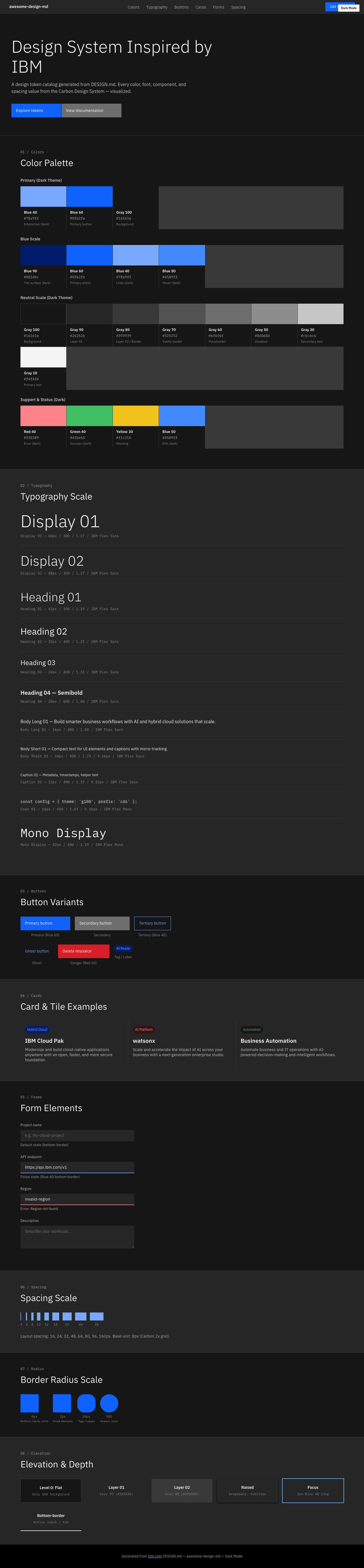
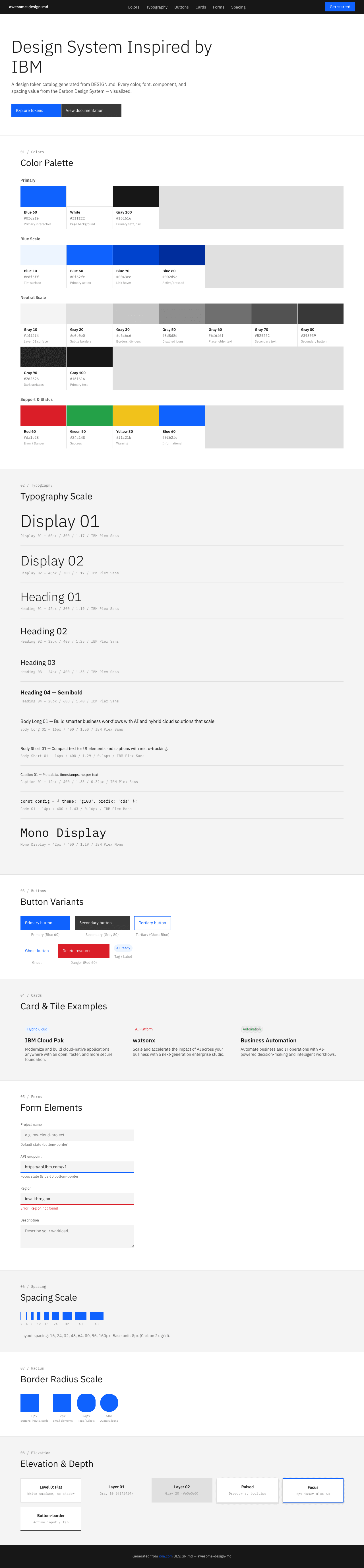
A sample landing page built with DESIGN.md. It shows the actual colors, typography, buttons, cards, spacing, and elevation, all in one page.
|
|
19
|
+
|
|
20
|
+
### Dark Mode
|
|
21
|
+
|
|
22
|
+
|
|
23
|
+
### Light Mode
|
|
24
|
+
|