awesome-design-md 1.0.0
This diff represents the content of publicly available package versions that have been released to one of the supported registries. The information contained in this diff is provided for informational purposes only and reflects changes between package versions as they appear in their respective public registries.
- package/LICENSE +21 -0
- package/README.md +172 -0
- package/bin/cli.mjs +126 -0
- package/design-md/airbnb/DESIGN.md +246 -0
- package/design-md/airbnb/README.md +23 -0
- package/design-md/airbnb/preview-dark.html +234 -0
- package/design-md/airbnb/preview.html +233 -0
- package/design-md/airtable/DESIGN.md +89 -0
- package/design-md/airtable/README.md +23 -0
- package/design-md/airtable/preview-dark.html +165 -0
- package/design-md/airtable/preview.html +164 -0
- package/design-md/apple/DESIGN.md +313 -0
- package/design-md/apple/README.md +24 -0
- package/design-md/apple/preview-dark.html +422 -0
- package/design-md/apple/preview.html +416 -0
- package/design-md/bmw/DESIGN.md +180 -0
- package/design-md/bmw/README.md +23 -0
- package/design-md/bmw/preview-dark.html +211 -0
- package/design-md/bmw/preview.html +210 -0
- package/design-md/cal/DESIGN.md +259 -0
- package/design-md/cal/README.md +23 -0
- package/design-md/cal/preview-dark.html +449 -0
- package/design-md/cal/preview.html +575 -0
- package/design-md/claude/DESIGN.md +312 -0
- package/design-md/claude/README.md +24 -0
- package/design-md/claude/preview-dark.html +803 -0
- package/design-md/claude/preview.html +826 -0
- package/design-md/clay/DESIGN.md +304 -0
- package/design-md/clay/README.md +23 -0
- package/design-md/clay/preview-dark.html +318 -0
- package/design-md/clay/preview.html +317 -0
- package/design-md/clickhouse/DESIGN.md +281 -0
- package/design-md/clickhouse/README.md +24 -0
- package/design-md/clickhouse/preview-dark.html +834 -0
- package/design-md/clickhouse/preview.html +786 -0
- package/design-md/cohere/DESIGN.md +266 -0
- package/design-md/cohere/README.md +24 -0
- package/design-md/cohere/preview-dark.html +810 -0
- package/design-md/cohere/preview.html +814 -0
- package/design-md/coinbase/DESIGN.md +129 -0
- package/design-md/coinbase/README.md +23 -0
- package/design-md/coinbase/preview-dark.html +164 -0
- package/design-md/coinbase/preview.html +163 -0
- package/design-md/composio/DESIGN.md +307 -0
- package/design-md/composio/README.md +24 -0
- package/design-md/composio/preview-dark.html +958 -0
- package/design-md/composio/preview.html +933 -0
- package/design-md/cursor/DESIGN.md +309 -0
- package/design-md/cursor/README.md +24 -0
- package/design-md/cursor/preview-dark.html +395 -0
- package/design-md/cursor/preview.html +385 -0
- package/design-md/elevenlabs/DESIGN.md +265 -0
- package/design-md/elevenlabs/README.md +23 -0
- package/design-md/elevenlabs/preview-dark.html +254 -0
- package/design-md/elevenlabs/preview.html +253 -0
- package/design-md/expo/DESIGN.md +281 -0
- package/design-md/expo/README.md +24 -0
- package/design-md/expo/preview-dark.html +536 -0
- package/design-md/expo/preview.html +536 -0
- package/design-md/figma/DESIGN.md +220 -0
- package/design-md/figma/README.md +24 -0
- package/design-md/figma/preview-dark.html +831 -0
- package/design-md/figma/preview.html +841 -0
- package/design-md/framer/DESIGN.md +246 -0
- package/design-md/framer/README.md +23 -0
- package/design-md/framer/preview-dark.html +904 -0
- package/design-md/framer/preview.html +885 -0
- package/design-md/hashicorp/DESIGN.md +278 -0
- package/design-md/hashicorp/README.md +24 -0
- package/design-md/hashicorp/preview-dark.html +1206 -0
- package/design-md/hashicorp/preview.html +1195 -0
- package/design-md/ibm/DESIGN.md +332 -0
- package/design-md/ibm/README.md +24 -0
- package/design-md/ibm/preview-dark.html +445 -0
- package/design-md/ibm/preview.html +430 -0
- package/design-md/intercom/DESIGN.md +146 -0
- package/design-md/intercom/README.md +23 -0
- package/design-md/intercom/preview-dark.html +185 -0
- package/design-md/intercom/preview.html +184 -0
- package/design-md/kraken/DESIGN.md +125 -0
- package/design-md/kraken/README.md +23 -0
- package/design-md/kraken/preview-dark.html +169 -0
- package/design-md/kraken/preview.html +168 -0
- package/design-md/linear.app/DESIGN.md +367 -0
- package/design-md/linear.app/README.md +24 -0
- package/design-md/linear.app/preview-dark.html +385 -0
- package/design-md/linear.app/preview.html +375 -0
- package/design-md/lovable/DESIGN.md +298 -0
- package/design-md/lovable/README.md +24 -0
- package/design-md/lovable/preview-dark.html +351 -0
- package/design-md/lovable/preview.html +350 -0
- package/design-md/minimax/DESIGN.md +257 -0
- package/design-md/minimax/README.md +24 -0
- package/design-md/minimax/preview-dark.html +1267 -0
- package/design-md/minimax/preview.html +1253 -0
- package/design-md/mintlify/DESIGN.md +326 -0
- package/design-md/mintlify/README.md +24 -0
- package/design-md/mintlify/preview-dark.html +411 -0
- package/design-md/mintlify/preview.html +400 -0
- package/design-md/miro/DESIGN.md +108 -0
- package/design-md/miro/README.md +23 -0
- package/design-md/miro/preview-dark.html +174 -0
- package/design-md/miro/preview.html +173 -0
- package/design-md/mistral.ai/DESIGN.md +261 -0
- package/design-md/mistral.ai/README.md +24 -0
- package/design-md/mistral.ai/preview-dark.html +813 -0
- package/design-md/mistral.ai/preview.html +812 -0
- package/design-md/mongodb/DESIGN.md +266 -0
- package/design-md/mongodb/README.md +23 -0
- package/design-md/mongodb/preview-dark.html +262 -0
- package/design-md/mongodb/preview.html +261 -0
- package/design-md/notion/DESIGN.md +309 -0
- package/design-md/notion/README.md +24 -0
- package/design-md/notion/preview-dark.html +374 -0
- package/design-md/notion/preview.html +366 -0
- package/design-md/nvidia/DESIGN.md +293 -0
- package/design-md/nvidia/README.md +24 -0
- package/design-md/nvidia/preview-dark.html +376 -0
- package/design-md/nvidia/preview.html +368 -0
- package/design-md/ollama/DESIGN.md +267 -0
- package/design-md/ollama/README.md +24 -0
- package/design-md/ollama/preview-dark.html +678 -0
- package/design-md/ollama/preview.html +678 -0
- package/design-md/opencode.ai/DESIGN.md +281 -0
- package/design-md/opencode.ai/README.md +24 -0
- package/design-md/opencode.ai/preview-dark.html +368 -0
- package/design-md/opencode.ai/preview.html +359 -0
- package/design-md/pinterest/DESIGN.md +230 -0
- package/design-md/pinterest/README.md +23 -0
- package/design-md/pinterest/preview-dark.html +233 -0
- package/design-md/pinterest/preview.html +232 -0
- package/design-md/posthog/DESIGN.md +256 -0
- package/design-md/posthog/README.md +23 -0
- package/design-md/posthog/preview-dark.html +701 -0
- package/design-md/posthog/preview.html +751 -0
- package/design-md/raycast/DESIGN.md +268 -0
- package/design-md/raycast/README.md +23 -0
- package/design-md/raycast/preview-dark.html +608 -0
- package/design-md/raycast/preview.html +690 -0
- package/design-md/replicate/DESIGN.md +261 -0
- package/design-md/replicate/README.md +24 -0
- package/design-md/replicate/preview-dark.html +828 -0
- package/design-md/replicate/preview.html +831 -0
- package/design-md/resend/DESIGN.md +303 -0
- package/design-md/resend/README.md +23 -0
- package/design-md/resend/preview-dark.html +357 -0
- package/design-md/resend/preview.html +356 -0
- package/design-md/revolut/DESIGN.md +185 -0
- package/design-md/revolut/README.md +23 -0
- package/design-md/revolut/preview-dark.html +234 -0
- package/design-md/revolut/preview.html +233 -0
- package/design-md/runwayml/DESIGN.md +244 -0
- package/design-md/runwayml/README.md +24 -0
- package/design-md/runwayml/preview-dark.html +664 -0
- package/design-md/runwayml/preview.html +665 -0
- package/design-md/sanity/DESIGN.md +357 -0
- package/design-md/sanity/README.md +24 -0
- package/design-md/sanity/preview-dark.html +995 -0
- package/design-md/sanity/preview.html +1140 -0
- package/design-md/sentry/DESIGN.md +262 -0
- package/design-md/sentry/README.md +24 -0
- package/design-md/sentry/preview-dark.html +628 -0
- package/design-md/sentry/preview.html +953 -0
- package/design-md/spacex/DESIGN.md +194 -0
- package/design-md/spacex/README.md +23 -0
- package/design-md/spacex/preview-dark.html +223 -0
- package/design-md/spacex/preview.html +222 -0
- package/design-md/spotify/DESIGN.md +246 -0
- package/design-md/spotify/README.md +23 -0
- package/design-md/spotify/preview-dark.html +231 -0
- package/design-md/spotify/preview.html +230 -0
- package/design-md/stripe/DESIGN.md +322 -0
- package/design-md/stripe/README.md +24 -0
- package/design-md/stripe/preview-dark.html +430 -0
- package/design-md/stripe/preview.html +421 -0
- package/design-md/supabase/DESIGN.md +255 -0
- package/design-md/supabase/README.md +24 -0
- package/design-md/supabase/preview-dark.html +977 -0
- package/design-md/supabase/preview.html +955 -0
- package/design-md/superhuman/DESIGN.md +252 -0
- package/design-md/superhuman/README.md +23 -0
- package/design-md/superhuman/preview-dark.html +975 -0
- package/design-md/superhuman/preview.html +953 -0
- package/design-md/together.ai/DESIGN.md +263 -0
- package/design-md/together.ai/README.md +24 -0
- package/design-md/together.ai/preview-dark.html +892 -0
- package/design-md/together.ai/preview.html +897 -0
- package/design-md/uber/DESIGN.md +295 -0
- package/design-md/uber/README.md +24 -0
- package/design-md/uber/preview-dark.html +1164 -0
- package/design-md/uber/preview.html +1163 -0
- package/design-md/vercel/DESIGN.md +310 -0
- package/design-md/vercel/README.md +24 -0
- package/design-md/vercel/preview-dark.html +370 -0
- package/design-md/vercel/preview.html +369 -0
- package/design-md/voltagent/DESIGN.md +323 -0
- package/design-md/voltagent/README.md +24 -0
- package/design-md/voltagent/preview-dark.html +487 -0
- package/design-md/voltagent/preview.html +766 -0
- package/design-md/warp/DESIGN.md +253 -0
- package/design-md/warp/README.md +23 -0
- package/design-md/warp/preview-dark.html +502 -0
- package/design-md/warp/preview.html +535 -0
- package/design-md/webflow/DESIGN.md +92 -0
- package/design-md/webflow/README.md +23 -0
- package/design-md/webflow/preview-dark.html +147 -0
- package/design-md/webflow/preview.html +146 -0
- package/design-md/wise/DESIGN.md +173 -0
- package/design-md/wise/README.md +23 -0
- package/design-md/wise/preview-dark.html +230 -0
- package/design-md/wise/preview.html +229 -0
- package/design-md/x.ai/DESIGN.md +257 -0
- package/design-md/x.ai/README.md +24 -0
- package/design-md/x.ai/preview-dark.html +358 -0
- package/design-md/x.ai/preview.html +409 -0
- package/design-md/zapier/DESIGN.md +328 -0
- package/design-md/zapier/README.md +24 -0
- package/design-md/zapier/preview-dark.html +382 -0
- package/design-md/zapier/preview.html +374 -0
- package/package.json +33 -0
|
@@ -0,0 +1,350 @@
|
|
|
1
|
+
<!DOCTYPE html>
|
|
2
|
+
<html lang="en">
|
|
3
|
+
<head>
|
|
4
|
+
<meta charset="UTF-8">
|
|
5
|
+
<meta name="viewport" content="width=device-width, initial-scale=1.0">
|
|
6
|
+
<title>Design System Preview: Lovable (Light)</title>
|
|
7
|
+
<link rel="preconnect" href="https://fonts.googleapis.com">
|
|
8
|
+
<link rel="preconnect" href="https://fonts.gstatic.com" crossorigin>
|
|
9
|
+
<link href="https://fonts.googleapis.com/css2?family=DM+Sans:wght@400;480;500;600&display=swap" rel="stylesheet">
|
|
10
|
+
<style>
|
|
11
|
+
:root {
|
|
12
|
+
--cream: #f7f4ed;
|
|
13
|
+
--charcoal: #1c1c1c;
|
|
14
|
+
--off-white: #fcfbf8;
|
|
15
|
+
--border-light: #eceae4;
|
|
16
|
+
--muted: #5f5f5d;
|
|
17
|
+
--charcoal-40: rgba(28,28,28,0.4);
|
|
18
|
+
--charcoal-83: rgba(28,28,28,0.83);
|
|
19
|
+
--charcoal-04: rgba(28,28,28,0.04);
|
|
20
|
+
--charcoal-03: rgba(28,28,28,0.03);
|
|
21
|
+
--ring-blue: rgba(59,130,246,0.5);
|
|
22
|
+
--focus-shadow: rgba(0,0,0,0.1) 0px 4px 12px;
|
|
23
|
+
--shadow-inset: rgba(255,255,255,0.2) 0px 0.5px 0px 0px inset, rgba(0,0,0,0.2) 0px 0px 0px 0.5px inset, rgba(0,0,0,0.05) 0px 1px 2px 0px;
|
|
24
|
+
--font-primary: 'DM Sans', ui-sans-serif, system-ui, -apple-system, sans-serif;
|
|
25
|
+
}
|
|
26
|
+
* { margin: 0; padding: 0; box-sizing: border-box; }
|
|
27
|
+
body {
|
|
28
|
+
background: var(--cream);
|
|
29
|
+
color: var(--charcoal);
|
|
30
|
+
font-family: var(--font-primary);
|
|
31
|
+
font-size: 16px; font-weight: 400; line-height: 1.50;
|
|
32
|
+
-webkit-font-smoothing: antialiased;
|
|
33
|
+
}
|
|
34
|
+
|
|
35
|
+
/* NAV */
|
|
36
|
+
.nav {
|
|
37
|
+
position: sticky; top: 0; z-index: 100;
|
|
38
|
+
display: flex; align-items: center; justify-content: space-between;
|
|
39
|
+
padding: 12px 32px;
|
|
40
|
+
background: rgba(247,244,237,0.88);
|
|
41
|
+
backdrop-filter: blur(12px);
|
|
42
|
+
border-bottom: 1px solid var(--border-light);
|
|
43
|
+
}
|
|
44
|
+
.nav-brand { font-size: 14px; font-weight: 600; color: var(--charcoal); text-decoration: none; letter-spacing: -0.28px; }
|
|
45
|
+
.nav-links { display: flex; gap: 24px; list-style: none; }
|
|
46
|
+
.nav-links a { font-size: 14px; font-weight: 400; color: var(--muted); text-decoration: none; transition: color 0.15s; }
|
|
47
|
+
.nav-links a:hover { color: var(--charcoal); }
|
|
48
|
+
.nav-cta {
|
|
49
|
+
display: inline-block; background: var(--charcoal); color: var(--off-white);
|
|
50
|
+
padding: 8px 16px; border-radius: 6px; font-size: 14px; font-weight: 500;
|
|
51
|
+
text-decoration: none; transition: opacity 0.15s;
|
|
52
|
+
box-shadow: var(--shadow-inset);
|
|
53
|
+
}
|
|
54
|
+
.nav-cta:hover { opacity: 0.85; }
|
|
55
|
+
|
|
56
|
+
/* HERO */
|
|
57
|
+
.hero { padding: 96px 32px 80px; text-align: center; }
|
|
58
|
+
.hero h1 {
|
|
59
|
+
font-size: 60px; font-weight: 600; line-height: 1.10;
|
|
60
|
+
letter-spacing: -1.5px; color: var(--charcoal); margin-bottom: 16px;
|
|
61
|
+
}
|
|
62
|
+
.hero p { font-size: 18px; font-weight: 400; line-height: 1.38; color: var(--muted); max-width: 560px; margin: 0 auto 32px; }
|
|
63
|
+
.hero-buttons { display: flex; gap: 12px; justify-content: center; flex-wrap: wrap; }
|
|
64
|
+
.btn-dark {
|
|
65
|
+
display: inline-block; background: var(--charcoal); color: var(--off-white);
|
|
66
|
+
padding: 10px 20px; border-radius: 6px; border: none;
|
|
67
|
+
font-family: var(--font-primary); font-size: 14px; font-weight: 500;
|
|
68
|
+
text-decoration: none; cursor: pointer; transition: opacity 0.15s;
|
|
69
|
+
box-shadow: var(--shadow-inset);
|
|
70
|
+
}
|
|
71
|
+
.btn-dark:hover { opacity: 0.85; }
|
|
72
|
+
.btn-ghost {
|
|
73
|
+
display: inline-block; background: transparent; color: var(--charcoal);
|
|
74
|
+
padding: 10px 20px; border-radius: 6px;
|
|
75
|
+
border: 1px solid var(--charcoal-40);
|
|
76
|
+
font-family: var(--font-primary); font-size: 14px; font-weight: 500;
|
|
77
|
+
text-decoration: none; cursor: pointer; transition: opacity 0.15s;
|
|
78
|
+
}
|
|
79
|
+
.btn-ghost:hover { opacity: 0.8; }
|
|
80
|
+
|
|
81
|
+
/* SECTIONS */
|
|
82
|
+
.section { padding: 64px 32px; max-width: 1200px; margin: 0 auto; }
|
|
83
|
+
.section-label { font-size: 12px; font-weight: 500; color: var(--muted); text-transform: uppercase; margin-bottom: 8px; letter-spacing: 0.5px; }
|
|
84
|
+
.section-title { font-size: 36px; font-weight: 600; line-height: 1.10; letter-spacing: -0.9px; margin-bottom: 32px; }
|
|
85
|
+
.section-divider { border: none; border-top: 1px solid var(--border-light); margin: 0; }
|
|
86
|
+
|
|
87
|
+
/* COLORS */
|
|
88
|
+
.color-grid { display: grid; grid-template-columns: repeat(auto-fill, minmax(155px, 1fr)); gap: 12px; margin-bottom: 24px; }
|
|
89
|
+
.color-swatch { border-radius: 12px; overflow: hidden; border: 1px solid var(--border-light); }
|
|
90
|
+
.color-swatch-block { height: 72px; width: 100%; }
|
|
91
|
+
.color-swatch-info { padding: 10px 12px; }
|
|
92
|
+
.color-swatch-name { font-size: 13px; font-weight: 600; margin-bottom: 2px; }
|
|
93
|
+
.color-swatch-hex { font-size: 12px; color: var(--muted); font-family: ui-monospace, SFMono-Regular, monospace; }
|
|
94
|
+
.color-swatch-role { font-size: 11px; color: var(--muted); margin-top: 3px; }
|
|
95
|
+
.color-group-label { font-size: 14px; font-weight: 600; color: var(--muted); margin: 24px 0 10px; }
|
|
96
|
+
|
|
97
|
+
/* TYPOGRAPHY */
|
|
98
|
+
.type-sample { margin-bottom: 28px; padding-bottom: 24px; border-bottom: 1px solid var(--border-light); }
|
|
99
|
+
.type-sample:last-child { border-bottom: none; }
|
|
100
|
+
.type-meta { font-size: 12px; font-weight: 500; color: var(--muted); margin-top: 8px; font-family: ui-monospace, SFMono-Regular, monospace; }
|
|
101
|
+
|
|
102
|
+
/* BUTTONS */
|
|
103
|
+
.button-row { display: flex; gap: 16px; flex-wrap: wrap; align-items: center; }
|
|
104
|
+
.button-item { text-align: center; }
|
|
105
|
+
.button-label { font-size: 12px; font-weight: 500; color: var(--muted); margin-top: 8px; }
|
|
106
|
+
.btn-cream {
|
|
107
|
+
display: inline-block; background: var(--cream); color: var(--charcoal);
|
|
108
|
+
padding: 8px 16px; border-radius: 6px; font-size: 14px; font-weight: 400;
|
|
109
|
+
text-decoration: none; border: none; cursor: pointer;
|
|
110
|
+
}
|
|
111
|
+
.btn-pill {
|
|
112
|
+
display: inline-flex; align-items: center; justify-content: center;
|
|
113
|
+
background: var(--cream); color: var(--charcoal);
|
|
114
|
+
width: 36px; height: 36px; border-radius: 9999px;
|
|
115
|
+
font-size: 14px; font-weight: 400; text-decoration: none;
|
|
116
|
+
box-shadow: var(--shadow-inset); opacity: 0.5; cursor: pointer; border: none;
|
|
117
|
+
}
|
|
118
|
+
|
|
119
|
+
/* CARDS */
|
|
120
|
+
.card-grid { display: grid; grid-template-columns: repeat(auto-fit, minmax(320px, 1fr)); gap: 20px; }
|
|
121
|
+
.card { background: var(--cream); border-radius: 12px; padding: 24px; border: 1px solid var(--border-light); transition: border-color 0.2s; }
|
|
122
|
+
.card:hover { border-color: var(--charcoal-40); }
|
|
123
|
+
.card h3 { font-size: 20px; font-weight: 600; letter-spacing: -0.5px; margin-bottom: 8px; }
|
|
124
|
+
.card p { font-size: 14px; color: var(--muted); line-height: 1.50; }
|
|
125
|
+
.card-badge { display: inline-block; font-size: 12px; font-weight: 500; padding: 2px 8px; border-radius: 9999px; margin-bottom: 12px; }
|
|
126
|
+
|
|
127
|
+
/* FORMS */
|
|
128
|
+
.form-group { margin-bottom: 20px; max-width: 400px; }
|
|
129
|
+
.form-label { display: block; font-size: 14px; font-weight: 500; color: var(--charcoal); margin-bottom: 6px; }
|
|
130
|
+
.form-input {
|
|
131
|
+
width: 100%; background: var(--cream); color: var(--charcoal);
|
|
132
|
+
border: 1px solid var(--border-light); padding: 10px 12px; border-radius: 6px;
|
|
133
|
+
font-family: var(--font-primary); font-size: 14px; outline: none;
|
|
134
|
+
transition: border-color 0.15s, box-shadow 0.15s;
|
|
135
|
+
}
|
|
136
|
+
.form-input:focus { border-color: transparent; box-shadow: 0 0 0 2px var(--ring-blue); }
|
|
137
|
+
.form-input--focus { border-color: transparent; box-shadow: 0 0 0 2px var(--ring-blue); }
|
|
138
|
+
.form-input--error { border-color: transparent; box-shadow: 0 0 0 2px #ef4444; }
|
|
139
|
+
.form-textarea {
|
|
140
|
+
width: 100%; min-height: 80px; background: var(--cream); color: var(--charcoal);
|
|
141
|
+
border: 1px solid var(--border-light); padding: 10px 12px; border-radius: 6px;
|
|
142
|
+
font-family: var(--font-primary); font-size: 14px; resize: vertical; outline: none;
|
|
143
|
+
}
|
|
144
|
+
.form-state-label { font-size: 11px; color: var(--muted); margin-top: 4px; }
|
|
145
|
+
|
|
146
|
+
/* SPACING */
|
|
147
|
+
.spacing-row { display: flex; align-items: flex-end; gap: 10px; flex-wrap: wrap; margin-bottom: 24px; }
|
|
148
|
+
.spacing-item { text-align: center; }
|
|
149
|
+
.spacing-block { background: var(--charcoal); border-radius: 3px; margin-bottom: 6px; height: 28px; }
|
|
150
|
+
.spacing-value { font-family: ui-monospace, SFMono-Regular, monospace; font-size: 11px; font-weight: 500; color: var(--muted); }
|
|
151
|
+
|
|
152
|
+
/* RADIUS */
|
|
153
|
+
.radius-row { display: flex; gap: 14px; flex-wrap: wrap; align-items: center; }
|
|
154
|
+
.radius-item { text-align: center; }
|
|
155
|
+
.radius-box { width: 64px; height: 64px; background: var(--charcoal); margin-bottom: 6px; }
|
|
156
|
+
.radius-label { font-family: ui-monospace, SFMono-Regular, monospace; font-size: 11px; font-weight: 500; color: var(--muted); }
|
|
157
|
+
.radius-context { font-size: 10px; color: var(--muted); }
|
|
158
|
+
|
|
159
|
+
/* ELEVATION */
|
|
160
|
+
.elevation-grid { display: grid; grid-template-columns: repeat(auto-fit, minmax(200px, 1fr)); gap: 20px; }
|
|
161
|
+
.elevation-card { background: var(--cream); border-radius: 12px; padding: 20px; text-align: center; }
|
|
162
|
+
.elevation-label { font-size: 14px; font-weight: 600; margin-bottom: 4px; }
|
|
163
|
+
.elevation-desc { font-family: ui-monospace, SFMono-Regular, monospace; font-size: 11px; color: var(--muted); }
|
|
164
|
+
|
|
165
|
+
/* FOOTER */
|
|
166
|
+
.footer { padding: 32px; text-align: center; border-top: 1px solid var(--border-light); font-size: 13px; color: var(--muted); }
|
|
167
|
+
.footer a { color: var(--charcoal); text-decoration: underline; }
|
|
168
|
+
|
|
169
|
+
@media (max-width: 768px) {
|
|
170
|
+
.hero h1 { font-size: 36px; letter-spacing: -0.9px; }
|
|
171
|
+
.nav-links { display: none; }
|
|
172
|
+
.section { padding: 48px 20px; }
|
|
173
|
+
.card-grid { grid-template-columns: 1fr; }
|
|
174
|
+
}
|
|
175
|
+
</style>
|
|
176
|
+
</head>
|
|
177
|
+
<body>
|
|
178
|
+
|
|
179
|
+
<nav class="nav">
|
|
180
|
+
<a class="nav-brand" href="#">awesome-design-md</a>
|
|
181
|
+
<ul class="nav-links">
|
|
182
|
+
<li><a href="#colors">Colors</a></li>
|
|
183
|
+
<li><a href="#typography">Typography</a></li>
|
|
184
|
+
<li><a href="#buttons">Buttons</a></li>
|
|
185
|
+
<li><a href="#cards">Cards</a></li>
|
|
186
|
+
<li><a href="#forms">Forms</a></li>
|
|
187
|
+
<li><a href="#spacing">Spacing</a></li>
|
|
188
|
+
</ul>
|
|
189
|
+
<a class="nav-cta" href="#">Start Building</a>
|
|
190
|
+
</nav>
|
|
191
|
+
|
|
192
|
+
<section class="hero">
|
|
193
|
+
<h1>Design System<br>Inspired by Lovable</h1>
|
|
194
|
+
<p>A design token catalog generated from DESIGN.md. Every color, font, component, and spacing value — visualized.</p>
|
|
195
|
+
<div class="hero-buttons">
|
|
196
|
+
<a class="btn-dark" href="#">Start Building</a>
|
|
197
|
+
<a class="btn-ghost" href="#">View Documentation</a>
|
|
198
|
+
</div>
|
|
199
|
+
</section>
|
|
200
|
+
|
|
201
|
+
<hr class="section-divider">
|
|
202
|
+
|
|
203
|
+
<section class="section" id="colors">
|
|
204
|
+
<div class="section-label">01 / Colors</div>
|
|
205
|
+
<h2 class="section-title">Color Palette</h2>
|
|
206
|
+
|
|
207
|
+
<div class="color-group-label">Primary</div>
|
|
208
|
+
<div class="color-grid">
|
|
209
|
+
<div class="color-swatch"><div class="color-swatch-block" style="background:#f7f4ed; border-bottom:1px solid #eceae4"></div><div class="color-swatch-info"><div class="color-swatch-name">Cream</div><div class="color-swatch-hex">#f7f4ed</div><div class="color-swatch-role">Page background</div></div></div>
|
|
210
|
+
<div class="color-swatch"><div class="color-swatch-block" style="background:#1c1c1c"></div><div class="color-swatch-info"><div class="color-swatch-name">Charcoal</div><div class="color-swatch-hex">#1c1c1c</div><div class="color-swatch-role">Primary text, headings</div></div></div>
|
|
211
|
+
<div class="color-swatch"><div class="color-swatch-block" style="background:#fcfbf8; border-bottom:1px solid #eceae4"></div><div class="color-swatch-info"><div class="color-swatch-name">Off-White</div><div class="color-swatch-hex">#fcfbf8</div><div class="color-swatch-role">Button text on dark</div></div></div>
|
|
212
|
+
</div>
|
|
213
|
+
|
|
214
|
+
<div class="color-group-label">Neutral Scale (Opacity-Based)</div>
|
|
215
|
+
<div class="color-grid">
|
|
216
|
+
<div class="color-swatch"><div class="color-swatch-block" style="background:rgba(28,28,28,0.83)"></div><div class="color-swatch-info"><div class="color-swatch-name">Charcoal 83%</div><div class="color-swatch-hex">rgba(28,28,28,0.83)</div><div class="color-swatch-role">Strong secondary</div></div></div>
|
|
217
|
+
<div class="color-swatch"><div class="color-swatch-block" style="background:#5f5f5d"></div><div class="color-swatch-info"><div class="color-swatch-name">Muted Gray</div><div class="color-swatch-hex">#5f5f5d</div><div class="color-swatch-role">Body text, captions</div></div></div>
|
|
218
|
+
<div class="color-swatch"><div class="color-swatch-block" style="background:rgba(28,28,28,0.4)"></div><div class="color-swatch-info"><div class="color-swatch-name">Charcoal 40%</div><div class="color-swatch-hex">rgba(28,28,28,0.4)</div><div class="color-swatch-role">Interactive borders</div></div></div>
|
|
219
|
+
<div class="color-swatch"><div class="color-swatch-block" style="background:rgba(28,28,28,0.04); border-bottom:1px solid #eceae4"></div><div class="color-swatch-info"><div class="color-swatch-name">Charcoal 4%</div><div class="color-swatch-hex">rgba(28,28,28,0.04)</div><div class="color-swatch-role">Hover tint</div></div></div>
|
|
220
|
+
<div class="color-swatch"><div class="color-swatch-block" style="background:rgba(28,28,28,0.03); border-bottom:1px solid #eceae4"></div><div class="color-swatch-info"><div class="color-swatch-name">Charcoal 3%</div><div class="color-swatch-hex">rgba(28,28,28,0.03)</div><div class="color-swatch-role">Subtle overlay</div></div></div>
|
|
221
|
+
</div>
|
|
222
|
+
|
|
223
|
+
<div class="color-group-label">Surface & Border</div>
|
|
224
|
+
<div class="color-grid">
|
|
225
|
+
<div class="color-swatch"><div class="color-swatch-block" style="background:#eceae4"></div><div class="color-swatch-info"><div class="color-swatch-name">Light Cream</div><div class="color-swatch-hex">#eceae4</div><div class="color-swatch-role">Borders, dividers</div></div></div>
|
|
226
|
+
</div>
|
|
227
|
+
|
|
228
|
+
<div class="color-group-label">Interactive</div>
|
|
229
|
+
<div class="color-grid">
|
|
230
|
+
<div class="color-swatch"><div class="color-swatch-block" style="background:rgba(59,130,246,0.5)"></div><div class="color-swatch-info"><div class="color-swatch-name">Ring Blue</div><div class="color-swatch-hex">rgba(59,130,246,0.5)</div><div class="color-swatch-role">Focus ring</div></div></div>
|
|
231
|
+
</div>
|
|
232
|
+
</section>
|
|
233
|
+
|
|
234
|
+
<hr class="section-divider">
|
|
235
|
+
|
|
236
|
+
<section class="section" id="typography">
|
|
237
|
+
<div class="section-label">02 / Typography</div>
|
|
238
|
+
<h2 class="section-title">Typography Scale</h2>
|
|
239
|
+
|
|
240
|
+
<div class="type-sample"><div style="font-size:60px; font-weight:600; line-height:1.10; letter-spacing:-1.5px;">Display Hero</div><div class="type-meta">Display Hero — 60px / 600 / 1.10 / -1.5px / Camera Plain Variable</div></div>
|
|
241
|
+
<div class="type-sample"><div style="font-size:48px; font-weight:600; line-height:1.00; letter-spacing:-1.2px;">Section Heading</div><div class="type-meta">Section Heading — 48px / 600 / 1.00 / -1.2px / Camera Plain Variable</div></div>
|
|
242
|
+
<div class="type-sample"><div style="font-size:36px; font-weight:600; line-height:1.10; letter-spacing:-0.9px;">Sub-heading</div><div class="type-meta">Sub-heading — 36px / 600 / 1.10 / -0.9px / Camera Plain Variable</div></div>
|
|
243
|
+
<div class="type-sample"><div style="font-size:20px; font-weight:400; line-height:1.25;">Card Title</div><div class="type-meta">Card Title — 20px / 400 / 1.25 / Camera Plain Variable</div></div>
|
|
244
|
+
<div class="type-sample"><div style="font-size:18px; font-weight:400; line-height:1.38;">Body Large — Build something lovable. Create web applications with AI-powered development tools.</div><div class="type-meta">Body Large — 18px / 400 / 1.38 / Camera Plain Variable</div></div>
|
|
245
|
+
<div class="type-sample"><div style="font-size:16px; font-weight:400; line-height:1.50;">Body — Standard reading text for descriptions, paragraphs, and UI content.</div><div class="type-meta">Body — 16px / 400 / 1.50 / Camera Plain Variable</div></div>
|
|
246
|
+
<div class="type-sample"><div style="font-size:14px; font-weight:400; line-height:1.50;">Button / Link — Interactive text</div><div class="type-meta">Button / Link — 14px / 400 / 1.50 / Camera Plain Variable</div></div>
|
|
247
|
+
<div class="type-sample"><div style="font-size:14px; font-weight:400; line-height:1.50; color:var(--muted);">Caption — Metadata and small labels</div><div class="type-meta">Caption — 14px / 400 / 1.50 / Camera Plain Variable</div></div>
|
|
248
|
+
</section>
|
|
249
|
+
|
|
250
|
+
<hr class="section-divider">
|
|
251
|
+
|
|
252
|
+
<section class="section" id="buttons">
|
|
253
|
+
<div class="section-label">03 / Buttons</div>
|
|
254
|
+
<h2 class="section-title">Button Variants</h2>
|
|
255
|
+
<div class="button-row">
|
|
256
|
+
<div class="button-item"><a class="btn-dark" href="#">Start Building</a><div class="button-label">Primary Dark</div></div>
|
|
257
|
+
<div class="button-item"><a class="btn-ghost" href="#">Documentation</a><div class="button-label">Ghost / Outline</div></div>
|
|
258
|
+
<div class="button-item"><a class="btn-cream" href="#">Settings</a><div class="button-label">Cream Surface</div></div>
|
|
259
|
+
<div class="button-item"><button class="btn-pill">+</button><div class="button-label">Pill Icon</div></div>
|
|
260
|
+
</div>
|
|
261
|
+
</section>
|
|
262
|
+
|
|
263
|
+
<hr class="section-divider">
|
|
264
|
+
|
|
265
|
+
<section class="section" id="cards">
|
|
266
|
+
<div class="section-label">04 / Cards</div>
|
|
267
|
+
<h2 class="section-title">Card Examples</h2>
|
|
268
|
+
<div class="card-grid">
|
|
269
|
+
<div class="card">
|
|
270
|
+
<div class="card-badge" style="background:var(--charcoal-04); color:var(--charcoal);">Template</div>
|
|
271
|
+
<h3>Portfolio Website</h3>
|
|
272
|
+
<p>A minimal portfolio template with project showcase, about section, and contact form. Built with modern design principles.</p>
|
|
273
|
+
</div>
|
|
274
|
+
<div class="card" style="border-color: var(--charcoal-40);">
|
|
275
|
+
<div class="card-badge" style="background:var(--charcoal-04); color:var(--charcoal);">Featured</div>
|
|
276
|
+
<h3>AI Chat Application</h3>
|
|
277
|
+
<p>Full-stack AI chat interface with streaming responses, conversation history, and customizable prompts. Hover-state border shown.</p>
|
|
278
|
+
</div>
|
|
279
|
+
<div class="card">
|
|
280
|
+
<div class="card-badge" style="background:var(--charcoal-04); color:var(--charcoal);">Starter</div>
|
|
281
|
+
<h3>SaaS Dashboard</h3>
|
|
282
|
+
<p>Analytics dashboard with charts, data tables, and user management. Integrates with common APIs and databases.</p>
|
|
283
|
+
</div>
|
|
284
|
+
</div>
|
|
285
|
+
</section>
|
|
286
|
+
|
|
287
|
+
<hr class="section-divider">
|
|
288
|
+
|
|
289
|
+
<section class="section" id="forms">
|
|
290
|
+
<div class="section-label">05 / Forms</div>
|
|
291
|
+
<h2 class="section-title">Form Elements</h2>
|
|
292
|
+
<div class="form-group"><label class="form-label">Project Name</label><input class="form-input" type="text" placeholder="my-lovable-app"><div class="form-state-label">Default (border)</div></div>
|
|
293
|
+
<div class="form-group"><label class="form-label">Repository</label><input class="form-input form-input--focus" type="text" value="lovable/my-project"><div class="form-state-label">Focus (blue ring)</div></div>
|
|
294
|
+
<div class="form-group"><label class="form-label">Domain</label><input class="form-input form-input--error" type="text" value="invalid domain"><div class="form-state-label">Error (red ring)</div></div>
|
|
295
|
+
<div class="form-group"><label class="form-label">Description</label><textarea class="form-textarea" placeholder="Describe your project..."></textarea></div>
|
|
296
|
+
</section>
|
|
297
|
+
|
|
298
|
+
<hr class="section-divider">
|
|
299
|
+
|
|
300
|
+
<section class="section" id="spacing">
|
|
301
|
+
<div class="section-label">06 / Spacing</div>
|
|
302
|
+
<h2 class="section-title">Spacing Scale</h2>
|
|
303
|
+
<div class="spacing-row">
|
|
304
|
+
<div class="spacing-item"><div class="spacing-block" style="width:8px"></div><div class="spacing-value">8</div></div>
|
|
305
|
+
<div class="spacing-item"><div class="spacing-block" style="width:10px"></div><div class="spacing-value">10</div></div>
|
|
306
|
+
<div class="spacing-item"><div class="spacing-block" style="width:12px"></div><div class="spacing-value">12</div></div>
|
|
307
|
+
<div class="spacing-item"><div class="spacing-block" style="width:16px"></div><div class="spacing-value">16</div></div>
|
|
308
|
+
<div class="spacing-item"><div class="spacing-block" style="width:24px"></div><div class="spacing-value">24</div></div>
|
|
309
|
+
<div class="spacing-item"><div class="spacing-block" style="width:32px"></div><div class="spacing-value">32</div></div>
|
|
310
|
+
<div class="spacing-item"><div class="spacing-block" style="width:40px"></div><div class="spacing-value">40</div></div>
|
|
311
|
+
<div class="spacing-item"><div class="spacing-block" style="width:56px"></div><div class="spacing-value">56</div></div>
|
|
312
|
+
<div class="spacing-item"><div class="spacing-block" style="width:80px"></div><div class="spacing-value">80</div></div>
|
|
313
|
+
</div>
|
|
314
|
+
</section>
|
|
315
|
+
|
|
316
|
+
<hr class="section-divider">
|
|
317
|
+
|
|
318
|
+
<section class="section" id="radius">
|
|
319
|
+
<div class="section-label">07 / Radius</div>
|
|
320
|
+
<h2 class="section-title">Border Radius Scale</h2>
|
|
321
|
+
<div class="radius-row">
|
|
322
|
+
<div class="radius-item"><div class="radius-box" style="border-radius:4px"></div><div class="radius-label">4px</div><div class="radius-context">Small</div></div>
|
|
323
|
+
<div class="radius-item"><div class="radius-box" style="border-radius:6px"></div><div class="radius-label">6px</div><div class="radius-context">Buttons</div></div>
|
|
324
|
+
<div class="radius-item"><div class="radius-box" style="border-radius:8px"></div><div class="radius-label">8px</div><div class="radius-context">Compact</div></div>
|
|
325
|
+
<div class="radius-item"><div class="radius-box" style="border-radius:12px"></div><div class="radius-label">12px</div><div class="radius-context">Cards</div></div>
|
|
326
|
+
<div class="radius-item"><div class="radius-box" style="border-radius:16px"></div><div class="radius-label">16px</div><div class="radius-context">Containers</div></div>
|
|
327
|
+
<div class="radius-item"><div class="radius-box" style="border-radius:9999px"></div><div class="radius-label">9999px</div><div class="radius-context">Pills</div></div>
|
|
328
|
+
</div>
|
|
329
|
+
</section>
|
|
330
|
+
|
|
331
|
+
<hr class="section-divider">
|
|
332
|
+
|
|
333
|
+
<section class="section" id="elevation">
|
|
334
|
+
<div class="section-label">08 / Elevation</div>
|
|
335
|
+
<h2 class="section-title">Elevation & Depth</h2>
|
|
336
|
+
<div class="elevation-grid">
|
|
337
|
+
<div class="elevation-card" style="border: 1px solid var(--border-light);"><div class="elevation-label">Level 0: Flat</div><div class="elevation-desc">No shadow, cream bg</div></div>
|
|
338
|
+
<div class="elevation-card" style="border: 1px solid var(--border-light);"><div class="elevation-label">Level 1: Bordered</div><div class="elevation-desc">1px solid #eceae4</div></div>
|
|
339
|
+
<div class="elevation-card" style="background:var(--charcoal); color:var(--off-white); box-shadow: var(--shadow-inset);"><div class="elevation-label" style="color:var(--off-white);">Level 2: Inset</div><div class="elevation-desc" style="color:rgba(252,251,248,0.6);">Button inset shadow</div></div>
|
|
340
|
+
<div class="elevation-card" style="border: 1px solid var(--border-light); box-shadow: var(--focus-shadow);"><div class="elevation-label">Level 3: Focus</div><div class="elevation-desc">Focus shadow glow</div></div>
|
|
341
|
+
<div class="elevation-card" style="box-shadow: 0 0 0 2px rgba(59,130,246,0.5);"><div class="elevation-label">Ring</div><div class="elevation-desc">Accessibility ring</div></div>
|
|
342
|
+
</div>
|
|
343
|
+
</section>
|
|
344
|
+
|
|
345
|
+
<footer class="footer">
|
|
346
|
+
Generated from <a href="https://lovable.dev/">lovable.dev</a> DESIGN.md — awesome-design-md
|
|
347
|
+
</footer>
|
|
348
|
+
|
|
349
|
+
</body>
|
|
350
|
+
</html>
|
|
@@ -0,0 +1,257 @@
|
|
|
1
|
+
# Design System: MiniMax
|
|
2
|
+
|
|
3
|
+
## 1. Visual Theme & Atmosphere
|
|
4
|
+
|
|
5
|
+
MiniMax's website is a clean, product-showcase platform for a Chinese AI technology company that bridges consumer-friendly appeal with technical credibility. The design language is predominantly white-space-driven with a light, airy feel — pure white backgrounds (`#ffffff`) dominate, letting colorful product cards and AI model illustrations serve as the visual anchors. The overall aesthetic sits at the intersection of Apple's product marketing clarity and a playful, rounded design language that makes AI technology feel approachable.
|
|
6
|
+
|
|
7
|
+
The typography system is notably multi-font: DM Sans serves as the primary UI workhorse, Outfit handles display headings with geometric elegance, Poppins appears for mid-tier headings, and Roboto handles data-heavy contexts. This variety reflects a brand in rapid growth — each font serves a distinct communicative purpose rather than competing for attention. The hero heading at 80px weight 500 in both DM Sans and Outfit with a tight 1.10 line-height creates a bold but not aggressive opening statement.
|
|
8
|
+
|
|
9
|
+
What makes MiniMax distinctive is its pill-button geometry (9999px radius) for navigation and primary actions, combined with softer 8px–24px radiused cards for product showcases. The product cards themselves are richly colorful — vibrant gradients in pink, purple, orange, and blue — creating a "gallery of AI capabilities" feel. Against the white canvas, these colorful cards pop like app icons on a phone home screen, making each AI model/product feel like a self-contained creative tool.
|
|
10
|
+
|
|
11
|
+
**Key Characteristics:**
|
|
12
|
+
- White-dominant layout with colorful product card accents
|
|
13
|
+
- Multi-font system: DM Sans (UI), Outfit (display), Poppins (mid-tier), Roboto (data)
|
|
14
|
+
- Pill buttons (9999px radius) for primary navigation and CTAs
|
|
15
|
+
- Generous rounded cards (20px–24px radius) for product showcases
|
|
16
|
+
- Brand blue spectrum: from `#1456f0` (brand-6) through `#3b82f6` (primary-500) to `#60a5fa` (light)
|
|
17
|
+
- Brand pink (`#ea5ec1`) as secondary accent
|
|
18
|
+
- Near-black text (`#222222`, `#18181b`) on white backgrounds
|
|
19
|
+
- Purple-tinted shadows (`rgba(44, 30, 116, 0.16)`) creating subtle brand-colored depth
|
|
20
|
+
- Dark footer section (`#181e25`) with product/company links
|
|
21
|
+
|
|
22
|
+
## 2. Color Palette & Roles
|
|
23
|
+
|
|
24
|
+
### Brand Primary
|
|
25
|
+
- **Brand Blue** (`#1456f0`): `--brand-6`, primary brand identity color
|
|
26
|
+
- **Sky Blue** (`#3daeff`): `--col-brand00`, lighter brand variant for accents
|
|
27
|
+
- **Brand Pink** (`#ea5ec1`): `--col-brand02`, secondary brand accent
|
|
28
|
+
|
|
29
|
+
### Blue Scale (Primary)
|
|
30
|
+
- **Primary 200** (`#bfdbfe`): `--color-primary-200`, light blue backgrounds
|
|
31
|
+
- **Primary Light** (`#60a5fa`): `--color-primary-light`, active states, highlights
|
|
32
|
+
- **Primary 500** (`#3b82f6`): `--color-primary-500`, standard blue actions
|
|
33
|
+
- **Primary 600** (`#2563eb`): `--color-primary-600`, hover states
|
|
34
|
+
- **Primary 700** (`#1d4ed8`): `--color-primary-700`, pressed/active states
|
|
35
|
+
- **Brand Deep** (`#17437d`): `--brand-3`, deep blue for emphasis
|
|
36
|
+
|
|
37
|
+
### Text Colors
|
|
38
|
+
- **Near Black** (`#222222`): `--col-text00`, primary text
|
|
39
|
+
- **Dark** (`#18181b`): Button text, headings
|
|
40
|
+
- **Charcoal** (`#181e25`): Dark surface text, footer background
|
|
41
|
+
- **Dark Gray** (`#45515e`): `--col-text04`, secondary text
|
|
42
|
+
- **Mid Gray** (`#8e8e93`): Tertiary text, muted labels
|
|
43
|
+
- **Light Gray** (`#5f5f5f`): `--brand-2`, helper text
|
|
44
|
+
|
|
45
|
+
### Surface & Background
|
|
46
|
+
- **Pure White** (`#ffffff`): `--col-bg13`, primary background
|
|
47
|
+
- **Light Gray** (`#f0f0f0`): Secondary button backgrounds
|
|
48
|
+
- **Glass White** (`hsla(0, 0%, 100%, 0.4)`): `--fill-bg-white`, frosted glass overlay
|
|
49
|
+
- **Border Light** (`#f2f3f5`): Subtle section dividers
|
|
50
|
+
- **Border Gray** (`#e5e7eb`): Component borders
|
|
51
|
+
|
|
52
|
+
### Semantic
|
|
53
|
+
- **Success Background** (`#e8ffea`): `--success-bg`, positive state backgrounds
|
|
54
|
+
|
|
55
|
+
### Shadows
|
|
56
|
+
- **Standard** (`rgba(0, 0, 0, 0.08) 0px 4px 6px`): Default card shadow
|
|
57
|
+
- **Soft Glow** (`rgba(0, 0, 0, 0.08) 0px 0px 22.576px`): Ambient soft shadow
|
|
58
|
+
- **Brand Purple** (`rgba(44, 30, 116, 0.16) 0px 0px 15px`): Brand-tinted glow
|
|
59
|
+
- **Brand Purple Offset** (`rgba(44, 30, 116, 0.11) 6.5px 2px 17.5px`): Directional brand glow
|
|
60
|
+
- **Card Elevation** (`rgba(36, 36, 36, 0.08) 0px 12px 16px -4px`): Lifted card shadow
|
|
61
|
+
|
|
62
|
+
## 3. Typography Rules
|
|
63
|
+
|
|
64
|
+
### Font Families
|
|
65
|
+
- **Primary UI**: `DM Sans`, with fallbacks: `Helvetica Neue, Helvetica, Arial`
|
|
66
|
+
- **Display**: `Outfit`, with fallbacks: `Helvetica Neue, Helvetica, Arial`
|
|
67
|
+
- **Mid-tier**: `Poppins`
|
|
68
|
+
- **Data/Technical**: `Roboto`, with fallbacks: `Helvetica Neue, Helvetica, Arial`
|
|
69
|
+
|
|
70
|
+
### Hierarchy
|
|
71
|
+
|
|
72
|
+
| Role | Font | Size | Weight | Line Height | Notes |
|
|
73
|
+
|------|------|------|--------|-------------|-------|
|
|
74
|
+
| Display Hero | DM Sans / Outfit | 80px (5.00rem) | 500 | 1.10 (tight) | Hero headlines |
|
|
75
|
+
| Section Heading | Outfit | 31px (1.94rem) | 600 | 1.50 | Feature section titles |
|
|
76
|
+
| Section Heading Alt | Roboto / DM Sans | 32px (2.00rem) | 600 | 0.88 (tight) | Compact headers |
|
|
77
|
+
| Card Title | Outfit | 28px (1.75rem) | 500–600 | 1.71 (relaxed) | Product card headings |
|
|
78
|
+
| Sub-heading | Poppins | 24px (1.50rem) | 500 | 1.50 | Mid-tier headings |
|
|
79
|
+
| Feature Label | Poppins | 18px (1.13rem) | 500 | 1.50 | Feature names |
|
|
80
|
+
| Body Large | DM Sans | 20px (1.25rem) | 500 | 1.50 | Emphasized body |
|
|
81
|
+
| Body | DM Sans | 16px (1.00rem) | 400–500 | 1.50 | Standard body text |
|
|
82
|
+
| Body Bold | DM Sans | 16px (1.00rem) | 700 | 1.50 | Strong emphasis |
|
|
83
|
+
| Nav/Link | DM Sans | 14px (0.88rem) | 400–500 | 1.50 | Navigation, links |
|
|
84
|
+
| Button Small | DM Sans | 13px (0.81rem) | 600 | 1.50 | Compact buttons |
|
|
85
|
+
| Caption | DM Sans / Poppins | 13px (0.81rem) | 400 | 1.70 (relaxed) | Metadata |
|
|
86
|
+
| Small Label | DM Sans | 12px (0.75rem) | 500–600 | 1.25–1.50 | Tags, badges |
|
|
87
|
+
| Micro | DM Sans / Outfit | 10px (0.63rem) | 400–500 | 1.50–1.80 | Tiny annotations |
|
|
88
|
+
|
|
89
|
+
### Principles
|
|
90
|
+
- **Multi-font purpose**: DM Sans = UI workhorse (body, nav, buttons); Outfit = geometric display (headings, product names); Poppins = friendly mid-tier (sub-headings, features); Roboto = technical/data contexts.
|
|
91
|
+
- **Universal 1.50 line-height**: The overwhelming majority of text uses 1.50 line-height, creating a consistent reading rhythm regardless of font or size. Exceptions: display (1.10 tight) and some captions (1.70 relaxed).
|
|
92
|
+
- **Weight 500 as default emphasis**: Most headings use 500 (medium) rather than bold, creating a modern, approachable tone. 600 for section titles, 700 reserved for strong emphasis.
|
|
93
|
+
- **Compact hierarchy**: The size scale jumps from 80px display straight to 28–32px section, then 16–20px body — a deliberate compression that keeps the visual hierarchy feeling efficient.
|
|
94
|
+
|
|
95
|
+
## 4. Component Stylings
|
|
96
|
+
|
|
97
|
+
### Buttons
|
|
98
|
+
|
|
99
|
+
**Pill Primary Dark**
|
|
100
|
+
- Background: `#181e25`
|
|
101
|
+
- Text: `#ffffff`
|
|
102
|
+
- Padding: 11px 20px
|
|
103
|
+
- Radius: 8px
|
|
104
|
+
- Use: Primary CTA ("Get Started", "Learn More")
|
|
105
|
+
|
|
106
|
+
**Pill Nav**
|
|
107
|
+
- Background: `rgba(0, 0, 0, 0.05)` (subtle tint)
|
|
108
|
+
- Text: `#18181b`
|
|
109
|
+
- Radius: 9999px (full pill)
|
|
110
|
+
- Use: Navigation tabs, filter toggles
|
|
111
|
+
|
|
112
|
+
**Pill White**
|
|
113
|
+
- Background: `#ffffff`
|
|
114
|
+
- Text: `rgba(24, 30, 37, 0.8)`
|
|
115
|
+
- Radius: 9999px
|
|
116
|
+
- Opacity: 0.5 (default state)
|
|
117
|
+
- Use: Secondary nav, inactive tabs
|
|
118
|
+
|
|
119
|
+
**Secondary Light**
|
|
120
|
+
- Background: `#f0f0f0`
|
|
121
|
+
- Text: `#333333`
|
|
122
|
+
- Padding: 11px 20px
|
|
123
|
+
- Radius: 8px
|
|
124
|
+
- Use: Secondary actions
|
|
125
|
+
|
|
126
|
+
### Product Cards
|
|
127
|
+
- Background: Vibrant gradients (pink/purple/orange/blue)
|
|
128
|
+
- Radius: 20px–24px (generous rounding)
|
|
129
|
+
- Shadow: `rgba(44, 30, 116, 0.16) 0px 0px 15px` (brand purple glow)
|
|
130
|
+
- Content: Product name, model version, descriptive text
|
|
131
|
+
- Each card has its own color palette matching the product identity
|
|
132
|
+
|
|
133
|
+
### AI Product Cards (Matrix)
|
|
134
|
+
- Background: white with subtle shadow
|
|
135
|
+
- Radius: 13px–16px
|
|
136
|
+
- Shadow: `rgba(0, 0, 0, 0.08) 0px 4px 6px`
|
|
137
|
+
- Icon/illustration centered above product name
|
|
138
|
+
- Product name in DM Sans 14–16px weight 500
|
|
139
|
+
|
|
140
|
+
### Links
|
|
141
|
+
- **Primary**: `#18181b` or `#181e25`, underline on dark text
|
|
142
|
+
- **Secondary**: `#8e8e93`, muted for less emphasis
|
|
143
|
+
- **On Dark**: `rgba(255, 255, 255, 0.8)` for footer and dark sections
|
|
144
|
+
|
|
145
|
+
### Navigation
|
|
146
|
+
- Clean horizontal nav on white background
|
|
147
|
+
- MiniMax logo left-aligned (red accent in logo)
|
|
148
|
+
- DM Sans 14px weight 500 for nav items
|
|
149
|
+
- Pill-shaped active indicators (9999px radius)
|
|
150
|
+
- "Login" text link, minimal right-side actions
|
|
151
|
+
- Sticky header behavior
|
|
152
|
+
|
|
153
|
+
## 5. Layout Principles
|
|
154
|
+
|
|
155
|
+
### Spacing System
|
|
156
|
+
- Base unit: 8px
|
|
157
|
+
- Scale: 1px, 2px, 4px, 6px, 8px, 10px, 11px, 14px, 16px, 24px, 32px, 40px, 50px, 64px, 80px
|
|
158
|
+
|
|
159
|
+
### Grid & Container
|
|
160
|
+
- Max content width centered on page
|
|
161
|
+
- Product card grids: horizontal scroll or 3–4 column layout
|
|
162
|
+
- Full-width white sections with contained content
|
|
163
|
+
- Dark footer at full-width
|
|
164
|
+
|
|
165
|
+
### Breakpoints
|
|
166
|
+
| Name | Width | Key Changes |
|
|
167
|
+
|------|-------|-------------|
|
|
168
|
+
| Mobile | <768px | Single column, stacked cards |
|
|
169
|
+
| Tablet | 768–1024px | 2-column grids |
|
|
170
|
+
| Desktop | >1024px | Full layout, horizontal card scrolls |
|
|
171
|
+
|
|
172
|
+
### Whitespace Philosophy
|
|
173
|
+
- **Gallery spacing**: Products are presented like gallery items with generous white space between cards, letting each AI model breathe as its own showcase.
|
|
174
|
+
- **Section rhythm**: Large vertical gaps (64px–80px) between major sections create distinct "chapters" of content.
|
|
175
|
+
- **Card breathing**: Product cards use internal padding of 16px–24px with ample whitespace around text.
|
|
176
|
+
|
|
177
|
+
### Border Radius Scale
|
|
178
|
+
- Minimal (4px): Small tags, micro badges
|
|
179
|
+
- Standard (8px): Buttons, small cards
|
|
180
|
+
- Comfortable (11px–13px): Medium cards, panels
|
|
181
|
+
- Generous (16px–20px): Large product cards
|
|
182
|
+
- Large (22px–24px): Hero product cards, major containers
|
|
183
|
+
- Pill (30px–32px): Badge pills, rounded panels
|
|
184
|
+
- Full (9999px): Buttons, nav tabs
|
|
185
|
+
|
|
186
|
+
## 6. Depth & Elevation
|
|
187
|
+
|
|
188
|
+
| Level | Treatment | Use |
|
|
189
|
+
|-------|-----------|-----|
|
|
190
|
+
| Flat (Level 0) | No shadow | White background, text blocks |
|
|
191
|
+
| Subtle (Level 1) | `rgba(0, 0, 0, 0.08) 0px 4px 6px` | Standard cards, containers |
|
|
192
|
+
| Ambient (Level 2) | `rgba(0, 0, 0, 0.08) 0px 0px 22.576px` | Soft glow around elements |
|
|
193
|
+
| Brand Glow (Level 3) | `rgba(44, 30, 116, 0.16) 0px 0px 15px` | Featured product cards |
|
|
194
|
+
| Elevated (Level 4) | `rgba(36, 36, 36, 0.08) 0px 12px 16px -4px` | Lifted cards, hover states |
|
|
195
|
+
|
|
196
|
+
**Shadow Philosophy**: MiniMax uses a distinctive purple-tinted shadow (`rgba(44, 30, 116, ...)`) for featured elements, creating a subtle brand-color glow that connects the shadow system to the blue brand identity. Standard shadows use neutral black but at low opacity (0.08), keeping everything feeling light and airy. The directional shadow variant (6.5px offset) adds dimensional interest to hero product cards.
|
|
197
|
+
|
|
198
|
+
## 7. Do's and Don'ts
|
|
199
|
+
|
|
200
|
+
### Do
|
|
201
|
+
- Use white as the dominant background — let product cards provide the color
|
|
202
|
+
- Apply pill radius (9999px) for navigation tabs and toggle buttons
|
|
203
|
+
- Use generous border radius (20px–24px) for product showcase cards
|
|
204
|
+
- Employ the purple-tinted shadow for featured/hero product cards
|
|
205
|
+
- Keep body text at DM Sans weight 400–500 — heavier weights for buttons only
|
|
206
|
+
- Use Outfit for display headings, DM Sans for everything functional
|
|
207
|
+
- Maintain the universal 1.50 line-height across body text
|
|
208
|
+
- Let colorful product illustrations/gradients serve as the primary visual interest
|
|
209
|
+
|
|
210
|
+
### Don't
|
|
211
|
+
- Don't add colored backgrounds to main content sections — white is structural
|
|
212
|
+
- Don't use sharp corners (0–4px radius) on product cards — the rounded aesthetic is core
|
|
213
|
+
- Don't apply the brand pink (`#ea5ec1`) to text or buttons — it's for logo and decorative accents only
|
|
214
|
+
- Don't mix more than one display font per section (Outfit OR Poppins, not both)
|
|
215
|
+
- Don't use weight 700 for headings — 500–600 is the range, 700 is reserved for strong emphasis in body text
|
|
216
|
+
- Don't darken shadows beyond 0.16 opacity — the light, airy feel requires restraint
|
|
217
|
+
- Don't use Roboto for headings — it's the data/technical context font only
|
|
218
|
+
|
|
219
|
+
## 8. Responsive Behavior
|
|
220
|
+
|
|
221
|
+
### Breakpoints
|
|
222
|
+
| Name | Width | Key Changes |
|
|
223
|
+
|------|-------|-------------|
|
|
224
|
+
| Mobile | <768px | Single column, stacked product cards, hamburger nav |
|
|
225
|
+
| Tablet | 768–1024px | 2-column product grids, condensed spacing |
|
|
226
|
+
| Desktop | >1024px | Full horizontal card layouts, expanded spacing |
|
|
227
|
+
|
|
228
|
+
### Collapsing Strategy
|
|
229
|
+
- Hero: 80px → responsive scaling to ~40px on mobile
|
|
230
|
+
- Product card grid: horizontal scroll → 2-column → single column stacked
|
|
231
|
+
- Navigation: horizontal → hamburger menu
|
|
232
|
+
- Footer: multi-column → stacked sections
|
|
233
|
+
- Spacing: 64–80px gaps → 32–40px on mobile
|
|
234
|
+
|
|
235
|
+
## 9. Agent Prompt Guide
|
|
236
|
+
|
|
237
|
+
### Quick Color Reference
|
|
238
|
+
- Background: `#ffffff` (primary), `#181e25` (dark/footer)
|
|
239
|
+
- Text: `#222222` (primary), `#45515e` (secondary), `#8e8e93` (muted)
|
|
240
|
+
- Brand Blue: `#1456f0` (brand), `#3b82f6` (primary-500), `#2563eb` (hover)
|
|
241
|
+
- Brand Pink: `#ea5ec1` (accent only)
|
|
242
|
+
- Borders: `#e5e7eb`, `#f2f3f5`
|
|
243
|
+
|
|
244
|
+
### Example Component Prompts
|
|
245
|
+
- "Create a hero section on white background. Headline at 80px Outfit weight 500, line-height 1.10, near-black (#222222) text. Sub-text at 16px DM Sans weight 400, line-height 1.50, #45515e. Dark CTA button (#181e25, 8px radius, 11px 20px padding, white text)."
|
|
246
|
+
- "Design a product card grid: white cards with 20px border-radius, shadow rgba(44,30,116,0.16) 0px 0px 15px. Product name at 28px Outfit weight 600. Internal gradient background for the product illustration area."
|
|
247
|
+
- "Build navigation bar: white background, DM Sans 14px weight 500 for links, #18181b text. Pill-shaped active tab (9999px radius, rgba(0,0,0,0.05) background). MiniMax logo left-aligned."
|
|
248
|
+
- "Create an AI product matrix: 4-column grid of cards with 13px radius, subtle shadow rgba(0,0,0,0.08) 0px 4px 6px. Centered icon above product name in DM Sans 16px weight 500."
|
|
249
|
+
- "Design footer on dark (#181e25) background. Product links in DM Sans 14px, rgba(255,255,255,0.8). Multi-column layout."
|
|
250
|
+
|
|
251
|
+
### Iteration Guide
|
|
252
|
+
1. Start with white — color comes from product cards and illustrations only
|
|
253
|
+
2. Pill buttons (9999px) for nav/tabs, standard radius (8px) for CTA buttons
|
|
254
|
+
3. Purple-tinted shadows for featured cards, neutral shadows for everything else
|
|
255
|
+
4. DM Sans handles 70% of text — Outfit is display-only, Poppins is mid-tier only
|
|
256
|
+
5. Keep weights moderate (500–600 for headings) — the brand tone is confident but approachable
|
|
257
|
+
6. Large radius cards (20–24px) for products, smaller radius (8–13px) for UI elements
|
|
@@ -0,0 +1,24 @@
|
|
|
1
|
+
# Minimax Inspired Design System
|
|
2
|
+
|
|
3
|
+
[DESIGN.md](https://github.com/VoltAgent/awesome-design-md/blob/main/design-md/minimax/DESIGN.md) extracted from the public [minimax](https://minimax.io/) website. This is not the official design system. Colors, fonts, and spacing may not be 100% accurate. But it's a good starting point for building something similar.
|
|
4
|
+
|
|
5
|
+
## Files
|
|
6
|
+
|
|
7
|
+
| File | Description |
|
|
8
|
+
|------|-------------|
|
|
9
|
+
| `DESIGN.md` | Complete design system documentation (9 sections) |
|
|
10
|
+
| `preview.html` | Interactive design token catalog (light) |
|
|
11
|
+
| `preview-dark.html` | Interactive design token catalog (dark) |
|
|
12
|
+
|
|
13
|
+
|
|
14
|
+
Use [DESIGN.md](https://github.com/VoltAgent/awesome-design-md/blob/main/design-md/minimax/DESIGN.md) to use as a reference for AI agents (Claude, Cursor, Stitch) to generate UI that looks like the Minimax design language.
|
|
15
|
+
|
|
16
|
+
## Preview
|
|
17
|
+
|
|
18
|
+
A sample landing page built with DESIGN.md. It shows the actual colors, typography, buttons, cards, spacing, and elevation, all in one page.
|
|
19
|
+
|
|
20
|
+
### Dark Mode
|
|
21
|
+
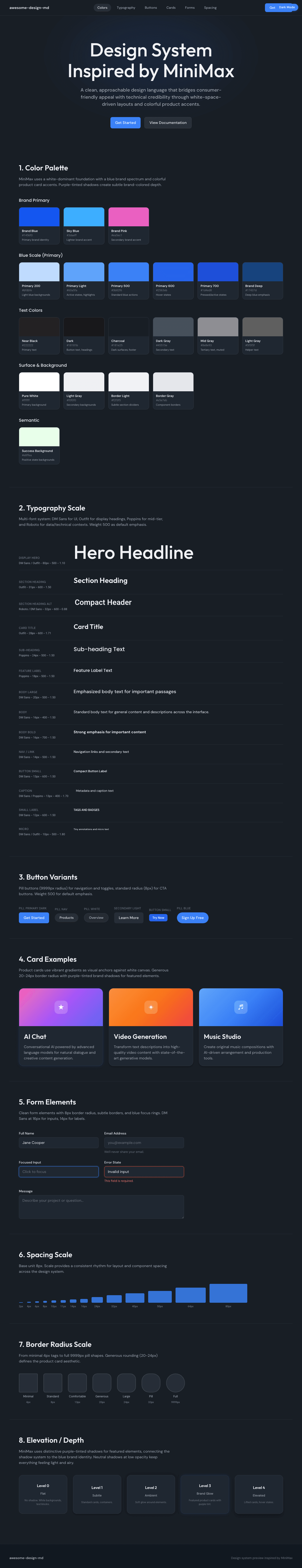
|
|
22
|
+
|
|
23
|
+
### Light Mode
|
|
24
|
+
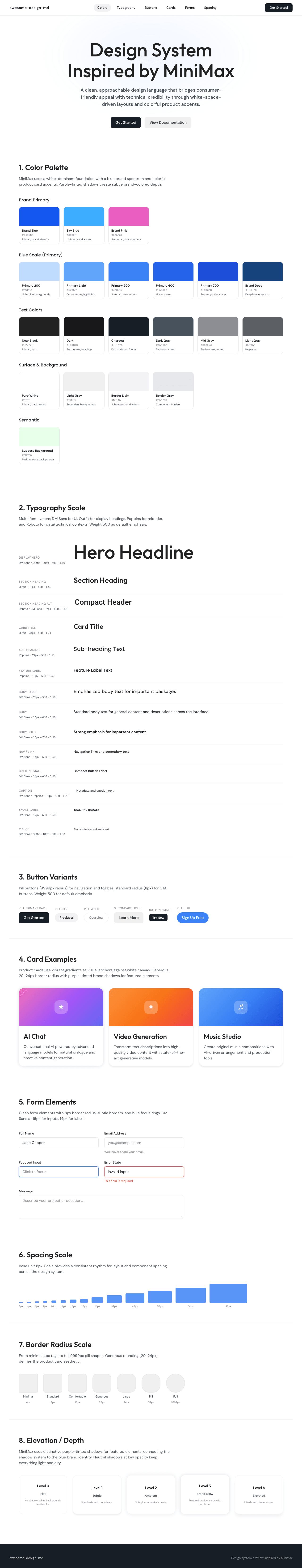
|