awesome-design-md 1.0.0
This diff represents the content of publicly available package versions that have been released to one of the supported registries. The information contained in this diff is provided for informational purposes only and reflects changes between package versions as they appear in their respective public registries.
- package/LICENSE +21 -0
- package/README.md +172 -0
- package/bin/cli.mjs +126 -0
- package/design-md/airbnb/DESIGN.md +246 -0
- package/design-md/airbnb/README.md +23 -0
- package/design-md/airbnb/preview-dark.html +234 -0
- package/design-md/airbnb/preview.html +233 -0
- package/design-md/airtable/DESIGN.md +89 -0
- package/design-md/airtable/README.md +23 -0
- package/design-md/airtable/preview-dark.html +165 -0
- package/design-md/airtable/preview.html +164 -0
- package/design-md/apple/DESIGN.md +313 -0
- package/design-md/apple/README.md +24 -0
- package/design-md/apple/preview-dark.html +422 -0
- package/design-md/apple/preview.html +416 -0
- package/design-md/bmw/DESIGN.md +180 -0
- package/design-md/bmw/README.md +23 -0
- package/design-md/bmw/preview-dark.html +211 -0
- package/design-md/bmw/preview.html +210 -0
- package/design-md/cal/DESIGN.md +259 -0
- package/design-md/cal/README.md +23 -0
- package/design-md/cal/preview-dark.html +449 -0
- package/design-md/cal/preview.html +575 -0
- package/design-md/claude/DESIGN.md +312 -0
- package/design-md/claude/README.md +24 -0
- package/design-md/claude/preview-dark.html +803 -0
- package/design-md/claude/preview.html +826 -0
- package/design-md/clay/DESIGN.md +304 -0
- package/design-md/clay/README.md +23 -0
- package/design-md/clay/preview-dark.html +318 -0
- package/design-md/clay/preview.html +317 -0
- package/design-md/clickhouse/DESIGN.md +281 -0
- package/design-md/clickhouse/README.md +24 -0
- package/design-md/clickhouse/preview-dark.html +834 -0
- package/design-md/clickhouse/preview.html +786 -0
- package/design-md/cohere/DESIGN.md +266 -0
- package/design-md/cohere/README.md +24 -0
- package/design-md/cohere/preview-dark.html +810 -0
- package/design-md/cohere/preview.html +814 -0
- package/design-md/coinbase/DESIGN.md +129 -0
- package/design-md/coinbase/README.md +23 -0
- package/design-md/coinbase/preview-dark.html +164 -0
- package/design-md/coinbase/preview.html +163 -0
- package/design-md/composio/DESIGN.md +307 -0
- package/design-md/composio/README.md +24 -0
- package/design-md/composio/preview-dark.html +958 -0
- package/design-md/composio/preview.html +933 -0
- package/design-md/cursor/DESIGN.md +309 -0
- package/design-md/cursor/README.md +24 -0
- package/design-md/cursor/preview-dark.html +395 -0
- package/design-md/cursor/preview.html +385 -0
- package/design-md/elevenlabs/DESIGN.md +265 -0
- package/design-md/elevenlabs/README.md +23 -0
- package/design-md/elevenlabs/preview-dark.html +254 -0
- package/design-md/elevenlabs/preview.html +253 -0
- package/design-md/expo/DESIGN.md +281 -0
- package/design-md/expo/README.md +24 -0
- package/design-md/expo/preview-dark.html +536 -0
- package/design-md/expo/preview.html +536 -0
- package/design-md/figma/DESIGN.md +220 -0
- package/design-md/figma/README.md +24 -0
- package/design-md/figma/preview-dark.html +831 -0
- package/design-md/figma/preview.html +841 -0
- package/design-md/framer/DESIGN.md +246 -0
- package/design-md/framer/README.md +23 -0
- package/design-md/framer/preview-dark.html +904 -0
- package/design-md/framer/preview.html +885 -0
- package/design-md/hashicorp/DESIGN.md +278 -0
- package/design-md/hashicorp/README.md +24 -0
- package/design-md/hashicorp/preview-dark.html +1206 -0
- package/design-md/hashicorp/preview.html +1195 -0
- package/design-md/ibm/DESIGN.md +332 -0
- package/design-md/ibm/README.md +24 -0
- package/design-md/ibm/preview-dark.html +445 -0
- package/design-md/ibm/preview.html +430 -0
- package/design-md/intercom/DESIGN.md +146 -0
- package/design-md/intercom/README.md +23 -0
- package/design-md/intercom/preview-dark.html +185 -0
- package/design-md/intercom/preview.html +184 -0
- package/design-md/kraken/DESIGN.md +125 -0
- package/design-md/kraken/README.md +23 -0
- package/design-md/kraken/preview-dark.html +169 -0
- package/design-md/kraken/preview.html +168 -0
- package/design-md/linear.app/DESIGN.md +367 -0
- package/design-md/linear.app/README.md +24 -0
- package/design-md/linear.app/preview-dark.html +385 -0
- package/design-md/linear.app/preview.html +375 -0
- package/design-md/lovable/DESIGN.md +298 -0
- package/design-md/lovable/README.md +24 -0
- package/design-md/lovable/preview-dark.html +351 -0
- package/design-md/lovable/preview.html +350 -0
- package/design-md/minimax/DESIGN.md +257 -0
- package/design-md/minimax/README.md +24 -0
- package/design-md/minimax/preview-dark.html +1267 -0
- package/design-md/minimax/preview.html +1253 -0
- package/design-md/mintlify/DESIGN.md +326 -0
- package/design-md/mintlify/README.md +24 -0
- package/design-md/mintlify/preview-dark.html +411 -0
- package/design-md/mintlify/preview.html +400 -0
- package/design-md/miro/DESIGN.md +108 -0
- package/design-md/miro/README.md +23 -0
- package/design-md/miro/preview-dark.html +174 -0
- package/design-md/miro/preview.html +173 -0
- package/design-md/mistral.ai/DESIGN.md +261 -0
- package/design-md/mistral.ai/README.md +24 -0
- package/design-md/mistral.ai/preview-dark.html +813 -0
- package/design-md/mistral.ai/preview.html +812 -0
- package/design-md/mongodb/DESIGN.md +266 -0
- package/design-md/mongodb/README.md +23 -0
- package/design-md/mongodb/preview-dark.html +262 -0
- package/design-md/mongodb/preview.html +261 -0
- package/design-md/notion/DESIGN.md +309 -0
- package/design-md/notion/README.md +24 -0
- package/design-md/notion/preview-dark.html +374 -0
- package/design-md/notion/preview.html +366 -0
- package/design-md/nvidia/DESIGN.md +293 -0
- package/design-md/nvidia/README.md +24 -0
- package/design-md/nvidia/preview-dark.html +376 -0
- package/design-md/nvidia/preview.html +368 -0
- package/design-md/ollama/DESIGN.md +267 -0
- package/design-md/ollama/README.md +24 -0
- package/design-md/ollama/preview-dark.html +678 -0
- package/design-md/ollama/preview.html +678 -0
- package/design-md/opencode.ai/DESIGN.md +281 -0
- package/design-md/opencode.ai/README.md +24 -0
- package/design-md/opencode.ai/preview-dark.html +368 -0
- package/design-md/opencode.ai/preview.html +359 -0
- package/design-md/pinterest/DESIGN.md +230 -0
- package/design-md/pinterest/README.md +23 -0
- package/design-md/pinterest/preview-dark.html +233 -0
- package/design-md/pinterest/preview.html +232 -0
- package/design-md/posthog/DESIGN.md +256 -0
- package/design-md/posthog/README.md +23 -0
- package/design-md/posthog/preview-dark.html +701 -0
- package/design-md/posthog/preview.html +751 -0
- package/design-md/raycast/DESIGN.md +268 -0
- package/design-md/raycast/README.md +23 -0
- package/design-md/raycast/preview-dark.html +608 -0
- package/design-md/raycast/preview.html +690 -0
- package/design-md/replicate/DESIGN.md +261 -0
- package/design-md/replicate/README.md +24 -0
- package/design-md/replicate/preview-dark.html +828 -0
- package/design-md/replicate/preview.html +831 -0
- package/design-md/resend/DESIGN.md +303 -0
- package/design-md/resend/README.md +23 -0
- package/design-md/resend/preview-dark.html +357 -0
- package/design-md/resend/preview.html +356 -0
- package/design-md/revolut/DESIGN.md +185 -0
- package/design-md/revolut/README.md +23 -0
- package/design-md/revolut/preview-dark.html +234 -0
- package/design-md/revolut/preview.html +233 -0
- package/design-md/runwayml/DESIGN.md +244 -0
- package/design-md/runwayml/README.md +24 -0
- package/design-md/runwayml/preview-dark.html +664 -0
- package/design-md/runwayml/preview.html +665 -0
- package/design-md/sanity/DESIGN.md +357 -0
- package/design-md/sanity/README.md +24 -0
- package/design-md/sanity/preview-dark.html +995 -0
- package/design-md/sanity/preview.html +1140 -0
- package/design-md/sentry/DESIGN.md +262 -0
- package/design-md/sentry/README.md +24 -0
- package/design-md/sentry/preview-dark.html +628 -0
- package/design-md/sentry/preview.html +953 -0
- package/design-md/spacex/DESIGN.md +194 -0
- package/design-md/spacex/README.md +23 -0
- package/design-md/spacex/preview-dark.html +223 -0
- package/design-md/spacex/preview.html +222 -0
- package/design-md/spotify/DESIGN.md +246 -0
- package/design-md/spotify/README.md +23 -0
- package/design-md/spotify/preview-dark.html +231 -0
- package/design-md/spotify/preview.html +230 -0
- package/design-md/stripe/DESIGN.md +322 -0
- package/design-md/stripe/README.md +24 -0
- package/design-md/stripe/preview-dark.html +430 -0
- package/design-md/stripe/preview.html +421 -0
- package/design-md/supabase/DESIGN.md +255 -0
- package/design-md/supabase/README.md +24 -0
- package/design-md/supabase/preview-dark.html +977 -0
- package/design-md/supabase/preview.html +955 -0
- package/design-md/superhuman/DESIGN.md +252 -0
- package/design-md/superhuman/README.md +23 -0
- package/design-md/superhuman/preview-dark.html +975 -0
- package/design-md/superhuman/preview.html +953 -0
- package/design-md/together.ai/DESIGN.md +263 -0
- package/design-md/together.ai/README.md +24 -0
- package/design-md/together.ai/preview-dark.html +892 -0
- package/design-md/together.ai/preview.html +897 -0
- package/design-md/uber/DESIGN.md +295 -0
- package/design-md/uber/README.md +24 -0
- package/design-md/uber/preview-dark.html +1164 -0
- package/design-md/uber/preview.html +1163 -0
- package/design-md/vercel/DESIGN.md +310 -0
- package/design-md/vercel/README.md +24 -0
- package/design-md/vercel/preview-dark.html +370 -0
- package/design-md/vercel/preview.html +369 -0
- package/design-md/voltagent/DESIGN.md +323 -0
- package/design-md/voltagent/README.md +24 -0
- package/design-md/voltagent/preview-dark.html +487 -0
- package/design-md/voltagent/preview.html +766 -0
- package/design-md/warp/DESIGN.md +253 -0
- package/design-md/warp/README.md +23 -0
- package/design-md/warp/preview-dark.html +502 -0
- package/design-md/warp/preview.html +535 -0
- package/design-md/webflow/DESIGN.md +92 -0
- package/design-md/webflow/README.md +23 -0
- package/design-md/webflow/preview-dark.html +147 -0
- package/design-md/webflow/preview.html +146 -0
- package/design-md/wise/DESIGN.md +173 -0
- package/design-md/wise/README.md +23 -0
- package/design-md/wise/preview-dark.html +230 -0
- package/design-md/wise/preview.html +229 -0
- package/design-md/x.ai/DESIGN.md +257 -0
- package/design-md/x.ai/README.md +24 -0
- package/design-md/x.ai/preview-dark.html +358 -0
- package/design-md/x.ai/preview.html +409 -0
- package/design-md/zapier/DESIGN.md +328 -0
- package/design-md/zapier/README.md +24 -0
- package/design-md/zapier/preview-dark.html +382 -0
- package/design-md/zapier/preview.html +374 -0
- package/package.json +33 -0
|
@@ -0,0 +1,310 @@
|
|
|
1
|
+
# Design System: Vercel
|
|
2
|
+
|
|
3
|
+
## 1. Visual Theme & Atmosphere
|
|
4
|
+
|
|
5
|
+
Vercel's website is the visual thesis of developer infrastructure made invisible — a design system so restrained it borders on philosophical. The page is overwhelmingly white (`#ffffff`) with near-black (`#171717`) text, creating a gallery-like emptiness where every element earns its pixel. This isn't minimalism as decoration; it's minimalism as engineering principle. The Geist design system treats the interface like a compiler treats code — every unnecessary token is stripped away until only structure remains.
|
|
6
|
+
|
|
7
|
+
The custom Geist font family is the crown jewel. Geist Sans uses aggressive negative letter-spacing (-2.4px to -2.88px at display sizes), creating headlines that feel compressed, urgent, and engineered — like code that's been minified for production. At body sizes, the tracking relaxes but the geometric precision persists. Geist Mono completes the system as the monospace companion for code, terminal output, and technical labels. Both fonts enable OpenType `"liga"` (ligatures) globally, adding a layer of typographic sophistication that rewards close reading.
|
|
8
|
+
|
|
9
|
+
What distinguishes Vercel from other monochrome design systems is its shadow-as-border philosophy. Instead of traditional CSS borders, Vercel uses `box-shadow: 0px 0px 0px 1px rgba(0,0,0,0.08)` — a zero-offset, zero-blur, 1px-spread shadow that creates a border-like line without the box model implications. This technique allows borders to exist in the shadow layer, enabling smoother transitions, rounded corners without clipping, and a subtler visual weight than traditional borders. The entire depth system is built on layered, multi-value shadow stacks where each layer serves a specific purpose: one for the border, one for soft elevation, one for ambient depth.
|
|
10
|
+
|
|
11
|
+
**Key Characteristics:**
|
|
12
|
+
- Geist Sans with extreme negative letter-spacing (-2.4px to -2.88px at display) — text as compressed infrastructure
|
|
13
|
+
- Geist Mono for code and technical labels with OpenType `"liga"` globally
|
|
14
|
+
- Shadow-as-border technique: `box-shadow 0px 0px 0px 1px` replaces traditional borders throughout
|
|
15
|
+
- Multi-layer shadow stacks for nuanced depth (border + elevation + ambient in single declarations)
|
|
16
|
+
- Near-pure white canvas with `#171717` text — not quite black, creating micro-contrast softness
|
|
17
|
+
- Workflow-specific accent colors: Ship Red (`#ff5b4f`), Preview Pink (`#de1d8d`), Develop Blue (`#0a72ef`)
|
|
18
|
+
- Focus ring system using `hsla(212, 100%, 48%, 1)` — a saturated blue for accessibility
|
|
19
|
+
- Pill badges (9999px) with tinted backgrounds for status indicators
|
|
20
|
+
|
|
21
|
+
## 2. Color Palette & Roles
|
|
22
|
+
|
|
23
|
+
### Primary
|
|
24
|
+
- **Vercel Black** (`#171717`): Primary text, headings, dark surface backgrounds. Not pure black — the slight warmth prevents harshness.
|
|
25
|
+
- **Pure White** (`#ffffff`): Page background, card surfaces, button text on dark.
|
|
26
|
+
- **True Black** (`#000000`): Secondary use, `--geist-console-text-color-default`, used in specific console/code contexts.
|
|
27
|
+
|
|
28
|
+
### Workflow Accent Colors
|
|
29
|
+
- **Ship Red** (`#ff5b4f`): `--ship-text`, the "ship to production" workflow step — warm, urgent coral-red.
|
|
30
|
+
- **Preview Pink** (`#de1d8d`): `--preview-text`, the preview deployment workflow — vivid magenta-pink.
|
|
31
|
+
- **Develop Blue** (`#0a72ef`): `--develop-text`, the development workflow — bright, focused blue.
|
|
32
|
+
|
|
33
|
+
### Console / Code Colors
|
|
34
|
+
- **Console Blue** (`#0070f3`): `--geist-console-text-color-blue`, syntax highlighting blue.
|
|
35
|
+
- **Console Purple** (`#7928ca`): `--geist-console-text-color-purple`, syntax highlighting purple.
|
|
36
|
+
- **Console Pink** (`#eb367f`): `--geist-console-text-color-pink`, syntax highlighting pink.
|
|
37
|
+
|
|
38
|
+
### Interactive
|
|
39
|
+
- **Link Blue** (`#0072f5`): Primary link color with underline decoration.
|
|
40
|
+
- **Focus Blue** (`hsla(212, 100%, 48%, 1)`): `--ds-focus-color`, focus ring on interactive elements.
|
|
41
|
+
- **Ring Blue** (`rgba(147, 197, 253, 0.5)`): `--tw-ring-color`, Tailwind ring utility.
|
|
42
|
+
|
|
43
|
+
### Neutral Scale
|
|
44
|
+
- **Gray 900** (`#171717`): Primary text, headings, nav text.
|
|
45
|
+
- **Gray 600** (`#4d4d4d`): Secondary text, description copy.
|
|
46
|
+
- **Gray 500** (`#666666`): Tertiary text, muted links.
|
|
47
|
+
- **Gray 400** (`#808080`): Placeholder text, disabled states.
|
|
48
|
+
- **Gray 100** (`#ebebeb`): Borders, card outlines, dividers.
|
|
49
|
+
- **Gray 50** (`#fafafa`): Subtle surface tint, inner shadow highlight.
|
|
50
|
+
|
|
51
|
+
### Surface & Overlay
|
|
52
|
+
- **Overlay Backdrop** (`hsla(0, 0%, 98%, 1)`): `--ds-overlay-backdrop-color`, modal/dialog backdrop.
|
|
53
|
+
- **Selection Text** (`hsla(0, 0%, 95%, 1)`): `--geist-selection-text-color`, text selection highlight.
|
|
54
|
+
- **Badge Blue Bg** (`#ebf5ff`): Pill badge background, tinted blue surface.
|
|
55
|
+
- **Badge Blue Text** (`#0068d6`): Pill badge text, darker blue for readability.
|
|
56
|
+
|
|
57
|
+
### Shadows & Depth
|
|
58
|
+
- **Border Shadow** (`rgba(0, 0, 0, 0.08) 0px 0px 0px 1px`): The signature — replaces traditional borders.
|
|
59
|
+
- **Subtle Elevation** (`rgba(0, 0, 0, 0.04) 0px 2px 2px`): Minimal lift for cards.
|
|
60
|
+
- **Card Stack** (`rgba(0,0,0,0.08) 0px 0px 0px 1px, rgba(0,0,0,0.04) 0px 2px 2px, rgba(0,0,0,0.04) 0px 8px 8px -8px, #fafafa 0px 0px 0px 1px`): Full multi-layer card shadow.
|
|
61
|
+
- **Ring Border** (`rgb(235, 235, 235) 0px 0px 0px 1px`): Light gray ring-border for tabs and images.
|
|
62
|
+
|
|
63
|
+
## 3. Typography Rules
|
|
64
|
+
|
|
65
|
+
### Font Family
|
|
66
|
+
- **Primary**: `Geist`, with fallbacks: `Arial, Apple Color Emoji, Segoe UI Emoji, Segoe UI Symbol`
|
|
67
|
+
- **Monospace**: `Geist Mono`, with fallbacks: `ui-monospace, SFMono-Regular, Roboto Mono, Menlo, Monaco, Liberation Mono, DejaVu Sans Mono, Courier New`
|
|
68
|
+
- **OpenType Features**: `"liga"` enabled globally on all Geist text; `"tnum"` for tabular numbers on specific captions.
|
|
69
|
+
|
|
70
|
+
### Hierarchy
|
|
71
|
+
|
|
72
|
+
| Role | Font | Size | Weight | Line Height | Letter Spacing | Notes |
|
|
73
|
+
|------|------|------|--------|-------------|----------------|-------|
|
|
74
|
+
| Display Hero | Geist | 48px (3.00rem) | 600 | 1.00–1.17 (tight) | -2.4px to -2.88px | Maximum compression, billboard impact |
|
|
75
|
+
| Section Heading | Geist | 40px (2.50rem) | 600 | 1.20 (tight) | -2.4px | Feature section titles |
|
|
76
|
+
| Sub-heading Large | Geist | 32px (2.00rem) | 600 | 1.25 (tight) | -1.28px | Card headings, sub-sections |
|
|
77
|
+
| Sub-heading | Geist | 32px (2.00rem) | 400 | 1.50 | -1.28px | Lighter sub-headings |
|
|
78
|
+
| Card Title | Geist | 24px (1.50rem) | 600 | 1.33 | -0.96px | Feature cards |
|
|
79
|
+
| Card Title Light | Geist | 24px (1.50rem) | 500 | 1.33 | -0.96px | Secondary card headings |
|
|
80
|
+
| Body Large | Geist | 20px (1.25rem) | 400 | 1.80 (relaxed) | normal | Introductions, feature descriptions |
|
|
81
|
+
| Body | Geist | 18px (1.13rem) | 400 | 1.56 | normal | Standard reading text |
|
|
82
|
+
| Body Small | Geist | 16px (1.00rem) | 400 | 1.50 | normal | Standard UI text |
|
|
83
|
+
| Body Medium | Geist | 16px (1.00rem) | 500 | 1.50 | normal | Navigation, emphasized text |
|
|
84
|
+
| Body Semibold | Geist | 16px (1.00rem) | 600 | 1.50 | -0.32px | Strong labels, active states |
|
|
85
|
+
| Button / Link | Geist | 14px (0.88rem) | 500 | 1.43 | normal | Buttons, links, captions |
|
|
86
|
+
| Button Small | Geist | 14px (0.88rem) | 400 | 1.00 (tight) | normal | Compact buttons |
|
|
87
|
+
| Caption | Geist | 12px (0.75rem) | 400–500 | 1.33 | normal | Metadata, tags |
|
|
88
|
+
| Mono Body | Geist Mono | 16px (1.00rem) | 400 | 1.50 | normal | Code blocks |
|
|
89
|
+
| Mono Caption | Geist Mono | 13px (0.81rem) | 500 | 1.54 | normal | Code labels |
|
|
90
|
+
| Mono Small | Geist Mono | 12px (0.75rem) | 500 | 1.00 (tight) | normal | `text-transform: uppercase`, technical labels |
|
|
91
|
+
| Micro Badge | Geist | 7px (0.44rem) | 700 | 1.00 (tight) | normal | `text-transform: uppercase`, tiny badges |
|
|
92
|
+
|
|
93
|
+
### Principles
|
|
94
|
+
- **Compression as identity**: Geist Sans at display sizes uses -2.4px to -2.88px letter-spacing — the most aggressive negative tracking of any major design system. This creates text that feels _minified_, like code optimized for production. The tracking progressively relaxes as size decreases: -1.28px at 32px, -0.96px at 24px, -0.32px at 16px, and normal at 14px.
|
|
95
|
+
- **Ligatures everywhere**: Every Geist text element enables OpenType `"liga"`. Ligatures aren't decorative — they're structural, creating tighter, more efficient glyph combinations.
|
|
96
|
+
- **Three weights, strict roles**: 400 (body/reading), 500 (UI/interactive), 600 (headings/emphasis). No bold (700) except for tiny micro-badges. This narrow weight range creates hierarchy through size and tracking, not weight.
|
|
97
|
+
- **Mono for identity**: Geist Mono in uppercase with `"tnum"` or `"liga"` serves as the "developer console" voice — compact technical labels that connect the marketing site to the product.
|
|
98
|
+
|
|
99
|
+
## 4. Component Stylings
|
|
100
|
+
|
|
101
|
+
### Buttons
|
|
102
|
+
|
|
103
|
+
**Primary White (Shadow-bordered)**
|
|
104
|
+
- Background: `#ffffff`
|
|
105
|
+
- Text: `#171717`
|
|
106
|
+
- Padding: 0px 6px (minimal — content-driven width)
|
|
107
|
+
- Radius: 6px (subtly rounded)
|
|
108
|
+
- Shadow: `rgb(235, 235, 235) 0px 0px 0px 1px` (ring-border)
|
|
109
|
+
- Hover: background shifts to `var(--ds-gray-1000)` (dark)
|
|
110
|
+
- Focus: `2px solid var(--ds-focus-color)` outline + `var(--ds-focus-ring)` shadow
|
|
111
|
+
- Use: Standard secondary button
|
|
112
|
+
|
|
113
|
+
**Primary Dark (Inferred from Geist system)**
|
|
114
|
+
- Background: `#171717`
|
|
115
|
+
- Text: `#ffffff`
|
|
116
|
+
- Padding: 8px 16px
|
|
117
|
+
- Radius: 6px
|
|
118
|
+
- Use: Primary CTA ("Start Deploying", "Get Started")
|
|
119
|
+
|
|
120
|
+
**Pill Button / Badge**
|
|
121
|
+
- Background: `#ebf5ff` (tinted blue)
|
|
122
|
+
- Text: `#0068d6`
|
|
123
|
+
- Padding: 0px 10px
|
|
124
|
+
- Radius: 9999px (full pill)
|
|
125
|
+
- Font: 12px weight 500
|
|
126
|
+
- Use: Status badges, tags, feature labels
|
|
127
|
+
|
|
128
|
+
**Large Pill (Navigation)**
|
|
129
|
+
- Background: transparent or `#171717`
|
|
130
|
+
- Radius: 64px–100px
|
|
131
|
+
- Use: Tab navigation, section selectors
|
|
132
|
+
|
|
133
|
+
### Cards & Containers
|
|
134
|
+
- Background: `#ffffff`
|
|
135
|
+
- Border: via shadow — `rgba(0, 0, 0, 0.08) 0px 0px 0px 1px`
|
|
136
|
+
- Radius: 8px (standard), 12px (featured/image cards)
|
|
137
|
+
- Shadow stack: `rgba(0,0,0,0.08) 0px 0px 0px 1px, rgba(0,0,0,0.04) 0px 2px 2px, #fafafa 0px 0px 0px 1px`
|
|
138
|
+
- Image cards: `1px solid #ebebeb` with 12px top radius
|
|
139
|
+
- Hover: subtle shadow intensification
|
|
140
|
+
|
|
141
|
+
### Inputs & Forms
|
|
142
|
+
- Radio: standard styling with focus `var(--ds-gray-200)` background
|
|
143
|
+
- Focus shadow: `1px 0 0 0 var(--ds-gray-alpha-600)`
|
|
144
|
+
- Focus outline: `2px solid var(--ds-focus-color)` — consistent blue focus ring
|
|
145
|
+
- Border: via shadow technique, not traditional border
|
|
146
|
+
|
|
147
|
+
### Navigation
|
|
148
|
+
- Clean horizontal nav on white, sticky
|
|
149
|
+
- Vercel logotype left-aligned, 262x52px
|
|
150
|
+
- Links: Geist 14px weight 500, `#171717` text
|
|
151
|
+
- Active: weight 600 or underline
|
|
152
|
+
- CTA: dark pill buttons ("Start Deploying", "Contact Sales")
|
|
153
|
+
- Mobile: hamburger menu collapse
|
|
154
|
+
- Product dropdowns with multi-level menus
|
|
155
|
+
|
|
156
|
+
### Image Treatment
|
|
157
|
+
- Product screenshots with `1px solid #ebebeb` border
|
|
158
|
+
- Top-rounded images: `12px 12px 0px 0px` radius
|
|
159
|
+
- Dashboard/code preview screenshots dominate feature sections
|
|
160
|
+
- Soft gradient backgrounds behind hero images (pastel multi-color)
|
|
161
|
+
|
|
162
|
+
### Distinctive Components
|
|
163
|
+
|
|
164
|
+
**Workflow Pipeline**
|
|
165
|
+
- Three-step horizontal pipeline: Develop → Preview → Ship
|
|
166
|
+
- Each step has its own accent color: Blue → Pink → Red
|
|
167
|
+
- Connected with lines/arrows
|
|
168
|
+
- The visual metaphor for Vercel's core value proposition
|
|
169
|
+
|
|
170
|
+
**Trust Bar / Logo Grid**
|
|
171
|
+
- Company logos (Perplexity, ChatGPT, Cursor, etc.) in grayscale
|
|
172
|
+
- Horizontal scroll or grid layout
|
|
173
|
+
- Subtle `#ebebeb` border separation
|
|
174
|
+
|
|
175
|
+
**Metric Cards**
|
|
176
|
+
- Large number display (e.g., "10x faster")
|
|
177
|
+
- Geist 48px weight 600 for the metric
|
|
178
|
+
- Description below in gray body text
|
|
179
|
+
- Shadow-bordered card container
|
|
180
|
+
|
|
181
|
+
## 5. Layout Principles
|
|
182
|
+
|
|
183
|
+
### Spacing System
|
|
184
|
+
- Base unit: 8px
|
|
185
|
+
- Scale: 1px, 2px, 3px, 4px, 5px, 6px, 8px, 10px, 12px, 14px, 16px, 32px, 36px, 40px
|
|
186
|
+
- Notable gap: jumps from 16px to 32px — no 20px or 24px in primary scale
|
|
187
|
+
|
|
188
|
+
### Grid & Container
|
|
189
|
+
- Max content width: approximately 1200px
|
|
190
|
+
- Hero: centered single-column with generous top padding
|
|
191
|
+
- Feature sections: 2–3 column grids for cards
|
|
192
|
+
- Full-width dividers using `border-bottom: 1px solid #171717`
|
|
193
|
+
- Code/dashboard screenshots as full-width or contained with border
|
|
194
|
+
|
|
195
|
+
### Whitespace Philosophy
|
|
196
|
+
- **Gallery emptiness**: Massive vertical padding between sections (80px–120px+). The white space IS the design — it communicates that Vercel has nothing to prove and nothing to hide.
|
|
197
|
+
- **Compressed text, expanded space**: The aggressive negative letter-spacing on headlines is counterbalanced by generous surrounding whitespace. The text is dense; the space around it is vast.
|
|
198
|
+
- **Section rhythm**: White sections alternate with white sections — there's no color variation between sections. Separation comes from borders (shadow-borders) and spacing alone.
|
|
199
|
+
|
|
200
|
+
### Border Radius Scale
|
|
201
|
+
- Micro (2px): Inline code snippets, small spans
|
|
202
|
+
- Subtle (4px): Small containers
|
|
203
|
+
- Standard (6px): Buttons, links, functional elements
|
|
204
|
+
- Comfortable (8px): Cards, list items
|
|
205
|
+
- Image (12px): Featured cards, image containers (top-rounded)
|
|
206
|
+
- Large (64px): Tab navigation pills
|
|
207
|
+
- XL (100px): Large navigation links
|
|
208
|
+
- Full Pill (9999px): Badges, status pills, tags
|
|
209
|
+
- Circle (50%): Menu toggle, avatar containers
|
|
210
|
+
|
|
211
|
+
## 6. Depth & Elevation
|
|
212
|
+
|
|
213
|
+
| Level | Treatment | Use |
|
|
214
|
+
|-------|-----------|-----|
|
|
215
|
+
| Flat (Level 0) | No shadow | Page background, text blocks |
|
|
216
|
+
| Ring (Level 1) | `rgba(0,0,0,0.08) 0px 0px 0px 1px` | Shadow-as-border for most elements |
|
|
217
|
+
| Light Ring (Level 1b) | `rgb(235,235,235) 0px 0px 0px 1px` | Lighter ring for tabs, images |
|
|
218
|
+
| Subtle Card (Level 2) | Ring + `rgba(0,0,0,0.04) 0px 2px 2px` | Standard cards with minimal lift |
|
|
219
|
+
| Full Card (Level 3) | Ring + Subtle + `rgba(0,0,0,0.04) 0px 8px 8px -8px` + inner `#fafafa` ring | Featured cards, highlighted panels |
|
|
220
|
+
| Focus (Accessibility) | `2px solid hsla(212, 100%, 48%, 1)` outline | Keyboard focus on all interactive elements |
|
|
221
|
+
|
|
222
|
+
**Shadow Philosophy**: Vercel has arguably the most sophisticated shadow system in modern web design. Rather than using shadows for elevation in the traditional Material Design sense, Vercel uses multi-value shadow stacks where each layer has a distinct architectural purpose: one creates the "border" (0px spread, 1px), another adds ambient softness (2px blur), another handles depth at distance (8px blur with negative spread), and an inner ring (`#fafafa`) creates the subtle highlight that makes the card "glow" from within. This layered approach means cards feel built, not floating.
|
|
223
|
+
|
|
224
|
+
### Decorative Depth
|
|
225
|
+
- Hero gradient: soft, pastel multi-color gradient wash behind hero content (barely visible, atmospheric)
|
|
226
|
+
- Section borders: `1px solid #171717` (full dark line) between major sections
|
|
227
|
+
- No background color variation — depth comes entirely from shadow layering and border contrast
|
|
228
|
+
|
|
229
|
+
## 7. Do's and Don'ts
|
|
230
|
+
|
|
231
|
+
### Do
|
|
232
|
+
- Use Geist Sans with aggressive negative letter-spacing at display sizes (-2.4px to -2.88px at 48px)
|
|
233
|
+
- Use shadow-as-border (`0px 0px 0px 1px rgba(0,0,0,0.08)`) instead of traditional CSS borders
|
|
234
|
+
- Enable `"liga"` on all Geist text — ligatures are structural, not optional
|
|
235
|
+
- Use the three-weight system: 400 (body), 500 (UI), 600 (headings)
|
|
236
|
+
- Apply workflow accent colors (Red/Pink/Blue) only in their workflow context
|
|
237
|
+
- Use multi-layer shadow stacks for cards (border + elevation + ambient + inner highlight)
|
|
238
|
+
- Keep the color palette achromatic — grays from `#171717` to `#ffffff` are the system
|
|
239
|
+
- Use `#171717` instead of `#000000` for primary text — the micro-warmth matters
|
|
240
|
+
|
|
241
|
+
### Don't
|
|
242
|
+
- Don't use positive letter-spacing on Geist Sans — it's always negative or zero
|
|
243
|
+
- Don't use weight 700 (bold) on body text — 600 is the maximum, used only for headings
|
|
244
|
+
- Don't use traditional CSS `border` on cards — use the shadow-border technique
|
|
245
|
+
- Don't introduce warm colors (oranges, yellows, greens) into the UI chrome
|
|
246
|
+
- Don't apply the workflow accent colors (Ship Red, Preview Pink, Develop Blue) decoratively
|
|
247
|
+
- Don't use heavy shadows (> 0.1 opacity) — the shadow system is whisper-level
|
|
248
|
+
- Don't increase body text letter-spacing — Geist is designed to run tight
|
|
249
|
+
- Don't use pill radius (9999px) on primary action buttons — pills are for badges/tags only
|
|
250
|
+
- Don't skip the inner `#fafafa` ring in card shadows — it's the glow that makes the system work
|
|
251
|
+
|
|
252
|
+
## 8. Responsive Behavior
|
|
253
|
+
|
|
254
|
+
### Breakpoints
|
|
255
|
+
| Name | Width | Key Changes |
|
|
256
|
+
|------|-------|-------------|
|
|
257
|
+
| Mobile Small | <400px | Tight single column, minimal padding |
|
|
258
|
+
| Mobile | 400–600px | Standard mobile, stacked layout |
|
|
259
|
+
| Tablet Small | 600–768px | 2-column grids begin |
|
|
260
|
+
| Tablet | 768–1024px | Full card grids, expanded padding |
|
|
261
|
+
| Desktop Small | 1024–1200px | Standard desktop layout |
|
|
262
|
+
| Desktop | 1200–1400px | Full layout, maximum content width |
|
|
263
|
+
| Large Desktop | >1400px | Centered, generous margins |
|
|
264
|
+
|
|
265
|
+
### Touch Targets
|
|
266
|
+
- Buttons use comfortable padding (8px–16px vertical)
|
|
267
|
+
- Navigation links at 14px with adequate spacing
|
|
268
|
+
- Pill badges have 10px horizontal padding for tap targets
|
|
269
|
+
- Mobile menu toggle uses 50% radius circular button
|
|
270
|
+
|
|
271
|
+
### Collapsing Strategy
|
|
272
|
+
- Hero: display 48px → scales down, maintains negative tracking proportionally
|
|
273
|
+
- Navigation: horizontal links + CTAs → hamburger menu
|
|
274
|
+
- Feature cards: 3-column → 2-column → single column stacked
|
|
275
|
+
- Code screenshots: maintain aspect ratio, may horizontally scroll
|
|
276
|
+
- Trust bar logos: grid → horizontal scroll
|
|
277
|
+
- Footer: multi-column → stacked single column
|
|
278
|
+
- Section spacing: 80px+ → 48px on mobile
|
|
279
|
+
|
|
280
|
+
### Image Behavior
|
|
281
|
+
- Dashboard screenshots maintain border treatment at all sizes
|
|
282
|
+
- Hero gradient softens/simplifies on mobile
|
|
283
|
+
- Product screenshots use responsive images with consistent border radius
|
|
284
|
+
- Full-width sections maintain edge-to-edge treatment
|
|
285
|
+
|
|
286
|
+
## 9. Agent Prompt Guide
|
|
287
|
+
|
|
288
|
+
### Quick Color Reference
|
|
289
|
+
- Primary CTA: Vercel Black (`#171717`)
|
|
290
|
+
- Background: Pure White (`#ffffff`)
|
|
291
|
+
- Heading text: Vercel Black (`#171717`)
|
|
292
|
+
- Body text: Gray 600 (`#4d4d4d`)
|
|
293
|
+
- Border (shadow): `rgba(0, 0, 0, 0.08) 0px 0px 0px 1px`
|
|
294
|
+
- Link: Link Blue (`#0072f5`)
|
|
295
|
+
- Focus ring: Focus Blue (`hsla(212, 100%, 48%, 1)`)
|
|
296
|
+
|
|
297
|
+
### Example Component Prompts
|
|
298
|
+
- "Create a hero section on white background. Headline at 48px Geist weight 600, line-height 1.00, letter-spacing -2.4px, color #171717. Subtitle at 20px Geist weight 400, line-height 1.80, color #4d4d4d. Dark CTA button (#171717, 6px radius, 8px 16px padding) and ghost button (white, shadow-border rgba(0,0,0,0.08) 0px 0px 0px 1px, 6px radius)."
|
|
299
|
+
- "Design a card: white background, no CSS border. Use shadow stack: rgba(0,0,0,0.08) 0px 0px 0px 1px, rgba(0,0,0,0.04) 0px 2px 2px, #fafafa 0px 0px 0px 1px. Radius 8px. Title at 24px Geist weight 600, letter-spacing -0.96px. Body at 16px weight 400, #4d4d4d."
|
|
300
|
+
- "Build a pill badge: #ebf5ff background, #0068d6 text, 9999px radius, 0px 10px padding, 12px Geist weight 500."
|
|
301
|
+
- "Create navigation: white sticky header. Geist 14px weight 500 for links, #171717 text. Dark pill CTA 'Start Deploying' right-aligned. Shadow-border on bottom: rgba(0,0,0,0.08) 0px 0px 0px 1px."
|
|
302
|
+
- "Design a workflow section showing three steps: Develop (text color #0a72ef), Preview (#de1d8d), Ship (#ff5b4f). Each step: 14px Geist Mono uppercase label + 24px Geist weight 600 title + 16px weight 400 description in #4d4d4d."
|
|
303
|
+
|
|
304
|
+
### Iteration Guide
|
|
305
|
+
1. Always use shadow-as-border instead of CSS border — `0px 0px 0px 1px rgba(0,0,0,0.08)` is the foundation
|
|
306
|
+
2. Letter-spacing scales with font size: -2.4px at 48px, -1.28px at 32px, -0.96px at 24px, normal at 14px
|
|
307
|
+
3. Three weights only: 400 (read), 500 (interact), 600 (announce)
|
|
308
|
+
4. Color is functional, never decorative — workflow colors (Red/Pink/Blue) mark pipeline stages only
|
|
309
|
+
5. The inner `#fafafa` ring in card shadows is what gives Vercel cards their subtle inner glow
|
|
310
|
+
6. Geist Mono uppercase for technical labels, Geist Sans for everything else
|
|
@@ -0,0 +1,24 @@
|
|
|
1
|
+
# Vercel Inspired Design System
|
|
2
|
+
|
|
3
|
+
[DESIGN.md](https://github.com/VoltAgent/awesome-design-md/blob/main/design-md/vercel/DESIGN.md) extracted from the public [vercel](https://vercel.com/) website. This is not the official design system. Colors, fonts, and spacing may not be 100% accurate. But it's a good starting point for building something similar.
|
|
4
|
+
|
|
5
|
+
## Files
|
|
6
|
+
|
|
7
|
+
| File | Description |
|
|
8
|
+
|------|-------------|
|
|
9
|
+
| `DESIGN.md` | Complete design system documentation (9 sections) |
|
|
10
|
+
| `preview.html` | Interactive design token catalog (light) |
|
|
11
|
+
| `preview-dark.html` | Interactive design token catalog (dark) |
|
|
12
|
+
|
|
13
|
+
|
|
14
|
+
Use [DESIGN.md](https://github.com/VoltAgent/awesome-design-md/blob/main/design-md/vercel/DESIGN.md) to use as a reference for AI agents (Claude, Cursor, Stitch) to generate UI that looks like the Vercel design language.
|
|
15
|
+
|
|
16
|
+
## Preview
|
|
17
|
+
|
|
18
|
+
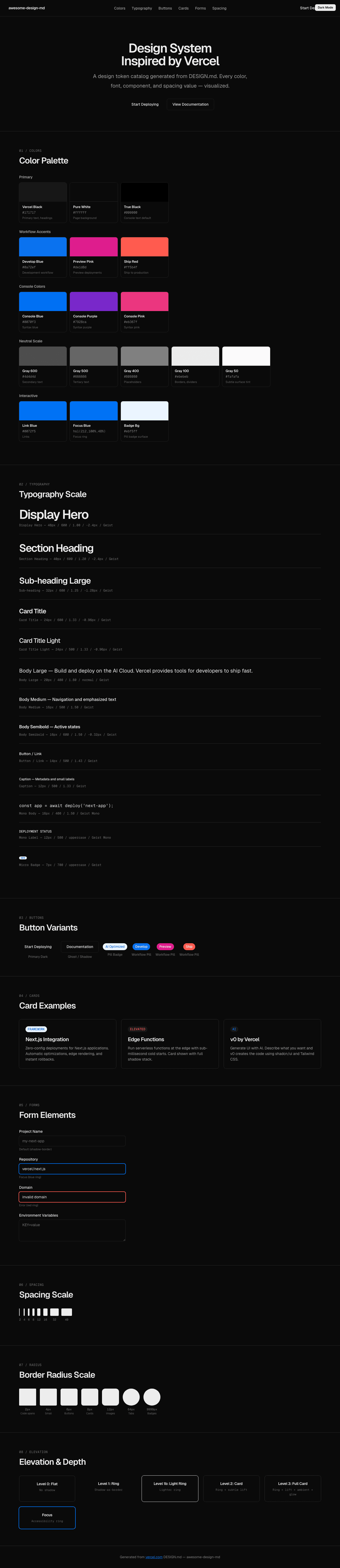
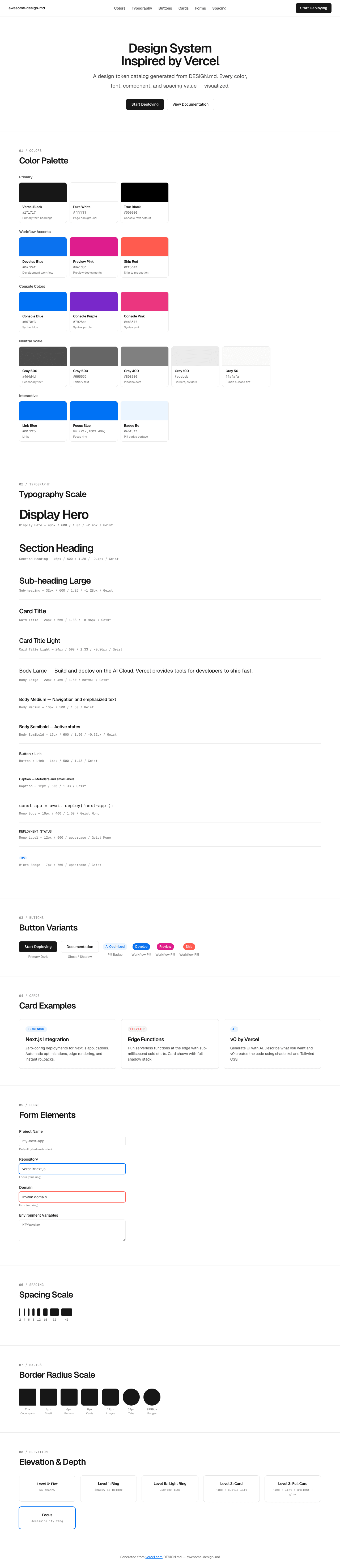
A sample landing page built with DESIGN.md. It shows the actual colors, typography, buttons, cards, spacing, and elevation, all in one page.
|
|
19
|
+
|
|
20
|
+
### Dark Mode
|
|
21
|
+
|
|
22
|
+
|
|
23
|
+
### Light Mode
|
|
24
|
+
|