awesome-design-md 1.0.0
This diff represents the content of publicly available package versions that have been released to one of the supported registries. The information contained in this diff is provided for informational purposes only and reflects changes between package versions as they appear in their respective public registries.
- package/LICENSE +21 -0
- package/README.md +172 -0
- package/bin/cli.mjs +126 -0
- package/design-md/airbnb/DESIGN.md +246 -0
- package/design-md/airbnb/README.md +23 -0
- package/design-md/airbnb/preview-dark.html +234 -0
- package/design-md/airbnb/preview.html +233 -0
- package/design-md/airtable/DESIGN.md +89 -0
- package/design-md/airtable/README.md +23 -0
- package/design-md/airtable/preview-dark.html +165 -0
- package/design-md/airtable/preview.html +164 -0
- package/design-md/apple/DESIGN.md +313 -0
- package/design-md/apple/README.md +24 -0
- package/design-md/apple/preview-dark.html +422 -0
- package/design-md/apple/preview.html +416 -0
- package/design-md/bmw/DESIGN.md +180 -0
- package/design-md/bmw/README.md +23 -0
- package/design-md/bmw/preview-dark.html +211 -0
- package/design-md/bmw/preview.html +210 -0
- package/design-md/cal/DESIGN.md +259 -0
- package/design-md/cal/README.md +23 -0
- package/design-md/cal/preview-dark.html +449 -0
- package/design-md/cal/preview.html +575 -0
- package/design-md/claude/DESIGN.md +312 -0
- package/design-md/claude/README.md +24 -0
- package/design-md/claude/preview-dark.html +803 -0
- package/design-md/claude/preview.html +826 -0
- package/design-md/clay/DESIGN.md +304 -0
- package/design-md/clay/README.md +23 -0
- package/design-md/clay/preview-dark.html +318 -0
- package/design-md/clay/preview.html +317 -0
- package/design-md/clickhouse/DESIGN.md +281 -0
- package/design-md/clickhouse/README.md +24 -0
- package/design-md/clickhouse/preview-dark.html +834 -0
- package/design-md/clickhouse/preview.html +786 -0
- package/design-md/cohere/DESIGN.md +266 -0
- package/design-md/cohere/README.md +24 -0
- package/design-md/cohere/preview-dark.html +810 -0
- package/design-md/cohere/preview.html +814 -0
- package/design-md/coinbase/DESIGN.md +129 -0
- package/design-md/coinbase/README.md +23 -0
- package/design-md/coinbase/preview-dark.html +164 -0
- package/design-md/coinbase/preview.html +163 -0
- package/design-md/composio/DESIGN.md +307 -0
- package/design-md/composio/README.md +24 -0
- package/design-md/composio/preview-dark.html +958 -0
- package/design-md/composio/preview.html +933 -0
- package/design-md/cursor/DESIGN.md +309 -0
- package/design-md/cursor/README.md +24 -0
- package/design-md/cursor/preview-dark.html +395 -0
- package/design-md/cursor/preview.html +385 -0
- package/design-md/elevenlabs/DESIGN.md +265 -0
- package/design-md/elevenlabs/README.md +23 -0
- package/design-md/elevenlabs/preview-dark.html +254 -0
- package/design-md/elevenlabs/preview.html +253 -0
- package/design-md/expo/DESIGN.md +281 -0
- package/design-md/expo/README.md +24 -0
- package/design-md/expo/preview-dark.html +536 -0
- package/design-md/expo/preview.html +536 -0
- package/design-md/figma/DESIGN.md +220 -0
- package/design-md/figma/README.md +24 -0
- package/design-md/figma/preview-dark.html +831 -0
- package/design-md/figma/preview.html +841 -0
- package/design-md/framer/DESIGN.md +246 -0
- package/design-md/framer/README.md +23 -0
- package/design-md/framer/preview-dark.html +904 -0
- package/design-md/framer/preview.html +885 -0
- package/design-md/hashicorp/DESIGN.md +278 -0
- package/design-md/hashicorp/README.md +24 -0
- package/design-md/hashicorp/preview-dark.html +1206 -0
- package/design-md/hashicorp/preview.html +1195 -0
- package/design-md/ibm/DESIGN.md +332 -0
- package/design-md/ibm/README.md +24 -0
- package/design-md/ibm/preview-dark.html +445 -0
- package/design-md/ibm/preview.html +430 -0
- package/design-md/intercom/DESIGN.md +146 -0
- package/design-md/intercom/README.md +23 -0
- package/design-md/intercom/preview-dark.html +185 -0
- package/design-md/intercom/preview.html +184 -0
- package/design-md/kraken/DESIGN.md +125 -0
- package/design-md/kraken/README.md +23 -0
- package/design-md/kraken/preview-dark.html +169 -0
- package/design-md/kraken/preview.html +168 -0
- package/design-md/linear.app/DESIGN.md +367 -0
- package/design-md/linear.app/README.md +24 -0
- package/design-md/linear.app/preview-dark.html +385 -0
- package/design-md/linear.app/preview.html +375 -0
- package/design-md/lovable/DESIGN.md +298 -0
- package/design-md/lovable/README.md +24 -0
- package/design-md/lovable/preview-dark.html +351 -0
- package/design-md/lovable/preview.html +350 -0
- package/design-md/minimax/DESIGN.md +257 -0
- package/design-md/minimax/README.md +24 -0
- package/design-md/minimax/preview-dark.html +1267 -0
- package/design-md/minimax/preview.html +1253 -0
- package/design-md/mintlify/DESIGN.md +326 -0
- package/design-md/mintlify/README.md +24 -0
- package/design-md/mintlify/preview-dark.html +411 -0
- package/design-md/mintlify/preview.html +400 -0
- package/design-md/miro/DESIGN.md +108 -0
- package/design-md/miro/README.md +23 -0
- package/design-md/miro/preview-dark.html +174 -0
- package/design-md/miro/preview.html +173 -0
- package/design-md/mistral.ai/DESIGN.md +261 -0
- package/design-md/mistral.ai/README.md +24 -0
- package/design-md/mistral.ai/preview-dark.html +813 -0
- package/design-md/mistral.ai/preview.html +812 -0
- package/design-md/mongodb/DESIGN.md +266 -0
- package/design-md/mongodb/README.md +23 -0
- package/design-md/mongodb/preview-dark.html +262 -0
- package/design-md/mongodb/preview.html +261 -0
- package/design-md/notion/DESIGN.md +309 -0
- package/design-md/notion/README.md +24 -0
- package/design-md/notion/preview-dark.html +374 -0
- package/design-md/notion/preview.html +366 -0
- package/design-md/nvidia/DESIGN.md +293 -0
- package/design-md/nvidia/README.md +24 -0
- package/design-md/nvidia/preview-dark.html +376 -0
- package/design-md/nvidia/preview.html +368 -0
- package/design-md/ollama/DESIGN.md +267 -0
- package/design-md/ollama/README.md +24 -0
- package/design-md/ollama/preview-dark.html +678 -0
- package/design-md/ollama/preview.html +678 -0
- package/design-md/opencode.ai/DESIGN.md +281 -0
- package/design-md/opencode.ai/README.md +24 -0
- package/design-md/opencode.ai/preview-dark.html +368 -0
- package/design-md/opencode.ai/preview.html +359 -0
- package/design-md/pinterest/DESIGN.md +230 -0
- package/design-md/pinterest/README.md +23 -0
- package/design-md/pinterest/preview-dark.html +233 -0
- package/design-md/pinterest/preview.html +232 -0
- package/design-md/posthog/DESIGN.md +256 -0
- package/design-md/posthog/README.md +23 -0
- package/design-md/posthog/preview-dark.html +701 -0
- package/design-md/posthog/preview.html +751 -0
- package/design-md/raycast/DESIGN.md +268 -0
- package/design-md/raycast/README.md +23 -0
- package/design-md/raycast/preview-dark.html +608 -0
- package/design-md/raycast/preview.html +690 -0
- package/design-md/replicate/DESIGN.md +261 -0
- package/design-md/replicate/README.md +24 -0
- package/design-md/replicate/preview-dark.html +828 -0
- package/design-md/replicate/preview.html +831 -0
- package/design-md/resend/DESIGN.md +303 -0
- package/design-md/resend/README.md +23 -0
- package/design-md/resend/preview-dark.html +357 -0
- package/design-md/resend/preview.html +356 -0
- package/design-md/revolut/DESIGN.md +185 -0
- package/design-md/revolut/README.md +23 -0
- package/design-md/revolut/preview-dark.html +234 -0
- package/design-md/revolut/preview.html +233 -0
- package/design-md/runwayml/DESIGN.md +244 -0
- package/design-md/runwayml/README.md +24 -0
- package/design-md/runwayml/preview-dark.html +664 -0
- package/design-md/runwayml/preview.html +665 -0
- package/design-md/sanity/DESIGN.md +357 -0
- package/design-md/sanity/README.md +24 -0
- package/design-md/sanity/preview-dark.html +995 -0
- package/design-md/sanity/preview.html +1140 -0
- package/design-md/sentry/DESIGN.md +262 -0
- package/design-md/sentry/README.md +24 -0
- package/design-md/sentry/preview-dark.html +628 -0
- package/design-md/sentry/preview.html +953 -0
- package/design-md/spacex/DESIGN.md +194 -0
- package/design-md/spacex/README.md +23 -0
- package/design-md/spacex/preview-dark.html +223 -0
- package/design-md/spacex/preview.html +222 -0
- package/design-md/spotify/DESIGN.md +246 -0
- package/design-md/spotify/README.md +23 -0
- package/design-md/spotify/preview-dark.html +231 -0
- package/design-md/spotify/preview.html +230 -0
- package/design-md/stripe/DESIGN.md +322 -0
- package/design-md/stripe/README.md +24 -0
- package/design-md/stripe/preview-dark.html +430 -0
- package/design-md/stripe/preview.html +421 -0
- package/design-md/supabase/DESIGN.md +255 -0
- package/design-md/supabase/README.md +24 -0
- package/design-md/supabase/preview-dark.html +977 -0
- package/design-md/supabase/preview.html +955 -0
- package/design-md/superhuman/DESIGN.md +252 -0
- package/design-md/superhuman/README.md +23 -0
- package/design-md/superhuman/preview-dark.html +975 -0
- package/design-md/superhuman/preview.html +953 -0
- package/design-md/together.ai/DESIGN.md +263 -0
- package/design-md/together.ai/README.md +24 -0
- package/design-md/together.ai/preview-dark.html +892 -0
- package/design-md/together.ai/preview.html +897 -0
- package/design-md/uber/DESIGN.md +295 -0
- package/design-md/uber/README.md +24 -0
- package/design-md/uber/preview-dark.html +1164 -0
- package/design-md/uber/preview.html +1163 -0
- package/design-md/vercel/DESIGN.md +310 -0
- package/design-md/vercel/README.md +24 -0
- package/design-md/vercel/preview-dark.html +370 -0
- package/design-md/vercel/preview.html +369 -0
- package/design-md/voltagent/DESIGN.md +323 -0
- package/design-md/voltagent/README.md +24 -0
- package/design-md/voltagent/preview-dark.html +487 -0
- package/design-md/voltagent/preview.html +766 -0
- package/design-md/warp/DESIGN.md +253 -0
- package/design-md/warp/README.md +23 -0
- package/design-md/warp/preview-dark.html +502 -0
- package/design-md/warp/preview.html +535 -0
- package/design-md/webflow/DESIGN.md +92 -0
- package/design-md/webflow/README.md +23 -0
- package/design-md/webflow/preview-dark.html +147 -0
- package/design-md/webflow/preview.html +146 -0
- package/design-md/wise/DESIGN.md +173 -0
- package/design-md/wise/README.md +23 -0
- package/design-md/wise/preview-dark.html +230 -0
- package/design-md/wise/preview.html +229 -0
- package/design-md/x.ai/DESIGN.md +257 -0
- package/design-md/x.ai/README.md +24 -0
- package/design-md/x.ai/preview-dark.html +358 -0
- package/design-md/x.ai/preview.html +409 -0
- package/design-md/zapier/DESIGN.md +328 -0
- package/design-md/zapier/README.md +24 -0
- package/design-md/zapier/preview-dark.html +382 -0
- package/design-md/zapier/preview.html +374 -0
- package/package.json +33 -0
|
@@ -0,0 +1,328 @@
|
|
|
1
|
+
# Design System: Zapier
|
|
2
|
+
|
|
3
|
+
## 1. Visual Theme & Atmosphere
|
|
4
|
+
|
|
5
|
+
Zapier's website radiates warm, approachable professionalism. It rejects the cold monochrome minimalism of developer tools in favor of a cream-tinted canvas (`#fffefb`) that feels like unbleached paper -- the digital equivalent of a well-organized notebook. The near-black (`#201515`) text has a faint reddish-brown warmth, creating an atmosphere more human than mechanical. This is automation designed to feel effortless, not technical.
|
|
6
|
+
|
|
7
|
+
The typographic system is a deliberate interplay of two distinct personalities. **Degular Display** -- a geometric, wide-set display face -- handles hero-scale headlines at 56-80px with medium weight (500) and extraordinarily tight line-heights (0.90), creating headlines that compress vertically like stacked blocks. **Inter** serves as the workhorse for everything else, from section headings to body text and navigation, with fallbacks to Helvetica and Arial. **GT Alpina**, an elegant thin-weight serif with aggressive negative letter-spacing (-1.6px to -1.92px), makes occasional appearances for softer editorial moments. This three-font system gives Zapier the ability to shift register -- from bold and punchy (Degular) to clean and functional (Inter) to refined and literary (GT Alpina).
|
|
8
|
+
|
|
9
|
+
The brand's signature orange (`#ff4f00`) is unmistakable -- a vivid, saturated red-orange that sits precisely between traffic-cone urgency and sunset warmth. It's used sparingly but decisively: primary CTA buttons, active state underlines, and accent borders. Against the warm cream background, this orange creates a color relationship that feels energetic without being aggressive.
|
|
10
|
+
|
|
11
|
+
**Key Characteristics:**
|
|
12
|
+
- Warm cream canvas (`#fffefb`) instead of pure white -- organic, paper-like warmth
|
|
13
|
+
- Near-black with reddish undertone (`#201515`) -- text that breathes rather than dominates
|
|
14
|
+
- Degular Display for hero headlines at 0.90 line-height -- compressed, impactful, modern
|
|
15
|
+
- Inter as the universal UI font across all functional typography
|
|
16
|
+
- GT Alpina for editorial accents -- thin-weight serif with extreme negative tracking
|
|
17
|
+
- Zapier Orange (`#ff4f00`) as the single accent -- vivid, warm, sparingly applied
|
|
18
|
+
- Warm neutral palette: borders (`#c5c0b1`), muted text (`#939084`), surface tints (`#eceae3`)
|
|
19
|
+
- 8px base spacing system with generous padding on CTAs (20px 24px)
|
|
20
|
+
- Border-forward design: `1px solid` borders in warm grays define structure over shadows
|
|
21
|
+
|
|
22
|
+
## 2. Color Palette & Roles
|
|
23
|
+
|
|
24
|
+
### Primary
|
|
25
|
+
- **Zapier Black** (`#201515`): Primary text, headings, dark button backgrounds. A warm near-black with reddish undertones -- never cold.
|
|
26
|
+
- **Cream White** (`#fffefb`): Page background, card surfaces, light button fills. Not pure white; the yellowish warmth is intentional.
|
|
27
|
+
- **Off-White** (`#fffdf9`): Secondary background surface, subtle alternate tint. Nearly indistinguishable from cream white but creates depth.
|
|
28
|
+
|
|
29
|
+
### Brand Accent
|
|
30
|
+
- **Zapier Orange** (`#ff4f00`): Primary CTA buttons, active underline indicators, accent borders. The signature color -- vivid and warm.
|
|
31
|
+
|
|
32
|
+
### Neutral Scale
|
|
33
|
+
- **Dark Charcoal** (`#36342e`): Secondary text, footer text, border color for strong dividers. A warm dark gray-brown with 70% opacity variant.
|
|
34
|
+
- **Warm Gray** (`#939084`): Tertiary text, muted labels, timestamp-style content. Mid-range with greenish-warm undertone.
|
|
35
|
+
- **Sand** (`#c5c0b1`): Primary border color, hover state backgrounds, divider lines. The backbone of Zapier's structural elements.
|
|
36
|
+
- **Light Sand** (`#eceae3`): Secondary button backgrounds, light borders, subtle card surfaces.
|
|
37
|
+
- **Mid Warm** (`#b5b2aa`): Alternate border tone, used on specific span elements.
|
|
38
|
+
|
|
39
|
+
### Interactive
|
|
40
|
+
- **Orange CTA** (`#ff4f00`): Primary action buttons and active tab underlines.
|
|
41
|
+
- **Dark CTA** (`#201515`): Secondary dark buttons with sand hover state.
|
|
42
|
+
- **Light CTA** (`#eceae3`): Tertiary/ghost buttons with sand hover.
|
|
43
|
+
- **Link Default** (`#201515`): Standard link color, matching body text.
|
|
44
|
+
- **Hover Underline**: Links remove `text-decoration: underline` on hover (inverse pattern).
|
|
45
|
+
|
|
46
|
+
### Overlay & Surface
|
|
47
|
+
- **Semi-transparent Dark** (`rgba(45, 45, 46, 0.5)`): Overlay button variant, backdrop-like elements.
|
|
48
|
+
- **Pill Surface** (`#fffefb`): White pill buttons with sand borders.
|
|
49
|
+
|
|
50
|
+
### Shadows & Depth
|
|
51
|
+
- **Inset Underline** (`rgb(255, 79, 0) 0px -4px 0px 0px inset`): Active tab indicator -- orange underline using inset box-shadow.
|
|
52
|
+
- **Hover Underline** (`rgb(197, 192, 177) 0px -4px 0px 0px inset`): Inactive tab hover -- sand-colored underline.
|
|
53
|
+
|
|
54
|
+
## 3. Typography Rules
|
|
55
|
+
|
|
56
|
+
### Font Families
|
|
57
|
+
- **Display**: `Degular Display` -- wide geometric display face for hero headlines
|
|
58
|
+
- **Primary**: `Inter`, with fallbacks: `Helvetica, Arial`
|
|
59
|
+
- **Editorial**: `GT Alpina` -- thin-weight serif for editorial moments
|
|
60
|
+
- **System**: `Arial` -- fallback for form elements and system UI
|
|
61
|
+
|
|
62
|
+
### Hierarchy
|
|
63
|
+
|
|
64
|
+
| Role | Font | Size | Weight | Line Height | Letter Spacing | Notes |
|
|
65
|
+
|------|------|------|--------|-------------|----------------|-------|
|
|
66
|
+
| Display Hero XL | Degular Display | 80px (5.00rem) | 500 | 0.90 (tight) | normal | Maximum impact, compressed block |
|
|
67
|
+
| Display Hero | Degular Display | 56px (3.50rem) | 500 | 0.90-1.10 (tight) | 0-1.12px | Primary hero headlines |
|
|
68
|
+
| Display Hero SM | Degular Display | 40px (2.50rem) | 500 | 0.90 (tight) | normal | Smaller hero variant |
|
|
69
|
+
| Display Button | Degular Display | 24px (1.50rem) | 600 | 1.00 (tight) | 1px | Large CTA button text |
|
|
70
|
+
| Section Heading | Inter | 48px (3.00rem) | 500 | 1.04 (tight) | normal | Major section titles |
|
|
71
|
+
| Editorial Heading | GT Alpina | 48px (3.00rem) | 250 | normal | -1.92px | Thin editorial headlines |
|
|
72
|
+
| Editorial Sub | GT Alpina | 40px (2.50rem) | 300 | 1.08 (tight) | -1.6px | Editorial subheadings |
|
|
73
|
+
| Sub-heading LG | Inter | 36px (2.25rem) | 500 | normal | -1px | Large sub-sections |
|
|
74
|
+
| Sub-heading | Inter | 32px (2.00rem) | 400 | 1.25 (tight) | normal | Standard sub-sections |
|
|
75
|
+
| Sub-heading MD | Inter | 28px (1.75rem) | 500 | normal | normal | Medium sub-headings |
|
|
76
|
+
| Card Title | Inter | 24px (1.50rem) | 600 | normal | -0.48px | Card headings |
|
|
77
|
+
| Body Large | Inter | 20px (1.25rem) | 400-500 | 1.00-1.20 (tight) | -0.2px | Feature descriptions |
|
|
78
|
+
| Body Emphasis | Inter | 18px (1.13rem) | 600 | 1.00 (tight) | normal | Emphasized body text |
|
|
79
|
+
| Body | Inter | 16px (1.00rem) | 400-500 | 1.20-1.25 | -0.16px | Standard reading text |
|
|
80
|
+
| Body Semibold | Inter | 16px (1.00rem) | 600 | 1.16 (tight) | normal | Strong labels |
|
|
81
|
+
| Button | Inter | 16px (1.00rem) | 600 | normal | normal | Standard buttons |
|
|
82
|
+
| Button SM | Inter | 14px (0.88rem) | 600 | normal | normal | Small buttons |
|
|
83
|
+
| Caption | Inter | 14px (0.88rem) | 500 | 1.25-1.43 | normal | Labels, metadata |
|
|
84
|
+
| Caption Upper | Inter | 14px (0.88rem) | 600 | normal | 0.5px | Uppercase section labels |
|
|
85
|
+
| Micro | Inter | 12px (0.75rem) | 600 | 0.90-1.33 | 0.5px | Tiny labels, often uppercase |
|
|
86
|
+
| Micro SM | Inter | 13px (0.81rem) | 500 | 1.00-1.54 | normal | Small metadata text |
|
|
87
|
+
|
|
88
|
+
### Principles
|
|
89
|
+
- **Three-font system, clear roles**: Degular Display commands attention at hero scale only. Inter handles everything functional. GT Alpina adds editorial warmth sparingly.
|
|
90
|
+
- **Compressed display**: Degular at 0.90 line-height creates vertically compressed headline blocks that feel modern and architectural.
|
|
91
|
+
- **Weight as hierarchy signal**: Inter uses 400 (reading), 500 (navigation/emphasis), 600 (headings/CTAs). Degular uses 500 (display) and 600 (buttons).
|
|
92
|
+
- **Uppercase for labels**: Section labels (like "01 / Colors") and small categorization use `text-transform: uppercase` with 0.5px letter-spacing.
|
|
93
|
+
- **Negative tracking for elegance**: GT Alpina uses -1.6px to -1.92px letter-spacing for its thin-weight editorial headlines.
|
|
94
|
+
|
|
95
|
+
## 4. Component Stylings
|
|
96
|
+
|
|
97
|
+
### Buttons
|
|
98
|
+
|
|
99
|
+
**Primary Orange**
|
|
100
|
+
- Background: `#ff4f00`
|
|
101
|
+
- Text: `#fffefb`
|
|
102
|
+
- Padding: 8px 16px
|
|
103
|
+
- Radius: 4px
|
|
104
|
+
- Border: `1px solid #ff4f00`
|
|
105
|
+
- Use: Primary CTA ("Start free with email", "Sign up free")
|
|
106
|
+
|
|
107
|
+
**Primary Dark**
|
|
108
|
+
- Background: `#201515`
|
|
109
|
+
- Text: `#fffefb`
|
|
110
|
+
- Padding: 20px 24px
|
|
111
|
+
- Radius: 8px
|
|
112
|
+
- Border: `1px solid #201515`
|
|
113
|
+
- Hover: background shifts to `#c5c0b1`, text to `#201515`
|
|
114
|
+
- Use: Large secondary CTA buttons
|
|
115
|
+
|
|
116
|
+
**Light / Ghost**
|
|
117
|
+
- Background: `#eceae3`
|
|
118
|
+
- Text: `#36342e`
|
|
119
|
+
- Padding: 20px 24px
|
|
120
|
+
- Radius: 8px
|
|
121
|
+
- Border: `1px solid #c5c0b1`
|
|
122
|
+
- Hover: background shifts to `#c5c0b1`, text to `#201515`
|
|
123
|
+
- Use: Tertiary actions, filter buttons
|
|
124
|
+
|
|
125
|
+
**Pill Button**
|
|
126
|
+
- Background: `#fffefb`
|
|
127
|
+
- Text: `#36342e`
|
|
128
|
+
- Padding: 0px 16px
|
|
129
|
+
- Radius: 20px
|
|
130
|
+
- Border: `1px solid #c5c0b1`
|
|
131
|
+
- Use: Tag-like selections, filter pills
|
|
132
|
+
|
|
133
|
+
**Overlay Semi-transparent**
|
|
134
|
+
- Background: `rgba(45, 45, 46, 0.5)`
|
|
135
|
+
- Text: `#fffefb`
|
|
136
|
+
- Radius: 20px
|
|
137
|
+
- Hover: background becomes fully opaque `#2d2d2e`
|
|
138
|
+
- Use: Video play buttons, floating actions
|
|
139
|
+
|
|
140
|
+
**Tab / Navigation (Inset Shadow)**
|
|
141
|
+
- Background: transparent
|
|
142
|
+
- Text: `#201515`
|
|
143
|
+
- Padding: 12px 16px
|
|
144
|
+
- Shadow: `rgb(255, 79, 0) 0px -4px 0px 0px inset` (active orange underline)
|
|
145
|
+
- Hover shadow: `rgb(197, 192, 177) 0px -4px 0px 0px inset` (sand underline)
|
|
146
|
+
- Use: Horizontal tab navigation
|
|
147
|
+
|
|
148
|
+
### Cards & Containers
|
|
149
|
+
- Background: `#fffefb`
|
|
150
|
+
- Border: `1px solid #c5c0b1` (warm sand border)
|
|
151
|
+
- Radius: 5px (standard), 8px (featured)
|
|
152
|
+
- No shadow elevation by default -- borders define containment
|
|
153
|
+
- Hover: subtle border color intensification
|
|
154
|
+
|
|
155
|
+
### Inputs & Forms
|
|
156
|
+
- Background: `#fffefb`
|
|
157
|
+
- Text: `#201515`
|
|
158
|
+
- Border: `1px solid #c5c0b1`
|
|
159
|
+
- Radius: 5px
|
|
160
|
+
- Focus: border color shifts to `#ff4f00` (orange)
|
|
161
|
+
- Placeholder: `#939084`
|
|
162
|
+
|
|
163
|
+
### Navigation
|
|
164
|
+
- Clean horizontal nav on cream background
|
|
165
|
+
- Zapier logotype left-aligned, 104x28px
|
|
166
|
+
- Links: Inter 16px weight 500, `#201515` text
|
|
167
|
+
- CTA: Orange button ("Start free with email")
|
|
168
|
+
- Tab navigation uses inset box-shadow underline technique
|
|
169
|
+
- Mobile: hamburger collapse
|
|
170
|
+
|
|
171
|
+
### Image Treatment
|
|
172
|
+
- Product screenshots with `1px solid #c5c0b1` border
|
|
173
|
+
- Rounded corners: 5-8px
|
|
174
|
+
- Dashboard/workflow screenshots prominent in feature sections
|
|
175
|
+
- Light gradient backgrounds behind hero content
|
|
176
|
+
|
|
177
|
+
### Distinctive Components
|
|
178
|
+
|
|
179
|
+
**Workflow Integration Cards**
|
|
180
|
+
- Display connected app icons in pairs
|
|
181
|
+
- Arrow or connection indicator between apps
|
|
182
|
+
- Sand border containment
|
|
183
|
+
- Inter weight 500 for app names
|
|
184
|
+
|
|
185
|
+
**Stat Counter**
|
|
186
|
+
- Large display number using Inter 48px weight 500
|
|
187
|
+
- Muted description below in `#36342e`
|
|
188
|
+
- Used for social proof metrics
|
|
189
|
+
|
|
190
|
+
**Social Proof Icons**
|
|
191
|
+
- Circular icon buttons: 14px radius
|
|
192
|
+
- Sand border: `1px solid #c5c0b1`
|
|
193
|
+
- Used for social media follow links in footer
|
|
194
|
+
|
|
195
|
+
## 5. Layout Principles
|
|
196
|
+
|
|
197
|
+
### Spacing System
|
|
198
|
+
- Base unit: 8px
|
|
199
|
+
- Scale: 1px, 4px, 6px, 8px, 10px, 12px, 16px, 20px, 24px, 32px, 40px, 48px, 56px, 64px, 72px
|
|
200
|
+
- CTA buttons use generous padding: 20px 24px for large, 8px 16px for standard
|
|
201
|
+
- Section padding: 64px-80px vertical
|
|
202
|
+
|
|
203
|
+
### Grid & Container
|
|
204
|
+
- Max content width: approximately 1200px
|
|
205
|
+
- Hero: centered single-column with large top padding
|
|
206
|
+
- Feature sections: 2-3 column grids for integration cards
|
|
207
|
+
- Full-width sand-bordered dividers between sections
|
|
208
|
+
- Footer: multi-column dark background (`#201515`)
|
|
209
|
+
|
|
210
|
+
### Whitespace Philosophy
|
|
211
|
+
- **Warm breathing room**: Generous vertical spacing between sections (64px-80px), but content areas are relatively dense -- Zapier packs information efficiently within its cream canvas.
|
|
212
|
+
- **Architectural compression**: Degular Display headlines at 0.90 line-height compress vertically, contrasting with the open spacing around them.
|
|
213
|
+
- **Section rhythm**: Cream background throughout, with sections separated by sand-colored borders rather than background color changes.
|
|
214
|
+
|
|
215
|
+
### Border Radius Scale
|
|
216
|
+
- Tight (3px): Small inline spans
|
|
217
|
+
- Standard (4px): Buttons (orange CTA), tags, small elements
|
|
218
|
+
- Content (5px): Cards, links, general containers
|
|
219
|
+
- Comfortable (8px): Featured cards, large buttons, tabs
|
|
220
|
+
- Social (14px): Social icon buttons, pill-like elements
|
|
221
|
+
- Pill (20px): Play buttons, large pill buttons, floating actions
|
|
222
|
+
|
|
223
|
+
## 6. Depth & Elevation
|
|
224
|
+
|
|
225
|
+
| Level | Treatment | Use |
|
|
226
|
+
|-------|-----------|-----|
|
|
227
|
+
| Flat (Level 0) | No shadow | Page background, text blocks |
|
|
228
|
+
| Bordered (Level 1) | `1px solid #c5c0b1` | Standard cards, containers, inputs |
|
|
229
|
+
| Strong Border (Level 1b) | `1px solid #36342e` | Dark dividers, emphasized sections |
|
|
230
|
+
| Active Tab (Level 2) | `rgb(255, 79, 0) 0px -4px 0px 0px inset` | Active tab underline (orange) |
|
|
231
|
+
| Hover Tab (Level 2b) | `rgb(197, 192, 177) 0px -4px 0px 0px inset` | Hover tab underline (sand) |
|
|
232
|
+
| Focus (Accessibility) | `1px solid #ff4f00` outline | Focus ring on interactive elements |
|
|
233
|
+
|
|
234
|
+
**Shadow Philosophy**: Zapier deliberately avoids traditional shadow-based elevation. Structure is defined almost entirely through borders -- warm sand (`#c5c0b1`) borders for standard containment, dark charcoal (`#36342e`) borders for emphasis. The only shadow-like technique is the inset box-shadow used for tab underlines, where a `0px -4px 0px 0px inset` shadow creates a bottom-bar indicator. This border-first approach keeps the design grounded and tangible rather than floating.
|
|
235
|
+
|
|
236
|
+
### Decorative Depth
|
|
237
|
+
- Orange inset underline on active tabs creates visual "weight" at the bottom of elements
|
|
238
|
+
- Sand hover underlines provide preview states without layout shifts
|
|
239
|
+
- No background gradients in main content -- the cream canvas is consistent
|
|
240
|
+
- Footer uses full dark background (`#201515`) for contrast reversal
|
|
241
|
+
|
|
242
|
+
## 7. Do's and Don'ts
|
|
243
|
+
|
|
244
|
+
### Do
|
|
245
|
+
- Use Degular Display exclusively for hero-scale headlines (40px+) with 0.90 line-height for compressed impact
|
|
246
|
+
- Use Inter for all functional UI -- navigation, body text, buttons, labels
|
|
247
|
+
- Apply warm cream (`#fffefb`) as the background, never pure white
|
|
248
|
+
- Use `#201515` for text, never pure black -- the reddish warmth matters
|
|
249
|
+
- Keep Zapier Orange (`#ff4f00`) reserved for primary CTAs and active state indicators
|
|
250
|
+
- Use sand (`#c5c0b1`) borders as the primary structural element instead of shadows
|
|
251
|
+
- Apply generous button padding (20px 24px) for large CTAs to match Zapier's spacious button style
|
|
252
|
+
- Use inset box-shadow underlines for tab navigation rather than border-bottom
|
|
253
|
+
- Apply uppercase with 0.5px letter-spacing for section labels and micro-categorization
|
|
254
|
+
|
|
255
|
+
### Don't
|
|
256
|
+
- Don't use Degular Display for body text or UI elements -- it's display-only
|
|
257
|
+
- Don't use pure white (`#ffffff`) or pure black (`#000000`) -- Zapier's palette is warm-shifted
|
|
258
|
+
- Don't apply box-shadow elevation to cards -- use borders instead
|
|
259
|
+
- Don't scatter Zapier Orange across the UI -- it's reserved for CTAs and active states
|
|
260
|
+
- Don't use tight padding on large CTA buttons -- Zapier's buttons are deliberately spacious
|
|
261
|
+
- Don't ignore the warm neutral system -- borders should be `#c5c0b1`, not gray
|
|
262
|
+
- Don't use GT Alpina for functional UI -- it's an editorial accent at thin weights only
|
|
263
|
+
- Don't apply positive letter-spacing to GT Alpina -- it uses aggressive negative tracking (-1.6px to -1.92px)
|
|
264
|
+
- Don't use rounded pill shapes (9999px) for primary buttons -- pills are for tags and social icons
|
|
265
|
+
|
|
266
|
+
## 8. Responsive Behavior
|
|
267
|
+
|
|
268
|
+
### Breakpoints
|
|
269
|
+
| Name | Width | Key Changes |
|
|
270
|
+
|------|-------|-------------|
|
|
271
|
+
| Mobile Small | <450px | Tight single column, reduced hero text |
|
|
272
|
+
| Mobile | 450-600px | Standard mobile, stacked layout |
|
|
273
|
+
| Mobile Large | 600-640px | Slight horizontal breathing room |
|
|
274
|
+
| Tablet Small | 640-680px | 2-column grids begin |
|
|
275
|
+
| Tablet | 680-768px | Card grids expand |
|
|
276
|
+
| Tablet Large | 768-991px | Full card grids, expanded padding |
|
|
277
|
+
| Desktop Small | 991-1024px | Desktop layout initiates |
|
|
278
|
+
| Desktop | 1024-1280px | Full layout, maximum content width |
|
|
279
|
+
| Large Desktop | >1280px | Centered with generous margins |
|
|
280
|
+
|
|
281
|
+
### Touch Targets
|
|
282
|
+
- Large CTA buttons: 20px 24px padding (comfortable 60px+ height)
|
|
283
|
+
- Standard buttons: 8px 16px padding
|
|
284
|
+
- Navigation links: 16px weight 500 with adequate spacing
|
|
285
|
+
- Social icons: 14px radius circular buttons
|
|
286
|
+
- Tab items: 12px 16px padding
|
|
287
|
+
|
|
288
|
+
### Collapsing Strategy
|
|
289
|
+
- Hero: Degular 80px display scales to 40-56px on smaller screens
|
|
290
|
+
- Navigation: horizontal links + CTA collapse to hamburger menu
|
|
291
|
+
- Feature cards: 3-column grid to 2-column to single-column stacked
|
|
292
|
+
- Integration workflow illustrations: maintain aspect ratio, may simplify
|
|
293
|
+
- Footer: multi-column dark section collapses to stacked
|
|
294
|
+
- Section spacing: 64-80px reduces to 40-48px on mobile
|
|
295
|
+
|
|
296
|
+
### Image Behavior
|
|
297
|
+
- Product screenshots maintain sand border treatment at all sizes
|
|
298
|
+
- Integration app icons maintain fixed sizes within responsive containers
|
|
299
|
+
- Hero illustrations scale proportionally
|
|
300
|
+
- Full-width sections maintain edge-to-edge treatment
|
|
301
|
+
|
|
302
|
+
## 9. Agent Prompt Guide
|
|
303
|
+
|
|
304
|
+
### Quick Color Reference
|
|
305
|
+
- Primary CTA: Zapier Orange (`#ff4f00`)
|
|
306
|
+
- Background: Cream White (`#fffefb`)
|
|
307
|
+
- Heading text: Zapier Black (`#201515`)
|
|
308
|
+
- Body text: Dark Charcoal (`#36342e`)
|
|
309
|
+
- Border: Sand (`#c5c0b1`)
|
|
310
|
+
- Secondary surface: Light Sand (`#eceae3`)
|
|
311
|
+
- Muted text: Warm Gray (`#939084`)
|
|
312
|
+
|
|
313
|
+
### Example Component Prompts
|
|
314
|
+
- "Create a hero section on cream background (`#fffefb`). Headline at 56px Degular Display weight 500, line-height 0.90, color `#201515`. Subtitle at 20px Inter weight 400, line-height 1.20, color `#36342e`. Orange CTA button (`#ff4f00`, 4px radius, 8px 16px padding, white text) and dark button (`#201515`, 8px radius, 20px 24px padding, white text)."
|
|
315
|
+
- "Design a card: cream background (`#fffefb`), `1px solid #c5c0b1` border, 5px radius. Title at 24px Inter weight 600, letter-spacing -0.48px, `#201515`. Body at 16px weight 400, `#36342e`. No box-shadow."
|
|
316
|
+
- "Build a tab navigation: transparent background. Inter 16px weight 500, `#201515` text. Active tab: `box-shadow: rgb(255, 79, 0) 0px -4px 0px 0px inset`. Hover: `box-shadow: rgb(197, 192, 177) 0px -4px 0px 0px inset`. Padding 12px 16px."
|
|
317
|
+
- "Create navigation: cream sticky header (`#fffefb`). Inter 16px weight 500 for links, `#201515` text. Orange pill CTA 'Start free with email' right-aligned (`#ff4f00`, 4px radius, 8px 16px padding)."
|
|
318
|
+
- "Design a footer with dark background (`#201515`). Text `#fffefb`. Links in `#c5c0b1` with hover to `#fffefb`. Multi-column layout. Social icons as 14px-radius circles with sand borders."
|
|
319
|
+
|
|
320
|
+
### Iteration Guide
|
|
321
|
+
1. Always use warm cream (`#fffefb`) background, never pure white -- the warmth defines Zapier
|
|
322
|
+
2. Borders (`1px solid #c5c0b1`) are the structural backbone -- avoid shadow elevation
|
|
323
|
+
3. Zapier Orange (`#ff4f00`) is the only accent color; everything else is warm neutrals
|
|
324
|
+
4. Three fonts, strict roles: Degular Display (hero), Inter (UI), GT Alpina (editorial)
|
|
325
|
+
5. Large CTA buttons need generous padding (20px 24px) -- Zapier buttons feel spacious
|
|
326
|
+
6. Tab navigation uses inset box-shadow underlines, not border-bottom
|
|
327
|
+
7. Text is always warm: `#201515` for dark, `#36342e` for body, `#939084` for muted
|
|
328
|
+
8. Uppercase labels at 12-14px with 0.5px letter-spacing for section categorization
|
|
@@ -0,0 +1,24 @@
|
|
|
1
|
+
# Zapier Inspired Design System
|
|
2
|
+
|
|
3
|
+
[DESIGN.md](https://github.com/VoltAgent/awesome-design-md/blob/main/design-md/zapier/DESIGN.md) extracted from the public [zapier](https://zapier.com/) website. This is not the official design system. Colors, fonts, and spacing may not be 100% accurate. But it's a good starting point for building something similar.
|
|
4
|
+
|
|
5
|
+
## Files
|
|
6
|
+
|
|
7
|
+
| File | Description |
|
|
8
|
+
|------|-------------|
|
|
9
|
+
| `DESIGN.md` | Complete design system documentation (9 sections) |
|
|
10
|
+
| `preview.html` | Interactive design token catalog (light) |
|
|
11
|
+
| `preview-dark.html` | Interactive design token catalog (dark) |
|
|
12
|
+
|
|
13
|
+
|
|
14
|
+
Use [DESIGN.md](https://github.com/VoltAgent/awesome-design-md/blob/main/design-md/zapier/DESIGN.md) to use as a reference for AI agents (Claude, Cursor, Stitch) to generate UI that looks like the Zapier design language.
|
|
15
|
+
|
|
16
|
+
## Preview
|
|
17
|
+
|
|
18
|
+
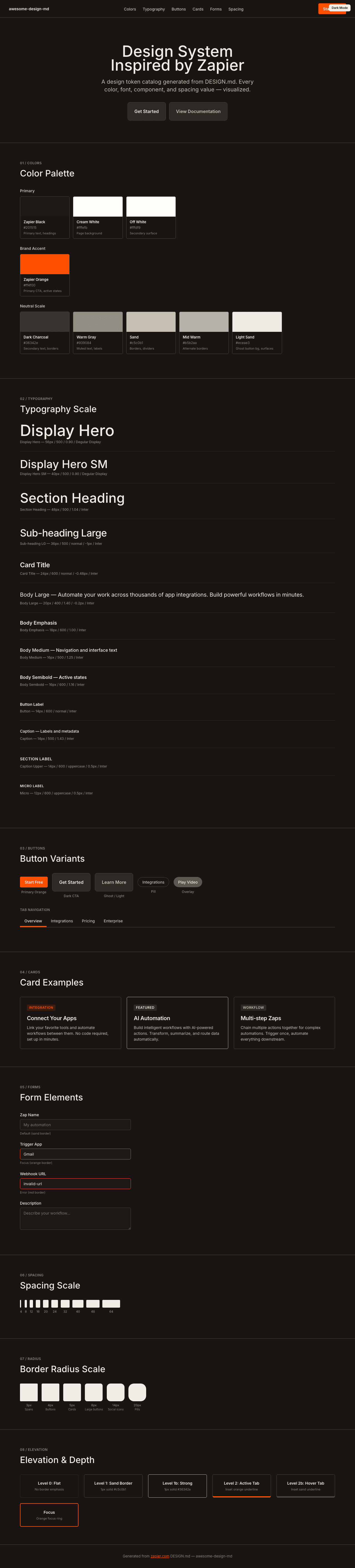
A sample landing page built with DESIGN.md. It shows the actual colors, typography, buttons, cards, spacing, and elevation, all in one page.
|
|
19
|
+
|
|
20
|
+
### Dark Mode
|
|
21
|
+
|
|
22
|
+
|
|
23
|
+
### Light Mode
|
|
24
|
+
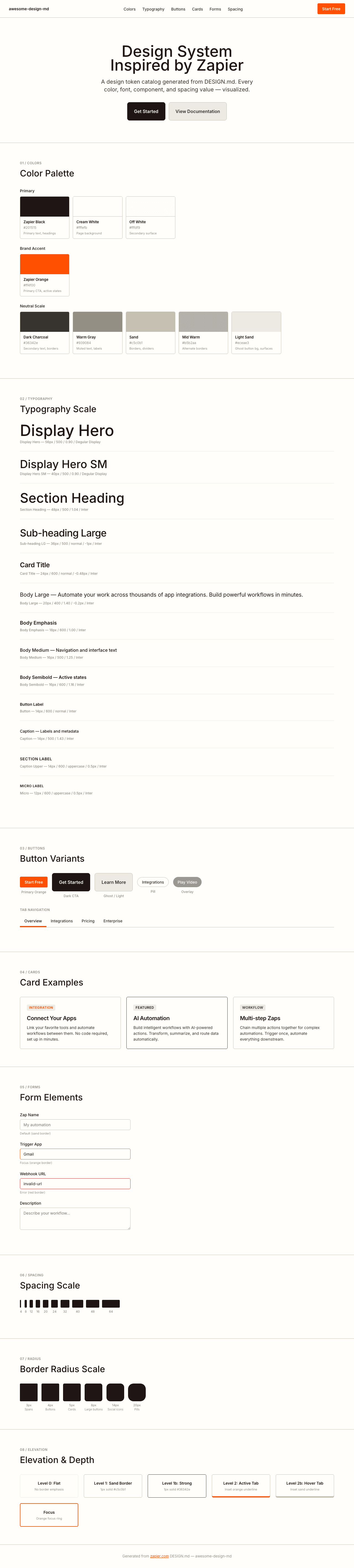
|