awesome-design-md 1.0.0
This diff represents the content of publicly available package versions that have been released to one of the supported registries. The information contained in this diff is provided for informational purposes only and reflects changes between package versions as they appear in their respective public registries.
- package/LICENSE +21 -0
- package/README.md +172 -0
- package/bin/cli.mjs +126 -0
- package/design-md/airbnb/DESIGN.md +246 -0
- package/design-md/airbnb/README.md +23 -0
- package/design-md/airbnb/preview-dark.html +234 -0
- package/design-md/airbnb/preview.html +233 -0
- package/design-md/airtable/DESIGN.md +89 -0
- package/design-md/airtable/README.md +23 -0
- package/design-md/airtable/preview-dark.html +165 -0
- package/design-md/airtable/preview.html +164 -0
- package/design-md/apple/DESIGN.md +313 -0
- package/design-md/apple/README.md +24 -0
- package/design-md/apple/preview-dark.html +422 -0
- package/design-md/apple/preview.html +416 -0
- package/design-md/bmw/DESIGN.md +180 -0
- package/design-md/bmw/README.md +23 -0
- package/design-md/bmw/preview-dark.html +211 -0
- package/design-md/bmw/preview.html +210 -0
- package/design-md/cal/DESIGN.md +259 -0
- package/design-md/cal/README.md +23 -0
- package/design-md/cal/preview-dark.html +449 -0
- package/design-md/cal/preview.html +575 -0
- package/design-md/claude/DESIGN.md +312 -0
- package/design-md/claude/README.md +24 -0
- package/design-md/claude/preview-dark.html +803 -0
- package/design-md/claude/preview.html +826 -0
- package/design-md/clay/DESIGN.md +304 -0
- package/design-md/clay/README.md +23 -0
- package/design-md/clay/preview-dark.html +318 -0
- package/design-md/clay/preview.html +317 -0
- package/design-md/clickhouse/DESIGN.md +281 -0
- package/design-md/clickhouse/README.md +24 -0
- package/design-md/clickhouse/preview-dark.html +834 -0
- package/design-md/clickhouse/preview.html +786 -0
- package/design-md/cohere/DESIGN.md +266 -0
- package/design-md/cohere/README.md +24 -0
- package/design-md/cohere/preview-dark.html +810 -0
- package/design-md/cohere/preview.html +814 -0
- package/design-md/coinbase/DESIGN.md +129 -0
- package/design-md/coinbase/README.md +23 -0
- package/design-md/coinbase/preview-dark.html +164 -0
- package/design-md/coinbase/preview.html +163 -0
- package/design-md/composio/DESIGN.md +307 -0
- package/design-md/composio/README.md +24 -0
- package/design-md/composio/preview-dark.html +958 -0
- package/design-md/composio/preview.html +933 -0
- package/design-md/cursor/DESIGN.md +309 -0
- package/design-md/cursor/README.md +24 -0
- package/design-md/cursor/preview-dark.html +395 -0
- package/design-md/cursor/preview.html +385 -0
- package/design-md/elevenlabs/DESIGN.md +265 -0
- package/design-md/elevenlabs/README.md +23 -0
- package/design-md/elevenlabs/preview-dark.html +254 -0
- package/design-md/elevenlabs/preview.html +253 -0
- package/design-md/expo/DESIGN.md +281 -0
- package/design-md/expo/README.md +24 -0
- package/design-md/expo/preview-dark.html +536 -0
- package/design-md/expo/preview.html +536 -0
- package/design-md/figma/DESIGN.md +220 -0
- package/design-md/figma/README.md +24 -0
- package/design-md/figma/preview-dark.html +831 -0
- package/design-md/figma/preview.html +841 -0
- package/design-md/framer/DESIGN.md +246 -0
- package/design-md/framer/README.md +23 -0
- package/design-md/framer/preview-dark.html +904 -0
- package/design-md/framer/preview.html +885 -0
- package/design-md/hashicorp/DESIGN.md +278 -0
- package/design-md/hashicorp/README.md +24 -0
- package/design-md/hashicorp/preview-dark.html +1206 -0
- package/design-md/hashicorp/preview.html +1195 -0
- package/design-md/ibm/DESIGN.md +332 -0
- package/design-md/ibm/README.md +24 -0
- package/design-md/ibm/preview-dark.html +445 -0
- package/design-md/ibm/preview.html +430 -0
- package/design-md/intercom/DESIGN.md +146 -0
- package/design-md/intercom/README.md +23 -0
- package/design-md/intercom/preview-dark.html +185 -0
- package/design-md/intercom/preview.html +184 -0
- package/design-md/kraken/DESIGN.md +125 -0
- package/design-md/kraken/README.md +23 -0
- package/design-md/kraken/preview-dark.html +169 -0
- package/design-md/kraken/preview.html +168 -0
- package/design-md/linear.app/DESIGN.md +367 -0
- package/design-md/linear.app/README.md +24 -0
- package/design-md/linear.app/preview-dark.html +385 -0
- package/design-md/linear.app/preview.html +375 -0
- package/design-md/lovable/DESIGN.md +298 -0
- package/design-md/lovable/README.md +24 -0
- package/design-md/lovable/preview-dark.html +351 -0
- package/design-md/lovable/preview.html +350 -0
- package/design-md/minimax/DESIGN.md +257 -0
- package/design-md/minimax/README.md +24 -0
- package/design-md/minimax/preview-dark.html +1267 -0
- package/design-md/minimax/preview.html +1253 -0
- package/design-md/mintlify/DESIGN.md +326 -0
- package/design-md/mintlify/README.md +24 -0
- package/design-md/mintlify/preview-dark.html +411 -0
- package/design-md/mintlify/preview.html +400 -0
- package/design-md/miro/DESIGN.md +108 -0
- package/design-md/miro/README.md +23 -0
- package/design-md/miro/preview-dark.html +174 -0
- package/design-md/miro/preview.html +173 -0
- package/design-md/mistral.ai/DESIGN.md +261 -0
- package/design-md/mistral.ai/README.md +24 -0
- package/design-md/mistral.ai/preview-dark.html +813 -0
- package/design-md/mistral.ai/preview.html +812 -0
- package/design-md/mongodb/DESIGN.md +266 -0
- package/design-md/mongodb/README.md +23 -0
- package/design-md/mongodb/preview-dark.html +262 -0
- package/design-md/mongodb/preview.html +261 -0
- package/design-md/notion/DESIGN.md +309 -0
- package/design-md/notion/README.md +24 -0
- package/design-md/notion/preview-dark.html +374 -0
- package/design-md/notion/preview.html +366 -0
- package/design-md/nvidia/DESIGN.md +293 -0
- package/design-md/nvidia/README.md +24 -0
- package/design-md/nvidia/preview-dark.html +376 -0
- package/design-md/nvidia/preview.html +368 -0
- package/design-md/ollama/DESIGN.md +267 -0
- package/design-md/ollama/README.md +24 -0
- package/design-md/ollama/preview-dark.html +678 -0
- package/design-md/ollama/preview.html +678 -0
- package/design-md/opencode.ai/DESIGN.md +281 -0
- package/design-md/opencode.ai/README.md +24 -0
- package/design-md/opencode.ai/preview-dark.html +368 -0
- package/design-md/opencode.ai/preview.html +359 -0
- package/design-md/pinterest/DESIGN.md +230 -0
- package/design-md/pinterest/README.md +23 -0
- package/design-md/pinterest/preview-dark.html +233 -0
- package/design-md/pinterest/preview.html +232 -0
- package/design-md/posthog/DESIGN.md +256 -0
- package/design-md/posthog/README.md +23 -0
- package/design-md/posthog/preview-dark.html +701 -0
- package/design-md/posthog/preview.html +751 -0
- package/design-md/raycast/DESIGN.md +268 -0
- package/design-md/raycast/README.md +23 -0
- package/design-md/raycast/preview-dark.html +608 -0
- package/design-md/raycast/preview.html +690 -0
- package/design-md/replicate/DESIGN.md +261 -0
- package/design-md/replicate/README.md +24 -0
- package/design-md/replicate/preview-dark.html +828 -0
- package/design-md/replicate/preview.html +831 -0
- package/design-md/resend/DESIGN.md +303 -0
- package/design-md/resend/README.md +23 -0
- package/design-md/resend/preview-dark.html +357 -0
- package/design-md/resend/preview.html +356 -0
- package/design-md/revolut/DESIGN.md +185 -0
- package/design-md/revolut/README.md +23 -0
- package/design-md/revolut/preview-dark.html +234 -0
- package/design-md/revolut/preview.html +233 -0
- package/design-md/runwayml/DESIGN.md +244 -0
- package/design-md/runwayml/README.md +24 -0
- package/design-md/runwayml/preview-dark.html +664 -0
- package/design-md/runwayml/preview.html +665 -0
- package/design-md/sanity/DESIGN.md +357 -0
- package/design-md/sanity/README.md +24 -0
- package/design-md/sanity/preview-dark.html +995 -0
- package/design-md/sanity/preview.html +1140 -0
- package/design-md/sentry/DESIGN.md +262 -0
- package/design-md/sentry/README.md +24 -0
- package/design-md/sentry/preview-dark.html +628 -0
- package/design-md/sentry/preview.html +953 -0
- package/design-md/spacex/DESIGN.md +194 -0
- package/design-md/spacex/README.md +23 -0
- package/design-md/spacex/preview-dark.html +223 -0
- package/design-md/spacex/preview.html +222 -0
- package/design-md/spotify/DESIGN.md +246 -0
- package/design-md/spotify/README.md +23 -0
- package/design-md/spotify/preview-dark.html +231 -0
- package/design-md/spotify/preview.html +230 -0
- package/design-md/stripe/DESIGN.md +322 -0
- package/design-md/stripe/README.md +24 -0
- package/design-md/stripe/preview-dark.html +430 -0
- package/design-md/stripe/preview.html +421 -0
- package/design-md/supabase/DESIGN.md +255 -0
- package/design-md/supabase/README.md +24 -0
- package/design-md/supabase/preview-dark.html +977 -0
- package/design-md/supabase/preview.html +955 -0
- package/design-md/superhuman/DESIGN.md +252 -0
- package/design-md/superhuman/README.md +23 -0
- package/design-md/superhuman/preview-dark.html +975 -0
- package/design-md/superhuman/preview.html +953 -0
- package/design-md/together.ai/DESIGN.md +263 -0
- package/design-md/together.ai/README.md +24 -0
- package/design-md/together.ai/preview-dark.html +892 -0
- package/design-md/together.ai/preview.html +897 -0
- package/design-md/uber/DESIGN.md +295 -0
- package/design-md/uber/README.md +24 -0
- package/design-md/uber/preview-dark.html +1164 -0
- package/design-md/uber/preview.html +1163 -0
- package/design-md/vercel/DESIGN.md +310 -0
- package/design-md/vercel/README.md +24 -0
- package/design-md/vercel/preview-dark.html +370 -0
- package/design-md/vercel/preview.html +369 -0
- package/design-md/voltagent/DESIGN.md +323 -0
- package/design-md/voltagent/README.md +24 -0
- package/design-md/voltagent/preview-dark.html +487 -0
- package/design-md/voltagent/preview.html +766 -0
- package/design-md/warp/DESIGN.md +253 -0
- package/design-md/warp/README.md +23 -0
- package/design-md/warp/preview-dark.html +502 -0
- package/design-md/warp/preview.html +535 -0
- package/design-md/webflow/DESIGN.md +92 -0
- package/design-md/webflow/README.md +23 -0
- package/design-md/webflow/preview-dark.html +147 -0
- package/design-md/webflow/preview.html +146 -0
- package/design-md/wise/DESIGN.md +173 -0
- package/design-md/wise/README.md +23 -0
- package/design-md/wise/preview-dark.html +230 -0
- package/design-md/wise/preview.html +229 -0
- package/design-md/x.ai/DESIGN.md +257 -0
- package/design-md/x.ai/README.md +24 -0
- package/design-md/x.ai/preview-dark.html +358 -0
- package/design-md/x.ai/preview.html +409 -0
- package/design-md/zapier/DESIGN.md +328 -0
- package/design-md/zapier/README.md +24 -0
- package/design-md/zapier/preview-dark.html +382 -0
- package/design-md/zapier/preview.html +374 -0
- package/package.json +33 -0
|
@@ -0,0 +1,400 @@
|
|
|
1
|
+
<!DOCTYPE html>
|
|
2
|
+
<html lang="en">
|
|
3
|
+
<head>
|
|
4
|
+
<meta charset="UTF-8">
|
|
5
|
+
<meta name="viewport" content="width=device-width, initial-scale=1.0">
|
|
6
|
+
<title>Design System Preview: Mintlify (Light)</title>
|
|
7
|
+
<link rel="preconnect" href="https://fonts.googleapis.com">
|
|
8
|
+
<link rel="preconnect" href="https://fonts.gstatic.com" crossorigin>
|
|
9
|
+
<link href="https://fonts.googleapis.com/css2?family=Inter:wght@400;500;600&family=Geist+Mono:wght@400;500;600&display=swap" rel="stylesheet">
|
|
10
|
+
<style>
|
|
11
|
+
:root {
|
|
12
|
+
--black: #0d0d0d;
|
|
13
|
+
--white: #ffffff;
|
|
14
|
+
--gray-50: #fafafa;
|
|
15
|
+
--gray-100: #f5f5f5;
|
|
16
|
+
--gray-200: #e5e5e5;
|
|
17
|
+
--gray-400: #888888;
|
|
18
|
+
--gray-500: #666666;
|
|
19
|
+
--gray-700: #333333;
|
|
20
|
+
--brand: #18E299;
|
|
21
|
+
--brand-light: #d4fae8;
|
|
22
|
+
--brand-deep: #0fa76e;
|
|
23
|
+
--warn: #c37d0d;
|
|
24
|
+
--info-blue: #3772cf;
|
|
25
|
+
--error: #d45656;
|
|
26
|
+
--border-subtle: rgba(0,0,0,0.05);
|
|
27
|
+
--border-medium: rgba(0,0,0,0.08);
|
|
28
|
+
--shadow-ambient: rgba(0,0,0,0.03) 0px 2px 4px;
|
|
29
|
+
--shadow-button: rgba(0,0,0,0.06) 0px 1px 2px;
|
|
30
|
+
--font-sans: 'Inter', system-ui, -apple-system, sans-serif;
|
|
31
|
+
--font-mono: 'Geist Mono', ui-monospace, SFMono-Regular, 'Roboto Mono', Menlo, monospace;
|
|
32
|
+
}
|
|
33
|
+
* { margin: 0; padding: 0; box-sizing: border-box; }
|
|
34
|
+
body {
|
|
35
|
+
background: var(--white);
|
|
36
|
+
color: var(--black);
|
|
37
|
+
font-family: var(--font-sans);
|
|
38
|
+
font-size: 16px; font-weight: 400; line-height: 1.50;
|
|
39
|
+
-webkit-font-smoothing: antialiased;
|
|
40
|
+
}
|
|
41
|
+
|
|
42
|
+
/* NAV */
|
|
43
|
+
.nav {
|
|
44
|
+
position: sticky; top: 0; z-index: 100;
|
|
45
|
+
display: flex; align-items: center; justify-content: space-between;
|
|
46
|
+
padding: 12px 32px;
|
|
47
|
+
background: rgba(255,255,255,0.88);
|
|
48
|
+
backdrop-filter: blur(12px);
|
|
49
|
+
border-bottom: 1px solid var(--border-subtle);
|
|
50
|
+
}
|
|
51
|
+
.nav-brand { font-size: 14px; font-weight: 600; color: var(--black); text-decoration: none; letter-spacing: -0.28px; }
|
|
52
|
+
.nav-links { display: flex; gap: 24px; list-style: none; }
|
|
53
|
+
.nav-links a { font-size: 14px; font-weight: 500; color: var(--gray-500); text-decoration: none; transition: color 0.15s; }
|
|
54
|
+
.nav-links a:hover { color: var(--brand); }
|
|
55
|
+
.nav-cta {
|
|
56
|
+
display: inline-block; background: var(--black); color: var(--white);
|
|
57
|
+
padding: 7px 18px; border-radius: 9999px; font-size: 14px; font-weight: 500;
|
|
58
|
+
text-decoration: none; transition: opacity 0.15s;
|
|
59
|
+
}
|
|
60
|
+
.nav-cta:hover { opacity: 0.88; }
|
|
61
|
+
|
|
62
|
+
/* HERO */
|
|
63
|
+
.hero {
|
|
64
|
+
padding: 96px 32px 80px; text-align: center;
|
|
65
|
+
background: linear-gradient(180deg, #e8faf1 0%, #f0fdf6 30%, #ffffff 100%);
|
|
66
|
+
position: relative;
|
|
67
|
+
}
|
|
68
|
+
.hero h1 {
|
|
69
|
+
font-size: 56px; font-weight: 600; line-height: 1.10;
|
|
70
|
+
letter-spacing: -1.28px; color: var(--black); margin-bottom: 16px;
|
|
71
|
+
}
|
|
72
|
+
.hero p { font-size: 18px; font-weight: 400; line-height: 1.50; color: var(--gray-500); max-width: 560px; margin: 0 auto 32px; }
|
|
73
|
+
.hero-buttons { display: flex; gap: 12px; justify-content: center; flex-wrap: wrap; }
|
|
74
|
+
.btn-dark {
|
|
75
|
+
display: inline-block; background: var(--black); color: var(--white);
|
|
76
|
+
padding: 10px 24px; border-radius: 9999px; border: none;
|
|
77
|
+
font-family: var(--font-sans); font-size: 15px; font-weight: 500;
|
|
78
|
+
text-decoration: none; cursor: pointer; transition: opacity 0.15s;
|
|
79
|
+
box-shadow: var(--shadow-button);
|
|
80
|
+
}
|
|
81
|
+
.btn-dark:hover { opacity: 0.88; }
|
|
82
|
+
.btn-ghost {
|
|
83
|
+
display: inline-block; background: var(--white); color: var(--black);
|
|
84
|
+
padding: 10px 24px; border-radius: 9999px; border: 1px solid var(--border-medium);
|
|
85
|
+
font-family: var(--font-sans); font-size: 15px; font-weight: 500;
|
|
86
|
+
text-decoration: none; cursor: pointer; transition: border-color 0.15s;
|
|
87
|
+
}
|
|
88
|
+
.btn-ghost:hover { border-color: var(--gray-400); }
|
|
89
|
+
|
|
90
|
+
/* SECTIONS */
|
|
91
|
+
.section { padding: 64px 32px; max-width: 1200px; margin: 0 auto; }
|
|
92
|
+
.section-label {
|
|
93
|
+
font-family: var(--font-mono); font-size: 12px; font-weight: 500;
|
|
94
|
+
color: var(--gray-400); text-transform: uppercase; margin-bottom: 8px;
|
|
95
|
+
letter-spacing: 0.6px;
|
|
96
|
+
}
|
|
97
|
+
.section-title { font-size: 32px; font-weight: 600; line-height: 1.20; letter-spacing: -0.8px; margin-bottom: 32px; }
|
|
98
|
+
.section-divider { border: none; border-top: 1px solid var(--border-subtle); margin: 0; }
|
|
99
|
+
|
|
100
|
+
/* COLORS */
|
|
101
|
+
.color-grid { display: grid; grid-template-columns: repeat(auto-fill, minmax(155px, 1fr)); gap: 12px; margin-bottom: 24px; }
|
|
102
|
+
.color-swatch { border-radius: 16px; overflow: hidden; border: 1px solid var(--border-subtle); }
|
|
103
|
+
.color-swatch-block { height: 72px; width: 100%; }
|
|
104
|
+
.color-swatch-info { padding: 10px 12px; }
|
|
105
|
+
.color-swatch-name { font-size: 13px; font-weight: 600; margin-bottom: 2px; letter-spacing: -0.26px; }
|
|
106
|
+
.color-swatch-hex { font-size: 12px; color: var(--gray-500); font-family: var(--font-mono); }
|
|
107
|
+
.color-swatch-role { font-size: 11px; color: var(--gray-400); margin-top: 3px; }
|
|
108
|
+
.color-group-label { font-size: 14px; font-weight: 600; color: var(--gray-500); letter-spacing: -0.28px; margin: 24px 0 10px; }
|
|
109
|
+
|
|
110
|
+
/* TYPOGRAPHY */
|
|
111
|
+
.type-sample { margin-bottom: 28px; padding-bottom: 24px; border-bottom: 1px solid var(--border-subtle); }
|
|
112
|
+
.type-sample:last-child { border-bottom: none; }
|
|
113
|
+
.type-meta { font-family: var(--font-mono); font-size: 12px; font-weight: 500; color: var(--gray-400); margin-top: 8px; }
|
|
114
|
+
|
|
115
|
+
/* BUTTONS */
|
|
116
|
+
.button-row { display: flex; gap: 16px; flex-wrap: wrap; align-items: center; }
|
|
117
|
+
.button-item { text-align: center; }
|
|
118
|
+
.button-label { font-size: 12px; font-weight: 500; color: var(--gray-400); margin-top: 8px; }
|
|
119
|
+
.btn-brand {
|
|
120
|
+
display: inline-block; background: var(--brand); color: var(--black);
|
|
121
|
+
padding: 10px 24px; border-radius: 9999px; font-size: 15px; font-weight: 500;
|
|
122
|
+
text-decoration: none; border: none; cursor: pointer;
|
|
123
|
+
}
|
|
124
|
+
.btn-pill-badge {
|
|
125
|
+
display: inline-block; background: var(--brand-light); color: var(--brand-deep);
|
|
126
|
+
padding: 4px 12px; border-radius: 9999px; font-size: 13px; font-weight: 500;
|
|
127
|
+
text-decoration: none; text-transform: uppercase; letter-spacing: 0.3px;
|
|
128
|
+
}
|
|
129
|
+
|
|
130
|
+
/* CARDS */
|
|
131
|
+
.card-grid { display: grid; grid-template-columns: repeat(auto-fit, minmax(320px, 1fr)); gap: 20px; }
|
|
132
|
+
.card {
|
|
133
|
+
background: var(--white); border-radius: 16px; padding: 24px;
|
|
134
|
+
border: 1px solid var(--border-subtle);
|
|
135
|
+
box-shadow: var(--shadow-ambient);
|
|
136
|
+
transition: border-color 0.2s;
|
|
137
|
+
}
|
|
138
|
+
.card:hover { border-color: var(--border-medium); }
|
|
139
|
+
.card h3 { font-size: 20px; font-weight: 600; letter-spacing: -0.2px; margin-bottom: 8px; }
|
|
140
|
+
.card p { font-size: 14px; color: var(--gray-500); line-height: 1.50; }
|
|
141
|
+
.card-badge {
|
|
142
|
+
display: inline-block; font-family: var(--font-mono); font-size: 12px; font-weight: 500;
|
|
143
|
+
text-transform: uppercase; padding: 2px 10px; border-radius: 9999px; margin-bottom: 12px;
|
|
144
|
+
letter-spacing: 0.5px;
|
|
145
|
+
}
|
|
146
|
+
|
|
147
|
+
/* FEATURED CARD */
|
|
148
|
+
.card-featured {
|
|
149
|
+
background: var(--white); border-radius: 24px; padding: 32px;
|
|
150
|
+
border: 1px solid var(--border-subtle);
|
|
151
|
+
box-shadow: var(--shadow-ambient);
|
|
152
|
+
}
|
|
153
|
+
.card-featured h3 { font-size: 24px; font-weight: 600; letter-spacing: -0.24px; margin-bottom: 8px; }
|
|
154
|
+
.card-featured p { font-size: 16px; color: var(--gray-500); line-height: 1.50; }
|
|
155
|
+
|
|
156
|
+
/* FORMS */
|
|
157
|
+
.form-group { margin-bottom: 20px; max-width: 400px; }
|
|
158
|
+
.form-label { display: block; font-size: 14px; font-weight: 500; color: var(--black); margin-bottom: 6px; }
|
|
159
|
+
.form-input {
|
|
160
|
+
width: 100%; background: var(--white); color: var(--black);
|
|
161
|
+
border: 1px solid var(--border-medium); padding: 10px 16px; border-radius: 9999px;
|
|
162
|
+
font-family: var(--font-sans); font-size: 14px; outline: none;
|
|
163
|
+
transition: border-color 0.15s;
|
|
164
|
+
}
|
|
165
|
+
.form-input:focus { border-color: var(--brand); box-shadow: 0 0 0 1px var(--brand); }
|
|
166
|
+
.form-input--focus { border-color: var(--brand); box-shadow: 0 0 0 1px var(--brand); }
|
|
167
|
+
.form-input--error { border-color: var(--error); box-shadow: 0 0 0 1px var(--error); }
|
|
168
|
+
.form-textarea {
|
|
169
|
+
width: 100%; min-height: 80px; background: var(--white); color: var(--black);
|
|
170
|
+
border: 1px solid var(--border-medium); padding: 12px 16px; border-radius: 16px;
|
|
171
|
+
font-family: var(--font-sans); font-size: 14px; resize: vertical; outline: none;
|
|
172
|
+
}
|
|
173
|
+
.form-state-label { font-size: 11px; color: var(--gray-400); margin-top: 4px; }
|
|
174
|
+
|
|
175
|
+
/* SPACING */
|
|
176
|
+
.spacing-row { display: flex; align-items: flex-end; gap: 10px; flex-wrap: wrap; margin-bottom: 24px; }
|
|
177
|
+
.spacing-item { text-align: center; }
|
|
178
|
+
.spacing-block { background: var(--brand); border-radius: 4px; margin-bottom: 6px; height: 28px; }
|
|
179
|
+
.spacing-value { font-family: var(--font-mono); font-size: 11px; font-weight: 500; color: var(--gray-400); }
|
|
180
|
+
|
|
181
|
+
/* RADIUS */
|
|
182
|
+
.radius-row { display: flex; gap: 14px; flex-wrap: wrap; align-items: center; }
|
|
183
|
+
.radius-item { text-align: center; }
|
|
184
|
+
.radius-box { width: 64px; height: 64px; background: var(--black); margin-bottom: 6px; }
|
|
185
|
+
.radius-label { font-family: var(--font-mono); font-size: 11px; font-weight: 500; color: var(--gray-400); }
|
|
186
|
+
.radius-context { font-size: 10px; color: var(--gray-400); }
|
|
187
|
+
|
|
188
|
+
/* ELEVATION */
|
|
189
|
+
.elevation-grid { display: grid; grid-template-columns: repeat(auto-fit, minmax(200px, 1fr)); gap: 20px; }
|
|
190
|
+
.elevation-card { background: var(--white); border-radius: 16px; padding: 20px; text-align: center; }
|
|
191
|
+
.elevation-label { font-size: 14px; font-weight: 600; letter-spacing: -0.28px; margin-bottom: 4px; }
|
|
192
|
+
.elevation-desc { font-family: var(--font-mono); font-size: 11px; color: var(--gray-400); }
|
|
193
|
+
|
|
194
|
+
/* FOOTER */
|
|
195
|
+
.footer { padding: 32px; text-align: center; border-top: 1px solid var(--border-subtle); font-size: 13px; color: var(--gray-500); }
|
|
196
|
+
.footer a { color: var(--brand); text-decoration: underline; }
|
|
197
|
+
|
|
198
|
+
@media (max-width: 768px) {
|
|
199
|
+
.hero h1 { font-size: 40px; letter-spacing: -0.8px; }
|
|
200
|
+
.nav-links { display: none; }
|
|
201
|
+
.section { padding: 48px 20px; }
|
|
202
|
+
.card-grid { grid-template-columns: 1fr; }
|
|
203
|
+
}
|
|
204
|
+
</style>
|
|
205
|
+
</head>
|
|
206
|
+
<body>
|
|
207
|
+
|
|
208
|
+
<nav class="nav">
|
|
209
|
+
<a class="nav-brand" href="#">awesome-design-md</a>
|
|
210
|
+
<ul class="nav-links">
|
|
211
|
+
<li><a href="#colors">Colors</a></li>
|
|
212
|
+
<li><a href="#typography">Typography</a></li>
|
|
213
|
+
<li><a href="#buttons">Buttons</a></li>
|
|
214
|
+
<li><a href="#cards">Cards</a></li>
|
|
215
|
+
<li><a href="#forms">Forms</a></li>
|
|
216
|
+
<li><a href="#spacing">Spacing</a></li>
|
|
217
|
+
</ul>
|
|
218
|
+
<a class="nav-cta" href="#">Get Started</a>
|
|
219
|
+
</nav>
|
|
220
|
+
|
|
221
|
+
<section class="hero">
|
|
222
|
+
<h1>Design System<br>Inspired by Mintlify</h1>
|
|
223
|
+
<p>A design token catalog generated from DESIGN.md. Every color, font, component, and spacing value — visualized.</p>
|
|
224
|
+
<div class="hero-buttons">
|
|
225
|
+
<a class="btn-dark" href="#">Get Started</a>
|
|
226
|
+
<a class="btn-ghost" href="#">View Documentation</a>
|
|
227
|
+
</div>
|
|
228
|
+
</section>
|
|
229
|
+
|
|
230
|
+
<hr class="section-divider">
|
|
231
|
+
|
|
232
|
+
<section class="section" id="colors">
|
|
233
|
+
<div class="section-label">01 / Colors</div>
|
|
234
|
+
<h2 class="section-title">Color Palette</h2>
|
|
235
|
+
|
|
236
|
+
<div class="color-group-label">Primary</div>
|
|
237
|
+
<div class="color-grid">
|
|
238
|
+
<div class="color-swatch"><div class="color-swatch-block" style="background:#0d0d0d"></div><div class="color-swatch-info"><div class="color-swatch-name">Near Black</div><div class="color-swatch-hex">#0d0d0d</div><div class="color-swatch-role">Primary text, headings</div></div></div>
|
|
239
|
+
<div class="color-swatch"><div class="color-swatch-block" style="background:#ffffff; border-bottom:1px solid #e5e5e5"></div><div class="color-swatch-info"><div class="color-swatch-name">Pure White</div><div class="color-swatch-hex">#ffffff</div><div class="color-swatch-role">Page background</div></div></div>
|
|
240
|
+
<div class="color-swatch"><div class="color-swatch-block" style="background:#18E299"></div><div class="color-swatch-info"><div class="color-swatch-name">Brand Green</div><div class="color-swatch-hex">#18E299</div><div class="color-swatch-role">Brand accent, CTAs</div></div></div>
|
|
241
|
+
</div>
|
|
242
|
+
|
|
243
|
+
<div class="color-group-label">Brand Extended</div>
|
|
244
|
+
<div class="color-grid">
|
|
245
|
+
<div class="color-swatch"><div class="color-swatch-block" style="background:#d4fae8"></div><div class="color-swatch-info"><div class="color-swatch-name">Green Light</div><div class="color-swatch-hex">#d4fae8</div><div class="color-swatch-role">Badge backgrounds</div></div></div>
|
|
246
|
+
<div class="color-swatch"><div class="color-swatch-block" style="background:#0fa76e"></div><div class="color-swatch-info"><div class="color-swatch-name">Green Deep</div><div class="color-swatch-hex">#0fa76e</div><div class="color-swatch-role">Badge text</div></div></div>
|
|
247
|
+
<div class="color-swatch"><div class="color-swatch-block" style="background:#1ba673"></div><div class="color-swatch-info"><div class="color-swatch-name">Annotate Green</div><div class="color-swatch-hex">#1ba673</div><div class="color-swatch-role">Code annotations</div></div></div>
|
|
248
|
+
</div>
|
|
249
|
+
|
|
250
|
+
<div class="color-group-label">Semantic</div>
|
|
251
|
+
<div class="color-grid">
|
|
252
|
+
<div class="color-swatch"><div class="color-swatch-block" style="background:#3772cf"></div><div class="color-swatch-info"><div class="color-swatch-name">Info Blue</div><div class="color-swatch-hex">#3772cf</div><div class="color-swatch-role">Tags, annotations</div></div></div>
|
|
253
|
+
<div class="color-swatch"><div class="color-swatch-block" style="background:#c37d0d"></div><div class="color-swatch-info"><div class="color-swatch-name">Warn Amber</div><div class="color-swatch-hex">#c37d0d</div><div class="color-swatch-role">Warnings, caution</div></div></div>
|
|
254
|
+
<div class="color-swatch"><div class="color-swatch-block" style="background:#d45656"></div><div class="color-swatch-info"><div class="color-swatch-name">Error Red</div><div class="color-swatch-hex">#d45656</div><div class="color-swatch-role">Errors, destructive</div></div></div>
|
|
255
|
+
</div>
|
|
256
|
+
|
|
257
|
+
<div class="color-group-label">Neutral Scale</div>
|
|
258
|
+
<div class="color-grid">
|
|
259
|
+
<div class="color-swatch"><div class="color-swatch-block" style="background:#333333"></div><div class="color-swatch-info"><div class="color-swatch-name">Gray 700</div><div class="color-swatch-hex">#333333</div><div class="color-swatch-role">Secondary text</div></div></div>
|
|
260
|
+
<div class="color-swatch"><div class="color-swatch-block" style="background:#666666"></div><div class="color-swatch-info"><div class="color-swatch-name">Gray 500</div><div class="color-swatch-hex">#666666</div><div class="color-swatch-role">Tertiary text</div></div></div>
|
|
261
|
+
<div class="color-swatch"><div class="color-swatch-block" style="background:#888888"></div><div class="color-swatch-info"><div class="color-swatch-name">Gray 400</div><div class="color-swatch-hex">#888888</div><div class="color-swatch-role">Placeholders</div></div></div>
|
|
262
|
+
<div class="color-swatch"><div class="color-swatch-block" style="background:#e5e5e5"></div><div class="color-swatch-info"><div class="color-swatch-name">Gray 200</div><div class="color-swatch-hex">#e5e5e5</div><div class="color-swatch-role">Borders</div></div></div>
|
|
263
|
+
<div class="color-swatch"><div class="color-swatch-block" style="background:#f5f5f5; border-bottom:1px solid #e5e5e5"></div><div class="color-swatch-info"><div class="color-swatch-name">Gray 100</div><div class="color-swatch-hex">#f5f5f5</div><div class="color-swatch-role">Subtle surface</div></div></div>
|
|
264
|
+
<div class="color-swatch"><div class="color-swatch-block" style="background:#fafafa; border-bottom:1px solid #e5e5e5"></div><div class="color-swatch-info"><div class="color-swatch-name">Gray 50</div><div class="color-swatch-hex">#fafafa</div><div class="color-swatch-role">Near-white tint</div></div></div>
|
|
265
|
+
</div>
|
|
266
|
+
</section>
|
|
267
|
+
|
|
268
|
+
<hr class="section-divider">
|
|
269
|
+
|
|
270
|
+
<section class="section" id="typography">
|
|
271
|
+
<div class="section-label">02 / Typography</div>
|
|
272
|
+
<h2 class="section-title">Typography Scale</h2>
|
|
273
|
+
|
|
274
|
+
<div class="type-sample"><div style="font-size:56px; font-weight:600; line-height:1.10; letter-spacing:-1.28px;">Display Hero</div><div class="type-meta">Display Hero — 56px / 600 / 1.10 / -1.28px / Inter</div></div>
|
|
275
|
+
<div class="type-sample"><div style="font-size:40px; font-weight:600; line-height:1.10; letter-spacing:-0.8px;">Section Heading</div><div class="type-meta">Section Heading — 40px / 600 / 1.10 / -0.8px / Inter</div></div>
|
|
276
|
+
<div class="type-sample"><div style="font-size:24px; font-weight:500; line-height:1.30; letter-spacing:-0.24px;">Sub-heading</div><div class="type-meta">Sub-heading — 24px / 500 / 1.30 / -0.24px / Inter</div></div>
|
|
277
|
+
<div class="type-sample"><div style="font-size:20px; font-weight:600; line-height:1.30; letter-spacing:-0.2px;">Card Title</div><div class="type-meta">Card Title — 20px / 600 / 1.30 / -0.2px / Inter</div></div>
|
|
278
|
+
<div class="type-sample"><div style="font-size:18px; font-weight:400; line-height:1.50;">Body Large — The intelligent knowledge platform that powers your documentation, APIs, and guides.</div><div class="type-meta">Body Large — 18px / 400 / 1.50 / normal / Inter</div></div>
|
|
279
|
+
<div class="type-sample"><div style="font-size:16px; font-weight:400; line-height:1.50;">Body — Standard reading text for documentation and content.</div><div class="type-meta">Body — 16px / 400 / 1.50 / normal / Inter</div></div>
|
|
280
|
+
<div class="type-sample"><div style="font-size:16px; font-weight:500; line-height:1.50;">Body Medium — Navigation and emphasized text</div><div class="type-meta">Body Medium — 16px / 500 / 1.50 / Inter</div></div>
|
|
281
|
+
<div class="type-sample"><div style="font-size:15px; font-weight:500; line-height:1.50;">Button Label</div><div class="type-meta">Button — 15px / 500 / 1.50 / Inter</div></div>
|
|
282
|
+
<div class="type-sample"><div style="font-size:14px; font-weight:500; line-height:1.50;">Link / Caption</div><div class="type-meta">Link / Caption — 14px / 500 / 1.50 / Inter</div></div>
|
|
283
|
+
<div class="type-sample"><div style="font-size:13px; font-weight:500; line-height:1.50; text-transform:uppercase; letter-spacing:0.65px;">Section Label</div><div class="type-meta">Label Uppercase — 13px / 500 / uppercase / 0.65px / Inter</div></div>
|
|
284
|
+
<div class="type-sample"><div style="font-family:var(--font-mono); font-size:12px; font-weight:500; line-height:1.50; text-transform:uppercase; letter-spacing:0.6px;">MONO TECHNICAL LABEL</div><div class="type-meta">Mono Code — 12px / 500 / uppercase / 0.6px / Geist Mono</div></div>
|
|
285
|
+
<div class="type-sample"><div style="font-family:var(--font-mono); font-size:10px; font-weight:500; line-height:1.50; text-transform:uppercase;">MICRO LABEL</div><div class="type-meta">Mono Micro — 10px / 500 / uppercase / Geist Mono</div></div>
|
|
286
|
+
</section>
|
|
287
|
+
|
|
288
|
+
<hr class="section-divider">
|
|
289
|
+
|
|
290
|
+
<section class="section" id="buttons">
|
|
291
|
+
<div class="section-label">03 / Buttons</div>
|
|
292
|
+
<h2 class="section-title">Button Variants</h2>
|
|
293
|
+
<div class="button-row">
|
|
294
|
+
<div class="button-item"><a class="btn-dark" href="#">Get Started</a><div class="button-label">Primary Dark</div></div>
|
|
295
|
+
<div class="button-item"><a class="btn-ghost" href="#">Documentation</a><div class="button-label">Ghost / Outline</div></div>
|
|
296
|
+
<div class="button-item"><a class="btn-brand" href="#">Start Building</a><div class="button-label">Brand Accent</div></div>
|
|
297
|
+
<div class="button-item"><span class="btn-pill-badge">Documentation</span><div class="button-label">Pill Badge</div></div>
|
|
298
|
+
<div class="button-item"><span style="display:inline-block; background:rgba(55,114,207,0.12); color:#3772cf; padding:4px 12px; border-radius:9999px; font-size:12px; font-weight:500;">Info</span><div class="button-label">Info Badge</div></div>
|
|
299
|
+
<div class="button-item"><span style="display:inline-block; background:rgba(195,125,13,0.12); color:#c37d0d; padding:4px 12px; border-radius:9999px; font-size:12px; font-weight:500;">Warning</span><div class="button-label">Warning Badge</div></div>
|
|
300
|
+
</div>
|
|
301
|
+
</section>
|
|
302
|
+
|
|
303
|
+
<hr class="section-divider">
|
|
304
|
+
|
|
305
|
+
<section class="section" id="cards">
|
|
306
|
+
<div class="section-label">04 / Cards</div>
|
|
307
|
+
<h2 class="section-title">Card Examples</h2>
|
|
308
|
+
<div class="card-grid">
|
|
309
|
+
<div class="card">
|
|
310
|
+
<div class="card-badge" style="background:var(--brand-light); color:var(--brand-deep);">Docs</div>
|
|
311
|
+
<h3>Intelligent Search</h3>
|
|
312
|
+
<p>AI-powered search that understands your documentation and delivers precise answers to developer questions.</p>
|
|
313
|
+
</div>
|
|
314
|
+
<div class="card">
|
|
315
|
+
<div class="card-badge" style="background:rgba(55,114,207,0.1); color:#3772cf;">API</div>
|
|
316
|
+
<h3>API Reference</h3>
|
|
317
|
+
<p>Auto-generated API documentation with interactive examples, authentication flows, and code snippets.</p>
|
|
318
|
+
</div>
|
|
319
|
+
<div class="card">
|
|
320
|
+
<div class="card-badge" style="background:rgba(195,125,13,0.1); color:#c37d0d;">Analytics</div>
|
|
321
|
+
<h3>Documentation Analytics</h3>
|
|
322
|
+
<p>Track what developers search for, which pages perform best, and where they get stuck.</p>
|
|
323
|
+
</div>
|
|
324
|
+
</div>
|
|
325
|
+
|
|
326
|
+
<div style="margin-top:32px;">
|
|
327
|
+
<div class="color-group-label">Featured Card (24px radius)</div>
|
|
328
|
+
<div class="card-featured">
|
|
329
|
+
<div class="card-badge" style="background:var(--brand-light); color:var(--brand-deep);">Featured</div>
|
|
330
|
+
<h3>The Intelligent Knowledge Platform</h3>
|
|
331
|
+
<p>Build beautiful documentation that powers your developer community. AI-enhanced, automatically updated, and always in sync with your codebase.</p>
|
|
332
|
+
</div>
|
|
333
|
+
</div>
|
|
334
|
+
</section>
|
|
335
|
+
|
|
336
|
+
<hr class="section-divider">
|
|
337
|
+
|
|
338
|
+
<section class="section" id="forms">
|
|
339
|
+
<div class="section-label">05 / Forms</div>
|
|
340
|
+
<h2 class="section-title">Form Elements</h2>
|
|
341
|
+
<div class="form-group"><label class="form-label">Email Address</label><input class="form-input" type="text" placeholder="you@company.com"><div class="form-state-label">Default (pill shape)</div></div>
|
|
342
|
+
<div class="form-group"><label class="form-label">Organization</label><input class="form-input form-input--focus" type="text" value="Mintlify"><div class="form-state-label">Focus (green ring)</div></div>
|
|
343
|
+
<div class="form-group"><label class="form-label">API Key</label><input class="form-input form-input--error" type="text" value="invalid-key"><div class="form-state-label">Error (red ring)</div></div>
|
|
344
|
+
<div class="form-group"><label class="form-label">Description</label><textarea class="form-textarea" placeholder="Tell us about your project..."></textarea></div>
|
|
345
|
+
</section>
|
|
346
|
+
|
|
347
|
+
<hr class="section-divider">
|
|
348
|
+
|
|
349
|
+
<section class="section" id="spacing">
|
|
350
|
+
<div class="section-label">06 / Spacing</div>
|
|
351
|
+
<h2 class="section-title">Spacing Scale</h2>
|
|
352
|
+
<div class="spacing-row">
|
|
353
|
+
<div class="spacing-item"><div class="spacing-block" style="width:2px"></div><div class="spacing-value">2</div></div>
|
|
354
|
+
<div class="spacing-item"><div class="spacing-block" style="width:4px"></div><div class="spacing-value">4</div></div>
|
|
355
|
+
<div class="spacing-item"><div class="spacing-block" style="width:6px"></div><div class="spacing-value">6</div></div>
|
|
356
|
+
<div class="spacing-item"><div class="spacing-block" style="width:8px"></div><div class="spacing-value">8</div></div>
|
|
357
|
+
<div class="spacing-item"><div class="spacing-block" style="width:10px"></div><div class="spacing-value">10</div></div>
|
|
358
|
+
<div class="spacing-item"><div class="spacing-block" style="width:12px"></div><div class="spacing-value">12</div></div>
|
|
359
|
+
<div class="spacing-item"><div class="spacing-block" style="width:16px"></div><div class="spacing-value">16</div></div>
|
|
360
|
+
<div class="spacing-item"><div class="spacing-block" style="width:24px"></div><div class="spacing-value">24</div></div>
|
|
361
|
+
<div class="spacing-item"><div class="spacing-block" style="width:32px"></div><div class="spacing-value">32</div></div>
|
|
362
|
+
<div class="spacing-item"><div class="spacing-block" style="width:48px"></div><div class="spacing-value">48</div></div>
|
|
363
|
+
<div class="spacing-item"><div class="spacing-block" style="width:64px"></div><div class="spacing-value">64</div></div>
|
|
364
|
+
</div>
|
|
365
|
+
</section>
|
|
366
|
+
|
|
367
|
+
<hr class="section-divider">
|
|
368
|
+
|
|
369
|
+
<section class="section" id="radius">
|
|
370
|
+
<div class="section-label">07 / Radius</div>
|
|
371
|
+
<h2 class="section-title">Border Radius Scale</h2>
|
|
372
|
+
<div class="radius-row">
|
|
373
|
+
<div class="radius-item"><div class="radius-box" style="border-radius:4px"></div><div class="radius-label">4px</div><div class="radius-context">Code, tags</div></div>
|
|
374
|
+
<div class="radius-item"><div class="radius-box" style="border-radius:8px"></div><div class="radius-label">8px</div><div class="radius-context">Nav buttons</div></div>
|
|
375
|
+
<div class="radius-item"><div class="radius-box" style="border-radius:16px"></div><div class="radius-label">16px</div><div class="radius-context">Cards</div></div>
|
|
376
|
+
<div class="radius-item"><div class="radius-box" style="border-radius:24px"></div><div class="radius-label">24px</div><div class="radius-context">Featured</div></div>
|
|
377
|
+
<div class="radius-item"><div class="radius-box" style="border-radius:9999px"></div><div class="radius-label">9999px</div><div class="radius-context">Buttons, pills</div></div>
|
|
378
|
+
</div>
|
|
379
|
+
</section>
|
|
380
|
+
|
|
381
|
+
<hr class="section-divider">
|
|
382
|
+
|
|
383
|
+
<section class="section" id="elevation">
|
|
384
|
+
<div class="section-label">08 / Elevation</div>
|
|
385
|
+
<h2 class="section-title">Elevation & Depth</h2>
|
|
386
|
+
<div class="elevation-grid">
|
|
387
|
+
<div class="elevation-card" style="border: 1px solid var(--border-subtle);"><div class="elevation-label">Level 0: Flat</div><div class="elevation-desc">No shadow</div></div>
|
|
388
|
+
<div class="elevation-card" style="border: 1px solid var(--border-subtle); box-shadow: var(--shadow-ambient);"><div class="elevation-label">Level 1: Subtle</div><div class="elevation-desc">5% border + ambient</div></div>
|
|
389
|
+
<div class="elevation-card" style="border: 1px solid var(--border-medium); box-shadow: var(--shadow-ambient);"><div class="elevation-label">Level 2: Medium</div><div class="elevation-desc">8% border + ambient</div></div>
|
|
390
|
+
<div class="elevation-card" style="border: 1px solid var(--border-medium); box-shadow: rgba(0,0,0,0.06) 0px 4px 12px;"><div class="elevation-label">Level 3: Raised</div><div class="elevation-desc">Stronger shadow</div></div>
|
|
391
|
+
<div class="elevation-card" style="border: 1px solid var(--brand); box-shadow: 0 0 0 1px var(--brand);"><div class="elevation-label">Focus Ring</div><div class="elevation-desc">Brand green ring</div></div>
|
|
392
|
+
</div>
|
|
393
|
+
</section>
|
|
394
|
+
|
|
395
|
+
<footer class="footer">
|
|
396
|
+
Generated from <a href="https://mintlify.com/">mintlify.com</a> DESIGN.md — awesome-design-md
|
|
397
|
+
</footer>
|
|
398
|
+
|
|
399
|
+
</body>
|
|
400
|
+
</html>
|
|
@@ -0,0 +1,108 @@
|
|
|
1
|
+
# Design System: Miro
|
|
2
|
+
|
|
3
|
+
## 1. Visual Theme & Atmosphere
|
|
4
|
+
|
|
5
|
+
Miro's website is a clean, collaborative-tool-forward platform that communicates "visual thinking" through generous whitespace, pastel accent colors, and a confident geometric font. The design uses a predominantly white canvas with near-black text (`#1c1c1e`) and a distinctive pastel color palette — coral, rose, teal, orange, yellow, moss — each representing different collaboration contexts.
|
|
6
|
+
|
|
7
|
+
The typography uses Roobert PRO Medium as the primary display font with OpenType character variants (`"blwf", "cv03", "cv04", "cv09", "cv11"`) and negative letter-spacing (-1.68px at 56px). Noto Sans handles body text with its own stylistic set (`"liga" 0, "ss01", "ss04", "ss05"`). The design is built with Framer, giving it smooth animations and modern component patterns.
|
|
8
|
+
|
|
9
|
+
**Key Characteristics:**
|
|
10
|
+
- White canvas with near-black (`#1c1c1e`) text
|
|
11
|
+
- Roobert PRO Medium with multiple OpenType character variants
|
|
12
|
+
- Pastel accent palette: coral, rose, teal, orange, yellow, moss (light + dark pairs)
|
|
13
|
+
- Blue 450 (`#5b76fe`) as primary interactive color
|
|
14
|
+
- Success green (`#00b473`) for positive states
|
|
15
|
+
- Generous border-radius: 8px–50px range
|
|
16
|
+
- Framer-built with smooth motion patterns
|
|
17
|
+
- Ring shadow border: `rgb(224,226,232) 0px 0px 0px 1px`
|
|
18
|
+
|
|
19
|
+
## 2. Color Palette & Roles
|
|
20
|
+
|
|
21
|
+
### Primary
|
|
22
|
+
- **Near Black** (`#1c1c1e`): Primary text
|
|
23
|
+
- **White** (`#ffffff`): `--tw-color-white`, primary surface
|
|
24
|
+
- **Blue 450** (`#5b76fe`): `--tw-color-blue-450`, primary interactive
|
|
25
|
+
- **Actionable Pressed** (`#2a41b6`): `--tw-color-actionable-pressed`
|
|
26
|
+
|
|
27
|
+
### Pastel Accents (Light/Dark pairs)
|
|
28
|
+
- **Coral**: Light `#ffc6c6` / Dark `#600000`
|
|
29
|
+
- **Rose**: Light `#ffd8f4` / Dark (implied)
|
|
30
|
+
- **Teal**: Light `#c3faf5` / Dark `#187574`
|
|
31
|
+
- **Orange**: Light `#ffe6cd`
|
|
32
|
+
- **Yellow**: Dark `#746019`
|
|
33
|
+
- **Moss**: Dark `#187574`
|
|
34
|
+
- **Pink** (`#fde0f0`): Soft pink surface
|
|
35
|
+
- **Red** (`#fbd4d4`): Light red surface
|
|
36
|
+
- **Dark Red** (`#e3c5c5`): Muted red
|
|
37
|
+
|
|
38
|
+
### Semantic
|
|
39
|
+
- **Success** (`#00b473`): `--tw-color-success-accent`
|
|
40
|
+
|
|
41
|
+
### Neutral
|
|
42
|
+
- **Slate** (`#555a6a`): Secondary text
|
|
43
|
+
- **Input Placeholder** (`#a5a8b5`): `--tw-color-input-placeholder`
|
|
44
|
+
- **Border** (`#c7cad5`): Button borders
|
|
45
|
+
- **Ring** (`rgb(224,226,232)`): Shadow-as-border
|
|
46
|
+
|
|
47
|
+
## 3. Typography Rules
|
|
48
|
+
|
|
49
|
+
### Font Families
|
|
50
|
+
- **Display**: `Roobert PRO Medium`, fallback: Placeholder — `"blwf", "cv03", "cv04", "cv09", "cv11"`
|
|
51
|
+
- **Display Variants**: `Roobert PRO SemiBold`, `Roobert PRO SemiBold Italic`, `Roobert PRO`
|
|
52
|
+
- **Body**: `Noto Sans` — `"liga" 0, "ss01", "ss04", "ss05"`
|
|
53
|
+
|
|
54
|
+
### Hierarchy
|
|
55
|
+
|
|
56
|
+
| Role | Font | Size | Weight | Line Height | Letter Spacing |
|
|
57
|
+
|------|------|------|--------|-------------|----------------|
|
|
58
|
+
| Display Hero | Roobert PRO Medium | 56px | 400 | 1.15 | -1.68px |
|
|
59
|
+
| Section Heading | Roobert PRO Medium | 48px | 400 | 1.15 | -1.44px |
|
|
60
|
+
| Card Title | Roobert PRO Medium | 24px | 400 | 1.15 | -0.72px |
|
|
61
|
+
| Sub-heading | Noto Sans | 22px | 400 | 1.35 | -0.44px |
|
|
62
|
+
| Feature | Roobert PRO Medium | 18px | 600 | 1.35 | normal |
|
|
63
|
+
| Body | Noto Sans | 18px | 400 | 1.45 | normal |
|
|
64
|
+
| Body Standard | Noto Sans | 16px | 400–600 | 1.50 | -0.16px |
|
|
65
|
+
| Button | Roobert PRO Medium | 17.5px | 700 | 1.29 | 0.175px |
|
|
66
|
+
| Caption | Roobert PRO Medium | 14px | 400 | 1.71 | normal |
|
|
67
|
+
| Small | Roobert PRO Medium | 12px | 400 | 1.15 | -0.36px |
|
|
68
|
+
| Micro Uppercase | Roobert PRO | 10.5px | 400 | 0.90 | uppercase |
|
|
69
|
+
|
|
70
|
+
## 4. Component Stylings
|
|
71
|
+
|
|
72
|
+
### Buttons
|
|
73
|
+
- Outlined: transparent bg, `1px solid #c7cad5`, 8px radius, 7px 12px padding
|
|
74
|
+
- White circle: 50% radius, white bg with shadow
|
|
75
|
+
- Blue primary (implied from interactive color)
|
|
76
|
+
|
|
77
|
+
### Cards: 12px–24px radius, pastel backgrounds
|
|
78
|
+
### Inputs: white bg, `1px solid #e9eaef`, 8px radius, 16px padding
|
|
79
|
+
|
|
80
|
+
## 5. Layout Principles
|
|
81
|
+
- Spacing: 1–24px base scale
|
|
82
|
+
- Radius: 8px (buttons), 10px–12px (cards), 20px–24px (panels), 40px–50px (large containers)
|
|
83
|
+
- Ring shadow: `rgb(224,226,232) 0px 0px 0px 1px`
|
|
84
|
+
|
|
85
|
+
## 6. Depth & Elevation
|
|
86
|
+
Minimal — ring shadow + pastel surface contrast
|
|
87
|
+
|
|
88
|
+
## 7. Do's and Don'ts
|
|
89
|
+
### Do
|
|
90
|
+
- Use pastel light/dark pairs for feature sections
|
|
91
|
+
- Apply Roobert PRO with OpenType character variants
|
|
92
|
+
- Use Blue 450 (#5b76fe) for interactive elements
|
|
93
|
+
### Don't
|
|
94
|
+
- Don't use heavy shadows
|
|
95
|
+
- Don't mix more than 2 pastel accents per section
|
|
96
|
+
|
|
97
|
+
## 8. Responsive Behavior
|
|
98
|
+
Breakpoints: 425px, 576px, 768px, 896px, 1024px, 1200px, 1280px, 1366px, 1700px, 1920px
|
|
99
|
+
|
|
100
|
+
## 9. Agent Prompt Guide
|
|
101
|
+
### Quick Color Reference
|
|
102
|
+
- Text: Near Black (`#1c1c1e`)
|
|
103
|
+
- Background: White (`#ffffff`)
|
|
104
|
+
- Interactive: Blue 450 (`#5b76fe`)
|
|
105
|
+
- Success: `#00b473`
|
|
106
|
+
- Border: `#c7cad5`
|
|
107
|
+
### Example Component Prompts
|
|
108
|
+
- "Create hero: white background. Roobert PRO Medium 56px, line-height 1.15, letter-spacing -1.68px. Blue CTA (#5b76fe). Outlined secondary (1px solid #c7cad5, 8px radius)."
|
|
@@ -0,0 +1,23 @@
|
|
|
1
|
+
# Miro Inspired Design System
|
|
2
|
+
|
|
3
|
+
[DESIGN.md](https://github.com/VoltAgent/awesome-design-md/blob/main/design-md/miro/DESIGN.md) extracted from the public [miro](https://miro.com/) website. This is not the official design system. Colors, fonts, and spacing may not be 100% accurate. But it's a good starting point for building something similar.
|
|
4
|
+
|
|
5
|
+
## Files
|
|
6
|
+
|
|
7
|
+
| File | Description |
|
|
8
|
+
|------|-------------|
|
|
9
|
+
| `DESIGN.md` | Complete design system documentation (9 sections) |
|
|
10
|
+
| `preview.html` | Interactive design token catalog (light) |
|
|
11
|
+
| `preview-dark.html` | Interactive design token catalog (dark) |
|
|
12
|
+
|
|
13
|
+
Use [DESIGN.md](https://github.com/VoltAgent/awesome-design-md/blob/main/design-md/miro/DESIGN.md) to use as a reference for AI agents (Claude, Cursor, Stitch) to generate UI that looks like the Miro design language.
|
|
14
|
+
|
|
15
|
+
## Preview
|
|
16
|
+
|
|
17
|
+
A sample landing page built with DESIGN.md. It shows the actual colors, typography, buttons, cards, spacing, and elevation, all in one page.
|
|
18
|
+
|
|
19
|
+
### Dark Mode
|
|
20
|
+
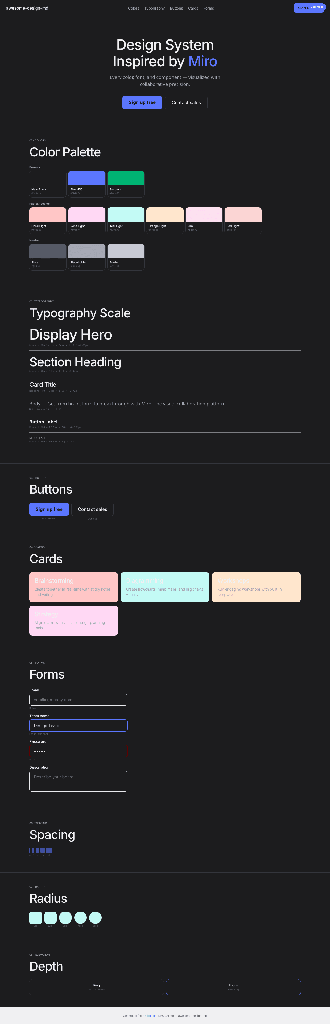
|
|
21
|
+
|
|
22
|
+
### Light Mode
|
|
23
|
+
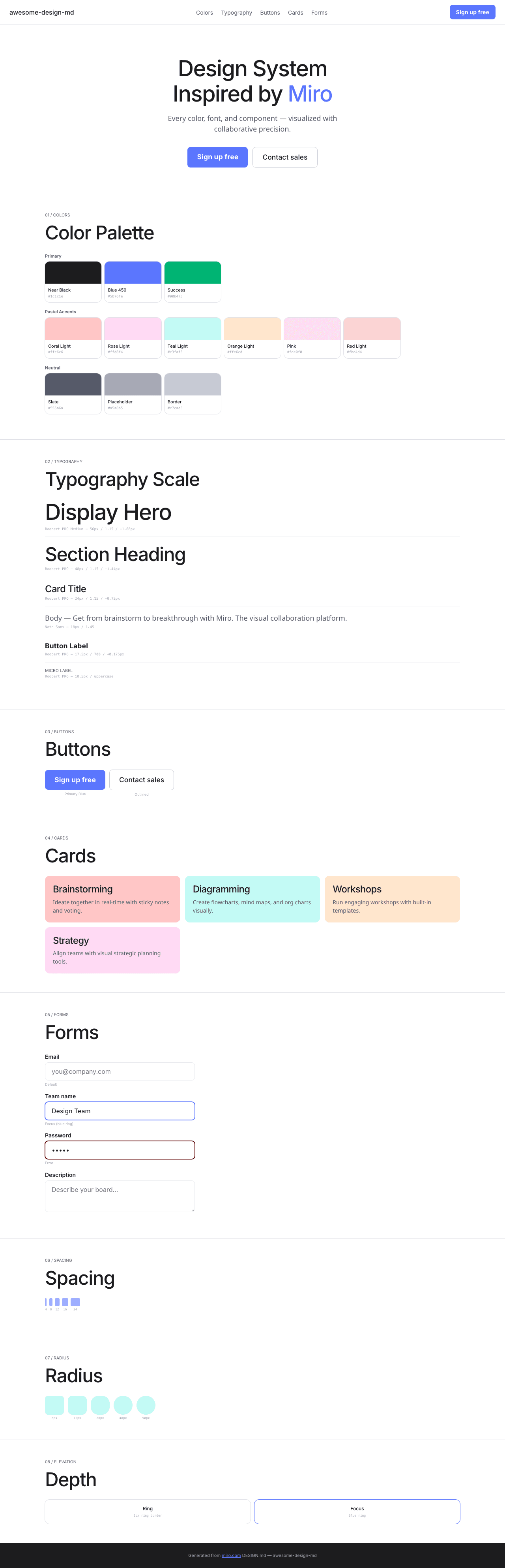
|