awesome-design-md 1.0.0
This diff represents the content of publicly available package versions that have been released to one of the supported registries. The information contained in this diff is provided for informational purposes only and reflects changes between package versions as they appear in their respective public registries.
- package/LICENSE +21 -0
- package/README.md +172 -0
- package/bin/cli.mjs +126 -0
- package/design-md/airbnb/DESIGN.md +246 -0
- package/design-md/airbnb/README.md +23 -0
- package/design-md/airbnb/preview-dark.html +234 -0
- package/design-md/airbnb/preview.html +233 -0
- package/design-md/airtable/DESIGN.md +89 -0
- package/design-md/airtable/README.md +23 -0
- package/design-md/airtable/preview-dark.html +165 -0
- package/design-md/airtable/preview.html +164 -0
- package/design-md/apple/DESIGN.md +313 -0
- package/design-md/apple/README.md +24 -0
- package/design-md/apple/preview-dark.html +422 -0
- package/design-md/apple/preview.html +416 -0
- package/design-md/bmw/DESIGN.md +180 -0
- package/design-md/bmw/README.md +23 -0
- package/design-md/bmw/preview-dark.html +211 -0
- package/design-md/bmw/preview.html +210 -0
- package/design-md/cal/DESIGN.md +259 -0
- package/design-md/cal/README.md +23 -0
- package/design-md/cal/preview-dark.html +449 -0
- package/design-md/cal/preview.html +575 -0
- package/design-md/claude/DESIGN.md +312 -0
- package/design-md/claude/README.md +24 -0
- package/design-md/claude/preview-dark.html +803 -0
- package/design-md/claude/preview.html +826 -0
- package/design-md/clay/DESIGN.md +304 -0
- package/design-md/clay/README.md +23 -0
- package/design-md/clay/preview-dark.html +318 -0
- package/design-md/clay/preview.html +317 -0
- package/design-md/clickhouse/DESIGN.md +281 -0
- package/design-md/clickhouse/README.md +24 -0
- package/design-md/clickhouse/preview-dark.html +834 -0
- package/design-md/clickhouse/preview.html +786 -0
- package/design-md/cohere/DESIGN.md +266 -0
- package/design-md/cohere/README.md +24 -0
- package/design-md/cohere/preview-dark.html +810 -0
- package/design-md/cohere/preview.html +814 -0
- package/design-md/coinbase/DESIGN.md +129 -0
- package/design-md/coinbase/README.md +23 -0
- package/design-md/coinbase/preview-dark.html +164 -0
- package/design-md/coinbase/preview.html +163 -0
- package/design-md/composio/DESIGN.md +307 -0
- package/design-md/composio/README.md +24 -0
- package/design-md/composio/preview-dark.html +958 -0
- package/design-md/composio/preview.html +933 -0
- package/design-md/cursor/DESIGN.md +309 -0
- package/design-md/cursor/README.md +24 -0
- package/design-md/cursor/preview-dark.html +395 -0
- package/design-md/cursor/preview.html +385 -0
- package/design-md/elevenlabs/DESIGN.md +265 -0
- package/design-md/elevenlabs/README.md +23 -0
- package/design-md/elevenlabs/preview-dark.html +254 -0
- package/design-md/elevenlabs/preview.html +253 -0
- package/design-md/expo/DESIGN.md +281 -0
- package/design-md/expo/README.md +24 -0
- package/design-md/expo/preview-dark.html +536 -0
- package/design-md/expo/preview.html +536 -0
- package/design-md/figma/DESIGN.md +220 -0
- package/design-md/figma/README.md +24 -0
- package/design-md/figma/preview-dark.html +831 -0
- package/design-md/figma/preview.html +841 -0
- package/design-md/framer/DESIGN.md +246 -0
- package/design-md/framer/README.md +23 -0
- package/design-md/framer/preview-dark.html +904 -0
- package/design-md/framer/preview.html +885 -0
- package/design-md/hashicorp/DESIGN.md +278 -0
- package/design-md/hashicorp/README.md +24 -0
- package/design-md/hashicorp/preview-dark.html +1206 -0
- package/design-md/hashicorp/preview.html +1195 -0
- package/design-md/ibm/DESIGN.md +332 -0
- package/design-md/ibm/README.md +24 -0
- package/design-md/ibm/preview-dark.html +445 -0
- package/design-md/ibm/preview.html +430 -0
- package/design-md/intercom/DESIGN.md +146 -0
- package/design-md/intercom/README.md +23 -0
- package/design-md/intercom/preview-dark.html +185 -0
- package/design-md/intercom/preview.html +184 -0
- package/design-md/kraken/DESIGN.md +125 -0
- package/design-md/kraken/README.md +23 -0
- package/design-md/kraken/preview-dark.html +169 -0
- package/design-md/kraken/preview.html +168 -0
- package/design-md/linear.app/DESIGN.md +367 -0
- package/design-md/linear.app/README.md +24 -0
- package/design-md/linear.app/preview-dark.html +385 -0
- package/design-md/linear.app/preview.html +375 -0
- package/design-md/lovable/DESIGN.md +298 -0
- package/design-md/lovable/README.md +24 -0
- package/design-md/lovable/preview-dark.html +351 -0
- package/design-md/lovable/preview.html +350 -0
- package/design-md/minimax/DESIGN.md +257 -0
- package/design-md/minimax/README.md +24 -0
- package/design-md/minimax/preview-dark.html +1267 -0
- package/design-md/minimax/preview.html +1253 -0
- package/design-md/mintlify/DESIGN.md +326 -0
- package/design-md/mintlify/README.md +24 -0
- package/design-md/mintlify/preview-dark.html +411 -0
- package/design-md/mintlify/preview.html +400 -0
- package/design-md/miro/DESIGN.md +108 -0
- package/design-md/miro/README.md +23 -0
- package/design-md/miro/preview-dark.html +174 -0
- package/design-md/miro/preview.html +173 -0
- package/design-md/mistral.ai/DESIGN.md +261 -0
- package/design-md/mistral.ai/README.md +24 -0
- package/design-md/mistral.ai/preview-dark.html +813 -0
- package/design-md/mistral.ai/preview.html +812 -0
- package/design-md/mongodb/DESIGN.md +266 -0
- package/design-md/mongodb/README.md +23 -0
- package/design-md/mongodb/preview-dark.html +262 -0
- package/design-md/mongodb/preview.html +261 -0
- package/design-md/notion/DESIGN.md +309 -0
- package/design-md/notion/README.md +24 -0
- package/design-md/notion/preview-dark.html +374 -0
- package/design-md/notion/preview.html +366 -0
- package/design-md/nvidia/DESIGN.md +293 -0
- package/design-md/nvidia/README.md +24 -0
- package/design-md/nvidia/preview-dark.html +376 -0
- package/design-md/nvidia/preview.html +368 -0
- package/design-md/ollama/DESIGN.md +267 -0
- package/design-md/ollama/README.md +24 -0
- package/design-md/ollama/preview-dark.html +678 -0
- package/design-md/ollama/preview.html +678 -0
- package/design-md/opencode.ai/DESIGN.md +281 -0
- package/design-md/opencode.ai/README.md +24 -0
- package/design-md/opencode.ai/preview-dark.html +368 -0
- package/design-md/opencode.ai/preview.html +359 -0
- package/design-md/pinterest/DESIGN.md +230 -0
- package/design-md/pinterest/README.md +23 -0
- package/design-md/pinterest/preview-dark.html +233 -0
- package/design-md/pinterest/preview.html +232 -0
- package/design-md/posthog/DESIGN.md +256 -0
- package/design-md/posthog/README.md +23 -0
- package/design-md/posthog/preview-dark.html +701 -0
- package/design-md/posthog/preview.html +751 -0
- package/design-md/raycast/DESIGN.md +268 -0
- package/design-md/raycast/README.md +23 -0
- package/design-md/raycast/preview-dark.html +608 -0
- package/design-md/raycast/preview.html +690 -0
- package/design-md/replicate/DESIGN.md +261 -0
- package/design-md/replicate/README.md +24 -0
- package/design-md/replicate/preview-dark.html +828 -0
- package/design-md/replicate/preview.html +831 -0
- package/design-md/resend/DESIGN.md +303 -0
- package/design-md/resend/README.md +23 -0
- package/design-md/resend/preview-dark.html +357 -0
- package/design-md/resend/preview.html +356 -0
- package/design-md/revolut/DESIGN.md +185 -0
- package/design-md/revolut/README.md +23 -0
- package/design-md/revolut/preview-dark.html +234 -0
- package/design-md/revolut/preview.html +233 -0
- package/design-md/runwayml/DESIGN.md +244 -0
- package/design-md/runwayml/README.md +24 -0
- package/design-md/runwayml/preview-dark.html +664 -0
- package/design-md/runwayml/preview.html +665 -0
- package/design-md/sanity/DESIGN.md +357 -0
- package/design-md/sanity/README.md +24 -0
- package/design-md/sanity/preview-dark.html +995 -0
- package/design-md/sanity/preview.html +1140 -0
- package/design-md/sentry/DESIGN.md +262 -0
- package/design-md/sentry/README.md +24 -0
- package/design-md/sentry/preview-dark.html +628 -0
- package/design-md/sentry/preview.html +953 -0
- package/design-md/spacex/DESIGN.md +194 -0
- package/design-md/spacex/README.md +23 -0
- package/design-md/spacex/preview-dark.html +223 -0
- package/design-md/spacex/preview.html +222 -0
- package/design-md/spotify/DESIGN.md +246 -0
- package/design-md/spotify/README.md +23 -0
- package/design-md/spotify/preview-dark.html +231 -0
- package/design-md/spotify/preview.html +230 -0
- package/design-md/stripe/DESIGN.md +322 -0
- package/design-md/stripe/README.md +24 -0
- package/design-md/stripe/preview-dark.html +430 -0
- package/design-md/stripe/preview.html +421 -0
- package/design-md/supabase/DESIGN.md +255 -0
- package/design-md/supabase/README.md +24 -0
- package/design-md/supabase/preview-dark.html +977 -0
- package/design-md/supabase/preview.html +955 -0
- package/design-md/superhuman/DESIGN.md +252 -0
- package/design-md/superhuman/README.md +23 -0
- package/design-md/superhuman/preview-dark.html +975 -0
- package/design-md/superhuman/preview.html +953 -0
- package/design-md/together.ai/DESIGN.md +263 -0
- package/design-md/together.ai/README.md +24 -0
- package/design-md/together.ai/preview-dark.html +892 -0
- package/design-md/together.ai/preview.html +897 -0
- package/design-md/uber/DESIGN.md +295 -0
- package/design-md/uber/README.md +24 -0
- package/design-md/uber/preview-dark.html +1164 -0
- package/design-md/uber/preview.html +1163 -0
- package/design-md/vercel/DESIGN.md +310 -0
- package/design-md/vercel/README.md +24 -0
- package/design-md/vercel/preview-dark.html +370 -0
- package/design-md/vercel/preview.html +369 -0
- package/design-md/voltagent/DESIGN.md +323 -0
- package/design-md/voltagent/README.md +24 -0
- package/design-md/voltagent/preview-dark.html +487 -0
- package/design-md/voltagent/preview.html +766 -0
- package/design-md/warp/DESIGN.md +253 -0
- package/design-md/warp/README.md +23 -0
- package/design-md/warp/preview-dark.html +502 -0
- package/design-md/warp/preview.html +535 -0
- package/design-md/webflow/DESIGN.md +92 -0
- package/design-md/webflow/README.md +23 -0
- package/design-md/webflow/preview-dark.html +147 -0
- package/design-md/webflow/preview.html +146 -0
- package/design-md/wise/DESIGN.md +173 -0
- package/design-md/wise/README.md +23 -0
- package/design-md/wise/preview-dark.html +230 -0
- package/design-md/wise/preview.html +229 -0
- package/design-md/x.ai/DESIGN.md +257 -0
- package/design-md/x.ai/README.md +24 -0
- package/design-md/x.ai/preview-dark.html +358 -0
- package/design-md/x.ai/preview.html +409 -0
- package/design-md/zapier/DESIGN.md +328 -0
- package/design-md/zapier/README.md +24 -0
- package/design-md/zapier/preview-dark.html +382 -0
- package/design-md/zapier/preview.html +374 -0
- package/package.json +33 -0
|
@@ -0,0 +1,261 @@
|
|
|
1
|
+
<!DOCTYPE html>
|
|
2
|
+
<html lang="en">
|
|
3
|
+
<head>
|
|
4
|
+
<meta charset="UTF-8">
|
|
5
|
+
<meta name="viewport" content="width=device-width, initial-scale=1.0">
|
|
6
|
+
<title>Design System Preview: MongoDB (Light)</title>
|
|
7
|
+
<link rel="preconnect" href="https://fonts.googleapis.com">
|
|
8
|
+
<link rel="preconnect" href="https://fonts.gstatic.com" crossorigin>
|
|
9
|
+
<link href="https://fonts.googleapis.com/css2?family=DM+Serif+Display&family=Inter:wght@300;400;500;600;700&family=Source+Code+Pro:wght@400;500;600&display=swap" rel="stylesheet">
|
|
10
|
+
<style>
|
|
11
|
+
:root {
|
|
12
|
+
--forest: #001e2b; --green: #00ed64; --dark-green: #00684a; --blue: #006cfa;
|
|
13
|
+
--hover-blue: #3860be; --teal: #1c2d38; --teal-gray: #3d4f58; --cool-gray: #5c6c75;
|
|
14
|
+
--silver: #b8c4c2; --white: #ffffff; --black: #000000;
|
|
15
|
+
--shadow-forest: rgba(0,30,43,0.12) 0px 26px 44px, rgba(0,0,0,0.13) 0px 7px 13px;
|
|
16
|
+
--font-serif: 'DM Serif Display', Georgia, serif;
|
|
17
|
+
--font-sans: 'Inter', system-ui, sans-serif;
|
|
18
|
+
--font-mono: 'Source Code Pro', ui-monospace, monospace;
|
|
19
|
+
}
|
|
20
|
+
* { margin:0; padding:0; box-sizing:border-box; }
|
|
21
|
+
body { background:var(--white); color:var(--black); font-family:var(--font-sans); font-size:16px; font-weight:300; line-height:1.50; -webkit-font-smoothing:antialiased; }
|
|
22
|
+
|
|
23
|
+
.nav { position:sticky; top:0; z-index:100; display:flex; align-items:center; justify-content:space-between; padding:12px 32px; background:var(--forest); }
|
|
24
|
+
.nav-brand { font-size:14px; font-weight:500; color:var(--white); text-decoration:none; }
|
|
25
|
+
.nav-links { display:flex; gap:24px; list-style:none; }
|
|
26
|
+
.nav-links a { font-size:14px; font-weight:500; color:rgba(255,255,255,0.7); text-decoration:none; transition:color 0.15s; }
|
|
27
|
+
.nav-links a:hover { color:var(--white); }
|
|
28
|
+
.nav-cta { display:inline-block; background:var(--dark-green); color:var(--white); padding:8px 18px; border-radius:100px; font-size:14px; font-weight:600; text-decoration:none; }
|
|
29
|
+
|
|
30
|
+
.hero { padding:80px 32px; background:var(--forest); text-align:center; color:var(--white); }
|
|
31
|
+
.hero h1 { font-family:var(--font-serif); font-size:72px; font-weight:400; line-height:1.10; margin-bottom:16px; }
|
|
32
|
+
.hero h1 span { color:var(--green); }
|
|
33
|
+
.hero p { font-size:18px; font-weight:300; line-height:1.50; color:rgba(255,255,255,0.7); max-width:550px; margin:0 auto 32px; }
|
|
34
|
+
.hero-buttons { display:flex; gap:12px; justify-content:center; }
|
|
35
|
+
.btn-green { display:inline-block; background:var(--dark-green); color:var(--white); padding:10px 24px; border-radius:100px; border:1px solid var(--dark-green); font-family:var(--font-sans); font-size:14px; font-weight:600; text-decoration:none; }
|
|
36
|
+
.btn-outline-light { display:inline-block; background:transparent; color:var(--white); padding:10px 24px; border-radius:100px; border:1px solid var(--teal-gray); font-family:var(--font-sans); font-size:14px; font-weight:500; text-decoration:none; }
|
|
37
|
+
|
|
38
|
+
.section { padding:64px 32px; max-width:1100px; margin:0 auto; }
|
|
39
|
+
.section-dark { padding:64px 32px; background:var(--forest); color:var(--white); }
|
|
40
|
+
.section-dark .section-inner { max-width:1100px; margin:0 auto; }
|
|
41
|
+
.section-label { font-family:var(--font-mono); font-size:12px; font-weight:500; text-transform:uppercase; letter-spacing:2px; color:var(--green); margin-bottom:8px; }
|
|
42
|
+
.section-label-light { font-family:var(--font-mono); font-size:12px; font-weight:500; text-transform:uppercase; letter-spacing:2px; color:var(--dark-green); margin-bottom:8px; }
|
|
43
|
+
.section-title { font-size:36px; font-weight:500; line-height:1.33; margin-bottom:32px; }
|
|
44
|
+
.section-divider { border:none; border-top:1px solid var(--silver); margin:0; }
|
|
45
|
+
|
|
46
|
+
.color-grid { display:grid; grid-template-columns:repeat(auto-fill, minmax(150px,1fr)); gap:12px; margin-bottom:24px; }
|
|
47
|
+
.color-swatch { border-radius:16px; overflow:hidden; border:1px solid var(--silver); }
|
|
48
|
+
.color-swatch-block { height:72px; width:100%; }
|
|
49
|
+
.color-swatch-info { padding:10px 12px; }
|
|
50
|
+
.color-swatch-name { font-size:13px; font-weight:500; margin-bottom:2px; }
|
|
51
|
+
.color-swatch-hex { font-size:11px; color:var(--cool-gray); font-family:var(--font-mono); }
|
|
52
|
+
.color-swatch-role { font-size:10px; color:var(--cool-gray); margin-top:3px; }
|
|
53
|
+
.color-group-label { font-size:14px; font-weight:500; color:var(--cool-gray); margin:24px 0 10px; }
|
|
54
|
+
|
|
55
|
+
.type-sample { margin-bottom:28px; padding-bottom:24px; border-bottom:1px solid rgba(184,196,194,0.5); }
|
|
56
|
+
.type-sample:last-child { border-bottom:none; }
|
|
57
|
+
.type-meta { font-family:var(--font-mono); font-size:11px; color:var(--cool-gray); margin-top:6px; }
|
|
58
|
+
|
|
59
|
+
.button-row { display:flex; gap:16px; flex-wrap:wrap; align-items:center; }
|
|
60
|
+
.button-item { text-align:center; }
|
|
61
|
+
.button-label { font-size:11px; font-weight:500; color:var(--cool-gray); margin-top:8px; }
|
|
62
|
+
.btn-teal { display:inline-block; background:var(--teal); color:var(--cool-gray); padding:10px 20px; border-radius:100px; border:1px solid var(--teal-gray); font-family:var(--font-sans); font-size:14px; font-weight:500; text-decoration:none; }
|
|
63
|
+
.btn-outline-dark { display:inline-block; background:transparent; color:var(--forest); padding:10px 20px; border-radius:8px; border:1px solid var(--silver); font-family:var(--font-sans); font-size:14px; font-weight:500; text-decoration:none; }
|
|
64
|
+
|
|
65
|
+
.card-grid { display:grid; grid-template-columns:repeat(auto-fit, minmax(300px,1fr)); gap:16px; }
|
|
66
|
+
.card { background:var(--white); border:1px solid var(--silver); border-radius:16px; padding:24px; }
|
|
67
|
+
.card h3 { font-size:24px; font-weight:500; margin-bottom:8px; }
|
|
68
|
+
.card p { font-size:16px; font-weight:300; color:var(--cool-gray); line-height:1.50; }
|
|
69
|
+
.card-accent { border-bottom:2px solid var(--green); display:inline-block; padding-bottom:2px; margin-bottom:12px; font-family:var(--font-mono); font-size:12px; font-weight:500; text-transform:uppercase; letter-spacing:2px; color:var(--dark-green); }
|
|
70
|
+
|
|
71
|
+
.form-group { margin-bottom:16px; max-width:400px; }
|
|
72
|
+
.form-label { display:block; font-size:14px; font-weight:500; margin-bottom:6px; }
|
|
73
|
+
.form-input { width:100%; background:var(--white); color:var(--black); border:1px solid var(--silver); padding:10px 12px; border-radius:4px; font-family:var(--font-sans); font-size:16px; font-weight:300; outline:none; }
|
|
74
|
+
.form-input:focus { border-color:var(--blue); box-shadow:0 0 0 2px rgba(0,108,250,0.2); }
|
|
75
|
+
.form-input--focus { border-color:var(--blue); box-shadow:0 0 0 2px rgba(0,108,250,0.2); }
|
|
76
|
+
.form-input--error { border-color:#e53e3e; box-shadow:0 0 0 2px rgba(229,62,62,0.2); }
|
|
77
|
+
.form-textarea { width:100%; min-height:80px; background:var(--white); color:var(--black); border:1px solid var(--silver); padding:10px 12px; border-radius:4px; font-family:var(--font-sans); font-size:16px; font-weight:300; resize:vertical; outline:none; }
|
|
78
|
+
.form-state-label { font-size:10px; color:var(--cool-gray); margin-top:4px; }
|
|
79
|
+
|
|
80
|
+
.spacing-row { display:flex; align-items:flex-end; gap:10px; flex-wrap:wrap; margin-bottom:20px; }
|
|
81
|
+
.spacing-item { text-align:center; }
|
|
82
|
+
.spacing-block { background:var(--green); border-radius:4px; margin-bottom:6px; height:28px; }
|
|
83
|
+
.spacing-value { font-family:var(--font-mono); font-size:10px; color:var(--cool-gray); }
|
|
84
|
+
|
|
85
|
+
.radius-row { display:flex; gap:14px; flex-wrap:wrap; align-items:center; }
|
|
86
|
+
.radius-item { text-align:center; }
|
|
87
|
+
.radius-box { width:60px; height:60px; background:var(--dark-green); margin-bottom:6px; }
|
|
88
|
+
.radius-label { font-family:var(--font-mono); font-size:10px; color:var(--cool-gray); }
|
|
89
|
+
.radius-context { font-size:9px; color:var(--cool-gray); }
|
|
90
|
+
|
|
91
|
+
.elevation-grid { display:grid; grid-template-columns:repeat(auto-fit, minmax(200px,1fr)); gap:16px; }
|
|
92
|
+
.elevation-card { background:var(--white); border:1px solid var(--silver); border-radius:16px; padding:20px; text-align:center; }
|
|
93
|
+
.elevation-label { font-size:14px; font-weight:500; margin-bottom:4px; }
|
|
94
|
+
.elevation-desc { font-family:var(--font-mono); font-size:10px; color:var(--cool-gray); }
|
|
95
|
+
|
|
96
|
+
.footer { padding:40px 32px; text-align:center; background:var(--forest); color:rgba(255,255,255,0.5); font-size:13px; }
|
|
97
|
+
.footer a { color:var(--green); text-decoration:underline; }
|
|
98
|
+
|
|
99
|
+
@media (max-width:768px) {
|
|
100
|
+
.hero h1 { font-size:48px; }
|
|
101
|
+
.nav-links { display:none; }
|
|
102
|
+
.section { padding:48px 20px; }
|
|
103
|
+
.card-grid { grid-template-columns:1fr; }
|
|
104
|
+
}
|
|
105
|
+
</style>
|
|
106
|
+
</head>
|
|
107
|
+
<body>
|
|
108
|
+
|
|
109
|
+
<nav class="nav">
|
|
110
|
+
<a class="nav-brand" href="#">awesome-design-md</a>
|
|
111
|
+
<ul class="nav-links">
|
|
112
|
+
<li><a href="#colors">Colors</a></li>
|
|
113
|
+
<li><a href="#typography">Typography</a></li>
|
|
114
|
+
<li><a href="#buttons">Buttons</a></li>
|
|
115
|
+
<li><a href="#cards">Cards</a></li>
|
|
116
|
+
<li><a href="#forms">Forms</a></li>
|
|
117
|
+
<li><a href="#spacing">Spacing</a></li>
|
|
118
|
+
</ul>
|
|
119
|
+
<a class="nav-cta" href="#">Try Free</a>
|
|
120
|
+
</nav>
|
|
121
|
+
|
|
122
|
+
<section class="hero">
|
|
123
|
+
<h1>Design System<br>Inspired by <span>MongoDB</span></h1>
|
|
124
|
+
<p>A design token catalog generated from DESIGN.md. Every color, font, component, and spacing value — visualized.</p>
|
|
125
|
+
<div class="hero-buttons">
|
|
126
|
+
<a class="btn-green" href="#">Try Free</a>
|
|
127
|
+
<a class="btn-outline-light" href="#">Contact Sales</a>
|
|
128
|
+
</div>
|
|
129
|
+
</section>
|
|
130
|
+
|
|
131
|
+
<section class="section" id="colors">
|
|
132
|
+
<div class="section-label-light">01 / Colors</div>
|
|
133
|
+
<h2 class="section-title">Color Palette</h2>
|
|
134
|
+
|
|
135
|
+
<div class="color-group-label">Brand</div>
|
|
136
|
+
<div class="color-grid">
|
|
137
|
+
<div class="color-swatch"><div class="color-swatch-block" style="background:#001e2b"></div><div class="color-swatch-info"><div class="color-swatch-name">Forest Black</div><div class="color-swatch-hex">#001e2b</div><div class="color-swatch-role">Dark background</div></div></div>
|
|
138
|
+
<div class="color-swatch"><div class="color-swatch-block" style="background:#00ed64"></div><div class="color-swatch-info"><div class="color-swatch-name">MongoDB Green</div><div class="color-swatch-hex">#00ed64</div><div class="color-swatch-role">Brand accent</div></div></div>
|
|
139
|
+
<div class="color-swatch"><div class="color-swatch-block" style="background:#00684a"></div><div class="color-swatch-info"><div class="color-swatch-name">Dark Green</div><div class="color-swatch-hex">#00684a</div><div class="color-swatch-role">Buttons, links</div></div></div>
|
|
140
|
+
<div class="color-swatch"><div class="color-swatch-block" style="background:#006cfa"></div><div class="color-swatch-info"><div class="color-swatch-name">Action Blue</div><div class="color-swatch-hex">#006cfa</div><div class="color-swatch-role">Links, interactive</div></div></div>
|
|
141
|
+
</div>
|
|
142
|
+
|
|
143
|
+
<div class="color-group-label">Neutral Scale</div>
|
|
144
|
+
<div class="color-grid">
|
|
145
|
+
<div class="color-swatch"><div class="color-swatch-block" style="background:#1c2d38"></div><div class="color-swatch-info"><div class="color-swatch-name">Deep Teal</div><div class="color-swatch-hex">#1c2d38</div><div class="color-swatch-role">Dark buttons</div></div></div>
|
|
146
|
+
<div class="color-swatch"><div class="color-swatch-block" style="background:#3d4f58"></div><div class="color-swatch-info"><div class="color-swatch-name">Teal Gray</div><div class="color-swatch-hex">#3d4f58</div><div class="color-swatch-role">Dark borders</div></div></div>
|
|
147
|
+
<div class="color-swatch"><div class="color-swatch-block" style="background:#5c6c75"></div><div class="color-swatch-info"><div class="color-swatch-name">Cool Gray</div><div class="color-swatch-hex">#5c6c75</div><div class="color-swatch-role">Muted text</div></div></div>
|
|
148
|
+
<div class="color-swatch"><div class="color-swatch-block" style="background:#b8c4c2"></div><div class="color-swatch-info"><div class="color-swatch-name">Silver Teal</div><div class="color-swatch-hex">#b8c4c2</div><div class="color-swatch-role">Light borders</div></div></div>
|
|
149
|
+
</div>
|
|
150
|
+
</section>
|
|
151
|
+
|
|
152
|
+
<hr class="section-divider">
|
|
153
|
+
|
|
154
|
+
<section class="section" id="typography">
|
|
155
|
+
<div class="section-label-light">02 / Typography</div>
|
|
156
|
+
<h2 class="section-title">Typography Scale</h2>
|
|
157
|
+
<div class="type-sample"><div style="font-family:var(--font-serif); font-size:72px; font-weight:400; line-height:1.10;">Display Hero</div><div class="type-meta">Display — 96px / 400 / 1.20 / MongoDB Value Serif</div></div>
|
|
158
|
+
<div class="type-sample"><div style="font-size:36px; font-weight:500; line-height:1.33;">Section Heading</div><div class="type-meta">Section — 36px / 500 / 1.33 / Euclid Circular A</div></div>
|
|
159
|
+
<div class="type-sample"><div style="font-size:24px; font-weight:500; line-height:1.33;">Sub-heading</div><div class="type-meta">Sub — 24px / 500 / 1.33 / Euclid Circular A</div></div>
|
|
160
|
+
<div class="type-sample"><div style="font-size:16px; font-weight:300; line-height:1.50;">Body Light — Build faster with MongoDB. The developer data platform for modern applications.</div><div class="type-meta">Body — 16px / 300 / 1.50 / Euclid Circular A</div></div>
|
|
161
|
+
<div class="type-sample"><div style="font-family:var(--font-mono); font-size:14px; text-transform:uppercase; letter-spacing:2px; color:var(--dark-green);">DATABASE COLLECTION</div><div class="type-meta">Code Label — 14px / uppercase / +2px / Source Code Pro</div></div>
|
|
162
|
+
<div class="type-sample"><div style="font-family:var(--font-mono); font-size:16px; color:var(--cool-gray);">db.collection.find({ status: "active" })</div><div class="type-meta">Code Body — 16px / 400 / Source Code Pro</div></div>
|
|
163
|
+
<div class="type-sample"><div style="font-family:var(--font-mono); font-size:9px; font-weight:600; text-transform:uppercase; letter-spacing:2.5px; color:var(--green);">AGGREGATION PIPELINE</div><div class="type-meta">Code Micro — 9px / 600 / uppercase / +2.5px / Source Code Pro</div></div>
|
|
164
|
+
</section>
|
|
165
|
+
|
|
166
|
+
<hr class="section-divider">
|
|
167
|
+
|
|
168
|
+
<section class="section" id="buttons">
|
|
169
|
+
<div class="section-label-light">03 / Buttons</div>
|
|
170
|
+
<h2 class="section-title">Button Variants</h2>
|
|
171
|
+
<div class="button-row">
|
|
172
|
+
<div class="button-item"><a class="btn-green" href="#">Try Free</a><div class="button-label">Green Pill</div></div>
|
|
173
|
+
<div class="button-item"><a class="btn-teal" href="#">Explore</a><div class="button-label">Dark Teal</div></div>
|
|
174
|
+
<div class="button-item"><a class="btn-outline-dark" href="#">Learn More</a><div class="button-label">Outlined</div></div>
|
|
175
|
+
<div class="button-item"><a class="btn-outline-light" style="color:var(--cool-gray); border-color:var(--teal-gray);" href="#">Dark Context</a><div class="button-label">Dark Outlined</div></div>
|
|
176
|
+
</div>
|
|
177
|
+
</section>
|
|
178
|
+
|
|
179
|
+
<div class="section-dark">
|
|
180
|
+
<div class="section-inner" id="cards">
|
|
181
|
+
<div class="section-label">04 / Cards</div>
|
|
182
|
+
<h2 class="section-title">Card Examples</h2>
|
|
183
|
+
<div class="card-grid">
|
|
184
|
+
<div class="card" style="background:var(--teal); border-color:var(--teal-gray); color:var(--white);">
|
|
185
|
+
<div class="card-accent" style="color:var(--green); border-color:var(--green);">Atlas</div>
|
|
186
|
+
<h3 style="color:var(--white);">Document Model</h3>
|
|
187
|
+
<p style="color:rgba(255,255,255,0.6);">Map your data naturally with flexible documents. No rigid schemas, no complex joins.</p>
|
|
188
|
+
</div>
|
|
189
|
+
<div class="card">
|
|
190
|
+
<div class="card-accent">Search</div>
|
|
191
|
+
<h3>Full-text Search</h3>
|
|
192
|
+
<p>Build rich search experiences using the same data you already have in Atlas.</p>
|
|
193
|
+
</div>
|
|
194
|
+
<div class="card" style="box-shadow: rgba(0,30,43,0.12) 0px 26px 44px, rgba(0,0,0,0.13) 0px 7px 13px;">
|
|
195
|
+
<div class="card-accent" style="border-color:var(--blue); color:var(--blue);">Elevated</div>
|
|
196
|
+
<h3>Vector Search</h3>
|
|
197
|
+
<p>Build AI-powered applications with native vector search. Forest-tinted shadow elevation.</p>
|
|
198
|
+
</div>
|
|
199
|
+
</div>
|
|
200
|
+
</div>
|
|
201
|
+
</div>
|
|
202
|
+
|
|
203
|
+
<section class="section" id="forms">
|
|
204
|
+
<div class="section-label-light">05 / Forms</div>
|
|
205
|
+
<h2 class="section-title">Form Elements</h2>
|
|
206
|
+
<div class="form-group"><label class="form-label">Cluster Name</label><input class="form-input" type="text" placeholder="my-cluster-0"><div class="form-state-label">Default</div></div>
|
|
207
|
+
<div class="form-group"><label class="form-label">Connection String</label><input class="form-input form-input--focus" type="text" value="mongodb+srv://..."><div class="form-state-label">Focus (blue ring)</div></div>
|
|
208
|
+
<div class="form-group"><label class="form-label">Database</label><input class="form-input form-input--error" type="text" value="invalid name"><div class="form-state-label">Error</div></div>
|
|
209
|
+
<div class="form-group"><label class="form-label">Query</label><textarea class="form-textarea" placeholder='{ "status": "active" }'></textarea></div>
|
|
210
|
+
</section>
|
|
211
|
+
|
|
212
|
+
<hr class="section-divider">
|
|
213
|
+
|
|
214
|
+
<section class="section" id="spacing">
|
|
215
|
+
<div class="section-label-light">06 / Spacing</div>
|
|
216
|
+
<h2 class="section-title">Spacing Scale</h2>
|
|
217
|
+
<div class="spacing-row">
|
|
218
|
+
<div class="spacing-item"><div class="spacing-block" style="width:4px"></div><div class="spacing-value">4</div></div>
|
|
219
|
+
<div class="spacing-item"><div class="spacing-block" style="width:8px"></div><div class="spacing-value">8</div></div>
|
|
220
|
+
<div class="spacing-item"><div class="spacing-block" style="width:12px"></div><div class="spacing-value">12</div></div>
|
|
221
|
+
<div class="spacing-item"><div class="spacing-block" style="width:16px"></div><div class="spacing-value">16</div></div>
|
|
222
|
+
<div class="spacing-item"><div class="spacing-block" style="width:20px"></div><div class="spacing-value">20</div></div>
|
|
223
|
+
<div class="spacing-item"><div class="spacing-block" style="width:24px"></div><div class="spacing-value">24</div></div>
|
|
224
|
+
<div class="spacing-item"><div class="spacing-block" style="width:32px"></div><div class="spacing-value">32</div></div>
|
|
225
|
+
</div>
|
|
226
|
+
</section>
|
|
227
|
+
|
|
228
|
+
<hr class="section-divider">
|
|
229
|
+
|
|
230
|
+
<section class="section">
|
|
231
|
+
<div class="section-label-light">07 / Radius</div>
|
|
232
|
+
<h2 class="section-title">Border Radius Scale</h2>
|
|
233
|
+
<div class="radius-row">
|
|
234
|
+
<div class="radius-item"><div class="radius-box" style="border-radius:4px"></div><div class="radius-label">4px</div><div class="radius-context">Inputs</div></div>
|
|
235
|
+
<div class="radius-item"><div class="radius-box" style="border-radius:8px"></div><div class="radius-label">8px</div><div class="radius-context">Links</div></div>
|
|
236
|
+
<div class="radius-item"><div class="radius-box" style="border-radius:16px"></div><div class="radius-label">16px</div><div class="radius-context">Cards</div></div>
|
|
237
|
+
<div class="radius-item"><div class="radius-box" style="border-radius:24px"></div><div class="radius-label">24px</div><div class="radius-context">Panels</div></div>
|
|
238
|
+
<div class="radius-item"><div class="radius-box" style="border-radius:48px"></div><div class="radius-label">48px</div><div class="radius-context">Hero cards</div></div>
|
|
239
|
+
<div class="radius-item"><div class="radius-box" style="border-radius:999px; width:60px; height:60px;"></div><div class="radius-label">pill</div><div class="radius-context">Buttons</div></div>
|
|
240
|
+
</div>
|
|
241
|
+
</section>
|
|
242
|
+
|
|
243
|
+
<hr class="section-divider">
|
|
244
|
+
|
|
245
|
+
<section class="section">
|
|
246
|
+
<div class="section-label-light">08 / Elevation</div>
|
|
247
|
+
<h2 class="section-title">Elevation & Depth</h2>
|
|
248
|
+
<div class="elevation-grid">
|
|
249
|
+
<div class="elevation-card"><div class="elevation-label">Level 0</div><div class="elevation-desc">Flat — no shadow</div></div>
|
|
250
|
+
<div class="elevation-card" style="box-shadow:rgba(0,0,0,0.1) 0px 2px 4px;"><div class="elevation-label">Subtle</div><div class="elevation-desc">Light lift</div></div>
|
|
251
|
+
<div class="elevation-card" style="box-shadow:rgba(0,0,0,0.15) 0px 3px 20px;"><div class="elevation-label">Standard</div><div class="elevation-desc">General elevation</div></div>
|
|
252
|
+
<div class="elevation-card" style="box-shadow:rgba(0,30,43,0.12) 0px 26px 44px, rgba(0,0,0,0.13) 0px 7px 13px;"><div class="elevation-label">Forest</div><div class="elevation-desc">Teal-tinted primary</div></div>
|
|
253
|
+
</div>
|
|
254
|
+
</section>
|
|
255
|
+
|
|
256
|
+
<footer class="footer">
|
|
257
|
+
Generated from <a href="https://www.mongodb.com/">mongodb.com</a> DESIGN.md — awesome-design-md
|
|
258
|
+
</footer>
|
|
259
|
+
|
|
260
|
+
</body>
|
|
261
|
+
</html>
|
|
@@ -0,0 +1,309 @@
|
|
|
1
|
+
# Design System: Notion
|
|
2
|
+
|
|
3
|
+
## 1. Visual Theme & Atmosphere
|
|
4
|
+
|
|
5
|
+
Notion's website embodies the philosophy of the tool itself: a blank canvas that gets out of your way. The design system is built on warm neutrals rather than cold grays, creating a distinctly approachable minimalism that feels like quality paper rather than sterile glass. The page canvas is pure white (`#ffffff`) but the text isn't pure black -- it's a warm near-black (`rgba(0,0,0,0.95)`) that softens the reading experience imperceptibly. The warm gray scale (`#f6f5f4`, `#31302e`, `#615d59`, `#a39e98`) carries subtle yellow-brown undertones, giving the interface a tactile, almost analog warmth.
|
|
6
|
+
|
|
7
|
+
The custom NotionInter font (a modified Inter) is the backbone of the system. At display sizes (64px), it uses aggressive negative letter-spacing (-2.125px), creating headlines that feel compressed and precise. The weight range is broader than typical systems: 400 for body, 500 for UI elements, 600 for semi-bold labels, and 700 for display headings. OpenType features `"lnum"` (lining numerals) and `"locl"` (localized forms) are enabled on larger text, adding typographic sophistication that rewards close reading.
|
|
8
|
+
|
|
9
|
+
What makes Notion's visual language distinctive is its border philosophy. Rather than heavy borders or shadows, Notion uses ultra-thin `1px solid rgba(0,0,0,0.1)` borders -- borders that exist as whispers, barely perceptible division lines that create structure without weight. The shadow system is equally restrained: multi-layer stacks with cumulative opacity never exceeding 0.05, creating depth that's felt rather than seen.
|
|
10
|
+
|
|
11
|
+
**Key Characteristics:**
|
|
12
|
+
- NotionInter (modified Inter) with negative letter-spacing at display sizes (-2.125px at 64px)
|
|
13
|
+
- Warm neutral palette: grays carry yellow-brown undertones (`#f6f5f4` warm white, `#31302e` warm dark)
|
|
14
|
+
- Near-black text via `rgba(0,0,0,0.95)` -- not pure black, creating micro-warmth
|
|
15
|
+
- Ultra-thin borders: `1px solid rgba(0,0,0,0.1)` throughout -- whisper-weight division
|
|
16
|
+
- Multi-layer shadow stacks with sub-0.05 opacity for barely-there depth
|
|
17
|
+
- Notion Blue (`#0075de`) as the singular accent color for CTAs and interactive elements
|
|
18
|
+
- Pill badges (9999px radius) with tinted blue backgrounds for status indicators
|
|
19
|
+
- 8px base spacing unit with an organic, non-rigid scale
|
|
20
|
+
|
|
21
|
+
## 2. Color Palette & Roles
|
|
22
|
+
|
|
23
|
+
### Primary
|
|
24
|
+
- **Notion Black** (`rgba(0,0,0,0.95)` / `#000000f2`): Primary text, headings, body copy. The 95% opacity softens pure black without sacrificing readability.
|
|
25
|
+
- **Pure White** (`#ffffff`): Page background, card surfaces, button text on blue.
|
|
26
|
+
- **Notion Blue** (`#0075de`): Primary CTA, link color, interactive accent -- the only saturated color in the core UI chrome.
|
|
27
|
+
|
|
28
|
+
### Brand Secondary
|
|
29
|
+
- **Deep Navy** (`#213183`): Secondary brand color, used sparingly for emphasis and dark feature sections.
|
|
30
|
+
- **Active Blue** (`#005bab`): Button active/pressed state -- darker variant of Notion Blue.
|
|
31
|
+
|
|
32
|
+
### Warm Neutral Scale
|
|
33
|
+
- **Warm White** (`#f6f5f4`): Background surface tint, section alternation, subtle card fill. The yellow undertone is key.
|
|
34
|
+
- **Warm Dark** (`#31302e`): Dark surface background, dark section text. Warmer than standard grays.
|
|
35
|
+
- **Warm Gray 500** (`#615d59`): Secondary text, descriptions, muted labels.
|
|
36
|
+
- **Warm Gray 300** (`#a39e98`): Placeholder text, disabled states, caption text.
|
|
37
|
+
|
|
38
|
+
### Semantic Accent Colors
|
|
39
|
+
- **Teal** (`#2a9d99`): Success states, positive indicators.
|
|
40
|
+
- **Green** (`#1aae39`): Confirmation, completion badges.
|
|
41
|
+
- **Orange** (`#dd5b00`): Warning states, attention indicators.
|
|
42
|
+
- **Pink** (`#ff64c8`): Decorative accent, feature highlights.
|
|
43
|
+
- **Purple** (`#391c57`): Premium features, deep accents.
|
|
44
|
+
- **Brown** (`#523410`): Earthy accent, warm feature sections.
|
|
45
|
+
|
|
46
|
+
### Interactive
|
|
47
|
+
- **Link Blue** (`#0075de`): Primary link color with underline-on-hover.
|
|
48
|
+
- **Link Light Blue** (`#62aef0`): Lighter link variant for dark backgrounds.
|
|
49
|
+
- **Focus Blue** (`#097fe8`): Focus ring on interactive elements.
|
|
50
|
+
- **Badge Blue Bg** (`#f2f9ff`): Pill badge background, tinted blue surface.
|
|
51
|
+
- **Badge Blue Text** (`#097fe8`): Pill badge text, darker blue for readability.
|
|
52
|
+
|
|
53
|
+
### Shadows & Depth
|
|
54
|
+
- **Card Shadow** (`rgba(0,0,0,0.04) 0px 4px 18px, rgba(0,0,0,0.027) 0px 2.025px 7.84688px, rgba(0,0,0,0.02) 0px 0.8px 2.925px, rgba(0,0,0,0.01) 0px 0.175px 1.04062px`): Multi-layer card elevation.
|
|
55
|
+
- **Deep Shadow** (`rgba(0,0,0,0.01) 0px 1px 3px, rgba(0,0,0,0.02) 0px 3px 7px, rgba(0,0,0,0.02) 0px 7px 15px, rgba(0,0,0,0.04) 0px 14px 28px, rgba(0,0,0,0.05) 0px 23px 52px`): Five-layer deep elevation for modals and featured content.
|
|
56
|
+
- **Whisper Border** (`1px solid rgba(0,0,0,0.1)`): Standard division border -- cards, dividers, sections.
|
|
57
|
+
|
|
58
|
+
## 3. Typography Rules
|
|
59
|
+
|
|
60
|
+
### Font Family
|
|
61
|
+
- **Primary**: `NotionInter`, with fallbacks: `Inter, -apple-system, system-ui, Segoe UI, Helvetica, Apple Color Emoji, Arial, Segoe UI Emoji, Segoe UI Symbol`
|
|
62
|
+
- **OpenType Features**: `"lnum"` (lining numerals) and `"locl"` (localized forms) enabled on display and heading text.
|
|
63
|
+
|
|
64
|
+
### Hierarchy
|
|
65
|
+
|
|
66
|
+
| Role | Font | Size | Weight | Line Height | Letter Spacing | Notes |
|
|
67
|
+
|------|------|------|--------|-------------|----------------|-------|
|
|
68
|
+
| Display Hero | NotionInter | 64px (4.00rem) | 700 | 1.00 (tight) | -2.125px | Maximum compression, billboard headlines |
|
|
69
|
+
| Display Secondary | NotionInter | 54px (3.38rem) | 700 | 1.04 (tight) | -1.875px | Secondary hero, feature headlines |
|
|
70
|
+
| Section Heading | NotionInter | 48px (3.00rem) | 700 | 1.00 (tight) | -1.5px | Feature section titles, with `"lnum"` |
|
|
71
|
+
| Sub-heading Large | NotionInter | 40px (2.50rem) | 700 | 1.50 | normal | Card headings, feature sub-sections |
|
|
72
|
+
| Sub-heading | NotionInter | 26px (1.63rem) | 700 | 1.23 (tight) | -0.625px | Section sub-titles, content headers |
|
|
73
|
+
| Card Title | NotionInter | 22px (1.38rem) | 700 | 1.27 (tight) | -0.25px | Feature cards, list titles |
|
|
74
|
+
| Body Large | NotionInter | 20px (1.25rem) | 600 | 1.40 | -0.125px | Introductions, feature descriptions |
|
|
75
|
+
| Body | NotionInter | 16px (1.00rem) | 400 | 1.50 | normal | Standard reading text |
|
|
76
|
+
| Body Medium | NotionInter | 16px (1.00rem) | 500 | 1.50 | normal | Navigation, emphasized UI text |
|
|
77
|
+
| Body Semibold | NotionInter | 16px (1.00rem) | 600 | 1.50 | normal | Strong labels, active states |
|
|
78
|
+
| Body Bold | NotionInter | 16px (1.00rem) | 700 | 1.50 | normal | Headlines at body size |
|
|
79
|
+
| Nav / Button | NotionInter | 15px (0.94rem) | 600 | 1.33 | normal | Navigation links, button text |
|
|
80
|
+
| Caption | NotionInter | 14px (0.88rem) | 500 | 1.43 | normal | Metadata, secondary labels |
|
|
81
|
+
| Caption Light | NotionInter | 14px (0.88rem) | 400 | 1.43 | normal | Body captions, descriptions |
|
|
82
|
+
| Badge | NotionInter | 12px (0.75rem) | 600 | 1.33 | 0.125px | Pill badges, tags, status labels |
|
|
83
|
+
| Micro Label | NotionInter | 12px (0.75rem) | 400 | 1.33 | 0.125px | Small metadata, timestamps |
|
|
84
|
+
|
|
85
|
+
### Principles
|
|
86
|
+
- **Compression at scale**: NotionInter at display sizes uses -2.125px letter-spacing at 64px, progressively relaxing to -0.625px at 26px and normal at 16px. The compression creates density at headlines while maintaining readability at body sizes.
|
|
87
|
+
- **Four-weight system**: 400 (body/reading), 500 (UI/interactive), 600 (emphasis/navigation), 700 (headings/display). The broader weight range compared to most systems allows nuanced hierarchy.
|
|
88
|
+
- **Warm scaling**: Line height tightens as size increases -- 1.50 at body (16px), 1.23-1.27 at sub-headings, 1.00-1.04 at display. This creates denser, more impactful headlines.
|
|
89
|
+
- **Badge micro-tracking**: The 12px badge text uses positive letter-spacing (0.125px) -- the only positive tracking in the system, creating wider, more legible small text.
|
|
90
|
+
|
|
91
|
+
## 4. Component Stylings
|
|
92
|
+
|
|
93
|
+
### Buttons
|
|
94
|
+
|
|
95
|
+
**Primary Blue**
|
|
96
|
+
- Background: `#0075de` (Notion Blue)
|
|
97
|
+
- Text: `#ffffff`
|
|
98
|
+
- Padding: 8px 16px
|
|
99
|
+
- Radius: 4px (subtle)
|
|
100
|
+
- Border: `1px solid transparent`
|
|
101
|
+
- Hover: background darkens to `#005bab`
|
|
102
|
+
- Active: scale(0.9) transform
|
|
103
|
+
- Focus: `2px solid` focus outline, `var(--shadow-level-200)` shadow
|
|
104
|
+
- Use: Primary CTA ("Get Notion free", "Try it")
|
|
105
|
+
|
|
106
|
+
**Secondary / Tertiary**
|
|
107
|
+
- Background: `rgba(0,0,0,0.05)` (translucent warm gray)
|
|
108
|
+
- Text: `#000000` (near-black)
|
|
109
|
+
- Padding: 8px 16px
|
|
110
|
+
- Radius: 4px
|
|
111
|
+
- Hover: text color shifts, scale(1.05)
|
|
112
|
+
- Active: scale(0.9) transform
|
|
113
|
+
- Use: Secondary actions, form submissions
|
|
114
|
+
|
|
115
|
+
**Ghost / Link Button**
|
|
116
|
+
- Background: transparent
|
|
117
|
+
- Text: `rgba(0,0,0,0.95)`
|
|
118
|
+
- Decoration: underline on hover
|
|
119
|
+
- Use: Tertiary actions, inline links
|
|
120
|
+
|
|
121
|
+
**Pill Badge Button**
|
|
122
|
+
- Background: `#f2f9ff` (tinted blue)
|
|
123
|
+
- Text: `#097fe8`
|
|
124
|
+
- Padding: 4px 8px
|
|
125
|
+
- Radius: 9999px (full pill)
|
|
126
|
+
- Font: 12px weight 600
|
|
127
|
+
- Use: Status badges, feature labels, "New" tags
|
|
128
|
+
|
|
129
|
+
### Cards & Containers
|
|
130
|
+
- Background: `#ffffff`
|
|
131
|
+
- Border: `1px solid rgba(0,0,0,0.1)` (whisper border)
|
|
132
|
+
- Radius: 12px (standard cards), 16px (featured/hero cards)
|
|
133
|
+
- Shadow: `rgba(0,0,0,0.04) 0px 4px 18px, rgba(0,0,0,0.027) 0px 2.025px 7.84688px, rgba(0,0,0,0.02) 0px 0.8px 2.925px, rgba(0,0,0,0.01) 0px 0.175px 1.04062px`
|
|
134
|
+
- Hover: subtle shadow intensification
|
|
135
|
+
- Image cards: 12px top radius, image fills top half
|
|
136
|
+
|
|
137
|
+
### Inputs & Forms
|
|
138
|
+
- Background: `#ffffff`
|
|
139
|
+
- Text: `rgba(0,0,0,0.9)`
|
|
140
|
+
- Border: `1px solid #dddddd`
|
|
141
|
+
- Padding: 6px
|
|
142
|
+
- Radius: 4px
|
|
143
|
+
- Focus: blue outline ring
|
|
144
|
+
- Placeholder: warm gray `#a39e98`
|
|
145
|
+
|
|
146
|
+
### Navigation
|
|
147
|
+
- Clean horizontal nav on white, not sticky
|
|
148
|
+
- Brand logo left-aligned (33x34px icon + wordmark)
|
|
149
|
+
- Links: NotionInter 15px weight 500-600, near-black text
|
|
150
|
+
- Hover: color shift to `var(--color-link-primary-text-hover)`
|
|
151
|
+
- CTA: blue pill button ("Get Notion free") right-aligned
|
|
152
|
+
- Mobile: hamburger menu collapse
|
|
153
|
+
- Product dropdowns with multi-level categorized menus
|
|
154
|
+
|
|
155
|
+
### Image Treatment
|
|
156
|
+
- Product screenshots with `1px solid rgba(0,0,0,0.1)` border
|
|
157
|
+
- Top-rounded images: `12px 12px 0px 0px` radius
|
|
158
|
+
- Dashboard/workspace preview screenshots dominate feature sections
|
|
159
|
+
- Warm gradient backgrounds behind hero illustrations (decorative character illustrations)
|
|
160
|
+
|
|
161
|
+
### Distinctive Components
|
|
162
|
+
|
|
163
|
+
**Feature Cards with Illustrations**
|
|
164
|
+
- Large illustrative headers (The Great Wave, product UI screenshots)
|
|
165
|
+
- 12px radius card with whisper border
|
|
166
|
+
- Title at 22px weight 700, description at 16px weight 400
|
|
167
|
+
- Warm white (`#f6f5f4`) background variant for alternating sections
|
|
168
|
+
|
|
169
|
+
**Trust Bar / Logo Grid**
|
|
170
|
+
- Company logos (trusted teams section) in their brand colors
|
|
171
|
+
- Horizontal scroll or grid layout with team counts
|
|
172
|
+
- Metric display: large number + description pattern
|
|
173
|
+
|
|
174
|
+
**Metric Cards**
|
|
175
|
+
- Large number display (e.g., "$4,200 ROI")
|
|
176
|
+
- NotionInter 40px+ weight 700 for the metric
|
|
177
|
+
- Description below in warm gray body text
|
|
178
|
+
- Whisper-bordered card container
|
|
179
|
+
|
|
180
|
+
## 5. Layout Principles
|
|
181
|
+
|
|
182
|
+
### Spacing System
|
|
183
|
+
- Base unit: 8px
|
|
184
|
+
- Scale: 2px, 3px, 4px, 5px, 6px, 7px, 8px, 11px, 12px, 14px, 16px, 24px, 32px
|
|
185
|
+
- Non-rigid organic scale with fractional values (5.6px, 6.4px) for micro-adjustments
|
|
186
|
+
|
|
187
|
+
### Grid & Container
|
|
188
|
+
- Max content width: approximately 1200px
|
|
189
|
+
- Hero: centered single-column with generous top padding (80-120px)
|
|
190
|
+
- Feature sections: 2-3 column grids for cards
|
|
191
|
+
- Full-width warm white (`#f6f5f4`) section backgrounds for alternation
|
|
192
|
+
- Code/dashboard screenshots as contained with whisper border
|
|
193
|
+
|
|
194
|
+
### Whitespace Philosophy
|
|
195
|
+
- **Generous vertical rhythm**: 64-120px between major sections. Notion lets content breathe with vast vertical padding.
|
|
196
|
+
- **Warm alternation**: White sections alternate with warm white (`#f6f5f4`) sections, creating gentle visual rhythm without harsh color breaks.
|
|
197
|
+
- **Content-first density**: Body text blocks are compact (line-height 1.50) but surrounded by ample margin, creating islands of readable content in a sea of white space.
|
|
198
|
+
|
|
199
|
+
### Border Radius Scale
|
|
200
|
+
- Micro (4px): Buttons, inputs, functional interactive elements
|
|
201
|
+
- Subtle (5px): Links, list items, menu items
|
|
202
|
+
- Standard (8px): Small cards, containers, inline elements
|
|
203
|
+
- Comfortable (12px): Standard cards, feature containers, image tops
|
|
204
|
+
- Large (16px): Hero cards, featured content, promotional blocks
|
|
205
|
+
- Full Pill (9999px): Badges, pills, status indicators
|
|
206
|
+
- Circle (100%): Tab indicators, avatars
|
|
207
|
+
|
|
208
|
+
## 6. Depth & Elevation
|
|
209
|
+
|
|
210
|
+
| Level | Treatment | Use |
|
|
211
|
+
|-------|-----------|-----|
|
|
212
|
+
| Flat (Level 0) | No shadow, no border | Page background, text blocks |
|
|
213
|
+
| Whisper (Level 1) | `1px solid rgba(0,0,0,0.1)` | Standard borders, card outlines, dividers |
|
|
214
|
+
| Soft Card (Level 2) | 4-layer shadow stack (max opacity 0.04) | Content cards, feature blocks |
|
|
215
|
+
| Deep Card (Level 3) | 5-layer shadow stack (max opacity 0.05, 52px blur) | Modals, featured panels, hero elements |
|
|
216
|
+
| Focus (Accessibility) | `2px solid var(--focus-color)` outline | Keyboard focus on all interactive elements |
|
|
217
|
+
|
|
218
|
+
**Shadow Philosophy**: Notion's shadow system uses multiple layers with extremely low individual opacity (0.01 to 0.05) that accumulate into soft, natural-looking elevation. The 4-layer card shadow spans from 1.04px to 18px blur, creating a gradient of depth rather than a single hard shadow. The 5-layer deep shadow extends to 52px blur at 0.05 opacity, producing ambient occlusion that feels like natural light rather than computer-generated depth. This layered approach makes elements feel embedded in the page rather than floating above it.
|
|
219
|
+
|
|
220
|
+
### Decorative Depth
|
|
221
|
+
- Hero section: decorative character illustrations (playful, hand-drawn style)
|
|
222
|
+
- Section alternation: white to warm white (`#f6f5f4`) background shifts
|
|
223
|
+
- No hard section borders -- separation comes from background color changes and spacing
|
|
224
|
+
|
|
225
|
+
## 7. Responsive Behavior
|
|
226
|
+
|
|
227
|
+
### Breakpoints
|
|
228
|
+
| Name | Width | Key Changes |
|
|
229
|
+
|------|-------|-------------|
|
|
230
|
+
| Mobile Small | <400px | Tight single column, minimal padding |
|
|
231
|
+
| Mobile | 400-600px | Standard mobile, stacked layout |
|
|
232
|
+
| Tablet Small | 600-768px | 2-column grids begin |
|
|
233
|
+
| Tablet | 768-1080px | Full card grids, expanded padding |
|
|
234
|
+
| Desktop Small | 1080-1200px | Standard desktop layout |
|
|
235
|
+
| Desktop | 1200-1440px | Full layout, maximum content width |
|
|
236
|
+
| Large Desktop | >1440px | Centered, generous margins |
|
|
237
|
+
|
|
238
|
+
### Touch Targets
|
|
239
|
+
- Buttons use comfortable padding (8px-16px vertical)
|
|
240
|
+
- Navigation links at 15px with adequate spacing
|
|
241
|
+
- Pill badges have 8px horizontal padding for tap targets
|
|
242
|
+
- Mobile menu toggle uses standard hamburger button
|
|
243
|
+
|
|
244
|
+
### Collapsing Strategy
|
|
245
|
+
- Hero: 64px display -> scales to 40px -> 26px on mobile, maintains proportional letter-spacing
|
|
246
|
+
- Navigation: horizontal links + blue CTA -> hamburger menu
|
|
247
|
+
- Feature cards: 3-column -> 2-column -> single column stacked
|
|
248
|
+
- Product screenshots: maintain aspect ratio with responsive images
|
|
249
|
+
- Trust bar logos: grid -> horizontal scroll on mobile
|
|
250
|
+
- Footer: multi-column -> stacked single column
|
|
251
|
+
- Section spacing: 80px+ -> 48px on mobile
|
|
252
|
+
|
|
253
|
+
### Image Behavior
|
|
254
|
+
- Workspace screenshots maintain whisper border at all sizes
|
|
255
|
+
- Hero illustrations scale proportionally
|
|
256
|
+
- Product screenshots use responsive images with consistent border radius
|
|
257
|
+
- Full-width warm white sections maintain edge-to-edge treatment
|
|
258
|
+
|
|
259
|
+
## 8. Accessibility & States
|
|
260
|
+
|
|
261
|
+
### Focus System
|
|
262
|
+
- All interactive elements receive visible focus indicators
|
|
263
|
+
- Focus outline: `2px solid` with focus color + shadow level 200
|
|
264
|
+
- Tab navigation supported throughout all interactive components
|
|
265
|
+
- High contrast text: near-black on white exceeds WCAG AAA (>14:1 ratio)
|
|
266
|
+
|
|
267
|
+
### Interactive States
|
|
268
|
+
- **Default**: Standard appearance with whisper borders
|
|
269
|
+
- **Hover**: Color shift on text, scale(1.05) on buttons, underline on links
|
|
270
|
+
- **Active/Pressed**: scale(0.9) transform, darker background variant
|
|
271
|
+
- **Focus**: Blue outline ring with shadow reinforcement
|
|
272
|
+
- **Disabled**: Warm gray (`#a39e98`) text, reduced opacity
|
|
273
|
+
|
|
274
|
+
### Color Contrast
|
|
275
|
+
- Primary text (rgba(0,0,0,0.95)) on white: ~18:1 ratio
|
|
276
|
+
- Secondary text (#615d59) on white: ~5.5:1 ratio (WCAG AA)
|
|
277
|
+
- Blue CTA (#0075de) on white: ~4.6:1 ratio (WCAG AA for large text)
|
|
278
|
+
- Badge text (#097fe8) on badge bg (#f2f9ff): ~4.5:1 ratio (WCAG AA for large text)
|
|
279
|
+
|
|
280
|
+
## 9. Agent Prompt Guide
|
|
281
|
+
|
|
282
|
+
### Quick Color Reference
|
|
283
|
+
- Primary CTA: Notion Blue (`#0075de`)
|
|
284
|
+
- Background: Pure White (`#ffffff`)
|
|
285
|
+
- Alt Background: Warm White (`#f6f5f4`)
|
|
286
|
+
- Heading text: Near-Black (`rgba(0,0,0,0.95)`)
|
|
287
|
+
- Body text: Near-Black (`rgba(0,0,0,0.95)`)
|
|
288
|
+
- Secondary text: Warm Gray 500 (`#615d59`)
|
|
289
|
+
- Muted text: Warm Gray 300 (`#a39e98`)
|
|
290
|
+
- Border: `1px solid rgba(0,0,0,0.1)`
|
|
291
|
+
- Link: Notion Blue (`#0075de`)
|
|
292
|
+
- Focus ring: Focus Blue (`#097fe8`)
|
|
293
|
+
|
|
294
|
+
### Example Component Prompts
|
|
295
|
+
- "Create a hero section on white background. Headline at 64px NotionInter weight 700, line-height 1.00, letter-spacing -2.125px, color rgba(0,0,0,0.95). Subtitle at 20px weight 600, line-height 1.40, color #615d59. Blue CTA button (#0075de, 4px radius, 8px 16px padding, white text) and ghost button (transparent bg, near-black text, underline on hover)."
|
|
296
|
+
- "Design a card: white background, 1px solid rgba(0,0,0,0.1) border, 12px radius. Use shadow stack: rgba(0,0,0,0.04) 0px 4px 18px, rgba(0,0,0,0.027) 0px 2.025px 7.85px, rgba(0,0,0,0.02) 0px 0.8px 2.93px, rgba(0,0,0,0.01) 0px 0.175px 1.04px. Title at 22px NotionInter weight 700, letter-spacing -0.25px. Body at 16px weight 400, color #615d59."
|
|
297
|
+
- "Build a pill badge: #f2f9ff background, #097fe8 text, 9999px radius, 4px 8px padding, 12px NotionInter weight 600, letter-spacing 0.125px."
|
|
298
|
+
- "Create navigation: white header. NotionInter 15px weight 600 for links, near-black text. Blue pill CTA 'Get Notion free' right-aligned (#0075de bg, white text, 4px radius)."
|
|
299
|
+
- "Design an alternating section layout: white sections alternate with warm white (#f6f5f4) sections. Each section has 64-80px vertical padding, max-width 1200px centered. Section heading at 48px weight 700, line-height 1.00, letter-spacing -1.5px."
|
|
300
|
+
|
|
301
|
+
### Iteration Guide
|
|
302
|
+
1. Always use warm neutrals -- Notion's grays have yellow-brown undertones (#f6f5f4, #31302e, #615d59, #a39e98), never blue-gray
|
|
303
|
+
2. Letter-spacing scales with font size: -2.125px at 64px, -1.875px at 54px, -0.625px at 26px, normal at 16px
|
|
304
|
+
3. Four weights: 400 (read), 500 (interact), 600 (emphasize), 700 (announce)
|
|
305
|
+
4. Borders are whispers: 1px solid rgba(0,0,0,0.1) -- never heavier
|
|
306
|
+
5. Shadows use 4-5 layers with individual opacity never exceeding 0.05
|
|
307
|
+
6. The warm white (#f6f5f4) section background is essential for visual rhythm
|
|
308
|
+
7. Pill badges (9999px) for status/tags, 4px radius for buttons and inputs
|
|
309
|
+
8. Notion Blue (#0075de) is the only saturated color in core UI -- use it sparingly for CTAs and links
|
|
@@ -0,0 +1,24 @@
|
|
|
1
|
+
# Notion Inspired Design System
|
|
2
|
+
|
|
3
|
+
[DESIGN.md](https://github.com/VoltAgent/awesome-design-md/blob/main/design-md/notion/DESIGN.md) extracted from the public [notion](https://notion.so/) website. This is not the official design system. Colors, fonts, and spacing may not be 100% accurate. But it's a good starting point for building something similar.
|
|
4
|
+
|
|
5
|
+
## Files
|
|
6
|
+
|
|
7
|
+
| File | Description |
|
|
8
|
+
|------|-------------|
|
|
9
|
+
| `DESIGN.md` | Complete design system documentation (9 sections) |
|
|
10
|
+
| `preview.html` | Interactive design token catalog (light) |
|
|
11
|
+
| `preview-dark.html` | Interactive design token catalog (dark) |
|
|
12
|
+
|
|
13
|
+
|
|
14
|
+
Use [DESIGN.md](https://github.com/VoltAgent/awesome-design-md/blob/main/design-md/notion/DESIGN.md) to use as a reference for AI agents (Claude, Cursor, Stitch) to generate UI that looks like the Notion design language.
|
|
15
|
+
|
|
16
|
+
## Preview
|
|
17
|
+
|
|
18
|
+
A sample landing page built with DESIGN.md. It shows the actual colors, typography, buttons, cards, spacing, and elevation, all in one page.
|
|
19
|
+
|
|
20
|
+
### Dark Mode
|
|
21
|
+
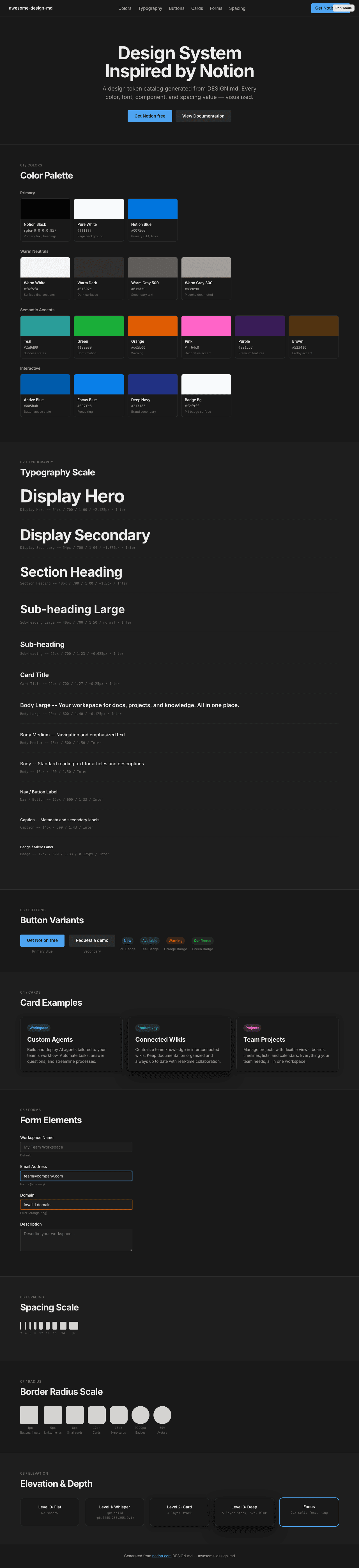
|
|
22
|
+
|
|
23
|
+
### Light Mode
|
|
24
|
+
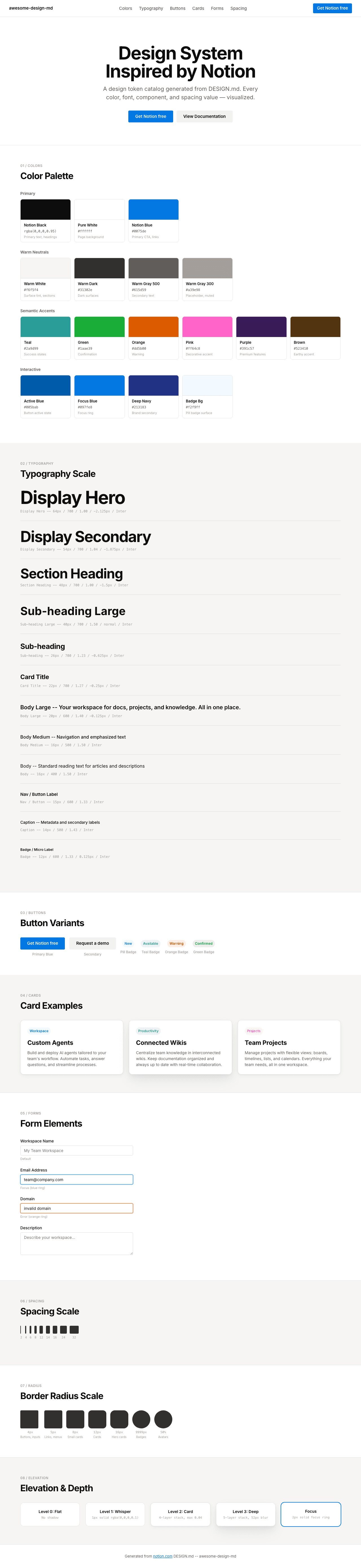
|