awesome-design-md 1.0.0
This diff represents the content of publicly available package versions that have been released to one of the supported registries. The information contained in this diff is provided for informational purposes only and reflects changes between package versions as they appear in their respective public registries.
- package/LICENSE +21 -0
- package/README.md +172 -0
- package/bin/cli.mjs +126 -0
- package/design-md/airbnb/DESIGN.md +246 -0
- package/design-md/airbnb/README.md +23 -0
- package/design-md/airbnb/preview-dark.html +234 -0
- package/design-md/airbnb/preview.html +233 -0
- package/design-md/airtable/DESIGN.md +89 -0
- package/design-md/airtable/README.md +23 -0
- package/design-md/airtable/preview-dark.html +165 -0
- package/design-md/airtable/preview.html +164 -0
- package/design-md/apple/DESIGN.md +313 -0
- package/design-md/apple/README.md +24 -0
- package/design-md/apple/preview-dark.html +422 -0
- package/design-md/apple/preview.html +416 -0
- package/design-md/bmw/DESIGN.md +180 -0
- package/design-md/bmw/README.md +23 -0
- package/design-md/bmw/preview-dark.html +211 -0
- package/design-md/bmw/preview.html +210 -0
- package/design-md/cal/DESIGN.md +259 -0
- package/design-md/cal/README.md +23 -0
- package/design-md/cal/preview-dark.html +449 -0
- package/design-md/cal/preview.html +575 -0
- package/design-md/claude/DESIGN.md +312 -0
- package/design-md/claude/README.md +24 -0
- package/design-md/claude/preview-dark.html +803 -0
- package/design-md/claude/preview.html +826 -0
- package/design-md/clay/DESIGN.md +304 -0
- package/design-md/clay/README.md +23 -0
- package/design-md/clay/preview-dark.html +318 -0
- package/design-md/clay/preview.html +317 -0
- package/design-md/clickhouse/DESIGN.md +281 -0
- package/design-md/clickhouse/README.md +24 -0
- package/design-md/clickhouse/preview-dark.html +834 -0
- package/design-md/clickhouse/preview.html +786 -0
- package/design-md/cohere/DESIGN.md +266 -0
- package/design-md/cohere/README.md +24 -0
- package/design-md/cohere/preview-dark.html +810 -0
- package/design-md/cohere/preview.html +814 -0
- package/design-md/coinbase/DESIGN.md +129 -0
- package/design-md/coinbase/README.md +23 -0
- package/design-md/coinbase/preview-dark.html +164 -0
- package/design-md/coinbase/preview.html +163 -0
- package/design-md/composio/DESIGN.md +307 -0
- package/design-md/composio/README.md +24 -0
- package/design-md/composio/preview-dark.html +958 -0
- package/design-md/composio/preview.html +933 -0
- package/design-md/cursor/DESIGN.md +309 -0
- package/design-md/cursor/README.md +24 -0
- package/design-md/cursor/preview-dark.html +395 -0
- package/design-md/cursor/preview.html +385 -0
- package/design-md/elevenlabs/DESIGN.md +265 -0
- package/design-md/elevenlabs/README.md +23 -0
- package/design-md/elevenlabs/preview-dark.html +254 -0
- package/design-md/elevenlabs/preview.html +253 -0
- package/design-md/expo/DESIGN.md +281 -0
- package/design-md/expo/README.md +24 -0
- package/design-md/expo/preview-dark.html +536 -0
- package/design-md/expo/preview.html +536 -0
- package/design-md/figma/DESIGN.md +220 -0
- package/design-md/figma/README.md +24 -0
- package/design-md/figma/preview-dark.html +831 -0
- package/design-md/figma/preview.html +841 -0
- package/design-md/framer/DESIGN.md +246 -0
- package/design-md/framer/README.md +23 -0
- package/design-md/framer/preview-dark.html +904 -0
- package/design-md/framer/preview.html +885 -0
- package/design-md/hashicorp/DESIGN.md +278 -0
- package/design-md/hashicorp/README.md +24 -0
- package/design-md/hashicorp/preview-dark.html +1206 -0
- package/design-md/hashicorp/preview.html +1195 -0
- package/design-md/ibm/DESIGN.md +332 -0
- package/design-md/ibm/README.md +24 -0
- package/design-md/ibm/preview-dark.html +445 -0
- package/design-md/ibm/preview.html +430 -0
- package/design-md/intercom/DESIGN.md +146 -0
- package/design-md/intercom/README.md +23 -0
- package/design-md/intercom/preview-dark.html +185 -0
- package/design-md/intercom/preview.html +184 -0
- package/design-md/kraken/DESIGN.md +125 -0
- package/design-md/kraken/README.md +23 -0
- package/design-md/kraken/preview-dark.html +169 -0
- package/design-md/kraken/preview.html +168 -0
- package/design-md/linear.app/DESIGN.md +367 -0
- package/design-md/linear.app/README.md +24 -0
- package/design-md/linear.app/preview-dark.html +385 -0
- package/design-md/linear.app/preview.html +375 -0
- package/design-md/lovable/DESIGN.md +298 -0
- package/design-md/lovable/README.md +24 -0
- package/design-md/lovable/preview-dark.html +351 -0
- package/design-md/lovable/preview.html +350 -0
- package/design-md/minimax/DESIGN.md +257 -0
- package/design-md/minimax/README.md +24 -0
- package/design-md/minimax/preview-dark.html +1267 -0
- package/design-md/minimax/preview.html +1253 -0
- package/design-md/mintlify/DESIGN.md +326 -0
- package/design-md/mintlify/README.md +24 -0
- package/design-md/mintlify/preview-dark.html +411 -0
- package/design-md/mintlify/preview.html +400 -0
- package/design-md/miro/DESIGN.md +108 -0
- package/design-md/miro/README.md +23 -0
- package/design-md/miro/preview-dark.html +174 -0
- package/design-md/miro/preview.html +173 -0
- package/design-md/mistral.ai/DESIGN.md +261 -0
- package/design-md/mistral.ai/README.md +24 -0
- package/design-md/mistral.ai/preview-dark.html +813 -0
- package/design-md/mistral.ai/preview.html +812 -0
- package/design-md/mongodb/DESIGN.md +266 -0
- package/design-md/mongodb/README.md +23 -0
- package/design-md/mongodb/preview-dark.html +262 -0
- package/design-md/mongodb/preview.html +261 -0
- package/design-md/notion/DESIGN.md +309 -0
- package/design-md/notion/README.md +24 -0
- package/design-md/notion/preview-dark.html +374 -0
- package/design-md/notion/preview.html +366 -0
- package/design-md/nvidia/DESIGN.md +293 -0
- package/design-md/nvidia/README.md +24 -0
- package/design-md/nvidia/preview-dark.html +376 -0
- package/design-md/nvidia/preview.html +368 -0
- package/design-md/ollama/DESIGN.md +267 -0
- package/design-md/ollama/README.md +24 -0
- package/design-md/ollama/preview-dark.html +678 -0
- package/design-md/ollama/preview.html +678 -0
- package/design-md/opencode.ai/DESIGN.md +281 -0
- package/design-md/opencode.ai/README.md +24 -0
- package/design-md/opencode.ai/preview-dark.html +368 -0
- package/design-md/opencode.ai/preview.html +359 -0
- package/design-md/pinterest/DESIGN.md +230 -0
- package/design-md/pinterest/README.md +23 -0
- package/design-md/pinterest/preview-dark.html +233 -0
- package/design-md/pinterest/preview.html +232 -0
- package/design-md/posthog/DESIGN.md +256 -0
- package/design-md/posthog/README.md +23 -0
- package/design-md/posthog/preview-dark.html +701 -0
- package/design-md/posthog/preview.html +751 -0
- package/design-md/raycast/DESIGN.md +268 -0
- package/design-md/raycast/README.md +23 -0
- package/design-md/raycast/preview-dark.html +608 -0
- package/design-md/raycast/preview.html +690 -0
- package/design-md/replicate/DESIGN.md +261 -0
- package/design-md/replicate/README.md +24 -0
- package/design-md/replicate/preview-dark.html +828 -0
- package/design-md/replicate/preview.html +831 -0
- package/design-md/resend/DESIGN.md +303 -0
- package/design-md/resend/README.md +23 -0
- package/design-md/resend/preview-dark.html +357 -0
- package/design-md/resend/preview.html +356 -0
- package/design-md/revolut/DESIGN.md +185 -0
- package/design-md/revolut/README.md +23 -0
- package/design-md/revolut/preview-dark.html +234 -0
- package/design-md/revolut/preview.html +233 -0
- package/design-md/runwayml/DESIGN.md +244 -0
- package/design-md/runwayml/README.md +24 -0
- package/design-md/runwayml/preview-dark.html +664 -0
- package/design-md/runwayml/preview.html +665 -0
- package/design-md/sanity/DESIGN.md +357 -0
- package/design-md/sanity/README.md +24 -0
- package/design-md/sanity/preview-dark.html +995 -0
- package/design-md/sanity/preview.html +1140 -0
- package/design-md/sentry/DESIGN.md +262 -0
- package/design-md/sentry/README.md +24 -0
- package/design-md/sentry/preview-dark.html +628 -0
- package/design-md/sentry/preview.html +953 -0
- package/design-md/spacex/DESIGN.md +194 -0
- package/design-md/spacex/README.md +23 -0
- package/design-md/spacex/preview-dark.html +223 -0
- package/design-md/spacex/preview.html +222 -0
- package/design-md/spotify/DESIGN.md +246 -0
- package/design-md/spotify/README.md +23 -0
- package/design-md/spotify/preview-dark.html +231 -0
- package/design-md/spotify/preview.html +230 -0
- package/design-md/stripe/DESIGN.md +322 -0
- package/design-md/stripe/README.md +24 -0
- package/design-md/stripe/preview-dark.html +430 -0
- package/design-md/stripe/preview.html +421 -0
- package/design-md/supabase/DESIGN.md +255 -0
- package/design-md/supabase/README.md +24 -0
- package/design-md/supabase/preview-dark.html +977 -0
- package/design-md/supabase/preview.html +955 -0
- package/design-md/superhuman/DESIGN.md +252 -0
- package/design-md/superhuman/README.md +23 -0
- package/design-md/superhuman/preview-dark.html +975 -0
- package/design-md/superhuman/preview.html +953 -0
- package/design-md/together.ai/DESIGN.md +263 -0
- package/design-md/together.ai/README.md +24 -0
- package/design-md/together.ai/preview-dark.html +892 -0
- package/design-md/together.ai/preview.html +897 -0
- package/design-md/uber/DESIGN.md +295 -0
- package/design-md/uber/README.md +24 -0
- package/design-md/uber/preview-dark.html +1164 -0
- package/design-md/uber/preview.html +1163 -0
- package/design-md/vercel/DESIGN.md +310 -0
- package/design-md/vercel/README.md +24 -0
- package/design-md/vercel/preview-dark.html +370 -0
- package/design-md/vercel/preview.html +369 -0
- package/design-md/voltagent/DESIGN.md +323 -0
- package/design-md/voltagent/README.md +24 -0
- package/design-md/voltagent/preview-dark.html +487 -0
- package/design-md/voltagent/preview.html +766 -0
- package/design-md/warp/DESIGN.md +253 -0
- package/design-md/warp/README.md +23 -0
- package/design-md/warp/preview-dark.html +502 -0
- package/design-md/warp/preview.html +535 -0
- package/design-md/webflow/DESIGN.md +92 -0
- package/design-md/webflow/README.md +23 -0
- package/design-md/webflow/preview-dark.html +147 -0
- package/design-md/webflow/preview.html +146 -0
- package/design-md/wise/DESIGN.md +173 -0
- package/design-md/wise/README.md +23 -0
- package/design-md/wise/preview-dark.html +230 -0
- package/design-md/wise/preview.html +229 -0
- package/design-md/x.ai/DESIGN.md +257 -0
- package/design-md/x.ai/README.md +24 -0
- package/design-md/x.ai/preview-dark.html +358 -0
- package/design-md/x.ai/preview.html +409 -0
- package/design-md/zapier/DESIGN.md +328 -0
- package/design-md/zapier/README.md +24 -0
- package/design-md/zapier/preview-dark.html +382 -0
- package/design-md/zapier/preview.html +374 -0
- package/package.json +33 -0
|
@@ -0,0 +1,256 @@
|
|
|
1
|
+
# Design System: PostHog
|
|
2
|
+
|
|
3
|
+
## 1. Visual Theme & Atmosphere
|
|
4
|
+
|
|
5
|
+
PostHog's website feels like a startup's internal wiki that escaped into the wild — warm, irreverent, and deliberately anti-corporate. The background isn't the expected crisp white or dark void of developer tools; it's a warm, sage-tinted cream (`#fdfdf8`) that gives every surface a handmade, paper-like quality. Colors lean into earthy olive greens and muted sage rather than the conventional blues and purples of the SaaS world. It's as if someone designed a developer analytics platform inside a cozy garden shed.
|
|
6
|
+
|
|
7
|
+
The personality is the star: hand-drawn hedgehog illustrations, quirky action figures, and playful imagery replace the stock photography and abstract gradients typical of B2B SaaS. IBM Plex Sans Variable serves as the typographic foundation — a font with genuine technical credibility (created by IBM, widely used in developer contexts) deployed here with bold weights (700, 800) on headings and generous line-heights on body text. The typography says "we're serious engineers" while everything around it says "but we don't take ourselves too seriously."
|
|
8
|
+
|
|
9
|
+
The interaction design carries the same spirit: hover states flash PostHog Orange (`#F54E00`) text — a hidden brand color that doesn't appear at rest but surprises on interaction. Dark near-black buttons (`#1e1f23`) use opacity reduction on hover rather than color shifts, and active states scale slightly. The border system uses sage-tinted grays (`#bfc1b7`) that harmonize with the olive text palette. Built on Tailwind CSS with Radix UI and shadcn/ui primitives, the technical foundation is modern and component-driven, but the visual output is stubbornly unique.
|
|
10
|
+
|
|
11
|
+
**Key Characteristics:**
|
|
12
|
+
- Warm sage/olive color palette instead of conventional blues — earthy and approachable
|
|
13
|
+
- IBM Plex Sans Variable font at bold weights (700/800) for headings with generous 1.50+ line-heights
|
|
14
|
+
- Hidden brand orange (`#F54E00`) that only appears on hover interactions — a delightful surprise
|
|
15
|
+
- Hand-drawn hedgehog illustrations and playful imagery — deliberately anti-corporate
|
|
16
|
+
- Sage-tinted borders (`#bfc1b7`) and backgrounds (`#eeefe9`) creating a unified warm-green system
|
|
17
|
+
- Dark near-black CTAs (`#1e1f23`) with opacity-based hover states
|
|
18
|
+
- Content-heavy editorial layout — the site reads like a magazine, not a typical landing page
|
|
19
|
+
- Tailwind CSS + Radix UI + shadcn/ui component architecture
|
|
20
|
+
|
|
21
|
+
## 2. Color Palette & Roles
|
|
22
|
+
|
|
23
|
+
### Primary
|
|
24
|
+
- **Olive Ink** (`#4d4f46`): Primary text color — a distinctive olive-gray that gives all text a warm, earthy tone
|
|
25
|
+
- **Deep Olive** (`#23251d`): Link text and high-emphasis headings — near-black with green undertone
|
|
26
|
+
- **PostHog Orange** (`#F54E00`): Hidden brand accent — appears only on hover states, a vibrant orange that surprises
|
|
27
|
+
|
|
28
|
+
### Secondary & Accent
|
|
29
|
+
- **Amber Gold** (`#F7A501`): Secondary hover accent on dark buttons — warm gold that pairs with the orange
|
|
30
|
+
- **Gold Border** (`#b17816`): Special button borders — an amber-gold for featured CTAs
|
|
31
|
+
- **Focus Blue** (`#3b82f6`): Focus ring color (Tailwind default) — the only blue in the system, reserved for accessibility
|
|
32
|
+
|
|
33
|
+
### Surface & Background
|
|
34
|
+
- **Warm Parchment** (`#fdfdf8`): Primary page background — warm near-white with yellow-green undertone
|
|
35
|
+
- **Sage Cream** (`#eeefe9`): Input backgrounds, secondary surfaces — light sage tint
|
|
36
|
+
- **Light Sage** (`#e5e7e0`): Button backgrounds, tertiary surfaces — muted sage-green
|
|
37
|
+
- **Warm Tan** (`#d4c9b8`): Featured button backgrounds — warm tan/khaki for emphasis
|
|
38
|
+
- **Hover White** (`#f4f4f4`): Universal hover background state
|
|
39
|
+
|
|
40
|
+
### Neutrals & Text
|
|
41
|
+
- **Olive Ink** (`#4d4f46`): Primary body and UI text
|
|
42
|
+
- **Muted Olive** (`#65675e`): Secondary text, button labels on light backgrounds
|
|
43
|
+
- **Sage Placeholder** (`#9ea096`): Placeholder text, disabled states — warm sage-green
|
|
44
|
+
- **Sage Border** (`#bfc1b7`): Primary border color — olive-tinted gray for all borders
|
|
45
|
+
- **Light Border** (`#b6b7af`): Secondary border, toolbar borders — slightly darker sage
|
|
46
|
+
|
|
47
|
+
### Semantic & Accent
|
|
48
|
+
- **PostHog Orange** (`#F54E00`): Hover text accent — signals interactivity and brand personality
|
|
49
|
+
- **Amber Gold** (`#F7A501`): Dark button hover accent — warmth signal
|
|
50
|
+
- **Focus Blue** (`#3b82f6` at 50% opacity): Keyboard focus rings — accessibility-only color
|
|
51
|
+
- **Dark Text** (`#111827`): High-contrast link text — near-black for important links
|
|
52
|
+
|
|
53
|
+
### Gradient System
|
|
54
|
+
- No gradients on the marketing site — PostHog's visual language is deliberately flat and warm
|
|
55
|
+
- Depth is achieved through layered surfaces and border containment, not color transitions
|
|
56
|
+
|
|
57
|
+
## 3. Typography Rules
|
|
58
|
+
|
|
59
|
+
### Font Family
|
|
60
|
+
- **Display & Body**: `IBM Plex Sans Variable` — variable font (100–700+ weight range). Fallbacks: `IBM Plex Sans, -apple-system, system-ui, Avenir Next, Avenir, Segoe UI, Helvetica Neue, Helvetica, Ubuntu, Roboto, Noto, Arial`
|
|
61
|
+
- **Monospace**: `ui-monospace, SFMono-Regular, Menlo, Monaco, Consolas, Liberation Mono, Courier New` — system monospace stack
|
|
62
|
+
- **Code Display**: `Source Code Pro` — with fallbacks: `Menlo, Consolas, Monaco`
|
|
63
|
+
|
|
64
|
+
### Hierarchy
|
|
65
|
+
|
|
66
|
+
| Role | Font | Size | Weight | Line Height | Letter Spacing | Notes |
|
|
67
|
+
|------|------|------|--------|-------------|----------------|-------|
|
|
68
|
+
| Display Hero | IBM Plex Sans Variable | 30px | 800 | 1.20 | -0.75px | Extra-bold, tight, maximum impact |
|
|
69
|
+
| Section Heading | IBM Plex Sans Variable | 36px | 700 | 1.50 | 0px | Large but generous line-height |
|
|
70
|
+
| Feature Heading | IBM Plex Sans Variable | 24px | 700 | 1.33 | 0px | Feature section titles |
|
|
71
|
+
| Card Heading | IBM Plex Sans Variable | 21.4px | 700 | 1.40 | -0.54px | Slightly unusual size (scaled) |
|
|
72
|
+
| Sub-heading | IBM Plex Sans Variable | 20px | 700 | 1.40 | -0.5px | Content sub-sections |
|
|
73
|
+
| Sub-heading Uppercase | IBM Plex Sans Variable | 20px | 700 | 1.40 | 0px | Uppercase transform for labels |
|
|
74
|
+
| Body Emphasis | IBM Plex Sans Variable | 19.3px | 600 | 1.56 | -0.48px | Semi-bold callout text |
|
|
75
|
+
| Label Uppercase | IBM Plex Sans Variable | 18px | 700 | 1.50 | 0px | Uppercase category labels |
|
|
76
|
+
| Body Semi | IBM Plex Sans Variable | 18px | 600 | 1.56 | 0px | Semi-bold body text |
|
|
77
|
+
| Body | IBM Plex Sans Variable | 16px | 400 | 1.50 | 0px | Standard reading text |
|
|
78
|
+
| Body Medium | IBM Plex Sans Variable | 16px | 500 | 1.50 | 0px | Medium-weight body |
|
|
79
|
+
| Body Relaxed | IBM Plex Sans Variable | 15px | 400 | 1.71 | 0px | Relaxed line-height for long reads |
|
|
80
|
+
| Nav / UI | IBM Plex Sans Variable | 15px | 600 | 1.50 | 0px | Navigation and UI labels |
|
|
81
|
+
| Caption | IBM Plex Sans Variable | 14px | 400–700 | 1.43 | 0px | Small text, various weights |
|
|
82
|
+
| Small Label | IBM Plex Sans Variable | 13px | 500–700 | 1.00–1.50 | 0px | Tags, badges, micro labels |
|
|
83
|
+
| Micro | IBM Plex Sans Variable | 12px | 400–700 | 1.33 | 0px | Smallest text, some uppercase |
|
|
84
|
+
| Code | Source Code Pro | 14px | 500 | 1.43 | 0px | Code snippets and terminal |
|
|
85
|
+
|
|
86
|
+
### Principles
|
|
87
|
+
- **Bold heading dominance**: Headings use 700–800 weight — PostHog's typography is confident and assertive, not whispery
|
|
88
|
+
- **Generous body line-heights**: Body text at 1.50–1.71 line-height creates extremely comfortable reading — the site is content-heavy and optimized for long sessions
|
|
89
|
+
- **Fractional sizes**: Several sizes (21.4px, 19.3px, 13.7px) suggest a fluid/scaled type system rather than fixed stops — likely computed from Tailwind's rem scale at non-standard base
|
|
90
|
+
- **Uppercase as category signal**: Bold uppercase labels (18px–20px weight 700) are used for product category headings — a magazine-editorial convention
|
|
91
|
+
- **Selective negative tracking**: Letter-spacing tightens on display text (-0.75px at 30px) but relaxes to 0px on body — headlines compress, body breathes
|
|
92
|
+
|
|
93
|
+
## 4. Component Stylings
|
|
94
|
+
|
|
95
|
+
### Buttons
|
|
96
|
+
- **Dark Primary**: `#1e1f23` background, white text, 6px radius, `10px 12px` padding. Hover: opacity 0.7 with Amber Gold text. Active: opacity 0.8 with slight scale transform. The main CTA — dark and confident
|
|
97
|
+
- **Sage Light**: `#e5e7e0` background, Olive Ink (`#4d4f46`) text, 4px radius, `4px` padding. Hover: `#f4f4f4` bg with PostHog Orange text. Compact utility button
|
|
98
|
+
- **Warm Tan Featured**: `#d4c9b8` background, black text, no visible radius. Hover: same orange text flash. Featured/premium actions
|
|
99
|
+
- **Input-style**: `#eeefe9` background, Sage Placeholder (`#9ea096`) text, 4px radius, 1px `#b6b7af` border. Looks like a search/filter control
|
|
100
|
+
- **Near-white Ghost**: `#fdfdf8` background, Olive Ink text, 4px radius, transparent 1px border. Minimal presence
|
|
101
|
+
- **Hover pattern**: All buttons flash PostHog Orange (`#F54E00`) or Amber Gold (`#F7A501`) text on hover — the brand's signature interaction surprise
|
|
102
|
+
|
|
103
|
+
### Cards & Containers
|
|
104
|
+
- **Bordered Card**: Warm Parchment (`#fdfdf8`) or white background, 1px `#bfc1b7` border, 4px–6px radius — clean and minimal
|
|
105
|
+
- **Sage Surface Card**: `#eeefe9` background for secondary content containers
|
|
106
|
+
- **Shadow Card**: `0px 25px 50px -12px rgba(0, 0, 0, 0.25)` — a single deep shadow for elevated content (modals, dropdowns)
|
|
107
|
+
- **Hover**: Orange text flash on interactive cards — consistent with button behavior
|
|
108
|
+
|
|
109
|
+
### Inputs & Forms
|
|
110
|
+
- **Default**: `#eeefe9` background, `#9ea096` placeholder text, 1px `#b6b7af` border, 4px radius, `2px 0px 2px 8px` padding
|
|
111
|
+
- **Focus**: `#3b82f6` ring at 50% opacity (Tailwind blue focus ring)
|
|
112
|
+
- **Text color**: `#374151` for input values — darker than primary text for readability
|
|
113
|
+
- **Border variations**: Multiple border patterns — some inputs use compound borders (top, left, bottom-only)
|
|
114
|
+
|
|
115
|
+
### Navigation
|
|
116
|
+
- **Top nav**: Warm background, IBM Plex Sans at 15px weight 600
|
|
117
|
+
- **Dropdown menus**: Rich mega-menu structure with product categories
|
|
118
|
+
- **Link color**: Deep Olive (`#23251d`) for nav links, underline on hover
|
|
119
|
+
- **CTA**: Dark Primary button (#1e1f23) in the nav — "Get started - free"
|
|
120
|
+
- **Mobile**: Collapses to hamburger with simplified menu
|
|
121
|
+
|
|
122
|
+
### Image Treatment
|
|
123
|
+
- **Hand-drawn illustrations**: Hedgehog mascot and quirky illustrations — the signature visual element
|
|
124
|
+
- **Product screenshots**: UI screenshots embedded in device frames or clean containers
|
|
125
|
+
- **Action figures**: Playful product photography of hedgehog figurines — anti-corporate
|
|
126
|
+
- **Trust logos**: Enterprise logos (Airbus, GOV.UK) displayed in a muted trust bar
|
|
127
|
+
- **Aspect ratios**: Mixed — illustrations are irregular, screenshots are 16:9 or widescreen
|
|
128
|
+
|
|
129
|
+
### AI Chat Widget
|
|
130
|
+
- Floating PostHog AI assistant with speech bubble — an interactive product demo embedded in the marketing site
|
|
131
|
+
|
|
132
|
+
## 5. Layout Principles
|
|
133
|
+
|
|
134
|
+
### Spacing System
|
|
135
|
+
- **Base unit**: 8px
|
|
136
|
+
- **Scale**: 2px, 4px, 6px, 8px, 10px, 12px, 16px, 18px, 24px, 32px, 34px
|
|
137
|
+
- **Section padding**: 32px–48px vertical between sections (compact for a content-heavy site)
|
|
138
|
+
- **Card padding**: 4px–12px internal (notably compact)
|
|
139
|
+
- **Component gaps**: 4px–8px between related elements
|
|
140
|
+
|
|
141
|
+
### Grid & Container
|
|
142
|
+
- **Max width**: 1536px (largest breakpoint), with content containers likely 1200px–1280px
|
|
143
|
+
- **Column patterns**: Varied — single column for text content, 2-3 column grids for feature cards, asymmetric layouts for product demos
|
|
144
|
+
- **Breakpoints**: 13 defined — 1px, 425px, 482px, 640px, 768px, 767px, 800px, 900px, 1024px, 1076px, 1160px, 1280px, 1536px
|
|
145
|
+
|
|
146
|
+
### Whitespace Philosophy
|
|
147
|
+
- **Content-dense by design**: PostHog's site is information-rich — whitespace is measured, not lavish
|
|
148
|
+
- **Editorial pacing**: Content sections flow like a magazine with varied layouts keeping the eye moving
|
|
149
|
+
- **Illustrations as breathing room**: Hand-drawn hedgehog art breaks up dense content sections naturally
|
|
150
|
+
|
|
151
|
+
### Border Radius Scale
|
|
152
|
+
- **2px**: Small inline elements, tags (`span`)
|
|
153
|
+
- **4px**: Primary UI components — buttons, inputs, dropdowns, menu items (`button`, `div`, `combobox`)
|
|
154
|
+
- **6px**: Secondary containers — larger buttons, list items, card variants (`button`, `div`, `li`)
|
|
155
|
+
- **9999px**: Pill shape — badges, status indicators, rounded tags (`span`, `div`)
|
|
156
|
+
|
|
157
|
+
## 6. Depth & Elevation
|
|
158
|
+
|
|
159
|
+
| Level | Treatment | Use |
|
|
160
|
+
|-------|-----------|-----|
|
|
161
|
+
| Level 0 (Flat) | No shadow, warm parchment background | Page canvas, most surfaces |
|
|
162
|
+
| Level 1 (Border) | `1px solid #bfc1b7` (Sage Border) | Card containment, input borders, section dividers |
|
|
163
|
+
| Level 2 (Compound Border) | Multiple 1px borders on different sides | Input groupings, toolbar elements |
|
|
164
|
+
| Level 3 (Deep Shadow) | `0px 25px 50px -12px rgba(0, 0, 0, 0.25)` | Modals, floating elements, mega-menu dropdowns |
|
|
165
|
+
|
|
166
|
+
### Shadow Philosophy
|
|
167
|
+
PostHog's elevation system is remarkably minimal — only one shadow definition exists in the entire system. Depth is communicated through:
|
|
168
|
+
- **Border containment**: Sage-tinted borders (`#bfc1b7`) at 1px create gentle warm separation
|
|
169
|
+
- **Surface color shifts**: Moving from `#fdfdf8` to `#eeefe9` to `#e5e7e0` creates layered depth without shadows
|
|
170
|
+
- **The single shadow**: The one defined shadow (`0 25px 50px -12px`) is reserved for floating elements — modals, dropdowns, popovers. It's a deep, dramatic shadow that creates clear separation when needed
|
|
171
|
+
|
|
172
|
+
### Decorative Depth
|
|
173
|
+
- **Illustration layering**: Hand-drawn hedgehog art creates visual depth naturally
|
|
174
|
+
- **No gradients or glow**: The flat, warm surface system relies entirely on border and surface-color differentiation
|
|
175
|
+
- **No glassmorphism**: Fully opaque surfaces throughout
|
|
176
|
+
|
|
177
|
+
## 7. Do's and Don'ts
|
|
178
|
+
|
|
179
|
+
### Do
|
|
180
|
+
- Use the olive/sage color family (#4d4f46, #23251d, #bfc1b7) for text and borders — the warm green undertone is essential to the brand
|
|
181
|
+
- Flash PostHog Orange (#F54E00) on hover states — it's the hidden brand signature
|
|
182
|
+
- Use IBM Plex Sans at bold weights (700/800) for headings — the font carries technical credibility
|
|
183
|
+
- Keep body text at generous line-heights (1.50–1.71) — the content-heavy site demands readability
|
|
184
|
+
- Maintain the warm parchment background (#fdfdf8) — not pure white, never cold
|
|
185
|
+
- Use 4px border-radius for most UI elements — keep corners subtle and functional
|
|
186
|
+
- Include playful, hand-drawn illustration elements — the personality is the differentiator
|
|
187
|
+
- Apply opacity-based hover states (0.7 opacity) on dark buttons rather than color shifts
|
|
188
|
+
|
|
189
|
+
### Don't
|
|
190
|
+
- Use blue, purple, or typical tech-SaaS colors — PostHog's palette is deliberately olive/sage
|
|
191
|
+
- Add heavy shadows — the system uses one shadow for floating elements only; everything else uses borders
|
|
192
|
+
- Make the design look "polished" or "premium" in a conventional sense — PostHog's charm is its irreverent, scrappy energy
|
|
193
|
+
- Use tight line-heights on body text — the generous 1.50+ spacing is essential for the content-heavy layout
|
|
194
|
+
- Apply large border-radius (12px+) on cards — PostHog uses 4px–6px, keeping things tight and functional
|
|
195
|
+
- Remove the orange hover flash — it's a core interaction pattern, not decoration
|
|
196
|
+
- Replace illustrations with stock photography — the hand-drawn hedgehog art is the brand
|
|
197
|
+
- Use pure white (#ffffff) as page background — the warm sage-cream (#fdfdf8) tint is foundational
|
|
198
|
+
|
|
199
|
+
## 8. Responsive Behavior
|
|
200
|
+
|
|
201
|
+
### Breakpoints
|
|
202
|
+
| Name | Width | Key Changes |
|
|
203
|
+
|------|-------|-------------|
|
|
204
|
+
| Mobile Small | <425px | Single column, compact padding, stacked cards |
|
|
205
|
+
| Mobile | 425px–640px | Slight layout adjustments, larger touch targets |
|
|
206
|
+
| Tablet | 640px–768px | 2-column grids begin, nav partially visible |
|
|
207
|
+
| Tablet Large | 768px–1024px | Multi-column layouts, expanded navigation |
|
|
208
|
+
| Desktop | 1024px–1280px | Full layout, 3-column feature grids, expanded mega-menu |
|
|
209
|
+
| Large Desktop | 1280px–1536px | Max-width container, generous margins |
|
|
210
|
+
| Extra Large | >1536px | Centered container at max-width |
|
|
211
|
+
|
|
212
|
+
### Touch Targets
|
|
213
|
+
- Buttons: 4px–6px radius with `4px–12px` padding — compact but usable
|
|
214
|
+
- Nav links: 15px text at weight 600 with adequate padding
|
|
215
|
+
- Mobile: Hamburger menu with simplified navigation
|
|
216
|
+
- Inputs: Generous vertical padding for thumb-friendly forms
|
|
217
|
+
|
|
218
|
+
### Collapsing Strategy
|
|
219
|
+
- **Navigation**: Full mega-menu with dropdowns → hamburger menu on mobile
|
|
220
|
+
- **Feature grids**: 3-column → 2-column → single column stacked
|
|
221
|
+
- **Typography**: Display sizes reduce across breakpoints (30px → smaller)
|
|
222
|
+
- **Illustrations**: Scale within containers, some may hide on mobile for space
|
|
223
|
+
- **Section spacing**: Reduces proportionally while maintaining readability
|
|
224
|
+
|
|
225
|
+
### Image Behavior
|
|
226
|
+
- Illustrations scale responsively within containers
|
|
227
|
+
- Product screenshots maintain aspect ratios
|
|
228
|
+
- Trust logos reflow into multi-row grids on mobile
|
|
229
|
+
- AI chat widget may reposition or simplify on small screens
|
|
230
|
+
|
|
231
|
+
## 9. Agent Prompt Guide
|
|
232
|
+
|
|
233
|
+
### Quick Color Reference
|
|
234
|
+
- Primary Text: Olive Ink (`#4d4f46`)
|
|
235
|
+
- Dark Text: Deep Olive (`#23251d`)
|
|
236
|
+
- Hover Accent: PostHog Orange (`#F54E00`)
|
|
237
|
+
- Dark CTA: Near-Black (`#1e1f23`)
|
|
238
|
+
- Button Surface: Light Sage (`#e5e7e0`)
|
|
239
|
+
- Page Background: Warm Parchment (`#fdfdf8`)
|
|
240
|
+
- Border: Sage Border (`#bfc1b7`)
|
|
241
|
+
- Placeholder: Sage Placeholder (`#9ea096`)
|
|
242
|
+
|
|
243
|
+
### Example Component Prompts
|
|
244
|
+
- "Create a hero section on warm parchment background (#fdfdf8) with 30px IBM Plex Sans heading at weight 800, line-height 1.20, letter-spacing -0.75px, olive ink text (#4d4f46), and a dark CTA button (#1e1f23, 6px radius, white text, opacity 0.7 on hover)"
|
|
245
|
+
- "Design a feature card with #fdfdf8 background, 1px #bfc1b7 border, 4px radius, IBM Plex Sans heading at 20px weight 700, and 16px body text at weight 400 with 1.50 line-height in olive ink (#4d4f46)"
|
|
246
|
+
- "Build a navigation bar with warm background, IBM Plex Sans links at 15px weight 600 in deep olive (#23251d), underline on hover, and a dark CTA button (#1e1f23) at the right"
|
|
247
|
+
- "Create a button group: primary dark (#1e1f23, white text, 6px radius), secondary sage (#e5e7e0, #4d4f46 text, 4px radius), and ghost/text button — all flash #F54E00 orange text on hover"
|
|
248
|
+
- "Design an input field with #eeefe9 background, 1px #b6b7af border, 4px radius, #9ea096 placeholder text, focus ring in #3b82f6 at 50% opacity"
|
|
249
|
+
|
|
250
|
+
### Iteration Guide
|
|
251
|
+
When refining existing screens generated with this design system:
|
|
252
|
+
1. Verify the background is warm parchment (#fdfdf8) not pure white — the sage-cream warmth is essential
|
|
253
|
+
2. Check that all text uses the olive family (#4d4f46, #23251d) not pure black or neutral gray
|
|
254
|
+
3. Ensure hover states flash PostHog Orange (#F54E00) — if hovering feels bland, you're missing this
|
|
255
|
+
4. Confirm borders use sage-tinted gray (#bfc1b7) not neutral gray — warmth runs through every element
|
|
256
|
+
5. The overall tone should feel like a fun, scrappy startup wiki — never corporate-polished or sterile
|
|
@@ -0,0 +1,23 @@
|
|
|
1
|
+
# Posthog Inspired Design System
|
|
2
|
+
|
|
3
|
+
[DESIGN.md](https://github.com/VoltAgent/awesome-design-md/blob/main/design-md/posthog/DESIGN.md) extracted from the public [posthog](https://posthog.com/) website. This is not the official design system. Colors, fonts, and spacing may not be 100% accurate. But it's a good starting point for building something similar.
|
|
4
|
+
|
|
5
|
+
## Files
|
|
6
|
+
|
|
7
|
+
| File | Description |
|
|
8
|
+
|------|-------------|
|
|
9
|
+
| `DESIGN.md` | Complete design system documentation (9 sections) |
|
|
10
|
+
| `preview.html` | Interactive design token catalog (light) |
|
|
11
|
+
| `preview-dark.html` | Interactive design token catalog (dark) |
|
|
12
|
+
|
|
13
|
+
Use [DESIGN.md](https://github.com/VoltAgent/awesome-design-md/blob/main/design-md/posthog/DESIGN.md) to use as a reference for AI agents (Claude, Cursor, Stitch) to generate UI that looks like the Posthog design language.
|
|
14
|
+
|
|
15
|
+
## Preview
|
|
16
|
+
|
|
17
|
+
A sample landing page built with DESIGN.md. It shows the actual colors, typography, buttons, cards, spacing, and elevation, all in one page.
|
|
18
|
+
|
|
19
|
+
### Dark Mode
|
|
20
|
+
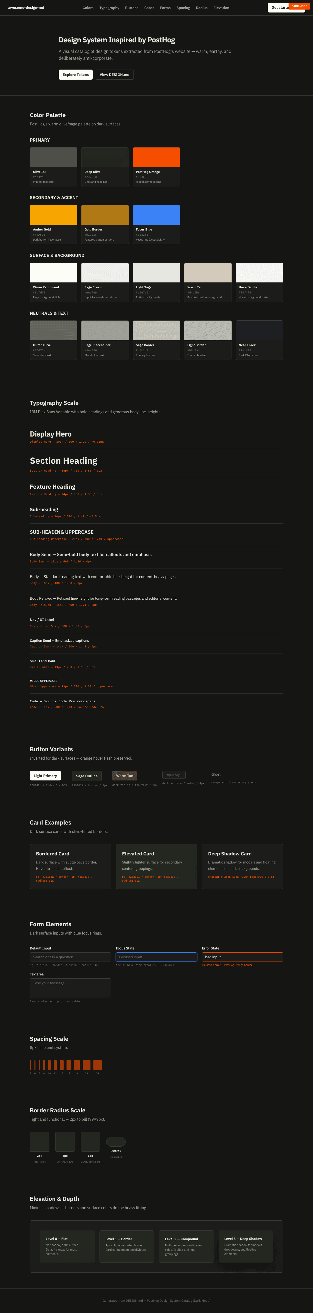
|
|
21
|
+
|
|
22
|
+
### Light Mode
|
|
23
|
+
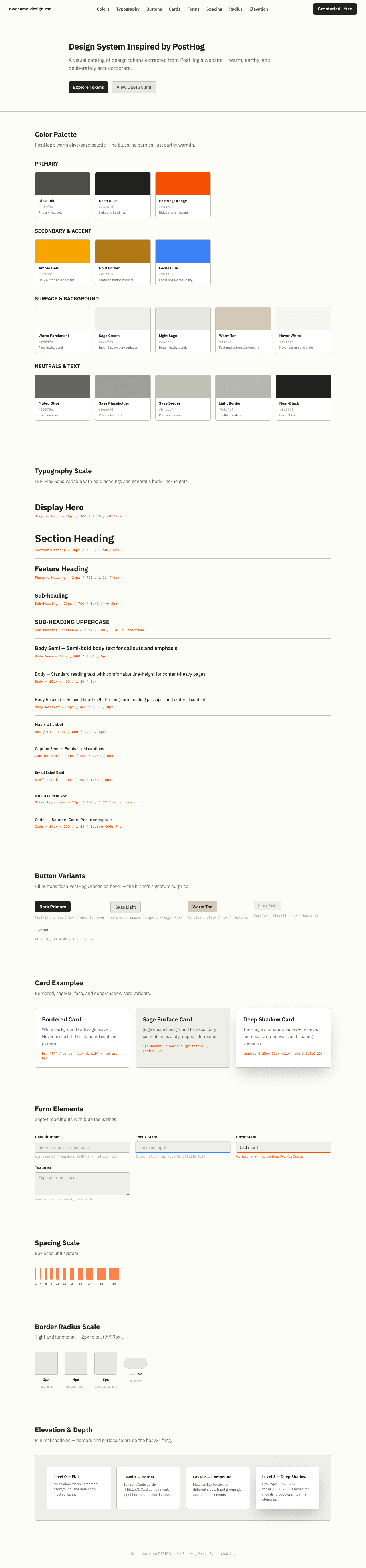
|