awesome-design-md 1.0.0
This diff represents the content of publicly available package versions that have been released to one of the supported registries. The information contained in this diff is provided for informational purposes only and reflects changes between package versions as they appear in their respective public registries.
- package/LICENSE +21 -0
- package/README.md +172 -0
- package/bin/cli.mjs +126 -0
- package/design-md/airbnb/DESIGN.md +246 -0
- package/design-md/airbnb/README.md +23 -0
- package/design-md/airbnb/preview-dark.html +234 -0
- package/design-md/airbnb/preview.html +233 -0
- package/design-md/airtable/DESIGN.md +89 -0
- package/design-md/airtable/README.md +23 -0
- package/design-md/airtable/preview-dark.html +165 -0
- package/design-md/airtable/preview.html +164 -0
- package/design-md/apple/DESIGN.md +313 -0
- package/design-md/apple/README.md +24 -0
- package/design-md/apple/preview-dark.html +422 -0
- package/design-md/apple/preview.html +416 -0
- package/design-md/bmw/DESIGN.md +180 -0
- package/design-md/bmw/README.md +23 -0
- package/design-md/bmw/preview-dark.html +211 -0
- package/design-md/bmw/preview.html +210 -0
- package/design-md/cal/DESIGN.md +259 -0
- package/design-md/cal/README.md +23 -0
- package/design-md/cal/preview-dark.html +449 -0
- package/design-md/cal/preview.html +575 -0
- package/design-md/claude/DESIGN.md +312 -0
- package/design-md/claude/README.md +24 -0
- package/design-md/claude/preview-dark.html +803 -0
- package/design-md/claude/preview.html +826 -0
- package/design-md/clay/DESIGN.md +304 -0
- package/design-md/clay/README.md +23 -0
- package/design-md/clay/preview-dark.html +318 -0
- package/design-md/clay/preview.html +317 -0
- package/design-md/clickhouse/DESIGN.md +281 -0
- package/design-md/clickhouse/README.md +24 -0
- package/design-md/clickhouse/preview-dark.html +834 -0
- package/design-md/clickhouse/preview.html +786 -0
- package/design-md/cohere/DESIGN.md +266 -0
- package/design-md/cohere/README.md +24 -0
- package/design-md/cohere/preview-dark.html +810 -0
- package/design-md/cohere/preview.html +814 -0
- package/design-md/coinbase/DESIGN.md +129 -0
- package/design-md/coinbase/README.md +23 -0
- package/design-md/coinbase/preview-dark.html +164 -0
- package/design-md/coinbase/preview.html +163 -0
- package/design-md/composio/DESIGN.md +307 -0
- package/design-md/composio/README.md +24 -0
- package/design-md/composio/preview-dark.html +958 -0
- package/design-md/composio/preview.html +933 -0
- package/design-md/cursor/DESIGN.md +309 -0
- package/design-md/cursor/README.md +24 -0
- package/design-md/cursor/preview-dark.html +395 -0
- package/design-md/cursor/preview.html +385 -0
- package/design-md/elevenlabs/DESIGN.md +265 -0
- package/design-md/elevenlabs/README.md +23 -0
- package/design-md/elevenlabs/preview-dark.html +254 -0
- package/design-md/elevenlabs/preview.html +253 -0
- package/design-md/expo/DESIGN.md +281 -0
- package/design-md/expo/README.md +24 -0
- package/design-md/expo/preview-dark.html +536 -0
- package/design-md/expo/preview.html +536 -0
- package/design-md/figma/DESIGN.md +220 -0
- package/design-md/figma/README.md +24 -0
- package/design-md/figma/preview-dark.html +831 -0
- package/design-md/figma/preview.html +841 -0
- package/design-md/framer/DESIGN.md +246 -0
- package/design-md/framer/README.md +23 -0
- package/design-md/framer/preview-dark.html +904 -0
- package/design-md/framer/preview.html +885 -0
- package/design-md/hashicorp/DESIGN.md +278 -0
- package/design-md/hashicorp/README.md +24 -0
- package/design-md/hashicorp/preview-dark.html +1206 -0
- package/design-md/hashicorp/preview.html +1195 -0
- package/design-md/ibm/DESIGN.md +332 -0
- package/design-md/ibm/README.md +24 -0
- package/design-md/ibm/preview-dark.html +445 -0
- package/design-md/ibm/preview.html +430 -0
- package/design-md/intercom/DESIGN.md +146 -0
- package/design-md/intercom/README.md +23 -0
- package/design-md/intercom/preview-dark.html +185 -0
- package/design-md/intercom/preview.html +184 -0
- package/design-md/kraken/DESIGN.md +125 -0
- package/design-md/kraken/README.md +23 -0
- package/design-md/kraken/preview-dark.html +169 -0
- package/design-md/kraken/preview.html +168 -0
- package/design-md/linear.app/DESIGN.md +367 -0
- package/design-md/linear.app/README.md +24 -0
- package/design-md/linear.app/preview-dark.html +385 -0
- package/design-md/linear.app/preview.html +375 -0
- package/design-md/lovable/DESIGN.md +298 -0
- package/design-md/lovable/README.md +24 -0
- package/design-md/lovable/preview-dark.html +351 -0
- package/design-md/lovable/preview.html +350 -0
- package/design-md/minimax/DESIGN.md +257 -0
- package/design-md/minimax/README.md +24 -0
- package/design-md/minimax/preview-dark.html +1267 -0
- package/design-md/minimax/preview.html +1253 -0
- package/design-md/mintlify/DESIGN.md +326 -0
- package/design-md/mintlify/README.md +24 -0
- package/design-md/mintlify/preview-dark.html +411 -0
- package/design-md/mintlify/preview.html +400 -0
- package/design-md/miro/DESIGN.md +108 -0
- package/design-md/miro/README.md +23 -0
- package/design-md/miro/preview-dark.html +174 -0
- package/design-md/miro/preview.html +173 -0
- package/design-md/mistral.ai/DESIGN.md +261 -0
- package/design-md/mistral.ai/README.md +24 -0
- package/design-md/mistral.ai/preview-dark.html +813 -0
- package/design-md/mistral.ai/preview.html +812 -0
- package/design-md/mongodb/DESIGN.md +266 -0
- package/design-md/mongodb/README.md +23 -0
- package/design-md/mongodb/preview-dark.html +262 -0
- package/design-md/mongodb/preview.html +261 -0
- package/design-md/notion/DESIGN.md +309 -0
- package/design-md/notion/README.md +24 -0
- package/design-md/notion/preview-dark.html +374 -0
- package/design-md/notion/preview.html +366 -0
- package/design-md/nvidia/DESIGN.md +293 -0
- package/design-md/nvidia/README.md +24 -0
- package/design-md/nvidia/preview-dark.html +376 -0
- package/design-md/nvidia/preview.html +368 -0
- package/design-md/ollama/DESIGN.md +267 -0
- package/design-md/ollama/README.md +24 -0
- package/design-md/ollama/preview-dark.html +678 -0
- package/design-md/ollama/preview.html +678 -0
- package/design-md/opencode.ai/DESIGN.md +281 -0
- package/design-md/opencode.ai/README.md +24 -0
- package/design-md/opencode.ai/preview-dark.html +368 -0
- package/design-md/opencode.ai/preview.html +359 -0
- package/design-md/pinterest/DESIGN.md +230 -0
- package/design-md/pinterest/README.md +23 -0
- package/design-md/pinterest/preview-dark.html +233 -0
- package/design-md/pinterest/preview.html +232 -0
- package/design-md/posthog/DESIGN.md +256 -0
- package/design-md/posthog/README.md +23 -0
- package/design-md/posthog/preview-dark.html +701 -0
- package/design-md/posthog/preview.html +751 -0
- package/design-md/raycast/DESIGN.md +268 -0
- package/design-md/raycast/README.md +23 -0
- package/design-md/raycast/preview-dark.html +608 -0
- package/design-md/raycast/preview.html +690 -0
- package/design-md/replicate/DESIGN.md +261 -0
- package/design-md/replicate/README.md +24 -0
- package/design-md/replicate/preview-dark.html +828 -0
- package/design-md/replicate/preview.html +831 -0
- package/design-md/resend/DESIGN.md +303 -0
- package/design-md/resend/README.md +23 -0
- package/design-md/resend/preview-dark.html +357 -0
- package/design-md/resend/preview.html +356 -0
- package/design-md/revolut/DESIGN.md +185 -0
- package/design-md/revolut/README.md +23 -0
- package/design-md/revolut/preview-dark.html +234 -0
- package/design-md/revolut/preview.html +233 -0
- package/design-md/runwayml/DESIGN.md +244 -0
- package/design-md/runwayml/README.md +24 -0
- package/design-md/runwayml/preview-dark.html +664 -0
- package/design-md/runwayml/preview.html +665 -0
- package/design-md/sanity/DESIGN.md +357 -0
- package/design-md/sanity/README.md +24 -0
- package/design-md/sanity/preview-dark.html +995 -0
- package/design-md/sanity/preview.html +1140 -0
- package/design-md/sentry/DESIGN.md +262 -0
- package/design-md/sentry/README.md +24 -0
- package/design-md/sentry/preview-dark.html +628 -0
- package/design-md/sentry/preview.html +953 -0
- package/design-md/spacex/DESIGN.md +194 -0
- package/design-md/spacex/README.md +23 -0
- package/design-md/spacex/preview-dark.html +223 -0
- package/design-md/spacex/preview.html +222 -0
- package/design-md/spotify/DESIGN.md +246 -0
- package/design-md/spotify/README.md +23 -0
- package/design-md/spotify/preview-dark.html +231 -0
- package/design-md/spotify/preview.html +230 -0
- package/design-md/stripe/DESIGN.md +322 -0
- package/design-md/stripe/README.md +24 -0
- package/design-md/stripe/preview-dark.html +430 -0
- package/design-md/stripe/preview.html +421 -0
- package/design-md/supabase/DESIGN.md +255 -0
- package/design-md/supabase/README.md +24 -0
- package/design-md/supabase/preview-dark.html +977 -0
- package/design-md/supabase/preview.html +955 -0
- package/design-md/superhuman/DESIGN.md +252 -0
- package/design-md/superhuman/README.md +23 -0
- package/design-md/superhuman/preview-dark.html +975 -0
- package/design-md/superhuman/preview.html +953 -0
- package/design-md/together.ai/DESIGN.md +263 -0
- package/design-md/together.ai/README.md +24 -0
- package/design-md/together.ai/preview-dark.html +892 -0
- package/design-md/together.ai/preview.html +897 -0
- package/design-md/uber/DESIGN.md +295 -0
- package/design-md/uber/README.md +24 -0
- package/design-md/uber/preview-dark.html +1164 -0
- package/design-md/uber/preview.html +1163 -0
- package/design-md/vercel/DESIGN.md +310 -0
- package/design-md/vercel/README.md +24 -0
- package/design-md/vercel/preview-dark.html +370 -0
- package/design-md/vercel/preview.html +369 -0
- package/design-md/voltagent/DESIGN.md +323 -0
- package/design-md/voltagent/README.md +24 -0
- package/design-md/voltagent/preview-dark.html +487 -0
- package/design-md/voltagent/preview.html +766 -0
- package/design-md/warp/DESIGN.md +253 -0
- package/design-md/warp/README.md +23 -0
- package/design-md/warp/preview-dark.html +502 -0
- package/design-md/warp/preview.html +535 -0
- package/design-md/webflow/DESIGN.md +92 -0
- package/design-md/webflow/README.md +23 -0
- package/design-md/webflow/preview-dark.html +147 -0
- package/design-md/webflow/preview.html +146 -0
- package/design-md/wise/DESIGN.md +173 -0
- package/design-md/wise/README.md +23 -0
- package/design-md/wise/preview-dark.html +230 -0
- package/design-md/wise/preview.html +229 -0
- package/design-md/x.ai/DESIGN.md +257 -0
- package/design-md/x.ai/README.md +24 -0
- package/design-md/x.ai/preview-dark.html +358 -0
- package/design-md/x.ai/preview.html +409 -0
- package/design-md/zapier/DESIGN.md +328 -0
- package/design-md/zapier/README.md +24 -0
- package/design-md/zapier/preview-dark.html +382 -0
- package/design-md/zapier/preview.html +374 -0
- package/package.json +33 -0
|
@@ -0,0 +1,303 @@
|
|
|
1
|
+
# Design System: Resend
|
|
2
|
+
|
|
3
|
+
## 1. Visual Theme & Atmosphere
|
|
4
|
+
|
|
5
|
+
Resend's website is a dark, cinematic canvas that treats email infrastructure like a luxury product. The entire page is draped in pure black (`#000000`) with text that glows in near-white (`#f0f0f0`), creating a theater-like experience where content performs on a void stage. This isn't the typical developer-tool darkness — it's the controlled darkness of a photography gallery, where every element is lit with intention and nothing competes for attention.
|
|
6
|
+
|
|
7
|
+
The typography system is the star of the show. Three carefully chosen typefaces create a hierarchy that feels both editorial and technical: Domaine Display (a Klim Type Foundry serif) appears at massive 96px for hero headlines with barely-there line-height (1.00) and negative tracking (-0.96px), creating display text that feels like a magazine cover. ABC Favorit (by Dinamo) handles section headings with an even more aggressive letter-spacing (-2.8px at 56px), giving a compressed, engineered quality to mid-tier text. Inter takes over for body and UI, providing the clean readability that lets the display fonts shine. Commit Mono rounds out the family for code blocks.
|
|
8
|
+
|
|
9
|
+
What makes Resend distinctive is its icy, blue-tinted border system. Instead of neutral gray borders, Resend uses `rgba(214, 235, 253, 0.19)` — a frosty, slightly blue-tinted line at 19% opacity that gives every container and divider a cold, crystalline quality against the black background. Combined with pill-shaped buttons (9999px radius), multi-color accent system (orange, green, blue, yellow, red — each with its own CSS variable scale), and OpenType stylistic sets (`"ss01"`, `"ss03"`, `"ss04"`, `"ss11"`), the result is a design system that feels premium, precise, and quietly confident.
|
|
10
|
+
|
|
11
|
+
**Key Characteristics:**
|
|
12
|
+
- Pure black background with near-white (`#f0f0f0`) text — theatrical, gallery-like darkness
|
|
13
|
+
- Three-font hierarchy: Domaine Display (serif hero), ABC Favorit (geometric sections), Inter (body/UI)
|
|
14
|
+
- Icy blue-tinted borders: `rgba(214, 235, 253, 0.19)` — every border has a cold, crystalline shimmer
|
|
15
|
+
- Multi-color accent system: orange, green, blue, yellow, red — each with numbered CSS variable scales
|
|
16
|
+
- Pill-shaped buttons and tags (9999px radius) with transparent backgrounds
|
|
17
|
+
- OpenType stylistic sets (`"ss01"`, `"ss03"`, `"ss04"`, `"ss11"`) on display fonts
|
|
18
|
+
- Commit Mono for code — monospace as a design element, not an afterthought
|
|
19
|
+
- Whisper-level shadows using blue-tinted ring: `rgba(176, 199, 217, 0.145) 0px 0px 0px 1px`
|
|
20
|
+
|
|
21
|
+
## 2. Color Palette & Roles
|
|
22
|
+
|
|
23
|
+
### Primary
|
|
24
|
+
- **Void Black** (`#000000`): Page background, the defining canvas color (95% opacity via `--color-black-12`)
|
|
25
|
+
- **Near White** (`#f0f0f0`): Primary text, button text, high-contrast elements
|
|
26
|
+
- **Pure White** (`#ffffff`): `--color-white`, maximum emphasis text, link highlights
|
|
27
|
+
|
|
28
|
+
### Accent Scale — Orange
|
|
29
|
+
- **Orange 4** (`#ff5900`): `--color-orange-4`, at 22% opacity — subtle warm glow
|
|
30
|
+
- **Orange 10** (`#ff801f`): `--color-orange-10`, primary orange accent — warm, energetic
|
|
31
|
+
- **Orange 11** (`#ffa057`): `--color-orange-11`, lighter orange for secondary use
|
|
32
|
+
|
|
33
|
+
### Accent Scale — Green
|
|
34
|
+
- **Green 3** (`#22ff99`): `--color-green-3`, at 12% opacity — faint emerald wash
|
|
35
|
+
- **Green 4** (`#11ff99`): `--color-green-4`, at 18% opacity — success indicator glow
|
|
36
|
+
|
|
37
|
+
### Accent Scale — Blue
|
|
38
|
+
- **Blue 4** (`#0075ff`): `--color-blue-4`, at 34% opacity — medium blue accent
|
|
39
|
+
- **Blue 5** (`#0081fd`): `--color-blue-5`, at 42% opacity — stronger blue
|
|
40
|
+
- **Blue 10** (`#3b9eff`): `--color-blue-10`, bright blue — links, interactive elements
|
|
41
|
+
|
|
42
|
+
### Accent Scale — Other
|
|
43
|
+
- **Yellow 9** (`#ffc53d`): `--color-yellow-9`, warm gold for warnings or highlights
|
|
44
|
+
- **Red 5** (`#ff2047`): `--color-red-5`, at 34% opacity — error states, destructive actions
|
|
45
|
+
|
|
46
|
+
### Neutral Scale
|
|
47
|
+
- **Silver** (`#a1a4a5`): Secondary text, muted links, descriptions
|
|
48
|
+
- **Dark Gray** (`#464a4d`): Tertiary text, de-emphasized content
|
|
49
|
+
- **Mid Gray** (`#5c5c5c`): Hover states, subtle emphasis
|
|
50
|
+
- **Medium Gray** (`#494949`): Quaternary text
|
|
51
|
+
- **Light Gray** (`#f8f8f8`): Light mode surface (if applicable)
|
|
52
|
+
- **Border Gray** (`#eaeaea`): Light context borders
|
|
53
|
+
- **Edge Gray** (`#ececec`): Subtle borders on light surfaces
|
|
54
|
+
- **Mist Gray** (`#dedfdf`): Light dividers
|
|
55
|
+
- **Soft Gray** (`#e5e6e6`): Alternate light border
|
|
56
|
+
|
|
57
|
+
### Surface & Overlay
|
|
58
|
+
- **Frost Primary** (`#fcfdff`): Primary color token (slight blue tint, 94% opacity)
|
|
59
|
+
- **White Hover** (`rgba(255, 255, 255, 0.28)`): Button hover state on dark
|
|
60
|
+
- **White 60%** (`oklab(0.999994 ... / 0.577)`): Semi-transparent white for muted text
|
|
61
|
+
- **White 64%** (`oklab(0.999994 ... / 0.642)`): Slightly brighter semi-transparent white
|
|
62
|
+
|
|
63
|
+
### Borders & Shadows
|
|
64
|
+
- **Frost Border** (`rgba(214, 235, 253, 0.19)`): The signature — icy blue-tinted borders at 19% opacity
|
|
65
|
+
- **Frost Border Alt** (`rgba(217, 237, 254, 0.145)`): Slightly lighter variant for list items
|
|
66
|
+
- **Ring Shadow** (`rgba(176, 199, 217, 0.145) 0px 0px 0px 1px`): Blue-tinted shadow-as-border
|
|
67
|
+
- **Focus Ring** (`rgb(0, 0, 0) 0px 0px 0px 8px`): Heavy black focus ring
|
|
68
|
+
- **Subtle Shadow** (`rgba(0, 0, 0, 0.1) 0px 1px 3px, rgba(0, 0, 0, 0.1) 0px 1px 2px -1px`): Minimal card elevation
|
|
69
|
+
|
|
70
|
+
## 3. Typography Rules
|
|
71
|
+
|
|
72
|
+
### Font Families
|
|
73
|
+
- **Display Serif**: `domaine` (Domaine Display by Klim Type Foundry) — hero headlines
|
|
74
|
+
- **Display Sans**: `aBCFavorit` (ABC Favorit by Dinamo), fallbacks: `ui-sans-serif, system-ui` — section headings
|
|
75
|
+
- **Body / UI**: `inter`, fallbacks: `ui-sans-serif, system-ui` — body text, buttons, navigation
|
|
76
|
+
- **Monospace**: `commitMono`, fallbacks: `ui-monospace, SFMono-Regular, Menlo, Monaco, Consolas`
|
|
77
|
+
- **Secondary**: `Helvetica` — fallback for specific UI contexts
|
|
78
|
+
- **System**: `-apple-system, system-ui, Segoe UI, Roboto` — embedded content
|
|
79
|
+
|
|
80
|
+
### Hierarchy
|
|
81
|
+
|
|
82
|
+
| Role | Font | Size | Weight | Line Height | Letter Spacing | Notes |
|
|
83
|
+
|------|------|------|--------|-------------|----------------|-------|
|
|
84
|
+
| Display Hero | domaine | 96px (6.00rem) | 400 | 1.00 (tight) | -0.96px | `"ss01", "ss04", "ss11"` |
|
|
85
|
+
| Display Hero Mobile | domaine | 76.8px (4.80rem) | 400 | 1.00 (tight) | -0.768px | Scaled for mobile |
|
|
86
|
+
| Section Heading | aBCFavorit | 56px (3.50rem) | 400 | 1.20 (tight) | -2.8px | `"ss01", "ss04", "ss11"` |
|
|
87
|
+
| Sub-heading | aBCFavorit | 20px (1.25rem) | 400 | 1.30 (tight) | normal | `"ss01", "ss04", "ss11"` |
|
|
88
|
+
| Sub-heading Compact | aBCFavorit | 16px (1.00rem) | 400 | 1.50 | -0.8px | `"ss01", "ss04", "ss11"` |
|
|
89
|
+
| Feature Title | inter | 24px (1.50rem) | 500 | 1.50 | normal | Section sub-headings |
|
|
90
|
+
| Body Large | inter | 18px (1.13rem) | 400 | 1.50 | normal | Introductions |
|
|
91
|
+
| Body | inter | 16px (1.00rem) | 400 | 1.50 | normal | Standard body text |
|
|
92
|
+
| Body Semibold | inter | 16px (1.00rem) | 600 | 1.50 | normal | Emphasis, active states |
|
|
93
|
+
| Nav Link | aBCFavorit | 14px (0.88rem) | 500 | 1.43 | 0.35px | `"ss01", "ss03", "ss04"` — positive tracking |
|
|
94
|
+
| Button / Link | inter | 14px (0.88rem) | 500–600 | 1.43 | normal | Buttons, nav, CTAs |
|
|
95
|
+
| Caption | inter | 14px (0.88rem) | 400 | 1.60 (relaxed) | normal | Descriptions |
|
|
96
|
+
| Helvetica Caption | Helvetica | 14px (0.88rem) | 400–600 | 1.00–1.71 | normal | UI elements |
|
|
97
|
+
| Small | inter | 12px (0.75rem) | 400–500 | 1.33 | normal | Tags, meta, fine print |
|
|
98
|
+
| Small Uppercase | inter | 12px (0.75rem) | 500 | 1.33 | normal | `text-transform: uppercase` |
|
|
99
|
+
| Small Capitalize | inter | 12px (0.75rem) | 500 | 1.33 | normal | `text-transform: capitalize` |
|
|
100
|
+
| Code Body | commitMono | 16px (1.00rem) | 400 | 1.50 | normal | Code blocks |
|
|
101
|
+
| Code Small | commitMono | 14px (0.88rem) | 400 | 1.43 | normal | Inline code |
|
|
102
|
+
| Code Tiny | commitMono | 12px (0.75rem) | 400 | 1.33 | normal | Small code labels |
|
|
103
|
+
| Heading (Helvetica) | Helvetica | 24px (1.50rem) | 400 | 1.40 | normal | Alternate heading context |
|
|
104
|
+
|
|
105
|
+
### Principles
|
|
106
|
+
- **Three-font editorial hierarchy**: Domaine Display (serif, hero), ABC Favorit (geometric sans, sections), Inter (readable body). Each font has a strict role — they never cross lanes.
|
|
107
|
+
- **Aggressive negative tracking on display**: Domaine at -0.96px, ABC Favorit at -2.8px. The display type feels compressed, urgent, and designed — like a magazine masthead.
|
|
108
|
+
- **Positive tracking on nav**: ABC Favorit nav links use +0.35px letter-spacing — the only positive tracking in the system. This creates airy, spaced-out navigation text that contrasts with the compressed headings.
|
|
109
|
+
- **OpenType as identity**: The `"ss01"`, `"ss03"`, `"ss04"`, `"ss11"` stylistic sets are enabled on all ABC Favorit and Domaine text, activating alternate glyphs that give Resend's typography its unique character.
|
|
110
|
+
- **Commit Mono as design element**: The monospace font isn't hidden in code blocks — it's used prominently for code examples and technical content, treated as a first-class visual element.
|
|
111
|
+
|
|
112
|
+
## 4. Component Stylings
|
|
113
|
+
|
|
114
|
+
### Buttons
|
|
115
|
+
|
|
116
|
+
**Primary Transparent Pill**
|
|
117
|
+
- Background: transparent
|
|
118
|
+
- Text: `#f0f0f0`
|
|
119
|
+
- Padding: 5px 12px
|
|
120
|
+
- Radius: 9999px (full pill)
|
|
121
|
+
- Border: `1px solid rgba(214, 235, 253, 0.19)` (frost border)
|
|
122
|
+
- Hover: background `rgba(255, 255, 255, 0.28)` (white glass)
|
|
123
|
+
- Use: Primary CTA on dark backgrounds
|
|
124
|
+
|
|
125
|
+
**White Solid Pill**
|
|
126
|
+
- Background: `#ffffff`
|
|
127
|
+
- Text: `#000000`
|
|
128
|
+
- Padding: 5px 12px
|
|
129
|
+
- Radius: 9999px
|
|
130
|
+
- Use: High-contrast CTA ("Get started")
|
|
131
|
+
|
|
132
|
+
**Ghost Button**
|
|
133
|
+
- Background: transparent
|
|
134
|
+
- Text: `#f0f0f0`
|
|
135
|
+
- Radius: 4px
|
|
136
|
+
- No border
|
|
137
|
+
- Hover: subtle background tint
|
|
138
|
+
- Use: Secondary actions, tab items
|
|
139
|
+
|
|
140
|
+
### Cards & Containers
|
|
141
|
+
- Background: transparent or very subtle dark tint
|
|
142
|
+
- Border: `1px solid rgba(214, 235, 253, 0.19)` (frost border)
|
|
143
|
+
- Radius: 16px (standard cards), 24px (large sections/panels)
|
|
144
|
+
- Shadow: `rgba(176, 199, 217, 0.145) 0px 0px 0px 1px` (ring shadow)
|
|
145
|
+
- Dark product screenshots and code demos as card content
|
|
146
|
+
- No traditional box-shadow elevation
|
|
147
|
+
|
|
148
|
+
### Inputs & Forms
|
|
149
|
+
- Text: `#f0f0f0` on dark, `#000000` on light
|
|
150
|
+
- Radius: 4px
|
|
151
|
+
- Focus: shadow-based ring
|
|
152
|
+
- Minimal styling — inherits dark theme
|
|
153
|
+
|
|
154
|
+
### Navigation
|
|
155
|
+
- Sticky dark header with frost border bottom: `1px solid rgba(214, 235, 253, 0.19)`
|
|
156
|
+
- "Resend" wordmark left-aligned
|
|
157
|
+
- ABC Favorit 14px weight 500 with +0.35px tracking for nav links
|
|
158
|
+
- Pill CTAs right-aligned
|
|
159
|
+
- Mobile: hamburger collapse
|
|
160
|
+
|
|
161
|
+
### Image Treatment
|
|
162
|
+
- Product screenshots and code demos dominate content sections
|
|
163
|
+
- Dark-themed screenshots on dark background — seamless integration
|
|
164
|
+
- Rounded corners: 12px–16px on images
|
|
165
|
+
- Full-width sections with subtle gradient overlays
|
|
166
|
+
|
|
167
|
+
### Distinctive Components
|
|
168
|
+
|
|
169
|
+
**Tab Navigation**
|
|
170
|
+
- Horizontal tabs with subtle selection indicator
|
|
171
|
+
- Tab items: 8px radius
|
|
172
|
+
- Active state with subtle background differentiation
|
|
173
|
+
|
|
174
|
+
**Code Preview Panels**
|
|
175
|
+
- Dark code blocks using Commit Mono
|
|
176
|
+
- Frost borders (`rgba(214, 235, 253, 0.19)`)
|
|
177
|
+
- Syntax-highlighted with multi-color accent tokens (orange, blue, green, yellow)
|
|
178
|
+
|
|
179
|
+
**Multi-color Accent Badges**
|
|
180
|
+
- Each product feature has its own accent color from the CSS variable scale
|
|
181
|
+
- Badges use the accent color at low opacity (12–42%) for background, full opacity for text
|
|
182
|
+
|
|
183
|
+
## 5. Layout Principles
|
|
184
|
+
|
|
185
|
+
### Spacing System
|
|
186
|
+
- Base unit: 8px
|
|
187
|
+
- Scale: 1px, 2px, 4px, 5px, 6px, 7px, 8px, 10px, 12px, 16px, 20px, 24px, 30px, 32px, 40px
|
|
188
|
+
|
|
189
|
+
### Grid & Container
|
|
190
|
+
- Centered content with generous max-width
|
|
191
|
+
- Full-width black sections with contained inner content
|
|
192
|
+
- Single-column hero, expanding to feature grids below
|
|
193
|
+
- Code preview panels as full-width or contained showcases
|
|
194
|
+
|
|
195
|
+
### Whitespace Philosophy
|
|
196
|
+
- **Cinematic black space**: The black background IS the whitespace. Generous vertical spacing (80px–120px+) between sections creates a scroll-through-darkness experience where each section emerges like a scene.
|
|
197
|
+
- **Tight content, vast surrounds**: Text blocks and cards are compact internally, but float in vast dark space — creating isolated "islands" of content.
|
|
198
|
+
- **Typography-led rhythm**: The massive display fonts (96px) create their own vertical rhythm — each headline is a visual event that anchors the surrounding space.
|
|
199
|
+
|
|
200
|
+
### Border Radius Scale
|
|
201
|
+
- Sharp (4px): Buttons (ghost), inputs, small interactive elements
|
|
202
|
+
- Subtle (6px): Menu panels, navigation items
|
|
203
|
+
- Standard (8px): Tabs, content blocks
|
|
204
|
+
- Comfortable (10px): Accent elements
|
|
205
|
+
- Card (12px): Clipboard buttons, medium containers
|
|
206
|
+
- Large (16px): Feature cards, images, main buttons
|
|
207
|
+
- Section (24px): Large panels, section containers
|
|
208
|
+
- Pill (9999px): Primary CTAs, tags, badges
|
|
209
|
+
|
|
210
|
+
## 6. Depth & Elevation
|
|
211
|
+
|
|
212
|
+
| Level | Treatment | Use |
|
|
213
|
+
|-------|-----------|-----|
|
|
214
|
+
| Flat (Level 0) | No shadow, transparent background | Default — most elements on dark void |
|
|
215
|
+
| Ring (Level 1) | `rgba(176, 199, 217, 0.145) 0px 0px 0px 1px` | Shadow-as-border for cards, containers |
|
|
216
|
+
| Frost Border (Level 1b) | `1px solid rgba(214, 235, 253, 0.19)` | Explicit borders — buttons, dividers, tabs |
|
|
217
|
+
| Subtle (Level 2) | `rgba(0, 0, 0, 0.1) 0px 1px 3px, rgba(0, 0, 0, 0.1) 0px 1px 2px -1px` | Light card elevation |
|
|
218
|
+
| Focus (Level 3) | `rgb(0, 0, 0) 0px 0px 0px 8px` | Heavy black focus ring — accessibility |
|
|
219
|
+
|
|
220
|
+
**Shadow Philosophy**: Resend barely uses shadows at all. On a pure black background, traditional shadows are invisible — you can't cast a shadow into the void. Instead, Resend creates depth through its signature frost borders (`rgba(214, 235, 253, 0.19)`) — thin, icy blue-tinted lines that catch light against the darkness. This creates a "glass panel floating in space" aesthetic where borders are the primary depth mechanism.
|
|
221
|
+
|
|
222
|
+
### Decorative Depth
|
|
223
|
+
- Subtle warm gradient glows behind hero content (orange/amber tints)
|
|
224
|
+
- Product screenshots create visual depth through their own internal UI
|
|
225
|
+
- No gradient backgrounds — depth comes from border luminance and content contrast
|
|
226
|
+
|
|
227
|
+
## 7. Do's and Don'ts
|
|
228
|
+
|
|
229
|
+
### Do
|
|
230
|
+
- Use pure black (`#000000`) as the page background — the void is the canvas
|
|
231
|
+
- Apply frost borders (`rgba(214, 235, 253, 0.19)`) for all structural lines — they're the blue-tinted signature
|
|
232
|
+
- Use Domaine Display ONLY for hero headings (96px), ABC Favorit for section headings, Inter for everything else
|
|
233
|
+
- Enable OpenType `"ss01"`, `"ss04"`, `"ss11"` on Domaine and ABC Favorit text
|
|
234
|
+
- Apply pill radius (9999px) to primary CTAs and tags
|
|
235
|
+
- Use the multi-color accent scale (orange/green/blue/yellow/red) with opacity variants for context-specific highlighting
|
|
236
|
+
- Keep shadows at ring level (`0px 0px 0px 1px`) — on black, traditional shadows don't work
|
|
237
|
+
- Use +0.35px letter-spacing on ABC Favorit nav links — the only positive tracking
|
|
238
|
+
|
|
239
|
+
### Don't
|
|
240
|
+
- Don't lighten the background above `#000000` — the pure black void is non-negotiable
|
|
241
|
+
- Don't use neutral gray borders — all borders must have the frost blue tint
|
|
242
|
+
- Don't apply Domaine Display to body text — it's a display-only serif
|
|
243
|
+
- Don't mix accent colors in the same component — each feature gets one accent color
|
|
244
|
+
- Don't use box-shadow for elevation on the dark background — use frost borders instead
|
|
245
|
+
- Don't skip the OpenType stylistic sets — they define the typographic character
|
|
246
|
+
- Don't use negative letter-spacing on nav links — ABC Favorit nav uses positive +0.35px
|
|
247
|
+
- Don't make buttons opaque on dark — transparency with frost border is the pattern
|
|
248
|
+
|
|
249
|
+
## 8. Responsive Behavior
|
|
250
|
+
|
|
251
|
+
### Breakpoints
|
|
252
|
+
| Name | Width | Key Changes |
|
|
253
|
+
|------|-------|-------------|
|
|
254
|
+
| Mobile Small | <480px | Single column, tight padding, 76.8px hero |
|
|
255
|
+
| Mobile | 480–600px | Standard mobile, stacked layout |
|
|
256
|
+
| Desktop | >600px | Full layout, 96px hero, expanded sections |
|
|
257
|
+
|
|
258
|
+
*Note: Resend uses a minimal breakpoint system — only 480px and 600px detected. The design is desktop-first with a clean mobile collapse.*
|
|
259
|
+
|
|
260
|
+
### Touch Targets
|
|
261
|
+
- Pill buttons: adequate padding (5px 12px minimum)
|
|
262
|
+
- Tab items: 8px radius with comfortable hit areas
|
|
263
|
+
- Navigation links spaced with 0.35px tracking for visual separation
|
|
264
|
+
|
|
265
|
+
### Collapsing Strategy
|
|
266
|
+
- Hero: Domaine 96px → 76.8px on mobile
|
|
267
|
+
- Navigation: horizontal → hamburger
|
|
268
|
+
- Feature sections: side-by-side → stacked
|
|
269
|
+
- Code panels: maintain width, horizontal scroll if needed
|
|
270
|
+
- Spacing compresses proportionally
|
|
271
|
+
|
|
272
|
+
### Image Behavior
|
|
273
|
+
- Product screenshots maintain aspect ratio
|
|
274
|
+
- Dark screenshots blend seamlessly with dark background at all sizes
|
|
275
|
+
- Rounded corners (12px–16px) maintained across breakpoints
|
|
276
|
+
|
|
277
|
+
## 9. Agent Prompt Guide
|
|
278
|
+
|
|
279
|
+
### Quick Color Reference
|
|
280
|
+
- Background: Void Black (`#000000`)
|
|
281
|
+
- Primary text: Near White (`#f0f0f0`)
|
|
282
|
+
- Secondary text: Silver (`#a1a4a5`)
|
|
283
|
+
- Border: Frost Border (`rgba(214, 235, 253, 0.19)`)
|
|
284
|
+
- Orange accent: `#ff801f`
|
|
285
|
+
- Green accent: `#11ff99` (at 18% opacity)
|
|
286
|
+
- Blue accent: `#3b9eff`
|
|
287
|
+
- Focus ring: `rgb(0, 0, 0) 0px 0px 0px 8px`
|
|
288
|
+
|
|
289
|
+
### Example Component Prompts
|
|
290
|
+
- "Create a hero section on pure black (#000000) background. Headline at 96px Domaine Display weight 400, line-height 1.00, letter-spacing -0.96px, near-white (#f0f0f0) text, OpenType 'ss01 ss04 ss11'. Subtitle at 20px ABC Favorit weight 400, line-height 1.30. Two pill buttons: white solid (#ffffff, 9999px radius) and transparent with frost border (rgba(214,235,253,0.19))."
|
|
291
|
+
- "Design a navigation bar: dark background with frost border bottom (1px solid rgba(214,235,253,0.19)). Nav links at 14px ABC Favorit weight 500, letter-spacing +0.35px, OpenType 'ss01 ss03 ss04'. White pill CTA right-aligned."
|
|
292
|
+
- "Build a feature card: transparent background, frost border (rgba(214,235,253,0.19)), 16px radius. Title at 56px ABC Favorit weight 400, letter-spacing -2.8px. Body at 16px Inter weight 400, #a1a4a5 text."
|
|
293
|
+
- "Create a code block using Commit Mono 16px on dark background. Frost border container (24px radius). Syntax colors: orange (#ff801f), blue (#3b9eff), green (#11ff99), yellow (#ffc53d)."
|
|
294
|
+
- "Design an accent badge: background #ff5900 at 22% opacity, text #ffa057, 9999px radius, 12px Inter weight 500."
|
|
295
|
+
|
|
296
|
+
### Iteration Guide
|
|
297
|
+
1. Start with pure black — everything floats in the void
|
|
298
|
+
2. Frost borders (`rgba(214, 235, 253, 0.19)`) are the universal structural element — not gray, not neutral
|
|
299
|
+
3. Three fonts, three roles: Domaine (hero), ABC Favorit (sections), Inter (body) — never cross
|
|
300
|
+
4. OpenType stylistic sets are mandatory on display fonts — they define the character
|
|
301
|
+
5. Multi-color accents at low opacity (12–42%) for backgrounds, full opacity for text
|
|
302
|
+
6. Pill shape (9999px) for CTAs and badges, standard radius (4px–16px) for containers
|
|
303
|
+
7. No shadows — use frost borders for depth against the void
|
|
@@ -0,0 +1,23 @@
|
|
|
1
|
+
# Resend Inspired Design System
|
|
2
|
+
|
|
3
|
+
[DESIGN.md](https://github.com/VoltAgent/awesome-design-md/blob/main/design-md/resend/DESIGN.md) extracted from the public [resend](https://resend.com/) website. This is not the official design system. Colors, fonts, and spacing may not be 100% accurate. But it's a good starting point for building something similar.
|
|
4
|
+
|
|
5
|
+
## Files
|
|
6
|
+
|
|
7
|
+
| File | Description |
|
|
8
|
+
|------|-------------|
|
|
9
|
+
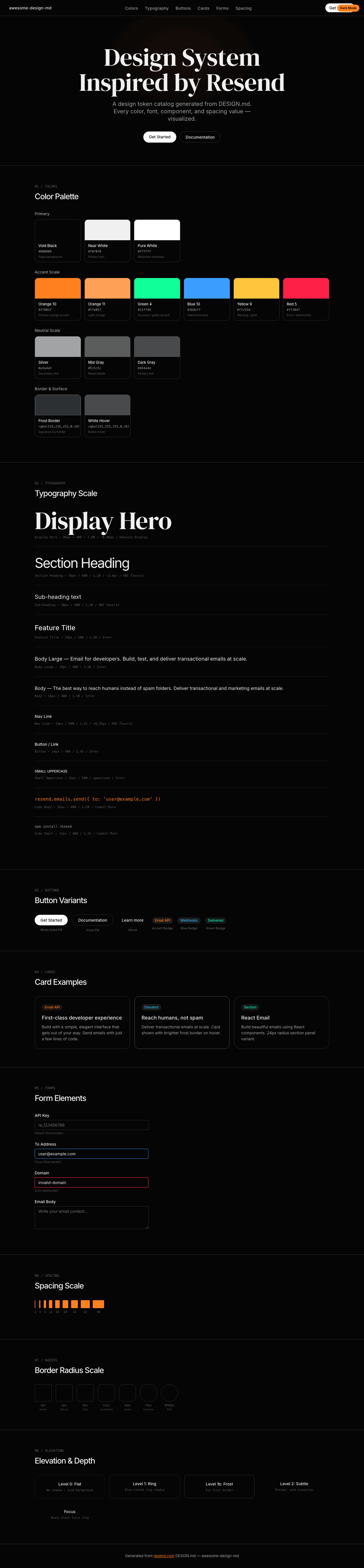
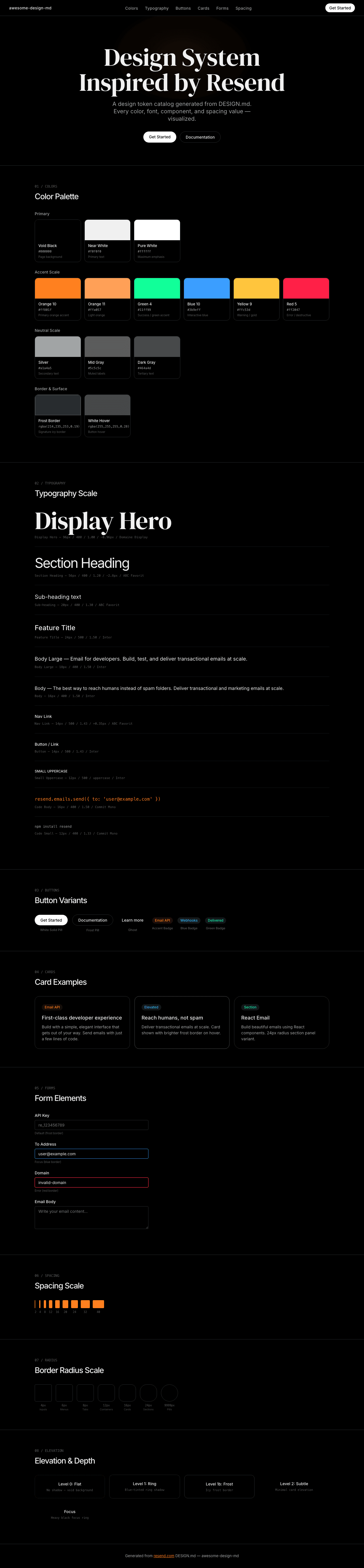
| `DESIGN.md` | Complete design system documentation (9 sections) |
|
|
10
|
+
| `preview.html` | Interactive design token catalog (light) |
|
|
11
|
+
| `preview-dark.html` | Interactive design token catalog (dark) |
|
|
12
|
+
|
|
13
|
+
Use [DESIGN.md](https://github.com/VoltAgent/awesome-design-md/blob/main/design-md/resend/DESIGN.md) to use as a reference for AI agents (Claude, Cursor, Stitch) to generate UI that looks like the Resend design language.
|
|
14
|
+
|
|
15
|
+
## Preview
|
|
16
|
+
|
|
17
|
+
A sample landing page built with DESIGN.md. It shows the actual colors, typography, buttons, cards, spacing, and elevation, all in one page.
|
|
18
|
+
|
|
19
|
+
### Dark Mode
|
|
20
|
+
|
|
21
|
+
|
|
22
|
+
### Light Mode
|
|
23
|
+
|