awesome-design-md 1.0.0
This diff represents the content of publicly available package versions that have been released to one of the supported registries. The information contained in this diff is provided for informational purposes only and reflects changes between package versions as they appear in their respective public registries.
- package/LICENSE +21 -0
- package/README.md +172 -0
- package/bin/cli.mjs +126 -0
- package/design-md/airbnb/DESIGN.md +246 -0
- package/design-md/airbnb/README.md +23 -0
- package/design-md/airbnb/preview-dark.html +234 -0
- package/design-md/airbnb/preview.html +233 -0
- package/design-md/airtable/DESIGN.md +89 -0
- package/design-md/airtable/README.md +23 -0
- package/design-md/airtable/preview-dark.html +165 -0
- package/design-md/airtable/preview.html +164 -0
- package/design-md/apple/DESIGN.md +313 -0
- package/design-md/apple/README.md +24 -0
- package/design-md/apple/preview-dark.html +422 -0
- package/design-md/apple/preview.html +416 -0
- package/design-md/bmw/DESIGN.md +180 -0
- package/design-md/bmw/README.md +23 -0
- package/design-md/bmw/preview-dark.html +211 -0
- package/design-md/bmw/preview.html +210 -0
- package/design-md/cal/DESIGN.md +259 -0
- package/design-md/cal/README.md +23 -0
- package/design-md/cal/preview-dark.html +449 -0
- package/design-md/cal/preview.html +575 -0
- package/design-md/claude/DESIGN.md +312 -0
- package/design-md/claude/README.md +24 -0
- package/design-md/claude/preview-dark.html +803 -0
- package/design-md/claude/preview.html +826 -0
- package/design-md/clay/DESIGN.md +304 -0
- package/design-md/clay/README.md +23 -0
- package/design-md/clay/preview-dark.html +318 -0
- package/design-md/clay/preview.html +317 -0
- package/design-md/clickhouse/DESIGN.md +281 -0
- package/design-md/clickhouse/README.md +24 -0
- package/design-md/clickhouse/preview-dark.html +834 -0
- package/design-md/clickhouse/preview.html +786 -0
- package/design-md/cohere/DESIGN.md +266 -0
- package/design-md/cohere/README.md +24 -0
- package/design-md/cohere/preview-dark.html +810 -0
- package/design-md/cohere/preview.html +814 -0
- package/design-md/coinbase/DESIGN.md +129 -0
- package/design-md/coinbase/README.md +23 -0
- package/design-md/coinbase/preview-dark.html +164 -0
- package/design-md/coinbase/preview.html +163 -0
- package/design-md/composio/DESIGN.md +307 -0
- package/design-md/composio/README.md +24 -0
- package/design-md/composio/preview-dark.html +958 -0
- package/design-md/composio/preview.html +933 -0
- package/design-md/cursor/DESIGN.md +309 -0
- package/design-md/cursor/README.md +24 -0
- package/design-md/cursor/preview-dark.html +395 -0
- package/design-md/cursor/preview.html +385 -0
- package/design-md/elevenlabs/DESIGN.md +265 -0
- package/design-md/elevenlabs/README.md +23 -0
- package/design-md/elevenlabs/preview-dark.html +254 -0
- package/design-md/elevenlabs/preview.html +253 -0
- package/design-md/expo/DESIGN.md +281 -0
- package/design-md/expo/README.md +24 -0
- package/design-md/expo/preview-dark.html +536 -0
- package/design-md/expo/preview.html +536 -0
- package/design-md/figma/DESIGN.md +220 -0
- package/design-md/figma/README.md +24 -0
- package/design-md/figma/preview-dark.html +831 -0
- package/design-md/figma/preview.html +841 -0
- package/design-md/framer/DESIGN.md +246 -0
- package/design-md/framer/README.md +23 -0
- package/design-md/framer/preview-dark.html +904 -0
- package/design-md/framer/preview.html +885 -0
- package/design-md/hashicorp/DESIGN.md +278 -0
- package/design-md/hashicorp/README.md +24 -0
- package/design-md/hashicorp/preview-dark.html +1206 -0
- package/design-md/hashicorp/preview.html +1195 -0
- package/design-md/ibm/DESIGN.md +332 -0
- package/design-md/ibm/README.md +24 -0
- package/design-md/ibm/preview-dark.html +445 -0
- package/design-md/ibm/preview.html +430 -0
- package/design-md/intercom/DESIGN.md +146 -0
- package/design-md/intercom/README.md +23 -0
- package/design-md/intercom/preview-dark.html +185 -0
- package/design-md/intercom/preview.html +184 -0
- package/design-md/kraken/DESIGN.md +125 -0
- package/design-md/kraken/README.md +23 -0
- package/design-md/kraken/preview-dark.html +169 -0
- package/design-md/kraken/preview.html +168 -0
- package/design-md/linear.app/DESIGN.md +367 -0
- package/design-md/linear.app/README.md +24 -0
- package/design-md/linear.app/preview-dark.html +385 -0
- package/design-md/linear.app/preview.html +375 -0
- package/design-md/lovable/DESIGN.md +298 -0
- package/design-md/lovable/README.md +24 -0
- package/design-md/lovable/preview-dark.html +351 -0
- package/design-md/lovable/preview.html +350 -0
- package/design-md/minimax/DESIGN.md +257 -0
- package/design-md/minimax/README.md +24 -0
- package/design-md/minimax/preview-dark.html +1267 -0
- package/design-md/minimax/preview.html +1253 -0
- package/design-md/mintlify/DESIGN.md +326 -0
- package/design-md/mintlify/README.md +24 -0
- package/design-md/mintlify/preview-dark.html +411 -0
- package/design-md/mintlify/preview.html +400 -0
- package/design-md/miro/DESIGN.md +108 -0
- package/design-md/miro/README.md +23 -0
- package/design-md/miro/preview-dark.html +174 -0
- package/design-md/miro/preview.html +173 -0
- package/design-md/mistral.ai/DESIGN.md +261 -0
- package/design-md/mistral.ai/README.md +24 -0
- package/design-md/mistral.ai/preview-dark.html +813 -0
- package/design-md/mistral.ai/preview.html +812 -0
- package/design-md/mongodb/DESIGN.md +266 -0
- package/design-md/mongodb/README.md +23 -0
- package/design-md/mongodb/preview-dark.html +262 -0
- package/design-md/mongodb/preview.html +261 -0
- package/design-md/notion/DESIGN.md +309 -0
- package/design-md/notion/README.md +24 -0
- package/design-md/notion/preview-dark.html +374 -0
- package/design-md/notion/preview.html +366 -0
- package/design-md/nvidia/DESIGN.md +293 -0
- package/design-md/nvidia/README.md +24 -0
- package/design-md/nvidia/preview-dark.html +376 -0
- package/design-md/nvidia/preview.html +368 -0
- package/design-md/ollama/DESIGN.md +267 -0
- package/design-md/ollama/README.md +24 -0
- package/design-md/ollama/preview-dark.html +678 -0
- package/design-md/ollama/preview.html +678 -0
- package/design-md/opencode.ai/DESIGN.md +281 -0
- package/design-md/opencode.ai/README.md +24 -0
- package/design-md/opencode.ai/preview-dark.html +368 -0
- package/design-md/opencode.ai/preview.html +359 -0
- package/design-md/pinterest/DESIGN.md +230 -0
- package/design-md/pinterest/README.md +23 -0
- package/design-md/pinterest/preview-dark.html +233 -0
- package/design-md/pinterest/preview.html +232 -0
- package/design-md/posthog/DESIGN.md +256 -0
- package/design-md/posthog/README.md +23 -0
- package/design-md/posthog/preview-dark.html +701 -0
- package/design-md/posthog/preview.html +751 -0
- package/design-md/raycast/DESIGN.md +268 -0
- package/design-md/raycast/README.md +23 -0
- package/design-md/raycast/preview-dark.html +608 -0
- package/design-md/raycast/preview.html +690 -0
- package/design-md/replicate/DESIGN.md +261 -0
- package/design-md/replicate/README.md +24 -0
- package/design-md/replicate/preview-dark.html +828 -0
- package/design-md/replicate/preview.html +831 -0
- package/design-md/resend/DESIGN.md +303 -0
- package/design-md/resend/README.md +23 -0
- package/design-md/resend/preview-dark.html +357 -0
- package/design-md/resend/preview.html +356 -0
- package/design-md/revolut/DESIGN.md +185 -0
- package/design-md/revolut/README.md +23 -0
- package/design-md/revolut/preview-dark.html +234 -0
- package/design-md/revolut/preview.html +233 -0
- package/design-md/runwayml/DESIGN.md +244 -0
- package/design-md/runwayml/README.md +24 -0
- package/design-md/runwayml/preview-dark.html +664 -0
- package/design-md/runwayml/preview.html +665 -0
- package/design-md/sanity/DESIGN.md +357 -0
- package/design-md/sanity/README.md +24 -0
- package/design-md/sanity/preview-dark.html +995 -0
- package/design-md/sanity/preview.html +1140 -0
- package/design-md/sentry/DESIGN.md +262 -0
- package/design-md/sentry/README.md +24 -0
- package/design-md/sentry/preview-dark.html +628 -0
- package/design-md/sentry/preview.html +953 -0
- package/design-md/spacex/DESIGN.md +194 -0
- package/design-md/spacex/README.md +23 -0
- package/design-md/spacex/preview-dark.html +223 -0
- package/design-md/spacex/preview.html +222 -0
- package/design-md/spotify/DESIGN.md +246 -0
- package/design-md/spotify/README.md +23 -0
- package/design-md/spotify/preview-dark.html +231 -0
- package/design-md/spotify/preview.html +230 -0
- package/design-md/stripe/DESIGN.md +322 -0
- package/design-md/stripe/README.md +24 -0
- package/design-md/stripe/preview-dark.html +430 -0
- package/design-md/stripe/preview.html +421 -0
- package/design-md/supabase/DESIGN.md +255 -0
- package/design-md/supabase/README.md +24 -0
- package/design-md/supabase/preview-dark.html +977 -0
- package/design-md/supabase/preview.html +955 -0
- package/design-md/superhuman/DESIGN.md +252 -0
- package/design-md/superhuman/README.md +23 -0
- package/design-md/superhuman/preview-dark.html +975 -0
- package/design-md/superhuman/preview.html +953 -0
- package/design-md/together.ai/DESIGN.md +263 -0
- package/design-md/together.ai/README.md +24 -0
- package/design-md/together.ai/preview-dark.html +892 -0
- package/design-md/together.ai/preview.html +897 -0
- package/design-md/uber/DESIGN.md +295 -0
- package/design-md/uber/README.md +24 -0
- package/design-md/uber/preview-dark.html +1164 -0
- package/design-md/uber/preview.html +1163 -0
- package/design-md/vercel/DESIGN.md +310 -0
- package/design-md/vercel/README.md +24 -0
- package/design-md/vercel/preview-dark.html +370 -0
- package/design-md/vercel/preview.html +369 -0
- package/design-md/voltagent/DESIGN.md +323 -0
- package/design-md/voltagent/README.md +24 -0
- package/design-md/voltagent/preview-dark.html +487 -0
- package/design-md/voltagent/preview.html +766 -0
- package/design-md/warp/DESIGN.md +253 -0
- package/design-md/warp/README.md +23 -0
- package/design-md/warp/preview-dark.html +502 -0
- package/design-md/warp/preview.html +535 -0
- package/design-md/webflow/DESIGN.md +92 -0
- package/design-md/webflow/README.md +23 -0
- package/design-md/webflow/preview-dark.html +147 -0
- package/design-md/webflow/preview.html +146 -0
- package/design-md/wise/DESIGN.md +173 -0
- package/design-md/wise/README.md +23 -0
- package/design-md/wise/preview-dark.html +230 -0
- package/design-md/wise/preview.html +229 -0
- package/design-md/x.ai/DESIGN.md +257 -0
- package/design-md/x.ai/README.md +24 -0
- package/design-md/x.ai/preview-dark.html +358 -0
- package/design-md/x.ai/preview.html +409 -0
- package/design-md/zapier/DESIGN.md +328 -0
- package/design-md/zapier/README.md +24 -0
- package/design-md/zapier/preview-dark.html +382 -0
- package/design-md/zapier/preview.html +374 -0
- package/package.json +33 -0
|
@@ -0,0 +1,295 @@
|
|
|
1
|
+
# Design System: Uber
|
|
2
|
+
|
|
3
|
+
## 1. Visual Theme & Atmosphere
|
|
4
|
+
|
|
5
|
+
Uber's design language is a masterclass in confident minimalism -- a black-and-white universe where every pixel serves a purpose and nothing decorates without earning its place. The entire experience is built on a stark duality: jet black (`#000000`) and pure white (`#ffffff`), with virtually no mid-tone grays diluting the message. This isn't the sterile minimalism of a startup that hasn't finished designing -- it's the deliberate restraint of a brand so established it can afford to whisper.
|
|
6
|
+
|
|
7
|
+
The signature typeface, UberMove, is a proprietary geometric sans-serif with a distinctly square, engineered quality. Headlines in UberMove Bold at 52px carry the weight of a billboard -- authoritative, direct, unapologetic. The companion face UberMoveText handles body copy and buttons with a slightly softer, more readable character at medium weight (500). Together, they create a typographic system that feels like a transit map: clear, efficient, built for scanning at speed.
|
|
8
|
+
|
|
9
|
+
What makes Uber's design truly distinctive is its use of full-bleed photography and illustration paired with pill-shaped interactive elements (999px border-radius). Navigation chips, CTA buttons, and category selectors all share this capsule shape, creating a tactile, thumb-friendly interface language that's unmistakably Uber. The illustrations -- warm, slightly stylized scenes of drivers, riders, and cityscapes -- inject humanity into what could otherwise be a cold, monochrome system. The site alternates between white content sections and a full-black footer, with card-based layouts using the gentlest possible shadows (rgba(0,0,0,0.12-0.16)) to create subtle lift without breaking the flat aesthetic.
|
|
10
|
+
|
|
11
|
+
**Key Characteristics:**
|
|
12
|
+
- Pure black-and-white foundation with virtually no mid-tone grays in the UI chrome
|
|
13
|
+
- UberMove (headlines) + UberMoveText (body/UI) -- proprietary geometric sans-serif family
|
|
14
|
+
- Pill-shaped everything: buttons, chips, nav items all use 999px border-radius
|
|
15
|
+
- Warm, human illustrations contrasting the stark monochrome interface
|
|
16
|
+
- Card-based layout with whisper-soft shadows (0.12-0.16 opacity)
|
|
17
|
+
- 8px spacing grid with compact, information-dense layouts
|
|
18
|
+
- Bold photography integrated as full-bleed hero backgrounds
|
|
19
|
+
- Black footer anchoring the page with a dark, high-contrast environment
|
|
20
|
+
|
|
21
|
+
## 2. Color Palette & Roles
|
|
22
|
+
|
|
23
|
+
### Primary
|
|
24
|
+
- **Uber Black** (`#000000`): The defining brand color -- used for primary buttons, headlines, navigation text, and the footer. Not "near-black" or "off-black," but true, uncompromising black.
|
|
25
|
+
- **Pure White** (`#ffffff`): The primary surface color and inverse text. Used for page backgrounds, card surfaces, and text on black elements.
|
|
26
|
+
|
|
27
|
+
### Interactive & Button States
|
|
28
|
+
- **Hover Gray** (`#e2e2e2`): White button hover state -- a clean, cool light gray that provides clear feedback without warmth.
|
|
29
|
+
- **Hover Light** (`#f3f3f3`): Subtle hover for elevated white buttons -- barely-there gray for gentle interaction feedback.
|
|
30
|
+
- **Chip Gray** (`#efefef`): Background for secondary/filter buttons and navigation chips -- a neutral, ultra-light gray.
|
|
31
|
+
|
|
32
|
+
### Text & Content
|
|
33
|
+
- **Body Gray** (`#4b4b4b`): Secondary text and footer links -- a true mid-gray with no warm or cool bias.
|
|
34
|
+
- **Muted Gray** (`#afafaf`): Tertiary text, de-emphasized footer links, and placeholder content.
|
|
35
|
+
|
|
36
|
+
### Borders & Separation
|
|
37
|
+
- **Border Black** (`#000000`): Thin 1px borders for structural containment -- used sparingly on dividers and form containers.
|
|
38
|
+
|
|
39
|
+
### Shadows & Depth
|
|
40
|
+
- **Shadow Light** (`rgba(0, 0, 0, 0.12)`): Standard card elevation -- a featherweight lift for content cards.
|
|
41
|
+
- **Shadow Medium** (`rgba(0, 0, 0, 0.16)`): Slightly stronger elevation for floating action buttons and overlays.
|
|
42
|
+
- **Button Press** (`rgba(0, 0, 0, 0.08)`): Inset shadow for active/pressed states on secondary buttons.
|
|
43
|
+
|
|
44
|
+
### Link States
|
|
45
|
+
- **Default Link Blue** (`#0000ee`): Standard browser blue for text links with underline -- used in body content.
|
|
46
|
+
- **Link White** (`#ffffff`): Links on dark surfaces -- used in footer and dark sections.
|
|
47
|
+
- **Link Black** (`#000000`): Links on light surfaces with underline decoration.
|
|
48
|
+
|
|
49
|
+
### Gradient System
|
|
50
|
+
- Uber's design is **entirely gradient-free**. The black/white duality and flat color blocks create all visual hierarchy. No gradients appear anywhere in the system -- every surface is a solid color, every transition is a hard edge or a shadow.
|
|
51
|
+
|
|
52
|
+
## 3. Typography Rules
|
|
53
|
+
|
|
54
|
+
### Font Family
|
|
55
|
+
- **Headline / Display**: `UberMove`, with fallbacks: `UberMoveText, system-ui, Helvetica Neue, Helvetica, Arial, sans-serif`
|
|
56
|
+
- **Body / UI**: `UberMoveText`, with fallbacks: `system-ui, Helvetica Neue, Helvetica, Arial, sans-serif`
|
|
57
|
+
|
|
58
|
+
*Note: UberMove and UberMoveText are proprietary typefaces. For external implementations, use `system-ui` or Inter as the closest available substitute. The geometric, square-proportioned character of UberMove can be approximated with Inter or DM Sans.*
|
|
59
|
+
|
|
60
|
+
### Hierarchy
|
|
61
|
+
|
|
62
|
+
| Role | Font | Size | Weight | Line Height | Notes |
|
|
63
|
+
|------|------|------|--------|-------------|-------|
|
|
64
|
+
| Display / Hero | UberMove | 52px (3.25rem) | 700 | 1.23 (tight) | Maximum impact, billboard presence |
|
|
65
|
+
| Section Heading | UberMove | 36px (2.25rem) | 700 | 1.22 (tight) | Major section anchors |
|
|
66
|
+
| Card Title | UberMove | 32px (2rem) | 700 | 1.25 (tight) | Card and feature headings |
|
|
67
|
+
| Sub-heading | UberMove | 24px (1.5rem) | 700 | 1.33 | Secondary section headers |
|
|
68
|
+
| Small Heading | UberMove | 20px (1.25rem) | 700 | 1.40 | Compact headings, list titles |
|
|
69
|
+
| Nav / UI Large | UberMoveText | 18px (1.13rem) | 500 | 1.33 | Navigation links, prominent UI text |
|
|
70
|
+
| Body / Button | UberMoveText | 16px (1rem) | 400-500 | 1.25-1.50 | Standard body text, button labels |
|
|
71
|
+
| Caption | UberMoveText | 14px (0.88rem) | 400-500 | 1.14-1.43 | Metadata, descriptions, small links |
|
|
72
|
+
| Micro | UberMoveText | 12px (0.75rem) | 400 | 1.67 (relaxed) | Fine print, legal text |
|
|
73
|
+
|
|
74
|
+
### Principles
|
|
75
|
+
- **Bold headlines, medium body**: UberMove headings are exclusively weight 700 (bold) -- every headline hits with billboard force. UberMoveText body and UI text uses 400-500, creating a clear visual hierarchy through weight contrast.
|
|
76
|
+
- **Tight heading line-heights**: All headlines use line-heights between 1.22-1.40 -- compact and punchy, designed for scanning rather than reading.
|
|
77
|
+
- **Functional typography**: There is no decorative type treatment anywhere. No letter-spacing, no text-transform, no ornamental sizing. Every text element serves a direct communication purpose.
|
|
78
|
+
- **Two fonts, strict roles**: UberMove is exclusively for headings. UberMoveText is exclusively for body, buttons, links, and UI. The boundary is never crossed.
|
|
79
|
+
|
|
80
|
+
## 4. Component Stylings
|
|
81
|
+
|
|
82
|
+
### Buttons
|
|
83
|
+
|
|
84
|
+
**Primary Black (CTA)**
|
|
85
|
+
- Background: Uber Black (`#000000`)
|
|
86
|
+
- Text: Pure White (`#ffffff`)
|
|
87
|
+
- Padding: 10px 12px
|
|
88
|
+
- Radius: 999px (full pill)
|
|
89
|
+
- Outline: none
|
|
90
|
+
- Focus: inset ring `rgb(255,255,255) 0px 0px 0px 2px`
|
|
91
|
+
- The primary action button -- bold, high-contrast, unmissable
|
|
92
|
+
|
|
93
|
+
**Secondary White**
|
|
94
|
+
- Background: Pure White (`#ffffff`)
|
|
95
|
+
- Text: Uber Black (`#000000`)
|
|
96
|
+
- Padding: 10px 12px
|
|
97
|
+
- Radius: 999px (full pill)
|
|
98
|
+
- Hover: background shifts to Hover Gray (`#e2e2e2`)
|
|
99
|
+
- Focus: background shifts to Hover Gray, inset ring appears
|
|
100
|
+
- Used on dark surfaces or as a secondary action alongside Primary Black
|
|
101
|
+
|
|
102
|
+
**Chip / Filter**
|
|
103
|
+
- Background: Chip Gray (`#efefef`)
|
|
104
|
+
- Text: Uber Black (`#000000`)
|
|
105
|
+
- Padding: 14px 16px
|
|
106
|
+
- Radius: 999px (full pill)
|
|
107
|
+
- Active: inset shadow `rgba(0,0,0,0.08)`
|
|
108
|
+
- Navigation chips, category selectors, filter toggles
|
|
109
|
+
|
|
110
|
+
**Floating Action**
|
|
111
|
+
- Background: Pure White (`#ffffff`)
|
|
112
|
+
- Text: Uber Black (`#000000`)
|
|
113
|
+
- Padding: 14px
|
|
114
|
+
- Radius: 999px (full pill)
|
|
115
|
+
- Shadow: `rgba(0,0,0,0.16) 0px 2px 8px 0px`
|
|
116
|
+
- Transform: `translateY(2px)` slight offset
|
|
117
|
+
- Hover: background shifts to `#f3f3f3`
|
|
118
|
+
- Map controls, scroll-to-top, floating CTAs
|
|
119
|
+
|
|
120
|
+
### Cards & Containers
|
|
121
|
+
- Background: Pure White (`#ffffff`) on white pages; no distinct card background differentiation
|
|
122
|
+
- Border: none by default -- cards are defined by shadow, not stroke
|
|
123
|
+
- Radius: 8px for standard content cards; 12px for featured/promoted cards
|
|
124
|
+
- Shadow: `rgba(0,0,0,0.12) 0px 4px 16px 0px` for standard lift
|
|
125
|
+
- Cards are content-dense with minimal internal padding
|
|
126
|
+
- Image-led cards use full-bleed imagery with text overlay or below
|
|
127
|
+
|
|
128
|
+
### Inputs & Forms
|
|
129
|
+
- Text: Uber Black (`#000000`)
|
|
130
|
+
- Background: Pure White (`#ffffff`)
|
|
131
|
+
- Border: 1px solid Black (`#000000`) -- the only place visible borders appear prominently
|
|
132
|
+
- Radius: 8px
|
|
133
|
+
- Padding: standard comfortable spacing
|
|
134
|
+
- Focus: no extracted custom focus state -- relies on standard browser focus ring
|
|
135
|
+
|
|
136
|
+
### Navigation
|
|
137
|
+
- Sticky top navigation with white background
|
|
138
|
+
- Logo: Uber wordmark/icon at 24x24px in black
|
|
139
|
+
- Links: UberMoveText at 14-18px, weight 500, in Uber Black
|
|
140
|
+
- Pill-shaped nav chips with Chip Gray (`#efefef`) background for category navigation ("Ride", "Drive", "Business", "Uber Eats")
|
|
141
|
+
- Menu toggle: circular button with 50% border-radius
|
|
142
|
+
- Mobile: hamburger menu pattern
|
|
143
|
+
|
|
144
|
+
### Image Treatment
|
|
145
|
+
- Warm, hand-illustrated scenes (not photographs for feature sections)
|
|
146
|
+
- Illustration style: slightly stylized people, warm color palette within illustrations, contemporary vibe
|
|
147
|
+
- Hero sections use bold photography or illustration as full-width backgrounds
|
|
148
|
+
- QR codes for app download CTAs
|
|
149
|
+
- All imagery uses standard 8px or 12px border-radius when contained in cards
|
|
150
|
+
|
|
151
|
+
### Distinctive Components
|
|
152
|
+
|
|
153
|
+
**Category Pill Navigation**
|
|
154
|
+
- Horizontal row of pill-shaped buttons for top-level navigation ("Ride", "Drive", "Business", "Uber Eats", "About")
|
|
155
|
+
- Each pill: Chip Gray background, black text, 999px radius
|
|
156
|
+
- Active state indicated by black background with white text (inversion)
|
|
157
|
+
|
|
158
|
+
**Hero with Dual Action**
|
|
159
|
+
- Split hero: text/CTA on left, map/illustration on right
|
|
160
|
+
- Two input fields side by side for pickup/destination
|
|
161
|
+
- "See prices" CTA button in black pill
|
|
162
|
+
|
|
163
|
+
**Plan-Ahead Cards**
|
|
164
|
+
- Cards promoting features like "Uber Reserve" and trip planning
|
|
165
|
+
- Illustration-heavy with warm, human-centric imagery
|
|
166
|
+
- Black CTA buttons with white text at bottom
|
|
167
|
+
|
|
168
|
+
## 5. Layout Principles
|
|
169
|
+
|
|
170
|
+
### Spacing System
|
|
171
|
+
- Base unit: 8px
|
|
172
|
+
- Scale: 4px, 6px, 8px, 10px, 12px, 14px, 16px, 18px, 20px, 24px, 32px
|
|
173
|
+
- Button padding: 10px 12px (compact) or 14px 16px (comfortable)
|
|
174
|
+
- Card internal padding: approximately 24-32px
|
|
175
|
+
- Section vertical spacing: generous but efficient -- approximately 64-96px between major sections
|
|
176
|
+
|
|
177
|
+
### Grid & Container
|
|
178
|
+
- Max container width: approximately 1136px, centered
|
|
179
|
+
- Hero: split layout with text left, visual right
|
|
180
|
+
- Feature sections: 2-column card grids or full-width single-column
|
|
181
|
+
- Footer: multi-column link grid on black background
|
|
182
|
+
- Full-width sections extending to viewport edges
|
|
183
|
+
|
|
184
|
+
### Whitespace Philosophy
|
|
185
|
+
- **Efficient, not airy**: Uber's whitespace is functional -- enough to separate, never enough to feel empty. This is transit-system spacing: compact, clear, purpose-driven.
|
|
186
|
+
- **Content-dense cards**: Cards pack information tightly with minimal internal spacing, relying on shadow and radius to define boundaries.
|
|
187
|
+
- **Section breathing room**: Major sections get generous vertical spacing, but within sections, elements are closely grouped.
|
|
188
|
+
|
|
189
|
+
### Border Radius Scale
|
|
190
|
+
- Sharp (0px): No square corners used in interactive elements
|
|
191
|
+
- Standard (8px): Content cards, input fields, listboxes
|
|
192
|
+
- Comfortable (12px): Featured cards, larger containers, link cards
|
|
193
|
+
- Full Pill (999px): All buttons, chips, navigation items, pills
|
|
194
|
+
- Circle (50%): Avatar images, icon containers, circular controls
|
|
195
|
+
|
|
196
|
+
## 6. Depth & Elevation
|
|
197
|
+
|
|
198
|
+
| Level | Treatment | Use |
|
|
199
|
+
|-------|-----------|-----|
|
|
200
|
+
| Flat (Level 0) | No shadow, solid background | Page background, inline content, text sections |
|
|
201
|
+
| Subtle (Level 1) | `rgba(0,0,0,0.12) 0px 4px 16px` | Standard content cards, feature blocks |
|
|
202
|
+
| Medium (Level 2) | `rgba(0,0,0,0.16) 0px 4px 16px` | Elevated cards, overlay elements |
|
|
203
|
+
| Floating (Level 3) | `rgba(0,0,0,0.16) 0px 2px 8px` + translateY(2px) | Floating action buttons, map controls |
|
|
204
|
+
| Pressed (Level 4) | `rgba(0,0,0,0.08) inset` (999px spread) | Active/pressed button states |
|
|
205
|
+
| Focus Ring | `rgb(255,255,255) 0px 0px 0px 2px inset` | Keyboard focus indicators |
|
|
206
|
+
|
|
207
|
+
**Shadow Philosophy**: Uber uses shadow purely as a structural tool, never decoratively. Shadows are always black at very low opacity (0.08-0.16), creating the bare minimum lift needed to separate content layers. The blur radii are moderate (8-16px) -- enough to feel natural but never dramatic. There are no colored shadows, no layered shadow stacks, and no ambient glow effects. Depth is communicated more through the black/white section contrast than through shadow elevation.
|
|
208
|
+
|
|
209
|
+
## 7. Do's and Don'ts
|
|
210
|
+
|
|
211
|
+
### Do
|
|
212
|
+
- Use true black (`#000000`) and pure white (`#ffffff`) as the primary palette -- the stark contrast IS Uber
|
|
213
|
+
- Use 999px border-radius for all buttons, chips, and pill-shaped navigation elements
|
|
214
|
+
- Keep all headings in UberMove Bold (700) for billboard-level impact
|
|
215
|
+
- Use whisper-soft shadows (0.12-0.16 opacity) for card elevation -- barely visible
|
|
216
|
+
- Maintain the compact, information-dense layout style -- Uber prioritizes efficiency over airiness
|
|
217
|
+
- Use warm, human-centric illustrations to soften the monochrome interface
|
|
218
|
+
- Apply 8px radius for content cards and 12px for featured containers
|
|
219
|
+
- Use UberMoveText at weight 500 for navigation and prominent UI text
|
|
220
|
+
- Pair black primary buttons with white secondary buttons for dual-action layouts
|
|
221
|
+
|
|
222
|
+
### Don't
|
|
223
|
+
- Don't introduce color into the UI chrome -- Uber's interface is strictly black, white, and gray
|
|
224
|
+
- Don't use rounded corners less than 999px on buttons -- the full-pill shape is a core identity element
|
|
225
|
+
- Don't apply heavy shadows or drop shadows with high opacity -- depth is whisper-subtle
|
|
226
|
+
- Don't use serif fonts anywhere -- Uber's typography is exclusively geometric sans-serif
|
|
227
|
+
- Don't create airy, spacious layouts with excessive whitespace -- Uber's density is intentional
|
|
228
|
+
- Don't use gradients or color overlays -- every surface is a flat, solid color
|
|
229
|
+
- Don't mix UberMove into body text or UberMoveText into headlines -- the hierarchy is strict
|
|
230
|
+
- Don't use decorative borders -- borders are functional (inputs, dividers) or absent entirely
|
|
231
|
+
- Don't soften the black/white contrast with off-whites or near-blacks -- the duality is deliberate
|
|
232
|
+
|
|
233
|
+
## 8. Responsive Behavior
|
|
234
|
+
|
|
235
|
+
### Breakpoints
|
|
236
|
+
| Name | Width | Key Changes |
|
|
237
|
+
|------|-------|-------------|
|
|
238
|
+
| Mobile Small | 320px | Minimum layout, single column, stacked inputs, compact typography |
|
|
239
|
+
| Mobile | 600px | Standard mobile, stacked layout, hamburger nav |
|
|
240
|
+
| Tablet Small | 768px | Two-column grids begin, expanded card layouts |
|
|
241
|
+
| Tablet | 1119px | Full tablet layout, side-by-side hero content |
|
|
242
|
+
| Desktop Small | 1120px | Desktop grid activates, horizontal nav pills |
|
|
243
|
+
| Desktop | 1136px | Full desktop layout, maximum container width, split hero |
|
|
244
|
+
|
|
245
|
+
### Touch Targets
|
|
246
|
+
- All pill buttons: minimum 44px height (10-14px vertical padding + line-height)
|
|
247
|
+
- Navigation chips: generous 14px 16px padding for comfortable thumb tapping
|
|
248
|
+
- Circular controls (menu, close): 50% radius ensures large, easy-to-hit targets
|
|
249
|
+
- Card surfaces serve as full-area touch targets on mobile
|
|
250
|
+
|
|
251
|
+
### Collapsing Strategy
|
|
252
|
+
- **Navigation**: Horizontal pill nav collapses to hamburger menu with circular toggle
|
|
253
|
+
- **Hero**: Split layout (text + map/visual) stacks to single column -- text above, visual below
|
|
254
|
+
- **Input fields**: Side-by-side pickup/destination inputs stack vertically
|
|
255
|
+
- **Feature cards**: 2-column grid collapses to full-width stacked cards
|
|
256
|
+
- **Headings**: 52px display scales down through 36px, 32px, 24px, 20px
|
|
257
|
+
- **Footer**: Multi-column link grid collapses to accordion or stacked single column
|
|
258
|
+
- **Category pills**: Horizontal scroll with overflow on smaller screens
|
|
259
|
+
|
|
260
|
+
### Image Behavior
|
|
261
|
+
- Illustrations scale proportionally within their containers
|
|
262
|
+
- Hero imagery maintains aspect ratio, may crop on smaller screens
|
|
263
|
+
- QR code sections hide on mobile (app download shifts to direct store links)
|
|
264
|
+
- Card imagery maintains 8-12px border radius at all sizes
|
|
265
|
+
|
|
266
|
+
## 9. Agent Prompt Guide
|
|
267
|
+
|
|
268
|
+
### Quick Color Reference
|
|
269
|
+
- Primary Button: "Uber Black (#000000)"
|
|
270
|
+
- Page Background: "Pure White (#ffffff)"
|
|
271
|
+
- Button Text (on black): "Pure White (#ffffff)"
|
|
272
|
+
- Button Text (on white): "Uber Black (#000000)"
|
|
273
|
+
- Secondary Text: "Body Gray (#4b4b4b)"
|
|
274
|
+
- Tertiary Text: "Muted Gray (#afafaf)"
|
|
275
|
+
- Chip Background: "Chip Gray (#efefef)"
|
|
276
|
+
- Hover State: "Hover Gray (#e2e2e2)"
|
|
277
|
+
- Card Shadow: "rgba(0,0,0,0.12) 0px 4px 16px"
|
|
278
|
+
- Footer Background: "Uber Black (#000000)"
|
|
279
|
+
|
|
280
|
+
### Example Component Prompts
|
|
281
|
+
- "Create a hero section on Pure White (#ffffff) with a headline at 52px UberMove Bold (700), line-height 1.23. Use Uber Black (#000000) text. Add a subtitle in Body Gray (#4b4b4b) at 16px UberMoveText weight 400 with 1.50 line-height. Place an Uber Black (#000000) pill CTA button with Pure White text, 999px radius, padding 10px 12px."
|
|
282
|
+
- "Design a category navigation bar with horizontal pill buttons. Each pill: Chip Gray (#efefef) background, Uber Black (#000000) text, 14px 16px padding, 999px border-radius. Active pill inverts to Uber Black background with Pure White text. Use UberMoveText at 14px weight 500."
|
|
283
|
+
- "Build a feature card on Pure White (#ffffff) with 8px border-radius and shadow rgba(0,0,0,0.12) 0px 4px 16px. Title in UberMove at 24px weight 700, description in Body Gray (#4b4b4b) at 16px UberMoveText. Add a black pill CTA button at the bottom."
|
|
284
|
+
- "Create a dark footer on Uber Black (#000000) with Pure White (#ffffff) heading text in UberMove at 20px weight 700. Footer links in Muted Gray (#afafaf) at 14px UberMoveText. Links hover to Pure White. Multi-column grid layout."
|
|
285
|
+
- "Design a floating action button with Pure White (#ffffff) background, 999px radius, 14px padding, and shadow rgba(0,0,0,0.16) 0px 2px 8px. Hover shifts background to #f3f3f3. Use for scroll-to-top or map controls."
|
|
286
|
+
|
|
287
|
+
### Iteration Guide
|
|
288
|
+
1. Focus on ONE component at a time
|
|
289
|
+
2. Reference the strict black/white palette -- "use Uber Black (#000000)" not "make it dark"
|
|
290
|
+
3. Always specify 999px radius for buttons and pills -- this is non-negotiable for the Uber identity
|
|
291
|
+
4. Describe the font family explicitly -- "UberMove Bold for the heading, UberMoveText Medium for the label"
|
|
292
|
+
5. For shadows, use "whisper shadow (rgba(0,0,0,0.12) 0px 4px 16px)" -- never heavy drop shadows
|
|
293
|
+
6. Keep layouts compact and information-dense -- Uber is efficient, not airy
|
|
294
|
+
7. Illustrations should be warm and human -- describe "stylized people in warm tones" not abstract shapes
|
|
295
|
+
8. Pair black CTAs with white secondaries for balanced dual-action layouts
|
|
@@ -0,0 +1,24 @@
|
|
|
1
|
+
# Uber Inspired Design System
|
|
2
|
+
|
|
3
|
+
[DESIGN.md](https://github.com/VoltAgent/awesome-design-md/blob/main/design-md/uber/DESIGN.md) extracted from the public [uber](https://uber.com/) website. This is not the official design system. Colors, fonts, and spacing may not be 100% accurate. But it's a good starting point for building something similar.
|
|
4
|
+
|
|
5
|
+
## Files
|
|
6
|
+
|
|
7
|
+
| File | Description |
|
|
8
|
+
|------|-------------|
|
|
9
|
+
| `DESIGN.md` | Complete design system documentation (9 sections) |
|
|
10
|
+
| `preview.html` | Interactive design token catalog (light) |
|
|
11
|
+
| `preview-dark.html` | Interactive design token catalog (dark) |
|
|
12
|
+
|
|
13
|
+
|
|
14
|
+
Use [DESIGN.md](https://github.com/VoltAgent/awesome-design-md/blob/main/design-md/uber/DESIGN.md) to use as a reference for AI agents (Claude, Cursor, Stitch) to generate UI that looks like the Uber design language.
|
|
15
|
+
|
|
16
|
+
## Preview
|
|
17
|
+
|
|
18
|
+
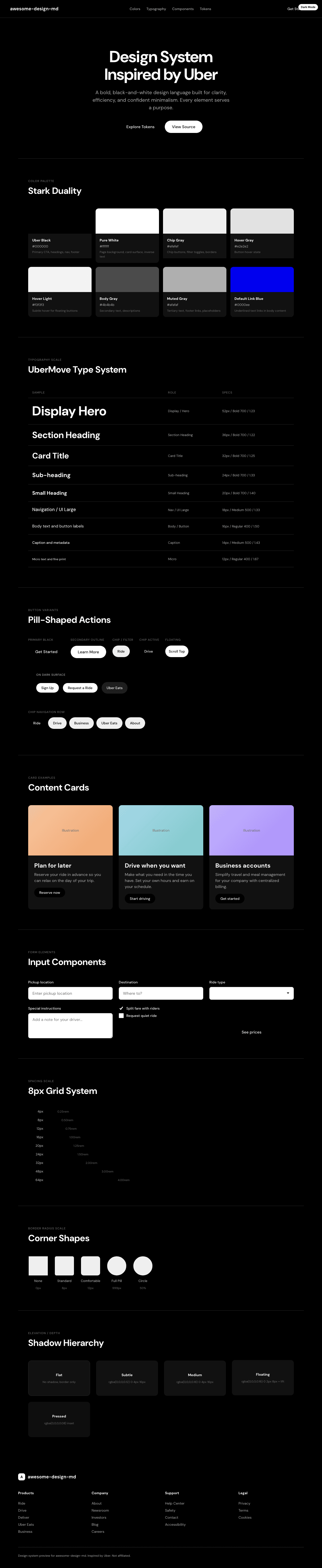
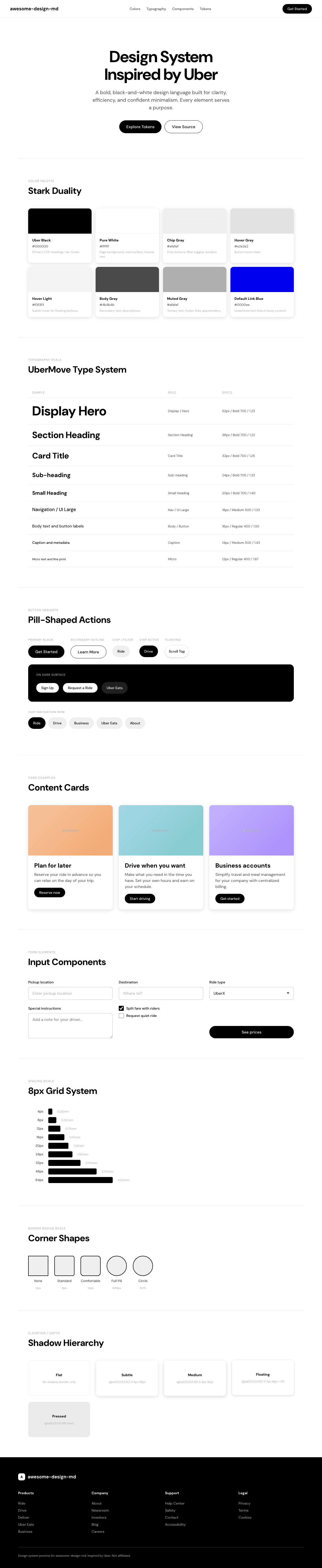
A sample landing page built with DESIGN.md. It shows the actual colors, typography, buttons, cards, spacing, and elevation, all in one page.
|
|
19
|
+
|
|
20
|
+
### Dark Mode
|
|
21
|
+
|
|
22
|
+
|
|
23
|
+
### Light Mode
|
|
24
|
+
|