awesome-design-md 1.0.0
This diff represents the content of publicly available package versions that have been released to one of the supported registries. The information contained in this diff is provided for informational purposes only and reflects changes between package versions as they appear in their respective public registries.
- package/LICENSE +21 -0
- package/README.md +172 -0
- package/bin/cli.mjs +126 -0
- package/design-md/airbnb/DESIGN.md +246 -0
- package/design-md/airbnb/README.md +23 -0
- package/design-md/airbnb/preview-dark.html +234 -0
- package/design-md/airbnb/preview.html +233 -0
- package/design-md/airtable/DESIGN.md +89 -0
- package/design-md/airtable/README.md +23 -0
- package/design-md/airtable/preview-dark.html +165 -0
- package/design-md/airtable/preview.html +164 -0
- package/design-md/apple/DESIGN.md +313 -0
- package/design-md/apple/README.md +24 -0
- package/design-md/apple/preview-dark.html +422 -0
- package/design-md/apple/preview.html +416 -0
- package/design-md/bmw/DESIGN.md +180 -0
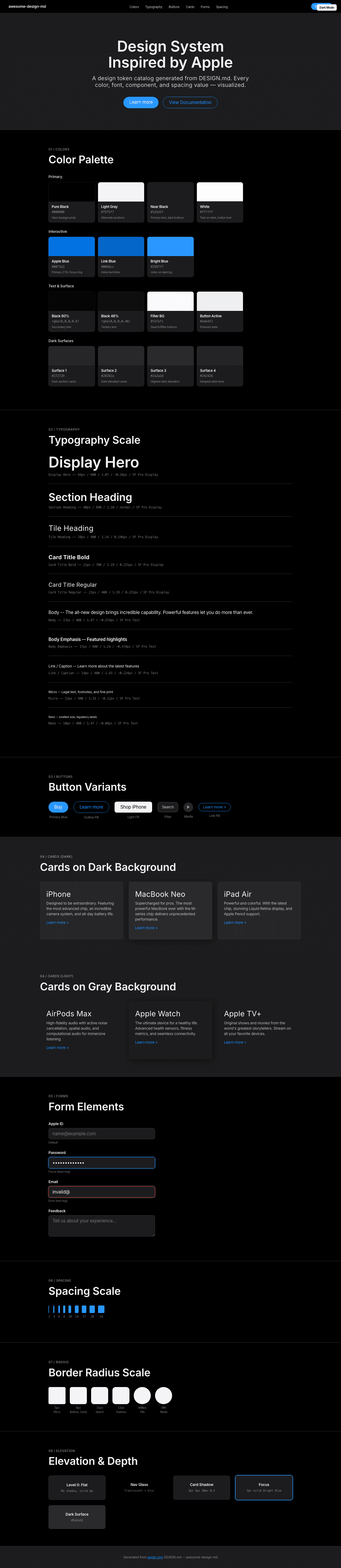
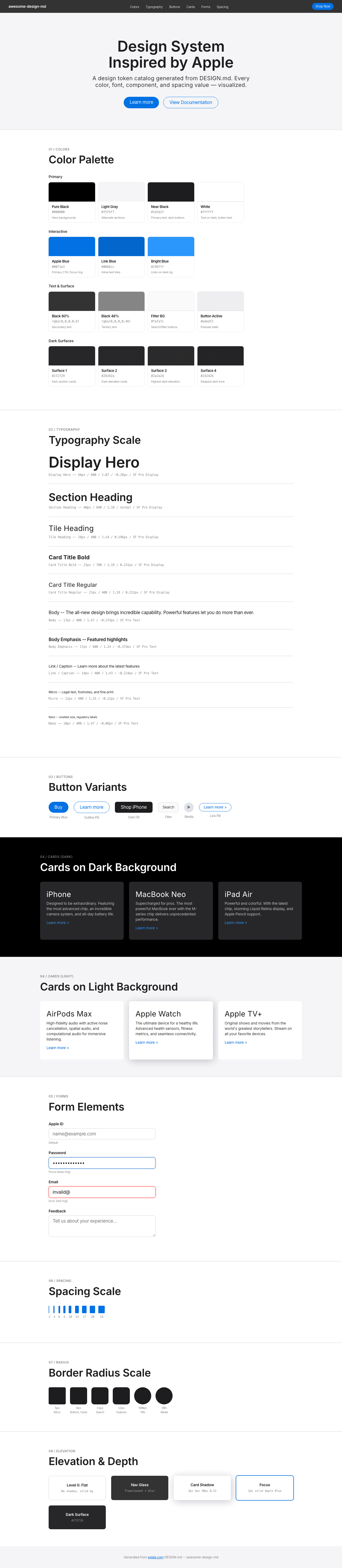
- package/design-md/bmw/README.md +23 -0
- package/design-md/bmw/preview-dark.html +211 -0
- package/design-md/bmw/preview.html +210 -0
- package/design-md/cal/DESIGN.md +259 -0
- package/design-md/cal/README.md +23 -0
- package/design-md/cal/preview-dark.html +449 -0
- package/design-md/cal/preview.html +575 -0
- package/design-md/claude/DESIGN.md +312 -0
- package/design-md/claude/README.md +24 -0
- package/design-md/claude/preview-dark.html +803 -0
- package/design-md/claude/preview.html +826 -0
- package/design-md/clay/DESIGN.md +304 -0
- package/design-md/clay/README.md +23 -0
- package/design-md/clay/preview-dark.html +318 -0
- package/design-md/clay/preview.html +317 -0
- package/design-md/clickhouse/DESIGN.md +281 -0
- package/design-md/clickhouse/README.md +24 -0
- package/design-md/clickhouse/preview-dark.html +834 -0
- package/design-md/clickhouse/preview.html +786 -0
- package/design-md/cohere/DESIGN.md +266 -0
- package/design-md/cohere/README.md +24 -0
- package/design-md/cohere/preview-dark.html +810 -0
- package/design-md/cohere/preview.html +814 -0
- package/design-md/coinbase/DESIGN.md +129 -0
- package/design-md/coinbase/README.md +23 -0
- package/design-md/coinbase/preview-dark.html +164 -0
- package/design-md/coinbase/preview.html +163 -0
- package/design-md/composio/DESIGN.md +307 -0
- package/design-md/composio/README.md +24 -0
- package/design-md/composio/preview-dark.html +958 -0
- package/design-md/composio/preview.html +933 -0
- package/design-md/cursor/DESIGN.md +309 -0
- package/design-md/cursor/README.md +24 -0
- package/design-md/cursor/preview-dark.html +395 -0
- package/design-md/cursor/preview.html +385 -0
- package/design-md/elevenlabs/DESIGN.md +265 -0
- package/design-md/elevenlabs/README.md +23 -0
- package/design-md/elevenlabs/preview-dark.html +254 -0
- package/design-md/elevenlabs/preview.html +253 -0
- package/design-md/expo/DESIGN.md +281 -0
- package/design-md/expo/README.md +24 -0
- package/design-md/expo/preview-dark.html +536 -0
- package/design-md/expo/preview.html +536 -0
- package/design-md/figma/DESIGN.md +220 -0
- package/design-md/figma/README.md +24 -0
- package/design-md/figma/preview-dark.html +831 -0
- package/design-md/figma/preview.html +841 -0
- package/design-md/framer/DESIGN.md +246 -0
- package/design-md/framer/README.md +23 -0
- package/design-md/framer/preview-dark.html +904 -0
- package/design-md/framer/preview.html +885 -0
- package/design-md/hashicorp/DESIGN.md +278 -0
- package/design-md/hashicorp/README.md +24 -0
- package/design-md/hashicorp/preview-dark.html +1206 -0
- package/design-md/hashicorp/preview.html +1195 -0
- package/design-md/ibm/DESIGN.md +332 -0
- package/design-md/ibm/README.md +24 -0
- package/design-md/ibm/preview-dark.html +445 -0
- package/design-md/ibm/preview.html +430 -0
- package/design-md/intercom/DESIGN.md +146 -0
- package/design-md/intercom/README.md +23 -0
- package/design-md/intercom/preview-dark.html +185 -0
- package/design-md/intercom/preview.html +184 -0
- package/design-md/kraken/DESIGN.md +125 -0
- package/design-md/kraken/README.md +23 -0
- package/design-md/kraken/preview-dark.html +169 -0
- package/design-md/kraken/preview.html +168 -0
- package/design-md/linear.app/DESIGN.md +367 -0
- package/design-md/linear.app/README.md +24 -0
- package/design-md/linear.app/preview-dark.html +385 -0
- package/design-md/linear.app/preview.html +375 -0
- package/design-md/lovable/DESIGN.md +298 -0
- package/design-md/lovable/README.md +24 -0
- package/design-md/lovable/preview-dark.html +351 -0
- package/design-md/lovable/preview.html +350 -0
- package/design-md/minimax/DESIGN.md +257 -0
- package/design-md/minimax/README.md +24 -0
- package/design-md/minimax/preview-dark.html +1267 -0
- package/design-md/minimax/preview.html +1253 -0
- package/design-md/mintlify/DESIGN.md +326 -0
- package/design-md/mintlify/README.md +24 -0
- package/design-md/mintlify/preview-dark.html +411 -0
- package/design-md/mintlify/preview.html +400 -0
- package/design-md/miro/DESIGN.md +108 -0
- package/design-md/miro/README.md +23 -0
- package/design-md/miro/preview-dark.html +174 -0
- package/design-md/miro/preview.html +173 -0
- package/design-md/mistral.ai/DESIGN.md +261 -0
- package/design-md/mistral.ai/README.md +24 -0
- package/design-md/mistral.ai/preview-dark.html +813 -0
- package/design-md/mistral.ai/preview.html +812 -0
- package/design-md/mongodb/DESIGN.md +266 -0
- package/design-md/mongodb/README.md +23 -0
- package/design-md/mongodb/preview-dark.html +262 -0
- package/design-md/mongodb/preview.html +261 -0
- package/design-md/notion/DESIGN.md +309 -0
- package/design-md/notion/README.md +24 -0
- package/design-md/notion/preview-dark.html +374 -0
- package/design-md/notion/preview.html +366 -0
- package/design-md/nvidia/DESIGN.md +293 -0
- package/design-md/nvidia/README.md +24 -0
- package/design-md/nvidia/preview-dark.html +376 -0
- package/design-md/nvidia/preview.html +368 -0
- package/design-md/ollama/DESIGN.md +267 -0
- package/design-md/ollama/README.md +24 -0
- package/design-md/ollama/preview-dark.html +678 -0
- package/design-md/ollama/preview.html +678 -0
- package/design-md/opencode.ai/DESIGN.md +281 -0
- package/design-md/opencode.ai/README.md +24 -0
- package/design-md/opencode.ai/preview-dark.html +368 -0
- package/design-md/opencode.ai/preview.html +359 -0
- package/design-md/pinterest/DESIGN.md +230 -0
- package/design-md/pinterest/README.md +23 -0
- package/design-md/pinterest/preview-dark.html +233 -0
- package/design-md/pinterest/preview.html +232 -0
- package/design-md/posthog/DESIGN.md +256 -0
- package/design-md/posthog/README.md +23 -0
- package/design-md/posthog/preview-dark.html +701 -0
- package/design-md/posthog/preview.html +751 -0
- package/design-md/raycast/DESIGN.md +268 -0
- package/design-md/raycast/README.md +23 -0
- package/design-md/raycast/preview-dark.html +608 -0
- package/design-md/raycast/preview.html +690 -0
- package/design-md/replicate/DESIGN.md +261 -0
- package/design-md/replicate/README.md +24 -0
- package/design-md/replicate/preview-dark.html +828 -0
- package/design-md/replicate/preview.html +831 -0
- package/design-md/resend/DESIGN.md +303 -0
- package/design-md/resend/README.md +23 -0
- package/design-md/resend/preview-dark.html +357 -0
- package/design-md/resend/preview.html +356 -0
- package/design-md/revolut/DESIGN.md +185 -0
- package/design-md/revolut/README.md +23 -0
- package/design-md/revolut/preview-dark.html +234 -0
- package/design-md/revolut/preview.html +233 -0
- package/design-md/runwayml/DESIGN.md +244 -0
- package/design-md/runwayml/README.md +24 -0
- package/design-md/runwayml/preview-dark.html +664 -0
- package/design-md/runwayml/preview.html +665 -0
- package/design-md/sanity/DESIGN.md +357 -0
- package/design-md/sanity/README.md +24 -0
- package/design-md/sanity/preview-dark.html +995 -0
- package/design-md/sanity/preview.html +1140 -0
- package/design-md/sentry/DESIGN.md +262 -0
- package/design-md/sentry/README.md +24 -0
- package/design-md/sentry/preview-dark.html +628 -0
- package/design-md/sentry/preview.html +953 -0
- package/design-md/spacex/DESIGN.md +194 -0
- package/design-md/spacex/README.md +23 -0
- package/design-md/spacex/preview-dark.html +223 -0
- package/design-md/spacex/preview.html +222 -0
- package/design-md/spotify/DESIGN.md +246 -0
- package/design-md/spotify/README.md +23 -0
- package/design-md/spotify/preview-dark.html +231 -0
- package/design-md/spotify/preview.html +230 -0
- package/design-md/stripe/DESIGN.md +322 -0
- package/design-md/stripe/README.md +24 -0
- package/design-md/stripe/preview-dark.html +430 -0
- package/design-md/stripe/preview.html +421 -0
- package/design-md/supabase/DESIGN.md +255 -0
- package/design-md/supabase/README.md +24 -0
- package/design-md/supabase/preview-dark.html +977 -0
- package/design-md/supabase/preview.html +955 -0
- package/design-md/superhuman/DESIGN.md +252 -0
- package/design-md/superhuman/README.md +23 -0
- package/design-md/superhuman/preview-dark.html +975 -0
- package/design-md/superhuman/preview.html +953 -0
- package/design-md/together.ai/DESIGN.md +263 -0
- package/design-md/together.ai/README.md +24 -0
- package/design-md/together.ai/preview-dark.html +892 -0
- package/design-md/together.ai/preview.html +897 -0
- package/design-md/uber/DESIGN.md +295 -0
- package/design-md/uber/README.md +24 -0
- package/design-md/uber/preview-dark.html +1164 -0
- package/design-md/uber/preview.html +1163 -0
- package/design-md/vercel/DESIGN.md +310 -0
- package/design-md/vercel/README.md +24 -0
- package/design-md/vercel/preview-dark.html +370 -0
- package/design-md/vercel/preview.html +369 -0
- package/design-md/voltagent/DESIGN.md +323 -0
- package/design-md/voltagent/README.md +24 -0
- package/design-md/voltagent/preview-dark.html +487 -0
- package/design-md/voltagent/preview.html +766 -0
- package/design-md/warp/DESIGN.md +253 -0
- package/design-md/warp/README.md +23 -0
- package/design-md/warp/preview-dark.html +502 -0
- package/design-md/warp/preview.html +535 -0
- package/design-md/webflow/DESIGN.md +92 -0
- package/design-md/webflow/README.md +23 -0
- package/design-md/webflow/preview-dark.html +147 -0
- package/design-md/webflow/preview.html +146 -0
- package/design-md/wise/DESIGN.md +173 -0
- package/design-md/wise/README.md +23 -0
- package/design-md/wise/preview-dark.html +230 -0
- package/design-md/wise/preview.html +229 -0
- package/design-md/x.ai/DESIGN.md +257 -0
- package/design-md/x.ai/README.md +24 -0
- package/design-md/x.ai/preview-dark.html +358 -0
- package/design-md/x.ai/preview.html +409 -0
- package/design-md/zapier/DESIGN.md +328 -0
- package/design-md/zapier/README.md +24 -0
- package/design-md/zapier/preview-dark.html +382 -0
- package/design-md/zapier/preview.html +374 -0
- package/package.json +33 -0
|
@@ -0,0 +1,313 @@
|
|
|
1
|
+
# Design System: Apple
|
|
2
|
+
|
|
3
|
+
## 1. Visual Theme & Atmosphere
|
|
4
|
+
|
|
5
|
+
Apple's website is a masterclass in controlled drama — vast expanses of pure black and near-white serve as cinematic backdrops for products that are photographed as if they were sculptures in a gallery. The design philosophy is reductive to its core: every pixel exists in service of the product, and the interface itself retreats until it becomes invisible. This is not minimalism as aesthetic preference; it is minimalism as reverence for the object.
|
|
6
|
+
|
|
7
|
+
The typography anchors everything. San Francisco (SF Pro Display for large sizes, SF Pro Text for body) is Apple's proprietary typeface, engineered with optical sizing that automatically adjusts letterforms depending on point size. At display sizes (56px), weight 600 with a tight line-height of 1.07 and subtle negative letter-spacing (-0.28px) creates headlines that feel machined rather than typeset — precise, confident, and unapologetically direct. At body sizes (17px), the tracking loosens slightly (-0.374px) and line-height opens to 1.47, creating a reading rhythm that is comfortable without ever feeling slack.
|
|
8
|
+
|
|
9
|
+
The color story is starkly binary. Product sections alternate between pure black (`#000000`) backgrounds with white text and light gray (`#f5f5f7`) backgrounds with near-black text (`#1d1d1f`). This creates a cinematic pacing — dark sections feel immersive and premium, light sections feel open and informational. The only chromatic accent is Apple Blue (`#0071e3`), reserved exclusively for interactive elements: links, buttons, and focus states. This singular accent color in a sea of neutrals gives every clickable element unmistakable visibility.
|
|
10
|
+
|
|
11
|
+
**Key Characteristics:**
|
|
12
|
+
- SF Pro Display/Text with optical sizing — letterforms adapt automatically to size context
|
|
13
|
+
- Binary light/dark section rhythm: black (`#000000`) alternating with light gray (`#f5f5f7`)
|
|
14
|
+
- Single accent color: Apple Blue (`#0071e3`) reserved exclusively for interactive elements
|
|
15
|
+
- Product-as-hero photography on solid color fields — no gradients, no textures, no distractions
|
|
16
|
+
- Extremely tight headline line-heights (1.07-1.14) creating compressed, billboard-like impact
|
|
17
|
+
- Full-width section layout with centered content — the viewport IS the canvas
|
|
18
|
+
- Pill-shaped CTAs (980px radius) creating soft, approachable action buttons
|
|
19
|
+
- Generous whitespace between sections allowing each product moment to breathe
|
|
20
|
+
|
|
21
|
+
## 2. Color Palette & Roles
|
|
22
|
+
|
|
23
|
+
### Primary
|
|
24
|
+
- **Pure Black** (`#000000`): Hero section backgrounds, immersive product showcases. The darkest canvas for the brightest products.
|
|
25
|
+
- **Light Gray** (`#f5f5f7`): Alternate section backgrounds, informational areas. Not white — the slight blue-gray tint prevents sterility.
|
|
26
|
+
- **Near Black** (`#1d1d1f`): Primary text on light backgrounds, dark button fills. Slightly warmer than pure black for comfortable reading.
|
|
27
|
+
|
|
28
|
+
### Interactive
|
|
29
|
+
- **Apple Blue** (`#0071e3`): `--sk-focus-color`, primary CTA backgrounds, focus rings. The ONLY chromatic color in the interface.
|
|
30
|
+
- **Link Blue** (`#0066cc`): `--sk-body-link-color`, inline text links. Slightly darker than Apple Blue for text-level readability.
|
|
31
|
+
- **Bright Blue** (`#2997ff`): Links on dark backgrounds. Higher luminance for contrast on black sections.
|
|
32
|
+
|
|
33
|
+
### Text
|
|
34
|
+
- **White** (`#ffffff`): Text on dark backgrounds, button text on blue/dark CTAs.
|
|
35
|
+
- **Near Black** (`#1d1d1f`): Primary body text on light backgrounds.
|
|
36
|
+
- **Black 80%** (`rgba(0, 0, 0, 0.8)`): Secondary text, nav items on light backgrounds. Slightly softened.
|
|
37
|
+
- **Black 48%** (`rgba(0, 0, 0, 0.48)`): Tertiary text, disabled states, carousel controls.
|
|
38
|
+
|
|
39
|
+
### Surface & Dark Variants
|
|
40
|
+
- **Dark Surface 1** (`#272729`): Card backgrounds in dark sections.
|
|
41
|
+
- **Dark Surface 2** (`#262628`): Subtle surface variation in dark contexts.
|
|
42
|
+
- **Dark Surface 3** (`#28282a`): Elevated cards on dark backgrounds.
|
|
43
|
+
- **Dark Surface 4** (`#2a2a2d`): Highest dark surface elevation.
|
|
44
|
+
- **Dark Surface 5** (`#242426`): Deepest dark surface tone.
|
|
45
|
+
|
|
46
|
+
### Button States
|
|
47
|
+
- **Button Active** (`#ededf2`): Active/pressed state for light buttons.
|
|
48
|
+
- **Button Default Light** (`#fafafc`): Search/filter button backgrounds.
|
|
49
|
+
- **Overlay** (`rgba(210, 210, 215, 0.64)`): Media control scrims, overlays.
|
|
50
|
+
- **White 32%** (`rgba(255, 255, 255, 0.32)`): Hover state on dark modal close buttons.
|
|
51
|
+
|
|
52
|
+
### Shadows
|
|
53
|
+
- **Card Shadow** (`rgba(0, 0, 0, 0.22) 3px 5px 30px 0px`): Soft, diffused elevation for product cards. Offset and wide blur create a natural, photographic shadow.
|
|
54
|
+
|
|
55
|
+
## 3. Typography Rules
|
|
56
|
+
|
|
57
|
+
### Font Family
|
|
58
|
+
- **Display**: `SF Pro Display`, with fallbacks: `SF Pro Icons, Helvetica Neue, Helvetica, Arial, sans-serif`
|
|
59
|
+
- **Body**: `SF Pro Text`, with fallbacks: `SF Pro Icons, Helvetica Neue, Helvetica, Arial, sans-serif`
|
|
60
|
+
- SF Pro Display is used at 20px and above; SF Pro Text is optimized for 19px and below.
|
|
61
|
+
|
|
62
|
+
### Hierarchy
|
|
63
|
+
|
|
64
|
+
| Role | Font | Size | Weight | Line Height | Letter Spacing | Notes |
|
|
65
|
+
|------|------|------|--------|-------------|----------------|-------|
|
|
66
|
+
| Display Hero | SF Pro Display | 56px (3.50rem) | 600 | 1.07 (tight) | -0.28px | Product launch headlines, maximum impact |
|
|
67
|
+
| Section Heading | SF Pro Display | 40px (2.50rem) | 600 | 1.10 (tight) | normal | Feature section titles |
|
|
68
|
+
| Tile Heading | SF Pro Display | 28px (1.75rem) | 400 | 1.14 (tight) | 0.196px | Product tile headlines |
|
|
69
|
+
| Card Title | SF Pro Display | 21px (1.31rem) | 700 | 1.19 (tight) | 0.231px | Bold card headings |
|
|
70
|
+
| Sub-heading | SF Pro Display | 21px (1.31rem) | 400 | 1.19 (tight) | 0.231px | Regular card headings |
|
|
71
|
+
| Nav Heading | SF Pro Text | 34px (2.13rem) | 600 | 1.47 | -0.374px | Large navigation headings |
|
|
72
|
+
| Sub-nav | SF Pro Text | 24px (1.50rem) | 300 | 1.50 | normal | Light sub-navigation text |
|
|
73
|
+
| Body | SF Pro Text | 17px (1.06rem) | 400 | 1.47 | -0.374px | Standard reading text |
|
|
74
|
+
| Body Emphasis | SF Pro Text | 17px (1.06rem) | 600 | 1.24 (tight) | -0.374px | Emphasized body text, labels |
|
|
75
|
+
| Button Large | SF Pro Text | 18px (1.13rem) | 300 | 1.00 (tight) | normal | Large button text, light weight |
|
|
76
|
+
| Button | SF Pro Text | 17px (1.06rem) | 400 | 2.41 (relaxed) | normal | Standard button text |
|
|
77
|
+
| Link | SF Pro Text | 14px (0.88rem) | 400 | 1.43 | -0.224px | Body links, "Learn more" |
|
|
78
|
+
| Caption | SF Pro Text | 14px (0.88rem) | 400 | 1.29 (tight) | -0.224px | Secondary text, descriptions |
|
|
79
|
+
| Caption Bold | SF Pro Text | 14px (0.88rem) | 600 | 1.29 (tight) | -0.224px | Emphasized captions |
|
|
80
|
+
| Micro | SF Pro Text | 12px (0.75rem) | 400 | 1.33 | -0.12px | Fine print, footnotes |
|
|
81
|
+
| Micro Bold | SF Pro Text | 12px (0.75rem) | 600 | 1.33 | -0.12px | Bold fine print |
|
|
82
|
+
| Nano | SF Pro Text | 10px (0.63rem) | 400 | 1.47 | -0.08px | Legal text, smallest size |
|
|
83
|
+
|
|
84
|
+
### Principles
|
|
85
|
+
- **Optical sizing as philosophy**: SF Pro automatically switches between Display and Text optical sizes. Display versions have wider letter spacing and thinner strokes optimized for large sizes; Text versions are tighter and sturdier for small sizes. This means the font literally changes its DNA based on context.
|
|
86
|
+
- **Weight restraint**: The scale spans 300 (light) to 700 (bold) but most text lives at 400 (regular) and 600 (semibold). Weight 300 appears only on large decorative text. Weight 700 is rare, used only for bold card titles.
|
|
87
|
+
- **Negative tracking at all sizes**: Unlike most systems that only track headlines, Apple applies subtle negative letter-spacing even at body sizes (-0.374px at 17px, -0.224px at 14px, -0.12px at 12px). This creates universally tight, efficient text.
|
|
88
|
+
- **Extreme line-height range**: Headlines compress to 1.07 while body text opens to 1.47, and some button contexts stretch to 2.41. This dramatic range creates clear visual hierarchy through rhythm alone.
|
|
89
|
+
|
|
90
|
+
## 4. Component Stylings
|
|
91
|
+
|
|
92
|
+
### Buttons
|
|
93
|
+
|
|
94
|
+
**Primary Blue (CTA)**
|
|
95
|
+
- Background: `#0071e3` (Apple Blue)
|
|
96
|
+
- Text: `#ffffff`
|
|
97
|
+
- Padding: 8px 15px
|
|
98
|
+
- Radius: 8px
|
|
99
|
+
- Border: 1px solid transparent
|
|
100
|
+
- Font: SF Pro Text, 17px, weight 400
|
|
101
|
+
- Hover: background brightens slightly
|
|
102
|
+
- Active: `#ededf2` background shift
|
|
103
|
+
- Focus: `2px solid var(--sk-focus-color, #0071E3)` outline
|
|
104
|
+
- Use: Primary call-to-action ("Buy", "Shop iPhone")
|
|
105
|
+
|
|
106
|
+
**Primary Dark**
|
|
107
|
+
- Background: `#1d1d1f`
|
|
108
|
+
- Text: `#ffffff`
|
|
109
|
+
- Padding: 8px 15px
|
|
110
|
+
- Radius: 8px
|
|
111
|
+
- Font: SF Pro Text, 17px, weight 400
|
|
112
|
+
- Use: Secondary CTA, dark variant
|
|
113
|
+
|
|
114
|
+
**Pill Link (Learn More / Shop)**
|
|
115
|
+
- Background: transparent
|
|
116
|
+
- Text: `#0066cc` (light bg) or `#2997ff` (dark bg)
|
|
117
|
+
- Radius: 980px (full pill)
|
|
118
|
+
- Border: 1px solid `#0066cc`
|
|
119
|
+
- Font: SF Pro Text, 14px-17px
|
|
120
|
+
- Hover: underline decoration
|
|
121
|
+
- Use: "Learn more" and "Shop" links — the signature Apple inline CTA
|
|
122
|
+
|
|
123
|
+
**Filter / Search Button**
|
|
124
|
+
- Background: `#fafafc`
|
|
125
|
+
- Text: `rgba(0, 0, 0, 0.8)`
|
|
126
|
+
- Padding: 0px 14px
|
|
127
|
+
- Radius: 11px
|
|
128
|
+
- Border: 3px solid `rgba(0, 0, 0, 0.04)`
|
|
129
|
+
- Focus: `2px solid var(--sk-focus-color, #0071E3)` outline
|
|
130
|
+
- Use: Search bars, filter controls
|
|
131
|
+
|
|
132
|
+
**Media Control**
|
|
133
|
+
- Background: `rgba(210, 210, 215, 0.64)`
|
|
134
|
+
- Text: `rgba(0, 0, 0, 0.48)`
|
|
135
|
+
- Radius: 50% (circular)
|
|
136
|
+
- Active: scale(0.9), background shifts
|
|
137
|
+
- Focus: `2px solid var(--sk-focus-color, #0071e3)` outline, white bg, black text
|
|
138
|
+
- Use: Play/pause, carousel arrows
|
|
139
|
+
|
|
140
|
+
### Cards & Containers
|
|
141
|
+
- Background: `#f5f5f7` (light) or `#272729`-`#2a2a2d` (dark)
|
|
142
|
+
- Border: none (borders are rare in Apple's system)
|
|
143
|
+
- Radius: 5px-8px
|
|
144
|
+
- Shadow: `rgba(0, 0, 0, 0.22) 3px 5px 30px 0px` for elevated product cards
|
|
145
|
+
- Content: centered, generous padding
|
|
146
|
+
- Hover: no standard hover state — cards are static, links within them are interactive
|
|
147
|
+
|
|
148
|
+
### Navigation
|
|
149
|
+
- Background: `rgba(0, 0, 0, 0.8)` (translucent dark) with `backdrop-filter: saturate(180%) blur(20px)`
|
|
150
|
+
- Height: 48px (compact)
|
|
151
|
+
- Text: `#ffffff` at 12px, weight 400
|
|
152
|
+
- Active: underline on hover
|
|
153
|
+
- Logo: Apple logomark (SVG) centered or left-aligned, 17x48px viewport
|
|
154
|
+
- Mobile: collapses to hamburger with full-screen overlay menu
|
|
155
|
+
- The nav floats above content, maintaining its dark translucent glass regardless of section background
|
|
156
|
+
|
|
157
|
+
### Image Treatment
|
|
158
|
+
- Products on solid-color fields (black or white) — no backgrounds, no context, just the object
|
|
159
|
+
- Full-bleed section images that span the entire viewport width
|
|
160
|
+
- Product photography at extremely high resolution with subtle shadows
|
|
161
|
+
- Lifestyle images confined to rounded-corner containers (12px+ radius)
|
|
162
|
+
|
|
163
|
+
### Distinctive Components
|
|
164
|
+
|
|
165
|
+
**Product Hero Module**
|
|
166
|
+
- Full-viewport-width section with solid background (black or `#f5f5f7`)
|
|
167
|
+
- Product name as the primary headline (SF Pro Display, 56px, weight 600)
|
|
168
|
+
- One-line descriptor below in lighter weight
|
|
169
|
+
- Two pill CTAs side by side: "Learn more" (outline) and "Buy" / "Shop" (filled)
|
|
170
|
+
|
|
171
|
+
**Product Grid Tile**
|
|
172
|
+
- Square or near-square card on contrasting background
|
|
173
|
+
- Product image dominating 60-70% of the tile
|
|
174
|
+
- Product name + one-line description below
|
|
175
|
+
- "Learn more" and "Shop" link pair at bottom
|
|
176
|
+
|
|
177
|
+
**Feature Comparison Strip**
|
|
178
|
+
- Horizontal scroll of product variants
|
|
179
|
+
- Each variant as a vertical card with image, name, and key specs
|
|
180
|
+
- Minimal chrome — the products speak for themselves
|
|
181
|
+
|
|
182
|
+
## 5. Layout Principles
|
|
183
|
+
|
|
184
|
+
### Spacing System
|
|
185
|
+
- Base unit: 8px
|
|
186
|
+
- Scale: 2px, 4px, 5px, 6px, 7px, 8px, 9px, 10px, 11px, 14px, 15px, 17px, 20px, 24px
|
|
187
|
+
- Notable characteristic: the scale is dense at small sizes (2-11px) with granular 1px increments, then jumps in larger steps. This allows precise micro-adjustments for typography and icon alignment.
|
|
188
|
+
|
|
189
|
+
### Grid & Container
|
|
190
|
+
- Max content width: approximately 980px (the recurring "980px radius" in pill buttons echoes this width)
|
|
191
|
+
- Hero: full-viewport-width sections with centered content block
|
|
192
|
+
- Product grids: 2-3 column layouts within centered container
|
|
193
|
+
- Single-column for hero moments — one product, one message, full attention
|
|
194
|
+
- No visible grid lines or gutters — spacing creates implied structure
|
|
195
|
+
|
|
196
|
+
### Whitespace Philosophy
|
|
197
|
+
- **Cinematic breathing room**: Each product section occupies a full viewport height (or close to it). The whitespace between products is not empty — it is the pause between scenes in a film.
|
|
198
|
+
- **Vertical rhythm through color blocks**: Rather than using spacing alone to separate sections, Apple uses alternating background colors (black, `#f5f5f7`, white). Each color change signals a new "scene."
|
|
199
|
+
- **Compression within, expansion between**: Text blocks are tightly set (negative letter-spacing, tight line-heights) while the space surrounding them is vast. This creates a tension between density and openness.
|
|
200
|
+
|
|
201
|
+
### Border Radius Scale
|
|
202
|
+
- Micro (5px): Small containers, link tags
|
|
203
|
+
- Standard (8px): Buttons, product cards, image containers
|
|
204
|
+
- Comfortable (11px): Search inputs, filter buttons
|
|
205
|
+
- Large (12px): Feature panels, lifestyle image containers
|
|
206
|
+
- Full Pill (980px): CTA links ("Learn more", "Shop"), navigation pills
|
|
207
|
+
- Circle (50%): Media controls (play/pause, arrows)
|
|
208
|
+
|
|
209
|
+
## 6. Depth & Elevation
|
|
210
|
+
|
|
211
|
+
| Level | Treatment | Use |
|
|
212
|
+
|-------|-----------|-----|
|
|
213
|
+
| Flat (Level 0) | No shadow, solid background | Standard content sections, text blocks |
|
|
214
|
+
| Navigation Glass | `backdrop-filter: saturate(180%) blur(20px)` on `rgba(0,0,0,0.8)` | Sticky navigation bar — the glass effect |
|
|
215
|
+
| Subtle Lift (Level 1) | `rgba(0, 0, 0, 0.22) 3px 5px 30px 0px` | Product cards, floating elements |
|
|
216
|
+
| Media Control | `rgba(210, 210, 215, 0.64)` background with scale transforms | Play/pause buttons, carousel controls |
|
|
217
|
+
| Focus (Accessibility) | `2px solid #0071e3` outline | Keyboard focus on all interactive elements |
|
|
218
|
+
|
|
219
|
+
**Shadow Philosophy**: Apple uses shadow extremely sparingly. The primary shadow (`3px 5px 30px` with 0.22 opacity) is soft, wide, and offset — mimicking a diffused studio light casting a natural shadow beneath a physical object. This reinforces the "product as physical sculpture" metaphor. Most elements have NO shadow at all; elevation comes from background color contrast (dark card on darker background, or light card on slightly different gray).
|
|
220
|
+
|
|
221
|
+
### Decorative Depth
|
|
222
|
+
- Navigation glass: the translucent, blurred navigation bar is the most recognizable depth element, creating a sense of floating UI above scrolling content
|
|
223
|
+
- Section color transitions: depth is implied by the alternation between black and light gray sections rather than by shadows
|
|
224
|
+
- Product photography shadows: the products themselves cast shadows in their photography, so the UI doesn't need to add synthetic ones
|
|
225
|
+
|
|
226
|
+
## 7. Do's and Don'ts
|
|
227
|
+
|
|
228
|
+
### Do
|
|
229
|
+
- Use SF Pro Display at 20px+ and SF Pro Text below 20px — respect the optical sizing boundary
|
|
230
|
+
- Apply negative letter-spacing at all text sizes (not just headlines) — Apple tracks tight universally
|
|
231
|
+
- Use Apple Blue (`#0071e3`) ONLY for interactive elements — it must be the singular accent
|
|
232
|
+
- Alternate between black and light gray (`#f5f5f7`) section backgrounds for cinematic rhythm
|
|
233
|
+
- Use 980px pill radius for CTA links — the signature Apple link shape
|
|
234
|
+
- Keep product imagery on solid-color fields with no competing visual elements
|
|
235
|
+
- Use the translucent dark glass (`rgba(0,0,0,0.8)` + blur) for sticky navigation
|
|
236
|
+
- Compress headline line-heights to 1.07-1.14 — Apple headlines are famously tight
|
|
237
|
+
|
|
238
|
+
### Don't
|
|
239
|
+
- Don't introduce additional accent colors — the entire chromatic budget is spent on blue
|
|
240
|
+
- Don't use heavy shadows or multiple shadow layers — Apple's shadow system is one soft diffused shadow or nothing
|
|
241
|
+
- Don't use borders on cards or containers — Apple almost never uses visible borders (except on specific buttons)
|
|
242
|
+
- Don't apply wide letter-spacing to SF Pro — it is designed to run tight at every size
|
|
243
|
+
- Don't use weight 800 or 900 — the maximum is 700 (bold), and even that is rare
|
|
244
|
+
- Don't add textures, patterns, or gradients to backgrounds — solid colors only
|
|
245
|
+
- Don't make the navigation opaque — the glass blur effect is essential to the Apple UI identity
|
|
246
|
+
- Don't center-align body text — Apple body copy is left-aligned; only headlines center
|
|
247
|
+
- Don't use rounded corners larger than 12px on rectangular elements (980px is for pills only)
|
|
248
|
+
|
|
249
|
+
## 8. Responsive Behavior
|
|
250
|
+
|
|
251
|
+
### Breakpoints
|
|
252
|
+
| Name | Width | Key Changes |
|
|
253
|
+
|------|-------|-------------|
|
|
254
|
+
| Small Mobile | <360px | Minimum supported, single column |
|
|
255
|
+
| Mobile | 360-480px | Standard mobile layout |
|
|
256
|
+
| Mobile Large | 480-640px | Wider single column, larger images |
|
|
257
|
+
| Tablet Small | 640-834px | 2-column product grids begin |
|
|
258
|
+
| Tablet | 834-1024px | Full tablet layout, expanded nav |
|
|
259
|
+
| Desktop Small | 1024-1070px | Standard desktop layout begins |
|
|
260
|
+
| Desktop | 1070-1440px | Full layout, max content width |
|
|
261
|
+
| Large Desktop | >1440px | Centered with generous margins |
|
|
262
|
+
|
|
263
|
+
### Touch Targets
|
|
264
|
+
- Primary CTAs: 8px 15px padding creating ~44px touch height
|
|
265
|
+
- Navigation links: 48px height with adequate spacing
|
|
266
|
+
- Media controls: 50% radius circular buttons, minimum 44x44px
|
|
267
|
+
- "Learn more" pills: generous padding for comfortable tapping
|
|
268
|
+
|
|
269
|
+
### Collapsing Strategy
|
|
270
|
+
- Hero headlines: 56px Display → 40px → 28px on mobile, maintaining tight line-height proportionally
|
|
271
|
+
- Product grids: 3-column → 2-column → single column stacked
|
|
272
|
+
- Navigation: full horizontal nav → compact mobile menu (hamburger)
|
|
273
|
+
- Product hero modules: full-bleed maintained at all sizes, text scales down
|
|
274
|
+
- Section backgrounds: maintain full-width color blocks at all breakpoints — the cinematic rhythm never breaks
|
|
275
|
+
- Image sizing: products scale proportionally, never crop — the product silhouette is sacred
|
|
276
|
+
|
|
277
|
+
### Image Behavior
|
|
278
|
+
- Product photography maintains aspect ratio at all breakpoints
|
|
279
|
+
- Hero product images scale down but stay centered
|
|
280
|
+
- Full-bleed section backgrounds persist at every size
|
|
281
|
+
- Lifestyle images may crop on mobile but maintain their rounded corners
|
|
282
|
+
- Lazy loading for below-fold product images
|
|
283
|
+
|
|
284
|
+
## 9. Agent Prompt Guide
|
|
285
|
+
|
|
286
|
+
### Quick Color Reference
|
|
287
|
+
- Primary CTA: Apple Blue (`#0071e3`)
|
|
288
|
+
- Page background (light): `#f5f5f7`
|
|
289
|
+
- Page background (dark): `#000000`
|
|
290
|
+
- Heading text (light): `#1d1d1f`
|
|
291
|
+
- Heading text (dark): `#ffffff`
|
|
292
|
+
- Body text: `rgba(0, 0, 0, 0.8)` on light, `#ffffff` on dark
|
|
293
|
+
- Link (light bg): `#0066cc`
|
|
294
|
+
- Link (dark bg): `#2997ff`
|
|
295
|
+
- Focus ring: `#0071e3`
|
|
296
|
+
- Card shadow: `rgba(0, 0, 0, 0.22) 3px 5px 30px 0px`
|
|
297
|
+
|
|
298
|
+
### Example Component Prompts
|
|
299
|
+
- "Create a hero section on black background. Headline at 56px SF Pro Display weight 600, line-height 1.07, letter-spacing -0.28px, color white. One-line subtitle at 21px SF Pro Display weight 400, line-height 1.19, color white. Two pill CTAs: 'Learn more' (transparent bg, white text, 1px solid white border, 980px radius) and 'Buy' (Apple Blue #0071e3 bg, white text, 8px radius, 8px 15px padding)."
|
|
300
|
+
- "Design a product card: #f5f5f7 background, 8px border-radius, no border, no shadow. Product image top 60% of card on solid background. Title at 28px SF Pro Display weight 400, letter-spacing 0.196px, line-height 1.14. Description at 14px SF Pro Text weight 400, color rgba(0,0,0,0.8). 'Learn more' and 'Shop' links in #0066cc at 14px."
|
|
301
|
+
- "Build the Apple navigation: sticky, 48px height, background rgba(0,0,0,0.8) with backdrop-filter: saturate(180%) blur(20px). Links at 12px SF Pro Text weight 400, white text. Apple logo left, links centered, search and bag icons right."
|
|
302
|
+
- "Create an alternating section layout: first section black bg with white text and centered product image, second section #f5f5f7 bg with #1d1d1f text. Each section near full-viewport height with 56px headline and two pill CTAs below."
|
|
303
|
+
- "Design a 'Learn more' link: text #0066cc on light bg or #2997ff on dark bg, 14px SF Pro Text, underline on hover. After the text, include a right-arrow chevron character (>). Wrap in a container with 980px border-radius for pill shape when used as a standalone CTA."
|
|
304
|
+
|
|
305
|
+
### Iteration Guide
|
|
306
|
+
1. Every interactive element gets Apple Blue (`#0071e3`) — no other accent colors
|
|
307
|
+
2. Section backgrounds alternate: black for immersive moments, `#f5f5f7` for informational moments
|
|
308
|
+
3. Typography optical sizing: SF Pro Display at 20px+, SF Pro Text below — never mix
|
|
309
|
+
4. Negative letter-spacing at all sizes: -0.28px at 56px, -0.374px at 17px, -0.224px at 14px, -0.12px at 12px
|
|
310
|
+
5. The navigation glass effect (translucent dark + blur) is non-negotiable — it defines the Apple web experience
|
|
311
|
+
6. Products always appear on solid color fields — never on gradients, textures, or lifestyle backgrounds in hero modules
|
|
312
|
+
7. Shadow is rare and always soft: `3px 5px 30px 0.22 opacity` or nothing at all
|
|
313
|
+
8. Pill CTAs use 980px radius — this creates the signature Apple rounded-rectangle-that-looks-like-a-capsule shape
|
|
@@ -0,0 +1,24 @@
|
|
|
1
|
+
# Apple Inspired Design System
|
|
2
|
+
|
|
3
|
+
[DESIGN.md](https://github.com/VoltAgent/awesome-design-md/blob/main/design-md/apple/DESIGN.md) extracted from the public [apple](https://apple.com/) website. This is not the official design system. Colors, fonts, and spacing may not be 100% accurate. But it's a good starting point for building something similar.
|
|
4
|
+
|
|
5
|
+
## Files
|
|
6
|
+
|
|
7
|
+
| File | Description |
|
|
8
|
+
|------|-------------|
|
|
9
|
+
| `DESIGN.md` | Complete design system documentation (9 sections) |
|
|
10
|
+
| `preview.html` | Interactive design token catalog (light) |
|
|
11
|
+
| `preview-dark.html` | Interactive design token catalog (dark) |
|
|
12
|
+
|
|
13
|
+
|
|
14
|
+
Use [DESIGN.md](https://github.com/VoltAgent/awesome-design-md/blob/main/design-md/apple/DESIGN.md) to use as a reference for AI agents (Claude, Cursor, Stitch) to generate UI that looks like the Apple design language.
|
|
15
|
+
|
|
16
|
+
## Preview
|
|
17
|
+
|
|
18
|
+
A sample landing page built with DESIGN.md. It shows the actual colors, typography, buttons, cards, spacing, and elevation, all in one page.
|
|
19
|
+
|
|
20
|
+
### Dark Mode
|
|
21
|
+
|
|
22
|
+
|
|
23
|
+
### Light Mode
|
|
24
|
+
|