awesome-design-md 1.0.0
This diff represents the content of publicly available package versions that have been released to one of the supported registries. The information contained in this diff is provided for informational purposes only and reflects changes between package versions as they appear in their respective public registries.
- package/LICENSE +21 -0
- package/README.md +172 -0
- package/bin/cli.mjs +126 -0
- package/design-md/airbnb/DESIGN.md +246 -0
- package/design-md/airbnb/README.md +23 -0
- package/design-md/airbnb/preview-dark.html +234 -0
- package/design-md/airbnb/preview.html +233 -0
- package/design-md/airtable/DESIGN.md +89 -0
- package/design-md/airtable/README.md +23 -0
- package/design-md/airtable/preview-dark.html +165 -0
- package/design-md/airtable/preview.html +164 -0
- package/design-md/apple/DESIGN.md +313 -0
- package/design-md/apple/README.md +24 -0
- package/design-md/apple/preview-dark.html +422 -0
- package/design-md/apple/preview.html +416 -0
- package/design-md/bmw/DESIGN.md +180 -0
- package/design-md/bmw/README.md +23 -0
- package/design-md/bmw/preview-dark.html +211 -0
- package/design-md/bmw/preview.html +210 -0
- package/design-md/cal/DESIGN.md +259 -0
- package/design-md/cal/README.md +23 -0
- package/design-md/cal/preview-dark.html +449 -0
- package/design-md/cal/preview.html +575 -0
- package/design-md/claude/DESIGN.md +312 -0
- package/design-md/claude/README.md +24 -0
- package/design-md/claude/preview-dark.html +803 -0
- package/design-md/claude/preview.html +826 -0
- package/design-md/clay/DESIGN.md +304 -0
- package/design-md/clay/README.md +23 -0
- package/design-md/clay/preview-dark.html +318 -0
- package/design-md/clay/preview.html +317 -0
- package/design-md/clickhouse/DESIGN.md +281 -0
- package/design-md/clickhouse/README.md +24 -0
- package/design-md/clickhouse/preview-dark.html +834 -0
- package/design-md/clickhouse/preview.html +786 -0
- package/design-md/cohere/DESIGN.md +266 -0
- package/design-md/cohere/README.md +24 -0
- package/design-md/cohere/preview-dark.html +810 -0
- package/design-md/cohere/preview.html +814 -0
- package/design-md/coinbase/DESIGN.md +129 -0
- package/design-md/coinbase/README.md +23 -0
- package/design-md/coinbase/preview-dark.html +164 -0
- package/design-md/coinbase/preview.html +163 -0
- package/design-md/composio/DESIGN.md +307 -0
- package/design-md/composio/README.md +24 -0
- package/design-md/composio/preview-dark.html +958 -0
- package/design-md/composio/preview.html +933 -0
- package/design-md/cursor/DESIGN.md +309 -0
- package/design-md/cursor/README.md +24 -0
- package/design-md/cursor/preview-dark.html +395 -0
- package/design-md/cursor/preview.html +385 -0
- package/design-md/elevenlabs/DESIGN.md +265 -0
- package/design-md/elevenlabs/README.md +23 -0
- package/design-md/elevenlabs/preview-dark.html +254 -0
- package/design-md/elevenlabs/preview.html +253 -0
- package/design-md/expo/DESIGN.md +281 -0
- package/design-md/expo/README.md +24 -0
- package/design-md/expo/preview-dark.html +536 -0
- package/design-md/expo/preview.html +536 -0
- package/design-md/figma/DESIGN.md +220 -0
- package/design-md/figma/README.md +24 -0
- package/design-md/figma/preview-dark.html +831 -0
- package/design-md/figma/preview.html +841 -0
- package/design-md/framer/DESIGN.md +246 -0
- package/design-md/framer/README.md +23 -0
- package/design-md/framer/preview-dark.html +904 -0
- package/design-md/framer/preview.html +885 -0
- package/design-md/hashicorp/DESIGN.md +278 -0
- package/design-md/hashicorp/README.md +24 -0
- package/design-md/hashicorp/preview-dark.html +1206 -0
- package/design-md/hashicorp/preview.html +1195 -0
- package/design-md/ibm/DESIGN.md +332 -0
- package/design-md/ibm/README.md +24 -0
- package/design-md/ibm/preview-dark.html +445 -0
- package/design-md/ibm/preview.html +430 -0
- package/design-md/intercom/DESIGN.md +146 -0
- package/design-md/intercom/README.md +23 -0
- package/design-md/intercom/preview-dark.html +185 -0
- package/design-md/intercom/preview.html +184 -0
- package/design-md/kraken/DESIGN.md +125 -0
- package/design-md/kraken/README.md +23 -0
- package/design-md/kraken/preview-dark.html +169 -0
- package/design-md/kraken/preview.html +168 -0
- package/design-md/linear.app/DESIGN.md +367 -0
- package/design-md/linear.app/README.md +24 -0
- package/design-md/linear.app/preview-dark.html +385 -0
- package/design-md/linear.app/preview.html +375 -0
- package/design-md/lovable/DESIGN.md +298 -0
- package/design-md/lovable/README.md +24 -0
- package/design-md/lovable/preview-dark.html +351 -0
- package/design-md/lovable/preview.html +350 -0
- package/design-md/minimax/DESIGN.md +257 -0
- package/design-md/minimax/README.md +24 -0
- package/design-md/minimax/preview-dark.html +1267 -0
- package/design-md/minimax/preview.html +1253 -0
- package/design-md/mintlify/DESIGN.md +326 -0
- package/design-md/mintlify/README.md +24 -0
- package/design-md/mintlify/preview-dark.html +411 -0
- package/design-md/mintlify/preview.html +400 -0
- package/design-md/miro/DESIGN.md +108 -0
- package/design-md/miro/README.md +23 -0
- package/design-md/miro/preview-dark.html +174 -0
- package/design-md/miro/preview.html +173 -0
- package/design-md/mistral.ai/DESIGN.md +261 -0
- package/design-md/mistral.ai/README.md +24 -0
- package/design-md/mistral.ai/preview-dark.html +813 -0
- package/design-md/mistral.ai/preview.html +812 -0
- package/design-md/mongodb/DESIGN.md +266 -0
- package/design-md/mongodb/README.md +23 -0
- package/design-md/mongodb/preview-dark.html +262 -0
- package/design-md/mongodb/preview.html +261 -0
- package/design-md/notion/DESIGN.md +309 -0
- package/design-md/notion/README.md +24 -0
- package/design-md/notion/preview-dark.html +374 -0
- package/design-md/notion/preview.html +366 -0
- package/design-md/nvidia/DESIGN.md +293 -0
- package/design-md/nvidia/README.md +24 -0
- package/design-md/nvidia/preview-dark.html +376 -0
- package/design-md/nvidia/preview.html +368 -0
- package/design-md/ollama/DESIGN.md +267 -0
- package/design-md/ollama/README.md +24 -0
- package/design-md/ollama/preview-dark.html +678 -0
- package/design-md/ollama/preview.html +678 -0
- package/design-md/opencode.ai/DESIGN.md +281 -0
- package/design-md/opencode.ai/README.md +24 -0
- package/design-md/opencode.ai/preview-dark.html +368 -0
- package/design-md/opencode.ai/preview.html +359 -0
- package/design-md/pinterest/DESIGN.md +230 -0
- package/design-md/pinterest/README.md +23 -0
- package/design-md/pinterest/preview-dark.html +233 -0
- package/design-md/pinterest/preview.html +232 -0
- package/design-md/posthog/DESIGN.md +256 -0
- package/design-md/posthog/README.md +23 -0
- package/design-md/posthog/preview-dark.html +701 -0
- package/design-md/posthog/preview.html +751 -0
- package/design-md/raycast/DESIGN.md +268 -0
- package/design-md/raycast/README.md +23 -0
- package/design-md/raycast/preview-dark.html +608 -0
- package/design-md/raycast/preview.html +690 -0
- package/design-md/replicate/DESIGN.md +261 -0
- package/design-md/replicate/README.md +24 -0
- package/design-md/replicate/preview-dark.html +828 -0
- package/design-md/replicate/preview.html +831 -0
- package/design-md/resend/DESIGN.md +303 -0
- package/design-md/resend/README.md +23 -0
- package/design-md/resend/preview-dark.html +357 -0
- package/design-md/resend/preview.html +356 -0
- package/design-md/revolut/DESIGN.md +185 -0
- package/design-md/revolut/README.md +23 -0
- package/design-md/revolut/preview-dark.html +234 -0
- package/design-md/revolut/preview.html +233 -0
- package/design-md/runwayml/DESIGN.md +244 -0
- package/design-md/runwayml/README.md +24 -0
- package/design-md/runwayml/preview-dark.html +664 -0
- package/design-md/runwayml/preview.html +665 -0
- package/design-md/sanity/DESIGN.md +357 -0
- package/design-md/sanity/README.md +24 -0
- package/design-md/sanity/preview-dark.html +995 -0
- package/design-md/sanity/preview.html +1140 -0
- package/design-md/sentry/DESIGN.md +262 -0
- package/design-md/sentry/README.md +24 -0
- package/design-md/sentry/preview-dark.html +628 -0
- package/design-md/sentry/preview.html +953 -0
- package/design-md/spacex/DESIGN.md +194 -0
- package/design-md/spacex/README.md +23 -0
- package/design-md/spacex/preview-dark.html +223 -0
- package/design-md/spacex/preview.html +222 -0
- package/design-md/spotify/DESIGN.md +246 -0
- package/design-md/spotify/README.md +23 -0
- package/design-md/spotify/preview-dark.html +231 -0
- package/design-md/spotify/preview.html +230 -0
- package/design-md/stripe/DESIGN.md +322 -0
- package/design-md/stripe/README.md +24 -0
- package/design-md/stripe/preview-dark.html +430 -0
- package/design-md/stripe/preview.html +421 -0
- package/design-md/supabase/DESIGN.md +255 -0
- package/design-md/supabase/README.md +24 -0
- package/design-md/supabase/preview-dark.html +977 -0
- package/design-md/supabase/preview.html +955 -0
- package/design-md/superhuman/DESIGN.md +252 -0
- package/design-md/superhuman/README.md +23 -0
- package/design-md/superhuman/preview-dark.html +975 -0
- package/design-md/superhuman/preview.html +953 -0
- package/design-md/together.ai/DESIGN.md +263 -0
- package/design-md/together.ai/README.md +24 -0
- package/design-md/together.ai/preview-dark.html +892 -0
- package/design-md/together.ai/preview.html +897 -0
- package/design-md/uber/DESIGN.md +295 -0
- package/design-md/uber/README.md +24 -0
- package/design-md/uber/preview-dark.html +1164 -0
- package/design-md/uber/preview.html +1163 -0
- package/design-md/vercel/DESIGN.md +310 -0
- package/design-md/vercel/README.md +24 -0
- package/design-md/vercel/preview-dark.html +370 -0
- package/design-md/vercel/preview.html +369 -0
- package/design-md/voltagent/DESIGN.md +323 -0
- package/design-md/voltagent/README.md +24 -0
- package/design-md/voltagent/preview-dark.html +487 -0
- package/design-md/voltagent/preview.html +766 -0
- package/design-md/warp/DESIGN.md +253 -0
- package/design-md/warp/README.md +23 -0
- package/design-md/warp/preview-dark.html +502 -0
- package/design-md/warp/preview.html +535 -0
- package/design-md/webflow/DESIGN.md +92 -0
- package/design-md/webflow/README.md +23 -0
- package/design-md/webflow/preview-dark.html +147 -0
- package/design-md/webflow/preview.html +146 -0
- package/design-md/wise/DESIGN.md +173 -0
- package/design-md/wise/README.md +23 -0
- package/design-md/wise/preview-dark.html +230 -0
- package/design-md/wise/preview.html +229 -0
- package/design-md/x.ai/DESIGN.md +257 -0
- package/design-md/x.ai/README.md +24 -0
- package/design-md/x.ai/preview-dark.html +358 -0
- package/design-md/x.ai/preview.html +409 -0
- package/design-md/zapier/DESIGN.md +328 -0
- package/design-md/zapier/README.md +24 -0
- package/design-md/zapier/preview-dark.html +382 -0
- package/design-md/zapier/preview.html +374 -0
- package/package.json +33 -0
|
@@ -0,0 +1,268 @@
|
|
|
1
|
+
# Design System: Raycast
|
|
2
|
+
|
|
3
|
+
## 1. Visual Theme & Atmosphere
|
|
4
|
+
|
|
5
|
+
Raycast's marketing site feels like the dark interior of a precision instrument — a Swiss watch case carved from obsidian. The background isn't just dark, it's an almost-black blue-tint (`#07080a`) that creates a sense of being inside a macOS native application rather than a website. Every surface, every border, every shadow is calibrated to evoke the feeling of a high-performance desktop utility: fast, minimal, trustworthy.
|
|
6
|
+
|
|
7
|
+
The signature move is the layered shadow system borrowed from macOS window chrome: multi-layer box-shadows with inset highlights that simulate physical depth, as if cards and buttons are actual pressed or raised glass elements on a dark desk. Combined with Raycast Red (`#FF6363`) — deployed almost exclusively in the hero's iconic diagonal stripe pattern — the palette creates a brand that reads as "powerful tool with personality." The red doesn't dominate; it punctuates.
|
|
8
|
+
|
|
9
|
+
Inter is used everywhere — headings, body, buttons, captions — with extensive OpenType features (`calt`, `kern`, `liga`, `ss03`) creating a consistent, readable typographic voice. The positive letter-spacing (0.2px–0.4px on body text) is unusual for a dark UI and gives the text an airy, breathable quality that counterbalances the dense, dark surfaces. GeistMono appears for code elements, reinforcing the developer-tool identity.
|
|
10
|
+
|
|
11
|
+
**Key Characteristics:**
|
|
12
|
+
- Near-black blue-tinted background (`#07080a`) — not pure black, subtly blue-shifted
|
|
13
|
+
- macOS-native shadow system with multi-layer inset highlights simulating physical depth
|
|
14
|
+
- Raycast Red (`#FF6363`) as a punctuation color — hero stripes, not pervasive
|
|
15
|
+
- Inter with positive letter-spacing (0.2px) for an airy, readable dark-mode experience
|
|
16
|
+
- Radix UI component primitives powering the interaction layer
|
|
17
|
+
- Subtle rgba white borders (0.06–0.1 opacity) for containment on dark surfaces
|
|
18
|
+
- Keyboard shortcut styling with gradient key caps and heavy shadows
|
|
19
|
+
|
|
20
|
+
## 2. Color Palette & Roles
|
|
21
|
+
|
|
22
|
+
### Primary
|
|
23
|
+
- **Near-Black Blue** (`#07080a`): Primary page background — the foundational void with a subtle blue-cold undertone
|
|
24
|
+
- **Pure White** (`#ffffff`): Primary heading text, high-emphasis elements
|
|
25
|
+
- **Raycast Red** (`#FF6363` / `hsl(0, 100%, 69%)`): Brand accent — hero stripes, danger states, critical highlights
|
|
26
|
+
|
|
27
|
+
### Secondary & Accent
|
|
28
|
+
- **Raycast Blue** (`hsl(202, 100%, 67%)` / ~`#55b3ff`): Interactive accent — links, focus states, selected items
|
|
29
|
+
- **Raycast Green** (`hsl(151, 59%, 59%)` / ~`#5fc992`): Success states, positive indicators
|
|
30
|
+
- **Raycast Yellow** (`hsl(43, 100%, 60%)` / ~`#ffbc33`): Warning accents, highlights
|
|
31
|
+
- **Blue Transparent** (`hsla(202, 100%, 67%, 0.15)`): Blue tint overlay for interactive surfaces
|
|
32
|
+
- **Red Transparent** (`hsla(0, 100%, 69%, 0.15)`): Red tint overlay for danger/error surfaces
|
|
33
|
+
|
|
34
|
+
### Surface & Background
|
|
35
|
+
- **Deep Background** (`#07080a`): Page canvas, the darkest surface
|
|
36
|
+
- **Surface 100** (`#101111`): Elevated surface, card backgrounds
|
|
37
|
+
- **Key Start** (`#121212`): Keyboard key gradient start
|
|
38
|
+
- **Key End** (`#0d0d0d`): Keyboard key gradient end
|
|
39
|
+
- **Card Surface** (`#1b1c1e`): Badge backgrounds, tag fills, elevated containers
|
|
40
|
+
- **Button Foreground** (`#18191a`): Dark surface for button text on light backgrounds
|
|
41
|
+
|
|
42
|
+
### Neutrals & Text
|
|
43
|
+
- **Near White** (`#f9f9f9` / `hsl(240, 11%, 96%)`): Primary body text, high-emphasis content
|
|
44
|
+
- **Light Gray** (`#cecece` / `#cdcdce`): Secondary body text, descriptions
|
|
45
|
+
- **Silver** (`#c0c0c0`): Tertiary text, subdued labels
|
|
46
|
+
- **Medium Gray** (`#9c9c9d`): Link default color, secondary navigation
|
|
47
|
+
- **Dim Gray** (`#6a6b6c`): Disabled text, low-emphasis labels
|
|
48
|
+
- **Dark Gray** (`#434345`): Muted borders, inactive navigation links
|
|
49
|
+
- **Border** (`hsl(195, 5%, 15%)` / ~`#252829`): Standard border color for cards and dividers
|
|
50
|
+
- **Dark Border** (`#2f3031`): Separator lines, table borders
|
|
51
|
+
|
|
52
|
+
### Semantic & Accent
|
|
53
|
+
- **Error Red** (`hsl(0, 100%, 69%)`): Error states, destructive actions
|
|
54
|
+
- **Success Green** (`hsl(151, 59%, 59%)`): Success confirmations, positive states
|
|
55
|
+
- **Warning Yellow** (`hsl(43, 100%, 60%)`): Warnings, attention-needed states
|
|
56
|
+
- **Info Blue** (`hsl(202, 100%, 67%)`): Informational highlights, links
|
|
57
|
+
|
|
58
|
+
### Gradient System
|
|
59
|
+
- **Keyboard Key Gradient**: Linear gradient from `#121212` (top) to `#0d0d0d` (bottom) — simulates physical key depth
|
|
60
|
+
- **Warm Glow**: `rgba(215, 201, 175, 0.05)` radial spread — subtle warm ambient glow behind featured elements
|
|
61
|
+
|
|
62
|
+
## 3. Typography Rules
|
|
63
|
+
|
|
64
|
+
### Font Family
|
|
65
|
+
- **Primary**: `Inter` — humanist sans-serif, used everywhere. Fallbacks: `Inter Fallback`, system sans-serif
|
|
66
|
+
- **System**: `SF Pro Text` — Apple system font for select macOS-native UI elements. Fallbacks: `SF Pro Icons`, `Inter`, `Inter Fallback`
|
|
67
|
+
- **Monospace**: `GeistMono` — Vercel's monospace font for code elements. Fallbacks: `ui-monospace`, `SFMono-Regular`, `Roboto Mono`, `Menlo`, `Monaco`
|
|
68
|
+
- **OpenType features**: `calt`, `kern`, `liga`, `ss03` enabled globally; `ss02`, `ss08` on display text; `liga` disabled (`"liga" 0`) on hero headings
|
|
69
|
+
|
|
70
|
+
### Hierarchy
|
|
71
|
+
|
|
72
|
+
| Role | Size | Weight | Line Height | Letter Spacing | Notes |
|
|
73
|
+
|------|------|--------|-------------|----------------|-------|
|
|
74
|
+
| Display Hero | 64px | 600 | 1.10 | 0px | OpenType: liga 0, ss02, ss08 |
|
|
75
|
+
| Section Display | 56px | 400 | 1.17 | 0.2px | OpenType: calt, kern, liga, ss03 |
|
|
76
|
+
| Section Heading | 24px | 500 | normal | 0.2px | OpenType: calt, kern, liga, ss03 |
|
|
77
|
+
| Card Heading | 22px | 400 | 1.15 | 0px | OpenType: calt, kern, liga, ss03 |
|
|
78
|
+
| Sub-heading | 20px | 500 | 1.60 | 0.2px | Relaxed line-height for readability |
|
|
79
|
+
| Body Large | 18px | 400 | 1.15 | 0.2px | OpenType: calt, kern, liga, ss03 |
|
|
80
|
+
| Body | 16px | 500 | 1.60 | 0.2px | Primary body text, relaxed rhythm |
|
|
81
|
+
| Body Tight | 16px | 400 | 1.15 | 0.1px | UI labels, compact contexts |
|
|
82
|
+
| Button | 16px | 600 | 1.15 | 0.3px | Semibold, slightly wider tracking |
|
|
83
|
+
| Nav Link | 16px | 500 | 1.40 | 0.3px | Links in navigation |
|
|
84
|
+
| Caption | 14px | 500 | 1.14 | 0.2px | Small labels, metadata |
|
|
85
|
+
| Caption Bold | 14px | 600 | 1.40 | 0px | Emphasized captions |
|
|
86
|
+
| Small | 12px | 600 | 1.33 | 0px | Badges, tags, micro-labels |
|
|
87
|
+
| Small Link | 12px | 400 | 1.50 | 0.4px | Footer links, fine print |
|
|
88
|
+
| Code | 14px (GeistMono) | 500 | 1.60 | 0.3px | Code blocks, technical content |
|
|
89
|
+
| Code Small | 12px (GeistMono) | 400 | 1.60 | 0.2px | Inline code, terminal output |
|
|
90
|
+
|
|
91
|
+
### Principles
|
|
92
|
+
- **Positive tracking on dark**: Unlike most dark UIs that use tight or neutral letter-spacing, Raycast applies +0.2px to +0.4px — creating an airy, readable feel that compensates for the dark background
|
|
93
|
+
- **Weight 500 as baseline**: Most body text uses medium weight (500), not regular (400) — subtle extra heft improves legibility on dark surfaces
|
|
94
|
+
- **Display restraint**: Hero text at 64px/600 is confident but not oversized — Raycast avoids typographic spectacle in favor of functional elegance
|
|
95
|
+
- **OpenType everywhere**: `ss03` (stylistic set 3) is enabled globally across Inter, giving the typeface a slightly more geometric, tool-like quality
|
|
96
|
+
|
|
97
|
+
## 4. Component Stylings
|
|
98
|
+
|
|
99
|
+
### Buttons
|
|
100
|
+
- **Primary Pill**: Transparent background, white text, pill shape (86px radius), multi-layer inset shadow (`rgba(255, 255, 255, 0.1) 0px 1px 0px 0px inset`). Hover: opacity 0.6
|
|
101
|
+
- **Secondary Button**: Transparent background, white text, 6px radius, `1px solid rgba(255, 255, 255, 0.1)` border, subtle drop shadow (`rgba(0, 0, 0, 0.03) 0px 7px 3px`). Hover: opacity 0.6
|
|
102
|
+
- **Ghost Button**: No background or border, gray text (`#6a6b6c`), 86px radius, same inset shadow. Hover: opacity 0.6, text brightens to white
|
|
103
|
+
- **CTA (Download)**: Semi-transparent white background (`hsla(0, 0%, 100%, 0.815)`), dark text (`#18191a`), pill shape. Hover: full white background (`hsl(0, 0%, 100%)`)
|
|
104
|
+
- **Transition**: All buttons use opacity transition for hover rather than background-color change — a signature Raycast interaction pattern
|
|
105
|
+
|
|
106
|
+
### Cards & Containers
|
|
107
|
+
- **Standard Card**: `#101111` surface, `1px solid rgba(255, 255, 255, 0.06)` border, 12px–16px border-radius
|
|
108
|
+
- **Elevated Card**: Ring shadow `rgb(27, 28, 30) 0px 0px 0px 1px` outer + `rgb(7, 8, 10) 0px 0px 0px 1px inset` inner — creates a double-ring containment
|
|
109
|
+
- **Feature Card**: 16px–20px border-radius, subtle warm glow (`rgba(215, 201, 175, 0.05) 0px 0px 20px 5px`) behind hero elements
|
|
110
|
+
- **Hover**: Cards brighten slightly via border opacity increase or subtle shadow enhancement
|
|
111
|
+
|
|
112
|
+
### Inputs & Forms
|
|
113
|
+
- Dark input fields with `#07080a` background, `1px solid rgba(255, 255, 255, 0.08)` border, 8px border-radius
|
|
114
|
+
- Focus state: Border brightens, blue glow (`hsla(202, 100%, 67%, 0.15)`) ring appears
|
|
115
|
+
- Text: `#f9f9f9` input color, `#6a6b6c` placeholder
|
|
116
|
+
- Labels: `#9c9c9d` at 14px weight 500
|
|
117
|
+
|
|
118
|
+
### Navigation
|
|
119
|
+
- **Top nav**: Dark background blending with page, white text links at 16px weight 500
|
|
120
|
+
- **Nav links**: Gray text (`#9c9c9d`) → white on hover, underline decoration on hover
|
|
121
|
+
- **CTA button**: Semi-transparent white pill at nav end
|
|
122
|
+
- **Mobile**: Collapses to hamburger, maintains dark theme
|
|
123
|
+
- **Sticky**: Nav fixed at top with subtle border separator
|
|
124
|
+
|
|
125
|
+
### Image Treatment
|
|
126
|
+
- **Product screenshots**: macOS window chrome style — rounded corners (12px), deep shadows simulating floating windows
|
|
127
|
+
- **Full-bleed sections**: Dark screenshots blend seamlessly into the dark background
|
|
128
|
+
- **Hero illustration**: Diagonal stripe pattern in Raycast Red — abstract, geometric, brand-defining
|
|
129
|
+
- **App UI embeds**: Showing actual Raycast command palette and extensions — product as content
|
|
130
|
+
|
|
131
|
+
### Keyboard Shortcut Keys
|
|
132
|
+
- **Key cap styling**: Gradient background (`#121212` → `#0d0d0d`), heavy multi-layer shadow (`rgba(0, 0, 0, 0.4) 0px 1.5px 0.5px 2.5px` + inset shadows), creating realistic physical key appearance
|
|
133
|
+
- Border-radius: 4px–6px for individual keys
|
|
134
|
+
|
|
135
|
+
### Badges & Tags
|
|
136
|
+
- **Neutral badge**: `#1b1c1e` background, white text, 6px radius, 14px font at weight 500, `0px 6px` padding
|
|
137
|
+
- Compact, pill-like treatment for categorization
|
|
138
|
+
|
|
139
|
+
## 5. Layout Principles
|
|
140
|
+
|
|
141
|
+
### Spacing System
|
|
142
|
+
- **Base unit**: 8px
|
|
143
|
+
- **Scale**: 1px, 2px, 3px, 4px, 8px, 10px, 12px, 16px, 20px, 24px, 32px, 40px
|
|
144
|
+
- **Section padding**: 80px–120px vertical between major sections
|
|
145
|
+
- **Card padding**: 16px–32px internal spacing
|
|
146
|
+
- **Component gaps**: 8px–16px between related elements
|
|
147
|
+
|
|
148
|
+
### Grid & Container
|
|
149
|
+
- **Max width**: ~1200px container (breakpoint at 1204px), centered
|
|
150
|
+
- **Column patterns**: Single-column hero, 2–3 column feature grids, full-width showcase sections
|
|
151
|
+
- **App showcase**: Product UI presented in centered window frames
|
|
152
|
+
|
|
153
|
+
### Whitespace Philosophy
|
|
154
|
+
- **Dramatic negative space**: Sections float in vast dark void, creating cinematic pacing between features
|
|
155
|
+
- **Dense product, sparse marketing**: The product UI screenshots are information-dense, but the surrounding marketing copy uses minimal text with generous spacing
|
|
156
|
+
- **Vertical rhythm**: Consistent 24px–32px gaps between elements within sections
|
|
157
|
+
|
|
158
|
+
### Border Radius Scale
|
|
159
|
+
- **2px–3px**: Micro-elements, code spans, tiny indicators
|
|
160
|
+
- **4px–5px**: Keyboard keys, small interactive elements
|
|
161
|
+
- **6px**: Buttons, badges, tags — the workhorse radius
|
|
162
|
+
- **8px**: Input fields, inline components
|
|
163
|
+
- **9px–11px**: Images, medium containers
|
|
164
|
+
- **12px**: Standard cards, product screenshots
|
|
165
|
+
- **16px**: Large cards, feature sections
|
|
166
|
+
- **20px**: Hero cards, prominent containers
|
|
167
|
+
- **86px+**: Pill buttons, nav CTAs — full pill shape
|
|
168
|
+
|
|
169
|
+
## 6. Depth & Elevation
|
|
170
|
+
|
|
171
|
+
| Level | Treatment | Use |
|
|
172
|
+
|-------|-----------|-----|
|
|
173
|
+
| Level 0 (Void) | No shadow, `#07080a` surface | Page background |
|
|
174
|
+
| Level 1 (Subtle) | `rgba(0, 0, 0, 0.28) 0px 1.189px 2.377px` | Minimal lift, inline elements |
|
|
175
|
+
| Level 2 (Ring) | `rgb(27, 28, 30) 0px 0px 0px 1px` outer + `rgb(7, 8, 10) 0px 0px 0px 1px inset` inner | Card containment, double-ring technique |
|
|
176
|
+
| Level 3 (Button) | `rgba(255, 255, 255, 0.05) 0px 1px 0px 0px inset` + `rgba(255, 255, 255, 0.25) 0px 0px 0px 1px` + `rgba(0, 0, 0, 0.2) 0px -1px 0px 0px inset` | macOS-native button press — white highlight top, dark inset bottom |
|
|
177
|
+
| Level 4 (Key) | 5-layer shadow stack with inset press effects | Keyboard shortcut key caps — physical 3D appearance |
|
|
178
|
+
| Level 5 (Floating) | `rgba(0, 0, 0, 0.5) 0px 0px 0px 2px` + `rgba(255, 255, 255, 0.19) 0px 0px 14px` + insets | Command palette, floating panels — heavy depth with glow |
|
|
179
|
+
|
|
180
|
+
### Shadow Philosophy
|
|
181
|
+
Raycast's shadow system is the most macOS-native on the web. Multi-layer shadows combine:
|
|
182
|
+
- **Outer rings** for containment (replacing traditional borders)
|
|
183
|
+
- **Inset top highlights** (`rgba(255, 255, 255, 0.05–0.25)`) simulating light source from above
|
|
184
|
+
- **Inset bottom darks** (`rgba(0, 0, 0, 0.2)`) simulating shadow underneath
|
|
185
|
+
- The effect is physical: elements feel like glass or brushed metal, not flat rectangles
|
|
186
|
+
|
|
187
|
+
### Decorative Depth
|
|
188
|
+
- **Warm glow**: `rgba(215, 201, 175, 0.05) 0px 0px 20px 5px` behind featured elements — a subtle warm aura on the cold dark canvas
|
|
189
|
+
- **Blue info glow**: `rgba(0, 153, 255, 0.15)` for interactive state emphasis
|
|
190
|
+
- **Red danger glow**: `rgba(255, 99, 99, 0.15)` for error/destructive state emphasis
|
|
191
|
+
|
|
192
|
+
## 7. Do's and Don'ts
|
|
193
|
+
|
|
194
|
+
### Do
|
|
195
|
+
- Use `#07080a` (not pure black) as the background — the blue-cold tint is essential to the Raycast feel
|
|
196
|
+
- Apply positive letter-spacing (+0.2px) on body text — this is deliberately different from most dark UIs
|
|
197
|
+
- Use multi-layer shadows with inset highlights for interactive elements — the macOS-native depth is signature
|
|
198
|
+
- Keep Raycast Red (`#FF6363`) as punctuation, not pervasive — reserve it for hero moments and error states
|
|
199
|
+
- Use `rgba(255, 255, 255, 0.06)` borders for card containment — barely visible, structurally essential
|
|
200
|
+
- Apply weight 500 as the body text baseline — medium weight improves dark-mode legibility
|
|
201
|
+
- Use pill shapes (86px+ radius) for primary CTAs, rectangular shapes (6px–8px) for secondary actions
|
|
202
|
+
- Enable OpenType features `calt`, `kern`, `liga`, `ss03` on all Inter text
|
|
203
|
+
- Use opacity transitions (hover: opacity 0.6) for button interactions, not color changes
|
|
204
|
+
|
|
205
|
+
### Don't
|
|
206
|
+
- Use pure black (`#000000`) as the background — the blue tint differentiates Raycast from generic dark themes
|
|
207
|
+
- Apply negative letter-spacing on body text — Raycast deliberately uses positive spacing for readability
|
|
208
|
+
- Use Raycast Blue as the primary accent for everything — blue is for interactive/info, red is the brand color
|
|
209
|
+
- Create single-layer flat shadows — the multi-layer inset system is core to the macOS-native aesthetic
|
|
210
|
+
- Use regular weight (400) for body text when 500 is available — the extra weight prevents dark-mode text from feeling thin
|
|
211
|
+
- Mix warm and cool borders — stick to the cool gray (`hsl(195, 5%, 15%)`) border palette
|
|
212
|
+
- Apply heavy drop shadows without inset companions — shadows always come in pairs (outer + inset)
|
|
213
|
+
- Use decorative elements, gradients, or colorful backgrounds — the dark void is the stage, content is the performer
|
|
214
|
+
|
|
215
|
+
## 8. Responsive Behavior
|
|
216
|
+
|
|
217
|
+
### Breakpoints
|
|
218
|
+
| Name | Width | Key Changes |
|
|
219
|
+
|------|-------|-------------|
|
|
220
|
+
| Mobile | <600px | Single column, stacked cards, hamburger nav, hero text reduces to ~40px |
|
|
221
|
+
| Small Tablet | 600px–768px | 2-column grid begins, nav partially visible |
|
|
222
|
+
| Tablet | 768px–1024px | 2–3 column features, nav expanding, screenshots scale |
|
|
223
|
+
| Desktop | 1024px–1200px | Full layout, all nav links visible, 64px hero display |
|
|
224
|
+
| Large Desktop | >1200px | Max-width container centered, generous side margins |
|
|
225
|
+
|
|
226
|
+
### Touch Targets
|
|
227
|
+
- Pill buttons: 86px radius with 20px padding — well above 44px minimum
|
|
228
|
+
- Secondary buttons: 8px padding minimum, but border provides visual target expansion
|
|
229
|
+
- Nav links: 16px text with surrounding padding for accessible touch targets
|
|
230
|
+
|
|
231
|
+
### Collapsing Strategy
|
|
232
|
+
- **Navigation**: Full horizontal nav → hamburger at mobile with slide-out menu
|
|
233
|
+
- **Hero**: 64px display → 48px → 36px across breakpoints
|
|
234
|
+
- **Feature grids**: 3-column → 2-column → single-column stack
|
|
235
|
+
- **Product screenshots**: Scale within containers, maintaining macOS window chrome proportions
|
|
236
|
+
- **Keyboard shortcut displays**: Simplify or hide on mobile where keyboard shortcuts are irrelevant
|
|
237
|
+
|
|
238
|
+
### Image Behavior
|
|
239
|
+
- Product screenshots scale responsively within fixed-ratio containers
|
|
240
|
+
- Hero diagonal stripe pattern scales proportionally
|
|
241
|
+
- macOS window chrome rounded corners maintained at all sizes
|
|
242
|
+
- No lazy-loading artifacts — images are critical to the product narrative
|
|
243
|
+
|
|
244
|
+
## 9. Agent Prompt Guide
|
|
245
|
+
|
|
246
|
+
### Quick Color Reference
|
|
247
|
+
- Primary Background: Near-Black Blue (`#07080a`)
|
|
248
|
+
- Primary Text: Near White (`#f9f9f9`)
|
|
249
|
+
- Brand Accent: Raycast Red (`#FF6363`)
|
|
250
|
+
- Interactive Blue: Raycast Blue (`hsl(202, 100%, 67%)` / ~`#55b3ff`)
|
|
251
|
+
- Secondary Text: Medium Gray (`#9c9c9d`)
|
|
252
|
+
- Card Surface: Surface 100 (`#101111`)
|
|
253
|
+
- Border: Dark Border (`hsl(195, 5%, 15%)` / ~`#252829`)
|
|
254
|
+
|
|
255
|
+
### Example Component Prompts
|
|
256
|
+
- "Create a hero section on #07080a background with 64px Inter heading (weight 600, line-height 1.1), near-white text (#f9f9f9), and a semi-transparent white pill CTA button (hsla(0,0%,100%,0.815), 86px radius, dark text #18191a)"
|
|
257
|
+
- "Design a feature card with #101111 background, 1px solid rgba(255,255,255,0.06) border, 16px border-radius, double-ring shadow (rgb(27,28,30) 0px 0px 0px 1px outer), 22px Inter heading, and #9c9c9d body text"
|
|
258
|
+
- "Build a navigation bar on dark background (#07080a), Inter links at 16px weight 500 in #9c9c9d, hover to white, and a translucent white pill button at the right end"
|
|
259
|
+
- "Create a keyboard shortcut display with key caps using gradient background (#121212→#0d0d0d), 5-layer shadow for physical depth, 4px radius, Inter 12px weight 600 text"
|
|
260
|
+
- "Design an alert card with #101111 surface, Raycast Red (#FF6363) left border accent, translucent red glow (hsla(0,100%,69%,0.15)), white heading, and #cecece description text"
|
|
261
|
+
|
|
262
|
+
### Iteration Guide
|
|
263
|
+
When refining existing screens generated with this design system:
|
|
264
|
+
1. Check the background is `#07080a` not pure black — the blue tint is critical
|
|
265
|
+
2. Verify letter-spacing is positive (+0.2px) on body text — negative spacing breaks the Raycast aesthetic
|
|
266
|
+
3. Ensure shadows have both outer and inset layers — single-layer shadows look flat and wrong
|
|
267
|
+
4. Confirm Inter has OpenType features `calt`, `kern`, `liga`, `ss03` enabled
|
|
268
|
+
5. Test that hover states use opacity transitions (0.6) not color swaps — this is a core interaction pattern
|
|
@@ -0,0 +1,23 @@
|
|
|
1
|
+
# Raycast Inspired Design System
|
|
2
|
+
|
|
3
|
+
[DESIGN.md](https://github.com/VoltAgent/awesome-design-md/blob/main/design-md/raycast/DESIGN.md) extracted from the public [raycast](https://raycast.com/) website. This is not the official design system. Colors, fonts, and spacing may not be 100% accurate. But it's a good starting point for building something similar.
|
|
4
|
+
|
|
5
|
+
## Files
|
|
6
|
+
|
|
7
|
+
| File | Description |
|
|
8
|
+
|------|-------------|
|
|
9
|
+
| `DESIGN.md` | Complete design system documentation (9 sections) |
|
|
10
|
+
| `preview.html` | Interactive design token catalog (light) |
|
|
11
|
+
| `preview-dark.html` | Interactive design token catalog (dark) |
|
|
12
|
+
|
|
13
|
+
Use [DESIGN.md](https://github.com/VoltAgent/awesome-design-md/blob/main/design-md/raycast/DESIGN.md) to use as a reference for AI agents (Claude, Cursor, Stitch) to generate UI that looks like the Raycast design language.
|
|
14
|
+
|
|
15
|
+
## Preview
|
|
16
|
+
|
|
17
|
+
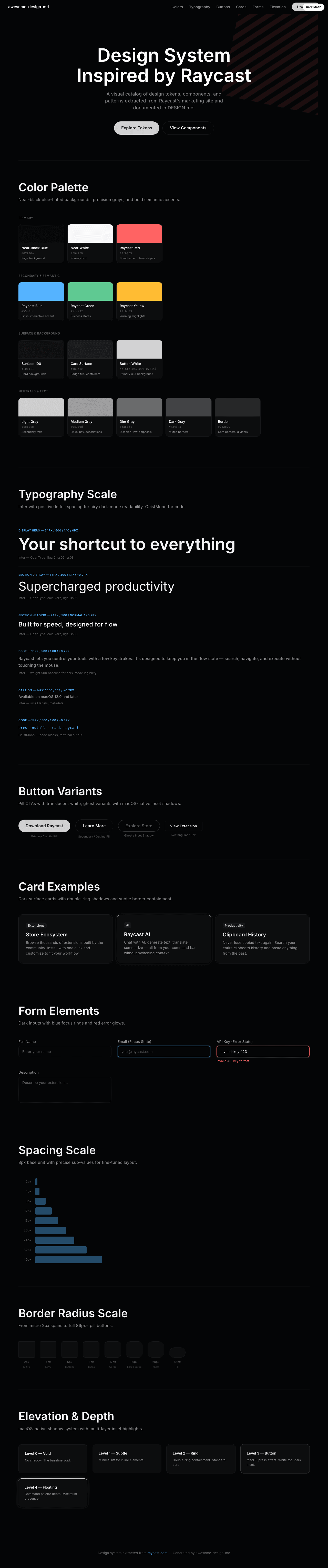
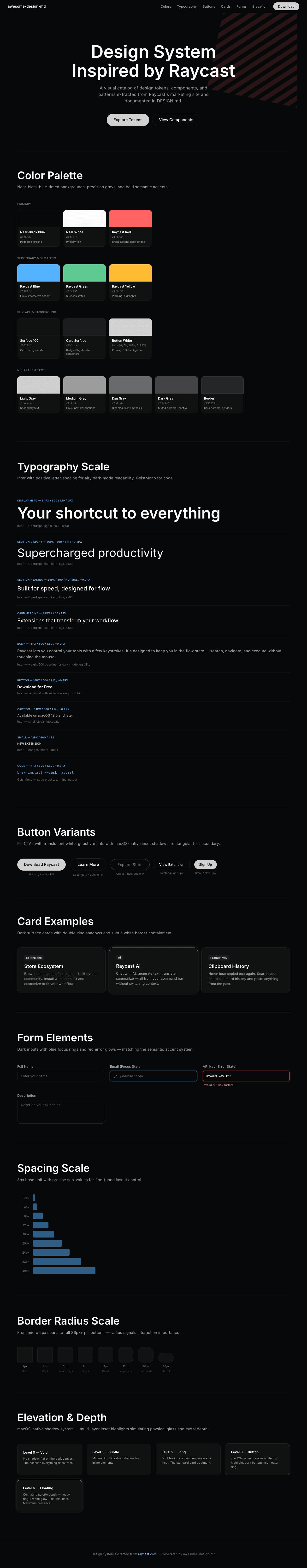
A sample landing page built with DESIGN.md. It shows the actual colors, typography, buttons, cards, spacing, and elevation, all in one page.
|
|
18
|
+
|
|
19
|
+
### Dark Mode
|
|
20
|
+
|
|
21
|
+
|
|
22
|
+
### Light Mode
|
|
23
|
+
|