awesome-design-md 1.0.0
This diff represents the content of publicly available package versions that have been released to one of the supported registries. The information contained in this diff is provided for informational purposes only and reflects changes between package versions as they appear in their respective public registries.
- package/LICENSE +21 -0
- package/README.md +172 -0
- package/bin/cli.mjs +126 -0
- package/design-md/airbnb/DESIGN.md +246 -0
- package/design-md/airbnb/README.md +23 -0
- package/design-md/airbnb/preview-dark.html +234 -0
- package/design-md/airbnb/preview.html +233 -0
- package/design-md/airtable/DESIGN.md +89 -0
- package/design-md/airtable/README.md +23 -0
- package/design-md/airtable/preview-dark.html +165 -0
- package/design-md/airtable/preview.html +164 -0
- package/design-md/apple/DESIGN.md +313 -0
- package/design-md/apple/README.md +24 -0
- package/design-md/apple/preview-dark.html +422 -0
- package/design-md/apple/preview.html +416 -0
- package/design-md/bmw/DESIGN.md +180 -0
- package/design-md/bmw/README.md +23 -0
- package/design-md/bmw/preview-dark.html +211 -0
- package/design-md/bmw/preview.html +210 -0
- package/design-md/cal/DESIGN.md +259 -0
- package/design-md/cal/README.md +23 -0
- package/design-md/cal/preview-dark.html +449 -0
- package/design-md/cal/preview.html +575 -0
- package/design-md/claude/DESIGN.md +312 -0
- package/design-md/claude/README.md +24 -0
- package/design-md/claude/preview-dark.html +803 -0
- package/design-md/claude/preview.html +826 -0
- package/design-md/clay/DESIGN.md +304 -0
- package/design-md/clay/README.md +23 -0
- package/design-md/clay/preview-dark.html +318 -0
- package/design-md/clay/preview.html +317 -0
- package/design-md/clickhouse/DESIGN.md +281 -0
- package/design-md/clickhouse/README.md +24 -0
- package/design-md/clickhouse/preview-dark.html +834 -0
- package/design-md/clickhouse/preview.html +786 -0
- package/design-md/cohere/DESIGN.md +266 -0
- package/design-md/cohere/README.md +24 -0
- package/design-md/cohere/preview-dark.html +810 -0
- package/design-md/cohere/preview.html +814 -0
- package/design-md/coinbase/DESIGN.md +129 -0
- package/design-md/coinbase/README.md +23 -0
- package/design-md/coinbase/preview-dark.html +164 -0
- package/design-md/coinbase/preview.html +163 -0
- package/design-md/composio/DESIGN.md +307 -0
- package/design-md/composio/README.md +24 -0
- package/design-md/composio/preview-dark.html +958 -0
- package/design-md/composio/preview.html +933 -0
- package/design-md/cursor/DESIGN.md +309 -0
- package/design-md/cursor/README.md +24 -0
- package/design-md/cursor/preview-dark.html +395 -0
- package/design-md/cursor/preview.html +385 -0
- package/design-md/elevenlabs/DESIGN.md +265 -0
- package/design-md/elevenlabs/README.md +23 -0
- package/design-md/elevenlabs/preview-dark.html +254 -0
- package/design-md/elevenlabs/preview.html +253 -0
- package/design-md/expo/DESIGN.md +281 -0
- package/design-md/expo/README.md +24 -0
- package/design-md/expo/preview-dark.html +536 -0
- package/design-md/expo/preview.html +536 -0
- package/design-md/figma/DESIGN.md +220 -0
- package/design-md/figma/README.md +24 -0
- package/design-md/figma/preview-dark.html +831 -0
- package/design-md/figma/preview.html +841 -0
- package/design-md/framer/DESIGN.md +246 -0
- package/design-md/framer/README.md +23 -0
- package/design-md/framer/preview-dark.html +904 -0
- package/design-md/framer/preview.html +885 -0
- package/design-md/hashicorp/DESIGN.md +278 -0
- package/design-md/hashicorp/README.md +24 -0
- package/design-md/hashicorp/preview-dark.html +1206 -0
- package/design-md/hashicorp/preview.html +1195 -0
- package/design-md/ibm/DESIGN.md +332 -0
- package/design-md/ibm/README.md +24 -0
- package/design-md/ibm/preview-dark.html +445 -0
- package/design-md/ibm/preview.html +430 -0
- package/design-md/intercom/DESIGN.md +146 -0
- package/design-md/intercom/README.md +23 -0
- package/design-md/intercom/preview-dark.html +185 -0
- package/design-md/intercom/preview.html +184 -0
- package/design-md/kraken/DESIGN.md +125 -0
- package/design-md/kraken/README.md +23 -0
- package/design-md/kraken/preview-dark.html +169 -0
- package/design-md/kraken/preview.html +168 -0
- package/design-md/linear.app/DESIGN.md +367 -0
- package/design-md/linear.app/README.md +24 -0
- package/design-md/linear.app/preview-dark.html +385 -0
- package/design-md/linear.app/preview.html +375 -0
- package/design-md/lovable/DESIGN.md +298 -0
- package/design-md/lovable/README.md +24 -0
- package/design-md/lovable/preview-dark.html +351 -0
- package/design-md/lovable/preview.html +350 -0
- package/design-md/minimax/DESIGN.md +257 -0
- package/design-md/minimax/README.md +24 -0
- package/design-md/minimax/preview-dark.html +1267 -0
- package/design-md/minimax/preview.html +1253 -0
- package/design-md/mintlify/DESIGN.md +326 -0
- package/design-md/mintlify/README.md +24 -0
- package/design-md/mintlify/preview-dark.html +411 -0
- package/design-md/mintlify/preview.html +400 -0
- package/design-md/miro/DESIGN.md +108 -0
- package/design-md/miro/README.md +23 -0
- package/design-md/miro/preview-dark.html +174 -0
- package/design-md/miro/preview.html +173 -0
- package/design-md/mistral.ai/DESIGN.md +261 -0
- package/design-md/mistral.ai/README.md +24 -0
- package/design-md/mistral.ai/preview-dark.html +813 -0
- package/design-md/mistral.ai/preview.html +812 -0
- package/design-md/mongodb/DESIGN.md +266 -0
- package/design-md/mongodb/README.md +23 -0
- package/design-md/mongodb/preview-dark.html +262 -0
- package/design-md/mongodb/preview.html +261 -0
- package/design-md/notion/DESIGN.md +309 -0
- package/design-md/notion/README.md +24 -0
- package/design-md/notion/preview-dark.html +374 -0
- package/design-md/notion/preview.html +366 -0
- package/design-md/nvidia/DESIGN.md +293 -0
- package/design-md/nvidia/README.md +24 -0
- package/design-md/nvidia/preview-dark.html +376 -0
- package/design-md/nvidia/preview.html +368 -0
- package/design-md/ollama/DESIGN.md +267 -0
- package/design-md/ollama/README.md +24 -0
- package/design-md/ollama/preview-dark.html +678 -0
- package/design-md/ollama/preview.html +678 -0
- package/design-md/opencode.ai/DESIGN.md +281 -0
- package/design-md/opencode.ai/README.md +24 -0
- package/design-md/opencode.ai/preview-dark.html +368 -0
- package/design-md/opencode.ai/preview.html +359 -0
- package/design-md/pinterest/DESIGN.md +230 -0
- package/design-md/pinterest/README.md +23 -0
- package/design-md/pinterest/preview-dark.html +233 -0
- package/design-md/pinterest/preview.html +232 -0
- package/design-md/posthog/DESIGN.md +256 -0
- package/design-md/posthog/README.md +23 -0
- package/design-md/posthog/preview-dark.html +701 -0
- package/design-md/posthog/preview.html +751 -0
- package/design-md/raycast/DESIGN.md +268 -0
- package/design-md/raycast/README.md +23 -0
- package/design-md/raycast/preview-dark.html +608 -0
- package/design-md/raycast/preview.html +690 -0
- package/design-md/replicate/DESIGN.md +261 -0
- package/design-md/replicate/README.md +24 -0
- package/design-md/replicate/preview-dark.html +828 -0
- package/design-md/replicate/preview.html +831 -0
- package/design-md/resend/DESIGN.md +303 -0
- package/design-md/resend/README.md +23 -0
- package/design-md/resend/preview-dark.html +357 -0
- package/design-md/resend/preview.html +356 -0
- package/design-md/revolut/DESIGN.md +185 -0
- package/design-md/revolut/README.md +23 -0
- package/design-md/revolut/preview-dark.html +234 -0
- package/design-md/revolut/preview.html +233 -0
- package/design-md/runwayml/DESIGN.md +244 -0
- package/design-md/runwayml/README.md +24 -0
- package/design-md/runwayml/preview-dark.html +664 -0
- package/design-md/runwayml/preview.html +665 -0
- package/design-md/sanity/DESIGN.md +357 -0
- package/design-md/sanity/README.md +24 -0
- package/design-md/sanity/preview-dark.html +995 -0
- package/design-md/sanity/preview.html +1140 -0
- package/design-md/sentry/DESIGN.md +262 -0
- package/design-md/sentry/README.md +24 -0
- package/design-md/sentry/preview-dark.html +628 -0
- package/design-md/sentry/preview.html +953 -0
- package/design-md/spacex/DESIGN.md +194 -0
- package/design-md/spacex/README.md +23 -0
- package/design-md/spacex/preview-dark.html +223 -0
- package/design-md/spacex/preview.html +222 -0
- package/design-md/spotify/DESIGN.md +246 -0
- package/design-md/spotify/README.md +23 -0
- package/design-md/spotify/preview-dark.html +231 -0
- package/design-md/spotify/preview.html +230 -0
- package/design-md/stripe/DESIGN.md +322 -0
- package/design-md/stripe/README.md +24 -0
- package/design-md/stripe/preview-dark.html +430 -0
- package/design-md/stripe/preview.html +421 -0
- package/design-md/supabase/DESIGN.md +255 -0
- package/design-md/supabase/README.md +24 -0
- package/design-md/supabase/preview-dark.html +977 -0
- package/design-md/supabase/preview.html +955 -0
- package/design-md/superhuman/DESIGN.md +252 -0
- package/design-md/superhuman/README.md +23 -0
- package/design-md/superhuman/preview-dark.html +975 -0
- package/design-md/superhuman/preview.html +953 -0
- package/design-md/together.ai/DESIGN.md +263 -0
- package/design-md/together.ai/README.md +24 -0
- package/design-md/together.ai/preview-dark.html +892 -0
- package/design-md/together.ai/preview.html +897 -0
- package/design-md/uber/DESIGN.md +295 -0
- package/design-md/uber/README.md +24 -0
- package/design-md/uber/preview-dark.html +1164 -0
- package/design-md/uber/preview.html +1163 -0
- package/design-md/vercel/DESIGN.md +310 -0
- package/design-md/vercel/README.md +24 -0
- package/design-md/vercel/preview-dark.html +370 -0
- package/design-md/vercel/preview.html +369 -0
- package/design-md/voltagent/DESIGN.md +323 -0
- package/design-md/voltagent/README.md +24 -0
- package/design-md/voltagent/preview-dark.html +487 -0
- package/design-md/voltagent/preview.html +766 -0
- package/design-md/warp/DESIGN.md +253 -0
- package/design-md/warp/README.md +23 -0
- package/design-md/warp/preview-dark.html +502 -0
- package/design-md/warp/preview.html +535 -0
- package/design-md/webflow/DESIGN.md +92 -0
- package/design-md/webflow/README.md +23 -0
- package/design-md/webflow/preview-dark.html +147 -0
- package/design-md/webflow/preview.html +146 -0
- package/design-md/wise/DESIGN.md +173 -0
- package/design-md/wise/README.md +23 -0
- package/design-md/wise/preview-dark.html +230 -0
- package/design-md/wise/preview.html +229 -0
- package/design-md/x.ai/DESIGN.md +257 -0
- package/design-md/x.ai/README.md +24 -0
- package/design-md/x.ai/preview-dark.html +358 -0
- package/design-md/x.ai/preview.html +409 -0
- package/design-md/zapier/DESIGN.md +328 -0
- package/design-md/zapier/README.md +24 -0
- package/design-md/zapier/preview-dark.html +382 -0
- package/design-md/zapier/preview.html +374 -0
- package/package.json +33 -0
|
@@ -0,0 +1,261 @@
|
|
|
1
|
+
# Design System: Mistral AI
|
|
2
|
+
|
|
3
|
+
## 1. Visual Theme & Atmosphere
|
|
4
|
+
|
|
5
|
+
Mistral AI's interface is a sun-drenched landscape rendered in code — a warm, bold, unapologetically European design that trades the typical blue-screen AI aesthetic for golden amber, burnt orange, and the feeling of late-afternoon light in southern France. Every surface glows with warmth: backgrounds fade from pale cream to deep amber, shadows carry golden undertones (`rgba(127, 99, 21, ...)`), and the brand's signature orange (`#fa520f`) burns through the page like a signal fire.
|
|
6
|
+
|
|
7
|
+
The design language is maximalist in its warmth but minimalist in its structure. Huge display headlines (82px) crash into the viewport with aggressive negative tracking (-2.05px), creating text blocks that feel like billboards or protest posters — declarations rather than descriptions. The typography uses Arial (likely a custom font with Arial as fallback) at extreme sizes, creating a raw, unadorned voice that says "we build frontier AI" with no decoration needed.
|
|
8
|
+
|
|
9
|
+
What makes Mistral distinctive is the complete commitment to a warm color temperature. The signature "block" identity — a gradient system flowing from bright yellow (`#ffd900`) through amber (`#ffa110`) to burnt orange (`#fa520f`) — creates a visual identity that's immediately recognizable. Even the shadows are warm, using amber-tinted blacks instead of cool grays. Combined with dramatic landscape photography in golden tones, the design feels less like a tech company and more like a European luxury brand that happens to build language models.
|
|
10
|
+
|
|
11
|
+
**Key Characteristics:**
|
|
12
|
+
- Golden-amber color universe: every tone from pale cream (#fffaeb) to burnt orange (#fa520f)
|
|
13
|
+
- Massive display typography (82px) with aggressive negative letter-spacing (-2.05px)
|
|
14
|
+
- Warm golden shadow system using amber-tinted rgba values
|
|
15
|
+
- The Mistral "M" block identity — a gradient from yellow to orange
|
|
16
|
+
- Dramatic landscape photography in warm golden tones
|
|
17
|
+
- Uppercase typography used strategically for section labels and CTAs
|
|
18
|
+
- Near-zero border-radius — sharp, architectural geometry
|
|
19
|
+
- French-European confidence: bold, warm, declarative
|
|
20
|
+
|
|
21
|
+
## 2. Color Palette & Roles
|
|
22
|
+
|
|
23
|
+
### Primary
|
|
24
|
+
- **Mistral Orange** (`#fa520f`): The core brand color — a vivid, saturated orange-red that anchors the entire identity. Used for primary emphasis, the brand block, and the highest-signal moments.
|
|
25
|
+
- **Mistral Flame** (`#fb6424`): A slightly warmer, lighter variant of the brand orange used for secondary brand moments and hover states.
|
|
26
|
+
- **Block Orange** (`#ff8105`): A pure orange used in the gradient block system — warmer and less red than Mistral Orange.
|
|
27
|
+
|
|
28
|
+
### Secondary & Accent
|
|
29
|
+
- **Sunshine 900** (`#ff8a00`): Deep golden amber — the darkest sunshine tone, used for strong accent moments.
|
|
30
|
+
- **Sunshine 700** (`#ffa110`): Warm amber-gold — the core sunshine accent for backgrounds and interactive elements.
|
|
31
|
+
- **Sunshine 500** (`#ffb83e`): Medium golden — balanced warmth for mid-level emphasis.
|
|
32
|
+
- **Sunshine 300** (`#ffd06a`): Light golden — for subtle warm tints and secondary backgrounds.
|
|
33
|
+
- **Block Gold** (`#ffe295`): Pale gold — soft background accents and gentle warmth.
|
|
34
|
+
- **Bright Yellow** (`#ffd900`): The brightest tone in the gradient — used at the "top" of the block identity.
|
|
35
|
+
|
|
36
|
+
### Surface & Background
|
|
37
|
+
- **Warm Ivory** (`#fffaeb`): The lightest page background — barely tinted with warmth, the foundation canvas.
|
|
38
|
+
- **Cream** (`#fff0c2`): The primary warm surface and secondary button background — noticeably golden.
|
|
39
|
+
- **Pure White** (`#ffffff`): Used for maximum contrast elements and popover surfaces.
|
|
40
|
+
- **Mistral Black** (`#1f1f1f`): The primary dark surface for buttons, text, and dark sections.
|
|
41
|
+
- **Accent Orange** (defined as `hsl(17, 96%, 52%)`): The functional accent color for interactive states.
|
|
42
|
+
|
|
43
|
+
### Neutrals & Text
|
|
44
|
+
- **Mistral Black** (`#1f1f1f`): Primary text color and dark button backgrounds — a near-black that's warmer than pure #000.
|
|
45
|
+
- **Black Tint** (defined as `hsl(0, 0%, 24%)`): A medium dark gray for secondary text on light backgrounds.
|
|
46
|
+
- **Pure White** (`#ffffff`): Text on dark surfaces and CTA labels.
|
|
47
|
+
|
|
48
|
+
### Semantic & Accent
|
|
49
|
+
- **Input Border** (defined as `hsl(240, 5.9%, 90%)`): A cool-tinted light gray for form borders — one of the few cool tones in the system.
|
|
50
|
+
- **White Overlay** (`oklab(1, 0, 0 / 0.088–0.1)`): Semi-transparent white for frosted glass effects and button overlays.
|
|
51
|
+
|
|
52
|
+
### Gradient System
|
|
53
|
+
- **Mistral Block Gradient**: The signature identity — a multi-step gradient flowing through Yellow (`#ffd900`) → Gold (`#ffe295`) → Amber (`#ffa110`) → Orange (`#ff8105`) → Flame (`#fb6424`) → Mistral Orange (`#fa520f`). This gradient appears in the logo blocks, section backgrounds, and decorative elements.
|
|
54
|
+
- **Golden Landscape Wash**: Photography and backgrounds use warm amber overlays creating a consistent golden temperature across the page.
|
|
55
|
+
- **Warm Shadow Cascade**: Multi-layered golden shadows that build depth with amber-tinted transparency rather than gray.
|
|
56
|
+
|
|
57
|
+
## 3. Typography Rules
|
|
58
|
+
|
|
59
|
+
### Font Family
|
|
60
|
+
- **Primary**: Likely a custom font (Font Source detected) with `Arial` as fallback, and extended stack: `ui-sans-serif, system-ui, Apple Color Emoji, Segoe UI Emoji, Segoe UI Symbol, Noto Color Emoji`
|
|
61
|
+
|
|
62
|
+
### Hierarchy
|
|
63
|
+
|
|
64
|
+
| Role | Font | Size | Weight | Line Height | Letter Spacing | Notes |
|
|
65
|
+
|------|------|------|--------|-------------|----------------|-------|
|
|
66
|
+
| Display / Hero | Arial (custom) | 82px (5.13rem) | 400 | 1.00 (tight) | -2.05px | Maximum impact, billboard scale |
|
|
67
|
+
| Section Heading | Arial (custom) | 56px (3.5rem) | 400 | 0.95 (ultra-tight) | normal | Feature section anchors |
|
|
68
|
+
| Sub-heading Large | Arial (custom) | 48px (3rem) | 400 | 0.95 (ultra-tight) | normal | Secondary section titles |
|
|
69
|
+
| Sub-heading | Arial (custom) | 32px (2rem) | 400 | 1.15 (tight) | normal | Card headings, feature names |
|
|
70
|
+
| Card Title | Arial (custom) | 30px (1.88rem) | 400 | 1.20 (tight) | normal | Mid-level headings |
|
|
71
|
+
| Feature Title | Arial (custom) | 24px (1.5rem) | 400 | 1.33 | normal | Small headings |
|
|
72
|
+
| Body / Button | Arial (custom) | 16px (1rem) | 400 | 1.50 | normal | Standard body, button text |
|
|
73
|
+
| Button Uppercase | Arial (custom) | 16px (1rem) | 400 | 1.50 | normal | Uppercase CTA labels |
|
|
74
|
+
| Caption / Link | Arial (custom) | 14px (0.88rem) | 400 | 1.43 | normal | Metadata, secondary links |
|
|
75
|
+
|
|
76
|
+
### Principles
|
|
77
|
+
- **Single weight, maximum impact**: The entire system uses weight 400 (regular) — even at 82px. This creates a surprisingly elegant effect where the size alone carries authority without needing bold weight.
|
|
78
|
+
- **Ultra-tight at scale**: Line-heights of 0.95–1.00 at display sizes create text blocks where ascenders nearly touch descenders from the line above — creating dense, poster-like composition.
|
|
79
|
+
- **Aggressive tracking on display**: -2.05px letter-spacing at 82px compresses the hero text into a monolithic block.
|
|
80
|
+
- **Uppercase as emphasis**: Strategic `text-transform: uppercase` on button labels and section markers creates a formal, European signage quality.
|
|
81
|
+
- **No weight variation**: Unlike most systems that use 300–700 weight range, Mistral uses 400 everywhere. Hierarchy comes from size and color, never weight.
|
|
82
|
+
|
|
83
|
+
## 4. Component Stylings
|
|
84
|
+
|
|
85
|
+
### Buttons
|
|
86
|
+
|
|
87
|
+
**Cream Surface**
|
|
88
|
+
- Background: Cream (`#fff0c2`)
|
|
89
|
+
- Text: Mistral Black (`#1f1f1f`)
|
|
90
|
+
- No visible border
|
|
91
|
+
- The warm, inviting secondary CTA
|
|
92
|
+
|
|
93
|
+
**Dark Solid**
|
|
94
|
+
- Background: Mistral Black (`#1f1f1f`)
|
|
95
|
+
- Text: Pure White (`#ffffff`)
|
|
96
|
+
- Padding: 12px (all sides)
|
|
97
|
+
- No visible border
|
|
98
|
+
- The primary action button — dark on warm
|
|
99
|
+
|
|
100
|
+
**Ghost / Transparent**
|
|
101
|
+
- Background: transparent with slight dark overlay (`oklab(0, 0, 0 / 0.1)`)
|
|
102
|
+
- Text: Mistral Black (`#1f1f1f`)
|
|
103
|
+
- Opacity: 0.4
|
|
104
|
+
- For secondary/de-emphasized actions
|
|
105
|
+
|
|
106
|
+
**Text / Underline**
|
|
107
|
+
- Background: transparent
|
|
108
|
+
- Text: Mistral Black (`#1f1f1f`)
|
|
109
|
+
- Padding: 8px 0px 0px (top-only)
|
|
110
|
+
- Minimal styling — text link as button
|
|
111
|
+
- For tertiary navigation actions
|
|
112
|
+
|
|
113
|
+
### Cards & Containers
|
|
114
|
+
- Background: Warm Ivory (`#fffaeb`), Cream (`#fff0c2`), or Pure White
|
|
115
|
+
- Border: minimal to none — containers defined by background color
|
|
116
|
+
- Radius: near-zero — sharp, architectural corners
|
|
117
|
+
- Shadow: warm golden multi-layer (`rgba(127, 99, 21, 0.12) -8px 16px 39px, rgba(127, 99, 21, 0.1) -33px 64px 72px, rgba(127, 99, 21, 0.06) -73px 144px 97px, ...`) — a dramatic, cascading warm shadow
|
|
118
|
+
- Distinctive: the golden shadow creates a "golden hour" lighting effect
|
|
119
|
+
|
|
120
|
+
### Inputs & Forms
|
|
121
|
+
- Border: `hsl(240, 5.9%, 90%)` — the sole cool-toned element
|
|
122
|
+
- Focus: accent color ring
|
|
123
|
+
- Minimal styling consistent with sparse aesthetic
|
|
124
|
+
|
|
125
|
+
### Navigation
|
|
126
|
+
- Transparent nav overlaying the warm hero
|
|
127
|
+
- Logo: Mistral "M" wordmark
|
|
128
|
+
- Links: Dark text (white on dark sections)
|
|
129
|
+
- CTA: Dark solid button or cream surface button
|
|
130
|
+
- Minimal, wide-spaced layout
|
|
131
|
+
|
|
132
|
+
### Image Treatment
|
|
133
|
+
- Dramatic landscape photography in warm golden tones
|
|
134
|
+
- The winding road through golden hills — a recurring visual motif
|
|
135
|
+
- The Mistral "M" rendered at large scale on golden backgrounds
|
|
136
|
+
- Warm color grading on all photography
|
|
137
|
+
- Full-bleed sections with photography
|
|
138
|
+
|
|
139
|
+
### Distinctive Components
|
|
140
|
+
|
|
141
|
+
**Mistral Block Identity**
|
|
142
|
+
- A row of colored blocks forming the gradient: yellow → amber → orange → burnt orange
|
|
143
|
+
- Each block gets progressively more orange/red
|
|
144
|
+
- The visual DNA of the brand — recognizable at any size
|
|
145
|
+
|
|
146
|
+
**Golden Shadow Cards**
|
|
147
|
+
- Cards elevated with warm amber multi-layered shadows
|
|
148
|
+
- 5 layers of shadow from 16px to 400px offset
|
|
149
|
+
- Creates a "floating in golden light" effect unique to Mistral
|
|
150
|
+
|
|
151
|
+
**Dark Footer Gradient**
|
|
152
|
+
- Footer transitions from warm amber to dark through a dramatic gradient
|
|
153
|
+
- Creates a "sunset" effect as the page ends
|
|
154
|
+
|
|
155
|
+
## 5. Layout Principles
|
|
156
|
+
|
|
157
|
+
### Spacing System
|
|
158
|
+
- Base unit: 8px
|
|
159
|
+
- Scale: 2px, 4px, 8px, 10px, 12px, 16px, 20px, 24px, 32px, 40px, 48px, 64px, 80px, 98px, 100px
|
|
160
|
+
- Button padding: 12px or 8px 0px (compact)
|
|
161
|
+
- Section vertical spacing: very generous (80px–100px)
|
|
162
|
+
|
|
163
|
+
### Grid & Container
|
|
164
|
+
- Max container width: approximately 1280px, centered
|
|
165
|
+
- Hero: full-width with massive typography overlaying warm backgrounds
|
|
166
|
+
- Feature sections: wide-format layouts with dramatic imagery
|
|
167
|
+
- Card grids: 2–3 column layouts
|
|
168
|
+
|
|
169
|
+
### Whitespace Philosophy
|
|
170
|
+
- **Bold declarations**: Huge headlines surrounded by generous whitespace create billboard-like impact — each statement gets its own breathing space.
|
|
171
|
+
- **Warm void**: Empty space itself feels warm because the backgrounds are tinted ivory/cream rather than pure white.
|
|
172
|
+
- **Photography as space-filler**: Large landscape images serve double duty as content and decorative whitespace.
|
|
173
|
+
|
|
174
|
+
### Border Radius Scale
|
|
175
|
+
- Near-zero: The dominant radius — sharp, architectural corners on most elements
|
|
176
|
+
- This extreme sharpness contrasts with the warmth of the colors, creating a tension between soft color and hard geometry.
|
|
177
|
+
|
|
178
|
+
## 6. Depth & Elevation
|
|
179
|
+
|
|
180
|
+
| Level | Treatment | Use |
|
|
181
|
+
|-------|-----------|-----|
|
|
182
|
+
| Flat (Level 0) | No shadow | Page backgrounds, text blocks |
|
|
183
|
+
| Golden Float (Level 1) | Multi-layer warm shadow (5 layers, 12%→0% opacity, amber-tinted) | Feature cards, product showcases, elevated content |
|
|
184
|
+
|
|
185
|
+
**Shadow Philosophy**: Mistral uses a single but extraordinarily complex shadow — **five cascading layers** of amber-tinted shadow (`rgba(127, 99, 21, ...)`) that build from a close 16px offset to a distant 400px offset. The result is a rich, warm, "golden hour" lighting effect that makes elevated elements look like they're bathed in afternoon sunlight. This is the most distinctive shadow system in any major AI brand.
|
|
186
|
+
|
|
187
|
+
## 7. Do's and Don'ts
|
|
188
|
+
|
|
189
|
+
### Do
|
|
190
|
+
- Use the warm color spectrum exclusively: ivory, cream, amber, gold, orange
|
|
191
|
+
- Keep display typography at 82px+ with -2.05px letter-spacing for hero sections
|
|
192
|
+
- Use the Mistral block gradient (yellow → amber → orange) for brand moments
|
|
193
|
+
- Apply warm golden shadows (amber-tinted rgba) for elevated elements
|
|
194
|
+
- Use Mistral Black (#1f1f1f) for text — never pure #000000
|
|
195
|
+
- Keep font weight at 400 throughout — let size and color carry hierarchy
|
|
196
|
+
- Use sharp, architectural corners — near-zero border-radius
|
|
197
|
+
- Apply uppercase on button labels and section markers for European formality
|
|
198
|
+
- Use warm landscape photography with golden color grading
|
|
199
|
+
|
|
200
|
+
### Don't
|
|
201
|
+
- Don't introduce cool colors (blue, green, purple) — the palette is exclusively warm
|
|
202
|
+
- Don't use bold (700+) weight — 400 is the only weight
|
|
203
|
+
- Don't round corners — the sharp geometry is intentional
|
|
204
|
+
- Don't use cool-toned shadows — shadows must carry amber warmth
|
|
205
|
+
- Don't use pure white as a page background — always warm-tinted (#fffaeb minimum)
|
|
206
|
+
- Don't reduce hero text below 48px on desktop — the billboard scale is core
|
|
207
|
+
- Don't use more than 2 font weights — size variation replaces weight variation
|
|
208
|
+
- Don't add gradients outside the warm spectrum — no blue-to-purple, no cool transitions
|
|
209
|
+
- Don't use generic gray for text — even neutrals should be warm-tinted
|
|
210
|
+
|
|
211
|
+
## 8. Responsive Behavior
|
|
212
|
+
|
|
213
|
+
### Breakpoints
|
|
214
|
+
| Name | Width | Key Changes |
|
|
215
|
+
|------|-------|-------------|
|
|
216
|
+
| Mobile | <640px | Single column, stacked everything, hero text reduces to ~32px |
|
|
217
|
+
| Tablet | 640–768px | Minor layout adjustments |
|
|
218
|
+
| Small Desktop | 768–1024px | 2-column layouts begin |
|
|
219
|
+
| Desktop | 1024–1280px | Full layout with maximum typography scale |
|
|
220
|
+
|
|
221
|
+
### Touch Targets
|
|
222
|
+
- Buttons use generous padding (12px minimum)
|
|
223
|
+
- Navigation elements adequately spaced
|
|
224
|
+
- Cards serve as large touch targets
|
|
225
|
+
|
|
226
|
+
### Collapsing Strategy
|
|
227
|
+
- **Navigation**: Collapses to hamburger on mobile
|
|
228
|
+
- **Hero text**: 82px → 56px → 48px → 32px progressive scaling
|
|
229
|
+
- **Feature sections**: Multi-column → stacked
|
|
230
|
+
- **Photography**: Scales proportionally, may crop on mobile
|
|
231
|
+
- **Block identity**: Scales down proportionally
|
|
232
|
+
|
|
233
|
+
### Image Behavior
|
|
234
|
+
- Landscape photography scales proportionally
|
|
235
|
+
- Warm color grading maintained at all sizes
|
|
236
|
+
- Block gradient elements resize fluidly
|
|
237
|
+
- No art direction changes — same warm composition at all sizes
|
|
238
|
+
|
|
239
|
+
## 9. Agent Prompt Guide
|
|
240
|
+
|
|
241
|
+
### Quick Color Reference
|
|
242
|
+
- Brand Orange: "Mistral Orange (#fa520f)"
|
|
243
|
+
- Page Background: "Warm Ivory (#fffaeb)"
|
|
244
|
+
- Warm Surface: "Cream (#fff0c2)"
|
|
245
|
+
- Primary Text: "Mistral Black (#1f1f1f)"
|
|
246
|
+
- Sunshine Amber: "Sunshine 700 (#ffa110)"
|
|
247
|
+
- Bright Gold: "Bright Yellow (#ffd900)"
|
|
248
|
+
- Text on Dark: "Pure White (#ffffff)"
|
|
249
|
+
|
|
250
|
+
### Example Component Prompts
|
|
251
|
+
- "Create a hero section on Warm Ivory (#fffaeb) with a massive headline at 82px Arial weight 400, line-height 1.0, letter-spacing -2.05px. Mistral Black (#1f1f1f) text. Add a dark solid CTA button (#1f1f1f bg, white text, 12px padding, sharp corners) and a cream secondary button (#fff0c2 bg)."
|
|
252
|
+
- "Design a feature card on Cream (#fff0c2) with sharp corners (no border-radius). Apply the golden shadow system: rgba(127, 99, 21, 0.12) -8px 16px 39px as the primary layer. Title at 32px weight 400, body at 16px."
|
|
253
|
+
- "Build the Mistral block identity: a row of colored blocks from Bright Yellow (#ffd900) through Sunshine 700 (#ffa110) to Mistral Orange (#fa520f). Sharp corners, no gaps."
|
|
254
|
+
- "Create a dark footer section on Mistral Black (#1f1f1f) with Pure White (#ffffff) text. Footer links at 14px. Add a warm gradient from Sunshine 700 (#ffa110) at the top fading to Mistral Black."
|
|
255
|
+
|
|
256
|
+
### Iteration Guide
|
|
257
|
+
1. Keep the warm temperature — "shift toward amber" not "shift toward gray"
|
|
258
|
+
2. Use size for hierarchy — 82px → 56px → 48px → 32px → 24px → 16px
|
|
259
|
+
3. Never add border-radius — sharp corners only
|
|
260
|
+
4. Shadows are always warm: "golden shadow with amber tones"
|
|
261
|
+
5. Font weight is always 400 — describe emphasis through size and color
|
|
@@ -0,0 +1,24 @@
|
|
|
1
|
+
# Mistral AI Inspired Design System
|
|
2
|
+
|
|
3
|
+
[DESIGN.md](https://github.com/VoltAgent/awesome-design-md/blob/main/design-md/mistral.ai/DESIGN.md) extracted from the public [mistral](https://mistral.ai/) website. This is not the official design system. Colors, fonts, and spacing may not be 100% accurate. But it's a good starting point for building something similar.
|
|
4
|
+
|
|
5
|
+
## Files
|
|
6
|
+
|
|
7
|
+
| File | Description |
|
|
8
|
+
|------|-------------|
|
|
9
|
+
| `DESIGN.md` | Complete design system documentation (9 sections) |
|
|
10
|
+
| `preview.html` | Interactive design token catalog (light) |
|
|
11
|
+
| `preview-dark.html` | Interactive design token catalog (dark) |
|
|
12
|
+
|
|
13
|
+
|
|
14
|
+
Use [DESIGN.md](https://github.com/VoltAgent/awesome-design-md/blob/main/design-md/mistral.ai/DESIGN.md) to use as a reference for AI agents (Claude, Cursor, Stitch) to generate UI that looks like the Mistral AI design language.
|
|
15
|
+
|
|
16
|
+
## Preview
|
|
17
|
+
|
|
18
|
+
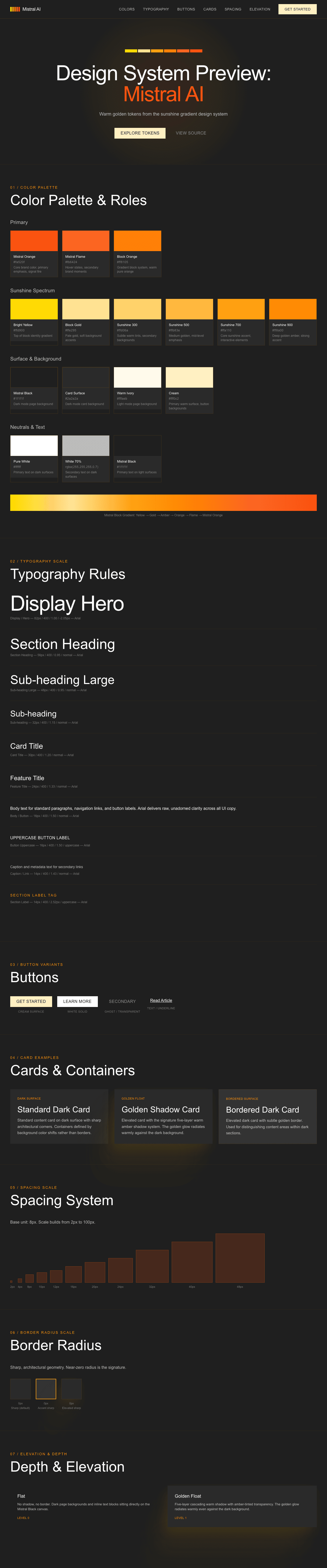
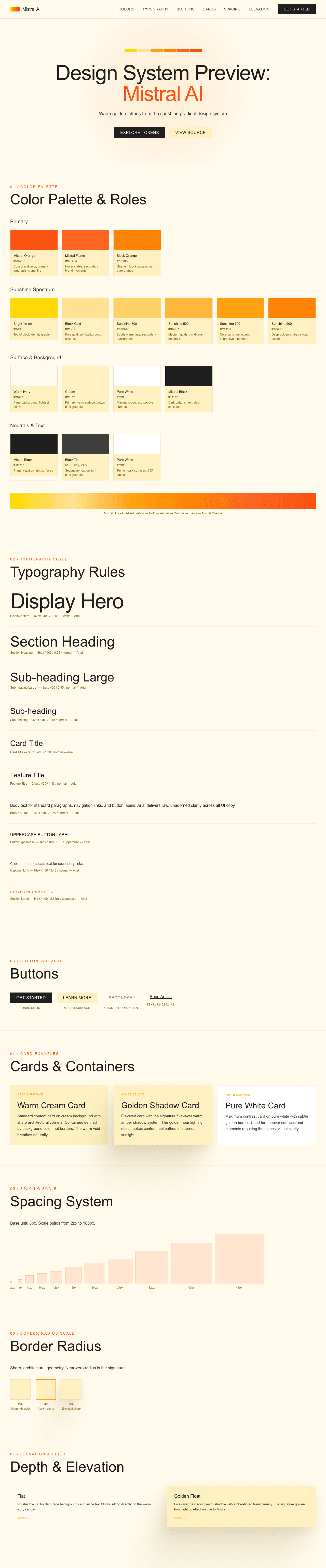
A sample landing page built with DESIGN.md. It shows the actual colors, typography, buttons, cards, spacing, and elevation, all in one page.
|
|
19
|
+
|
|
20
|
+
### Dark Mode
|
|
21
|
+
|
|
22
|
+
|
|
23
|
+
### Light Mode
|
|
24
|
+
|