awesome-design-md 1.0.0
This diff represents the content of publicly available package versions that have been released to one of the supported registries. The information contained in this diff is provided for informational purposes only and reflects changes between package versions as they appear in their respective public registries.
- package/LICENSE +21 -0
- package/README.md +172 -0
- package/bin/cli.mjs +126 -0
- package/design-md/airbnb/DESIGN.md +246 -0
- package/design-md/airbnb/README.md +23 -0
- package/design-md/airbnb/preview-dark.html +234 -0
- package/design-md/airbnb/preview.html +233 -0
- package/design-md/airtable/DESIGN.md +89 -0
- package/design-md/airtable/README.md +23 -0
- package/design-md/airtable/preview-dark.html +165 -0
- package/design-md/airtable/preview.html +164 -0
- package/design-md/apple/DESIGN.md +313 -0
- package/design-md/apple/README.md +24 -0
- package/design-md/apple/preview-dark.html +422 -0
- package/design-md/apple/preview.html +416 -0
- package/design-md/bmw/DESIGN.md +180 -0
- package/design-md/bmw/README.md +23 -0
- package/design-md/bmw/preview-dark.html +211 -0
- package/design-md/bmw/preview.html +210 -0
- package/design-md/cal/DESIGN.md +259 -0
- package/design-md/cal/README.md +23 -0
- package/design-md/cal/preview-dark.html +449 -0
- package/design-md/cal/preview.html +575 -0
- package/design-md/claude/DESIGN.md +312 -0
- package/design-md/claude/README.md +24 -0
- package/design-md/claude/preview-dark.html +803 -0
- package/design-md/claude/preview.html +826 -0
- package/design-md/clay/DESIGN.md +304 -0
- package/design-md/clay/README.md +23 -0
- package/design-md/clay/preview-dark.html +318 -0
- package/design-md/clay/preview.html +317 -0
- package/design-md/clickhouse/DESIGN.md +281 -0
- package/design-md/clickhouse/README.md +24 -0
- package/design-md/clickhouse/preview-dark.html +834 -0
- package/design-md/clickhouse/preview.html +786 -0
- package/design-md/cohere/DESIGN.md +266 -0
- package/design-md/cohere/README.md +24 -0
- package/design-md/cohere/preview-dark.html +810 -0
- package/design-md/cohere/preview.html +814 -0
- package/design-md/coinbase/DESIGN.md +129 -0
- package/design-md/coinbase/README.md +23 -0
- package/design-md/coinbase/preview-dark.html +164 -0
- package/design-md/coinbase/preview.html +163 -0
- package/design-md/composio/DESIGN.md +307 -0
- package/design-md/composio/README.md +24 -0
- package/design-md/composio/preview-dark.html +958 -0
- package/design-md/composio/preview.html +933 -0
- package/design-md/cursor/DESIGN.md +309 -0
- package/design-md/cursor/README.md +24 -0
- package/design-md/cursor/preview-dark.html +395 -0
- package/design-md/cursor/preview.html +385 -0
- package/design-md/elevenlabs/DESIGN.md +265 -0
- package/design-md/elevenlabs/README.md +23 -0
- package/design-md/elevenlabs/preview-dark.html +254 -0
- package/design-md/elevenlabs/preview.html +253 -0
- package/design-md/expo/DESIGN.md +281 -0
- package/design-md/expo/README.md +24 -0
- package/design-md/expo/preview-dark.html +536 -0
- package/design-md/expo/preview.html +536 -0
- package/design-md/figma/DESIGN.md +220 -0
- package/design-md/figma/README.md +24 -0
- package/design-md/figma/preview-dark.html +831 -0
- package/design-md/figma/preview.html +841 -0
- package/design-md/framer/DESIGN.md +246 -0
- package/design-md/framer/README.md +23 -0
- package/design-md/framer/preview-dark.html +904 -0
- package/design-md/framer/preview.html +885 -0
- package/design-md/hashicorp/DESIGN.md +278 -0
- package/design-md/hashicorp/README.md +24 -0
- package/design-md/hashicorp/preview-dark.html +1206 -0
- package/design-md/hashicorp/preview.html +1195 -0
- package/design-md/ibm/DESIGN.md +332 -0
- package/design-md/ibm/README.md +24 -0
- package/design-md/ibm/preview-dark.html +445 -0
- package/design-md/ibm/preview.html +430 -0
- package/design-md/intercom/DESIGN.md +146 -0
- package/design-md/intercom/README.md +23 -0
- package/design-md/intercom/preview-dark.html +185 -0
- package/design-md/intercom/preview.html +184 -0
- package/design-md/kraken/DESIGN.md +125 -0
- package/design-md/kraken/README.md +23 -0
- package/design-md/kraken/preview-dark.html +169 -0
- package/design-md/kraken/preview.html +168 -0
- package/design-md/linear.app/DESIGN.md +367 -0
- package/design-md/linear.app/README.md +24 -0
- package/design-md/linear.app/preview-dark.html +385 -0
- package/design-md/linear.app/preview.html +375 -0
- package/design-md/lovable/DESIGN.md +298 -0
- package/design-md/lovable/README.md +24 -0
- package/design-md/lovable/preview-dark.html +351 -0
- package/design-md/lovable/preview.html +350 -0
- package/design-md/minimax/DESIGN.md +257 -0
- package/design-md/minimax/README.md +24 -0
- package/design-md/minimax/preview-dark.html +1267 -0
- package/design-md/minimax/preview.html +1253 -0
- package/design-md/mintlify/DESIGN.md +326 -0
- package/design-md/mintlify/README.md +24 -0
- package/design-md/mintlify/preview-dark.html +411 -0
- package/design-md/mintlify/preview.html +400 -0
- package/design-md/miro/DESIGN.md +108 -0
- package/design-md/miro/README.md +23 -0
- package/design-md/miro/preview-dark.html +174 -0
- package/design-md/miro/preview.html +173 -0
- package/design-md/mistral.ai/DESIGN.md +261 -0
- package/design-md/mistral.ai/README.md +24 -0
- package/design-md/mistral.ai/preview-dark.html +813 -0
- package/design-md/mistral.ai/preview.html +812 -0
- package/design-md/mongodb/DESIGN.md +266 -0
- package/design-md/mongodb/README.md +23 -0
- package/design-md/mongodb/preview-dark.html +262 -0
- package/design-md/mongodb/preview.html +261 -0
- package/design-md/notion/DESIGN.md +309 -0
- package/design-md/notion/README.md +24 -0
- package/design-md/notion/preview-dark.html +374 -0
- package/design-md/notion/preview.html +366 -0
- package/design-md/nvidia/DESIGN.md +293 -0
- package/design-md/nvidia/README.md +24 -0
- package/design-md/nvidia/preview-dark.html +376 -0
- package/design-md/nvidia/preview.html +368 -0
- package/design-md/ollama/DESIGN.md +267 -0
- package/design-md/ollama/README.md +24 -0
- package/design-md/ollama/preview-dark.html +678 -0
- package/design-md/ollama/preview.html +678 -0
- package/design-md/opencode.ai/DESIGN.md +281 -0
- package/design-md/opencode.ai/README.md +24 -0
- package/design-md/opencode.ai/preview-dark.html +368 -0
- package/design-md/opencode.ai/preview.html +359 -0
- package/design-md/pinterest/DESIGN.md +230 -0
- package/design-md/pinterest/README.md +23 -0
- package/design-md/pinterest/preview-dark.html +233 -0
- package/design-md/pinterest/preview.html +232 -0
- package/design-md/posthog/DESIGN.md +256 -0
- package/design-md/posthog/README.md +23 -0
- package/design-md/posthog/preview-dark.html +701 -0
- package/design-md/posthog/preview.html +751 -0
- package/design-md/raycast/DESIGN.md +268 -0
- package/design-md/raycast/README.md +23 -0
- package/design-md/raycast/preview-dark.html +608 -0
- package/design-md/raycast/preview.html +690 -0
- package/design-md/replicate/DESIGN.md +261 -0
- package/design-md/replicate/README.md +24 -0
- package/design-md/replicate/preview-dark.html +828 -0
- package/design-md/replicate/preview.html +831 -0
- package/design-md/resend/DESIGN.md +303 -0
- package/design-md/resend/README.md +23 -0
- package/design-md/resend/preview-dark.html +357 -0
- package/design-md/resend/preview.html +356 -0
- package/design-md/revolut/DESIGN.md +185 -0
- package/design-md/revolut/README.md +23 -0
- package/design-md/revolut/preview-dark.html +234 -0
- package/design-md/revolut/preview.html +233 -0
- package/design-md/runwayml/DESIGN.md +244 -0
- package/design-md/runwayml/README.md +24 -0
- package/design-md/runwayml/preview-dark.html +664 -0
- package/design-md/runwayml/preview.html +665 -0
- package/design-md/sanity/DESIGN.md +357 -0
- package/design-md/sanity/README.md +24 -0
- package/design-md/sanity/preview-dark.html +995 -0
- package/design-md/sanity/preview.html +1140 -0
- package/design-md/sentry/DESIGN.md +262 -0
- package/design-md/sentry/README.md +24 -0
- package/design-md/sentry/preview-dark.html +628 -0
- package/design-md/sentry/preview.html +953 -0
- package/design-md/spacex/DESIGN.md +194 -0
- package/design-md/spacex/README.md +23 -0
- package/design-md/spacex/preview-dark.html +223 -0
- package/design-md/spacex/preview.html +222 -0
- package/design-md/spotify/DESIGN.md +246 -0
- package/design-md/spotify/README.md +23 -0
- package/design-md/spotify/preview-dark.html +231 -0
- package/design-md/spotify/preview.html +230 -0
- package/design-md/stripe/DESIGN.md +322 -0
- package/design-md/stripe/README.md +24 -0
- package/design-md/stripe/preview-dark.html +430 -0
- package/design-md/stripe/preview.html +421 -0
- package/design-md/supabase/DESIGN.md +255 -0
- package/design-md/supabase/README.md +24 -0
- package/design-md/supabase/preview-dark.html +977 -0
- package/design-md/supabase/preview.html +955 -0
- package/design-md/superhuman/DESIGN.md +252 -0
- package/design-md/superhuman/README.md +23 -0
- package/design-md/superhuman/preview-dark.html +975 -0
- package/design-md/superhuman/preview.html +953 -0
- package/design-md/together.ai/DESIGN.md +263 -0
- package/design-md/together.ai/README.md +24 -0
- package/design-md/together.ai/preview-dark.html +892 -0
- package/design-md/together.ai/preview.html +897 -0
- package/design-md/uber/DESIGN.md +295 -0
- package/design-md/uber/README.md +24 -0
- package/design-md/uber/preview-dark.html +1164 -0
- package/design-md/uber/preview.html +1163 -0
- package/design-md/vercel/DESIGN.md +310 -0
- package/design-md/vercel/README.md +24 -0
- package/design-md/vercel/preview-dark.html +370 -0
- package/design-md/vercel/preview.html +369 -0
- package/design-md/voltagent/DESIGN.md +323 -0
- package/design-md/voltagent/README.md +24 -0
- package/design-md/voltagent/preview-dark.html +487 -0
- package/design-md/voltagent/preview.html +766 -0
- package/design-md/warp/DESIGN.md +253 -0
- package/design-md/warp/README.md +23 -0
- package/design-md/warp/preview-dark.html +502 -0
- package/design-md/warp/preview.html +535 -0
- package/design-md/webflow/DESIGN.md +92 -0
- package/design-md/webflow/README.md +23 -0
- package/design-md/webflow/preview-dark.html +147 -0
- package/design-md/webflow/preview.html +146 -0
- package/design-md/wise/DESIGN.md +173 -0
- package/design-md/wise/README.md +23 -0
- package/design-md/wise/preview-dark.html +230 -0
- package/design-md/wise/preview.html +229 -0
- package/design-md/x.ai/DESIGN.md +257 -0
- package/design-md/x.ai/README.md +24 -0
- package/design-md/x.ai/preview-dark.html +358 -0
- package/design-md/x.ai/preview.html +409 -0
- package/design-md/zapier/DESIGN.md +328 -0
- package/design-md/zapier/README.md +24 -0
- package/design-md/zapier/preview-dark.html +382 -0
- package/design-md/zapier/preview.html +374 -0
- package/package.json +33 -0
|
@@ -0,0 +1,253 @@
|
|
|
1
|
+
# Design System: Warp
|
|
2
|
+
|
|
3
|
+
## 1. Visual Theme & Atmosphere
|
|
4
|
+
|
|
5
|
+
Warp's website feels like sitting at a campfire in a deep forest — warm, dark, and alive with quiet confidence. Unlike the cold, blue-tinted blacks favored by most developer tools, Warp wraps everything in a warm near-black that feels like charred wood or dark earth. The text isn't pure white either — it's Warm Parchment (`#faf9f6`), a barely-perceptible cream that softens every headline and makes the dark canvas feel inviting rather than austere.
|
|
6
|
+
|
|
7
|
+
The typography is the secret weapon: Matter, a geometric sans-serif with distinctive character, deployed at Regular weight across virtually all text. The font choice is unusual for a developer tool — Matter has a softness and humanity that signals "this terminal is for everyone, not just greybeards." Combined with tight line-heights and controlled negative letter-spacing on headlines, the effect is refined and approachable simultaneously. Nature photography is woven between terminal screenshots, creating a visual language that says: this tool brings you closer to flow, to calm productivity.
|
|
8
|
+
|
|
9
|
+
The overall design philosophy is restraint through warmth. Minimal color (almost monochromatic warm grays), minimal ornamentation, and a focus on product showcases set against cinematic dark landscapes. It's a terminal company that markets like a lifestyle brand.
|
|
10
|
+
|
|
11
|
+
**Key Characteristics:**
|
|
12
|
+
- Warm dark background — not cold black, but earthy near-black with warm gray undertones
|
|
13
|
+
- Warm Parchment (`#faf9f6`) text instead of pure white — subtle cream warmth
|
|
14
|
+
- Matter font family (Regular weight) — geometric but approachable, not the typical developer-tool typeface
|
|
15
|
+
- Nature photography interleaved with product screenshots — lifestyle meets developer tool
|
|
16
|
+
- Almost monochromatic warm gray palette — no bold accent colors
|
|
17
|
+
- Uppercase labels with wide letter-spacing (2.4px) for categorization — editorial signaling
|
|
18
|
+
- Pill-shaped dark buttons (`#353534`, 50px radius) — restrained, muted CTAs
|
|
19
|
+
|
|
20
|
+
## 2. Color Palette & Roles
|
|
21
|
+
|
|
22
|
+
### Primary
|
|
23
|
+
- **Warm Parchment** (`#faf9f6`): Primary text color — a barely-cream off-white that softens every surface
|
|
24
|
+
- **Earth Gray** (`#353534`): Button backgrounds, dark interactive surfaces — warm, not cold
|
|
25
|
+
- **Deep Void** (near-black, page background): The warm dark canvas derived from the body background
|
|
26
|
+
|
|
27
|
+
### Secondary & Accent
|
|
28
|
+
- **Stone Gray** (`#868584`): Secondary text, muted descriptions — warm mid-gray
|
|
29
|
+
- **Ash Gray** (`#afaeac`): Body text, button text — the workhorse reading color
|
|
30
|
+
- **Purple-Tint Gray** (`#666469`): Link text with subtle purple undertone — underlined links in content
|
|
31
|
+
|
|
32
|
+
### Surface & Background
|
|
33
|
+
- **Frosted Veil** (`rgba(255, 255, 255, 0.04)`): Ultra-subtle white overlay for surface differentiation
|
|
34
|
+
- **Mist Border** (`rgba(226, 226, 226, 0.35)` / `rgba(227, 227, 227, 0.337)`): Semi-transparent borders for card containment
|
|
35
|
+
- **Translucent Parchment** (`rgba(250, 249, 246, 0.9)`): Slightly transparent primary surface, allowing depth
|
|
36
|
+
|
|
37
|
+
### Neutrals & Text
|
|
38
|
+
- **Warm Parchment** (`#faf9f6`): Headlines, high-emphasis text
|
|
39
|
+
- **Ash Gray** (`#afaeac`): Body paragraphs, descriptions
|
|
40
|
+
- **Stone Gray** (`#868584`): Secondary labels, subdued information
|
|
41
|
+
- **Muted Purple** (`#666469`): Underlined links, tertiary content
|
|
42
|
+
- **Dark Charcoal** (`#454545` / `#353534`): Borders, button backgrounds
|
|
43
|
+
|
|
44
|
+
### Semantic & Accent
|
|
45
|
+
- Warp operates as an almost monochromatic system — no bold accent colors
|
|
46
|
+
- Interactive states are communicated through opacity changes and underline decorations rather than color shifts
|
|
47
|
+
- Any accent color would break the warm, restrained palette
|
|
48
|
+
|
|
49
|
+
### Gradient System
|
|
50
|
+
- No explicit gradients on the marketing site
|
|
51
|
+
- Depth is created through layered semi-transparent surfaces and photography rather than color gradients
|
|
52
|
+
|
|
53
|
+
## 3. Typography Rules
|
|
54
|
+
|
|
55
|
+
### Font Family
|
|
56
|
+
- **Display & Body**: `Matter Regular` — geometric sans-serif with soft character. Fallbacks: `Matter Regular Placeholder`, system sans-serif
|
|
57
|
+
- **Medium**: `Matter Medium` — weight 500 variant for emphasis. Fallbacks: `Matter Medium Placeholder`
|
|
58
|
+
- **Square**: `Matter SQ Regular` — squared variant for select display contexts. Fallbacks: `Matter SQ Regular Placeholder`
|
|
59
|
+
- **UI Supplement**: `Inter` — used for specific UI elements. Fallbacks: `Inter Placeholder`
|
|
60
|
+
- **Monospace Display**: `Geist Mono` — for code/terminal display headings
|
|
61
|
+
- **Monospace Body**: `Matter Mono Regular` — custom mono companion. Fallbacks: `Matter Mono Regular Placeholder`
|
|
62
|
+
|
|
63
|
+
### Hierarchy
|
|
64
|
+
|
|
65
|
+
| Role | Font | Size | Weight | Line Height | Letter Spacing | Notes |
|
|
66
|
+
|------|------|------|--------|-------------|----------------|-------|
|
|
67
|
+
| Display Hero | Matter Regular | 80px | 400 | 1.00 | -2.4px | Maximum compression, hero impact |
|
|
68
|
+
| Section Display | Matter Regular | 56px | 400 | 1.20 | -0.56px | Feature section headings |
|
|
69
|
+
| Section Heading | Matter Regular | 48px | 400 | 1.20 | -0.48px to -0.96px | Alternate heading weight |
|
|
70
|
+
| Feature Heading | Matter Regular | 40px | 400 | 1.10 | -0.4px | Feature block titles |
|
|
71
|
+
| Sub-heading Large | Matter Regular | 36px | 400 | 1.15 | -0.72px | Sub-section headers |
|
|
72
|
+
| Card Display | Matter SQ Regular | 42px | 400 | 1.00 | 0px | Squared variant for special display |
|
|
73
|
+
| Sub-heading | Matter Regular | 32px | 400 | 1.19 | 0px | Content sub-headings |
|
|
74
|
+
| Body Heading | Matter Regular | 24px | 400 | 1.20 | -0.72px to 0px | Bold content intros |
|
|
75
|
+
| Card Title | Matter Medium | 22px | 500 | 1.14 | 0px | Emphasized card headers |
|
|
76
|
+
| Body Large | Matter Regular | 20px | 400 | 1.40 | -0.2px | Primary body text, relaxed |
|
|
77
|
+
| Body | Matter Regular | 18px | 400 | 1.30 | -0.18px | Standard body paragraphs |
|
|
78
|
+
| Nav/UI | Matter Regular | 16px | 400 | 1.20 | 0px | Navigation links, UI text |
|
|
79
|
+
| Button Text | Matter Medium | 16px | 500 | 1.20 | 0px | Button labels |
|
|
80
|
+
| Caption | Matter Regular | 14px | 400 | 1.00 | 1.4px | Uppercase labels (transform: uppercase) |
|
|
81
|
+
| Small Label | Matter Regular | 12px | 400 | 1.35 | 2.4px | Uppercase micro-labels (transform: uppercase) |
|
|
82
|
+
| Micro | Matter Regular | 11px | 400 | 1.20 | 0px | Smallest text elements |
|
|
83
|
+
| Code UI | Geist Mono | 16px | 400 | 1.00 | 0px | Terminal/code display |
|
|
84
|
+
| Code Body | Matter Mono Regular | 16px | 400 | 1.00 | -0.2px | Code content |
|
|
85
|
+
| UI Supplement | Inter | 16px | 500 | 1.00 | -0.2px | Specific UI elements |
|
|
86
|
+
|
|
87
|
+
### Principles
|
|
88
|
+
- **Regular weight dominance**: Nearly all text uses weight 400 (Regular) — even headlines. Matter Medium (500) appears only for emphasis moments like card titles and buttons. This creates a remarkably even, calm typographic texture
|
|
89
|
+
- **Uppercase as editorial signal**: Small labels and categories use uppercase transform with wide letter-spacing (1.4px–2.4px), creating a magazine-editorial categorization system
|
|
90
|
+
- **Warm legibility**: The combination of Matter's geometric softness + warm text colors (#faf9f6) + controlled negative tracking creates text that reads as effortlessly human on dark surfaces
|
|
91
|
+
- **No bold display**: Zero use of bold (700+) weight anywhere — restraint is the philosophy
|
|
92
|
+
|
|
93
|
+
## 4. Component Stylings
|
|
94
|
+
|
|
95
|
+
### Buttons
|
|
96
|
+
- **Dark Pill**: `#353534` background, Ash Gray (`#afaeac`) text, pill shape (50px radius), `10px` padding. The primary CTA — warm, muted, understated
|
|
97
|
+
- **Frosted Tag**: `rgba(255, 255, 255, 0.16)` background, black text (`rgb(0, 0, 0)`), rectangular (6px radius), `1px 6px` padding. Small inline tag-like buttons
|
|
98
|
+
- **Ghost**: No visible background, text-only with underline decoration on hover
|
|
99
|
+
- **Hover**: Subtle opacity or brightness shift — no dramatic color changes
|
|
100
|
+
|
|
101
|
+
### Cards & Containers
|
|
102
|
+
- **Photography Cards**: Full-bleed nature imagery with overlay text, 8px–12px border-radius
|
|
103
|
+
- **Terminal Screenshot Cards**: Product UI embedded in dark containers with rounded corners (8px–12px)
|
|
104
|
+
- **Bordered Cards**: Semi-transparent border (`rgba(226, 226, 226, 0.35)`) for containment, 12px–14px radius
|
|
105
|
+
- **Hover**: Minimal — content cards don't dramatically change on hover, maintaining the calm aesthetic
|
|
106
|
+
|
|
107
|
+
### Inputs & Forms
|
|
108
|
+
- Minimal form presence on the marketing site
|
|
109
|
+
- Dark background inputs with warm gray text
|
|
110
|
+
- Focus: Border brightness increase, no colored rings (consistent with the monochromatic palette)
|
|
111
|
+
|
|
112
|
+
### Navigation
|
|
113
|
+
- **Top nav**: Dark background, warm parchment brand text, Matter Regular at 16px for links
|
|
114
|
+
- **Link color**: Stone Gray (`#868584`) for muted nav, Warm Parchment for active/hover
|
|
115
|
+
- **CTA button**: Dark pill (#353534) at nav end — restrained, not attention-grabbing
|
|
116
|
+
- **Mobile**: Collapses to simplified navigation
|
|
117
|
+
- **Sticky**: Nav stays fixed on scroll
|
|
118
|
+
|
|
119
|
+
### Image Treatment
|
|
120
|
+
- **Nature photography**: Landscapes, forests, golden-hour scenes — completely unique for a developer tool
|
|
121
|
+
- **Terminal screenshots**: Product UI shown in realistic terminal window frames
|
|
122
|
+
- **Mixed composition**: Nature images and terminal screenshots are interleaved, creating a lifestyle-meets-tool narrative
|
|
123
|
+
- **Full-bleed**: Images often span full container width with 8px radius
|
|
124
|
+
- **Video**: Video elements present with 10px border-radius
|
|
125
|
+
|
|
126
|
+
### Testimonial Section
|
|
127
|
+
- Social proof area ("Don't take our word for it") with quotes
|
|
128
|
+
- Muted styling consistent with overall restraint
|
|
129
|
+
|
|
130
|
+
## 5. Layout Principles
|
|
131
|
+
|
|
132
|
+
### Spacing System
|
|
133
|
+
- **Base unit**: 8px
|
|
134
|
+
- **Scale**: 1px, 4px, 5px, 8px, 10px, 12px, 14px, 15px, 16px, 18px, 24px, 26px, 30px, 32px, 36px
|
|
135
|
+
- **Section padding**: 80px–120px vertical between major sections
|
|
136
|
+
- **Card padding**: 16px–32px internal spacing
|
|
137
|
+
- **Component gaps**: 8px–16px between related elements
|
|
138
|
+
|
|
139
|
+
### Grid & Container
|
|
140
|
+
- **Max width**: ~1500px container (breakpoint at 1500px), centered
|
|
141
|
+
- **Column patterns**: Full-width hero, 2-column feature sections with photography, single-column testimonials
|
|
142
|
+
- **Cinematic layout**: Wide containers that let photography breathe
|
|
143
|
+
|
|
144
|
+
### Whitespace Philosophy
|
|
145
|
+
- **Vast and warm**: Generous spacing between sections — the dark background creates a warm void that feels contemplative rather than empty
|
|
146
|
+
- **Photography as whitespace**: Nature images serve as visual breathing room between dense product information
|
|
147
|
+
- **Editorial pacing**: The layout reads like a magazine — each section is a deliberate page-turn moment
|
|
148
|
+
|
|
149
|
+
### Border Radius Scale
|
|
150
|
+
- **4px**: Small interactive elements — buttons, tags
|
|
151
|
+
- **5px–6px**: Standard components — links, small containers
|
|
152
|
+
- **8px**: Images, video containers, standard cards
|
|
153
|
+
- **10px**: Video elements, medium containers
|
|
154
|
+
- **12px**: Feature cards, large images
|
|
155
|
+
- **14px**: Large containers, prominent cards
|
|
156
|
+
- **40px**: Large rounded sections
|
|
157
|
+
- **50px**: Pill buttons — primary CTAs
|
|
158
|
+
- **200px**: Progress bars — full pill shape
|
|
159
|
+
|
|
160
|
+
## 6. Depth & Elevation
|
|
161
|
+
|
|
162
|
+
| Level | Treatment | Use |
|
|
163
|
+
|-------|-----------|-----|
|
|
164
|
+
| Level 0 (Flat) | No shadow, dark background | Page canvas, most surfaces |
|
|
165
|
+
| Level 1 (Veil) | `rgba(255, 255, 255, 0.04)` overlay | Subtle surface differentiation |
|
|
166
|
+
| Level 2 (Border) | `rgba(226, 226, 226, 0.35) 1px` border | Card containment, section separation |
|
|
167
|
+
| Level 3 (Ambient) | `rgba(0, 0, 0, 0.2) 0px 5px 15px` (inferred from design) | Image containers, floating elements |
|
|
168
|
+
|
|
169
|
+
### Shadow Philosophy
|
|
170
|
+
Warp's elevation system is remarkably flat — almost zero shadow usage on the marketing site. Depth is communicated through:
|
|
171
|
+
- **Semi-transparent borders** instead of shadows — borders at 35% opacity create a ghostly containment
|
|
172
|
+
- **Photography layering** — images create natural depth without artificial shadows
|
|
173
|
+
- **Surface opacity shifts** — `rgba(255, 255, 255, 0.04)` overlays create barely-perceptible layer differences
|
|
174
|
+
- The effect is calm and grounded — nothing floats, everything rests
|
|
175
|
+
|
|
176
|
+
### Decorative Depth
|
|
177
|
+
- **Photography as depth**: Nature images create atmospheric depth that shadows cannot
|
|
178
|
+
- **No glass or blur effects**: The design avoids trendy glassmorphism entirely
|
|
179
|
+
- **Warm ambient**: Any glow comes from the photography's natural lighting, not artificial CSS
|
|
180
|
+
|
|
181
|
+
## 7. Do's and Don'ts
|
|
182
|
+
|
|
183
|
+
### Do
|
|
184
|
+
- Use warm off-white (`#faf9f6`) for text instead of pure white — the cream undertone is essential
|
|
185
|
+
- Keep buttons restrained and muted — dark fill (#353534) with muted text (#afaeac), no bright CTAs
|
|
186
|
+
- Apply Matter Regular (weight 400) for nearly everything — even headlines. Reserve Medium (500) for emphasis only
|
|
187
|
+
- Use uppercase labels with wide letter-spacing (1.4px–2.4px) for categorization
|
|
188
|
+
- Interleave nature photography with product screenshots — this is core to the brand identity
|
|
189
|
+
- Maintain the almost monochromatic warm gray palette — no bold accent colors
|
|
190
|
+
- Use semi-transparent borders (`rgba(226, 226, 226, 0.35)`) for card containment instead of shadows
|
|
191
|
+
- Keep negative letter-spacing on headlines (-0.4px to -2.4px) for Matter's compressed display treatment
|
|
192
|
+
|
|
193
|
+
### Don't
|
|
194
|
+
- Use pure white (#ffffff) for text — it's always warm parchment (#faf9f6)
|
|
195
|
+
- Add bold accent colors (blue, red, green) — the system is deliberately monochromatic warm grays
|
|
196
|
+
- Apply bold weight (700+) to any text — Warp never goes above Medium (500)
|
|
197
|
+
- Use heavy drop shadows — depth comes from borders, photography, and opacity shifts
|
|
198
|
+
- Create cold or blue-tinted dark backgrounds — the warmth is essential
|
|
199
|
+
- Add decorative gradients or glow effects — the photography provides all visual interest
|
|
200
|
+
- Use tight, compressed layouts — the editorial spacing is generous and contemplative
|
|
201
|
+
- Mix in additional typefaces beyond the Matter family + Inter supplement
|
|
202
|
+
|
|
203
|
+
## 8. Responsive Behavior
|
|
204
|
+
|
|
205
|
+
### Breakpoints
|
|
206
|
+
| Name | Width | Key Changes |
|
|
207
|
+
|------|-------|-------------|
|
|
208
|
+
| Mobile | <810px | Single column, stacked sections, hero text reduces to ~48px, hamburger nav |
|
|
209
|
+
| Tablet | 810px–1500px | 2-column features begin, photography scales, nav links partially visible |
|
|
210
|
+
| Desktop | >1500px | Full cinematic layout, 80px hero display, side-by-side photography + text |
|
|
211
|
+
|
|
212
|
+
### Touch Targets
|
|
213
|
+
- Pill buttons: 50px radius with 10px padding — comfortable touch targets
|
|
214
|
+
- Nav links: 16px text with surrounding padding for accessibility
|
|
215
|
+
- Mobile CTAs: Full-width pills on mobile for easy thumb reach
|
|
216
|
+
|
|
217
|
+
### Collapsing Strategy
|
|
218
|
+
- **Navigation**: Full horizontal nav → simplified mobile navigation
|
|
219
|
+
- **Hero text**: 80px display → 56px → 48px across breakpoints
|
|
220
|
+
- **Feature sections**: Side-by-side photography + text → stacked vertically
|
|
221
|
+
- **Photography**: Scales within containers, maintains cinematic aspect ratios
|
|
222
|
+
- **Section spacing**: Reduces proportionally — generous desktop → compact mobile
|
|
223
|
+
|
|
224
|
+
### Image Behavior
|
|
225
|
+
- Nature photography scales responsively, maintaining wide cinematic ratios
|
|
226
|
+
- Terminal screenshots maintain aspect ratios within responsive containers
|
|
227
|
+
- Video elements scale with 10px radius maintained
|
|
228
|
+
- No art direction changes — same compositions across breakpoints
|
|
229
|
+
|
|
230
|
+
## 9. Agent Prompt Guide
|
|
231
|
+
|
|
232
|
+
### Quick Color Reference
|
|
233
|
+
- Primary Text: Warm Parchment (`#faf9f6`)
|
|
234
|
+
- Secondary Text: Ash Gray (`#afaeac`)
|
|
235
|
+
- Tertiary Text: Stone Gray (`#868584`)
|
|
236
|
+
- Button Background: Earth Gray (`#353534`)
|
|
237
|
+
- Border: Mist Border (`rgba(226, 226, 226, 0.35)`)
|
|
238
|
+
- Background: Deep warm near-black (page background)
|
|
239
|
+
|
|
240
|
+
### Example Component Prompts
|
|
241
|
+
- "Create a hero section on warm dark background with 80px Matter Regular heading in warm parchment (#faf9f6), line-height 1.0, letter-spacing -2.4px, and a dark pill button (#353534, 50px radius, #afaeac text)"
|
|
242
|
+
- "Design a feature card with semi-transparent border (rgba(226,226,226,0.35)), 12px radius, warm dark background, Matter Regular heading at 24px, and ash gray (#afaeac) body text at 18px"
|
|
243
|
+
- "Build a category label using Matter Regular at 12px, uppercase transform, letter-spacing 2.4px, stone gray (#868584) color — editorial magazine style"
|
|
244
|
+
- "Create a testimonial section with warm parchment quotes in Matter Regular 24px, attributed in stone gray (#868584), on dark background with minimal ornamentation"
|
|
245
|
+
- "Design a navigation bar with warm dark background, Matter Regular links at 16px in stone gray (#868584), hover to warm parchment (#faf9f6), and a dark pill CTA button (#353534) at the right"
|
|
246
|
+
|
|
247
|
+
### Iteration Guide
|
|
248
|
+
When refining existing screens generated with this design system:
|
|
249
|
+
1. Verify text color is warm parchment (#faf9f6) not pure white — the warmth is subtle but essential
|
|
250
|
+
2. Ensure all buttons use the restrained dark palette (#353534) — no bright or colorful CTAs
|
|
251
|
+
3. Check that Matter Regular (400) is the default weight — Medium (500) only for emphasis
|
|
252
|
+
4. Confirm uppercase labels have wide letter-spacing (1.4px–2.4px) — tight uppercase feels wrong here
|
|
253
|
+
5. The overall tone should feel warm and calm, like a well-designed magazine — not aggressive or tech-flashy
|
|
@@ -0,0 +1,23 @@
|
|
|
1
|
+
# Warp Inspired Design System
|
|
2
|
+
|
|
3
|
+
[DESIGN.md](https://github.com/VoltAgent/awesome-design-md/blob/main/design-md/warp/DESIGN.md) extracted from the public [warp](https://warp.com/) website. This is not the official design system. Colors, fonts, and spacing may not be 100% accurate. But it's a good starting point for building something similar.
|
|
4
|
+
|
|
5
|
+
## Files
|
|
6
|
+
|
|
7
|
+
| File | Description |
|
|
8
|
+
|------|-------------|
|
|
9
|
+
| `DESIGN.md` | Complete design system documentation (9 sections) |
|
|
10
|
+
| `preview.html` | Interactive design token catalog (light) |
|
|
11
|
+
| `preview-dark.html` | Interactive design token catalog (dark) |
|
|
12
|
+
|
|
13
|
+
Use [DESIGN.md](https://github.com/VoltAgent/awesome-design-md/blob/main/design-md/warp/DESIGN.md) to use as a reference for AI agents (Claude, Cursor, Stitch) to generate UI that looks like the Warp design language.
|
|
14
|
+
|
|
15
|
+
## Preview
|
|
16
|
+
|
|
17
|
+
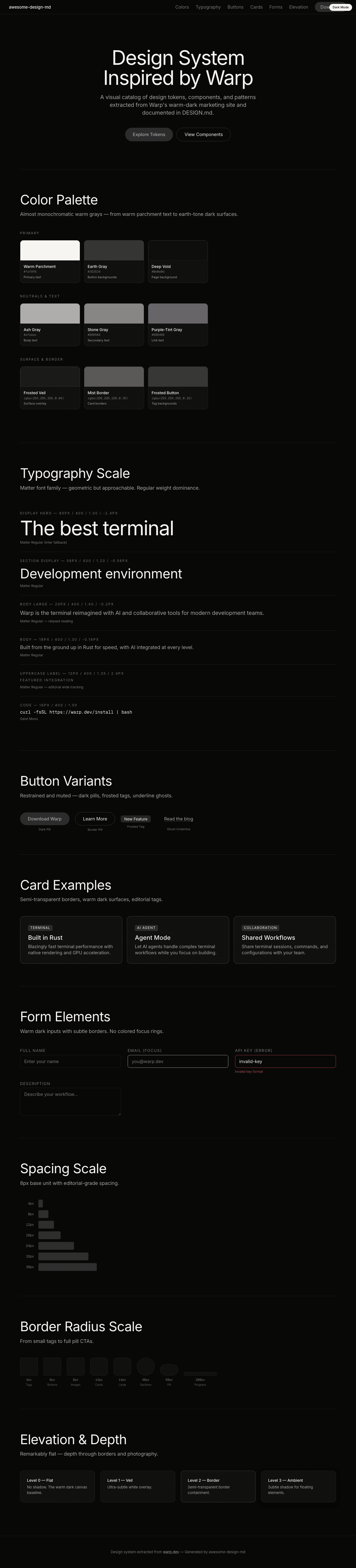
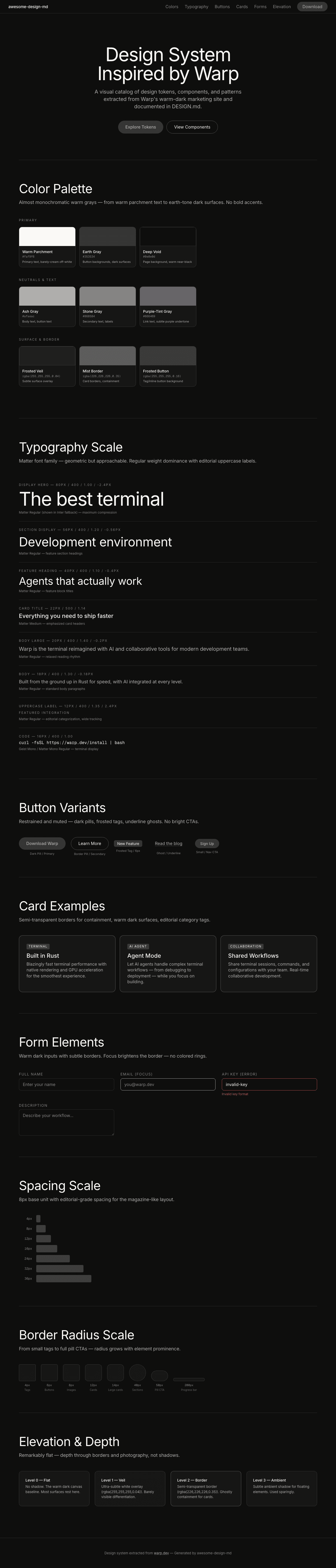
A sample landing page built with DESIGN.md. It shows the actual colors, typography, buttons, cards, spacing, and elevation, all in one page.
|
|
18
|
+
|
|
19
|
+
### Dark Mode
|
|
20
|
+
|
|
21
|
+
|
|
22
|
+
### Light Mode
|
|
23
|
+
|