awesome-design-md 1.0.0
This diff represents the content of publicly available package versions that have been released to one of the supported registries. The information contained in this diff is provided for informational purposes only and reflects changes between package versions as they appear in their respective public registries.
- package/LICENSE +21 -0
- package/README.md +172 -0
- package/bin/cli.mjs +126 -0
- package/design-md/airbnb/DESIGN.md +246 -0
- package/design-md/airbnb/README.md +23 -0
- package/design-md/airbnb/preview-dark.html +234 -0
- package/design-md/airbnb/preview.html +233 -0
- package/design-md/airtable/DESIGN.md +89 -0
- package/design-md/airtable/README.md +23 -0
- package/design-md/airtable/preview-dark.html +165 -0
- package/design-md/airtable/preview.html +164 -0
- package/design-md/apple/DESIGN.md +313 -0
- package/design-md/apple/README.md +24 -0
- package/design-md/apple/preview-dark.html +422 -0
- package/design-md/apple/preview.html +416 -0
- package/design-md/bmw/DESIGN.md +180 -0
- package/design-md/bmw/README.md +23 -0
- package/design-md/bmw/preview-dark.html +211 -0
- package/design-md/bmw/preview.html +210 -0
- package/design-md/cal/DESIGN.md +259 -0
- package/design-md/cal/README.md +23 -0
- package/design-md/cal/preview-dark.html +449 -0
- package/design-md/cal/preview.html +575 -0
- package/design-md/claude/DESIGN.md +312 -0
- package/design-md/claude/README.md +24 -0
- package/design-md/claude/preview-dark.html +803 -0
- package/design-md/claude/preview.html +826 -0
- package/design-md/clay/DESIGN.md +304 -0
- package/design-md/clay/README.md +23 -0
- package/design-md/clay/preview-dark.html +318 -0
- package/design-md/clay/preview.html +317 -0
- package/design-md/clickhouse/DESIGN.md +281 -0
- package/design-md/clickhouse/README.md +24 -0
- package/design-md/clickhouse/preview-dark.html +834 -0
- package/design-md/clickhouse/preview.html +786 -0
- package/design-md/cohere/DESIGN.md +266 -0
- package/design-md/cohere/README.md +24 -0
- package/design-md/cohere/preview-dark.html +810 -0
- package/design-md/cohere/preview.html +814 -0
- package/design-md/coinbase/DESIGN.md +129 -0
- package/design-md/coinbase/README.md +23 -0
- package/design-md/coinbase/preview-dark.html +164 -0
- package/design-md/coinbase/preview.html +163 -0
- package/design-md/composio/DESIGN.md +307 -0
- package/design-md/composio/README.md +24 -0
- package/design-md/composio/preview-dark.html +958 -0
- package/design-md/composio/preview.html +933 -0
- package/design-md/cursor/DESIGN.md +309 -0
- package/design-md/cursor/README.md +24 -0
- package/design-md/cursor/preview-dark.html +395 -0
- package/design-md/cursor/preview.html +385 -0
- package/design-md/elevenlabs/DESIGN.md +265 -0
- package/design-md/elevenlabs/README.md +23 -0
- package/design-md/elevenlabs/preview-dark.html +254 -0
- package/design-md/elevenlabs/preview.html +253 -0
- package/design-md/expo/DESIGN.md +281 -0
- package/design-md/expo/README.md +24 -0
- package/design-md/expo/preview-dark.html +536 -0
- package/design-md/expo/preview.html +536 -0
- package/design-md/figma/DESIGN.md +220 -0
- package/design-md/figma/README.md +24 -0
- package/design-md/figma/preview-dark.html +831 -0
- package/design-md/figma/preview.html +841 -0
- package/design-md/framer/DESIGN.md +246 -0
- package/design-md/framer/README.md +23 -0
- package/design-md/framer/preview-dark.html +904 -0
- package/design-md/framer/preview.html +885 -0
- package/design-md/hashicorp/DESIGN.md +278 -0
- package/design-md/hashicorp/README.md +24 -0
- package/design-md/hashicorp/preview-dark.html +1206 -0
- package/design-md/hashicorp/preview.html +1195 -0
- package/design-md/ibm/DESIGN.md +332 -0
- package/design-md/ibm/README.md +24 -0
- package/design-md/ibm/preview-dark.html +445 -0
- package/design-md/ibm/preview.html +430 -0
- package/design-md/intercom/DESIGN.md +146 -0
- package/design-md/intercom/README.md +23 -0
- package/design-md/intercom/preview-dark.html +185 -0
- package/design-md/intercom/preview.html +184 -0
- package/design-md/kraken/DESIGN.md +125 -0
- package/design-md/kraken/README.md +23 -0
- package/design-md/kraken/preview-dark.html +169 -0
- package/design-md/kraken/preview.html +168 -0
- package/design-md/linear.app/DESIGN.md +367 -0
- package/design-md/linear.app/README.md +24 -0
- package/design-md/linear.app/preview-dark.html +385 -0
- package/design-md/linear.app/preview.html +375 -0
- package/design-md/lovable/DESIGN.md +298 -0
- package/design-md/lovable/README.md +24 -0
- package/design-md/lovable/preview-dark.html +351 -0
- package/design-md/lovable/preview.html +350 -0
- package/design-md/minimax/DESIGN.md +257 -0
- package/design-md/minimax/README.md +24 -0
- package/design-md/minimax/preview-dark.html +1267 -0
- package/design-md/minimax/preview.html +1253 -0
- package/design-md/mintlify/DESIGN.md +326 -0
- package/design-md/mintlify/README.md +24 -0
- package/design-md/mintlify/preview-dark.html +411 -0
- package/design-md/mintlify/preview.html +400 -0
- package/design-md/miro/DESIGN.md +108 -0
- package/design-md/miro/README.md +23 -0
- package/design-md/miro/preview-dark.html +174 -0
- package/design-md/miro/preview.html +173 -0
- package/design-md/mistral.ai/DESIGN.md +261 -0
- package/design-md/mistral.ai/README.md +24 -0
- package/design-md/mistral.ai/preview-dark.html +813 -0
- package/design-md/mistral.ai/preview.html +812 -0
- package/design-md/mongodb/DESIGN.md +266 -0
- package/design-md/mongodb/README.md +23 -0
- package/design-md/mongodb/preview-dark.html +262 -0
- package/design-md/mongodb/preview.html +261 -0
- package/design-md/notion/DESIGN.md +309 -0
- package/design-md/notion/README.md +24 -0
- package/design-md/notion/preview-dark.html +374 -0
- package/design-md/notion/preview.html +366 -0
- package/design-md/nvidia/DESIGN.md +293 -0
- package/design-md/nvidia/README.md +24 -0
- package/design-md/nvidia/preview-dark.html +376 -0
- package/design-md/nvidia/preview.html +368 -0
- package/design-md/ollama/DESIGN.md +267 -0
- package/design-md/ollama/README.md +24 -0
- package/design-md/ollama/preview-dark.html +678 -0
- package/design-md/ollama/preview.html +678 -0
- package/design-md/opencode.ai/DESIGN.md +281 -0
- package/design-md/opencode.ai/README.md +24 -0
- package/design-md/opencode.ai/preview-dark.html +368 -0
- package/design-md/opencode.ai/preview.html +359 -0
- package/design-md/pinterest/DESIGN.md +230 -0
- package/design-md/pinterest/README.md +23 -0
- package/design-md/pinterest/preview-dark.html +233 -0
- package/design-md/pinterest/preview.html +232 -0
- package/design-md/posthog/DESIGN.md +256 -0
- package/design-md/posthog/README.md +23 -0
- package/design-md/posthog/preview-dark.html +701 -0
- package/design-md/posthog/preview.html +751 -0
- package/design-md/raycast/DESIGN.md +268 -0
- package/design-md/raycast/README.md +23 -0
- package/design-md/raycast/preview-dark.html +608 -0
- package/design-md/raycast/preview.html +690 -0
- package/design-md/replicate/DESIGN.md +261 -0
- package/design-md/replicate/README.md +24 -0
- package/design-md/replicate/preview-dark.html +828 -0
- package/design-md/replicate/preview.html +831 -0
- package/design-md/resend/DESIGN.md +303 -0
- package/design-md/resend/README.md +23 -0
- package/design-md/resend/preview-dark.html +357 -0
- package/design-md/resend/preview.html +356 -0
- package/design-md/revolut/DESIGN.md +185 -0
- package/design-md/revolut/README.md +23 -0
- package/design-md/revolut/preview-dark.html +234 -0
- package/design-md/revolut/preview.html +233 -0
- package/design-md/runwayml/DESIGN.md +244 -0
- package/design-md/runwayml/README.md +24 -0
- package/design-md/runwayml/preview-dark.html +664 -0
- package/design-md/runwayml/preview.html +665 -0
- package/design-md/sanity/DESIGN.md +357 -0
- package/design-md/sanity/README.md +24 -0
- package/design-md/sanity/preview-dark.html +995 -0
- package/design-md/sanity/preview.html +1140 -0
- package/design-md/sentry/DESIGN.md +262 -0
- package/design-md/sentry/README.md +24 -0
- package/design-md/sentry/preview-dark.html +628 -0
- package/design-md/sentry/preview.html +953 -0
- package/design-md/spacex/DESIGN.md +194 -0
- package/design-md/spacex/README.md +23 -0
- package/design-md/spacex/preview-dark.html +223 -0
- package/design-md/spacex/preview.html +222 -0
- package/design-md/spotify/DESIGN.md +246 -0
- package/design-md/spotify/README.md +23 -0
- package/design-md/spotify/preview-dark.html +231 -0
- package/design-md/spotify/preview.html +230 -0
- package/design-md/stripe/DESIGN.md +322 -0
- package/design-md/stripe/README.md +24 -0
- package/design-md/stripe/preview-dark.html +430 -0
- package/design-md/stripe/preview.html +421 -0
- package/design-md/supabase/DESIGN.md +255 -0
- package/design-md/supabase/README.md +24 -0
- package/design-md/supabase/preview-dark.html +977 -0
- package/design-md/supabase/preview.html +955 -0
- package/design-md/superhuman/DESIGN.md +252 -0
- package/design-md/superhuman/README.md +23 -0
- package/design-md/superhuman/preview-dark.html +975 -0
- package/design-md/superhuman/preview.html +953 -0
- package/design-md/together.ai/DESIGN.md +263 -0
- package/design-md/together.ai/README.md +24 -0
- package/design-md/together.ai/preview-dark.html +892 -0
- package/design-md/together.ai/preview.html +897 -0
- package/design-md/uber/DESIGN.md +295 -0
- package/design-md/uber/README.md +24 -0
- package/design-md/uber/preview-dark.html +1164 -0
- package/design-md/uber/preview.html +1163 -0
- package/design-md/vercel/DESIGN.md +310 -0
- package/design-md/vercel/README.md +24 -0
- package/design-md/vercel/preview-dark.html +370 -0
- package/design-md/vercel/preview.html +369 -0
- package/design-md/voltagent/DESIGN.md +323 -0
- package/design-md/voltagent/README.md +24 -0
- package/design-md/voltagent/preview-dark.html +487 -0
- package/design-md/voltagent/preview.html +766 -0
- package/design-md/warp/DESIGN.md +253 -0
- package/design-md/warp/README.md +23 -0
- package/design-md/warp/preview-dark.html +502 -0
- package/design-md/warp/preview.html +535 -0
- package/design-md/webflow/DESIGN.md +92 -0
- package/design-md/webflow/README.md +23 -0
- package/design-md/webflow/preview-dark.html +147 -0
- package/design-md/webflow/preview.html +146 -0
- package/design-md/wise/DESIGN.md +173 -0
- package/design-md/wise/README.md +23 -0
- package/design-md/wise/preview-dark.html +230 -0
- package/design-md/wise/preview.html +229 -0
- package/design-md/x.ai/DESIGN.md +257 -0
- package/design-md/x.ai/README.md +24 -0
- package/design-md/x.ai/preview-dark.html +358 -0
- package/design-md/x.ai/preview.html +409 -0
- package/design-md/zapier/DESIGN.md +328 -0
- package/design-md/zapier/README.md +24 -0
- package/design-md/zapier/preview-dark.html +382 -0
- package/design-md/zapier/preview.html +374 -0
- package/package.json +33 -0
|
@@ -0,0 +1,265 @@
|
|
|
1
|
+
# Design System: ElevenLabs
|
|
2
|
+
|
|
3
|
+
## 1. Visual Theme & Atmosphere
|
|
4
|
+
|
|
5
|
+
ElevenLabs' website is a study in restrained elegance — a near-white canvas (`#ffffff`, `#f5f5f5`) where typography and subtle shadows do all the heavy lifting. The design feels like a premium audio product brochure: clean, spacious, and confident enough to let the content speak (literally, given ElevenLabs makes voice AI). There's an almost Apple-like quality to the whitespace strategy, but warmer — the occasional warm stone tint (`#f5f2ef`, `#777169`) prevents the purity from feeling clinical.
|
|
6
|
+
|
|
7
|
+
The typography system is built on a fascinating duality: Waldenburg at weight 300 (light) for display headings creates ethereal, whisper-thin titles that feel like sound waves rendered in type — delicate, precise, and surprisingly impactful at large sizes. This light-weight display approach is the design's signature — where most sites use bold headings to grab attention, ElevenLabs uses lightness to create intrigue. Inter handles all body and UI text with workmanlike reliability, using slight positive letter-spacing (0.14px–0.18px) that gives body text an airy, well-spaced quality. WaldenburgFH appears as a bold uppercase variant for specific button labels.
|
|
8
|
+
|
|
9
|
+
What makes ElevenLabs distinctive is its multi-layered shadow system. Rather than simple box-shadows, elements use complex stacks: inset border-shadows (`rgba(0,0,0,0.075) 0px 0px 0px 0.5px inset`), outline shadows (`rgba(0,0,0,0.06) 0px 0px 0px 1px`), and soft elevation shadows (`rgba(0,0,0,0.04) 0px 4px 4px`) — all at remarkably low opacities. The result is a design where surfaces seem to barely exist, floating just above the page with the lightest possible touch. Pill-shaped buttons (9999px) with warm-tinted backgrounds (`rgba(245,242,239,0.8)`) and warm shadows (`rgba(78,50,23,0.04)`) add a tactile, physical quality.
|
|
10
|
+
|
|
11
|
+
**Key Characteristics:**
|
|
12
|
+
- Near-white canvas with warm undertones (`#f5f5f5`, `#f5f2ef`)
|
|
13
|
+
- Waldenburg weight 300 (light) for display — ethereal, whisper-thin headings
|
|
14
|
+
- Inter with positive letter-spacing (0.14–0.18px) for body — airy readability
|
|
15
|
+
- Multi-layered shadow stacks at sub-0.1 opacity — surfaces barely exist
|
|
16
|
+
- Pill buttons (9999px) with warm stone-tinted backgrounds
|
|
17
|
+
- WaldenburgFH bold uppercase for specific CTA labels
|
|
18
|
+
- Warm shadow tints: `rgba(78, 50, 23, 0.04)` — shadows have color, not just darkness
|
|
19
|
+
- Geist Mono / ui-monospace for code snippets
|
|
20
|
+
|
|
21
|
+
## 2. Color Palette & Roles
|
|
22
|
+
|
|
23
|
+
### Primary
|
|
24
|
+
- **Pure White** (`#ffffff`): Primary background, card surfaces, button backgrounds
|
|
25
|
+
- **Light Gray** (`#f5f5f5`): Secondary surface, subtle section differentiation
|
|
26
|
+
- **Warm Stone** (`#f5f2ef`): Button background (at 80% opacity) — the warm signature
|
|
27
|
+
- **Black** (`#000000`): Primary text, headings, dark buttons
|
|
28
|
+
|
|
29
|
+
### Neutral Scale
|
|
30
|
+
- **Dark Gray** (`#4e4e4e`): Secondary text, descriptions
|
|
31
|
+
- **Warm Gray** (`#777169`): Tertiary text, muted links, decorative underlines
|
|
32
|
+
- **Near White** (`#f6f6f6`): Alternate light surface
|
|
33
|
+
|
|
34
|
+
### Interactive
|
|
35
|
+
- **Grid Cyan** (`#7fffff`): `--grid-column-bg`, at 25% opacity — decorative grid overlay
|
|
36
|
+
- **Ring Blue** (`rgb(147 197 253 / 0.5)`): `--tw-ring-color`, focus ring
|
|
37
|
+
- **Border Light** (`#e5e5e5`): Explicit borders
|
|
38
|
+
- **Border Subtle** (`rgba(0, 0, 0, 0.05)`): Ultra-subtle bottom borders
|
|
39
|
+
|
|
40
|
+
### Shadows
|
|
41
|
+
- **Inset Border** (`rgba(0,0,0,0.075) 0px 0px 0px 0.5px inset`): Internal edge definition
|
|
42
|
+
- **Inset Dark** (`rgba(0,0,0,0.1) 0px 0px 0px 0.5px inset`): Stronger inset variant
|
|
43
|
+
- **Outline Ring** (`rgba(0,0,0,0.06) 0px 0px 0px 1px`): Shadow-as-border
|
|
44
|
+
- **Soft Elevation** (`rgba(0,0,0,0.04) 0px 4px 4px`): Gentle lift
|
|
45
|
+
- **Card Shadow** (`rgba(0,0,0,0.4) 0px 0px 1px, rgba(0,0,0,0.04) 0px 4px 4px`): Button/card elevation
|
|
46
|
+
- **Warm Shadow** (`rgba(78,50,23,0.04) 0px 6px 16px`): Warm-tinted button shadow
|
|
47
|
+
- **Edge Shadow** (`rgba(0,0,0,0.08) 0px 0px 0px 0.5px`): Subtle edge definition
|
|
48
|
+
- **Inset Ring** (`rgba(0,0,0,0.1) 0px 0px 0px 1px inset`): Strong inset border
|
|
49
|
+
|
|
50
|
+
## 3. Typography Rules
|
|
51
|
+
|
|
52
|
+
### Font Families
|
|
53
|
+
- **Display**: `Waldenburg`, fallback: `Waldenburg Fallback`
|
|
54
|
+
- **Display Bold**: `WaldenburgFH`, fallback: `WaldenburgFH Fallback`
|
|
55
|
+
- **Body / UI**: `Inter`, fallback: `Inter Fallback`
|
|
56
|
+
- **Monospace**: `Geist Mono` or `ui-monospace, SFMono-Regular, Menlo, Monaco, Consolas`
|
|
57
|
+
|
|
58
|
+
### Hierarchy
|
|
59
|
+
|
|
60
|
+
| Role | Font | Size | Weight | Line Height | Letter Spacing | Notes |
|
|
61
|
+
|------|------|------|--------|-------------|----------------|-------|
|
|
62
|
+
| Display Hero | Waldenburg | 48px (3.00rem) | 300 | 1.08 (tight) | -0.96px | Whisper-thin, ethereal |
|
|
63
|
+
| Section Heading | Waldenburg | 36px (2.25rem) | 300 | 1.17 (tight) | normal | Light display |
|
|
64
|
+
| Card Heading | Waldenburg | 32px (2.00rem) | 300 | 1.13 (tight) | normal | Light card titles |
|
|
65
|
+
| Body Large | Inter | 20px (1.25rem) | 400 | 1.35 | normal | Introductions |
|
|
66
|
+
| Body | Inter | 18px (1.13rem) | 400 | 1.44–1.60 | 0.18px | Standard reading text |
|
|
67
|
+
| Body Standard | Inter | 16px (1.00rem) | 400 | 1.50 | 0.16px | UI text |
|
|
68
|
+
| Body Medium | Inter | 16px (1.00rem) | 500 | 1.50 | 0.16px | Emphasized body |
|
|
69
|
+
| Nav / UI | Inter | 15px (0.94rem) | 500 | 1.33–1.47 | 0.15px | Navigation links |
|
|
70
|
+
| Button | Inter | 15px (0.94rem) | 500 | 1.47 | normal | Button labels |
|
|
71
|
+
| Button Uppercase | WaldenburgFH | 14px (0.88rem) | 700 | 1.10 (tight) | 0.7px | `text-transform: uppercase` |
|
|
72
|
+
| Caption | Inter | 14px (0.88rem) | 400–500 | 1.43–1.50 | 0.14px | Metadata |
|
|
73
|
+
| Small | Inter | 13px (0.81rem) | 500 | 1.38 | normal | Tags, badges |
|
|
74
|
+
| Code | Geist Mono | 13px (0.81rem) | 400 | 1.85 (relaxed) | normal | Code blocks |
|
|
75
|
+
| Micro | Inter | 12px (0.75rem) | 500 | 1.33 | normal | Tiny labels |
|
|
76
|
+
| Tiny | Inter | 10px (0.63rem) | 400 | 1.60 (relaxed) | normal | Fine print |
|
|
77
|
+
|
|
78
|
+
### Principles
|
|
79
|
+
- **Light as the hero weight**: Waldenburg at 300 is the defining typographic choice. Where other design systems use bold for impact, ElevenLabs uses lightness — thin strokes that feel like audio waveforms, creating intrigue through restraint.
|
|
80
|
+
- **Positive letter-spacing on body**: Inter uses +0.14px to +0.18px tracking across body text, creating an airy, well-spaced reading rhythm that contrasts with the tight display tracking (-0.96px).
|
|
81
|
+
- **WaldenburgFH for emphasis**: A bold (700) uppercase variant of Waldenburg appears only in specific CTA button labels with 0.7px letter-spacing — the one place where the type system gets loud.
|
|
82
|
+
- **Monospace as ambient**: Geist Mono at relaxed line-height (1.85) for code blocks feels unhurried and readable.
|
|
83
|
+
|
|
84
|
+
## 4. Component Stylings
|
|
85
|
+
|
|
86
|
+
### Buttons
|
|
87
|
+
|
|
88
|
+
**Primary Black Pill**
|
|
89
|
+
- Background: `#000000`
|
|
90
|
+
- Text: `#ffffff`
|
|
91
|
+
- Padding: 0px 14px
|
|
92
|
+
- Radius: 9999px (full pill)
|
|
93
|
+
- Use: Primary CTA
|
|
94
|
+
|
|
95
|
+
**White Pill (Shadow-bordered)**
|
|
96
|
+
- Background: `#ffffff`
|
|
97
|
+
- Text: `#000000`
|
|
98
|
+
- Radius: 9999px
|
|
99
|
+
- Shadow: `rgba(0,0,0,0.4) 0px 0px 1px, rgba(0,0,0,0.04) 0px 4px 4px`
|
|
100
|
+
- Use: Secondary CTA on white
|
|
101
|
+
|
|
102
|
+
**Warm Stone Pill**
|
|
103
|
+
- Background: `rgba(245, 242, 239, 0.8)` (warm translucent)
|
|
104
|
+
- Text: `#000000`
|
|
105
|
+
- Padding: 12px 20px 12px 14px (asymmetric)
|
|
106
|
+
- Radius: 30px
|
|
107
|
+
- Shadow: `rgba(78, 50, 23, 0.04) 0px 6px 16px` (warm-tinted)
|
|
108
|
+
- Use: Featured CTA, hero action — the signature warm button
|
|
109
|
+
|
|
110
|
+
**Uppercase Waldenburg Button**
|
|
111
|
+
- Font: WaldenburgFH 14px weight 700
|
|
112
|
+
- Text-transform: uppercase
|
|
113
|
+
- Letter-spacing: 0.7px
|
|
114
|
+
- Use: Specific bold CTA labels
|
|
115
|
+
|
|
116
|
+
### Cards & Containers
|
|
117
|
+
- Background: `#ffffff`
|
|
118
|
+
- Border: `1px solid #e5e5e5` or shadow-as-border
|
|
119
|
+
- Radius: 16px–24px
|
|
120
|
+
- Shadow: multi-layer stack (inset + outline + elevation)
|
|
121
|
+
- Content: product screenshots, code examples, audio waveform previews
|
|
122
|
+
|
|
123
|
+
### Inputs & Forms
|
|
124
|
+
- Textarea: padding 12px 20px, transparent text at default
|
|
125
|
+
- Select: white background, standard styling
|
|
126
|
+
- Radio: standard with tw-ring focus
|
|
127
|
+
- Focus: `var(--tw-ring-offset-shadow)` ring system
|
|
128
|
+
|
|
129
|
+
### Navigation
|
|
130
|
+
- Clean white sticky header
|
|
131
|
+
- Inter 15px weight 500 for nav links
|
|
132
|
+
- Pill CTAs right-aligned (black primary, white secondary)
|
|
133
|
+
- Mobile: hamburger collapse at 1024px
|
|
134
|
+
|
|
135
|
+
### Image Treatment
|
|
136
|
+
- Product screenshots and audio waveform visualizations
|
|
137
|
+
- Warm gradient backgrounds in feature sections
|
|
138
|
+
- 20px–24px radius on image containers
|
|
139
|
+
- Full-width sections alternating white and light gray
|
|
140
|
+
|
|
141
|
+
### Distinctive Components
|
|
142
|
+
|
|
143
|
+
**Audio Waveform Sections**
|
|
144
|
+
- Colorful gradient backgrounds showcasing voice AI capabilities
|
|
145
|
+
- Warm amber, blue, and green gradients behind product demos
|
|
146
|
+
- Screenshots of the ElevenLabs product interface
|
|
147
|
+
|
|
148
|
+
**Warm Stone CTA Block**
|
|
149
|
+
- `rgba(245,242,239,0.8)` background with warm shadow
|
|
150
|
+
- Asymmetric padding (more right padding)
|
|
151
|
+
- Creates a physical, tactile quality unique to ElevenLabs
|
|
152
|
+
|
|
153
|
+
## 5. Layout Principles
|
|
154
|
+
|
|
155
|
+
### Spacing System
|
|
156
|
+
- Base unit: 8px
|
|
157
|
+
- Scale: 1px, 3px, 4px, 8px, 9px, 10px, 11px, 12px, 16px, 18px, 20px, 24px, 28px, 32px, 40px
|
|
158
|
+
|
|
159
|
+
### Grid & Container
|
|
160
|
+
- Centered content with generous max-width
|
|
161
|
+
- Single-column hero, expanding to feature grids
|
|
162
|
+
- Full-width gradient sections for product showcases
|
|
163
|
+
- White card grids on light gray backgrounds
|
|
164
|
+
|
|
165
|
+
### Whitespace Philosophy
|
|
166
|
+
- **Apple-like generosity**: Massive vertical spacing between sections creates a premium, unhurried pace. Each section is an exhibit.
|
|
167
|
+
- **Warm emptiness**: The whitespace isn't cold — the warm stone undertones and warm shadows give empty space a tactile, physical quality.
|
|
168
|
+
- **Typography-led rhythm**: The light-weight Waldenburg headings create visual "whispers" that draw the eye through vast white space.
|
|
169
|
+
|
|
170
|
+
### Border Radius Scale
|
|
171
|
+
- Minimal (2px): Small links, inline elements
|
|
172
|
+
- Subtle (4px): Nav items, tab panels, tags
|
|
173
|
+
- Standard (8px): Small containers
|
|
174
|
+
- Comfortable (10px–12px): Medium cards, dropdowns
|
|
175
|
+
- Card (16px): Standard cards, articles
|
|
176
|
+
- Large (18px–20px): Featured cards, code panels
|
|
177
|
+
- Section (24px): Large panels, section containers
|
|
178
|
+
- Warm Button (30px): Warm stone CTA
|
|
179
|
+
- Pill (9999px): Primary buttons, navigation pills
|
|
180
|
+
|
|
181
|
+
## 6. Depth & Elevation
|
|
182
|
+
|
|
183
|
+
| Level | Treatment | Use |
|
|
184
|
+
|-------|-----------|-----|
|
|
185
|
+
| Flat (Level 0) | No shadow | Page background, text blocks |
|
|
186
|
+
| Inset Edge (Level 0.5) | `rgba(0,0,0,0.075) 0px 0px 0px 0.5px inset, #fff 0px 0px 0px 0px inset` | Internal border definition |
|
|
187
|
+
| Outline Ring (Level 1) | `rgba(0,0,0,0.06) 0px 0px 0px 1px` + `rgba(0,0,0,0.04) 0px 1px 2px` + `rgba(0,0,0,0.04) 0px 2px 4px` | Shadow-as-border for cards |
|
|
188
|
+
| Card (Level 2) | `rgba(0,0,0,0.4) 0px 0px 1px, rgba(0,0,0,0.04) 0px 4px 4px` | Button elevation, prominent cards |
|
|
189
|
+
| Warm Lift (Level 3) | `rgba(78,50,23,0.04) 0px 6px 16px` | Featured CTAs — warm-tinted |
|
|
190
|
+
| Focus (Accessibility) | `var(--tw-ring-offset-shadow)` blue ring | Keyboard focus |
|
|
191
|
+
|
|
192
|
+
**Shadow Philosophy**: ElevenLabs uses the most refined shadow system of any design system analyzed. Every shadow is at sub-0.1 opacity, many include both outward cast AND inward inset components, and the warm CTA shadows use an actual warm color (`rgba(78,50,23,...)`) rather than neutral black. The inset half-pixel borders (`0px 0px 0px 0.5px inset`) create edges so subtle they're felt rather than seen — surfaces define themselves through the lightest possible touch.
|
|
193
|
+
|
|
194
|
+
## 7. Do's and Don'ts
|
|
195
|
+
|
|
196
|
+
### Do
|
|
197
|
+
- Use Waldenburg weight 300 for all display headings — the lightness IS the brand
|
|
198
|
+
- Apply multi-layer shadows (inset + outline + elevation) at sub-0.1 opacity
|
|
199
|
+
- Use warm stone tints (`#f5f2ef`, `rgba(245,242,239,0.8)`) for featured elements
|
|
200
|
+
- Apply positive letter-spacing (+0.14px to +0.18px) on Inter body text
|
|
201
|
+
- Use 9999px radius for primary buttons — pill shape is standard
|
|
202
|
+
- Use warm-tinted shadows (`rgba(78,50,23,0.04)`) on featured CTAs
|
|
203
|
+
- Keep the page predominantly white with subtle gray section differentiation
|
|
204
|
+
- Use WaldenburgFH bold uppercase ONLY for specific CTA button labels
|
|
205
|
+
|
|
206
|
+
### Don't
|
|
207
|
+
- Don't use bold (700) Waldenburg for headings — weight 300 is non-negotiable
|
|
208
|
+
- Don't use heavy shadows (>0.1 opacity) — the ethereal quality requires whisper-level depth
|
|
209
|
+
- Don't use cool gray borders — the system is warm-tinted throughout
|
|
210
|
+
- Don't skip the inset shadow component — half-pixel inset borders define edges
|
|
211
|
+
- Don't apply negative letter-spacing to body text — Inter uses positive tracking
|
|
212
|
+
- Don't use sharp corners (<8px) on cards — the generous radius is structural
|
|
213
|
+
- Don't introduce brand colors — the palette is intentionally achromatic with warm undertones
|
|
214
|
+
- Don't make buttons opaque and heavy — the warm translucent stone treatment is the signature
|
|
215
|
+
|
|
216
|
+
## 8. Responsive Behavior
|
|
217
|
+
|
|
218
|
+
### Breakpoints
|
|
219
|
+
| Name | Width | Key Changes |
|
|
220
|
+
|------|-------|-------------|
|
|
221
|
+
| Mobile | <1024px | Single column, hamburger nav, stacked sections |
|
|
222
|
+
| Desktop | >1024px | Full layout, horizontal nav, multi-column grids |
|
|
223
|
+
|
|
224
|
+
### Touch Targets
|
|
225
|
+
- Pill buttons with generous padding (12px–20px)
|
|
226
|
+
- Navigation links at 15px with adequate spacing
|
|
227
|
+
- Select dropdowns maintain comfortable sizing
|
|
228
|
+
|
|
229
|
+
### Collapsing Strategy
|
|
230
|
+
- Navigation: horizontal → hamburger at 1024px
|
|
231
|
+
- Feature grids: multi-column → stacked
|
|
232
|
+
- Hero: maintains centered layout, font scales proportionally
|
|
233
|
+
- Gradient sections: full-width maintained, content stacks
|
|
234
|
+
- Spacing compresses proportionally
|
|
235
|
+
|
|
236
|
+
### Image Behavior
|
|
237
|
+
- Product screenshots scale responsively
|
|
238
|
+
- Gradient backgrounds simplify on mobile
|
|
239
|
+
- Audio waveform previews maintain aspect ratio
|
|
240
|
+
- Rounded corners maintained across breakpoints
|
|
241
|
+
|
|
242
|
+
## 9. Agent Prompt Guide
|
|
243
|
+
|
|
244
|
+
### Quick Color Reference
|
|
245
|
+
- Background: Pure White (`#ffffff`) or Light Gray (`#f5f5f5`)
|
|
246
|
+
- Text: Black (`#000000`)
|
|
247
|
+
- Secondary text: Dark Gray (`#4e4e4e`)
|
|
248
|
+
- Muted text: Warm Gray (`#777169`)
|
|
249
|
+
- Warm surface: Warm Stone (`rgba(245, 242, 239, 0.8)`)
|
|
250
|
+
- Border: `#e5e5e5` or `rgba(0,0,0,0.05)`
|
|
251
|
+
|
|
252
|
+
### Example Component Prompts
|
|
253
|
+
- "Create a hero on white background. Headline at 48px Waldenburg weight 300, line-height 1.08, letter-spacing -0.96px, black text. Subtitle at 18px Inter weight 400, line-height 1.60, letter-spacing 0.18px, #4e4e4e text. Two pill buttons: black (9999px, 0px 14px padding) and warm stone (rgba(245,242,239,0.8), 30px radius, 12px 20px padding, warm shadow rgba(78,50,23,0.04) 0px 6px 16px)."
|
|
254
|
+
- "Design a card: white background, 20px radius. Shadow: rgba(0,0,0,0.06) 0px 0px 0px 1px, rgba(0,0,0,0.04) 0px 1px 2px, rgba(0,0,0,0.04) 0px 2px 4px. Title at 32px Waldenburg weight 300, body at 16px Inter weight 400 letter-spacing 0.16px, #4e4e4e."
|
|
255
|
+
- "Build a white pill button: white bg, 9999px radius. Shadow: rgba(0,0,0,0.4) 0px 0px 1px, rgba(0,0,0,0.04) 0px 4px 4px. Text at 15px Inter weight 500."
|
|
256
|
+
- "Create an uppercase CTA label: 14px WaldenburgFH weight 700, text-transform uppercase, letter-spacing 0.7px."
|
|
257
|
+
- "Design navigation: white sticky header. Inter 15px weight 500. Black pill CTA right-aligned. Border-bottom: rgba(0,0,0,0.05)."
|
|
258
|
+
|
|
259
|
+
### Iteration Guide
|
|
260
|
+
1. Start with white — the warm undertone comes from shadows and stone surfaces, not backgrounds
|
|
261
|
+
2. Waldenburg 300 for headings — never bold, the lightness is the identity
|
|
262
|
+
3. Multi-layer shadows: always include inset + outline + elevation at sub-0.1 opacity
|
|
263
|
+
4. Positive letter-spacing on Inter body (+0.14px to +0.18px) — the airy reading quality
|
|
264
|
+
5. Warm stone CTA is the signature — `rgba(245,242,239,0.8)` with `rgba(78,50,23,0.04)` shadow
|
|
265
|
+
6. Pill (9999px) for buttons, generous radius (16px–24px) for cards
|
|
@@ -0,0 +1,23 @@
|
|
|
1
|
+
# Elevenlabs Inspired Design System
|
|
2
|
+
|
|
3
|
+
[DESIGN.md](https://github.com/VoltAgent/awesome-design-md/blob/main/design-md/elevenlabs/DESIGN.md) extracted from the public [elevenlabs](https://elevenlabs.io/) website. This is not the official design system. Colors, fonts, and spacing may not be 100% accurate. But it's a good starting point for building something similar.
|
|
4
|
+
|
|
5
|
+
## Files
|
|
6
|
+
|
|
7
|
+
| File | Description |
|
|
8
|
+
|------|-------------|
|
|
9
|
+
| `DESIGN.md` | Complete design system documentation (9 sections) |
|
|
10
|
+
| `preview.html` | Interactive design token catalog (light) |
|
|
11
|
+
| `preview-dark.html` | Interactive design token catalog (dark) |
|
|
12
|
+
|
|
13
|
+
Use [DESIGN.md](https://github.com/VoltAgent/awesome-design-md/blob/main/design-md/elevenlabs/DESIGN.md) to use as a reference for AI agents (Claude, Cursor, Stitch) to generate UI that looks like the Elevenlabs design language.
|
|
14
|
+
|
|
15
|
+
## Preview
|
|
16
|
+
|
|
17
|
+
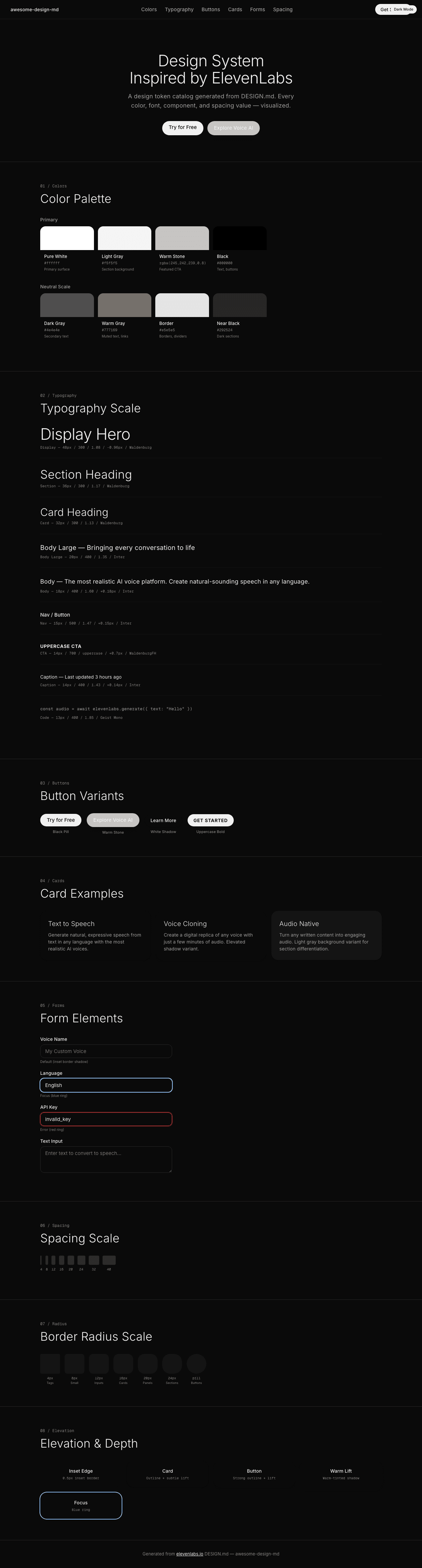
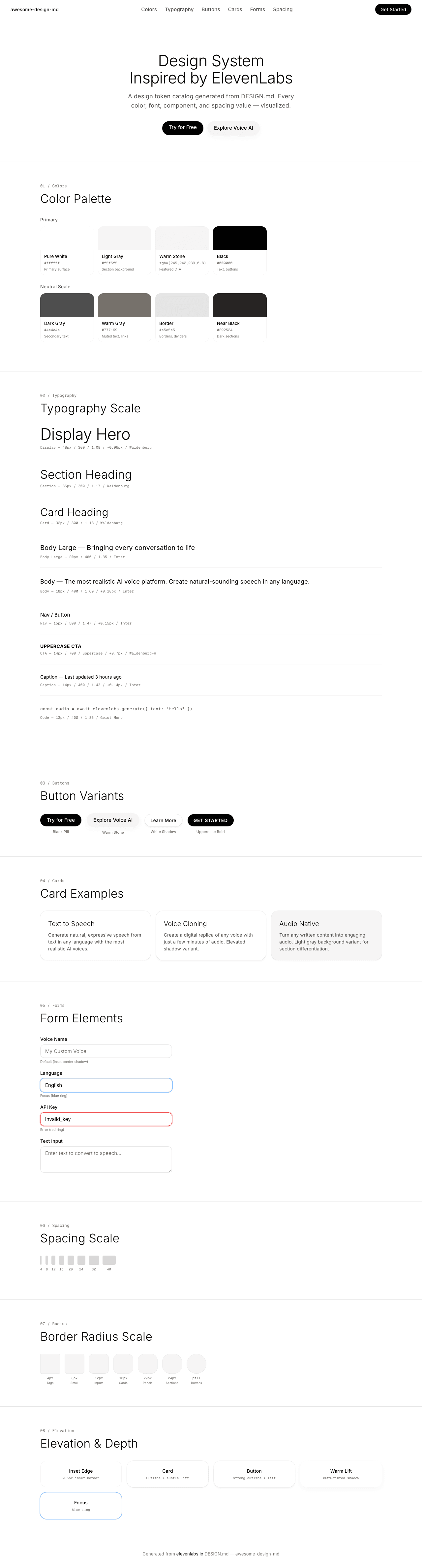
A sample landing page built with DESIGN.md. It shows the actual colors, typography, buttons, cards, spacing, and elevation, all in one page.
|
|
18
|
+
|
|
19
|
+
### Dark Mode
|
|
20
|
+
|
|
21
|
+
|
|
22
|
+
### Light Mode
|
|
23
|
+
|
|
@@ -0,0 +1,254 @@
|
|
|
1
|
+
<!DOCTYPE html>
|
|
2
|
+
<html lang="en">
|
|
3
|
+
<head>
|
|
4
|
+
<meta charset="UTF-8">
|
|
5
|
+
<meta name="viewport" content="width=device-width, initial-scale=1.0">
|
|
6
|
+
<title>Design System Preview: ElevenLabs (Dark)</title>
|
|
7
|
+
<link rel="preconnect" href="https://fonts.googleapis.com">
|
|
8
|
+
<link rel="preconnect" href="https://fonts.gstatic.com" crossorigin>
|
|
9
|
+
<link href="https://fonts.googleapis.com/css2?family=Inter:wght@300;400;500;700&family=Geist+Mono&display=swap" rel="stylesheet">
|
|
10
|
+
<style>
|
|
11
|
+
:root {
|
|
12
|
+
--white: #0a0a0a; --light: #141414; --warm-stone: rgba(245,242,239,0.8);
|
|
13
|
+
--black: #f0f0f0; --dark-gray: #a0a0a0; --warm-gray: #8a8580;
|
|
14
|
+
--border: #2a2a2a; --border-subtle: rgba(255,255,255,0.08);
|
|
15
|
+
--shadow-card: rgba(0,0,0,0.06) 0px 0px 0px 1px, rgba(0,0,0,0.04) 0px 1px 2px, rgba(0,0,0,0.04) 0px 2px 4px;
|
|
16
|
+
--shadow-btn: rgba(0,0,0,0.4) 0px 0px 1px, rgba(0,0,0,0.04) 0px 4px 4px;
|
|
17
|
+
--shadow-warm: rgba(78,50,23,0.04) 0px 6px 16px;
|
|
18
|
+
--shadow-inset: rgb(255,255,255) 0px 0px 0px 0px inset, rgba(0,0,0,0.075) 0px 0px 0px 0.5px inset;
|
|
19
|
+
--font-sans: 'Inter', system-ui, sans-serif;
|
|
20
|
+
--font-mono: 'Geist Mono', ui-monospace, SFMono-Regular, Menlo, monospace;
|
|
21
|
+
}
|
|
22
|
+
* { margin:0; padding:0; box-sizing:border-box; }
|
|
23
|
+
body { background:var(--white); color:var(--black); font-family:var(--font-sans); font-size:16px; font-weight:400; line-height:1.50; letter-spacing:0.16px; -webkit-font-smoothing:antialiased; }
|
|
24
|
+
|
|
25
|
+
.nav { position:sticky; top:0; z-index:100; display:flex; align-items:center; justify-content:space-between; padding:12px 32px; background:rgba(10,10,10,0.92); backdrop-filter:blur(12px); border-bottom:1px solid var(--border-subtle); }
|
|
26
|
+
.nav-brand { font-size:14px; font-weight:500; color:var(--black); text-decoration:none; }
|
|
27
|
+
.nav-links { display:flex; gap:24px; list-style:none; }
|
|
28
|
+
.nav-links a { font-size:15px; font-weight:500; color:var(--dark-gray); text-decoration:none; letter-spacing:0.15px; transition:color 0.15s; }
|
|
29
|
+
.nav-links a:hover { color:var(--black); }
|
|
30
|
+
.nav-cta { display:inline-block; background:var(--black); color:var(--white); padding:6px 16px; border-radius:9999px; font-size:14px; font-weight:500; text-decoration:none; }
|
|
31
|
+
|
|
32
|
+
.hero { padding:100px 32px 80px; text-align:center; }
|
|
33
|
+
.hero h1 { font-size:48px; font-weight:300; line-height:1.08; letter-spacing:-0.96px; margin-bottom:16px; }
|
|
34
|
+
.hero p { font-size:18px; font-weight:400; line-height:1.60; letter-spacing:0.18px; color:var(--dark-gray); max-width:520px; margin:0 auto 32px; }
|
|
35
|
+
.hero-buttons { display:flex; gap:12px; justify-content:center; flex-wrap:wrap; }
|
|
36
|
+
.btn-black { display:inline-block; background:var(--black); color:var(--white); padding:8px 20px; border-radius:9999px; font-size:15px; font-weight:500; text-decoration:none; border:none; cursor:pointer; }
|
|
37
|
+
.btn-warm { display:inline-block; background:var(--warm-stone); color:var(--black); padding:10px 20px; border-radius:30px; font-size:15px; font-weight:500; text-decoration:none; border:none; cursor:pointer; box-shadow:var(--shadow-warm); }
|
|
38
|
+
.btn-white { display:inline-block; background:var(--white); color:var(--black); padding:8px 18px; border-radius:9999px; font-size:14px; font-weight:500; text-decoration:none; border:none; cursor:pointer; box-shadow:var(--shadow-btn); }
|
|
39
|
+
.btn-upper { display:inline-block; background:var(--black); color:var(--white); padding:8px 18px; border-radius:9999px; font-size:14px; font-weight:700; text-decoration:none; text-transform:uppercase; letter-spacing:0.7px; border:none; cursor:pointer; }
|
|
40
|
+
|
|
41
|
+
.section { padding:64px 32px; max-width:1100px; margin:0 auto; }
|
|
42
|
+
.section-label { font-family:var(--font-mono); font-size:12px; font-weight:500; color:var(--warm-gray); margin-bottom:8px; }
|
|
43
|
+
.section-title { font-size:36px; font-weight:300; line-height:1.17; margin-bottom:32px; }
|
|
44
|
+
.section-divider { border:none; border-top:1px solid var(--border); margin:0; }
|
|
45
|
+
|
|
46
|
+
.color-grid { display:grid; grid-template-columns:repeat(auto-fill, minmax(150px,1fr)); gap:12px; margin-bottom:24px; }
|
|
47
|
+
.color-swatch { border-radius:16px; overflow:hidden; box-shadow:var(--shadow-inset); }
|
|
48
|
+
.color-swatch-block { height:72px; width:100%; }
|
|
49
|
+
.color-swatch-info { padding:10px 12px; }
|
|
50
|
+
.color-swatch-name { font-size:13px; font-weight:500; margin-bottom:2px; }
|
|
51
|
+
.color-swatch-hex { font-size:11px; color:var(--warm-gray); font-family:var(--font-mono); }
|
|
52
|
+
.color-swatch-role { font-size:10px; color:var(--warm-gray); margin-top:3px; }
|
|
53
|
+
.color-group-label { font-size:14px; font-weight:500; color:var(--dark-gray); margin:24px 0 10px; }
|
|
54
|
+
|
|
55
|
+
.type-sample { margin-bottom:28px; padding-bottom:24px; border-bottom:1px solid var(--light); }
|
|
56
|
+
.type-sample:last-child { border-bottom:none; }
|
|
57
|
+
.type-meta { font-family:var(--font-mono); font-size:11px; color:var(--warm-gray); margin-top:6px; }
|
|
58
|
+
|
|
59
|
+
.button-row { display:flex; gap:16px; flex-wrap:wrap; align-items:center; }
|
|
60
|
+
.button-item { text-align:center; }
|
|
61
|
+
.button-label { font-size:11px; font-weight:500; color:var(--warm-gray); margin-top:8px; }
|
|
62
|
+
|
|
63
|
+
.card-grid { display:grid; grid-template-columns:repeat(auto-fit, minmax(300px,1fr)); gap:16px; }
|
|
64
|
+
.card { background:var(--white); border-radius:20px; padding:24px; box-shadow:var(--shadow-card); }
|
|
65
|
+
.card h3 { font-size:20px; font-weight:300; margin-bottom:8px; }
|
|
66
|
+
.card p { font-size:14px; color:var(--dark-gray); line-height:1.50; letter-spacing:0.14px; }
|
|
67
|
+
|
|
68
|
+
.form-group { margin-bottom:16px; max-width:400px; }
|
|
69
|
+
.form-label { display:block; font-size:14px; font-weight:500; margin-bottom:6px; letter-spacing:0.14px; }
|
|
70
|
+
.form-input { width:100%; background:var(--white); color:var(--black); border:1px solid var(--border); padding:10px 14px; border-radius:12px; font-family:var(--font-sans); font-size:15px; outline:none; box-shadow:var(--shadow-inset); transition:box-shadow 0.15s; }
|
|
71
|
+
.form-input:focus { box-shadow:0 0 0 2px rgb(147,197,253); }
|
|
72
|
+
.form-input--focus { box-shadow:0 0 0 2px rgb(147,197,253); }
|
|
73
|
+
.form-input--error { border-color:#ef4444; box-shadow:0 0 0 2px rgba(239,68,68,0.3); }
|
|
74
|
+
.form-textarea { width:100%; min-height:80px; background:var(--white); color:var(--black); border:1px solid var(--border); padding:10px 14px; border-radius:12px; font-family:var(--font-sans); font-size:15px; resize:vertical; outline:none; box-shadow:var(--shadow-inset); }
|
|
75
|
+
.form-state-label { font-size:10px; color:var(--warm-gray); margin-top:4px; }
|
|
76
|
+
|
|
77
|
+
.spacing-row { display:flex; align-items:flex-end; gap:10px; flex-wrap:wrap; margin-bottom:20px; }
|
|
78
|
+
.spacing-item { text-align:center; }
|
|
79
|
+
.spacing-block { background:var(--black); border-radius:4px; margin-bottom:6px; height:28px; opacity:0.15; }
|
|
80
|
+
.spacing-value { font-family:var(--font-mono); font-size:10px; color:var(--warm-gray); }
|
|
81
|
+
|
|
82
|
+
.radius-row { display:flex; gap:14px; flex-wrap:wrap; align-items:center; }
|
|
83
|
+
.radius-item { text-align:center; }
|
|
84
|
+
.radius-box { width:60px; height:60px; background:var(--light); margin-bottom:6px; box-shadow:var(--shadow-inset); }
|
|
85
|
+
.radius-label { font-family:var(--font-mono); font-size:10px; color:var(--warm-gray); }
|
|
86
|
+
.radius-context { font-size:9px; color:var(--warm-gray); }
|
|
87
|
+
|
|
88
|
+
.elevation-grid { display:grid; grid-template-columns:repeat(auto-fit, minmax(200px,1fr)); gap:16px; }
|
|
89
|
+
.elevation-card { background:var(--white); border-radius:20px; padding:20px; text-align:center; }
|
|
90
|
+
.elevation-label { font-size:14px; font-weight:500; margin-bottom:4px; }
|
|
91
|
+
.elevation-desc { font-family:var(--font-mono); font-size:10px; color:var(--warm-gray); }
|
|
92
|
+
|
|
93
|
+
.footer { padding:32px; text-align:center; border-top:1px solid var(--border); font-size:13px; color:var(--warm-gray); letter-spacing:0.13px; }
|
|
94
|
+
.footer a { color:var(--black); text-decoration:underline; }
|
|
95
|
+
|
|
96
|
+
@media (max-width:1024px) {
|
|
97
|
+
.hero h1 { font-size:36px; }
|
|
98
|
+
.nav-links { display:none; }
|
|
99
|
+
.section { padding:48px 20px; }
|
|
100
|
+
.card-grid { grid-template-columns:1fr; }
|
|
101
|
+
}
|
|
102
|
+
</style>
|
|
103
|
+
</head>
|
|
104
|
+
<body>
|
|
105
|
+
|
|
106
|
+
<nav class="nav">
|
|
107
|
+
<a class="nav-brand" href="#">awesome-design-md</a>
|
|
108
|
+
<ul class="nav-links">
|
|
109
|
+
<li><a href="#colors">Colors</a></li>
|
|
110
|
+
<li><a href="#typography">Typography</a></li>
|
|
111
|
+
<li><a href="#buttons">Buttons</a></li>
|
|
112
|
+
<li><a href="#cards">Cards</a></li>
|
|
113
|
+
<li><a href="#forms">Forms</a></li>
|
|
114
|
+
<li><a href="#spacing">Spacing</a></li>
|
|
115
|
+
</ul>
|
|
116
|
+
<a class="nav-cta" href="#">Get Started</a>
|
|
117
|
+
</nav>
|
|
118
|
+
<div style="position:fixed;top:16px;right:16px;z-index:200;background:#f0f0f0;color:#0a0a0a;font-size:11px;font-weight:500;padding:4px 10px;border-radius:9999px;">Dark Mode</div>
|
|
119
|
+
|
|
120
|
+
<section class="hero">
|
|
121
|
+
<h1>Design System<br>Inspired by ElevenLabs</h1>
|
|
122
|
+
<p>A design token catalog generated from DESIGN.md. Every color, font, component, and spacing value — visualized.</p>
|
|
123
|
+
<div class="hero-buttons">
|
|
124
|
+
<a class="btn-black" href="#">Try for Free</a>
|
|
125
|
+
<a class="btn-warm" href="#">Explore Voice AI</a>
|
|
126
|
+
</div>
|
|
127
|
+
</section>
|
|
128
|
+
|
|
129
|
+
<hr class="section-divider">
|
|
130
|
+
|
|
131
|
+
<section class="section" id="colors">
|
|
132
|
+
<div class="section-label">01 / Colors</div>
|
|
133
|
+
<h2 class="section-title">Color Palette</h2>
|
|
134
|
+
<div class="color-group-label">Primary</div>
|
|
135
|
+
<div class="color-grid">
|
|
136
|
+
<div class="color-swatch"><div class="color-swatch-block" style="background:#ffffff"></div><div class="color-swatch-info"><div class="color-swatch-name">Pure White</div><div class="color-swatch-hex">#ffffff</div><div class="color-swatch-role">Primary surface</div></div></div>
|
|
137
|
+
<div class="color-swatch"><div class="color-swatch-block" style="background:#f5f5f5"></div><div class="color-swatch-info"><div class="color-swatch-name">Light Gray</div><div class="color-swatch-hex">#f5f5f5</div><div class="color-swatch-role">Section background</div></div></div>
|
|
138
|
+
<div class="color-swatch"><div class="color-swatch-block" style="background:rgba(245,242,239,0.8)"></div><div class="color-swatch-info"><div class="color-swatch-name">Warm Stone</div><div class="color-swatch-hex">rgba(245,242,239,0.8)</div><div class="color-swatch-role">Featured CTA</div></div></div>
|
|
139
|
+
<div class="color-swatch"><div class="color-swatch-block" style="background:#000000"></div><div class="color-swatch-info"><div class="color-swatch-name">Black</div><div class="color-swatch-hex">#000000</div><div class="color-swatch-role">Text, buttons</div></div></div>
|
|
140
|
+
</div>
|
|
141
|
+
<div class="color-group-label">Neutral Scale</div>
|
|
142
|
+
<div class="color-grid">
|
|
143
|
+
<div class="color-swatch"><div class="color-swatch-block" style="background:#4e4e4e"></div><div class="color-swatch-info"><div class="color-swatch-name">Dark Gray</div><div class="color-swatch-hex">#4e4e4e</div><div class="color-swatch-role">Secondary text</div></div></div>
|
|
144
|
+
<div class="color-swatch"><div class="color-swatch-block" style="background:#777169"></div><div class="color-swatch-info"><div class="color-swatch-name">Warm Gray</div><div class="color-swatch-hex">#777169</div><div class="color-swatch-role">Muted text, links</div></div></div>
|
|
145
|
+
<div class="color-swatch"><div class="color-swatch-block" style="background:#e5e5e5"></div><div class="color-swatch-info"><div class="color-swatch-name">Border</div><div class="color-swatch-hex">#e5e5e5</div><div class="color-swatch-role">Borders, dividers</div></div></div>
|
|
146
|
+
<div class="color-swatch"><div class="color-swatch-block" style="background:#292524"></div><div class="color-swatch-info"><div class="color-swatch-name">Near Black</div><div class="color-swatch-hex">#292524</div><div class="color-swatch-role">Dark sections</div></div></div>
|
|
147
|
+
</div>
|
|
148
|
+
</section>
|
|
149
|
+
|
|
150
|
+
<hr class="section-divider">
|
|
151
|
+
|
|
152
|
+
<section class="section" id="typography">
|
|
153
|
+
<div class="section-label">02 / Typography</div>
|
|
154
|
+
<h2 class="section-title">Typography Scale</h2>
|
|
155
|
+
<div class="type-sample"><div style="font-size:48px; font-weight:300; line-height:1.08; letter-spacing:-0.96px;">Display Hero</div><div class="type-meta">Display — 48px / 300 / 1.08 / -0.96px / Waldenburg</div></div>
|
|
156
|
+
<div class="type-sample"><div style="font-size:36px; font-weight:300; line-height:1.17;">Section Heading</div><div class="type-meta">Section — 36px / 300 / 1.17 / Waldenburg</div></div>
|
|
157
|
+
<div class="type-sample"><div style="font-size:32px; font-weight:300; line-height:1.13;">Card Heading</div><div class="type-meta">Card — 32px / 300 / 1.13 / Waldenburg</div></div>
|
|
158
|
+
<div class="type-sample"><div style="font-size:20px; font-weight:400; line-height:1.35;">Body Large — Bringing every conversation to life</div><div class="type-meta">Body Large — 20px / 400 / 1.35 / Inter</div></div>
|
|
159
|
+
<div class="type-sample"><div style="font-size:18px; font-weight:400; line-height:1.60; letter-spacing:0.18px;">Body — The most realistic AI voice platform. Create natural-sounding speech in any language.</div><div class="type-meta">Body — 18px / 400 / 1.60 / +0.18px / Inter</div></div>
|
|
160
|
+
<div class="type-sample"><div style="font-size:15px; font-weight:500; line-height:1.47; letter-spacing:0.15px;">Nav / Button</div><div class="type-meta">Nav — 15px / 500 / 1.47 / +0.15px / Inter</div></div>
|
|
161
|
+
<div class="type-sample"><div style="font-size:14px; font-weight:700; line-height:1.10; text-transform:uppercase; letter-spacing:0.7px;">Uppercase CTA</div><div class="type-meta">CTA — 14px / 700 / uppercase / +0.7px / WaldenburgFH</div></div>
|
|
162
|
+
<div class="type-sample"><div style="font-size:14px; font-weight:400; line-height:1.43; letter-spacing:0.14px;">Caption — Last updated 3 hours ago</div><div class="type-meta">Caption — 14px / 400 / 1.43 / +0.14px / Inter</div></div>
|
|
163
|
+
<div class="type-sample"><div style="font-family:var(--font-mono); font-size:13px; font-weight:400; line-height:1.85; color:var(--dark-gray);">const audio = await elevenlabs.generate({ text: "Hello" })</div><div class="type-meta">Code — 13px / 400 / 1.85 / Geist Mono</div></div>
|
|
164
|
+
</section>
|
|
165
|
+
|
|
166
|
+
<hr class="section-divider">
|
|
167
|
+
|
|
168
|
+
<section class="section" id="buttons">
|
|
169
|
+
<div class="section-label">03 / Buttons</div>
|
|
170
|
+
<h2 class="section-title">Button Variants</h2>
|
|
171
|
+
<div class="button-row">
|
|
172
|
+
<div class="button-item"><a class="btn-black" href="#">Try for Free</a><div class="button-label">Black Pill</div></div>
|
|
173
|
+
<div class="button-item"><a class="btn-warm" href="#">Explore Voice AI</a><div class="button-label">Warm Stone</div></div>
|
|
174
|
+
<div class="button-item"><a class="btn-white" href="#">Learn More</a><div class="button-label">White Shadow</div></div>
|
|
175
|
+
<div class="button-item"><a class="btn-upper" href="#">Get Started</a><div class="button-label">Uppercase Bold</div></div>
|
|
176
|
+
</div>
|
|
177
|
+
</section>
|
|
178
|
+
|
|
179
|
+
<hr class="section-divider">
|
|
180
|
+
|
|
181
|
+
<section class="section" id="cards">
|
|
182
|
+
<div class="section-label">04 / Cards</div>
|
|
183
|
+
<h2 class="section-title">Card Examples</h2>
|
|
184
|
+
<div class="card-grid">
|
|
185
|
+
<div class="card"><h3>Text to Speech</h3><p>Generate natural, expressive speech from text in any language with the most realistic AI voices.</p></div>
|
|
186
|
+
<div class="card" style="box-shadow:rgba(0,0,0,0.4) 0px 0px 1px, rgba(0,0,0,0.04) 0px 4px 4px;"><h3>Voice Cloning</h3><p>Create a digital replica of any voice with just a few minutes of audio. Elevated shadow variant.</p></div>
|
|
187
|
+
<div class="card" style="background:var(--light);"><h3>Audio Native</h3><p>Turn any written content into engaging audio. Light gray background variant for section differentiation.</p></div>
|
|
188
|
+
</div>
|
|
189
|
+
</section>
|
|
190
|
+
|
|
191
|
+
<hr class="section-divider">
|
|
192
|
+
|
|
193
|
+
<section class="section" id="forms">
|
|
194
|
+
<div class="section-label">05 / Forms</div>
|
|
195
|
+
<h2 class="section-title">Form Elements</h2>
|
|
196
|
+
<div class="form-group"><label class="form-label">Voice Name</label><input class="form-input" type="text" placeholder="My Custom Voice"><div class="form-state-label">Default (inset border shadow)</div></div>
|
|
197
|
+
<div class="form-group"><label class="form-label">Language</label><input class="form-input form-input--focus" type="text" value="English"><div class="form-state-label">Focus (blue ring)</div></div>
|
|
198
|
+
<div class="form-group"><label class="form-label">API Key</label><input class="form-input form-input--error" type="text" value="invalid_key"><div class="form-state-label">Error (red ring)</div></div>
|
|
199
|
+
<div class="form-group"><label class="form-label">Text Input</label><textarea class="form-textarea" placeholder="Enter text to convert to speech..."></textarea></div>
|
|
200
|
+
</section>
|
|
201
|
+
|
|
202
|
+
<hr class="section-divider">
|
|
203
|
+
|
|
204
|
+
<section class="section" id="spacing">
|
|
205
|
+
<div class="section-label">06 / Spacing</div>
|
|
206
|
+
<h2 class="section-title">Spacing Scale</h2>
|
|
207
|
+
<div class="spacing-row">
|
|
208
|
+
<div class="spacing-item"><div class="spacing-block" style="width:4px"></div><div class="spacing-value">4</div></div>
|
|
209
|
+
<div class="spacing-item"><div class="spacing-block" style="width:8px"></div><div class="spacing-value">8</div></div>
|
|
210
|
+
<div class="spacing-item"><div class="spacing-block" style="width:12px"></div><div class="spacing-value">12</div></div>
|
|
211
|
+
<div class="spacing-item"><div class="spacing-block" style="width:16px"></div><div class="spacing-value">16</div></div>
|
|
212
|
+
<div class="spacing-item"><div class="spacing-block" style="width:20px"></div><div class="spacing-value">20</div></div>
|
|
213
|
+
<div class="spacing-item"><div class="spacing-block" style="width:24px"></div><div class="spacing-value">24</div></div>
|
|
214
|
+
<div class="spacing-item"><div class="spacing-block" style="width:32px"></div><div class="spacing-value">32</div></div>
|
|
215
|
+
<div class="spacing-item"><div class="spacing-block" style="width:40px"></div><div class="spacing-value">40</div></div>
|
|
216
|
+
</div>
|
|
217
|
+
</section>
|
|
218
|
+
|
|
219
|
+
<hr class="section-divider">
|
|
220
|
+
|
|
221
|
+
<section class="section" id="radius">
|
|
222
|
+
<div class="section-label">07 / Radius</div>
|
|
223
|
+
<h2 class="section-title">Border Radius Scale</h2>
|
|
224
|
+
<div class="radius-row">
|
|
225
|
+
<div class="radius-item"><div class="radius-box" style="border-radius:4px"></div><div class="radius-label">4px</div><div class="radius-context">Tags</div></div>
|
|
226
|
+
<div class="radius-item"><div class="radius-box" style="border-radius:8px"></div><div class="radius-label">8px</div><div class="radius-context">Small</div></div>
|
|
227
|
+
<div class="radius-item"><div class="radius-box" style="border-radius:12px"></div><div class="radius-label">12px</div><div class="radius-context">Inputs</div></div>
|
|
228
|
+
<div class="radius-item"><div class="radius-box" style="border-radius:16px"></div><div class="radius-label">16px</div><div class="radius-context">Cards</div></div>
|
|
229
|
+
<div class="radius-item"><div class="radius-box" style="border-radius:20px"></div><div class="radius-label">20px</div><div class="radius-context">Panels</div></div>
|
|
230
|
+
<div class="radius-item"><div class="radius-box" style="border-radius:24px"></div><div class="radius-label">24px</div><div class="radius-context">Sections</div></div>
|
|
231
|
+
<div class="radius-item"><div class="radius-box" style="border-radius:9999px; width:60px; height:60px;"></div><div class="radius-label">pill</div><div class="radius-context">Buttons</div></div>
|
|
232
|
+
</div>
|
|
233
|
+
</section>
|
|
234
|
+
|
|
235
|
+
<hr class="section-divider">
|
|
236
|
+
|
|
237
|
+
<section class="section" id="elevation">
|
|
238
|
+
<div class="section-label">08 / Elevation</div>
|
|
239
|
+
<h2 class="section-title">Elevation & Depth</h2>
|
|
240
|
+
<div class="elevation-grid">
|
|
241
|
+
<div class="elevation-card" style="box-shadow:var(--shadow-inset);"><div class="elevation-label">Inset Edge</div><div class="elevation-desc">0.5px inset border</div></div>
|
|
242
|
+
<div class="elevation-card" style="box-shadow:var(--shadow-card);"><div class="elevation-label">Card</div><div class="elevation-desc">Outline + subtle lift</div></div>
|
|
243
|
+
<div class="elevation-card" style="box-shadow:var(--shadow-btn);"><div class="elevation-label">Button</div><div class="elevation-desc">Strong outline + lift</div></div>
|
|
244
|
+
<div class="elevation-card" style="box-shadow:var(--shadow-warm);"><div class="elevation-label">Warm Lift</div><div class="elevation-desc">Warm-tinted shadow</div></div>
|
|
245
|
+
<div class="elevation-card" style="box-shadow:0 0 0 2px rgb(147,197,253);"><div class="elevation-label">Focus</div><div class="elevation-desc">Blue ring</div></div>
|
|
246
|
+
</div>
|
|
247
|
+
</section>
|
|
248
|
+
|
|
249
|
+
<footer class="footer">
|
|
250
|
+
Generated from <a href="https://elevenlabs.io/">elevenlabs.io</a> DESIGN.md — awesome-design-md
|
|
251
|
+
</footer>
|
|
252
|
+
|
|
253
|
+
</body>
|
|
254
|
+
</html>
|