awesome-design-md 1.0.0
This diff represents the content of publicly available package versions that have been released to one of the supported registries. The information contained in this diff is provided for informational purposes only and reflects changes between package versions as they appear in their respective public registries.
- package/LICENSE +21 -0
- package/README.md +172 -0
- package/bin/cli.mjs +126 -0
- package/design-md/airbnb/DESIGN.md +246 -0
- package/design-md/airbnb/README.md +23 -0
- package/design-md/airbnb/preview-dark.html +234 -0
- package/design-md/airbnb/preview.html +233 -0
- package/design-md/airtable/DESIGN.md +89 -0
- package/design-md/airtable/README.md +23 -0
- package/design-md/airtable/preview-dark.html +165 -0
- package/design-md/airtable/preview.html +164 -0
- package/design-md/apple/DESIGN.md +313 -0
- package/design-md/apple/README.md +24 -0
- package/design-md/apple/preview-dark.html +422 -0
- package/design-md/apple/preview.html +416 -0
- package/design-md/bmw/DESIGN.md +180 -0
- package/design-md/bmw/README.md +23 -0
- package/design-md/bmw/preview-dark.html +211 -0
- package/design-md/bmw/preview.html +210 -0
- package/design-md/cal/DESIGN.md +259 -0
- package/design-md/cal/README.md +23 -0
- package/design-md/cal/preview-dark.html +449 -0
- package/design-md/cal/preview.html +575 -0
- package/design-md/claude/DESIGN.md +312 -0
- package/design-md/claude/README.md +24 -0
- package/design-md/claude/preview-dark.html +803 -0
- package/design-md/claude/preview.html +826 -0
- package/design-md/clay/DESIGN.md +304 -0
- package/design-md/clay/README.md +23 -0
- package/design-md/clay/preview-dark.html +318 -0
- package/design-md/clay/preview.html +317 -0
- package/design-md/clickhouse/DESIGN.md +281 -0
- package/design-md/clickhouse/README.md +24 -0
- package/design-md/clickhouse/preview-dark.html +834 -0
- package/design-md/clickhouse/preview.html +786 -0
- package/design-md/cohere/DESIGN.md +266 -0
- package/design-md/cohere/README.md +24 -0
- package/design-md/cohere/preview-dark.html +810 -0
- package/design-md/cohere/preview.html +814 -0
- package/design-md/coinbase/DESIGN.md +129 -0
- package/design-md/coinbase/README.md +23 -0
- package/design-md/coinbase/preview-dark.html +164 -0
- package/design-md/coinbase/preview.html +163 -0
- package/design-md/composio/DESIGN.md +307 -0
- package/design-md/composio/README.md +24 -0
- package/design-md/composio/preview-dark.html +958 -0
- package/design-md/composio/preview.html +933 -0
- package/design-md/cursor/DESIGN.md +309 -0
- package/design-md/cursor/README.md +24 -0
- package/design-md/cursor/preview-dark.html +395 -0
- package/design-md/cursor/preview.html +385 -0
- package/design-md/elevenlabs/DESIGN.md +265 -0
- package/design-md/elevenlabs/README.md +23 -0
- package/design-md/elevenlabs/preview-dark.html +254 -0
- package/design-md/elevenlabs/preview.html +253 -0
- package/design-md/expo/DESIGN.md +281 -0
- package/design-md/expo/README.md +24 -0
- package/design-md/expo/preview-dark.html +536 -0
- package/design-md/expo/preview.html +536 -0
- package/design-md/figma/DESIGN.md +220 -0
- package/design-md/figma/README.md +24 -0
- package/design-md/figma/preview-dark.html +831 -0
- package/design-md/figma/preview.html +841 -0
- package/design-md/framer/DESIGN.md +246 -0
- package/design-md/framer/README.md +23 -0
- package/design-md/framer/preview-dark.html +904 -0
- package/design-md/framer/preview.html +885 -0
- package/design-md/hashicorp/DESIGN.md +278 -0
- package/design-md/hashicorp/README.md +24 -0
- package/design-md/hashicorp/preview-dark.html +1206 -0
- package/design-md/hashicorp/preview.html +1195 -0
- package/design-md/ibm/DESIGN.md +332 -0
- package/design-md/ibm/README.md +24 -0
- package/design-md/ibm/preview-dark.html +445 -0
- package/design-md/ibm/preview.html +430 -0
- package/design-md/intercom/DESIGN.md +146 -0
- package/design-md/intercom/README.md +23 -0
- package/design-md/intercom/preview-dark.html +185 -0
- package/design-md/intercom/preview.html +184 -0
- package/design-md/kraken/DESIGN.md +125 -0
- package/design-md/kraken/README.md +23 -0
- package/design-md/kraken/preview-dark.html +169 -0
- package/design-md/kraken/preview.html +168 -0
- package/design-md/linear.app/DESIGN.md +367 -0
- package/design-md/linear.app/README.md +24 -0
- package/design-md/linear.app/preview-dark.html +385 -0
- package/design-md/linear.app/preview.html +375 -0
- package/design-md/lovable/DESIGN.md +298 -0
- package/design-md/lovable/README.md +24 -0
- package/design-md/lovable/preview-dark.html +351 -0
- package/design-md/lovable/preview.html +350 -0
- package/design-md/minimax/DESIGN.md +257 -0
- package/design-md/minimax/README.md +24 -0
- package/design-md/minimax/preview-dark.html +1267 -0
- package/design-md/minimax/preview.html +1253 -0
- package/design-md/mintlify/DESIGN.md +326 -0
- package/design-md/mintlify/README.md +24 -0
- package/design-md/mintlify/preview-dark.html +411 -0
- package/design-md/mintlify/preview.html +400 -0
- package/design-md/miro/DESIGN.md +108 -0
- package/design-md/miro/README.md +23 -0
- package/design-md/miro/preview-dark.html +174 -0
- package/design-md/miro/preview.html +173 -0
- package/design-md/mistral.ai/DESIGN.md +261 -0
- package/design-md/mistral.ai/README.md +24 -0
- package/design-md/mistral.ai/preview-dark.html +813 -0
- package/design-md/mistral.ai/preview.html +812 -0
- package/design-md/mongodb/DESIGN.md +266 -0
- package/design-md/mongodb/README.md +23 -0
- package/design-md/mongodb/preview-dark.html +262 -0
- package/design-md/mongodb/preview.html +261 -0
- package/design-md/notion/DESIGN.md +309 -0
- package/design-md/notion/README.md +24 -0
- package/design-md/notion/preview-dark.html +374 -0
- package/design-md/notion/preview.html +366 -0
- package/design-md/nvidia/DESIGN.md +293 -0
- package/design-md/nvidia/README.md +24 -0
- package/design-md/nvidia/preview-dark.html +376 -0
- package/design-md/nvidia/preview.html +368 -0
- package/design-md/ollama/DESIGN.md +267 -0
- package/design-md/ollama/README.md +24 -0
- package/design-md/ollama/preview-dark.html +678 -0
- package/design-md/ollama/preview.html +678 -0
- package/design-md/opencode.ai/DESIGN.md +281 -0
- package/design-md/opencode.ai/README.md +24 -0
- package/design-md/opencode.ai/preview-dark.html +368 -0
- package/design-md/opencode.ai/preview.html +359 -0
- package/design-md/pinterest/DESIGN.md +230 -0
- package/design-md/pinterest/README.md +23 -0
- package/design-md/pinterest/preview-dark.html +233 -0
- package/design-md/pinterest/preview.html +232 -0
- package/design-md/posthog/DESIGN.md +256 -0
- package/design-md/posthog/README.md +23 -0
- package/design-md/posthog/preview-dark.html +701 -0
- package/design-md/posthog/preview.html +751 -0
- package/design-md/raycast/DESIGN.md +268 -0
- package/design-md/raycast/README.md +23 -0
- package/design-md/raycast/preview-dark.html +608 -0
- package/design-md/raycast/preview.html +690 -0
- package/design-md/replicate/DESIGN.md +261 -0
- package/design-md/replicate/README.md +24 -0
- package/design-md/replicate/preview-dark.html +828 -0
- package/design-md/replicate/preview.html +831 -0
- package/design-md/resend/DESIGN.md +303 -0
- package/design-md/resend/README.md +23 -0
- package/design-md/resend/preview-dark.html +357 -0
- package/design-md/resend/preview.html +356 -0
- package/design-md/revolut/DESIGN.md +185 -0
- package/design-md/revolut/README.md +23 -0
- package/design-md/revolut/preview-dark.html +234 -0
- package/design-md/revolut/preview.html +233 -0
- package/design-md/runwayml/DESIGN.md +244 -0
- package/design-md/runwayml/README.md +24 -0
- package/design-md/runwayml/preview-dark.html +664 -0
- package/design-md/runwayml/preview.html +665 -0
- package/design-md/sanity/DESIGN.md +357 -0
- package/design-md/sanity/README.md +24 -0
- package/design-md/sanity/preview-dark.html +995 -0
- package/design-md/sanity/preview.html +1140 -0
- package/design-md/sentry/DESIGN.md +262 -0
- package/design-md/sentry/README.md +24 -0
- package/design-md/sentry/preview-dark.html +628 -0
- package/design-md/sentry/preview.html +953 -0
- package/design-md/spacex/DESIGN.md +194 -0
- package/design-md/spacex/README.md +23 -0
- package/design-md/spacex/preview-dark.html +223 -0
- package/design-md/spacex/preview.html +222 -0
- package/design-md/spotify/DESIGN.md +246 -0
- package/design-md/spotify/README.md +23 -0
- package/design-md/spotify/preview-dark.html +231 -0
- package/design-md/spotify/preview.html +230 -0
- package/design-md/stripe/DESIGN.md +322 -0
- package/design-md/stripe/README.md +24 -0
- package/design-md/stripe/preview-dark.html +430 -0
- package/design-md/stripe/preview.html +421 -0
- package/design-md/supabase/DESIGN.md +255 -0
- package/design-md/supabase/README.md +24 -0
- package/design-md/supabase/preview-dark.html +977 -0
- package/design-md/supabase/preview.html +955 -0
- package/design-md/superhuman/DESIGN.md +252 -0
- package/design-md/superhuman/README.md +23 -0
- package/design-md/superhuman/preview-dark.html +975 -0
- package/design-md/superhuman/preview.html +953 -0
- package/design-md/together.ai/DESIGN.md +263 -0
- package/design-md/together.ai/README.md +24 -0
- package/design-md/together.ai/preview-dark.html +892 -0
- package/design-md/together.ai/preview.html +897 -0
- package/design-md/uber/DESIGN.md +295 -0
- package/design-md/uber/README.md +24 -0
- package/design-md/uber/preview-dark.html +1164 -0
- package/design-md/uber/preview.html +1163 -0
- package/design-md/vercel/DESIGN.md +310 -0
- package/design-md/vercel/README.md +24 -0
- package/design-md/vercel/preview-dark.html +370 -0
- package/design-md/vercel/preview.html +369 -0
- package/design-md/voltagent/DESIGN.md +323 -0
- package/design-md/voltagent/README.md +24 -0
- package/design-md/voltagent/preview-dark.html +487 -0
- package/design-md/voltagent/preview.html +766 -0
- package/design-md/warp/DESIGN.md +253 -0
- package/design-md/warp/README.md +23 -0
- package/design-md/warp/preview-dark.html +502 -0
- package/design-md/warp/preview.html +535 -0
- package/design-md/webflow/DESIGN.md +92 -0
- package/design-md/webflow/README.md +23 -0
- package/design-md/webflow/preview-dark.html +147 -0
- package/design-md/webflow/preview.html +146 -0
- package/design-md/wise/DESIGN.md +173 -0
- package/design-md/wise/README.md +23 -0
- package/design-md/wise/preview-dark.html +230 -0
- package/design-md/wise/preview.html +229 -0
- package/design-md/x.ai/DESIGN.md +257 -0
- package/design-md/x.ai/README.md +24 -0
- package/design-md/x.ai/preview-dark.html +358 -0
- package/design-md/x.ai/preview.html +409 -0
- package/design-md/zapier/DESIGN.md +328 -0
- package/design-md/zapier/README.md +24 -0
- package/design-md/zapier/preview-dark.html +382 -0
- package/design-md/zapier/preview.html +374 -0
- package/package.json +33 -0
|
@@ -0,0 +1,304 @@
|
|
|
1
|
+
# Design System: Clay
|
|
2
|
+
|
|
3
|
+
## 1. Visual Theme & Atmosphere
|
|
4
|
+
|
|
5
|
+
Clay's website is a warm, playful celebration of color that treats B2B data enrichment like a craft rather than an enterprise chore. The design language is built on a foundation of warm cream backgrounds (`#faf9f7`) and oat-toned borders (`#dad4c8`, `#eee9df`) that give every surface the tactile quality of handmade paper. Against this artisanal canvas, a vivid swatch palette explodes with personality — Matcha green, Slushie cyan, Lemon gold, Ube purple, Pomegranate pink, Blueberry navy, and Dragonfruit magenta — each named like flavors at a juice bar, not colors in an enterprise UI kit.
|
|
6
|
+
|
|
7
|
+
The typography is anchored by Roobert, a geometric sans-serif with character, loaded with an extensive set of OpenType stylistic sets (`"ss01"`, `"ss03"`, `"ss10"`, `"ss11"`, `"ss12"`) that give the text a distinctive, slightly quirky personality. At display scale (80px, weight 600), Roobert uses aggressive negative letter-spacing (-3.2px) that compresses headlines into punchy, billboard-like statements. Space Mono serves as the monospace companion for code and technical labels, completing the craft-meets-tech duality.
|
|
8
|
+
|
|
9
|
+
What makes Clay truly distinctive is its hover micro-animations: buttons on hover rotate slightly (`rotateZ(-8deg)`), translate upward (`translateY(-80%)`), change background to a contrasting swatch color, and cast a hard offset shadow (`rgb(0,0,0) -7px 7px`). This playful hover behavior — where a button literally tilts and jumps on interaction — creates a sense of physical delight that's rare in B2B software. Combined with generously rounded containers (24px–40px radius), dashed borders alongside solid ones, and a multi-layer shadow system that includes inset highlights, Clay feels like a design system that was made by people who genuinely enjoy making things.
|
|
10
|
+
|
|
11
|
+
**Key Characteristics:**
|
|
12
|
+
- Warm cream canvas (`#faf9f7`) with oat-toned borders (`#dad4c8`) — artisanal, not clinical
|
|
13
|
+
- Named swatch palette: Matcha, Slushie, Lemon, Ube, Pomegranate, Blueberry, Dragonfruit
|
|
14
|
+
- Roobert font with 5 OpenType stylistic sets — quirky geometric character
|
|
15
|
+
- Playful hover animations: rotateZ(-8deg) + translateY(-80%) + hard offset shadow
|
|
16
|
+
- Space Mono for code and technical labels
|
|
17
|
+
- Generous border radius: 24px cards, 40px sections, 1584px pills
|
|
18
|
+
- Mixed border styles: solid + dashed in the same interface
|
|
19
|
+
- Multi-layer shadow with inset highlight: `0px 1px 1px` + `-1px inset` + `-0.5px`
|
|
20
|
+
|
|
21
|
+
## 2. Color Palette & Roles
|
|
22
|
+
|
|
23
|
+
### Primary
|
|
24
|
+
- **Clay Black** (`#000000`): Text, headings, pricing card text, `--_theme--pricing-cards---text`
|
|
25
|
+
- **Pure White** (`#ffffff`): Card backgrounds, button backgrounds, inverse text
|
|
26
|
+
- **Warm Cream** (`#faf9f7`): Page background — the warm, paper-like canvas
|
|
27
|
+
|
|
28
|
+
### Swatch Palette — Named Colors
|
|
29
|
+
|
|
30
|
+
**Matcha (Green)**
|
|
31
|
+
- **Matcha 300** (`#84e7a5`): `--_swatches---color--matcha-300`, light green accent
|
|
32
|
+
- **Matcha 600** (`#078a52`): `--_swatches---color--matcha-600`, mid green
|
|
33
|
+
- **Matcha 800** (`#02492a`): `--_swatches---color--matcha-800`, deep green for dark sections
|
|
34
|
+
|
|
35
|
+
**Slushie (Cyan)**
|
|
36
|
+
- **Slushie 500** (`#3bd3fd`): `--_swatches---color--slushie-500`, bright cyan accent
|
|
37
|
+
- **Slushie 800** (`#0089ad`): `--_swatches---color--slushie-800`, deep teal
|
|
38
|
+
|
|
39
|
+
**Lemon (Gold)**
|
|
40
|
+
- **Lemon 400** (`#f8cc65`): `--_swatches---color--lemon-400`, warm pale gold
|
|
41
|
+
- **Lemon 500** (`#fbbd41`): `--_swatches---color--lemon-500`, primary gold
|
|
42
|
+
- **Lemon 700** (`#d08a11`): `--_swatches---color--lemon-700`, deep amber
|
|
43
|
+
- **Lemon 800** (`#9d6a09`): `--_swatches---color--lemon-800`, dark amber
|
|
44
|
+
|
|
45
|
+
**Ube (Purple)**
|
|
46
|
+
- **Ube 300** (`#c1b0ff`): `--_swatches---color--ube-300`, soft lavender
|
|
47
|
+
- **Ube 800** (`#43089f`): `--_swatches---color--ube-800`, deep purple
|
|
48
|
+
- **Ube 900** (`#32037d`): `--_swatches---color--ube-900`, darkest purple
|
|
49
|
+
|
|
50
|
+
**Pomegranate (Pink/Red)**
|
|
51
|
+
- **Pomegranate 400** (`#fc7981`): `--_swatches---color--pomegranate-400`, warm coral-pink
|
|
52
|
+
|
|
53
|
+
**Blueberry (Navy Blue)**
|
|
54
|
+
- **Blueberry 800** (`#01418d`): `--_swatches---color--blueberry-800`, deep navy
|
|
55
|
+
|
|
56
|
+
### Neutral Scale (Warm)
|
|
57
|
+
- **Warm Silver** (`#9f9b93`): Secondary/muted text, footer links
|
|
58
|
+
- **Warm Charcoal** (`#55534e`): Tertiary text, dark muted links
|
|
59
|
+
- **Dark Charcoal** (`#333333`): Link text on light backgrounds
|
|
60
|
+
|
|
61
|
+
### Surface & Border
|
|
62
|
+
- **Oat Border** (`#dad4c8`): Primary border — warm, cream-toned structural lines
|
|
63
|
+
- **Oat Light** (`#eee9df`): Secondary lighter border
|
|
64
|
+
- **Cool Border** (`#e6e8ec`): Cool-toned border for contrast sections
|
|
65
|
+
- **Dark Border** (`#525a69`): Border on dark sections
|
|
66
|
+
- **Light Frost** (`#eff1f3`): Subtle button background (at 0% opacity on hover)
|
|
67
|
+
|
|
68
|
+
### Badges
|
|
69
|
+
- **Badge Blue Bg** (`#f0f8ff`): Blue-tinted badge surface
|
|
70
|
+
- **Badge Blue Text** (`#3859f9`): Vivid blue badge text
|
|
71
|
+
- **Focus Ring** (`rgb(20, 110, 245) solid 2px`): Accessibility focus indicator
|
|
72
|
+
|
|
73
|
+
### Shadows
|
|
74
|
+
- **Clay Shadow** (`rgba(0,0,0,0.1) 0px 1px 1px, rgba(0,0,0,0.04) 0px -1px 1px inset, rgba(0,0,0,0.05) 0px -0.5px 1px`): Multi-layer with inset highlight — the signature
|
|
75
|
+
- **Hard Offset** (`rgb(0,0,0) -7px 7px`): Hover state — playful hard shadow
|
|
76
|
+
|
|
77
|
+
## 3. Typography Rules
|
|
78
|
+
|
|
79
|
+
### Font Families
|
|
80
|
+
- **Primary**: `Roobert`, fallback: `Arial`
|
|
81
|
+
- **Monospace**: `Space Mono`
|
|
82
|
+
- **OpenType Features**: `"ss01"`, `"ss03"`, `"ss10"`, `"ss11"`, `"ss12"` on all Roobert text (display uses all 5; body/UI uses `"ss03"`, `"ss10"`, `"ss11"`, `"ss12"`)
|
|
83
|
+
|
|
84
|
+
### Hierarchy
|
|
85
|
+
|
|
86
|
+
| Role | Font | Size | Weight | Line Height | Letter Spacing | Notes |
|
|
87
|
+
|------|------|------|--------|-------------|----------------|-------|
|
|
88
|
+
| Display Hero | Roobert | 80px (5.00rem) | 600 | 1.00 (tight) | -3.2px | All 5 stylistic sets |
|
|
89
|
+
| Display Secondary | Roobert | 60px (3.75rem) | 600 | 1.00 (tight) | -2.4px | All 5 stylistic sets |
|
|
90
|
+
| Section Heading | Roobert | 44px (2.75rem) | 600 | 1.10 (tight) | -0.88px to -1.32px | All 5 stylistic sets |
|
|
91
|
+
| Card Heading | Roobert | 32px (2.00rem) | 600 | 1.10 (tight) | -0.64px | All 5 stylistic sets |
|
|
92
|
+
| Feature Title | Roobert | 20px (1.25rem) | 600 | 1.40 | -0.4px | All 5 stylistic sets |
|
|
93
|
+
| Sub-heading | Roobert | 20px (1.25rem) | 500 | 1.50 | -0.16px | 4 stylistic sets (no ss01) |
|
|
94
|
+
| Body Large | Roobert | 20px (1.25rem) | 400 | 1.40 | normal | 4 stylistic sets |
|
|
95
|
+
| Body | Roobert | 18px (1.13rem) | 400 | 1.60 (relaxed) | -0.36px | 4 stylistic sets |
|
|
96
|
+
| Body Standard | Roobert | 16px (1.00rem) | 400 | 1.50 | normal | 4 stylistic sets |
|
|
97
|
+
| Body Medium | Roobert | 16px (1.00rem) | 500 | 1.20–1.40 | -0.16px to -0.32px | 4–5 stylistic sets |
|
|
98
|
+
| Button | Roobert | 16px (1.00rem) | 500 | 1.50 | -0.16px | 4 stylistic sets |
|
|
99
|
+
| Button Large | Roobert | 24px (1.50rem) | 400 | 1.50 | normal | 4 stylistic sets |
|
|
100
|
+
| Button Small | Roobert | 12.8px (0.80rem) | 500 | 1.50 | -0.128px | 4 stylistic sets |
|
|
101
|
+
| Nav Link | Roobert | 15px (0.94rem) | 500 | 1.60 (relaxed) | normal | 4 stylistic sets |
|
|
102
|
+
| Caption | Roobert | 14px (0.88rem) | 400 | 1.50–1.60 | -0.14px | 4 stylistic sets |
|
|
103
|
+
| Small | Roobert | 12px (0.75rem) | 400 | 1.50 | normal | 4 stylistic sets |
|
|
104
|
+
| Uppercase Label | Roobert | 12px (0.75rem) | 600 | 1.20 (tight) | 1.08px | `text-transform: uppercase`, 4 sets |
|
|
105
|
+
| Badge | Roobert | 9.6px | 600 | — | — | Pill badges |
|
|
106
|
+
|
|
107
|
+
### Principles
|
|
108
|
+
- **Five stylistic sets as identity**: The combination of `"ss01"`, `"ss03"`, `"ss10"`, `"ss11"`, `"ss12"` on Roobert creates a distinctive typographic personality. `ss01` is reserved for headings and emphasis — body text omits it, creating a subtle hierarchy through glyph variation.
|
|
109
|
+
- **Aggressive display compression**: -3.2px at 80px, -2.4px at 60px — the most compressed display tracking alongside the most generous body spacing (1.60 line-height), creating dramatic contrast.
|
|
110
|
+
- **Weight 600 for headings, 500 for UI, 400 for body**: Clean three-tier system where each weight has a strict role.
|
|
111
|
+
- **Uppercase labels with positive tracking**: 12px uppercase at 1.08px letter-spacing creates the systematic wayfinding pattern.
|
|
112
|
+
|
|
113
|
+
## 4. Component Stylings
|
|
114
|
+
|
|
115
|
+
### Buttons
|
|
116
|
+
|
|
117
|
+
**Primary (Transparent with Hover Animation)**
|
|
118
|
+
- Background: transparent (`rgba(239, 241, 243, 0)`)
|
|
119
|
+
- Text: `#000000`
|
|
120
|
+
- Padding: 6.4px 12.8px
|
|
121
|
+
- Border: none (or `1px solid #717989` for outlined variant)
|
|
122
|
+
- Hover: background shifts to swatch color (e.g., `#434346`), text to white, `rotateZ(-8deg)`, `translateY(-80%)`, hard shadow `rgb(0,0,0) -7px 7px`
|
|
123
|
+
- Focus: `rgb(20, 110, 245) solid 2px` outline
|
|
124
|
+
|
|
125
|
+
**White Solid**
|
|
126
|
+
- Background: `#ffffff`
|
|
127
|
+
- Text: `#000000`
|
|
128
|
+
- Padding: 6.4px
|
|
129
|
+
- Hover: oat-200 swatch color, animated rotation + shadow
|
|
130
|
+
- Use: Primary CTA on colored sections
|
|
131
|
+
|
|
132
|
+
**Ghost Outlined**
|
|
133
|
+
- Background: transparent
|
|
134
|
+
- Text: `#000000`
|
|
135
|
+
- Padding: 8px
|
|
136
|
+
- Border: `1px solid #717989`
|
|
137
|
+
- Radius: 4px
|
|
138
|
+
- Hover: dragonfruit swatch color, white text, animated rotation
|
|
139
|
+
|
|
140
|
+
### Cards & Containers
|
|
141
|
+
- Background: `#ffffff` on cream canvas
|
|
142
|
+
- Border: `1px solid #dad4c8` (warm oat) or `1px dashed #dad4c8`
|
|
143
|
+
- Radius: 12px (standard cards), 24px (feature cards/images), 40px (section containers/footer)
|
|
144
|
+
- Shadow: `rgba(0,0,0,0.1) 0px 1px 1px, rgba(0,0,0,0.04) 0px -1px 1px inset, rgba(0,0,0,0.05) 0px -0.5px 1px`
|
|
145
|
+
- Colorful section backgrounds using swatch palette (matcha, slushie, ube, lemon)
|
|
146
|
+
|
|
147
|
+
### Inputs & Forms
|
|
148
|
+
- Text: `#000000`
|
|
149
|
+
- Border: `1px solid #717989`
|
|
150
|
+
- Radius: 4px
|
|
151
|
+
- Focus: `rgb(20, 110, 245) solid 2px` outline
|
|
152
|
+
|
|
153
|
+
### Navigation
|
|
154
|
+
- Sticky top nav on cream background
|
|
155
|
+
- Roobert 15px weight 500 for nav links
|
|
156
|
+
- Clay logo left-aligned
|
|
157
|
+
- CTA buttons right-aligned with pill radius
|
|
158
|
+
- Border bottom: `1px solid #dad4c8`
|
|
159
|
+
- Mobile: hamburger collapse at 767px
|
|
160
|
+
|
|
161
|
+
### Image Treatment
|
|
162
|
+
- Product screenshots in white cards with oat borders
|
|
163
|
+
- Colorful illustrated sections with swatch background colors
|
|
164
|
+
- 8px–24px radius on images
|
|
165
|
+
- Full-width colorful section backgrounds
|
|
166
|
+
|
|
167
|
+
### Distinctive Components
|
|
168
|
+
|
|
169
|
+
**Swatch Color Sections**
|
|
170
|
+
- Full-width sections with swatch-colored backgrounds (matcha green, slushie cyan, ube purple, lemon gold)
|
|
171
|
+
- White text on dark swatches, black text on light swatches
|
|
172
|
+
- Each section tells a distinct product story through its color
|
|
173
|
+
|
|
174
|
+
**Playful Hover Buttons**
|
|
175
|
+
- Rotate -8deg + translate upward on hover
|
|
176
|
+
- Hard offset shadow (`-7px 7px`) instead of soft blur
|
|
177
|
+
- Background transitions to contrasting swatch color
|
|
178
|
+
- Creates a physical, toy-like interaction quality
|
|
179
|
+
|
|
180
|
+
**Dashed Border Elements**
|
|
181
|
+
- Dashed borders (`1px dashed #dad4c8`) alongside solid borders
|
|
182
|
+
- Used for secondary containers and decorative elements
|
|
183
|
+
- Adds a hand-drawn, craft-like quality
|
|
184
|
+
|
|
185
|
+
## 5. Layout Principles
|
|
186
|
+
|
|
187
|
+
### Spacing System
|
|
188
|
+
- Base unit: 8px
|
|
189
|
+
- Scale: 1px, 2px, 4px, 6.4px, 8px, 12px, 12.8px, 16px, 18px, 20px, 24px
|
|
190
|
+
|
|
191
|
+
### Grid & Container
|
|
192
|
+
- Max content width centered
|
|
193
|
+
- Feature sections alternate between white cards and colorful swatch backgrounds
|
|
194
|
+
- Card grids: 2–3 columns on desktop
|
|
195
|
+
- Full-width colorful sections break the grid
|
|
196
|
+
- Footer with generous 40px radius container
|
|
197
|
+
|
|
198
|
+
### Whitespace Philosophy
|
|
199
|
+
- **Warm, generous breathing**: The cream background provides a warm rest between content blocks. Spacing is generous but not austere — it feels inviting, like a well-set table.
|
|
200
|
+
- **Color as spatial rhythm**: The alternating swatch-colored sections create visual rhythm through hue rather than just whitespace. Each color section is its own "room."
|
|
201
|
+
- **Craft-like density inside cards**: Within cards, content is compact and well-organized, contrasting with the generous outer spacing.
|
|
202
|
+
|
|
203
|
+
### Border Radius Scale
|
|
204
|
+
- Sharp (4px): Ghost buttons, inputs
|
|
205
|
+
- Standard (8px): Small cards, images, links
|
|
206
|
+
- Badge (11px): Tag badges
|
|
207
|
+
- Card (12px): Standard cards, buttons
|
|
208
|
+
- Feature (24px): Feature cards, images, panels
|
|
209
|
+
- Section (40px): Large sections, footer, containers
|
|
210
|
+
- Pill (1584px): CTAs, pill-shaped buttons
|
|
211
|
+
|
|
212
|
+
## 6. Depth & Elevation
|
|
213
|
+
|
|
214
|
+
| Level | Treatment | Use |
|
|
215
|
+
|-------|-----------|-----|
|
|
216
|
+
| Flat (Level 0) | No shadow, cream canvas | Page background |
|
|
217
|
+
| Clay Shadow (Level 1) | `rgba(0,0,0,0.1) 0px 1px 1px, rgba(0,0,0,0.04) 0px -1px inset, rgba(0,0,0,0.05) 0px -0.5px` | Cards, buttons — multi-layer with inset highlight |
|
|
218
|
+
| Hover Hard (Level 2) | `rgb(0,0,0) -7px 7px` | Hover state — playful hard offset shadow |
|
|
219
|
+
| Focus (Level 3) | `rgb(20, 110, 245) solid 2px` | Keyboard focus ring |
|
|
220
|
+
|
|
221
|
+
**Shadow Philosophy**: Clay's shadow system is uniquely three-layered: a downward cast (`0px 1px 1px`), an upward inset highlight (`0px -1px 1px inset`), and a subtle edge (`0px -0.5px 1px`). This creates a "pressed into clay" quality where elements feel both raised AND embedded — like a clay tablet where content is stamped into the surface. The hover hard shadow (`-7px 7px`) is deliberately retro-graphic, referencing print-era drop shadows and adding physical playfulness.
|
|
222
|
+
|
|
223
|
+
### Decorative Depth
|
|
224
|
+
- Full-width swatch-colored sections create dramatic depth through color contrast
|
|
225
|
+
- Dashed borders add visual texture alongside solid borders
|
|
226
|
+
- Product illustrations with warm, organic art style
|
|
227
|
+
|
|
228
|
+
## 7. Do's and Don'ts
|
|
229
|
+
|
|
230
|
+
### Do
|
|
231
|
+
- Use warm cream (`#faf9f7`) as the page background — the warmth is the identity
|
|
232
|
+
- Apply all 5 OpenType stylistic sets on Roobert headings: `"ss01", "ss03", "ss10", "ss11", "ss12"`
|
|
233
|
+
- Use the named swatch palette (Matcha, Slushie, Lemon, Ube, Pomegranate, Blueberry) for section backgrounds
|
|
234
|
+
- Apply the playful hover animation: `rotateZ(-8deg)`, `translateY(-80%)`, hard shadow `-7px 7px`
|
|
235
|
+
- Use warm oat borders (`#dad4c8`) — not neutral gray
|
|
236
|
+
- Mix solid and dashed borders for visual variety
|
|
237
|
+
- Use generous radius: 24px for cards, 40px for sections
|
|
238
|
+
- Use weight 600 exclusively for headings, 500 for UI, 400 for body
|
|
239
|
+
|
|
240
|
+
### Don't
|
|
241
|
+
- Don't use cool gray backgrounds — the warm cream (`#faf9f7`) is non-negotiable
|
|
242
|
+
- Don't use neutral gray borders (`#ccc`, `#ddd`) — always use the warm oat tones
|
|
243
|
+
- Don't mix more than 2 swatch colors in the same section
|
|
244
|
+
- Don't skip the OpenType stylistic sets — they define Roobert's character
|
|
245
|
+
- Don't use subtle hover effects — the rotation + hard shadow is the signature interaction
|
|
246
|
+
- Don't use small border radius (<12px) on feature cards — the generous rounding is structural
|
|
247
|
+
- Don't use standard shadows (blur-based) — Clay uses hard offset and multi-layer inset
|
|
248
|
+
- Don't forget the uppercase labels with 1.08px tracking — they're the wayfinding system
|
|
249
|
+
|
|
250
|
+
## 8. Responsive Behavior
|
|
251
|
+
|
|
252
|
+
### Breakpoints
|
|
253
|
+
| Name | Width | Key Changes |
|
|
254
|
+
|------|-------|-------------|
|
|
255
|
+
| Mobile Small | <479px | Single column, tight padding |
|
|
256
|
+
| Mobile | 479–767px | Standard mobile, stacked layout |
|
|
257
|
+
| Tablet | 768–991px | 2-column grids, condensed nav |
|
|
258
|
+
| Desktop | 992px+ | Full layout, 3-column grids, expanded sections |
|
|
259
|
+
|
|
260
|
+
### Touch Targets
|
|
261
|
+
- Buttons: minimum 6.4px + 12.8px padding for adequate touch area
|
|
262
|
+
- Nav links: 15px font with generous spacing
|
|
263
|
+
- Mobile: full-width buttons for easy tapping
|
|
264
|
+
|
|
265
|
+
### Collapsing Strategy
|
|
266
|
+
- Hero: 80px → 60px → smaller display text
|
|
267
|
+
- Navigation: horizontal → hamburger at 767px
|
|
268
|
+
- Feature sections: multi-column → stacked
|
|
269
|
+
- Colorful sections: maintain full-width but compress padding
|
|
270
|
+
- Card grids: 3-column → 2-column → single column
|
|
271
|
+
|
|
272
|
+
### Image Behavior
|
|
273
|
+
- Product screenshots scale proportionally
|
|
274
|
+
- Colorful section illustrations adapt to viewport width
|
|
275
|
+
- Rounded corners maintained across breakpoints
|
|
276
|
+
|
|
277
|
+
## 9. Agent Prompt Guide
|
|
278
|
+
|
|
279
|
+
### Quick Color Reference
|
|
280
|
+
- Background: Warm Cream (`#faf9f7`)
|
|
281
|
+
- Text: Clay Black (`#000000`)
|
|
282
|
+
- Secondary text: Warm Silver (`#9f9b93`)
|
|
283
|
+
- Border: Oat Border (`#dad4c8`)
|
|
284
|
+
- Green accent: Matcha 600 (`#078a52`)
|
|
285
|
+
- Cyan accent: Slushie 500 (`#3bd3fd`)
|
|
286
|
+
- Gold accent: Lemon 500 (`#fbbd41`)
|
|
287
|
+
- Purple accent: Ube 800 (`#43089f`)
|
|
288
|
+
- Pink accent: Pomegranate 400 (`#fc7981`)
|
|
289
|
+
|
|
290
|
+
### Example Component Prompts
|
|
291
|
+
- "Create a hero on warm cream (#faf9f7) background. Headline at 80px Roobert weight 600, line-height 1.00, letter-spacing -3.2px, OpenType 'ss01 ss03 ss10 ss11 ss12', black text. Subtitle at 20px weight 400, line-height 1.40, #9f9b93 text. Two buttons: white solid pill (12px radius) and ghost outlined (4px radius, 1px solid #717989)."
|
|
292
|
+
- "Design a colorful section with Matcha 800 (#02492a) background. Heading at 44px Roobert weight 600, letter-spacing -1.32px, white text. Body at 18px weight 400, line-height 1.60, #84e7a5 text. White card inset with oat border (#dad4c8), 24px radius."
|
|
293
|
+
- "Build a button with playful hover: default transparent background, black text, 16px Roobert weight 500. On hover: background #434346, text white, transform rotateZ(-8deg) translateY(-80%), hard shadow rgb(0,0,0) -7px 7px."
|
|
294
|
+
- "Create a card: white background, 1px solid #dad4c8 border, 24px radius. Shadow: rgba(0,0,0,0.1) 0px 1px 1px, rgba(0,0,0,0.04) 0px -1px 1px inset. Title at 32px Roobert weight 600, letter-spacing -0.64px."
|
|
295
|
+
- "Design an uppercase label: 12px Roobert weight 600, text-transform uppercase, letter-spacing 1.08px, OpenType 'ss03 ss10 ss11 ss12'."
|
|
296
|
+
|
|
297
|
+
### Iteration Guide
|
|
298
|
+
1. Start with warm cream (#faf9f7) — never cool white
|
|
299
|
+
2. Swatch colors are for full sections, not small accents — go bold with matcha, slushie, ube
|
|
300
|
+
3. Oat borders (#dad4c8) everywhere — dashed variants for decoration
|
|
301
|
+
4. OpenType stylistic sets are mandatory — they make Roobert look like Roobert
|
|
302
|
+
5. Hover animations are the signature — rotation + hard shadow, not subtle fades
|
|
303
|
+
6. Generous radius: 24px cards, 40px sections — nothing looks sharp or corporate
|
|
304
|
+
7. Three weights: 600 (headings), 500 (UI), 400 (body) — strict roles
|
|
@@ -0,0 +1,23 @@
|
|
|
1
|
+
# Clay Inspired Design System
|
|
2
|
+
|
|
3
|
+
[DESIGN.md](https://github.com/VoltAgent/awesome-design-md/blob/main/design-md/clay/DESIGN.md) extracted from the public [clay](https://clay.com/) website. This is not the official design system. Colors, fonts, and spacing may not be 100% accurate. But it's a good starting point for building something similar.
|
|
4
|
+
|
|
5
|
+
## Files
|
|
6
|
+
|
|
7
|
+
| File | Description |
|
|
8
|
+
|------|-------------|
|
|
9
|
+
| `DESIGN.md` | Complete design system documentation (9 sections) |
|
|
10
|
+
| `preview.html` | Interactive design token catalog (light) |
|
|
11
|
+
| `preview-dark.html` | Interactive design token catalog (dark) |
|
|
12
|
+
|
|
13
|
+
Use [DESIGN.md](https://github.com/VoltAgent/awesome-design-md/blob/main/design-md/clay/DESIGN.md) to use as a reference for AI agents (Claude, Cursor, Stitch) to generate UI that looks like the Clay design language.
|
|
14
|
+
|
|
15
|
+
## Preview
|
|
16
|
+
|
|
17
|
+
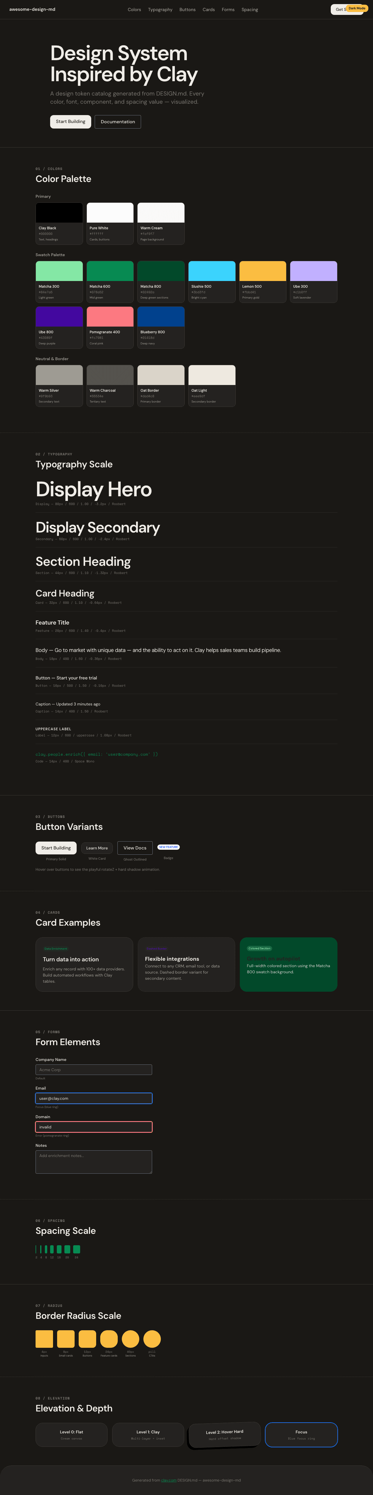
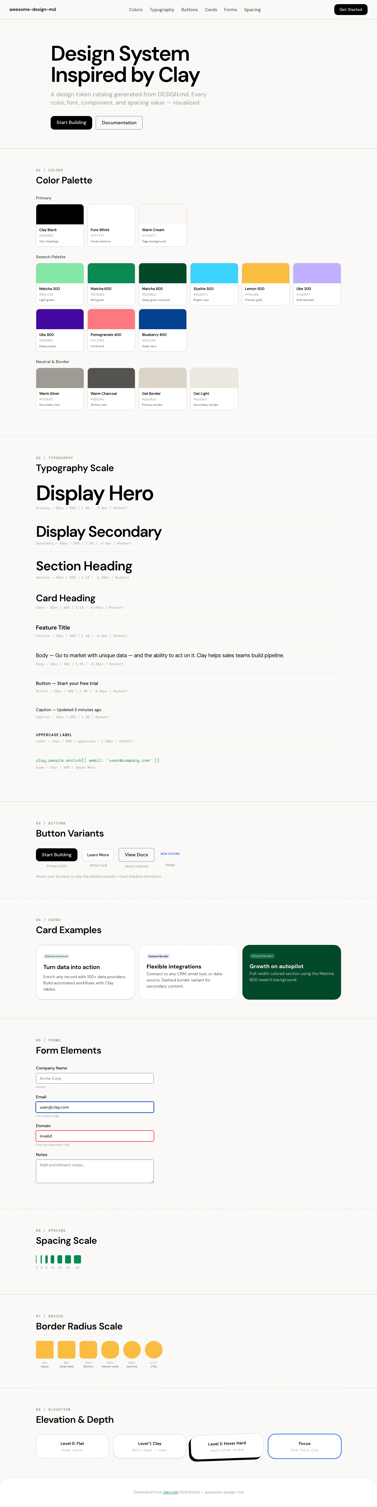
A sample landing page built with DESIGN.md. It shows the actual colors, typography, buttons, cards, spacing, and elevation, all in one page.
|
|
18
|
+
|
|
19
|
+
### Dark Mode
|
|
20
|
+
|
|
21
|
+
|
|
22
|
+
### Light Mode
|
|
23
|
+
|