awesome-design-md 1.0.0
This diff represents the content of publicly available package versions that have been released to one of the supported registries. The information contained in this diff is provided for informational purposes only and reflects changes between package versions as they appear in their respective public registries.
- package/LICENSE +21 -0
- package/README.md +172 -0
- package/bin/cli.mjs +126 -0
- package/design-md/airbnb/DESIGN.md +246 -0
- package/design-md/airbnb/README.md +23 -0
- package/design-md/airbnb/preview-dark.html +234 -0
- package/design-md/airbnb/preview.html +233 -0
- package/design-md/airtable/DESIGN.md +89 -0
- package/design-md/airtable/README.md +23 -0
- package/design-md/airtable/preview-dark.html +165 -0
- package/design-md/airtable/preview.html +164 -0
- package/design-md/apple/DESIGN.md +313 -0
- package/design-md/apple/README.md +24 -0
- package/design-md/apple/preview-dark.html +422 -0
- package/design-md/apple/preview.html +416 -0
- package/design-md/bmw/DESIGN.md +180 -0
- package/design-md/bmw/README.md +23 -0
- package/design-md/bmw/preview-dark.html +211 -0
- package/design-md/bmw/preview.html +210 -0
- package/design-md/cal/DESIGN.md +259 -0
- package/design-md/cal/README.md +23 -0
- package/design-md/cal/preview-dark.html +449 -0
- package/design-md/cal/preview.html +575 -0
- package/design-md/claude/DESIGN.md +312 -0
- package/design-md/claude/README.md +24 -0
- package/design-md/claude/preview-dark.html +803 -0
- package/design-md/claude/preview.html +826 -0
- package/design-md/clay/DESIGN.md +304 -0
- package/design-md/clay/README.md +23 -0
- package/design-md/clay/preview-dark.html +318 -0
- package/design-md/clay/preview.html +317 -0
- package/design-md/clickhouse/DESIGN.md +281 -0
- package/design-md/clickhouse/README.md +24 -0
- package/design-md/clickhouse/preview-dark.html +834 -0
- package/design-md/clickhouse/preview.html +786 -0
- package/design-md/cohere/DESIGN.md +266 -0
- package/design-md/cohere/README.md +24 -0
- package/design-md/cohere/preview-dark.html +810 -0
- package/design-md/cohere/preview.html +814 -0
- package/design-md/coinbase/DESIGN.md +129 -0
- package/design-md/coinbase/README.md +23 -0
- package/design-md/coinbase/preview-dark.html +164 -0
- package/design-md/coinbase/preview.html +163 -0
- package/design-md/composio/DESIGN.md +307 -0
- package/design-md/composio/README.md +24 -0
- package/design-md/composio/preview-dark.html +958 -0
- package/design-md/composio/preview.html +933 -0
- package/design-md/cursor/DESIGN.md +309 -0
- package/design-md/cursor/README.md +24 -0
- package/design-md/cursor/preview-dark.html +395 -0
- package/design-md/cursor/preview.html +385 -0
- package/design-md/elevenlabs/DESIGN.md +265 -0
- package/design-md/elevenlabs/README.md +23 -0
- package/design-md/elevenlabs/preview-dark.html +254 -0
- package/design-md/elevenlabs/preview.html +253 -0
- package/design-md/expo/DESIGN.md +281 -0
- package/design-md/expo/README.md +24 -0
- package/design-md/expo/preview-dark.html +536 -0
- package/design-md/expo/preview.html +536 -0
- package/design-md/figma/DESIGN.md +220 -0
- package/design-md/figma/README.md +24 -0
- package/design-md/figma/preview-dark.html +831 -0
- package/design-md/figma/preview.html +841 -0
- package/design-md/framer/DESIGN.md +246 -0
- package/design-md/framer/README.md +23 -0
- package/design-md/framer/preview-dark.html +904 -0
- package/design-md/framer/preview.html +885 -0
- package/design-md/hashicorp/DESIGN.md +278 -0
- package/design-md/hashicorp/README.md +24 -0
- package/design-md/hashicorp/preview-dark.html +1206 -0
- package/design-md/hashicorp/preview.html +1195 -0
- package/design-md/ibm/DESIGN.md +332 -0
- package/design-md/ibm/README.md +24 -0
- package/design-md/ibm/preview-dark.html +445 -0
- package/design-md/ibm/preview.html +430 -0
- package/design-md/intercom/DESIGN.md +146 -0
- package/design-md/intercom/README.md +23 -0
- package/design-md/intercom/preview-dark.html +185 -0
- package/design-md/intercom/preview.html +184 -0
- package/design-md/kraken/DESIGN.md +125 -0
- package/design-md/kraken/README.md +23 -0
- package/design-md/kraken/preview-dark.html +169 -0
- package/design-md/kraken/preview.html +168 -0
- package/design-md/linear.app/DESIGN.md +367 -0
- package/design-md/linear.app/README.md +24 -0
- package/design-md/linear.app/preview-dark.html +385 -0
- package/design-md/linear.app/preview.html +375 -0
- package/design-md/lovable/DESIGN.md +298 -0
- package/design-md/lovable/README.md +24 -0
- package/design-md/lovable/preview-dark.html +351 -0
- package/design-md/lovable/preview.html +350 -0
- package/design-md/minimax/DESIGN.md +257 -0
- package/design-md/minimax/README.md +24 -0
- package/design-md/minimax/preview-dark.html +1267 -0
- package/design-md/minimax/preview.html +1253 -0
- package/design-md/mintlify/DESIGN.md +326 -0
- package/design-md/mintlify/README.md +24 -0
- package/design-md/mintlify/preview-dark.html +411 -0
- package/design-md/mintlify/preview.html +400 -0
- package/design-md/miro/DESIGN.md +108 -0
- package/design-md/miro/README.md +23 -0
- package/design-md/miro/preview-dark.html +174 -0
- package/design-md/miro/preview.html +173 -0
- package/design-md/mistral.ai/DESIGN.md +261 -0
- package/design-md/mistral.ai/README.md +24 -0
- package/design-md/mistral.ai/preview-dark.html +813 -0
- package/design-md/mistral.ai/preview.html +812 -0
- package/design-md/mongodb/DESIGN.md +266 -0
- package/design-md/mongodb/README.md +23 -0
- package/design-md/mongodb/preview-dark.html +262 -0
- package/design-md/mongodb/preview.html +261 -0
- package/design-md/notion/DESIGN.md +309 -0
- package/design-md/notion/README.md +24 -0
- package/design-md/notion/preview-dark.html +374 -0
- package/design-md/notion/preview.html +366 -0
- package/design-md/nvidia/DESIGN.md +293 -0
- package/design-md/nvidia/README.md +24 -0
- package/design-md/nvidia/preview-dark.html +376 -0
- package/design-md/nvidia/preview.html +368 -0
- package/design-md/ollama/DESIGN.md +267 -0
- package/design-md/ollama/README.md +24 -0
- package/design-md/ollama/preview-dark.html +678 -0
- package/design-md/ollama/preview.html +678 -0
- package/design-md/opencode.ai/DESIGN.md +281 -0
- package/design-md/opencode.ai/README.md +24 -0
- package/design-md/opencode.ai/preview-dark.html +368 -0
- package/design-md/opencode.ai/preview.html +359 -0
- package/design-md/pinterest/DESIGN.md +230 -0
- package/design-md/pinterest/README.md +23 -0
- package/design-md/pinterest/preview-dark.html +233 -0
- package/design-md/pinterest/preview.html +232 -0
- package/design-md/posthog/DESIGN.md +256 -0
- package/design-md/posthog/README.md +23 -0
- package/design-md/posthog/preview-dark.html +701 -0
- package/design-md/posthog/preview.html +751 -0
- package/design-md/raycast/DESIGN.md +268 -0
- package/design-md/raycast/README.md +23 -0
- package/design-md/raycast/preview-dark.html +608 -0
- package/design-md/raycast/preview.html +690 -0
- package/design-md/replicate/DESIGN.md +261 -0
- package/design-md/replicate/README.md +24 -0
- package/design-md/replicate/preview-dark.html +828 -0
- package/design-md/replicate/preview.html +831 -0
- package/design-md/resend/DESIGN.md +303 -0
- package/design-md/resend/README.md +23 -0
- package/design-md/resend/preview-dark.html +357 -0
- package/design-md/resend/preview.html +356 -0
- package/design-md/revolut/DESIGN.md +185 -0
- package/design-md/revolut/README.md +23 -0
- package/design-md/revolut/preview-dark.html +234 -0
- package/design-md/revolut/preview.html +233 -0
- package/design-md/runwayml/DESIGN.md +244 -0
- package/design-md/runwayml/README.md +24 -0
- package/design-md/runwayml/preview-dark.html +664 -0
- package/design-md/runwayml/preview.html +665 -0
- package/design-md/sanity/DESIGN.md +357 -0
- package/design-md/sanity/README.md +24 -0
- package/design-md/sanity/preview-dark.html +995 -0
- package/design-md/sanity/preview.html +1140 -0
- package/design-md/sentry/DESIGN.md +262 -0
- package/design-md/sentry/README.md +24 -0
- package/design-md/sentry/preview-dark.html +628 -0
- package/design-md/sentry/preview.html +953 -0
- package/design-md/spacex/DESIGN.md +194 -0
- package/design-md/spacex/README.md +23 -0
- package/design-md/spacex/preview-dark.html +223 -0
- package/design-md/spacex/preview.html +222 -0
- package/design-md/spotify/DESIGN.md +246 -0
- package/design-md/spotify/README.md +23 -0
- package/design-md/spotify/preview-dark.html +231 -0
- package/design-md/spotify/preview.html +230 -0
- package/design-md/stripe/DESIGN.md +322 -0
- package/design-md/stripe/README.md +24 -0
- package/design-md/stripe/preview-dark.html +430 -0
- package/design-md/stripe/preview.html +421 -0
- package/design-md/supabase/DESIGN.md +255 -0
- package/design-md/supabase/README.md +24 -0
- package/design-md/supabase/preview-dark.html +977 -0
- package/design-md/supabase/preview.html +955 -0
- package/design-md/superhuman/DESIGN.md +252 -0
- package/design-md/superhuman/README.md +23 -0
- package/design-md/superhuman/preview-dark.html +975 -0
- package/design-md/superhuman/preview.html +953 -0
- package/design-md/together.ai/DESIGN.md +263 -0
- package/design-md/together.ai/README.md +24 -0
- package/design-md/together.ai/preview-dark.html +892 -0
- package/design-md/together.ai/preview.html +897 -0
- package/design-md/uber/DESIGN.md +295 -0
- package/design-md/uber/README.md +24 -0
- package/design-md/uber/preview-dark.html +1164 -0
- package/design-md/uber/preview.html +1163 -0
- package/design-md/vercel/DESIGN.md +310 -0
- package/design-md/vercel/README.md +24 -0
- package/design-md/vercel/preview-dark.html +370 -0
- package/design-md/vercel/preview.html +369 -0
- package/design-md/voltagent/DESIGN.md +323 -0
- package/design-md/voltagent/README.md +24 -0
- package/design-md/voltagent/preview-dark.html +487 -0
- package/design-md/voltagent/preview.html +766 -0
- package/design-md/warp/DESIGN.md +253 -0
- package/design-md/warp/README.md +23 -0
- package/design-md/warp/preview-dark.html +502 -0
- package/design-md/warp/preview.html +535 -0
- package/design-md/webflow/DESIGN.md +92 -0
- package/design-md/webflow/README.md +23 -0
- package/design-md/webflow/preview-dark.html +147 -0
- package/design-md/webflow/preview.html +146 -0
- package/design-md/wise/DESIGN.md +173 -0
- package/design-md/wise/README.md +23 -0
- package/design-md/wise/preview-dark.html +230 -0
- package/design-md/wise/preview.html +229 -0
- package/design-md/x.ai/DESIGN.md +257 -0
- package/design-md/x.ai/README.md +24 -0
- package/design-md/x.ai/preview-dark.html +358 -0
- package/design-md/x.ai/preview.html +409 -0
- package/design-md/zapier/DESIGN.md +328 -0
- package/design-md/zapier/README.md +24 -0
- package/design-md/zapier/preview-dark.html +382 -0
- package/design-md/zapier/preview.html +374 -0
- package/package.json +33 -0
|
@@ -0,0 +1,326 @@
|
|
|
1
|
+
# Design System: Mintlify
|
|
2
|
+
|
|
3
|
+
## 1. Visual Theme & Atmosphere
|
|
4
|
+
|
|
5
|
+
Mintlify's website is a study in documentation-as-product design — a white, airy, information-rich surface that treats clarity as its highest aesthetic value. The page opens with a luminous white (`#ffffff`) background, near-black (`#0d0d0d`) text, and a signature green brand accent (`#18E299`) that signals freshness and intelligence without dominating the palette. The overall mood is calm, confident, and engineered for legibility — a design system that whispers "we care about your developer experience" in every pixel.
|
|
6
|
+
|
|
7
|
+
The Inter font family carries the entire typographic load. At display sizes (40–64px), it uses tight negative letter-spacing (-0.8px to -1.28px) and semibold weight (600), creating headlines that feel focused and compressed like well-written documentation headers. Body text at 16–18px with 150% line-height provides generous reading comfort. Geist Mono appears exclusively for code and technical labels — uppercase, tracked-out, small — the voice of the terminal inside the marketing page.
|
|
8
|
+
|
|
9
|
+
What distinguishes Mintlify from other documentation platforms is its atmospheric gradient hero. A soft, cloud-like green-to-white gradient wash behind the hero content creates a sense of ethereal intelligence — documentation that floats above the noise. Below the hero, the page settles into a disciplined alternation of white sections separated by subtle 5% opacity borders. Cards use generous padding (24px+) with large radii (16px–24px) and whisper-thin borders, creating containers that feel open rather than boxed.
|
|
10
|
+
|
|
11
|
+
**Key Characteristics:**
|
|
12
|
+
- Inter with tight negative tracking at display sizes (-0.8px to -1.28px) — compressed yet readable
|
|
13
|
+
- Geist Mono for code labels: uppercase, 12px, tracked-out, the terminal voice
|
|
14
|
+
- Brand green (`#18E299`) used sparingly — CTAs, hover states, focus rings, and accent touches
|
|
15
|
+
- Atmospheric gradient hero with cloud-like green-white wash
|
|
16
|
+
- Ultra-round corners: 16px for containers, 24px for featured cards, full-round (9999px) for buttons and pills
|
|
17
|
+
- Subtle 5% opacity borders (`rgba(0,0,0,0.05)`) creating barely-there separation
|
|
18
|
+
- 8px base spacing system with generous section padding (48px–96px)
|
|
19
|
+
- Clean white canvas — no gray backgrounds, no color sections, depth through borders and whitespace alone
|
|
20
|
+
|
|
21
|
+
## 2. Color Palette & Roles
|
|
22
|
+
|
|
23
|
+
### Primary
|
|
24
|
+
- **Near Black** (`#0d0d0d`): Primary text, headings, dark surfaces. Not pure black — the micro-softness improves reading comfort.
|
|
25
|
+
- **Pure White** (`#ffffff`): Page background, card surfaces, input backgrounds.
|
|
26
|
+
- **Brand Green** (`#18E299`): The signature accent — CTAs, links on hover, focus rings, brand identity.
|
|
27
|
+
|
|
28
|
+
### Secondary Accents
|
|
29
|
+
- **Brand Green Light** (`#d4fae8`): Tinted green surface for badges, hover states, subtle backgrounds.
|
|
30
|
+
- **Brand Green Deep** (`#0fa76e`): Darker green for text on light-green badges, hover states on brand elements.
|
|
31
|
+
- **Warm Amber** (`#c37d0d`): Warning states, caution badges — `--twoslash-warn-bg`.
|
|
32
|
+
- **Soft Blue** (`#3772cf`): Tag backgrounds, informational annotations — `--twoslash-tag-bg`.
|
|
33
|
+
- **Error Red** (`#d45656`): Error states, destructive actions — `--twoslash-error-bg`.
|
|
34
|
+
|
|
35
|
+
### Neutral Scale
|
|
36
|
+
- **Gray 900** (`#0d0d0d`): Primary heading text, nav links.
|
|
37
|
+
- **Gray 700** (`#333333`): Secondary text, descriptions, body copy.
|
|
38
|
+
- **Gray 500** (`#666666`): Tertiary text, muted labels.
|
|
39
|
+
- **Gray 400** (`#888888`): Placeholder text, disabled states, code annotations.
|
|
40
|
+
- **Gray 200** (`#e5e5e5`): Borders, dividers, card outlines.
|
|
41
|
+
- **Gray 100** (`#f5f5f5`): Subtle surface backgrounds, hover states.
|
|
42
|
+
- **Gray 50** (`#fafafa`): Near-white surface tint.
|
|
43
|
+
|
|
44
|
+
### Interactive
|
|
45
|
+
- **Link Default** (`#0d0d0d`): Links match text color, relying on underline/context.
|
|
46
|
+
- **Link Hover** (`#18E299`): Brand green on hover — `var(--color-brand)`.
|
|
47
|
+
- **Focus Ring** (`#18E299`): Brand green focus outline for inputs and interactive elements.
|
|
48
|
+
|
|
49
|
+
### Surface & Overlay
|
|
50
|
+
- **Card Background** (`#ffffff`): White cards on white background, separated by borders.
|
|
51
|
+
- **Border Subtle** (`rgba(0,0,0,0.05)`): 5% black opacity borders — the primary separation mechanism.
|
|
52
|
+
- **Border Medium** (`rgba(0,0,0,0.08)`): Slightly stronger borders for interactive elements.
|
|
53
|
+
- **Input Border Focus** (`var(--color-brand)`): Green ring on focused inputs.
|
|
54
|
+
|
|
55
|
+
### Shadows & Depth
|
|
56
|
+
- **Card Shadow** (`rgba(0,0,0,0.03) 0px 2px 4px`): Barely-there ambient shadow for subtle lift.
|
|
57
|
+
- **Button Shadow** (`rgba(0,0,0,0.06) 0px 1px 2px`): Micro-shadow for button depth.
|
|
58
|
+
- **No heavy shadows**: Mintlify relies on borders, not shadows, for depth.
|
|
59
|
+
|
|
60
|
+
## 3. Typography Rules
|
|
61
|
+
|
|
62
|
+
### Font Family
|
|
63
|
+
- **Primary**: `Inter`, with fallback: `Inter Fallback, system-ui, -apple-system, sans-serif`
|
|
64
|
+
- **Monospace**: `Geist Mono`, with fallback: `Geist Mono Fallback, ui-monospace, SFMono-Regular, monospace`
|
|
65
|
+
|
|
66
|
+
### Hierarchy
|
|
67
|
+
|
|
68
|
+
| Role | Font | Size | Weight | Line Height | Letter Spacing | Notes |
|
|
69
|
+
|------|------|------|--------|-------------|----------------|-------|
|
|
70
|
+
| Display Hero | Inter | 64px (4.00rem) | 600 | 1.15 (tight) | -1.28px | Maximum impact, hero headlines |
|
|
71
|
+
| Section Heading | Inter | 40px (2.50rem) | 600 | 1.10 (tight) | -0.8px | Feature section titles |
|
|
72
|
+
| Sub-heading | Inter | 24px (1.50rem) | 500 | 1.30 (tight) | -0.24px | Card headings, sub-sections |
|
|
73
|
+
| Card Title | Inter | 20px (1.25rem) | 600 | 1.30 (tight) | -0.2px | Feature card titles |
|
|
74
|
+
| Card Title Light | Inter | 20px (1.25rem) | 500 | 1.30 (tight) | -0.2px | Secondary card headings |
|
|
75
|
+
| Body Large | Inter | 18px (1.13rem) | 400 | 1.50 | normal | Hero descriptions, introductions |
|
|
76
|
+
| Body | Inter | 16px (1.00rem) | 400 | 1.50 | normal | Standard reading text |
|
|
77
|
+
| Body Medium | Inter | 16px (1.00rem) | 500 | 1.50 | normal | Navigation, emphasized text |
|
|
78
|
+
| Button | Inter | 15px (0.94rem) | 500 | 1.50 | normal | Button labels |
|
|
79
|
+
| Link | Inter | 14px (0.88rem) | 500 | 1.50 | normal | Navigation links, small CTAs |
|
|
80
|
+
| Caption | Inter | 14px (0.88rem) | 400–500 | 1.50–1.71 | normal | Metadata, descriptions |
|
|
81
|
+
| Label Uppercase | Inter | 13px (0.81rem) | 500 | 1.50 | 0.65px | `text-transform: uppercase`, section labels |
|
|
82
|
+
| Small | Inter | 13px (0.81rem) | 400–500 | 1.50 | -0.26px | Small body text |
|
|
83
|
+
| Mono Code | Geist Mono | 12px (0.75rem) | 500 | 1.50 | 0.6px | `text-transform: uppercase`, technical labels |
|
|
84
|
+
| Mono Badge | Geist Mono | 12px (0.75rem) | 600 | 1.50 | 0.6px | `text-transform: uppercase`, status badges |
|
|
85
|
+
| Mono Micro | Geist Mono | 10px (0.63rem) | 500 | 1.50 | normal | `text-transform: uppercase`, tiny labels |
|
|
86
|
+
|
|
87
|
+
### Principles
|
|
88
|
+
- **Tight tracking at display sizes**: Inter at 40–64px uses -0.8px to -1.28px letter-spacing. This compression creates headlines that feel deliberate and space-efficient — documentation headings, not billboard copy.
|
|
89
|
+
- **Relaxed reading at body sizes**: 16–18px body text uses normal tracking with 150% line-height, creating generous reading lanes. Documentation demands comfort.
|
|
90
|
+
- **Two-font system**: Inter for all human-readable content, Geist Mono exclusively for technical/code contexts. The boundary is strict — no mixing.
|
|
91
|
+
- **Uppercase as hierarchy signal**: Section labels and technical tags use uppercase + positive tracking (0.6px–0.65px) as a clear visual delimiter between content types.
|
|
92
|
+
- **Three weights**: 400 (body/reading), 500 (UI/navigation/emphasis), 600 (headings/titles). No bold (700) in the system.
|
|
93
|
+
|
|
94
|
+
## 4. Component Stylings
|
|
95
|
+
|
|
96
|
+
### Buttons
|
|
97
|
+
|
|
98
|
+
**Primary Brand (Full-round)**
|
|
99
|
+
- Background: `#0d0d0d` (near-black)
|
|
100
|
+
- Text: `#ffffff`
|
|
101
|
+
- Padding: 8px 24px
|
|
102
|
+
- Radius: 9999px (full pill)
|
|
103
|
+
- Font: Inter 15px weight 500
|
|
104
|
+
- Shadow: `rgba(0,0,0,0.06) 0px 1px 2px`
|
|
105
|
+
- Hover: opacity 0.9
|
|
106
|
+
- Use: Primary CTA ("Get Started", "Start Building")
|
|
107
|
+
|
|
108
|
+
**Secondary / Ghost (Full-round)**
|
|
109
|
+
- Background: `#ffffff`
|
|
110
|
+
- Text: `#0d0d0d`
|
|
111
|
+
- Padding: 4.5px 12px
|
|
112
|
+
- Radius: 9999px (full pill)
|
|
113
|
+
- Border: `1px solid rgba(0,0,0,0.08)`
|
|
114
|
+
- Font: Inter 15px weight 500
|
|
115
|
+
- Hover: opacity 0.9
|
|
116
|
+
- Use: Secondary actions ("Request Demo", "View Docs")
|
|
117
|
+
|
|
118
|
+
**Transparent / Nav Button**
|
|
119
|
+
- Background: transparent
|
|
120
|
+
- Text: `#0d0d0d`
|
|
121
|
+
- Padding: 5px 6px
|
|
122
|
+
- Radius: 8px
|
|
123
|
+
- Border: none or `1px solid rgba(0,0,0,0.05)`
|
|
124
|
+
- Use: Navigation items, icon buttons
|
|
125
|
+
|
|
126
|
+
**Brand Accent Button**
|
|
127
|
+
- Background: `#18E299`
|
|
128
|
+
- Text: `#0d0d0d`
|
|
129
|
+
- Padding: 8px 24px
|
|
130
|
+
- Radius: 9999px
|
|
131
|
+
- Use: Special promotional CTAs
|
|
132
|
+
|
|
133
|
+
### Cards & Containers
|
|
134
|
+
|
|
135
|
+
**Standard Card**
|
|
136
|
+
- Background: `#ffffff`
|
|
137
|
+
- Border: `1px solid rgba(0,0,0,0.05)`
|
|
138
|
+
- Radius: 16px
|
|
139
|
+
- Padding: 24px
|
|
140
|
+
- Shadow: `rgba(0,0,0,0.03) 0px 2px 4px`
|
|
141
|
+
- Hover: subtle border darkening to `rgba(0,0,0,0.08)`
|
|
142
|
+
|
|
143
|
+
**Featured Card**
|
|
144
|
+
- Background: `#ffffff`
|
|
145
|
+
- Border: `1px solid rgba(0,0,0,0.05)`
|
|
146
|
+
- Radius: 24px
|
|
147
|
+
- Padding: 32px
|
|
148
|
+
- Inner content areas may have their own 16px radius containers
|
|
149
|
+
|
|
150
|
+
**Logo/Trust Card**
|
|
151
|
+
- Background: `#fafafa` or `#ffffff`
|
|
152
|
+
- Border: `1px solid rgba(0,0,0,0.05)`
|
|
153
|
+
- Radius: 16px
|
|
154
|
+
- Centered logo/icon with consistent sizing
|
|
155
|
+
|
|
156
|
+
### Inputs & Forms
|
|
157
|
+
|
|
158
|
+
**Email Input**
|
|
159
|
+
- Background: transparent or `#ffffff`
|
|
160
|
+
- Text: `#0d0d0d`
|
|
161
|
+
- Padding: 0px 12px (height controlled by line-height)
|
|
162
|
+
- Border: `1px solid rgba(0,0,0,0.08)`
|
|
163
|
+
- Radius: 9999px (full pill, matching buttons)
|
|
164
|
+
- Focus: `1px solid var(--color-brand)` + `outline: 1px solid var(--color-brand)`
|
|
165
|
+
- Placeholder: `#888888`
|
|
166
|
+
|
|
167
|
+
### Navigation
|
|
168
|
+
- Clean horizontal nav on white, sticky with backdrop blur
|
|
169
|
+
- Brand logotype left-aligned
|
|
170
|
+
- Links: Inter 14–15px weight 500, `#0d0d0d` text
|
|
171
|
+
- Hover: color shifts to brand green `var(--color-brand)`
|
|
172
|
+
- CTA: dark pill button right-aligned ("Get Started")
|
|
173
|
+
- Mobile: hamburger menu collapse at 768px
|
|
174
|
+
|
|
175
|
+
### Image Treatment
|
|
176
|
+
- Product screenshots with subtle 1px borders
|
|
177
|
+
- Rounded containers: 16px–24px radius
|
|
178
|
+
- Atmospheric gradient backgrounds behind hero images
|
|
179
|
+
- Cloud/sky imagery with soft green tinting
|
|
180
|
+
|
|
181
|
+
### Distinctive Components
|
|
182
|
+
|
|
183
|
+
**Atmospheric Hero**
|
|
184
|
+
- Full-width gradient wash: soft green-to-white cloud-like gradient
|
|
185
|
+
- Centered headline with tight tracking
|
|
186
|
+
- Subtitle in muted gray
|
|
187
|
+
- Dual CTA buttons (dark primary + ghost secondary)
|
|
188
|
+
- The gradient creates a sense of elevation and intelligence
|
|
189
|
+
|
|
190
|
+
**Trust Bar / Logo Grid**
|
|
191
|
+
- "Loved by your favorite companies" section
|
|
192
|
+
- Company logos in muted grayscale
|
|
193
|
+
- Grid or horizontal layout with consistent sizing
|
|
194
|
+
- Subtle border separation between logos
|
|
195
|
+
|
|
196
|
+
**Feature Cards with Icons**
|
|
197
|
+
- Icon or illustration at top
|
|
198
|
+
- Title at 20px weight 600
|
|
199
|
+
- Description at 14–16px in gray
|
|
200
|
+
- Consistent padding and border treatment
|
|
201
|
+
- Grid layout: 2–3 columns on desktop
|
|
202
|
+
|
|
203
|
+
**CTA Footer Section**
|
|
204
|
+
- Dark or gradient background
|
|
205
|
+
- Large headline: "Make documentation your winning advantage"
|
|
206
|
+
- Email input with pill styling
|
|
207
|
+
- Brand green accent on CTAs
|
|
208
|
+
|
|
209
|
+
## 5. Layout Principles
|
|
210
|
+
|
|
211
|
+
### Spacing System
|
|
212
|
+
- Base unit: 8px
|
|
213
|
+
- Scale: 2px, 4px, 5px, 6px, 7px, 8px, 10px, 12px, 16px, 24px, 32px, 48px, 64px
|
|
214
|
+
- Section padding: 48px–96px vertical
|
|
215
|
+
- Card padding: 24px–32px
|
|
216
|
+
- Component gaps: 8px–16px
|
|
217
|
+
|
|
218
|
+
### Grid & Container
|
|
219
|
+
- Max content width: approximately 1200px
|
|
220
|
+
- Hero: centered single-column with generous top padding (96px+)
|
|
221
|
+
- Feature sections: 2–3 column CSS Grid for cards
|
|
222
|
+
- Full-width sections with contained content
|
|
223
|
+
- Consistent horizontal padding: 24px (mobile) to 32px (desktop)
|
|
224
|
+
|
|
225
|
+
### Whitespace Philosophy
|
|
226
|
+
- **Documentation-grade breathing room**: Every element has generous surrounding whitespace. Mintlify sells documentation, so the marketing page itself demonstrates reading comfort.
|
|
227
|
+
- **Sections as chapters**: Each feature section is a self-contained unit with 48px–96px vertical padding, creating clear "chapter breaks."
|
|
228
|
+
- **Content density is low**: Unlike developer tools that pack the page, Mintlify uses 1–2 key messages per section with supporting imagery.
|
|
229
|
+
|
|
230
|
+
### Border Radius Scale
|
|
231
|
+
- Small (4px): Inline code, small tags, tooltips
|
|
232
|
+
- Medium (8px): Nav buttons, transparent buttons, small containers
|
|
233
|
+
- Standard (16px): Cards, content containers, image wrappers
|
|
234
|
+
- Large (24px): Featured cards, hero containers, section panels
|
|
235
|
+
- Full Pill (9999px): Buttons, inputs, badges, pills — the signature shape
|
|
236
|
+
|
|
237
|
+
## 6. Depth & Elevation
|
|
238
|
+
|
|
239
|
+
| Level | Treatment | Use |
|
|
240
|
+
|-------|-----------|-----|
|
|
241
|
+
| Flat (Level 0) | No shadow, no border | Page background, text blocks |
|
|
242
|
+
| Subtle Border (Level 1) | `1px solid rgba(0,0,0,0.05)` | Standard card borders, dividers |
|
|
243
|
+
| Medium Border (Level 1b) | `1px solid rgba(0,0,0,0.08)` | Interactive elements, input borders |
|
|
244
|
+
| Ambient Shadow (Level 2) | `rgba(0,0,0,0.03) 0px 2px 4px` | Cards with subtle lift |
|
|
245
|
+
| Button Shadow (Level 2b) | `rgba(0,0,0,0.06) 0px 1px 2px` | Button micro-depth |
|
|
246
|
+
| Focus Ring (Accessibility) | `1px solid #18E299` outline | Focused inputs, active interactive elements |
|
|
247
|
+
|
|
248
|
+
**Shadow Philosophy**: Mintlify barely uses shadows. The depth system is almost entirely border-driven — ultra-subtle 5% opacity borders create separation without visual weight. When shadows appear, they're atmospheric whispers (`0.03 opacity, 2px blur, 4px spread`) that add the barest sense of lift. This restraint keeps the page feeling flat and paper-like — appropriate for a documentation company whose product is about clarity and readability.
|
|
249
|
+
|
|
250
|
+
### Decorative Depth
|
|
251
|
+
- Hero gradient: atmospheric green-white cloud gradient behind hero content
|
|
252
|
+
- No background color alternation — white on white throughout
|
|
253
|
+
- Depth comes from border opacity variation (5% → 8%) and whitespace
|
|
254
|
+
|
|
255
|
+
## 7. Dark Mode
|
|
256
|
+
|
|
257
|
+
### Color Inversions
|
|
258
|
+
- **Background**: `#0d0d0d` (near-black)
|
|
259
|
+
- **Text Primary**: `#ededed` (near-white)
|
|
260
|
+
- **Text Secondary**: `#a0a0a0` (muted gray)
|
|
261
|
+
- **Brand Green**: `#18E299` (unchanged — the green works on both backgrounds)
|
|
262
|
+
- **Border**: `rgba(255,255,255,0.08)` (white at 8% opacity)
|
|
263
|
+
- **Card Background**: `#141414` (slightly lighter than page)
|
|
264
|
+
- **Shadow**: `rgba(0,0,0,0.4) 0px 2px 4px` (stronger shadow for contrast)
|
|
265
|
+
|
|
266
|
+
### Key Adjustments
|
|
267
|
+
- Buttons invert: white background dark text becomes dark background light text
|
|
268
|
+
- Badge backgrounds shift to deeper tones with lighter text
|
|
269
|
+
- Focus ring remains brand green
|
|
270
|
+
- Hero gradient shifts to dark-tinted green atmospheric wash
|
|
271
|
+
|
|
272
|
+
## 8. Responsive Behavior
|
|
273
|
+
|
|
274
|
+
### Breakpoints
|
|
275
|
+
| Name | Width | Key Changes |
|
|
276
|
+
|------|-------|-------------|
|
|
277
|
+
| Mobile | <768px | Single column, stacked layout, hamburger nav |
|
|
278
|
+
| Tablet | 768–1024px | Two-column grids begin, expanded padding |
|
|
279
|
+
| Desktop | >1024px | Full layout, 3-column grids, maximum content width |
|
|
280
|
+
|
|
281
|
+
### Touch Targets
|
|
282
|
+
- Buttons with full-pill shape have comfortable 8px+ vertical padding
|
|
283
|
+
- Navigation links spaced with adequate 16px+ gaps
|
|
284
|
+
- Mobile menu provides full-width tap targets
|
|
285
|
+
|
|
286
|
+
### Collapsing Strategy
|
|
287
|
+
- Hero: 64px → 40px headline, maintains tight tracking proportionally
|
|
288
|
+
- Navigation: horizontal links + CTA → hamburger menu at 768px
|
|
289
|
+
- Feature cards: 3-column → 2-column → single column stacked
|
|
290
|
+
- Section spacing: 96px → 48px on mobile
|
|
291
|
+
- Footer: multi-column → stacked single column
|
|
292
|
+
- Trust bar: grid → horizontal scroll or stacked
|
|
293
|
+
|
|
294
|
+
### Image Behavior
|
|
295
|
+
- Product screenshots maintain aspect ratio with responsive containers
|
|
296
|
+
- Hero gradient simplifies on mobile
|
|
297
|
+
- Full-width sections maintain edge-to-edge treatment
|
|
298
|
+
|
|
299
|
+
## 9. Agent Prompt Guide
|
|
300
|
+
|
|
301
|
+
### Quick Color Reference
|
|
302
|
+
- Primary CTA: Near Black (`#0d0d0d`)
|
|
303
|
+
- Background: Pure White (`#ffffff`)
|
|
304
|
+
- Heading text: Near Black (`#0d0d0d`)
|
|
305
|
+
- Body text: Gray 700 (`#333333`)
|
|
306
|
+
- Border: `rgba(0,0,0,0.05)` (5% opacity)
|
|
307
|
+
- Brand accent: Green (`#18E299`)
|
|
308
|
+
- Link hover: Brand Green (`#18E299`)
|
|
309
|
+
- Focus ring: Brand Green (`#18E299`)
|
|
310
|
+
|
|
311
|
+
### Example Component Prompts
|
|
312
|
+
- "Create a hero section on white background with atmospheric green-white gradient wash. Headline at 64px Inter weight 600, line-height 1.15, letter-spacing -1.28px, color #0d0d0d. Subtitle at 18px Inter weight 400, line-height 1.50, color #666666. Dark pill CTA (#0d0d0d, 9999px radius, 8px 24px padding) and ghost pill button (white, 1px solid rgba(0,0,0,0.08), 9999px radius)."
|
|
313
|
+
- "Design a card: white background, 1px solid rgba(0,0,0,0.05) border, 16px radius, 24px padding, shadow rgba(0,0,0,0.03) 0px 2px 4px. Title at 20px Inter weight 600, letter-spacing -0.2px. Body at 14px weight 400, #666666."
|
|
314
|
+
- "Build a pill badge: #d4fae8 background, #0fa76e text, 9999px radius, 4px 12px padding, 13px Inter weight 500, uppercase."
|
|
315
|
+
- "Create navigation: white sticky header with backdrop-filter blur(12px). Inter 15px weight 500 for links, #0d0d0d text. Dark pill CTA 'Get Started' right-aligned, 9999px radius. Bottom border: 1px solid rgba(0,0,0,0.05)."
|
|
316
|
+
- "Design a trust section showing company logos in muted gray. Grid layout with 16px radius containers, 1px border at 5% opacity. Label above: 'Loved by your favorite companies' at 13px Inter weight 500, uppercase, tracking 0.65px."
|
|
317
|
+
|
|
318
|
+
### Iteration Guide
|
|
319
|
+
1. Always use full-pill radius (9999px) for buttons and inputs — this is Mintlify's signature shape
|
|
320
|
+
2. Keep borders at 5% opacity (`rgba(0,0,0,0.05)`) — stronger borders break the airy feeling
|
|
321
|
+
3. Letter-spacing scales with font size: -1.28px at 64px, -0.8px at 40px, -0.24px at 24px, normal at 16px
|
|
322
|
+
4. Three weights only: 400 (read), 500 (interact), 600 (announce)
|
|
323
|
+
5. Brand green (`#18E299`) is used sparingly — CTAs and hover states only, never for decorative fills
|
|
324
|
+
6. Geist Mono uppercase for technical labels, Inter for everything else
|
|
325
|
+
7. Section padding is generous: 64px–96px on desktop, 48px on mobile
|
|
326
|
+
8. No gray background sections — white throughout, separation through borders and whitespace
|
|
@@ -0,0 +1,24 @@
|
|
|
1
|
+
# Mintlify Inspired Design System
|
|
2
|
+
|
|
3
|
+
[DESIGN.md](https://github.com/VoltAgent/awesome-design-md/blob/main/design-md/mintlify/DESIGN.md) extracted from the public [mintlify](https://mintlify.com/) website. This is not the official design system. Colors, fonts, and spacing may not be 100% accurate. But it's a good starting point for building something similar.
|
|
4
|
+
|
|
5
|
+
## Files
|
|
6
|
+
|
|
7
|
+
| File | Description |
|
|
8
|
+
|------|-------------|
|
|
9
|
+
| `DESIGN.md` | Complete design system documentation (9 sections) |
|
|
10
|
+
| `preview.html` | Interactive design token catalog (light) |
|
|
11
|
+
| `preview-dark.html` | Interactive design token catalog (dark) |
|
|
12
|
+
|
|
13
|
+
|
|
14
|
+
Use [DESIGN.md](https://github.com/VoltAgent/awesome-design-md/blob/main/design-md/mintlify/DESIGN.md) to use as a reference for AI agents (Claude, Cursor, Stitch) to generate UI that looks like the Mintlify design language.
|
|
15
|
+
|
|
16
|
+
## Preview
|
|
17
|
+
|
|
18
|
+
A sample landing page built with DESIGN.md. It shows the actual colors, typography, buttons, cards, spacing, and elevation, all in one page.
|
|
19
|
+
|
|
20
|
+
### Dark Mode
|
|
21
|
+
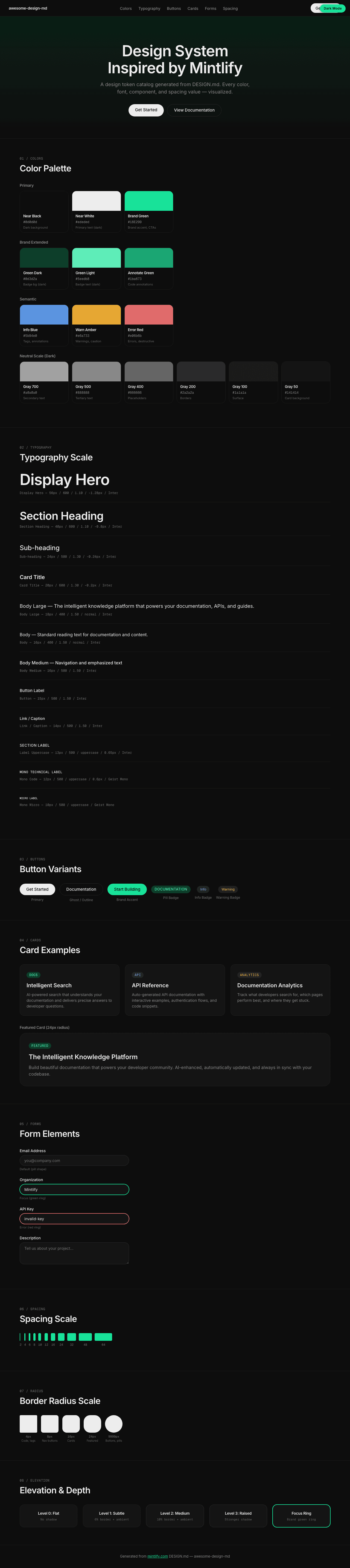
|
|
22
|
+
|
|
23
|
+
### Light Mode
|
|
24
|
+
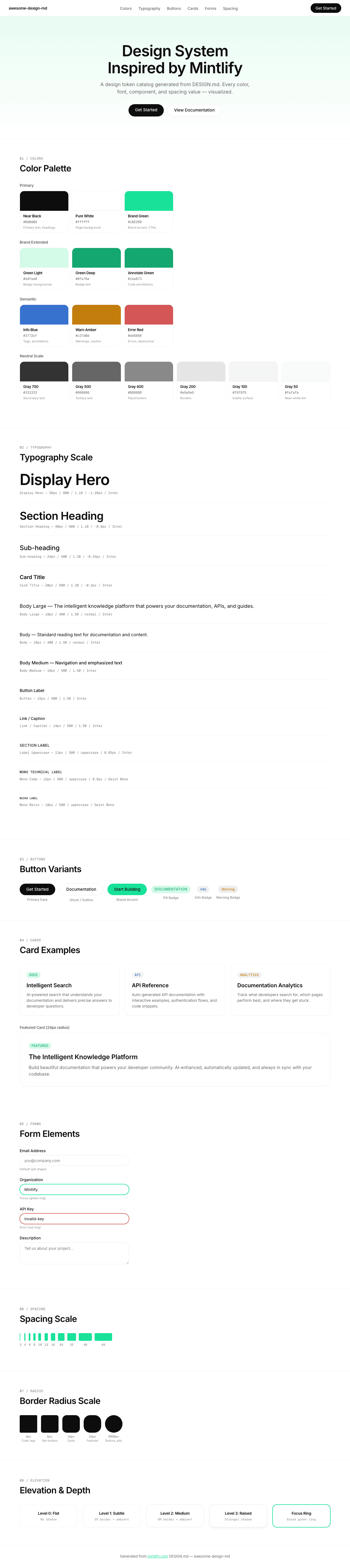
|