awesome-design-md 1.0.0
This diff represents the content of publicly available package versions that have been released to one of the supported registries. The information contained in this diff is provided for informational purposes only and reflects changes between package versions as they appear in their respective public registries.
- package/LICENSE +21 -0
- package/README.md +172 -0
- package/bin/cli.mjs +126 -0
- package/design-md/airbnb/DESIGN.md +246 -0
- package/design-md/airbnb/README.md +23 -0
- package/design-md/airbnb/preview-dark.html +234 -0
- package/design-md/airbnb/preview.html +233 -0
- package/design-md/airtable/DESIGN.md +89 -0
- package/design-md/airtable/README.md +23 -0
- package/design-md/airtable/preview-dark.html +165 -0
- package/design-md/airtable/preview.html +164 -0
- package/design-md/apple/DESIGN.md +313 -0
- package/design-md/apple/README.md +24 -0
- package/design-md/apple/preview-dark.html +422 -0
- package/design-md/apple/preview.html +416 -0
- package/design-md/bmw/DESIGN.md +180 -0
- package/design-md/bmw/README.md +23 -0
- package/design-md/bmw/preview-dark.html +211 -0
- package/design-md/bmw/preview.html +210 -0
- package/design-md/cal/DESIGN.md +259 -0
- package/design-md/cal/README.md +23 -0
- package/design-md/cal/preview-dark.html +449 -0
- package/design-md/cal/preview.html +575 -0
- package/design-md/claude/DESIGN.md +312 -0
- package/design-md/claude/README.md +24 -0
- package/design-md/claude/preview-dark.html +803 -0
- package/design-md/claude/preview.html +826 -0
- package/design-md/clay/DESIGN.md +304 -0
- package/design-md/clay/README.md +23 -0
- package/design-md/clay/preview-dark.html +318 -0
- package/design-md/clay/preview.html +317 -0
- package/design-md/clickhouse/DESIGN.md +281 -0
- package/design-md/clickhouse/README.md +24 -0
- package/design-md/clickhouse/preview-dark.html +834 -0
- package/design-md/clickhouse/preview.html +786 -0
- package/design-md/cohere/DESIGN.md +266 -0
- package/design-md/cohere/README.md +24 -0
- package/design-md/cohere/preview-dark.html +810 -0
- package/design-md/cohere/preview.html +814 -0
- package/design-md/coinbase/DESIGN.md +129 -0
- package/design-md/coinbase/README.md +23 -0
- package/design-md/coinbase/preview-dark.html +164 -0
- package/design-md/coinbase/preview.html +163 -0
- package/design-md/composio/DESIGN.md +307 -0
- package/design-md/composio/README.md +24 -0
- package/design-md/composio/preview-dark.html +958 -0
- package/design-md/composio/preview.html +933 -0
- package/design-md/cursor/DESIGN.md +309 -0
- package/design-md/cursor/README.md +24 -0
- package/design-md/cursor/preview-dark.html +395 -0
- package/design-md/cursor/preview.html +385 -0
- package/design-md/elevenlabs/DESIGN.md +265 -0
- package/design-md/elevenlabs/README.md +23 -0
- package/design-md/elevenlabs/preview-dark.html +254 -0
- package/design-md/elevenlabs/preview.html +253 -0
- package/design-md/expo/DESIGN.md +281 -0
- package/design-md/expo/README.md +24 -0
- package/design-md/expo/preview-dark.html +536 -0
- package/design-md/expo/preview.html +536 -0
- package/design-md/figma/DESIGN.md +220 -0
- package/design-md/figma/README.md +24 -0
- package/design-md/figma/preview-dark.html +831 -0
- package/design-md/figma/preview.html +841 -0
- package/design-md/framer/DESIGN.md +246 -0
- package/design-md/framer/README.md +23 -0
- package/design-md/framer/preview-dark.html +904 -0
- package/design-md/framer/preview.html +885 -0
- package/design-md/hashicorp/DESIGN.md +278 -0
- package/design-md/hashicorp/README.md +24 -0
- package/design-md/hashicorp/preview-dark.html +1206 -0
- package/design-md/hashicorp/preview.html +1195 -0
- package/design-md/ibm/DESIGN.md +332 -0
- package/design-md/ibm/README.md +24 -0
- package/design-md/ibm/preview-dark.html +445 -0
- package/design-md/ibm/preview.html +430 -0
- package/design-md/intercom/DESIGN.md +146 -0
- package/design-md/intercom/README.md +23 -0
- package/design-md/intercom/preview-dark.html +185 -0
- package/design-md/intercom/preview.html +184 -0
- package/design-md/kraken/DESIGN.md +125 -0
- package/design-md/kraken/README.md +23 -0
- package/design-md/kraken/preview-dark.html +169 -0
- package/design-md/kraken/preview.html +168 -0
- package/design-md/linear.app/DESIGN.md +367 -0
- package/design-md/linear.app/README.md +24 -0
- package/design-md/linear.app/preview-dark.html +385 -0
- package/design-md/linear.app/preview.html +375 -0
- package/design-md/lovable/DESIGN.md +298 -0
- package/design-md/lovable/README.md +24 -0
- package/design-md/lovable/preview-dark.html +351 -0
- package/design-md/lovable/preview.html +350 -0
- package/design-md/minimax/DESIGN.md +257 -0
- package/design-md/minimax/README.md +24 -0
- package/design-md/minimax/preview-dark.html +1267 -0
- package/design-md/minimax/preview.html +1253 -0
- package/design-md/mintlify/DESIGN.md +326 -0
- package/design-md/mintlify/README.md +24 -0
- package/design-md/mintlify/preview-dark.html +411 -0
- package/design-md/mintlify/preview.html +400 -0
- package/design-md/miro/DESIGN.md +108 -0
- package/design-md/miro/README.md +23 -0
- package/design-md/miro/preview-dark.html +174 -0
- package/design-md/miro/preview.html +173 -0
- package/design-md/mistral.ai/DESIGN.md +261 -0
- package/design-md/mistral.ai/README.md +24 -0
- package/design-md/mistral.ai/preview-dark.html +813 -0
- package/design-md/mistral.ai/preview.html +812 -0
- package/design-md/mongodb/DESIGN.md +266 -0
- package/design-md/mongodb/README.md +23 -0
- package/design-md/mongodb/preview-dark.html +262 -0
- package/design-md/mongodb/preview.html +261 -0
- package/design-md/notion/DESIGN.md +309 -0
- package/design-md/notion/README.md +24 -0
- package/design-md/notion/preview-dark.html +374 -0
- package/design-md/notion/preview.html +366 -0
- package/design-md/nvidia/DESIGN.md +293 -0
- package/design-md/nvidia/README.md +24 -0
- package/design-md/nvidia/preview-dark.html +376 -0
- package/design-md/nvidia/preview.html +368 -0
- package/design-md/ollama/DESIGN.md +267 -0
- package/design-md/ollama/README.md +24 -0
- package/design-md/ollama/preview-dark.html +678 -0
- package/design-md/ollama/preview.html +678 -0
- package/design-md/opencode.ai/DESIGN.md +281 -0
- package/design-md/opencode.ai/README.md +24 -0
- package/design-md/opencode.ai/preview-dark.html +368 -0
- package/design-md/opencode.ai/preview.html +359 -0
- package/design-md/pinterest/DESIGN.md +230 -0
- package/design-md/pinterest/README.md +23 -0
- package/design-md/pinterest/preview-dark.html +233 -0
- package/design-md/pinterest/preview.html +232 -0
- package/design-md/posthog/DESIGN.md +256 -0
- package/design-md/posthog/README.md +23 -0
- package/design-md/posthog/preview-dark.html +701 -0
- package/design-md/posthog/preview.html +751 -0
- package/design-md/raycast/DESIGN.md +268 -0
- package/design-md/raycast/README.md +23 -0
- package/design-md/raycast/preview-dark.html +608 -0
- package/design-md/raycast/preview.html +690 -0
- package/design-md/replicate/DESIGN.md +261 -0
- package/design-md/replicate/README.md +24 -0
- package/design-md/replicate/preview-dark.html +828 -0
- package/design-md/replicate/preview.html +831 -0
- package/design-md/resend/DESIGN.md +303 -0
- package/design-md/resend/README.md +23 -0
- package/design-md/resend/preview-dark.html +357 -0
- package/design-md/resend/preview.html +356 -0
- package/design-md/revolut/DESIGN.md +185 -0
- package/design-md/revolut/README.md +23 -0
- package/design-md/revolut/preview-dark.html +234 -0
- package/design-md/revolut/preview.html +233 -0
- package/design-md/runwayml/DESIGN.md +244 -0
- package/design-md/runwayml/README.md +24 -0
- package/design-md/runwayml/preview-dark.html +664 -0
- package/design-md/runwayml/preview.html +665 -0
- package/design-md/sanity/DESIGN.md +357 -0
- package/design-md/sanity/README.md +24 -0
- package/design-md/sanity/preview-dark.html +995 -0
- package/design-md/sanity/preview.html +1140 -0
- package/design-md/sentry/DESIGN.md +262 -0
- package/design-md/sentry/README.md +24 -0
- package/design-md/sentry/preview-dark.html +628 -0
- package/design-md/sentry/preview.html +953 -0
- package/design-md/spacex/DESIGN.md +194 -0
- package/design-md/spacex/README.md +23 -0
- package/design-md/spacex/preview-dark.html +223 -0
- package/design-md/spacex/preview.html +222 -0
- package/design-md/spotify/DESIGN.md +246 -0
- package/design-md/spotify/README.md +23 -0
- package/design-md/spotify/preview-dark.html +231 -0
- package/design-md/spotify/preview.html +230 -0
- package/design-md/stripe/DESIGN.md +322 -0
- package/design-md/stripe/README.md +24 -0
- package/design-md/stripe/preview-dark.html +430 -0
- package/design-md/stripe/preview.html +421 -0
- package/design-md/supabase/DESIGN.md +255 -0
- package/design-md/supabase/README.md +24 -0
- package/design-md/supabase/preview-dark.html +977 -0
- package/design-md/supabase/preview.html +955 -0
- package/design-md/superhuman/DESIGN.md +252 -0
- package/design-md/superhuman/README.md +23 -0
- package/design-md/superhuman/preview-dark.html +975 -0
- package/design-md/superhuman/preview.html +953 -0
- package/design-md/together.ai/DESIGN.md +263 -0
- package/design-md/together.ai/README.md +24 -0
- package/design-md/together.ai/preview-dark.html +892 -0
- package/design-md/together.ai/preview.html +897 -0
- package/design-md/uber/DESIGN.md +295 -0
- package/design-md/uber/README.md +24 -0
- package/design-md/uber/preview-dark.html +1164 -0
- package/design-md/uber/preview.html +1163 -0
- package/design-md/vercel/DESIGN.md +310 -0
- package/design-md/vercel/README.md +24 -0
- package/design-md/vercel/preview-dark.html +370 -0
- package/design-md/vercel/preview.html +369 -0
- package/design-md/voltagent/DESIGN.md +323 -0
- package/design-md/voltagent/README.md +24 -0
- package/design-md/voltagent/preview-dark.html +487 -0
- package/design-md/voltagent/preview.html +766 -0
- package/design-md/warp/DESIGN.md +253 -0
- package/design-md/warp/README.md +23 -0
- package/design-md/warp/preview-dark.html +502 -0
- package/design-md/warp/preview.html +535 -0
- package/design-md/webflow/DESIGN.md +92 -0
- package/design-md/webflow/README.md +23 -0
- package/design-md/webflow/preview-dark.html +147 -0
- package/design-md/webflow/preview.html +146 -0
- package/design-md/wise/DESIGN.md +173 -0
- package/design-md/wise/README.md +23 -0
- package/design-md/wise/preview-dark.html +230 -0
- package/design-md/wise/preview.html +229 -0
- package/design-md/x.ai/DESIGN.md +257 -0
- package/design-md/x.ai/README.md +24 -0
- package/design-md/x.ai/preview-dark.html +358 -0
- package/design-md/x.ai/preview.html +409 -0
- package/design-md/zapier/DESIGN.md +328 -0
- package/design-md/zapier/README.md +24 -0
- package/design-md/zapier/preview-dark.html +382 -0
- package/design-md/zapier/preview.html +374 -0
- package/package.json +33 -0
|
@@ -0,0 +1,323 @@
|
|
|
1
|
+
# Design System: VoltAgent
|
|
2
|
+
|
|
3
|
+
## 1. Visual Theme & Atmosphere
|
|
4
|
+
|
|
5
|
+
VoltAgent's interface is a deep-space command terminal for the AI age — a developer-facing darkness built on near-pure-black surfaces (`#050507`) where the only interruption is the electric pulse of emerald green energy. The entire experience evokes the feeling of staring into a high-powered IDE at 2am: dark, focused, and alive with purpose. This is not a friendly SaaS landing page — it's an engineering platform that announces itself through code snippets, architectural diagrams, and raw technical confidence.
|
|
6
|
+
|
|
7
|
+
The green accent (`#00d992`) is used with surgical precision — it glows from headlines, borders, and interactive elements like a circuit board carrying a signal. Against the carbon-black canvas, this green reads as "power on" — a deliberate visual metaphor for an AI agent engineering platform. The supporting palette is built entirely from warm-neutral grays (`#3d3a39`, `#8b949e`, `#b8b3b0`) that soften the darkness without introducing color noise, creating a cockpit-like warmth that pure blue-grays would lack.
|
|
8
|
+
|
|
9
|
+
Typography leans on the system font stack for headings — achieving maximum rendering speed and native-feeling authority — while Inter carries the body and UI text with geometric precision. Code blocks use SFMono-Regular, the same font developers see in their terminals, reinforcing the tool's credibility at every scroll.
|
|
10
|
+
|
|
11
|
+
**Key Characteristics:**
|
|
12
|
+
- Carbon-black canvas (`#050507`) with warm-gray border containment (`#3d3a39`) — not cold or sterile
|
|
13
|
+
- Single-accent identity: Emerald Signal Green (`#00d992`) as the sole chromatic energy source
|
|
14
|
+
- Dual-typography system: system-ui for authoritative headings, Inter for precise UI/body text, SFMono for code credibility
|
|
15
|
+
- Ultra-tight heading line-heights (1.0–1.11) creating dense, compressed power blocks
|
|
16
|
+
- Warm neutral palette (`#3d3a39`, `#8b949e`, `#b8b3b0`) that prevents the dark theme from feeling clinical
|
|
17
|
+
- Developer-terminal aesthetic where code snippets ARE the hero content
|
|
18
|
+
- Green glow effects (`drop-shadow`, border accents) that make UI elements feel electrically alive
|
|
19
|
+
|
|
20
|
+
## 2. Color Palette & Roles
|
|
21
|
+
|
|
22
|
+
### Primary
|
|
23
|
+
- **Emerald Signal Green** (`#00d992`): The core brand energy — used for accent borders, glow effects, and the highest-signal interactive moments. This is the "power-on" indicator of the entire interface.
|
|
24
|
+
- **VoltAgent Mint** (`#2fd6a1`): The button-text variant of the brand green — slightly warmer and more readable than pure Signal Green, used specifically for CTA text on dark surfaces.
|
|
25
|
+
- **Tailwind Emerald** (`#10b981`): The ecosystem-standard green used at low opacity (30%) for subtle background tints and link defaults. Bridges VoltAgent's custom palette with Tailwind's utility classes.
|
|
26
|
+
|
|
27
|
+
### Secondary & Accent
|
|
28
|
+
- **Soft Purple** (`#818cf8`): A cool indigo-violet used sparingly for secondary categorization, code syntax highlights, and visual variety without competing with green.
|
|
29
|
+
- **Cobalt Primary** (`#306cce`): Docusaurus primary dark — used in documentation contexts for links and interactive focus states.
|
|
30
|
+
- **Deep Cobalt** (`#2554a0`): The darkest primary shade, reserved for pressed/active states in documentation UI.
|
|
31
|
+
- **Ring Blue** (`#3b82f6`): Tailwind's ring color at 50% opacity — visible only during keyboard focus for accessibility compliance.
|
|
32
|
+
|
|
33
|
+
### Surface & Background
|
|
34
|
+
- **Abyss Black** (`#050507`): The landing page canvas — a near-pure black with the faintest warm undertone, darker than most "dark themes" for maximum contrast with green accents.
|
|
35
|
+
- **Carbon Surface** (`#101010`): The primary card and button background — one shade lighter than Abyss, creating a barely perceptible elevation layer. Used across all contained surfaces.
|
|
36
|
+
- **Warm Charcoal Border** (`#3d3a39`): The signature containment color — not a cold gray but a warm, almost brownish dark tone that prevents borders from feeling harsh against the black canvas.
|
|
37
|
+
|
|
38
|
+
### Neutrals & Text
|
|
39
|
+
- **Snow White** (`#f2f2f2`): The primary text color on dark surfaces — not pure white (`#ffffff`) but a softened, eye-friendly off-white. The most-used color on the site (1008 instances).
|
|
40
|
+
- **Pure White** (`#ffffff`): Reserved for the highest-emphasis moments — ghost button text and maximum-contrast headings. Used at low opacity (5%) for subtle overlay effects.
|
|
41
|
+
- **Warm Parchment** (`#b8b3b0`): Secondary body text — a warm light gray with a slight pinkish undertone that reads as "paper" against the dark canvas.
|
|
42
|
+
- **Steel Slate** (`#8b949e`): Tertiary text, metadata, timestamps, and de-emphasized content. A cool blue-gray that provides clear hierarchy below Warm Parchment.
|
|
43
|
+
- **Fog Gray** (`#bdbdbd`): Footer links and supporting navigation text — brightens on hover to Pure White.
|
|
44
|
+
- **Mist Gray** (`#dcdcdc`): Slightly brighter than Fog, used for secondary link text that transitions to bright green on hover.
|
|
45
|
+
- **Near White** (`#eeeeee`): Highest-contrast secondary text, one step below Snow White.
|
|
46
|
+
|
|
47
|
+
### Semantic & Accent
|
|
48
|
+
- **Success Emerald** (`#008b00`): Deep green for success states and positive confirmations in documentation contexts.
|
|
49
|
+
- **Success Light** (`#80d280`): Soft pastel green for success backgrounds and subtle positive indicators.
|
|
50
|
+
- **Warning Amber** (`#ffba00`): Bright amber for warning alerts and caution states.
|
|
51
|
+
- **Warning Pale** (`#ffdd80`): Softened amber for warning background fills.
|
|
52
|
+
- **Danger Coral** (`#fb565b`): Vivid red for error states and destructive action warnings.
|
|
53
|
+
- **Danger Rose** (`#fd9c9f`): Softened coral-pink for error backgrounds.
|
|
54
|
+
- **Info Teal** (`#4cb3d4`): Cool teal-blue for informational callouts and tip admonitions.
|
|
55
|
+
- **Dashed Border Slate** (`#4f5d75` at 40%): A muted blue-gray used exclusively for decorative dashed borders in workflow diagrams.
|
|
56
|
+
|
|
57
|
+
### Gradient System
|
|
58
|
+
- **Green Signal Glow**: `drop-shadow(0 0 2px #00d992)` animating to `drop-shadow(0 0 8px #00d992)` — creates a pulsing "electric charge" effect on the VoltAgent bolt logo and interactive elements. The glow expands and contracts like a heartbeat.
|
|
59
|
+
- **Warm Ambient Haze**: `rgba(92, 88, 85, 0.2) 0px 0px 15px` — a warm-toned diffused shadow that creates a soft atmospheric glow around elevated cards, visible at the edges without sharp boundaries.
|
|
60
|
+
- **Deep Dramatic Elevation**: `rgba(0, 0, 0, 0.7) 0px 20px 60px` with `rgba(148, 163, 184, 0.1) 0px 0px 0px 1px inset` — a heavy, dramatic downward shadow paired with a faint inset slate ring for the most prominent floating elements.
|
|
61
|
+
|
|
62
|
+
## 3. Typography Rules
|
|
63
|
+
|
|
64
|
+
### Font Family
|
|
65
|
+
- **Primary (Headings)**: `system-ui`, with fallbacks: `-apple-system, Segoe UI, Roboto, Ubuntu, Cantarell, Noto Sans, Helvetica, Arial, Apple Color Emoji, Segoe UI Emoji, Segoe UI Symbol`
|
|
66
|
+
- **Secondary (Body/UI)**: `Inter`, with fallbacks inheriting from system-ui stack. OpenType features: `"calt", "rlig"` (contextual alternates and required ligatures)
|
|
67
|
+
- **Monospace (Code)**: `SFMono-Regular`, with fallbacks: `Menlo, Monaco, Consolas, Liberation Mono, Courier New, monospace`
|
|
68
|
+
|
|
69
|
+
### Hierarchy
|
|
70
|
+
|
|
71
|
+
| Role | Font | Size | Weight | Line Height | Letter Spacing | Notes |
|
|
72
|
+
|------|------|------|--------|-------------|----------------|-------|
|
|
73
|
+
| Display / Hero | system-ui | 60px (3.75rem) | 400 | 1.00 (tight) | -0.65px | Maximum impact, compressed blocks |
|
|
74
|
+
| Section Heading | system-ui | 36px (2.25rem) | 400 | 1.11 (tight) | -0.9px | Tightest letter-spacing in the system |
|
|
75
|
+
| Sub-heading | system-ui | 24px (1.50rem) | 700 | 1.33 | -0.6px | Bold weight for emphasis at this size |
|
|
76
|
+
| Sub-heading Light | system-ui / Inter | 24px (1.50rem) | 300–400 | 1.33 | -0.6px | Light weight variant for softer hierarchy |
|
|
77
|
+
| Overline | system-ui | 20px (1.25rem) | 600 | 1.40 | 0.5px | Uppercase transform, positive letter-spacing |
|
|
78
|
+
| Feature Title | Inter | 20px (1.25rem) | 500–600 | 1.40 | normal | Card headings, feature names |
|
|
79
|
+
| Overline Small | Inter | 18px (1.13rem) | 600 | 1.56 | 0.45px | Uppercase section labels |
|
|
80
|
+
| Body / Button | Inter | 16px (1.00rem) | 400–600 | 1.50–1.65 | normal | Standard text, nav links, buttons |
|
|
81
|
+
| Nav Link | Inter | 14.45px (0.90rem) | 500 | 1.65 | normal | Navigation-specific sizing |
|
|
82
|
+
| Caption / Label | Inter | 14px (0.88rem) | 400–600 | 1.43–1.65 | normal | Descriptions, metadata, badge text |
|
|
83
|
+
| Tag / Overline Tiny | system-ui | 14px (0.88rem) | 600 | 1.43 | 2.52px | Widest letter-spacing — reserved for uppercase tags |
|
|
84
|
+
| Micro | Inter | 12px (0.75rem) | 400–500 | 1.33 | normal | Smallest sans-serif text |
|
|
85
|
+
| Code Body | SFMono-Regular | 13–14px | 400–686 | 1.23–1.43 | normal | Inline code, terminal output, variable weight for syntax |
|
|
86
|
+
| Code Small | SFMono-Regular | 11–12px | 400 | 1.33–1.45 | normal | Tiny code references, line numbers |
|
|
87
|
+
| Code Button | monospace | 13px (0.81rem) | 700 | 1.65 | normal | Copy-to-clipboard button labels |
|
|
88
|
+
|
|
89
|
+
### Principles
|
|
90
|
+
- **System-native authority**: Display headings use system-ui rather than a custom web font — this means the largest text renders instantly (no FOIT/FOUT) and inherits the operating system's native personality. On macOS it's SF Pro, on Windows it's Segoe UI. The design accepts this variability as a feature, not a bug.
|
|
91
|
+
- **Tight compression creates density**: Hero line-heights are extremely compressed (1.0) with negative letter-spacing (-0.65px to -0.9px), creating text blocks that feel like dense technical specifications rather than airy marketing copy.
|
|
92
|
+
- **Weight gradient, not weight contrast**: The system uses a gentle 300→400→500→600→700 weight progression. Bold (700) is reserved for sub-headings and code-button emphasis. Most body text lives at 400–500, creating subtle rather than dramatic hierarchy.
|
|
93
|
+
- **Uppercase is earned and wide**: When uppercase appears, it's always paired with generous letter-spacing (0.45px–2.52px), transforming dense words into spaced-out overline labels. This treatment is never applied to headings.
|
|
94
|
+
- **OpenType by default**: Both system-ui and Inter enable `"calt"` and `"rlig"` features, ensuring contextual character adjustments and ligature rendering throughout.
|
|
95
|
+
|
|
96
|
+
## 4. Component Stylings
|
|
97
|
+
|
|
98
|
+
### Buttons
|
|
99
|
+
|
|
100
|
+
**Ghost / Outline (Standard)**
|
|
101
|
+
- Background: transparent
|
|
102
|
+
- Text: Pure White (`#ffffff`)
|
|
103
|
+
- Padding: comfortable (12px 16px)
|
|
104
|
+
- Border: thin solid Warm Charcoal (`1px solid #3d3a39`)
|
|
105
|
+
- Radius: comfortably rounded (6px)
|
|
106
|
+
- Hover: background darkens to `rgba(0, 0, 0, 0.2)`, opacity drops to 0.4
|
|
107
|
+
- Outline: subtle green tint (`rgba(33, 196, 93, 0.5)`)
|
|
108
|
+
- The default interactive element — unassuming but clearly clickable
|
|
109
|
+
|
|
110
|
+
**Primary Green CTA**
|
|
111
|
+
- Background: Carbon Surface (`#101010`)
|
|
112
|
+
- Text: VoltAgent Mint (`#2fd6a1`)
|
|
113
|
+
- Padding: comfortable (12px 16px)
|
|
114
|
+
- Border: none visible (outline-based focus indicator)
|
|
115
|
+
- Outline: VoltAgent Mint (`rgb(47, 214, 161)`)
|
|
116
|
+
- Hover: same darkening behavior as Ghost
|
|
117
|
+
- The "powered on" button — green text on dark surface reads as an active terminal command
|
|
118
|
+
|
|
119
|
+
**Tertiary / Emphasized Container Button**
|
|
120
|
+
- Background: Carbon Surface (`#101010`)
|
|
121
|
+
- Text: Snow White (`#f2f2f2`)
|
|
122
|
+
- Padding: generous (20px all sides)
|
|
123
|
+
- Border: thick solid Warm Charcoal (`3px solid #3d3a39`)
|
|
124
|
+
- Radius: comfortably rounded (8px)
|
|
125
|
+
- A card-like button treatment for larger interactive surfaces (code copy blocks, feature CTAs)
|
|
126
|
+
|
|
127
|
+
### Cards & Containers
|
|
128
|
+
- Background: Carbon Surface (`#101010`) — one shade lighter than the page canvas
|
|
129
|
+
- Border: `1px solid #3d3a39` (Warm Charcoal) for standard containment; `2px solid #00d992` for highlighted/active cards
|
|
130
|
+
- Radius: comfortably rounded (8px) for content cards; subtly rounded (4–6px) for smaller inline containers
|
|
131
|
+
- Shadow Level 1: Warm Ambient Haze (`rgba(92, 88, 85, 0.2) 0px 0px 15px`) for standard elevation
|
|
132
|
+
- Shadow Level 2: Deep Dramatic (`rgba(0, 0, 0, 0.7) 0px 20px 60px` + `rgba(148, 163, 184, 0.1) 0px 0px 0px 1px inset`) for hero/feature showcase cards
|
|
133
|
+
- Hover behavior: likely border color shift toward green accent or subtle opacity increase
|
|
134
|
+
- Dashed variant: `1px dashed rgba(79, 93, 117, 0.4)` for workflow/diagram containers — visually distinct from solid-border content cards
|
|
135
|
+
|
|
136
|
+
### Inputs & Forms
|
|
137
|
+
- No explicit input token data extracted — the site is landing-page focused with minimal form UI
|
|
138
|
+
- The npm install command (`npm create voltagent-app@latest`) is presented as a code block rather than an input field
|
|
139
|
+
- Inferred style: Carbon Surface background, Warm Charcoal border, VoltAgent Mint focus ring, Snow White text
|
|
140
|
+
|
|
141
|
+
### Navigation
|
|
142
|
+
- Sticky top nav bar on Abyss Black canvas
|
|
143
|
+
- Logo: VoltAgent bolt icon with animated green glow (`drop-shadow` cycling 2px–8px)
|
|
144
|
+
- Nav structure: Logo → Product dropdown → Use Cases dropdown → Resources dropdown → GitHub stars badge → Docs CTA
|
|
145
|
+
- Link text: Snow White (`#f2f2f2`) at 14–16px Inter, weight 500
|
|
146
|
+
- Hover: links transition to green variants (`#00c182` or `#00ffaa`)
|
|
147
|
+
- GitHub badge: social proof element integrated directly into nav
|
|
148
|
+
- Mobile: collapses to hamburger menu, single-column vertical layout
|
|
149
|
+
|
|
150
|
+
### Image Treatment
|
|
151
|
+
- Dark-themed product screenshots and architectural diagrams dominate
|
|
152
|
+
- Code blocks are treated as primary visual content — syntax-highlighted with SFMono-Regular
|
|
153
|
+
- Agent workflow visualizations appear as interactive node graphs with green connection lines
|
|
154
|
+
- Decorative dot-pattern backgrounds appear behind hero sections
|
|
155
|
+
- Full-bleed within card containers, respecting 8px radius rounding
|
|
156
|
+
|
|
157
|
+
### Distinctive Components
|
|
158
|
+
|
|
159
|
+
**npm Install Command Block**
|
|
160
|
+
- A prominent code snippet (`npm create voltagent-app@latest`) styled as a copyable command
|
|
161
|
+
- SFMono-Regular on Carbon Surface with a copy-to-clipboard button
|
|
162
|
+
- Functions as the primary CTA — "install first, read later" developer psychology
|
|
163
|
+
|
|
164
|
+
**Company Logo Marquee**
|
|
165
|
+
- Horizontal scrolling strip of developer/company logos
|
|
166
|
+
- Infinite animation (`scrollLeft`/`scrollRight`, 25–80s durations)
|
|
167
|
+
- Pauses on hover and for users with reduced-motion preferences
|
|
168
|
+
- Demonstrates ecosystem adoption without cluttering the layout
|
|
169
|
+
|
|
170
|
+
**Feature Section Cards**
|
|
171
|
+
- Large cards combining code examples with descriptive text
|
|
172
|
+
- Left: code snippet with syntax highlighting; Right: feature description
|
|
173
|
+
- Green accent border (`2px solid #00d992`) on highlighted/active features
|
|
174
|
+
- Internal padding: generous (24–32px estimated)
|
|
175
|
+
|
|
176
|
+
**Agent Flow Diagrams**
|
|
177
|
+
- Interactive node-graph visualizations showing agent coordination
|
|
178
|
+
- Connection lines use VoltAgent green variants
|
|
179
|
+
- Nodes styled as mini-cards within the Warm Charcoal border system
|
|
180
|
+
|
|
181
|
+
**Community / GitHub Section**
|
|
182
|
+
- Large GitHub icon as the visual anchor
|
|
183
|
+
- Star count and contributor metrics prominently displayed
|
|
184
|
+
- Warm social proof: Discord, X, Reddit, LinkedIn, YouTube links in footer
|
|
185
|
+
|
|
186
|
+
## 5. Layout Principles
|
|
187
|
+
|
|
188
|
+
### Spacing System
|
|
189
|
+
- Base unit: 8px
|
|
190
|
+
- Scale: 2px, 4px, 5px, 6px, 6.4px, 8px, 12px, 16px, 20px, 24px, 28px, 32px, 40px, 48px, 64px
|
|
191
|
+
- Button padding: 12px 16px (standard), 20px (container-button)
|
|
192
|
+
- Card internal padding: approximately 24–32px
|
|
193
|
+
- Section vertical spacing: generous (estimated 64–96px between major sections)
|
|
194
|
+
- Component gap: 16–24px between sibling cards/elements
|
|
195
|
+
|
|
196
|
+
### Grid & Container
|
|
197
|
+
- Max container width: approximately 1280–1440px, centered
|
|
198
|
+
- Hero: centered single-column with maximum breathing room
|
|
199
|
+
- Feature sections: alternating asymmetric layouts (code left / text right, then reversed)
|
|
200
|
+
- Logo marquee: full-width horizontal scroll, breaking the container constraint
|
|
201
|
+
- Card grids: 2–3 column for feature showcases
|
|
202
|
+
- Integration grid: responsive multi-column for partner/integration icons
|
|
203
|
+
|
|
204
|
+
### Whitespace Philosophy
|
|
205
|
+
- **Cinematic breathing room between sections**: Massive vertical gaps create a "scroll-through-chapters" experience — each section feels like a new scene.
|
|
206
|
+
- **Dense within components**: Cards and code blocks are internally compact, with tight line-heights and controlled padding. Information is concentrated, not spread thin.
|
|
207
|
+
- **Border-defined separation**: Rather than relying solely on whitespace, VoltAgent uses the Warm Charcoal border system (`#3d3a39`) to delineate content zones. The border IS the whitespace signal.
|
|
208
|
+
- **Hero-first hierarchy**: The top of the page commands the most space — the "AI Agent Engineering Platform" headline and npm command get maximum vertical runway before the first content section appears.
|
|
209
|
+
|
|
210
|
+
### Border Radius Scale
|
|
211
|
+
- Nearly squared (4px): Small inline elements, SVG containers, code spans — the sharpest treatment, conveying technical precision
|
|
212
|
+
- Subtly rounded (6px): Buttons, links, clipboard actions — the workhorse radius for interactive elements
|
|
213
|
+
- Code-specific (6.4px): Code blocks, `pre` elements, clipboard copy targets — a deliberate micro-distinction from standard 6px
|
|
214
|
+
- Comfortably rounded (8px): Content cards, feature containers, emphasized buttons — the standard containment radius
|
|
215
|
+
- Pill-shaped (9999px): Tags, badges, status indicators, pill-shaped navigation elements — the roundest treatment for small categorical labels
|
|
216
|
+
|
|
217
|
+
## 6. Depth & Elevation
|
|
218
|
+
|
|
219
|
+
| Level | Treatment | Use |
|
|
220
|
+
|-------|-----------|-----|
|
|
221
|
+
| Flat (Level 0) | No shadow, no border | Page background (`#050507`), inline text |
|
|
222
|
+
| Contained (Level 1) | `1px solid #3d3a39`, no shadow | Standard cards, nav bar, code blocks |
|
|
223
|
+
| Emphasized (Level 2) | `3px solid #3d3a39`, no shadow | Large interactive buttons, emphasized containers |
|
|
224
|
+
| Accent (Level 3) | `2px solid #00d992`, no shadow | Active/highlighted feature cards, selected states |
|
|
225
|
+
| Ambient Glow (Level 4) | `rgba(92, 88, 85, 0.2) 0px 0px 15px` | Elevated cards, hover states, soft atmospheric lift |
|
|
226
|
+
| Dramatic Float (Level 5) | `rgba(0, 0, 0, 0.7) 0px 20px 60px` + `rgba(148, 163, 184, 0.1) 1px inset` | Hero feature showcase, modals, maximum-elevation content |
|
|
227
|
+
|
|
228
|
+
**Shadow Philosophy**: VoltAgent communicates depth primarily through **border weight and color**, not shadows. The standard `1px solid #3d3a39` border IS the elevation — adding a `3px` border weight or switching to green (`#00d992`) communicates importance more than adding shadow does. When shadows do appear, they're either warm and diffused (Level 4) or cinematic and dramatic (Level 5) — never medium or generic.
|
|
229
|
+
|
|
230
|
+
### Decorative Depth
|
|
231
|
+
- **Green Signal Glow**: The VoltAgent bolt logo pulses with a `drop-shadow` animation cycling between 2px and 8px blur radius in Emerald Signal Green. This is the most distinctive decorative element — it makes the logo feel "powered on."
|
|
232
|
+
- **Warm Charcoal Containment Lines**: The warm tone of `#3d3a39` borders creates a subtle visual warmth against the cool black, as if the cards are faintly heated from within.
|
|
233
|
+
- **Dashed Workflow Lines**: `1px dashed rgba(79, 93, 117, 0.4)` creates a blueprint-like aesthetic for architecture diagrams, visually distinct from solid content borders.
|
|
234
|
+
|
|
235
|
+
## 7. Do's and Don'ts
|
|
236
|
+
|
|
237
|
+
### Do
|
|
238
|
+
- Use Abyss Black (`#050507`) as the landing page background and Carbon Surface (`#101010`) for all contained elements — the two-shade dark system is essential
|
|
239
|
+
- Reserve Emerald Signal Green (`#00d992`) exclusively for high-signal moments: active borders, glow effects, and the most important interactive accents
|
|
240
|
+
- Use VoltAgent Mint (`#2fd6a1`) for button text on dark surfaces — it's more readable than pure Signal Green
|
|
241
|
+
- Keep heading line-heights compressed (1.0–1.11) with negative letter-spacing for dense, authoritative text blocks
|
|
242
|
+
- Use the warm gray palette (`#3d3a39`, `#8b949e`, `#b8b3b0`) for borders and secondary text — warmth prevents the dark theme from feeling sterile
|
|
243
|
+
- Present code snippets as primary content — they're hero elements, not supporting illustrations
|
|
244
|
+
- Use border weight (1px → 2px → 3px) and color shifts (`#3d3a39` → `#00d992`) to communicate depth and importance, rather than relying on shadows
|
|
245
|
+
- Pair system-ui for headings with Inter for body text — the speed/authority of native fonts combined with the precision of a geometric sans
|
|
246
|
+
- Use SFMono-Regular for all code content — it's the developer credibility signal
|
|
247
|
+
- Apply `"calt"` and `"rlig"` OpenType features across all text
|
|
248
|
+
|
|
249
|
+
### Don't
|
|
250
|
+
- Don't use bright or light backgrounds as primary surfaces — the entire identity lives on near-black
|
|
251
|
+
- Don't introduce warm colors (orange, red, yellow) as decorative accents — the palette is strictly green + warm neutrals on black. Warm colors are reserved for semantic states (warning, error) only
|
|
252
|
+
- Don't use Emerald Signal Green (`#00d992`) on large surfaces or as background fills — it's an accent, never a surface
|
|
253
|
+
- Don't increase heading line-heights beyond 1.33 — the compressed density is core to the engineering-platform identity
|
|
254
|
+
- Don't use heavy shadows generously — depth comes from border treatment, not box-shadow. Shadows are reserved for Level 4–5 elevation only
|
|
255
|
+
- Don't use pure white (`#ffffff`) as default body text — Snow White (`#f2f2f2`) is the standard. Pure white is reserved for maximum-emphasis headings and button text
|
|
256
|
+
- Don't mix in serif or decorative fonts — the entire system is geometric sans + monospace
|
|
257
|
+
- Don't use border-radius larger than 8px on content cards — 9999px (pill) is only for small tags and badges
|
|
258
|
+
- Don't skip the warm-gray border system — cards without `#3d3a39` borders lose their containment and float ambiguously on the dark canvas
|
|
259
|
+
- Don't animate aggressively — animations are slow and subtle (25–100s durations for marquee, gentle glow pulses). Fast motion contradicts the "engineering precision" atmosphere
|
|
260
|
+
|
|
261
|
+
## 8. Responsive Behavior
|
|
262
|
+
|
|
263
|
+
### Breakpoints
|
|
264
|
+
| Name | Width | Key Changes |
|
|
265
|
+
|------|-------|-------------|
|
|
266
|
+
| Small Mobile | <420px | Minimum layout, stacked everything, reduced hero text to ~24px |
|
|
267
|
+
| Mobile | 420–767px | Single column, hamburger nav, full-width cards, hero text ~36px |
|
|
268
|
+
| Tablet | 768–1024px | 2-column grids begin, condensed nav, medium hero text |
|
|
269
|
+
| Desktop | 1025–1440px | Full multi-column layout, expanded nav with dropdowns, large hero (60px) |
|
|
270
|
+
| Large Desktop | >1440px | Max-width container centered (est. 1280–1440px), generous horizontal margins |
|
|
271
|
+
|
|
272
|
+
*23 breakpoints detected in total, ranging from 360px to 1992px — indicating a fluid, heavily responsive grid system rather than fixed breakpoint snapping.*
|
|
273
|
+
|
|
274
|
+
### Touch Targets
|
|
275
|
+
- Buttons use comfortable padding (12px 16px minimum) ensuring adequate touch area
|
|
276
|
+
- Navigation links spaced with sufficient gap for thumb navigation
|
|
277
|
+
- Interactive card surfaces are large enough to serve as full touch targets
|
|
278
|
+
- Minimum recommended touch target: 44x44px
|
|
279
|
+
|
|
280
|
+
### Collapsing Strategy
|
|
281
|
+
- **Navigation**: Full horizontal nav with dropdowns collapses to hamburger menu on mobile
|
|
282
|
+
- **Feature grids**: 3-column → 2-column → single-column vertical stacking
|
|
283
|
+
- **Hero text**: 60px → 36px → 24px progressive scaling with maintained compression ratios
|
|
284
|
+
- **Logo marquee**: Adjusts scroll speed and item sizing; maintains infinite loop
|
|
285
|
+
- **Code blocks**: Horizontal scroll on smaller viewports rather than wrapping — preserving code readability
|
|
286
|
+
- **Section padding**: Reduces proportionally but maintains generous vertical rhythm between chapters
|
|
287
|
+
- **Cards**: Stack vertically on mobile with full-width treatment and maintained internal padding
|
|
288
|
+
|
|
289
|
+
### Image Behavior
|
|
290
|
+
- Dark-themed screenshots and diagrams scale proportionally within containers
|
|
291
|
+
- Agent flow diagrams simplify or scroll horizontally on narrow viewports
|
|
292
|
+
- Dot-pattern decorative backgrounds scale with viewport
|
|
293
|
+
- No visible art direction changes between breakpoints — same crops, proportional scaling
|
|
294
|
+
- Lazy loading for below-fold images (Docusaurus default behavior)
|
|
295
|
+
|
|
296
|
+
## 9. Agent Prompt Guide
|
|
297
|
+
|
|
298
|
+
### Quick Color Reference
|
|
299
|
+
- Brand Accent: "Emerald Signal Green (#00d992)"
|
|
300
|
+
- Button Text: "VoltAgent Mint (#2fd6a1)"
|
|
301
|
+
- Page Background: "Abyss Black (#050507)"
|
|
302
|
+
- Card Surface: "Carbon Surface (#101010)"
|
|
303
|
+
- Border / Containment: "Warm Charcoal (#3d3a39)"
|
|
304
|
+
- Primary Text: "Snow White (#f2f2f2)"
|
|
305
|
+
- Secondary Text: "Warm Parchment (#b8b3b0)"
|
|
306
|
+
- Tertiary Text: "Steel Slate (#8b949e)"
|
|
307
|
+
|
|
308
|
+
### Example Component Prompts
|
|
309
|
+
- "Create a feature card on Carbon Surface (#101010) with a 1px solid Warm Charcoal (#3d3a39) border, comfortably rounded corners (8px). Use Snow White (#f2f2f2) for the title in system-ui at 24px weight 700, and Warm Parchment (#b8b3b0) for the description in Inter at 16px. Add a subtle Warm Ambient shadow (rgba(92, 88, 85, 0.2) 0px 0px 15px)."
|
|
310
|
+
- "Design a ghost button with transparent background, Snow White (#f2f2f2) text in Inter at 16px, a 1px solid Warm Charcoal (#3d3a39) border, and subtly rounded corners (6px). Padding: 12px vertical, 16px horizontal. On hover, background shifts to rgba(0, 0, 0, 0.2)."
|
|
311
|
+
- "Build a hero section on Abyss Black (#050507) with a massive heading at 60px system-ui, line-height 1.0, letter-spacing -0.65px. The word 'Platform' should be colored in Emerald Signal Green (#00d992). Below the heading, place a code block showing 'npm create voltagent-app@latest' in SFMono-Regular at 14px on Carbon Surface (#101010) with a copy button."
|
|
312
|
+
- "Create a highlighted feature card using a 2px solid Emerald Signal Green (#00d992) border instead of the standard Warm Charcoal. Keep Carbon Surface background, comfortably rounded corners (8px), and include a code snippet on the left with feature description text on the right."
|
|
313
|
+
- "Design a navigation bar on Abyss Black (#050507) with the VoltAgent logo (bolt icon with animated green glow) on the left, nav links in Inter at 14px weight 500 in Snow White, and a green CTA button (Carbon Surface bg, VoltAgent Mint text) on the right. Add a 1px solid Warm Charcoal bottom border."
|
|
314
|
+
|
|
315
|
+
### Iteration Guide
|
|
316
|
+
When refining existing screens generated with this design system:
|
|
317
|
+
1. Focus on ONE component at a time
|
|
318
|
+
2. Reference specific color names and hex codes — "use Warm Parchment (#b8b3b0)" not "make it lighter"
|
|
319
|
+
3. Use border treatment to communicate elevation: "change the border to 2px solid Emerald Signal Green (#00d992)" for emphasis
|
|
320
|
+
4. Describe the desired "feel" alongside measurements — "compressed and authoritative heading at 36px with line-height 1.11 and -0.9px letter-spacing"
|
|
321
|
+
5. For glow effects, specify "Emerald Signal Green (#00d992) as a drop-shadow with 2–8px blur radius"
|
|
322
|
+
6. Always specify which font — system-ui for headings, Inter for body/UI, SFMono-Regular for code
|
|
323
|
+
7. Keep animations slow and subtle — marquee scrolls at 25–80s, glow pulses gently
|
|
@@ -0,0 +1,24 @@
|
|
|
1
|
+
# VoltAgent Inspired Design System
|
|
2
|
+
|
|
3
|
+
[DESIGN.md](https://github.com/VoltAgent/awesome-design-md/blob/main/design-md/voltagent/DESIGN.md) extracted from the public [voltagent](https://voltagent.dev/) website. This is not the official design system. Colors, fonts, and spacing may not be 100% accurate. But it's a good starting point for building something similar.
|
|
4
|
+
|
|
5
|
+
## Files
|
|
6
|
+
|
|
7
|
+
| File | Description |
|
|
8
|
+
|------|-------------|
|
|
9
|
+
| `DESIGN.md` | Complete design system documentation (9 sections) |
|
|
10
|
+
| `preview.html` | Interactive design token catalog (light) |
|
|
11
|
+
| `preview-dark.html` | Interactive design token catalog (dark) |
|
|
12
|
+
|
|
13
|
+
|
|
14
|
+
Use [DESIGN.md](https://github.com/VoltAgent/awesome-design-md/blob/main/design-md/voltagent/DESIGN.md) to use as a reference for AI agents (Claude, Cursor, Stitch) to generate UI that looks like the VoltAgent design language.
|
|
15
|
+
|
|
16
|
+
## Preview
|
|
17
|
+
|
|
18
|
+
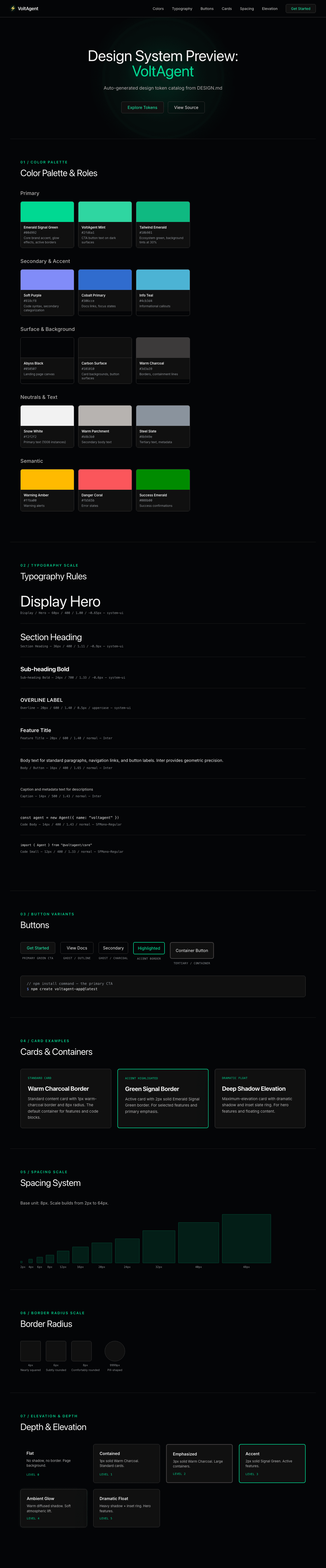
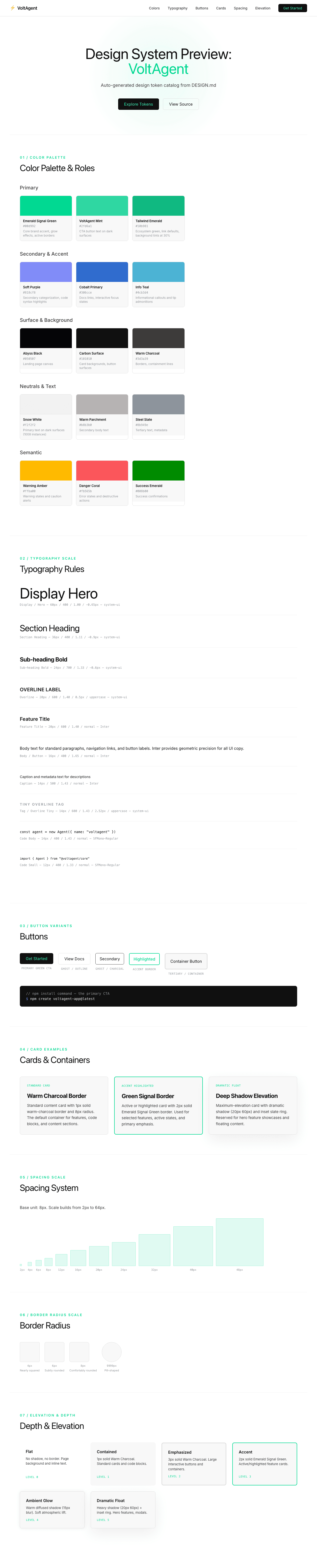
A sample landing page built with DESIGN.md. It shows the actual colors, typography, buttons, cards, spacing, and elevation, all in one page.
|
|
19
|
+
|
|
20
|
+
### Dark Mode
|
|
21
|
+
|
|
22
|
+
|
|
23
|
+
### Light Mode
|
|
24
|
+
|