awesome-design-md 1.0.0
This diff represents the content of publicly available package versions that have been released to one of the supported registries. The information contained in this diff is provided for informational purposes only and reflects changes between package versions as they appear in their respective public registries.
- package/LICENSE +21 -0
- package/README.md +172 -0
- package/bin/cli.mjs +126 -0
- package/design-md/airbnb/DESIGN.md +246 -0
- package/design-md/airbnb/README.md +23 -0
- package/design-md/airbnb/preview-dark.html +234 -0
- package/design-md/airbnb/preview.html +233 -0
- package/design-md/airtable/DESIGN.md +89 -0
- package/design-md/airtable/README.md +23 -0
- package/design-md/airtable/preview-dark.html +165 -0
- package/design-md/airtable/preview.html +164 -0
- package/design-md/apple/DESIGN.md +313 -0
- package/design-md/apple/README.md +24 -0
- package/design-md/apple/preview-dark.html +422 -0
- package/design-md/apple/preview.html +416 -0
- package/design-md/bmw/DESIGN.md +180 -0
- package/design-md/bmw/README.md +23 -0
- package/design-md/bmw/preview-dark.html +211 -0
- package/design-md/bmw/preview.html +210 -0
- package/design-md/cal/DESIGN.md +259 -0
- package/design-md/cal/README.md +23 -0
- package/design-md/cal/preview-dark.html +449 -0
- package/design-md/cal/preview.html +575 -0
- package/design-md/claude/DESIGN.md +312 -0
- package/design-md/claude/README.md +24 -0
- package/design-md/claude/preview-dark.html +803 -0
- package/design-md/claude/preview.html +826 -0
- package/design-md/clay/DESIGN.md +304 -0
- package/design-md/clay/README.md +23 -0
- package/design-md/clay/preview-dark.html +318 -0
- package/design-md/clay/preview.html +317 -0
- package/design-md/clickhouse/DESIGN.md +281 -0
- package/design-md/clickhouse/README.md +24 -0
- package/design-md/clickhouse/preview-dark.html +834 -0
- package/design-md/clickhouse/preview.html +786 -0
- package/design-md/cohere/DESIGN.md +266 -0
- package/design-md/cohere/README.md +24 -0
- package/design-md/cohere/preview-dark.html +810 -0
- package/design-md/cohere/preview.html +814 -0
- package/design-md/coinbase/DESIGN.md +129 -0
- package/design-md/coinbase/README.md +23 -0
- package/design-md/coinbase/preview-dark.html +164 -0
- package/design-md/coinbase/preview.html +163 -0
- package/design-md/composio/DESIGN.md +307 -0
- package/design-md/composio/README.md +24 -0
- package/design-md/composio/preview-dark.html +958 -0
- package/design-md/composio/preview.html +933 -0
- package/design-md/cursor/DESIGN.md +309 -0
- package/design-md/cursor/README.md +24 -0
- package/design-md/cursor/preview-dark.html +395 -0
- package/design-md/cursor/preview.html +385 -0
- package/design-md/elevenlabs/DESIGN.md +265 -0
- package/design-md/elevenlabs/README.md +23 -0
- package/design-md/elevenlabs/preview-dark.html +254 -0
- package/design-md/elevenlabs/preview.html +253 -0
- package/design-md/expo/DESIGN.md +281 -0
- package/design-md/expo/README.md +24 -0
- package/design-md/expo/preview-dark.html +536 -0
- package/design-md/expo/preview.html +536 -0
- package/design-md/figma/DESIGN.md +220 -0
- package/design-md/figma/README.md +24 -0
- package/design-md/figma/preview-dark.html +831 -0
- package/design-md/figma/preview.html +841 -0
- package/design-md/framer/DESIGN.md +246 -0
- package/design-md/framer/README.md +23 -0
- package/design-md/framer/preview-dark.html +904 -0
- package/design-md/framer/preview.html +885 -0
- package/design-md/hashicorp/DESIGN.md +278 -0
- package/design-md/hashicorp/README.md +24 -0
- package/design-md/hashicorp/preview-dark.html +1206 -0
- package/design-md/hashicorp/preview.html +1195 -0
- package/design-md/ibm/DESIGN.md +332 -0
- package/design-md/ibm/README.md +24 -0
- package/design-md/ibm/preview-dark.html +445 -0
- package/design-md/ibm/preview.html +430 -0
- package/design-md/intercom/DESIGN.md +146 -0
- package/design-md/intercom/README.md +23 -0
- package/design-md/intercom/preview-dark.html +185 -0
- package/design-md/intercom/preview.html +184 -0
- package/design-md/kraken/DESIGN.md +125 -0
- package/design-md/kraken/README.md +23 -0
- package/design-md/kraken/preview-dark.html +169 -0
- package/design-md/kraken/preview.html +168 -0
- package/design-md/linear.app/DESIGN.md +367 -0
- package/design-md/linear.app/README.md +24 -0
- package/design-md/linear.app/preview-dark.html +385 -0
- package/design-md/linear.app/preview.html +375 -0
- package/design-md/lovable/DESIGN.md +298 -0
- package/design-md/lovable/README.md +24 -0
- package/design-md/lovable/preview-dark.html +351 -0
- package/design-md/lovable/preview.html +350 -0
- package/design-md/minimax/DESIGN.md +257 -0
- package/design-md/minimax/README.md +24 -0
- package/design-md/minimax/preview-dark.html +1267 -0
- package/design-md/minimax/preview.html +1253 -0
- package/design-md/mintlify/DESIGN.md +326 -0
- package/design-md/mintlify/README.md +24 -0
- package/design-md/mintlify/preview-dark.html +411 -0
- package/design-md/mintlify/preview.html +400 -0
- package/design-md/miro/DESIGN.md +108 -0
- package/design-md/miro/README.md +23 -0
- package/design-md/miro/preview-dark.html +174 -0
- package/design-md/miro/preview.html +173 -0
- package/design-md/mistral.ai/DESIGN.md +261 -0
- package/design-md/mistral.ai/README.md +24 -0
- package/design-md/mistral.ai/preview-dark.html +813 -0
- package/design-md/mistral.ai/preview.html +812 -0
- package/design-md/mongodb/DESIGN.md +266 -0
- package/design-md/mongodb/README.md +23 -0
- package/design-md/mongodb/preview-dark.html +262 -0
- package/design-md/mongodb/preview.html +261 -0
- package/design-md/notion/DESIGN.md +309 -0
- package/design-md/notion/README.md +24 -0
- package/design-md/notion/preview-dark.html +374 -0
- package/design-md/notion/preview.html +366 -0
- package/design-md/nvidia/DESIGN.md +293 -0
- package/design-md/nvidia/README.md +24 -0
- package/design-md/nvidia/preview-dark.html +376 -0
- package/design-md/nvidia/preview.html +368 -0
- package/design-md/ollama/DESIGN.md +267 -0
- package/design-md/ollama/README.md +24 -0
- package/design-md/ollama/preview-dark.html +678 -0
- package/design-md/ollama/preview.html +678 -0
- package/design-md/opencode.ai/DESIGN.md +281 -0
- package/design-md/opencode.ai/README.md +24 -0
- package/design-md/opencode.ai/preview-dark.html +368 -0
- package/design-md/opencode.ai/preview.html +359 -0
- package/design-md/pinterest/DESIGN.md +230 -0
- package/design-md/pinterest/README.md +23 -0
- package/design-md/pinterest/preview-dark.html +233 -0
- package/design-md/pinterest/preview.html +232 -0
- package/design-md/posthog/DESIGN.md +256 -0
- package/design-md/posthog/README.md +23 -0
- package/design-md/posthog/preview-dark.html +701 -0
- package/design-md/posthog/preview.html +751 -0
- package/design-md/raycast/DESIGN.md +268 -0
- package/design-md/raycast/README.md +23 -0
- package/design-md/raycast/preview-dark.html +608 -0
- package/design-md/raycast/preview.html +690 -0
- package/design-md/replicate/DESIGN.md +261 -0
- package/design-md/replicate/README.md +24 -0
- package/design-md/replicate/preview-dark.html +828 -0
- package/design-md/replicate/preview.html +831 -0
- package/design-md/resend/DESIGN.md +303 -0
- package/design-md/resend/README.md +23 -0
- package/design-md/resend/preview-dark.html +357 -0
- package/design-md/resend/preview.html +356 -0
- package/design-md/revolut/DESIGN.md +185 -0
- package/design-md/revolut/README.md +23 -0
- package/design-md/revolut/preview-dark.html +234 -0
- package/design-md/revolut/preview.html +233 -0
- package/design-md/runwayml/DESIGN.md +244 -0
- package/design-md/runwayml/README.md +24 -0
- package/design-md/runwayml/preview-dark.html +664 -0
- package/design-md/runwayml/preview.html +665 -0
- package/design-md/sanity/DESIGN.md +357 -0
- package/design-md/sanity/README.md +24 -0
- package/design-md/sanity/preview-dark.html +995 -0
- package/design-md/sanity/preview.html +1140 -0
- package/design-md/sentry/DESIGN.md +262 -0
- package/design-md/sentry/README.md +24 -0
- package/design-md/sentry/preview-dark.html +628 -0
- package/design-md/sentry/preview.html +953 -0
- package/design-md/spacex/DESIGN.md +194 -0
- package/design-md/spacex/README.md +23 -0
- package/design-md/spacex/preview-dark.html +223 -0
- package/design-md/spacex/preview.html +222 -0
- package/design-md/spotify/DESIGN.md +246 -0
- package/design-md/spotify/README.md +23 -0
- package/design-md/spotify/preview-dark.html +231 -0
- package/design-md/spotify/preview.html +230 -0
- package/design-md/stripe/DESIGN.md +322 -0
- package/design-md/stripe/README.md +24 -0
- package/design-md/stripe/preview-dark.html +430 -0
- package/design-md/stripe/preview.html +421 -0
- package/design-md/supabase/DESIGN.md +255 -0
- package/design-md/supabase/README.md +24 -0
- package/design-md/supabase/preview-dark.html +977 -0
- package/design-md/supabase/preview.html +955 -0
- package/design-md/superhuman/DESIGN.md +252 -0
- package/design-md/superhuman/README.md +23 -0
- package/design-md/superhuman/preview-dark.html +975 -0
- package/design-md/superhuman/preview.html +953 -0
- package/design-md/together.ai/DESIGN.md +263 -0
- package/design-md/together.ai/README.md +24 -0
- package/design-md/together.ai/preview-dark.html +892 -0
- package/design-md/together.ai/preview.html +897 -0
- package/design-md/uber/DESIGN.md +295 -0
- package/design-md/uber/README.md +24 -0
- package/design-md/uber/preview-dark.html +1164 -0
- package/design-md/uber/preview.html +1163 -0
- package/design-md/vercel/DESIGN.md +310 -0
- package/design-md/vercel/README.md +24 -0
- package/design-md/vercel/preview-dark.html +370 -0
- package/design-md/vercel/preview.html +369 -0
- package/design-md/voltagent/DESIGN.md +323 -0
- package/design-md/voltagent/README.md +24 -0
- package/design-md/voltagent/preview-dark.html +487 -0
- package/design-md/voltagent/preview.html +766 -0
- package/design-md/warp/DESIGN.md +253 -0
- package/design-md/warp/README.md +23 -0
- package/design-md/warp/preview-dark.html +502 -0
- package/design-md/warp/preview.html +535 -0
- package/design-md/webflow/DESIGN.md +92 -0
- package/design-md/webflow/README.md +23 -0
- package/design-md/webflow/preview-dark.html +147 -0
- package/design-md/webflow/preview.html +146 -0
- package/design-md/wise/DESIGN.md +173 -0
- package/design-md/wise/README.md +23 -0
- package/design-md/wise/preview-dark.html +230 -0
- package/design-md/wise/preview.html +229 -0
- package/design-md/x.ai/DESIGN.md +257 -0
- package/design-md/x.ai/README.md +24 -0
- package/design-md/x.ai/preview-dark.html +358 -0
- package/design-md/x.ai/preview.html +409 -0
- package/design-md/zapier/DESIGN.md +328 -0
- package/design-md/zapier/README.md +24 -0
- package/design-md/zapier/preview-dark.html +382 -0
- package/design-md/zapier/preview.html +374 -0
- package/package.json +33 -0
|
@@ -0,0 +1,281 @@
|
|
|
1
|
+
# Design System: OpenCode
|
|
2
|
+
|
|
3
|
+
## 1. Visual Theme & Atmosphere
|
|
4
|
+
|
|
5
|
+
OpenCode's website embodies a terminal-native, monospace-first aesthetic that reflects its identity as an open source AI coding agent. The entire visual system is built on a stark dark-on-light contrast using a near-black background (`#201d1d`) with warm off-white text (`#fdfcfc`). This isn't a generic dark theme -- it's a warm, slightly reddish-brown dark that feels like a sophisticated terminal emulator rather than a cold IDE. The warm undertone in both the darks and lights (notice the subtle red channel in `#201d1d` -- rgb(32, 29, 29)) creates a cohesive, lived-in quality.
|
|
6
|
+
|
|
7
|
+
Berkeley Mono is the sole typeface, establishing an unapologetic monospace identity. Every element -- headings, body text, buttons, navigation -- shares this single font family, creating a unified "everything is code" philosophy. The heading at 38px bold with 1.50 line-height is generous and readable, while body text at 16px with weight 500 provides a slightly heavier-than-normal reading weight that enhances legibility on screen. The monospace grid naturally enforces alignment and rhythm across the layout.
|
|
8
|
+
|
|
9
|
+
The color system is deliberately minimal. The primary palette consists of just three functional tones: the warm near-black (`#201d1d`), a medium warm gray (`#9a9898`), and a bright off-white (`#fdfcfc`). Semantic colors borrow from the Apple HIG palette -- blue accent (`#007aff`), red danger (`#ff3b30`), green success (`#30d158`), orange warning (`#ff9f0a`) -- giving the interface familiar, trustworthy signal colors without adding brand complexity. Borders use a subtle warm transparency (`rgba(15, 0, 0, 0.12)`) that ties into the warm undertone of the entire system.
|
|
10
|
+
|
|
11
|
+
**Key Characteristics:**
|
|
12
|
+
- Berkeley Mono as the sole typeface -- monospace everywhere, no sans-serif or serif voices
|
|
13
|
+
- Warm near-black primary (`#201d1d`) with reddish-brown undertone, not pure black
|
|
14
|
+
- Off-white text (`#fdfcfc`) with warm tint, not pure white
|
|
15
|
+
- Minimal 4px border radius throughout -- sharp, utilitarian corners
|
|
16
|
+
- 8px base spacing system scaling up to 96px
|
|
17
|
+
- Apple HIG-inspired semantic colors (blue, red, green, orange)
|
|
18
|
+
- Transparent warm borders using `rgba(15, 0, 0, 0.12)`
|
|
19
|
+
- Email input with generous 20px padding and 6px radius -- the most generous component radius
|
|
20
|
+
- Single button variant: dark background, light text, tight vertical padding (4px 20px)
|
|
21
|
+
- Underlined links as default link style, reinforcing the text-centric identity
|
|
22
|
+
|
|
23
|
+
## 2. Color Palette & Roles
|
|
24
|
+
|
|
25
|
+
### Primary
|
|
26
|
+
- **OpenCode Dark** (`#201d1d`): Primary background, button fills, link text. A warm near-black with subtle reddish-brown warmth -- rgb(32, 29, 29).
|
|
27
|
+
- **OpenCode Light** (`#fdfcfc`): Primary text on dark surfaces, button text. A barely-warm off-white that avoids clinical pure white.
|
|
28
|
+
- **Mid Gray** (`#9a9898`): Secondary text, muted links. A neutral warm gray that bridges dark and light.
|
|
29
|
+
|
|
30
|
+
### Secondary
|
|
31
|
+
- **Dark Surface** (`#302c2c`): Slightly lighter than primary dark, used for elevated surfaces and subtle differentiation.
|
|
32
|
+
- **Border Gray** (`#646262`): Stronger borders, outline rings on interactive elements.
|
|
33
|
+
- **Light Surface** (`#f1eeee`): Light mode surface, subtle background variation.
|
|
34
|
+
|
|
35
|
+
### Accent
|
|
36
|
+
- **Accent Blue** (`#007aff`): Primary accent, links, interactive highlights. Apple system blue.
|
|
37
|
+
- **Accent Blue Hover** (`#0056b3`): Darker blue for hover states.
|
|
38
|
+
- **Accent Blue Active** (`#004085`): Deepest blue for pressed/active states.
|
|
39
|
+
|
|
40
|
+
### Semantic
|
|
41
|
+
- **Danger Red** (`#ff3b30`): Error states, destructive actions. Apple system red.
|
|
42
|
+
- **Danger Hover** (`#d70015`): Darker red for hover on danger elements.
|
|
43
|
+
- **Danger Active** (`#a50011`): Deepest red for pressed danger states.
|
|
44
|
+
- **Success Green** (`#30d158`): Success states, positive feedback. Apple system green.
|
|
45
|
+
- **Warning Orange** (`#ff9f0a`): Warning states, caution signals. Apple system orange.
|
|
46
|
+
- **Warning Hover** (`#cc7f08`): Darker orange for hover on warning elements.
|
|
47
|
+
- **Warning Active** (`#995f06`): Deepest orange for pressed warning states.
|
|
48
|
+
|
|
49
|
+
### Text Scale
|
|
50
|
+
- **Text Muted** (`#6e6e73`): Muted labels, disabled text, placeholder content.
|
|
51
|
+
- **Text Secondary** (`#424245`): Secondary text on light backgrounds, captions.
|
|
52
|
+
|
|
53
|
+
### Border
|
|
54
|
+
- **Border Warm** (`rgba(15, 0, 0, 0.12)`): Primary border color, warm transparent black with red tint.
|
|
55
|
+
- **Border Tab** (`#9a9898`): Tab underline border, 2px solid bottom.
|
|
56
|
+
- **Border Outline** (`#646262`): 1px solid outline border for containers.
|
|
57
|
+
|
|
58
|
+
## 3. Typography Rules
|
|
59
|
+
|
|
60
|
+
### Font Family
|
|
61
|
+
- **Universal**: `Berkeley Mono`, with fallbacks: `IBM Plex Mono, ui-monospace, SFMono-Regular, Menlo, Monaco, Consolas, Liberation Mono, Courier New, monospace`
|
|
62
|
+
|
|
63
|
+
### Hierarchy
|
|
64
|
+
|
|
65
|
+
| Role | Size | Weight | Line Height | Notes |
|
|
66
|
+
|------|------|--------|-------------|-------|
|
|
67
|
+
| Heading 1 | 38px (2.38rem) | 700 | 1.50 | Hero headlines, page titles |
|
|
68
|
+
| Heading 2 | 16px (1.00rem) | 700 | 1.50 | Section titles, bold emphasis |
|
|
69
|
+
| Body | 16px (1.00rem) | 400 | 1.50 | Standard body text, paragraphs |
|
|
70
|
+
| Body Medium | 16px (1.00rem) | 500 | 1.50 | Links, button text, nav items |
|
|
71
|
+
| Body Tight | 16px (1.00rem) | 500 | 1.00 (tight) | Compact labels, tab items |
|
|
72
|
+
| Caption | 14px (0.88rem) | 400 | 2.00 (relaxed) | Footnotes, metadata, small labels |
|
|
73
|
+
|
|
74
|
+
### Principles
|
|
75
|
+
- **One font, one voice**: Berkeley Mono is used exclusively. There is no typographic variation between display, body, and code -- everything speaks in the same monospace register. Hierarchy is achieved through size and weight alone.
|
|
76
|
+
- **Weight as hierarchy**: 700 for headings, 500 for interactive/medium emphasis, 400 for body text. Three weight levels create the entire hierarchy.
|
|
77
|
+
- **Generous line-height**: 1.50 as the standard line-height gives text room to breathe within the monospace grid. The relaxed 2.00 line-height on captions creates clear visual separation.
|
|
78
|
+
- **Tight for interaction**: Interactive elements (tabs, compact labels) use 1.00 line-height for dense, clickable targets.
|
|
79
|
+
|
|
80
|
+
## 4. Component Stylings
|
|
81
|
+
|
|
82
|
+
### Buttons
|
|
83
|
+
|
|
84
|
+
**Primary (Dark Fill)**
|
|
85
|
+
- Background: `#201d1d` (OpenCode Dark)
|
|
86
|
+
- Text: `#fdfcfc` (OpenCode Light)
|
|
87
|
+
- Padding: 4px 20px
|
|
88
|
+
- Radius: 4px
|
|
89
|
+
- Font: 16px Berkeley Mono, weight 500, line-height 2.00 (relaxed)
|
|
90
|
+
- Outline: `rgb(253, 252, 252) none 0px`
|
|
91
|
+
- Use: Primary CTAs, main actions
|
|
92
|
+
|
|
93
|
+
### Inputs
|
|
94
|
+
|
|
95
|
+
**Email Input**
|
|
96
|
+
- Background: `#f8f7f7` (light neutral)
|
|
97
|
+
- Text: `#201d1d`
|
|
98
|
+
- Border: `1px solid rgba(15, 0, 0, 0.12)`
|
|
99
|
+
- Padding: 20px
|
|
100
|
+
- Radius: 6px
|
|
101
|
+
- Font: Berkeley Mono, standard size
|
|
102
|
+
- Use: Form fields, email capture
|
|
103
|
+
|
|
104
|
+
### Links
|
|
105
|
+
|
|
106
|
+
**Default Link**
|
|
107
|
+
- Color: `#201d1d`
|
|
108
|
+
- Decoration: underline 1px
|
|
109
|
+
- Font-weight: 500
|
|
110
|
+
- Use: Primary text links in body content
|
|
111
|
+
|
|
112
|
+
**Light Link**
|
|
113
|
+
- Color: `#fdfcfc`
|
|
114
|
+
- Decoration: none
|
|
115
|
+
- Use: Links on dark backgrounds, navigation
|
|
116
|
+
|
|
117
|
+
**Muted Link**
|
|
118
|
+
- Color: `#9a9898`
|
|
119
|
+
- Decoration: none
|
|
120
|
+
- Use: Footer links, secondary navigation
|
|
121
|
+
|
|
122
|
+
### Tabs
|
|
123
|
+
|
|
124
|
+
**Tab Navigation**
|
|
125
|
+
- Border-bottom: `2px solid #9a9898` (active tab indicator)
|
|
126
|
+
- Font: 16px, weight 500, line-height 1.00
|
|
127
|
+
- Use: Section switching, content filtering
|
|
128
|
+
|
|
129
|
+
### Navigation
|
|
130
|
+
- Clean horizontal layout with Berkeley Mono throughout
|
|
131
|
+
- Brand logotype left-aligned in monospace
|
|
132
|
+
- Links at 16px weight 500 with underline decoration
|
|
133
|
+
- Dark background matching page background
|
|
134
|
+
- No backdrop blur or transparency -- solid surfaces only
|
|
135
|
+
|
|
136
|
+
### Image Treatment
|
|
137
|
+
- Terminal/code screenshots as hero imagery
|
|
138
|
+
- Dark terminal aesthetic with monospace type
|
|
139
|
+
- Minimal borders, content speaks for itself
|
|
140
|
+
|
|
141
|
+
### Distinctive Components
|
|
142
|
+
|
|
143
|
+
**Terminal Hero**
|
|
144
|
+
- Full-width dark terminal window as hero element
|
|
145
|
+
- ASCII art / stylized logo within terminal frame
|
|
146
|
+
- Monospace command examples with syntax highlighting
|
|
147
|
+
- Reinforces the CLI-first identity of the product
|
|
148
|
+
|
|
149
|
+
**Feature List**
|
|
150
|
+
- Bulleted feature items with Berkeley Mono text
|
|
151
|
+
- Weight 500 for feature names, 400 for descriptions
|
|
152
|
+
- Tight vertical spacing between items
|
|
153
|
+
- No cards or borders -- pure text layout
|
|
154
|
+
|
|
155
|
+
**Email Capture**
|
|
156
|
+
- Light background input (`#f8f7f7`) contrasting dark page
|
|
157
|
+
- Generous 20px padding for comfortable typing
|
|
158
|
+
- 6px radius -- the roundest element in the system
|
|
159
|
+
- Newsletter/waitlist pattern
|
|
160
|
+
|
|
161
|
+
## 5. Layout Principles
|
|
162
|
+
|
|
163
|
+
### Spacing System
|
|
164
|
+
- Base unit: 8px
|
|
165
|
+
- Fine scale: 1px, 2px, 4px (sub-8px for borders and micro-adjustments)
|
|
166
|
+
- Standard scale: 8px, 12px, 16px, 20px, 24px
|
|
167
|
+
- Extended scale: 32px, 40px, 48px, 64px, 80px, 96px
|
|
168
|
+
- The system follows a clean 4/8px grid with consistent doubling
|
|
169
|
+
|
|
170
|
+
### Grid & Container
|
|
171
|
+
- Max content width: approximately 800-900px (narrow, reading-optimized)
|
|
172
|
+
- Single-column layout as the primary pattern
|
|
173
|
+
- Centered content with generous horizontal margins
|
|
174
|
+
- Hero section: full-width dark terminal element
|
|
175
|
+
- Feature sections: single-column text blocks
|
|
176
|
+
- Footer: multi-column link grid
|
|
177
|
+
|
|
178
|
+
### Whitespace Philosophy
|
|
179
|
+
- **Monospace rhythm**: The fixed-width nature of Berkeley Mono creates a natural vertical grid. Line-heights of 1.50 and 2.00 maintain consistent rhythm.
|
|
180
|
+
- **Narrow and focused**: Content is constrained to a narrow column, creating generous side margins that focus attention on the text.
|
|
181
|
+
- **Sections through spacing**: No decorative dividers. Sections are separated by generous vertical spacing (48-96px) rather than borders or background changes.
|
|
182
|
+
|
|
183
|
+
### Border Radius Scale
|
|
184
|
+
- Micro (4px): Default for all elements -- buttons, containers, badges
|
|
185
|
+
- Input (6px): Form inputs get slightly more roundness
|
|
186
|
+
- The entire system uses just two radius values, reinforcing the utilitarian aesthetic
|
|
187
|
+
|
|
188
|
+
## 6. Depth & Elevation
|
|
189
|
+
|
|
190
|
+
| Level | Treatment | Use |
|
|
191
|
+
|-------|-----------|-----|
|
|
192
|
+
| Flat (Level 0) | No shadow, no border | Default state for most elements |
|
|
193
|
+
| Border Subtle (Level 1) | `1px solid rgba(15, 0, 0, 0.12)` | Section dividers, input borders, horizontal rules |
|
|
194
|
+
| Border Tab (Level 2) | `2px solid #9a9898` bottom only | Active tab indicator |
|
|
195
|
+
| Border Outline (Level 3) | `1px solid #646262` | Container outlines, elevated elements |
|
|
196
|
+
|
|
197
|
+
**Shadow Philosophy**: OpenCode's depth system is intentionally flat. There are no box-shadows in the extracted tokens -- zero shadow values were detected. Depth is communicated exclusively through border treatments and background color shifts. This flatness is consistent with the terminal aesthetic: terminals don't have shadows, and neither does OpenCode. The three border levels (transparent warm, tab indicator, solid outline) create sufficient visual hierarchy without any elevation illusion.
|
|
198
|
+
|
|
199
|
+
### Decorative Depth
|
|
200
|
+
- Background color shifts between `#201d1d` and `#302c2c` create subtle surface differentiation
|
|
201
|
+
- Transparent borders at 12% opacity provide barely-visible structure
|
|
202
|
+
- The warm reddish tint in border colors (`rgba(15, 0, 0, 0.12)`) ties borders to the overall warm dark palette
|
|
203
|
+
- No gradients, no blurs, no ambient effects -- pure flat terminal aesthetic
|
|
204
|
+
|
|
205
|
+
## 7. Interaction & Motion
|
|
206
|
+
|
|
207
|
+
### Hover States
|
|
208
|
+
- Links: color shift from default to accent blue (`#007aff`) or underline style change
|
|
209
|
+
- Buttons: subtle background lightening or border emphasis
|
|
210
|
+
- Accent blue provides a three-stage hover sequence: `#007aff` → `#0056b3` → `#004085` (default → hover → active)
|
|
211
|
+
- Danger red: `#ff3b30` → `#d70015` → `#a50011`
|
|
212
|
+
- Warning orange: `#ff9f0a` → `#cc7f08` → `#995f06`
|
|
213
|
+
|
|
214
|
+
### Focus States
|
|
215
|
+
- Border-based focus: increased border opacity or solid border color
|
|
216
|
+
- No shadow-based focus rings -- consistent with the flat, no-shadow aesthetic
|
|
217
|
+
- Keyboard focus likely uses outline or border color shift to accent blue
|
|
218
|
+
|
|
219
|
+
### Transitions
|
|
220
|
+
- Minimal transitions expected -- terminal-inspired interfaces favor instant state changes
|
|
221
|
+
- Color transitions: 100-150ms for subtle state feedback
|
|
222
|
+
- No scale, rotate, or complex transform animations
|
|
223
|
+
|
|
224
|
+
## 8. Responsive Behavior
|
|
225
|
+
|
|
226
|
+
### Breakpoints
|
|
227
|
+
| Name | Width | Key Changes |
|
|
228
|
+
|------|-------|-------------|
|
|
229
|
+
| Mobile | <640px | Single column, reduced padding, heading scales down |
|
|
230
|
+
| Tablet | 640-1024px | Content width expands, slight padding increase |
|
|
231
|
+
| Desktop | >1024px | Full content width (~800-900px centered), maximum whitespace |
|
|
232
|
+
|
|
233
|
+
### Touch Targets
|
|
234
|
+
- Buttons with 4px 20px padding provide adequate horizontal touch area
|
|
235
|
+
- Input fields with 20px padding ensure comfortable mobile typing
|
|
236
|
+
- Tab items at 16px with tight line-height may need mobile adaptation
|
|
237
|
+
|
|
238
|
+
### Collapsing Strategy
|
|
239
|
+
- Hero heading: 38px → 28px → 24px on smaller screens
|
|
240
|
+
- Navigation: horizontal links → hamburger/drawer on mobile
|
|
241
|
+
- Feature lists: maintain single-column, reduce horizontal padding
|
|
242
|
+
- Terminal hero: maintain full-width, reduce internal padding
|
|
243
|
+
- Footer columns: multi-column → stacked single column
|
|
244
|
+
- Section spacing: 96px → 64px → 48px on mobile
|
|
245
|
+
|
|
246
|
+
### Image Behavior
|
|
247
|
+
- Terminal screenshots maintain aspect ratio and border treatment
|
|
248
|
+
- Full-width elements scale proportionally
|
|
249
|
+
- Monospace type maintains readability at all sizes due to fixed-width nature
|
|
250
|
+
|
|
251
|
+
## 9. Agent Prompt Guide
|
|
252
|
+
|
|
253
|
+
### Quick Color Reference
|
|
254
|
+
- Page background: `#201d1d` (warm near-black)
|
|
255
|
+
- Primary text: `#fdfcfc` (warm off-white)
|
|
256
|
+
- Secondary text: `#9a9898` (warm gray)
|
|
257
|
+
- Muted text: `#6e6e73`
|
|
258
|
+
- Accent: `#007aff` (blue)
|
|
259
|
+
- Danger: `#ff3b30` (red)
|
|
260
|
+
- Success: `#30d158` (green)
|
|
261
|
+
- Warning: `#ff9f0a` (orange)
|
|
262
|
+
- Button bg: `#201d1d`, button text: `#fdfcfc`
|
|
263
|
+
- Border: `rgba(15, 0, 0, 0.12)` (warm transparent)
|
|
264
|
+
- Input bg: `#f8f7f7`, input border: `rgba(15, 0, 0, 0.12)`
|
|
265
|
+
|
|
266
|
+
### Example Component Prompts
|
|
267
|
+
- "Create a hero section on `#201d1d` warm dark background. Headline at 38px Berkeley Mono weight 700, line-height 1.50, color `#fdfcfc`. Subtitle at 16px weight 400, color `#9a9898`. Primary CTA button (`#201d1d` bg with `1px solid #646262` border, 4px radius, 4px 20px padding, `#fdfcfc` text at weight 500)."
|
|
268
|
+
- "Design a feature list: single-column on `#201d1d` background. Feature name at 16px Berkeley Mono weight 700, color `#fdfcfc`. Description at 16px weight 400, color `#9a9898`. No cards, no borders -- pure text with 16px vertical gap between items."
|
|
269
|
+
- "Build an email capture form: `#f8f7f7` background input, `1px solid rgba(15, 0, 0, 0.12)` border, 6px radius, 20px padding. Adjacent dark button (`#201d1d` bg, `#fdfcfc` text, 4px radius, 4px 20px padding). Berkeley Mono throughout."
|
|
270
|
+
- "Create navigation: sticky `#201d1d` background. 16px Berkeley Mono weight 500 for links, `#fdfcfc` text. Brand name left-aligned in monospace. Links with underline decoration. No blur, no transparency -- solid dark surface."
|
|
271
|
+
- "Design a footer: `#201d1d` background, multi-column link grid. Links at 16px Berkeley Mono weight 400, color `#9a9898`. Section headers at weight 700. Border-top `1px solid rgba(15, 0, 0, 0.12)` separator."
|
|
272
|
+
|
|
273
|
+
### Iteration Guide
|
|
274
|
+
1. Berkeley Mono is the only font -- never introduce a second typeface. Size and weight create all hierarchy.
|
|
275
|
+
2. Keep surfaces flat: no shadows, no gradients, no blur effects. Use borders and background shifts only.
|
|
276
|
+
3. The warm undertone matters: use `#201d1d` not `#000000`, use `#fdfcfc` not `#ffffff`. The reddish warmth is subtle but essential.
|
|
277
|
+
4. Border radius is 4px everywhere except inputs (6px). Never use rounded pills or large radii.
|
|
278
|
+
5. Semantic colors follow Apple HIG: `#007aff` blue, `#ff3b30` red, `#30d158` green, `#ff9f0a` orange. Each has hover and active darkened variants.
|
|
279
|
+
6. Three-stage interaction: default → hover (darkened) → active (deeply darkened) for all semantic colors.
|
|
280
|
+
7. Borders use `rgba(15, 0, 0, 0.12)` -- a warm transparent dark, not neutral gray. This ties borders to the warm palette.
|
|
281
|
+
8. Spacing follows an 8px grid: 8, 16, 24, 32, 40, 48, 64, 80, 96px. Use 4px for fine adjustments only.
|
|
@@ -0,0 +1,24 @@
|
|
|
1
|
+
# OpenCode AI Inspired Design System
|
|
2
|
+
|
|
3
|
+
[DESIGN.md](https://github.com/VoltAgent/awesome-design-md/blob/main/design-md/opencode.ai/DESIGN.md) extracted from the public [opencode](https://opencode.ai/) website. This is not the official design system. Colors, fonts, and spacing may not be 100% accurate. But it's a good starting point for building something similar.
|
|
4
|
+
|
|
5
|
+
## Files
|
|
6
|
+
|
|
7
|
+
| File | Description |
|
|
8
|
+
|------|-------------|
|
|
9
|
+
| `DESIGN.md` | Complete design system documentation (9 sections) |
|
|
10
|
+
| `preview.html` | Interactive design token catalog (light) |
|
|
11
|
+
| `preview-dark.html` | Interactive design token catalog (dark) |
|
|
12
|
+
|
|
13
|
+
|
|
14
|
+
Use [DESIGN.md](https://github.com/VoltAgent/awesome-design-md/blob/main/design-md/opencode.ai/DESIGN.md) to use as a reference for AI agents (Claude, Cursor, Stitch) to generate UI that looks like the OpenCode AI design language.
|
|
15
|
+
|
|
16
|
+
## Preview
|
|
17
|
+
|
|
18
|
+
A sample landing page built with DESIGN.md. It shows the actual colors, typography, buttons, cards, spacing, and elevation, all in one page.
|
|
19
|
+
|
|
20
|
+
### Dark Mode
|
|
21
|
+
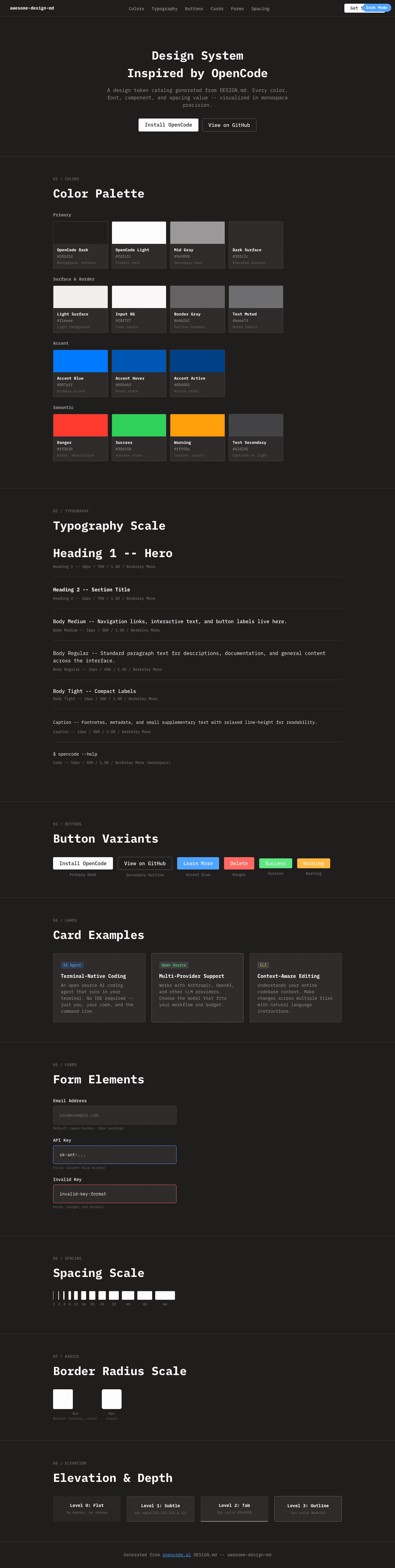
|
|
22
|
+
|
|
23
|
+
### Light Mode
|
|
24
|
+
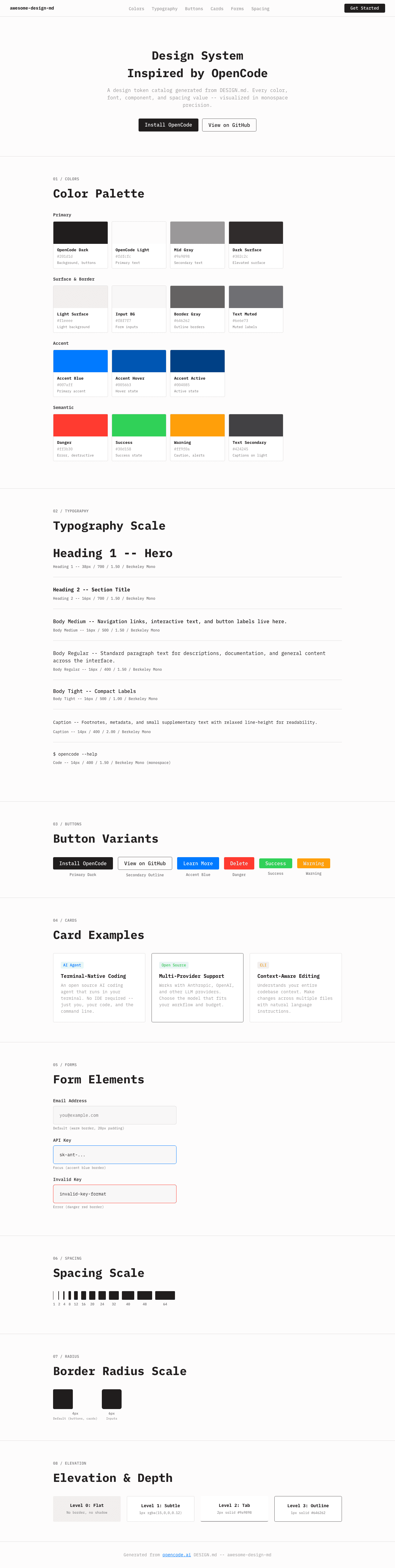
|