awesome-design-md 1.0.0
This diff represents the content of publicly available package versions that have been released to one of the supported registries. The information contained in this diff is provided for informational purposes only and reflects changes between package versions as they appear in their respective public registries.
- package/LICENSE +21 -0
- package/README.md +172 -0
- package/bin/cli.mjs +126 -0
- package/design-md/airbnb/DESIGN.md +246 -0
- package/design-md/airbnb/README.md +23 -0
- package/design-md/airbnb/preview-dark.html +234 -0
- package/design-md/airbnb/preview.html +233 -0
- package/design-md/airtable/DESIGN.md +89 -0
- package/design-md/airtable/README.md +23 -0
- package/design-md/airtable/preview-dark.html +165 -0
- package/design-md/airtable/preview.html +164 -0
- package/design-md/apple/DESIGN.md +313 -0
- package/design-md/apple/README.md +24 -0
- package/design-md/apple/preview-dark.html +422 -0
- package/design-md/apple/preview.html +416 -0
- package/design-md/bmw/DESIGN.md +180 -0
- package/design-md/bmw/README.md +23 -0
- package/design-md/bmw/preview-dark.html +211 -0
- package/design-md/bmw/preview.html +210 -0
- package/design-md/cal/DESIGN.md +259 -0
- package/design-md/cal/README.md +23 -0
- package/design-md/cal/preview-dark.html +449 -0
- package/design-md/cal/preview.html +575 -0
- package/design-md/claude/DESIGN.md +312 -0
- package/design-md/claude/README.md +24 -0
- package/design-md/claude/preview-dark.html +803 -0
- package/design-md/claude/preview.html +826 -0
- package/design-md/clay/DESIGN.md +304 -0
- package/design-md/clay/README.md +23 -0
- package/design-md/clay/preview-dark.html +318 -0
- package/design-md/clay/preview.html +317 -0
- package/design-md/clickhouse/DESIGN.md +281 -0
- package/design-md/clickhouse/README.md +24 -0
- package/design-md/clickhouse/preview-dark.html +834 -0
- package/design-md/clickhouse/preview.html +786 -0
- package/design-md/cohere/DESIGN.md +266 -0
- package/design-md/cohere/README.md +24 -0
- package/design-md/cohere/preview-dark.html +810 -0
- package/design-md/cohere/preview.html +814 -0
- package/design-md/coinbase/DESIGN.md +129 -0
- package/design-md/coinbase/README.md +23 -0
- package/design-md/coinbase/preview-dark.html +164 -0
- package/design-md/coinbase/preview.html +163 -0
- package/design-md/composio/DESIGN.md +307 -0
- package/design-md/composio/README.md +24 -0
- package/design-md/composio/preview-dark.html +958 -0
- package/design-md/composio/preview.html +933 -0
- package/design-md/cursor/DESIGN.md +309 -0
- package/design-md/cursor/README.md +24 -0
- package/design-md/cursor/preview-dark.html +395 -0
- package/design-md/cursor/preview.html +385 -0
- package/design-md/elevenlabs/DESIGN.md +265 -0
- package/design-md/elevenlabs/README.md +23 -0
- package/design-md/elevenlabs/preview-dark.html +254 -0
- package/design-md/elevenlabs/preview.html +253 -0
- package/design-md/expo/DESIGN.md +281 -0
- package/design-md/expo/README.md +24 -0
- package/design-md/expo/preview-dark.html +536 -0
- package/design-md/expo/preview.html +536 -0
- package/design-md/figma/DESIGN.md +220 -0
- package/design-md/figma/README.md +24 -0
- package/design-md/figma/preview-dark.html +831 -0
- package/design-md/figma/preview.html +841 -0
- package/design-md/framer/DESIGN.md +246 -0
- package/design-md/framer/README.md +23 -0
- package/design-md/framer/preview-dark.html +904 -0
- package/design-md/framer/preview.html +885 -0
- package/design-md/hashicorp/DESIGN.md +278 -0
- package/design-md/hashicorp/README.md +24 -0
- package/design-md/hashicorp/preview-dark.html +1206 -0
- package/design-md/hashicorp/preview.html +1195 -0
- package/design-md/ibm/DESIGN.md +332 -0
- package/design-md/ibm/README.md +24 -0
- package/design-md/ibm/preview-dark.html +445 -0
- package/design-md/ibm/preview.html +430 -0
- package/design-md/intercom/DESIGN.md +146 -0
- package/design-md/intercom/README.md +23 -0
- package/design-md/intercom/preview-dark.html +185 -0
- package/design-md/intercom/preview.html +184 -0
- package/design-md/kraken/DESIGN.md +125 -0
- package/design-md/kraken/README.md +23 -0
- package/design-md/kraken/preview-dark.html +169 -0
- package/design-md/kraken/preview.html +168 -0
- package/design-md/linear.app/DESIGN.md +367 -0
- package/design-md/linear.app/README.md +24 -0
- package/design-md/linear.app/preview-dark.html +385 -0
- package/design-md/linear.app/preview.html +375 -0
- package/design-md/lovable/DESIGN.md +298 -0
- package/design-md/lovable/README.md +24 -0
- package/design-md/lovable/preview-dark.html +351 -0
- package/design-md/lovable/preview.html +350 -0
- package/design-md/minimax/DESIGN.md +257 -0
- package/design-md/minimax/README.md +24 -0
- package/design-md/minimax/preview-dark.html +1267 -0
- package/design-md/minimax/preview.html +1253 -0
- package/design-md/mintlify/DESIGN.md +326 -0
- package/design-md/mintlify/README.md +24 -0
- package/design-md/mintlify/preview-dark.html +411 -0
- package/design-md/mintlify/preview.html +400 -0
- package/design-md/miro/DESIGN.md +108 -0
- package/design-md/miro/README.md +23 -0
- package/design-md/miro/preview-dark.html +174 -0
- package/design-md/miro/preview.html +173 -0
- package/design-md/mistral.ai/DESIGN.md +261 -0
- package/design-md/mistral.ai/README.md +24 -0
- package/design-md/mistral.ai/preview-dark.html +813 -0
- package/design-md/mistral.ai/preview.html +812 -0
- package/design-md/mongodb/DESIGN.md +266 -0
- package/design-md/mongodb/README.md +23 -0
- package/design-md/mongodb/preview-dark.html +262 -0
- package/design-md/mongodb/preview.html +261 -0
- package/design-md/notion/DESIGN.md +309 -0
- package/design-md/notion/README.md +24 -0
- package/design-md/notion/preview-dark.html +374 -0
- package/design-md/notion/preview.html +366 -0
- package/design-md/nvidia/DESIGN.md +293 -0
- package/design-md/nvidia/README.md +24 -0
- package/design-md/nvidia/preview-dark.html +376 -0
- package/design-md/nvidia/preview.html +368 -0
- package/design-md/ollama/DESIGN.md +267 -0
- package/design-md/ollama/README.md +24 -0
- package/design-md/ollama/preview-dark.html +678 -0
- package/design-md/ollama/preview.html +678 -0
- package/design-md/opencode.ai/DESIGN.md +281 -0
- package/design-md/opencode.ai/README.md +24 -0
- package/design-md/opencode.ai/preview-dark.html +368 -0
- package/design-md/opencode.ai/preview.html +359 -0
- package/design-md/pinterest/DESIGN.md +230 -0
- package/design-md/pinterest/README.md +23 -0
- package/design-md/pinterest/preview-dark.html +233 -0
- package/design-md/pinterest/preview.html +232 -0
- package/design-md/posthog/DESIGN.md +256 -0
- package/design-md/posthog/README.md +23 -0
- package/design-md/posthog/preview-dark.html +701 -0
- package/design-md/posthog/preview.html +751 -0
- package/design-md/raycast/DESIGN.md +268 -0
- package/design-md/raycast/README.md +23 -0
- package/design-md/raycast/preview-dark.html +608 -0
- package/design-md/raycast/preview.html +690 -0
- package/design-md/replicate/DESIGN.md +261 -0
- package/design-md/replicate/README.md +24 -0
- package/design-md/replicate/preview-dark.html +828 -0
- package/design-md/replicate/preview.html +831 -0
- package/design-md/resend/DESIGN.md +303 -0
- package/design-md/resend/README.md +23 -0
- package/design-md/resend/preview-dark.html +357 -0
- package/design-md/resend/preview.html +356 -0
- package/design-md/revolut/DESIGN.md +185 -0
- package/design-md/revolut/README.md +23 -0
- package/design-md/revolut/preview-dark.html +234 -0
- package/design-md/revolut/preview.html +233 -0
- package/design-md/runwayml/DESIGN.md +244 -0
- package/design-md/runwayml/README.md +24 -0
- package/design-md/runwayml/preview-dark.html +664 -0
- package/design-md/runwayml/preview.html +665 -0
- package/design-md/sanity/DESIGN.md +357 -0
- package/design-md/sanity/README.md +24 -0
- package/design-md/sanity/preview-dark.html +995 -0
- package/design-md/sanity/preview.html +1140 -0
- package/design-md/sentry/DESIGN.md +262 -0
- package/design-md/sentry/README.md +24 -0
- package/design-md/sentry/preview-dark.html +628 -0
- package/design-md/sentry/preview.html +953 -0
- package/design-md/spacex/DESIGN.md +194 -0
- package/design-md/spacex/README.md +23 -0
- package/design-md/spacex/preview-dark.html +223 -0
- package/design-md/spacex/preview.html +222 -0
- package/design-md/spotify/DESIGN.md +246 -0
- package/design-md/spotify/README.md +23 -0
- package/design-md/spotify/preview-dark.html +231 -0
- package/design-md/spotify/preview.html +230 -0
- package/design-md/stripe/DESIGN.md +322 -0
- package/design-md/stripe/README.md +24 -0
- package/design-md/stripe/preview-dark.html +430 -0
- package/design-md/stripe/preview.html +421 -0
- package/design-md/supabase/DESIGN.md +255 -0
- package/design-md/supabase/README.md +24 -0
- package/design-md/supabase/preview-dark.html +977 -0
- package/design-md/supabase/preview.html +955 -0
- package/design-md/superhuman/DESIGN.md +252 -0
- package/design-md/superhuman/README.md +23 -0
- package/design-md/superhuman/preview-dark.html +975 -0
- package/design-md/superhuman/preview.html +953 -0
- package/design-md/together.ai/DESIGN.md +263 -0
- package/design-md/together.ai/README.md +24 -0
- package/design-md/together.ai/preview-dark.html +892 -0
- package/design-md/together.ai/preview.html +897 -0
- package/design-md/uber/DESIGN.md +295 -0
- package/design-md/uber/README.md +24 -0
- package/design-md/uber/preview-dark.html +1164 -0
- package/design-md/uber/preview.html +1163 -0
- package/design-md/vercel/DESIGN.md +310 -0
- package/design-md/vercel/README.md +24 -0
- package/design-md/vercel/preview-dark.html +370 -0
- package/design-md/vercel/preview.html +369 -0
- package/design-md/voltagent/DESIGN.md +323 -0
- package/design-md/voltagent/README.md +24 -0
- package/design-md/voltagent/preview-dark.html +487 -0
- package/design-md/voltagent/preview.html +766 -0
- package/design-md/warp/DESIGN.md +253 -0
- package/design-md/warp/README.md +23 -0
- package/design-md/warp/preview-dark.html +502 -0
- package/design-md/warp/preview.html +535 -0
- package/design-md/webflow/DESIGN.md +92 -0
- package/design-md/webflow/README.md +23 -0
- package/design-md/webflow/preview-dark.html +147 -0
- package/design-md/webflow/preview.html +146 -0
- package/design-md/wise/DESIGN.md +173 -0
- package/design-md/wise/README.md +23 -0
- package/design-md/wise/preview-dark.html +230 -0
- package/design-md/wise/preview.html +229 -0
- package/design-md/x.ai/DESIGN.md +257 -0
- package/design-md/x.ai/README.md +24 -0
- package/design-md/x.ai/preview-dark.html +358 -0
- package/design-md/x.ai/preview.html +409 -0
- package/design-md/zapier/DESIGN.md +328 -0
- package/design-md/zapier/README.md +24 -0
- package/design-md/zapier/preview-dark.html +382 -0
- package/design-md/zapier/preview.html +374 -0
- package/package.json +33 -0
|
@@ -0,0 +1,430 @@
|
|
|
1
|
+
<!DOCTYPE html>
|
|
2
|
+
<html lang="en">
|
|
3
|
+
<head>
|
|
4
|
+
<meta charset="UTF-8">
|
|
5
|
+
<meta name="viewport" content="width=device-width, initial-scale=1.0">
|
|
6
|
+
<title>Design System Preview: IBM (Light)</title>
|
|
7
|
+
<link rel="preconnect" href="https://fonts.googleapis.com">
|
|
8
|
+
<link rel="preconnect" href="https://fonts.gstatic.com" crossorigin>
|
|
9
|
+
<link href="https://fonts.googleapis.com/css2?family=IBM+Plex+Sans:wght@300;400;600&family=IBM+Plex+Mono:wght@400;500;600&display=swap" rel="stylesheet">
|
|
10
|
+
<style>
|
|
11
|
+
:root {
|
|
12
|
+
--white: #ffffff;
|
|
13
|
+
--gray-10: #f4f4f4;
|
|
14
|
+
--gray-10-hover: #e8e8e8;
|
|
15
|
+
--gray-20: #e0e0e0;
|
|
16
|
+
--gray-30: #c6c6c6;
|
|
17
|
+
--gray-50: #8d8d8d;
|
|
18
|
+
--gray-60: #6f6f6f;
|
|
19
|
+
--gray-70: #525252;
|
|
20
|
+
--gray-80: #393939;
|
|
21
|
+
--gray-90: #262626;
|
|
22
|
+
--gray-100: #161616;
|
|
23
|
+
--blue-10: #edf5ff;
|
|
24
|
+
--blue-60: #0f62fe;
|
|
25
|
+
--blue-70: #0043ce;
|
|
26
|
+
--blue-80: #002d9c;
|
|
27
|
+
--red-60: #da1e28;
|
|
28
|
+
--green-50: #24a148;
|
|
29
|
+
--yellow-30: #f1c21b;
|
|
30
|
+
--font-sans: 'IBM Plex Sans', 'Helvetica Neue', Arial, sans-serif;
|
|
31
|
+
--font-mono: 'IBM Plex Mono', Menlo, Courier, monospace;
|
|
32
|
+
}
|
|
33
|
+
* { margin: 0; padding: 0; box-sizing: border-box; }
|
|
34
|
+
body {
|
|
35
|
+
background: var(--white);
|
|
36
|
+
color: var(--gray-100);
|
|
37
|
+
font-family: var(--font-sans);
|
|
38
|
+
font-size: 16px; font-weight: 400; line-height: 1.50;
|
|
39
|
+
-webkit-font-smoothing: antialiased;
|
|
40
|
+
}
|
|
41
|
+
|
|
42
|
+
/* NAV */
|
|
43
|
+
.nav {
|
|
44
|
+
position: sticky; top: 0; z-index: 100;
|
|
45
|
+
display: flex; align-items: center; justify-content: space-between;
|
|
46
|
+
padding: 0 32px;
|
|
47
|
+
height: 48px;
|
|
48
|
+
background: var(--gray-100);
|
|
49
|
+
color: var(--white);
|
|
50
|
+
}
|
|
51
|
+
.nav-brand { font-size: 14px; font-weight: 600; color: var(--white); text-decoration: none; }
|
|
52
|
+
.nav-links { display: flex; gap: 24px; list-style: none; }
|
|
53
|
+
.nav-links a { font-size: 14px; font-weight: 400; color: var(--gray-30); text-decoration: none; letter-spacing: 0.16px; transition: color 0.15s; }
|
|
54
|
+
.nav-links a:hover { color: var(--white); }
|
|
55
|
+
.nav-cta {
|
|
56
|
+
display: inline-flex; align-items: center; background: var(--blue-60); color: var(--white);
|
|
57
|
+
padding: 0 16px; height: 32px; border-radius: 0; font-size: 14px; font-weight: 400;
|
|
58
|
+
text-decoration: none; letter-spacing: 0.16px; transition: background 0.15s;
|
|
59
|
+
}
|
|
60
|
+
.nav-cta:hover { background: #0353e9; }
|
|
61
|
+
|
|
62
|
+
/* HERO */
|
|
63
|
+
.hero { padding: 80px 32px 64px; background: var(--white); }
|
|
64
|
+
.hero-inner { max-width: 1200px; margin: 0 auto; }
|
|
65
|
+
.hero h1 {
|
|
66
|
+
font-size: 60px; font-weight: 300; line-height: 1.17;
|
|
67
|
+
color: var(--gray-100); margin-bottom: 16px; max-width: 800px;
|
|
68
|
+
}
|
|
69
|
+
.hero p { font-size: 16px; font-weight: 400; line-height: 1.50; color: var(--gray-70); max-width: 640px; margin-bottom: 32px; }
|
|
70
|
+
.hero-buttons { display: flex; gap: 1px; flex-wrap: wrap; }
|
|
71
|
+
.btn-primary {
|
|
72
|
+
display: inline-flex; align-items: center; justify-content: space-between;
|
|
73
|
+
background: var(--blue-60); color: var(--white);
|
|
74
|
+
padding: 14px 63px 14px 16px; height: 48px;
|
|
75
|
+
border-radius: 0; border: none;
|
|
76
|
+
font-family: var(--font-sans); font-size: 14px; font-weight: 400;
|
|
77
|
+
letter-spacing: 0.16px;
|
|
78
|
+
text-decoration: none; cursor: pointer; transition: background 0.15s;
|
|
79
|
+
}
|
|
80
|
+
.btn-primary:hover { background: #0353e9; }
|
|
81
|
+
.btn-secondary {
|
|
82
|
+
display: inline-flex; align-items: center; justify-content: space-between;
|
|
83
|
+
background: var(--gray-80); color: var(--white);
|
|
84
|
+
padding: 14px 63px 14px 16px; height: 48px;
|
|
85
|
+
border-radius: 0; border: none;
|
|
86
|
+
font-family: var(--font-sans); font-size: 14px; font-weight: 400;
|
|
87
|
+
letter-spacing: 0.16px;
|
|
88
|
+
text-decoration: none; cursor: pointer; transition: background 0.15s;
|
|
89
|
+
}
|
|
90
|
+
.btn-secondary:hover { background: #4c4c4c; }
|
|
91
|
+
.btn-tertiary {
|
|
92
|
+
display: inline-flex; align-items: center;
|
|
93
|
+
background: transparent; color: var(--blue-60);
|
|
94
|
+
padding: 14px 16px; height: 48px;
|
|
95
|
+
border-radius: 0; border: 1px solid var(--blue-60);
|
|
96
|
+
font-family: var(--font-sans); font-size: 14px; font-weight: 400;
|
|
97
|
+
letter-spacing: 0.16px;
|
|
98
|
+
text-decoration: none; cursor: pointer; transition: all 0.15s;
|
|
99
|
+
}
|
|
100
|
+
.btn-tertiary:hover { background: #0353e9; color: var(--white); border-color: #0353e9; }
|
|
101
|
+
.btn-ghost {
|
|
102
|
+
display: inline-flex; align-items: center;
|
|
103
|
+
background: transparent; color: var(--blue-60);
|
|
104
|
+
padding: 14px 16px; height: 48px;
|
|
105
|
+
border-radius: 0; border: none;
|
|
106
|
+
font-family: var(--font-sans); font-size: 14px; font-weight: 400;
|
|
107
|
+
letter-spacing: 0.16px;
|
|
108
|
+
text-decoration: none; cursor: pointer; transition: background 0.15s;
|
|
109
|
+
}
|
|
110
|
+
.btn-ghost:hover { background: var(--gray-10-hover); }
|
|
111
|
+
.btn-danger {
|
|
112
|
+
display: inline-flex; align-items: center;
|
|
113
|
+
background: var(--red-60); color: var(--white);
|
|
114
|
+
padding: 14px 63px 14px 16px; height: 48px;
|
|
115
|
+
border-radius: 0; border: none;
|
|
116
|
+
font-family: var(--font-sans); font-size: 14px; font-weight: 400;
|
|
117
|
+
letter-spacing: 0.16px;
|
|
118
|
+
text-decoration: none; cursor: pointer; transition: background 0.15s;
|
|
119
|
+
}
|
|
120
|
+
.btn-danger:hover { background: #b81921; }
|
|
121
|
+
|
|
122
|
+
/* SECTIONS */
|
|
123
|
+
.section { padding: 48px 32px; max-width: 1200px; margin: 0 auto; }
|
|
124
|
+
.section-alt { background: var(--gray-10); }
|
|
125
|
+
.section-alt .section { max-width: 1200px; margin: 0 auto; }
|
|
126
|
+
.section-label { font-family: var(--font-mono); font-size: 12px; font-weight: 400; color: var(--gray-60); letter-spacing: 0.32px; margin-bottom: 8px; }
|
|
127
|
+
.section-title { font-size: 32px; font-weight: 400; line-height: 1.25; margin-bottom: 32px; }
|
|
128
|
+
.section-divider { border: none; border-top: 1px solid var(--gray-20); margin: 0; }
|
|
129
|
+
|
|
130
|
+
/* COLORS */
|
|
131
|
+
.color-grid { display: grid; grid-template-columns: repeat(auto-fill, minmax(155px, 1fr)); gap: 1px; margin-bottom: 24px; background: var(--gray-20); }
|
|
132
|
+
.color-swatch { background: var(--white); overflow: hidden; }
|
|
133
|
+
.color-swatch-block { height: 72px; width: 100%; }
|
|
134
|
+
.color-swatch-info { padding: 10px 12px; }
|
|
135
|
+
.color-swatch-name { font-size: 13px; font-weight: 600; margin-bottom: 2px; }
|
|
136
|
+
.color-swatch-hex { font-size: 12px; color: var(--gray-60); font-family: var(--font-mono); letter-spacing: 0.32px; }
|
|
137
|
+
.color-swatch-role { font-size: 11px; color: var(--gray-50); margin-top: 3px; letter-spacing: 0.16px; }
|
|
138
|
+
.color-group-label { font-size: 14px; font-weight: 600; color: var(--gray-70); margin: 24px 0 10px; letter-spacing: 0.16px; }
|
|
139
|
+
|
|
140
|
+
/* TYPOGRAPHY */
|
|
141
|
+
.type-sample { margin-bottom: 24px; padding-bottom: 24px; border-bottom: 1px solid var(--gray-20); }
|
|
142
|
+
.type-sample:last-child { border-bottom: none; }
|
|
143
|
+
.type-meta { font-family: var(--font-mono); font-size: 12px; font-weight: 400; color: var(--gray-50); margin-top: 8px; letter-spacing: 0.32px; }
|
|
144
|
+
|
|
145
|
+
/* BUTTONS */
|
|
146
|
+
.button-row { display: flex; gap: 16px; flex-wrap: wrap; align-items: flex-start; }
|
|
147
|
+
.button-item { text-align: center; }
|
|
148
|
+
.button-label { font-size: 12px; font-weight: 400; color: var(--gray-50); margin-top: 8px; letter-spacing: 0.32px; }
|
|
149
|
+
|
|
150
|
+
/* CARDS */
|
|
151
|
+
.card-grid { display: grid; grid-template-columns: repeat(auto-fit, minmax(320px, 1fr)); gap: 1px; background: var(--gray-20); }
|
|
152
|
+
.card { background: var(--gray-10); padding: 16px; transition: background 0.15s; cursor: pointer; }
|
|
153
|
+
.card:hover { background: var(--gray-10-hover); }
|
|
154
|
+
.card h3 { font-size: 20px; font-weight: 600; line-height: 1.40; margin-bottom: 8px; }
|
|
155
|
+
.card p { font-size: 14px; color: var(--gray-70); line-height: 1.29; letter-spacing: 0.16px; }
|
|
156
|
+
.card-tag { display: inline-block; font-size: 12px; font-weight: 400; padding: 4px 8px; border-radius: 24px; margin-bottom: 12px; }
|
|
157
|
+
|
|
158
|
+
/* FORMS */
|
|
159
|
+
.form-group { margin-bottom: 24px; max-width: 400px; }
|
|
160
|
+
.form-label { display: block; font-size: 12px; font-weight: 400; color: var(--gray-70); margin-bottom: 8px; letter-spacing: 0.32px; }
|
|
161
|
+
.form-input {
|
|
162
|
+
width: 100%; background: var(--gray-10); color: var(--gray-100);
|
|
163
|
+
border: none; border-bottom: 2px solid transparent;
|
|
164
|
+
padding: 0 16px; height: 40px;
|
|
165
|
+
font-family: var(--font-sans); font-size: 14px; letter-spacing: 0.16px;
|
|
166
|
+
outline: none; border-radius: 0;
|
|
167
|
+
transition: border-color 0.15s;
|
|
168
|
+
}
|
|
169
|
+
.form-input:focus { border-bottom-color: var(--blue-60); }
|
|
170
|
+
.form-input--active { border-bottom-color: var(--gray-100); }
|
|
171
|
+
.form-input--focus { border-bottom-color: var(--blue-60); }
|
|
172
|
+
.form-input--error { border-bottom-color: var(--red-60); }
|
|
173
|
+
.form-helper { font-size: 12px; color: var(--gray-60); margin-top: 4px; letter-spacing: 0.32px; }
|
|
174
|
+
.form-helper--error { color: var(--red-60); }
|
|
175
|
+
.form-textarea {
|
|
176
|
+
width: 100%; min-height: 80px; background: var(--gray-10); color: var(--gray-100);
|
|
177
|
+
border: none; border-bottom: 2px solid transparent;
|
|
178
|
+
padding: 11px 16px; border-radius: 0;
|
|
179
|
+
font-family: var(--font-sans); font-size: 14px; letter-spacing: 0.16px;
|
|
180
|
+
resize: vertical; outline: none;
|
|
181
|
+
}
|
|
182
|
+
|
|
183
|
+
/* SPACING */
|
|
184
|
+
.spacing-row { display: flex; align-items: flex-end; gap: 12px; flex-wrap: wrap; margin-bottom: 24px; }
|
|
185
|
+
.spacing-item { text-align: center; }
|
|
186
|
+
.spacing-block { background: var(--blue-60); margin-bottom: 6px; height: 28px; }
|
|
187
|
+
.spacing-value { font-family: var(--font-mono); font-size: 11px; font-weight: 400; color: var(--gray-50); letter-spacing: 0.32px; }
|
|
188
|
+
|
|
189
|
+
/* RADIUS */
|
|
190
|
+
.radius-row { display: flex; gap: 16px; flex-wrap: wrap; align-items: center; }
|
|
191
|
+
.radius-item { text-align: center; }
|
|
192
|
+
.radius-box { width: 64px; height: 64px; background: var(--blue-60); margin-bottom: 6px; }
|
|
193
|
+
.radius-label { font-family: var(--font-mono); font-size: 11px; font-weight: 400; color: var(--gray-50); letter-spacing: 0.32px; }
|
|
194
|
+
.radius-context { font-size: 10px; color: var(--gray-50); }
|
|
195
|
+
|
|
196
|
+
/* ELEVATION */
|
|
197
|
+
.elevation-grid { display: grid; grid-template-columns: repeat(auto-fit, minmax(200px, 1fr)); gap: 16px; }
|
|
198
|
+
.elevation-card { background: var(--white); padding: 20px; text-align: center; }
|
|
199
|
+
.elevation-label { font-size: 14px; font-weight: 600; margin-bottom: 4px; }
|
|
200
|
+
.elevation-desc { font-family: var(--font-mono); font-size: 11px; color: var(--gray-50); letter-spacing: 0.32px; }
|
|
201
|
+
|
|
202
|
+
/* FOOTER */
|
|
203
|
+
.footer { padding: 32px; text-align: center; background: var(--gray-100); color: var(--gray-30); font-size: 12px; letter-spacing: 0.32px; }
|
|
204
|
+
.footer a { color: var(--blue-60); text-decoration: underline; }
|
|
205
|
+
|
|
206
|
+
@media (max-width: 768px) {
|
|
207
|
+
.hero h1 { font-size: 42px; }
|
|
208
|
+
.nav-links { display: none; }
|
|
209
|
+
.section { padding: 32px 16px; }
|
|
210
|
+
.card-grid { grid-template-columns: 1fr; }
|
|
211
|
+
.color-grid { grid-template-columns: repeat(auto-fill, minmax(140px, 1fr)); }
|
|
212
|
+
}
|
|
213
|
+
</style>
|
|
214
|
+
</head>
|
|
215
|
+
<body>
|
|
216
|
+
|
|
217
|
+
<nav class="nav">
|
|
218
|
+
<a class="nav-brand" href="#">awesome-design-md</a>
|
|
219
|
+
<ul class="nav-links">
|
|
220
|
+
<li><a href="#colors">Colors</a></li>
|
|
221
|
+
<li><a href="#typography">Typography</a></li>
|
|
222
|
+
<li><a href="#buttons">Buttons</a></li>
|
|
223
|
+
<li><a href="#cards">Cards</a></li>
|
|
224
|
+
<li><a href="#forms">Forms</a></li>
|
|
225
|
+
<li><a href="#spacing">Spacing</a></li>
|
|
226
|
+
</ul>
|
|
227
|
+
<a class="nav-cta" href="#">Get started</a>
|
|
228
|
+
</nav>
|
|
229
|
+
|
|
230
|
+
<section class="hero">
|
|
231
|
+
<div class="hero-inner">
|
|
232
|
+
<h1>Design System Inspired by IBM</h1>
|
|
233
|
+
<p>A design token catalog generated from DESIGN.md. Every color, font, component, and spacing value from the Carbon Design System — visualized.</p>
|
|
234
|
+
<div class="hero-buttons">
|
|
235
|
+
<a class="btn-primary" href="#">Explore tokens</a>
|
|
236
|
+
<a class="btn-secondary" href="#">View documentation</a>
|
|
237
|
+
</div>
|
|
238
|
+
</div>
|
|
239
|
+
</section>
|
|
240
|
+
|
|
241
|
+
<hr class="section-divider">
|
|
242
|
+
|
|
243
|
+
<section class="section" id="colors">
|
|
244
|
+
<div class="section-label">01 / Colors</div>
|
|
245
|
+
<h2 class="section-title">Color Palette</h2>
|
|
246
|
+
|
|
247
|
+
<div class="color-group-label">Primary</div>
|
|
248
|
+
<div class="color-grid">
|
|
249
|
+
<div class="color-swatch"><div class="color-swatch-block" style="background:#0f62fe"></div><div class="color-swatch-info"><div class="color-swatch-name">Blue 60</div><div class="color-swatch-hex">#0f62fe</div><div class="color-swatch-role">Primary interactive</div></div></div>
|
|
250
|
+
<div class="color-swatch"><div class="color-swatch-block" style="background:#ffffff; border-bottom:1px solid #e0e0e0"></div><div class="color-swatch-info"><div class="color-swatch-name">White</div><div class="color-swatch-hex">#ffffff</div><div class="color-swatch-role">Page background</div></div></div>
|
|
251
|
+
<div class="color-swatch"><div class="color-swatch-block" style="background:#161616"></div><div class="color-swatch-info"><div class="color-swatch-name">Gray 100</div><div class="color-swatch-hex">#161616</div><div class="color-swatch-role">Primary text, nav</div></div></div>
|
|
252
|
+
</div>
|
|
253
|
+
|
|
254
|
+
<div class="color-group-label">Blue Scale</div>
|
|
255
|
+
<div class="color-grid">
|
|
256
|
+
<div class="color-swatch"><div class="color-swatch-block" style="background:#edf5ff"></div><div class="color-swatch-info"><div class="color-swatch-name">Blue 10</div><div class="color-swatch-hex">#edf5ff</div><div class="color-swatch-role">Tint surface</div></div></div>
|
|
257
|
+
<div class="color-swatch"><div class="color-swatch-block" style="background:#0f62fe"></div><div class="color-swatch-info"><div class="color-swatch-name">Blue 60</div><div class="color-swatch-hex">#0f62fe</div><div class="color-swatch-role">Primary action</div></div></div>
|
|
258
|
+
<div class="color-swatch"><div class="color-swatch-block" style="background:#0043ce"></div><div class="color-swatch-info"><div class="color-swatch-name">Blue 70</div><div class="color-swatch-hex">#0043ce</div><div class="color-swatch-role">Link hover</div></div></div>
|
|
259
|
+
<div class="color-swatch"><div class="color-swatch-block" style="background:#002d9c"></div><div class="color-swatch-info"><div class="color-swatch-name">Blue 80</div><div class="color-swatch-hex">#002d9c</div><div class="color-swatch-role">Active/pressed</div></div></div>
|
|
260
|
+
</div>
|
|
261
|
+
|
|
262
|
+
<div class="color-group-label">Neutral Scale</div>
|
|
263
|
+
<div class="color-grid">
|
|
264
|
+
<div class="color-swatch"><div class="color-swatch-block" style="background:#f4f4f4"></div><div class="color-swatch-info"><div class="color-swatch-name">Gray 10</div><div class="color-swatch-hex">#f4f4f4</div><div class="color-swatch-role">Layer 01 surface</div></div></div>
|
|
265
|
+
<div class="color-swatch"><div class="color-swatch-block" style="background:#e0e0e0"></div><div class="color-swatch-info"><div class="color-swatch-name">Gray 20</div><div class="color-swatch-hex">#e0e0e0</div><div class="color-swatch-role">Subtle borders</div></div></div>
|
|
266
|
+
<div class="color-swatch"><div class="color-swatch-block" style="background:#c6c6c6"></div><div class="color-swatch-info"><div class="color-swatch-name">Gray 30</div><div class="color-swatch-hex">#c6c6c6</div><div class="color-swatch-role">Borders, dividers</div></div></div>
|
|
267
|
+
<div class="color-swatch"><div class="color-swatch-block" style="background:#8d8d8d"></div><div class="color-swatch-info"><div class="color-swatch-name">Gray 50</div><div class="color-swatch-hex">#8d8d8d</div><div class="color-swatch-role">Disabled icons</div></div></div>
|
|
268
|
+
<div class="color-swatch"><div class="color-swatch-block" style="background:#6f6f6f"></div><div class="color-swatch-info"><div class="color-swatch-name">Gray 60</div><div class="color-swatch-hex">#6f6f6f</div><div class="color-swatch-role">Placeholder text</div></div></div>
|
|
269
|
+
<div class="color-swatch"><div class="color-swatch-block" style="background:#525252"></div><div class="color-swatch-info"><div class="color-swatch-name">Gray 70</div><div class="color-swatch-hex">#525252</div><div class="color-swatch-role">Secondary text</div></div></div>
|
|
270
|
+
<div class="color-swatch"><div class="color-swatch-block" style="background:#393939"></div><div class="color-swatch-info"><div class="color-swatch-name">Gray 80</div><div class="color-swatch-hex">#393939</div><div class="color-swatch-role">Secondary button</div></div></div>
|
|
271
|
+
<div class="color-swatch"><div class="color-swatch-block" style="background:#262626"></div><div class="color-swatch-info"><div class="color-swatch-name">Gray 90</div><div class="color-swatch-hex">#262626</div><div class="color-swatch-role">Dark surfaces</div></div></div>
|
|
272
|
+
<div class="color-swatch"><div class="color-swatch-block" style="background:#161616"></div><div class="color-swatch-info"><div class="color-swatch-name">Gray 100</div><div class="color-swatch-hex">#161616</div><div class="color-swatch-role">Primary text</div></div></div>
|
|
273
|
+
</div>
|
|
274
|
+
|
|
275
|
+
<div class="color-group-label">Support & Status</div>
|
|
276
|
+
<div class="color-grid">
|
|
277
|
+
<div class="color-swatch"><div class="color-swatch-block" style="background:#da1e28"></div><div class="color-swatch-info"><div class="color-swatch-name">Red 60</div><div class="color-swatch-hex">#da1e28</div><div class="color-swatch-role">Error / Danger</div></div></div>
|
|
278
|
+
<div class="color-swatch"><div class="color-swatch-block" style="background:#24a148"></div><div class="color-swatch-info"><div class="color-swatch-name">Green 50</div><div class="color-swatch-hex">#24a148</div><div class="color-swatch-role">Success</div></div></div>
|
|
279
|
+
<div class="color-swatch"><div class="color-swatch-block" style="background:#f1c21b"></div><div class="color-swatch-info"><div class="color-swatch-name">Yellow 30</div><div class="color-swatch-hex">#f1c21b</div><div class="color-swatch-role">Warning</div></div></div>
|
|
280
|
+
<div class="color-swatch"><div class="color-swatch-block" style="background:#0f62fe"></div><div class="color-swatch-info"><div class="color-swatch-name">Blue 60</div><div class="color-swatch-hex">#0f62fe</div><div class="color-swatch-role">Informational</div></div></div>
|
|
281
|
+
</div>
|
|
282
|
+
</section>
|
|
283
|
+
|
|
284
|
+
<hr class="section-divider">
|
|
285
|
+
|
|
286
|
+
<div class="section-alt">
|
|
287
|
+
<section class="section" id="typography">
|
|
288
|
+
<div class="section-label">02 / Typography</div>
|
|
289
|
+
<h2 class="section-title">Typography Scale</h2>
|
|
290
|
+
|
|
291
|
+
<div class="type-sample"><div style="font-size:60px; font-weight:300; line-height:1.17;">Display 01</div><div class="type-meta">Display 01 — 60px / 300 / 1.17 / IBM Plex Sans</div></div>
|
|
292
|
+
<div class="type-sample"><div style="font-size:48px; font-weight:300; line-height:1.17;">Display 02</div><div class="type-meta">Display 02 — 48px / 300 / 1.17 / IBM Plex Sans</div></div>
|
|
293
|
+
<div class="type-sample"><div style="font-size:42px; font-weight:300; line-height:1.19;">Heading 01</div><div class="type-meta">Heading 01 — 42px / 300 / 1.19 / IBM Plex Sans</div></div>
|
|
294
|
+
<div class="type-sample"><div style="font-size:32px; font-weight:400; line-height:1.25;">Heading 02</div><div class="type-meta">Heading 02 — 32px / 400 / 1.25 / IBM Plex Sans</div></div>
|
|
295
|
+
<div class="type-sample"><div style="font-size:24px; font-weight:400; line-height:1.33;">Heading 03</div><div class="type-meta">Heading 03 — 24px / 400 / 1.33 / IBM Plex Sans</div></div>
|
|
296
|
+
<div class="type-sample"><div style="font-size:20px; font-weight:600; line-height:1.40;">Heading 04 — Semibold</div><div class="type-meta">Heading 04 — 20px / 600 / 1.40 / IBM Plex Sans</div></div>
|
|
297
|
+
<div class="type-sample"><div style="font-size:16px; font-weight:400; line-height:1.50;">Body Long 01 — Build smarter business workflows with AI and hybrid cloud solutions that scale.</div><div class="type-meta">Body Long 01 — 16px / 400 / 1.50 / IBM Plex Sans</div></div>
|
|
298
|
+
<div class="type-sample"><div style="font-size:14px; font-weight:400; line-height:1.29; letter-spacing:0.16px;">Body Short 01 — Compact text for UI elements and captions with micro-tracking.</div><div class="type-meta">Body Short 01 — 14px / 400 / 1.29 / 0.16px / IBM Plex Sans</div></div>
|
|
299
|
+
<div class="type-sample"><div style="font-size:12px; font-weight:400; line-height:1.33; letter-spacing:0.32px;">Caption 01 — Metadata, timestamps, helper text</div><div class="type-meta">Caption 01 — 12px / 400 / 1.33 / 0.32px / IBM Plex Sans</div></div>
|
|
300
|
+
<div class="type-sample"><div style="font-family:var(--font-mono); font-size:14px; font-weight:400; line-height:1.43; letter-spacing:0.16px;">const config = { theme: 'g100', prefix: 'cds' };</div><div class="type-meta">Code 01 — 14px / 400 / 1.43 / 0.16px / IBM Plex Mono</div></div>
|
|
301
|
+
<div class="type-sample"><div style="font-family:var(--font-mono); font-size:42px; font-weight:400; line-height:1.19;">Mono Display</div><div class="type-meta">Mono Display — 42px / 400 / 1.19 / IBM Plex Mono</div></div>
|
|
302
|
+
</section>
|
|
303
|
+
</div>
|
|
304
|
+
|
|
305
|
+
<hr class="section-divider">
|
|
306
|
+
|
|
307
|
+
<section class="section" id="buttons">
|
|
308
|
+
<div class="section-label">03 / Buttons</div>
|
|
309
|
+
<h2 class="section-title">Button Variants</h2>
|
|
310
|
+
<div class="button-row" style="margin-bottom: 24px;">
|
|
311
|
+
<div class="button-item"><a class="btn-primary" href="#">Primary button</a><div class="button-label">Primary (Blue 60)</div></div>
|
|
312
|
+
<div class="button-item"><a class="btn-secondary" href="#">Secondary button</a><div class="button-label">Secondary (Gray 80)</div></div>
|
|
313
|
+
<div class="button-item"><a class="btn-tertiary" href="#">Tertiary button</a><div class="button-label">Tertiary (Ghost Blue)</div></div>
|
|
314
|
+
</div>
|
|
315
|
+
<div class="button-row">
|
|
316
|
+
<div class="button-item"><a class="btn-ghost" href="#">Ghost button</a><div class="button-label">Ghost</div></div>
|
|
317
|
+
<div class="button-item"><a class="btn-danger" href="#">Delete resource</a><div class="button-label">Danger (Red 60)</div></div>
|
|
318
|
+
<div class="button-item"><span style="display:inline-block; background:var(--blue-10); color:var(--blue-60); font-size:12px; font-weight:400; padding:4px 8px; border-radius:24px;">AI Ready</span><div class="button-label">Tag / Label</div></div>
|
|
319
|
+
</div>
|
|
320
|
+
</section>
|
|
321
|
+
|
|
322
|
+
<hr class="section-divider">
|
|
323
|
+
|
|
324
|
+
<div class="section-alt">
|
|
325
|
+
<section class="section" id="cards">
|
|
326
|
+
<div class="section-label">04 / Cards</div>
|
|
327
|
+
<h2 class="section-title">Card & Tile Examples</h2>
|
|
328
|
+
<div class="card-grid">
|
|
329
|
+
<div class="card">
|
|
330
|
+
<div class="card-tag" style="background:var(--blue-10); color:var(--blue-60);">Hybrid Cloud</div>
|
|
331
|
+
<h3>IBM Cloud Pak</h3>
|
|
332
|
+
<p>Modernize and build cloud-native applications anywhere with an open, faster, and more secure foundation.</p>
|
|
333
|
+
</div>
|
|
334
|
+
<div class="card">
|
|
335
|
+
<div class="card-tag" style="background:#fff1f1; color:var(--red-60);">AI Platform</div>
|
|
336
|
+
<h3>watsonx</h3>
|
|
337
|
+
<p>Scale and accelerate the impact of AI across your business with a next-generation enterprise studio.</p>
|
|
338
|
+
</div>
|
|
339
|
+
<div class="card">
|
|
340
|
+
<div class="card-tag" style="background:#defbe6; color:var(--green-50);">Automation</div>
|
|
341
|
+
<h3>Business Automation</h3>
|
|
342
|
+
<p>Automate business and IT operations with AI-powered decision-making and intelligent workflows.</p>
|
|
343
|
+
</div>
|
|
344
|
+
</div>
|
|
345
|
+
</section>
|
|
346
|
+
</div>
|
|
347
|
+
|
|
348
|
+
<hr class="section-divider">
|
|
349
|
+
|
|
350
|
+
<section class="section" id="forms">
|
|
351
|
+
<div class="section-label">05 / Forms</div>
|
|
352
|
+
<h2 class="section-title">Form Elements</h2>
|
|
353
|
+
<div class="form-group">
|
|
354
|
+
<label class="form-label">Project name</label>
|
|
355
|
+
<input class="form-input" type="text" placeholder="e.g. my-cloud-project">
|
|
356
|
+
<div class="form-helper">Default state (bottom-border)</div>
|
|
357
|
+
</div>
|
|
358
|
+
<div class="form-group">
|
|
359
|
+
<label class="form-label">API endpoint</label>
|
|
360
|
+
<input class="form-input form-input--focus" type="text" value="https://api.ibm.com/v1">
|
|
361
|
+
<div class="form-helper">Focus state (Blue 60 bottom-border)</div>
|
|
362
|
+
</div>
|
|
363
|
+
<div class="form-group">
|
|
364
|
+
<label class="form-label">Region</label>
|
|
365
|
+
<input class="form-input form-input--error" type="text" value="invalid-region">
|
|
366
|
+
<div class="form-helper form-helper--error">Error: Region not found</div>
|
|
367
|
+
</div>
|
|
368
|
+
<div class="form-group">
|
|
369
|
+
<label class="form-label">Description</label>
|
|
370
|
+
<textarea class="form-textarea" placeholder="Describe your workload..."></textarea>
|
|
371
|
+
</div>
|
|
372
|
+
</section>
|
|
373
|
+
|
|
374
|
+
<hr class="section-divider">
|
|
375
|
+
|
|
376
|
+
<div class="section-alt">
|
|
377
|
+
<section class="section" id="spacing">
|
|
378
|
+
<div class="section-label">06 / Spacing</div>
|
|
379
|
+
<h2 class="section-title">Spacing Scale</h2>
|
|
380
|
+
<div class="spacing-row">
|
|
381
|
+
<div class="spacing-item"><div class="spacing-block" style="width:2px"></div><div class="spacing-value">2</div></div>
|
|
382
|
+
<div class="spacing-item"><div class="spacing-block" style="width:4px"></div><div class="spacing-value">4</div></div>
|
|
383
|
+
<div class="spacing-item"><div class="spacing-block" style="width:8px"></div><div class="spacing-value">8</div></div>
|
|
384
|
+
<div class="spacing-item"><div class="spacing-block" style="width:12px"></div><div class="spacing-value">12</div></div>
|
|
385
|
+
<div class="spacing-item"><div class="spacing-block" style="width:16px"></div><div class="spacing-value">16</div></div>
|
|
386
|
+
<div class="spacing-item"><div class="spacing-block" style="width:24px"></div><div class="spacing-value">24</div></div>
|
|
387
|
+
<div class="spacing-item"><div class="spacing-block" style="width:32px"></div><div class="spacing-value">32</div></div>
|
|
388
|
+
<div class="spacing-item"><div class="spacing-block" style="width:40px"></div><div class="spacing-value">40</div></div>
|
|
389
|
+
<div class="spacing-item"><div class="spacing-block" style="width:48px"></div><div class="spacing-value">48</div></div>
|
|
390
|
+
</div>
|
|
391
|
+
<p style="font-size:14px; color:var(--gray-60); letter-spacing:0.16px; line-height:1.29;">Layout spacing: 16, 24, 32, 48, 64, 80, 96, 160px. Base unit: 8px (Carbon 2x grid).</p>
|
|
392
|
+
</section>
|
|
393
|
+
</div>
|
|
394
|
+
|
|
395
|
+
<hr class="section-divider">
|
|
396
|
+
|
|
397
|
+
<section class="section" id="radius">
|
|
398
|
+
<div class="section-label">07 / Radius</div>
|
|
399
|
+
<h2 class="section-title">Border Radius Scale</h2>
|
|
400
|
+
<div class="radius-row">
|
|
401
|
+
<div class="radius-item"><div class="radius-box" style="border-radius:0px"></div><div class="radius-label">0px</div><div class="radius-context">Buttons, inputs, cards</div></div>
|
|
402
|
+
<div class="radius-item"><div class="radius-box" style="border-radius:2px"></div><div class="radius-label">2px</div><div class="radius-context">Small elements</div></div>
|
|
403
|
+
<div class="radius-item"><div class="radius-box" style="border-radius:24px"></div><div class="radius-label">24px</div><div class="radius-context">Tags / Labels</div></div>
|
|
404
|
+
<div class="radius-item"><div class="radius-box" style="border-radius:50%"></div><div class="radius-label">50%</div><div class="radius-context">Avatars, icons</div></div>
|
|
405
|
+
</div>
|
|
406
|
+
</section>
|
|
407
|
+
|
|
408
|
+
<hr class="section-divider">
|
|
409
|
+
|
|
410
|
+
<div class="section-alt">
|
|
411
|
+
<section class="section" id="elevation">
|
|
412
|
+
<div class="section-label">08 / Elevation</div>
|
|
413
|
+
<h2 class="section-title">Elevation & Depth</h2>
|
|
414
|
+
<div class="elevation-grid">
|
|
415
|
+
<div class="elevation-card" style="background:var(--white); border:1px solid var(--gray-20);"><div class="elevation-label">Level 0: Flat</div><div class="elevation-desc">White surface, no shadow</div></div>
|
|
416
|
+
<div class="elevation-card" style="background:var(--gray-10);"><div class="elevation-label">Layer 01</div><div class="elevation-desc">Gray 10 (#f4f4f4)</div></div>
|
|
417
|
+
<div class="elevation-card" style="background:var(--gray-20);"><div class="elevation-label">Layer 02</div><div class="elevation-desc">Gray 20 (#e0e0e0)</div></div>
|
|
418
|
+
<div class="elevation-card" style="box-shadow: 0 2px 6px rgba(0,0,0,0.3);"><div class="elevation-label">Raised</div><div class="elevation-desc">Dropdowns, tooltips</div></div>
|
|
419
|
+
<div class="elevation-card" style="box-shadow: 0 2px 6px rgba(0,0,0,0.3); border:2px solid var(--blue-60);"><div class="elevation-label">Focus</div><div class="elevation-desc">2px inset Blue 60</div></div>
|
|
420
|
+
<div class="elevation-card" style="border-bottom: 2px solid var(--gray-100);"><div class="elevation-label">Bottom-border</div><div class="elevation-desc">Active input / tab</div></div>
|
|
421
|
+
</div>
|
|
422
|
+
</section>
|
|
423
|
+
</div>
|
|
424
|
+
|
|
425
|
+
<footer class="footer">
|
|
426
|
+
Generated from <a href="https://ibm.com/">ibm.com</a> DESIGN.md — awesome-design-md
|
|
427
|
+
</footer>
|
|
428
|
+
|
|
429
|
+
</body>
|
|
430
|
+
</html>
|
|
@@ -0,0 +1,146 @@
|
|
|
1
|
+
# Design System: Intercom
|
|
2
|
+
|
|
3
|
+
## 1. Visual Theme & Atmosphere
|
|
4
|
+
|
|
5
|
+
Intercom's website is a warm, confident customer service platform that communicates "AI-first helpdesk" through a clean, editorial design language. The page operates on a warm off-white canvas (`#faf9f6`) with off-black (`#111111`) text, creating an intimate, magazine-like reading experience. The signature Fin Orange (`#ff5600`) — named after Intercom's AI agent — serves as the singular vibrant accent against the warm neutral palette.
|
|
6
|
+
|
|
7
|
+
The typography uses Saans — a custom geometric sans-serif with aggressive negative letter-spacing (-2.4px at 80px, -0.48px at 24px) and a consistent 1.00 line-height across all heading sizes. This creates ultra-compressed, billboard-like headlines that feel engineered and precise. Serrif provides the serif companion for editorial moments, and SaansMono handles code and uppercase technical labels. MediumLL and LLMedium appear for specific UI contexts, creating a rich five-font ecosystem.
|
|
8
|
+
|
|
9
|
+
What distinguishes Intercom is its remarkably sharp geometry — 4px border-radius on buttons creates near-rectangular interactive elements that feel industrial and precise, contrasting with the warm surface colors. Button hover states use `scale(1.1)` expansion, creating a physical "growing" interaction. The border system uses warm oat tones (`#dedbd6`) and oklab-based opacity values for sophisticated color management.
|
|
10
|
+
|
|
11
|
+
**Key Characteristics:**
|
|
12
|
+
- Warm off-white canvas (`#faf9f6`) with oat-toned borders (`#dedbd6`)
|
|
13
|
+
- Saans font with extreme negative tracking (-2.4px at 80px) and 1.00 line-height
|
|
14
|
+
- Fin Orange (`#ff5600`) as singular brand accent
|
|
15
|
+
- Sharp 4px border-radius — near-rectangular buttons and elements
|
|
16
|
+
- Scale(1.1) hover with scale(0.85) active — physical button interaction
|
|
17
|
+
- SaansMono uppercase labels with wide tracking (0.6px–1.2px)
|
|
18
|
+
- Rich multi-color report palette (blue, green, red, pink, lime, orange)
|
|
19
|
+
- oklab color values for sophisticated opacity management
|
|
20
|
+
|
|
21
|
+
## 2. Color Palette & Roles
|
|
22
|
+
|
|
23
|
+
### Primary
|
|
24
|
+
- **Off Black** (`#111111`): `--color-off-black`, primary text, button backgrounds
|
|
25
|
+
- **Pure White** (`#ffffff`): `--wsc-color-content-primary`, primary surface
|
|
26
|
+
- **Warm Cream** (`#faf9f6`): Button backgrounds, card surfaces
|
|
27
|
+
- **Fin Orange** (`#ff5600`): `--color-fin`, primary brand accent
|
|
28
|
+
- **Report Orange** (`#fe4c02`): `--color-report-orange`, data visualization
|
|
29
|
+
|
|
30
|
+
### Report Palette
|
|
31
|
+
- **Report Blue** (`#65b5ff`): `--color-report-blue`
|
|
32
|
+
- **Report Green** (`#0bdf50`): `--color-report-green`
|
|
33
|
+
- **Report Red** (`#c41c1c`): `--color-report-red`
|
|
34
|
+
- **Report Pink** (`#ff2067`): `--color-report-pink`
|
|
35
|
+
- **Report Lime** (`#b3e01c`): `--color-report-lime-300`
|
|
36
|
+
- **Green** (`#00da00`): `--color-green`
|
|
37
|
+
- **Deep Blue** (`#0007cb`): Deep blue accent
|
|
38
|
+
|
|
39
|
+
### Neutral Scale (Warm)
|
|
40
|
+
- **Black 80** (`#313130`): `--wsc-color-black-80`, dark neutral
|
|
41
|
+
- **Black 60** (`#626260`): `--wsc-color-black-60`, mid neutral
|
|
42
|
+
- **Black 50** (`#7b7b78`): `--wsc-color-black-50`, muted text
|
|
43
|
+
- **Content Tertiary** (`#9c9fa5`): `--wsc-color-content-tertiary`
|
|
44
|
+
- **Oat Border** (`#dedbd6`): Warm border color
|
|
45
|
+
- **Warm Sand** (`#d3cec6`): Light warm neutral
|
|
46
|
+
|
|
47
|
+
## 3. Typography Rules
|
|
48
|
+
|
|
49
|
+
### Font Families
|
|
50
|
+
- **Primary**: `Saans`, fallbacks: `Saans Fallback, ui-sans-serif, system-ui`
|
|
51
|
+
- **Serif**: `Serrif`, fallbacks: `Serrif Fallback, ui-serif, Georgia`
|
|
52
|
+
- **Monospace**: `SaansMono`, fallbacks: `SaansMono Fallback, ui-monospace`
|
|
53
|
+
- **UI**: `MediumLL` / `LLMedium`, fallbacks: `system-ui, -apple-system`
|
|
54
|
+
|
|
55
|
+
### Hierarchy
|
|
56
|
+
|
|
57
|
+
| Role | Font | Size | Weight | Line Height | Letter Spacing |
|
|
58
|
+
|------|------|------|--------|-------------|----------------|
|
|
59
|
+
| Display Hero | Saans | 80px | 400 | 1.00 (tight) | -2.4px |
|
|
60
|
+
| Section Heading | Saans | 54px | 400 | 1.00 | -1.6px |
|
|
61
|
+
| Sub-heading | Saans | 40px | 400 | 1.00 | -1.2px |
|
|
62
|
+
| Card Title | Saans | 32px | 400 | 1.00 | -0.96px |
|
|
63
|
+
| Feature Title | Saans | 24px | 400 | 1.00 | -0.48px |
|
|
64
|
+
| Body Emphasis | Saans | 20px | 400 | 0.95 | -0.2px |
|
|
65
|
+
| Nav / UI | Saans | 18px | 400 | 1.00 | normal |
|
|
66
|
+
| Body | Saans | 16px | 400 | 1.50 | normal |
|
|
67
|
+
| Body Light | Saans | 14px | 300 | 1.40 | normal |
|
|
68
|
+
| Button | Saans | 16px / 14px | 400 | 1.50 / 1.43 | normal |
|
|
69
|
+
| Button Bold | LLMedium | 16px | 700 | 1.20 | 0.16px |
|
|
70
|
+
| Serif Body | Serrif | 16px | 300 | 1.40 | -0.16px |
|
|
71
|
+
| Mono Label | SaansMono | 12px | 400–500 | 1.00–1.30 | 0.6px–1.2px uppercase |
|
|
72
|
+
|
|
73
|
+
## 4. Component Stylings
|
|
74
|
+
|
|
75
|
+
### Buttons
|
|
76
|
+
|
|
77
|
+
**Primary Dark**
|
|
78
|
+
- Background: `#111111`
|
|
79
|
+
- Text: `#ffffff`
|
|
80
|
+
- Padding: 0px 14px
|
|
81
|
+
- Radius: 4px
|
|
82
|
+
- Hover: white background, dark text, scale(1.1)
|
|
83
|
+
- Active: green background (`#2c6415`), scale(0.85)
|
|
84
|
+
|
|
85
|
+
**Outlined**
|
|
86
|
+
- Background: transparent
|
|
87
|
+
- Text: `#111111`
|
|
88
|
+
- Border: `1px solid #111111`
|
|
89
|
+
- Radius: 4px
|
|
90
|
+
- Same scale hover/active behavior
|
|
91
|
+
|
|
92
|
+
**Warm Card Button**
|
|
93
|
+
- Background: `#faf9f6`
|
|
94
|
+
- Text: `#111111`
|
|
95
|
+
- Padding: 16px
|
|
96
|
+
- Border: `1px solid oklab(... / 0.1)`
|
|
97
|
+
|
|
98
|
+
### Cards & Containers
|
|
99
|
+
- Background: `#faf9f6` (warm cream)
|
|
100
|
+
- Border: `1px solid #dedbd6` (warm oat)
|
|
101
|
+
- Radius: 8px
|
|
102
|
+
- No visible shadows
|
|
103
|
+
|
|
104
|
+
### Navigation
|
|
105
|
+
- Saans 16px for links
|
|
106
|
+
- Off-black text on white
|
|
107
|
+
- Small 4px–6px radius buttons
|
|
108
|
+
- Orange Fin accent for AI features
|
|
109
|
+
|
|
110
|
+
## 5. Layout Principles
|
|
111
|
+
|
|
112
|
+
### Spacing: 8px, 10px, 12px, 14px, 16px, 20px, 24px, 32px, 40px, 48px, 60px, 64px, 80px, 96px
|
|
113
|
+
### Border Radius: 4px (buttons), 6px (nav items), 8px (cards, containers)
|
|
114
|
+
|
|
115
|
+
## 6. Depth & Elevation
|
|
116
|
+
Minimal shadows. Depth through warm border colors and surface tints.
|
|
117
|
+
|
|
118
|
+
## 7. Do's and Don'ts
|
|
119
|
+
|
|
120
|
+
### Do
|
|
121
|
+
- Use Saans with 1.00 line-height and negative tracking on all headings
|
|
122
|
+
- Apply 4px radius on buttons — sharp geometry is the identity
|
|
123
|
+
- Use Fin Orange (#ff5600) for AI/brand accent only
|
|
124
|
+
- Apply scale(1.1) hover on buttons
|
|
125
|
+
- Use warm neutrals (#faf9f6, #dedbd6)
|
|
126
|
+
|
|
127
|
+
### Don't
|
|
128
|
+
- Don't round buttons beyond 4px
|
|
129
|
+
- Don't use Fin Orange decoratively
|
|
130
|
+
- Don't use cool gray borders — always warm oat tones
|
|
131
|
+
- Don't skip the negative tracking on headings
|
|
132
|
+
|
|
133
|
+
## 8. Responsive Behavior
|
|
134
|
+
Breakpoints: 425px, 530px, 600px, 640px, 768px, 896px
|
|
135
|
+
|
|
136
|
+
## 9. Agent Prompt Guide
|
|
137
|
+
|
|
138
|
+
### Quick Color Reference
|
|
139
|
+
- Text: Off Black (`#111111`)
|
|
140
|
+
- Background: Warm Cream (`#faf9f6`)
|
|
141
|
+
- Accent: Fin Orange (`#ff5600`)
|
|
142
|
+
- Border: Oat (`#dedbd6`)
|
|
143
|
+
- Muted: `#7b7b78`
|
|
144
|
+
|
|
145
|
+
### Example Component Prompts
|
|
146
|
+
- "Create hero: warm cream (#faf9f6) background. Saans 80px weight 400, line-height 1.00, letter-spacing -2.4px, #111111. Dark button (#111111, 4px radius). Hover: scale(1.1), white bg."
|
|
@@ -0,0 +1,23 @@
|
|
|
1
|
+
# Intercom Inspired Design System
|
|
2
|
+
|
|
3
|
+
[DESIGN.md](https://github.com/VoltAgent/awesome-design-md/blob/main/design-md/intercom/DESIGN.md) extracted from the public [intercom](https://intercom.com/) website. This is not the official design system. Colors, fonts, and spacing may not be 100% accurate. But it's a good starting point for building something similar.
|
|
4
|
+
|
|
5
|
+
## Files
|
|
6
|
+
|
|
7
|
+
| File | Description |
|
|
8
|
+
|------|-------------|
|
|
9
|
+
| `DESIGN.md` | Complete design system documentation (9 sections) |
|
|
10
|
+
| `preview.html` | Interactive design token catalog (light) |
|
|
11
|
+
| `preview-dark.html` | Interactive design token catalog (dark) |
|
|
12
|
+
|
|
13
|
+
Use [DESIGN.md](https://github.com/VoltAgent/awesome-design-md/blob/main/design-md/intercom/DESIGN.md) to use as a reference for AI agents (Claude, Cursor, Stitch) to generate UI that looks like the Intercom design language.
|
|
14
|
+
|
|
15
|
+
## Preview
|
|
16
|
+
|
|
17
|
+
A sample landing page built with DESIGN.md. It shows the actual colors, typography, buttons, cards, spacing, and elevation, all in one page.
|
|
18
|
+
|
|
19
|
+
### Dark Mode
|
|
20
|
+
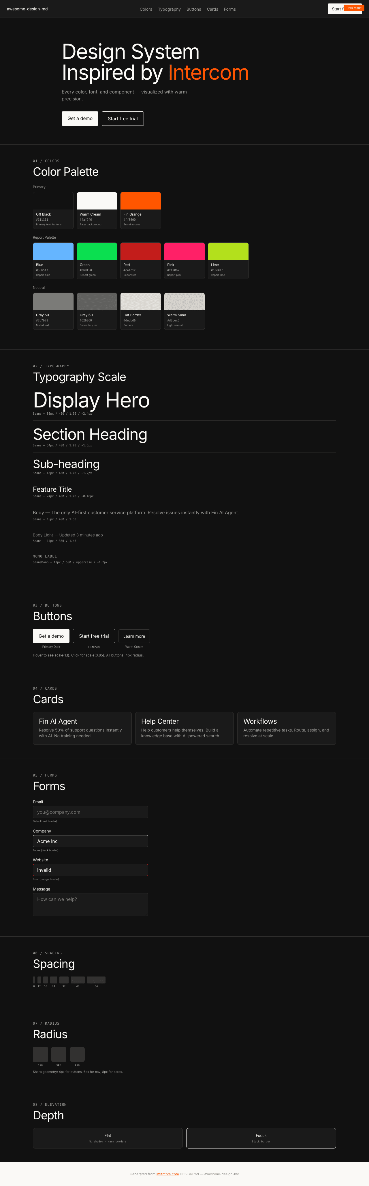
|
|
21
|
+
|
|
22
|
+
### Light Mode
|
|
23
|
+
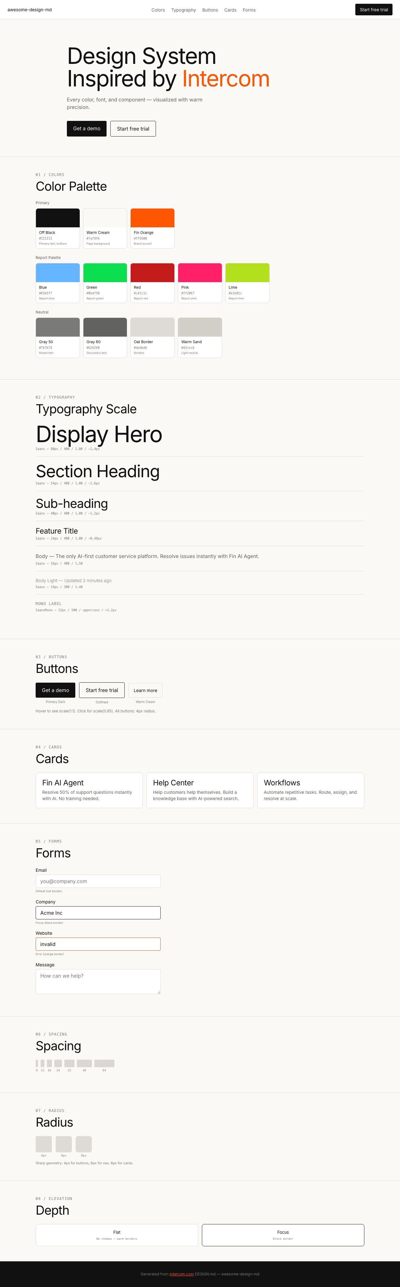
|