@dropins/mcp 0.1.0
This diff represents the content of publicly available package versions that have been released to one of the supported registries. The information contained in this diff is provided for informational purposes only and reflects changes between package versions as they appear in their respective public registries.
- package/LICENSE.md +127 -0
- package/README.md +314 -0
- package/dist/common/project-reader.d.ts +55 -0
- package/dist/common/project-reader.js +173 -0
- package/dist/common/registry-loader.d.ts +101 -0
- package/dist/common/registry-loader.js +386 -0
- package/dist/common/response-handling.d.ts +12 -0
- package/dist/common/response-handling.js +21 -0
- package/dist/common/sanitize.d.ts +8 -0
- package/dist/common/sanitize.js +45 -0
- package/dist/common/synonyms.d.ts +9 -0
- package/dist/common/synonyms.js +127 -0
- package/dist/common/telemetry.d.ts +14 -0
- package/dist/common/telemetry.js +54 -0
- package/dist/common/types.d.ts +308 -0
- package/dist/common/types.js +1 -0
- package/dist/common/version.d.ts +2 -0
- package/dist/common/version.js +14 -0
- package/dist/index.d.ts +2 -0
- package/dist/index.js +136 -0
- package/dist/operations/analyze-project.d.ts +13 -0
- package/dist/operations/analyze-project.js +125 -0
- package/dist/operations/check-block-health.d.ts +19 -0
- package/dist/operations/check-block-health.js +1149 -0
- package/dist/operations/check-config.d.ts +13 -0
- package/dist/operations/check-config.js +228 -0
- package/dist/operations/explain-event-flow.d.ts +16 -0
- package/dist/operations/explain-event-flow.js +218 -0
- package/dist/operations/get-upgrade-diff.d.ts +13 -0
- package/dist/operations/get-upgrade-diff.js +144 -0
- package/dist/operations/list-api-functions.d.ts +13 -0
- package/dist/operations/list-api-functions.js +53 -0
- package/dist/operations/list-containers.d.ts +13 -0
- package/dist/operations/list-containers.js +44 -0
- package/dist/operations/list-design-tokens.d.ts +13 -0
- package/dist/operations/list-design-tokens.js +47 -0
- package/dist/operations/list-events.d.ts +16 -0
- package/dist/operations/list-events.js +39 -0
- package/dist/operations/list-graphql-queries.d.ts +19 -0
- package/dist/operations/list-graphql-queries.js +84 -0
- package/dist/operations/list-i18n-keys.d.ts +19 -0
- package/dist/operations/list-i18n-keys.js +105 -0
- package/dist/operations/list-models.d.ts +16 -0
- package/dist/operations/list-models.js +80 -0
- package/dist/operations/list-slots.d.ts +16 -0
- package/dist/operations/list-slots.js +81 -0
- package/dist/operations/scaffold-block.d.ts +31 -0
- package/dist/operations/scaffold-block.js +331 -0
- package/dist/operations/scaffold-extension.d.ts +28 -0
- package/dist/operations/scaffold-extension.js +346 -0
- package/dist/operations/scaffold-slot.d.ts +22 -0
- package/dist/operations/scaffold-slot.js +189 -0
- package/dist/operations/search-commerce-docs.d.ts +16 -0
- package/dist/operations/search-commerce-docs.js +101 -0
- package/dist/operations/search-docs.d.ts +23 -0
- package/dist/operations/search-docs.js +298 -0
- package/dist/operations/suggest-event-handler.d.ts +16 -0
- package/dist/operations/suggest-event-handler.js +175 -0
- package/dist/operations/suggest-slot-implementation.d.ts +19 -0
- package/dist/operations/suggest-slot-implementation.js +183 -0
- package/dist/registry/api-functions.json +3045 -0
- package/dist/registry/block-patterns.json +78 -0
- package/dist/registry/containers.json +2003 -0
- package/dist/registry/design-tokens.json +577 -0
- package/dist/registry/docs/boilerplate.json +55 -0
- package/dist/registry/docs/dropins-all.json +97 -0
- package/dist/registry/docs/dropins-b2b.json +607 -0
- package/dist/registry/docs/dropins-cart.json +163 -0
- package/dist/registry/docs/dropins-checkout.json +193 -0
- package/dist/registry/docs/dropins-order.json +139 -0
- package/dist/registry/docs/dropins-payment-services.json +73 -0
- package/dist/registry/docs/dropins-personalization.json +67 -0
- package/dist/registry/docs/dropins-product-details.json +139 -0
- package/dist/registry/docs/dropins-product-discovery.json +85 -0
- package/dist/registry/docs/dropins-recommendations.json +67 -0
- package/dist/registry/docs/dropins-user-account.json +121 -0
- package/dist/registry/docs/dropins-user-auth.json +103 -0
- package/dist/registry/docs/dropins-wishlist.json +85 -0
- package/dist/registry/docs/get-started.json +85 -0
- package/dist/registry/docs/how-tos.json +19 -0
- package/dist/registry/docs/index.json +139 -0
- package/dist/registry/docs/licensing.json +19 -0
- package/dist/registry/docs/merchants.json +523 -0
- package/dist/registry/docs/resources.json +13 -0
- package/dist/registry/docs/sdk.json +139 -0
- package/dist/registry/docs/setup.json +145 -0
- package/dist/registry/docs/troubleshooting.json +19 -0
- package/dist/registry/events.json +2200 -0
- package/dist/registry/examples/index.json +19 -0
- package/dist/registry/examples/storefront-checkout.json +377 -0
- package/dist/registry/examples/storefront-quote-management.json +49 -0
- package/dist/registry/extensions.json +272 -0
- package/dist/registry/graphql.json +3469 -0
- package/dist/registry/i18n.json +1873 -0
- package/dist/registry/models.json +1001 -0
- package/dist/registry/sdk.json +2357 -0
- package/dist/registry/slots.json +2270 -0
- package/dist/registry/tools-components.json +595 -0
- package/dist/resources/guides.d.ts +7 -0
- package/dist/resources/guides.js +625 -0
- package/dist/resources/handlers.d.ts +31 -0
- package/dist/resources/handlers.js +322 -0
- package/package.json +47 -0
|
@@ -0,0 +1,523 @@
|
|
|
1
|
+
{
|
|
2
|
+
"section": "merchants",
|
|
3
|
+
"label": "Merchants",
|
|
4
|
+
"pageCount": 86,
|
|
5
|
+
"pages": [
|
|
6
|
+
{
|
|
7
|
+
"path": "merchants/blocks",
|
|
8
|
+
"title": "Commerce Blocks",
|
|
9
|
+
"description": "Learn how Commerce blocks work on your pages, what you can change without code, and where to find each block reference for your storefront.",
|
|
10
|
+
"content": "Commerce blocks are the tables you add in [Document Authoring](https://experienceleague.adobe.com/developer/commerce/storefront/merchants/quick-start/document-authoring/) when you edit a page. Each table tells your storefront to show one shopping feature, such as cart, checkout, a product page, or account management.\n\n\n| Topic | Description |\n|-------|-------------|\n| **Get oriented** | |\n| [Content and Commerce blocks](https://experienceleague.adobe.com/developer/commerce/storefront/merchants/blocks/content-commerce-blocks/) | What content blocks and Commerce blocks are and how they work together on a page |\n| [Author and developer tasks](https://experienceleague.adobe.com/developer/commerce/storefront/merchants/blocks/author-and-developer-tasks/) | Which changes you can make without code and which need a developer |\n| [Block table structure](https://experienceleague.adobe.com/developer/commerce/storefront/merchants/blocks/block-tables/) | How the rows in a block table map to the block on the page |\n| **Change labels and layout** | |\n| [Labels and placeholders](https://experienceleague.adobe.com/developer/commerce/storefront/merchants/blocks/labels-and-placeholders/) | Change the words shoppers see in Commerce blocks |\n| [Placeholder sheets](https://experienceleague.adobe.com/developer/commerce/storefront/merchants/blocks/placeholder-sheets/) | Which sheet controls which block and what labels each sheet contains |\n| [Page Metadata](https://experienceleague.adobe.com/developer/commerce/storefront/merchants/blocks/page-metadata/) | Page title, description, search settings, caching, and catalog fields such as SKU |\n| [Section Metadata](https://experienceleague.adobe.com/developer/commerce/storefront/merchants/blocks/section-metadata/) | Spacing, background, and column widths around a block |\n| **Block reference** | |\n| [B2C Commerce Blocks](https://experienceleague.adobe.com/developer/commerce/storefront/merchants/blocks/b2c/) | Blocks for business-to-consumer storefronts, including cart, checkout, account, and orders |\n| [B2B Commerce Blocks](https://experienceleague.adobe.com/developer/commerce/storefront/merchants/blocks/b2b/) | Blocks for business-to-business storefronts, including company management, purchase orders, and quotes |"
|
|
11
|
+
},
|
|
12
|
+
{
|
|
13
|
+
"path": "merchants/blocks/author-and-developer-tasks",
|
|
14
|
+
"title": "Author and developer tasks",
|
|
15
|
+
"description": "Learn which Commerce Storefront page changes you can make without code, and which to hand to a developer when code is required.",
|
|
16
|
+
"content": "Labels, block settings, spacing, and scheduling are all author tasks done in Document Authoring without code. Visual design and behavior inside a drop-in (colors, layout, how buttons work) belongs to a developer.\n\n## What you can change without code\n\nUse tables and sheets in Document Authoring (The tooling for creating storefront pages as documents in Google Docs, SharePoint, or DA.live without writing code. Tables in documents define the blocks that appear on each page.):\n\n\n| Task | Where to do it | Reference |\n| --- | --- | --- |\n| Choose which Commerce block appears on a page | The block table on the page | [Block table structure](https://experienceleague.adobe.com/developer/commerce/storefront/merchants/blocks/block-tables/) |\n| Set the few settings a Commerce block accepts | The block table on the page | The Commerce block's reference page in [B2C Commerce blocks](https://experienceleague.adobe.com/developer/commerce/storefront/merchants/blocks/b2c/) or [B2B Commerce blocks](https://experienceleague.adobe.com/developer/commerce/storefront/merchants/blocks/b2b/) |\n| Change the words shoppers see (button labels, headings, messages) | The placeholders sheet for the matching drop-in | [Labels and placeholders](https://experienceleague.adobe.com/developer/commerce/storefront/merchants/blocks/labels-and-placeholders/) |\n| Set the page title, description, and indexing | The metadata table on the page | [Page metadata](https://experienceleague.adobe.com/developer/commerce/storefront/merchants/blocks/page-metadata/) |\n| Adjust spacing, background, and column widths around a Commerce block | A section-metadata table after the Commerce block | [Section metadata](https://experienceleague.adobe.com/developer/commerce/storefront/merchants/blocks/section-metadata/) |\n| Translate labels into other locales | The locale-specific placeholders sheets | [Commerce localization tasks](https://experienceleague.adobe.com/developer/commerce/storefront/merchants/quick-start/content-localization-commerce-tasks/) |\n| Add related blocks on the same page (for example, breadcrumbs or Product Recommendations) | Add another block table on the page | [Using Content and Commerce blocks](https://experienceleague.adobe.com/developer/commerce/storefront/merchants/blocks/content-commerce-blocks/) |\n| Schedule when a page goes live | Snapshot scheduling in Document Authoring | [Scheduling options](https://experienceleague.adobe.com/developer/commerce/storefront/merchants/edge-delivery-services/scheduling/) |\n\n\n## What needs a developer\n\nThese changes require code or configuration outside the author tools:\n\n\n| Task | Why it is not an author task |\n| --- | --- |\n| Add or remove an element inside a drop-in (for example, a wishlist button on the product page) | That element is part of the drop-in layout code, not your block table. A developer adds or removes it there. |\n| Change the visual design of a drop-in (colors, fonts, button shapes beyond section metadata) | Visual design lives in your storefront's CSS and shared style settings. A developer edits those files. |\n| Track a new event in analytics or A/B testing | Drop-ins send events that other code can listen for. A developer connects those events to your analytics tool (for example, Google Analytics or Adobe Target). |\n| Connect or change your storefront's connection to Adobe Commerce (endpoints, store view headers, services) | These settings live in your [storefront configuration](https://experienceleague.adobe.com/developer/commerce/storefront/setup/configuration/commerce-configuration/). The integrator owns this work, often with a developer. |\n| Add a drop-in that is not on your storefront yet | A developer installs the package and adds the Commerce block that loads it. |\n| Change how a Commerce block behaves, not just how it looks (for example, how Add to Cart works) | The behavior comes from the drop-in code, not from the block table. A developer customizes the drop-in. |\n\n\nIf the change is not in either table, file a ticket with the page URL, the block name (for example, `product-details`), and a short description of what you want that you cannot do from the author tools.\n\n\n## How a Commerce Storefront page is built\n\nEvery Commerce Storefront page stacks three layers:\n\n- Drop-in components (NPM packages that provide core Commerce storefront features such as cart, checkout, product details, and account flows.) — Adobe-shipped UI for Commerce features such as Product Details, Cart, Checkout, and Account. A drop-in powers the interactive Commerce parts of a page (gallery, price, cart) and loads live catalog data from Adobe Commerce. Content blocks handle other page sections, such as marketing copy or images.\n- Commerce block (JavaScript blocks that integrate drop-in components into Edge Delivery Services pages to power storefront commerce experiences.) — A Block table (A table in a document that begins with a block name row, followed by configuration rows. Edge Delivery uses the name row to map the table to a storefront block implementation.) in your document with the block name (for example, `product-details` or `commerce-cart`) and any settings that block needs. See [Block table structure](https://experienceleague.adobe.com/developer/commerce/storefront/merchants/blocks/block-tables/) for the table shape.\n- Page — The document that holds your Commerce blocks and any content blocks (marketing copy, images, breadcrumbs, Product Recommendations).\n\nMost Commerce blocks live on a page you author yourself, such as your cart or sign-in page. The product page (PDP) is the exception. One document at `/products/default` is the template layout for every product URL, so a change there updates all product pages at once. Names, prices, and images still come from your catalog, not from that document. See [Product Details](https://experienceleague.adobe.com/developer/commerce/storefront/merchants/blocks/product-details/) for how this template works.\n\n#### Roles at a glance\n\n- **Author** — Edits pages in Document Authoring or the Universal Editor. Owns shopper-facing copy, block settings, placeholders sheets, section and page metadata, publishing, and scheduling.\n- **Integrator** — Connects the storefront to Adobe Commerce. Edits [storefront configuration](https://experienceleague.adobe.com/developer/commerce/storefront/setup/configuration/commerce-configuration/), store view headers, and similar settings, often with a developer when code is required.\n- **Developer** — Owns code in your storefront repository: drop-in customization, CSS, shared style settings, new drop-ins, and analytics integrations.\n\nOn a small team, one person may cover two roles. Name the role you need on a ticket so the request reaches the right person faster.\n\nFor developer-facing vocabulary (containers, slots, events), see [Introduction to drop-in components](https://experienceleague.adobe.com/developer/commerce/storefront/dropins/all/introduction/)."
|
|
17
|
+
},
|
|
18
|
+
{
|
|
19
|
+
"path": "merchants/blocks/b2b",
|
|
20
|
+
"title": "B2B Blocks",
|
|
21
|
+
"description": "Complete reference guide for all B2B commerce blocks available in the Adobe Commerce boilerplate, organized by business function.",
|
|
22
|
+
"content": "This reference provides a complete list of all B2B commerce blocks available for creating your storefront pages. These blocks power B2B storefronts and provide company management, purchase order workflows, quote negotiation, and requisition list features for business-to-business commerce.\n\nIf you are new to Commerce blocks, read [Author and developer tasks](https://experienceleague.adobe.com/developer/commerce/storefront/merchants/blocks/author-and-developer-tasks/) first. It explains drop-ins, blocks, and pages as three layers, what you can change without code, and when to hand off to a developer.\n\n## B2B commerce blocks\n\n\n| Commerce Block | Purpose | Common Usage |\n|----------------|---------|--------------|\n| **Company Management** | | |\n| [Create Company](https://experienceleague.adobe.com/developer/commerce/storefront/merchants/blocks/commerce-company-create/) | Customers register new companies to access B2B purchasing features | Company registration pages |\n| [Accept Company Invitation](https://experienceleague.adobe.com/developer/commerce/storefront/merchants/blocks/commerce-company-accept-invitation/) | Invited users join companies | Invitation acceptance pages |\n| [Company Profile](https://experienceleague.adobe.com/developer/commerce/storefront/merchants/blocks/commerce-company-profile/) | Company administrators update business details and contact information | Company profile pages |\n| [Company Structure](https://experienceleague.adobe.com/developer/commerce/storefront/merchants/blocks/commerce-company-structure/) | Company administrators organize teams and departments | Company structure pages |\n| [Company Users](https://experienceleague.adobe.com/developer/commerce/storefront/merchants/blocks/commerce-company-users/) | Company administrators add team members and manage user access | Company user management pages |\n| [Company Roles and Permissions](https://experienceleague.adobe.com/developer/commerce/storefront/merchants/blocks/commerce-company-roles-permissions/) | Company administrators control who can approve orders and access features | Roles and permissions pages |\n| [Company Credit](https://experienceleague.adobe.com/developer/commerce/storefront/merchants/blocks/commerce-company-credit/) | Company buyers view credit balances and transaction history | Company credit pages |\n| [Customer Company](https://experienceleague.adobe.com/developer/commerce/storefront/merchants/blocks/commerce-customer-company/) | Company users view their company affiliation and job title | Account information pages |\n| **Purchase Orders** | | |\n| [Purchase Order Status](https://experienceleague.adobe.com/developer/commerce/storefront/merchants/blocks/commerce-b2b-po-status/) | Users view order status and take actions like approve, reject, or cancel | Purchase order detail pages |\n| [Purchase Orders Requiring Approval](https://experienceleague.adobe.com/developer/commerce/storefront/merchants/blocks/commerce-b2b-po-require-approval-purchase-orders/) | Approvers see orders awaiting their review and prioritize approval processing | Orders for approval pages |\n| [Purchase Order History Log](https://experienceleague.adobe.com/developer/commerce/storefront/merchants/blocks/commerce-b2b-po-history-log/) | Users view audit trails showing who approved orders and when actions occurred | Purchase order detail pages |\n| [Purchase Order Header](https://experienceleague.adobe.com/developer/commerce/storefront/merchants/blocks/commerce-b2b-po-header/) | Users navigate purchase order details with contextual page headers | Top of purchase order pages |\n| [Customer Purchase Orders](https://experienceleague.adobe.com/developer/commerce/storefront/merchants/blocks/commerce-b2b-po-customer-purchase-orders/) | Buyers track their own purchase orders and monitor approval status | My purchase orders pages |\n| [Company Purchase Orders](https://experienceleague.adobe.com/developer/commerce/storefront/merchants/blocks/commerce-b2b-po-company-purchase-orders/) | Managers monitor all company spending and track pending approvals | Company purchase orders pages |\n| [Purchase Order Comments List](https://experienceleague.adobe.com/developer/commerce/storefront/merchants/blocks/commerce-b2b-po-comments-list/) | Team members view order discussions and approval reasons | Purchase order detail pages |\n| [Purchase Order Comment Form](https://experienceleague.adobe.com/developer/commerce/storefront/merchants/blocks/commerce-b2b-po-comment-form/) | Team members communicate about orders and document decisions | Purchase order detail pages |\n| [Purchase Order Checkout Success](https://experienceleague.adobe.com/developer/commerce/storefront/merchants/blocks/commerce-b2b-po-checkout-success/) | Buyers receive purchase order confirmation and order numbers | Purchase order confirmation pages |\n| [Purchase Order Approval Rules List](https://experienceleague.adobe.com/developer/commerce/storefront/merchants/blocks/commerce-b2b-po-approval-rules-list/) | Administrators view all approval rules and which orders they affect | Approval rules pages |\n| [Purchase Order Approval Rule Form](https://experienceleague.adobe.com/developer/commerce/storefront/merchants/blocks/commerce-b2b-po-approval-rule-form/) | Administrators create spending limits and set approval hierarchies | Create approval rule pages |\n| [Purchase Order Approval Rule Details](https://experienceleague.adobe.com/developer/commerce/storefront/merchants/blocks/commerce-b2b-po-approval-rule-details/) | Administrators review rule conditions and approval requirements | Approval rule detail pages |\n| [Purchase Order Approval Flow](https://experienceleague.adobe.com/developer/commerce/storefront/merchants/blocks/commerce-b2b-po-approval-flow/) | Users view workflow status and who approved or rejected orders | Purchase order detail pages |\n| **Quotes** | | |\n| [Negotiable Quote](https://experienceleague.adobe.com/developer/commerce/storefront/merchants/blocks/commerce-b2b-negotiable-quote/) | Buyers request custom pricing and negotiate terms with your sales team | Quote pages |\n| [Negotiable Quote Template](https://experienceleague.adobe.com/developer/commerce/storefront/merchants/blocks/commerce-b2b-negotiable-quote-template/) | Buyers create reusable quote templates for recurring orders | Quote template pages |\n| [Quote Checkout](https://experienceleague.adobe.com/developer/commerce/storefront/merchants/blocks/commerce-b2b-quote-checkout/) | Buyers complete negotiated quote purchases with approved pricing | Quote checkout pages |\n| **Requisition Lists** | | |\n| [Requisition Lists](https://experienceleague.adobe.com/developer/commerce/storefront/merchants/blocks/commerce-b2b-requisition-list/) | Buyers create shopping lists for recurring orders | Requisition list pages |\n| [Requisition List View](https://experienceleague.adobe.com/developer/commerce/storefront/merchants/blocks/commerce-b2b-requisition-list-view/) | Buyers review and add items to cart from saved requisition lists | Requisition list detail pages |\n| **Shared Blocks** | | |\n| [Account Nav](https://experienceleague.adobe.com/developer/commerce/storefront/merchants/blocks/commerce-account-nav/) | Provides account navigation menu for B2B accounts | Account section navigation |\n| [Checkout Success](https://experienceleague.adobe.com/developer/commerce/storefront/merchants/blocks/commerce-checkout-success/) | Displays order confirmation after checkout | Order confirmation pages |\n\n\n## Setup guides\n\nSome blocks require additional setup and configuration beyond the basic block reference:\n\n- [Personalization setup](https://experienceleague.adobe.com/developer/commerce/storefront/merchants/content-customizations/personalization/) - Add personalized content to your storefront.\n- [Product Recommendations setup](https://experienceleague.adobe.com/developer/commerce/storefront/merchants/content-customizations/product-recommendations/) - Set up intelligent product recommendations.\n\n## Using commerce blocks\n\n### Adding a block to your page\n\n\n1. In the Document Authoring tool, create a table with the block name.\n1. Add configuration options as key-value pairs in the table.\n1. The block will automatically render when the page is published.\n\n\nIf the table parts (block name row, key-value rows, and merged full-width content rows) are new to you, read [Block table structure](https://experienceleague.adobe.com/developer/commerce/storefront/merchants/blocks/block-tables/) and then come back to this reference.\n\n**Examples:**\n\n**Simple block with configuration:**\n<table style=\"width: 100%; min-width: 470px; max-width: 100%; table-layout: fixed; border-collapse: collapse;\">\n<tbody>\n<tr>\n<td colspan=\"2\" style=\"text-align: center; padding: 1.25rem; border: 1px solid var(--sl-color-gray-5); background-color: var(--sl-color-gray-6); font-weight: 600;\">commerce-company-credit</td>\n</tr>\n<tr>\n<td style=\"width: 50%; padding: 1.25rem; border: 1px solid var(--sl-color-gray-5);\">showHistory</td>\n<td style=\"width: 50%; padding: 1.25rem; border: 1px solid var(--sl-color-gray-5);\">true</td>\n</tr>\n</tbody>\n</table>\n\n**Multiple blocks on one page (purchase order detail):**\n<table style=\"width: 100%; min-width: 470px; max-width: 100%; table-layout: fixed; border-collapse: collapse; margin-bottom: 1.5rem;\">\n<tbody>\n<tr>\n<td colspan=\"2\" style=\"text-align: center; padding: 1.25rem; border: 1px solid var(--sl-color-gray-5); background-color: var(--sl-color-gray-6); font-weight: 600;\">commerce-b2b-po-header</td>\n</tr>\n<tr>\n<td colspan=\"2\" style=\"padding: 1.25rem; border: 1px solid var(--sl-color-gray-5);\"></td>\n</tr>\n</tbody>\n</table>\n\n<table style=\"width: 100%; min-width: 470px; max-width: 100%; table-layout: fixed; border-collapse: collapse; margin-bottom: 1.5rem;\">\n<tbody>\n<tr>\n<td colspan=\"2\" style=\"text-align: center; padding: 1.25rem; border: 1px solid var(--sl-color-gray-5); background-color: var(--sl-color-gray-6); font-weight: 600;\">commerce-b2b-po-status</td>\n</tr>\n<tr>\n<td colspan=\"2\" style=\"padding: 1.25rem; border: 1px solid var(--sl-color-gray-5);\"></td>\n</tr>\n</tbody>\n</table>\n\n<table style=\"width: 100%; min-width: 470px; max-width: 100%; table-layout: fixed; border-collapse: collapse; margin-bottom: 1.5rem;\">\n<tbody>\n<tr>\n<td colspan=\"2\" style=\"text-align: center; padding: 1.25rem; border: 1px solid var(--sl-color-gray-5); background-color: var(--sl-color-gray-6); font-weight: 600;\">commerce-b2b-po-approval-flow</td>\n</tr>\n<tr>\n<td colspan=\"2\" style=\"padding: 1.25rem; border: 1px solid var(--sl-color-gray-5);\"></td>\n</tr>\n</tbody>\n</table>\n\n<table style=\"width: 100%; min-width: 470px; max-width: 100%; table-layout: fixed; border-collapse: collapse; margin-bottom: 1.5rem;\">\n<tbody>\n<tr>\n<td colspan=\"2\" style=\"text-align: center; padding: 1.25rem; border: 1px solid var(--sl-color-gray-5); background-color: var(--sl-color-gray-6); font-weight: 600;\">commerce-b2b-po-comments-list</td>\n</tr>\n<tr>\n<td colspan=\"2\" style=\"padding: 1.25rem; border: 1px solid var(--sl-color-gray-5);\"></td>\n</tr>\n</tbody>\n</table>\n\n<table style=\"width: 100%; min-width: 470px; max-width: 100%; table-layout: fixed; border-collapse: collapse;\">\n<tbody>\n<tr>\n<td colspan=\"2\" style=\"text-align: center; padding: 1.25rem; border: 1px solid var(--sl-color-gray-5); background-color: var(--sl-color-gray-6); font-weight: 600;\">commerce-b2b-po-comment-form</td>\n</tr>\n<tr>\n<td colspan=\"2\" style=\"padding: 1.25rem; border: 1px solid var(--sl-color-gray-5);\"></td>\n</tr>\n</tbody>\n</table>\n\n### Block naming conventions\n\n- All B2B commerce blocks start with \"Commerce\".\n- Block names are case-sensitive.\n- Use the exact spelling shown in this reference.\n- Hyphens in the reference should be spaces in tables.\n\n### Configuration options\n\nEach block has its own set of configuration options. For detailed configuration information:\n\n- View the [individual block documentation](https://experienceleague.adobe.com/developer/commerce/storefront/merchants/blocks/commerce-company-create/) for specific configuration options.\n- Most blocks have optional configuration (they work with defaults).\n- Configuration keys are case-sensitive.\n\n## Blocks by page type\n\nFor B2B storefronts, add these specialized pages:\n\n### Company management pages\n\n- **Company registration** - Use the Create Company block.\n- **Company profile** - Use the Company Profile block.\n- **Company administration** - Combine Company Structure, Company Users, and Company Roles and Permissions blocks on separate sections or pages.\n- **Company credit** - Use the Company Credit block.\n\n### Purchase order pages\n\n- **Purchase order list** - Use Customer Purchase Orders (for buyers) or Company Purchase Orders (for managers).\n- **Purchase order detail** - Combine Purchase Order Header, Purchase Order Status, Purchase Order Approval Flow, Purchase Order Comments List, and Purchase Order Comment Form blocks.\n- **Orders for approval** - Use Purchase Orders Requiring Approval block.\n- **Approval rules management** - Use Purchase Order Approval Rules List, Purchase Order Approval Rule Form, and Purchase Order Approval Rule Details blocks.\n\n### Quote pages\n\n- **Quote management** - Use Negotiable Quote block.\n- **Quote templates** - Use Negotiable Quote Template block.\n- **Quote checkout** - Use Quote Checkout block.\n\n### Requisition list pages\n\n- **Requisition list management** - Use Requisition Lists block.\n- **Requisition list detail** - Use Requisition List View block.\n\n## Related resources\n\n- [Your first page](https://experienceleague.adobe.com/developer/commerce/storefront/merchants/quick-start/your-first-page/) - Step-by-step tutorial for creating a page.\n- [Page metadata](https://experienceleague.adobe.com/developer/commerce/storefront/merchants/blocks/page-metadata/) - Configure page-level settings.\n- [Section metadata](https://experienceleague.adobe.com/developer/commerce/storefront/merchants/blocks/section-metadata/) - Style your page sections.\n- [B2C Commerce blocks](https://experienceleague.adobe.com/developer/commerce/storefront/merchants/blocks/b2c/) - If you're building a B2C storefront, see the B2C blocks reference.\n\n## Need help?\n\n- **Missing a block?** All available B2B blocks are listed in the table above.\n- **Configuration not working?** Review the [individual block documentation](https://experienceleague.adobe.com/developer/commerce/storefront/merchants/blocks/commerce-company-create/) for exact option names.\n- **Block not appearing?** Verify the block name is spelled exactly as shown in this reference."
|
|
23
|
+
},
|
|
24
|
+
{
|
|
25
|
+
"path": "merchants/blocks/b2c",
|
|
26
|
+
"title": "B2C Blocks",
|
|
27
|
+
"description": "Complete reference guide for all B2C commerce blocks available in the Adobe Commerce boilerplate, organized by shopping experience.",
|
|
28
|
+
"content": "This reference provides a complete list of all B2C commerce blocks available for creating your storefront pages. These blocks power standard B2C storefronts and provide essential shopping, account, and order management features for direct-to-consumer commerce.\n\nIf you are new to Commerce blocks, read [Author and developer tasks](https://experienceleague.adobe.com/developer/commerce/storefront/merchants/blocks/author-and-developer-tasks/) first. It explains drop-ins, blocks, and pages as three layers, what you can change without code, and when to hand off to a developer.\n\n## B2C commerce blocks\n\n\n| Commerce Block | Purpose | Common Usage |\n|----------------|---------|--------------|\n| **Shopping Experience** | | |\n| [Product List Page](https://experienceleague.adobe.com/developer/commerce/storefront/merchants/blocks/product-list-page/) | Displays product listings with filtering, sorting, and pagination | Category pages, search results pages |\n| [Product Details](https://experienceleague.adobe.com/developer/commerce/storefront/merchants/blocks/product-details/) | Shows detailed product information with images, pricing, and options | Individual product pages (PDP) |\n| [Product Recommendations](https://experienceleague.adobe.com/developer/commerce/storefront/merchants/content-customizations/product-recommendations/) | Displays AI-powered product recommendations | Product pages, cart page, homepage |\n| [Commerce Cart](https://experienceleague.adobe.com/developer/commerce/storefront/merchants/blocks/commerce-cart/) | Shows shopping cart with items, pricing, and cart management | Cart page |\n| [Commerce Mini Cart](https://experienceleague.adobe.com/developer/commerce/storefront/merchants/blocks/commerce-mini-cart/) | Displays cart summary in a dropdown or overlay | Site header, global navigation |\n| **Customer Account** | | |\n| [Commerce Login](https://experienceleague.adobe.com/developer/commerce/storefront/merchants/blocks/commerce-login/) | Provides customer login form | Login page, account access page |\n| [Commerce Forgot Password](https://experienceleague.adobe.com/developer/commerce/storefront/merchants/blocks/commerce-forgot-password/) | Initiates password reset process | Password recovery page |\n| [Commerce Create Password](https://experienceleague.adobe.com/developer/commerce/storefront/merchants/blocks/commerce-create-password/) | Sets new password after reset | Password reset landing page |\n| [Commerce Addresses](https://experienceleague.adobe.com/developer/commerce/storefront/merchants/blocks/commerce-addresses/) | Manages shipping and billing addresses | Account address book page |\n| [Commerce Customer Information](https://experienceleague.adobe.com/developer/commerce/storefront/merchants/blocks/commerce-customer-information/) | Displays and edits customer profile details | Account profile page |\n| [Commerce Customer Details](https://experienceleague.adobe.com/developer/commerce/storefront/merchants/blocks/commerce-customer-details/) | Shows customer information in order context | Order details page |\n| [Commerce Account Header](https://experienceleague.adobe.com/developer/commerce/storefront/merchants/blocks/commerce-account-header/) | Displays account navigation and user information | Account section header |\n| [Commerce Account Sidebar](https://experienceleague.adobe.com/developer/commerce/storefront/merchants/blocks/commerce-account-sidebar/) | Provides account navigation menu | Account section sidebar |\n| **Order Management** | | |\n| [Commerce Orders List](https://experienceleague.adobe.com/developer/commerce/storefront/merchants/blocks/commerce-orders-list/) | Lists all customer orders with status and details | Order history page |\n| [Commerce Search Order](https://experienceleague.adobe.com/developer/commerce/storefront/merchants/blocks/commerce-search-order/) | Allows guest order lookup by order number and email | Guest order tracking page |\n| [Commerce Order Header](https://experienceleague.adobe.com/developer/commerce/storefront/merchants/blocks/commerce-order-header/) | Displays order number, date, and status | Order details page header |\n| [Commerce Order Status](https://experienceleague.adobe.com/developer/commerce/storefront/merchants/blocks/commerce-order-status/) | Shows detailed order status and tracking information | Order details page |\n| [Commerce Order Product List](https://experienceleague.adobe.com/developer/commerce/storefront/merchants/blocks/commerce-order-product-list/) | Lists products in the order with images and details | Order details page |\n| [Commerce Order Cost Summary](https://experienceleague.adobe.com/developer/commerce/storefront/merchants/blocks/commerce-order-cost-summary/) | Shows order totals, taxes, shipping, and discounts | Order details page, order confirmation |\n| [Commerce Shipping Status](https://experienceleague.adobe.com/developer/commerce/storefront/merchants/blocks/commerce-shipping-status/) | Displays shipment tracking and delivery information | Order details page, tracking page |\n| **Returns & Exchanges** | | |\n| [Commerce Returns List](https://experienceleague.adobe.com/developer/commerce/storefront/merchants/blocks/commerce-returns-list/) | Lists all return requests with status | Account returns page |\n| [Commerce Create Return](https://experienceleague.adobe.com/developer/commerce/storefront/merchants/blocks/commerce-create-return/) | Initiates return request with item selection and reasons | Return request page |\n| [Commerce Order Returns](https://experienceleague.adobe.com/developer/commerce/storefront/merchants/blocks/commerce-order-returns/) | Shows return details for a specific order | Order details page |\n| [Commerce Return Header](https://experienceleague.adobe.com/developer/commerce/storefront/merchants/blocks/commerce-return-header/) | Displays return request number and status | Return details page |\n| **Gift Options** | | |\n| [Commerce Gift Options](https://experienceleague.adobe.com/developer/commerce/storefront/merchants/blocks/commerce-gift-options/) | Allows adding gift messages and gift wrapping | Cart page, checkout page |\n| **Wishlist** | | |\n| [Commerce Wishlist](https://experienceleague.adobe.com/developer/commerce/storefront/merchants/blocks/commerce-wishlist/) | Displays saved items for later purchase | Wishlist page, account section |\n\n\n## Setup guides\n\nSome blocks require additional setup and configuration beyond the basic block reference:\n\n- [Personalization setup](https://experienceleague.adobe.com/developer/commerce/storefront/merchants/content-customizations/personalization/) - Add personalized content to your storefront.\n- [Product Recommendations setup](https://experienceleague.adobe.com/developer/commerce/storefront/merchants/content-customizations/product-recommendations/) - Set up intelligent product recommendations.\n\n## Using commerce blocks\n\n### Adding a block to your page\n\n\n1. In the Document Authoring tool, create a table with the block name.\n1. Add configuration options as key-value pairs in the table.\n1. The block will automatically render when the page is published.\n\n\nIf the table parts (block name row, key-value rows, and occasional merged full-width content rows) are new to you, read [Block table structure](https://experienceleague.adobe.com/developer/commerce/storefront/merchants/blocks/block-tables/) and then come back to this reference.\n\n**Example:**\n\n| Commerce Cart | |\n|---------------|---|\n| Hide Heading | false |\n| Max Items | 10 |\n\n### Block naming conventions\n\n- All commerce blocks start with \"Commerce\" (except Product blocks).\n- Block names are case-sensitive.\n- Use the exact spelling shown in this reference.\n- Hyphens in the reference (for example, \"Mini Cart\") should be spaces in tables.\n\n### Configuration options\n\nEach block has its own set of configuration options. For detailed configuration information:\n\n- View the [individual block documentation](https://experienceleague.adobe.com/developer/commerce/storefront/merchants/blocks/commerce-cart/) for specific configuration options.\n- Most blocks have optional configuration (they work with defaults).\n- Configuration keys are case-sensitive.\n\n## Blocks by page type\n\n### Essential pages\n\nEvery B2C storefront needs these core pages:\n\n- **Homepage**: Product Recommendations, Product List Page\n- **Product Page**: Product Details, Product Recommendations\n- **Cart**: Commerce Cart, Product Recommendations\n- **Checkout**: Commerce Checkout\n- **Account Dashboard**: Commerce Account Header, Commerce Account Sidebar\n\n### Optional pages\n\nEnhance your B2C storefront with these additional pages:\n\n- **Wishlist**: Commerce Wishlist\n- **Order Tracking**: Commerce Search Order, Commerce Order Status\n- **Returns**: Commerce Create Return, Commerce Returns List\n- **Address Management**: Commerce Addresses\n\n## Related resources\n\n- [Your first page](https://experienceleague.adobe.com/developer/commerce/storefront/merchants/quick-start/your-first-page/) - Step-by-step tutorial for creating a cart page.\n- [Page metadata](https://experienceleague.adobe.com/developer/commerce/storefront/merchants/blocks/page-metadata/) - Configure page-level settings.\n- [Section metadata](https://experienceleague.adobe.com/developer/commerce/storefront/merchants/blocks/section-metadata/) - Style your page sections.\n- [B2B Commerce blocks](https://experienceleague.adobe.com/developer/commerce/storefront/merchants/blocks/b2b/) - If you're building a B2B storefront, see the B2B blocks reference.\n\n## Need help?\n\n- **Missing a block?** All available B2C blocks are listed in the table above.\n- **Configuration not working?** Review the [individual block documentation](https://experienceleague.adobe.com/developer/commerce/storefront/merchants/blocks/commerce-cart/) for exact option names.\n- **Block not appearing?** Verify the block name is spelled exactly as shown in this reference."
|
|
29
|
+
},
|
|
30
|
+
{
|
|
31
|
+
"path": "merchants/blocks/block-tables",
|
|
32
|
+
"title": "Block table structure",
|
|
33
|
+
"description": "Learn how Adobe Commerce block tables are structured in documents, including block names, key-value settings, and merged full-width rows.",
|
|
34
|
+
"content": "A block table (A table in a document that begins with a block name row, followed by configuration rows. Edge Delivery uses the name row to map the table to a storefront block implementation.) in your document is how you add any Commerce block or Content block to a page. You create it in Document Authoring as a simple table: the block name goes in the first row, and settings go in the rows below it.\n\n## Example: a block table in your document\n\nThis example uses the `commerce-cart` block and includes all three row types.\n\n<table style=\"width: 100%; min-width: 470px; max-width: 100%; table-layout: fixed; border-collapse: collapse;\">\n<tbody>\n<tr>\n<td colspan=\"2\" style=\"text-align: center; padding: 0.4rem 0.75rem; border: 1px solid var(--sl-color-gray-5); background-color: var(--sl-color-gray-6); font-weight: 600;\">commerce-cart</td>\n</tr>\n<tr>\n<td style=\"width: 50%; padding: 0.4rem 0.75rem; border: 1px solid var(--sl-color-gray-5);\">Enable Item Quantity Update</td>\n<td style=\"width: 50%; padding: 0.4rem 0.75rem; border: 1px solid var(--sl-color-gray-5);\">true</td>\n</tr>\n<tr>\n<td style=\"width: 50%; padding: 0.4rem 0.75rem; border: 1px solid var(--sl-color-gray-5);\">Hide Heading</td>\n<td style=\"width: 50%; padding: 0.4rem 0.75rem; border: 1px solid var(--sl-color-gray-5);\">false</td>\n</tr>\n<tr>\n<td style=\"width: 50%; padding: 0.4rem 0.75rem; border: 1px solid var(--sl-color-gray-5);\">Checkout URL</td>\n<td style=\"width: 50%; padding: 0.4rem 0.75rem; border: 1px solid var(--sl-color-gray-5);\">/checkout</td>\n</tr>\n<tr>\n<td colspan=\"2\" style=\"padding: 0.4rem 0.75rem; border: 1px solid var(--sl-color-gray-5); color: var(--sl-color-gray-3); font-style: italic;\">Optional: in some blocks, a merged full-width row is where the visible page content goes when it does not fit in a small value cell. Not every block uses this row.</td>\n</tr>\n</tbody>\n</table>\n\nRead the table from top to bottom:\n\n- The first row (full width, shaded) is the block name (The first row in a block table. It usually contains a single `kebab-case` block identifier (for example, `commerce-cart` or `targeted-block`) that tells the system which block to render.) row. It contains a single `kebab-case` name such as `commerce-cart`. The storefront uses this name to find and load the right block.\n- Rows with two cells are key-value (A two-column table row in a block table. The first cell is a setting name (a key) and the second cell is the value, such as `true`, `10`, or a text label.) settings: a setting name in the left column and its value in the right. Most settings are optional and fall back to safe defaults. Each block's [reference page](https://experienceleague.adobe.com/developer/commerce/storefront/merchants/blocks/) lists the available keys and which are required.\n- A row with one cell spanning the full width is a merged full-width row (A table row where one cell spans the full table width, so you can add rich page content in one large cell. Some blocks (like `targeted-block`) use this for inline content or layout when a separate fragment document is not used.). Some blocks use it to hold page content that doesn't fit in a setting value. The italic row in the example shows this option.\n\n> **Where is my block?**\n>\nIf a block does not appear on the page when previewed, the most common cause is a block name that does not match the spelling on that block's [reference page](https://experienceleague.adobe.com/developer/commerce/storefront/merchants/blocks/). If the block appears but looks wrong or empty, check the content rules on that block's [reference page](https://experienceleague.adobe.com/developer/commerce/storefront/merchants/blocks/), or use [Personalization setup](https://experienceleague.adobe.com/developer/commerce/storefront/merchants/content-customizations/personalization/) for `targeted-block`.\n\n\n## Add a block to your document\n\nTo add any Commerce block to a page, create a block table in Document Authoring (the web-based editor where you create and update storefront pages).\n\n\n1. Add a new table to the page.\n\n1. Set the first row to the block name in `kebab-case`, for example, `commerce-cart`.\n\n1. Add the key-value rows that the block's [reference page](https://experienceleague.adobe.com/developer/commerce/storefront/merchants/blocks/) requires or recommends.\n\n1. Preview the page. The block should appear in the section where you placed the table.\n\n1. Publish when the page looks right.\n\n\nFor an end-to-end example that covers metadata, a cart block, and section styling, work through [Your first page](https://experienceleague.adobe.com/developer/commerce/storefront/merchants/quick-start/your-first-page/)."
|
|
35
|
+
},
|
|
36
|
+
{
|
|
37
|
+
"path": "merchants/blocks/commerce-account-header",
|
|
38
|
+
"title": "Commerce Account Header",
|
|
39
|
+
"description": "Customers see consistent page headers across account pages through this block. Place it at the top of account-related pages.",
|
|
40
|
+
"content": "Customers see consistent page headers across account pages through this block. Place it at the top of account-related pages.\n\n\n## Configuration\n\nAdd this table to your document to configure the block:\n\n<table style=\"width: 100%; min-width: 470px; max-width: 100%; table-layout: fixed; border-collapse: collapse;\">\n<tbody>\n<tr>\n<td colspan=\"2\" style=\"text-align: center; padding: 0.75rem; border: 1px solid var(--sl-color-gray-5); background-color: var(--sl-color-gray-6); font-weight: 600;\">commerce-account-header</td>\n</tr>\n<tr>\n<td style=\"width: 50%; padding: 0.75rem; border: 1px solid var(--sl-color-gray-5);\">title</td>\n<td style=\"width: 50%; padding: 0.75rem; border: 1px solid var(--sl-color-gray-5);\">My account</td>\n</tr>\n</tbody>\n</table>\n\n### Property descriptions\n\n**title**: The header title text displayed to users. Default: `My account`.\n\nThe block uses default configuration values if custom settings are missing or invalid.\n\n## Section metadata\n\nControl the section styling, spacing, and layout that wraps your commerce block. All properties are optional:\n\n<table style=\"width: 100%; min-width: 470px; max-width: 100%; table-layout: fixed; border-collapse: collapse;\">\n<tbody>\n<tr>\n<td colspan=\"2\" style=\"text-align: center; padding: 0.75rem; border: 1px solid var(--sl-color-gray-5); background-color: var(--sl-color-gray-6); font-weight: 600;\">section-metadata</td>\n</tr>\n<tr>\n<td style=\"width: 50%; padding: 0.75rem; border: 1px solid var(--sl-color-gray-5);\">Style</td>\n<td style=\"width: 50%; padding: 0.75rem; border: 1px solid var(--sl-color-gray-5);\">light (optional)</td>\n</tr>\n<tr>\n<td style=\"width: 50%; padding: 0.75rem; border: 1px solid var(--sl-color-gray-5);\">Padding</td>\n<td style=\"width: 50%; padding: 0.75rem; border: 1px solid var(--sl-color-gray-5);\">medium (optional)</td>\n</tr>\n<tr>\n<td style=\"width: 50%; padding: 0.75rem; border: 1px solid var(--sl-color-gray-5);\">Margin</td>\n<td style=\"width: 50%; padding: 0.75rem; border: 1px solid var(--sl-color-gray-5);\">small (optional)</td>\n</tr>\n<tr>\n<td style=\"width: 50%; padding: 0.75rem; border: 1px solid var(--sl-color-gray-5);\">Column Width</td>\n<td style=\"width: 50%; padding: 0.75rem; border: 1px solid var(--sl-color-gray-5);\">30% (optional)</td>\n</tr>\n<tr>\n<td style=\"width: 50%; padding: 0.75rem; border: 1px solid var(--sl-color-gray-5);\">Gap</td>\n<td style=\"width: 50%; padding: 0.75rem; border: 1px solid var(--sl-color-gray-5);\">small (optional)</td>\n</tr>\n</tbody>\n</table>\n\n> **Learn more**\n>\n\nSee the [Section Metadata guide](https://experienceleague.adobe.com/developer/commerce/storefront/merchants/blocks/section-metadata/) for all available values and the [Page Metadata guide](https://experienceleague.adobe.com/developer/commerce/storefront/merchants/blocks/page-metadata/) for SEO and caching options."
|
|
41
|
+
},
|
|
42
|
+
{
|
|
43
|
+
"path": "merchants/blocks/commerce-account-nav",
|
|
44
|
+
"title": "Account Navigation",
|
|
45
|
+
"description": "Customers navigate between account sections through this block. Place it on account dashboard pages.",
|
|
46
|
+
"content": "Customers navigate between account sections through this block. Place it on account dashboard pages.\n\n\n## Requirements\n\nCustomers must log in to access this block.\n\n## Configuration\n\nNo configurations available for this block.\n\n## Section metadata\n\nControl the section styling, spacing, and layout that wraps your commerce block. All properties are optional:\n\n<table style=\"width: 100%; min-width: 470px; max-width: 100%; table-layout: fixed; border-collapse: collapse;\">\n<tbody>\n<tr>\n<td colspan=\"2\" style=\"text-align: center; padding: 0.75rem; border: 1px solid var(--sl-color-gray-5); background-color: var(--sl-color-gray-6); font-weight: 600;\">section-metadata</td>\n</tr>\n<tr>\n<td style=\"width: 50%; padding: 0.75rem; border: 1px solid var(--sl-color-gray-5);\">Style</td>\n<td style=\"width: 50%; padding: 0.75rem; border: 1px solid var(--sl-color-gray-5);\">light (optional)</td>\n</tr>\n<tr>\n<td style=\"width: 50%; padding: 0.75rem; border: 1px solid var(--sl-color-gray-5);\">Padding</td>\n<td style=\"width: 50%; padding: 0.75rem; border: 1px solid var(--sl-color-gray-5);\">medium (optional)</td>\n</tr>\n<tr>\n<td style=\"width: 50%; padding: 0.75rem; border: 1px solid var(--sl-color-gray-5);\">Margin</td>\n<td style=\"width: 50%; padding: 0.75rem; border: 1px solid var(--sl-color-gray-5);\">small (optional)</td>\n</tr>\n<tr>\n<td style=\"width: 50%; padding: 0.75rem; border: 1px solid var(--sl-color-gray-5);\">Column Width</td>\n<td style=\"width: 50%; padding: 0.75rem; border: 1px solid var(--sl-color-gray-5);\">30% (optional)</td>\n</tr>\n<tr>\n<td style=\"width: 50%; padding: 0.75rem; border: 1px solid var(--sl-color-gray-5);\">Gap</td>\n<td style=\"width: 50%; padding: 0.75rem; border: 1px solid var(--sl-color-gray-5);\">small (optional)</td>\n</tr>\n</tbody>\n</table>\n\n> **Learn more**\n>\n\nSee the [Section Metadata guide](https://experienceleague.adobe.com/developer/commerce/storefront/merchants/blocks/section-metadata/) for all available values and the [Page Metadata guide](https://experienceleague.adobe.com/developer/commerce/storefront/merchants/blocks/page-metadata/) for SEO and caching options."
|
|
47
|
+
},
|
|
48
|
+
{
|
|
49
|
+
"path": "merchants/blocks/commerce-account-sidebar",
|
|
50
|
+
"title": "Commerce Account Sidebar",
|
|
51
|
+
"description": "Customers navigate account sections through this sidebar. Place it on account pages for easy navigation.",
|
|
52
|
+
"content": "Customers navigate account sections through this sidebar. Place it on account pages for easy navigation.\n\n## Configuration\n\nNo configurations available for this block.\n\n## Section metadata\n\nControl the section styling, spacing, and layout that wraps your commerce block. All properties are optional:\n\n<table style=\"width: 100%; min-width: 470px; max-width: 100%; table-layout: fixed; border-collapse: collapse;\">\n<tbody>\n<tr>\n<td colspan=\"2\" style=\"text-align: center; padding: 0.75rem; border: 1px solid var(--sl-color-gray-5); background-color: var(--sl-color-gray-6); font-weight: 600;\">section-metadata</td>\n</tr>\n<tr>\n<td style=\"width: 50%; padding: 0.75rem; border: 1px solid var(--sl-color-gray-5);\">Style</td>\n<td style=\"width: 50%; padding: 0.75rem; border: 1px solid var(--sl-color-gray-5);\">light (optional)</td>\n</tr>\n<tr>\n<td style=\"width: 50%; padding: 0.75rem; border: 1px solid var(--sl-color-gray-5);\">Padding</td>\n<td style=\"width: 50%; padding: 0.75rem; border: 1px solid var(--sl-color-gray-5);\">medium (optional)</td>\n</tr>\n<tr>\n<td style=\"width: 50%; padding: 0.75rem; border: 1px solid var(--sl-color-gray-5);\">Margin</td>\n<td style=\"width: 50%; padding: 0.75rem; border: 1px solid var(--sl-color-gray-5);\">small (optional)</td>\n</tr>\n<tr>\n<td style=\"width: 50%; padding: 0.75rem; border: 1px solid var(--sl-color-gray-5);\">Column Width</td>\n<td style=\"width: 50%; padding: 0.75rem; border: 1px solid var(--sl-color-gray-5);\">30% (optional)</td>\n</tr>\n<tr>\n<td style=\"width: 50%; padding: 0.75rem; border: 1px solid var(--sl-color-gray-5);\">Gap</td>\n<td style=\"width: 50%; padding: 0.75rem; border: 1px solid var(--sl-color-gray-5);\">small (optional)</td>\n</tr>\n</tbody>\n</table>\n\n> **Learn more**\n>\n\nSee the [Section Metadata guide](https://experienceleague.adobe.com/developer/commerce/storefront/merchants/blocks/section-metadata/) for all available values and the [Page Metadata guide](https://experienceleague.adobe.com/developer/commerce/storefront/merchants/blocks/page-metadata/) for SEO and caching options."
|
|
53
|
+
},
|
|
54
|
+
{
|
|
55
|
+
"path": "merchants/blocks/commerce-addresses",
|
|
56
|
+
"title": "Commerce Addresses",
|
|
57
|
+
"description": "Customers add, edit, and delete saved addresses through this block. Place it on account address management pages.",
|
|
58
|
+
"content": "Customers add, edit, and delete saved addresses through this block. Place it on account address management pages.\n\n\n## Configuration\n\nAdd this table to your document to configure the block:\n\n<table style=\"width: 100%; min-width: 470px; max-width: 100%; table-layout: fixed; border-collapse: collapse;\">\n<tbody>\n<tr>\n<td colspan=\"2\" style=\"text-align: center; padding: 0.75rem; border: 1px solid var(--sl-color-gray-5); background-color: var(--sl-color-gray-6); font-weight: 600;\">commerce-addresses</td>\n</tr>\n<tr>\n<td style=\"width: 50%; padding: 0.75rem; border: 1px solid var(--sl-color-gray-5);\">minifiedView</td>\n<td style=\"width: 50%; padding: 0.75rem; border: 1px solid var(--sl-color-gray-5);\">false</td>\n</tr>\n</tbody>\n</table>\n\n### Property descriptions\n\n**minifiedView**: Controls whether addresses are displayed in minified or full view mode. Use `true` for space-constrained layouts like checkout flows. Default: `false`.\n\n### Important notes\n\n- Requires user authentication. Unauthenticated users are automatically redirected to the login page.\n\n## Page metadata\n\nConfigure page-level metadata in the document authoring table below:\n\n<table style=\"width: 100%; min-width: 470px; max-width: 100%; table-layout: fixed; border-collapse: collapse;\">\n<tbody>\n<tr>\n<td colspan=\"2\" style=\"text-align: center; padding: 0.75rem; border: 1px solid var(--sl-color-gray-5); background-color: var(--sl-color-gray-6); font-weight: 600;\">metadata</td>\n</tr>\n<tr>\n<td style=\"width: 50%; padding: 0.75rem; border: 1px solid var(--sl-color-gray-5);\">Title</td>\n<td style=\"width: 50%; padding: 0.75rem; border: 1px solid var(--sl-color-gray-5);\">Addresses</td>\n</tr>\n<tr>\n<td style=\"width: 50%; padding: 0.75rem; border: 1px solid var(--sl-color-gray-5);\">Template</td>\n<td style=\"width: 50%; padding: 0.75rem; border: 1px solid var(--sl-color-gray-5);\">Addresses, Columns</td>\n</tr>\n<tr>\n<td style=\"width: 50%; padding: 0.75rem; border: 1px solid var(--sl-color-gray-5);\">Robots</td>\n<td style=\"width: 50%; padding: 0.75rem; border: 1px solid var(--sl-color-gray-5);\">noindex, nofollow</td>\n</tr>\n</tbody>\n</table>\n\n## Section metadata\n\nControl the section styling, spacing, and layout that wraps your commerce block. All properties are optional:\n\n<table style=\"width: 100%; min-width: 470px; max-width: 100%; table-layout: fixed; border-collapse: collapse;\">\n<tbody>\n<tr>\n<td colspan=\"2\" style=\"text-align: center; padding: 0.75rem; border: 1px solid var(--sl-color-gray-5); background-color: var(--sl-color-gray-6); font-weight: 600;\">section-metadata</td>\n</tr>\n<tr>\n<td style=\"width: 50%; padding: 0.75rem; border: 1px solid var(--sl-color-gray-5);\">Style</td>\n<td style=\"width: 50%; padding: 0.75rem; border: 1px solid var(--sl-color-gray-5);\">light (optional)</td>\n</tr>\n<tr>\n<td style=\"width: 50%; padding: 0.75rem; border: 1px solid var(--sl-color-gray-5);\">Padding</td>\n<td style=\"width: 50%; padding: 0.75rem; border: 1px solid var(--sl-color-gray-5);\">medium (optional)</td>\n</tr>\n<tr>\n<td style=\"width: 50%; padding: 0.75rem; border: 1px solid var(--sl-color-gray-5);\">Margin</td>\n<td style=\"width: 50%; padding: 0.75rem; border: 1px solid var(--sl-color-gray-5);\">small (optional)</td>\n</tr>\n<tr>\n<td style=\"width: 50%; padding: 0.75rem; border: 1px solid var(--sl-color-gray-5);\">Column Width</td>\n<td style=\"width: 50%; padding: 0.75rem; border: 1px solid var(--sl-color-gray-5);\">30% (optional)</td>\n</tr>\n<tr>\n<td style=\"width: 50%; padding: 0.75rem; border: 1px solid var(--sl-color-gray-5);\">Gap</td>\n<td style=\"width: 50%; padding: 0.75rem; border: 1px solid var(--sl-color-gray-5);\">small (optional)</td>\n</tr>\n</tbody>\n</table>\n\n> **Learn more**\n>\n\nSee the [Section Metadata guide](https://experienceleague.adobe.com/developer/commerce/storefront/merchants/blocks/section-metadata/) for all available values and the [Page Metadata guide](https://experienceleague.adobe.com/developer/commerce/storefront/merchants/blocks/page-metadata/) for SEO and caching options."
|
|
59
|
+
},
|
|
60
|
+
{
|
|
61
|
+
"path": "merchants/blocks/commerce-b2b-negotiable-quote",
|
|
62
|
+
"title": "Negotiable Quote",
|
|
63
|
+
"description": "Buyers request custom pricing and negotiate terms with your sales team through this block. Place it on quote pages.",
|
|
64
|
+
"content": "Buyers request custom pricing and negotiate terms with your sales team through this block. Place it on quote pages.\n\n## Requirements\n\nCustomers must log in to access this block. Enable company features and negotiable quotes in **Stores** > **Configuration** > **General** > **B2B Features** > **Enable Company** and **Stores** > **Configuration** > **General** > **B2B Features** > **Enable B2B Quote**.\n\n## Configuration\n\nNo configurations available for this block.\n\n## Page metadata\n\nConfigure page-level metadata in the document authoring table below:\n\n<table style=\"width: 100%; min-width: 470px; max-width: 100%; table-layout: fixed; border-collapse: collapse;\">\n<tbody>\n<tr>\n<td colspan=\"2\" style=\"text-align: center; padding: 0.75rem; border: 1px solid var(--sl-color-gray-5); background-color: var(--sl-color-gray-6); font-weight: 600;\">metadata</td>\n</tr>\n<tr>\n<td style=\"width: 50%; padding: 0.75rem; border: 1px solid var(--sl-color-gray-5);\">Title</td>\n<td style=\"width: 50%; padding: 0.75rem; border: 1px solid var(--sl-color-gray-5);\">Quotes</td>\n</tr>\n<tr>\n<td style=\"width: 50%; padding: 0.75rem; border: 1px solid var(--sl-color-gray-5);\">Robots</td>\n<td style=\"width: 50%; padding: 0.75rem; border: 1px solid var(--sl-color-gray-5);\">noindex, nofollow</td>\n</tr>\n<tr>\n<td style=\"width: 50%; padding: 0.75rem; border: 1px solid var(--sl-color-gray-5);\">Cache Control</td>\n<td style=\"width: 50%; padding: 0.75rem; border: 1px solid var(--sl-color-gray-5);\">no-store</td>\n</tr>\n</tbody>\n</table>\n\n## Section metadata\n\nControl the section styling, spacing, and layout that wraps your commerce block. All properties are optional:\n\n<table style=\"width: 100%; min-width: 470px; max-width: 100%; table-layout: fixed; border-collapse: collapse;\">\n<tbody>\n<tr>\n<td colspan=\"2\" style=\"text-align: center; padding: 0.75rem; border: 1px solid var(--sl-color-gray-5); background-color: var(--sl-color-gray-6); font-weight: 600;\">section-metadata</td>\n</tr>\n<tr>\n<td style=\"width: 50%; padding: 0.75rem; border: 1px solid var(--sl-color-gray-5);\">Style</td>\n<td style=\"width: 50%; padding: 0.75rem; border: 1px solid var(--sl-color-gray-5);\">highlight (optional)</td>\n</tr>\n<tr>\n<td style=\"width: 50%; padding: 0.75rem; border: 1px solid var(--sl-color-gray-5);\">Padding</td>\n<td style=\"width: 50%; padding: 0.75rem; border: 1px solid var(--sl-color-gray-5);\">medium (optional)</td>\n</tr>\n<tr>\n<td style=\"width: 50%; padding: 0.75rem; border: 1px solid var(--sl-color-gray-5);\">Margin</td>\n<td style=\"width: 50%; padding: 0.75rem; border: 1px solid var(--sl-color-gray-5);\">small (optional)</td>\n</tr>\n<tr>\n<td style=\"width: 50%; padding: 0.75rem; border: 1px solid var(--sl-color-gray-5);\">Column Width</td>\n<td style=\"width: 50%; padding: 0.75rem; border: 1px solid var(--sl-color-gray-5);\">30% (optional)</td>\n</tr>\n<tr>\n<td style=\"width: 50%; padding: 0.75rem; border: 1px solid var(--sl-color-gray-5);\">Gap</td>\n<td style=\"width: 50%; padding: 0.75rem; border: 1px solid var(--sl-color-gray-5);\">small (optional)</td>\n</tr>\n</tbody>\n</table>\n\n> **Learn more**\n>\n\nSee the [Section Metadata guide](https://experienceleague.adobe.com/developer/commerce/storefront/merchants/blocks/section-metadata/) for all available values and the [Page Metadata guide](https://experienceleague.adobe.com/developer/commerce/storefront/merchants/blocks/page-metadata/) for SEO and caching options."
|
|
65
|
+
},
|
|
66
|
+
{
|
|
67
|
+
"path": "merchants/blocks/commerce-b2b-negotiable-quote-template",
|
|
68
|
+
"title": "Negotiable Quote Template",
|
|
69
|
+
"description": "Buyers save frequently ordered items as templates for faster reordering through this block. Place it on quote template pages.",
|
|
70
|
+
"content": "Buyers save frequently ordered items as templates for faster reordering through this block. Place it on quote template pages.\n\n## Requirements\n\nCustomers must log in to access this block. Enable company features and negotiable quotes in **Stores** > **Configuration** > **General** > **B2B Features** > **Enable Company** and **Stores** > **Configuration** > **General** > **B2B Features** > **Enable B2B Quote**.\n\n## Configuration\n\nNo configurations available for this block.\n\n## Section metadata\n\nControl the section styling, spacing, and layout that wraps your commerce block. All properties are optional:\n\n<table style=\"width: 100%; min-width: 470px; max-width: 100%; table-layout: fixed; border-collapse: collapse;\">\n<tbody>\n<tr>\n<td colspan=\"2\" style=\"text-align: center; padding: 0.75rem; border: 1px solid var(--sl-color-gray-5); background-color: var(--sl-color-gray-6); font-weight: 600;\">section-metadata</td>\n</tr>\n<tr>\n<td style=\"width: 50%; padding: 0.75rem; border: 1px solid var(--sl-color-gray-5);\">Style</td>\n<td style=\"width: 50%; padding: 0.75rem; border: 1px solid var(--sl-color-gray-5);\">highlight (optional)</td>\n</tr>\n<tr>\n<td style=\"width: 50%; padding: 0.75rem; border: 1px solid var(--sl-color-gray-5);\">Padding</td>\n<td style=\"width: 50%; padding: 0.75rem; border: 1px solid var(--sl-color-gray-5);\">medium (optional)</td>\n</tr>\n<tr>\n<td style=\"width: 50%; padding: 0.75rem; border: 1px solid var(--sl-color-gray-5);\">Margin</td>\n<td style=\"width: 50%; padding: 0.75rem; border: 1px solid var(--sl-color-gray-5);\">small (optional)</td>\n</tr>\n<tr>\n<td style=\"width: 50%; padding: 0.75rem; border: 1px solid var(--sl-color-gray-5);\">Column Width</td>\n<td style=\"width: 50%; padding: 0.75rem; border: 1px solid var(--sl-color-gray-5);\">30% (optional)</td>\n</tr>\n<tr>\n<td style=\"width: 50%; padding: 0.75rem; border: 1px solid var(--sl-color-gray-5);\">Gap</td>\n<td style=\"width: 50%; padding: 0.75rem; border: 1px solid var(--sl-color-gray-5);\">small (optional)</td>\n</tr>\n</tbody>\n</table>\n\n> **Learn more**\n>\n\nSee the [Section Metadata guide](https://experienceleague.adobe.com/developer/commerce/storefront/merchants/blocks/section-metadata/) for all available values and the [Page Metadata guide](https://experienceleague.adobe.com/developer/commerce/storefront/merchants/blocks/page-metadata/) for SEO and caching options."
|
|
71
|
+
},
|
|
72
|
+
{
|
|
73
|
+
"path": "merchants/blocks/commerce-b2b-po-approval-flow",
|
|
74
|
+
"title": "Purchase Order Approval Flow",
|
|
75
|
+
"description": "Users view workflow status and who approved or rejected orders through this block. Place it on purchase order detail pages.",
|
|
76
|
+
"content": "Users view workflow status and who approved or rejected orders through this block. Place it on purchase order detail pages.\n\n## Requirements\n\nCustomers must log in to access this block. Enable company features in **Stores** > **Configuration** > **General** > **B2B Features** > **Enable Company**. Purchase orders are then configured per company.\n\n## Configuration\n\nNo configurations available for this block.\n\n## Section metadata\n\nControl the section styling, spacing, and layout that wraps your commerce block. All properties are optional:\n\n<table style=\"width: 100%; min-width: 470px; max-width: 100%; table-layout: fixed; border-collapse: collapse;\">\n<tbody>\n<tr>\n<td colspan=\"2\" style=\"text-align: center; padding: 0.75rem; border: 1px solid var(--sl-color-gray-5); background-color: var(--sl-color-gray-6); font-weight: 600;\">section-metadata</td>\n</tr>\n<tr>\n<td style=\"width: 50%; padding: 0.75rem; border: 1px solid var(--sl-color-gray-5);\">Style</td>\n<td style=\"width: 50%; padding: 0.75rem; border: 1px solid var(--sl-color-gray-5);\">highlight (optional)</td>\n</tr>\n<tr>\n<td style=\"width: 50%; padding: 0.75rem; border: 1px solid var(--sl-color-gray-5);\">Padding</td>\n<td style=\"width: 50%; padding: 0.75rem; border: 1px solid var(--sl-color-gray-5);\">medium (optional)</td>\n</tr>\n<tr>\n<td style=\"width: 50%; padding: 0.75rem; border: 1px solid var(--sl-color-gray-5);\">Margin</td>\n<td style=\"width: 50%; padding: 0.75rem; border: 1px solid var(--sl-color-gray-5);\">small (optional)</td>\n</tr>\n<tr>\n<td style=\"width: 50%; padding: 0.75rem; border: 1px solid var(--sl-color-gray-5);\">Column Width</td>\n<td style=\"width: 50%; padding: 0.75rem; border: 1px solid var(--sl-color-gray-5);\">30% (optional)</td>\n</tr>\n<tr>\n<td style=\"width: 50%; padding: 0.75rem; border: 1px solid var(--sl-color-gray-5);\">Gap</td>\n<td style=\"width: 50%; padding: 0.75rem; border: 1px solid var(--sl-color-gray-5);\">small (optional)</td>\n</tr>\n</tbody>\n</table>\n\n> **Learn more**\n>\n\nSee the [Section Metadata guide](https://experienceleague.adobe.com/developer/commerce/storefront/merchants/blocks/section-metadata/) for all available values and the [Page Metadata guide](https://experienceleague.adobe.com/developer/commerce/storefront/merchants/blocks/page-metadata/) for SEO and caching options."
|
|
77
|
+
},
|
|
78
|
+
{
|
|
79
|
+
"path": "merchants/blocks/commerce-b2b-po-approval-rule-details",
|
|
80
|
+
"title": "Purchase Order Approval Rule Details",
|
|
81
|
+
"description": "Administrators review rule conditions and approval requirements through this block. Place it on approval rule detail pages.",
|
|
82
|
+
"content": "Administrators review rule conditions and approval requirements through this block. Place it on approval rule detail pages.\n\n## Requirements\n\nCustomers must log in to access this block. Enable company features in **Stores** > **Configuration** > **General** > **B2B Features** > **Enable Company**. Purchase orders are then configured per company.\n\n## Configuration\n\nNo configurations available for this block.\n\n## Section metadata\n\nControl the section styling, spacing, and layout that wraps your commerce block. All properties are optional:\n\n<table style=\"width: 100%; min-width: 470px; max-width: 100%; table-layout: fixed; border-collapse: collapse;\">\n<tbody>\n<tr>\n<td colspan=\"2\" style=\"text-align: center; padding: 0.75rem; border: 1px solid var(--sl-color-gray-5); background-color: var(--sl-color-gray-6); font-weight: 600;\">section-metadata</td>\n</tr>\n<tr>\n<td style=\"width: 50%; padding: 0.75rem; border: 1px solid var(--sl-color-gray-5);\">Style</td>\n<td style=\"width: 50%; padding: 0.75rem; border: 1px solid var(--sl-color-gray-5);\">highlight (optional)</td>\n</tr>\n<tr>\n<td style=\"width: 50%; padding: 0.75rem; border: 1px solid var(--sl-color-gray-5);\">Padding</td>\n<td style=\"width: 50%; padding: 0.75rem; border: 1px solid var(--sl-color-gray-5);\">medium (optional)</td>\n</tr>\n<tr>\n<td style=\"width: 50%; padding: 0.75rem; border: 1px solid var(--sl-color-gray-5);\">Margin</td>\n<td style=\"width: 50%; padding: 0.75rem; border: 1px solid var(--sl-color-gray-5);\">small (optional)</td>\n</tr>\n<tr>\n<td style=\"width: 50%; padding: 0.75rem; border: 1px solid var(--sl-color-gray-5);\">Column Width</td>\n<td style=\"width: 50%; padding: 0.75rem; border: 1px solid var(--sl-color-gray-5);\">30% (optional)</td>\n</tr>\n<tr>\n<td style=\"width: 50%; padding: 0.75rem; border: 1px solid var(--sl-color-gray-5);\">Gap</td>\n<td style=\"width: 50%; padding: 0.75rem; border: 1px solid var(--sl-color-gray-5);\">small (optional)</td>\n</tr>\n</tbody>\n</table>\n\n> **Learn more**\n>\n\nSee the [Section Metadata guide](https://experienceleague.adobe.com/developer/commerce/storefront/merchants/blocks/section-metadata/) for all available values and the [Page Metadata guide](https://experienceleague.adobe.com/developer/commerce/storefront/merchants/blocks/page-metadata/) for SEO and caching options."
|
|
83
|
+
},
|
|
84
|
+
{
|
|
85
|
+
"path": "merchants/blocks/commerce-b2b-po-approval-rule-form",
|
|
86
|
+
"title": "Purchase Order Approval Rule Form",
|
|
87
|
+
"description": "Administrators create spending limits and set approval hierarchies through this block. Place it on create approval rule pages.",
|
|
88
|
+
"content": "Administrators create spending limits and set approval hierarchies through this block. Place it on create approval rule pages.\n\n## Requirements\n\nCustomers must log in to access this block. Enable company features in **Stores** > **Configuration** > **General** > **B2B Features** > **Enable Company**. Purchase orders are then configured per company.\n\n## Configuration\n\nNo configurations available for this block.\n\n## Section metadata\n\nControl the section styling, spacing, and layout that wraps your commerce block. All properties are optional:\n\n<table style=\"width: 100%; min-width: 470px; max-width: 100%; table-layout: fixed; border-collapse: collapse;\">\n<tbody>\n<tr>\n<td colspan=\"2\" style=\"text-align: center; padding: 0.75rem; border: 1px solid var(--sl-color-gray-5); background-color: var(--sl-color-gray-6); font-weight: 600;\">section-metadata</td>\n</tr>\n<tr>\n<td style=\"width: 50%; padding: 0.75rem; border: 1px solid var(--sl-color-gray-5);\">Style</td>\n<td style=\"width: 50%; padding: 0.75rem; border: 1px solid var(--sl-color-gray-5);\">highlight (optional)</td>\n</tr>\n<tr>\n<td style=\"width: 50%; padding: 0.75rem; border: 1px solid var(--sl-color-gray-5);\">Padding</td>\n<td style=\"width: 50%; padding: 0.75rem; border: 1px solid var(--sl-color-gray-5);\">medium (optional)</td>\n</tr>\n<tr>\n<td style=\"width: 50%; padding: 0.75rem; border: 1px solid var(--sl-color-gray-5);\">Margin</td>\n<td style=\"width: 50%; padding: 0.75rem; border: 1px solid var(--sl-color-gray-5);\">small (optional)</td>\n</tr>\n<tr>\n<td style=\"width: 50%; padding: 0.75rem; border: 1px solid var(--sl-color-gray-5);\">Column Width</td>\n<td style=\"width: 50%; padding: 0.75rem; border: 1px solid var(--sl-color-gray-5);\">30% (optional)</td>\n</tr>\n<tr>\n<td style=\"width: 50%; padding: 0.75rem; border: 1px solid var(--sl-color-gray-5);\">Gap</td>\n<td style=\"width: 50%; padding: 0.75rem; border: 1px solid var(--sl-color-gray-5);\">small (optional)</td>\n</tr>\n</tbody>\n</table>\n\n> **Learn more**\n>\n\nSee the [Section Metadata guide](https://experienceleague.adobe.com/developer/commerce/storefront/merchants/blocks/section-metadata/) for all available values and the [Page Metadata guide](https://experienceleague.adobe.com/developer/commerce/storefront/merchants/blocks/page-metadata/) for SEO and caching options."
|
|
89
|
+
},
|
|
90
|
+
{
|
|
91
|
+
"path": "merchants/blocks/commerce-b2b-po-approval-rules-list",
|
|
92
|
+
"title": "Purchase Order Approval Rules List",
|
|
93
|
+
"description": "Administrators view all approval rules and which orders they affect through this block. Place it on approval rules pages.",
|
|
94
|
+
"content": "Administrators view all approval rules and which orders they affect through this block. Place it on approval rules pages.\n\n\n## Requirements\n\nCustomers must log in to access this block. Enable company features in **Stores** > **Configuration** > **General** > **B2B Features** > **Enable Company**. Purchase orders are then configured per company.\n\n## Configuration\n\nNo configurations available for this block.\n\n## Page metadata\n\nConfigure page-level metadata in the document authoring table below:\n\n<table style=\"width: 100%; min-width: 470px; max-width: 100%; table-layout: fixed; border-collapse: collapse;\">\n<tbody>\n<tr>\n<td colspan=\"2\" style=\"text-align: center; padding: 0.75rem; border: 1px solid var(--sl-color-gray-5); background-color: var(--sl-color-gray-6); font-weight: 600;\">metadata</td>\n</tr>\n<tr>\n<td style=\"width: 50%; padding: 0.75rem; border: 1px solid var(--sl-color-gray-5);\">Title</td>\n<td style=\"width: 50%; padding: 0.75rem; border: 1px solid var(--sl-color-gray-5);\">Approval Rules</td>\n</tr>\n<tr>\n<td style=\"width: 50%; padding: 0.75rem; border: 1px solid var(--sl-color-gray-5);\">Robots</td>\n<td style=\"width: 50%; padding: 0.75rem; border: 1px solid var(--sl-color-gray-5);\">noindex, nofollow</td>\n</tr>\n<tr>\n<td style=\"width: 50%; padding: 0.75rem; border: 1px solid var(--sl-color-gray-5);\">Cache Control</td>\n<td style=\"width: 50%; padding: 0.75rem; border: 1px solid var(--sl-color-gray-5);\">no-store</td>\n</tr>\n</tbody>\n</table>\n\n## Section metadata\n\nControl the section styling, spacing, and layout that wraps your commerce block. All properties are optional:\n\n<table style=\"width: 100%; min-width: 470px; max-width: 100%; table-layout: fixed; border-collapse: collapse;\">\n<tbody>\n<tr>\n<td colspan=\"2\" style=\"text-align: center; padding: 0.75rem; border: 1px solid var(--sl-color-gray-5); background-color: var(--sl-color-gray-6); font-weight: 600;\">section-metadata</td>\n</tr>\n<tr>\n<td style=\"width: 50%; padding: 0.75rem; border: 1px solid var(--sl-color-gray-5);\">Style</td>\n<td style=\"width: 50%; padding: 0.75rem; border: 1px solid var(--sl-color-gray-5);\">highlight (optional)</td>\n</tr>\n<tr>\n<td style=\"width: 50%; padding: 0.75rem; border: 1px solid var(--sl-color-gray-5);\">Padding</td>\n<td style=\"width: 50%; padding: 0.75rem; border: 1px solid var(--sl-color-gray-5);\">medium (optional)</td>\n</tr>\n<tr>\n<td style=\"width: 50%; padding: 0.75rem; border: 1px solid var(--sl-color-gray-5);\">Margin</td>\n<td style=\"width: 50%; padding: 0.75rem; border: 1px solid var(--sl-color-gray-5);\">small (optional)</td>\n</tr>\n<tr>\n<td style=\"width: 50%; padding: 0.75rem; border: 1px solid var(--sl-color-gray-5);\">Column Width</td>\n<td style=\"width: 50%; padding: 0.75rem; border: 1px solid var(--sl-color-gray-5);\">30% (optional)</td>\n</tr>\n<tr>\n<td style=\"width: 50%; padding: 0.75rem; border: 1px solid var(--sl-color-gray-5);\">Gap</td>\n<td style=\"width: 50%; padding: 0.75rem; border: 1px solid var(--sl-color-gray-5);\">small (optional)</td>\n</tr>\n</tbody>\n</table>\n\n> **Learn more**\n>\n\nSee the [Section Metadata guide](https://experienceleague.adobe.com/developer/commerce/storefront/merchants/blocks/section-metadata/) for all available values and the [Page Metadata guide](https://experienceleague.adobe.com/developer/commerce/storefront/merchants/blocks/page-metadata/) for SEO and caching options."
|
|
95
|
+
},
|
|
96
|
+
{
|
|
97
|
+
"path": "merchants/blocks/commerce-b2b-po-checkout-success",
|
|
98
|
+
"title": "Purchase Order Checkout Success",
|
|
99
|
+
"description": "Buyers receive purchase order confirmation and order numbers through this block. Place it on purchase order confirmation pages.",
|
|
100
|
+
"content": "Buyers receive purchase order confirmation and order numbers through this block. Place it on purchase order confirmation pages.\n\n## Requirements\n\nCustomers must log in to access this block. Enable company features in **Stores** > **Configuration** > **General** > **B2B Features** > **Enable Company**. Purchase orders are then configured per company.\n\n## Configuration\n\nNo configurations available for this block.\n\n## Section metadata\n\nControl the section styling, spacing, and layout that wraps your commerce block. All properties are optional:\n\n<table style=\"width: 100%; min-width: 470px; max-width: 100%; table-layout: fixed; border-collapse: collapse;\">\n<tbody>\n<tr>\n<td colspan=\"2\" style=\"text-align: center; padding: 0.75rem; border: 1px solid var(--sl-color-gray-5); background-color: var(--sl-color-gray-6); font-weight: 600;\">section-metadata</td>\n</tr>\n<tr>\n<td style=\"width: 50%; padding: 0.75rem; border: 1px solid var(--sl-color-gray-5);\">Style</td>\n<td style=\"width: 50%; padding: 0.75rem; border: 1px solid var(--sl-color-gray-5);\">highlight (optional)</td>\n</tr>\n<tr>\n<td style=\"width: 50%; padding: 0.75rem; border: 1px solid var(--sl-color-gray-5);\">Padding</td>\n<td style=\"width: 50%; padding: 0.75rem; border: 1px solid var(--sl-color-gray-5);\">medium (optional)</td>\n</tr>\n<tr>\n<td style=\"width: 50%; padding: 0.75rem; border: 1px solid var(--sl-color-gray-5);\">Margin</td>\n<td style=\"width: 50%; padding: 0.75rem; border: 1px solid var(--sl-color-gray-5);\">small (optional)</td>\n</tr>\n<tr>\n<td style=\"width: 50%; padding: 0.75rem; border: 1px solid var(--sl-color-gray-5);\">Column Width</td>\n<td style=\"width: 50%; padding: 0.75rem; border: 1px solid var(--sl-color-gray-5);\">30% (optional)</td>\n</tr>\n<tr>\n<td style=\"width: 50%; padding: 0.75rem; border: 1px solid var(--sl-color-gray-5);\">Gap</td>\n<td style=\"width: 50%; padding: 0.75rem; border: 1px solid var(--sl-color-gray-5);\">small (optional)</td>\n</tr>\n</tbody>\n</table>\n\n> **Learn more**\n>\n\nSee the [Section Metadata guide](https://experienceleague.adobe.com/developer/commerce/storefront/merchants/blocks/section-metadata/) for all available values and the [Page Metadata guide](https://experienceleague.adobe.com/developer/commerce/storefront/merchants/blocks/page-metadata/) for SEO and caching options."
|
|
101
|
+
},
|
|
102
|
+
{
|
|
103
|
+
"path": "merchants/blocks/commerce-b2b-po-comment-form",
|
|
104
|
+
"title": "Purchase Order Comment Form",
|
|
105
|
+
"description": "Team members communicate about orders and document decisions through this block. Place it on purchase order detail pages.",
|
|
106
|
+
"content": "Team members communicate about orders and document decisions through this block. Place it on purchase order detail pages.\n\n## Requirements\n\nCustomers must log in to access this block. Enable company features in **Stores** > **Configuration** > **General** > **B2B Features** > **Enable Company**. Purchase orders are then configured per company.\n\n## Configuration\n\nNo configurations available for this block.\n\n## Section metadata\n\nControl the section styling, spacing, and layout that wraps your commerce block. All properties are optional:\n\n<table style=\"width: 100%; min-width: 470px; max-width: 100%; table-layout: fixed; border-collapse: collapse;\">\n<tbody>\n<tr>\n<td colspan=\"2\" style=\"text-align: center; padding: 0.75rem; border: 1px solid var(--sl-color-gray-5); background-color: var(--sl-color-gray-6); font-weight: 600;\">section-metadata</td>\n</tr>\n<tr>\n<td style=\"width: 50%; padding: 0.75rem; border: 1px solid var(--sl-color-gray-5);\">Style</td>\n<td style=\"width: 50%; padding: 0.75rem; border: 1px solid var(--sl-color-gray-5);\">highlight (optional)</td>\n</tr>\n<tr>\n<td style=\"width: 50%; padding: 0.75rem; border: 1px solid var(--sl-color-gray-5);\">Padding</td>\n<td style=\"width: 50%; padding: 0.75rem; border: 1px solid var(--sl-color-gray-5);\">medium (optional)</td>\n</tr>\n<tr>\n<td style=\"width: 50%; padding: 0.75rem; border: 1px solid var(--sl-color-gray-5);\">Margin</td>\n<td style=\"width: 50%; padding: 0.75rem; border: 1px solid var(--sl-color-gray-5);\">small (optional)</td>\n</tr>\n<tr>\n<td style=\"width: 50%; padding: 0.75rem; border: 1px solid var(--sl-color-gray-5);\">Column Width</td>\n<td style=\"width: 50%; padding: 0.75rem; border: 1px solid var(--sl-color-gray-5);\">30% (optional)</td>\n</tr>\n<tr>\n<td style=\"width: 50%; padding: 0.75rem; border: 1px solid var(--sl-color-gray-5);\">Gap</td>\n<td style=\"width: 50%; padding: 0.75rem; border: 1px solid var(--sl-color-gray-5);\">small (optional)</td>\n</tr>\n</tbody>\n</table>\n\n> **Learn more**\n>\n\nSee the [Section Metadata guide](https://experienceleague.adobe.com/developer/commerce/storefront/merchants/blocks/section-metadata/) for all available values and the [Page Metadata guide](https://experienceleague.adobe.com/developer/commerce/storefront/merchants/blocks/page-metadata/) for SEO and caching options."
|
|
107
|
+
},
|
|
108
|
+
{
|
|
109
|
+
"path": "merchants/blocks/commerce-b2b-po-comments-list",
|
|
110
|
+
"title": "Purchase Order Comments List",
|
|
111
|
+
"description": "Team members view order discussions and approval reasons through this block. Place it on purchase order detail pages.",
|
|
112
|
+
"content": "Team members view order discussions and approval reasons through this block. Place it on purchase order detail pages.\n\n## Requirements\n\nCustomers must log in to access this block. Enable company features in **Stores** > **Configuration** > **General** > **B2B Features** > **Enable Company**. Purchase orders are then configured per company.\n\n## Configuration\n\nNo configurations available for this block.\n\n## Section metadata\n\nControl the section styling, spacing, and layout that wraps your commerce block. All properties are optional:\n\n<table style=\"width: 100%; min-width: 470px; max-width: 100%; table-layout: fixed; border-collapse: collapse;\">\n<tbody>\n<tr>\n<td colspan=\"2\" style=\"text-align: center; padding: 0.75rem; border: 1px solid var(--sl-color-gray-5); background-color: var(--sl-color-gray-6); font-weight: 600;\">section-metadata</td>\n</tr>\n<tr>\n<td style=\"width: 50%; padding: 0.75rem; border: 1px solid var(--sl-color-gray-5);\">Style</td>\n<td style=\"width: 50%; padding: 0.75rem; border: 1px solid var(--sl-color-gray-5);\">highlight (optional)</td>\n</tr>\n<tr>\n<td style=\"width: 50%; padding: 0.75rem; border: 1px solid var(--sl-color-gray-5);\">Padding</td>\n<td style=\"width: 50%; padding: 0.75rem; border: 1px solid var(--sl-color-gray-5);\">medium (optional)</td>\n</tr>\n<tr>\n<td style=\"width: 50%; padding: 0.75rem; border: 1px solid var(--sl-color-gray-5);\">Margin</td>\n<td style=\"width: 50%; padding: 0.75rem; border: 1px solid var(--sl-color-gray-5);\">small (optional)</td>\n</tr>\n<tr>\n<td style=\"width: 50%; padding: 0.75rem; border: 1px solid var(--sl-color-gray-5);\">Column Width</td>\n<td style=\"width: 50%; padding: 0.75rem; border: 1px solid var(--sl-color-gray-5);\">30% (optional)</td>\n</tr>\n<tr>\n<td style=\"width: 50%; padding: 0.75rem; border: 1px solid var(--sl-color-gray-5);\">Gap</td>\n<td style=\"width: 50%; padding: 0.75rem; border: 1px solid var(--sl-color-gray-5);\">small (optional)</td>\n</tr>\n</tbody>\n</table>\n\n> **Learn more**\n>\n\nSee the [Section Metadata guide](https://experienceleague.adobe.com/developer/commerce/storefront/merchants/blocks/section-metadata/) for all available values and the [Page Metadata guide](https://experienceleague.adobe.com/developer/commerce/storefront/merchants/blocks/page-metadata/) for SEO and caching options."
|
|
113
|
+
},
|
|
114
|
+
{
|
|
115
|
+
"path": "merchants/blocks/commerce-b2b-po-company-purchase-orders",
|
|
116
|
+
"title": "Company Purchase Orders",
|
|
117
|
+
"description": "Managers monitor all company spending and track pending approvals through this block. Place it on company purchase orders pages.",
|
|
118
|
+
"content": "Managers monitor all company spending and track pending approvals through this block. Place it on company purchase orders pages.\n\n\n## Requirements\n\nCustomers must log in to access this block. Enable company features in **Stores** > **Configuration** > **General** > **B2B Features** > **Enable Company**. Purchase orders are then configured per company.\n\n## Configuration\n\nNo configurations available for this block.\n\n## Page metadata\n\nConfigure page-level metadata in the document authoring table below:\n\n<table style=\"width: 100%; min-width: 470px; max-width: 100%; table-layout: fixed; border-collapse: collapse;\">\n<tbody>\n<tr>\n<td colspan=\"2\" style=\"text-align: center; padding: 0.75rem; border: 1px solid var(--sl-color-gray-5); background-color: var(--sl-color-gray-6); font-weight: 600;\">metadata</td>\n</tr>\n<tr>\n<td style=\"width: 50%; padding: 0.75rem; border: 1px solid var(--sl-color-gray-5);\">Title</td>\n<td style=\"width: 50%; padding: 0.75rem; border: 1px solid var(--sl-color-gray-5);\">Purchase Orders</td>\n</tr>\n<tr>\n<td style=\"width: 50%; padding: 0.75rem; border: 1px solid var(--sl-color-gray-5);\">Robots</td>\n<td style=\"width: 50%; padding: 0.75rem; border: 1px solid var(--sl-color-gray-5);\">noindex, nofollow</td>\n</tr>\n<tr>\n<td style=\"width: 50%; padding: 0.75rem; border: 1px solid var(--sl-color-gray-5);\">Cache Control</td>\n<td style=\"width: 50%; padding: 0.75rem; border: 1px solid var(--sl-color-gray-5);\">no-store</td>\n</tr>\n</tbody>\n</table>\n\n## Section metadata\n\nControl the section styling, spacing, and layout that wraps your commerce block. All properties are optional:\n\n<table style=\"width: 100%; min-width: 470px; max-width: 100%; table-layout: fixed; border-collapse: collapse;\">\n<tbody>\n<tr>\n<td colspan=\"2\" style=\"text-align: center; padding: 0.75rem; border: 1px solid var(--sl-color-gray-5); background-color: var(--sl-color-gray-6); font-weight: 600;\">section-metadata</td>\n</tr>\n<tr>\n<td style=\"width: 50%; padding: 0.75rem; border: 1px solid var(--sl-color-gray-5);\">Style</td>\n<td style=\"width: 50%; padding: 0.75rem; border: 1px solid var(--sl-color-gray-5);\">highlight (optional)</td>\n</tr>\n<tr>\n<td style=\"width: 50%; padding: 0.75rem; border: 1px solid var(--sl-color-gray-5);\">Padding</td>\n<td style=\"width: 50%; padding: 0.75rem; border: 1px solid var(--sl-color-gray-5);\">medium (optional)</td>\n</tr>\n<tr>\n<td style=\"width: 50%; padding: 0.75rem; border: 1px solid var(--sl-color-gray-5);\">Margin</td>\n<td style=\"width: 50%; padding: 0.75rem; border: 1px solid var(--sl-color-gray-5);\">small (optional)</td>\n</tr>\n<tr>\n<td style=\"width: 50%; padding: 0.75rem; border: 1px solid var(--sl-color-gray-5);\">Column Width</td>\n<td style=\"width: 50%; padding: 0.75rem; border: 1px solid var(--sl-color-gray-5);\">30% (optional)</td>\n</tr>\n<tr>\n<td style=\"width: 50%; padding: 0.75rem; border: 1px solid var(--sl-color-gray-5);\">Gap</td>\n<td style=\"width: 50%; padding: 0.75rem; border: 1px solid var(--sl-color-gray-5);\">small (optional)</td>\n</tr>\n</tbody>\n</table>\n\n> **Learn more**\n>\n\nSee the [Section Metadata guide](https://experienceleague.adobe.com/developer/commerce/storefront/merchants/blocks/section-metadata/) for all available values and the [Page Metadata guide](https://experienceleague.adobe.com/developer/commerce/storefront/merchants/blocks/page-metadata/) for SEO and caching options."
|
|
119
|
+
},
|
|
120
|
+
{
|
|
121
|
+
"path": "merchants/blocks/commerce-b2b-po-customer-purchase-orders",
|
|
122
|
+
"title": "Customer Purchase Orders",
|
|
123
|
+
"description": "Buyers track their own purchase orders and monitor approval status through this block. Place it on my purchase orders pages.",
|
|
124
|
+
"content": "Buyers track their own purchase orders and monitor approval status through this block. Place it on my purchase orders pages.\n\n## Requirements\n\nCustomers must log in to access this block. Enable company features in **Stores** > **Configuration** > **General** > **B2B Features** > **Enable Company**. Purchase orders are then configured per company.\n\n## Configuration\n\nNo configurations available for this block.\n\n## Page metadata\n\nConfigure page-level metadata in the document authoring table below:\n\n<table style=\"width: 100%; min-width: 470px; max-width: 100%; table-layout: fixed; border-collapse: collapse;\">\n<tbody>\n<tr>\n<td colspan=\"2\" style=\"text-align: center; padding: 0.75rem; border: 1px solid var(--sl-color-gray-5); background-color: var(--sl-color-gray-6); font-weight: 600;\">metadata</td>\n</tr>\n<tr>\n<td style=\"width: 50%; padding: 0.75rem; border: 1px solid var(--sl-color-gray-5);\">Title</td>\n<td style=\"width: 50%; padding: 0.75rem; border: 1px solid var(--sl-color-gray-5);\">My Purchase Orders</td>\n</tr>\n<tr>\n<td style=\"width: 50%; padding: 0.75rem; border: 1px solid var(--sl-color-gray-5);\">Robots</td>\n<td style=\"width: 50%; padding: 0.75rem; border: 1px solid var(--sl-color-gray-5);\">noindex, nofollow</td>\n</tr>\n<tr>\n<td style=\"width: 50%; padding: 0.75rem; border: 1px solid var(--sl-color-gray-5);\">Cache Control</td>\n<td style=\"width: 50%; padding: 0.75rem; border: 1px solid var(--sl-color-gray-5);\">no-store</td>\n</tr>\n</tbody>\n</table>\n\n## Section metadata\n\nControl the section styling, spacing, and layout that wraps your commerce block. All properties are optional:\n\n<table style=\"width: 100%; min-width: 470px; max-width: 100%; table-layout: fixed; border-collapse: collapse;\">\n<tbody>\n<tr>\n<td colspan=\"2\" style=\"text-align: center; padding: 0.75rem; border: 1px solid var(--sl-color-gray-5); background-color: var(--sl-color-gray-6); font-weight: 600;\">section-metadata</td>\n</tr>\n<tr>\n<td style=\"width: 50%; padding: 0.75rem; border: 1px solid var(--sl-color-gray-5);\">Style</td>\n<td style=\"width: 50%; padding: 0.75rem; border: 1px solid var(--sl-color-gray-5);\">highlight (optional)</td>\n</tr>\n<tr>\n<td style=\"width: 50%; padding: 0.75rem; border: 1px solid var(--sl-color-gray-5);\">Padding</td>\n<td style=\"width: 50%; padding: 0.75rem; border: 1px solid var(--sl-color-gray-5);\">medium (optional)</td>\n</tr>\n<tr>\n<td style=\"width: 50%; padding: 0.75rem; border: 1px solid var(--sl-color-gray-5);\">Margin</td>\n<td style=\"width: 50%; padding: 0.75rem; border: 1px solid var(--sl-color-gray-5);\">small (optional)</td>\n</tr>\n<tr>\n<td style=\"width: 50%; padding: 0.75rem; border: 1px solid var(--sl-color-gray-5);\">Column Width</td>\n<td style=\"width: 50%; padding: 0.75rem; border: 1px solid var(--sl-color-gray-5);\">30% (optional)</td>\n</tr>\n<tr>\n<td style=\"width: 50%; padding: 0.75rem; border: 1px solid var(--sl-color-gray-5);\">Gap</td>\n<td style=\"width: 50%; padding: 0.75rem; border: 1px solid var(--sl-color-gray-5);\">small (optional)</td>\n</tr>\n</tbody>\n</table>\n\n> **Learn more**\n>\n\nSee the [Section Metadata guide](https://experienceleague.adobe.com/developer/commerce/storefront/merchants/blocks/section-metadata/) for all available values and the [Page Metadata guide](https://experienceleague.adobe.com/developer/commerce/storefront/merchants/blocks/page-metadata/) for SEO and caching options."
|
|
125
|
+
},
|
|
126
|
+
{
|
|
127
|
+
"path": "merchants/blocks/commerce-b2b-po-header",
|
|
128
|
+
"title": "Purchase Order Header",
|
|
129
|
+
"description": "Users navigate purchase order details with contextual page headers through this block. Place it at the top of purchase order pages.",
|
|
130
|
+
"content": "Users navigate purchase order details with contextual page headers through this block. Place it at the top of purchase order pages.\n\n## Requirements\n\nCustomers must log in to access this block. Enable company features in **Stores** > **Configuration** > **General** > **B2B Features** > **Enable Company**. Purchase orders are then configured per company.\n\n## Configuration\n\nNo configurations available for this block.\n\n## Section metadata\n\nControl the section styling, spacing, and layout that wraps your commerce block. All properties are optional:\n\n<table style=\"width: 100%; min-width: 470px; max-width: 100%; table-layout: fixed; border-collapse: collapse;\">\n<tbody>\n<tr>\n<td colspan=\"2\" style=\"text-align: center; padding: 0.75rem; border: 1px solid var(--sl-color-gray-5); background-color: var(--sl-color-gray-6); font-weight: 600;\">section-metadata</td>\n</tr>\n<tr>\n<td style=\"width: 50%; padding: 0.75rem; border: 1px solid var(--sl-color-gray-5);\">Style</td>\n<td style=\"width: 50%; padding: 0.75rem; border: 1px solid var(--sl-color-gray-5);\">highlight (optional)</td>\n</tr>\n<tr>\n<td style=\"width: 50%; padding: 0.75rem; border: 1px solid var(--sl-color-gray-5);\">Padding</td>\n<td style=\"width: 50%; padding: 0.75rem; border: 1px solid var(--sl-color-gray-5);\">medium (optional)</td>\n</tr>\n<tr>\n<td style=\"width: 50%; padding: 0.75rem; border: 1px solid var(--sl-color-gray-5);\">Margin</td>\n<td style=\"width: 50%; padding: 0.75rem; border: 1px solid var(--sl-color-gray-5);\">small (optional)</td>\n</tr>\n<tr>\n<td style=\"width: 50%; padding: 0.75rem; border: 1px solid var(--sl-color-gray-5);\">Column Width</td>\n<td style=\"width: 50%; padding: 0.75rem; border: 1px solid var(--sl-color-gray-5);\">30% (optional)</td>\n</tr>\n<tr>\n<td style=\"width: 50%; padding: 0.75rem; border: 1px solid var(--sl-color-gray-5);\">Gap</td>\n<td style=\"width: 50%; padding: 0.75rem; border: 1px solid var(--sl-color-gray-5);\">small (optional)</td>\n</tr>\n</tbody>\n</table>\n\n> **Learn more**\n>\n\nSee the [Section Metadata guide](https://experienceleague.adobe.com/developer/commerce/storefront/merchants/blocks/section-metadata/) for all available values and the [Page Metadata guide](https://experienceleague.adobe.com/developer/commerce/storefront/merchants/blocks/page-metadata/) for SEO and caching options."
|
|
131
|
+
},
|
|
132
|
+
{
|
|
133
|
+
"path": "merchants/blocks/commerce-b2b-po-history-log",
|
|
134
|
+
"title": "Purchase Order History Log",
|
|
135
|
+
"description": "Users view audit trails showing who approved orders and when actions occurred through this block. Place it on purchase order detail pages.",
|
|
136
|
+
"content": "Users view audit trails showing who approved orders and when actions occurred through this block. Place it on purchase order detail pages.\n\n## Requirements\n\nCustomers must log in to access this block. Enable company features in **Stores** > **Configuration** > **General** > **B2B Features** > **Enable Company**. Purchase orders are then configured per company.\n\n## Configuration\n\nNo configurations available for this block.\n\n## Section metadata\n\nControl the section styling, spacing, and layout that wraps your commerce block. All properties are optional:\n\n<table style=\"width: 100%; min-width: 470px; max-width: 100%; table-layout: fixed; border-collapse: collapse;\">\n<tbody>\n<tr>\n<td colspan=\"2\" style=\"text-align: center; padding: 0.75rem; border: 1px solid var(--sl-color-gray-5); background-color: var(--sl-color-gray-6); font-weight: 600;\">section-metadata</td>\n</tr>\n<tr>\n<td style=\"width: 50%; padding: 0.75rem; border: 1px solid var(--sl-color-gray-5);\">Style</td>\n<td style=\"width: 50%; padding: 0.75rem; border: 1px solid var(--sl-color-gray-5);\">highlight (optional)</td>\n</tr>\n<tr>\n<td style=\"width: 50%; padding: 0.75rem; border: 1px solid var(--sl-color-gray-5);\">Padding</td>\n<td style=\"width: 50%; padding: 0.75rem; border: 1px solid var(--sl-color-gray-5);\">medium (optional)</td>\n</tr>\n<tr>\n<td style=\"width: 50%; padding: 0.75rem; border: 1px solid var(--sl-color-gray-5);\">Margin</td>\n<td style=\"width: 50%; padding: 0.75rem; border: 1px solid var(--sl-color-gray-5);\">small (optional)</td>\n</tr>\n<tr>\n<td style=\"width: 50%; padding: 0.75rem; border: 1px solid var(--sl-color-gray-5);\">Column Width</td>\n<td style=\"width: 50%; padding: 0.75rem; border: 1px solid var(--sl-color-gray-5);\">30% (optional)</td>\n</tr>\n<tr>\n<td style=\"width: 50%; padding: 0.75rem; border: 1px solid var(--sl-color-gray-5);\">Gap</td>\n<td style=\"width: 50%; padding: 0.75rem; border: 1px solid var(--sl-color-gray-5);\">small (optional)</td>\n</tr>\n</tbody>\n</table>\n\n> **Learn more**\n>\n\nSee the [Section Metadata guide](https://experienceleague.adobe.com/developer/commerce/storefront/merchants/blocks/section-metadata/) for all available values and the [Page Metadata guide](https://experienceleague.adobe.com/developer/commerce/storefront/merchants/blocks/page-metadata/) for SEO and caching options."
|
|
137
|
+
},
|
|
138
|
+
{
|
|
139
|
+
"path": "merchants/blocks/commerce-b2b-po-require-approval-purchase-orders",
|
|
140
|
+
"title": "Purchase Orders Requiring Approval",
|
|
141
|
+
"description": "Approvers see orders awaiting their review and prioritize approval processing through this block. Place it on orders for approval pages.",
|
|
142
|
+
"content": "Approvers see orders awaiting their review and prioritize approval processing through this block. Place it on orders for approval pages.\n\n\n## Requirements\n\nCustomers must log in to access this block. Enable company features in **Stores** > **Configuration** > **General** > **B2B Features** > **Enable Company**. Purchase orders are then configured per company.\n\n## Configuration\n\nNo configurations available for this block.\n\n## Page metadata\n\nConfigure page-level metadata in the document authoring table below:\n\n<table style=\"width: 100%; min-width: 470px; max-width: 100%; table-layout: fixed; border-collapse: collapse;\">\n<tbody>\n<tr>\n<td colspan=\"2\" style=\"text-align: center; padding: 0.75rem; border: 1px solid var(--sl-color-gray-5); background-color: var(--sl-color-gray-6); font-weight: 600;\">metadata</td>\n</tr>\n<tr>\n<td style=\"width: 50%; padding: 0.75rem; border: 1px solid var(--sl-color-gray-5);\">Title</td>\n<td style=\"width: 50%; padding: 0.75rem; border: 1px solid var(--sl-color-gray-5);\">Requires My Approval</td>\n</tr>\n<tr>\n<td style=\"width: 50%; padding: 0.75rem; border: 1px solid var(--sl-color-gray-5);\">Robots</td>\n<td style=\"width: 50%; padding: 0.75rem; border: 1px solid var(--sl-color-gray-5);\">noindex, nofollow</td>\n</tr>\n<tr>\n<td style=\"width: 50%; padding: 0.75rem; border: 1px solid var(--sl-color-gray-5);\">Cache Control</td>\n<td style=\"width: 50%; padding: 0.75rem; border: 1px solid var(--sl-color-gray-5);\">no-store</td>\n</tr>\n</tbody>\n</table>\n\n## Section metadata\n\nControl the section styling, spacing, and layout that wraps your commerce block. All properties are optional:\n\n<table style=\"width: 100%; min-width: 470px; max-width: 100%; table-layout: fixed; border-collapse: collapse;\">\n<tbody>\n<tr>\n<td colspan=\"2\" style=\"text-align: center; padding: 0.75rem; border: 1px solid var(--sl-color-gray-5); background-color: var(--sl-color-gray-6); font-weight: 600;\">section-metadata</td>\n</tr>\n<tr>\n<td style=\"width: 50%; padding: 0.75rem; border: 1px solid var(--sl-color-gray-5);\">Style</td>\n<td style=\"width: 50%; padding: 0.75rem; border: 1px solid var(--sl-color-gray-5);\">highlight (optional)</td>\n</tr>\n<tr>\n<td style=\"width: 50%; padding: 0.75rem; border: 1px solid var(--sl-color-gray-5);\">Padding</td>\n<td style=\"width: 50%; padding: 0.75rem; border: 1px solid var(--sl-color-gray-5);\">medium (optional)</td>\n</tr>\n<tr>\n<td style=\"width: 50%; padding: 0.75rem; border: 1px solid var(--sl-color-gray-5);\">Margin</td>\n<td style=\"width: 50%; padding: 0.75rem; border: 1px solid var(--sl-color-gray-5);\">small (optional)</td>\n</tr>\n<tr>\n<td style=\"width: 50%; padding: 0.75rem; border: 1px solid var(--sl-color-gray-5);\">Column Width</td>\n<td style=\"width: 50%; padding: 0.75rem; border: 1px solid var(--sl-color-gray-5);\">30% (optional)</td>\n</tr>\n<tr>\n<td style=\"width: 50%; padding: 0.75rem; border: 1px solid var(--sl-color-gray-5);\">Gap</td>\n<td style=\"width: 50%; padding: 0.75rem; border: 1px solid var(--sl-color-gray-5);\">small (optional)</td>\n</tr>\n</tbody>\n</table>\n\n> **Learn more**\n>\n\nSee the [Section Metadata guide](https://experienceleague.adobe.com/developer/commerce/storefront/merchants/blocks/section-metadata/) for all available values and the [Page Metadata guide](https://experienceleague.adobe.com/developer/commerce/storefront/merchants/blocks/page-metadata/) for SEO and caching options."
|
|
143
|
+
},
|
|
144
|
+
{
|
|
145
|
+
"path": "merchants/blocks/commerce-b2b-po-status",
|
|
146
|
+
"title": "Purchase Order Status",
|
|
147
|
+
"description": "Users view order status and take actions like approve, reject, or cancel through this block. Place it on purchase order detail pages.",
|
|
148
|
+
"content": "Users view order status and take actions like approve, reject, or cancel through this block. Place it on purchase order detail pages.\n\n## Requirements\n\nCustomers must log in to access this block. Enable company features in **Stores** > **Configuration** > **General** > **B2B Features** > **Enable Company**. Purchase orders are then configured per company.\n\n## Configuration\n\nNo configurations available for this block.\n\n## Section metadata\n\nControl the section styling, spacing, and layout that wraps your commerce block. All properties are optional:\n\n<table style=\"width: 100%; min-width: 470px; max-width: 100%; table-layout: fixed; border-collapse: collapse;\">\n<tbody>\n<tr>\n<td colspan=\"2\" style=\"text-align: center; padding: 0.75rem; border: 1px solid var(--sl-color-gray-5); background-color: var(--sl-color-gray-6); font-weight: 600;\">section-metadata</td>\n</tr>\n<tr>\n<td style=\"width: 50%; padding: 0.75rem; border: 1px solid var(--sl-color-gray-5);\">Style</td>\n<td style=\"width: 50%; padding: 0.75rem; border: 1px solid var(--sl-color-gray-5);\">highlight (optional)</td>\n</tr>\n<tr>\n<td style=\"width: 50%; padding: 0.75rem; border: 1px solid var(--sl-color-gray-5);\">Padding</td>\n<td style=\"width: 50%; padding: 0.75rem; border: 1px solid var(--sl-color-gray-5);\">medium (optional)</td>\n</tr>\n<tr>\n<td style=\"width: 50%; padding: 0.75rem; border: 1px solid var(--sl-color-gray-5);\">Margin</td>\n<td style=\"width: 50%; padding: 0.75rem; border: 1px solid var(--sl-color-gray-5);\">small (optional)</td>\n</tr>\n<tr>\n<td style=\"width: 50%; padding: 0.75rem; border: 1px solid var(--sl-color-gray-5);\">Column Width</td>\n<td style=\"width: 50%; padding: 0.75rem; border: 1px solid var(--sl-color-gray-5);\">30% (optional)</td>\n</tr>\n<tr>\n<td style=\"width: 50%; padding: 0.75rem; border: 1px solid var(--sl-color-gray-5);\">Gap</td>\n<td style=\"width: 50%; padding: 0.75rem; border: 1px solid var(--sl-color-gray-5);\">small (optional)</td>\n</tr>\n</tbody>\n</table>\n\n> **Learn more**\n>\n\nSee the [Section Metadata guide](https://experienceleague.adobe.com/developer/commerce/storefront/merchants/blocks/section-metadata/) for all available values and the [Page Metadata guide](https://experienceleague.adobe.com/developer/commerce/storefront/merchants/blocks/page-metadata/) for SEO and caching options."
|
|
149
|
+
},
|
|
150
|
+
{
|
|
151
|
+
"path": "merchants/blocks/commerce-b2b-quote-checkout",
|
|
152
|
+
"title": "Quote checkout",
|
|
153
|
+
"description": "Buyers complete negotiated quote purchases with approved pricing through this block. Place it on quote checkout pages.",
|
|
154
|
+
"content": "Buyers complete negotiated quote purchases with approved pricing through this block. Place it on quote checkout pages.\n\n## Requirements\n\nCustomers must log in to access this block. Enable company features and negotiable quotes in **Stores** > **Configuration** > **General** > **B2B Features** > **Enable Company** and **Stores** > **Configuration** > **General** > **B2B Features** > **Enable B2B Quote**.\n\n## Configuration\n\nNo configurations available for this block.\n\n## Page metadata\n\nConfigure page-level metadata in the document authoring table below:\n\n<table style=\"width: 100%; min-width: 470px; max-width: 100%; table-layout: fixed; border-collapse: collapse;\">\n<tbody>\n<tr>\n<td colspan=\"2\" style=\"text-align: center; padding: 0.75rem; border: 1px solid var(--sl-color-gray-5); background-color: var(--sl-color-gray-6); font-weight: 600;\">metadata</td>\n</tr>\n<tr>\n<td style=\"width: 50%; padding: 0.75rem; border: 1px solid var(--sl-color-gray-5);\">Title</td>\n<td style=\"width: 50%; padding: 0.75rem; border: 1px solid var(--sl-color-gray-5);\">Checkout</td>\n</tr>\n<tr>\n<td style=\"width: 50%; padding: 0.75rem; border: 1px solid var(--sl-color-gray-5);\">Robots</td>\n<td style=\"width: 50%; padding: 0.75rem; border: 1px solid var(--sl-color-gray-5);\">noindex, nofollow</td>\n</tr>\n<tr>\n<td style=\"width: 50%; padding: 0.75rem; border: 1px solid var(--sl-color-gray-5);\">Cache Control</td>\n<td style=\"width: 50%; padding: 0.75rem; border: 1px solid var(--sl-color-gray-5);\">no-store</td>\n</tr>\n</tbody>\n</table>\n\n## Section metadata\n\nControl the section styling, spacing, and layout that wraps your commerce block. All properties are optional:\n\n<table style=\"width: 100%; min-width: 470px; max-width: 100%; table-layout: fixed; border-collapse: collapse;\">\n<tbody>\n<tr>\n<td colspan=\"2\" style=\"text-align: center; padding: 0.75rem; border: 1px solid var(--sl-color-gray-5); background-color: var(--sl-color-gray-6); font-weight: 600;\">section-metadata</td>\n</tr>\n<tr>\n<td style=\"width: 50%; padding: 0.75rem; border: 1px solid var(--sl-color-gray-5);\">Style</td>\n<td style=\"width: 50%; padding: 0.75rem; border: 1px solid var(--sl-color-gray-5);\">highlight (optional)</td>\n</tr>\n<tr>\n<td style=\"width: 50%; padding: 0.75rem; border: 1px solid var(--sl-color-gray-5);\">Padding</td>\n<td style=\"width: 50%; padding: 0.75rem; border: 1px solid var(--sl-color-gray-5);\">medium (optional)</td>\n</tr>\n<tr>\n<td style=\"width: 50%; padding: 0.75rem; border: 1px solid var(--sl-color-gray-5);\">Margin</td>\n<td style=\"width: 50%; padding: 0.75rem; border: 1px solid var(--sl-color-gray-5);\">small (optional)</td>\n</tr>\n<tr>\n<td style=\"width: 50%; padding: 0.75rem; border: 1px solid var(--sl-color-gray-5);\">Column Width</td>\n<td style=\"width: 50%; padding: 0.75rem; border: 1px solid var(--sl-color-gray-5);\">30% (optional)</td>\n</tr>\n<tr>\n<td style=\"width: 50%; padding: 0.75rem; border: 1px solid var(--sl-color-gray-5);\">Gap</td>\n<td style=\"width: 50%; padding: 0.75rem; border: 1px solid var(--sl-color-gray-5);\">small (optional)</td>\n</tr>\n</tbody>\n</table>\n\n> **Learn more**\n>\n\nSee the [Section Metadata guide](https://experienceleague.adobe.com/developer/commerce/storefront/merchants/blocks/section-metadata/) for all available values and the [Page Metadata guide](https://experienceleague.adobe.com/developer/commerce/storefront/merchants/blocks/page-metadata/) for SEO and caching options."
|
|
155
|
+
},
|
|
156
|
+
{
|
|
157
|
+
"path": "merchants/blocks/commerce-b2b-requisition-list",
|
|
158
|
+
"title": "Requisition Lists",
|
|
159
|
+
"description": "Buyers create shopping lists for recurring orders through this block. Place it on requisition list pages.",
|
|
160
|
+
"content": "Buyers create shopping lists for recurring orders through this block. Place it on requisition list pages.\n\n## Requirements\n\nCustomers must log in to access this block. Enable company features and requisition lists in **Stores** > **Configuration** > **General** > **B2B Features** > **Enable Company** and **Stores** > **Configuration** > **General** > **B2B Features** > **Enable Requisition List**.\n\n## Configuration\n\nNo configurations available for this block.\n\n## Page metadata\n\nConfigure page-level metadata in the document authoring table below:\n\n<table style=\"width: 100%; min-width: 470px; max-width: 100%; table-layout: fixed; border-collapse: collapse;\">\n<tbody>\n<tr>\n<td colspan=\"2\" style=\"text-align: center; padding: 0.75rem; border: 1px solid var(--sl-color-gray-5); background-color: var(--sl-color-gray-6); font-weight: 600;\">metadata</td>\n</tr>\n<tr>\n<td style=\"width: 50%; padding: 0.75rem; border: 1px solid var(--sl-color-gray-5);\">Title</td>\n<td style=\"width: 50%; padding: 0.75rem; border: 1px solid var(--sl-color-gray-5);\">Requisition Lists</td>\n</tr>\n<tr>\n<td style=\"width: 50%; padding: 0.75rem; border: 1px solid var(--sl-color-gray-5);\">Robots</td>\n<td style=\"width: 50%; padding: 0.75rem; border: 1px solid var(--sl-color-gray-5);\">noindex, nofollow</td>\n</tr>\n<tr>\n<td style=\"width: 50%; padding: 0.75rem; border: 1px solid var(--sl-color-gray-5);\">Cache Control</td>\n<td style=\"width: 50%; padding: 0.75rem; border: 1px solid var(--sl-color-gray-5);\">no-store</td>\n</tr>\n</tbody>\n</table>\n\n## Section metadata\n\nControl the section styling, spacing, and layout that wraps your commerce block. All properties are optional:\n\n<table style=\"width: 100%; min-width: 470px; max-width: 100%; table-layout: fixed; border-collapse: collapse;\">\n<tbody>\n<tr>\n<td colspan=\"2\" style=\"text-align: center; padding: 0.75rem; border: 1px solid var(--sl-color-gray-5); background-color: var(--sl-color-gray-6); font-weight: 600;\">section-metadata</td>\n</tr>\n<tr>\n<td style=\"width: 50%; padding: 0.75rem; border: 1px solid var(--sl-color-gray-5);\">Style</td>\n<td style=\"width: 50%; padding: 0.75rem; border: 1px solid var(--sl-color-gray-5);\">highlight (optional)</td>\n</tr>\n<tr>\n<td style=\"width: 50%; padding: 0.75rem; border: 1px solid var(--sl-color-gray-5);\">Padding</td>\n<td style=\"width: 50%; padding: 0.75rem; border: 1px solid var(--sl-color-gray-5);\">medium (optional)</td>\n</tr>\n<tr>\n<td style=\"width: 50%; padding: 0.75rem; border: 1px solid var(--sl-color-gray-5);\">Margin</td>\n<td style=\"width: 50%; padding: 0.75rem; border: 1px solid var(--sl-color-gray-5);\">small (optional)</td>\n</tr>\n<tr>\n<td style=\"width: 50%; padding: 0.75rem; border: 1px solid var(--sl-color-gray-5);\">Column Width</td>\n<td style=\"width: 50%; padding: 0.75rem; border: 1px solid var(--sl-color-gray-5);\">30% (optional)</td>\n</tr>\n<tr>\n<td style=\"width: 50%; padding: 0.75rem; border: 1px solid var(--sl-color-gray-5);\">Gap</td>\n<td style=\"width: 50%; padding: 0.75rem; border: 1px solid var(--sl-color-gray-5);\">small (optional)</td>\n</tr>\n</tbody>\n</table>\n\n> **Learn more**\n>\n\nSee the [Section Metadata guide](https://experienceleague.adobe.com/developer/commerce/storefront/merchants/blocks/section-metadata/) for all available values and the [Page Metadata guide](https://experienceleague.adobe.com/developer/commerce/storefront/merchants/blocks/page-metadata/) for SEO and caching options."
|
|
161
|
+
},
|
|
162
|
+
{
|
|
163
|
+
"path": "merchants/blocks/commerce-b2b-requisition-list-view",
|
|
164
|
+
"title": "Requisition List View",
|
|
165
|
+
"description": "Buyers review and add items to cart from saved requisition lists through this block. Place it on requisition list detail pages.",
|
|
166
|
+
"content": "Buyers review and add items to cart from saved requisition lists through this block. Place it on requisition list detail pages.\n\n## Requirements\n\nCustomers must log in to access this block. Enable company features and requisition lists in **Stores** > **Configuration** > **General** > **B2B Features** > **Enable Company** and **Stores** > **Configuration** > **General** > **B2B Features** > **Enable Requisition List**.\n\n## Configuration\n\nNo configurations available for this block.\n\n## Page metadata\n\nConfigure page-level metadata in the document authoring table below:\n\n<table style=\"width: 100%; min-width: 470px; max-width: 100%; table-layout: fixed; border-collapse: collapse;\">\n<tbody>\n<tr>\n<td colspan=\"2\" style=\"text-align: center; padding: 0.75rem; border: 1px solid var(--sl-color-gray-5); background-color: var(--sl-color-gray-6); font-weight: 600;\">metadata</td>\n</tr>\n<tr>\n<td style=\"width: 50%; padding: 0.75rem; border: 1px solid var(--sl-color-gray-5);\">Title</td>\n<td style=\"width: 50%; padding: 0.75rem; border: 1px solid var(--sl-color-gray-5);\">Requisition List</td>\n</tr>\n<tr>\n<td style=\"width: 50%; padding: 0.75rem; border: 1px solid var(--sl-color-gray-5);\">Robots</td>\n<td style=\"width: 50%; padding: 0.75rem; border: 1px solid var(--sl-color-gray-5);\">noindex, nofollow</td>\n</tr>\n<tr>\n<td style=\"width: 50%; padding: 0.75rem; border: 1px solid var(--sl-color-gray-5);\">Cache Control</td>\n<td style=\"width: 50%; padding: 0.75rem; border: 1px solid var(--sl-color-gray-5);\">no-store</td>\n</tr>\n</tbody>\n</table>\n\n## Section metadata\n\nControl the section styling, spacing, and layout that wraps your commerce block. All properties are optional:\n\n<table style=\"width: 100%; min-width: 470px; max-width: 100%; table-layout: fixed; border-collapse: collapse;\">\n<tbody>\n<tr>\n<td colspan=\"2\" style=\"text-align: center; padding: 0.75rem; border: 1px solid var(--sl-color-gray-5); background-color: var(--sl-color-gray-6); font-weight: 600;\">section-metadata</td>\n</tr>\n<tr>\n<td style=\"width: 50%; padding: 0.75rem; border: 1px solid var(--sl-color-gray-5);\">Style</td>\n<td style=\"width: 50%; padding: 0.75rem; border: 1px solid var(--sl-color-gray-5);\">highlight (optional)</td>\n</tr>\n<tr>\n<td style=\"width: 50%; padding: 0.75rem; border: 1px solid var(--sl-color-gray-5);\">Padding</td>\n<td style=\"width: 50%; padding: 0.75rem; border: 1px solid var(--sl-color-gray-5);\">medium (optional)</td>\n</tr>\n<tr>\n<td style=\"width: 50%; padding: 0.75rem; border: 1px solid var(--sl-color-gray-5);\">Margin</td>\n<td style=\"width: 50%; padding: 0.75rem; border: 1px solid var(--sl-color-gray-5);\">small (optional)</td>\n</tr>\n<tr>\n<td style=\"width: 50%; padding: 0.75rem; border: 1px solid var(--sl-color-gray-5);\">Column Width</td>\n<td style=\"width: 50%; padding: 0.75rem; border: 1px solid var(--sl-color-gray-5);\">30% (optional)</td>\n</tr>\n<tr>\n<td style=\"width: 50%; padding: 0.75rem; border: 1px solid var(--sl-color-gray-5);\">Gap</td>\n<td style=\"width: 50%; padding: 0.75rem; border: 1px solid var(--sl-color-gray-5);\">small (optional)</td>\n</tr>\n</tbody>\n</table>\n\n> **Learn more**\n>\n\nSee the [Section Metadata guide](https://experienceleague.adobe.com/developer/commerce/storefront/merchants/blocks/section-metadata/) for all available values and the [Page Metadata guide](https://experienceleague.adobe.com/developer/commerce/storefront/merchants/blocks/page-metadata/) for SEO and caching options."
|
|
167
|
+
},
|
|
168
|
+
{
|
|
169
|
+
"path": "merchants/blocks/commerce-cart",
|
|
170
|
+
"title": "Commerce Cart",
|
|
171
|
+
"description": "Customers review items, update quantities, apply coupons, and proceed to checkout through this block. Place it on your cart page.",
|
|
172
|
+
"content": "Customers review items, update quantities, apply coupons, and proceed to checkout through this block. Place it on your cart page.\n\n## Configuration\n\nAdd this table to your document to configure the block:\n\n<table style=\"width: 100%; min-width: 470px; max-width: 100%; table-layout: fixed; border-collapse: collapse;\">\n<tbody>\n<tr>\n<td colspan=\"2\" style=\"text-align: center; padding: 0.75rem; border: 1px solid var(--sl-color-gray-5); background-color: var(--sl-color-gray-6); font-weight: 600;\">commerce-cart</td>\n</tr>\n<tr>\n<td style=\"width: 50%; padding: 0.75rem; border: 1px solid var(--sl-color-gray-5);\">hideHeading</td>\n<td style=\"width: 50%; padding: 0.75rem; border: 1px solid var(--sl-color-gray-5);\">false</td>\n</tr>\n<tr>\n<td style=\"width: 50%; padding: 0.75rem; border: 1px solid var(--sl-color-gray-5);\">maxItems</td>\n<td style=\"width: 50%; padding: 0.75rem; border: 1px solid var(--sl-color-gray-5);\">10 (example)</td>\n</tr>\n<tr>\n<td style=\"width: 50%; padding: 0.75rem; border: 1px solid var(--sl-color-gray-5);\">hideAttributes</td>\n<td style=\"width: 50%; padding: 0.75rem; border: 1px solid var(--sl-color-gray-5);\">color, size (example)</td>\n</tr>\n<tr>\n<td style=\"width: 50%; padding: 0.75rem; border: 1px solid var(--sl-color-gray-5);\">enableItemQuantityUpdate</td>\n<td style=\"width: 50%; padding: 0.75rem; border: 1px solid var(--sl-color-gray-5);\">false</td>\n</tr>\n<tr>\n<td style=\"width: 50%; padding: 0.75rem; border: 1px solid var(--sl-color-gray-5);\">enableItemRemove</td>\n<td style=\"width: 50%; padding: 0.75rem; border: 1px solid var(--sl-color-gray-5);\">true</td>\n</tr>\n<tr>\n<td style=\"width: 50%; padding: 0.75rem; border: 1px solid var(--sl-color-gray-5);\">enableEstimateShipping</td>\n<td style=\"width: 50%; padding: 0.75rem; border: 1px solid var(--sl-color-gray-5);\">false</td>\n</tr>\n<tr>\n<td style=\"width: 50%; padding: 0.75rem; border: 1px solid var(--sl-color-gray-5);\">startShoppingUrl</td>\n<td style=\"width: 50%; padding: 0.75rem; border: 1px solid var(--sl-color-gray-5);\">/path/to/page (example)</td>\n</tr>\n<tr>\n<td style=\"width: 50%; padding: 0.75rem; border: 1px solid var(--sl-color-gray-5);\">checkoutUrl</td>\n<td style=\"width: 50%; padding: 0.75rem; border: 1px solid var(--sl-color-gray-5);\">/path/to/page (example)</td>\n</tr>\n<tr>\n<td style=\"width: 50%; padding: 0.75rem; border: 1px solid var(--sl-color-gray-5);\">enableUpdatingProduct</td>\n<td style=\"width: 50%; padding: 0.75rem; border: 1px solid var(--sl-color-gray-5);\">false</td>\n</tr>\n<tr>\n<td style=\"width: 50%; padding: 0.75rem; border: 1px solid var(--sl-color-gray-5);\">undoRemoveItem</td>\n<td style=\"width: 50%; padding: 0.75rem; border: 1px solid var(--sl-color-gray-5);\">false</td>\n</tr>\n</tbody>\n</table>\n\n### Property descriptions\n\n**hideHeading**: Controls whether the cart heading is hidden. Set to `true` to hide this feature. Default: `false`.\n\n**maxItems**: Maximum number of items to display in cart. Leave empty to show all items.\n\n**hideAttributes**: Comma-separated list of product attributes to hide.\n\n**enableItemQuantityUpdate**: Enables quantity update controls for cart items. Set to `true` to enable this feature. Default: `false`.\n\n**enableItemRemove**: Enables remove item functionality. Set to `true` to enable this feature. Default: `true`.\n\n**enableEstimateShipping**: Enables shipping estimation functionality. Set to `true` to enable this feature. Default: `false`.\n\n**startShoppingUrl**: URL for \"Start Shopping\" button when cart is empty.\n\n**checkoutUrl**: URL for checkout button.\n\n**enableUpdatingProduct**: Enables product editing via mini-PDP modal. Set to `true` to enable this feature. Default: `false`.\n\n**undoRemoveItem**: Enables undo functionality when removing items. Allows customers to restore accidentally removed items. Default: `false`.\n\n### Common configurations\n\n**Quick checkout** (streamlined cart):\n- Set `enableItemQuantityUpdate` to `false`\n- Set `enableEstimateShipping` to `false`\n- Set `checkoutUrl` to `/checkout`\n- Minimizes steps before checkout\n\n**Full-featured cart** (maximum customer control):\n- Set `enableItemQuantityUpdate` to `true`\n- Set `enableEstimateShipping` to `true`\n- Set `enableUpdatingProduct` to `true`\n- Set `startShoppingUrl` to `/` for empty cart\n- Gives customers flexibility to modify before checkout\n\n### Important notes\n\n- Uses default configuration values if custom settings are missing or invalid.\n- All URL paths must point to valid pages on your site for navigation to work correctly.\n\n## Page metadata\n\nConfigure page-level metadata in the document authoring table below:\n\n<table style=\"width: 100%; min-width: 470px; max-width: 100%; table-layout: fixed; border-collapse: collapse;\">\n<tbody>\n<tr>\n<td colspan=\"2\" style=\"text-align: center; padding: 0.75rem; border: 1px solid var(--sl-color-gray-5); background-color: var(--sl-color-gray-6); font-weight: 600;\">metadata</td>\n</tr>\n<tr>\n<td style=\"width: 50%; padding: 0.75rem; border: 1px solid var(--sl-color-gray-5);\">Title</td>\n<td style=\"width: 50%; padding: 0.75rem; border: 1px solid var(--sl-color-gray-5);\">Cart</td>\n</tr>\n<tr>\n<td style=\"width: 50%; padding: 0.75rem; border: 1px solid var(--sl-color-gray-5);\">Robots</td>\n<td style=\"width: 50%; padding: 0.75rem; border: 1px solid var(--sl-color-gray-5);\">noindex, nofollow</td>\n</tr>\n<tr>\n<td style=\"width: 50%; padding: 0.75rem; border: 1px solid var(--sl-color-gray-5);\">Cache Control</td>\n<td style=\"width: 50%; padding: 0.75rem; border: 1px solid var(--sl-color-gray-5);\">no-store</td>\n</tr>\n</tbody>\n</table>\n\n## Section metadata\n\nControl the section styling, spacing, and layout that wraps your commerce block. All properties are optional:\n\n<table style=\"width: 100%; min-width: 470px; max-width: 100%; table-layout: fixed; border-collapse: collapse;\">\n<tbody>\n<tr>\n<td colspan=\"2\" style=\"text-align: center; padding: 0.75rem; border: 1px solid var(--sl-color-gray-5); background-color: var(--sl-color-gray-6); font-weight: 600;\">section-metadata</td>\n</tr>\n<tr>\n<td style=\"width: 50%; padding: 0.75rem; border: 1px solid var(--sl-color-gray-5);\">Style</td>\n<td style=\"width: 50%; padding: 0.75rem; border: 1px solid var(--sl-color-gray-5);\">light, highlight (optional)</td>\n</tr>\n<tr>\n<td style=\"width: 50%; padding: 0.75rem; border: 1px solid var(--sl-color-gray-5);\">Padding</td>\n<td style=\"width: 50%; padding: 0.75rem; border: 1px solid var(--sl-color-gray-5);\">medium (optional)</td>\n</tr>\n<tr>\n<td style=\"width: 50%; padding: 0.75rem; border: 1px solid var(--sl-color-gray-5);\">Margin</td>\n<td style=\"width: 50%; padding: 0.75rem; border: 1px solid var(--sl-color-gray-5);\">small (optional)</td>\n</tr>\n<tr>\n<td style=\"width: 50%; padding: 0.75rem; border: 1px solid var(--sl-color-gray-5);\">Column Width</td>\n<td style=\"width: 50%; padding: 0.75rem; border: 1px solid var(--sl-color-gray-5);\">30% (optional)</td>\n</tr>\n<tr>\n<td style=\"width: 50%; padding: 0.75rem; border: 1px solid var(--sl-color-gray-5);\">Gap</td>\n<td style=\"width: 50%; padding: 0.75rem; border: 1px solid var(--sl-color-gray-5);\">small (optional)</td>\n</tr>\n</tbody>\n</table>\n\n> **Learn more**\n>\n\nSee the [Section Metadata guide](https://experienceleague.adobe.com/developer/commerce/storefront/merchants/blocks/section-metadata/) for all available values and the [Page Metadata guide](https://experienceleague.adobe.com/developer/commerce/storefront/merchants/blocks/page-metadata/) for SEO and caching options."
|
|
173
|
+
},
|
|
174
|
+
{
|
|
175
|
+
"path": "merchants/blocks/commerce-checkout",
|
|
176
|
+
"title": "Commerce Checkout",
|
|
177
|
+
"description": "Customers enter shipping details, select payment methods, and complete purchases through this block. Place it on your checkout page.",
|
|
178
|
+
"content": "Customers enter shipping details, select payment methods, and complete purchases through this block. Place it on your checkout page.\n\n## Configuration\n\nNo configurations available for this block.\n\n## Page metadata\n\nConfigure page-level metadata in the document authoring table below:\n\n<table style=\"width: 100%; min-width: 470px; max-width: 100%; table-layout: fixed; border-collapse: collapse;\">\n<tbody>\n<tr>\n<td colspan=\"2\" style=\"text-align: center; padding: 0.75rem; border: 1px solid var(--sl-color-gray-5); background-color: var(--sl-color-gray-6); font-weight: 600;\">metadata</td>\n</tr>\n<tr>\n<td style=\"width: 50%; padding: 0.75rem; border: 1px solid var(--sl-color-gray-5);\">Title</td>\n<td style=\"width: 50%; padding: 0.75rem; border: 1px solid var(--sl-color-gray-5);\">Checkout</td>\n</tr>\n<tr>\n<td style=\"width: 50%; padding: 0.75rem; border: 1px solid var(--sl-color-gray-5);\">Robots</td>\n<td style=\"width: 50%; padding: 0.75rem; border: 1px solid var(--sl-color-gray-5);\">noindex, nofollow</td>\n</tr>\n<tr>\n<td style=\"width: 50%; padding: 0.75rem; border: 1px solid var(--sl-color-gray-5);\">Cache Control</td>\n<td style=\"width: 50%; padding: 0.75rem; border: 1px solid var(--sl-color-gray-5);\">no-store</td>\n</tr>\n</tbody>\n</table>\n\n## Section metadata\n\nControl the section styling, spacing, and layout that wraps your commerce block. All properties are optional:\n\n<table style=\"width: 100%; min-width: 470px; max-width: 100%; table-layout: fixed; border-collapse: collapse;\">\n<tbody>\n<tr>\n<td colspan=\"2\" style=\"text-align: center; padding: 0.75rem; border: 1px solid var(--sl-color-gray-5); background-color: var(--sl-color-gray-6); font-weight: 600;\">section-metadata</td>\n</tr>\n<tr>\n<td style=\"width: 50%; padding: 0.75rem; border: 1px solid var(--sl-color-gray-5);\">Style</td>\n<td style=\"width: 50%; padding: 0.75rem; border: 1px solid var(--sl-color-gray-5);\">light, highlight (optional)</td>\n</tr>\n<tr>\n<td style=\"width: 50%; padding: 0.75rem; border: 1px solid var(--sl-color-gray-5);\">Padding</td>\n<td style=\"width: 50%; padding: 0.75rem; border: 1px solid var(--sl-color-gray-5);\">medium (optional)</td>\n</tr>\n<tr>\n<td style=\"width: 50%; padding: 0.75rem; border: 1px solid var(--sl-color-gray-5);\">Margin</td>\n<td style=\"width: 50%; padding: 0.75rem; border: 1px solid var(--sl-color-gray-5);\">small (optional)</td>\n</tr>\n<tr>\n<td style=\"width: 50%; padding: 0.75rem; border: 1px solid var(--sl-color-gray-5);\">Column Width</td>\n<td style=\"width: 50%; padding: 0.75rem; border: 1px solid var(--sl-color-gray-5);\">30% (optional)</td>\n</tr>\n<tr>\n<td style=\"width: 50%; padding: 0.75rem; border: 1px solid var(--sl-color-gray-5);\">Gap</td>\n<td style=\"width: 50%; padding: 0.75rem; border: 1px solid var(--sl-color-gray-5);\">small (optional)</td>\n</tr>\n</tbody>\n</table>\n\n> **Learn more**\n>\n\nSee the [Section Metadata guide](https://experienceleague.adobe.com/developer/commerce/storefront/merchants/blocks/section-metadata/) for all available values and the [Page Metadata guide](https://experienceleague.adobe.com/developer/commerce/storefront/merchants/blocks/page-metadata/) for SEO and caching options."
|
|
179
|
+
},
|
|
180
|
+
{
|
|
181
|
+
"path": "merchants/blocks/commerce-checkout-success",
|
|
182
|
+
"title": "Checkout Success",
|
|
183
|
+
"description": "Customers see order confirmation and order numbers after completing checkout through this block. Place it on your order confirmation page.",
|
|
184
|
+
"content": "Customers see order confirmation and order numbers after completing checkout through this block. Place it on your order confirmation page.\n\n## Requirements\n\nCustomers must log in to access this block. Enable company features in **Stores** > **Configuration** > **General** > **B2B Features** > **Enable Company**. Purchase orders are then configured per company.\n\n## Configuration\n\nNo configurations available for this block.\n\n## Section metadata\n\nControl the section styling, spacing, and layout that wraps your commerce block. All properties are optional:\n\n<table style=\"width: 100%; min-width: 470px; max-width: 100%; table-layout: fixed; border-collapse: collapse;\">\n<tbody>\n<tr>\n<td colspan=\"2\" style=\"text-align: center; padding: 0.75rem; border: 1px solid var(--sl-color-gray-5); background-color: var(--sl-color-gray-6); font-weight: 600;\">section-metadata</td>\n</tr>\n<tr>\n<td style=\"width: 50%; padding: 0.75rem; border: 1px solid var(--sl-color-gray-5);\">Style</td>\n<td style=\"width: 50%; padding: 0.75rem; border: 1px solid var(--sl-color-gray-5);\">light, highlight (optional)</td>\n</tr>\n<tr>\n<td style=\"width: 50%; padding: 0.75rem; border: 1px solid var(--sl-color-gray-5);\">Padding</td>\n<td style=\"width: 50%; padding: 0.75rem; border: 1px solid var(--sl-color-gray-5);\">medium (optional)</td>\n</tr>\n<tr>\n<td style=\"width: 50%; padding: 0.75rem; border: 1px solid var(--sl-color-gray-5);\">Margin</td>\n<td style=\"width: 50%; padding: 0.75rem; border: 1px solid var(--sl-color-gray-5);\">small (optional)</td>\n</tr>\n<tr>\n<td style=\"width: 50%; padding: 0.75rem; border: 1px solid var(--sl-color-gray-5);\">Column Width</td>\n<td style=\"width: 50%; padding: 0.75rem; border: 1px solid var(--sl-color-gray-5);\">30% (optional)</td>\n</tr>\n<tr>\n<td style=\"width: 50%; padding: 0.75rem; border: 1px solid var(--sl-color-gray-5);\">Gap</td>\n<td style=\"width: 50%; padding: 0.75rem; border: 1px solid var(--sl-color-gray-5);\">small (optional)</td>\n</tr>\n</tbody>\n</table>\n\n> **Learn more**\n>\n\nSee the [Section Metadata guide](https://experienceleague.adobe.com/developer/commerce/storefront/merchants/blocks/section-metadata/) for all available values and the [Page Metadata guide](https://experienceleague.adobe.com/developer/commerce/storefront/merchants/blocks/page-metadata/) for SEO and caching options."
|
|
185
|
+
},
|
|
186
|
+
{
|
|
187
|
+
"path": "merchants/blocks/commerce-company-accept-invitation",
|
|
188
|
+
"title": "Accept Company Invitation",
|
|
189
|
+
"description": "Invited users join companies through this block. Place it on invitation acceptance pages.",
|
|
190
|
+
"content": "Invited users join companies through this block. Place it on invitation acceptance pages.\n\n## Requirements\n\nCustomers must log in to access this block. Enable company features in **Stores** > **Configuration** > **General** > **B2B Features** > **Enable Company**.\n\n## Configuration\n\nNo configurations available for this block.\n\n## Section metadata\n\nControl the section styling, spacing, and layout that wraps your commerce block. All properties are optional:\n\n<table style=\"width: 100%; min-width: 470px; max-width: 100%; table-layout: fixed; border-collapse: collapse;\">\n<tbody>\n<tr>\n<td colspan=\"2\" style=\"text-align: center; padding: 0.75rem; border: 1px solid var(--sl-color-gray-5); background-color: var(--sl-color-gray-6); font-weight: 600;\">section-metadata</td>\n</tr>\n<tr>\n<td style=\"width: 50%; padding: 0.75rem; border: 1px solid var(--sl-color-gray-5);\">Style</td>\n<td style=\"width: 50%; padding: 0.75rem; border: 1px solid var(--sl-color-gray-5);\">light (optional)</td>\n</tr>\n<tr>\n<td style=\"width: 50%; padding: 0.75rem; border: 1px solid var(--sl-color-gray-5);\">Padding</td>\n<td style=\"width: 50%; padding: 0.75rem; border: 1px solid var(--sl-color-gray-5);\">medium (optional)</td>\n</tr>\n<tr>\n<td style=\"width: 50%; padding: 0.75rem; border: 1px solid var(--sl-color-gray-5);\">Margin</td>\n<td style=\"width: 50%; padding: 0.75rem; border: 1px solid var(--sl-color-gray-5);\">small (optional)</td>\n</tr>\n<tr>\n<td style=\"width: 50%; padding: 0.75rem; border: 1px solid var(--sl-color-gray-5);\">Column Width</td>\n<td style=\"width: 50%; padding: 0.75rem; border: 1px solid var(--sl-color-gray-5);\">30% (optional)</td>\n</tr>\n<tr>\n<td style=\"width: 50%; padding: 0.75rem; border: 1px solid var(--sl-color-gray-5);\">Gap</td>\n<td style=\"width: 50%; padding: 0.75rem; border: 1px solid var(--sl-color-gray-5);\">small (optional)</td>\n</tr>\n</tbody>\n</table>\n\n> **Learn more**\n>\n\nSee the [Section Metadata guide](https://experienceleague.adobe.com/developer/commerce/storefront/merchants/blocks/section-metadata/) for all available values and the [Page Metadata guide](https://experienceleague.adobe.com/developer/commerce/storefront/merchants/blocks/page-metadata/) for SEO and caching options."
|
|
191
|
+
},
|
|
192
|
+
{
|
|
193
|
+
"path": "merchants/blocks/commerce-company-create",
|
|
194
|
+
"title": "Create Company",
|
|
195
|
+
"description": "Customers register new companies to access B2B purchasing features through this block. Place it on company registration pages.",
|
|
196
|
+
"content": "Customers register new companies to access B2B purchasing features through this block. Place it on company registration pages.\n\n## Requirements\n\nCustomers must log in to access this block. Enable company features in **Stores** > **Configuration** > **General** > **B2B Features** > **Enable Company**.\n\n## Configuration\n\nNo configurations available for this block.\n\n## Page metadata\n\nConfigure page-level metadata in the document authoring table below:\n\n<table style=\"width: 100%; min-width: 470px; max-width: 100%; table-layout: fixed; border-collapse: collapse;\">\n<tbody>\n<tr>\n<td colspan=\"2\" style=\"text-align: center; padding: 0.75rem; border: 1px solid var(--sl-color-gray-5); background-color: var(--sl-color-gray-6); font-weight: 600;\">metadata</td>\n</tr>\n<tr>\n<td style=\"width: 50%; padding: 0.75rem; border: 1px solid var(--sl-color-gray-5);\">Title</td>\n<td style=\"width: 50%; padding: 0.75rem; border: 1px solid var(--sl-color-gray-5);\">Company Registration</td>\n</tr>\n<tr>\n<td style=\"width: 50%; padding: 0.75rem; border: 1px solid var(--sl-color-gray-5);\">Robots</td>\n<td style=\"width: 50%; padding: 0.75rem; border: 1px solid var(--sl-color-gray-5);\">noindex, nofollow</td>\n</tr>\n</tbody>\n</table>\n\n## Section metadata\n\nControl the section styling, spacing, and layout that wraps your commerce block. All properties are optional:\n\n<table style=\"width: 100%; min-width: 470px; max-width: 100%; table-layout: fixed; border-collapse: collapse;\">\n<tbody>\n<tr>\n<td colspan=\"2\" style=\"text-align: center; padding: 0.75rem; border: 1px solid var(--sl-color-gray-5); background-color: var(--sl-color-gray-6); font-weight: 600;\">section-metadata</td>\n</tr>\n<tr>\n<td style=\"width: 50%; padding: 0.75rem; border: 1px solid var(--sl-color-gray-5);\">Style</td>\n<td style=\"width: 50%; padding: 0.75rem; border: 1px solid var(--sl-color-gray-5);\">light (optional)</td>\n</tr>\n<tr>\n<td style=\"width: 50%; padding: 0.75rem; border: 1px solid var(--sl-color-gray-5);\">Padding</td>\n<td style=\"width: 50%; padding: 0.75rem; border: 1px solid var(--sl-color-gray-5);\">medium (optional)</td>\n</tr>\n<tr>\n<td style=\"width: 50%; padding: 0.75rem; border: 1px solid var(--sl-color-gray-5);\">Margin</td>\n<td style=\"width: 50%; padding: 0.75rem; border: 1px solid var(--sl-color-gray-5);\">small (optional)</td>\n</tr>\n<tr>\n<td style=\"width: 50%; padding: 0.75rem; border: 1px solid var(--sl-color-gray-5);\">Column Width</td>\n<td style=\"width: 50%; padding: 0.75rem; border: 1px solid var(--sl-color-gray-5);\">30% (optional)</td>\n</tr>\n<tr>\n<td style=\"width: 50%; padding: 0.75rem; border: 1px solid var(--sl-color-gray-5);\">Gap</td>\n<td style=\"width: 50%; padding: 0.75rem; border: 1px solid var(--sl-color-gray-5);\">small (optional)</td>\n</tr>\n</tbody>\n</table>\n\n> **Learn more**\n>\n\nSee the [Section Metadata guide](https://experienceleague.adobe.com/developer/commerce/storefront/merchants/blocks/section-metadata/) for all available values and the [Page Metadata guide](https://experienceleague.adobe.com/developer/commerce/storefront/merchants/blocks/page-metadata/) for SEO and caching options."
|
|
197
|
+
},
|
|
198
|
+
{
|
|
199
|
+
"path": "merchants/blocks/commerce-company-credit",
|
|
200
|
+
"title": "Company Credit",
|
|
201
|
+
"description": "Company buyers view credit balances and transaction history through this block. Place it on company credit pages.",
|
|
202
|
+
"content": "Company buyers view credit balances and transaction history through this block. Place it on company credit pages.\n\n## Requirements\n\nCustomers must log in to access this block. Enable company features and company credit in **Stores** > **Configuration** > **General** > **B2B Features** > **Enable Company** and **Stores** > **Configuration** > **Customers** > **Company Configuration** > **Enable Company Credit**.\n\n## Configuration\n\nAdd this table to your document to configure the block:\n\n<table style=\"width: 100%; min-width: 470px; max-width: 100%; table-layout: fixed; border-collapse: collapse;\">\n<tbody>\n<tr>\n<td colspan=\"2\" style=\"text-align: center; padding: 0.75rem; border: 1px solid var(--sl-color-gray-5); background-color: var(--sl-color-gray-6); font-weight: 600;\">commerce-company-credit</td>\n</tr>\n<tr>\n<td style=\"width: 50%; padding: 0.75rem; border: 1px solid var(--sl-color-gray-5);\">showHistory</td>\n<td style=\"width: 50%; padding: 0.75rem; border: 1px solid var(--sl-color-gray-5);\">true</td>\n</tr>\n</tbody>\n</table>\n\n### Property descriptions\n\n**showHistory**: Controls whether to show company credit transaction history ('true') or only credit summary information ('false'). Set to `true` to enable this feature. Default: `true`.\n\n### Important notes\n\n- Requires user authentication. Unauthenticated users are automatically redirected to the login page.\n\n## Page metadata\n\nConfigure page-level metadata in the document authoring table below:\n\n<table style=\"width: 100%; min-width: 470px; max-width: 100%; table-layout: fixed; border-collapse: collapse;\">\n<tbody>\n<tr>\n<td colspan=\"2\" style=\"text-align: center; padding: 0.75rem; border: 1px solid var(--sl-color-gray-5); background-color: var(--sl-color-gray-6); font-weight: 600;\">metadata</td>\n</tr>\n<tr>\n<td style=\"width: 50%; padding: 0.75rem; border: 1px solid var(--sl-color-gray-5);\">Title</td>\n<td style=\"width: 50%; padding: 0.75rem; border: 1px solid var(--sl-color-gray-5);\">Company Credit</td>\n</tr>\n<tr>\n<td style=\"width: 50%; padding: 0.75rem; border: 1px solid var(--sl-color-gray-5);\">Robots</td>\n<td style=\"width: 50%; padding: 0.75rem; border: 1px solid var(--sl-color-gray-5);\">noindex, nofollow</td>\n</tr>\n<tr>\n<td style=\"width: 50%; padding: 0.75rem; border: 1px solid var(--sl-color-gray-5);\">Cache Control</td>\n<td style=\"width: 50%; padding: 0.75rem; border: 1px solid var(--sl-color-gray-5);\">no-store</td>\n</tr>\n</tbody>\n</table>\n\n## Section metadata\n\nControl the section styling, spacing, and layout that wraps your commerce block. All properties are optional:\n\n<table style=\"width: 100%; min-width: 470px; max-width: 100%; table-layout: fixed; border-collapse: collapse;\">\n<tbody>\n<tr>\n<td colspan=\"2\" style=\"text-align: center; padding: 0.75rem; border: 1px solid var(--sl-color-gray-5); background-color: var(--sl-color-gray-6); font-weight: 600;\">section-metadata</td>\n</tr>\n<tr>\n<td style=\"width: 50%; padding: 0.75rem; border: 1px solid var(--sl-color-gray-5);\">Style</td>\n<td style=\"width: 50%; padding: 0.75rem; border: 1px solid var(--sl-color-gray-5);\">light (optional)</td>\n</tr>\n<tr>\n<td style=\"width: 50%; padding: 0.75rem; border: 1px solid var(--sl-color-gray-5);\">Padding</td>\n<td style=\"width: 50%; padding: 0.75rem; border: 1px solid var(--sl-color-gray-5);\">medium (optional)</td>\n</tr>\n<tr>\n<td style=\"width: 50%; padding: 0.75rem; border: 1px solid var(--sl-color-gray-5);\">Margin</td>\n<td style=\"width: 50%; padding: 0.75rem; border: 1px solid var(--sl-color-gray-5);\">small (optional)</td>\n</tr>\n<tr>\n<td style=\"width: 50%; padding: 0.75rem; border: 1px solid var(--sl-color-gray-5);\">Column Width</td>\n<td style=\"width: 50%; padding: 0.75rem; border: 1px solid var(--sl-color-gray-5);\">30% (optional)</td>\n</tr>\n<tr>\n<td style=\"width: 50%; padding: 0.75rem; border: 1px solid var(--sl-color-gray-5);\">Gap</td>\n<td style=\"width: 50%; padding: 0.75rem; border: 1px solid var(--sl-color-gray-5);\">small (optional)</td>\n</tr>\n</tbody>\n</table>\n\n> **Learn more**\n>\n\nSee the [Section Metadata guide](https://experienceleague.adobe.com/developer/commerce/storefront/merchants/blocks/section-metadata/) for all available values and the [Page Metadata guide](https://experienceleague.adobe.com/developer/commerce/storefront/merchants/blocks/page-metadata/) for SEO and caching options."
|
|
203
|
+
},
|
|
204
|
+
{
|
|
205
|
+
"path": "merchants/blocks/commerce-company-profile",
|
|
206
|
+
"title": "Company Profile",
|
|
207
|
+
"description": "Company administrators update business details and contact information through this block. Place it on company profile pages.",
|
|
208
|
+
"content": "Company administrators update business details and contact information through this block. Place it on company profile pages.\n\n## Requirements\n\nCustomers must log in to access this block. Enable company features in **Stores** > **Configuration** > **General** > **B2B Features** > **Enable Company**.\n\n## Configuration\n\nNo configurations available for this block.\n\n## Page metadata\n\nConfigure page-level metadata in the document authoring table below:\n\n<table style=\"width: 100%; min-width: 470px; max-width: 100%; table-layout: fixed; border-collapse: collapse;\">\n<tbody>\n<tr>\n<td colspan=\"2\" style=\"text-align: center; padding: 0.75rem; border: 1px solid var(--sl-color-gray-5); background-color: var(--sl-color-gray-6); font-weight: 600;\">metadata</td>\n</tr>\n<tr>\n<td style=\"width: 50%; padding: 0.75rem; border: 1px solid var(--sl-color-gray-5);\">Title</td>\n<td style=\"width: 50%; padding: 0.75rem; border: 1px solid var(--sl-color-gray-5);\">Company Profile</td>\n</tr>\n<tr>\n<td style=\"width: 50%; padding: 0.75rem; border: 1px solid var(--sl-color-gray-5);\">Robots</td>\n<td style=\"width: 50%; padding: 0.75rem; border: 1px solid var(--sl-color-gray-5);\">noindex, nofollow</td>\n</tr>\n<tr>\n<td style=\"width: 50%; padding: 0.75rem; border: 1px solid var(--sl-color-gray-5);\">Cache Control</td>\n<td style=\"width: 50%; padding: 0.75rem; border: 1px solid var(--sl-color-gray-5);\">no-store</td>\n</tr>\n</tbody>\n</table>\n\n## Section metadata\n\nControl the section styling, spacing, and layout that wraps your commerce block. All properties are optional:\n\n<table style=\"width: 100%; min-width: 470px; max-width: 100%; table-layout: fixed; border-collapse: collapse;\">\n<tbody>\n<tr>\n<td colspan=\"2\" style=\"text-align: center; padding: 0.75rem; border: 1px solid var(--sl-color-gray-5); background-color: var(--sl-color-gray-6); font-weight: 600;\">section-metadata</td>\n</tr>\n<tr>\n<td style=\"width: 50%; padding: 0.75rem; border: 1px solid var(--sl-color-gray-5);\">Style</td>\n<td style=\"width: 50%; padding: 0.75rem; border: 1px solid var(--sl-color-gray-5);\">light (optional)</td>\n</tr>\n<tr>\n<td style=\"width: 50%; padding: 0.75rem; border: 1px solid var(--sl-color-gray-5);\">Padding</td>\n<td style=\"width: 50%; padding: 0.75rem; border: 1px solid var(--sl-color-gray-5);\">medium (optional)</td>\n</tr>\n<tr>\n<td style=\"width: 50%; padding: 0.75rem; border: 1px solid var(--sl-color-gray-5);\">Margin</td>\n<td style=\"width: 50%; padding: 0.75rem; border: 1px solid var(--sl-color-gray-5);\">small (optional)</td>\n</tr>\n<tr>\n<td style=\"width: 50%; padding: 0.75rem; border: 1px solid var(--sl-color-gray-5);\">Column Width</td>\n<td style=\"width: 50%; padding: 0.75rem; border: 1px solid var(--sl-color-gray-5);\">30% (optional)</td>\n</tr>\n<tr>\n<td style=\"width: 50%; padding: 0.75rem; border: 1px solid var(--sl-color-gray-5);\">Gap</td>\n<td style=\"width: 50%; padding: 0.75rem; border: 1px solid var(--sl-color-gray-5);\">small (optional)</td>\n</tr>\n</tbody>\n</table>\n\n> **Learn more**\n>\n\nSee the [Section Metadata guide](https://experienceleague.adobe.com/developer/commerce/storefront/merchants/blocks/section-metadata/) for all available values and the [Page Metadata guide](https://experienceleague.adobe.com/developer/commerce/storefront/merchants/blocks/page-metadata/) for SEO and caching options."
|
|
209
|
+
},
|
|
210
|
+
{
|
|
211
|
+
"path": "merchants/blocks/commerce-company-roles-permissions",
|
|
212
|
+
"title": "Company Roles and Permissions",
|
|
213
|
+
"description": "Company administrators control who can approve orders and access features through this block. Place it on roles and permissions pages.",
|
|
214
|
+
"content": "Company administrators control who can access B2B features (such as company credit, negotiable quotes, purchase orders, and requisition lists) through this block. Place it on roles and permissions pages.\n\n## Requirements\n\nCustomers must log in to access this block. Enable company features in **Stores** > **Configuration** > **General** > **B2B Features** > **Enable Company**.\n\n## Configuration\n\nNo configurations available for this block.\n\n## Page metadata\n\nConfigure page-level metadata in the document authoring table below:\n\n<table style=\"width: 100%; min-width: 470px; max-width: 100%; table-layout: fixed; border-collapse: collapse;\">\n<tbody>\n<tr>\n<td colspan=\"2\" style=\"text-align: center; padding: 0.75rem; border: 1px solid var(--sl-color-gray-5); background-color: var(--sl-color-gray-6); font-weight: 600;\">metadata</td>\n</tr>\n<tr>\n<td style=\"width: 50%; padding: 0.75rem; border: 1px solid var(--sl-color-gray-5);\">Title</td>\n<td style=\"width: 50%; padding: 0.75rem; border: 1px solid var(--sl-color-gray-5);\">Roles & Permissions</td>\n</tr>\n<tr>\n<td style=\"width: 50%; padding: 0.75rem; border: 1px solid var(--sl-color-gray-5);\">Robots</td>\n<td style=\"width: 50%; padding: 0.75rem; border: 1px solid var(--sl-color-gray-5);\">noindex, nofollow</td>\n</tr>\n<tr>\n<td style=\"width: 50%; padding: 0.75rem; border: 1px solid var(--sl-color-gray-5);\">Cache Control</td>\n<td style=\"width: 50%; padding: 0.75rem; border: 1px solid var(--sl-color-gray-5);\">no-store</td>\n</tr>\n</tbody>\n</table>\n\n## Section metadata\n\nControl the section styling, spacing, and layout that wraps your commerce block. All properties are optional:\n\n<table style=\"width: 100%; min-width: 470px; max-width: 100%; table-layout: fixed; border-collapse: collapse;\">\n<tbody>\n<tr>\n<td colspan=\"2\" style=\"text-align: center; padding: 0.75rem; border: 1px solid var(--sl-color-gray-5); background-color: var(--sl-color-gray-6); font-weight: 600;\">section-metadata</td>\n</tr>\n<tr>\n<td style=\"width: 50%; padding: 0.75rem; border: 1px solid var(--sl-color-gray-5);\">Style</td>\n<td style=\"width: 50%; padding: 0.75rem; border: 1px solid var(--sl-color-gray-5);\">light (optional)</td>\n</tr>\n<tr>\n<td style=\"width: 50%; padding: 0.75rem; border: 1px solid var(--sl-color-gray-5);\">Padding</td>\n<td style=\"width: 50%; padding: 0.75rem; border: 1px solid var(--sl-color-gray-5);\">medium (optional)</td>\n</tr>\n<tr>\n<td style=\"width: 50%; padding: 0.75rem; border: 1px solid var(--sl-color-gray-5);\">Margin</td>\n<td style=\"width: 50%; padding: 0.75rem; border: 1px solid var(--sl-color-gray-5);\">small (optional)</td>\n</tr>\n<tr>\n<td style=\"width: 50%; padding: 0.75rem; border: 1px solid var(--sl-color-gray-5);\">Column Width</td>\n<td style=\"width: 50%; padding: 0.75rem; border: 1px solid var(--sl-color-gray-5);\">30% (optional)</td>\n</tr>\n<tr>\n<td style=\"width: 50%; padding: 0.75rem; border: 1px solid var(--sl-color-gray-5);\">Gap</td>\n<td style=\"width: 50%; padding: 0.75rem; border: 1px solid var(--sl-color-gray-5);\">small (optional)</td>\n</tr>\n</tbody>\n</table>\n\n> **Learn more**\n>\n\nSee the [Section Metadata guide](https://experienceleague.adobe.com/developer/commerce/storefront/merchants/blocks/section-metadata/) for all available values and the [Page Metadata guide](https://experienceleague.adobe.com/developer/commerce/storefront/merchants/blocks/page-metadata/) for SEO and caching options."
|
|
215
|
+
},
|
|
216
|
+
{
|
|
217
|
+
"path": "merchants/blocks/commerce-company-structure",
|
|
218
|
+
"title": "Company Structure",
|
|
219
|
+
"description": "Company administrators organize teams and departments through this block. Place it on company structure pages.",
|
|
220
|
+
"content": "Company administrators organize teams and departments through this block. Place it on company structure pages.\n\n## Requirements\n\nCustomers must log in to access this block. Enable company features in **Stores** > **Configuration** > **General** > **B2B Features** > **Enable Company**.\n\n## Configuration\n\nNo configurations available for this block.\n\n## Page metadata\n\nConfigure page-level metadata in the document authoring table below:\n\n<table style=\"width: 100%; min-width: 470px; max-width: 100%; table-layout: fixed; border-collapse: collapse;\">\n<tbody>\n<tr>\n<td colspan=\"2\" style=\"text-align: center; padding: 0.75rem; border: 1px solid var(--sl-color-gray-5); background-color: var(--sl-color-gray-6); font-weight: 600;\">metadata</td>\n</tr>\n<tr>\n<td style=\"width: 50%; padding: 0.75rem; border: 1px solid var(--sl-color-gray-5);\">Title</td>\n<td style=\"width: 50%; padding: 0.75rem; border: 1px solid var(--sl-color-gray-5);\">Company Structure</td>\n</tr>\n<tr>\n<td style=\"width: 50%; padding: 0.75rem; border: 1px solid var(--sl-color-gray-5);\">Robots</td>\n<td style=\"width: 50%; padding: 0.75rem; border: 1px solid var(--sl-color-gray-5);\">noindex, nofollow</td>\n</tr>\n<tr>\n<td style=\"width: 50%; padding: 0.75rem; border: 1px solid var(--sl-color-gray-5);\">Cache Control</td>\n<td style=\"width: 50%; padding: 0.75rem; border: 1px solid var(--sl-color-gray-5);\">no-store</td>\n</tr>\n</tbody>\n</table>\n\n## Section metadata\n\nControl the section styling, spacing, and layout that wraps your commerce block. All properties are optional:\n\n<table style=\"width: 100%; min-width: 470px; max-width: 100%; table-layout: fixed; border-collapse: collapse;\">\n<tbody>\n<tr>\n<td colspan=\"2\" style=\"text-align: center; padding: 0.75rem; border: 1px solid var(--sl-color-gray-5); background-color: var(--sl-color-gray-6); font-weight: 600;\">section-metadata</td>\n</tr>\n<tr>\n<td style=\"width: 50%; padding: 0.75rem; border: 1px solid var(--sl-color-gray-5);\">Style</td>\n<td style=\"width: 50%; padding: 0.75rem; border: 1px solid var(--sl-color-gray-5);\">light (optional)</td>\n</tr>\n<tr>\n<td style=\"width: 50%; padding: 0.75rem; border: 1px solid var(--sl-color-gray-5);\">Padding</td>\n<td style=\"width: 50%; padding: 0.75rem; border: 1px solid var(--sl-color-gray-5);\">medium (optional)</td>\n</tr>\n<tr>\n<td style=\"width: 50%; padding: 0.75rem; border: 1px solid var(--sl-color-gray-5);\">Margin</td>\n<td style=\"width: 50%; padding: 0.75rem; border: 1px solid var(--sl-color-gray-5);\">small (optional)</td>\n</tr>\n<tr>\n<td style=\"width: 50%; padding: 0.75rem; border: 1px solid var(--sl-color-gray-5);\">Column Width</td>\n<td style=\"width: 50%; padding: 0.75rem; border: 1px solid var(--sl-color-gray-5);\">30% (optional)</td>\n</tr>\n<tr>\n<td style=\"width: 50%; padding: 0.75rem; border: 1px solid var(--sl-color-gray-5);\">Gap</td>\n<td style=\"width: 50%; padding: 0.75rem; border: 1px solid var(--sl-color-gray-5);\">small (optional)</td>\n</tr>\n</tbody>\n</table>\n\n> **Learn more**\n>\n\nSee the [Section Metadata guide](https://experienceleague.adobe.com/developer/commerce/storefront/merchants/blocks/section-metadata/) for all available values and the [Page Metadata guide](https://experienceleague.adobe.com/developer/commerce/storefront/merchants/blocks/page-metadata/) for SEO and caching options."
|
|
221
|
+
},
|
|
222
|
+
{
|
|
223
|
+
"path": "merchants/blocks/commerce-company-users",
|
|
224
|
+
"title": "Company Users",
|
|
225
|
+
"description": "Company administrators add team members and manage user access through this block. Place it on company user management pages.",
|
|
226
|
+
"content": "Company administrators add team members and manage user access through this block. Place it on company user management pages.\n\n## Requirements\n\nCustomers must log in to access this block. Enable company features in **Stores** > **Configuration** > **General** > **B2B Features** > **Enable Company**.\n\n## Configuration\n\nNo configurations available for this block.\n\n## Page metadata\n\nConfigure page-level metadata in the document authoring table below:\n\n<table style=\"width: 100%; min-width: 470px; max-width: 100%; table-layout: fixed; border-collapse: collapse;\">\n<tbody>\n<tr>\n<td colspan=\"2\" style=\"text-align: center; padding: 0.75rem; border: 1px solid var(--sl-color-gray-5); background-color: var(--sl-color-gray-6); font-weight: 600;\">metadata</td>\n</tr>\n<tr>\n<td style=\"width: 50%; padding: 0.75rem; border: 1px solid var(--sl-color-gray-5);\">Title</td>\n<td style=\"width: 50%; padding: 0.75rem; border: 1px solid var(--sl-color-gray-5);\">Company Users</td>\n</tr>\n<tr>\n<td style=\"width: 50%; padding: 0.75rem; border: 1px solid var(--sl-color-gray-5);\">Robots</td>\n<td style=\"width: 50%; padding: 0.75rem; border: 1px solid var(--sl-color-gray-5);\">noindex, nofollow</td>\n</tr>\n<tr>\n<td style=\"width: 50%; padding: 0.75rem; border: 1px solid var(--sl-color-gray-5);\">Cache Control</td>\n<td style=\"width: 50%; padding: 0.75rem; border: 1px solid var(--sl-color-gray-5);\">no-store</td>\n</tr>\n</tbody>\n</table>\n\n## Section metadata\n\nControl the section styling, spacing, and layout that wraps your commerce block. All properties are optional:\n\n<table style=\"width: 100%; min-width: 470px; max-width: 100%; table-layout: fixed; border-collapse: collapse;\">\n<tbody>\n<tr>\n<td colspan=\"2\" style=\"text-align: center; padding: 0.75rem; border: 1px solid var(--sl-color-gray-5); background-color: var(--sl-color-gray-6); font-weight: 600;\">section-metadata</td>\n</tr>\n<tr>\n<td style=\"width: 50%; padding: 0.75rem; border: 1px solid var(--sl-color-gray-5);\">Style</td>\n<td style=\"width: 50%; padding: 0.75rem; border: 1px solid var(--sl-color-gray-5);\">light (optional)</td>\n</tr>\n<tr>\n<td style=\"width: 50%; padding: 0.75rem; border: 1px solid var(--sl-color-gray-5);\">Padding</td>\n<td style=\"width: 50%; padding: 0.75rem; border: 1px solid var(--sl-color-gray-5);\">medium (optional)</td>\n</tr>\n<tr>\n<td style=\"width: 50%; padding: 0.75rem; border: 1px solid var(--sl-color-gray-5);\">Margin</td>\n<td style=\"width: 50%; padding: 0.75rem; border: 1px solid var(--sl-color-gray-5);\">small (optional)</td>\n</tr>\n<tr>\n<td style=\"width: 50%; padding: 0.75rem; border: 1px solid var(--sl-color-gray-5);\">Column Width</td>\n<td style=\"width: 50%; padding: 0.75rem; border: 1px solid var(--sl-color-gray-5);\">30% (optional)</td>\n</tr>\n<tr>\n<td style=\"width: 50%; padding: 0.75rem; border: 1px solid var(--sl-color-gray-5);\">Gap</td>\n<td style=\"width: 50%; padding: 0.75rem; border: 1px solid var(--sl-color-gray-5);\">small (optional)</td>\n</tr>\n</tbody>\n</table>\n\n> **Learn more**\n>\n\nSee the [Section Metadata guide](https://experienceleague.adobe.com/developer/commerce/storefront/merchants/blocks/section-metadata/) for all available values and the [Page Metadata guide](https://experienceleague.adobe.com/developer/commerce/storefront/merchants/blocks/page-metadata/) for SEO and caching options."
|
|
227
|
+
},
|
|
228
|
+
{
|
|
229
|
+
"path": "merchants/blocks/commerce-confirm-account",
|
|
230
|
+
"title": "Commerce Confirm Account",
|
|
231
|
+
"description": "Customers verify their email addresses and sign in through this block. Place it on your account confirmation page.",
|
|
232
|
+
"content": "Customers verify their email addresses and sign in through this block. Place it on your account confirmation page.\n\n\n## Configuration\n\nNo configurations available for this block.\n\n## Section metadata\n\nControl the section styling, spacing, and layout that wraps your commerce block. All properties are optional:\n\n<table style=\"width: 100%; min-width: 470px; max-width: 100%; table-layout: fixed; border-collapse: collapse;\">\n<tbody>\n<tr>\n<td colspan=\"2\" style=\"text-align: center; padding: 0.75rem; border: 1px solid var(--sl-color-gray-5); background-color: var(--sl-color-gray-6); font-weight: 600;\">section-metadata</td>\n</tr>\n<tr>\n<td style=\"width: 50%; padding: 0.75rem; border: 1px solid var(--sl-color-gray-5);\">Style</td>\n<td style=\"width: 50%; padding: 0.75rem; border: 1px solid var(--sl-color-gray-5);\">light (optional)</td>\n</tr>\n<tr>\n<td style=\"width: 50%; padding: 0.75rem; border: 1px solid var(--sl-color-gray-5);\">Padding</td>\n<td style=\"width: 50%; padding: 0.75rem; border: 1px solid var(--sl-color-gray-5);\">medium (optional)</td>\n</tr>\n<tr>\n<td style=\"width: 50%; padding: 0.75rem; border: 1px solid var(--sl-color-gray-5);\">Margin</td>\n<td style=\"width: 50%; padding: 0.75rem; border: 1px solid var(--sl-color-gray-5);\">small (optional)</td>\n</tr>\n<tr>\n<td style=\"width: 50%; padding: 0.75rem; border: 1px solid var(--sl-color-gray-5);\">Column Width</td>\n<td style=\"width: 50%; padding: 0.75rem; border: 1px solid var(--sl-color-gray-5);\">30% (optional)</td>\n</tr>\n<tr>\n<td style=\"width: 50%; padding: 0.75rem; border: 1px solid var(--sl-color-gray-5);\">Gap</td>\n<td style=\"width: 50%; padding: 0.75rem; border: 1px solid var(--sl-color-gray-5);\">small (optional)</td>\n</tr>\n</tbody>\n</table>\n\n> **Learn more**\n>\n\nSee the [Section Metadata guide](https://experienceleague.adobe.com/developer/commerce/storefront/merchants/blocks/section-metadata/) for all available values and the [Page Metadata guide](https://experienceleague.adobe.com/developer/commerce/storefront/merchants/blocks/page-metadata/) for SEO and caching options."
|
|
233
|
+
},
|
|
234
|
+
{
|
|
235
|
+
"path": "merchants/blocks/commerce-create-account",
|
|
236
|
+
"title": "Commerce Create Account",
|
|
237
|
+
"description": "Customers create new accounts to save addresses and track orders through this block. Place it on your registration page.",
|
|
238
|
+
"content": "Customers create new accounts to save addresses and track orders through this block. Place it on your registration page.\n\n## Configuration\n\nNo configurations available for this block.\n\n## Page metadata\n\nConfigure page-level metadata in the document authoring table below:\n\n<table style=\"width: 100%; min-width: 470px; max-width: 100%; table-layout: fixed; border-collapse: collapse;\">\n<tbody>\n<tr>\n<td colspan=\"2\" style=\"text-align: center; padding: 0.75rem; border: 1px solid var(--sl-color-gray-5); background-color: var(--sl-color-gray-6); font-weight: 600;\">metadata</td>\n</tr>\n<tr>\n<td style=\"width: 50%; padding: 0.75rem; border: 1px solid var(--sl-color-gray-5);\">Title</td>\n<td style=\"width: 50%; padding: 0.75rem; border: 1px solid var(--sl-color-gray-5);\">Create Account</td>\n</tr>\n<tr>\n<td style=\"width: 50%; padding: 0.75rem; border: 1px solid var(--sl-color-gray-5);\">Robots</td>\n<td style=\"width: 50%; padding: 0.75rem; border: 1px solid var(--sl-color-gray-5);\">noindex, nofollow</td>\n</tr>\n<tr>\n<td style=\"width: 50%; padding: 0.75rem; border: 1px solid var(--sl-color-gray-5);\">Cache Control</td>\n<td style=\"width: 50%; padding: 0.75rem; border: 1px solid var(--sl-color-gray-5);\">no-store</td>\n</tr>\n</tbody>\n</table>\n\n## Section metadata\n\nControl the section styling, spacing, and layout that wraps your commerce block. All properties are optional:\n\n<table style=\"width: 100%; min-width: 470px; max-width: 100%; table-layout: fixed; border-collapse: collapse;\">\n<tbody>\n<tr>\n<td colspan=\"2\" style=\"text-align: center; padding: 0.75rem; border: 1px solid var(--sl-color-gray-5); background-color: var(--sl-color-gray-6); font-weight: 600;\">section-metadata</td>\n</tr>\n<tr>\n<td style=\"width: 50%; padding: 0.75rem; border: 1px solid var(--sl-color-gray-5);\">Style</td>\n<td style=\"width: 50%; padding: 0.75rem; border: 1px solid var(--sl-color-gray-5);\">light (optional)</td>\n</tr>\n<tr>\n<td style=\"width: 50%; padding: 0.75rem; border: 1px solid var(--sl-color-gray-5);\">Padding</td>\n<td style=\"width: 50%; padding: 0.75rem; border: 1px solid var(--sl-color-gray-5);\">medium (optional)</td>\n</tr>\n<tr>\n<td style=\"width: 50%; padding: 0.75rem; border: 1px solid var(--sl-color-gray-5);\">Margin</td>\n<td style=\"width: 50%; padding: 0.75rem; border: 1px solid var(--sl-color-gray-5);\">small (optional)</td>\n</tr>\n<tr>\n<td style=\"width: 50%; padding: 0.75rem; border: 1px solid var(--sl-color-gray-5);\">Column Width</td>\n<td style=\"width: 50%; padding: 0.75rem; border: 1px solid var(--sl-color-gray-5);\">30% (optional)</td>\n</tr>\n<tr>\n<td style=\"width: 50%; padding: 0.75rem; border: 1px solid var(--sl-color-gray-5);\">Gap</td>\n<td style=\"width: 50%; padding: 0.75rem; border: 1px solid var(--sl-color-gray-5);\">small (optional)</td>\n</tr>\n</tbody>\n</table>\n\n> **Learn more**\n>\n\nSee the [Section Metadata guide](https://experienceleague.adobe.com/developer/commerce/storefront/merchants/blocks/section-metadata/) for all available values and the [Page Metadata guide](https://experienceleague.adobe.com/developer/commerce/storefront/merchants/blocks/page-metadata/) for SEO and caching options."
|
|
239
|
+
},
|
|
240
|
+
{
|
|
241
|
+
"path": "merchants/blocks/commerce-create-password",
|
|
242
|
+
"title": "Commerce Create Password",
|
|
243
|
+
"description": "Customers change their account passwords through this block. Place it on account settings pages.",
|
|
244
|
+
"content": "Customers change their account passwords through this block. Place it on account settings pages.\n\n\n## Configuration\n\nNo configurations available for this block.\n\n## Section metadata\n\nControl the section styling, spacing, and layout that wraps your commerce block. All properties are optional:\n\n<table style=\"width: 100%; min-width: 470px; max-width: 100%; table-layout: fixed; border-collapse: collapse;\">\n<tbody>\n<tr>\n<td colspan=\"2\" style=\"text-align: center; padding: 0.75rem; border: 1px solid var(--sl-color-gray-5); background-color: var(--sl-color-gray-6); font-weight: 600;\">section-metadata</td>\n</tr>\n<tr>\n<td style=\"width: 50%; padding: 0.75rem; border: 1px solid var(--sl-color-gray-5);\">Style</td>\n<td style=\"width: 50%; padding: 0.75rem; border: 1px solid var(--sl-color-gray-5);\">light (optional)</td>\n</tr>\n<tr>\n<td style=\"width: 50%; padding: 0.75rem; border: 1px solid var(--sl-color-gray-5);\">Padding</td>\n<td style=\"width: 50%; padding: 0.75rem; border: 1px solid var(--sl-color-gray-5);\">medium (optional)</td>\n</tr>\n<tr>\n<td style=\"width: 50%; padding: 0.75rem; border: 1px solid var(--sl-color-gray-5);\">Margin</td>\n<td style=\"width: 50%; padding: 0.75rem; border: 1px solid var(--sl-color-gray-5);\">small (optional)</td>\n</tr>\n<tr>\n<td style=\"width: 50%; padding: 0.75rem; border: 1px solid var(--sl-color-gray-5);\">Column Width</td>\n<td style=\"width: 50%; padding: 0.75rem; border: 1px solid var(--sl-color-gray-5);\">30% (optional)</td>\n</tr>\n<tr>\n<td style=\"width: 50%; padding: 0.75rem; border: 1px solid var(--sl-color-gray-5);\">Gap</td>\n<td style=\"width: 50%; padding: 0.75rem; border: 1px solid var(--sl-color-gray-5);\">small (optional)</td>\n</tr>\n</tbody>\n</table>\n\n> **Learn more**\n>\n\nSee the [Section Metadata guide](https://experienceleague.adobe.com/developer/commerce/storefront/merchants/blocks/section-metadata/) for all available values and the [Page Metadata guide](https://experienceleague.adobe.com/developer/commerce/storefront/merchants/blocks/page-metadata/) for SEO and caching options."
|
|
245
|
+
},
|
|
246
|
+
{
|
|
247
|
+
"path": "merchants/blocks/commerce-create-return",
|
|
248
|
+
"title": "Commerce Create Return",
|
|
249
|
+
"description": "Customers request returns for purchased items through this block. Place it on return request pages.",
|
|
250
|
+
"content": "Customers request returns for purchased items through this block. Place it on return request pages.\n\n## Configuration\n\nNo configurations available for this block.\n\n## Section metadata\n\nControl the section styling, spacing, and layout that wraps your commerce block. All properties are optional:\n\n<table style=\"width: 100%; min-width: 470px; max-width: 100%; table-layout: fixed; border-collapse: collapse;\">\n<tbody>\n<tr>\n<td colspan=\"2\" style=\"text-align: center; padding: 0.75rem; border: 1px solid var(--sl-color-gray-5); background-color: var(--sl-color-gray-6); font-weight: 600;\">section-metadata</td>\n</tr>\n<tr>\n<td style=\"width: 50%; padding: 0.75rem; border: 1px solid var(--sl-color-gray-5);\">Style</td>\n<td style=\"width: 50%; padding: 0.75rem; border: 1px solid var(--sl-color-gray-5);\">light (optional)</td>\n</tr>\n<tr>\n<td style=\"width: 50%; padding: 0.75rem; border: 1px solid var(--sl-color-gray-5);\">Padding</td>\n<td style=\"width: 50%; padding: 0.75rem; border: 1px solid var(--sl-color-gray-5);\">medium (optional)</td>\n</tr>\n<tr>\n<td style=\"width: 50%; padding: 0.75rem; border: 1px solid var(--sl-color-gray-5);\">Margin</td>\n<td style=\"width: 50%; padding: 0.75rem; border: 1px solid var(--sl-color-gray-5);\">small (optional)</td>\n</tr>\n<tr>\n<td style=\"width: 50%; padding: 0.75rem; border: 1px solid var(--sl-color-gray-5);\">Column Width</td>\n<td style=\"width: 50%; padding: 0.75rem; border: 1px solid var(--sl-color-gray-5);\">30% (optional)</td>\n</tr>\n<tr>\n<td style=\"width: 50%; padding: 0.75rem; border: 1px solid var(--sl-color-gray-5);\">Gap</td>\n<td style=\"width: 50%; padding: 0.75rem; border: 1px solid var(--sl-color-gray-5);\">small (optional)</td>\n</tr>\n</tbody>\n</table>\n\n> **Learn more**\n>\n\nSee the [Section Metadata guide](https://experienceleague.adobe.com/developer/commerce/storefront/merchants/blocks/section-metadata/) for all available values and the [Page Metadata guide](https://experienceleague.adobe.com/developer/commerce/storefront/merchants/blocks/page-metadata/) for SEO and caching options."
|
|
251
|
+
},
|
|
252
|
+
{
|
|
253
|
+
"path": "merchants/blocks/commerce-customer-company",
|
|
254
|
+
"title": "Customer Company",
|
|
255
|
+
"description": "Company users view their company affiliation and job title through this block. Place it on account information pages.",
|
|
256
|
+
"content": "Company users view their company affiliation and job title through this block. Place it on account information pages.\n\n## Requirements\n\nCustomers must log in to access this block. Enable company features in **Stores** > **Configuration** > **General** > **B2B Features** > **Enable Company**.\n\n## Configuration\n\nNo configurations available for this block.\n\n## Section metadata\n\nControl the section styling, spacing, and layout that wraps your commerce block. All properties are optional:\n\n<table style=\"width: 100%; min-width: 470px; max-width: 100%; table-layout: fixed; border-collapse: collapse;\">\n<tbody>\n<tr>\n<td colspan=\"2\" style=\"text-align: center; padding: 0.75rem; border: 1px solid var(--sl-color-gray-5); background-color: var(--sl-color-gray-6); font-weight: 600;\">section-metadata</td>\n</tr>\n<tr>\n<td style=\"width: 50%; padding: 0.75rem; border: 1px solid var(--sl-color-gray-5);\">Style</td>\n<td style=\"width: 50%; padding: 0.75rem; border: 1px solid var(--sl-color-gray-5);\">light (optional)</td>\n</tr>\n<tr>\n<td style=\"width: 50%; padding: 0.75rem; border: 1px solid var(--sl-color-gray-5);\">Padding</td>\n<td style=\"width: 50%; padding: 0.75rem; border: 1px solid var(--sl-color-gray-5);\">medium (optional)</td>\n</tr>\n<tr>\n<td style=\"width: 50%; padding: 0.75rem; border: 1px solid var(--sl-color-gray-5);\">Margin</td>\n<td style=\"width: 50%; padding: 0.75rem; border: 1px solid var(--sl-color-gray-5);\">small (optional)</td>\n</tr>\n<tr>\n<td style=\"width: 50%; padding: 0.75rem; border: 1px solid var(--sl-color-gray-5);\">Column Width</td>\n<td style=\"width: 50%; padding: 0.75rem; border: 1px solid var(--sl-color-gray-5);\">30% (optional)</td>\n</tr>\n<tr>\n<td style=\"width: 50%; padding: 0.75rem; border: 1px solid var(--sl-color-gray-5);\">Gap</td>\n<td style=\"width: 50%; padding: 0.75rem; border: 1px solid var(--sl-color-gray-5);\">small (optional)</td>\n</tr>\n</tbody>\n</table>\n\n> **Learn more**\n>\n\nSee the [Section Metadata guide](https://experienceleague.adobe.com/developer/commerce/storefront/merchants/blocks/section-metadata/) for all available values and the [Page Metadata guide](https://experienceleague.adobe.com/developer/commerce/storefront/merchants/blocks/page-metadata/) for SEO and caching options."
|
|
257
|
+
},
|
|
258
|
+
{
|
|
259
|
+
"path": "merchants/blocks/commerce-customer-details",
|
|
260
|
+
"title": "Commerce Customer Details",
|
|
261
|
+
"description": "Customers view their contact information on order pages through this block. Place it on order detail pages.",
|
|
262
|
+
"content": "Customers view their contact information on order pages through this block. Place it on order detail pages.\n\n## Configuration\n\nNo configurations available for this block.\n\n## Section metadata\n\nControl the section styling, spacing, and layout that wraps your commerce block. All properties are optional:\n\n<table style=\"width: 100%; min-width: 470px; max-width: 100%; table-layout: fixed; border-collapse: collapse;\">\n<tbody>\n<tr>\n<td colspan=\"2\" style=\"text-align: center; padding: 0.75rem; border: 1px solid var(--sl-color-gray-5); background-color: var(--sl-color-gray-6); font-weight: 600;\">section-metadata</td>\n</tr>\n<tr>\n<td style=\"width: 50%; padding: 0.75rem; border: 1px solid var(--sl-color-gray-5);\">Style</td>\n<td style=\"width: 50%; padding: 0.75rem; border: 1px solid var(--sl-color-gray-5);\">light (optional)</td>\n</tr>\n<tr>\n<td style=\"width: 50%; padding: 0.75rem; border: 1px solid var(--sl-color-gray-5);\">Padding</td>\n<td style=\"width: 50%; padding: 0.75rem; border: 1px solid var(--sl-color-gray-5);\">medium (optional)</td>\n</tr>\n<tr>\n<td style=\"width: 50%; padding: 0.75rem; border: 1px solid var(--sl-color-gray-5);\">Margin</td>\n<td style=\"width: 50%; padding: 0.75rem; border: 1px solid var(--sl-color-gray-5);\">small (optional)</td>\n</tr>\n<tr>\n<td style=\"width: 50%; padding: 0.75rem; border: 1px solid var(--sl-color-gray-5);\">Column Width</td>\n<td style=\"width: 50%; padding: 0.75rem; border: 1px solid var(--sl-color-gray-5);\">30% (optional)</td>\n</tr>\n<tr>\n<td style=\"width: 50%; padding: 0.75rem; border: 1px solid var(--sl-color-gray-5);\">Gap</td>\n<td style=\"width: 50%; padding: 0.75rem; border: 1px solid var(--sl-color-gray-5);\">small (optional)</td>\n</tr>\n</tbody>\n</table>\n\n> **Learn more**\n>\n\nSee the [Section Metadata guide](https://experienceleague.adobe.com/developer/commerce/storefront/merchants/blocks/section-metadata/) for all available values and the [Page Metadata guide](https://experienceleague.adobe.com/developer/commerce/storefront/merchants/blocks/page-metadata/) for SEO and caching options."
|
|
263
|
+
},
|
|
264
|
+
{
|
|
265
|
+
"path": "merchants/blocks/commerce-customer-information",
|
|
266
|
+
"title": "Commerce Customer Information",
|
|
267
|
+
"description": "Customers edit their profile details and update contact information through this block. Place it on account information pages.",
|
|
268
|
+
"content": "Customers edit their profile details and update contact information through this block. Place it on account information pages.\n\n\n## Requirements\n\nThis block requires user authentication and redirects unauthenticated users to the login page.\n\n## Configuration\n\nNo configurations available for this block.\n\n## Section metadata\n\nControl the section styling, spacing, and layout that wraps your commerce block. All properties are optional:\n\n<table style=\"width: 100%; min-width: 470px; max-width: 100%; table-layout: fixed; border-collapse: collapse;\">\n<tbody>\n<tr>\n<td colspan=\"2\" style=\"text-align: center; padding: 0.75rem; border: 1px solid var(--sl-color-gray-5); background-color: var(--sl-color-gray-6); font-weight: 600;\">section-metadata</td>\n</tr>\n<tr>\n<td style=\"width: 50%; padding: 0.75rem; border: 1px solid var(--sl-color-gray-5);\">Style</td>\n<td style=\"width: 50%; padding: 0.75rem; border: 1px solid var(--sl-color-gray-5);\">light (optional)</td>\n</tr>\n<tr>\n<td style=\"width: 50%; padding: 0.75rem; border: 1px solid var(--sl-color-gray-5);\">Padding</td>\n<td style=\"width: 50%; padding: 0.75rem; border: 1px solid var(--sl-color-gray-5);\">medium (optional)</td>\n</tr>\n<tr>\n<td style=\"width: 50%; padding: 0.75rem; border: 1px solid var(--sl-color-gray-5);\">Margin</td>\n<td style=\"width: 50%; padding: 0.75rem; border: 1px solid var(--sl-color-gray-5);\">small (optional)</td>\n</tr>\n<tr>\n<td style=\"width: 50%; padding: 0.75rem; border: 1px solid var(--sl-color-gray-5);\">Column Width</td>\n<td style=\"width: 50%; padding: 0.75rem; border: 1px solid var(--sl-color-gray-5);\">30% (optional)</td>\n</tr>\n<tr>\n<td style=\"width: 50%; padding: 0.75rem; border: 1px solid var(--sl-color-gray-5);\">Gap</td>\n<td style=\"width: 50%; padding: 0.75rem; border: 1px solid var(--sl-color-gray-5);\">small (optional)</td>\n</tr>\n</tbody>\n</table>\n\n> **Learn more**\n>\n\nSee the [Section Metadata guide](https://experienceleague.adobe.com/developer/commerce/storefront/merchants/blocks/section-metadata/) for all available values and the [Page Metadata guide](https://experienceleague.adobe.com/developer/commerce/storefront/merchants/blocks/page-metadata/) for SEO and caching options."
|
|
269
|
+
},
|
|
270
|
+
{
|
|
271
|
+
"path": "merchants/blocks/commerce-forgot-password",
|
|
272
|
+
"title": "Commerce Forgot Password",
|
|
273
|
+
"description": "Customers reset forgotten passwords through this block. Place it on your password reset page.",
|
|
274
|
+
"content": "Customers reset forgotten passwords through this block. Place it on your password reset page.\n\n## Configuration\n\nNo configurations available for this block.\n\n## Section metadata\n\nControl the section styling, spacing, and layout that wraps your commerce block. All properties are optional:\n\n<table style=\"width: 100%; min-width: 470px; max-width: 100%; table-layout: fixed; border-collapse: collapse;\">\n<tbody>\n<tr>\n<td colspan=\"2\" style=\"text-align: center; padding: 0.75rem; border: 1px solid var(--sl-color-gray-5); background-color: var(--sl-color-gray-6); font-weight: 600;\">section-metadata</td>\n</tr>\n<tr>\n<td style=\"width: 50%; padding: 0.75rem; border: 1px solid var(--sl-color-gray-5);\">Style</td>\n<td style=\"width: 50%; padding: 0.75rem; border: 1px solid var(--sl-color-gray-5);\">light (optional)</td>\n</tr>\n<tr>\n<td style=\"width: 50%; padding: 0.75rem; border: 1px solid var(--sl-color-gray-5);\">Padding</td>\n<td style=\"width: 50%; padding: 0.75rem; border: 1px solid var(--sl-color-gray-5);\">medium (optional)</td>\n</tr>\n<tr>\n<td style=\"width: 50%; padding: 0.75rem; border: 1px solid var(--sl-color-gray-5);\">Margin</td>\n<td style=\"width: 50%; padding: 0.75rem; border: 1px solid var(--sl-color-gray-5);\">small (optional)</td>\n</tr>\n<tr>\n<td style=\"width: 50%; padding: 0.75rem; border: 1px solid var(--sl-color-gray-5);\">Column Width</td>\n<td style=\"width: 50%; padding: 0.75rem; border: 1px solid var(--sl-color-gray-5);\">30% (optional)</td>\n</tr>\n<tr>\n<td style=\"width: 50%; padding: 0.75rem; border: 1px solid var(--sl-color-gray-5);\">Gap</td>\n<td style=\"width: 50%; padding: 0.75rem; border: 1px solid var(--sl-color-gray-5);\">small (optional)</td>\n</tr>\n</tbody>\n</table>\n\n> **Learn more**\n>\n\nSee the [Section Metadata guide](https://experienceleague.adobe.com/developer/commerce/storefront/merchants/blocks/section-metadata/) for all available values and the [Page Metadata guide](https://experienceleague.adobe.com/developer/commerce/storefront/merchants/blocks/page-metadata/) for SEO and caching options."
|
|
275
|
+
},
|
|
276
|
+
{
|
|
277
|
+
"path": "merchants/blocks/commerce-gift-options",
|
|
278
|
+
"title": "Commerce Gift Options",
|
|
279
|
+
"description": "Customers view gift wrapping, gift messages, and gift receipt options through this block. Place it on order detail pages.",
|
|
280
|
+
"content": "Customers view gift wrapping, gift messages, and gift receipt options through this block. Place it on order detail pages.\n\n## Configuration\n\nNo configurations available for this block.\n\n## Section metadata\n\nControl the section styling, spacing, and layout that wraps your commerce block. All properties are optional:\n\n<table style=\"width: 100%; min-width: 470px; max-width: 100%; table-layout: fixed; border-collapse: collapse;\">\n<tbody>\n<tr>\n<td colspan=\"2\" style=\"text-align: center; padding: 0.75rem; border: 1px solid var(--sl-color-gray-5); background-color: var(--sl-color-gray-6); font-weight: 600;\">section-metadata</td>\n</tr>\n<tr>\n<td style=\"width: 50%; padding: 0.75rem; border: 1px solid var(--sl-color-gray-5);\">Style</td>\n<td style=\"width: 50%; padding: 0.75rem; border: 1px solid var(--sl-color-gray-5);\">light (optional)</td>\n</tr>\n<tr>\n<td style=\"width: 50%; padding: 0.75rem; border: 1px solid var(--sl-color-gray-5);\">Padding</td>\n<td style=\"width: 50%; padding: 0.75rem; border: 1px solid var(--sl-color-gray-5);\">medium (optional)</td>\n</tr>\n<tr>\n<td style=\"width: 50%; padding: 0.75rem; border: 1px solid var(--sl-color-gray-5);\">Margin</td>\n<td style=\"width: 50%; padding: 0.75rem; border: 1px solid var(--sl-color-gray-5);\">small (optional)</td>\n</tr>\n<tr>\n<td style=\"width: 50%; padding: 0.75rem; border: 1px solid var(--sl-color-gray-5);\">Column Width</td>\n<td style=\"width: 50%; padding: 0.75rem; border: 1px solid var(--sl-color-gray-5);\">30% (optional)</td>\n</tr>\n<tr>\n<td style=\"width: 50%; padding: 0.75rem; border: 1px solid var(--sl-color-gray-5);\">Gap</td>\n<td style=\"width: 50%; padding: 0.75rem; border: 1px solid var(--sl-color-gray-5);\">small (optional)</td>\n</tr>\n</tbody>\n</table>\n\n> **Learn more**\n>\n\nSee the [Section Metadata guide](https://experienceleague.adobe.com/developer/commerce/storefront/merchants/blocks/section-metadata/) for all available values and the [Page Metadata guide](https://experienceleague.adobe.com/developer/commerce/storefront/merchants/blocks/page-metadata/) for SEO and caching options."
|
|
281
|
+
},
|
|
282
|
+
{
|
|
283
|
+
"path": "merchants/blocks/commerce-login",
|
|
284
|
+
"title": "Commerce Login",
|
|
285
|
+
"description": "Customers sign in to access their accounts and personalized features through this block. Place it on your login page.",
|
|
286
|
+
"content": "Customers sign in to access their accounts and personalized features through this block. Place it on your login page.\n\n## Configuration\n\nNo configurations available for this block.\n\n## Page metadata\n\nConfigure page-level metadata in the document authoring table below:\n\n<table style=\"width: 100%; min-width: 470px; max-width: 100%; table-layout: fixed; border-collapse: collapse;\">\n<tbody>\n<tr>\n<td colspan=\"2\" style=\"text-align: center; padding: 0.75rem; border: 1px solid var(--sl-color-gray-5); background-color: var(--sl-color-gray-6); font-weight: 600;\">metadata</td>\n</tr>\n<tr>\n<td style=\"width: 50%; padding: 0.75rem; border: 1px solid var(--sl-color-gray-5);\">Title</td>\n<td style=\"width: 50%; padding: 0.75rem; border: 1px solid var(--sl-color-gray-5);\">Login</td>\n</tr>\n<tr>\n<td style=\"width: 50%; padding: 0.75rem; border: 1px solid var(--sl-color-gray-5);\">Robots</td>\n<td style=\"width: 50%; padding: 0.75rem; border: 1px solid var(--sl-color-gray-5);\">noindex, nofollow</td>\n</tr>\n<tr>\n<td style=\"width: 50%; padding: 0.75rem; border: 1px solid var(--sl-color-gray-5);\">Cache Control</td>\n<td style=\"width: 50%; padding: 0.75rem; border: 1px solid var(--sl-color-gray-5);\">no-store</td>\n</tr>\n</tbody>\n</table>\n\n## Section metadata\n\nControl the section styling, spacing, and layout that wraps your commerce block. All properties are optional:\n\n<table style=\"width: 100%; min-width: 470px; max-width: 100%; table-layout: fixed; border-collapse: collapse;\">\n<tbody>\n<tr>\n<td colspan=\"2\" style=\"text-align: center; padding: 0.75rem; border: 1px solid var(--sl-color-gray-5); background-color: var(--sl-color-gray-6); font-weight: 600;\">section-metadata</td>\n</tr>\n<tr>\n<td style=\"width: 50%; padding: 0.75rem; border: 1px solid var(--sl-color-gray-5);\">Style</td>\n<td style=\"width: 50%; padding: 0.75rem; border: 1px solid var(--sl-color-gray-5);\">light (optional)</td>\n</tr>\n<tr>\n<td style=\"width: 50%; padding: 0.75rem; border: 1px solid var(--sl-color-gray-5);\">Padding</td>\n<td style=\"width: 50%; padding: 0.75rem; border: 1px solid var(--sl-color-gray-5);\">medium (optional)</td>\n</tr>\n<tr>\n<td style=\"width: 50%; padding: 0.75rem; border: 1px solid var(--sl-color-gray-5);\">Margin</td>\n<td style=\"width: 50%; padding: 0.75rem; border: 1px solid var(--sl-color-gray-5);\">small (optional)</td>\n</tr>\n<tr>\n<td style=\"width: 50%; padding: 0.75rem; border: 1px solid var(--sl-color-gray-5);\">Column Width</td>\n<td style=\"width: 50%; padding: 0.75rem; border: 1px solid var(--sl-color-gray-5);\">30% (optional)</td>\n</tr>\n<tr>\n<td style=\"width: 50%; padding: 0.75rem; border: 1px solid var(--sl-color-gray-5);\">Gap</td>\n<td style=\"width: 50%; padding: 0.75rem; border: 1px solid var(--sl-color-gray-5);\">small (optional)</td>\n</tr>\n</tbody>\n</table>\n\n> **Learn more**\n>\n\nSee the [Section Metadata guide](https://experienceleague.adobe.com/developer/commerce/storefront/merchants/blocks/section-metadata/) for all available values and the [Page Metadata guide](https://experienceleague.adobe.com/developer/commerce/storefront/merchants/blocks/page-metadata/) for SEO and caching options."
|
|
287
|
+
},
|
|
288
|
+
{
|
|
289
|
+
"path": "merchants/blocks/commerce-mini-cart",
|
|
290
|
+
"title": "Commerce Mini Cart",
|
|
291
|
+
"description": "Customers view cart contents and proceed to checkout through this dropdown. Place it in your site header for quick access.",
|
|
292
|
+
"content": "Customers view cart contents and proceed to checkout through this dropdown. Place it in your site header for quick access.\n\n## Configuration\n\nAdd this table to your document to configure the block:\n\n<table style=\"width: 100%; min-width: 470px; max-width: 100%; table-layout: fixed; border-collapse: collapse;\">\n<tbody>\n<tr>\n<td colspan=\"2\" style=\"text-align: center; padding: 0.75rem; border: 1px solid var(--sl-color-gray-5); background-color: var(--sl-color-gray-6); font-weight: 600;\">commerce-mini-cart</td>\n</tr>\n<tr>\n<td style=\"width: 50%; padding: 0.75rem; border: 1px solid var(--sl-color-gray-5);\">startShoppingUrl</td>\n<td style=\"width: 50%; padding: 0.75rem; border: 1px solid var(--sl-color-gray-5);\">/path/to/page (example)</td>\n</tr>\n<tr>\n<td style=\"width: 50%; padding: 0.75rem; border: 1px solid var(--sl-color-gray-5);\">cartUrl</td>\n<td style=\"width: 50%; padding: 0.75rem; border: 1px solid var(--sl-color-gray-5);\">/path/to/page (example)</td>\n</tr>\n<tr>\n<td style=\"width: 50%; padding: 0.75rem; border: 1px solid var(--sl-color-gray-5);\">checkoutUrl</td>\n<td style=\"width: 50%; padding: 0.75rem; border: 1px solid var(--sl-color-gray-5);\">/path/to/page (example)</td>\n</tr>\n<tr>\n<td style=\"width: 50%; padding: 0.75rem; border: 1px solid var(--sl-color-gray-5);\">enableUpdatingProduct</td>\n<td style=\"width: 50%; padding: 0.75rem; border: 1px solid var(--sl-color-gray-5);\">false</td>\n</tr>\n<tr>\n<td style=\"width: 50%; padding: 0.75rem; border: 1px solid var(--sl-color-gray-5);\">undoRemoveItem</td>\n<td style=\"width: 50%; padding: 0.75rem; border: 1px solid var(--sl-color-gray-5);\">false</td>\n</tr>\n</tbody>\n</table>\n\n### Property descriptions\n\n**startShoppingUrl**: URL for \"Start Shopping\" button when cart is empty.\n\n**cartUrl**: URL for cart page navigation.\n\n**checkoutUrl**: URL for checkout navigation.\n\n**enableUpdatingProduct**: Enables product editing via mini-PDP modal. Set to `true` to enable this feature. Default: `false`.\n\n**undoRemoveItem**: Enables undo functionality when removing items. Allows customers to restore accidentally removed items. Default: `false`.\n\n### Common configurations\n\n**Basic mini cart** (view and checkout only):\n- Set `enableUpdatingProduct` to `false`\n- Set `undoRemoveItem` to `false`\n- Set `checkoutUrl` to `/checkout`\n- Simple, streamlined experience\n\n**Enhanced mini cart** (full product control):\n- Set `enableUpdatingProduct` to `true`\n- Set `undoRemoveItem` to `true`\n- Set `cartUrl` to `/cart`\n- Set `startShoppingUrl` to `/` for empty cart\n- Customers can edit products and undo removals\n\n### Important notes\n\n- Uses default configuration values if custom settings are missing or invalid.\n- All URL paths must point to valid pages on your site for navigation to work correctly.\n\n## Section metadata\n\nControl the section styling, spacing, and layout that wraps your commerce block. All properties are optional:\n\n<table style=\"width: 100%; min-width: 470px; max-width: 100%; table-layout: fixed; border-collapse: collapse;\">\n<tbody>\n<tr>\n<td colspan=\"2\" style=\"text-align: center; padding: 0.75rem; border: 1px solid var(--sl-color-gray-5); background-color: var(--sl-color-gray-6); font-weight: 600;\">section-metadata</td>\n</tr>\n<tr>\n<td style=\"width: 50%; padding: 0.75rem; border: 1px solid var(--sl-color-gray-5);\">Style</td>\n<td style=\"width: 50%; padding: 0.75rem; border: 1px solid var(--sl-color-gray-5);\">light, highlight (optional)</td>\n</tr>\n<tr>\n<td style=\"width: 50%; padding: 0.75rem; border: 1px solid var(--sl-color-gray-5);\">Padding</td>\n<td style=\"width: 50%; padding: 0.75rem; border: 1px solid var(--sl-color-gray-5);\">medium (optional)</td>\n</tr>\n<tr>\n<td style=\"width: 50%; padding: 0.75rem; border: 1px solid var(--sl-color-gray-5);\">Margin</td>\n<td style=\"width: 50%; padding: 0.75rem; border: 1px solid var(--sl-color-gray-5);\">small (optional)</td>\n</tr>\n<tr>\n<td style=\"width: 50%; padding: 0.75rem; border: 1px solid var(--sl-color-gray-5);\">Column Width</td>\n<td style=\"width: 50%; padding: 0.75rem; border: 1px solid var(--sl-color-gray-5);\">30% (optional)</td>\n</tr>\n<tr>\n<td style=\"width: 50%; padding: 0.75rem; border: 1px solid var(--sl-color-gray-5);\">Gap</td>\n<td style=\"width: 50%; padding: 0.75rem; border: 1px solid var(--sl-color-gray-5);\">small (optional)</td>\n</tr>\n</tbody>\n</table>\n\n> **Learn more**\n>\n\nSee the [Section Metadata guide](https://experienceleague.adobe.com/developer/commerce/storefront/merchants/blocks/section-metadata/) for all available values and the [Page Metadata guide](https://experienceleague.adobe.com/developer/commerce/storefront/merchants/blocks/page-metadata/) for SEO and caching options."
|
|
293
|
+
},
|
|
294
|
+
{
|
|
295
|
+
"path": "merchants/blocks/commerce-order-comments",
|
|
296
|
+
"title": "Commerce Order Comments",
|
|
297
|
+
"description": "Customers view order comments through this block. Place it on order detail pages.",
|
|
298
|
+
"content": "Customers view order comments through this block. Place it on order detail pages.\n\n\n## Configuration\n\nNo configurations available for this block.\n\n## Section metadata\n\nControl the section styling, spacing, and layout that wraps your commerce block. All properties are optional:\n\n<table style=\"width: 100%; min-width: 470px; max-width: 100%; table-layout: fixed; border-collapse: collapse;\">\n<tbody>\n<tr>\n<td colspan=\"2\" style=\"text-align: center; padding: 0.75rem; border: 1px solid var(--sl-color-gray-5); background-color: var(--sl-color-gray-6); font-weight: 600;\">section-metadata</td>\n</tr>\n<tr>\n<td style=\"width: 50%; padding: 0.75rem; border: 1px solid var(--sl-color-gray-5);\">Style</td>\n<td style=\"width: 50%; padding: 0.75rem; border: 1px solid var(--sl-color-gray-5);\">light (optional)</td>\n</tr>\n<tr>\n<td style=\"width: 50%; padding: 0.75rem; border: 1px solid var(--sl-color-gray-5);\">Padding</td>\n<td style=\"width: 50%; padding: 0.75rem; border: 1px solid var(--sl-color-gray-5);\">medium (optional)</td>\n</tr>\n<tr>\n<td style=\"width: 50%; padding: 0.75rem; border: 1px solid var(--sl-color-gray-5);\">Margin</td>\n<td style=\"width: 50%; padding: 0.75rem; border: 1px solid var(--sl-color-gray-5);\">small (optional)</td>\n</tr>\n<tr>\n<td style=\"width: 50%; padding: 0.75rem; border: 1px solid var(--sl-color-gray-5);\">Column Width</td>\n<td style=\"width: 50%; padding: 0.75rem; border: 1px solid var(--sl-color-gray-5);\">30% (optional)</td>\n</tr>\n<tr>\n<td style=\"width: 50%; padding: 0.75rem; border: 1px solid var(--sl-color-gray-5);\">Gap</td>\n<td style=\"width: 50%; padding: 0.75rem; border: 1px solid var(--sl-color-gray-5);\">small (optional)</td>\n</tr>\n</tbody>\n</table>"
|
|
299
|
+
},
|
|
300
|
+
{
|
|
301
|
+
"path": "merchants/blocks/commerce-order-cost-summary",
|
|
302
|
+
"title": "Commerce Order Cost Summary",
|
|
303
|
+
"description": "Customers view order totals including tax, shipping, and discounts through this block. Place it on order detail pages.",
|
|
304
|
+
"content": "Customers view order totals including tax, shipping, and discounts through this block. Place it on order detail pages.\n\n\n## Configuration\n\nNo configurations available for this block.\n\n## Section metadata\n\nControl the section styling, spacing, and layout that wraps your commerce block. All properties are optional:\n\n<table style=\"width: 100%; min-width: 470px; max-width: 100%; table-layout: fixed; border-collapse: collapse;\">\n<tbody>\n<tr>\n<td colspan=\"2\" style=\"text-align: center; padding: 0.75rem; border: 1px solid var(--sl-color-gray-5); background-color: var(--sl-color-gray-6); font-weight: 600;\">section-metadata</td>\n</tr>\n<tr>\n<td style=\"width: 50%; padding: 0.75rem; border: 1px solid var(--sl-color-gray-5);\">Style</td>\n<td style=\"width: 50%; padding: 0.75rem; border: 1px solid var(--sl-color-gray-5);\">light (optional)</td>\n</tr>\n<tr>\n<td style=\"width: 50%; padding: 0.75rem; border: 1px solid var(--sl-color-gray-5);\">Padding</td>\n<td style=\"width: 50%; padding: 0.75rem; border: 1px solid var(--sl-color-gray-5);\">medium (optional)</td>\n</tr>\n<tr>\n<td style=\"width: 50%; padding: 0.75rem; border: 1px solid var(--sl-color-gray-5);\">Margin</td>\n<td style=\"width: 50%; padding: 0.75rem; border: 1px solid var(--sl-color-gray-5);\">small (optional)</td>\n</tr>\n<tr>\n<td style=\"width: 50%; padding: 0.75rem; border: 1px solid var(--sl-color-gray-5);\">Column Width</td>\n<td style=\"width: 50%; padding: 0.75rem; border: 1px solid var(--sl-color-gray-5);\">30% (optional)</td>\n</tr>\n<tr>\n<td style=\"width: 50%; padding: 0.75rem; border: 1px solid var(--sl-color-gray-5);\">Gap</td>\n<td style=\"width: 50%; padding: 0.75rem; border: 1px solid var(--sl-color-gray-5);\">small (optional)</td>\n</tr>\n</tbody>\n</table>\n\n> **Learn more**\n>\n\nSee the [Section Metadata guide](https://experienceleague.adobe.com/developer/commerce/storefront/merchants/blocks/section-metadata/) for all available values and the [Page Metadata guide](https://experienceleague.adobe.com/developer/commerce/storefront/merchants/blocks/page-metadata/) for SEO and caching options."
|
|
305
|
+
},
|
|
306
|
+
{
|
|
307
|
+
"path": "merchants/blocks/commerce-order-header",
|
|
308
|
+
"title": "Commerce Order Header",
|
|
309
|
+
"description": "Customers see order numbers and navigate back to order lists through this block. Place it at the top of order detail pages.",
|
|
310
|
+
"content": "Customers see order numbers and navigate back to order lists through this block. Place it at the top of order detail pages.\n\n## Configuration\n\nNo configurations available for this block.\n\n## Section metadata\n\nControl the section styling, spacing, and layout that wraps your commerce block. All properties are optional:\n\n<table style=\"width: 100%; min-width: 470px; max-width: 100%; table-layout: fixed; border-collapse: collapse;\">\n<tbody>\n<tr>\n<td colspan=\"2\" style=\"text-align: center; padding: 0.75rem; border: 1px solid var(--sl-color-gray-5); background-color: var(--sl-color-gray-6); font-weight: 600;\">section-metadata</td>\n</tr>\n<tr>\n<td style=\"width: 50%; padding: 0.75rem; border: 1px solid var(--sl-color-gray-5);\">Style</td>\n<td style=\"width: 50%; padding: 0.75rem; border: 1px solid var(--sl-color-gray-5);\">light (optional)</td>\n</tr>\n<tr>\n<td style=\"width: 50%; padding: 0.75rem; border: 1px solid var(--sl-color-gray-5);\">Padding</td>\n<td style=\"width: 50%; padding: 0.75rem; border: 1px solid var(--sl-color-gray-5);\">medium (optional)</td>\n</tr>\n<tr>\n<td style=\"width: 50%; padding: 0.75rem; border: 1px solid var(--sl-color-gray-5);\">Margin</td>\n<td style=\"width: 50%; padding: 0.75rem; border: 1px solid var(--sl-color-gray-5);\">small (optional)</td>\n</tr>\n<tr>\n<td style=\"width: 50%; padding: 0.75rem; border: 1px solid var(--sl-color-gray-5);\">Column Width</td>\n<td style=\"width: 50%; padding: 0.75rem; border: 1px solid var(--sl-color-gray-5);\">30% (optional)</td>\n</tr>\n<tr>\n<td style=\"width: 50%; padding: 0.75rem; border: 1px solid var(--sl-color-gray-5);\">Gap</td>\n<td style=\"width: 50%; padding: 0.75rem; border: 1px solid var(--sl-color-gray-5);\">small (optional)</td>\n</tr>\n</tbody>\n</table>\n\n> **Learn more**\n>\n\nSee the [Section Metadata guide](https://experienceleague.adobe.com/developer/commerce/storefront/merchants/blocks/section-metadata/) for all available values and the [Page Metadata guide](https://experienceleague.adobe.com/developer/commerce/storefront/merchants/blocks/page-metadata/) for SEO and caching options."
|
|
311
|
+
},
|
|
312
|
+
{
|
|
313
|
+
"path": "merchants/blocks/commerce-order-product-list",
|
|
314
|
+
"title": "Commerce Order Product List",
|
|
315
|
+
"description": "Customers see products included in orders through this block. Place it on order detail pages.",
|
|
316
|
+
"content": "Customers see products included in orders through this block. Place it on order detail pages.\n\n## Configuration\n\nNo configurations available for this block.\n\n## Section metadata\n\nControl the section styling, spacing, and layout that wraps your commerce block. All properties are optional:\n\n<table style=\"width: 100%; min-width: 470px; max-width: 100%; table-layout: fixed; border-collapse: collapse;\">\n<tbody>\n<tr>\n<td colspan=\"2\" style=\"text-align: center; padding: 0.75rem; border: 1px solid var(--sl-color-gray-5); background-color: var(--sl-color-gray-6); font-weight: 600;\">section-metadata</td>\n</tr>\n<tr>\n<td style=\"width: 50%; padding: 0.75rem; border: 1px solid var(--sl-color-gray-5);\">Style</td>\n<td style=\"width: 50%; padding: 0.75rem; border: 1px solid var(--sl-color-gray-5);\">light (optional)</td>\n</tr>\n<tr>\n<td style=\"width: 50%; padding: 0.75rem; border: 1px solid var(--sl-color-gray-5);\">Padding</td>\n<td style=\"width: 50%; padding: 0.75rem; border: 1px solid var(--sl-color-gray-5);\">medium (optional)</td>\n</tr>\n<tr>\n<td style=\"width: 50%; padding: 0.75rem; border: 1px solid var(--sl-color-gray-5);\">Margin</td>\n<td style=\"width: 50%; padding: 0.75rem; border: 1px solid var(--sl-color-gray-5);\">small (optional)</td>\n</tr>\n<tr>\n<td style=\"width: 50%; padding: 0.75rem; border: 1px solid var(--sl-color-gray-5);\">Column Width</td>\n<td style=\"width: 50%; padding: 0.75rem; border: 1px solid var(--sl-color-gray-5);\">30% (optional)</td>\n</tr>\n<tr>\n<td style=\"width: 50%; padding: 0.75rem; border: 1px solid var(--sl-color-gray-5);\">Gap</td>\n<td style=\"width: 50%; padding: 0.75rem; border: 1px solid var(--sl-color-gray-5);\">small (optional)</td>\n</tr>\n</tbody>\n</table>\n\n> **Learn more**\n>\n\nSee the [Section Metadata guide](https://experienceleague.adobe.com/developer/commerce/storefront/merchants/blocks/section-metadata/) for all available values and the [Page Metadata guide](https://experienceleague.adobe.com/developer/commerce/storefront/merchants/blocks/page-metadata/) for SEO and caching options."
|
|
317
|
+
},
|
|
318
|
+
{
|
|
319
|
+
"path": "merchants/blocks/commerce-order-returns",
|
|
320
|
+
"title": "Commerce Order Returns",
|
|
321
|
+
"description": "Customers view return information and track return shipments through this block. Place it on order detail pages with returns.",
|
|
322
|
+
"content": "Customers view return information and track return shipments through this block. Place it on order detail pages with returns.\n\n## Configuration\n\nNo configurations available for this block.\n\n## Section metadata\n\nControl the section styling, spacing, and layout that wraps your commerce block. All properties are optional:\n\n<table style=\"width: 100%; min-width: 470px; max-width: 100%; table-layout: fixed; border-collapse: collapse;\">\n<tbody>\n<tr>\n<td colspan=\"2\" style=\"text-align: center; padding: 0.75rem; border: 1px solid var(--sl-color-gray-5); background-color: var(--sl-color-gray-6); font-weight: 600;\">section-metadata</td>\n</tr>\n<tr>\n<td style=\"width: 50%; padding: 0.75rem; border: 1px solid var(--sl-color-gray-5);\">Style</td>\n<td style=\"width: 50%; padding: 0.75rem; border: 1px solid var(--sl-color-gray-5);\">light (optional)</td>\n</tr>\n<tr>\n<td style=\"width: 50%; padding: 0.75rem; border: 1px solid var(--sl-color-gray-5);\">Padding</td>\n<td style=\"width: 50%; padding: 0.75rem; border: 1px solid var(--sl-color-gray-5);\">medium (optional)</td>\n</tr>\n<tr>\n<td style=\"width: 50%; padding: 0.75rem; border: 1px solid var(--sl-color-gray-5);\">Margin</td>\n<td style=\"width: 50%; padding: 0.75rem; border: 1px solid var(--sl-color-gray-5);\">small (optional)</td>\n</tr>\n<tr>\n<td style=\"width: 50%; padding: 0.75rem; border: 1px solid var(--sl-color-gray-5);\">Column Width</td>\n<td style=\"width: 50%; padding: 0.75rem; border: 1px solid var(--sl-color-gray-5);\">30% (optional)</td>\n</tr>\n<tr>\n<td style=\"width: 50%; padding: 0.75rem; border: 1px solid var(--sl-color-gray-5);\">Gap</td>\n<td style=\"width: 50%; padding: 0.75rem; border: 1px solid var(--sl-color-gray-5);\">small (optional)</td>\n</tr>\n</tbody>\n</table>\n\n> **Learn more**\n>\n\nSee the [Section Metadata guide](https://experienceleague.adobe.com/developer/commerce/storefront/merchants/blocks/section-metadata/) for all available values and the [Page Metadata guide](https://experienceleague.adobe.com/developer/commerce/storefront/merchants/blocks/page-metadata/) for SEO and caching options."
|
|
323
|
+
},
|
|
324
|
+
{
|
|
325
|
+
"path": "merchants/blocks/commerce-order-status",
|
|
326
|
+
"title": "Commerce Order Status",
|
|
327
|
+
"description": "Customers view order status and create returns through this block. Place it on order detail pages.",
|
|
328
|
+
"content": "Customers view order status and create returns through this block. Place it on order detail pages.\n\n\n## Configuration\n\nNo configurations available for this block.\n\n## Section metadata\n\nControl the section styling, spacing, and layout that wraps your commerce block. All properties are optional:\n\n<table style=\"width: 100%; min-width: 470px; max-width: 100%; table-layout: fixed; border-collapse: collapse;\">\n<tbody>\n<tr>\n<td colspan=\"2\" style=\"text-align: center; padding: 0.75rem; border: 1px solid var(--sl-color-gray-5); background-color: var(--sl-color-gray-6); font-weight: 600;\">section-metadata</td>\n</tr>\n<tr>\n<td style=\"width: 50%; padding: 0.75rem; border: 1px solid var(--sl-color-gray-5);\">Style</td>\n<td style=\"width: 50%; padding: 0.75rem; border: 1px solid var(--sl-color-gray-5);\">light (optional)</td>\n</tr>\n<tr>\n<td style=\"width: 50%; padding: 0.75rem; border: 1px solid var(--sl-color-gray-5);\">Padding</td>\n<td style=\"width: 50%; padding: 0.75rem; border: 1px solid var(--sl-color-gray-5);\">medium (optional)</td>\n</tr>\n<tr>\n<td style=\"width: 50%; padding: 0.75rem; border: 1px solid var(--sl-color-gray-5);\">Margin</td>\n<td style=\"width: 50%; padding: 0.75rem; border: 1px solid var(--sl-color-gray-5);\">small (optional)</td>\n</tr>\n<tr>\n<td style=\"width: 50%; padding: 0.75rem; border: 1px solid var(--sl-color-gray-5);\">Column Width</td>\n<td style=\"width: 50%; padding: 0.75rem; border: 1px solid var(--sl-color-gray-5);\">30% (optional)</td>\n</tr>\n<tr>\n<td style=\"width: 50%; padding: 0.75rem; border: 1px solid var(--sl-color-gray-5);\">Gap</td>\n<td style=\"width: 50%; padding: 0.75rem; border: 1px solid var(--sl-color-gray-5);\">small (optional)</td>\n</tr>\n</tbody>\n</table>\n\n> **Learn more**\n>\n\nSee the [Section Metadata guide](https://experienceleague.adobe.com/developer/commerce/storefront/merchants/blocks/section-metadata/) for all available values and the [Page Metadata guide](https://experienceleague.adobe.com/developer/commerce/storefront/merchants/blocks/page-metadata/) for SEO and caching options."
|
|
329
|
+
},
|
|
330
|
+
{
|
|
331
|
+
"path": "merchants/blocks/commerce-orders-list",
|
|
332
|
+
"title": "Commerce Orders List",
|
|
333
|
+
"description": "Customers view past orders and track shipments through this block. Place it on order history pages.",
|
|
334
|
+
"content": "Customers view past orders and track shipments through this block. Place it on order history pages.\n\n## Configuration\n\nAdd this table to your document to configure the block:\n\n<table style=\"width: 100%; min-width: 470px; max-width: 100%; table-layout: fixed; border-collapse: collapse;\">\n<tbody>\n<tr>\n<td colspan=\"2\" style=\"text-align: center; padding: 0.75rem; border: 1px solid var(--sl-color-gray-5); background-color: var(--sl-color-gray-6); font-weight: 600;\">commerce-orders-list</td>\n</tr>\n<tr>\n<td style=\"width: 50%; padding: 0.75rem; border: 1px solid var(--sl-color-gray-5);\">minifiedView</td>\n<td style=\"width: 50%; padding: 0.75rem; border: 1px solid var(--sl-color-gray-5);\">false</td>\n</tr>\n</tbody>\n</table>\n\n### Property descriptions\n\n**minifiedView**: Controls whether orders are displayed in minified or full view mode. Use `true` for space-constrained layouts like checkout flows. Default: `false`.\n\n### Important notes\n\n- Requires user authentication. Unauthenticated users are automatically redirected to the login page.\n\n## Section metadata\n\nControl the section styling, spacing, and layout that wraps your commerce block. All properties are optional:\n\n<table style=\"width: 100%; min-width: 470px; max-width: 100%; table-layout: fixed; border-collapse: collapse;\">\n<tbody>\n<tr>\n<td colspan=\"2\" style=\"text-align: center; padding: 0.75rem; border: 1px solid var(--sl-color-gray-5); background-color: var(--sl-color-gray-6); font-weight: 600;\">section-metadata</td>\n</tr>\n<tr>\n<td style=\"width: 50%; padding: 0.75rem; border: 1px solid var(--sl-color-gray-5);\">Style</td>\n<td style=\"width: 50%; padding: 0.75rem; border: 1px solid var(--sl-color-gray-5);\">light (optional)</td>\n</tr>\n<tr>\n<td style=\"width: 50%; padding: 0.75rem; border: 1px solid var(--sl-color-gray-5);\">Padding</td>\n<td style=\"width: 50%; padding: 0.75rem; border: 1px solid var(--sl-color-gray-5);\">medium (optional)</td>\n</tr>\n<tr>\n<td style=\"width: 50%; padding: 0.75rem; border: 1px solid var(--sl-color-gray-5);\">Margin</td>\n<td style=\"width: 50%; padding: 0.75rem; border: 1px solid var(--sl-color-gray-5);\">small (optional)</td>\n</tr>\n<tr>\n<td style=\"width: 50%; padding: 0.75rem; border: 1px solid var(--sl-color-gray-5);\">Column Width</td>\n<td style=\"width: 50%; padding: 0.75rem; border: 1px solid var(--sl-color-gray-5);\">30% (optional)</td>\n</tr>\n<tr>\n<td style=\"width: 50%; padding: 0.75rem; border: 1px solid var(--sl-color-gray-5);\">Gap</td>\n<td style=\"width: 50%; padding: 0.75rem; border: 1px solid var(--sl-color-gray-5);\">small (optional)</td>\n</tr>\n</tbody>\n</table>\n\n> **Learn more**\n>\n\nSee the [Section Metadata guide](https://experienceleague.adobe.com/developer/commerce/storefront/merchants/blocks/section-metadata/) for all available values and the [Page Metadata guide](https://experienceleague.adobe.com/developer/commerce/storefront/merchants/blocks/page-metadata/) for SEO and caching options."
|
|
335
|
+
},
|
|
336
|
+
{
|
|
337
|
+
"path": "merchants/blocks/commerce-return-header",
|
|
338
|
+
"title": "Commerce Return Header",
|
|
339
|
+
"description": "Customers see return numbers and navigate back to return lists through this block. Place it at the top of return detail pages.",
|
|
340
|
+
"content": "Customers see return numbers and navigate back to return lists through this block. Place it at the top of return detail pages.\n\n## Configuration\n\nNo configurations available for this block.\n\n## Section metadata\n\nControl the section styling, spacing, and layout that wraps your commerce block. All properties are optional:\n\n<table style=\"width: 100%; min-width: 470px; max-width: 100%; table-layout: fixed; border-collapse: collapse;\">\n<tbody>\n<tr>\n<td colspan=\"2\" style=\"text-align: center; padding: 0.75rem; border: 1px solid var(--sl-color-gray-5); background-color: var(--sl-color-gray-6); font-weight: 600;\">section-metadata</td>\n</tr>\n<tr>\n<td style=\"width: 50%; padding: 0.75rem; border: 1px solid var(--sl-color-gray-5);\">Style</td>\n<td style=\"width: 50%; padding: 0.75rem; border: 1px solid var(--sl-color-gray-5);\">light (optional)</td>\n</tr>\n<tr>\n<td style=\"width: 50%; padding: 0.75rem; border: 1px solid var(--sl-color-gray-5);\">Padding</td>\n<td style=\"width: 50%; padding: 0.75rem; border: 1px solid var(--sl-color-gray-5);\">medium (optional)</td>\n</tr>\n<tr>\n<td style=\"width: 50%; padding: 0.75rem; border: 1px solid var(--sl-color-gray-5);\">Margin</td>\n<td style=\"width: 50%; padding: 0.75rem; border: 1px solid var(--sl-color-gray-5);\">small (optional)</td>\n</tr>\n<tr>\n<td style=\"width: 50%; padding: 0.75rem; border: 1px solid var(--sl-color-gray-5);\">Column Width</td>\n<td style=\"width: 50%; padding: 0.75rem; border: 1px solid var(--sl-color-gray-5);\">30% (optional)</td>\n</tr>\n<tr>\n<td style=\"width: 50%; padding: 0.75rem; border: 1px solid var(--sl-color-gray-5);\">Gap</td>\n<td style=\"width: 50%; padding: 0.75rem; border: 1px solid var(--sl-color-gray-5);\">small (optional)</td>\n</tr>\n</tbody>\n</table>\n\n> **Learn more**\n>\n\nSee the [Section Metadata guide](https://experienceleague.adobe.com/developer/commerce/storefront/merchants/blocks/section-metadata/) for all available values and the [Page Metadata guide](https://experienceleague.adobe.com/developer/commerce/storefront/merchants/blocks/page-metadata/) for SEO and caching options."
|
|
341
|
+
},
|
|
342
|
+
{
|
|
343
|
+
"path": "merchants/blocks/commerce-returns-list",
|
|
344
|
+
"title": "Commerce Returns List",
|
|
345
|
+
"description": "Customers view return requests and track return status through this block. Place it on return history pages.",
|
|
346
|
+
"content": "Customers view return requests and track return status through this block. Place it on return history pages.\n\n## Configuration\n\nAdd this table to your document to configure the block:\n\n<table style=\"width: 100%; min-width: 470px; max-width: 100%; table-layout: fixed; border-collapse: collapse;\">\n<tbody>\n<tr>\n<td colspan=\"2\" style=\"text-align: center; padding: 0.75rem; border: 1px solid var(--sl-color-gray-5); background-color: var(--sl-color-gray-6); font-weight: 600;\">commerce-returns-list</td>\n</tr>\n<tr>\n<td style=\"width: 50%; padding: 0.75rem; border: 1px solid var(--sl-color-gray-5);\">minifiedView</td>\n<td style=\"width: 50%; padding: 0.75rem; border: 1px solid var(--sl-color-gray-5);\">false</td>\n</tr>\n</tbody>\n</table>\n\n### Property descriptions\n\n**minifiedView**: Controls whether returns are displayed in minified or full view mode. Use `true` for space-constrained layouts like checkout flows. Default: `false`.\n\n### Important notes\n\n- Requires user authentication. Unauthenticated users are automatically redirected to the login page.\n\n## Section metadata\n\nControl the section styling, spacing, and layout that wraps your commerce block. All properties are optional:\n\n<table style=\"width: 100%; min-width: 470px; max-width: 100%; table-layout: fixed; border-collapse: collapse;\">\n<tbody>\n<tr>\n<td colspan=\"2\" style=\"text-align: center; padding: 0.75rem; border: 1px solid var(--sl-color-gray-5); background-color: var(--sl-color-gray-6); font-weight: 600;\">section-metadata</td>\n</tr>\n<tr>\n<td style=\"width: 50%; padding: 0.75rem; border: 1px solid var(--sl-color-gray-5);\">Style</td>\n<td style=\"width: 50%; padding: 0.75rem; border: 1px solid var(--sl-color-gray-5);\">light (optional)</td>\n</tr>\n<tr>\n<td style=\"width: 50%; padding: 0.75rem; border: 1px solid var(--sl-color-gray-5);\">Padding</td>\n<td style=\"width: 50%; padding: 0.75rem; border: 1px solid var(--sl-color-gray-5);\">medium (optional)</td>\n</tr>\n<tr>\n<td style=\"width: 50%; padding: 0.75rem; border: 1px solid var(--sl-color-gray-5);\">Margin</td>\n<td style=\"width: 50%; padding: 0.75rem; border: 1px solid var(--sl-color-gray-5);\">small (optional)</td>\n</tr>\n<tr>\n<td style=\"width: 50%; padding: 0.75rem; border: 1px solid var(--sl-color-gray-5);\">Column Width</td>\n<td style=\"width: 50%; padding: 0.75rem; border: 1px solid var(--sl-color-gray-5);\">30% (optional)</td>\n</tr>\n<tr>\n<td style=\"width: 50%; padding: 0.75rem; border: 1px solid var(--sl-color-gray-5);\">Gap</td>\n<td style=\"width: 50%; padding: 0.75rem; border: 1px solid var(--sl-color-gray-5);\">small (optional)</td>\n</tr>\n</tbody>\n</table>\n\n> **Learn more**\n>\n\nSee the [Section Metadata guide](https://experienceleague.adobe.com/developer/commerce/storefront/merchants/blocks/section-metadata/) for all available values and the [Page Metadata guide](https://experienceleague.adobe.com/developer/commerce/storefront/merchants/blocks/page-metadata/) for SEO and caching options."
|
|
347
|
+
},
|
|
348
|
+
{
|
|
349
|
+
"path": "merchants/blocks/commerce-search-order",
|
|
350
|
+
"title": "Commerce Search Order",
|
|
351
|
+
"description": "Customers find orders by order number and email through this block. Place it on guest order lookup pages.",
|
|
352
|
+
"content": "Customers find orders by order number and email through this block. Place it on guest order lookup pages.\n\n## Configuration\n\nNo configurations available for this block.\n\n## Section metadata\n\nControl the section styling, spacing, and layout that wraps your commerce block. All properties are optional:\n\n<table style=\"width: 100%; min-width: 470px; max-width: 100%; table-layout: fixed; border-collapse: collapse;\">\n<tbody>\n<tr>\n<td colspan=\"2\" style=\"text-align: center; padding: 0.75rem; border: 1px solid var(--sl-color-gray-5); background-color: var(--sl-color-gray-6); font-weight: 600;\">section-metadata</td>\n</tr>\n<tr>\n<td style=\"width: 50%; padding: 0.75rem; border: 1px solid var(--sl-color-gray-5);\">Style</td>\n<td style=\"width: 50%; padding: 0.75rem; border: 1px solid var(--sl-color-gray-5);\">light (optional)</td>\n</tr>\n<tr>\n<td style=\"width: 50%; padding: 0.75rem; border: 1px solid var(--sl-color-gray-5);\">Padding</td>\n<td style=\"width: 50%; padding: 0.75rem; border: 1px solid var(--sl-color-gray-5);\">medium (optional)</td>\n</tr>\n<tr>\n<td style=\"width: 50%; padding: 0.75rem; border: 1px solid var(--sl-color-gray-5);\">Margin</td>\n<td style=\"width: 50%; padding: 0.75rem; border: 1px solid var(--sl-color-gray-5);\">small (optional)</td>\n</tr>\n<tr>\n<td style=\"width: 50%; padding: 0.75rem; border: 1px solid var(--sl-color-gray-5);\">Column Width</td>\n<td style=\"width: 50%; padding: 0.75rem; border: 1px solid var(--sl-color-gray-5);\">30% (optional)</td>\n</tr>\n<tr>\n<td style=\"width: 50%; padding: 0.75rem; border: 1px solid var(--sl-color-gray-5);\">Gap</td>\n<td style=\"width: 50%; padding: 0.75rem; border: 1px solid var(--sl-color-gray-5);\">small (optional)</td>\n</tr>\n</tbody>\n</table>\n\n> **Learn more**\n>\n\nSee the [Section Metadata guide](https://experienceleague.adobe.com/developer/commerce/storefront/merchants/blocks/section-metadata/) for all available values and the [Page Metadata guide](https://experienceleague.adobe.com/developer/commerce/storefront/merchants/blocks/page-metadata/) for SEO and caching options."
|
|
353
|
+
},
|
|
354
|
+
{
|
|
355
|
+
"path": "merchants/blocks/commerce-shipping-status",
|
|
356
|
+
"title": "Commerce Shipping Status",
|
|
357
|
+
"description": "Customers track shipments and view delivery status through this block. Place it on order detail pages.",
|
|
358
|
+
"content": "Customers track shipments and view delivery status through this block. Place it on order detail pages.\n\n\n## Configuration\n\nNo configurations available for this block.\n\n## Section metadata\n\nControl the section styling, spacing, and layout that wraps your commerce block. All properties are optional:\n\n<table style=\"width: 100%; min-width: 470px; max-width: 100%; table-layout: fixed; border-collapse: collapse;\">\n<tbody>\n<tr>\n<td colspan=\"2\" style=\"text-align: center; padding: 0.75rem; border: 1px solid var(--sl-color-gray-5); background-color: var(--sl-color-gray-6); font-weight: 600;\">section-metadata</td>\n</tr>\n<tr>\n<td style=\"width: 50%; padding: 0.75rem; border: 1px solid var(--sl-color-gray-5);\">Style</td>\n<td style=\"width: 50%; padding: 0.75rem; border: 1px solid var(--sl-color-gray-5);\">light (optional)</td>\n</tr>\n<tr>\n<td style=\"width: 50%; padding: 0.75rem; border: 1px solid var(--sl-color-gray-5);\">Padding</td>\n<td style=\"width: 50%; padding: 0.75rem; border: 1px solid var(--sl-color-gray-5);\">medium (optional)</td>\n</tr>\n<tr>\n<td style=\"width: 50%; padding: 0.75rem; border: 1px solid var(--sl-color-gray-5);\">Margin</td>\n<td style=\"width: 50%; padding: 0.75rem; border: 1px solid var(--sl-color-gray-5);\">small (optional)</td>\n</tr>\n<tr>\n<td style=\"width: 50%; padding: 0.75rem; border: 1px solid var(--sl-color-gray-5);\">Column Width</td>\n<td style=\"width: 50%; padding: 0.75rem; border: 1px solid var(--sl-color-gray-5);\">30% (optional)</td>\n</tr>\n<tr>\n<td style=\"width: 50%; padding: 0.75rem; border: 1px solid var(--sl-color-gray-5);\">Gap</td>\n<td style=\"width: 50%; padding: 0.75rem; border: 1px solid var(--sl-color-gray-5);\">small (optional)</td>\n</tr>\n</tbody>\n</table>\n\n> **Learn more**\n>\n\nSee the [Section Metadata guide](https://experienceleague.adobe.com/developer/commerce/storefront/merchants/blocks/section-metadata/) for all available values and the [Page Metadata guide](https://experienceleague.adobe.com/developer/commerce/storefront/merchants/blocks/page-metadata/) for SEO and caching options."
|
|
359
|
+
},
|
|
360
|
+
{
|
|
361
|
+
"path": "merchants/blocks/commerce-wishlist",
|
|
362
|
+
"title": "Commerce Wishlist",
|
|
363
|
+
"description": "Customers save products for later and move items to cart through this block. Place it on wishlist pages.",
|
|
364
|
+
"content": "Customers save products for later and move items to cart through this block. Place it on wishlist pages.\n\n\n## Configuration\n\nAdd this table to your document to configure the block:\n\n<table style=\"width: 100%; min-width: 470px; max-width: 100%; table-layout: fixed; border-collapse: collapse;\">\n<tbody>\n<tr>\n<td colspan=\"2\" style=\"text-align: center; padding: 0.75rem; border: 1px solid var(--sl-color-gray-5); background-color: var(--sl-color-gray-6); font-weight: 600;\">commerce-wishlist</td>\n</tr>\n<tr>\n<td style=\"width: 50%; padding: 0.75rem; border: 1px solid var(--sl-color-gray-5);\">startShoppingUrl</td>\n<td style=\"width: 50%; padding: 0.75rem; border: 1px solid var(--sl-color-gray-5);\">/path/to/page (example)</td>\n</tr>\n</tbody>\n</table>\n\n### Property descriptions\n\n**startShoppingUrl**: URL for \"Start Shopping\" button when wishlist is empty.\n\n### Important notes\n\n- Uses default configuration values if custom settings are missing or invalid.\n- URL paths must point to valid pages on your site for navigation to work correctly.\n\n## Section metadata\n\nControl the section styling, spacing, and layout that wraps your commerce block. All properties are optional:\n\n<table style=\"width: 100%; min-width: 470px; max-width: 100%; table-layout: fixed; border-collapse: collapse;\">\n<tbody>\n<tr>\n<td colspan=\"2\" style=\"text-align: center; padding: 0.75rem; border: 1px solid var(--sl-color-gray-5); background-color: var(--sl-color-gray-6); font-weight: 600;\">section-metadata</td>\n</tr>\n<tr>\n<td style=\"width: 50%; padding: 0.75rem; border: 1px solid var(--sl-color-gray-5);\">Style</td>\n<td style=\"width: 50%; padding: 0.75rem; border: 1px solid var(--sl-color-gray-5);\">light (optional)</td>\n</tr>\n<tr>\n<td style=\"width: 50%; padding: 0.75rem; border: 1px solid var(--sl-color-gray-5);\">Padding</td>\n<td style=\"width: 50%; padding: 0.75rem; border: 1px solid var(--sl-color-gray-5);\">medium (optional)</td>\n</tr>\n<tr>\n<td style=\"width: 50%; padding: 0.75rem; border: 1px solid var(--sl-color-gray-5);\">Margin</td>\n<td style=\"width: 50%; padding: 0.75rem; border: 1px solid var(--sl-color-gray-5);\">small (optional)</td>\n</tr>\n<tr>\n<td style=\"width: 50%; padding: 0.75rem; border: 1px solid var(--sl-color-gray-5);\">Column Width</td>\n<td style=\"width: 50%; padding: 0.75rem; border: 1px solid var(--sl-color-gray-5);\">30% (optional)</td>\n</tr>\n<tr>\n<td style=\"width: 50%; padding: 0.75rem; border: 1px solid var(--sl-color-gray-5);\">Gap</td>\n<td style=\"width: 50%; padding: 0.75rem; border: 1px solid var(--sl-color-gray-5);\">small (optional)</td>\n</tr>\n</tbody>\n</table>\n\n> **Learn more**\n>\n\nSee the [Section Metadata guide](https://experienceleague.adobe.com/developer/commerce/storefront/merchants/blocks/section-metadata/) for all available values and the [Page Metadata guide](https://experienceleague.adobe.com/developer/commerce/storefront/merchants/blocks/page-metadata/) for SEO and caching options."
|
|
365
|
+
},
|
|
366
|
+
{
|
|
367
|
+
"path": "merchants/blocks/content-commerce-blocks",
|
|
368
|
+
"title": "Content and Commerce blocks",
|
|
369
|
+
"description": "Understand the difference between content blocks and Commerce blocks, and how they work together on a storefront page.",
|
|
370
|
+
"content": "Content blocks and Commerce blocks are the two types of building blocks on every storefront page. Understanding what each one does helps you know which to use and where.\n\n## Content blocks\n\nContent blocks are pre-built UI components for static page content — buttons, images, galleries, navigation, and text layouts. They come from Edge Delivery Services and the AEM block collection. You add a content block to a page with the same document table pattern you use for Commerce blocks.\n\nFor the full list and how to author them, see the and the .\n\n## Commerce blocks\n\nCommerce blocks are content blocks that load a drop-in. A drop-in is an Adobe-built UI component that handles a specific Commerce job — product details, cart, checkout, account pages, and so on. When the page loads, the Commerce block hands off to the drop-in, which fetches live catalog and commerce data and renders the interactive experience.\n\n<Aside>\nYou can add commerce features to any content block by including a drop-in. A Commerce block is simply a content block that is wired to a specific drop-in.\n\n\n## How they work together on a page\n\nA storefront page is a document that mixes both types. Commerce blocks handle the transactional areas — the product gallery, the cart, the checkout form. Content blocks handle everything else — hero images, marketing copy, breadcrumbs, and Product Recommendations widgets. You can add both to the same page using block tables in Document Authoring."
|
|
371
|
+
},
|
|
372
|
+
{
|
|
373
|
+
"path": "merchants/blocks/labels-and-placeholders",
|
|
374
|
+
"title": "Labels and placeholders",
|
|
375
|
+
"description": "Change the words shoppers see in Adobe Commerce blocks by editing a placeholders sheet in Document Authoring and publishing it to make your changes live.",
|
|
376
|
+
"content": "Changing a label on a Commerce block means editing a value in a placeholders sheet in Document Authoring (The tooling for creating storefront pages as documents in Google Docs, SharePoint, or DA.live without writing code. Tables in documents define the blocks that appear on each page.) and then publishing the sheet to the live site. The edit itself is quick. The step most people miss is **Publish**. Without it, the live storefront keeps serving the previous label.\n\n\n1. Find the placeholders sheet for your block.\n\n1. Edit the value of the label you want to change.\n\n1. Preview the sheet to push your change to the preview site.\n\n1. Publish the sheet to push your change to the live site.\n\n1. Hard-refresh the storefront page (press Cmd+Shift+R or Ctrl+Shift+R) to see the new label.\n\n\n## How labels work in Commerce blocks\n\nA placeholder is a named text value that the storefront looks up at page load and displays on the page. The text for every button, heading, and message in a Commerce block comes from a placeholders sheet stored in your content folder. Each drop-in (NPM packages that provide core Commerce storefront features such as cart, checkout, product details, and account flows.) has its own sheet.\n\nEach sheet has two columns: Key and Value. The Key is a fixed label name such as `Cart.MiniCart.heading` that the drop-in uses to find the right text. The Value is the text shoppers see. You change the values, but the drop-in code defines the keys. Do not rename them.\n\nMost sheets are named after the block they serve, so `cart`, `checkout`, and `wishlist` hold the labels for their matching blocks. A few sheets group related blocks: `auth` covers login and account-creation blocks, `account` covers signed-in customer pages, `order` covers orders and returns, and `search` covers product listing and search. `pdp` (the product detail page sheet) is the one name that doesn't match its block (`product-details`). `global` holds labels reused across blocks, such as header buttons.\n\nIf your storefront uses business-to-business (B2B) drop-ins, you'll also see B2B-specific sheets such as `company`, `purchase-order`, and `quick-order`. The workflow for editing B2B sheets is identical. Only the sheet names differ. For the full list and what each sheet controls, see [Placeholder sheets](https://experienceleague.adobe.com/developer/commerce/storefront/merchants/blocks/placeholder-sheets/).\n\nYour storefront already has placeholders sheets set up and connected, so you do not add the sheet or change any code to start using it.\n\n## Change a label step by step\n\n\n### Open the right placeholders sheet\n\nIn Document Authoring (da.live), navigate to the `placeholders` folder. Open the sheet for the drop-in that owns the label you want to change. If you're not sure which sheet to pick, [Placeholder sheets](https://experienceleague.adobe.com/developer/commerce/storefront/merchants/blocks/placeholder-sheets/) lists every sheet and what it controls.\n\nThe sheet opens in a spreadsheet view. If your site supports multiple languages, edit the sheet in the locale folder that matches the storefront URL you preview — for example, `/fr/placeholders/cart` for a French storefront.\n\n\n### Edit the value, not the key\n\nFind the row whose key matches the label you want to change. Edit only the Value cell. Keep the Key spelled exactly as it is, because the drop-in uses the key to look the value up. Renaming a key disconnects the value from the drop-in and the label disappears.\n\n{/* SCREENSHOT: A placeholders sheet open in Document Authoring, with the Key and Value columns clearly visible and one row about to be edited. Anchors steps 2 and 3 of the procedure. Ideally also shows the data and dnt tabs at the top so the next paragraph is actionable. */}\n\nIf the sheet shows more than one tab at the top (for example, `data` and `dnt`), edit the `data` tab. The `dnt` tab is for do-not-translate values and does not control the shopper-visible label.\n\n\n### Preview and publish the sheet\n\nWith the sheet open in Document Authoring, select **Preview** to save your changes and push them to the preview site. Confirm the new label looks right. When you're satisfied, select **Publish** to push the change to the live site.\n\n{/* SCREENSHOT: Close-up of the Preview and Publish buttons in the Document Authoring toolbar for a sheet. This is the most-skipped step, so a screenshot makes the buttons concrete. */}\n\n> **Preview is not enough**\n>\nUntil you publish the sheet, the live storefront keeps serving the previous version of the labels, and your change does not appear for shoppers. This is the most common reason a label change looks like it did nothing: you previewed the storefront page but did not publish the placeholders sheet.\n\n\n### See your change on the storefront\n\nOpen the storefront page that uses the block (for example, your product detail page or cart page). Press Cmd+Shift+R on macOS, or Ctrl+Shift+R on Windows or Linux, to bypass the browser cache. The new label appears on the next load.\n\nThe drop-in reads the placeholders sheet once when the page loads, so there is no live update when you edit the sheet. A regular reload may not clear the browser's cached copy of the sheet, so use a hard-refresh to be sure.\n\n\n## Troubleshooting\n\nIf your label change isn't showing up, a missing publish step on the sheet is the most common cause.\n\n### My change doesn't appear on the storefront\n\n[Check what the sheet actually saved](#how-to-check-what-the-sheet-actually-saved) to narrow down the cause, then look for your key in the JSON output:\n\n- If you see the old value: you did not preview or publish the sheet. Return to the sheet in Document Authoring and select **Preview** or **Publish**.\n- If you see the new value but the storefront page still shows the old one: hard-refresh the page, and confirm the page URL is in the same locale folder as the sheet you edited.\n\n### My change shows in preview but not on the live site\n\n**Preview** and **Publish** are separate actions. **Preview** updates the preview site only. After you confirm the label looks right in preview, select **Publish** to push the change to the live site.\n\n### One language is right, another is wrong\n\nYou may be editing one locale sheet while previewing a different locale page. Edit the sheet whose folder matches the URL you preview. For the multi-locale workflow, see [Commerce localization tasks](https://experienceleague.adobe.com/developer/commerce/storefront/merchants/quick-start/content-localization-commerce-tasks/).\n\n### The key I need isn't in the sheet\n\nIf a key isn't in the sheet, the drop-in uses its built-in default text. To change that text, add a new row with the exact key (for example, `Cart.MiniCart.heading`) and the value you want. A wrong key fails silently — the drop-in shows its default with no error — so copy the key exactly from the JSON source. [Placeholder sheets](https://experienceleague.adobe.com/developer/commerce/storefront/merchants/blocks/placeholder-sheets/) links to each sheet's live JSON so you can find the keys each drop-in supports.\n\n### How to check what the sheet actually saved\n\nEach placeholders sheet is available as a JSON file (a text file your browser can open). Opening this file shows the saved value directly, without going through the storefront page. If the URL was already cached in your browser from an earlier check, hard-refresh the tab (Cmd+Shift+R or Ctrl+Shift+R) to fetch the latest version.\n\n{/* SCREENSHOT: A placeholders JSON file open in a browser tab, showing one key and value highlighted. Helps the reader recognize success when they see it. */}\n\nThe URL pattern is:\n\n```text\nhttps://<branch>--<repo>--<org>.aem.page/placeholders/<sheet>.json\nhttps://<your-site>/placeholders/<sheet>.json\n```\n\nA real preview URL looks like `https://main--my-storefront--acme.aem.page/placeholders/cart.json`, where `main` is your branch, `my-storefront` is your repository, `acme` is your organization, and `cart` is the sheet name. You can find your organization and repository in the Document Authoring URL, where they appear after `da.live/#/` as `org/repo`. The branch is `main` unless your team uses a different default. The live URL uses `.aem.live` instead of `.aem.page`, or your custom storefront domain if one is configured.\n\nUse the preview URL right after **Preview**, or the live URL after **Publish**. Search the JSON for your key and check that the value matches what you typed.\n\nIf the URL returns nothing or a 404, you haven't previewed or published the sheet yet. Go back to the sheet and run **Preview** or **Publish** first.\n\n## Related authoring tools\n\nLabels and placeholders work alongside two other authoring tools that control how a Commerce block appears on a page:\n\n- [Page metadata](https://experienceleague.adobe.com/developer/commerce/storefront/merchants/blocks/page-metadata/) — page-level settings (title, description, caching, social sharing).\n- [Section metadata](https://experienceleague.adobe.com/developer/commerce/storefront/merchants/blocks/section-metadata/) — visual styling for the section around a block.\n\nPage metadata and section metadata change how the page looks around a block. Labels and placeholders change the words inside the block.\n\nFor multi-locale translation, see [Commerce localization tasks](https://experienceleague.adobe.com/developer/commerce/storefront/merchants/quick-start/content-localization-commerce-tasks/). For developer-side details on how drop-ins use placeholders, see [Labeling and localizing drop-in components](https://experienceleague.adobe.com/developer/commerce/storefront/dropins/all/labeling/)."
|
|
377
|
+
},
|
|
378
|
+
{
|
|
379
|
+
"path": "merchants/blocks/page-metadata",
|
|
380
|
+
"title": "Page Metadata",
|
|
381
|
+
"description": "Configure page-level SEO, caching, social sharing, structured data, and commerce properties like sku using page metadata tables in document authoring.",
|
|
382
|
+
"content": "Page metadata controls page-level settings. Add a metadata table to your document to configure SEO, caching, social sharing, and structured data — and to pass commerce properties like `sku` to blocks that need them.\n\n## What is page metadata?\n\nPage metadata is a special table that controls page-level properties. Unlike [section metadata](https://experienceleague.adobe.com/developer/commerce/storefront/merchants/blocks/section-metadata/), which styles sections, page metadata affects the entire page — its SEO, caching behavior, social sharing appearance, and commerce-specific settings such as which product to display.\n\n### Page vs. Section metadata\n\n- **Page metadata** — Controls SEO, caching, and page structure (added to the `metadata` table)\n- **Section metadata** — Controls section styling and visual presentation (added to the `section-metadata` table)\n\nBoth can be used on the same page but serve different purposes.\n\n## How to use page metadata\n\n\n### Create or open your document\n\nOpen the document in the [Universal Editor](https://experienceleague.adobe.com/developer/commerce/storefront/merchants/quick-start/universal-editor/) or the [Document Authoring tool](https://experienceleague.adobe.com/developer/commerce/storefront/merchants/quick-start/document-authoring/).\n\n\n### Add the metadata table\n\nAt the top of your document (typically before any [commerce blocks](https://experienceleague.adobe.com/developer/commerce/storefront/merchants/blocks/)), add a new table with exactly two columns.\n\n\n### Set the table header\n\nIn the first row, merge both cells and enter: `metadata`\n\n\n### Add metadata properties\n\nIn subsequent rows, add your desired properties:\n- First column: Property name (e.g., `Title`)\n- Second column: Property value (e.g., `My Product Name`)\n\n\n### Save and publish\n\nSave your document. The metadata applies when you publish the page.\n\n\n## Examples\n\nThese examples show common page metadata configurations for different types of commerce pages. Each example demonstrates how the metadata table appears in your document and explains why specific properties are used.\n\n### Basic page metadata\n\nFor a standard product page:\n\n\n### Cart or checkout page metadata\n\nFor pages with sensitive content that should not be cached or indexed:\n\n\n### Page with social sharing\n\nFor pages optimized for social media sharing:\n\n\n### Product on a marketing page\n\nFor a campaign or landing page that features one specific product, add a `sku` row so the `product-details` block knows which product to render. Without this row the block has no SKU to work with and the page will not display a product.\n\n\n### Page with custom template\n\nFor account pages using the Columns layout template:\n\n\n## Available metadata properties\n\nThe metadata table accepts two kinds of properties: commerce properties that blocks read directly, and standard page properties for SEO, caching, and social sharing.\n\n### Commerce properties\n\n\n| Property | Purpose | Example value |\n|----------|---------|---------------|\n| `sku` | Tells the `product-details` block which product to display on pages where the SKU is not in the URL, for example a campaign or landing page | `HOODIE-001` |\n\n\n### Page properties\n\n\n| Property | Purpose | Common values |\n|----------|---------|---------------|\n| `Title` | Page title in browser tab and search results | `Cart`, `Checkout`, `Product Name` |\n| `Description` | Page description for search results | Product or page description (150-160 characters) |\n| `Keywords` | SEO keywords (optional) | `shoes, running, athletic` |\n| `Robots` | Search engine indexing | `noindex, nofollow`, `index, follow` |\n| `Cache Control` | Page caching behavior | `no-store`, `max-age=3600` |\n| `Template` | Page layout template | `Columns`, `Addresses, Columns` |\n| `Theme` | Visual theme | `dark`, `light` |\n| `og:type` | Social media content type | `product`, `website` |\n| `og:title` | Social sharing title | Product or page name |\n| `og:description` | Social sharing description | Product or page description |\n| `og:image` | Social sharing image URL | Full URL to product or page image |\n| `json-ld` | Structured data for search engines | JSON-LD string for products, breadcrumbs |\n\n\n> **Quick tips**\n>\n- Use `noindex, nofollow` for checkout, cart, and account pages\n- Use `no-store` for pages with sensitive or personalized content\n- Keep titles under 60 characters and descriptions under 160 characters"
|
|
383
|
+
},
|
|
384
|
+
{
|
|
385
|
+
"path": "merchants/blocks/placeholder-sheets",
|
|
386
|
+
"title": "Placeholder sheets",
|
|
387
|
+
"description": "Find which placeholders sheet controls each Commerce block and see what labels each sheet contains.",
|
|
388
|
+
"content": "Each Commerce block reads the words shoppers see — button text, headings, and messages — from a placeholders sheet stored in Document Authoring. Each sheet has two columns: Key (the fixed identifier the drop-in looks up) and Value (the text shoppers see). This page lists every sheet and what part of the storefront it controls so you can find the right one quickly. To change a value, see [Labels and placeholders](https://experienceleague.adobe.com/developer/commerce/storefront/merchants/blocks/labels-and-placeholders/).\n\n## Standard storefront sheets\n\nThe following placeholder sheets ship with the Adobe Commerce boilerplate and are present on every storefront. Each name links to the live JSON on the boilerplate so you can see the current keys and values.\n\n\n| Sheet | What it controls |\n| --- | --- |\n| | Labels reused across the storefront, such as the quantity selector, the shared \"Add to Cart\" text, and back-navigation links used by multiple drop-ins. |\n| | Product detail page — price labels, add-to-cart button, quantity controls, and the out-of-stock message. |\n| | Mini cart and full cart page — headings, line items, edit and view actions, and totals. |\n| | Checkout flow — shipping and billing addresses, address validation, payment, and order placement. |\n| | Payment Services credit card form — field labels, placeholders, and validation messages. |\n| | Order list, order detail, and the create-return and returns flows. |\n| | Sign-in, account creation, password reset, and account-confirmation labels and validation messages. |\n| | Signed-in customer pages — profile, addresses, change-password, and notification preferences. |\n| | Product listing and search results — empty-results message, sort options, and search errors. |\n| | Wishlist actions — empty state, add and move alerts, and the sign-in prompt. |\n| | Product recommendation cards — add-to-cart, select-options, and view-product labels. |\n\n\n## B2B drop-in sheets\n\nThe sheets below ship with the matching B2B drop-ins and appear in your `placeholders/` folder only when those drop-ins are installed on your storefront. Each name links to the live JSON on the B2B boilerplate so you can see the default keys and values.\n\n\n| Sheet | What it controls |\n| --- | --- |\n| | Company Management drop-in — company structure, roles, users, and team-administration labels. |\n| | Purchase Order drop-in — creating a purchase order, the approval flow, and confirmation. |\n| | Quote Management drop-in — the request-a-quote button and negotiable-quote messages. |\n| | Quick Order drop-in — bulk add by SKU, CSV upload, and variant search. |\n| | Requisition List drop-in — saved item lists for fast reordering. |"
|
|
389
|
+
},
|
|
390
|
+
{
|
|
391
|
+
"path": "merchants/blocks/product-details",
|
|
392
|
+
"title": "Product Details",
|
|
393
|
+
"description": "Learn how to preview products, feature them on campaign pages, and add companion blocks using the product-details block in Document Authoring.",
|
|
394
|
+
"content": "The Product Details block renders the page that shoppers see when they view a single product: the image gallery, price, options, add-to-cart button, and more. Most shopper sessions go through the product page before a purchase, so it is one of the most important Commerce blocks on your site. Your storefront already includes this block, so you do not need to add it from scratch.\n\n## What shoppers see\n\nProduct names, prices, images, and descriptions all come from your catalog, so you do not create or edit them here. Code controls the layout and what appears in each region, not the block table in Document Authoring.\n\n<Diagram caption=\"A typical product page on a Commerce storefront.\">\n \n</Diagram>\n\n\n## Preview a product\n\nThis is the task you'll use most often. The document at `/products/default` is a template for every product page on your storefront, so changes you make there apply to all product URLs. Sample pages already include a `defaultSku` row. Set it to a SKU in your catalog and open the inline live-preview pane to see real product data while you edit.\n\n> **Confirm the document at /products/default exists**\n>\nOpen `/products/default` in your content folder in Document Authoring. If the document is missing or empty, you cannot preview the product page.\n\n\n1. In Document Authoring (The tooling for creating storefront pages as documents in Google Docs, SharePoint, or DA.live without writing code. Tables in documents define the blocks that appear on each page.), open the document at `/products/default`.\n\n1. Add or update the `product-details` table with a `defaultSku` row that points to a SKU in your catalog.\n\n To find a SKU, go to **Catalog → Products** in Admin, or ask your integrator.\n\n <table style=\"width: 100%; min-width: 470px; max-width: 100%; table-layout: fixed; border-collapse: collapse;\">\n <tbody>\n <tr>\n <td colspan=\"2\" style=\"text-align: center; padding: 0.4rem 0.75rem; border: 1px solid var(--sl-color-gray-5); background-color: var(--sl-color-gray-6); font-weight: 600;\">product-details</td>\n </tr>\n <tr>\n <td style=\"width: 50%; padding: 0.4rem 0.75rem; border: 1px solid var(--sl-color-gray-5);\">defaultSku</td>\n <td style=\"width: 50%; padding: 0.4rem 0.75rem; border: 1px solid var(--sl-color-gray-5);\">HOODIE-001</td>\n </tr>\n </tbody>\n </table>\n\n1. Click the split-screen icon on the right sidebar to open the inline live-preview pane.\n\n The PDP renders using the SKU in the `defaultSku` row.\n\n\n> **Use the inline live-preview pane, not the paper-plane button**\n>\nThe paper-plane (Publish or Preview) button does not work at `/products/default`. It opens the page without a product SKU, so the block redirects to `/notfound`. This is expected for a template path. Use the inline live-preview pane instead, which reads the `defaultSku` row from the block table.\n\n\nThe `defaultSku` row applies only at `/products/default` in the inline live-preview pane. On real product URLs, the SKU comes from the URL, so you do not need to keep `defaultSku` in sync with catalog changes.\n\n\n## View a real product page\n\nTo confirm that a real product page renders (not just the preview at `/products/default`):\n\n\n1. Find a product's URL key and SKU in **Catalog → Products** in Admin, or open a category or search results page on your storefront and click any product.\n\n1. Open the product URL, which follows the pattern `/products/<url-key>/<sku>` (for example, `/products/cool-hoodie/HOODIE-001`).\n\n1. Confirm the product page loads with live catalog data.\n\n\n> **Note**\n>\nA real product URL works in a normal browser tab and through the Publish to Preview button, because the SKU comes from the URL. The `/products/default` document is the exception: it needs the inline live-preview pane instead, as described in [Preview a product](https://experienceleague.adobe.com/developer/commerce/storefront/merchants/blocks/product-details/#preview-a-product).\n\n\n## Feature a product on a marketing page\n\nTo highlight one product on a custom page (for example, a landing page for a campaign):\n\n\n1. Create your marketing page in Document Authoring at the path you want, for example, `/campaigns/new-arrivals`.\n\n1. Add the `product-details` block to the page. The block renders the product UI (gallery, price, options, and so on). You do not need any rows inside the block table. A header-only table is enough:\n\n <table style=\"width: 100%; min-width: 470px; max-width: 100%; table-layout: fixed; border-collapse: collapse;\">\n <tbody>\n <tr>\n <td style=\"text-align: center; padding: 0.4rem 0.75rem; border: 1px solid var(--sl-color-gray-5); background-color: var(--sl-color-gray-6); font-weight: 600;\">product-details</td>\n </tr>\n </tbody>\n </table>\n\n1. Add a `sku` row to your metadata table, or create one as shown here:\n\n <table style=\"width: 100%; min-width: 470px; max-width: 100%; table-layout: fixed; border-collapse: collapse;\">\n <tbody>\n <tr>\n <td colspan=\"2\" style=\"text-align: center; padding: 0.4rem 0.75rem; border: 1px solid var(--sl-color-gray-5); background-color: var(--sl-color-gray-6); font-weight: 600;\">metadata</td>\n </tr>\n <tr>\n <td style=\"width: 50%; padding: 0.4rem 0.75rem; border: 1px solid var(--sl-color-gray-5);\">sku</td>\n <td style=\"width: 50%; padding: 0.4rem 0.75rem; border: 1px solid var(--sl-color-gray-5);\">HOODIE-001</td>\n </tr>\n </tbody>\n </table>\n\n If your page already has a metadata table, add a new `sku` row to it. You do not need a second table. For page metadata and its other properties, see [Page metadata](https://experienceleague.adobe.com/developer/commerce/storefront/merchants/blocks/page-metadata/).\n\n1. Click the paper plane button, then click the Preview button to preview the page\n\n The block reads the `sku` from page metadata and renders that product in a new tab.\n\n\n> **Caution**\n>\n\nUse this pattern sparingly. Every product already has its own page at `/products/<url-key>/<sku>`. Adding a second hand-built page for the same product means you have to keep both in sync when the catalog changes. Prefer linking from your campaign page to the product's existing URL whenever you can.\n\n\n## Add companion blocks to a product page\n\nYour storefront comes with several blocks already set up at `/products/default`. Each block is a separate table in the document, and the page renders them in the order they appear. That means you can add a banner, a carousel, or a [Product Recommendations](https://experienceleague.adobe.com/developer/commerce/storefront/merchants/content-customizations/product-recommendations/) block by inserting a new table at the right spot.\n\n\n1. In Document Authoring, open the document at `/products/default`.\n\n1. Click above the `product-details` table and insert a new table for the carousel. Each row below the header is one slide. Add your campaign image in the left cell and a caption in the right:\n\n <table style=\"width: 100%; min-width: 470px; max-width: 100%; table-layout: fixed; border-collapse: collapse;\">\n <tbody>\n <tr>\n <td colspan=\"2\" style=\"text-align: center; padding: 0.4rem 0.75rem; border: 1px solid var(--sl-color-gray-5); background-color: var(--sl-color-gray-6); font-weight: 600;\">carousel</td>\n </tr>\n <tr>\n <td style=\"width: 50%; padding: 0.4rem 0.75rem; border: 1px solid var(--sl-color-gray-5); color: var(--sl-color-gray-3); font-style: italic;\">image</td>\n <td style=\"width: 50%; padding: 0.4rem 0.75rem; border: 1px solid var(--sl-color-gray-5);\">Slide 1</td>\n </tr>\n <tr>\n <td style=\"width: 50%; padding: 0.4rem 0.75rem; border: 1px solid var(--sl-color-gray-5); color: var(--sl-color-gray-3); font-style: italic;\">image</td>\n <td style=\"width: 50%; padding: 0.4rem 0.75rem; border: 1px solid var(--sl-color-gray-5);\">Slide 2</td>\n </tr>\n </tbody>\n </table>\n\n1. Open the inline live-preview pane to confirm the carousel appears above the product details.\n\n\nWhen you save, the carousel table sits above your `product-details` table. Shoppers see the carousel first, then scroll down to the product details. The same principle applies to any other companion block: add it where you want it to appear, and the page renders it there."
|
|
395
|
+
},
|
|
396
|
+
{
|
|
397
|
+
"path": "merchants/blocks/product-list-page",
|
|
398
|
+
"title": "Product List Page",
|
|
399
|
+
"description": "Customers browse products, filter selections, and sort results through this block. Place it on category and search results pages.",
|
|
400
|
+
"content": "Customers browse products, filter selections, and sort results through this block. Place it on category and search results pages.\n\n## Configuration\n\nAdd this table to your document to configure the block:\n\n<table style=\"width: 100%; min-width: 470px; max-width: 100%; table-layout: fixed; border-collapse: collapse;\">\n<tbody>\n<tr>\n<td colspan=\"2\" style=\"text-align: center; padding: 0.75rem; border: 1px solid var(--sl-color-gray-5); background-color: var(--sl-color-gray-6); font-weight: 600;\">product-list-page</td>\n</tr>\n<tr>\n<td style=\"width: 50%; padding: 0.75rem; border: 1px solid var(--sl-color-gray-5);\">urlPath</td>\n<td style=\"width: 50%; padding: 0.75rem; border: 1px solid var(--sl-color-gray-5);\">/path/to/page (example)</td>\n</tr>\n</tbody>\n</table>\n\n### Property descriptions\n\n#### urlPath\n\nSpecifies the category URL path as defined in your commerce catalog, distinct from the CMS page path. Use this to create category-specific product listing pages. For example, `/women/dresses` shows products from the dresses category. Set this when creating a dedicated category page. Leave empty for search result pages.\n\nThe [enrichment block](https://experienceleague.adobe.com/developer/commerce/storefront/merchants/content-customizations/enrichment/) reads this configuration for category-based content enrichment.\n\n## Section metadata\n\nControl the section styling, spacing, and layout that wraps your commerce block. All properties are optional:\n\n<table style=\"width: 100%; min-width: 470px; max-width: 100%; table-layout: fixed; border-collapse: collapse;\">\n<tbody>\n<tr>\n<td colspan=\"2\" style=\"text-align: center; padding: 0.75rem; border: 1px solid var(--sl-color-gray-5); background-color: var(--sl-color-gray-6); font-weight: 600;\">section-metadata</td>\n</tr>\n<tr>\n<td style=\"width: 50%; padding: 0.75rem; border: 1px solid var(--sl-color-gray-5);\">Style</td>\n<td style=\"width: 50%; padding: 0.75rem; border: 1px solid var(--sl-color-gray-5);\">light (optional)</td>\n</tr>\n<tr>\n<td style=\"width: 50%; padding: 0.75rem; border: 1px solid var(--sl-color-gray-5);\">Padding</td>\n<td style=\"width: 50%; padding: 0.75rem; border: 1px solid var(--sl-color-gray-5);\">medium (optional)</td>\n</tr>\n<tr>\n<td style=\"width: 50%; padding: 0.75rem; border: 1px solid var(--sl-color-gray-5);\">Margin</td>\n<td style=\"width: 50%; padding: 0.75rem; border: 1px solid var(--sl-color-gray-5);\">small (optional)</td>\n</tr>\n<tr>\n<td style=\"width: 50%; padding: 0.75rem; border: 1px solid var(--sl-color-gray-5);\">Column Width</td>\n<td style=\"width: 50%; padding: 0.75rem; border: 1px solid var(--sl-color-gray-5);\">30% (optional)</td>\n</tr>\n<tr>\n<td style=\"width: 50%; padding: 0.75rem; border: 1px solid var(--sl-color-gray-5);\">Gap</td>\n<td style=\"width: 50%; padding: 0.75rem; border: 1px solid var(--sl-color-gray-5);\">small (optional)</td>\n</tr>\n</tbody>\n</table>\n\n> **Learn more**\n>\n\nSee the [Section Metadata guide](https://experienceleague.adobe.com/developer/commerce/storefront/merchants/blocks/section-metadata/) for all available values and the [Page Metadata guide](https://experienceleague.adobe.com/developer/commerce/storefront/merchants/blocks/page-metadata/) for SEO and caching options."
|
|
401
|
+
},
|
|
402
|
+
{
|
|
403
|
+
"path": "merchants/blocks/section-metadata",
|
|
404
|
+
"title": "Section Metadata",
|
|
405
|
+
"description": "Control page layout and section styling using section metadata tables in document authoring.",
|
|
406
|
+
"content": "Section metadata controls the styling and layout of sections containing your commerce blocks. Add a Section Metadata table to your document to apply visual styling to an entire section.\n\n## What is section metadata?\n\nSection metadata is a special table that styles the section wrapping your content. Block configuration controls the behavior of individual blocks, while section metadata controls the visual presentation of the section container.\n\n### Section vs. Block\n\n- Section — The container that wraps one or more blocks on your page\n- Block — The individual commerce functionality (cart, checkout, product details)\n See [Commerce blocks](https://experienceleague.adobe.com/developer/commerce/storefront/merchants/blocks/).\n- Section Metadata — Styling applied to the section container\n- Block Configuration — Settings specific to the block's functionality\n\n### Section vs. Page metadata\n\nBoth can be used on the same page but serve different purposes.\n\n- Section metadata — Controls section styling and visual presentation (covered on this page)\n- Page metadata — Controls SEO, caching, social sharing, and page structure. See the [Page metadata guide](https://experienceleague.adobe.com/developer/commerce/storefront/merchants/blocks/page-metadata/).\n\n## How to use section metadata\n\n\n### Create or open your document\n\nOpen the document containing your commerce block in the [Document Authoring tool](https://experienceleague.adobe.com/developer/commerce/storefront/merchants/quick-start/document-authoring/) or the [Universal Editor](https://experienceleague.adobe.com/developer/commerce/storefront/merchants/quick-start/universal-editor/).\n\n\n### Add the Section Metadata table\n\nBelow your commerce block, add a new table with exactly two columns.\n\n\n### Set the table header\n\nIn the first row, merge both cells and enter: `section-metadata`\n\n\n### Add style properties\n\nIn subsequent rows, add your desired properties:\n- First column: Property name (e.g., `Style`)\n- Second column: Property value (e.g., `highlight`)\n\n\n### Save and publish\n\nSave your document. The metadata applies when you publish the page.\n\n\n## Example\n\nApply a light background to highlight a section:\n\n\n## Available section metadata properties\n\n### Style property\n\nUse the `Style` property to apply a light gray background to your sections:\n\n- `light` — Applies light gray background\n- `highlight` — Applies light gray background\n\nBoth values produce the same visual effect and help distinguish sections from the rest of the page.\n\n### Custom properties\n\nYou can add custom properties if your developer has configured them for your site. Common examples include `Theme`, `Background Color`, or `Analytics Section`.\n\n> **Custom properties**\n>\nUse Title Case with spaces for property names (e.g., `Background Color`, `Analytics Section`). Check with your developer to confirm which custom properties are available before using them."
|
|
407
|
+
},
|
|
408
|
+
{
|
|
409
|
+
"path": "merchants/content-customizations",
|
|
410
|
+
"title": "Content customizations",
|
|
411
|
+
"description": "Enhance your product content with enrichment, run A/B tests, configure personalization and recommendations, and manage terms and conditions.",
|
|
412
|
+
"content": "Customize and optimize your storefront content using these powerful tools."
|
|
413
|
+
},
|
|
414
|
+
{
|
|
415
|
+
"path": "merchants/content-customizations/enrichment",
|
|
416
|
+
"title": "Enrichment",
|
|
417
|
+
"description": "Author contextual Edge Delivery Services blocks around commerce fragments by configuring query.yaml so enrichment.json maps blocks to SKUs and placements.",
|
|
418
|
+
"content": "This topic introduces you to enrichment (Additional contextual content shown around commerce experiences to improve a shopper’s page experience.) for product pages in your storefront. You will learn how to add content blocks (Edge Delivery Services blocks used for non-commerce page content and layout, such as cards, columns, headers, and footers.) above or below a commerce block (or any other block).\n\n> **Caution**\n>\n**Critical Setup Required**: Before using enrichment functionality, you must configure your `query.yaml` file to automatically generate the `enrichment.json` file. This is the most common cause of enrichment failures.\n\n**Common mistake**: Users often manually create the `enrichment.json` file when they see it's missing, but this approach will not work reliably. The file must be generated automatically by the `query.yaml` configuration.\n\n\n## Prerequisites\n\nBefore you can use enrichment functionality, you must complete the following setup steps:\n\n\n### Configure query.yaml to generate enrichment.json\n\nThe `enrichment.json` file is automatically generated by the system when you configure your `query.yaml` file properly. You do not need to manually create this file.\n\nConfigure your `helix-query.yaml` or the `query.yaml` pushed to your Helix site config to include the enrichment index configuration.\n\n<Code code={`version: 1\nindices:\n enrichment:\n target: /enrichment/enrichment.json\n include:\n - '**/enrichment/**'\n properties:\n title:\n select: head > meta[property=\"og:title\"]\n value: |\n attribute(el, 'content')\n products:\n select: head > meta[name=\"enrichment-products\"]\n values: |\n match(attribute(el, 'content'), '([^,]+)')\n categories:\n select: head > meta[name=\"enrichment-categories\"]\n values: |\n match(attribute(el, 'content'), '([^,]+)')\n positions:\n select: head > meta[name=\"enrichment-positions\"]\n values: |\n match(attribute(el, 'content'), '([^,]+)')`} lang=\"yaml\" title=\"query.yaml enrichment index configuration\" />\n\n\n### Choose the correct location for your query.yaml\n\nYou have two options for where to place your `query.yaml` configuration:\n\n**Option 1: Site-specific configuration (Recommended for Helix 5)**\n- Configure at: `https://admin.hlx.page/config/[ORG]/sites/[SITE]/content/query.yaml`\n- This is the recommended approach for new Helix 5 projects\n- Each site has its own independent configuration to prevent conflicts between different sites\n\n**Option 2: GitHub-based configuration**\n- Place as `helix-query.yaml` in your GitHub repository\n- This configuration will be shared among all sites using the same code reference\n- Suitable for multi-site deployments with shared configuration\n\n> **Tip**\n>\nFor the complete `query.yaml` configuration including all required indices, refer to the .\n\n\n### Verify enrichment setup\n\nAfter completing the above steps, verify that your enrichment setup is working by:\n\n1. **Test enrichment functionality**: Create enrichment content and test it on a product page\n2. **Check browser console**: Look for any JavaScript errors that might prevent enrichment from loading\n\n> **Tip**\n>\nThe `/enrichment/enrichment.json` file is automatically generated by the system based on your query.yaml configuration.\n\n\n## Enrichment metadata structure\n\nThe enrichment system uses specific metadata tags in your enrichment content documents to determine when and where content should appear. Based on the `query.yaml` configuration, the following metadata properties are supported:\n\n\n### Example enrichment content metadata\n\nWhen creating enrichment content, add these metadata tags to the document's frontmatter:\n\n```yaml\n---\ntitle: \"Special Watch Promotion\"\nenrichment-products: \"WATCH-001, WATCH-002\"\nenrichment-categories: \"watches, accessories\"\nenrichment-positions: \"below\"\n---\n```\n\n> **Tip**\n>\nThe enrichment system will automatically match your content to products and categories based on these metadata values. Multiple values can be specified using comma-separated lists.\n\n\n## Add content blocks\n\nThe following steps show you how to enrich a commerce block by placing content blocks above or below it. This content positioning (The placement order of content blocks and commerce blocks on a page, including above/below relationships.) pattern uses an enrichment block to control where supporting content appears. The following example shows the default product-details document with a simple product recommendation block below it.\n\n<Diagram caption=\"Add enrichment blocks\">\n \n</Diagram>\n\n\n### Open a commerce block document\n\nOpen the document that contains the commerce block you want to enrich. In the boilerplate starter content, open the `products/default` to see an example of a product recommendation block below the product details block.\n\n\n### Add normal content or content blocks\n\nAdd a normal headings, text, images or content blocks above or below the commerce block in the document. You can copy content blocks (tables) from the and paste them into the document.\n\n\n### Preview and publish changes\n\nUse AEM Sidekick to preview and publish the changes to see the content above or below the commerce block.\n\n\n## Universal Editor compatibility\n\nUniversal Editor preserves enrichment block wrappers so they remain visible and authorable. You can edit enrichment block properties directly in the visual editor. On the published storefront, the wrapper loads enrichment content and then removes itself, leaving the page layout unchanged.\n\n## Add enrichment blocks\n\nEnrichment blocks are used to add content above or below commerce blocks based on product and category numbers. The following steps show you how to enrich a commerce block by placing an enrichment block above or below it.\n\n<Diagram caption=\"Add enrichment blocks\">\n \n</Diagram>\n\n\n### Create enrichment content\n\nIn your content folder, add a new document to the `enrichment` folder. You can duplicate the `product-banner` document and rename it. Then add the content you want to display below the commerce block.\n\n\n### Change the metadata values\n\nChange the metadata values for the enrichment content to match the product SKUs or product categories for which you want your content to appear.\n\n\n### Preview and publish changes\n\nUse AEM Sidekick to preview and publish the changes to see the content above or below the commerce block.\n\n\n## Troubleshooting\n\nIf enrichment functionality is not working as expected, follow these troubleshooting steps:\n\n### Common issues and solutions\n\n<Callouts columnCount=\"1\">\n\n**Enrichments not appearing on product pages**\n\n- **Check browser console**: Look for JavaScript errors that might prevent enrichment from loading\n- **Verify `query.yaml` configuration**: Ensure the enrichment target is properly configured in your `query.yaml` file\n- **Check content structure**: Ensure enrichment content follows the correct document structure\n- **Content not published**: Verify that enrichment content documents are properly published\n\n**Enrichment content not displaying**\n\n- **Metadata mismatch**: Ensure the `enrichment-products` and `enrichment-categories` metadata values match your actual product SKUs and category IDs\n- **Missing metadata**: Verify that enrichment content documents include the required metadata tags (`enrichment-products`, `enrichment-categories`, `enrichment-positions`)\n- **Content not published**: Use AEM Sidekick to preview and publish enrichment content\n- **Document structure**: Verify that enrichment content follows the correct table structure\n- **Query.yaml configuration**: Ensure the enrichment index is properly configured with the correct `include` pattern (`'**/enrichment/**'`)\n\n</Callouts>\n\n### Debugging steps\n\n1. **Check browser console**: Open developer tools and look for JavaScript errors\n2. **Verify query.yaml configuration**: Check your site's query.yaml configuration at `https://admin.hlx.page/config/[your-site]/content/query.yaml`\n3. **Confirm enrichment target**: Ensure the enrichment target is properly configured (lines 34-54 in the boilerplate example)\n4. **Test with boilerplate**: Compare your setup with the \n\n### Getting help\n\nIf you continue to experience issues:\n\n1. Check the for reference implementations\n2. Review the configuration\n3. Contact Adobe Commerce support with specific error messages from your browser console\n\n## Summary\n\nIn this topic, you learned how to enrich drop-in components by adding Edge Delivery Services content and enrichment blocks above and below commerce blocks (powered by drop-in components). You also learned about the prerequisite setup steps and troubleshooting common issues."
|
|
419
|
+
},
|
|
420
|
+
{
|
|
421
|
+
"path": "merchants/content-customizations/experiments",
|
|
422
|
+
"title": "Experimenting with drop-in components",
|
|
423
|
+
"description": "Learn about how to create A/B experiments for drop-in components.",
|
|
424
|
+
"content": "This topic introduces you to creating an A/B experiment (A controlled test that compares two or more page versions to measure which performs better.) for drop-in components.\n\n## About storefront A/B experiments\n\nThe Experimentation Plugin (The optional AEM experimentation integration used to run A/B experiments, route audiences, and track outcomes.) provides all the features for running A/B experiments on your storefront pages. You can track conversions and experiment with different page variations quickly, using real user metrics.\n\nThe features include setting up A/B tests, serving different content to multiple audiences, and integrating marketing campaigns without collecting personal user data. Metadata markers and rules define which versions of a page visitors see. By default, tests do not require user consent and don't require cookies.\n\nAdditionally, the plugin allows A/B experiments that can be run on mobile or desktop users and success can be tracked for each variant. You can also customize sample rates, data storage, and environment detection to suit your project. And with marketing campaigns, you can tailor experiences so visitors from a particular email or social link see unique content.\n\nThis plugin integrates seamlessly with the AEM boilerplate code, allowing experiments to be loaded early and with minimal impact.\n\nFor detailed development information, see https://github.com/adobe/aem-experimentation.\n\n## Step-by-step\n\nCreating an A/B experiment for a Commerce storefront page includes the following tasks:\n\n\n1. Create a variant page for the experiment.\n1. Add the experiment to the metadata block of the original page.\n1. Preview the experiment using the AEM Sidekick extension.\n\n\n### Create a variant page for the experiment\n\nDuplicate the original page and make the changes you need to create a new variant (An alternative page or experience used in an experiment to compare against a control version.) page for the experiment. For most content changes, you can add those changes directly to the page/document. Examples include adding any of the , additional commerce blocks (such as product recommendations) and more.\n\n\n### Add the experiment to the original page\n\nAdd the experiment to the metadata block of the original page by adding the experiment name and the URL to the experiment pages. The following example shows how to add an experiment to the cart drop-in block using the `metadata` block on the cart page. The keys are:\n\n- **Experiment**: The name of the experiment. The Experimentation plugin uses this name to track this experiment.\n- **Experiment Variants**: The URLs to the control (The original baseline experience in an experiment used for comparison.)/challenger (The competing variant in an experiment that is measured against the control.) pages in the experiment. The Experimentation plugin uses these URLs to set up the experiment.\n\n<Diagram caption=\"Add experiment to metadata block\">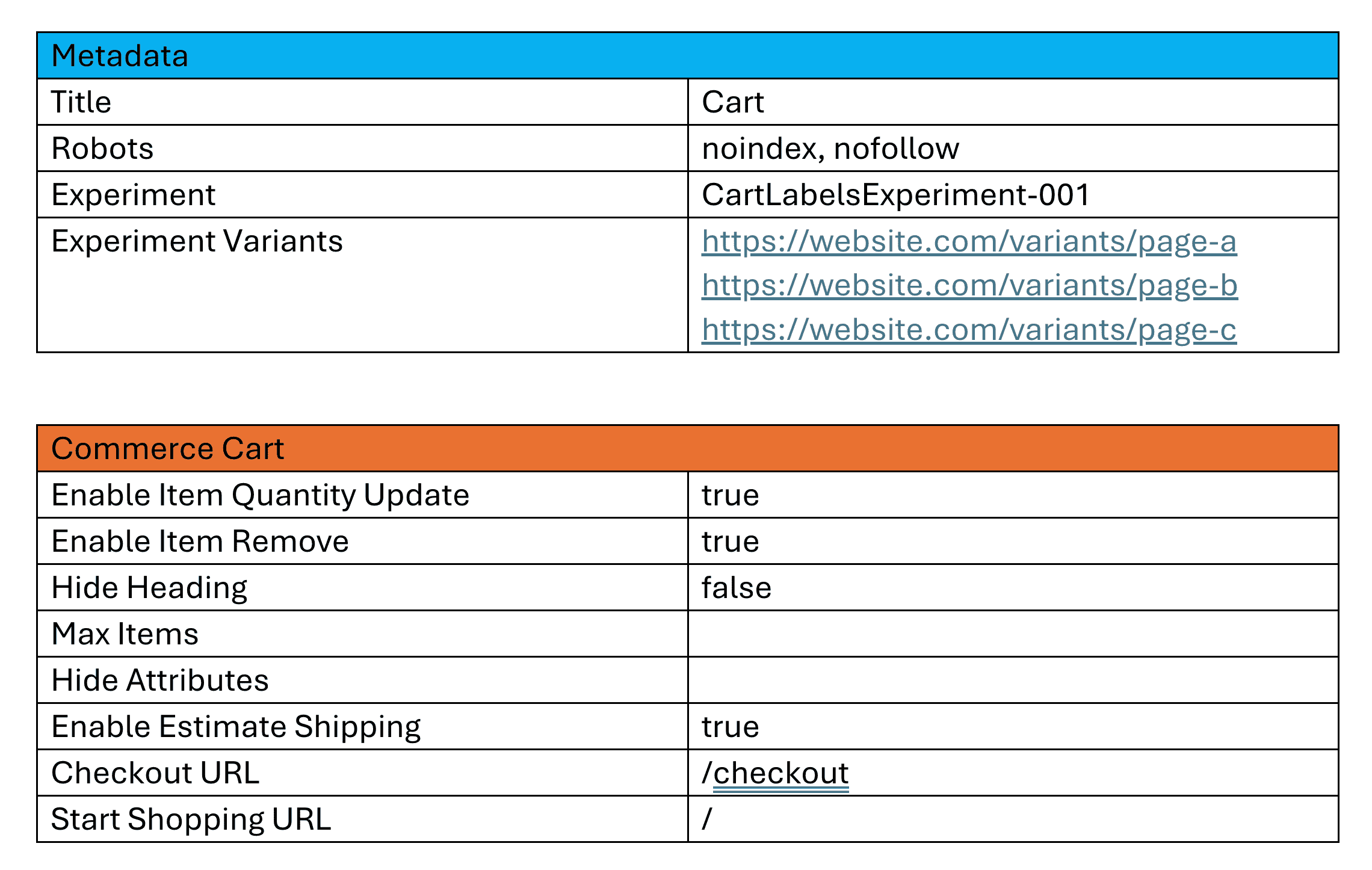</Diagram>\n\n\n### Preview the experiment\n\nUse the AEM Sidekick Preview button to preview the experiment and compare the original page with the variant page. Make sure that the changes are displayed correctly and that the experiment is functioning as expected. You can also share the experiment URL with stakeholders for feedback before launching it to a wider audience.\n\n<Diagram caption=\"Preview the experiment\">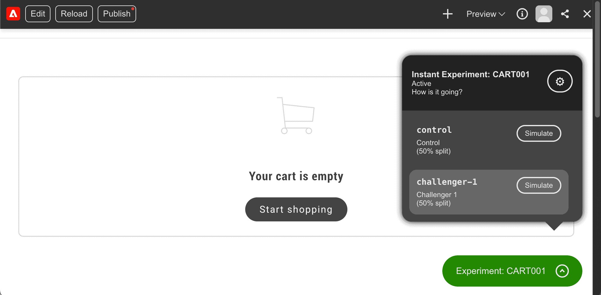</Diagram>\n\n\n---\n\n## Experimenting with UI label changes\n\nYou can use the Experimentation plugin to test different UI labeling (Customizing UI text labels for tone, branding, or clarity while staying in the same language.) variations in your storefront. This allows you to experiment with the labels used by drop-in components to determine which versions perform best.\n\nYou can include labels in your experiment by creating a variant update in your placeholder files (JSON files that store storefront UI labels by drop-in and locale so merchants can change text without changing code.), then referencing that placeholder path in metadata on the variant page. Any overlapping keys in the variant placeholders file will override the existing placeholders, making it ideal for experiments with different label variations. Using the Experimentation plugin, you can track the performance of each variant to identify which labels and texts are most effective.\n\n## Step-by-step\n\nFollowing the steps above, create a new experiment. Adding UI label changes to your experiment includes the following tasks:\n\n\n1. Create a variant placeholders file.\n1. Add the path to the variant placeholders JSON file in the metadata block of the variant page.\n1. Preview the experiment using the AEM Sidekick extension.\n\n\n### Create a variant placeholders file\n- Create a new variant placeholders JSON file that only contains the labels you wish to override. When this file is loaded on the storefront, any overlapping keys will replace the original placeholder keys. The variant placeholders file should include the following structure:\n- **Key**: The key for the label you want to override. This key should match the key used in the original placeholders file.\n- **Value**: The new value for the label you want to override. This value should be the new label text you want to use in the experiment.\n\n<Diagram caption=\"Add new label values\">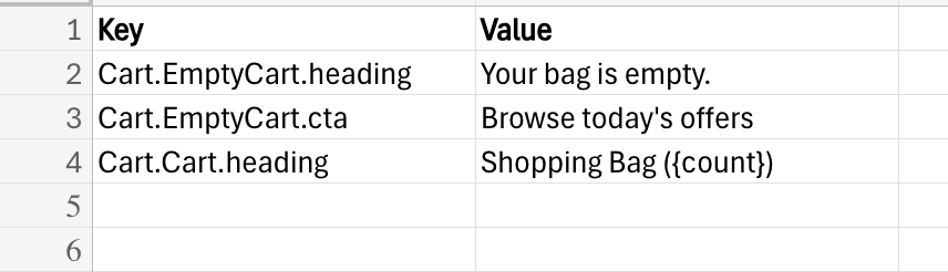</Diagram>\n\n\n### Add the path to the variant placeholders JSON file in the metadata block of the variant page\nUpdate the metadata block of the variant page by adding the URL to the variant placeholders file. The following example shows how to override labels in the cart drop-in component by updating the metadata block of a variant cart page. The key is:\n\n- **Placeholders**: The path to the variant placeholders JSON file. This file will load on the page and any overlapping keys will override the existing placeholders. The Experimentation plugin uses this URL to configure the experiment.\n\n<Diagram caption=\"Add new placeholders overrides\">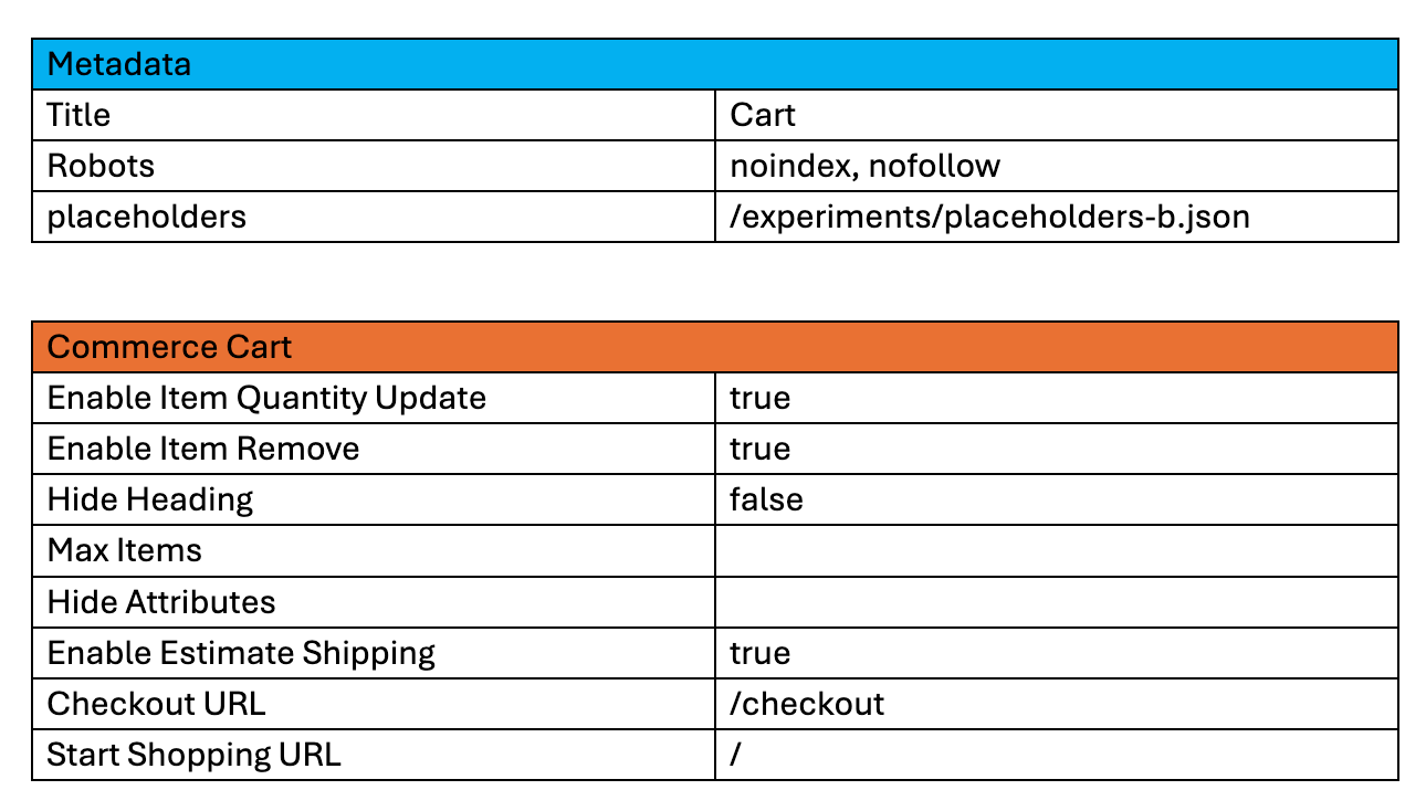</Diagram>\n\n\n### Preview the experiment\n\nUse the AEM Sidekick Preview button to preview the experiment and compare the original page with the variant page. Make sure that the changes are displayed correctly and that the experiment is functioning as expected. You can also share the experiment URL with stakeholders for feedback before launching it to a wider audience.\n\n<Diagram caption=\"Preview the experiment\">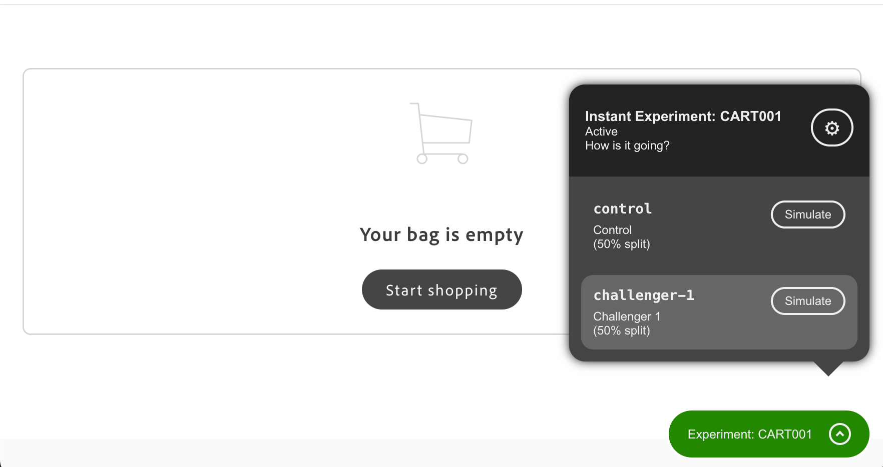</Diagram>\n\n\n## Next steps\n\nNow that you understand how to create A/B experiments for drop-in components, you can start experimenting with different variants to optimize the performance of your storefront."
|
|
425
|
+
},
|
|
426
|
+
{
|
|
427
|
+
"path": "merchants/content-customizations/personalization",
|
|
428
|
+
"title": "Personalization setup",
|
|
429
|
+
"description": "Learn how to enable and configure Personalization on Commerce Storefronts powered by Edge Delivery Services.",
|
|
430
|
+
"content": "Personalization blocks display targeted content to specific customer groups, segments, or cart rules so you can show different promotions, messaging, or content on the same page.\n\n## Before you start\n\nThis guide assumes you are comfortable with how commerce block tables are laid out in a document. If you are new to block name rows, key-value settings, and merged full-width content rows, read [Block table structure](https://experienceleague.adobe.com/developer/commerce/storefront/merchants/blocks/block-tables/) first.\n\n## Configuration\n\nAdd this table to your document to configure a targeted block. A targeted block is a block configuration that conditionally shows content for selected customer groups, segments, or cart price rule contexts:\n\n<table style=\"width: 100%; min-width: 470px; max-width: 100%; table-layout: fixed; border-collapse: collapse;\">\n<tbody>\n<tr>\n<td colspan=\"2\" style=\"text-align: center; padding: 0.75rem; border: 1px solid var(--sl-color-gray-5); background-color: var(--sl-color-gray-6); font-weight: 600;\">targeted-block</td>\n</tr>\n<tr>\n<td style=\"width: 50%; padding: 0.75rem; border: 1px solid var(--sl-color-gray-5);\">segments</td>\n<td style=\"width: 50%; padding: 0.75rem; border: 1px solid var(--sl-color-gray-5);\">1, 2 (example)</td>\n</tr>\n<tr>\n<td style=\"width: 50%; padding: 0.75rem; border: 1px solid var(--sl-color-gray-5);\">groups</td>\n<td style=\"width: 50%; padding: 0.75rem; border: 1px solid var(--sl-color-gray-5);\">1, 3 (example)</td>\n</tr>\n<tr>\n<td style=\"width: 50%; padding: 0.75rem; border: 1px solid var(--sl-color-gray-5);\">cartRules</td>\n<td style=\"width: 50%; padding: 0.75rem; border: 1px solid var(--sl-color-gray-5);\">5 (example)</td>\n</tr>\n<tr>\n<td style=\"width: 50%; padding: 0.75rem; border: 1px solid var(--sl-color-gray-5);\">fragment</td>\n<td style=\"width: 50%; padding: 0.75rem; border: 1px solid var(--sl-color-gray-5);\">/path/to/fragment (example)</td>\n</tr>\n<tr>\n<td style=\"width: 50%; padding: 0.75rem; border: 1px solid var(--sl-color-gray-5);\">type</td>\n<td style=\"width: 50%; padding: 0.75rem; border: 1px solid var(--sl-color-gray-5);\">promotion-banner (example)</td>\n</tr>\n</tbody>\n</table>\n\nIn the `targeted-block` table, most settings use a key-value row: a two-column row where the first cell is the setting name and the second cell is the value (for example, `true`, a number, or a label). If you do not set a fragment path, you must add a final merged full-width row—one cell that spans the full table width so you can place rich page content in one place (for example, headings, text, and images). The `targeted-block` table uses that row for inline content when you do not load a separate fragment document.\n\n- `segments` — A segment is a rule-based way to target experiences to qualifying shopper cohorts. This row holds a comma-separated list of customer segment IDs; the block only appears for shoppers who belong to those segments. Optional.\n\n- `groups` — A customer group in Commerce is used to segment shoppers for pricing, permissions, or targeted content. This row holds a comma-separated list of customer group IDs; the block only appears for shoppers in those groups. Optional.\n\n- `cartRules` — A cart price rule is a Commerce rule you can use as a condition for targeting content or promotions. This row holds a comma-separated list of cart rule IDs; the block only appears when those cart price rules are satisfied. Optional.\n\n- `fragment` — An optional path to a separate content document. When you set a fragment, the `TargetedBlock` loads content from that document. When you omit it, add your content in the last merged full-width row in this `targeted-block` table, as described above. Optional.\n\n- `type` — A value that groups `TargetedBlock` entries: when several blocks use the same type, only the first one whose conditions match a shopper is shown, which allows fallback-chain behavior. Set it to the type name to use in that chain. Only the first block that satisfies the conditions of each type is shown. Optional.\n\n## How to enable and configure Personalization\n\nPersonalization blocks can be configured on each page through Document Authoring. Follow the step-by-step guide below to enable and configure Personalization:\n\n\n### Create customer segments, groups, or cart rules\n\nYou must first create the targeting criteria in Adobe Commerce Admin that will determine which customers see your personalized content.\n\n\n1. Log in to the Adobe Commerce Admin.\n\n1. Create customer segments, customer groups, or cart price rules as needed:\n - **Customer Segments** - Go to **Customers** > **Segments** and follow the to create segments.\n - **Customer Groups** - Go to **Customers** > **Customer Groups** and follow the to create groups.\n - **Cart Price Rules** - Go to **Marketing** > **Promotions** > **Cart Price Rules** and follow the to create rules.\n\n\n### How to add and configure the Personalization block\n\nYou can configure each page to display personalized content by setting targeting criteria and optionally specifying a fragment path or block type.\n\n\n1. Open the page where you want to display personalized content.\n\n1. Create a new table in your document with the block name `targeted-block`.\n\n1. Add configuration properties based on your targeting needs:\n\n **Example: Target specific customer segments:**\n \n <table style=\"width: 100%; min-width: 470px; max-width: 100%; table-layout: fixed; border-collapse: collapse;\">\n <tbody>\n <tr>\n <td colspan=\"2\" style=\"text-align: center; padding: 0.75rem; border: 1px solid var(--sl-color-gray-5); background-color: var(--sl-color-gray-6); font-weight: 600;\">targeted-block</td>\n </tr>\n <tr>\n <td style=\"width: 50%; padding: 0.75rem; border: 1px solid var(--sl-color-gray-5);\">segments</td>\n <td style=\"width: 50%; padding: 0.75rem; border: 1px solid var(--sl-color-gray-5);\">1, 2</td>\n </tr>\n </tbody>\n </table>\n\n **Example: Load content from a fragment:**\n \n <table style=\"width: 100%; min-width: 470px; max-width: 100%; table-layout: fixed; border-collapse: collapse;\">\n <tbody>\n <tr>\n <td colspan=\"2\" style=\"text-align: center; padding: 0.75rem; border: 1px solid var(--sl-color-gray-5); background-color: var(--sl-color-gray-6); font-weight: 600;\">targeted-block</td>\n </tr>\n <tr>\n <td style=\"width: 50%; padding: 0.75rem; border: 1px solid var(--sl-color-gray-5);\">fragment</td>\n <td style=\"width: 50%; padding: 0.75rem; border: 1px solid var(--sl-color-gray-5);\">/path/to/fragment</td>\n </tr>\n </tbody>\n </table>\n\n **Example: Use fallback with block type:**\n \n Create two blocks with the same `type` value. The first block (with conditions) displays when conditions are met, and the second block (fallback) displays otherwise:\n \n <table style=\"width: 100%; min-width: 470px; max-width: 100%; table-layout: fixed; border-collapse: collapse;\">\n <tbody>\n <tr>\n <td colspan=\"2\" style=\"text-align: center; padding: 0.75rem; border: 1px solid var(--sl-color-gray-5); background-color: var(--sl-color-gray-6); font-weight: 600;\">targeted-block</td>\n </tr>\n <tr>\n <td style=\"width: 50%; padding: 0.75rem; border: 1px solid var(--sl-color-gray-5);\">cartRules</td>\n <td style=\"width: 50%; padding: 0.75rem; border: 1px solid var(--sl-color-gray-5);\">5</td>\n </tr>\n <tr>\n <td style=\"width: 50%; padding: 0.75rem; border: 1px solid var(--sl-color-gray-5);\">type</td>\n <td style=\"width: 50%; padding: 0.75rem; border: 1px solid var(--sl-color-gray-5);\">promotion-banner</td>\n </tr>\n </tbody>\n </table>\n \n Then add a fallback block with the same type but no conditions:\n \n <table style=\"width: 100%; min-width: 470px; max-width: 100%; table-layout: fixed; border-collapse: collapse;\">\n <tbody>\n <tr>\n <td colspan=\"2\" style=\"text-align: center; padding: 0.75rem; border: 1px solid var(--sl-color-gray-5); background-color: var(--sl-color-gray-6); font-weight: 600;\">targeted-block</td>\n </tr>\n <tr>\n <td style=\"width: 50%; padding: 0.75rem; border: 1px solid var(--sl-color-gray-5);\">type</td>\n <td style=\"width: 50%; padding: 0.75rem; border: 1px solid var(--sl-color-gray-5);\">promotion-banner</td>\n </tr>\n </tbody>\n </table>\n\n > **Specify a fragment**\n>\n If you don't specify a `fragment`, the content must be placed in the last merged full-width row, as described in the Configuration section.\n \n\n\n## Section metadata\n\nControl the section styling, spacing, and layout that wraps your commerce block. All properties are optional:\n\n<table style=\"width: 100%; min-width: 470px; max-width: 100%; table-layout: fixed; border-collapse: collapse;\">\n<tbody>\n<tr>\n<td colspan=\"2\" style=\"text-align: center; padding: 0.75rem; border: 1px solid var(--sl-color-gray-5); background-color: var(--sl-color-gray-6); font-weight: 600;\">section-metadata</td>\n</tr>\n<tr>\n<td style=\"width: 50%; padding: 0.75rem; border: 1px solid var(--sl-color-gray-5);\">Style</td>\n<td style=\"width: 50%; padding: 0.75rem; border: 1px solid var(--sl-color-gray-5);\">light (optional)</td>\n</tr>\n<tr>\n<td style=\"width: 50%; padding: 0.75rem; border: 1px solid var(--sl-color-gray-5);\">Padding</td>\n<td style=\"width: 50%; padding: 0.75rem; border: 1px solid var(--sl-color-gray-5);\">medium (optional)</td>\n</tr>\n<tr>\n<td style=\"width: 50%; padding: 0.75rem; border: 1px solid var(--sl-color-gray-5);\">Margin</td>\n<td style=\"width: 50%; padding: 0.75rem; border: 1px solid var(--sl-color-gray-5);\">small (optional)</td>\n</tr>\n<tr>\n<td style=\"width: 50%; padding: 0.75rem; border: 1px solid var(--sl-color-gray-5);\">Column Width</td>\n<td style=\"width: 50%; padding: 0.75rem; border: 1px solid var(--sl-color-gray-5);\">30% (optional)</td>\n</tr>\n<tr>\n<td style=\"width: 50%; padding: 0.75rem; border: 1px solid var(--sl-color-gray-5);\">Gap</td>\n<td style=\"width: 50%; padding: 0.75rem; border: 1px solid var(--sl-color-gray-5);\">small (optional)</td>\n</tr>\n</tbody>\n</table>\n\n> **Learn more**\n>\n See the [Section Metadata guide](https://experienceleague.adobe.com/developer/commerce/storefront/merchants/blocks/section-metadata/) for all available values and the [Page Metadata guide](https://experienceleague.adobe.com/developer/commerce/storefront/merchants/blocks/page-metadata/) for SEO and caching options."
|
|
431
|
+
},
|
|
432
|
+
{
|
|
433
|
+
"path": "merchants/content-customizations/prerendered-product-pages",
|
|
434
|
+
"title": "Prerendered product pages",
|
|
435
|
+
"description": "Learn how prerendered product pages improve your store's performance and search engine visibility.",
|
|
436
|
+
"content": "Prerendered product pages are built and ready before a shopper visits them, so your store delivers product information instantly without waiting for JavaScript to run.\n\n## What you need to do\n\nManage your products in Adobe Commerce as usual. The prerender system detects your changes automatically and updates product pages in the background. Your development team sets it up once, and after that it runs without any changes to your workflow.\n\n<Diagram\n type=\"mermaid\"\n caption=\"How prerendering works: You update products, the system generates pages automatically, and shoppers get fast, SEO-optimized pages.\"\n code={`%%{init: {'theme':'base', 'themeVariables': {'edgeLabelBackground':'#ffffff'}}}%%\nflowchart LR\n A[\"👨💼\nYou Update Products\"]:::merchant\n B[\"⚙️\nSystem Generates\"]:::auto\n C[\"⚡\nPages Delivered\"]:::delivery\n D[\"🛒\nCustomers\"]:::customer\n\n A -->|\"In Adobe Commerce\n(business as usual)\"| B\n B -->|\"Automatically detects\nchanges & creates pages\"| C\n C -->|\"To customers\n& search engines\"| D\n\n classDef merchant fill:none,stroke:none,color:#000000\n classDef auto fill:none,stroke:none,color:#000000\n classDef delivery fill:none,stroke:none,color:#000000\n classDef customer fill:none,stroke:none,color:#000000\n`}\n/>\n\n## Why it matters for your store\n\nPrerendered pages improve your store's performance and visibility.\n\n- **Better search rankings:** Search engines can index your product information without running JavaScript, so your products appear in search results faster and help shoppers find your store.\n- **Faster page loads:** Pages can load in under one second, which can improve customer retention, product views, conversion rates, and mobile experience.\n- **AI and social media ready:** Product links on social media display your images, descriptions, and pricing automatically. AI shopping assistants can understand and recommend your products.\n\n## How quickly changes appear\n\nHow quickly a change appears on your storefront depends on whether the product already exists or is new. Changes to existing products are visible within a few minutes after the change appears in your catalog. New products can take about an hour to appear.\n\n## Product lifecycle\n\n### Previewing draft products\n\nThe prerender system publishes every product your Catalog Service (Adobe's fast, read-only GraphQL API for product data. Drop-ins call it instead of core Commerce GraphQL for product pages, search results, and category listings — up to ten times faster.) returns without filtering by product status, visibility, or stock level. Whether a draft or inactive product appears depends on your catalog settings in Adobe Commerce. If a product is not active or visible there, Catalog Service won't return it, and it won't be prerendered.\n\nYou can preview the product page template in your authoring environment to review the layout and content before any products go live. Your developer configures a placeholder SKU so the template shows realistic product data during preview.\n\n### Scheduling product launches\n\nProducts appear on your storefront only after they are activated in Adobe Commerce. If you schedule a product to activate on a future date, the product page goes live on your storefront within about an hour after that date. You don't need to take any additional steps.\n\n### Removing offline products\n\nWhen a product's offline date passes or it is disabled in Adobe Commerce, the system removes it from your published storefront within about an hour. You don't need to unpublish it manually.\n\n## What content is prerendered\n\nPrerendered pages include:\n\n- Product names and descriptions\n- Product images and image carousels\n- SEO (search engine optimization) metadata (titles, descriptions, keywords)\n- Structured data (machine-readable product information that helps search engines display richer results)\n- Product categories and attributes\n\n> **Note**\n>\nPrices, stock quantities, and personalized recommendations load separately to ensure shoppers always see current data.\n\n\n## Getting help\n\nContact your development team or Adobe Commerce support for help with product page issues or prerendering questions."
|
|
437
|
+
},
|
|
438
|
+
{
|
|
439
|
+
"path": "merchants/content-customizations/product-recommendations",
|
|
440
|
+
"title": "Product Recommendations setup",
|
|
441
|
+
"description": "Learn how to enable and configure Product Recommendations on Commerce Storefronts powered by Edge Delivery Services.",
|
|
442
|
+
"content": "Product Recommendations displays relevant products to customers based on their browsing history and preferences, helping increase cross-selling. You must enable and configure this feature before adding it to your pages. Once configured, it displays as specific recommendation units that you can place on any page.\n\n## Configuration\n\nAdd this table to your document to configure the block:\n\n<table style=\"width: 100%; min-width: 470px; max-width: 100%; table-layout: fixed; border-collapse: collapse;\">\n<tbody>\n<tr>\n<td colspan=\"2\" style=\"text-align: center; padding: 0.75rem; border: 1px solid var(--sl-color-gray-5); background-color: var(--sl-color-gray-6); font-weight: 600;\">product-recommendations</td>\n</tr>\n<tr>\n<td style=\"width: 50%; padding: 0.75rem; border: 1px solid var(--sl-color-gray-5);\">currentSku</td>\n<td style=\"width: 50%; padding: 0.75rem; border: 1px solid var(--sl-color-gray-5);\">crz-eco-tr-std-2017 (example)</td>\n</tr>\n<tr>\n<td style=\"width: 50%; padding: 0.75rem; border: 1px solid var(--sl-color-gray-5);\">recId</td>\n<td style=\"width: 50%; padding: 0.75rem; border: 1px solid var(--sl-color-gray-5);\">2ed7ea09-d9bd-4691-91c3-2c0a6d4fd869 (example)</td>\n</tr>\n</tbody>\n</table>\n\n- **recId**: Recommendation ID for targeting specific recommendation types. Required for all pages. No default value.\n\n- **currentSku**: Current product SKU for recommendation context. Required for non-PDP pages only. Not needed for product detail pages. No default value.\n\n> **Important**\n>\n\n - **PDP pages** require only the `recId` to be set.\n - **Other pages** require both the `recId` and `currentSku` to be set.\n\n\n## How to enable and configure Product Recommendations\n\nThe Product Recommendations block can be configured on each page through Document Authoring. Follow the step-by-step guide below to enable and configure Product Recommendations:\n\n\n### Create a recommendation unit\n\nYou must first create recommendation units in the Adobe Commerce Admin (PaaS) or Adobe Commerce Optimizer Admin (SaaS).\n\n#### Adobe Commerce Optimizer Admin (SaaS)\n\nThe following steps apply to merchants using Adobe Commerce Optimizer or Adobe Commerce as a Cloud Service.\n\n \n\n 1. Log in to the Adobe Commerce Optimizer Admin.\n \n 1. On the Admin sidebar, go to **Recommendations**.\n\n 1. Follow the steps in the to create a recommendation unit.\n\n \n\n :::note\n For Adobe Commerce Admin (PaaS), follow the steps in the to create a recommendation unit.\n\n :::\n \n \n \n\n### Get the recommendations unit ID\n\nYou can specify which recommendation unit to display on each page by using the recommendation unit ID.\n\n\n1. Navigate to the Product Recommendations page in the Adobe Commerce Admin or Adobe Commerce Optimizer Admin.\n\n1. Click the eye icon next to the recommendation unit that you'd like to display on your store.\n\n1. Copy the **Recommendation ID** from the modal.\n\n\nYou will use this ID in the next step to configure the recommendations block.\n\n\n### Add and configure the recommendations block\n\nYou can configure each page to display a specific recommendation unit by setting its recommendation ID.\n\n\n1. Open the page where you want to display the recommendation unit.\n\n1. Create a new table in your document with the block name `product-recommendations`.\n\n For product detail pages, set the `recId` to match the recommendation unit ID from the previous step. For example:\n\n <table style=\"width: 100%; min-width: 470px; max-width: 100%; table-layout: fixed; border-collapse: collapse;\">\n <tbody>\n <tr>\n <td colspan=\"2\" style=\"text-align: center; padding: 0.75rem; border: 1px solid var(--sl-color-gray-5); background-color: var(--sl-color-gray-6); font-weight: 600;\">product-recommendations</td>\n </tr>\n <tr>\n <td style=\"width: 50%; padding: 0.75rem; border: 1px solid var(--sl-color-gray-5);\">recId</td>\n <td style=\"width: 50%; padding: 0.75rem; border: 1px solid var(--sl-color-gray-5);\">2ed7ea09-d9bd-4691-91c3-2c0a6d4fd869</td>\n </tr>\n </tbody>\n </table>\n\n :::note\n PDP pages require only the `recId` to be set as shown above.\n\n Other pages require both the `recId` and `currentSku` to be set. For example:\n\n <table style=\"width: 100%; min-width: 470px; max-width: 100%; table-layout: fixed; border-collapse: collapse;\">\n <tbody>\n <tr>\n <td colspan=\"2\" style=\"text-align: center; padding: 0.75rem; border: 1px solid var(--sl-color-gray-5); background-color: var(--sl-color-gray-6); font-weight: 600;\">product-recommendations</td>\n </tr>\n <tr>\n <td style=\"width: 50%; padding: 0.75rem; border: 1px solid var(--sl-color-gray-5);\">currentSku</td>\n <td style=\"width: 50%; padding: 0.75rem; border: 1px solid var(--sl-color-gray-5);\">crz-eco-tr-std-2017</td>\n </tr>\n <tr>\n <td style=\"width: 50%; padding: 0.75rem; border: 1px solid var(--sl-color-gray-5);\">recId</td>\n <td style=\"width: 50%; padding: 0.75rem; border: 1px solid var(--sl-color-gray-5);\">2ed7ea09-d9bd-4691-91c3-2c0a6d4fd869</td>\n </tr>\n </tbody>\n </table>\n\n :::\n\n\n## Section metadata\n\nControl the section styling, spacing, and layout that wraps your commerce block. All properties are optional:\n\n<table style=\"width: 100%; min-width: 470px; max-width: 100%; table-layout: fixed; border-collapse: collapse;\">\n<tbody>\n<tr>\n<td colspan=\"2\" style=\"text-align: center; padding: 0.75rem; border: 1px solid var(--sl-color-gray-5); background-color: var(--sl-color-gray-6); font-weight: 600;\">section-metadata</td>\n</tr>\n<tr>\n<td style=\"width: 50%; padding: 0.75rem; border: 1px solid var(--sl-color-gray-5);\">Style</td>\n<td style=\"width: 50%; padding: 0.75rem; border: 1px solid var(--sl-color-gray-5);\">light (optional)</td>\n</tr>\n<tr>\n<td style=\"width: 50%; padding: 0.75rem; border: 1px solid var(--sl-color-gray-5);\">Padding</td>\n<td style=\"width: 50%; padding: 0.75rem; border: 1px solid var(--sl-color-gray-5);\">medium (optional)</td>\n</tr>\n<tr>\n<td style=\"width: 50%; padding: 0.75rem; border: 1px solid var(--sl-color-gray-5);\">Margin</td>\n<td style=\"width: 50%; padding: 0.75rem; border: 1px solid var(--sl-color-gray-5);\">small (optional)</td>\n</tr>\n<tr>\n<td style=\"width: 50%; padding: 0.75rem; border: 1px solid var(--sl-color-gray-5);\">Column Width</td>\n<td style=\"width: 50%; padding: 0.75rem; border: 1px solid var(--sl-color-gray-5);\">30% (optional)</td>\n</tr>\n<tr>\n<td style=\"width: 50%; padding: 0.75rem; border: 1px solid var(--sl-color-gray-5);\">Gap</td>\n<td style=\"width: 50%; padding: 0.75rem; border: 1px solid var(--sl-color-gray-5);\">small (optional)</td>\n</tr>\n</tbody>\n</table>\n\n:::tip[Learn more]\nSee the [Section Metadata guide](https://experienceleague.adobe.com/developer/commerce/storefront/merchants/blocks/section-metadata/) for all available values and the [Page Metadata guide](https://experienceleague.adobe.com/developer/commerce/storefront/merchants/blocks/page-metadata/) for SEO and caching options.\n:::"
|
|
443
|
+
},
|
|
444
|
+
{
|
|
445
|
+
"path": "merchants/content-customizations/terms-and-conditions",
|
|
446
|
+
"title": "Terms & Conditions setup",
|
|
447
|
+
"description": "Learn how to enable and set up the Terms & Conditions feature.",
|
|
448
|
+
"content": "The Terms & Conditions feature must be enabled and configured to be available during the checkout process before placing an order.\nThe configured terms and conditions will appear in the Checkout component as specific checkboxes. Each checkbox will display a label with text and links, directing users to the corresponding agreement pages configured at store-view level.\n\n> **TermsAndConditions configurable on a per store-view basis**\n>\n Merchants can add as many agreements as they want for a specific store-view; this allows merchants to provide different documents for each language and other needs.\n\n Visit the [Multi-store setup](https://experienceleague.adobe.com/developer/commerce/storefront/setup/configuration/multistore-setup/) documentation for more information on how to build blocks and configure the storefront structure based on **Edge Delivery Services (EDS)**.\n\n\n## How to enable and configure the Terms and Conditions\n\nThis checkout component is configurable on a per store-view basis on EDS, but a merchant can also rely on the Admin Panel's configuration. Follow the next step-by-step guide to enable and configure the Terms and Conditions:\n\n\n### Enable the component\n\nThe merchant has to enable the component in the Admin Panel as follows:\n\n\n1. Log in to the Admin Panel.\n\n1. On the Admin sidebar, go to **Stores** > _Settings_ > **Configuration**.\n\n1. In the left panel, expand **Sales** and choose **Checkout**.\n\n1. Expand the **Checkout Options** section.\n\n1. Set **Enable Terms and Conditions** to \"Yes\".\n\n1. Click **Save Config**.\n\n\nSee documentation for more information on how to enable the terms and conditions using the Admin Panel.\n\n\n### Create the agreement document\n\nThe agreements pages will be created **ONLY** using _document-based authoring (DBA)_ within EDS instead of using the Admin Panel, allowing the merchant to create and manage as many agreements pages and content as required for each store-view and language.\n\n\n### Configure the agreement checkbox label\n\nUse the **EDS placeholders** or the **Admin Panel** instructions in the following tabs to configure the agreement checkbox label.\n\n\n **Using EDS placeholders:**\n\n For each agreement, the merchant has to update the **`placeholders`** sheet with the following information:\n\n - An **_identifier_**:\n It's the reference that identifies the label translated\n - A **_label_**:\n It's the text to display next to the checkbox, and will be directly retrieved from the Boilerplate translations for a specific store-view and language. This data accepts HTML with links to a specific page in EDS\n\n Similarly, the merchant can configure the translation for the validation error that appears when the user clicks the `Place Order` button and an agreement is not checked, using the **\"Checkout.TermsAndConditions.error\"** identifier.\n\n Sample of **placeholders** sheet:\n ```txt\n \"Checkout.TermsAndConditions.label\", \"I have read, understand, and accept the <a href='/en/privacy-policy' target='_blank'>Terms of Use, Terms of Sales, Privacy Policy, and Return Policy</a>.\"\n \"Checkout.TermsAndConditions.terms_label\", \"By placing an order, you are agreeing to be bound by our <a href='/en/terms-and-conditions' target='_blank'>Terms And Conditions</a>.\"\n \"Checkout.TermsAndConditions.privacy_label\", \"By placing an order, you acknowledge our <a href='/en/privacy-policy' target='_blank'>Privacy Policy</a>.\"\n \"Checkout.TermsAndConditions.error\", \"Please accept the Terms and Conditions to continue.\"\n ```\n\n These labels are used to render the `TermsAndConditions` container in the **commerce-checkout.js** block file.\n\n Refer to the Adobe Commerce documentation for examples on how to use these labels.\n \n **Using the Admin Panel:**\n\n The merchant has to configure the checkbox label for each agreement using the Admin Panel. As mentioned before, the Admin Panel allows merchants to create configurations per store-view level as follows:\n\n 1. Log in to the Admin Panel.\n\n 1. On the Admin sidebar, go to **Stores** > _Settings_ > **Terms and Conditions**.\n\n 1. In the upper-right corner, click the **Add New Condition** button.\n\n 1. Enter the following **Terms and Conditions** information:\n - **`Condition Name`**\n The agreement identifier\n - **`Status`**\n Attribute to indicate if it's available or not:\n - 'Enabled'; the agreement will be retrieved by the GraphQL API query\n - 'Disabled'; the agreement won't be retrieved by the GraphQL API query\n - **`Applied`**\n Specifies how the checkbox should appear:\n - 'Manually': the user is required to manually check and accept the conditions to place an order\n - 'Automatically': the checkbox will appear checked by default, conditions are automatically accepted upon checkout\n - **`Store View`**\n Defines the scope at store view level for this agreement where you want these Terms and Conditions to be used\n - **`Checkbox Text`**\n It contains directly the text to show; it accepts HTML with links to a specific page in EDS\n\n > **Some attributes are not used**\n>\n Although the following attributes are provided by the Admin Panel, they are not going to be utilized in the current solution because they will be handled in EDS. Merchants are able to work on their own solution if they want to use them:\n - **`Content`**\n As described above, the content for the agreements pages will be created **ONLY** using EDS\n - **`Show Content as`** (Text, HTML)\n Not really needed because EDS pages accept HTML code\n - **`Content Height (css)`**\n \n\n 1. Click **Save Condition**.\n\n These entries are used to render the `TermsAndConditions` container in the **commerce-checkout.js** block file.\n\n Refer to the Adobe Commerce documentation for examples of this feature.\n\n See the documentation to learn how to configure the terms and conditions using the Admin Panel.\n \n\n\n:::note\nBecause the agreements pages will be created using DBA within EDS, the agreements checkbox label should provide links to the relevant agreements pages for each store-view.\n:::"
|
|
449
|
+
},
|
|
450
|
+
{
|
|
451
|
+
"path": "merchants/edge-delivery-services",
|
|
452
|
+
"title": "Edge Delivery Services",
|
|
453
|
+
"description": "Learn about AEM Edge Delivery Services features for your storefront, including scheduled publishing for storefront content.",
|
|
454
|
+
"content": "Edge Delivery Services (EDS) is Adobe's modern content delivery platform that powers your Commerce Storefront. It delivers exceptional page load speeds, high Lighthouse scores, and an intuitive authoring experience using .\n\nFor your storefront, Edge Delivery Services handles content management and delivery while integrating seamlessly with Adobe Commerce for product data, cart, checkout, account functionality, and more. This separation lets content authors update pages independently without requiring developer involvement.\n\nLearn more about Edge Delivery Services in the .\n\n## Features for merchants\n\nThe topics below cover Edge Delivery Services features available to merchants for managing storefront content."
|
|
455
|
+
},
|
|
456
|
+
{
|
|
457
|
+
"path": "merchants/edge-delivery-services/content-migration",
|
|
458
|
+
"title": "Migrate content between projects",
|
|
459
|
+
"description": "Learn how to copy all pages from one Document Authoring project to another and publish them in the new project using the Traverse, Import, and Bulk Operations tools.",
|
|
460
|
+
"content": "You can copy all pages from one project to another using three tools: Traverse, Import, and Bulk Operations. You might want to do this when you rename a project, move tested content to your main project, or reorganize your project structure.\n\nIn DA.live, a project is a named folder inside your organization. Your projects might be called test and live, or staging and production, but they work the same way. The migration process is the same regardless of what the projects are called.\n\n## Before you start\n\nYou'll need:\n\n- Access to your source project on DA.live.\n- Your organization name and the name of the target project on DA.live.\n\n## Migrate your content\n\nThe following steps copy all pages from your source project to your target project, then make them live.\n\n\n1. Open the section in DA.live and open the Traverse tool.\n\n Enter your source project's organization and project name, then run the traverse. The tool crawls your project and returns a list of every page URL. Copy that list.\n\n1. Open the Import tool from the Apps section.\n\n Paste the URL list from step 1. Enter your organization name and target project name, then run the import.\n\n When the import finishes, open your organization on DA.live. You'll see a new folder named after your target project with all the imported pages inside.\n\n1. Open the Traverse tool again, this time for your target project.\n\n Enter your target project's organization and project name, then run the traverse. Copy the new URL list.\n\n1. Open the Bulk Operations tool from the Apps section.\n\n Paste the URL list from the previous step. Run **Preview** first to make the pages available on your preview URL, then run **Publish** to make them live.\n\n > **Tip**\n>\n If you see errors during preview or publish, check that your target project's `fstab.yaml` and other required configuration files are in place.\n \n\n\n## Handle file conflicts\n\nIf a page in your target project has the same path as a page you're importing, the import returns an error because the file already exists at that location.\n\nTo avoid this, move the conflicting page in your target project to an archives folder before you run the import. For example, move `/products/running-shoes` to `/archive/products/running-shoes`. The import succeeds because the path is now unique.\n\nAfter the import and publish, you can always go back to the original page by moving the archived file to its original path and republishing it."
|
|
461
|
+
},
|
|
462
|
+
{
|
|
463
|
+
"path": "merchants/edge-delivery-services/scheduling",
|
|
464
|
+
"title": "Scheduling Options",
|
|
465
|
+
"description": "Learn about the different ways to schedule content changes, page publishing, and promotions on your Edge Delivery Services storefront. Compare snapshot scheduling, promotion schedules, AEM Sites publishing, and recurring tasks.",
|
|
466
|
+
"content": "Edge Delivery Services provides several ways to schedule content changes on your storefront. The right approach depends on what you're scheduling, such as publishing a set of pages, switching promotional content, or automating recurring operations. Use the comparison table below to find the approach that fits your needs, then follow the links to get started.\n\n> **Migrating from Content Staging?**\n>\nIf you previously used in the Commerce Admin to schedule content updates, that feature does not apply to Edge Delivery Services storefronts. The scheduling options below are the replacements.\n\n\n## Comparison\n\n\n| Approach | Best for | Your role | Developer role | Description |\n|----------|----------|-----------|----------------|-------------|\n| [Snapshot scheduling](#snapshot-scheduling) | Publishing pages at a specific date and time | Create snapshots, add pages, schedule publishing | One-time registration of your site with the scheduler service | Groups pages into a snapshot that publishes them together at a scheduled time. |\n| [Promotion schedules](#promotion-schedules) | Turning promotions on and off by date | Author the schedule spreadsheet and content fragments | Implement the storefront code that reads the schedule | Displays different content based on the current date using a spreadsheet with start and end dates. Pages stay published. |\n| [AEM Sites scheduled publishing](#aem-sites-scheduled-publishing) | Publishing content from AEM Author | Schedule publish or unpublish actions in AEM Author | None (beyond initial site setup) | Schedules publish or unpublish actions through the Manage Publication workflow in AEM Author. |\n| [Recurring tasks](#recurring-tasks) | Automating index publishing, cache purges, and other repetitive operations | None | Set up GitHub Actions in the site repository | Automates Admin API calls on a cron schedule using GitHub Actions. |\n\n\n> **Deprecated: Crontab scheduling**\n>\nThe original crontab-based scheduler (using a `crontab` sheet in the `.helix` folder) is **deprecated**. If you are currently using crontab scheduling, migrate to one of the approaches below based on what you used it for:\n\n- **Publishing or unpublishing pages** → [Snapshot scheduling](#snapshot-scheduling)\n- **Publishing snapshots** → [Snapshot scheduling](#snapshot-scheduling)\n- **Publishing indexes** → [Recurring tasks](#recurring-tasks)\n- **HTTP requests or CDN cache purges** → [Recurring tasks](#recurring-tasks)\n\nSee the on aem.live for reference.\n\n\n## Snapshot scheduling\n\nUse snapshot scheduling when you need to publish a set of pages together at a specific date and time. This is the recommended approach for coordinating content launches where you want to review everything before it goes live.\n\nA **snapshot** captures the current state of one or more pages at a point in time. You add pages to a named snapshot (for example, `fall-collection-2026`), review the snapshot to verify everything looks correct, and then schedule it to publish. When the scheduled time arrives, all pages in the snapshot go live simultaneously.\n\n**Common scenarios:**\n\n- Publish a landing page, product pages, and banners together for a product launch.\n- Coordinate a site-wide update where dozens of pages must go live at the same time.\n- Prepare content in advance and publish it during off-hours without manual intervention.\n\n> **One-time developer setup required**\n>\nBefore you can schedule snapshots, your developer must register your site with the snapshot scheduler service. This is a one-time setup that requires an and an with publish permissions.\n\n\n**Get started:**\n\n- **Document Authoring (da.live):** See the for creating, managing, and scheduling snapshots.\n- **SharePoint or Google Drive:** Use the to manage snapshots and schedule them for publishing.\n- **All authoring methods:** See on aem.live for the full lifecycle, including review environments and approval workflows.\n\n## Promotion schedules\n\nUse promotion schedules when you want to rotate time-sensitive content -- like sale banners or seasonal campaigns -- on and off based on dates you define. Unlike snapshot scheduling, this approach does **not** publish or unpublish pages. Instead, it displays different content fragments on already-published pages based on the current date and time.\n\n**What you do:** Author a schedule spreadsheet with start dates, end dates, and links to content fragments for each promotion. A default entry (with no dates) serves as the fallback when no promotion is active. You also author the content fragments for each promotion.\n\n**What your developer does:** Implement the storefront code that reads the published schedule and displays the correct content fragment based on the current date.\n\n**Common scenarios:**\n\n- Display a \"4th of July Sale\" banner only during the holiday week.\n- Rotate seasonal promotions (Memorial Day, Back to School, Halloween) throughout the year.\n- Show different hero content or calls-to-action based on an active campaign window.\n\n> **Preview future promotions**\n>\nYou can preview what your site will look like during a future promotion by appending a `schedule` parameter to your pre-production URL. For example: `https://main--{your-site}--{your-org}.aem.live/?schedule=`. Do not expose your production promotion data publicly if it contains confidential campaign details.\n\n\n**Get started:** Work with your developer to implement promotion schedules for your storefront. The overview above describes the spreadsheet structure and content fragment approach your developer needs to build.\n\n## AEM Sites scheduled publishing\n\nUse AEM Sites scheduled publishing when you author content in **AEM Sites (WYSIWYG)** with AEM as a Cloud Service. This approach uses the **Manage Publication** workflow in AEM Author to schedule publish or unpublish actions for a specific date and time. Once AEM publishes the content, the changes go live on Edge Delivery Services automatically.\n\n> **AEM Sites authoring only**\n>\nThis approach only works with AEM Sites (WYSIWYG) authoring. It does **not** apply to document-based authoring with DA, SharePoint, or Google Drive. For document-based authoring, use [snapshot scheduling](#snapshot-scheduling) or [promotion schedules](#promotion-schedules) instead.\n\n\n**Get started:**\n\n- — Experience League guide with detailed instructions on scheduling publish and unpublish actions.\n\n## Recurring tasks\n\nUse recurring tasks to automate repetitive operations on a schedule, such as publishing an index or purging CDN caches. This is a developer-managed approach that replaces the `publish-index`, `http`, and similar commands from the deprecated crontab scheduler.\n\n**What your developer does:** Create a GitHub Action in the site repository that calls the AEM Admin API on a cron schedule. No merchant involvement is needed after the initial setup.\n\n**Common scenarios:**\n\n- Publish a query index every hour to keep search results current.\n- Automate periodic cache purges for frequently updated content.\n\n**Get started:**\n\n- — Step-by-step example using GitHub Actions on aem.live.\n- — Required for authenticating automated requests to the Admin API."
|
|
467
|
+
},
|
|
468
|
+
{
|
|
469
|
+
"path": "merchants/quick-start",
|
|
470
|
+
"title": "Quick start",
|
|
471
|
+
"description": "Learn how to create pages, add commerce blocks, and configure your storefront using document authoring tools.",
|
|
472
|
+
"content": "Get started by learning what Commerce Storefront is and how block tables work, then open the Document Authoring tool and follow the hands-on tutorial. After that, use the Universal Editor, the blocks overview, and the metadata references as you need them.\n\n\n| Topic | Description |\n|-------|-------------|\n| **Get oriented** | |\n| [What is Commerce Storefront?](https://experienceleague.adobe.com/developer/commerce/storefront/merchants/quick-start/create-content/) | Learn about the Commerce Storefront platform and the tools you use to build storefront pages |\n| [Author and developer tasks](https://experienceleague.adobe.com/developer/commerce/storefront/merchants/blocks/author-and-developer-tasks/) | Drop-ins, blocks, and pages as three layers; what you can change without code; when to hand off to a developer |\n| [Block table structure](https://experienceleague.adobe.com/developer/commerce/storefront/merchants/blocks/block-tables/) | How document tables map to blocks (name row, key-value settings, and merged full-width content rows) |\n| **Build a page** | |\n| [Using the Document Authoring tool](https://experienceleague.adobe.com/developer/commerce/storefront/merchants/quick-start/document-authoring/) | Learn the document-based authoring interface for creating and editing page content |\n| [Your first page](https://experienceleague.adobe.com/developer/commerce/storefront/merchants/quick-start/your-first-page/) | Step-by-step tutorial: create a cart page with page metadata, a commerce block, and section metadata |\n| **Refine and go deeper** | |\n| [Using the Universal Editor](https://experienceleague.adobe.com/developer/commerce/storefront/merchants/quick-start/universal-editor/) | Edit storefront content visually, directly on the rendered page |\n| [Using Content and Commerce blocks](https://experienceleague.adobe.com/developer/commerce/storefront/merchants/blocks/content-commerce-blocks/) | Add pre-built content blocks and commerce functionality to your pages |\n| **Configuration and metadata (reference)** | |\n| [Page metadata](https://experienceleague.adobe.com/developer/commerce/storefront/merchants/blocks/page-metadata/) | Configure page-level SEO, caching, social sharing, and structured data |\n| [Section metadata](https://experienceleague.adobe.com/developer/commerce/storefront/merchants/blocks/section-metadata/) | Control page layout and section styling using section metadata tables |"
|
|
473
|
+
},
|
|
474
|
+
{
|
|
475
|
+
"path": "merchants/quick-start/content-localization",
|
|
476
|
+
"title": "Localization (Document Authoring Tool)",
|
|
477
|
+
"description": "Step-by-step guide for localizing the Edge Delivery content blocks of a storefront using Document Authoring Tool (da.live).",
|
|
478
|
+
"content": "Use the **Document Authoring Tool** (da.live) Translation app to translate your storefront content into multiple languages. After translation, complete Commerce-specific tasks for placeholder files and store view verification (see [Commerce localization tasks](https://experienceleague.adobe.com/developer/commerce/storefront/merchants/quick-start/content-localization-commerce-tasks/)).\n\n> **Choosing your authoring approach**\n>\n\n**Two approaches for authoring with Edge Delivery Services:**\n\n- **Document Authoring** (this guide): Content authored on da.live. Simple Translation app workflow (Traverse + Translate).\n\n- **AEM Sites Authoring**: Content authored in AEM as a Cloud Service. See [Localization (Universal Editor)](https://experienceleague.adobe.com/developer/commerce/storefront/merchants/quick-start/content-localization-universal-editor/) for the AEM translation workflow.\n\n\n> **Before translating**\n>\n\nComplete the [multistore setup](https://experienceleague.adobe.com/developer/commerce/storefront/setup/configuration/multistore-setup/) to create the folder structure, configure store views, and set up the currency and headers. This guide covers translating the content in those folders.\n\n\n## Prerequisites\n\n- You have a storefront project in the Document Authoring app ().\n- You know the basics of using the Document Authoring tool ().\n\n## Additional resources\n\n### Edge Delivery Services documentation\n\n- - Adobe Experience League\n- - Adobe Experience League\n- - aem.live\n\n### Translation and localization\n\n- - aem.live\n- - da.live\n\n## Big picture\n\nThe following diagram provides the basic workflow for translating the Edge Delivery content of your storefront into multiple languages using the Document Authoring apps from .\n\n<Diagram caption=\"Workflow for localizing your storefront\">\n \n</Diagram>\n\n## Step-by-step\n\nThese steps provide the details for the translation workflow shown in the diagram. The steps describe how to translate the default English store to another language. In this example, we will translate the default English store to French (`fr`).\n\n\n### Navigate to the apps page for your storefront\n\n\n1. Open your storefront project in the Document Authoring tool ().\n1. Select Apps from the left sidebar.\n\n\n### Use the Traverse app to get a list of site URLs\n\n\n1. Open the **Traverse** app by selecting its *Go* button.\n1. On the Crawl Tree page, enter the organization name and site name for your storefront. Example: `/acme/storefront`. Ensure that you enter a forward slash (`/`) at the beginning of the string or it will not work. \n1. Select the **Crawl** button to start the crawl.\n1. Select the **Copy list** button after the URLs for the site have been traversed. This puts all the URLs in your clipboard.\n1. Return to the Apps page.\n\n\n### Use the Translation app to translate your storefront\n\n\n1. Open the **Translate** app by selecting its *Go* button.\n2. On the Localization page, enter the title for the translation project: `acme-storefront-fr`.\n3. Paste the list of URLs from the **Traverse** app into the **URLs** field.\n :::note\n We recommend excluding certain files—such as `metadata.json`, `redirects.json`, and `sitemap.json`—from the translation process. Adding these files to the translation process shouldn't cause any technical issues with translation, but translating them is not necessary.\n :::\n1. Select the **Next** button.\n1. View the validated URLs to ensure that they are all correct.\n1. Select the **Next** button.\n1. Select one or more languages you want to translate to. In this example, we will translate to French (`fr`).\n1. For the French language, select **Translate** from the selector, then select the **Create project** button.\n1. From the project page, select the **Send all for translation** button.\n\n\n> **Translation services**\n>\n\nBy default, the Translation app uses the Google Translate service to translate the content of the storefront into the selected language. Your organization can also connect other translation services for a more robust translation experience. For more information on translation services and configuration, see .\n\n\n### View the translated site\n\n\n1. Navigate back to the main (root) folder for your English storefront.\n1. Scroll the site files and folders to find the `fr` folder and open it.\n1. Select a document to view the translated content. For example, select the `index` document to view the translated home page.\n\n\n## Next steps\n\nAfter translating your content with the da.live Translation app:\n\n1. **Complete Commerce tasks**: Follow the [Commerce localization tasks](https://experienceleague.adobe.com/developer/commerce/storefront/merchants/quick-start/content-localization-commerce-tasks/) guide to:\n - Translate drop-in placeholder files (`cart.json`, `checkout.json`, `pdp.json`)\n - Verify store view configuration aligns with your multistore setup\n - Test Commerce functionality (product data, pricing, currency, store switcher)\n\n2. **Review best practices**: See Commerce-specific best practices in the [Commerce localization tasks](https://experienceleague.adobe.com/developer/commerce/storefront/merchants/quick-start/content-localization-commerce-tasks/) guide.\n\n3. **Troubleshooting**: For Commerce-specific issues, refer to the troubleshooting section in [Commerce localization tasks](https://experienceleague.adobe.com/developer/commerce/storefront/merchants/quick-start/content-localization-commerce-tasks/).\n\n## Troubleshooting\n\nFor da.live Translation app issues, see:\n- - aem.live\n- - da.live\n- - Adobe Experience League\n\nFor Adobe Commerce store view configuration issues, see:\n- - Adobe Experience League\n- - Adobe Experience League"
|
|
479
|
+
},
|
|
480
|
+
{
|
|
481
|
+
"path": "merchants/quick-start/content-localization-commerce-tasks",
|
|
482
|
+
"title": "Commerce localization tasks",
|
|
483
|
+
"description": "Commerce-specific tasks for translating drop-in labels, verifying store view configuration, and testing Commerce functionality across locales.",
|
|
484
|
+
"content": "After translating your storefront content ([Universal Editor](https://experienceleague.adobe.com/developer/commerce/storefront/merchants/quick-start/content-localization-universal-editor/) or [Document Authoring](https://experienceleague.adobe.com/developer/commerce/storefront/merchants/quick-start/content-localization/)), complete these Commerce-specific tasks.\n\n> **For developers**\n>\n\nFor technical implementation details, see:\n- [Labeling and Localizing Drop-In Components](https://experienceleague.adobe.com/developer/commerce/storefront/dropins/all/labeling/) - How placeholder files work with drop-in dictionaries\n- [Localizing links](https://experienceleague.adobe.com/developer/commerce/storefront/dropins/all/linking/) - Programmatic link localization with `decorateLinks()` and `rootLink()`\n\n\n## Commerce-specific localization tasks\n\n\n### Translate drop-in placeholder files\n\nDrop-in components use placeholder JSON files to store UI labels and text. These files must be translated for each locale.\n\n\n1. Locate the `placeholders` folder for each locale:\n - Source: `/en/placeholders/`\n - Target: `/fr/placeholders/` (or your target locale)\n1. Translate the placeholder JSON files for each drop-in:\n - `cart.json` - Shopping cart labels and messages\n - `checkout.json` - Checkout flow text\n - `pdp.json` - Product detail page labels\n - Other drop-in-specific placeholder files\n1. Include these files in your translation workflow or translate them manually.\n1. Verify that the JSON syntax remains valid after translation.\n\n\n> **Placeholder file format**\n>\n\nPlaceholder files contain key-value pairs where the keys must remain in English (they are used by the code), but the values should be translated. For example: `\"addToCart\": \"Ajouter au panier\"` (French) instead of `\"addToCart\": \"Add to Cart\"`.\n\n\n### Align with the multistore configuration\n\nEnsure that your translated content aligns with the multistore folder structure and store view configuration.\n\n\n1. Review your [multistore setup](https://experienceleague.adobe.com/developer/commerce/storefront/setup/configuration/multistore-setup/) to confirm:\n - Store view codes in Adobe Commerce Admin\n - Folder structure on Edge Delivery Services (for example, `/en/`, `/fr/`, `/fr-ca/`, `/en-ca/`)\n - Store view headers in `config.json`\n1. Verify that translated content exists in the correct locale folders.\n1. Confirm store view headers are configured:\n - Each locale should have the correct `Magento-Store-View-Code` header\n - Headers must match the store view codes in Adobe Commerce Admin\n\n\n### Verify Commerce functionality\n\nAfter publishing translated content, verify that all Commerce integration points work correctly.\n\n\n1. Navigate to your storefront in each locale (for example, `https://yoursite.com/fr/`).\n1. Verify drop-in components display translated text:\n - Shopping cart labels\n - Checkout flow text\n - Product detail page labels\n - Account/login interfaces\n1. Test Commerce data integration:\n - Products display in the correct language\n - Prices show the correct currency for the locale\n - Product descriptions match the store view language\n1. Verify store view functionality:\n - Store switcher displays available locales\n - Switching stores navigates to the correct URL\n - Each store view shows appropriate content\n1. Test the complete customer journey:\n - Browse products in the translated locale\n - Add items to cart and verify cart labels\n - Proceed through checkout and verify all text\n - Check confirmation emails use the correct language\n\n\n> **Store view headers**\n>\n\nIf product data or pricing appears incorrect, verify the store view headers in your `config.json` file. The `Magento-Store-View-Code` header determines which Commerce data is returned for each locale.\n\n\n## Link localization\n\nThe boilerplate automatically localizes internal links to match the current locale. This ensures that users stay within their chosen language and region as they navigate the site.\n\n### Automatic link localization\n\nThe `decorateLinks()` function (enabled by default in the boilerplate) automatically prepends the locale path to all internal links. For example:\n- On `/en-ca/` pages: `/products/` becomes `/en-ca/products/`\n- On `/fr/` pages: `/products/` becomes `/fr/products/`\n\n### Preventing link localization\n\nFor links that should always point to a specific locale (like store switcher links), add `#nolocal` to the URL:\n\n```\n[Switch to US Store](https://yoursite.com/en/#nolocal)\n```\n\nThis prevents automatic localization, keeping the link at `/en/` regardless of locale.\n\n**See also:** [Localizing links](https://experienceleague.adobe.com/developer/commerce/storefront/dropins/all/linking/) for developer implementation details.\n\n## Best practices for Commerce localization\n\n- **Placeholder files**: Translate placeholder JSON files before launching each locale. Untranslated labels confuse customers.\n- **Store view testing**: Test the complete customer journey (browse → cart → checkout) in each locale.\n- **Path alignment**: Align content paths with multistore configuration for each locale.\n- **Product configuration**: Configure products, categories, and CMS content for each store view in Adobe Commerce Admin.\n- **Translation quality**: Use human translation for checkout, cart messages, and error messages.\n- **Currency and pricing**: Verify currency symbols, decimal separators, and price formatting for each locale.\n- **Link localization**: Add `#nolocal` to store switcher and cross-locale links.\n\n## Troubleshooting Commerce-specific issues\n\n### Product data appears in wrong language\n\n**Symptoms**: Products display English descriptions on the French storefront, or prices show wrong currency.\n\n**Solutions**:\n- Verify the `Magento-Store-View-Code` header in your `config.json` for the locale path\n- Ensure the store view code matches the one configured in Adobe Commerce Admin\n- Check that products are configured for the target store view in Commerce Admin\n- Clear the browser cache and test in an incognito window\n\n### Drop-in labels not translated\n\n**Symptoms**: Cart, checkout, or product detail page labels appear in English instead of the target language.\n\n**Solutions**:\n- Verify placeholder JSON files (`cart.json`, `checkout.json`, `pdp.json`) exist in the locale's `placeholders` folder\n- Check that JSON files contain translated values (not just copied from English)\n- Ensure JSON syntax is valid (no syntax errors from translation process)\n- Republish the placeholder files to Edge Delivery Services\n- Check browser console for errors loading placeholder files\n\n### Store view path issues\n\n**Symptoms**: `/fr/` URLs show English content, or French content appears at wrong paths.\n\n**Solutions**:\n- Verify that locale folders match your [multistore setup](https://experienceleague.adobe.com/developer/commerce/storefront/setup/configuration/multistore-setup/) folder structure\n- Check that store view headers in `config.json` match the locale paths\n- Example: `/fr/` folder should have `\"Magento-Store-View-Code\": \"fr\"` in its config\n- Clear CDN cache and test in an incognito window\n\n### Currency or pricing display issues\n\n**Symptoms**: Wrong currency symbols, incorrect decimal separators, or unexpected price formatting.\n\n**Solutions**:\n- Verify the store view is configured with the correct currency in Adobe Commerce Admin\n- Check that the `Magento-Store-View-Code` header is correctly set for the locale\n- Ensure product prices are configured for the target store view\n- Test in different browsers to rule out browser-specific formatting issues\n\n## Additional resources\n\n### Adobe Commerce configuration\n\n- - Adobe Experience League\n- - Adobe Experience League\n- - Adobe Experience League\n\n### Edge Delivery Services\n\n- - aem.live\n- - aem.live"
|
|
485
|
+
},
|
|
486
|
+
{
|
|
487
|
+
"path": "merchants/quick-start/content-localization-universal-editor",
|
|
488
|
+
"title": "Localization (Universal Editor)",
|
|
489
|
+
"description": "Learn how to localize your Commerce storefront when using AEM Sites authoring with Universal Editor, including Commerce-specific considerations for placeholder files, store views, and product data.",
|
|
490
|
+
"content": "Learn to localize your Commerce storefront using **AEM Sites authoring with Universal Editor**. For the complete AEM translation workflow, refer to the official Adobe documentation linked below. For Commerce-specific tasks, see [Commerce localization tasks](https://experienceleague.adobe.com/developer/commerce/storefront/merchants/quick-start/content-localization-commerce-tasks/).\n\n> **Choosing your authoring approach**\n>\n\n**Two approaches for authoring with Edge Delivery Services:**\n\n- **AEM Sites Authoring** (this guide): Content authored in AEM as a Cloud Service, published to Edge Delivery Services. Supports AEM Translation Projects and Multi-Site Management (MSM) features.\n\n- **Document Authoring**: Content authored on da.live. See [Localization (Document Authoring Tool)](https://experienceleague.adobe.com/developer/commerce/storefront/merchants/quick-start/content-localization/) for the da.live Translation app workflow.\n\n\n## Prerequisites\n\n- You have access to AEM as a Cloud Service with Universal Editor enabled.\n- Your storefront project is configured to use AEM Sites as the content source for Edge Delivery Services.\n- Path mapping is configured between AEM content paths and Edge Delivery Services URLs.\n- You have the necessary permissions to create translation projects in AEM as a Cloud Service.\n- You know the basics of using the Universal Editor ().\n- You have completed the [multistore setup](https://experienceleague.adobe.com/developer/commerce/storefront/setup/configuration/multistore-setup/) to create the folder structure for localized content.\n\n## Workflow overview\n\nLocalizing a Commerce storefront with AEM Sites authoring involves:\n\n\n1. **Complete the multistore setup**: Set up the folder structure, store views, and configuration (see [multistore setup](https://experienceleague.adobe.com/developer/commerce/storefront/setup/configuration/multistore-setup/)).\n2. **Follow the AEM translation workflow**: Create language copies, translation projects, and publish (see the Adobe documentation below).\n3. **Complete the Commerce-specific tasks**: Translate placeholder files, verify store views, and test Commerce functionality (see [Commerce localization tasks](https://experienceleague.adobe.com/developer/commerce/storefront/merchants/quick-start/content-localization-commerce-tasks/)).\n\n\n## AEM translation workflow\n\nFor the complete AEM translation workflow, follow the official Adobe documentation:\n\n\n1. **Set up language copies and translation projects**:\n - \n - \n\n2. **Review translations using Universal Editor**:\n - \n\n3. **Publish to Edge Delivery Services**:\n - \n\n4. **Configure path mapping**:\n - \n\n\n## Choosing between AEM Sites and Document Authoring\n\nBoth approaches work with Commerce storefronts, but they differ significantly:\n\n| Feature | AEM Sites Authoring (this guide) | Document Authoring (da.live) |\n|---------|----------------------------------|------------------------------|\n| **Translation Services** | Microsoft Translator, Google Cloud Translation, custom enterprise connectors | Google Translate by default, other services configurable |\n| **Workflow Management** | Full AEM Translation Projects with MSM, language copies, approval workflows | Simple Translation app (Traverse + Translate) |\n| **Setup Complexity** | Requires AEM as a Cloud Service infrastructure | Simpler setup on da.live |\n| **Authoring Style** | Component-based pages in AEM Sites console or Universal Editor | Document-based (like Word/Docs) |\n| **Best For** | Enterprise localization with professional translation services, complex workflows | Quick localization with basic translation needs |\n\n**See also**: [Localization (Document Authoring Tool)](https://experienceleague.adobe.com/developer/commerce/storefront/merchants/quick-start/content-localization/) for the da.live workflow.\n\nBoth approaches handle Commerce-specific requirements (placeholder files, store views, multistore configuration) the same way. The main difference is the authoring and translation management system.\n\n## Next steps\n\nAfter completing the AEM translation workflow:\n\n\n1. **Complete Commerce tasks**: Follow the [Commerce localization tasks](https://experienceleague.adobe.com/developer/commerce/storefront/merchants/quick-start/content-localization-commerce-tasks/) guide to translate placeholder files, verify store view configuration, and test Commerce functionality.\n\n2. **Review best practices**: See Commerce-specific best practices in the [Commerce localization tasks](https://experienceleague.adobe.com/developer/commerce/storefront/merchants/quick-start/content-localization-commerce-tasks/) guide.\n\n3. **Troubleshooting**: For Commerce-specific issues (product data, drop-in labels, store views), refer to the troubleshooting section in [Commerce localization tasks](https://experienceleague.adobe.com/developer/commerce/storefront/merchants/quick-start/content-localization-commerce-tasks/).\n\n\nFor AEM translation workflow issues, refer to or contact Adobe Support."
|
|
491
|
+
},
|
|
492
|
+
{
|
|
493
|
+
"path": "merchants/quick-start/create-content",
|
|
494
|
+
"title": "What is Commerce Storefront?",
|
|
495
|
+
"description": "Learn about the Commerce Storefront platform and the tools you use to create and manage content for your storefront.",
|
|
496
|
+
"content": "**Commerce Storefront** is included with Adobe Commerce as a Cloud Service and Adobe Commerce Optimizer. It is designed to streamline both the technical and editorial workflows for creating and maintaining the content for your commerce storefronts. \n\n## What is the Commerce Storefront?\n\nThe **Commerce Storefront** is a collection of tools and technologies from Adobe designed to make it easy to create, manage, and customize modern, high-performance storefronts. It brings together the following tools—the building blocks of a commerce storefront:\n\n<Diagram caption=\"What is the Commerce Storefront?\">\n \n</Diagram>\n\n<Callouts columnCount=\"1\">\n\n1. [**Document Authoring (DA.live)**](#dalive-document-authoring): The content management app (CMS) where your storefront's pages, blocks, and assets are authored and managed.\n\n2. [**Universal Editor**](#universal-editor): A WYSIWYG editor that enables business users and content authors to update content directly on the rendered page of the storefront.\n\n3. [**Digital Assets Management**](#digital-assets-management): Tools for storing and managing images and other media used on your storefront.\n\n4. [**Content Blocks**](#content-and-commerce-blocks): Pre-built content components used to build the static storefront content, such as buttons, images, lists, links, and more.\n\n5. [**Commerce Blocks**](#content-and-commerce-blocks): Pre-built commerce components that use drop-ins to add commerce features to your storefront, such as product details, cart, checkout, product lists, and more.\n\n6. [**Edge Delivery Services**](#edge-delivery-services): A fast, scalable delivery platform for your storefront and its assets.\n\n</Callouts>\n\n### DA.live (Document Authoring)\n\nDA.live (Document Authoring) is the content management system (CMS) you use to build your storefront site. It is where you create and manage your storefront's pages, blocks, and assets. DA.live provides a collaborative environment for content teams to create and structure site content, manage translations, and control publishing workflows. It can integrate with the Universal Editor for in-context editing and with Edge Delivery Services for fast, reliable content delivery. DA.live supports versioning, localization, and the features required to manage multiple commerce storefronts.\n\nLearn more about DA.live in the .\n\n### Universal Editor\n\nThe Universal Editor enables visual editing of content directly on the rendered page. Learn more about the Universal Editor by visiting the [Using the Universal Editor](https://experienceleague.adobe.com/developer/commerce/storefront/merchants/quick-start/universal-editor/) topic.\n\n### Digital Assets Management\n\nThe digital assets management (DAM) tool, powered by Adobe Experience Manager Assets, provides access to editorial assets like images, videos, and other media used on content pages and product enrichments. The DAM tools integrate with DA.live and the Universal Editor for seamless media content management and asset selection. It works with Edge Delivery Services to deliver optimized assets globally.\n\nFor more information about AEM Assets, see and .\n\n### Content and Commerce blocks\n\nBlocks are a foundational concept for adding form and function to page sections. They are defined using tables in the content and rendered on-screen using content properties and style sheets. Commerce blocks are content blocks that use drop-ins to add commerce features to your storefront, such as product details, cart, checkout, product lists, and more.\n\nLearn how to use the Content and Commerce blocks in the [Content and Commerce blocks](https://experienceleague.adobe.com/developer/commerce/storefront/merchants/blocks/content-commerce-blocks/) topic.\n\nFor more information about content blocks, see the topic.\n\n### Edge Delivery Services\n\nEdge Delivery Services is a fast, scalable platform for delivering your storefront's content and assets to customers. It leverages a global content delivery network (CDN) to ensure that pages, images, and other resources load quickly, no matter where your customers are located. By serving content from the edge (geographically distributed servers closer to your customers), we reduce latency and improve site performance, which is critical for both user experience and SEO. Edge Delivery Services is tightly integrated with the Commerce Storefront ecosystem, ensuring seamless deployment and updates to your customer's storefront experience.\n\nLearn more about Edge Delivery Services in the topic.\n\n## Summary\n\nThe Commerce Storefront is Adobe's comprehensive solution for creating and managing modern, high-performance storefronts. It combines six essential tools into a unified ecosystem:\n\n- **DA.live** serves as your content management system for authoring and organizing storefront content\n- **Universal Editor** provides real-time, in-context editing capabilities for business users and content authors\n- **Digital Assets Management** offers digital asset management for storing and optimizing editorial media\n- **Content Blocks** and **Commerce Blocks** provide pre-built components for both static content and dynamic commerce functionality\n- **Edge Delivery Services** ensures fast, global content delivery through a scalable CDN platform\n\nTogether, these tools streamline both technical and editorial workflows, enabling teams to efficiently create, customize, and maintain commerce storefronts that deliver exceptional user experiences and optimal performance."
|
|
497
|
+
},
|
|
498
|
+
{
|
|
499
|
+
"path": "merchants/quick-start/document-authoring",
|
|
500
|
+
"title": "Using the Document Authoring tool",
|
|
501
|
+
"description": "Learn about the Document Authoring tool in the Commerce Storefront.",
|
|
502
|
+
"content": "The Document Authoring tool is the content management system (CMS) at the heart of the Commerce Storefront. It is where your storefront's pages, blocks, and assets are authored, organized, and managed. \n\nDA.live provides a collaborative environment for content teams to create and structure site content, manage translations, and control publishing workflows. It can integrate with the Universal Editor for in-context editing and with Edge Delivery Services for fast, reliable content delivery. DA.live supports versioning, localization, and multistore management, making it a powerful tool for complex commerce operations.\n\n## How to use the Document Authoring tool\n\nInformation about the tool and how to use it is well-documented in the following tutorial and within the Document Authoring application itself. Links to both are provided below.\n\n- \n-"
|
|
503
|
+
},
|
|
504
|
+
{
|
|
505
|
+
"path": "merchants/quick-start/universal-editor",
|
|
506
|
+
"title": "Using the Universal Editor",
|
|
507
|
+
"description": "Edit Commerce storefront content with the Universal Editor. See DA.live and AEM docs for setup, workflow, and reference.",
|
|
508
|
+
"content": "The Universal Editor lets you edit storefront content in the context of the rendered page. The content is then saved into your Document Authoring (DA.live) project where you can use most content orchestration apps, such as localization, bulk publish, Snapshots, and more.\n\nThe Universal Editor workflow applies to all Commerce backends, including Platform as a Service (PaaS), Adobe Commerce as a Cloud Service, and Adobe Commerce Optimizer. See the Resources section below for setup, workflow steps, and reference.\n\n## Prerequisite\n\nYour storefront must be set up and content initialized in DA.live. See [Create a storefront](https://experienceleague.adobe.com/developer/commerce/storefront/get-started/create-storefront/) for the setup process and to learn the DA.live interface.\n\n## Resources\n\n**Start here:** — workflow steps and the full Universal Editor authoring reference. Use this as your main guide for editing content in the UE.\n\n**Supporting docs:**\n- — authoring basics\n- [Commerce Picker](https://experienceleague.adobe.com/developer/commerce/storefront/merchants/storefront-builder/commerce-picker/) — select products, categories, and variants from your catalog in the UE\n- [Localization (Document Authoring)](https://experienceleague.adobe.com/developer/commerce/storefront/merchants/quick-start/content-localization/) — Commerce-specific localization tasks\n\n**For developers:** [Universal Editor for developers](https://experienceleague.adobe.com/developer/commerce/storefront/boilerplate/universal-editor/) — enable UE and instrument custom blocks"
|
|
509
|
+
},
|
|
510
|
+
{
|
|
511
|
+
"path": "merchants/quick-start/your-first-page",
|
|
512
|
+
"title": "Your first page",
|
|
513
|
+
"description": "Create your first commerce page using document authoring with page metadata, section metadata, and commerce blocks.",
|
|
514
|
+
"content": "Create a complete commerce page in minutes by building a shopping cart page. This hands-on tutorial introduces you to the three essential building blocks—page metadata, commerce blocks, and section styling—by using them to build a real page.\n\n## Tutorial: Create a cart page\n\n\n### Create a new document\n\nIn the Document Authoring tool, create a new document named `cart`.\n\n\n### Add page metadata\n\n**Page metadata** controls page-level settings like the browser tab title, SEO rules, and caching behavior. You configure it using a special table at the top of your document. (See [all page metadata options](https://experienceleague.adobe.com/developer/commerce/storefront/merchants/blocks/page-metadata/) for advanced configuration.)\n\nCreate a metadata table at the top of your document:\n\n\nThese settings prevent search engines from indexing the cart and ensure the page is never cached (since cart contents change frequently).\n\n\n### Add the Commerce Cart block\n\n**Commerce blocks** are pre-built components that add shopping functionality to your pages (like carts, product lists, and checkout). You add them using tables where the table name identifies the block and the rows configure its behavior. (See [all commerce blocks](https://experienceleague.adobe.com/developer/commerce/storefront/merchants/blocks/) for the complete list.)\n\nCreate a table with the Commerce Cart block and essential configuration:\n\n\nThis configuration limits the cart display to 10 items, enables shipping estimation, and provides a checkout link.\n\n\n### Add section metadata\n\n**Section metadata** controls the visual styling of page sections (like background colors and layouts). You add a section metadata table after the content you want to style. (See [all section metadata styles](https://experienceleague.adobe.com/developer/commerce/storefront/merchants/blocks/section-metadata/) for layout options.)\n\nBelow the Commerce Cart block, add a section metadata table:\n\n\nThis applies a light background to distinguish the cart section from other page content.\n\n\n### Preview and publish\n\nPreview your page to verify everything looks correct, then publish it to make it live.\n\n\n## Complete page structure\n\nYour document contains three tables in this order:\n\n\n1. **metadata** table (Title, Robots, Cache Control)\n2. **commerce-cart** block table (Max Items, Enable Estimate Shipping, Checkout Url)\n3. **section-metadata** table (Style: light)\n\n\n## Troubleshooting\n\n**Block not appearing?** Verify the block name is `commerce-cart` (kebab-case) and configuration keys match exactly.\n\n**Changes not visible?** Wait a moment for cache to clear, then hard refresh the page (Cmd+Shift+R on Mac, Ctrl+Shift+R on Windows)."
|
|
515
|
+
},
|
|
516
|
+
{
|
|
517
|
+
"path": "merchants/storefront-builder/commerce-picker",
|
|
518
|
+
"title": "Install the Commerce Picker",
|
|
519
|
+
"description": "Learn how to install the Commerce Picker extension, which lets you select catalog items to insert into your content.",
|
|
520
|
+
"content": "The Commerce Picker is an extension that lets you select products, categories, and product variants from your catalog and insert them into your content. It provides a visual interface for browsing and selecting commerce items in your authoring environment.\n\n## Installing the Commerce Picker\n\nThe Commerce Picker can be installed for both the Universal Editor and the Document Authoring tool. Choose the installation method based on your authoring environment.\n\n### For the Universal Editor\n\nGo to the and complete the setup process.\n\n### For the Document Authoring Tool\n\n\n1. **Access your storefront configuration**: Navigate to your storefront's configuration in Document Authoring by either:\n - Clicking the gear icon in the DA.live browser interface\n - Opening directly: `https://da.live/config#/<your-org>/<your-site>/`\n\n2. **Navigate to the Library tab**: Click the **Library** tab in the configuration interface.\n\n3. **Add the Commerce Picker configuration**: Add a new row with the following values:\n\n <Diagram caption=\"Commerce Picker Configuration\">\n \n </Diagram>\n\n | Field | Value |\n |-------|-------|\n | **Title** | Commerce Picker |\n | **Path** | `https://main--aem-commerce-picker-dist--oneadobe.aem.page/dist/dist/document-authoring.html?configs-path=/config.json` |\n | **Experience** | fullsize-dialog |\n | **Icon** | `https://main--aem-boilerplate-commerce--hlxsites.aem.page/icons/cart.svg` |\n\n4. **Update your project configuration**: Modify your project's `config.json` file to set your root category ID under `\"plugins.picker.rootCategory\"`. Refer to the for an example.\n\n\n> **Configuration Path**\n>\nIf your configuration file is at a different path from `/config.json`, modify the URL query parameter in the Path field accordingly."
|
|
521
|
+
}
|
|
522
|
+
]
|
|
523
|
+
}
|