@dropins/mcp 0.1.0
This diff represents the content of publicly available package versions that have been released to one of the supported registries. The information contained in this diff is provided for informational purposes only and reflects changes between package versions as they appear in their respective public registries.
- package/LICENSE.md +127 -0
- package/README.md +314 -0
- package/dist/common/project-reader.d.ts +55 -0
- package/dist/common/project-reader.js +173 -0
- package/dist/common/registry-loader.d.ts +101 -0
- package/dist/common/registry-loader.js +386 -0
- package/dist/common/response-handling.d.ts +12 -0
- package/dist/common/response-handling.js +21 -0
- package/dist/common/sanitize.d.ts +8 -0
- package/dist/common/sanitize.js +45 -0
- package/dist/common/synonyms.d.ts +9 -0
- package/dist/common/synonyms.js +127 -0
- package/dist/common/telemetry.d.ts +14 -0
- package/dist/common/telemetry.js +54 -0
- package/dist/common/types.d.ts +308 -0
- package/dist/common/types.js +1 -0
- package/dist/common/version.d.ts +2 -0
- package/dist/common/version.js +14 -0
- package/dist/index.d.ts +2 -0
- package/dist/index.js +136 -0
- package/dist/operations/analyze-project.d.ts +13 -0
- package/dist/operations/analyze-project.js +125 -0
- package/dist/operations/check-block-health.d.ts +19 -0
- package/dist/operations/check-block-health.js +1149 -0
- package/dist/operations/check-config.d.ts +13 -0
- package/dist/operations/check-config.js +228 -0
- package/dist/operations/explain-event-flow.d.ts +16 -0
- package/dist/operations/explain-event-flow.js +218 -0
- package/dist/operations/get-upgrade-diff.d.ts +13 -0
- package/dist/operations/get-upgrade-diff.js +144 -0
- package/dist/operations/list-api-functions.d.ts +13 -0
- package/dist/operations/list-api-functions.js +53 -0
- package/dist/operations/list-containers.d.ts +13 -0
- package/dist/operations/list-containers.js +44 -0
- package/dist/operations/list-design-tokens.d.ts +13 -0
- package/dist/operations/list-design-tokens.js +47 -0
- package/dist/operations/list-events.d.ts +16 -0
- package/dist/operations/list-events.js +39 -0
- package/dist/operations/list-graphql-queries.d.ts +19 -0
- package/dist/operations/list-graphql-queries.js +84 -0
- package/dist/operations/list-i18n-keys.d.ts +19 -0
- package/dist/operations/list-i18n-keys.js +105 -0
- package/dist/operations/list-models.d.ts +16 -0
- package/dist/operations/list-models.js +80 -0
- package/dist/operations/list-slots.d.ts +16 -0
- package/dist/operations/list-slots.js +81 -0
- package/dist/operations/scaffold-block.d.ts +31 -0
- package/dist/operations/scaffold-block.js +331 -0
- package/dist/operations/scaffold-extension.d.ts +28 -0
- package/dist/operations/scaffold-extension.js +346 -0
- package/dist/operations/scaffold-slot.d.ts +22 -0
- package/dist/operations/scaffold-slot.js +189 -0
- package/dist/operations/search-commerce-docs.d.ts +16 -0
- package/dist/operations/search-commerce-docs.js +101 -0
- package/dist/operations/search-docs.d.ts +23 -0
- package/dist/operations/search-docs.js +298 -0
- package/dist/operations/suggest-event-handler.d.ts +16 -0
- package/dist/operations/suggest-event-handler.js +175 -0
- package/dist/operations/suggest-slot-implementation.d.ts +19 -0
- package/dist/operations/suggest-slot-implementation.js +183 -0
- package/dist/registry/api-functions.json +3045 -0
- package/dist/registry/block-patterns.json +78 -0
- package/dist/registry/containers.json +2003 -0
- package/dist/registry/design-tokens.json +577 -0
- package/dist/registry/docs/boilerplate.json +55 -0
- package/dist/registry/docs/dropins-all.json +97 -0
- package/dist/registry/docs/dropins-b2b.json +607 -0
- package/dist/registry/docs/dropins-cart.json +163 -0
- package/dist/registry/docs/dropins-checkout.json +193 -0
- package/dist/registry/docs/dropins-order.json +139 -0
- package/dist/registry/docs/dropins-payment-services.json +73 -0
- package/dist/registry/docs/dropins-personalization.json +67 -0
- package/dist/registry/docs/dropins-product-details.json +139 -0
- package/dist/registry/docs/dropins-product-discovery.json +85 -0
- package/dist/registry/docs/dropins-recommendations.json +67 -0
- package/dist/registry/docs/dropins-user-account.json +121 -0
- package/dist/registry/docs/dropins-user-auth.json +103 -0
- package/dist/registry/docs/dropins-wishlist.json +85 -0
- package/dist/registry/docs/get-started.json +85 -0
- package/dist/registry/docs/how-tos.json +19 -0
- package/dist/registry/docs/index.json +139 -0
- package/dist/registry/docs/licensing.json +19 -0
- package/dist/registry/docs/merchants.json +523 -0
- package/dist/registry/docs/resources.json +13 -0
- package/dist/registry/docs/sdk.json +139 -0
- package/dist/registry/docs/setup.json +145 -0
- package/dist/registry/docs/troubleshooting.json +19 -0
- package/dist/registry/events.json +2200 -0
- package/dist/registry/examples/index.json +19 -0
- package/dist/registry/examples/storefront-checkout.json +377 -0
- package/dist/registry/examples/storefront-quote-management.json +49 -0
- package/dist/registry/extensions.json +272 -0
- package/dist/registry/graphql.json +3469 -0
- package/dist/registry/i18n.json +1873 -0
- package/dist/registry/models.json +1001 -0
- package/dist/registry/sdk.json +2357 -0
- package/dist/registry/slots.json +2270 -0
- package/dist/registry/tools-components.json +595 -0
- package/dist/resources/guides.d.ts +7 -0
- package/dist/resources/guides.js +625 -0
- package/dist/resources/handlers.d.ts +31 -0
- package/dist/resources/handlers.js +322 -0
- package/package.json +47 -0
|
@@ -0,0 +1,67 @@
|
|
|
1
|
+
{
|
|
2
|
+
"section": "dropins/personalization",
|
|
3
|
+
"label": "Personalization Drop-in",
|
|
4
|
+
"pageCount": 10,
|
|
5
|
+
"pages": [
|
|
6
|
+
{
|
|
7
|
+
"path": "dropins/personalization",
|
|
8
|
+
"title": "Personalization overview",
|
|
9
|
+
"description": "Learn about the features and functions of the personalization drop-in component.",
|
|
10
|
+
"content": "The personalization drop-in component provides a set of tools and containers designed to display content conditionally, based on Adobe Commerce customer groups, segments, and cart price rules.\n\n## Overview\n\nThe personalization drop-in component provides the [`TargetedBlock`](https://experienceleague.adobe.com/developer/commerce/storefront/dropins/personalization/containers/targeted-block/) container, which requires you to specify the content (or a path to a fragment containing the content), and optionally specify the block type, Adobe Commerce customer groups, segments, and cart price rules that determine which customers can view the content.\n\nThe component's initialization sets up event listeners that respond to changes in authentication state and cart state.\n\nThese listeners request the currently applied customer groups, segments, and cart price rules from Adobe Commerce and save them to a cookie.\n\nWhen you add a `TargetedBlock` container to a page, it displays only when the customer groups, segments, and cart price rules specified in the block configuration match the groups, segments, and rules stored in the cookie.\n\nWhen you specify a block type for a `TargetedBlock`, only the first targeted block of that type is rendered on the page. This behavior enables you to create a fallback chain of targeted blocks."
|
|
11
|
+
},
|
|
12
|
+
{
|
|
13
|
+
"path": "dropins/personalization/containers",
|
|
14
|
+
"title": "Personalization Containers",
|
|
15
|
+
"description": "Overview of containers available in the Personalization drop-in.",
|
|
16
|
+
"content": "The **Personalization** drop-in provides pre-built container components for integrating into your storefront.\n\n\n## What are Containers?\n\nContainers are pre-built UI components that combine functionality, state management, and presentation. They provide a complete solution for specific features and can be customized through props, slots, and CSS.\n\n## Available Containers\n\n\n| Container | Description |\n| --------- | ----------- |\n| [TargetedBlock](https://experienceleague.adobe.com/developer/commerce/storefront/dropins/personalization/containers/targeted-block/) | Learn about the `TargetedBlock` container in the personalization drop-in component. |\n\n\n> **Tip**\n>\nEach container is designed to work independently but can be composed together to create comprehensive user experiences."
|
|
17
|
+
},
|
|
18
|
+
{
|
|
19
|
+
"path": "dropins/personalization/containers/targeted-block",
|
|
20
|
+
"title": "TargetedBlock container",
|
|
21
|
+
"description": "Learn about the TargetedBlock container in the personalization drop-in component.",
|
|
22
|
+
"content": "The `TargetedBlock` container wraps the conditional content.\n\n## Configurations\n\nThe `TargetedBlock` container provides the following configuration options:\n\n\n## Example\n\nThe following example demonstrates how to integrate the `TargetedBlock` container:\n\n```javascript\nexport default async function decorate(block) {\n const blockConfig = readBlockConfig(block);\n\n const {\n fragment,\n type,\n segments,\n groups,\n cartRules,\n } = blockConfig;\n\n const content = (blockConfig.fragment !== undefined)\n ? await loadFragment(fragment)\n : block.children[block.children.length - 1];\n\n render.render(TargetedBlock, {\n type,\n personalizationData: {\n segments,\n groups,\n cartRules,\n },\n slots: {\n Content: (ctx) => {\n const container = document.createElement('div');\n container.append(content);\n ctx.replaceWith(container);\n },\n },\n })(block);\n}\n```"
|
|
23
|
+
},
|
|
24
|
+
{
|
|
25
|
+
"path": "dropins/personalization/dictionary",
|
|
26
|
+
"title": "Personalization Dictionary",
|
|
27
|
+
"description": "Customize user-facing text and labels in the Personalization drop-in for localization and branding.",
|
|
28
|
+
"content": "The **Personalization dictionary** contains all user-facing text, labels, and messages displayed by this drop-in. Customize the dictionary to:\n\n- **Localize** the drop-in for different languages and regions\n- **Customize** labels and messages to match your brand voice\n- **Override** default text without modifying source code for the drop-in\n\nDictionaries use the **i18n (internationalization)** pattern, where each text string is identified by a unique key path.\n\n\n## How to customize\n\nOverride dictionary values during drop-in initialization. The drop-in deep-merges your custom values with the defaults.\n\n```javascript\n\nawait initialize({\n langDefinitions: {\n en_US: {\n \"Personalization\": {\n \"Component\": {\n \"heading\": \"My Custom Heading\",\n \"buttonText\": \"Click Me\"\n }\n }\n }\n }\n});\n```\n\nYou only need to include the keys you want to change. For multi-language support and advanced patterns, see the [Dictionary customization guide](https://experienceleague.adobe.com/developer/commerce/storefront/dropins/all/dictionaries/).\n\n## Default keys and values\n\nBelow are the default English (`en_US`) strings provided by the **Personalization** drop-in:\n\n```json title=\"en_US.json\"\n{\n \"\": {}\n}\n```"
|
|
29
|
+
},
|
|
30
|
+
{
|
|
31
|
+
"path": "dropins/personalization/events",
|
|
32
|
+
"title": "Personalization Data & Events",
|
|
33
|
+
"description": "Learn about the events used by the Personalization and the data available within the events.",
|
|
34
|
+
"content": "The **Personalization** drop-in uses the [event bus](https://experienceleague.adobe.com/developer/commerce/storefront/sdk/reference/events) to emit and listen to events for communication between drop-ins and external integrations.\n\n\n## Events reference\n\n{/* EVENTS_TABLE_START */}\n\n\n| Event | Direction | Description |\n|-------|-----------|-------------|\n| [cart/initialized](#cartinitialized-listens) | Listens | Fired by Cart (`cart`) when the component completes initialization. |\n| [cart/updated](#cartupdated-listens) | Listens | Fired by Cart (`cart`) when the component state is updated. |\n| [order/placed](#orderplaced-listens) | Listens | Fired by Order (`order`) when an order is placed. |\n| [personalization/updated](#personalizationupdated-emits-and-listens) | Emits and listens | Triggered when the component state is updated. |\n\n\n{/* EVENTS_TABLE_END */}\n\n## Event details\n\nThe following sections provide detailed information about each event, including its direction, event payload, and usage examples.\n\n\n### `cart/initialized` (listens)\n\nFired by Cart (`cart`) when the component completes initialization.\n\n#### Event payload\n\n```typescript\nCartModel | null\n```\n\nSee [`CartModel`](#cartmodel) for full type definition.\n\n\n#### Example\n\n```js\n\nevents.on('cart/initialized', (payload) => {\n console.log('cart/initialized event received:', payload);\n // Add your custom logic here\n});\n```\n\n\n### `cart/updated` (listens)\n\nFired by Cart (`cart`) when the component state is updated.\n\n#### Event payload\n\n```typescript\nCartModel | null\n```\n\nSee [`CartModel`](#cartmodel) for full type definition.\n\n\n#### Example\n\n```js\n\nevents.on('cart/updated', (payload) => {\n console.log('cart/updated event received:', payload);\n // Add your custom logic here\n});\n```\n\n\n### `order/placed` (listens)\n\nFired by Order (`order`) when an order is placed.\n\n#### Event payload\n\n```typescript\nOrderDataModel\n```\n\nSee [`OrderDataModel`](#orderdatamodel) for full type definition.\n\n\n#### Example\n\n```js\n\nevents.on('order/placed', (payload) => {\n console.log('order/placed event received:', payload);\n // Add your custom logic here\n});\n```\n\n\n### `personalization/updated` (emits and listens)\n\nTriggered when the component state is updated.\n\n#### Event payload\n\n```typescript\nPersonalizationData,\n'personalization/type-matched': string,\n'cart/initialized': CartModel | null\n```\n\nSee [`PersonalizationData`](#personalizationdata), [`CartModel`](#cartmodel) for full type definitions.\n\n\n#### Example\n\n```js\n\nevents.on('personalization/updated', (payload) => {\n console.log('personalization/updated event received:', payload);\n // Add your custom logic here\n});\n```\n\n\n## Data Models\n\nThe following data models are used in event payloads for this drop-in.\n\n### CartModel\n\nUsed in: [`cart/initialized`](#cartinitialized-listens), [`cart/updated`](#cartupdated-listens), [`personalization/updated`](#personalizationupdated-emits-and-listens).\n\n```ts\ninterface CartModel {\n id: string;\n}\n```\n\n### OrderDataModel\n\nUsed in: [`order/placed`](#orderplaced-listens).\n\n```ts\ninterface OrderDataModel {\n id: string;\n}\n```\n\n### PersonalizationData\n\nUsed in: [`personalization/updated`](#personalizationupdated-emits-and-listens).\n\n```ts\ninterface PersonalizationData {\n segments: string[],\n groups: string[],\n cartRules: string[]\n}\n```"
|
|
35
|
+
},
|
|
36
|
+
{
|
|
37
|
+
"path": "dropins/personalization/functions",
|
|
38
|
+
"title": "Personalization Functions",
|
|
39
|
+
"description": "API functions provided by the Personalization drop-in for programmatic control and customization.",
|
|
40
|
+
"content": "The Personalization drop-in provides API functions that enable you to programmatically control behavior, fetch data, and integrate with Adobe Commerce backend services.\n\n\n| Function | Description |\n| --- | --- |\n| [`fetchPersonalizationData`](#fetchpersonalizationdata) | Request the customer groups, applied segments, and cart price rules from Adobe Commerce based on the cart ID. |\n| [`getPersonalizationData`](#getpersonalizationdata) | Retrieves the saved personalization data from a cookie. |\n| [`getStoreConfig`](#getstoreconfig) | Returns information about the store configuration related to personalization. |\n| [`savePersonalizationData`](#savepersonalizationdata) | Saves the personalization data to a cookie for later retrieval. |\n\n\n## fetchPersonalizationData\n\nThe `fetchPersonalizationData` function can be used to request the customer groups, applied segments, and cart price rules from Adobe Commerce based on the cart ID.\n\n```ts\nconst fetchPersonalizationData = async (\n cartId: string\n): Promise<PersonalizationData | null>\n```\n\n\n| Parameter | Type | Req? | Description |\n|---|---|---|---|\n| `cartId` | `string` | Yes | The ID of the shopping cart. |\n\n\n### Events\n\nDoes not emit any drop-in events.\n\n### Returns\n\nReturns [`PersonalizationData`](#personalizationdata) or `null`.\n\n## getPersonalizationData\n\nThe `getPersonalizationData` function retrieves the saved personalization data from a cookie.\n\n```ts\nconst getPersonalizationData = async (): PersonalizationData\n```\n\n### Events\n\nDoes not emit any drop-in events.\n\n### Returns\n\nReturns [`PersonalizationData`](#personalizationdata).\n\n## getStoreConfig\n\nThe `getStoreConfig` function returns information about the store configuration related to personalization.\n\n```ts\nconst getStoreConfig = async (): Promise<StoreConfigModel | null>\n```\n\n### Events\n\nDoes not emit any drop-in events.\n\n### Returns\n\nReturns [`StoreConfigModel`](#storeconfigmodel) or `null`.\n\n## savePersonalizationData\n\nThe `savePersonalizationData` function saves the personalization data to a cookie for later retrieval.\n\n```ts\nconst savePersonalizationData = async (\n data: PersonalizationData\n): Promise<void>\n```\n\n\n| Parameter | Type | Req? | Description |\n|---|---|---|---|\n| `data` | `PersonalizationData` | Yes | Personalization data containing groups, segments, and cart price rules. |\n\n\n### Events\n\nEmits the `personalization/updated` event.\n\nEmits the **personalization-updated** event with the saved personalization data, including customer segments, groups, and cart price rules.\n\n### Returns\n\nReturns `void`.\n\n## Data Models\n\nThe following data models are used by functions in this drop-in.\n\n### PersonalizationData\n\nThe `PersonalizationData` object is returned by the following functions: [`fetchPersonalizationData`](#fetchpersonalizationdata), [`getPersonalizationData`](#getpersonalizationdata).\n\n```ts\ninterface PersonalizationData {\n segments: string[],\n groups: string[],\n cartRules: string[]\n}\n```\n\n### StoreConfigModel\n\nThe `StoreConfigModel` object is returned by the following functions: [`getStoreConfig`](#getstoreconfig).\n\n```ts\ninterface StoreConfigModel {\n shareActiveSegments: boolean;\n shareCustomerGroup: boolean;\n shareAppliedCartRule: boolean;\n customerAccessTokenLifetime: number;\n}\n```\n\n\n{/* This documentation is auto-generated from the drop-in source repository: REPO_URL */}"
|
|
41
|
+
},
|
|
42
|
+
{
|
|
43
|
+
"path": "dropins/personalization/initialization",
|
|
44
|
+
"title": "Personalization initialization",
|
|
45
|
+
"description": "Configure the Personalization drop-in with language definitions, custom data models, and drop-in-specific options.",
|
|
46
|
+
"content": "The **Personalization initializer** configures personalization features including user preferences, behavioral tracking, and content customization. Use initialization to customize personalization data models and enhance user experience.\n\n\n## Configuration options\n\nThe following table describes the configuration options available for the **Personalization** initializer:\n\n\n| Parameter | Type | Req? | Description |\n|---|---|---|---|\n| `langDefinitions` | [`LangDefinitions`](#langdefinitions) | No | Language definitions for internationalization (i18n). Override dictionary keys for localization or branding. |\n\n\n## Default configuration\n\nThe initializer runs with these defaults when no configuration is provided:\n\n```javascript title=\"scripts/initializers/personalization.js\"\n\n\n// All configuration options are optional\nawait initializers.mountImmediately(initialize, {\n langDefinitions: {}, // Uses built-in English strings\n models: {}, // Uses default data models\n \n});\n```\n\n## Language definitions\n\nOverride dictionary keys for localization or branding. The `langDefinitions` object maps locale keys to custom strings that override default text for the drop-in.\n\n```javascript title=\"scripts/initializers/personalization.js\"\n\n\nconst customStrings = {\n 'AddToCart': 'Add to Bag',\n 'Checkout': 'Complete Purchase',\n 'Price': 'Cost',\n};\n\nconst langDefinitions = {\n default: customStrings,\n};\n\nawait initializers.mountImmediately(initialize, { langDefinitions });\n```\n\n> **Tip**\n>\nFor complete dictionary customization including all available keys and multi-language support, see the [Personalization Dictionary](https://experienceleague.adobe.com/developer/commerce/storefront/dropins/personalization/dictionary/) page.\n\n\n## Customizing data models\n\nExtend or transform data models by providing custom transformer functions. Use the `models` option to add custom fields or modify existing data structures returned from the backend.\n\n### Available models\n\nThe following models can be customized through the `models` configuration option:\n\n\n> **Note**\n>\nNo customizable models are available for this drop-in.\n\n\nThe following example shows how to customize the `CustomModel` model for the **Personalization** drop-in:\n\n```javascript title=\"scripts/initializers/personalization.js\"\n\n\nconst models = {\n CustomModel: {\n transformer: (data) => ({\n // Add custom fields from backend data\n customField: data?.custom_field,\n promotionBadge: data?.promotion?.label,\n // Transform existing fields\n displayPrice: data?.price?.value ? `$` : 'N/A',\n }),\n },\n};\n\nawait initializers.mountImmediately(initialize, { models });\n```\n\n\n## Configuration types\n\nThe following TypeScript definitions show the structure of each configuration object:\n\n### langDefinitions\n\nMaps locale identifiers to dictionaries of key-value pairs. The `default` locale is used as the fallback when no specific locale matches. Each dictionary key corresponds to a text string used in the drop-in UI.\n\n```typescript\nlangDefinitions?: {\n [locale: string]: {\n [key: string]: string;\n };\n};\n```"
|
|
47
|
+
},
|
|
48
|
+
{
|
|
49
|
+
"path": "dropins/personalization/quick-start",
|
|
50
|
+
"title": "Personalization Quick Start",
|
|
51
|
+
"description": "Quick reference and getting started guide for the Personalization drop-in.",
|
|
52
|
+
"content": "The Personalization drop-in enables dynamic, AI-powered content recommendations based on real-time customer behavior and Adobe Experience Platform data.\n\n\n## Quick example\n\nThe Personalization drop-in is included in the . This example shows the basic pattern:\n\n```js\n// 1. Import initializer (handles all setup)\n\n// 2. Import the container you need\n\n// 3. Import the provider\n\n// 4. Render in your block\nexport default async function decorate(block) {\n await provider.render(TargetedBlock, {\n // Configuration options - see Containers page\n })(block);\n}\n```\n\n**New to drop-ins?** See the [Using drop-ins](https://experienceleague.adobe.com/developer/commerce/storefront/dropins/all/quick-start/) guide for complete step-by-step instructions.\n\n\n## Quick reference\n\n**Import paths:**\n- Initializer: `import '../../scripts/initializers/personalization.js'`\n- Containers: `import ContainerName from '@dropins/storefront-personalization/containers/ContainerName.js'`\n- Provider: `import { render } from '@dropins/storefront-personalization/render.js'`\n\n**Package:** `@dropins/storefront-personalization`\n\n**Version:** 3.1.1 (verify compatibility with your Commerce instance)\n\n**Example container:** `TargetedBlock`\n\n## Learn more\n\n- [Containers](https://experienceleague.adobe.com/developer/commerce/storefront/dropins/personalization/containers/) - Available UI components and configuration options\n- [Initialization](https://experienceleague.adobe.com/developer/commerce/storefront/dropins/personalization/initialization/) - Customize initializer settings and data models\n- [Functions](https://experienceleague.adobe.com/developer/commerce/storefront/dropins/personalization/functions/) - Control drop-in behavior programmatically\n- [Events](https://experienceleague.adobe.com/developer/commerce/storefront/dropins/personalization/events/) - Listen to and respond to drop-in state changes\n- [Slots](https://experienceleague.adobe.com/developer/commerce/storefront/dropins/personalization/slots/) - Extend containers with custom content"
|
|
53
|
+
},
|
|
54
|
+
{
|
|
55
|
+
"path": "dropins/personalization/slots",
|
|
56
|
+
"title": "Personalization Slots",
|
|
57
|
+
"description": "Customize UI sections in the Personalization drop-in using slots.",
|
|
58
|
+
"content": "The Personalization drop-in exposes slots for customizing specific UI sections. Use slots to replace or extend container components. For default properties available to all slots, see [Extending drop-in components](https://experienceleague.adobe.com/developer/commerce/storefront/dropins/all/extending/).\n\n\n| Container | Slots |\n|-----------|-------|\n| [`TargetedBlock`](#targetedblock-slots) | `Content` |\n\n\n> **Slot usage best practice**\n>\nDo not use context methods inside other context methods (for example, `appendChild()` inside `onChange()`). See [Slots best practices](https://experienceleague.adobe.com/developer/commerce/storefront/dropins/all/slots/#best-practice-for-dynamic-slot-content) for details and examples.\n\n\n## TargetedBlock slots\n\nThe slots for the `TargetedBlock` container allow you to customize its appearance and behavior.\n\n```typescript\ninterface TargetedBlockProps {\n slots?: {\n Content: SlotProps\n };\n}\n```"
|
|
59
|
+
},
|
|
60
|
+
{
|
|
61
|
+
"path": "dropins/personalization/styles",
|
|
62
|
+
"title": "Personalization styles",
|
|
63
|
+
"description": "CSS classes and customization examples for the Personalization drop-in.",
|
|
64
|
+
"content": "Customize the Personalization drop-in using CSS classes and design tokens. This page covers the Personalization-specific container classes and customization examples. For comprehensive information about design tokens, responsive breakpoints, and styling best practices, see [Styling Drop-In Components](https://experienceleague.adobe.com/developer/commerce/storefront/dropins/all/styling/).\n\n\n## Customization example\n\nAdd this to the CSS file of the specific where you're using the Personalization drop-in.\n\nFor a complete list of available design tokens (colors, spacing, typography, and more), see the [Design tokens reference](https://experienceleague.adobe.com/developer/commerce/storefront/dropins/all/styling/#design-tokens-reference).\n\n```css title=\"styles/styles.css\"\n/* Target Personalization containers */\n.personalization-container {\n /* Use the browser DevTools to find the specific classes you need */\n}\n```\n\n## Container classes\n\nThe Personalization drop-in uses BEM-style class naming. Use the browser DevTools to inspect elements and find specific class names."
|
|
65
|
+
}
|
|
66
|
+
]
|
|
67
|
+
}
|
|
@@ -0,0 +1,139 @@
|
|
|
1
|
+
{
|
|
2
|
+
"section": "dropins/product-details",
|
|
3
|
+
"label": "Product Details Drop-in",
|
|
4
|
+
"pageCount": 22,
|
|
5
|
+
"pages": [
|
|
6
|
+
{
|
|
7
|
+
"path": "dropins/product-details",
|
|
8
|
+
"title": "Product details page overview",
|
|
9
|
+
"description": "Learn about the purpose, features, and use cases of the product details page drop-in component.",
|
|
10
|
+
"content": "The product details page (PDP) drop-in renders the full product page from a set of composable containers — gallery, header, price, options, quantity, and more. Each container is independently customizable through props, slots, and CSS, and you can rearrange, replace, or remove any container without touching the others.\n\nThe image below shows the different containers that make up the product details page.\n\n<Diagram caption=\"The different containers that make up the product details page.\">\n 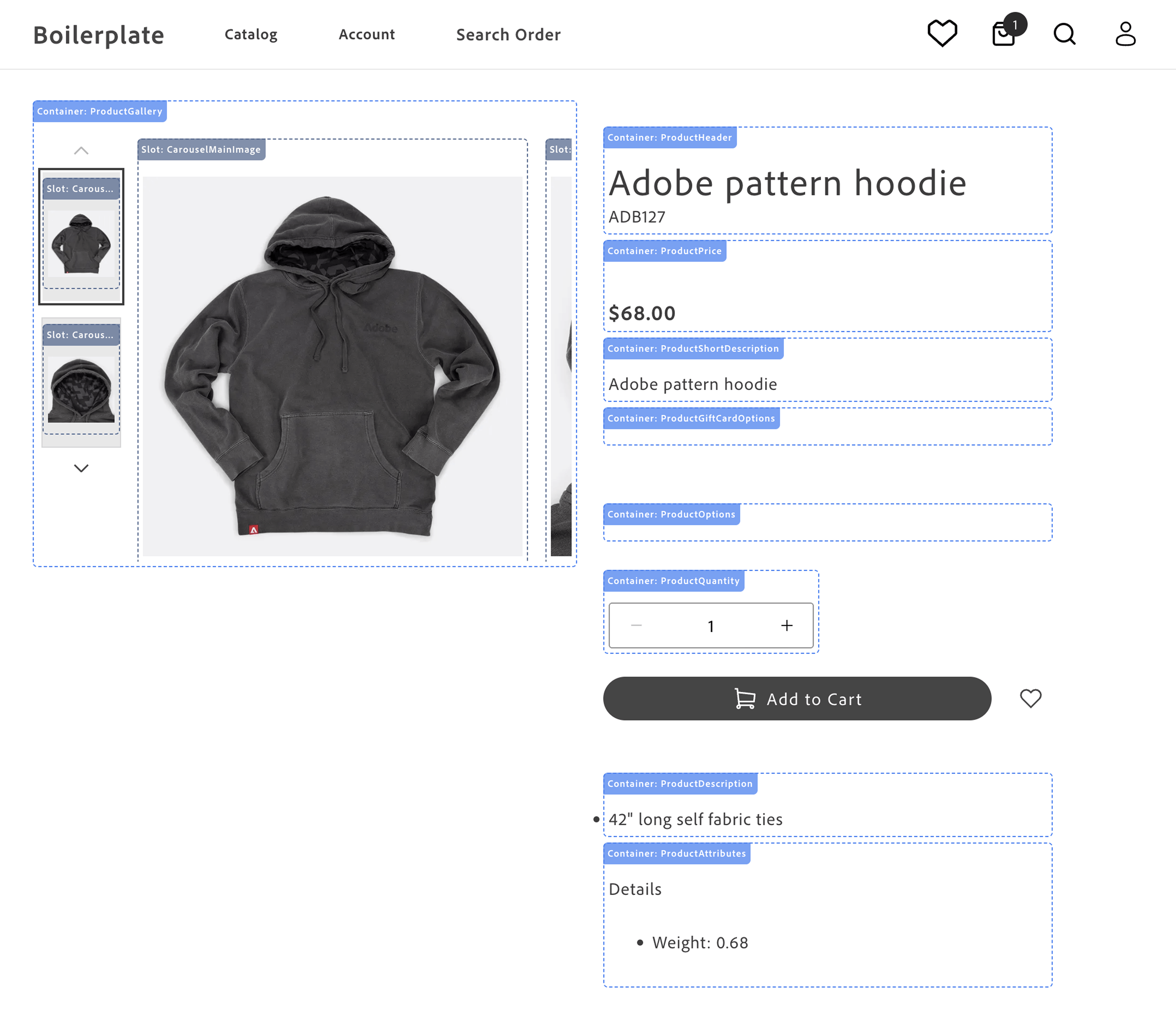\n</Diagram>\n\n- **Product Gallery** - displays the product images and videos. See [`ProductGallery`](https://experienceleague.adobe.com/developer/commerce/storefront/dropins/product-details/containers/product-gallery/).\n\n- **Product Header** - displays the product name and SKU. See [`ProductHeader`](https://experienceleague.adobe.com/developer/commerce/storefront/dropins/product-details/containers/product-header/).\n\n- **Product Price** - displays the product price and special price. See [`ProductPrice`](https://experienceleague.adobe.com/developer/commerce/storefront/dropins/product-details/containers/product-price/).\n\n- **Product Gift Card Options** - displays the product gift card options. See [`ProductGiftCardOptions`](https://experienceleague.adobe.com/developer/commerce/storefront/dropins/product-details/containers/product-gift-card-options/).\n\n- **Product Short Description** - displays the product short description. See [`ProductShortDescription`](https://experienceleague.adobe.com/developer/commerce/storefront/dropins/product-details/containers/product-short-description/).\n\n- **Product Options** - displays the product options (size, color, and so on). See [`ProductOptions`](https://experienceleague.adobe.com/developer/commerce/storefront/dropins/product-details/containers/product-options/).\n\n- **Product Downloadable Options** - displays the downloadable link selection UI so shoppers can choose which files to include in their purchase. Not shown in image — renders only for downloadable product types. See [`ProductDownloadableOptions`](https://experienceleague.adobe.com/developer/commerce/storefront/dropins/product-details/containers/product-downloadable-options/).\n\n- **Product Quantity** - displays the product quantity selector. See [`ProductQuantity`](https://experienceleague.adobe.com/developer/commerce/storefront/dropins/product-details/containers/product-quantity/).\n\n- **Add to Cart and Wishlist Buttons** - rendered by the block, not the drop-in, so they can be rearranged or restyled in the block code.\n\n- **Product Description** - displays the product description. See [`ProductDescription`](https://experienceleague.adobe.com/developer/commerce/storefront/dropins/product-details/containers/product-description/).\n\n- **Product Attributes** - displays the product attributes. See [`ProductAttributes`](https://experienceleague.adobe.com/developer/commerce/storefront/dropins/product-details/containers/product-attributes/).\n\nThe practical application of rendering different product types is to provide a consistent user experience across different products. For example, a simple product can be rendered with a single price and quantity, while a complex product can be rendered with multiple options that combine into product variants. This flexibility allows you to showcase a wide range of products in a consistent and user-friendly manner. These product types allow you to cater to diverse customer needs, streamline operations, and enhance the shopping experience.\n\nAll containers in the product-details drop-in support **scoped contexts**, allowing multiple independent PDP instances to run on the same page and enabling features like product comparison, related products, and quick product previews without conflicts.\n\n## Use cases\n\nThe PDP component provides a variety of fully-customizable controls to showcase your products according to your brand's aesthetics and build interactive experiences that engage customers. Use cases include:\n\n- **Image Carousel**: Display multiple product images and videos in a carousel format, allowing users to browse product images, videos, and other details.\n- **Product Information**: Showcase detailed product information, including pricing, descriptions, and specifications.\n- **Product Variants**: Display different product variants, such as colors, sizes, and styles, allowing users to select the option that best fits their needs.\n- **Product Reviews**: Include user reviews and ratings to provide social proof and help users make informed purchasing decisions.\n- **Customization Options**: Customize the appearance and behavior of the drop-in component to align with your brand's design aesthetic and user experience goals.\n\n## Supported Commerce features\n\nThe following table provides an overview of the Adobe Commerce features that the PDP drop-in component supports:\n\n| Feature | Status |\n| ------------------------------- | -------------------------------------------- |\n| Bundle product type | |\n| Configurable product type | |\n| Image gallery | |\n| Grouped products | |\n| Product details | |\n| Simple product type | |\n| Virtual product type | |\n| Zoom | |\n\n## Render product types\n\nThe PDP component supports rendering different product types configured in your Adobe Commerce instance by default using data provided by the . Adobe Commerce supports seven product types, but the Catalog Service GraphQL API schema maps these to two types:\n\n- _Simple products_ are products that are defined with a single price and quantity. Catalog Service maps the simple, virtual, downloadable, and gift card product types to .\n- _Complex products_ comprise multiple simple products. The component simple products can have different prices. A complex product can also be defined so that the shopper can specify the quantity of component simple products. Catalog Service maps the configurable, bundle, and grouped product types to .\n\n > **Pro tip!**\n>\n Go to the \n and run the `product` query to see the product data structure for different product types.\n \n\n## Product metadata and SEO\n\nGenerating product metadata is crucial for optimizing search engine visibility, enhancing user experience, integrating with social media, supporting ecommerce functionality, ensuring compliance, and enabling data-driven decision-making.\n\nThe Commerce boilerplate provides a [metadata generation script](https://experienceleague.adobe.com/developer/commerce/storefront/setup/seo/metadata/#generate-metadata) that fetches product data from the Catalog Service GraphQL API and generates meta tags and structured data in JSON-LD format. The script writes the metadata to an Excel file, which you can upload to Edge Delivery Services."
|
|
11
|
+
},
|
|
12
|
+
{
|
|
13
|
+
"path": "dropins/product-details/containers",
|
|
14
|
+
"title": "Product Details Containers",
|
|
15
|
+
"description": "Overview of Product Details drop-in containers. Add to Cart and wishlist buttons use block composition, not the slots on this drop-in's composed containers (see the Slots topic).",
|
|
16
|
+
"content": "The Product Details drop-in provides pre-built container components for integrating into your storefront.\n\n\n## What are Containers?\n\nContainers are pre-built UI components that combine functionality, state management, and presentation. They provide a complete solution for specific features and can be customized through props, slots, and CSS.\n\n## Available Containers\n\n> **Caution**\n>\n The monolithic `ProductDetails` container is deprecated. It is not used in the Commerce boilerplate. Do not use it for new work. Compose the smaller containers in this table instead (for example, [ProductHeader](https://experienceleague.adobe.com/developer/commerce/storefront/dropins/product-details/containers/product-header/), [ProductGallery](https://experienceleague.adobe.com/developer/commerce/storefront/dropins/product-details/containers/product-gallery/), [ProductPrice](https://experienceleague.adobe.com/developer/commerce/storefront/dropins/product-details/containers/product-price/), and [ProductOptions](https://experienceleague.adobe.com/developer/commerce/storefront/dropins/product-details/containers/product-options/)), then use [Slots](https://experienceleague.adobe.com/developer/commerce/storefront/dropins/product-details/slots/) on each container when you need slot-based customization.\n\n\nAdd to Cart, Add to Wishlist, and similar primary actions are not provided through the Product Details slots in the [Slots](https://experienceleague.adobe.com/developer/commerce/storefront/dropins/product-details/slots/) table. The storefront composes them in the product-details block using separate mount points and the Wishlist or cart patterns described in [Add to Cart and Add to Wishlist](https://experienceleague.adobe.com/developer/commerce/storefront/dropins/product-details/slots/#add-to-cart-and-add-to-wishlist) on that page.\n\n\n| Container | Description |\n| --------- | ----------- |\n| [ProductAttributes](https://experienceleague.adobe.com/developer/commerce/storefront/dropins/product-details/containers/product-attributes/) | Configure the `ProductAttributes` container for the product details page drop-in component. |\n| [ProductDownloadableOptions](https://experienceleague.adobe.com/developer/commerce/storefront/dropins/product-details/containers/product-downloadable-options/) | Renders the downloadable link selection UI for downloadable product types. |\n| [ProductDescription](https://experienceleague.adobe.com/developer/commerce/storefront/dropins/product-details/containers/product-description/) | Configure the `ProductDescription` container for the product details page drop-in component. |\n| [ProductDetails container (deprecated)](https://experienceleague.adobe.com/developer/commerce/storefront/dropins/product-details/containers/product-details/) | Deprecated monolithic container. See the caution above and the linked topic for configuration and slots. |\n| [ProductGallery](https://experienceleague.adobe.com/developer/commerce/storefront/dropins/product-details/containers/product-gallery/) | Configure the `ProductGallery` container for the product details page drop-in component. |\n| [ProductGiftCardOptions](https://experienceleague.adobe.com/developer/commerce/storefront/dropins/product-details/containers/product-gift-card-options/) | *Enrichment needed - add description to `_dropin-enrichments/product-details/containers.json`* |\n| [ProductHeader](https://experienceleague.adobe.com/developer/commerce/storefront/dropins/product-details/containers/product-header/) | Configure the `ProductHeader` container for the product details page drop-in component. |\n| [ProductOptions](https://experienceleague.adobe.com/developer/commerce/storefront/dropins/product-details/containers/product-options/) | Configure the `ProductOptions` container for the product details page drop-in component. |\n| [ProductPrice](https://experienceleague.adobe.com/developer/commerce/storefront/dropins/product-details/containers/product-price/) | Configure the `ProductPrice` container for the product details page drop-in component. |\n| [ProductQuantity](https://experienceleague.adobe.com/developer/commerce/storefront/dropins/product-details/containers/product-quantity/) | Configure the `ProductQuantity` container for the product details page drop-in component. |\n| [ProductShortDescription](https://experienceleague.adobe.com/developer/commerce/storefront/dropins/product-details/containers/product-short-description/) | Configure the `ProductShortDescription` container for the product details page drop-in component. |\n\n\n> **Tip**\n>\nEach container is designed to work independently but can be composed together to create comprehensive user experiences."
|
|
17
|
+
},
|
|
18
|
+
{
|
|
19
|
+
"path": "dropins/product-details/containers/product-attributes",
|
|
20
|
+
"title": "ProductAttributes",
|
|
21
|
+
"description": "Configure the ProductAttributes container for the product details page drop-in component.",
|
|
22
|
+
"content": "The `ProductAttributes` container displays a list of attributes for a product on the product details page.\n\nThe container receives initial product data during [initialization](https://experienceleague.adobe.com/developer/commerce/storefront/dropins/product-details/initialization/) to preload the component and, being event-driven, updates with data emitted to `pdp/data` within the event scope.\n\n## ProductAttributes configurations\n\nThe `ProductAttributes` container provides the following configuration options:\n\n\n## Example\n\nThe following example demonstrates how to configure the `ProductAttributes` container:\n\n```js\nreturn productRenderer.render(ProductAttributes, {\n scope: 'modal', // optional\n});\n```"
|
|
23
|
+
},
|
|
24
|
+
{
|
|
25
|
+
"path": "dropins/product-details/containers/product-description",
|
|
26
|
+
"title": "ProductDescription",
|
|
27
|
+
"description": "Configure the ProductDescription container for the product details page drop-in component.",
|
|
28
|
+
"content": "The `ProductDescription` container displays the detailed description of a product on the product details page.\n\nThe container receives initial product data during [initialization](https://experienceleague.adobe.com/developer/commerce/storefront/dropins/product-details/initialization/) to preload the component and, being event-driven, updates with data emitted to `pdp/data` within the event scope.\n\n## ProductDescription configurations\n\nThe `ProductDescription` container provides the following configuration options:\n\n\n## Example\n\nThe following example demonstrates how to configure the `ProductDescription` container:\n\n```js\nreturn productRenderer.render(ProductDescription, {\n scope: 'modal', // optional\n});\n```"
|
|
29
|
+
},
|
|
30
|
+
{
|
|
31
|
+
"path": "dropins/product-details/containers/product-details",
|
|
32
|
+
"title": "ProductDetails container (deprecated)",
|
|
33
|
+
"description": "Learn about the deprecated monolithic ProductDetails container for legacy Adobe Commerce storefront PDP code. Prefer composed containers for new work.",
|
|
34
|
+
"content": "> **Deprecated**\n>\n The monolithic `ProductDetails` container is deprecated. It is not used in the Commerce boilerplate. Do not use it for new work. Compose the smaller containers from the [containers overview](https://experienceleague.adobe.com/developer/commerce/storefront/dropins/product-details/containers/) instead. For slot-by-slot examples, see [ProductDetails (deprecated) slots](https://experienceleague.adobe.com/developer/commerce/storefront/dropins/product-details/slots/#productdetails-deprecated-slots). For migration context, see [Product details page architectural evolution](https://experienceleague.adobe.com/developer/commerce/storefront/boilerplate/updates/#product-details-page-architectural-evolution).\n\n\nThe legacy `ProductDetails` container (deprecated) renders a full product details experience from one component. This topic lists configuration parameters and slot names for older integrations.\n\n\n## Configuration\n\nThe `ProductDetails` container (deprecated) provides the following configuration options:\n\n\n| Parameter | Type | Req? | Description |\n|---|---|---|---|\n| `sku` | `string` | Yes | SKU of the product to load. |\n| `productData` | `ProductModel` | No | Optional pre-fetched product data. |\n| `hideSku` | `boolean` | No | Hides the SKU when set to `true`. |\n| `hideQuantity` | `boolean` | No | Hides the quantity selector when set to `true`. |\n| `hideShortDescription` | `boolean` | No | Hides the short description when set to `true`. |\n| `hideDescription` | `boolean` | No | Hides the long description when set to `true`. |\n| `hideAttributes` | `boolean` | No | Hides the attributes block when set to `true`. |\n| `hideSelectedOptionValue` | `boolean` | No | Hides the selected option value display when set to `true`. |\n| `hideURLParams` | `boolean` | No | Stops reading product context from URL parameters when set to `true`. |\n| `carousel` | `CarouselConfig` | No | Carousel configuration for the gallery. |\n| `optionsConfig` | `OptionsConfig` | No | Options UI configuration. |\n| `useACDL` | `boolean` | No | Enables Adobe Client Data Layer integration when set to `true`. |\n| `onAddToCart` | `function` | No | Callback invoked when the shopper adds to cart. |\n| `zoomType` | `'zoom' \\| 'overlay'` | No | Image zoom behavior. |\n| `closeButton` | `boolean` | No | Shows or hides a close control where applicable. |\n| `disableDropdownPreselection` | `boolean` | No | Disables preselecting the first dropdown option when set to `true`. |\n\n\n## Slots\n\nThis container exposes the following slots for customization. For examples and TypeScript shapes, see [ProductDetails (deprecated) slots](https://experienceleague.adobe.com/developer/commerce/storefront/dropins/product-details/slots/#productdetails-deprecated-slots).\n\n\n| Slot | Type | Required | Description |\n|------|------|----------|-------------|\n| `Title` | `SlotProps` | No | Title area of the PDP. |\n| `SKU` | `SlotProps` | No | SKU line. |\n| `RegularPrice` | `SlotProps` | No | Regular price display. |\n| `SpecialPrice` | `SlotProps` | No | Special or sale price display. |\n| `Options` | `SlotProps` | No | Configurable options UI. |\n| `Quantity` | `SlotProps` | No | Quantity selector. |\n| `Actions` | `SlotProps` | No | Primary actions region (for example, add to cart). |\n| `ShortDescription` | `SlotProps` | No | Short description block. |\n| `Description` | `SlotProps` | No | Long description block. |\n| `Attributes` | `SlotProps` | No | Attributes list. |\n| `Breadcrumbs` | `SlotProps` | No | Breadcrumb trail. |\n| `GalleryContent` | `SlotProps` | No | Gallery region content. |\n| `InfoContent` | `SlotProps` | No | Secondary info column content. |\n| `Content` | `SlotProps` | No | General content region. |\n\n\n## Usage\n\nThe following example shows how older code rendered the `ProductDetails` container (deprecated):\n\n```js\n\nimport { ProductDetails } from '@dropins/storefront-pdp/containers/ProductDetails.js'; // (deprecated)\n\nawait provider.render(ProductDetails, {\n sku: 'PRODUCT-SKU-123',\n productData: productData,\n hideSku: true,\n slots: {\n // Add custom slot implementations here\n },\n})(block);\n```"
|
|
35
|
+
},
|
|
36
|
+
{
|
|
37
|
+
"path": "dropins/product-details/containers/product-downloadable-options",
|
|
38
|
+
"title": "ProductDownloadableOptions Container",
|
|
39
|
+
"description": "Learn about the ProductDownloadableOptions container in the Product Details drop-in.",
|
|
40
|
+
"content": "The `ProductDownloadableOptions` container renders the downloadable link selection UI for downloadable product types. It allows customers to choose which downloadable files (links) to include in their purchase.\n\n## Configuration\n\nThe `ProductDownloadableOptions` container provides the following configuration options:\n\n\n| Parameter | Type | Req? | Description |\n|---|---|---|---|\n| `scope` | `string` | No | Optional scope identifier used to namespace product data events, allowing multiple PDP instances on the same page. |\n\n\n## Slots\n\nThis container does not expose any customizable slots.\n\n## Usage\n\nThe following example demonstrates how to use the `ProductDownloadableOptions` container:\n\n```js\n\n\nawait provider.render(ProductDownloadableOptions, {\n scope: \"example\",\n})(block);\n```"
|
|
41
|
+
},
|
|
42
|
+
{
|
|
43
|
+
"path": "dropins/product-details/containers/product-gallery",
|
|
44
|
+
"title": "ProductGallery",
|
|
45
|
+
"description": "Configure the ProductGallery container for the product details page drop-in component.",
|
|
46
|
+
"content": "The `ProductGallery` container displays a gallery of product images and videos on the product details page.\n\nThe container receives initial product data during [initialization](https://experienceleague.adobe.com/developer/commerce/storefront/dropins/product-details/initialization/) to preload the component and, being event-driven, updates with data emitted to `pdp/data` within the event scope.\n\n## ProductGallery configurations\n\nThe `ProductGallery` container provides the following configuration options:\n\n\n## Videos\n\nThe `videos` prop enables product video support in the gallery carousel. The following usage example shows the different configuration options: disabled (default), enabled, and placing your videos before or after your static images within the carousel.\n\n### Usage\n\n```js\n// Disabled (default) — backward compatible\n\n\n// Enabled — videos appear after images\n\n\n// Videos appear before images\n\n\n// Videos appear after images (explicit)\n\n```\n\n### Supported video sources\n\nThe gallery supports multiple video sources and formats, rendering each based on its URL type.\n\n\n| Video source | Render method |\n|--------------|---------------|\n| Video file URLs — URLs that resolve directly to a video file (.mp4, .webm, .ogg, .mov, .avi, .mkv) | Native `<video>` element with playback controls |\n| Video platform URLs (YouTube, Vimeo, etc.) | `<iframe>` with embedded player |\n\n\n## Example\n\nThe following example demonstrates how to configure the `ProductGallery` container with video support.\n\n```js {18}\nreturn productRenderer.render(ProductGallery, {\n controls: 'thumbnailsRow',\n loop: true,\n peak: false,\n gap: 'medium',\n arrows: true,\n imageParams: {\n width: 800,\n height: 800,\n },\n thumbnailParams: {\n width: 150,\n height: 150,\n },\n zoom: {\n closeButton: true,\n },\n videos: true,\n});\n```"
|
|
47
|
+
},
|
|
48
|
+
{
|
|
49
|
+
"path": "dropins/product-details/containers/product-gift-card-options",
|
|
50
|
+
"title": "ProductGiftCardOptions Container",
|
|
51
|
+
"description": "Learn about the ProductGiftCardOptions container in the Product Details drop-in.",
|
|
52
|
+
"content": "## Configuration\n\nThe `ProductGiftCardOptions` container provides the following configuration options:\n\n\n| Parameter | Type | Req? | Description |\n|---|---|---|---|\n| `scope` | `string` | No | |\n\n\n## Slots\n\nThis container does not expose any customizable slots.\n\n## Usage\n\nThe following example demonstrates how to use the `ProductGiftCardOptions` container:\n\n```js\n\n\nawait provider.render(ProductGiftCardOptions, {\n scope: \"example\",\n})(block);\n```"
|
|
53
|
+
},
|
|
54
|
+
{
|
|
55
|
+
"path": "dropins/product-details/containers/product-giftcard-options",
|
|
56
|
+
"title": "ProductGiftCardOptions",
|
|
57
|
+
"description": "Configure the ProductGiftCardOptions container for the product details page drop-in component.",
|
|
58
|
+
"content": "The `ProductGiftCardOptions` container manages and displays gift card-specific options on the product details page.\n\nThe container receives initial product data during [initialization](https://experienceleague.adobe.com/developer/commerce/storefront/dropins/product-details/initialization/) to preload the component. Once loaded, it operates in an event-driven manner, updating with data emitted to `pdp/data` within the event scope. Additionally, it listens to `pdp/values` to keep its displayed state in sync with the currently selected configuration. As shoppers interact with the gift card fields, the container updates the global PDP configuration values and validity.\n\n:::note\n- Rendering is conditional. The container renders only when the product includes the `ac_giftcard` attribute containing a JSON string with the shape `{ \"options\": Option[] }` that defines the UI fields.\n- User interactions are tracked. As shoppers edit fields, the container writes selected values to the PDP configuration (`enteredOptions`) and updates validity to enable actions like **Add to Cart**.\n- Additionally, the container passes the currency of the product to the `GiftCardOptions` component so it can format and display the currency correctly.\n:::\n\n## Container rendering\n\n<Diagram caption=\"ProductGiftCardOptions container\">\n \n</Diagram>\n\n## ProductGiftCardOptions configurations\n\nThe `ProductGiftCardOptions` container provides the following configuration options:\n\n\n## Example\n\nThe following example demonstrates how to configure and render the `ProductGiftCardOptions` container:\n\n```js\nreturn productRenderer.render(ProductGiftCardOptions, {\n scope: 'modal', // optional\n className: 'pdp-gift-card-options--custom',\n});\n```"
|
|
59
|
+
},
|
|
60
|
+
{
|
|
61
|
+
"path": "dropins/product-details/containers/product-header",
|
|
62
|
+
"title": "ProductHeader",
|
|
63
|
+
"description": "Configure the ProductHeader container for the product details page drop-in component.",
|
|
64
|
+
"content": "The `ProductHeader` container is designed to display the header information of a product on the product details page.\n\nThe header displays the product name with the SKU below it. Set `hideSku` to `true` to hide the SKU.\n\nFor **configurable** products, when the shopper has selected a full variant, product data on `pdp/data` can include `variantSku` and `variantName` (see [`getRefinedProduct`](https://experienceleague.adobe.com/developer/commerce/storefront/dropins/product-details/functions/#getrefinedproduct)). Set `showVariantSku` and/or `showVariantName` to `true` to show those values in the header in addition to the parent product name and SKU.\n\nThe container receives initial product data during [initialization](https://experienceleague.adobe.com/developer/commerce/storefront/dropins/product-details/initialization/) to preload the component and, being event-driven, updates with data emitted to `pdp/data` within the event scope.\n\n## ProductHeader configurations\n\nThe `ProductHeader` container provides the following configuration options:\n\n\n## Example\n\nThe following example demonstrates how to configure the `ProductHeader` container:\n\n```js\nrender(ProductHeader, {\n hideSku: false,\n showVariantSku: true,\n showVariantName: true,\n});\n```\n\n{/* TODO: Add screenshots of the ProductHeader with hideSku: true, and one with hideSku: false. */}"
|
|
65
|
+
},
|
|
66
|
+
{
|
|
67
|
+
"path": "dropins/product-details/containers/product-options",
|
|
68
|
+
"title": "ProductOptions",
|
|
69
|
+
"description": "Configure the ProductOptions container for the product details page drop-in component.",
|
|
70
|
+
"content": "The `ProductOptions` container manages and displays product options on the product details page.\n\nThe container receives initial product data during [initialization](https://experienceleague.adobe.com/developer/commerce/storefront/dropins/product-details/initialization/) to preload the component and, being event-driven, updates with data emitted to `pdp/data` within the event scope.\n\n## ProductOptions configurations\n\nThe `ProductOptions` container provides the following configuration options:\n\n\n## Example\n\nThe following example demonstrates how to configure the `ProductOptions` container:\n\n```js\nreturn productRenderer.render(ProductOptions, {\n slots: {\n Swatches: (ctx) => {\n const size = ctx.getSlotElement('product-swatch--fashion_size');\n\n // Add link to Sizes\n if (size) {\n // Create Size Link\n const link = document.createElement('a');\n link.href = '#';\n link.addEventListener('click', (e) => {\n e.preventDefault();\n console.log('Size Chart');\n });\n // append inside size\n size.appendChild(link);\n }\n },\n },\n});\n```"
|
|
71
|
+
},
|
|
72
|
+
{
|
|
73
|
+
"path": "dropins/product-details/containers/product-price",
|
|
74
|
+
"title": "ProductPrice",
|
|
75
|
+
"description": "Configure the ProductPrice container for the product details page drop-in component.",
|
|
76
|
+
"content": "The `ProductPrice` container displays the price of a product on the product details page. It includes special prices and regular prices if they are available and visible.\n\nThe container receives initial product data during [initialization](https://experienceleague.adobe.com/developer/commerce/storefront/dropins/product-details/initialization/) to preload the component and, being event-driven, updates with data emitted to `pdp/data` within the event scope.\n\n## ProductPrice configurations\n\nThe `ProductPrice` container provides the following configuration options:\n\n\n## Example\n\nThe following example demonstrates how to configure the `ProductPrice` container:\n\n```js\nreturn productRenderer.render(ProductPrice, {\n scope: 'modal', // optional\n});\n```"
|
|
77
|
+
},
|
|
78
|
+
{
|
|
79
|
+
"path": "dropins/product-details/containers/product-quantity",
|
|
80
|
+
"title": "ProductQuantity",
|
|
81
|
+
"description": "Configure the ProductQuantity container for the product details page drop-in component.",
|
|
82
|
+
"content": "The `ProductQuantity` container manages and displays the quantity of a product that a shopper wants to purchase on the product details page.\n\nThe container receives initial product data during [initialization](https://experienceleague.adobe.com/developer/commerce/storefront/dropins/product-details/initialization/) to preload the component and, being event-driven, updates with data emitted to `pdp/data` within the event scope.\n\n## ProductQuantity configurations\n\nThe `ProductQuantity` container provides the following configuration options:\n\n\n## Example\n\nThe following example demonstrates how to configure the `ProductQuantity` container:\n\n```js\n\n\nawait provider.render(ProductQuantity, {\n onValue: (value) => console.log(value),\n})(mountElement);\n```\n\nReplace `mountElement` with the DOM node where the quantity control should appear."
|
|
83
|
+
},
|
|
84
|
+
{
|
|
85
|
+
"path": "dropins/product-details/containers/product-short-description",
|
|
86
|
+
"title": "ProductShortDescription",
|
|
87
|
+
"description": "Configure the ProductShortDescription container for the product details page drop-in component.",
|
|
88
|
+
"content": "The `ProductShortDescription` container displays a short description of a product on the product details page.\n\nThe container receives initial product data during [initialization](https://experienceleague.adobe.com/developer/commerce/storefront/dropins/product-details/initialization/) to preload the component and, being event-driven, updates with data emitted to `pdp/data` within the event scope.\n\n## ProductShortDescription configurations\n\nThe `ProductShortDescription` container provides the following configuration options:\n\n\n## Example\n\nThe following example demonstrates how to configure the `ProductShortDescription` container:\n\n```js\nreturn productRenderer.render(ProductShortDescription, {\n scope: 'modal', // optional\n});\n```"
|
|
89
|
+
},
|
|
90
|
+
{
|
|
91
|
+
"path": "dropins/product-details/dictionary",
|
|
92
|
+
"title": "Product Details Dictionary",
|
|
93
|
+
"description": "Customize user-facing text and labels in the Product Details drop-in for localization and branding.",
|
|
94
|
+
"content": "The **Product Details dictionary** contains all user-facing text, labels, and messages displayed by this drop-in. Customize the dictionary to:\n\n- **Localize** the drop-in for different languages and regions\n- **Customize** labels and messages to match your brand voice\n- **Override** default text without modifying source code for the drop-in\n\nDictionaries use the **i18n (internationalization)** pattern, where each text string is identified by a unique key path.\n\n\n## How to customize\n\nOverride dictionary values during drop-in initialization. The drop-in deep-merges your custom values with the defaults.\n\n```javascript\n\nawait initialize({\n langDefinitions: {\n en_US: {\n \"PDP\": {\n \"Product\": {\n \"Incrementer\": {\n \"label\": \"Custom Label\"\n },\n \"OutOfStock\": {\n \"label\": \"Custom Label\"\n }\n }\n }\n }\n }\n});\n```\n\nYou only need to include the keys you want to change. For multi-language support and advanced patterns, see the [Dictionary customization guide](https://experienceleague.adobe.com/developer/commerce/storefront/dropins/all/dictionaries/).\n\n## Default keys and values\n\nBelow are the default English (`en_US`) strings provided by the **Product Details** drop-in:\n\n```json title=\"en_US.json\"\n{\n \"PDP\": {\n \"Product\": {\n \"Incrementer\": {\n \"label\": \"Item Quantity\"\n },\n \"OutOfStock\": {\n \"label\": \"Out of Stock\"\n },\n \"AddToCart\": {\n \"label\": \"Add to Cart\"\n },\n \"Details\": {\n \"label\": \"Details\"\n },\n \"RegularPrice\": {\n \"label\": \"Regular Price\"\n },\n \"SpecialPrice\": {\n \"label\": \"Special Price\"\n },\n \"PriceRange\": {\n \"From\": {\n \"label\": \"From\"\n },\n \"To\": {\n \"label\": \"to\"\n }\n },\n \"Image\": {\n \"label\": \" Image of \"\n },\n \"GiftCardOptions\": {\n \"ChooseAmount\": {\n \"label\": \"Choose amount\"\n },\n \"OtherAmount\": {\n \"label\": \"Other amount\"\n },\n \"RequiredFieldError\": {\n \"label\": \"This field is required\"\n },\n \"NumberError\": {\n \"label\": \"Please enter a valid number\"\n },\n \"MinError\": {\n \"label\": \"Minimum value is \"\n },\n \"MaxError\": {\n \"label\": \"Maximum value is \"\n },\n \"MinLengthError\": {\n \"label\": \"Minimum length is characters\"\n },\n \"MaxLengthError\": {\n \"label\": \"Maximum length is characters\"\n },\n \"EmailError\": {\n \"label\": \"Please enter a valid email address\"\n },\n \"InvalidValueError\": {\n \"label\": \"Please select one of the allowed values: \"\n }\n }\n },\n \"Swatches\": {\n \"Required\": {\n \"label\": \"Required\"\n },\n \"ChooseOption\": {\n \"label\": \"Choose an option\"\n }\n },\n \"Carousel\": {\n \"label\": \"Carousel\",\n \"Next\": {\n \"label\": \"Next\"\n },\n \"Previous\": {\n \"label\": \"Previous\"\n },\n \"Slide\": {\n \"label\": \"Slide\"\n },\n \"Controls\": {\n \"label\": \"Carousel Controls\",\n \"Button\": {\n \"label\": \"Show slide of \"\n }\n }\n },\n \"Overlay\": {\n \"Close\": {\n \"label\": \"Close\"\n }\n },\n \"Zoom\": {\n \"Close\": {\n \"label\": \"Close\"\n }\n }\n },\n \"Custom\": {\n \"quantityLabel\": \"Quantity\"\n }\n}\n```"
|
|
95
|
+
},
|
|
96
|
+
{
|
|
97
|
+
"path": "dropins/product-details/events",
|
|
98
|
+
"title": "Product Details Data & Events",
|
|
99
|
+
"description": "Learn about the events used by the Product Details drop-in and the data available within those events.",
|
|
100
|
+
"content": "The **Product Details** drop-in uses the [event bus](https://experienceleague.adobe.com/developer/commerce/storefront/sdk/reference/events) to emit and listen to events for communication between drop-ins and external integrations.\n\n\n## Events reference\n\n{/* EVENTS_TABLE_START */}\n\n\n| Event | Direction | Description |\n|-------|-----------|-------------|\n| [pdp/valid](#pdpvalid-emits) | Emits | Emitted when validation state changes. |\n| [pdp/setValues](#pdpsetvalues-listens) | Listens | Fired by PDP (`pdp`) when values are set programmatically. |\n| [pdp/data](#pdpdata-emits-and-listens) | Emits and listens | Triggered when data is available or changes. |\n| [pdp/values](#pdpvalues-emits-and-listens) | Emits and listens | Triggered when form or configuration values change. |\n\n\n{/* EVENTS_TABLE_END */}\n\n## Event details\n\nThe following sections provide detailed information about each event, including its direction, event payload, and usage examples.\n\n\n### `pdp/data` (emits and listens)\n\nTriggered when data is available or changes.\n\n#### Event payload\n\n```typescript\nProductModel | null\n```\n\nSee [`ProductModel`](#productmodel) for full type definition.\n\n\n#### Example\n\n```js\n\nevents.on('pdp/data', (payload) => {\n console.log('pdp/data event received:', payload);\n // Add your custom logic here\n});\n```\n\n\n### `pdp/setValues` (listens)\n\nFired by PDP (`pdp`) when values are set programmatically.\n\n#### Event payload\n\n\n#### Example\n\n```js\n\nevents.on('pdp/setValues', (payload) => {\n console.log('pdp/setValues event received:', payload);\n // Add your custom logic here\n});\n```\n\n\n### `pdp/valid` (emits)\n\nEmitted when validation state changes.\n\n#### Event payload\n\n```typescript\nboolean\n```\n\n\n#### Example\n\n```js\n\nevents.on('pdp/valid', (payload) => {\n console.log('pdp/valid event received:', payload);\n // Add your custom logic here\n});\n```\n\n\n### `pdp/values` (emits and listens)\n\nTriggered when form or configuration values change.\n\n#### Event payload\n\n```typescript\nValuesModel\n```\n\nSee [`ValuesModel`](#valuesmodel) for full type definition.\n\n\n#### Example\n\n```js\n\nevents.on('pdp/values', (payload) => {\n console.log('pdp/values event received:', payload);\n // Add your custom logic here\n});\n```\n\n\n## Data Models\n\nThe following data models are used in event payloads for this drop-in.\n\n### ProductModel\n\nUsed in: [`pdp/data`](#pdpdata-emits-and-listens).\n\n```ts\ninterface ProductModel {\n name: string;\n sku: string;\n isBundle: boolean;\n addToCartAllowed: boolean;\n inStock: boolean | null;\n shortDescription?: string;\n metaDescription?: string;\n metaKeyword?: string;\n metaTitle?: string;\n description?: string;\n images?: Image[];\n prices: Prices;\n attributes?: Attribute[];\n options?: Option[];\n optionUIDs?: string[];\n url?: string;\n urlKey?: string;\n externalId?: string;\n externalParentId?: string;\n variantSku?: string;\n productType?: ProductType | undefined;\n}\n```\n\n### ValuesModel\n\nUsed in: [`pdp/values`](#pdpvalues-emits-and-listens).\n\n```ts\ninterface ValuesModel {\n sku: string;\n quantity: number;\n optionsUIDs?: string[];\n enteredOptions?: Array<{ uid: string; value: string }>;\n}\n```"
|
|
101
|
+
},
|
|
102
|
+
{
|
|
103
|
+
"path": "dropins/product-details/functions",
|
|
104
|
+
"title": "Product Details Functions",
|
|
105
|
+
"description": "API functions provided by the Product Details drop-in for programmatic control and customization.",
|
|
106
|
+
"content": "The Product Details drop-in provides API functions that enable you to programmatically control behavior, fetch data, and integrate with Adobe Commerce backend services.\n\n\n| Function | Description |\n| --- | --- |\n| [`fetchProductData`](#fetchproductdata) | Fetches product data for a given SKU. |\n| [`getFetchedProductData`](#getfetchedproductdata) | Returns previously fetched product data from cache. |\n| [`getProductConfigurationValues`](#getproductconfigurationvalues) | Returns the current product configuration values. |\n| [`getProductData`](#getproductdata) | Returns the product data for a given product SKU. |\n| [`getProductsData`](#getproductsdata) | Fetches multiple products by SKUs with optional per-product option configuration. |\n| [`getRefinedProduct`](#getrefinedproduct) | Returns refined product data with specific options selected. |\n| [`isProductConfigurationValid`](#isproductconfigurationvalid) | Checks if the current product configuration is valid. |\n| [`setProductConfigurationValid`](#setproductconfigurationvalid) | Sets a callback to be called when product configuration validity changes. |\n| [`setProductConfigurationValues`](#setproductconfigurationvalues) | Sets a callback to be called when product configuration values change. |\n\n\n## fetchProductData\n\nThe `fetchProductData` function fetches product data for a given SKU. It can fetch either simple product data or refined product data with selected options.\n\n```ts\nconst fetchProductData = async (\n sku: string,\n options?: Options\n): Promise<any>\n```\n\n\n| Parameter | Type | Req? | Description |\n|---|---|---|---|\n| `sku` | `string` | Yes | The SKU (Stock Keeping Unit) of the product to fetch. |\n| `options` | `Options` | No | Optional configuration including \\`anchors\\` (anchor options), \\`optionsUIDs\\` (selected option IDs), \\`preselectFirstOption\\` (whether to preselect first option), \\`isBundle\\` (whether product is a bundle), and \\`skipTransform\\` (whether to skip data transformation). |\n\n\n### Events\n\nDoes not emit any drop-in events.\n\n### Returns\n\nReturns `void`.\n\n## getFetchedProductData\n\nThe `getFetchedProductData` function returns previously fetched product data from cache.\n\n```ts\nconst getFetchedProductData = async (\n { scope, }: { scope?: string } = {}\n): Promise<ProductModel | null>\n```\n\n\n| Parameter | Type | Req? | Description |\n|---|---|---|---|\n| `options` | `{ scope?: string }` | No | Optional configuration. Use `scope` to identify the PDP instance when using scoped contexts. |\n\n\n### Events\n\nDoes not emit any drop-in events.\n\n### Returns\n\nReturns [`ProductModel`](#productmodel) or `null`.\n\n## getProductConfigurationValues\n\nThe `getProductConfigurationValues` function returns the current product configuration values.\n\n```ts\nconst getProductConfigurationValues = (\n { scope, }: { scope?: string } = {}\n): ValuesModel | null\n```\n\n\n| Parameter | Type | Req? | Description |\n|---|---|---|---|\n| `options` | `{ scope?: string }` | No | Optional configuration. Use `scope` to identify the PDP instance when using scoped contexts. |\n\n\n### Events\n\nDoes not emit any drop-in events.\n\n### Returns\n\nReturns [`ValuesModel`](#valuesmodel) or `null`.\n\n## getProductData\n\nThe `getProductData` function returns the product data for a given product SKU. It fetches data from Adobe Commerce and optionally preselects the first available option. The function calls the query.\n\n```ts\nconst getProductData = async (\n sku: string,\n options?: { preselectFirstOption?: boolean; optionsUIDs?: string[]; },\n raw?: boolean\n): Promise<ProductModel | null>\n```\n\n\n| Parameter | Type | Req? | Description |\n|---|---|---|---|\n| `sku` | `string` | Yes | The SKU (Stock Keeping Unit) of the product to fetch. |\n| `preselectFirstOption` | `boolean` | No | Whether to automatically preselect the first available option for configurable products. |\n| `optionsUIDs` | `string[]` | No | An array of option UIDs to preselect for the product. |\n| `raw` | `boolean` | No | Whether to return raw GraphQL data without transformation. |\n\n\n### Events\n\nDoes not emit any drop-in events.\n\n### Returns\n\nReturns [`ProductModel`](#productmodel) or `null`.\n\n## getProductsData\n\nThe `getProductsData` function fetches multiple products by their SKUs in a single request. Each item can include optional configuration such as selected option UIDs and a flag to pre-select the first available option. Useful for bulk product data retrieval, such as in Quick Order or product list pages.\n\n```ts\nconst getProductsData = async (\n items: ProductDataItem[],\n raw?: boolean\n): Promise<ProductModel[] | null>\n```\n\n\n| Parameter | Type | Req? | Description |\n|---|---|---|---|\n| `items` | `ProductDataItem[]` | Yes | An array of product request objects. Each object must include a `sku` and optionally `optionsUIDs` (array of selected option UIDs) and `preselectFirstOption` (boolean to auto-select the first available option for each swatch). |\n| `raw` | `boolean` | No | When `true`, returns the raw GraphQL response without transformation. Defaults to `false`. |\n\n\n### Events\n\nDoes not emit any drop-in events.\n\n### Returns\n\nReturns an array of [`ProductModel`](#productmodel) objects or `null` when no products are found or the input is empty.\n\n## getRefinedProduct\n\nThe `getRefinedProduct` function returns refined product data with specific options selected. This is used for configurable products where options have been chosen. The function calls the query.\n\nFor configurable products, the returned [`ProductModel`](#productmodel) always keeps the parent product’s `name` and `sku`. When refinement resolves to a simple variant (`SimpleProductView`), the model also includes `variantSku` and `variantName` for that variant so you can display or forward the child SKU and title (for example from the [`ProductHeader`](https://experienceleague.adobe.com/developer/commerce/storefront/dropins/product-details/containers/product-header/) container).\n\n```ts\nconst getRefinedProduct = async (\n sku: string,\n optionUIDs: string[],\n anchorOptions?: string[],\n raw?: boolean\n): Promise<ProductModel | null>\n```\n\n\n| Parameter | Type | Req? | Description |\n|---|---|---|---|\n| `sku` | `string` | Yes | The SKU (Stock Keeping Unit) of the product to fetch. |\n| `optionUIDs` | `string[]` | Yes | An array of option UIDs representing the selected variant. |\n| `anchorOptions` | `string[]` | No | Anchor options for the product selection. |\n| `raw` | `boolean` | No | Whether to return raw GraphQL data without transformation. |\n\n\n### Events\n\nDoes not emit any drop-in events.\n\n### Returns\n\nReturns [`ProductModel`](#productmodel) or `null`.\n\n## isProductConfigurationValid\n\nThe `isProductConfigurationValid` function checks if the current product configuration is valid.\n\n```ts\nconst isProductConfigurationValid = async (\n { scope, }: { scope?: string } = {}\n): boolean | null\n```\n\n\n| Parameter | Type | Req? | Description |\n|---|---|---|---|\n| `options` | `{ scope?: string }` | No | Optional configuration. Use `scope` to identify the PDP instance when using scoped contexts. |\n\n\n### Events\n\nDoes not emit any drop-in events.\n\n### Returns\n\nReturns `boolean | null`.\n\n## setProductConfigurationValid\n\nThe `setProductConfigurationValid` function sets a callback to be called when product configuration validity changes.\n\n```ts\nconst setProductConfigurationValid = async (\n callback: (prev: boolean) => boolean,\n options?: { scope?: string }\n): any\n```\n\n\n| Parameter | Type | Req? | Description |\n|---|---|---|---|\n| `callback` | `prev: boolean` | No | A callback function that receives the validity status of the product configuration. |\n\n\n### Events\n\nEmits the [`pdp/valid`](https://experienceleague.adobe.com/developer/commerce/storefront/dropins/product-details/events/#pdpvalid-emits) event.\n\n### Returns\n\nReturns `void`.\n\n## setProductConfigurationValues\n\nThe `setProductConfigurationValues` function sets a callback to be called when product configuration values change.\n\n```ts\nconst setProductConfigurationValues = async (\n callback: (prev: ValuesModel) => ValuesModel,\n options?: { scope?: string }\n): any\n```\n\n\n| Parameter | Type | Req? | Description |\n|---|---|---|---|\n| `callback` | `prev: ValuesModel` | No | A callback function that receives the updated product configuration values. |\n\n\n### Events\n\nEmits the [`pdp/values`](https://experienceleague.adobe.com/developer/commerce/storefront/dropins/product-details/events/#pdpvalues-emits-and-listens) event.\n\n### Returns\n\nReturns `void`.\n\n## Data Models\n\nThe following data models are used by functions in this drop-in.\n\n### ProductModel\n\nThe `ProductModel` object is returned by the following functions: [`getFetchedProductData`](#getfetchedproductdata), [`getProductData`](#getproductdata), [`getRefinedProduct`](#getrefinedproduct).\n\n```ts\ninterface ProductModel {\n name: string;\n sku: string;\n isBundle: boolean;\n addToCartAllowed: boolean;\n inStock: boolean | null;\n shortDescription?: string;\n metaDescription?: string;\n metaKeyword?: string;\n metaTitle?: string;\n description?: string;\n images?: Image[];\n videos?: Video[];\n prices: Prices;\n attributes?: Attribute[];\n options?: Option[];\n optionUIDs?: string[];\n url?: string;\n urlKey?: string;\n externalId?: string;\n externalParentId?: string;\n variantSku?: string;\n variantName?: string;\n productType?: ProductType | undefined;\n}\n```\n\n### Video\n\nThe `Video` interface defines the shape of a product video object returned as part of the `ProductModel`.\n\n```ts\ninterface Video {\n url: string;\n title?: string;\n description?: string;\n preview?: {\n url: string;\n label?: string;\n roles?: string[];\n };\n}\n```\n\n### ValuesModel\n\nThe `ValuesModel` object is returned by the following functions: [`getProductConfigurationValues`](#getproductconfigurationvalues).\n\n```ts\ninterface ValuesModel {\n sku: string;\n quantity: number;\n optionsUIDs?: string[];\n enteredOptions?: Array<{ uid: string; value: string }>;\n}\n```\n\n\n{/* This documentation is auto-generated from the drop-in source repository: REPO_URL */}"
|
|
107
|
+
},
|
|
108
|
+
{
|
|
109
|
+
"path": "dropins/product-details/initialization",
|
|
110
|
+
"title": "Product Details initialization",
|
|
111
|
+
"description": "Configure the Product Details drop-in with language definitions, custom data models, and drop-in-specific options.",
|
|
112
|
+
"content": "The **Product Details initializer** configures how product information is displayed and managed, including images, descriptions, pricing, and options. Use initialization to customize product data models and enhance product presentation.\n\n\n## Configuration options\n\nThe following table describes the configuration options available for the **Product Details** initializer:\n\n\n| Parameter | Type | Req? | Description |\n|---|---|---|---|\n| `langDefinitions` | [`LangDefinitions`](#langdefinitions) | No | Language definitions for internationalization (i18n). Override dictionary keys for localization or branding. |\n| `models` | [`Record<string, any>`](#models) | No | Custom data models for type transformations. Extend or modify default models with custom fields and transformers. |\n| `scope` | `string` | No | Defines the store view scope for product data retrieval. Used in multi-store setups to fetch store-specific product information. |\n| `defaultLocale` | `string` | No | Sets the default locale for product content when no specific locale is detected. |\n| `globalLocale` | `string` | No | Overrides locale detection and forces all product content to use this specific locale regardless of user settings. |\n| `sku` | `string` | No | Pre-loads a specific product SKU on initialization. Useful for server-side rendering or direct product page access. |\n| `acdl` | `boolean` | No | Configuration for Adobe Client Data Layer (ACDL) integration to track product view events and user interactions for analytics. |\n| `anchors` | `string[]` | No | Controls hash navigation behavior for product page sections (e.g., #reviews, #specifications). Enables deep linking to specific content areas. |\n| `persistURLParams` | `boolean` | No | Determines which URL query parameters should persist when navigating between product variants. Useful for tracking campaigns or referral sources. |\n| `preselectFirstOption` | `boolean` | No | When \\`true\\`, automatically selects the first available option for each configurable attribute. Streamlines selection for products with default variants. |\n| `optionsUIDs` | `string[]` | No | Pre-selects specific product options by their unique identifiers. Useful for direct links to configured product variants (e.g., specific \\`size/color\\` combinations). |\n\n\n## Default configuration\n\nThe initializer runs with these defaults when no configuration is provided:\n\n```javascript title=\"scripts/initializers/product-details.js\"\n\n\n// All configuration options are optional\nawait initializers.mountImmediately(initialize, {\n langDefinitions: {}, // Uses built-in English strings\n models: {}, // Uses default data models\n // Drop-in-specific defaults:\n // scope: undefined // See configuration options below\n // defaultLocale: undefined // See configuration options below\n // globalLocale: undefined // See configuration options below\n // sku: undefined // See configuration options below\n // acdl: undefined // See configuration options below\n // anchors: undefined // See configuration options below\n // persistURLParams: undefined // See configuration options below\n // preselectFirstOption: undefined // See configuration options below\n // optionsUIDs: undefined // See configuration options below\n});\n```\n\n## Language definitions\n\nOverride dictionary keys for localization or branding. The `langDefinitions` object maps locale keys to custom strings that override default text for the drop-in.\n\n```javascript title=\"scripts/initializers/product-details.js\"\n\n\nconst customStrings = {\n 'AddToCart': 'Add to Bag',\n 'Checkout': 'Complete Purchase',\n 'Price': 'Cost',\n};\n\nconst langDefinitions = {\n default: customStrings,\n};\n\nawait initializers.mountImmediately(initialize, { langDefinitions });\n```\n\n> **Tip**\n>\nFor complete dictionary customization including all available keys and multi-language support, see the [Product Details Dictionary](https://experienceleague.adobe.com/developer/commerce/storefront/dropins/product-details/dictionary/) page.\n\n\n## Customizing data models\n\nExtend or transform data models by providing custom transformer functions. Use the `models` option to add custom fields or modify existing data structures returned from the backend.\n\n### Model properties\n\nEach model in the `models` configuration object supports the following properties:\n\n\n| Property | Type | Description |\n|---|---|---|\n| `initialData` | `any` | Provides initial data for the model before backend data is fetched. |\n| `transformer` | `(data?: ProductModel) => ProductModel` | Transforms product data returned from GraphQL. Use this to add custom fields or modify existing data structures. |\n| `transform` | `(data?: ProductModel) => ProductModel` | **Deprecated.** Use `transformer` instead. |\n| `fallbackData` | `(parentProduct: any, simpleProduct: ProductModel) => ProductModel` | Provides fallback data when a simple product variant is selected from a configurable parent product. |\n\n\nThe following example shows how to customize a model for the **Product Details** drop-in:\n\n```javascript title=\"scripts/initializers/product-details.js\"\n\n\nconst models = {\n ProductModel: {\n transformer: (data) => ({\n ...data,\n customField: data?.custom_field,\n promotionBadge: data?.promotion?.label,\n displayPrice: data?.price?.value ? `$` : 'N/A',\n }),\n },\n};\n\nawait initializers.mountImmediately(initialize, { models });\n```\n\n## Drop-in configuration\n\nThe **Product Details initializer** configures how product information is displayed and managed, including images, descriptions, pricing, and options. Use initialization to customize product data models and enhance product presentation.\n\n```javascript title=\"scripts/initializers/product-details.js\"\n\n\nawait initializers.mountImmediately(initialize, {\n scope: 'value',\n langDefinitions: {},\n defaultLocale: 'value',\n globalLocale: 'value',\n sku: 'value',\n acdl: true,\n anchors: 'value',\n persistURLParams: true,\n preselectFirstOption: true,\n optionsUIDs: 'abc123',\n models: {},\n});\n```\n\n> **Note**\n>\nRefer to the [Configuration options](#configuration-options) table for detailed descriptions of each option.\n\n\n## Configuration types\n\nThe following TypeScript definitions show the structure of each configuration object:\n\n### langDefinitions\n\nMaps locale identifiers to dictionaries of key-value pairs. The `default` locale is used as the fallback when no specific locale matches. Each dictionary key corresponds to a text string used in the drop-in UI.\n\n```typescript\nlangDefinitions?: {\n [locale: string]: {\n [key: string]: string;\n };\n};\n```\n\n### models\n\nMaps model names to objects that configure how product data is transformed. Each model can provide an initial data state, a transformer function to modify GraphQL responses, and a fallback for configurable product variants.\n\n```typescript\nmodels?: {\n [name: string]: {\n initialData: any;\n /** @deprecated Use \"transformer\" instead */\n transform?: (data?: ProductModel) => ProductModel;\n transformer?: (data?: ProductModel) => ProductModel;\n fallbackData?: (parentProduct: any, simpleProduct: ProductModel) => ProductModel;\n };\n};\n```"
|
|
113
|
+
},
|
|
114
|
+
{
|
|
115
|
+
"path": "dropins/product-details/quick-start",
|
|
116
|
+
"title": "Product Details Quick Start",
|
|
117
|
+
"description": "Quick reference and getting started guide for the Product Details drop-in.",
|
|
118
|
+
"content": "The Product Details drop-in provides a comprehensive product display page with image galleries, pricing, options, swatches, and add-to-cart functionality for all product types.\n\n\n## Quick example\n\nThe Product Details drop-in is included in the . This example shows the basic pattern:\n\n```js\n// 1. Import initializer (handles all setup)\n\n// 2. Import the container you need\n\n// 3. Import the provider\n\n// 4. Render in your block\nexport default async function decorate(block) {\n await provider.render(ProductAttributes, {\n // Configuration options - see Containers page\n })(block);\n}\n```\n\n**New to drop-ins?** See the [Using drop-ins](https://experienceleague.adobe.com/developer/commerce/storefront/dropins/all/quick-start/) guide for complete step-by-step instructions.\n\n\n## Quick reference\n\n**Import paths:**\n- Initializer: `import '../../scripts/initializers/pdp.js'`\n- Containers: `import ContainerName from '@dropins/storefront-pdp/containers/ContainerName.js'`\n- Provider: `import { render } from '@dropins/storefront-pdp/render.js'`\n\n**Package:** `@dropins/storefront-pdp`\n\n**Version:** 3.0.2 (verify compatibility with your Commerce instance)\n\n**Example container:** `ProductAttributes`\n\n## Learn more\n\n- [Containers](https://experienceleague.adobe.com/developer/commerce/storefront/dropins/product-details/containers/) - Available UI components and configuration options\n- [Initialization](https://experienceleague.adobe.com/developer/commerce/storefront/dropins/product-details/initialization/) - Customize initializer settings and data models\n- [Functions](https://experienceleague.adobe.com/developer/commerce/storefront/dropins/product-details/functions/) - Control drop-in behavior programmatically\n- [Events](https://experienceleague.adobe.com/developer/commerce/storefront/dropins/product-details/events/) - Listen to and respond to drop-in state changes\n- [Slots](https://experienceleague.adobe.com/developer/commerce/storefront/dropins/product-details/slots/) - Extend containers with custom content"
|
|
119
|
+
},
|
|
120
|
+
{
|
|
121
|
+
"path": "dropins/product-details/slots",
|
|
122
|
+
"title": "Product Details Slots",
|
|
123
|
+
"description": "Customize Product Details UI with slots on composed containers, and learn how Add to Cart and wishlist buttons use block composition instead of those slots.",
|
|
124
|
+
"content": "The Product Details drop-in exposes slots on each composed container so you can customize specific UI sections. Use slots to replace or extend those container components.\n\nSee the [containers overview](https://experienceleague.adobe.com/developer/commerce/storefront/dropins/product-details/containers/) for the official deprecation wording. The summary table includes a deprecated `ProductDetails` row so you can map legacy slot names during migration. Use the sections below for [ProductAttributes](#productattributes-slots), [ProductGallery](#productgallery-slots), [ProductOptions](#productoptions-slots), and [ProductDetails (deprecated) slots](#productdetails-deprecated-slots). For default properties available to all slots, see [Extending drop-in components](https://experienceleague.adobe.com/developer/commerce/storefront/dropins/all/extending/). For Add to Cart, Add to Wishlist, and similar buttons, read [Add to Cart and Add to Wishlist](#add-to-cart-and-add-to-wishlist) first, because that pattern is not covered by the slots in the table below.\n\n\n| Container | Slots | Deprecated |\n|-----------|-------|------------|\n| [`ProductAttributes`](#productattributes-slots) | `Attributes` | No |\n| [`ProductGallery`](#productgallery-slots) | `CarouselThumbnail`, `CarouselMainImage` | No |\n| [`ProductOptions`](#productoptions-slots) | `Swatches`, `SwatchImage` | No |\n| [`ProductDetails` container (deprecated)](#productdetails-deprecated-slots) | `Title`, `SKU`, `RegularPrice`, `SpecialPrice`, `Options`, `Quantity`, `Actions`, `ShortDescription`, `Description`, `Attributes`, `Breadcrumbs`, `GalleryContent`, `InfoContent`, `Content` | Yes |\n\n\n## Add to Cart and Add to Wishlist\n\nThe slot topics for `ProductAttributes`, `ProductGallery`, and `ProductOptions` describe the supported Commerce boilerplate pattern. The [ProductDetails (deprecated) slots](#productdetails-deprecated-slots) section documents the legacy monolithic container only. None of these slot topics is the extension point for placing a secondary button directly under Add to Cart in the Commerce boilerplate, and you do not need to fork `@dropins/storefront-pdp` to get that layout. For the supported pattern, see [Commerce storefront layouts](https://experienceleague.adobe.com/developer/commerce/storefront/dropins/all/layouts/#add-an-element-to-the-layout-and-reference-it) (the `product-details__buttons` markup) and the bullets below for wiring Add to Cart and Add to Wishlist.\n\nIn the Commerce boilerplate, those controls live in your product-details block: you define empty mount elements in the HTML fragment (next to or below the quantity area), then your block script renders into them. The [Commerce storefront layouts](https://experienceleague.adobe.com/developer/commerce/storefront/dropins/all/layouts/) topic shows a `product-details__buttons` row with separate targets for Add to Cart and Add to Wishlist so you can stack or arrange them with ordinary CSS.\n\nUse that composition pattern together with the Product Details event bus:\n\n- Add to Cart — Your block owns the button and wires it to cart logic and `pdp/data` / `pdp/valid` (see [Notify Me CTA](https://experienceleague.adobe.com/developer/commerce/storefront/dropins/product-details/tutorials/notify-me-cta/) for the same mount pattern when stock changes the label).\n- Add to Wishlist — Initialize the Wishlist drop-in, then render [`WishlistToggle`](https://experienceleague.adobe.com/developer/commerce/storefront/dropins/wishlist/containers/wishlist-toggle/) into a second mount point (for example, the wishlist `div` next to the cart `div` in the layout). Subscribe to `pdp/data` so the `product` you pass into `WishlistToggle` updates when the shopper changes configurable options.\n\nFor wishlist setup and imports, start at [Wishlist quick start](https://experienceleague.adobe.com/developer/commerce/storefront/dropins/wishlist/quick-start/).\n\n## ProductAttributes slots\n\nThe slots for the `ProductAttributes` container allow you to customize its appearance and behavior.\n\n```typescript\ninterface ProductAttributesProps {\n slots?: {\n Attributes?: SlotProps<DefaultSlotContext>;\n };\n}\n```\n\n### Attributes slot\n\nThe Attributes slot allows you to customize the attributes section of the `ProductAttributes` container.\n\n#### Example\n\n```js\n\n\nawait provider.render(ProductAttributes, {\n slots: {\n Attributes: (ctx) => {\n // Your custom implementation\n const element = document.createElement('div');\n element.innerText = 'Custom Attributes';\n ctx.appendChild(element);\n }\n }\n})(block);\n```\n\n## ProductDetails (deprecated) slots\n\n> **Deprecated**\n>\n The monolithic `ProductDetails` container is deprecated. It is not used in the Commerce boilerplate. Do not use it for new work. Compose the smaller containers from the [containers overview](https://experienceleague.adobe.com/developer/commerce/storefront/dropins/product-details/containers/) instead. This section is for legacy code only. For migration context, see [Product details page architectural evolution](https://experienceleague.adobe.com/developer/commerce/storefront/boilerplate/updates/#product-details-page-architectural-evolution).\n\n\nThe slots for the `ProductDetails` container (deprecated) allow you to customize its appearance and behavior.\n\n```typescript\ninterface ProductDetailsProps {\n slots?: {\n Title?: SlotProps<DefaultSlotContext>;\n SKU?: SlotProps<DefaultSlotContext>;\n RegularPrice?: SlotProps<DefaultSlotContext>;\n SpecialPrice?: SlotProps<DefaultSlotContext>;\n Options?: SlotProps<DefaultSlotContext>;\n Quantity?: SlotProps<DefaultSlotContext>;\n Actions?: SlotProps<\n DefaultSlotContext & {\n appendButton: SlotMethod<\n Omit<ButtonProps, 'icon'> & {\n text?: string;\n icon?: IconType;\n }\n >;\n }\n >;\n ShortDescription?: SlotProps<DefaultSlotContext>;\n Description?: SlotProps<DefaultSlotContext>;\n Attributes?: SlotProps<DefaultSlotContext>;\n Breadcrumbs?: SlotProps<\n DefaultSlotContext & {\n setSeparator: SlotMethod<IconType>;\n appendLink: SlotMethod<\n HTMLAttributes<HTMLAnchorElement> & { text?: string }\n >;\n appendHTMLElement: SlotMethod<HTMLElement>;\n }\n >;\n GalleryContent?: SlotProps<DefaultSlotContext>;\n InfoContent?: SlotProps<DefaultSlotContext>;\n Content?: SlotProps<DefaultSlotContext>;\n };\n}\n```\n\n### Title slot\n\nThe Title slot allows you to customize the title section of the `ProductDetails` container (deprecated).\n\n#### Example\n\n```js\n\nimport { ProductDetails } from '@dropins/storefront-pdp/containers/ProductDetails.js'; // (deprecated)\n\nawait provider.render(ProductDetails, {\n slots: {\n Title: (ctx) => {\n // Your custom implementation\n const element = document.createElement('div');\n element.innerText = 'Custom Title';\n ctx.appendChild(element);\n }\n }\n})(block);\n```\n\n### SKU slot\n\nThe SKU slot allows you to customize the SKU section of the `ProductDetails` container (deprecated).\n\n#### Example\n\n```js\n\nimport { ProductDetails } from '@dropins/storefront-pdp/containers/ProductDetails.js'; // (deprecated)\n\nawait provider.render(ProductDetails, {\n slots: {\n SKU: (ctx) => {\n // Your custom implementation\n const element = document.createElement('div');\n element.innerText = 'Custom SKU';\n ctx.appendChild(element);\n }\n }\n})(block);\n```\n\n### RegularPrice slot\n\nThe `RegularPrice` slot allows you to customize the regular price section of the `ProductDetails` container (deprecated).\n\n#### Example\n\n```js\n\nimport { ProductDetails } from '@dropins/storefront-pdp/containers/ProductDetails.js'; // (deprecated)\n\nawait provider.render(ProductDetails, {\n slots: {\n RegularPrice: (ctx) => {\n // Your custom implementation\n const element = document.createElement('div');\n element.innerText = 'Custom RegularPrice';\n ctx.appendChild(element);\n }\n }\n})(block);\n```\n\n### SpecialPrice slot\n\nThe `SpecialPrice` slot allows you to customize the special price section of the `ProductDetails` container (deprecated).\n\n#### Example\n\n```js\n\nimport { ProductDetails } from '@dropins/storefront-pdp/containers/ProductDetails.js'; // (deprecated)\n\nawait provider.render(ProductDetails, {\n slots: {\n SpecialPrice: (ctx) => {\n // Your custom implementation\n const element = document.createElement('div');\n element.innerText = 'Custom SpecialPrice';\n ctx.appendChild(element);\n }\n }\n})(block);\n```\n\n### Options slot\n\nThe Options slot allows you to customize the options section of the `ProductDetails` container (deprecated).\n\n#### Example\n\n```js\n\nimport { ProductDetails } from '@dropins/storefront-pdp/containers/ProductDetails.js'; // (deprecated)\n\nawait provider.render(ProductDetails, {\n slots: {\n Options: (ctx) => {\n // Your custom implementation\n const element = document.createElement('div');\n element.innerText = 'Custom Options';\n ctx.appendChild(element);\n }\n }\n})(block);\n```\n\n### Quantity slot\n\nThe Quantity slot allows you to customize the quantity section of the `ProductDetails` container (deprecated).\n\n#### Example\n\n```js\n\nimport { ProductDetails } from '@dropins/storefront-pdp/containers/ProductDetails.js'; // (deprecated)\n\nawait provider.render(ProductDetails, {\n slots: {\n Quantity: (ctx) => {\n // Your custom implementation\n const element = document.createElement('div');\n element.innerText = 'Custom Quantity';\n ctx.appendChild(element);\n }\n }\n})(block);\n```\n\n### Actions slot\n\nThe Actions slot allows you to customize the actions section of the `ProductDetails` container (deprecated).\n\n#### Example\n\n```js\n\nimport { ProductDetails } from '@dropins/storefront-pdp/containers/ProductDetails.js'; // (deprecated)\n\nawait provider.render(ProductDetails, {\n slots: {\n Actions: (ctx) => {\n // Your custom implementation\n const element = document.createElement('div');\n element.innerText = 'Custom Actions';\n ctx.appendChild(element);\n }\n }\n})(block);\n```\n\n### ShortDescription slot\n\nThe `ShortDescription` slot allows you to customize the short description section of the `ProductDetails` container (deprecated).\n\n#### Example\n\n```js\n\nimport { ProductDetails } from '@dropins/storefront-pdp/containers/ProductDetails.js'; // (deprecated)\n\nawait provider.render(ProductDetails, {\n slots: {\n ShortDescription: (ctx) => {\n // Your custom implementation\n const element = document.createElement('div');\n element.innerText = 'Custom ShortDescription';\n ctx.appendChild(element);\n }\n }\n})(block);\n```\n\n### Description slot\n\nThe Description slot allows you to customize the description section of the `ProductDetails` container (deprecated).\n\n#### Example\n\n```js\n\nimport { ProductDetails } from '@dropins/storefront-pdp/containers/ProductDetails.js'; // (deprecated)\n\nawait provider.render(ProductDetails, {\n slots: {\n Description: (ctx) => {\n // Your custom implementation\n const element = document.createElement('div');\n element.innerText = 'Custom Description';\n ctx.appendChild(element);\n }\n }\n})(block);\n```\n\n### Attributes slot\n\nThe Attributes slot allows you to customize the attributes section of the `ProductDetails` container (deprecated).\n\n#### Example\n\n```js\n\nimport { ProductDetails } from '@dropins/storefront-pdp/containers/ProductDetails.js'; // (deprecated)\n\nawait provider.render(ProductDetails, {\n slots: {\n Attributes: (ctx) => {\n // Your custom implementation\n const element = document.createElement('div');\n element.innerText = 'Custom Attributes';\n ctx.appendChild(element);\n }\n }\n})(block);\n```\n\n### Breadcrumbs slot\n\nThe Breadcrumbs slot allows you to customize the breadcrumbs section of the `ProductDetails` container (deprecated).\n\n#### Example\n\n```js\n\nimport { ProductDetails } from '@dropins/storefront-pdp/containers/ProductDetails.js'; // (deprecated)\n\nawait provider.render(ProductDetails, {\n slots: {\n Breadcrumbs: (ctx) => {\n // Your custom implementation\n const element = document.createElement('div');\n element.innerText = 'Custom Breadcrumbs';\n ctx.appendChild(element);\n }\n }\n})(block);\n```\n\n### GalleryContent slot\n\nThe `GalleryContent` slot allows you to customize the gallery content section of the `ProductDetails` container (deprecated).\n\n#### Example\n\n```js\n\nimport { ProductDetails } from '@dropins/storefront-pdp/containers/ProductDetails.js'; // (deprecated)\n\nawait provider.render(ProductDetails, {\n slots: {\n GalleryContent: (ctx) => {\n // Your custom implementation\n const element = document.createElement('div');\n element.innerText = 'Custom GalleryContent';\n ctx.appendChild(element);\n }\n }\n})(block);\n```\n\n### InfoContent slot\n\nThe `InfoContent` slot allows you to customize the info content section of the `ProductDetails` container (deprecated).\n\n#### Example\n\n```js\n\nimport { ProductDetails } from '@dropins/storefront-pdp/containers/ProductDetails.js'; // (deprecated)\n\nawait provider.render(ProductDetails, {\n slots: {\n InfoContent: (ctx) => {\n // Your custom implementation\n const element = document.createElement('div');\n element.innerText = 'Custom InfoContent';\n ctx.appendChild(element);\n }\n }\n})(block);\n```\n\n### Content slot\n\nThe Content slot allows you to customize the content section of the `ProductDetails` container (deprecated).\n\n#### Example\n\n```js\n\nimport { ProductDetails } from '@dropins/storefront-pdp/containers/ProductDetails.js'; // (deprecated)\n\nawait provider.render(ProductDetails, {\n slots: {\n Content: (ctx) => {\n // Your custom implementation\n const element = document.createElement('div');\n element.innerText = 'Custom Content';\n ctx.appendChild(element);\n }\n }\n})(block);\n```\n\n## ProductGallery slots\n\nThe slots for the `ProductGallery` container allow you to customize its appearance and behavior.\n\n```typescript\ninterface ProductGalleryProps {\n slots?: {\n CarouselThumbnail?: SlotProps<\n DefaultSlotContext & {\n defaultImageProps: ImageProps;\n mediaType?: 'image' | 'video';\n previewUrl?: string;\n }\n >;\n CarouselMainImage?: SlotProps<\n DefaultSlotContext & {\n defaultImageProps: ImageProps;\n mediaType?: 'image' | 'video';\n previewUrl?: string;\n }\n >;\n };\n}\n```\n\n### CarouselThumbnail slot\n\nThe `CarouselThumbnail` slot allows you to customize the carousel thumbnail section of the `ProductGallery` container.\n\n#### Example\n\n```js\n\n\nawait provider.render(ProductGallery, {\n slots: {\n CarouselThumbnail: (ctx) => {\n // Your custom implementation\n const element = document.createElement('div');\n element.innerText = 'Custom CarouselThumbnail';\n ctx.appendChild(element);\n }\n }\n})(block);\n```\n\n### CarouselMainImage slot\n\nThe `CarouselMainImage` slot allows you to customize the carousel main image section of the `ProductGallery` container.\n\n#### Example\n\n```js\n\n\nawait provider.render(ProductGallery, {\n slots: {\n CarouselMainImage: (ctx) => {\n // Your custom implementation\n const element = document.createElement('div');\n element.innerText = 'Custom CarouselMainImage';\n ctx.appendChild(element);\n }\n }\n})(block);\n```\n\n## ProductOptions slots\n\nThe slots for the `ProductOptions` container allow you to customize its appearance and behavior.\n\n```typescript\ninterface ProductOptionsProps {\n slots?: {\n Swatches?: SlotProps<{ data: ProductModel | null; optionsUIDs: string[] }>;\n SwatchImage?: SlotProps<{\n data: ProductModel | null;\n optionsUIDs: string[];\n imageSwatchContext: ImageNodeRenderProps['imageSwatchContext'];\n defaultImageProps: ImageProps;\n }>;\n };\n}\n```\n\n### Swatches slot\n\nThe Swatches slot allows you to customize the swatches section of the `ProductOptions` container.\n\n#### Example\n\n```js\n\n\nawait provider.render(ProductOptions, {\n slots: {\n Swatches: (ctx) => {\n // Your custom implementation\n const element = document.createElement('div');\n element.innerText = 'Custom Swatches';\n ctx.appendChild(element);\n }\n }\n})(block);\n```\n\n### SwatchImage slot\n\nThe `SwatchImage` slot allows you to customize the swatch image section of the `ProductOptions` container.\n\n#### Example\n\n```js\n\n\nawait provider.render(ProductOptions, {\n slots: {\n SwatchImage: (ctx) => {\n // Your custom implementation\n const element = document.createElement('div');\n element.innerText = 'Custom SwatchImage';\n ctx.appendChild(element);\n }\n }\n})(block);\n```"
|
|
125
|
+
},
|
|
126
|
+
{
|
|
127
|
+
"path": "dropins/product-details/styles",
|
|
128
|
+
"title": "Product Details styles",
|
|
129
|
+
"description": "CSS classes and customization examples for the Product Details drop-in.",
|
|
130
|
+
"content": "Customize the Product Details drop-in using CSS classes and design tokens. This page covers the Product Details-specific container classes and customization examples. For comprehensive information about design tokens, responsive breakpoints, and styling best practices, see [Styling Drop-In Components](https://experienceleague.adobe.com/developer/commerce/storefront/dropins/all/styling/).\n\n\n## Customization example\n\nAdd this to the CSS file of the specific where you're using the Product Details drop-in.\n\nFor a complete list of available design tokens (colors, spacing, typography, and more), see the [Design tokens reference](https://experienceleague.adobe.com/developer/commerce/storefront/dropins/all/styling/#design-tokens-reference).\n\n```css title=\"styles/styles.css\" del={2-2} ins={3-3}\n.pdp-price-range__label {\n margin-left: 5px;\n margin-left: 8px;\n}\n```\n\n## Container classes\n\nThe Product Details drop-in uses BEM-style class naming. Use the browser DevTools to inspect elements and find specific class names.\n\n```css\n/* Carousel */\n.dropin-button--tertiary--disabled {}\n.pdp-carousel {}\n.pdp-carousel--arrows {}\n.pdp-carousel--main-image-controls {}\n.pdp-carousel--thumbnailsColumn {}\n.pdp-carousel--thumbnailsRow {}\n.pdp-carousel-thumbnail__span {}\n.pdp-carousel__button {}\n.pdp-carousel__button--next {}\n.pdp-carousel__button--prev {}\n.pdp-carousel__button--thumbnailsColumn {}\n.pdp-carousel__button--thumbnailsRow {}\n.pdp-carousel__button__icon--next {}\n.pdp-carousel__button__icon--prev {}\n.pdp-carousel__button__icon--thumbnailsColumn--prev {}\n.pdp-carousel__button__icon--thumbnailsRow--next {}\n.pdp-carousel__button__icon--thumbnailsRow--prev {}\n.pdp-carousel__controls {}\n.pdp-carousel__controls--thumbnailsColumn {}\n.pdp-carousel__controls--thumbnailsRow {}\n.pdp-carousel__controls__button {}\n.pdp-carousel__controls__button--active {}\n.pdp-carousel__controls__container--no-arrows {}\n.pdp-carousel__controls__container--thumbnailsColumn {}\n.pdp-carousel__controls__container--thumbnailsRow {}\n.pdp-carousel__controls__wrapper {}\n.pdp-carousel__controls__wrapper--thumbnailsColumn {}\n.pdp-carousel__controls__wrapper--thumbnailsRow {}\n.pdp-carousel__slide {}\n.pdp-carousel__slide--hidden {}\n.pdp-carousel__slide--horizontal {}\n.pdp-carousel__slide--last {}\n.pdp-carousel__slide--orphan {}\n.pdp-carousel__thumbnail--selected {}\n.pdp-carousel__thumbnail__container {}\n.pdp-carousel__thumbnail__content {}\n.pdp-carousel__thumbnail__span {}\n/* Video */\n.pdp-product-gallery__video {}\n.pdp-product-gallery__video-iframe {}\n.pdp-product-gallery__video-thumbnail {}\n.pdp-product-gallery__video-thumbnail-placeholder {}\n.pdp-product-gallery__video-icon {}\n.pdp-carousel__wrapper {}\n.pdp-carousel__wrapper--horizontal {}\n.pdp-carousel__wrapper--peak {}\n.pdp-carousel__wrapper--scrollbar {}\n\n/* GalleryGrid */\n.pdp-gallery-grid {}\n.pdp-gallery-grid__item {}\n\n/* GiftCardOptions */\n.pdp-gift-card-options {}\n.pdp-gift-card-options__grid {}\n.pdp-gift-card-options__label {}\n.pdp-gift-card-options__option-field {}\n.pdp-gift-card-options__option-field--full-width {}\n.pdp-gift-card-options__row {}\n.pdp-product__gift-card-options-container {}\n\n/* Header */\n.pdp-header {}\n.pdp-header__sku {}\n.pdp-header__title {}\n\n/* Overlay */\n.pdp-overlay {}\n.pdp-overlay--centered {}\n.pdp-overlay__close-button {}\n.pdp-overlay__content {}\n\n/* Price */\n.pdp-price {}\n.pdp-price__amount {}\n.pdp-price__amount--grey {}\n.pdp-price__amount-special {}\n\n/* PriceRange */\n.dropin-price {}\n.pdp-price-range {}\n.pdp-price-range__label {}\n\n/* Product */\n.pdp-carousel__controls__container--thumbnailsColumn {}\n.pdp-carousel__controls__container--thumbnailsRow {}\n.pdp-overlay__content {}\n.pdp-product {}\n.pdp-product__actions {}\n.pdp-product__actions--out-of-stock {}\n.pdp-product__attributes {}\n.pdp-product__breadcrumbs {}\n.pdp-product__buttons {}\n.pdp-product__column-body {}\n.pdp-product__column-container {}\n.pdp-product__content {}\n.pdp-product__content-column {}\n.pdp-product__description {}\n.pdp-product__gallery-column {}\n.pdp-product__gallery-content {}\n.pdp-product__header {}\n.pdp-product__images--carousel {}\n.pdp-product__images--carousel--thumbnails {}\n.pdp-product__images__placeholder {}\n.pdp-product__options {}\n.pdp-product__out-of-stock__text {}\n.pdp-product__overlay {}\n.pdp-product__overlay__carousel {}\n.pdp-product__price {}\n.pdp-product__price--grey {}\n.pdp-product__price-special {}\n.pdp-product__prices {}\n.pdp-product__quantity {}\n.pdp-product__short_description {}\n.pdp-product__sku {}\n.pdp-product__title {}\n\n/* Swatches */\n.pdp-swatches {}\n.pdp-swatches__field {}\n.pdp-swatches__field__label {}\n.pdp-swatches__options {}\n\n/* Zoom */\n.pdp-zoom {}\n.pdp-zoom--no-effects {}\n.pdp-zoom--zoomed {}\n.pdp-zoom__close-button {}\n```"
|
|
131
|
+
},
|
|
132
|
+
{
|
|
133
|
+
"path": "dropins/product-details/tutorials/notify-me-cta",
|
|
134
|
+
"title": "Notify Me CTA",
|
|
135
|
+
"description": "Learn how to add a \"Notify Me\" CTA when a product or variant is out of stock on the PDP. Use the event bus and CTA element updates to switch between Add to Cart and Notify Me based on stock status.",
|
|
136
|
+
"content": "When a product or selected variant is out of stock, the primary Call to Action (CTA) button on the Product Detail Page (PDP) can display **\"Notify Me\"** instead of **\"Add to Cart\"**. This applies to both simple products and configurable products with multiple options (for example, size and color). When the shopper switches to a different variant, the CTA updates dynamically based on that variant's stock status.\n\n> **Notify Me as customization**\n>\n\"Notify Me\" is a frequently requested customization. This tutorial shows how to add it using the event bus and CTA updates. If your implementation requires backend integration (for example, an admin toggle for back-in-stock notifications), this approach keeps the logic in your block. If it becomes standard behavior in the future, it may be added to the boilerplate directly.\n\n\n## Prerequisites\n\nBefore following these steps, you should understand:\n\n- [Events](https://experienceleague.adobe.com/developer/commerce/storefront/dropins/product-details/events/) — `pdp/data`, `pdp/valid`, and subscription patterns\n- [Functions](https://experienceleague.adobe.com/developer/commerce/storefront/dropins/product-details/functions/) — `getProductConfigurationValues` for reading selected options\n- [Cart Events](https://experienceleague.adobe.com/developer/commerce/storefront/dropins/cart/events/) — `cart/data` for detecting when the product is already in the cart\n- **Add to Cart button** — Your block must include an Add to Cart button. This can be a standard HTML `<button>` element or any other button implementation. Step 1 shows how to create one using the SDK's [Button component](https://experienceleague.adobe.com/developer/commerce/storefront/sdk/components/button/), which supports `setProps` for the CTA updates in this tutorial. If you already have an Add to Cart button, start at Step 2.\n\nThis tutorial uses the basic tools exposed by the Product Details drop-in: the [event bus](https://experienceleague.adobe.com/developer/commerce/storefront/sdk/reference/events) and a CTA element in your block. For a full implementation reference example in the Commerce boilerplate, see .\n\n## Overview\n\nYou'll create the Add to Cart button, subscribe to `pdp/data`, `pdp/valid`, and `cart/data`, and update the CTA in each callback based on stock status, configuration validity, and cart state.\n\n## Implementation steps\n\nAll code below runs inside your block's `decorate(block)` function.\n\n\n### Create the Add to Cart button\n\nCreate the primary CTA button using the [Button component](https://experienceleague.adobe.com/developer/commerce/storefront/sdk/components/button/) from the SDK. The `render` call returns a Promise that resolves to the button instance—store it so you can call `setProps` on it later.\n\nIf your block already has this button, skip to the next step.\n\nIn the boilerplate, the element comes from the layout fragment (see [layouts](https://experienceleague.adobe.com/developer/commerce/storefront/dropins/all/layouts/) for the full structure). After creating the fragment and calling `block.replaceChildren(fragment)`, get the element and render the button. The `onClick` body is expanded in Steps 6 and 7.\n\n```js\n\n\n// Inside decorate(block): product, labels, fragment already created (see layouts)\nconst $addToCart = fragment.querySelector('.product-details__buttons__add-to-cart');\nblock.replaceChildren(fragment);\n\nconst addToCart = await UI.render(Button, {\n children: labels.Global?.AddProductToCart,\n icon: h(Icon, { source: 'Cart' }),\n onClick: async () => {\n // Step 6: out-of-stock guard (top of handler)\n // Step 7: try-catch-finally with Add to Cart / Update in Cart logic\n },\n})($addToCart);\n```\n\n\n### Implement a CTA update function\n\nCreate a function that updates the CTA element based on stock status, update mode (item in cart), and labels. When out of stock, set the button text to **\"Notify Me\"**, remove the cart icon, and keep the button enabled. When in stock, show **\"Add to Cart\"** or **\"Update in Cart\"** with the cart icon based on cart context.\n\nDefine this at module level (before `decorate`). It uses `h` and `Icon` from the Step 1 imports.\n\n```js\nfunction updatePrimaryCTA(buttonInstance, { isOutOfStock, isUpdateMode, labels }) {\n if (!buttonInstance) return;\n\n if (isOutOfStock) {\n buttonInstance.setProps((prev) => ({\n ...prev,\n children: labels.Global?.NotifyMe || 'Notify Me',\n icon: null,\n disabled: false,\n }));\n } else {\n const buttonText = isUpdateMode\n ? labels.Global?.UpdateProductInCart\n : labels.Global?.AddProductToCart;\n buttonInstance.setProps((prev) => ({\n ...prev,\n children: buttonText,\n icon: h(Icon, { source: 'Cart' }),\n }));\n }\n}\n```\n\n<Aside>\nIf your block uses a placeholders spreadsheet, add a `NotifyMe` entry. Otherwise the code falls back to the hardcoded string `\"Notify Me\"`.\n\n\n### Track stock and update mode state\n\nDefine these state variables at the start of `decorate`. They drive the CTA update logic.\n\n```js\nlet isUpdateMode = false;\nlet isOutOfStock = false;\n```\n\n\n### Subscribe to `pdp/data` for stock status\n\nSubscribe to `pdp/data` with `{ eager: true }` so the handler runs on initial load and whenever the product or variant changes. Read `inStock` from the payload and update the CTA accordingly.\n\n**Why:** Product data (including stock) changes when the page loads or when the shopper selects a different variant. You need to react to both.\n\n```js\nevents.on('pdp/data', (data) => {\n isOutOfStock = data?.inStock === false;\n updatePrimaryCTA(addToCart, { isOutOfStock, isUpdateMode, labels });\n}, { eager: true });\n```\n\nSee the [`pdp/data` event reference](https://experienceleague.adobe.com/developer/commerce/storefront/dropins/product-details/events/#pdpdata-emits-and-listens) for the full event payload.\n\n\n### Subscribe to `pdp/valid` for configuration validity\n\nSubscribe to `pdp/valid` with `{ eager: true }`. When the product is **in stock**, disable the button if the configuration is invalid (for example, required options not selected). When **out of stock**, keep the **\"Notify Me\"** button enabled regardless of configuration validity.\n\n**Why:** For Add to Cart, the button should be disabled until the shopper completes required selections. For Notify Me, the button can stay enabled so the shopper can request notification even before selecting options.\n\n```js\nevents.on('pdp/valid', (valid) => {\n if (!isOutOfStock) {\n addToCart.setProps((prev) => ({ ...prev, disabled: !valid }));\n }\n}, { eager: true });\n```\n\n\n### Handle out-of-stock clicks in the button handler\n\nAdd this at the **top** of the `onClick` handler you created in Step 1. When `isOutOfStock` is `true`, run your custom notify-me logic and return early so no cart logic executes.\n\n```js\n// Inside the onClick from Step 1:\nif (isOutOfStock) {\n const values = pdpApi.getProductConfigurationValues();\n // Replace with your logic: open modal, call back-in-stock API, emit custom event, etc.\n console.log('Notify Me', { sku: product?.sku, values });\n return;\n}\n\n// ... existing Add to Cart / Update in Cart logic (try block)\n```\n\n\n### Subscribe to `cart/data` for update mode\n\nSubscribe to `cart/data` with `{ eager: true }`. When the cart data changes, determine whether the current product is already in the cart. If so, set `isUpdateMode` and call `updatePrimaryCTA` so the button shows **\"Update in Cart\"** instead of **\"Add to Cart\"**.\n\n**Why:** The CTA text and behavior differ when the item is already in the cart. Cart data changes when items are added, updated, or removed.\n\n```js\nevents.on(\n 'cart/data',\n (data) => {\n // Determine if current product/variant is in cart...\n isUpdateMode = itemIsInCart;\n updatePrimaryCTA(addToCart, { isOutOfStock, isUpdateMode, labels });\n },\n { eager: true },\n);\n```\n\n\n### Reset the CTA after cart actions\n\nAfter an add-to-cart or update-in-cart action completes (for example, in the `finally` block of your click handler), call `updatePrimaryCTA` to restore the correct button state.\n\n```js\n// Inside the onClick from Step 1, in the finally block:\n} finally {\n updatePrimaryCTA(addToCart, { isOutOfStock, isUpdateMode, labels });\n addToCart.setProps((prev) => ({\n ...prev,\n disabled: false,\n }));\n}\n```"
|
|
137
|
+
}
|
|
138
|
+
]
|
|
139
|
+
}
|