@dropins/mcp 0.1.0
This diff represents the content of publicly available package versions that have been released to one of the supported registries. The information contained in this diff is provided for informational purposes only and reflects changes between package versions as they appear in their respective public registries.
- package/LICENSE.md +127 -0
- package/README.md +314 -0
- package/dist/common/project-reader.d.ts +55 -0
- package/dist/common/project-reader.js +173 -0
- package/dist/common/registry-loader.d.ts +101 -0
- package/dist/common/registry-loader.js +386 -0
- package/dist/common/response-handling.d.ts +12 -0
- package/dist/common/response-handling.js +21 -0
- package/dist/common/sanitize.d.ts +8 -0
- package/dist/common/sanitize.js +45 -0
- package/dist/common/synonyms.d.ts +9 -0
- package/dist/common/synonyms.js +127 -0
- package/dist/common/telemetry.d.ts +14 -0
- package/dist/common/telemetry.js +54 -0
- package/dist/common/types.d.ts +308 -0
- package/dist/common/types.js +1 -0
- package/dist/common/version.d.ts +2 -0
- package/dist/common/version.js +14 -0
- package/dist/index.d.ts +2 -0
- package/dist/index.js +136 -0
- package/dist/operations/analyze-project.d.ts +13 -0
- package/dist/operations/analyze-project.js +125 -0
- package/dist/operations/check-block-health.d.ts +19 -0
- package/dist/operations/check-block-health.js +1149 -0
- package/dist/operations/check-config.d.ts +13 -0
- package/dist/operations/check-config.js +228 -0
- package/dist/operations/explain-event-flow.d.ts +16 -0
- package/dist/operations/explain-event-flow.js +218 -0
- package/dist/operations/get-upgrade-diff.d.ts +13 -0
- package/dist/operations/get-upgrade-diff.js +144 -0
- package/dist/operations/list-api-functions.d.ts +13 -0
- package/dist/operations/list-api-functions.js +53 -0
- package/dist/operations/list-containers.d.ts +13 -0
- package/dist/operations/list-containers.js +44 -0
- package/dist/operations/list-design-tokens.d.ts +13 -0
- package/dist/operations/list-design-tokens.js +47 -0
- package/dist/operations/list-events.d.ts +16 -0
- package/dist/operations/list-events.js +39 -0
- package/dist/operations/list-graphql-queries.d.ts +19 -0
- package/dist/operations/list-graphql-queries.js +84 -0
- package/dist/operations/list-i18n-keys.d.ts +19 -0
- package/dist/operations/list-i18n-keys.js +105 -0
- package/dist/operations/list-models.d.ts +16 -0
- package/dist/operations/list-models.js +80 -0
- package/dist/operations/list-slots.d.ts +16 -0
- package/dist/operations/list-slots.js +81 -0
- package/dist/operations/scaffold-block.d.ts +31 -0
- package/dist/operations/scaffold-block.js +331 -0
- package/dist/operations/scaffold-extension.d.ts +28 -0
- package/dist/operations/scaffold-extension.js +346 -0
- package/dist/operations/scaffold-slot.d.ts +22 -0
- package/dist/operations/scaffold-slot.js +189 -0
- package/dist/operations/search-commerce-docs.d.ts +16 -0
- package/dist/operations/search-commerce-docs.js +101 -0
- package/dist/operations/search-docs.d.ts +23 -0
- package/dist/operations/search-docs.js +298 -0
- package/dist/operations/suggest-event-handler.d.ts +16 -0
- package/dist/operations/suggest-event-handler.js +175 -0
- package/dist/operations/suggest-slot-implementation.d.ts +19 -0
- package/dist/operations/suggest-slot-implementation.js +183 -0
- package/dist/registry/api-functions.json +3045 -0
- package/dist/registry/block-patterns.json +78 -0
- package/dist/registry/containers.json +2003 -0
- package/dist/registry/design-tokens.json +577 -0
- package/dist/registry/docs/boilerplate.json +55 -0
- package/dist/registry/docs/dropins-all.json +97 -0
- package/dist/registry/docs/dropins-b2b.json +607 -0
- package/dist/registry/docs/dropins-cart.json +163 -0
- package/dist/registry/docs/dropins-checkout.json +193 -0
- package/dist/registry/docs/dropins-order.json +139 -0
- package/dist/registry/docs/dropins-payment-services.json +73 -0
- package/dist/registry/docs/dropins-personalization.json +67 -0
- package/dist/registry/docs/dropins-product-details.json +139 -0
- package/dist/registry/docs/dropins-product-discovery.json +85 -0
- package/dist/registry/docs/dropins-recommendations.json +67 -0
- package/dist/registry/docs/dropins-user-account.json +121 -0
- package/dist/registry/docs/dropins-user-auth.json +103 -0
- package/dist/registry/docs/dropins-wishlist.json +85 -0
- package/dist/registry/docs/get-started.json +85 -0
- package/dist/registry/docs/how-tos.json +19 -0
- package/dist/registry/docs/index.json +139 -0
- package/dist/registry/docs/licensing.json +19 -0
- package/dist/registry/docs/merchants.json +523 -0
- package/dist/registry/docs/resources.json +13 -0
- package/dist/registry/docs/sdk.json +139 -0
- package/dist/registry/docs/setup.json +145 -0
- package/dist/registry/docs/troubleshooting.json +19 -0
- package/dist/registry/events.json +2200 -0
- package/dist/registry/examples/index.json +19 -0
- package/dist/registry/examples/storefront-checkout.json +377 -0
- package/dist/registry/examples/storefront-quote-management.json +49 -0
- package/dist/registry/extensions.json +272 -0
- package/dist/registry/graphql.json +3469 -0
- package/dist/registry/i18n.json +1873 -0
- package/dist/registry/models.json +1001 -0
- package/dist/registry/sdk.json +2357 -0
- package/dist/registry/slots.json +2270 -0
- package/dist/registry/tools-components.json +595 -0
- package/dist/resources/guides.d.ts +7 -0
- package/dist/resources/guides.js +625 -0
- package/dist/resources/handlers.d.ts +31 -0
- package/dist/resources/handlers.js +322 -0
- package/package.json +47 -0
|
@@ -0,0 +1,97 @@
|
|
|
1
|
+
{
|
|
2
|
+
"section": "dropins/all",
|
|
3
|
+
"label": "Drop-ins Overview",
|
|
4
|
+
"pageCount": 15,
|
|
5
|
+
"pages": [
|
|
6
|
+
{
|
|
7
|
+
"path": "dropins/all/branding",
|
|
8
|
+
"title": "Branding Drop-In Components",
|
|
9
|
+
"description": "Learn how to override the Adobe Commerce design tokens to match your brand.",
|
|
10
|
+
"content": "Branding with design tokens (CSS custom properties that define reusable design values such as color, type scale, spacing, shape, and layout.) is the quickest way to customize your storefront.\n\n## Big picture\n\nThe following diagram shows a small branding change. When we override the default value of a single shape token, we override the default border-radius of the `Button` in the storefront's library components (Foundational UI pieces such as buttons and inputs that are composed into larger drop-in experiences.), which changes the look and feel of drop-in components that use it.\n\n<Diagram caption=\"How to override the drop-in design tokens.\">\n \n</Diagram>\n\n\nThese token values come from the Adobe Commerce design system (The set of design tokens, base components, and conventions used to style Commerce storefront drop-ins.) and are picked up automatically by drop-in UI components.\n\n## Examples\n\nThis example shows six design tokens with new values for three color and three shape tokens from the boilerplate's `styles/styles.css` file.\n\n\n## Step-by-step\n\nThe following steps show how to override default token values to match your brand (Your storefront’s visual identity, including colors, typography, spacing, and shape choices.) colors, typography, spacing, shapes, and layouts (grids).\n\n:::tip\n**Tip:** Work on one category at a time.\n\nFor example, start with **typography**, then move on to **spacing**, **shapes**, **grids**, and finally **colors** (because they are typically the hardest to map to design tokens). Using this process ensures each brand category is completed and reviewed before moving on to the next.\n:::\n\n\n### Open the `styles/styles.css` file.\n\nFrom the root of your project, open the `styles/styles.css` file.\n\n\n- scripts/\n- **styles/** _CSS files for drop-in component design tokens, fonts, deferred styles_\n - fonts.css _-- Default font styles_\n - lazy-styles.css _-- Global styles loaded after LCP_\n - **styles.css** _-- Global design tokens and CSS classes for site_\n- tools/\n\n\n### Override typography tokens.\n\nWe suggest starting with typography overrides. Mapping a brand's typography to the available design tokens is typically straightforward. For example, specifies three font families:\n\n- **Inter** for large display and heading text\n- **Public Sans** for interfaces and body text\n- **DM Mono** for numbers and small labels\n\n:::tip\n**Tip:** Download the fonts. For better performance, we recommend downloading your brand fonts and adding them to the `fonts/` directory. Then, update the `styles/fonts.css` file to import them for use in the design tokens. Use the default Roboto font as an example for adding your brand's fonts.\n:::\n\nAfter installing the fonts, you can map them to the storefront design tokens. The following example shows how you might override the default typography design tokens to match NASA's brand guidelines.\n\n```css\n:root,\n.dropin-design {\n --type-body-font-family: 'Public Sans', sans-serif;\n --type-display-font-family: 'Inter', sans-serif;\n --type-details-font-family: 'DM Mono', monospace;\n\n --type-display-1-font: normal normal 300 60px/72px var(--type-display-font-family); /* Hero title */\n --type-display-1-letter-spacing: 0.04em;\n --type-display-2-font: normal normal 300 48px/56px var(--type-display-font-family); /* Banner title */\n --type-display-2-letter-spacing: 0.04em;\n --type-display-3-font: normal normal 300 34px/40px var(--type-display-font-family); /* Desktop & tablet section title */\n --type-display-3-letter-spacing: 0.04em;\n\n --type-headline-1-font: normal normal 400 24px/32px var(--type-display-font-family); /* Desktop & tablet page title */\n --type-headline-1-letter-spacing: 0.04em;\n --type-headline-2-default-font: normal normal 300 20px/24px var(--type-display-font-family); /* Rail title */\n --type-headline-2-default-letter-spacing: 0.04em;\n --type-headline-2-strong-font: normal normal 400 20px/24px var(--type-display-font-family); /* Mobile page and section title */\n --type-headline-2-strong-letter-spacing: 0.04em;\n\n --type-body-1-default-font: normal normal 300 16px/24px var(--type-body-font-family); /* Normal text paragraph */\n --type-body-1-default-letter-spacing: 0.04em;\n --type-body-1-strong-font: normal normal 400 16px/24px var(--type-body-font-family);\n --type-body-1-strong-letter-spacing: 0.04em;\n --type-body-1-emphasized-font: normal normal 700 16px/24px var(--type-body-font-family);\n --type-body-1-emphasized-letter-spacing: 0.04em;\n --type-body-2-default-font: normal normal 300 14px/20px var(--type-body-font-family);\n --type-body-2-default-letter-spacing: 0.04em;\n --type-body-2-strong-font: normal normal 400 14px/20px var(--type-body-font-family);\n --type-body-2-strong-letter-spacing: 0.04em;\n --type-body-2-emphasized-font: normal normal 700 14px/20px var(--type-body-font-family);\n --type-body-2-emphasized-letter-spacing: 0.04em;\n\n --type-button-1-font: normal normal 400 20px/26px var(--type-body-font-family); /* Primary button text */\n --type-button-1-letter-spacing: 0.08em;\n --type-button-2-font: normal normal 400 16px/24px var(--type-body-font-family); /* Small buttons */\n --type-button-2-letter-spacing: 0.08em;\n\n --type-details-caption-1-font: normal normal 400 12px/16px var(--type-details-font-family);\n --type-details-caption-1-letter-spacing: 0.08em;\n --type-details-caption-2-font: normal normal 300 12px/16px var(--type-details-font-family);\n --type-details-caption-2-letter-spacing: 0.08em;\n --type-details-overline-font: normal normal 700 12px/20px var(--type-details-font-family);\n --type-details-overline-letter-spacing: 0.16em;\n}\n```\n\n\n### Continue with spacing, shapes, layouts, and colors.\n\nUse the same process for overriding the spacing, shapes, grids, and color token values. Apply deeper styling (Visual customization of drop-ins through CSS overrides, token changes, and layout adjustments.) changes only after you have mapped the core tokens. With a company's brand guidelines, you can start discovering how to map brand categories to the design-token values you need to override. But it's not always straightforward. Mapping brand colors to the color token options can be challenging. This is when you will need to work closely with the design team to make decisions about which design tokens to override and how to map your brand colors to the available options.\n\n\n## Summary\n\nThe process of branding drop-in components is typically fast and easy. Focus on one brand category at a time and work with your designers to solve the less obvious brand-to-token overrides."
|
|
11
|
+
},
|
|
12
|
+
{
|
|
13
|
+
"path": "dropins/all/commerce-blocks",
|
|
14
|
+
"title": "Commerce blocks and drop-ins",
|
|
15
|
+
"description": "Learn which drop-in components are used in the Commerce blocks from the Adobe Commerce boilerplate.",
|
|
16
|
+
"content": "## Related documentation\n\n- [Commerce Blocks Configuration](https://experienceleague.adobe.com/developer/commerce/storefront/merchants/blocks/) - Learn how to configure Commerce blocks using Document Authoring\n- [Drop-in components](https://experienceleague.adobe.com/developer/commerce/storefront/dropins/all/introduction/) - Overview of all available drop-in components\n\nThe Adobe Commerce boilerplate includes 30 Commerce blocks that wrap drop-in components to provide ready-to-use e-commerce functionality. These blocks integrate drop-ins with Edge Delivery Services, making it easy to add commerce features to your storefront without writing custom code.\n\n## Drop-ins used in Commerce blocks\n\nThe following table shows which drop-in components are used by each Commerce block:\n\n\n| Drop-in | Commerce blocks |\n|---------|---------------------------|\n| **storefront-account** | Account Sidebar, Addresses, Customer Information, Orders List |\n| **storefront-auth** | Confirm Account, Create Account, Create Password, Forgot Password, Login, Search Order, Wishlist |\n| **storefront-cart** | Cart, Gift Options, Mini Cart, Order Product List |\n| **storefront-checkout** | Checkout |\n| **storefront-order** | Create Return, Customer Details, Order Comments, Order Cost Summary, Order Product List, Order Returns, Order Status, Returns List, Search Order, Shipping Status |\n| **storefront-payment-services** | Checkout |\n| **storefront-pdp** | Product Details |\n| **storefront-product-discovery** | Product List Page |\n| **storefront-recommendations** | Product Recommendations |\n| **storefront-wishlist** | Cart, Wishlist, Product Details, Product List Page, Product Recommendations |\n\n\n> **Note**\n>\nThe `@dropins/tools` package is a utility library required by all drop-in components, providing shared functionality like `fetch-graphql`, `event-bus`, and `initializer` utilities. It is not a drop-in component itself, but rather a dependency used by Commerce blocks that integrate drop-ins."
|
|
17
|
+
},
|
|
18
|
+
{
|
|
19
|
+
"path": "dropins/all/common-events",
|
|
20
|
+
"title": "Common events reference",
|
|
21
|
+
"description": "Detailed reference for common events shared across multiple drop-ins, including authentication, error handling, and localization events.",
|
|
22
|
+
"content": "Drop-ins use common events for cross-component communication, authentication management, localization, and error handling. These events provide a standard way for your storefront to communicate with drop-ins and coordinate behavior across the application.\n\n> **Tip**\n>\nFor conceptual information about the event system, see the [Events guide](https://experienceleague.adobe.com/developer/commerce/storefront/dropins/all/events/). For drop-in-specific events, refer to each drop-in's individual Events page.\n\n\n## Events overview\n\n\n| Event | Category | Used By | Description |\n|-------|----------|---------|-------------|\n| [authenticated](#authenticated) | Authentication | Most B2C & B2B drop-ins | Authentication state changes |\n| [error](#error) | Error Handling | Most drop-ins | Error notifications |\n| [locale](#locale) | Localization | All drop-ins | Language/locale changes |\n\n\n---\n\n## authenticated\n\nCategory: Authentication \nDirection: Emitted by external source, Listened to by drop-ins \nUsed By: Cart, Checkout, Order, User Account, User Auth, Wishlist, and most B2B drop-ins\n\nFires when the user's authentication state changes (login, logout, token refresh, session expiration). Drop-ins listen to this event to update their internal state and UI based on the current authentication status.\n\n### When to emit\n\nEmit this event from your storefront when:\n- An authentication token is refreshed\n- The authentication state is restored (e.g., page refresh with active session)\n- A session expires\n- A user logs out\n- A user successfully logs in\n\n### Data payload\n\n```typescript\nboolean\n```\n\nThe payload is a simple boolean value:\n- `true` = User is authenticated\n- `false` = User is not authenticated or has logged out\n\n### Usage examples\n\n**Emit when authentication changes:**\n\n```javascript\n\n// User logged in\nevents.emit('authenticated', true);\n\n// User logged out\nevents.emit('authenticated', false);\n```\n\n**Listen for authentication changes:**\n\n```javascript\n\nconst authListener = events.on('authenticated', (isAuthenticated) => {\n if (isAuthenticated) {\n console.log('User authenticated');\n // Update UI, load user-specific data, etc.\n } else {\n console.log('User logged out');\n // Clear user data, redirect to login, etc.\n }\n});\n\n// Later, when you want to stop listening\nauthListener.off();\n```\n\n---\n\n## error\n\nCategory: Error Handling \nDirection: Emitted by drop-ins, Listened to by external code \nUsed By: Most drop-ins for error reporting\n\nFires when a drop-in encounters an error (API failure, validation error, network timeout). Your storefront should listen to this event to display error messages, log errors, or trigger error recovery logic.\n\n### When emitted\n\nDrop-ins emit this event when:\n- API requests fail\n- Critical operations fail\n- Network errors occur\n- Unexpected errors occur\n- Validation fails\n\n### Data payload\n\n```typescript\n{\n message: string;\n code?: string;\n details?: any;\n source?: string;\n}\n```\n\n\n### Usage examples\n\n**Listen for errors from drop-ins:**\n\n```javascript\n\nconst errorListener = events.on('error', (error) => {\n console.error('Drop-in error:', error.message);\n \n // Display error to user\n showErrorNotification(error.message);\n \n // Log to error tracking service\n if (window.Sentry) {\n Sentry.captureException(error);\n }\n \n // Handle specific error codes\n if (error.code === 'AUTH_EXPIRED') {\n redirectToLogin();\n }\n});\n\n// Later, when you want to stop listening\nerrorListener.off();\n```\n\n**Emit errors from custom code:**\n\n```javascript\n\ntry {\n // Your custom logic\n await customOperation();\n} catch (err) {\n events.emit('error', {\n message: 'Custom operation failed',\n code: 'CUSTOM_ERROR',\n details: err,\n source: 'MyCustomComponent'\n });\n}\n```\n\n---\n\n## locale\n\nCategory: Localization \nDirection: Emitted by external source, Listened to by drop-ins \nUsed By: All drop-ins with internationalization support\n\nFires when the application's language or locale changes. Drop-ins listen to this event to update their text content, date formatting, currency display, and other locale-specific elements.\n\n### When to emit\n\nEmit this event from your storefront when:\n- A user selects a different language\n- The application detects and applies a locale based on user preferences\n- The locale is programmatically changed\n\n### Data payload\n\n```typescript\nstring\n```\n\nThe locale string should follow standard locale format (e.g., `en-US`, `fr-FR`, `de-DE`).\n\n### Usage examples\n\n**Emit when locale changes:**\n\n```javascript\n\n// User selects a new language\nevents.emit('locale', 'fr-FR');\n\n// Or based on browser detection\nconst userLocale = navigator.language || 'en-US';\nevents.emit('locale', userLocale);\n```\n\n**Listen for locale changes:**\n\n```javascript\n\nconst localeListener = events.on('locale', (newLocale) => {\n console.log('Locale changed to:', newLocale);\n // Update UI text, reload translations, etc.\n updateTranslations(newLocale);\n});\n\n// Later, when you want to stop listening\nlocaleListener.off();\n```"
|
|
23
|
+
},
|
|
24
|
+
{
|
|
25
|
+
"path": "dropins/all/creating",
|
|
26
|
+
"title": "Creating Drop-In Components",
|
|
27
|
+
"description": "Learn how to create a drop-in component using the drop-in template.",
|
|
28
|
+
"content": "This topic describes how to use the `drop-template` repository to create drop-in components for Adobe Commerce Storefronts.\n\n## What are drop-in component templates?\nDrop-in templates are GitHub Templates that allow you to quickly create drop-in components with the same structure, branches, files, and best practices built in. The `dropin-template` repository provides the starting point for creating new drop-ins quickly and consistently.\n\nFor more information on GitHub Templates, you can refer to the following resource: .\n\n## How to use the Adobe Commerce drop-in template\n:::note\nSupported Node versions are: Maintenance (v20) and Active (v22).\n:::\n\nTo create a new drop-in component using the Adobe Commerce drop-in template, follow these steps:\n\n\n1. **Navigate to the Template Repository**: Go to https://github.com/adobe-commerce/dropin-template.\n1. **Create a New Repository**: Click on the **Use this template** button to create a new repository based on the template. This will generate a new repository with the same directory structure and files as the template.\n1. **Clone Your New Repository**: You can now clone the newly created repository to your local machine using `git clone`.\n1. **Getting Started**: Follow the instructions below to install the dependencies, generate a configuration file, update your Mesh endpoint, generate your source files, and launch your development environment.\n\n\n**Troubleshooting:** \n- If you don't see the **Use this template** button, make sure you are logged into GitHub.\n- If you get a \"Permission denied\" error, check your SSH keys or use HTTPS.\n\n## Getting started\n\n\n### Install dependencies\nBefore you begin, make sure you have all the necessary dependencies installed. Run the following command to install all required packages:\n```bash\nnpm install\n```\n**Troubleshooting:** \nIf you see errors about missing Node.js, install it from <ExternalLink href=\"https://nodejs.org/\">nodejs.org</ExternalLink>.\n\n\n### Generate new config\nBefore you can start developing, you need to generate the `.elsie.js` config file. The Elsie CLI uses this file to generate new components, containers, and API functions in specified directories within your project.\nTo create a new configuration file, run the following command. Replace `<DropInName>` with the name of your new drop-in.\n\n```bash\nnpx elsie generate config --name <DropInName>\n```\n\nAfter generating the `.elsie.js` config, open it and take a look. Below is an annotated version describing the main properties:\n\n```javascript\nmodule.exports = {\n name: 'Login', // The name of your frontend. This name can be changed at any time.\n api: {\n root: './src/api', // Directory where the CLI will add all your generated API functions.\n importAliasRoot: '@/login/api',\n },\n components: [\n {\n id: 'Components',\n root: './src/components', // Directory where the CLI will add all your generated components.\n importAliasRoot: '@/login/components',\n cssPrefix: 'elsie',\n default: true,\n },\n ],\n containers: {\n root: './src/containers', // Directory where the CLI will add all your generated containers.\n importAliasRoot: '@/login/containers',\n },\n};\n```\n\n**Troubleshooting:** \nIf `npx` is not found, ensure Node.js and npm are installed.\n\n:::tip[More Info]\nFor more details on _Elsie CLI_ commands and their usage, visit this documentation page: .\n:::\n\n\n### Explore the project structure\nUnderstand where to find and place your code.\n\n\n - .storybook/ *-- Best-practice Storybook configurations right out of the box*\n - examples/\n - html-host/ *-- Preconfigured HTML UI for testing your drop-in components*\n - example.css\n - favicon.ico\n - index.html\n - styles.css\n - src/\n - api/ *-- By default, the Elsie CLI adds your API functions here*\n - data/ *-- Contains data models and type definitions*\n - docs/ *-- Provides an MDX template to document your frontend*\n - i18n/ *-- Internationalization setup with starter en_US.json file*\n - render/ *-- Contains rendering utilities and provider functions*\n - types/ *-- TypeScript type definitions and interfaces*\n - tests/ *-- Unit tests and testing utilities*\n - elsie.js *-- Configuration file for creating components, containers and functions*\n - .env.sample *-- Preconfigured settings for a development-only mesh endpoint*\n - .eslintrc.js *-- Preconfigured linting*\n - .gitignore\n - .jest.config.js *-- Preconfigured unit testing*\n - LICENSE *-- Adobe Drop-in Template License*\n - package.json *-- Preconfigured dependencies*\n - prettier.config.js *-- Preconfigured formatting*\n - README.md *-- Quick instructional overview of frontend development tasks*\n - storybook-stories.js *-- Additional storybook settings*\n - tsconfig.js *-- Preconfigured for TypeScript*\n\n\n### Update mesh/backend endpoint (for development only)\nFor development purposes, you will need to rename your `.env.sample` file to `.env` and update the new `.env` file with the correct mesh/backend endpoint. This file is used to store environment-specific configurations.\n```sh\nENDPOINT=\"your-endpoint\"\n```\n**Troubleshooting:** \nIf you see network errors when running the dev server, check your endpoint URL.\n\n\n### Start the development server\n```bash\nnpm run dev\n```\nCongratulations! You just launched your frontend development environment. It's a preconfigured HTML page (`examples > html-host > index.html`) that loads your frontend components for testing during development:\n\n<Diagram caption=\"Frontend development environment\">\n \n</Diagram>\n\nNow you're ready to start building a composable frontend. Stop the server with `Ctrl + C` and let's get started.\n\n\n### Generate a new UI component\nUI components in this codebase are primarily responsible for rendering the UI, handling presentation, and managing styling. To generate a new UI component, use the following command. Replace `<MyUIComponent>` with the name of your component.\n\n```bash\nnpx elsie generate component --pathname <MyUIComponent>\n```\n**Make sure to use Pascal casing for the component name.**\n\nFor a login form, you might choose:\n\n```bash\nnpx elsie generate component --pathname LoginForm\n```\n\nLet's take a quick look at the files that are generated for you:\n\n```console\n~/composable-login [main] » npx elsie generate component --pathname LoginForm\n🆕 src/components/LoginForm/LoginForm.css created\n🆕 src/components/LoginForm/LoginForm.stories.tsx created\n🆕 src/components/LoginForm/LoginForm.test.tsx created\n🆕 src/components/LoginForm/LoginForm.tsx created\n🆕 src/components/LoginForm/index.ts created\n🆕 src/components/index.ts created\n~/composable-login [main] »\n```\n\nThese files were not only generated with the appropriate names, but they are completely preconfigured to work together as a unit. For example, the `LoginForm` component was automatically imported into `src/components/index.ts` to let you start referencing the component throughout your project.\n\nAnd if you run `npm run dev` again, you'll see your new component in the Storybook UI, configured with an example and best practices to help you get started with Storybook.\n\n\n### Generate a new frontend container\nContainers handle business logic, state management, API calls, and data fetching using the components. They do not contain CSS or styling logic.\nTo create a new frontend container, use this command. Replace `<MyContainer>` with the desired name of your frontend container. \n\n**Make sure to use Pascal casing for the container name.**\n\n```bash\nnpx elsie generate container --pathname <MyContainer>\n```\nFor a login form, you might choose:\n\n```bash\nnpx elsie generate container --pathname LoginContainer\n```\n\n\n### Generate a new API function\nThe API layer provides core functionalities like fetching, handling events, and GraphQL operations. This API is primarily consumed by a container.\n\nIf you need to add a new API function, run the following command. Replace `<myApiFunction>` with the desired name for your API function. \n\n**Make sure to use camel casing for the API name.**\n\n```bash\nnpx elsie generate api --pathname <myApiFunction>\n```\n\nFor a login form, you might want to add `login` and `logout` functions as follows:\n\n```bash\nnpx elsie generate api --pathname login\n```\n\n```bash\nnpx elsie generate api --pathname logout\n```\n\n\n**Location:** \n\nGenerated files will be placed in `src/components/`, `src/containers/`, and `src/api/` respectively\n\n\n## Adding a shared component to your project\nAfter creating your drop-in component, let's add a shared component from the Storefront SDK. These components are designed to be reusable and customizable, making it easier to build consistent and high-quality user interfaces. Follow the steps below to add a shared component to your drop-in component project.\n\n\n### Install the `@adobe-commerce/elsie` package\nRun the following command to install the Storefront SDK package:\n\n```bash\nnpm install @adobe-commerce/elsie\n```\n\n\n### Use a shared component from the SDK\nIn your generated UI component, import a shared component from the Storefront SDK package and render it. For example, you can add the `Button` component as follows:\n\n ```javascript\n import { Button } from '@adobe-commerce/elsie';\n \n function MyUiComponent() {\n return (\n <div>\n \n \n );\n }\n ```\n\n\n## Development and testing\nThese development tools help you preview components during your development process and ensure that your code is properly tested.\n\n### I. Run unit tests\nThe commands to generate a component, container or an API, also create a `.test.tsx` file in their respective directories. These files are useful for unit testing.\n\nTo ensure your code is working as expected, you should run these unit tests to catch any issues early in the development process:\n\n```bash\nnpm run test\n```\n\nThis project is set up to use the Jest testing framework. Here are some useful resources:\n\n- \n- \n\n### II. Build production bundles\nOnce you're ready to prepare your app for production, run the following command to build the production bundles:\n\n```bash\nnpm run build\n```\nA dist/ directory with production-ready assets will be created.\n\n### III. Storybook\nStorybook is a tool used for developing and testing UI components in isolation. Once a container/component is created using one of the commands above, a `.stories.tsx` file is also created in the same directory as the component/container to preview the component/container.\n\nUse `npm run storybook` to spin up the Storybook environment at `http://localhost:6006/`.\n\n is the official Storybook documentation.\n\n### IV. Sandbox environment\nThe Sandbox is an HTML file with minimal application setup to deploy your drop-in. It is useful for testing and integration between different pieces of your project.\n\nTo render your container in the sandbox, update the `examples/html-host/index.html` file.\nUse `npm run serve` to spin up the Sandbox environment at `http://127.0.0.1:3000`.\n\n## Understanding the drop-in sandbox environment\nThe following steps help you preview your drop-in in the Sandbox environment (`examples/html-host/index.html`).\n\n\n### Import map configuration\n```html\n<script type=\"importmap\">\n {\n \"imports\": {\n \"@dropins/tools/\": \"https://cdn.jsdelivr.net/npm/@dropins/tools/\",\n \"my-pkg/\": \"http://localhost:3002/\"\n }\n }\n</script>\n```\n\nThis tells the browser:\n\n- **Adobe Commerce tools**: `@dropins/tools/` (served from `https://cdn.jsdelivr.net/npm/@dropins/tools/`)\n- **Your drop-in code**: `my-pkg/` (served from `http://localhost:3002/`)\n\n> **Tip:** Replace `my-pkg/` with your drop-in's npm name, for example, `@dropins/cart/`. \n> Add and edit other imports for your drop-in as needed.\n\n\n### Core imports\n```javascript\n// Import API functions to use with action buttons\n// Replace `my-pkg` with `@dropins/YourDropin`\n\n// or more specifically:\n\n```\n```javascript\n// The event bus is a core communication tool for all drop-ins. \n// They subscribe and publish to events to talk to each other without direct coupling.\n\n```\n*For Mesh-based Drop-ins (for example, Cart):*\n```javascript\n\n// GraphQL Client - For data fetching\n\n// Initialize GraphQL Client (Mesh)\n// Replace with your actual endpoint\nmesh.setEndpoint('your-endpoint');\n```\n\n*For Direct API-based drop-ins (for example, Recommendations):*\n\n```javascript\n// Configure API\n// Replace with your actual endpoint\npkg.setEndpoint('your-endpoint');\n```\n\n*Initializers*\n\nThe initializer is a lifecycle management system that handles the setup, configuration, and coordination of components in the application.\n\n```javascript\n\n```\n\n\n### Drop-in container setup\nUncomment and modify these lines to set up your container.\n\n```javascript\n// import { render as provider } from 'my-pkg/render.js';\n// import <Container> from 'my-pkg/containers/<Container>.js';\n```\nFor example:\n\n```javascript\n\n\n```\n\n\n### Sandbox structure\nThe sandbox environment is divided into three main sections:\n\n#### 1. Action Controls (Top)\nControls for triggering functionality:\n\n```html\n<fieldset class=\"actions\">\n <legend>API Functions</legend>\n <button id=\"action-1\" disabled>Action</button>\n</fieldset>\n```\n\nExample usage:\n\n```javascript\nconst $action_1 = document.getElementById('action-1');\n$action_1.addEventListener('click', () => {\n console.log(\"action-1 has been clicked\");\n myFunction(); // or pkg.myFunction();\n});\n```\n\n#### 2. Data/debug display (Middle)\nReal-time data and response visualization:\n\n```html\n<code data-label=\"fetchGraphQl\">\n <pre id=\"data\">⏳ Loading...</pre>\n</code>\n```\n\nExample usage:\n\n```javascript\n// Display event data\nconst $data = document.getElementById('data');\nevents.on('<eventName>', (data) => {\n $data.innerText = JSON.stringify(data, null, 2);\n});\n\n// Update loading state\n$data.innerText = '⏳ Loading...';\n```\n\n#### 3. Container display (Bottom)\nWhere your drop-in components are rendered:\n\n```html\n\n <h2 class=\"heading\">Frontend Containers</h2>\n \n\n```\n\nExample usage:\n\n```javascript\nconst $my_container = document.getElementById('my-container');\nprovider.render(Container, {\n // Your container props\n})($my_container);\n```\n\n:::tip[More Info]\nFor more details on the usage of _event bus_, _initializers_, and _render_, visit this documentation page: .\n:::\n\n### Styling the sandbox\nThe Sandbox environment is styled using two stylesheets:\n\n- `style.css` which is the base styling file that handles root-level styles and variables as well as global element styles. \n- `example.css` which is specifically for styling sandbox UI components.\n\n\n## Best practices and accessibility\n- Use meaningful names for components and API functions.\n- Write tests for every component and function.\n- Keep components small and focused.\n- Document your code and update the MDX docs in `src/docs/`.\n- Use Storybook to visually test components.\n- Commit early and often; use branches for new features.\n- Use clear, simple language in UI and documentation.\n- Ensure all components are keyboard accessible.\n- Add ARIA labels where appropriate.\n- Test with screen readers.\n\n**Common pitfalls:**\n\n- Forgetting to create and update `.env` with the correct endpoint.\n- Not running `npm install` after cloning.\n- Skipping tests before building for production.\n\n## Summary and next steps\nYou've learned how to:\n\n- Set up a drop-in component project\n- Generate and configure components, API functions, and containers\n- Run and test your frontend locally\n- Build for production\n\n**Next Steps:**\n\n- Explore advanced component patterns\n- Integrate with real backend APIs\n- Contribute to the <ExternalLink href=\"https://github.com/adobe-commerce/dropin-template\">drop-in template repo</ExternalLink>"
|
|
29
|
+
},
|
|
30
|
+
{
|
|
31
|
+
"path": "dropins/all/dictionaries",
|
|
32
|
+
"title": "Dictionary Customization Guide",
|
|
33
|
+
"description": "Learn how to customize drop-in dictionaries for localization, branding, and multi-language support.",
|
|
34
|
+
"content": "Every drop-in includes a **dictionary** with all user-facing text. Customize it to localize for different languages, match your brand voice, or override default text. The drop-in **deep-merges** your custom values with defaults—you only specify what you want to change.\n\n> **Which guide do I need?**\n>\n- **Using the boilerplate?** → See [Labels](https://experienceleague.adobe.com/developer/commerce/storefront/dropins/all/labeling/) for the placeholder system \n- **Want conceptual understanding?** → You're in the right place (deep-merge behavior, multi-language patterns, advanced use cases)\n- **Need specific drop-in keys?** → See individual dictionary pages: [Cart](https://experienceleague.adobe.com/developer/commerce/storefront/dropins/cart/dictionary/), [Checkout](https://experienceleague.adobe.com/developer/commerce/storefront/dropins/checkout/dictionary/), [Product Details](https://experienceleague.adobe.com/developer/commerce/storefront/dropins/product-details/dictionary/), etc.\n\n\n## Quick start\n\n\n1. **Find the dictionary keys:** Check your drop-in's dictionary page ([Cart](https://experienceleague.adobe.com/developer/commerce/storefront/dropins/cart/dictionary/), [Checkout](https://experienceleague.adobe.com/developer/commerce/storefront/dropins/checkout/dictionary/), and so on).\n\n2. **Create your overrides:**\n\n ```javascript title=\"src/config/custom-dictionary.js\"\n export const customDictionary = {\n Cart: {\n MiniCart: {\n heading: \"Shopping Basket ()\", // Only override what you want\n cartLink: \"View Basket\"\n }\n }\n };\n ```\n\n3. **Pass it to `initialize()`:**\n\n ```javascript title=\"scripts/initializers/cart.js\"\n import { initializers } from '@dropins/tools/initializer.js';\n import { initialize } from '@dropins/storefront-cart/api.js';\n import { customDictionary } from '../config/custom-dictionary.js';\n\n const langDefinitions = {\n default: {\n ...customDictionary,\n },\n };\n\n await initializers.mountImmediately(initialize, { langDefinitions });\n ```\n\n\n> **Tip**\n>\n**Partial overrides only:** You don't need the entire dictionary. The drop-in deep-merges your values with the defaults, so specify only what you're changing.\n\n\n## How deep merge works\n\nUnderstanding the merge behavior is critical:\n\n**✅ Override specific keys, keep all the defaults:**\n```javascript\n// Your dictionary:\n{ Cart: { MiniCart: { heading: \"My Cart\" } } }\n\n// Result (merged with defaults):\n{ \n Cart: { \n MiniCart: { \n heading: \"My Cart\", // ← Your value\n cartLink: \"View Cart\", // ← Default kept\n checkoutLink: \"Checkout\" // ← Default kept\n }\n }\n}\n```\n\n**✅ Nested objects merge recursively:**\n```javascript\n{\n Cart: {\n PriceSummary: {\n promoCode: {\n errors: {\n invalid: \"That code didn't work\" // Only this changes\n // All other errors stay default\n }\n }\n }\n }\n}\n```\n\n## Multi-language support\n\nCreate dictionaries for each locale and load them dynamically:\n\n\n**Setup:**\n\n\n```javascript title=\"scripts/config/dictionaries/cart-en.js\"\nexport const cartEN = {\n Cart: { MiniCart: { heading: \"Cart ()\" } }\n};\n```\n\n```javascript title=\"scripts/config/dictionaries/cart-fr.js\"\nexport const cartFR = {\n Cart: { MiniCart: { heading: \"Panier ()\" } }\n};\n```\n\n\n**Load by locale:**\n\n\n```javascript title=\"scripts/initializers/cart.js\"\n\n\nconst userLocale = navigator.language.replace('-', '_');\nconst translations = { en_US: cartEN, fr_FR: cartFR };\nconst selectedLang = translations[userLocale] || cartEN;\n\nconst langDefinitions = {\n default: {\n ...selectedLang,\n },\n};\n\nawait initializers.mountImmediately(initialize, { langDefinitions });\n```\n\n\n:::note\n**Dynamic language switching**: To switch languages after initialization, you'll need to re-initialize the drop-in with the new `langDefinitions`. Store your translations and re-run the initialization code with the selected language.\n:::\n\n> **Caution**\n>\nTest the text length in all languages—longer translations may affect the UI layout.\n\n\n## Advanced patterns\n\n\n**Organize by drop-in:**\n\n\n```\nsrc/config/dictionaries/\n cart.js\n checkout.js\n user-auth.js\n```\n\n```javascript title=\"scripts/initializers/cart.js\"\n\n\nconst langDefinitions = {\n default: {\n ...cartDictionary,\n },\n};\n\nawait initializers.mountImmediately(initialize, { langDefinitions });\n```\n\n\n**Use JSON:**\n\n\n```json title=\"scripts/config/dictionaries/en_US.json\"\n{\n \"Cart\": {\n \"MiniCart\": {\n \"heading\": \"Cart ()\"\n }\n }\n}\n```\n\n```javascript title=\"scripts/initializers/cart.js\"\n\n\nconst langDefinitions = {\n default: {\n ...enUS,\n },\n};\n\nawait initializers.mountImmediately(initialize, { langDefinitions });\n```\n\n\n**Load from CMS:**\n\n\n```javascript title=\"scripts/initializers/cart.js\"\n\n\nconst translations = await fetch('/api/translations/cart/en_US')\n .then(res => res.json());\n\nconst langDefinitions = {\n default: {\n ...translations,\n },\n};\n\nawait initializers.mountImmediately(initialize, { langDefinitions });\n```\n\n\n---\n\n## Best practices\n\n\n1. **Keep placeholders** - Values with ``, ``, and so on, must keep these placeholders for dynamic data injection\n2. **Use version control** - Track all custom dictionaries in Git\n3. **Start small** - Override a few keys, test them, then iterate \n4. **Document the changes** - Add comments explaining why certain values were customized\n5. **Test the text length** - Longer translations can break the UI layouts\n6. **Check for updates** - New drop-in versions may add dictionary keys\n\n\n## Troubleshooting\n\n**Custom values not appearing:**\n- Verify that `langDefinitions` is passed to `initialize()`\n- Check that the locale key matches exactly (`en_US` not `en-US`)\n- Ensure that the dictionary structure matches the defaults\n- Check the console for initialization errors\n\n**Missing dynamic values (counts, prices):**\n```javascript\n// ❌ Bad\nheading: \"Shopping Cart\"\n\n// ✅ Good - keep placeholder\nheading: \"Shopping Cart ()\"\n```\n\n**Language not switching:**\nSome components need to re-render after `setLang()`. Try refreshing the page or re-initializing the drop-in.\n\n---\n\n**Related:** [Initialization](https://experienceleague.adobe.com/developer/commerce/storefront/dropins/cart/initialization/) • [Labels](https://experienceleague.adobe.com/developer/commerce/storefront/dropins/all/labeling/) • [Branding](https://experienceleague.adobe.com/developer/commerce/storefront/dropins/all/branding/)"
|
|
35
|
+
},
|
|
36
|
+
{
|
|
37
|
+
"path": "dropins/all/events",
|
|
38
|
+
"title": "Events",
|
|
39
|
+
"description": "Learn how drop-in components use events for communication, including the event bus architecture and common events shared across all drop-ins.",
|
|
40
|
+
"content": "Drop-in components implement an event-driven architecture that uses the `@dropins/tools/event-bus.js` module to facilitate communication between components. This event system enables drop-ins to respond to application state changes, maintain loose coupling between components, and keep their state synchronized across your storefront.\n\n> **Looking for the API reference?**\n>\nFor detailed API documentation including methods like `events.on()`, `events.emit()`, and advanced features like scoping, see the [Event Bus API Reference](https://experienceleague.adobe.com/developer/commerce/storefront/sdk/reference/events/).\n\n\n## Event system architecture\n\nThe system uses a publish-subscribe pattern where components can:\n\n\n1. **Subscribe** to specific events using `events.on()`\n2. **Emit** events using `events.emit()`\n3. **Unsubscribe** using `subscription.off()`\n\n\nThis pattern allows drop-ins to communicate without having direct dependencies on each other, making your storefront more modular and maintainable.\n\n### Multiple storefront routes\n\n> **Note**\n>\nThe bus coordinates drop-ins on the same loaded document. It does not send events from one full page navigation to the next. When the shopper moves from a cart route to a checkout route, the checkout document loads a new bus instance; cart continuity comes from Commerce (server-side cart) and from your storefront wiring that rehydrates the cart on the new page. The Commerce boilerplate persists the cart id when `cart/data` fires (`persistCartDataInSession` in the ) and imports the on startup. The checkout block listens on that new page's bus; see for `cart/initialized` and related handlers. For a shorter introduction, read [How drop-ins coordinate on a page](https://experienceleague.adobe.com/developer/commerce/storefront/get-started/architecture/drop-ins-on-a-page/). For synchronous reads from code, see [Using drop-ins](https://experienceleague.adobe.com/developer/commerce/storefront/dropins/all/quick-start/) (`getCartDataFromCache`).\n\n\n<Diagram type=\"mermaid\" code={`\n%%{init: {'theme':'base', 'themeVariables': { 'edgeLabelBackground':'#ffffff'}}}%%\ngraph LR\n Cart(Cart Drop-in)\n Checkout(Checkout Drop-in)\n Auth(User Auth Drop-in)\n EventBus(Event Bus)\n Custom(Custom Code)\n \n Cart -->|emits cart/updated| EventBus\n EventBus -->|cart/updated| Checkout\n Auth -->|emits authenticated| EventBus\n EventBus -->|authenticated| Cart\n EventBus -->|authenticated| Checkout\n Custom -->|emits locale| EventBus\n EventBus -->|locale| Cart\n \n style EventBus fill:#fef3c7,stroke:#f59e0b,stroke-width:3px\n style Cart fill:#dbeafe,stroke:#3b82f6,stroke-width:2px\n style Checkout fill:#e0e7ff,stroke:#6366f1,stroke-width:2px\n style Auth fill:#f3e8ff,stroke:#a855f7,stroke-width:2px\n style Custom fill:#fce7f3,stroke:#ec4899,stroke-width:2px\n`} caption=\"Drop-ins communicate through the central event bus without direct dependencies on each other. Custom storefront code (pink) can also emit events like locale and authenticated that drop-ins listen to.\">\n</Diagram>\n\n## Common event patterns\n\nDrop-ins use consistent naming conventions for their events:\n\n- **`dropin/initialized`**: Fires when a drop-in completes initialization\n- **`dropin/updated`**: Fires when a drop-in's state changes\n- **`dropin/data`**: Provides the current data state\n- **`dropin/reset`**: Fires when a drop-in's state is reset\n- **`dropin/error`**: Fires when an error occurs\n\n### Event directions\n\nEvents can flow in different directions:\n\n- **Emits**: The drop-in publishes this event for others to consume\n- **Listens**: The drop-in subscribes to this event from external sources\n- **Emits and listens**: The drop-in both publishes and subscribes to this event (bidirectional)\n\nEmits Only)\n DropinB(Drop-in B\nListens Only)\n DropinC(Drop-in C\nEmits and Listens)\n EventBus(Event Bus)\n External1(Other\nComponents)\n External2(Other\nComponents)\n \n DropinA -->|emits| EventBus\n EventBus -.->|listens| External1\n External2 -->|emits| EventBus\n EventBus -.->|listens| DropinB\n DropinC -->|\nemits| EventBus\n EventBus -.->|listens| DropinC\n \n linkStyle 0 stroke-width:2px\n linkStyle 1 stroke-width:1.5px\n linkStyle 2 stroke-width:2px\n linkStyle 3 stroke-width:1.5px\n linkStyle 4 stroke-width:2px\n linkStyle 5 stroke-width:1.5px\n \n style DropinA fill:#dbeafe,stroke:#3b82f6,stroke-width:2px\n style DropinB fill:#e0e7ff,stroke:#6366f1,stroke-width:2px\n style DropinC fill:#f3e8ff,stroke:#a855f7,stroke-width:2px\n style EventBus fill:#fef3c7,stroke:#f59e0b,stroke-width:3px\n style External1 fill:#f1f5f9,stroke:#64748b,stroke-width:1.5px\n style External2 fill:#f1f5f9,stroke:#64748b,stroke-width:1.5px\n`} caption=\"Three types of event flow: emits only (blue), listens only (indigo), and bidirectional (purple).\">\n</Diagram>\n\n> **Tip**\n>\nEach drop-in's event documentation clearly indicates which events it emits and which it listens to. This helps you understand the data flow in your storefront.\n\n\n## Event subscription\n\nComponents subscribe to events to listen for and respond to the changes elsewhere in the application.\n\n### Subscription syntax\n\nTo subscribe to an event, provide:\n\n\n1. The **event name** (as a string)\n2. An **event handler** callback function that receives the payload\n3. Optional **configuration** parameters\n\n\n```javascript\nconst subscription = events.on('event-name', handler, options);\n```\n\n### Subscription options\n\nEvent subscriptions support an optional configuration parameter:\n\n- **`eager: true`**: The handler executes immediately if the event has been emitted previously\n- **`eager: false`** (default): The handler only responds to future emissions of the event\n\nSee [Best Practices](#best-practices) for detailed guidance on using eager mode effectively.\n\n### Example: Subscribing to an event\n\nListen to an initialization event:\n\n```javascript\n\n// Subscribe to the event\nconst subscription = events.on('cart/initialized', (data) => {\n console.log('Cart initialized with data:', data);\n // Handle the cart data\n updateUI(data);\n});\n\n// Later, unsubscribe when no longer needed\nsubscription.off();\n```\n\n\n## Event emission\n\nComponents emit events to share information with other components, drop-ins, or external systems.\n\n### Emission syntax\n\nTo emit an event, provide:\n\n\n1. The **event name** (as a string)\n2. The **payload** containing the data to share\n\n\n```javascript\nevents.emit('event-name', payload);\n```\n\n### Example: Emitting an event\n\nEmit an event when state changes:\n\n```javascript\n\nfunction updateCartQuantity(itemId, quantity) {\n // Update the cart\n const updatedCart = performCartUpdate(itemId, quantity);\n \n // Notify other components about the change\n events.emit('cart/updated', updatedCart);\n}\n```\n\n---\n\n## Common events reference\n\nThese three events are shared across multiple drop-ins. Your storefront code emits `authenticated` and `locale`; drop-ins emit `error` for your code to handle.\n\n\n| Event | Category | Used By | Description |\n|-------|----------|---------|-------------|\n| [authenticated](#authenticated) | Authentication | Most B2C & B2B drop-ins | Authentication state changes |\n| [error](#error) | Error Handling | Most drop-ins | Error notifications |\n| [locale](#locale) | Localization | All drop-ins | Language/locale changes |\n\n\n### authenticated\n\nCategory: Authentication\nDirection: Emitted by an external source, listened to by drop-ins\nUsed By: Cart, Checkout, Order, User Account, User Auth, Wishlist, and most B2B drop-ins\n\nFires when the user's authentication state changes (login, logout, token refresh, session expiration). Drop-ins listen to this event to update their internal state and UI.\n\n#### When to emit\n\nEmit this event from your storefront when:\n\n- An authentication token is refreshed\n- The authentication state is restored (for example, page refresh with active session)\n- A session expires\n- A user logs out\n- A user successfully logs in\n\n#### Data payload\n\n```typescript\nboolean\n```\n\n`true` = user is authenticated. `false` = user is not authenticated or has logged out.\n\n#### Usage examples\n\n```javascript\n\n// User logged in\nevents.emit('authenticated', true);\n\n// User logged out\nevents.emit('authenticated', false);\n```\n\n```javascript\n\nconst authListener = events.on('authenticated', (isAuthenticated) => {\n if (isAuthenticated) {\n // Update UI, load user-specific data, etc.\n } else {\n // Clear user data, redirect to login, etc.\n }\n});\n\n// Stop listening when no longer needed\nauthListener.off();\n```\n\n---\n\n### error\n\nCategory: Error Handling\nDirection: Emitted by drop-ins, external code listens\nUsed By: Most drop-ins for error reporting\n\nFires when a drop-in encounters an error (API failure, validation error, network timeout). Listen to this event to display error messages, log errors, or trigger error recovery logic.\n\n#### When emitted\n\nDrop-ins emit this event when:\n\n- API requests fail\n- Critical operations fail\n- Network errors occur\n- Validation fails\n\n#### Data payload\n\n```typescript\n{\n message: string;\n code?: string;\n details?: any;\n source?: string;\n}\n```\n\n#### Usage examples\n\n```javascript\n\nconst errorListener = events.on('error', (error) => {\n console.error('Drop-in error:', error.message);\n showErrorNotification(error.message);\n\n if (error.code === 'AUTH_EXPIRED') {\n redirectToLogin();\n }\n});\n\nerrorListener.off();\n```\n\n---\n\n### locale\n\nCategory: Localization\nDirection: Emitted by external source, listened to by drop-ins\nUsed By: All drop-ins with internationalization support\n\nFires when the application's language or locale changes. Drop-ins listen to update their text content, date formatting, currency display, and other locale-specific elements.\n\n#### When to emit\n\nEmit this event from your storefront when:\n\n- A user selects a different language\n- The application detects and applies a locale based on user preferences\n- The locale is programmatically changed\n\n#### Data payload\n\n```typescript\nstring\n```\n\nThe locale string should follow standard format (for example, `en-US`, `fr-FR`, `de-DE`).\n\n#### Usage examples\n\n```javascript\n\n// User selects a new language\nevents.emit('locale', 'fr-FR');\n\n// Or based on browser detection\nconst userLocale = navigator.language || 'en-US';\nevents.emit('locale', userLocale);\n```\n\n```javascript\n\nconst localeListener = events.on('locale', (newLocale) => {\n updateTranslations(newLocale);\n});\n\nlocaleListener.off();\n```\n\n---\n\n## Best practices\n\n### Use type-safe event names\n\nImport event types when available to ensure you're using the correct event names:\n\n```typescript\n\n// TypeScript will validate the event name\nevents.on('cart/initialized', (data) => {\n // ...\n});\n```\n\n### Use eager mode wisely\n\nSet `eager: true` when you need the current state immediately:\n\n```javascript\n// Good: Getting initial state on component mount\nevents.on('cart/data', (data) => {\n initializeComponent(data);\n}, { eager: true });\n\n// Good: Only responding to future changes\nevents.on('cart/updated', (data) => {\n updateComponent(data);\n}, { eager: false });\n```\n\n### Keep handlers focused\n\nEvent handlers should be small and focused on a single responsibility:\n\n```javascript\n// Good: Focused handler\nevents.on('cart/updated', (cart) => {\n updateCartBadge(cart.itemCount);\n});\n\n// Avoid: Handler doing too much\nevents.on('cart/updated', (cart) => {\n updateCartBadge(cart.itemCount);\n updateMiniCart(cart);\n recalculateTotals(cart);\n logAnalytics(cart);\n // Too many responsibilities\n});\n```\n\n### Use state management helpers\n\nUse `events.lastPayload('<event>')` to retrieve the most recent state without waiting for the next event:\n\n```javascript\n// Get current authentication state\nconst isAuthenticated = events.lastPayload('authenticated');\nif (isAuthenticated) {\n console.log('User is authenticated');\n}\n\n// Get current locale\nconst currentLocale = events.lastPayload('locale');\nconsole.log('Current locale:', currentLocale);\n```\n\n### Handle errors gracefully\n\nAlways include error listeners in production applications to gracefully handle failures and provide helpful feedback to users.\n\n---\n\n## Event sources: External vs. Internal\n\nEvents can originate from different sources in your storefront:\n\n**External events** are fired by:\n- Your storefront application code (authentication, locale changes)\n- Other drop-ins (cart updates affecting checkout)\n- Third-party integrations (payment processors, analytics)\n\n**Internal events** are fired by:\n- Components within the same drop-in (checkout steps communicating with each other)\n- Drop-in initialization and state management\n\nUnderstanding whether an event is external or internal helps you determine:\n- Where to emit the event in your custom code\n- Which events you need to handle from your storefront\n- How drop-ins coordinate internally vs. with the broader application\n\nThe following diagram illustrates this using the Checkout drop-in as an example:\n\nIntegrations)\n end\n \n subgraph EventBus[\"Event Bus\"]\n EB(Central Event Bus)\n end\n \n subgraph Checkout[\"Checkout\"]\n direction TB\n Container1(Address Form)\n Container2(Shipping Methods)\n Container3(Payment Form)\n Container4(Order Summary)\n end\n \n Storefront -->|authenticated, locale| EB\n Cart -->|cart/initialized, cart/updated, cart/data| EB\n ThirdParty -->|payment/complete| EB\n \n EB -.->|External Events| Container1\n EB -.->|External Events| Container2\n EB -.->|External Events| Container3\n EB -.->|External Events| Container4\n \n Container2 ==>|Internal Events| Container4\n Container3 ==>|Internal Events| Container4\n \n linkStyle 3 stroke:#6366f1,stroke-width:1.5px\n linkStyle 4 stroke:#6366f1,stroke-width:1.5px\n linkStyle 5 stroke:#6366f1,stroke-width:1.5px\n linkStyle 6 stroke:#6366f1,stroke-width:1.5px\n linkStyle 7 stroke:#6366f1,stroke-width:3px\n linkStyle 8 stroke:#6366f1,stroke-width:3px\n \n style EventBus fill:#fef3c7,stroke:#f59e0b,stroke-width:2px\n style Checkout fill:#e0e7ff,stroke:#6366f1,stroke-width:2px\n style Storefront fill:#fce7f3,stroke:#ec4899,stroke-width:1.5px\n style Cart fill:#fce7f3,stroke:#ec4899,stroke-width:1.5px\n style ThirdParty fill:#fce7f3,stroke:#ec4899,stroke-width:1.5px\n style EB fill:#fef3c7,stroke:#f59e0b,stroke-width:2px\n style Container1 fill:#e0e7ff,stroke:#6366f1,stroke-width:1.5px\n style Container2 fill:#e0e7ff,stroke:#6366f1,stroke-width:1.5px\n style Container3 fill:#e0e7ff,stroke:#6366f1,stroke-width:1.5px\n style Container4 fill:#e0e7ff,stroke:#6366f1,stroke-width:1.5px\n`} caption=\"External events (thin dashed arrows) flow from outside sources through the Event Bus to the drop-in. Internal events (thick solid arrows) coordinate between containers within the same drop-in.\">\n</Diagram>\n\nThe Checkout drop-in:\n- **Listens to external events**: `authenticated`, `cart/initialized`, `cart/updated`, `cart/merged`, `cart/reset`, `cart/data`, `locale`\n- **Uses internal events**: `checkout/initialized`, `checkout/updated`, `shipping/estimate` (for coordinating between its own containers)\n\n## Event declaration\n\nEvents are strongly typed using TypeScript declaration merging to provide type safety and autocomplete support. Each drop-in declares its events by extending the `Events` interface from the event bus.\n\n### Basic declaration\n\nHere's a simplified example of how events are declared:\n\n```typescript title=\"event-bus.d.ts\"\ndeclare module '@adobe-commerce/event-bus' {\n interface Events {\n 'dropin/initialized': DataModel | null;\n 'dropin/updated': DataModel | null;\n 'dropin/data': DataModel;\n authenticated: boolean;\n locale: string;\n error: { source: string; type: string; error: Error };\n }\n}\n```\n\n### Complete declaration example\n\nIn practice, drop-ins declare their events with imports and type extensions. Here's a more comprehensive example from the Checkout drop-in:\n\n```typescript title=\"event-bus.d.ts\"\nimport {\n Cart as CheckoutData,\n ShippingEstimate,\n ValuesModel,\n} from '@/checkout/data/models';\n\n\ndeclare module '@adobe-commerce/event-bus' {\n interface Events {\n 'cart/initialized': CartModel | null;\n 'cart/updated': CartModel | null;\n 'cart/reset': void;\n 'cart/merged': { oldCartItems: any[] };\n 'checkout/initialized': CheckoutData | null;\n 'checkout/updated': CheckoutData | null;\n 'checkout/values': ValuesModel;\n 'shipping/estimate': ShippingEstimate;\n authenticated: boolean;\n error: { source: string; type: string; error: Error };\n }\n\n interface Cart extends CartModel {}\n}\n```\n\nThis pattern allows TypeScript to provide autocomplete and type checking for both event names and their payloads throughout your application.\n\n---\n\n## Next steps\n\n- Review the [Event Bus API Reference](https://experienceleague.adobe.com/developer/commerce/storefront/sdk/reference/events/) for detailed API methods and code examples\n- Check individual drop-in event pages for component-specific events\n- Try drop-in tutorials for practical event usage examples"
|
|
41
|
+
},
|
|
42
|
+
{
|
|
43
|
+
"path": "dropins/all/extend-or-create",
|
|
44
|
+
"title": "Extend, substitute, or create?",
|
|
45
|
+
"description": "Decision guidance for customizing drop-ins—when to extend existing ones, when to substitute with third-party solutions, and when it might be necessary to create new ones.",
|
|
46
|
+
"content": "You can build on the drop-ins Adobe provides in more than one way, and the path you pick changes how much is supported for you and how much you maintain yourself. The sections below step through the tradeoffs. Start with the recommended path, then read the others if your requirements rule it out.\n\n## Choose your approach\n\n<Options>\n<Option>\n\n### EXTEND\n\nWhen you Extend (Customize existing drop-ins through supported extension points such as slots, events, styling, transformers, and configuration.) a drop-in, you keep the Adobe package and add behavior or UI through the extension levers the product exposes. This is the path that Adobe is set up to support and keep compatible across releases.\n\n> **Recommended approach**\n>\nMost needs are met with the levers in Extension methods below—without replacing the whole package or writing a new drop-in from scratch.\n\n\n**Extend a drop-in if you need to:**\n- Change how drop-ins look or behave\n- Add custom content or UI elements\n- Integrate third-party services (like payment methods)\n- Respond to drop-in events with custom logic\n- Modify how data is displayed or processed\n\n**Note**: You can integrate third-party services using slots without replacing the entire drop-in. For example, integrate Stripe or PayPal payment methods into the Checkout drop-in rather than replacing the entire checkout flow.\n\n#### Extension methods:\n- **Slots (An extension point inside a drop-in where custom UI or behavior can be added, replaced, or removed.)** - Inject custom HTML/components at predefined points\n- **Styling (Visual customization of drop-ins through CSS overrides, token changes, and layout adjustments.)** - Override CSS, modify layouts, replace components\n- **Events (Data or lifecycle signals emitted by drop-ins that custom code can listen to in order to run additional behavior.)** - Listen to data events and add custom behavior\n- **Configuration (Settings used to change behavior without rewriting core implementation logic.)** - Modify drop-in settings and options\n- **Transformers (Functions that modify or shape data before a drop-in displays it.)** - Change how drop-ins process and display data\n\n#### Benefits:\n- Fully supported by Adobe\n- Automatic compatibility with updates\n- Lower maintenance overhead\n- Access to new features and bug fixes\n\n</Option>\n\n<Option>\n\n### SUBSTITUTE\n\nUse Substitute (Replace an Adobe drop-in with a third-party implementation and own compatibility and maintenance responsibility.) when you will put a third-party solution (An external service or component used in place of a native Adobe drop-in implementation.) in place of the Adobe drop-in for that part of the experience, so you own integration, updates, and API compatibility—not when you only need a contained integration (for example, a payment provider you wire in while still extending the Checkout drop-in).\n\n> **Proceed with caution**\n>\nIf you substitute, you are responsible for keeping compatibility with Commerce APIs and keeping up with changes yourself.\n\n\n**Replace an Adobe drop-in with a full third-party solution if you have:**\n- Complete solutions from a single provider (not just payment methods)\n- Specialized functionality that doesn't align with Adobe's approach\n- Legacy system integration requirements\n- Provider-specific workflows requiring their complete UI and logic\n\n#### Risks and responsibilities:\n- **Maintenance burden** - You own all updates, bug fixes, and compatibility\n- **API changes** - Must adapt to Commerce API changes independently\n- **Feature gaps** - May miss out on new Commerce features\n- **Support limitations** - Adobe cannot provide support for third-party code\n\n</Option>\n\n<Option>\n\n### CREATE\n\nThe SDK (The Drop-in SDK used to build custom drop-ins and related integration logic.) is what you use to Create (Build a new drop-in from scratch when extension and substitution are not suitable for the required experience.) a new drop-in package. Reserve that for cases where you need a whole new feature surface that the existing family of drop-ins does not cover, and you can commit to owning it over time.\n\n<Aside type=\"caution\" title='Early access considerations'>\nThe drop-in SDK is in early access, with limited third-party support. Before you invest, contact Adobe to discuss your use case in the .\n\n\n**Create a drop-in if you:**\n- Have a use case that no existing drop-in addresses\n- Are building entirely new functionality for multiple storefronts or brands\n- Have the resources and expertise for long-term maintenance\n\n</Option>\n</Options>\n\n## Boundaries and limitations\nDrop-ins work best for certain types of functionality. Understanding these boundaries helps you choose the right approach:\n\n#### Drop-ins excel at:\n- Commerce-specific UI components (product displays, cart management, checkout flows)\n- Data-driven interfaces that connect to Commerce APIs\n- Reusable functionality across multiple storefronts\n- Components that benefit from Commerce's styling and theming system\n\n#### Consider alternatives for these use cases:\n- Simple static content (use HTML/CSS instead)\n- Third-party integrations with existing UI (use vendor scripts)\n- Highly merchant-specific logic (use application-level code)\n- Temporary A/B testing variants (use feature flags)\n- Single-use, non-reusable customizations\n\n## Need a new extension point?\nIf existing drop-ins don't provide the slots or events you need:\n\n\n1. **Document your use case** - Explain what you're trying to achieve\n1. **Identify the gap** - What specific slot or event is missing?\n1. **Submit a request** - Share your requirements in the \n\n\n## FAQs\n\n**Q: Why does Adobe recommend extending over building new drop-ins?** \nExtending is fully supported, maintains compatibility with updates, and reduces maintenance overhead. Most customization needs can be met through extension without the risks associated with building from scratch or substituting drop-ins.\n\n**Q: When is it acceptable to substitute a drop-in?** \nSubstitution is acceptable when you need complete solutions from a single provider, have specialized functionality that doesn't align with Adobe's approach, need legacy system integration, or require provider-specific workflows with their complete UI and logic. However, you become responsible for maintaining compatibility with Commerce APIs and handling all updates independently.\n\n**Q: Is the drop-in SDK ready for production use?** \nNo. The SDK is currently in early access with limited third-party support and no timeline for full support. Contact Adobe before investing in custom drop-in development.\n\n**Q: What extensibility options are available beyond slots?** \nWhile slots are the primary mechanism, you can also:\n- Use configuration options to customize behavior\n- Change how drop-ins look or behave (styling and layouts)\n- Respond to drop-in events with custom logic\n- Modify transformers to change how drop-ins process data\n\n**Q: How do I know if my use case requires a new drop-in?** \nFollow the decision flow in this guide. Most needs can be met by extending existing drop-ins. Only consider building new drop-ins if you have a use case that no existing drop-in addresses, are building entirely new functionality for multiple storefronts or brands, and have the resources and expertise for long-term maintenance.\n\n**Q: What happens if I substitute a drop-in and Commerce APIs change?** \nYou're responsible for updating your substitute to maintain compatibility. Adobe cannot provide support for third-party substitutes, and you may miss out on new features or security updates."
|
|
47
|
+
},
|
|
48
|
+
{
|
|
49
|
+
"path": "dropins/all/extending",
|
|
50
|
+
"title": "Extending Drop-In Components",
|
|
51
|
+
"description": "Learn about different methods to extend drop-in components.",
|
|
52
|
+
"content": "Drop-in components are designed to be flexible and extensible. This guide provides an overview of how to extend drop-in components to add new features, integrate with third-party services, and customize the user experience.\n\n## Extend drop-ins with Commerce APIs\n\nThe following steps describe how to add existing Commerce API services to a drop-in. For example, the Commerce API provides the necessary endpoints to fetch and update gift messages through GraphQL, but the checkout drop-in doesn't provide this feature out of the box. We will extend the checkout drop-in by adding a UI for gift messages, use the Commerce GraphQL API to update the message data on the cart, and extend the cart drop-in to include the message data when it fetches the cart.\n\n### Step-by-step\n\n\n### Add your UI to the drop-in\n\nThe first step is to create a UI for the feature and add it to the checkout drop-in. You can implement the UI however you want, as long as it can be added to the HTML DOM. For this example, we'll implement a web component (`GiftOptionsField`) that provides the form fields needed to enter a gift message. Here's an example implementation of the UI component:\n\n```js title='gift-options-field.js'\n\nconst sdkStyle = document.querySelector('style[data-dropin=\"sdk\"]');\nconst checkoutStyle = document.querySelector('style[data-dropin=\"checkout\"]');\n\nclass GiftOptionsField extends HTMLElement {\n static observedAttributes = ['cartid', 'giftmessage', 'fromname', 'toname', 'loading'];\n\n constructor() {\n super();\n this.attachShadow({ mode: 'open' });\n\n this._submitGiftMessageHandler = (event) => {\n event.preventDefault();\n }\n }\n\n set submitGiftMessageHandler(callback) {\n this._submitGiftMessageHandler = callback;\n }\n\n connectedCallback() {\n this._formTemplate = document.createElement('template');\n\n this._formTemplate.innerHTML = `\n <h2 class=\"checkout-payment-methods__title\">Gift Message</h2>\n <form id=\"gift-options-form\" class=\"checkout-fields-form__form\">\n \n \n \n <input type=\"hidden\" name=\"cartId\" />\n \n </form>\n `;\n\n this.render();\n }\n\n attributeChangedCallback(name, oldValue, newValue) {\n const toName = this.shadowRoot.querySelector('input[name=\"toName\"]');\n const fromName = this.shadowRoot.querySelector('input[name=\"fromName\"]');\n const giftMessage = this.shadowRoot.querySelector('textarea[name=\"giftMessage\"]');\n const cartId = this.shadowRoot.querySelector('input[name=\"cartId\"]');\n\n switch (name) {\n case 'cartid':\n cartId.value = newValue;\n break;\n case 'giftmessage':\n giftMessage.value = newValue;\n break;\n case 'fromname':\n fromName.value = newValue;\n break;\n case 'toname':\n toName.value = newValue;\n break;\n case 'loading':\n if (newValue) {\n toName?.setAttribute('disabled', '');\n fromName?.setAttribute('disabled', '');\n giftMessage?.setAttribute('disabled', '');\n } else {\n toName?.removeAttribute('disabled');\n fromName?.removeAttribute('disabled');\n giftMessage?.removeAttribute('disabled');\n }\n break;\n }\n }\n\n render() {\n this.shadowRoot.innerHTML = '';\n\n this.shadowRoot.appendChild(this._formTemplate.content.cloneNode(true));\n this.shadowRoot.querySelector('input[name=\"cartId\"]').value = this.getAttribute('cartId');\n this.shadowRoot.querySelector('#gift-options-form').addEventListener('submit', this._submitGiftMessageHandler?.bind(this));\n\n const submitWrapper = this.shadowRoot.querySelector('.submit-wrapper');\n const fromNameWrapper = this.shadowRoot.querySelector('.fromName-wrapper');\n const toNameWrapper = this.shadowRoot.querySelector('.toName-wrapper');\n const giftMessageWrapper = this.shadowRoot.querySelector('.giftMessage-wrapper');\n\n UI.render(Input,\n {\n type: \"text\",\n name: \"toName\",\n placeholder: \"To name\",\n floatingLabel: \"To name\",\n value: this.getAttribute('toName'),\n disabled: !!this.hasAttribute('loading')\n })(toNameWrapper);\n UI.render(Input,\n {\n type: \"text\",\n name: \"fromName\",\n placeholder: \"From name\",\n floatingLabel: \"From name\",\n value: this.getAttribute('fromName'),\n disabled: !!this.hasAttribute('loading')\n })(fromNameWrapper);\n UI.render(TextArea,\n {\n name: \"giftMessage\",\n placeholder: \"Message\",\n value: this.getAttribute('giftMessage'),\n disabled: !!this.hasAttribute('loading')\n })(giftMessageWrapper);\n UI.render(Button,\n {\n variant: \"primary\",\n children: \"Add Message\",\n type: \"submit\",\n enabled: true,\n size: \"medium\",\n disabled: !!this.hasAttribute('loading')\n })(submitWrapper);\n\n this.shadowRoot.appendChild(sdkStyle.cloneNode(true));\n this.shadowRoot.appendChild(checkoutStyle.cloneNode(true));\n }\n}\n\ncustomElements.define('gift-options-field', GiftOptionsField);\n```\n\n\n### Render the UI into the checkout drop-in\n\nNext, we need to render the `GiftOptionsField` component into the checkout page by creating the `gift-options-field` .\n\n```js\nconst GiftOptionsField = document.createElement('gift-options-field');\nGiftOptionsField.setAttribute('loading', 'true');\n```\n\nThen, insert the custom element into the layouts defined on the checkout page. The following example updates the render function for mobile and desktop to insert the `giftOptionsField` element into the layouts.\n\n```js title='commerce-checkout.js'\nfunction renderMobileLayout(block) {\n root.replaceChildren(\n heading,\n giftOptionsField,\n ...\n );\n\n block.replaceChildren(root);\n}\n\nfunction renderDesktopLayout(block) {\n main.replaceChildren(\n heading,\n giftOptionsField,\n ...\n );\n\n block.replaceChildren(block);\n}\n```\n\n\n### Add handler for gift message submission\n\nNow that we have the UI in place, we need to add a handler to save the gift message data. We'll use the `fetchGraphl()` function from the API to send a GraphQL mutation to set the gift message on the cart.\n\n```js title='commerce-checkout.js'\ngiftOptionsField.submitGiftMessageHandler = async (event) => {\n event.preventDefault();\n\n const form = event.target;\n const formData = new FormData(form);\n const cartId = formData.get('cartId');\n const fromName = formData.get('fromName');\n const toName = formData.get('toName');\n const giftMessage = formData.get('giftMessage');\n\n giftOptionsField.setAttribute('loading', 'true');\n console.log('form data', cartId, fromName, toName, giftMessage);\n\n const giftMessageInput = {\n from: fromName,\n to: toName,\n message: giftMessage,\n }\n\n fetchGraphQl(`\n mutation SET_GIFT_OPTIONS($cartId: String!, $giftMessage: GiftMessageInput!) {\n setGiftOptionsOnCart(input: {\n cart_id: $cartId,\n gift_message: $giftMessage\n printed_card_included: false\n }) {\n\t\t\t\t\tcart {\n\t\t\t\t\t\tid\n\t\t\t\t\t\tgift_message {\n\t\t\t\t\t\t\tfrom\n\t\t\t\t\t\t\tto\n\t\t\t\t\t\t\tmessage\n\t\t\t\t\t\t}\n\t\t\t\t\t}\n }\n }\n `,\n {\n variables: {\n cartId,\n giftMessage: giftMessageInput,\n },\n }).then(() => {\n refreshCart();\n giftOptionsField.removeAttribute('loading');\n });\n};\n```\n\n\n### Extend the data payload for the drop-in\n\nTo extend the data payload of a drop-in, first you need to update the GraphQL fragment used by the cart drop-in to request the additional field. This is done by modifying the `build.mjs` script at the root of your storefront project. In the following example, the `CART_FRAGMENT` fragment is extended to include the gift message data whenever the cart drop-in requests the cart data from GraphQL:\n\n```js title='build.mjs'\n/* eslint-disable import/no-extraneous-dependencies */\n\n// Extend the cart fragment to include the gift message\noverrideGQLOperations([\n {\n // The name of the drop-in to extend\n npm: '@dropins/storefront-cart',\n // Additional fields to include in the cart results (gift_message)\n operations: [\n `fragment CART_FRAGMENT on Cart {\n gift_message {\n from\n to\n message\n }\n }`\n ],\n },\n]);\n```\n\nWhen you run the install command, the `build.mjs` script generates a new GraphQL query for the cart drop-in that includes the `gift_message` data.\n\n\n### Add new data to the payload\n\nMap the new GraphQL data to the payload data that the cart events provide to listeners so they can access the gift message values.\n\nConfigure the cart drop-in's initializer to add the new cart data to the existing cart payload. This is done by defining a transformer function on the CartModel. This function receives the GraphQL data and returns an object that gets merged with the rest of the cart payload. As an example, here is how it might be configured:\n\n```js title='cart.js'\n/* eslint-disable import/no-cycle */\n\n\ninitializeDropin(async () => {\n await initializers.mountImmediately(initialize, {\n models: {\n CartModel: {\n transformer: (data) => {\n const { gift_message: giftMessage } = data;\n return {\n giftMessage,\n }\n }\n }\n }\n });\n})();\n```\n\nNow when the cart emits an event with cart data, the `giftMessage` data is included.\n\n\n### Retrieve the data and render it\n\nGet the data from the cart event and use it to populate the gift message fields on the checkout page. Here's an example of how you might do this:\n\n```js title='commerce-checkout.js'\n// Event listener to hydrate the new fields with the cart data\nevents.on('cart/data', data => {\n if (!data) return;\n\n const { id, orderAttributes, giftMessage } = data;\n\n // Update gift options fields\n giftOptionsField.setAttribute('cartId', id);\n if(giftMessage) {\n giftOptionsField.setAttribute('giftmessage', giftMessage.message);\n giftOptionsField.setAttribute('fromname', giftMessage.from);\n giftOptionsField.setAttribute('toname', giftMessage.to);\n }\n giftOptionsField.removeAttribute('loading');\n}, { eager: true });\n```\n\n\n### Summary\n\nAfter just a few changes, we were able to add a new feature to the checkout drop-in that allows users to add a gift message to their order. We added a new UI component, integrated the Commerce API to fetch and update gift messages, and extended the data payload for the drop-in to include the gift message data. You can apply these same concepts to any drop-in.\n\n\n## Extendable fragments by drop-in\n\nEach drop-in exports one or more `GraphQL` fragments that you can extend using `overrideGQLOperations` in your `build.mjs` file. Extending a fragment adds custom fields to the drop-in's existing queries without replacing them.\n\n\n| Drop-in package | Fragment name | GraphQL type | Description |\n|---|---|---|---|\n| `@dropins/storefront-cart` | `CART_FRAGMENT` | `Cart` | Extends cart queries with additional fields on the `Cart` type. |\n| `@dropins/storefront-checkout` | `CHECKOUT_DATA_FRAGMENT` | `Cart` | Extends checkout queries with additional fields on the `Cart` type. |\n| `@dropins/storefront-order` | `GUEST_ORDER_FRAGMENT` | `CustomerOrder` | Extends unauthenticated guest order detail queries with additional fields on the `CustomerOrder` type. |\n| `@dropins/storefront-order` | `CUSTOMER_ORDER_FRAGMENT` | `CustomerOrder` | Extends authenticated order detail queries with additional fields on the `CustomerOrder` type. |\n| `@dropins/storefront-account` | `CUSTOMER_ORDER_FRAGMENT` | `CustomerOrder` | Extends the orders list query with additional fields on the `CustomerOrder` type. |\n\n\n### Extending order and account queries\n\nTo add custom fields to order data, extend the fragments for the order and account drop-ins in your `build.mjs` file. The following example shows how to add a `custom_attribute` field to both the order detail and orders list pages:\n\n```js title='build.mjs'\n\noverrideGQLOperations([\n {\n npm: '@dropins/storefront-order',\n operations: [\n `fragment GUEST_ORDER_FRAGMENT on CustomerOrder {\n custom_attribute\n }`,\n `fragment CUSTOMER_ORDER_FRAGMENT on CustomerOrder {\n custom_attribute\n }`,\n ],\n },\n {\n npm: '@dropins/storefront-account',\n operations: [\n `fragment CUSTOMER_ORDER_FRAGMENT on CustomerOrder {\n custom_attribute\n }`,\n ],\n },\n]);\n```\n\nAfter updating `build.mjs`, run `npm install` to apply the fragment extensions. This needs to be re-run whenever you install new packages since it patches files inside `node_modules`.\n\n> **Tip**\n>\nYou can extend multiple drop-ins in a single `overrideGQLOperations` call. Each entry in the array targets a different drop-in package.\n\n\n<Aside type=\"note\" text=\"Limitations\">\nThe `returns` field on `CustomerOrder` cannot be extended via fragments because it requires query-specific arguments (like `pageSize`). To extend return data, use the model transformer approach instead.\n\n\n### Mapping extended data with model transformers\n\nAfter extending a `GraphQL` fragment, the response includes the new fields, but they are not automatically displayed. Use model transformers in the drop-in initializer to map the new fields into the drop-in data model.\n\nTo make `custom_attribute` available in the order drop-in's data model, add a model transformer in the initializer:\n\n```js title='scripts/initializers/order.js'\n\n\nawait initializers.mountImmediately(initialize, {\n models: {\n OrderDataModel: {\n transformer: (data) => ({\n customAttribute: data?.custom_attribute,\n }),\n },\n },\n});\n```\n\nThe transformer function receives the `GraphQL` response data and returns an object that the system merges into the existing data model. Only the fields you return are overridden; all other data renders normally.\n\n> **Tip**\n>\nEach drop-in has its own set of customizable models. See the initialization page of each drop-in for the full list of available models:\n\n- [Order initialization](https://experienceleague.adobe.com/developer/commerce/storefront/dropins/order/initialization/#customizing-data-models)\n- [User Account initialization](https://experienceleague.adobe.com/developer/commerce/storefront/dropins/user-account/initialization/#customizing-data-models)\n- [Cart initialization](https://experienceleague.adobe.com/developer/commerce/storefront/dropins/cart/initialization/#customizing-data-models)\n- [Checkout initialization](https://experienceleague.adobe.com/developer/commerce/storefront/dropins/checkout/initialization/#customizing-data-models)\n\n\n## Extend drop-ins with third-party components\n\nThe following steps guide you through adding a third-party component to a drop-in. We'll add a fictitious ratings & reviews component to the product details drop-in as an example.\n\n### Prerequisites\n\n- Third-party component API key. You typically need an API key to fetch data for the component.\n- Familiarity with .\n\n### What you'll learn\n\n- How to configure third-party API keys for use in drop-ins.\n- How to use the `EventBus` to emit events and listen for events from the third-party component.\n- How to delay loading large data sets from third-party components to improve page performance.\n\n### Step-by-step\n\n\n### Add your third-party API key\n\nAdd your API key to your commerce configuration in your project's `config.json` file.\n\n```json\n{\n \"public\": {\n \"default\": {\n \"commerce-core-endpoint\": \"MY_ENDPOINT\",\n // other config...\n \"third-party-api-key\": \"THIRD_PARTY_API_KEY\"\n }\n }\n}\n```\n\n\n### Fetch the API key\n\nTo fetch the API key, you need to import the `getConfigValue` function from the `configs.js` file. This function reads the API key from the config file and returns the value. You can then use this value to fetch data from the third-party service.\n\n```js\n\nexport default async function decorate(block) {\n // Fetch API key from the config file\n const thirdPartyApiKey = await getConfigValue('third-party-api-key');\n\n // Fetch the component data\n setRatingsJson(product, thirdPartyApiKey);\n}\n```\n\n\n### Fetch the component data\n\nAfter the page loads, your third-party component likely needs to fetch some data. In our case, our ratings & reviews component needs to fetch data from its rating service to display the star-rating for the product. After your API key is fetched (`thirdPartyApiKey`), you can trigger a call to the service's endpoint and use the EventBus to emit an event when the data is received.\n\n```js\n\nfunction setRatingsJson(product, thirdPartyApiKey) {\n try {\n fetch(`https://api.rating.service.com/products/$/$/bottomline`).then(e => e.ok ? e.json() : {}).then(body => {\n const { average_score, total_reviews } = body?.response?.bottomline || {};\n setHtmlProductJsonLd({\n aggregateRating: {\n '@type': 'AggregateRating',\n ratingValue: average_score || 0,\n reviewCount: total_reviews || 0,\n }\n });\n\n events.emit('eds/pdp/ratings', {average: average_score, total: total_reviews});\n });\n} catch (error) {\n console.log(`Error fetching product ratings: $`);\n setHtmlProductJsonLd({\n aggregateRating: {\n '@type': 'AggregateRating',\n ratingValue: 0,\n reviewCount: 0,\n }\n });\n\n events.emit('eds/pdp/ratings', {average: 0, total: 0});\n }\n}\n```\n\n\n### Render the component\n\nTo ensure the least amount of CLS, we'll make sure we don't render the component until after its data is returned. To do this, we need to add an event listener for the third-party component's event. This strategy, along with reserving a predefined space for the component, will minimize CLS. Here's an example implementation for our third-party ratings component:\n\n```js\nevents.on('eds/pdp/ratings', ({ average, total }) => {\n // Title slot logic\n const titleSlotElement = document.querySelector('.title-slot');\n\n // Optionally reserve space for the star rating to avoid CLS\n // e.g., setting a placeholder element or CSS min-height\n\n // Render star rating\n titleSlotElement.innerHTML = `\n \n <span>Average Rating: ${average.toFixed(1)}\n <span>($ reviews)\n \n `;\n});\n```\n\n\n### Delay loading large data sets\n\nComponents like ratings & reviews typically load large blocks of text to display a product's reviews. In such cases, we need to ensure that those reviews are not loaded until the user scrolls near the reviews section or clicks a \"View All Reviews\" button. This strategy keeps the First Contentful Paint (FCP) and Cumulative Layout Shift (CLS) scores low.\n\nThe following example uses an Intersection Observer to load reviews only when a user scrolls near the reviews section or clicks \"View All Reviews\".\n\n```js\n// Trigger the delayed load when the user scrolls near the reviews section or clicks \"View All Reviews\"\nconst reviewsSection = document.getElementById('reviews-section');\n\nconst loadReviews = () => {\n // Fetch or render the full reviews only when needed\n fetch(`/path/to/full-reviews?apiKey=$&productId=$`)\n .then(response => response.json())\n .then(data => {\n reviewsSection.innerHTML = data.reviewsHtml;\n })\n .catch(console.error);\n};\n\n// Event listener approach for a \"View All Reviews\" button\ndocument.getElementById('view-reviews-btn').addEventListener('click', loadReviews);\n\n// OR intersection observer approach to load when user scrolls near the section\nconst observer = new IntersectionObserver((entries) => {\n entries.forEach(entry => {\n if (entry.isIntersecting) {\n loadReviews();\n observer.disconnect();\n }\n });\n}, { threshold: 0.1 });\n\nobserver.observe(reviewsSection);\n```\n\n\n### Summary\n\nThroughout this tutorial, we examined the key steps of integrating a fictitious third-party component. We learned how to configure API keys, fetch data, and delay loading data sets to improve page performance. You can apply these same concepts to any drop-in."
|
|
53
|
+
},
|
|
54
|
+
{
|
|
55
|
+
"path": "dropins/all/introduction",
|
|
56
|
+
"title": "Introduction to Drop-In Components",
|
|
57
|
+
"description": "Learn what drop-in components are and how to use them.",
|
|
58
|
+
"content": "At this point in the onboarding path, you should already have a locally running boilerplate storefront. This page explains the drop-in system you'll be working with — what every drop-in is made of, which drop-ins are available, and what you can customize. The next page, [Using drop-ins](https://experienceleague.adobe.com/developer/commerce/storefront/dropins/all/quick-start/), shows the code pattern you write in each block.\n\n## What is a drop-in component?\n\nA drop-in component is a ready-made npm package that provides the complete user interface and Commerce logic for one shopper job — cart, checkout, product detail, user sign-in, and so on. The boilerplate ships with all B2C drop-ins pre-installed. You wire them up; you do not build them from scratch.\n\n## Anatomy of a drop-in\n\nEvery drop-in has three parts. Understanding these three parts is the key to reading and writing Commerce block code.\n\n| Part | What it is | Where you find it |\n|---|---|---|\n| npm package | The published code for that drop-in | `node_modules/@dropins/storefront-*` and `package.json` |\n| Initializer | A JavaScript file that configures the drop-in once — sets the GraphQL endpoint, loads placeholder text, and registers the drop-in | `scripts/initializers/<dropin>.js` |\n| Containers | The individual UI panels that the drop-in exposes for you to place on a page | Imported from `@dropins/storefront-*/containers/` |\n\nWhen you open a Commerce block file in the boilerplate, you will see all three of these parts: an import of the initializer, an import of a container, and a call that renders the container into a `div` on the page. [Using drop-ins](https://experienceleague.adobe.com/developer/commerce/storefront/dropins/all/quick-start/) shows exactly how those three lines fit together.\n\n> **The boilerplate already has this wired**\n>\nIf you are working from the Commerce boilerplate, the initializer files already exist in `scripts/initializers/` and the npm packages are already installed. You can open any Commerce block to see a real example before you write your own.\n\n\n## Available drop-ins\n\nThe tables below list every available drop-in. Click a drop-in name to open its reference page, which includes its containers, props, slots, and events.\n\n### B2C drop-ins\n\n\n| Drop-in | Description |\n| ------- | ----------- |\n| [Cart](https://experienceleague.adobe.com/developer/commerce/storefront/dropins/cart/) | Summary of items in the cart; view and manage cart contents, update quantities, and proceed to checkout. |\n| [Checkout](https://experienceleague.adobe.com/developer/commerce/storefront/dropins/checkout/) | Streamlined process for completing a purchase: shipping and payment information, order review, and confirmation. |\n| [Order](https://experienceleague.adobe.com/developer/commerce/storefront/dropins/order/) | Tools and containers to manage and display order-related data across pages; supports customer accounts and guest workflows. |\n| [Payment Services](https://experienceleague.adobe.com/developer/commerce/storefront/dropins/payment-services/) | Renders the credit card form and Apple Pay button for payment details; supports credit/debit cards and Apple Pay. |\n| [Personalization](https://experienceleague.adobe.com/developer/commerce/storefront/dropins/personalization/) | Displays content conditionally based on Adobe Commerce customer groups, segments, and cart price rules. |\n| [Product Details](https://experienceleague.adobe.com/developer/commerce/storefront/dropins/product-details/) | Detailed product information: SKUs, pricing, descriptions, options; supports internationalization and accessibility. |\n| [Product Discovery](https://experienceleague.adobe.com/developer/commerce/storefront/dropins/product-discovery/) | Search results, category listings, and faceted navigation so customers can find and explore products. |\n| [Recommendations](https://experienceleague.adobe.com/developer/commerce/storefront/dropins/recommendations/) | Suggests products from browsing patterns (e.g. \"Customers who viewed this also viewed\"); manageable from Adobe Commerce Admin. |\n| [User Account](https://experienceleague.adobe.com/developer/commerce/storefront/dropins/user-account/) | Personalized experience: order history, account settings, and other account-related features. |\n| [User Authentication](https://experienceleague.adobe.com/developer/commerce/storefront/dropins/user-auth/) | Sign up, sign in, and log out; supports account confirmation, password reset, and optional ReCAPTCHA. |\n| [Wishlist](https://experienceleague.adobe.com/developer/commerce/storefront/dropins/wishlist/) | Lets guests and registered customers save products to purchase later. |\n\n\n### B2B drop-ins\n\nBusiness-to-business (B2B) drop-ins cover workflows such as company administration, negotiable quotes, and purchase orders. You wire them up with the same three parts as in [Anatomy of a drop-in](#anatomy-of-a-drop-in): npm package, initializer, and containers. Enable B2B features on your Commerce instance so the APIs and company data these packages expect are available.\n\n\n| Drop-in | Description |\n| ------- | ----------- |\n| [Company Management](https://experienceleague.adobe.com/developer/commerce/storefront/dropins-b2b/company-management/) | Company profile management, role-based permissions, legal address and contact information. |\n| [Company Switcher](https://experienceleague.adobe.com/developer/commerce/storefront/dropins-b2b/company-switcher/) | Switch between multiple companies a user is associated with; company context and GraphQL header management. |\n| [Purchase Order](https://experienceleague.adobe.com/developer/commerce/storefront/dropins-b2b/purchase-order/) | Purchase order workflows, approval rules, and purchase order history for B2B transactions. |\n| [Quote Management](https://experienceleague.adobe.com/developer/commerce/storefront/dropins-b2b/quote-management/) | Negotiable quotes: request, negotiation, approval, and tracking for B2B customers. |\n| [Quick Order](https://experienceleague.adobe.com/developer/commerce/storefront/dropins-b2b/quick-order/) | Bulk ordering by SKU, search, and CSV upload; Grid Ordering for configurable products on PDP. |\n| [Requisition List](https://experienceleague.adobe.com/developer/commerce/storefront/dropins-b2b/requisition-list/) | Create and manage requisition lists for repeat and bulk ordering; multiple lists per account. |\n\n\n## What you can customize\n\nEach drop-in exposes several layers of customization. Most projects need only the first two. The rest exist for cases where configuration alone is not enough.\n\nThe table below shows every approach with links to the details.\n\n\n| Approach | Description |\n| -------- | ----------- |\n| [Design tokens](https://experienceleague.adobe.com/developer/commerce/storefront/dropins/all/branding/) | Override Adobe Commerce design tokens (colors, typography, spacing, shapes) for quick, global brand changes. |\n| [CSS classes](https://experienceleague.adobe.com/developer/commerce/storefront/dropins/all/styling/) | Override or add CSS classes to restyle specific areas of a drop-in beyond what tokens provide. |\n| [Slots](https://experienceleague.adobe.com/developer/commerce/storefront/dropins/all/slots/) | Use built-in extension points to add or replace UI and behavior in drop-in components. |\n| [Content enrichment](https://experienceleague.adobe.com/developer/commerce/storefront/merchants/content-customizations/enrichment/) | Add content above or below commerce blocks by product SKU, category, and the physical position on the page. |\n| [Localization](https://experienceleague.adobe.com/developer/commerce/storefront/dropins/all/labeling/) | Use the placeholder system to override default drop-in text and support multiple languages. |\n| [Dictionaries](https://experienceleague.adobe.com/developer/commerce/storefront/dropins/all/dictionaries/) | Customize drop-in dictionaries (deep-merge) for localization, branding, and multi-language support. |\n| [Extending](https://experienceleague.adobe.com/developer/commerce/storefront/dropins/all/extending/) | Add new features and Commerce API integrations to existing drop-ins (for example, gift messages in checkout). |\n| [Layouts](https://experienceleague.adobe.com/developer/commerce/storefront/dropins/all/layouts/) | Configure where drop-in containers appear on the page via HTML fragments and block layout. |\n| [Localizing links](https://experienceleague.adobe.com/developer/commerce/storefront/dropins/all/linking/) | Manage localized internal links in the boilerplate so users stay within their chosen locale. |\n| [Extend, substitute, or create?](https://experienceleague.adobe.com/developer/commerce/storefront/dropins/all/extend-or-create/) | Decide when to extend an existing drop-in, substitute with a third-party solution, or create a new one. |\n\n\n## What's next\n\nYou now know what every drop-in is made of, and which ones are available. The next step is writing the code. [Using drop-ins](https://experienceleague.adobe.com/developer/commerce/storefront/dropins/all/quick-start/) shows the three-line pattern — import the initializer, import a container, render it with a complete working example."
|
|
59
|
+
},
|
|
60
|
+
{
|
|
61
|
+
"path": "dropins/all/labeling",
|
|
62
|
+
"title": "Labeling and Localizing Drop-In Components",
|
|
63
|
+
"description": "Relabel and translate Adobe Commerce drop-in UI text with placeholder JSON files and dictionary overrides your team ships alongside the storefront.",
|
|
64
|
+
"content": "The Commerce Boilerplate provides a placeholder system that lets merchants handle labeling (Customizing UI text labels for tone, branding, or clarity while staying in the same language.) without code. Learn to implement placeholder files (JSON files that store storefront UI labels by drop-in and locale so merchants can change text without changing code.) to override default text in drop-in components.\n\n> **Merchant vs Developer guides**\n>\n\n**Merchants translating content:** See [Commerce localization tasks](https://experienceleague.adobe.com/developer/commerce/storefront/merchants/quick-start/content-localization-commerce-tasks/) for step-by-step guidance on localizing (Adapting UI text and formatting for specific languages and regions, including translated labels and locale-specific conventions.) placeholder files for different locales.\n\n**Developers implementing the system:** This guide explains how placeholder files integrate with drop-in dictionaries using `langDefinitions` language objects (Objects such as `langDefinitions` that map translation keys to localized UI text values.). For advanced customization beyond the placeholder system, see the [Dictionary customization guide](https://experienceleague.adobe.com/developer/commerce/storefront/dropins/all/dictionaries/).\n\n\n## Big picture\n\nLabeling drop-in components in the storefront involves two files:\n\n\n1. The **placeholders files** that provide the default drop-in component UI labels that merchants can quickly update as needed.\n2. The **drop-in block** (examples, `product-details.js`, `cart.js`) where you add code to fetch, map, and override the drop-in component dictionary at runtime.\n\n\nThe following diagram shows the process for adding and overriding labels and text for drop-in components within the boilerplate template.\n\n<Diagram caption=\"How localization and labeling works in storefronts.\">\n \n</Diagram>\n\n<Callouts>\n\n1. **Placeholder files**. Merchants can change the storefront labels by changing the values in the placeholder JSON files, which are organized by drop-in components—`cart.json`, `checkout.json`, `pdp.json`, and so on.\n1. **Import function**. You need to import the `fetchPlaceholders` function from the boilerplate's `commerce.js` file.\n1. **Fetch placeholders.** Use the `fetchPlaceholders` function to retrieve the `placeholders` key-value pairs from the content folder.\n1. **Override default dictionary**. Override the `default` property from the `langDefinitions` object with the keys and values from the `placeholder` object.\n1. **Initialize dictionary**. Use the `register` function to update the dictionary at runtime.\n\n</Callouts>\n\n## Step-by-step\n\nIn the boilerplate code, the UI text labels in drop-in components come from the placeholder files. By using these files as the source for all storefront UI labels, merchants can easily change labels without involving developers.\n\nThere are two things to be aware of when using the `fetchPlaceholders()` function:\n\n1. **During initialization**: \n You must provide the path to the drop-in’s placeholders file. This file will be fetched and merged into the existing placeholders object. Subsequent calls to `fetchPlaceholders()` without a path will return the merged object containing all fetched labels.\n\n2. **After initialization**: \n You can call `fetchPlaceholders()` without a path to retrieve all initialized placeholders as a single object. This object can be accessed from a Block or anywhere else in the project.\n\n\n### Import `fetchPlaceholders` function\n\nIn the drop-in block (for example, `product-details.js`, `cart.js`), import the `fetchPlaceholders` function from the boilerplate's `commerce.js` file.\n\n```javascript\n\n```\n\n\n### Initialize placeholders with path\n\nDuring initialization, you must use the `fetchPlaceholders()` function using an argument to the path to your drop-in's placeholders file. This fetches and merges the placeholders into the global object.\n\n```javascript\n// Initialize placeholders for this drop-in\nconst placeholders = await fetchPlaceholders('placeholders/cart.json');\n\nconst langDefinitions = {\n default: {\n ...placeholders,\n },\n};\n\n// Register Initializers\ninitializers.mountImmediately(initialize, {\n langDefinitions,\n //...\n});\n```\n\n> **Tip**\n>\n**Locale key**: The boilerplate uses `default` as the locale key for the primary language. Under the hood, this maps to the drop-in's `en_US` locale. For multi-language implementations, see the [Dictionary customization guide](https://experienceleague.adobe.com/developer/commerce/storefront/dropins/all/dictionaries/).\n\n\n### Fetch placeholders after initialization\n\nAfter initialization, you can use the `fetchPlaceholders` function without a path to retrieve all merged placeholders. The following diagram and code snippet shows how to fetch the placeholders.\n\n<Diagram caption=\"Using placeholder labels in your EDS commerce block\">\n \n</Diagram>\n\n```javascript\n// Retrieve the placeholders language object\nconst labels = await fetchPlaceholders();\n\nexport default async function decorate(block) {\n const $elem = document.createElement('div');\n $elem.innerText = labels.Cart.PriceSummary.shipping.label;\n}\n```\n\n\n### Test the changes\n\nAfter you've updated the drop-in component dictionary with the new `langDefinitions` object, test the changes in the storefront to ensure the new labels are displayed correctly. If the labels are not displaying as expected, review the mapping between the placeholder keys and the drop-in component dictionary keys. Make sure the keys match exactly. If the keys don't match, the drop-in component will use the default dictionary values."
|
|
65
|
+
},
|
|
66
|
+
{
|
|
67
|
+
"path": "dropins/all/layouts",
|
|
68
|
+
"title": "Commerce block layouts",
|
|
69
|
+
"description": "Arrange Commerce drop-in containers on Edge Delivery Services by editing the HTML layout fragment so gallery, details, and recommendations sit where shoppers expect.",
|
|
70
|
+
"content": "A drop-in component's layout is defined by an HTML fragment that controls where the drop-in's containers appear on the page. You can customize the layout as you would with any HTML, by using CSS and adding, removing, or rearranging the elements in the HTML. In this topic, we'll customize the product details layout by adding the Product Recommendations block.\n\n## Big picture\n\nThis screenshot shows the product details page with the Product Recommendations block below the product gallery container.\n\n<Diagram caption=\"Add Product Recommendations block to the page\">\n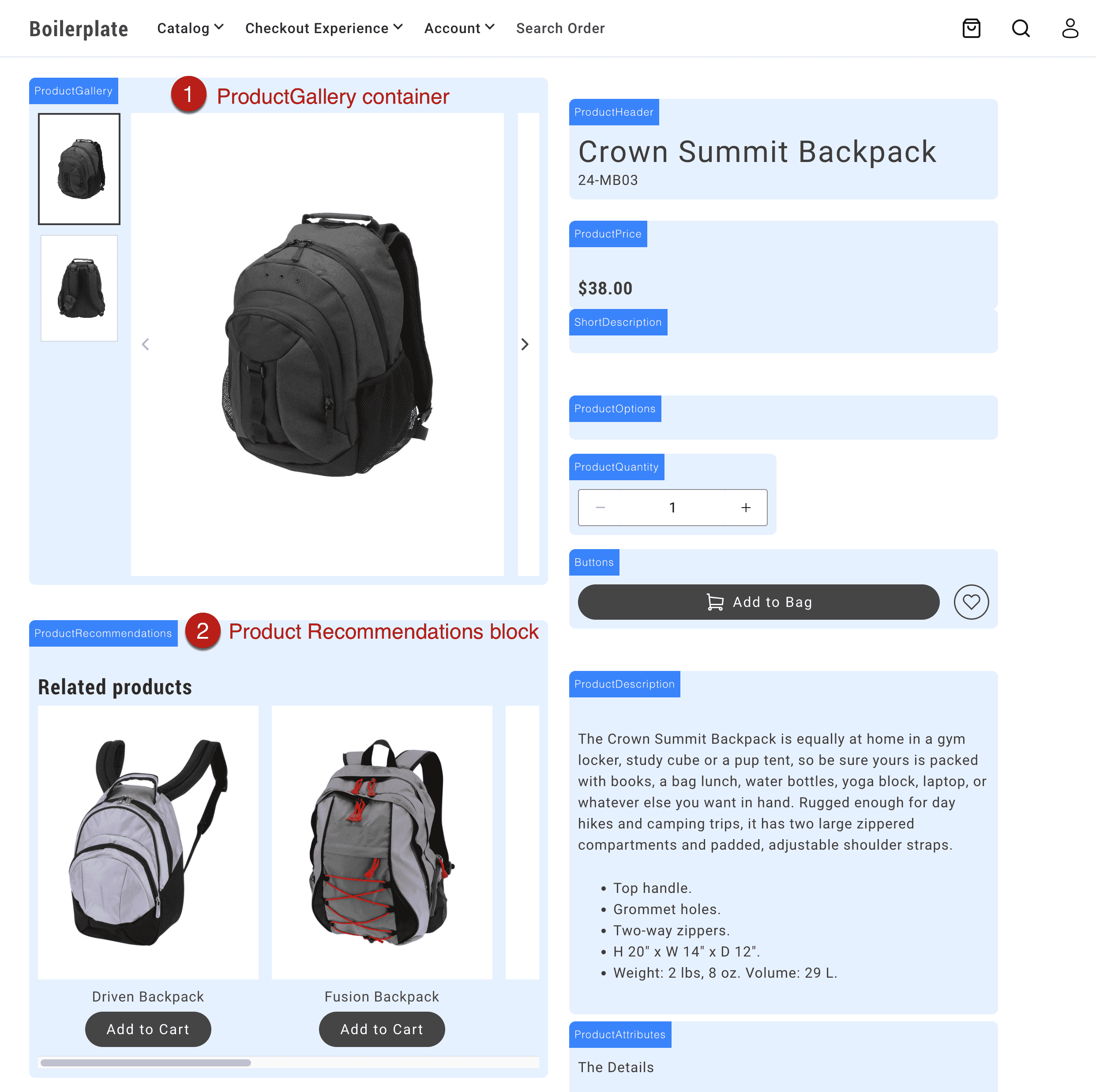\n</Diagram>\n\n## Customize commerce block layouts\n\nFor this use case, we'll customize the product details layout by adding the Product Recommendations block inside the product details block, instead of below it.\n\n\n### Add an Edge Delivery block to a commerce page\n\nFor example, add a Product Recommendations block to the product details page so that it can be rendered on the page, then referenced and moved to the layout (in code):\n\n<Diagram caption=\"Add Product Recommendations block to the page\">\n\n</Diagram>\n\n\n### Add an element to the layout and reference it\n\nAdd an HTML element to the commerce block's layout where you want the Edge Delivery block (or other content) to appear. In this example, we want the Product Recommendations block to appear in the left column of the product-details layout, below the product gallery. So we add a `div` element to the left column with a class of `product-details__prex`.\n\n```js ins={12}\nexport default async function decorate(block) {\n // eslint-disable-next-line no-underscore-dangle\n const product = events._lastEvent?.['pdp/data']?.payload ?? null;\n const labels = await fetchPlaceholders();\n\n // Layout\n const fragment = document.createRange().createContextualFragment(`\n \n \n \n \n \n \n \n \n \n \n \n \n \n \n \n \n \n \n \n \n \n \n \n `);\n```\n\nThen, we reference the `div` element in the layout as follows:\n\n```js\n // Reference the element\n const $prex = fragment.querySelector('.product-details__prex');\n```\n\n\n### Move the Edge Delivery block to the layout\n\nWithin the `eds/lcp` lifecycle event, query the Edge Delivery block's class selector from the rendered block and append it to right element in the layout. In this example, we select the Product Recommendations block using the `.product-recommendations` class, then move it to the element you want in the layout (`$prex`).\n\n```js ins={9-12}\n events.on(\n 'eds/lcp',\n () => {\n if (product) {\n setJsonLdProduct(product);\n setMetaTags(product);\n document.title = product.name;\n }\n const $productRecommendations = document.querySelector('.product-recommendations');\n if ($productRecommendations) {\n $prex.appendChild($productRecommendations);\n }\n },\n { eager: true },\n );\n```"
|
|
71
|
+
},
|
|
72
|
+
{
|
|
73
|
+
"path": "dropins/all/linking",
|
|
74
|
+
"title": "Localizing links",
|
|
75
|
+
"description": "Learn how to programmatically manage localized links in the boilerplate.",
|
|
76
|
+
"content": "Learn how the boilerplate automatically localizes internal links for multistore/multilingual storefronts. The system keeps users within their chosen locale as they navigate the site.\n\n> **Merchant guide**\n>\n\nFor merchant-friendly guidance on link localization and using `#nolocal` in store switchers, see [Commerce localization tasks - Link localization](https://experienceleague.adobe.com/developer/commerce/storefront/merchants/quick-start/content-localization-commerce-tasks/#link-localization).\n\n\n## decorateLinks\n\nThe `decorateLinks` function automatically prepends all content links with the root path for each language. This ensures users stay within their current locale as they navigate the site.\n\n**How it works:**\n- On `/en-ca/` pages: `/products/` becomes `/en-ca/products/`\n- On `/fr/` pages: `/products/` becomes `/fr/products/`\n- Links with `#nolocal` hash are not modified (useful for store switcher links)\n\nThis function is enabled by default in the Commerce Boilerplate via `scripts/script.js`.\n\n```js\nimport { decorateLinks } from './commerce.js`\n\n/**\n * Decorates the main element.\n * @param main The main element\n */\nexport function decorateMain(main) {\n decorateLinks(main); // enables localization of links\n decorateButtons(main);\n decorateIcons(main);\n buildAutoBlocks(main);\n decorateSections(main);\n decorateBlocks(main);\n}\n```\n\n## rootLink\n\nThe `rootLink` function prepends the appropriate language root path to a given link. Use it within a block to localize links from a drop-in for loading scripts, styles or links to other pages within a drop-in. This approach ensures consistency across languages and store views.\n\n```js\n\nexport async function decorateMyBlock(block) {\n const atag = document.createElement('a');\n atag.innerText = 'My Link';\n atag.href = rootLink('/my-path'); // returns the localized url for '/my-path'\n // ...\n}\n```"
|
|
77
|
+
},
|
|
78
|
+
{
|
|
79
|
+
"path": "dropins/all/quick-start",
|
|
80
|
+
"title": "Using drop-ins",
|
|
81
|
+
"description": "Learn how to use Adobe Commerce drop-in components in your storefront blocks.",
|
|
82
|
+
"content": "Drop-in components add Commerce functionality to your storefront. The includes all drop-ins pre-installed—no package installation needed.\n\n## How to use drop-ins\n\nThree steps: import the initializer (A JavaScript module that configures a drop-in when imported, such as setting endpoints, registering dictionaries, and preparing runtime behavior.), import the container (A pre-built UI module that renders drop-in functionality and manages logic, state, and data for a feature.), and render it. Most blocks use a single container.\n\n\n### Import the initializer\n\nImport the initializer for the drop-in. This configures the GraphQL endpoint, loads placeholder text, and registers the drop-in.\n\n```js title=\"blocks/commerce-login/commerce-login.js\"\n// Import initializer (side-effect import handles all setup)\n\n```\n\n> **Initializers**\n>\nInitializers run once when imported. They configure the drop-in for use throughout your application.\n\n\n### Import the container\n\nImport the container you need and the render provider (The render function exported by a drop-in package that mounts containers into a storefront block.). Import maps in `head.html` resolve paths to the optimized code.\n\n```js title=\"blocks/commerce-login/commerce-login.js\"\n// Import the container\n\n// Import the provider\n\n```\n\n\n### Render the container\n\nRender the container in your block decorate function (The JavaScript module that runs for a block after the page loads. It imports the initializer, then calls provider.render() to mount the drop-in UI into the block region of the page.). Pass configuration options to customize behavior.\n\n```js title=\"blocks/commerce-login/commerce-login.js\"\n\nexport default async function decorate(block) {\n await authRenderer.render(SignIn, {\n routeForgotPassword: () => rootLink('/customer/forgot-password'),\n routeRedirectOnSignIn: () => rootLink('/customer/account'),\n })(block);\n}\n```\n\n**Complete example:**\n\n```js title=\"blocks/commerce-login/commerce-login.js\"\n\n\nexport default async function decorate(block) {\n await authRenderer.render(SignIn, {\n routeForgotPassword: () => rootLink('/customer/forgot-password'),\n routeRedirectOnSignIn: () => rootLink('/customer/account'),\n })(block);\n}\n```\n\n> **Container documentation**\n>\nSee the Containers documentation for each drop-in for available configuration options.\n\n\n## Drop-in specific guides\n\nEach drop-in has its own Quick Start page with package names, versions, and drop-in-specific requirements:\n\n- [Cart](https://experienceleague.adobe.com/developer/commerce/storefront/dropins/cart/quick-start/)\n- [Checkout](https://experienceleague.adobe.com/developer/commerce/storefront/dropins/checkout/quick-start/)\n- [Order](https://experienceleague.adobe.com/developer/commerce/storefront/dropins/order/quick-start/)\n- [Payment Services](https://experienceleague.adobe.com/developer/commerce/storefront/dropins/payment-services/installation/)\n- [Personalization](https://experienceleague.adobe.com/developer/commerce/storefront/dropins/personalization/quick-start/)\n- [Product Details](https://experienceleague.adobe.com/developer/commerce/storefront/dropins/product-details/quick-start/)\n- [Product Discovery](https://experienceleague.adobe.com/developer/commerce/storefront/dropins/product-discovery/quick-start/)\n- [Recommendations](https://experienceleague.adobe.com/developer/commerce/storefront/dropins/recommendations/quick-start/)\n- [User Account](https://experienceleague.adobe.com/developer/commerce/storefront/dropins/user-account/quick-start/)\n- [User Auth](https://experienceleague.adobe.com/developer/commerce/storefront/dropins/user-auth/quick-start/)\n- [Wishlist](https://experienceleague.adobe.com/developer/commerce/storefront/dropins/wishlist/quick-start/)\n\n## Advanced patterns\n\nThese patterns show how to handle more complex scenarios in your blocks.\n\n### Multiple containers in one block\n\nMost blocks use a single container, but complex blocks can render multiple containers together. Use `Promise.all()` to render them in parallel for better performance. The Cart block demonstrates this pattern:\n\n```js title=\"blocks/commerce-cart/commerce-cart.js\"\n\n\nexport default async function decorate(block) {\n // Create layout structure\n const fragment = document.createRange().createContextualFragment(`\n \n \n `);\n \n const $list = fragment.querySelector('.cart__list');\n const $summary = fragment.querySelector('.cart__order-summary');\n block.appendChild(fragment);\n\n // Helper to create product links\n const createProductLink = (product) => getProductLink(product.url.urlKey, product.topLevelSku);\n\n // Render multiple containers in parallel\n await Promise.all([\n provider.render(CartSummaryList, {\n routeProduct: createProductLink,\n enableRemoveItem: true,\n })($list),\n\n provider.render(OrderSummary, {\n routeCheckout: () => rootLink('/checkout'),\n })($summary),\n ]);\n}\n```\n\n### Nesting containers with slots\n\nRender containers inside other container slots for advanced composition. Use conditional logic to control which slots render:\n\n```js title=\"blocks/commerce-cart/commerce-cart.js\"\n\n\nexport default async function decorate(block) {\n const { 'enable-estimate-shipping': enableEstimateShipping = 'false' } = readBlockConfig(block);\n const createProductLink = (product) => getProductLink(product.url.urlKey, product.topLevelSku);\n\n await provider.render(OrderSummary, {\n routeProduct: createProductLink,\n routeCheckout: () => rootLink('/checkout'),\n slots: {\n EstimateShipping: async (ctx) => {\n if (enableEstimateShipping === 'true') {\n const wrapper = document.createElement('div');\n await provider.render(EstimateShipping, {})(wrapper);\n ctx.replaceWith(wrapper);\n }\n },\n Coupons: (ctx) => {\n const coupons = document.createElement('div');\n provider.render(Coupons)(coupons);\n ctx.appendChild(coupons);\n },\n },\n })(block);\n}\n```\n\n### Combining multiple drop-ins\n\nUse multiple drop-ins in a single block when functionality overlaps. The Cart block combines Cart and Wishlist:\n\n```js title=\"blocks/commerce-cart/commerce-cart.js\"\n// Import event bus\n\n// Import initializers for both drop-ins\n\n\n// Import from both drop-ins\n\n\nexport default async function decorate(block) {\n // Create notification area\n const fragment = document.createRange().createContextualFragment(`\n \n `);\n const $notification = fragment.querySelector('.cart__notification');\n block.appendChild(fragment);\n \n // Wishlist route\n const routeToWishlist = '/wishlist';\n \n // Helper to create product links\n const createProductLink = (product) => getProductLink(product.url.urlKey, product.topLevelSku);\n \n // Render cart with wishlist functionality in slots\n await provider.render(CartSummaryList, {\n routeProduct: createProductLink,\n slots: {\n Footer: (ctx) => {\n // Add wishlist toggle to each cart item\n const $wishlistToggle = document.createElement('div');\n $wishlistToggle.classList.add('cart__action--wishlist-toggle');\n \n wishlistRender.render(WishlistToggle, {\n product: ctx.item,\n removeProdFromCart: Cart.updateProductsFromCart,\n })($wishlistToggle);\n \n ctx.appendChild($wishlistToggle);\n },\n },\n })(block);\n \n // Listen for wishlist events\n events.on('wishlist/alert', ({ action, item }) => {\n wishlistRender.render(WishlistAlert, {\n action,\n item,\n routeToWishlist,\n })($notification);\n \n setTimeout(() => {\n $notification.innerHTML = '';\n }, 5000);\n });\n}\n```\n\n### Using API functions without containers\n\nCall API functions directly for programmatic control without rendering UI:\n\n```js title=\"blocks/custom-block/custom-block.js\"\n\n\nexport default async function decorate(block) {\n // Get cached cart data synchronously\n const cachedCart = Cart.getCartDataFromCache();\n console.log('Cached cart:', cachedCart);\n \n // Fetch fresh cart data\n const freshCart = await Cart.getCartData();\n console.log('Fresh cart:', freshCart);\n \n // Add products programmatically\n const button = block.querySelector('.add-to-cart-button');\n if (button) {\n button.addEventListener('click', async () => {\n try {\n await Cart.addProductsToCart([\n { sku: 'ABC123', quantity: 1 }\n ]);\n console.log('Product added successfully');\n } catch (error) {\n console.error('Failed to add product:', error);\n }\n });\n }\n \n // Update cart totals in custom UI\n events.on('cart/data', (cartData) => {\n const totalElement = block.querySelector('.cart-total');\n if (totalElement && cartData?.prices?.grandTotal) {\n totalElement.textContent = cartData.prices.grandTotal.value;\n }\n }, { eager: true });\n}\n```\n\n### Error handling\n\nHandle errors gracefully with try/catch blocks and user notifications:\n\n```js title=\"blocks/commerce-mini-cart/commerce-mini-cart.js\"\n\n\nexport default async function decorate(block) {\n const placeholders = await fetchPlaceholders();\n let currentModal = null;\n\n // Custom message display function\n const showMessage = (message) => {\n const messageEl = block.querySelector('.mini-cart__message');\n if (messageEl) {\n messageEl.textContent = message;\n messageEl.classList.add('visible');\n setTimeout(() => messageEl.classList.remove('visible'), 3000);\n }\n };\n\n async function handleEditButtonClick(cartItem) {\n try {\n // Attempt to load and show mini PDP\n const miniPDPContent = await createMiniPDP(cartItem);\n currentModal = await createModal([miniPDPContent]);\n \n if (currentModal.block) {\n currentModal.block.setAttribute('id', 'mini-pdp-modal');\n }\n \n currentModal.showModal();\n } catch (error) {\n console.error('Error opening mini PDP modal:', error);\n \n // Show error message using mini-cart's message system\n showMessage(placeholders?.Global?.ProductLoadError || 'Failed to load product');\n }\n }\n \n // ... rest of block implementation\n}\n```\n\n> **Always provide feedback**\n>\nAlways provide feedback to users when operations fail. The example shows how to define a custom message function, but you can also use the `InLineAlert` component from `@dropins/tools/components.js` for consistent error messaging.\n\n\n## What the boilerplate provides\n\nThe boilerplate includes everything you need:\n\n- Drop-in packages installed in `package.json`.\n- Optimized code in `scripts/__dropins__/`.\n- Import maps in `head.html`.\n- Initializers in `scripts/initializers/` for automatic setup.\n- Example blocks demonstrating usage.\n\n## How it works\n\nThe following diagram shows how drop-ins integrate into your boilerplate project:\n\n<Diagram></Diagram>\n\n## Additional concepts\n\nAdditional terms you'll encounter as you work with drop-ins.\n\n**Drop-in** \nA self-contained Commerce component (Cart, Checkout, Product Details) that includes containers, API functions, and events.\n\n**Import maps** (in `head.html`) \nConfiguration that maps clean import paths (for example, `@dropins/storefront-cart`) to optimized code in `scripts/__dropins__/`. The boilerplate includes these pre-configured.\n\n**Event bus** (`@dropins/tools/event-bus.js`) \nPub/sub system for drop-in communication. Drop-ins emit events when state changes (for example, `cart/data`, `checkout/updated`). Listen to events to update custom UI or trigger logic.\n\n**API functions** \nProgrammatic interfaces to control drop-in behavior without rendering UI. Fetch data, trigger actions, and read cached state (for example, `Cart.addProductsToCart()`, `Cart.getCartData()`).\n\n**Slots** \nExtension points in containers where you can inject custom content or replace default behavior. Used for deep customization beyond configuration options.\n\n## Summary\n\nThe boilerplate makes using drop-ins straightforward: import an initializer for automatic setup, import the containers you need, render them with configuration options, and optionally listen to events for custom behavior. No manual package installation or complex configuration required."
|
|
83
|
+
},
|
|
84
|
+
{
|
|
85
|
+
"path": "dropins/all/slots",
|
|
86
|
+
"title": "Slots",
|
|
87
|
+
"description": "Learn how to use drop-in slots to customize drop-in components.",
|
|
88
|
+
"content": "Using slots (An extension point inside a drop-in where custom UI or behavior can be added, replaced, or removed.) provides the deepest level of customization for drop-in components. A slot provides a place in a drop-in container (A pre-built UI module that renders drop-in functionality and manages logic, state, and data for a feature.) to add your own UI components and functions. This architecture makes it easy to change the default look, layout, and behavior. Let's learn how slots work.\n\n## Big Picture\n\n<Diagram caption=\"What is a slot?\"></Diagram>\n\nThe following functions are available to all slots:\n\n<Callouts>\n\n1. `prependSibling`: Prepends a new HTML element before the content of the slot.\n1. `prependChild`: Prepends a new HTML element to the content of the slot.\n1. `replaceWith`: Replaces the content of the slot with a new HTML element.\n1. `appendChild`: Appends a new HTML element to the content of the slot.\n1. `appendSibling`: Appends a new HTML element after the content of the slot.\n1. `remove`: Removes the slot from the DOM.\n1. `getSlotElement`: Gets a slot element.\n1. `onChange`: Listens to changes in the context of the slot.\n1. `dictionary`: Provides a JSON Object for the current locale. If the locale changes, the `dictionary` values change to reflect the values for the selected language.\n\n</Callouts>\n\n## Best practice for dynamic slot content\n\n**Do not use context methods inside other context methods.** Context methods include `appendChild()`, `prependChild()`, `replaceWith()`, `appendSibling()`, `prependSibling()`, `remove()`, `getSlotElement()`, and `onChange()`.\n\nInstead, create and append wrapper elements on mount, then update their content inside callbacks using standard DOM methods like `innerHTML`:\n\n```js\nslots: {\n MySlot: (ctx) => {\n const wrapper = document.createElement('div');\n \n // Use context method on mount (outside other context methods)\n ctx.appendChild(wrapper);\n \n // Update content inside onChange using standard DOM methods\n ctx.onChange((next) => {\n if (next.data.condition) {\n wrapper.innerHTML = 'Content A';\n } else {\n wrapper.innerHTML = 'Content B';\n }\n });\n }\n}\n```\n\n```js\n// ❌ Incorrect: Calling context method inside context method\nctx.onChange((next) => {\n const element = document.createElement('div');\n ctx.appendChild(element); // Incorrect - context method inside context method\n});\n```\n\n## Related resources\n\n- [Extending drop-in components](https://experienceleague.adobe.com/developer/commerce/storefront/dropins/all/extending/) - Advanced customization techniques\n- [Cart drop-in](https://experienceleague.adobe.com/developer/commerce/storefront/dropins/cart/) - Cart drop-in documentation\n- [Recommendations drop-in](https://experienceleague.adobe.com/developer/commerce/storefront/dropins/recommendations/) - Recommendations drop-in documentation"
|
|
89
|
+
},
|
|
90
|
+
{
|
|
91
|
+
"path": "dropins/all/styling",
|
|
92
|
+
"title": "Styling Drop-In Components",
|
|
93
|
+
"description": "Learn how to customize drop-in components using design tokens and CSS classes.",
|
|
94
|
+
"content": "export const brandColors = [\n {\n \"name\": \"--color-brand-300\",\n \"value\": \"#6d6d6d\",\n \"resolvedColor\": \"#6d6d6d\"\n },\n {\n \"name\": \"--color-brand-500\",\n \"value\": \"#454545\",\n \"resolvedColor\": \"#454545\"\n },\n {\n \"name\": \"--color-brand-600\",\n \"value\": \"#383838\",\n \"resolvedColor\": \"#383838\"\n },\n {\n \"name\": \"--color-brand-700\",\n \"value\": \"#2b2b2b\",\n \"resolvedColor\": \"#2b2b2b\"\n }\n];\n\nexport const neutralColors = [\n {\n \"name\": \"--color-neutral-50\",\n \"value\": \"#fff\",\n \"resolvedColor\": \"#fff\"\n },\n {\n \"name\": \"--color-neutral-100\",\n \"value\": \"#fafafa\",\n \"resolvedColor\": \"#fafafa\"\n },\n {\n \"name\": \"--color-neutral-200\",\n \"value\": \"#f5f5f5\",\n \"resolvedColor\": \"#f5f5f5\"\n },\n {\n \"name\": \"--color-neutral-300\",\n \"value\": \"#e8e8e8\",\n \"resolvedColor\": \"#e8e8e8\"\n },\n {\n \"name\": \"--color-neutral-400\",\n \"value\": \"#d6d6d6\",\n \"resolvedColor\": \"#d6d6d6\"\n },\n {\n \"name\": \"--color-neutral-500\",\n \"value\": \"#b8b8b8\",\n \"resolvedColor\": \"#b8b8b8\"\n },\n {\n \"name\": \"--color-neutral-600\",\n \"value\": \"#8f8f8f\",\n \"resolvedColor\": \"#8f8f8f\"\n },\n {\n \"name\": \"--color-neutral-700\",\n \"value\": \"#666\",\n \"resolvedColor\": \"#666\"\n },\n {\n \"name\": \"--color-neutral-800\",\n \"value\": \"#3d3d3d\",\n \"resolvedColor\": \"#3d3d3d\"\n },\n {\n \"name\": \"--color-neutral-900\",\n \"value\": \"#292929\",\n \"resolvedColor\": \"#292929\"\n }\n];\n\nexport const semanticColors = [\n {\n \"name\": \"--color-positive-200\",\n \"value\": \"#eff5ef\",\n \"resolvedColor\": \"#eff5ef\"\n },\n {\n \"name\": \"--color-positive-500\",\n \"value\": \"#7fb078\",\n \"resolvedColor\": \"#7fb078\"\n },\n {\n \"name\": \"--color-positive-800\",\n \"value\": \"#53824c\",\n \"resolvedColor\": \"#53824c\"\n },\n {\n \"name\": \"--color-informational-200\",\n \"value\": \"#eeeffb\",\n \"resolvedColor\": \"#eeeffb\"\n },\n {\n \"name\": \"--color-informational-500\",\n \"value\": \"#6978d9\",\n \"resolvedColor\": \"#6978d9\"\n },\n {\n \"name\": \"--color-informational-800\",\n \"value\": \"#5d6dd6\",\n \"resolvedColor\": \"#5d6dd6\"\n },\n {\n \"name\": \"--color-warning-200\",\n \"value\": \"#fdf3e9\",\n \"resolvedColor\": \"#fdf3e9\"\n },\n {\n \"name\": \"--color-warning-500\",\n \"value\": \"#e79f5c\",\n \"resolvedColor\": \"#e79f5c\"\n },\n {\n \"name\": \"--color-warning-800\",\n \"value\": \"#cc7a2e\",\n \"resolvedColor\": \"#cc7a2e\"\n },\n {\n \"name\": \"--color-alert-200\",\n \"value\": \"#ffebeb\",\n \"resolvedColor\": \"#ffebeb\"\n },\n {\n \"name\": \"--color-alert-500\",\n \"value\": \"#db7070\",\n \"resolvedColor\": \"#db7070\"\n },\n {\n \"name\": \"--color-alert-800\",\n \"value\": \"#c35050\",\n \"resolvedColor\": \"#c35050\"\n }\n];\n\nexport const buttonColors = [\n {\n \"name\": \"--color-button-active\",\n \"value\": \"var(--color-brand-700)\",\n \"resolvedColor\": \"#2b2b2b\"\n },\n {\n \"name\": \"--color-button-focus\",\n \"value\": \"var(--color-neutral-400)\",\n \"resolvedColor\": \"#d6d6d6\"\n },\n {\n \"name\": \"--color-button-hover\",\n \"value\": \"var(--color-brand-600)\",\n \"resolvedColor\": \"#383838\"\n },\n {\n \"name\": \"--color-action-button-active\",\n \"value\": \"var(--color-neutral-50)\",\n \"resolvedColor\": \"#fff\"\n },\n {\n \"name\": \"--color-action-button-hover\",\n \"value\": \"var(--color-neutral-300)\",\n \"resolvedColor\": \"#e8e8e8\"\n }\n];\n\nexport const opacityColors = [\n {\n \"name\": \"--color-opacity-16\",\n \"value\": \"rgb(255 255 255 / 16%)\",\n \"resolvedColor\": \"rgb(255 255 255 / 16%)\"\n },\n {\n \"name\": \"--color-opacity-24\",\n \"value\": \"rgb(255 255 255 / 24%)\",\n \"resolvedColor\": \"rgb(255 255 255 / 24%)\"\n }\n];\n\nCustomize drop-in components using the design token system and CSS classes from the boilerplate. This guide covers the universal styling approach used across all drop-ins.\n\n## Drop-in-specific styles\n\nEach drop-in has a dedicated styles page with practical customization examples. See the individual drop-in documentation:\n\n- [Cart styles](https://experienceleague.adobe.com/developer/commerce/storefront/dropins/cart/styles/)\n- [Checkout styles](https://experienceleague.adobe.com/developer/commerce/storefront/dropins/checkout/styles/)\n- [Order styles](https://experienceleague.adobe.com/developer/commerce/storefront/dropins/order/styles/)\n- [Payment Services styles](https://experienceleague.adobe.com/developer/commerce/storefront/dropins/payment-services/styles/)\n- [Personalization styles](https://experienceleague.adobe.com/developer/commerce/storefront/dropins/personalization/styles/)\n- [Product Details styles](https://experienceleague.adobe.com/developer/commerce/storefront/dropins/product-details/styles/)\n- [Product Discovery styles](https://experienceleague.adobe.com/developer/commerce/storefront/dropins/product-discovery/styles/)\n- [Recommendations styles](https://experienceleague.adobe.com/developer/commerce/storefront/dropins/recommendations/styles/)\n- [User Account styles](https://experienceleague.adobe.com/developer/commerce/storefront/dropins/user-account/styles/)\n- [User Auth styles](https://experienceleague.adobe.com/developer/commerce/storefront/dropins/user-auth/styles/)\n- [Wishlist styles](https://experienceleague.adobe.com/developer/commerce/storefront/dropins/wishlist/styles/)\n\n## Where to add custom styles\n\nAdd your custom CSS in the appropriate location based on the scope of your changes:\n\n### Global styles and design token overrides\n\n- Edit to override design tokens or add site-wide styles\n- These styles load immediately and affect all drop-ins\n\n### Block-specific styles\n\n- Add styles to `blocks/{block-name}/{block-name}.css`\n- For example: \n- These styles load only when the block is used\n- See all in the boilerplate\n\n### Deferred global styles\n\n- Add to for non-critical styles that can load after page render\n- Improves initial page load performance\n\n## Design tokens\n\nThe drop-in components use CSS custom properties (design tokens) defined in the `styles/styles.css` file from the boilerplate. These tokens ensure consistent styling across all drop-ins and make global theme changes easy to apply.\n\n### Override design tokens\n\nChange the appearance of all drop-ins by overriding design tokens in your custom CSS:\n\n```css\n:root {\n /* Brand colors */\n --color-brand-500: #0066cc;\n --color-brand-600: #0052a3;\n --color-brand-700: #003d7a;\n \n /* Typography */\n --type-base-font-family: 'Inter', system-ui, sans-serif;\n \n /* Spacing */\n --spacing-small: 12px;\n --spacing-medium: 20px;\n}\n```\n\n## Finding CSS classes\n\nUse the browser DevTools to find specific class names for your customizations:\n\nInspect the UI of any drop-in component using your browser developer tools:\n\n<Diagram caption=\"Find CSS classes to override.\">\n \n</Diagram>\n\n<Callouts>\n\n1. **Inspect the element** you want to customize (right-click the element and select \"Inspect\" from the menu).\n1. **Identify the CSS class(es)** for the element. We use , which makes components and their elements easy to identify. For example, `.pdp-product__title` indicates the title element of the product component.\n1. **Copy the CSS class** to your CSS file to override existing rules or add new rules. If the class uses design tokens (like `var(--spacing-small)`), override the token value instead of removing it. This keeps your customizations consistent with the design system.\n\n</Callouts>\n\n## Examples\n\nThese examples show common component customization patterns:\n\n```css\n/* Adjust layout for a specific component */\n.pdp-product__options {\n grid-column: 1 / span 3;\n}\n\n.pdp-product__quantity {\n grid-column: 1 / span 3;\n}\n\n/* Modify spacing using design tokens */\n.pdp-product__buttons {\n gap: var(--spacing-small);\n}\n```\n\n## Responsive breakpoints\n\nDrop-in components use these breakpoints:\n\n- **Mobile**: up to 767px\n- **Tablet**: 768px - 1023px \n- **Desktop**: 1024px and up\n\nUse a mobile-first approach when you add responsive styles:\n\n```css\n/* Mobile styles (default) */\n.my-component {\n padding: var(--spacing-small);\n}\n\n/* Desktop styles */\n@media (min-width: 1024px) {\n .my-component {\n padding: var(--spacing-big);\n }\n}\n```\n\n## Design tokens reference\n\nThe following sections show all available design tokens with their default values for reference when customizing your storefront.\n\n\n### Colors\n\nColor tokens define the palette for branding, UI elements, semantic states, and interactive components.\n\n#### Brand Colors\n\n\n#### Neutral Colors\n\n\n#### Semantic Colors\n\n\n#### Button Colors\n\n\n#### Opacity\n\n\n### Spacing\n\nSpacing tokens provide consistent padding, margins, and gaps across all components.\n\n```css\n--spacing-xxsmall: 4px\n--spacing-xsmall: 8px\n--spacing-small: 16px\n--spacing-medium: 24px\n--spacing-big: 32px\n--spacing-xbig: 40px\n--spacing-xxbig: 48px\n--spacing-large: 64px\n--spacing-xlarge: 72px\n--spacing-xxlarge: 96px\n--spacing-huge: 120px\n--spacing-xhuge: 144px\n--spacing-xxhuge: 192px\n```\n\n### Typography\n\nTypography tokens define font families, sizes, weights, line heights, and letter spacing for text elements.\n\n#### Font Families\n\n```css\n--type-base-font-family: adobe-clean, roboto, roboto-fallback, system-ui, sans-serif\n--type-fixed-font-family: adobe-clean, \"Roboto Mono\", menlo, consolas, \"Liberation Mono\", monospace, system-ui, sans-serif\n```\n\n#### Type Scales\n\n```css\n--type-display-1-font: normal normal 300 6rem/7.2rem var(--type-base-font-family)\n--type-display-1-letter-spacing: 0.04em\n--type-display-2-font: normal normal 300 4.8rem/5.6rem var(--type-base-font-family)\n--type-display-2-letter-spacing: 0.04em\n--type-display-3-font: normal normal 300 3.4rem/4rem var(--type-base-font-family)\n--type-display-3-letter-spacing: 0.04em\n--type-headline-1-font: normal normal 400 2.4rem/3.2rem var(--type-base-font-family)\n--type-headline-1-letter-spacing: 0.04em\n--type-headline-2-default-font: normal normal 300 2rem/2.4rem var(--type-base-font-family)\n--type-headline-2-default-letter-spacing: 0.04em\n--type-headline-2-strong-font: normal normal 700 2rem/2.4rem var(--type-base-font-family)\n--type-headline-2-strong-letter-spacing: 0.04em\n--type-body-1-default-font: normal normal 300 1.6rem/2.4rem var(--type-base-font-family)\n--type-body-1-default-letter-spacing: 0.04em\n--type-body-1-strong-font: normal normal 700 1.6rem/2.4rem var(--type-base-font-family)\n--type-body-1-strong-letter-spacing: 0.04em\n--type-body-1-emphasized-font: normal normal 700 1.6rem/2.4rem var(--type-base-font-family)\n--type-body-1-emphasized-letter-spacing: 0.04em\n--type-body-2-default-font: normal normal 300 1.4rem/2rem var(--type-base-font-family)\n--type-body-2-default-letter-spacing: 0.04em\n--type-body-2-strong-font: normal normal 700 1.4rem/2rem var(--type-base-font-family)\n--type-body-2-strong-letter-spacing: 0.04em\n--type-body-2-emphasized-font: normal normal 700 1.4rem/2rem var(--type-base-font-family)\n--type-body-2-emphasized-letter-spacing: 0.04em\n--type-button-1-font: normal normal 400 2rem/2.6rem var(--type-base-font-family)\n--type-button-1-letter-spacing: 0.08em\n--type-button-2-font: normal normal 400 1.6rem/2.4rem var(--type-base-font-family)\n--type-button-2-letter-spacing: 0.08em\n--type-details-caption-1-font: normal normal 400 1.2rem/1.6rem var(--type-base-font-family)\n--type-details-caption-1-letter-spacing: 0.08em\n--type-details-caption-2-font: normal normal 300 1.2rem/1.6rem var(--type-base-font-family)\n--type-details-caption-2-letter-spacing: 0.08em\n--type-details-overline-font: normal normal 400 1.2rem/2rem var(--type-base-font-family)\n--type-details-overline-letter-spacing: 0.16em\n```\n\n### Shapes & Borders\n\nShape tokens control the visual appearance of borders, shadows, and icon strokes.\n\n#### Border Radius\n\n```css\n--shape-border-radius-1: 3px\n--shape-border-radius-2: 8px\n--shape-border-radius-3: 24px\n```\n\n#### Border Width\n\n```css\n--shape-border-width-1: 1px\n--shape-border-width-2: 1.5px\n--shape-border-width-3: 2px\n--shape-border-width-4: 4px\n```\n\n#### Shadows\n\n```css\n--shape-shadow-1: 0 0 16px 0 rgb(0 0 0 / 16%)\n--shape-shadow-2: 0 2px 16px 0 rgb(0 0 0 / 16%)\n--shape-shadow-3: 0 2px 3px 0 rgb(0 0 0 / 16%)\n```\n\n#### Icon Stroke\n\n```css\n--shape-icon-stroke-1: 1px\n--shape-icon-stroke-2: 1.5px\n--shape-icon-stroke-3: 2px\n--shape-icon-stroke-4: 4px\n```\n\n### Grid System\n\n```css\n--grid-1-columns: 4\n--grid-1-margins: 0\n--grid-1-gutters: 16px\n--grid-2-columns: 12\n--grid-2-margins: 0\n--grid-2-gutters: 16px\n--grid-3-columns: 12\n--grid-3-margins: 0\n--grid-3-gutters: 24px\n--grid-4-columns: 12\n--grid-4-margins: 0\n--grid-4-gutters: 24px\n--grid-5-columns: 12\n--grid-5-margins: 0\n--grid-5-gutters: 24px\n```\n\n\n## Advanced customization\n\n### Inspect CSS variables in use\n\nUse the browser DevTools to discover which CSS variables (design tokens) a component is using:\n\n1. **Right-click on any element** and select \"Inspect\"\n2. **In the Styles panel**, look for properties using `var()` syntax\n3. **Click the variable name** (e.g., `var(--spacing-medium)`) to see its computed value\n4. **In the Computed tab**, filter by \"spacing\", \"color\", etc. to see all applied tokens\n\n#### Example: Inspecting a button might show\n\n```css\npadding: var(--spacing-small); /* Resolves to: 16px */\nbackground: var(--color-brand-500); /* Resolves to: #454545 */\n```\n\n### How tokens flow through components\n\nDesign tokens control the visual appearance of components by mapping to specific CSS properties. Understanding this flow helps you predict what changes when you override a token.\n\n#### The flow:\n1. A design token is defined in the boilerplate: `--spacing-small: 16px`\n2. A component uses it in a CSS property: `gap: var(--spacing-small);`\n3. The browser resolves it to the actual value: `gap: 16px`\n4. The visual effect appears: 16px of spacing between grid items\n\n#### Real-world example: Cart grid spacing\n\nThe grid component for the Cart drop-in uses `--spacing-small` to control the gap between product images:\n\n```css\n.cart-cart-summary-grid__content {\n display: grid;\n gap: var(--spacing-small); /* Controls spacing between rows and columns */\n grid-template-columns: repeat(6, 1fr);\n}\n```\n\n<Diagram caption=\"The gap property controls spacing between grid items in both directions.\">\n\n```\n┌─────────┐ ←──16px──→ ┌─────────┐ ←──16px──→ ┌─────────┐\n│ Product │ │ Product │ │ Product │\n│ Image │ │ Image │ │ Image │\n└─────────┘ └─────────┘ └─────────┘\n ↓ ↓ ↓\n 16px 16px 16px\n ↓ ↓ ↓\n┌─────────┐ ┌─────────┐ ┌─────────┐\n│ Product │ │ Product │ │ Product │\n│ Image │ │ Image │ │ Image │\n└─────────┘ └─────────┘ └─────────┘\n ↓ ↓ ↓\n 16px 16px 16px\n ↓ ↓ ↓\n┌─────────┐ ┌─────────┐ ┌─────────┐\n│ Product │ │ Product │ │ Product │\n│ Image │ │ Image │ │ Image │\n└─────────┘ └─────────┘ └─────────┘\n\ngap: var(--spacing-small) = 16px\n```\n\n</Diagram>\n\nWhen you override `--spacing-small`, you directly change how tightly or loosely the product images are packed together. A smaller value (8px) creates a denser grid, while a larger value (24px) creates more breathing room.\n\n#### Common token-to-property mappings\n\n- `--spacing-*` tokens → `gap`, `padding`, `margin` properties → Controls whitespace\n- `--color-*` tokens → `background`, `color`, `border-color` properties → Controls visual identity\n- `--shape-border-radius-*` tokens → `border-radius` property → Controls corner roundness\n- `--type-*` tokens → `font`, `font-size`, `line-height` properties → Controls typography\n\n### Scoped token overrides\n\nOverride design tokens for specific components only, rather than globally:\n\n```css\n/* Global override - affects all drop-ins */\n:root {\n --spacing-small: 12px;\n}\n\n/* Scoped override - only affects Cart drop-in */\n.cart-cart-summary-grid {\n --spacing-small: 16px;\n /* This component now uses 16px, others still use the global value */\n}\n\n/* Scoped to a specific element state */\n.dropin-button:hover {\n --color-brand-500: #0066cc;\n background: var(--color-brand-500); /* Uses the hover value */\n}\n```"
|
|
95
|
+
}
|
|
96
|
+
]
|
|
97
|
+
}
|