buildanything 1.7.1 → 2.0.0
This diff represents the content of publicly available package versions that have been released to one of the supported registries. The information contained in this diff is provided for informational purposes only and reflects changes between package versions as they appear in their respective public registries.
- package/.claude-plugin/marketplace.json +3 -3
- package/.claude-plugin/plugin.json +9 -3
- package/CHANGELOG.md +112 -0
- package/README.md +2 -2
- package/agents/a11y-architect.md +166 -0
- package/agents/business-model.md +80 -29
- package/agents/code-architect.md +75 -0
- package/agents/code-reviewer.md +255 -0
- package/agents/code-simplifier.md +64 -0
- package/agents/design-brand-guardian.md +293 -53
- package/agents/design-critic.md +139 -0
- package/agents/design-inclusive-visuals-specialist.md +6 -19
- package/agents/design-ui-designer.md +335 -56
- package/agents/design-ux-architect.md +403 -55
- package/agents/design-ux-researcher.md +264 -49
- package/agents/engineering-ai-engineer.md +26 -36
- package/agents/engineering-backend-architect.md +185 -36
- package/agents/engineering-data-engineer.md +225 -43
- package/agents/engineering-devops-automator.md +227 -74
- package/agents/engineering-frontend-developer.md +210 -34
- package/agents/engineering-mobile-app-builder.md +6 -1
- package/agents/engineering-rapid-prototyper.md +30 -9
- package/agents/engineering-security-engineer.md +263 -61
- package/agents/engineering-senior-developer.md +128 -19
- package/agents/engineering-sre.md +84 -0
- package/agents/engineering-technical-writer.md +285 -41
- package/agents/feature-intel.md +110 -0
- package/agents/ios-app-review-guardian.md +66 -0
- package/agents/ios-foundation-models-specialist.md +64 -0
- package/agents/ios-storekit-specialist.md +59 -0
- package/agents/ios-swift-architect.md +129 -0
- package/agents/ios-swift-search.md +137 -0
- package/agents/ios-swift-ui-design.md +136 -0
- package/agents/marketing-app-store-optimizer.md +246 -64
- package/agents/planner.md +216 -0
- package/agents/pr-test-analyzer.md +63 -0
- package/agents/product-feedback-synthesizer.md +8 -2
- package/agents/refactor-cleaner.md +102 -0
- package/agents/security-reviewer.md +128 -0
- package/agents/silent-failure-hunter.md +54 -0
- package/agents/swift-build-resolver.md +119 -0
- package/agents/swift-reviewer.md +112 -0
- package/agents/tech-feasibility.md +21 -1
- package/agents/testing-api-tester.md +236 -59
- package/agents/testing-evidence-collector.md +26 -1
- package/agents/testing-performance-benchmarker.md +21 -1
- package/agents/testing-reality-checker.md +6 -1
- package/agents/visual-research.md +116 -0
- package/bin/adapters/cycle-counter-tool.ts +155 -0
- package/bin/adapters/scribe-tool.ts +71 -0
- package/bin/adapters/state-save-tool.ts +130 -0
- package/bin/adapters/write-lease-tool.ts +127 -0
- package/bin/buildanything-runtime.js +15 -0
- package/bin/buildanything-runtime.ts +328 -0
- package/bin/setup.js +83 -8
- package/commands/add-feature.md +2 -0
- package/commands/build.md +752 -332
- package/commands/fix.md +65 -0
- package/commands/self-check.md +121 -0
- package/commands/setup.md +114 -0
- package/commands/ux-review.md +63 -0
- package/commands/verify.md +69 -0
- package/docs/migration/agents.yaml +729 -0
- package/docs/migration/phase-graph.yaml +1088 -0
- package/docs/migration/sdk-host-compat.md +18 -0
- package/hooks/compile-writer-owner-cache.ts +171 -0
- package/hooks/hooks.json +36 -0
- package/hooks/pre-tool-use +19 -0
- package/hooks/pre-tool-use.ts +776 -0
- package/hooks/record-mode-transitions.ts +178 -0
- package/hooks/session-start +89 -2
- package/hooks/subagent-start +17 -0
- package/hooks/subagent-start.ts +471 -0
- package/hooks/subagent-stop +17 -0
- package/hooks/subagent-stop.ts +153 -0
- package/package.json +28 -5
- package/protocols/architecture-schema.md +171 -0
- package/protocols/build-fix.md +52 -0
- package/protocols/cleanup.md +54 -0
- package/protocols/decision-log.md +131 -0
- package/protocols/eval-harness.md +61 -0
- package/protocols/fake-data-detector.md +64 -0
- package/protocols/ios-context.md +234 -0
- package/protocols/ios-frameworks-map.md +323 -0
- package/protocols/ios-phase-branches.md +337 -0
- package/protocols/ios-preflight.md +27 -0
- package/protocols/launch-readiness.md +258 -0
- package/protocols/metric-loop.md +153 -0
- package/protocols/smoke-test.md +118 -0
- package/protocols/state-schema.json +388 -0
- package/protocols/state-schema.md +172 -0
- package/protocols/verify.md +127 -0
- package/protocols/visual-dna.md +185 -0
- package/protocols/web-phase-branches.md +351 -0
- package/skills/ios/_VENDORED.md +62 -0
- package/skills/ios/activitykit/LICENSE +131 -0
- package/skills/ios/activitykit/SKILL.md +505 -0
- package/skills/ios/activitykit/references/activitykit-patterns.md +868 -0
- package/skills/ios/app-intents/LICENSE +131 -0
- package/skills/ios/app-intents/SKILL.md +494 -0
- package/skills/ios/app-intents/references/appintents-advanced.md +1076 -0
- package/skills/ios/app-store-connect-metadata/SKILL.md +148 -0
- package/skills/ios/apple-on-device-ai/LICENSE +131 -0
- package/skills/ios/apple-on-device-ai/SKILL.md +505 -0
- package/skills/ios/apple-on-device-ai/references/coreml-conversion.md +425 -0
- package/skills/ios/apple-on-device-ai/references/coreml-optimization.md +344 -0
- package/skills/ios/apple-on-device-ai/references/foundation-models.md +508 -0
- package/skills/ios/apple-on-device-ai/references/mlx-swift.md +285 -0
- package/skills/ios/asc-privacy-manifest/SKILL.md +350 -0
- package/skills/ios/hig-components-content/SKILL.md +86 -0
- package/skills/ios/hig-components-content/references/activity-views.md +79 -0
- package/skills/ios/hig-components-content/references/charts.md +180 -0
- package/skills/ios/hig-components-content/references/collections.md +48 -0
- package/skills/ios/hig-components-content/references/color-wells.md +42 -0
- package/skills/ios/hig-components-content/references/image-views.md +82 -0
- package/skills/ios/hig-components-content/references/image-wells.md +34 -0
- package/skills/ios/hig-components-content/references/lockups.md +78 -0
- package/skills/ios/hig-components-content/references/web-views.md +36 -0
- package/skills/ios/hig-components-controls/SKILL.md +88 -0
- package/skills/ios/hig-components-controls/references/combo-boxes.md +40 -0
- package/skills/ios/hig-components-controls/references/controls.md +112 -0
- package/skills/ios/hig-components-controls/references/gauges.md +74 -0
- package/skills/ios/hig-components-controls/references/labels.md +92 -0
- package/skills/ios/hig-components-controls/references/pickers.md +128 -0
- package/skills/ios/hig-components-controls/references/rating-indicators.md +38 -0
- package/skills/ios/hig-components-controls/references/segmented-controls.md +94 -0
- package/skills/ios/hig-components-controls/references/sliders.md +92 -0
- package/skills/ios/hig-components-controls/references/steppers.md +40 -0
- package/skills/ios/hig-components-controls/references/text-fields.md +88 -0
- package/skills/ios/hig-components-controls/references/text-views.md +56 -0
- package/skills/ios/hig-components-controls/references/toggles.md +127 -0
- package/skills/ios/hig-components-controls/references/token-fields.md +48 -0
- package/skills/ios/hig-components-controls/references/virtual-keyboards.md +156 -0
- package/skills/ios/hig-components-dialogs/SKILL.md +76 -0
- package/skills/ios/hig-components-dialogs/references/action-sheets.md +74 -0
- package/skills/ios/hig-components-dialogs/references/alerts.md +158 -0
- package/skills/ios/hig-components-dialogs/references/digit-entry-views.md +32 -0
- package/skills/ios/hig-components-dialogs/references/popovers.md +81 -0
- package/skills/ios/hig-components-dialogs/references/sheets.md +157 -0
- package/skills/ios/hig-components-layout/SKILL.md +99 -0
- package/skills/ios/hig-components-layout/references/boxes.md +48 -0
- package/skills/ios/hig-components-layout/references/column-views.md +44 -0
- package/skills/ios/hig-components-layout/references/lists-and-tables.md +99 -0
- package/skills/ios/hig-components-layout/references/ornaments.md +56 -0
- package/skills/ios/hig-components-layout/references/outline-views.md +64 -0
- package/skills/ios/hig-components-layout/references/panels.md +75 -0
- package/skills/ios/hig-components-layout/references/scroll-views.md +123 -0
- package/skills/ios/hig-components-layout/references/sidebars.md +109 -0
- package/skills/ios/hig-components-layout/references/split-views.md +110 -0
- package/skills/ios/hig-components-layout/references/tab-bars.md +173 -0
- package/skills/ios/hig-components-layout/references/tab-views.md +68 -0
- package/skills/ios/hig-components-layout/references/windows.md +188 -0
- package/skills/ios/hig-components-menus/SKILL.md +81 -0
- package/skills/ios/hig-components-menus/references/action-button.md +61 -0
- package/skills/ios/hig-components-menus/references/buttons.md +261 -0
- package/skills/ios/hig-components-menus/references/context-menus.md +105 -0
- package/skills/ios/hig-components-menus/references/disclosure-controls.md +84 -0
- package/skills/ios/hig-components-menus/references/dock-menus.md +40 -0
- package/skills/ios/hig-components-menus/references/edit-menus.md +88 -0
- package/skills/ios/hig-components-menus/references/menus.md +171 -0
- package/skills/ios/hig-components-menus/references/pop-up-buttons.md +70 -0
- package/skills/ios/hig-components-menus/references/pull-down-buttons.md +77 -0
- package/skills/ios/hig-components-menus/references/the-menu-bar.md +303 -0
- package/skills/ios/hig-components-menus/references/toolbars.md +256 -0
- package/skills/ios/hig-components-search/SKILL.md +68 -0
- package/skills/ios/hig-components-search/references/page-controls.md +120 -0
- package/skills/ios/hig-components-search/references/path-controls.md +40 -0
- package/skills/ios/hig-components-search/references/search-fields.md +189 -0
- package/skills/ios/hig-components-status/SKILL.md +80 -0
- package/skills/ios/hig-components-status/references/activity-rings.md +105 -0
- package/skills/ios/hig-components-status/references/progress-indicators.md +116 -0
- package/skills/ios/hig-components-status/references/status-bars.md +38 -0
- package/skills/ios/hig-components-system/SKILL.md +88 -0
- package/skills/ios/hig-components-system/references/app-clips.md +387 -0
- package/skills/ios/hig-components-system/references/app-shortcuts.md +114 -0
- package/skills/ios/hig-components-system/references/complications.md +425 -0
- package/skills/ios/hig-components-system/references/home-screen-quick-actions.md +42 -0
- package/skills/ios/hig-components-system/references/live-activities.md +442 -0
- package/skills/ios/hig-components-system/references/notifications.md +153 -0
- package/skills/ios/hig-components-system/references/top-shelf.md +135 -0
- package/skills/ios/hig-components-system/references/watch-faces.md +40 -0
- package/skills/ios/hig-components-system/references/widgets.md +517 -0
- package/skills/ios/hig-foundations/SKILL.md +98 -0
- package/skills/ios/hig-foundations/references/accessibility.md +291 -0
- package/skills/ios/hig-foundations/references/app-icons.md +210 -0
- package/skills/ios/hig-foundations/references/branding.md +44 -0
- package/skills/ios/hig-foundations/references/color.md +274 -0
- package/skills/ios/hig-foundations/references/dark-mode.md +116 -0
- package/skills/ios/hig-foundations/references/icons.md +263 -0
- package/skills/ios/hig-foundations/references/images.md +176 -0
- package/skills/ios/hig-foundations/references/immersive-experiences.md +174 -0
- package/skills/ios/hig-foundations/references/inclusion.md +189 -0
- package/skills/ios/hig-foundations/references/layout.md +425 -0
- package/skills/ios/hig-foundations/references/materials.md +238 -0
- package/skills/ios/hig-foundations/references/motion.md +103 -0
- package/skills/ios/hig-foundations/references/privacy.md +231 -0
- package/skills/ios/hig-foundations/references/right-to-left.md +206 -0
- package/skills/ios/hig-foundations/references/sf-symbols.md +310 -0
- package/skills/ios/hig-foundations/references/spatial-layout.md +142 -0
- package/skills/ios/hig-foundations/references/typography.md +1146 -0
- package/skills/ios/hig-foundations/references/writing.md +91 -0
- package/skills/ios/hig-inputs/SKILL.md +94 -0
- package/skills/ios/hig-inputs/references/apple-pencil-and-scribble.md +148 -0
- package/skills/ios/hig-inputs/references/camera-control.md +107 -0
- package/skills/ios/hig-inputs/references/digital-crown.md +83 -0
- package/skills/ios/hig-inputs/references/eyes.md +120 -0
- package/skills/ios/hig-inputs/references/focus-and-selection.md +120 -0
- package/skills/ios/hig-inputs/references/game-controls.md +156 -0
- package/skills/ios/hig-inputs/references/gestures.md +208 -0
- package/skills/ios/hig-inputs/references/gyro-and-accelerometer.md +40 -0
- package/skills/ios/hig-inputs/references/keyboards.md +234 -0
- package/skills/ios/hig-inputs/references/nearby-interactions.md +70 -0
- package/skills/ios/hig-inputs/references/pointing-devices.md +237 -0
- package/skills/ios/hig-inputs/references/remotes.md +67 -0
- package/skills/ios/hig-inputs/references/spatial-interactions.md +70 -0
- package/skills/ios/hig-patterns/SKILL.md +104 -0
- package/skills/ios/hig-patterns/references/charting-data.md +81 -0
- package/skills/ios/hig-patterns/references/collaboration-and-sharing.md +86 -0
- package/skills/ios/hig-patterns/references/drag-and-drop.md +134 -0
- package/skills/ios/hig-patterns/references/entering-data.md +69 -0
- package/skills/ios/hig-patterns/references/feedback.md +67 -0
- package/skills/ios/hig-patterns/references/file-management.md +135 -0
- package/skills/ios/hig-patterns/references/going-full-screen.md +79 -0
- package/skills/ios/hig-patterns/references/launching.md +81 -0
- package/skills/ios/hig-patterns/references/live-viewing-apps.md +79 -0
- package/skills/ios/hig-patterns/references/loading.md +59 -0
- package/skills/ios/hig-patterns/references/managing-accounts.md +107 -0
- package/skills/ios/hig-patterns/references/managing-notifications.md +99 -0
- package/skills/ios/hig-patterns/references/modality.md +82 -0
- package/skills/ios/hig-patterns/references/multitasking.md +131 -0
- package/skills/ios/hig-patterns/references/offering-help.md +117 -0
- package/skills/ios/hig-patterns/references/onboarding.md +69 -0
- package/skills/ios/hig-patterns/references/playing-audio.md +124 -0
- package/skills/ios/hig-patterns/references/playing-haptics.md +280 -0
- package/skills/ios/hig-patterns/references/playing-video.md +180 -0
- package/skills/ios/hig-patterns/references/printing.md +50 -0
- package/skills/ios/hig-patterns/references/ratings-and-reviews.md +48 -0
- package/skills/ios/hig-patterns/references/searching.md +70 -0
- package/skills/ios/hig-patterns/references/settings.md +84 -0
- package/skills/ios/hig-patterns/references/undo-and-redo.md +58 -0
- package/skills/ios/hig-patterns/references/workouts.md +76 -0
- package/skills/ios/hig-platforms/SKILL.md +84 -0
- package/skills/ios/hig-platforms/references/designing-for-games.md +159 -0
- package/skills/ios/hig-platforms/references/designing-for-ios.md +66 -0
- package/skills/ios/hig-platforms/references/designing-for-ipados.md +64 -0
- package/skills/ios/hig-platforms/references/designing-for-macos.md +70 -0
- package/skills/ios/hig-platforms/references/designing-for-tvos.md +68 -0
- package/skills/ios/hig-platforms/references/designing-for-visionos.md +85 -0
- package/skills/ios/hig-platforms/references/designing-for-watchos.md +74 -0
- package/skills/ios/hig-project-context/SKILL.md +133 -0
- package/skills/ios/hig-technologies/SKILL.md +107 -0
- package/skills/ios/hig-technologies/references/airplay.md +125 -0
- package/skills/ios/hig-technologies/references/always-on.md +62 -0
- package/skills/ios/hig-technologies/references/apple-pay.md +441 -0
- package/skills/ios/hig-technologies/references/augmented-reality.md +247 -0
- package/skills/ios/hig-technologies/references/carekit.md +224 -0
- package/skills/ios/hig-technologies/references/carplay.md +119 -0
- package/skills/ios/hig-technologies/references/game-center.md +343 -0
- package/skills/ios/hig-technologies/references/generative-ai.md +110 -0
- package/skills/ios/hig-technologies/references/healthkit.md +120 -0
- package/skills/ios/hig-technologies/references/homekit.md +343 -0
- package/skills/ios/hig-technologies/references/icloud.md +52 -0
- package/skills/ios/hig-technologies/references/id-verifier.md +73 -0
- package/skills/ios/hig-technologies/references/imessage-apps-and-stickers.md +105 -0
- package/skills/ios/hig-technologies/references/in-app-purchase.md +263 -0
- package/skills/ios/hig-technologies/references/live-photos.md +54 -0
- package/skills/ios/hig-technologies/references/mac-catalyst.md +216 -0
- package/skills/ios/hig-technologies/references/machine-learning.md +394 -0
- package/skills/ios/hig-technologies/references/maps.md +221 -0
- package/skills/ios/hig-technologies/references/nfc.md +51 -0
- package/skills/ios/hig-technologies/references/photo-editing.md +40 -0
- package/skills/ios/hig-technologies/references/researchkit.md +134 -0
- package/skills/ios/hig-technologies/references/shareplay.md +142 -0
- package/skills/ios/hig-technologies/references/shazamkit.md +47 -0
- package/skills/ios/hig-technologies/references/sign-in-with-apple.md +288 -0
- package/skills/ios/hig-technologies/references/siri.md +523 -0
- package/skills/ios/hig-technologies/references/tap-to-pay-on-iphone.md +208 -0
- package/skills/ios/hig-technologies/references/voiceover.md +90 -0
- package/skills/ios/hig-technologies/references/wallet.md +420 -0
- package/skills/ios/ios-26-platform/SKILL.md +53 -0
- package/skills/ios/ios-26-platform/references/automatic-adoption.md +161 -0
- package/skills/ios/ios-26-platform/references/backward-compat.md +238 -0
- package/skills/ios/ios-26-platform/references/liquid-glass.md +255 -0
- package/skills/ios/ios-26-platform/references/swiftui-apis.md +277 -0
- package/skills/ios/ios-26-platform/references/toolbar-navigation.md +250 -0
- package/skills/ios/ios-bootstrap/SKILL.md +107 -0
- package/skills/ios/ios-bootstrap/references/apple-docs-mcp-config.md +28 -0
- package/skills/ios/ios-bootstrap/references/new-project-dialog.md +41 -0
- package/skills/ios/ios-bootstrap/references/xcode-mcp-config.md +29 -0
- package/skills/ios/ios-debugger-agent/LICENSE +21 -0
- package/skills/ios/ios-debugger-agent/SKILL.md +58 -0
- package/skills/ios/ios-debugger-agent/agents/openai.yaml +4 -0
- package/skills/ios/ios-entitlements-generator/SKILL.md +47 -0
- package/skills/ios/ios-info-plist-hardening/SKILL.md +130 -0
- package/skills/ios/ios-maestro-flow-author/SKILL.md +68 -0
- package/skills/ios/ios-maestro-flow-author/references/input-and-scroll.yaml +17 -0
- package/skills/ios/ios-maestro-flow-author/references/modal-and-dismiss.yaml +14 -0
- package/skills/ios/ios-maestro-flow-author/references/onboarding-flow.yaml +16 -0
- package/skills/ios/ios-maestro-flow-author/references/tab-navigation.yaml +13 -0
- package/skills/ios/ios-maestro-flow-author/references/tap-and-assert.yaml +9 -0
- package/skills/ios/swift-accessibility/LICENSE +21 -0
- package/skills/ios/swift-accessibility/SKILL.md +371 -0
- package/skills/ios/swift-accessibility/examples/before-after-appkit.md +446 -0
- package/skills/ios/swift-accessibility/examples/before-after-swiftui.md +441 -0
- package/skills/ios/swift-accessibility/examples/before-after-uikit.md +464 -0
- package/skills/ios/swift-accessibility/references/assistive-access.md +441 -0
- package/skills/ios/swift-accessibility/references/display-settings.md +491 -0
- package/skills/ios/swift-accessibility/references/dynamic-type.md +420 -0
- package/skills/ios/swift-accessibility/references/media-accessibility.md +421 -0
- package/skills/ios/swift-accessibility/references/motor-input.md +393 -0
- package/skills/ios/swift-accessibility/references/nutrition-labels.md +362 -0
- package/skills/ios/swift-accessibility/references/platform-specifics.md +515 -0
- package/skills/ios/swift-accessibility/references/semantic-structure.md +585 -0
- package/skills/ios/swift-accessibility/references/testing-auditing.md +507 -0
- package/skills/ios/swift-accessibility/references/voice-control.md +317 -0
- package/skills/ios/swift-accessibility/references/voiceover-swiftui.md +584 -0
- package/skills/ios/swift-accessibility/references/voiceover-uikit.md +519 -0
- package/skills/ios/swift-accessibility/references/wcag-mapping.md +167 -0
- package/skills/ios/swift-accessibility/resources/audit-template.swift +128 -0
- package/skills/ios/swift-accessibility/resources/qa-checklist.md +258 -0
- package/skills/ios/swift-actor-persistence/SKILL.md +143 -0
- package/skills/ios/swift-concurrency/LICENSE +21 -0
- package/skills/ios/swift-concurrency/SKILL.md +171 -0
- package/skills/ios/swift-concurrency/references/_index.md +50 -0
- package/skills/ios/swift-concurrency/references/actors.md +660 -0
- package/skills/ios/swift-concurrency/references/async-algorithms.md +847 -0
- package/skills/ios/swift-concurrency/references/async-await-basics.md +266 -0
- package/skills/ios/swift-concurrency/references/async-sequences.md +710 -0
- package/skills/ios/swift-concurrency/references/core-data.md +560 -0
- package/skills/ios/swift-concurrency/references/glossary.md +135 -0
- package/skills/ios/swift-concurrency/references/linting.md +155 -0
- package/skills/ios/swift-concurrency/references/memory-management.md +569 -0
- package/skills/ios/swift-concurrency/references/migration.md +1104 -0
- package/skills/ios/swift-concurrency/references/performance.md +593 -0
- package/skills/ios/swift-concurrency/references/sendable.md +598 -0
- package/skills/ios/swift-concurrency/references/tasks.md +636 -0
- package/skills/ios/swift-concurrency/references/testing.md +592 -0
- package/skills/ios/swift-concurrency/references/threading.md +495 -0
- package/skills/ios/swift-concurrency-6-2/SKILL.md +216 -0
- package/skills/ios/swift-protocol-di-testing/SKILL.md +190 -0
- package/skills/ios/swift-security-expert/LICENSE +21 -0
- package/skills/ios/swift-security-expert/SKILL.md +470 -0
- package/skills/ios/swift-security-expert/references/biometric-authentication.md +565 -0
- package/skills/ios/swift-security-expert/references/certificate-trust.md +592 -0
- package/skills/ios/swift-security-expert/references/common-anti-patterns.md +690 -0
- package/skills/ios/swift-security-expert/references/compliance-owasp-mapping.md +537 -0
- package/skills/ios/swift-security-expert/references/credential-storage-patterns.md +721 -0
- package/skills/ios/swift-security-expert/references/cryptokit-public-key.md +505 -0
- package/skills/ios/swift-security-expert/references/cryptokit-symmetric.md +497 -0
- package/skills/ios/swift-security-expert/references/keychain-access-control.md +508 -0
- package/skills/ios/swift-security-expert/references/keychain-fundamentals.md +596 -0
- package/skills/ios/swift-security-expert/references/keychain-item-classes.md +476 -0
- package/skills/ios/swift-security-expert/references/keychain-sharing.md +458 -0
- package/skills/ios/swift-security-expert/references/migration-legacy-stores.md +727 -0
- package/skills/ios/swift-security-expert/references/secure-enclave.md +539 -0
- package/skills/ios/swift-security-expert/references/testing-security-code.md +781 -0
- package/skills/ios/swift-testing-expert/LICENSE +21 -0
- package/skills/ios/swift-testing-expert/SKILL.md +79 -0
- package/skills/ios/swift-testing-expert/references/_index.md +12 -0
- package/skills/ios/swift-testing-expert/references/async-testing-and-waiting.md +127 -0
- package/skills/ios/swift-testing-expert/references/expectations.md +145 -0
- package/skills/ios/swift-testing-expert/references/fundamentals.md +141 -0
- package/skills/ios/swift-testing-expert/references/migration-from-xctest.md +127 -0
- package/skills/ios/swift-testing-expert/references/parallelization-and-isolation.md +95 -0
- package/skills/ios/swift-testing-expert/references/parameterized-testing.md +284 -0
- package/skills/ios/swift-testing-expert/references/performance-and-best-practices.md +187 -0
- package/skills/ios/swift-testing-expert/references/traits-and-tags.md +114 -0
- package/skills/ios/swift-testing-expert/references/xcode-workflows.md +70 -0
- package/skills/ios/swiftdata-pro/LICENSE +21 -0
- package/skills/ios/swiftdata-pro/SKILL.md +102 -0
- package/skills/ios/swiftdata-pro/agents/openai.yaml +10 -0
- package/skills/ios/swiftdata-pro/assets/swiftdata-pro-icon.png +0 -0
- package/skills/ios/swiftdata-pro/assets/swiftdata-pro-icon.svg +29 -0
- package/skills/ios/swiftdata-pro/references/class-inheritance.md +104 -0
- package/skills/ios/swiftdata-pro/references/cloudkit.md +10 -0
- package/skills/ios/swiftdata-pro/references/core-rules.md +20 -0
- package/skills/ios/swiftdata-pro/references/indexing.md +27 -0
- package/skills/ios/swiftdata-pro/references/predicates.md +73 -0
- package/skills/ios/swiftui-design-principles/AGENTS.md +21 -0
- package/skills/ios/swiftui-design-principles/LICENSE +21 -0
- package/skills/ios/swiftui-design-principles/README.md +41 -0
- package/skills/ios/swiftui-design-principles/SKILL.md +605 -0
- package/skills/ios/swiftui-design-principles/metadata.json +10 -0
- package/skills/ios/swiftui-design-tokens/SKILL.md +475 -0
- package/skills/ios/swiftui-liquid-glass/LICENSE +21 -0
- package/skills/ios/swiftui-liquid-glass/SKILL.md +95 -0
- package/skills/ios/swiftui-liquid-glass/agents/openai.yaml +4 -0
- package/skills/ios/swiftui-liquid-glass/references/liquid-glass.md +280 -0
- package/skills/ios/swiftui-performance-audit/LICENSE +21 -0
- package/skills/ios/swiftui-performance-audit/SKILL.md +111 -0
- package/skills/ios/swiftui-performance-audit/agents/openai.yaml +4 -0
- package/skills/ios/swiftui-performance-audit/references/code-smells.md +150 -0
- package/skills/ios/swiftui-performance-audit/references/demystify-swiftui-performance-wwdc23.md +46 -0
- package/skills/ios/swiftui-performance-audit/references/optimizing-swiftui-performance-instruments.md +29 -0
- package/skills/ios/swiftui-performance-audit/references/profiling-intake.md +44 -0
- package/skills/ios/swiftui-performance-audit/references/report-template.md +47 -0
- package/skills/ios/swiftui-performance-audit/references/understanding-hangs-in-your-app.md +33 -0
- package/skills/ios/swiftui-performance-audit/references/understanding-improving-swiftui-performance.md +52 -0
- package/skills/ios/swiftui-pro/LICENSE +21 -0
- package/skills/ios/swiftui-pro/SKILL.md +108 -0
- package/skills/ios/swiftui-pro/agents/openai.yaml +10 -0
- package/skills/ios/swiftui-pro/assets/swiftui-pro-icon.png +0 -0
- package/skills/ios/swiftui-pro/assets/swiftui-pro-icon.svg +29 -0
- package/skills/ios/swiftui-pro/references/accessibility.md +13 -0
- package/skills/ios/swiftui-pro/references/api.md +39 -0
- package/skills/ios/swiftui-pro/references/data.md +43 -0
- package/skills/ios/swiftui-pro/references/design.md +31 -0
- package/skills/ios/swiftui-pro/references/hygiene.md +9 -0
- package/skills/ios/swiftui-pro/references/navigation.md +14 -0
- package/skills/ios/swiftui-pro/references/performance.md +46 -0
- package/skills/ios/swiftui-pro/references/swift.md +56 -0
- package/skills/ios/swiftui-pro/references/views.md +35 -0
- package/skills/ios/swiftui-ui-patterns/LICENSE +21 -0
- package/skills/ios/swiftui-ui-patterns/SKILL.md +100 -0
- package/skills/ios/swiftui-ui-patterns/agents/openai.yaml +4 -0
- package/skills/ios/swiftui-ui-patterns/references/app-wiring.md +201 -0
- package/skills/ios/swiftui-ui-patterns/references/async-state.md +96 -0
- package/skills/ios/swiftui-ui-patterns/references/components-index.md +50 -0
- package/skills/ios/swiftui-ui-patterns/references/controls.md +57 -0
- package/skills/ios/swiftui-ui-patterns/references/deeplinks.md +66 -0
- package/skills/ios/swiftui-ui-patterns/references/focus.md +90 -0
- package/skills/ios/swiftui-ui-patterns/references/form.md +97 -0
- package/skills/ios/swiftui-ui-patterns/references/grids.md +71 -0
- package/skills/ios/swiftui-ui-patterns/references/haptics.md +71 -0
- package/skills/ios/swiftui-ui-patterns/references/input-toolbar.md +51 -0
- package/skills/ios/swiftui-ui-patterns/references/lightweight-clients.md +93 -0
- package/skills/ios/swiftui-ui-patterns/references/list.md +86 -0
- package/skills/ios/swiftui-ui-patterns/references/loading-placeholders.md +38 -0
- package/skills/ios/swiftui-ui-patterns/references/macos-settings.md +71 -0
- package/skills/ios/swiftui-ui-patterns/references/matched-transitions.md +59 -0
- package/skills/ios/swiftui-ui-patterns/references/media.md +73 -0
- package/skills/ios/swiftui-ui-patterns/references/menu-bar.md +101 -0
- package/skills/ios/swiftui-ui-patterns/references/navigationstack.md +159 -0
- package/skills/ios/swiftui-ui-patterns/references/overlay.md +45 -0
- package/skills/ios/swiftui-ui-patterns/references/performance.md +62 -0
- package/skills/ios/swiftui-ui-patterns/references/previews.md +48 -0
- package/skills/ios/swiftui-ui-patterns/references/scroll-reveal.md +133 -0
- package/skills/ios/swiftui-ui-patterns/references/scrollview.md +87 -0
- package/skills/ios/swiftui-ui-patterns/references/searchable.md +71 -0
- package/skills/ios/swiftui-ui-patterns/references/sheets.md +155 -0
- package/skills/ios/swiftui-ui-patterns/references/split-views.md +72 -0
- package/skills/ios/swiftui-ui-patterns/references/tabview.md +114 -0
- package/skills/ios/swiftui-ui-patterns/references/theming.md +71 -0
- package/skills/ios/swiftui-ui-patterns/references/title-menus.md +93 -0
- package/skills/ios/swiftui-ui-patterns/references/top-bar.md +49 -0
- package/skills/ios/swiftui-view-refactor/LICENSE +21 -0
- package/skills/ios/swiftui-view-refactor/SKILL.md +207 -0
- package/skills/ios/swiftui-view-refactor/agents/openai.yaml +4 -0
- package/skills/ios/swiftui-view-refactor/references/mv-patterns.md +161 -0
- package/skills/ios/widgetkit/LICENSE +131 -0
- package/skills/ios/widgetkit/SKILL.md +502 -0
- package/skills/ios/widgetkit/references/widgetkit-advanced.md +871 -0
- package/skills/ios/writing-for-interfaces/SKILL.md +75 -0
- package/skills/web/accessibility/SKILL.md +146 -0
- package/skills/web/aceternity-ui/SKILL.md +719 -0
- package/skills/web/aceternity-ui/metadata.json +10 -0
- package/skills/web/api-design/SKILL.md +523 -0
- package/skills/web/chart-accessibility/SKILL.md +332 -0
- package/skills/web/composition-patterns/AGENTS.md +946 -0
- package/skills/web/composition-patterns/README.md +60 -0
- package/skills/web/composition-patterns/SKILL.md +89 -0
- package/skills/web/composition-patterns/metadata.json +11 -0
- package/skills/web/composition-patterns/rules/_sections.md +29 -0
- package/skills/web/composition-patterns/rules/_template.md +24 -0
- package/skills/web/composition-patterns/rules/architecture-avoid-boolean-props.md +100 -0
- package/skills/web/composition-patterns/rules/architecture-compound-components.md +112 -0
- package/skills/web/composition-patterns/rules/patterns-children-over-render-props.md +87 -0
- package/skills/web/composition-patterns/rules/patterns-explicit-variants.md +100 -0
- package/skills/web/composition-patterns/rules/react19-no-forwardref.md +42 -0
- package/skills/web/composition-patterns/rules/state-context-interface.md +191 -0
- package/skills/web/composition-patterns/rules/state-decouple-implementation.md +113 -0
- package/skills/web/composition-patterns/rules/state-lift-state.md +125 -0
- package/skills/web/cost-aware-llm-pipeline/SKILL.md +183 -0
- package/skills/web/database-migrations/SKILL.md +429 -0
- package/skills/web/deployment-patterns/SKILL.md +427 -0
- package/skills/web/docker-patterns/SKILL.md +364 -0
- package/skills/web/e2e-testing/SKILL.md +326 -0
- package/skills/web/lighthouse-ci/SKILL.md +361 -0
- package/skills/web/mcp-server-patterns/SKILL.md +69 -0
- package/skills/web/next-best-practices/SKILL.md +153 -0
- package/skills/web/next-best-practices/async-patterns.md +87 -0
- package/skills/web/next-best-practices/bundling.md +180 -0
- package/skills/web/next-best-practices/data-patterns.md +297 -0
- package/skills/web/next-best-practices/debug-tricks.md +105 -0
- package/skills/web/next-best-practices/directives.md +73 -0
- package/skills/web/next-best-practices/error-handling.md +227 -0
- package/skills/web/next-best-practices/file-conventions.md +140 -0
- package/skills/web/next-best-practices/font.md +245 -0
- package/skills/web/next-best-practices/functions.md +108 -0
- package/skills/web/next-best-practices/hydration-error.md +91 -0
- package/skills/web/next-best-practices/image.md +173 -0
- package/skills/web/next-best-practices/metadata.md +301 -0
- package/skills/web/next-best-practices/parallel-routes.md +287 -0
- package/skills/web/next-best-practices/route-handlers.md +146 -0
- package/skills/web/next-best-practices/rsc-boundaries.md +159 -0
- package/skills/web/next-best-practices/runtime-selection.md +39 -0
- package/skills/web/next-best-practices/scripts.md +141 -0
- package/skills/web/next-best-practices/self-hosting.md +371 -0
- package/skills/web/next-best-practices/suspense-boundaries.md +67 -0
- package/skills/web/next-cache-components/SKILL.md +411 -0
- package/skills/web/postgres-best-practices/SKILL.md +14 -0
- package/skills/web/postgres-best-practices/references/schema-design.md +9 -0
- package/skills/web/react-best-practices/AGENTS.md +3810 -0
- package/skills/web/react-best-practices/README.md +123 -0
- package/skills/web/react-best-practices/SKILL.md +149 -0
- package/skills/web/react-best-practices/metadata.json +15 -0
- package/skills/web/react-best-practices/rules/_sections.md +46 -0
- package/skills/web/react-best-practices/rules/_template.md +28 -0
- package/skills/web/react-best-practices/rules/advanced-effect-event-deps.md +56 -0
- package/skills/web/react-best-practices/rules/advanced-event-handler-refs.md +55 -0
- package/skills/web/react-best-practices/rules/advanced-init-once.md +42 -0
- package/skills/web/react-best-practices/rules/advanced-use-latest.md +39 -0
- package/skills/web/react-best-practices/rules/async-api-routes.md +38 -0
- package/skills/web/react-best-practices/rules/async-cheap-condition-before-await.md +37 -0
- package/skills/web/react-best-practices/rules/async-defer-await.md +82 -0
- package/skills/web/react-best-practices/rules/async-dependencies.md +51 -0
- package/skills/web/react-best-practices/rules/async-parallel.md +28 -0
- package/skills/web/react-best-practices/rules/async-suspense-boundaries.md +99 -0
- package/skills/web/react-best-practices/rules/bundle-analyzable-paths.md +63 -0
- package/skills/web/react-best-practices/rules/bundle-barrel-imports.md +60 -0
- package/skills/web/react-best-practices/rules/bundle-conditional.md +31 -0
- package/skills/web/react-best-practices/rules/bundle-defer-third-party.md +49 -0
- package/skills/web/react-best-practices/rules/bundle-dynamic-imports.md +35 -0
- package/skills/web/react-best-practices/rules/bundle-preload.md +50 -0
- package/skills/web/react-best-practices/rules/client-event-listeners.md +74 -0
- package/skills/web/react-best-practices/rules/client-localstorage-schema.md +71 -0
- package/skills/web/react-best-practices/rules/client-passive-event-listeners.md +48 -0
- package/skills/web/react-best-practices/rules/client-swr-dedup.md +56 -0
- package/skills/web/react-best-practices/rules/js-batch-dom-css.md +107 -0
- package/skills/web/react-best-practices/rules/js-cache-function-results.md +80 -0
- package/skills/web/react-best-practices/rules/js-cache-property-access.md +28 -0
- package/skills/web/react-best-practices/rules/js-cache-storage.md +70 -0
- package/skills/web/react-best-practices/rules/js-combine-iterations.md +32 -0
- package/skills/web/react-best-practices/rules/js-early-exit.md +50 -0
- package/skills/web/react-best-practices/rules/js-flatmap-filter.md +60 -0
- package/skills/web/react-best-practices/rules/js-hoist-regexp.md +45 -0
- package/skills/web/react-best-practices/rules/js-index-maps.md +37 -0
- package/skills/web/react-best-practices/rules/js-length-check-first.md +49 -0
- package/skills/web/react-best-practices/rules/js-min-max-loop.md +82 -0
- package/skills/web/react-best-practices/rules/js-request-idle-callback.md +105 -0
- package/skills/web/react-best-practices/rules/js-set-map-lookups.md +24 -0
- package/skills/web/react-best-practices/rules/js-tosorted-immutable.md +57 -0
- package/skills/web/react-best-practices/rules/rendering-activity.md +26 -0
- package/skills/web/react-best-practices/rules/rendering-animate-svg-wrapper.md +47 -0
- package/skills/web/react-best-practices/rules/rendering-conditional-render.md +40 -0
- package/skills/web/react-best-practices/rules/rendering-content-visibility.md +38 -0
- package/skills/web/react-best-practices/rules/rendering-hoist-jsx.md +46 -0
- package/skills/web/react-best-practices/rules/rendering-hydration-no-flicker.md +82 -0
- package/skills/web/react-best-practices/rules/rendering-hydration-suppress-warning.md +30 -0
- package/skills/web/react-best-practices/rules/rendering-resource-hints.md +85 -0
- package/skills/web/react-best-practices/rules/rendering-script-defer-async.md +68 -0
- package/skills/web/react-best-practices/rules/rendering-svg-precision.md +28 -0
- package/skills/web/react-best-practices/rules/rendering-usetransition-loading.md +75 -0
- package/skills/web/react-best-practices/rules/rerender-defer-reads.md +39 -0
- package/skills/web/react-best-practices/rules/rerender-dependencies.md +45 -0
- package/skills/web/react-best-practices/rules/rerender-derived-state-no-effect.md +40 -0
- package/skills/web/react-best-practices/rules/rerender-derived-state.md +29 -0
- package/skills/web/react-best-practices/rules/rerender-functional-setstate.md +74 -0
- package/skills/web/react-best-practices/rules/rerender-lazy-state-init.md +58 -0
- package/skills/web/react-best-practices/rules/rerender-memo-with-default-value.md +38 -0
- package/skills/web/react-best-practices/rules/rerender-memo.md +44 -0
- package/skills/web/react-best-practices/rules/rerender-move-effect-to-event.md +45 -0
- package/skills/web/react-best-practices/rules/rerender-no-inline-components.md +82 -0
- package/skills/web/react-best-practices/rules/rerender-simple-expression-in-memo.md +35 -0
- package/skills/web/react-best-practices/rules/rerender-split-combined-hooks.md +64 -0
- package/skills/web/react-best-practices/rules/rerender-transitions.md +40 -0
- package/skills/web/react-best-practices/rules/rerender-use-deferred-value.md +59 -0
- package/skills/web/react-best-practices/rules/rerender-use-ref-transient-values.md +73 -0
- package/skills/web/react-best-practices/rules/server-after-nonblocking.md +73 -0
- package/skills/web/react-best-practices/rules/server-auth-actions.md +96 -0
- package/skills/web/react-best-practices/rules/server-cache-lru.md +41 -0
- package/skills/web/react-best-practices/rules/server-cache-react.md +76 -0
- package/skills/web/react-best-practices/rules/server-dedup-props.md +65 -0
- package/skills/web/react-best-practices/rules/server-hoist-static-io.md +149 -0
- package/skills/web/react-best-practices/rules/server-no-shared-module-state.md +50 -0
- package/skills/web/react-best-practices/rules/server-parallel-fetching.md +83 -0
- package/skills/web/react-best-practices/rules/server-parallel-nested-fetching.md +34 -0
- package/skills/web/react-best-practices/rules/server-serialization.md +38 -0
- package/skills/web/seo/SKILL.md +154 -0
- package/skills/web/web-design-guidelines/SKILL.md +39 -0
- package/skills/web/zap-scan-config/SKILL.md +444 -0
- package/skills/web/zap-scan-config/assets/.gitkeep +9 -0
- package/skills/web/zap-scan-config/assets/github_action.yml +207 -0
- package/skills/web/zap-scan-config/assets/gitlab_ci.yml +226 -0
- package/skills/web/zap-scan-config/assets/zap_automation.yaml +196 -0
- package/skills/web/zap-scan-config/assets/zap_context.xml +192 -0
- package/skills/web/zap-scan-config/references/EXAMPLE.md +40 -0
- package/skills/web/zap-scan-config/references/api_testing_guide.md +475 -0
- package/skills/web/zap-scan-config/references/authentication_guide.md +431 -0
- package/skills/web/zap-scan-config/references/false_positive_handling.md +427 -0
- package/skills/web/zap-scan-config/references/owasp_mapping.md +255 -0
- package/src/lrr/aggregator.ts +80 -0
- package/src/orchestrator/hooks/context-header.ts +95 -0
- package/src/orchestrator/hooks/token-accounting-emitter.ts +77 -0
- package/src/orchestrator/hooks/token-accounting.ts +101 -0
- package/src/orchestrator/mcp/cycle-counter.ts +129 -0
- package/src/orchestrator/mcp/scribe.ts +283 -0
- package/src/orchestrator/mcp/state-save.ts +149 -0
- package/src/orchestrator/mcp/write-lease.ts +167 -0
- package/src/orchestrator/phase4-shared-context.ts +41 -0
- package/src/orchestrator/schemas/backward-edge.ts +46 -0
- package/agents/agentic-identity-trust.md +0 -121
- package/agents/data-consolidation-agent.md +0 -39
- package/agents/design-image-prompt-engineer.md +0 -105
- package/agents/design-visual-storyteller.md +0 -147
- package/agents/design-whimsy-injector.md +0 -89
- package/agents/engineering-autonomous-optimization-architect.md +0 -105
- package/agents/market-intel.md +0 -35
- package/agents/marketing-instagram-curator.md +0 -111
- package/agents/marketing-reddit-community-builder.md +0 -121
- package/agents/marketing-social-media-strategist.md +0 -74
- package/agents/marketing-tiktok-strategist.md +0 -123
- package/agents/marketing-twitter-engager.md +0 -124
- package/agents/marketing-wechat-official-account.md +0 -143
- package/agents/marketing-xiaohongshu-specialist.md +0 -136
- package/agents/marketing-zhihu-strategist.md +0 -160
- package/agents/product-behavioral-nudge-engine.md +0 -78
- package/agents/project-management-experiment-tracker.md +0 -102
- package/agents/report-distribution-agent.md +0 -43
- package/agents/risk-analysis.md +0 -45
- package/agents/sales-data-extraction-agent.md +0 -46
- package/agents/specialized-cultural-intelligence-strategist.md +0 -65
- package/agents/specialized-developer-advocate.md +0 -146
- package/agents/support-analytics-reporter.md +0 -133
- package/agents/support-executive-summary-generator.md +0 -64
- package/agents/support-finance-tracker.md +0 -145
- package/agents/support-legal-compliance-checker.md +0 -129
- package/agents/support-support-responder.md +0 -91
- package/agents/testing-accessibility-auditor.md +0 -110
- package/agents/testing-test-results-analyzer.md +0 -97
- package/agents/testing-tool-evaluator.md +0 -76
- package/agents/testing-workflow-optimizer.md +0 -99
- package/agents/user-research.md +0 -40
|
@@ -0,0 +1,81 @@
|
|
|
1
|
+
---
|
|
2
|
+
name: hig-components-menus
|
|
3
|
+
version: 1.0.0
|
|
4
|
+
description: >-
|
|
5
|
+
Apple HIG guidance for menu and button components including menus, context menus,
|
|
6
|
+
dock menus, edit menus, the menu bar, toolbars, action buttons, pop-up buttons,
|
|
7
|
+
pull-down buttons, disclosure controls, and standard buttons. Use this skill
|
|
8
|
+
when the user says "how should my buttons look," "what goes in the menu bar,"
|
|
9
|
+
"should I use a context menu or action sheet," "how do I design a toolbar," or
|
|
10
|
+
asks about button design, menu design, context menu, toolbar, menu bar, action
|
|
11
|
+
button, pop-up button, pull-down button, disclosure control, dock menu, edit
|
|
12
|
+
menu, or any menu/button component layout and behavior. Cross-references:
|
|
13
|
+
hig-components-search, hig-components-controls, hig-components-dialogs.
|
|
14
|
+
---
|
|
15
|
+
|
|
16
|
+
# Apple HIG: Menus and Buttons
|
|
17
|
+
|
|
18
|
+
Check for `.claude/apple-design-context.md` before asking questions. Use existing context and only ask for information not already covered.
|
|
19
|
+
|
|
20
|
+
## Key Principles
|
|
21
|
+
|
|
22
|
+
1. **Menus should be contextual and predictable.** Standard items in standard locations. Follow platform conventions for ordering and grouping.
|
|
23
|
+
|
|
24
|
+
2. **Use standard button styles.** System-defined styles communicate affordance and maintain visual consistency. Prefer them over custom designs.
|
|
25
|
+
|
|
26
|
+
3. **Toolbars for frequent actions.** Most commonly used commands in the toolbar. Rarely used actions belong in menus.
|
|
27
|
+
|
|
28
|
+
4. **Menu bar is the primary command interface on macOS.** Every command reachable from the menu bar. Toolbars and context menus supplement, not replace.
|
|
29
|
+
|
|
30
|
+
5. **Context menus for secondary actions.** Right-click or long-press, relevant to the item under the pointer. Never put a command only in a context menu.
|
|
31
|
+
|
|
32
|
+
6. **Pop-up buttons for mutually exclusive choices.** Select exactly one option from a set.
|
|
33
|
+
|
|
34
|
+
7. **Pull-down buttons for action lists.** No current selection; they offer a set of commands.
|
|
35
|
+
|
|
36
|
+
8. **Action buttons consolidate related actions** behind a single icon in toolbars or title bars.
|
|
37
|
+
|
|
38
|
+
9. **Disclosure controls for progressive disclosure.** Show or hide additional content.
|
|
39
|
+
|
|
40
|
+
10. **Dock menus: short and focused** on the most useful actions when the app is running.
|
|
41
|
+
|
|
42
|
+
## Reference Index
|
|
43
|
+
|
|
44
|
+
| Reference | Topic | Key content |
|
|
45
|
+
|---|---|---|
|
|
46
|
+
| [menus.md](references/menus.md) | General menu design | Item ordering, grouping, shortcuts |
|
|
47
|
+
| [context-menus.md](references/context-menus.md) | Context menus | Right-click, long press, secondary actions |
|
|
48
|
+
| [dock-menus.md](references/dock-menus.md) | Dock menus | macOS app-level actions, running state |
|
|
49
|
+
| [edit-menus.md](references/edit-menus.md) | Edit menus | Undo, copy, paste, standard items |
|
|
50
|
+
| [the-menu-bar.md](references/the-menu-bar.md) | Menu bar | macOS primary command interface, structure |
|
|
51
|
+
| [toolbars.md](references/toolbars.md) | Toolbars | Frequent actions, customization, placement |
|
|
52
|
+
| [buttons.md](references/buttons.md) | Buttons | System styles, sizing, affordance |
|
|
53
|
+
| [action-button.md](references/action-button.md) | Action button | Grouped secondary actions, toolbar use |
|
|
54
|
+
| [pop-up-buttons.md](references/pop-up-buttons.md) | Pop-up buttons | Mutually exclusive choice selection |
|
|
55
|
+
| [pull-down-buttons.md](references/pull-down-buttons.md) | Pull-down buttons | Action lists, no current selection |
|
|
56
|
+
| [disclosure-controls.md](references/disclosure-controls.md) | Disclosure controls | Progressive disclosure, show/hide |
|
|
57
|
+
|
|
58
|
+
## Output Format
|
|
59
|
+
|
|
60
|
+
1. **Component recommendation** -- which menu or button type and why.
|
|
61
|
+
2. **Visual hierarchy** -- placement, sizing, grouping within the interface.
|
|
62
|
+
3. **Platform-specific behavior** across iOS, iPadOS, macOS, visionOS.
|
|
63
|
+
4. **Keyboard shortcuts** (macOS) -- standard and custom shortcuts for menu items and toolbar actions.
|
|
64
|
+
|
|
65
|
+
## Questions to Ask
|
|
66
|
+
|
|
67
|
+
1. Which platforms?
|
|
68
|
+
2. Primary or secondary action?
|
|
69
|
+
3. How many actions need to be available?
|
|
70
|
+
4. macOS menu bar app?
|
|
71
|
+
|
|
72
|
+
## Related Skills
|
|
73
|
+
|
|
74
|
+
- **hig-components-search** -- Search fields, page controls alongside toolbars and menus
|
|
75
|
+
- **hig-components-controls** -- Toggles, pickers, segmented controls complementing buttons
|
|
76
|
+
- **hig-components-dialogs** -- Alerts, sheets, popovers triggered by menu items or buttons
|
|
77
|
+
- **hig-inputs** -- Keyboard shortcuts and pointer interactions with menus and toolbars
|
|
78
|
+
|
|
79
|
+
---
|
|
80
|
+
|
|
81
|
+
*Built by [Raintree Technology](https://raintree.technology) · [More developer tools](https://raintree.technology)*
|
|
@@ -0,0 +1,61 @@
|
|
|
1
|
+
---
|
|
2
|
+
title: "Action button | Apple Developer Documentation"
|
|
3
|
+
source: https://developer.apple.com/design/human-interface-guidelines/action-button
|
|
4
|
+
|
|
5
|
+
# Action button
|
|
6
|
+
|
|
7
|
+
The Action button gives people quick access to their favorite features on supported iPhone and Apple Watch models.
|
|
8
|
+
|
|
9
|
+
|
|
10
|
+
|
|
11
|
+
On a supported device, people can use the Action button to run [App Shortcuts](https://developer.apple.com/design/human-interface-guidelines/app-shortcuts) or access system-provided functionality, like turning the flashlight on or off. On Apple Watch Ultra, the Action button supports activity-related actions, including workouts and dives.
|
|
12
|
+
|
|
13
|
+
A person chooses a function for the Action button when they set up their device; later, they can adjust this choice in Settings. When someone associates an App Shortcut with the Action button, pressing the button runs the App Shortcut similarly to using their voice with Siri or tapping it in Spotlight.
|
|
14
|
+
|
|
15
|
+
When designing your app or game, think of the Action button as another way for someone to quickly access a function that they use on a regular basis.
|
|
16
|
+
|
|
17
|
+
## [Best practices](https://developer.apple.com/design/human-interface-guidelines/action-button#Best-practices)
|
|
18
|
+
|
|
19
|
+
**Support the Action button with a set of your app’s essential functions.** For example, if your cooking app includes an egg timer, a “Start Egg Timer” action might be one that people want to initiate when they press the Action button. You don’t need to offer an App Shortcut that opens your app, because the system provides this function already. Your app icon, widgets, and Apple Watch complications give people other quick ways to open your app. For additional guidance, see [App Shortcuts](https://developer.apple.com/design/human-interface-guidelines/app-shortcuts).
|
|
20
|
+
|
|
21
|
+
**For each action you support, write a short label that succinctly describes it.** People see your labels when they visit Settings to configure the Action button’s behavior. Create labels that use [title-style capitalization](https://support.apple.com/guide/applestyleguide/c-apsgb744e4a3/web#apdca93e113f1d64), begin with a verb, use present tense, and exclude articles and prepositions. Keep labels as short as possible, with a maximum of three words. For example, use “Start Race” instead of “Started Race” or “Start the Race.”
|
|
22
|
+
|
|
23
|
+
**Prefer letting the system show people how to use the Action button with your app.** When you support the Action button, the system automatically helps people configure it to initiate one of your app’s functions. Avoid creating content that repeats the guidance offered in Settings for the Action button, or other usage tips the system provides.
|
|
24
|
+
|
|
25
|
+
## [Platform considerations](https://developer.apple.com/design/human-interface-guidelines/action-button#Platform-considerations)
|
|
26
|
+
|
|
27
|
+
_Not supported in iPadOS, macOS, tvOS, or visionOS._
|
|
28
|
+
|
|
29
|
+
### [iOS](https://developer.apple.com/design/human-interface-guidelines/action-button#iOS)
|
|
30
|
+
|
|
31
|
+
**Let people use your actions without leaving their current context.** When possible, make use of lightweight multitasking capabilities like [Live Activities](https://developer.apple.com/design/human-interface-guidelines/live-activities) and custom snippets to provide functionality without opening your app. For example, the “Set Timer” action doesn’t launch the Clock app; it prompts people to set a duration for the timer, and then launches a Live Activity with the countdown.
|
|
32
|
+
|
|
33
|
+
### [watchOS](https://developer.apple.com/design/human-interface-guidelines/action-button#watchOS)
|
|
34
|
+
|
|
35
|
+
In watchOS, a person can assign the Action button’s first press to drop a waypoint, start a dive, or begin a specific workout. Beyond a single button press, the Action button also supports secondary actions like marking a segment or transitioning to the next modality during a multi-part workout.
|
|
36
|
+
|
|
37
|
+
**Consider offering a secondary function that supports or advances the primary action people choose.** People often use the Action button without looking at the screen, so a subsequent button press needs to flow logically from the first press, while also making sense in the current context. If your app supports workout or dive actions, consider designing a simple, intuitive secondary function that people can easily learn and remember. Consider carefully before you offer more than one secondary function, because doing so can increase people’s cognitive load and make your app seem harder to use.
|
|
38
|
+
|
|
39
|
+
**Prefer using subsequent button presses to support additional functionality rather than to stop or conclude a function.** If you need to let people stop their main task — as opposed to pausing the current function — offer this option within your interface instead.
|
|
40
|
+
|
|
41
|
+
**Pause the current function when people press the Action button and side button together.** The exception is in a diving app where pausing a dive may be dangerous to the diver, causing them to lose track of their depth or not understand how long they’ve been underwater. Unless pausing the current function results in a negative experience, be sure to meet people’s expectations by letting them pause their current activity when they press both buttons at the same time.
|
|
42
|
+
|
|
43
|
+
## [Resources](https://developer.apple.com/design/human-interface-guidelines/action-button#Resources)
|
|
44
|
+
|
|
45
|
+
#### [Related](https://developer.apple.com/design/human-interface-guidelines/action-button#Related)
|
|
46
|
+
|
|
47
|
+
[Workouts](https://developer.apple.com/design/human-interface-guidelines/workouts)
|
|
48
|
+
|
|
49
|
+
[Digital Crown](https://developer.apple.com/design/human-interface-guidelines/digital-crown)
|
|
50
|
+
|
|
51
|
+
[App Shortcuts](https://developer.apple.com/design/human-interface-guidelines/app-shortcuts)
|
|
52
|
+
|
|
53
|
+
[Live Activities](https://developer.apple.com/design/human-interface-guidelines/live-activities)
|
|
54
|
+
|
|
55
|
+
## [Change log](https://developer.apple.com/design/human-interface-guidelines/action-button#Change-log)
|
|
56
|
+
|
|
57
|
+
Date| Changes
|
|
58
|
+
---|---
|
|
59
|
+
September 12, 2023| Updated to include guidance for iOS.
|
|
60
|
+
September 14, 2022| New page.
|
|
61
|
+
|
|
@@ -0,0 +1,261 @@
|
|
|
1
|
+
---
|
|
2
|
+
title: "Buttons | Apple Developer Documentation"
|
|
3
|
+
source: https://developer.apple.com/design/human-interface-guidelines/buttons
|
|
4
|
+
|
|
5
|
+
# Buttons
|
|
6
|
+
|
|
7
|
+
A button initiates an instantaneous action.
|
|
8
|
+
|
|
9
|
+
|
|
10
|
+
|
|
11
|
+
Versatile and highly customizable, buttons give people simple, familiar ways to do tasks in your app. In general, a button combines three attributes to clearly communicate its function:
|
|
12
|
+
|
|
13
|
+
* **Style.** A visual style based on size, color, and shape.
|
|
14
|
+
|
|
15
|
+
* **Content.** A symbol (or icon), text label, or both that a button displays to convey its purpose.
|
|
16
|
+
|
|
17
|
+
* **Role.** A system-defined role that identifies a button’s semantic meaning and can affect its appearance.
|
|
18
|
+
|
|
19
|
+
|
|
20
|
+
|
|
21
|
+
|
|
22
|
+
There are also many button-like components that have distinct appearances and behaviors for specific use cases, like [toggles](https://developer.apple.com/design/human-interface-guidelines/toggles), [pop-up buttons](https://developer.apple.com/design/human-interface-guidelines/pop-up-buttons), and [segmented controls](https://developer.apple.com/design/human-interface-guidelines/segmented-controls).
|
|
23
|
+
|
|
24
|
+
## [Best practices](https://developer.apple.com/design/human-interface-guidelines/buttons#Best-practices)
|
|
25
|
+
|
|
26
|
+
When buttons are instantly recognizable and easy to understand, an app tends to feel intuitive and well designed.
|
|
27
|
+
|
|
28
|
+
**Make buttons easy for people to use.** It’s essential to include enough space around a button so that people can visually distinguish it from surrounding components and content. Giving a button enough space is also critical for helping people select or activate it, regardless of the method of input they use. As a general rule, a button needs a hit region of at least 44x44 pt — in visionOS, 60x60 pt — to ensure that people can select it easily, whether they use a fingertip, a pointer, their eyes, or a remote.
|
|
29
|
+
|
|
30
|
+
**Always include a press state for a custom button.** Without a press state, a button can feel unresponsive, making people wonder if it’s accepting their input.
|
|
31
|
+
|
|
32
|
+
## [Style](https://developer.apple.com/design/human-interface-guidelines/buttons#Style)
|
|
33
|
+
|
|
34
|
+
System buttons offer a range of styles that support customization while providing built-in interaction states, accessibility support, and appearance adaptation. Different platforms define different styles that help you communicate hierarchies of actions in your app.
|
|
35
|
+
|
|
36
|
+
**In general, use a button that has a prominent visual style for the most likely action in a view.** To draw people’s attention to a specific button, use a prominent button style so the system can apply an accent color to the button’s background. Buttons that use color tend to be the most visually distinctive, helping people quickly identify the actions they’re most likely to use. Keep the number of prominent buttons to one or two per view. Presenting too many prominent buttons increases cognitive load, requiring people to spend more time considering options before making a choice.
|
|
37
|
+
|
|
38
|
+
**Use style — not size — to visually distinguish the preferred choice among multiple options.** When you use buttons of the same size to offer two or more options, you signal that the options form a coherent set of choices. By contrast, placing two buttons of different sizes near each other can make the interface look confusing and inconsistent. If you want to highlight the preferred or most likely option in a set, use a more prominent button style for that option and a less prominent style for the remaining ones.
|
|
39
|
+
|
|
40
|
+
**Avoid applying a similar color to button labels and content layer backgrounds.** If your app already has bright, colorful content in the content layer, prefer using the default monochromatic appearance of button labels. For more guidance, see [Liquid Glass color](https://developer.apple.com/design/human-interface-guidelines/color#Liquid-Glass-color).
|
|
41
|
+
|
|
42
|
+
## [Content](https://developer.apple.com/design/human-interface-guidelines/buttons#Content)
|
|
43
|
+
|
|
44
|
+
**Ensure that each button clearly communicates its purpose.** Depending on the platform, a button can contain a symbol (or icon), a text label, or both to help people understand what it does.
|
|
45
|
+
|
|
46
|
+
Note
|
|
47
|
+
|
|
48
|
+
In macOS and visionOS, the system displays a tooltip after people hover over a button for a moment. A tooltip displays a brief phrase that explains what a button does; for guidance, see [Offering help](https://developer.apple.com/design/human-interface-guidelines/offering-help).
|
|
49
|
+
|
|
50
|
+
**Try to associate familiar actions with familiar icons.** For example, people can predict that a button containing the `square.and.arrow.up` symbol will help them perform share-related activities. If it makes sense to use an icon in your button, consider using an existing or customized [symbol](https://developer.apple.com/design/human-interface-guidelines/sf-symbols). For a list of symbols that represent common actions, see [Standard icons](https://developer.apple.com/design/human-interface-guidelines/icons#Standard-icons).
|
|
51
|
+
|
|
52
|
+
**Consider using text when a short label communicates more clearly than an icon.** To use text, write a few words that succinctly describe what the button does. Using [title-style capitalization](https://help.apple.com/applestyleguide/#/apsgb744e4a3?sub=apdca93e113f1d64), consider starting the label with a verb to help convey the button’s action — for example, a button that lets people add items to their shopping cart might use the label “Add to Cart.”
|
|
53
|
+
|
|
54
|
+
## [Role](https://developer.apple.com/design/human-interface-guidelines/buttons#Role)
|
|
55
|
+
|
|
56
|
+
A system button can have one of the following roles:
|
|
57
|
+
|
|
58
|
+
* **Normal.** No specific meaning.
|
|
59
|
+
|
|
60
|
+
* **Primary.** The button is the default button — the button people are most likely to choose.
|
|
61
|
+
|
|
62
|
+
* **Cancel.** The button cancels the current action.
|
|
63
|
+
|
|
64
|
+
* **Destructive.** The button performs an action that can result in data destruction.
|
|
65
|
+
|
|
66
|
+
|
|
67
|
+
|
|
68
|
+
|
|
69
|
+
A button’s role can have additional effects on its appearance. For example, a primary button uses an app’s accent color, whereas a destructive button uses the system red color.
|
|
70
|
+
|
|
71
|
+
|
|
72
|
+
|
|
73
|
+
**Assign the primary role to the button people are most likely to choose.** When a primary button responds to the Return key, it makes it easy for people to quickly confirm their choice. In addition, when the button is in a temporary view — like a [sheet](https://developer.apple.com/design/human-interface-guidelines/sheets), an editable view, or an [alert](https://developer.apple.com/design/human-interface-guidelines/alerts) — assigning it the primary role means that the view can automatically close when people press Return.
|
|
74
|
+
|
|
75
|
+
**Don’t assign the primary role to a button that performs a destructive action, even if that action is the most likely choice.** Because of its visual prominence, people sometimes choose a primary button without reading it first. Help people avoid losing content by assigning the primary role to nondestructive buttons.
|
|
76
|
+
|
|
77
|
+
## [Platform considerations](https://developer.apple.com/design/human-interface-guidelines/buttons#Platform-considerations)
|
|
78
|
+
|
|
79
|
+
_No additional considerations for tvOS._
|
|
80
|
+
|
|
81
|
+
### [iOS, iPadOS](https://developer.apple.com/design/human-interface-guidelines/buttons#iOS-iPadOS)
|
|
82
|
+
|
|
83
|
+
**Configure a button to display an activity indicator when you need to provide feedback about an action that doesn’t instantly complete.** Displaying an activity indicator within a button can save space in your user interface while clearly communicating the reason for the delay. To help clarify what’s happening, you can also configure the button to display a different label alongside the activity indicator. For example, the label “Checkout” could change to “Checking out…” while the activity indicator is visible. When a delay occurs after people click or tap your configured button, the system displays the activity indicator next to the original or alternative label, hiding the button image, if there is one.
|
|
84
|
+
|
|
85
|
+

|
|
86
|
+
|
|
87
|
+

|
|
88
|
+
|
|
89
|
+
### [macOS](https://developer.apple.com/design/human-interface-guidelines/buttons#macOS)
|
|
90
|
+
|
|
91
|
+
Several specific button types are unique to macOS.
|
|
92
|
+
|
|
93
|
+
#### [Push buttons](https://developer.apple.com/design/human-interface-guidelines/buttons#Push-buttons)
|
|
94
|
+
|
|
95
|
+
The standard button type in macOS is known as a _push button_. You can configure a push button to display text, a symbol, an icon, or an image, or a combination of text and image content. Push buttons can act as the default button in a view and you can tint them.
|
|
96
|
+
|
|
97
|
+
**Use a flexible-height push button only when you need to display tall or variable height content.** Flexible-height buttons support the same configurations as regular push buttons — and they use the same corner radius and content padding — so they look consistent with other buttons in your interface. If you need to present a button that contains two lines of text or a tall icon, use a flexible-height button; otherwise, use a standard push button. For developer guidance, see [`NSButton.BezelStyle.flexiblePush`](https://developer.apple.com/documentation/AppKit/NSButton/BezelStyle-swift.enum/flexiblePush).
|
|
98
|
+
|
|
99
|
+
**Append a trailing ellipsis to the title when a push button opens another window, view, or app.** Throughout the system, an ellipsis in a control title signals that people can provide additional input. For example, the Edit buttons in the AutoFill pane of Safari Settings include ellipses because they open other views that let people modify autofill values.
|
|
100
|
+
|
|
101
|
+
**Consider supporting spring loading.** On systems with a Magic Trackpad, _spring loading_ lets people activate a button by dragging selected items over it and force clicking — that is, pressing harder — without dropping the selected items. After force clicking, people can continue dragging the items, possibly to perform additional actions.
|
|
102
|
+
|
|
103
|
+
#### [Square buttons](https://developer.apple.com/design/human-interface-guidelines/buttons#Square-buttons)
|
|
104
|
+
|
|
105
|
+
A _square button_ (also known as a _gradient button_) initiates an action related to a view, like adding or removing rows in a table.
|
|
106
|
+
|
|
107
|
+
Square buttons contain symbols or icons — not text — and you can configure them to behave like push buttons, toggles, or pop-up buttons. The buttons appear in close proximity to their associated view — usually within or beneath it — so people know which view the buttons affect.
|
|
108
|
+
|
|
109
|
+
**Use square buttons in a view, not in the window frame.** Square buttons aren’t intended for use in toolbars or status bars. If you need a button in a [toolbar](https://developer.apple.com/design/human-interface-guidelines/toolbars), use a toolbar item.
|
|
110
|
+
|
|
111
|
+
**Prefer using a symbol in a square button.** [SF Symbols](https://developer.apple.com/design/human-interface-guidelines/sf-symbols) provides a wide range of symbols that automatically receive appropriate coloring in their default state and in response to user interaction.
|
|
112
|
+
|
|
113
|
+
**Avoid using labels to introduce square buttons.** Because square buttons are closely connected with a specific view, their purpose is generally clear without the need for descriptive text.
|
|
114
|
+
|
|
115
|
+
For developer guidance, see [`NSButton.BezelStyle.smallSquare`](https://developer.apple.com/documentation/AppKit/NSButton/BezelStyle-swift.enum/smallSquare).
|
|
116
|
+
|
|
117
|
+
#### [Help buttons](https://developer.apple.com/design/human-interface-guidelines/buttons#Help-buttons)
|
|
118
|
+
|
|
119
|
+
A _help button_ appears within a view and opens app-specific help documentation.
|
|
120
|
+
|
|
121
|
+
Help buttons are circular, consistently sized buttons that contain a question mark. For guidance on creating help documentation, see [Offering help](https://developer.apple.com/design/human-interface-guidelines/offering-help).
|
|
122
|
+
|
|
123
|
+
**Use the system-provided help button to display your help documentation.** People are familiar with the appearance of the standard help button and know that choosing it opens help content.
|
|
124
|
+
|
|
125
|
+
**When possible, open the help topic that’s related to the current context.** For example, the help button in the Rules pane of Mail settings opens the Mail User Guide to a help topic that explains how to change these settings. If no specific help topic applies directly to the current context, open the top level of your app’s help documentation when people choose a help button.
|
|
126
|
+
|
|
127
|
+
**Include no more than one help button per window.** Multiple help buttons in the same context make it hard for people to predict the result of clicking one.
|
|
128
|
+
|
|
129
|
+
**Position help buttons where people expect to find them.** Use the following locations for guidance.
|
|
130
|
+
|
|
131
|
+
View style| Help button location
|
|
132
|
+
---|---
|
|
133
|
+
Dialog with dismissal buttons (like OK and Cancel)| Lower corner, opposite to the dismissal buttons and vertically aligned with them
|
|
134
|
+
Dialog without dismissal buttons| Lower-left or lower-right corner
|
|
135
|
+
Settings window or pane| Lower-left or lower-right corner
|
|
136
|
+
|
|
137
|
+
**Use a help button within a view, not in the window frame.** For example, avoid placing a help button in a toolbar or status bar.
|
|
138
|
+
|
|
139
|
+
**Avoid displaying text that introduces a help button.** People know what a help button does, so they don’t need additional descriptive text.
|
|
140
|
+
|
|
141
|
+
#### [Image buttons](https://developer.apple.com/design/human-interface-guidelines/buttons#Image-buttons)
|
|
142
|
+
|
|
143
|
+
An _image button_ appears in a view and displays an image, symbol, or icon. You can configure an image button to behave like a push button, toggle, or pop-up button.
|
|
144
|
+
|
|
145
|
+
**Use an image button in a view, not in the window frame.** For example, avoid placing an image button in a toolbar or status bar. If you need to use an image as a button in a toolbar, use a toolbar item. See [Toolbars](https://developer.apple.com/design/human-interface-guidelines/toolbars).
|
|
146
|
+
|
|
147
|
+
**Include about 10 pixels of padding between the edges of the image and the button edges.** An image button’s edges define its clickable area even when they aren’t visible. Including padding ensures that a click registers correctly even if it’s not precisely within the image. In general, avoid including a system-provided border in an image button; for developer guidance, see [`isBordered`](https://developer.apple.com/documentation/AppKit/NSButton/isBordered).
|
|
148
|
+
|
|
149
|
+
**If you need to include a label, position it below the image button.** For related guidance, see [Labels](https://developer.apple.com/design/human-interface-guidelines/labels).
|
|
150
|
+
|
|
151
|
+
### [visionOS](https://developer.apple.com/design/human-interface-guidelines/buttons#visionOS)
|
|
152
|
+
|
|
153
|
+
A visionOS button typically includes a visible background that can help people see it, and the button plays sound to provide feedback when people interact with it.
|
|
154
|
+
|
|
155
|
+
Video with custom controls.
|
|
156
|
+
|
|
157
|
+
Content description: A recording showing the top portion of a window in visionOS. The window contains several buttons, including a 'More' button, which receives the hover effect. The button is selected and a menu containing additional options appears.
|
|
158
|
+
|
|
159
|
+
Play
|
|
160
|
+
|
|
161
|
+
There are three standard button shapes in visionOS. Typically, an icon-only button uses a [`circle`](https://developer.apple.com/documentation/SwiftUI/ButtonBorderShape/circle) shape, a text-only button uses a [`roundedRectangle`](https://developer.apple.com/documentation/SwiftUI/ButtonBorderShape/roundedRectangle) or [`capsule`](https://developer.apple.com/documentation/SwiftUI/ButtonBorderShape/capsule) shape, and a button that includes both an icon and text uses the capsule shape.
|
|
162
|
+
|
|
163
|
+
visionOS buttons use different visual styles to communicate four different interaction states.
|
|
164
|
+
|
|
165
|
+
Idle
|
|
166
|
+
|
|
167
|
+
Hover
|
|
168
|
+
|
|
169
|
+
Selected
|
|
170
|
+
|
|
171
|
+
Unavailable
|
|
172
|
+
|
|
173
|
+
Note
|
|
174
|
+
|
|
175
|
+
In visionOS, buttons don’t support custom hover effects.
|
|
176
|
+
|
|
177
|
+
In addition to the four states shown above, a button can also reveal a tooltip when people look at it for a brief time. In general, buttons that contain text don’t need to display a tooltip because the button’s descriptive label communicates what it does.
|
|
178
|
+
|
|
179
|
+
Video with custom controls.
|
|
180
|
+
|
|
181
|
+
Content description: An animation showing a tooltip appearing beneath a visionOS button.
|
|
182
|
+
|
|
183
|
+
Play
|
|
184
|
+
|
|
185
|
+
In visionOS, buttons can have the following sizes.
|
|
186
|
+
|
|
187
|
+
Shape| Mini (28 pt)| Small (32 pt)| Regular (44 pt)| Large (52 pt)| Extra large (64 pt)
|
|
188
|
+
---|---|---|---|---|---
|
|
189
|
+
Circular| | | | | 
|
|
190
|
+
Capsule (text only)| | | | |
|
|
191
|
+
Capsule (text and icon)| | | | |
|
|
192
|
+
Rounded rectangle| | | | |
|
|
193
|
+
|
|
194
|
+
**Prefer buttons that have a discernible background shape and fill.** It tends to be easier for people to see a button when it’s enclosed in a shape that uses a contrasting background fill. The exception is a button in a toolbar, context menu, alert, or [ornament](https://developer.apple.com/design/human-interface-guidelines/ornaments) where the shape and material of the larger component make the button comfortably visible. The following guidelines can help you ensure that a button looks good in different contexts:
|
|
195
|
+
|
|
196
|
+
* When a button appears on top of a glass [window](https://developer.apple.com/design/human-interface-guidelines/windows#visionOS), use the [`thin`](https://developer.apple.com/documentation/SwiftUI/Material/thin) material as the button’s background.
|
|
197
|
+
|
|
198
|
+
* When a button appears floating in space, use the [glass material](https://developer.apple.com/design/human-interface-guidelines/materials#visionOS) for its background.
|
|
199
|
+
|
|
200
|
+
|
|
201
|
+
|
|
202
|
+
|
|
203
|
+
**Avoid creating a custom button that uses a white background fill and black text or icons.** The system reserves this visual style to convey the toggled state.
|
|
204
|
+
|
|
205
|
+
**In general, prefer circular or capsule-shape buttons.** People’s eyes tend to be drawn toward the corners in a shape, making it difficult to keep looking at the shape’s center. The more rounded a button’s shape, the easier it is for people to look steadily at it. When you need to display a button by itself, prefer a capsule-shape button.
|
|
206
|
+
|
|
207
|
+
**Provide enough space around a button to make it easy for people to look at it.** Aim to place buttons so their centers are always at least 60 pts apart. If your buttons measure 60 pts or larger, add 4 pts of padding around them to keep the hover effect from overlapping. Also, it’s usually best to avoid displaying small or mini buttons in a vertical stack or horizontal row.
|
|
208
|
+
|
|
209
|
+
**Choose the right shape if you need to display text-labeled buttons in a stack or row.** Specifically, prefer the rounded-rectangle shape in a vertical stack of buttons and prefer the capsule shape in a horizontal row of buttons.
|
|
210
|
+
|
|
211
|
+
**Use standard controls to take advantage of the audible feedback sounds people already know.** Audible feedback is especially important in visionOS, because the system doesn’t play haptics.
|
|
212
|
+
|
|
213
|
+
### [watchOS](https://developer.apple.com/design/human-interface-guidelines/buttons#watchOS)
|
|
214
|
+
|
|
215
|
+
watchOS displays all inline buttons using the [`capsule`](https://developer.apple.com/documentation/SwiftUI/ButtonBorderShape/capsule) button shape. When you place a button inline with content, it gains a material effect that contrasts with the background to ensure legibility.
|
|
216
|
+
|
|
217
|
+
|
|
218
|
+
|
|
219
|
+
**Use a toolbar to place buttons in the corners.** The system automatically moves the time and title to accommodate toolbar buttons. The system also applies the [Liquid Glass](https://developer.apple.com/design/human-interface-guidelines/materials#Liquid-Glass) appearance to toolbar buttons, providing a clear visual distinction from the content beneath them.
|
|
220
|
+
|
|
221
|
+
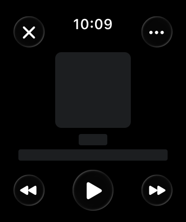
|
|
222
|
+
|
|
223
|
+
**Prefer buttons that span the width of the screen for primary actions in your app.** Full-width buttons look better and are easier for people to tap. If two buttons must share the same horizontal space, use the same height for both, and use images or short text titles for each button’s content.
|
|
224
|
+
|
|
225
|
+
**Use toolbar buttons to provide either navigation to related areas or contextual actions for the view’s content.** These buttons provide access to additional information or secondary actions for the view’s content.
|
|
226
|
+
|
|
227
|
+
**Use the same height for vertical stacks of one- and two-line text buttons.** As much as possible, use identical button heights for visual consistency.
|
|
228
|
+
|
|
229
|
+
## [Resources](https://developer.apple.com/design/human-interface-guidelines/buttons#Resources)
|
|
230
|
+
|
|
231
|
+
#### [Related](https://developer.apple.com/design/human-interface-guidelines/buttons#Related)
|
|
232
|
+
|
|
233
|
+
[Pop-up buttons](https://developer.apple.com/design/human-interface-guidelines/pop-up-buttons)
|
|
234
|
+
|
|
235
|
+
[Pull-down buttons](https://developer.apple.com/design/human-interface-guidelines/pull-down-buttons)
|
|
236
|
+
|
|
237
|
+
[Toggles](https://developer.apple.com/design/human-interface-guidelines/toggles)
|
|
238
|
+
|
|
239
|
+
[Segmented controls](https://developer.apple.com/design/human-interface-guidelines/segmented-controls)
|
|
240
|
+
|
|
241
|
+
[Location button](https://developer.apple.com/design/human-interface-guidelines/privacy#Location-button)
|
|
242
|
+
|
|
243
|
+
#### [Developer documentation](https://developer.apple.com/design/human-interface-guidelines/buttons#Developer-documentation)
|
|
244
|
+
|
|
245
|
+
[`Button`](https://developer.apple.com/documentation/SwiftUI/Button) — SwiftUI
|
|
246
|
+
|
|
247
|
+
[`UIButton`](https://developer.apple.com/documentation/UIKit/UIButton) — UIKit
|
|
248
|
+
|
|
249
|
+
[`NSButton`](https://developer.apple.com/documentation/AppKit/NSButton) — AppKit
|
|
250
|
+
|
|
251
|
+
## [Change log](https://developer.apple.com/design/human-interface-guidelines/buttons#Change-log)
|
|
252
|
+
|
|
253
|
+
Date| Changes
|
|
254
|
+
---|---
|
|
255
|
+
December 16, 2025| Updated guidance for Liquid Glass.
|
|
256
|
+
June 9, 2025| Updated guidance for button styles and content.
|
|
257
|
+
February 2, 2024| Noted that visionOS buttons don’t support custom hover effects.
|
|
258
|
+
December 5, 2023| Clarified some terminology and guidance for buttons in visionOS.
|
|
259
|
+
June 21, 2023| Updated to include guidance for visionOS.
|
|
260
|
+
June 5, 2023| Updated guidance for using buttons in watchOS.
|
|
261
|
+
|
|
@@ -0,0 +1,105 @@
|
|
|
1
|
+
---
|
|
2
|
+
title: "Context menus | Apple Developer Documentation"
|
|
3
|
+
source: https://developer.apple.com/design/human-interface-guidelines/context-menus
|
|
4
|
+
|
|
5
|
+
# Context menus
|
|
6
|
+
|
|
7
|
+
A context menu provides access to functionality that’s directly related to an item, without cluttering the interface.
|
|
8
|
+
|
|
9
|
+
|
|
10
|
+
|
|
11
|
+
Although a context menu provides convenient access to frequently used items, it’s hidden by default, so people might not know it’s there. To reveal a context menu, people generally choose a view or select some content and then perform an action, using the input modes their current configuration supports. For example:
|
|
12
|
+
|
|
13
|
+
* The system-defined touch or pinch and hold gesture in visionOS, iOS, and iPadOS
|
|
14
|
+
|
|
15
|
+
* Pressing the Control key while clicking a pointing device in macOS and iPadOS
|
|
16
|
+
|
|
17
|
+
* Using a secondary click on a Magic Trackpad in macOS or iPadOS
|
|
18
|
+
|
|
19
|
+
|
|
20
|
+
|
|
21
|
+
|
|
22
|
+
## [Best practices](https://developer.apple.com/design/human-interface-guidelines/context-menus#Best-practices)
|
|
23
|
+
|
|
24
|
+
**Prioritize relevancy when choosing items to include in a context menu.** A context menu isn’t for providing advanced or rarely used items; instead, it helps people quickly access the commands they’re most likely to need in their current context. For example, the context menu for a Mail message in the Inbox includes commands for replying and moving the message, but not commands for editing message content, managing mailboxes, or filtering messages.
|
|
25
|
+
|
|
26
|
+
**Aim for a small number of menu items.** A context menu that’s too long can be difficult to scan and scroll.
|
|
27
|
+
|
|
28
|
+
**Support context menus consistently throughout your app.** If you provide context menus for items in some places but not in others, people won’t know where they can use the feature and may think there’s a problem.
|
|
29
|
+
|
|
30
|
+
**Always make context menu items available in the main interface, too.** For example, in Mail in iOS and iPadOS, the context menu items that are available for a message in the Inbox are also available in the toolbar of the message view. In macOS, an app’s menu bar menus list all the app’s commands, including those in various context menus.
|
|
31
|
+
|
|
32
|
+
**If you need to use submenus to manage a menu’s complexity, keep them to one level.** A submenu is a menu item that reveals a secondary menu of logically related commands. Although submenus can shorten a context menu and clarify its commands, more than one level of submenu complicates the experience and can be difficult for people to navigate. If you need to include a submenu, give it an intuitive title that helps people predict its contents without opening it. For guidance, see [Submenus](https://developer.apple.com/design/human-interface-guidelines/menus#Submenus).
|
|
33
|
+
|
|
34
|
+
**Hide unavailable menu items, don’t dim them.** Unlike a regular menu, which helps people discover actions they can perform even when the action isn’t available, a context menu displays only the actions that are relevant to the currently selected view or content. In macOS, the exceptions are the Cut, Copy, and Paste menu items, which may appear unavailable if they don’t apply to the current context.
|
|
35
|
+
|
|
36
|
+
**Aim to place the most frequently used menu items where people are likely to encounter them first.** When a context menu opens, people often read it starting from the part that’s closest to where their finger or pointer revealed it. Depending on the location of the selected content, a context menu might open above or below it, so you might also need to reverse the order of items to match the position of the menu.
|
|
37
|
+
|
|
38
|
+
**Show keyboard shortcuts in your app’s main menus, not in context menus.** Context menus already provide a shortcut to task-specific commands, so it’s redundant to display keyboard shortcuts too.
|
|
39
|
+
|
|
40
|
+
**Follow best practices for using separators.** As with other types of menus, you can use separators to group items in a context menu and help people scan the menu more quickly. In general, you don’t want more than about three groups in a context menu. For guidance, see [Menus](https://developer.apple.com/design/human-interface-guidelines/menus).
|
|
41
|
+
|
|
42
|
+
**In iOS, iPadOS, and visionOS, warn people about context menu items that can destroy data.** If you need to include potentially destructive items in your context menu — such as Delete or Remove — list them at the end of the menu and identify them as destructive (for developer guidance, see [`destructive`](https://developer.apple.com/documentation/UIKit/UIMenuElement/Attributes/destructive)). The system can display a destructive menu item using a red text color.
|
|
43
|
+
|
|
44
|
+
## [Content](https://developer.apple.com/design/human-interface-guidelines/context-menus#Content)
|
|
45
|
+
|
|
46
|
+
A context menu seldom displays a title. In contrast, each item in a context menu needs to display a short label that clearly describes what it does. For guidance, see [Menus > Labels](https://developer.apple.com/design/human-interface-guidelines/menus#Labels).
|
|
47
|
+
|
|
48
|
+
**Include a title in a context menu only if doing so clarifies the menu’s effect.** For example, when people select multiple Mail messages and tap the Mark toolbar button in iOS and iPadOS, the resulting context menu displays a title that states the number of selected messages, reminding people that the command they choose affects all the messages they selected.
|
|
49
|
+
|
|
50
|
+
**Represent menu item actions with familiar icons.** Icons help people recognize common actions throughout your app. Use the same icons as the system to represent actions such as Copy, Share, and Delete, wherever they appear. For a list of icons that represent common actions, see [Standard icons](https://developer.apple.com/design/human-interface-guidelines/icons#Standard-icons). For additional guidance, see [Menus](https://developer.apple.com/design/human-interface-guidelines/menus).
|
|
51
|
+
|
|
52
|
+
## [Platform considerations](https://developer.apple.com/design/human-interface-guidelines/context-menus#Platform-considerations)
|
|
53
|
+
|
|
54
|
+
_No additional considerations for tvOS. Not supported in watchOS._
|
|
55
|
+
|
|
56
|
+
### [iOS, iPadOS](https://developer.apple.com/design/human-interface-guidelines/context-menus#iOS-iPadOS)
|
|
57
|
+
|
|
58
|
+
**Provide either a context menu or an edit menu for an item, but not both.** If you provide both features for the same item, it can be confusing to people — and difficult for the system to detect their intent. See [Edit menus](https://developer.apple.com/design/human-interface-guidelines/edit-menus).
|
|
59
|
+
|
|
60
|
+
**In iPadOS, consider using a context menu to let people create a new object in your app.** iPadOS lets you reveal a context menu when people perform a long press on the touchscreen or use a secondary click with an attached trackpad or keyboard. For example, Files lets people create a new folder by revealing a context menu in an area between existing files and folders.
|
|
61
|
+
|
|
62
|
+
In iOS and iPadOS, a context menu can display a preview of the current content near the list of commands. People can choose a command in the menu or — in some cases — they can tap the preview to open it or drag it to another area.
|
|
63
|
+
|
|
64
|
+
**Prefer a graphical preview that clarifies the target of a context menu’s commands.** For example, when people reveal a context menu on a list item in Notes or Mail, the preview shows a condensed version of the actual content to help people confirm that they’re working with the item they intend.
|
|
65
|
+
|
|
66
|
+
**Ensure that your preview looks good as it animates.** As people reveal a context menu on an onscreen object, the system animates the preview image as it emerges from the content, dimming the screen behind the preview and the menu. It’s important to adjust the preview’s clipping path to match the shape of the preview image so that its contours, such as the rounded corners, don’t appear to change during animation. For developer guidance, see [`UIContextMenuInteractionDelegate`](https://developer.apple.com/documentation/UIKit/UIContextMenuInteractionDelegate).
|
|
67
|
+
|
|
68
|
+
### [macOS](https://developer.apple.com/design/human-interface-guidelines/context-menus#macOS)
|
|
69
|
+
|
|
70
|
+
On a Mac, a context menu is sometimes called a _contextual_ menu.
|
|
71
|
+
|
|
72
|
+
### [visionOS](https://developer.apple.com/design/human-interface-guidelines/context-menus#visionOS)
|
|
73
|
+
|
|
74
|
+
**Consider using a context menu instead of a panel or inspector window to present frequently used functionality.** Minimizing the number of separate views or windows your app opens can help people keep their space uncluttered.
|
|
75
|
+
|
|
76
|
+
**In general, avoid letting a context menu’s height exceed the height of the window.** In visionOS, a window includes system-provided components above and below its top and bottom edges, such as window-management controls and the Share menu, so a context menu that’s too tall could obscure them. As you consider the number of items to include, be guided by the ways people are likely to use your app. For example, people who use an app to accomplish in-depth, specialist tasks often expect to spend time learning a large number of sophisticated commands and might appreciate contextual access to them. On the other hand, people who use an app to perform a few simple actions may appreciate short contextual menus that are quick to scan and use.
|
|
77
|
+
|
|
78
|
+
## [Resources](https://developer.apple.com/design/human-interface-guidelines/context-menus#Resources)
|
|
79
|
+
|
|
80
|
+
#### [Related](https://developer.apple.com/design/human-interface-guidelines/context-menus#Related)
|
|
81
|
+
|
|
82
|
+
[Menus](https://developer.apple.com/design/human-interface-guidelines/menus)
|
|
83
|
+
|
|
84
|
+
[Edit menus](https://developer.apple.com/design/human-interface-guidelines/edit-menus)
|
|
85
|
+
|
|
86
|
+
[Pop-up buttons](https://developer.apple.com/design/human-interface-guidelines/pop-up-buttons)
|
|
87
|
+
|
|
88
|
+
[Pull-down buttons](https://developer.apple.com/design/human-interface-guidelines/pull-down-buttons)
|
|
89
|
+
|
|
90
|
+
#### [Developer documentation](https://developer.apple.com/design/human-interface-guidelines/context-menus#Developer-documentation)
|
|
91
|
+
|
|
92
|
+
[`contextMenu(menuItems:)`](https://developer.apple.com/documentation/SwiftUI/View/contextMenu\(menuItems:\)) — SwiftUI
|
|
93
|
+
|
|
94
|
+
[`UIContextMenuInteraction`](https://developer.apple.com/documentation/UIKit/UIContextMenuInteraction) — UIKit
|
|
95
|
+
|
|
96
|
+
[`popUpContextMenu(_:with:for:)`](https://developer.apple.com/documentation/AppKit/NSMenu/popUpContextMenu\(_:with:for:\)) — AppKit
|
|
97
|
+
|
|
98
|
+
## [Change log](https://developer.apple.com/design/human-interface-guidelines/context-menus#Change-log)
|
|
99
|
+
|
|
100
|
+
Date| Changes
|
|
101
|
+
---|---
|
|
102
|
+
December 5, 2023| Added guidance on hiding unavailable menu items.
|
|
103
|
+
June 21, 2023| Updated to include guidance for visionOS.
|
|
104
|
+
September 14, 2022| Refined guidance on including a submenu and added a guideline on using a context menu to support object creation in an iPadOS app.
|
|
105
|
+
|
|
@@ -0,0 +1,84 @@
|
|
|
1
|
+
---
|
|
2
|
+
title: "Disclosure controls | Apple Developer Documentation"
|
|
3
|
+
source: https://developer.apple.com/design/human-interface-guidelines/disclosure-controls
|
|
4
|
+
|
|
5
|
+
# Disclosure controls
|
|
6
|
+
|
|
7
|
+
Disclosure controls reveal and hide information and functionality related to specific controls or views.
|
|
8
|
+
|
|
9
|
+
|
|
10
|
+
|
|
11
|
+
## [Best practices](https://developer.apple.com/design/human-interface-guidelines/disclosure-controls#Best-practices)
|
|
12
|
+
|
|
13
|
+
**Use a disclosure control to hide details until they’re relevant.** Place controls that people are most likely to use at the top of the disclosure hierarchy so they’re always visible, with more advanced functionality hidden by default. This organization helps people quickly find the most essential information without overwhelming them with too many detailed options.
|
|
14
|
+
|
|
15
|
+
## [Disclosure triangles](https://developer.apple.com/design/human-interface-guidelines/disclosure-controls#Disclosure-triangles)
|
|
16
|
+
|
|
17
|
+
A disclosure triangle shows and hides information and functionality associated with a view or a list of items. For example, Keynote uses a disclosure triangle to show advanced options when exporting a presentation, and the Finder uses disclosure triangles to progressively reveal hierarchy when navigating a folder structure in list view.
|
|
18
|
+
|
|
19
|
+
* Collapsed
|
|
20
|
+
* Expanded
|
|
21
|
+
|
|
22
|
+
|
|
23
|
+
|
|
24
|
+
|
|
25
|
+
|
|
26
|
+
|
|
27
|
+
|
|
28
|
+
A disclosure triangle points inward from the leading edge when its content is hidden and down when its content is visible. Clicking or tapping the disclosure triangle switches between these two states, and the view expands or collapses accordingly to accommodate the content.
|
|
29
|
+
|
|
30
|
+
**Provide a descriptive label when using a disclosure triangle.** Make sure your labels indicate what is disclosed or hidden, like “Advanced Options.”
|
|
31
|
+
|
|
32
|
+
For developer guidance, see [`NSButton.BezelStyle.disclosure`](https://developer.apple.com/documentation/AppKit/NSButton/BezelStyle-swift.enum/disclosure).
|
|
33
|
+
|
|
34
|
+
## [Disclosure buttons](https://developer.apple.com/design/human-interface-guidelines/disclosure-controls#Disclosure-buttons)
|
|
35
|
+
|
|
36
|
+
A disclosure button shows and hides functionality associated with a specific control. For example, the macOS Save sheet shows a disclosure button next to the Save As text field. When people click or tap this button, the Save dialog expands to give advanced navigation options for selecting an output location for their document.
|
|
37
|
+
|
|
38
|
+
A disclosure button points down when its content is hidden and up when its content is visible. Clicking or tapping the disclosure button switches between these two states, and the view expands or collapses accordingly to accommodate the content.
|
|
39
|
+
|
|
40
|
+
* Collapsed
|
|
41
|
+
* Expanded
|
|
42
|
+
|
|
43
|
+
|
|
44
|
+
|
|
45
|
+
|
|
46
|
+
|
|
47
|
+
|
|
48
|
+
|
|
49
|
+
**Place a disclosure button near the content that it shows and hides.** Establish a clear relationship between the control and the expanded choices that appear when a person clicks or taps a button.
|
|
50
|
+
|
|
51
|
+
**Use no more than one disclosure button in a single view.** Multiple disclosure buttons add complexity and can be confusing.
|
|
52
|
+
|
|
53
|
+
For developer guidance, see [`NSButton.BezelStyle.pushDisclosure`](https://developer.apple.com/documentation/AppKit/NSButton/BezelStyle-swift.enum/pushDisclosure).
|
|
54
|
+
|
|
55
|
+
## [Platform considerations](https://developer.apple.com/design/human-interface-guidelines/disclosure-controls#Platform-considerations)
|
|
56
|
+
|
|
57
|
+
_No additional considerations for macOS. Not supported in tvOS or watchOS._
|
|
58
|
+
|
|
59
|
+
### [iOS, iPadOS, visionOS](https://developer.apple.com/design/human-interface-guidelines/disclosure-controls#iOS-iPadOS-visionOS)
|
|
60
|
+
|
|
61
|
+
Disclosure controls are available in iOS, iPadOS, and visionOS with the SwiftUI [`DisclosureGroup`](https://developer.apple.com/documentation/SwiftUI/DisclosureGroup) view.
|
|
62
|
+
|
|
63
|
+
## [Resources](https://developer.apple.com/design/human-interface-guidelines/disclosure-controls#Resources)
|
|
64
|
+
|
|
65
|
+
#### [Related](https://developer.apple.com/design/human-interface-guidelines/disclosure-controls#Related)
|
|
66
|
+
|
|
67
|
+
[Outline views](https://developer.apple.com/design/human-interface-guidelines/outline-views)
|
|
68
|
+
|
|
69
|
+
[Lists and tables](https://developer.apple.com/design/human-interface-guidelines/lists-and-tables)
|
|
70
|
+
|
|
71
|
+
[Buttons](https://developer.apple.com/design/human-interface-guidelines/buttons)
|
|
72
|
+
|
|
73
|
+
#### [Developer documentation](https://developer.apple.com/design/human-interface-guidelines/disclosure-controls#Developer-documentation)
|
|
74
|
+
|
|
75
|
+
[`DisclosureGroup`](https://developer.apple.com/documentation/SwiftUI/DisclosureGroup) — SwiftUI
|
|
76
|
+
|
|
77
|
+
[`NSButton.BezelStyle.disclosure`](https://developer.apple.com/documentation/AppKit/NSButton/BezelStyle-swift.enum/disclosure) — AppKit
|
|
78
|
+
|
|
79
|
+
[`NSButton.BezelStyle.pushDisclosure`](https://developer.apple.com/documentation/AppKit/NSButton/BezelStyle-swift.enum/pushDisclosure) — AppKit
|
|
80
|
+
|
|
81
|
+
#### [Videos](https://developer.apple.com/design/human-interface-guidelines/disclosure-controls#Videos)
|
|
82
|
+
|
|
83
|
+
[ Stacks, Grids, and Outlines in SwiftUI ](https://developer.apple.com/videos/play/wwdc2020/10031)
|
|
84
|
+
|