@tencent-rtc/mcp 1.3.1 → 1.3.2
This diff represents the content of publicly available package versions that have been released to one of the supported registries. The information contained in this diff is provided for informational purposes only and reflects changes between package versions as they appear in their respective public registries.
- package/index.js +4 -0
- package/index.js.map +1 -1
- package/package.json +1 -1
- package/resource/doc/chatuikit/faq/web_sdk/faq.md +125 -0
- package/resource/doc/chatuikit/flutter/faq.md +17 -114
- package/resource/doc/chatuikit/flutter/integrate_tuikit_Flutter.md +86 -722
- package/resource/doc/roomkit/vue/features/call-user-to-room.md +256 -0
- package/resource/doc/roomkit/vue/features/device-detection.md +388 -0
- package/resource/doc/roomkit/vue/features/device-state.md +480 -0
- package/resource/doc/roomkit/vue/features/free-beauty-panel.md +238 -0
- package/resource/doc/roomkit/vue/features/room-chat.md +427 -0
- package/resource/doc/roomkit/vue/features/room-participant-state.md +407 -0
- package/resource/doc/roomkit/vue/features/room-state.md +291 -0
- package/resource/doc/roomkit/vue/features/room-view.md +338 -0
- package/resource/doc/roomkit/vue/features/schedule-room.md +349 -0
- package/resource/doc/roomkit/vue/features/screen-share.md +333 -0
- package/resource/doc/roomkit/vue/features/virtual-background.md +287 -0
- package/resource/doc/roomkit/vue/features/workflow.md +553 -0
- package/resource/doc/roomkit/vue/integration.md +479 -0
- package/resource/doc/roomkit/vue/workflow.md +487 -0
- package/resource/doc/tuicallkit/react/api.md +21 -0
- package/resource/doc/tuicallkit/vue/api.md +21 -0
- package/tools/definitions/get_web_room_feature_detail_def.js +95 -0
- package/tools/definitions/get_web_room_feature_detail_def.js.map +1 -0
- package/tools/definitions/get_web_room_uikit_integration_def.js +44 -0
- package/tools/definitions/get_web_room_uikit_integration_def.js.map +1 -0
- package/tools/index.js +4 -2
- package/tools/index.js.map +1 -1
- package/tools/room/get-web-room-feature-detail.js +68 -0
- package/tools/room/get-web-room-feature-detail.js.map +1 -0
- package/tools/room/get-web-room-integration.js +43 -0
- package/tools/room/get-web-room-integration.js.map +1 -0
- package/utils/report-cls-client.js +1 -1
- package/utils/report-es-client.js +1 -1
- package/resource/doc/chatuikit/flutter/integrate_only_tuichat_Flutter.md +0 -333
- package/resource/doc/chatuikit/flutter/quick_start_Flutter.md +0 -217
- package/resource/doc/roomkit/vue/states/device-state.md +0 -369
- package/resource/doc/roomkit/vue/states/login-state.md +0 -59
- package/resource/doc/roomkit/vue/states/room-list-state.md +0 -355
- package/resource/doc/roomkit/vue/states/room-participant-state.md +0 -388
- package/tools/room/get-web-room-state-detail.js +0 -31
- package/tools/room/get-web-room-state-detail.js.map +0 -1
|
@@ -1,769 +1,133 @@
|
|
|
1
|
-
|
|
2
|
-
>
|
|
3
|
-
|
|
4
|
-
> This documentation primarily covers our new Flutter UIKit (tencent_cloud_chat). If you're looking for the documentation for the earlier version of UIKit, [please click here](https://www.tencentcloud.com/document/product/1047/50054).
|
|
5
|
-
>
|
|
6
|
-
|
|
7
|
-
|
|
8
|
-
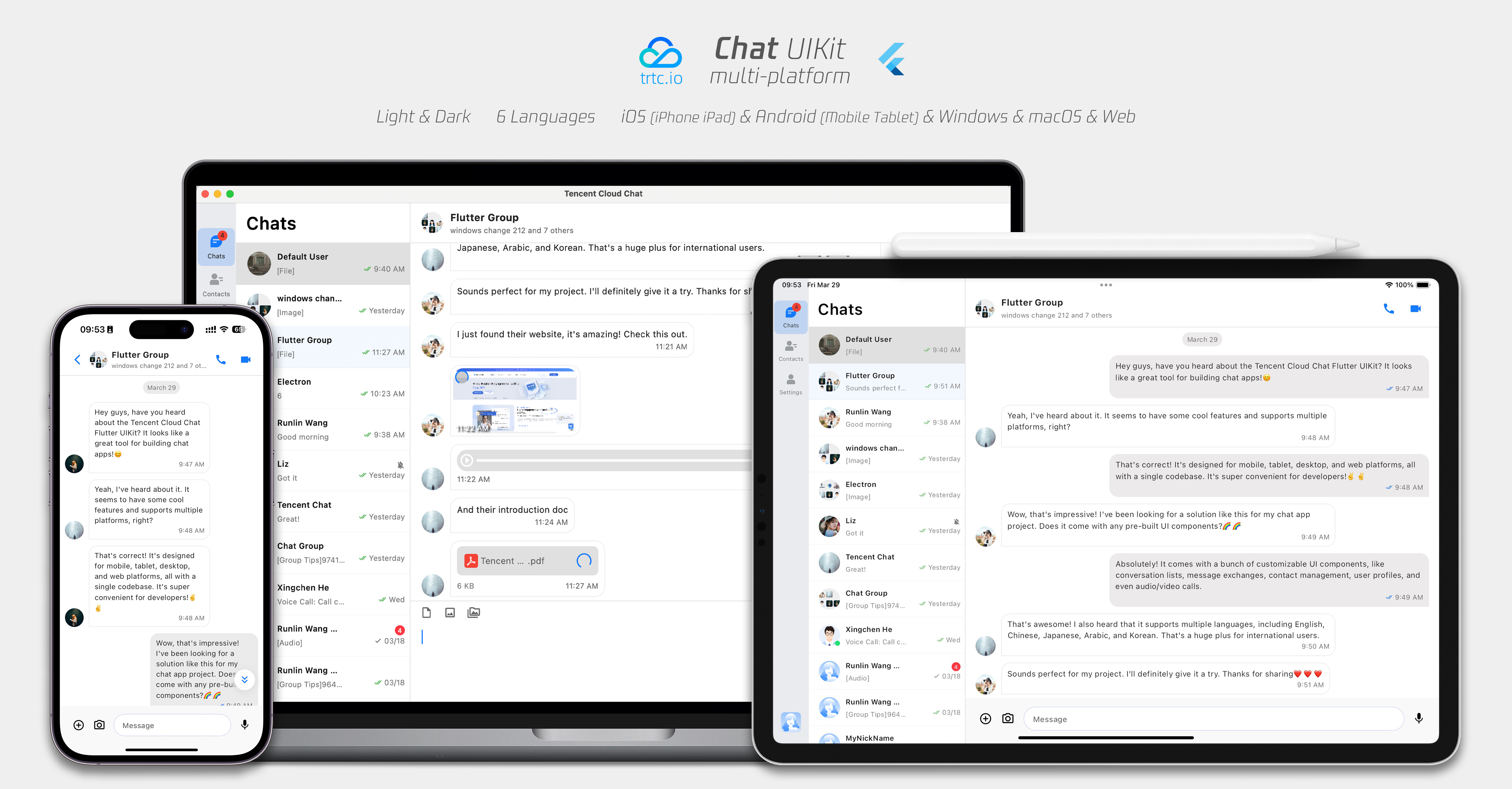
Our Flutter Chat UIKit is designed to provide developers with a comprehensive set of tools to create feature-rich chat applications with ease.
|
|
9
|
-
|
|
10
|
-
It is built with a modular approach, allowing you to pick and choose the components you need while keeping your application lightweight and efficient.
|
|
11
|
-
|
|
12
|
-
The UIKit includes a wide range of capabilities, such as Conversation list, Message handling,
|
|
13
|
-
|
|
14
|
-
Contact lists, Message Translation, Speech-to-Text, and more.
|
|
15
|
-
|
|
16
|
-
|
|
17
|
-
|
|
18
|
-
## Features
|
|
19
|
-
1. **Personalized Appearance** : With built-in **dark and light** modes, the UIKit offers a variety of **theme and appearance customization** options to meet your business needs.
|
|
20
|
-
|
|
21
|
-
2. **Multi-Platform Compatibility** : The adaptable single codebase ensures compatibility across various platforms, including **mobile** devices (iOS/Android), **tablets** (iPad and Android tablets), **web** browsers, and **desktop** environments (Windows/macOS).
|
|
22
|
-
|
|
23
|
-
3. **Localization Support** : Developed with native English and additional language options, including Arabic, Japanese, Korean, Simplified Chinese, and Traditional Chinese. The internationalization features ensure a localized interface language and support custom and **supplementary language** , with Arabic support for **RTL** UI.
|
|
24
|
-
|
|
25
|
-
4. **Enhanced Performance** : The UIKit delivers improved message list **performance** , **memory usage** , and precise message positioning capabilities, catering to scenarios with large message volumes and navigation to older messages.
|
|
26
|
-
|
|
27
|
-
5. **Advanced Features** : Boasting numerous advanced capabilities, the UIKit includes continuous voice message playback, enhanced multimedia and file message experiences, and intuitive left-right swiping for multimedia message previews.
|
|
28
|
-
|
|
29
|
-
6. **Refined User Experience** : Detail optimizations such as rich **animations** , **haptic feedback** , and **a polished interface** contribute to an improved user experience. New features like grid-style avatars, redesigned forwarding panels, group member selectors, and revamped long-press message menus further enrich the experience.
|
|
30
|
-
|
|
31
|
-
7. **Modular Design** : Components are organized into modular packages, allowing for selective importing and reducing unnecessary bloat. Each package supports **built-in navigation transitions** , streamlining development and integration by automatically handling transitions, such as between Conversation and Message.
|
|
32
|
-
|
|
33
|
-
8. **Developer-Friendly Approach** : A more unified, standardized component parameter design, clearer code naming conventions, and detailed comments, combined with the flexibility to choose **global or instance-level configuration ** management, make development easier and more efficient.
|
|
34
|
-
|
|
35
|
-
|
|
36
|
-
## Compatibility
|
|
37
|
-
|
|
38
|
-
This UIKit supports **mobile**, **tablet**, and **desktop** UI styles, and is compatible with Android, iOS, macOS, Windows, and Web (will be supported in future versions).
|
|
39
|
-
|
|
40
|
-
It comes with built-in support for English, Simplified Chinese, Traditional Chinese, Japanese, Korean, and Arabic languages (with support for Arabic RTL interface), and light and dark appearance styles.
|
|
41
|
-
|
|
42
|
-
## Requirements
|
|
43
|
-
- Flutter version: 3.24 or above
|
|
44
|
-
|
|
45
|
-
- Dart version: 3.0 or above
|
|
46
|
-
|
|
47
|
-
|
|
48
|
-
## Getting Started
|
|
49
|
-
|
|
50
|
-
### Demo
|
|
51
|
-
|
|
52
|
-
You can refer to the [Demo source code](https://github.com/TencentCloud/chat-demo-flutter/tree/v2) alongside this document to ensure a smooth and successful integration process.
|
|
1
|
+
TUIKit is a UI component library built on the Chat SDK. It enables rapid implementation of chat, conversation, search, relationship chain, and group management features through ready-to-use UI components. Message sending and receiving are handled by the TUIChat component. This guide explains how to quickly integrate TUIKit and implement its core features.
|
|
53
2
|
|
|
54
3
|
> **Note:**
|
|
55
4
|
>
|
|
56
5
|
|
|
57
|
-
>
|
|
6
|
+
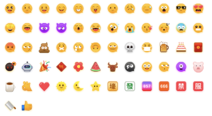
> This demo uses TRTC's emoji pack with restricted licensing.
|
|
58
7
|
>
|
|
59
8
|
|
|
60
|
-
>
|
|
9
|
+
> **Commercial Usage Options**
|
|
61
10
|
>
|
|
11
|
+
> - **Option A: Keep Our Emoji (Recommended)**
|
|
62
12
|
|
|
63
|
-
|
|
64
|
-
### Import Packages
|
|
65
|
-
|
|
66
|
-
#### Base Package
|
|
67
|
-
|
|
68
|
-
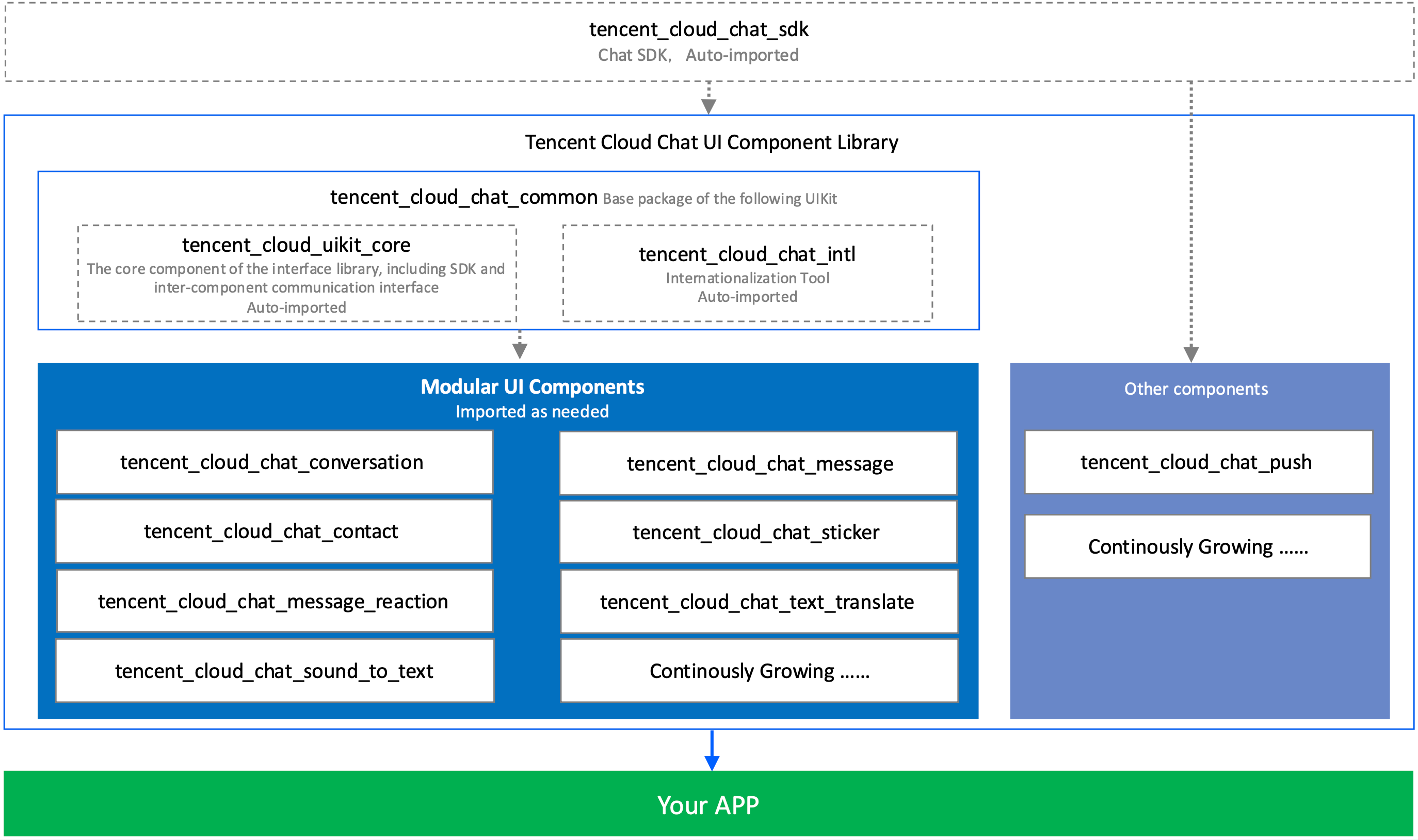
To start using our UIKit, first import the base package, tencent_cloud_chat_common.
|
|
69
|
-
|
|
70
|
-
#### Modular UI Packages
|
|
71
|
-
|
|
72
|
-
Next, import the required UI component packages that suit your needs from the following list:
|
|
73
|
-
- tencent_cloud_chat_message
|
|
74
|
-
|
|
75
|
-
- tencent_cloud_chat_conversation
|
|
76
|
-
|
|
77
|
-
- tencent_cloud_chat_contact
|
|
78
|
-
|
|
79
|
-
- tencent_cloud_chat_sticker
|
|
80
|
-
|
|
81
|
-
- tencent_cloud_chat_message_reaction
|
|
82
|
-
|
|
83
|
-
- tencent_cloud_chat_text_translate
|
|
84
|
-
|
|
85
|
-
- tencent_cloud_chat_sound_to_text
|
|
86
|
-
|
|
87
|
-
- tencent_cloud_chat_search *(In Beta)*
|
|
88
|
-
|
|
89
|
-
|
|
90
|
-
The architecture of our UIKit is shown below:
|
|
91
|
-
|
|
92
|
-
|
|
93
|
-
|
|
94
|
-
|
|
95
|
-
|
|
96
|
-
|
|
97
|
-
|
|
98
|
-
> **Platform Integration:**
|
|
13
|
+
> Upgrade to [Chat Pro Plus or Enterprise Plan](https://console.trtc.io/subscription/buy/chat?packType=pro) and use our emoji pack at no additional cost.
|
|
99
14
|
>
|
|
15
|
+
> - **Option B: Use Your Own**
|
|
100
16
|
|
|
101
|
-
>
|
|
17
|
+
> Replace default emoji with your own custom designs, or use emoji packs with proper commercial licensing.
|
|
102
18
|
>
|
|
103
|
-
> - **Web / macOS: **Please [Follow this guide](https://trtc.io/document/45907?platform=flutter&product=chat&menulabel=uikit#more) if you plan to deploy your project on***Web*** or ***macOS*** platforms.
|
|
104
|
-
> - **iOS: **Open `ios/Podfile` , and replace the final section with the following content.
|
|
105
|
-
> `post_install do |installer|`
|
|
106
|
-
> ` installer.pods_project.targets.each do |target|`
|
|
107
|
-
> ` flutter_additional_ios_build_settings(target)`
|
|
108
|
-
> ` target.build_configurations.each do |config| `
|
|
109
|
-
> ` config.build_settings['EXCLUDED_ARCHS[sdk=iphonesimulator*]'] = 'arm64' `
|
|
110
|
-
> ` config.build_settings['ENABLE_BITCODE'] = 'NO' `
|
|
111
|
-
> ` config.build_settings["ONLY_ACTIVE_ARCH"] = "NO" `
|
|
112
|
-
> ` end`
|
|
113
|
-
> ` target.build_configurations.each do |config|`
|
|
114
|
-
> ` config.build_settings['GCC_PREPROCESSOR_DEFINITIONS'] ||= [`
|
|
115
|
-
> ` '$(inherited)',`
|
|
116
|
-
> ` 'PERMISSION_MICROPHONE=1',`
|
|
117
|
-
> ` 'PERMISSION_CAMERA=1',`
|
|
118
|
-
> ` 'PERMISSION_PHOTOS=1',`
|
|
119
|
-
> ` ]`
|
|
120
|
-
> ` end`
|
|
121
|
-
> ` end`
|
|
122
|
-
> `end`
|
|
123
|
-
> - **Android / Windows: **No additional actions required.
|
|
124
|
-
|
|
125
|
-
|
|
126
|
-
## Basic Usage
|
|
127
|
-
|
|
128
|
-
Before you start using each Modular Package UI component, there are some initial setup steps you need to follow in your project.
|
|
129
|
-
1. Prepare the necessary Tencent Cloud Chat configuration information, such as sdkappid, test userID, userSig, etc. [You can refer to Run Demo](https://trtc.io/zh/document/45907?platform=flutter&product=chat&menulabel=uikit).
|
|
130
|
-
|
|
131
|
-
2. **Packages installing:**
|
|
132
|
-
|
|
133
|
-
|
|
134
|
-
In your Flutter project, install the main package and the optional modular packages mentioned in the Getting Started section.
|
|
135
|
-
|
|
136
|
-
3. Global configuration**:**
|
|
137
|
-
|
|
138
|
-
|
|
139
|
-
Import `TencentCloudChatMaterialApp`: Replace your project's `MaterialApp` with `TencentCloudChatMaterialApp`. This enables automatic management and configuration of the language, theme *(with material3)*, theme mode, and other settings, ensuring that the UIKit's interface parameters are consistent with your project.
|
|
140
|
-
|
|
141
|
-
|
|
142
|
-
This step will take over the language, theme, and theme mode configuration of your project. If you do not want the automatic management of the configuration for your project, you can manually import the features you need into your project according to the **following guide**.
|
|
143
|
-
|
|
144
|
-
|
|
145
|
-
|
|
146
|
-
|
|
147
|
-
|
|
148
|
-
|
|
149
|
-
|
|
150
19
|
|
|
151
|
-
|
|
152
|
-
|
|
153
|
-
It is recommended to replace your project's `MaterialApp` with `TencentCloudChatMaterialApp`. This enables automatic management of global configuration, including localization, theme, and theme mode.
|
|
154
|
-
|
|
155
|
-
However, if you want to retain your project's `MaterialApp` due to extensive customization or the use of other packages such as `Get`, which also manage it, you can manually initialize the UIKit. This guide will walk you through that process.
|
|
156
|
-
|
|
157
|
-
In the global configuration, localization is required, while the theme and theme mode settings are optional. Let's get started.
|
|
158
|
-
|
|
159
|
-
##### Required Configuration
|
|
160
|
-
- **Localization**
|
|
161
|
-
|
|
162
|
-
|
|
163
|
-
First, import the localization tools into your app's entry file.
|
|
164
|
-
``` java
|
|
165
|
-
import 'package:tencent_cloud_chat_intl/localizations/tencent_cloud_chat_localizations.dart';
|
|
166
|
-
```
|
|
167
|
-
|
|
168
|
-
Next, add the localization configuration to `MaterialApp` or another entry provided by third-party packages like `GetMaterialApp`.
|
|
169
|
-
``` plaintext
|
|
170
|
-
MaterialApp(
|
|
171
|
-
localizationsDelegates: const [
|
|
172
|
-
/// Your configuration
|
|
173
|
-
GlobalMaterialLocalizations.delegate,
|
|
174
|
-
|
|
175
|
-
/// Add this line
|
|
176
|
-
...TencentCloudChatLocalizations.localizationsDelegates, /// Add this line
|
|
177
|
-
],
|
|
178
|
-
supportedLocales: [
|
|
179
|
-
/// Your configuration
|
|
180
|
-
...S.delegate.supportedLocales,
|
|
181
|
-
|
|
182
|
-
/// Add this line
|
|
183
|
-
...TencentCloudChatLocalizations.supportedLocales,
|
|
184
|
-
],
|
|
185
|
-
/// ... Other configurations
|
|
186
|
-
)
|
|
187
|
-
```
|
|
188
|
-
|
|
189
|
-
Additionally, you can set the language region `locale` according to your business logic, such as recording the user-specified language upon app launch, instead of following the system settings. This configuration will apply to both your project and the Chat UIKit.
|
|
20
|
+
> 
|
|
21
|
+
>
|
|
190
22
|
|
|
191
|
-
For more information of customizing localization, including adding or removing languages, adding the localization entry, and modifying translation words, [Please refer to the corresponding guide](https://trtc.io/document/52154).
|
|
192
23
|
|
|
193
|
-
|
|
194
|
-
-
|
|
24
|
+
## Prerequisites
|
|
25
|
+
- Flutter version >= 3.29.0, Dart version >= 3.7.0.
|
|
195
26
|
|
|
27
|
+
- Android Studio 2022.3.1 or later, Android Gradle plugin version 7.3.1 or above.
|
|
196
28
|
|
|
197
|
-
|
|
198
|
-
``` dart
|
|
199
|
-
TencentCloudChatTheme theme = TencentCloudChat.dataInstance.theme;
|
|
200
|
-
```
|
|
29
|
+
- Xcode 12.0 or later.
|
|
201
30
|
|
|
202
|
-
|
|
203
|
-
|
|
204
|
-
Furthermore, you can specify the `theme` and `darkTheme`from `MaterialApp` using the Material 3 style theme data that we provide for both light and dark modes. You can also set the `themeMode` status based on the `brightness` status we maintain. This ensures a consistent appearance across your application and our Chat UIKit, enhancing the user experience. (You can customize this theme style as described below.)
|
|
205
|
-
|
|
206
|
-
To achieve this, we suggest converting your entry widget (which hosts the `MaterialApp`) to a `StatefulWidget`. Add a `TencentCloudChatTheme theme` as a state, and listen to `Stream<TencentCloudChatTheme>? themeDataListener` to update its value and build the app based on dynamic, customizable theme data. Here is sample code:
|
|
207
|
-
``` dart
|
|
208
|
-
// Theme instance for the Chat UIKit
|
|
209
|
-
TencentCloudChatTheme theme = TencentCloudChat.dataInstance.theme;
|
|
210
|
-
|
|
211
|
-
// Listener for theme data changes
|
|
212
|
-
Stream<TencentCloudChatTheme>? themeDataListener = TencentCloudChat.eventBusInstance.on<TencentCloudChatTheme>();
|
|
213
|
-
|
|
214
|
-
// Callback for handling theme data changes
|
|
215
|
-
void _themeDataChangeCallback(TencentCloudChatTheme themeData) {
|
|
216
|
-
setState(() {
|
|
217
|
-
theme = themeData;
|
|
218
|
-
});
|
|
219
|
-
}
|
|
220
|
-
|
|
221
|
-
// Adds a listener for theme data changes
|
|
222
|
-
void _addThemeDataChangeListener() {
|
|
223
|
-
themeDataListener?.listen(
|
|
224
|
-
_themeDataChangeCallback,
|
|
225
|
-
);
|
|
226
|
-
}
|
|
227
|
-
|
|
228
|
-
@override
|
|
229
|
-
void initState() {
|
|
230
|
-
super.initState();
|
|
231
|
-
_addThemeDataChangeListener();
|
|
232
|
-
}
|
|
233
|
-
|
|
234
|
-
// .......
|
|
235
|
-
|
|
236
|
-
return MaterialApp(
|
|
237
|
-
themeMode: theme.brightness != null ? (theme.brightness == Brightness.light ? ThemeMode.light : ThemeMode.dark) : null,
|
|
238
|
-
theme: theme.getThemeData(brightness: Brightness.light),
|
|
239
|
-
darkTheme: theme.getThemeData(brightness: Brightness.dark),
|
|
240
|
-
/// ... Other configurations
|
|
241
|
-
);
|
|
242
|
-
```
|
|
243
|
-
- To customize the theme for the Chat UIKit appearance and the global theme (if specified in `MaterialApp` as shown above), use the `TencentCloudChatCoreController.setThemeColors` method to specify the appearance colors for both light and dark modes. For specific usage instructions, see the comments in the code.
|
|
31
|
+
- A valid Tencent Cloud account and Chat Application. Refer to [Enable the Service](https://trtc.io/zh/document/45907?product=chat&menulabel=uikit&platform=flutter) to obtain the following information from the Console:
|
|
244
32
|
|
|
245
|
-
-
|
|
33
|
+
- `SDKAppID`: The unique identifier for your Chat Application.
|
|
246
34
|
|
|
35
|
+
- `SDKSecretKey`: The secret key for your Application.
|
|
36
|
+
|
|
247
37
|
|
|
248
|
-
|
|
38
|
+
> **Version Compatibility Notice:**
|
|
39
|
+
>
|
|
249
40
|
|
|
41
|
+
> To ensure a stable build environment, strictly follow official compatibility requirements:
|
|
42
|
+
>
|
|
43
|
+
> - For Gradle, Android Gradle Plugin, JDK, and Android Studio compatibility, refer to the Android official documentation: [Release Notes](https://developer.android.com/build/releases/gradle-plugin?hl=en#updating-gradle).
|
|
44
|
+
> - For Kotlin, Android Gradle Plugin, and Gradle version mapping, refer to the Kotlin official documentation: [Kotlin-Gradle Plugin Compatibility](https://kotlinlang.org/docs/gradle-configure-project.html#apply-the-plugin).
|
|
45
|
+
> - If Android Studio installs with a higher default JDK version, compilation may fail. We recommend using JDK 17. See: [Switching Java Versions](https://developer.android.com/build/jdks#kts)
|
|
46
|
+
> - We recommend selecting a version combination that matches your project requirements exactly, following the guidelines above.
|
|
250
47
|
|
|
251
|
-
Call the `TencentCloudChat.controller.initUIKit` method to initialize and log in. The call instructions and reference code are as follows:
|
|
252
|
-
|
|
253
48
|
|
|
254
|
-
|
|
255
|
-
|
|
49
|
+
## Integrate TUIKit
|
|
50
|
+
1. If you don't have a Flutter app, refer to the [Flutter documentation](https://docs.flutter.dev/get-started/codelab) to quickly create a Flutter application. If you already have a Flutter app, skip this step.
|
|
256
51
|
|
|
257
|
-
|
|
258
|
-
>
|
|
52
|
+
2. Add the following dependencies to your project's root `pubspec.yaml` file:
|
|
259
53
|
|
|
260
|
-
```
|
|
261
|
-
|
|
262
|
-
|
|
263
|
-
|
|
264
|
-
|
|
265
|
-
|
|
266
|
-
|
|
267
|
-
|
|
268
|
-
|
|
269
|
-
components: TencentCloudChatInitComponentsRelated( /// [Required]: The modular UI components related settings, taking effect on a global scale.
|
|
270
|
-
usedComponentsRegister: [
|
|
271
|
-
/// [Required]: List of registration functions for the components used in the Chat UIKit.
|
|
272
|
-
TencentCloudChatConversationManager.register,
|
|
273
|
-
TencentCloudChatMessageManager.register,
|
|
274
|
-
/// ......
|
|
275
|
-
/// The above registers are examples. In this field, pass in the register of each sub modular UI package.
|
|
276
|
-
/// After installing each sub modular UI package, you need to declare it here before you can use it.
|
|
277
|
-
],
|
|
278
|
-
componentConfigs: TencentCloudChatComponentConfigs(
|
|
279
|
-
/// [Optional]: Provide your custom configurations for each UI modular component here. These builders will be applied globally.
|
|
280
|
-
),
|
|
281
|
-
componentBuilders: TencentCloudChatComponentBuilders(
|
|
282
|
-
/// [Optional]: Provide your custom UI builders for each UI modular component here. These builders will be applied globally.
|
|
283
|
-
),
|
|
284
|
-
componentEventHandlers: TencentCloudChatComponentEventHandlers(
|
|
285
|
-
/// [Optional]: Provide your custom event handlers for UI component-related events here. These builders will be applied globally.
|
|
286
|
-
),
|
|
287
|
-
),
|
|
288
|
-
|
|
289
|
-
/// **[Critical]**: It's strongly advised to incorporate the following callback listeners for effectively managing SDK events, SDK API errors and specific UIKit events that require user attention.
|
|
290
|
-
/// For detailed usage, see the Introducing callbacks for UIKit section at the end of this README.
|
|
291
|
-
callbacks: TencentCloudChatCallbacks(
|
|
292
|
-
onTencentCloudChatSDKEvent: V2TimSDKListener(), /// [Optional]: Handles SDK events, such as onKickedOffline and onUserSigExpired, etc.
|
|
293
|
-
onTencentCloudChatSDKFailCallback: (apiName, code, desc) {}, /// [Optional]: Handles SDK API errors.
|
|
294
|
-
onTencentCloudChatUIKitUserNotificationEvent: (TencentCloudChatComponentsEnum component, TencentCloudChatUserNotificationEvent event) {}, /// [Optional]: Handles specific UIKit events that require user attention on a global scale.
|
|
295
|
-
),
|
|
296
|
-
|
|
297
|
-
plugins: [], /// [Optional]: Used plugins, such as tencent_cloud_chat_robot, etc. For specific usage, see the README of each plugin.
|
|
298
|
-
);
|
|
54
|
+
``` yaml
|
|
55
|
+
tencent_cloud_chat_common: ^4.1.0+1
|
|
56
|
+
tencent_cloud_chat_conversation: ^4.1.0
|
|
57
|
+
tencent_cloud_chat_message: ^4.1.0+3
|
|
58
|
+
tencent_cloud_chat_contact: ^4.1.0
|
|
59
|
+
tencent_cloud_chat_sticker: ^4.1.0
|
|
60
|
+
tencent_cloud_chat_message_reaction: ^4.1.0
|
|
61
|
+
tencent_cloud_chat_text_translate: ^4.1.0
|
|
62
|
+
tencent_cloud_chat_sound_to_text: ^4.1.0
|
|
299
63
|
```
|
|
64
|
+
3. Configure Permissions
|
|
300
65
|
|
|
301
|
-
Once you have completed the basic integration process of the UIKit, you can proceed to explore the documentations of each Modular Package to complete the integration of the individual UI components.
|
|
302
|
-
|
|
303
|
-
|
|
304
|
-
This will help you understand the specific usage and customization options for each component, allowing you to create a tailored chat application that meets your requirements.
|
|
305
|
-
|
|
306
|
-
|
|
307
|
-
> **Notice:**
|
|
308
|
-
>
|
|
309
|
-
|
|
310
|
-
> The documentations of each Modular Package listed below in this doc.
|
|
311
|
-
>
|
|
312
|
-
|
|
313
|
-
|
|
314
|
-
### Common Usage for Modular UI Packages
|
|
315
66
|
|
|
316
|
-
|
|
317
|
-
Other components are automatically navigated based on user actions, as long as they have been declared in the `usedComponentsRegister` within the `components` parameter during the `initUIKit` call.
|
|
67
|
+
TUIKit requires camera, photo library, audio recording, and network permissions. You must manually declare these permissions in your native files to enable related features.
|
|
318
68
|
|
|
319
|
-
To integrate these two basic components, simply instantiate them and return them in a `build` method without any additional configuration parameters.
|
|
320
69
|
|
|
321
|
-
## Advanced Usage
|
|
322
|
-
|
|
323
|
-
### Advanced Usage for Modular UI Packages
|
|
324
|
-
|
|
325
|
-
#### Component Input Parameters
|
|
326
|
-
|
|
327
|
-
Each modular UI component package provides four unified input parameters:
|
|
328
|
-
- **options** : Component-specific parameters that ensure proper functionality. Some generic components might not need this parameter.
|
|
329
|
-
|
|
330
|
-
- **config** : A set of component-specific configurations for fine-grained customization, such as adjusting the attachment area configuration for the Message component.
|
|
331
|
-
|
|
332
|
-
- **builders** : A collection of methods for building widgets within the component, enabling external UI customization. Each builder includes the necessary parameters and methods, making data and logic layer methods readily available. *For details, see the following ****Customizing UI Widgets**** section.*
|
|
333
|
-
|
|
334
|
-
- **eventHandlers** : Callbacks for handling component-specific events, including `uiEventHandlers` (e.g., various `onTap` -like events) and `lifeCycleEventHandlers` (e.g., events triggered after a message has been sent). These handlers allow for custom behavior in response to user interactions and component lifecycle changes.
|
|
335
70
|
|
|
336
71
|
|
|
337
|
-
|
|
338
|
-
>
|
|
339
|
-
|
|
340
|
-
> The `options` parameters should be specified in the component constructor. Currently, only `TencentCloudChatMessage` components require this parameter, used for specifying a target user or group.
|
|
341
|
-
>
|
|
342
|
-
|
|
343
|
-
> The other three parameters can be specified either in the component constructor for a specific component instance or globally in the `components` parameter during the `initUIKit` call or managed from the manager of each component, affecting all instances of the corresponding component.
|
|
344
|
-
For the integration process, **we recommend using the global configuration approach** , as described in the following sections.
|
|
345
|
-
>
|
|
346
|
-
|
|
347
|
-
|
|
348
|
-
#### Global: Configuring Components
|
|
349
|
-
|
|
350
|
-
Each component offers a set of component-specific configurations for fine-grained customization, such as adjusting the attachment area configuration for the Message component.
|
|
351
|
-
|
|
352
|
-
There are two methods for customizing configurations on a global scale: During `initUIKit` and using the manager.
|
|
353
|
-
- **During init** : Define configurations during the `initUIKit` call using the `components` parameter with `componentConfigs` specified for each modular UI component.
|
|
354
|
-
|
|
355
|
-
- **By manager** : Utilize each component's manager to dynamically modify configurations from any location within the codebase.
|
|
356
|
-
|
|
357
|
-
|
|
358
|
-
To dynamically modify the configurations for all instances of the corresponding component, follow these steps:
|
|
359
|
-
|
|
360
|
-
1. Access the global `config` instance from the component's manager by appending `Manager` to the component's name (e.g., `TencentCloudChatMessageManager` ).
|
|
361
|
-
|
|
362
|
-
2. Invoke the `setConfigs` method and pass any configurations to be modified. This will replace the previous configuration and apply changes immediately.
|
|
363
|
-
|
|
364
|
-
|
|
365
|
-
For example, you can use the `config` from the `TencentCloudChatConversation` component by accessing it through the `TencentCloudChatConversationManager` object (e.g., `TencentCloudChatConversationManager.controller` ) to modify some configurations:
|
|
366
|
-
|
|
367
|
-
``` java
|
|
368
|
-
TencentCloudChatConversationManager.config.setConfigs(
|
|
369
|
-
useDesktopMode: true,
|
|
370
|
-
);
|
|
371
|
-
```
|
|
372
|
-
|
|
373
|
-
#### Global: Customizing UI Widgets
|
|
374
|
-
|
|
375
|
-
UI Builders enable external UI customization. If no builder is defined, the built-in UI widgets will be used. Each builder comes with the required parameters and methods, allowing easy access to the data and logic layer methods. This means that you can use the provided context data, such as a specific conversation, to return a builder tailored to that context.
|
|
376
|
-
|
|
377
|
-
There are two modes for defining custom builders on a global scale: During `initUIKit` and by using manager.
|
|
378
|
-
- **During init** : Defined during the `initUIKit` call using the `components` parameter with `componentBuilders` specified for each modular UI component.
|
|
379
|
-
|
|
380
|
-
- **By manager** : Usage instructions shows on the next section **Dynamically Updating UI Builders** .
|
|
381
|
-
|
|
382
|
-
|
|
383
|
-
We recommend using the following dynamic definition method, allows modifications from any location within the codebase.
|
|
384
|
-
|
|
385
|
-
|
|
386
|
-
##### Dynamically Updating UI Builders
|
|
387
|
-
|
|
388
|
-
Please note that this approach is only applicable for modifying global builders that are defined during the `initUIKit` call using the `components` parameter or the default builders when no custom builders are specified. This method cannot be used to modify builders at the component instance level, i.e., the `builders` parameter passed when instantiating a component.
|
|
389
|
-
|
|
390
|
-
To dynamically update the UI builders that affect all instances of a specific component, follow these steps:
|
|
391
|
-
1. Retrieve the global `builder` instance from the component's manager by appending `Manager` to the component's name (e.g., `TencentCloudChatMessageManager` ).
|
|
392
|
-
|
|
393
|
-
2. Call the `setBuilders` method on the retrieved instance and provide your custom builders.
|
|
394
|
-
|
|
395
|
-
|
|
396
|
-
For instance, to customize the UI widgets of the `TencentCloudChatConversation` component, you can use the following code:
|
|
397
|
-
|
|
398
|
-
``` java
|
|
399
|
-
TencentCloudChatConversationManager.builder.setBuilders(
|
|
400
|
-
conversationItemContentBuilder: (V2TimConversation conversation) => Container(),
|
|
401
|
-
conversationHeaderBuilder: () => Container(),
|
|
402
|
-
);
|
|
403
|
-
```
|
|
404
|
-
|
|
405
|
-
<u>I</u>n this example, you only need to specify the builders you want to customize, while the others remain unchanged.
|
|
406
|
-
|
|
407
|
-
|
|
408
|
-
With this approach, you can dynamically update global builders anywhere in your application.
|
|
409
|
-
|
|
72
|
+
【Android】
|
|
410
73
|
|
|
411
|
-
|
|
412
|
-
|
|
413
|
-
Each component is equipped with two types of events: `uiEventHandlers` (e.g., onTap-like events) and `lifeCycleEventHandlers` (business-related events).
|
|
414
|
-
|
|
415
|
-
In general, events provide a comprehensive set of information parameters to help you implement custom business logic. For events returning a boolean value (which is the majority), returning `true` prevents the execution of default business logic, while returning `false` allows it to proceed.
|
|
416
|
-
|
|
417
|
-
Custom event handling allows for seamless integration of your business logic with the default UIKit actions. For instance, you can customize component navigation, as demonstrated in the **Case: Manual Navigation between Components** section below.
|
|
418
|
-
|
|
419
|
-
There are two methods for attaching your event handlers globally:
|
|
420
|
-
1. During the `initUIKit` call, use the `components` parameter and specify `componentEventHandlers` for each modular UI component.
|
|
421
|
-
|
|
422
|
-
2. Employ each component's manager to dynamically attach and update event handlers from any location within the codebase.
|
|
423
|
-
|
|
424
|
-
|
|
425
|
-
To dynamically attach and update event handlers that listen to events from all instances, follow these steps:
|
|
426
|
-
|
|
427
|
-
1. Access the global eventHandlers instance from the component's manager by appending Manager to the component's name (e.g., TencentCloudChatMessageManager).
|
|
428
|
-
|
|
429
|
-
2. Invoke `setEventHandlers` for `uiEventHandlers` or `lifeCycleEventHandlers` to update specific event handlers.
|
|
430
|
-
*Note: This will cause the corresponding event's previously attached handlers to be invalidated, i.e., overridden.*
|
|
431
|
-
|
|
432
|
-
|
|
433
|
-
For example usage, refer to the **Case: Manual Navigation between Components** section.
|
|
434
|
-
|
|
435
|
-
|
|
436
|
-
Whichever method you choose, you only need to attach the event handlers you wish, while the others remain unspecified.
|
|
437
|
-
|
|
438
|
-
|
|
439
|
-
##### Case: Manual Navigation Between Components
|
|
440
|
-
|
|
441
|
-
As previously mentioned, our components support automatic navigation between them, provided they have been declared. However, if your business logic is incompatible with automatic navigation (e.g., you need to navigate to other components or implement additional business logic), you can manually handle events by listening to click events and blocking default navigation to meet your requirements.
|
|
442
|
-
|
|
443
|
-
For manual navigation between provided components, it's advised to attach corresponding `onTap` -like event handlers and return `true` or `false` to decide whether to proceed with built-in auto-navigation.
|
|
444
|
-
|
|
445
|
-
For example, when clicking a contact item in the `TencentCloudChatContact` component, you can execute custom navigation as shown in the following sample:
|
|
446
|
-
``` java
|
|
447
|
-
TencentCloudChatContactManager.eventHandlers.uiEventHandlers.setEventHandlers(
|
|
448
|
-
onTapContactItem: ({
|
|
449
|
-
String? userID,
|
|
450
|
-
String? groupID,
|
|
451
|
-
}) async {
|
|
452
|
-
// Determine whether manual navigation is needed based on the provided userID, groupID, and your business logic.
|
|
453
|
-
if (needed) {
|
|
454
|
-
// Execute your custom business logic
|
|
455
|
-
return true;
|
|
456
|
-
} else {
|
|
457
|
-
// Continue with the built-in logic
|
|
458
|
-
return false;
|
|
459
|
-
}
|
|
460
|
-
},
|
|
461
|
-
);
|
|
462
|
-
```
|
|
463
|
-
|
|
464
|
-
#### Global: Taking Control of Each Component
|
|
465
|
-
|
|
466
|
-
Each component is associated with a set of control methods. These provide enhanced functionality and control over the component's behavior.
|
|
467
|
-
|
|
468
|
-
To use these control methods, first retrieve the `controller` instance from the respective component's manager, which is formed by appending `Manager` to the component's name (e.g., `TencentCloudChatMessageManager` ). You can then call the methods provided by the `controller` instance.
|
|
469
|
-
|
|
470
|
-
For example, you can use the controller from the `TencentCloudChatMessage` component by accessing it through the `TencentCloudChatMessageManager` object(e.g., `TencentCloudChatMessageManager.controller` ). To send a message and add it to the message list UI, use the following code:
|
|
74
|
+
Open `android/app/src/main/AndroidManifest.xml` file, and add the following permissions:
|
|
471
75
|
``` java
|
|
472
|
-
|
|
473
|
-
|
|
474
|
-
|
|
475
|
-
|
|
476
|
-
|
|
477
|
-
|
|
76
|
+
<uses-permission android:name="android.permission.RECORD_AUDIO" />
|
|
77
|
+
<uses-permission
|
|
78
|
+
android:name="android.permission.READ_EXTERNAL_STORAGE"
|
|
79
|
+
android:maxSdkVersion="32" />
|
|
80
|
+
<uses-permission android:name="android.permission.READ_MEDIA_IMAGES" />
|
|
81
|
+
<!-- Compatibility for Android13 -->
|
|
82
|
+
<uses-permission android:name="android.permission.MANAGE_EXTERNAL_STORAGE" />
|
|
478
83
|
```
|
|
479
84
|
|
|
480
|
-
|
|
481
|
-
|
|
482
|
-
|
|
483
|
-
|
|
484
|
-
|
|
485
|
-
|
|
486
|
-
|
|
487
|
-
|
|
488
|
-
|
|
489
|
-
|
|
490
|
-
|
|
491
|
-
|
|
492
|
-
|
|
493
|
-
|
|
494
|
-
|
|
495
|
-
|
|
496
|
-
|
|
497
|
-
|
|
498
|
-
|
|
499
|
-
|
|
500
|
-
|
|
501
|
-
|
|
502
|
-
|
|
503
|
-
> **Note:**
|
|
504
|
-
>
|
|
505
|
-
|
|
506
|
-
> If you come across null safety errors outlined below when using our modular UI packages, kindly consult this guide for assistance.
|
|
507
|
-
>
|
|
508
|
-
|
|
509
|
-

|
|
510
|
-
|
|
511
|
-
|
|
512
|
-
> These issues could potentially stem from premature usage of Chat UIKit components prior to the full initialization of the project.
|
|
513
|
-
>
|
|
514
|
-
|
|
515
|
-
> A possible solution is to manually run the subsequent code before these components are used.
|
|
516
|
-
>
|
|
517
|
-
> `TencentCloudChatIntl().init(context);`
|
|
518
|
-
|
|
519
|
-
> If the aforementioned solution proves ineffective, ensure that you have either replaced the entry `MaterialApp` with the provided `TencentCloudChatMaterialApp`, or manually implemented the global configuration for UIKit at the earliest stage, as described in the Basic Usage section.
|
|
520
|
-
>
|
|
521
|
-
|
|
522
|
-
|
|
523
|
-
### Conversation
|
|
524
|
-
|
|
525
|
-
Introducing the Conversation component of the Tencent Cloud Chat UIKit, designed to provide a versatile conversation list for your chat applications that seamlessly adapts to both desktop and mobile environments.
|
|
526
|
-
|
|
527
|
-
The Conversation component offers a conversation list that displays all participated conversations, sorted by the last active time. It also supports managing conversation information, ensuring a smooth and organized chat experience.
|
|
528
|
-
|
|
529
|
-
When used in conjunction with the [tencent_cloud_chat_message](https://pub.dev/packages/tencent_cloud_chat_message) component, the Conversation component enables automatic navigation to the corresponding message chat page upon tapping a conversation on mobile devices. On desktop environments, the Message chat page appears in the right-side area, allowing for dynamic switching between conversations.
|
|
530
|
-
|
|
531
|
-
#### Getting Started
|
|
532
|
-
|
|
533
|
-
#### Import and Declare
|
|
534
|
-
|
|
535
|
-
To begin, add the [tencent_cloud_chat_conversation](https://pub.dev/packages/tencent_cloud_chat_conversation) UI module to your project.
|
|
536
|
-
|
|
537
|
-
Once installed, you'll need to register this UI component within the `usedComponentsRegister` parameter of the `TencentCloudChat.controller.initUIKit` method's `components`. Here's an example:
|
|
538
|
-
``` dart
|
|
539
|
-
await TencentCloudChat.controller.initUIKit(
|
|
540
|
-
components: TencentCloudChatInitComponentsRelated(
|
|
541
|
-
usedComponentsRegister: [
|
|
542
|
-
TencentCloudChatConversationManager.register, /// Add this line
|
|
543
|
-
/// ...
|
|
544
|
-
],
|
|
545
|
-
/// ...
|
|
546
|
-
),
|
|
547
|
-
/// ...
|
|
548
|
-
);
|
|
85
|
+
【iOS】
|
|
86
|
+
1. Open `ios/Podfile`. Add the following permissions:
|
|
87
|
+
|
|
88
|
+
``` ruby
|
|
89
|
+
post_install do |installer|
|
|
90
|
+
installer.pods_project.targets.each do |target|
|
|
91
|
+
flutter_additional_ios_build_settings(target)
|
|
92
|
+
target.build_configurations.each do |config|
|
|
93
|
+
config.build_settings['EXCLUDED_ARCHS[sdk=iphonesimulator*]'] = 'arm64'
|
|
94
|
+
config.build_settings['ENABLE_BITCODE'] = 'NO'
|
|
95
|
+
config.build_settings["ONLY_ACTIVE_ARCH"] = "NO"
|
|
96
|
+
end
|
|
97
|
+
target.build_configurations.each do |config|
|
|
98
|
+
config.build_settings['GCC_PREPROCESSOR_DEFINITIONS'] ||= [
|
|
99
|
+
'$(inherited)',
|
|
100
|
+
'PERMISSION_MICROPHONE=1',
|
|
101
|
+
'PERMISSION_CAMERA=1',
|
|
102
|
+
'PERMISSION_PHOTOS=1',
|
|
103
|
+
]
|
|
104
|
+
end
|
|
105
|
+
end
|
|
106
|
+
end
|
|
549
107
|
```
|
|
550
|
-
|
|
551
|
-
|
|
552
|
-
|
|
553
|
-
|
|
554
|
-
|
|
555
|
-
|
|
556
|
-
|
|
557
|
-
|
|
558
|
-
|
|
559
|
-
@override
|
|
560
|
-
Widget build(BuildContext context) {
|
|
561
|
-
return const TencentCloudChatConversation();
|
|
562
|
-
}
|
|
108
|
+
2. Open `ios/Runner/info.plist` and add permission description keys:
|
|
109
|
+
|
|
110
|
+
``` xml
|
|
111
|
+
<key>NSCameraUsageDescription</key>
|
|
112
|
+
<string>Our app requires access to your camera to enable video calling and capturing photos or videos to share in your conversations.</string>
|
|
113
|
+
<key>NSMicrophoneUsageDescription</key>
|
|
114
|
+
<string>Our app requires access to your microphone to enable voice and video calling features.</string>
|
|
115
|
+
<key>NSPhotoLibraryUsageDescription</key>
|
|
116
|
+
<string>Our app requires access to your photo library to enable sharing photos, videos, and files in your conversations.</string>
|
|
563
117
|
```
|
|
564
118
|
|
|
565
|
-
With just a few lines of code, you can easily integrate the Conversation component into your chat application and display a list of conversations for users to interact with.
|
|
566
|
-
|
|
567
|
-
#### Customizing Details
|
|
568
|
-
|
|
569
|
-
##### Using config
|
|
570
|
-
|
|
571
|
-
For simple and basic configurations, you can use the `config` parameter. The `config` for the Conversation component is provided by the `TencentCloudChatConversationConfig` class.
|
|
572
|
-
|
|
573
|
-
It includes control options for various data types such as booleans, integers, and custom parameters.
|
|
574
|
-
|
|
575
|
-
For instance, the `useDesktopMode` configuration determines whether, in a desktop environment and when used in conjunction with the [tencent_cloud_chat_message](https://pub.dev/packages/tencent_cloud_chat_message) component, the component should span the full horizontal space, displaying the conversation list on the left and the `Message` component for the currently selected conversation on the right, with support for dynamic switching.
|
|
576
|
-
|
|
577
|
-
##### Using builders
|
|
578
|
-
|
|
579
|
-
For more in-depth UI customization, you can use custom builders. The builders for the Conversation component are provided by the `TencentCloudChatConversationBuilders` class.
|
|
580
|
-
|
|
581
|
-
The Conversation component provides several builders, like `ConversationItemAvatarBuilder` for displaying the avatar on conversation items, `ConversationItemContentBuilder` for displaying content in conversation items, and `ConversationItemInfoBuilder` for displaying the info within conversation items.
|
|
582
|
-
|
|
583
|
-
### Message
|
|
584
|
-
|
|
585
|
-
This component is engineered to enrich your chat applications with a comprehensive messaging experience, offering both essential and advanced chat functionalities.
|
|
586
|
-
|
|
587
|
-
The Message component is composed of several key elements, including a header for displaying conversation information, a message list view for showcasing message history, and a message input for facilitating message sending. To elevate the user experience, it comes packed with rich animations and interactive details.
|
|
588
|
-
|
|
589
|
-
At its foundation, the component provides essential chat functionalities such as sending, receiving, copying, forwarding, previewing, and deleting messages, ensuring a seamless chat experience.
|
|
590
|
-
|
|
591
|
-
To accommodate diverse user needs, it also includes advanced features. Such as message context menu, marking messages as read, displaying group read receipt details, and supporting emoji reactions, to facilitating precise navigation to specific messages, enabling message multi-selection, and offering extensive customization capabilities.
|
|
592
|
-
|
|
593
|
-
When used in conjunction with the [tencent_cloud_chat_conversation](https://pub.dev/packages/tencent_cloud_chat_conversation) and [tencent_cloud_chat_contact](https://pub.dev/packages/tencent_cloud_chat_contact) components, the Message component enables seamless navigation, eliminating the need for manual navigation implementation. Furthermore, when integrated with the [tencent_calls_uikit](https://pub.dev/packages/tencent_calls_uikit), it provides the ability to initiate voice/video calls, thus enhancing the overall communication experience.
|
|
594
|
-
|
|
595
|
-
In essence, the Message component empowers you to create engaging, feature-rich chat applications that cater to various user requirements and deliver a delightful user experience.
|
|
596
|
-
|
|
597
|
-
#### Getting Started
|
|
598
|
-
|
|
599
|
-
##### Import and Declare
|
|
600
|
-
|
|
601
|
-
To begin, add the [tencent_cloud_chat_message](https://pub.dev/packages/tencent_cloud_chat_message) UI module to your project.
|
|
602
|
-
|
|
603
|
-
Once installed, you'll need to register this UI component within the `usedComponentsRegister` parameter of the `TencentCloudChat.controller.initUIKit` method's `components`. Here's an example:
|
|
604
|
-
``` dart
|
|
605
|
-
await TencentCloudChat.controller.initUIKit(
|
|
606
|
-
components: TencentCloudChatInitComponentsRelated(
|
|
607
|
-
usedComponentsRegister: [
|
|
608
|
-
TencentCloudChatMessageManager.register, /// Add this line
|
|
609
|
-
/// ...
|
|
610
|
-
],
|
|
611
|
-
/// ...
|
|
612
|
-
),
|
|
613
|
-
/// ...
|
|
614
|
-
);
|
|
615
|
-
```
|
|
616
|
-
|
|
617
|
-
If your project incorporates modular components like [tencent_cloud_chat_conversation](https://pub.dev/packages/tencent_cloud_chat_conversation) or [tencent_cloud_chat_contact](https://pub.dev/packages/tencent_cloud_chat_contact) for displaying conversation, contact, or group lists, they will automatically navigate to the Message component from those lists.
|
|
618
|
-
|
|
619
|
-
If navigation is only required from these built-in components and not from your custom pages, the `Message` component integration is complete with this single step. The UIKit handles navigation transitions internally, eliminating the need for manual coding.
|
|
620
|
-
|
|
621
|
-
For projects that require navigation from custom pages, refer to the following steps.
|
|
622
|
-
|
|
623
|
-
#### Navigating to the Message Component
|
|
624
|
-
|
|
625
|
-
Before navigating, prepare a `TencentCloudChatMessageOptions` instance to specify the conversation for the chat:
|
|
626
|
-
``` dart
|
|
627
|
-
final messageOptions = TencentCloudChatMessageOptions(
|
|
628
|
-
// Provide either userID or groupID, indicating the conversation for the chat.
|
|
629
|
-
userID: "", // For one-on-one chats, provide the other user's userID
|
|
630
|
-
groupID: "", // For group chats, provide the groupID
|
|
631
|
-
);
|
|
632
|
-
```
|
|
633
|
-
|
|
634
|
-
##### Easy Navigation with One Line of Code
|
|
635
|
-
|
|
636
|
-
Simply call the `navigateToMessage` method to navigate to the Message component effortlessly:
|
|
637
|
-
``` dart
|
|
638
|
-
/// Use the messageOptions constructed above
|
|
639
|
-
navigateToMessage(context: context, options: messageOptions);
|
|
640
|
-
```
|
|
641
|
-
|
|
642
|
-
##### Manual Navigation
|
|
643
|
-
|
|
644
|
-
If you need to manually handle navigation, wrap the component within your custom page, or utilize custom features such as `TencentCloudChatMessageController`, start by instantiating a `TencentCloudChatMessage` component.
|
|
645
|
-
|
|
646
|
-
This provides you with greater control and flexibility when integrating the Message component into your application:
|
|
647
|
-
``` dart
|
|
648
|
-
// If you need to use the controller, maintain a TencentCloudChatMessageController instance.
|
|
649
|
-
final TencentCloudChatMessageController messageController = TencentCloudChatMessageController();
|
|
650
|
-
|
|
651
|
-
final message = TencentCloudChatMessage(
|
|
652
|
-
// Be sure to provide options. Use the messageOptions constructed above.
|
|
653
|
-
options: messageOptions,
|
|
654
|
-
|
|
655
|
-
// If you need to use the controller, provide a controller instance.
|
|
656
|
-
controller: messageController,
|
|
657
|
-
|
|
658
|
-
// Other parameters, such as builders, can be specified globally or passed in statically here, depending on your requirements. For detailed usage, refer to the parameter and method comments.
|
|
659
|
-
);
|
|
660
|
-
```
|
|
661
|
-
|
|
662
|
-
You can place this instantiated component in the `build` method of a separate page or use it directly for navigation like using `Navigator.push`.
|
|
663
|
-
|
|
664
|
-
If you use `TencentCloudChatMessageController`, it is recommended to maintain it within the `State` of a `StatefulWidget`, using a single instance to control the component. For specific usage, see the internal comments.
|
|
665
|
-
|
|
666
|
-
#### Customizing Details
|
|
667
|
-
|
|
668
|
-
You can use `builders` and `config` to customize various aspects of the Message component. Both options provide different levels of customization, allowing you to tailor the component to your specific needs.
|
|
669
|
-
|
|
670
|
-
##### Using config
|
|
671
|
-
|
|
672
|
-
For simple and basic configurations, you can use the `config` parameter. The `config` for the Message component is provided by the `TencentCloudChatMessageConfig` class.
|
|
673
|
-
|
|
674
|
-
It includes control options for various data types such as booleans, integers, and custom parameters. Each control option is a method `T Function({String? userID, String? groupID})` that provides the current conversation's `userID` or `groupID` information. You can use these fields to return the appropriate configuration values.
|
|
675
|
-
|
|
676
|
-
This approach allows you to define a global `TencentCloudChatMessageConfig` class that will be effective during the automatic navigation process, without the need to manually instantiate a `TencentCloudChatMessage` instance and pass it in. This is because, in most cases, different types of conversations require different configuration parameters.
|
|
677
|
-
|
|
678
|
-
Here's an example:
|
|
679
|
-
``` dart
|
|
680
|
-
final messageConfig = TencentCloudChatMessageConfig(
|
|
681
|
-
// Demonstrating one configuration option.
|
|
682
|
-
// Whether to show other users' avatars in the message list.
|
|
683
|
-
showOthersAvatar: ({userID, groupID}){
|
|
684
|
-
if(userID!=null&&userID.isNotEmpty){
|
|
685
|
-
// If it's a one-on-one chat, don't show the other user's avatar since it's already in the header.
|
|
686
|
-
return false;
|
|
687
|
-
}
|
|
688
|
-
// If it's a group chat, show other users' avatars.
|
|
689
|
-
return true;
|
|
690
|
-
}
|
|
691
|
-
);
|
|
692
|
-
```
|
|
693
|
-
|
|
694
|
-
##### Using builders
|
|
695
|
-
|
|
696
|
-
For more in-depth UI customization, you can use custom builders. The builders for the Message component are provided by the `TencentCloudChatMessageBuilders` class.
|
|
697
|
-
|
|
698
|
-
The Message component provides an overall `MessageLayoutBuilder`, which is further divided into three main builders: `MessageListViewBuilder` for displaying the message list, `MessageInputBuilder` for displaying the message input area, and `MessageHeaderBuilder` for displaying the top area. They all basically expose the `String? userID` and `String? groupID` parameters, helping you determine different UI styles based on the conversation type during the automatic navigation process same as `config`.
|
|
699
|
-
|
|
700
|
-
In addition to these, there are more granular builders to help you customize finer details, such as message rendering and message layout.
|
|
701
|
-
|
|
702
|
-
Additionally, each builder comes with the required parameters and methods, making data and logic layer methods readily available for use. For example, the `messageInputBuilder` exposes various parameters such as methods for sending different types of messages, current conversation details, group member lists, and more. This allows you to focus on the input area's UI development and directly call the methods we provide for sending messages, speeding up your development process.
|
|
703
|
-
|
|
704
|
-
### Contact
|
|
705
|
-
|
|
706
|
-
Introducing the Contact component of the Tencent Cloud Chat UIKit, designed to provide a versatile contact list for your chat applications.
|
|
707
|
-
|
|
708
|
-
The Contact component offers a contact list that displays all added contacts, sorted by the initial letter of their names. It also supports displaying additional information such as joined group lists, blocked user lists, users who have requested to add you as a contact, and group message notifications.
|
|
709
|
-
|
|
710
|
-
When used in conjunction with the [tencent_cloud_chat_message](https://pub.dev/packages/tencent_cloud_chat_message) component, the Contact component enables automatic navigation to the corresponding message chat page upon tapping a contact or a group on both mobile and desktop environments. This seamless integration ensures a smooth and organized chat experience for your users.
|
|
711
|
-
|
|
712
|
-
#### Getting Started
|
|
713
|
-
|
|
714
|
-
##### Import and Declare
|
|
715
|
-
|
|
716
|
-
To begin, add the [tencent_cloud_chat_conversation](https://pub.dev/packages/tencent_cloud_chat_conversation) UI module to your project.
|
|
717
|
-
|
|
718
|
-
Once installed, you'll need to register this UI component within the `usedComponentsRegister` parameter of the `TencentCloudChat.controller.initUIKit` method's `components`. Here's an example:
|
|
719
|
-
|
|
720
|
-
|
|
721
|
-
``` dart
|
|
722
|
-
await TencentCloudChat.controller.initUIKit(
|
|
723
|
-
components: TencentCloudChatInitComponentsRelated(
|
|
724
|
-
usedComponentsRegister: [
|
|
725
|
-
TencentCloudChatContactManager.register, /// Add this line
|
|
726
|
-
/// ...
|
|
727
|
-
],
|
|
728
|
-
/// ...
|
|
729
|
-
),
|
|
730
|
-
/// ...
|
|
731
|
-
);
|
|
732
|
-
```
|
|
733
|
-
|
|
734
|
-
##### Instantiate and Use the Component
|
|
735
|
-
|
|
736
|
-
Using the Contact component is straightforward. Simply instantiate a `TencentCloudChatContact` instance and render it on the desired page.
|
|
737
|
-
|
|
738
|
-
By default, the component will automatically fetch and display all contact information without requiring any additional parameters.
|
|
739
|
-
|
|
740
|
-
You can use this instance in the `build` method of the page where you want to display the contact list, along with the entry to joined group lists, blocked user lists, users who have requested to add you as a contact, and group message notifications.
|
|
741
|
-
``` dart
|
|
742
|
-
@override
|
|
743
|
-
Widget build(BuildContext context) {
|
|
744
|
-
return const TencentCloudChatContact();
|
|
745
|
-
}
|
|
746
|
-
```
|
|
747
|
-
|
|
748
|
-
With just a few lines of code, you can easily integrate the Contact component into your chat application for users to interact with.
|
|
749
|
-
|
|
750
|
-
#### Customizing Details
|
|
751
|
-
|
|
752
|
-
##### Using config
|
|
753
119
|
|
|
754
|
-
|
|
120
|
+
At this point, you have successfully integrated TUIKit into your project. To continue building chat, conversation, and other basic interfaces, refer to the [Demo Example](https://trtc.io/zh/document/45907?product=chat&menulabel=uikit&platform=flutter).
|
|
755
121
|
|
|
756
|
-
It includes control options for various data types such as booleans, integers, and custom parameters.
|
|
757
122
|
|
|
758
|
-
|
|
123
|
+
## FAQs
|
|
759
124
|
|
|
760
|
-
|
|
125
|
+
### Android Error: Unsupported class file major version 65
|
|
761
126
|
|
|
762
|
-
|
|
127
|
+
**Cause:**
|
|
763
128
|
|
|
764
|
-
|
|
765
|
-
With its modular design and a wide range of customizable options, it provides a comprehensive solution for building chat applications.
|
|
766
|
-
Its advanced features, such as Conversation management, Message handling, and built-in navigation transitions, make it a robust tool for developers.
|
|
129
|
+
This error indicates that your project uses an outdated Gradle version or your system has a Java version higher than what the project supports. (Version 65 corresponds to Java 21; each Java version has a unique class file version number.)
|
|
767
130
|
|
|
768
|
-
|
|
131
|
+
**Solution:**
|
|
769
132
|
|
|
133
|
+
Use JDK 17. See: [Switching Java Versions](https://developer.android.com/build/jdks#kts).
|