oh-my-design-cli 0.1.0
This diff represents the content of publicly available package versions that have been released to one of the supported registries. The information contained in this diff is provided for informational purposes only and reflects changes between package versions as they appear in their respective public registries.
- package/LICENSE +21 -0
- package/README.ja.md +145 -0
- package/README.ko.md +245 -0
- package/README.md +245 -0
- package/README.zh-TW.md +145 -0
- package/data/reference-tags.md +104 -0
- package/data/synonyms.json +79 -0
- package/data/vocabulary.json +516 -0
- package/dist/bin/oh-my-design.js +858 -0
- package/dist/bin/oh-my-design.js.map +1 -0
- package/dist/chunk-6YNSV3VY.js +35 -0
- package/dist/chunk-6YNSV3VY.js.map +1 -0
- package/dist/chunk-MHFYGZSO.js +337 -0
- package/dist/chunk-MHFYGZSO.js.map +1 -0
- package/dist/chunk-N2JG6N4Q.js +264 -0
- package/dist/chunk-N2JG6N4Q.js.map +1 -0
- package/dist/chunk-OOQQEUGX.js +46 -0
- package/dist/chunk-OOQQEUGX.js.map +1 -0
- package/dist/chunk-OR5DHENY.js +250 -0
- package/dist/chunk-OR5DHENY.js.map +1 -0
- package/dist/customizer-CM76752R.js +8 -0
- package/dist/customizer-CM76752R.js.map +1 -0
- package/dist/index.d.ts +559 -0
- package/dist/index.js +3113 -0
- package/dist/index.js.map +1 -0
- package/dist/init-STACB7E5.js +635 -0
- package/dist/init-STACB7E5.js.map +1 -0
- package/dist/install-skills-CM6VXFZJ.js +152 -0
- package/dist/install-skills-CM6VXFZJ.js.map +1 -0
- package/dist/learn-33LHKEJA.js +140 -0
- package/dist/learn-33LHKEJA.js.map +1 -0
- package/dist/reference-YMNAOXJQ.js +47 -0
- package/dist/reference-YMNAOXJQ.js.map +1 -0
- package/dist/reference-parser-TM3CJPNE.js +10 -0
- package/dist/reference-parser-TM3CJPNE.js.map +1 -0
- package/dist/remember-UAFA5B2O.js +78 -0
- package/dist/remember-UAFA5B2O.js.map +1 -0
- package/dist/sync-P7X4S2DK.js +404 -0
- package/dist/sync-P7X4S2DK.js.map +1 -0
- package/dist/templates/templates/design-md.hbs +44 -0
- package/dist/templates/templates/partials/agent-prompt-guide.hbs +28 -0
- package/dist/templates/templates/partials/color-palette.hbs +49 -0
- package/dist/templates/templates/partials/component-stylings.hbs +28 -0
- package/dist/templates/templates/partials/depth-elevation.hbs +31 -0
- package/dist/templates/templates/partials/dos-donts.hbs +13 -0
- package/dist/templates/templates/partials/layout.hbs +30 -0
- package/dist/templates/templates/partials/responsive.hbs +25 -0
- package/dist/templates/templates/partials/shadcn-tokens.hbs +64 -0
- package/dist/templates/templates/partials/typography.hbs +43 -0
- package/dist/templates/templates/partials/visual-theme.hbs +26 -0
- package/package.json +68 -0
- package/references/Claude-Design-Sys-Prompt.txt +421 -0
- package/references/airbnb/DESIGN.md +427 -0
- package/references/airbnb/README.md +23 -0
- package/references/airbnb/preview-dark.html +234 -0
- package/references/airbnb/preview.html +233 -0
- package/references/airtable/DESIGN.md +107 -0
- package/references/airtable/README.md +23 -0
- package/references/airtable/preview-dark.html +165 -0
- package/references/airtable/preview.html +164 -0
- package/references/apple/DESIGN.md +496 -0
- package/references/apple/README.md +24 -0
- package/references/apple/preview-dark.html +420 -0
- package/references/apple/preview.html +414 -0
- package/references/baemin/DESIGN.md +260 -0
- package/references/baemin/README.md +19 -0
- package/references/bmw/DESIGN.md +180 -0
- package/references/bmw/README.md +23 -0
- package/references/bmw/preview-dark.html +211 -0
- package/references/bmw/preview.html +210 -0
- package/references/cal/DESIGN.md +259 -0
- package/references/cal/README.md +23 -0
- package/references/cal/preview-dark.html +449 -0
- package/references/cal/preview.html +575 -0
- package/references/claude/DESIGN.md +455 -0
- package/references/claude/README.md +24 -0
- package/references/claude/preview-dark.html +803 -0
- package/references/claude/preview.html +826 -0
- package/references/clay/DESIGN.md +304 -0
- package/references/clay/README.md +23 -0
- package/references/clay/preview-dark.html +316 -0
- package/references/clay/preview.html +315 -0
- package/references/clickhouse/DESIGN.md +281 -0
- package/references/clickhouse/README.md +24 -0
- package/references/clickhouse/preview-dark.html +834 -0
- package/references/clickhouse/preview.html +786 -0
- package/references/cohere/DESIGN.md +266 -0
- package/references/cohere/README.md +24 -0
- package/references/cohere/preview-dark.html +803 -0
- package/references/cohere/preview.html +807 -0
- package/references/coinbase/DESIGN.md +129 -0
- package/references/coinbase/README.md +23 -0
- package/references/coinbase/preview-dark.html +164 -0
- package/references/coinbase/preview.html +163 -0
- package/references/composio/DESIGN.md +307 -0
- package/references/composio/README.md +24 -0
- package/references/composio/preview-dark.html +958 -0
- package/references/composio/preview.html +933 -0
- package/references/cursor/DESIGN.md +322 -0
- package/references/cursor/README.md +24 -0
- package/references/cursor/preview-dark.html +393 -0
- package/references/cursor/preview.html +383 -0
- package/references/dcard/DESIGN.md +302 -0
- package/references/dcard/README.md +12 -0
- package/references/dcard/_research/forum-1440px.png +0 -0
- package/references/dcard/_research.md +77 -0
- package/references/elevenlabs/DESIGN.md +265 -0
- package/references/elevenlabs/README.md +23 -0
- package/references/elevenlabs/preview-dark.html +252 -0
- package/references/elevenlabs/preview.html +251 -0
- package/references/expo/DESIGN.md +281 -0
- package/references/expo/README.md +24 -0
- package/references/expo/preview-dark.html +533 -0
- package/references/expo/preview.html +533 -0
- package/references/ferrari/DESIGN.md +314 -0
- package/references/ferrari/README.md +23 -0
- package/references/ferrari/preview-dark.html +1162 -0
- package/references/ferrari/preview.html +1122 -0
- package/references/figma/DESIGN.md +399 -0
- package/references/figma/README.md +24 -0
- package/references/figma/preview-dark.html +822 -0
- package/references/figma/preview.html +832 -0
- package/references/framer/DESIGN.md +246 -0
- package/references/framer/README.md +23 -0
- package/references/framer/preview-dark.html +902 -0
- package/references/framer/preview.html +883 -0
- package/references/freee/DESIGN.md +308 -0
- package/references/freee/README.md +12 -0
- package/references/freee/_research/vibes-storybook-1440px.png +0 -0
- package/references/freee/_research.md +77 -0
- package/references/hashicorp/DESIGN.md +278 -0
- package/references/hashicorp/README.md +24 -0
- package/references/hashicorp/preview-dark.html +1202 -0
- package/references/hashicorp/preview.html +1193 -0
- package/references/ibm/DESIGN.md +332 -0
- package/references/ibm/README.md +24 -0
- package/references/ibm/preview-dark.html +443 -0
- package/references/ibm/preview.html +428 -0
- package/references/intercom/DESIGN.md +146 -0
- package/references/intercom/README.md +23 -0
- package/references/intercom/preview-dark.html +185 -0
- package/references/intercom/preview.html +184 -0
- package/references/kakao/DESIGN.md +261 -0
- package/references/kakao/README.md +18 -0
- package/references/karrot/DESIGN.md +252 -0
- package/references/karrot/README.md +18 -0
- package/references/kraken/DESIGN.md +146 -0
- package/references/kraken/README.md +23 -0
- package/references/kraken/preview-dark.html +169 -0
- package/references/kraken/preview.html +168 -0
- package/references/lamborghini/DESIGN.md +288 -0
- package/references/lamborghini/README.md +23 -0
- package/references/lamborghini/preview-dark.html +303 -0
- package/references/lamborghini/preview.html +381 -0
- package/references/line/DESIGN.md +375 -0
- package/references/line/README.md +12 -0
- package/references/line/_research/home-1440px.png +0 -0
- package/references/line/_research.md +65 -0
- package/references/linear.app/DESIGN.md +526 -0
- package/references/linear.app/README.md +24 -0
- package/references/linear.app/preview-dark.html +383 -0
- package/references/linear.app/preview.html +373 -0
- package/references/lovable/DESIGN.md +298 -0
- package/references/lovable/README.md +24 -0
- package/references/lovable/preview-dark.html +349 -0
- package/references/lovable/preview.html +348 -0
- package/references/mercari/DESIGN.md +294 -0
- package/references/mercari/README.md +12 -0
- package/references/mercari/_research/home-1440px.png +0 -0
- package/references/mercari/_research.md +77 -0
- package/references/minimax/DESIGN.md +257 -0
- package/references/minimax/README.md +24 -0
- package/references/minimax/preview-dark.html +1262 -0
- package/references/minimax/preview.html +1248 -0
- package/references/mintlify/DESIGN.md +341 -0
- package/references/mintlify/README.md +24 -0
- package/references/mintlify/preview-dark.html +409 -0
- package/references/mintlify/preview.html +398 -0
- package/references/miro/DESIGN.md +108 -0
- package/references/miro/README.md +23 -0
- package/references/miro/preview-dark.html +174 -0
- package/references/miro/preview.html +173 -0
- package/references/mistral.ai/DESIGN.md +261 -0
- package/references/mistral.ai/README.md +24 -0
- package/references/mistral.ai/preview-dark.html +806 -0
- package/references/mistral.ai/preview.html +805 -0
- package/references/mongodb/DESIGN.md +266 -0
- package/references/mongodb/README.md +23 -0
- package/references/mongodb/preview-dark.html +260 -0
- package/references/mongodb/preview.html +259 -0
- package/references/notion/DESIGN.md +492 -0
- package/references/notion/README.md +24 -0
- package/references/notion/preview-dark.html +372 -0
- package/references/notion/preview.html +364 -0
- package/references/nvidia/DESIGN.md +308 -0
- package/references/nvidia/README.md +24 -0
- package/references/nvidia/preview-dark.html +374 -0
- package/references/nvidia/preview.html +366 -0
- package/references/ollama/DESIGN.md +267 -0
- package/references/ollama/README.md +24 -0
- package/references/ollama/preview-dark.html +678 -0
- package/references/ollama/preview.html +678 -0
- package/references/opencode.ai/DESIGN.md +295 -0
- package/references/opencode.ai/README.md +24 -0
- package/references/opencode.ai/preview-dark.html +366 -0
- package/references/opencode.ai/preview.html +357 -0
- package/references/pinkoi/DESIGN.md +309 -0
- package/references/pinkoi/README.md +12 -0
- package/references/pinkoi/_research/browse-1440px.png +0 -0
- package/references/pinkoi/_research.md +115 -0
- package/references/pinterest/DESIGN.md +230 -0
- package/references/pinterest/README.md +23 -0
- package/references/pinterest/preview-dark.html +233 -0
- package/references/pinterest/preview.html +232 -0
- package/references/posthog/DESIGN.md +256 -0
- package/references/posthog/README.md +23 -0
- package/references/posthog/preview-dark.html +699 -0
- package/references/posthog/preview.html +749 -0
- package/references/raycast/DESIGN.md +268 -0
- package/references/raycast/README.md +23 -0
- package/references/raycast/preview-dark.html +606 -0
- package/references/raycast/preview.html +688 -0
- package/references/renault/DESIGN.md +311 -0
- package/references/renault/README.md +23 -0
- package/references/renault/preview-dark.html +406 -0
- package/references/renault/preview.html +606 -0
- package/references/replicate/DESIGN.md +261 -0
- package/references/replicate/README.md +24 -0
- package/references/replicate/preview-dark.html +828 -0
- package/references/replicate/preview.html +831 -0
- package/references/resend/DESIGN.md +303 -0
- package/references/resend/README.md +23 -0
- package/references/resend/preview-dark.html +355 -0
- package/references/resend/preview.html +354 -0
- package/references/revolut/DESIGN.md +185 -0
- package/references/revolut/README.md +23 -0
- package/references/revolut/preview-dark.html +234 -0
- package/references/revolut/preview.html +233 -0
- package/references/runwayml/DESIGN.md +244 -0
- package/references/runwayml/README.md +24 -0
- package/references/runwayml/preview-dark.html +664 -0
- package/references/runwayml/preview.html +665 -0
- package/references/sanity/DESIGN.md +357 -0
- package/references/sanity/README.md +24 -0
- package/references/sanity/preview-dark.html +990 -0
- package/references/sanity/preview.html +1135 -0
- package/references/sentry/DESIGN.md +262 -0
- package/references/sentry/README.md +24 -0
- package/references/sentry/preview-dark.html +626 -0
- package/references/sentry/preview.html +951 -0
- package/references/spacex/DESIGN.md +205 -0
- package/references/spacex/README.md +23 -0
- package/references/spacex/preview-dark.html +221 -0
- package/references/spacex/preview.html +220 -0
- package/references/spotify/DESIGN.md +246 -0
- package/references/spotify/README.md +23 -0
- package/references/spotify/preview-dark.html +231 -0
- package/references/spotify/preview.html +230 -0
- package/references/stripe/DESIGN.md +473 -0
- package/references/stripe/README.md +24 -0
- package/references/stripe/preview-dark.html +428 -0
- package/references/stripe/preview.html +419 -0
- package/references/supabase/DESIGN.md +255 -0
- package/references/supabase/README.md +24 -0
- package/references/supabase/preview-dark.html +977 -0
- package/references/supabase/preview.html +955 -0
- package/references/superhuman/DESIGN.md +252 -0
- package/references/superhuman/README.md +23 -0
- package/references/superhuman/preview-dark.html +973 -0
- package/references/superhuman/preview.html +951 -0
- package/references/tesla/DESIGN.md +286 -0
- package/references/tesla/README.md +23 -0
- package/references/tesla/preview-dark.html +947 -0
- package/references/tesla/preview.html +925 -0
- package/references/together.ai/DESIGN.md +263 -0
- package/references/together.ai/README.md +24 -0
- package/references/together.ai/preview-dark.html +892 -0
- package/references/together.ai/preview.html +897 -0
- package/references/toss/DESIGN.md +387 -0
- package/references/toss/README.md +19 -0
- package/references/uber/DESIGN.md +295 -0
- package/references/uber/README.md +24 -0
- package/references/uber/preview-dark.html +1120 -0
- package/references/uber/preview.html +1119 -0
- package/references/vercel/DESIGN.md +456 -0
- package/references/vercel/README.md +24 -0
- package/references/vercel/preview-dark.html +368 -0
- package/references/vercel/preview.html +367 -0
- package/references/voltagent/DESIGN.md +323 -0
- package/references/voltagent/README.md +24 -0
- package/references/voltagent/preview-dark.html +487 -0
- package/references/voltagent/preview.html +766 -0
- package/references/warp/DESIGN.md +253 -0
- package/references/warp/README.md +23 -0
- package/references/warp/preview-dark.html +500 -0
- package/references/warp/preview.html +533 -0
- package/references/webflow/DESIGN.md +109 -0
- package/references/webflow/README.md +23 -0
- package/references/webflow/preview-dark.html +147 -0
- package/references/webflow/preview.html +146 -0
- package/references/wise/DESIGN.md +173 -0
- package/references/wise/README.md +23 -0
- package/references/wise/preview-dark.html +230 -0
- package/references/wise/preview.html +229 -0
- package/references/x.ai/DESIGN.md +267 -0
- package/references/x.ai/README.md +24 -0
- package/references/x.ai/preview-dark.html +356 -0
- package/references/x.ai/preview.html +407 -0
- package/references/zapier/DESIGN.md +328 -0
- package/references/zapier/README.md +24 -0
- package/references/zapier/preview-dark.html +380 -0
- package/references/zapier/preview.html +372 -0
- package/skills/omd-apply/SKILL.md +85 -0
- package/skills/omd-init/SKILL.md +167 -0
- package/skills/omd-learn/SKILL.md +81 -0
- package/skills/omd-remember/SKILL.md +44 -0
- package/skills/omd-sync/SKILL.md +38 -0
|
@@ -0,0 +1,492 @@
|
|
|
1
|
+
---
|
|
2
|
+
omd: 0.1
|
|
3
|
+
brand: Notion
|
|
4
|
+
---
|
|
5
|
+
|
|
6
|
+
# Design System Inspiration of Notion
|
|
7
|
+
|
|
8
|
+
## 1. Visual Theme & Atmosphere
|
|
9
|
+
|
|
10
|
+
Notion's website embodies the philosophy of the tool itself: a blank canvas that gets out of your way. The design system is built on warm neutrals rather than cold grays, creating a distinctly approachable minimalism that feels like quality paper rather than sterile glass. The page canvas is pure white (`#ffffff`) but the text isn't pure black -- it's a warm near-black (`rgba(0,0,0,0.95)`) that softens the reading experience imperceptibly. The warm gray scale (`#f6f5f4`, `#31302e`, `#615d59`, `#a39e98`) carries subtle yellow-brown undertones, giving the interface a tactile, almost analog warmth.
|
|
11
|
+
|
|
12
|
+
The custom NotionInter font (a modified Inter) is the backbone of the system. At display sizes (64px), it uses aggressive negative letter-spacing (-2.125px), creating headlines that feel compressed and precise. The weight range is broader than typical systems: 400 for body, 500 for UI elements, 600 for semi-bold labels, and 700 for display headings. OpenType features `"lnum"` (lining numerals) and `"locl"` (localized forms) are enabled on larger text, adding typographic sophistication that rewards close reading.
|
|
13
|
+
|
|
14
|
+
What makes Notion's visual language distinctive is its border philosophy. Rather than heavy borders or shadows, Notion uses ultra-thin `1px solid rgba(0,0,0,0.1)` borders -- borders that exist as whispers, barely perceptible division lines that create structure without weight. The shadow system is equally restrained: multi-layer stacks with cumulative opacity never exceeding 0.05, creating depth that's felt rather than seen.
|
|
15
|
+
|
|
16
|
+
**Key Characteristics:**
|
|
17
|
+
- NotionInter (modified Inter) with negative letter-spacing at display sizes (-2.125px at 64px)
|
|
18
|
+
- Warm neutral palette: grays carry yellow-brown undertones (`#f6f5f4` warm white, `#31302e` warm dark)
|
|
19
|
+
- Near-black text via `rgba(0,0,0,0.95)` -- not pure black, creating micro-warmth
|
|
20
|
+
- Ultra-thin borders: `1px solid rgba(0,0,0,0.1)` throughout -- whisper-weight division
|
|
21
|
+
- Multi-layer shadow stacks with sub-0.05 opacity for barely-there depth
|
|
22
|
+
- Notion Blue (`#0075de`) as the singular accent color for CTAs and interactive elements
|
|
23
|
+
- Pill badges (9999px radius) with tinted blue backgrounds for status indicators
|
|
24
|
+
- 8px base spacing unit with an organic, non-rigid scale
|
|
25
|
+
|
|
26
|
+
## 2. Color Palette & Roles
|
|
27
|
+
|
|
28
|
+
### Primary
|
|
29
|
+
- **Notion Black** (`rgba(0,0,0,0.95)` / `#000000f2`): Primary text, headings, body copy. The 95% opacity softens pure black without sacrificing readability.
|
|
30
|
+
- **Pure White** (`#ffffff`): Page background, card surfaces, button text on blue.
|
|
31
|
+
- **Notion Blue** (`#0075de`): Primary CTA, link color, interactive accent -- the only saturated color in the core UI chrome.
|
|
32
|
+
|
|
33
|
+
### Brand Secondary
|
|
34
|
+
- **Deep Navy** (`#213183`): Secondary brand color, used sparingly for emphasis and dark feature sections.
|
|
35
|
+
- **Active Blue** (`#005bab`): Button active/pressed state -- darker variant of Notion Blue.
|
|
36
|
+
|
|
37
|
+
### Warm Neutral Scale
|
|
38
|
+
- **Warm White** (`#f6f5f4`): Background surface tint, section alternation, subtle card fill. The yellow undertone is key.
|
|
39
|
+
- **Warm Dark** (`#31302e`): Dark surface background, dark section text. Warmer than standard grays.
|
|
40
|
+
- **Warm Gray 500** (`#615d59`): Secondary text, descriptions, muted labels.
|
|
41
|
+
- **Warm Gray 300** (`#a39e98`): Placeholder text, disabled states, caption text.
|
|
42
|
+
|
|
43
|
+
### Semantic Accent Colors
|
|
44
|
+
- **Teal** (`#2a9d99`): Success states, positive indicators.
|
|
45
|
+
- **Green** (`#1aae39`): Confirmation, completion badges.
|
|
46
|
+
- **Orange** (`#dd5b00`): Warning states, attention indicators.
|
|
47
|
+
- **Pink** (`#ff64c8`): Decorative accent, feature highlights.
|
|
48
|
+
- **Purple** (`#391c57`): Premium features, deep accents.
|
|
49
|
+
- **Brown** (`#523410`): Earthy accent, warm feature sections.
|
|
50
|
+
|
|
51
|
+
### Interactive
|
|
52
|
+
- **Link Blue** (`#0075de`): Primary link color with underline-on-hover.
|
|
53
|
+
- **Link Light Blue** (`#62aef0`): Lighter link variant for dark backgrounds.
|
|
54
|
+
- **Focus Blue** (`#097fe8`): Focus ring on interactive elements.
|
|
55
|
+
- **Badge Blue Bg** (`#f2f9ff`): Pill badge background, tinted blue surface.
|
|
56
|
+
- **Badge Blue Text** (`#097fe8`): Pill badge text, darker blue for readability.
|
|
57
|
+
|
|
58
|
+
### Shadows & Depth
|
|
59
|
+
- **Card Shadow** (`rgba(0,0,0,0.04) 0px 4px 18px, rgba(0,0,0,0.027) 0px 2.025px 7.84688px, rgba(0,0,0,0.02) 0px 0.8px 2.925px, rgba(0,0,0,0.01) 0px 0.175px 1.04062px`): Multi-layer card elevation.
|
|
60
|
+
- **Deep Shadow** (`rgba(0,0,0,0.01) 0px 1px 3px, rgba(0,0,0,0.02) 0px 3px 7px, rgba(0,0,0,0.02) 0px 7px 15px, rgba(0,0,0,0.04) 0px 14px 28px, rgba(0,0,0,0.05) 0px 23px 52px`): Five-layer deep elevation for modals and featured content.
|
|
61
|
+
- **Whisper Border** (`1px solid rgba(0,0,0,0.1)`): Standard division border -- cards, dividers, sections.
|
|
62
|
+
|
|
63
|
+
## 3. Typography Rules
|
|
64
|
+
|
|
65
|
+
### Font Family
|
|
66
|
+
- **Primary**: `NotionInter`, with fallbacks: `Inter, -apple-system, system-ui, Segoe UI, Helvetica, Apple Color Emoji, Arial, Segoe UI Emoji, Segoe UI Symbol`
|
|
67
|
+
- **OpenType Features**: `"lnum"` (lining numerals) and `"locl"` (localized forms) enabled on display and heading text.
|
|
68
|
+
|
|
69
|
+
### Hierarchy
|
|
70
|
+
|
|
71
|
+
| Role | Font | Size | Weight | Line Height | Letter Spacing | Notes |
|
|
72
|
+
|------|------|------|--------|-------------|----------------|-------|
|
|
73
|
+
| Display Hero | NotionInter | 64px (4.00rem) | 700 | 1.00 (tight) | -2.125px | Maximum compression, billboard headlines |
|
|
74
|
+
| Display Secondary | NotionInter | 54px (3.38rem) | 700 | 1.04 (tight) | -1.875px | Secondary hero, feature headlines |
|
|
75
|
+
| Section Heading | NotionInter | 48px (3.00rem) | 700 | 1.00 (tight) | -1.5px | Feature section titles, with `"lnum"` |
|
|
76
|
+
| Sub-heading Large | NotionInter | 40px (2.50rem) | 700 | 1.50 | normal | Card headings, feature sub-sections |
|
|
77
|
+
| Sub-heading | NotionInter | 26px (1.63rem) | 700 | 1.23 (tight) | -0.625px | Section sub-titles, content headers |
|
|
78
|
+
| Card Title | NotionInter | 22px (1.38rem) | 700 | 1.27 (tight) | -0.25px | Feature cards, list titles |
|
|
79
|
+
| Body Large | NotionInter | 20px (1.25rem) | 600 | 1.40 | -0.125px | Introductions, feature descriptions |
|
|
80
|
+
| Body | NotionInter | 16px (1.00rem) | 400 | 1.50 | normal | Standard reading text |
|
|
81
|
+
| Body Medium | NotionInter | 16px (1.00rem) | 500 | 1.50 | normal | Navigation, emphasized UI text |
|
|
82
|
+
| Body Semibold | NotionInter | 16px (1.00rem) | 600 | 1.50 | normal | Strong labels, active states |
|
|
83
|
+
| Body Bold | NotionInter | 16px (1.00rem) | 700 | 1.50 | normal | Headlines at body size |
|
|
84
|
+
| Nav / Button | NotionInter | 15px (0.94rem) | 600 | 1.33 | normal | Navigation links, button text |
|
|
85
|
+
| Caption | NotionInter | 14px (0.88rem) | 500 | 1.43 | normal | Metadata, secondary labels |
|
|
86
|
+
| Caption Light | NotionInter | 14px (0.88rem) | 400 | 1.43 | normal | Body captions, descriptions |
|
|
87
|
+
| Badge | NotionInter | 12px (0.75rem) | 600 | 1.33 | 0.125px | Pill badges, tags, status labels |
|
|
88
|
+
| Micro Label | NotionInter | 12px (0.75rem) | 400 | 1.33 | 0.125px | Small metadata, timestamps |
|
|
89
|
+
|
|
90
|
+
### Principles
|
|
91
|
+
- **Compression at scale**: NotionInter at display sizes uses -2.125px letter-spacing at 64px, progressively relaxing to -0.625px at 26px and normal at 16px. The compression creates density at headlines while maintaining readability at body sizes.
|
|
92
|
+
- **Four-weight system**: 400 (body/reading), 500 (UI/interactive), 600 (emphasis/navigation), 700 (headings/display). The broader weight range compared to most systems allows nuanced hierarchy.
|
|
93
|
+
- **Warm scaling**: Line height tightens as size increases -- 1.50 at body (16px), 1.23-1.27 at sub-headings, 1.00-1.04 at display. This creates denser, more impactful headlines.
|
|
94
|
+
- **Badge micro-tracking**: The 12px badge text uses positive letter-spacing (0.125px) -- the only positive tracking in the system, creating wider, more legible small text.
|
|
95
|
+
|
|
96
|
+
## 4. Component Stylings
|
|
97
|
+
|
|
98
|
+
### Buttons
|
|
99
|
+
|
|
100
|
+
**Primary Blue**
|
|
101
|
+
- Background: `#0075de` (Notion Blue)
|
|
102
|
+
- Text: `#ffffff`
|
|
103
|
+
- Padding: 8px 16px
|
|
104
|
+
- Radius: 4px (subtle)
|
|
105
|
+
- Border: `1px solid transparent`
|
|
106
|
+
- Hover: background darkens to `#005bab`
|
|
107
|
+
- Active: scale(0.9) transform
|
|
108
|
+
- Focus: `2px solid` focus outline, `var(--shadow-level-200)` shadow
|
|
109
|
+
- Use: Primary CTA ("Get Notion free", "Try it")
|
|
110
|
+
|
|
111
|
+
**Secondary / Tertiary**
|
|
112
|
+
- Background: `rgba(0,0,0,0.05)` (translucent warm gray)
|
|
113
|
+
- Text: `#000000` (near-black)
|
|
114
|
+
- Padding: 8px 16px
|
|
115
|
+
- Radius: 4px
|
|
116
|
+
- Hover: text color shifts, scale(1.05)
|
|
117
|
+
- Active: scale(0.9) transform
|
|
118
|
+
- Use: Secondary actions, form submissions
|
|
119
|
+
|
|
120
|
+
**Ghost / Link Button**
|
|
121
|
+
- Background: transparent
|
|
122
|
+
- Text: `rgba(0,0,0,0.95)`
|
|
123
|
+
- Decoration: underline on hover
|
|
124
|
+
- Use: Tertiary actions, inline links
|
|
125
|
+
|
|
126
|
+
**Pill Badge Button**
|
|
127
|
+
- Background: `#f2f9ff` (tinted blue)
|
|
128
|
+
- Text: `#097fe8`
|
|
129
|
+
- Padding: 4px 8px
|
|
130
|
+
- Radius: 9999px (full pill)
|
|
131
|
+
- Font: 12px weight 600
|
|
132
|
+
- Use: Status badges, feature labels, "New" tags
|
|
133
|
+
|
|
134
|
+
### Cards & Containers
|
|
135
|
+
- Background: `#ffffff`
|
|
136
|
+
- Border: `1px solid rgba(0,0,0,0.1)` (whisper border)
|
|
137
|
+
- Radius: 12px (standard cards), 16px (featured/hero cards)
|
|
138
|
+
- Shadow: `rgba(0,0,0,0.04) 0px 4px 18px, rgba(0,0,0,0.027) 0px 2.025px 7.84688px, rgba(0,0,0,0.02) 0px 0.8px 2.925px, rgba(0,0,0,0.01) 0px 0.175px 1.04062px`
|
|
139
|
+
- Hover: subtle shadow intensification
|
|
140
|
+
- Image cards: 12px top radius, image fills top half
|
|
141
|
+
|
|
142
|
+
### Inputs & Forms
|
|
143
|
+
- Background: `#ffffff`
|
|
144
|
+
- Text: `rgba(0,0,0,0.9)`
|
|
145
|
+
- Border: `1px solid #dddddd`
|
|
146
|
+
- Padding: 6px
|
|
147
|
+
- Radius: 4px
|
|
148
|
+
- Focus: blue outline ring
|
|
149
|
+
- Placeholder: warm gray `#a39e98`
|
|
150
|
+
|
|
151
|
+
### Navigation
|
|
152
|
+
- Clean horizontal nav on white, not sticky
|
|
153
|
+
- Brand logo left-aligned (33x34px icon + wordmark)
|
|
154
|
+
- Links: NotionInter 15px weight 500-600, near-black text
|
|
155
|
+
- Hover: color shift to `var(--color-link-primary-text-hover)`
|
|
156
|
+
- CTA: blue pill button ("Get Notion free") right-aligned
|
|
157
|
+
- Mobile: hamburger menu collapse
|
|
158
|
+
- Product dropdowns with multi-level categorized menus
|
|
159
|
+
|
|
160
|
+
### Image Treatment
|
|
161
|
+
- Product screenshots with `1px solid rgba(0,0,0,0.1)` border
|
|
162
|
+
- Top-rounded images: `12px 12px 0px 0px` radius
|
|
163
|
+
- Dashboard/workspace preview screenshots dominate feature sections
|
|
164
|
+
- Warm gradient backgrounds behind hero illustrations (decorative character illustrations)
|
|
165
|
+
|
|
166
|
+
### Distinctive Components
|
|
167
|
+
|
|
168
|
+
**Feature Cards with Illustrations**
|
|
169
|
+
- Large illustrative headers (The Great Wave, product UI screenshots)
|
|
170
|
+
- 12px radius card with whisper border
|
|
171
|
+
- Title at 22px weight 700, description at 16px weight 400
|
|
172
|
+
- Warm white (`#f6f5f4`) background variant for alternating sections
|
|
173
|
+
|
|
174
|
+
**Trust Bar / Logo Grid**
|
|
175
|
+
- Company logos (trusted teams section) in their brand colors
|
|
176
|
+
- Horizontal scroll or grid layout with team counts
|
|
177
|
+
- Metric display: large number + description pattern
|
|
178
|
+
|
|
179
|
+
**Metric Cards**
|
|
180
|
+
- Large number display (e.g., "$4,200 ROI")
|
|
181
|
+
- NotionInter 40px+ weight 700 for the metric
|
|
182
|
+
- Description below in warm gray body text
|
|
183
|
+
- Whisper-bordered card container
|
|
184
|
+
|
|
185
|
+
### Interactive States
|
|
186
|
+
|
|
187
|
+
Consolidated state behavior across all interactive components.
|
|
188
|
+
|
|
189
|
+
- **Default**: Standard appearance with whisper border (`1px solid rgba(0,0,0,0.1)`)
|
|
190
|
+
- **Hover**: Color shift on text, `scale(1.05)` transform on buttons, underline on links
|
|
191
|
+
- **Active / Pressed**: `scale(0.9)` transform, darker background variant (e.g. `#005bab` for Notion Blue)
|
|
192
|
+
- **Focus**: `2px solid` focus ring in Focus Blue (`#097fe8`) + shadow level 200 reinforcement; supported on all interactive elements via keyboard tab navigation
|
|
193
|
+
- **Disabled**: Warm gray (`#a39e98`) text, primary actions reduce to `rgba(0,117,222,0.3)`, ultra-thin border preserved
|
|
194
|
+
|
|
195
|
+
## 5. Layout Principles
|
|
196
|
+
|
|
197
|
+
### Spacing System
|
|
198
|
+
- Base unit: 8px
|
|
199
|
+
- Scale: 2px, 3px, 4px, 5px, 6px, 7px, 8px, 11px, 12px, 14px, 16px, 24px, 32px
|
|
200
|
+
- Non-rigid organic scale with fractional values (5.6px, 6.4px) for micro-adjustments
|
|
201
|
+
|
|
202
|
+
### Grid & Container
|
|
203
|
+
- Max content width: approximately 1200px
|
|
204
|
+
- Hero: centered single-column with generous top padding (80-120px)
|
|
205
|
+
- Feature sections: 2-3 column grids for cards
|
|
206
|
+
- Full-width warm white (`#f6f5f4`) section backgrounds for alternation
|
|
207
|
+
- Code/dashboard screenshots as contained with whisper border
|
|
208
|
+
|
|
209
|
+
### Whitespace Philosophy
|
|
210
|
+
- **Generous vertical rhythm**: 64-120px between major sections. Notion lets content breathe with vast vertical padding.
|
|
211
|
+
- **Warm alternation**: White sections alternate with warm white (`#f6f5f4`) sections, creating gentle visual rhythm without harsh color breaks.
|
|
212
|
+
- **Content-first density**: Body text blocks are compact (line-height 1.50) but surrounded by ample margin, creating islands of readable content in a sea of white space.
|
|
213
|
+
|
|
214
|
+
### Border Radius Scale
|
|
215
|
+
- Micro (4px): Buttons, inputs, functional interactive elements
|
|
216
|
+
- Subtle (5px): Links, list items, menu items
|
|
217
|
+
- Standard (8px): Small cards, containers, inline elements
|
|
218
|
+
- Comfortable (12px): Standard cards, feature containers, image tops
|
|
219
|
+
- Large (16px): Hero cards, featured content, promotional blocks
|
|
220
|
+
- Full Pill (9999px): Badges, pills, status indicators
|
|
221
|
+
- Circle (100%): Tab indicators, avatars
|
|
222
|
+
|
|
223
|
+
## 6. Depth & Elevation
|
|
224
|
+
|
|
225
|
+
| Level | Treatment | Use |
|
|
226
|
+
|-------|-----------|-----|
|
|
227
|
+
| Flat (Level 0) | No shadow, no border | Page background, text blocks |
|
|
228
|
+
| Whisper (Level 1) | `1px solid rgba(0,0,0,0.1)` | Standard borders, card outlines, dividers |
|
|
229
|
+
| Soft Card (Level 2) | 4-layer shadow stack (max opacity 0.04) | Content cards, feature blocks |
|
|
230
|
+
| Deep Card (Level 3) | 5-layer shadow stack (max opacity 0.05, 52px blur) | Modals, featured panels, hero elements |
|
|
231
|
+
| Focus (Accessibility) | `2px solid var(--focus-color)` outline | Keyboard focus on all interactive elements |
|
|
232
|
+
|
|
233
|
+
**Shadow Philosophy**: Notion's shadow system uses multiple layers with extremely low individual opacity (0.01 to 0.05) that accumulate into soft, natural-looking elevation. The 4-layer card shadow spans from 1.04px to 18px blur, creating a gradient of depth rather than a single hard shadow. The 5-layer deep shadow extends to 52px blur at 0.05 opacity, producing ambient occlusion that feels like natural light rather than computer-generated depth. This layered approach makes elements feel embedded in the page rather than floating above it.
|
|
234
|
+
|
|
235
|
+
### Decorative Depth
|
|
236
|
+
- Hero section: decorative character illustrations (playful, hand-drawn style)
|
|
237
|
+
- Section alternation: white to warm white (`#f6f5f4`) background shifts
|
|
238
|
+
- No hard section borders -- separation comes from background color changes and spacing
|
|
239
|
+
|
|
240
|
+
## 7. Do's and Don'ts
|
|
241
|
+
|
|
242
|
+
### Brand Rules
|
|
243
|
+
|
|
244
|
+
- **DO** use warm near-black for text via `rgba(0,0,0,0.95)` — pure `#000000` reads as cold and clinical against Notion's warm canvas.
|
|
245
|
+
- **DON'T** use cold grays (`#9ca3af`, `#6b7280`) — they break the warm yellow-brown undertone that defines Notion's analog feel.
|
|
246
|
+
- **DO** apply aggressive negative tracking (-2.125px at 64px) on display headlines using NotionInter (or standard Inter).
|
|
247
|
+
- **DON'T** use default tracking on display sizes — Notion's typography is precisely engineered, not casual.
|
|
248
|
+
- **DO** use ultra-thin `1px solid rgba(0,0,0,0.1)` borders as the dominant separation pattern — they exist as whispers.
|
|
249
|
+
- **DON'T** use heavy borders, opaque colors, or visible shadows — Notion's depth is felt, not seen.
|
|
250
|
+
- **DO** stack multi-layer shadows with each layer below 0.05 opacity for cumulative depth.
|
|
251
|
+
- **DON'T** use single-layer drop shadows over 0.1 opacity — they read as heavy and break the analog warmth.
|
|
252
|
+
- **DO** reserve Notion Blue `#0075de` for CTAs and interactive elements only — it's the singular accent.
|
|
253
|
+
- **DON'T** scatter blue across borders, dividers, or decorative elements — the brand uses blue surgically.
|
|
254
|
+
- **DO** enable OpenType `"lnum"` and `"locl"` features on larger text — they reward close reading.
|
|
255
|
+
- **DON'T** disable these features for Latin-only contexts — they're part of Notion's typographic refinement.
|
|
256
|
+
|
|
257
|
+
### Accessibility
|
|
258
|
+
|
|
259
|
+
- **DO** ensure visible focus indicators on every interactive element — `2px solid` outline in Focus Blue (`#097fe8`) plus shadow level 200 reinforcement. Tab navigation must work everywhere.
|
|
260
|
+
- **DO** maintain WCAG AA-or-better contrast ratios:
|
|
261
|
+
- Primary text (`rgba(0,0,0,0.95)`) on white: ~18:1 (exceeds WCAG AAA)
|
|
262
|
+
- Secondary text (`#615d59`) on white: ~5.5:1 (WCAG AA)
|
|
263
|
+
- Blue CTA (`#0075de`) on white: ~4.6:1 (WCAG AA for large text)
|
|
264
|
+
- Badge text (`#097fe8`) on badge background (`#f2f9ff`): ~4.5:1 (WCAG AA for large text)
|
|
265
|
+
- **DON'T** drop focus rings to "look cleaner" — they are mandatory across the system, not decoration.
|
|
266
|
+
- **DON'T** use Notion Blue at less than ~4.5:1 against any background — the brand color carries an accessibility floor.
|
|
267
|
+
|
|
268
|
+
## 8. Responsive Behavior
|
|
269
|
+
|
|
270
|
+
### Breakpoints
|
|
271
|
+
| Name | Width | Key Changes |
|
|
272
|
+
|------|-------|-------------|
|
|
273
|
+
| Mobile Small | <400px | Tight single column, minimal padding |
|
|
274
|
+
| Mobile | 400-600px | Standard mobile, stacked layout |
|
|
275
|
+
| Tablet Small | 600-768px | 2-column grids begin |
|
|
276
|
+
| Tablet | 768-1080px | Full card grids, expanded padding |
|
|
277
|
+
| Desktop Small | 1080-1200px | Standard desktop layout |
|
|
278
|
+
| Desktop | 1200-1440px | Full layout, maximum content width |
|
|
279
|
+
| Large Desktop | >1440px | Centered, generous margins |
|
|
280
|
+
|
|
281
|
+
### Touch Targets
|
|
282
|
+
- Buttons use comfortable padding (8px-16px vertical)
|
|
283
|
+
- Navigation links at 15px with adequate spacing
|
|
284
|
+
- Pill badges have 8px horizontal padding for tap targets
|
|
285
|
+
- Mobile menu toggle uses standard hamburger button
|
|
286
|
+
|
|
287
|
+
### Collapsing Strategy
|
|
288
|
+
- Hero: 64px display -> scales to 40px -> 26px on mobile, maintains proportional letter-spacing
|
|
289
|
+
- Navigation: horizontal links + blue CTA -> hamburger menu
|
|
290
|
+
- Feature cards: 3-column -> 2-column -> single column stacked
|
|
291
|
+
- Product screenshots: maintain aspect ratio with responsive images
|
|
292
|
+
- Trust bar logos: grid -> horizontal scroll on mobile
|
|
293
|
+
- Footer: multi-column -> stacked single column
|
|
294
|
+
- Section spacing: 80px+ -> 48px on mobile
|
|
295
|
+
|
|
296
|
+
### Image Behavior
|
|
297
|
+
- Workspace screenshots maintain whisper border at all sizes
|
|
298
|
+
- Hero illustrations scale proportionally
|
|
299
|
+
- Product screenshots use responsive images with consistent border radius
|
|
300
|
+
- Full-width warm white sections maintain edge-to-edge treatment
|
|
301
|
+
|
|
302
|
+
## 9. Agent Prompt Guide
|
|
303
|
+
|
|
304
|
+
### Quick Color Reference
|
|
305
|
+
- Primary CTA: Notion Blue (`#0075de`)
|
|
306
|
+
- Background: Pure White (`#ffffff`)
|
|
307
|
+
- Alt Background: Warm White (`#f6f5f4`)
|
|
308
|
+
- Heading text: Near-Black (`rgba(0,0,0,0.95)`)
|
|
309
|
+
- Body text: Near-Black (`rgba(0,0,0,0.95)`)
|
|
310
|
+
- Secondary text: Warm Gray 500 (`#615d59`)
|
|
311
|
+
- Muted text: Warm Gray 300 (`#a39e98`)
|
|
312
|
+
- Border: `1px solid rgba(0,0,0,0.1)`
|
|
313
|
+
- Link: Notion Blue (`#0075de`)
|
|
314
|
+
- Focus ring: Focus Blue (`#097fe8`)
|
|
315
|
+
|
|
316
|
+
### Example Component Prompts
|
|
317
|
+
- "Create a hero section on white background. Headline at 64px NotionInter weight 700, line-height 1.00, letter-spacing -2.125px, color rgba(0,0,0,0.95). Subtitle at 20px weight 600, line-height 1.40, color #615d59. Blue CTA button (#0075de, 4px radius, 8px 16px padding, white text) and ghost button (transparent bg, near-black text, underline on hover)."
|
|
318
|
+
- "Design a card: white background, 1px solid rgba(0,0,0,0.1) border, 12px radius. Use shadow stack: rgba(0,0,0,0.04) 0px 4px 18px, rgba(0,0,0,0.027) 0px 2.025px 7.85px, rgba(0,0,0,0.02) 0px 0.8px 2.93px, rgba(0,0,0,0.01) 0px 0.175px 1.04px. Title at 22px NotionInter weight 700, letter-spacing -0.25px. Body at 16px weight 400, color #615d59."
|
|
319
|
+
- "Build a pill badge: #f2f9ff background, #097fe8 text, 9999px radius, 4px 8px padding, 12px NotionInter weight 600, letter-spacing 0.125px."
|
|
320
|
+
- "Create navigation: white header. NotionInter 15px weight 600 for links, near-black text. Blue pill CTA 'Get Notion free' right-aligned (#0075de bg, white text, 4px radius)."
|
|
321
|
+
- "Design an alternating section layout: white sections alternate with warm white (#f6f5f4) sections. Each section has 64-80px vertical padding, max-width 1200px centered. Section heading at 48px weight 700, line-height 1.00, letter-spacing -1.5px."
|
|
322
|
+
|
|
323
|
+
### Iteration Guide
|
|
324
|
+
1. Always use warm neutrals -- Notion's grays have yellow-brown undertones (#f6f5f4, #31302e, #615d59, #a39e98), never blue-gray
|
|
325
|
+
2. Letter-spacing scales with font size: -2.125px at 64px, -1.875px at 54px, -0.625px at 26px, normal at 16px
|
|
326
|
+
3. Four weights: 400 (read), 500 (interact), 600 (emphasize), 700 (announce)
|
|
327
|
+
4. Borders are whispers: 1px solid rgba(0,0,0,0.1) -- never heavier
|
|
328
|
+
5. Shadows use 4-5 layers with individual opacity never exceeding 0.05
|
|
329
|
+
6. The warm white (#f6f5f4) section background is essential for visual rhythm
|
|
330
|
+
7. Pill badges (9999px) for status/tags, 4px radius for buttons and inputs
|
|
331
|
+
8. Notion Blue (#0075de) is the only saturated color in core UI -- use it sparingly for CTAs and links
|
|
332
|
+
|
|
333
|
+
---
|
|
334
|
+
|
|
335
|
+
## 10. Voice & Tone
|
|
336
|
+
|
|
337
|
+
Notion's voice operates on two registers. Current marketing copy — *"The AI workspace that works for you."*, *"Meet the night shift."*, *"More productivity. Fewer tools."* — is terse, imperative, and confidently practical. But when Notion writes about itself at length (careers, about, long-form blog), the voice shifts to **lineage**: Alan Kay quotes, references to "early computing pioneers", and the now-famous LEGO metaphor *"a set of Legos (if Legos were designed by The New York Times)"*. The dual register is the signature — pragmatic at the surface, intellectual at the foundation.
|
|
338
|
+
|
|
339
|
+
| Context | Tone |
|
|
340
|
+
|---|---|
|
|
341
|
+
| Hero headlines | Short, confident, promise-driven. "The AI workspace that works for you." |
|
|
342
|
+
| Product feature copy | Consolidation-framed. "More productivity. Fewer tools." Not feature-listy. |
|
|
343
|
+
| CTAs | Imperative verb + noun. "Get Notion free", "Contact sales", "Request a demo". |
|
|
344
|
+
| Empty states | Encouraging without being perky. Guide the first action, never congratulatory. |
|
|
345
|
+
| Docs / help | Neutral, thorough, respects reader's time. Screenshots are high-fidelity and unnarrated. |
|
|
346
|
+
| Careers / about | Lineage voice. References pioneers, craft, the LEGO-by-NYT metaphor. |
|
|
347
|
+
| Changelog / Release notes | Ship-proud but understated. Past tense, specific, unglamorous. |
|
|
348
|
+
| Blog / long-form | Essayistic. Ideas-first; screenshots illustrating ideas, not decorating them. |
|
|
349
|
+
|
|
350
|
+
**Forbidden phrases.** "Revolutionary", "game-changer", "unleash", "next-generation", "10x". Toast strings like "You're amazing! 🎉". Corporate verbs like "leverage", "synergize", "optimize" as self-descriptors. Emoji at the start of product-surface strings — Notion treats emoji as first-class block icons for *users*; the product's own voice is not emoji-spammy. Adjective stacks on capabilities ("powerful, flexible, intuitive").
|
|
351
|
+
|
|
352
|
+
## 11. Brand Narrative
|
|
353
|
+
|
|
354
|
+
Notion was founded in San Francisco by **Ivan Zhao** and **Simon Last** in the mid-2010s. The founding thesis — still centered in Notion's careers and about pages — inherits from the "tools for thought" lineage of Douglas Engelbart and Alan Kay: software as a medium that, in Notion's own phrasing, *"amplify[s] our imagination, extend[s] our intellect, and help[s] us model information in ways never before seen."* Alan Kay is quoted directly on Notion's about page: *"The best way to predict the future is to invent it."* Notion frames itself explicitly as a continuation of that intellectual project.
|
|
355
|
+
|
|
356
|
+
The product metaphor is **building blocks** — what Notion's own careers page calls *"a set of Legos (if Legos were designed by The New York Times)."* That sentence captures the whole aesthetic in one line: modularity like Lego, but composed with the taste of a high editorial design desk. Every block (text, page, database, embed, toggle) is treated as a small typographic object with the care a New York Times story would get, not a spreadsheet cell.
|
|
357
|
+
|
|
358
|
+
What Notion refuses: the rigid schemas of traditional productivity software (Jira-style workflows, SharePoint-style wikis), the cold-glass aesthetic of enterprise SaaS (blue-gray palettes, generic illustrations of laptops), and playful-at-the-expense-of-serious design (cartoon mascots, decorative emoji applied by the product itself). What it embraces: warm neutrals with yellow-brown undertones, NotionInter as a modified but restrained Inter, whisper-thin `1px solid rgba(0,0,0,0.1)` borders, and the user's own emoji choices as the primary source of color and personality on any given page.
|
|
359
|
+
|
|
360
|
+
## 12. Principles
|
|
361
|
+
|
|
362
|
+
1. **Empower every person to use software their way.** *(Notion values, verbatim.)* The product's job is to bend to the user's shape, not the other way around. Designs that force a workflow (forms, wizards, linear "steps") exist only in onboarding.
|
|
363
|
+
2. **Be a truth seeker.** *(Notion values, verbatim.)* Design decisions are backed by evidence or by an explicit opinion — never by hand-wave. When the truth changes, the design changes.
|
|
364
|
+
3. **Be kind and direct.** *(Notion values, verbatim.)* Product copy treats users as peers; error messages are specific and blameless; help docs don't patronize. Warmth does not require hedging.
|
|
365
|
+
4. **Be a pace setter.** *(Notion values, verbatim.)* Ship rhythm matters more than big unveils. Changelog entries are frequent and specific, not seasonal marketing events.
|
|
366
|
+
5. **Blocks are the product.** Every surface — page, doc, database, kanban — is a composition of the same small primitives. The visual treatment of a block is *slightly-smaller-than-invisible*: ultra-thin borders, near-zero shadows, warm neutrals. The block stays out of the way so the user's content can be the thing.
|
|
367
|
+
6. **LEGO, but by The New York Times.** The careers page's own phrase is the whole aesthetic guidance. Modular like Lego; composed with editorial taste. Never cartoonish; never sterile.
|
|
368
|
+
7. **Warmth is tone, not decoration.** The yellow-brown undertones in every gray (`#f6f5f4`, `#31302e`, `#615d59`) are the warmth. Illustrations and stickers are user-supplied; the product's own chrome provides warmth through color temperature alone.
|
|
369
|
+
8. **Notion Blue is the one color.** `#0075de` anchors CTAs and primary interactive moments. Everything else lives in the warm-neutral scale. Rainbow-accent design would betray the block-as-canvas philosophy.
|
|
370
|
+
9. **The user's emoji is the brand's color.** Page icons, cover images, emoji-as-bullet — these are first-class design surfaces, but they are *user-supplied*, not part of Notion's own voice. The product's own copy, buttons, and marketing do not emoji-spam.
|
|
371
|
+
|
|
372
|
+
## 13. Personas
|
|
373
|
+
|
|
374
|
+
*Personas below are fictional archetypes informed by publicly observable Notion user segments (knowledge workers, startup operators, writers, researchers, small-team leaders), not individual people.*
|
|
375
|
+
|
|
376
|
+
**Sophie Tremblay, 29, Montreal.** Operations manager at a 40-person B2B startup. Notion is her single workspace — company wiki, project tracker, personal second brain. Has ~60 pages arranged in a nested hierarchy she has built over three years. Notices immediately when a Notion release subtly shifts the line-height of body text because she reads in Notion for 5 hours a day. Would be horrified by any "redesign" that removed the warm neutral palette.
|
|
377
|
+
|
|
378
|
+
**Hiroshi Tanaka, 37, Osaka.** Independent researcher and academic writer. Uses Notion for literature review, manuscript drafting, and citation management. Values the block-level typography because his notes include Japanese, English, and occasional LaTeX — NotionInter's `"lnum"` and `"locl"` features matter to him directly. Reads long-form essays on the Notion blog for their ideas-first voice; ignores promotional posts.
|
|
379
|
+
|
|
380
|
+
**Amaka Obi, 25, Lagos.** Solo founder building a creator-economy SaaS. Uses Notion as internal docs, a public customer FAQ (via publishing), and a public customer-facing changelog. Uses emoji as page icons extensively — the page icons are effectively her brand's color scheme. Notices immediately when a SaaS competitor uses a Notion-clone layout without the "LEGO-by-NYT" taste, and writes them off.
|
|
381
|
+
|
|
382
|
+
**Priscilla Mendes, 42, Lisbon.** Chief of Staff at a Series-C SaaS company. Runs her CEO's weekly meeting off a Notion database, an embedded calendar, and a toggled prep doc. Does not use Notion AI by default — prefers the empty canvas because it forces her to write the agenda, not delegate it. Would not use Notion if the product copy sounded like it was selling her productivity.
|
|
383
|
+
|
|
384
|
+
## 14. States
|
|
385
|
+
|
|
386
|
+
| State | Treatment |
|
|
387
|
+
|---|---|
|
|
388
|
+
| **Empty (new page)** | White canvas. Single placeholder string in warm gray (`#a39e98`) at body size: "Press `space` for AI, `/` for commands…". Blinking cursor in warm near-black. No illustration, no onboarding tour. The blank page is the welcome. |
|
|
389
|
+
| **Empty (database, no rows)** | Warm gray (`#615d59`) caption: "No items yet." One link ("Add a row") in Notion Blue. Database schema visible above, so the user can see what to add to. |
|
|
390
|
+
| **Empty (search, no results)** | Warm gray caption: "No results for `<query>`." Nothing else — Notion trusts users to rephrase or move on without illustration. |
|
|
391
|
+
| **Loading (page first paint)** | Warm neutral (`#f6f5f4`) skeleton blocks matching the block-level structure of the page. Ultra-thin border maintained on skeleton blocks. 1.5s shimmer in a lighter warm tone. |
|
|
392
|
+
| **Loading (block rendering, real-time)** | Individual block renders with a 180ms opacity fade from 0.6 → 1.0. Cursor position preserved. Never a spinner on an individual block. |
|
|
393
|
+
| **Error (sync failed)** | Top-right inline indicator — small warm-gray dot that transitions to a muted red when sync fails. Tooltip on hover: specific failure reason + retry action. Never a modal; Notion does not block the document. |
|
|
394
|
+
| **Error (form validation, database property)** | Field-level. 13px caption below the property in muted red (not bright). States what is invalid and what would be valid. |
|
|
395
|
+
| **Error (AI response failure)** | Inline under the AI action. One line of warm-gray text: "Couldn't complete that. Try again." + reason if known. Blameless, concise. |
|
|
396
|
+
| **Success (comment added)** | Comment appears inline with a 300ms fade. No toast, no celebratory emoji. The comment's presence is the confirmation. |
|
|
397
|
+
| **Success (page published to web)** | Toast at bottom-left with warm-gray background and near-black text: "Published to web." Link + copy-URL action inline. 5s auto-dismiss. |
|
|
398
|
+
| **Skeleton** | Warm neutral `#f6f5f4` blocks at exact block dimensions. Ultra-thin border preserved. Shimmer uses a lighter warm tone, never cool blue. |
|
|
399
|
+
| **Disabled** | Opacity on text and ultra-thin border together. Primary Notion Blue actions become `rgba(0,117,222,0.3)`. |
|
|
400
|
+
| **AI thinking (Notion AI)** | A small waveform / "thinking" indicator inline at the AI invocation point. Stays within the block flow — never floats over the document. |
|
|
401
|
+
|
|
402
|
+
## 15. Motion & Easing
|
|
403
|
+
|
|
404
|
+
**Durations**:
|
|
405
|
+
|
|
406
|
+
| Token | Value | Use |
|
|
407
|
+
|---|---|---|
|
|
408
|
+
| `motion-instant` | 0ms | Selection, toggle commit, keyboard shortcut confirm |
|
|
409
|
+
| `motion-fast` | 150ms | Hover, focus, block drag-handle reveal |
|
|
410
|
+
| `motion-standard` | 220ms | Sheet, popover, database view switch |
|
|
411
|
+
| `motion-slow` | 360ms | Page transitions on marketing surfaces, rare hero reveals |
|
|
412
|
+
|
|
413
|
+
**Easings**:
|
|
414
|
+
|
|
415
|
+
| Token | Curve | Use |
|
|
416
|
+
|---|---|---|
|
|
417
|
+
| `ease-enter` | `cubic-bezier(0.2, 0.6, 0.25, 1)` | Arriving — popovers, sheets, toggle expand |
|
|
418
|
+
| `ease-exit` | `cubic-bezier(0.4, 0.0, 1, 1)` | Dismissals |
|
|
419
|
+
| `ease-standard` | `cubic-bezier(0.25, 0.1, 0.25, 1)` | Two-way transitions |
|
|
420
|
+
| `ease-gentle` | `cubic-bezier(0.2, 0.4, 0.2, 1)` | Block opacity fades, toggle-content reveals — slightly softer entry for in-document changes |
|
|
421
|
+
|
|
422
|
+
**Explicitly forbidden.** No spring, no bounce, no overshoot. Blocks never "pop" into view. A bouncing callout block would undermine the "document as medium" feeling that underwrites the whole product.
|
|
423
|
+
|
|
424
|
+
**Signature motions.**
|
|
425
|
+
|
|
426
|
+
1. **Block drag-handle reveal.** On hover over a block's left gutter, the drag handle (`⋮⋮` six-dot icon) fades in at `motion-fast` with `ease-gentle`. This is Notion's single most recognizable motion — the "handle that appears when you look at it" is the tactile proof that everything is a block.
|
|
427
|
+
2. **Toggle expand.** When a toggle block opens, its content expands over `motion-standard` with `ease-gentle`, height animating from 0 to natural. No scale, no fade — just height. The toggle's content feels physical, not theatrical.
|
|
428
|
+
3. **Slash menu reveal.** The `/` command menu appears at `motion-fast` with `ease-enter`. Keyboard-driven, so speed matters; 150ms is deliberately close to instant.
|
|
429
|
+
4. **Cursor-follow comments.** Live collaboration cursors update position at raw frame rate (no easing) — accurate position is more important than smooth motion when multiple people are typing simultaneously.
|
|
430
|
+
5. **Reduce motion.** Under `prefers-reduced-motion: reduce`, all `motion-*` tokens collapse to `motion-instant`. Toggle expansions become instantaneous. Drag handles appear immediately on hover. The document remains fully functional.
|
|
431
|
+
|
|
432
|
+
<!--
|
|
433
|
+
OmD v0.1 Sources — Philosophy Layer (sections 10–15)
|
|
434
|
+
|
|
435
|
+
Direct verification via WebFetch (2026-04-19):
|
|
436
|
+
- https://www.notion.com/ — confirms current marketing positioning and voice:
|
|
437
|
+
"The AI workspace that works for you." (current tagline)
|
|
438
|
+
"Meet the night shift."
|
|
439
|
+
"Keep work moving 24/7."
|
|
440
|
+
"More productivity. Fewer tools."
|
|
441
|
+
"Bring all your work together."
|
|
442
|
+
Confirms Notion's current AI-forward positioning and headline register
|
|
443
|
+
(terse, imperative, consolidation-framed).
|
|
444
|
+
- https://www.notion.com/about — confirms the lineage framing:
|
|
445
|
+
"break away from today's tools—and bring back some of the ideas of
|
|
446
|
+
those early pioneers"
|
|
447
|
+
"all-in-one workspace"
|
|
448
|
+
Alan Kay quote: "The best way to predict the future is to invent it."
|
|
449
|
+
Confirms "building blocks" metaphor ("dozens of building blocks") used
|
|
450
|
+
in the product positioning.
|
|
451
|
+
- https://www.notion.com/careers — confirms Notion's stated company values
|
|
452
|
+
(verbatim), used as direct source for §12 Principles #1–#4:
|
|
453
|
+
"We are drivers of our mission. We're driven by our commitment to
|
|
454
|
+
empower every person on the planet to use software exactly the way
|
|
455
|
+
they want."
|
|
456
|
+
"Be a pace setter."
|
|
457
|
+
"Be a truth seeker."
|
|
458
|
+
"Be kind and direct."
|
|
459
|
+
Also confirms the famous self-description verbatim:
|
|
460
|
+
"a set of Legos (if Legos were designed by The New York Times)"
|
|
461
|
+
And the pioneers framing:
|
|
462
|
+
"Early computing pioneers envisioned a future where machines on our
|
|
463
|
+
desks could amplify our imagination, extend our intellect, and help
|
|
464
|
+
us model information in ways never before seen."
|
|
465
|
+
|
|
466
|
+
Base DESIGN.md (sections 1–9) is the source for all token-level claims
|
|
467
|
+
(NotionInter typeface, warm neutral palette with yellow-brown undertones,
|
|
468
|
+
#0075de Notion Blue as the sole accent, `1px solid rgba(0,0,0,0.1)`
|
|
469
|
+
whisper borders, multi-layer shadow stacks with sub-0.05 opacity,
|
|
470
|
+
four-weight system 400/500/600/700).
|
|
471
|
+
|
|
472
|
+
Not independently verified via WebFetch — widely documented public facts used:
|
|
473
|
+
- Notion is headquartered in San Francisco.
|
|
474
|
+
- Notion was founded by Ivan Zhao (CEO) and Simon Last (CTO).
|
|
475
|
+
- The company had an earlier product iteration before the current Notion
|
|
476
|
+
was rebuilt (widely reported in founder interviews).
|
|
477
|
+
- "Tools for thought" as an intellectual lineage is associated with
|
|
478
|
+
Douglas Engelbart and Alan Kay; Notion's public positioning invokes
|
|
479
|
+
this tradition without always citing the phrase itself.
|
|
480
|
+
|
|
481
|
+
Personas (§13) are fictional archetypes informed by publicly observable
|
|
482
|
+
Notion user segments (operations managers, researchers, solo founders,
|
|
483
|
+
chief-of-staff roles). Names are illustrative; they do not refer to real
|
|
484
|
+
people.
|
|
485
|
+
|
|
486
|
+
Interpretive claims (e.g., "LEGO, but by The New York Times as the whole
|
|
487
|
+
aesthetic guidance", "user's emoji is the brand's color", "blocks are
|
|
488
|
+
slightly-smaller-than-invisible") are editorial readings connecting
|
|
489
|
+
Notion's stated positioning to the design system, not directly sourced
|
|
490
|
+
Notion statements.
|
|
491
|
+
-->
|
|
492
|
+
|
|
@@ -0,0 +1,24 @@
|
|
|
1
|
+
# Notion Inspired Design System
|
|
2
|
+
|
|
3
|
+
[DESIGN.md](https://github.com/VoltAgent/awesome-design-md/blob/main/design-md/notion/DESIGN.md) extracted from the public [Notion](https://notion.so/) website. This is not the official design system. Colors, fonts, and spacing may not be 100% accurate. But it's a good starting point for building something similar.
|
|
4
|
+
|
|
5
|
+
## Files
|
|
6
|
+
|
|
7
|
+
| File | Description |
|
|
8
|
+
|------|-------------|
|
|
9
|
+
| `DESIGN.md` | Complete design system documentation (9 sections) |
|
|
10
|
+
| `preview.html` | Interactive design token catalog (light) |
|
|
11
|
+
| `preview-dark.html` | Interactive design token catalog (dark) |
|
|
12
|
+
|
|
13
|
+
|
|
14
|
+
Use [DESIGN.md](https://github.com/VoltAgent/awesome-design-md/blob/main/design-md/notion/DESIGN.md) to use as a reference for AI agents (Claude, Cursor, Stitch) to generate UI that looks like the Notion design language.
|
|
15
|
+
|
|
16
|
+
## Preview
|
|
17
|
+
|
|
18
|
+
A sample landing page built with DESIGN.md. It shows the actual colors, typography, buttons, cards, spacing, and elevation, all in one page.
|
|
19
|
+
|
|
20
|
+
### Dark Mode
|
|
21
|
+
|
|
22
|
+
|
|
23
|
+
### Light Mode
|
|
24
|
+
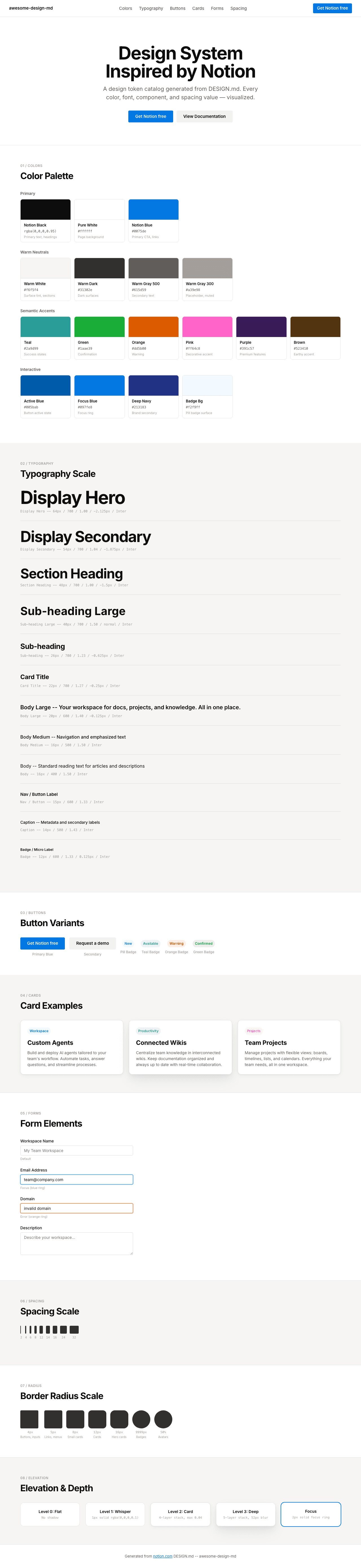
|