oh-my-design-cli 0.1.0
This diff represents the content of publicly available package versions that have been released to one of the supported registries. The information contained in this diff is provided for informational purposes only and reflects changes between package versions as they appear in their respective public registries.
- package/LICENSE +21 -0
- package/README.ja.md +145 -0
- package/README.ko.md +245 -0
- package/README.md +245 -0
- package/README.zh-TW.md +145 -0
- package/data/reference-tags.md +104 -0
- package/data/synonyms.json +79 -0
- package/data/vocabulary.json +516 -0
- package/dist/bin/oh-my-design.js +858 -0
- package/dist/bin/oh-my-design.js.map +1 -0
- package/dist/chunk-6YNSV3VY.js +35 -0
- package/dist/chunk-6YNSV3VY.js.map +1 -0
- package/dist/chunk-MHFYGZSO.js +337 -0
- package/dist/chunk-MHFYGZSO.js.map +1 -0
- package/dist/chunk-N2JG6N4Q.js +264 -0
- package/dist/chunk-N2JG6N4Q.js.map +1 -0
- package/dist/chunk-OOQQEUGX.js +46 -0
- package/dist/chunk-OOQQEUGX.js.map +1 -0
- package/dist/chunk-OR5DHENY.js +250 -0
- package/dist/chunk-OR5DHENY.js.map +1 -0
- package/dist/customizer-CM76752R.js +8 -0
- package/dist/customizer-CM76752R.js.map +1 -0
- package/dist/index.d.ts +559 -0
- package/dist/index.js +3113 -0
- package/dist/index.js.map +1 -0
- package/dist/init-STACB7E5.js +635 -0
- package/dist/init-STACB7E5.js.map +1 -0
- package/dist/install-skills-CM6VXFZJ.js +152 -0
- package/dist/install-skills-CM6VXFZJ.js.map +1 -0
- package/dist/learn-33LHKEJA.js +140 -0
- package/dist/learn-33LHKEJA.js.map +1 -0
- package/dist/reference-YMNAOXJQ.js +47 -0
- package/dist/reference-YMNAOXJQ.js.map +1 -0
- package/dist/reference-parser-TM3CJPNE.js +10 -0
- package/dist/reference-parser-TM3CJPNE.js.map +1 -0
- package/dist/remember-UAFA5B2O.js +78 -0
- package/dist/remember-UAFA5B2O.js.map +1 -0
- package/dist/sync-P7X4S2DK.js +404 -0
- package/dist/sync-P7X4S2DK.js.map +1 -0
- package/dist/templates/templates/design-md.hbs +44 -0
- package/dist/templates/templates/partials/agent-prompt-guide.hbs +28 -0
- package/dist/templates/templates/partials/color-palette.hbs +49 -0
- package/dist/templates/templates/partials/component-stylings.hbs +28 -0
- package/dist/templates/templates/partials/depth-elevation.hbs +31 -0
- package/dist/templates/templates/partials/dos-donts.hbs +13 -0
- package/dist/templates/templates/partials/layout.hbs +30 -0
- package/dist/templates/templates/partials/responsive.hbs +25 -0
- package/dist/templates/templates/partials/shadcn-tokens.hbs +64 -0
- package/dist/templates/templates/partials/typography.hbs +43 -0
- package/dist/templates/templates/partials/visual-theme.hbs +26 -0
- package/package.json +68 -0
- package/references/Claude-Design-Sys-Prompt.txt +421 -0
- package/references/airbnb/DESIGN.md +427 -0
- package/references/airbnb/README.md +23 -0
- package/references/airbnb/preview-dark.html +234 -0
- package/references/airbnb/preview.html +233 -0
- package/references/airtable/DESIGN.md +107 -0
- package/references/airtable/README.md +23 -0
- package/references/airtable/preview-dark.html +165 -0
- package/references/airtable/preview.html +164 -0
- package/references/apple/DESIGN.md +496 -0
- package/references/apple/README.md +24 -0
- package/references/apple/preview-dark.html +420 -0
- package/references/apple/preview.html +414 -0
- package/references/baemin/DESIGN.md +260 -0
- package/references/baemin/README.md +19 -0
- package/references/bmw/DESIGN.md +180 -0
- package/references/bmw/README.md +23 -0
- package/references/bmw/preview-dark.html +211 -0
- package/references/bmw/preview.html +210 -0
- package/references/cal/DESIGN.md +259 -0
- package/references/cal/README.md +23 -0
- package/references/cal/preview-dark.html +449 -0
- package/references/cal/preview.html +575 -0
- package/references/claude/DESIGN.md +455 -0
- package/references/claude/README.md +24 -0
- package/references/claude/preview-dark.html +803 -0
- package/references/claude/preview.html +826 -0
- package/references/clay/DESIGN.md +304 -0
- package/references/clay/README.md +23 -0
- package/references/clay/preview-dark.html +316 -0
- package/references/clay/preview.html +315 -0
- package/references/clickhouse/DESIGN.md +281 -0
- package/references/clickhouse/README.md +24 -0
- package/references/clickhouse/preview-dark.html +834 -0
- package/references/clickhouse/preview.html +786 -0
- package/references/cohere/DESIGN.md +266 -0
- package/references/cohere/README.md +24 -0
- package/references/cohere/preview-dark.html +803 -0
- package/references/cohere/preview.html +807 -0
- package/references/coinbase/DESIGN.md +129 -0
- package/references/coinbase/README.md +23 -0
- package/references/coinbase/preview-dark.html +164 -0
- package/references/coinbase/preview.html +163 -0
- package/references/composio/DESIGN.md +307 -0
- package/references/composio/README.md +24 -0
- package/references/composio/preview-dark.html +958 -0
- package/references/composio/preview.html +933 -0
- package/references/cursor/DESIGN.md +322 -0
- package/references/cursor/README.md +24 -0
- package/references/cursor/preview-dark.html +393 -0
- package/references/cursor/preview.html +383 -0
- package/references/dcard/DESIGN.md +302 -0
- package/references/dcard/README.md +12 -0
- package/references/dcard/_research/forum-1440px.png +0 -0
- package/references/dcard/_research.md +77 -0
- package/references/elevenlabs/DESIGN.md +265 -0
- package/references/elevenlabs/README.md +23 -0
- package/references/elevenlabs/preview-dark.html +252 -0
- package/references/elevenlabs/preview.html +251 -0
- package/references/expo/DESIGN.md +281 -0
- package/references/expo/README.md +24 -0
- package/references/expo/preview-dark.html +533 -0
- package/references/expo/preview.html +533 -0
- package/references/ferrari/DESIGN.md +314 -0
- package/references/ferrari/README.md +23 -0
- package/references/ferrari/preview-dark.html +1162 -0
- package/references/ferrari/preview.html +1122 -0
- package/references/figma/DESIGN.md +399 -0
- package/references/figma/README.md +24 -0
- package/references/figma/preview-dark.html +822 -0
- package/references/figma/preview.html +832 -0
- package/references/framer/DESIGN.md +246 -0
- package/references/framer/README.md +23 -0
- package/references/framer/preview-dark.html +902 -0
- package/references/framer/preview.html +883 -0
- package/references/freee/DESIGN.md +308 -0
- package/references/freee/README.md +12 -0
- package/references/freee/_research/vibes-storybook-1440px.png +0 -0
- package/references/freee/_research.md +77 -0
- package/references/hashicorp/DESIGN.md +278 -0
- package/references/hashicorp/README.md +24 -0
- package/references/hashicorp/preview-dark.html +1202 -0
- package/references/hashicorp/preview.html +1193 -0
- package/references/ibm/DESIGN.md +332 -0
- package/references/ibm/README.md +24 -0
- package/references/ibm/preview-dark.html +443 -0
- package/references/ibm/preview.html +428 -0
- package/references/intercom/DESIGN.md +146 -0
- package/references/intercom/README.md +23 -0
- package/references/intercom/preview-dark.html +185 -0
- package/references/intercom/preview.html +184 -0
- package/references/kakao/DESIGN.md +261 -0
- package/references/kakao/README.md +18 -0
- package/references/karrot/DESIGN.md +252 -0
- package/references/karrot/README.md +18 -0
- package/references/kraken/DESIGN.md +146 -0
- package/references/kraken/README.md +23 -0
- package/references/kraken/preview-dark.html +169 -0
- package/references/kraken/preview.html +168 -0
- package/references/lamborghini/DESIGN.md +288 -0
- package/references/lamborghini/README.md +23 -0
- package/references/lamborghini/preview-dark.html +303 -0
- package/references/lamborghini/preview.html +381 -0
- package/references/line/DESIGN.md +375 -0
- package/references/line/README.md +12 -0
- package/references/line/_research/home-1440px.png +0 -0
- package/references/line/_research.md +65 -0
- package/references/linear.app/DESIGN.md +526 -0
- package/references/linear.app/README.md +24 -0
- package/references/linear.app/preview-dark.html +383 -0
- package/references/linear.app/preview.html +373 -0
- package/references/lovable/DESIGN.md +298 -0
- package/references/lovable/README.md +24 -0
- package/references/lovable/preview-dark.html +349 -0
- package/references/lovable/preview.html +348 -0
- package/references/mercari/DESIGN.md +294 -0
- package/references/mercari/README.md +12 -0
- package/references/mercari/_research/home-1440px.png +0 -0
- package/references/mercari/_research.md +77 -0
- package/references/minimax/DESIGN.md +257 -0
- package/references/minimax/README.md +24 -0
- package/references/minimax/preview-dark.html +1262 -0
- package/references/minimax/preview.html +1248 -0
- package/references/mintlify/DESIGN.md +341 -0
- package/references/mintlify/README.md +24 -0
- package/references/mintlify/preview-dark.html +409 -0
- package/references/mintlify/preview.html +398 -0
- package/references/miro/DESIGN.md +108 -0
- package/references/miro/README.md +23 -0
- package/references/miro/preview-dark.html +174 -0
- package/references/miro/preview.html +173 -0
- package/references/mistral.ai/DESIGN.md +261 -0
- package/references/mistral.ai/README.md +24 -0
- package/references/mistral.ai/preview-dark.html +806 -0
- package/references/mistral.ai/preview.html +805 -0
- package/references/mongodb/DESIGN.md +266 -0
- package/references/mongodb/README.md +23 -0
- package/references/mongodb/preview-dark.html +260 -0
- package/references/mongodb/preview.html +259 -0
- package/references/notion/DESIGN.md +492 -0
- package/references/notion/README.md +24 -0
- package/references/notion/preview-dark.html +372 -0
- package/references/notion/preview.html +364 -0
- package/references/nvidia/DESIGN.md +308 -0
- package/references/nvidia/README.md +24 -0
- package/references/nvidia/preview-dark.html +374 -0
- package/references/nvidia/preview.html +366 -0
- package/references/ollama/DESIGN.md +267 -0
- package/references/ollama/README.md +24 -0
- package/references/ollama/preview-dark.html +678 -0
- package/references/ollama/preview.html +678 -0
- package/references/opencode.ai/DESIGN.md +295 -0
- package/references/opencode.ai/README.md +24 -0
- package/references/opencode.ai/preview-dark.html +366 -0
- package/references/opencode.ai/preview.html +357 -0
- package/references/pinkoi/DESIGN.md +309 -0
- package/references/pinkoi/README.md +12 -0
- package/references/pinkoi/_research/browse-1440px.png +0 -0
- package/references/pinkoi/_research.md +115 -0
- package/references/pinterest/DESIGN.md +230 -0
- package/references/pinterest/README.md +23 -0
- package/references/pinterest/preview-dark.html +233 -0
- package/references/pinterest/preview.html +232 -0
- package/references/posthog/DESIGN.md +256 -0
- package/references/posthog/README.md +23 -0
- package/references/posthog/preview-dark.html +699 -0
- package/references/posthog/preview.html +749 -0
- package/references/raycast/DESIGN.md +268 -0
- package/references/raycast/README.md +23 -0
- package/references/raycast/preview-dark.html +606 -0
- package/references/raycast/preview.html +688 -0
- package/references/renault/DESIGN.md +311 -0
- package/references/renault/README.md +23 -0
- package/references/renault/preview-dark.html +406 -0
- package/references/renault/preview.html +606 -0
- package/references/replicate/DESIGN.md +261 -0
- package/references/replicate/README.md +24 -0
- package/references/replicate/preview-dark.html +828 -0
- package/references/replicate/preview.html +831 -0
- package/references/resend/DESIGN.md +303 -0
- package/references/resend/README.md +23 -0
- package/references/resend/preview-dark.html +355 -0
- package/references/resend/preview.html +354 -0
- package/references/revolut/DESIGN.md +185 -0
- package/references/revolut/README.md +23 -0
- package/references/revolut/preview-dark.html +234 -0
- package/references/revolut/preview.html +233 -0
- package/references/runwayml/DESIGN.md +244 -0
- package/references/runwayml/README.md +24 -0
- package/references/runwayml/preview-dark.html +664 -0
- package/references/runwayml/preview.html +665 -0
- package/references/sanity/DESIGN.md +357 -0
- package/references/sanity/README.md +24 -0
- package/references/sanity/preview-dark.html +990 -0
- package/references/sanity/preview.html +1135 -0
- package/references/sentry/DESIGN.md +262 -0
- package/references/sentry/README.md +24 -0
- package/references/sentry/preview-dark.html +626 -0
- package/references/sentry/preview.html +951 -0
- package/references/spacex/DESIGN.md +205 -0
- package/references/spacex/README.md +23 -0
- package/references/spacex/preview-dark.html +221 -0
- package/references/spacex/preview.html +220 -0
- package/references/spotify/DESIGN.md +246 -0
- package/references/spotify/README.md +23 -0
- package/references/spotify/preview-dark.html +231 -0
- package/references/spotify/preview.html +230 -0
- package/references/stripe/DESIGN.md +473 -0
- package/references/stripe/README.md +24 -0
- package/references/stripe/preview-dark.html +428 -0
- package/references/stripe/preview.html +419 -0
- package/references/supabase/DESIGN.md +255 -0
- package/references/supabase/README.md +24 -0
- package/references/supabase/preview-dark.html +977 -0
- package/references/supabase/preview.html +955 -0
- package/references/superhuman/DESIGN.md +252 -0
- package/references/superhuman/README.md +23 -0
- package/references/superhuman/preview-dark.html +973 -0
- package/references/superhuman/preview.html +951 -0
- package/references/tesla/DESIGN.md +286 -0
- package/references/tesla/README.md +23 -0
- package/references/tesla/preview-dark.html +947 -0
- package/references/tesla/preview.html +925 -0
- package/references/together.ai/DESIGN.md +263 -0
- package/references/together.ai/README.md +24 -0
- package/references/together.ai/preview-dark.html +892 -0
- package/references/together.ai/preview.html +897 -0
- package/references/toss/DESIGN.md +387 -0
- package/references/toss/README.md +19 -0
- package/references/uber/DESIGN.md +295 -0
- package/references/uber/README.md +24 -0
- package/references/uber/preview-dark.html +1120 -0
- package/references/uber/preview.html +1119 -0
- package/references/vercel/DESIGN.md +456 -0
- package/references/vercel/README.md +24 -0
- package/references/vercel/preview-dark.html +368 -0
- package/references/vercel/preview.html +367 -0
- package/references/voltagent/DESIGN.md +323 -0
- package/references/voltagent/README.md +24 -0
- package/references/voltagent/preview-dark.html +487 -0
- package/references/voltagent/preview.html +766 -0
- package/references/warp/DESIGN.md +253 -0
- package/references/warp/README.md +23 -0
- package/references/warp/preview-dark.html +500 -0
- package/references/warp/preview.html +533 -0
- package/references/webflow/DESIGN.md +109 -0
- package/references/webflow/README.md +23 -0
- package/references/webflow/preview-dark.html +147 -0
- package/references/webflow/preview.html +146 -0
- package/references/wise/DESIGN.md +173 -0
- package/references/wise/README.md +23 -0
- package/references/wise/preview-dark.html +230 -0
- package/references/wise/preview.html +229 -0
- package/references/x.ai/DESIGN.md +267 -0
- package/references/x.ai/README.md +24 -0
- package/references/x.ai/preview-dark.html +356 -0
- package/references/x.ai/preview.html +407 -0
- package/references/zapier/DESIGN.md +328 -0
- package/references/zapier/README.md +24 -0
- package/references/zapier/preview-dark.html +380 -0
- package/references/zapier/preview.html +372 -0
- package/skills/omd-apply/SKILL.md +85 -0
- package/skills/omd-init/SKILL.md +167 -0
- package/skills/omd-learn/SKILL.md +81 -0
- package/skills/omd-remember/SKILL.md +44 -0
- package/skills/omd-sync/SKILL.md +38 -0
|
@@ -0,0 +1,473 @@
|
|
|
1
|
+
---
|
|
2
|
+
omd: 0.1
|
|
3
|
+
brand: Stripe
|
|
4
|
+
---
|
|
5
|
+
|
|
6
|
+
# Design System Inspiration of Stripe
|
|
7
|
+
|
|
8
|
+
## 1. Visual Theme & Atmosphere
|
|
9
|
+
|
|
10
|
+
Stripe's website is the gold standard of fintech design -- a system that manages to feel simultaneously technical and luxurious, precise and warm. The page opens on a clean white canvas (`#ffffff`) with deep navy headings (`#061b31`) and a signature purple (`#533afd`) that functions as both brand anchor and interactive accent. This isn't the cold, clinical purple of enterprise software; it's a rich, saturated violet that reads as confident and premium. The overall impression is of a financial institution redesigned by a world-class type foundry.
|
|
11
|
+
|
|
12
|
+
The custom `sohne-var` variable font is the defining element of Stripe's visual identity. Every text element enables the OpenType `"ss01"` stylistic set, which modifies character shapes for a distinctly geometric, modern feel. At display sizes (48px-56px), sohne-var runs at weight 300 -- an extraordinarily light weight for headlines that creates an ethereal, almost whispered authority. This is the opposite of the "bold hero headline" convention; Stripe's headlines feel like they don't need to shout. The negative letter-spacing (-1.4px at 56px, -0.96px at 48px) tightens the text into dense, engineered blocks. At smaller sizes, the system also uses weight 300 with proportionally reduced tracking, and tabular numerals via `"tnum"` for financial data display.
|
|
13
|
+
|
|
14
|
+
What truly distinguishes Stripe is its shadow system. Rather than the flat or single-layer approach of most sites, Stripe uses multi-layer, blue-tinted shadows: the signature `rgba(50,50,93,0.25)` combined with `rgba(0,0,0,0.1)` creates shadows with a cool, almost atmospheric depth -- like elements are floating in a twilight sky. The blue-gray undertone of the primary shadow color (50,50,93) ties directly to the navy-purple brand palette, making even elevation feel on-brand.
|
|
15
|
+
|
|
16
|
+
**Key Characteristics:**
|
|
17
|
+
- sohne-var with OpenType `"ss01"` on all text -- a custom stylistic set that defines the brand's letterforms
|
|
18
|
+
- Weight 300 as the signature headline weight -- light, confident, anti-convention
|
|
19
|
+
- Negative letter-spacing at display sizes (-1.4px at 56px, progressive relaxation downward)
|
|
20
|
+
- Blue-tinted multi-layer shadows using `rgba(50,50,93,0.25)` -- elevation that feels brand-colored
|
|
21
|
+
- Deep navy (`#061b31`) headings instead of black -- warm, premium, financial-grade
|
|
22
|
+
- Conservative border-radius (4px-8px) -- nothing pill-shaped, nothing harsh
|
|
23
|
+
- Ruby (`#ea2261`) and magenta (`#f96bee`) accents for gradient and decorative elements
|
|
24
|
+
- `SourceCodePro` as the monospace companion for code and technical labels
|
|
25
|
+
|
|
26
|
+
## 2. Color Palette & Roles
|
|
27
|
+
|
|
28
|
+
### Primary
|
|
29
|
+
- **Stripe Purple** (`#533afd`): Primary brand color, CTA backgrounds, link text, interactive highlights. A saturated blue-violet that anchors the entire system.
|
|
30
|
+
- **Deep Navy** (`#061b31`): `--hds-color-heading-solid`. Primary heading color. Not black, not gray -- a very dark blue that adds warmth and depth to text.
|
|
31
|
+
- **Pure White** (`#ffffff`): Page background, card surfaces, button text on dark backgrounds.
|
|
32
|
+
|
|
33
|
+
### Brand & Dark
|
|
34
|
+
- **Brand Dark** (`#1c1e54`): `--hds-color-util-brand-900`. Deep indigo for dark sections, footer backgrounds, and immersive brand moments.
|
|
35
|
+
- **Dark Navy** (`#0d253d`): `--hds-color-core-neutral-975`. The darkest neutral -- almost-black with a blue undertone for maximum depth without harshness.
|
|
36
|
+
|
|
37
|
+
### Accent Colors
|
|
38
|
+
- **Ruby** (`#ea2261`): `--hds-color-accentColorMode-ruby-icon-solid`. Warm red-pink for icons, alerts, and accent elements.
|
|
39
|
+
- **Magenta** (`#f96bee`): `--hds-color-accentColorMode-magenta-icon-gradientMiddle`. Vivid pink-purple for gradients and decorative highlights.
|
|
40
|
+
- **Magenta Light** (`#ffd7ef`): `--hds-color-util-accent-magenta-100`. Tinted surface for magenta-themed cards and badges.
|
|
41
|
+
|
|
42
|
+
### Interactive
|
|
43
|
+
- **Primary Purple** (`#533afd`): Primary link color, active states, selected elements.
|
|
44
|
+
- **Purple Hover** (`#4434d4`): Darker purple for hover states on primary elements.
|
|
45
|
+
- **Purple Deep** (`#2e2b8c`): `--hds-color-button-ui-iconHover`. Dark purple for icon hover states.
|
|
46
|
+
- **Purple Light** (`#b9b9f9`): `--hds-color-action-bg-subduedHover`. Soft lavender for subdued hover backgrounds.
|
|
47
|
+
- **Purple Mid** (`#665efd`): `--hds-color-input-selector-text-range`. Range selector and input highlight color.
|
|
48
|
+
|
|
49
|
+
### Neutral Scale
|
|
50
|
+
- **Heading** (`#061b31`): Primary headings, nav text, strong labels.
|
|
51
|
+
- **Label** (`#273951`): `--hds-color-input-text-label`. Form labels, secondary headings.
|
|
52
|
+
- **Body** (`#64748d`): Secondary text, descriptions, captions.
|
|
53
|
+
- **Success Green** (`#15be53`): Status badges, success indicators (with 0.2-0.4 alpha for backgrounds/borders).
|
|
54
|
+
- **Success Text** (`#108c3d`): Success badge text color.
|
|
55
|
+
- **Lemon** (`#9b6829`): `--hds-color-core-lemon-500`. Warning and highlight accent.
|
|
56
|
+
|
|
57
|
+
### Surface & Borders
|
|
58
|
+
- **Border Default** (`#e5edf5`): Standard border color for cards, dividers, and containers.
|
|
59
|
+
- **Border Purple** (`#b9b9f9`): Active/selected state borders on buttons and inputs.
|
|
60
|
+
- **Border Soft Purple** (`#d6d9fc`): Subtle purple-tinted borders for secondary elements.
|
|
61
|
+
- **Border Magenta** (`#ffd7ef`): Pink-tinted borders for magenta-themed elements.
|
|
62
|
+
- **Border Dashed** (`#362baa`): Dashed borders for drop zones and placeholder elements.
|
|
63
|
+
|
|
64
|
+
### Shadow Colors
|
|
65
|
+
- **Shadow Blue** (`rgba(50,50,93,0.25)`): The signature -- blue-tinted primary shadow color.
|
|
66
|
+
- **Shadow Dark Blue** (`rgba(3,3,39,0.25)`): Deeper blue shadow for elevated elements.
|
|
67
|
+
- **Shadow Black** (`rgba(0,0,0,0.1)`): Secondary shadow layer for depth reinforcement.
|
|
68
|
+
- **Shadow Ambient** (`rgba(23,23,23,0.08)`): Soft ambient shadow for subtle elevation.
|
|
69
|
+
- **Shadow Soft** (`rgba(23,23,23,0.06)`): Minimal ambient shadow for light lift.
|
|
70
|
+
|
|
71
|
+
## 3. Typography Rules
|
|
72
|
+
|
|
73
|
+
### Font Family
|
|
74
|
+
- **Primary**: `sohne-var`, with fallback: `SF Pro Display`
|
|
75
|
+
- **Monospace**: `SourceCodePro`, with fallback: `SFMono-Regular`
|
|
76
|
+
- **OpenType Features**: `"ss01"` enabled globally on all sohne-var text; `"tnum"` for tabular numbers on financial data and captions.
|
|
77
|
+
|
|
78
|
+
### Hierarchy
|
|
79
|
+
|
|
80
|
+
| Role | Font | Size | Weight | Line Height | Letter Spacing | Features | Notes |
|
|
81
|
+
|------|------|------|--------|-------------|----------------|----------|-------|
|
|
82
|
+
| Display Hero | sohne-var | 56px (3.50rem) | 300 | 1.03 (tight) | -1.4px | ss01 | Maximum size, whisper-weight authority |
|
|
83
|
+
| Display Large | sohne-var | 48px (3.00rem) | 300 | 1.15 (tight) | -0.96px | ss01 | Secondary hero headlines |
|
|
84
|
+
| Section Heading | sohne-var | 32px (2.00rem) | 300 | 1.10 (tight) | -0.64px | ss01 | Feature section titles |
|
|
85
|
+
| Sub-heading Large | sohne-var | 26px (1.63rem) | 300 | 1.12 (tight) | -0.26px | ss01 | Card headings, sub-sections |
|
|
86
|
+
| Sub-heading | sohne-var | 22px (1.38rem) | 300 | 1.10 (tight) | -0.22px | ss01 | Smaller section heads |
|
|
87
|
+
| Body Large | sohne-var | 18px (1.13rem) | 300 | 1.40 | normal | ss01 | Feature descriptions, intro text |
|
|
88
|
+
| Body | sohne-var | 16px (1.00rem) | 300-400 | 1.40 | normal | ss01 | Standard reading text |
|
|
89
|
+
| Button | sohne-var | 16px (1.00rem) | 400 | 1.00 (tight) | normal | ss01 | Primary button text |
|
|
90
|
+
| Button Small | sohne-var | 14px (0.88rem) | 400 | 1.00 (tight) | normal | ss01 | Secondary/compact buttons |
|
|
91
|
+
| Link | sohne-var | 14px (0.88rem) | 400 | 1.00 (tight) | normal | ss01 | Navigation links |
|
|
92
|
+
| Caption | sohne-var | 13px (0.81rem) | 400 | normal | normal | ss01 | Small labels, metadata |
|
|
93
|
+
| Caption Small | sohne-var | 12px (0.75rem) | 300-400 | 1.33-1.45 | normal | ss01 | Fine print, timestamps |
|
|
94
|
+
| Caption Tabular | sohne-var | 12px (0.75rem) | 300-400 | 1.33 | -0.36px | tnum | Financial data, numbers |
|
|
95
|
+
| Micro | sohne-var | 10px (0.63rem) | 300 | 1.15 (tight) | 0.1px | ss01 | Tiny labels, axis markers |
|
|
96
|
+
| Micro Tabular | sohne-var | 10px (0.63rem) | 300 | 1.15 (tight) | -0.3px | tnum | Chart data, small numbers |
|
|
97
|
+
| Nano | sohne-var | 8px (0.50rem) | 300 | 1.07 (tight) | normal | ss01 | Smallest labels |
|
|
98
|
+
| Code Body | SourceCodePro | 12px (0.75rem) | 500 | 2.00 (relaxed) | normal | -- | Code blocks, syntax |
|
|
99
|
+
| Code Bold | SourceCodePro | 12px (0.75rem) | 700 | 2.00 (relaxed) | normal | -- | Bold code, keywords |
|
|
100
|
+
| Code Label | SourceCodePro | 12px (0.75rem) | 500 | 2.00 (relaxed) | normal | uppercase | Technical labels |
|
|
101
|
+
| Code Micro | SourceCodePro | 9px (0.56rem) | 500 | 1.00 (tight) | normal | ss01 | Tiny code annotations |
|
|
102
|
+
|
|
103
|
+
### Principles
|
|
104
|
+
- **Light weight as signature**: Weight 300 at display sizes is Stripe's most distinctive typographic choice. Where others use 600-700 to command attention, Stripe uses lightness as luxury -- the text is so confident it doesn't need weight to be authoritative.
|
|
105
|
+
- **ss01 everywhere**: The `"ss01"` stylistic set is non-negotiable. It modifies specific glyphs (likely alternate `a`, `g`, `l` forms) to create a more geometric, contemporary feel across all sohne-var text.
|
|
106
|
+
- **Two OpenType modes**: `"ss01"` for display/body text, `"tnum"` for tabular numerals in financial data. These never overlap -- a number in a paragraph uses ss01, a number in a data table uses tnum.
|
|
107
|
+
- **Progressive tracking**: Letter-spacing tightens proportionally with size: -1.4px at 56px, -0.96px at 48px, -0.64px at 32px, -0.26px at 26px, normal at 16px and below.
|
|
108
|
+
- **Two-weight simplicity**: Primarily 300 (body and headings) and 400 (UI/buttons). No bold (700) in the primary font -- SourceCodePro uses 500/700 for code contrast.
|
|
109
|
+
|
|
110
|
+
## 4. Component Stylings
|
|
111
|
+
|
|
112
|
+
### Buttons
|
|
113
|
+
|
|
114
|
+
**Primary Purple**
|
|
115
|
+
- Background: `#533afd`
|
|
116
|
+
- Text: `#ffffff`
|
|
117
|
+
- Padding: 8px 16px
|
|
118
|
+
- Radius: 4px
|
|
119
|
+
- Font: 16px sohne-var weight 400, `"ss01"`
|
|
120
|
+
- Hover: `#4434d4` background
|
|
121
|
+
- Use: Primary CTA ("Start now", "Contact sales")
|
|
122
|
+
|
|
123
|
+
**Ghost / Outlined**
|
|
124
|
+
- Background: transparent
|
|
125
|
+
- Text: `#533afd`
|
|
126
|
+
- Padding: 8px 16px
|
|
127
|
+
- Radius: 4px
|
|
128
|
+
- Border: `1px solid #b9b9f9`
|
|
129
|
+
- Font: 16px sohne-var weight 400, `"ss01"`
|
|
130
|
+
- Hover: background shifts to `rgba(83,58,253,0.05)`
|
|
131
|
+
- Use: Secondary actions
|
|
132
|
+
|
|
133
|
+
**Transparent Info**
|
|
134
|
+
- Background: transparent
|
|
135
|
+
- Text: `#2874ad`
|
|
136
|
+
- Padding: 8px 16px
|
|
137
|
+
- Radius: 4px
|
|
138
|
+
- Border: `1px solid rgba(43,145,223,0.2)`
|
|
139
|
+
- Use: Tertiary/info-level actions
|
|
140
|
+
|
|
141
|
+
**Neutral Ghost**
|
|
142
|
+
- Background: transparent (`rgba(255,255,255,0)`)
|
|
143
|
+
- Text: `rgba(16,16,16,0.3)`
|
|
144
|
+
- Padding: 8px 16px
|
|
145
|
+
- Radius: 4px
|
|
146
|
+
- Outline: `1px solid rgb(212,222,233)`
|
|
147
|
+
- Use: Disabled or muted actions
|
|
148
|
+
|
|
149
|
+
### Cards & Containers
|
|
150
|
+
- Background: `#ffffff`
|
|
151
|
+
- Border: `1px solid #e5edf5` (standard) or `1px solid #061b31` (dark accent)
|
|
152
|
+
- Radius: 4px (tight), 5px (standard), 6px (comfortable), 8px (featured)
|
|
153
|
+
- Shadow (standard): `rgba(50,50,93,0.25) 0px 30px 45px -30px, rgba(0,0,0,0.1) 0px 18px 36px -18px`
|
|
154
|
+
- Shadow (ambient): `rgba(23,23,23,0.08) 0px 15px 35px 0px`
|
|
155
|
+
- Hover: shadow intensifies, often adding the blue-tinted layer
|
|
156
|
+
|
|
157
|
+
### Badges / Tags / Pills
|
|
158
|
+
**Neutral Pill**
|
|
159
|
+
- Background: `#ffffff`
|
|
160
|
+
- Text: `#000000`
|
|
161
|
+
- Padding: 0px 6px
|
|
162
|
+
- Radius: 4px
|
|
163
|
+
- Border: `1px solid #f6f9fc`
|
|
164
|
+
- Font: 11px weight 400
|
|
165
|
+
|
|
166
|
+
**Success Badge**
|
|
167
|
+
- Background: `rgba(21,190,83,0.2)`
|
|
168
|
+
- Text: `#108c3d`
|
|
169
|
+
- Padding: 1px 6px
|
|
170
|
+
- Radius: 4px
|
|
171
|
+
- Border: `1px solid rgba(21,190,83,0.4)`
|
|
172
|
+
- Font: 10px weight 300
|
|
173
|
+
|
|
174
|
+
### Inputs & Forms
|
|
175
|
+
- Border: `1px solid #e5edf5`
|
|
176
|
+
- Radius: 4px
|
|
177
|
+
- Focus: `1px solid #533afd` or purple ring
|
|
178
|
+
- Label: `#273951`, 14px sohne-var
|
|
179
|
+
- Text: `#061b31`
|
|
180
|
+
- Placeholder: `#64748d`
|
|
181
|
+
|
|
182
|
+
### Navigation
|
|
183
|
+
- Clean horizontal nav on white, sticky with blur backdrop
|
|
184
|
+
- Brand logotype left-aligned
|
|
185
|
+
- Links: sohne-var 14px weight 400, `#061b31` text with `"ss01"`
|
|
186
|
+
- Radius: 6px on nav container
|
|
187
|
+
- CTA: purple button right-aligned ("Sign in", "Start now")
|
|
188
|
+
- Mobile: hamburger toggle with 6px radius
|
|
189
|
+
|
|
190
|
+
### Decorative Elements
|
|
191
|
+
**Dashed Borders**
|
|
192
|
+
- `1px dashed #362baa` (purple) for placeholder/drop zones
|
|
193
|
+
- `1px dashed #ffd7ef` (magenta) for magenta-themed decorative borders
|
|
194
|
+
|
|
195
|
+
**Gradient Accents**
|
|
196
|
+
- Ruby-to-magenta gradients (`#ea2261` to `#f96bee`) for hero decorations
|
|
197
|
+
- Brand dark sections use `#1c1e54` backgrounds with white text
|
|
198
|
+
|
|
199
|
+
## 5. Layout Principles
|
|
200
|
+
|
|
201
|
+
### Spacing System
|
|
202
|
+
- Base unit: 8px
|
|
203
|
+
- Scale: 1px, 2px, 4px, 6px, 8px, 10px, 11px, 12px, 14px, 16px, 18px, 20px
|
|
204
|
+
- Notable: The scale is dense at the small end (every 2px from 4-12), reflecting Stripe's precision-oriented UI for financial data
|
|
205
|
+
|
|
206
|
+
### Grid & Container
|
|
207
|
+
- Max content width: approximately 1080px
|
|
208
|
+
- Hero: centered single-column with generous padding, lightweight headlines
|
|
209
|
+
- Feature sections: 2-3 column grids for feature cards
|
|
210
|
+
- Full-width dark sections with `#1c1e54` background for brand immersion
|
|
211
|
+
- Code/dashboard previews as contained cards with blue-tinted shadows
|
|
212
|
+
|
|
213
|
+
### Whitespace Philosophy
|
|
214
|
+
- **Precision spacing**: Unlike the vast emptiness of minimalist systems, Stripe uses measured, purposeful whitespace. Every gap is a deliberate typographic choice.
|
|
215
|
+
- **Dense data, generous chrome**: Financial data displays (tables, charts) are tightly packed, but the UI chrome around them is generously spaced. This creates a sense of controlled density -- like a well-organized spreadsheet in a beautiful frame.
|
|
216
|
+
- **Section rhythm**: White sections alternate with dark brand sections (`#1c1e54`), creating a dramatic light/dark cadence that prevents monotony without introducing arbitrary color.
|
|
217
|
+
|
|
218
|
+
### Border Radius Scale
|
|
219
|
+
- Micro (1px): Fine-grained elements, subtle rounding
|
|
220
|
+
- Standard (4px): Buttons, inputs, badges, cards -- the workhorse
|
|
221
|
+
- Comfortable (5px): Standard card containers
|
|
222
|
+
- Relaxed (6px): Navigation, larger interactive elements
|
|
223
|
+
- Large (8px): Featured cards, hero elements
|
|
224
|
+
- Compound: `0px 0px 6px 6px` for bottom-rounded containers (tab panels, dropdown footers)
|
|
225
|
+
|
|
226
|
+
## 6. Depth & Elevation
|
|
227
|
+
|
|
228
|
+
| Level | Treatment | Use |
|
|
229
|
+
|-------|-----------|-----|
|
|
230
|
+
| Flat (Level 0) | No shadow | Page background, inline text |
|
|
231
|
+
| Ambient (Level 1) | `rgba(23,23,23,0.06) 0px 3px 6px` | Subtle card lift, hover hints |
|
|
232
|
+
| Standard (Level 2) | `rgba(23,23,23,0.08) 0px 15px 35px` | Standard cards, content panels |
|
|
233
|
+
| Elevated (Level 3) | `rgba(50,50,93,0.25) 0px 30px 45px -30px, rgba(0,0,0,0.1) 0px 18px 36px -18px` | Featured cards, dropdowns, popovers |
|
|
234
|
+
| Deep (Level 4) | `rgba(3,3,39,0.25) 0px 14px 21px -14px, rgba(0,0,0,0.1) 0px 8px 17px -8px` | Modals, floating panels |
|
|
235
|
+
| Ring (Accessibility) | `2px solid #533afd` outline | Keyboard focus ring |
|
|
236
|
+
|
|
237
|
+
**Shadow Philosophy**: Stripe's shadow system is built on a principle of chromatic depth. Where most design systems use neutral gray or black shadows, Stripe's primary shadow color (`rgba(50,50,93,0.25)`) is a deep blue-gray that echoes the brand's navy palette. This creates shadows that don't just add depth -- they add brand atmosphere. The multi-layer approach pairs this blue-tinted shadow with a pure black secondary layer (`rgba(0,0,0,0.1)`) at a different offset, creating a parallax-like depth where the branded shadow sits farther from the element and the neutral shadow sits closer. The negative spread values (-30px, -18px) ensure shadows don't extend beyond the element's footprint horizontally, keeping elevation vertical and controlled.
|
|
238
|
+
|
|
239
|
+
### Decorative Depth
|
|
240
|
+
- Dark brand sections (`#1c1e54`) create immersive depth through background color contrast
|
|
241
|
+
- Gradient overlays with ruby-to-magenta transitions for hero decorations
|
|
242
|
+
- Shadow color `rgba(0,55,112,0.08)` (`--hds-color-shadow-sm-top`) for top-edge shadows on sticky elements
|
|
243
|
+
|
|
244
|
+
## 7. Do's and Don'ts
|
|
245
|
+
|
|
246
|
+
### Do
|
|
247
|
+
- Use sohne-var with `"ss01"` on every text element -- the stylistic set IS the brand
|
|
248
|
+
- Use weight 300 for all headlines and body text -- lightness is the signature
|
|
249
|
+
- Apply blue-tinted shadows (`rgba(50,50,93,0.25)`) for all elevated elements
|
|
250
|
+
- Use `#061b31` (deep navy) for headings instead of `#000000` -- the warmth matters
|
|
251
|
+
- Keep border-radius between 4px-8px -- conservative rounding is intentional
|
|
252
|
+
- Use `"tnum"` for any tabular/financial number display
|
|
253
|
+
- Layer shadows: blue-tinted far + neutral close for depth parallax
|
|
254
|
+
- Use `#533afd` purple as the primary interactive/CTA color
|
|
255
|
+
|
|
256
|
+
### Don't
|
|
257
|
+
- Don't use weight 600-700 for sohne-var headlines -- weight 300 is the brand voice
|
|
258
|
+
- Don't use large border-radius (12px+, pill shapes) on cards or buttons -- Stripe is conservative
|
|
259
|
+
- Don't use neutral gray shadows -- always tint with blue (`rgba(50,50,93,...)`)
|
|
260
|
+
- Don't skip `"ss01"` on any sohne-var text -- the alternate glyphs define the personality
|
|
261
|
+
- Don't use pure black (`#000000`) for headings -- always `#061b31` deep navy
|
|
262
|
+
- Don't use warm accent colors (orange, yellow) for interactive elements -- purple is primary
|
|
263
|
+
- Don't apply positive letter-spacing at display sizes -- Stripe tracks tight
|
|
264
|
+
- Don't use the magenta/ruby accents for buttons or links -- they're decorative/gradient only
|
|
265
|
+
|
|
266
|
+
## 8. Responsive Behavior
|
|
267
|
+
|
|
268
|
+
### Breakpoints
|
|
269
|
+
| Name | Width | Key Changes |
|
|
270
|
+
|------|-------|-------------|
|
|
271
|
+
| Mobile | <640px | Single column, reduced heading sizes, stacked cards |
|
|
272
|
+
| Tablet | 640-1024px | 2-column grids, moderate padding |
|
|
273
|
+
| Desktop | 1024-1280px | Full layout, 3-column feature grids |
|
|
274
|
+
| Large Desktop | >1280px | Centered content with generous margins |
|
|
275
|
+
|
|
276
|
+
### Touch Targets
|
|
277
|
+
- Buttons use comfortable padding (8px-16px vertical)
|
|
278
|
+
- Navigation links at 14px with adequate spacing
|
|
279
|
+
- Badges have 6px horizontal padding minimum for tap targets
|
|
280
|
+
- Mobile nav toggle with 6px radius button
|
|
281
|
+
|
|
282
|
+
### Collapsing Strategy
|
|
283
|
+
- Hero: 56px display -> 32px on mobile, weight 300 maintained
|
|
284
|
+
- Navigation: horizontal links + CTAs -> hamburger toggle
|
|
285
|
+
- Feature cards: 3-column -> 2-column -> single column stacked
|
|
286
|
+
- Dark brand sections: maintain full-width treatment, reduce internal padding
|
|
287
|
+
- Financial data tables: horizontal scroll on mobile
|
|
288
|
+
- Section spacing: 64px+ -> 40px on mobile
|
|
289
|
+
- Typography scale compresses: 56px -> 48px -> 32px hero sizes across breakpoints
|
|
290
|
+
|
|
291
|
+
### Image Behavior
|
|
292
|
+
- Dashboard/product screenshots maintain blue-tinted shadow at all sizes
|
|
293
|
+
- Hero gradient decorations simplify on mobile
|
|
294
|
+
- Code blocks maintain `SourceCodePro` treatment, may horizontally scroll
|
|
295
|
+
- Card images maintain consistent 4px-6px border-radius
|
|
296
|
+
|
|
297
|
+
## 9. Agent Prompt Guide
|
|
298
|
+
|
|
299
|
+
### Quick Color Reference
|
|
300
|
+
- Primary CTA: Stripe Purple (`#533afd`)
|
|
301
|
+
- CTA Hover: Purple Dark (`#4434d4`)
|
|
302
|
+
- Background: Pure White (`#ffffff`)
|
|
303
|
+
- Heading text: Deep Navy (`#061b31`)
|
|
304
|
+
- Body text: Slate (`#64748d`)
|
|
305
|
+
- Label text: Dark Slate (`#273951`)
|
|
306
|
+
- Border: Soft Blue (`#e5edf5`)
|
|
307
|
+
- Link: Stripe Purple (`#533afd`)
|
|
308
|
+
- Dark section: Brand Dark (`#1c1e54`)
|
|
309
|
+
- Success: Green (`#15be53`)
|
|
310
|
+
- Accent decorative: Ruby (`#ea2261`), Magenta (`#f96bee`)
|
|
311
|
+
|
|
312
|
+
### Example Component Prompts
|
|
313
|
+
- "Create a hero section on white background. Headline at 48px sohne-var weight 300, line-height 1.15, letter-spacing -0.96px, color #061b31, font-feature-settings 'ss01'. Subtitle at 18px weight 300, line-height 1.40, color #64748d. Purple CTA button (#533afd, 4px radius, 8px 16px padding, white text) and ghost button (transparent, 1px solid #b9b9f9, #533afd text, 4px radius)."
|
|
314
|
+
- "Design a card: white background, 1px solid #e5edf5 border, 6px radius. Shadow: rgba(50,50,93,0.25) 0px 30px 45px -30px, rgba(0,0,0,0.1) 0px 18px 36px -18px. Title at 22px sohne-var weight 300, letter-spacing -0.22px, color #061b31, 'ss01'. Body at 16px weight 300, #64748d."
|
|
315
|
+
- "Build a success badge: rgba(21,190,83,0.2) background, #108c3d text, 4px radius, 1px 6px padding, 10px sohne-var weight 300, border 1px solid rgba(21,190,83,0.4)."
|
|
316
|
+
- "Create navigation: white sticky header with backdrop-filter blur(12px). sohne-var 14px weight 400 for links, #061b31 text, 'ss01'. Purple CTA 'Start now' right-aligned (#533afd bg, white text, 4px radius). Nav container 6px radius."
|
|
317
|
+
- "Design a dark brand section: #1c1e54 background, white text. Headline 32px sohne-var weight 300, letter-spacing -0.64px, 'ss01'. Body 16px weight 300, rgba(255,255,255,0.7). Cards inside use rgba(255,255,255,0.1) border with 6px radius."
|
|
318
|
+
|
|
319
|
+
### Iteration Guide
|
|
320
|
+
1. Always enable `font-feature-settings: "ss01"` on sohne-var text -- this is the brand's typographic DNA
|
|
321
|
+
2. Weight 300 is the default; use 400 only for buttons/links/navigation
|
|
322
|
+
3. Shadow formula: `rgba(50,50,93,0.25) 0px Y1 B1 -S1, rgba(0,0,0,0.1) 0px Y2 B2 -S2` where Y1/B1 are larger (far shadow) and Y2/B2 are smaller (near shadow)
|
|
323
|
+
4. Heading color is `#061b31` (deep navy), body is `#64748d` (slate), labels are `#273951` (dark slate)
|
|
324
|
+
5. Border-radius stays in the 4px-8px range -- never use pill shapes or large rounding
|
|
325
|
+
6. Use `"tnum"` for any numbers in tables, charts, or financial displays
|
|
326
|
+
7. Dark sections use `#1c1e54` -- not black, not gray, but a deep branded indigo
|
|
327
|
+
8. SourceCodePro for code at 12px/500 with 2.00 line-height (very generous for readability)
|
|
328
|
+
|
|
329
|
+
---
|
|
330
|
+
|
|
331
|
+
## 10. Voice & Tone
|
|
332
|
+
|
|
333
|
+
Stripe's voice is that of a careful engineer who happens to have literary sensibilities — precise, understated, quietly confident, and anti-hype. The official tagline *"Growing the GDP of the internet"* captures the register: ambitious in scope, economist-flavored in vocabulary, zero exclamation points. Button labels are austere ("Start now", "Sign in", "Contact sales"), never "Get started FREE 🚀". Developer-facing surfaces (docs, API reference, error messages) and business-facing surfaces (pricing, marketing) share the same voice; only the density changes.
|
|
334
|
+
|
|
335
|
+
| Context | Tone |
|
|
336
|
+
|---|---|
|
|
337
|
+
| Hero headlines | Declarative, measured. Reads like a white-paper summary. Never superlative. |
|
|
338
|
+
| Product descriptions | One verb + concrete capability. "Accept payments online." Never "Transform your business." |
|
|
339
|
+
| CTAs | Austere imperatives. "Start now", "Contact sales", "Read the docs". |
|
|
340
|
+
| API error messages | Structured as developer errors: error type + precise explanation + link to docs. |
|
|
341
|
+
| Docs / API reference | Dense, precise, respects reader as a peer. Examples precede explanations. |
|
|
342
|
+
| Marketing / enterprise | Slightly more formal register, same voice. Never shifts into sales-speak. |
|
|
343
|
+
| Careers / About | Confident but humble. Celebrates rigor, not scale. |
|
|
344
|
+
| Legal / compliance | Formal, reads like a carefully edited regulatory filing. |
|
|
345
|
+
| Changelog / release notes | Chronological, specific, engineer-to-engineer. |
|
|
346
|
+
|
|
347
|
+
**Forbidden phrases.** "Revolutionary", "game-changer", "unleash", "supercharge", "cutting-edge", "disrupt/disruption" as verbs. "Simply...", "Just...". Exclamation marks on routine CTAs. Emoji anywhere on marketing, product, docs, or developer surfaces. Performative hedging ("We're so excited to announce..."). Stacked adjectives on capabilities ("world-class, enterprise-grade, battle-tested payment infrastructure" — pick one, usually none).
|
|
348
|
+
|
|
349
|
+
## 11. Brand Narrative
|
|
350
|
+
|
|
351
|
+
Stripe was founded in 2010 by Patrick and John Collison — two Irish brothers who kept running into the same problem: accepting payments online was far harder than it should be for any developer who wanted to build something on the internet. The founding rejection was of every incumbent payment processor that treated integration as a multi-week enterprise-sales procurement cycle. Stripe's first pitch was, essentially: *"what if it took seven lines of code instead."*
|
|
352
|
+
|
|
353
|
+
That developer-first framing shaped everything that came after: the API as the product, the docs as an interface, *"Growing the GDP of the internet"* as a mission statement that reads like an economist wrote it, and the company's obsession with reliability (99.999% uptime as a stated number, not a marketing claim). **Stripe Press** — the company's publishing imprint with the tagline *"Ideas for progress"* — makes the intellectual posture explicit: this is a company that takes ideas seriously enough to commission and print books about maintenance, scientific freedom, and efficiency.
|
|
354
|
+
|
|
355
|
+
What Stripe refuses: sales-driven UX (no "Request a demo" gating of basic functionality), hype-driven marketing (no "revolutionary" superlatives), and the visual aesthetics of legacy financial services (institutional blue, corporate stock photography). What it embraces: developer-readable prose, mathematically tight typography, blue-tinted chromatic shadows that feel like atmospheric depth rather than decoration, and a restraint that signals "we plan to be here for decades".
|
|
356
|
+
|
|
357
|
+
## 12. Principles
|
|
358
|
+
|
|
359
|
+
1. **Details are the product.** Stripe's own values statement says *"We focus on the details of everything we do."* A design system that gets a letter-spacing wrong on a pricing page is as broken as a payment intent that fails silently. Both cost trust.
|
|
360
|
+
2. **Rigorous thinking, visible in the output.** The company states that *"Successful Stripes are rigorous thinkers who appreciate that things worth doing are rarely simple."* Design artifacts should reveal that rigor — precise tokens, tight typography, documented rationale. Hand-wavy design is not Stripe.
|
|
361
|
+
3. **Kindness and boldness, calibrated.** From Stripe's values: *"We try to embrace kindness while still encouraging Stripes to take measured risks and act boldly."* In design this reads as: warm typography choices (the -0.96px tracking has personality), but no design feature exists just to be clever. Measured boldness, never showboating.
|
|
362
|
+
4. **Ship today, infrastructure for decades.** Another stated value: *"We need to get projects done today, while building infrastructure that the internet will rely upon for decades."* Design decisions should not be trendy. A pill-radius button on a Stripe surface ages badly in four years; the 4px corner does not.
|
|
363
|
+
5. **Lightness signals confidence.** Weight 300 at display sizes is the most un-Silicon-Valley-default choice in the system. Headlines that don't shout signal authority that doesn't need volume.
|
|
364
|
+
6. **Chromatic shadows as brand.** `rgba(50,50,93,0.25)` is not just depth — it is Stripe's navy palette reappearing in the shadow layer. Generic gray shadows would make the UI indistinguishable from any other SaaS.
|
|
365
|
+
7. **No pill buttons.** The 4px radius is a typographic commitment, not a visual preference. Stripe reads as engineering; pills would read as consumer app.
|
|
366
|
+
8. **Developer as first-class user.** Documentation is a design surface. API reference is a design surface. Error messages are a design surface. Marketing does not outrank developer experience; they are peers.
|
|
367
|
+
9. **Numbers are first-class citizens.** `"tnum"` for every financial figure, every table, every chart axis. Numbers are typography with different rules, not body text that happens to be digits.
|
|
368
|
+
|
|
369
|
+
## 13. Personas
|
|
370
|
+
|
|
371
|
+
*Personas below are fictional archetypes informed by publicly observable Stripe user segments (indie developers, startup founders, finance operations at mid-market companies, enterprise engineers), not individual people.*
|
|
372
|
+
|
|
373
|
+
**Tiffany Okonkwo, 31, Lagos.** Solo indie developer launching a course-selling platform. Has integrated Stripe Checkout in an afternoon using the docs as her only guide. Measures her trust in a tool by how well the error messages explain themselves when something goes wrong. Finds Stripe's API errors the friendliest-to-debug of any payment provider she has tried. Would never use a payment processor whose primary CTA was "Book a demo" — it signals they don't trust developers to integrate without a salesperson.
|
|
374
|
+
|
|
375
|
+
**Yuto Sasaki, 36, Tokyo.** Staff engineer at a Series-C SaaS startup, responsible for the billing infrastructure. Reads Stripe's docs the way a classical musician reads a score — for the notation, not just the music. Has opinions about webhook retry semantics. Cares that the `invoice` object contract is stable across API versions because his company's ledger depends on it. Notices immediately when a SaaS product's pricing page uses phrases like "Unleash your growth" and mentally downgrades the company.
|
|
376
|
+
|
|
377
|
+
**Mariana Valdés, 44, Mexico City.** Head of Finance Operations at a regional e-commerce company processing ~$200M annually through Stripe. Does not write code but works daily in the Stripe Dashboard. Values the product's density — she can scan 300 transactions at a glance because the tabular numerals align. Would be annoyed by any "redesign" that added whitespace at the expense of data density. Trusts the Stripe brand in part because Stripe Press publishes books she actually reads on long flights.
|
|
378
|
+
|
|
379
|
+
**Arjun Menon, 27, Bangalore.** Founding engineer at a B2B fintech startup. Builds on Stripe Connect because it is the only realistic way to launch an embedded-payments product in under six months. Reads Stripe's engineering blog for reference implementations. Views the *"Growing the GDP of the internet"* tagline as earnest rather than grandiose — he believes the claim literally and that's why he chose Stripe.
|
|
380
|
+
|
|
381
|
+
## 14. States
|
|
382
|
+
|
|
383
|
+
| State | Treatment |
|
|
384
|
+
|---|---|
|
|
385
|
+
| **Empty (dashboard, no transactions)** | White canvas. Single sentence in Deep Navy (`#061b31`) at 18px sohne-var weight 300: "No transactions yet." One Stripe Purple CTA: "Test a payment". No illustration. Honest about what the empty state means — no activity has happened yet. |
|
|
386
|
+
| **Empty (report, zero rows)** | Slate (`#64748d`) single line at 14px: "Nothing to show for this period." Filter summary visible above so user can adjust scope. Never an illustration, never "No data found". |
|
|
387
|
+
| **Loading (dashboard first paint)** | Skeleton blocks at exact final dimensions in Border Default (`#e5edf5`). 1.2s shimmer. Tabular-number skeletons use narrow bars matching `tnum` width — never wider than the final value. |
|
|
388
|
+
| **Loading (table in-place refresh)** | Subtle Stripe Purple 2px progress bar below the header. Previous content stays visible with previous values. Never block the table during refresh. |
|
|
389
|
+
| **Error (API call failed, dashboard)** | Inline banner below the action. Ruby-adjacent tone (Ruby `#ea2261` border, tinted background). Message = error type + one-line plain-English explanation + "View in logs" link. No generic "Something went wrong". |
|
|
390
|
+
| **Error (form validation)** | Field-level. Ruby border + 13px error text below field. The message describes what specifically is invalid and what would be valid — not just "Required". |
|
|
391
|
+
| **Error (payment declined)** | Dedicated state. Returns the decline code verbatim (`Card declined: insufficient_funds`) plus plain-language guidance for the end customer. Developer and customer both know exactly what happened. |
|
|
392
|
+
| **Success (payment succeeded)** | Brief inline confirmation. Success Green (`#15be53`, 0.2 alpha background) with `#108c3d` text: "Succeeded". Full transaction detail linked immediately below. No toast — the row itself shows the state. |
|
|
393
|
+
| **Success (action saved)** | 3s auto-dismiss toast at top-right. Sentence case, past tense: "Invoice saved." No emoji, no exclamation. |
|
|
394
|
+
| **Skeleton** | Border Default blocks at final dimensions. Blue-tinted shimmer (consistent with shadow system). Amount skeletons always narrower than the longest expected value — a wide skeleton that shrinks is disorienting. |
|
|
395
|
+
| **Disabled** | Opacity reduced on surface and text together. Purple actions become `rgba(83,58,253,0.3)` — faded purple, not switched to gray, to preserve brand read. |
|
|
396
|
+
| **API rate-limited (429)** | Banner surfaces the specific rate-limit category plus concrete retry-after guidance. Documented in the same voice as the docs — no apology, just mechanism. |
|
|
397
|
+
|
|
398
|
+
## 15. Motion & Easing
|
|
399
|
+
|
|
400
|
+
**Durations**:
|
|
401
|
+
|
|
402
|
+
| Token | Value | Use |
|
|
403
|
+
|---|---|---|
|
|
404
|
+
| `motion-instant` | 0ms | State commits, selection ticks, focus rings |
|
|
405
|
+
| `motion-fast` | 120ms | Hover, focus, button press overlays |
|
|
406
|
+
| `motion-standard` | 200ms | Sheet, modal, dropdown, table-row expand |
|
|
407
|
+
| `motion-slow` | 320ms | Page-level transitions, rare hero reveals |
|
|
408
|
+
|
|
409
|
+
**Easings**:
|
|
410
|
+
|
|
411
|
+
| Token | Curve | Use |
|
|
412
|
+
|---|---|---|
|
|
413
|
+
| `ease-enter` | `cubic-bezier(0.2, 0.6, 0.25, 1)` | Arriving — sheets, dropdowns, floating panels |
|
|
414
|
+
| `ease-exit` | `cubic-bezier(0.4, 0.0, 1, 1)` | Dismissals |
|
|
415
|
+
| `ease-standard` | `cubic-bezier(0.25, 0.1, 0.25, 1)` | Two-way transitions |
|
|
416
|
+
|
|
417
|
+
**Explicitly forbidden.** No spring, no overshoot, no bounce. No `cubic-bezier` with a middle control value above `1.0` anywhere. Spring easings read as consumer-app delight; this is payments infrastructure. Infrastructure is steady.
|
|
418
|
+
|
|
419
|
+
**Signature motions.**
|
|
420
|
+
|
|
421
|
+
1. **Dashboard table row reveal.** New rows appearing during live event streams (webhook events, payment events) use `motion-standard / ease-enter` with a 3px fade-in-from-below. Never slide in from the side — the table's temporal order is always top-down and sideways motion would suggest a different meaning.
|
|
422
|
+
2. **Gradient decoration.** On marketing surfaces, the ruby-to-magenta gradient decoration shifts hue at slow 20-second cycles using `linear` easing. This is the one place non-standard timing lives — the gradient is ambient atmosphere, not interactive.
|
|
423
|
+
3. **Dark section transition.** On marketing pages, transitioning into a `#1c1e54` brand-dark section uses `motion-slow` background crossfade. Headlines do not move during the transition; the ambient light level is what changes. Cinematic-once, intentional.
|
|
424
|
+
4. **Reduce motion.** Under `prefers-reduced-motion: reduce`, all `motion-*` tokens collapse to `motion-instant`. The ambient gradient freezes. Table row reveals become instantaneous. The dashboard remains fully functional; there is no delightful motion at the cost of accessibility.
|
|
425
|
+
|
|
426
|
+
<!--
|
|
427
|
+
OmD v0.1 Sources — Philosophy Layer (sections 10–15)
|
|
428
|
+
|
|
429
|
+
Direct verification via WebFetch (2026-04-19):
|
|
430
|
+
- https://stripe.com/jobs — confirms Stripe's publicly stated operating principles
|
|
431
|
+
and values (verbatim):
|
|
432
|
+
"We focus on the details of everything we do, so businesses around the
|
|
433
|
+
world can focus on what's most important to them."
|
|
434
|
+
"Successful Stripes are rigorous thinkers who appreciate that things
|
|
435
|
+
worth doing are rarely simple."
|
|
436
|
+
"We try to embrace kindness while still encouraging Stripes to take
|
|
437
|
+
measured risks and act boldly."
|
|
438
|
+
"We need to get projects done today, while building infrastructure
|
|
439
|
+
that the internet will rely upon for decades."
|
|
440
|
+
Confirms mission phrase "Growing the GDP of the internet" and the Collison
|
|
441
|
+
brothers (John and Patrick) as founders/leadership on the page.
|
|
442
|
+
- https://stripe.com/about — confirms current core positioning "Financial
|
|
443
|
+
infrastructure to grow your revenue" and the published reliability number
|
|
444
|
+
("99.999% historical uptime").
|
|
445
|
+
- https://press.stripe.com/ — confirms Stripe Press tagline "Ideas for progress"
|
|
446
|
+
and stated purpose: "Stripe Press highlights ideas that we think can be
|
|
447
|
+
broadly useful." Catalog confirms the intellectual register of the imprint
|
|
448
|
+
(Tyler Cowen's Stubborn Attachments, Richard Hamming's Art of Doing Science
|
|
449
|
+
and Engineering, Will Larson's An Elegant Puzzle, Nadia Eghbal's
|
|
450
|
+
Working in Public, among others).
|
|
451
|
+
|
|
452
|
+
Base DESIGN.md (sections 1–9) is the source for all token-level claims
|
|
453
|
+
(Stripe Purple #533afd, Deep Navy #061b31, sohne-var with "ss01" stylistic set,
|
|
454
|
+
weight-300 signature, blue-tinted multi-layer shadows, 4–8px radius scale,
|
|
455
|
+
"tnum" for financial data).
|
|
456
|
+
|
|
457
|
+
Not independently verified via WebFetch — widely documented public facts used:
|
|
458
|
+
- Stripe was founded in 2010 by Patrick and John Collison (Irish brothers).
|
|
459
|
+
- Stripe is headquartered in San Francisco and Dublin.
|
|
460
|
+
- The company's original codename was "/dev/payments" before being renamed Stripe.
|
|
461
|
+
- Stripe Press is the company's publishing imprint (launched ~2018).
|
|
462
|
+
|
|
463
|
+
Personas (§13) are fictional archetypes informed by publicly observable Stripe
|
|
464
|
+
user segments (indie developers, startup founders, finance operations at
|
|
465
|
+
mid-market companies, enterprise engineers). Names are illustrative; they do
|
|
466
|
+
not refer to real people.
|
|
467
|
+
|
|
468
|
+
Interpretive claims (e.g., "the 4px radius is a typographic commitment, not
|
|
469
|
+
a visual preference", "developer-first framing as a founding rejection of
|
|
470
|
+
enterprise procurement cycles") are editorial readings connecting Stripe's
|
|
471
|
+
stated values to its design system, not directly sourced Stripe statements.
|
|
472
|
+
-->
|
|
473
|
+
|
|
@@ -0,0 +1,24 @@
|
|
|
1
|
+
# Stripe Inspired Design System
|
|
2
|
+
|
|
3
|
+
[DESIGN.md](https://github.com/VoltAgent/awesome-design-md/blob/main/design-md/stripe/DESIGN.md) extracted from the public [Stripe](https://stripe.com/) website. This is not the official design system. Colors, fonts, and spacing may not be 100% accurate. But it's a good starting point for building something similar.
|
|
4
|
+
|
|
5
|
+
## Files
|
|
6
|
+
|
|
7
|
+
| File | Description |
|
|
8
|
+
|------|-------------|
|
|
9
|
+
| `DESIGN.md` | Complete design system documentation (9 sections) |
|
|
10
|
+
| `preview.html` | Interactive design token catalog (light) |
|
|
11
|
+
| `preview-dark.html` | Interactive design token catalog (dark) |
|
|
12
|
+
|
|
13
|
+
|
|
14
|
+
Use [DESIGN.md](https://github.com/VoltAgent/awesome-design-md/blob/main/design-md/stripe/DESIGN.md) to use as a reference for AI agents (Claude, Cursor, Stitch) to generate UI that looks like the Stripe design language.
|
|
15
|
+
|
|
16
|
+
## Preview
|
|
17
|
+
|
|
18
|
+
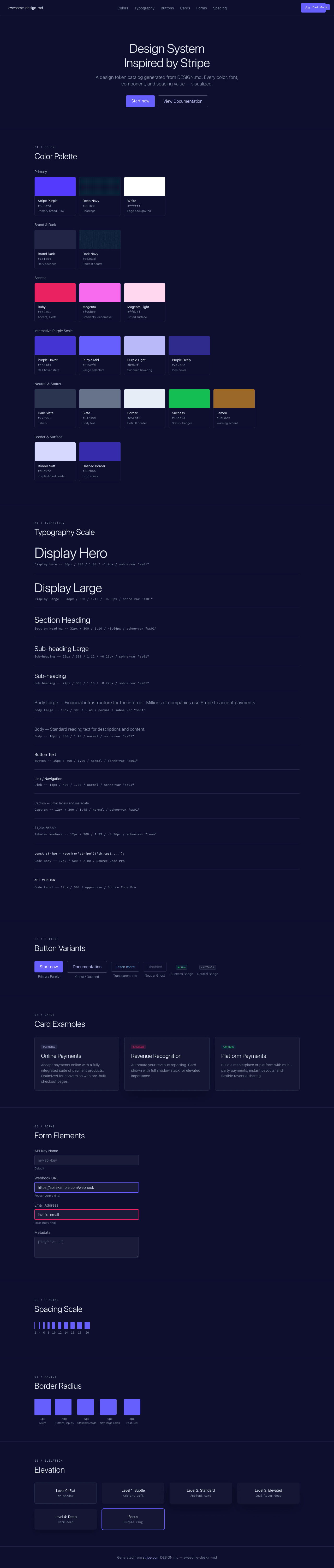
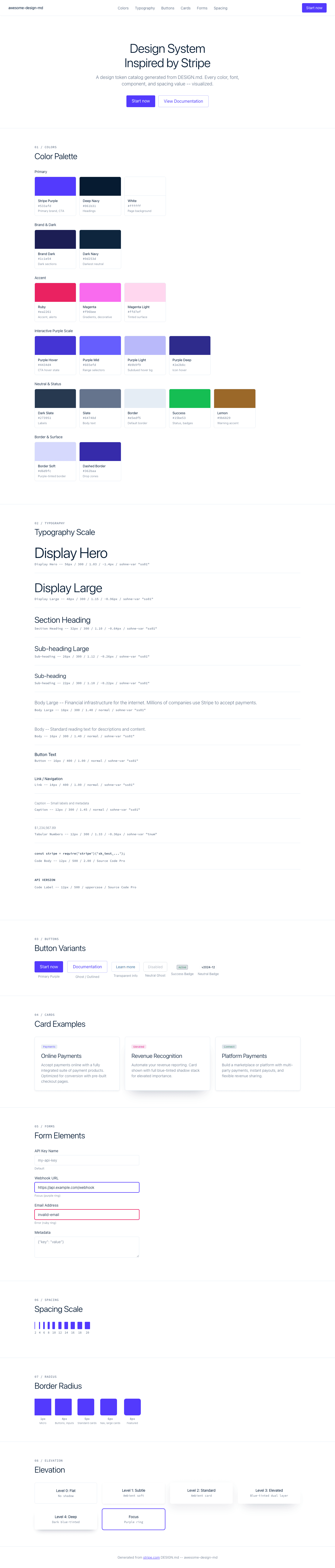
A sample landing page built with DESIGN.md. It shows the actual colors, typography, buttons, cards, spacing, and elevation, all in one page.
|
|
19
|
+
|
|
20
|
+
### Dark Mode
|
|
21
|
+
|
|
22
|
+
|
|
23
|
+
### Light Mode
|
|
24
|
+
|