oh-my-design-cli 0.1.0
This diff represents the content of publicly available package versions that have been released to one of the supported registries. The information contained in this diff is provided for informational purposes only and reflects changes between package versions as they appear in their respective public registries.
- package/LICENSE +21 -0
- package/README.ja.md +145 -0
- package/README.ko.md +245 -0
- package/README.md +245 -0
- package/README.zh-TW.md +145 -0
- package/data/reference-tags.md +104 -0
- package/data/synonyms.json +79 -0
- package/data/vocabulary.json +516 -0
- package/dist/bin/oh-my-design.js +858 -0
- package/dist/bin/oh-my-design.js.map +1 -0
- package/dist/chunk-6YNSV3VY.js +35 -0
- package/dist/chunk-6YNSV3VY.js.map +1 -0
- package/dist/chunk-MHFYGZSO.js +337 -0
- package/dist/chunk-MHFYGZSO.js.map +1 -0
- package/dist/chunk-N2JG6N4Q.js +264 -0
- package/dist/chunk-N2JG6N4Q.js.map +1 -0
- package/dist/chunk-OOQQEUGX.js +46 -0
- package/dist/chunk-OOQQEUGX.js.map +1 -0
- package/dist/chunk-OR5DHENY.js +250 -0
- package/dist/chunk-OR5DHENY.js.map +1 -0
- package/dist/customizer-CM76752R.js +8 -0
- package/dist/customizer-CM76752R.js.map +1 -0
- package/dist/index.d.ts +559 -0
- package/dist/index.js +3113 -0
- package/dist/index.js.map +1 -0
- package/dist/init-STACB7E5.js +635 -0
- package/dist/init-STACB7E5.js.map +1 -0
- package/dist/install-skills-CM6VXFZJ.js +152 -0
- package/dist/install-skills-CM6VXFZJ.js.map +1 -0
- package/dist/learn-33LHKEJA.js +140 -0
- package/dist/learn-33LHKEJA.js.map +1 -0
- package/dist/reference-YMNAOXJQ.js +47 -0
- package/dist/reference-YMNAOXJQ.js.map +1 -0
- package/dist/reference-parser-TM3CJPNE.js +10 -0
- package/dist/reference-parser-TM3CJPNE.js.map +1 -0
- package/dist/remember-UAFA5B2O.js +78 -0
- package/dist/remember-UAFA5B2O.js.map +1 -0
- package/dist/sync-P7X4S2DK.js +404 -0
- package/dist/sync-P7X4S2DK.js.map +1 -0
- package/dist/templates/templates/design-md.hbs +44 -0
- package/dist/templates/templates/partials/agent-prompt-guide.hbs +28 -0
- package/dist/templates/templates/partials/color-palette.hbs +49 -0
- package/dist/templates/templates/partials/component-stylings.hbs +28 -0
- package/dist/templates/templates/partials/depth-elevation.hbs +31 -0
- package/dist/templates/templates/partials/dos-donts.hbs +13 -0
- package/dist/templates/templates/partials/layout.hbs +30 -0
- package/dist/templates/templates/partials/responsive.hbs +25 -0
- package/dist/templates/templates/partials/shadcn-tokens.hbs +64 -0
- package/dist/templates/templates/partials/typography.hbs +43 -0
- package/dist/templates/templates/partials/visual-theme.hbs +26 -0
- package/package.json +68 -0
- package/references/Claude-Design-Sys-Prompt.txt +421 -0
- package/references/airbnb/DESIGN.md +427 -0
- package/references/airbnb/README.md +23 -0
- package/references/airbnb/preview-dark.html +234 -0
- package/references/airbnb/preview.html +233 -0
- package/references/airtable/DESIGN.md +107 -0
- package/references/airtable/README.md +23 -0
- package/references/airtable/preview-dark.html +165 -0
- package/references/airtable/preview.html +164 -0
- package/references/apple/DESIGN.md +496 -0
- package/references/apple/README.md +24 -0
- package/references/apple/preview-dark.html +420 -0
- package/references/apple/preview.html +414 -0
- package/references/baemin/DESIGN.md +260 -0
- package/references/baemin/README.md +19 -0
- package/references/bmw/DESIGN.md +180 -0
- package/references/bmw/README.md +23 -0
- package/references/bmw/preview-dark.html +211 -0
- package/references/bmw/preview.html +210 -0
- package/references/cal/DESIGN.md +259 -0
- package/references/cal/README.md +23 -0
- package/references/cal/preview-dark.html +449 -0
- package/references/cal/preview.html +575 -0
- package/references/claude/DESIGN.md +455 -0
- package/references/claude/README.md +24 -0
- package/references/claude/preview-dark.html +803 -0
- package/references/claude/preview.html +826 -0
- package/references/clay/DESIGN.md +304 -0
- package/references/clay/README.md +23 -0
- package/references/clay/preview-dark.html +316 -0
- package/references/clay/preview.html +315 -0
- package/references/clickhouse/DESIGN.md +281 -0
- package/references/clickhouse/README.md +24 -0
- package/references/clickhouse/preview-dark.html +834 -0
- package/references/clickhouse/preview.html +786 -0
- package/references/cohere/DESIGN.md +266 -0
- package/references/cohere/README.md +24 -0
- package/references/cohere/preview-dark.html +803 -0
- package/references/cohere/preview.html +807 -0
- package/references/coinbase/DESIGN.md +129 -0
- package/references/coinbase/README.md +23 -0
- package/references/coinbase/preview-dark.html +164 -0
- package/references/coinbase/preview.html +163 -0
- package/references/composio/DESIGN.md +307 -0
- package/references/composio/README.md +24 -0
- package/references/composio/preview-dark.html +958 -0
- package/references/composio/preview.html +933 -0
- package/references/cursor/DESIGN.md +322 -0
- package/references/cursor/README.md +24 -0
- package/references/cursor/preview-dark.html +393 -0
- package/references/cursor/preview.html +383 -0
- package/references/dcard/DESIGN.md +302 -0
- package/references/dcard/README.md +12 -0
- package/references/dcard/_research/forum-1440px.png +0 -0
- package/references/dcard/_research.md +77 -0
- package/references/elevenlabs/DESIGN.md +265 -0
- package/references/elevenlabs/README.md +23 -0
- package/references/elevenlabs/preview-dark.html +252 -0
- package/references/elevenlabs/preview.html +251 -0
- package/references/expo/DESIGN.md +281 -0
- package/references/expo/README.md +24 -0
- package/references/expo/preview-dark.html +533 -0
- package/references/expo/preview.html +533 -0
- package/references/ferrari/DESIGN.md +314 -0
- package/references/ferrari/README.md +23 -0
- package/references/ferrari/preview-dark.html +1162 -0
- package/references/ferrari/preview.html +1122 -0
- package/references/figma/DESIGN.md +399 -0
- package/references/figma/README.md +24 -0
- package/references/figma/preview-dark.html +822 -0
- package/references/figma/preview.html +832 -0
- package/references/framer/DESIGN.md +246 -0
- package/references/framer/README.md +23 -0
- package/references/framer/preview-dark.html +902 -0
- package/references/framer/preview.html +883 -0
- package/references/freee/DESIGN.md +308 -0
- package/references/freee/README.md +12 -0
- package/references/freee/_research/vibes-storybook-1440px.png +0 -0
- package/references/freee/_research.md +77 -0
- package/references/hashicorp/DESIGN.md +278 -0
- package/references/hashicorp/README.md +24 -0
- package/references/hashicorp/preview-dark.html +1202 -0
- package/references/hashicorp/preview.html +1193 -0
- package/references/ibm/DESIGN.md +332 -0
- package/references/ibm/README.md +24 -0
- package/references/ibm/preview-dark.html +443 -0
- package/references/ibm/preview.html +428 -0
- package/references/intercom/DESIGN.md +146 -0
- package/references/intercom/README.md +23 -0
- package/references/intercom/preview-dark.html +185 -0
- package/references/intercom/preview.html +184 -0
- package/references/kakao/DESIGN.md +261 -0
- package/references/kakao/README.md +18 -0
- package/references/karrot/DESIGN.md +252 -0
- package/references/karrot/README.md +18 -0
- package/references/kraken/DESIGN.md +146 -0
- package/references/kraken/README.md +23 -0
- package/references/kraken/preview-dark.html +169 -0
- package/references/kraken/preview.html +168 -0
- package/references/lamborghini/DESIGN.md +288 -0
- package/references/lamborghini/README.md +23 -0
- package/references/lamborghini/preview-dark.html +303 -0
- package/references/lamborghini/preview.html +381 -0
- package/references/line/DESIGN.md +375 -0
- package/references/line/README.md +12 -0
- package/references/line/_research/home-1440px.png +0 -0
- package/references/line/_research.md +65 -0
- package/references/linear.app/DESIGN.md +526 -0
- package/references/linear.app/README.md +24 -0
- package/references/linear.app/preview-dark.html +383 -0
- package/references/linear.app/preview.html +373 -0
- package/references/lovable/DESIGN.md +298 -0
- package/references/lovable/README.md +24 -0
- package/references/lovable/preview-dark.html +349 -0
- package/references/lovable/preview.html +348 -0
- package/references/mercari/DESIGN.md +294 -0
- package/references/mercari/README.md +12 -0
- package/references/mercari/_research/home-1440px.png +0 -0
- package/references/mercari/_research.md +77 -0
- package/references/minimax/DESIGN.md +257 -0
- package/references/minimax/README.md +24 -0
- package/references/minimax/preview-dark.html +1262 -0
- package/references/minimax/preview.html +1248 -0
- package/references/mintlify/DESIGN.md +341 -0
- package/references/mintlify/README.md +24 -0
- package/references/mintlify/preview-dark.html +409 -0
- package/references/mintlify/preview.html +398 -0
- package/references/miro/DESIGN.md +108 -0
- package/references/miro/README.md +23 -0
- package/references/miro/preview-dark.html +174 -0
- package/references/miro/preview.html +173 -0
- package/references/mistral.ai/DESIGN.md +261 -0
- package/references/mistral.ai/README.md +24 -0
- package/references/mistral.ai/preview-dark.html +806 -0
- package/references/mistral.ai/preview.html +805 -0
- package/references/mongodb/DESIGN.md +266 -0
- package/references/mongodb/README.md +23 -0
- package/references/mongodb/preview-dark.html +260 -0
- package/references/mongodb/preview.html +259 -0
- package/references/notion/DESIGN.md +492 -0
- package/references/notion/README.md +24 -0
- package/references/notion/preview-dark.html +372 -0
- package/references/notion/preview.html +364 -0
- package/references/nvidia/DESIGN.md +308 -0
- package/references/nvidia/README.md +24 -0
- package/references/nvidia/preview-dark.html +374 -0
- package/references/nvidia/preview.html +366 -0
- package/references/ollama/DESIGN.md +267 -0
- package/references/ollama/README.md +24 -0
- package/references/ollama/preview-dark.html +678 -0
- package/references/ollama/preview.html +678 -0
- package/references/opencode.ai/DESIGN.md +295 -0
- package/references/opencode.ai/README.md +24 -0
- package/references/opencode.ai/preview-dark.html +366 -0
- package/references/opencode.ai/preview.html +357 -0
- package/references/pinkoi/DESIGN.md +309 -0
- package/references/pinkoi/README.md +12 -0
- package/references/pinkoi/_research/browse-1440px.png +0 -0
- package/references/pinkoi/_research.md +115 -0
- package/references/pinterest/DESIGN.md +230 -0
- package/references/pinterest/README.md +23 -0
- package/references/pinterest/preview-dark.html +233 -0
- package/references/pinterest/preview.html +232 -0
- package/references/posthog/DESIGN.md +256 -0
- package/references/posthog/README.md +23 -0
- package/references/posthog/preview-dark.html +699 -0
- package/references/posthog/preview.html +749 -0
- package/references/raycast/DESIGN.md +268 -0
- package/references/raycast/README.md +23 -0
- package/references/raycast/preview-dark.html +606 -0
- package/references/raycast/preview.html +688 -0
- package/references/renault/DESIGN.md +311 -0
- package/references/renault/README.md +23 -0
- package/references/renault/preview-dark.html +406 -0
- package/references/renault/preview.html +606 -0
- package/references/replicate/DESIGN.md +261 -0
- package/references/replicate/README.md +24 -0
- package/references/replicate/preview-dark.html +828 -0
- package/references/replicate/preview.html +831 -0
- package/references/resend/DESIGN.md +303 -0
- package/references/resend/README.md +23 -0
- package/references/resend/preview-dark.html +355 -0
- package/references/resend/preview.html +354 -0
- package/references/revolut/DESIGN.md +185 -0
- package/references/revolut/README.md +23 -0
- package/references/revolut/preview-dark.html +234 -0
- package/references/revolut/preview.html +233 -0
- package/references/runwayml/DESIGN.md +244 -0
- package/references/runwayml/README.md +24 -0
- package/references/runwayml/preview-dark.html +664 -0
- package/references/runwayml/preview.html +665 -0
- package/references/sanity/DESIGN.md +357 -0
- package/references/sanity/README.md +24 -0
- package/references/sanity/preview-dark.html +990 -0
- package/references/sanity/preview.html +1135 -0
- package/references/sentry/DESIGN.md +262 -0
- package/references/sentry/README.md +24 -0
- package/references/sentry/preview-dark.html +626 -0
- package/references/sentry/preview.html +951 -0
- package/references/spacex/DESIGN.md +205 -0
- package/references/spacex/README.md +23 -0
- package/references/spacex/preview-dark.html +221 -0
- package/references/spacex/preview.html +220 -0
- package/references/spotify/DESIGN.md +246 -0
- package/references/spotify/README.md +23 -0
- package/references/spotify/preview-dark.html +231 -0
- package/references/spotify/preview.html +230 -0
- package/references/stripe/DESIGN.md +473 -0
- package/references/stripe/README.md +24 -0
- package/references/stripe/preview-dark.html +428 -0
- package/references/stripe/preview.html +419 -0
- package/references/supabase/DESIGN.md +255 -0
- package/references/supabase/README.md +24 -0
- package/references/supabase/preview-dark.html +977 -0
- package/references/supabase/preview.html +955 -0
- package/references/superhuman/DESIGN.md +252 -0
- package/references/superhuman/README.md +23 -0
- package/references/superhuman/preview-dark.html +973 -0
- package/references/superhuman/preview.html +951 -0
- package/references/tesla/DESIGN.md +286 -0
- package/references/tesla/README.md +23 -0
- package/references/tesla/preview-dark.html +947 -0
- package/references/tesla/preview.html +925 -0
- package/references/together.ai/DESIGN.md +263 -0
- package/references/together.ai/README.md +24 -0
- package/references/together.ai/preview-dark.html +892 -0
- package/references/together.ai/preview.html +897 -0
- package/references/toss/DESIGN.md +387 -0
- package/references/toss/README.md +19 -0
- package/references/uber/DESIGN.md +295 -0
- package/references/uber/README.md +24 -0
- package/references/uber/preview-dark.html +1120 -0
- package/references/uber/preview.html +1119 -0
- package/references/vercel/DESIGN.md +456 -0
- package/references/vercel/README.md +24 -0
- package/references/vercel/preview-dark.html +368 -0
- package/references/vercel/preview.html +367 -0
- package/references/voltagent/DESIGN.md +323 -0
- package/references/voltagent/README.md +24 -0
- package/references/voltagent/preview-dark.html +487 -0
- package/references/voltagent/preview.html +766 -0
- package/references/warp/DESIGN.md +253 -0
- package/references/warp/README.md +23 -0
- package/references/warp/preview-dark.html +500 -0
- package/references/warp/preview.html +533 -0
- package/references/webflow/DESIGN.md +109 -0
- package/references/webflow/README.md +23 -0
- package/references/webflow/preview-dark.html +147 -0
- package/references/webflow/preview.html +146 -0
- package/references/wise/DESIGN.md +173 -0
- package/references/wise/README.md +23 -0
- package/references/wise/preview-dark.html +230 -0
- package/references/wise/preview.html +229 -0
- package/references/x.ai/DESIGN.md +267 -0
- package/references/x.ai/README.md +24 -0
- package/references/x.ai/preview-dark.html +356 -0
- package/references/x.ai/preview.html +407 -0
- package/references/zapier/DESIGN.md +328 -0
- package/references/zapier/README.md +24 -0
- package/references/zapier/preview-dark.html +380 -0
- package/references/zapier/preview.html +372 -0
- package/skills/omd-apply/SKILL.md +85 -0
- package/skills/omd-init/SKILL.md +167 -0
- package/skills/omd-learn/SKILL.md +81 -0
- package/skills/omd-remember/SKILL.md +44 -0
- package/skills/omd-sync/SKILL.md +38 -0
|
@@ -0,0 +1,526 @@
|
|
|
1
|
+
---
|
|
2
|
+
omd: 0.1
|
|
3
|
+
brand: Linear
|
|
4
|
+
---
|
|
5
|
+
|
|
6
|
+
# Design System Inspiration of Linear
|
|
7
|
+
|
|
8
|
+
## 1. Visual Theme & Atmosphere
|
|
9
|
+
|
|
10
|
+
Linear's website is a masterclass in dark-mode-first product design — a near-black canvas (`#08090a`) where content emerges from darkness like starlight. The overall impression is one of extreme precision engineering: every element exists in a carefully calibrated hierarchy of luminance, from barely-visible borders (`rgba(255,255,255,0.05)`) to soft, luminous text (`#f7f8f8`). This is not a dark theme applied to a light design — it is darkness as the native medium, where information density is managed through subtle gradations of white opacity rather than color variation.
|
|
11
|
+
|
|
12
|
+
The typography system is built entirely on Inter Variable with OpenType features `"cv01"` and `"ss03"` enabled globally, giving the typeface a cleaner, more geometric character. Inter is used at a remarkable range of weights — from 300 (light body) through 510 (medium, Linear's signature weight) to 590 (semibold emphasis). The 510 weight is particularly distinctive: it sits between regular and medium, creating a subtle emphasis that doesn't shout. At display sizes (72px, 64px, 48px), Inter uses aggressive negative letter-spacing (-1.584px to -1.056px), creating compressed, authoritative headlines that feel engineered rather than designed. Berkeley Mono serves as the monospace companion for code and technical labels, with fallbacks to ui-monospace, SF Mono, and Menlo.
|
|
13
|
+
|
|
14
|
+
The color system is almost entirely achromatic — dark backgrounds with white/gray text — punctuated by a single brand accent: Linear's signature indigo-violet (`#5e6ad2` for backgrounds, `#7170ff` for interactive accents). This accent color is used sparingly and intentionally, appearing only on CTAs, active states, and brand elements. The border system uses ultra-thin, semi-transparent white borders (`rgba(255,255,255,0.05)` to `rgba(255,255,255,0.08)`) that create structure without visual noise, like wireframes drawn in moonlight.
|
|
15
|
+
|
|
16
|
+
**Key Characteristics:**
|
|
17
|
+
- Dark-mode-native: `#08090a` marketing background, `#0f1011` panel background, `#191a1b` elevated surfaces
|
|
18
|
+
- Inter Variable with `"cv01", "ss03"` globally — geometric alternates for a cleaner aesthetic
|
|
19
|
+
- Signature weight 510 (between regular and medium) for most UI text
|
|
20
|
+
- Aggressive negative letter-spacing at display sizes (-1.584px at 72px, -1.056px at 48px)
|
|
21
|
+
- Brand indigo-violet: `#5e6ad2` (bg) / `#7170ff` (accent) / `#828fff` (hover) — the only chromatic color in the system
|
|
22
|
+
- Semi-transparent white borders throughout: `rgba(255,255,255,0.05)` to `rgba(255,255,255,0.08)`
|
|
23
|
+
- Button backgrounds at near-zero opacity: `rgba(255,255,255,0.02)` to `rgba(255,255,255,0.05)`
|
|
24
|
+
- Multi-layered shadows with inset variants for depth on dark surfaces
|
|
25
|
+
- Radix UI primitives as the component foundation (6 detected primitives)
|
|
26
|
+
- Success green (`#27a644`, `#10b981`) used only for status indicators
|
|
27
|
+
|
|
28
|
+
## 2. Color Palette & Roles
|
|
29
|
+
|
|
30
|
+
### Background Surfaces
|
|
31
|
+
- **Marketing Black** (`#010102` / `#08090a`): The deepest background — the canvas for hero sections and marketing pages. Near-pure black with an imperceptible blue-cool undertone.
|
|
32
|
+
- **Panel Dark** (`#0f1011`): Sidebar and panel backgrounds. One step up from the marketing black.
|
|
33
|
+
- **Level 3 Surface** (`#191a1b`): Elevated surface areas, card backgrounds, dropdowns.
|
|
34
|
+
- **Secondary Surface** (`#28282c`): The lightest dark surface — used for hover states and slightly elevated components.
|
|
35
|
+
|
|
36
|
+
### Text & Content
|
|
37
|
+
- **Primary Text** (`#f7f8f8`): Near-white with a barely-warm cast. The default text color — not pure white, preventing eye strain on dark backgrounds.
|
|
38
|
+
- **Secondary Text** (`#d0d6e0`): Cool silver-gray for body text, descriptions, and secondary content.
|
|
39
|
+
- **Tertiary Text** (`#8a8f98`): Muted gray for placeholders, metadata, and de-emphasized content.
|
|
40
|
+
- **Quaternary Text** (`#62666d`): The most subdued text — timestamps, disabled states, subtle labels.
|
|
41
|
+
|
|
42
|
+
### Brand & Accent
|
|
43
|
+
- **Brand Indigo** (`#5e6ad2`): Primary brand color — used for CTA button backgrounds, brand marks, and key interactive surfaces.
|
|
44
|
+
- **Accent Violet** (`#7170ff`): Brighter variant for interactive elements — links, active states, selected items.
|
|
45
|
+
- **Accent Hover** (`#828fff`): Lighter, more saturated variant for hover states on accent elements.
|
|
46
|
+
- **Security Lavender** (`#7a7fad`): Muted indigo used specifically for security-related UI elements.
|
|
47
|
+
|
|
48
|
+
### Status Colors
|
|
49
|
+
- **Green** (`#27a644`): Primary success/active status. Used for "in progress" indicators.
|
|
50
|
+
- **Emerald** (`#10b981`): Secondary success — pill badges, completion states.
|
|
51
|
+
|
|
52
|
+
### Border & Divider
|
|
53
|
+
- **Border Primary** (`#23252a`): Solid dark border for prominent separations.
|
|
54
|
+
- **Border Secondary** (`#34343a`): Slightly lighter solid border.
|
|
55
|
+
- **Border Tertiary** (`#3e3e44`): Lightest solid border variant.
|
|
56
|
+
- **Border Subtle** (`rgba(255,255,255,0.05)`): Ultra-subtle semi-transparent border — the default.
|
|
57
|
+
- **Border Standard** (`rgba(255,255,255,0.08)`): Standard semi-transparent border for cards, inputs, code blocks.
|
|
58
|
+
- **Line Tint** (`#141516`): Nearly invisible line for the subtlest divisions.
|
|
59
|
+
- **Line Tertiary** (`#18191a`): Slightly more visible divider line.
|
|
60
|
+
|
|
61
|
+
### Light Mode Neutrals (for light theme contexts)
|
|
62
|
+
- **Light Background** (`#f7f8f8`): Page background in light mode.
|
|
63
|
+
- **Light Surface** (`#f3f4f5` / `#f5f6f7`): Subtle surface tinting.
|
|
64
|
+
- **Light Border** (`#d0d6e0`): Visible border in light contexts.
|
|
65
|
+
- **Light Border Alt** (`#e6e6e6`): Alternative lighter border.
|
|
66
|
+
- **Pure White** (`#ffffff`): Card surfaces, highlights.
|
|
67
|
+
|
|
68
|
+
### Overlay
|
|
69
|
+
- **Overlay Primary** (`rgba(0,0,0,0.85)`): Modal/dialog backdrop — extremely dark for focus isolation.
|
|
70
|
+
|
|
71
|
+
## 3. Typography Rules
|
|
72
|
+
|
|
73
|
+
### Font Family
|
|
74
|
+
- **Primary**: `Inter Variable`, with fallbacks: `SF Pro Display, -apple-system, system-ui, Segoe UI, Roboto, Oxygen, Ubuntu, Cantarell, Open Sans, Helvetica Neue`
|
|
75
|
+
- **Monospace**: `Berkeley Mono`, with fallbacks: `ui-monospace, SF Mono, Menlo`
|
|
76
|
+
- **OpenType Features**: `"cv01", "ss03"` enabled globally — cv01 provides an alternate lowercase 'a' (single-story), ss03 adjusts specific letterforms for a cleaner geometric appearance.
|
|
77
|
+
|
|
78
|
+
### Hierarchy
|
|
79
|
+
|
|
80
|
+
| Role | Font | Size | Weight | Line Height | Letter Spacing | Notes |
|
|
81
|
+
|------|------|------|--------|-------------|----------------|-------|
|
|
82
|
+
| Display XL | Inter Variable | 72px (4.50rem) | 510 | 1.00 (tight) | -1.584px | Hero headlines, maximum impact |
|
|
83
|
+
| Display Large | Inter Variable | 64px (4.00rem) | 510 | 1.00 (tight) | -1.408px | Secondary hero text |
|
|
84
|
+
| Display | Inter Variable | 48px (3.00rem) | 510 | 1.00 (tight) | -1.056px | Section headlines |
|
|
85
|
+
| Heading 1 | Inter Variable | 32px (2.00rem) | 400 | 1.13 (tight) | -0.704px | Major section titles |
|
|
86
|
+
| Heading 2 | Inter Variable | 24px (1.50rem) | 400 | 1.33 | -0.288px | Sub-section headings |
|
|
87
|
+
| Heading 3 | Inter Variable | 20px (1.25rem) | 590 | 1.33 | -0.24px | Feature titles, card headers |
|
|
88
|
+
| Body Large | Inter Variable | 18px (1.13rem) | 400 | 1.60 (relaxed) | -0.165px | Introduction text, feature descriptions |
|
|
89
|
+
| Body Emphasis | Inter Variable | 17px (1.06rem) | 590 | 1.60 (relaxed) | normal | Emphasized body, sub-headings in content |
|
|
90
|
+
| Body | Inter Variable | 16px (1.00rem) | 400 | 1.50 | normal | Standard reading text |
|
|
91
|
+
| Body Medium | Inter Variable | 16px (1.00rem) | 510 | 1.50 | normal | Navigation, labels |
|
|
92
|
+
| Body Semibold | Inter Variable | 16px (1.00rem) | 590 | 1.50 | normal | Strong emphasis |
|
|
93
|
+
| Small | Inter Variable | 15px (0.94rem) | 400 | 1.60 (relaxed) | -0.165px | Secondary body text |
|
|
94
|
+
| Small Medium | Inter Variable | 15px (0.94rem) | 510 | 1.60 (relaxed) | -0.165px | Emphasized small text |
|
|
95
|
+
| Small Semibold | Inter Variable | 15px (0.94rem) | 590 | 1.60 (relaxed) | -0.165px | Strong small text |
|
|
96
|
+
| Small Light | Inter Variable | 15px (0.94rem) | 300 | 1.47 | -0.165px | De-emphasized body |
|
|
97
|
+
| Caption Large | Inter Variable | 14px (0.88rem) | 510–590 | 1.50 | -0.182px | Sub-labels, category headers |
|
|
98
|
+
| Caption | Inter Variable | 13px (0.81rem) | 400–510 | 1.50 | -0.13px | Metadata, timestamps |
|
|
99
|
+
| Label | Inter Variable | 12px (0.75rem) | 400–590 | 1.40 | normal | Button text, small labels |
|
|
100
|
+
| Micro | Inter Variable | 11px (0.69rem) | 510 | 1.40 | normal | Tiny labels |
|
|
101
|
+
| Tiny | Inter Variable | 10px (0.63rem) | 400–510 | 1.50 | -0.15px | Overline text, sometimes uppercase |
|
|
102
|
+
| Link Large | Inter Variable | 16px (1.00rem) | 400 | 1.50 | normal | Standard links |
|
|
103
|
+
| Link Medium | Inter Variable | 15px (0.94rem) | 510 | 2.67 | normal | Spaced navigation links |
|
|
104
|
+
| Link Small | Inter Variable | 14px (0.88rem) | 510 | 1.50 | normal | Compact links |
|
|
105
|
+
| Link Caption | Inter Variable | 13px (0.81rem) | 400–510 | 1.50 | -0.13px | Footer, metadata links |
|
|
106
|
+
| Mono Body | Berkeley Mono | 14px (0.88rem) | 400 | 1.50 | normal | Code blocks |
|
|
107
|
+
| Mono Caption | Berkeley Mono | 13px (0.81rem) | 400 | 1.50 | normal | Code labels |
|
|
108
|
+
| Mono Label | Berkeley Mono | 12px (0.75rem) | 400 | 1.40 | normal | Code metadata, sometimes uppercase |
|
|
109
|
+
|
|
110
|
+
### Principles
|
|
111
|
+
- **510 is the signature weight**: Linear uses Inter Variable's 510 weight (between regular 400 and medium 500) as its default emphasis weight. This creates a subtly bolded feel without the heaviness of traditional medium or semibold.
|
|
112
|
+
- **Compression at scale**: Display sizes use progressively tighter letter-spacing — -1.584px at 72px, -1.408px at 64px, -1.056px at 48px, -0.704px at 32px. Below 24px, spacing relaxes toward normal.
|
|
113
|
+
- **OpenType as identity**: `"cv01", "ss03"` aren't decorative — they transform Inter into Linear's distinctive typeface, giving it a more geometric, purposeful character.
|
|
114
|
+
- **Three-tier weight system**: 400 (reading), 510 (emphasis/UI), 590 (strong emphasis). The 300 weight appears only in deliberately de-emphasized contexts.
|
|
115
|
+
|
|
116
|
+
## 4. Component Stylings
|
|
117
|
+
|
|
118
|
+
### Buttons
|
|
119
|
+
|
|
120
|
+
**Ghost Button (Default)**
|
|
121
|
+
- Background: `rgba(255,255,255,0.02)`
|
|
122
|
+
- Text: `#e2e4e7` (near-white)
|
|
123
|
+
- Padding: comfortable
|
|
124
|
+
- Radius: 6px
|
|
125
|
+
- Border: `1px solid rgb(36, 40, 44)`
|
|
126
|
+
- Outline: none
|
|
127
|
+
- Focus shadow: `rgba(0,0,0,0.1) 0px 4px 12px`
|
|
128
|
+
- Use: Standard actions, secondary CTAs
|
|
129
|
+
|
|
130
|
+
**Subtle Button**
|
|
131
|
+
- Background: `rgba(255,255,255,0.04)`
|
|
132
|
+
- Text: `#d0d6e0` (silver-gray)
|
|
133
|
+
- Padding: 0px 6px
|
|
134
|
+
- Radius: 6px
|
|
135
|
+
- Use: Toolbar actions, contextual buttons
|
|
136
|
+
|
|
137
|
+
**Primary Brand Button (Inferred)**
|
|
138
|
+
- Background: `#5e6ad2` (brand indigo)
|
|
139
|
+
- Text: `#ffffff`
|
|
140
|
+
- Padding: 8px 16px
|
|
141
|
+
- Radius: 6px
|
|
142
|
+
- Hover: `#828fff` shift
|
|
143
|
+
- Use: Primary CTAs ("Start building", "Sign up")
|
|
144
|
+
|
|
145
|
+
**Icon Button (Circle)**
|
|
146
|
+
- Background: `rgba(255,255,255,0.03)` or `rgba(255,255,255,0.05)`
|
|
147
|
+
- Text: `#f7f8f8` or `#ffffff`
|
|
148
|
+
- Radius: 50%
|
|
149
|
+
- Border: `1px solid rgba(255,255,255,0.08)`
|
|
150
|
+
- Use: Close, menu toggle, icon-only actions
|
|
151
|
+
|
|
152
|
+
**Pill Button**
|
|
153
|
+
- Background: transparent
|
|
154
|
+
- Text: `#d0d6e0`
|
|
155
|
+
- Padding: 0px 10px 0px 5px
|
|
156
|
+
- Radius: 9999px
|
|
157
|
+
- Border: `1px solid rgb(35, 37, 42)`
|
|
158
|
+
- Use: Filter chips, tags, status indicators
|
|
159
|
+
|
|
160
|
+
**Small Toolbar Button**
|
|
161
|
+
- Background: `rgba(255,255,255,0.05)`
|
|
162
|
+
- Text: `#62666d` (muted)
|
|
163
|
+
- Radius: 2px
|
|
164
|
+
- Border: `1px solid rgba(255,255,255,0.05)`
|
|
165
|
+
- Shadow: `rgba(0,0,0,0.03) 0px 1.2px 0px 0px`
|
|
166
|
+
- Font: 12px weight 510
|
|
167
|
+
- Use: Toolbar actions, quick-access controls
|
|
168
|
+
|
|
169
|
+
### Cards & Containers
|
|
170
|
+
- Background: `rgba(255,255,255,0.02)` to `rgba(255,255,255,0.05)` (never solid — always translucent)
|
|
171
|
+
- Border: `1px solid rgba(255,255,255,0.08)` (standard) or `1px solid rgba(255,255,255,0.05)` (subtle)
|
|
172
|
+
- Radius: 8px (standard), 12px (featured), 22px (large panels)
|
|
173
|
+
- Shadow: `rgba(0,0,0,0.2) 0px 0px 0px 1px` or layered multi-shadow stacks
|
|
174
|
+
- Hover: subtle background opacity increase
|
|
175
|
+
|
|
176
|
+
### Inputs & Forms
|
|
177
|
+
|
|
178
|
+
**Text Area**
|
|
179
|
+
- Background: `rgba(255,255,255,0.02)`
|
|
180
|
+
- Text: `#d0d6e0`
|
|
181
|
+
- Border: `1px solid rgba(255,255,255,0.08)`
|
|
182
|
+
- Padding: 12px 14px
|
|
183
|
+
- Radius: 6px
|
|
184
|
+
|
|
185
|
+
**Search Input**
|
|
186
|
+
- Background: transparent
|
|
187
|
+
- Text: `#f7f8f8`
|
|
188
|
+
- Padding: 1px 32px (icon-aware)
|
|
189
|
+
|
|
190
|
+
**Button-style Input**
|
|
191
|
+
- Text: `#8a8f98`
|
|
192
|
+
- Padding: 1px 6px
|
|
193
|
+
- Radius: 5px
|
|
194
|
+
- Focus shadow: multi-layer stack
|
|
195
|
+
|
|
196
|
+
### Badges & Pills
|
|
197
|
+
|
|
198
|
+
**Success Pill**
|
|
199
|
+
- Background: `#10b981`
|
|
200
|
+
- Text: `#f7f8f8`
|
|
201
|
+
- Radius: 50% (circular)
|
|
202
|
+
- Font: 10px weight 510
|
|
203
|
+
- Use: Status dots, completion indicators
|
|
204
|
+
|
|
205
|
+
**Neutral Pill**
|
|
206
|
+
- Background: transparent
|
|
207
|
+
- Text: `#d0d6e0`
|
|
208
|
+
- Padding: 0px 10px 0px 5px
|
|
209
|
+
- Radius: 9999px
|
|
210
|
+
- Border: `1px solid rgb(35, 37, 42)`
|
|
211
|
+
- Font: 12px weight 510
|
|
212
|
+
- Use: Tags, filter chips, category labels
|
|
213
|
+
|
|
214
|
+
**Subtle Badge**
|
|
215
|
+
- Background: `rgba(255,255,255,0.05)`
|
|
216
|
+
- Text: `#f7f8f8`
|
|
217
|
+
- Padding: 0px 8px 0px 2px
|
|
218
|
+
- Radius: 2px
|
|
219
|
+
- Border: `1px solid rgba(255,255,255,0.05)`
|
|
220
|
+
- Font: 10px weight 510
|
|
221
|
+
- Use: Inline labels, version tags
|
|
222
|
+
|
|
223
|
+
### Navigation
|
|
224
|
+
- Dark sticky header on near-black background
|
|
225
|
+
- Linear logomark left-aligned (SVG icon)
|
|
226
|
+
- Links: Inter Variable 13–14px weight 510, `#d0d6e0` text
|
|
227
|
+
- Active/hover: text lightens to `#f7f8f8`
|
|
228
|
+
- CTA: Brand indigo button or ghost button
|
|
229
|
+
- Mobile: hamburger collapse
|
|
230
|
+
- Search: command palette trigger (`/` or `Cmd+K`)
|
|
231
|
+
|
|
232
|
+
### Image Treatment
|
|
233
|
+
- Product screenshots on dark backgrounds with subtle border (`rgba(255,255,255,0.08)`)
|
|
234
|
+
- Top-rounded images: `12px 12px 0px 0px` radius
|
|
235
|
+
- Dashboard/issue previews dominate feature sections
|
|
236
|
+
- Subtle shadow beneath screenshots: `rgba(0,0,0,0.4) 0px 2px 4px`
|
|
237
|
+
|
|
238
|
+
## 5. Layout Principles
|
|
239
|
+
|
|
240
|
+
### Spacing System
|
|
241
|
+
- Base unit: 8px
|
|
242
|
+
- Scale: 1px, 4px, 7px, 8px, 11px, 12px, 16px, 19px, 20px, 22px, 24px, 28px, 32px, 35px
|
|
243
|
+
- The 7px and 11px values suggest micro-adjustments for optical alignment
|
|
244
|
+
- Primary rhythm: 8px, 16px, 24px, 32px (standard 8px grid)
|
|
245
|
+
|
|
246
|
+
### Grid & Container
|
|
247
|
+
- Max content width: approximately 1200px
|
|
248
|
+
- Hero: centered single-column with generous vertical padding
|
|
249
|
+
- Feature sections: 2–3 column grids for feature cards
|
|
250
|
+
- Full-width dark sections with internal max-width constraints
|
|
251
|
+
- Changelog: single-column timeline layout
|
|
252
|
+
|
|
253
|
+
### Whitespace Philosophy
|
|
254
|
+
- **Darkness as space**: On Linear's dark canvas, empty space isn't white — it's absence. The near-black background IS the whitespace, and content emerges from it.
|
|
255
|
+
- **Compressed headlines, expanded surroundings**: Display text at 72px with -1.584px tracking is dense and compressed, but sits within vast dark padding. The contrast between typographic density and spatial generosity creates tension.
|
|
256
|
+
- **Section isolation**: Each feature section is separated by generous vertical padding (80px+) with no visible dividers — the dark background provides natural separation.
|
|
257
|
+
|
|
258
|
+
### Border Radius Scale
|
|
259
|
+
- Micro (2px): Inline badges, toolbar buttons, subtle tags
|
|
260
|
+
- Standard (4px): Small containers, list items
|
|
261
|
+
- Comfortable (6px): Buttons, inputs, functional elements
|
|
262
|
+
- Card (8px): Cards, dropdowns, popovers
|
|
263
|
+
- Panel (12px): Panels, featured cards, section containers
|
|
264
|
+
- Large (22px): Large panel elements
|
|
265
|
+
- Full Pill (9999px): Chips, filter pills, status tags
|
|
266
|
+
- Circle (50%): Icon buttons, avatars, status dots
|
|
267
|
+
|
|
268
|
+
## 6. Depth & Elevation
|
|
269
|
+
|
|
270
|
+
| Level | Treatment | Use |
|
|
271
|
+
|-------|-----------|-----|
|
|
272
|
+
| Flat (Level 0) | No shadow, `#010102` bg | Page background, deepest canvas |
|
|
273
|
+
| Subtle (Level 1) | `rgba(0,0,0,0.03) 0px 1.2px 0px` | Toolbar buttons, micro-elevation |
|
|
274
|
+
| Surface (Level 2) | `rgba(255,255,255,0.05)` bg + `1px solid rgba(255,255,255,0.08)` border | Cards, input fields, containers |
|
|
275
|
+
| Inset (Level 2b) | `rgba(0,0,0,0.2) 0px 0px 12px 0px inset` | Recessed panels, inner shadows |
|
|
276
|
+
| Ring (Level 3) | `rgba(0,0,0,0.2) 0px 0px 0px 1px` | Border-as-shadow technique |
|
|
277
|
+
| Elevated (Level 4) | `rgba(0,0,0,0.4) 0px 2px 4px` | Floating elements, dropdowns |
|
|
278
|
+
| Dialog (Level 5) | Multi-layer stack: `rgba(0,0,0,0) 0px 8px 2px, rgba(0,0,0,0.01) 0px 5px 2px, rgba(0,0,0,0.04) 0px 3px 2px, rgba(0,0,0,0.07) 0px 1px 1px, rgba(0,0,0,0.08) 0px 0px 1px` | Popovers, command palette, modals |
|
|
279
|
+
| Focus | `rgba(0,0,0,0.1) 0px 4px 12px` + additional layers | Keyboard focus on interactive elements |
|
|
280
|
+
|
|
281
|
+
**Shadow Philosophy**: On dark surfaces, traditional shadows (dark on dark) are nearly invisible. Linear solves this by using semi-transparent white borders as the primary depth indicator. Elevation isn't communicated through shadow darkness but through background luminance steps — each level slightly increases the white opacity of the surface background (`0.02` → `0.04` → `0.05`), creating a subtle stacking effect. The inset shadow technique (`rgba(0,0,0,0.2) 0px 0px 12px 0px inset`) creates a unique "sunken" effect for recessed panels, adding dimensional depth that traditional dark themes lack.
|
|
282
|
+
|
|
283
|
+
## 7. Do's and Don'ts
|
|
284
|
+
|
|
285
|
+
### Do
|
|
286
|
+
- Use Inter Variable with `"cv01", "ss03"` on ALL text — these features are fundamental to Linear's typeface identity
|
|
287
|
+
- Use weight 510 as your default emphasis weight — it's Linear's signature between-weight
|
|
288
|
+
- Apply aggressive negative letter-spacing at display sizes (-1.584px at 72px, -1.056px at 48px)
|
|
289
|
+
- Build on near-black backgrounds: `#08090a` for marketing, `#0f1011` for panels, `#191a1b` for elevated surfaces
|
|
290
|
+
- Use semi-transparent white borders (`rgba(255,255,255,0.05)` to `rgba(255,255,255,0.08)`) instead of solid dark borders
|
|
291
|
+
- Keep button backgrounds nearly transparent: `rgba(255,255,255,0.02)` to `rgba(255,255,255,0.05)`
|
|
292
|
+
- Reserve brand indigo (`#5e6ad2` / `#7170ff`) for primary CTAs and interactive accents only
|
|
293
|
+
- Use `#f7f8f8` for primary text — not pure `#ffffff`, which would be too harsh
|
|
294
|
+
- Apply the luminance stacking model: deeper = darker bg, elevated = slightly lighter bg
|
|
295
|
+
|
|
296
|
+
### Don't
|
|
297
|
+
- Don't use pure white (`#ffffff`) as primary text — `#f7f8f8` prevents eye strain
|
|
298
|
+
- Don't use solid colored backgrounds for buttons — transparency is the system (rgba white at 0.02–0.05)
|
|
299
|
+
- Don't apply the brand indigo decoratively — it's reserved for interactive/CTA elements only
|
|
300
|
+
- Don't use positive letter-spacing on display text — Inter at large sizes always runs negative
|
|
301
|
+
- Don't use visible/opaque borders on dark backgrounds — borders should be whisper-thin semi-transparent white
|
|
302
|
+
- Don't skip the OpenType features (`"cv01", "ss03"`) — without them, it's generic Inter, not Linear's Inter
|
|
303
|
+
- Don't use weight 700 (bold) — Linear's maximum weight is 590, with 510 as the workhorse
|
|
304
|
+
- Don't introduce warm colors into the UI chrome — the palette is cool gray with blue-violet accent only
|
|
305
|
+
- Don't use drop shadows for elevation on dark surfaces — use background luminance stepping instead
|
|
306
|
+
|
|
307
|
+
## 8. Responsive Behavior
|
|
308
|
+
|
|
309
|
+
### Breakpoints
|
|
310
|
+
| Name | Width | Key Changes |
|
|
311
|
+
|------|-------|-------------|
|
|
312
|
+
| Mobile Small | <600px | Single column, compact padding |
|
|
313
|
+
| Mobile | 600–640px | Standard mobile layout |
|
|
314
|
+
| Tablet | 640–768px | Two-column grids begin |
|
|
315
|
+
| Desktop Small | 768–1024px | Full card grids, expanded padding |
|
|
316
|
+
| Desktop | 1024–1280px | Standard desktop, full navigation |
|
|
317
|
+
| Large Desktop | >1280px | Full layout, generous margins |
|
|
318
|
+
|
|
319
|
+
### Touch Targets
|
|
320
|
+
- Buttons use comfortable padding with 6px radius minimum
|
|
321
|
+
- Navigation links at 13–14px with adequate spacing
|
|
322
|
+
- Pill tags have 10px horizontal padding for touch accessibility
|
|
323
|
+
- Icon buttons at 50% radius ensure circular, easy-to-tap targets
|
|
324
|
+
- Search trigger is prominently placed with generous hit area
|
|
325
|
+
|
|
326
|
+
### Collapsing Strategy
|
|
327
|
+
- Hero: 72px → 48px → 32px display text, tracking adjusts proportionally
|
|
328
|
+
- Navigation: horizontal links + CTAs → hamburger menu at 768px
|
|
329
|
+
- Feature cards: 3-column → 2-column → single column stacked
|
|
330
|
+
- Product screenshots: maintain aspect ratio, may reduce padding
|
|
331
|
+
- Changelog: timeline maintains single-column through all sizes
|
|
332
|
+
- Footer: multi-column → stacked single column
|
|
333
|
+
- Section spacing: 80px+ → 48px on mobile
|
|
334
|
+
|
|
335
|
+
### Image Behavior
|
|
336
|
+
- Dashboard screenshots maintain border treatment at all sizes
|
|
337
|
+
- Hero visuals simplify on mobile (fewer floating UI elements)
|
|
338
|
+
- Product screenshots use responsive sizing with consistent radius
|
|
339
|
+
- Dark background ensures screenshots blend naturally at any viewport
|
|
340
|
+
|
|
341
|
+
## 9. Agent Prompt Guide
|
|
342
|
+
|
|
343
|
+
### Quick Color Reference
|
|
344
|
+
- Primary CTA: Brand Indigo (`#5e6ad2`)
|
|
345
|
+
- Page Background: Marketing Black (`#08090a`)
|
|
346
|
+
- Panel Background: Panel Dark (`#0f1011`)
|
|
347
|
+
- Surface: Level 3 (`#191a1b`)
|
|
348
|
+
- Heading text: Primary White (`#f7f8f8`)
|
|
349
|
+
- Body text: Silver Gray (`#d0d6e0`)
|
|
350
|
+
- Muted text: Tertiary Gray (`#8a8f98`)
|
|
351
|
+
- Subtle text: Quaternary Gray (`#62666d`)
|
|
352
|
+
- Accent: Violet (`#7170ff`)
|
|
353
|
+
- Accent Hover: Light Violet (`#828fff`)
|
|
354
|
+
- Border (default): `rgba(255,255,255,0.08)`
|
|
355
|
+
- Border (subtle): `rgba(255,255,255,0.05)`
|
|
356
|
+
- Focus ring: Multi-layer shadow stack
|
|
357
|
+
|
|
358
|
+
### Example Component Prompts
|
|
359
|
+
- "Create a hero section on `#08090a` background. Headline at 48px Inter Variable weight 510, line-height 1.00, letter-spacing -1.056px, color `#f7f8f8`, font-feature-settings `'cv01', 'ss03'`. Subtitle at 18px weight 400, line-height 1.60, color `#8a8f98`. Brand CTA button (`#5e6ad2`, 6px radius, 8px 16px padding) and ghost button (`rgba(255,255,255,0.02)` bg, `1px solid rgba(255,255,255,0.08)` border, 6px radius)."
|
|
360
|
+
- "Design a card on dark background: `rgba(255,255,255,0.02)` background, `1px solid rgba(255,255,255,0.08)` border, 8px radius. Title at 20px Inter Variable weight 590, letter-spacing -0.24px, color `#f7f8f8`. Body at 15px weight 400, color `#8a8f98`, letter-spacing -0.165px."
|
|
361
|
+
- "Build a pill badge: transparent background, `#d0d6e0` text, 9999px radius, 0px 10px padding, `1px solid #23252a` border, 12px Inter Variable weight 510."
|
|
362
|
+
- "Create navigation: dark sticky header on `#0f1011`. Inter Variable 13px weight 510 for links, `#d0d6e0` text. Brand indigo CTA `#5e6ad2` right-aligned with 6px radius. Bottom border: `1px solid rgba(255,255,255,0.05)`."
|
|
363
|
+
- "Design a command palette: `#191a1b` background, `1px solid rgba(255,255,255,0.08)` border, 12px radius, multi-layer shadow stack. Input at 16px Inter Variable weight 400, `#f7f8f8` text. Results list with 13px weight 510 labels in `#d0d6e0` and 12px metadata in `#62666d`."
|
|
364
|
+
|
|
365
|
+
### Iteration Guide
|
|
366
|
+
1. Always set font-feature-settings `"cv01", "ss03"` on all Inter text — this is non-negotiable for Linear's look
|
|
367
|
+
2. Letter-spacing scales with font size: -1.584px at 72px, -1.056px at 48px, -0.704px at 32px, normal below 16px
|
|
368
|
+
3. Three weights: 400 (read), 510 (emphasize/navigate), 590 (announce)
|
|
369
|
+
4. Surface elevation via background opacity: `rgba(255,255,255, 0.02 → 0.04 → 0.05)` — never solid backgrounds on dark
|
|
370
|
+
5. Brand indigo (`#5e6ad2` / `#7170ff`) is the only chromatic color — everything else is grayscale
|
|
371
|
+
6. Borders are always semi-transparent white, never solid dark colors on dark backgrounds
|
|
372
|
+
7. Berkeley Mono for any code or technical content, Inter Variable for everything else
|
|
373
|
+
|
|
374
|
+
---
|
|
375
|
+
|
|
376
|
+
## 10. Voice & Tone
|
|
377
|
+
|
|
378
|
+
Linear's voice is craftsman-like, direct, and quietly opinionated. The product's own README opens with *"This is not a manifesto. This is not a codex, not a whitepaper, and not a secret master plan. This is just a simple story"* — and that anti-grandeur register is the whole voice. It speaks to makers: software engineers, designers, product managers, founding teams. Technical vocabulary is used when appropriate, without apology. Marketing superlatives are never used. When Linear makes a claim, it is specific ("2-week cycles are the most common in software building") rather than promotional ("boost your team's productivity by 10x").
|
|
379
|
+
|
|
380
|
+
| Context | Tone |
|
|
381
|
+
|---|---|
|
|
382
|
+
| Hero headlines | Declarative, opinionated. "The AI-native platform for modern product teams." |
|
|
383
|
+
| Product descriptions | Concrete, mechanic-focused ("Cycles create a healthy routine and focus teams"). Never feature-listy. |
|
|
384
|
+
| CTAs | Imperative verb + noun. "Start building", "Sign in", "Read the method". |
|
|
385
|
+
| Issue / UI strings | Dense but unambiguous. Technical abbreviations are fine — the audience reads them. |
|
|
386
|
+
| Docs / API reference | Peer-to-peer. Never condescending, never hedging. |
|
|
387
|
+
| Changelog ("Now") | Specific, dated, ship-proud. "We shipped X. It does Y." |
|
|
388
|
+
| Marketing copy | Craft-oriented — speaks about quality, speed, focus — not productivity metrics. |
|
|
389
|
+
| Error messages | Specific and blameless. Never "An error occurred." |
|
|
390
|
+
| Onboarding | One idea per screen. Keyboard shortcuts are taught inline, not in a tour. |
|
|
391
|
+
|
|
392
|
+
**Forbidden phrases.** "10x", "boost your productivity", "empower your team", "unleash", "supercharge", "revolutionary". User-story vocabulary ("As a user, I want...") — the Linear Method explicitly rejects this frame, and it should not appear anywhere in product, marketing, or docs copy. "Easy peasy", "effortless" as self-descriptors. Performative onboarding toasts ("Great choice!"). Emoji on product or marketing surfaces — Linear does not add 🚀 or ✨ to its release notes.
|
|
393
|
+
|
|
394
|
+
## 11. Brand Narrative
|
|
395
|
+
|
|
396
|
+
Linear was founded in 2019 by Karri Saarinen, Tuomas Artman, and Jori Lallo — three engineers and designers with backgrounds at companies like Airbnb, Coinbase, and Uber, frustrated with the state of project-management software. Their founding complaint is published on their public README: *"Craftsmanship was replaced with growth hacks. Our once so lively dreams have become positively lifeless."* The name itself was chosen as a design statement: *"We chose to name it Linear to signify progress."*
|
|
397
|
+
|
|
398
|
+
That craft-first positioning has stayed the company's center of gravity. Linear publishes **The Linear Method** — a public document stating *"There is a lost art of building true quality software. To bring back the right focus, here are the foundational ideas Linear is built on."* The Method articulates opinions most companies would never publish: *"Write issues not user stories"*, *"A tool should work for you, not the other way around"*, *"Don't invent terms if possible"*. These are not marketing — they are internal operating principles made public because Linear wants to attract customers who already agree with them.
|
|
399
|
+
|
|
400
|
+
What Linear refuses: bloat (*"A tool should be simple to get started with and grow more powerful as you scale"*), vocabulary inflation, the user-story framework, marketing metrics like "10x productivity", and the generic SaaS dark-theme-as-afterthought aesthetic. What it embraces: near-black as the native medium (not a toggled theme), Inter Variable at its 510 weight as a typographic signature, keyboard-first interaction, and publishing strong opinions *before* asking a customer to adopt them.
|
|
401
|
+
|
|
402
|
+
## 12. Principles
|
|
403
|
+
|
|
404
|
+
1. **A tool should work for you, not the other way around.** *(Linear Method, verbatim.)* The UI must never demand admin work to be useful. Keyboard shortcuts are first-class; mouse-only workflows are second-class.
|
|
405
|
+
2. **Productivity software needs to be designed for purpose.** *(Linear Method, verbatim.)* No generic SaaS templates. Every surface — issue list, cycle view, project brief — is shaped by the specific work it supports.
|
|
406
|
+
3. **Write issues not user stories.** *(Linear Method, verbatim.)* The "As a user, I want..." frame is banned from the product vocabulary and from Linear's own copy.
|
|
407
|
+
4. **Don't invent terms if possible.** *(Linear Method, verbatim.)* If a concept can use an existing word, use it. Proprietary jargon is a tax on every new user.
|
|
408
|
+
5. **Cycles over sprints.** *(Linear Method.)* Sprints are running — frantic, short-term. Cycles are rhythms — sustainable, repeated. Word choice is design.
|
|
409
|
+
6. **Craft is the product.** Linear's public README critiques the industry for replacing craft with growth hacks. The visible craft — exact letter-spacing, semi-transparent borders at 0.05 opacity, weight 510 as signature — is that critique made concrete.
|
|
410
|
+
7. **Ambitious goals are the only way to make a significant impact.** *(Linear Method, verbatim.)* Every project has a named owner and a specific brief. Vague roadmaps do not exist.
|
|
411
|
+
8. **Opinions are the feature.** Linear publishes opinions (The Method, the README) before the product converts anyone. Customers self-select for alignment; they are not sold.
|
|
412
|
+
9. **Darkness is the canvas, not a theme.** The near-black background is native to the product, not a dark-mode toggle. Light mode exists but is secondary. Chromatic restraint (single indigo-violet accent) is the same discipline.
|
|
413
|
+
10. **Designers and engineers work together.** *(Linear Method, verbatim: "Designers and engineers should work together on projects, creating a natural push and pull.")* The design system's precision and the product's UX cohesion both come from this pairing — no handoff artifacts, no siloed "design review".
|
|
414
|
+
|
|
415
|
+
## 13. Personas
|
|
416
|
+
|
|
417
|
+
*Personas below are fictional archetypes informed by publicly observable Linear user segments (software engineers, product designers, engineering managers, early-stage founders), not individual people.*
|
|
418
|
+
|
|
419
|
+
**Lena Hoffmann, 32, Berlin.** Staff engineer at a Series-B SaaS startup. Uses Linear as her primary work surface — issues, cycles, documents — and refuses to switch to anything that requires more than one keystroke to capture a thought. Reads The Linear Method periodically to see how the team thinks. Has opinions about the exact width of the sidebar (a few pixels too narrow for her taste). Would not use Jira if she were paid to.
|
|
420
|
+
|
|
421
|
+
**Juan Pablo Reyes, 28, Buenos Aires.** Product designer at a fintech startup. Uses Linear's issue list the way a composer uses a score — he can read the state of a project in five seconds from the shape of the list alone. Appreciates that cards do not have decorative illustrations or progress bars; the data is the design. Finds Linear's keyboard shortcuts addictive to the point of being slightly annoying when he uses other tools.
|
|
422
|
+
|
|
423
|
+
**Mei-Ling Chen, 45, Taipei.** Engineering manager with 12 engineers reporting to her. Runs biweekly cycles. Relies on the cycle view to see slip without having to ask anyone. Values that Linear publishes its method publicly — she uses the Method as training material for new hires instead of writing her own playbook.
|
|
424
|
+
|
|
425
|
+
**Matias Lahti, 26, Helsinki.** Founding engineer at a stealth startup. Introduced Linear to his co-founders on day one because he views project-management tool choice as culture-setting. Reads Linear's "Now" release notes as a weekly ritual. Views Linear's pricing page the way he views a well-designed terminal prompt — functional, opinionated, correctly small.
|
|
426
|
+
|
|
427
|
+
## 14. States
|
|
428
|
+
|
|
429
|
+
| State | Treatment |
|
|
430
|
+
|---|---|
|
|
431
|
+
| **Empty (no issues)** | Near-black (`#08090a`) canvas. Single Primary Text line at 18px Inter Variable 510: "No issues yet." One ghost button "Create first issue". No illustration. No decorative progress bars. |
|
|
432
|
+
| **Empty (filter with zero results)** | Tertiary Text (`#8a8f98`) caption: "No issues match this filter." Active filter chip visible above. Reset filter link in Accent Violet (`#7170ff`). |
|
|
433
|
+
| **Loading (first paint)** | Skeleton bars at exact list-row heights using `rgba(255,255,255,0.03)` — one luminance step *below* the actual row background, so content paints in as a step-up rather than a step-down. 1.2s shimmer in cool gray. No spinners. |
|
|
434
|
+
| **Loading (real-time sync)** | Nothing. Linear's sync is assumed; if it breaks, the offline banner surfaces instead. Persistent sync spinners would violate the "tool works for you" principle. |
|
|
435
|
+
| **Error (offline / sync failed)** | Top banner at `rgba(255,255,255,0.05)` with Primary Text + an Accent Violet reconnect link. One sentence. Technical and honest ("Sync paused — will reconnect automatically"). |
|
|
436
|
+
| **Error (command palette action failed)** | Inline below the command input. Muted red at 510 weight — Linear's palette does not include a vibrant error red, so the error tone stays in the cool, restrained register. |
|
|
437
|
+
| **Error (form validation)** | Field-level. 13px caption below the field in muted red (`~#c45858` equivalent), describes what is invalid and what would be valid. No icon, no banner. |
|
|
438
|
+
| **Success (issue created)** | Issue appears at the top of the list with a 300ms fade from 0 opacity. No toast. The issue's presence is the confirmation. |
|
|
439
|
+
| **Success (cycle completed)** | Cycle chip transitions to Success Green (`#10b981`) with 510 weight label. One-time transition, no celebratory effects, no confetti. |
|
|
440
|
+
| **Skeleton** | Semi-transparent white (`rgba(255,255,255,0.03)` → `0.05` shimmer) blocks at exact list-row dimensions. Never cool blue or purple — stays in the achromatic palette. |
|
|
441
|
+
| **Disabled** | Opacity drops on both text and border together. Disabled buttons keep their 6px radius; geometry stable if re-enabled. |
|
|
442
|
+
| **Keyboard focus ring** | Multi-layer shadow stack (Depth Level "Focus" from §6). Visible but not loud — matches the "subtle structure" philosophy. |
|
|
443
|
+
|
|
444
|
+
## 15. Motion & Easing
|
|
445
|
+
|
|
446
|
+
**Durations**:
|
|
447
|
+
|
|
448
|
+
| Token | Value | Use |
|
|
449
|
+
|---|---|---|
|
|
450
|
+
| `motion-instant` | 0ms | Selection, toggle, keyboard shortcut commits |
|
|
451
|
+
| `motion-fast` | 100ms | Hover, focus, button press — deliberately the fastest across the reference set |
|
|
452
|
+
| `motion-standard` | 180ms | Sheet, modal, dropdown, command palette |
|
|
453
|
+
| `motion-slow` | 280ms | Rare — hero reveals on marketing surfaces only |
|
|
454
|
+
|
|
455
|
+
**Easings**:
|
|
456
|
+
|
|
457
|
+
| Token | Curve | Use |
|
|
458
|
+
|---|---|---|
|
|
459
|
+
| `ease-enter` | `cubic-bezier(0.2, 0.6, 0.25, 1)` | Arriving — sheets, command palette, dropdowns |
|
|
460
|
+
| `ease-exit` | `cubic-bezier(0.4, 0.0, 1, 1)` | Dismissals |
|
|
461
|
+
| `ease-standard` | `cubic-bezier(0.25, 0.1, 0.25, 1)` | Two-way transitions, hover states |
|
|
462
|
+
|
|
463
|
+
**Explicitly forbidden.** No spring. No bounce. No overshoot. Linear does not use a `cubic-bezier` with a middle control value above `1.0` anywhere. Motion is a precision instrument, not a delight vehicle. A bouncing button in Linear would undermine the entire craft argument.
|
|
464
|
+
|
|
465
|
+
**Signature motions.**
|
|
466
|
+
|
|
467
|
+
1. **Command palette (⌘K).** The palette opens at `motion-fast` with `ease-enter` — 100ms is deliberately fast enough to feel like the UI responds at the speed of thought. A slower open would break the keyboard-first promise.
|
|
468
|
+
2. **Issue row fade-in.** New issues appearing at the top of a list fade from 0 to 1 over `motion-standard`. No slide, no scale. The issue either exists or it doesn't — the transition is the smallest necessary proof that something changed.
|
|
469
|
+
3. **Cycle completion.** When a cycle completes, the cycle header chip transitions color from Accent Violet to Success Green over `motion-slow` with `ease-standard`. One time, no repeat. This is the one place Linear's UI "celebrates" — and it celebrates by changing a color token, not by animating confetti.
|
|
470
|
+
4. **Reduce motion.** Under `prefers-reduced-motion: reduce`, all `motion-*` tokens collapse to `motion-instant`. Fade-ins become instant appearances. The app stays fully functional; the keyboard-first workflow gets no worse.
|
|
471
|
+
|
|
472
|
+
<!--
|
|
473
|
+
OmD v0.1 Sources — Philosophy Layer (sections 10–15)
|
|
474
|
+
|
|
475
|
+
Direct verification via WebFetch (2026-04-19):
|
|
476
|
+
- https://linear.app/method — confirms the existence of "The Linear Method" as
|
|
477
|
+
a public philosophy document. Opening statement verbatim:
|
|
478
|
+
"There is a lost art of building true quality software. To bring back
|
|
479
|
+
the right focus, here are the foundational ideas Linear is built on."
|
|
480
|
+
Includes explicit practice "Write issues not user stories" (rejecting the
|
|
481
|
+
user-story frame).
|
|
482
|
+
- https://linear.app/method/introduction — confirms the following verbatim
|
|
483
|
+
principles used directly in §10 and §12:
|
|
484
|
+
"Software project management tools should build with the end users –
|
|
485
|
+
the creators – in mind."
|
|
486
|
+
"Productivity software needs to be designed for purpose."
|
|
487
|
+
"A tool should work for you, not the other way around."
|
|
488
|
+
"Don't invent terms if possible, as these can confuse and have different
|
|
489
|
+
meanings in different teams."
|
|
490
|
+
"Ambitious goals are the only way to make a significant impact."
|
|
491
|
+
"Cycles create a healthy routine and focus teams on what needs to happen
|
|
492
|
+
next."
|
|
493
|
+
"2-week cycles are the most common in software building."
|
|
494
|
+
"Designers and engineers should work together on projects, creating a
|
|
495
|
+
natural push and pull."
|
|
496
|
+
- https://linear.app/readme — confirms the following verbatim statements used
|
|
497
|
+
directly in §10 and §11:
|
|
498
|
+
"This is not a manifesto. This is not a codex, not a whitepaper, and
|
|
499
|
+
not a secret master plan. This is just a simple story."
|
|
500
|
+
"Our mission is to create the tool for the story at hand. A tool that
|
|
501
|
+
feels magical..."
|
|
502
|
+
"Craftsmanship was replaced with growth hacks...Our once so lively
|
|
503
|
+
dreams have become positively lifeless."
|
|
504
|
+
"We chose to name it Linear to signify progress."
|
|
505
|
+
|
|
506
|
+
Base DESIGN.md (sections 1–9) is the source for all token-level claims
|
|
507
|
+
(near-black backgrounds #08090a/#0f1011/#191a1b, Inter Variable with "cv01"/
|
|
508
|
+
"ss03", weight 510 as the signature, semi-transparent white borders
|
|
509
|
+
at 0.05–0.08 alpha, brand indigo #5e6ad2/#7170ff, Berkeley Mono for code).
|
|
510
|
+
|
|
511
|
+
Not independently verified via WebFetch — widely documented public facts used:
|
|
512
|
+
- Linear was founded in 2019 by Karri Saarinen, Tuomas Artman, and Jori Lallo.
|
|
513
|
+
- Karri's prior roles at companies including Airbnb and Coinbase are widely
|
|
514
|
+
reported in tech press and in founder interviews.
|
|
515
|
+
|
|
516
|
+
Personas (§13) are fictional archetypes informed by publicly observable
|
|
517
|
+
Linear user segments (software engineers, product designers, engineering
|
|
518
|
+
managers, early-stage founders). Names are illustrative; they do not refer
|
|
519
|
+
to real people.
|
|
520
|
+
|
|
521
|
+
Interpretive claims (e.g., "Cycles over sprints — word choice is design",
|
|
522
|
+
"Darkness is the canvas, not a theme") are editorial readings connecting
|
|
523
|
+
Linear's stated principles to the design system, not directly sourced
|
|
524
|
+
Linear statements.
|
|
525
|
+
-->
|
|
526
|
+
|
|
@@ -0,0 +1,24 @@
|
|
|
1
|
+
# Linear Inspired Design System
|
|
2
|
+
|
|
3
|
+
[DESIGN.md](https://github.com/VoltAgent/awesome-design-md/blob/main/design-md/linear.app/DESIGN.md) extracted from the public [Linear](https://linear.app/) website. This is not the official design system. Colors, fonts, and spacing may not be 100% accurate. But it's a good starting point for building something similar.
|
|
4
|
+
|
|
5
|
+
## Files
|
|
6
|
+
|
|
7
|
+
| File | Description |
|
|
8
|
+
|------|-------------|
|
|
9
|
+
| `DESIGN.md` | Complete design system documentation (9 sections) |
|
|
10
|
+
| `preview.html` | Interactive design token catalog (light) |
|
|
11
|
+
| `preview-dark.html` | Interactive design token catalog (dark) |
|
|
12
|
+
|
|
13
|
+
|
|
14
|
+
Use [DESIGN.md](https://github.com/VoltAgent/awesome-design-md/blob/main/design-md/linear.app/DESIGN.md) to use as a reference for AI agents (Claude, Cursor, Stitch) to generate UI that looks like the Linear design language.
|
|
15
|
+
|
|
16
|
+
## Preview
|
|
17
|
+
|
|
18
|
+
A sample landing page built with DESIGN.md. It shows the actual colors, typography, buttons, cards, spacing, and elevation, all in one page.
|
|
19
|
+
|
|
20
|
+
### Dark Mode
|
|
21
|
+
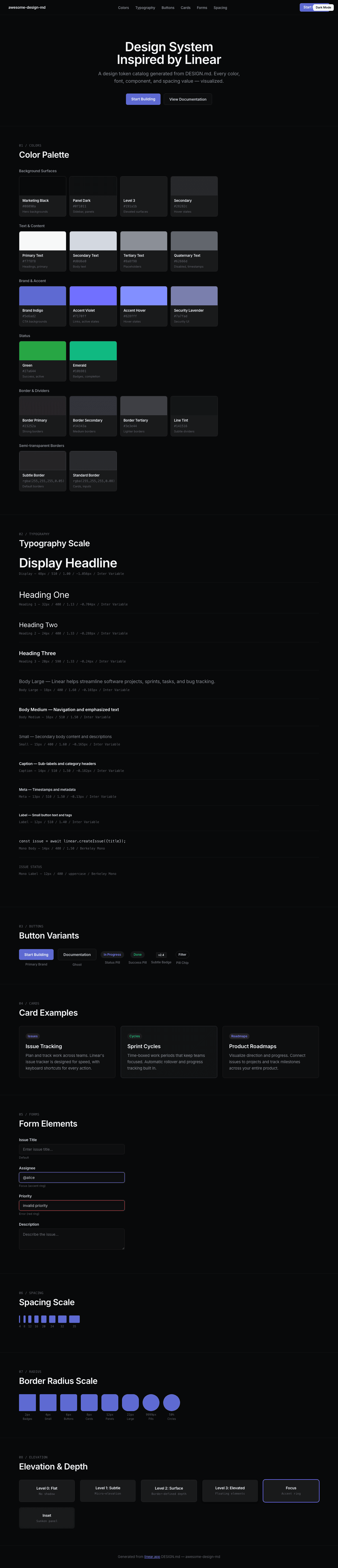
|
|
22
|
+
|
|
23
|
+
### Light Mode
|
|
24
|
+
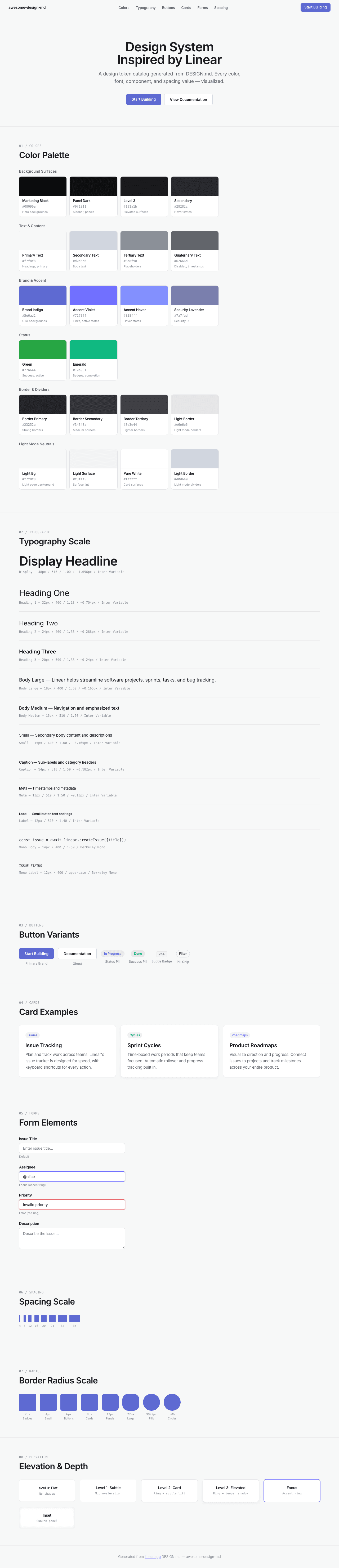
|