oh-my-design-cli 0.1.0
This diff represents the content of publicly available package versions that have been released to one of the supported registries. The information contained in this diff is provided for informational purposes only and reflects changes between package versions as they appear in their respective public registries.
- package/LICENSE +21 -0
- package/README.ja.md +145 -0
- package/README.ko.md +245 -0
- package/README.md +245 -0
- package/README.zh-TW.md +145 -0
- package/data/reference-tags.md +104 -0
- package/data/synonyms.json +79 -0
- package/data/vocabulary.json +516 -0
- package/dist/bin/oh-my-design.js +858 -0
- package/dist/bin/oh-my-design.js.map +1 -0
- package/dist/chunk-6YNSV3VY.js +35 -0
- package/dist/chunk-6YNSV3VY.js.map +1 -0
- package/dist/chunk-MHFYGZSO.js +337 -0
- package/dist/chunk-MHFYGZSO.js.map +1 -0
- package/dist/chunk-N2JG6N4Q.js +264 -0
- package/dist/chunk-N2JG6N4Q.js.map +1 -0
- package/dist/chunk-OOQQEUGX.js +46 -0
- package/dist/chunk-OOQQEUGX.js.map +1 -0
- package/dist/chunk-OR5DHENY.js +250 -0
- package/dist/chunk-OR5DHENY.js.map +1 -0
- package/dist/customizer-CM76752R.js +8 -0
- package/dist/customizer-CM76752R.js.map +1 -0
- package/dist/index.d.ts +559 -0
- package/dist/index.js +3113 -0
- package/dist/index.js.map +1 -0
- package/dist/init-STACB7E5.js +635 -0
- package/dist/init-STACB7E5.js.map +1 -0
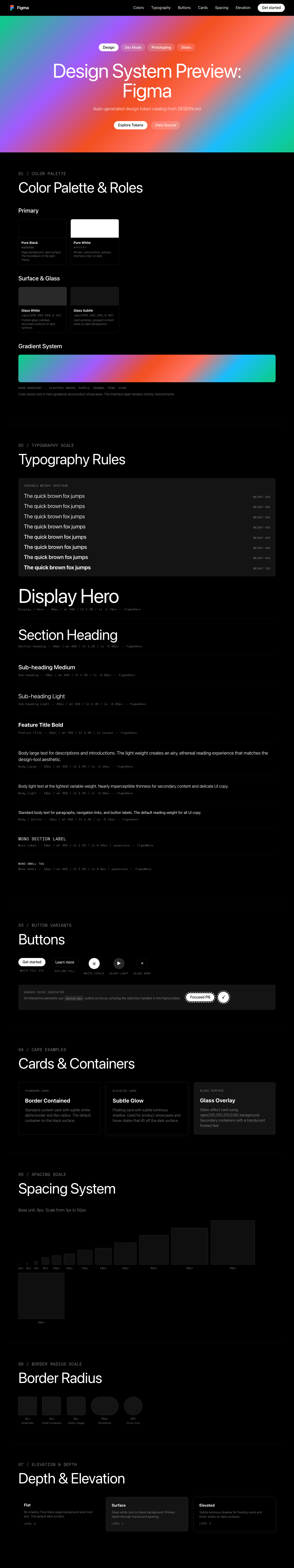
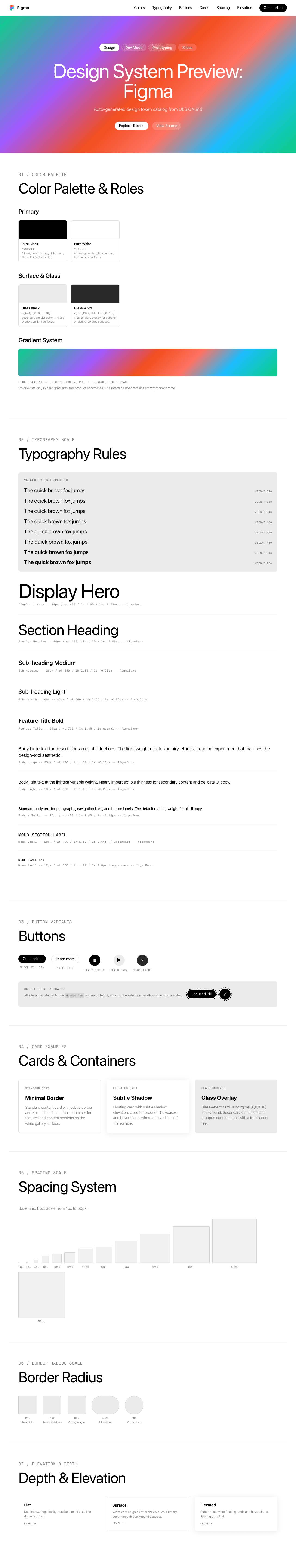
- package/dist/install-skills-CM6VXFZJ.js +152 -0
- package/dist/install-skills-CM6VXFZJ.js.map +1 -0
- package/dist/learn-33LHKEJA.js +140 -0
- package/dist/learn-33LHKEJA.js.map +1 -0
- package/dist/reference-YMNAOXJQ.js +47 -0
- package/dist/reference-YMNAOXJQ.js.map +1 -0
- package/dist/reference-parser-TM3CJPNE.js +10 -0
- package/dist/reference-parser-TM3CJPNE.js.map +1 -0
- package/dist/remember-UAFA5B2O.js +78 -0
- package/dist/remember-UAFA5B2O.js.map +1 -0
- package/dist/sync-P7X4S2DK.js +404 -0
- package/dist/sync-P7X4S2DK.js.map +1 -0
- package/dist/templates/templates/design-md.hbs +44 -0
- package/dist/templates/templates/partials/agent-prompt-guide.hbs +28 -0
- package/dist/templates/templates/partials/color-palette.hbs +49 -0
- package/dist/templates/templates/partials/component-stylings.hbs +28 -0
- package/dist/templates/templates/partials/depth-elevation.hbs +31 -0
- package/dist/templates/templates/partials/dos-donts.hbs +13 -0
- package/dist/templates/templates/partials/layout.hbs +30 -0
- package/dist/templates/templates/partials/responsive.hbs +25 -0
- package/dist/templates/templates/partials/shadcn-tokens.hbs +64 -0
- package/dist/templates/templates/partials/typography.hbs +43 -0
- package/dist/templates/templates/partials/visual-theme.hbs +26 -0
- package/package.json +68 -0
- package/references/Claude-Design-Sys-Prompt.txt +421 -0
- package/references/airbnb/DESIGN.md +427 -0
- package/references/airbnb/README.md +23 -0
- package/references/airbnb/preview-dark.html +234 -0
- package/references/airbnb/preview.html +233 -0
- package/references/airtable/DESIGN.md +107 -0
- package/references/airtable/README.md +23 -0
- package/references/airtable/preview-dark.html +165 -0
- package/references/airtable/preview.html +164 -0
- package/references/apple/DESIGN.md +496 -0
- package/references/apple/README.md +24 -0
- package/references/apple/preview-dark.html +420 -0
- package/references/apple/preview.html +414 -0
- package/references/baemin/DESIGN.md +260 -0
- package/references/baemin/README.md +19 -0
- package/references/bmw/DESIGN.md +180 -0
- package/references/bmw/README.md +23 -0
- package/references/bmw/preview-dark.html +211 -0
- package/references/bmw/preview.html +210 -0
- package/references/cal/DESIGN.md +259 -0
- package/references/cal/README.md +23 -0
- package/references/cal/preview-dark.html +449 -0
- package/references/cal/preview.html +575 -0
- package/references/claude/DESIGN.md +455 -0
- package/references/claude/README.md +24 -0
- package/references/claude/preview-dark.html +803 -0
- package/references/claude/preview.html +826 -0
- package/references/clay/DESIGN.md +304 -0
- package/references/clay/README.md +23 -0
- package/references/clay/preview-dark.html +316 -0
- package/references/clay/preview.html +315 -0
- package/references/clickhouse/DESIGN.md +281 -0
- package/references/clickhouse/README.md +24 -0
- package/references/clickhouse/preview-dark.html +834 -0
- package/references/clickhouse/preview.html +786 -0
- package/references/cohere/DESIGN.md +266 -0
- package/references/cohere/README.md +24 -0
- package/references/cohere/preview-dark.html +803 -0
- package/references/cohere/preview.html +807 -0
- package/references/coinbase/DESIGN.md +129 -0
- package/references/coinbase/README.md +23 -0
- package/references/coinbase/preview-dark.html +164 -0
- package/references/coinbase/preview.html +163 -0
- package/references/composio/DESIGN.md +307 -0
- package/references/composio/README.md +24 -0
- package/references/composio/preview-dark.html +958 -0
- package/references/composio/preview.html +933 -0
- package/references/cursor/DESIGN.md +322 -0
- package/references/cursor/README.md +24 -0
- package/references/cursor/preview-dark.html +393 -0
- package/references/cursor/preview.html +383 -0
- package/references/dcard/DESIGN.md +302 -0
- package/references/dcard/README.md +12 -0
- package/references/dcard/_research/forum-1440px.png +0 -0
- package/references/dcard/_research.md +77 -0
- package/references/elevenlabs/DESIGN.md +265 -0
- package/references/elevenlabs/README.md +23 -0
- package/references/elevenlabs/preview-dark.html +252 -0
- package/references/elevenlabs/preview.html +251 -0
- package/references/expo/DESIGN.md +281 -0
- package/references/expo/README.md +24 -0
- package/references/expo/preview-dark.html +533 -0
- package/references/expo/preview.html +533 -0
- package/references/ferrari/DESIGN.md +314 -0
- package/references/ferrari/README.md +23 -0
- package/references/ferrari/preview-dark.html +1162 -0
- package/references/ferrari/preview.html +1122 -0
- package/references/figma/DESIGN.md +399 -0
- package/references/figma/README.md +24 -0
- package/references/figma/preview-dark.html +822 -0
- package/references/figma/preview.html +832 -0
- package/references/framer/DESIGN.md +246 -0
- package/references/framer/README.md +23 -0
- package/references/framer/preview-dark.html +902 -0
- package/references/framer/preview.html +883 -0
- package/references/freee/DESIGN.md +308 -0
- package/references/freee/README.md +12 -0
- package/references/freee/_research/vibes-storybook-1440px.png +0 -0
- package/references/freee/_research.md +77 -0
- package/references/hashicorp/DESIGN.md +278 -0
- package/references/hashicorp/README.md +24 -0
- package/references/hashicorp/preview-dark.html +1202 -0
- package/references/hashicorp/preview.html +1193 -0
- package/references/ibm/DESIGN.md +332 -0
- package/references/ibm/README.md +24 -0
- package/references/ibm/preview-dark.html +443 -0
- package/references/ibm/preview.html +428 -0
- package/references/intercom/DESIGN.md +146 -0
- package/references/intercom/README.md +23 -0
- package/references/intercom/preview-dark.html +185 -0
- package/references/intercom/preview.html +184 -0
- package/references/kakao/DESIGN.md +261 -0
- package/references/kakao/README.md +18 -0
- package/references/karrot/DESIGN.md +252 -0
- package/references/karrot/README.md +18 -0
- package/references/kraken/DESIGN.md +146 -0
- package/references/kraken/README.md +23 -0
- package/references/kraken/preview-dark.html +169 -0
- package/references/kraken/preview.html +168 -0
- package/references/lamborghini/DESIGN.md +288 -0
- package/references/lamborghini/README.md +23 -0
- package/references/lamborghini/preview-dark.html +303 -0
- package/references/lamborghini/preview.html +381 -0
- package/references/line/DESIGN.md +375 -0
- package/references/line/README.md +12 -0
- package/references/line/_research/home-1440px.png +0 -0
- package/references/line/_research.md +65 -0
- package/references/linear.app/DESIGN.md +526 -0
- package/references/linear.app/README.md +24 -0
- package/references/linear.app/preview-dark.html +383 -0
- package/references/linear.app/preview.html +373 -0
- package/references/lovable/DESIGN.md +298 -0
- package/references/lovable/README.md +24 -0
- package/references/lovable/preview-dark.html +349 -0
- package/references/lovable/preview.html +348 -0
- package/references/mercari/DESIGN.md +294 -0
- package/references/mercari/README.md +12 -0
- package/references/mercari/_research/home-1440px.png +0 -0
- package/references/mercari/_research.md +77 -0
- package/references/minimax/DESIGN.md +257 -0
- package/references/minimax/README.md +24 -0
- package/references/minimax/preview-dark.html +1262 -0
- package/references/minimax/preview.html +1248 -0
- package/references/mintlify/DESIGN.md +341 -0
- package/references/mintlify/README.md +24 -0
- package/references/mintlify/preview-dark.html +409 -0
- package/references/mintlify/preview.html +398 -0
- package/references/miro/DESIGN.md +108 -0
- package/references/miro/README.md +23 -0
- package/references/miro/preview-dark.html +174 -0
- package/references/miro/preview.html +173 -0
- package/references/mistral.ai/DESIGN.md +261 -0
- package/references/mistral.ai/README.md +24 -0
- package/references/mistral.ai/preview-dark.html +806 -0
- package/references/mistral.ai/preview.html +805 -0
- package/references/mongodb/DESIGN.md +266 -0
- package/references/mongodb/README.md +23 -0
- package/references/mongodb/preview-dark.html +260 -0
- package/references/mongodb/preview.html +259 -0
- package/references/notion/DESIGN.md +492 -0
- package/references/notion/README.md +24 -0
- package/references/notion/preview-dark.html +372 -0
- package/references/notion/preview.html +364 -0
- package/references/nvidia/DESIGN.md +308 -0
- package/references/nvidia/README.md +24 -0
- package/references/nvidia/preview-dark.html +374 -0
- package/references/nvidia/preview.html +366 -0
- package/references/ollama/DESIGN.md +267 -0
- package/references/ollama/README.md +24 -0
- package/references/ollama/preview-dark.html +678 -0
- package/references/ollama/preview.html +678 -0
- package/references/opencode.ai/DESIGN.md +295 -0
- package/references/opencode.ai/README.md +24 -0
- package/references/opencode.ai/preview-dark.html +366 -0
- package/references/opencode.ai/preview.html +357 -0
- package/references/pinkoi/DESIGN.md +309 -0
- package/references/pinkoi/README.md +12 -0
- package/references/pinkoi/_research/browse-1440px.png +0 -0
- package/references/pinkoi/_research.md +115 -0
- package/references/pinterest/DESIGN.md +230 -0
- package/references/pinterest/README.md +23 -0
- package/references/pinterest/preview-dark.html +233 -0
- package/references/pinterest/preview.html +232 -0
- package/references/posthog/DESIGN.md +256 -0
- package/references/posthog/README.md +23 -0
- package/references/posthog/preview-dark.html +699 -0
- package/references/posthog/preview.html +749 -0
- package/references/raycast/DESIGN.md +268 -0
- package/references/raycast/README.md +23 -0
- package/references/raycast/preview-dark.html +606 -0
- package/references/raycast/preview.html +688 -0
- package/references/renault/DESIGN.md +311 -0
- package/references/renault/README.md +23 -0
- package/references/renault/preview-dark.html +406 -0
- package/references/renault/preview.html +606 -0
- package/references/replicate/DESIGN.md +261 -0
- package/references/replicate/README.md +24 -0
- package/references/replicate/preview-dark.html +828 -0
- package/references/replicate/preview.html +831 -0
- package/references/resend/DESIGN.md +303 -0
- package/references/resend/README.md +23 -0
- package/references/resend/preview-dark.html +355 -0
- package/references/resend/preview.html +354 -0
- package/references/revolut/DESIGN.md +185 -0
- package/references/revolut/README.md +23 -0
- package/references/revolut/preview-dark.html +234 -0
- package/references/revolut/preview.html +233 -0
- package/references/runwayml/DESIGN.md +244 -0
- package/references/runwayml/README.md +24 -0
- package/references/runwayml/preview-dark.html +664 -0
- package/references/runwayml/preview.html +665 -0
- package/references/sanity/DESIGN.md +357 -0
- package/references/sanity/README.md +24 -0
- package/references/sanity/preview-dark.html +990 -0
- package/references/sanity/preview.html +1135 -0
- package/references/sentry/DESIGN.md +262 -0
- package/references/sentry/README.md +24 -0
- package/references/sentry/preview-dark.html +626 -0
- package/references/sentry/preview.html +951 -0
- package/references/spacex/DESIGN.md +205 -0
- package/references/spacex/README.md +23 -0
- package/references/spacex/preview-dark.html +221 -0
- package/references/spacex/preview.html +220 -0
- package/references/spotify/DESIGN.md +246 -0
- package/references/spotify/README.md +23 -0
- package/references/spotify/preview-dark.html +231 -0
- package/references/spotify/preview.html +230 -0
- package/references/stripe/DESIGN.md +473 -0
- package/references/stripe/README.md +24 -0
- package/references/stripe/preview-dark.html +428 -0
- package/references/stripe/preview.html +419 -0
- package/references/supabase/DESIGN.md +255 -0
- package/references/supabase/README.md +24 -0
- package/references/supabase/preview-dark.html +977 -0
- package/references/supabase/preview.html +955 -0
- package/references/superhuman/DESIGN.md +252 -0
- package/references/superhuman/README.md +23 -0
- package/references/superhuman/preview-dark.html +973 -0
- package/references/superhuman/preview.html +951 -0
- package/references/tesla/DESIGN.md +286 -0
- package/references/tesla/README.md +23 -0
- package/references/tesla/preview-dark.html +947 -0
- package/references/tesla/preview.html +925 -0
- package/references/together.ai/DESIGN.md +263 -0
- package/references/together.ai/README.md +24 -0
- package/references/together.ai/preview-dark.html +892 -0
- package/references/together.ai/preview.html +897 -0
- package/references/toss/DESIGN.md +387 -0
- package/references/toss/README.md +19 -0
- package/references/uber/DESIGN.md +295 -0
- package/references/uber/README.md +24 -0
- package/references/uber/preview-dark.html +1120 -0
- package/references/uber/preview.html +1119 -0
- package/references/vercel/DESIGN.md +456 -0
- package/references/vercel/README.md +24 -0
- package/references/vercel/preview-dark.html +368 -0
- package/references/vercel/preview.html +367 -0
- package/references/voltagent/DESIGN.md +323 -0
- package/references/voltagent/README.md +24 -0
- package/references/voltagent/preview-dark.html +487 -0
- package/references/voltagent/preview.html +766 -0
- package/references/warp/DESIGN.md +253 -0
- package/references/warp/README.md +23 -0
- package/references/warp/preview-dark.html +500 -0
- package/references/warp/preview.html +533 -0
- package/references/webflow/DESIGN.md +109 -0
- package/references/webflow/README.md +23 -0
- package/references/webflow/preview-dark.html +147 -0
- package/references/webflow/preview.html +146 -0
- package/references/wise/DESIGN.md +173 -0
- package/references/wise/README.md +23 -0
- package/references/wise/preview-dark.html +230 -0
- package/references/wise/preview.html +229 -0
- package/references/x.ai/DESIGN.md +267 -0
- package/references/x.ai/README.md +24 -0
- package/references/x.ai/preview-dark.html +356 -0
- package/references/x.ai/preview.html +407 -0
- package/references/zapier/DESIGN.md +328 -0
- package/references/zapier/README.md +24 -0
- package/references/zapier/preview-dark.html +380 -0
- package/references/zapier/preview.html +372 -0
- package/skills/omd-apply/SKILL.md +85 -0
- package/skills/omd-init/SKILL.md +167 -0
- package/skills/omd-learn/SKILL.md +81 -0
- package/skills/omd-remember/SKILL.md +44 -0
- package/skills/omd-sync/SKILL.md +38 -0
|
@@ -0,0 +1,399 @@
|
|
|
1
|
+
---
|
|
2
|
+
omd: 0.1
|
|
3
|
+
brand: Figma
|
|
4
|
+
---
|
|
5
|
+
|
|
6
|
+
# Design System Inspiration of Figma
|
|
7
|
+
|
|
8
|
+
## 1. Visual Theme & Atmosphere
|
|
9
|
+
|
|
10
|
+
Figma's interface is the design tool that designed itself — a masterclass in typographic sophistication where a custom variable font (figmaSans) modulates between razor-thin (weight 320) and bold (weight 700) with stops at unusual intermediates (330, 340, 450, 480, 540) that most type systems never explore. This granular weight control gives every text element a precisely calibrated visual weight, creating hierarchy through micro-differences rather than the blunt instrument of "regular vs bold."
|
|
11
|
+
|
|
12
|
+
The page presents a fascinating duality: the interface chrome is strictly black-and-white (literally only `#000000` and `#ffffff` detected as colors), while the hero section and product showcases explode with vibrant multi-color gradients — electric greens, bright yellows, deep purples, hot pinks. This separation means the design system itself is colorless, treating the product's colorful output as the hero content. Figma's marketing page is essentially a white gallery wall displaying colorful art.
|
|
13
|
+
|
|
14
|
+
What makes Figma distinctive beyond the variable font is its circle-and-pill geometry. Buttons use 50px radius (pill) or 50% (perfect circle for icon buttons), creating an organic, tool-palette-like feel. The dashed-outline focus indicator (`dashed 2px`) is a deliberate design choice that echoes selection handles in the Figma editor itself — the website's UI language references the product's UI language.
|
|
15
|
+
|
|
16
|
+
**Key Characteristics:**
|
|
17
|
+
- Custom variable font (figmaSans) with unusual weight stops: 320, 330, 340, 450, 480, 540, 700
|
|
18
|
+
- Strictly black-and-white interface chrome — color exists only in product content
|
|
19
|
+
- figmaMono for uppercase technical labels with wide letter-spacing
|
|
20
|
+
- Pill (50px) and circular (50%) button geometry
|
|
21
|
+
- Dashed focus outlines echoing Figma's editor selection handles
|
|
22
|
+
- Vibrant multi-color hero gradients (green, yellow, purple, pink)
|
|
23
|
+
- OpenType `"kern"` feature enabled globally
|
|
24
|
+
- Negative letter-spacing throughout — even body text at -0.14px to -0.26px
|
|
25
|
+
|
|
26
|
+
## 2. Color Palette & Roles
|
|
27
|
+
|
|
28
|
+
### Primary
|
|
29
|
+
- **Pure Black** (`#000000`): All text, all solid buttons, all borders. The sole "color" of the interface.
|
|
30
|
+
- **Pure White** (`#ffffff`): All backgrounds, white buttons, text on dark surfaces. The other half of the binary.
|
|
31
|
+
|
|
32
|
+
*Note: Figma's marketing site uses ONLY these two colors for its interface layer. All vibrant colors appear exclusively in product screenshots, hero gradients, and embedded content.*
|
|
33
|
+
|
|
34
|
+
### Surface & Background
|
|
35
|
+
- **Pure White** (`#ffffff`): Primary page background and card surfaces.
|
|
36
|
+
- **Glass Black** (`rgba(0, 0, 0, 0.08)`): Subtle dark overlay for secondary circular buttons and glass effects.
|
|
37
|
+
- **Glass White** (`rgba(255, 255, 255, 0.16)`): Frosted glass overlay for buttons on dark/colored surfaces.
|
|
38
|
+
|
|
39
|
+
### Gradient System
|
|
40
|
+
- **Hero Gradient**: A vibrant multi-stop gradient using electric green, bright yellow, deep purple, and hot pink. This gradient is the visual signature of the hero section — it represents the creative possibilities of the tool.
|
|
41
|
+
- **Product Section Gradients**: Individual product areas (Design, Dev Mode, Prototyping) may use distinct color themes in their showcases.
|
|
42
|
+
|
|
43
|
+
### Resolved Surface Tints
|
|
44
|
+
The rgba overlays above resolve to these effective hex values when composited on standard backgrounds:
|
|
45
|
+
- **Light Border** (`#ebebeb`): `rgba(0, 0, 0, 0.08)` composited on white — subtle separator.
|
|
46
|
+
- **Dark Glass** (`#292929`): `rgba(255, 255, 255, 0.16)` composited on black — used inside dark hero sections.
|
|
47
|
+
- **Muted Text** (`#374151`): Used for secondary copy in product UI screenshots and footer links.
|
|
48
|
+
|
|
49
|
+
### Product Accent Colors
|
|
50
|
+
These appear in product UI screenshots and hero gradients (NOT in marketing chrome):
|
|
51
|
+
- **Figma Plugin Purple** (`#a259ff`): Common product accent in plugin/extension cards.
|
|
52
|
+
- **Plot Pink** (`#f24e1e`): Brand-adjacent accent used in select marketing visuals.
|
|
53
|
+
|
|
54
|
+
## 3. Typography Rules
|
|
55
|
+
|
|
56
|
+
### Font Family
|
|
57
|
+
- **Primary**: `figmaSans`, with fallbacks: `figmaSans Fallback, SF Pro Display, system-ui, helvetica`
|
|
58
|
+
- **Monospace / Labels**: `figmaMono`, with fallbacks: `figmaMono Fallback, SF Mono, menlo`
|
|
59
|
+
|
|
60
|
+
### Hierarchy
|
|
61
|
+
|
|
62
|
+
| Role | Font | Size | Weight | Line Height | Letter Spacing | Notes |
|
|
63
|
+
|------|------|------|--------|-------------|----------------|-------|
|
|
64
|
+
| Display / Hero | figmaSans | 86px (5.38rem) | 400 | 1.00 (tight) | -1.72px | Maximum impact, extreme tracking |
|
|
65
|
+
| Section Heading | figmaSans | 64px (4rem) | 400 | 1.10 (tight) | -0.96px | Feature section titles |
|
|
66
|
+
| Sub-heading | figmaSans | 26px (1.63rem) | 540 | 1.35 | -0.26px | Emphasized section text |
|
|
67
|
+
| Sub-heading Light | figmaSans | 26px (1.63rem) | 340 | 1.35 | -0.26px | Light-weight section text |
|
|
68
|
+
| Feature Title | figmaSans | 24px (1.5rem) | 700 | 1.45 | normal | Bold card headings |
|
|
69
|
+
| Body Large | figmaSans | 20px (1.25rem) | 330–450 | 1.30–1.40 | -0.1px to -0.14px | Descriptions, intros |
|
|
70
|
+
| Body / Button | figmaSans | 16px (1rem) | 330–400 | 1.40–1.45 | -0.14px to normal | Standard body, nav, buttons |
|
|
71
|
+
| Body Light | figmaSans | 18px (1.13rem) | 320 | 1.45 | -0.26px to normal | Light-weight body text |
|
|
72
|
+
| Mono Label | figmaMono | 18px (1.13rem) | 400 | 1.30 (tight) | 0.54px | Uppercase section labels |
|
|
73
|
+
| Mono Small | figmaMono | 12px (0.75rem) | 400 | 1.00 (tight) | 0.6px | Uppercase tiny tags |
|
|
74
|
+
|
|
75
|
+
### Principles
|
|
76
|
+
- **Variable font precision**: figmaSans uses weights that most systems never touch — 320, 330, 340, 450, 480, 540. This creates hierarchy through subtle weight differences rather than dramatic jumps. The difference between 330 and 340 is nearly imperceptible but structurally significant.
|
|
77
|
+
- **Light as the base**: Most body text uses 320–340 (lighter than typical 400 "regular"), creating an ethereal, airy reading experience that matches the design-tool aesthetic.
|
|
78
|
+
- **Kern everywhere**: Every text element enables OpenType `"kern"` feature — kerning is not optional, it's structural.
|
|
79
|
+
- **Negative tracking by default**: Even body text uses -0.1px to -0.26px letter-spacing, creating universally tight text. Display text compresses further to -0.96px and -1.72px.
|
|
80
|
+
- **Mono for structure**: figmaMono in uppercase with positive letter-spacing (0.54px–0.6px) creates technical signpost labels.
|
|
81
|
+
|
|
82
|
+
## 4. Component Stylings
|
|
83
|
+
|
|
84
|
+
### Buttons
|
|
85
|
+
|
|
86
|
+
**Black Solid (Pill)**
|
|
87
|
+
- Background: Pure Black (`#000000`)
|
|
88
|
+
- Text: Pure White (`#ffffff`)
|
|
89
|
+
- Radius: circle (50%) for icon buttons
|
|
90
|
+
- Focus: dashed 2px outline
|
|
91
|
+
- Maximum emphasis
|
|
92
|
+
|
|
93
|
+
**White Pill**
|
|
94
|
+
- Background: Pure White (`#ffffff`)
|
|
95
|
+
- Text: Pure Black (`#000000`)
|
|
96
|
+
- Padding: 8px 18px 10px (asymmetric vertical)
|
|
97
|
+
- Radius: pill (50px)
|
|
98
|
+
- Focus: dashed 2px outline
|
|
99
|
+
- Standard CTA on dark/colored surfaces
|
|
100
|
+
|
|
101
|
+
**Glass Dark**
|
|
102
|
+
- Background: `rgba(0, 0, 0, 0.08)` (subtle dark overlay)
|
|
103
|
+
- Text: Pure Black
|
|
104
|
+
- Radius: circle (50%)
|
|
105
|
+
- Focus: dashed 2px outline
|
|
106
|
+
- Secondary action on light surfaces
|
|
107
|
+
|
|
108
|
+
**Glass Light**
|
|
109
|
+
- Background: `rgba(255, 255, 255, 0.16)` (frosted glass)
|
|
110
|
+
- Text: Pure White
|
|
111
|
+
- Radius: circle (50%)
|
|
112
|
+
- Focus: dashed 2px outline
|
|
113
|
+
- Secondary action on dark/colored surfaces
|
|
114
|
+
|
|
115
|
+
### Cards & Containers
|
|
116
|
+
- Background: Pure White
|
|
117
|
+
- Border: none or minimal
|
|
118
|
+
- Radius: 6px (small containers), 8px (images, cards, dialogs)
|
|
119
|
+
- Shadow: subtle to medium elevation effects
|
|
120
|
+
- Product screenshots as card content
|
|
121
|
+
|
|
122
|
+
### Navigation
|
|
123
|
+
- Clean horizontal nav on white
|
|
124
|
+
- Logo: Figma wordmark in black
|
|
125
|
+
- Product tabs: pill-shaped (50px) tab navigation
|
|
126
|
+
- Links: black text, underline 1px decoration
|
|
127
|
+
- CTA: Black pill button
|
|
128
|
+
- Hover: text color via CSS variable
|
|
129
|
+
|
|
130
|
+
### Distinctive Components
|
|
131
|
+
|
|
132
|
+
**Product Tab Bar**
|
|
133
|
+
- Horizontal pill-shaped tabs (50px radius)
|
|
134
|
+
- Each tab represents a Figma product area (Design, Dev Mode, Prototyping, etc.)
|
|
135
|
+
- Active tab highlighted
|
|
136
|
+
|
|
137
|
+
**Hero Gradient Section**
|
|
138
|
+
- Full-width vibrant multi-color gradient background
|
|
139
|
+
- White text overlay with 86px display heading
|
|
140
|
+
- Product screenshots floating within the gradient
|
|
141
|
+
|
|
142
|
+
**Dashed Focus Indicators**
|
|
143
|
+
- All interactive elements use `dashed 2px` outline on focus
|
|
144
|
+
- References the selection handles in the Figma editor
|
|
145
|
+
- A meta-design choice connecting website and product
|
|
146
|
+
|
|
147
|
+
## 5. Layout Principles
|
|
148
|
+
|
|
149
|
+
### Spacing System
|
|
150
|
+
- Base unit: 8px
|
|
151
|
+
- Scale: 1px, 2px, 4px, 4.5px, 8px, 10px, 12px, 16px, 18px, 24px, 32px, 40px, 46px, 48px, 50px
|
|
152
|
+
|
|
153
|
+
### Grid & Container
|
|
154
|
+
- Max container width: up to 1920px
|
|
155
|
+
- Hero: full-width gradient with centered content
|
|
156
|
+
- Product sections: alternating showcases
|
|
157
|
+
- Footer: dark full-width section
|
|
158
|
+
- Responsive from 559px to 1920px
|
|
159
|
+
|
|
160
|
+
### Whitespace Philosophy
|
|
161
|
+
- **Gallery-like pacing**: Generous spacing lets each product section breathe as its own exhibit.
|
|
162
|
+
- **Color sections as visual breathing**: The gradient hero and product showcases provide chromatic relief between the monochrome interface sections.
|
|
163
|
+
|
|
164
|
+
### Border Radius Scale
|
|
165
|
+
- Minimal (2px): Small link elements
|
|
166
|
+
- Subtle (6px): Small containers, dividers
|
|
167
|
+
- Comfortable (8px): Cards, images, dialogs
|
|
168
|
+
- Pill (50px): Tab buttons, CTAs
|
|
169
|
+
- Circle (50%): Icon buttons, circular elements
|
|
170
|
+
|
|
171
|
+
## 6. Depth & Elevation
|
|
172
|
+
|
|
173
|
+
| Level | Treatment | Use |
|
|
174
|
+
|-------|-----------|-----|
|
|
175
|
+
| Flat (Level 0) | No shadow | Page background, most text |
|
|
176
|
+
| Surface (Level 1) | White card on gradient/dark section | Cards, product showcases |
|
|
177
|
+
| Elevated (Level 2) | Subtle shadow | Floating cards, hover states |
|
|
178
|
+
|
|
179
|
+
**Shadow Philosophy**: Figma uses shadows sparingly. The primary depth mechanisms are **background contrast** (white content on colorful/dark sections) and the inherent dimensionality of the product screenshots themselves.
|
|
180
|
+
|
|
181
|
+
## 7. Do's and Don'ts
|
|
182
|
+
|
|
183
|
+
### Do
|
|
184
|
+
- Use figmaSans with precise variable weights (320–540) — the granular weight control IS the design
|
|
185
|
+
- Keep the interface strictly black-and-white — color comes from product content only
|
|
186
|
+
- Use pill (50px) and circular (50%) geometry for all interactive elements
|
|
187
|
+
- Apply dashed 2px focus outlines — the signature accessibility pattern
|
|
188
|
+
- Enable `"kern"` feature on all text
|
|
189
|
+
- Use figmaMono in uppercase with positive letter-spacing for labels
|
|
190
|
+
- Apply negative letter-spacing throughout (-0.1px to -1.72px)
|
|
191
|
+
|
|
192
|
+
### Don't
|
|
193
|
+
- Don't add interface colors — the monochrome palette is absolute
|
|
194
|
+
- Don't use standard font weights (400, 500, 600, 700) — use the variable font's unique stops (320, 330, 340, 450, 480, 540)
|
|
195
|
+
- Don't use sharp corners on buttons — pill and circular geometry only
|
|
196
|
+
- Don't use solid focus outlines — dashed is the signature
|
|
197
|
+
- Don't increase body font weight above 450 — the light-weight aesthetic is core
|
|
198
|
+
- Don't use positive letter-spacing on body text — it's always negative
|
|
199
|
+
|
|
200
|
+
## 8. Responsive Behavior
|
|
201
|
+
|
|
202
|
+
### Breakpoints
|
|
203
|
+
| Name | Width | Key Changes |
|
|
204
|
+
|------|-------|-------------|
|
|
205
|
+
| Small Mobile | <560px | Compact layout, stacked |
|
|
206
|
+
| Tablet | 560–768px | Minor adjustments |
|
|
207
|
+
| Small Desktop | 768–960px | 2-column layouts |
|
|
208
|
+
| Desktop | 960–1280px | Standard layout |
|
|
209
|
+
| Large Desktop | 1280–1440px | Expanded |
|
|
210
|
+
| Ultra-wide | 1440–1920px | Maximum width |
|
|
211
|
+
|
|
212
|
+
### Collapsing Strategy
|
|
213
|
+
- Hero text: 86px → 64px → 48px
|
|
214
|
+
- Product tabs: horizontal scroll on mobile
|
|
215
|
+
- Feature sections: stacked single column
|
|
216
|
+
- Footer: multi-column → stacked
|
|
217
|
+
|
|
218
|
+
## 9. Agent Prompt Guide
|
|
219
|
+
|
|
220
|
+
### Quick Color Reference
|
|
221
|
+
- Everything: "Pure Black (#000000)" and "Pure White (#ffffff)"
|
|
222
|
+
- Glass Dark: "rgba(0, 0, 0, 0.08)"
|
|
223
|
+
- Glass Light: "rgba(255, 255, 255, 0.16)"
|
|
224
|
+
|
|
225
|
+
### Example Component Prompts
|
|
226
|
+
- "Create a hero on a vibrant multi-color gradient (green, yellow, purple, pink). Headline at 86px figmaSans weight 400, line-height 1.0, letter-spacing -1.72px. White text. White pill CTA button (50px radius, 8px 18px padding)."
|
|
227
|
+
- "Design a product tab bar with pill-shaped buttons (50px radius). Active: Black bg, white text. Inactive: transparent, black text. figmaSans at 20px weight 480."
|
|
228
|
+
- "Build a section label: figmaMono 18px, uppercase, letter-spacing 0.54px, black text. Kern enabled."
|
|
229
|
+
- "Create body text at 20px figmaSans weight 330, line-height 1.40, letter-spacing -0.14px. Pure Black on white."
|
|
230
|
+
|
|
231
|
+
### Iteration Guide
|
|
232
|
+
1. Use variable font weight stops precisely: 320, 330, 340, 450, 480, 540, 700
|
|
233
|
+
2. Interface is always black + white — never add colors to chrome
|
|
234
|
+
3. Dashed focus outlines, not solid
|
|
235
|
+
4. Letter-spacing is always negative on body, always positive on mono labels
|
|
236
|
+
5. Pill (50px) for buttons/tabs, circle (50%) for icon buttons
|
|
237
|
+
|
|
238
|
+
---
|
|
239
|
+
|
|
240
|
+
## 10. Voice & Tone
|
|
241
|
+
|
|
242
|
+
Figma's voice is **colloquial-craft** — the register of someone who takes design seriously and refuses to sound like corporate-SaaS while doing it. Marketing headlines are short and aspirational (*"Make anything possible, all in Figma"*), but blog voice allows real colloquialism (*"Chat, are we cooked?"*) that would be unthinkable at Apple or Stripe. The tonal anchor is that Figma speaks *as a designer to designers* — peer-to-peer, not vendor-to-customer. Internal jargon (frames, components, auto-layout, variants) is used without defining, because the audience already knows it.
|
|
243
|
+
|
|
244
|
+
| Context | Tone |
|
|
245
|
+
|---|---|
|
|
246
|
+
| Hero headlines | Short, aspirational, peer-voice. "Make anything possible, all in Figma." |
|
|
247
|
+
| Product page copy | Feature + payoff. "Ship products, any way you want." Not spec-listy. |
|
|
248
|
+
| CTAs | Minimal, present-tense. "Get started", "Watch Config", "Try Figma free". |
|
|
249
|
+
| Blog editorial | Colloquial + substantive. Titles like *"The TL;DR on MCP"*, *"Chat, are we cooked?"*, *"Cooking with constraints"*. |
|
|
250
|
+
| Product UI strings | Designer vocabulary assumed — "frame", "component", "auto-layout" without gloss. |
|
|
251
|
+
| Error messages | Specific and friendly. Problem + action. |
|
|
252
|
+
| Community / Config copy | Celebrates user work without sycophancy. |
|
|
253
|
+
| Dev Mode / MCP / developer-facing | Slightly more technical; code examples prioritized. |
|
|
254
|
+
| Enterprise sales copy | Calmer register but same voice foundation — never shifts into pure B2B-ese. |
|
|
255
|
+
|
|
256
|
+
**Forbidden phrases.** "Revolutionary", "disrupt", "unleash", "world-class" — the voice is peer, not promotional. "Easy peasy" or "effortless" as self-descriptors — Figma is not easy; it is powerful, and the voice respects that. Stock-SaaS AI hype phrases ("AI-powered transformation"). Generic marketing emoji (🚀 ✨ 💡). Exclamation marks on routine CTAs. Condescending vocabulary for beginners — Figma treats every user as a designer, including ones who are not yet.
|
|
257
|
+
|
|
258
|
+
## 11. Brand Narrative
|
|
259
|
+
|
|
260
|
+
Figma was founded in 2012 by **Dylan Field and Evan Wallace**. The founding bet was technical and contrarian: at a time when every serious design tool was a native app (Sketch for Mac, Adobe everything), Field and Wallace decided to build a design tool that ran **in the browser, with real-time multiplayer collaboration**. That required solving WebGL rendering, operational-transform networking for multiplayer, and typesetting — all simultaneously. The tool launched publicly in 2016 after roughly four years of head-down engineering.
|
|
261
|
+
|
|
262
|
+
Figma's brand has always centered on **design as collaboration** rather than design as solo authorship. The product's original framing was captured in the phrase "design is a team sport"; the current marketing positioning — *"Figma lets you turn big ideas into real products. Brainstorm, design, and build with your team."* — preserves the same thesis through different words. **Config**, Figma's annual conference, is explicitly framed around *"craft, quality, and intention in an AI-powered world"* and functions as a community gathering more than a product-launch event.
|
|
263
|
+
|
|
264
|
+
What Figma refuses: the Sketch-era framing of design as solo craft, the Adobe-era pricing of tools behind per-seat walls, and the enterprise-SaaS aesthetic of cold dashboards and generic stock photography. What it embraces: **browser-native rendering** as a technical identity, black-and-white chrome that puts colorful user work in the foreground (the product's job is to get out of the way of what designers make in it), colloquial blog voice, Config as a recurring community ritual, and — in the current AI-native era — new sub-products (Dev Mode, FigJam, Slides, Draw, Make, Buzz, Sites, MCP) that all inherit the browser-multiplayer DNA.
|
|
265
|
+
|
|
266
|
+
## 12. Principles
|
|
267
|
+
|
|
268
|
+
1. **Design is collaboration, not authorship.** Multi-cursor multiplayer was built into the first public release. Every surface assumes multiple people are present or will be. Features that quietly assume a solo designer (single-user comment threads, lock-by-default edits) are anti-pattern.
|
|
269
|
+
2. **The browser is the runtime.** Figma's founding technical bet — WebGL rendering, operational transforms for collab — is not legacy; it is identity. Design decisions that would require a native-only capability are rejected or reworked for the browser.
|
|
270
|
+
3. **Colorless chrome, colorful content.** The interface is strictly black-and-white precisely so the user's colorful work can be the hero. Any chromatic decoration on the product UI itself would compete with the user's design output.
|
|
271
|
+
4. **Peer voice, not vendor voice.** Figma speaks as a designer to designers. Blog titles use colloquialisms (*"Chat, are we cooked?"*) because peers actually talk that way. Corporate-SaaS copy would break the intimacy of the relationship.
|
|
272
|
+
5. **Designer vocabulary is used without gloss.** "Frame", "component", "auto-layout", "variant" — Figma does not explain these in product copy. Assuming the audience's literacy is a form of respect.
|
|
273
|
+
6. **Config is a ritual, not a launch vehicle.** The annual conference's stated frame — *"craft, quality, and intention in an AI-powered world"* — describes a community gathering around ideas, not a sales funnel around products.
|
|
274
|
+
7. **The product's job is to get out of the way.** Black-and-white chrome, minimal ornament, dashed selection-handle outlines referenced by the marketing site — these are all "the tool should disappear into the work" made visible.
|
|
275
|
+
8. **Sub-products inherit DNA.** FigJam, Dev Mode, Slides, Draw, Make, Buzz, Sites, MCP — each new sub-product is browser-native, multiplayer-by-default, and visually continuous with the flagship. Expanding the product family must not fragment the feel.
|
|
276
|
+
9. **Craft, quality, and intention.** *(Config 2026 frame, verbatim.)* These three words are the current era's anchor. In an AI-native moment, Figma's defensive posture is to champion intentional craft rather than automated generation.
|
|
277
|
+
|
|
278
|
+
## 13. Personas
|
|
279
|
+
|
|
280
|
+
*Personas below are fictional archetypes informed by publicly observable Figma user segments (product designers, design-system authors, developers using Dev Mode, early-career designers, cross-functional collaborators), not individual people.*
|
|
281
|
+
|
|
282
|
+
**Maya Johnson, 30, Brooklyn.** Senior product designer at a Series-B SaaS. Lives in Figma — prototyping, design review comments, handoff specs, design-system maintenance. Has opinions about auto-layout edge cases. Reads Figma's blog for the design-culture posts, less for product announcements. Would never use a design tool that required opening a desktop app instead of a browser tab.
|
|
283
|
+
|
|
284
|
+
**Daniel Chen, 26, Singapore.** Design-system lead at a fintech scale-up. Maintains ~400 components across three themed variants. Relies on Figma variants + modes + libraries as the spine of his company's UI consistency. Notices when component props change behavior across releases. Watches every Config talk related to design-systems practice.
|
|
285
|
+
|
|
286
|
+
**Saoirse Murphy, 22, Dublin.** Recent graduate in visual communication. Uses Figma Community as her primary learning environment — forks templates, remixes, studies how others structure files. Thinks of Figma less as a tool and more as a public workspace. Discovered her first job via a portfolio shared through Figma Community links.
|
|
287
|
+
|
|
288
|
+
**Tomás Rivera, 35, Mexico City.** Frontend developer who uses Dev Mode daily to inspect design tokens, export SVGs, and increasingly Figma's MCP server to pipe design decisions into Claude Code and Cursor. Would previously have called himself "not a designer", but the browser-native inspection experience made him fluent in design vocabulary over three years.
|
|
289
|
+
|
|
290
|
+
## 14. States
|
|
291
|
+
|
|
292
|
+
| State | Treatment |
|
|
293
|
+
|---|---|
|
|
294
|
+
| **Empty (new file)** | Black-and-white chrome, vast white canvas. Single black-text hint at top-left: "Start designing." No template picker unless explicitly opened. The empty canvas is the welcome. |
|
|
295
|
+
| **Empty (community search, no results)** | Black sans text at 14px: "No results for `<query>`." Community link in black — no accent color, because the chrome is colorless by design. |
|
|
296
|
+
| **Empty (dashboard, no files yet)** | Simple typographic hero: "Welcome to Figma." One CTA "New design file". Zero illustration. |
|
|
297
|
+
| **Loading (canvas first paint)** | Skeleton frames rendered as white blocks with dashed outlines — echoing Figma's selection-handle visual language. 1.2s shimmer in a lighter white tone. |
|
|
298
|
+
| **Loading (community asset fetch)** | Community tile shows designer's handle and file name placeholders while thumbnail fetches. Fades in at `motion-fast`. |
|
|
299
|
+
| **Error (sync failed)** | Small indicator at the top — colorless by default, a subtle warm-gray dot that becomes a specific icon on failure. Never blocks the canvas; Figma does not prevent design work because a sync hiccuped. |
|
|
300
|
+
| **Error (plugin crash)** | Modal with specific plugin name + error + "Restart plugin" CTA. Plugin errors are isolated; rest of Figma stays responsive. |
|
|
301
|
+
| **Error (form validation, account settings)** | Field-level. Thin black outline switches to a black dashed outline (borrowing selection-handle visual). 13px caption below in near-black — no alert red in the chrome. |
|
|
302
|
+
| **Success (invite accepted)** | Presence chip animates in at the top of the file with the new user's cursor color. No toast. Multiplayer presence IS the confirmation. |
|
|
303
|
+
| **Success (version saved)** | Tiny timestamp update in the file title bar. No celebration; version save is assumed, not announced. |
|
|
304
|
+
| **Skeleton** | White blocks at exact final dimensions. Dashed outline preserved on blocks that will have selection-handle behavior when real. Never a colored skeleton — the chrome is colorless. |
|
|
305
|
+
| **Disabled** | Opacity on text and border together. Dashed outline remains visible; disabled components keep their selection-echo visual language. |
|
|
306
|
+
| **Multiplayer presence (others in file)** | Small colored cursor with designer's initials. Cursor color is the **only chromatic element in the chrome** — deliberately, because *other humans* are the only color the chrome admits. |
|
|
307
|
+
|
|
308
|
+
## 15. Motion & Easing
|
|
309
|
+
|
|
310
|
+
**Durations**:
|
|
311
|
+
|
|
312
|
+
| Token | Value | Use |
|
|
313
|
+
|---|---|---|
|
|
314
|
+
| `motion-instant` | 0ms | Selection commit, property value commit |
|
|
315
|
+
| `motion-fast` | 120ms | Hover, focus, property panel reveal |
|
|
316
|
+
| `motion-standard` | 220ms | Sheet, modal, panel expand |
|
|
317
|
+
| `motion-slow` | 380ms | Page transitions on marketing surfaces |
|
|
318
|
+
| `motion-cursor` | raw frame rate (no easing) | Multiplayer cursor updates — accuracy beats smoothness |
|
|
319
|
+
|
|
320
|
+
**Easings**:
|
|
321
|
+
|
|
322
|
+
| Token | Curve | Use |
|
|
323
|
+
|---|---|---|
|
|
324
|
+
| `ease-enter` | `cubic-bezier(0.2, 0.6, 0.25, 1)` | Arriving — sheets, panels, popovers |
|
|
325
|
+
| `ease-exit` | `cubic-bezier(0.4, 0.0, 1, 1)` | Dismissals |
|
|
326
|
+
| `ease-standard` | `cubic-bezier(0.25, 0.1, 0.25, 1)` | Two-way transitions |
|
|
327
|
+
|
|
328
|
+
**Explicitly forbidden.** No spring, no bounce, no overshoot in chrome. Canvas interactions (zoom, pan, object drag) use native-feeling physics, but chrome UI — panels, modals, menus — is always cubic-bezier. A bouncing property panel would feel like a toy, not a tool.
|
|
329
|
+
|
|
330
|
+
**Signature motions.**
|
|
331
|
+
|
|
332
|
+
1. **Multiplayer cursor presence.** Other designers' cursors update at raw frame rate with no easing — accurate position matters more than smooth motion. The cursor trail is Figma's single most recognizable motion, and it works *because* it is honest about where the other person actually is.
|
|
333
|
+
2. **Property panel reveal.** When a user selects an object on canvas, the Properties panel expands at `motion-fast` with `ease-standard`. Speed matters — this is invoked thousands of times per design session.
|
|
334
|
+
3. **Canvas pan / zoom.** Native-feeling physics with momentum and natural deceleration. This is the one place Figma permits physics motion in the chrome, because the canvas IS the work.
|
|
335
|
+
4. **Comment-mode transition.** When the user toggles comment mode, the cursor becomes a comment-shaped icon and the chrome shifts subtly over `motion-standard`. One visual cue, not a heavy mode change.
|
|
336
|
+
5. **Reduce motion.** Under `prefers-reduced-motion: reduce`, chrome `motion-*` tokens collapse to `motion-instant`. Canvas pan / zoom preserve physics feel (the canvas is content, and removing its physics would make the product unusable). Property panels open instantly. Multiplayer cursors still update at frame rate.
|
|
337
|
+
|
|
338
|
+
<!--
|
|
339
|
+
OmD v0.1 Sources — Philosophy Layer (sections 10–15)
|
|
340
|
+
|
|
341
|
+
Direct verification via WebFetch (2026-04-19):
|
|
342
|
+
- https://www.figma.com/ — confirms current primary positioning verbatim:
|
|
343
|
+
"Make anything possible, all in Figma"
|
|
344
|
+
"Figma lets you turn big ideas into real products. Brainstorm, design,
|
|
345
|
+
and build with your team."
|
|
346
|
+
Additional marketing headlines captured:
|
|
347
|
+
"Bring everyone together with systems that scale"
|
|
348
|
+
"Ship products, any way you want"
|
|
349
|
+
"Prompt, code, and design from first idea to final product"
|
|
350
|
+
"Start with a template. Make just about anything."
|
|
351
|
+
Current product family confirmed: Figma Design, Dev Mode, FigJam, Figma
|
|
352
|
+
Slides, Figma Draw, Figma Buzz (Beta), Figma Sites (Beta), Figma Make,
|
|
353
|
+
MCP (Model Context Protocol).
|
|
354
|
+
- https://www.figma.com/blog/ — confirms the colloquial blog voice used as
|
|
355
|
+
a direct source in §10 (colloquial + substantive register). Titles
|
|
356
|
+
captured verbatim:
|
|
357
|
+
"The TL;DR on MCP: Why context matters and how to put it to work"
|
|
358
|
+
"Chat, are we cooked? How language has become the new metric of virality"
|
|
359
|
+
"Hard problems are still hard: A story about the tools that change
|
|
360
|
+
and the work that doesn't"
|
|
361
|
+
"Cooking with constraints: A designer's framework for better AI prompts"
|
|
362
|
+
Config 2026 frame confirmed verbatim:
|
|
363
|
+
"craft, quality, and intention in an AI-powered world"
|
|
364
|
+
MCP integration framing confirmed:
|
|
365
|
+
"Figma's MCP server brings your design decisions into the tools where
|
|
366
|
+
code gets written—so what gets built actually matches what was designed."
|
|
367
|
+
- https://www.figma.com/about — visited but returned primarily navigational
|
|
368
|
+
content without substantive founding / mission text; founding details
|
|
369
|
+
below are drawn from widely documented public facts.
|
|
370
|
+
|
|
371
|
+
Base DESIGN.md (sections 1–9) is the source for all token-level claims
|
|
372
|
+
(figmaSans variable font with unusual weight stops, strict black-and-white
|
|
373
|
+
chrome, pill 50px / circle 50% radius geometry, dashed focus outlines
|
|
374
|
+
echoing canvas selection handles, figmaMono for uppercase technical labels).
|
|
375
|
+
|
|
376
|
+
Not independently verified via WebFetch — widely documented public facts used:
|
|
377
|
+
- Figma was founded in 2012 by Dylan Field and Evan Wallace.
|
|
378
|
+
- Figma launched publicly in 2016 after roughly four years of development.
|
|
379
|
+
- Evan Wallace departed Figma in 2021; Dylan Field remains CEO.
|
|
380
|
+
- Config is Figma's annual conference, held yearly in San Francisco.
|
|
381
|
+
- Figma's original technical differentiator was browser-native WebGL
|
|
382
|
+
rendering with real-time multiplayer collaboration via operational
|
|
383
|
+
transforms.
|
|
384
|
+
- "Design is a team sport" was an early Figma framing that captured the
|
|
385
|
+
collaborative thesis; current marketing uses "Make anything possible"
|
|
386
|
+
as the primary headline while preserving the same collaborative frame.
|
|
387
|
+
|
|
388
|
+
Personas (§13) are fictional archetypes informed by publicly observable
|
|
389
|
+
Figma user segments (product designers, design-system leads, early-career
|
|
390
|
+
designers using Figma Community, developers using Dev Mode / MCP). Names
|
|
391
|
+
are illustrative; they do not refer to real people.
|
|
392
|
+
|
|
393
|
+
Interpretive claims (e.g., "colorless chrome, colorful content" as a
|
|
394
|
+
principle; "peer voice, not vendor voice"; "multiplayer cursor presence
|
|
395
|
+
IS the most recognizable motion") are editorial readings connecting
|
|
396
|
+
Figma's verified marketing voice and product decisions to the design
|
|
397
|
+
system, not directly sourced Figma statements.
|
|
398
|
+
-->
|
|
399
|
+
|
|
@@ -0,0 +1,24 @@
|
|
|
1
|
+
# Figma Inspired Design System
|
|
2
|
+
|
|
3
|
+
[DESIGN.md](https://github.com/VoltAgent/awesome-design-md/blob/main/design-md/figma/DESIGN.md) extracted from the public [Figma](https://figma.com/) website. This is not the official design system. Colors, fonts, and spacing may not be 100% accurate. But it's a good starting point for building something similar.
|
|
4
|
+
|
|
5
|
+
## Files
|
|
6
|
+
|
|
7
|
+
| File | Description |
|
|
8
|
+
|------|-------------|
|
|
9
|
+
| `DESIGN.md` | Complete design system documentation (9 sections) |
|
|
10
|
+
| `preview.html` | Interactive design token catalog (light) |
|
|
11
|
+
| `preview-dark.html` | Interactive design token catalog (dark) |
|
|
12
|
+
|
|
13
|
+
|
|
14
|
+
Use [DESIGN.md](https://github.com/VoltAgent/awesome-design-md/blob/main/design-md/figma/DESIGN.md) to use as a reference for AI agents (Claude, Cursor, Stitch) to generate UI that looks like the Figma design language.
|
|
15
|
+
|
|
16
|
+
## Preview
|
|
17
|
+
|
|
18
|
+
A sample landing page built with DESIGN.md. It shows the actual colors, typography, buttons, cards, spacing, and elevation, all in one page.
|
|
19
|
+
|
|
20
|
+
### Dark Mode
|
|
21
|
+
|
|
22
|
+
|
|
23
|
+
### Light Mode
|
|
24
|
+
|