oh-my-design-cli 0.1.0
This diff represents the content of publicly available package versions that have been released to one of the supported registries. The information contained in this diff is provided for informational purposes only and reflects changes between package versions as they appear in their respective public registries.
- package/LICENSE +21 -0
- package/README.ja.md +145 -0
- package/README.ko.md +245 -0
- package/README.md +245 -0
- package/README.zh-TW.md +145 -0
- package/data/reference-tags.md +104 -0
- package/data/synonyms.json +79 -0
- package/data/vocabulary.json +516 -0
- package/dist/bin/oh-my-design.js +858 -0
- package/dist/bin/oh-my-design.js.map +1 -0
- package/dist/chunk-6YNSV3VY.js +35 -0
- package/dist/chunk-6YNSV3VY.js.map +1 -0
- package/dist/chunk-MHFYGZSO.js +337 -0
- package/dist/chunk-MHFYGZSO.js.map +1 -0
- package/dist/chunk-N2JG6N4Q.js +264 -0
- package/dist/chunk-N2JG6N4Q.js.map +1 -0
- package/dist/chunk-OOQQEUGX.js +46 -0
- package/dist/chunk-OOQQEUGX.js.map +1 -0
- package/dist/chunk-OR5DHENY.js +250 -0
- package/dist/chunk-OR5DHENY.js.map +1 -0
- package/dist/customizer-CM76752R.js +8 -0
- package/dist/customizer-CM76752R.js.map +1 -0
- package/dist/index.d.ts +559 -0
- package/dist/index.js +3113 -0
- package/dist/index.js.map +1 -0
- package/dist/init-STACB7E5.js +635 -0
- package/dist/init-STACB7E5.js.map +1 -0
- package/dist/install-skills-CM6VXFZJ.js +152 -0
- package/dist/install-skills-CM6VXFZJ.js.map +1 -0
- package/dist/learn-33LHKEJA.js +140 -0
- package/dist/learn-33LHKEJA.js.map +1 -0
- package/dist/reference-YMNAOXJQ.js +47 -0
- package/dist/reference-YMNAOXJQ.js.map +1 -0
- package/dist/reference-parser-TM3CJPNE.js +10 -0
- package/dist/reference-parser-TM3CJPNE.js.map +1 -0
- package/dist/remember-UAFA5B2O.js +78 -0
- package/dist/remember-UAFA5B2O.js.map +1 -0
- package/dist/sync-P7X4S2DK.js +404 -0
- package/dist/sync-P7X4S2DK.js.map +1 -0
- package/dist/templates/templates/design-md.hbs +44 -0
- package/dist/templates/templates/partials/agent-prompt-guide.hbs +28 -0
- package/dist/templates/templates/partials/color-palette.hbs +49 -0
- package/dist/templates/templates/partials/component-stylings.hbs +28 -0
- package/dist/templates/templates/partials/depth-elevation.hbs +31 -0
- package/dist/templates/templates/partials/dos-donts.hbs +13 -0
- package/dist/templates/templates/partials/layout.hbs +30 -0
- package/dist/templates/templates/partials/responsive.hbs +25 -0
- package/dist/templates/templates/partials/shadcn-tokens.hbs +64 -0
- package/dist/templates/templates/partials/typography.hbs +43 -0
- package/dist/templates/templates/partials/visual-theme.hbs +26 -0
- package/package.json +68 -0
- package/references/Claude-Design-Sys-Prompt.txt +421 -0
- package/references/airbnb/DESIGN.md +427 -0
- package/references/airbnb/README.md +23 -0
- package/references/airbnb/preview-dark.html +234 -0
- package/references/airbnb/preview.html +233 -0
- package/references/airtable/DESIGN.md +107 -0
- package/references/airtable/README.md +23 -0
- package/references/airtable/preview-dark.html +165 -0
- package/references/airtable/preview.html +164 -0
- package/references/apple/DESIGN.md +496 -0
- package/references/apple/README.md +24 -0
- package/references/apple/preview-dark.html +420 -0
- package/references/apple/preview.html +414 -0
- package/references/baemin/DESIGN.md +260 -0
- package/references/baemin/README.md +19 -0
- package/references/bmw/DESIGN.md +180 -0
- package/references/bmw/README.md +23 -0
- package/references/bmw/preview-dark.html +211 -0
- package/references/bmw/preview.html +210 -0
- package/references/cal/DESIGN.md +259 -0
- package/references/cal/README.md +23 -0
- package/references/cal/preview-dark.html +449 -0
- package/references/cal/preview.html +575 -0
- package/references/claude/DESIGN.md +455 -0
- package/references/claude/README.md +24 -0
- package/references/claude/preview-dark.html +803 -0
- package/references/claude/preview.html +826 -0
- package/references/clay/DESIGN.md +304 -0
- package/references/clay/README.md +23 -0
- package/references/clay/preview-dark.html +316 -0
- package/references/clay/preview.html +315 -0
- package/references/clickhouse/DESIGN.md +281 -0
- package/references/clickhouse/README.md +24 -0
- package/references/clickhouse/preview-dark.html +834 -0
- package/references/clickhouse/preview.html +786 -0
- package/references/cohere/DESIGN.md +266 -0
- package/references/cohere/README.md +24 -0
- package/references/cohere/preview-dark.html +803 -0
- package/references/cohere/preview.html +807 -0
- package/references/coinbase/DESIGN.md +129 -0
- package/references/coinbase/README.md +23 -0
- package/references/coinbase/preview-dark.html +164 -0
- package/references/coinbase/preview.html +163 -0
- package/references/composio/DESIGN.md +307 -0
- package/references/composio/README.md +24 -0
- package/references/composio/preview-dark.html +958 -0
- package/references/composio/preview.html +933 -0
- package/references/cursor/DESIGN.md +322 -0
- package/references/cursor/README.md +24 -0
- package/references/cursor/preview-dark.html +393 -0
- package/references/cursor/preview.html +383 -0
- package/references/dcard/DESIGN.md +302 -0
- package/references/dcard/README.md +12 -0
- package/references/dcard/_research/forum-1440px.png +0 -0
- package/references/dcard/_research.md +77 -0
- package/references/elevenlabs/DESIGN.md +265 -0
- package/references/elevenlabs/README.md +23 -0
- package/references/elevenlabs/preview-dark.html +252 -0
- package/references/elevenlabs/preview.html +251 -0
- package/references/expo/DESIGN.md +281 -0
- package/references/expo/README.md +24 -0
- package/references/expo/preview-dark.html +533 -0
- package/references/expo/preview.html +533 -0
- package/references/ferrari/DESIGN.md +314 -0
- package/references/ferrari/README.md +23 -0
- package/references/ferrari/preview-dark.html +1162 -0
- package/references/ferrari/preview.html +1122 -0
- package/references/figma/DESIGN.md +399 -0
- package/references/figma/README.md +24 -0
- package/references/figma/preview-dark.html +822 -0
- package/references/figma/preview.html +832 -0
- package/references/framer/DESIGN.md +246 -0
- package/references/framer/README.md +23 -0
- package/references/framer/preview-dark.html +902 -0
- package/references/framer/preview.html +883 -0
- package/references/freee/DESIGN.md +308 -0
- package/references/freee/README.md +12 -0
- package/references/freee/_research/vibes-storybook-1440px.png +0 -0
- package/references/freee/_research.md +77 -0
- package/references/hashicorp/DESIGN.md +278 -0
- package/references/hashicorp/README.md +24 -0
- package/references/hashicorp/preview-dark.html +1202 -0
- package/references/hashicorp/preview.html +1193 -0
- package/references/ibm/DESIGN.md +332 -0
- package/references/ibm/README.md +24 -0
- package/references/ibm/preview-dark.html +443 -0
- package/references/ibm/preview.html +428 -0
- package/references/intercom/DESIGN.md +146 -0
- package/references/intercom/README.md +23 -0
- package/references/intercom/preview-dark.html +185 -0
- package/references/intercom/preview.html +184 -0
- package/references/kakao/DESIGN.md +261 -0
- package/references/kakao/README.md +18 -0
- package/references/karrot/DESIGN.md +252 -0
- package/references/karrot/README.md +18 -0
- package/references/kraken/DESIGN.md +146 -0
- package/references/kraken/README.md +23 -0
- package/references/kraken/preview-dark.html +169 -0
- package/references/kraken/preview.html +168 -0
- package/references/lamborghini/DESIGN.md +288 -0
- package/references/lamborghini/README.md +23 -0
- package/references/lamborghini/preview-dark.html +303 -0
- package/references/lamborghini/preview.html +381 -0
- package/references/line/DESIGN.md +375 -0
- package/references/line/README.md +12 -0
- package/references/line/_research/home-1440px.png +0 -0
- package/references/line/_research.md +65 -0
- package/references/linear.app/DESIGN.md +526 -0
- package/references/linear.app/README.md +24 -0
- package/references/linear.app/preview-dark.html +383 -0
- package/references/linear.app/preview.html +373 -0
- package/references/lovable/DESIGN.md +298 -0
- package/references/lovable/README.md +24 -0
- package/references/lovable/preview-dark.html +349 -0
- package/references/lovable/preview.html +348 -0
- package/references/mercari/DESIGN.md +294 -0
- package/references/mercari/README.md +12 -0
- package/references/mercari/_research/home-1440px.png +0 -0
- package/references/mercari/_research.md +77 -0
- package/references/minimax/DESIGN.md +257 -0
- package/references/minimax/README.md +24 -0
- package/references/minimax/preview-dark.html +1262 -0
- package/references/minimax/preview.html +1248 -0
- package/references/mintlify/DESIGN.md +341 -0
- package/references/mintlify/README.md +24 -0
- package/references/mintlify/preview-dark.html +409 -0
- package/references/mintlify/preview.html +398 -0
- package/references/miro/DESIGN.md +108 -0
- package/references/miro/README.md +23 -0
- package/references/miro/preview-dark.html +174 -0
- package/references/miro/preview.html +173 -0
- package/references/mistral.ai/DESIGN.md +261 -0
- package/references/mistral.ai/README.md +24 -0
- package/references/mistral.ai/preview-dark.html +806 -0
- package/references/mistral.ai/preview.html +805 -0
- package/references/mongodb/DESIGN.md +266 -0
- package/references/mongodb/README.md +23 -0
- package/references/mongodb/preview-dark.html +260 -0
- package/references/mongodb/preview.html +259 -0
- package/references/notion/DESIGN.md +492 -0
- package/references/notion/README.md +24 -0
- package/references/notion/preview-dark.html +372 -0
- package/references/notion/preview.html +364 -0
- package/references/nvidia/DESIGN.md +308 -0
- package/references/nvidia/README.md +24 -0
- package/references/nvidia/preview-dark.html +374 -0
- package/references/nvidia/preview.html +366 -0
- package/references/ollama/DESIGN.md +267 -0
- package/references/ollama/README.md +24 -0
- package/references/ollama/preview-dark.html +678 -0
- package/references/ollama/preview.html +678 -0
- package/references/opencode.ai/DESIGN.md +295 -0
- package/references/opencode.ai/README.md +24 -0
- package/references/opencode.ai/preview-dark.html +366 -0
- package/references/opencode.ai/preview.html +357 -0
- package/references/pinkoi/DESIGN.md +309 -0
- package/references/pinkoi/README.md +12 -0
- package/references/pinkoi/_research/browse-1440px.png +0 -0
- package/references/pinkoi/_research.md +115 -0
- package/references/pinterest/DESIGN.md +230 -0
- package/references/pinterest/README.md +23 -0
- package/references/pinterest/preview-dark.html +233 -0
- package/references/pinterest/preview.html +232 -0
- package/references/posthog/DESIGN.md +256 -0
- package/references/posthog/README.md +23 -0
- package/references/posthog/preview-dark.html +699 -0
- package/references/posthog/preview.html +749 -0
- package/references/raycast/DESIGN.md +268 -0
- package/references/raycast/README.md +23 -0
- package/references/raycast/preview-dark.html +606 -0
- package/references/raycast/preview.html +688 -0
- package/references/renault/DESIGN.md +311 -0
- package/references/renault/README.md +23 -0
- package/references/renault/preview-dark.html +406 -0
- package/references/renault/preview.html +606 -0
- package/references/replicate/DESIGN.md +261 -0
- package/references/replicate/README.md +24 -0
- package/references/replicate/preview-dark.html +828 -0
- package/references/replicate/preview.html +831 -0
- package/references/resend/DESIGN.md +303 -0
- package/references/resend/README.md +23 -0
- package/references/resend/preview-dark.html +355 -0
- package/references/resend/preview.html +354 -0
- package/references/revolut/DESIGN.md +185 -0
- package/references/revolut/README.md +23 -0
- package/references/revolut/preview-dark.html +234 -0
- package/references/revolut/preview.html +233 -0
- package/references/runwayml/DESIGN.md +244 -0
- package/references/runwayml/README.md +24 -0
- package/references/runwayml/preview-dark.html +664 -0
- package/references/runwayml/preview.html +665 -0
- package/references/sanity/DESIGN.md +357 -0
- package/references/sanity/README.md +24 -0
- package/references/sanity/preview-dark.html +990 -0
- package/references/sanity/preview.html +1135 -0
- package/references/sentry/DESIGN.md +262 -0
- package/references/sentry/README.md +24 -0
- package/references/sentry/preview-dark.html +626 -0
- package/references/sentry/preview.html +951 -0
- package/references/spacex/DESIGN.md +205 -0
- package/references/spacex/README.md +23 -0
- package/references/spacex/preview-dark.html +221 -0
- package/references/spacex/preview.html +220 -0
- package/references/spotify/DESIGN.md +246 -0
- package/references/spotify/README.md +23 -0
- package/references/spotify/preview-dark.html +231 -0
- package/references/spotify/preview.html +230 -0
- package/references/stripe/DESIGN.md +473 -0
- package/references/stripe/README.md +24 -0
- package/references/stripe/preview-dark.html +428 -0
- package/references/stripe/preview.html +419 -0
- package/references/supabase/DESIGN.md +255 -0
- package/references/supabase/README.md +24 -0
- package/references/supabase/preview-dark.html +977 -0
- package/references/supabase/preview.html +955 -0
- package/references/superhuman/DESIGN.md +252 -0
- package/references/superhuman/README.md +23 -0
- package/references/superhuman/preview-dark.html +973 -0
- package/references/superhuman/preview.html +951 -0
- package/references/tesla/DESIGN.md +286 -0
- package/references/tesla/README.md +23 -0
- package/references/tesla/preview-dark.html +947 -0
- package/references/tesla/preview.html +925 -0
- package/references/together.ai/DESIGN.md +263 -0
- package/references/together.ai/README.md +24 -0
- package/references/together.ai/preview-dark.html +892 -0
- package/references/together.ai/preview.html +897 -0
- package/references/toss/DESIGN.md +387 -0
- package/references/toss/README.md +19 -0
- package/references/uber/DESIGN.md +295 -0
- package/references/uber/README.md +24 -0
- package/references/uber/preview-dark.html +1120 -0
- package/references/uber/preview.html +1119 -0
- package/references/vercel/DESIGN.md +456 -0
- package/references/vercel/README.md +24 -0
- package/references/vercel/preview-dark.html +368 -0
- package/references/vercel/preview.html +367 -0
- package/references/voltagent/DESIGN.md +323 -0
- package/references/voltagent/README.md +24 -0
- package/references/voltagent/preview-dark.html +487 -0
- package/references/voltagent/preview.html +766 -0
- package/references/warp/DESIGN.md +253 -0
- package/references/warp/README.md +23 -0
- package/references/warp/preview-dark.html +500 -0
- package/references/warp/preview.html +533 -0
- package/references/webflow/DESIGN.md +109 -0
- package/references/webflow/README.md +23 -0
- package/references/webflow/preview-dark.html +147 -0
- package/references/webflow/preview.html +146 -0
- package/references/wise/DESIGN.md +173 -0
- package/references/wise/README.md +23 -0
- package/references/wise/preview-dark.html +230 -0
- package/references/wise/preview.html +229 -0
- package/references/x.ai/DESIGN.md +267 -0
- package/references/x.ai/README.md +24 -0
- package/references/x.ai/preview-dark.html +356 -0
- package/references/x.ai/preview.html +407 -0
- package/references/zapier/DESIGN.md +328 -0
- package/references/zapier/README.md +24 -0
- package/references/zapier/preview-dark.html +380 -0
- package/references/zapier/preview.html +372 -0
- package/skills/omd-apply/SKILL.md +85 -0
- package/skills/omd-init/SKILL.md +167 -0
- package/skills/omd-learn/SKILL.md +81 -0
- package/skills/omd-remember/SKILL.md +44 -0
- package/skills/omd-sync/SKILL.md +38 -0
|
@@ -0,0 +1,260 @@
|
|
|
1
|
+
# Design System Inspiration of Baemin (배달의민족)
|
|
2
|
+
|
|
3
|
+
## 1. Visual Theme & Atmosphere
|
|
4
|
+
|
|
5
|
+
Baemin is Korea's beloved food delivery platform -- a brand that turned ordering takeout into a cultural experience through typography, humor, and a fiercely distinctive mint green. The interface opens on a clean white canvas (`#ffffff`) with warm dark headings (`#212529`) and that unmistakable Baemin Mint (`#2AC1BC`) that feels like no other app. This isn't the utilitarian teal of medical software; it's a warm, playful cyan-green chosen specifically because the food industry conventionally uses warm reds and oranges -- Baemin is the deliberate contrast.
|
|
6
|
+
|
|
7
|
+
Typography IS the brand. Where most companies treat fonts as infrastructure, Baemin has released over a dozen custom typefaces -- each one preserving disappearing Korean signage culture. From the 1960s acrylic-cut Hanna (한나체) to the weathered Euljiro district lettering (을지로체), every font tells a story. But for the functional UI itself, the system uses the platform's native sans-serif -- brand fonts appear only in promotional banners and splash screens, creating a layered personality where the app is professional but the brand is warm and irreverent.
|
|
8
|
+
|
|
9
|
+
The design philosophy is "playful warmth." The UX writing is legendary in Korea for its conversational wit ("배민다움"), and the illustration-based icon system uses appetizing, sketch-like drawings rather than flat geometric icons. The overall impression is of a neighborhood restaurant's charm scaled to a platform serving millions.
|
|
10
|
+
|
|
11
|
+
**Key Characteristics:**
|
|
12
|
+
- Baemin Mint (`#2AC1BC`) as the singular brand accent -- warm, fresh, deliberately counter-industry
|
|
13
|
+
- 10+ custom open-source fonts (OFL) preserving Korean signage culture -- brand display only
|
|
14
|
+
- System fonts for functional UI, brand fonts for personality moments
|
|
15
|
+
- Card-based layout composition -- "all information composed of card-format combinations"
|
|
16
|
+
- Illustration-based icons: appetizing, hand-drawn feel over flat minimalism
|
|
17
|
+
- Conversational UX writing ("배민다움") -- witty, warm, human
|
|
18
|
+
- Five-variant shadow system (Natural through Crisp) for nuanced elevation
|
|
19
|
+
|
|
20
|
+
## 2. Color Palette & Roles
|
|
21
|
+
|
|
22
|
+
### Primary
|
|
23
|
+
- **Baemin Mint** (`#2AC1BC`): Primary brand color, CTA backgrounds, active states. Warm cyan-green, instantly recognizable. Official spec: CMYK 65:0:29:0 (hex is approximate).
|
|
24
|
+
- **Pure White** (`#ffffff`): Page background, card surfaces. Clean and appetizing.
|
|
25
|
+
- **Dark Charcoal** (`#212529`): Primary heading and text color. Warm, not harsh.
|
|
26
|
+
|
|
27
|
+
### Accent
|
|
28
|
+
- **Primary Teal** (`#12B886`): UI primary green, confirmation button fills, positive accents.
|
|
29
|
+
- **Teal Light** (`#20C997`): Hover states on teal elements, lighter accent.
|
|
30
|
+
- **Destructive Red** (`#FF6B6B`): Error states, destructive actions, out-of-stock indicators.
|
|
31
|
+
- **Warning Orange** (`#FFB347`): Attention-needed states, delivery delays, star ratings.
|
|
32
|
+
- **Info Blue** (`#74C0FC`): General information, order status updates.
|
|
33
|
+
- **Promo Red** (`#FF0000`): High-urgency alerts, promotional countdown timers.
|
|
34
|
+
|
|
35
|
+
### Neutral Scale
|
|
36
|
+
- **Text Primary** (`#212529`): Headings, menu item names, strong labels.
|
|
37
|
+
- **Text Secondary** (`#495057`): Body text, descriptions, ingredient lists.
|
|
38
|
+
- **Text Tertiary** (`#868E96`): Captions, timestamps, secondary metadata.
|
|
39
|
+
- **Text Disabled** (`#ADB5BD`): Placeholder text, disabled labels.
|
|
40
|
+
- **Border Light** (`#DEE2E6`): Standard card borders, dividers, input borders.
|
|
41
|
+
- **Surface Fill** (`#F8F9FA`): Background fill, secondary canvas.
|
|
42
|
+
- **Surface Subtle** (`#F1F3F5`): Tertiary background, input fills.
|
|
43
|
+
|
|
44
|
+
### Surface & Borders
|
|
45
|
+
- **Border Default**: `#DEE2E6`. Card borders, list dividers.
|
|
46
|
+
- **Border Strong**: `#343A40`. High-contrast borders for emphasis.
|
|
47
|
+
- **Overlay**: `rgba(0,0,0,0.5)`. Modal/sheet backdrops.
|
|
48
|
+
- **Overlay Dark**: `rgba(0,0,0,0.7)`. Full-screen image viewers.
|
|
49
|
+
|
|
50
|
+
## 3. Typography Rules
|
|
51
|
+
|
|
52
|
+
### Font Family
|
|
53
|
+
- **UI Primary**: `-apple-system, BlinkMacSystemFont, "Helvetica Neue", "Apple SD Gothic Neo", "Malgun Gothic", "Noto Sans KR", sans-serif`
|
|
54
|
+
- **Monospace**: `"SF Mono", SFMono-Regular, Menlo, Consolas, monospace`
|
|
55
|
+
- **Brand Display**: `"BMHANNA Pro"` -- signature Baemin font for brand headings and promotional banners
|
|
56
|
+
- **Brand Playful**: `"BMJua"` -- rounded, friendly, for casual brand copy
|
|
57
|
+
|
|
58
|
+
All 12 Baemin fonts are free under OFL license. Four are on Google Fonts (Jua, Do Hyeon, Kirang Haerang, Yeon Sung). Hanna variants available via direct download from woowahan.com.
|
|
59
|
+
|
|
60
|
+
### Hierarchy
|
|
61
|
+
|
|
62
|
+
| Role | Font | Size | Weight | Line Height | Letter Spacing | Notes |
|
|
63
|
+
|------|------|------|--------|-------------|----------------|-------|
|
|
64
|
+
| Display Hero | BMHANNA Pro | 42px | 700 | 1.20 | normal | Splash screens, brand moments |
|
|
65
|
+
| Display Large | System | 36px | 700 | 1.25 | normal | Campaign titles, section heroes |
|
|
66
|
+
| Heading Large | System | 24px | 700 | 1.33 | normal | Feature section titles |
|
|
67
|
+
| Heading | System | 20px | 700 | 1.40 | normal | Card headings, menu categories |
|
|
68
|
+
| Title | System | 18px | 600 | 1.44 | normal | Restaurant names, item titles |
|
|
69
|
+
| Body Large | System | 16px | 400 | 1.50 | normal | Descriptions, menu details |
|
|
70
|
+
| Body | System | 14px | 400 | 1.57 | normal | Standard reading, reviews |
|
|
71
|
+
| Body Small | System | 13px | 400 | 1.54 | normal | Secondary info, ingredients |
|
|
72
|
+
| Caption | System | 12px | 400 | 1.50 | normal | Timestamps, delivery times |
|
|
73
|
+
| Price Display | System | 20px | 700 | 1.30 | normal | Menu item prices, order totals |
|
|
74
|
+
|
|
75
|
+
### Principles
|
|
76
|
+
- **Dual personality**: System fonts for functional UI (ordering, tracking, payments), brand fonts for the experiential layer (banners, promotions, splash). The separation keeps the app professional while the brand stays playful.
|
|
77
|
+
- **Bold for clarity**: In food ordering, weight 700 is used liberally for menu names, prices, and CTAs. Users scan quickly through many options.
|
|
78
|
+
- **All fonts are free**: Every Baemin typeface is available under OFL license for personal and commercial use.
|
|
79
|
+
|
|
80
|
+
## 4. Component Stylings
|
|
81
|
+
|
|
82
|
+
### Buttons
|
|
83
|
+
|
|
84
|
+
**Primary (Brand Mint)**
|
|
85
|
+
- Background: `#2AC1BC`
|
|
86
|
+
- Text: `#ffffff`
|
|
87
|
+
- Padding: 12px 24px
|
|
88
|
+
- Radius: 8px
|
|
89
|
+
- Font: 16px system weight 700
|
|
90
|
+
- Pressed: `#20A8A4` (darkened mint)
|
|
91
|
+
- Disabled: `#DEE2E6` background, `#ADB5BD` text
|
|
92
|
+
- Use: Primary CTAs ("주문하기", "배달 주문")
|
|
93
|
+
|
|
94
|
+
**Secondary (Ghost)**
|
|
95
|
+
- Background: transparent
|
|
96
|
+
- Text: `#2AC1BC`
|
|
97
|
+
- Border: 1px solid `#2AC1BC`
|
|
98
|
+
- Radius: 8px
|
|
99
|
+
- Pressed: `rgba(42,193,188,0.08)` background
|
|
100
|
+
- Use: Secondary actions ("장바구니", "찜하기")
|
|
101
|
+
|
|
102
|
+
**Neutral**
|
|
103
|
+
- Background: `#F8F9FA`
|
|
104
|
+
- Text: `#212529`
|
|
105
|
+
- Radius: 8px
|
|
106
|
+
- Use: Tertiary actions, filter toggles
|
|
107
|
+
|
|
108
|
+
**Destructive**
|
|
109
|
+
- Background: `#FF6B6B`
|
|
110
|
+
- Text: `#ffffff`
|
|
111
|
+
- Use: Cancel order, remove item
|
|
112
|
+
|
|
113
|
+
### Cards & Containers
|
|
114
|
+
- Background: `#ffffff`
|
|
115
|
+
- Border: 1px solid `#DEE2E6` or no border with shadow
|
|
116
|
+
- Radius: 8px (standard), 12px (featured restaurant cards)
|
|
117
|
+
- Shadow: `0px 2px 8px rgba(0,0,0,0.06)` (standard)
|
|
118
|
+
|
|
119
|
+
### Restaurant Cards (Key Component)
|
|
120
|
+
- Image: full-width, 16:9, 12px top radius
|
|
121
|
+
- Name: 18px weight 700, `#212529`
|
|
122
|
+
- Rating: star icon (`#FFB347`) + score 14px weight 600
|
|
123
|
+
- Delivery info: 13px weight 400, `#868E96`
|
|
124
|
+
- Tags: pill (9999px radius), `#F1F3F5` bg, `#495057` text, 12px
|
|
125
|
+
- Internal padding: 16px
|
|
126
|
+
|
|
127
|
+
### Tags & Badges
|
|
128
|
+
- **Category Tag**: `#F1F3F5` bg, `#495057` text, pill radius, 12px font weight 500
|
|
129
|
+
- **Promo Badge**: `#FF6B6B` or `#FFB347` bg, white text, 4px radius, 11px weight 700
|
|
130
|
+
- **Delivery Badge**: `#2AC1BC` bg, white text, 4px radius
|
|
131
|
+
|
|
132
|
+
### Inputs & Forms
|
|
133
|
+
- Border: 1px solid `#DEE2E6`, Radius: 8px
|
|
134
|
+
- Focus: 2px solid `#2AC1BC`
|
|
135
|
+
- Text: `#212529`, Placeholder: `#ADB5BD`
|
|
136
|
+
- Search bar: 20px radius, `#F8F9FA` background, search icon left
|
|
137
|
+
|
|
138
|
+
### Navigation
|
|
139
|
+
- Bottom tab bar: white, top border `#DEE2E6`
|
|
140
|
+
- Active: `#2AC1BC` icon + text, Inactive: `#868E96`
|
|
141
|
+
- Top app bar: white, centered title 18px weight 700
|
|
142
|
+
- Cart badge: `#FF6B6B` circle, white count text
|
|
143
|
+
|
|
144
|
+
## 5. Layout Principles
|
|
145
|
+
|
|
146
|
+
### Spacing System
|
|
147
|
+
- Base unit: 8px
|
|
148
|
+
- Scale: 4px, 8px, 12px, 16px, 20px, 24px, 32px, 40px, 48px
|
|
149
|
+
- Card internal padding: 16px
|
|
150
|
+
- Section gaps: 24px-32px
|
|
151
|
+
|
|
152
|
+
### Grid & Container
|
|
153
|
+
- Mobile: full-width, 16px horizontal padding
|
|
154
|
+
- Content max-width: 768px for tablet/web
|
|
155
|
+
- Restaurant list: single-column on mobile, 2-column on tablet
|
|
156
|
+
- Category grid: horizontal scroll with equal-width items
|
|
157
|
+
|
|
158
|
+
### Whitespace Philosophy
|
|
159
|
+
- **Appetizing spacing**: Food photos get generous whitespace to feel premium. A cramped photo kills appetite; a well-spaced one invites exploration.
|
|
160
|
+
- **Scan-friendly density**: Restaurant lists balance showing 3-4 options per viewport with enough detail per card to decide without tapping.
|
|
161
|
+
- **Card-format composition**: All service information is composed of card-format combinations that auto-transform based on device.
|
|
162
|
+
|
|
163
|
+
### Border Radius Scale
|
|
164
|
+
- Standard (4px): Small badges, promotional tags
|
|
165
|
+
- Comfortable (8px): Buttons, inputs, standard cards
|
|
166
|
+
- Featured (12px): Restaurant cards, image containers
|
|
167
|
+
- Search (20px): Search bar, large rounded containers
|
|
168
|
+
- Pill (9999px): Category tags, filter chips
|
|
169
|
+
|
|
170
|
+
## 6. Depth & Elevation
|
|
171
|
+
|
|
172
|
+
| Level | Treatment | Use |
|
|
173
|
+
|-------|-----------|-----|
|
|
174
|
+
| Flat (Level 0) | No shadow | Page background, inline elements |
|
|
175
|
+
| Natural (Level 1) | `0px 1px 3px rgba(0,0,0,0.04)` | Subtle card separation, list items |
|
|
176
|
+
| Deep (Level 2) | `0px 2px 8px rgba(0,0,0,0.08)` | Standard restaurant cards |
|
|
177
|
+
| Sharp (Level 3) | `0px 4px 12px rgba(0,0,0,0.10)` | Floating cart button, active overlays |
|
|
178
|
+
| Outlined (Level 4) | `0px 4px 16px rgba(0,0,0,0.12)` | Bottom sheets, modal dialogs |
|
|
179
|
+
| Crisp (Level 5) | `0px 8px 24px rgba(0,0,0,0.16)` | Full-screen overlays, floating menus |
|
|
180
|
+
|
|
181
|
+
**Shadow Philosophy**: Baemin uses five tiers -- richer than most mobile apps, reflecting the layered nature of a delivery platform where maps, restaurant lists, order sheets, and cart overlays compete for attention. The naming (Natural, Deep, Sharp, Outlined, Crisp) reflects Baemin's design culture of using evocative, human language rather than cold technical terms.
|
|
182
|
+
|
|
183
|
+
## 7. Do's and Don'ts
|
|
184
|
+
|
|
185
|
+
### Do
|
|
186
|
+
- Use Baemin Mint (`#2AC1BC`) as the primary brand accent for CTAs and active states
|
|
187
|
+
- Apply brand fonts (BMHANNA, BMJua) for promotional banners and special moments only
|
|
188
|
+
- Use system fonts for the core ordering/tracking UI -- keep it functional
|
|
189
|
+
- Make food photography the star: generous whitespace, no overlapping UI on images
|
|
190
|
+
- Keep border-radius between 4px-12px for standard UI elements
|
|
191
|
+
- Use the conversational, warm tone for UX writing (Baemin voice)
|
|
192
|
+
- Use illustration-based icons for food categories -- appetizing over geometric
|
|
193
|
+
|
|
194
|
+
### Don't
|
|
195
|
+
- Don't use brand fonts for body text or functional UI -- they're for personality moments only
|
|
196
|
+
- Don't use heavy shadows on food photos -- let the photography speak
|
|
197
|
+
- Don't introduce competing accent colors alongside mint -- one-accent system
|
|
198
|
+
- Don't use cold, clinical blues for interactive elements -- warm mint territory
|
|
199
|
+
- Don't use pure black (`#000000`) for text -- `#212529` is the correct dark
|
|
200
|
+
- Don't apply mint to large background areas -- it works as an accent, not a canvas
|
|
201
|
+
- Don't make checkout/payment "fun" -- ordering should be clear and trustworthy
|
|
202
|
+
|
|
203
|
+
## 8. Responsive Behavior
|
|
204
|
+
|
|
205
|
+
### Breakpoints
|
|
206
|
+
| Name | Width | Key Changes |
|
|
207
|
+
|------|-------|-------------|
|
|
208
|
+
| Mobile (Primary) | <480px | Full design, single column, 16px gutter |
|
|
209
|
+
| Tablet | 480-768px | 2-column restaurant grid, expanded cards |
|
|
210
|
+
| Desktop (Web) | >768px | Centered content, max-width 768px |
|
|
211
|
+
|
|
212
|
+
### Touch Targets
|
|
213
|
+
- CTA buttons: minimum 48px height, full-width on mobile
|
|
214
|
+
- Restaurant cards: entire card tappable, min 120px height
|
|
215
|
+
- Category scrollers: 44px minimum touch height
|
|
216
|
+
- Cart floating button: 56px circular, fixed bottom-right
|
|
217
|
+
- Quantity steppers: 36px minimum
|
|
218
|
+
|
|
219
|
+
### Collapsing Strategy
|
|
220
|
+
- Restaurant grid: 2-column → single column below 480px
|
|
221
|
+
- Category bar: horizontal scroll on all sizes, no wrapping
|
|
222
|
+
- Order summary: full-width sheet on mobile, side panel on tablet+
|
|
223
|
+
- Search: full-screen overlay on mobile, inline on desktop
|
|
224
|
+
|
|
225
|
+
### Image Behavior
|
|
226
|
+
- Restaurant photos: 16:9 aspect ratio, full card width, 12px top radius
|
|
227
|
+
- Menu thumbnails: 1:1 square, 8px radius, 80-100px on mobile
|
|
228
|
+
- Promotional banners: full-width, swipeable carousel
|
|
229
|
+
|
|
230
|
+
## 9. Agent Prompt Guide
|
|
231
|
+
|
|
232
|
+
### Quick Color Reference
|
|
233
|
+
- Primary CTA: Baemin Mint (`#2AC1BC`)
|
|
234
|
+
- CTA Pressed: Deep Mint (`#20A8A4`)
|
|
235
|
+
- Alternate CTA: Teal (`#12B886`)
|
|
236
|
+
- Background: Pure White (`#ffffff`)
|
|
237
|
+
- Background Surface: Light Gray (`#F8F9FA`)
|
|
238
|
+
- Heading text: Dark Charcoal (`#212529`)
|
|
239
|
+
- Body text: Dark Gray (`#495057`)
|
|
240
|
+
- Caption text: Medium Gray (`#868E96`)
|
|
241
|
+
- Placeholder: Soft Gray (`#ADB5BD`)
|
|
242
|
+
- Border: Light Gray (`#DEE2E6`)
|
|
243
|
+
- Error: Warm Red (`#FF6B6B`)
|
|
244
|
+
- Rating: Warm Orange (`#FFB347`)
|
|
245
|
+
|
|
246
|
+
### Example Component Prompts
|
|
247
|
+
- "Create a restaurant card: white bg, 12px radius. Full-width photo (16:9, 12px top radius). Name 18px weight 700, #212529. Star icon (#FFB347) + rating 14px weight 600. Delivery time + fee 13px weight 400, #868E96. Tags as pills (#F1F3F5 bg, #495057 text). 16px padding."
|
|
248
|
+
- "Build a primary button: #2AC1BC bg, white text, 16px weight 700, 48px height, 8px radius, full-width. Pressed: #20A8A4."
|
|
249
|
+
- "Design a menu item row: 16px padding. Left: name (16px weight 600, #212529) + description (13px weight 400, #868E96, 2-line max) + price (16px weight 700). Right: 80px square thumbnail, 8px radius. Divider: 1px solid #DEE2E6."
|
|
250
|
+
- "Build a floating cart button: 56px circle, #2AC1BC bg, white cart icon. Badge: 18px circle, #FF6B6B bg, white text 11px weight 700, top-right. Shadow: 0px 4px 12px rgba(0,0,0,0.10)."
|
|
251
|
+
- "Design a search bar: #F8F9FA bg, 20px radius, 44px height. Left: 16px padding + #868E96 search icon. Placeholder '맛집을 검색해보세요' in #ADB5BD. Text: #212529. Full-width with 16px margin."
|
|
252
|
+
|
|
253
|
+
### Iteration Guide
|
|
254
|
+
1. System fonts for UI, BMHANNA for brand display moments only
|
|
255
|
+
2. Primary accent is `#2AC1BC` (Baemin Mint) -- warm, not cold
|
|
256
|
+
3. Food photography is centerpiece: 16:9 for restaurants, 1:1 for menu items
|
|
257
|
+
4. Bold (700) used liberally for names, prices, CTAs -- food ordering needs scannable bold
|
|
258
|
+
5. Border-radius: 8px buttons/inputs, 12px restaurant cards, pill for tags
|
|
259
|
+
6. Five shadow levels: use Deep (Level 2) as default card shadow
|
|
260
|
+
7. Warm neutrals: #212529 headings, #F8F9FA backgrounds
|
|
@@ -0,0 +1,19 @@
|
|
|
1
|
+
# Baemin (배달의민족) Inspired Design System
|
|
2
|
+
|
|
3
|
+
DESIGN.md crafted from Baemin's publicly available design resources including the [Woowa Design System Storybook](https://woowa-ds.vercel.app/), [tech blog articles](https://techblog.woowahan.com/), and open-source fonts. Colors, fonts, and spacing are based on publicly documented specifications and component analysis.
|
|
4
|
+
|
|
5
|
+
## Files
|
|
6
|
+
|
|
7
|
+
| File | Description |
|
|
8
|
+
|------|-------------|
|
|
9
|
+
| `DESIGN.md` | Complete design system documentation (9 sections) |
|
|
10
|
+
|
|
11
|
+
Use DESIGN.md as a reference for AI agents (Claude, Cursor, Stitch) to generate UI that looks like the Baemin design language.
|
|
12
|
+
|
|
13
|
+
## Sources
|
|
14
|
+
|
|
15
|
+
- [Woowa Design System Storybook](https://woowa-ds.vercel.app/) — Component library
|
|
16
|
+
- [Woowa Tech Blog](https://techblog.woowahan.com/) — Design system articles
|
|
17
|
+
- [Baemin Fonts](https://www.woowahan.com/) — 13 free custom fonts (OFL license)
|
|
18
|
+
- [Google Fonts](https://fonts.google.com/?query=baemin) — Jua, Do Hyeon, BM Hanna, etc.
|
|
19
|
+
- [Woowa GitHub](https://github.com/woowabros) — Open-source font repos
|
|
@@ -0,0 +1,180 @@
|
|
|
1
|
+
# Design System Inspiration of BMW
|
|
2
|
+
|
|
3
|
+
## 1. Visual Theme & Atmosphere
|
|
4
|
+
|
|
5
|
+
BMW's website is automotive engineering made visual — a design system that communicates precision, performance, and German industrial confidence. The page alternates between deep dark hero sections (featuring full-bleed automotive photography) and clean white content areas, creating a cinematic rhythm reminiscent of a luxury car showroom where vehicles are lit against darkness. The BMW CI2020 design language (their corporate identity refresh) defines every element.
|
|
6
|
+
|
|
7
|
+
The typography is built on BMWTypeNextLatin — a proprietary typeface in two variants: BMWTypeNextLatin Light (weight 300) for massive uppercase display headings, and BMWTypeNextLatin Regular for body and UI text. The 60px uppercase headline at weight 300 is the defining typographic gesture — light-weight type that whispers authority rather than shouting it. The fallback stack includes Helvetica and Japanese fonts (Hiragino, Meiryo), reflecting BMW's global presence.
|
|
8
|
+
|
|
9
|
+
What makes BMW distinctive is its CSS variable-driven theming system. Context-aware variables (`--site-context-highlight-color: #1c69d4`, `--site-context-focus-color: #0653b6`, `--site-context-metainfo-color: #757575`) suggest a design system built for multi-brand, multi-context deployment where colors can be swapped globally. The blue highlight color (`#1c69d4`) is BMW's signature blue — used sparingly for interactive elements and focus states, never decoratively. Zero border-radius was detected — BMW's design is angular, sharp-cornered, and uncompromisingly geometric.
|
|
10
|
+
|
|
11
|
+
**Key Characteristics:**
|
|
12
|
+
- BMWTypeNextLatin Light (weight 300) uppercase for display — whispered authority
|
|
13
|
+
- BMW Blue (`#1c69d4`) as singular accent — used only for interactive elements
|
|
14
|
+
- Zero border-radius detected — angular, sharp-cornered, industrial geometry
|
|
15
|
+
- Dark hero photography + white content sections — showroom lighting rhythm
|
|
16
|
+
- CSS variable-driven theming: `--site-context-*` tokens for brand flexibility
|
|
17
|
+
- Weight 900 for navigation emphasis — extreme contrast with 300 display
|
|
18
|
+
- Tight line-heights (1.15–1.30) throughout — compressed, efficient, German engineering
|
|
19
|
+
- Full-bleed automotive photography as primary visual content
|
|
20
|
+
|
|
21
|
+
## 2. Color Palette & Roles
|
|
22
|
+
|
|
23
|
+
### Primary Brand
|
|
24
|
+
- **Pure White** (`#ffffff`): `--site-context-theme-color`, primary surface, card backgrounds
|
|
25
|
+
- **BMW Blue** (`#1c69d4`): `--site-context-highlight-color`, primary interactive accent
|
|
26
|
+
- **BMW Focus Blue** (`#0653b6`): `--site-context-focus-color`, keyboard focus and active states
|
|
27
|
+
|
|
28
|
+
### Neutral Scale
|
|
29
|
+
- **Near Black** (`#262626`): Primary text on light surfaces, dark link text
|
|
30
|
+
- **Meta Gray** (`#757575`): `--site-context-metainfo-color`, secondary text, metadata
|
|
31
|
+
- **Silver** (`#bbbbbb`): Tertiary text, muted links, footer elements
|
|
32
|
+
|
|
33
|
+
### Interactive States
|
|
34
|
+
- All links hover to white (`#ffffff`) — suggesting primarily dark-surface navigation
|
|
35
|
+
- Text links use underline: none on hover — clean interaction
|
|
36
|
+
|
|
37
|
+
### Shadows
|
|
38
|
+
- Minimal shadow system — depth through photography and dark/light section contrast
|
|
39
|
+
|
|
40
|
+
## 3. Typography Rules
|
|
41
|
+
|
|
42
|
+
### Font Families
|
|
43
|
+
- **Display Light**: `BMWTypeNextLatin Light`, fallbacks: `Helvetica, Arial, Hiragino Kaku Gothic ProN, Hiragino Sans, Meiryo`
|
|
44
|
+
- **Body / UI**: `BMWTypeNextLatin`, same fallback stack
|
|
45
|
+
|
|
46
|
+
### Hierarchy
|
|
47
|
+
|
|
48
|
+
| Role | Font | Size | Weight | Line Height | Notes |
|
|
49
|
+
|------|------|------|--------|-------------|-------|
|
|
50
|
+
| Display Hero | BMWTypeNextLatin Light | 60px (3.75rem) | 300 | 1.30 (tight) | `text-transform: uppercase` |
|
|
51
|
+
| Section Heading | BMWTypeNextLatin | 32px (2.00rem) | 400 | 1.30 (tight) | Major section titles |
|
|
52
|
+
| Nav Emphasis | BMWTypeNextLatin | 18px (1.13rem) | 900 | 1.30 (tight) | Navigation bold items |
|
|
53
|
+
| Body | BMWTypeNextLatin | 16px (1.00rem) | 400 | 1.15 (tight) | Standard body text |
|
|
54
|
+
| Button Bold | BMWTypeNextLatin | 16px (1.00rem) | 700 | 1.20–2.88 | CTA buttons |
|
|
55
|
+
| Button | BMWTypeNextLatin | 16px (1.00rem) | 400 | 1.15 (tight) | Standard buttons |
|
|
56
|
+
|
|
57
|
+
### Principles
|
|
58
|
+
- **Light display, heavy navigation**: Weight 300 for hero headlines creates whispered elegance; weight 900 for navigation creates stark authority. This extreme weight contrast (300 vs 900) is the signature typographic tension.
|
|
59
|
+
- **Universal uppercase display**: The 60px hero is always uppercase — creating a monumental, architectural quality.
|
|
60
|
+
- **Tight everything**: Line-heights from 1.15 to 1.30 across the entire system. Nothing breathes — every line is compressed, efficient, German-engineered.
|
|
61
|
+
- **Single font family**: BMWTypeNextLatin handles everything from 60px display to 16px body — unity through one typeface at different weights.
|
|
62
|
+
|
|
63
|
+
## 4. Component Stylings
|
|
64
|
+
|
|
65
|
+
### Buttons
|
|
66
|
+
- Text: 16px BMWTypeNextLatin, weight 700 for primary, 400 for secondary
|
|
67
|
+
- Line-height: 1.15–2.88 (large variation suggests padding-driven sizing)
|
|
68
|
+
- Border: white bottom-border on dark surfaces (`1px solid #ffffff`)
|
|
69
|
+
- No border-radius — sharp rectangular buttons
|
|
70
|
+
|
|
71
|
+
### Cards & Containers
|
|
72
|
+
- No border-radius — all containers are sharp-cornered rectangles
|
|
73
|
+
- White backgrounds on light sections
|
|
74
|
+
- Dark backgrounds for hero/feature sections
|
|
75
|
+
- No visible borders on most elements
|
|
76
|
+
|
|
77
|
+
### Navigation
|
|
78
|
+
- BMWTypeNextLatin 18px weight 900 for primary nav links
|
|
79
|
+
- White text on dark header
|
|
80
|
+
- BMW logo 54x54px
|
|
81
|
+
- Hover: remains white, text-decoration none
|
|
82
|
+
- "Home" text link in header
|
|
83
|
+
|
|
84
|
+
### Image Treatment
|
|
85
|
+
- Full-bleed automotive photography
|
|
86
|
+
- Dark cinematic lighting
|
|
87
|
+
- Edge-to-edge hero images
|
|
88
|
+
- Car photography as primary visual content
|
|
89
|
+
|
|
90
|
+
## 5. Layout Principles
|
|
91
|
+
|
|
92
|
+
### Spacing System
|
|
93
|
+
- Base unit: 8px
|
|
94
|
+
- Scale: 1px, 5px, 8px, 10px, 12px, 15px, 16px, 20px, 24px, 30px, 32px, 40px, 45px, 56px, 60px
|
|
95
|
+
|
|
96
|
+
### Grid & Container
|
|
97
|
+
- Full-width hero photography
|
|
98
|
+
- Centered content sections
|
|
99
|
+
- Footer: multi-column link grid
|
|
100
|
+
|
|
101
|
+
### Whitespace Philosophy
|
|
102
|
+
- **Showroom pacing**: Dark hero sections with generous padding create the feeling of walking through a showroom where each vehicle is spotlit in its own space.
|
|
103
|
+
- **Compressed content**: Body text areas use tight line-heights and compact spacing — information-dense, no waste.
|
|
104
|
+
|
|
105
|
+
### Border Radius Scale
|
|
106
|
+
- **None detected.** BMW uses sharp corners exclusively — every element is a precise rectangle. This is the most angular design system analyzed.
|
|
107
|
+
|
|
108
|
+
## 6. Depth & Elevation
|
|
109
|
+
|
|
110
|
+
| Level | Treatment | Use |
|
|
111
|
+
|-------|-----------|-----|
|
|
112
|
+
| Photography (Level 0) | Full-bleed dark imagery | Hero backgrounds |
|
|
113
|
+
| Flat (Level 1) | White surface, no shadow | Content sections |
|
|
114
|
+
| Focus (Accessibility) | BMW Focus Blue (`#0653b6`) | Focus states |
|
|
115
|
+
|
|
116
|
+
**Shadow Philosophy**: BMW uses virtually no shadows. Depth is created entirely through the contrast between dark photographic sections and white content sections — the automotive lighting does the elevation work.
|
|
117
|
+
|
|
118
|
+
## 7. Do's and Don'ts
|
|
119
|
+
|
|
120
|
+
### Do
|
|
121
|
+
- Use BMWTypeNextLatin Light (300) uppercase for all display headings
|
|
122
|
+
- Keep ALL corners sharp (0px radius) — angular geometry is non-negotiable
|
|
123
|
+
- Use BMW Blue (`#1c69d4`) only for interactive elements — never decoratively
|
|
124
|
+
- Apply weight 900 for navigation emphasis — the extreme weight contrast is intentional
|
|
125
|
+
- Use full-bleed automotive photography for hero sections
|
|
126
|
+
- Keep line-heights tight (1.15–1.30) throughout
|
|
127
|
+
- Use `--site-context-*` CSS variables for theming
|
|
128
|
+
|
|
129
|
+
### Don't
|
|
130
|
+
- Don't round corners — zero radius is the BMW identity
|
|
131
|
+
- Don't use BMW Blue for backgrounds or large surfaces — it's an accent only
|
|
132
|
+
- Don't use medium font weights (500–600) — the system uses 300, 400, 700, 900 extremes
|
|
133
|
+
- Don't add decorative elements — the photography and typography carry everything
|
|
134
|
+
- Don't use relaxed line-heights — BMW text is always compressed
|
|
135
|
+
- Don't lighten the dark hero sections — the contrast with white IS the design
|
|
136
|
+
|
|
137
|
+
## 8. Responsive Behavior
|
|
138
|
+
|
|
139
|
+
### Breakpoints
|
|
140
|
+
| Name | Width | Key Changes |
|
|
141
|
+
|------|-------|-------------|
|
|
142
|
+
| Mobile Small | <375px | Minimum supported |
|
|
143
|
+
| Mobile | 375–480px | Single column |
|
|
144
|
+
| Mobile Large | 480–640px | Slight adjustments |
|
|
145
|
+
| Tablet Small | 640–768px | 2-column begins |
|
|
146
|
+
| Tablet | 768–920px | Standard tablet |
|
|
147
|
+
| Desktop Small | 920–1024px | Desktop layout begins |
|
|
148
|
+
| Desktop | 1024–1280px | Standard desktop |
|
|
149
|
+
| Large Desktop | 1280–1440px | Expanded |
|
|
150
|
+
| Ultra-wide | 1440–1600px | Maximum layout |
|
|
151
|
+
|
|
152
|
+
### Collapsing Strategy
|
|
153
|
+
- Hero: 60px → scales down, maintains uppercase
|
|
154
|
+
- Navigation: horizontal → hamburger
|
|
155
|
+
- Photography: full-bleed maintained at all sizes
|
|
156
|
+
- Content sections: stack vertically
|
|
157
|
+
- Footer: multi-column → stacked
|
|
158
|
+
|
|
159
|
+
## 9. Agent Prompt Guide
|
|
160
|
+
|
|
161
|
+
### Quick Color Reference
|
|
162
|
+
- Background: Pure White (`#ffffff`)
|
|
163
|
+
- Text: Near Black (`#262626`)
|
|
164
|
+
- Secondary text: Meta Gray (`#757575`)
|
|
165
|
+
- Accent: BMW Blue (`#1c69d4`)
|
|
166
|
+
- Focus: BMW Focus Blue (`#0653b6`)
|
|
167
|
+
- Muted: Silver (`#bbbbbb`)
|
|
168
|
+
|
|
169
|
+
### Example Component Prompts
|
|
170
|
+
- "Create a hero: full-width dark automotive photography background. Heading at 60px BMWTypeNextLatin Light weight 300, uppercase, line-height 1.30, white text. No border-radius anywhere."
|
|
171
|
+
- "Design navigation: dark background. BMWTypeNextLatin 18px weight 900 for links, white text. BMW logo 54x54. Sharp rectangular layout."
|
|
172
|
+
- "Build a button: 16px BMWTypeNextLatin weight 700, line-height 1.20. Sharp corners (0px radius). White bottom border on dark surface."
|
|
173
|
+
- "Create content section: white background. Heading at 32px weight 400, line-height 1.30, #262626. Body at 16px weight 400, line-height 1.15."
|
|
174
|
+
|
|
175
|
+
### Iteration Guide
|
|
176
|
+
1. Zero border-radius — every corner is sharp, no exceptions
|
|
177
|
+
2. Weight extremes: 300 (display), 400 (body), 700 (buttons), 900 (nav)
|
|
178
|
+
3. BMW Blue for interactive only — never as background or decoration
|
|
179
|
+
4. Photography carries emotion — the UI is pure precision
|
|
180
|
+
5. Tight line-heights everywhere — 1.15 to 1.30 is the range
|
|
@@ -0,0 +1,23 @@
|
|
|
1
|
+
# Bmw Inspired Design System
|
|
2
|
+
|
|
3
|
+
[DESIGN.md](https://github.com/VoltAgent/awesome-design-md/blob/main/design-md/bmw/DESIGN.md) extracted from the public [BMW](https://bmw.com/) website. This is not the official design system. Colors, fonts, and spacing may not be 100% accurate. But it's a good starting point for building something similar.
|
|
4
|
+
|
|
5
|
+
## Files
|
|
6
|
+
|
|
7
|
+
| File | Description |
|
|
8
|
+
|------|-------------|
|
|
9
|
+
| `DESIGN.md` | Complete design system documentation (9 sections) |
|
|
10
|
+
| `preview.html` | Interactive design token catalog (light) |
|
|
11
|
+
| `preview-dark.html` | Interactive design token catalog (dark) |
|
|
12
|
+
|
|
13
|
+
Use [DESIGN.md](https://github.com/VoltAgent/awesome-design-md/blob/main/design-md/bmw/DESIGN.md) to use as a reference for AI agents (Claude, Cursor, Stitch) to generate UI that looks like the Bmw design language.
|
|
14
|
+
|
|
15
|
+
## Preview
|
|
16
|
+
|
|
17
|
+
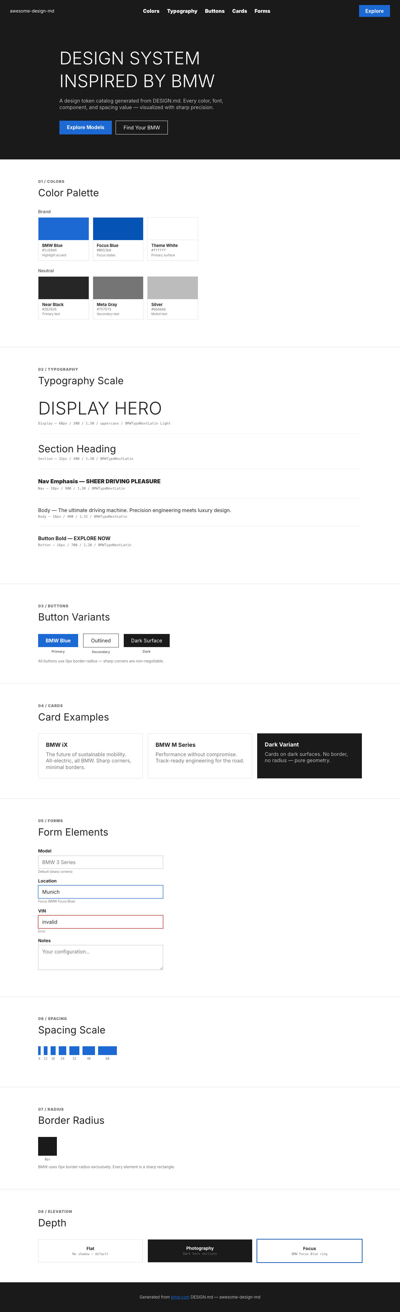
A sample landing page built with DESIGN.md. It shows the actual colors, typography, buttons, cards, spacing, and elevation, all in one page.
|
|
18
|
+
|
|
19
|
+
### Dark Mode
|
|
20
|
+
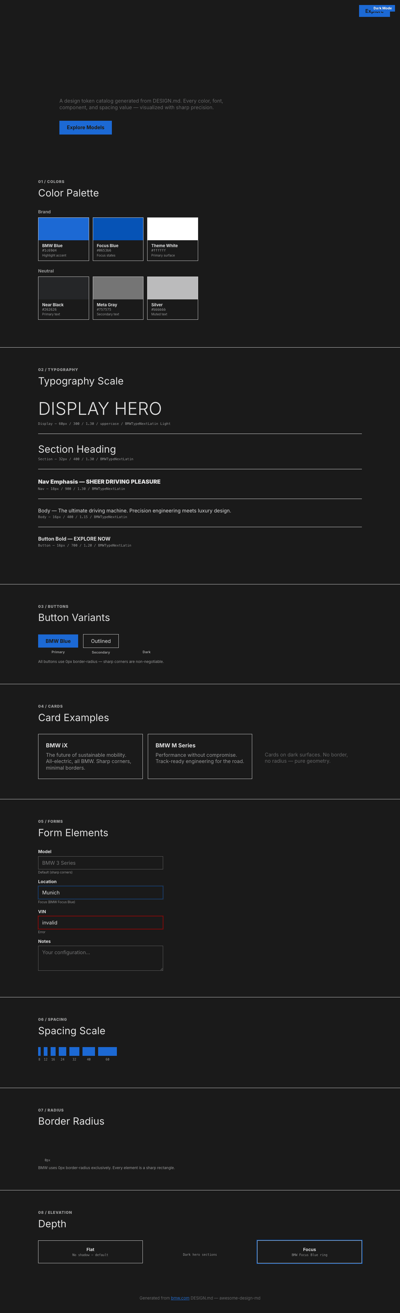
|
|
21
|
+
|
|
22
|
+
### Light Mode
|
|
23
|
+
|