@primer/react-brand 0.69.1-rc.0a4e5ff5 → 0.70.0-rc.11ae3568
This diff represents the content of publicly available package versions that have been released to one of the supported registries. The information contained in this diff is provided for informational purposes only and reflects changes between package versions as they appear in their respective public registries.
- package/README.md +19 -0
- package/docs/components/ActionMenu/index.md +156 -0
- package/docs/components/AnchorNav/index.md +220 -0
- package/docs/components/Avatar/index.md +30 -0
- package/docs/components/Avatar/react.md +71 -0
- package/docs/components/Bento/index.md +223 -0
- package/docs/components/Breadcrumbs/index.md +51 -0
- package/docs/components/Breadcrumbs/react.md +53 -0
- package/docs/components/BreakoutBanner/index.md +102 -0
- package/docs/components/BreakoutBanner/react.md +174 -0
- package/docs/components/Button/index.md +133 -0
- package/docs/components/Button/react.md +94 -0
- package/docs/components/ButtonGroup/index.md +62 -0
- package/docs/components/ButtonGroup/react.md +60 -0
- package/docs/components/CTABanner/index.md +114 -0
- package/docs/components/CTABanner/react.md +343 -0
- package/docs/components/CTAForm/index.md +95 -0
- package/docs/components/CTAForm/react.md +103 -0
- package/docs/components/Card/index.md +126 -0
- package/docs/components/Card/react.md +240 -0
- package/docs/components/ComparisonTable/index.md +381 -0
- package/docs/components/EyebrowBanner/index.md +153 -0
- package/docs/components/FAQ/index.md +66 -0
- package/docs/components/FAQ/react.md +477 -0
- package/docs/components/Footnotes/index.md +41 -0
- package/docs/components/Footnotes/react.md +156 -0
- package/docs/components/Hero/index.md +65 -0
- package/docs/components/Hero/react.md +215 -0
- package/docs/components/IDE/index.md +278 -0
- package/docs/components/Icon/index.md +87 -0
- package/docs/components/Image/index.md +51 -0
- package/docs/components/Image/react.md +160 -0
- package/docs/components/Label/index.md +86 -0
- package/docs/components/Label/react.md +76 -0
- package/docs/components/LogoSuite/index.md +93 -0
- package/docs/components/LogoSuite/react.md +667 -0
- package/docs/components/MediaPlaylist/index.md +133 -0
- package/docs/components/MinimalFooter/index.md +94 -0
- package/docs/components/NavList/index.md +210 -0
- package/docs/components/OrderedList/index.md +55 -0
- package/docs/components/OrderedList/react.md +41 -0
- package/docs/components/Pagination/index.md +80 -0
- package/docs/components/Pillar/index.md +114 -0
- package/docs/components/Pillar/react.md +175 -0
- package/docs/components/PricingOptions/index.md +509 -0
- package/docs/components/Prose/index.md +158 -0
- package/docs/components/River/index.md +190 -0
- package/docs/components/River/react.md +295 -0
- package/docs/components/RiverAccordion/index.md +200 -0
- package/docs/components/RiverBreakoutTabs/index.md +171 -0
- package/docs/components/Section/index.md +40 -0
- package/docs/components/Section/react.md +137 -0
- package/docs/components/SectionIntro/index.md +77 -0
- package/docs/components/SectionIntro/react.md +107 -0
- package/docs/components/SectionIntroStacked/index.md +226 -0
- package/docs/components/Statistic/index.md +111 -0
- package/docs/components/SubNav/index.md +156 -0
- package/docs/components/SubdomainNavBar/index.md +136 -0
- package/docs/components/Tabs/index.md +243 -0
- package/docs/components/Testimonial/index.md +138 -0
- package/docs/components/Testimonial/react.md +191 -0
- package/docs/components/Tiles/index.md +1441 -0
- package/docs/components/Timeline/index.md +68 -0
- package/docs/components/Token/index.md +86 -0
- package/docs/components/Tooltip/index.md +61 -0
- package/docs/components/UnorderedList/index.md +67 -0
- package/docs/components/UnorderedList/react.md +89 -0
- package/docs/components/VideoPlayer/index.md +234 -0
- package/docs/components/index.md +53 -0
- package/docs/forms/Checkbox/index.md +86 -0
- package/docs/forms/Checkbox/react.md +111 -0
- package/docs/forms/CheckboxGroup/index.md +37 -0
- package/docs/forms/CheckboxGroup/react.md +175 -0
- package/docs/forms/FormControl/index.md +404 -0
- package/docs/forms/Radio/index.md +63 -0
- package/docs/forms/Radio/react.md +68 -0
- package/docs/forms/RadioGroup/index.md +45 -0
- package/docs/forms/RadioGroup/react.md +151 -0
- package/docs/forms/Select/index.md +244 -0
- package/docs/forms/TextArea/index.md +126 -0
- package/docs/forms/TextInput/index.md +221 -0
- package/docs/forms/index.md +14 -0
- package/docs/getting-started/esm.md +49 -0
- package/docs/getting-started/index.md +98 -0
- package/docs/index.md +99 -0
- package/docs/introduction/animation.md +127 -0
- package/docs/introduction/index.md +10 -0
- package/docs/introduction/mcp.md +52 -0
- package/docs/introduction/theming.md +132 -0
- package/docs/layout/Box/index.md +46 -0
- package/docs/layout/Box/react.md +284 -0
- package/docs/layout/Grid/index.md +132 -0
- package/docs/layout/Grid/react.md +117 -0
- package/docs/layout/Stack/index.md +60 -0
- package/docs/layout/Stack/react.md +166 -0
- package/docs/layout/index.md +9 -0
- package/docs/primitives/color.md +6 -0
- package/docs/primitives/index.md +8 -0
- package/docs/typography/Heading/index.md +53 -0
- package/docs/typography/Heading/react.md +182 -0
- package/docs/typography/Text/index.md +68 -0
- package/docs/typography/Text/react.md +125 -0
- package/docs/typography/index.md +8 -0
- package/esm/Footnotes/{Footnotes.module-Du0yaz7E.css → Footnotes.module-DG9Vx76y.css} +1 -1
- package/esm/Footnotes/Footnotes.module.js +1 -1
- package/esm/Footnotes/Footnotes.module.js.map +1 -1
- package/esm/Heading/Heading.d.ts +10 -0
- package/esm/Heading/Heading.d.ts.map +1 -1
- package/esm/Heading/Heading.js.map +1 -1
- package/esm/Hero/Hero.d.ts.map +1 -1
- package/esm/Hero/Hero.js +60 -58
- package/esm/Hero/Hero.js.map +1 -1
- package/esm/Hero/{Hero.module-Cy82CEW3.css → Hero.module-DqG5f0MT.css} +1 -1
- package/esm/Hero/Hero.module.js +1 -1
- package/esm/Hero/Hero.module.js.map +1 -1
- package/esm/NavList/NavList.d.ts +86 -0
- package/esm/NavList/NavList.d.ts.map +1 -0
- package/esm/NavList/NavList.js +277 -0
- package/esm/NavList/NavList.js.map +1 -0
- package/esm/NavList/NavList.module-CZFnt8br.css +1 -0
- package/esm/NavList/NavList.module.js +32 -0
- package/esm/NavList/NavList.module.js.map +1 -0
- package/esm/NavList/index.d.ts +2 -0
- package/esm/NavList/index.d.ts.map +1 -0
- package/esm/SectionIntroStacked/{SectionIntroStacked.module-Cr7kUqTH.css → SectionIntroStacked.module-C3cmwHDY.css} +1 -1
- package/esm/SectionIntroStacked/SectionIntroStacked.module.js +1 -1
- package/esm/SectionIntroStacked/SectionIntroStacked.module.js.map +1 -1
- package/esm/Token/Token.js +0 -1
- package/esm/Token/Token.js.map +1 -1
- package/esm/Token/{Token.module-BcKU1KwK.css → Token.module-DtWE9IPI.css} +1 -1
- package/esm/Token/Token.module.js +1 -1
- package/esm/Token/Token.module.js.map +1 -1
- package/esm/index.d.ts +1 -0
- package/esm/index.d.ts.map +1 -1
- package/esm/index.esm.js +12 -11
- package/esm/packages/design-tokens/lib/design-tokens/css/tokens/functional/components/nav-list/colors-with-modes-CGyt2t8f.css +1 -0
- package/lib/Grid/Grid.d.ts +1 -1
- package/lib/Heading/Heading.d.ts +10 -0
- package/lib/NavList/NavList.d.ts +85 -0
- package/lib/NavList/index.d.ts +1 -0
- package/lib/SubNav/SubNav.d.ts +1 -1
- package/lib/Token/Token.d.ts +1 -1
- package/lib/css/main.css +613 -74
- package/lib/design-tokens/css/tokens/base/colors/color-scales-with-modes.css +1 -1
- package/lib/design-tokens/css/tokens/base/colors/light.css +1 -1
- package/lib/design-tokens/css/tokens/base/size/size.css +1 -1
- package/lib/design-tokens/css/tokens/base/typography/typography.css +1 -1
- package/lib/design-tokens/css/tokens/functional/animation/base.css +1 -1
- package/lib/design-tokens/css/tokens/functional/colors/global-with-modes.css +1 -1
- package/lib/design-tokens/css/tokens/functional/colors/global.css +1 -1
- package/lib/design-tokens/css/tokens/functional/components/accordion/colors-with-modes.css +1 -1
- package/lib/design-tokens/css/tokens/functional/components/action-menu/colors-with-modes.css +1 -1
- package/lib/design-tokens/css/tokens/functional/components/anchor-nav/colors-with-modes.css +1 -1
- package/lib/design-tokens/css/tokens/functional/components/bento/base.css +1 -1
- package/lib/design-tokens/css/tokens/functional/components/blinking-cursor/colors-with-modes.css +1 -1
- package/lib/design-tokens/css/tokens/functional/components/breadcrumbs/colors-with-modes.css +1 -1
- package/lib/design-tokens/css/tokens/functional/components/button/colors-with-modes.css +1 -1
- package/lib/design-tokens/css/tokens/functional/components/card/base.css +1 -1
- package/lib/design-tokens/css/tokens/functional/components/card/colors-with-modes.css +1 -1
- package/lib/design-tokens/css/tokens/functional/components/card/colors.css +1 -1
- package/lib/design-tokens/css/tokens/functional/components/comparison-table/colors-with-modes.css +1 -1
- package/lib/design-tokens/css/tokens/functional/components/comparison-table/comparison-table.css +1 -1
- package/lib/design-tokens/css/tokens/functional/components/control/colors-with-modes.css +1 -1
- package/lib/design-tokens/css/tokens/functional/components/cta-banner/colors-with-modes.css +1 -1
- package/lib/design-tokens/css/tokens/functional/components/eyebrow-banner/colors-with-modes.css +1 -1
- package/lib/design-tokens/css/tokens/functional/components/eyebrow-banner/eyebrow-banner.css +1 -1
- package/lib/design-tokens/css/tokens/functional/components/faq/base.css +1 -1
- package/lib/design-tokens/css/tokens/functional/components/faq/colors-with-modes.css +1 -1
- package/lib/design-tokens/css/tokens/functional/components/faq/colors.css +1 -1
- package/lib/design-tokens/css/tokens/functional/components/faq/faq.css +1 -1
- package/lib/design-tokens/css/tokens/functional/components/footer/colors-with-modes.css +1 -1
- package/lib/design-tokens/css/tokens/functional/components/footer/colors.css +1 -1
- package/lib/design-tokens/css/tokens/functional/components/frosted-glass-vfx/base.css +1 -1
- package/lib/design-tokens/css/tokens/functional/components/frosted-glass-vfx/colors-with-modes.css +1 -1
- package/lib/design-tokens/css/tokens/functional/components/grid/colors-with-modes.css +1 -1
- package/lib/design-tokens/css/tokens/functional/components/grid/colors.css +1 -1
- package/lib/design-tokens/css/tokens/functional/components/grid/grid.css +1 -1
- package/lib/design-tokens/css/tokens/functional/components/hero/base.css +1 -1
- package/lib/design-tokens/css/tokens/functional/components/icon/colors-with-modes.css +1 -1
- package/lib/design-tokens/css/tokens/functional/components/icon/colors.css +1 -1
- package/lib/design-tokens/css/tokens/functional/components/ide/base.css +1 -1
- package/lib/design-tokens/css/tokens/functional/components/ide/colors-with-modes.css +1 -1
- package/lib/design-tokens/css/tokens/functional/components/image/base.css +1 -1
- package/lib/design-tokens/css/tokens/functional/components/inline-link/base.css +1 -1
- package/lib/design-tokens/css/tokens/functional/components/inline-link/colors-with-modes.css +1 -1
- package/lib/design-tokens/css/tokens/functional/components/inline-link/colors.css +1 -1
- package/lib/design-tokens/css/tokens/functional/components/label/colors-with-modes.css +1 -1
- package/lib/design-tokens/css/tokens/functional/components/label/colors.css +1 -1
- package/lib/design-tokens/css/tokens/functional/components/link/colors-with-modes.css +1 -1
- package/lib/design-tokens/css/tokens/functional/components/link/colors.css +1 -1
- package/lib/design-tokens/css/tokens/functional/components/logosuite/base.css +1 -1
- package/lib/design-tokens/css/tokens/functional/components/logosuite/colors-with-modes.css +1 -1
- package/lib/design-tokens/css/tokens/functional/components/logosuite/colors.css +1 -1
- package/lib/design-tokens/css/tokens/functional/components/media-playlist/colors-with-modes.css +1 -1
- package/lib/design-tokens/css/tokens/functional/components/media-playlist/colors.css +1 -1
- package/lib/design-tokens/css/tokens/functional/components/nav-list/colors-with-modes.css +13 -0
- package/lib/design-tokens/css/tokens/functional/components/pricing-options/colors-with-modes.css +1 -1
- package/lib/design-tokens/css/tokens/functional/components/pricing-options/colors.css +1 -1
- package/lib/design-tokens/css/tokens/functional/components/pricing-options/pricing-options.css +1 -1
- package/lib/design-tokens/css/tokens/functional/components/prose/base.css +1 -1
- package/lib/design-tokens/css/tokens/functional/components/prose/colors-with-modes.css +1 -1
- package/lib/design-tokens/css/tokens/functional/components/river/base.css +1 -1
- package/lib/design-tokens/css/tokens/functional/components/river/river.css +1 -1
- package/lib/design-tokens/css/tokens/functional/components/river-story-scroll/colors-with-modes.css +1 -1
- package/lib/design-tokens/css/tokens/functional/components/section/section.css +1 -1
- package/lib/design-tokens/css/tokens/functional/components/statistic/base.css +1 -1
- package/lib/design-tokens/css/tokens/functional/components/sub-nav/base.css +1 -1
- package/lib/design-tokens/css/tokens/functional/components/sub-nav/colors-with-modes.css +1 -1
- package/lib/design-tokens/css/tokens/functional/components/subdomain-nav-bar/colors-with-modes.css +1 -1
- package/lib/design-tokens/css/tokens/functional/components/tabs/base.css +1 -1
- package/lib/design-tokens/css/tokens/functional/components/tabs/colors-with-modes.css +1 -1
- package/lib/design-tokens/css/tokens/functional/components/tabs/colors.css +1 -1
- package/lib/design-tokens/css/tokens/functional/components/testimonial/base.css +1 -1
- package/lib/design-tokens/css/tokens/functional/components/testimonial/colors-with-modes.css +1 -1
- package/lib/design-tokens/css/tokens/functional/components/testimonial/colors.css +1 -1
- package/lib/design-tokens/css/tokens/functional/components/text-cursor-animation/colors-with-modes.css +1 -1
- package/lib/design-tokens/css/tokens/functional/components/text-cursor-animation/colors.css +1 -1
- package/lib/design-tokens/css/tokens/functional/components/tiles/colors-with-modes.css +1 -1
- package/lib/design-tokens/css/tokens/functional/components/timeline/base.css +1 -1
- package/lib/design-tokens/css/tokens/functional/components/timeline/colors-with-modes.css +1 -1
- package/lib/design-tokens/css/tokens/functional/components/timeline/colors.css +1 -1
- package/lib/design-tokens/css/tokens/functional/components/token/colors-with-modes.css +1 -1
- package/lib/design-tokens/css/tokens/functional/components/token/colors.css +1 -1
- package/lib/design-tokens/css/tokens/functional/components/tooltip/colors-with-modes.css +1 -1
- package/lib/design-tokens/css/tokens/functional/components/tooltip/colors.css +1 -1
- package/lib/design-tokens/css/tokens/functional/components/video-player/base.css +1 -1
- package/lib/design-tokens/css/tokens/functional/components/video-player/colors-with-modes.css +1 -1
- package/lib/design-tokens/css/tokens/functional/size/border.css +1 -1
- package/lib/design-tokens/css/tokens/functional/size/breakpoints.css +1 -1
- package/lib/design-tokens/css/tokens/functional/size/size-coarse.css +1 -1
- package/lib/design-tokens/css/tokens/functional/size/size-fine.css +1 -1
- package/lib/design-tokens/css/tokens/functional/size/size.css +1 -1
- package/lib/design-tokens/css/tokens/functional/size/viewport.css +1 -1
- package/lib/design-tokens/css/tokens/functional/typography/typography-responsive.css +1 -1
- package/lib/design-tokens/css/tokens/functional/typography/typography.css +1 -1
- package/lib/design-tokens/js/module/tokens/base/colors/light.js +1 -1
- package/lib/design-tokens/js/module/tokens/base/size/size.js +1 -1
- package/lib/design-tokens/js/module/tokens/base/typography/typography.js +1 -1
- package/lib/design-tokens/js/module/tokens/functional/animation/base.js +1 -1
- package/lib/design-tokens/js/module/tokens/functional/colors/global.js +1 -1
- package/lib/design-tokens/js/module/tokens/functional/components/bento/base.js +1 -1
- package/lib/design-tokens/js/module/tokens/functional/components/card/base.js +1 -1
- package/lib/design-tokens/js/module/tokens/functional/components/card/colors.js +1 -1
- package/lib/design-tokens/js/module/tokens/functional/components/comparison-table/comparison-table.js +1 -1
- package/lib/design-tokens/js/module/tokens/functional/components/eyebrow-banner/eyebrow-banner.js +1 -1
- package/lib/design-tokens/js/module/tokens/functional/components/faq/base.js +1 -1
- package/lib/design-tokens/js/module/tokens/functional/components/faq/colors.js +1 -1
- package/lib/design-tokens/js/module/tokens/functional/components/faq/faq.js +1 -1
- package/lib/design-tokens/js/module/tokens/functional/components/footer/colors.js +1 -1
- package/lib/design-tokens/js/module/tokens/functional/components/frosted-glass-vfx/base.js +1 -1
- package/lib/design-tokens/js/module/tokens/functional/components/grid/colors.js +1 -1
- package/lib/design-tokens/js/module/tokens/functional/components/grid/grid.js +1 -1
- package/lib/design-tokens/js/module/tokens/functional/components/hero/base.js +1 -1
- package/lib/design-tokens/js/module/tokens/functional/components/icon/colors.js +1 -1
- package/lib/design-tokens/js/module/tokens/functional/components/ide/base.js +1 -1
- package/lib/design-tokens/js/module/tokens/functional/components/image/base.js +1 -1
- package/lib/design-tokens/js/module/tokens/functional/components/inline-link/base.js +1 -1
- package/lib/design-tokens/js/module/tokens/functional/components/inline-link/colors.js +1 -1
- package/lib/design-tokens/js/module/tokens/functional/components/label/colors.js +1 -1
- package/lib/design-tokens/js/module/tokens/functional/components/link/colors.js +1 -1
- package/lib/design-tokens/js/module/tokens/functional/components/logosuite/base.js +1 -1
- package/lib/design-tokens/js/module/tokens/functional/components/logosuite/colors.js +1 -1
- package/lib/design-tokens/js/module/tokens/functional/components/media-playlist/colors.js +1 -1
- package/lib/design-tokens/js/module/tokens/functional/components/pricing-options/colors.js +1 -1
- package/lib/design-tokens/js/module/tokens/functional/components/pricing-options/pricing-options.js +1 -1
- package/lib/design-tokens/js/module/tokens/functional/components/prose/base.js +1 -1
- package/lib/design-tokens/js/module/tokens/functional/components/river/base.js +1 -1
- package/lib/design-tokens/js/module/tokens/functional/components/river/river.js +1 -1
- package/lib/design-tokens/js/module/tokens/functional/components/section/section.js +1 -1
- package/lib/design-tokens/js/module/tokens/functional/components/statistic/base.js +1 -1
- package/lib/design-tokens/js/module/tokens/functional/components/sub-nav/base.js +1 -1
- package/lib/design-tokens/js/module/tokens/functional/components/tabs/base.js +1 -1
- package/lib/design-tokens/js/module/tokens/functional/components/tabs/colors.js +1 -1
- package/lib/design-tokens/js/module/tokens/functional/components/testimonial/base.js +1 -1
- package/lib/design-tokens/js/module/tokens/functional/components/testimonial/colors.js +1 -1
- package/lib/design-tokens/js/module/tokens/functional/components/text-cursor-animation/colors.js +1 -1
- package/lib/design-tokens/js/module/tokens/functional/components/timeline/base.js +1 -1
- package/lib/design-tokens/js/module/tokens/functional/components/timeline/colors.js +1 -1
- package/lib/design-tokens/js/module/tokens/functional/components/token/colors.js +1 -1
- package/lib/design-tokens/js/module/tokens/functional/components/tooltip/colors.js +1 -1
- package/lib/design-tokens/js/module/tokens/functional/components/video-player/base.js +1 -1
- package/lib/design-tokens/js/module/tokens/functional/size/border.js +1 -1
- package/lib/design-tokens/js/module/tokens/functional/size/breakpoints.js +1 -1
- package/lib/design-tokens/js/module/tokens/functional/size/size-coarse.js +1 -1
- package/lib/design-tokens/js/module/tokens/functional/size/size-fine.js +1 -1
- package/lib/design-tokens/js/module/tokens/functional/size/size.js +1 -1
- package/lib/design-tokens/js/module/tokens/functional/size/viewport.js +1 -1
- package/lib/design-tokens/js/module/tokens/functional/typography/typography-responsive.js +1 -1
- package/lib/design-tokens/js/module/tokens/functional/typography/typography.js +1 -1
- package/lib/design-tokens/js/tokens/base/colors/light.js +1 -1
- package/lib/design-tokens/js/tokens/base/size/size.js +1 -1
- package/lib/design-tokens/js/tokens/base/typography/typography.js +1 -1
- package/lib/design-tokens/js/tokens/functional/animation/base.js +1 -1
- package/lib/design-tokens/js/tokens/functional/colors/global.js +1 -1
- package/lib/design-tokens/js/tokens/functional/components/bento/base.js +1 -1
- package/lib/design-tokens/js/tokens/functional/components/card/base.js +1 -1
- package/lib/design-tokens/js/tokens/functional/components/card/colors.js +1 -1
- package/lib/design-tokens/js/tokens/functional/components/comparison-table/comparison-table.js +1 -1
- package/lib/design-tokens/js/tokens/functional/components/eyebrow-banner/eyebrow-banner.js +1 -1
- package/lib/design-tokens/js/tokens/functional/components/faq/base.js +1 -1
- package/lib/design-tokens/js/tokens/functional/components/faq/colors.js +1 -1
- package/lib/design-tokens/js/tokens/functional/components/faq/faq.js +1 -1
- package/lib/design-tokens/js/tokens/functional/components/footer/colors.js +1 -1
- package/lib/design-tokens/js/tokens/functional/components/frosted-glass-vfx/base.js +1 -1
- package/lib/design-tokens/js/tokens/functional/components/grid/colors.js +1 -1
- package/lib/design-tokens/js/tokens/functional/components/grid/grid.js +1 -1
- package/lib/design-tokens/js/tokens/functional/components/hero/base.js +1 -1
- package/lib/design-tokens/js/tokens/functional/components/icon/colors.js +1 -1
- package/lib/design-tokens/js/tokens/functional/components/ide/base.js +1 -1
- package/lib/design-tokens/js/tokens/functional/components/image/base.js +1 -1
- package/lib/design-tokens/js/tokens/functional/components/inline-link/base.js +1 -1
- package/lib/design-tokens/js/tokens/functional/components/inline-link/colors.js +1 -1
- package/lib/design-tokens/js/tokens/functional/components/label/colors.js +1 -1
- package/lib/design-tokens/js/tokens/functional/components/link/colors.js +1 -1
- package/lib/design-tokens/js/tokens/functional/components/logosuite/base.js +1 -1
- package/lib/design-tokens/js/tokens/functional/components/logosuite/colors.js +1 -1
- package/lib/design-tokens/js/tokens/functional/components/media-playlist/colors.js +1 -1
- package/lib/design-tokens/js/tokens/functional/components/pricing-options/colors.js +1 -1
- package/lib/design-tokens/js/tokens/functional/components/pricing-options/pricing-options.js +1 -1
- package/lib/design-tokens/js/tokens/functional/components/prose/base.js +1 -1
- package/lib/design-tokens/js/tokens/functional/components/river/base.js +1 -1
- package/lib/design-tokens/js/tokens/functional/components/river/river.js +1 -1
- package/lib/design-tokens/js/tokens/functional/components/section/section.js +1 -1
- package/lib/design-tokens/js/tokens/functional/components/statistic/base.js +1 -1
- package/lib/design-tokens/js/tokens/functional/components/sub-nav/base.js +1 -1
- package/lib/design-tokens/js/tokens/functional/components/tabs/base.js +1 -1
- package/lib/design-tokens/js/tokens/functional/components/tabs/colors.js +1 -1
- package/lib/design-tokens/js/tokens/functional/components/testimonial/base.js +1 -1
- package/lib/design-tokens/js/tokens/functional/components/testimonial/colors.js +1 -1
- package/lib/design-tokens/js/tokens/functional/components/text-cursor-animation/colors.js +1 -1
- package/lib/design-tokens/js/tokens/functional/components/timeline/base.js +1 -1
- package/lib/design-tokens/js/tokens/functional/components/timeline/colors.js +1 -1
- package/lib/design-tokens/js/tokens/functional/components/token/colors.js +1 -1
- package/lib/design-tokens/js/tokens/functional/components/tooltip/colors.js +1 -1
- package/lib/design-tokens/js/tokens/functional/components/video-player/base.js +1 -1
- package/lib/design-tokens/js/tokens/functional/size/border.js +1 -1
- package/lib/design-tokens/js/tokens/functional/size/breakpoints.js +1 -1
- package/lib/design-tokens/js/tokens/functional/size/size-coarse.js +1 -1
- package/lib/design-tokens/js/tokens/functional/size/size-fine.js +1 -1
- package/lib/design-tokens/js/tokens/functional/size/size.js +1 -1
- package/lib/design-tokens/js/tokens/functional/size/viewport.js +1 -1
- package/lib/design-tokens/js/tokens/functional/typography/typography-responsive.js +1 -1
- package/lib/design-tokens/js/tokens/functional/typography/typography.js +1 -1
- package/lib/design-tokens/scss/tokens/base/colors/light.scss +1 -1
- package/lib/design-tokens/scss/tokens/base/size/size.scss +1 -1
- package/lib/design-tokens/scss/tokens/base/typography/typography.scss +1 -1
- package/lib/design-tokens/scss/tokens/functional/animation/base.scss +1 -1
- package/lib/design-tokens/scss/tokens/functional/colors/global.scss +1 -1
- package/lib/design-tokens/scss/tokens/functional/components/bento/base.scss +1 -1
- package/lib/design-tokens/scss/tokens/functional/components/card/base.scss +1 -1
- package/lib/design-tokens/scss/tokens/functional/components/card/colors.scss +1 -1
- package/lib/design-tokens/scss/tokens/functional/components/comparison-table/comparison-table.scss +1 -1
- package/lib/design-tokens/scss/tokens/functional/components/eyebrow-banner/eyebrow-banner.scss +1 -1
- package/lib/design-tokens/scss/tokens/functional/components/faq/base.scss +1 -1
- package/lib/design-tokens/scss/tokens/functional/components/faq/colors.scss +1 -1
- package/lib/design-tokens/scss/tokens/functional/components/faq/faq.scss +1 -1
- package/lib/design-tokens/scss/tokens/functional/components/footer/colors.scss +1 -1
- package/lib/design-tokens/scss/tokens/functional/components/frosted-glass-vfx/base.scss +1 -1
- package/lib/design-tokens/scss/tokens/functional/components/grid/colors.scss +1 -1
- package/lib/design-tokens/scss/tokens/functional/components/grid/grid.scss +1 -1
- package/lib/design-tokens/scss/tokens/functional/components/hero/base.scss +1 -1
- package/lib/design-tokens/scss/tokens/functional/components/icon/colors.scss +1 -1
- package/lib/design-tokens/scss/tokens/functional/components/ide/base.scss +1 -1
- package/lib/design-tokens/scss/tokens/functional/components/image/base.scss +1 -1
- package/lib/design-tokens/scss/tokens/functional/components/inline-link/base.scss +1 -1
- package/lib/design-tokens/scss/tokens/functional/components/inline-link/colors.scss +1 -1
- package/lib/design-tokens/scss/tokens/functional/components/label/colors.scss +1 -1
- package/lib/design-tokens/scss/tokens/functional/components/link/colors.scss +1 -1
- package/lib/design-tokens/scss/tokens/functional/components/logosuite/base.scss +1 -1
- package/lib/design-tokens/scss/tokens/functional/components/logosuite/colors.scss +1 -1
- package/lib/design-tokens/scss/tokens/functional/components/media-playlist/colors.scss +1 -1
- package/lib/design-tokens/scss/tokens/functional/components/pricing-options/colors.scss +1 -1
- package/lib/design-tokens/scss/tokens/functional/components/pricing-options/pricing-options.scss +1 -1
- package/lib/design-tokens/scss/tokens/functional/components/prose/base.scss +1 -1
- package/lib/design-tokens/scss/tokens/functional/components/river/base.scss +1 -1
- package/lib/design-tokens/scss/tokens/functional/components/river/river.scss +1 -1
- package/lib/design-tokens/scss/tokens/functional/components/section/section.scss +1 -1
- package/lib/design-tokens/scss/tokens/functional/components/statistic/base.scss +1 -1
- package/lib/design-tokens/scss/tokens/functional/components/sub-nav/base.scss +1 -1
- package/lib/design-tokens/scss/tokens/functional/components/tabs/base.scss +1 -1
- package/lib/design-tokens/scss/tokens/functional/components/tabs/colors.scss +1 -1
- package/lib/design-tokens/scss/tokens/functional/components/testimonial/base.scss +1 -1
- package/lib/design-tokens/scss/tokens/functional/components/testimonial/colors.scss +1 -1
- package/lib/design-tokens/scss/tokens/functional/components/text-cursor-animation/colors.scss +1 -1
- package/lib/design-tokens/scss/tokens/functional/components/timeline/base.scss +1 -1
- package/lib/design-tokens/scss/tokens/functional/components/timeline/colors.scss +1 -1
- package/lib/design-tokens/scss/tokens/functional/components/token/colors.scss +1 -1
- package/lib/design-tokens/scss/tokens/functional/components/tooltip/colors.scss +1 -1
- package/lib/design-tokens/scss/tokens/functional/components/video-player/base.scss +1 -1
- package/lib/design-tokens/scss/tokens/functional/size/border.scss +1 -1
- package/lib/design-tokens/scss/tokens/functional/size/breakpoints.scss +1 -1
- package/lib/design-tokens/scss/tokens/functional/size/size-coarse.scss +1 -1
- package/lib/design-tokens/scss/tokens/functional/size/size-fine.scss +1 -1
- package/lib/design-tokens/scss/tokens/functional/size/size.scss +1 -1
- package/lib/design-tokens/scss/tokens/functional/size/viewport.scss +1 -1
- package/lib/design-tokens/scss/tokens/functional/typography/typography-responsive.scss +1 -1
- package/lib/design-tokens/scss/tokens/functional/typography/typography.scss +1 -1
- package/lib/design-tokens/ts/tokens/base/colors/light.d.ts +1 -1
- package/lib/design-tokens/ts/tokens/base/colors/light.js +1 -1
- package/lib/design-tokens/ts/tokens/base/size/size.d.ts +1 -1
- package/lib/design-tokens/ts/tokens/base/size/size.js +1 -1
- package/lib/design-tokens/ts/tokens/base/typography/typography.d.ts +1 -1
- package/lib/design-tokens/ts/tokens/base/typography/typography.js +1 -1
- package/lib/design-tokens/ts/tokens/functional/animation/base.d.ts +1 -1
- package/lib/design-tokens/ts/tokens/functional/animation/base.js +1 -1
- package/lib/design-tokens/ts/tokens/functional/colors/global.d.ts +1 -1
- package/lib/design-tokens/ts/tokens/functional/colors/global.js +1 -1
- package/lib/design-tokens/ts/tokens/functional/components/bento/base.d.ts +1 -1
- package/lib/design-tokens/ts/tokens/functional/components/bento/base.js +1 -1
- package/lib/design-tokens/ts/tokens/functional/components/card/base.d.ts +1 -1
- package/lib/design-tokens/ts/tokens/functional/components/card/base.js +1 -1
- package/lib/design-tokens/ts/tokens/functional/components/card/colors.d.ts +1 -1
- package/lib/design-tokens/ts/tokens/functional/components/card/colors.js +1 -1
- package/lib/design-tokens/ts/tokens/functional/components/comparison-table/comparison-table.d.ts +1 -1
- package/lib/design-tokens/ts/tokens/functional/components/comparison-table/comparison-table.js +1 -1
- package/lib/design-tokens/ts/tokens/functional/components/eyebrow-banner/eyebrow-banner.d.ts +1 -1
- package/lib/design-tokens/ts/tokens/functional/components/eyebrow-banner/eyebrow-banner.js +1 -1
- package/lib/design-tokens/ts/tokens/functional/components/faq/base.d.ts +1 -1
- package/lib/design-tokens/ts/tokens/functional/components/faq/base.js +1 -1
- package/lib/design-tokens/ts/tokens/functional/components/faq/colors.d.ts +1 -1
- package/lib/design-tokens/ts/tokens/functional/components/faq/colors.js +1 -1
- package/lib/design-tokens/ts/tokens/functional/components/faq/faq.d.ts +1 -1
- package/lib/design-tokens/ts/tokens/functional/components/faq/faq.js +1 -1
- package/lib/design-tokens/ts/tokens/functional/components/footer/colors.d.ts +1 -1
- package/lib/design-tokens/ts/tokens/functional/components/footer/colors.js +1 -1
- package/lib/design-tokens/ts/tokens/functional/components/frosted-glass-vfx/base.d.ts +1 -1
- package/lib/design-tokens/ts/tokens/functional/components/frosted-glass-vfx/base.js +1 -1
- package/lib/design-tokens/ts/tokens/functional/components/grid/colors.d.ts +1 -1
- package/lib/design-tokens/ts/tokens/functional/components/grid/colors.js +1 -1
- package/lib/design-tokens/ts/tokens/functional/components/grid/grid.d.ts +1 -1
- package/lib/design-tokens/ts/tokens/functional/components/grid/grid.js +1 -1
- package/lib/design-tokens/ts/tokens/functional/components/hero/base.d.ts +1 -1
- package/lib/design-tokens/ts/tokens/functional/components/hero/base.js +1 -1
- package/lib/design-tokens/ts/tokens/functional/components/icon/colors.d.ts +1 -1
- package/lib/design-tokens/ts/tokens/functional/components/icon/colors.js +1 -1
- package/lib/design-tokens/ts/tokens/functional/components/ide/base.d.ts +1 -1
- package/lib/design-tokens/ts/tokens/functional/components/ide/base.js +1 -1
- package/lib/design-tokens/ts/tokens/functional/components/image/base.d.ts +1 -1
- package/lib/design-tokens/ts/tokens/functional/components/image/base.js +1 -1
- package/lib/design-tokens/ts/tokens/functional/components/inline-link/base.d.ts +1 -1
- package/lib/design-tokens/ts/tokens/functional/components/inline-link/base.js +1 -1
- package/lib/design-tokens/ts/tokens/functional/components/inline-link/colors.d.ts +1 -1
- package/lib/design-tokens/ts/tokens/functional/components/inline-link/colors.js +1 -1
- package/lib/design-tokens/ts/tokens/functional/components/label/colors.d.ts +1 -1
- package/lib/design-tokens/ts/tokens/functional/components/label/colors.js +1 -1
- package/lib/design-tokens/ts/tokens/functional/components/link/colors.d.ts +1 -1
- package/lib/design-tokens/ts/tokens/functional/components/link/colors.js +1 -1
- package/lib/design-tokens/ts/tokens/functional/components/logosuite/base.d.ts +1 -1
- package/lib/design-tokens/ts/tokens/functional/components/logosuite/base.js +1 -1
- package/lib/design-tokens/ts/tokens/functional/components/logosuite/colors.d.ts +1 -1
- package/lib/design-tokens/ts/tokens/functional/components/logosuite/colors.js +1 -1
- package/lib/design-tokens/ts/tokens/functional/components/media-playlist/colors.d.ts +1 -1
- package/lib/design-tokens/ts/tokens/functional/components/media-playlist/colors.js +1 -1
- package/lib/design-tokens/ts/tokens/functional/components/pricing-options/colors.d.ts +1 -1
- package/lib/design-tokens/ts/tokens/functional/components/pricing-options/colors.js +1 -1
- package/lib/design-tokens/ts/tokens/functional/components/pricing-options/pricing-options.d.ts +1 -1
- package/lib/design-tokens/ts/tokens/functional/components/pricing-options/pricing-options.js +1 -1
- package/lib/design-tokens/ts/tokens/functional/components/prose/base.d.ts +1 -1
- package/lib/design-tokens/ts/tokens/functional/components/prose/base.js +1 -1
- package/lib/design-tokens/ts/tokens/functional/components/river/base.d.ts +1 -1
- package/lib/design-tokens/ts/tokens/functional/components/river/base.js +1 -1
- package/lib/design-tokens/ts/tokens/functional/components/river/river.d.ts +1 -1
- package/lib/design-tokens/ts/tokens/functional/components/river/river.js +1 -1
- package/lib/design-tokens/ts/tokens/functional/components/section/section.d.ts +1 -1
- package/lib/design-tokens/ts/tokens/functional/components/section/section.js +1 -1
- package/lib/design-tokens/ts/tokens/functional/components/statistic/base.d.ts +1 -1
- package/lib/design-tokens/ts/tokens/functional/components/statistic/base.js +1 -1
- package/lib/design-tokens/ts/tokens/functional/components/sub-nav/base.d.ts +1 -1
- package/lib/design-tokens/ts/tokens/functional/components/sub-nav/base.js +1 -1
- package/lib/design-tokens/ts/tokens/functional/components/tabs/base.d.ts +1 -1
- package/lib/design-tokens/ts/tokens/functional/components/tabs/base.js +1 -1
- package/lib/design-tokens/ts/tokens/functional/components/tabs/colors.d.ts +1 -1
- package/lib/design-tokens/ts/tokens/functional/components/tabs/colors.js +1 -1
- package/lib/design-tokens/ts/tokens/functional/components/testimonial/base.d.ts +1 -1
- package/lib/design-tokens/ts/tokens/functional/components/testimonial/base.js +1 -1
- package/lib/design-tokens/ts/tokens/functional/components/testimonial/colors.d.ts +1 -1
- package/lib/design-tokens/ts/tokens/functional/components/testimonial/colors.js +1 -1
- package/lib/design-tokens/ts/tokens/functional/components/text-cursor-animation/colors.d.ts +1 -1
- package/lib/design-tokens/ts/tokens/functional/components/text-cursor-animation/colors.js +1 -1
- package/lib/design-tokens/ts/tokens/functional/components/timeline/base.d.ts +1 -1
- package/lib/design-tokens/ts/tokens/functional/components/timeline/base.js +1 -1
- package/lib/design-tokens/ts/tokens/functional/components/timeline/colors.d.ts +1 -1
- package/lib/design-tokens/ts/tokens/functional/components/timeline/colors.js +1 -1
- package/lib/design-tokens/ts/tokens/functional/components/token/colors.d.ts +1 -1
- package/lib/design-tokens/ts/tokens/functional/components/token/colors.js +1 -1
- package/lib/design-tokens/ts/tokens/functional/components/tooltip/colors.d.ts +1 -1
- package/lib/design-tokens/ts/tokens/functional/components/tooltip/colors.js +1 -1
- package/lib/design-tokens/ts/tokens/functional/components/video-player/base.d.ts +1 -1
- package/lib/design-tokens/ts/tokens/functional/components/video-player/base.js +1 -1
- package/lib/design-tokens/ts/tokens/functional/size/border.d.ts +1 -1
- package/lib/design-tokens/ts/tokens/functional/size/border.js +1 -1
- package/lib/design-tokens/ts/tokens/functional/size/breakpoints.d.ts +1 -1
- package/lib/design-tokens/ts/tokens/functional/size/breakpoints.js +1 -1
- package/lib/design-tokens/ts/tokens/functional/size/size-coarse.d.ts +1 -1
- package/lib/design-tokens/ts/tokens/functional/size/size-coarse.js +1 -1
- package/lib/design-tokens/ts/tokens/functional/size/size-fine.d.ts +1 -1
- package/lib/design-tokens/ts/tokens/functional/size/size-fine.js +1 -1
- package/lib/design-tokens/ts/tokens/functional/size/size.d.ts +1 -1
- package/lib/design-tokens/ts/tokens/functional/size/size.js +1 -1
- package/lib/design-tokens/ts/tokens/functional/size/viewport.d.ts +1 -1
- package/lib/design-tokens/ts/tokens/functional/size/viewport.js +1 -1
- package/lib/design-tokens/ts/tokens/functional/typography/typography-responsive.d.ts +1 -1
- package/lib/design-tokens/ts/tokens/functional/typography/typography-responsive.js +1 -1
- package/lib/design-tokens/ts/tokens/functional/typography/typography.d.ts +1 -1
- package/lib/design-tokens/ts/tokens/functional/typography/typography.js +1 -1
- package/lib/index.d.ts +1 -0
- package/lib/index.js +1 -1
- package/llms.txt +97 -0
- package/package.json +17 -5
- package/esm/Hero/Hero.figma.d.ts +0 -2
- package/esm/Hero/Hero.figma.d.ts.map +0 -1
- package/esm/IDE/fixtures/content.d.ts +0 -7
- package/esm/IDE/fixtures/content.d.ts.map +0 -1
- package/esm/LogoSuite/LogoSuite.figma.d.ts +0 -2
- package/esm/LogoSuite/LogoSuite.figma.d.ts.map +0 -1
- package/esm/LogoSuite/LogoSuite.fixtures.d.ts +0 -2
- package/esm/LogoSuite/LogoSuite.fixtures.d.ts.map +0 -1
- package/esm/MonaSans/MonaSans.d.ts +0 -11
- package/esm/MonaSans/MonaSans.d.ts.map +0 -1
- package/esm/MonaSans/index.d.ts +0 -2
- package/esm/MonaSans/index.d.ts.map +0 -1
- package/esm/PricingOptions/PricingOptions.figma.d.ts +0 -2
- package/esm/PricingOptions/PricingOptions.figma.d.ts.map +0 -1
- package/esm/Tiles/Tiles.fixtures.d.ts +0 -7
- package/esm/Tiles/Tiles.fixtures.d.ts.map +0 -1
- package/esm/fixtures/third-party-logos/AzureLogo.d.ts +0 -5
- package/esm/fixtures/third-party-logos/AzureLogo.d.ts.map +0 -1
- package/esm/fixtures/third-party-logos/JetBrainsLogo.d.ts +0 -5
- package/esm/fixtures/third-party-logos/JetBrainsLogo.d.ts.map +0 -1
- package/esm/fixtures/third-party-logos/MicrosoftCopilotLogo.d.ts +0 -5
- package/esm/fixtures/third-party-logos/MicrosoftCopilotLogo.d.ts.map +0 -1
- package/esm/fixtures/third-party-logos/MicrosoftLogo.d.ts +0 -5
- package/esm/fixtures/third-party-logos/MicrosoftLogo.d.ts.map +0 -1
- package/esm/fixtures/third-party-logos/NeoVimLogo.d.ts +0 -5
- package/esm/fixtures/third-party-logos/NeoVimLogo.d.ts.map +0 -1
- package/esm/fixtures/third-party-logos/VisualStudioCodeLogo.d.ts +0 -5
- package/esm/fixtures/third-party-logos/VisualStudioCodeLogo.d.ts.map +0 -1
- package/esm/fixtures/third-party-logos/VisualStudioLogo.d.ts +0 -5
- package/esm/fixtures/third-party-logos/VisualStudioLogo.d.ts.map +0 -1
- package/esm/list/ListItem/index.d.ts +0 -2
- package/esm/list/ListItem/index.d.ts.map +0 -1
- package/esm/recipes/FeaturePreviewLPs/FeaturePreviewLevelOne/FeaturePreviewLevelOne.d.ts +0 -13
- package/esm/recipes/FeaturePreviewLPs/FeaturePreviewLevelOne/FeaturePreviewLevelOne.d.ts.map +0 -1
- package/esm/recipes/FeaturePreviewLPs/FeaturePreviewLevelOne/FeaturePreviewLevelOneSideBySide.d.ts +0 -14
- package/esm/recipes/FeaturePreviewLPs/FeaturePreviewLevelOne/FeaturePreviewLevelOneSideBySide.d.ts.map +0 -1
- package/esm/recipes/FeaturePreviewLPs/FeaturePreviewLevelOne/components/FormExample.d.ts +0 -8
- package/esm/recipes/FeaturePreviewLPs/FeaturePreviewLevelOne/components/FormExample.d.ts.map +0 -1
- package/esm/recipes/FeaturePreviewLPs/FeaturePreviewLevelOne/index.d.ts +0 -2
- package/esm/recipes/FeaturePreviewLPs/FeaturePreviewLevelOne/index.d.ts.map +0 -1
- package/esm/recipes/FeaturePreviewLPs/FeaturePreviewLevelTwo/FeaturePreviewLevelTwo.d.ts +0 -49
- package/esm/recipes/FeaturePreviewLPs/FeaturePreviewLevelTwo/FeaturePreviewLevelTwo.d.ts.map +0 -1
- package/esm/recipes/FeaturePreviewLPs/FeaturePreviewLevelTwo/index.d.ts +0 -2
- package/esm/recipes/FeaturePreviewLPs/FeaturePreviewLevelTwo/index.d.ts.map +0 -1
- package/esm/recipes/FeaturePreviewLPs/FeaturePreviewLevelZero/FeaturePreviewLevelZero.d.ts +0 -17
- package/esm/recipes/FeaturePreviewLPs/FeaturePreviewLevelZero/FeaturePreviewLevelZero.d.ts.map +0 -1
- package/esm/recipes/FeaturePreviewLPs/FeaturePreviewLevelZero/index.d.ts +0 -2
- package/esm/recipes/FeaturePreviewLPs/FeaturePreviewLevelZero/index.d.ts.map +0 -1
- package/esm/recipes/FeaturePreviewLPs/helpers.d.ts +0 -30
- package/esm/recipes/FeaturePreviewLPs/helpers.d.ts.map +0 -1
- package/esm/recipes/FlexTemplate/FlexSection/FlexSection.d.ts +0 -8
- package/esm/recipes/FlexTemplate/FlexSection/FlexSection.d.ts.map +0 -1
- package/esm/recipes/FlexTemplate/FlexSection/components/ContentfulRiver.d.ts +0 -2
- package/esm/recipes/FlexTemplate/FlexSection/components/ContentfulRiver.d.ts.map +0 -1
- package/esm/recipes/FlexTemplate/FlexSection/components/ContentfulRiverAccordion.d.ts +0 -8
- package/esm/recipes/FlexTemplate/FlexSection/components/ContentfulRiverAccordion.d.ts.map +0 -1
- package/esm/recipes/FlexTemplate/FlexSection/components/ContentfulRiverBreakout.d.ts +0 -2
- package/esm/recipes/FlexTemplate/FlexSection/components/ContentfulRiverBreakout.d.ts.map +0 -1
- package/esm/recipes/FlexTemplate/FlexSection/components/ContentfulTestimonials.d.ts +0 -8
- package/esm/recipes/FlexTemplate/FlexSection/components/ContentfulTestimonials.d.ts.map +0 -1
- package/esm/recipes/FlexTemplate/FlexSection/components/FlexSectionTestimonials.d.ts +0 -8
- package/esm/recipes/FlexTemplate/FlexSection/components/FlexSectionTestimonials.d.ts.map +0 -1
- package/esm/recipes/FlexTemplate/FlexSection/components/index.d.ts +0 -6
- package/esm/recipes/FlexTemplate/FlexSection/components/index.d.ts.map +0 -1
- package/esm/recipes/FlexTemplate/FlexSection/index.d.ts +0 -2
- package/esm/recipes/FlexTemplate/FlexSection/index.d.ts.map +0 -1
- package/esm/recipes/FlexTemplate/FlexTemplate.d.ts +0 -7
- package/esm/recipes/FlexTemplate/FlexTemplate.d.ts.map +0 -1
- package/esm/recipes/FlexTemplate/FlexTemplate.types.d.ts +0 -318
- package/esm/recipes/FlexTemplate/FlexTemplate.types.d.ts.map +0 -1
- package/esm/recipes/FlexTemplate/FlexTemplateTrailingSection/FlexTemplateTrailingSection.d.ts +0 -6
- package/esm/recipes/FlexTemplate/FlexTemplateTrailingSection/FlexTemplateTrailingSection.d.ts.map +0 -1
- package/esm/recipes/FlexTemplate/FlexTemplateTrailingSection/index.d.ts +0 -3
- package/esm/recipes/FlexTemplate/FlexTemplateTrailingSection/index.d.ts.map +0 -1
- package/esm/recipes/FlexTemplate/fixtures/content.d.ts +0 -2
- package/esm/recipes/FlexTemplate/fixtures/content.d.ts.map +0 -1
- package/esm/recipes/FlexTemplate/index.d.ts +0 -4
- package/esm/recipes/FlexTemplate/index.d.ts.map +0 -1
- package/esm/recipes/Flexsuite/Category/FlexSuiteSecurityCategory/FlexSuiteSecurityCategory.content.d.ts +0 -68
- package/esm/recipes/Flexsuite/Category/FlexSuiteSecurityCategory/FlexSuiteSecurityCategory.content.d.ts.map +0 -1
- package/esm/recipes/Flexsuite/Category/FlexSuiteSecurityCategory/FlexSuiteSecurityCategory.d.ts +0 -7
- package/esm/recipes/Flexsuite/Category/FlexSuiteSecurityCategory/FlexSuiteSecurityCategory.d.ts.map +0 -1
- package/esm/recipes/Flexsuite/Category/index.d.ts +0 -2
- package/esm/recipes/Flexsuite/Category/index.d.ts.map +0 -1
- package/esm/recipes/Flexsuite/Details/FlexSuiteAIDetailsPlaylist/FlexSuiteAIDetailsPlaylist.content.d.ts +0 -49
- package/esm/recipes/Flexsuite/Details/FlexSuiteAIDetailsPlaylist/FlexSuiteAIDetailsPlaylist.content.d.ts.map +0 -1
- package/esm/recipes/Flexsuite/Details/FlexSuiteAIDetailsPlaylist/FlexSuiteAIDetailsPlaylist.d.ts +0 -7
- package/esm/recipes/Flexsuite/Details/FlexSuiteAIDetailsPlaylist/FlexSuiteAIDetailsPlaylist.d.ts.map +0 -1
- package/esm/recipes/Flexsuite/Details/index.d.ts +0 -4
- package/esm/recipes/Flexsuite/Details/index.d.ts.map +0 -1
- package/esm/recipes/Flexsuite/Overview/FlexSuiteAIOverview.content.d.ts +0 -101
- package/esm/recipes/Flexsuite/Overview/FlexSuiteAIOverview.content.d.ts.map +0 -1
- package/esm/recipes/Flexsuite/Overview/FlexSuiteAIOverview.d.ts +0 -7
- package/esm/recipes/Flexsuite/Overview/FlexSuiteAIOverview.d.ts.map +0 -1
- package/esm/recipes/Flexsuite/Overview/FlexSuiteOverview.content.d.ts +0 -5
- package/esm/recipes/Flexsuite/Overview/FlexSuiteOverview.content.d.ts.map +0 -1
- package/esm/recipes/Flexsuite/Overview/index.d.ts +0 -4
- package/esm/recipes/Flexsuite/Overview/index.d.ts.map +0 -1
- package/esm/recipes/SolutionTemplates/CategoryPage/CategoryPage.d.ts +0 -16
- package/esm/recipes/SolutionTemplates/CategoryPage/CategoryPage.d.ts.map +0 -1
- package/esm/recipes/SolutionTemplates/SolutionPage/SolutionPage.d.ts +0 -33
- package/esm/recipes/SolutionTemplates/SolutionPage/SolutionPage.d.ts.map +0 -1
- package/esm/recipes/SolutionTemplates/SolutionPage/index.d.ts +0 -2
- package/esm/recipes/SolutionTemplates/SolutionPage/index.d.ts.map +0 -1
- package/esm/recipes/SolutionTemplates/SolutionsOverview/SolutionsOverview.d.ts +0 -17
- package/esm/recipes/SolutionTemplates/SolutionsOverview/SolutionsOverview.d.ts.map +0 -1
- package/esm/recipes/SolutionTemplates/helpers.d.ts +0 -127
- package/esm/recipes/SolutionTemplates/helpers.d.ts.map +0 -1
- package/esm/recipes/SolutionTemplates/index.d.ts +0 -1
- package/esm/recipes/SolutionTemplates/index.d.ts.map +0 -1
- package/esm/recipes/seo/Article/Article.d.ts +0 -14
- package/esm/recipes/seo/Article/Article.d.ts.map +0 -1
- package/esm/recipes/seo/Article/ArticleToC.d.ts +0 -4
- package/esm/recipes/seo/Article/ArticleToC.d.ts.map +0 -1
- package/esm/recipes/seo/Article/article-shared.d.ts +0 -5
- package/esm/recipes/seo/Article/article-shared.d.ts.map +0 -1
- package/esm/recipes/seo/Article/index.d.ts +0 -2
- package/esm/recipes/seo/Article/index.d.ts.map +0 -1
- package/esm/recipes/seo/Category/CategoryPage.d.ts +0 -9
- package/esm/recipes/seo/Category/CategoryPage.d.ts.map +0 -1
- package/esm/recipes/seo/Category/index.d.ts +0 -2
- package/esm/recipes/seo/Category/index.d.ts.map +0 -1
- package/esm/recipes/seo/helpers.d.ts +0 -16
- package/esm/recipes/seo/helpers.d.ts.map +0 -1
- package/esm/recipes/seo/index.d.ts +0 -1
- package/esm/recipes/seo/index.d.ts.map +0 -1
- package/esm/river/River.figma.d.ts +0 -2
- package/esm/river/River.figma.d.ts.map +0 -1
- package/lib/Hero/Hero.figma.d.ts +0 -1
- package/lib/IDE/fixtures/content.d.ts +0 -6
- package/lib/LogoSuite/LogoSuite.figma.d.ts +0 -1
- package/lib/LogoSuite/LogoSuite.fixtures.d.ts +0 -1
- package/lib/MonaSans/MonaSans.d.ts +0 -10
- package/lib/MonaSans/index.d.ts +0 -1
- package/lib/PricingOptions/PricingOptions.figma.d.ts +0 -1
- package/lib/Tiles/Tiles.fixtures.d.ts +0 -6
- package/lib/fixtures/third-party-logos/AzureLogo.d.ts +0 -4
- package/lib/fixtures/third-party-logos/JetBrainsLogo.d.ts +0 -4
- package/lib/fixtures/third-party-logos/MicrosoftCopilotLogo.d.ts +0 -4
- package/lib/fixtures/third-party-logos/MicrosoftLogo.d.ts +0 -4
- package/lib/fixtures/third-party-logos/NeoVimLogo.d.ts +0 -4
- package/lib/fixtures/third-party-logos/VisualStudioCodeLogo.d.ts +0 -4
- package/lib/fixtures/third-party-logos/VisualStudioLogo.d.ts +0 -4
- package/lib/index.esm.d.ts +0 -7
- package/lib/list/ListItem/index.d.ts +0 -1
- package/lib/recipes/FeaturePreviewLPs/FeaturePreviewLevelOne/FeaturePreviewLevelOne.d.ts +0 -12
- package/lib/recipes/FeaturePreviewLPs/FeaturePreviewLevelOne/FeaturePreviewLevelOneSideBySide.d.ts +0 -13
- package/lib/recipes/FeaturePreviewLPs/FeaturePreviewLevelOne/components/FormExample.d.ts +0 -7
- package/lib/recipes/FeaturePreviewLPs/FeaturePreviewLevelOne/index.d.ts +0 -1
- package/lib/recipes/FeaturePreviewLPs/FeaturePreviewLevelTwo/FeaturePreviewLevelTwo.d.ts +0 -48
- package/lib/recipes/FeaturePreviewLPs/FeaturePreviewLevelTwo/index.d.ts +0 -1
- package/lib/recipes/FeaturePreviewLPs/FeaturePreviewLevelZero/FeaturePreviewLevelZero.d.ts +0 -16
- package/lib/recipes/FeaturePreviewLPs/FeaturePreviewLevelZero/index.d.ts +0 -1
- package/lib/recipes/FeaturePreviewLPs/helpers.d.ts +0 -29
- package/lib/recipes/FlexTemplate/FlexSection/FlexSection.d.ts +0 -7
- package/lib/recipes/FlexTemplate/FlexSection/components/ContentfulRiver.d.ts +0 -1
- package/lib/recipes/FlexTemplate/FlexSection/components/ContentfulRiverAccordion.d.ts +0 -7
- package/lib/recipes/FlexTemplate/FlexSection/components/ContentfulRiverBreakout.d.ts +0 -1
- package/lib/recipes/FlexTemplate/FlexSection/components/ContentfulTestimonials.d.ts +0 -7
- package/lib/recipes/FlexTemplate/FlexSection/components/FlexSectionTestimonials.d.ts +0 -7
- package/lib/recipes/FlexTemplate/FlexSection/components/index.d.ts +0 -5
- package/lib/recipes/FlexTemplate/FlexSection/index.d.ts +0 -1
- package/lib/recipes/FlexTemplate/FlexTemplate.d.ts +0 -6
- package/lib/recipes/FlexTemplate/FlexTemplate.types.d.ts +0 -317
- package/lib/recipes/FlexTemplate/FlexTemplateTrailingSection/FlexTemplateTrailingSection.d.ts +0 -5
- package/lib/recipes/FlexTemplate/FlexTemplateTrailingSection/index.d.ts +0 -2
- package/lib/recipes/FlexTemplate/fixtures/content.d.ts +0 -1
- package/lib/recipes/FlexTemplate/index.d.ts +0 -3
- package/lib/recipes/Flexsuite/Category/FlexSuiteSecurityCategory/FlexSuiteSecurityCategory.content.d.ts +0 -67
- package/lib/recipes/Flexsuite/Category/FlexSuiteSecurityCategory/FlexSuiteSecurityCategory.d.ts +0 -6
- package/lib/recipes/Flexsuite/Category/index.d.ts +0 -1
- package/lib/recipes/Flexsuite/Details/FlexSuiteAIDetailsPlaylist/FlexSuiteAIDetailsPlaylist.content.d.ts +0 -48
- package/lib/recipes/Flexsuite/Details/FlexSuiteAIDetailsPlaylist/FlexSuiteAIDetailsPlaylist.d.ts +0 -6
- package/lib/recipes/Flexsuite/Details/index.d.ts +0 -3
- package/lib/recipes/Flexsuite/Overview/FlexSuiteAIOverview.content.d.ts +0 -100
- package/lib/recipes/Flexsuite/Overview/FlexSuiteAIOverview.d.ts +0 -6
- package/lib/recipes/Flexsuite/Overview/FlexSuiteOverview.content.d.ts +0 -4
- package/lib/recipes/Flexsuite/Overview/index.d.ts +0 -3
- package/lib/recipes/SolutionTemplates/CategoryPage/CategoryPage.d.ts +0 -15
- package/lib/recipes/SolutionTemplates/SolutionPage/SolutionPage.d.ts +0 -32
- package/lib/recipes/SolutionTemplates/SolutionPage/index.d.ts +0 -1
- package/lib/recipes/SolutionTemplates/SolutionsOverview/SolutionsOverview.d.ts +0 -16
- package/lib/recipes/SolutionTemplates/helpers.d.ts +0 -126
- package/lib/recipes/SolutionTemplates/index.d.ts +0 -0
- package/lib/recipes/seo/Article/Article.d.ts +0 -13
- package/lib/recipes/seo/Article/ArticleToC.d.ts +0 -3
- package/lib/recipes/seo/Article/article-shared.d.ts +0 -4
- package/lib/recipes/seo/Article/index.d.ts +0 -1
- package/lib/recipes/seo/Category/CategoryPage.d.ts +0 -8
- package/lib/recipes/seo/Category/index.d.ts +0 -1
- package/lib/recipes/seo/helpers.d.ts +0 -15
- package/lib/recipes/seo/index.d.ts +0 -0
- package/lib/river/River.figma.d.ts +0 -1
|
@@ -0,0 +1,343 @@
|
|
|
1
|
+
---
|
|
2
|
+
title: CTA banner
|
|
3
|
+
description: Use the CTA banner component to highlight and create urgency around user actions.
|
|
4
|
+
keywords: ['call to action', 'banner', 'conversion', 'highlight', 'urgent']
|
|
5
|
+
ready: true
|
|
6
|
+
figma: https://www.figma.com/file/BJ95AjraesmRCWsKA013GS/Primer-Brand?node-id=539%3A14285&t=RJEWZhVUtrRQ0pKh-0
|
|
7
|
+
source: https://github.com/primer/brand/blob/main/packages/react/src/CTABanner/CTABanner.tsx
|
|
8
|
+
storybook: '/brand/storybook/?path=/story/components-ctabanner--playground'
|
|
9
|
+
---
|
|
10
|
+
|
|
11
|
+
```js
|
|
12
|
+
import {CTABanner, Button} from '@primer/react-brand'
|
|
13
|
+
```
|
|
14
|
+
|
|
15
|
+
## Examples
|
|
16
|
+
|
|
17
|
+
### Default
|
|
18
|
+
|
|
19
|
+
```jsx
|
|
20
|
+
<CTABanner>
|
|
21
|
+
<CTABanner.Heading>Where the most ambitious teams build great things</CTABanner.Heading>
|
|
22
|
+
<CTABanner.Description>
|
|
23
|
+
Lorem ipsum dolor sit amet, consectetur adipiscing elit. In sapien sit ullamcorper id. Aliquam luctus sed turpis
|
|
24
|
+
felis nam pulvinar risus elementum.
|
|
25
|
+
</CTABanner.Description>
|
|
26
|
+
<CTABanner.ButtonGroup>
|
|
27
|
+
<Button>Primary Action</Button>
|
|
28
|
+
<Button>Secondary Action</Button>
|
|
29
|
+
</CTABanner.ButtonGroup>
|
|
30
|
+
</CTABanner>
|
|
31
|
+
```
|
|
32
|
+
|
|
33
|
+
### Variants
|
|
34
|
+
|
|
35
|
+
#### Balanced
|
|
36
|
+
|
|
37
|
+
> A `CTABanner.Image` child is required in this variant.
|
|
38
|
+
|
|
39
|
+
```jsx
|
|
40
|
+
<CTABanner variant="balanced">
|
|
41
|
+
<CTABanner.Heading>Where the most ambitious teams build great things</CTABanner.Heading>
|
|
42
|
+
<CTABanner.Description>
|
|
43
|
+
Lorem ipsum dolor sit amet, consectetur adipiscing elit. In sapien sit ullamcorper id. Aliquam luctus sed turpis
|
|
44
|
+
felis nam pulvinar risus elementum.
|
|
45
|
+
</CTABanner.Description>
|
|
46
|
+
<CTABanner.ButtonGroup>
|
|
47
|
+
<Button>Primary Action</Button>
|
|
48
|
+
<Button>Secondary Action</Button>
|
|
49
|
+
</CTABanner.ButtonGroup>
|
|
50
|
+
<CTABanner.Image src="/images/placeholder.png" alt="placeholder" />
|
|
51
|
+
</CTABanner>
|
|
52
|
+
```
|
|
53
|
+
|
|
54
|
+
#### Minimal
|
|
55
|
+
|
|
56
|
+
> `CTABanner.Image` is not supported in this variant and will not be rendered.
|
|
57
|
+
|
|
58
|
+
```jsx
|
|
59
|
+
<CTABanner variant="minimal">
|
|
60
|
+
<CTABanner.Heading>Where the most ambitious teams build great things</CTABanner.Heading>
|
|
61
|
+
<CTABanner.Description>
|
|
62
|
+
Lorem ipsum dolor sit amet, consectetur adipiscing elit. In sapien sit ullamcorper id.
|
|
63
|
+
</CTABanner.Description>
|
|
64
|
+
<CTABanner.ButtonGroup>
|
|
65
|
+
<Button>Primary Action</Button>
|
|
66
|
+
<Button>Secondary Action</Button>
|
|
67
|
+
</CTABanner.ButtonGroup>
|
|
68
|
+
</CTABanner>
|
|
69
|
+
```
|
|
70
|
+
|
|
71
|
+
### With logo
|
|
72
|
+
|
|
73
|
+
Use `CTABanner.Logo` to display a brand mark above the heading.
|
|
74
|
+
|
|
75
|
+
```jsx
|
|
76
|
+
<CTABanner>
|
|
77
|
+
<CTABanner.Logo>
|
|
78
|
+
<svg role="img" focusable="false" xmlns="http://www.w3.org/2000/svg" viewBox="0 0 45 16" width="45" height="16">
|
|
79
|
+
<title>GitHub</title>
|
|
80
|
+
<path d="M8.81 7.35v5.74c0 .04-.01.11-.06.13 0 0-1.25.89-3.31.89-2.49 0-5.44-.78-5.44-5.92S2.58 1.99 5.1 2c2.18 0 3.06.49 3.2.58.04.05.06.09.06.14L7.94 4.5c0 .09-.09.2-.2.17-.36-.11-.9-.33-2.17-.33-1.47 0-3.05.42-3.05 3.73s1.5 3.7 2.58 3.7c.92 0 1.25-.11 1.25-.11v-2.3H4.88c-.11 0-.19-.08-.19-.17V7.35c0-.09.08-.17.19-.17h3.74c.11 0 .19.08.19.17Zm35.85 2.33c0 3.43-1.11 4.41-3.05 4.41-1.64 0-2.52-.83-2.52-.83s-.04.46-.09.52c-.03.06-.08.08-.14.08h-1.48c-.1 0-.19-.08-.19-.17l.02-11.11c0-.09.08-.17.17-.17h2.13c.09 0 .17.08.17.17v3.77s.82-.53 2.02-.53l-.01-.02c1.2 0 2.97.45 2.97 3.88ZM27.68 2.43c.09 0 .17.08.17.17v11.11c0 .09-.08.17-.17.17h-2.13c-.09 0-.17-.08-.17-.17l.02-4.75h-3.31v4.75c0 .09-.08.17-.17.17h-2.13c-.08 0-.17-.08-.17-.17V2.6c0-.09.08-.17.17-.17h2.13c.09 0 .17.08.17.17v4.09h3.31V2.6c0-.09.08-.17.17-.17Zm8.26 3.64c.11 0 .19.08.19.17l-.02 7.47c0 .09-.06.17-.17.17H34.6c-.07 0-.14-.04-.16-.09-.03-.06-.08-.45-.08-.45s-1.13.77-2.52.77c-1.69 0-2.92-.55-2.92-2.75V6.25c0-.09.08-.17.17-.17h2.14c.09 0 .17.08.17.17V11c0 .75.22 1.09.97 1.09s1.3-.39 1.3-.39V6.26c0-.11.06-.19.17-.19Zm-17.406 5.971h.005a.177.177 0 0 1 .141.179v1.5c0 .07-.03.14-.09.16-.1.05-.74.22-1.27.22-1.16 0-2.86-.25-2.86-2.69V8.13h-1.11c-.09 0-.17-.08-.17-.19V6.58c0-.08.05-.15.13-.17.07-.01 1.16-.28 1.16-.28V3.96c0-.08.05-.13.14-.13h2.16c.09 0 .14.05.14.13v2.11h1.59c.08 0 .16.08.16.17v1.7c0 .11-.07.19-.16.19h-1.59v3.131c0 .47.27.83 1.05.83.247 0 .481-.049.574-.05ZM12.24 6.06c.09 0 .17.08.17.17v7.37c0 .18-.05.27-.25.27h-1.92c-.17 0-.3-.07-.3-.27V6.26c0-.11.08-.2.17-.2Zm29.99 3.78c0-1.81-.73-2.05-1.5-1.97-.6.04-1.08.34-1.08.34v3.52s.49.34 1.22.36c1.03.03 1.36-.34 1.36-2.25ZM11.19 2.68c.75 0 1.36.61 1.36 1.38 0 .77-.61 1.38-1.36 1.38-.77 0-1.38-.61-1.38-1.38 0-.77.61-1.38 1.38-1.38Zm7.34 9.35v.001l.01.01h-.001l-.005-.001v.001c-.009-.001-.015-.011-.024-.011Z"></path>
|
|
81
|
+
</svg>
|
|
82
|
+
</CTABanner.Logo>
|
|
83
|
+
<CTABanner.Heading>Where the most ambitious teams build great things</CTABanner.Heading>
|
|
84
|
+
<CTABanner.Description>
|
|
85
|
+
Lorem ipsum dolor sit amet, consectetur adipiscing elit. In sapien sit ullamcorper id.
|
|
86
|
+
</CTABanner.Description>
|
|
87
|
+
<CTABanner.ButtonGroup>
|
|
88
|
+
<Button>Primary Action</Button>
|
|
89
|
+
<Button>Secondary Action</Button>
|
|
90
|
+
</CTABanner.ButtonGroup>
|
|
91
|
+
</CTABanner>
|
|
92
|
+
```
|
|
93
|
+
|
|
94
|
+
### With link
|
|
95
|
+
|
|
96
|
+
Use `CTABanner.Link` to provide a secondary call-to-action as a text link instead of a button.
|
|
97
|
+
|
|
98
|
+
```jsx
|
|
99
|
+
<CTABanner>
|
|
100
|
+
<CTABanner.Heading>Where the most ambitious teams build great things</CTABanner.Heading>
|
|
101
|
+
<CTABanner.Description>
|
|
102
|
+
Lorem ipsum dolor sit amet, consectetur adipiscing elit. In sapien sit ullamcorper id.
|
|
103
|
+
</CTABanner.Description>
|
|
104
|
+
<CTABanner.Link href="#">Read the customer story</CTABanner.Link>
|
|
105
|
+
</CTABanner>
|
|
106
|
+
```
|
|
107
|
+
|
|
108
|
+
### Duotone heading text
|
|
109
|
+
|
|
110
|
+
Wrap part of a heading in a `<b>` tag to apply the duotone emphasis color.
|
|
111
|
+
|
|
112
|
+
```jsx
|
|
113
|
+
<CTABanner>
|
|
114
|
+
<CTABanner.Heading>
|
|
115
|
+
Where the most ambitious teams <b>build great things</b>
|
|
116
|
+
</CTABanner.Heading>
|
|
117
|
+
<CTABanner.Description>
|
|
118
|
+
Lorem ipsum dolor sit amet, consectetur adipiscing elit. In sapien sit ullamcorper id.
|
|
119
|
+
</CTABanner.Description>
|
|
120
|
+
<CTABanner.ButtonGroup>
|
|
121
|
+
<Button>Primary Action</Button>
|
|
122
|
+
<Button>Secondary Action</Button>
|
|
123
|
+
</CTABanner.ButtonGroup>
|
|
124
|
+
</CTABanner>
|
|
125
|
+
```
|
|
126
|
+
|
|
127
|
+
### Alignment
|
|
128
|
+
|
|
129
|
+
The content alignment can be changed using the `align` prop on the root `CTABanner`. This can be configured to either `start` or `center`.
|
|
130
|
+
|
|
131
|
+
```jsx
|
|
132
|
+
<CTABanner align="center">
|
|
133
|
+
<CTABanner.Heading>Where the most ambitious teams build great things</CTABanner.Heading>
|
|
134
|
+
<CTABanner.Description>
|
|
135
|
+
Lorem ipsum dolor sit amet, consectetur adipiscing elit. In sapien sit ullamcorper id. Aliquam luctus sed turpis
|
|
136
|
+
felis nam pulvinar risus elementum.
|
|
137
|
+
</CTABanner.Description>
|
|
138
|
+
<CTABanner.ButtonGroup>
|
|
139
|
+
<Button>Primary Action</Button>
|
|
140
|
+
<Button>Secondary Action</Button>
|
|
141
|
+
</CTABanner.ButtonGroup>
|
|
142
|
+
</CTABanner>
|
|
143
|
+
```
|
|
144
|
+
|
|
145
|
+
### Optional background image
|
|
146
|
+
|
|
147
|
+
```jsx
|
|
148
|
+
<ThemeProvider colorMode="dark">
|
|
149
|
+
<CTABanner
|
|
150
|
+
backgroundImageSrc={{
|
|
151
|
+
narrow: 'https://github.com/user-attachments/assets/a28110fd-d019-41a4-8f80-b49ae8895708',
|
|
152
|
+
regular: 'https://github.com/user-attachments/assets/a28110fd-d019-41a4-8f80-b49ae8895708',
|
|
153
|
+
wide: 'https://github.com/user-attachments/assets/a28110fd-d019-41a4-8f80-b49ae8895708',
|
|
154
|
+
}}
|
|
155
|
+
align="center"
|
|
156
|
+
hasShadow={false}
|
|
157
|
+
>
|
|
158
|
+
<CTABanner.Heading>Where the most ambitious teams build great things</CTABanner.Heading>
|
|
159
|
+
<CTABanner.Description variant="default">
|
|
160
|
+
Lorem ipsum dolor sit amet, consectetur adipiscing elit. In sapien sit ullamcorper id. Aliquam luctus sed turpis
|
|
161
|
+
felis nam pulvinar risus elementum.
|
|
162
|
+
</CTABanner.Description>
|
|
163
|
+
<CTABanner.ButtonGroup>
|
|
164
|
+
<Button>Primary Action</Button>
|
|
165
|
+
</CTABanner.ButtonGroup>
|
|
166
|
+
</CTABanner>
|
|
167
|
+
</ThemeProvider>
|
|
168
|
+
```
|
|
169
|
+
|
|
170
|
+
### Optional background colors
|
|
171
|
+
|
|
172
|
+
`CTABanner` supports `default`, `subtle` and arbitrary `background-color` values
|
|
173
|
+
|
|
174
|
+
```jsx
|
|
175
|
+
<CTABanner backgroundColor="subtle" hasShadow={false}>
|
|
176
|
+
<CTABanner.Heading>Where the most ambitious teams build great things</CTABanner.Heading>
|
|
177
|
+
<CTABanner.Description>
|
|
178
|
+
Lorem ipsum dolor sit amet, consectetur adipiscing elit. In sapien sit ullamcorper id. Aliquam luctus sed turpis
|
|
179
|
+
felis nam pulvinar risus elementum.
|
|
180
|
+
</CTABanner.Description>
|
|
181
|
+
<CTABanner.ButtonGroup>
|
|
182
|
+
<Button>Primary Action</Button>
|
|
183
|
+
</CTABanner.ButtonGroup>
|
|
184
|
+
</CTABanner>
|
|
185
|
+
```
|
|
186
|
+
|
|
187
|
+
### Optional border
|
|
188
|
+
|
|
189
|
+
A border can be provided using the `hasBorder` prop on the root `CTABanner`. This will render a border around the `CTABanner` component giving further separation between the foreground and background. Especially when there is no shadow present on the background.
|
|
190
|
+
|
|
191
|
+
```jsx
|
|
192
|
+
<CTABanner hasBorder>
|
|
193
|
+
<CTABanner.Heading>Where the most ambitious teams build great things</CTABanner.Heading>
|
|
194
|
+
<CTABanner.Description>
|
|
195
|
+
Lorem ipsum dolor sit amet, consectetur adipiscing elit. In sapien sit ullamcorper id. Aliquam luctus sed turpis
|
|
196
|
+
felis nam pulvinar risus elementum.
|
|
197
|
+
</CTABanner.Description>
|
|
198
|
+
<CTABanner.ButtonGroup>
|
|
199
|
+
<Button>Primary Action</Button>
|
|
200
|
+
<Button>Secondary Action</Button>
|
|
201
|
+
</CTABanner.ButtonGroup>
|
|
202
|
+
</CTABanner>
|
|
203
|
+
```
|
|
204
|
+
|
|
205
|
+
### Optional background
|
|
206
|
+
|
|
207
|
+
A background can be removed using the `hasBackground` prop on the root `CTABanner`. This will render the `CTABanner` component without a background allowing it to blend in with its parent.
|
|
208
|
+
|
|
209
|
+
```jsx
|
|
210
|
+
<CTABanner hasBackground={false} hasShadow={false}>
|
|
211
|
+
<CTABanner.Heading>Where the most ambitious teams build great things</CTABanner.Heading>
|
|
212
|
+
<CTABanner.Description>
|
|
213
|
+
Lorem ipsum dolor sit amet, consectetur adipiscing elit. In sapien sit ullamcorper id. Aliquam luctus sed turpis
|
|
214
|
+
felis nam pulvinar risus elementum.
|
|
215
|
+
</CTABanner.Description>
|
|
216
|
+
<CTABanner.ButtonGroup>
|
|
217
|
+
<Button>Primary Action</Button>
|
|
218
|
+
<Button>Secondary Action</Button>
|
|
219
|
+
</CTABanner.ButtonGroup>
|
|
220
|
+
</CTABanner>
|
|
221
|
+
```
|
|
222
|
+
|
|
223
|
+
### Remove shadow
|
|
224
|
+
|
|
225
|
+
The shadow can be removed using the `hasShadow` prop. This will render the component without the background shadow.
|
|
226
|
+
|
|
227
|
+
```jsx
|
|
228
|
+
<CTABanner hasShadow={false}>
|
|
229
|
+
<CTABanner.Heading>Where the most ambitious teams build great things</CTABanner.Heading>
|
|
230
|
+
<CTABanner.Description>
|
|
231
|
+
Lorem ipsum dolor sit amet, consectetur adipiscing elit. In sapien sit ullamcorper id. Aliquam luctus sed turpis
|
|
232
|
+
felis nam pulvinar risus elementum.
|
|
233
|
+
</CTABanner.Description>
|
|
234
|
+
<CTABanner.ButtonGroup>
|
|
235
|
+
<Button>Primary Action</Button>
|
|
236
|
+
<Button>Secondary Action</Button>
|
|
237
|
+
</CTABanner.ButtonGroup>
|
|
238
|
+
</CTABanner>
|
|
239
|
+
```
|
|
240
|
+
|
|
241
|
+
### Shadow color customization
|
|
242
|
+
|
|
243
|
+
The default shadow colors can be customized through their respective CSS variables.
|
|
244
|
+
|
|
245
|
+
```jsx filename="noinline"
|
|
246
|
+
const App = () => {
|
|
247
|
+
const designTokenOverrides = `
|
|
248
|
+
.custom-colors[data-color-mode='dark'] {
|
|
249
|
+
/*
|
|
250
|
+
* Modify the value of these tokens.
|
|
251
|
+
* Remember to apply light mode equivalents if you're enabling theme switching.
|
|
252
|
+
*/
|
|
253
|
+
--brand-CTABanner-shadow-color-start: var(--base-color-scale-purple-5);
|
|
254
|
+
--brand-CTABanner-shadow-color-end: var(--base-color-scale-red-5);
|
|
255
|
+
}
|
|
256
|
+
`
|
|
257
|
+
return (
|
|
258
|
+
<ThemeProvider colorMode="dark" className="custom-colors">
|
|
259
|
+
<style>{designTokenOverrides}</style>
|
|
260
|
+
<CTABanner>
|
|
261
|
+
<CTABanner.Heading>Where the most ambitious teams build great things</CTABanner.Heading>
|
|
262
|
+
<CTABanner.Description>
|
|
263
|
+
Lorem ipsum dolor sit amet, consectetur adipiscing elit. In sapien sit ullamcorper id. Aliquam luctus sed
|
|
264
|
+
turpis felis nam pulvinar risus elementum.
|
|
265
|
+
</CTABanner.Description>
|
|
266
|
+
<CTABanner.ButtonGroup>
|
|
267
|
+
<Button>Primary Action</Button>
|
|
268
|
+
<Button>Secondary Action</Button>
|
|
269
|
+
</CTABanner.ButtonGroup>
|
|
270
|
+
</CTABanner>
|
|
271
|
+
</ThemeProvider>
|
|
272
|
+
)
|
|
273
|
+
}
|
|
274
|
+
render(<App />)
|
|
275
|
+
```
|
|
276
|
+
|
|
277
|
+
## Component props
|
|
278
|
+
|
|
279
|
+
### CTABanner `Required`
|
|
280
|
+
|
|
281
|
+
| name | type | default | required | description |
|
|
282
|
+
| ------------------------- | ------------------------------------------------------ | ----------- | -------- | ----------------------------------------------------------------- |
|
|
283
|
+
| `children` | `ReactNode`, `ReactNode[]` | `undefined` | `true` | Content to include within the banner component |
|
|
284
|
+
| `variant` | `'default' \| 'balanced' \| 'minimal'` | `'default'` | `false` | Alternative layout presentations |
|
|
285
|
+
| `align` | `'start' \| 'center'` | `'center'` | `false` | The horizontal positioning of content within the banner component |
|
|
286
|
+
| `backgroundColor` | `'default' \| 'subtle' \| 'string' \| 'ResponsiveMap'` | `'default'` | `false` | Optional, custom background color |
|
|
287
|
+
| `backgroundImageSrc` | `'string' \| 'ResponsiveMap'` | `undefined` | `false` | Optional, custom background image |
|
|
288
|
+
| `backgroundImagePosition` | `'string' \| 'ResponsiveMap'` | `'center'` | `false` | Optional, custom background position |
|
|
289
|
+
| `backgroundImageSize` | `'string' \| 'ResponsiveMap'` | `'cover'` | `false` | Optional, custom background position size |
|
|
290
|
+
| `hasBorder` | `boolean` | `false` | `false` | A flag used to provide a border to the banner component |
|
|
291
|
+
| `hasGridLines` | `boolean` | `false` | `false` | Enables optional gridlines appearance |
|
|
292
|
+
| `hasShadow` | `boolean` | `false` | `false` | A flag used to provide a shadow to the banner component |
|
|
293
|
+
| `hasBackground` | `boolean` | `true` | `false` | A flag used to add a background to the banner component |
|
|
294
|
+
|
|
295
|
+
### CTABanner.Heading
|
|
296
|
+
|
|
297
|
+
| name | type | default | required | description |
|
|
298
|
+
| ---------- | ---------------------------------------------- | ----------- | -------- | ---------------------------------------------------------------------------------------------------------------------------- |
|
|
299
|
+
| `children` | `ReactNode`, `ReactNode[]` | `undefined` | `true` | Content to be displayed inside the `CTABanner.Heading` component. Wrap text in `<b>` to apply duotone emphasis. |
|
|
300
|
+
| `as` | `'h1' \| 'h2' \| 'h3' \| 'h4' \| 'h5' \| 'h6'` | `'h3'` | `false` | Heading level |
|
|
301
|
+
| `size` | `'1' \| '2' \| '3' \| '4' \| '5' \| '6'` | `'3'` | `false` | Visual heading size, irrespective of level. Note: the `minimal` variant defaults the visual size to `'6'` when not provided. |
|
|
302
|
+
|
|
303
|
+
### CTABanner.Description
|
|
304
|
+
|
|
305
|
+
| name | type | default | required | description |
|
|
306
|
+
| ---------- | ---------------------------------- | ----------- | -------- | --------------------------------------------------- |
|
|
307
|
+
| `children` | `ReactNode`, `ReactNode[]` | `undefined` | `true` | Content to be displayed inside the banner component |
|
|
308
|
+
| `variant` | `'default' \| 'muted' \| 'subtle'` | `'muted'` | `false` | Specify alternative text appearance |
|
|
309
|
+
|
|
310
|
+
### CTABanner.ButtonGroup `Required`
|
|
311
|
+
|
|
312
|
+
| name | type | default | required | description |
|
|
313
|
+
| ------------ | ------------------------ | ----------- | -------- | -------------------------------------------- |
|
|
314
|
+
| `children` | `<Button>`, `<Button>[]` | `undefined` | `true` | The buttons to be displayed within the group |
|
|
315
|
+
| `buttonSize` | `'medium'`, `'large'` | `large` | `false` | The size of the buttons in the group |
|
|
316
|
+
| `buttonsAs` | `'a'`, `'button'` | `'button'` | `false` | Sets underlying HTML element for each button |
|
|
317
|
+
|
|
318
|
+
`id`, `className` and `ref` are forwarded by default to all children.
|
|
319
|
+
|
|
320
|
+
### CTABanner.Image
|
|
321
|
+
|
|
322
|
+
| name | type | default | required | description |
|
|
323
|
+
| ----- | -------- | ----------- | -------- | ----------------------------------------- |
|
|
324
|
+
| `src` | `string` | `undefined` | `true` | The image source URL |
|
|
325
|
+
| `alt` | `string` | `undefined` | `true` | Accessible alternative text for the image |
|
|
326
|
+
|
|
327
|
+
### CTABanner.Logo
|
|
328
|
+
|
|
329
|
+
| name | type | default | required | description |
|
|
330
|
+
| ---------- | ----------- | ----------- | -------- | ------------------------------------------------------------------------------------- |
|
|
331
|
+
| `children` | `ReactNode` | `undefined` | `true` | The logo to display, typically an inline SVG so it can be styled and stay accessible. |
|
|
332
|
+
|
|
333
|
+
### CTABanner.Link
|
|
334
|
+
|
|
335
|
+
| name | type | default | required | description |
|
|
336
|
+
| ---------- | ----------------------- | ----------- | -------- | ----------------------------------------------------- |
|
|
337
|
+
| `children` | `ReactNode` | `undefined` | `true` | The link text |
|
|
338
|
+
| `href` | `string` | `undefined` | `true` | The link target URL |
|
|
339
|
+
| `variant` | `'default'`, `'accent'` | `'accent'` | `false` | Visual variant. Defaults to `accent` inside CTABanner |
|
|
340
|
+
|
|
341
|
+
## Related components
|
|
342
|
+
|
|
343
|
+
- [BreakoutBanner](../BreakoutBanner/index.md)
|
|
@@ -0,0 +1,95 @@
|
|
|
1
|
+
---
|
|
2
|
+
title: CTA form
|
|
3
|
+
description: Use CTA form to capture user input and call to action button.
|
|
4
|
+
keywords: ['call to action', 'form', 'input']
|
|
5
|
+
---
|
|
6
|
+
|
|
7
|
+
## Anatomy
|
|
8
|
+
|
|
9
|
+

|
|
10
|
+
|
|
11
|
+
- Label: Short text that describes the required input form.
|
|
12
|
+
- Text input: Single-line text field
|
|
13
|
+
- Action: Call-to-action button that corresponds after completing the input form.
|
|
14
|
+
- Checkbox: An optional checkbox to request additional behavior.
|
|
15
|
+
|
|
16
|
+
## Usage
|
|
17
|
+
|
|
18
|
+
The CTA form is designed to capture user input and call to actions on a website. It serves as an efficient tool to prompt user engagement and action. While it can be placed throughout the page, it is encouraged to be positioned at the bottom to conclude the user journey, summarize key information, and encourage users to take action.
|
|
19
|
+
|
|
20
|
+
The CTA form presents a concise label, prompting users to provide specific input in the form field. Once users enter the required information, they can trigger the call-to-action through the button. Additionally, the CTA form supports an optional checkbox to seek additional user behavior or acknowledge certain terms.
|
|
21
|
+
|
|
22
|
+
By adopting the same guidelines as the respective [text input](../../forms/TextInput/index.md) component, [button](../Button/index.md) component, and [checkbox](../../forms/Checkbox/index.md) component, the CTA form ensures consistency in design and enhances user familiarity with the interface.
|
|
23
|
+
|
|
24
|
+
We recommend the CTA form over the [CTA banner](../CTABanner/index.md) when the main action for a user to take is to submit a form (e.g subscribe to a newsletter) vs taking actions (sign in or bring the user to a pricing page).
|
|
25
|
+
|
|
26
|
+
**✅ Do**
|
|
27
|
+
|
|
28
|
+

|
|
29
|
+
|
|
30
|
+
_Place the CTA form near the end of the page to conclude the user journey and encourage users to take action._
|
|
31
|
+
|
|
32
|
+
**❌ Don't**
|
|
33
|
+
|
|
34
|
+

|
|
35
|
+
|
|
36
|
+
_Don't place the CTA Form early on in the user journey. Use the Hero instead for early on._
|
|
37
|
+
|
|
38
|
+
### Setting Context
|
|
39
|
+
|
|
40
|
+
Keep the CTA Form simple and intuitive to minimize friction and encourage user engagement. Ensure there is enough context surrounding the component. Utilize the label as a description of the form input.
|
|
41
|
+
|
|
42
|
+
**✅ Do**
|
|
43
|
+
|
|
44
|
+

|
|
45
|
+
|
|
46
|
+
_Include context in areas surrounding the CTA Form to encourage user engagement._
|
|
47
|
+
|
|
48
|
+
**❌ Don't**
|
|
49
|
+
|
|
50
|
+

|
|
51
|
+
|
|
52
|
+
_Don't use the CTA Form without context. The label should be used to describe the input, not to provide context._
|
|
53
|
+
|
|
54
|
+
### Component length
|
|
55
|
+
|
|
56
|
+
When implementing CTA form, it's important to consider the length of the input field in order to maintain consistency and enhance user familiarity with the interface. Keeping the string length (width) of the component relative to the expected input is a recommended practice. Pair the component with additional information or context instead of spanning in wide viewports.
|
|
57
|
+
|
|
58
|
+
**✅ Do**
|
|
59
|
+
|
|
60
|
+

|
|
61
|
+
|
|
62
|
+
_Keep the string length (width) of the component relative to the expected input._
|
|
63
|
+
|
|
64
|
+
**❌ Don't**
|
|
65
|
+
|
|
66
|
+

|
|
67
|
+
|
|
68
|
+
_Don't over extend or compress the CTA form when possible._
|
|
69
|
+
|
|
70
|
+
## Options
|
|
71
|
+
|
|
72
|
+
### Checkbox
|
|
73
|
+
|
|
74
|
+
Use the checkbox property in the CTA form to prompt additional user behavior or seek acknowledgment– examples include to gather consent, confirm agreement to terms, or request optional actions.
|
|
75
|
+
|
|
76
|
+
It is crucial to provide a clear description of the checkbox's purpose and hyperlink to relevant resources. When using the checkbox, completion of the checkbox must be a requirement (not optional) to proceed with the CTA.
|
|
77
|
+
|
|
78
|
+
**✅ Do**
|
|
79
|
+
|
|
80
|
+

|
|
81
|
+
|
|
82
|
+
_Use short and concise text for the checkbox and inline links to relevant resources._
|
|
83
|
+
|
|
84
|
+
**❌ Don't**
|
|
85
|
+
|
|
86
|
+

|
|
87
|
+
|
|
88
|
+
_Don't use lengthy text or unstlyed links._
|
|
89
|
+
|
|
90
|
+
## Related components
|
|
91
|
+
|
|
92
|
+
- [Button](../Button/index.md): To display a button that performs an action.
|
|
93
|
+
- [Text input](../../forms/TextInput/index.md): To create an input form for single-line text field.
|
|
94
|
+
- [Checkbox](../../forms/Checkbox/index.md): To select options or acknowledge information.
|
|
95
|
+
- [CTA Banner](../CTABanner/index.md): To draw attention to or create urgency around a user action.
|
|
@@ -0,0 +1,103 @@
|
|
|
1
|
+
---
|
|
2
|
+
title: CTA form
|
|
3
|
+
description: Use the CTA form component to create a form that is used to collect minimal information from users.
|
|
4
|
+
keywords: ['call to action', 'form', 'input']
|
|
5
|
+
ready: true
|
|
6
|
+
source: https://github.com/primer/brand/blob/main/packages/react/src/CTAForm/CTAForm.tsx
|
|
7
|
+
figma: 'https://www.figma.com/file/BJ95AjraesmRCWsKA013GS/Primer-Brand?node-id=1377%3A30754'
|
|
8
|
+
storybook: '/brand/storybook/?path=/story/components-ctaform--playground'
|
|
9
|
+
---
|
|
10
|
+
|
|
11
|
+
```js
|
|
12
|
+
import {CTAForm} from '@primer/react-brand'
|
|
13
|
+
```
|
|
14
|
+
|
|
15
|
+
## Examples
|
|
16
|
+
|
|
17
|
+
For simplicity, examples on this page use default browser validation.
|
|
18
|
+
|
|
19
|
+
Use [`FormControl` validation](../../forms/FormControl/index.md#validation) to display the correct status in accordance with [Primer form guidelines](https://primer.style/product/ui-patterns/forms/#validation).
|
|
20
|
+
|
|
21
|
+
### Default
|
|
22
|
+
|
|
23
|
+
```jsx
|
|
24
|
+
<CTAForm>
|
|
25
|
+
<CTAForm.Input>
|
|
26
|
+
<FormControl required>
|
|
27
|
+
<FormControl.Label>Your work email address</FormControl.Label>
|
|
28
|
+
<TextInput placeholder="email" autoComplete="email" />
|
|
29
|
+
</FormControl>
|
|
30
|
+
</CTAForm.Input>
|
|
31
|
+
<CTAForm.Confirm>
|
|
32
|
+
<FormControl required>
|
|
33
|
+
<Checkbox name="confirm" />
|
|
34
|
+
<FormControl.Label>
|
|
35
|
+
<Text size="300" variant="muted">
|
|
36
|
+
I agree to the <InlineLink href="www.github.com">Privacy Policy</InlineLink> and{' '}
|
|
37
|
+
<InlineLink href="www.github.com">Terms of Service</InlineLink>
|
|
38
|
+
</Text>
|
|
39
|
+
</FormControl.Label>
|
|
40
|
+
</FormControl>
|
|
41
|
+
</CTAForm.Confirm>
|
|
42
|
+
<CTAForm.Action>Subscribe</CTAForm.Action>
|
|
43
|
+
</CTAForm>
|
|
44
|
+
```
|
|
45
|
+
|
|
46
|
+
### Component without confirm block
|
|
47
|
+
|
|
48
|
+
```jsx
|
|
49
|
+
<CTAForm>
|
|
50
|
+
<CTAForm.Input>
|
|
51
|
+
<FormControl required>
|
|
52
|
+
<FormControl.Label>Your work email address</FormControl.Label>
|
|
53
|
+
<TextInput placeholder="email" autoComplete="email" />
|
|
54
|
+
</FormControl>
|
|
55
|
+
</CTAForm.Input>
|
|
56
|
+
<CTAForm.Action>Subscribe</CTAForm.Action>
|
|
57
|
+
</CTAForm>
|
|
58
|
+
```
|
|
59
|
+
|
|
60
|
+
### Using onChange & onSubmit handlers
|
|
61
|
+
|
|
62
|
+
```jsx
|
|
63
|
+
<CTAForm onSubmit={() => alert('onSubmit event triggered')}>
|
|
64
|
+
<CTAForm.Input onChange={() => console.log('onChange event triggered')}>
|
|
65
|
+
<FormControl required>
|
|
66
|
+
<FormControl.Label>Your work email address</FormControl.Label>
|
|
67
|
+
<TextInput placeholder="email" autoComplete="email" />
|
|
68
|
+
</FormControl>
|
|
69
|
+
</CTAForm.Input>
|
|
70
|
+
<CTAForm.Action>Subscribe</CTAForm.Action>
|
|
71
|
+
</CTAForm>
|
|
72
|
+
```
|
|
73
|
+
|
|
74
|
+
## Component props
|
|
75
|
+
|
|
76
|
+
### CTAForm
|
|
77
|
+
|
|
78
|
+
| name | type | default | required | description |
|
|
79
|
+
| ----------- | -------- | ----------- | -------- | ------------------------------------------------------------------ |
|
|
80
|
+
| `action` | `string` | `undefined` | `false` | The URL that processes the form submission |
|
|
81
|
+
| `method` | `string` | `undefined` | `false` | The HTTP method to submit the form with |
|
|
82
|
+
| `target` | `string` | `undefined` | `false` | Indicates where to display the response after submitting the form. |
|
|
83
|
+
| `className` | `string` | `undefined` | `false` | Sets a custom class |
|
|
84
|
+
|
|
85
|
+
Additional props can be passed to the `<form>` element. [See MDN for a list of props](https://developer.mozilla.org/en-US/docs/Web/HTML/Element/form) accepted by the `<form>` element.
|
|
86
|
+
|
|
87
|
+
### CTAForm.Input
|
|
88
|
+
|
|
89
|
+
| name | type | default | required | description |
|
|
90
|
+
| ----------- | -------- | ----------- | -------- | ------------------- |
|
|
91
|
+
| `className` | `string` | `undefined` | `false` | Sets a custom class |
|
|
92
|
+
|
|
93
|
+
### CTAForm.Confirm
|
|
94
|
+
|
|
95
|
+
| name | type | default | required | description |
|
|
96
|
+
| ----------- | -------- | ----------- | -------- | ------------------- |
|
|
97
|
+
| `className` | `string` | `undefined` | `false` | Sets a custom class |
|
|
98
|
+
|
|
99
|
+
### CTAForm.Action
|
|
100
|
+
|
|
101
|
+
| name | type | default | required | description |
|
|
102
|
+
| ----------- | -------- | ----------- | -------- | ------------------- |
|
|
103
|
+
| `className` | `string` | `undefined` | `false` | Sets a custom class |
|
|
@@ -0,0 +1,126 @@
|
|
|
1
|
+
---
|
|
2
|
+
title: Card
|
|
3
|
+
description: Use the card component to display information in a compact way and link to other internal pages.
|
|
4
|
+
keywords: ['card', 'link', 'summary', 'content', 'information']
|
|
5
|
+
---
|
|
6
|
+
|
|
7
|
+
|
|
8
|
+
|
|
9
|
+
## Usage
|
|
10
|
+
|
|
11
|
+
Use cards to summarize the central idea behind some content and provide a link to its corresponding detailed resource. It is important to present the information in a concise manner, avoiding lengthy and complex descriptions.
|
|
12
|
+
|
|
13
|
+
Cards should always be used in groups of two or more related concepts.
|
|
14
|
+
|
|
15
|
+
**✅ Do**
|
|
16
|
+
|
|
17
|
+

|
|
18
|
+
|
|
19
|
+
_Use cards in groups to display related information._
|
|
20
|
+
|
|
21
|
+
**❌ Don't**
|
|
22
|
+
|
|
23
|
+

|
|
24
|
+
|
|
25
|
+
_Don't use isolated cards. Consider using a CTABanner instead._
|
|
26
|
+
|
|
27
|
+
### Stacked
|
|
28
|
+
|
|
29
|
+
Cards should be stacked to display a list of items that are related to each other. When displaying a visual asset, ensure it is consistent across all cards to create a visually balanced layout. The visual asset should be the same type for each card, either an icon or an image.
|
|
30
|
+
|
|
31
|
+
For a better visual experience, we recommend using similar length size for the heading and description in all stacked cards.
|
|
32
|
+
|
|
33
|
+
**✅ Do**
|
|
34
|
+
|
|
35
|
+

|
|
36
|
+
|
|
37
|
+
_Use the same type of visual asset for all cards and a similar length size for the content._
|
|
38
|
+
|
|
39
|
+
**❌ Don't**
|
|
40
|
+
|
|
41
|
+

|
|
42
|
+
|
|
43
|
+
_Don't use different length sizes for the title or the description._
|
|
44
|
+
|
|
45
|
+
When using an image as the visual asset, we recommend using the same aspect ratio for all images. This will create a more balanced visual experience.
|
|
46
|
+
|
|
47
|
+
**✅ Do**
|
|
48
|
+
|
|
49
|
+

|
|
50
|
+
|
|
51
|
+
_Use the same image ratio and a similar length sizes for the content._
|
|
52
|
+
|
|
53
|
+
**❌ Don't**
|
|
54
|
+
|
|
55
|
+

|
|
56
|
+
|
|
57
|
+
_Don't use different image ratios and a different length size for the content._
|
|
58
|
+
|
|
59
|
+
Cards typically appear in groups of three or four in desktop viewports. For smaller viewports, or when more than four cards are needed, we recommend stacking the cards vertically. You can use the [Grid](../../layout/Grid/index.md) or the [Stack](../../layout/Stack/index.md) component to achieve this.
|
|
60
|
+
|
|
61
|
+
Use center alignment when stacking multiple cards up to a maximum of three. For four (or more) use start alignment.
|
|
62
|
+
|
|
63
|
+
**✅ Do**
|
|
64
|
+
|
|
65
|
+
_Use center alignment when presenting up to three cards in single row\._
|
|
66
|
+
|
|
67
|
+
**❌ Don't**
|
|
68
|
+
|
|
69
|
+
_Don't use center alignment when presenting more than three cards._
|
|
70
|
+
|
|
71
|
+
_Video demonstration — see the online docs._
|
|
72
|
+
|
|
73
|
+
_Stack cards vertically so that the content has enough line length._
|
|
74
|
+
|
|
75
|
+
## Anatomy
|
|
76
|
+
|
|
77
|
+
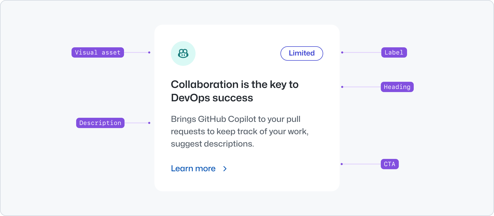
|
|
78
|
+
|
|
79
|
+
### Visual asset
|
|
80
|
+
|
|
81
|
+
The visual asset is optional and can be an image or an icon. It can be used to provide a visual cue to the user about the content of the card. To avoid visual noise, we recommend using only one icon or image, but not both in the same card.
|
|
82
|
+
|
|
83
|
+

|
|
84
|
+
|
|
85
|
+
**✅ Do**
|
|
86
|
+
|
|
87
|
+
|
|
88
|
+
|
|
89
|
+
_Use only one visual asset per card._
|
|
90
|
+
|
|
91
|
+
**❌ Don't**
|
|
92
|
+
|
|
93
|
+

|
|
94
|
+
|
|
95
|
+
_Don't use both icon and image as the visual asset._
|
|
96
|
+
|
|
97
|
+
### Label
|
|
98
|
+
|
|
99
|
+
The label can be used to indicate the type of content or its status. For example, use it to indicate that the content is `new` or that it is a `beta` feature. The label is optional and can be used along with a visual asset.
|
|
100
|
+
|
|
101
|
+

|
|
102
|
+
|
|
103
|
+
### Heading
|
|
104
|
+
|
|
105
|
+
The heading is the main title of the card. It should be short and concise.
|
|
106
|
+
|
|
107
|
+
### Description
|
|
108
|
+
|
|
109
|
+
The description is an optional short text that extends the information provided by the heading.
|
|
110
|
+
|
|
111
|
+
### Call to action
|
|
112
|
+
|
|
113
|
+
The call to action label indicates the action or resource the card links to. It defaults to "Learn more".
|
|
114
|
+
|
|
115
|
+
## Options
|
|
116
|
+
|
|
117
|
+
### Border
|
|
118
|
+
|
|
119
|
+
Card offers a variation with a border. Border is disabled by default.
|
|
120
|
+
|
|
121
|
+
## Related components
|
|
122
|
+
|
|
123
|
+
- [Pillar](../Pillar/index.md): To display related content with less visual emphasis.
|
|
124
|
+
- [River](../River/index.md): To display a list of content items with a visual asset.
|
|
125
|
+
- [CTABanner](../CTABanner/index.md): To display a single block of content to draw attention or create urgency around a user action.
|
|
126
|
+
- [UnorderedList](../UnorderedList/index.md) or the [OrderedList](../OrderedList/index.md): to display a list of plain content items.
|