@primer/react-brand 0.69.1-rc.0a4e5ff5 → 0.70.0-rc.11ae3568
This diff represents the content of publicly available package versions that have been released to one of the supported registries. The information contained in this diff is provided for informational purposes only and reflects changes between package versions as they appear in their respective public registries.
- package/README.md +19 -0
- package/docs/components/ActionMenu/index.md +156 -0
- package/docs/components/AnchorNav/index.md +220 -0
- package/docs/components/Avatar/index.md +30 -0
- package/docs/components/Avatar/react.md +71 -0
- package/docs/components/Bento/index.md +223 -0
- package/docs/components/Breadcrumbs/index.md +51 -0
- package/docs/components/Breadcrumbs/react.md +53 -0
- package/docs/components/BreakoutBanner/index.md +102 -0
- package/docs/components/BreakoutBanner/react.md +174 -0
- package/docs/components/Button/index.md +133 -0
- package/docs/components/Button/react.md +94 -0
- package/docs/components/ButtonGroup/index.md +62 -0
- package/docs/components/ButtonGroup/react.md +60 -0
- package/docs/components/CTABanner/index.md +114 -0
- package/docs/components/CTABanner/react.md +343 -0
- package/docs/components/CTAForm/index.md +95 -0
- package/docs/components/CTAForm/react.md +103 -0
- package/docs/components/Card/index.md +126 -0
- package/docs/components/Card/react.md +240 -0
- package/docs/components/ComparisonTable/index.md +381 -0
- package/docs/components/EyebrowBanner/index.md +153 -0
- package/docs/components/FAQ/index.md +66 -0
- package/docs/components/FAQ/react.md +477 -0
- package/docs/components/Footnotes/index.md +41 -0
- package/docs/components/Footnotes/react.md +156 -0
- package/docs/components/Hero/index.md +65 -0
- package/docs/components/Hero/react.md +215 -0
- package/docs/components/IDE/index.md +278 -0
- package/docs/components/Icon/index.md +87 -0
- package/docs/components/Image/index.md +51 -0
- package/docs/components/Image/react.md +160 -0
- package/docs/components/Label/index.md +86 -0
- package/docs/components/Label/react.md +76 -0
- package/docs/components/LogoSuite/index.md +93 -0
- package/docs/components/LogoSuite/react.md +667 -0
- package/docs/components/MediaPlaylist/index.md +133 -0
- package/docs/components/MinimalFooter/index.md +94 -0
- package/docs/components/NavList/index.md +210 -0
- package/docs/components/OrderedList/index.md +55 -0
- package/docs/components/OrderedList/react.md +41 -0
- package/docs/components/Pagination/index.md +80 -0
- package/docs/components/Pillar/index.md +114 -0
- package/docs/components/Pillar/react.md +175 -0
- package/docs/components/PricingOptions/index.md +509 -0
- package/docs/components/Prose/index.md +158 -0
- package/docs/components/River/index.md +190 -0
- package/docs/components/River/react.md +295 -0
- package/docs/components/RiverAccordion/index.md +200 -0
- package/docs/components/RiverBreakoutTabs/index.md +171 -0
- package/docs/components/Section/index.md +40 -0
- package/docs/components/Section/react.md +137 -0
- package/docs/components/SectionIntro/index.md +77 -0
- package/docs/components/SectionIntro/react.md +107 -0
- package/docs/components/SectionIntroStacked/index.md +226 -0
- package/docs/components/Statistic/index.md +111 -0
- package/docs/components/SubNav/index.md +156 -0
- package/docs/components/SubdomainNavBar/index.md +136 -0
- package/docs/components/Tabs/index.md +243 -0
- package/docs/components/Testimonial/index.md +138 -0
- package/docs/components/Testimonial/react.md +191 -0
- package/docs/components/Tiles/index.md +1441 -0
- package/docs/components/Timeline/index.md +68 -0
- package/docs/components/Token/index.md +86 -0
- package/docs/components/Tooltip/index.md +61 -0
- package/docs/components/UnorderedList/index.md +67 -0
- package/docs/components/UnorderedList/react.md +89 -0
- package/docs/components/VideoPlayer/index.md +234 -0
- package/docs/components/index.md +53 -0
- package/docs/forms/Checkbox/index.md +86 -0
- package/docs/forms/Checkbox/react.md +111 -0
- package/docs/forms/CheckboxGroup/index.md +37 -0
- package/docs/forms/CheckboxGroup/react.md +175 -0
- package/docs/forms/FormControl/index.md +404 -0
- package/docs/forms/Radio/index.md +63 -0
- package/docs/forms/Radio/react.md +68 -0
- package/docs/forms/RadioGroup/index.md +45 -0
- package/docs/forms/RadioGroup/react.md +151 -0
- package/docs/forms/Select/index.md +244 -0
- package/docs/forms/TextArea/index.md +126 -0
- package/docs/forms/TextInput/index.md +221 -0
- package/docs/forms/index.md +14 -0
- package/docs/getting-started/esm.md +49 -0
- package/docs/getting-started/index.md +98 -0
- package/docs/index.md +99 -0
- package/docs/introduction/animation.md +127 -0
- package/docs/introduction/index.md +10 -0
- package/docs/introduction/mcp.md +52 -0
- package/docs/introduction/theming.md +132 -0
- package/docs/layout/Box/index.md +46 -0
- package/docs/layout/Box/react.md +284 -0
- package/docs/layout/Grid/index.md +132 -0
- package/docs/layout/Grid/react.md +117 -0
- package/docs/layout/Stack/index.md +60 -0
- package/docs/layout/Stack/react.md +166 -0
- package/docs/layout/index.md +9 -0
- package/docs/primitives/color.md +6 -0
- package/docs/primitives/index.md +8 -0
- package/docs/typography/Heading/index.md +53 -0
- package/docs/typography/Heading/react.md +182 -0
- package/docs/typography/Text/index.md +68 -0
- package/docs/typography/Text/react.md +125 -0
- package/docs/typography/index.md +8 -0
- package/esm/Footnotes/{Footnotes.module-Du0yaz7E.css → Footnotes.module-DG9Vx76y.css} +1 -1
- package/esm/Footnotes/Footnotes.module.js +1 -1
- package/esm/Footnotes/Footnotes.module.js.map +1 -1
- package/esm/Heading/Heading.d.ts +10 -0
- package/esm/Heading/Heading.d.ts.map +1 -1
- package/esm/Heading/Heading.js.map +1 -1
- package/esm/Hero/Hero.d.ts.map +1 -1
- package/esm/Hero/Hero.js +60 -58
- package/esm/Hero/Hero.js.map +1 -1
- package/esm/Hero/{Hero.module-Cy82CEW3.css → Hero.module-DqG5f0MT.css} +1 -1
- package/esm/Hero/Hero.module.js +1 -1
- package/esm/Hero/Hero.module.js.map +1 -1
- package/esm/NavList/NavList.d.ts +86 -0
- package/esm/NavList/NavList.d.ts.map +1 -0
- package/esm/NavList/NavList.js +277 -0
- package/esm/NavList/NavList.js.map +1 -0
- package/esm/NavList/NavList.module-CZFnt8br.css +1 -0
- package/esm/NavList/NavList.module.js +32 -0
- package/esm/NavList/NavList.module.js.map +1 -0
- package/esm/NavList/index.d.ts +2 -0
- package/esm/NavList/index.d.ts.map +1 -0
- package/esm/SectionIntroStacked/{SectionIntroStacked.module-Cr7kUqTH.css → SectionIntroStacked.module-C3cmwHDY.css} +1 -1
- package/esm/SectionIntroStacked/SectionIntroStacked.module.js +1 -1
- package/esm/SectionIntroStacked/SectionIntroStacked.module.js.map +1 -1
- package/esm/Token/Token.js +0 -1
- package/esm/Token/Token.js.map +1 -1
- package/esm/Token/{Token.module-BcKU1KwK.css → Token.module-DtWE9IPI.css} +1 -1
- package/esm/Token/Token.module.js +1 -1
- package/esm/Token/Token.module.js.map +1 -1
- package/esm/index.d.ts +1 -0
- package/esm/index.d.ts.map +1 -1
- package/esm/index.esm.js +12 -11
- package/esm/packages/design-tokens/lib/design-tokens/css/tokens/functional/components/nav-list/colors-with-modes-CGyt2t8f.css +1 -0
- package/lib/Grid/Grid.d.ts +1 -1
- package/lib/Heading/Heading.d.ts +10 -0
- package/lib/NavList/NavList.d.ts +85 -0
- package/lib/NavList/index.d.ts +1 -0
- package/lib/SubNav/SubNav.d.ts +1 -1
- package/lib/Token/Token.d.ts +1 -1
- package/lib/css/main.css +613 -74
- package/lib/design-tokens/css/tokens/base/colors/color-scales-with-modes.css +1 -1
- package/lib/design-tokens/css/tokens/base/colors/light.css +1 -1
- package/lib/design-tokens/css/tokens/base/size/size.css +1 -1
- package/lib/design-tokens/css/tokens/base/typography/typography.css +1 -1
- package/lib/design-tokens/css/tokens/functional/animation/base.css +1 -1
- package/lib/design-tokens/css/tokens/functional/colors/global-with-modes.css +1 -1
- package/lib/design-tokens/css/tokens/functional/colors/global.css +1 -1
- package/lib/design-tokens/css/tokens/functional/components/accordion/colors-with-modes.css +1 -1
- package/lib/design-tokens/css/tokens/functional/components/action-menu/colors-with-modes.css +1 -1
- package/lib/design-tokens/css/tokens/functional/components/anchor-nav/colors-with-modes.css +1 -1
- package/lib/design-tokens/css/tokens/functional/components/bento/base.css +1 -1
- package/lib/design-tokens/css/tokens/functional/components/blinking-cursor/colors-with-modes.css +1 -1
- package/lib/design-tokens/css/tokens/functional/components/breadcrumbs/colors-with-modes.css +1 -1
- package/lib/design-tokens/css/tokens/functional/components/button/colors-with-modes.css +1 -1
- package/lib/design-tokens/css/tokens/functional/components/card/base.css +1 -1
- package/lib/design-tokens/css/tokens/functional/components/card/colors-with-modes.css +1 -1
- package/lib/design-tokens/css/tokens/functional/components/card/colors.css +1 -1
- package/lib/design-tokens/css/tokens/functional/components/comparison-table/colors-with-modes.css +1 -1
- package/lib/design-tokens/css/tokens/functional/components/comparison-table/comparison-table.css +1 -1
- package/lib/design-tokens/css/tokens/functional/components/control/colors-with-modes.css +1 -1
- package/lib/design-tokens/css/tokens/functional/components/cta-banner/colors-with-modes.css +1 -1
- package/lib/design-tokens/css/tokens/functional/components/eyebrow-banner/colors-with-modes.css +1 -1
- package/lib/design-tokens/css/tokens/functional/components/eyebrow-banner/eyebrow-banner.css +1 -1
- package/lib/design-tokens/css/tokens/functional/components/faq/base.css +1 -1
- package/lib/design-tokens/css/tokens/functional/components/faq/colors-with-modes.css +1 -1
- package/lib/design-tokens/css/tokens/functional/components/faq/colors.css +1 -1
- package/lib/design-tokens/css/tokens/functional/components/faq/faq.css +1 -1
- package/lib/design-tokens/css/tokens/functional/components/footer/colors-with-modes.css +1 -1
- package/lib/design-tokens/css/tokens/functional/components/footer/colors.css +1 -1
- package/lib/design-tokens/css/tokens/functional/components/frosted-glass-vfx/base.css +1 -1
- package/lib/design-tokens/css/tokens/functional/components/frosted-glass-vfx/colors-with-modes.css +1 -1
- package/lib/design-tokens/css/tokens/functional/components/grid/colors-with-modes.css +1 -1
- package/lib/design-tokens/css/tokens/functional/components/grid/colors.css +1 -1
- package/lib/design-tokens/css/tokens/functional/components/grid/grid.css +1 -1
- package/lib/design-tokens/css/tokens/functional/components/hero/base.css +1 -1
- package/lib/design-tokens/css/tokens/functional/components/icon/colors-with-modes.css +1 -1
- package/lib/design-tokens/css/tokens/functional/components/icon/colors.css +1 -1
- package/lib/design-tokens/css/tokens/functional/components/ide/base.css +1 -1
- package/lib/design-tokens/css/tokens/functional/components/ide/colors-with-modes.css +1 -1
- package/lib/design-tokens/css/tokens/functional/components/image/base.css +1 -1
- package/lib/design-tokens/css/tokens/functional/components/inline-link/base.css +1 -1
- package/lib/design-tokens/css/tokens/functional/components/inline-link/colors-with-modes.css +1 -1
- package/lib/design-tokens/css/tokens/functional/components/inline-link/colors.css +1 -1
- package/lib/design-tokens/css/tokens/functional/components/label/colors-with-modes.css +1 -1
- package/lib/design-tokens/css/tokens/functional/components/label/colors.css +1 -1
- package/lib/design-tokens/css/tokens/functional/components/link/colors-with-modes.css +1 -1
- package/lib/design-tokens/css/tokens/functional/components/link/colors.css +1 -1
- package/lib/design-tokens/css/tokens/functional/components/logosuite/base.css +1 -1
- package/lib/design-tokens/css/tokens/functional/components/logosuite/colors-with-modes.css +1 -1
- package/lib/design-tokens/css/tokens/functional/components/logosuite/colors.css +1 -1
- package/lib/design-tokens/css/tokens/functional/components/media-playlist/colors-with-modes.css +1 -1
- package/lib/design-tokens/css/tokens/functional/components/media-playlist/colors.css +1 -1
- package/lib/design-tokens/css/tokens/functional/components/nav-list/colors-with-modes.css +13 -0
- package/lib/design-tokens/css/tokens/functional/components/pricing-options/colors-with-modes.css +1 -1
- package/lib/design-tokens/css/tokens/functional/components/pricing-options/colors.css +1 -1
- package/lib/design-tokens/css/tokens/functional/components/pricing-options/pricing-options.css +1 -1
- package/lib/design-tokens/css/tokens/functional/components/prose/base.css +1 -1
- package/lib/design-tokens/css/tokens/functional/components/prose/colors-with-modes.css +1 -1
- package/lib/design-tokens/css/tokens/functional/components/river/base.css +1 -1
- package/lib/design-tokens/css/tokens/functional/components/river/river.css +1 -1
- package/lib/design-tokens/css/tokens/functional/components/river-story-scroll/colors-with-modes.css +1 -1
- package/lib/design-tokens/css/tokens/functional/components/section/section.css +1 -1
- package/lib/design-tokens/css/tokens/functional/components/statistic/base.css +1 -1
- package/lib/design-tokens/css/tokens/functional/components/sub-nav/base.css +1 -1
- package/lib/design-tokens/css/tokens/functional/components/sub-nav/colors-with-modes.css +1 -1
- package/lib/design-tokens/css/tokens/functional/components/subdomain-nav-bar/colors-with-modes.css +1 -1
- package/lib/design-tokens/css/tokens/functional/components/tabs/base.css +1 -1
- package/lib/design-tokens/css/tokens/functional/components/tabs/colors-with-modes.css +1 -1
- package/lib/design-tokens/css/tokens/functional/components/tabs/colors.css +1 -1
- package/lib/design-tokens/css/tokens/functional/components/testimonial/base.css +1 -1
- package/lib/design-tokens/css/tokens/functional/components/testimonial/colors-with-modes.css +1 -1
- package/lib/design-tokens/css/tokens/functional/components/testimonial/colors.css +1 -1
- package/lib/design-tokens/css/tokens/functional/components/text-cursor-animation/colors-with-modes.css +1 -1
- package/lib/design-tokens/css/tokens/functional/components/text-cursor-animation/colors.css +1 -1
- package/lib/design-tokens/css/tokens/functional/components/tiles/colors-with-modes.css +1 -1
- package/lib/design-tokens/css/tokens/functional/components/timeline/base.css +1 -1
- package/lib/design-tokens/css/tokens/functional/components/timeline/colors-with-modes.css +1 -1
- package/lib/design-tokens/css/tokens/functional/components/timeline/colors.css +1 -1
- package/lib/design-tokens/css/tokens/functional/components/token/colors-with-modes.css +1 -1
- package/lib/design-tokens/css/tokens/functional/components/token/colors.css +1 -1
- package/lib/design-tokens/css/tokens/functional/components/tooltip/colors-with-modes.css +1 -1
- package/lib/design-tokens/css/tokens/functional/components/tooltip/colors.css +1 -1
- package/lib/design-tokens/css/tokens/functional/components/video-player/base.css +1 -1
- package/lib/design-tokens/css/tokens/functional/components/video-player/colors-with-modes.css +1 -1
- package/lib/design-tokens/css/tokens/functional/size/border.css +1 -1
- package/lib/design-tokens/css/tokens/functional/size/breakpoints.css +1 -1
- package/lib/design-tokens/css/tokens/functional/size/size-coarse.css +1 -1
- package/lib/design-tokens/css/tokens/functional/size/size-fine.css +1 -1
- package/lib/design-tokens/css/tokens/functional/size/size.css +1 -1
- package/lib/design-tokens/css/tokens/functional/size/viewport.css +1 -1
- package/lib/design-tokens/css/tokens/functional/typography/typography-responsive.css +1 -1
- package/lib/design-tokens/css/tokens/functional/typography/typography.css +1 -1
- package/lib/design-tokens/js/module/tokens/base/colors/light.js +1 -1
- package/lib/design-tokens/js/module/tokens/base/size/size.js +1 -1
- package/lib/design-tokens/js/module/tokens/base/typography/typography.js +1 -1
- package/lib/design-tokens/js/module/tokens/functional/animation/base.js +1 -1
- package/lib/design-tokens/js/module/tokens/functional/colors/global.js +1 -1
- package/lib/design-tokens/js/module/tokens/functional/components/bento/base.js +1 -1
- package/lib/design-tokens/js/module/tokens/functional/components/card/base.js +1 -1
- package/lib/design-tokens/js/module/tokens/functional/components/card/colors.js +1 -1
- package/lib/design-tokens/js/module/tokens/functional/components/comparison-table/comparison-table.js +1 -1
- package/lib/design-tokens/js/module/tokens/functional/components/eyebrow-banner/eyebrow-banner.js +1 -1
- package/lib/design-tokens/js/module/tokens/functional/components/faq/base.js +1 -1
- package/lib/design-tokens/js/module/tokens/functional/components/faq/colors.js +1 -1
- package/lib/design-tokens/js/module/tokens/functional/components/faq/faq.js +1 -1
- package/lib/design-tokens/js/module/tokens/functional/components/footer/colors.js +1 -1
- package/lib/design-tokens/js/module/tokens/functional/components/frosted-glass-vfx/base.js +1 -1
- package/lib/design-tokens/js/module/tokens/functional/components/grid/colors.js +1 -1
- package/lib/design-tokens/js/module/tokens/functional/components/grid/grid.js +1 -1
- package/lib/design-tokens/js/module/tokens/functional/components/hero/base.js +1 -1
- package/lib/design-tokens/js/module/tokens/functional/components/icon/colors.js +1 -1
- package/lib/design-tokens/js/module/tokens/functional/components/ide/base.js +1 -1
- package/lib/design-tokens/js/module/tokens/functional/components/image/base.js +1 -1
- package/lib/design-tokens/js/module/tokens/functional/components/inline-link/base.js +1 -1
- package/lib/design-tokens/js/module/tokens/functional/components/inline-link/colors.js +1 -1
- package/lib/design-tokens/js/module/tokens/functional/components/label/colors.js +1 -1
- package/lib/design-tokens/js/module/tokens/functional/components/link/colors.js +1 -1
- package/lib/design-tokens/js/module/tokens/functional/components/logosuite/base.js +1 -1
- package/lib/design-tokens/js/module/tokens/functional/components/logosuite/colors.js +1 -1
- package/lib/design-tokens/js/module/tokens/functional/components/media-playlist/colors.js +1 -1
- package/lib/design-tokens/js/module/tokens/functional/components/pricing-options/colors.js +1 -1
- package/lib/design-tokens/js/module/tokens/functional/components/pricing-options/pricing-options.js +1 -1
- package/lib/design-tokens/js/module/tokens/functional/components/prose/base.js +1 -1
- package/lib/design-tokens/js/module/tokens/functional/components/river/base.js +1 -1
- package/lib/design-tokens/js/module/tokens/functional/components/river/river.js +1 -1
- package/lib/design-tokens/js/module/tokens/functional/components/section/section.js +1 -1
- package/lib/design-tokens/js/module/tokens/functional/components/statistic/base.js +1 -1
- package/lib/design-tokens/js/module/tokens/functional/components/sub-nav/base.js +1 -1
- package/lib/design-tokens/js/module/tokens/functional/components/tabs/base.js +1 -1
- package/lib/design-tokens/js/module/tokens/functional/components/tabs/colors.js +1 -1
- package/lib/design-tokens/js/module/tokens/functional/components/testimonial/base.js +1 -1
- package/lib/design-tokens/js/module/tokens/functional/components/testimonial/colors.js +1 -1
- package/lib/design-tokens/js/module/tokens/functional/components/text-cursor-animation/colors.js +1 -1
- package/lib/design-tokens/js/module/tokens/functional/components/timeline/base.js +1 -1
- package/lib/design-tokens/js/module/tokens/functional/components/timeline/colors.js +1 -1
- package/lib/design-tokens/js/module/tokens/functional/components/token/colors.js +1 -1
- package/lib/design-tokens/js/module/tokens/functional/components/tooltip/colors.js +1 -1
- package/lib/design-tokens/js/module/tokens/functional/components/video-player/base.js +1 -1
- package/lib/design-tokens/js/module/tokens/functional/size/border.js +1 -1
- package/lib/design-tokens/js/module/tokens/functional/size/breakpoints.js +1 -1
- package/lib/design-tokens/js/module/tokens/functional/size/size-coarse.js +1 -1
- package/lib/design-tokens/js/module/tokens/functional/size/size-fine.js +1 -1
- package/lib/design-tokens/js/module/tokens/functional/size/size.js +1 -1
- package/lib/design-tokens/js/module/tokens/functional/size/viewport.js +1 -1
- package/lib/design-tokens/js/module/tokens/functional/typography/typography-responsive.js +1 -1
- package/lib/design-tokens/js/module/tokens/functional/typography/typography.js +1 -1
- package/lib/design-tokens/js/tokens/base/colors/light.js +1 -1
- package/lib/design-tokens/js/tokens/base/size/size.js +1 -1
- package/lib/design-tokens/js/tokens/base/typography/typography.js +1 -1
- package/lib/design-tokens/js/tokens/functional/animation/base.js +1 -1
- package/lib/design-tokens/js/tokens/functional/colors/global.js +1 -1
- package/lib/design-tokens/js/tokens/functional/components/bento/base.js +1 -1
- package/lib/design-tokens/js/tokens/functional/components/card/base.js +1 -1
- package/lib/design-tokens/js/tokens/functional/components/card/colors.js +1 -1
- package/lib/design-tokens/js/tokens/functional/components/comparison-table/comparison-table.js +1 -1
- package/lib/design-tokens/js/tokens/functional/components/eyebrow-banner/eyebrow-banner.js +1 -1
- package/lib/design-tokens/js/tokens/functional/components/faq/base.js +1 -1
- package/lib/design-tokens/js/tokens/functional/components/faq/colors.js +1 -1
- package/lib/design-tokens/js/tokens/functional/components/faq/faq.js +1 -1
- package/lib/design-tokens/js/tokens/functional/components/footer/colors.js +1 -1
- package/lib/design-tokens/js/tokens/functional/components/frosted-glass-vfx/base.js +1 -1
- package/lib/design-tokens/js/tokens/functional/components/grid/colors.js +1 -1
- package/lib/design-tokens/js/tokens/functional/components/grid/grid.js +1 -1
- package/lib/design-tokens/js/tokens/functional/components/hero/base.js +1 -1
- package/lib/design-tokens/js/tokens/functional/components/icon/colors.js +1 -1
- package/lib/design-tokens/js/tokens/functional/components/ide/base.js +1 -1
- package/lib/design-tokens/js/tokens/functional/components/image/base.js +1 -1
- package/lib/design-tokens/js/tokens/functional/components/inline-link/base.js +1 -1
- package/lib/design-tokens/js/tokens/functional/components/inline-link/colors.js +1 -1
- package/lib/design-tokens/js/tokens/functional/components/label/colors.js +1 -1
- package/lib/design-tokens/js/tokens/functional/components/link/colors.js +1 -1
- package/lib/design-tokens/js/tokens/functional/components/logosuite/base.js +1 -1
- package/lib/design-tokens/js/tokens/functional/components/logosuite/colors.js +1 -1
- package/lib/design-tokens/js/tokens/functional/components/media-playlist/colors.js +1 -1
- package/lib/design-tokens/js/tokens/functional/components/pricing-options/colors.js +1 -1
- package/lib/design-tokens/js/tokens/functional/components/pricing-options/pricing-options.js +1 -1
- package/lib/design-tokens/js/tokens/functional/components/prose/base.js +1 -1
- package/lib/design-tokens/js/tokens/functional/components/river/base.js +1 -1
- package/lib/design-tokens/js/tokens/functional/components/river/river.js +1 -1
- package/lib/design-tokens/js/tokens/functional/components/section/section.js +1 -1
- package/lib/design-tokens/js/tokens/functional/components/statistic/base.js +1 -1
- package/lib/design-tokens/js/tokens/functional/components/sub-nav/base.js +1 -1
- package/lib/design-tokens/js/tokens/functional/components/tabs/base.js +1 -1
- package/lib/design-tokens/js/tokens/functional/components/tabs/colors.js +1 -1
- package/lib/design-tokens/js/tokens/functional/components/testimonial/base.js +1 -1
- package/lib/design-tokens/js/tokens/functional/components/testimonial/colors.js +1 -1
- package/lib/design-tokens/js/tokens/functional/components/text-cursor-animation/colors.js +1 -1
- package/lib/design-tokens/js/tokens/functional/components/timeline/base.js +1 -1
- package/lib/design-tokens/js/tokens/functional/components/timeline/colors.js +1 -1
- package/lib/design-tokens/js/tokens/functional/components/token/colors.js +1 -1
- package/lib/design-tokens/js/tokens/functional/components/tooltip/colors.js +1 -1
- package/lib/design-tokens/js/tokens/functional/components/video-player/base.js +1 -1
- package/lib/design-tokens/js/tokens/functional/size/border.js +1 -1
- package/lib/design-tokens/js/tokens/functional/size/breakpoints.js +1 -1
- package/lib/design-tokens/js/tokens/functional/size/size-coarse.js +1 -1
- package/lib/design-tokens/js/tokens/functional/size/size-fine.js +1 -1
- package/lib/design-tokens/js/tokens/functional/size/size.js +1 -1
- package/lib/design-tokens/js/tokens/functional/size/viewport.js +1 -1
- package/lib/design-tokens/js/tokens/functional/typography/typography-responsive.js +1 -1
- package/lib/design-tokens/js/tokens/functional/typography/typography.js +1 -1
- package/lib/design-tokens/scss/tokens/base/colors/light.scss +1 -1
- package/lib/design-tokens/scss/tokens/base/size/size.scss +1 -1
- package/lib/design-tokens/scss/tokens/base/typography/typography.scss +1 -1
- package/lib/design-tokens/scss/tokens/functional/animation/base.scss +1 -1
- package/lib/design-tokens/scss/tokens/functional/colors/global.scss +1 -1
- package/lib/design-tokens/scss/tokens/functional/components/bento/base.scss +1 -1
- package/lib/design-tokens/scss/tokens/functional/components/card/base.scss +1 -1
- package/lib/design-tokens/scss/tokens/functional/components/card/colors.scss +1 -1
- package/lib/design-tokens/scss/tokens/functional/components/comparison-table/comparison-table.scss +1 -1
- package/lib/design-tokens/scss/tokens/functional/components/eyebrow-banner/eyebrow-banner.scss +1 -1
- package/lib/design-tokens/scss/tokens/functional/components/faq/base.scss +1 -1
- package/lib/design-tokens/scss/tokens/functional/components/faq/colors.scss +1 -1
- package/lib/design-tokens/scss/tokens/functional/components/faq/faq.scss +1 -1
- package/lib/design-tokens/scss/tokens/functional/components/footer/colors.scss +1 -1
- package/lib/design-tokens/scss/tokens/functional/components/frosted-glass-vfx/base.scss +1 -1
- package/lib/design-tokens/scss/tokens/functional/components/grid/colors.scss +1 -1
- package/lib/design-tokens/scss/tokens/functional/components/grid/grid.scss +1 -1
- package/lib/design-tokens/scss/tokens/functional/components/hero/base.scss +1 -1
- package/lib/design-tokens/scss/tokens/functional/components/icon/colors.scss +1 -1
- package/lib/design-tokens/scss/tokens/functional/components/ide/base.scss +1 -1
- package/lib/design-tokens/scss/tokens/functional/components/image/base.scss +1 -1
- package/lib/design-tokens/scss/tokens/functional/components/inline-link/base.scss +1 -1
- package/lib/design-tokens/scss/tokens/functional/components/inline-link/colors.scss +1 -1
- package/lib/design-tokens/scss/tokens/functional/components/label/colors.scss +1 -1
- package/lib/design-tokens/scss/tokens/functional/components/link/colors.scss +1 -1
- package/lib/design-tokens/scss/tokens/functional/components/logosuite/base.scss +1 -1
- package/lib/design-tokens/scss/tokens/functional/components/logosuite/colors.scss +1 -1
- package/lib/design-tokens/scss/tokens/functional/components/media-playlist/colors.scss +1 -1
- package/lib/design-tokens/scss/tokens/functional/components/pricing-options/colors.scss +1 -1
- package/lib/design-tokens/scss/tokens/functional/components/pricing-options/pricing-options.scss +1 -1
- package/lib/design-tokens/scss/tokens/functional/components/prose/base.scss +1 -1
- package/lib/design-tokens/scss/tokens/functional/components/river/base.scss +1 -1
- package/lib/design-tokens/scss/tokens/functional/components/river/river.scss +1 -1
- package/lib/design-tokens/scss/tokens/functional/components/section/section.scss +1 -1
- package/lib/design-tokens/scss/tokens/functional/components/statistic/base.scss +1 -1
- package/lib/design-tokens/scss/tokens/functional/components/sub-nav/base.scss +1 -1
- package/lib/design-tokens/scss/tokens/functional/components/tabs/base.scss +1 -1
- package/lib/design-tokens/scss/tokens/functional/components/tabs/colors.scss +1 -1
- package/lib/design-tokens/scss/tokens/functional/components/testimonial/base.scss +1 -1
- package/lib/design-tokens/scss/tokens/functional/components/testimonial/colors.scss +1 -1
- package/lib/design-tokens/scss/tokens/functional/components/text-cursor-animation/colors.scss +1 -1
- package/lib/design-tokens/scss/tokens/functional/components/timeline/base.scss +1 -1
- package/lib/design-tokens/scss/tokens/functional/components/timeline/colors.scss +1 -1
- package/lib/design-tokens/scss/tokens/functional/components/token/colors.scss +1 -1
- package/lib/design-tokens/scss/tokens/functional/components/tooltip/colors.scss +1 -1
- package/lib/design-tokens/scss/tokens/functional/components/video-player/base.scss +1 -1
- package/lib/design-tokens/scss/tokens/functional/size/border.scss +1 -1
- package/lib/design-tokens/scss/tokens/functional/size/breakpoints.scss +1 -1
- package/lib/design-tokens/scss/tokens/functional/size/size-coarse.scss +1 -1
- package/lib/design-tokens/scss/tokens/functional/size/size-fine.scss +1 -1
- package/lib/design-tokens/scss/tokens/functional/size/size.scss +1 -1
- package/lib/design-tokens/scss/tokens/functional/size/viewport.scss +1 -1
- package/lib/design-tokens/scss/tokens/functional/typography/typography-responsive.scss +1 -1
- package/lib/design-tokens/scss/tokens/functional/typography/typography.scss +1 -1
- package/lib/design-tokens/ts/tokens/base/colors/light.d.ts +1 -1
- package/lib/design-tokens/ts/tokens/base/colors/light.js +1 -1
- package/lib/design-tokens/ts/tokens/base/size/size.d.ts +1 -1
- package/lib/design-tokens/ts/tokens/base/size/size.js +1 -1
- package/lib/design-tokens/ts/tokens/base/typography/typography.d.ts +1 -1
- package/lib/design-tokens/ts/tokens/base/typography/typography.js +1 -1
- package/lib/design-tokens/ts/tokens/functional/animation/base.d.ts +1 -1
- package/lib/design-tokens/ts/tokens/functional/animation/base.js +1 -1
- package/lib/design-tokens/ts/tokens/functional/colors/global.d.ts +1 -1
- package/lib/design-tokens/ts/tokens/functional/colors/global.js +1 -1
- package/lib/design-tokens/ts/tokens/functional/components/bento/base.d.ts +1 -1
- package/lib/design-tokens/ts/tokens/functional/components/bento/base.js +1 -1
- package/lib/design-tokens/ts/tokens/functional/components/card/base.d.ts +1 -1
- package/lib/design-tokens/ts/tokens/functional/components/card/base.js +1 -1
- package/lib/design-tokens/ts/tokens/functional/components/card/colors.d.ts +1 -1
- package/lib/design-tokens/ts/tokens/functional/components/card/colors.js +1 -1
- package/lib/design-tokens/ts/tokens/functional/components/comparison-table/comparison-table.d.ts +1 -1
- package/lib/design-tokens/ts/tokens/functional/components/comparison-table/comparison-table.js +1 -1
- package/lib/design-tokens/ts/tokens/functional/components/eyebrow-banner/eyebrow-banner.d.ts +1 -1
- package/lib/design-tokens/ts/tokens/functional/components/eyebrow-banner/eyebrow-banner.js +1 -1
- package/lib/design-tokens/ts/tokens/functional/components/faq/base.d.ts +1 -1
- package/lib/design-tokens/ts/tokens/functional/components/faq/base.js +1 -1
- package/lib/design-tokens/ts/tokens/functional/components/faq/colors.d.ts +1 -1
- package/lib/design-tokens/ts/tokens/functional/components/faq/colors.js +1 -1
- package/lib/design-tokens/ts/tokens/functional/components/faq/faq.d.ts +1 -1
- package/lib/design-tokens/ts/tokens/functional/components/faq/faq.js +1 -1
- package/lib/design-tokens/ts/tokens/functional/components/footer/colors.d.ts +1 -1
- package/lib/design-tokens/ts/tokens/functional/components/footer/colors.js +1 -1
- package/lib/design-tokens/ts/tokens/functional/components/frosted-glass-vfx/base.d.ts +1 -1
- package/lib/design-tokens/ts/tokens/functional/components/frosted-glass-vfx/base.js +1 -1
- package/lib/design-tokens/ts/tokens/functional/components/grid/colors.d.ts +1 -1
- package/lib/design-tokens/ts/tokens/functional/components/grid/colors.js +1 -1
- package/lib/design-tokens/ts/tokens/functional/components/grid/grid.d.ts +1 -1
- package/lib/design-tokens/ts/tokens/functional/components/grid/grid.js +1 -1
- package/lib/design-tokens/ts/tokens/functional/components/hero/base.d.ts +1 -1
- package/lib/design-tokens/ts/tokens/functional/components/hero/base.js +1 -1
- package/lib/design-tokens/ts/tokens/functional/components/icon/colors.d.ts +1 -1
- package/lib/design-tokens/ts/tokens/functional/components/icon/colors.js +1 -1
- package/lib/design-tokens/ts/tokens/functional/components/ide/base.d.ts +1 -1
- package/lib/design-tokens/ts/tokens/functional/components/ide/base.js +1 -1
- package/lib/design-tokens/ts/tokens/functional/components/image/base.d.ts +1 -1
- package/lib/design-tokens/ts/tokens/functional/components/image/base.js +1 -1
- package/lib/design-tokens/ts/tokens/functional/components/inline-link/base.d.ts +1 -1
- package/lib/design-tokens/ts/tokens/functional/components/inline-link/base.js +1 -1
- package/lib/design-tokens/ts/tokens/functional/components/inline-link/colors.d.ts +1 -1
- package/lib/design-tokens/ts/tokens/functional/components/inline-link/colors.js +1 -1
- package/lib/design-tokens/ts/tokens/functional/components/label/colors.d.ts +1 -1
- package/lib/design-tokens/ts/tokens/functional/components/label/colors.js +1 -1
- package/lib/design-tokens/ts/tokens/functional/components/link/colors.d.ts +1 -1
- package/lib/design-tokens/ts/tokens/functional/components/link/colors.js +1 -1
- package/lib/design-tokens/ts/tokens/functional/components/logosuite/base.d.ts +1 -1
- package/lib/design-tokens/ts/tokens/functional/components/logosuite/base.js +1 -1
- package/lib/design-tokens/ts/tokens/functional/components/logosuite/colors.d.ts +1 -1
- package/lib/design-tokens/ts/tokens/functional/components/logosuite/colors.js +1 -1
- package/lib/design-tokens/ts/tokens/functional/components/media-playlist/colors.d.ts +1 -1
- package/lib/design-tokens/ts/tokens/functional/components/media-playlist/colors.js +1 -1
- package/lib/design-tokens/ts/tokens/functional/components/pricing-options/colors.d.ts +1 -1
- package/lib/design-tokens/ts/tokens/functional/components/pricing-options/colors.js +1 -1
- package/lib/design-tokens/ts/tokens/functional/components/pricing-options/pricing-options.d.ts +1 -1
- package/lib/design-tokens/ts/tokens/functional/components/pricing-options/pricing-options.js +1 -1
- package/lib/design-tokens/ts/tokens/functional/components/prose/base.d.ts +1 -1
- package/lib/design-tokens/ts/tokens/functional/components/prose/base.js +1 -1
- package/lib/design-tokens/ts/tokens/functional/components/river/base.d.ts +1 -1
- package/lib/design-tokens/ts/tokens/functional/components/river/base.js +1 -1
- package/lib/design-tokens/ts/tokens/functional/components/river/river.d.ts +1 -1
- package/lib/design-tokens/ts/tokens/functional/components/river/river.js +1 -1
- package/lib/design-tokens/ts/tokens/functional/components/section/section.d.ts +1 -1
- package/lib/design-tokens/ts/tokens/functional/components/section/section.js +1 -1
- package/lib/design-tokens/ts/tokens/functional/components/statistic/base.d.ts +1 -1
- package/lib/design-tokens/ts/tokens/functional/components/statistic/base.js +1 -1
- package/lib/design-tokens/ts/tokens/functional/components/sub-nav/base.d.ts +1 -1
- package/lib/design-tokens/ts/tokens/functional/components/sub-nav/base.js +1 -1
- package/lib/design-tokens/ts/tokens/functional/components/tabs/base.d.ts +1 -1
- package/lib/design-tokens/ts/tokens/functional/components/tabs/base.js +1 -1
- package/lib/design-tokens/ts/tokens/functional/components/tabs/colors.d.ts +1 -1
- package/lib/design-tokens/ts/tokens/functional/components/tabs/colors.js +1 -1
- package/lib/design-tokens/ts/tokens/functional/components/testimonial/base.d.ts +1 -1
- package/lib/design-tokens/ts/tokens/functional/components/testimonial/base.js +1 -1
- package/lib/design-tokens/ts/tokens/functional/components/testimonial/colors.d.ts +1 -1
- package/lib/design-tokens/ts/tokens/functional/components/testimonial/colors.js +1 -1
- package/lib/design-tokens/ts/tokens/functional/components/text-cursor-animation/colors.d.ts +1 -1
- package/lib/design-tokens/ts/tokens/functional/components/text-cursor-animation/colors.js +1 -1
- package/lib/design-tokens/ts/tokens/functional/components/timeline/base.d.ts +1 -1
- package/lib/design-tokens/ts/tokens/functional/components/timeline/base.js +1 -1
- package/lib/design-tokens/ts/tokens/functional/components/timeline/colors.d.ts +1 -1
- package/lib/design-tokens/ts/tokens/functional/components/timeline/colors.js +1 -1
- package/lib/design-tokens/ts/tokens/functional/components/token/colors.d.ts +1 -1
- package/lib/design-tokens/ts/tokens/functional/components/token/colors.js +1 -1
- package/lib/design-tokens/ts/tokens/functional/components/tooltip/colors.d.ts +1 -1
- package/lib/design-tokens/ts/tokens/functional/components/tooltip/colors.js +1 -1
- package/lib/design-tokens/ts/tokens/functional/components/video-player/base.d.ts +1 -1
- package/lib/design-tokens/ts/tokens/functional/components/video-player/base.js +1 -1
- package/lib/design-tokens/ts/tokens/functional/size/border.d.ts +1 -1
- package/lib/design-tokens/ts/tokens/functional/size/border.js +1 -1
- package/lib/design-tokens/ts/tokens/functional/size/breakpoints.d.ts +1 -1
- package/lib/design-tokens/ts/tokens/functional/size/breakpoints.js +1 -1
- package/lib/design-tokens/ts/tokens/functional/size/size-coarse.d.ts +1 -1
- package/lib/design-tokens/ts/tokens/functional/size/size-coarse.js +1 -1
- package/lib/design-tokens/ts/tokens/functional/size/size-fine.d.ts +1 -1
- package/lib/design-tokens/ts/tokens/functional/size/size-fine.js +1 -1
- package/lib/design-tokens/ts/tokens/functional/size/size.d.ts +1 -1
- package/lib/design-tokens/ts/tokens/functional/size/size.js +1 -1
- package/lib/design-tokens/ts/tokens/functional/size/viewport.d.ts +1 -1
- package/lib/design-tokens/ts/tokens/functional/size/viewport.js +1 -1
- package/lib/design-tokens/ts/tokens/functional/typography/typography-responsive.d.ts +1 -1
- package/lib/design-tokens/ts/tokens/functional/typography/typography-responsive.js +1 -1
- package/lib/design-tokens/ts/tokens/functional/typography/typography.d.ts +1 -1
- package/lib/design-tokens/ts/tokens/functional/typography/typography.js +1 -1
- package/lib/index.d.ts +1 -0
- package/lib/index.js +1 -1
- package/llms.txt +97 -0
- package/package.json +17 -5
- package/esm/Hero/Hero.figma.d.ts +0 -2
- package/esm/Hero/Hero.figma.d.ts.map +0 -1
- package/esm/IDE/fixtures/content.d.ts +0 -7
- package/esm/IDE/fixtures/content.d.ts.map +0 -1
- package/esm/LogoSuite/LogoSuite.figma.d.ts +0 -2
- package/esm/LogoSuite/LogoSuite.figma.d.ts.map +0 -1
- package/esm/LogoSuite/LogoSuite.fixtures.d.ts +0 -2
- package/esm/LogoSuite/LogoSuite.fixtures.d.ts.map +0 -1
- package/esm/MonaSans/MonaSans.d.ts +0 -11
- package/esm/MonaSans/MonaSans.d.ts.map +0 -1
- package/esm/MonaSans/index.d.ts +0 -2
- package/esm/MonaSans/index.d.ts.map +0 -1
- package/esm/PricingOptions/PricingOptions.figma.d.ts +0 -2
- package/esm/PricingOptions/PricingOptions.figma.d.ts.map +0 -1
- package/esm/Tiles/Tiles.fixtures.d.ts +0 -7
- package/esm/Tiles/Tiles.fixtures.d.ts.map +0 -1
- package/esm/fixtures/third-party-logos/AzureLogo.d.ts +0 -5
- package/esm/fixtures/third-party-logos/AzureLogo.d.ts.map +0 -1
- package/esm/fixtures/third-party-logos/JetBrainsLogo.d.ts +0 -5
- package/esm/fixtures/third-party-logos/JetBrainsLogo.d.ts.map +0 -1
- package/esm/fixtures/third-party-logos/MicrosoftCopilotLogo.d.ts +0 -5
- package/esm/fixtures/third-party-logos/MicrosoftCopilotLogo.d.ts.map +0 -1
- package/esm/fixtures/third-party-logos/MicrosoftLogo.d.ts +0 -5
- package/esm/fixtures/third-party-logos/MicrosoftLogo.d.ts.map +0 -1
- package/esm/fixtures/third-party-logos/NeoVimLogo.d.ts +0 -5
- package/esm/fixtures/third-party-logos/NeoVimLogo.d.ts.map +0 -1
- package/esm/fixtures/third-party-logos/VisualStudioCodeLogo.d.ts +0 -5
- package/esm/fixtures/third-party-logos/VisualStudioCodeLogo.d.ts.map +0 -1
- package/esm/fixtures/third-party-logos/VisualStudioLogo.d.ts +0 -5
- package/esm/fixtures/third-party-logos/VisualStudioLogo.d.ts.map +0 -1
- package/esm/list/ListItem/index.d.ts +0 -2
- package/esm/list/ListItem/index.d.ts.map +0 -1
- package/esm/recipes/FeaturePreviewLPs/FeaturePreviewLevelOne/FeaturePreviewLevelOne.d.ts +0 -13
- package/esm/recipes/FeaturePreviewLPs/FeaturePreviewLevelOne/FeaturePreviewLevelOne.d.ts.map +0 -1
- package/esm/recipes/FeaturePreviewLPs/FeaturePreviewLevelOne/FeaturePreviewLevelOneSideBySide.d.ts +0 -14
- package/esm/recipes/FeaturePreviewLPs/FeaturePreviewLevelOne/FeaturePreviewLevelOneSideBySide.d.ts.map +0 -1
- package/esm/recipes/FeaturePreviewLPs/FeaturePreviewLevelOne/components/FormExample.d.ts +0 -8
- package/esm/recipes/FeaturePreviewLPs/FeaturePreviewLevelOne/components/FormExample.d.ts.map +0 -1
- package/esm/recipes/FeaturePreviewLPs/FeaturePreviewLevelOne/index.d.ts +0 -2
- package/esm/recipes/FeaturePreviewLPs/FeaturePreviewLevelOne/index.d.ts.map +0 -1
- package/esm/recipes/FeaturePreviewLPs/FeaturePreviewLevelTwo/FeaturePreviewLevelTwo.d.ts +0 -49
- package/esm/recipes/FeaturePreviewLPs/FeaturePreviewLevelTwo/FeaturePreviewLevelTwo.d.ts.map +0 -1
- package/esm/recipes/FeaturePreviewLPs/FeaturePreviewLevelTwo/index.d.ts +0 -2
- package/esm/recipes/FeaturePreviewLPs/FeaturePreviewLevelTwo/index.d.ts.map +0 -1
- package/esm/recipes/FeaturePreviewLPs/FeaturePreviewLevelZero/FeaturePreviewLevelZero.d.ts +0 -17
- package/esm/recipes/FeaturePreviewLPs/FeaturePreviewLevelZero/FeaturePreviewLevelZero.d.ts.map +0 -1
- package/esm/recipes/FeaturePreviewLPs/FeaturePreviewLevelZero/index.d.ts +0 -2
- package/esm/recipes/FeaturePreviewLPs/FeaturePreviewLevelZero/index.d.ts.map +0 -1
- package/esm/recipes/FeaturePreviewLPs/helpers.d.ts +0 -30
- package/esm/recipes/FeaturePreviewLPs/helpers.d.ts.map +0 -1
- package/esm/recipes/FlexTemplate/FlexSection/FlexSection.d.ts +0 -8
- package/esm/recipes/FlexTemplate/FlexSection/FlexSection.d.ts.map +0 -1
- package/esm/recipes/FlexTemplate/FlexSection/components/ContentfulRiver.d.ts +0 -2
- package/esm/recipes/FlexTemplate/FlexSection/components/ContentfulRiver.d.ts.map +0 -1
- package/esm/recipes/FlexTemplate/FlexSection/components/ContentfulRiverAccordion.d.ts +0 -8
- package/esm/recipes/FlexTemplate/FlexSection/components/ContentfulRiverAccordion.d.ts.map +0 -1
- package/esm/recipes/FlexTemplate/FlexSection/components/ContentfulRiverBreakout.d.ts +0 -2
- package/esm/recipes/FlexTemplate/FlexSection/components/ContentfulRiverBreakout.d.ts.map +0 -1
- package/esm/recipes/FlexTemplate/FlexSection/components/ContentfulTestimonials.d.ts +0 -8
- package/esm/recipes/FlexTemplate/FlexSection/components/ContentfulTestimonials.d.ts.map +0 -1
- package/esm/recipes/FlexTemplate/FlexSection/components/FlexSectionTestimonials.d.ts +0 -8
- package/esm/recipes/FlexTemplate/FlexSection/components/FlexSectionTestimonials.d.ts.map +0 -1
- package/esm/recipes/FlexTemplate/FlexSection/components/index.d.ts +0 -6
- package/esm/recipes/FlexTemplate/FlexSection/components/index.d.ts.map +0 -1
- package/esm/recipes/FlexTemplate/FlexSection/index.d.ts +0 -2
- package/esm/recipes/FlexTemplate/FlexSection/index.d.ts.map +0 -1
- package/esm/recipes/FlexTemplate/FlexTemplate.d.ts +0 -7
- package/esm/recipes/FlexTemplate/FlexTemplate.d.ts.map +0 -1
- package/esm/recipes/FlexTemplate/FlexTemplate.types.d.ts +0 -318
- package/esm/recipes/FlexTemplate/FlexTemplate.types.d.ts.map +0 -1
- package/esm/recipes/FlexTemplate/FlexTemplateTrailingSection/FlexTemplateTrailingSection.d.ts +0 -6
- package/esm/recipes/FlexTemplate/FlexTemplateTrailingSection/FlexTemplateTrailingSection.d.ts.map +0 -1
- package/esm/recipes/FlexTemplate/FlexTemplateTrailingSection/index.d.ts +0 -3
- package/esm/recipes/FlexTemplate/FlexTemplateTrailingSection/index.d.ts.map +0 -1
- package/esm/recipes/FlexTemplate/fixtures/content.d.ts +0 -2
- package/esm/recipes/FlexTemplate/fixtures/content.d.ts.map +0 -1
- package/esm/recipes/FlexTemplate/index.d.ts +0 -4
- package/esm/recipes/FlexTemplate/index.d.ts.map +0 -1
- package/esm/recipes/Flexsuite/Category/FlexSuiteSecurityCategory/FlexSuiteSecurityCategory.content.d.ts +0 -68
- package/esm/recipes/Flexsuite/Category/FlexSuiteSecurityCategory/FlexSuiteSecurityCategory.content.d.ts.map +0 -1
- package/esm/recipes/Flexsuite/Category/FlexSuiteSecurityCategory/FlexSuiteSecurityCategory.d.ts +0 -7
- package/esm/recipes/Flexsuite/Category/FlexSuiteSecurityCategory/FlexSuiteSecurityCategory.d.ts.map +0 -1
- package/esm/recipes/Flexsuite/Category/index.d.ts +0 -2
- package/esm/recipes/Flexsuite/Category/index.d.ts.map +0 -1
- package/esm/recipes/Flexsuite/Details/FlexSuiteAIDetailsPlaylist/FlexSuiteAIDetailsPlaylist.content.d.ts +0 -49
- package/esm/recipes/Flexsuite/Details/FlexSuiteAIDetailsPlaylist/FlexSuiteAIDetailsPlaylist.content.d.ts.map +0 -1
- package/esm/recipes/Flexsuite/Details/FlexSuiteAIDetailsPlaylist/FlexSuiteAIDetailsPlaylist.d.ts +0 -7
- package/esm/recipes/Flexsuite/Details/FlexSuiteAIDetailsPlaylist/FlexSuiteAIDetailsPlaylist.d.ts.map +0 -1
- package/esm/recipes/Flexsuite/Details/index.d.ts +0 -4
- package/esm/recipes/Flexsuite/Details/index.d.ts.map +0 -1
- package/esm/recipes/Flexsuite/Overview/FlexSuiteAIOverview.content.d.ts +0 -101
- package/esm/recipes/Flexsuite/Overview/FlexSuiteAIOverview.content.d.ts.map +0 -1
- package/esm/recipes/Flexsuite/Overview/FlexSuiteAIOverview.d.ts +0 -7
- package/esm/recipes/Flexsuite/Overview/FlexSuiteAIOverview.d.ts.map +0 -1
- package/esm/recipes/Flexsuite/Overview/FlexSuiteOverview.content.d.ts +0 -5
- package/esm/recipes/Flexsuite/Overview/FlexSuiteOverview.content.d.ts.map +0 -1
- package/esm/recipes/Flexsuite/Overview/index.d.ts +0 -4
- package/esm/recipes/Flexsuite/Overview/index.d.ts.map +0 -1
- package/esm/recipes/SolutionTemplates/CategoryPage/CategoryPage.d.ts +0 -16
- package/esm/recipes/SolutionTemplates/CategoryPage/CategoryPage.d.ts.map +0 -1
- package/esm/recipes/SolutionTemplates/SolutionPage/SolutionPage.d.ts +0 -33
- package/esm/recipes/SolutionTemplates/SolutionPage/SolutionPage.d.ts.map +0 -1
- package/esm/recipes/SolutionTemplates/SolutionPage/index.d.ts +0 -2
- package/esm/recipes/SolutionTemplates/SolutionPage/index.d.ts.map +0 -1
- package/esm/recipes/SolutionTemplates/SolutionsOverview/SolutionsOverview.d.ts +0 -17
- package/esm/recipes/SolutionTemplates/SolutionsOverview/SolutionsOverview.d.ts.map +0 -1
- package/esm/recipes/SolutionTemplates/helpers.d.ts +0 -127
- package/esm/recipes/SolutionTemplates/helpers.d.ts.map +0 -1
- package/esm/recipes/SolutionTemplates/index.d.ts +0 -1
- package/esm/recipes/SolutionTemplates/index.d.ts.map +0 -1
- package/esm/recipes/seo/Article/Article.d.ts +0 -14
- package/esm/recipes/seo/Article/Article.d.ts.map +0 -1
- package/esm/recipes/seo/Article/ArticleToC.d.ts +0 -4
- package/esm/recipes/seo/Article/ArticleToC.d.ts.map +0 -1
- package/esm/recipes/seo/Article/article-shared.d.ts +0 -5
- package/esm/recipes/seo/Article/article-shared.d.ts.map +0 -1
- package/esm/recipes/seo/Article/index.d.ts +0 -2
- package/esm/recipes/seo/Article/index.d.ts.map +0 -1
- package/esm/recipes/seo/Category/CategoryPage.d.ts +0 -9
- package/esm/recipes/seo/Category/CategoryPage.d.ts.map +0 -1
- package/esm/recipes/seo/Category/index.d.ts +0 -2
- package/esm/recipes/seo/Category/index.d.ts.map +0 -1
- package/esm/recipes/seo/helpers.d.ts +0 -16
- package/esm/recipes/seo/helpers.d.ts.map +0 -1
- package/esm/recipes/seo/index.d.ts +0 -1
- package/esm/recipes/seo/index.d.ts.map +0 -1
- package/esm/river/River.figma.d.ts +0 -2
- package/esm/river/River.figma.d.ts.map +0 -1
- package/lib/Hero/Hero.figma.d.ts +0 -1
- package/lib/IDE/fixtures/content.d.ts +0 -6
- package/lib/LogoSuite/LogoSuite.figma.d.ts +0 -1
- package/lib/LogoSuite/LogoSuite.fixtures.d.ts +0 -1
- package/lib/MonaSans/MonaSans.d.ts +0 -10
- package/lib/MonaSans/index.d.ts +0 -1
- package/lib/PricingOptions/PricingOptions.figma.d.ts +0 -1
- package/lib/Tiles/Tiles.fixtures.d.ts +0 -6
- package/lib/fixtures/third-party-logos/AzureLogo.d.ts +0 -4
- package/lib/fixtures/third-party-logos/JetBrainsLogo.d.ts +0 -4
- package/lib/fixtures/third-party-logos/MicrosoftCopilotLogo.d.ts +0 -4
- package/lib/fixtures/third-party-logos/MicrosoftLogo.d.ts +0 -4
- package/lib/fixtures/third-party-logos/NeoVimLogo.d.ts +0 -4
- package/lib/fixtures/third-party-logos/VisualStudioCodeLogo.d.ts +0 -4
- package/lib/fixtures/third-party-logos/VisualStudioLogo.d.ts +0 -4
- package/lib/index.esm.d.ts +0 -7
- package/lib/list/ListItem/index.d.ts +0 -1
- package/lib/recipes/FeaturePreviewLPs/FeaturePreviewLevelOne/FeaturePreviewLevelOne.d.ts +0 -12
- package/lib/recipes/FeaturePreviewLPs/FeaturePreviewLevelOne/FeaturePreviewLevelOneSideBySide.d.ts +0 -13
- package/lib/recipes/FeaturePreviewLPs/FeaturePreviewLevelOne/components/FormExample.d.ts +0 -7
- package/lib/recipes/FeaturePreviewLPs/FeaturePreviewLevelOne/index.d.ts +0 -1
- package/lib/recipes/FeaturePreviewLPs/FeaturePreviewLevelTwo/FeaturePreviewLevelTwo.d.ts +0 -48
- package/lib/recipes/FeaturePreviewLPs/FeaturePreviewLevelTwo/index.d.ts +0 -1
- package/lib/recipes/FeaturePreviewLPs/FeaturePreviewLevelZero/FeaturePreviewLevelZero.d.ts +0 -16
- package/lib/recipes/FeaturePreviewLPs/FeaturePreviewLevelZero/index.d.ts +0 -1
- package/lib/recipes/FeaturePreviewLPs/helpers.d.ts +0 -29
- package/lib/recipes/FlexTemplate/FlexSection/FlexSection.d.ts +0 -7
- package/lib/recipes/FlexTemplate/FlexSection/components/ContentfulRiver.d.ts +0 -1
- package/lib/recipes/FlexTemplate/FlexSection/components/ContentfulRiverAccordion.d.ts +0 -7
- package/lib/recipes/FlexTemplate/FlexSection/components/ContentfulRiverBreakout.d.ts +0 -1
- package/lib/recipes/FlexTemplate/FlexSection/components/ContentfulTestimonials.d.ts +0 -7
- package/lib/recipes/FlexTemplate/FlexSection/components/FlexSectionTestimonials.d.ts +0 -7
- package/lib/recipes/FlexTemplate/FlexSection/components/index.d.ts +0 -5
- package/lib/recipes/FlexTemplate/FlexSection/index.d.ts +0 -1
- package/lib/recipes/FlexTemplate/FlexTemplate.d.ts +0 -6
- package/lib/recipes/FlexTemplate/FlexTemplate.types.d.ts +0 -317
- package/lib/recipes/FlexTemplate/FlexTemplateTrailingSection/FlexTemplateTrailingSection.d.ts +0 -5
- package/lib/recipes/FlexTemplate/FlexTemplateTrailingSection/index.d.ts +0 -2
- package/lib/recipes/FlexTemplate/fixtures/content.d.ts +0 -1
- package/lib/recipes/FlexTemplate/index.d.ts +0 -3
- package/lib/recipes/Flexsuite/Category/FlexSuiteSecurityCategory/FlexSuiteSecurityCategory.content.d.ts +0 -67
- package/lib/recipes/Flexsuite/Category/FlexSuiteSecurityCategory/FlexSuiteSecurityCategory.d.ts +0 -6
- package/lib/recipes/Flexsuite/Category/index.d.ts +0 -1
- package/lib/recipes/Flexsuite/Details/FlexSuiteAIDetailsPlaylist/FlexSuiteAIDetailsPlaylist.content.d.ts +0 -48
- package/lib/recipes/Flexsuite/Details/FlexSuiteAIDetailsPlaylist/FlexSuiteAIDetailsPlaylist.d.ts +0 -6
- package/lib/recipes/Flexsuite/Details/index.d.ts +0 -3
- package/lib/recipes/Flexsuite/Overview/FlexSuiteAIOverview.content.d.ts +0 -100
- package/lib/recipes/Flexsuite/Overview/FlexSuiteAIOverview.d.ts +0 -6
- package/lib/recipes/Flexsuite/Overview/FlexSuiteOverview.content.d.ts +0 -4
- package/lib/recipes/Flexsuite/Overview/index.d.ts +0 -3
- package/lib/recipes/SolutionTemplates/CategoryPage/CategoryPage.d.ts +0 -15
- package/lib/recipes/SolutionTemplates/SolutionPage/SolutionPage.d.ts +0 -32
- package/lib/recipes/SolutionTemplates/SolutionPage/index.d.ts +0 -1
- package/lib/recipes/SolutionTemplates/SolutionsOverview/SolutionsOverview.d.ts +0 -16
- package/lib/recipes/SolutionTemplates/helpers.d.ts +0 -126
- package/lib/recipes/SolutionTemplates/index.d.ts +0 -0
- package/lib/recipes/seo/Article/Article.d.ts +0 -13
- package/lib/recipes/seo/Article/ArticleToC.d.ts +0 -3
- package/lib/recipes/seo/Article/article-shared.d.ts +0 -4
- package/lib/recipes/seo/Article/index.d.ts +0 -1
- package/lib/recipes/seo/Category/CategoryPage.d.ts +0 -8
- package/lib/recipes/seo/Category/index.d.ts +0 -1
- package/lib/recipes/seo/helpers.d.ts +0 -15
- package/lib/recipes/seo/index.d.ts +0 -0
- package/lib/river/River.figma.d.ts +0 -1
|
@@ -0,0 +1,114 @@
|
|
|
1
|
+
---
|
|
2
|
+
title: Pillar
|
|
3
|
+
description: Use the pillar component to group related content together.
|
|
4
|
+
keywords: ['feature', 'benefit', 'icon']
|
|
5
|
+
---
|
|
6
|
+
|
|
7
|
+
## Anatomy
|
|
8
|
+
|
|
9
|
+
|
|
10
|
+
|
|
11
|
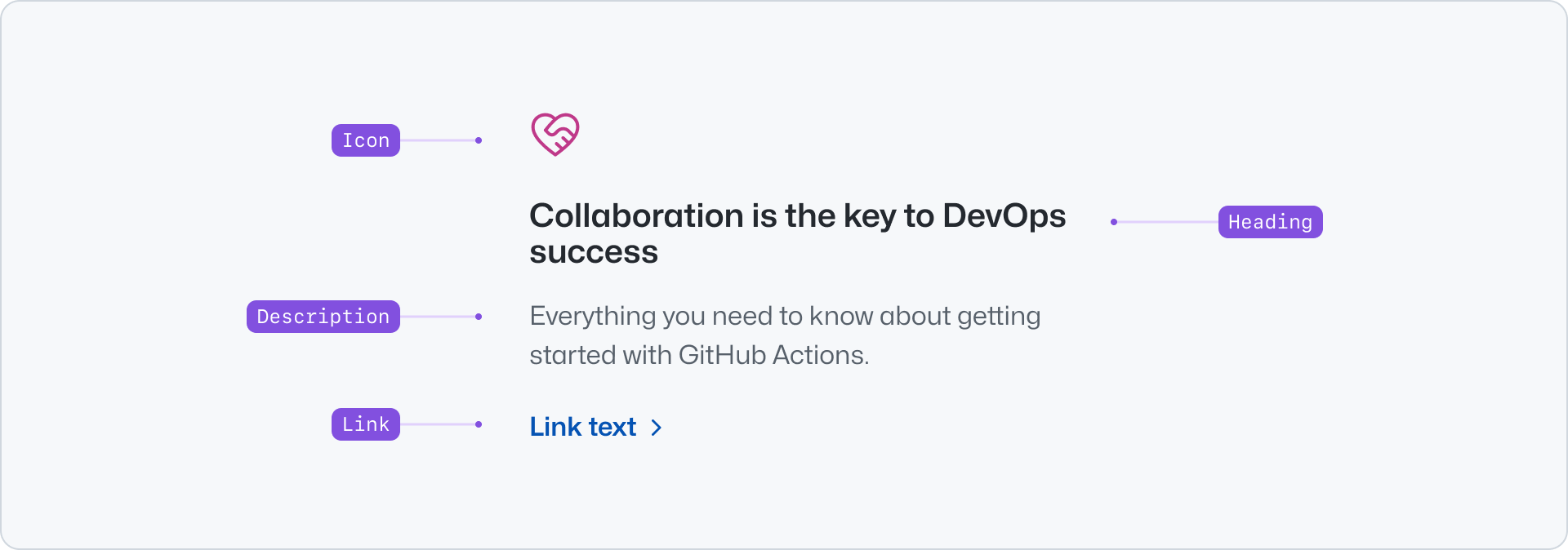
+
- Icon: An optional visual cue related to the content of the Pillar.
|
|
12
|
+
- Heading: The main title of the Pillar. It should be short and concise.
|
|
13
|
+
- Description: Short text that extends the information provided by the heading.
|
|
14
|
+
- Link: An optional link to extended the information.
|
|
15
|
+
|
|
16
|
+
## Usage
|
|
17
|
+
|
|
18
|
+
Use pillars to display a collection of features or benefits, making them easier to scan and read. Pillars present content in a familiar and recognizable style.
|
|
19
|
+
|
|
20
|
+
### Stacked
|
|
21
|
+
|
|
22
|
+
Stack multiple pillars to create a collection of items. Ensure that all the items in a group have consistent content lengths so that their width and height match, making the content more visually appealing. When displaying a visual, create a balanced layout by using the same type for each pillar, either an icon or an image.
|
|
23
|
+
|
|
24
|
+
**✅ Do**
|
|
25
|
+
|
|
26
|
+

|
|
27
|
+
|
|
28
|
+
_Use similar character counts to achieve a visually balanced layout._
|
|
29
|
+
|
|
30
|
+
**❌ Don't**
|
|
31
|
+
|
|
32
|
+

|
|
33
|
+
|
|
34
|
+
_Avoid varying content lengths for the title and description._
|
|
35
|
+
|
|
36
|
+
> Use pillars with images only for groups of a maximum of three to six items. Avoid stacking multiple sections that each
|
|
37
|
+
> contain groups of six pillars.
|
|
38
|
+
|
|
39
|
+
**✅ Do**
|
|
40
|
+
|
|
41
|
+

|
|
42
|
+
|
|
43
|
+
_When using icons, add them to all pillars to create a visually balanced layout._
|
|
44
|
+
|
|
45
|
+
**❌ Don't**
|
|
46
|
+
|
|
47
|
+

|
|
48
|
+
|
|
49
|
+
_Don't use icons sparingly._
|
|
50
|
+
|
|
51
|
+
**✅ Do**
|
|
52
|
+
|
|
53
|
+
_When using images, add them to all pillars to create a visually balanced layout._
|
|
54
|
+
|
|
55
|
+
**❌ Don't**
|
|
56
|
+
|
|
57
|
+
_Don't use images with different aspect ratios._
|
|
58
|
+
|
|
59
|
+
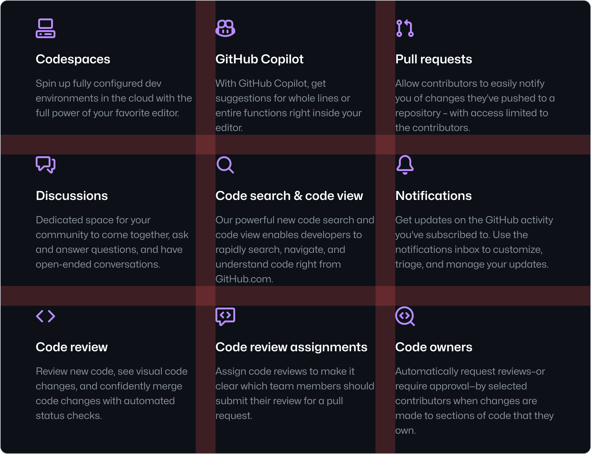
When presenting more than four pillars, we recommend displaying them in multiple rows. You can use the [Grid](../../layout/Grid/index.md) or the [Stack](../../layout/Stack/index.md) component to achieve this. We recommend using a grid with three or four columns and balancing the number of pillars on each row.
|
|
60
|
+
|
|
61
|
+
|
|
62
|
+
|
|
63
|
+
### Pillar and Card
|
|
64
|
+
|
|
65
|
+
Pillar and Card are both components that are used to present related and/or condensed information. They have distinct use-cases however, with the main differences between them being:
|
|
66
|
+
|
|
67
|
+
#### Interaction
|
|
68
|
+
|
|
69
|
+
Pillars are used mainly for non-interactive content and might include an optional link for extended information. On the other hand, Cards are primarily navigational elements.
|
|
70
|
+
|
|
71
|
+
#### Hierarchy
|
|
72
|
+
|
|
73
|
+
Cards should be used for noteworthy information to immediately draw user attention. Pillars, on the other hand, should be used for lower priority information compared to Cards.
|
|
74
|
+
|
|
75
|
+
#### Group size
|
|
76
|
+
|
|
77
|
+
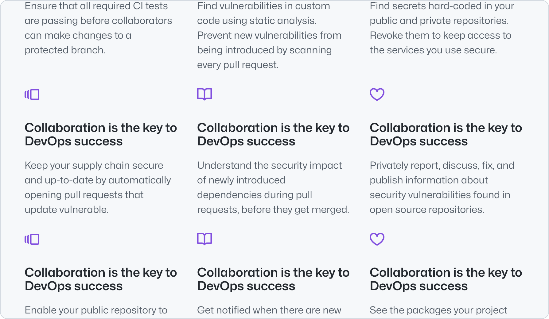
Cards should be used in small groups of three to five items, while Pillars can accommodate larger groups of up to nine items, or six if using images. The more items in a group, the less distinctive each individual element becomes.
|
|
78
|
+
|
|
79
|
+
**✅ Do**
|
|
80
|
+
|
|
81
|
+
|
|
82
|
+
|
|
83
|
+
_Pillars are suitable for groups of up to six items._
|
|
84
|
+
|
|
85
|
+
**❌ Don't**
|
|
86
|
+
|
|
87
|
+

|
|
88
|
+
|
|
89
|
+
_Don't use Cards for groups of five or more items. Use them sparingly in groups of three or four._
|
|
90
|
+
|
|
91
|
+
## Options
|
|
92
|
+
|
|
93
|
+
### Align
|
|
94
|
+
|
|
95
|
+
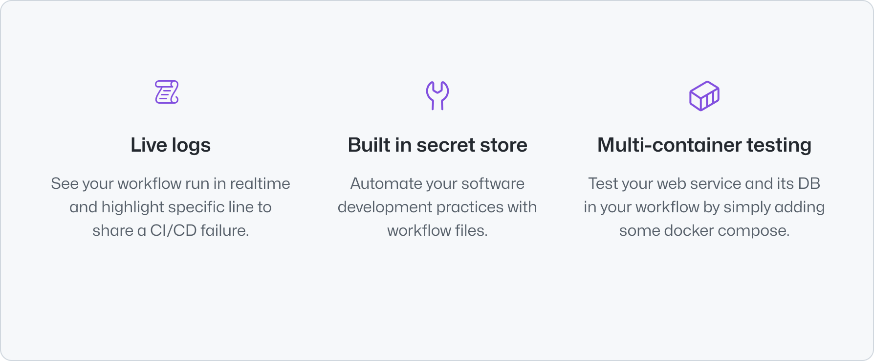
Pillars can be aligned to the start or center of the container. Aligning to the start is the default and recommended behavior. Use center alignment only when displaying a maximum of 4 pillars and the overall page design calls for this alignment, so that the content is visually balanced and easy to scan.
|
|
96
|
+
|
|
97
|
+
**✅ Do**
|
|
98
|
+
|
|
99
|
+
|
|
100
|
+
|
|
101
|
+
_Center align pillars when in groups of 3 or 4 and if their title and descriptions are short._
|
|
102
|
+
|
|
103
|
+
**❌ Don't**
|
|
104
|
+
|
|
105
|
+

|
|
106
|
+
|
|
107
|
+
_Don't use center alignment when in groups of 5 or more._
|
|
108
|
+
|
|
109
|
+
## Related components
|
|
110
|
+
|
|
111
|
+
- [Card](../Card/index.md): To display navigational related content with higher visual weight.
|
|
112
|
+
- [River](../River/index.md): To display a list of content items with a visual asset.
|
|
113
|
+
- [CTABanner](../CTABanner/index.md): To display a single block of content to draw attention or create urgency around a user action.
|
|
114
|
+
- [UnorderedList](../UnorderedList/index.md) or the [OrderedList](../OrderedList/index.md): To display a list of plain content items.
|
|
@@ -0,0 +1,175 @@
|
|
|
1
|
+
---
|
|
2
|
+
title: Pillar
|
|
3
|
+
description: Use the pillar component to group related content together.
|
|
4
|
+
keywords: ['feature', 'benefit', 'icon']
|
|
5
|
+
ready: true
|
|
6
|
+
source: https://github.com/primer/brand/blob/main/packages/react/src/Pillar/Pillar.tsx
|
|
7
|
+
storybook: '/brand/storybook/?path=/story/components-pillar--playground'
|
|
8
|
+
figma: https://www.figma.com/file/BJ95AjraesmRCWsKA013GS/Primer-Brand?node-id=6849-31364&mode=design
|
|
9
|
+
---
|
|
10
|
+
|
|
11
|
+
```js
|
|
12
|
+
import {Pillar} from '@primer/react-brand'
|
|
13
|
+
```
|
|
14
|
+
|
|
15
|
+
## Examples
|
|
16
|
+
|
|
17
|
+
### Default
|
|
18
|
+
|
|
19
|
+
The default Pillar displays a heading and description.
|
|
20
|
+
|
|
21
|
+
```jsx
|
|
22
|
+
<Pillar>
|
|
23
|
+
<Pillar.Heading>Collaboration is the key to DevOps success</Pillar.Heading>
|
|
24
|
+
<Pillar.Description>Everything you need to know about getting started with GitHub Actions.</Pillar.Description>
|
|
25
|
+
</Pillar>
|
|
26
|
+
```
|
|
27
|
+
|
|
28
|
+
### Icon
|
|
29
|
+
|
|
30
|
+
You can add an `icon` to enhance the visual context. We recommend using an [Octicon](https://primer.style/design/foundations/icons). The icon defaults to a green presentation and can be customized using the `size` and `hasBackground` props. For custom SVG artwork or logos, set `hasBackground` to `false` to render the icon without the shared square icon frame.
|
|
31
|
+
|
|
32
|
+
```jsx
|
|
33
|
+
<Pillar>
|
|
34
|
+
<Pillar.Icon icon={<CopilotIcon />} />
|
|
35
|
+
<Pillar.Heading>Code search & code view</Pillar.Heading>
|
|
36
|
+
<Pillar.Description>
|
|
37
|
+
Enables you to rapidly search, navigate, and understand code, right from GitHub.com.
|
|
38
|
+
</Pillar.Description>
|
|
39
|
+
</Pillar>
|
|
40
|
+
```
|
|
41
|
+
|
|
42
|
+
### Image
|
|
43
|
+
|
|
44
|
+
You can add an image to enhance the visual context.
|
|
45
|
+
|
|
46
|
+
```jsx
|
|
47
|
+
<Pillar>
|
|
48
|
+
<Pillar.Image src="/images/placeholder.png" alt="placeholder, blank area with a gray background color" />
|
|
49
|
+
<Pillar.Heading>Code search & code view</Pillar.Heading>
|
|
50
|
+
<Pillar.Description>
|
|
51
|
+
Enables you to rapidly search, navigate, and understand code, right from GitHub.com.
|
|
52
|
+
</Pillar.Description>
|
|
53
|
+
</Pillar>
|
|
54
|
+
```
|
|
55
|
+
|
|
56
|
+
### Full width
|
|
57
|
+
|
|
58
|
+
Use the `fullWidth` prop to allow the Pillar to fill the width of its parent container. By default, pillar width is constrained.
|
|
59
|
+
|
|
60
|
+
```jsx
|
|
61
|
+
<Pillar fullWidth>
|
|
62
|
+
<Pillar.Image src="/images/placeholder.png" alt="placeholder, blank area with a gray background color" />
|
|
63
|
+
<Pillar.Heading>Code search & code view</Pillar.Heading>
|
|
64
|
+
<Pillar.Description>
|
|
65
|
+
Enables you to rapidly search, navigate, and understand code, right from GitHub.com.
|
|
66
|
+
</Pillar.Description>
|
|
67
|
+
</Pillar>
|
|
68
|
+
```
|
|
69
|
+
|
|
70
|
+
### Link
|
|
71
|
+
|
|
72
|
+
You can add an external link to the Pillar using the `Link` component.
|
|
73
|
+
|
|
74
|
+
```jsx
|
|
75
|
+
<Pillar>
|
|
76
|
+
<Pillar.Heading>Code search & code view</Pillar.Heading>
|
|
77
|
+
<Pillar.Description>
|
|
78
|
+
Enables you to rapidly search, navigate, and understand code, right from GitHub.com.
|
|
79
|
+
</Pillar.Description>
|
|
80
|
+
<Pillar.Link href="https://github.com">Learn more</Pillar.Link>
|
|
81
|
+
</Pillar>
|
|
82
|
+
```
|
|
83
|
+
|
|
84
|
+
### Align
|
|
85
|
+
|
|
86
|
+
The content alignment can be changed using the `align` prop on the root `Pillar`. This can be configured to either `start` or `center`.
|
|
87
|
+
|
|
88
|
+
```jsx
|
|
89
|
+
<Pillar align="center">
|
|
90
|
+
<Pillar.Icon icon={<CopilotIcon />} />
|
|
91
|
+
<Pillar.Heading>Code search & code view</Pillar.Heading>
|
|
92
|
+
<Pillar.Description>
|
|
93
|
+
Enables you to rapidly search, navigate, and understand code, right from GitHub.com.
|
|
94
|
+
</Pillar.Description>
|
|
95
|
+
</Pillar>
|
|
96
|
+
```
|
|
97
|
+
|
|
98
|
+
### Stacked Pillars
|
|
99
|
+
|
|
100
|
+
Use the `Stack` component to stack multiple Pillars horizontally or vertically.
|
|
101
|
+
|
|
102
|
+
```jsx
|
|
103
|
+
<Stack direction="horizontal" alignItems="center" justifyContent="center" gap="normal">
|
|
104
|
+
<Pillar>
|
|
105
|
+
<Pillar.Icon icon={<CopilotIcon />} />
|
|
106
|
+
<Pillar.Heading>Heading</Pillar.Heading>
|
|
107
|
+
<Pillar.Description>Everything you need to know about getting started with GitHub Actions.</Pillar.Description>
|
|
108
|
+
</Pillar>
|
|
109
|
+
<Pillar>
|
|
110
|
+
<Pillar.Icon icon={<RocketIcon />} />
|
|
111
|
+
<Pillar.Heading>Heading</Pillar.Heading>
|
|
112
|
+
<Pillar.Description>Everything you need to know about getting started with GitHub Actions.</Pillar.Description>
|
|
113
|
+
</Pillar>
|
|
114
|
+
<Pillar>
|
|
115
|
+
<Pillar.Icon icon={<GitBranchIcon />} />
|
|
116
|
+
<Pillar.Heading>Heading</Pillar.Heading>
|
|
117
|
+
<Pillar.Description>Everything you need to know about getting started with GitHub Actions.</Pillar.Description>
|
|
118
|
+
</Pillar>
|
|
119
|
+
</Stack>
|
|
120
|
+
```
|
|
121
|
+
|
|
122
|
+
## Component props
|
|
123
|
+
|
|
124
|
+
### Pillar
|
|
125
|
+
|
|
126
|
+
| name | type | default | required | description |
|
|
127
|
+
| ----------- | -------------------- | ------- | -------- | ------------------------------------------------------------ |
|
|
128
|
+
| `align` | `start`, `center` | `start` | `false` | Aligns the pillar content |
|
|
129
|
+
| `as` | `'div' \| 'article'` | `'div'` | `false` | The HTML element used to render the pillar. |
|
|
130
|
+
| `fullWidth` | `boolean` | `false` | `false` | Allows the pillar to fill the width of its parent container. |
|
|
131
|
+
|
|
132
|
+
### Pillar.Icon
|
|
133
|
+
|
|
134
|
+
| name | type | default | required | description |
|
|
135
|
+
| --------------- | ------------------------------------ | ------- | -------- | --------------------------------------------------------------------------------------------------------------------------------- |
|
|
136
|
+
| `icon` | `React.Node` | | `true` | Octicon |
|
|
137
|
+
| `size` | `namedIconSizes \| numericIconSizes` | `32` | `false` | The size of the icon |
|
|
138
|
+
| `hasBackground` | `boolean` | `true` | `false` | Adds a filled colored background to the icon. Set to `false` for custom artwork that should not use the shared square icon frame. |
|
|
139
|
+
|
|
140
|
+
Supports the [Icon component](../Icon/index.md) props, excluding `color`.
|
|
141
|
+
|
|
142
|
+
### Pillar.Image
|
|
143
|
+
|
|
144
|
+
Forwards all the props from the [Image component](../Image/index.md), including `src`, `alt`, and `aspectRatio`.
|
|
145
|
+
|
|
146
|
+
### Pillar.Heading
|
|
147
|
+
|
|
148
|
+
| name | type | default | required | description |
|
|
149
|
+
| ----------- | ---------------------------- | ----------- | -------- | ----------------------------------------------------- |
|
|
150
|
+
| `as` | `h2`, `h3`, `h4`, `h5`, `h6` | `h3` | `false` | |
|
|
151
|
+
| `className` | `string` | | `false` | Custom class name for the heading component |
|
|
152
|
+
| `children` | `ReactNode`, `ReactNode[]` | `undefined` | `true` | Content to be displayed inside the heading component. |
|
|
153
|
+
|
|
154
|
+
Forwards all the props from the [Heading component](../../typography/Heading/index.md), including `as`, `size`, and `weight`.
|
|
155
|
+
|
|
156
|
+
### Pillar.Description
|
|
157
|
+
|
|
158
|
+
Optional node that can be used to provide a description for the section.
|
|
159
|
+
|
|
160
|
+
| name | type | default | required | description |
|
|
161
|
+
| ---------- | -------------------------- | ----------- | -------- | --------------------------------------------------- |
|
|
162
|
+
| `children` | `ReactNode`, `ReactNode[]` | `undefined` | `true` | Content to be displayed inside the pillar component |
|
|
163
|
+
|
|
164
|
+
`id`, `className` and `ref` are forwarded by default to all children.
|
|
165
|
+
|
|
166
|
+
### Pillar.Link
|
|
167
|
+
|
|
168
|
+
Optional node that can be used to provide a link.
|
|
169
|
+
|
|
170
|
+
| name | type | default | required | description |
|
|
171
|
+
| ----------- | -------- | ----------- | -------- | ----------------------------------------- |
|
|
172
|
+
| `className` | `string` | `undefined` | `false` | Sets a custom class on the root element |
|
|
173
|
+
| `href` | `string` | | `true` | Local identifier for the anchored element |
|
|
174
|
+
|
|
175
|
+
`id`, `className` and `ref` are forwarded by default to all children.
|