@primer/react-brand 0.69.1-rc.0a4e5ff5 → 0.70.0-rc.11ae3568
This diff represents the content of publicly available package versions that have been released to one of the supported registries. The information contained in this diff is provided for informational purposes only and reflects changes between package versions as they appear in their respective public registries.
- package/README.md +19 -0
- package/docs/components/ActionMenu/index.md +156 -0
- package/docs/components/AnchorNav/index.md +220 -0
- package/docs/components/Avatar/index.md +30 -0
- package/docs/components/Avatar/react.md +71 -0
- package/docs/components/Bento/index.md +223 -0
- package/docs/components/Breadcrumbs/index.md +51 -0
- package/docs/components/Breadcrumbs/react.md +53 -0
- package/docs/components/BreakoutBanner/index.md +102 -0
- package/docs/components/BreakoutBanner/react.md +174 -0
- package/docs/components/Button/index.md +133 -0
- package/docs/components/Button/react.md +94 -0
- package/docs/components/ButtonGroup/index.md +62 -0
- package/docs/components/ButtonGroup/react.md +60 -0
- package/docs/components/CTABanner/index.md +114 -0
- package/docs/components/CTABanner/react.md +343 -0
- package/docs/components/CTAForm/index.md +95 -0
- package/docs/components/CTAForm/react.md +103 -0
- package/docs/components/Card/index.md +126 -0
- package/docs/components/Card/react.md +240 -0
- package/docs/components/ComparisonTable/index.md +381 -0
- package/docs/components/EyebrowBanner/index.md +153 -0
- package/docs/components/FAQ/index.md +66 -0
- package/docs/components/FAQ/react.md +477 -0
- package/docs/components/Footnotes/index.md +41 -0
- package/docs/components/Footnotes/react.md +156 -0
- package/docs/components/Hero/index.md +65 -0
- package/docs/components/Hero/react.md +215 -0
- package/docs/components/IDE/index.md +278 -0
- package/docs/components/Icon/index.md +87 -0
- package/docs/components/Image/index.md +51 -0
- package/docs/components/Image/react.md +160 -0
- package/docs/components/Label/index.md +86 -0
- package/docs/components/Label/react.md +76 -0
- package/docs/components/LogoSuite/index.md +93 -0
- package/docs/components/LogoSuite/react.md +667 -0
- package/docs/components/MediaPlaylist/index.md +133 -0
- package/docs/components/MinimalFooter/index.md +94 -0
- package/docs/components/NavList/index.md +210 -0
- package/docs/components/OrderedList/index.md +55 -0
- package/docs/components/OrderedList/react.md +41 -0
- package/docs/components/Pagination/index.md +80 -0
- package/docs/components/Pillar/index.md +114 -0
- package/docs/components/Pillar/react.md +175 -0
- package/docs/components/PricingOptions/index.md +509 -0
- package/docs/components/Prose/index.md +158 -0
- package/docs/components/River/index.md +190 -0
- package/docs/components/River/react.md +295 -0
- package/docs/components/RiverAccordion/index.md +200 -0
- package/docs/components/RiverBreakoutTabs/index.md +171 -0
- package/docs/components/Section/index.md +40 -0
- package/docs/components/Section/react.md +137 -0
- package/docs/components/SectionIntro/index.md +77 -0
- package/docs/components/SectionIntro/react.md +107 -0
- package/docs/components/SectionIntroStacked/index.md +226 -0
- package/docs/components/Statistic/index.md +111 -0
- package/docs/components/SubNav/index.md +156 -0
- package/docs/components/SubdomainNavBar/index.md +136 -0
- package/docs/components/Tabs/index.md +243 -0
- package/docs/components/Testimonial/index.md +138 -0
- package/docs/components/Testimonial/react.md +191 -0
- package/docs/components/Tiles/index.md +1441 -0
- package/docs/components/Timeline/index.md +68 -0
- package/docs/components/Token/index.md +86 -0
- package/docs/components/Tooltip/index.md +61 -0
- package/docs/components/UnorderedList/index.md +67 -0
- package/docs/components/UnorderedList/react.md +89 -0
- package/docs/components/VideoPlayer/index.md +234 -0
- package/docs/components/index.md +53 -0
- package/docs/forms/Checkbox/index.md +86 -0
- package/docs/forms/Checkbox/react.md +111 -0
- package/docs/forms/CheckboxGroup/index.md +37 -0
- package/docs/forms/CheckboxGroup/react.md +175 -0
- package/docs/forms/FormControl/index.md +404 -0
- package/docs/forms/Radio/index.md +63 -0
- package/docs/forms/Radio/react.md +68 -0
- package/docs/forms/RadioGroup/index.md +45 -0
- package/docs/forms/RadioGroup/react.md +151 -0
- package/docs/forms/Select/index.md +244 -0
- package/docs/forms/TextArea/index.md +126 -0
- package/docs/forms/TextInput/index.md +221 -0
- package/docs/forms/index.md +14 -0
- package/docs/getting-started/esm.md +49 -0
- package/docs/getting-started/index.md +98 -0
- package/docs/index.md +99 -0
- package/docs/introduction/animation.md +127 -0
- package/docs/introduction/index.md +10 -0
- package/docs/introduction/mcp.md +52 -0
- package/docs/introduction/theming.md +132 -0
- package/docs/layout/Box/index.md +46 -0
- package/docs/layout/Box/react.md +284 -0
- package/docs/layout/Grid/index.md +132 -0
- package/docs/layout/Grid/react.md +117 -0
- package/docs/layout/Stack/index.md +60 -0
- package/docs/layout/Stack/react.md +166 -0
- package/docs/layout/index.md +9 -0
- package/docs/primitives/color.md +6 -0
- package/docs/primitives/index.md +8 -0
- package/docs/typography/Heading/index.md +53 -0
- package/docs/typography/Heading/react.md +182 -0
- package/docs/typography/Text/index.md +68 -0
- package/docs/typography/Text/react.md +125 -0
- package/docs/typography/index.md +8 -0
- package/esm/Footnotes/{Footnotes.module-Du0yaz7E.css → Footnotes.module-DG9Vx76y.css} +1 -1
- package/esm/Footnotes/Footnotes.module.js +1 -1
- package/esm/Footnotes/Footnotes.module.js.map +1 -1
- package/esm/Heading/Heading.d.ts +10 -0
- package/esm/Heading/Heading.d.ts.map +1 -1
- package/esm/Heading/Heading.js.map +1 -1
- package/esm/Hero/Hero.d.ts.map +1 -1
- package/esm/Hero/Hero.js +60 -58
- package/esm/Hero/Hero.js.map +1 -1
- package/esm/Hero/{Hero.module-Cy82CEW3.css → Hero.module-DqG5f0MT.css} +1 -1
- package/esm/Hero/Hero.module.js +1 -1
- package/esm/Hero/Hero.module.js.map +1 -1
- package/esm/NavList/NavList.d.ts +86 -0
- package/esm/NavList/NavList.d.ts.map +1 -0
- package/esm/NavList/NavList.js +277 -0
- package/esm/NavList/NavList.js.map +1 -0
- package/esm/NavList/NavList.module-CZFnt8br.css +1 -0
- package/esm/NavList/NavList.module.js +32 -0
- package/esm/NavList/NavList.module.js.map +1 -0
- package/esm/NavList/index.d.ts +2 -0
- package/esm/NavList/index.d.ts.map +1 -0
- package/esm/SectionIntroStacked/{SectionIntroStacked.module-Cr7kUqTH.css → SectionIntroStacked.module-C3cmwHDY.css} +1 -1
- package/esm/SectionIntroStacked/SectionIntroStacked.module.js +1 -1
- package/esm/SectionIntroStacked/SectionIntroStacked.module.js.map +1 -1
- package/esm/Token/Token.js +0 -1
- package/esm/Token/Token.js.map +1 -1
- package/esm/Token/{Token.module-BcKU1KwK.css → Token.module-DtWE9IPI.css} +1 -1
- package/esm/Token/Token.module.js +1 -1
- package/esm/Token/Token.module.js.map +1 -1
- package/esm/index.d.ts +1 -0
- package/esm/index.d.ts.map +1 -1
- package/esm/index.esm.js +12 -11
- package/esm/packages/design-tokens/lib/design-tokens/css/tokens/functional/components/nav-list/colors-with-modes-CGyt2t8f.css +1 -0
- package/lib/Grid/Grid.d.ts +1 -1
- package/lib/Heading/Heading.d.ts +10 -0
- package/lib/NavList/NavList.d.ts +85 -0
- package/lib/NavList/index.d.ts +1 -0
- package/lib/SubNav/SubNav.d.ts +1 -1
- package/lib/Token/Token.d.ts +1 -1
- package/lib/css/main.css +613 -74
- package/lib/design-tokens/css/tokens/base/colors/color-scales-with-modes.css +1 -1
- package/lib/design-tokens/css/tokens/base/colors/light.css +1 -1
- package/lib/design-tokens/css/tokens/base/size/size.css +1 -1
- package/lib/design-tokens/css/tokens/base/typography/typography.css +1 -1
- package/lib/design-tokens/css/tokens/functional/animation/base.css +1 -1
- package/lib/design-tokens/css/tokens/functional/colors/global-with-modes.css +1 -1
- package/lib/design-tokens/css/tokens/functional/colors/global.css +1 -1
- package/lib/design-tokens/css/tokens/functional/components/accordion/colors-with-modes.css +1 -1
- package/lib/design-tokens/css/tokens/functional/components/action-menu/colors-with-modes.css +1 -1
- package/lib/design-tokens/css/tokens/functional/components/anchor-nav/colors-with-modes.css +1 -1
- package/lib/design-tokens/css/tokens/functional/components/bento/base.css +1 -1
- package/lib/design-tokens/css/tokens/functional/components/blinking-cursor/colors-with-modes.css +1 -1
- package/lib/design-tokens/css/tokens/functional/components/breadcrumbs/colors-with-modes.css +1 -1
- package/lib/design-tokens/css/tokens/functional/components/button/colors-with-modes.css +1 -1
- package/lib/design-tokens/css/tokens/functional/components/card/base.css +1 -1
- package/lib/design-tokens/css/tokens/functional/components/card/colors-with-modes.css +1 -1
- package/lib/design-tokens/css/tokens/functional/components/card/colors.css +1 -1
- package/lib/design-tokens/css/tokens/functional/components/comparison-table/colors-with-modes.css +1 -1
- package/lib/design-tokens/css/tokens/functional/components/comparison-table/comparison-table.css +1 -1
- package/lib/design-tokens/css/tokens/functional/components/control/colors-with-modes.css +1 -1
- package/lib/design-tokens/css/tokens/functional/components/cta-banner/colors-with-modes.css +1 -1
- package/lib/design-tokens/css/tokens/functional/components/eyebrow-banner/colors-with-modes.css +1 -1
- package/lib/design-tokens/css/tokens/functional/components/eyebrow-banner/eyebrow-banner.css +1 -1
- package/lib/design-tokens/css/tokens/functional/components/faq/base.css +1 -1
- package/lib/design-tokens/css/tokens/functional/components/faq/colors-with-modes.css +1 -1
- package/lib/design-tokens/css/tokens/functional/components/faq/colors.css +1 -1
- package/lib/design-tokens/css/tokens/functional/components/faq/faq.css +1 -1
- package/lib/design-tokens/css/tokens/functional/components/footer/colors-with-modes.css +1 -1
- package/lib/design-tokens/css/tokens/functional/components/footer/colors.css +1 -1
- package/lib/design-tokens/css/tokens/functional/components/frosted-glass-vfx/base.css +1 -1
- package/lib/design-tokens/css/tokens/functional/components/frosted-glass-vfx/colors-with-modes.css +1 -1
- package/lib/design-tokens/css/tokens/functional/components/grid/colors-with-modes.css +1 -1
- package/lib/design-tokens/css/tokens/functional/components/grid/colors.css +1 -1
- package/lib/design-tokens/css/tokens/functional/components/grid/grid.css +1 -1
- package/lib/design-tokens/css/tokens/functional/components/hero/base.css +1 -1
- package/lib/design-tokens/css/tokens/functional/components/icon/colors-with-modes.css +1 -1
- package/lib/design-tokens/css/tokens/functional/components/icon/colors.css +1 -1
- package/lib/design-tokens/css/tokens/functional/components/ide/base.css +1 -1
- package/lib/design-tokens/css/tokens/functional/components/ide/colors-with-modes.css +1 -1
- package/lib/design-tokens/css/tokens/functional/components/image/base.css +1 -1
- package/lib/design-tokens/css/tokens/functional/components/inline-link/base.css +1 -1
- package/lib/design-tokens/css/tokens/functional/components/inline-link/colors-with-modes.css +1 -1
- package/lib/design-tokens/css/tokens/functional/components/inline-link/colors.css +1 -1
- package/lib/design-tokens/css/tokens/functional/components/label/colors-with-modes.css +1 -1
- package/lib/design-tokens/css/tokens/functional/components/label/colors.css +1 -1
- package/lib/design-tokens/css/tokens/functional/components/link/colors-with-modes.css +1 -1
- package/lib/design-tokens/css/tokens/functional/components/link/colors.css +1 -1
- package/lib/design-tokens/css/tokens/functional/components/logosuite/base.css +1 -1
- package/lib/design-tokens/css/tokens/functional/components/logosuite/colors-with-modes.css +1 -1
- package/lib/design-tokens/css/tokens/functional/components/logosuite/colors.css +1 -1
- package/lib/design-tokens/css/tokens/functional/components/media-playlist/colors-with-modes.css +1 -1
- package/lib/design-tokens/css/tokens/functional/components/media-playlist/colors.css +1 -1
- package/lib/design-tokens/css/tokens/functional/components/nav-list/colors-with-modes.css +13 -0
- package/lib/design-tokens/css/tokens/functional/components/pricing-options/colors-with-modes.css +1 -1
- package/lib/design-tokens/css/tokens/functional/components/pricing-options/colors.css +1 -1
- package/lib/design-tokens/css/tokens/functional/components/pricing-options/pricing-options.css +1 -1
- package/lib/design-tokens/css/tokens/functional/components/prose/base.css +1 -1
- package/lib/design-tokens/css/tokens/functional/components/prose/colors-with-modes.css +1 -1
- package/lib/design-tokens/css/tokens/functional/components/river/base.css +1 -1
- package/lib/design-tokens/css/tokens/functional/components/river/river.css +1 -1
- package/lib/design-tokens/css/tokens/functional/components/river-story-scroll/colors-with-modes.css +1 -1
- package/lib/design-tokens/css/tokens/functional/components/section/section.css +1 -1
- package/lib/design-tokens/css/tokens/functional/components/statistic/base.css +1 -1
- package/lib/design-tokens/css/tokens/functional/components/sub-nav/base.css +1 -1
- package/lib/design-tokens/css/tokens/functional/components/sub-nav/colors-with-modes.css +1 -1
- package/lib/design-tokens/css/tokens/functional/components/subdomain-nav-bar/colors-with-modes.css +1 -1
- package/lib/design-tokens/css/tokens/functional/components/tabs/base.css +1 -1
- package/lib/design-tokens/css/tokens/functional/components/tabs/colors-with-modes.css +1 -1
- package/lib/design-tokens/css/tokens/functional/components/tabs/colors.css +1 -1
- package/lib/design-tokens/css/tokens/functional/components/testimonial/base.css +1 -1
- package/lib/design-tokens/css/tokens/functional/components/testimonial/colors-with-modes.css +1 -1
- package/lib/design-tokens/css/tokens/functional/components/testimonial/colors.css +1 -1
- package/lib/design-tokens/css/tokens/functional/components/text-cursor-animation/colors-with-modes.css +1 -1
- package/lib/design-tokens/css/tokens/functional/components/text-cursor-animation/colors.css +1 -1
- package/lib/design-tokens/css/tokens/functional/components/tiles/colors-with-modes.css +1 -1
- package/lib/design-tokens/css/tokens/functional/components/timeline/base.css +1 -1
- package/lib/design-tokens/css/tokens/functional/components/timeline/colors-with-modes.css +1 -1
- package/lib/design-tokens/css/tokens/functional/components/timeline/colors.css +1 -1
- package/lib/design-tokens/css/tokens/functional/components/token/colors-with-modes.css +1 -1
- package/lib/design-tokens/css/tokens/functional/components/token/colors.css +1 -1
- package/lib/design-tokens/css/tokens/functional/components/tooltip/colors-with-modes.css +1 -1
- package/lib/design-tokens/css/tokens/functional/components/tooltip/colors.css +1 -1
- package/lib/design-tokens/css/tokens/functional/components/video-player/base.css +1 -1
- package/lib/design-tokens/css/tokens/functional/components/video-player/colors-with-modes.css +1 -1
- package/lib/design-tokens/css/tokens/functional/size/border.css +1 -1
- package/lib/design-tokens/css/tokens/functional/size/breakpoints.css +1 -1
- package/lib/design-tokens/css/tokens/functional/size/size-coarse.css +1 -1
- package/lib/design-tokens/css/tokens/functional/size/size-fine.css +1 -1
- package/lib/design-tokens/css/tokens/functional/size/size.css +1 -1
- package/lib/design-tokens/css/tokens/functional/size/viewport.css +1 -1
- package/lib/design-tokens/css/tokens/functional/typography/typography-responsive.css +1 -1
- package/lib/design-tokens/css/tokens/functional/typography/typography.css +1 -1
- package/lib/design-tokens/js/module/tokens/base/colors/light.js +1 -1
- package/lib/design-tokens/js/module/tokens/base/size/size.js +1 -1
- package/lib/design-tokens/js/module/tokens/base/typography/typography.js +1 -1
- package/lib/design-tokens/js/module/tokens/functional/animation/base.js +1 -1
- package/lib/design-tokens/js/module/tokens/functional/colors/global.js +1 -1
- package/lib/design-tokens/js/module/tokens/functional/components/bento/base.js +1 -1
- package/lib/design-tokens/js/module/tokens/functional/components/card/base.js +1 -1
- package/lib/design-tokens/js/module/tokens/functional/components/card/colors.js +1 -1
- package/lib/design-tokens/js/module/tokens/functional/components/comparison-table/comparison-table.js +1 -1
- package/lib/design-tokens/js/module/tokens/functional/components/eyebrow-banner/eyebrow-banner.js +1 -1
- package/lib/design-tokens/js/module/tokens/functional/components/faq/base.js +1 -1
- package/lib/design-tokens/js/module/tokens/functional/components/faq/colors.js +1 -1
- package/lib/design-tokens/js/module/tokens/functional/components/faq/faq.js +1 -1
- package/lib/design-tokens/js/module/tokens/functional/components/footer/colors.js +1 -1
- package/lib/design-tokens/js/module/tokens/functional/components/frosted-glass-vfx/base.js +1 -1
- package/lib/design-tokens/js/module/tokens/functional/components/grid/colors.js +1 -1
- package/lib/design-tokens/js/module/tokens/functional/components/grid/grid.js +1 -1
- package/lib/design-tokens/js/module/tokens/functional/components/hero/base.js +1 -1
- package/lib/design-tokens/js/module/tokens/functional/components/icon/colors.js +1 -1
- package/lib/design-tokens/js/module/tokens/functional/components/ide/base.js +1 -1
- package/lib/design-tokens/js/module/tokens/functional/components/image/base.js +1 -1
- package/lib/design-tokens/js/module/tokens/functional/components/inline-link/base.js +1 -1
- package/lib/design-tokens/js/module/tokens/functional/components/inline-link/colors.js +1 -1
- package/lib/design-tokens/js/module/tokens/functional/components/label/colors.js +1 -1
- package/lib/design-tokens/js/module/tokens/functional/components/link/colors.js +1 -1
- package/lib/design-tokens/js/module/tokens/functional/components/logosuite/base.js +1 -1
- package/lib/design-tokens/js/module/tokens/functional/components/logosuite/colors.js +1 -1
- package/lib/design-tokens/js/module/tokens/functional/components/media-playlist/colors.js +1 -1
- package/lib/design-tokens/js/module/tokens/functional/components/pricing-options/colors.js +1 -1
- package/lib/design-tokens/js/module/tokens/functional/components/pricing-options/pricing-options.js +1 -1
- package/lib/design-tokens/js/module/tokens/functional/components/prose/base.js +1 -1
- package/lib/design-tokens/js/module/tokens/functional/components/river/base.js +1 -1
- package/lib/design-tokens/js/module/tokens/functional/components/river/river.js +1 -1
- package/lib/design-tokens/js/module/tokens/functional/components/section/section.js +1 -1
- package/lib/design-tokens/js/module/tokens/functional/components/statistic/base.js +1 -1
- package/lib/design-tokens/js/module/tokens/functional/components/sub-nav/base.js +1 -1
- package/lib/design-tokens/js/module/tokens/functional/components/tabs/base.js +1 -1
- package/lib/design-tokens/js/module/tokens/functional/components/tabs/colors.js +1 -1
- package/lib/design-tokens/js/module/tokens/functional/components/testimonial/base.js +1 -1
- package/lib/design-tokens/js/module/tokens/functional/components/testimonial/colors.js +1 -1
- package/lib/design-tokens/js/module/tokens/functional/components/text-cursor-animation/colors.js +1 -1
- package/lib/design-tokens/js/module/tokens/functional/components/timeline/base.js +1 -1
- package/lib/design-tokens/js/module/tokens/functional/components/timeline/colors.js +1 -1
- package/lib/design-tokens/js/module/tokens/functional/components/token/colors.js +1 -1
- package/lib/design-tokens/js/module/tokens/functional/components/tooltip/colors.js +1 -1
- package/lib/design-tokens/js/module/tokens/functional/components/video-player/base.js +1 -1
- package/lib/design-tokens/js/module/tokens/functional/size/border.js +1 -1
- package/lib/design-tokens/js/module/tokens/functional/size/breakpoints.js +1 -1
- package/lib/design-tokens/js/module/tokens/functional/size/size-coarse.js +1 -1
- package/lib/design-tokens/js/module/tokens/functional/size/size-fine.js +1 -1
- package/lib/design-tokens/js/module/tokens/functional/size/size.js +1 -1
- package/lib/design-tokens/js/module/tokens/functional/size/viewport.js +1 -1
- package/lib/design-tokens/js/module/tokens/functional/typography/typography-responsive.js +1 -1
- package/lib/design-tokens/js/module/tokens/functional/typography/typography.js +1 -1
- package/lib/design-tokens/js/tokens/base/colors/light.js +1 -1
- package/lib/design-tokens/js/tokens/base/size/size.js +1 -1
- package/lib/design-tokens/js/tokens/base/typography/typography.js +1 -1
- package/lib/design-tokens/js/tokens/functional/animation/base.js +1 -1
- package/lib/design-tokens/js/tokens/functional/colors/global.js +1 -1
- package/lib/design-tokens/js/tokens/functional/components/bento/base.js +1 -1
- package/lib/design-tokens/js/tokens/functional/components/card/base.js +1 -1
- package/lib/design-tokens/js/tokens/functional/components/card/colors.js +1 -1
- package/lib/design-tokens/js/tokens/functional/components/comparison-table/comparison-table.js +1 -1
- package/lib/design-tokens/js/tokens/functional/components/eyebrow-banner/eyebrow-banner.js +1 -1
- package/lib/design-tokens/js/tokens/functional/components/faq/base.js +1 -1
- package/lib/design-tokens/js/tokens/functional/components/faq/colors.js +1 -1
- package/lib/design-tokens/js/tokens/functional/components/faq/faq.js +1 -1
- package/lib/design-tokens/js/tokens/functional/components/footer/colors.js +1 -1
- package/lib/design-tokens/js/tokens/functional/components/frosted-glass-vfx/base.js +1 -1
- package/lib/design-tokens/js/tokens/functional/components/grid/colors.js +1 -1
- package/lib/design-tokens/js/tokens/functional/components/grid/grid.js +1 -1
- package/lib/design-tokens/js/tokens/functional/components/hero/base.js +1 -1
- package/lib/design-tokens/js/tokens/functional/components/icon/colors.js +1 -1
- package/lib/design-tokens/js/tokens/functional/components/ide/base.js +1 -1
- package/lib/design-tokens/js/tokens/functional/components/image/base.js +1 -1
- package/lib/design-tokens/js/tokens/functional/components/inline-link/base.js +1 -1
- package/lib/design-tokens/js/tokens/functional/components/inline-link/colors.js +1 -1
- package/lib/design-tokens/js/tokens/functional/components/label/colors.js +1 -1
- package/lib/design-tokens/js/tokens/functional/components/link/colors.js +1 -1
- package/lib/design-tokens/js/tokens/functional/components/logosuite/base.js +1 -1
- package/lib/design-tokens/js/tokens/functional/components/logosuite/colors.js +1 -1
- package/lib/design-tokens/js/tokens/functional/components/media-playlist/colors.js +1 -1
- package/lib/design-tokens/js/tokens/functional/components/pricing-options/colors.js +1 -1
- package/lib/design-tokens/js/tokens/functional/components/pricing-options/pricing-options.js +1 -1
- package/lib/design-tokens/js/tokens/functional/components/prose/base.js +1 -1
- package/lib/design-tokens/js/tokens/functional/components/river/base.js +1 -1
- package/lib/design-tokens/js/tokens/functional/components/river/river.js +1 -1
- package/lib/design-tokens/js/tokens/functional/components/section/section.js +1 -1
- package/lib/design-tokens/js/tokens/functional/components/statistic/base.js +1 -1
- package/lib/design-tokens/js/tokens/functional/components/sub-nav/base.js +1 -1
- package/lib/design-tokens/js/tokens/functional/components/tabs/base.js +1 -1
- package/lib/design-tokens/js/tokens/functional/components/tabs/colors.js +1 -1
- package/lib/design-tokens/js/tokens/functional/components/testimonial/base.js +1 -1
- package/lib/design-tokens/js/tokens/functional/components/testimonial/colors.js +1 -1
- package/lib/design-tokens/js/tokens/functional/components/text-cursor-animation/colors.js +1 -1
- package/lib/design-tokens/js/tokens/functional/components/timeline/base.js +1 -1
- package/lib/design-tokens/js/tokens/functional/components/timeline/colors.js +1 -1
- package/lib/design-tokens/js/tokens/functional/components/token/colors.js +1 -1
- package/lib/design-tokens/js/tokens/functional/components/tooltip/colors.js +1 -1
- package/lib/design-tokens/js/tokens/functional/components/video-player/base.js +1 -1
- package/lib/design-tokens/js/tokens/functional/size/border.js +1 -1
- package/lib/design-tokens/js/tokens/functional/size/breakpoints.js +1 -1
- package/lib/design-tokens/js/tokens/functional/size/size-coarse.js +1 -1
- package/lib/design-tokens/js/tokens/functional/size/size-fine.js +1 -1
- package/lib/design-tokens/js/tokens/functional/size/size.js +1 -1
- package/lib/design-tokens/js/tokens/functional/size/viewport.js +1 -1
- package/lib/design-tokens/js/tokens/functional/typography/typography-responsive.js +1 -1
- package/lib/design-tokens/js/tokens/functional/typography/typography.js +1 -1
- package/lib/design-tokens/scss/tokens/base/colors/light.scss +1 -1
- package/lib/design-tokens/scss/tokens/base/size/size.scss +1 -1
- package/lib/design-tokens/scss/tokens/base/typography/typography.scss +1 -1
- package/lib/design-tokens/scss/tokens/functional/animation/base.scss +1 -1
- package/lib/design-tokens/scss/tokens/functional/colors/global.scss +1 -1
- package/lib/design-tokens/scss/tokens/functional/components/bento/base.scss +1 -1
- package/lib/design-tokens/scss/tokens/functional/components/card/base.scss +1 -1
- package/lib/design-tokens/scss/tokens/functional/components/card/colors.scss +1 -1
- package/lib/design-tokens/scss/tokens/functional/components/comparison-table/comparison-table.scss +1 -1
- package/lib/design-tokens/scss/tokens/functional/components/eyebrow-banner/eyebrow-banner.scss +1 -1
- package/lib/design-tokens/scss/tokens/functional/components/faq/base.scss +1 -1
- package/lib/design-tokens/scss/tokens/functional/components/faq/colors.scss +1 -1
- package/lib/design-tokens/scss/tokens/functional/components/faq/faq.scss +1 -1
- package/lib/design-tokens/scss/tokens/functional/components/footer/colors.scss +1 -1
- package/lib/design-tokens/scss/tokens/functional/components/frosted-glass-vfx/base.scss +1 -1
- package/lib/design-tokens/scss/tokens/functional/components/grid/colors.scss +1 -1
- package/lib/design-tokens/scss/tokens/functional/components/grid/grid.scss +1 -1
- package/lib/design-tokens/scss/tokens/functional/components/hero/base.scss +1 -1
- package/lib/design-tokens/scss/tokens/functional/components/icon/colors.scss +1 -1
- package/lib/design-tokens/scss/tokens/functional/components/ide/base.scss +1 -1
- package/lib/design-tokens/scss/tokens/functional/components/image/base.scss +1 -1
- package/lib/design-tokens/scss/tokens/functional/components/inline-link/base.scss +1 -1
- package/lib/design-tokens/scss/tokens/functional/components/inline-link/colors.scss +1 -1
- package/lib/design-tokens/scss/tokens/functional/components/label/colors.scss +1 -1
- package/lib/design-tokens/scss/tokens/functional/components/link/colors.scss +1 -1
- package/lib/design-tokens/scss/tokens/functional/components/logosuite/base.scss +1 -1
- package/lib/design-tokens/scss/tokens/functional/components/logosuite/colors.scss +1 -1
- package/lib/design-tokens/scss/tokens/functional/components/media-playlist/colors.scss +1 -1
- package/lib/design-tokens/scss/tokens/functional/components/pricing-options/colors.scss +1 -1
- package/lib/design-tokens/scss/tokens/functional/components/pricing-options/pricing-options.scss +1 -1
- package/lib/design-tokens/scss/tokens/functional/components/prose/base.scss +1 -1
- package/lib/design-tokens/scss/tokens/functional/components/river/base.scss +1 -1
- package/lib/design-tokens/scss/tokens/functional/components/river/river.scss +1 -1
- package/lib/design-tokens/scss/tokens/functional/components/section/section.scss +1 -1
- package/lib/design-tokens/scss/tokens/functional/components/statistic/base.scss +1 -1
- package/lib/design-tokens/scss/tokens/functional/components/sub-nav/base.scss +1 -1
- package/lib/design-tokens/scss/tokens/functional/components/tabs/base.scss +1 -1
- package/lib/design-tokens/scss/tokens/functional/components/tabs/colors.scss +1 -1
- package/lib/design-tokens/scss/tokens/functional/components/testimonial/base.scss +1 -1
- package/lib/design-tokens/scss/tokens/functional/components/testimonial/colors.scss +1 -1
- package/lib/design-tokens/scss/tokens/functional/components/text-cursor-animation/colors.scss +1 -1
- package/lib/design-tokens/scss/tokens/functional/components/timeline/base.scss +1 -1
- package/lib/design-tokens/scss/tokens/functional/components/timeline/colors.scss +1 -1
- package/lib/design-tokens/scss/tokens/functional/components/token/colors.scss +1 -1
- package/lib/design-tokens/scss/tokens/functional/components/tooltip/colors.scss +1 -1
- package/lib/design-tokens/scss/tokens/functional/components/video-player/base.scss +1 -1
- package/lib/design-tokens/scss/tokens/functional/size/border.scss +1 -1
- package/lib/design-tokens/scss/tokens/functional/size/breakpoints.scss +1 -1
- package/lib/design-tokens/scss/tokens/functional/size/size-coarse.scss +1 -1
- package/lib/design-tokens/scss/tokens/functional/size/size-fine.scss +1 -1
- package/lib/design-tokens/scss/tokens/functional/size/size.scss +1 -1
- package/lib/design-tokens/scss/tokens/functional/size/viewport.scss +1 -1
- package/lib/design-tokens/scss/tokens/functional/typography/typography-responsive.scss +1 -1
- package/lib/design-tokens/scss/tokens/functional/typography/typography.scss +1 -1
- package/lib/design-tokens/ts/tokens/base/colors/light.d.ts +1 -1
- package/lib/design-tokens/ts/tokens/base/colors/light.js +1 -1
- package/lib/design-tokens/ts/tokens/base/size/size.d.ts +1 -1
- package/lib/design-tokens/ts/tokens/base/size/size.js +1 -1
- package/lib/design-tokens/ts/tokens/base/typography/typography.d.ts +1 -1
- package/lib/design-tokens/ts/tokens/base/typography/typography.js +1 -1
- package/lib/design-tokens/ts/tokens/functional/animation/base.d.ts +1 -1
- package/lib/design-tokens/ts/tokens/functional/animation/base.js +1 -1
- package/lib/design-tokens/ts/tokens/functional/colors/global.d.ts +1 -1
- package/lib/design-tokens/ts/tokens/functional/colors/global.js +1 -1
- package/lib/design-tokens/ts/tokens/functional/components/bento/base.d.ts +1 -1
- package/lib/design-tokens/ts/tokens/functional/components/bento/base.js +1 -1
- package/lib/design-tokens/ts/tokens/functional/components/card/base.d.ts +1 -1
- package/lib/design-tokens/ts/tokens/functional/components/card/base.js +1 -1
- package/lib/design-tokens/ts/tokens/functional/components/card/colors.d.ts +1 -1
- package/lib/design-tokens/ts/tokens/functional/components/card/colors.js +1 -1
- package/lib/design-tokens/ts/tokens/functional/components/comparison-table/comparison-table.d.ts +1 -1
- package/lib/design-tokens/ts/tokens/functional/components/comparison-table/comparison-table.js +1 -1
- package/lib/design-tokens/ts/tokens/functional/components/eyebrow-banner/eyebrow-banner.d.ts +1 -1
- package/lib/design-tokens/ts/tokens/functional/components/eyebrow-banner/eyebrow-banner.js +1 -1
- package/lib/design-tokens/ts/tokens/functional/components/faq/base.d.ts +1 -1
- package/lib/design-tokens/ts/tokens/functional/components/faq/base.js +1 -1
- package/lib/design-tokens/ts/tokens/functional/components/faq/colors.d.ts +1 -1
- package/lib/design-tokens/ts/tokens/functional/components/faq/colors.js +1 -1
- package/lib/design-tokens/ts/tokens/functional/components/faq/faq.d.ts +1 -1
- package/lib/design-tokens/ts/tokens/functional/components/faq/faq.js +1 -1
- package/lib/design-tokens/ts/tokens/functional/components/footer/colors.d.ts +1 -1
- package/lib/design-tokens/ts/tokens/functional/components/footer/colors.js +1 -1
- package/lib/design-tokens/ts/tokens/functional/components/frosted-glass-vfx/base.d.ts +1 -1
- package/lib/design-tokens/ts/tokens/functional/components/frosted-glass-vfx/base.js +1 -1
- package/lib/design-tokens/ts/tokens/functional/components/grid/colors.d.ts +1 -1
- package/lib/design-tokens/ts/tokens/functional/components/grid/colors.js +1 -1
- package/lib/design-tokens/ts/tokens/functional/components/grid/grid.d.ts +1 -1
- package/lib/design-tokens/ts/tokens/functional/components/grid/grid.js +1 -1
- package/lib/design-tokens/ts/tokens/functional/components/hero/base.d.ts +1 -1
- package/lib/design-tokens/ts/tokens/functional/components/hero/base.js +1 -1
- package/lib/design-tokens/ts/tokens/functional/components/icon/colors.d.ts +1 -1
- package/lib/design-tokens/ts/tokens/functional/components/icon/colors.js +1 -1
- package/lib/design-tokens/ts/tokens/functional/components/ide/base.d.ts +1 -1
- package/lib/design-tokens/ts/tokens/functional/components/ide/base.js +1 -1
- package/lib/design-tokens/ts/tokens/functional/components/image/base.d.ts +1 -1
- package/lib/design-tokens/ts/tokens/functional/components/image/base.js +1 -1
- package/lib/design-tokens/ts/tokens/functional/components/inline-link/base.d.ts +1 -1
- package/lib/design-tokens/ts/tokens/functional/components/inline-link/base.js +1 -1
- package/lib/design-tokens/ts/tokens/functional/components/inline-link/colors.d.ts +1 -1
- package/lib/design-tokens/ts/tokens/functional/components/inline-link/colors.js +1 -1
- package/lib/design-tokens/ts/tokens/functional/components/label/colors.d.ts +1 -1
- package/lib/design-tokens/ts/tokens/functional/components/label/colors.js +1 -1
- package/lib/design-tokens/ts/tokens/functional/components/link/colors.d.ts +1 -1
- package/lib/design-tokens/ts/tokens/functional/components/link/colors.js +1 -1
- package/lib/design-tokens/ts/tokens/functional/components/logosuite/base.d.ts +1 -1
- package/lib/design-tokens/ts/tokens/functional/components/logosuite/base.js +1 -1
- package/lib/design-tokens/ts/tokens/functional/components/logosuite/colors.d.ts +1 -1
- package/lib/design-tokens/ts/tokens/functional/components/logosuite/colors.js +1 -1
- package/lib/design-tokens/ts/tokens/functional/components/media-playlist/colors.d.ts +1 -1
- package/lib/design-tokens/ts/tokens/functional/components/media-playlist/colors.js +1 -1
- package/lib/design-tokens/ts/tokens/functional/components/pricing-options/colors.d.ts +1 -1
- package/lib/design-tokens/ts/tokens/functional/components/pricing-options/colors.js +1 -1
- package/lib/design-tokens/ts/tokens/functional/components/pricing-options/pricing-options.d.ts +1 -1
- package/lib/design-tokens/ts/tokens/functional/components/pricing-options/pricing-options.js +1 -1
- package/lib/design-tokens/ts/tokens/functional/components/prose/base.d.ts +1 -1
- package/lib/design-tokens/ts/tokens/functional/components/prose/base.js +1 -1
- package/lib/design-tokens/ts/tokens/functional/components/river/base.d.ts +1 -1
- package/lib/design-tokens/ts/tokens/functional/components/river/base.js +1 -1
- package/lib/design-tokens/ts/tokens/functional/components/river/river.d.ts +1 -1
- package/lib/design-tokens/ts/tokens/functional/components/river/river.js +1 -1
- package/lib/design-tokens/ts/tokens/functional/components/section/section.d.ts +1 -1
- package/lib/design-tokens/ts/tokens/functional/components/section/section.js +1 -1
- package/lib/design-tokens/ts/tokens/functional/components/statistic/base.d.ts +1 -1
- package/lib/design-tokens/ts/tokens/functional/components/statistic/base.js +1 -1
- package/lib/design-tokens/ts/tokens/functional/components/sub-nav/base.d.ts +1 -1
- package/lib/design-tokens/ts/tokens/functional/components/sub-nav/base.js +1 -1
- package/lib/design-tokens/ts/tokens/functional/components/tabs/base.d.ts +1 -1
- package/lib/design-tokens/ts/tokens/functional/components/tabs/base.js +1 -1
- package/lib/design-tokens/ts/tokens/functional/components/tabs/colors.d.ts +1 -1
- package/lib/design-tokens/ts/tokens/functional/components/tabs/colors.js +1 -1
- package/lib/design-tokens/ts/tokens/functional/components/testimonial/base.d.ts +1 -1
- package/lib/design-tokens/ts/tokens/functional/components/testimonial/base.js +1 -1
- package/lib/design-tokens/ts/tokens/functional/components/testimonial/colors.d.ts +1 -1
- package/lib/design-tokens/ts/tokens/functional/components/testimonial/colors.js +1 -1
- package/lib/design-tokens/ts/tokens/functional/components/text-cursor-animation/colors.d.ts +1 -1
- package/lib/design-tokens/ts/tokens/functional/components/text-cursor-animation/colors.js +1 -1
- package/lib/design-tokens/ts/tokens/functional/components/timeline/base.d.ts +1 -1
- package/lib/design-tokens/ts/tokens/functional/components/timeline/base.js +1 -1
- package/lib/design-tokens/ts/tokens/functional/components/timeline/colors.d.ts +1 -1
- package/lib/design-tokens/ts/tokens/functional/components/timeline/colors.js +1 -1
- package/lib/design-tokens/ts/tokens/functional/components/token/colors.d.ts +1 -1
- package/lib/design-tokens/ts/tokens/functional/components/token/colors.js +1 -1
- package/lib/design-tokens/ts/tokens/functional/components/tooltip/colors.d.ts +1 -1
- package/lib/design-tokens/ts/tokens/functional/components/tooltip/colors.js +1 -1
- package/lib/design-tokens/ts/tokens/functional/components/video-player/base.d.ts +1 -1
- package/lib/design-tokens/ts/tokens/functional/components/video-player/base.js +1 -1
- package/lib/design-tokens/ts/tokens/functional/size/border.d.ts +1 -1
- package/lib/design-tokens/ts/tokens/functional/size/border.js +1 -1
- package/lib/design-tokens/ts/tokens/functional/size/breakpoints.d.ts +1 -1
- package/lib/design-tokens/ts/tokens/functional/size/breakpoints.js +1 -1
- package/lib/design-tokens/ts/tokens/functional/size/size-coarse.d.ts +1 -1
- package/lib/design-tokens/ts/tokens/functional/size/size-coarse.js +1 -1
- package/lib/design-tokens/ts/tokens/functional/size/size-fine.d.ts +1 -1
- package/lib/design-tokens/ts/tokens/functional/size/size-fine.js +1 -1
- package/lib/design-tokens/ts/tokens/functional/size/size.d.ts +1 -1
- package/lib/design-tokens/ts/tokens/functional/size/size.js +1 -1
- package/lib/design-tokens/ts/tokens/functional/size/viewport.d.ts +1 -1
- package/lib/design-tokens/ts/tokens/functional/size/viewport.js +1 -1
- package/lib/design-tokens/ts/tokens/functional/typography/typography-responsive.d.ts +1 -1
- package/lib/design-tokens/ts/tokens/functional/typography/typography-responsive.js +1 -1
- package/lib/design-tokens/ts/tokens/functional/typography/typography.d.ts +1 -1
- package/lib/design-tokens/ts/tokens/functional/typography/typography.js +1 -1
- package/lib/index.d.ts +1 -0
- package/lib/index.js +1 -1
- package/llms.txt +97 -0
- package/package.json +17 -5
- package/esm/Hero/Hero.figma.d.ts +0 -2
- package/esm/Hero/Hero.figma.d.ts.map +0 -1
- package/esm/IDE/fixtures/content.d.ts +0 -7
- package/esm/IDE/fixtures/content.d.ts.map +0 -1
- package/esm/LogoSuite/LogoSuite.figma.d.ts +0 -2
- package/esm/LogoSuite/LogoSuite.figma.d.ts.map +0 -1
- package/esm/LogoSuite/LogoSuite.fixtures.d.ts +0 -2
- package/esm/LogoSuite/LogoSuite.fixtures.d.ts.map +0 -1
- package/esm/MonaSans/MonaSans.d.ts +0 -11
- package/esm/MonaSans/MonaSans.d.ts.map +0 -1
- package/esm/MonaSans/index.d.ts +0 -2
- package/esm/MonaSans/index.d.ts.map +0 -1
- package/esm/PricingOptions/PricingOptions.figma.d.ts +0 -2
- package/esm/PricingOptions/PricingOptions.figma.d.ts.map +0 -1
- package/esm/Tiles/Tiles.fixtures.d.ts +0 -7
- package/esm/Tiles/Tiles.fixtures.d.ts.map +0 -1
- package/esm/fixtures/third-party-logos/AzureLogo.d.ts +0 -5
- package/esm/fixtures/third-party-logos/AzureLogo.d.ts.map +0 -1
- package/esm/fixtures/third-party-logos/JetBrainsLogo.d.ts +0 -5
- package/esm/fixtures/third-party-logos/JetBrainsLogo.d.ts.map +0 -1
- package/esm/fixtures/third-party-logos/MicrosoftCopilotLogo.d.ts +0 -5
- package/esm/fixtures/third-party-logos/MicrosoftCopilotLogo.d.ts.map +0 -1
- package/esm/fixtures/third-party-logos/MicrosoftLogo.d.ts +0 -5
- package/esm/fixtures/third-party-logos/MicrosoftLogo.d.ts.map +0 -1
- package/esm/fixtures/third-party-logos/NeoVimLogo.d.ts +0 -5
- package/esm/fixtures/third-party-logos/NeoVimLogo.d.ts.map +0 -1
- package/esm/fixtures/third-party-logos/VisualStudioCodeLogo.d.ts +0 -5
- package/esm/fixtures/third-party-logos/VisualStudioCodeLogo.d.ts.map +0 -1
- package/esm/fixtures/third-party-logos/VisualStudioLogo.d.ts +0 -5
- package/esm/fixtures/third-party-logos/VisualStudioLogo.d.ts.map +0 -1
- package/esm/list/ListItem/index.d.ts +0 -2
- package/esm/list/ListItem/index.d.ts.map +0 -1
- package/esm/recipes/FeaturePreviewLPs/FeaturePreviewLevelOne/FeaturePreviewLevelOne.d.ts +0 -13
- package/esm/recipes/FeaturePreviewLPs/FeaturePreviewLevelOne/FeaturePreviewLevelOne.d.ts.map +0 -1
- package/esm/recipes/FeaturePreviewLPs/FeaturePreviewLevelOne/FeaturePreviewLevelOneSideBySide.d.ts +0 -14
- package/esm/recipes/FeaturePreviewLPs/FeaturePreviewLevelOne/FeaturePreviewLevelOneSideBySide.d.ts.map +0 -1
- package/esm/recipes/FeaturePreviewLPs/FeaturePreviewLevelOne/components/FormExample.d.ts +0 -8
- package/esm/recipes/FeaturePreviewLPs/FeaturePreviewLevelOne/components/FormExample.d.ts.map +0 -1
- package/esm/recipes/FeaturePreviewLPs/FeaturePreviewLevelOne/index.d.ts +0 -2
- package/esm/recipes/FeaturePreviewLPs/FeaturePreviewLevelOne/index.d.ts.map +0 -1
- package/esm/recipes/FeaturePreviewLPs/FeaturePreviewLevelTwo/FeaturePreviewLevelTwo.d.ts +0 -49
- package/esm/recipes/FeaturePreviewLPs/FeaturePreviewLevelTwo/FeaturePreviewLevelTwo.d.ts.map +0 -1
- package/esm/recipes/FeaturePreviewLPs/FeaturePreviewLevelTwo/index.d.ts +0 -2
- package/esm/recipes/FeaturePreviewLPs/FeaturePreviewLevelTwo/index.d.ts.map +0 -1
- package/esm/recipes/FeaturePreviewLPs/FeaturePreviewLevelZero/FeaturePreviewLevelZero.d.ts +0 -17
- package/esm/recipes/FeaturePreviewLPs/FeaturePreviewLevelZero/FeaturePreviewLevelZero.d.ts.map +0 -1
- package/esm/recipes/FeaturePreviewLPs/FeaturePreviewLevelZero/index.d.ts +0 -2
- package/esm/recipes/FeaturePreviewLPs/FeaturePreviewLevelZero/index.d.ts.map +0 -1
- package/esm/recipes/FeaturePreviewLPs/helpers.d.ts +0 -30
- package/esm/recipes/FeaturePreviewLPs/helpers.d.ts.map +0 -1
- package/esm/recipes/FlexTemplate/FlexSection/FlexSection.d.ts +0 -8
- package/esm/recipes/FlexTemplate/FlexSection/FlexSection.d.ts.map +0 -1
- package/esm/recipes/FlexTemplate/FlexSection/components/ContentfulRiver.d.ts +0 -2
- package/esm/recipes/FlexTemplate/FlexSection/components/ContentfulRiver.d.ts.map +0 -1
- package/esm/recipes/FlexTemplate/FlexSection/components/ContentfulRiverAccordion.d.ts +0 -8
- package/esm/recipes/FlexTemplate/FlexSection/components/ContentfulRiverAccordion.d.ts.map +0 -1
- package/esm/recipes/FlexTemplate/FlexSection/components/ContentfulRiverBreakout.d.ts +0 -2
- package/esm/recipes/FlexTemplate/FlexSection/components/ContentfulRiverBreakout.d.ts.map +0 -1
- package/esm/recipes/FlexTemplate/FlexSection/components/ContentfulTestimonials.d.ts +0 -8
- package/esm/recipes/FlexTemplate/FlexSection/components/ContentfulTestimonials.d.ts.map +0 -1
- package/esm/recipes/FlexTemplate/FlexSection/components/FlexSectionTestimonials.d.ts +0 -8
- package/esm/recipes/FlexTemplate/FlexSection/components/FlexSectionTestimonials.d.ts.map +0 -1
- package/esm/recipes/FlexTemplate/FlexSection/components/index.d.ts +0 -6
- package/esm/recipes/FlexTemplate/FlexSection/components/index.d.ts.map +0 -1
- package/esm/recipes/FlexTemplate/FlexSection/index.d.ts +0 -2
- package/esm/recipes/FlexTemplate/FlexSection/index.d.ts.map +0 -1
- package/esm/recipes/FlexTemplate/FlexTemplate.d.ts +0 -7
- package/esm/recipes/FlexTemplate/FlexTemplate.d.ts.map +0 -1
- package/esm/recipes/FlexTemplate/FlexTemplate.types.d.ts +0 -318
- package/esm/recipes/FlexTemplate/FlexTemplate.types.d.ts.map +0 -1
- package/esm/recipes/FlexTemplate/FlexTemplateTrailingSection/FlexTemplateTrailingSection.d.ts +0 -6
- package/esm/recipes/FlexTemplate/FlexTemplateTrailingSection/FlexTemplateTrailingSection.d.ts.map +0 -1
- package/esm/recipes/FlexTemplate/FlexTemplateTrailingSection/index.d.ts +0 -3
- package/esm/recipes/FlexTemplate/FlexTemplateTrailingSection/index.d.ts.map +0 -1
- package/esm/recipes/FlexTemplate/fixtures/content.d.ts +0 -2
- package/esm/recipes/FlexTemplate/fixtures/content.d.ts.map +0 -1
- package/esm/recipes/FlexTemplate/index.d.ts +0 -4
- package/esm/recipes/FlexTemplate/index.d.ts.map +0 -1
- package/esm/recipes/Flexsuite/Category/FlexSuiteSecurityCategory/FlexSuiteSecurityCategory.content.d.ts +0 -68
- package/esm/recipes/Flexsuite/Category/FlexSuiteSecurityCategory/FlexSuiteSecurityCategory.content.d.ts.map +0 -1
- package/esm/recipes/Flexsuite/Category/FlexSuiteSecurityCategory/FlexSuiteSecurityCategory.d.ts +0 -7
- package/esm/recipes/Flexsuite/Category/FlexSuiteSecurityCategory/FlexSuiteSecurityCategory.d.ts.map +0 -1
- package/esm/recipes/Flexsuite/Category/index.d.ts +0 -2
- package/esm/recipes/Flexsuite/Category/index.d.ts.map +0 -1
- package/esm/recipes/Flexsuite/Details/FlexSuiteAIDetailsPlaylist/FlexSuiteAIDetailsPlaylist.content.d.ts +0 -49
- package/esm/recipes/Flexsuite/Details/FlexSuiteAIDetailsPlaylist/FlexSuiteAIDetailsPlaylist.content.d.ts.map +0 -1
- package/esm/recipes/Flexsuite/Details/FlexSuiteAIDetailsPlaylist/FlexSuiteAIDetailsPlaylist.d.ts +0 -7
- package/esm/recipes/Flexsuite/Details/FlexSuiteAIDetailsPlaylist/FlexSuiteAIDetailsPlaylist.d.ts.map +0 -1
- package/esm/recipes/Flexsuite/Details/index.d.ts +0 -4
- package/esm/recipes/Flexsuite/Details/index.d.ts.map +0 -1
- package/esm/recipes/Flexsuite/Overview/FlexSuiteAIOverview.content.d.ts +0 -101
- package/esm/recipes/Flexsuite/Overview/FlexSuiteAIOverview.content.d.ts.map +0 -1
- package/esm/recipes/Flexsuite/Overview/FlexSuiteAIOverview.d.ts +0 -7
- package/esm/recipes/Flexsuite/Overview/FlexSuiteAIOverview.d.ts.map +0 -1
- package/esm/recipes/Flexsuite/Overview/FlexSuiteOverview.content.d.ts +0 -5
- package/esm/recipes/Flexsuite/Overview/FlexSuiteOverview.content.d.ts.map +0 -1
- package/esm/recipes/Flexsuite/Overview/index.d.ts +0 -4
- package/esm/recipes/Flexsuite/Overview/index.d.ts.map +0 -1
- package/esm/recipes/SolutionTemplates/CategoryPage/CategoryPage.d.ts +0 -16
- package/esm/recipes/SolutionTemplates/CategoryPage/CategoryPage.d.ts.map +0 -1
- package/esm/recipes/SolutionTemplates/SolutionPage/SolutionPage.d.ts +0 -33
- package/esm/recipes/SolutionTemplates/SolutionPage/SolutionPage.d.ts.map +0 -1
- package/esm/recipes/SolutionTemplates/SolutionPage/index.d.ts +0 -2
- package/esm/recipes/SolutionTemplates/SolutionPage/index.d.ts.map +0 -1
- package/esm/recipes/SolutionTemplates/SolutionsOverview/SolutionsOverview.d.ts +0 -17
- package/esm/recipes/SolutionTemplates/SolutionsOverview/SolutionsOverview.d.ts.map +0 -1
- package/esm/recipes/SolutionTemplates/helpers.d.ts +0 -127
- package/esm/recipes/SolutionTemplates/helpers.d.ts.map +0 -1
- package/esm/recipes/SolutionTemplates/index.d.ts +0 -1
- package/esm/recipes/SolutionTemplates/index.d.ts.map +0 -1
- package/esm/recipes/seo/Article/Article.d.ts +0 -14
- package/esm/recipes/seo/Article/Article.d.ts.map +0 -1
- package/esm/recipes/seo/Article/ArticleToC.d.ts +0 -4
- package/esm/recipes/seo/Article/ArticleToC.d.ts.map +0 -1
- package/esm/recipes/seo/Article/article-shared.d.ts +0 -5
- package/esm/recipes/seo/Article/article-shared.d.ts.map +0 -1
- package/esm/recipes/seo/Article/index.d.ts +0 -2
- package/esm/recipes/seo/Article/index.d.ts.map +0 -1
- package/esm/recipes/seo/Category/CategoryPage.d.ts +0 -9
- package/esm/recipes/seo/Category/CategoryPage.d.ts.map +0 -1
- package/esm/recipes/seo/Category/index.d.ts +0 -2
- package/esm/recipes/seo/Category/index.d.ts.map +0 -1
- package/esm/recipes/seo/helpers.d.ts +0 -16
- package/esm/recipes/seo/helpers.d.ts.map +0 -1
- package/esm/recipes/seo/index.d.ts +0 -1
- package/esm/recipes/seo/index.d.ts.map +0 -1
- package/esm/river/River.figma.d.ts +0 -2
- package/esm/river/River.figma.d.ts.map +0 -1
- package/lib/Hero/Hero.figma.d.ts +0 -1
- package/lib/IDE/fixtures/content.d.ts +0 -6
- package/lib/LogoSuite/LogoSuite.figma.d.ts +0 -1
- package/lib/LogoSuite/LogoSuite.fixtures.d.ts +0 -1
- package/lib/MonaSans/MonaSans.d.ts +0 -10
- package/lib/MonaSans/index.d.ts +0 -1
- package/lib/PricingOptions/PricingOptions.figma.d.ts +0 -1
- package/lib/Tiles/Tiles.fixtures.d.ts +0 -6
- package/lib/fixtures/third-party-logos/AzureLogo.d.ts +0 -4
- package/lib/fixtures/third-party-logos/JetBrainsLogo.d.ts +0 -4
- package/lib/fixtures/third-party-logos/MicrosoftCopilotLogo.d.ts +0 -4
- package/lib/fixtures/third-party-logos/MicrosoftLogo.d.ts +0 -4
- package/lib/fixtures/third-party-logos/NeoVimLogo.d.ts +0 -4
- package/lib/fixtures/third-party-logos/VisualStudioCodeLogo.d.ts +0 -4
- package/lib/fixtures/third-party-logos/VisualStudioLogo.d.ts +0 -4
- package/lib/index.esm.d.ts +0 -7
- package/lib/list/ListItem/index.d.ts +0 -1
- package/lib/recipes/FeaturePreviewLPs/FeaturePreviewLevelOne/FeaturePreviewLevelOne.d.ts +0 -12
- package/lib/recipes/FeaturePreviewLPs/FeaturePreviewLevelOne/FeaturePreviewLevelOneSideBySide.d.ts +0 -13
- package/lib/recipes/FeaturePreviewLPs/FeaturePreviewLevelOne/components/FormExample.d.ts +0 -7
- package/lib/recipes/FeaturePreviewLPs/FeaturePreviewLevelOne/index.d.ts +0 -1
- package/lib/recipes/FeaturePreviewLPs/FeaturePreviewLevelTwo/FeaturePreviewLevelTwo.d.ts +0 -48
- package/lib/recipes/FeaturePreviewLPs/FeaturePreviewLevelTwo/index.d.ts +0 -1
- package/lib/recipes/FeaturePreviewLPs/FeaturePreviewLevelZero/FeaturePreviewLevelZero.d.ts +0 -16
- package/lib/recipes/FeaturePreviewLPs/FeaturePreviewLevelZero/index.d.ts +0 -1
- package/lib/recipes/FeaturePreviewLPs/helpers.d.ts +0 -29
- package/lib/recipes/FlexTemplate/FlexSection/FlexSection.d.ts +0 -7
- package/lib/recipes/FlexTemplate/FlexSection/components/ContentfulRiver.d.ts +0 -1
- package/lib/recipes/FlexTemplate/FlexSection/components/ContentfulRiverAccordion.d.ts +0 -7
- package/lib/recipes/FlexTemplate/FlexSection/components/ContentfulRiverBreakout.d.ts +0 -1
- package/lib/recipes/FlexTemplate/FlexSection/components/ContentfulTestimonials.d.ts +0 -7
- package/lib/recipes/FlexTemplate/FlexSection/components/FlexSectionTestimonials.d.ts +0 -7
- package/lib/recipes/FlexTemplate/FlexSection/components/index.d.ts +0 -5
- package/lib/recipes/FlexTemplate/FlexSection/index.d.ts +0 -1
- package/lib/recipes/FlexTemplate/FlexTemplate.d.ts +0 -6
- package/lib/recipes/FlexTemplate/FlexTemplate.types.d.ts +0 -317
- package/lib/recipes/FlexTemplate/FlexTemplateTrailingSection/FlexTemplateTrailingSection.d.ts +0 -5
- package/lib/recipes/FlexTemplate/FlexTemplateTrailingSection/index.d.ts +0 -2
- package/lib/recipes/FlexTemplate/fixtures/content.d.ts +0 -1
- package/lib/recipes/FlexTemplate/index.d.ts +0 -3
- package/lib/recipes/Flexsuite/Category/FlexSuiteSecurityCategory/FlexSuiteSecurityCategory.content.d.ts +0 -67
- package/lib/recipes/Flexsuite/Category/FlexSuiteSecurityCategory/FlexSuiteSecurityCategory.d.ts +0 -6
- package/lib/recipes/Flexsuite/Category/index.d.ts +0 -1
- package/lib/recipes/Flexsuite/Details/FlexSuiteAIDetailsPlaylist/FlexSuiteAIDetailsPlaylist.content.d.ts +0 -48
- package/lib/recipes/Flexsuite/Details/FlexSuiteAIDetailsPlaylist/FlexSuiteAIDetailsPlaylist.d.ts +0 -6
- package/lib/recipes/Flexsuite/Details/index.d.ts +0 -3
- package/lib/recipes/Flexsuite/Overview/FlexSuiteAIOverview.content.d.ts +0 -100
- package/lib/recipes/Flexsuite/Overview/FlexSuiteAIOverview.d.ts +0 -6
- package/lib/recipes/Flexsuite/Overview/FlexSuiteOverview.content.d.ts +0 -4
- package/lib/recipes/Flexsuite/Overview/index.d.ts +0 -3
- package/lib/recipes/SolutionTemplates/CategoryPage/CategoryPage.d.ts +0 -15
- package/lib/recipes/SolutionTemplates/SolutionPage/SolutionPage.d.ts +0 -32
- package/lib/recipes/SolutionTemplates/SolutionPage/index.d.ts +0 -1
- package/lib/recipes/SolutionTemplates/SolutionsOverview/SolutionsOverview.d.ts +0 -16
- package/lib/recipes/SolutionTemplates/helpers.d.ts +0 -126
- package/lib/recipes/SolutionTemplates/index.d.ts +0 -0
- package/lib/recipes/seo/Article/Article.d.ts +0 -13
- package/lib/recipes/seo/Article/ArticleToC.d.ts +0 -3
- package/lib/recipes/seo/Article/article-shared.d.ts +0 -4
- package/lib/recipes/seo/Article/index.d.ts +0 -1
- package/lib/recipes/seo/Category/CategoryPage.d.ts +0 -8
- package/lib/recipes/seo/Category/index.d.ts +0 -1
- package/lib/recipes/seo/helpers.d.ts +0 -15
- package/lib/recipes/seo/index.d.ts +0 -0
- package/lib/river/River.figma.d.ts +0 -1
|
@@ -0,0 +1,404 @@
|
|
|
1
|
+
---
|
|
2
|
+
title: Form control
|
|
3
|
+
description: Use the form control component to display form inputs alongside labels, validation and more.
|
|
4
|
+
keywords: ['forms', 'input', 'label', 'validation', 'hint', 'form control']
|
|
5
|
+
figma: 'https://www.figma.com/file/BJ95AjraesmRCWsKA013GS/Primer-Brand?node-id=1793%3A27781'
|
|
6
|
+
source: https://github.com/primer/brand/blob/main/packages/react/src/forms/FormControl/FormControl.tsx
|
|
7
|
+
storybook: '/brand/storybook/?path=/story/components-forms-formcontrol--text-input-playground'
|
|
8
|
+
---
|
|
9
|
+
|
|
10
|
+
```js
|
|
11
|
+
import {FormControl} from '@primer/react-brand'
|
|
12
|
+
```
|
|
13
|
+
|
|
14
|
+
## Examples
|
|
15
|
+
|
|
16
|
+
### Basic
|
|
17
|
+
|
|
18
|
+
`FormControl` is responsible for layout and ensuring that relevant IDs and ARIA attributes are passed to its `children`.
|
|
19
|
+
|
|
20
|
+
```jsx
|
|
21
|
+
<FormControl>
|
|
22
|
+
<FormControl.Label>Name</FormControl.Label>
|
|
23
|
+
<TextInput autoComplete="name" />
|
|
24
|
+
</FormControl>
|
|
25
|
+
```
|
|
26
|
+
|
|
27
|
+
### Alternative inputs
|
|
28
|
+
|
|
29
|
+
```jsx
|
|
30
|
+
<Stack direction="vertical" gap="spacious">
|
|
31
|
+
{/* Select */}
|
|
32
|
+
<FormControl>
|
|
33
|
+
<FormControl.Label>Select</FormControl.Label>
|
|
34
|
+
<Select defaultValue="">
|
|
35
|
+
<Select.Option value="" disabled>
|
|
36
|
+
Select a handle
|
|
37
|
+
</Select.Option>
|
|
38
|
+
<Select.Option value="mona">Monalisa</Select.Option>
|
|
39
|
+
<Select.Option value="hubot">Hubot</Select.Option>
|
|
40
|
+
</Select>
|
|
41
|
+
</FormControl>
|
|
42
|
+
{/* Checkbox */}
|
|
43
|
+
<FormControl>
|
|
44
|
+
<Checkbox />
|
|
45
|
+
<FormControl.Label>Checkbox</FormControl.Label>
|
|
46
|
+
<FormControl.Hint>With an optional message</FormControl.Hint>
|
|
47
|
+
</FormControl>
|
|
48
|
+
{/* Radio */}
|
|
49
|
+
<FormControl>
|
|
50
|
+
<FormControl.Label>Radio</FormControl.Label>
|
|
51
|
+
<FormControl.Hint>With an optional message</FormControl.Hint>
|
|
52
|
+
<Radio />
|
|
53
|
+
</FormControl>
|
|
54
|
+
{/* Textarea */}
|
|
55
|
+
<FormControl fullWidth>
|
|
56
|
+
<FormControl.Label>Textarea</FormControl.Label>
|
|
57
|
+
<Textarea />
|
|
58
|
+
</FormControl>
|
|
59
|
+
</Stack>
|
|
60
|
+
```
|
|
61
|
+
|
|
62
|
+
## Layout
|
|
63
|
+
|
|
64
|
+
`FormControl` can help compose form layouts quickly, while ensuring the inputs are accessible for assistive technologies.
|
|
65
|
+
|
|
66
|
+
An example of a typical layout composed using `FormControl`:
|
|
67
|
+
|
|
68
|
+
```jsx
|
|
69
|
+
<form>
|
|
70
|
+
<div
|
|
71
|
+
style={{
|
|
72
|
+
alignItems: 'center',
|
|
73
|
+
display: 'grid',
|
|
74
|
+
gap: 16,
|
|
75
|
+
margin: '0 auto ',
|
|
76
|
+
maxWidth: 600,
|
|
77
|
+
paddingBottom: 3,
|
|
78
|
+
}}
|
|
79
|
+
>
|
|
80
|
+
<Text as="p" variant="muted" size="100">
|
|
81
|
+
All fields marked with an asterisk (*) are required
|
|
82
|
+
</Text>
|
|
83
|
+
<div
|
|
84
|
+
style={{
|
|
85
|
+
display: 'grid',
|
|
86
|
+
gridTemplateColumns: '0.5fr 1fr 1fr',
|
|
87
|
+
gap: 16,
|
|
88
|
+
}}
|
|
89
|
+
>
|
|
90
|
+
<FormControl fullWidth>
|
|
91
|
+
<FormControl.Label>Title</FormControl.Label>
|
|
92
|
+
<Select defaultValue="">
|
|
93
|
+
<Select.Option value="" disabled>
|
|
94
|
+
Title
|
|
95
|
+
</Select.Option>
|
|
96
|
+
<Select.Option value="miss">Miss</Select.Option>
|
|
97
|
+
<Select.Option value="mr">Mr</Select.Option>
|
|
98
|
+
<Select.Option value="mrs">Mrs</Select.Option>
|
|
99
|
+
<Select.Option value="mx">Mx</Select.Option>
|
|
100
|
+
</Select>
|
|
101
|
+
</FormControl>
|
|
102
|
+
<FormControl fullWidth required>
|
|
103
|
+
<FormControl.Label>First name</FormControl.Label>
|
|
104
|
+
<TextInput required autoComplete="given-name" />
|
|
105
|
+
</FormControl>
|
|
106
|
+
<FormControl fullWidth required>
|
|
107
|
+
<FormControl.Label>Last name</FormControl.Label>
|
|
108
|
+
<TextInput required autoComplete="family-name" />
|
|
109
|
+
</FormControl>
|
|
110
|
+
</div>
|
|
111
|
+
|
|
112
|
+
<FormControl fullWidth required>
|
|
113
|
+
<FormControl.Label>Enterprise name</FormControl.Label>
|
|
114
|
+
<TextInput required />
|
|
115
|
+
</FormControl>
|
|
116
|
+
|
|
117
|
+
<FormControl fullWidth required>
|
|
118
|
+
<FormControl.Label>Enterprise URL</FormControl.Label>
|
|
119
|
+
<TextInput leadingText="github.com/" required />
|
|
120
|
+
</FormControl>
|
|
121
|
+
|
|
122
|
+
<FormControl fullWidth required>
|
|
123
|
+
<FormControl.Label>Country</FormControl.Label>
|
|
124
|
+
<Select defaultValue="">
|
|
125
|
+
<Select.Option value="" disabled>
|
|
126
|
+
Country
|
|
127
|
+
</Select.Option>
|
|
128
|
+
<Select.Option value="us">United States of America</Select.Option>
|
|
129
|
+
<Select.Option value="uk">United Kingdom</Select.Option>
|
|
130
|
+
</Select>
|
|
131
|
+
</FormControl>
|
|
132
|
+
<FormControl hasBorder required>
|
|
133
|
+
<Checkbox />
|
|
134
|
+
<FormControl.Label>Contact me about GitHub Enterprise Server</FormControl.Label>
|
|
135
|
+
<FormControl.Hint>
|
|
136
|
+
<Text size="200" variant="muted">
|
|
137
|
+
I'm interested in learning more about{' '}
|
|
138
|
+
<InlineLink size="200" href="https://github.com/enterprise" target="_blank">
|
|
139
|
+
GitHub Enterprise Server
|
|
140
|
+
</InlineLink>{' '}
|
|
141
|
+
and would like to be contacted by GitHub’s sales team.
|
|
142
|
+
</Text>
|
|
143
|
+
</FormControl.Hint>
|
|
144
|
+
</FormControl>
|
|
145
|
+
<div
|
|
146
|
+
style={{
|
|
147
|
+
borderWidth: 1,
|
|
148
|
+
borderStyle: 'solid',
|
|
149
|
+
borderColor: 'var(--brand-control-color-border-default)',
|
|
150
|
+
backgroundColor: 'var(--brand-color-canvas-inset)',
|
|
151
|
+
height: 150,
|
|
152
|
+
width: '100%',
|
|
153
|
+
borderRadius: 6,
|
|
154
|
+
display: 'flex',
|
|
155
|
+
justifyContent: 'center',
|
|
156
|
+
alignItems: 'center',
|
|
157
|
+
}}
|
|
158
|
+
>
|
|
159
|
+
<Text size="200" variant="muted">
|
|
160
|
+
Captcha
|
|
161
|
+
</Text>
|
|
162
|
+
</div>
|
|
163
|
+
<FormControl required>
|
|
164
|
+
<Checkbox />
|
|
165
|
+
<FormControl.Label>
|
|
166
|
+
<Text size="200" variant="muted">
|
|
167
|
+
I hereby accept the{' '}
|
|
168
|
+
<InlineLink size="200" href="https://github.com/customer-terms" target="_blank">
|
|
169
|
+
GitHub Customer Agreement
|
|
170
|
+
</InlineLink>{' '}
|
|
171
|
+
on behalf of my organization and confirm that I have the authority to do so. For more information about
|
|
172
|
+
GitHub's privacy practices, see the{' '}
|
|
173
|
+
<InlineLink
|
|
174
|
+
size="200"
|
|
175
|
+
href="https://docs.github.com/en/site-policy/privacy-policies/github-privacy-statement"
|
|
176
|
+
target="_blank"
|
|
177
|
+
>
|
|
178
|
+
GitHub Privacy Statement.
|
|
179
|
+
</InlineLink>{' '}
|
|
180
|
+
</Text>
|
|
181
|
+
</FormControl.Label>
|
|
182
|
+
</FormControl>
|
|
183
|
+
<div
|
|
184
|
+
style={{
|
|
185
|
+
justifyContent: 'end',
|
|
186
|
+
display: 'inline-grid',
|
|
187
|
+
gap: 16,
|
|
188
|
+
}}
|
|
189
|
+
>
|
|
190
|
+
<Button variant="primary" type="submit">
|
|
191
|
+
Start trial
|
|
192
|
+
</Button>
|
|
193
|
+
</div>
|
|
194
|
+
</div>
|
|
195
|
+
</form>
|
|
196
|
+
```
|
|
197
|
+
|
|
198
|
+
### Visually hidden label
|
|
199
|
+
|
|
200
|
+
Labels should only be visually hidden when the context is clear from the input itself. For example, a search input with a search icon. The majority of the time, labels should be visible.
|
|
201
|
+
|
|
202
|
+
```jsx
|
|
203
|
+
<FormControl>
|
|
204
|
+
<FormControl.Label visuallyHidden>Search</FormControl.Label>
|
|
205
|
+
<TextInput type="search" trailingVisual={<SearchIcon />} />
|
|
206
|
+
</FormControl>
|
|
207
|
+
```
|
|
208
|
+
|
|
209
|
+
### Validation
|
|
210
|
+
|
|
211
|
+
The following example demonstrates declarative form validation in [controlled mode](https://reactjs.org/docs/forms.html#controlled-components).
|
|
212
|
+
|
|
213
|
+
When the form is submitted with an invalid value, the invalid input receives focus to help the user correct the error. This is especially important for users navigating the form using a screen reader.
|
|
214
|
+
|
|
215
|
+
More information on form validation best practices can be found in the [Primer UI Patterns documentation](https://primer.style/ui-patterns/forms/overview#validation).
|
|
216
|
+
|
|
217
|
+
Try changing the input value to `monalisa` and submitting the form to show the `success` state.
|
|
218
|
+
|
|
219
|
+
```jsx filename="noinline"
|
|
220
|
+
const App = () => {
|
|
221
|
+
const inputRef = React.useRef(null)
|
|
222
|
+
const [value, setValue] = React.useState('mona lisa')
|
|
223
|
+
const [isValid, setIsValid] = React.useState(false)
|
|
224
|
+
|
|
225
|
+
const onChange = e => setValue(e.target.value)
|
|
226
|
+
|
|
227
|
+
const onSubmit = e => {
|
|
228
|
+
e.preventDefault()
|
|
229
|
+
const valid = !value.includes(' ')
|
|
230
|
+
setIsValid(valid)
|
|
231
|
+
|
|
232
|
+
if (!valid) {
|
|
233
|
+
inputRef.current.focus()
|
|
234
|
+
}
|
|
235
|
+
}
|
|
236
|
+
|
|
237
|
+
return (
|
|
238
|
+
<form onSubmit={onSubmit}>
|
|
239
|
+
<Stack gap="normal">
|
|
240
|
+
<FormControl validationStatus={isValid ? 'success' : 'error'} fullWidth>
|
|
241
|
+
<FormControl.Label>GitHub handle</FormControl.Label>
|
|
242
|
+
<TextInput ref={inputRef} fullWidth value={value} onChange={onChange} />
|
|
243
|
+
{isValid && <FormControl.Validation>Valid name</FormControl.Validation>}
|
|
244
|
+
{!isValid && (
|
|
245
|
+
<FormControl.Validation>
|
|
246
|
+
GitHub handles cannot contain spaces. {value && `Did you mean "${value.replaceAll(' ', '')}"`}
|
|
247
|
+
</FormControl.Validation>
|
|
248
|
+
)}
|
|
249
|
+
</FormControl>
|
|
250
|
+
<Button type="submit">Submit</Button>
|
|
251
|
+
</Stack>
|
|
252
|
+
</form>
|
|
253
|
+
)
|
|
254
|
+
}
|
|
255
|
+
|
|
256
|
+
render(App)
|
|
257
|
+
```
|
|
258
|
+
|
|
259
|
+
### Hint
|
|
260
|
+
|
|
261
|
+
`FormControl.Hint` can be used to provide additional context or guidance to the user. `FormControl.Hint` must be a direct child of `FormControl`.
|
|
262
|
+
|
|
263
|
+
```jsx
|
|
264
|
+
<FormControl>
|
|
265
|
+
<FormControl.Label>Select</FormControl.Label>
|
|
266
|
+
<Select>
|
|
267
|
+
<Select.Option value="" disabled>
|
|
268
|
+
Select a handle
|
|
269
|
+
</Select.Option>
|
|
270
|
+
<Select.Option value="mona">Monalisa</Select.Option>
|
|
271
|
+
<Select.Option value="hubot">Hubot</Select.Option>
|
|
272
|
+
</Select>
|
|
273
|
+
<FormControl.Hint>With an optional message</FormControl.Hint>
|
|
274
|
+
</FormControl>
|
|
275
|
+
```
|
|
276
|
+
|
|
277
|
+
### Full width
|
|
278
|
+
|
|
279
|
+
Pass the `fullWidth` prop to `FormControl` to provide additional behavior and state context to all `children`, rather than the input only.
|
|
280
|
+
|
|
281
|
+
```jsx
|
|
282
|
+
<FormControl fullWidth>
|
|
283
|
+
<FormControl.Label>Name</FormControl.Label>
|
|
284
|
+
<TextInput autoComplete="name" />
|
|
285
|
+
</FormControl>
|
|
286
|
+
```
|
|
287
|
+
|
|
288
|
+
### Sizes
|
|
289
|
+
|
|
290
|
+
`FormControl` can appear in `medium` and `large` dimensions using the `size` prop.
|
|
291
|
+
|
|
292
|
+
```jsx
|
|
293
|
+
<div style={{display: 'grid', gap: 3}}>
|
|
294
|
+
<FormControl size="medium">
|
|
295
|
+
<FormControl.Label>Medium</FormControl.Label>
|
|
296
|
+
<TextInput />
|
|
297
|
+
</FormControl>
|
|
298
|
+
|
|
299
|
+
<FormControl size="large">
|
|
300
|
+
<FormControl.Label>Large</FormControl.Label>
|
|
301
|
+
<TextInput />
|
|
302
|
+
</FormControl>
|
|
303
|
+
</div>
|
|
304
|
+
```
|
|
305
|
+
|
|
306
|
+
### Required
|
|
307
|
+
|
|
308
|
+
Pass the `required` prop to `FormControl` to provide additional behavior and state context to all `children`, rather than the input only.
|
|
309
|
+
|
|
310
|
+
When marking a field as required, it is recommended to also provide a corresponding message at the start of the form informing the user that "_all fields marked with an asterisk (\*) are required_".
|
|
311
|
+
|
|
312
|
+
```jsx
|
|
313
|
+
<FormControl required>
|
|
314
|
+
<FormControl.Label>Name</FormControl.Label>
|
|
315
|
+
<TextInput autoComplete="name" />
|
|
316
|
+
</FormControl>
|
|
317
|
+
```
|
|
318
|
+
|
|
319
|
+
### Using `refs`
|
|
320
|
+
|
|
321
|
+
`FormControl` inputs can be used in [uncontrolled mode](https://reactjs.org/docs/uncontrolled-components.html) by forwarding a `ref` to the underlying element.
|
|
322
|
+
|
|
323
|
+
```jsx filename="noinline"
|
|
324
|
+
const App = () => {
|
|
325
|
+
const inputRef = React.useRef(null)
|
|
326
|
+
|
|
327
|
+
const handleSubmit = e => {
|
|
328
|
+
e.preventDefault()
|
|
329
|
+
if (inputRef.current) {
|
|
330
|
+
alert(`Name: ${inputRef.current.value}`)
|
|
331
|
+
}
|
|
332
|
+
}
|
|
333
|
+
|
|
334
|
+
return (
|
|
335
|
+
<form onSubmit={handleSubmit}>
|
|
336
|
+
<div
|
|
337
|
+
style={{
|
|
338
|
+
display: 'grid',
|
|
339
|
+
gap: 'var(--base-size-16)',
|
|
340
|
+
maxWidth: 400,
|
|
341
|
+
marginX: 'auto',
|
|
342
|
+
}}
|
|
343
|
+
>
|
|
344
|
+
<FormControl fullWidth>
|
|
345
|
+
<FormControl.Label>Name</FormControl.Label>
|
|
346
|
+
<TextInput ref={inputRef} defaultValue="Mona Lisa" autoComplete="name" />
|
|
347
|
+
</FormControl>
|
|
348
|
+
<Button type="submit" variant="primary">
|
|
349
|
+
Submit
|
|
350
|
+
</Button>
|
|
351
|
+
</div>
|
|
352
|
+
</form>
|
|
353
|
+
)
|
|
354
|
+
}
|
|
355
|
+
|
|
356
|
+
render(App)
|
|
357
|
+
```
|
|
358
|
+
|
|
359
|
+
## Component props
|
|
360
|
+
|
|
361
|
+
### FormControl `Required`
|
|
362
|
+
|
|
363
|
+
`FormControl` passes contextual data to its child inputs, labels, validation messaging and more.
|
|
364
|
+
|
|
365
|
+
| Name | Type | Default | Description |
|
|
366
|
+
| :----------------- | :--------------------- | :-----: | :---------------------------------------------------------------- |
|
|
367
|
+
| `children` | , | | Valid child nodes |
|
|
368
|
+
| `className` | `string` | | Sets a custom class |
|
|
369
|
+
| `id` | `string` | | Sets a custom id |
|
|
370
|
+
| `fullWidth` | `boolean` | | Stretches elements visually to the edges of its parent container. |
|
|
371
|
+
| `ref` | `React.RefObject` | | Forward a Ref to the underlying DOM node |
|
|
372
|
+
| `size` | `'medium' \| 'large'` | | Visual dimensions for input and label |
|
|
373
|
+
| `validationStatus` | `'error' \| 'success'` | | Applies visual and semantic state to the underlying elements |
|
|
374
|
+
|
|
375
|
+
### FormControl.Label `Required`
|
|
376
|
+
|
|
377
|
+
`FormControl.Label` should be provided for the `FormControl` to be accessible to assistive technology, but it may be visually hidden.
|
|
378
|
+
|
|
379
|
+
| Name | Type | Default | Description |
|
|
380
|
+
| :--------------- | :-------------------- | :--------: | :--------------------------------------- |
|
|
381
|
+
| `children` | `string` | | Label text |
|
|
382
|
+
| `className` | `string` | | Applies a custom class |
|
|
383
|
+
| `id` | `string` | | Sets a custom id |
|
|
384
|
+
| `ref` | `React.RefObject` | | Forward a Ref to the underlying DOM node |
|
|
385
|
+
| `size` | `'medium' \| 'large'` | `'medium'` | Set visual dimensions |
|
|
386
|
+
| `visuallyHidden` | `boolean` | `false` | Hide for sighted users |
|
|
387
|
+
|
|
388
|
+
Additional props can be passed to the `<label>` element. [See MDN for a list of props](https://developer.mozilla.org/en-US/docs/Web/HTML/Element/label#attributes) accepted by the `<label>` element.
|
|
389
|
+
|
|
390
|
+
### FormControl.Validation
|
|
391
|
+
|
|
392
|
+
| Name | Type | Default | Description |
|
|
393
|
+
| :----------------- | :--------------------- | :-----: | :------------------------------------------------------------------------ |
|
|
394
|
+
| `children` | `string` | | Validation message |
|
|
395
|
+
| `className` | `string` | | FormControl.Validation custom class |
|
|
396
|
+
| `id` | `string` | | Sets a custom id |
|
|
397
|
+
| `ref` | `React.RefObject` | | Forward a Ref to the underlying DOM node |
|
|
398
|
+
| `validationStatus` | `'error' \| 'success'` | | Applies a visual and semantic validation state to the underlying elements |
|
|
399
|
+
|
|
400
|
+
## Related components
|
|
401
|
+
|
|
402
|
+
- [Checkbox](../Checkbox/index.md)
|
|
403
|
+
- [Select](../Select/index.md)
|
|
404
|
+
- [TextInput](../TextInput/index.md)
|
|
@@ -0,0 +1,63 @@
|
|
|
1
|
+
---
|
|
2
|
+
title: Radio
|
|
3
|
+
description: Use the radio component when a user needs to select one option from a list.
|
|
4
|
+
keywords: ['radio button', 'selection', 'input', 'form', 'option', 'single choice']
|
|
5
|
+
---
|
|
6
|
+
|
|
7
|
+
## Anatomy
|
|
8
|
+
|
|
9
|
+
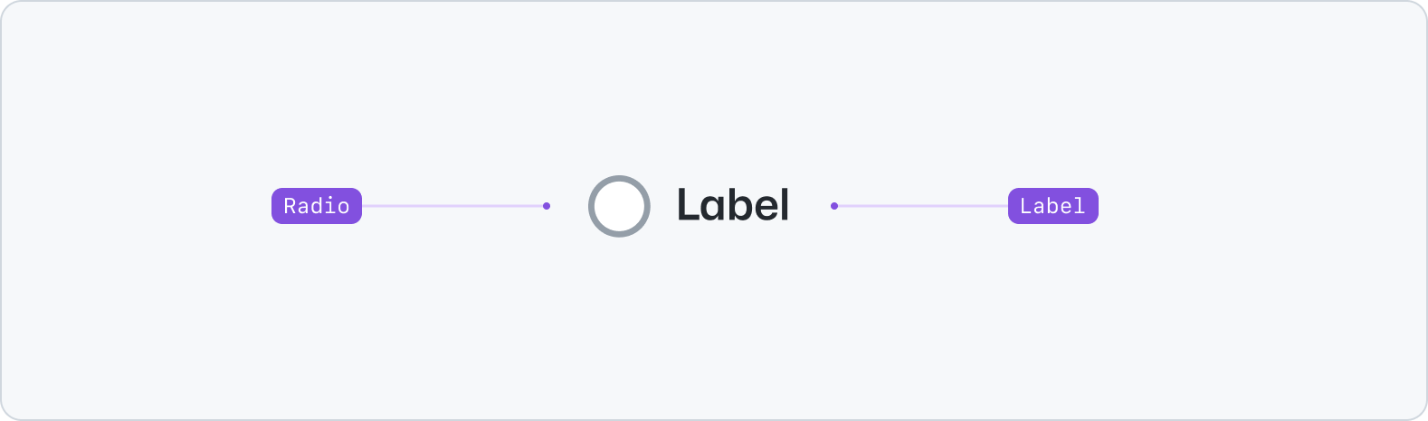
|
|
10
|
+
|
|
11
|
+
- Radio: A selection control.
|
|
12
|
+
- Label: A description for the radio.
|
|
13
|
+
|
|
14
|
+
## Usage
|
|
15
|
+
|
|
16
|
+
Use the radio component to enable users to select a single option from a list.
|
|
17
|
+
|
|
18
|
+
For scenarios that allow for multiple selections, use the [Checkbox](../Checkbox/index.md) component instead. Keep the radio label descriptive and concise: aim for no more than 3 words. Write labels in sentence case and without ending in punctuation.
|
|
19
|
+
|
|
20
|
+
### Grouping
|
|
21
|
+
|
|
22
|
+
To group related radio components together in a list, use the [Stack](../../layout/Stack/index.md) and [FormControl](../FormControl/index.md) components. When rendering a group of radio components, make sure to consider all potential option. Remember to include "None" or "Other" options when necessary.
|
|
23
|
+
|
|
24
|
+
**✅ Do**
|
|
25
|
+
|
|
26
|
+

|
|
27
|
+
|
|
28
|
+
_Ensure radio options are are mutually exclusive. Include "None" or "Other" options when necessary._
|
|
29
|
+
|
|
30
|
+
**❌ Don't**
|
|
31
|
+
|
|
32
|
+

|
|
33
|
+
|
|
34
|
+
_Don't overlap or leave out potential radio options from the list._
|
|
35
|
+
|
|
36
|
+
**✅ Do**
|
|
37
|
+
|
|
38
|
+

|
|
39
|
+
|
|
40
|
+
_When used in groups, order the radio options in a logical order (e.g. smallest to largest)._
|
|
41
|
+
|
|
42
|
+
**❌ Don't**
|
|
43
|
+
|
|
44
|
+

|
|
45
|
+
|
|
46
|
+
_Don't order radio options without logic in a group._
|
|
47
|
+
|
|
48
|
+
### States
|
|
49
|
+
|
|
50
|
+
Radios have static dimensions and three different states: default, checked, and disabled.
|
|
51
|
+
|
|
52
|
+

|
|
53
|
+
|
|
54
|
+
## Accessibility
|
|
55
|
+
|
|
56
|
+
Please use [FormControl](../FormControl/index.md) to render a standard radio input field. If using standalone, it should always be accompanied by a corresponding `<label>` to improve support for assistive technologies.
|
|
57
|
+
|
|
58
|
+
## Related components
|
|
59
|
+
|
|
60
|
+
- [Checkbox](../Checkbox/index.md): Use the checkbox component to select one or more options of a limited number of choices.
|
|
61
|
+
- [Select](../Select/index.md): Use the select component to enable selection of one option from a list.
|
|
62
|
+
- [FormControl](../FormControl/index.md): Use the form control component to display form inputs alongside labels, validation and more.
|
|
63
|
+
- [Stack](../../layout/Stack/index.md): Use the stack component to create a layout for its immediate children along the vertical or horizontal axis.
|
|
@@ -0,0 +1,68 @@
|
|
|
1
|
+
---
|
|
2
|
+
title: Radio
|
|
3
|
+
description: Use the radio component when a user needs to select one option from a list.
|
|
4
|
+
keywords: ['radio button', 'selection', 'input', 'form', 'option', 'single choice']
|
|
5
|
+
source: https://github.com/primer/brand/blob/main/packages/react/src/forms/Radio/Radio.tsx
|
|
6
|
+
figma: https://www.figma.com/file/BJ95AjraesmRCWsKA013GS/Primer-Brand?node-id=3063%3A30198&t=QKh20cPDVIFtBCHj-0
|
|
7
|
+
storybook: '/react/storybook?path=/story/components-forms-radio--default'
|
|
8
|
+
---
|
|
9
|
+
|
|
10
|
+
## Examples
|
|
11
|
+
|
|
12
|
+
> **Use [FormControl](../FormControl/index.md) to render a standard radio input field.** If using standalone, it should always be accompanied by a corresponding `<label>` to improve support for assistive technologies.
|
|
13
|
+
|
|
14
|
+
```jsx
|
|
15
|
+
<>
|
|
16
|
+
<Radio value="one" name="radio-group-name" />
|
|
17
|
+
<Radio value="two" name="radio-group-name" />
|
|
18
|
+
<Radio disabled value="three" name="radio-group-name" />
|
|
19
|
+
</>
|
|
20
|
+
```
|
|
21
|
+
|
|
22
|
+
> Please use a [Checkbox](../Checkbox/index.md) if the user needs to select more than one option in a list
|
|
23
|
+
|
|
24
|
+
### Grouping Radio components
|
|
25
|
+
|
|
26
|
+
Use the `name` prop to group together related `Radio` components in a list.
|
|
27
|
+
|
|
28
|
+
If you're not building something custom, you should use the [Stack](../../layout/Stack/index.md) and [FormControl](../FormControl/index.md) component to render a group of radio inputs.
|
|
29
|
+
|
|
30
|
+
#### Using `FormControl`
|
|
31
|
+
|
|
32
|
+
```jsx
|
|
33
|
+
<form>
|
|
34
|
+
<Stack direction={{narrow: 'vertical', regular: 'horizontal'}} gap="condensed" padding="condensed">
|
|
35
|
+
<FormControl>
|
|
36
|
+
<FormControl.Label>Mona</FormControl.Label>
|
|
37
|
+
<Radio name="radio-group" value="mona" />
|
|
38
|
+
</FormControl>
|
|
39
|
+
<FormControl>
|
|
40
|
+
<FormControl.Label>Hubot</FormControl.Label>
|
|
41
|
+
<Radio name="radio-group" value="hubot" />
|
|
42
|
+
</FormControl>
|
|
43
|
+
</Stack>
|
|
44
|
+
</form>
|
|
45
|
+
```
|
|
46
|
+
|
|
47
|
+
## Props
|
|
48
|
+
|
|
49
|
+
### Radio
|
|
50
|
+
|
|
51
|
+
| Name | Type | Default | Description |
|
|
52
|
+
| :----------------- | :----------------------------------------------- | :------: | :-------------------------------------------------------------------------------- |
|
|
53
|
+
| `checked` | `string` | | Modifies true/false value of the native radio |
|
|
54
|
+
| `className` | `string` | | Sets a custom class |
|
|
55
|
+
| `cols` | `number` | `30` | Specifies the visible width of a textarea |
|
|
56
|
+
| `defaultChecked` | `boolean` | | Selects the radio by default in uncontrolled mode |
|
|
57
|
+
| `id` | `string` | | Sets a custom id |
|
|
58
|
+
| `name` | `string` | | Required for grouping multiple radios |
|
|
59
|
+
| `onChange` | `(event: React.ChangeEvent) => void` | | A callback function that is triggered when the input state has been changed |
|
|
60
|
+
| `ref` | `React.RefObject` | | Forward a Ref to the underlying DOM node |
|
|
61
|
+
| `required` | `boolean` | | Indicates to the user and assistive technologies that the field value is required |
|
|
62
|
+
| `resize` | `'both' \| 'horizontal' \| 'vertical' \| 'none'` | `'both'` | Sets whether an element is resizable, and if so, in which directions |
|
|
63
|
+
| `rows` | `number` | `7` | Specifies the visible height of a text area |
|
|
64
|
+
| `size` | `'medium' \| 'large'` | | Provides alternate visual presentation |
|
|
65
|
+
| `validationStatus` | `'error' \| 'success'` | | Applies visual and semantic state to the underlying elements |
|
|
66
|
+
| `value` | `string` | | A unique value that is never shown to the user |
|
|
67
|
+
|
|
68
|
+
Additional props can be passed to the `<input>` element. [See MDN for a list of props](https://developer.mozilla.org/en-US/docs/Web/HTML/Element/input) accepted by the `<input>` element.
|
|
@@ -0,0 +1,45 @@
|
|
|
1
|
+
---
|
|
2
|
+
title: Radio group
|
|
3
|
+
description: Radio group is used to render a short list of mutually exclusive options.
|
|
4
|
+
keywords: ['radio button', 'selection', 'input', 'form', 'option', 'single choice']
|
|
5
|
+
---
|
|
6
|
+
|
|
7
|
+
## Usage
|
|
8
|
+
|
|
9
|
+
Use radio group to allow users to select a single option from a short list of related options.
|
|
10
|
+
|
|
11
|
+
### Orientation
|
|
12
|
+
|
|
13
|
+
A vertical orientation makes options easier to visually scan.
|
|
14
|
+
|
|
15
|
+
### Anatomy
|
|
16
|
+
|
|
17
|
+
**Label:** A title that labels the group of options and helps users understand the relationship between the options in the group
|
|
18
|
+
|
|
19
|
+
**Required indicator:** Indicates that a selection is required
|
|
20
|
+
|
|
21
|
+
**Caption:** May be used to provide additional context about the radio group when the label alone is not sufficient
|
|
22
|
+
|
|
23
|
+
**Options:** A list of mutually exclusive options represented using [radio buttons](../Radio/index.md)
|
|
24
|
+
|
|
25
|
+
**Validation message:** A message explaining why the selection failed validation. See the [form pattern documentation](https://primer.style/ui-patterns/forms/overview#validation-message) for more information on form validation patterns.
|
|
26
|
+
|
|
27
|
+
### Best practices
|
|
28
|
+
|
|
29
|
+
- Put radio buttons in a logical order
|
|
30
|
+
- Only use a radio group for a short list of options: aim for 6 or less options. For longer sets of options, consider using a [select](../Select/index.md) or an [action menu](../../components/ActionMenu/index.md)
|
|
31
|
+
- Radio buttons cannot be unchecked, so only use a radio group when a selection is required. Consider the following alternatives:
|
|
32
|
+
- use a radio group, but with one option that equates to "none of these options"
|
|
33
|
+
- use a [checkbox group](../CheckboxGroup/index.md) that fails validation if more than one option is selected
|
|
34
|
+
- If there is an option that's the most likely option to be checked, that option should be checked by default
|
|
35
|
+
|
|
36
|
+
## Accessibility
|
|
37
|
+
|
|
38
|
+
- Once a user checks an option from a radio group, the result should not be saved or applied until the user has explicitly submitted their input using a "save" or "submit" button. A radio group is a single tab stop, and the options can be navigated using the arrow keys: this means assistive technologies like a screen reader cannot "read" an option without selecting it. See the [saving pattern guidelines](https://primer.style/ui-patterns/saving) for more information.
|
|
39
|
+
- Radio groups must be labeled. The label may be visually hidden, but visible labels are preferred.
|
|
40
|
+
|
|
41
|
+
## Related components
|
|
42
|
+
|
|
43
|
+
- [FormControl](../FormControl/index.md): Used to group form controls with labels
|
|
44
|
+
- [Radio](../Radio/index.md): Individual radio button control
|
|
45
|
+
- [CheckboxGroup](../CheckboxGroup/index.md): For allowing multiple selections
|