@primer/react-brand 0.69.1-rc.0a4e5ff5 → 0.70.0-rc.11ae3568
This diff represents the content of publicly available package versions that have been released to one of the supported registries. The information contained in this diff is provided for informational purposes only and reflects changes between package versions as they appear in their respective public registries.
- package/README.md +19 -0
- package/docs/components/ActionMenu/index.md +156 -0
- package/docs/components/AnchorNav/index.md +220 -0
- package/docs/components/Avatar/index.md +30 -0
- package/docs/components/Avatar/react.md +71 -0
- package/docs/components/Bento/index.md +223 -0
- package/docs/components/Breadcrumbs/index.md +51 -0
- package/docs/components/Breadcrumbs/react.md +53 -0
- package/docs/components/BreakoutBanner/index.md +102 -0
- package/docs/components/BreakoutBanner/react.md +174 -0
- package/docs/components/Button/index.md +133 -0
- package/docs/components/Button/react.md +94 -0
- package/docs/components/ButtonGroup/index.md +62 -0
- package/docs/components/ButtonGroup/react.md +60 -0
- package/docs/components/CTABanner/index.md +114 -0
- package/docs/components/CTABanner/react.md +343 -0
- package/docs/components/CTAForm/index.md +95 -0
- package/docs/components/CTAForm/react.md +103 -0
- package/docs/components/Card/index.md +126 -0
- package/docs/components/Card/react.md +240 -0
- package/docs/components/ComparisonTable/index.md +381 -0
- package/docs/components/EyebrowBanner/index.md +153 -0
- package/docs/components/FAQ/index.md +66 -0
- package/docs/components/FAQ/react.md +477 -0
- package/docs/components/Footnotes/index.md +41 -0
- package/docs/components/Footnotes/react.md +156 -0
- package/docs/components/Hero/index.md +65 -0
- package/docs/components/Hero/react.md +215 -0
- package/docs/components/IDE/index.md +278 -0
- package/docs/components/Icon/index.md +87 -0
- package/docs/components/Image/index.md +51 -0
- package/docs/components/Image/react.md +160 -0
- package/docs/components/Label/index.md +86 -0
- package/docs/components/Label/react.md +76 -0
- package/docs/components/LogoSuite/index.md +93 -0
- package/docs/components/LogoSuite/react.md +667 -0
- package/docs/components/MediaPlaylist/index.md +133 -0
- package/docs/components/MinimalFooter/index.md +94 -0
- package/docs/components/NavList/index.md +210 -0
- package/docs/components/OrderedList/index.md +55 -0
- package/docs/components/OrderedList/react.md +41 -0
- package/docs/components/Pagination/index.md +80 -0
- package/docs/components/Pillar/index.md +114 -0
- package/docs/components/Pillar/react.md +175 -0
- package/docs/components/PricingOptions/index.md +509 -0
- package/docs/components/Prose/index.md +158 -0
- package/docs/components/River/index.md +190 -0
- package/docs/components/River/react.md +295 -0
- package/docs/components/RiverAccordion/index.md +200 -0
- package/docs/components/RiverBreakoutTabs/index.md +171 -0
- package/docs/components/Section/index.md +40 -0
- package/docs/components/Section/react.md +137 -0
- package/docs/components/SectionIntro/index.md +77 -0
- package/docs/components/SectionIntro/react.md +107 -0
- package/docs/components/SectionIntroStacked/index.md +226 -0
- package/docs/components/Statistic/index.md +111 -0
- package/docs/components/SubNav/index.md +156 -0
- package/docs/components/SubdomainNavBar/index.md +136 -0
- package/docs/components/Tabs/index.md +243 -0
- package/docs/components/Testimonial/index.md +138 -0
- package/docs/components/Testimonial/react.md +191 -0
- package/docs/components/Tiles/index.md +1441 -0
- package/docs/components/Timeline/index.md +68 -0
- package/docs/components/Token/index.md +86 -0
- package/docs/components/Tooltip/index.md +61 -0
- package/docs/components/UnorderedList/index.md +67 -0
- package/docs/components/UnorderedList/react.md +89 -0
- package/docs/components/VideoPlayer/index.md +234 -0
- package/docs/components/index.md +53 -0
- package/docs/forms/Checkbox/index.md +86 -0
- package/docs/forms/Checkbox/react.md +111 -0
- package/docs/forms/CheckboxGroup/index.md +37 -0
- package/docs/forms/CheckboxGroup/react.md +175 -0
- package/docs/forms/FormControl/index.md +404 -0
- package/docs/forms/Radio/index.md +63 -0
- package/docs/forms/Radio/react.md +68 -0
- package/docs/forms/RadioGroup/index.md +45 -0
- package/docs/forms/RadioGroup/react.md +151 -0
- package/docs/forms/Select/index.md +244 -0
- package/docs/forms/TextArea/index.md +126 -0
- package/docs/forms/TextInput/index.md +221 -0
- package/docs/forms/index.md +14 -0
- package/docs/getting-started/esm.md +49 -0
- package/docs/getting-started/index.md +98 -0
- package/docs/index.md +99 -0
- package/docs/introduction/animation.md +127 -0
- package/docs/introduction/index.md +10 -0
- package/docs/introduction/mcp.md +52 -0
- package/docs/introduction/theming.md +132 -0
- package/docs/layout/Box/index.md +46 -0
- package/docs/layout/Box/react.md +284 -0
- package/docs/layout/Grid/index.md +132 -0
- package/docs/layout/Grid/react.md +117 -0
- package/docs/layout/Stack/index.md +60 -0
- package/docs/layout/Stack/react.md +166 -0
- package/docs/layout/index.md +9 -0
- package/docs/primitives/color.md +6 -0
- package/docs/primitives/index.md +8 -0
- package/docs/typography/Heading/index.md +53 -0
- package/docs/typography/Heading/react.md +182 -0
- package/docs/typography/Text/index.md +68 -0
- package/docs/typography/Text/react.md +125 -0
- package/docs/typography/index.md +8 -0
- package/esm/Footnotes/{Footnotes.module-Du0yaz7E.css → Footnotes.module-DG9Vx76y.css} +1 -1
- package/esm/Footnotes/Footnotes.module.js +1 -1
- package/esm/Footnotes/Footnotes.module.js.map +1 -1
- package/esm/Heading/Heading.d.ts +10 -0
- package/esm/Heading/Heading.d.ts.map +1 -1
- package/esm/Heading/Heading.js.map +1 -1
- package/esm/Hero/Hero.d.ts.map +1 -1
- package/esm/Hero/Hero.js +60 -58
- package/esm/Hero/Hero.js.map +1 -1
- package/esm/Hero/{Hero.module-Cy82CEW3.css → Hero.module-DqG5f0MT.css} +1 -1
- package/esm/Hero/Hero.module.js +1 -1
- package/esm/Hero/Hero.module.js.map +1 -1
- package/esm/NavList/NavList.d.ts +86 -0
- package/esm/NavList/NavList.d.ts.map +1 -0
- package/esm/NavList/NavList.js +277 -0
- package/esm/NavList/NavList.js.map +1 -0
- package/esm/NavList/NavList.module-CZFnt8br.css +1 -0
- package/esm/NavList/NavList.module.js +32 -0
- package/esm/NavList/NavList.module.js.map +1 -0
- package/esm/NavList/index.d.ts +2 -0
- package/esm/NavList/index.d.ts.map +1 -0
- package/esm/SectionIntroStacked/{SectionIntroStacked.module-Cr7kUqTH.css → SectionIntroStacked.module-C3cmwHDY.css} +1 -1
- package/esm/SectionIntroStacked/SectionIntroStacked.module.js +1 -1
- package/esm/SectionIntroStacked/SectionIntroStacked.module.js.map +1 -1
- package/esm/Token/Token.js +0 -1
- package/esm/Token/Token.js.map +1 -1
- package/esm/Token/{Token.module-BcKU1KwK.css → Token.module-DtWE9IPI.css} +1 -1
- package/esm/Token/Token.module.js +1 -1
- package/esm/Token/Token.module.js.map +1 -1
- package/esm/index.d.ts +1 -0
- package/esm/index.d.ts.map +1 -1
- package/esm/index.esm.js +12 -11
- package/esm/packages/design-tokens/lib/design-tokens/css/tokens/functional/components/nav-list/colors-with-modes-CGyt2t8f.css +1 -0
- package/lib/Grid/Grid.d.ts +1 -1
- package/lib/Heading/Heading.d.ts +10 -0
- package/lib/NavList/NavList.d.ts +85 -0
- package/lib/NavList/index.d.ts +1 -0
- package/lib/SubNav/SubNav.d.ts +1 -1
- package/lib/Token/Token.d.ts +1 -1
- package/lib/css/main.css +613 -74
- package/lib/design-tokens/css/tokens/base/colors/color-scales-with-modes.css +1 -1
- package/lib/design-tokens/css/tokens/base/colors/light.css +1 -1
- package/lib/design-tokens/css/tokens/base/size/size.css +1 -1
- package/lib/design-tokens/css/tokens/base/typography/typography.css +1 -1
- package/lib/design-tokens/css/tokens/functional/animation/base.css +1 -1
- package/lib/design-tokens/css/tokens/functional/colors/global-with-modes.css +1 -1
- package/lib/design-tokens/css/tokens/functional/colors/global.css +1 -1
- package/lib/design-tokens/css/tokens/functional/components/accordion/colors-with-modes.css +1 -1
- package/lib/design-tokens/css/tokens/functional/components/action-menu/colors-with-modes.css +1 -1
- package/lib/design-tokens/css/tokens/functional/components/anchor-nav/colors-with-modes.css +1 -1
- package/lib/design-tokens/css/tokens/functional/components/bento/base.css +1 -1
- package/lib/design-tokens/css/tokens/functional/components/blinking-cursor/colors-with-modes.css +1 -1
- package/lib/design-tokens/css/tokens/functional/components/breadcrumbs/colors-with-modes.css +1 -1
- package/lib/design-tokens/css/tokens/functional/components/button/colors-with-modes.css +1 -1
- package/lib/design-tokens/css/tokens/functional/components/card/base.css +1 -1
- package/lib/design-tokens/css/tokens/functional/components/card/colors-with-modes.css +1 -1
- package/lib/design-tokens/css/tokens/functional/components/card/colors.css +1 -1
- package/lib/design-tokens/css/tokens/functional/components/comparison-table/colors-with-modes.css +1 -1
- package/lib/design-tokens/css/tokens/functional/components/comparison-table/comparison-table.css +1 -1
- package/lib/design-tokens/css/tokens/functional/components/control/colors-with-modes.css +1 -1
- package/lib/design-tokens/css/tokens/functional/components/cta-banner/colors-with-modes.css +1 -1
- package/lib/design-tokens/css/tokens/functional/components/eyebrow-banner/colors-with-modes.css +1 -1
- package/lib/design-tokens/css/tokens/functional/components/eyebrow-banner/eyebrow-banner.css +1 -1
- package/lib/design-tokens/css/tokens/functional/components/faq/base.css +1 -1
- package/lib/design-tokens/css/tokens/functional/components/faq/colors-with-modes.css +1 -1
- package/lib/design-tokens/css/tokens/functional/components/faq/colors.css +1 -1
- package/lib/design-tokens/css/tokens/functional/components/faq/faq.css +1 -1
- package/lib/design-tokens/css/tokens/functional/components/footer/colors-with-modes.css +1 -1
- package/lib/design-tokens/css/tokens/functional/components/footer/colors.css +1 -1
- package/lib/design-tokens/css/tokens/functional/components/frosted-glass-vfx/base.css +1 -1
- package/lib/design-tokens/css/tokens/functional/components/frosted-glass-vfx/colors-with-modes.css +1 -1
- package/lib/design-tokens/css/tokens/functional/components/grid/colors-with-modes.css +1 -1
- package/lib/design-tokens/css/tokens/functional/components/grid/colors.css +1 -1
- package/lib/design-tokens/css/tokens/functional/components/grid/grid.css +1 -1
- package/lib/design-tokens/css/tokens/functional/components/hero/base.css +1 -1
- package/lib/design-tokens/css/tokens/functional/components/icon/colors-with-modes.css +1 -1
- package/lib/design-tokens/css/tokens/functional/components/icon/colors.css +1 -1
- package/lib/design-tokens/css/tokens/functional/components/ide/base.css +1 -1
- package/lib/design-tokens/css/tokens/functional/components/ide/colors-with-modes.css +1 -1
- package/lib/design-tokens/css/tokens/functional/components/image/base.css +1 -1
- package/lib/design-tokens/css/tokens/functional/components/inline-link/base.css +1 -1
- package/lib/design-tokens/css/tokens/functional/components/inline-link/colors-with-modes.css +1 -1
- package/lib/design-tokens/css/tokens/functional/components/inline-link/colors.css +1 -1
- package/lib/design-tokens/css/tokens/functional/components/label/colors-with-modes.css +1 -1
- package/lib/design-tokens/css/tokens/functional/components/label/colors.css +1 -1
- package/lib/design-tokens/css/tokens/functional/components/link/colors-with-modes.css +1 -1
- package/lib/design-tokens/css/tokens/functional/components/link/colors.css +1 -1
- package/lib/design-tokens/css/tokens/functional/components/logosuite/base.css +1 -1
- package/lib/design-tokens/css/tokens/functional/components/logosuite/colors-with-modes.css +1 -1
- package/lib/design-tokens/css/tokens/functional/components/logosuite/colors.css +1 -1
- package/lib/design-tokens/css/tokens/functional/components/media-playlist/colors-with-modes.css +1 -1
- package/lib/design-tokens/css/tokens/functional/components/media-playlist/colors.css +1 -1
- package/lib/design-tokens/css/tokens/functional/components/nav-list/colors-with-modes.css +13 -0
- package/lib/design-tokens/css/tokens/functional/components/pricing-options/colors-with-modes.css +1 -1
- package/lib/design-tokens/css/tokens/functional/components/pricing-options/colors.css +1 -1
- package/lib/design-tokens/css/tokens/functional/components/pricing-options/pricing-options.css +1 -1
- package/lib/design-tokens/css/tokens/functional/components/prose/base.css +1 -1
- package/lib/design-tokens/css/tokens/functional/components/prose/colors-with-modes.css +1 -1
- package/lib/design-tokens/css/tokens/functional/components/river/base.css +1 -1
- package/lib/design-tokens/css/tokens/functional/components/river/river.css +1 -1
- package/lib/design-tokens/css/tokens/functional/components/river-story-scroll/colors-with-modes.css +1 -1
- package/lib/design-tokens/css/tokens/functional/components/section/section.css +1 -1
- package/lib/design-tokens/css/tokens/functional/components/statistic/base.css +1 -1
- package/lib/design-tokens/css/tokens/functional/components/sub-nav/base.css +1 -1
- package/lib/design-tokens/css/tokens/functional/components/sub-nav/colors-with-modes.css +1 -1
- package/lib/design-tokens/css/tokens/functional/components/subdomain-nav-bar/colors-with-modes.css +1 -1
- package/lib/design-tokens/css/tokens/functional/components/tabs/base.css +1 -1
- package/lib/design-tokens/css/tokens/functional/components/tabs/colors-with-modes.css +1 -1
- package/lib/design-tokens/css/tokens/functional/components/tabs/colors.css +1 -1
- package/lib/design-tokens/css/tokens/functional/components/testimonial/base.css +1 -1
- package/lib/design-tokens/css/tokens/functional/components/testimonial/colors-with-modes.css +1 -1
- package/lib/design-tokens/css/tokens/functional/components/testimonial/colors.css +1 -1
- package/lib/design-tokens/css/tokens/functional/components/text-cursor-animation/colors-with-modes.css +1 -1
- package/lib/design-tokens/css/tokens/functional/components/text-cursor-animation/colors.css +1 -1
- package/lib/design-tokens/css/tokens/functional/components/tiles/colors-with-modes.css +1 -1
- package/lib/design-tokens/css/tokens/functional/components/timeline/base.css +1 -1
- package/lib/design-tokens/css/tokens/functional/components/timeline/colors-with-modes.css +1 -1
- package/lib/design-tokens/css/tokens/functional/components/timeline/colors.css +1 -1
- package/lib/design-tokens/css/tokens/functional/components/token/colors-with-modes.css +1 -1
- package/lib/design-tokens/css/tokens/functional/components/token/colors.css +1 -1
- package/lib/design-tokens/css/tokens/functional/components/tooltip/colors-with-modes.css +1 -1
- package/lib/design-tokens/css/tokens/functional/components/tooltip/colors.css +1 -1
- package/lib/design-tokens/css/tokens/functional/components/video-player/base.css +1 -1
- package/lib/design-tokens/css/tokens/functional/components/video-player/colors-with-modes.css +1 -1
- package/lib/design-tokens/css/tokens/functional/size/border.css +1 -1
- package/lib/design-tokens/css/tokens/functional/size/breakpoints.css +1 -1
- package/lib/design-tokens/css/tokens/functional/size/size-coarse.css +1 -1
- package/lib/design-tokens/css/tokens/functional/size/size-fine.css +1 -1
- package/lib/design-tokens/css/tokens/functional/size/size.css +1 -1
- package/lib/design-tokens/css/tokens/functional/size/viewport.css +1 -1
- package/lib/design-tokens/css/tokens/functional/typography/typography-responsive.css +1 -1
- package/lib/design-tokens/css/tokens/functional/typography/typography.css +1 -1
- package/lib/design-tokens/js/module/tokens/base/colors/light.js +1 -1
- package/lib/design-tokens/js/module/tokens/base/size/size.js +1 -1
- package/lib/design-tokens/js/module/tokens/base/typography/typography.js +1 -1
- package/lib/design-tokens/js/module/tokens/functional/animation/base.js +1 -1
- package/lib/design-tokens/js/module/tokens/functional/colors/global.js +1 -1
- package/lib/design-tokens/js/module/tokens/functional/components/bento/base.js +1 -1
- package/lib/design-tokens/js/module/tokens/functional/components/card/base.js +1 -1
- package/lib/design-tokens/js/module/tokens/functional/components/card/colors.js +1 -1
- package/lib/design-tokens/js/module/tokens/functional/components/comparison-table/comparison-table.js +1 -1
- package/lib/design-tokens/js/module/tokens/functional/components/eyebrow-banner/eyebrow-banner.js +1 -1
- package/lib/design-tokens/js/module/tokens/functional/components/faq/base.js +1 -1
- package/lib/design-tokens/js/module/tokens/functional/components/faq/colors.js +1 -1
- package/lib/design-tokens/js/module/tokens/functional/components/faq/faq.js +1 -1
- package/lib/design-tokens/js/module/tokens/functional/components/footer/colors.js +1 -1
- package/lib/design-tokens/js/module/tokens/functional/components/frosted-glass-vfx/base.js +1 -1
- package/lib/design-tokens/js/module/tokens/functional/components/grid/colors.js +1 -1
- package/lib/design-tokens/js/module/tokens/functional/components/grid/grid.js +1 -1
- package/lib/design-tokens/js/module/tokens/functional/components/hero/base.js +1 -1
- package/lib/design-tokens/js/module/tokens/functional/components/icon/colors.js +1 -1
- package/lib/design-tokens/js/module/tokens/functional/components/ide/base.js +1 -1
- package/lib/design-tokens/js/module/tokens/functional/components/image/base.js +1 -1
- package/lib/design-tokens/js/module/tokens/functional/components/inline-link/base.js +1 -1
- package/lib/design-tokens/js/module/tokens/functional/components/inline-link/colors.js +1 -1
- package/lib/design-tokens/js/module/tokens/functional/components/label/colors.js +1 -1
- package/lib/design-tokens/js/module/tokens/functional/components/link/colors.js +1 -1
- package/lib/design-tokens/js/module/tokens/functional/components/logosuite/base.js +1 -1
- package/lib/design-tokens/js/module/tokens/functional/components/logosuite/colors.js +1 -1
- package/lib/design-tokens/js/module/tokens/functional/components/media-playlist/colors.js +1 -1
- package/lib/design-tokens/js/module/tokens/functional/components/pricing-options/colors.js +1 -1
- package/lib/design-tokens/js/module/tokens/functional/components/pricing-options/pricing-options.js +1 -1
- package/lib/design-tokens/js/module/tokens/functional/components/prose/base.js +1 -1
- package/lib/design-tokens/js/module/tokens/functional/components/river/base.js +1 -1
- package/lib/design-tokens/js/module/tokens/functional/components/river/river.js +1 -1
- package/lib/design-tokens/js/module/tokens/functional/components/section/section.js +1 -1
- package/lib/design-tokens/js/module/tokens/functional/components/statistic/base.js +1 -1
- package/lib/design-tokens/js/module/tokens/functional/components/sub-nav/base.js +1 -1
- package/lib/design-tokens/js/module/tokens/functional/components/tabs/base.js +1 -1
- package/lib/design-tokens/js/module/tokens/functional/components/tabs/colors.js +1 -1
- package/lib/design-tokens/js/module/tokens/functional/components/testimonial/base.js +1 -1
- package/lib/design-tokens/js/module/tokens/functional/components/testimonial/colors.js +1 -1
- package/lib/design-tokens/js/module/tokens/functional/components/text-cursor-animation/colors.js +1 -1
- package/lib/design-tokens/js/module/tokens/functional/components/timeline/base.js +1 -1
- package/lib/design-tokens/js/module/tokens/functional/components/timeline/colors.js +1 -1
- package/lib/design-tokens/js/module/tokens/functional/components/token/colors.js +1 -1
- package/lib/design-tokens/js/module/tokens/functional/components/tooltip/colors.js +1 -1
- package/lib/design-tokens/js/module/tokens/functional/components/video-player/base.js +1 -1
- package/lib/design-tokens/js/module/tokens/functional/size/border.js +1 -1
- package/lib/design-tokens/js/module/tokens/functional/size/breakpoints.js +1 -1
- package/lib/design-tokens/js/module/tokens/functional/size/size-coarse.js +1 -1
- package/lib/design-tokens/js/module/tokens/functional/size/size-fine.js +1 -1
- package/lib/design-tokens/js/module/tokens/functional/size/size.js +1 -1
- package/lib/design-tokens/js/module/tokens/functional/size/viewport.js +1 -1
- package/lib/design-tokens/js/module/tokens/functional/typography/typography-responsive.js +1 -1
- package/lib/design-tokens/js/module/tokens/functional/typography/typography.js +1 -1
- package/lib/design-tokens/js/tokens/base/colors/light.js +1 -1
- package/lib/design-tokens/js/tokens/base/size/size.js +1 -1
- package/lib/design-tokens/js/tokens/base/typography/typography.js +1 -1
- package/lib/design-tokens/js/tokens/functional/animation/base.js +1 -1
- package/lib/design-tokens/js/tokens/functional/colors/global.js +1 -1
- package/lib/design-tokens/js/tokens/functional/components/bento/base.js +1 -1
- package/lib/design-tokens/js/tokens/functional/components/card/base.js +1 -1
- package/lib/design-tokens/js/tokens/functional/components/card/colors.js +1 -1
- package/lib/design-tokens/js/tokens/functional/components/comparison-table/comparison-table.js +1 -1
- package/lib/design-tokens/js/tokens/functional/components/eyebrow-banner/eyebrow-banner.js +1 -1
- package/lib/design-tokens/js/tokens/functional/components/faq/base.js +1 -1
- package/lib/design-tokens/js/tokens/functional/components/faq/colors.js +1 -1
- package/lib/design-tokens/js/tokens/functional/components/faq/faq.js +1 -1
- package/lib/design-tokens/js/tokens/functional/components/footer/colors.js +1 -1
- package/lib/design-tokens/js/tokens/functional/components/frosted-glass-vfx/base.js +1 -1
- package/lib/design-tokens/js/tokens/functional/components/grid/colors.js +1 -1
- package/lib/design-tokens/js/tokens/functional/components/grid/grid.js +1 -1
- package/lib/design-tokens/js/tokens/functional/components/hero/base.js +1 -1
- package/lib/design-tokens/js/tokens/functional/components/icon/colors.js +1 -1
- package/lib/design-tokens/js/tokens/functional/components/ide/base.js +1 -1
- package/lib/design-tokens/js/tokens/functional/components/image/base.js +1 -1
- package/lib/design-tokens/js/tokens/functional/components/inline-link/base.js +1 -1
- package/lib/design-tokens/js/tokens/functional/components/inline-link/colors.js +1 -1
- package/lib/design-tokens/js/tokens/functional/components/label/colors.js +1 -1
- package/lib/design-tokens/js/tokens/functional/components/link/colors.js +1 -1
- package/lib/design-tokens/js/tokens/functional/components/logosuite/base.js +1 -1
- package/lib/design-tokens/js/tokens/functional/components/logosuite/colors.js +1 -1
- package/lib/design-tokens/js/tokens/functional/components/media-playlist/colors.js +1 -1
- package/lib/design-tokens/js/tokens/functional/components/pricing-options/colors.js +1 -1
- package/lib/design-tokens/js/tokens/functional/components/pricing-options/pricing-options.js +1 -1
- package/lib/design-tokens/js/tokens/functional/components/prose/base.js +1 -1
- package/lib/design-tokens/js/tokens/functional/components/river/base.js +1 -1
- package/lib/design-tokens/js/tokens/functional/components/river/river.js +1 -1
- package/lib/design-tokens/js/tokens/functional/components/section/section.js +1 -1
- package/lib/design-tokens/js/tokens/functional/components/statistic/base.js +1 -1
- package/lib/design-tokens/js/tokens/functional/components/sub-nav/base.js +1 -1
- package/lib/design-tokens/js/tokens/functional/components/tabs/base.js +1 -1
- package/lib/design-tokens/js/tokens/functional/components/tabs/colors.js +1 -1
- package/lib/design-tokens/js/tokens/functional/components/testimonial/base.js +1 -1
- package/lib/design-tokens/js/tokens/functional/components/testimonial/colors.js +1 -1
- package/lib/design-tokens/js/tokens/functional/components/text-cursor-animation/colors.js +1 -1
- package/lib/design-tokens/js/tokens/functional/components/timeline/base.js +1 -1
- package/lib/design-tokens/js/tokens/functional/components/timeline/colors.js +1 -1
- package/lib/design-tokens/js/tokens/functional/components/token/colors.js +1 -1
- package/lib/design-tokens/js/tokens/functional/components/tooltip/colors.js +1 -1
- package/lib/design-tokens/js/tokens/functional/components/video-player/base.js +1 -1
- package/lib/design-tokens/js/tokens/functional/size/border.js +1 -1
- package/lib/design-tokens/js/tokens/functional/size/breakpoints.js +1 -1
- package/lib/design-tokens/js/tokens/functional/size/size-coarse.js +1 -1
- package/lib/design-tokens/js/tokens/functional/size/size-fine.js +1 -1
- package/lib/design-tokens/js/tokens/functional/size/size.js +1 -1
- package/lib/design-tokens/js/tokens/functional/size/viewport.js +1 -1
- package/lib/design-tokens/js/tokens/functional/typography/typography-responsive.js +1 -1
- package/lib/design-tokens/js/tokens/functional/typography/typography.js +1 -1
- package/lib/design-tokens/scss/tokens/base/colors/light.scss +1 -1
- package/lib/design-tokens/scss/tokens/base/size/size.scss +1 -1
- package/lib/design-tokens/scss/tokens/base/typography/typography.scss +1 -1
- package/lib/design-tokens/scss/tokens/functional/animation/base.scss +1 -1
- package/lib/design-tokens/scss/tokens/functional/colors/global.scss +1 -1
- package/lib/design-tokens/scss/tokens/functional/components/bento/base.scss +1 -1
- package/lib/design-tokens/scss/tokens/functional/components/card/base.scss +1 -1
- package/lib/design-tokens/scss/tokens/functional/components/card/colors.scss +1 -1
- package/lib/design-tokens/scss/tokens/functional/components/comparison-table/comparison-table.scss +1 -1
- package/lib/design-tokens/scss/tokens/functional/components/eyebrow-banner/eyebrow-banner.scss +1 -1
- package/lib/design-tokens/scss/tokens/functional/components/faq/base.scss +1 -1
- package/lib/design-tokens/scss/tokens/functional/components/faq/colors.scss +1 -1
- package/lib/design-tokens/scss/tokens/functional/components/faq/faq.scss +1 -1
- package/lib/design-tokens/scss/tokens/functional/components/footer/colors.scss +1 -1
- package/lib/design-tokens/scss/tokens/functional/components/frosted-glass-vfx/base.scss +1 -1
- package/lib/design-tokens/scss/tokens/functional/components/grid/colors.scss +1 -1
- package/lib/design-tokens/scss/tokens/functional/components/grid/grid.scss +1 -1
- package/lib/design-tokens/scss/tokens/functional/components/hero/base.scss +1 -1
- package/lib/design-tokens/scss/tokens/functional/components/icon/colors.scss +1 -1
- package/lib/design-tokens/scss/tokens/functional/components/ide/base.scss +1 -1
- package/lib/design-tokens/scss/tokens/functional/components/image/base.scss +1 -1
- package/lib/design-tokens/scss/tokens/functional/components/inline-link/base.scss +1 -1
- package/lib/design-tokens/scss/tokens/functional/components/inline-link/colors.scss +1 -1
- package/lib/design-tokens/scss/tokens/functional/components/label/colors.scss +1 -1
- package/lib/design-tokens/scss/tokens/functional/components/link/colors.scss +1 -1
- package/lib/design-tokens/scss/tokens/functional/components/logosuite/base.scss +1 -1
- package/lib/design-tokens/scss/tokens/functional/components/logosuite/colors.scss +1 -1
- package/lib/design-tokens/scss/tokens/functional/components/media-playlist/colors.scss +1 -1
- package/lib/design-tokens/scss/tokens/functional/components/pricing-options/colors.scss +1 -1
- package/lib/design-tokens/scss/tokens/functional/components/pricing-options/pricing-options.scss +1 -1
- package/lib/design-tokens/scss/tokens/functional/components/prose/base.scss +1 -1
- package/lib/design-tokens/scss/tokens/functional/components/river/base.scss +1 -1
- package/lib/design-tokens/scss/tokens/functional/components/river/river.scss +1 -1
- package/lib/design-tokens/scss/tokens/functional/components/section/section.scss +1 -1
- package/lib/design-tokens/scss/tokens/functional/components/statistic/base.scss +1 -1
- package/lib/design-tokens/scss/tokens/functional/components/sub-nav/base.scss +1 -1
- package/lib/design-tokens/scss/tokens/functional/components/tabs/base.scss +1 -1
- package/lib/design-tokens/scss/tokens/functional/components/tabs/colors.scss +1 -1
- package/lib/design-tokens/scss/tokens/functional/components/testimonial/base.scss +1 -1
- package/lib/design-tokens/scss/tokens/functional/components/testimonial/colors.scss +1 -1
- package/lib/design-tokens/scss/tokens/functional/components/text-cursor-animation/colors.scss +1 -1
- package/lib/design-tokens/scss/tokens/functional/components/timeline/base.scss +1 -1
- package/lib/design-tokens/scss/tokens/functional/components/timeline/colors.scss +1 -1
- package/lib/design-tokens/scss/tokens/functional/components/token/colors.scss +1 -1
- package/lib/design-tokens/scss/tokens/functional/components/tooltip/colors.scss +1 -1
- package/lib/design-tokens/scss/tokens/functional/components/video-player/base.scss +1 -1
- package/lib/design-tokens/scss/tokens/functional/size/border.scss +1 -1
- package/lib/design-tokens/scss/tokens/functional/size/breakpoints.scss +1 -1
- package/lib/design-tokens/scss/tokens/functional/size/size-coarse.scss +1 -1
- package/lib/design-tokens/scss/tokens/functional/size/size-fine.scss +1 -1
- package/lib/design-tokens/scss/tokens/functional/size/size.scss +1 -1
- package/lib/design-tokens/scss/tokens/functional/size/viewport.scss +1 -1
- package/lib/design-tokens/scss/tokens/functional/typography/typography-responsive.scss +1 -1
- package/lib/design-tokens/scss/tokens/functional/typography/typography.scss +1 -1
- package/lib/design-tokens/ts/tokens/base/colors/light.d.ts +1 -1
- package/lib/design-tokens/ts/tokens/base/colors/light.js +1 -1
- package/lib/design-tokens/ts/tokens/base/size/size.d.ts +1 -1
- package/lib/design-tokens/ts/tokens/base/size/size.js +1 -1
- package/lib/design-tokens/ts/tokens/base/typography/typography.d.ts +1 -1
- package/lib/design-tokens/ts/tokens/base/typography/typography.js +1 -1
- package/lib/design-tokens/ts/tokens/functional/animation/base.d.ts +1 -1
- package/lib/design-tokens/ts/tokens/functional/animation/base.js +1 -1
- package/lib/design-tokens/ts/tokens/functional/colors/global.d.ts +1 -1
- package/lib/design-tokens/ts/tokens/functional/colors/global.js +1 -1
- package/lib/design-tokens/ts/tokens/functional/components/bento/base.d.ts +1 -1
- package/lib/design-tokens/ts/tokens/functional/components/bento/base.js +1 -1
- package/lib/design-tokens/ts/tokens/functional/components/card/base.d.ts +1 -1
- package/lib/design-tokens/ts/tokens/functional/components/card/base.js +1 -1
- package/lib/design-tokens/ts/tokens/functional/components/card/colors.d.ts +1 -1
- package/lib/design-tokens/ts/tokens/functional/components/card/colors.js +1 -1
- package/lib/design-tokens/ts/tokens/functional/components/comparison-table/comparison-table.d.ts +1 -1
- package/lib/design-tokens/ts/tokens/functional/components/comparison-table/comparison-table.js +1 -1
- package/lib/design-tokens/ts/tokens/functional/components/eyebrow-banner/eyebrow-banner.d.ts +1 -1
- package/lib/design-tokens/ts/tokens/functional/components/eyebrow-banner/eyebrow-banner.js +1 -1
- package/lib/design-tokens/ts/tokens/functional/components/faq/base.d.ts +1 -1
- package/lib/design-tokens/ts/tokens/functional/components/faq/base.js +1 -1
- package/lib/design-tokens/ts/tokens/functional/components/faq/colors.d.ts +1 -1
- package/lib/design-tokens/ts/tokens/functional/components/faq/colors.js +1 -1
- package/lib/design-tokens/ts/tokens/functional/components/faq/faq.d.ts +1 -1
- package/lib/design-tokens/ts/tokens/functional/components/faq/faq.js +1 -1
- package/lib/design-tokens/ts/tokens/functional/components/footer/colors.d.ts +1 -1
- package/lib/design-tokens/ts/tokens/functional/components/footer/colors.js +1 -1
- package/lib/design-tokens/ts/tokens/functional/components/frosted-glass-vfx/base.d.ts +1 -1
- package/lib/design-tokens/ts/tokens/functional/components/frosted-glass-vfx/base.js +1 -1
- package/lib/design-tokens/ts/tokens/functional/components/grid/colors.d.ts +1 -1
- package/lib/design-tokens/ts/tokens/functional/components/grid/colors.js +1 -1
- package/lib/design-tokens/ts/tokens/functional/components/grid/grid.d.ts +1 -1
- package/lib/design-tokens/ts/tokens/functional/components/grid/grid.js +1 -1
- package/lib/design-tokens/ts/tokens/functional/components/hero/base.d.ts +1 -1
- package/lib/design-tokens/ts/tokens/functional/components/hero/base.js +1 -1
- package/lib/design-tokens/ts/tokens/functional/components/icon/colors.d.ts +1 -1
- package/lib/design-tokens/ts/tokens/functional/components/icon/colors.js +1 -1
- package/lib/design-tokens/ts/tokens/functional/components/ide/base.d.ts +1 -1
- package/lib/design-tokens/ts/tokens/functional/components/ide/base.js +1 -1
- package/lib/design-tokens/ts/tokens/functional/components/image/base.d.ts +1 -1
- package/lib/design-tokens/ts/tokens/functional/components/image/base.js +1 -1
- package/lib/design-tokens/ts/tokens/functional/components/inline-link/base.d.ts +1 -1
- package/lib/design-tokens/ts/tokens/functional/components/inline-link/base.js +1 -1
- package/lib/design-tokens/ts/tokens/functional/components/inline-link/colors.d.ts +1 -1
- package/lib/design-tokens/ts/tokens/functional/components/inline-link/colors.js +1 -1
- package/lib/design-tokens/ts/tokens/functional/components/label/colors.d.ts +1 -1
- package/lib/design-tokens/ts/tokens/functional/components/label/colors.js +1 -1
- package/lib/design-tokens/ts/tokens/functional/components/link/colors.d.ts +1 -1
- package/lib/design-tokens/ts/tokens/functional/components/link/colors.js +1 -1
- package/lib/design-tokens/ts/tokens/functional/components/logosuite/base.d.ts +1 -1
- package/lib/design-tokens/ts/tokens/functional/components/logosuite/base.js +1 -1
- package/lib/design-tokens/ts/tokens/functional/components/logosuite/colors.d.ts +1 -1
- package/lib/design-tokens/ts/tokens/functional/components/logosuite/colors.js +1 -1
- package/lib/design-tokens/ts/tokens/functional/components/media-playlist/colors.d.ts +1 -1
- package/lib/design-tokens/ts/tokens/functional/components/media-playlist/colors.js +1 -1
- package/lib/design-tokens/ts/tokens/functional/components/pricing-options/colors.d.ts +1 -1
- package/lib/design-tokens/ts/tokens/functional/components/pricing-options/colors.js +1 -1
- package/lib/design-tokens/ts/tokens/functional/components/pricing-options/pricing-options.d.ts +1 -1
- package/lib/design-tokens/ts/tokens/functional/components/pricing-options/pricing-options.js +1 -1
- package/lib/design-tokens/ts/tokens/functional/components/prose/base.d.ts +1 -1
- package/lib/design-tokens/ts/tokens/functional/components/prose/base.js +1 -1
- package/lib/design-tokens/ts/tokens/functional/components/river/base.d.ts +1 -1
- package/lib/design-tokens/ts/tokens/functional/components/river/base.js +1 -1
- package/lib/design-tokens/ts/tokens/functional/components/river/river.d.ts +1 -1
- package/lib/design-tokens/ts/tokens/functional/components/river/river.js +1 -1
- package/lib/design-tokens/ts/tokens/functional/components/section/section.d.ts +1 -1
- package/lib/design-tokens/ts/tokens/functional/components/section/section.js +1 -1
- package/lib/design-tokens/ts/tokens/functional/components/statistic/base.d.ts +1 -1
- package/lib/design-tokens/ts/tokens/functional/components/statistic/base.js +1 -1
- package/lib/design-tokens/ts/tokens/functional/components/sub-nav/base.d.ts +1 -1
- package/lib/design-tokens/ts/tokens/functional/components/sub-nav/base.js +1 -1
- package/lib/design-tokens/ts/tokens/functional/components/tabs/base.d.ts +1 -1
- package/lib/design-tokens/ts/tokens/functional/components/tabs/base.js +1 -1
- package/lib/design-tokens/ts/tokens/functional/components/tabs/colors.d.ts +1 -1
- package/lib/design-tokens/ts/tokens/functional/components/tabs/colors.js +1 -1
- package/lib/design-tokens/ts/tokens/functional/components/testimonial/base.d.ts +1 -1
- package/lib/design-tokens/ts/tokens/functional/components/testimonial/base.js +1 -1
- package/lib/design-tokens/ts/tokens/functional/components/testimonial/colors.d.ts +1 -1
- package/lib/design-tokens/ts/tokens/functional/components/testimonial/colors.js +1 -1
- package/lib/design-tokens/ts/tokens/functional/components/text-cursor-animation/colors.d.ts +1 -1
- package/lib/design-tokens/ts/tokens/functional/components/text-cursor-animation/colors.js +1 -1
- package/lib/design-tokens/ts/tokens/functional/components/timeline/base.d.ts +1 -1
- package/lib/design-tokens/ts/tokens/functional/components/timeline/base.js +1 -1
- package/lib/design-tokens/ts/tokens/functional/components/timeline/colors.d.ts +1 -1
- package/lib/design-tokens/ts/tokens/functional/components/timeline/colors.js +1 -1
- package/lib/design-tokens/ts/tokens/functional/components/token/colors.d.ts +1 -1
- package/lib/design-tokens/ts/tokens/functional/components/token/colors.js +1 -1
- package/lib/design-tokens/ts/tokens/functional/components/tooltip/colors.d.ts +1 -1
- package/lib/design-tokens/ts/tokens/functional/components/tooltip/colors.js +1 -1
- package/lib/design-tokens/ts/tokens/functional/components/video-player/base.d.ts +1 -1
- package/lib/design-tokens/ts/tokens/functional/components/video-player/base.js +1 -1
- package/lib/design-tokens/ts/tokens/functional/size/border.d.ts +1 -1
- package/lib/design-tokens/ts/tokens/functional/size/border.js +1 -1
- package/lib/design-tokens/ts/tokens/functional/size/breakpoints.d.ts +1 -1
- package/lib/design-tokens/ts/tokens/functional/size/breakpoints.js +1 -1
- package/lib/design-tokens/ts/tokens/functional/size/size-coarse.d.ts +1 -1
- package/lib/design-tokens/ts/tokens/functional/size/size-coarse.js +1 -1
- package/lib/design-tokens/ts/tokens/functional/size/size-fine.d.ts +1 -1
- package/lib/design-tokens/ts/tokens/functional/size/size-fine.js +1 -1
- package/lib/design-tokens/ts/tokens/functional/size/size.d.ts +1 -1
- package/lib/design-tokens/ts/tokens/functional/size/size.js +1 -1
- package/lib/design-tokens/ts/tokens/functional/size/viewport.d.ts +1 -1
- package/lib/design-tokens/ts/tokens/functional/size/viewport.js +1 -1
- package/lib/design-tokens/ts/tokens/functional/typography/typography-responsive.d.ts +1 -1
- package/lib/design-tokens/ts/tokens/functional/typography/typography-responsive.js +1 -1
- package/lib/design-tokens/ts/tokens/functional/typography/typography.d.ts +1 -1
- package/lib/design-tokens/ts/tokens/functional/typography/typography.js +1 -1
- package/lib/index.d.ts +1 -0
- package/lib/index.js +1 -1
- package/llms.txt +97 -0
- package/package.json +17 -5
- package/esm/Hero/Hero.figma.d.ts +0 -2
- package/esm/Hero/Hero.figma.d.ts.map +0 -1
- package/esm/IDE/fixtures/content.d.ts +0 -7
- package/esm/IDE/fixtures/content.d.ts.map +0 -1
- package/esm/LogoSuite/LogoSuite.figma.d.ts +0 -2
- package/esm/LogoSuite/LogoSuite.figma.d.ts.map +0 -1
- package/esm/LogoSuite/LogoSuite.fixtures.d.ts +0 -2
- package/esm/LogoSuite/LogoSuite.fixtures.d.ts.map +0 -1
- package/esm/MonaSans/MonaSans.d.ts +0 -11
- package/esm/MonaSans/MonaSans.d.ts.map +0 -1
- package/esm/MonaSans/index.d.ts +0 -2
- package/esm/MonaSans/index.d.ts.map +0 -1
- package/esm/PricingOptions/PricingOptions.figma.d.ts +0 -2
- package/esm/PricingOptions/PricingOptions.figma.d.ts.map +0 -1
- package/esm/Tiles/Tiles.fixtures.d.ts +0 -7
- package/esm/Tiles/Tiles.fixtures.d.ts.map +0 -1
- package/esm/fixtures/third-party-logos/AzureLogo.d.ts +0 -5
- package/esm/fixtures/third-party-logos/AzureLogo.d.ts.map +0 -1
- package/esm/fixtures/third-party-logos/JetBrainsLogo.d.ts +0 -5
- package/esm/fixtures/third-party-logos/JetBrainsLogo.d.ts.map +0 -1
- package/esm/fixtures/third-party-logos/MicrosoftCopilotLogo.d.ts +0 -5
- package/esm/fixtures/third-party-logos/MicrosoftCopilotLogo.d.ts.map +0 -1
- package/esm/fixtures/third-party-logos/MicrosoftLogo.d.ts +0 -5
- package/esm/fixtures/third-party-logos/MicrosoftLogo.d.ts.map +0 -1
- package/esm/fixtures/third-party-logos/NeoVimLogo.d.ts +0 -5
- package/esm/fixtures/third-party-logos/NeoVimLogo.d.ts.map +0 -1
- package/esm/fixtures/third-party-logos/VisualStudioCodeLogo.d.ts +0 -5
- package/esm/fixtures/third-party-logos/VisualStudioCodeLogo.d.ts.map +0 -1
- package/esm/fixtures/third-party-logos/VisualStudioLogo.d.ts +0 -5
- package/esm/fixtures/third-party-logos/VisualStudioLogo.d.ts.map +0 -1
- package/esm/list/ListItem/index.d.ts +0 -2
- package/esm/list/ListItem/index.d.ts.map +0 -1
- package/esm/recipes/FeaturePreviewLPs/FeaturePreviewLevelOne/FeaturePreviewLevelOne.d.ts +0 -13
- package/esm/recipes/FeaturePreviewLPs/FeaturePreviewLevelOne/FeaturePreviewLevelOne.d.ts.map +0 -1
- package/esm/recipes/FeaturePreviewLPs/FeaturePreviewLevelOne/FeaturePreviewLevelOneSideBySide.d.ts +0 -14
- package/esm/recipes/FeaturePreviewLPs/FeaturePreviewLevelOne/FeaturePreviewLevelOneSideBySide.d.ts.map +0 -1
- package/esm/recipes/FeaturePreviewLPs/FeaturePreviewLevelOne/components/FormExample.d.ts +0 -8
- package/esm/recipes/FeaturePreviewLPs/FeaturePreviewLevelOne/components/FormExample.d.ts.map +0 -1
- package/esm/recipes/FeaturePreviewLPs/FeaturePreviewLevelOne/index.d.ts +0 -2
- package/esm/recipes/FeaturePreviewLPs/FeaturePreviewLevelOne/index.d.ts.map +0 -1
- package/esm/recipes/FeaturePreviewLPs/FeaturePreviewLevelTwo/FeaturePreviewLevelTwo.d.ts +0 -49
- package/esm/recipes/FeaturePreviewLPs/FeaturePreviewLevelTwo/FeaturePreviewLevelTwo.d.ts.map +0 -1
- package/esm/recipes/FeaturePreviewLPs/FeaturePreviewLevelTwo/index.d.ts +0 -2
- package/esm/recipes/FeaturePreviewLPs/FeaturePreviewLevelTwo/index.d.ts.map +0 -1
- package/esm/recipes/FeaturePreviewLPs/FeaturePreviewLevelZero/FeaturePreviewLevelZero.d.ts +0 -17
- package/esm/recipes/FeaturePreviewLPs/FeaturePreviewLevelZero/FeaturePreviewLevelZero.d.ts.map +0 -1
- package/esm/recipes/FeaturePreviewLPs/FeaturePreviewLevelZero/index.d.ts +0 -2
- package/esm/recipes/FeaturePreviewLPs/FeaturePreviewLevelZero/index.d.ts.map +0 -1
- package/esm/recipes/FeaturePreviewLPs/helpers.d.ts +0 -30
- package/esm/recipes/FeaturePreviewLPs/helpers.d.ts.map +0 -1
- package/esm/recipes/FlexTemplate/FlexSection/FlexSection.d.ts +0 -8
- package/esm/recipes/FlexTemplate/FlexSection/FlexSection.d.ts.map +0 -1
- package/esm/recipes/FlexTemplate/FlexSection/components/ContentfulRiver.d.ts +0 -2
- package/esm/recipes/FlexTemplate/FlexSection/components/ContentfulRiver.d.ts.map +0 -1
- package/esm/recipes/FlexTemplate/FlexSection/components/ContentfulRiverAccordion.d.ts +0 -8
- package/esm/recipes/FlexTemplate/FlexSection/components/ContentfulRiverAccordion.d.ts.map +0 -1
- package/esm/recipes/FlexTemplate/FlexSection/components/ContentfulRiverBreakout.d.ts +0 -2
- package/esm/recipes/FlexTemplate/FlexSection/components/ContentfulRiverBreakout.d.ts.map +0 -1
- package/esm/recipes/FlexTemplate/FlexSection/components/ContentfulTestimonials.d.ts +0 -8
- package/esm/recipes/FlexTemplate/FlexSection/components/ContentfulTestimonials.d.ts.map +0 -1
- package/esm/recipes/FlexTemplate/FlexSection/components/FlexSectionTestimonials.d.ts +0 -8
- package/esm/recipes/FlexTemplate/FlexSection/components/FlexSectionTestimonials.d.ts.map +0 -1
- package/esm/recipes/FlexTemplate/FlexSection/components/index.d.ts +0 -6
- package/esm/recipes/FlexTemplate/FlexSection/components/index.d.ts.map +0 -1
- package/esm/recipes/FlexTemplate/FlexSection/index.d.ts +0 -2
- package/esm/recipes/FlexTemplate/FlexSection/index.d.ts.map +0 -1
- package/esm/recipes/FlexTemplate/FlexTemplate.d.ts +0 -7
- package/esm/recipes/FlexTemplate/FlexTemplate.d.ts.map +0 -1
- package/esm/recipes/FlexTemplate/FlexTemplate.types.d.ts +0 -318
- package/esm/recipes/FlexTemplate/FlexTemplate.types.d.ts.map +0 -1
- package/esm/recipes/FlexTemplate/FlexTemplateTrailingSection/FlexTemplateTrailingSection.d.ts +0 -6
- package/esm/recipes/FlexTemplate/FlexTemplateTrailingSection/FlexTemplateTrailingSection.d.ts.map +0 -1
- package/esm/recipes/FlexTemplate/FlexTemplateTrailingSection/index.d.ts +0 -3
- package/esm/recipes/FlexTemplate/FlexTemplateTrailingSection/index.d.ts.map +0 -1
- package/esm/recipes/FlexTemplate/fixtures/content.d.ts +0 -2
- package/esm/recipes/FlexTemplate/fixtures/content.d.ts.map +0 -1
- package/esm/recipes/FlexTemplate/index.d.ts +0 -4
- package/esm/recipes/FlexTemplate/index.d.ts.map +0 -1
- package/esm/recipes/Flexsuite/Category/FlexSuiteSecurityCategory/FlexSuiteSecurityCategory.content.d.ts +0 -68
- package/esm/recipes/Flexsuite/Category/FlexSuiteSecurityCategory/FlexSuiteSecurityCategory.content.d.ts.map +0 -1
- package/esm/recipes/Flexsuite/Category/FlexSuiteSecurityCategory/FlexSuiteSecurityCategory.d.ts +0 -7
- package/esm/recipes/Flexsuite/Category/FlexSuiteSecurityCategory/FlexSuiteSecurityCategory.d.ts.map +0 -1
- package/esm/recipes/Flexsuite/Category/index.d.ts +0 -2
- package/esm/recipes/Flexsuite/Category/index.d.ts.map +0 -1
- package/esm/recipes/Flexsuite/Details/FlexSuiteAIDetailsPlaylist/FlexSuiteAIDetailsPlaylist.content.d.ts +0 -49
- package/esm/recipes/Flexsuite/Details/FlexSuiteAIDetailsPlaylist/FlexSuiteAIDetailsPlaylist.content.d.ts.map +0 -1
- package/esm/recipes/Flexsuite/Details/FlexSuiteAIDetailsPlaylist/FlexSuiteAIDetailsPlaylist.d.ts +0 -7
- package/esm/recipes/Flexsuite/Details/FlexSuiteAIDetailsPlaylist/FlexSuiteAIDetailsPlaylist.d.ts.map +0 -1
- package/esm/recipes/Flexsuite/Details/index.d.ts +0 -4
- package/esm/recipes/Flexsuite/Details/index.d.ts.map +0 -1
- package/esm/recipes/Flexsuite/Overview/FlexSuiteAIOverview.content.d.ts +0 -101
- package/esm/recipes/Flexsuite/Overview/FlexSuiteAIOverview.content.d.ts.map +0 -1
- package/esm/recipes/Flexsuite/Overview/FlexSuiteAIOverview.d.ts +0 -7
- package/esm/recipes/Flexsuite/Overview/FlexSuiteAIOverview.d.ts.map +0 -1
- package/esm/recipes/Flexsuite/Overview/FlexSuiteOverview.content.d.ts +0 -5
- package/esm/recipes/Flexsuite/Overview/FlexSuiteOverview.content.d.ts.map +0 -1
- package/esm/recipes/Flexsuite/Overview/index.d.ts +0 -4
- package/esm/recipes/Flexsuite/Overview/index.d.ts.map +0 -1
- package/esm/recipes/SolutionTemplates/CategoryPage/CategoryPage.d.ts +0 -16
- package/esm/recipes/SolutionTemplates/CategoryPage/CategoryPage.d.ts.map +0 -1
- package/esm/recipes/SolutionTemplates/SolutionPage/SolutionPage.d.ts +0 -33
- package/esm/recipes/SolutionTemplates/SolutionPage/SolutionPage.d.ts.map +0 -1
- package/esm/recipes/SolutionTemplates/SolutionPage/index.d.ts +0 -2
- package/esm/recipes/SolutionTemplates/SolutionPage/index.d.ts.map +0 -1
- package/esm/recipes/SolutionTemplates/SolutionsOverview/SolutionsOverview.d.ts +0 -17
- package/esm/recipes/SolutionTemplates/SolutionsOverview/SolutionsOverview.d.ts.map +0 -1
- package/esm/recipes/SolutionTemplates/helpers.d.ts +0 -127
- package/esm/recipes/SolutionTemplates/helpers.d.ts.map +0 -1
- package/esm/recipes/SolutionTemplates/index.d.ts +0 -1
- package/esm/recipes/SolutionTemplates/index.d.ts.map +0 -1
- package/esm/recipes/seo/Article/Article.d.ts +0 -14
- package/esm/recipes/seo/Article/Article.d.ts.map +0 -1
- package/esm/recipes/seo/Article/ArticleToC.d.ts +0 -4
- package/esm/recipes/seo/Article/ArticleToC.d.ts.map +0 -1
- package/esm/recipes/seo/Article/article-shared.d.ts +0 -5
- package/esm/recipes/seo/Article/article-shared.d.ts.map +0 -1
- package/esm/recipes/seo/Article/index.d.ts +0 -2
- package/esm/recipes/seo/Article/index.d.ts.map +0 -1
- package/esm/recipes/seo/Category/CategoryPage.d.ts +0 -9
- package/esm/recipes/seo/Category/CategoryPage.d.ts.map +0 -1
- package/esm/recipes/seo/Category/index.d.ts +0 -2
- package/esm/recipes/seo/Category/index.d.ts.map +0 -1
- package/esm/recipes/seo/helpers.d.ts +0 -16
- package/esm/recipes/seo/helpers.d.ts.map +0 -1
- package/esm/recipes/seo/index.d.ts +0 -1
- package/esm/recipes/seo/index.d.ts.map +0 -1
- package/esm/river/River.figma.d.ts +0 -2
- package/esm/river/River.figma.d.ts.map +0 -1
- package/lib/Hero/Hero.figma.d.ts +0 -1
- package/lib/IDE/fixtures/content.d.ts +0 -6
- package/lib/LogoSuite/LogoSuite.figma.d.ts +0 -1
- package/lib/LogoSuite/LogoSuite.fixtures.d.ts +0 -1
- package/lib/MonaSans/MonaSans.d.ts +0 -10
- package/lib/MonaSans/index.d.ts +0 -1
- package/lib/PricingOptions/PricingOptions.figma.d.ts +0 -1
- package/lib/Tiles/Tiles.fixtures.d.ts +0 -6
- package/lib/fixtures/third-party-logos/AzureLogo.d.ts +0 -4
- package/lib/fixtures/third-party-logos/JetBrainsLogo.d.ts +0 -4
- package/lib/fixtures/third-party-logos/MicrosoftCopilotLogo.d.ts +0 -4
- package/lib/fixtures/third-party-logos/MicrosoftLogo.d.ts +0 -4
- package/lib/fixtures/third-party-logos/NeoVimLogo.d.ts +0 -4
- package/lib/fixtures/third-party-logos/VisualStudioCodeLogo.d.ts +0 -4
- package/lib/fixtures/third-party-logos/VisualStudioLogo.d.ts +0 -4
- package/lib/index.esm.d.ts +0 -7
- package/lib/list/ListItem/index.d.ts +0 -1
- package/lib/recipes/FeaturePreviewLPs/FeaturePreviewLevelOne/FeaturePreviewLevelOne.d.ts +0 -12
- package/lib/recipes/FeaturePreviewLPs/FeaturePreviewLevelOne/FeaturePreviewLevelOneSideBySide.d.ts +0 -13
- package/lib/recipes/FeaturePreviewLPs/FeaturePreviewLevelOne/components/FormExample.d.ts +0 -7
- package/lib/recipes/FeaturePreviewLPs/FeaturePreviewLevelOne/index.d.ts +0 -1
- package/lib/recipes/FeaturePreviewLPs/FeaturePreviewLevelTwo/FeaturePreviewLevelTwo.d.ts +0 -48
- package/lib/recipes/FeaturePreviewLPs/FeaturePreviewLevelTwo/index.d.ts +0 -1
- package/lib/recipes/FeaturePreviewLPs/FeaturePreviewLevelZero/FeaturePreviewLevelZero.d.ts +0 -16
- package/lib/recipes/FeaturePreviewLPs/FeaturePreviewLevelZero/index.d.ts +0 -1
- package/lib/recipes/FeaturePreviewLPs/helpers.d.ts +0 -29
- package/lib/recipes/FlexTemplate/FlexSection/FlexSection.d.ts +0 -7
- package/lib/recipes/FlexTemplate/FlexSection/components/ContentfulRiver.d.ts +0 -1
- package/lib/recipes/FlexTemplate/FlexSection/components/ContentfulRiverAccordion.d.ts +0 -7
- package/lib/recipes/FlexTemplate/FlexSection/components/ContentfulRiverBreakout.d.ts +0 -1
- package/lib/recipes/FlexTemplate/FlexSection/components/ContentfulTestimonials.d.ts +0 -7
- package/lib/recipes/FlexTemplate/FlexSection/components/FlexSectionTestimonials.d.ts +0 -7
- package/lib/recipes/FlexTemplate/FlexSection/components/index.d.ts +0 -5
- package/lib/recipes/FlexTemplate/FlexSection/index.d.ts +0 -1
- package/lib/recipes/FlexTemplate/FlexTemplate.d.ts +0 -6
- package/lib/recipes/FlexTemplate/FlexTemplate.types.d.ts +0 -317
- package/lib/recipes/FlexTemplate/FlexTemplateTrailingSection/FlexTemplateTrailingSection.d.ts +0 -5
- package/lib/recipes/FlexTemplate/FlexTemplateTrailingSection/index.d.ts +0 -2
- package/lib/recipes/FlexTemplate/fixtures/content.d.ts +0 -1
- package/lib/recipes/FlexTemplate/index.d.ts +0 -3
- package/lib/recipes/Flexsuite/Category/FlexSuiteSecurityCategory/FlexSuiteSecurityCategory.content.d.ts +0 -67
- package/lib/recipes/Flexsuite/Category/FlexSuiteSecurityCategory/FlexSuiteSecurityCategory.d.ts +0 -6
- package/lib/recipes/Flexsuite/Category/index.d.ts +0 -1
- package/lib/recipes/Flexsuite/Details/FlexSuiteAIDetailsPlaylist/FlexSuiteAIDetailsPlaylist.content.d.ts +0 -48
- package/lib/recipes/Flexsuite/Details/FlexSuiteAIDetailsPlaylist/FlexSuiteAIDetailsPlaylist.d.ts +0 -6
- package/lib/recipes/Flexsuite/Details/index.d.ts +0 -3
- package/lib/recipes/Flexsuite/Overview/FlexSuiteAIOverview.content.d.ts +0 -100
- package/lib/recipes/Flexsuite/Overview/FlexSuiteAIOverview.d.ts +0 -6
- package/lib/recipes/Flexsuite/Overview/FlexSuiteOverview.content.d.ts +0 -4
- package/lib/recipes/Flexsuite/Overview/index.d.ts +0 -3
- package/lib/recipes/SolutionTemplates/CategoryPage/CategoryPage.d.ts +0 -15
- package/lib/recipes/SolutionTemplates/SolutionPage/SolutionPage.d.ts +0 -32
- package/lib/recipes/SolutionTemplates/SolutionPage/index.d.ts +0 -1
- package/lib/recipes/SolutionTemplates/SolutionsOverview/SolutionsOverview.d.ts +0 -16
- package/lib/recipes/SolutionTemplates/helpers.d.ts +0 -126
- package/lib/recipes/SolutionTemplates/index.d.ts +0 -0
- package/lib/recipes/seo/Article/Article.d.ts +0 -13
- package/lib/recipes/seo/Article/ArticleToC.d.ts +0 -3
- package/lib/recipes/seo/Article/article-shared.d.ts +0 -4
- package/lib/recipes/seo/Article/index.d.ts +0 -1
- package/lib/recipes/seo/Category/CategoryPage.d.ts +0 -8
- package/lib/recipes/seo/Category/index.d.ts +0 -1
- package/lib/recipes/seo/helpers.d.ts +0 -15
- package/lib/recipes/seo/index.d.ts +0 -0
- package/lib/river/River.figma.d.ts +0 -1
|
@@ -0,0 +1,53 @@
|
|
|
1
|
+
---
|
|
2
|
+
title: Components
|
|
3
|
+
description: Primer Brand UI components
|
|
4
|
+
---
|
|
5
|
+
|
|
6
|
+
## In this section
|
|
7
|
+
|
|
8
|
+
- [Action menu](ActionMenu/index.md): Use the action menu component to display a list of actions or selections that expand through a trigger button.
|
|
9
|
+
- [Anchor nav](AnchorNav/index.md): Use the anchor nav component for prompt navigation to different sections of a page.
|
|
10
|
+
- [Avatar](Avatar/react.md): Use the avatar component to display a thumbnail representation of a person.
|
|
11
|
+
- [Bento](Bento/index.md): Use the bento to present content in a responsive grid layout.
|
|
12
|
+
- [Breadcrumbs](Breadcrumbs/react.md): Breadcrumbs display the current page within the site's hierarchy, allowing users to easily navigate to a different level.
|
|
13
|
+
- [Breakout banner](BreakoutBanner/react.md): Use a breakout banner to break up content on longer pages and highlight important information.
|
|
14
|
+
- [Button](Button/react.md): Use the button component for the main actions on a page or form.
|
|
15
|
+
- [Button group](ButtonGroup/react.md): Use the button group component to group related buttons together.
|
|
16
|
+
- [Card](Card/react.md): Use the card component to display information in a compact way and link to other internal pages.
|
|
17
|
+
- [Comparison table](ComparisonTable/index.md): Use the comparison table component to compare two products or features in a table format.
|
|
18
|
+
- [CTA banner](CTABanner/react.md): Use the CTA banner component to highlight and create urgency around user actions.
|
|
19
|
+
- [CTA form](CTAForm/react.md): Use the CTA form component to create a form that is used to collect minimal information from users.
|
|
20
|
+
- [Eyebrow banner](EyebrowBanner/index.md): Use the eyebrow banner to highlight important information at the top of a page.
|
|
21
|
+
- [FAQ](FAQ/react.md): Use the FAQ component to display content in a Q&A format.
|
|
22
|
+
- [Footnotes](Footnotes/react.md): Use footnotes to display contextual information and cite sources in the page content.
|
|
23
|
+
- [Hero](Hero/react.md): Use the hero component to render a full-width banner at the top of a page.
|
|
24
|
+
- [Icon](Icon/index.md): Use the icon component to display Octicons with an optional background
|
|
25
|
+
- [IDE](IDE/index.md): Use the IDE to showcase a simulated integrated developer environment, complete with a code editor and AI chat that's intended to enhance code representation in marketing contexts.
|
|
26
|
+
- [Image](Image/react.md): Use the image component to display a graphical representation.
|
|
27
|
+
- [Label](Label/react.md): Use the label component to add metadata or indicate the status of items.
|
|
28
|
+
- [Logo suite](LogoSuite/react.md): Use a logo suite to present a list logos, such as sponsors or vendors.
|
|
29
|
+
- [Media playlist](MediaPlaylist/index.md): Use MediaPlaylist to pair thumbnail-backed media items with a shared playback or media area.
|
|
30
|
+
- [Minimal footer](MinimalFooter/index.md): Use the minimal footer component to provide a global footer featuring legal links, GitHub logomarks and footnotes.
|
|
31
|
+
- [NavList](NavList/index.md): Use NavList to render vertical navigation with optional expandable groups.
|
|
32
|
+
- [Ordered list](OrderedList/react.md): Use the ordered list component to display a list of numbered items.
|
|
33
|
+
- [Pagination](Pagination/index.md): Use Pagination to display a sequence of links that allow navigation to discrete, related pages.
|
|
34
|
+
- [Pillar](Pillar/react.md): Use the pillar component to group related content together.
|
|
35
|
+
- [Pricing options](PricingOptions/index.md): Use the pricing options to display pricing plan information on a page.
|
|
36
|
+
- [Prose](Prose/index.md): Use the prose component to apply Primer Brand styles to HTML markup.
|
|
37
|
+
- [River](River/react.md): Use the river component to introduce a feature using a type and media pairing.
|
|
38
|
+
- [River accordion](RiverAccordion/index.md): Use the river accordion to create expandable content panels with associated visuals.
|
|
39
|
+
- [River breakout tabs](RiverBreakoutTabs/index.md): Use RiverBreakoutTabs to pair card-based tabs with a shared visual area on desktop and an accordion pattern on narrower viewports.
|
|
40
|
+
- [Section](Section/react.md): Use the section component to group related content together.
|
|
41
|
+
- [Section intro](SectionIntro/react.md): Use the section intro component to provide a title, optional description and link to a new section in the page.
|
|
42
|
+
- [Section intro stacked](SectionIntroStacked/index.md): Use this section intro component to provide a heading, link and itemized content in a stacked layout.
|
|
43
|
+
- [Statistic](Statistic/index.md): Use the statistic component display concise numerical information
|
|
44
|
+
- [Sub nav](SubNav/index.md): A sub nav is a secondary navigation element, typically positioned beneath a primary navigation.
|
|
45
|
+
- [Subdomain nav bar](SubdomainNavBar/index.md): Use the subdomain nav bar component for top level navigation for subdomain sites.
|
|
46
|
+
- [Tabs](Tabs/index.md): Use Tabs to display a list of tabs with associated content panels.
|
|
47
|
+
- [Testimonial](Testimonial/react.md): Use testimonial to display a quote from a customer or user.
|
|
48
|
+
- [Tiles](Tiles/index.md): Use tiles to display a grid of logos or icons with optional links.
|
|
49
|
+
- [Timeline](Timeline/index.md): Use the timeline component to display a list of connected items as a vertical timeline.
|
|
50
|
+
- [Token](Token/index.md): Token is a compact representation of an object, and is typically used to show a collection of related metadata.
|
|
51
|
+
- [Tooltip](Tooltip/index.md): Use the tooltip component to display a short message when a user hovers or focuses an interactive element.
|
|
52
|
+
- [Unordered list](UnorderedList/react.md): Use the unordered list component to present a collection of items without specific ordering.
|
|
53
|
+
- [Video player](VideoPlayer/index.md): Use the video player component to enable playback of self-hosted videos
|
|
@@ -0,0 +1,86 @@
|
|
|
1
|
+
---
|
|
2
|
+
title: Checkbox
|
|
3
|
+
description: Use the checkbox component to select one or more options of a limited number of choices.
|
|
4
|
+
keywords: ['form', 'control', 'selection', 'choices']
|
|
5
|
+
---
|
|
6
|
+
|
|
7
|
+
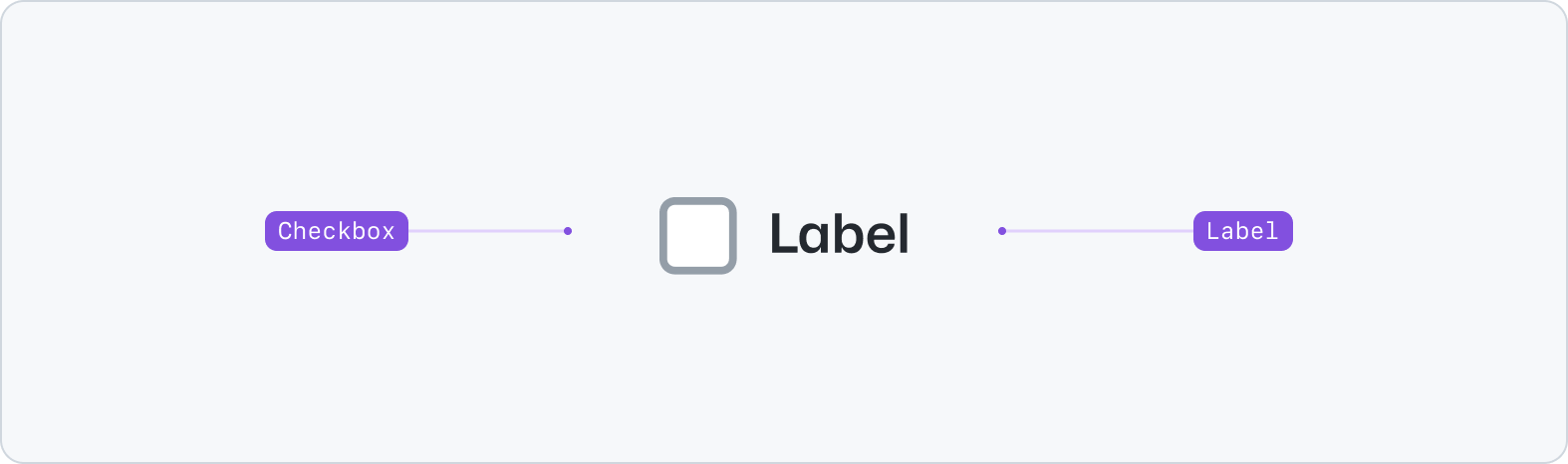
## Anatomy
|
|
8
|
+
|
|
9
|
+
|
|
10
|
+
|
|
11
|
+
- Checkbox: A selection control.
|
|
12
|
+
- Label: A description for the checkbox.
|
|
13
|
+
|
|
14
|
+
## Usage
|
|
15
|
+
|
|
16
|
+
Use checkboxes to allow users to select multiple items from a list of individual items, or to mark one individual item as selected. Unlike the [Radio](../Radio/index.md) component or [Select](../Select/index.md) component, Checkbox does not restrict users to choosing just a single option.
|
|
17
|
+
|
|
18
|
+
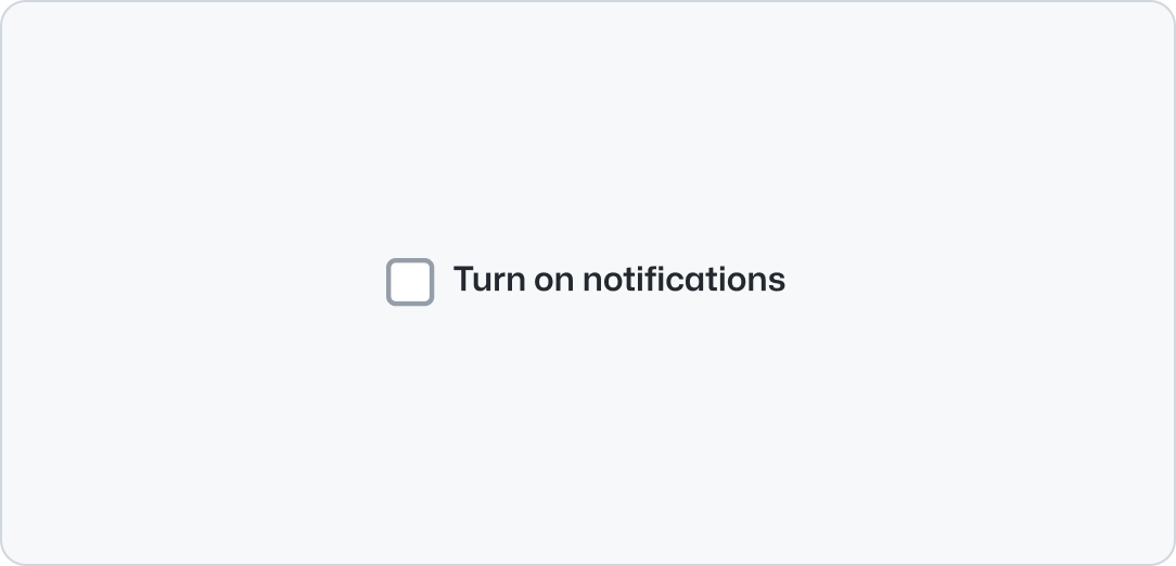
Checkbox labels should be descriptive and concise. Write labels in sentence case.
|
|
19
|
+
|
|
20
|
+
**✅ Do**
|
|
21
|
+
|
|
22
|
+
|
|
23
|
+
|
|
24
|
+
_Checkbox labels should be descriptive and concise._
|
|
25
|
+
|
|
26
|
+
**❌ Don't**
|
|
27
|
+
|
|
28
|
+
|
|
29
|
+
|
|
30
|
+
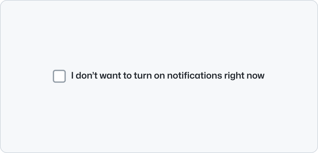
_Don't make checkbox labels confusing, indirect, and avoid negative statements._
|
|
31
|
+
|
|
32
|
+
**✅ Do**
|
|
33
|
+
|
|
34
|
+
|
|
35
|
+
|
|
36
|
+
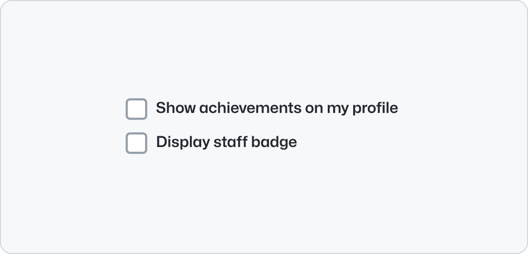
_Use consistent styling (starting with capitalization and not ending with punctuation)._
|
|
37
|
+
|
|
38
|
+
**❌ Don't**
|
|
39
|
+
|
|
40
|
+

|
|
41
|
+
|
|
42
|
+
_Don't have inconsistent styling (not starting with capitalization or ending in punctuation)._
|
|
43
|
+
|
|
44
|
+
**✅ Do**
|
|
45
|
+
|
|
46
|
+

|
|
47
|
+
|
|
48
|
+
_Use first-person when asking users for acknowledgement or consent._
|
|
49
|
+
|
|
50
|
+
**❌ Don't**
|
|
51
|
+
|
|
52
|
+

|
|
53
|
+
|
|
54
|
+
_Don't use third-person when asking users for acknowledgement or consent._
|
|
55
|
+
|
|
56
|
+
**✅ Do**
|
|
57
|
+
|
|
58
|
+
|
|
59
|
+
|
|
60
|
+
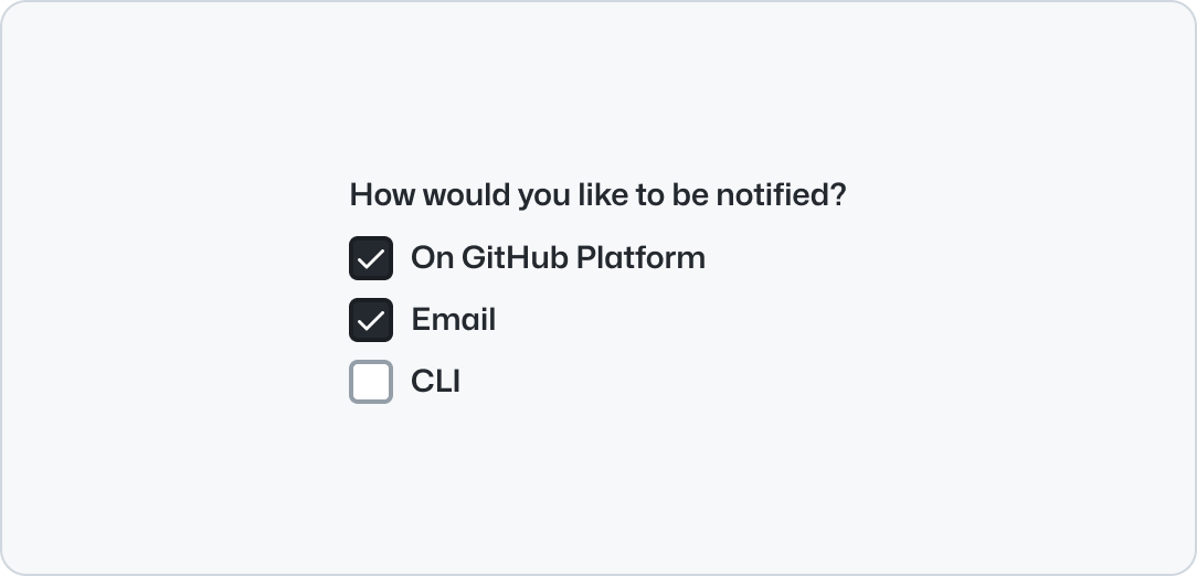
_Create checkbox options that are non-exclusive and allow for multiple selections._
|
|
61
|
+
|
|
62
|
+
**❌ Don't**
|
|
63
|
+
|
|
64
|
+
|
|
65
|
+
|
|
66
|
+
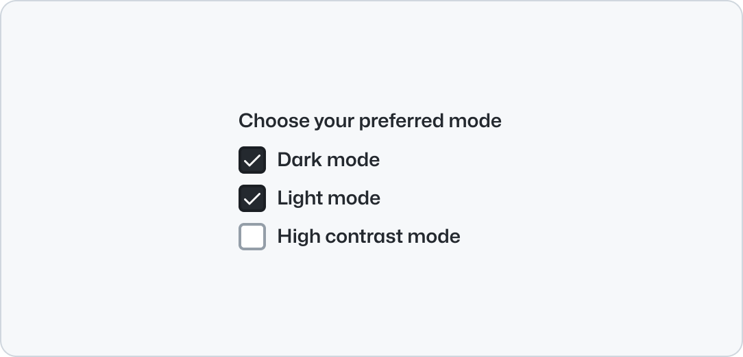
_Don't use checkbox options exclusive to one another. They should not be automatically deselected._
|
|
67
|
+
|
|
68
|
+
### States
|
|
69
|
+
|
|
70
|
+
Checkboxes have static dimensions and four different states: rest (default), checked, indeterminate, and disabled.
|
|
71
|
+
|
|
72
|
+
An indeterminate checkbox state should be used if the input value is neither true nor false. This can be useful in situations where you are required to display an incomplete state, or one that is dependent on other input selections to determine a value.
|
|
73
|
+
|
|
74
|
+

|
|
75
|
+
|
|
76
|
+
## Accessibility
|
|
77
|
+
|
|
78
|
+
Please use [FormControl](../FormControl/index.md) to display accessible checkboxes in the UI. This Checkbox component is intended only as an ingredient for other custom components, or as a drop-in replacement for native HTML checkboxes outside of form use-cases.
|
|
79
|
+
|
|
80
|
+
If you intend to use this component as part of another component, it should always be accompanied by a corresponding `<label>` to improve support for assistive technologies.
|
|
81
|
+
|
|
82
|
+
## Related components
|
|
83
|
+
|
|
84
|
+
- [Radio](../Radio/index.md): Use the radio component when a user needs to select one option from a list.
|
|
85
|
+
- [Select](../Select/index.md): Use the select component to enable selection of one option from a list.
|
|
86
|
+
- [FormControl](../FormControl/index.md): Use the form control component to display form inputs alongside labels, validation and more.
|
|
@@ -0,0 +1,111 @@
|
|
|
1
|
+
---
|
|
2
|
+
title: Checkbox
|
|
3
|
+
source: https://github.com/primer/brand/blob/main/packages/react/src/forms/Checkbox/Checkbox.tsx
|
|
4
|
+
keywords: ['form', 'control', 'selection', 'choices']
|
|
5
|
+
figma: 'https://www.figma.com/file/BJ95AjraesmRCWsKA013GS/Primer-Brand?node-id=1377%3A30754'
|
|
6
|
+
storybook: '/brand/storybook/?path=/story/components-forms-checkbox--playground'
|
|
7
|
+
description: Use the checkbox component to select one or more options of a limited number of choices.
|
|
8
|
+
---
|
|
9
|
+
|
|
10
|
+
## Examples
|
|
11
|
+
|
|
12
|
+
> **Please use [FormControl](../FormControl/index.md) to display accessible checkboxes in the UI**. This `Checkbox` component is intended only as an ingredient for other custom components, or as a drop-in replacement for native HTML checkboxes outside of form use-cases.
|
|
13
|
+
>
|
|
14
|
+
> If you intend to use this component as part of another component, it should always be accompanied by a corresponding `<label>` to improve support for assistive technologies.
|
|
15
|
+
|
|
16
|
+
The `Checkbox` component can be used in controlled and uncontrolled modes.
|
|
17
|
+
|
|
18
|
+
```jsx
|
|
19
|
+
<form>
|
|
20
|
+
<FormControl>
|
|
21
|
+
<Checkbox />
|
|
22
|
+
<FormControl.Label>Default checkbox</FormControl.Label>
|
|
23
|
+
</FormControl>
|
|
24
|
+
<FormControl>
|
|
25
|
+
<Checkbox checked />
|
|
26
|
+
<FormControl.Label>Always checked</FormControl.Label>
|
|
27
|
+
</FormControl>
|
|
28
|
+
<FormControl>
|
|
29
|
+
<Checkbox checked={false} />
|
|
30
|
+
<FormControl.Label>Always unchecked</FormControl.Label>
|
|
31
|
+
</FormControl>
|
|
32
|
+
<FormControl>
|
|
33
|
+
<Checkbox checked disabled />
|
|
34
|
+
<FormControl.Label>Inactive</FormControl.Label>
|
|
35
|
+
</FormControl>
|
|
36
|
+
</form>
|
|
37
|
+
```
|
|
38
|
+
|
|
39
|
+
## Indeterminate
|
|
40
|
+
|
|
41
|
+
An `indeterminate` checkbox state should be used if the input value is neither `true` nor `false`. This can be useful in situations where you are required to display an incomplete state, or one that is dependent on other input selections to determine a value.
|
|
42
|
+
|
|
43
|
+
```jsx
|
|
44
|
+
<form>
|
|
45
|
+
<FormControl>
|
|
46
|
+
<Checkbox onChange={() => {}} indeterminate={true} />
|
|
47
|
+
<FormControl.Label>Indeterminate checkbox</FormControl.Label>
|
|
48
|
+
</FormControl>
|
|
49
|
+
</form>
|
|
50
|
+
```
|
|
51
|
+
|
|
52
|
+
## Optional border
|
|
53
|
+
|
|
54
|
+
Apply an optional border using `FormControl` and `hasBorder`.
|
|
55
|
+
|
|
56
|
+
```jsx
|
|
57
|
+
<FormControl hasBorder required>
|
|
58
|
+
<Checkbox />
|
|
59
|
+
<FormControl.Label>Contact me about GitHub Enterprise Server</FormControl.Label>
|
|
60
|
+
</FormControl>
|
|
61
|
+
```
|
|
62
|
+
|
|
63
|
+
## Custom label usage
|
|
64
|
+
|
|
65
|
+
When using a custom label alongside a checkbox, the `Checkbox` component should always appear after the `FormControl.Label` component in the DOM. This ensures that the checkbox is correctly associated with the label for assistive technologies.
|
|
66
|
+
|
|
67
|
+
```jsx
|
|
68
|
+
<FormControl required>
|
|
69
|
+
<Checkbox />
|
|
70
|
+
<FormControl.Label>
|
|
71
|
+
<Text size="200" variant="muted">
|
|
72
|
+
I hereby accept the{' '}
|
|
73
|
+
<InlineLink size="200" href="https://github.com/customer-terms" target="_blank">
|
|
74
|
+
GitHub Customer Agreement
|
|
75
|
+
</InlineLink>{' '}
|
|
76
|
+
on behalf of my organization and confirm that I have the authority to do so. For more information about
|
|
77
|
+
GitHub's privacy practices, see the{' '}
|
|
78
|
+
<InlineLink
|
|
79
|
+
size="200"
|
|
80
|
+
href="https://docs.github.com/en/site-policy/privacy-policies/github-privacy-statement"
|
|
81
|
+
target="_blank"
|
|
82
|
+
>
|
|
83
|
+
GitHub Privacy Statement.
|
|
84
|
+
</InlineLink>
|
|
85
|
+
</Text>
|
|
86
|
+
</FormControl.Label>
|
|
87
|
+
</FormControl>
|
|
88
|
+
```
|
|
89
|
+
|
|
90
|
+
## Component props
|
|
91
|
+
|
|
92
|
+
`Checkbox` provides a React alternative to the native HTML `<input type="checkbox">`.
|
|
93
|
+
|
|
94
|
+
The component API supports all standard HTML attribute props, while providing some additional behavior as described below.
|
|
95
|
+
|
|
96
|
+
| Name | Type | Default | Description |
|
|
97
|
+
| :----------------- | :---------------- | :-----: | :-------------------------------------------------------------------------------------------------------------------------------------------- |
|
|
98
|
+
| `checked` | `boolean` | | Modifies true/false value of the native checkbox |
|
|
99
|
+
| `className` | `string` | | Sets a custom class |
|
|
100
|
+
| `defaultChecked` | `boolean` | | Checks the input by default in uncontrolled mode |
|
|
101
|
+
| `disabled` | `boolean` | | Modifies the native disabled state of the native checkbox |
|
|
102
|
+
| `id` | `string` | | Sets a custom id |
|
|
103
|
+
| `indeterminate` | `boolean` | | Applies an [indeterminate state](https://developer.mozilla.org/en-US/docs/Web/HTML/Element/input/checkbox#attr-indeterminate) to the checkbox |
|
|
104
|
+
| `ref` | `React.RefObject` | | Forward a Ref to the underlying DOM node |
|
|
105
|
+
| `validationStatus` | | | Ussed to inform ARIA attributes. Individual checkboxes do not have validation styles. |
|
|
106
|
+
|
|
107
|
+
Additional props can be passed to the `<input>` element. [See MDN for a list of props](https://developer.mozilla.org/en-US/docs/Web/HTML/Element/input) accepted by the `<input>` element.
|
|
108
|
+
|
|
109
|
+
## Related components
|
|
110
|
+
|
|
111
|
+
- FormControl
|
|
@@ -0,0 +1,37 @@
|
|
|
1
|
+
---
|
|
2
|
+
title: Checkbox group
|
|
3
|
+
description: Checkbox group renders a set of checkboxes.
|
|
4
|
+
keywords: ['form', 'control', 'selection', 'choices']
|
|
5
|
+
---
|
|
6
|
+
|
|
7
|
+
## Usage
|
|
8
|
+
|
|
9
|
+
Use checkbox group to allow users to select multiple items from a list of individual items, or to mark one individual item as selected.
|
|
10
|
+
|
|
11
|
+
### Best practices
|
|
12
|
+
|
|
13
|
+
- Put checkboxes in a logical order
|
|
14
|
+
- If users are only allowed to select a single option, consider using a [radio group](../RadioGroup/index.md) instead
|
|
15
|
+
- Each checkbox's state should be independent from other checkboxes in the group. For example: checking one checkbox should not check or disable any other checkboxes
|
|
16
|
+
|
|
17
|
+
## Anatomy
|
|
18
|
+
|
|
19
|
+
**Label:** A title that labels the group of options and helps users understand the relationship between the options in the group.
|
|
20
|
+
|
|
21
|
+
**Required indicator:** Indicates that a selection is required.
|
|
22
|
+
|
|
23
|
+
**Caption:** May be used to provide additional context about the checkbox group when the label alone is not sufficient
|
|
24
|
+
|
|
25
|
+
**Options:** A list of options represented using [checkboxes](../Checkbox/index.md).
|
|
26
|
+
|
|
27
|
+
**Validation message:** A message explaining why the selection failed validation. See the [form pattern documentation](https://primer.style/ui-patterns/forms/overview#validation-message) for more information on form validation patterns.
|
|
28
|
+
|
|
29
|
+
## Accessibility
|
|
30
|
+
|
|
31
|
+
Once a user checks an option from a checkbox group, the result should not be saved or applied until the user has explicitly submitted their input using a "save" or "submit" button. See the [saving pattern guidelines](https://primer.style/ui-patterns/saving) for more information.
|
|
32
|
+
|
|
33
|
+
## Related components
|
|
34
|
+
|
|
35
|
+
- [Checkbox](../Checkbox/index.md): Used to render an individual checkbox control.
|
|
36
|
+
- [FormControl](../FormControl/index.md): Used to group individual controls with an associated label.
|
|
37
|
+
- [RadioGroup](../RadioGroup/index.md): Similar to `CheckboxGroup`, but used for organizing radio controls.
|
|
@@ -0,0 +1,175 @@
|
|
|
1
|
+
---
|
|
2
|
+
title: Checkbox group
|
|
3
|
+
description: Checkbox group renders a set of checkboxes.
|
|
4
|
+
keywords: ['form', 'control', 'selection', 'choices']
|
|
5
|
+
source: https://github.com/primer/brand/blob/main/packages/react/src/forms/Checkbox/Checkbox.tsx
|
|
6
|
+
figma: 'https://www.figma.com/file/BJ95AjraesmRCWsKA013GS/Primer-Brand?node-id=1377%3A30754'
|
|
7
|
+
storybook: '/brand/storybook/?path=/story/components-forms-checkbox--playground'
|
|
8
|
+
---
|
|
9
|
+
|
|
10
|
+
```js
|
|
11
|
+
import {CheckboxGroup} from '@primer/react-brand'
|
|
12
|
+
```
|
|
13
|
+
|
|
14
|
+
## Examples
|
|
15
|
+
|
|
16
|
+
### Default
|
|
17
|
+
|
|
18
|
+
`CheckboxGroup` creates a semantic container for multiple related checkboxes.
|
|
19
|
+
|
|
20
|
+
```jsx
|
|
21
|
+
<CheckboxGroup>
|
|
22
|
+
<CheckboxGroup.Label>Choose your favorite features</CheckboxGroup.Label>
|
|
23
|
+
<FormControl>
|
|
24
|
+
<FormControl.Label>Actions notifications</FormControl.Label>
|
|
25
|
+
<Checkbox value="actions" />
|
|
26
|
+
</FormControl>
|
|
27
|
+
<FormControl>
|
|
28
|
+
<FormControl.Label>Packages</FormControl.Label>
|
|
29
|
+
<Checkbox value="packages" />
|
|
30
|
+
</FormControl>
|
|
31
|
+
<FormControl>
|
|
32
|
+
<FormControl.Label>Codespaces</FormControl.Label>
|
|
33
|
+
<Checkbox value="codespaces" />
|
|
34
|
+
</FormControl>
|
|
35
|
+
</CheckboxGroup>
|
|
36
|
+
```
|
|
37
|
+
|
|
38
|
+
### With caption
|
|
39
|
+
|
|
40
|
+
Use `CheckboxGroup.Caption` to provide additional context for the group.
|
|
41
|
+
|
|
42
|
+
```jsx
|
|
43
|
+
<CheckboxGroup>
|
|
44
|
+
<CheckboxGroup.Label>Notification preferences</CheckboxGroup.Label>
|
|
45
|
+
<CheckboxGroup.Caption>Select how you'd like to be notified</CheckboxGroup.Caption>
|
|
46
|
+
<FormControl>
|
|
47
|
+
<FormControl.Label>Email notifications</FormControl.Label>
|
|
48
|
+
<Checkbox value="email" />
|
|
49
|
+
</FormControl>
|
|
50
|
+
<FormControl>
|
|
51
|
+
<FormControl.Label>Browser notifications</FormControl.Label>
|
|
52
|
+
<Checkbox value="browser" />
|
|
53
|
+
</FormControl>
|
|
54
|
+
<FormControl>
|
|
55
|
+
<FormControl.Label>Mobile notifications</FormControl.Label>
|
|
56
|
+
<Checkbox value="mobile" />
|
|
57
|
+
</FormControl>
|
|
58
|
+
</CheckboxGroup>
|
|
59
|
+
```
|
|
60
|
+
|
|
61
|
+
### With validation
|
|
62
|
+
|
|
63
|
+
`CheckboxGroup.Validation` can display success or error states with appropriate icons.
|
|
64
|
+
|
|
65
|
+
```jsx
|
|
66
|
+
<Stack direction="vertical" gap="spacious">
|
|
67
|
+
<CheckboxGroup>
|
|
68
|
+
<CheckboxGroup.Label>Valid selection</CheckboxGroup.Label>
|
|
69
|
+
<FormControl>
|
|
70
|
+
<FormControl.Label>Option one</FormControl.Label>
|
|
71
|
+
<Checkbox value="one" />
|
|
72
|
+
</FormControl>
|
|
73
|
+
<FormControl>
|
|
74
|
+
<FormControl.Label>Option two</FormControl.Label>
|
|
75
|
+
<Checkbox value="two" />
|
|
76
|
+
</FormControl>
|
|
77
|
+
<CheckboxGroup.Validation variant="success">Great choice!</CheckboxGroup.Validation>
|
|
78
|
+
</CheckboxGroup>
|
|
79
|
+
|
|
80
|
+
<CheckboxGroup>
|
|
81
|
+
<CheckboxGroup.Label>Invalid selection</CheckboxGroup.Label>
|
|
82
|
+
<FormControl>
|
|
83
|
+
<FormControl.Label>Option one</FormControl.Label>
|
|
84
|
+
<Checkbox value="one" />
|
|
85
|
+
</FormControl>
|
|
86
|
+
<FormControl>
|
|
87
|
+
<FormControl.Label>Option two</FormControl.Label>
|
|
88
|
+
<Checkbox value="two" />
|
|
89
|
+
</FormControl>
|
|
90
|
+
<CheckboxGroup.Validation variant="error">Please select at least one option</CheckboxGroup.Validation>
|
|
91
|
+
</CheckboxGroup>
|
|
92
|
+
</Stack>
|
|
93
|
+
```
|
|
94
|
+
|
|
95
|
+
### Visually hidden label
|
|
96
|
+
|
|
97
|
+
When context is clear, labels can be visually hidden while remaining accessible to screen readers.
|
|
98
|
+
|
|
99
|
+
```jsx
|
|
100
|
+
<CheckboxGroup>
|
|
101
|
+
<CheckboxGroup.Label visuallyHidden>Filter options</CheckboxGroup.Label>
|
|
102
|
+
<Stack direction="vertical" gap="regular">
|
|
103
|
+
<FormControl>
|
|
104
|
+
<FormControl.Label>Show all</FormControl.Label>
|
|
105
|
+
<Checkbox value="all" />
|
|
106
|
+
</FormControl>
|
|
107
|
+
<FormControl>
|
|
108
|
+
<FormControl.Label>Show active only</FormControl.Label>
|
|
109
|
+
<Checkbox value="active" />
|
|
110
|
+
</FormControl>
|
|
111
|
+
</Stack>
|
|
112
|
+
</CheckboxGroup>
|
|
113
|
+
```
|
|
114
|
+
|
|
115
|
+
### Inline
|
|
116
|
+
|
|
117
|
+
When space is limited, checkboxes can be arranged horizontally using the [Stack](../../layout/Stack/index.md) component.
|
|
118
|
+
|
|
119
|
+
```jsx
|
|
120
|
+
<CheckboxGroup>
|
|
121
|
+
<CheckboxGroup.Label visuallyHidden>Filter options</CheckboxGroup.Label>
|
|
122
|
+
<CheckboxGroup.Caption>Some inline checkboxes with a visually hidden label</CheckboxGroup.Caption>
|
|
123
|
+
<Stack direction="horizontal" gap="normal" padding="none" flexWrap="wrap">
|
|
124
|
+
<FormControl>
|
|
125
|
+
<FormControl.Label>Choice one</FormControl.Label>
|
|
126
|
+
<Checkbox value="one" />
|
|
127
|
+
</FormControl>
|
|
128
|
+
<FormControl>
|
|
129
|
+
<FormControl.Label>Choice two</FormControl.Label>
|
|
130
|
+
<Checkbox value="two" />
|
|
131
|
+
</FormControl>
|
|
132
|
+
<FormControl>
|
|
133
|
+
<FormControl.Label>Choice three</FormControl.Label>
|
|
134
|
+
<Checkbox value="three" />
|
|
135
|
+
</FormControl>
|
|
136
|
+
</Stack>
|
|
137
|
+
</CheckboxGroup>
|
|
138
|
+
```
|
|
139
|
+
|
|
140
|
+
## Component props
|
|
141
|
+
|
|
142
|
+
### CheckboxGroup `Required`
|
|
143
|
+
|
|
144
|
+
| Name | Type | Default | Description |
|
|
145
|
+
| :--------- | :--------------------- | :-----: | :--------------------------------------------------------------- |
|
|
146
|
+
| `children` | `React.ReactElement[]` | | CheckboxGroup components and FormControl components |
|
|
147
|
+
| `id` | `string` | | Sets a custom id. If not provided, a unique id will be generated |
|
|
148
|
+
|
|
149
|
+
`CheckboxGroup` extends the HTML `fieldset` element and supports all `fieldset` props.
|
|
150
|
+
|
|
151
|
+
### CheckboxGroup.Label `Required`
|
|
152
|
+
|
|
153
|
+
| Name | Type | Default | Description |
|
|
154
|
+
| :--------------- | :-------- | :-----: | :-------------------------------------- |
|
|
155
|
+
| `children` | `string` | | Label text |
|
|
156
|
+
| `visuallyHidden` | `boolean` | `false` | Hide label visually but keep accessible |
|
|
157
|
+
|
|
158
|
+
`CheckboxGroup.Label` extends the HTML `legend` element and supports all `legend` props.
|
|
159
|
+
|
|
160
|
+
### CheckboxGroup.Caption
|
|
161
|
+
|
|
162
|
+
| Name | Type | Default | Description |
|
|
163
|
+
| :--------- | :------- | :-----: | :----------- |
|
|
164
|
+
| `children` | `string` | | Caption text |
|
|
165
|
+
|
|
166
|
+
`CheckboxGroup.Caption` extends the `span` element and supports all `span` props.
|
|
167
|
+
|
|
168
|
+
### CheckboxGroup.Validation
|
|
169
|
+
|
|
170
|
+
| Name | Type | Default | Description |
|
|
171
|
+
| :--------- | :--------------------- | :-----: | :--------------------------------- |
|
|
172
|
+
| `children` | `string` | | Validation message |
|
|
173
|
+
| `variant` | `'error' \| 'success'` | | Sets the validation state and icon |
|
|
174
|
+
|
|
175
|
+
`CheckboxGroup.Validation` extends the `span` element and supports all `span` props.
|