@primer/react-brand 0.69.1-rc.0a4e5ff5 → 0.70.0-rc.11ae3568
This diff represents the content of publicly available package versions that have been released to one of the supported registries. The information contained in this diff is provided for informational purposes only and reflects changes between package versions as they appear in their respective public registries.
- package/README.md +19 -0
- package/docs/components/ActionMenu/index.md +156 -0
- package/docs/components/AnchorNav/index.md +220 -0
- package/docs/components/Avatar/index.md +30 -0
- package/docs/components/Avatar/react.md +71 -0
- package/docs/components/Bento/index.md +223 -0
- package/docs/components/Breadcrumbs/index.md +51 -0
- package/docs/components/Breadcrumbs/react.md +53 -0
- package/docs/components/BreakoutBanner/index.md +102 -0
- package/docs/components/BreakoutBanner/react.md +174 -0
- package/docs/components/Button/index.md +133 -0
- package/docs/components/Button/react.md +94 -0
- package/docs/components/ButtonGroup/index.md +62 -0
- package/docs/components/ButtonGroup/react.md +60 -0
- package/docs/components/CTABanner/index.md +114 -0
- package/docs/components/CTABanner/react.md +343 -0
- package/docs/components/CTAForm/index.md +95 -0
- package/docs/components/CTAForm/react.md +103 -0
- package/docs/components/Card/index.md +126 -0
- package/docs/components/Card/react.md +240 -0
- package/docs/components/ComparisonTable/index.md +381 -0
- package/docs/components/EyebrowBanner/index.md +153 -0
- package/docs/components/FAQ/index.md +66 -0
- package/docs/components/FAQ/react.md +477 -0
- package/docs/components/Footnotes/index.md +41 -0
- package/docs/components/Footnotes/react.md +156 -0
- package/docs/components/Hero/index.md +65 -0
- package/docs/components/Hero/react.md +215 -0
- package/docs/components/IDE/index.md +278 -0
- package/docs/components/Icon/index.md +87 -0
- package/docs/components/Image/index.md +51 -0
- package/docs/components/Image/react.md +160 -0
- package/docs/components/Label/index.md +86 -0
- package/docs/components/Label/react.md +76 -0
- package/docs/components/LogoSuite/index.md +93 -0
- package/docs/components/LogoSuite/react.md +667 -0
- package/docs/components/MediaPlaylist/index.md +133 -0
- package/docs/components/MinimalFooter/index.md +94 -0
- package/docs/components/NavList/index.md +210 -0
- package/docs/components/OrderedList/index.md +55 -0
- package/docs/components/OrderedList/react.md +41 -0
- package/docs/components/Pagination/index.md +80 -0
- package/docs/components/Pillar/index.md +114 -0
- package/docs/components/Pillar/react.md +175 -0
- package/docs/components/PricingOptions/index.md +509 -0
- package/docs/components/Prose/index.md +158 -0
- package/docs/components/River/index.md +190 -0
- package/docs/components/River/react.md +295 -0
- package/docs/components/RiverAccordion/index.md +200 -0
- package/docs/components/RiverBreakoutTabs/index.md +171 -0
- package/docs/components/Section/index.md +40 -0
- package/docs/components/Section/react.md +137 -0
- package/docs/components/SectionIntro/index.md +77 -0
- package/docs/components/SectionIntro/react.md +107 -0
- package/docs/components/SectionIntroStacked/index.md +226 -0
- package/docs/components/Statistic/index.md +111 -0
- package/docs/components/SubNav/index.md +156 -0
- package/docs/components/SubdomainNavBar/index.md +136 -0
- package/docs/components/Tabs/index.md +243 -0
- package/docs/components/Testimonial/index.md +138 -0
- package/docs/components/Testimonial/react.md +191 -0
- package/docs/components/Tiles/index.md +1441 -0
- package/docs/components/Timeline/index.md +68 -0
- package/docs/components/Token/index.md +86 -0
- package/docs/components/Tooltip/index.md +61 -0
- package/docs/components/UnorderedList/index.md +67 -0
- package/docs/components/UnorderedList/react.md +89 -0
- package/docs/components/VideoPlayer/index.md +234 -0
- package/docs/components/index.md +53 -0
- package/docs/forms/Checkbox/index.md +86 -0
- package/docs/forms/Checkbox/react.md +111 -0
- package/docs/forms/CheckboxGroup/index.md +37 -0
- package/docs/forms/CheckboxGroup/react.md +175 -0
- package/docs/forms/FormControl/index.md +404 -0
- package/docs/forms/Radio/index.md +63 -0
- package/docs/forms/Radio/react.md +68 -0
- package/docs/forms/RadioGroup/index.md +45 -0
- package/docs/forms/RadioGroup/react.md +151 -0
- package/docs/forms/Select/index.md +244 -0
- package/docs/forms/TextArea/index.md +126 -0
- package/docs/forms/TextInput/index.md +221 -0
- package/docs/forms/index.md +14 -0
- package/docs/getting-started/esm.md +49 -0
- package/docs/getting-started/index.md +98 -0
- package/docs/index.md +99 -0
- package/docs/introduction/animation.md +127 -0
- package/docs/introduction/index.md +10 -0
- package/docs/introduction/mcp.md +52 -0
- package/docs/introduction/theming.md +132 -0
- package/docs/layout/Box/index.md +46 -0
- package/docs/layout/Box/react.md +284 -0
- package/docs/layout/Grid/index.md +132 -0
- package/docs/layout/Grid/react.md +117 -0
- package/docs/layout/Stack/index.md +60 -0
- package/docs/layout/Stack/react.md +166 -0
- package/docs/layout/index.md +9 -0
- package/docs/primitives/color.md +6 -0
- package/docs/primitives/index.md +8 -0
- package/docs/typography/Heading/index.md +53 -0
- package/docs/typography/Heading/react.md +182 -0
- package/docs/typography/Text/index.md +68 -0
- package/docs/typography/Text/react.md +125 -0
- package/docs/typography/index.md +8 -0
- package/esm/Footnotes/{Footnotes.module-Du0yaz7E.css → Footnotes.module-DG9Vx76y.css} +1 -1
- package/esm/Footnotes/Footnotes.module.js +1 -1
- package/esm/Footnotes/Footnotes.module.js.map +1 -1
- package/esm/Heading/Heading.d.ts +10 -0
- package/esm/Heading/Heading.d.ts.map +1 -1
- package/esm/Heading/Heading.js.map +1 -1
- package/esm/Hero/Hero.d.ts.map +1 -1
- package/esm/Hero/Hero.js +60 -58
- package/esm/Hero/Hero.js.map +1 -1
- package/esm/Hero/{Hero.module-Cy82CEW3.css → Hero.module-DqG5f0MT.css} +1 -1
- package/esm/Hero/Hero.module.js +1 -1
- package/esm/Hero/Hero.module.js.map +1 -1
- package/esm/NavList/NavList.d.ts +86 -0
- package/esm/NavList/NavList.d.ts.map +1 -0
- package/esm/NavList/NavList.js +277 -0
- package/esm/NavList/NavList.js.map +1 -0
- package/esm/NavList/NavList.module-CZFnt8br.css +1 -0
- package/esm/NavList/NavList.module.js +32 -0
- package/esm/NavList/NavList.module.js.map +1 -0
- package/esm/NavList/index.d.ts +2 -0
- package/esm/NavList/index.d.ts.map +1 -0
- package/esm/SectionIntroStacked/{SectionIntroStacked.module-Cr7kUqTH.css → SectionIntroStacked.module-C3cmwHDY.css} +1 -1
- package/esm/SectionIntroStacked/SectionIntroStacked.module.js +1 -1
- package/esm/SectionIntroStacked/SectionIntroStacked.module.js.map +1 -1
- package/esm/Token/Token.js +0 -1
- package/esm/Token/Token.js.map +1 -1
- package/esm/Token/{Token.module-BcKU1KwK.css → Token.module-DtWE9IPI.css} +1 -1
- package/esm/Token/Token.module.js +1 -1
- package/esm/Token/Token.module.js.map +1 -1
- package/esm/index.d.ts +1 -0
- package/esm/index.d.ts.map +1 -1
- package/esm/index.esm.js +12 -11
- package/esm/packages/design-tokens/lib/design-tokens/css/tokens/functional/components/nav-list/colors-with-modes-CGyt2t8f.css +1 -0
- package/lib/Grid/Grid.d.ts +1 -1
- package/lib/Heading/Heading.d.ts +10 -0
- package/lib/NavList/NavList.d.ts +85 -0
- package/lib/NavList/index.d.ts +1 -0
- package/lib/SubNav/SubNav.d.ts +1 -1
- package/lib/Token/Token.d.ts +1 -1
- package/lib/css/main.css +613 -74
- package/lib/design-tokens/css/tokens/base/colors/color-scales-with-modes.css +1 -1
- package/lib/design-tokens/css/tokens/base/colors/light.css +1 -1
- package/lib/design-tokens/css/tokens/base/size/size.css +1 -1
- package/lib/design-tokens/css/tokens/base/typography/typography.css +1 -1
- package/lib/design-tokens/css/tokens/functional/animation/base.css +1 -1
- package/lib/design-tokens/css/tokens/functional/colors/global-with-modes.css +1 -1
- package/lib/design-tokens/css/tokens/functional/colors/global.css +1 -1
- package/lib/design-tokens/css/tokens/functional/components/accordion/colors-with-modes.css +1 -1
- package/lib/design-tokens/css/tokens/functional/components/action-menu/colors-with-modes.css +1 -1
- package/lib/design-tokens/css/tokens/functional/components/anchor-nav/colors-with-modes.css +1 -1
- package/lib/design-tokens/css/tokens/functional/components/bento/base.css +1 -1
- package/lib/design-tokens/css/tokens/functional/components/blinking-cursor/colors-with-modes.css +1 -1
- package/lib/design-tokens/css/tokens/functional/components/breadcrumbs/colors-with-modes.css +1 -1
- package/lib/design-tokens/css/tokens/functional/components/button/colors-with-modes.css +1 -1
- package/lib/design-tokens/css/tokens/functional/components/card/base.css +1 -1
- package/lib/design-tokens/css/tokens/functional/components/card/colors-with-modes.css +1 -1
- package/lib/design-tokens/css/tokens/functional/components/card/colors.css +1 -1
- package/lib/design-tokens/css/tokens/functional/components/comparison-table/colors-with-modes.css +1 -1
- package/lib/design-tokens/css/tokens/functional/components/comparison-table/comparison-table.css +1 -1
- package/lib/design-tokens/css/tokens/functional/components/control/colors-with-modes.css +1 -1
- package/lib/design-tokens/css/tokens/functional/components/cta-banner/colors-with-modes.css +1 -1
- package/lib/design-tokens/css/tokens/functional/components/eyebrow-banner/colors-with-modes.css +1 -1
- package/lib/design-tokens/css/tokens/functional/components/eyebrow-banner/eyebrow-banner.css +1 -1
- package/lib/design-tokens/css/tokens/functional/components/faq/base.css +1 -1
- package/lib/design-tokens/css/tokens/functional/components/faq/colors-with-modes.css +1 -1
- package/lib/design-tokens/css/tokens/functional/components/faq/colors.css +1 -1
- package/lib/design-tokens/css/tokens/functional/components/faq/faq.css +1 -1
- package/lib/design-tokens/css/tokens/functional/components/footer/colors-with-modes.css +1 -1
- package/lib/design-tokens/css/tokens/functional/components/footer/colors.css +1 -1
- package/lib/design-tokens/css/tokens/functional/components/frosted-glass-vfx/base.css +1 -1
- package/lib/design-tokens/css/tokens/functional/components/frosted-glass-vfx/colors-with-modes.css +1 -1
- package/lib/design-tokens/css/tokens/functional/components/grid/colors-with-modes.css +1 -1
- package/lib/design-tokens/css/tokens/functional/components/grid/colors.css +1 -1
- package/lib/design-tokens/css/tokens/functional/components/grid/grid.css +1 -1
- package/lib/design-tokens/css/tokens/functional/components/hero/base.css +1 -1
- package/lib/design-tokens/css/tokens/functional/components/icon/colors-with-modes.css +1 -1
- package/lib/design-tokens/css/tokens/functional/components/icon/colors.css +1 -1
- package/lib/design-tokens/css/tokens/functional/components/ide/base.css +1 -1
- package/lib/design-tokens/css/tokens/functional/components/ide/colors-with-modes.css +1 -1
- package/lib/design-tokens/css/tokens/functional/components/image/base.css +1 -1
- package/lib/design-tokens/css/tokens/functional/components/inline-link/base.css +1 -1
- package/lib/design-tokens/css/tokens/functional/components/inline-link/colors-with-modes.css +1 -1
- package/lib/design-tokens/css/tokens/functional/components/inline-link/colors.css +1 -1
- package/lib/design-tokens/css/tokens/functional/components/label/colors-with-modes.css +1 -1
- package/lib/design-tokens/css/tokens/functional/components/label/colors.css +1 -1
- package/lib/design-tokens/css/tokens/functional/components/link/colors-with-modes.css +1 -1
- package/lib/design-tokens/css/tokens/functional/components/link/colors.css +1 -1
- package/lib/design-tokens/css/tokens/functional/components/logosuite/base.css +1 -1
- package/lib/design-tokens/css/tokens/functional/components/logosuite/colors-with-modes.css +1 -1
- package/lib/design-tokens/css/tokens/functional/components/logosuite/colors.css +1 -1
- package/lib/design-tokens/css/tokens/functional/components/media-playlist/colors-with-modes.css +1 -1
- package/lib/design-tokens/css/tokens/functional/components/media-playlist/colors.css +1 -1
- package/lib/design-tokens/css/tokens/functional/components/nav-list/colors-with-modes.css +13 -0
- package/lib/design-tokens/css/tokens/functional/components/pricing-options/colors-with-modes.css +1 -1
- package/lib/design-tokens/css/tokens/functional/components/pricing-options/colors.css +1 -1
- package/lib/design-tokens/css/tokens/functional/components/pricing-options/pricing-options.css +1 -1
- package/lib/design-tokens/css/tokens/functional/components/prose/base.css +1 -1
- package/lib/design-tokens/css/tokens/functional/components/prose/colors-with-modes.css +1 -1
- package/lib/design-tokens/css/tokens/functional/components/river/base.css +1 -1
- package/lib/design-tokens/css/tokens/functional/components/river/river.css +1 -1
- package/lib/design-tokens/css/tokens/functional/components/river-story-scroll/colors-with-modes.css +1 -1
- package/lib/design-tokens/css/tokens/functional/components/section/section.css +1 -1
- package/lib/design-tokens/css/tokens/functional/components/statistic/base.css +1 -1
- package/lib/design-tokens/css/tokens/functional/components/sub-nav/base.css +1 -1
- package/lib/design-tokens/css/tokens/functional/components/sub-nav/colors-with-modes.css +1 -1
- package/lib/design-tokens/css/tokens/functional/components/subdomain-nav-bar/colors-with-modes.css +1 -1
- package/lib/design-tokens/css/tokens/functional/components/tabs/base.css +1 -1
- package/lib/design-tokens/css/tokens/functional/components/tabs/colors-with-modes.css +1 -1
- package/lib/design-tokens/css/tokens/functional/components/tabs/colors.css +1 -1
- package/lib/design-tokens/css/tokens/functional/components/testimonial/base.css +1 -1
- package/lib/design-tokens/css/tokens/functional/components/testimonial/colors-with-modes.css +1 -1
- package/lib/design-tokens/css/tokens/functional/components/testimonial/colors.css +1 -1
- package/lib/design-tokens/css/tokens/functional/components/text-cursor-animation/colors-with-modes.css +1 -1
- package/lib/design-tokens/css/tokens/functional/components/text-cursor-animation/colors.css +1 -1
- package/lib/design-tokens/css/tokens/functional/components/tiles/colors-with-modes.css +1 -1
- package/lib/design-tokens/css/tokens/functional/components/timeline/base.css +1 -1
- package/lib/design-tokens/css/tokens/functional/components/timeline/colors-with-modes.css +1 -1
- package/lib/design-tokens/css/tokens/functional/components/timeline/colors.css +1 -1
- package/lib/design-tokens/css/tokens/functional/components/token/colors-with-modes.css +1 -1
- package/lib/design-tokens/css/tokens/functional/components/token/colors.css +1 -1
- package/lib/design-tokens/css/tokens/functional/components/tooltip/colors-with-modes.css +1 -1
- package/lib/design-tokens/css/tokens/functional/components/tooltip/colors.css +1 -1
- package/lib/design-tokens/css/tokens/functional/components/video-player/base.css +1 -1
- package/lib/design-tokens/css/tokens/functional/components/video-player/colors-with-modes.css +1 -1
- package/lib/design-tokens/css/tokens/functional/size/border.css +1 -1
- package/lib/design-tokens/css/tokens/functional/size/breakpoints.css +1 -1
- package/lib/design-tokens/css/tokens/functional/size/size-coarse.css +1 -1
- package/lib/design-tokens/css/tokens/functional/size/size-fine.css +1 -1
- package/lib/design-tokens/css/tokens/functional/size/size.css +1 -1
- package/lib/design-tokens/css/tokens/functional/size/viewport.css +1 -1
- package/lib/design-tokens/css/tokens/functional/typography/typography-responsive.css +1 -1
- package/lib/design-tokens/css/tokens/functional/typography/typography.css +1 -1
- package/lib/design-tokens/js/module/tokens/base/colors/light.js +1 -1
- package/lib/design-tokens/js/module/tokens/base/size/size.js +1 -1
- package/lib/design-tokens/js/module/tokens/base/typography/typography.js +1 -1
- package/lib/design-tokens/js/module/tokens/functional/animation/base.js +1 -1
- package/lib/design-tokens/js/module/tokens/functional/colors/global.js +1 -1
- package/lib/design-tokens/js/module/tokens/functional/components/bento/base.js +1 -1
- package/lib/design-tokens/js/module/tokens/functional/components/card/base.js +1 -1
- package/lib/design-tokens/js/module/tokens/functional/components/card/colors.js +1 -1
- package/lib/design-tokens/js/module/tokens/functional/components/comparison-table/comparison-table.js +1 -1
- package/lib/design-tokens/js/module/tokens/functional/components/eyebrow-banner/eyebrow-banner.js +1 -1
- package/lib/design-tokens/js/module/tokens/functional/components/faq/base.js +1 -1
- package/lib/design-tokens/js/module/tokens/functional/components/faq/colors.js +1 -1
- package/lib/design-tokens/js/module/tokens/functional/components/faq/faq.js +1 -1
- package/lib/design-tokens/js/module/tokens/functional/components/footer/colors.js +1 -1
- package/lib/design-tokens/js/module/tokens/functional/components/frosted-glass-vfx/base.js +1 -1
- package/lib/design-tokens/js/module/tokens/functional/components/grid/colors.js +1 -1
- package/lib/design-tokens/js/module/tokens/functional/components/grid/grid.js +1 -1
- package/lib/design-tokens/js/module/tokens/functional/components/hero/base.js +1 -1
- package/lib/design-tokens/js/module/tokens/functional/components/icon/colors.js +1 -1
- package/lib/design-tokens/js/module/tokens/functional/components/ide/base.js +1 -1
- package/lib/design-tokens/js/module/tokens/functional/components/image/base.js +1 -1
- package/lib/design-tokens/js/module/tokens/functional/components/inline-link/base.js +1 -1
- package/lib/design-tokens/js/module/tokens/functional/components/inline-link/colors.js +1 -1
- package/lib/design-tokens/js/module/tokens/functional/components/label/colors.js +1 -1
- package/lib/design-tokens/js/module/tokens/functional/components/link/colors.js +1 -1
- package/lib/design-tokens/js/module/tokens/functional/components/logosuite/base.js +1 -1
- package/lib/design-tokens/js/module/tokens/functional/components/logosuite/colors.js +1 -1
- package/lib/design-tokens/js/module/tokens/functional/components/media-playlist/colors.js +1 -1
- package/lib/design-tokens/js/module/tokens/functional/components/pricing-options/colors.js +1 -1
- package/lib/design-tokens/js/module/tokens/functional/components/pricing-options/pricing-options.js +1 -1
- package/lib/design-tokens/js/module/tokens/functional/components/prose/base.js +1 -1
- package/lib/design-tokens/js/module/tokens/functional/components/river/base.js +1 -1
- package/lib/design-tokens/js/module/tokens/functional/components/river/river.js +1 -1
- package/lib/design-tokens/js/module/tokens/functional/components/section/section.js +1 -1
- package/lib/design-tokens/js/module/tokens/functional/components/statistic/base.js +1 -1
- package/lib/design-tokens/js/module/tokens/functional/components/sub-nav/base.js +1 -1
- package/lib/design-tokens/js/module/tokens/functional/components/tabs/base.js +1 -1
- package/lib/design-tokens/js/module/tokens/functional/components/tabs/colors.js +1 -1
- package/lib/design-tokens/js/module/tokens/functional/components/testimonial/base.js +1 -1
- package/lib/design-tokens/js/module/tokens/functional/components/testimonial/colors.js +1 -1
- package/lib/design-tokens/js/module/tokens/functional/components/text-cursor-animation/colors.js +1 -1
- package/lib/design-tokens/js/module/tokens/functional/components/timeline/base.js +1 -1
- package/lib/design-tokens/js/module/tokens/functional/components/timeline/colors.js +1 -1
- package/lib/design-tokens/js/module/tokens/functional/components/token/colors.js +1 -1
- package/lib/design-tokens/js/module/tokens/functional/components/tooltip/colors.js +1 -1
- package/lib/design-tokens/js/module/tokens/functional/components/video-player/base.js +1 -1
- package/lib/design-tokens/js/module/tokens/functional/size/border.js +1 -1
- package/lib/design-tokens/js/module/tokens/functional/size/breakpoints.js +1 -1
- package/lib/design-tokens/js/module/tokens/functional/size/size-coarse.js +1 -1
- package/lib/design-tokens/js/module/tokens/functional/size/size-fine.js +1 -1
- package/lib/design-tokens/js/module/tokens/functional/size/size.js +1 -1
- package/lib/design-tokens/js/module/tokens/functional/size/viewport.js +1 -1
- package/lib/design-tokens/js/module/tokens/functional/typography/typography-responsive.js +1 -1
- package/lib/design-tokens/js/module/tokens/functional/typography/typography.js +1 -1
- package/lib/design-tokens/js/tokens/base/colors/light.js +1 -1
- package/lib/design-tokens/js/tokens/base/size/size.js +1 -1
- package/lib/design-tokens/js/tokens/base/typography/typography.js +1 -1
- package/lib/design-tokens/js/tokens/functional/animation/base.js +1 -1
- package/lib/design-tokens/js/tokens/functional/colors/global.js +1 -1
- package/lib/design-tokens/js/tokens/functional/components/bento/base.js +1 -1
- package/lib/design-tokens/js/tokens/functional/components/card/base.js +1 -1
- package/lib/design-tokens/js/tokens/functional/components/card/colors.js +1 -1
- package/lib/design-tokens/js/tokens/functional/components/comparison-table/comparison-table.js +1 -1
- package/lib/design-tokens/js/tokens/functional/components/eyebrow-banner/eyebrow-banner.js +1 -1
- package/lib/design-tokens/js/tokens/functional/components/faq/base.js +1 -1
- package/lib/design-tokens/js/tokens/functional/components/faq/colors.js +1 -1
- package/lib/design-tokens/js/tokens/functional/components/faq/faq.js +1 -1
- package/lib/design-tokens/js/tokens/functional/components/footer/colors.js +1 -1
- package/lib/design-tokens/js/tokens/functional/components/frosted-glass-vfx/base.js +1 -1
- package/lib/design-tokens/js/tokens/functional/components/grid/colors.js +1 -1
- package/lib/design-tokens/js/tokens/functional/components/grid/grid.js +1 -1
- package/lib/design-tokens/js/tokens/functional/components/hero/base.js +1 -1
- package/lib/design-tokens/js/tokens/functional/components/icon/colors.js +1 -1
- package/lib/design-tokens/js/tokens/functional/components/ide/base.js +1 -1
- package/lib/design-tokens/js/tokens/functional/components/image/base.js +1 -1
- package/lib/design-tokens/js/tokens/functional/components/inline-link/base.js +1 -1
- package/lib/design-tokens/js/tokens/functional/components/inline-link/colors.js +1 -1
- package/lib/design-tokens/js/tokens/functional/components/label/colors.js +1 -1
- package/lib/design-tokens/js/tokens/functional/components/link/colors.js +1 -1
- package/lib/design-tokens/js/tokens/functional/components/logosuite/base.js +1 -1
- package/lib/design-tokens/js/tokens/functional/components/logosuite/colors.js +1 -1
- package/lib/design-tokens/js/tokens/functional/components/media-playlist/colors.js +1 -1
- package/lib/design-tokens/js/tokens/functional/components/pricing-options/colors.js +1 -1
- package/lib/design-tokens/js/tokens/functional/components/pricing-options/pricing-options.js +1 -1
- package/lib/design-tokens/js/tokens/functional/components/prose/base.js +1 -1
- package/lib/design-tokens/js/tokens/functional/components/river/base.js +1 -1
- package/lib/design-tokens/js/tokens/functional/components/river/river.js +1 -1
- package/lib/design-tokens/js/tokens/functional/components/section/section.js +1 -1
- package/lib/design-tokens/js/tokens/functional/components/statistic/base.js +1 -1
- package/lib/design-tokens/js/tokens/functional/components/sub-nav/base.js +1 -1
- package/lib/design-tokens/js/tokens/functional/components/tabs/base.js +1 -1
- package/lib/design-tokens/js/tokens/functional/components/tabs/colors.js +1 -1
- package/lib/design-tokens/js/tokens/functional/components/testimonial/base.js +1 -1
- package/lib/design-tokens/js/tokens/functional/components/testimonial/colors.js +1 -1
- package/lib/design-tokens/js/tokens/functional/components/text-cursor-animation/colors.js +1 -1
- package/lib/design-tokens/js/tokens/functional/components/timeline/base.js +1 -1
- package/lib/design-tokens/js/tokens/functional/components/timeline/colors.js +1 -1
- package/lib/design-tokens/js/tokens/functional/components/token/colors.js +1 -1
- package/lib/design-tokens/js/tokens/functional/components/tooltip/colors.js +1 -1
- package/lib/design-tokens/js/tokens/functional/components/video-player/base.js +1 -1
- package/lib/design-tokens/js/tokens/functional/size/border.js +1 -1
- package/lib/design-tokens/js/tokens/functional/size/breakpoints.js +1 -1
- package/lib/design-tokens/js/tokens/functional/size/size-coarse.js +1 -1
- package/lib/design-tokens/js/tokens/functional/size/size-fine.js +1 -1
- package/lib/design-tokens/js/tokens/functional/size/size.js +1 -1
- package/lib/design-tokens/js/tokens/functional/size/viewport.js +1 -1
- package/lib/design-tokens/js/tokens/functional/typography/typography-responsive.js +1 -1
- package/lib/design-tokens/js/tokens/functional/typography/typography.js +1 -1
- package/lib/design-tokens/scss/tokens/base/colors/light.scss +1 -1
- package/lib/design-tokens/scss/tokens/base/size/size.scss +1 -1
- package/lib/design-tokens/scss/tokens/base/typography/typography.scss +1 -1
- package/lib/design-tokens/scss/tokens/functional/animation/base.scss +1 -1
- package/lib/design-tokens/scss/tokens/functional/colors/global.scss +1 -1
- package/lib/design-tokens/scss/tokens/functional/components/bento/base.scss +1 -1
- package/lib/design-tokens/scss/tokens/functional/components/card/base.scss +1 -1
- package/lib/design-tokens/scss/tokens/functional/components/card/colors.scss +1 -1
- package/lib/design-tokens/scss/tokens/functional/components/comparison-table/comparison-table.scss +1 -1
- package/lib/design-tokens/scss/tokens/functional/components/eyebrow-banner/eyebrow-banner.scss +1 -1
- package/lib/design-tokens/scss/tokens/functional/components/faq/base.scss +1 -1
- package/lib/design-tokens/scss/tokens/functional/components/faq/colors.scss +1 -1
- package/lib/design-tokens/scss/tokens/functional/components/faq/faq.scss +1 -1
- package/lib/design-tokens/scss/tokens/functional/components/footer/colors.scss +1 -1
- package/lib/design-tokens/scss/tokens/functional/components/frosted-glass-vfx/base.scss +1 -1
- package/lib/design-tokens/scss/tokens/functional/components/grid/colors.scss +1 -1
- package/lib/design-tokens/scss/tokens/functional/components/grid/grid.scss +1 -1
- package/lib/design-tokens/scss/tokens/functional/components/hero/base.scss +1 -1
- package/lib/design-tokens/scss/tokens/functional/components/icon/colors.scss +1 -1
- package/lib/design-tokens/scss/tokens/functional/components/ide/base.scss +1 -1
- package/lib/design-tokens/scss/tokens/functional/components/image/base.scss +1 -1
- package/lib/design-tokens/scss/tokens/functional/components/inline-link/base.scss +1 -1
- package/lib/design-tokens/scss/tokens/functional/components/inline-link/colors.scss +1 -1
- package/lib/design-tokens/scss/tokens/functional/components/label/colors.scss +1 -1
- package/lib/design-tokens/scss/tokens/functional/components/link/colors.scss +1 -1
- package/lib/design-tokens/scss/tokens/functional/components/logosuite/base.scss +1 -1
- package/lib/design-tokens/scss/tokens/functional/components/logosuite/colors.scss +1 -1
- package/lib/design-tokens/scss/tokens/functional/components/media-playlist/colors.scss +1 -1
- package/lib/design-tokens/scss/tokens/functional/components/pricing-options/colors.scss +1 -1
- package/lib/design-tokens/scss/tokens/functional/components/pricing-options/pricing-options.scss +1 -1
- package/lib/design-tokens/scss/tokens/functional/components/prose/base.scss +1 -1
- package/lib/design-tokens/scss/tokens/functional/components/river/base.scss +1 -1
- package/lib/design-tokens/scss/tokens/functional/components/river/river.scss +1 -1
- package/lib/design-tokens/scss/tokens/functional/components/section/section.scss +1 -1
- package/lib/design-tokens/scss/tokens/functional/components/statistic/base.scss +1 -1
- package/lib/design-tokens/scss/tokens/functional/components/sub-nav/base.scss +1 -1
- package/lib/design-tokens/scss/tokens/functional/components/tabs/base.scss +1 -1
- package/lib/design-tokens/scss/tokens/functional/components/tabs/colors.scss +1 -1
- package/lib/design-tokens/scss/tokens/functional/components/testimonial/base.scss +1 -1
- package/lib/design-tokens/scss/tokens/functional/components/testimonial/colors.scss +1 -1
- package/lib/design-tokens/scss/tokens/functional/components/text-cursor-animation/colors.scss +1 -1
- package/lib/design-tokens/scss/tokens/functional/components/timeline/base.scss +1 -1
- package/lib/design-tokens/scss/tokens/functional/components/timeline/colors.scss +1 -1
- package/lib/design-tokens/scss/tokens/functional/components/token/colors.scss +1 -1
- package/lib/design-tokens/scss/tokens/functional/components/tooltip/colors.scss +1 -1
- package/lib/design-tokens/scss/tokens/functional/components/video-player/base.scss +1 -1
- package/lib/design-tokens/scss/tokens/functional/size/border.scss +1 -1
- package/lib/design-tokens/scss/tokens/functional/size/breakpoints.scss +1 -1
- package/lib/design-tokens/scss/tokens/functional/size/size-coarse.scss +1 -1
- package/lib/design-tokens/scss/tokens/functional/size/size-fine.scss +1 -1
- package/lib/design-tokens/scss/tokens/functional/size/size.scss +1 -1
- package/lib/design-tokens/scss/tokens/functional/size/viewport.scss +1 -1
- package/lib/design-tokens/scss/tokens/functional/typography/typography-responsive.scss +1 -1
- package/lib/design-tokens/scss/tokens/functional/typography/typography.scss +1 -1
- package/lib/design-tokens/ts/tokens/base/colors/light.d.ts +1 -1
- package/lib/design-tokens/ts/tokens/base/colors/light.js +1 -1
- package/lib/design-tokens/ts/tokens/base/size/size.d.ts +1 -1
- package/lib/design-tokens/ts/tokens/base/size/size.js +1 -1
- package/lib/design-tokens/ts/tokens/base/typography/typography.d.ts +1 -1
- package/lib/design-tokens/ts/tokens/base/typography/typography.js +1 -1
- package/lib/design-tokens/ts/tokens/functional/animation/base.d.ts +1 -1
- package/lib/design-tokens/ts/tokens/functional/animation/base.js +1 -1
- package/lib/design-tokens/ts/tokens/functional/colors/global.d.ts +1 -1
- package/lib/design-tokens/ts/tokens/functional/colors/global.js +1 -1
- package/lib/design-tokens/ts/tokens/functional/components/bento/base.d.ts +1 -1
- package/lib/design-tokens/ts/tokens/functional/components/bento/base.js +1 -1
- package/lib/design-tokens/ts/tokens/functional/components/card/base.d.ts +1 -1
- package/lib/design-tokens/ts/tokens/functional/components/card/base.js +1 -1
- package/lib/design-tokens/ts/tokens/functional/components/card/colors.d.ts +1 -1
- package/lib/design-tokens/ts/tokens/functional/components/card/colors.js +1 -1
- package/lib/design-tokens/ts/tokens/functional/components/comparison-table/comparison-table.d.ts +1 -1
- package/lib/design-tokens/ts/tokens/functional/components/comparison-table/comparison-table.js +1 -1
- package/lib/design-tokens/ts/tokens/functional/components/eyebrow-banner/eyebrow-banner.d.ts +1 -1
- package/lib/design-tokens/ts/tokens/functional/components/eyebrow-banner/eyebrow-banner.js +1 -1
- package/lib/design-tokens/ts/tokens/functional/components/faq/base.d.ts +1 -1
- package/lib/design-tokens/ts/tokens/functional/components/faq/base.js +1 -1
- package/lib/design-tokens/ts/tokens/functional/components/faq/colors.d.ts +1 -1
- package/lib/design-tokens/ts/tokens/functional/components/faq/colors.js +1 -1
- package/lib/design-tokens/ts/tokens/functional/components/faq/faq.d.ts +1 -1
- package/lib/design-tokens/ts/tokens/functional/components/faq/faq.js +1 -1
- package/lib/design-tokens/ts/tokens/functional/components/footer/colors.d.ts +1 -1
- package/lib/design-tokens/ts/tokens/functional/components/footer/colors.js +1 -1
- package/lib/design-tokens/ts/tokens/functional/components/frosted-glass-vfx/base.d.ts +1 -1
- package/lib/design-tokens/ts/tokens/functional/components/frosted-glass-vfx/base.js +1 -1
- package/lib/design-tokens/ts/tokens/functional/components/grid/colors.d.ts +1 -1
- package/lib/design-tokens/ts/tokens/functional/components/grid/colors.js +1 -1
- package/lib/design-tokens/ts/tokens/functional/components/grid/grid.d.ts +1 -1
- package/lib/design-tokens/ts/tokens/functional/components/grid/grid.js +1 -1
- package/lib/design-tokens/ts/tokens/functional/components/hero/base.d.ts +1 -1
- package/lib/design-tokens/ts/tokens/functional/components/hero/base.js +1 -1
- package/lib/design-tokens/ts/tokens/functional/components/icon/colors.d.ts +1 -1
- package/lib/design-tokens/ts/tokens/functional/components/icon/colors.js +1 -1
- package/lib/design-tokens/ts/tokens/functional/components/ide/base.d.ts +1 -1
- package/lib/design-tokens/ts/tokens/functional/components/ide/base.js +1 -1
- package/lib/design-tokens/ts/tokens/functional/components/image/base.d.ts +1 -1
- package/lib/design-tokens/ts/tokens/functional/components/image/base.js +1 -1
- package/lib/design-tokens/ts/tokens/functional/components/inline-link/base.d.ts +1 -1
- package/lib/design-tokens/ts/tokens/functional/components/inline-link/base.js +1 -1
- package/lib/design-tokens/ts/tokens/functional/components/inline-link/colors.d.ts +1 -1
- package/lib/design-tokens/ts/tokens/functional/components/inline-link/colors.js +1 -1
- package/lib/design-tokens/ts/tokens/functional/components/label/colors.d.ts +1 -1
- package/lib/design-tokens/ts/tokens/functional/components/label/colors.js +1 -1
- package/lib/design-tokens/ts/tokens/functional/components/link/colors.d.ts +1 -1
- package/lib/design-tokens/ts/tokens/functional/components/link/colors.js +1 -1
- package/lib/design-tokens/ts/tokens/functional/components/logosuite/base.d.ts +1 -1
- package/lib/design-tokens/ts/tokens/functional/components/logosuite/base.js +1 -1
- package/lib/design-tokens/ts/tokens/functional/components/logosuite/colors.d.ts +1 -1
- package/lib/design-tokens/ts/tokens/functional/components/logosuite/colors.js +1 -1
- package/lib/design-tokens/ts/tokens/functional/components/media-playlist/colors.d.ts +1 -1
- package/lib/design-tokens/ts/tokens/functional/components/media-playlist/colors.js +1 -1
- package/lib/design-tokens/ts/tokens/functional/components/pricing-options/colors.d.ts +1 -1
- package/lib/design-tokens/ts/tokens/functional/components/pricing-options/colors.js +1 -1
- package/lib/design-tokens/ts/tokens/functional/components/pricing-options/pricing-options.d.ts +1 -1
- package/lib/design-tokens/ts/tokens/functional/components/pricing-options/pricing-options.js +1 -1
- package/lib/design-tokens/ts/tokens/functional/components/prose/base.d.ts +1 -1
- package/lib/design-tokens/ts/tokens/functional/components/prose/base.js +1 -1
- package/lib/design-tokens/ts/tokens/functional/components/river/base.d.ts +1 -1
- package/lib/design-tokens/ts/tokens/functional/components/river/base.js +1 -1
- package/lib/design-tokens/ts/tokens/functional/components/river/river.d.ts +1 -1
- package/lib/design-tokens/ts/tokens/functional/components/river/river.js +1 -1
- package/lib/design-tokens/ts/tokens/functional/components/section/section.d.ts +1 -1
- package/lib/design-tokens/ts/tokens/functional/components/section/section.js +1 -1
- package/lib/design-tokens/ts/tokens/functional/components/statistic/base.d.ts +1 -1
- package/lib/design-tokens/ts/tokens/functional/components/statistic/base.js +1 -1
- package/lib/design-tokens/ts/tokens/functional/components/sub-nav/base.d.ts +1 -1
- package/lib/design-tokens/ts/tokens/functional/components/sub-nav/base.js +1 -1
- package/lib/design-tokens/ts/tokens/functional/components/tabs/base.d.ts +1 -1
- package/lib/design-tokens/ts/tokens/functional/components/tabs/base.js +1 -1
- package/lib/design-tokens/ts/tokens/functional/components/tabs/colors.d.ts +1 -1
- package/lib/design-tokens/ts/tokens/functional/components/tabs/colors.js +1 -1
- package/lib/design-tokens/ts/tokens/functional/components/testimonial/base.d.ts +1 -1
- package/lib/design-tokens/ts/tokens/functional/components/testimonial/base.js +1 -1
- package/lib/design-tokens/ts/tokens/functional/components/testimonial/colors.d.ts +1 -1
- package/lib/design-tokens/ts/tokens/functional/components/testimonial/colors.js +1 -1
- package/lib/design-tokens/ts/tokens/functional/components/text-cursor-animation/colors.d.ts +1 -1
- package/lib/design-tokens/ts/tokens/functional/components/text-cursor-animation/colors.js +1 -1
- package/lib/design-tokens/ts/tokens/functional/components/timeline/base.d.ts +1 -1
- package/lib/design-tokens/ts/tokens/functional/components/timeline/base.js +1 -1
- package/lib/design-tokens/ts/tokens/functional/components/timeline/colors.d.ts +1 -1
- package/lib/design-tokens/ts/tokens/functional/components/timeline/colors.js +1 -1
- package/lib/design-tokens/ts/tokens/functional/components/token/colors.d.ts +1 -1
- package/lib/design-tokens/ts/tokens/functional/components/token/colors.js +1 -1
- package/lib/design-tokens/ts/tokens/functional/components/tooltip/colors.d.ts +1 -1
- package/lib/design-tokens/ts/tokens/functional/components/tooltip/colors.js +1 -1
- package/lib/design-tokens/ts/tokens/functional/components/video-player/base.d.ts +1 -1
- package/lib/design-tokens/ts/tokens/functional/components/video-player/base.js +1 -1
- package/lib/design-tokens/ts/tokens/functional/size/border.d.ts +1 -1
- package/lib/design-tokens/ts/tokens/functional/size/border.js +1 -1
- package/lib/design-tokens/ts/tokens/functional/size/breakpoints.d.ts +1 -1
- package/lib/design-tokens/ts/tokens/functional/size/breakpoints.js +1 -1
- package/lib/design-tokens/ts/tokens/functional/size/size-coarse.d.ts +1 -1
- package/lib/design-tokens/ts/tokens/functional/size/size-coarse.js +1 -1
- package/lib/design-tokens/ts/tokens/functional/size/size-fine.d.ts +1 -1
- package/lib/design-tokens/ts/tokens/functional/size/size-fine.js +1 -1
- package/lib/design-tokens/ts/tokens/functional/size/size.d.ts +1 -1
- package/lib/design-tokens/ts/tokens/functional/size/size.js +1 -1
- package/lib/design-tokens/ts/tokens/functional/size/viewport.d.ts +1 -1
- package/lib/design-tokens/ts/tokens/functional/size/viewport.js +1 -1
- package/lib/design-tokens/ts/tokens/functional/typography/typography-responsive.d.ts +1 -1
- package/lib/design-tokens/ts/tokens/functional/typography/typography-responsive.js +1 -1
- package/lib/design-tokens/ts/tokens/functional/typography/typography.d.ts +1 -1
- package/lib/design-tokens/ts/tokens/functional/typography/typography.js +1 -1
- package/lib/index.d.ts +1 -0
- package/lib/index.js +1 -1
- package/llms.txt +97 -0
- package/package.json +17 -5
- package/esm/Hero/Hero.figma.d.ts +0 -2
- package/esm/Hero/Hero.figma.d.ts.map +0 -1
- package/esm/IDE/fixtures/content.d.ts +0 -7
- package/esm/IDE/fixtures/content.d.ts.map +0 -1
- package/esm/LogoSuite/LogoSuite.figma.d.ts +0 -2
- package/esm/LogoSuite/LogoSuite.figma.d.ts.map +0 -1
- package/esm/LogoSuite/LogoSuite.fixtures.d.ts +0 -2
- package/esm/LogoSuite/LogoSuite.fixtures.d.ts.map +0 -1
- package/esm/MonaSans/MonaSans.d.ts +0 -11
- package/esm/MonaSans/MonaSans.d.ts.map +0 -1
- package/esm/MonaSans/index.d.ts +0 -2
- package/esm/MonaSans/index.d.ts.map +0 -1
- package/esm/PricingOptions/PricingOptions.figma.d.ts +0 -2
- package/esm/PricingOptions/PricingOptions.figma.d.ts.map +0 -1
- package/esm/Tiles/Tiles.fixtures.d.ts +0 -7
- package/esm/Tiles/Tiles.fixtures.d.ts.map +0 -1
- package/esm/fixtures/third-party-logos/AzureLogo.d.ts +0 -5
- package/esm/fixtures/third-party-logos/AzureLogo.d.ts.map +0 -1
- package/esm/fixtures/third-party-logos/JetBrainsLogo.d.ts +0 -5
- package/esm/fixtures/third-party-logos/JetBrainsLogo.d.ts.map +0 -1
- package/esm/fixtures/third-party-logos/MicrosoftCopilotLogo.d.ts +0 -5
- package/esm/fixtures/third-party-logos/MicrosoftCopilotLogo.d.ts.map +0 -1
- package/esm/fixtures/third-party-logos/MicrosoftLogo.d.ts +0 -5
- package/esm/fixtures/third-party-logos/MicrosoftLogo.d.ts.map +0 -1
- package/esm/fixtures/third-party-logos/NeoVimLogo.d.ts +0 -5
- package/esm/fixtures/third-party-logos/NeoVimLogo.d.ts.map +0 -1
- package/esm/fixtures/third-party-logos/VisualStudioCodeLogo.d.ts +0 -5
- package/esm/fixtures/third-party-logos/VisualStudioCodeLogo.d.ts.map +0 -1
- package/esm/fixtures/third-party-logos/VisualStudioLogo.d.ts +0 -5
- package/esm/fixtures/third-party-logos/VisualStudioLogo.d.ts.map +0 -1
- package/esm/list/ListItem/index.d.ts +0 -2
- package/esm/list/ListItem/index.d.ts.map +0 -1
- package/esm/recipes/FeaturePreviewLPs/FeaturePreviewLevelOne/FeaturePreviewLevelOne.d.ts +0 -13
- package/esm/recipes/FeaturePreviewLPs/FeaturePreviewLevelOne/FeaturePreviewLevelOne.d.ts.map +0 -1
- package/esm/recipes/FeaturePreviewLPs/FeaturePreviewLevelOne/FeaturePreviewLevelOneSideBySide.d.ts +0 -14
- package/esm/recipes/FeaturePreviewLPs/FeaturePreviewLevelOne/FeaturePreviewLevelOneSideBySide.d.ts.map +0 -1
- package/esm/recipes/FeaturePreviewLPs/FeaturePreviewLevelOne/components/FormExample.d.ts +0 -8
- package/esm/recipes/FeaturePreviewLPs/FeaturePreviewLevelOne/components/FormExample.d.ts.map +0 -1
- package/esm/recipes/FeaturePreviewLPs/FeaturePreviewLevelOne/index.d.ts +0 -2
- package/esm/recipes/FeaturePreviewLPs/FeaturePreviewLevelOne/index.d.ts.map +0 -1
- package/esm/recipes/FeaturePreviewLPs/FeaturePreviewLevelTwo/FeaturePreviewLevelTwo.d.ts +0 -49
- package/esm/recipes/FeaturePreviewLPs/FeaturePreviewLevelTwo/FeaturePreviewLevelTwo.d.ts.map +0 -1
- package/esm/recipes/FeaturePreviewLPs/FeaturePreviewLevelTwo/index.d.ts +0 -2
- package/esm/recipes/FeaturePreviewLPs/FeaturePreviewLevelTwo/index.d.ts.map +0 -1
- package/esm/recipes/FeaturePreviewLPs/FeaturePreviewLevelZero/FeaturePreviewLevelZero.d.ts +0 -17
- package/esm/recipes/FeaturePreviewLPs/FeaturePreviewLevelZero/FeaturePreviewLevelZero.d.ts.map +0 -1
- package/esm/recipes/FeaturePreviewLPs/FeaturePreviewLevelZero/index.d.ts +0 -2
- package/esm/recipes/FeaturePreviewLPs/FeaturePreviewLevelZero/index.d.ts.map +0 -1
- package/esm/recipes/FeaturePreviewLPs/helpers.d.ts +0 -30
- package/esm/recipes/FeaturePreviewLPs/helpers.d.ts.map +0 -1
- package/esm/recipes/FlexTemplate/FlexSection/FlexSection.d.ts +0 -8
- package/esm/recipes/FlexTemplate/FlexSection/FlexSection.d.ts.map +0 -1
- package/esm/recipes/FlexTemplate/FlexSection/components/ContentfulRiver.d.ts +0 -2
- package/esm/recipes/FlexTemplate/FlexSection/components/ContentfulRiver.d.ts.map +0 -1
- package/esm/recipes/FlexTemplate/FlexSection/components/ContentfulRiverAccordion.d.ts +0 -8
- package/esm/recipes/FlexTemplate/FlexSection/components/ContentfulRiverAccordion.d.ts.map +0 -1
- package/esm/recipes/FlexTemplate/FlexSection/components/ContentfulRiverBreakout.d.ts +0 -2
- package/esm/recipes/FlexTemplate/FlexSection/components/ContentfulRiverBreakout.d.ts.map +0 -1
- package/esm/recipes/FlexTemplate/FlexSection/components/ContentfulTestimonials.d.ts +0 -8
- package/esm/recipes/FlexTemplate/FlexSection/components/ContentfulTestimonials.d.ts.map +0 -1
- package/esm/recipes/FlexTemplate/FlexSection/components/FlexSectionTestimonials.d.ts +0 -8
- package/esm/recipes/FlexTemplate/FlexSection/components/FlexSectionTestimonials.d.ts.map +0 -1
- package/esm/recipes/FlexTemplate/FlexSection/components/index.d.ts +0 -6
- package/esm/recipes/FlexTemplate/FlexSection/components/index.d.ts.map +0 -1
- package/esm/recipes/FlexTemplate/FlexSection/index.d.ts +0 -2
- package/esm/recipes/FlexTemplate/FlexSection/index.d.ts.map +0 -1
- package/esm/recipes/FlexTemplate/FlexTemplate.d.ts +0 -7
- package/esm/recipes/FlexTemplate/FlexTemplate.d.ts.map +0 -1
- package/esm/recipes/FlexTemplate/FlexTemplate.types.d.ts +0 -318
- package/esm/recipes/FlexTemplate/FlexTemplate.types.d.ts.map +0 -1
- package/esm/recipes/FlexTemplate/FlexTemplateTrailingSection/FlexTemplateTrailingSection.d.ts +0 -6
- package/esm/recipes/FlexTemplate/FlexTemplateTrailingSection/FlexTemplateTrailingSection.d.ts.map +0 -1
- package/esm/recipes/FlexTemplate/FlexTemplateTrailingSection/index.d.ts +0 -3
- package/esm/recipes/FlexTemplate/FlexTemplateTrailingSection/index.d.ts.map +0 -1
- package/esm/recipes/FlexTemplate/fixtures/content.d.ts +0 -2
- package/esm/recipes/FlexTemplate/fixtures/content.d.ts.map +0 -1
- package/esm/recipes/FlexTemplate/index.d.ts +0 -4
- package/esm/recipes/FlexTemplate/index.d.ts.map +0 -1
- package/esm/recipes/Flexsuite/Category/FlexSuiteSecurityCategory/FlexSuiteSecurityCategory.content.d.ts +0 -68
- package/esm/recipes/Flexsuite/Category/FlexSuiteSecurityCategory/FlexSuiteSecurityCategory.content.d.ts.map +0 -1
- package/esm/recipes/Flexsuite/Category/FlexSuiteSecurityCategory/FlexSuiteSecurityCategory.d.ts +0 -7
- package/esm/recipes/Flexsuite/Category/FlexSuiteSecurityCategory/FlexSuiteSecurityCategory.d.ts.map +0 -1
- package/esm/recipes/Flexsuite/Category/index.d.ts +0 -2
- package/esm/recipes/Flexsuite/Category/index.d.ts.map +0 -1
- package/esm/recipes/Flexsuite/Details/FlexSuiteAIDetailsPlaylist/FlexSuiteAIDetailsPlaylist.content.d.ts +0 -49
- package/esm/recipes/Flexsuite/Details/FlexSuiteAIDetailsPlaylist/FlexSuiteAIDetailsPlaylist.content.d.ts.map +0 -1
- package/esm/recipes/Flexsuite/Details/FlexSuiteAIDetailsPlaylist/FlexSuiteAIDetailsPlaylist.d.ts +0 -7
- package/esm/recipes/Flexsuite/Details/FlexSuiteAIDetailsPlaylist/FlexSuiteAIDetailsPlaylist.d.ts.map +0 -1
- package/esm/recipes/Flexsuite/Details/index.d.ts +0 -4
- package/esm/recipes/Flexsuite/Details/index.d.ts.map +0 -1
- package/esm/recipes/Flexsuite/Overview/FlexSuiteAIOverview.content.d.ts +0 -101
- package/esm/recipes/Flexsuite/Overview/FlexSuiteAIOverview.content.d.ts.map +0 -1
- package/esm/recipes/Flexsuite/Overview/FlexSuiteAIOverview.d.ts +0 -7
- package/esm/recipes/Flexsuite/Overview/FlexSuiteAIOverview.d.ts.map +0 -1
- package/esm/recipes/Flexsuite/Overview/FlexSuiteOverview.content.d.ts +0 -5
- package/esm/recipes/Flexsuite/Overview/FlexSuiteOverview.content.d.ts.map +0 -1
- package/esm/recipes/Flexsuite/Overview/index.d.ts +0 -4
- package/esm/recipes/Flexsuite/Overview/index.d.ts.map +0 -1
- package/esm/recipes/SolutionTemplates/CategoryPage/CategoryPage.d.ts +0 -16
- package/esm/recipes/SolutionTemplates/CategoryPage/CategoryPage.d.ts.map +0 -1
- package/esm/recipes/SolutionTemplates/SolutionPage/SolutionPage.d.ts +0 -33
- package/esm/recipes/SolutionTemplates/SolutionPage/SolutionPage.d.ts.map +0 -1
- package/esm/recipes/SolutionTemplates/SolutionPage/index.d.ts +0 -2
- package/esm/recipes/SolutionTemplates/SolutionPage/index.d.ts.map +0 -1
- package/esm/recipes/SolutionTemplates/SolutionsOverview/SolutionsOverview.d.ts +0 -17
- package/esm/recipes/SolutionTemplates/SolutionsOverview/SolutionsOverview.d.ts.map +0 -1
- package/esm/recipes/SolutionTemplates/helpers.d.ts +0 -127
- package/esm/recipes/SolutionTemplates/helpers.d.ts.map +0 -1
- package/esm/recipes/SolutionTemplates/index.d.ts +0 -1
- package/esm/recipes/SolutionTemplates/index.d.ts.map +0 -1
- package/esm/recipes/seo/Article/Article.d.ts +0 -14
- package/esm/recipes/seo/Article/Article.d.ts.map +0 -1
- package/esm/recipes/seo/Article/ArticleToC.d.ts +0 -4
- package/esm/recipes/seo/Article/ArticleToC.d.ts.map +0 -1
- package/esm/recipes/seo/Article/article-shared.d.ts +0 -5
- package/esm/recipes/seo/Article/article-shared.d.ts.map +0 -1
- package/esm/recipes/seo/Article/index.d.ts +0 -2
- package/esm/recipes/seo/Article/index.d.ts.map +0 -1
- package/esm/recipes/seo/Category/CategoryPage.d.ts +0 -9
- package/esm/recipes/seo/Category/CategoryPage.d.ts.map +0 -1
- package/esm/recipes/seo/Category/index.d.ts +0 -2
- package/esm/recipes/seo/Category/index.d.ts.map +0 -1
- package/esm/recipes/seo/helpers.d.ts +0 -16
- package/esm/recipes/seo/helpers.d.ts.map +0 -1
- package/esm/recipes/seo/index.d.ts +0 -1
- package/esm/recipes/seo/index.d.ts.map +0 -1
- package/esm/river/River.figma.d.ts +0 -2
- package/esm/river/River.figma.d.ts.map +0 -1
- package/lib/Hero/Hero.figma.d.ts +0 -1
- package/lib/IDE/fixtures/content.d.ts +0 -6
- package/lib/LogoSuite/LogoSuite.figma.d.ts +0 -1
- package/lib/LogoSuite/LogoSuite.fixtures.d.ts +0 -1
- package/lib/MonaSans/MonaSans.d.ts +0 -10
- package/lib/MonaSans/index.d.ts +0 -1
- package/lib/PricingOptions/PricingOptions.figma.d.ts +0 -1
- package/lib/Tiles/Tiles.fixtures.d.ts +0 -6
- package/lib/fixtures/third-party-logos/AzureLogo.d.ts +0 -4
- package/lib/fixtures/third-party-logos/JetBrainsLogo.d.ts +0 -4
- package/lib/fixtures/third-party-logos/MicrosoftCopilotLogo.d.ts +0 -4
- package/lib/fixtures/third-party-logos/MicrosoftLogo.d.ts +0 -4
- package/lib/fixtures/third-party-logos/NeoVimLogo.d.ts +0 -4
- package/lib/fixtures/third-party-logos/VisualStudioCodeLogo.d.ts +0 -4
- package/lib/fixtures/third-party-logos/VisualStudioLogo.d.ts +0 -4
- package/lib/index.esm.d.ts +0 -7
- package/lib/list/ListItem/index.d.ts +0 -1
- package/lib/recipes/FeaturePreviewLPs/FeaturePreviewLevelOne/FeaturePreviewLevelOne.d.ts +0 -12
- package/lib/recipes/FeaturePreviewLPs/FeaturePreviewLevelOne/FeaturePreviewLevelOneSideBySide.d.ts +0 -13
- package/lib/recipes/FeaturePreviewLPs/FeaturePreviewLevelOne/components/FormExample.d.ts +0 -7
- package/lib/recipes/FeaturePreviewLPs/FeaturePreviewLevelOne/index.d.ts +0 -1
- package/lib/recipes/FeaturePreviewLPs/FeaturePreviewLevelTwo/FeaturePreviewLevelTwo.d.ts +0 -48
- package/lib/recipes/FeaturePreviewLPs/FeaturePreviewLevelTwo/index.d.ts +0 -1
- package/lib/recipes/FeaturePreviewLPs/FeaturePreviewLevelZero/FeaturePreviewLevelZero.d.ts +0 -16
- package/lib/recipes/FeaturePreviewLPs/FeaturePreviewLevelZero/index.d.ts +0 -1
- package/lib/recipes/FeaturePreviewLPs/helpers.d.ts +0 -29
- package/lib/recipes/FlexTemplate/FlexSection/FlexSection.d.ts +0 -7
- package/lib/recipes/FlexTemplate/FlexSection/components/ContentfulRiver.d.ts +0 -1
- package/lib/recipes/FlexTemplate/FlexSection/components/ContentfulRiverAccordion.d.ts +0 -7
- package/lib/recipes/FlexTemplate/FlexSection/components/ContentfulRiverBreakout.d.ts +0 -1
- package/lib/recipes/FlexTemplate/FlexSection/components/ContentfulTestimonials.d.ts +0 -7
- package/lib/recipes/FlexTemplate/FlexSection/components/FlexSectionTestimonials.d.ts +0 -7
- package/lib/recipes/FlexTemplate/FlexSection/components/index.d.ts +0 -5
- package/lib/recipes/FlexTemplate/FlexSection/index.d.ts +0 -1
- package/lib/recipes/FlexTemplate/FlexTemplate.d.ts +0 -6
- package/lib/recipes/FlexTemplate/FlexTemplate.types.d.ts +0 -317
- package/lib/recipes/FlexTemplate/FlexTemplateTrailingSection/FlexTemplateTrailingSection.d.ts +0 -5
- package/lib/recipes/FlexTemplate/FlexTemplateTrailingSection/index.d.ts +0 -2
- package/lib/recipes/FlexTemplate/fixtures/content.d.ts +0 -1
- package/lib/recipes/FlexTemplate/index.d.ts +0 -3
- package/lib/recipes/Flexsuite/Category/FlexSuiteSecurityCategory/FlexSuiteSecurityCategory.content.d.ts +0 -67
- package/lib/recipes/Flexsuite/Category/FlexSuiteSecurityCategory/FlexSuiteSecurityCategory.d.ts +0 -6
- package/lib/recipes/Flexsuite/Category/index.d.ts +0 -1
- package/lib/recipes/Flexsuite/Details/FlexSuiteAIDetailsPlaylist/FlexSuiteAIDetailsPlaylist.content.d.ts +0 -48
- package/lib/recipes/Flexsuite/Details/FlexSuiteAIDetailsPlaylist/FlexSuiteAIDetailsPlaylist.d.ts +0 -6
- package/lib/recipes/Flexsuite/Details/index.d.ts +0 -3
- package/lib/recipes/Flexsuite/Overview/FlexSuiteAIOverview.content.d.ts +0 -100
- package/lib/recipes/Flexsuite/Overview/FlexSuiteAIOverview.d.ts +0 -6
- package/lib/recipes/Flexsuite/Overview/FlexSuiteOverview.content.d.ts +0 -4
- package/lib/recipes/Flexsuite/Overview/index.d.ts +0 -3
- package/lib/recipes/SolutionTemplates/CategoryPage/CategoryPage.d.ts +0 -15
- package/lib/recipes/SolutionTemplates/SolutionPage/SolutionPage.d.ts +0 -32
- package/lib/recipes/SolutionTemplates/SolutionPage/index.d.ts +0 -1
- package/lib/recipes/SolutionTemplates/SolutionsOverview/SolutionsOverview.d.ts +0 -16
- package/lib/recipes/SolutionTemplates/helpers.d.ts +0 -126
- package/lib/recipes/SolutionTemplates/index.d.ts +0 -0
- package/lib/recipes/seo/Article/Article.d.ts +0 -13
- package/lib/recipes/seo/Article/ArticleToC.d.ts +0 -3
- package/lib/recipes/seo/Article/article-shared.d.ts +0 -4
- package/lib/recipes/seo/Article/index.d.ts +0 -1
- package/lib/recipes/seo/Category/CategoryPage.d.ts +0 -8
- package/lib/recipes/seo/Category/index.d.ts +0 -1
- package/lib/recipes/seo/helpers.d.ts +0 -15
- package/lib/recipes/seo/index.d.ts +0 -0
- package/lib/river/River.figma.d.ts +0 -1
|
@@ -0,0 +1,117 @@
|
|
|
1
|
+
---
|
|
2
|
+
title: Grid
|
|
3
|
+
description: Use the grid component to create flexible and responsive grid-based layouts.
|
|
4
|
+
keywords: ['layout', 'responsive', 'columns', 'rows', 'spacing']
|
|
5
|
+
source: https://github.com/primer/brand/tree/main/packages/react/src/Grid/Grid.tsx
|
|
6
|
+
storybook: '/brand/storybook/?path=/story/components-grid--playground'
|
|
7
|
+
---
|
|
8
|
+
|
|
9
|
+
```js
|
|
10
|
+
import {Grid} from '@primer/react-brand'
|
|
11
|
+
```
|
|
12
|
+
|
|
13
|
+
## Examples
|
|
14
|
+
|
|
15
|
+
### Default
|
|
16
|
+
|
|
17
|
+
The `Grid` component uses a 12-column layout system. Use `span` to control the number of columns that should be displayed.
|
|
18
|
+
|
|
19
|
+
```jsx
|
|
20
|
+
<Grid enableOverlay>
|
|
21
|
+
<Grid.Column span={1}></Grid.Column>
|
|
22
|
+
<Grid.Column span={11}></Grid.Column>
|
|
23
|
+
<Grid.Column span={2}></Grid.Column>
|
|
24
|
+
<Grid.Column span={10}></Grid.Column>
|
|
25
|
+
<Grid.Column span={3}></Grid.Column>
|
|
26
|
+
<Grid.Column span={9}></Grid.Column>
|
|
27
|
+
<Grid.Column span={4}></Grid.Column>
|
|
28
|
+
<Grid.Column span={8}></Grid.Column>
|
|
29
|
+
<Grid.Column span={5}></Grid.Column>
|
|
30
|
+
<Grid.Column span={7}></Grid.Column>
|
|
31
|
+
<Grid.Column span={6}></Grid.Column>
|
|
32
|
+
<Grid.Column span={6}></Grid.Column>
|
|
33
|
+
<Grid.Column span={7}></Grid.Column>
|
|
34
|
+
<Grid.Column span={5}></Grid.Column>
|
|
35
|
+
<Grid.Column span={8}></Grid.Column>
|
|
36
|
+
<Grid.Column span={4}></Grid.Column>
|
|
37
|
+
<Grid.Column span={9}></Grid.Column>
|
|
38
|
+
<Grid.Column span={3}></Grid.Column>
|
|
39
|
+
<Grid.Column span={10}></Grid.Column>
|
|
40
|
+
<Grid.Column span={2}></Grid.Column>
|
|
41
|
+
</Grid>
|
|
42
|
+
```
|
|
43
|
+
|
|
44
|
+
### Nested grids
|
|
45
|
+
|
|
46
|
+
```jsx
|
|
47
|
+
<Grid enableOverlay>
|
|
48
|
+
<Grid.Column>
|
|
49
|
+
<Grid enableOverlay>
|
|
50
|
+
<Grid.Column span={4}></Grid.Column>
|
|
51
|
+
<Grid.Column span={4}></Grid.Column>
|
|
52
|
+
<Grid.Column span={4}></Grid.Column>
|
|
53
|
+
</Grid>
|
|
54
|
+
</Grid.Column>
|
|
55
|
+
</Grid>
|
|
56
|
+
```
|
|
57
|
+
|
|
58
|
+
### Responsive behavior
|
|
59
|
+
|
|
60
|
+
Use `span` with an `Object` of breakpoint-specific keys and `number` values to enable responsive behavior.
|
|
61
|
+
|
|
62
|
+
Breakpoints use `min-width`, where it will also apply your chosen `span` value to all larger breakpoints.
|
|
63
|
+
|
|
64
|
+
```jsx
|
|
65
|
+
<Grid enableOverlay>
|
|
66
|
+
<Grid.Column span={{xsmall: 12, small: 12, medium: 6, large: 4, xlarge: 3, xxlarge: 2}} />
|
|
67
|
+
<Grid.Column span={{xsmall: 6, small: 6, medium: 6, large: 4, xlarge: 3, xxlarge: 2}} />
|
|
68
|
+
<Grid.Column span={{xsmall: 6, small: 6, medium: 6, large: 4, xlarge: 3, xxlarge: 2}} />
|
|
69
|
+
<Grid.Column span={{xsmall: 12, small: 12, medium: 6, large: 4, xlarge: 3, xxlarge: 2}} />
|
|
70
|
+
<Grid.Column span={{xsmall: 6, small: 6, medium: 6, large: 4, xlarge: 3, xxlarge: 2}} />
|
|
71
|
+
<Grid.Column span={{xsmall: 6, small: 6, medium: 6, large: 4, xlarge: 3, xxlarge: 2}} />
|
|
72
|
+
<Grid.Column span={{xsmall: 12, small: 12, medium: 6, large: 4, xlarge: 3, xxlarge: 2}} />
|
|
73
|
+
<Grid.Column span={{xsmall: 6, small: 6, medium: 6, large: 4, xlarge: 3, xxlarge: 2}} />
|
|
74
|
+
<Grid.Column span={{xsmall: 6, small: 6, medium: 6, large: 4, xlarge: 3, xxlarge: 2}} />
|
|
75
|
+
<Grid.Column span={{xsmall: 12, small: 12, medium: 6, large: 4, xlarge: 3, xxlarge: 2}} />
|
|
76
|
+
<Grid.Column span={{xsmall: 6, small: 6, medium: 6, large: 4, xlarge: 3, xxlarge: 2}} />
|
|
77
|
+
<Grid.Column span={{xsmall: 6, small: 6, medium: 6, large: 4, xlarge: 3, xxlarge: 2}} />
|
|
78
|
+
</Grid>
|
|
79
|
+
```
|
|
80
|
+
|
|
81
|
+
### Column offset
|
|
82
|
+
|
|
83
|
+
Use `start` to provide a positioning offset.
|
|
84
|
+
|
|
85
|
+
```jsx
|
|
86
|
+
<Grid enableOverlay>
|
|
87
|
+
<Grid.Column span={3}></Grid.Column>
|
|
88
|
+
<Grid.Column span={5} start={8}></Grid.Column>
|
|
89
|
+
</Grid>
|
|
90
|
+
```
|
|
91
|
+
|
|
92
|
+
## Component props
|
|
93
|
+
|
|
94
|
+
### Grid `Required`
|
|
95
|
+
|
|
96
|
+
| name | type | default | required | description |
|
|
97
|
+
| --------------- | ------------- | ----------- | -------- | ----------------------------------------- |
|
|
98
|
+
| `as` | | `'div'` | `false` | The HTML element used to render the grid. |
|
|
99
|
+
| `columnGap` | | `'default'` | `false` | Defines the gap between columns. |
|
|
100
|
+
| `enableGutters` | `boolean` | `true` | `false` | Enable or disable default gutters. |
|
|
101
|
+
| `enableOverlay` | `boolean` | `false` | `false` | Visual aid to help with alignment. |
|
|
102
|
+
| `fullWidth` | `boolean` | `false` | `false` | Fills the width of the parent container |
|
|
103
|
+
| `rowGap` | | `'default'` | `false` | Defines the gap between rows. |
|
|
104
|
+
| `className` | `string` | | `false` | Sets a custom class on the element. |
|
|
105
|
+
| `children` | `Grid.Column` | | `true` | |
|
|
106
|
+
| `id` | `string` | | `false` | Sets a custom `id` attribute. |
|
|
107
|
+
|
|
108
|
+
### Grid.Column `Required`
|
|
109
|
+
|
|
110
|
+
| name | type | default | required | description |
|
|
111
|
+
| ----------- | -------------------------------------------------------------------------------- | ------- | -------- | ------------------------------------------------------------------ |
|
|
112
|
+
| `as` | `'div' \| 'section' \| 'span'` | `'div'` | `false` | The HTML element used to render the column. |
|
|
113
|
+
| `span` | `1 \| 2 \| 3 \| 4 \| 5 \| 6 \| 7 \| 8 \| 9 \| 10 \| 11 \| 12 \| 'ResponsiveMap'` | `12` | `false` | The number of columns the element should span or a responsive map. |
|
|
114
|
+
| `start` | `1 \| 2 \| 3 \| 4 \| 5 \| 6 \| 7 \| 8 \| 9 \| 10 \| 11 \| 12 \| 'ResponsiveMap'` | | `false` | The column index to start the element or a responsive map. |
|
|
115
|
+
| `className` | `string` | | `false` | Sets a custom class on the element |
|
|
116
|
+
| `children` | `ReactElement` | | `false` | |
|
|
117
|
+
| `id` | `string` | | `false` | Sets a custom `id` |
|
|
@@ -0,0 +1,60 @@
|
|
|
1
|
+
---
|
|
2
|
+
title: Stack
|
|
3
|
+
description: Use the stack component to create a layout for its immediate children along the vertical or horizontal axis.
|
|
4
|
+
keywords: ['layout']
|
|
5
|
+
---
|
|
6
|
+
|
|
7
|
+

|
|
8
|
+
|
|
9
|
+
## Usage
|
|
10
|
+
|
|
11
|
+
Use the stack component to distribute space and alignment between items in a vertical or horizontal direction (one-dimensional layout)[^1]. If you need both vertical and horizontal layout (two-dimensional layout), use the [grid](../Grid/index.md) component instead. When in doubt, we recommend reading the [grid vs stack](../Grid/index.md#grid-vs-stack) documentation.
|
|
12
|
+
|
|
13
|
+
We recommend using the stack component for inline or text based elements. Stack enables items to scale, wrap, and shrink depending on each item's content and the available space.
|
|
14
|
+
|
|
15
|
+
[^1]: The stack component is implemented using the [CSS Flexbox Layout](https://developer.mozilla.org/en-US/docs/Web/CSS/CSS_Flexible_Box_Layout) specification.
|
|
16
|
+
|
|
17
|
+
**✅ Do**
|
|
18
|
+
|
|
19
|
+

|
|
20
|
+
|
|
21
|
+
_Use the stack component for inline or text based elements. Like a navigational list or a button group._
|
|
22
|
+
|
|
23
|
+
**❌ Don't**
|
|
24
|
+
|
|
25
|
+
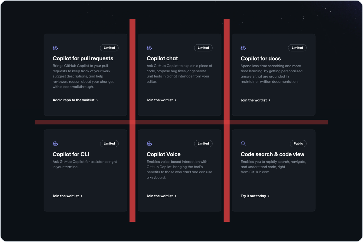
|
|
26
|
+
|
|
27
|
+
_Don't use the stack component to create a grid of items. Use the grid component instead._
|
|
28
|
+
|
|
29
|
+
## Options
|
|
30
|
+
|
|
31
|
+
### Gap
|
|
32
|
+
|
|
33
|
+
Use the gap to change the space between items. Use small values when grouping closed related items, and larger values to separate sections or non-related items between them.
|
|
34
|
+
|
|
35
|
+
**✅ Do**
|
|
36
|
+
|
|
37
|
+

|
|
38
|
+
|
|
39
|
+
_Use large gap values to separate sections or non-related items._
|
|
40
|
+
|
|
41
|
+
**❌ Don't**
|
|
42
|
+
|
|
43
|
+

|
|
44
|
+
|
|
45
|
+
_Don't use large gap values for related items._
|
|
46
|
+
|
|
47
|
+
### Direction, alignment, and justification
|
|
48
|
+
|
|
49
|
+
Use the direction to control the rendering direction of items. The direction can be adjusted on different viewports. For example, an icon and a label might be rendered horizontally on large viewports, but vertically on small viewports for better readability and composition.
|
|
50
|
+
|
|
51
|
+
Use the align and justify options for determining the rendering alignment on the cross-axis and main-axis respectively. Taking the example above, the icon and label might be aligned to the center on mobile viewports, but aligned to the start on large viewports.
|
|
52
|
+
|
|
53
|
+
_Video demonstration — see the online docs._
|
|
54
|
+
|
|
55
|
+
_Use vertical layout on small viewports to ensure that the content is readable. Combine it with center alignment if
|
|
56
|
+
the text is short and the context calls for it._
|
|
57
|
+
|
|
58
|
+
## Related components
|
|
59
|
+
|
|
60
|
+
- [Grid](../Grid/index.md): Use the grid component to create flexible and responsive grid-based layouts.
|
|
@@ -0,0 +1,166 @@
|
|
|
1
|
+
---
|
|
2
|
+
title: Stack
|
|
3
|
+
description: Use the stack component to create a layout for its immediate children along the vertical or horizontal axis.
|
|
4
|
+
keywords: ['layout']
|
|
5
|
+
ready: true
|
|
6
|
+
source: https://github.com/primer/brand/blob/main/packages/react/src/Stack/Stack.tsx
|
|
7
|
+
storybook: '/brand/storybook/?path=/story/components-stack--default'
|
|
8
|
+
---
|
|
9
|
+
|
|
10
|
+
```js
|
|
11
|
+
import {Stack} from '@primer/react-brand'
|
|
12
|
+
```
|
|
13
|
+
|
|
14
|
+
## Examples
|
|
15
|
+
|
|
16
|
+
### Default
|
|
17
|
+
|
|
18
|
+
`Stack` is a layout helper component intended for rendering `children` in a single direction.
|
|
19
|
+
|
|
20
|
+
Use the `direction` prop to alternate between `vertical` and `horizontal` directions.
|
|
21
|
+
|
|
22
|
+
Many `Stack` props - including `direction` - accept both `string` and `Object` values. The former will apply the value across all viewports, while the latter will permit granular control at specific breakpoints. See [Responsive](#Responsive) below for more details.
|
|
23
|
+
|
|
24
|
+
```jsx
|
|
25
|
+
<Stack>
|
|
26
|
+
<Heading size="subhead-large">Code search & code view</Heading>
|
|
27
|
+
<Text as="p">Enables you to rapidly search, navigate, and understand code, right from GitHub.com.</Text>
|
|
28
|
+
</Stack>
|
|
29
|
+
```
|
|
30
|
+
|
|
31
|
+
### Alignment
|
|
32
|
+
|
|
33
|
+
`Stack` provides `alignItems` and `justifyContent` props for determining the rendering direction on the cross-axis and main-axis respectively.
|
|
34
|
+
|
|
35
|
+
Use the playground below to experiment with the various options.
|
|
36
|
+
|
|
37
|
+
```jsx filename="noinline"
|
|
38
|
+
const App = () => {
|
|
39
|
+
const [alignItemsValue, setAlignItemsValue] = React.useState('center')
|
|
40
|
+
const [justifyContentValue, setJustifyContentValue] = React.useState('space-between')
|
|
41
|
+
|
|
42
|
+
const handleMainAxisChange = event => setJustifyContentValue(event.target.value)
|
|
43
|
+
const handleCrossAxisChange = event => setAlignItemsValue(event.target.value)
|
|
44
|
+
|
|
45
|
+
return (
|
|
46
|
+
<div style={{width: '100%'}}>
|
|
47
|
+
<Stack
|
|
48
|
+
direction="horizontal"
|
|
49
|
+
alignItems={alignItemsValue}
|
|
50
|
+
justifyContent={justifyContentValue}
|
|
51
|
+
style={{height: 400}}
|
|
52
|
+
>
|
|
53
|
+
<img
|
|
54
|
+
src="/images/placeholder.png"
|
|
55
|
+
alt="placeholder with gray background and no foreground text"
|
|
56
|
+
style={{width: 150, height: 75}}
|
|
57
|
+
/>
|
|
58
|
+
<img
|
|
59
|
+
src="/images/placeholder.png"
|
|
60
|
+
alt="placeholder with gray background and no foreground text"
|
|
61
|
+
style={{width: 150, height: 75}}
|
|
62
|
+
/>
|
|
63
|
+
<img
|
|
64
|
+
src="/images/placeholder.png"
|
|
65
|
+
alt="placeholder with gray background and no foreground text"
|
|
66
|
+
style={{width: 150, height: 75}}
|
|
67
|
+
/>
|
|
68
|
+
</Stack>
|
|
69
|
+
|
|
70
|
+
<Stack direction="horizontal" gap="spacious" justifyContent="center">
|
|
71
|
+
<FormControl>
|
|
72
|
+
<FormControl.Label>Main axis</FormControl.Label>
|
|
73
|
+
<Select defaultValue={justifyContentValue} onChange={handleMainAxisChange}>
|
|
74
|
+
<Select.Option value="center">center</Select.Option>
|
|
75
|
+
<Select.Option value="flex-start">flex-start</Select.Option>
|
|
76
|
+
<Select.Option value="flex-end">flex-end</Select.Option>
|
|
77
|
+
<Select.Option value="space-between">space-between</Select.Option>
|
|
78
|
+
<Select.Option value="space-around">space-around</Select.Option>
|
|
79
|
+
<Select.Option value="space-evenly">space-evenly</Select.Option>
|
|
80
|
+
</Select>
|
|
81
|
+
</FormControl>
|
|
82
|
+
|
|
83
|
+
<FormControl>
|
|
84
|
+
<FormControl.Label>Cross axis</FormControl.Label>
|
|
85
|
+
<Select defaultValue={alignItemsValue} onChange={handleCrossAxisChange}>
|
|
86
|
+
<Select.Option value="center">center</Select.Option>
|
|
87
|
+
<Select.Option value="flex-start">flex-start</Select.Option>
|
|
88
|
+
<Select.Option value="flex-end">flex-end</Select.Option>
|
|
89
|
+
</Select>
|
|
90
|
+
</FormControl>
|
|
91
|
+
</Stack>
|
|
92
|
+
</div>
|
|
93
|
+
)
|
|
94
|
+
}
|
|
95
|
+
|
|
96
|
+
render(App)
|
|
97
|
+
```
|
|
98
|
+
|
|
99
|
+
### Responsive
|
|
100
|
+
|
|
101
|
+
Passing an Object of a particular shape will allow granular control of `direction`, `gap`, `alignItems`, `justifyContent` and `padding` at various supported breakpoints.
|
|
102
|
+
|
|
103
|
+
Supported breakpoints are `narrow`, `regular` and `wide`.
|
|
104
|
+
|
|
105
|
+
The Object value does not require all properties be passed, but rather operates on the basis of `min-width`.
|
|
106
|
+
|
|
107
|
+
E.g. Providing only `narrow` will apply that value to all larger breakpoints, but not the other way.
|
|
108
|
+
|
|
109
|
+
```jsx
|
|
110
|
+
<Stack
|
|
111
|
+
style={{height: 400}}
|
|
112
|
+
direction={{
|
|
113
|
+
narrow: 'vertical',
|
|
114
|
+
regular: 'vertical',
|
|
115
|
+
wide: 'horizontal',
|
|
116
|
+
}}
|
|
117
|
+
gap={{
|
|
118
|
+
narrow: 'condensed',
|
|
119
|
+
regular: 'normal',
|
|
120
|
+
wide: 'spacious',
|
|
121
|
+
}}
|
|
122
|
+
padding={{
|
|
123
|
+
narrow: 'condensed',
|
|
124
|
+
regular: 'normal',
|
|
125
|
+
wide: 'spacious',
|
|
126
|
+
}}
|
|
127
|
+
alignItems={{
|
|
128
|
+
narrow: 'flex-start',
|
|
129
|
+
regular: 'center',
|
|
130
|
+
wide: 'center',
|
|
131
|
+
}}
|
|
132
|
+
justifyContent={{
|
|
133
|
+
narrow: 'center',
|
|
134
|
+
regular: 'center',
|
|
135
|
+
wide: 'space-between',
|
|
136
|
+
}}
|
|
137
|
+
>
|
|
138
|
+
<img
|
|
139
|
+
src="/images/placeholder.png"
|
|
140
|
+
alt="placeholder with gray background and no foreground text"
|
|
141
|
+
style={{width: 150, height: 75}}
|
|
142
|
+
/>
|
|
143
|
+
<img
|
|
144
|
+
src="/images/placeholder.png"
|
|
145
|
+
alt="placeholder with gray background and no foreground text"
|
|
146
|
+
style={{width: 150, height: 75}}
|
|
147
|
+
/>
|
|
148
|
+
<img
|
|
149
|
+
src="/images/placeholder.png"
|
|
150
|
+
alt="placeholder with gray background and no foreground text"
|
|
151
|
+
style={{width: 150, height: 75}}
|
|
152
|
+
/>
|
|
153
|
+
</Stack>
|
|
154
|
+
```
|
|
155
|
+
|
|
156
|
+
## Component props
|
|
157
|
+
|
|
158
|
+
### Stack
|
|
159
|
+
|
|
160
|
+
| Name | Type | Default | Description |
|
|
161
|
+
| :--------------- | :---------------------------- | :-----: | :----------------------------------------- |
|
|
162
|
+
| `direction` | `StackDirectionVariants` | | Determines layout direction |
|
|
163
|
+
| `gap` | `StackSpacingVariants` | | Determines gap between items |
|
|
164
|
+
| `padding` | `StackSpacingVariants` | | Determines padding applied to Stack parent |
|
|
165
|
+
| `justifyContent` | `StackJustifyContentVariants` | | Determines rendering on the main-axis |
|
|
166
|
+
| `alignItems` | `StackAlignItemVariants` | | Determines rendering on the cross-axis |
|
|
@@ -0,0 +1,9 @@
|
|
|
1
|
+
---
|
|
2
|
+
title: Layout
|
|
3
|
+
---
|
|
4
|
+
|
|
5
|
+
## In this section
|
|
6
|
+
|
|
7
|
+
- [Box](Box/react.md): Use a box to simplify the process of applying one-off styles to an element
|
|
8
|
+
- [Grid](Grid/react.md): Use the grid component to create flexible and responsive grid-based layouts.
|
|
9
|
+
- [Stack](Stack/react.md): Use the stack component to create a layout for its immediate children along the vertical or horizontal axis.
|
|
@@ -0,0 +1,6 @@
|
|
|
1
|
+
---
|
|
2
|
+
title: Color
|
|
3
|
+
figma: 'https://www.figma.com/file/BJ95AjraesmRCWsKA013GS/Primer-Brand?node-id=387%3A8439'
|
|
4
|
+
---
|
|
5
|
+
|
|
6
|
+
This page is an interactive demo, so it has no static Markdown form. The primitives it showcases ship with this package: load `@primer/react-brand/lib/css/main.css` and read the design tokens bundled under `lib/design-tokens/`.
|
|
@@ -0,0 +1,53 @@
|
|
|
1
|
+
---
|
|
2
|
+
title: Heading
|
|
3
|
+
description: Use the heading component to render title or subtitle text
|
|
4
|
+
keywords: ['title', 'subtitle']
|
|
5
|
+
---
|
|
6
|
+
|
|
7
|
+
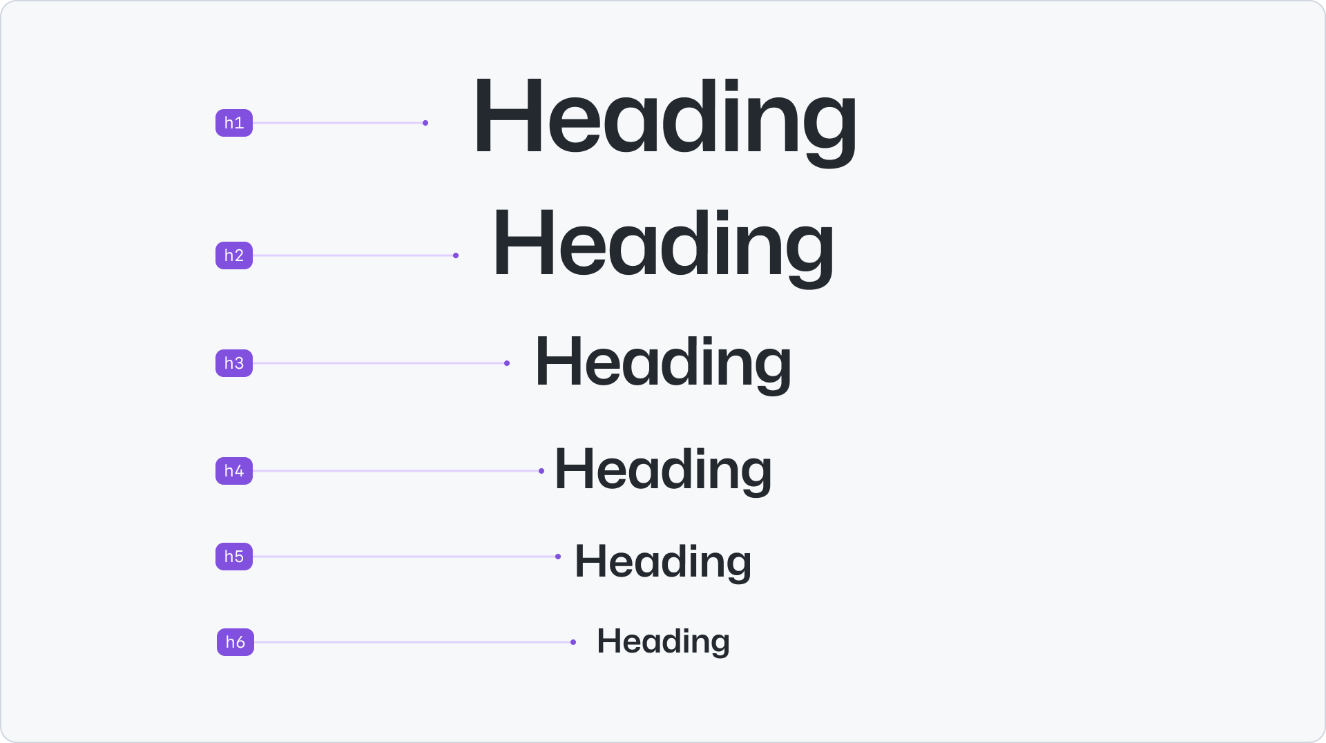
|
|
8
|
+
|
|
9
|
+
## Usage
|
|
10
|
+
|
|
11
|
+
Headings are used to structure the content on the page, with each heading representing a different level of importance. It is recommended to use headings in a logical manner to create a clear hierarchy and improve accessibility.
|
|
12
|
+
|
|
13
|
+
- Heading should be used to communicate page organization and hierarchy.
|
|
14
|
+
- Use heading as the title that introduces a page, a section or an article.
|
|
15
|
+
- The heading component will render an html h2 tag without any default styling.
|
|
16
|
+
|
|
17
|
+
## Options
|
|
18
|
+
|
|
19
|
+
### Scale and size
|
|
20
|
+
|
|
21
|
+
The heading scale ranges from 1 to 6 and maps to the HTML heading elements h1 to h6 respectively. The size is determined by the type of HTML element specified, although you can override this when the scenario calls for it. E.g. use a `h2` heading size on a `<h3>` to highlight an article that might be relevant to the user.
|
|
22
|
+
|
|
23
|
+
### Weight, stretch and letter spacing
|
|
24
|
+
|
|
25
|
+
The heading component also supports the following options: `weight`, `stretch` and `letterSpacing`. Each of these options are determined by the heading scale and size, but can be overridden when the scenario calls for it.
|
|
26
|
+
|
|
27
|
+
### Responsive
|
|
28
|
+
|
|
29
|
+
The heading component is responsive by default and the size will scale down on smaller screens. Weight, stretch and letter spacing will remain the same across all screen sizes but can be overridden for each breakpoint.
|
|
30
|
+
|
|
31
|
+
_Video demonstration — see the online docs._
|
|
32
|
+
|
|
33
|
+
## Accessibility
|
|
34
|
+
|
|
35
|
+
While sighted users rely on visual cues such as font size changes to determine what the heading is, assistive technology users rely on programatic cues that can be read out. When text on a page is visually implied to be a heading, ensure that it is coded as a heading. Additionally, visually implied heading level and coded heading level should be consistent. See [WCAG success criteria: 1.3.1: Info and Relationships](https://www.w3.org/WAI/WCAG21/Understanding/info-and-relationships.html).
|
|
36
|
+
|
|
37
|
+
Headings allow assistive technology users to quickly navigate around a page. Navigation as text that is not meant to be a heading can be a confusing experience. [Learn more about best heading practices (WAI Headings)](https://www.w3.org/WAI/tutorials/page-structure/headings/).
|
|
38
|
+
|
|
39
|
+
**✅ Do**
|
|
40
|
+
|
|
41
|
+

|
|
42
|
+
|
|
43
|
+
_Use headings with a lower rank to start new subsections that are part of the higher ranked section._
|
|
44
|
+
|
|
45
|
+
**❌ Don't**
|
|
46
|
+
|
|
47
|
+

|
|
48
|
+
|
|
49
|
+
_Don't skip heading ranks. Make sure that a h2 is not followed directly by an h4, for example._
|
|
50
|
+
|
|
51
|
+
## Related components
|
|
52
|
+
|
|
53
|
+
- [Text](../Text/index.md): to render body content
|
|
@@ -0,0 +1,182 @@
|
|
|
1
|
+
---
|
|
2
|
+
title: Heading
|
|
3
|
+
description: Use the heading component to render title or subtitle text.
|
|
4
|
+
keywords: ['title', 'subtitle']
|
|
5
|
+
ready: true
|
|
6
|
+
figma: 'https://www.figma.com/file/BJ95AjraesmRCWsKA013GS/Primer-Brand?node-id=354%3A8982'
|
|
7
|
+
source: https://github.com/primer/brand/blob/main/packages/react/src/Heading/Heading.tsx
|
|
8
|
+
storybook: '/brand/storybook/?path=/story/components-heading--playground'
|
|
9
|
+
---
|
|
10
|
+
|
|
11
|
+
```js
|
|
12
|
+
import {Heading} from '@primer/react-brand'
|
|
13
|
+
```
|
|
14
|
+
|
|
15
|
+
## Examples
|
|
16
|
+
|
|
17
|
+
### Default
|
|
18
|
+
|
|
19
|
+
```jsx
|
|
20
|
+
<Heading>This is my super sweet heading</Heading>
|
|
21
|
+
```
|
|
22
|
+
|
|
23
|
+
### Scale
|
|
24
|
+
|
|
25
|
+
```jsx
|
|
26
|
+
<Stack gap="condensed" style={{width: '100%'}}>
|
|
27
|
+
<Heading size="display">Display: 96px</Heading>
|
|
28
|
+
<Heading size="1">1: 72px</Heading>
|
|
29
|
+
<Heading size="2">2: 64px</Heading>
|
|
30
|
+
<Heading size="3">3: 48px</Heading>
|
|
31
|
+
<Heading size="4">4: 40px</Heading>
|
|
32
|
+
<Heading size="5">5: 32px</Heading>
|
|
33
|
+
<Heading size="6">6: 24px</Heading>
|
|
34
|
+
<Heading size="subhead-large">subhead-large: 20px</Heading>
|
|
35
|
+
<Heading size="subhead-medium">subhead-medium: 16px</Heading>
|
|
36
|
+
</Stack>
|
|
37
|
+
```
|
|
38
|
+
|
|
39
|
+
### Levels
|
|
40
|
+
|
|
41
|
+
The `Heading` level can be assigned using the `as` prop, which accepts any valid HTML heading tag.
|
|
42
|
+
|
|
43
|
+
Its visual appearance corresponds to the `1-6` scale values, but can be overridden using the `size` prop.
|
|
44
|
+
|
|
45
|
+
```jsx
|
|
46
|
+
<Stack gap="condensed" style={{width: '100%'}}>
|
|
47
|
+
<Heading as="h6">This is my super sweet heading as a h6</Heading>
|
|
48
|
+
|
|
49
|
+
<Heading as="h2" size="4">
|
|
50
|
+
This h2 will appear visually identical to a h4
|
|
51
|
+
</Heading>
|
|
52
|
+
</Stack>
|
|
53
|
+
```
|
|
54
|
+
|
|
55
|
+
### Weight
|
|
56
|
+
|
|
57
|
+
The recommended text weight is automatically applied to Headings based on their position on the type scale.
|
|
58
|
+
|
|
59
|
+
Use the `weight` prop to override the default visual appearance if required.
|
|
60
|
+
|
|
61
|
+
```jsx
|
|
62
|
+
<Stack gap="condensed" style={{width: '100%'}}>
|
|
63
|
+
<Heading as="h3" weight="heavy">
|
|
64
|
+
heavy
|
|
65
|
+
</Heading>
|
|
66
|
+
<Heading as="h3" weight="extrabold">
|
|
67
|
+
extrabold
|
|
68
|
+
</Heading>
|
|
69
|
+
<Heading as="h3" weight="bold">
|
|
70
|
+
bold
|
|
71
|
+
</Heading>
|
|
72
|
+
<Heading as="h3" weight="semibold">
|
|
73
|
+
semibold
|
|
74
|
+
</Heading>
|
|
75
|
+
<Heading as="h3" weight="medium">
|
|
76
|
+
medium
|
|
77
|
+
</Heading>
|
|
78
|
+
<Heading as="h3" weight="normal">
|
|
79
|
+
normal
|
|
80
|
+
</Heading>
|
|
81
|
+
<Heading as="h3" weight="light">
|
|
82
|
+
light
|
|
83
|
+
</Heading>
|
|
84
|
+
|
|
85
|
+
{/* Responsive */}
|
|
86
|
+
<br />
|
|
87
|
+
<br />
|
|
88
|
+
<Heading
|
|
89
|
+
as="h4"
|
|
90
|
+
weight={{
|
|
91
|
+
narrow: 'heavy',
|
|
92
|
+
regular: 'semibold',
|
|
93
|
+
wide: 'light',
|
|
94
|
+
}}
|
|
95
|
+
>
|
|
96
|
+
Responsive
|
|
97
|
+
</Heading>
|
|
98
|
+
</Stack>
|
|
99
|
+
```
|
|
100
|
+
|
|
101
|
+
### Width / Stretch
|
|
102
|
+
|
|
103
|
+
The recommended text width value is automatically applied to Headings based on their position on the type scale.
|
|
104
|
+
|
|
105
|
+
Use the `stretch` prop to override the default visual appearance if required.
|
|
106
|
+
|
|
107
|
+
```jsx
|
|
108
|
+
<Stack gap="condensed" style={{width: '100%'}}>
|
|
109
|
+
<Heading as="h3" stretch="condensed">
|
|
110
|
+
condensed
|
|
111
|
+
</Heading>
|
|
112
|
+
<Heading as="h3" stretch="normal">
|
|
113
|
+
normal
|
|
114
|
+
</Heading>
|
|
115
|
+
<Heading as="h3" stretch="expanded">
|
|
116
|
+
expanded
|
|
117
|
+
</Heading>
|
|
118
|
+
|
|
119
|
+
{/* Responsive */}
|
|
120
|
+
<br />
|
|
121
|
+
<br />
|
|
122
|
+
<Heading
|
|
123
|
+
as="h4"
|
|
124
|
+
stretch={{
|
|
125
|
+
narrow: 'condensed',
|
|
126
|
+
regular: 'normal',
|
|
127
|
+
wide: 'expanded',
|
|
128
|
+
}}
|
|
129
|
+
>
|
|
130
|
+
Responsive
|
|
131
|
+
</Heading>
|
|
132
|
+
</Stack>
|
|
133
|
+
```
|
|
134
|
+
|
|
135
|
+
### Letter spacing
|
|
136
|
+
|
|
137
|
+
The recommended character letter spacing is automatically applied to Headings based on their position on the type scale.
|
|
138
|
+
|
|
139
|
+
Use the `letterSpacing` prop to override the default settings if required.
|
|
140
|
+
|
|
141
|
+
```jsx
|
|
142
|
+
<Stack gap="condensed" style={{width: '100%'}}>
|
|
143
|
+
<Heading as="h3" letterSpacing="condensed">
|
|
144
|
+
condensed
|
|
145
|
+
</Heading>
|
|
146
|
+
<Heading as="h3" letterSpacing="normal">
|
|
147
|
+
normal
|
|
148
|
+
</Heading>
|
|
149
|
+
<Heading as="h3" letterSpacing="none">
|
|
150
|
+
none
|
|
151
|
+
</Heading>
|
|
152
|
+
|
|
153
|
+
{/* Responsive */}
|
|
154
|
+
<br />
|
|
155
|
+
<br />
|
|
156
|
+
<Heading
|
|
157
|
+
as="h4"
|
|
158
|
+
letterSpacing={{
|
|
159
|
+
narrow: 'condensed',
|
|
160
|
+
regular: 'normal',
|
|
161
|
+
wide: 'none',
|
|
162
|
+
}}
|
|
163
|
+
>
|
|
164
|
+
Responsive
|
|
165
|
+
</Heading>
|
|
166
|
+
</Stack>
|
|
167
|
+
```
|
|
168
|
+
|
|
169
|
+
## Component props
|
|
170
|
+
|
|
171
|
+
### Heading
|
|
172
|
+
|
|
173
|
+
| Name | Type | Default | Description |
|
|
174
|
+
| :-------------- | :------------------------------------------------------ | :-----------------: | :--------------------------------------------- |
|
|
175
|
+
| `as` | `HeadingTags` | `defaultHeadingTag` | Applies the underlying HTML element |
|
|
176
|
+
| `className` | `string` | | Sets a custom class on the root element |
|
|
177
|
+
| `id` | `string` | | Sets a custom id |
|
|
178
|
+
| `ref` | `React.RefObject` | | Forward a Ref to the underlying DOM node |
|
|
179
|
+
| `size` | `HeadingSizes` | | Override the default visual text size |
|
|
180
|
+
| `weight` | `HeadingWeights \| 'ResponsiveWeightMap'` | | Override the default visual text weight |
|
|
181
|
+
| `stretch` | `HeadingStretch \| 'ResponsiveStretchMap'` | | Override the default visual text stretch value |
|
|
182
|
+
| `letterSpacing` | `HeadingLetterSpacing \| 'ResponsiveLetterSpacingMap'`> | | Override the default visual character spacing |
|
|
@@ -0,0 +1,68 @@
|
|
|
1
|
+
---
|
|
2
|
+
title: Text
|
|
3
|
+
description: Use the text component create a range of body text
|
|
4
|
+
keywords: ['body', 'content', 'copy', 'paragraph']
|
|
5
|
+
---
|
|
6
|
+
|
|
7
|
+
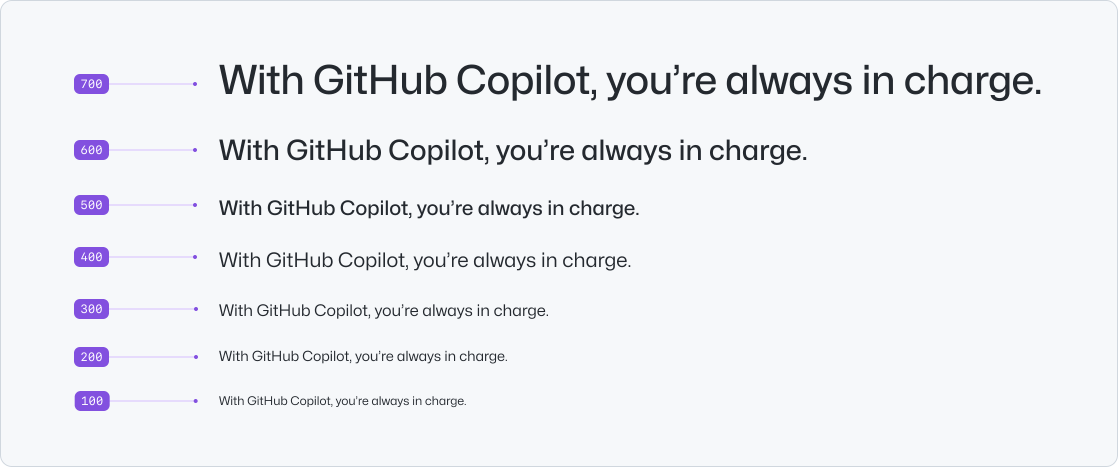
|
|
8
|
+
|
|
9
|
+
## Usage
|
|
10
|
+
|
|
11
|
+
Use the text component to provide content and a clear hierarchy structure. The text component renders an HTML `<span>` tag without any default styling. Use `<p>` for any text that is meant to be a paragraph of text. Use multiple text components to represent paragraphs as distinct blocks of text. This helps with readability and makes it easier for search engines and assistive technologies to understand the content.
|
|
12
|
+
|
|
13
|
+
## Options
|
|
14
|
+
|
|
15
|
+
### Variant
|
|
16
|
+
|
|
17
|
+
The text component provides two variant options: `default` and `muted`. The `muted` variant is used to de-emphasize text or to provide visual contrast when paired with a title.
|
|
18
|
+
|
|
19
|
+
**✅ Do**
|
|
20
|
+
|
|
21
|
+

|
|
22
|
+
|
|
23
|
+
_Use muted text to de-emphasize text and provide additional context._
|
|
24
|
+
|
|
25
|
+
**❌ Don't**
|
|
26
|
+
|
|
27
|
+

|
|
28
|
+
|
|
29
|
+
_Don't use standalone muted text. Muted text should always be paired with emphasized text or a title._
|
|
30
|
+
|
|
31
|
+
### Size
|
|
32
|
+
|
|
33
|
+
The text size ranges from 100 to 700, with 400 as the default size. This scale is built to provide hierarchy for all types of scenarios.
|
|
34
|
+
|
|
35
|
+
**✅ Do**
|
|
36
|
+
|
|
37
|
+

|
|
38
|
+
|
|
39
|
+
_Use a smaller size to provide visual hierarchy when the text is paired with a title. Use as many text components
|
|
40
|
+
as needed to represent different blocks of content._
|
|
41
|
+
|
|
42
|
+
**❌ Don't**
|
|
43
|
+
|
|
44
|
+

|
|
45
|
+
|
|
46
|
+
_When the text is paired with a title, use a smaller size to provide visual hierarchy._
|
|
47
|
+
|
|
48
|
+
### Alignment
|
|
49
|
+
|
|
50
|
+
Text alignment options offer a convenient way to control the positioning of content within block level elements.
|
|
51
|
+
|
|
52
|
+
Available options include `start`, `center`, and `end`, which are recommended for supporting bidirectional reading.
|
|
53
|
+
|
|
54
|
+
### Weight
|
|
55
|
+
|
|
56
|
+
The text component also supports `weight` options. Weight is automatically determined by the text size, but can be overridden when the scenario calls for it.
|
|
57
|
+
|
|
58
|
+
### Responsive
|
|
59
|
+
|
|
60
|
+
The text component is responsive by default and the size will scale down on smaller screens. Weight options will remain the same across all screen sizes but can be overridden for each breakpoint.
|
|
61
|
+
|
|
62
|
+
_Video demonstration — see the online docs._
|
|
63
|
+
|
|
64
|
+
## Related components
|
|
65
|
+
|
|
66
|
+
- [Heading](../Heading/index.md): to render headings.
|
|
67
|
+
- [Ordered list](../../components/OrderedList/index.md): to render ordered lists.
|
|
68
|
+
- [Unordered list](../../components/UnorderedList/index.md): to render unordered lists.
|