@primer/react-brand 0.69.1-rc.0a4e5ff5 → 0.70.0-rc.11ae3568
This diff represents the content of publicly available package versions that have been released to one of the supported registries. The information contained in this diff is provided for informational purposes only and reflects changes between package versions as they appear in their respective public registries.
- package/README.md +19 -0
- package/docs/components/ActionMenu/index.md +156 -0
- package/docs/components/AnchorNav/index.md +220 -0
- package/docs/components/Avatar/index.md +30 -0
- package/docs/components/Avatar/react.md +71 -0
- package/docs/components/Bento/index.md +223 -0
- package/docs/components/Breadcrumbs/index.md +51 -0
- package/docs/components/Breadcrumbs/react.md +53 -0
- package/docs/components/BreakoutBanner/index.md +102 -0
- package/docs/components/BreakoutBanner/react.md +174 -0
- package/docs/components/Button/index.md +133 -0
- package/docs/components/Button/react.md +94 -0
- package/docs/components/ButtonGroup/index.md +62 -0
- package/docs/components/ButtonGroup/react.md +60 -0
- package/docs/components/CTABanner/index.md +114 -0
- package/docs/components/CTABanner/react.md +343 -0
- package/docs/components/CTAForm/index.md +95 -0
- package/docs/components/CTAForm/react.md +103 -0
- package/docs/components/Card/index.md +126 -0
- package/docs/components/Card/react.md +240 -0
- package/docs/components/ComparisonTable/index.md +381 -0
- package/docs/components/EyebrowBanner/index.md +153 -0
- package/docs/components/FAQ/index.md +66 -0
- package/docs/components/FAQ/react.md +477 -0
- package/docs/components/Footnotes/index.md +41 -0
- package/docs/components/Footnotes/react.md +156 -0
- package/docs/components/Hero/index.md +65 -0
- package/docs/components/Hero/react.md +215 -0
- package/docs/components/IDE/index.md +278 -0
- package/docs/components/Icon/index.md +87 -0
- package/docs/components/Image/index.md +51 -0
- package/docs/components/Image/react.md +160 -0
- package/docs/components/Label/index.md +86 -0
- package/docs/components/Label/react.md +76 -0
- package/docs/components/LogoSuite/index.md +93 -0
- package/docs/components/LogoSuite/react.md +667 -0
- package/docs/components/MediaPlaylist/index.md +133 -0
- package/docs/components/MinimalFooter/index.md +94 -0
- package/docs/components/NavList/index.md +210 -0
- package/docs/components/OrderedList/index.md +55 -0
- package/docs/components/OrderedList/react.md +41 -0
- package/docs/components/Pagination/index.md +80 -0
- package/docs/components/Pillar/index.md +114 -0
- package/docs/components/Pillar/react.md +175 -0
- package/docs/components/PricingOptions/index.md +509 -0
- package/docs/components/Prose/index.md +158 -0
- package/docs/components/River/index.md +190 -0
- package/docs/components/River/react.md +295 -0
- package/docs/components/RiverAccordion/index.md +200 -0
- package/docs/components/RiverBreakoutTabs/index.md +171 -0
- package/docs/components/Section/index.md +40 -0
- package/docs/components/Section/react.md +137 -0
- package/docs/components/SectionIntro/index.md +77 -0
- package/docs/components/SectionIntro/react.md +107 -0
- package/docs/components/SectionIntroStacked/index.md +226 -0
- package/docs/components/Statistic/index.md +111 -0
- package/docs/components/SubNav/index.md +156 -0
- package/docs/components/SubdomainNavBar/index.md +136 -0
- package/docs/components/Tabs/index.md +243 -0
- package/docs/components/Testimonial/index.md +138 -0
- package/docs/components/Testimonial/react.md +191 -0
- package/docs/components/Tiles/index.md +1441 -0
- package/docs/components/Timeline/index.md +68 -0
- package/docs/components/Token/index.md +86 -0
- package/docs/components/Tooltip/index.md +61 -0
- package/docs/components/UnorderedList/index.md +67 -0
- package/docs/components/UnorderedList/react.md +89 -0
- package/docs/components/VideoPlayer/index.md +234 -0
- package/docs/components/index.md +53 -0
- package/docs/forms/Checkbox/index.md +86 -0
- package/docs/forms/Checkbox/react.md +111 -0
- package/docs/forms/CheckboxGroup/index.md +37 -0
- package/docs/forms/CheckboxGroup/react.md +175 -0
- package/docs/forms/FormControl/index.md +404 -0
- package/docs/forms/Radio/index.md +63 -0
- package/docs/forms/Radio/react.md +68 -0
- package/docs/forms/RadioGroup/index.md +45 -0
- package/docs/forms/RadioGroup/react.md +151 -0
- package/docs/forms/Select/index.md +244 -0
- package/docs/forms/TextArea/index.md +126 -0
- package/docs/forms/TextInput/index.md +221 -0
- package/docs/forms/index.md +14 -0
- package/docs/getting-started/esm.md +49 -0
- package/docs/getting-started/index.md +98 -0
- package/docs/index.md +99 -0
- package/docs/introduction/animation.md +127 -0
- package/docs/introduction/index.md +10 -0
- package/docs/introduction/mcp.md +52 -0
- package/docs/introduction/theming.md +132 -0
- package/docs/layout/Box/index.md +46 -0
- package/docs/layout/Box/react.md +284 -0
- package/docs/layout/Grid/index.md +132 -0
- package/docs/layout/Grid/react.md +117 -0
- package/docs/layout/Stack/index.md +60 -0
- package/docs/layout/Stack/react.md +166 -0
- package/docs/layout/index.md +9 -0
- package/docs/primitives/color.md +6 -0
- package/docs/primitives/index.md +8 -0
- package/docs/typography/Heading/index.md +53 -0
- package/docs/typography/Heading/react.md +182 -0
- package/docs/typography/Text/index.md +68 -0
- package/docs/typography/Text/react.md +125 -0
- package/docs/typography/index.md +8 -0
- package/esm/Footnotes/{Footnotes.module-Du0yaz7E.css → Footnotes.module-DG9Vx76y.css} +1 -1
- package/esm/Footnotes/Footnotes.module.js +1 -1
- package/esm/Footnotes/Footnotes.module.js.map +1 -1
- package/esm/Heading/Heading.d.ts +10 -0
- package/esm/Heading/Heading.d.ts.map +1 -1
- package/esm/Heading/Heading.js.map +1 -1
- package/esm/Hero/Hero.d.ts.map +1 -1
- package/esm/Hero/Hero.js +60 -58
- package/esm/Hero/Hero.js.map +1 -1
- package/esm/Hero/{Hero.module-Cy82CEW3.css → Hero.module-DqG5f0MT.css} +1 -1
- package/esm/Hero/Hero.module.js +1 -1
- package/esm/Hero/Hero.module.js.map +1 -1
- package/esm/NavList/NavList.d.ts +86 -0
- package/esm/NavList/NavList.d.ts.map +1 -0
- package/esm/NavList/NavList.js +277 -0
- package/esm/NavList/NavList.js.map +1 -0
- package/esm/NavList/NavList.module-CZFnt8br.css +1 -0
- package/esm/NavList/NavList.module.js +32 -0
- package/esm/NavList/NavList.module.js.map +1 -0
- package/esm/NavList/index.d.ts +2 -0
- package/esm/NavList/index.d.ts.map +1 -0
- package/esm/SectionIntroStacked/{SectionIntroStacked.module-Cr7kUqTH.css → SectionIntroStacked.module-C3cmwHDY.css} +1 -1
- package/esm/SectionIntroStacked/SectionIntroStacked.module.js +1 -1
- package/esm/SectionIntroStacked/SectionIntroStacked.module.js.map +1 -1
- package/esm/Token/Token.js +0 -1
- package/esm/Token/Token.js.map +1 -1
- package/esm/Token/{Token.module-BcKU1KwK.css → Token.module-DtWE9IPI.css} +1 -1
- package/esm/Token/Token.module.js +1 -1
- package/esm/Token/Token.module.js.map +1 -1
- package/esm/index.d.ts +1 -0
- package/esm/index.d.ts.map +1 -1
- package/esm/index.esm.js +12 -11
- package/esm/packages/design-tokens/lib/design-tokens/css/tokens/functional/components/nav-list/colors-with-modes-CGyt2t8f.css +1 -0
- package/lib/Grid/Grid.d.ts +1 -1
- package/lib/Heading/Heading.d.ts +10 -0
- package/lib/NavList/NavList.d.ts +85 -0
- package/lib/NavList/index.d.ts +1 -0
- package/lib/SubNav/SubNav.d.ts +1 -1
- package/lib/Token/Token.d.ts +1 -1
- package/lib/css/main.css +613 -74
- package/lib/design-tokens/css/tokens/base/colors/color-scales-with-modes.css +1 -1
- package/lib/design-tokens/css/tokens/base/colors/light.css +1 -1
- package/lib/design-tokens/css/tokens/base/size/size.css +1 -1
- package/lib/design-tokens/css/tokens/base/typography/typography.css +1 -1
- package/lib/design-tokens/css/tokens/functional/animation/base.css +1 -1
- package/lib/design-tokens/css/tokens/functional/colors/global-with-modes.css +1 -1
- package/lib/design-tokens/css/tokens/functional/colors/global.css +1 -1
- package/lib/design-tokens/css/tokens/functional/components/accordion/colors-with-modes.css +1 -1
- package/lib/design-tokens/css/tokens/functional/components/action-menu/colors-with-modes.css +1 -1
- package/lib/design-tokens/css/tokens/functional/components/anchor-nav/colors-with-modes.css +1 -1
- package/lib/design-tokens/css/tokens/functional/components/bento/base.css +1 -1
- package/lib/design-tokens/css/tokens/functional/components/blinking-cursor/colors-with-modes.css +1 -1
- package/lib/design-tokens/css/tokens/functional/components/breadcrumbs/colors-with-modes.css +1 -1
- package/lib/design-tokens/css/tokens/functional/components/button/colors-with-modes.css +1 -1
- package/lib/design-tokens/css/tokens/functional/components/card/base.css +1 -1
- package/lib/design-tokens/css/tokens/functional/components/card/colors-with-modes.css +1 -1
- package/lib/design-tokens/css/tokens/functional/components/card/colors.css +1 -1
- package/lib/design-tokens/css/tokens/functional/components/comparison-table/colors-with-modes.css +1 -1
- package/lib/design-tokens/css/tokens/functional/components/comparison-table/comparison-table.css +1 -1
- package/lib/design-tokens/css/tokens/functional/components/control/colors-with-modes.css +1 -1
- package/lib/design-tokens/css/tokens/functional/components/cta-banner/colors-with-modes.css +1 -1
- package/lib/design-tokens/css/tokens/functional/components/eyebrow-banner/colors-with-modes.css +1 -1
- package/lib/design-tokens/css/tokens/functional/components/eyebrow-banner/eyebrow-banner.css +1 -1
- package/lib/design-tokens/css/tokens/functional/components/faq/base.css +1 -1
- package/lib/design-tokens/css/tokens/functional/components/faq/colors-with-modes.css +1 -1
- package/lib/design-tokens/css/tokens/functional/components/faq/colors.css +1 -1
- package/lib/design-tokens/css/tokens/functional/components/faq/faq.css +1 -1
- package/lib/design-tokens/css/tokens/functional/components/footer/colors-with-modes.css +1 -1
- package/lib/design-tokens/css/tokens/functional/components/footer/colors.css +1 -1
- package/lib/design-tokens/css/tokens/functional/components/frosted-glass-vfx/base.css +1 -1
- package/lib/design-tokens/css/tokens/functional/components/frosted-glass-vfx/colors-with-modes.css +1 -1
- package/lib/design-tokens/css/tokens/functional/components/grid/colors-with-modes.css +1 -1
- package/lib/design-tokens/css/tokens/functional/components/grid/colors.css +1 -1
- package/lib/design-tokens/css/tokens/functional/components/grid/grid.css +1 -1
- package/lib/design-tokens/css/tokens/functional/components/hero/base.css +1 -1
- package/lib/design-tokens/css/tokens/functional/components/icon/colors-with-modes.css +1 -1
- package/lib/design-tokens/css/tokens/functional/components/icon/colors.css +1 -1
- package/lib/design-tokens/css/tokens/functional/components/ide/base.css +1 -1
- package/lib/design-tokens/css/tokens/functional/components/ide/colors-with-modes.css +1 -1
- package/lib/design-tokens/css/tokens/functional/components/image/base.css +1 -1
- package/lib/design-tokens/css/tokens/functional/components/inline-link/base.css +1 -1
- package/lib/design-tokens/css/tokens/functional/components/inline-link/colors-with-modes.css +1 -1
- package/lib/design-tokens/css/tokens/functional/components/inline-link/colors.css +1 -1
- package/lib/design-tokens/css/tokens/functional/components/label/colors-with-modes.css +1 -1
- package/lib/design-tokens/css/tokens/functional/components/label/colors.css +1 -1
- package/lib/design-tokens/css/tokens/functional/components/link/colors-with-modes.css +1 -1
- package/lib/design-tokens/css/tokens/functional/components/link/colors.css +1 -1
- package/lib/design-tokens/css/tokens/functional/components/logosuite/base.css +1 -1
- package/lib/design-tokens/css/tokens/functional/components/logosuite/colors-with-modes.css +1 -1
- package/lib/design-tokens/css/tokens/functional/components/logosuite/colors.css +1 -1
- package/lib/design-tokens/css/tokens/functional/components/media-playlist/colors-with-modes.css +1 -1
- package/lib/design-tokens/css/tokens/functional/components/media-playlist/colors.css +1 -1
- package/lib/design-tokens/css/tokens/functional/components/nav-list/colors-with-modes.css +13 -0
- package/lib/design-tokens/css/tokens/functional/components/pricing-options/colors-with-modes.css +1 -1
- package/lib/design-tokens/css/tokens/functional/components/pricing-options/colors.css +1 -1
- package/lib/design-tokens/css/tokens/functional/components/pricing-options/pricing-options.css +1 -1
- package/lib/design-tokens/css/tokens/functional/components/prose/base.css +1 -1
- package/lib/design-tokens/css/tokens/functional/components/prose/colors-with-modes.css +1 -1
- package/lib/design-tokens/css/tokens/functional/components/river/base.css +1 -1
- package/lib/design-tokens/css/tokens/functional/components/river/river.css +1 -1
- package/lib/design-tokens/css/tokens/functional/components/river-story-scroll/colors-with-modes.css +1 -1
- package/lib/design-tokens/css/tokens/functional/components/section/section.css +1 -1
- package/lib/design-tokens/css/tokens/functional/components/statistic/base.css +1 -1
- package/lib/design-tokens/css/tokens/functional/components/sub-nav/base.css +1 -1
- package/lib/design-tokens/css/tokens/functional/components/sub-nav/colors-with-modes.css +1 -1
- package/lib/design-tokens/css/tokens/functional/components/subdomain-nav-bar/colors-with-modes.css +1 -1
- package/lib/design-tokens/css/tokens/functional/components/tabs/base.css +1 -1
- package/lib/design-tokens/css/tokens/functional/components/tabs/colors-with-modes.css +1 -1
- package/lib/design-tokens/css/tokens/functional/components/tabs/colors.css +1 -1
- package/lib/design-tokens/css/tokens/functional/components/testimonial/base.css +1 -1
- package/lib/design-tokens/css/tokens/functional/components/testimonial/colors-with-modes.css +1 -1
- package/lib/design-tokens/css/tokens/functional/components/testimonial/colors.css +1 -1
- package/lib/design-tokens/css/tokens/functional/components/text-cursor-animation/colors-with-modes.css +1 -1
- package/lib/design-tokens/css/tokens/functional/components/text-cursor-animation/colors.css +1 -1
- package/lib/design-tokens/css/tokens/functional/components/tiles/colors-with-modes.css +1 -1
- package/lib/design-tokens/css/tokens/functional/components/timeline/base.css +1 -1
- package/lib/design-tokens/css/tokens/functional/components/timeline/colors-with-modes.css +1 -1
- package/lib/design-tokens/css/tokens/functional/components/timeline/colors.css +1 -1
- package/lib/design-tokens/css/tokens/functional/components/token/colors-with-modes.css +1 -1
- package/lib/design-tokens/css/tokens/functional/components/token/colors.css +1 -1
- package/lib/design-tokens/css/tokens/functional/components/tooltip/colors-with-modes.css +1 -1
- package/lib/design-tokens/css/tokens/functional/components/tooltip/colors.css +1 -1
- package/lib/design-tokens/css/tokens/functional/components/video-player/base.css +1 -1
- package/lib/design-tokens/css/tokens/functional/components/video-player/colors-with-modes.css +1 -1
- package/lib/design-tokens/css/tokens/functional/size/border.css +1 -1
- package/lib/design-tokens/css/tokens/functional/size/breakpoints.css +1 -1
- package/lib/design-tokens/css/tokens/functional/size/size-coarse.css +1 -1
- package/lib/design-tokens/css/tokens/functional/size/size-fine.css +1 -1
- package/lib/design-tokens/css/tokens/functional/size/size.css +1 -1
- package/lib/design-tokens/css/tokens/functional/size/viewport.css +1 -1
- package/lib/design-tokens/css/tokens/functional/typography/typography-responsive.css +1 -1
- package/lib/design-tokens/css/tokens/functional/typography/typography.css +1 -1
- package/lib/design-tokens/js/module/tokens/base/colors/light.js +1 -1
- package/lib/design-tokens/js/module/tokens/base/size/size.js +1 -1
- package/lib/design-tokens/js/module/tokens/base/typography/typography.js +1 -1
- package/lib/design-tokens/js/module/tokens/functional/animation/base.js +1 -1
- package/lib/design-tokens/js/module/tokens/functional/colors/global.js +1 -1
- package/lib/design-tokens/js/module/tokens/functional/components/bento/base.js +1 -1
- package/lib/design-tokens/js/module/tokens/functional/components/card/base.js +1 -1
- package/lib/design-tokens/js/module/tokens/functional/components/card/colors.js +1 -1
- package/lib/design-tokens/js/module/tokens/functional/components/comparison-table/comparison-table.js +1 -1
- package/lib/design-tokens/js/module/tokens/functional/components/eyebrow-banner/eyebrow-banner.js +1 -1
- package/lib/design-tokens/js/module/tokens/functional/components/faq/base.js +1 -1
- package/lib/design-tokens/js/module/tokens/functional/components/faq/colors.js +1 -1
- package/lib/design-tokens/js/module/tokens/functional/components/faq/faq.js +1 -1
- package/lib/design-tokens/js/module/tokens/functional/components/footer/colors.js +1 -1
- package/lib/design-tokens/js/module/tokens/functional/components/frosted-glass-vfx/base.js +1 -1
- package/lib/design-tokens/js/module/tokens/functional/components/grid/colors.js +1 -1
- package/lib/design-tokens/js/module/tokens/functional/components/grid/grid.js +1 -1
- package/lib/design-tokens/js/module/tokens/functional/components/hero/base.js +1 -1
- package/lib/design-tokens/js/module/tokens/functional/components/icon/colors.js +1 -1
- package/lib/design-tokens/js/module/tokens/functional/components/ide/base.js +1 -1
- package/lib/design-tokens/js/module/tokens/functional/components/image/base.js +1 -1
- package/lib/design-tokens/js/module/tokens/functional/components/inline-link/base.js +1 -1
- package/lib/design-tokens/js/module/tokens/functional/components/inline-link/colors.js +1 -1
- package/lib/design-tokens/js/module/tokens/functional/components/label/colors.js +1 -1
- package/lib/design-tokens/js/module/tokens/functional/components/link/colors.js +1 -1
- package/lib/design-tokens/js/module/tokens/functional/components/logosuite/base.js +1 -1
- package/lib/design-tokens/js/module/tokens/functional/components/logosuite/colors.js +1 -1
- package/lib/design-tokens/js/module/tokens/functional/components/media-playlist/colors.js +1 -1
- package/lib/design-tokens/js/module/tokens/functional/components/pricing-options/colors.js +1 -1
- package/lib/design-tokens/js/module/tokens/functional/components/pricing-options/pricing-options.js +1 -1
- package/lib/design-tokens/js/module/tokens/functional/components/prose/base.js +1 -1
- package/lib/design-tokens/js/module/tokens/functional/components/river/base.js +1 -1
- package/lib/design-tokens/js/module/tokens/functional/components/river/river.js +1 -1
- package/lib/design-tokens/js/module/tokens/functional/components/section/section.js +1 -1
- package/lib/design-tokens/js/module/tokens/functional/components/statistic/base.js +1 -1
- package/lib/design-tokens/js/module/tokens/functional/components/sub-nav/base.js +1 -1
- package/lib/design-tokens/js/module/tokens/functional/components/tabs/base.js +1 -1
- package/lib/design-tokens/js/module/tokens/functional/components/tabs/colors.js +1 -1
- package/lib/design-tokens/js/module/tokens/functional/components/testimonial/base.js +1 -1
- package/lib/design-tokens/js/module/tokens/functional/components/testimonial/colors.js +1 -1
- package/lib/design-tokens/js/module/tokens/functional/components/text-cursor-animation/colors.js +1 -1
- package/lib/design-tokens/js/module/tokens/functional/components/timeline/base.js +1 -1
- package/lib/design-tokens/js/module/tokens/functional/components/timeline/colors.js +1 -1
- package/lib/design-tokens/js/module/tokens/functional/components/token/colors.js +1 -1
- package/lib/design-tokens/js/module/tokens/functional/components/tooltip/colors.js +1 -1
- package/lib/design-tokens/js/module/tokens/functional/components/video-player/base.js +1 -1
- package/lib/design-tokens/js/module/tokens/functional/size/border.js +1 -1
- package/lib/design-tokens/js/module/tokens/functional/size/breakpoints.js +1 -1
- package/lib/design-tokens/js/module/tokens/functional/size/size-coarse.js +1 -1
- package/lib/design-tokens/js/module/tokens/functional/size/size-fine.js +1 -1
- package/lib/design-tokens/js/module/tokens/functional/size/size.js +1 -1
- package/lib/design-tokens/js/module/tokens/functional/size/viewport.js +1 -1
- package/lib/design-tokens/js/module/tokens/functional/typography/typography-responsive.js +1 -1
- package/lib/design-tokens/js/module/tokens/functional/typography/typography.js +1 -1
- package/lib/design-tokens/js/tokens/base/colors/light.js +1 -1
- package/lib/design-tokens/js/tokens/base/size/size.js +1 -1
- package/lib/design-tokens/js/tokens/base/typography/typography.js +1 -1
- package/lib/design-tokens/js/tokens/functional/animation/base.js +1 -1
- package/lib/design-tokens/js/tokens/functional/colors/global.js +1 -1
- package/lib/design-tokens/js/tokens/functional/components/bento/base.js +1 -1
- package/lib/design-tokens/js/tokens/functional/components/card/base.js +1 -1
- package/lib/design-tokens/js/tokens/functional/components/card/colors.js +1 -1
- package/lib/design-tokens/js/tokens/functional/components/comparison-table/comparison-table.js +1 -1
- package/lib/design-tokens/js/tokens/functional/components/eyebrow-banner/eyebrow-banner.js +1 -1
- package/lib/design-tokens/js/tokens/functional/components/faq/base.js +1 -1
- package/lib/design-tokens/js/tokens/functional/components/faq/colors.js +1 -1
- package/lib/design-tokens/js/tokens/functional/components/faq/faq.js +1 -1
- package/lib/design-tokens/js/tokens/functional/components/footer/colors.js +1 -1
- package/lib/design-tokens/js/tokens/functional/components/frosted-glass-vfx/base.js +1 -1
- package/lib/design-tokens/js/tokens/functional/components/grid/colors.js +1 -1
- package/lib/design-tokens/js/tokens/functional/components/grid/grid.js +1 -1
- package/lib/design-tokens/js/tokens/functional/components/hero/base.js +1 -1
- package/lib/design-tokens/js/tokens/functional/components/icon/colors.js +1 -1
- package/lib/design-tokens/js/tokens/functional/components/ide/base.js +1 -1
- package/lib/design-tokens/js/tokens/functional/components/image/base.js +1 -1
- package/lib/design-tokens/js/tokens/functional/components/inline-link/base.js +1 -1
- package/lib/design-tokens/js/tokens/functional/components/inline-link/colors.js +1 -1
- package/lib/design-tokens/js/tokens/functional/components/label/colors.js +1 -1
- package/lib/design-tokens/js/tokens/functional/components/link/colors.js +1 -1
- package/lib/design-tokens/js/tokens/functional/components/logosuite/base.js +1 -1
- package/lib/design-tokens/js/tokens/functional/components/logosuite/colors.js +1 -1
- package/lib/design-tokens/js/tokens/functional/components/media-playlist/colors.js +1 -1
- package/lib/design-tokens/js/tokens/functional/components/pricing-options/colors.js +1 -1
- package/lib/design-tokens/js/tokens/functional/components/pricing-options/pricing-options.js +1 -1
- package/lib/design-tokens/js/tokens/functional/components/prose/base.js +1 -1
- package/lib/design-tokens/js/tokens/functional/components/river/base.js +1 -1
- package/lib/design-tokens/js/tokens/functional/components/river/river.js +1 -1
- package/lib/design-tokens/js/tokens/functional/components/section/section.js +1 -1
- package/lib/design-tokens/js/tokens/functional/components/statistic/base.js +1 -1
- package/lib/design-tokens/js/tokens/functional/components/sub-nav/base.js +1 -1
- package/lib/design-tokens/js/tokens/functional/components/tabs/base.js +1 -1
- package/lib/design-tokens/js/tokens/functional/components/tabs/colors.js +1 -1
- package/lib/design-tokens/js/tokens/functional/components/testimonial/base.js +1 -1
- package/lib/design-tokens/js/tokens/functional/components/testimonial/colors.js +1 -1
- package/lib/design-tokens/js/tokens/functional/components/text-cursor-animation/colors.js +1 -1
- package/lib/design-tokens/js/tokens/functional/components/timeline/base.js +1 -1
- package/lib/design-tokens/js/tokens/functional/components/timeline/colors.js +1 -1
- package/lib/design-tokens/js/tokens/functional/components/token/colors.js +1 -1
- package/lib/design-tokens/js/tokens/functional/components/tooltip/colors.js +1 -1
- package/lib/design-tokens/js/tokens/functional/components/video-player/base.js +1 -1
- package/lib/design-tokens/js/tokens/functional/size/border.js +1 -1
- package/lib/design-tokens/js/tokens/functional/size/breakpoints.js +1 -1
- package/lib/design-tokens/js/tokens/functional/size/size-coarse.js +1 -1
- package/lib/design-tokens/js/tokens/functional/size/size-fine.js +1 -1
- package/lib/design-tokens/js/tokens/functional/size/size.js +1 -1
- package/lib/design-tokens/js/tokens/functional/size/viewport.js +1 -1
- package/lib/design-tokens/js/tokens/functional/typography/typography-responsive.js +1 -1
- package/lib/design-tokens/js/tokens/functional/typography/typography.js +1 -1
- package/lib/design-tokens/scss/tokens/base/colors/light.scss +1 -1
- package/lib/design-tokens/scss/tokens/base/size/size.scss +1 -1
- package/lib/design-tokens/scss/tokens/base/typography/typography.scss +1 -1
- package/lib/design-tokens/scss/tokens/functional/animation/base.scss +1 -1
- package/lib/design-tokens/scss/tokens/functional/colors/global.scss +1 -1
- package/lib/design-tokens/scss/tokens/functional/components/bento/base.scss +1 -1
- package/lib/design-tokens/scss/tokens/functional/components/card/base.scss +1 -1
- package/lib/design-tokens/scss/tokens/functional/components/card/colors.scss +1 -1
- package/lib/design-tokens/scss/tokens/functional/components/comparison-table/comparison-table.scss +1 -1
- package/lib/design-tokens/scss/tokens/functional/components/eyebrow-banner/eyebrow-banner.scss +1 -1
- package/lib/design-tokens/scss/tokens/functional/components/faq/base.scss +1 -1
- package/lib/design-tokens/scss/tokens/functional/components/faq/colors.scss +1 -1
- package/lib/design-tokens/scss/tokens/functional/components/faq/faq.scss +1 -1
- package/lib/design-tokens/scss/tokens/functional/components/footer/colors.scss +1 -1
- package/lib/design-tokens/scss/tokens/functional/components/frosted-glass-vfx/base.scss +1 -1
- package/lib/design-tokens/scss/tokens/functional/components/grid/colors.scss +1 -1
- package/lib/design-tokens/scss/tokens/functional/components/grid/grid.scss +1 -1
- package/lib/design-tokens/scss/tokens/functional/components/hero/base.scss +1 -1
- package/lib/design-tokens/scss/tokens/functional/components/icon/colors.scss +1 -1
- package/lib/design-tokens/scss/tokens/functional/components/ide/base.scss +1 -1
- package/lib/design-tokens/scss/tokens/functional/components/image/base.scss +1 -1
- package/lib/design-tokens/scss/tokens/functional/components/inline-link/base.scss +1 -1
- package/lib/design-tokens/scss/tokens/functional/components/inline-link/colors.scss +1 -1
- package/lib/design-tokens/scss/tokens/functional/components/label/colors.scss +1 -1
- package/lib/design-tokens/scss/tokens/functional/components/link/colors.scss +1 -1
- package/lib/design-tokens/scss/tokens/functional/components/logosuite/base.scss +1 -1
- package/lib/design-tokens/scss/tokens/functional/components/logosuite/colors.scss +1 -1
- package/lib/design-tokens/scss/tokens/functional/components/media-playlist/colors.scss +1 -1
- package/lib/design-tokens/scss/tokens/functional/components/pricing-options/colors.scss +1 -1
- package/lib/design-tokens/scss/tokens/functional/components/pricing-options/pricing-options.scss +1 -1
- package/lib/design-tokens/scss/tokens/functional/components/prose/base.scss +1 -1
- package/lib/design-tokens/scss/tokens/functional/components/river/base.scss +1 -1
- package/lib/design-tokens/scss/tokens/functional/components/river/river.scss +1 -1
- package/lib/design-tokens/scss/tokens/functional/components/section/section.scss +1 -1
- package/lib/design-tokens/scss/tokens/functional/components/statistic/base.scss +1 -1
- package/lib/design-tokens/scss/tokens/functional/components/sub-nav/base.scss +1 -1
- package/lib/design-tokens/scss/tokens/functional/components/tabs/base.scss +1 -1
- package/lib/design-tokens/scss/tokens/functional/components/tabs/colors.scss +1 -1
- package/lib/design-tokens/scss/tokens/functional/components/testimonial/base.scss +1 -1
- package/lib/design-tokens/scss/tokens/functional/components/testimonial/colors.scss +1 -1
- package/lib/design-tokens/scss/tokens/functional/components/text-cursor-animation/colors.scss +1 -1
- package/lib/design-tokens/scss/tokens/functional/components/timeline/base.scss +1 -1
- package/lib/design-tokens/scss/tokens/functional/components/timeline/colors.scss +1 -1
- package/lib/design-tokens/scss/tokens/functional/components/token/colors.scss +1 -1
- package/lib/design-tokens/scss/tokens/functional/components/tooltip/colors.scss +1 -1
- package/lib/design-tokens/scss/tokens/functional/components/video-player/base.scss +1 -1
- package/lib/design-tokens/scss/tokens/functional/size/border.scss +1 -1
- package/lib/design-tokens/scss/tokens/functional/size/breakpoints.scss +1 -1
- package/lib/design-tokens/scss/tokens/functional/size/size-coarse.scss +1 -1
- package/lib/design-tokens/scss/tokens/functional/size/size-fine.scss +1 -1
- package/lib/design-tokens/scss/tokens/functional/size/size.scss +1 -1
- package/lib/design-tokens/scss/tokens/functional/size/viewport.scss +1 -1
- package/lib/design-tokens/scss/tokens/functional/typography/typography-responsive.scss +1 -1
- package/lib/design-tokens/scss/tokens/functional/typography/typography.scss +1 -1
- package/lib/design-tokens/ts/tokens/base/colors/light.d.ts +1 -1
- package/lib/design-tokens/ts/tokens/base/colors/light.js +1 -1
- package/lib/design-tokens/ts/tokens/base/size/size.d.ts +1 -1
- package/lib/design-tokens/ts/tokens/base/size/size.js +1 -1
- package/lib/design-tokens/ts/tokens/base/typography/typography.d.ts +1 -1
- package/lib/design-tokens/ts/tokens/base/typography/typography.js +1 -1
- package/lib/design-tokens/ts/tokens/functional/animation/base.d.ts +1 -1
- package/lib/design-tokens/ts/tokens/functional/animation/base.js +1 -1
- package/lib/design-tokens/ts/tokens/functional/colors/global.d.ts +1 -1
- package/lib/design-tokens/ts/tokens/functional/colors/global.js +1 -1
- package/lib/design-tokens/ts/tokens/functional/components/bento/base.d.ts +1 -1
- package/lib/design-tokens/ts/tokens/functional/components/bento/base.js +1 -1
- package/lib/design-tokens/ts/tokens/functional/components/card/base.d.ts +1 -1
- package/lib/design-tokens/ts/tokens/functional/components/card/base.js +1 -1
- package/lib/design-tokens/ts/tokens/functional/components/card/colors.d.ts +1 -1
- package/lib/design-tokens/ts/tokens/functional/components/card/colors.js +1 -1
- package/lib/design-tokens/ts/tokens/functional/components/comparison-table/comparison-table.d.ts +1 -1
- package/lib/design-tokens/ts/tokens/functional/components/comparison-table/comparison-table.js +1 -1
- package/lib/design-tokens/ts/tokens/functional/components/eyebrow-banner/eyebrow-banner.d.ts +1 -1
- package/lib/design-tokens/ts/tokens/functional/components/eyebrow-banner/eyebrow-banner.js +1 -1
- package/lib/design-tokens/ts/tokens/functional/components/faq/base.d.ts +1 -1
- package/lib/design-tokens/ts/tokens/functional/components/faq/base.js +1 -1
- package/lib/design-tokens/ts/tokens/functional/components/faq/colors.d.ts +1 -1
- package/lib/design-tokens/ts/tokens/functional/components/faq/colors.js +1 -1
- package/lib/design-tokens/ts/tokens/functional/components/faq/faq.d.ts +1 -1
- package/lib/design-tokens/ts/tokens/functional/components/faq/faq.js +1 -1
- package/lib/design-tokens/ts/tokens/functional/components/footer/colors.d.ts +1 -1
- package/lib/design-tokens/ts/tokens/functional/components/footer/colors.js +1 -1
- package/lib/design-tokens/ts/tokens/functional/components/frosted-glass-vfx/base.d.ts +1 -1
- package/lib/design-tokens/ts/tokens/functional/components/frosted-glass-vfx/base.js +1 -1
- package/lib/design-tokens/ts/tokens/functional/components/grid/colors.d.ts +1 -1
- package/lib/design-tokens/ts/tokens/functional/components/grid/colors.js +1 -1
- package/lib/design-tokens/ts/tokens/functional/components/grid/grid.d.ts +1 -1
- package/lib/design-tokens/ts/tokens/functional/components/grid/grid.js +1 -1
- package/lib/design-tokens/ts/tokens/functional/components/hero/base.d.ts +1 -1
- package/lib/design-tokens/ts/tokens/functional/components/hero/base.js +1 -1
- package/lib/design-tokens/ts/tokens/functional/components/icon/colors.d.ts +1 -1
- package/lib/design-tokens/ts/tokens/functional/components/icon/colors.js +1 -1
- package/lib/design-tokens/ts/tokens/functional/components/ide/base.d.ts +1 -1
- package/lib/design-tokens/ts/tokens/functional/components/ide/base.js +1 -1
- package/lib/design-tokens/ts/tokens/functional/components/image/base.d.ts +1 -1
- package/lib/design-tokens/ts/tokens/functional/components/image/base.js +1 -1
- package/lib/design-tokens/ts/tokens/functional/components/inline-link/base.d.ts +1 -1
- package/lib/design-tokens/ts/tokens/functional/components/inline-link/base.js +1 -1
- package/lib/design-tokens/ts/tokens/functional/components/inline-link/colors.d.ts +1 -1
- package/lib/design-tokens/ts/tokens/functional/components/inline-link/colors.js +1 -1
- package/lib/design-tokens/ts/tokens/functional/components/label/colors.d.ts +1 -1
- package/lib/design-tokens/ts/tokens/functional/components/label/colors.js +1 -1
- package/lib/design-tokens/ts/tokens/functional/components/link/colors.d.ts +1 -1
- package/lib/design-tokens/ts/tokens/functional/components/link/colors.js +1 -1
- package/lib/design-tokens/ts/tokens/functional/components/logosuite/base.d.ts +1 -1
- package/lib/design-tokens/ts/tokens/functional/components/logosuite/base.js +1 -1
- package/lib/design-tokens/ts/tokens/functional/components/logosuite/colors.d.ts +1 -1
- package/lib/design-tokens/ts/tokens/functional/components/logosuite/colors.js +1 -1
- package/lib/design-tokens/ts/tokens/functional/components/media-playlist/colors.d.ts +1 -1
- package/lib/design-tokens/ts/tokens/functional/components/media-playlist/colors.js +1 -1
- package/lib/design-tokens/ts/tokens/functional/components/pricing-options/colors.d.ts +1 -1
- package/lib/design-tokens/ts/tokens/functional/components/pricing-options/colors.js +1 -1
- package/lib/design-tokens/ts/tokens/functional/components/pricing-options/pricing-options.d.ts +1 -1
- package/lib/design-tokens/ts/tokens/functional/components/pricing-options/pricing-options.js +1 -1
- package/lib/design-tokens/ts/tokens/functional/components/prose/base.d.ts +1 -1
- package/lib/design-tokens/ts/tokens/functional/components/prose/base.js +1 -1
- package/lib/design-tokens/ts/tokens/functional/components/river/base.d.ts +1 -1
- package/lib/design-tokens/ts/tokens/functional/components/river/base.js +1 -1
- package/lib/design-tokens/ts/tokens/functional/components/river/river.d.ts +1 -1
- package/lib/design-tokens/ts/tokens/functional/components/river/river.js +1 -1
- package/lib/design-tokens/ts/tokens/functional/components/section/section.d.ts +1 -1
- package/lib/design-tokens/ts/tokens/functional/components/section/section.js +1 -1
- package/lib/design-tokens/ts/tokens/functional/components/statistic/base.d.ts +1 -1
- package/lib/design-tokens/ts/tokens/functional/components/statistic/base.js +1 -1
- package/lib/design-tokens/ts/tokens/functional/components/sub-nav/base.d.ts +1 -1
- package/lib/design-tokens/ts/tokens/functional/components/sub-nav/base.js +1 -1
- package/lib/design-tokens/ts/tokens/functional/components/tabs/base.d.ts +1 -1
- package/lib/design-tokens/ts/tokens/functional/components/tabs/base.js +1 -1
- package/lib/design-tokens/ts/tokens/functional/components/tabs/colors.d.ts +1 -1
- package/lib/design-tokens/ts/tokens/functional/components/tabs/colors.js +1 -1
- package/lib/design-tokens/ts/tokens/functional/components/testimonial/base.d.ts +1 -1
- package/lib/design-tokens/ts/tokens/functional/components/testimonial/base.js +1 -1
- package/lib/design-tokens/ts/tokens/functional/components/testimonial/colors.d.ts +1 -1
- package/lib/design-tokens/ts/tokens/functional/components/testimonial/colors.js +1 -1
- package/lib/design-tokens/ts/tokens/functional/components/text-cursor-animation/colors.d.ts +1 -1
- package/lib/design-tokens/ts/tokens/functional/components/text-cursor-animation/colors.js +1 -1
- package/lib/design-tokens/ts/tokens/functional/components/timeline/base.d.ts +1 -1
- package/lib/design-tokens/ts/tokens/functional/components/timeline/base.js +1 -1
- package/lib/design-tokens/ts/tokens/functional/components/timeline/colors.d.ts +1 -1
- package/lib/design-tokens/ts/tokens/functional/components/timeline/colors.js +1 -1
- package/lib/design-tokens/ts/tokens/functional/components/token/colors.d.ts +1 -1
- package/lib/design-tokens/ts/tokens/functional/components/token/colors.js +1 -1
- package/lib/design-tokens/ts/tokens/functional/components/tooltip/colors.d.ts +1 -1
- package/lib/design-tokens/ts/tokens/functional/components/tooltip/colors.js +1 -1
- package/lib/design-tokens/ts/tokens/functional/components/video-player/base.d.ts +1 -1
- package/lib/design-tokens/ts/tokens/functional/components/video-player/base.js +1 -1
- package/lib/design-tokens/ts/tokens/functional/size/border.d.ts +1 -1
- package/lib/design-tokens/ts/tokens/functional/size/border.js +1 -1
- package/lib/design-tokens/ts/tokens/functional/size/breakpoints.d.ts +1 -1
- package/lib/design-tokens/ts/tokens/functional/size/breakpoints.js +1 -1
- package/lib/design-tokens/ts/tokens/functional/size/size-coarse.d.ts +1 -1
- package/lib/design-tokens/ts/tokens/functional/size/size-coarse.js +1 -1
- package/lib/design-tokens/ts/tokens/functional/size/size-fine.d.ts +1 -1
- package/lib/design-tokens/ts/tokens/functional/size/size-fine.js +1 -1
- package/lib/design-tokens/ts/tokens/functional/size/size.d.ts +1 -1
- package/lib/design-tokens/ts/tokens/functional/size/size.js +1 -1
- package/lib/design-tokens/ts/tokens/functional/size/viewport.d.ts +1 -1
- package/lib/design-tokens/ts/tokens/functional/size/viewport.js +1 -1
- package/lib/design-tokens/ts/tokens/functional/typography/typography-responsive.d.ts +1 -1
- package/lib/design-tokens/ts/tokens/functional/typography/typography-responsive.js +1 -1
- package/lib/design-tokens/ts/tokens/functional/typography/typography.d.ts +1 -1
- package/lib/design-tokens/ts/tokens/functional/typography/typography.js +1 -1
- package/lib/index.d.ts +1 -0
- package/lib/index.js +1 -1
- package/llms.txt +97 -0
- package/package.json +17 -5
- package/esm/Hero/Hero.figma.d.ts +0 -2
- package/esm/Hero/Hero.figma.d.ts.map +0 -1
- package/esm/IDE/fixtures/content.d.ts +0 -7
- package/esm/IDE/fixtures/content.d.ts.map +0 -1
- package/esm/LogoSuite/LogoSuite.figma.d.ts +0 -2
- package/esm/LogoSuite/LogoSuite.figma.d.ts.map +0 -1
- package/esm/LogoSuite/LogoSuite.fixtures.d.ts +0 -2
- package/esm/LogoSuite/LogoSuite.fixtures.d.ts.map +0 -1
- package/esm/MonaSans/MonaSans.d.ts +0 -11
- package/esm/MonaSans/MonaSans.d.ts.map +0 -1
- package/esm/MonaSans/index.d.ts +0 -2
- package/esm/MonaSans/index.d.ts.map +0 -1
- package/esm/PricingOptions/PricingOptions.figma.d.ts +0 -2
- package/esm/PricingOptions/PricingOptions.figma.d.ts.map +0 -1
- package/esm/Tiles/Tiles.fixtures.d.ts +0 -7
- package/esm/Tiles/Tiles.fixtures.d.ts.map +0 -1
- package/esm/fixtures/third-party-logos/AzureLogo.d.ts +0 -5
- package/esm/fixtures/third-party-logos/AzureLogo.d.ts.map +0 -1
- package/esm/fixtures/third-party-logos/JetBrainsLogo.d.ts +0 -5
- package/esm/fixtures/third-party-logos/JetBrainsLogo.d.ts.map +0 -1
- package/esm/fixtures/third-party-logos/MicrosoftCopilotLogo.d.ts +0 -5
- package/esm/fixtures/third-party-logos/MicrosoftCopilotLogo.d.ts.map +0 -1
- package/esm/fixtures/third-party-logos/MicrosoftLogo.d.ts +0 -5
- package/esm/fixtures/third-party-logos/MicrosoftLogo.d.ts.map +0 -1
- package/esm/fixtures/third-party-logos/NeoVimLogo.d.ts +0 -5
- package/esm/fixtures/third-party-logos/NeoVimLogo.d.ts.map +0 -1
- package/esm/fixtures/third-party-logos/VisualStudioCodeLogo.d.ts +0 -5
- package/esm/fixtures/third-party-logos/VisualStudioCodeLogo.d.ts.map +0 -1
- package/esm/fixtures/third-party-logos/VisualStudioLogo.d.ts +0 -5
- package/esm/fixtures/third-party-logos/VisualStudioLogo.d.ts.map +0 -1
- package/esm/list/ListItem/index.d.ts +0 -2
- package/esm/list/ListItem/index.d.ts.map +0 -1
- package/esm/recipes/FeaturePreviewLPs/FeaturePreviewLevelOne/FeaturePreviewLevelOne.d.ts +0 -13
- package/esm/recipes/FeaturePreviewLPs/FeaturePreviewLevelOne/FeaturePreviewLevelOne.d.ts.map +0 -1
- package/esm/recipes/FeaturePreviewLPs/FeaturePreviewLevelOne/FeaturePreviewLevelOneSideBySide.d.ts +0 -14
- package/esm/recipes/FeaturePreviewLPs/FeaturePreviewLevelOne/FeaturePreviewLevelOneSideBySide.d.ts.map +0 -1
- package/esm/recipes/FeaturePreviewLPs/FeaturePreviewLevelOne/components/FormExample.d.ts +0 -8
- package/esm/recipes/FeaturePreviewLPs/FeaturePreviewLevelOne/components/FormExample.d.ts.map +0 -1
- package/esm/recipes/FeaturePreviewLPs/FeaturePreviewLevelOne/index.d.ts +0 -2
- package/esm/recipes/FeaturePreviewLPs/FeaturePreviewLevelOne/index.d.ts.map +0 -1
- package/esm/recipes/FeaturePreviewLPs/FeaturePreviewLevelTwo/FeaturePreviewLevelTwo.d.ts +0 -49
- package/esm/recipes/FeaturePreviewLPs/FeaturePreviewLevelTwo/FeaturePreviewLevelTwo.d.ts.map +0 -1
- package/esm/recipes/FeaturePreviewLPs/FeaturePreviewLevelTwo/index.d.ts +0 -2
- package/esm/recipes/FeaturePreviewLPs/FeaturePreviewLevelTwo/index.d.ts.map +0 -1
- package/esm/recipes/FeaturePreviewLPs/FeaturePreviewLevelZero/FeaturePreviewLevelZero.d.ts +0 -17
- package/esm/recipes/FeaturePreviewLPs/FeaturePreviewLevelZero/FeaturePreviewLevelZero.d.ts.map +0 -1
- package/esm/recipes/FeaturePreviewLPs/FeaturePreviewLevelZero/index.d.ts +0 -2
- package/esm/recipes/FeaturePreviewLPs/FeaturePreviewLevelZero/index.d.ts.map +0 -1
- package/esm/recipes/FeaturePreviewLPs/helpers.d.ts +0 -30
- package/esm/recipes/FeaturePreviewLPs/helpers.d.ts.map +0 -1
- package/esm/recipes/FlexTemplate/FlexSection/FlexSection.d.ts +0 -8
- package/esm/recipes/FlexTemplate/FlexSection/FlexSection.d.ts.map +0 -1
- package/esm/recipes/FlexTemplate/FlexSection/components/ContentfulRiver.d.ts +0 -2
- package/esm/recipes/FlexTemplate/FlexSection/components/ContentfulRiver.d.ts.map +0 -1
- package/esm/recipes/FlexTemplate/FlexSection/components/ContentfulRiverAccordion.d.ts +0 -8
- package/esm/recipes/FlexTemplate/FlexSection/components/ContentfulRiverAccordion.d.ts.map +0 -1
- package/esm/recipes/FlexTemplate/FlexSection/components/ContentfulRiverBreakout.d.ts +0 -2
- package/esm/recipes/FlexTemplate/FlexSection/components/ContentfulRiverBreakout.d.ts.map +0 -1
- package/esm/recipes/FlexTemplate/FlexSection/components/ContentfulTestimonials.d.ts +0 -8
- package/esm/recipes/FlexTemplate/FlexSection/components/ContentfulTestimonials.d.ts.map +0 -1
- package/esm/recipes/FlexTemplate/FlexSection/components/FlexSectionTestimonials.d.ts +0 -8
- package/esm/recipes/FlexTemplate/FlexSection/components/FlexSectionTestimonials.d.ts.map +0 -1
- package/esm/recipes/FlexTemplate/FlexSection/components/index.d.ts +0 -6
- package/esm/recipes/FlexTemplate/FlexSection/components/index.d.ts.map +0 -1
- package/esm/recipes/FlexTemplate/FlexSection/index.d.ts +0 -2
- package/esm/recipes/FlexTemplate/FlexSection/index.d.ts.map +0 -1
- package/esm/recipes/FlexTemplate/FlexTemplate.d.ts +0 -7
- package/esm/recipes/FlexTemplate/FlexTemplate.d.ts.map +0 -1
- package/esm/recipes/FlexTemplate/FlexTemplate.types.d.ts +0 -318
- package/esm/recipes/FlexTemplate/FlexTemplate.types.d.ts.map +0 -1
- package/esm/recipes/FlexTemplate/FlexTemplateTrailingSection/FlexTemplateTrailingSection.d.ts +0 -6
- package/esm/recipes/FlexTemplate/FlexTemplateTrailingSection/FlexTemplateTrailingSection.d.ts.map +0 -1
- package/esm/recipes/FlexTemplate/FlexTemplateTrailingSection/index.d.ts +0 -3
- package/esm/recipes/FlexTemplate/FlexTemplateTrailingSection/index.d.ts.map +0 -1
- package/esm/recipes/FlexTemplate/fixtures/content.d.ts +0 -2
- package/esm/recipes/FlexTemplate/fixtures/content.d.ts.map +0 -1
- package/esm/recipes/FlexTemplate/index.d.ts +0 -4
- package/esm/recipes/FlexTemplate/index.d.ts.map +0 -1
- package/esm/recipes/Flexsuite/Category/FlexSuiteSecurityCategory/FlexSuiteSecurityCategory.content.d.ts +0 -68
- package/esm/recipes/Flexsuite/Category/FlexSuiteSecurityCategory/FlexSuiteSecurityCategory.content.d.ts.map +0 -1
- package/esm/recipes/Flexsuite/Category/FlexSuiteSecurityCategory/FlexSuiteSecurityCategory.d.ts +0 -7
- package/esm/recipes/Flexsuite/Category/FlexSuiteSecurityCategory/FlexSuiteSecurityCategory.d.ts.map +0 -1
- package/esm/recipes/Flexsuite/Category/index.d.ts +0 -2
- package/esm/recipes/Flexsuite/Category/index.d.ts.map +0 -1
- package/esm/recipes/Flexsuite/Details/FlexSuiteAIDetailsPlaylist/FlexSuiteAIDetailsPlaylist.content.d.ts +0 -49
- package/esm/recipes/Flexsuite/Details/FlexSuiteAIDetailsPlaylist/FlexSuiteAIDetailsPlaylist.content.d.ts.map +0 -1
- package/esm/recipes/Flexsuite/Details/FlexSuiteAIDetailsPlaylist/FlexSuiteAIDetailsPlaylist.d.ts +0 -7
- package/esm/recipes/Flexsuite/Details/FlexSuiteAIDetailsPlaylist/FlexSuiteAIDetailsPlaylist.d.ts.map +0 -1
- package/esm/recipes/Flexsuite/Details/index.d.ts +0 -4
- package/esm/recipes/Flexsuite/Details/index.d.ts.map +0 -1
- package/esm/recipes/Flexsuite/Overview/FlexSuiteAIOverview.content.d.ts +0 -101
- package/esm/recipes/Flexsuite/Overview/FlexSuiteAIOverview.content.d.ts.map +0 -1
- package/esm/recipes/Flexsuite/Overview/FlexSuiteAIOverview.d.ts +0 -7
- package/esm/recipes/Flexsuite/Overview/FlexSuiteAIOverview.d.ts.map +0 -1
- package/esm/recipes/Flexsuite/Overview/FlexSuiteOverview.content.d.ts +0 -5
- package/esm/recipes/Flexsuite/Overview/FlexSuiteOverview.content.d.ts.map +0 -1
- package/esm/recipes/Flexsuite/Overview/index.d.ts +0 -4
- package/esm/recipes/Flexsuite/Overview/index.d.ts.map +0 -1
- package/esm/recipes/SolutionTemplates/CategoryPage/CategoryPage.d.ts +0 -16
- package/esm/recipes/SolutionTemplates/CategoryPage/CategoryPage.d.ts.map +0 -1
- package/esm/recipes/SolutionTemplates/SolutionPage/SolutionPage.d.ts +0 -33
- package/esm/recipes/SolutionTemplates/SolutionPage/SolutionPage.d.ts.map +0 -1
- package/esm/recipes/SolutionTemplates/SolutionPage/index.d.ts +0 -2
- package/esm/recipes/SolutionTemplates/SolutionPage/index.d.ts.map +0 -1
- package/esm/recipes/SolutionTemplates/SolutionsOverview/SolutionsOverview.d.ts +0 -17
- package/esm/recipes/SolutionTemplates/SolutionsOverview/SolutionsOverview.d.ts.map +0 -1
- package/esm/recipes/SolutionTemplates/helpers.d.ts +0 -127
- package/esm/recipes/SolutionTemplates/helpers.d.ts.map +0 -1
- package/esm/recipes/SolutionTemplates/index.d.ts +0 -1
- package/esm/recipes/SolutionTemplates/index.d.ts.map +0 -1
- package/esm/recipes/seo/Article/Article.d.ts +0 -14
- package/esm/recipes/seo/Article/Article.d.ts.map +0 -1
- package/esm/recipes/seo/Article/ArticleToC.d.ts +0 -4
- package/esm/recipes/seo/Article/ArticleToC.d.ts.map +0 -1
- package/esm/recipes/seo/Article/article-shared.d.ts +0 -5
- package/esm/recipes/seo/Article/article-shared.d.ts.map +0 -1
- package/esm/recipes/seo/Article/index.d.ts +0 -2
- package/esm/recipes/seo/Article/index.d.ts.map +0 -1
- package/esm/recipes/seo/Category/CategoryPage.d.ts +0 -9
- package/esm/recipes/seo/Category/CategoryPage.d.ts.map +0 -1
- package/esm/recipes/seo/Category/index.d.ts +0 -2
- package/esm/recipes/seo/Category/index.d.ts.map +0 -1
- package/esm/recipes/seo/helpers.d.ts +0 -16
- package/esm/recipes/seo/helpers.d.ts.map +0 -1
- package/esm/recipes/seo/index.d.ts +0 -1
- package/esm/recipes/seo/index.d.ts.map +0 -1
- package/esm/river/River.figma.d.ts +0 -2
- package/esm/river/River.figma.d.ts.map +0 -1
- package/lib/Hero/Hero.figma.d.ts +0 -1
- package/lib/IDE/fixtures/content.d.ts +0 -6
- package/lib/LogoSuite/LogoSuite.figma.d.ts +0 -1
- package/lib/LogoSuite/LogoSuite.fixtures.d.ts +0 -1
- package/lib/MonaSans/MonaSans.d.ts +0 -10
- package/lib/MonaSans/index.d.ts +0 -1
- package/lib/PricingOptions/PricingOptions.figma.d.ts +0 -1
- package/lib/Tiles/Tiles.fixtures.d.ts +0 -6
- package/lib/fixtures/third-party-logos/AzureLogo.d.ts +0 -4
- package/lib/fixtures/third-party-logos/JetBrainsLogo.d.ts +0 -4
- package/lib/fixtures/third-party-logos/MicrosoftCopilotLogo.d.ts +0 -4
- package/lib/fixtures/third-party-logos/MicrosoftLogo.d.ts +0 -4
- package/lib/fixtures/third-party-logos/NeoVimLogo.d.ts +0 -4
- package/lib/fixtures/third-party-logos/VisualStudioCodeLogo.d.ts +0 -4
- package/lib/fixtures/third-party-logos/VisualStudioLogo.d.ts +0 -4
- package/lib/index.esm.d.ts +0 -7
- package/lib/list/ListItem/index.d.ts +0 -1
- package/lib/recipes/FeaturePreviewLPs/FeaturePreviewLevelOne/FeaturePreviewLevelOne.d.ts +0 -12
- package/lib/recipes/FeaturePreviewLPs/FeaturePreviewLevelOne/FeaturePreviewLevelOneSideBySide.d.ts +0 -13
- package/lib/recipes/FeaturePreviewLPs/FeaturePreviewLevelOne/components/FormExample.d.ts +0 -7
- package/lib/recipes/FeaturePreviewLPs/FeaturePreviewLevelOne/index.d.ts +0 -1
- package/lib/recipes/FeaturePreviewLPs/FeaturePreviewLevelTwo/FeaturePreviewLevelTwo.d.ts +0 -48
- package/lib/recipes/FeaturePreviewLPs/FeaturePreviewLevelTwo/index.d.ts +0 -1
- package/lib/recipes/FeaturePreviewLPs/FeaturePreviewLevelZero/FeaturePreviewLevelZero.d.ts +0 -16
- package/lib/recipes/FeaturePreviewLPs/FeaturePreviewLevelZero/index.d.ts +0 -1
- package/lib/recipes/FeaturePreviewLPs/helpers.d.ts +0 -29
- package/lib/recipes/FlexTemplate/FlexSection/FlexSection.d.ts +0 -7
- package/lib/recipes/FlexTemplate/FlexSection/components/ContentfulRiver.d.ts +0 -1
- package/lib/recipes/FlexTemplate/FlexSection/components/ContentfulRiverAccordion.d.ts +0 -7
- package/lib/recipes/FlexTemplate/FlexSection/components/ContentfulRiverBreakout.d.ts +0 -1
- package/lib/recipes/FlexTemplate/FlexSection/components/ContentfulTestimonials.d.ts +0 -7
- package/lib/recipes/FlexTemplate/FlexSection/components/FlexSectionTestimonials.d.ts +0 -7
- package/lib/recipes/FlexTemplate/FlexSection/components/index.d.ts +0 -5
- package/lib/recipes/FlexTemplate/FlexSection/index.d.ts +0 -1
- package/lib/recipes/FlexTemplate/FlexTemplate.d.ts +0 -6
- package/lib/recipes/FlexTemplate/FlexTemplate.types.d.ts +0 -317
- package/lib/recipes/FlexTemplate/FlexTemplateTrailingSection/FlexTemplateTrailingSection.d.ts +0 -5
- package/lib/recipes/FlexTemplate/FlexTemplateTrailingSection/index.d.ts +0 -2
- package/lib/recipes/FlexTemplate/fixtures/content.d.ts +0 -1
- package/lib/recipes/FlexTemplate/index.d.ts +0 -3
- package/lib/recipes/Flexsuite/Category/FlexSuiteSecurityCategory/FlexSuiteSecurityCategory.content.d.ts +0 -67
- package/lib/recipes/Flexsuite/Category/FlexSuiteSecurityCategory/FlexSuiteSecurityCategory.d.ts +0 -6
- package/lib/recipes/Flexsuite/Category/index.d.ts +0 -1
- package/lib/recipes/Flexsuite/Details/FlexSuiteAIDetailsPlaylist/FlexSuiteAIDetailsPlaylist.content.d.ts +0 -48
- package/lib/recipes/Flexsuite/Details/FlexSuiteAIDetailsPlaylist/FlexSuiteAIDetailsPlaylist.d.ts +0 -6
- package/lib/recipes/Flexsuite/Details/index.d.ts +0 -3
- package/lib/recipes/Flexsuite/Overview/FlexSuiteAIOverview.content.d.ts +0 -100
- package/lib/recipes/Flexsuite/Overview/FlexSuiteAIOverview.d.ts +0 -6
- package/lib/recipes/Flexsuite/Overview/FlexSuiteOverview.content.d.ts +0 -4
- package/lib/recipes/Flexsuite/Overview/index.d.ts +0 -3
- package/lib/recipes/SolutionTemplates/CategoryPage/CategoryPage.d.ts +0 -15
- package/lib/recipes/SolutionTemplates/SolutionPage/SolutionPage.d.ts +0 -32
- package/lib/recipes/SolutionTemplates/SolutionPage/index.d.ts +0 -1
- package/lib/recipes/SolutionTemplates/SolutionsOverview/SolutionsOverview.d.ts +0 -16
- package/lib/recipes/SolutionTemplates/helpers.d.ts +0 -126
- package/lib/recipes/SolutionTemplates/index.d.ts +0 -0
- package/lib/recipes/seo/Article/Article.d.ts +0 -13
- package/lib/recipes/seo/Article/ArticleToC.d.ts +0 -3
- package/lib/recipes/seo/Article/article-shared.d.ts +0 -4
- package/lib/recipes/seo/Article/index.d.ts +0 -1
- package/lib/recipes/seo/Category/CategoryPage.d.ts +0 -8
- package/lib/recipes/seo/Category/index.d.ts +0 -1
- package/lib/recipes/seo/helpers.d.ts +0 -15
- package/lib/recipes/seo/index.d.ts +0 -0
- package/lib/river/River.figma.d.ts +0 -1
|
@@ -0,0 +1,68 @@
|
|
|
1
|
+
---
|
|
2
|
+
title: Timeline
|
|
3
|
+
description: Use the timeline component to display a list of connected items as a vertical timeline.
|
|
4
|
+
ready: true
|
|
5
|
+
source: https://github.com/primer/brand/blob/main/packages/react/src/Timeline/Timeline.tsx
|
|
6
|
+
storybook: '/brand/storybook/?path=/story/components-timeline--default'
|
|
7
|
+
---
|
|
8
|
+
|
|
9
|
+
```js
|
|
10
|
+
import {Timeline} from '@primer/react-brand'
|
|
11
|
+
```
|
|
12
|
+
|
|
13
|
+
## Examples
|
|
14
|
+
|
|
15
|
+
> Timeline requires the `dir` attribute to be set on the `<html>` element to ensure the correct visual appearance of timeline items.
|
|
16
|
+
|
|
17
|
+
### Default
|
|
18
|
+
|
|
19
|
+
```jsx
|
|
20
|
+
<Timeline>
|
|
21
|
+
<Timeline.Item>
|
|
22
|
+
GitHub Codespaces offers a complete dev environment in seconds, so you can code, build, test, and open pull requests
|
|
23
|
+
from any repo anywhere.
|
|
24
|
+
</Timeline.Item>
|
|
25
|
+
<Timeline.Item>
|
|
26
|
+
GitHub Copilot is your AI pair programmer that empowers you to complete tasks 55% faster by turning natural language
|
|
27
|
+
prompts into coding suggestions.
|
|
28
|
+
</Timeline.Item>
|
|
29
|
+
<Timeline.Item>
|
|
30
|
+
GitHub Actions automates your build, test, and deployment workflow with simple and secure CI/CD.
|
|
31
|
+
</Timeline.Item>
|
|
32
|
+
</Timeline>
|
|
33
|
+
```
|
|
34
|
+
|
|
35
|
+
### With emphasis
|
|
36
|
+
|
|
37
|
+
Use a `<b>` element within the timeline items to apply a duotone style and emphasize part of the text.
|
|
38
|
+
|
|
39
|
+
```jsx
|
|
40
|
+
<Timeline>
|
|
41
|
+
<Timeline.Item>
|
|
42
|
+
<b>GitHub Codespaces</b> offers a complete dev environment in seconds, so you can code, build, test, and open pull
|
|
43
|
+
requests from any repo anywhere.
|
|
44
|
+
</Timeline.Item>
|
|
45
|
+
<Timeline.Item>
|
|
46
|
+
<b>GitHub Copilot</b> is your AI pair programmer that empowers you to complete tasks 55% faster by turning natural
|
|
47
|
+
language prompts into coding suggestions.
|
|
48
|
+
</Timeline.Item>
|
|
49
|
+
<Timeline.Item>
|
|
50
|
+
<b>GitHub Actions</b> automates your build, test, and deployment workflow with simple and secure CI/CD.
|
|
51
|
+
</Timeline.Item>
|
|
52
|
+
</Timeline>
|
|
53
|
+
```
|
|
54
|
+
|
|
55
|
+
### Timeline
|
|
56
|
+
|
|
57
|
+
| Name | Type | Default | Description |
|
|
58
|
+
| :---------- | :--------------------------------- | :-----: | :------------------------------------------- |
|
|
59
|
+
| `className` | `string` | | Sets a custom class on the root element |
|
|
60
|
+
| `children` | `Timeline.Item`, `Timeline.Item[]` | | Content to be displayed within the component |
|
|
61
|
+
| `fullWidth` | `boolean` | `false` | Fills available space |
|
|
62
|
+
|
|
63
|
+
### Timeline.Item
|
|
64
|
+
|
|
65
|
+
| Name | Type | Default | Description |
|
|
66
|
+
| :---------- | :------------------------------------- | :-----: | :--------------------------------------- |
|
|
67
|
+
| `className` | `string` | | Sets a custom class on the root element |
|
|
68
|
+
| `children` | `React.ReactNode`, `React.ReactNode[]` | | Content to be displayed within the item. |
|
|
@@ -0,0 +1,86 @@
|
|
|
1
|
+
---
|
|
2
|
+
title: Token
|
|
3
|
+
description: Token is a compact representation of an object, and is typically used to show a collection of related metadata.
|
|
4
|
+
keywords: ['tag', 'metadata', 'category', 'chip', 'link']
|
|
5
|
+
ready: true
|
|
6
|
+
source: https://github.com/primer/brand/blob/main/packages/react/src/Token/Token.tsx
|
|
7
|
+
storybook: '/brand/storybook/?path=/story/components-token--playground'
|
|
8
|
+
a11yReviewed: false
|
|
9
|
+
---
|
|
10
|
+
|
|
11
|
+
```js
|
|
12
|
+
import {Avatar, Stack, Token} from '@primer/react-brand'
|
|
13
|
+
```
|
|
14
|
+
|
|
15
|
+
`Token` is a compact representation of an object, and is typically used to show a collection of related metadata.
|
|
16
|
+
|
|
17
|
+
Keep `Token` content short and easy to scan. A single word is ideal. Two short words are acceptable when the category or type needs more context.
|
|
18
|
+
|
|
19
|
+
## Examples
|
|
20
|
+
|
|
21
|
+
### Default
|
|
22
|
+
|
|
23
|
+
```jsx
|
|
24
|
+
<Token>Guide</Token>
|
|
25
|
+
```
|
|
26
|
+
|
|
27
|
+
### Variants
|
|
28
|
+
|
|
29
|
+
```jsx
|
|
30
|
+
<Stack direction="horizontal" alignItems="flex-start" padding="none" style={{flexWrap: 'wrap'}}>
|
|
31
|
+
<Token variant="default">Default</Token>
|
|
32
|
+
<Token variant="accent">Accent</Token>
|
|
33
|
+
<Token variant="outline">Outline</Token>
|
|
34
|
+
<Token variant="invisible">Invisible</Token>
|
|
35
|
+
</Stack>
|
|
36
|
+
```
|
|
37
|
+
|
|
38
|
+
### Interactive tokens
|
|
39
|
+
|
|
40
|
+
When the entire `Token` should act as a link, render it as an anchor. Use interactive Tokens for secondary navigation, filters, or related metadata links. Do not use Tokens as primary calls to action.
|
|
41
|
+
|
|
42
|
+
Use `as="a"` when the whole `Token` should act as a link.
|
|
43
|
+
|
|
44
|
+
```jsx
|
|
45
|
+
<Stack direction="horizontal" alignItems="flex-start" padding="none" style={{flexWrap: 'wrap'}}>
|
|
46
|
+
<Token as="a" href="https://github.com" variant="default">
|
|
47
|
+
Guide
|
|
48
|
+
</Token>
|
|
49
|
+
<Token as="a" href="https://github.com" variant="outline">
|
|
50
|
+
Actions
|
|
51
|
+
</Token>
|
|
52
|
+
</Stack>
|
|
53
|
+
```
|
|
54
|
+
|
|
55
|
+
### Leading visual
|
|
56
|
+
|
|
57
|
+
Use a leading visual when it helps users scan the Token more quickly. Octicons, logos, and small square avatars work well here. Keep the visual decorative and compact.
|
|
58
|
+
|
|
59
|
+
```jsx
|
|
60
|
+
<Stack direction="horizontal" alignItems="flex-start" padding="none" style={{flexWrap: 'wrap'}}>
|
|
61
|
+
<Token leadingVisual={<CopilotIcon />}>Copilot</Token>
|
|
62
|
+
<Token variant="outline" leadingVisual={<CopilotIcon />}>
|
|
63
|
+
Compare
|
|
64
|
+
</Token>
|
|
65
|
+
<Token leadingVisual={<Avatar shape="square" size={32} src="/images/avatar-mona.png" alt="Mona profile" />}>
|
|
66
|
+
With an optional Avatar
|
|
67
|
+
</Token>
|
|
68
|
+
</Stack>
|
|
69
|
+
```
|
|
70
|
+
|
|
71
|
+
## Component props
|
|
72
|
+
|
|
73
|
+
### Token
|
|
74
|
+
|
|
75
|
+
| name | type | default | required | description |
|
|
76
|
+
| --------------- | --------------- | ----------- | -------- | --------------------------------------------------- |
|
|
77
|
+
| `as` | `'span' \| 'a'` | `'span'` | `false` | The HTML element rendered by Token |
|
|
78
|
+
| `leadingVisual` | `ReactElement` | `undefined` | `false` | The leading visual appears before the Token content |
|
|
79
|
+
| `variant` | `TokenVariants` | `'default'` | `false` | The variant variations available in Token |
|
|
80
|
+
| `href` | `string` | `undefined` | `false` | Anchor destination when `as="a"` |
|
|
81
|
+
|
|
82
|
+
## Related components
|
|
83
|
+
|
|
84
|
+
- [Label](../Label/index.md): For larger non-interactive status and metadata treatments.
|
|
85
|
+
- Link: For inline navigational text.
|
|
86
|
+
- [Button](../Button/index.md): For higher-emphasis actions.
|
|
@@ -0,0 +1,61 @@
|
|
|
1
|
+
---
|
|
2
|
+
title: Tooltip
|
|
3
|
+
description: Use the tooltip component to display a short message when a user hovers or focuses an interactive element.
|
|
4
|
+
keywords: ['tooltip', 'help', 'popup', 'information', 'hint']
|
|
5
|
+
source: https://github.com/primer/brand/blob/main/packages/react/src/Tooltip/Tooltip.tsx
|
|
6
|
+
storybook: '/brand/storybook/?path=/story/components-tooltip--playground'
|
|
7
|
+
ready: true
|
|
8
|
+
---
|
|
9
|
+
|
|
10
|
+
```js
|
|
11
|
+
import {Tooltip} from '@primer/react-brand'
|
|
12
|
+
```
|
|
13
|
+
|
|
14
|
+
## Examples
|
|
15
|
+
|
|
16
|
+
### Default
|
|
17
|
+
|
|
18
|
+
```jsx
|
|
19
|
+
<Tooltip text="Sample tooltip content">
|
|
20
|
+
<Button>Action</Button>
|
|
21
|
+
</Tooltip>
|
|
22
|
+
```
|
|
23
|
+
|
|
24
|
+
### Custom direction
|
|
25
|
+
|
|
26
|
+
By default, tooltips appear below the element. You can change the direction by passing the `direction` prop with a value of `n`, `e`, `s`, or `w`.
|
|
27
|
+
|
|
28
|
+
As long as there is enough room in the viewport, the tooltip will appear in the specified direction. If there is not enough room, the tooltip will appear in whatever direction it can place the tooltip without overflowing the viewport.
|
|
29
|
+
|
|
30
|
+
```jsx
|
|
31
|
+
<Tooltip text="Sample tooltip content" direction="e">
|
|
32
|
+
<Button>Action</Button>
|
|
33
|
+
</Tooltip>
|
|
34
|
+
```
|
|
35
|
+
|
|
36
|
+
### Substitute a visible label
|
|
37
|
+
|
|
38
|
+
If a ubiquitously understood icon is used in place of a text label, you can use the `type` to provide a text label for assistive technologies such as screen readers.
|
|
39
|
+
|
|
40
|
+
Use this with caution. It is generally better to use a visible label for better usability and accessibility.
|
|
41
|
+
|
|
42
|
+
```jsx
|
|
43
|
+
<Tooltip text="Go fullscreen" type="label">
|
|
44
|
+
<Button>
|
|
45
|
+
<ScreenFullIcon />
|
|
46
|
+
</Button>
|
|
47
|
+
</Tooltip>
|
|
48
|
+
```
|
|
49
|
+
|
|
50
|
+
## Component props
|
|
51
|
+
|
|
52
|
+
| name | type | default | required | description |
|
|
53
|
+
| ----------- | -------------------------- | --------------- | -------- | ---------------------------------------------------------------------------------------------------------------------------------------------------------------------------------------------------------- |
|
|
54
|
+
| `direction` | `'n' \| 'e' \| 's' \| 'w'` | `'s'` | `false` | The side the tooltip appears on |
|
|
55
|
+
| `text` | `string` | `undefined` | `true` | The text to be displayed in the tooltip |
|
|
56
|
+
| `type` | `'description' \| 'label'` | `'description'` | `false` | The type of tooltip. `label` is used for labelling the element that triggers tooltip. `description` is used for describing or adding a supplementary information to the element that triggers the tooltip. |
|
|
57
|
+
|
|
58
|
+
## Related components
|
|
59
|
+
|
|
60
|
+
- Popover: For displaying more complex interactive content that appears when triggered
|
|
61
|
+
- [Button](../Button/index.md): Often used in conjunction with tooltips
|
|
@@ -0,0 +1,67 @@
|
|
|
1
|
+
---
|
|
2
|
+
title: Unordered list
|
|
3
|
+
description: Use the unordered list component to present a collection of items without specific ordering.
|
|
4
|
+
keywords: ['bullet list']
|
|
5
|
+
---
|
|
6
|
+
|
|
7
|
+
## Anatomy
|
|
8
|
+
|
|
9
|
+
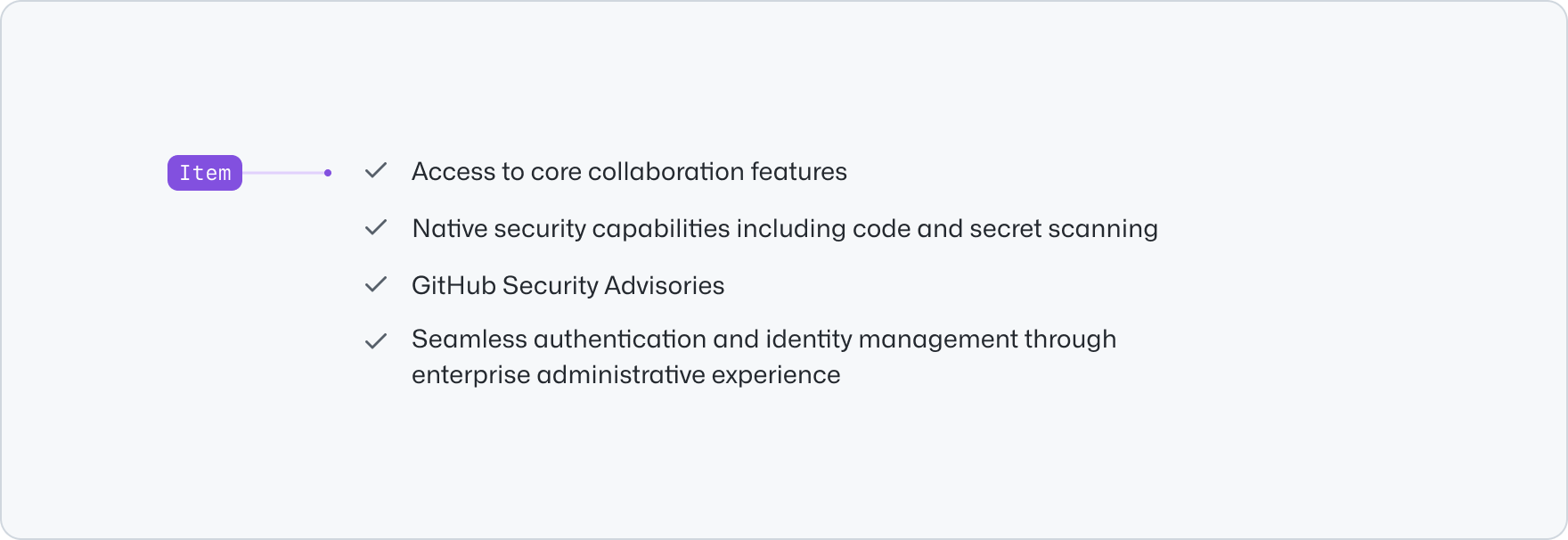
|
|
10
|
+
|
|
11
|
+
## Usage
|
|
12
|
+
|
|
13
|
+
Use an unordered list to group related items together. It is suitable for presenting a collection of items that do not require a specific order or ranking. The unordered list provides visual dashes for each item, which helps to emphasize the individuality of each point and makes it easier for users to scan and comprehend the information.
|
|
14
|
+
|
|
15
|
+
**✅ Do**
|
|
16
|
+
|
|
17
|
+

|
|
18
|
+
|
|
19
|
+
_Use an unordered list to present and group a list of items that don't require a specific order._
|
|
20
|
+
|
|
21
|
+
**❌ Don't**
|
|
22
|
+
|
|
23
|
+

|
|
24
|
+
|
|
25
|
+
_Don't use an unordered list to present a sequence of steps. Use an ordered list instead._
|
|
26
|
+
|
|
27
|
+
Use the unordered list to effectively provide a quick reference or highlight key points. This allows users to easily grasp the main ideas or features without having to read lengthy paragraphs. For lists that require a linear order, consider using an [ordered list](../OrderedList/index.md) instead.
|
|
28
|
+
|
|
29
|
+
The unordered list should have concise and short items. Avoid using long sentences or paragraphs as they can be difficult to scan and comprehend. If you need to include a long item or even headings and links, consider using a [pillar](../Pillar/index.md), a [card](../Card/index.md) or a [river](../River/index.md) instead.
|
|
30
|
+
|
|
31
|
+
**✅ Do**
|
|
32
|
+
|
|
33
|
+

|
|
34
|
+
|
|
35
|
+
_Use an unordered list for short and concise content items._
|
|
36
|
+
|
|
37
|
+
**❌ Don't**
|
|
38
|
+
|
|
39
|
+

|
|
40
|
+
|
|
41
|
+
_Don't use an unordered list for long and rich sentences, paragraphs, headings or links. Use a pillar, card or
|
|
42
|
+
river components instead._
|
|
43
|
+
|
|
44
|
+
## Options
|
|
45
|
+
|
|
46
|
+
### Variant
|
|
47
|
+
|
|
48
|
+
The unordered list uses a dash to indicate each item in the list. The dash is the default variant and is suitable for most use cases. You can use check icons to indicate a list of features or benefits that are supported by the application. This way users can easily check off or easily compare the features that they might be interested in.
|
|
49
|
+
|
|
50
|
+
**✅ Do**
|
|
51
|
+
|
|
52
|
+

|
|
53
|
+
|
|
54
|
+
_Use the check variant to indicate a list of features that are supported._
|
|
55
|
+
|
|
56
|
+
**❌ Don't**
|
|
57
|
+
|
|
58
|
+

|
|
59
|
+
|
|
60
|
+
_Don't include mutliple benefits in one single items, split them into multiple ones for better readability._
|
|
61
|
+
|
|
62
|
+
## Related components
|
|
63
|
+
|
|
64
|
+
- [Ordered list](../OrderedList/index.md): to display a list of plain content items.
|
|
65
|
+
- [Pillar](../Pillar/index.md): To display related content with less visual emphasis.
|
|
66
|
+
- [Card](../Card/index.md): to display navigational related content with higher visual weight.
|
|
67
|
+
- [River](../River/index.md): To display a list of content items with a visual asset.
|
|
@@ -0,0 +1,89 @@
|
|
|
1
|
+
---
|
|
2
|
+
title: Unordered list
|
|
3
|
+
description: Use the unordered list component to present a collection of items without specific ordering.
|
|
4
|
+
keywords: ['bullet list']
|
|
5
|
+
ready: true
|
|
6
|
+
figma: 'https://www.figma.com/file/BJ95AjraesmRCWsKA013GS/branch/NzBMPIfPrFU9I87d3k7KVq/Primer-Brand?node-id=4045%3A17093&t=XJ9W58VgtbVo74gb-0'
|
|
7
|
+
source: https://github.com/primer/brand/blob/main/packages/react/src/list/UnorderedList/UnorderedList.tsx
|
|
8
|
+
storybook: '/brand/storybook/?path=/story/components-unorderedlist--playground'
|
|
9
|
+
---
|
|
10
|
+
|
|
11
|
+
```js
|
|
12
|
+
import {UnorderedList} from '@primer/react-brand'
|
|
13
|
+
```
|
|
14
|
+
|
|
15
|
+
## Examples
|
|
16
|
+
|
|
17
|
+
### Default
|
|
18
|
+
|
|
19
|
+
```jsx
|
|
20
|
+
<UnorderedList>
|
|
21
|
+
<UnorderedList.Item>Automatic security and version updates</UnorderedList.Item>
|
|
22
|
+
<UnorderedList.Item>GitHub Security Advisories</UnorderedList.Item>
|
|
23
|
+
<UnorderedList.Item>Code and secret scanning</UnorderedList.Item>
|
|
24
|
+
<UnorderedList.Item>Dependency review</UnorderedList.Item>
|
|
25
|
+
<UnorderedList.Item>Automated authentication and identity management</UnorderedList.Item>
|
|
26
|
+
</UnorderedList>
|
|
27
|
+
```
|
|
28
|
+
|
|
29
|
+
### Checked variant
|
|
30
|
+
|
|
31
|
+
```jsx
|
|
32
|
+
<UnorderedList variant="checked">
|
|
33
|
+
<UnorderedList.Item>Automatic security and version updates</UnorderedList.Item>
|
|
34
|
+
<UnorderedList.Item>GitHub Security Advisories</UnorderedList.Item>
|
|
35
|
+
<UnorderedList.Item>Code and secret scanning</UnorderedList.Item>
|
|
36
|
+
<UnorderedList.Item>Dependency review</UnorderedList.Item>
|
|
37
|
+
<UnorderedList.Item>Automated authentication and identity management</UnorderedList.Item>
|
|
38
|
+
</UnorderedList>
|
|
39
|
+
```
|
|
40
|
+
|
|
41
|
+
### `x` variant
|
|
42
|
+
|
|
43
|
+
```jsx
|
|
44
|
+
<UnorderedList variant="x">
|
|
45
|
+
<UnorderedList.Item>Automatic security and version updates</UnorderedList.Item>
|
|
46
|
+
<UnorderedList.Item>GitHub Security Advisories</UnorderedList.Item>
|
|
47
|
+
<UnorderedList.Item>Code and secret scanning</UnorderedList.Item>
|
|
48
|
+
<UnorderedList.Item>Dependency review</UnorderedList.Item>
|
|
49
|
+
<UnorderedList.Item>Automated authentication and identity management</UnorderedList.Item>
|
|
50
|
+
</UnorderedList>
|
|
51
|
+
```
|
|
52
|
+
|
|
53
|
+
### Custom colors
|
|
54
|
+
|
|
55
|
+
```jsx
|
|
56
|
+
<UnorderedList variant="checked">
|
|
57
|
+
<UnorderedList.Item leadingVisualFill="var(--brand-color-success-fg)">
|
|
58
|
+
Automatic security and version updates
|
|
59
|
+
</UnorderedList.Item>
|
|
60
|
+
<UnorderedList.Item leadingVisualFill="var(--brand-color-success-fg)">GitHub Security Advisories</UnorderedList.Item>
|
|
61
|
+
<UnorderedList.Item leadingVisualFill="var(--brand-color-success-fg)">Code and secret scanning</UnorderedList.Item>
|
|
62
|
+
<UnorderedList.Item leadingVisualFill="var(--brand-color-success-fg)">Dependency review</UnorderedList.Item>
|
|
63
|
+
<UnorderedList.Item leadingVisualFill="var(--brand-color-success-fg)">
|
|
64
|
+
Automated authentication and identity management
|
|
65
|
+
</UnorderedList.Item>
|
|
66
|
+
</UnorderedList>
|
|
67
|
+
```
|
|
68
|
+
|
|
69
|
+
## Component props
|
|
70
|
+
|
|
71
|
+
### UnorderedList
|
|
72
|
+
|
|
73
|
+
| Name | Type | Default | Description |
|
|
74
|
+
| :---------- | :------------------------------------- | :-------: | :--------------------------------------------------------- |
|
|
75
|
+
| `className` | `string` | | Sets a custom class on the root element |
|
|
76
|
+
| `variant` | `default`, `checked` , `x` | `default` | Specify alternative leading visual for list items |
|
|
77
|
+
| `children` | `React.ReactNode`, `React.ReactNode[]` | | Content to be displayed within the UnorderedList component |
|
|
78
|
+
|
|
79
|
+
### UnorderedList.Item
|
|
80
|
+
|
|
81
|
+
| Name | Type | Default | Description |
|
|
82
|
+
| :----------------------- | :------------------------------------- | :---------: | :-------------------------------------------------------------------------------------------------- |
|
|
83
|
+
| `className` | `string` | | Sets a custom class on the root element |
|
|
84
|
+
| `children` | `React.ReactNode`, `React.ReactNode[]` | `default` | Content to be displayed within the OrderedList component |
|
|
85
|
+
| `leadingVisual` | `Icon` | `undefined` | Sets a custom leading visual ([Octicon](https://primer.style/foundations/icons/)) for the list item |
|
|
86
|
+
| `leadingVisualFill` | `string` | `undefined` | Sets a custom color value for the leading visual |
|
|
87
|
+
| `leadingVisualAriaLabel` | `string` | `undefined` | Sets `aria-label` on the leading visual icon |
|
|
88
|
+
|
|
89
|
+
Also forwards the `variant` prop from the [Text component](../../typography/Text/index.md).
|
|
@@ -0,0 +1,234 @@
|
|
|
1
|
+
---
|
|
2
|
+
title: Video player
|
|
3
|
+
description: Use the video player component to enable playback of self-hosted videos
|
|
4
|
+
keywords: ['playback', 'media']
|
|
5
|
+
ready: true
|
|
6
|
+
source: https://github.com/primer/brand/blob/main/packages/react/src/VideoPlayer/VideoPlayer.tsx
|
|
7
|
+
storybook: '/brand/storybook/?path=/story/components-videoplayer--playground'
|
|
8
|
+
---
|
|
9
|
+
|
|
10
|
+
```js
|
|
11
|
+
import {VideoPlayer} from '@primer/react-brand'
|
|
12
|
+
```
|
|
13
|
+
|
|
14
|
+
## Examples
|
|
15
|
+
|
|
16
|
+
### Default
|
|
17
|
+
|
|
18
|
+
```jsx
|
|
19
|
+
<VideoPlayer title="GitHub media player">
|
|
20
|
+
<VideoPlayer.Source src="/example.mp4" />
|
|
21
|
+
<VideoPlayer.Track src="/example.vtt" default />
|
|
22
|
+
</VideoPlayer>
|
|
23
|
+
```
|
|
24
|
+
|
|
25
|
+
## With Audio Description
|
|
26
|
+
|
|
27
|
+
Videos with important visual information must include an audio description to ensure that the content is accessible to all users.
|
|
28
|
+
|
|
29
|
+
The audio description can be provided as part of the existing soundtrack, or via a link to an alternate audio-described version.
|
|
30
|
+
|
|
31
|
+
```jsx
|
|
32
|
+
<Stack gap="normal" alignItems="center">
|
|
33
|
+
<VideoPlayer title="GitHub media player">
|
|
34
|
+
<VideoPlayer.Source src="/example.mp4" />
|
|
35
|
+
<VideoPlayer.Track src="/example.vtt" default />
|
|
36
|
+
</VideoPlayer>
|
|
37
|
+
<Stack direction="horizontal" gap={12} padding="none" alignItems="center">
|
|
38
|
+
<Link href="#" arrowDirection="none">
|
|
39
|
+
Watch with audio description
|
|
40
|
+
</Link>
|
|
41
|
+
<LinkExternalIcon size={16} />
|
|
42
|
+
</Stack>
|
|
43
|
+
</Stack>
|
|
44
|
+
```
|
|
45
|
+
|
|
46
|
+
## With poster
|
|
47
|
+
|
|
48
|
+
```jsx
|
|
49
|
+
<VideoPlayer poster="/images/example-poster.png" title="GitHub media player">
|
|
50
|
+
<VideoPlayer.Source src="/example.mp4" />
|
|
51
|
+
<VideoPlayer.Track src="/example.vtt" default />
|
|
52
|
+
</VideoPlayer>
|
|
53
|
+
```
|
|
54
|
+
|
|
55
|
+
## Without branding
|
|
56
|
+
|
|
57
|
+
```jsx
|
|
58
|
+
<VideoPlayer showBranding={false} title="GitHub media player">
|
|
59
|
+
<VideoPlayer.Source src="/example.mp4" />
|
|
60
|
+
<VideoPlayer.Track src="/example.vtt" default />
|
|
61
|
+
</VideoPlayer>
|
|
62
|
+
```
|
|
63
|
+
|
|
64
|
+
## With visually hidden title
|
|
65
|
+
|
|
66
|
+
```jsx
|
|
67
|
+
<VideoPlayer visuallyHiddenTitle title="GitHub media player">
|
|
68
|
+
<VideoPlayer.Source src="/example.mp4" />
|
|
69
|
+
<VideoPlayer.Track src="/example.vtt" default />
|
|
70
|
+
</VideoPlayer>
|
|
71
|
+
```
|
|
72
|
+
|
|
73
|
+
## With some hidden controls
|
|
74
|
+
|
|
75
|
+
```jsx
|
|
76
|
+
<VideoPlayer
|
|
77
|
+
title="GitHub media player"
|
|
78
|
+
showPlayPauseButton={false}
|
|
79
|
+
showSeekControl={true}
|
|
80
|
+
showCCButton={false}
|
|
81
|
+
showMuteButton={false}
|
|
82
|
+
showVolumeControl={false}
|
|
83
|
+
showFullScreenButton={false}
|
|
84
|
+
>
|
|
85
|
+
<VideoPlayer.Source src="/example.mp4" type="video/mp4" />
|
|
86
|
+
<VideoPlayer.Track src="/example.vtt" default />
|
|
87
|
+
</VideoPlayer>
|
|
88
|
+
```
|
|
89
|
+
|
|
90
|
+
## Hide controls when paused
|
|
91
|
+
|
|
92
|
+
```jsx
|
|
93
|
+
<VideoPlayer title="GitHub media player" showControlsWhenPaused={false}>
|
|
94
|
+
<VideoPlayer.Source src="/example.mp4" type="video/mp4" />
|
|
95
|
+
<VideoPlayer.Track src="/example.vtt" default />
|
|
96
|
+
</VideoPlayer>
|
|
97
|
+
```
|
|
98
|
+
|
|
99
|
+
## Minimal
|
|
100
|
+
|
|
101
|
+
```jsx
|
|
102
|
+
<VideoPlayer title="GitHub media player" visuallyHiddenTitle showBranding={false} showControlsWhenPaused={false}>
|
|
103
|
+
<VideoPlayer.Source src="/example.mp4" type="video/mp4" />
|
|
104
|
+
<VideoPlayer.Track src="/example.vtt" default />
|
|
105
|
+
</VideoPlayer>
|
|
106
|
+
```
|
|
107
|
+
|
|
108
|
+
## Custom play icon
|
|
109
|
+
|
|
110
|
+
```jsx
|
|
111
|
+
<VideoPlayer title="GitHub media player" playIcon={() => <PlayIcon fill="white" size={96} />}>
|
|
112
|
+
<VideoPlayer.Source src="/example.mp4" type="video/mp4" />
|
|
113
|
+
<VideoPlayer.Track src="/example.vtt" default />
|
|
114
|
+
</VideoPlayer>
|
|
115
|
+
```
|
|
116
|
+
|
|
117
|
+
## Controlling programmatically
|
|
118
|
+
|
|
119
|
+
The `VideoPlayer` component exposes a `useVideo` hook that can be used to control the video programmatically. To use the hook, the `VideoPlayer` component must be wrapped in a `VideoPlayer.Provider` component.
|
|
120
|
+
|
|
121
|
+
Full documentation for the `useVideo` hook can be found [below](#usevideo-context).
|
|
122
|
+
|
|
123
|
+
```jsx filename="noinline"
|
|
124
|
+
const CustomVideoPlayer = () => {
|
|
125
|
+
const {isPlaying, togglePlaying, seek} = useVideo()
|
|
126
|
+
|
|
127
|
+
return (
|
|
128
|
+
<Stack direction="vertical">
|
|
129
|
+
<VideoPlayer
|
|
130
|
+
title="GitHub media player"
|
|
131
|
+
showPlayPauseButton={false}
|
|
132
|
+
showSeekControl={false}
|
|
133
|
+
showCCButton={false}
|
|
134
|
+
showMuteButton={false}
|
|
135
|
+
showVolumeControl={false}
|
|
136
|
+
showFullScreenButton={false}
|
|
137
|
+
>
|
|
138
|
+
<VideoPlayer.Source src="/example.mp4" type="video/mp4" />
|
|
139
|
+
<VideoPlayer.Track src="/example.vtt" default />
|
|
140
|
+
</VideoPlayer>
|
|
141
|
+
<Stack direction="horizontal">
|
|
142
|
+
<Button onClick={() => togglePlaying()}>{isPlaying ? 'Pause' : 'Play'}</Button>
|
|
143
|
+
<Button onClick={() => seek(0)}>Go to start</Button>
|
|
144
|
+
<Button onClick={() => seek(t => t + 5)}>Skip 5 seconds</Button>
|
|
145
|
+
</Stack>
|
|
146
|
+
</Stack>
|
|
147
|
+
)
|
|
148
|
+
}
|
|
149
|
+
|
|
150
|
+
const App = () => (
|
|
151
|
+
<VideoPlayer.Provider>
|
|
152
|
+
<CustomVideoPlayer />
|
|
153
|
+
</VideoPlayer.Provider>
|
|
154
|
+
)
|
|
155
|
+
|
|
156
|
+
render(<App />)
|
|
157
|
+
```
|
|
158
|
+
|
|
159
|
+
## useVideo Context
|
|
160
|
+
|
|
161
|
+
The `useVideo` context provides a comprehensive API for managing video playback, volume, closed captioning, and fullscreen mode.
|
|
162
|
+
|
|
163
|
+
The context can be accessed by using the `useVideo` hook in any component that is a child of `VideoPlayer.Provider`.
|
|
164
|
+
|
|
165
|
+
Below is a detailed description of each property and method available in the `useVideo` context.
|
|
166
|
+
|
|
167
|
+
| Name | Type | Description |
|
|
168
|
+
| :----------------- | :------------------------------------------------- | :--------------------------------------------------------------------------------------------- |
|
|
169
|
+
| `ref` | `RefObject<HTMLVideoElement>` | A reference to the video element. |
|
|
170
|
+
| `isPlaying` | `boolean` | Indicates if the video is currently playing. |
|
|
171
|
+
| `volume` | `number` | The current volume of the video, ranging from 0 to 1. |
|
|
172
|
+
| `isMuted` | `boolean` | Indicates if the video is currently muted. |
|
|
173
|
+
| `volumeBeforeMute` | `number` | The volume of the video before it was muted, allowing for easy unmuting to the previous level. |
|
|
174
|
+
| `duration` | `number` | The total duration of the video in seconds. |
|
|
175
|
+
| `ccEnabled` | `boolean` | Indicates if closed captions are enabled. |
|
|
176
|
+
| `isFullScreen` | `boolean` | Indicates if the video is currently in fullscreen mode. |
|
|
177
|
+
| `play` | `() => void` | Plays the video. |
|
|
178
|
+
| `pause` | `() => void` | Pauses the video. |
|
|
179
|
+
| `togglePlaying` | `() => void` | Toggles between playing and pausing the video. |
|
|
180
|
+
| `setVolume` | `(volumeValOrFn: SetStateAction<number>) => void` | Sets the volume of the video. |
|
|
181
|
+
| `mute` | `() => void` | Mutes the video. |
|
|
182
|
+
| `unmute` | `() => void` | Unmutes the video. |
|
|
183
|
+
| `toggleMute` | `() => void` | Toggles between muting and unmuting the video. |
|
|
184
|
+
| `setDuration` | `(duration: number) => void` | Sets the duration of the video. |
|
|
185
|
+
| `seekToPercent` | `(percent: number) => void` | Seeks the video to a specific percentage of its duration. |
|
|
186
|
+
| `seek` | `(secondsValOrFn: SetStateAction<number>) => void` | Seeks the video to an absolute time, or to a relative time if passed a function. |
|
|
187
|
+
| `enableCC` | `() => void` | Enables closed captions. |
|
|
188
|
+
| `disableCC` | `() => void` | Disables closed captions. |
|
|
189
|
+
| `toggleCC` | `() => void` | Toggles closed captions on and off. |
|
|
190
|
+
| `enterFullScreen` | `() => void` | Enters fullscreen mode. |
|
|
191
|
+
| `exitFullScreen` | `() => void` | Exits fullscreen mode. |
|
|
192
|
+
| `toggleFullScreen` | `() => void` | Toggles between entering and exiting fullscreen mode. |
|
|
193
|
+
|
|
194
|
+
## Component props
|
|
195
|
+
|
|
196
|
+
### VideoPlayer `Required`
|
|
197
|
+
|
|
198
|
+
`VideoPlayer` provides a React alternative to the native HTML `<video />`.
|
|
199
|
+
|
|
200
|
+
| Name | Type | Default | Required | Description |
|
|
201
|
+
| :----------------------- | :------------------------------------- | :-----: | :------: | :-------------------------------------------------------------- |
|
|
202
|
+
| `children` | `React.ReactNode`, `React.ReactNode[]` | | `true` | Takes `<VideoPlayer.Source>` and `<VideoPlayer.Track>` elements |
|
|
203
|
+
| `title` | `string` | | `true` | Sets the title of the video |
|
|
204
|
+
| `visuallyHiddenTitle` | `boolean` | | `false` | Visually hides the title of the video in the upper-left corner |
|
|
205
|
+
| `showBranding` | `boolean` | `true` | `false` | Displays GitHub branding next to video title |
|
|
206
|
+
| `poster` | `string` | | `false` | Sets an image as the starting frame for the video element |
|
|
207
|
+
| `className` | `string` | | `false` | Sets a custom class on the `<video>` element |
|
|
208
|
+
| `showControlsWhenPaused` | `boolean` | `true` | `false` | Show the video controls when paused |
|
|
209
|
+
| `showPlayPauseButton` | `boolean` | `true` | `false` | Show the play button control |
|
|
210
|
+
| `showSeekControl` | `boolean` | `true` | `false` | Show the seek control |
|
|
211
|
+
| `showCCButton` | `boolean` | `true` | `false` | Show the closed caption toggle control |
|
|
212
|
+
| `showMuteButton` | `boolean` | `true` | `false` | Show the mute button control |
|
|
213
|
+
| `showVolumeControl` | `boolean` | `true` | `false` | Show the volume control |
|
|
214
|
+
| `showFullScreenButton` | `boolean` | `true` | `false` | Show the full screen button control |
|
|
215
|
+
|
|
216
|
+
The component API supports all standard HTML attribute props, while providing some additional behavior as described above.
|
|
217
|
+
|
|
218
|
+
### VideoPlayer.Source `Required`
|
|
219
|
+
|
|
220
|
+
`VideoPlayer.Source` provides a React alternative to the native HTML `<source />`. The component API supports all standard HTML attribute props.
|
|
221
|
+
|
|
222
|
+
### VideoPlayer.Track `Required`
|
|
223
|
+
|
|
224
|
+
`VideoPlayer.Track` provides a React alternative to the native HTML `<track />`.
|
|
225
|
+
|
|
226
|
+
| Name | Type | Default | Required | Description |
|
|
227
|
+
| :----- | :------------------------------------------------------------------------ | :----------: | :------: | :------------------------------------------ |
|
|
228
|
+
| `kind` | `'subtitles'`, `'captions'`, `'descriptions'`, `'chapters'`, `'metadata'` | `'captions'` | `false` | Sets how the text track is meant to be used |
|
|
229
|
+
|
|
230
|
+
The component API supports all standard HTML attribute props, while providing some additional behavior as described above.
|
|
231
|
+
|
|
232
|
+
### VideoPlayer.Provider
|
|
233
|
+
|
|
234
|
+
`VideoPlayer.Provider` can be used in conjunction with the `useVideo` hook to enable programmatic access to features such as video playback, volume, closed captioning, and fullscreen mode.
|