buildanything 1.8.0 → 2.0.0
This diff represents the content of publicly available package versions that have been released to one of the supported registries. The information contained in this diff is provided for informational purposes only and reflects changes between package versions as they appear in their respective public registries.
- package/.claude-plugin/marketplace.json +3 -3
- package/.claude-plugin/plugin.json +9 -3
- package/CHANGELOG.md +57 -0
- package/README.md +2 -2
- package/agents/a11y-architect.md +166 -0
- package/agents/business-model.md +80 -29
- package/agents/code-architect.md +75 -0
- package/agents/code-reviewer.md +255 -0
- package/agents/code-simplifier.md +64 -0
- package/agents/design-brand-guardian.md +293 -53
- package/agents/design-critic.md +139 -0
- package/agents/design-inclusive-visuals-specialist.md +6 -19
- package/agents/design-ui-designer.md +335 -56
- package/agents/design-ux-architect.md +403 -55
- package/agents/design-ux-researcher.md +264 -49
- package/agents/engineering-ai-engineer.md +26 -36
- package/agents/engineering-backend-architect.md +185 -36
- package/agents/engineering-data-engineer.md +225 -43
- package/agents/engineering-devops-automator.md +227 -74
- package/agents/engineering-frontend-developer.md +210 -34
- package/agents/engineering-mobile-app-builder.md +6 -1
- package/agents/engineering-rapid-prototyper.md +30 -9
- package/agents/engineering-security-engineer.md +263 -61
- package/agents/engineering-senior-developer.md +128 -19
- package/agents/engineering-sre.md +84 -0
- package/agents/engineering-technical-writer.md +285 -41
- package/agents/feature-intel.md +110 -0
- package/agents/ios-app-review-guardian.md +19 -2
- package/agents/ios-foundation-models-specialist.md +20 -2
- package/agents/ios-storekit-specialist.md +9 -2
- package/agents/ios-swift-architect.md +28 -1
- package/agents/ios-swift-search.md +8 -1
- package/agents/ios-swift-ui-design.md +33 -1
- package/agents/marketing-app-store-optimizer.md +246 -64
- package/agents/planner.md +216 -0
- package/agents/pr-test-analyzer.md +63 -0
- package/agents/product-feedback-synthesizer.md +8 -2
- package/agents/refactor-cleaner.md +102 -0
- package/agents/security-reviewer.md +128 -0
- package/agents/silent-failure-hunter.md +54 -0
- package/agents/swift-build-resolver.md +119 -0
- package/agents/swift-reviewer.md +112 -0
- package/agents/tech-feasibility.md +21 -1
- package/agents/testing-api-tester.md +236 -59
- package/agents/testing-evidence-collector.md +26 -1
- package/agents/testing-performance-benchmarker.md +21 -1
- package/agents/testing-reality-checker.md +6 -1
- package/agents/visual-research.md +116 -0
- package/bin/adapters/cycle-counter-tool.ts +155 -0
- package/bin/adapters/scribe-tool.ts +71 -0
- package/bin/adapters/state-save-tool.ts +130 -0
- package/bin/adapters/write-lease-tool.ts +127 -0
- package/bin/buildanything-runtime.js +15 -0
- package/bin/buildanything-runtime.ts +328 -0
- package/bin/setup.js +83 -8
- package/commands/add-feature.md +2 -0
- package/commands/build.md +782 -266
- package/commands/fix.md +1 -1
- package/commands/self-check.md +121 -0
- package/commands/setup.md +50 -9
- package/commands/ux-review.md +2 -2
- package/commands/verify.md +6 -9
- package/docs/migration/agents.yaml +729 -0
- package/docs/migration/phase-graph.yaml +1088 -0
- package/docs/migration/sdk-host-compat.md +18 -0
- package/hooks/compile-writer-owner-cache.ts +171 -0
- package/hooks/hooks.json +36 -0
- package/hooks/pre-tool-use +19 -0
- package/hooks/pre-tool-use.ts +776 -0
- package/hooks/record-mode-transitions.ts +178 -0
- package/hooks/session-start +71 -1
- package/hooks/subagent-start +17 -0
- package/hooks/subagent-start.ts +471 -0
- package/hooks/subagent-stop +17 -0
- package/hooks/subagent-stop.ts +153 -0
- package/package.json +24 -4
- package/protocols/architecture-schema.md +171 -0
- package/protocols/decision-log.md +131 -0
- package/protocols/ios-context.md +10 -11
- package/protocols/ios-phase-branches.md +208 -33
- package/protocols/launch-readiness.md +258 -0
- package/protocols/metric-loop.md +62 -2
- package/protocols/smoke-test.md +9 -1
- package/protocols/state-schema.json +388 -0
- package/protocols/state-schema.md +172 -0
- package/protocols/verify.md +62 -2
- package/protocols/visual-dna.md +185 -0
- package/protocols/web-phase-branches.md +222 -72
- package/skills/ios/_VENDORED.md +2 -0
- package/skills/ios/app-store-connect-metadata/SKILL.md +148 -0
- package/skills/ios/asc-privacy-manifest/SKILL.md +350 -0
- package/skills/ios/hig-components-content/SKILL.md +86 -0
- package/skills/ios/hig-components-content/references/activity-views.md +79 -0
- package/skills/ios/hig-components-content/references/charts.md +180 -0
- package/skills/ios/hig-components-content/references/collections.md +48 -0
- package/skills/ios/hig-components-content/references/color-wells.md +42 -0
- package/skills/ios/hig-components-content/references/image-views.md +82 -0
- package/skills/ios/hig-components-content/references/image-wells.md +34 -0
- package/skills/ios/hig-components-content/references/lockups.md +78 -0
- package/skills/ios/hig-components-content/references/web-views.md +36 -0
- package/skills/ios/hig-components-controls/SKILL.md +88 -0
- package/skills/ios/hig-components-controls/references/combo-boxes.md +40 -0
- package/skills/ios/hig-components-controls/references/controls.md +112 -0
- package/skills/ios/hig-components-controls/references/gauges.md +74 -0
- package/skills/ios/hig-components-controls/references/labels.md +92 -0
- package/skills/ios/hig-components-controls/references/pickers.md +128 -0
- package/skills/ios/hig-components-controls/references/rating-indicators.md +38 -0
- package/skills/ios/hig-components-controls/references/segmented-controls.md +94 -0
- package/skills/ios/hig-components-controls/references/sliders.md +92 -0
- package/skills/ios/hig-components-controls/references/steppers.md +40 -0
- package/skills/ios/hig-components-controls/references/text-fields.md +88 -0
- package/skills/ios/hig-components-controls/references/text-views.md +56 -0
- package/skills/ios/hig-components-controls/references/toggles.md +127 -0
- package/skills/ios/hig-components-controls/references/token-fields.md +48 -0
- package/skills/ios/hig-components-controls/references/virtual-keyboards.md +156 -0
- package/skills/ios/hig-components-dialogs/SKILL.md +76 -0
- package/skills/ios/hig-components-dialogs/references/action-sheets.md +74 -0
- package/skills/ios/hig-components-dialogs/references/alerts.md +158 -0
- package/skills/ios/hig-components-dialogs/references/digit-entry-views.md +32 -0
- package/skills/ios/hig-components-dialogs/references/popovers.md +81 -0
- package/skills/ios/hig-components-dialogs/references/sheets.md +157 -0
- package/skills/ios/hig-components-layout/SKILL.md +99 -0
- package/skills/ios/hig-components-layout/references/boxes.md +48 -0
- package/skills/ios/hig-components-layout/references/column-views.md +44 -0
- package/skills/ios/hig-components-layout/references/lists-and-tables.md +99 -0
- package/skills/ios/hig-components-layout/references/ornaments.md +56 -0
- package/skills/ios/hig-components-layout/references/outline-views.md +64 -0
- package/skills/ios/hig-components-layout/references/panels.md +75 -0
- package/skills/ios/hig-components-layout/references/scroll-views.md +123 -0
- package/skills/ios/hig-components-layout/references/sidebars.md +109 -0
- package/skills/ios/hig-components-layout/references/split-views.md +110 -0
- package/skills/ios/hig-components-layout/references/tab-bars.md +173 -0
- package/skills/ios/hig-components-layout/references/tab-views.md +68 -0
- package/skills/ios/hig-components-layout/references/windows.md +188 -0
- package/skills/ios/hig-components-menus/SKILL.md +81 -0
- package/skills/ios/hig-components-menus/references/action-button.md +61 -0
- package/skills/ios/hig-components-menus/references/buttons.md +261 -0
- package/skills/ios/hig-components-menus/references/context-menus.md +105 -0
- package/skills/ios/hig-components-menus/references/disclosure-controls.md +84 -0
- package/skills/ios/hig-components-menus/references/dock-menus.md +40 -0
- package/skills/ios/hig-components-menus/references/edit-menus.md +88 -0
- package/skills/ios/hig-components-menus/references/menus.md +171 -0
- package/skills/ios/hig-components-menus/references/pop-up-buttons.md +70 -0
- package/skills/ios/hig-components-menus/references/pull-down-buttons.md +77 -0
- package/skills/ios/hig-components-menus/references/the-menu-bar.md +303 -0
- package/skills/ios/hig-components-menus/references/toolbars.md +256 -0
- package/skills/ios/hig-components-search/SKILL.md +68 -0
- package/skills/ios/hig-components-search/references/page-controls.md +120 -0
- package/skills/ios/hig-components-search/references/path-controls.md +40 -0
- package/skills/ios/hig-components-search/references/search-fields.md +189 -0
- package/skills/ios/hig-components-status/SKILL.md +80 -0
- package/skills/ios/hig-components-status/references/activity-rings.md +105 -0
- package/skills/ios/hig-components-status/references/progress-indicators.md +116 -0
- package/skills/ios/hig-components-status/references/status-bars.md +38 -0
- package/skills/ios/hig-components-system/SKILL.md +88 -0
- package/skills/ios/hig-components-system/references/app-clips.md +387 -0
- package/skills/ios/hig-components-system/references/app-shortcuts.md +114 -0
- package/skills/ios/hig-components-system/references/complications.md +425 -0
- package/skills/ios/hig-components-system/references/home-screen-quick-actions.md +42 -0
- package/skills/ios/hig-components-system/references/live-activities.md +442 -0
- package/skills/ios/hig-components-system/references/notifications.md +153 -0
- package/skills/ios/hig-components-system/references/top-shelf.md +135 -0
- package/skills/ios/hig-components-system/references/watch-faces.md +40 -0
- package/skills/ios/hig-components-system/references/widgets.md +517 -0
- package/skills/ios/hig-foundations/SKILL.md +98 -0
- package/skills/ios/hig-foundations/references/accessibility.md +291 -0
- package/skills/ios/hig-foundations/references/app-icons.md +210 -0
- package/skills/ios/hig-foundations/references/branding.md +44 -0
- package/skills/ios/hig-foundations/references/color.md +274 -0
- package/skills/ios/hig-foundations/references/dark-mode.md +116 -0
- package/skills/ios/hig-foundations/references/icons.md +263 -0
- package/skills/ios/hig-foundations/references/images.md +176 -0
- package/skills/ios/hig-foundations/references/immersive-experiences.md +174 -0
- package/skills/ios/hig-foundations/references/inclusion.md +189 -0
- package/skills/ios/hig-foundations/references/layout.md +425 -0
- package/skills/ios/hig-foundations/references/materials.md +238 -0
- package/skills/ios/hig-foundations/references/motion.md +103 -0
- package/skills/ios/hig-foundations/references/privacy.md +231 -0
- package/skills/ios/hig-foundations/references/right-to-left.md +206 -0
- package/skills/ios/hig-foundations/references/sf-symbols.md +310 -0
- package/skills/ios/hig-foundations/references/spatial-layout.md +142 -0
- package/skills/ios/hig-foundations/references/typography.md +1146 -0
- package/skills/ios/hig-foundations/references/writing.md +91 -0
- package/skills/ios/hig-inputs/SKILL.md +94 -0
- package/skills/ios/hig-inputs/references/apple-pencil-and-scribble.md +148 -0
- package/skills/ios/hig-inputs/references/camera-control.md +107 -0
- package/skills/ios/hig-inputs/references/digital-crown.md +83 -0
- package/skills/ios/hig-inputs/references/eyes.md +120 -0
- package/skills/ios/hig-inputs/references/focus-and-selection.md +120 -0
- package/skills/ios/hig-inputs/references/game-controls.md +156 -0
- package/skills/ios/hig-inputs/references/gestures.md +208 -0
- package/skills/ios/hig-inputs/references/gyro-and-accelerometer.md +40 -0
- package/skills/ios/hig-inputs/references/keyboards.md +234 -0
- package/skills/ios/hig-inputs/references/nearby-interactions.md +70 -0
- package/skills/ios/hig-inputs/references/pointing-devices.md +237 -0
- package/skills/ios/hig-inputs/references/remotes.md +67 -0
- package/skills/ios/hig-inputs/references/spatial-interactions.md +70 -0
- package/skills/ios/hig-patterns/SKILL.md +104 -0
- package/skills/ios/hig-patterns/references/charting-data.md +81 -0
- package/skills/ios/hig-patterns/references/collaboration-and-sharing.md +86 -0
- package/skills/ios/hig-patterns/references/drag-and-drop.md +134 -0
- package/skills/ios/hig-patterns/references/entering-data.md +69 -0
- package/skills/ios/hig-patterns/references/feedback.md +67 -0
- package/skills/ios/hig-patterns/references/file-management.md +135 -0
- package/skills/ios/hig-patterns/references/going-full-screen.md +79 -0
- package/skills/ios/hig-patterns/references/launching.md +81 -0
- package/skills/ios/hig-patterns/references/live-viewing-apps.md +79 -0
- package/skills/ios/hig-patterns/references/loading.md +59 -0
- package/skills/ios/hig-patterns/references/managing-accounts.md +107 -0
- package/skills/ios/hig-patterns/references/managing-notifications.md +99 -0
- package/skills/ios/hig-patterns/references/modality.md +82 -0
- package/skills/ios/hig-patterns/references/multitasking.md +131 -0
- package/skills/ios/hig-patterns/references/offering-help.md +117 -0
- package/skills/ios/hig-patterns/references/onboarding.md +69 -0
- package/skills/ios/hig-patterns/references/playing-audio.md +124 -0
- package/skills/ios/hig-patterns/references/playing-haptics.md +280 -0
- package/skills/ios/hig-patterns/references/playing-video.md +180 -0
- package/skills/ios/hig-patterns/references/printing.md +50 -0
- package/skills/ios/hig-patterns/references/ratings-and-reviews.md +48 -0
- package/skills/ios/hig-patterns/references/searching.md +70 -0
- package/skills/ios/hig-patterns/references/settings.md +84 -0
- package/skills/ios/hig-patterns/references/undo-and-redo.md +58 -0
- package/skills/ios/hig-patterns/references/workouts.md +76 -0
- package/skills/ios/hig-platforms/SKILL.md +84 -0
- package/skills/ios/hig-platforms/references/designing-for-games.md +159 -0
- package/skills/ios/hig-platforms/references/designing-for-ios.md +66 -0
- package/skills/ios/hig-platforms/references/designing-for-ipados.md +64 -0
- package/skills/ios/hig-platforms/references/designing-for-macos.md +70 -0
- package/skills/ios/hig-platforms/references/designing-for-tvos.md +68 -0
- package/skills/ios/hig-platforms/references/designing-for-visionos.md +85 -0
- package/skills/ios/hig-platforms/references/designing-for-watchos.md +74 -0
- package/skills/ios/hig-project-context/SKILL.md +133 -0
- package/skills/ios/hig-technologies/SKILL.md +107 -0
- package/skills/ios/hig-technologies/references/airplay.md +125 -0
- package/skills/ios/hig-technologies/references/always-on.md +62 -0
- package/skills/ios/hig-technologies/references/apple-pay.md +441 -0
- package/skills/ios/hig-technologies/references/augmented-reality.md +247 -0
- package/skills/ios/hig-technologies/references/carekit.md +224 -0
- package/skills/ios/hig-technologies/references/carplay.md +119 -0
- package/skills/ios/hig-technologies/references/game-center.md +343 -0
- package/skills/ios/hig-technologies/references/generative-ai.md +110 -0
- package/skills/ios/hig-technologies/references/healthkit.md +120 -0
- package/skills/ios/hig-technologies/references/homekit.md +343 -0
- package/skills/ios/hig-technologies/references/icloud.md +52 -0
- package/skills/ios/hig-technologies/references/id-verifier.md +73 -0
- package/skills/ios/hig-technologies/references/imessage-apps-and-stickers.md +105 -0
- package/skills/ios/hig-technologies/references/in-app-purchase.md +263 -0
- package/skills/ios/hig-technologies/references/live-photos.md +54 -0
- package/skills/ios/hig-technologies/references/mac-catalyst.md +216 -0
- package/skills/ios/hig-technologies/references/machine-learning.md +394 -0
- package/skills/ios/hig-technologies/references/maps.md +221 -0
- package/skills/ios/hig-technologies/references/nfc.md +51 -0
- package/skills/ios/hig-technologies/references/photo-editing.md +40 -0
- package/skills/ios/hig-technologies/references/researchkit.md +134 -0
- package/skills/ios/hig-technologies/references/shareplay.md +142 -0
- package/skills/ios/hig-technologies/references/shazamkit.md +47 -0
- package/skills/ios/hig-technologies/references/sign-in-with-apple.md +288 -0
- package/skills/ios/hig-technologies/references/siri.md +523 -0
- package/skills/ios/hig-technologies/references/tap-to-pay-on-iphone.md +208 -0
- package/skills/ios/hig-technologies/references/voiceover.md +90 -0
- package/skills/ios/hig-technologies/references/wallet.md +420 -0
- package/skills/ios/ios-bootstrap/SKILL.md +16 -7
- package/skills/ios/swift-actor-persistence/SKILL.md +143 -0
- package/skills/ios/swift-concurrency-6-2/SKILL.md +216 -0
- package/skills/ios/swift-protocol-di-testing/SKILL.md +190 -0
- package/skills/ios/swiftui-design-tokens/SKILL.md +475 -0
- package/skills/ios/writing-for-interfaces/SKILL.md +75 -0
- package/skills/web/accessibility/SKILL.md +146 -0
- package/skills/web/aceternity-ui/SKILL.md +719 -0
- package/skills/web/aceternity-ui/metadata.json +10 -0
- package/skills/web/api-design/SKILL.md +523 -0
- package/skills/web/chart-accessibility/SKILL.md +332 -0
- package/skills/web/composition-patterns/AGENTS.md +946 -0
- package/skills/web/composition-patterns/README.md +60 -0
- package/skills/web/composition-patterns/SKILL.md +89 -0
- package/skills/web/composition-patterns/metadata.json +11 -0
- package/skills/web/composition-patterns/rules/_sections.md +29 -0
- package/skills/web/composition-patterns/rules/_template.md +24 -0
- package/skills/web/composition-patterns/rules/architecture-avoid-boolean-props.md +100 -0
- package/skills/web/composition-patterns/rules/architecture-compound-components.md +112 -0
- package/skills/web/composition-patterns/rules/patterns-children-over-render-props.md +87 -0
- package/skills/web/composition-patterns/rules/patterns-explicit-variants.md +100 -0
- package/skills/web/composition-patterns/rules/react19-no-forwardref.md +42 -0
- package/skills/web/composition-patterns/rules/state-context-interface.md +191 -0
- package/skills/web/composition-patterns/rules/state-decouple-implementation.md +113 -0
- package/skills/web/composition-patterns/rules/state-lift-state.md +125 -0
- package/skills/web/cost-aware-llm-pipeline/SKILL.md +183 -0
- package/skills/web/database-migrations/SKILL.md +429 -0
- package/skills/web/deployment-patterns/SKILL.md +427 -0
- package/skills/web/docker-patterns/SKILL.md +364 -0
- package/skills/web/e2e-testing/SKILL.md +326 -0
- package/skills/web/lighthouse-ci/SKILL.md +361 -0
- package/skills/web/mcp-server-patterns/SKILL.md +69 -0
- package/skills/web/next-best-practices/SKILL.md +153 -0
- package/skills/web/next-best-practices/async-patterns.md +87 -0
- package/skills/web/next-best-practices/bundling.md +180 -0
- package/skills/web/next-best-practices/data-patterns.md +297 -0
- package/skills/web/next-best-practices/debug-tricks.md +105 -0
- package/skills/web/next-best-practices/directives.md +73 -0
- package/skills/web/next-best-practices/error-handling.md +227 -0
- package/skills/web/next-best-practices/file-conventions.md +140 -0
- package/skills/web/next-best-practices/font.md +245 -0
- package/skills/web/next-best-practices/functions.md +108 -0
- package/skills/web/next-best-practices/hydration-error.md +91 -0
- package/skills/web/next-best-practices/image.md +173 -0
- package/skills/web/next-best-practices/metadata.md +301 -0
- package/skills/web/next-best-practices/parallel-routes.md +287 -0
- package/skills/web/next-best-practices/route-handlers.md +146 -0
- package/skills/web/next-best-practices/rsc-boundaries.md +159 -0
- package/skills/web/next-best-practices/runtime-selection.md +39 -0
- package/skills/web/next-best-practices/scripts.md +141 -0
- package/skills/web/next-best-practices/self-hosting.md +371 -0
- package/skills/web/next-best-practices/suspense-boundaries.md +67 -0
- package/skills/web/next-cache-components/SKILL.md +411 -0
- package/skills/web/postgres-best-practices/SKILL.md +14 -0
- package/skills/web/postgres-best-practices/references/schema-design.md +9 -0
- package/skills/web/react-best-practices/AGENTS.md +3810 -0
- package/skills/web/react-best-practices/README.md +123 -0
- package/skills/web/react-best-practices/SKILL.md +149 -0
- package/skills/web/react-best-practices/metadata.json +15 -0
- package/skills/web/react-best-practices/rules/_sections.md +46 -0
- package/skills/web/react-best-practices/rules/_template.md +28 -0
- package/skills/web/react-best-practices/rules/advanced-effect-event-deps.md +56 -0
- package/skills/web/react-best-practices/rules/advanced-event-handler-refs.md +55 -0
- package/skills/web/react-best-practices/rules/advanced-init-once.md +42 -0
- package/skills/web/react-best-practices/rules/advanced-use-latest.md +39 -0
- package/skills/web/react-best-practices/rules/async-api-routes.md +38 -0
- package/skills/web/react-best-practices/rules/async-cheap-condition-before-await.md +37 -0
- package/skills/web/react-best-practices/rules/async-defer-await.md +82 -0
- package/skills/web/react-best-practices/rules/async-dependencies.md +51 -0
- package/skills/web/react-best-practices/rules/async-parallel.md +28 -0
- package/skills/web/react-best-practices/rules/async-suspense-boundaries.md +99 -0
- package/skills/web/react-best-practices/rules/bundle-analyzable-paths.md +63 -0
- package/skills/web/react-best-practices/rules/bundle-barrel-imports.md +60 -0
- package/skills/web/react-best-practices/rules/bundle-conditional.md +31 -0
- package/skills/web/react-best-practices/rules/bundle-defer-third-party.md +49 -0
- package/skills/web/react-best-practices/rules/bundle-dynamic-imports.md +35 -0
- package/skills/web/react-best-practices/rules/bundle-preload.md +50 -0
- package/skills/web/react-best-practices/rules/client-event-listeners.md +74 -0
- package/skills/web/react-best-practices/rules/client-localstorage-schema.md +71 -0
- package/skills/web/react-best-practices/rules/client-passive-event-listeners.md +48 -0
- package/skills/web/react-best-practices/rules/client-swr-dedup.md +56 -0
- package/skills/web/react-best-practices/rules/js-batch-dom-css.md +107 -0
- package/skills/web/react-best-practices/rules/js-cache-function-results.md +80 -0
- package/skills/web/react-best-practices/rules/js-cache-property-access.md +28 -0
- package/skills/web/react-best-practices/rules/js-cache-storage.md +70 -0
- package/skills/web/react-best-practices/rules/js-combine-iterations.md +32 -0
- package/skills/web/react-best-practices/rules/js-early-exit.md +50 -0
- package/skills/web/react-best-practices/rules/js-flatmap-filter.md +60 -0
- package/skills/web/react-best-practices/rules/js-hoist-regexp.md +45 -0
- package/skills/web/react-best-practices/rules/js-index-maps.md +37 -0
- package/skills/web/react-best-practices/rules/js-length-check-first.md +49 -0
- package/skills/web/react-best-practices/rules/js-min-max-loop.md +82 -0
- package/skills/web/react-best-practices/rules/js-request-idle-callback.md +105 -0
- package/skills/web/react-best-practices/rules/js-set-map-lookups.md +24 -0
- package/skills/web/react-best-practices/rules/js-tosorted-immutable.md +57 -0
- package/skills/web/react-best-practices/rules/rendering-activity.md +26 -0
- package/skills/web/react-best-practices/rules/rendering-animate-svg-wrapper.md +47 -0
- package/skills/web/react-best-practices/rules/rendering-conditional-render.md +40 -0
- package/skills/web/react-best-practices/rules/rendering-content-visibility.md +38 -0
- package/skills/web/react-best-practices/rules/rendering-hoist-jsx.md +46 -0
- package/skills/web/react-best-practices/rules/rendering-hydration-no-flicker.md +82 -0
- package/skills/web/react-best-practices/rules/rendering-hydration-suppress-warning.md +30 -0
- package/skills/web/react-best-practices/rules/rendering-resource-hints.md +85 -0
- package/skills/web/react-best-practices/rules/rendering-script-defer-async.md +68 -0
- package/skills/web/react-best-practices/rules/rendering-svg-precision.md +28 -0
- package/skills/web/react-best-practices/rules/rendering-usetransition-loading.md +75 -0
- package/skills/web/react-best-practices/rules/rerender-defer-reads.md +39 -0
- package/skills/web/react-best-practices/rules/rerender-dependencies.md +45 -0
- package/skills/web/react-best-practices/rules/rerender-derived-state-no-effect.md +40 -0
- package/skills/web/react-best-practices/rules/rerender-derived-state.md +29 -0
- package/skills/web/react-best-practices/rules/rerender-functional-setstate.md +74 -0
- package/skills/web/react-best-practices/rules/rerender-lazy-state-init.md +58 -0
- package/skills/web/react-best-practices/rules/rerender-memo-with-default-value.md +38 -0
- package/skills/web/react-best-practices/rules/rerender-memo.md +44 -0
- package/skills/web/react-best-practices/rules/rerender-move-effect-to-event.md +45 -0
- package/skills/web/react-best-practices/rules/rerender-no-inline-components.md +82 -0
- package/skills/web/react-best-practices/rules/rerender-simple-expression-in-memo.md +35 -0
- package/skills/web/react-best-practices/rules/rerender-split-combined-hooks.md +64 -0
- package/skills/web/react-best-practices/rules/rerender-transitions.md +40 -0
- package/skills/web/react-best-practices/rules/rerender-use-deferred-value.md +59 -0
- package/skills/web/react-best-practices/rules/rerender-use-ref-transient-values.md +73 -0
- package/skills/web/react-best-practices/rules/server-after-nonblocking.md +73 -0
- package/skills/web/react-best-practices/rules/server-auth-actions.md +96 -0
- package/skills/web/react-best-practices/rules/server-cache-lru.md +41 -0
- package/skills/web/react-best-practices/rules/server-cache-react.md +76 -0
- package/skills/web/react-best-practices/rules/server-dedup-props.md +65 -0
- package/skills/web/react-best-practices/rules/server-hoist-static-io.md +149 -0
- package/skills/web/react-best-practices/rules/server-no-shared-module-state.md +50 -0
- package/skills/web/react-best-practices/rules/server-parallel-fetching.md +83 -0
- package/skills/web/react-best-practices/rules/server-parallel-nested-fetching.md +34 -0
- package/skills/web/react-best-practices/rules/server-serialization.md +38 -0
- package/skills/web/seo/SKILL.md +154 -0
- package/skills/web/web-design-guidelines/SKILL.md +39 -0
- package/skills/web/zap-scan-config/SKILL.md +444 -0
- package/skills/web/zap-scan-config/assets/.gitkeep +9 -0
- package/skills/web/zap-scan-config/assets/github_action.yml +207 -0
- package/skills/web/zap-scan-config/assets/gitlab_ci.yml +226 -0
- package/skills/web/zap-scan-config/assets/zap_automation.yaml +196 -0
- package/skills/web/zap-scan-config/assets/zap_context.xml +192 -0
- package/skills/web/zap-scan-config/references/EXAMPLE.md +40 -0
- package/skills/web/zap-scan-config/references/api_testing_guide.md +475 -0
- package/skills/web/zap-scan-config/references/authentication_guide.md +431 -0
- package/skills/web/zap-scan-config/references/false_positive_handling.md +427 -0
- package/skills/web/zap-scan-config/references/owasp_mapping.md +255 -0
- package/src/lrr/aggregator.ts +80 -0
- package/src/orchestrator/hooks/context-header.ts +95 -0
- package/src/orchestrator/hooks/token-accounting-emitter.ts +77 -0
- package/src/orchestrator/hooks/token-accounting.ts +101 -0
- package/src/orchestrator/mcp/cycle-counter.ts +129 -0
- package/src/orchestrator/mcp/scribe.ts +283 -0
- package/src/orchestrator/mcp/state-save.ts +149 -0
- package/src/orchestrator/mcp/write-lease.ts +167 -0
- package/src/orchestrator/phase4-shared-context.ts +41 -0
- package/src/orchestrator/schemas/backward-edge.ts +46 -0
- package/agents/agentic-identity-trust.md +0 -121
- package/agents/data-consolidation-agent.md +0 -39
- package/agents/design-image-prompt-engineer.md +0 -105
- package/agents/design-visual-storyteller.md +0 -147
- package/agents/design-whimsy-injector.md +0 -89
- package/agents/engineering-autonomous-optimization-architect.md +0 -105
- package/agents/market-intel.md +0 -35
- package/agents/marketing-instagram-curator.md +0 -111
- package/agents/marketing-reddit-community-builder.md +0 -121
- package/agents/marketing-social-media-strategist.md +0 -74
- package/agents/marketing-tiktok-strategist.md +0 -123
- package/agents/marketing-twitter-engager.md +0 -124
- package/agents/marketing-wechat-official-account.md +0 -143
- package/agents/marketing-xiaohongshu-specialist.md +0 -136
- package/agents/marketing-zhihu-strategist.md +0 -160
- package/agents/product-behavioral-nudge-engine.md +0 -78
- package/agents/project-management-experiment-tracker.md +0 -102
- package/agents/report-distribution-agent.md +0 -43
- package/agents/risk-analysis.md +0 -45
- package/agents/sales-data-extraction-agent.md +0 -46
- package/agents/specialized-cultural-intelligence-strategist.md +0 -65
- package/agents/specialized-developer-advocate.md +0 -146
- package/agents/support-analytics-reporter.md +0 -133
- package/agents/support-executive-summary-generator.md +0 -64
- package/agents/support-finance-tracker.md +0 -145
- package/agents/support-legal-compliance-checker.md +0 -129
- package/agents/support-support-responder.md +0 -91
- package/agents/testing-accessibility-auditor.md +0 -110
- package/agents/testing-test-results-analyzer.md +0 -97
- package/agents/testing-tool-evaluator.md +0 -76
- package/agents/testing-workflow-optimizer.md +0 -99
- package/agents/user-research.md +0 -40
- package/protocols/brainstorm.md +0 -99
- package/protocols/design.md +0 -269
- package/protocols/planning.md +0 -87
- package/skills/ios/ios-hig/SKILL.md +0 -41
- package/skills/ios/ios-hig/references/accessibility.md +0 -81
- package/skills/ios/ios-hig/references/content.md +0 -142
- package/skills/ios/ios-hig/references/feedback.md +0 -123
- package/skills/ios/ios-hig/references/interaction.md +0 -199
- package/skills/ios/ios-hig/references/performance-platform.md +0 -129
- package/skills/ios/ios-hig/references/privacy-permissions.md +0 -181
- package/skills/ios/ios-hig/references/visual-design.md +0 -84
|
@@ -0,0 +1,40 @@
|
|
|
1
|
+
---
|
|
2
|
+
title: "Combo boxes | Apple Developer Documentation"
|
|
3
|
+
source: https://developer.apple.com/design/human-interface-guidelines/combo-boxes
|
|
4
|
+
|
|
5
|
+
# Combo boxes
|
|
6
|
+
|
|
7
|
+
A combo box combines a text field with a pull-down button in a single control.
|
|
8
|
+
|
|
9
|
+
|
|
10
|
+
|
|
11
|
+
People can enter a custom value into the field or click the button to choose from a list of predefined values. When people enter a custom value, it’s not added to the list of choices.
|
|
12
|
+
|
|
13
|
+
## [Best practices](https://developer.apple.com/design/human-interface-guidelines/combo-boxes#Best-practices)
|
|
14
|
+
|
|
15
|
+
**Populate the field with a meaningful default value from the list.** Although the field can be empty by default, it’s best when the default value refers to the hidden choices. The default value doesn’t have to be the first item in the list.
|
|
16
|
+
|
|
17
|
+
**Use an introductory label to let people know what types of items to expect.** Generally, use title-style capitalization for labels and end them with a colon. For related guidance, see [Labels](https://developer.apple.com/design/human-interface-guidelines/labels).
|
|
18
|
+
|
|
19
|
+
**Provide relevant choices.** People appreciate the ability to enter a custom value, as well as the convenience of choosing from a list of the most likely choices.
|
|
20
|
+
|
|
21
|
+
**Make sure list items aren’t wider than the text field.** If an item is too wide, the text field might truncate it, which is hard for people to read.
|
|
22
|
+
|
|
23
|
+
For guidance, see [Text fields](https://developer.apple.com/design/human-interface-guidelines/text-fields) and [Pull-down buttons](https://developer.apple.com/design/human-interface-guidelines/pull-down-buttons).
|
|
24
|
+
|
|
25
|
+
## [Platform considerations](https://developer.apple.com/design/human-interface-guidelines/combo-boxes#Platform-considerations)
|
|
26
|
+
|
|
27
|
+
_Not supported in iOS, iPadOS, tvOS, visionOS, or watchOS._
|
|
28
|
+
|
|
29
|
+
## [Resources](https://developer.apple.com/design/human-interface-guidelines/combo-boxes#Resources)
|
|
30
|
+
|
|
31
|
+
#### [Related](https://developer.apple.com/design/human-interface-guidelines/combo-boxes#Related)
|
|
32
|
+
|
|
33
|
+
[Text fields](https://developer.apple.com/design/human-interface-guidelines/text-fields)
|
|
34
|
+
|
|
35
|
+
[Pull-down buttons](https://developer.apple.com/design/human-interface-guidelines/pull-down-buttons)
|
|
36
|
+
|
|
37
|
+
#### [Developer documentation](https://developer.apple.com/design/human-interface-guidelines/combo-boxes#Developer-documentation)
|
|
38
|
+
|
|
39
|
+
[`NSComboBox`](https://developer.apple.com/documentation/AppKit/NSComboBox) — AppKit
|
|
40
|
+
|
|
@@ -0,0 +1,112 @@
|
|
|
1
|
+
---
|
|
2
|
+
title: "Controls | Apple Developer Documentation"
|
|
3
|
+
source: https://developer.apple.com/design/human-interface-guidelines/controls
|
|
4
|
+
|
|
5
|
+
# Controls
|
|
6
|
+
|
|
7
|
+
In iOS and iPadOS, a control provides quick access to a feature of your app from Control Center, the Lock Screen, or the Action button.
|
|
8
|
+
|
|
9
|
+
|
|
10
|
+
|
|
11
|
+
A control is a button or toggle that provides quick access to your app’s features from other areas of the system. Control buttons perform an action, link to a specific area of your app, or launch a [camera experience on a locked device](https://developer.apple.com/design/human-interface-guidelines/controls#Camera-experiences-on-a-locked-device). Control toggles switch between two states, such as on and off.
|
|
12
|
+
|
|
13
|
+
People can add controls to Control Center by pressing and holding in an empty area of Control Center, to the Lock Screen by customizing their Lock Screen, and to the Action button by configuring the Action button in the Settings app.
|
|
14
|
+
|
|
15
|
+
## [Anatomy](https://developer.apple.com/design/human-interface-guidelines/controls#Anatomy)
|
|
16
|
+
|
|
17
|
+
Controls contain a symbol image, a title, and, optionally, a value. The symbol visually represents what the control does and can be a symbol from [SF Symbols](https://developer.apple.com/design/human-interface-guidelines/sf-symbols) or a custom symbol. The title describes what the control relates to, and the value represents the state of the control. For example, the title can display the name of a light in a room, while the value can display whether it’s on or off.
|
|
18
|
+
|
|
19
|
+
|
|
20
|
+
|
|
21
|
+
Controls display their information differently depending on where they appear:
|
|
22
|
+
|
|
23
|
+
* In Control Center, a control displays its symbol and, at larger sizes, its title and value.
|
|
24
|
+
|
|
25
|
+
* On the Lock Screen, a control displays its symbol.
|
|
26
|
+
|
|
27
|
+
* On iPhone devices with a control assigned to the Action button, pressing and holding it displays the control’s symbol in the Dynamic Island, as well as its value (if present).
|
|
28
|
+
|
|
29
|
+
|
|
30
|
+
|
|
31
|
+
|
|
32
|
+
|
|
33
|
+
|
|
34
|
+
Control toggle in Control Center
|
|
35
|
+
|
|
36
|
+
|
|
37
|
+
|
|
38
|
+
Control toggle on the Lock Screen
|
|
39
|
+
|
|
40
|
+
|
|
41
|
+
|
|
42
|
+
Control toggle in the Dynamic Island
|
|
43
|
+
performed from the Action button
|
|
44
|
+
|
|
45
|
+
## [Best practices](https://developer.apple.com/design/human-interface-guidelines/controls#Best-practices)
|
|
46
|
+
|
|
47
|
+
**Offer controls for actions that provide the most benefit without having to launch your app.** For example, launching a Live Activity from a control creates an easy and seamless experience that informs someone about progress without having to navigate to your app to stay up to date. For guidance, see [Live Activities](https://developer.apple.com/design/human-interface-guidelines/live-activities).
|
|
48
|
+
|
|
49
|
+
**Update controls when someone interacts with them, when an action completes, or remotely with a push notification.** Update the contents of a control to accurately reflect the state and show if an action is still in progress.
|
|
50
|
+
|
|
51
|
+
**Choose a descriptive symbol that suggests the behavior of the control.** Depending on where a person adds a control, it may not display the title and value, so the symbol needs to convey enough information about the control’s action. For control toggles, provide a symbol for both the on and off states. For example, use the SF Symbols `door.garage.open` and `door.garage.closed` to represent a control that opens and closes a garage door. For guidance, see [SF Symbols](https://developer.apple.com/design/human-interface-guidelines/sf-symbols).
|
|
52
|
+
|
|
53
|
+
**Use symbol animations to highlight state changes.** For control toggles, animate the transition between both on and off states. For control buttons with actions that have a duration, animate indefinitely while the action performs and stop animating when the action is complete. For developer guidance, see [Symbols](https://developer.apple.com/documentation/Symbols) and [`SymbolEffect`](https://developer.apple.com/documentation/Symbols/SymbolEffect).
|
|
54
|
+
|
|
55
|
+
**Select a tint color that works with your app’s brand.** The system applies this tint color to a control toggle’s symbol in its on state. When a person performs the action of a control from the Action button, the system also uses this tint color to display the value and symbol in the Dynamic Island. For guidance, see [Branding](https://developer.apple.com/design/human-interface-guidelines/branding).
|
|
56
|
+
|
|
57
|
+
Nontinted control toggle in the off state
|
|
58
|
+
|
|
59
|
+
Tinted control toggle in the on state
|
|
60
|
+
|
|
61
|
+
**Help people provide additional information the system needs to perform an action.** A person may need to configure a control to perform a desired action — for example, select a specific light in a house to turn on and off. If a control requires configuration, prompt people to complete this step when they first add it. People can reconfigure the control at any time. For developer guidance, see [`promptsForUserConfiguration()`](https://developer.apple.com/documentation/SwiftUI/ControlWidgetConfiguration/promptsForUserConfiguration\(\)).
|
|
62
|
+
|
|
63
|
+
|
|
64
|
+
|
|
65
|
+
**Provide hint text for the Action button.** When a person presses the Action button, the system displays hint text to help them understand what happens when they press and hold. When someone presses and holds the Action button, the system performs the action configured to it. Use verbs to construct the hint text. For developer guidance, see [`controlWidgetActionHint(_:)`](https://developer.apple.com/documentation/SwiftUI/View/controlWidgetActionHint\(_:\)-5yoyh).
|
|
66
|
+
|
|
67
|
+
|
|
68
|
+
|
|
69
|
+
|
|
70
|
+
|
|
71
|
+
**If your control title or value can vary, include a placeholder.** Placeholder information tells people what your control does when the title and value are situational. The system displays this information when someone brings up the controls gallery in Control Center or the Lock Screen and chooses your control, or before they assign it to the Action button.
|
|
72
|
+
|
|
73
|
+
**Hide sensitive information when the device is locked.** When the device is locked, consider having the system redact the title and value to hide personal or security-related information. Specify if the system needs to redact the symbol state as well. If specified, the system redacts the title and value, and displays the symbol in its off state.
|
|
74
|
+
|
|
75
|
+
Control toggle with no information hidden
|
|
76
|
+
|
|
77
|
+
Control toggle with information hidden on a locked device
|
|
78
|
+
|
|
79
|
+
**Require authentication for actions that affect security.** For example, require people to unlock their device to access controls to lock or unlock the door to their house or start their car. For developer guidance, see [`IntentAuthenticationPolicy`](https://developer.apple.com/documentation/AppIntents/IntentAuthenticationPolicy).
|
|
80
|
+
|
|
81
|
+
## [Camera experiences on a locked device](https://developer.apple.com/design/human-interface-guidelines/controls#Camera-experiences-on-a-locked-device)
|
|
82
|
+
|
|
83
|
+
If your app supports camera capture, starting with iOS 18 you can create a control that launches directly to your app’s camera experience while the device is locked. For any task beyond capture, a person must authenticate and unlock their device to complete the task in your app. For developer guidance, see [LockedCameraCapture](https://developer.apple.com/documentation/LockedCameraCapture).
|
|
84
|
+
|
|
85
|
+
**Use the same camera UI in your app and your camera experience.** Sharing UI leverages people’s familiarity with the app. By using the same UI, the transition to the app is seamless when someone captures content and taps a button to perform additional tasks, such as posting to a social network or editing a photo.
|
|
86
|
+
|
|
87
|
+
**Provide instructions for adding the control.** Help people understand how to add the control that launches this camera experience.
|
|
88
|
+
|
|
89
|
+
## [Platform considerations](https://developer.apple.com/design/human-interface-guidelines/controls#Platform-considerations)
|
|
90
|
+
|
|
91
|
+
_No additional considerations for iOS or iPadOS. Not supported in macOS, watchOS, tvOS, or visionOS._
|
|
92
|
+
|
|
93
|
+
## [Resources](https://developer.apple.com/design/human-interface-guidelines/controls#Resources)
|
|
94
|
+
|
|
95
|
+
#### [Related](https://developer.apple.com/design/human-interface-guidelines/controls#Related)
|
|
96
|
+
|
|
97
|
+
[Widgets](https://developer.apple.com/design/human-interface-guidelines/widgets)
|
|
98
|
+
|
|
99
|
+
[Action button](https://developer.apple.com/design/human-interface-guidelines/action-button)
|
|
100
|
+
|
|
101
|
+
#### [Developer documentation](https://developer.apple.com/design/human-interface-guidelines/controls#Developer-documentation)
|
|
102
|
+
|
|
103
|
+
[LockedCameraCapture](https://developer.apple.com/documentation/LockedCameraCapture)
|
|
104
|
+
|
|
105
|
+
[WidgetKit](https://developer.apple.com/documentation/WidgetKit)
|
|
106
|
+
|
|
107
|
+
## [Change log](https://developer.apple.com/design/human-interface-guidelines/controls#Change-log)
|
|
108
|
+
|
|
109
|
+
Date| Changes
|
|
110
|
+
---|---
|
|
111
|
+
June 10, 2024| New page.
|
|
112
|
+
|
|
@@ -0,0 +1,74 @@
|
|
|
1
|
+
---
|
|
2
|
+
title: "Gauges | Apple Developer Documentation"
|
|
3
|
+
source: https://developer.apple.com/design/human-interface-guidelines/gauges
|
|
4
|
+
|
|
5
|
+
# Gauges
|
|
6
|
+
|
|
7
|
+
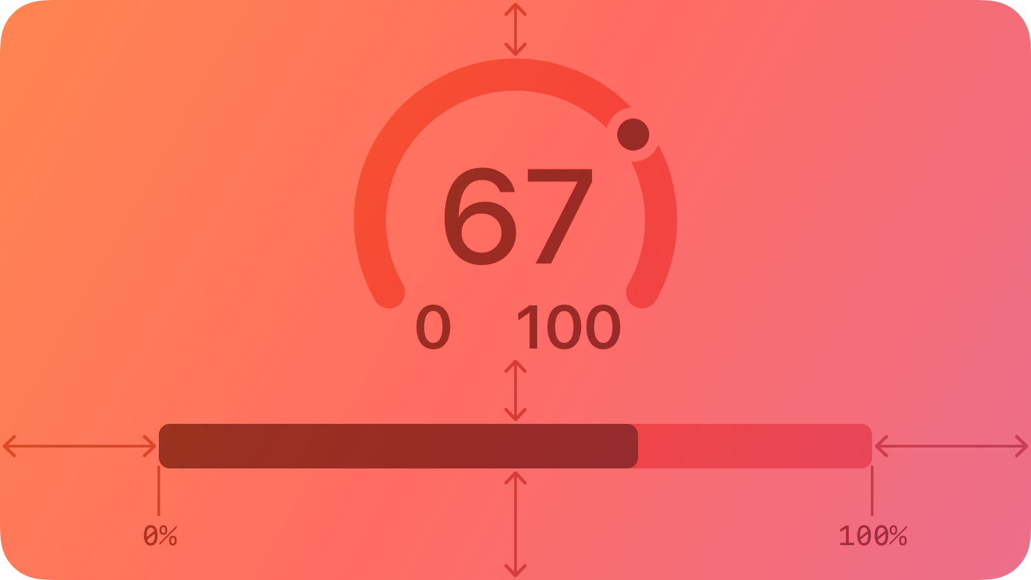
A gauge displays a specific numerical value within a range of values.
|
|
8
|
+
|
|
9
|
+
|
|
10
|
+
|
|
11
|
+
In addition to indicating the current value in a range, a gauge can provide more context about the range itself. For example, a temperature gauge can use text to identify the highest and lowest temperatures in the range and display a spectrum of colors that visually reinforce the changing values.
|
|
12
|
+
|
|
13
|
+
## [Anatomy](https://developer.apple.com/design/human-interface-guidelines/gauges#Anatomy)
|
|
14
|
+
|
|
15
|
+
A gauge uses a circular or linear path to represent a range of values, mapping the current value to a specific point on the path. A standard gauge displays an indicator that shows the current value’s location; a gauge that uses the capacity style displays a fill that stops at the value’s location on the path.
|
|
16
|
+
|
|
17
|
+
Circular and linear gauges in both standard and capacity styles are also available in a variant that’s visually similar to watchOS complications. This variant — called accessory — works well in iOS Lock Screen widgets and anywhere you want to echo the appearance of complications.
|
|
18
|
+
|
|
19
|
+
Note
|
|
20
|
+
|
|
21
|
+
In addition to gauges, macOS also supports level indicators, some of which have visual styles that are similar to gauges. For guidance, see [macOS](https://developer.apple.com/design/human-interface-guidelines/gauges#macOS).
|
|
22
|
+
|
|
23
|
+
## [Best practices](https://developer.apple.com/design/human-interface-guidelines/gauges#Best-practices)
|
|
24
|
+
|
|
25
|
+
**Write succinct labels that describe the current value and both endpoints of the range.** Although not every gauge style displays all labels, VoiceOver reads the visible labels to help people understand the gauge without seeing the screen.
|
|
26
|
+
|
|
27
|
+
**Consider filling the path with a gradient to help communicate the purpose of the gauge.** For example, a temperature gauge might use colors that range from red to blue to represent temperatures that range from hot to cold.
|
|
28
|
+
|
|
29
|
+
## [Platform considerations](https://developer.apple.com/design/human-interface-guidelines/gauges#Platform-considerations)
|
|
30
|
+
|
|
31
|
+
_No additional considerations for iOS, iPadOS, visionOS, or watchOS. Not supported in tvOS._
|
|
32
|
+
|
|
33
|
+
### [macOS](https://developer.apple.com/design/human-interface-guidelines/gauges#macOS)
|
|
34
|
+
|
|
35
|
+
In addition to supporting gauges, macOS also defines a level indicator that displays a specific numerical value within a range. You can configure a level indicator to convey capacity, rating, or — rarely — relevance.
|
|
36
|
+
|
|
37
|
+
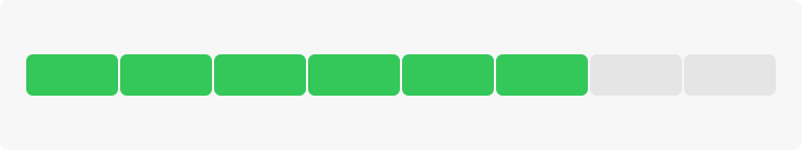
The capacity style can depict discrete or continuous values.
|
|
38
|
+
|
|
39
|
+

|
|
40
|
+
|
|
41
|
+
**Continuous.** A horizontal translucent track that fills with a solid bar to indicate the current value.
|
|
42
|
+
|
|
43
|
+
|
|
44
|
+
|
|
45
|
+
**Discrete.** A horizontal row of separate, equally sized, rectangular segments. The number of segments matches the total capacity, and the segments fill completely — never partially — with color to indicate the current value.
|
|
46
|
+
|
|
47
|
+
**Consider using the continuous style for large ranges.** A large value range can make the segments of a discrete capacity indicator too small to be useful.
|
|
48
|
+
|
|
49
|
+
**Consider changing the fill color to inform people about significant parts of the range.** By default, the fill color for both capacity indicator styles is green. If it makes sense in your app, you can change the fill color when the current value reaches certain levels, such as very low, very high, or just past the middle. You can change the fill color of the entire indicator or you can use the tiered state to show a sequence of several colors in one indicator, as shown below.
|
|
50
|
+
|
|
51
|
+
Tiered level appearance
|
|
52
|
+
|
|
53
|
+
For guidance using the rating style to help people rank something, see [Rating indicators](https://developer.apple.com/design/human-interface-guidelines/rating-indicators).
|
|
54
|
+
|
|
55
|
+
Although rarely used, the relevance style can communicate relevancy using a shaded horizontal bar. For example, a relevance indicator might appear in a list of search results, helping people visualize the relevancy of the results when sorting or comparing multiple items.
|
|
56
|
+
|
|
57
|
+
## [Resources](https://developer.apple.com/design/human-interface-guidelines/gauges#Resources)
|
|
58
|
+
|
|
59
|
+
#### [Related](https://developer.apple.com/design/human-interface-guidelines/gauges#Related)
|
|
60
|
+
|
|
61
|
+
[Ratings and reviews](https://developer.apple.com/design/human-interface-guidelines/ratings-and-reviews)
|
|
62
|
+
|
|
63
|
+
#### [Developer documentation](https://developer.apple.com/design/human-interface-guidelines/gauges#Developer-documentation)
|
|
64
|
+
|
|
65
|
+
[`Gauge`](https://developer.apple.com/documentation/SwiftUI/Gauge) — SwiftUI
|
|
66
|
+
|
|
67
|
+
[`NSLevelIndicator`](https://developer.apple.com/documentation/AppKit/NSLevelIndicator) — AppKit
|
|
68
|
+
|
|
69
|
+
## [Change log](https://developer.apple.com/design/human-interface-guidelines/gauges#Change-log)
|
|
70
|
+
|
|
71
|
+
Date| Changes
|
|
72
|
+
---|---
|
|
73
|
+
September 23, 2022| New page.
|
|
74
|
+
|
|
@@ -0,0 +1,92 @@
|
|
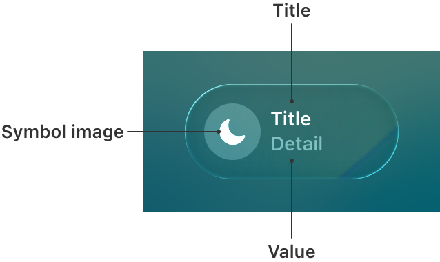
|
1
|
+
---
|
|
2
|
+
title: "Labels | Apple Developer Documentation"
|
|
3
|
+
source: https://developer.apple.com/design/human-interface-guidelines/labels
|
|
4
|
+
|
|
5
|
+
# Labels
|
|
6
|
+
|
|
7
|
+
A label is a static piece of text that people can read and often copy, but not edit.
|
|
8
|
+
|
|
9
|
+
|
|
10
|
+
|
|
11
|
+
Labels display text throughout the interface, in buttons, menu items, and views, helping people understand the current context and what they can do next.
|
|
12
|
+
|
|
13
|
+
The term _label_ refers to uneditable text that can appear in various places. For example:
|
|
14
|
+
|
|
15
|
+
* Within a button, a label generally conveys what the button does, such as Edit, Cancel, or Send.
|
|
16
|
+
|
|
17
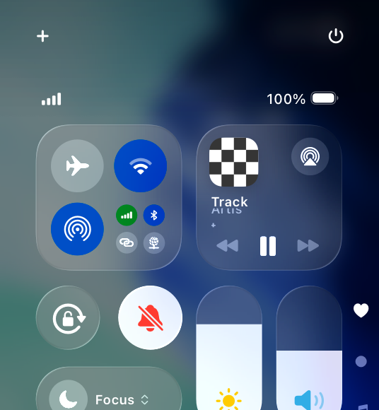
|
+
* Within many lists, a label can describe each item, often accompanied by a symbol or an image.
|
|
18
|
+
|
|
19
|
+
* Within a view, a label might provide additional context by introducing a control or describing a common action or task that people can perform in the view.
|
|
20
|
+
|
|
21
|
+
|
|
22
|
+
|
|
23
|
+
|
|
24
|
+
Developer note
|
|
25
|
+
|
|
26
|
+
To display uneditable text, SwiftUI defines two components: [`Label`](https://developer.apple.com/documentation/SwiftUI/Label) and [`Text`](https://developer.apple.com/documentation/SwiftUI/Text).
|
|
27
|
+
|
|
28
|
+
The guidance below can help you use a label to display text. In some cases, guidance for specific components — such as [action buttons](https://developer.apple.com/design/human-interface-guidelines/buttons), [menus](https://developer.apple.com/design/human-interface-guidelines/menus), and [lists and tables](https://developer.apple.com/design/human-interface-guidelines/lists-and-tables) — includes additional recommendations for using text.
|
|
29
|
+
|
|
30
|
+
## [Best practices](https://developer.apple.com/design/human-interface-guidelines/labels#Best-practices)
|
|
31
|
+
|
|
32
|
+
**Use a label to display a small amount of text that people don’t need to edit.** If you need to let people edit a small amount of text, use a [text field](https://developer.apple.com/design/human-interface-guidelines/text-fields). If you need to display a large amount of text, and optionally let people edit it, use a [text view](https://developer.apple.com/design/human-interface-guidelines/text-views).
|
|
33
|
+
|
|
34
|
+
**Prefer system fonts.** A label can display plain or styled text, and it supports Dynamic Type (where available) by default. If you adjust the style of a label or use custom fonts, make sure the text remains legible.
|
|
35
|
+
|
|
36
|
+
**Use system-provided label colors to communicate relative importance.** The system defines four label colors that vary in appearance to help you give text different levels of visual importance. For additional guidance, see [Color](https://developer.apple.com/design/human-interface-guidelines/color).
|
|
37
|
+
|
|
38
|
+
System color| Example usage| iOS, iPadOS, tvOS, visionOS| macOS
|
|
39
|
+
---|---|---|---
|
|
40
|
+
Label| Primary information| [`label`](https://developer.apple.com/documentation/UIKit/UIColor/label)| [`labelColor`](https://developer.apple.com/documentation/AppKit/NSColor/labelColor)
|
|
41
|
+
Secondary label| A subheading or supplemental text| [`secondaryLabel`](https://developer.apple.com/documentation/UIKit/UIColor/secondaryLabel)| [`secondaryLabelColor`](https://developer.apple.com/documentation/AppKit/NSColor/secondaryLabelColor)
|
|
42
|
+
Tertiary label| Text that describes an unavailable item or behavior| [`tertiaryLabel`](https://developer.apple.com/documentation/UIKit/UIColor/tertiaryLabel)| [`tertiaryLabelColor`](https://developer.apple.com/documentation/AppKit/NSColor/tertiaryLabelColor)
|
|
43
|
+
Quaternary label| Watermark text| [`quaternaryLabel`](https://developer.apple.com/documentation/UIKit/UIColor/quaternaryLabel)| [`quaternaryLabelColor`](https://developer.apple.com/documentation/AppKit/NSColor/quaternaryLabelColor)
|
|
44
|
+
|
|
45
|
+
**Make useful label text selectable.** If a label contains useful information — like an error message, a location, or an IP address — consider letting people select and copy it for pasting elsewhere.
|
|
46
|
+
|
|
47
|
+
## [Platform considerations](https://developer.apple.com/design/human-interface-guidelines/labels#Platform-considerations)
|
|
48
|
+
|
|
49
|
+
_No additional considerations for iOS, iPadOS, tvOS, or visionOS._
|
|
50
|
+
|
|
51
|
+
### [macOS](https://developer.apple.com/design/human-interface-guidelines/labels#macOS)
|
|
52
|
+
|
|
53
|
+
Developer note
|
|
54
|
+
|
|
55
|
+
To display uneditable text in a label, use the [`isEditable`](https://developer.apple.com/documentation/AppKit/NSTextField/isEditable) property of [`NSTextField`](https://developer.apple.com/documentation/AppKit/NSTextField).
|
|
56
|
+
|
|
57
|
+
### [watchOS](https://developer.apple.com/design/human-interface-guidelines/labels#watchOS)
|
|
58
|
+
|
|
59
|
+
Date and time text components (shown below on the left) display the current date, the current time, or a combination of both. You can configure a date text component to use a variety of formats, calendars, and time zones. A countdown timer text component (shown below on the right) displays a precise countdown or count-up timer. You can configure a timer text component to display its count value in a variety of formats.
|
|
60
|
+
|
|
61
|
+
Date and time labels
|
|
62
|
+
|
|
63
|
+
Timer label
|
|
64
|
+
|
|
65
|
+
When you use the system-provided date and timer text components, watchOS automatically adjusts the label’s presentation to fit the available space. The system also updates the content without further input from your app.
|
|
66
|
+
|
|
67
|
+
Consider using date and timer components in complications. For design guidance, see [Complications](https://developer.apple.com/design/human-interface-guidelines/components/system-experiences/complications); for developer guidance, see [`Text`](https://developer.apple.com/documentation/SwiftUI/Text).
|
|
68
|
+
|
|
69
|
+
## [Resources](https://developer.apple.com/design/human-interface-guidelines/labels#Resources)
|
|
70
|
+
|
|
71
|
+
#### [Related](https://developer.apple.com/design/human-interface-guidelines/labels#Related)
|
|
72
|
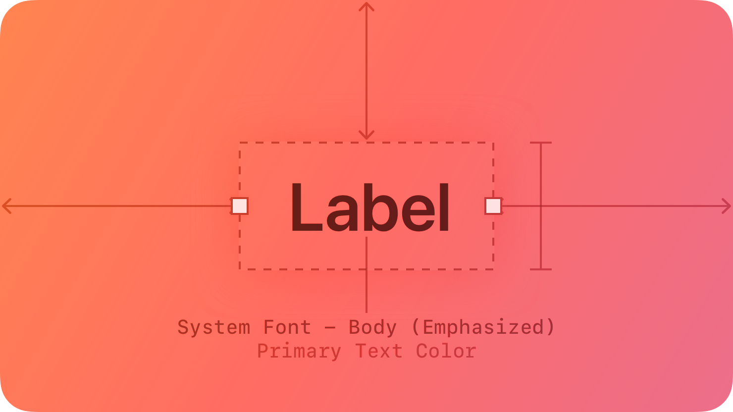
+
|
|
73
|
+
[Text fields](https://developer.apple.com/design/human-interface-guidelines/text-fields)
|
|
74
|
+
|
|
75
|
+
[Text views](https://developer.apple.com/design/human-interface-guidelines/text-views)
|
|
76
|
+
|
|
77
|
+
#### [Developer documentation](https://developer.apple.com/design/human-interface-guidelines/labels#Developer-documentation)
|
|
78
|
+
|
|
79
|
+
[`Label`](https://developer.apple.com/documentation/SwiftUI/Label) — SwiftUI
|
|
80
|
+
|
|
81
|
+
[`Text`](https://developer.apple.com/documentation/SwiftUI/Text) — SwiftUI
|
|
82
|
+
|
|
83
|
+
[`UILabel`](https://developer.apple.com/documentation/UIKit/UILabel) — UIKit
|
|
84
|
+
|
|
85
|
+
[`NSTextField`](https://developer.apple.com/documentation/AppKit/NSTextField) — AppKit
|
|
86
|
+
|
|
87
|
+
## [Change log](https://developer.apple.com/design/human-interface-guidelines/labels#Change-log)
|
|
88
|
+
|
|
89
|
+
Date| Changes
|
|
90
|
+
---|---
|
|
91
|
+
June 5, 2023| Updated guidance to reflect changes in watchOS 10.
|
|
92
|
+
|
|
@@ -0,0 +1,128 @@
|
|
|
1
|
+
---
|
|
2
|
+
title: "Pickers | Apple Developer Documentation"
|
|
3
|
+
source: https://developer.apple.com/design/human-interface-guidelines/pickers
|
|
4
|
+
|
|
5
|
+
# Pickers
|
|
6
|
+
|
|
7
|
+
A picker displays one or more scrollable lists of distinct values that people can choose from.
|
|
8
|
+
|
|
9
|
+
|
|
10
|
+
|
|
11
|
+
The system provides several styles of pickers, each of which offers different types of selectable values and has a different appearance. The exact values shown in a picker, and their order, depend on the device language.
|
|
12
|
+
|
|
13
|
+
Pickers help people enter information by letting them choose single or multipart values. Date pickers specifically offer additional ways to choose values, like selecting a day in a calendar view or entering dates and times using a numeric keypad.
|
|
14
|
+
|
|
15
|
+
## [Best practices](https://developer.apple.com/design/human-interface-guidelines/pickers#Best-practices)
|
|
16
|
+
|
|
17
|
+
**Consider using a picker to offer medium-to-long lists of items.** If you need to display a fairly short list of choices, consider using a [pull-down button](https://developer.apple.com/design/human-interface-guidelines/pull-down-buttons) instead of a picker. Although a picker makes it easy to scroll quickly through many items, it may add too much visual weight to a short list of items. On the other hand, if you need to present a very large set of items, consider using a [list or table](https://developer.apple.com/design/human-interface-guidelines/lists-and-tables). Lists and tables can adjust in height, and tables can include an index, which makes it much faster to target a section of the list.
|
|
18
|
+
|
|
19
|
+
**Use predictable and logically ordered values.** Before people interact with a picker, many of its values can be hidden. It’s best when people can predict what the hidden values are, such as with an alphabetized list of countries, so they can move through the items quickly.
|
|
20
|
+
|
|
21
|
+
**Avoid switching views to show a picker.** A picker works well when displayed in context, below or in proximity to the field people are editing. A picker typically appears at the bottom of a window or in a popover.
|
|
22
|
+
|
|
23
|
+
**Consider providing less granularity when specifying minutes in a date picker.** By default, a minute list includes 60 values (0 to 59). You can optionally increase the minute interval as long as it divides evenly into 60. For example, you might want quarter-hour intervals (0, 15, 30, and 45).
|
|
24
|
+
|
|
25
|
+
## [Platform considerations](https://developer.apple.com/design/human-interface-guidelines/pickers#Platform-considerations)
|
|
26
|
+
|
|
27
|
+
_No additional considerations for visionOS._
|
|
28
|
+
|
|
29
|
+
### [iOS, iPadOS](https://developer.apple.com/design/human-interface-guidelines/pickers#iOS-iPadOS)
|
|
30
|
+
|
|
31
|
+
A date picker is an efficient interface for selecting a specific date, time, or both, using touch, a keyboard, or a pointing device. You can display a date picker in one of the following styles:
|
|
32
|
+
|
|
33
|
+
* Compact — A button that displays editable date and time content in a modal view.
|
|
34
|
+
|
|
35
|
+
* Inline — For time only, a button that displays wheels of values; for dates and times, an inline calendar view.
|
|
36
|
+
|
|
37
|
+
* Wheels — A set of scrolling wheels that also supports data entry through built-in or external keyboards.
|
|
38
|
+
|
|
39
|
+
* Automatic — A system-determined style based on the current platform and date picker mode.
|
|
40
|
+
|
|
41
|
+
|
|
42
|
+
|
|
43
|
+
|
|
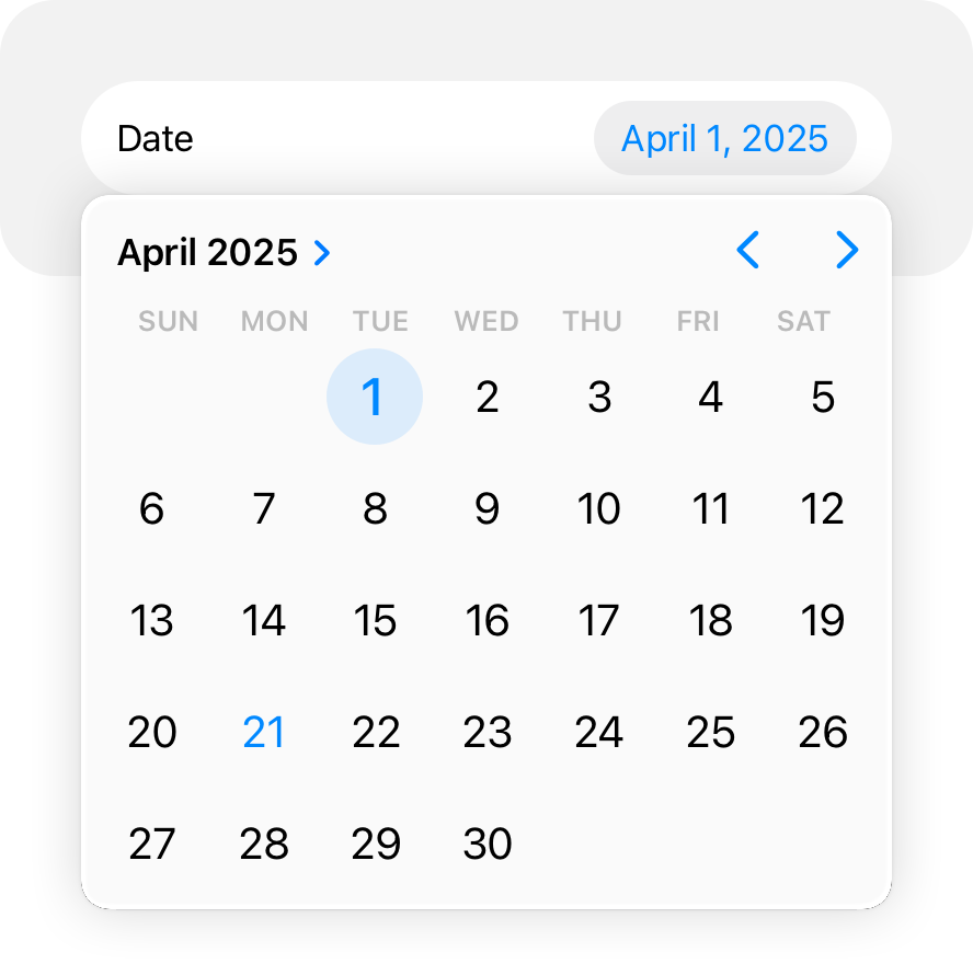
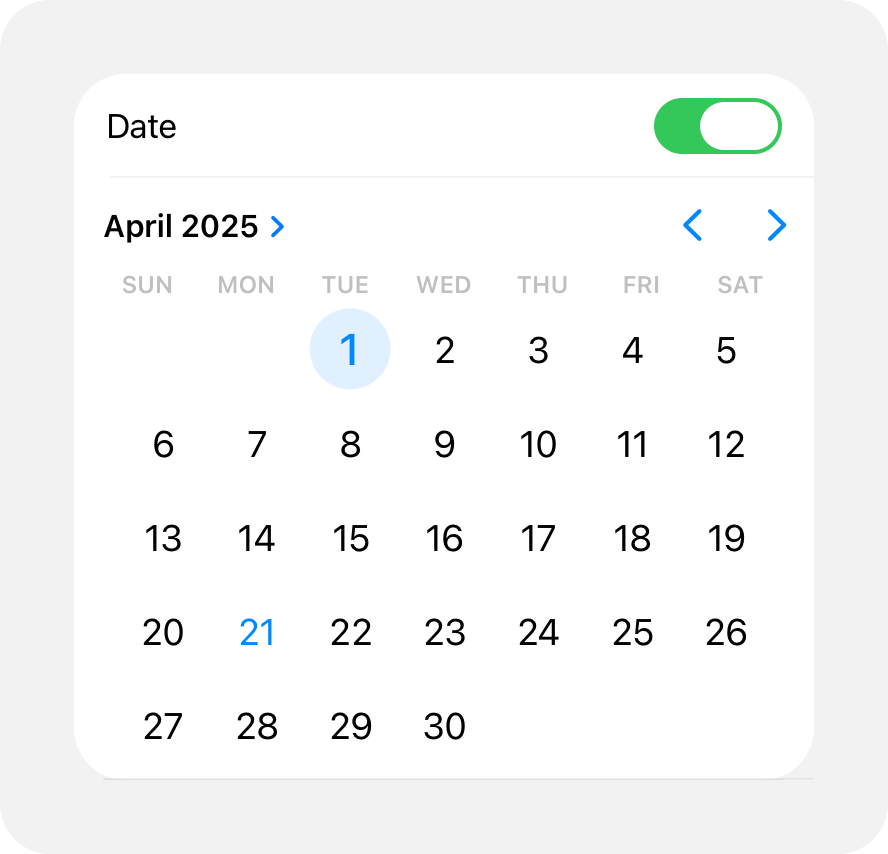
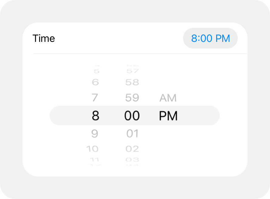
44
|
+
A date picker has four modes, each of which presents a different set of selectable values.
|
|
45
|
+
|
|
46
|
+
* Date — Displays months, days of the month, and years.
|
|
47
|
+
|
|
48
|
+
* Time — Displays hours, minutes, and (optionally) an AM/PM designation.
|
|
49
|
+
|
|
50
|
+
* Date and time — Displays dates, hours, minutes, and (optionally) an AM/PM designation.
|
|
51
|
+
|
|
52
|
+
* Countdown timer — Displays hours and minutes, up to a maximum of 23 hours and 59 minutes. This mode isn’t available in the inline or compact styles.
|
|
53
|
+
|
|
54
|
+
|
|
55
|
+
|
|
56
|
+
|
|
57
|
+
The exact values shown in a date picker, and their order, depend on the device location.
|
|
58
|
+
|
|
59
|
+
Here are several examples of date pickers showing different combinations of style and mode.
|
|
60
|
+
|
|
61
|
+
* Compact
|
|
62
|
+
* Inline
|
|
63
|
+
* Wheels
|
|
64
|
+
|
|
65
|
+
|
|
66
|
+
|
|
67
|
+
In a compact layout, a picker opens as a popover over your content.
|
|
68
|
+
|
|
69
|
+
In an inline layout, a picker opens inline with your content.
|
|
70
|
+
|
|
71
|
+
Another example of an inline picker uses wheels to choose values for date and time.
|
|
72
|
+
|
|
73
|
+
**Use a compact date picker when space is constrained.** The compact style displays a button that shows the current value in your app’s accent color. When people tap the button, the date picker opens a modal view, providing access to a familiar calendar-style editor and time picker. Within the modal view, people can make multiple edits to dates and times before tapping outside the view to confirm their choices.
|
|
74
|
+
|
|
75
|
+
### [macOS](https://developer.apple.com/design/human-interface-guidelines/pickers#macOS)
|
|
76
|
+
|
|
77
|
+
**Choose a date picker style that suits your app.** There are two styles of date pickers in macOS: textual and graphical. The textual style is useful when you’re working with limited space and you expect people to make specific date and time selections. The graphical style is useful when you want to give people the option of browsing through days in a calendar or selecting a range of dates, or when the look of a clock face is appropriate for your app.
|
|
78
|
+
|
|
79
|
+
For developer guidance, see [`NSDatePicker`](https://developer.apple.com/documentation/AppKit/NSDatePicker).
|
|
80
|
+
|
|
81
|
+
### [tvOS](https://developer.apple.com/design/human-interface-guidelines/pickers#tvOS)
|
|
82
|
+
|
|
83
|
+
Pickers are available in tvOS with SwiftUI. For developer guidance, see [`Picker`](https://developer.apple.com/documentation/SwiftUI/Picker).
|
|
84
|
+
|
|
85
|
+
### [watchOS](https://developer.apple.com/design/human-interface-guidelines/pickers#watchOS)
|
|
86
|
+
|
|
87
|
+
Pickers display lists of items that people navigate using the Digital Crown, which helps people manage selections in a precise and engaging way.
|
|
88
|
+
|
|
89
|
+
A picker can display a list of items using the wheels style. watchOS can also display date and time pickers using the wheels style. For developer guidance, see [`Picker`](https://developer.apple.com/documentation/SwiftUI/Picker) and [`DatePicker`](https://developer.apple.com/documentation/SwiftUI/DatePicker).
|
|
90
|
+
|
|
91
|
+
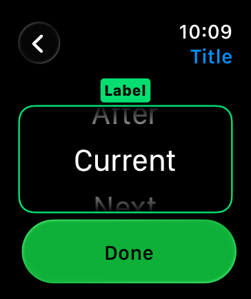
|
|
92
|
+
|
|
93
|
+
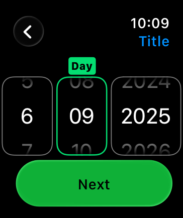
|
|
94
|
+
|
|
95
|
+
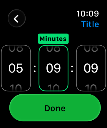
|
|
96
|
+
|
|
97
|
+
You can configure a picker to display an outline, caption, and scrolling indicator.
|
|
98
|
+
|
|
99
|
+
For longer lists, the navigation link displays the picker as a button. When someone taps the button, the system shows the list of options. The person can also scrub through the options using the Digital Crown without tapping the button. For developer guidance, see [`navigationLink`](https://developer.apple.com/documentation/SwiftUI/PickerStyle/navigationLink).
|
|
100
|
+
|
|
101
|
+
|
|
102
|
+
|
|
103
|
+
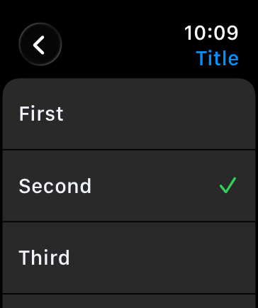
|
|
104
|
+
|
|
105
|
+
## [Resources](https://developer.apple.com/design/human-interface-guidelines/pickers#Resources)
|
|
106
|
+
|
|
107
|
+
#### [Related](https://developer.apple.com/design/human-interface-guidelines/pickers#Related)
|
|
108
|
+
|
|
109
|
+
[Pull-down buttons](https://developer.apple.com/design/human-interface-guidelines/pull-down-buttons)
|
|
110
|
+
|
|
111
|
+
[Lists and tables](https://developer.apple.com/design/human-interface-guidelines/lists-and-tables)
|
|
112
|
+
|
|
113
|
+
#### [Developer documentation](https://developer.apple.com/design/human-interface-guidelines/pickers#Developer-documentation)
|
|
114
|
+
|
|
115
|
+
[`Picker`](https://developer.apple.com/documentation/SwiftUI/Picker) — SwiftUI
|
|
116
|
+
|
|
117
|
+
[`UIDatePicker`](https://developer.apple.com/documentation/UIKit/UIDatePicker) — UIKit
|
|
118
|
+
|
|
119
|
+
[`UIPickerView`](https://developer.apple.com/documentation/UIKit/UIPickerView) — UIKit
|
|
120
|
+
|
|
121
|
+
[`NSDatePicker`](https://developer.apple.com/documentation/AppKit/NSDatePicker) — AppKit
|
|
122
|
+
|
|
123
|
+
## [Change log](https://developer.apple.com/design/human-interface-guidelines/pickers#Change-log)
|
|
124
|
+
|
|
125
|
+
Date| Changes
|
|
126
|
+
---|---
|
|
127
|
+
June 5, 2023| Updated guidance for using pickers in watchOS.
|
|
128
|
+
|
|
@@ -0,0 +1,38 @@
|
|
|
1
|
+
---
|
|
2
|
+
title: "Rating indicators | Apple Developer Documentation"
|
|
3
|
+
source: https://developer.apple.com/design/human-interface-guidelines/rating-indicators
|
|
4
|
+
|
|
5
|
+
# Rating indicators
|
|
6
|
+
|
|
7
|
+
A rating indicator uses a series of horizontally arranged graphical symbols — by default, stars — to communicate a ranking level.
|
|
8
|
+
|
|
9
|
+
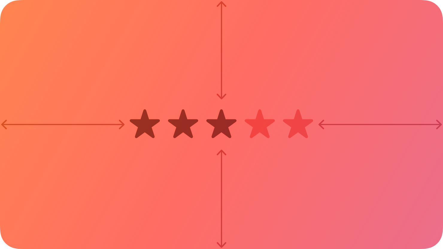
|
|
10
|
+
|
|
11
|
+
A rating indicator doesn’t display partial symbols; it rounds the value to display complete symbols only. Within a rating indicator, symbols are always the same distance apart and don’t expand or shrink to fit the component’s width.
|
|
12
|
+
|
|
13
|
+
## [Best practices](https://developer.apple.com/design/human-interface-guidelines/rating-indicators#Best-practices)
|
|
14
|
+
|
|
15
|
+
**Make it easy to change rankings.** When presenting a list of ranked items, let people adjust the rank of individual items inline without navigating to a separate editing screen.
|
|
16
|
+
|
|
17
|
+
**If you replace the star with a custom symbol, make sure that its purpose is clear.** The star is a very recognizable ranking symbol, and people may not associate other symbols with a rating scale.
|
|
18
|
+
|
|
19
|
+
## [Platform considerations](https://developer.apple.com/design/human-interface-guidelines/rating-indicators#Platform-considerations)
|
|
20
|
+
|
|
21
|
+
_No additional considerations for macOS. Not supported in iOS, iPadOS, tvOS, visionOS, or watchOS._
|
|
22
|
+
|
|
23
|
+
## [Resources](https://developer.apple.com/design/human-interface-guidelines/rating-indicators#Resources)
|
|
24
|
+
|
|
25
|
+
#### [Related](https://developer.apple.com/design/human-interface-guidelines/rating-indicators#Related)
|
|
26
|
+
|
|
27
|
+
[Ratings and reviews](https://developer.apple.com/design/human-interface-guidelines/ratings-and-reviews)
|
|
28
|
+
|
|
29
|
+
#### [Developer documentation](https://developer.apple.com/design/human-interface-guidelines/rating-indicators#Developer-documentation)
|
|
30
|
+
|
|
31
|
+
[`NSLevelIndicator.Style.rating`](https://developer.apple.com/documentation/AppKit/NSLevelIndicator/Style/rating) — AppKit
|
|
32
|
+
|
|
33
|
+
## [Change log](https://developer.apple.com/design/human-interface-guidelines/rating-indicators#Change-log)
|
|
34
|
+
|
|
35
|
+
Date| Changes
|
|
36
|
+
---|---
|
|
37
|
+
September 23, 2022| New page.
|
|
38
|
+
|
|
@@ -0,0 +1,94 @@
|
|
|
1
|
+
---
|
|
2
|
+
title: "Segmented controls | Apple Developer Documentation"
|
|
3
|
+
source: https://developer.apple.com/design/human-interface-guidelines/segmented-controls
|
|
4
|
+
|
|
5
|
+
# Segmented controls
|
|
6
|
+
|
|
7
|
+
A segmented control is a linear set of two or more segments, each of which functions as a button.
|
|
8
|
+
|
|
9
|
+
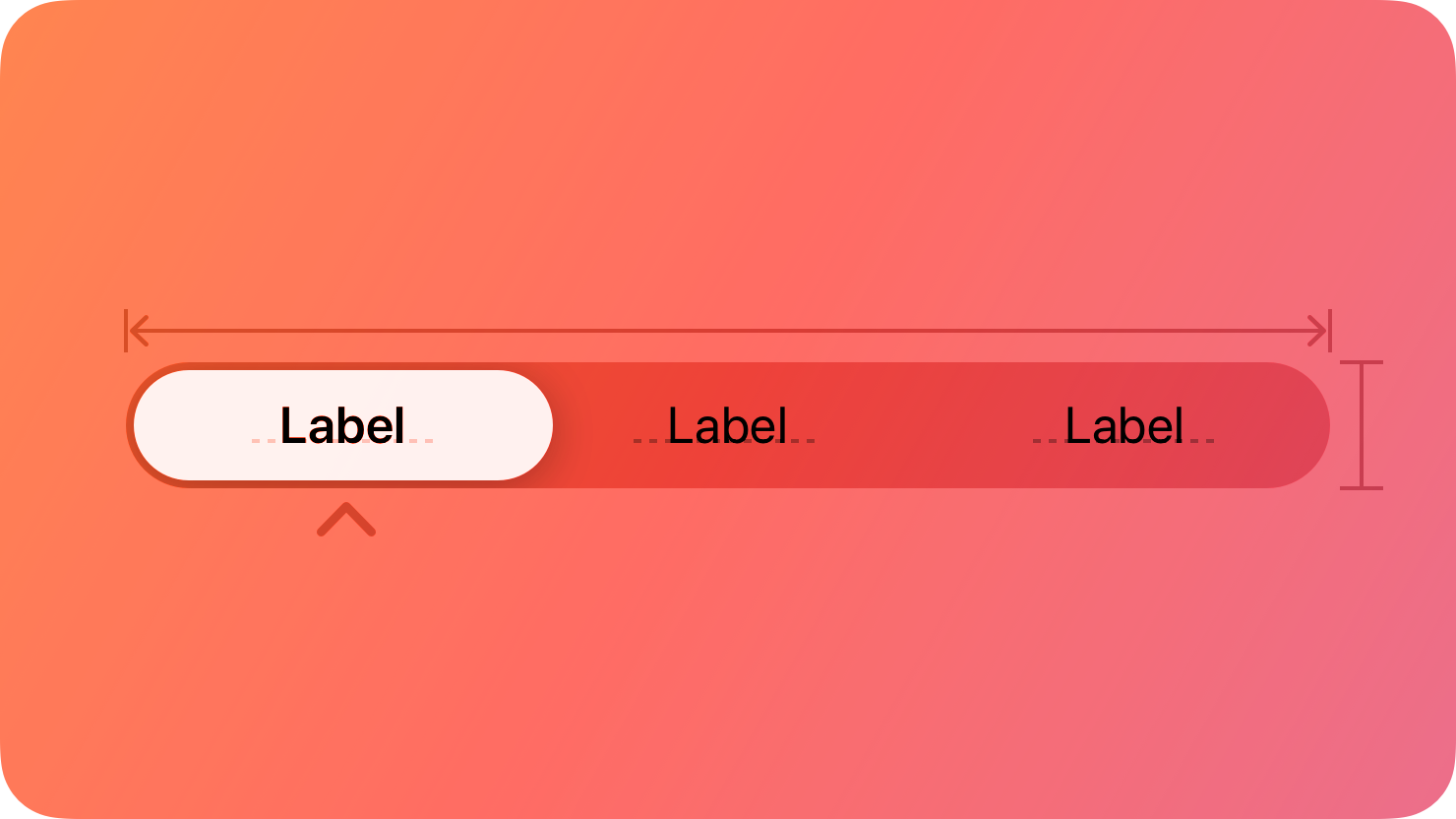
|
|
10
|
+
|
|
11
|
+
Within a segmented control, all segments are usually equal in width. Like [buttons](https://developer.apple.com/design/human-interface-guidelines/buttons), segments can contain text or images. Segments can also have text labels beneath them (or beneath the control as a whole).
|
|
12
|
+
|
|
13
|
+
A segmented control offers a single choice from among a set of options, or in macOS, either a single choice or multiple choices. For example, in macOS Keynote people can select only one segment in the alignment options control to align selected text. In contrast, people can choose multiple segments in the font attributes control to combine styles like bold, italics, and underline. The toolbar of a Keynote window also uses a segmented control to let people show and hide various editing panes within the main window area.
|
|
14
|
+
|
|
15
|
+
Single choice
|
|
16
|
+
|
|
17
|
+
Multiple choices
|
|
18
|
+
|
|
19
|
+
In addition to representing the state of a single or multiple-choice selection, a segmented control can function as a set of buttons that perform actions without showing a selection state. For example, the Reply, Reply all, and Forward buttons in macOS Mail. For developer guidance, see [`isMomentary`](https://developer.apple.com/documentation/UIKit/UISegmentedControl/isMomentary) and [`NSSegmentedControl.SwitchTracking.momentary`](https://developer.apple.com/documentation/AppKit/NSSegmentedControl/SwitchTracking/momentary).
|
|
20
|
+
|
|
21
|
+
## [Best practices](https://developer.apple.com/design/human-interface-guidelines/segmented-controls#Best-practices)
|
|
22
|
+
|
|
23
|
+
**Use a segmented control to provide closely related choices that affect an object, state, or view.** For example, a segmented control in an inspector could let people choose one or more attributes to apply to a selection, or a segmented control in a toolbar could offer a set of actions to perform on the current view.
|
|
24
|
+
|
|
25
|
+
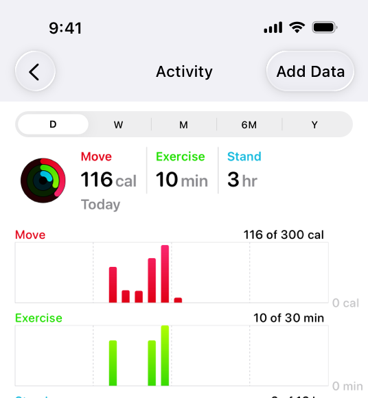
|
|
26
|
+
|
|
27
|
+
In the iOS Health app, a segmented control provides a choice of time ranges for the activity graphs to display.
|
|
28
|
+
|
|
29
|
+
**Consider a segmented control when it’s important to group functions together, or to clearly show their selection state.** Unlike other button styles, segmented controls preserve their grouping regardless of the view size or where they appear. This grouping can also help people understand at a glance which controls are currently selected.
|
|
30
|
+
|
|
31
|
+
**Keep control types consistent within a single segmented control.** Don’t assign actions to segments in a control that otherwise represents selection state, and don’t show a selection state for segments in a control that otherwise performs actions.
|
|
32
|
+
|
|
33
|
+
**Limit the number of segments in a control.** Too many segments can be hard to parse and time-consuming to navigate. Aim for no more than about five to seven segments in a wide interface and no more than about five segments on iPhone.
|
|
34
|
+
|
|
35
|
+
**In general, keep segment size consistent.** When all segments have equal width, a segmented control feels balanced. To the extent possible, it’s best to keep icon and title widths consistent too.
|
|
36
|
+
|
|
37
|
+
## [Content](https://developer.apple.com/design/human-interface-guidelines/segmented-controls#Content)
|
|
38
|
+
|
|
39
|
+
**Prefer using either text or images — not a mix of both — in a single segmented control.** Although individual segments can contain text labels or images, mixing the two in a single control can lead to a disconnected and confusing interface.
|
|
40
|
+
|
|
41
|
+
**As much as possible, use content with a similar size in each segment.** Because all segments typically have equal width, it doesn’t look good if content fills some segments but not others.
|
|
42
|
+
|
|
43
|
+
**Use nouns or noun phrases for segment labels.** Write text that describes each segment and uses [title-style capitalization](https://support.apple.com/guide/applestyleguide/c-apsgb744e4a3/web#apdca93e113f1d64). A segmented control that displays text labels doesn’t need introductory text.
|
|
44
|
+
|
|
45
|
+
## [Platform considerations](https://developer.apple.com/design/human-interface-guidelines/segmented-controls#Platform-considerations)
|
|
46
|
+
|
|
47
|
+
_Not supported in watchOS._
|
|
48
|
+
|
|
49
|
+
### [iOS, iPadOS](https://developer.apple.com/design/human-interface-guidelines/segmented-controls#iOS-iPadOS)
|
|
50
|
+
|
|
51
|
+
**Consider a segmented control to switch between closely related subviews.** A segmented control can be useful as a way to quickly switch between related subviews. For example, the segmented control in Calendar’s New Event sheet switches between the subviews for creating a new event and a new reminder. For switching between completely separate sections of an app, use a [tab bar](https://developer.apple.com/design/human-interface-guidelines/tab-bars) instead.
|
|
52
|
+
|
|
53
|
+
|
|
54
|
+
|
|
55
|
+
### [macOS](https://developer.apple.com/design/human-interface-guidelines/segmented-controls#macOS)
|
|
56
|
+
|
|
57
|
+
**Consider using introductory text to clarify the purpose of a segmented control.** When the control uses symbols or interface icons, you could also add a label below each segment to clarify its meaning. If your app includes tooltips, provide one for each segment in a segmented control.
|
|
58
|
+
|
|
59
|
+
**Use a tab view in the main window area — instead of a segmented control — for view switching.** A [tab view](https://developer.apple.com/design/human-interface-guidelines/tab-views) supports efficient view switching and is similar in appearance to a [box](https://developer.apple.com/design/human-interface-guidelines/boxes) combined with a segmented control. Consider using a segmented control to help people switch views in a toolbar or inspector pane.
|
|
60
|
+
|
|
61
|
+
|
|
62
|
+
|
|
63
|
+
**Consider supporting spring loading.** On a Mac equipped with a Magic Trackpad, spring loading lets people activate a segment by dragging selected items over it and force clicking without dropping the selected items. People can also continue dragging the items after a segment activates.
|
|
64
|
+
|
|
65
|
+
### [tvOS](https://developer.apple.com/design/human-interface-guidelines/segmented-controls#tvOS)
|
|
66
|
+
|
|
67
|
+
**Consider using a split view instead of a segmented control on screens that perform content filtering.** People generally find it easy to navigate back and forth between content and filtering options using a split view. Depending on its placement, a segmented control may not be as easy to access.
|
|
68
|
+
|
|
69
|
+
**Avoid putting other focusable elements close to segmented controls.** Segments become selected when focus moves to them, not when people click them. Carefully consider where you position a segmented control relative to other interface elements. If other focusable elements are too close, people might accidentally focus on them when attempting to switch between segments.
|
|
70
|
+
|
|
71
|
+
### [visionOS](https://developer.apple.com/design/human-interface-guidelines/segmented-controls#visionOS)
|
|
72
|
+
|
|
73
|
+
When people look at a segmented control that uses icons, the system displays a tooltip that contains the descriptive text you supply.
|
|
74
|
+
|
|
75
|
+
## [Resources](https://developer.apple.com/design/human-interface-guidelines/segmented-controls#Resources)
|
|
76
|
+
|
|
77
|
+
#### [Related](https://developer.apple.com/design/human-interface-guidelines/segmented-controls#Related)
|
|
78
|
+
|
|
79
|
+
[Split views](https://developer.apple.com/design/human-interface-guidelines/split-views)
|
|
80
|
+
|
|
81
|
+
#### [Developer documentation](https://developer.apple.com/design/human-interface-guidelines/segmented-controls#Developer-documentation)
|
|
82
|
+
|
|
83
|
+
[`segmented`](https://developer.apple.com/documentation/SwiftUI/PickerStyle/segmented) — SwiftUI
|
|
84
|
+
|
|
85
|
+
[`UISegmentedControl`](https://developer.apple.com/documentation/UIKit/UISegmentedControl) — UIKit
|
|
86
|
+
|
|
87
|
+
[`NSSegmentedControl`](https://developer.apple.com/documentation/AppKit/NSSegmentedControl) — AppKit
|
|
88
|
+
|
|
89
|
+
## [Change log](https://developer.apple.com/design/human-interface-guidelines/segmented-controls#Change-log)
|
|
90
|
+
|
|
91
|
+
Date| Changes
|
|
92
|
+
---|---
|
|
93
|
+
June 21, 2023| Updated to include guidance for visionOS.
|
|
94
|
+
|