hs-uix 2.0.0 → 2.1.0
This diff represents the content of publicly available package versions that have been released to one of the supported registries. The information contained in this diff is provided for informational purposes only and reflects changes between package versions as they appear in their respective public registries.
- package/README.md +54 -31
- package/calendar.d.ts +1 -0
- package/common-components.d.ts +143 -0
- package/datatable.d.ts +1 -27
- package/dist/calendar.js +2003 -0
- package/dist/calendar.mjs +2004 -0
- package/dist/common-components.js +1072 -717
- package/dist/common-components.mjs +1344 -994
- package/dist/datatable.js +1114 -251
- package/dist/datatable.mjs +1089 -219
- package/dist/feed.js +1166 -154
- package/dist/feed.mjs +1170 -153
- package/dist/form.js +792 -166
- package/dist/form.mjs +693 -68
- package/dist/index.js +8354 -7077
- package/dist/index.mjs +8425 -7128
- package/dist/kanban.js +1076 -329
- package/dist/kanban.mjs +1061 -311
- package/dist/utils.js +1492 -646
- package/dist/utils.mjs +1410 -573
- package/feed.d.ts +1 -1
- package/form.d.ts +1 -28
- package/index.d.ts +54 -103
- package/kanban.d.ts +1 -1
- package/package.json +10 -6
- package/src/calendar/README.md +301 -0
- package/src/calendar/index.d.ts +201 -0
- package/src/common-components/README.md +400 -0
- package/{packages → src}/datatable/README.md +10 -10
- package/{packages → src}/datatable/index.d.ts +11 -0
- package/{packages → src}/feed/README.md +3 -1
- package/{packages → src}/feed/index.d.ts +18 -0
- package/{packages → src}/form/README.md +24 -10
- package/{packages → src}/kanban/README.md +13 -13
- package/{packages → src}/kanban/index.d.ts +18 -7
- package/src/utils/README.md +511 -0
- package/utils.d.ts +55 -3
- /package/{packages → src}/form/index.d.ts +0 -0
|
@@ -6,7 +6,7 @@
|
|
|
6
6
|
|
|
7
7
|
A drop-in table component for HubSpot UI Extensions. Define your columns, pass your data, and you get search, filtering, sorting, pagination, inline editing, row grouping, and auto-sized columns out of the box.
|
|
8
8
|
|
|
9
|
-

|
|
10
10
|
|
|
11
11
|
## Why DataTable?
|
|
12
12
|
|
|
@@ -111,7 +111,7 @@ hubspot.extend(() => (
|
|
|
111
111
|
|
|
112
112
|
### Filters, sorting, and footer totals
|
|
113
113
|
|
|
114
|
-

|
|
115
115
|
|
|
116
116
|
When more than 2 filters are defined, the first 2 appear inline and the rest are tucked behind a **Filters** button with a funnel icon. Active filters display as removable chips with a "Clear all" option by default. Hiding the badges via `showFilterBadges={false}` also hides the "Clear all" button by default — set `showClearFiltersButton={true}` to keep the reset without chips. Footer totals are declared directly on the column — a static string or a function that receives the filtered data.
|
|
117
117
|
|
|
@@ -236,7 +236,7 @@ const FILTERS = [
|
|
|
236
236
|
|
|
237
237
|
### Row selection with bulk actions
|
|
238
238
|
|
|
239
|
-

|
|
240
240
|
|
|
241
241
|
Add checkboxes with a select-all header (selects current page). When rows are selected, a compact action bar appears above the table showing the selected count, a "Select all" button, "Deselect all", and any custom action buttons you define.
|
|
242
242
|
|
|
@@ -314,7 +314,7 @@ Server-side selection example:
|
|
|
314
314
|
|
|
315
315
|
### Row actions and full-row "Edit/Done" flow
|
|
316
316
|
|
|
317
|
-

|
|
318
318
|
|
|
319
319
|
Use `rowActions` to append an actions column on the right. You can pass a static action list or a row-aware function.
|
|
320
320
|
|
|
@@ -385,7 +385,7 @@ const columns = [
|
|
|
385
385
|
|
|
386
386
|
### Scrollable wide tables
|
|
387
387
|
|
|
388
|
-

|
|
389
389
|
|
|
390
390
|
When you have many columns, set `scrollable={true}` to allow horizontal overflow instead of squishing columns. Columns without explicit widths fall back to `"min"` width, keeping each column compact and letting the table scroll.
|
|
391
391
|
|
|
@@ -402,8 +402,8 @@ When you have many columns, set `scrollable={true}` to allow horizontal overflow
|
|
|
402
402
|
|
|
403
403
|
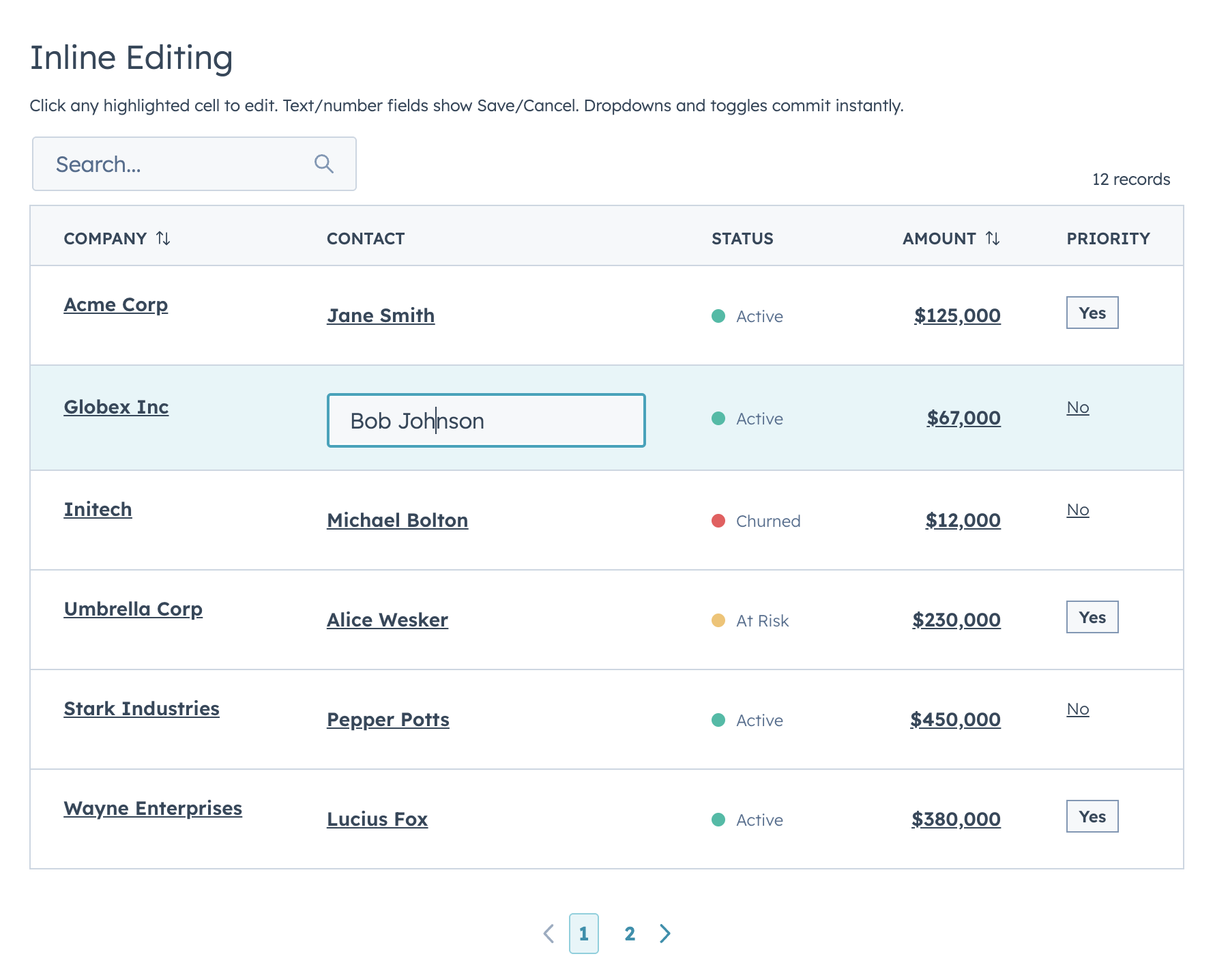
### Inline editing — discrete mode
|
|
404
404
|
|
|
405
|
-

|
|
406
|
+
|
|
407
407
|
|
|
408
408
|
In discrete mode (the default), editable cells appear as dark links. Click to open the input. The cell reverts to display when you click away, keeping the last committed value. Select/date/toggle-type inputs commit and close instantly on change. Text-like inputs commit via HubSpot `onChange` (typically blur/submit), and can stream live input through `onRowEditInput`.
|
|
409
409
|
|
|
@@ -473,7 +473,7 @@ function EditableTable() {
|
|
|
473
473
|
|
|
474
474
|
### Inline editing — inline mode
|
|
475
475
|
|
|
476
|
-

|
|
477
477
|
|
|
478
478
|
In inline mode, all editable cells always show their input controls. This mode is also used for full-row editing when `editingRowId` is set. Set `editMode="inline"` to enable always-visible inputs.
|
|
479
479
|
|
|
@@ -511,7 +511,7 @@ Use `editProps` to pass additional props to the edit component (e.g., `{ currenc
|
|
|
511
511
|
|
|
512
512
|
### Row grouping with aggregations
|
|
513
513
|
|
|
514
|
-

|
|
515
515
|
|
|
516
516
|
Groups are collapsible. Click a group header to expand or collapse it. You can define aggregation functions per column, and groups start expanded by default.
|
|
517
517
|
|
|
@@ -654,7 +654,7 @@ When `title` is set, DataTable renders a simple demibold title row above the too
|
|
|
654
654
|
|
|
655
655
|
### useAssociations
|
|
656
656
|
|
|
657
|
-

|
|
658
658
|
|
|
659
659
|
Connect live CRM data to a DataTable in two lines. The `useAssociations` hook from `@hubspot/ui-extensions/crm` fetches associated records from the current CRM record — pass the results straight into DataTable.
|
|
660
660
|
|
|
@@ -30,9 +30,16 @@ export interface DataTableOption<T = unknown> {
|
|
|
30
30
|
export interface DataTableFilterConfig<Row = Record<string, unknown>> {
|
|
31
31
|
name: string;
|
|
32
32
|
type?: DataTableFilterType;
|
|
33
|
+
label?: string;
|
|
33
34
|
placeholder?: string;
|
|
34
35
|
options?: DataTableOption[];
|
|
35
36
|
chipLabel?: string;
|
|
37
|
+
includeAll?: boolean;
|
|
38
|
+
allValue?: unknown;
|
|
39
|
+
emptyValue?: unknown;
|
|
40
|
+
allLabel?: string;
|
|
41
|
+
fromLabel?: string;
|
|
42
|
+
toLabel?: string;
|
|
36
43
|
filterFn?: (row: Row, value: unknown) => boolean;
|
|
37
44
|
}
|
|
38
45
|
|
|
@@ -195,6 +202,8 @@ export interface DataTableProps<Row = Record<string, unknown>, Id = string | num
|
|
|
195
202
|
loading?: boolean;
|
|
196
203
|
error?: string | boolean;
|
|
197
204
|
totalCount?: number;
|
|
205
|
+
/** Client-mode total when rows are lazy-loaded in batches. */
|
|
206
|
+
clientTotalCount?: number;
|
|
198
207
|
page?: number;
|
|
199
208
|
searchValue?: string;
|
|
200
209
|
filterValues?: Record<string, unknown>;
|
|
@@ -232,6 +241,8 @@ export interface DataTableProps<Row = Record<string, unknown>, Id = string | num
|
|
|
232
241
|
showSearch?: boolean; // Show/hide the search input (default true)
|
|
233
242
|
showSelectionBar?: boolean; // Show/hide the selection action bar when rows are selected (default true)
|
|
234
243
|
filterInlineLimit?: number; // Max filters shown inline before overflow into "Filters" button (default 2)
|
|
244
|
+
toolbarLeftFlex?: number; // Left toolbar column flex weight (default 3)
|
|
245
|
+
toolbarRightFlex?: number; // Right toolbar column flex weight (default 1)
|
|
235
246
|
|
|
236
247
|
labels?: DataTableLabels; // Override hardcoded UI strings for i18n
|
|
237
248
|
|
|
@@ -89,6 +89,8 @@ Feed works out of the box with these item keys:
|
|
|
89
89
|
| `type` | Activity type label, rendered in a `StatusTag` by default |
|
|
90
90
|
| `typeLabel` | Optional display label when `type` is a machine value |
|
|
91
91
|
| `typeVariant` | `StatusTag` variant: `default`, `info`, `success`, `warning`, `danger` |
|
|
92
|
+
| `status` / `statusLabel` / `outcome` / `severity` | Optional secondary status text rendered in its own `StatusTag` (e.g. a call outcome or task severity). `statusLabel` wins when set, then `status`, `outcome`, `severity` |
|
|
93
|
+
| `statusVariant` / `outcomeVariant` / `severityVariant` | `StatusTag` variant for that status text (`default`, `info`, `success`, `warning`, `danger`); defaults to `default` |
|
|
92
94
|
| `iconName` / `icon` | Activity/entity icon. Use verified HubSpot icon names (`email`, `calling`, `appointment`, `comment`, `description`, etc.) |
|
|
93
95
|
| `title` / `subject` | Main item heading |
|
|
94
96
|
| `href` | Optional link wrapping the title |
|
|
@@ -209,7 +211,7 @@ Use `serverSide` when the parent/API owns filtering, sorting, searching, and pag
|
|
|
209
211
|
```
|
|
210
212
|
|
|
211
213
|
- `container`: `"tile"` (default), `"none"`, or `"card"` (`card` is a Tile-backed alias)
|
|
212
|
-
- `itemContainer`: `"
|
|
214
|
+
- `itemContainer`: `"tile"` (default), `"none"`, or `"card"` (`card` is a Tile-backed alias)
|
|
213
215
|
- `showDividers`: dividers between items when `itemContainer="none"`
|
|
214
216
|
|
|
215
217
|
## Render escape hatches
|
|
@@ -104,7 +104,10 @@ export interface FeedFilterConfig<Row = FeedItem> {
|
|
|
104
104
|
options?: FeedOption[];
|
|
105
105
|
defaultValue?: unknown;
|
|
106
106
|
includeAll?: boolean;
|
|
107
|
+
allValue?: unknown;
|
|
108
|
+
emptyValue?: unknown;
|
|
107
109
|
allLabel?: string;
|
|
110
|
+
chipLabel?: string;
|
|
108
111
|
fromLabel?: string;
|
|
109
112
|
toLabel?: string;
|
|
110
113
|
filterFn?: (item: Row, value: unknown) => boolean;
|
|
@@ -121,6 +124,8 @@ export interface FeedSortOption<Row = FeedItem> {
|
|
|
121
124
|
export interface FeedLabels {
|
|
122
125
|
search?: string;
|
|
123
126
|
sort?: string;
|
|
127
|
+
sortButton?: string;
|
|
128
|
+
filtersButton?: string;
|
|
124
129
|
all?: string;
|
|
125
130
|
clearAll?: string;
|
|
126
131
|
dateFrom?: string;
|
|
@@ -158,11 +163,13 @@ export interface FeedToolbarRenderContext {
|
|
|
158
163
|
search: string;
|
|
159
164
|
filters: Record<string, unknown>;
|
|
160
165
|
sort: string | null;
|
|
166
|
+
activeChips?: Array<{ key: string; label: ReactNode }>;
|
|
161
167
|
totalCount: number;
|
|
162
168
|
visibleCount: number;
|
|
163
169
|
onTabChange: (value: string | number | boolean | null) => void;
|
|
164
170
|
onSearchChange: (value: string) => void;
|
|
165
171
|
onFilterChange: (name: string, value: unknown) => void;
|
|
172
|
+
onFilterRemove: (key: string) => void;
|
|
166
173
|
onSortChange: (value: string | null) => void;
|
|
167
174
|
}
|
|
168
175
|
|
|
@@ -241,7 +248,18 @@ export interface FeedProps<Row = FeedItem> {
|
|
|
241
248
|
onParamsChange?: (params: FeedParams) => void;
|
|
242
249
|
serverSide?: boolean;
|
|
243
250
|
showToolbar?: boolean;
|
|
251
|
+
/**
|
|
252
|
+
* When the toolbar has no left-side controls (search / filters), float its
|
|
253
|
+
* right-side controls (sort + item count) onto the first date-group header
|
|
254
|
+
* row instead of a standalone row above it. "auto" (default) applies this
|
|
255
|
+
* only when grouping is active; `true` forces it, `false` disables it.
|
|
256
|
+
*/
|
|
257
|
+
alignToolbarWithGroups?: boolean | "auto";
|
|
244
258
|
filterInlineLimit?: number;
|
|
259
|
+
toolbarLeftFlex?: number;
|
|
260
|
+
toolbarRightFlex?: number;
|
|
261
|
+
showFilterBadges?: boolean;
|
|
262
|
+
showClearFiltersButton?: boolean;
|
|
245
263
|
showItemCount?: boolean;
|
|
246
264
|
itemCountText?: (shown: number, total: number) => string;
|
|
247
265
|
recordLabel?: FeedRecordLabel;
|
|
@@ -2,7 +2,7 @@
|
|
|
2
2
|
|
|
3
3
|
Declarative, config-driven FormBuilder for HubSpot UI Extensions. Define fields as data, get a complete form with validation, layout, multi-step wizards, and full HubSpot component integration.
|
|
4
4
|
|
|
5
|
-

|
|
6
6
|
|
|
7
7
|
```bash
|
|
8
8
|
npm install hs-uix
|
|
@@ -119,7 +119,7 @@ With `columnWidth={200}`, a 400px card shows 2 columns; a 600px page shows 3. Us
|
|
|
119
119
|
|
|
120
120
|
### Explicit Layout
|
|
121
121
|
|
|
122
|
-

|
|
123
123
|
|
|
124
124
|
Define exact row structure with the `layout` prop. Each inner array is a row.
|
|
125
125
|
|
|
@@ -351,7 +351,7 @@ const fields = [
|
|
|
351
351
|
|
|
352
352
|
## Dependent Properties
|
|
353
353
|
|
|
354
|
-

|
|
355
355
|
|
|
356
356
|
Dependent fields are grouped in a HubSpot Tile container below their parent. Use `dependsOnConfig` to define the relationship and `visible` to control when the dependent field appears:
|
|
357
357
|
|
|
@@ -440,7 +440,7 @@ Each step can have per-step validation:
|
|
|
440
440
|
|
|
441
441
|
## Display Options
|
|
442
442
|
|
|
443
|
-

|
|
444
444
|
|
|
445
445
|
### Boolean Fields
|
|
446
446
|
|
|
@@ -597,7 +597,7 @@ For any HubSpot component prop not exposed as a first-class field config, use `f
|
|
|
597
597
|
|
|
598
598
|
## Sections (Accordion Grouping)
|
|
599
599
|
|
|
600
|
-

|
|
601
601
|
|
|
602
602
|
Group fields into collapsible accordion sections:
|
|
603
603
|
|
|
@@ -745,7 +745,7 @@ Display fields can also interact with the form via `setFieldValue` and `setField
|
|
|
745
745
|
|
|
746
746
|
## Read-Only Mode
|
|
747
747
|
|
|
748
|
-

|
|
749
749
|
|
|
750
750
|
Lock the entire form with an optional warning message:
|
|
751
751
|
|
|
@@ -774,7 +774,7 @@ To keep specific fields editable while the rest of the form is locked, set `alwa
|
|
|
774
774
|
|
|
775
775
|
## Async Validation
|
|
776
776
|
|
|
777
|
-

|
|
778
778
|
|
|
779
779
|
`validate` and entries in `validators` can return a Promise. The field shows a loading indicator while validation runs:
|
|
780
780
|
|
|
@@ -930,7 +930,7 @@ Change handlers on field definitions that can update other fields:
|
|
|
930
930
|
|
|
931
931
|
## Repeater Fields
|
|
932
932
|
|
|
933
|
-

|
|
934
934
|
|
|
935
935
|
Add/remove rows for dynamic lists:
|
|
936
936
|
|
|
@@ -943,7 +943,21 @@ Add/remove rows for dynamic lists:
|
|
|
943
943
|
min: 1, max: 5 }
|
|
944
944
|
```
|
|
945
945
|
|
|
946
|
-
Repeater sub-fields now validate on blur/onChange like top-level fields.
|
|
946
|
+
Repeater sub-fields now validate on blur/onChange like top-level fields. Pass `repeaterProps` on the repeater field to customize the add/remove/reorder controls:
|
|
947
|
+
|
|
948
|
+
| `repeaterProps` key | Type | Default | Description |
|
|
949
|
+
|---|---|---|---|
|
|
950
|
+
| `addLabel` | `string` | repeater add label | Text for the add-row control |
|
|
951
|
+
| `removeLabel` | `string` | repeater remove label | Text for the per-row remove control |
|
|
952
|
+
| `renderAdd` | `({ onClick, count }) => ReactNode` | — | Replace the default add control |
|
|
953
|
+
| `renderRemove` | `({ index, onClick }) => ReactNode` | — | Replace the default per-row remove control |
|
|
954
|
+
| `reorderable` | `boolean` | `false` | Enable up/down row reordering controls |
|
|
955
|
+
| `moveUpLabel` | `string` | `"Up"` | Label for the move-up control |
|
|
956
|
+
| `moveDownLabel` | `string` | `"Down"` | Label for the move-down control |
|
|
957
|
+
| `renderMoveUp` | `({ index, disabled, onClick }) => ReactNode` | — | Replace the move-up control. `disabled` is `true` on the first row |
|
|
958
|
+
| `renderMoveDown` | `({ index, disabled, onClick }) => ReactNode` | — | Replace the move-down control. `disabled` is `true` on the last row |
|
|
959
|
+
|
|
960
|
+
When `reorderable` is set, both move controls always render so rows stay column-aligned — the first row's "up" and the last row's "down" come through disabled (and the `disabled` flag is passed to `renderMoveUp` / `renderMoveDown`).
|
|
947
961
|
|
|
948
962
|
## Field Groups (Structured)
|
|
949
963
|
|
|
@@ -975,7 +989,7 @@ Each item's sub-fields get their own top-level form values (e.g. `hours_monday_s
|
|
|
975
989
|
|
|
976
990
|
## Custom Field Types
|
|
977
991
|
|
|
978
|
-

|
|
979
993
|
|
|
980
994
|
Register custom renderers with full FormBuilder integration:
|
|
981
995
|
|
|
@@ -6,7 +6,7 @@
|
|
|
6
6
|
|
|
7
7
|
A stage-based board view for HubSpot UI Extensions. Share DataTable's config vocabulary (`cardFields` ≈ `columns`, filters, sort, selection) so you can offer users a table-or-board toggle without rewriting the data layer. Drag-and-drop isn't available inside HubSpot UI Extensions, so stage changes happen through an inline `Select` (or menu) on each card.
|
|
8
8
|
|
|
9
|
-

|
|
10
10
|
|
|
11
11
|
## Why Kanban?
|
|
12
12
|
|
|
@@ -106,7 +106,7 @@ hubspot.extend(() => (
|
|
|
106
106
|
|
|
107
107
|
### HubSpot Deals preset with metrics
|
|
108
108
|
|
|
109
|
-

|
|
110
110
|
|
|
111
111
|
Drop-in preset shaped like HubSpot's native deals pipeline: stage-variant headers, per-stage amount totals in the column footer, and a headline metrics panel above the board. Hide the summary row with `showMetrics={false}` for dashboards that already surface totals elsewhere.
|
|
112
112
|
|
|
@@ -136,7 +136,7 @@ const metrics = useMemo(() => {
|
|
|
136
136
|
/>
|
|
137
137
|
```
|
|
138
138
|
|
|
139
|
-

|
|
140
140
|
|
|
141
141
|
The metrics panel is toggled via a **Metrics** button that appears in the toolbar whenever `metrics` is provided. Pass an array for the shorthand `<StatisticsItem>` rendering, or a raw `ReactNode` when you need a chart / multi-row layout:
|
|
142
142
|
|
|
@@ -163,7 +163,7 @@ Keep metrics to 4–6 items (HubSpot's own `<Statistics>` guidance caps at 4 sid
|
|
|
163
163
|
|
|
164
164
|
### Compact lead board
|
|
165
165
|
|
|
166
|
-

|
|
167
167
|
|
|
168
168
|
`cardDensity="compact"` with trimmed `cardFields` for high-volume boards (leads, tickets, tasks) where you want to fit 8–12 cards per column on a typical viewport without horizontal scrolling.
|
|
169
169
|
|
|
@@ -213,7 +213,7 @@ Every knob stays overridable per board — density only shifts the defaults.
|
|
|
213
213
|
|
|
214
214
|
### Per-stage "Load more" and stage controls
|
|
215
215
|
|
|
216
|
-

|
|
217
217
|
|
|
218
218
|
Per-column pagination via an `onLoadMore` handler and `stageMeta[stage].hasMore`, plus inline `Select` stage controls on each card (`stageControl="select"`). Switch to `"menu"` for action-menu style transitions, or `"none"` for read-only boards.
|
|
219
219
|
|
|
@@ -477,7 +477,7 @@ const SORT_OPTIONS = [
|
|
|
477
477
|
/>
|
|
478
478
|
```
|
|
479
479
|
|
|
480
|
-
|
|
480
|
+
The toolbar renders sort options as a compact transparent `Select`, matching the Feed toolbar style. Optional `field` / `direction` metadata can still be useful when deriving board sorts from shared table config, but the visible option text comes from each option's `label`.
|
|
481
481
|
|
|
482
482
|
---
|
|
483
483
|
|
|
@@ -550,11 +550,11 @@ If your data comes from an API or you have too many records to load up-front, dr
|
|
|
550
550
|
| `showSearch` | boolean | `true` (when `searchFields` set) | Show/hide the search input |
|
|
551
551
|
| `searchFields` | string[] | `[]` | Fields to search across. Search UI only renders when non-empty. |
|
|
552
552
|
| `searchPlaceholder` | string | `"Search..."` | Placeholder for the search input |
|
|
553
|
-
| `searchDebounce` | number | `
|
|
553
|
+
| `searchDebounce` | number | `250` | Milliseconds to debounce `onSearchChange` callback. Pass `0` for synchronous search |
|
|
554
554
|
| `fuzzySearch` | boolean | `false` | Enable fuzzy matching via Fuse.js |
|
|
555
555
|
| `fuzzyOptions` | object | — | Custom Fuse.js options (threshold, distance, keys) |
|
|
556
556
|
| `filters` | `KanbanFilterConfig[]` | `[]` | Filter configurations (see below) |
|
|
557
|
-
| `filterInlineLimit` | number | `
|
|
557
|
+
| `filterInlineLimit` | number | `4` | Max filters shown inline before overflow into a "Filters" button |
|
|
558
558
|
| `showFilterBadges` | boolean | `true` | Show active filter chips |
|
|
559
559
|
| `showClearFiltersButton` | boolean | `showFilterBadges` | Show "Clear all" reset button. Defaults to the value of `showFilterBadges`, so hiding the chips hides the reset button too unless set explicitly |
|
|
560
560
|
| `sortOptions` | `KanbanSortOption[]` | — | Sort options (single board-wide sort) |
|
|
@@ -562,7 +562,7 @@ If your data comes from an API or you have too many records to load up-front, dr
|
|
|
562
562
|
| `sort` | string | — | Controlled sort option `value` |
|
|
563
563
|
| `onSortChange` | `(value) => void` | — | Sort callback (controlled) |
|
|
564
564
|
| `columnFooter` | `(rows, stage) => ReactNode` | — | Per-stage footer (aggregate row). Overridden by `stage.footer` when set. |
|
|
565
|
-
| `columnWidth` | number | `
|
|
565
|
+
| `columnWidth` | number | `350` | Min per-column width in px (AutoGrid `columnWidth`). Clamped to a 350px minimum. |
|
|
566
566
|
| `collapsedStages` | string[] | — | Controlled list of collapsed stage values |
|
|
567
567
|
| `onCollapsedStagesChange` | `(stages) => void` | — | Controlled-collapse callback |
|
|
568
568
|
| `metrics` | `KanbanMetricItem[] \| ReactNode` | — | Headline metrics panel. Array → `<StatisticsItem>` shorthand; ReactNode → full custom render. |
|
|
@@ -627,9 +627,9 @@ If your data comes from an API or you have too many records to load up-front, dr
|
|
|
627
627
|
|---|---|---|
|
|
628
628
|
| `value` | string | Unique sort identifier |
|
|
629
629
|
| `label` | string | Display label in the sort dropdown |
|
|
630
|
-
| `field` | string | *(Optional)* Field
|
|
631
|
-
| `direction` | `"asc" \| "desc"` | *(Optional)* Direction for
|
|
632
|
-
| `fieldLabel` | string | *(Optional)*
|
|
630
|
+
| `field` | string | *(Optional)* Field metadata for consumers deriving shared table/board sort configs |
|
|
631
|
+
| `direction` | `"asc" \| "desc"` | *(Optional)* Direction metadata for shared sort configs |
|
|
632
|
+
| `fieldLabel` | string | *(Optional)* Display label for `field` metadata |
|
|
633
633
|
| `comparator` | `(a, b) => number` | Sort comparator applied within each stage |
|
|
634
634
|
|
|
635
635
|
### Stage Meta
|
|
@@ -698,7 +698,7 @@ These come from HubSpot UI Extensions itself, not Kanban:
|
|
|
698
698
|
| No swimlanes | Secondary grouping (e.g. by owner within stage) isn't supported. On the roadmap. |
|
|
699
699
|
| No export | No built-in CSV/Excel export. Pair with a serverless function. |
|
|
700
700
|
|
|
701
|
-
See [`
|
|
701
|
+
See [`src/kanban/SPEC.md`](./SPEC.md) for the full design doc, decision log, and roadmap.
|
|
702
702
|
|
|
703
703
|
---
|
|
704
704
|
|
|
@@ -18,10 +18,17 @@ export interface KanbanOption<T = string> {
|
|
|
18
18
|
export interface KanbanFilterConfig<Row = Record<string, unknown>> {
|
|
19
19
|
name: string;
|
|
20
20
|
type?: KanbanFilterType;
|
|
21
|
+
label?: string;
|
|
21
22
|
placeholder?: string;
|
|
22
23
|
/** Prefix used in the active-filter chip. Defaults to `placeholder` or `name`. */
|
|
23
24
|
chipLabel?: string;
|
|
24
25
|
options?: KanbanOption[];
|
|
26
|
+
includeAll?: boolean;
|
|
27
|
+
allValue?: unknown;
|
|
28
|
+
emptyValue?: unknown;
|
|
29
|
+
allLabel?: string;
|
|
30
|
+
fromLabel?: string;
|
|
31
|
+
toLabel?: string;
|
|
25
32
|
filterFn?: (row: Row, value: unknown) => boolean;
|
|
26
33
|
}
|
|
27
34
|
|
|
@@ -104,11 +111,11 @@ export interface KanbanStageMeta {
|
|
|
104
111
|
export interface KanbanSortOption<Row = Record<string, unknown>> {
|
|
105
112
|
value: string;
|
|
106
113
|
label: string;
|
|
107
|
-
/** Optional
|
|
114
|
+
/** Optional field metadata for consumers that derive shared table/board sort configs. */
|
|
108
115
|
field?: string;
|
|
109
|
-
/** Optional direction
|
|
116
|
+
/** Optional direction metadata for consumers that derive shared table/board sort configs. */
|
|
110
117
|
direction?: "asc" | "desc";
|
|
111
|
-
/** Optional label
|
|
118
|
+
/** Optional display label for `field` metadata. */
|
|
112
119
|
fieldLabel?: string;
|
|
113
120
|
comparator: (a: Row, b: Row) => number;
|
|
114
121
|
}
|
|
@@ -303,20 +310,24 @@ export interface KanbanProps<Row = Record<string, unknown>, Id = string | number
|
|
|
303
310
|
/** Search is only active, and the search input only renders, when this list is non-empty. */
|
|
304
311
|
searchFields?: string[];
|
|
305
312
|
searchPlaceholder?: string;
|
|
306
|
-
/** ms to debounce onSearchChange callback. 0 = no debounce. */
|
|
313
|
+
/** ms to debounce onSearchChange callback. Default 250; 0 = no debounce. */
|
|
307
314
|
searchDebounce?: number;
|
|
308
315
|
/** Enable fuzzy matching via Fuse.js */
|
|
309
316
|
fuzzySearch?: boolean;
|
|
310
317
|
/** Custom Fuse.js options (threshold, distance, keys, etc.) */
|
|
311
318
|
fuzzyOptions?: Record<string, unknown>;
|
|
312
319
|
filters?: KanbanFilterConfig<Row>[];
|
|
313
|
-
/** Number of filters shown inline before the "Filters" overflow button. Default
|
|
320
|
+
/** Number of filters shown inline before the "Filters" overflow button. Default 4. */
|
|
314
321
|
filterInlineLimit?: number;
|
|
322
|
+
/** Left toolbar column flex weight. Default 3. */
|
|
323
|
+
toolbarLeftFlex?: number;
|
|
324
|
+
/** Right toolbar column flex weight. Default 1. */
|
|
325
|
+
toolbarRightFlex?: number;
|
|
315
326
|
/** Show active filter chips with individual clear affordances. Default true. */
|
|
316
327
|
showFilterBadges?: boolean;
|
|
317
328
|
/** Show the "Clear all" reset button when filters are active. Defaults to `showFilterBadges` when omitted, so hiding the chips hides the clear-all button too. */
|
|
318
329
|
showClearFiltersButton?: boolean;
|
|
319
|
-
/**
|
|
330
|
+
/** Board-wide sort options shown in the toolbar Select. */
|
|
320
331
|
sortOptions?: KanbanSortOption<Row>[];
|
|
321
332
|
defaultSort?: string;
|
|
322
333
|
sort?: string;
|
|
@@ -327,7 +338,7 @@ export interface KanbanProps<Row = Record<string, unknown>, Id = string | number
|
|
|
327
338
|
/**
|
|
328
339
|
* Pixel width for each column, passed to AutoGrid's columnWidth. Columns
|
|
329
340
|
* share available horizontal space equally with this value as the minimum.
|
|
330
|
-
* Clamped to
|
|
341
|
+
* Clamped to 350px minimum regardless of the value passed. Default 350px.
|
|
331
342
|
*/
|
|
332
343
|
columnWidth?: number;
|
|
333
344
|
collapsedStages?: string[];
|