hs-uix 2.0.0 → 2.1.0
This diff represents the content of publicly available package versions that have been released to one of the supported registries. The information contained in this diff is provided for informational purposes only and reflects changes between package versions as they appear in their respective public registries.
- package/README.md +54 -31
- package/calendar.d.ts +1 -0
- package/common-components.d.ts +143 -0
- package/datatable.d.ts +1 -27
- package/dist/calendar.js +2003 -0
- package/dist/calendar.mjs +2004 -0
- package/dist/common-components.js +1072 -717
- package/dist/common-components.mjs +1344 -994
- package/dist/datatable.js +1114 -251
- package/dist/datatable.mjs +1089 -219
- package/dist/feed.js +1166 -154
- package/dist/feed.mjs +1170 -153
- package/dist/form.js +792 -166
- package/dist/form.mjs +693 -68
- package/dist/index.js +8354 -7077
- package/dist/index.mjs +8425 -7128
- package/dist/kanban.js +1076 -329
- package/dist/kanban.mjs +1061 -311
- package/dist/utils.js +1492 -646
- package/dist/utils.mjs +1410 -573
- package/feed.d.ts +1 -1
- package/form.d.ts +1 -28
- package/index.d.ts +54 -103
- package/kanban.d.ts +1 -1
- package/package.json +10 -6
- package/src/calendar/README.md +301 -0
- package/src/calendar/index.d.ts +201 -0
- package/src/common-components/README.md +400 -0
- package/{packages → src}/datatable/README.md +10 -10
- package/{packages → src}/datatable/index.d.ts +11 -0
- package/{packages → src}/feed/README.md +3 -1
- package/{packages → src}/feed/index.d.ts +18 -0
- package/{packages → src}/form/README.md +24 -10
- package/{packages → src}/kanban/README.md +13 -13
- package/{packages → src}/kanban/index.d.ts +18 -7
- package/src/utils/README.md +511 -0
- package/utils.d.ts +55 -3
- /package/{packages → src}/form/index.d.ts +0 -0
package/README.md
CHANGED
|
@@ -15,25 +15,36 @@ npm install hs-uix
|
|
|
15
15
|
import { DataTable } from "hs-uix/datatable";
|
|
16
16
|
import { FormBuilder } from "hs-uix/form";
|
|
17
17
|
import { Feed } from "hs-uix/feed";
|
|
18
|
-
import {
|
|
19
|
-
import {
|
|
18
|
+
import { Calendar } from "hs-uix/calendar";
|
|
19
|
+
import {
|
|
20
|
+
Icon,
|
|
21
|
+
AutoStatusTag,
|
|
22
|
+
AutoTag,
|
|
23
|
+
CrmLookupSelect,
|
|
24
|
+
KeyValueList,
|
|
25
|
+
SectionHeader,
|
|
26
|
+
CollectionToolbar,
|
|
27
|
+
} from "hs-uix/common-components";
|
|
28
|
+
import { CrmDataTable, CrmKanban, formatCurrency, formatDate } from "hs-uix/utils";
|
|
20
29
|
|
|
21
30
|
// or import everything from the root
|
|
22
|
-
import { DataTable, FormBuilder,
|
|
31
|
+
import { DataTable, FormBuilder, Kanban, Feed, Calendar, Icon } from "hs-uix";
|
|
23
32
|
```
|
|
24
33
|
|
|
25
|
-
Requires `react` >= 18.0.0 and `@hubspot/ui-extensions` >= 0.
|
|
34
|
+
Requires `react` >= 18.0.0 and `@hubspot/ui-extensions` >= 0.14.0 as peer dependencies (already present in any HubSpot UI Extensions project).
|
|
26
35
|
|
|
27
36
|
## Components
|
|
28
37
|
|
|
29
38
|
| Component | Description | Docs |
|
|
30
39
|
|-----------|-------------|------|
|
|
31
|
-
| **DataTable** | Filterable, sortable, paginated table with auto-sized columns, inline editing, row grouping, and more | [Full documentation](https://github.com/05bmckay/hs-uix/blob/main/
|
|
32
|
-
| **FormBuilder** | Declarative, config-driven form with validation, multi-step wizards, and 20+ field types | [Full documentation](https://github.com/05bmckay/hs-uix/blob/main/
|
|
33
|
-
| **Kanban** | Stage-based board with filters, sort, headline metrics, card action bars, and DataTable-parity card field config | [Full documentation](https://github.com/05bmckay/hs-uix/blob/main/
|
|
34
|
-
| **Feed** | Activity feed / timeline with a standard item shape, date grouping, load-more pagination, and HubSpot-native item regions | [Full documentation](https://github.com/05bmckay/hs-uix/blob/main/
|
|
35
|
-
| **
|
|
36
|
-
| **
|
|
40
|
+
| **DataTable** | Filterable, sortable, paginated table with auto-sized columns, inline editing, row grouping, and more | [Full documentation](https://github.com/05bmckay/hs-uix/blob/main/src/datatable/README.md) |
|
|
41
|
+
| **FormBuilder** | Declarative, config-driven form with validation, multi-step wizards, and 20+ field types | [Full documentation](https://github.com/05bmckay/hs-uix/blob/main/src/form/README.md) |
|
|
42
|
+
| **Kanban** | Stage-based board with filters, sort, headline metrics, card action bars, and DataTable-parity card field config | [Full documentation](https://github.com/05bmckay/hs-uix/blob/main/src/kanban/README.md) |
|
|
43
|
+
| **Feed** | Activity feed / timeline with a standard item shape, date grouping, load-more pagination, and HubSpot-native item regions | [Full documentation](https://github.com/05bmckay/hs-uix/blob/main/src/feed/README.md) |
|
|
44
|
+
| **Calendar** | Presentational month/week/day/agenda calendar with search, filters, date navigation, event overlays, and experimental Gantt view | [Full documentation](https://github.com/05bmckay/hs-uix/blob/main/src/calendar/README.md) |
|
|
45
|
+
| **Common Components** | Thin visual wrappers and shared collection primitives — `Icon`, `AutoTag`, `AutoStatusTag`, `AvatarStack`, `CrmLookupSelect`, `CollectionToolbar`, `CollectionFilterControl`, `CollectionSortSelect`, `CollectionCount`, and more | [Full documentation](https://github.com/05bmckay/hs-uix/blob/main/src/common-components/README.md) |
|
|
46
|
+
| **CRM data** | `CrmDataTable` / `CrmKanban` — batch-fetching, client-side-paginating CRM table & board, plus the `useCrmSearch*` hooks behind them | [Full documentation](https://github.com/05bmckay/hs-uix/blob/main/src/utils/README.md) |
|
|
47
|
+
| **Utils** | Pure helpers for formatting, options, HubSpot value guards, tag-variant inference, collection filtering/searching, and active-filter chips | [Full documentation](https://github.com/05bmckay/hs-uix/blob/main/src/utils/README.md) |
|
|
37
48
|
|
|
38
49
|
---
|
|
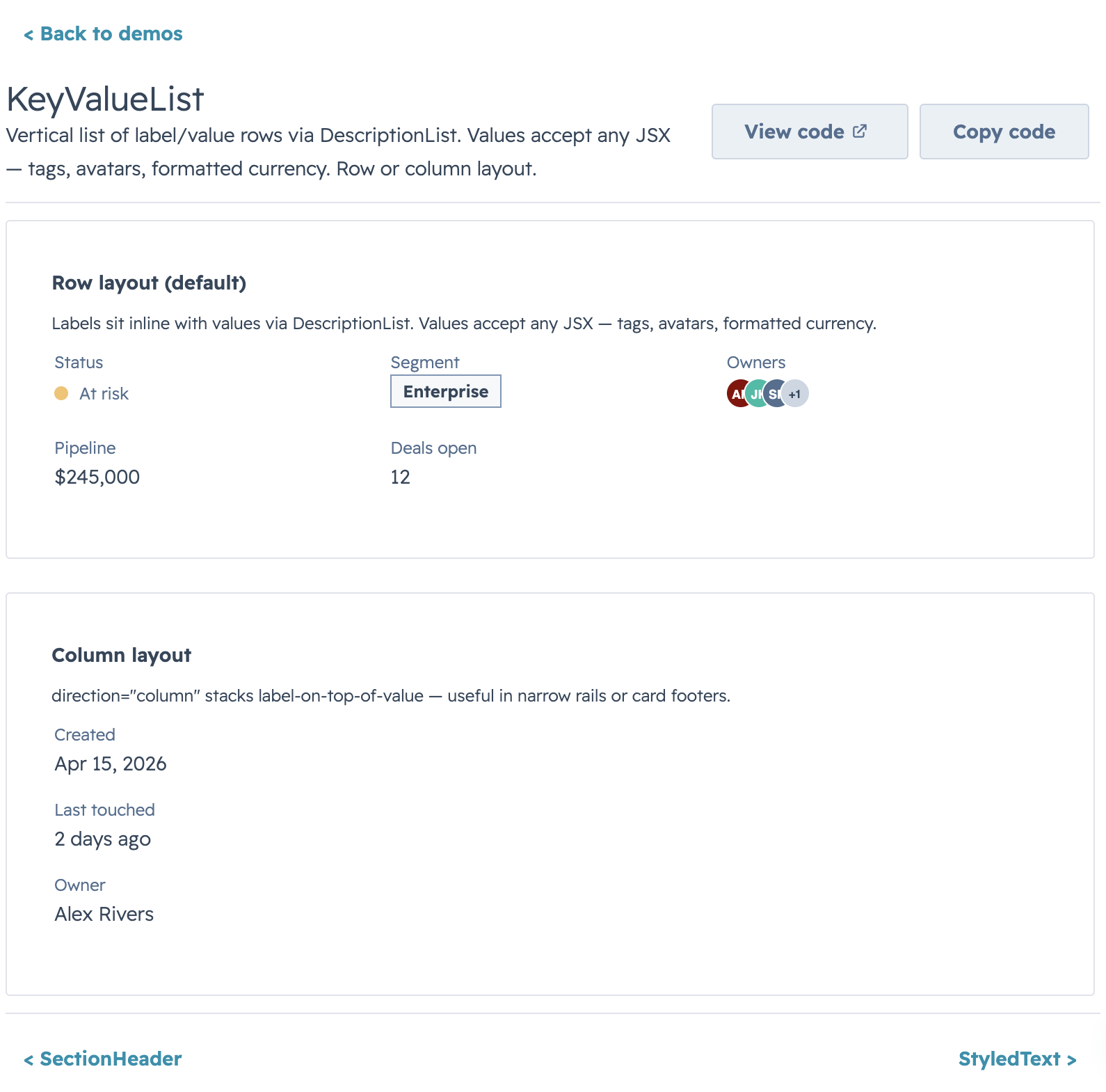
39
50
|
|
|
@@ -41,7 +52,7 @@ Requires `react` >= 18.0.0 and `@hubspot/ui-extensions` >= 0.12.0 as peer depend
|
|
|
41
52
|
|
|
42
53
|
A drop-in table component for HubSpot UI Extensions. Define your columns, pass your data, and you get search, filtering, sorting, pagination, inline editing, row grouping, and auto-sized columns out of the box.
|
|
43
54
|
|
|
44
|
-

|
|
45
56
|
|
|
46
57
|
## Quick Start
|
|
47
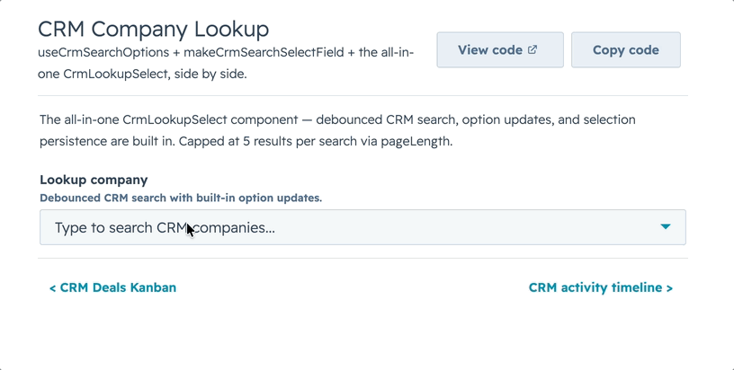
58
|
|
|
@@ -94,29 +105,29 @@ That's a searchable, sortable, paginated table with auto-sized columns in 5 line
|
|
|
94
105
|
|
|
95
106
|
### Filters & Footer Totals
|
|
96
107
|
|
|
97
|
-

|
|
98
109
|
|
|
99
110
|
### Row Selection & Bulk Actions
|
|
100
111
|
|
|
101
|
-

|
|
102
113
|
|
|
103
114
|
### Inline Editing
|
|
104
115
|
|
|
105
|
-

|
|
106
117
|
|
|
107
118
|
Two edit modes: **discrete** (click-to-edit, default) and **inline** (always-visible inputs). Supports `text`, `textarea`, `number`, `currency`, `stepper`, `select`, `multiselect`, `date`, `time`, `datetime`, `toggle`, and `checkbox`.
|
|
108
119
|
|
|
109
120
|
### Row Grouping
|
|
110
121
|
|
|
111
|
-

|
|
112
123
|
|
|
113
124
|
### Full-Row Editing
|
|
114
125
|
|
|
115
|
-

|
|
116
127
|
|
|
117
128
|
### useAssociations
|
|
118
129
|
|
|
119
|
-

|
|
120
131
|
|
|
121
132
|
Connect live CRM data (contacts, deals, tickets, etc.) to a DataTable with `useAssociations` from `@hubspot/ui-extensions/crm`.
|
|
122
133
|
|
|
@@ -126,7 +137,7 @@ Connect live CRM data (contacts, deals, tickets, etc.) to a DataTable with `useA
|
|
|
126
137
|
|
|
127
138
|
Declarative, config-driven forms for HubSpot UI Extensions. Define fields as data, get a complete form with validation, layout, multi-step wizards, and full HubSpot component integration.
|
|
128
139
|
|
|
129
|
-

|
|
130
141
|
|
|
131
142
|
## Quick Start
|
|
132
143
|
|
|
@@ -165,35 +176,35 @@ const fields = [
|
|
|
165
176
|
|
|
166
177
|
### Layout
|
|
167
178
|
|
|
168
|
-

|
|
169
180
|
|
|
170
181
|
### Conditional Visibility & Dependent Properties
|
|
171
182
|
|
|
172
|
-

|
|
173
184
|
|
|
174
185
|
### Async Validation
|
|
175
186
|
|
|
176
|
-

|
|
177
188
|
|
|
178
189
|
### Repeater Fields
|
|
179
190
|
|
|
180
|
-

|
|
181
192
|
|
|
182
193
|
### Sections & Groups
|
|
183
194
|
|
|
184
|
-

|
|
185
196
|
|
|
186
197
|
### Custom Field Types
|
|
187
198
|
|
|
188
|
-

|
|
189
200
|
|
|
190
201
|
### Display Options
|
|
191
202
|
|
|
192
|
-

|
|
193
204
|
|
|
194
205
|
### Read-Only Mode
|
|
195
206
|
|
|
196
|
-

|
|
197
208
|
|
|
198
209
|
---
|
|
199
210
|
|
|
@@ -201,7 +212,7 @@ const fields = [
|
|
|
201
212
|
|
|
202
213
|
A stage-based board view that shares DataTable's config vocabulary (`cardFields` ≈ `columns`, filters, sort, selection) so you can offer users a table-or-board toggle without rewriting the data layer. Drag-and-drop isn't available inside HubSpot UI Extensions, so stage changes happen through an inline `Select` (or menu) on each card.
|
|
203
214
|
|
|
204
|
-

|
|
205
216
|
|
|
206
217
|
## Quick Start
|
|
207
218
|
|
|
@@ -250,21 +261,21 @@ const CARD_FIELDS = [
|
|
|
250
261
|
|
|
251
262
|
### HubSpot Deals preset
|
|
252
263
|
|
|
253
|
-

|
|
254
265
|
|
|
255
266
|
Drop-in preset shaped like HubSpot's native deals pipeline: stage-variant headers, per-stage amount totals in the header metric, and an avatar-stack footer row. Hide the summary row with `showMetrics={false}` for dashboards that already surface totals elsewhere.
|
|
256
267
|
|
|
257
|
-

|
|
258
269
|
|
|
259
270
|
### Compact lead board
|
|
260
271
|
|
|
261
|
-

|
|
262
273
|
|
|
263
274
|
`cardDensity="compact"` with trimmed `cardFields` for high-volume boards (leads, tickets, tasks) where you want to fit 8-12 cards per column on a typical viewport without horizontal scrolling.
|
|
264
275
|
|
|
265
276
|
### Load-more & stage controls
|
|
266
277
|
|
|
267
|
-

|
|
268
279
|
|
|
269
280
|
Per-stage pagination via an `onLoadMore` handler and `stageMeta.hasMore`, plus inline `Select` stage controls on each card (`stageControl="select"`). Switch to `"menu"` for action-menu style transitions, or `"none"` for read-only boards.
|
|
270
281
|
|
|
@@ -305,9 +316,11 @@ import { formatCurrency } from "hs-uix/utils";
|
|
|
305
316
|
|
|
306
317
|
## What's inside
|
|
307
318
|
|
|
319
|
+
- `Icon` — a superset of HubSpot's native `<Icon>`: custom glyphs, any CSS color, and pixel sizes, delegating to the native component whenever the request is natively expressible
|
|
308
320
|
- `AutoStatusTag` — `StatusTag` with variant inferred from the value (`Active` → success, `At risk` → warning, `Failed` → danger, etc.)
|
|
309
321
|
- `AutoTag` — `Tag` with the same inference, for non-status labels
|
|
310
322
|
- `AvatarStack` — overlapping circular avatars as a single SVG (letters, image URLs, or mixed); `+N` overflow chip past `maxVisible`
|
|
323
|
+
- `CrmLookupSelect` — CRM-backed `Select` / `MultiSelect` with live, debounced search
|
|
311
324
|
- `SectionHeader` — title + optional description + actions slot
|
|
312
325
|
- `KeyValueList` — vertical list of label/value rows via `DescriptionList`
|
|
313
326
|
- `StyledText` — SVG-rendered text with rotation, custom color, and pill backgrounds for cases native `<Text>` can't express
|
|
@@ -330,6 +343,16 @@ Pass a free-form status string and get a properly-colored tag back. Matching is
|
|
|
330
343
|
|
|
331
344
|
Overlapping avatars rendered as a single SVG via `<Image>`. T-shirt sizing (`xs` → `xl`) or a raw pixel number. Letters auto-color from the built-in palette; image URLs get circular-clipped. Extras past `maxVisible` collapse into a neutral `+N` chip.
|
|
332
345
|
|
|
346
|
+
### Icon
|
|
347
|
+
|
|
348
|
+
A superset of HubSpot's native `<Icon>`. When the request is natively expressible (a whitelisted `name`, a semantic `color`, an `sm`/`md`/`lg` `size`) it **delegates to the real `<Icon>`** — keeping auto-sizing, `color="inherit"`, and screen-reader semantics. Otherwise it renders a registered SVG glyph as a data-URI `<Image>`, lifting all three native limits: custom/unregistered glyphs (~248 bundled in `ICONS`), any CSS color, and `xs`–`xl` tokens or a pixel size. Add your own glyphs via `svgToIconEntry`, or build a data URI directly with `makeIconDataUri`.
|
|
349
|
+
|
|
350
|
+
### CrmLookupSelect
|
|
351
|
+
|
|
352
|
+
|
|
353
|
+
|
|
354
|
+
Point it at a CRM `objectType` + `properties` and get a debounced `Select` / `MultiSelect` that searches the first `pageLength` CRM matches as the user types. Picked options stay valid after results change, `loadingOption` shows during the debounce window, and `noResultsOption` only appears once a query settles — no "no results" flash mid-type. For custom lookup UIs that need native cursor controls, `useCrmSearchOptions` exposes `pagination` / `hasMore`.
|
|
355
|
+
|
|
333
356
|
### SectionHeader & KeyValueList
|
|
334
357
|
|
|
335
358
|
|
package/calendar.d.ts
ADDED
|
@@ -0,0 +1 @@
|
|
|
1
|
+
export * from "./src/calendar/index";
|
package/common-components.d.ts
CHANGED
|
@@ -100,6 +100,139 @@ export interface AvatarStackProps {
|
|
|
100
100
|
alt?: string;
|
|
101
101
|
}
|
|
102
102
|
|
|
103
|
+
export interface CollectionFilterConfig {
|
|
104
|
+
name: string;
|
|
105
|
+
type?: "select" | "multiselect" | "dateRange" | string;
|
|
106
|
+
label?: string;
|
|
107
|
+
placeholder?: string;
|
|
108
|
+
options?: Array<{ label: ReactNode; value: unknown }>;
|
|
109
|
+
includeAll?: boolean;
|
|
110
|
+
allValue?: unknown;
|
|
111
|
+
emptyValue?: unknown;
|
|
112
|
+
allLabel?: string;
|
|
113
|
+
chipLabel?: string;
|
|
114
|
+
fromLabel?: string;
|
|
115
|
+
toLabel?: string;
|
|
116
|
+
}
|
|
117
|
+
|
|
118
|
+
export interface CollectionFilterLabels {
|
|
119
|
+
all?: string;
|
|
120
|
+
dateFrom?: string;
|
|
121
|
+
dateTo?: string;
|
|
122
|
+
}
|
|
123
|
+
|
|
124
|
+
export interface CollectionFilterControlProps {
|
|
125
|
+
filter?: CollectionFilterConfig;
|
|
126
|
+
value?: unknown;
|
|
127
|
+
onChange?: (name: string, value: unknown) => void;
|
|
128
|
+
namePrefix?: string;
|
|
129
|
+
labels?: CollectionFilterLabels;
|
|
130
|
+
selectVariant?: "transparent" | "input" | string;
|
|
131
|
+
includeAll?: boolean;
|
|
132
|
+
allValue?: unknown;
|
|
133
|
+
}
|
|
134
|
+
|
|
135
|
+
export interface ActiveFilterChip {
|
|
136
|
+
key: string;
|
|
137
|
+
label: ReactNode;
|
|
138
|
+
}
|
|
139
|
+
|
|
140
|
+
export interface ActiveFilterChipsProps {
|
|
141
|
+
chips?: ActiveFilterChip[];
|
|
142
|
+
showBadges?: boolean;
|
|
143
|
+
showClearAll?: boolean;
|
|
144
|
+
clearAllLabel?: ReactNode;
|
|
145
|
+
onRemove?: (key: string) => void;
|
|
146
|
+
gap?: string;
|
|
147
|
+
}
|
|
148
|
+
|
|
149
|
+
export interface CollectionToolbarSearchConfig {
|
|
150
|
+
visible?: boolean;
|
|
151
|
+
show?: boolean;
|
|
152
|
+
name?: string;
|
|
153
|
+
placeholder?: string;
|
|
154
|
+
value?: string;
|
|
155
|
+
clearable?: boolean;
|
|
156
|
+
onChange?: (value: string) => void;
|
|
157
|
+
onInput?: (value: string) => void;
|
|
158
|
+
}
|
|
159
|
+
|
|
160
|
+
export interface CollectionToolbarFiltersConfig {
|
|
161
|
+
items?: CollectionFilterConfig[];
|
|
162
|
+
values?: Record<string, unknown>;
|
|
163
|
+
inlineLimit?: number;
|
|
164
|
+
namePrefix?: string;
|
|
165
|
+
onChange?: (name: string, value: unknown) => void;
|
|
166
|
+
labels?: CollectionFilterLabels & Record<string, unknown>;
|
|
167
|
+
includeAll?: boolean;
|
|
168
|
+
allValue?: unknown;
|
|
169
|
+
selectVariant?: "transparent" | "input" | string;
|
|
170
|
+
overflowButtonSize?: string;
|
|
171
|
+
filtersButtonLabel?: ReactNode;
|
|
172
|
+
}
|
|
173
|
+
|
|
174
|
+
export interface CollectionToolbarChipsConfig {
|
|
175
|
+
items?: ActiveFilterChip[];
|
|
176
|
+
showBadges?: boolean;
|
|
177
|
+
showClearAll?: boolean;
|
|
178
|
+
clearAllLabel?: ReactNode;
|
|
179
|
+
onRemove?: (key: string) => void;
|
|
180
|
+
gap?: string;
|
|
181
|
+
}
|
|
182
|
+
|
|
183
|
+
export interface CollectionCountLabelObject {
|
|
184
|
+
singular: string;
|
|
185
|
+
plural: string;
|
|
186
|
+
}
|
|
187
|
+
|
|
188
|
+
export interface CollectionCountProps {
|
|
189
|
+
shown?: number;
|
|
190
|
+
total?: number;
|
|
191
|
+
label?: string | CollectionCountLabelObject | ((count: number) => string);
|
|
192
|
+
text?: ReactNode;
|
|
193
|
+
formatter?: (shown: number, total: number) => ReactNode;
|
|
194
|
+
bold?: boolean;
|
|
195
|
+
variant?: string;
|
|
196
|
+
format?: Record<string, unknown>;
|
|
197
|
+
}
|
|
198
|
+
|
|
199
|
+
export interface FormatCollectionCountParams {
|
|
200
|
+
shown?: number;
|
|
201
|
+
total?: number;
|
|
202
|
+
label?: string | CollectionCountLabelObject | ((count: number) => string);
|
|
203
|
+
formatter?: (shown: number, total: number) => ReactNode;
|
|
204
|
+
}
|
|
205
|
+
|
|
206
|
+
export interface CollectionSortSelectProps {
|
|
207
|
+
name?: string;
|
|
208
|
+
value?: string | null;
|
|
209
|
+
options?: Array<{ label: ReactNode; value: string }>;
|
|
210
|
+
placeholder?: string;
|
|
211
|
+
onChange?: (value: string) => void;
|
|
212
|
+
includeEmpty?: boolean;
|
|
213
|
+
emptyValue?: string;
|
|
214
|
+
variant?: "transparent" | "input" | string;
|
|
215
|
+
idPrefix?: string;
|
|
216
|
+
uniqueName?: boolean;
|
|
217
|
+
}
|
|
218
|
+
|
|
219
|
+
export interface CollectionToolbarProps {
|
|
220
|
+
search?: CollectionToolbarSearchConfig;
|
|
221
|
+
filters?: CollectionToolbarFiltersConfig;
|
|
222
|
+
chips?: CollectionToolbarChipsConfig;
|
|
223
|
+
right?: ReactNode;
|
|
224
|
+
footer?: ReactNode;
|
|
225
|
+
labels?: Record<string, unknown>;
|
|
226
|
+
leftFlex?: number;
|
|
227
|
+
rightFlex?: number;
|
|
228
|
+
rightAlignSelf?: string;
|
|
229
|
+
gap?: string;
|
|
230
|
+
/** Optional stable prefix used to generate unique child input/select names. */
|
|
231
|
+
idPrefix?: string;
|
|
232
|
+
/** Append a per-toolbar suffix to child input/select names. Default true. */
|
|
233
|
+
uniqueNames?: boolean;
|
|
234
|
+
}
|
|
235
|
+
|
|
103
236
|
export interface CrmLookupSelectProps {
|
|
104
237
|
objectType: "contact" | "contacts" | "company" | "companies" | "deal" | "deals" | string;
|
|
105
238
|
properties?: string[];
|
|
@@ -267,6 +400,10 @@ export interface IconProps {
|
|
|
267
400
|
size?: IconSize;
|
|
268
401
|
/** Accessible label for screen readers. */
|
|
269
402
|
screenReaderText?: string;
|
|
403
|
+
/** Passed through to native HubSpot Icon when possible; fallback Image also receives it. */
|
|
404
|
+
onClick?: (...args: unknown[]) => void;
|
|
405
|
+
/** Passed through to native HubSpot Icon when possible; fallback Image also receives it. */
|
|
406
|
+
href?: string | { url: string; external?: boolean };
|
|
270
407
|
}
|
|
271
408
|
|
|
272
409
|
export interface IconDataUriResult {
|
|
@@ -297,6 +434,12 @@ export declare function svgToIconEntry(raw: string): IconEntry;
|
|
|
297
434
|
|
|
298
435
|
export declare function AutoTag(props: AutoTagProps): ReactNode;
|
|
299
436
|
export declare function AutoStatusTag(props: AutoStatusTagProps): ReactNode;
|
|
437
|
+
export declare function ActiveFilterChips(props: ActiveFilterChipsProps): ReactNode;
|
|
438
|
+
export declare function CollectionCount(props: CollectionCountProps): ReactNode;
|
|
439
|
+
export declare function formatCollectionCount(params: FormatCollectionCountParams): ReactNode;
|
|
440
|
+
export declare function CollectionFilterControl(props: CollectionFilterControlProps): ReactNode;
|
|
441
|
+
export declare function CollectionSortSelect(props: CollectionSortSelectProps): ReactNode;
|
|
442
|
+
export declare function CollectionToolbar(props: CollectionToolbarProps): ReactNode;
|
|
300
443
|
export declare function SectionHeader(props: SectionHeaderProps): ReactNode;
|
|
301
444
|
export declare function KeyValueList(props: KeyValueListProps): ReactNode;
|
|
302
445
|
export declare function AvatarStack(props: AvatarStackProps): ReactNode;
|
package/datatable.d.ts
CHANGED
|
@@ -1,27 +1 @@
|
|
|
1
|
-
export
|
|
2
|
-
DataTable,
|
|
3
|
-
DataTableProps,
|
|
4
|
-
DataTableColumn,
|
|
5
|
-
DataTableFilterConfig,
|
|
6
|
-
DataTableFilterType,
|
|
7
|
-
DataTableGroupBy,
|
|
8
|
-
DataTableSortDirection,
|
|
9
|
-
DataTableSortObject,
|
|
10
|
-
DataTableParams,
|
|
11
|
-
DataTableOption,
|
|
12
|
-
DataTableDateValue,
|
|
13
|
-
DataTableTimeValue,
|
|
14
|
-
DataTableDateRangeValue,
|
|
15
|
-
DataTableWidth,
|
|
16
|
-
DataTableColumnWidth,
|
|
17
|
-
DataTableEditMode,
|
|
18
|
-
DataTableEditType,
|
|
19
|
-
DataTableSelectionAction,
|
|
20
|
-
DataTableRowAction,
|
|
21
|
-
DataTableSelectAllRequestPayload,
|
|
22
|
-
DataTableLabels,
|
|
23
|
-
DataTableSelectionBarRenderContext,
|
|
24
|
-
DataTableEmptyStateRenderContext,
|
|
25
|
-
DataTableLoadingStateRenderContext,
|
|
26
|
-
DataTableErrorStateRenderContext,
|
|
27
|
-
} from "./packages/datatable/index";
|
|
1
|
+
export * from "./src/datatable/index";
|