hs-uix 2.0.0 → 2.1.0
This diff represents the content of publicly available package versions that have been released to one of the supported registries. The information contained in this diff is provided for informational purposes only and reflects changes between package versions as they appear in their respective public registries.
- package/README.md +54 -31
- package/calendar.d.ts +1 -0
- package/common-components.d.ts +143 -0
- package/datatable.d.ts +1 -27
- package/dist/calendar.js +2003 -0
- package/dist/calendar.mjs +2004 -0
- package/dist/common-components.js +1072 -717
- package/dist/common-components.mjs +1344 -994
- package/dist/datatable.js +1114 -251
- package/dist/datatable.mjs +1089 -219
- package/dist/feed.js +1166 -154
- package/dist/feed.mjs +1170 -153
- package/dist/form.js +792 -166
- package/dist/form.mjs +693 -68
- package/dist/index.js +8354 -7077
- package/dist/index.mjs +8425 -7128
- package/dist/kanban.js +1076 -329
- package/dist/kanban.mjs +1061 -311
- package/dist/utils.js +1492 -646
- package/dist/utils.mjs +1410 -573
- package/feed.d.ts +1 -1
- package/form.d.ts +1 -28
- package/index.d.ts +54 -103
- package/kanban.d.ts +1 -1
- package/package.json +10 -6
- package/src/calendar/README.md +301 -0
- package/src/calendar/index.d.ts +201 -0
- package/src/common-components/README.md +400 -0
- package/{packages → src}/datatable/README.md +10 -10
- package/{packages → src}/datatable/index.d.ts +11 -0
- package/{packages → src}/feed/README.md +3 -1
- package/{packages → src}/feed/index.d.ts +18 -0
- package/{packages → src}/form/README.md +24 -10
- package/{packages → src}/kanban/README.md +13 -13
- package/{packages → src}/kanban/index.d.ts +18 -7
- package/src/utils/README.md +511 -0
- package/utils.d.ts +55 -3
- /package/{packages → src}/form/index.d.ts +0 -0
|
@@ -0,0 +1,201 @@
|
|
|
1
|
+
import type { ReactElement, ReactNode } from "react";
|
|
2
|
+
|
|
3
|
+
// ---------------------------------------------------------------------------
|
|
4
|
+
// Primitives
|
|
5
|
+
// ---------------------------------------------------------------------------
|
|
6
|
+
|
|
7
|
+
export type CalendarView = "month" | "week" | "day" | "agenda";
|
|
8
|
+
export type CalendarOverlayMode = "popover" | "modal" | "panel" | "none";
|
|
9
|
+
export type CalendarFilterType = "select" | "multiselect" | "dateRange";
|
|
10
|
+
|
|
11
|
+
/** Any date shape the calendar can coerce: Date, epoch ms, ISO string, or a
|
|
12
|
+
* HubSpot DateInput value object ({ year, month, date } with 0-indexed month). */
|
|
13
|
+
export type CalendarDateInput =
|
|
14
|
+
| Date
|
|
15
|
+
| number
|
|
16
|
+
| string
|
|
17
|
+
| { year: number; month: number; date: number; hour?: number; minute?: number };
|
|
18
|
+
|
|
19
|
+
export interface CalendarOption<T = string> {
|
|
20
|
+
label: string;
|
|
21
|
+
value: T;
|
|
22
|
+
}
|
|
23
|
+
|
|
24
|
+
export interface CalendarFilterConfig<Event = Record<string, unknown>> {
|
|
25
|
+
name: string;
|
|
26
|
+
type?: CalendarFilterType;
|
|
27
|
+
placeholder?: string;
|
|
28
|
+
/** Prefix used in the active-filter chip. Defaults to `placeholder` or `name`. */
|
|
29
|
+
chipLabel?: string;
|
|
30
|
+
options?: CalendarOption[];
|
|
31
|
+
filterFn?: (event: Event, value: unknown) => boolean;
|
|
32
|
+
}
|
|
33
|
+
|
|
34
|
+
export type CalendarHref =
|
|
35
|
+
| string
|
|
36
|
+
| { url: string; external?: boolean };
|
|
37
|
+
|
|
38
|
+
/** Maps fields on each event object to the roles the calendar understands. Each
|
|
39
|
+
* entry is either a key on the event object or an accessor function. */
|
|
40
|
+
export interface CalendarEventFields<Event = Record<string, unknown>> {
|
|
41
|
+
id?: string | ((event: Event) => string | number);
|
|
42
|
+
start?: string | ((event: Event) => CalendarDateInput | null | undefined);
|
|
43
|
+
end?: string | ((event: Event) => CalendarDateInput | null | undefined);
|
|
44
|
+
title?: string | ((event: Event) => ReactNode);
|
|
45
|
+
subtitle?: string | ((event: Event) => ReactNode);
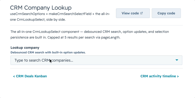
|
|
46
|
+
/** A Tag/StatusTag variant: "default" | "info" | "success" | "warning" | "error". */
|
|
47
|
+
color?: string | ((event: Event) => string);
|
|
48
|
+
href?: CalendarHref | ((event: Event) => CalendarHref | null | undefined);
|
|
49
|
+
}
|
|
50
|
+
|
|
51
|
+
/** The normalized event passed to render callbacks. */
|
|
52
|
+
export interface CalendarNormalizedEvent<Event = Record<string, unknown>> {
|
|
53
|
+
key: string;
|
|
54
|
+
id: string | number | undefined;
|
|
55
|
+
start: Date | null;
|
|
56
|
+
end: Date | null;
|
|
57
|
+
title: ReactNode;
|
|
58
|
+
subtitle: ReactNode;
|
|
59
|
+
color: string | undefined;
|
|
60
|
+
href: { url: string; external: boolean } | null;
|
|
61
|
+
raw: Event;
|
|
62
|
+
}
|
|
63
|
+
|
|
64
|
+
export interface CalendarRange {
|
|
65
|
+
start: Date;
|
|
66
|
+
end: Date;
|
|
67
|
+
view: CalendarView;
|
|
68
|
+
}
|
|
69
|
+
|
|
70
|
+
/** A timezone option for the built-in selector: an IANA id, or an id with an
|
|
71
|
+
* explicit label (otherwise a DST-aware "UTC −05:00 Central Time" is computed). */
|
|
72
|
+
export type CalendarTimeZoneOption = string | { value: string; label?: string };
|
|
73
|
+
|
|
74
|
+
export interface CalendarToolbarApi {
|
|
75
|
+
title: string;
|
|
76
|
+
view: CalendarView;
|
|
77
|
+
views: CalendarView[];
|
|
78
|
+
focusedDate: Date;
|
|
79
|
+
onViewChange: (view: CalendarView) => void;
|
|
80
|
+
onPrev: () => void;
|
|
81
|
+
onNext: () => void;
|
|
82
|
+
onToday: () => void;
|
|
83
|
+
/** Active IANA timezone (undefined when the tz layer is disabled). */
|
|
84
|
+
timeZone?: string;
|
|
85
|
+
onTimeZoneChange: (tz: string) => void;
|
|
86
|
+
/** Selector options ({ value, label }), or null when `showTimeZoneSelect` is off. */
|
|
87
|
+
timeZoneOptions: { value: string; label: string }[] | null;
|
|
88
|
+
}
|
|
89
|
+
|
|
90
|
+
export interface CalendarLabels {
|
|
91
|
+
today?: string;
|
|
92
|
+
previous?: string;
|
|
93
|
+
next?: string;
|
|
94
|
+
search?: string;
|
|
95
|
+
clearAll?: string;
|
|
96
|
+
more?: (count: number) => string;
|
|
97
|
+
noEventsTitle?: string;
|
|
98
|
+
noEventsMessage?: string;
|
|
99
|
+
loading?: string;
|
|
100
|
+
errorTitle?: string;
|
|
101
|
+
errorMessage?: string;
|
|
102
|
+
open?: string;
|
|
103
|
+
allDay?: string;
|
|
104
|
+
}
|
|
105
|
+
|
|
106
|
+
export interface CalendarProps<Event = Record<string, unknown>> {
|
|
107
|
+
/** Event objects. The calendar is presentational — the caller owns fetching. */
|
|
108
|
+
events: Event[];
|
|
109
|
+
/** Maps event fields to calendar roles (start/end/title/color/href/…). */
|
|
110
|
+
eventFields?: CalendarEventFields<Event>;
|
|
111
|
+
|
|
112
|
+
// View control
|
|
113
|
+
view?: CalendarView;
|
|
114
|
+
defaultView?: CalendarView;
|
|
115
|
+
onViewChange?: (view: CalendarView) => void;
|
|
116
|
+
/** Which views to expose in the switcher. Defaults to all (month, week, day, agenda). */
|
|
117
|
+
views?: CalendarView[];
|
|
118
|
+
|
|
119
|
+
// Date control
|
|
120
|
+
focusedDate?: CalendarDateInput;
|
|
121
|
+
defaultFocusedDate?: CalendarDateInput;
|
|
122
|
+
onNavigate?: (date: Date, ctx: { view: CalendarView }) => void;
|
|
123
|
+
/** 0 = Sunday (default), 1 = Monday. */
|
|
124
|
+
weekStartsOn?: 0 | 1;
|
|
125
|
+
hideWeekends?: boolean;
|
|
126
|
+
/** Max chips per day cell in month view before collapsing to "N more". */
|
|
127
|
+
maxEventsPerDay?: number;
|
|
128
|
+
|
|
129
|
+
// Time grid (week / day views)
|
|
130
|
+
/** First hour row in week/day view (0–23). Default 8. */
|
|
131
|
+
dayStartHour?: number;
|
|
132
|
+
/** Last hour row in week/day view (0–23). Default 20. */
|
|
133
|
+
dayEndHour?: number;
|
|
134
|
+
|
|
135
|
+
// Timezone — OFF by default: with none of these props set, events render exactly
|
|
136
|
+
// as provided (no conversion, browser-local). Opt in via `timeZone`,
|
|
137
|
+
// `defaultTimeZone`, or `showTimeZoneSelect` and all times, grid placement, and
|
|
138
|
+
// day-grouping resolve in the chosen IANA zone (DST-correct).
|
|
139
|
+
/** Controlled IANA timezone, e.g. "America/Chicago". Pair with `onTimeZoneChange`.
|
|
140
|
+
* Engaging the tz layer at all is opt-in; unset = events render as-sent. */
|
|
141
|
+
timeZone?: string;
|
|
142
|
+
/** Initial (uncontrolled) IANA timezone. Only applies once the tz layer is
|
|
143
|
+
* engaged; the layer itself defaults to `"UTC"` when opted in without this. */
|
|
144
|
+
defaultTimeZone?: string;
|
|
145
|
+
/** Fires when the timezone changes (via the built-in selector or prop). */
|
|
146
|
+
onTimeZoneChange?: (timeZone: string) => void;
|
|
147
|
+
/** Show the built-in timezone dropdown in the toolbar. Default `false`. Enabling
|
|
148
|
+
* it opts into the timezone layer (which starts at UTC). */
|
|
149
|
+
showTimeZoneSelect?: boolean;
|
|
150
|
+
/** Override the selector's zone list. IANA ids, or `{ value, label }` to supply
|
|
151
|
+
* a custom label (otherwise a DST-aware label is computed). */
|
|
152
|
+
timeZoneOptions?: CalendarTimeZoneOption[];
|
|
153
|
+
|
|
154
|
+
// Filter / search (reuses the DataTable/Kanban query pipeline)
|
|
155
|
+
filters?: CalendarFilterConfig<Event>[];
|
|
156
|
+
/** Top-level keys on each raw event to search. REQUIRED for `showSearch` to do
|
|
157
|
+
* anything — with no `searchFields` the search box matches nothing. */
|
|
158
|
+
searchFields?: string[];
|
|
159
|
+
searchValue?: string;
|
|
160
|
+
onSearchChange?: (value: string) => void;
|
|
161
|
+
filterValues?: Record<string, unknown>;
|
|
162
|
+
onFilterChange?: (values: Record<string, unknown>) => void;
|
|
163
|
+
fuzzySearch?: boolean;
|
|
164
|
+
/** Show the search box. Pair with `searchFields` (search is a no-op without it). */
|
|
165
|
+
showSearch?: boolean;
|
|
166
|
+
/** Flex weight for the toolbar's left search/filter column. Default 3 (60% with default right flex 2). */
|
|
167
|
+
toolbarLeftFlex?: number;
|
|
168
|
+
/** Flex weight for the toolbar's right nav/view controls. Default 2 (40% with default left flex 3). */
|
|
169
|
+
toolbarRightFlex?: number;
|
|
170
|
+
|
|
171
|
+
// Server-side
|
|
172
|
+
serverSide?: boolean;
|
|
173
|
+
loading?: boolean;
|
|
174
|
+
error?: string | boolean;
|
|
175
|
+
/** Fires on mount and whenever the visible range changes — fetch here. */
|
|
176
|
+
onRangeChange?: (range: CalendarRange) => void;
|
|
177
|
+
|
|
178
|
+
// Event interactivity
|
|
179
|
+
/** How an event opens. Default "popover" (experimental). */
|
|
180
|
+
overlayMode?: CalendarOverlayMode;
|
|
181
|
+
/** Override the overlay body for an event. */
|
|
182
|
+
renderEventDetail?: (event: CalendarNormalizedEvent<Event>) => ReactNode;
|
|
183
|
+
/** Always fires on event click, regardless of overlay mode. */
|
|
184
|
+
onEventClick?: (raw: Event, event: CalendarNormalizedEvent<Event>) => void;
|
|
185
|
+
|
|
186
|
+
// Render overrides
|
|
187
|
+
renderToolbar?: (api: CalendarToolbarApi) => ReactNode;
|
|
188
|
+
renderDayCell?: (day: Date, events: CalendarNormalizedEvent<Event>[]) => ReactNode;
|
|
189
|
+
/** Replace the empty state in the agenda view when the visible range has no
|
|
190
|
+
* events. The month / week / day grids always render their grid, so this does
|
|
191
|
+
* not apply there. */
|
|
192
|
+
renderEmptyState?: (ctx: Record<string, never>) => ReactNode;
|
|
193
|
+
renderLoadingState?: (ctx: Record<string, never>) => ReactNode;
|
|
194
|
+
renderErrorState?: (ctx: { error: string | boolean }) => ReactNode;
|
|
195
|
+
|
|
196
|
+
labels?: CalendarLabels;
|
|
197
|
+
}
|
|
198
|
+
|
|
199
|
+
export declare function Calendar<Event = Record<string, unknown>>(
|
|
200
|
+
props: CalendarProps<Event>
|
|
201
|
+
): ReactElement | null;
|
|
@@ -0,0 +1,400 @@
|
|
|
1
|
+
# common-components
|
|
2
|
+
|
|
3
|
+
Reusable UI wrappers built on top of HubSpot UI Extensions primitives.
|
|
4
|
+
|
|
5
|
+
## Current components
|
|
6
|
+
|
|
7
|
+
- `AutoStatusTag` — status tag whose variant is inferred from the value
|
|
8
|
+
- `AutoTag` — generic tag with inferred variant + display text
|
|
9
|
+
- `AvatarStack` — overlapping circular avatars (letters or image URLs)
|
|
10
|
+
- `Icon` — superset of HubSpot's native `<Icon>`: custom glyphs, any CSS color, pixel sizes
|
|
11
|
+
- `CrmLookupSelect` — CRM-backed `Select` / `MultiSelect` with live, debounced search
|
|
12
|
+
- `CollectionToolbar`, `CollectionFilterControl`, `ActiveFilterChips`, `CollectionSortSelect`, `CollectionCount` — shared search/filter/sort/count primitives used by DataTable, Kanban, Feed, and Calendar
|
|
13
|
+
- `SectionHeader` — title + optional description row
|
|
14
|
+
- `KeyValueList` — vertical list of label/value rows
|
|
15
|
+
- `StyledText` — SVG-rendered text with rotation, custom colors, pill backgrounds
|
|
16
|
+
- `Spinner` — animated unicode/braille loading indicator
|
|
17
|
+
|
|
18
|
+
Plus utilities + constants:
|
|
19
|
+
|
|
20
|
+
- `makeAvatarStackDataUri`, `makeStyledTextDataUri`, `makeIconDataUri` — low-level builders that return `{ src, width, height }` for composing into larger SVGs
|
|
21
|
+
- `ICONS`, `ICON_NAMES`, `NATIVE_ICON_NAME_LIST`, `svgToIconEntry` — the custom icon registry and helpers behind `Icon`
|
|
22
|
+
- `SPINNERS`, `SPINNER_NAMES` — spinner presets and registry
|
|
23
|
+
- `HS_DATE_PRESETS`, `HS_DATE_DIRECTION_LABELS` — HubSpot's native quick-date preset list
|
|
24
|
+
- `HS_FONT_FAMILY`, `HS_TEXT_COLOR`, `HS_SUBTLE_BG`, `HS_MUTED_TEXT`, `HS_NEUTRAL_CHIP` — style constants matching native HubSpot CSS
|
|
25
|
+
|
|
26
|
+
## Purpose
|
|
27
|
+
|
|
28
|
+
This folder is for composable visual building blocks.
|
|
29
|
+
|
|
30
|
+
Use `common-components` when the export renders JSX and wraps HubSpot primitives into a reusable display pattern, or when the export is a style-related constant (fonts, colors, preset option lists) that sits alongside those visual wrappers.
|
|
31
|
+
|
|
32
|
+
## Import paths
|
|
33
|
+
|
|
34
|
+
```js
|
|
35
|
+
import {
|
|
36
|
+
AutoStatusTag,
|
|
37
|
+
AutoTag,
|
|
38
|
+
AvatarStack,
|
|
39
|
+
Icon,
|
|
40
|
+
CrmLookupSelect,
|
|
41
|
+
CollectionToolbar,
|
|
42
|
+
CollectionSortSelect,
|
|
43
|
+
SectionHeader,
|
|
44
|
+
KeyValueList,
|
|
45
|
+
StyledText,
|
|
46
|
+
Spinner,
|
|
47
|
+
HS_DATE_PRESETS,
|
|
48
|
+
} from "hs-uix/common-components";
|
|
49
|
+
```
|
|
50
|
+
|
|
51
|
+
Or from the root package:
|
|
52
|
+
|
|
53
|
+
```js
|
|
54
|
+
import { AvatarStack, Icon, StyledText } from "hs-uix";
|
|
55
|
+
```
|
|
56
|
+
|
|
57
|
+
---
|
|
58
|
+
|
|
59
|
+
## Collection controls
|
|
60
|
+
|
|
61
|
+
The collection controls are the low-level toolbar primitives used internally by `DataTable`, `Kanban`, `Feed`, and `Calendar`. Use them when you are building a custom collection view but want the same search/filter/sort/count UX as the packaged components.
|
|
62
|
+
|
|
63
|
+
```jsx
|
|
64
|
+
import {
|
|
65
|
+
CollectionToolbar,
|
|
66
|
+
CollectionSortSelect,
|
|
67
|
+
} from "hs-uix/common-components";
|
|
68
|
+
import {
|
|
69
|
+
buildActiveFilterChips,
|
|
70
|
+
resetFilterValues,
|
|
71
|
+
} from "hs-uix/utils";
|
|
72
|
+
|
|
73
|
+
const activeChips = buildActiveFilterChips(filters, filterValues);
|
|
74
|
+
|
|
75
|
+
<CollectionToolbar
|
|
76
|
+
search={{
|
|
77
|
+
name: "deals-search",
|
|
78
|
+
value: search,
|
|
79
|
+
placeholder: "Search deals...",
|
|
80
|
+
onChange: setSearch,
|
|
81
|
+
}}
|
|
82
|
+
filters={{
|
|
83
|
+
items: filters,
|
|
84
|
+
values: filterValues,
|
|
85
|
+
inlineLimit: 2,
|
|
86
|
+
onChange: (name, value) => setFilterValues((prev) => ({ ...prev, [name]: value })),
|
|
87
|
+
}}
|
|
88
|
+
chips={{
|
|
89
|
+
items: activeChips,
|
|
90
|
+
onRemove: (key) => setFilterValues((prev) => resetFilterValues(filters, prev, key)),
|
|
91
|
+
}}
|
|
92
|
+
right={
|
|
93
|
+
<CollectionSortSelect
|
|
94
|
+
value={sort}
|
|
95
|
+
options={sortOptions}
|
|
96
|
+
placeholder="Sort"
|
|
97
|
+
onChange={setSort}
|
|
98
|
+
/>
|
|
99
|
+
}
|
|
100
|
+
/>
|
|
101
|
+
```
|
|
102
|
+
|
|
103
|
+
### Design notes
|
|
104
|
+
|
|
105
|
+
- These primitives are **controlled**. They render controls and emit changes; callers own query state and data filtering.
|
|
106
|
+
- `CollectionToolbar` automatically appends a per-toolbar suffix to child input/select names using React `useId()`. This prevents collisions when multiple tables, boards, feeds, or calendars render in the same extension. Pass `idPrefix` for a stable suffix or `uniqueNames={false}` to opt out.
|
|
107
|
+
- The right-side slot defaults to `alignSelf="end"`, so counts/sort controls sit on the lowest toolbar row. This keeps them aligned with active filter chips when chips are visible.
|
|
108
|
+
- `CollectionToolbar` accepts `leftFlex` / `rightFlex` for view-specific space allocation. Calendar uses a 3/2 split (60/40) by default because its right side contains Today, previous/next, and view controls.
|
|
109
|
+
|
|
110
|
+
### Shared filter config vocabulary
|
|
111
|
+
|
|
112
|
+
```js
|
|
113
|
+
{
|
|
114
|
+
name: "stage",
|
|
115
|
+
type: "select", // "select" | "multiselect" | "dateRange"
|
|
116
|
+
label: "Stage",
|
|
117
|
+
placeholder: "All stages",
|
|
118
|
+
chipLabel: "Stage",
|
|
119
|
+
emptyValue: "",
|
|
120
|
+
options: [
|
|
121
|
+
{ label: "Open", value: "open" },
|
|
122
|
+
{ label: "Closed", value: "closed" },
|
|
123
|
+
],
|
|
124
|
+
}
|
|
125
|
+
```
|
|
126
|
+
|
|
127
|
+
`CollectionFilterControl` also supports `includeAll`, `allValue`, `allLabel`, `fromLabel`, and `toLabel` for advanced cases. Prefer `emptyValue` for new filter configs; the library default is `""` for select filters. Feed keeps its legacy `"all"` empty value internally for compatibility, but custom shared configs should generally use `emptyValue: ""`.
|
|
128
|
+
|
|
129
|
+
---
|
|
130
|
+
|
|
131
|
+
## AvatarStack
|
|
132
|
+
|
|
133
|
+
Overlapping circular avatars rendered as a single SVG via `<Image>`. Letters get colored circles with white initials; `http(s):` or `data:image/...` URIs get circular-clipped images. Extras beyond `maxVisible` collapse into a neutral `+N` chip.
|
|
134
|
+
|
|
135
|
+
```jsx
|
|
136
|
+
import { AvatarStack } from "hs-uix/common-components";
|
|
137
|
+
|
|
138
|
+
<AvatarStack
|
|
139
|
+
items={["AR", "JK", "SP"]}
|
|
140
|
+
size="medium"
|
|
141
|
+
maxVisible={4}
|
|
142
|
+
overlap={8}
|
|
143
|
+
/>
|
|
144
|
+
|
|
145
|
+
// Mixed letters + image URLs
|
|
146
|
+
<AvatarStack
|
|
147
|
+
items={[
|
|
148
|
+
"AR",
|
|
149
|
+
"https://cdn.example.com/photos/jordan.png",
|
|
150
|
+
{ letter: "SP", color: "#8B0000" },
|
|
151
|
+
]}
|
|
152
|
+
/>
|
|
153
|
+
```
|
|
154
|
+
|
|
155
|
+
### Props
|
|
156
|
+
|
|
157
|
+
| Prop | Type | Default | Description |
|
|
158
|
+
| ---- | ---- | ------- | ----------- |
|
|
159
|
+
| `items` | `(string \| { letter, color, src })[]` | — | Each entry: a letter (2-char initials), an image URL (http(s)/data:image), or an explicit `{letter, color, src}` object. Empty/`null` values are filtered out. |
|
|
160
|
+
| `size` | t-shirt token \| number | `"medium"` | Diameter. Tokens: `xs`/`extra-small` (16), `sm`/`small` (20), `md`/`medium` (24), `lg`/`large` (32), `xl`/`extra-large` (40). Or any pixel number. |
|
|
161
|
+
| `overlap` | number | ~35% of `size` | Pixels each chip overlaps its neighbor. `0` = side-by-side, `size` = fully stacked. Clamped internally. |
|
|
162
|
+
| `step` | number | (derived from `overlap`) | Advanced: explicit center-to-center offset. Overrides `overlap` when set. |
|
|
163
|
+
| `maxVisible` | number | `4` | Cap on visible chips; extras become the `+N` overflow chip. |
|
|
164
|
+
| `colors` | `string[]` | built-in palette | Background palette for letter avatars (picked via char-code hash). |
|
|
165
|
+
| `overflowBg` | string | `HS_NEUTRAL_CHIP` | Background color for the `+N` chip. |
|
|
166
|
+
| `overflowColor` | string | `HS_TEXT_COLOR` | Text color for the `+N` chip. |
|
|
167
|
+
| `fontFamily` | string | `HS_FONT_FAMILY` | CSS font-family for letter initials. |
|
|
168
|
+
| `alt` | string | `"N associated records"` | Accessibility label on the underlying `<Image>`. |
|
|
169
|
+
|
|
170
|
+
### Low-level builder
|
|
171
|
+
|
|
172
|
+
```js
|
|
173
|
+
import { makeAvatarStackDataUri } from "hs-uix/common-components";
|
|
174
|
+
|
|
175
|
+
const { src, width, height } = makeAvatarStackDataUri(items, { size: "sm", overlap: 6 });
|
|
176
|
+
// → paint anywhere an <Image> is valid
|
|
177
|
+
```
|
|
178
|
+
|
|
179
|
+
Returns `null` when `items` resolves to zero valid entries — callers can unconditionally render without guarding.
|
|
180
|
+
|
|
181
|
+
**Image-URL caveat:** SVG `<image>` loads external assets via the browser's fetcher; the host must serve CORS-friendly headers. HubSpot-served avatars and most CDN hosts work; self-hosted images behind restricted CORS may not paint.
|
|
182
|
+
|
|
183
|
+
---
|
|
184
|
+
|
|
185
|
+
## Icon
|
|
186
|
+
|
|
187
|
+
A drop-in superset of HubSpot's native `<Icon>`. The native component is great but boxed in three ways: a fixed `name` whitelist, only 4 colors (`inherit` / `alert` / `warning` / `success`), and only 3 sizes (`small` / `medium` / `large`). `Icon` lifts all three.
|
|
188
|
+
|
|
189
|
+
When a request is **fully native-expressible** (a whitelisted `name`, a semantic `color`, and an `sm`/`md`/`lg` `size`) it **delegates to the real `<Icon>`** — so you keep native auto-sizing, real `color="inherit"`, and proper screen-reader semantics. Otherwise it falls back to rendering a registered SVG glyph as a data-URI `<Image>`, which is what unlocks custom glyphs, arbitrary colors, and pixel sizes.
|
|
190
|
+
|
|
191
|
+
```jsx
|
|
192
|
+
import { Icon } from "hs-uix/common-components";
|
|
193
|
+
|
|
194
|
+
// Native-expressible → delegates to HubSpot's <Icon>
|
|
195
|
+
<Icon name="email" size="md" color="inherit" />
|
|
196
|
+
|
|
197
|
+
// Custom glyph + arbitrary color + pixel size → SVG fallback
|
|
198
|
+
<Icon name="AdvancedFilters" color="#516f90" size={20} />
|
|
199
|
+
|
|
200
|
+
// Semantic color on a custom glyph
|
|
201
|
+
<Icon name="trophy" color="success" size="lg" screenReaderText="Top performer" />
|
|
202
|
+
```
|
|
203
|
+
|
|
204
|
+
### Props
|
|
205
|
+
|
|
206
|
+
| Prop | Type | Default | Description |
|
|
207
|
+
| ---- | ---- | ------- | ----------- |
|
|
208
|
+
| `name` | string | — | A registered glyph name — native (see `NATIVE_ICON_NAME_LIST`) or custom (see `ICON_NAMES`). An unknown, non-native name renders nothing. |
|
|
209
|
+
| `color` | string | `"inherit"` | A semantic token (`inherit` / `alert` / `warning` / `success`) or **any CSS color** (e.g. `#516f90`). Non-semantic colors force the SVG fallback. |
|
|
210
|
+
| `size` | t-shirt token \| number | `"md"` | `xs`/`extra-small` (12), `sm`/`small` (14), `md`/`medium` (16), `lg`/`large` (20), `xl`/`extra-large` (24), or a raw pixel number. Only `sm`/`md`/`lg` stay on the native path. |
|
|
211
|
+
| `screenReaderText` | string | `name` | Accessible label. On the fallback path it becomes the `<Image alt>`. |
|
|
212
|
+
|
|
213
|
+
### Custom glyphs & helpers
|
|
214
|
+
|
|
215
|
+
`ICONS` is the bundled custom-glyph registry (~248 glyphs scraped from HubSpot's web app); `ICON_NAMES` are its keys and `NATIVE_ICON_NAME_LIST` is the native whitelist. To use a glyph the native component doesn't expose, add it to the registry — or build one from a copied `<svg>`:
|
|
216
|
+
|
|
217
|
+
```js
|
|
218
|
+
import { makeIconDataUri, svgToIconEntry } from "hs-uix/common-components";
|
|
219
|
+
|
|
220
|
+
// Build a data URI directly (returns { src, width, height }, or null for an unknown name)
|
|
221
|
+
const { src, width, height } = makeIconDataUri("AdvancedFilters", { size: 20, color: "#516f90" });
|
|
222
|
+
|
|
223
|
+
// Turn a raw <svg> string into a registry entry (drops <mask>/<defs> and `currentColor`
|
|
224
|
+
// fills so `color` can recolor it; keeps explicit fills / fill-rules for multi-color glyphs)
|
|
225
|
+
const entry = svgToIconEntry('<svg viewBox="0 0 24 24"><path d="…" /></svg>');
|
|
226
|
+
```
|
|
227
|
+
|
|
228
|
+
**Fallback caveat:** a data-URI glyph can't inherit `currentColor`, so a fallback `Icon` won't auto-match surrounding text color — pass `color` explicitly. For multi-color glyphs, give individual paths their own `fill` in the registry entry; a single `color` prop only recolors paths that don't declare one.
|
|
229
|
+
|
|
230
|
+
---
|
|
231
|
+
|
|
232
|
+
## StyledText
|
|
233
|
+
|
|
234
|
+
Drop-in enhancement over HubSpot's `<Text>` for cases native `<Text>` can't express — rotation, custom colors, pill backgrounds, specific font sizes. Rendered as an inline-SVG data URI through `<Image>`.
|
|
235
|
+
|
|
236
|
+
Accepts the same `variant` / `format` props as HubSpot's `<Text>` so existing usage patterns carry over; adds SVG-only extras.
|
|
237
|
+
|
|
238
|
+
```jsx
|
|
239
|
+
import { StyledText } from "hs-uix/common-components";
|
|
240
|
+
|
|
241
|
+
// Rotated column-header label in a collapsed rail
|
|
242
|
+
<StyledText
|
|
243
|
+
text="Pricing Complete"
|
|
244
|
+
variant="bodytext"
|
|
245
|
+
format={{ fontWeight: "demibold" }}
|
|
246
|
+
orientation="vertical-down"
|
|
247
|
+
/>
|
|
248
|
+
|
|
249
|
+
// Pill-wrapped count indicator
|
|
250
|
+
<StyledText
|
|
251
|
+
text="339"
|
|
252
|
+
variant="microcopy"
|
|
253
|
+
format={{ fontWeight: "demibold" }}
|
|
254
|
+
background={{ preset: "tag" }}
|
|
255
|
+
/>
|
|
256
|
+
|
|
257
|
+
// Custom color (native <Text> can't do this)
|
|
258
|
+
<StyledText text="High priority" color="#f2545b" format={{ fontWeight: "bold" }} />
|
|
259
|
+
|
|
260
|
+
// Semantic tag colors with HubSpot-style tag chrome
|
|
261
|
+
<StyledText
|
|
262
|
+
text="At risk"
|
|
263
|
+
variant="microcopy"
|
|
264
|
+
format={{ fontWeight: "demibold" }}
|
|
265
|
+
background={{ preset: "tag", variant: "warning" }}
|
|
266
|
+
/>
|
|
267
|
+
```
|
|
268
|
+
|
|
269
|
+
### Props
|
|
270
|
+
|
|
271
|
+
| Prop | Type | Default | Description |
|
|
272
|
+
| ---- | ---- | ------- | ----------- |
|
|
273
|
+
| `text` / `children` | string | — | The text to render. `text` prop or a string child. |
|
|
274
|
+
| `variant` | `"bodytext"` \| `"microcopy"` | `"bodytext"` | Size preset. `bodytext` → 14px, `microcopy` → 12px. Matches HubSpot's native CSS. |
|
|
275
|
+
| `format` | object | `{}` | `{ fontWeight: "bold" \| "demibold" \| "regular", italic, lineDecoration: "underline" \| "strikethrough", textTransform: "uppercase" \| "lowercase" \| "capitalize" \| "sentenceCase" }`. Same shape as HubSpot's `<Text format>`. |
|
|
276
|
+
| `orientation` | `"horizontal"` \| `"vertical-up"` \| `"vertical-down"` \| number | `"horizontal"` | Rotation. Number = custom degrees. |
|
|
277
|
+
| `color` | string | `HS_TEXT_COLOR` | Glyph color. Native `<Text>` can't override color; this can. |
|
|
278
|
+
| `background` | `{ preset, variant, color, textColor, borderColor, borderWidth, radius, paddingX, paddingY, height, fontSize, canvasPaddingX, canvasPaddingY }` | — | Optional pill behind the text. `preset: "tag"` uses the native HubSpot `Tag` component for plain horizontal tags, and falls back to SVG only for rotated/custom cases. `variant` supports `default`, `success`, `warning`, `error`/`danger`, and `info`. |
|
|
279
|
+
| `fontFamily` | string | `HS_FONT_FAMILY` | CSS font-family string. |
|
|
280
|
+
| `fontSize` | number | (from `variant`) | Override the computed font size. |
|
|
281
|
+
| `paddingX`, `paddingY` | number | `4, 2` | Canvas padding. |
|
|
282
|
+
| `width`, `height` | number | auto | Override computed canvas dimensions (useful for custom rotation angles). |
|
|
283
|
+
| `alt` | string | `text` | Accessibility label on the underlying `<Image>`. |
|
|
284
|
+
|
|
285
|
+
### Low-level builder
|
|
286
|
+
|
|
287
|
+
```js
|
|
288
|
+
import { makeStyledTextDataUri } from "hs-uix/common-components";
|
|
289
|
+
|
|
290
|
+
const { src, width, height } = makeStyledTextDataUri("Sort", {
|
|
291
|
+
variant: "microcopy",
|
|
292
|
+
orientation: "vertical-down",
|
|
293
|
+
});
|
|
294
|
+
```
|
|
295
|
+
|
|
296
|
+
### ⚠️ Selection caveat
|
|
297
|
+
|
|
298
|
+
Text rendered through `<Image>` as a data URI is **not user-selectable** — glyphs live inside a rasterized image boundary, not the DOM tree. If the text needs to be selectable/copyable, use the native `<Text>` component instead. `StyledText` is for cases where you need visual effects `<Text>` can't provide.
|
|
299
|
+
|
|
300
|
+
For `background={{ preset: "tag" }}` specifically: plain horizontal tags now render through native HubSpot `Tag` so they match the platform exactly. The SVG path is still used when you rotate the tag or override the tag chrome.
|
|
301
|
+
|
|
302
|
+
---
|
|
303
|
+
|
|
304
|
+
## CrmLookupSelect
|
|
305
|
+
|
|
306
|
+
A CRM-backed `Select` (or `MultiSelect` when `multiple`) that searches live as the user types. It wraps HubSpot's CRM search so you point it at an object type and properties and get a debounced, paginated lookup — no manual data-source wiring.
|
|
307
|
+
|
|
308
|
+
|
|
309
|
+
|
|
310
|
+
A picked option stays valid after the live results change (the component remembers selected options internally), it shows `loadingOption` during the debounce window — not just the in-flight request — and only shows `noResultsOption` once a query has settled, so it never flashes "no results" while you're still typing. It fetches the first `pageLength` matches for each query; for custom lookup UIs that need native cursor controls, use `useCrmSearchOptions`, which exposes `pagination` / `hasMore` from HubSpot's fixed `useCrmSearch` response.
|
|
311
|
+
|
|
312
|
+
```jsx
|
|
313
|
+
import { CrmLookupSelect } from "hs-uix/common-components";
|
|
314
|
+
|
|
315
|
+
<CrmLookupSelect
|
|
316
|
+
objectType="contact"
|
|
317
|
+
properties={["firstname", "lastname", "email"]}
|
|
318
|
+
label="Primary contact"
|
|
319
|
+
value={contactId}
|
|
320
|
+
onChange={setContactId}
|
|
321
|
+
labelProperty={(r) => `${r.firstname} ${r.lastname}`}
|
|
322
|
+
valueProperty="hs_object_id"
|
|
323
|
+
descriptionProperty="email"
|
|
324
|
+
/>
|
|
325
|
+
```
|
|
326
|
+
|
|
327
|
+
### Props
|
|
328
|
+
|
|
329
|
+
| Prop | Type | Default | Description |
|
|
330
|
+
| ---- | ---- | ------- | ----------- |
|
|
331
|
+
| `objectType` | string | — | CRM object to search (`"contact"`, `"company"`, `"deal"`, or any object type id/name). |
|
|
332
|
+
| `properties` | `string[]` | — | Properties to fetch and search across. |
|
|
333
|
+
| `value` / `onChange` | value \| `(value) => void` | — | Controlled selected value(s). |
|
|
334
|
+
| `multiple` | boolean | `false` | Render a `MultiSelect` and allow multiple picks. |
|
|
335
|
+
| `labelProperty` / `valueProperty` / `descriptionProperty` | string \| `(row) => unknown` | — | How to derive each option's label / value / description from a record. |
|
|
336
|
+
| `option` | object | — | Advanced mapping: `{ label, value, description, fallbackLabel, mapOption }` for full control over option shape. |
|
|
337
|
+
| `debounce` | number | — | Milliseconds to debounce the search query. |
|
|
338
|
+
| `minSearchLength` | number | — | Minimum query length before searching. |
|
|
339
|
+
| `pageLength` | number | — | Results fetched per query. |
|
|
340
|
+
| `loadingOption` / `noResultsOption` | option | — | Placeholder options shown while debouncing/loading and after an empty settled query. |
|
|
341
|
+
| `query` / `onSearchChange` | string \| `(q) => void` | — | Controlled search query. |
|
|
342
|
+
| `variant` | `"transparent"` \| `"input"` | — | Visual variant passed to the underlying select. |
|
|
343
|
+
| `placeholder`, `description`, `tooltip`, `required`, `readOnly`, `error`, `validationMessage` | — | — | Standard field props forwarded to the native select. |
|
|
344
|
+
|
|
345
|
+
---
|
|
346
|
+
|
|
347
|
+
## HS_DATE_PRESETS
|
|
348
|
+
|
|
349
|
+
HubSpot's native quick-date preset list — matches the Create date dropdown on the Deals board. Use as the `options` for a `select` filter on Kanban / DataTable so consumers don't have to retype the list.
|
|
350
|
+
|
|
351
|
+
```jsx
|
|
352
|
+
import { HS_DATE_PRESETS } from "hs-uix/common-components";
|
|
353
|
+
|
|
354
|
+
filters={[
|
|
355
|
+
{
|
|
356
|
+
name: "createDate",
|
|
357
|
+
type: "select",
|
|
358
|
+
placeholder: "Create date",
|
|
359
|
+
chipLabel: "Created",
|
|
360
|
+
options: HS_DATE_PRESETS,
|
|
361
|
+
},
|
|
362
|
+
]}
|
|
363
|
+
```
|
|
364
|
+
|
|
365
|
+
The preset values are stable identifiers (`"today"`, `"7d"`, `"this_quarter"`, etc.) — it's up to the consumer to translate them into actual date bounds (via `filterFn` on the filter config or server-side in `onFilterChange`).
|
|
366
|
+
|
|
367
|
+
Also exports `HS_DATE_DIRECTION_LABELS` (`{ asc: "Ascending", desc: "Descending" }`) for pairing with direction-specific sort UIs.
|
|
368
|
+
|
|
369
|
+
---
|
|
370
|
+
|
|
371
|
+
## Style constants (svgDefaults)
|
|
372
|
+
|
|
373
|
+
Raw style tokens used internally by `StyledText` and `AvatarStack` so they match the rest of HubSpot's UI. Exported so consumers can reuse them when composing their own SVG/data-URI visuals.
|
|
374
|
+
|
|
375
|
+
| Export | Value | Use |
|
|
376
|
+
| ------ | ----- | --- |
|
|
377
|
+
| `HS_FONT_FAMILY` | `"Lexend Deca", Helvetica, Arial, sans-serif` | All SVG text |
|
|
378
|
+
| `HS_TEXT_COLOR` | `#33475b` | Primary body text |
|
|
379
|
+
| `HS_SUBTLE_BG` | `#F5F8FA` | Tag `variant="subtle"` background |
|
|
380
|
+
| `HS_MUTED_TEXT` | `#7C98B6` | Secondary / microcopy gray |
|
|
381
|
+
| `HS_NEUTRAL_CHIP` | `#CBD6E2` | Neutral chip background (`+N` overflow) |
|
|
382
|
+
| `HS_TAG_SUBTLE_BORDER` | — | Border color for subtle-variant tag pills |
|
|
383
|
+
| `HS_TAG_TEXT_COLOR` | — | Text color inside tag pills |
|
|
384
|
+
| `HS_TAG_FONT_SIZE` | — | Font size (px) for tag pill text |
|
|
385
|
+
| `HS_TAG_LINE_HEIGHT` | — | Line height (px) for tag pill text |
|
|
386
|
+
| `HS_TAG_PADDING_X` / `HS_TAG_PADDING_Y` | — | Horizontal / vertical padding inside tag pills |
|
|
387
|
+
| `HS_TAG_BORDER_RADIUS` | — | Corner radius for tag pills |
|
|
388
|
+
| `HS_TAG_BORDER_WIDTH` | — | Border width for tag pills |
|
|
389
|
+
| `DEFAULT_SVG_FONT_WEIGHT` | `600` | Default demibold weight inside SVG text |
|
|
390
|
+
|
|
391
|
+
The `HS_TAG_*` constants mirror the computed styles of HubSpot's native `<Tag>` so `StyledText` can draw pixel-matching pill backgrounds when the SVG fallback is needed.
|
|
392
|
+
|
|
393
|
+
---
|
|
394
|
+
|
|
395
|
+
## Guidelines
|
|
396
|
+
|
|
397
|
+
- Keep components thin and composable
|
|
398
|
+
- Prefer wrapping native HubSpot primitives over inventing new abstractions
|
|
399
|
+
- Reach for `StyledText` only when native `<Text>` can't do what you need (rotation, custom color, pill background) — selection/copy-paste breaks with SVG-as-image
|
|
400
|
+
- Put non-visual helper logic in `src/utils/`
|