@maccesar/titools 5.3.0 → 5.4.0
This diff represents the content of publicly available package versions that have been released to one of the supported registries. The information contained in this diff is provided for informational purposes only and reflects changes between package versions as they appear in their respective public registries.
- package/CONTRIBUTING.md +1 -1
- package/README.md +31 -60
- package/agents/ti-pro.md +3 -1
- package/commands/ti-audit.md +6 -4
- package/docs/examples.md +9 -0
- package/docs/knowledge-index.md +2 -1
- package/lib/config.js +1 -0
- package/package.json +1 -1
- package/skills/alloy-guides/SKILL.md +18 -179
- package/skills/alloy-guides/references/CLI_TASKS.md +17 -216
- package/skills/alloy-guides/references/CONCEPTS.md +27 -162
- package/skills/alloy-guides/references/CONTROLLERS.md +38 -236
- package/skills/alloy-guides/references/MODELS.md +47 -723
- package/skills/alloy-guides/references/MODELS_ADVANCED.md +21 -482
- package/skills/alloy-guides/references/VIEWS_DYNAMIC.md +12 -222
- package/skills/alloy-guides/references/VIEWS_STYLES.md +39 -358
- package/skills/alloy-guides/references/VIEWS_XML.md +36 -552
- package/skills/alloy-guides/references/WIDGETS.md +49 -127
- package/skills/alloy-howtos/SKILL.md +14 -169
- package/skills/alloy-howtos/references/best_practices.md +9 -113
- package/skills/alloy-howtos/references/cli_reference.md +18 -223
- package/skills/alloy-howtos/references/config_files.md +50 -133
- package/skills/alloy-howtos/references/debugging_troubleshooting.md +19 -63
- package/skills/alloy-howtos/references/samples.md +21 -138
- package/skills/ti-api/SKILL.md +10 -2
- package/skills/ti-api/references/api-android.md +36 -2
- package/skills/ti-api/references/api-app-platform.md +39 -3
- package/skills/ti-api/references/api-core.md +50 -18
- package/skills/ti-api/references/api-data-network.md +49 -35
- package/skills/ti-api/references/api-media.md +45 -27
- package/skills/ti-api/references/api-services.md +39 -9
- package/skills/ti-api/references/api-ui-android.md +33 -13
- package/skills/ti-api/references/api-ui-extras.md +41 -15
- package/skills/ti-api/references/api-ui-ios-animator.md +42 -26
- package/skills/ti-api/references/api-ui-ios.md +74 -2
- package/skills/ti-api/references/api-ui-lists.md +32 -16
- package/skills/ti-api/references/api-ui-text-input.md +34 -17
- package/skills/ti-api/references/api-ui-views.md +27 -1
- package/skills/ti-api/references/api-ui-windows-navigation.md +32 -18
- package/skills/ti-api/references/api-xml-global.md +66 -16
- package/skills/ti-create-release/SKILL.md +98 -0
- package/skills/ti-create-release/references/module-discovery.md +69 -0
- package/skills/ti-expert/references/adaptive-layouts.md +1 -1
- package/skills/ti-guides/SKILL.md +37 -76
- package/skills/ti-guides/references/advanced-data-and-images.md +122 -126
- package/skills/ti-guides/references/android-manifest.md +24 -83
- package/skills/ti-guides/references/app-distribution.md +31 -377
- package/skills/ti-guides/references/application-frameworks.md +127 -335
- package/skills/ti-guides/references/cli-reference.md +184 -633
- package/skills/ti-guides/references/commonjs-advanced.md +81 -231
- package/skills/ti-guides/references/compatibility-matrix.md +36 -75
- package/skills/ti-guides/references/hello-world.md +95 -70
- package/skills/ti-guides/references/hyperloop-native-access.md +52 -448
- package/skills/ti-guides/references/resources.md +174 -142
- package/skills/ti-guides/references/sdk-release-notes.md +28 -71
- package/skills/ti-guides/references/tiapp-config.md +222 -598
- package/skills/ti-howtos/SKILL.md +23 -123
- package/skills/ti-howtos/references/cross-platform-development.md +119 -324
- package/skills/ti-howtos/references/debugging-profiling.md +77 -445
- package/skills/ti-howtos/references/extending-titanium.md +199 -673
- package/skills/ti-howtos/references/local-data-sources.md +87 -300
- package/skills/ti-howtos/references/location-and-maps.md +86 -213
- package/skills/ti-howtos/references/media-apis.md +103 -223
- package/skills/ti-howtos/references/notification-services.md +86 -506
- package/skills/ti-howtos/references/remote-data-sources.md +97 -316
- package/skills/ti-howtos/references/using-modules.md +77 -133
- package/skills/ti-ui/SKILL.md +28 -143
- package/skills/ti-ui/references/icons-and-splash-screens.md +74 -403
- package/skills/ti-ui/references/layouts-and-positioning.md +175 -402
- package/skills/ti-ui/references/listviews-and-performance.md +100 -703
- package/skills/ti-ui/references/platform-conventions.md +180 -0
- package/skills/ti-ui/references/user-interface.md +43 -0
- package/skills/alloy-guides/references/VIEWS_WITHOUT_CONTROLLERS.md +0 -102
- package/skills/alloy-howtos/references/custom_tags.md +0 -148
- package/skills/ti-guides/references/coding-best-practices.md +0 -149
- package/skills/ti-guides/references/javascript-primer.md +0 -414
- package/skills/ti-guides/references/reserved-words.md +0 -36
- package/skills/ti-guides/references/style-and-conventions.md +0 -103
- package/skills/ti-howtos/references/android-platform-deep-dives.md +0 -624
- package/skills/ti-howtos/references/automation-fastlane-appium.md +0 -96
- package/skills/ti-howtos/references/buffer-codec-streams.md +0 -162
- package/skills/ti-howtos/references/google-maps-v2.md +0 -172
- package/skills/ti-howtos/references/ios-map-kit.md +0 -149
- package/skills/ti-howtos/references/ios-platform-deep-dives.md +0 -611
- package/skills/ti-howtos/references/tutorials.md +0 -565
- package/skills/ti-howtos/references/web-content-integration.md +0 -287
- package/skills/ti-howtos/references/webpack-build-pipeline.md +0 -124
- package/skills/ti-ui/references/accessibility-deep-dive.md +0 -288
- package/skills/ti-ui/references/animation-and-matrices.md +0 -569
- package/skills/ti-ui/references/application-structures.md +0 -626
- package/skills/ti-ui/references/custom-fonts-styling.md +0 -549
- package/skills/ti-ui/references/event-handling.md +0 -401
- package/skills/ti-ui/references/gestures.md +0 -448
- package/skills/ti-ui/references/orientation.md +0 -374
- package/skills/ti-ui/references/platform-ui-android.md +0 -727
- package/skills/ti-ui/references/platform-ui-ios.md +0 -576
- package/skills/ti-ui/references/scrolling-views.md +0 -288
- package/skills/ti-ui/references/tableviews.md +0 -542
|
@@ -1,476 +1,249 @@
|
|
|
1
|
-
#
|
|
2
|
-
|
|
3
|
-
<!-- TOC-START -->
|
|
4
|
-
## Contents
|
|
5
|
-
|
|
6
|
-
- [Critical: platform-specific properties require modifiers](#critical-platform-specific-properties-require-modifiers)
|
|
7
|
-
- [1. Units of measurement](#1-units-of-measurement)
|
|
8
|
-
- [2. Positioning properties](#2-positioning-properties)
|
|
9
|
-
- [3. Layout modes](#3-layout-modes)
|
|
10
|
-
- [4. Auto-size behaviors](#4-auto-size-behaviors)
|
|
11
|
-
- [5. Combining layouts](#5-combining-layouts)
|
|
12
|
-
- [6. View hierarchy and zIndex](#6-view-hierarchy-and-zindex)
|
|
13
|
-
- [7. Common layout patterns](#7-common-layout-patterns)
|
|
14
|
-
- [8. Platform considerations](#8-platform-considerations)
|
|
15
|
-
- [Best practices](#best-practices)
|
|
16
|
-
|
|
17
|
-
<!-- TOC-END -->
|
|
18
|
-
|
|
19
|
-
## Critical: platform-specific properties require modifiers
|
|
20
|
-
|
|
21
|
-
Do not use `Ti.UI.iOS.*` or `Ti.UI.Android.*` properties without modifiers. It will break builds.
|
|
22
|
-
|
|
23
|
-
Example of the problem:
|
|
24
|
-
```javascript
|
|
25
|
-
// WRONG - Adds Ti.UI.iOS to Android project
|
|
26
|
-
const win = Ti.UI.createWindow({
|
|
27
|
-
statusBarStyle: Ti.UI.iOS.StatusBar.LIGHT_CONTENT // Fails on Android
|
|
28
|
-
})
|
|
29
|
-
```
|
|
30
|
-
|
|
31
|
-
Correct approaches:
|
|
32
|
-
|
|
33
|
-
Option 1: TSS modifier (Alloy projects)
|
|
34
|
-
```tss
|
|
35
|
-
// CORRECT - Only adds to iOS
|
|
36
|
-
"#mainWindow[platform=ios]": {
|
|
37
|
-
statusBarStyle: Ti.UI.iOS.StatusBar.LIGHT_CONTENT
|
|
38
|
-
}
|
|
39
|
-
```
|
|
40
|
-
|
|
41
|
-
Option 2: conditional code
|
|
42
|
-
```javascript
|
|
43
|
-
if (OS_IOS) {
|
|
44
|
-
$.mainWindow.statusBarStyle = Ti.UI.iOS.StatusBar.LIGHT_CONTENT
|
|
45
|
-
}
|
|
46
|
-
```
|
|
47
|
-
|
|
48
|
-
Common platform-specific properties that require modifiers:
|
|
49
|
-
- iOS: `statusBarStyle`, `modalStyle`, `modalTransitionStyle`, any `Ti.UI.iOS.*`
|
|
50
|
-
- Android: `actionBar` config, any `Ti.Android.*` constant
|
|
51
|
-
|
|
52
|
-
## 1. Units of measurement
|
|
53
|
-
|
|
54
|
-
### Available units
|
|
55
|
-
|
|
56
|
-
| Unit | Description | Platform notes |
|
|
57
|
-
| ------------ | -------------------------- | ---------------------------------------- |
|
|
58
|
-
| `dp` / `dip` | Density-independent pixels | Recommended for cross-platform |
|
|
59
|
-
| `px` | Absolute pixels | Use sparingly, varies by density |
|
|
60
|
-
| `%` | Percentage of parent size | Relative to parent dimension |
|
|
61
|
-
| `mm` | Millimeters | Absolute physical unit |
|
|
62
|
-
| `cm` | Centimeters | Absolute physical unit |
|
|
63
|
-
| `in` | Inches | Absolute physical unit |
|
|
64
|
-
| `system` | Platform default | iOS = dip, Android = px (unless changed) |
|
|
65
|
-
|
|
66
|
-
### Density-independent pixels (dp)
|
|
67
|
-
|
|
68
|
-
Android: `actual pixels = dip * (screen density) / 160`
|
|
69
|
-
- mdpi (160 dpi): 1dp = 1px
|
|
70
|
-
- hdpi (240 dpi): 1dp = 1.5px
|
|
71
|
-
- xhdpi (320 dpi): 1dp = 2px
|
|
72
|
-
- xxhdpi (480 dpi): 1dp = 3px
|
|
1
|
+
# Layout & positioning
|
|
73
2
|
|
|
74
|
-
|
|
3
|
+
> The three layout modes, the two sizing constants, and the precedence order that decides which of your properties wins.
|
|
75
4
|
|
|
76
|
-
|
|
5
|
+
- Source: https://titaniumsdk.com/docs/build/ui/layout
|
|
6
|
+
- Written for Titanium SDK 13.4.0 and later.
|
|
7
|
+
- This corpus documents Titanium SDK 13.4.1. Anything here that does not name a version describes 13.4.1.
|
|
8
|
+
- Titanium is maintained by TiDev. The Appcelerator toolchain is retired: there is no `appc` CLI, no Appcelerator Studio and no hosted build service. The supported CLI is `titanium` on npm, invoked as `ti`.
|
|
77
9
|
|
|
78
|
-
|
|
10
|
+
---
|
|
79
11
|
|
|
80
|
-
|
|
81
|
-
|
|
82
|
-
|
|
83
|
-
|
|
84
|
-
When set, numeric values without explicit units (for example, `width: 100`) use this unit instead of the platform default.
|
|
85
|
-
|
|
86
|
-
### Platform coordinate grid differences
|
|
87
|
-
|
|
88
|
-
iOS uses a density-independent grid. Android uses a pixel-based grid by default. That is why setting `ti.ui.defaultunit` to `dp` is the safest cross-platform choice.
|
|
89
|
-
|
|
90
|
-
### Best practice
|
|
91
|
-
|
|
92
|
-
Use `dp` for consistent sizing across devices:
|
|
93
|
-
|
|
94
|
-
```javascript
|
|
95
|
-
// GOOD
|
|
96
|
-
const view = Ti.UI.createView({
|
|
97
|
-
width: '100dp',
|
|
98
|
-
height: '50dp'
|
|
99
|
-
});
|
|
12
|
+
Titanium positions a view from properties you set on it: `top`, `left`,
|
|
13
|
+
`right`, `bottom`, `center`, `width`, `height`. Which of them apply depends on
|
|
14
|
+
one property on the **parent**: its `layout`.
|
|
100
15
|
|
|
101
|
-
|
|
102
|
-
const view = Ti.UI.createView({
|
|
103
|
-
width: 100, // pixels - varies by device
|
|
104
|
-
height: 50
|
|
105
|
-
});
|
|
106
|
-
```
|
|
16
|
+
There are three modes, and the default is the one people trip over.
|
|
107
17
|
|
|
108
|
-
##
|
|
18
|
+
## The three layout modes
|
|
109
19
|
|
|
110
|
-
|
|
20
|
+
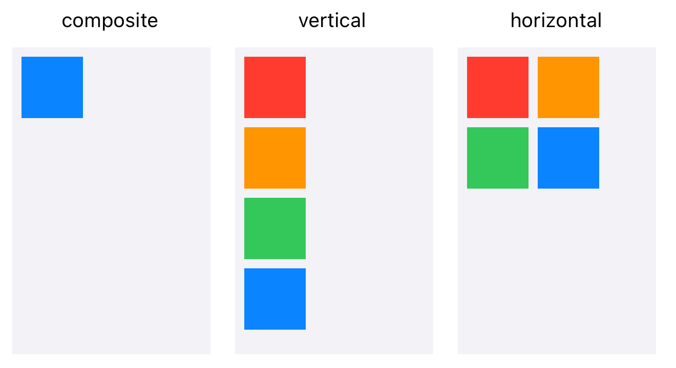
`composite` is the default. Children are pinned to the parent's edges, and a
|
|
21
|
+
child with no positioning properties at all is centred.
|
|
111
22
|
|
|
112
|
-
|
|
23
|
+
`vertical` stacks children top to bottom in the order you add them.
|
|
113
24
|
|
|
114
|
-
|
|
115
|
-
|
|
116
|
-
top: 20, // 20dp from top
|
|
117
|
-
left: 30, // 30dp from left
|
|
118
|
-
bottom: 10, // 10dp from bottom (height = parent.height - 30)
|
|
119
|
-
right: 15 // 15dp from right (width = parent.width - 45)
|
|
120
|
-
});
|
|
121
|
-
```
|
|
25
|
+
`horizontal` places them left to right, wrapping onto a new row when they run
|
|
26
|
+
out of width.
|
|
122
27
|
|
|
123
|
-
|
|
28
|
+
```js
|
|
29
|
+
const win = Ti.UI.createWindow({ backgroundColor: 'white' });
|
|
124
30
|
|
|
125
|
-
|
|
126
|
-
const view = Ti.UI.createView({
|
|
127
|
-
center: { x: 50, y: 50 } // 50% from parent's top-left
|
|
128
|
-
});
|
|
129
|
-
```
|
|
130
|
-
|
|
131
|
-
### Dynamic sizing
|
|
132
|
-
|
|
133
|
-
Omit a dimension to calculate dynamically:
|
|
134
|
-
|
|
135
|
-
```javascript
|
|
136
|
-
const view = Ti.UI.createView({
|
|
137
|
-
top: 10,
|
|
138
|
-
bottom: 10, // Height = parent.height - 20
|
|
139
|
-
left: 0,
|
|
140
|
-
right: 0 // Width = parent.width
|
|
141
|
-
});
|
|
142
|
-
```
|
|
143
|
-
|
|
144
|
-
## 3. Layout modes
|
|
145
|
-
|
|
146
|
-
### Composite (default)
|
|
147
|
-
|
|
148
|
-
Views stack on top of each other:
|
|
149
|
-
|
|
150
|
-
```javascript
|
|
151
|
-
const container = Ti.UI.createView({
|
|
152
|
-
layout: 'composite' // default
|
|
153
|
-
});
|
|
154
|
-
|
|
155
|
-
const view1 = Ti.UI.createView({
|
|
156
|
-
backgroundColor: 'red',
|
|
157
|
-
top: 10, left: 10, width: 100, height: 100
|
|
158
|
-
});
|
|
159
|
-
|
|
160
|
-
const view2 = Ti.UI.createView({
|
|
161
|
-
backgroundColor: 'blue',
|
|
162
|
-
top: 20, left: 20, width: 100, height: 100
|
|
163
|
-
});
|
|
164
|
-
|
|
165
|
-
container.add(view1);
|
|
166
|
-
container.add(view2);
|
|
167
|
-
// view2 appears on top of view1
|
|
168
|
-
```
|
|
169
|
-
|
|
170
|
-
Stacking order is controlled by:
|
|
171
|
-
- Addition order
|
|
172
|
-
- `zIndex` (higher is on top)
|
|
173
|
-
|
|
174
|
-
Android limitation: `zIndex` is only supported by composite layouts. It is ignored by horizontal and vertical layouts.
|
|
175
|
-
|
|
176
|
-
### Vertical layout
|
|
177
|
-
|
|
178
|
-
Children stack vertically:
|
|
179
|
-
|
|
180
|
-
```javascript
|
|
181
|
-
const container = Ti.UI.createView({
|
|
31
|
+
const stack = Ti.UI.createView({
|
|
182
32
|
layout: 'vertical',
|
|
183
|
-
|
|
184
|
-
|
|
185
|
-
|
|
186
|
-
const label1 = Ti.UI.createLabel({
|
|
187
|
-
text: 'First',
|
|
188
|
-
height: Ti.UI.SIZE
|
|
189
|
-
});
|
|
190
|
-
|
|
191
|
-
const label2 = Ti.UI.createLabel({
|
|
192
|
-
text: 'Second',
|
|
193
|
-
top: 10, // Offset from previous sibling's bottom
|
|
33
|
+
top: 40,
|
|
34
|
+
width: '80%',
|
|
194
35
|
height: Ti.UI.SIZE
|
|
195
36
|
});
|
|
196
37
|
|
|
197
|
-
|
|
198
|
-
|
|
199
|
-
|
|
200
|
-
```
|
|
201
|
-
|
|
202
|
-
Vertical layout rules:
|
|
203
|
-
- `top` is an offset from the previous sibling.
|
|
204
|
-
- Children are horizontally centered by default.
|
|
205
|
-
- Set `horizontalWrap: false` to prevent wrapping.
|
|
206
|
-
|
|
207
|
-
### Horizontal layout
|
|
208
|
-
|
|
209
|
-
Children line up left to right:
|
|
210
|
-
|
|
211
|
-
```javascript
|
|
212
|
-
const container = Ti.UI.createView({
|
|
213
|
-
layout: 'horizontal',
|
|
214
|
-
width: Ti.UI.FILL,
|
|
215
|
-
height: Ti.UI.SIZE
|
|
216
|
-
});
|
|
217
|
-
|
|
218
|
-
const view1 = Ti.UI.createView({
|
|
219
|
-
width: 100, height: 50,
|
|
220
|
-
backgroundColor: 'red'
|
|
221
|
-
});
|
|
38
|
+
stack.add(Ti.UI.createLabel({ text: 'First', top: 10 }));
|
|
39
|
+
stack.add(Ti.UI.createLabel({ text: 'Second', top: 10 }));
|
|
40
|
+
stack.add(Ti.UI.createLabel({ text: 'Third', top: 10 }));
|
|
222
41
|
|
|
223
|
-
|
|
224
|
-
|
|
225
|
-
left: 10, // Offset from previous sibling's right
|
|
226
|
-
backgroundColor: 'blue'
|
|
227
|
-
});
|
|
228
|
-
|
|
229
|
-
container.add(view1);
|
|
230
|
-
container.add(view2);
|
|
231
|
-
// view2 appears to right of view1 with 10dp gap
|
|
42
|
+
win.add(stack);
|
|
43
|
+
win.open();
|
|
232
44
|
```
|
|
233
45
|
|
|
234
|
-
|
|
235
|
-
- `left` is an offset from the previous sibling.
|
|
236
|
-
- `horizontalWrap: true` (default) moves to the next row if needed.
|
|
237
|
-
- `horizontalWrap: false` keeps items on one row and may overflow.
|
|
46
|
+
|
|
238
47
|
|
|
239
|
-
|
|
48
|
+
`layout` is set on the container, never on the child. A child cannot ask to be
|
|
49
|
+
stacked; its parent decides.
|
|
240
50
|
|
|
241
|
-
|
|
51
|
+
## Sizing: SIZE, FILL, and numbers
|
|
242
52
|
|
|
243
|
-
|
|
53
|
+
`width` and `height` each take one of four kinds of value.
|
|
244
54
|
|
|
245
|
-
|
|
246
|
-
|
|
247
|
-
|
|
248
|
-
|
|
249
|
-
|
|
250
|
-
|
|
251
|
-
```
|
|
55
|
+
| Value | Meaning |
|
|
56
|
+
| ----- | ------- |
|
|
57
|
+
| `Ti.UI.SIZE` | As large as the content needs, and no larger |
|
|
58
|
+
| `Ti.UI.FILL` | As large as the parent allows |
|
|
59
|
+
| A number | That many units. `120` is 120dp with the template's default unit |
|
|
60
|
+
| A string | An explicit unit or a percentage: `'120dp'`, `'50%'` |
|
|
252
61
|
|
|
253
|
-
|
|
62
|
+
A plain number is in whatever `ti.ui.defaultunit` says in `tiapp.xml`, which
|
|
63
|
+
`ti create` sets to `dp`. Density-independent pixels, so `120` is the same
|
|
64
|
+
physical size on any screen. Write `'120px'` if you really mean device pixels,
|
|
65
|
+
which you rarely do.
|
|
254
66
|
|
|
255
|
-
|
|
67
|
+
> [!IMPORTANT]
|
|
68
|
+
> `Ti.UI.SIZE` on a container measures its **children**. A container with
|
|
69
|
+
> `height: Ti.UI.SIZE` and no children is zero tall and invisible, which is the
|
|
70
|
+
> usual reason a view you definitely added is nowhere on screen.
|
|
256
71
|
|
|
257
|
-
|
|
258
|
-
const view = Ti.UI.createView({
|
|
259
|
-
width: Ti.UI.FILL, // Fill remaining width
|
|
260
|
-
height: Ti.UI.FILL // Fill remaining height
|
|
261
|
-
});
|
|
262
|
-
```
|
|
72
|
+
### What a view does when you say nothing
|
|
263
73
|
|
|
264
|
-
|
|
74
|
+
Leave `width` and `height` unset and each view falls back to its own default,
|
|
75
|
+
which is `SIZE` for things that wrap content and `FILL` for things that own a
|
|
76
|
+
region:
|
|
265
77
|
|
|
266
|
-
|
|
|
267
|
-
|
|
|
268
|
-
| Button
|
|
269
|
-
|
|
|
270
|
-
|
|
|
271
|
-
|
|
|
272
|
-
|
|
|
78
|
+
| View | Default width | Default height |
|
|
79
|
+
| ---- | ------------- | -------------- |
|
|
80
|
+
| `Label`, `Button`, `Switch`, `ImageView` | SIZE | SIZE |
|
|
81
|
+
| `ActivityIndicator`, `Picker` | SIZE | SIZE |
|
|
82
|
+
| `TextField`, `TextArea`, `SearchBar` | FILL | SIZE |
|
|
83
|
+
| `Slider`, `ProgressBar`, `Toolbar` | FILL | SIZE |
|
|
84
|
+
| `ScrollView`, `ScrollableView`, `WebView` | FILL | FILL |
|
|
85
|
+
| `ListView`, `TableView`, `TabGroup` | FILL | FILL |
|
|
273
86
|
|
|
274
|
-
|
|
87
|
+
Read off the iOS layout code, where these are declared. Android reaches the
|
|
88
|
+
same answers through each native widget's own measurement rather than a
|
|
89
|
+
declared default, so treat the table as the shape of the behaviour and set
|
|
90
|
+
`width` and `height` yourself wherever it matters.
|
|
275
91
|
|
|
276
|
-
|
|
92
|
+
A plain `View` declares neither. Give it a size, or give it children and
|
|
93
|
+
`Ti.UI.SIZE`.
|
|
277
94
|
|
|
278
|
-
|
|
279
|
-
const scrollView = Ti.UI.createScrollView({
|
|
280
|
-
contentWidth: 'auto',
|
|
281
|
-
contentHeight: 'auto',
|
|
282
|
-
layout: 'vertical'
|
|
283
|
-
});
|
|
284
|
-
```
|
|
95
|
+
## Composite layout, and why your property was ignored
|
|
285
96
|
|
|
286
|
-
|
|
97
|
+
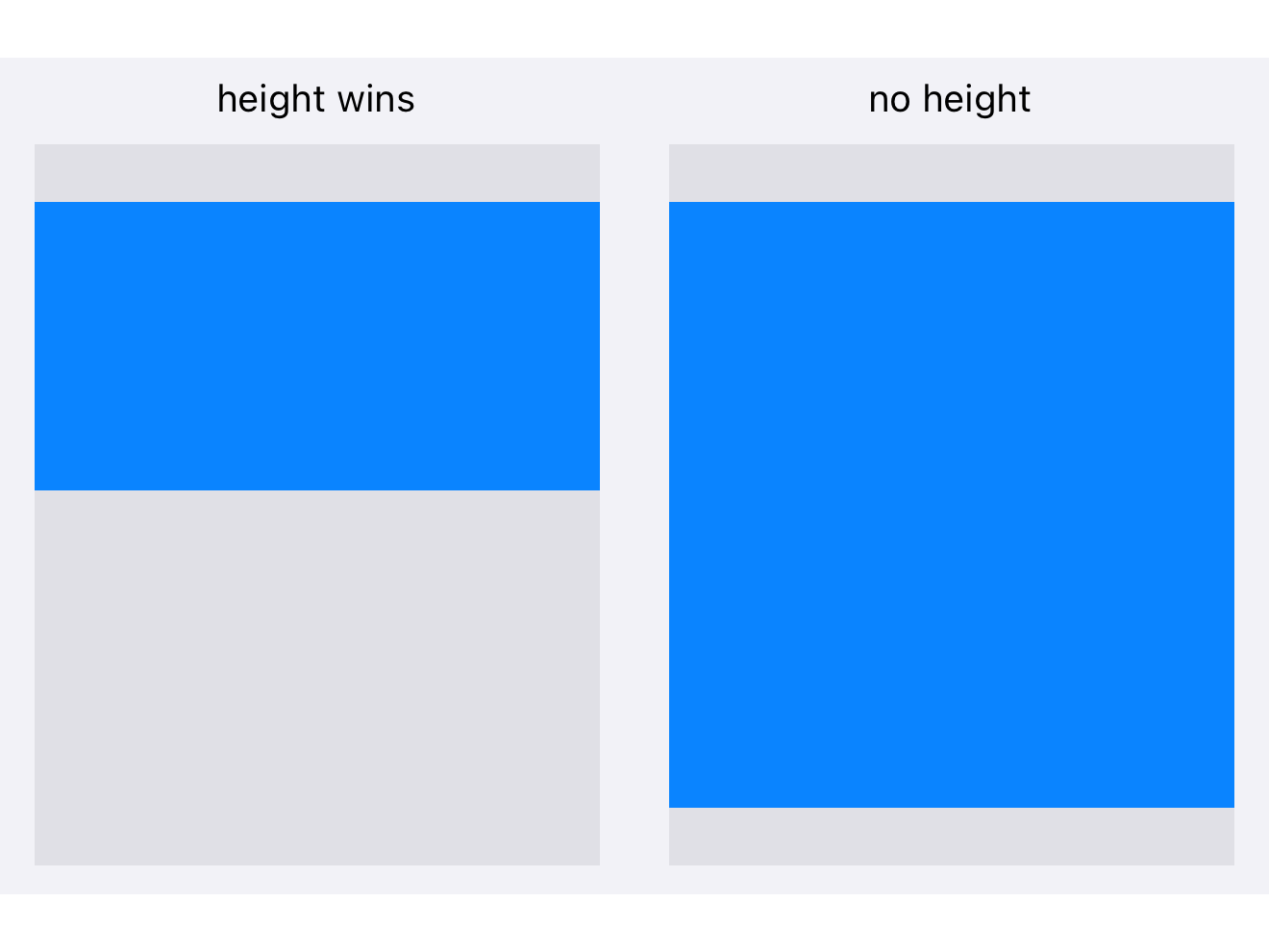
In composite layout you can over-specify a view: `height`, `top`, `center` and
|
|
98
|
+
`bottom` can all be set, and they cannot all be honoured. Rather than erroring,
|
|
99
|
+
Titanium applies a fixed precedence and silently drops the rest.
|
|
287
100
|
|
|
288
|
-
|
|
289
|
-
-
|
|
290
|
-
- Example: First child `FILL`, second child `SIZE` means the second gets remaining space.
|
|
101
|
+
**Vertically the order is `height`, `top`, `center.y`, `bottom`.** The two
|
|
102
|
+
highest-precedence properties you set are the two that win.
|
|
291
103
|
|
|
292
|
-
|
|
104
|
+
| What you set | What happens |
|
|
105
|
+
| ------------ | ------------ |
|
|
106
|
+
| `height` and `top` | Positioned `top` from the parent's top, at that height. `center.y` and `bottom` ignored |
|
|
107
|
+
| `height` and `center.y` | Centred on `center.y`, at that height. `bottom` ignored |
|
|
108
|
+
| `height` and `bottom` | Positioned `bottom` from the parent's bottom, at that height |
|
|
109
|
+
| `top` and `bottom` | Both edges pinned. **Height is whatever is left between them** |
|
|
110
|
+
| `top` and `center.y` | Top edge pinned, centre pinned, height implied. `bottom` ignored |
|
|
111
|
+
| `top` only | Pinned from the top, at the view's default height |
|
|
112
|
+
| `bottom` only | Pinned from the bottom, at the view's default height |
|
|
113
|
+
| none of them | Centred vertically, at the view's default height |
|
|
293
114
|
|
|
294
|
-
|
|
115
|
+
Horizontally it works the same way, with the order `width`, `left`,
|
|
116
|
+
`center.x`, `right`.
|
|
295
117
|
|
|
296
|
-
|
|
297
|
-
|
|
298
|
-
|
|
299
|
-
|
|
300
|
-
height: Ti.UI.FILL
|
|
301
|
-
});
|
|
118
|
+
That table is the answer to most "why is my view the wrong size" questions.
|
|
119
|
+
Setting `top`, `bottom` **and** `height` does not stretch anything: `height`
|
|
120
|
+
outranks `bottom`, so the view sits at the top with the height you asked for.
|
|
121
|
+
Drop the `height` and the two pins size it.
|
|
302
122
|
|
|
303
|
-
|
|
304
|
-
const header = Ti.UI.createView({
|
|
305
|
-
layout: 'horizontal',
|
|
306
|
-
height: 50,
|
|
307
|
-
backgroundColor: 'blue'
|
|
308
|
-
});
|
|
123
|
+
|
|
309
124
|
|
|
310
|
-
|
|
311
|
-
text: 'Header',
|
|
312
|
-
color: 'white'
|
|
313
|
-
});
|
|
125
|
+
## Vertical layout
|
|
314
126
|
|
|
315
|
-
|
|
316
|
-
|
|
317
|
-
|
|
127
|
+
Children stack in the order added. A child's `top` is the gap above it and its
|
|
128
|
+
`bottom` is the gap below, so the space between two children is the upper
|
|
129
|
+
one's `bottom` plus the lower one's `top`.
|
|
318
130
|
|
|
319
|
-
|
|
320
|
-
|
|
131
|
+
```js
|
|
132
|
+
const win = Ti.UI.createWindow({ backgroundColor: 'white', layout: 'vertical' });
|
|
321
133
|
|
|
322
|
-
|
|
323
|
-
|
|
324
|
-
|
|
325
|
-
backgroundColor: 'white',
|
|
326
|
-
height: Ti.UI.FILL
|
|
327
|
-
});
|
|
134
|
+
win.add(Ti.UI.createLabel({ text: 'Title', top: 60, left: 20 }));
|
|
135
|
+
win.add(Ti.UI.createLabel({ text: 'Subtitle', top: 8, left: 20 }));
|
|
136
|
+
win.add(Ti.UI.createView({ height: 1, width: Ti.UI.FILL, top: 16, backgroundColor: '#ccc' }));
|
|
328
137
|
|
|
329
|
-
|
|
330
|
-
outerContainer.add(content);
|
|
138
|
+
win.open();
|
|
331
139
|
```
|
|
332
140
|
|
|
333
|
-
|
|
141
|
+
Horizontally each child still behaves as it would in composite layout, which is
|
|
142
|
+
why `left: 20` works above and why a child with no horizontal properties is
|
|
143
|
+
centred.
|
|
334
144
|
|
|
335
|
-
|
|
145
|
+
> [!WARNING]
|
|
146
|
+
> A child with `height: Ti.UI.FILL` in a vertical layout takes everything left
|
|
147
|
+
> over, and every child after it gets nothing. One `FILL` child per vertical
|
|
148
|
+
> container, and put it last unless you mean to push the rest off screen.
|
|
336
149
|
|
|
337
|
-
|
|
150
|
+
## Horizontal layout
|
|
338
151
|
|
|
339
|
-
|
|
340
|
-
|
|
341
|
-
|
|
342
|
-
width: 100, height: 100
|
|
343
|
-
});
|
|
152
|
+
Children run left to right. **Wrapping is on by default**: when a child does
|
|
153
|
+
not fit in the current row it starts a new one, and each row is as tall as its
|
|
154
|
+
tallest child.
|
|
344
155
|
|
|
345
|
-
|
|
346
|
-
|
|
347
|
-
|
|
348
|
-
top:
|
|
156
|
+
```js
|
|
157
|
+
const tags = Ti.UI.createView({
|
|
158
|
+
layout: 'horizontal',
|
|
159
|
+
top: 40,
|
|
160
|
+
width: 240,
|
|
161
|
+
height: Ti.UI.SIZE
|
|
349
162
|
});
|
|
350
163
|
|
|
351
|
-
|
|
352
|
-
|
|
353
|
-
|
|
354
|
-
|
|
355
|
-
|
|
356
|
-
|
|
357
|
-
|
|
358
|
-
|
|
359
|
-
|
|
360
|
-
|
|
361
|
-
|
|
362
|
-
|
|
363
|
-
|
|
364
|
-
});
|
|
164
|
+
for (const name of ['alloy', 'android', 'ios', 'layout', 'listview']) {
|
|
165
|
+
tags.add(Ti.UI.createLabel({
|
|
166
|
+
text: name,
|
|
167
|
+
width: Ti.UI.SIZE,
|
|
168
|
+
height: Ti.UI.SIZE,
|
|
169
|
+
left: 4,
|
|
170
|
+
right: 4,
|
|
171
|
+
top: 4,
|
|
172
|
+
bottom: 4,
|
|
173
|
+
color: '#fff',
|
|
174
|
+
backgroundColor: '#4a4a4a'
|
|
175
|
+
}));
|
|
176
|
+
}
|
|
365
177
|
```
|
|
366
178
|
|
|
367
|
-
|
|
179
|
+

|
|
368
180
|
|
|
369
|
-
|
|
370
|
-
|
|
371
|
-
|
|
372
|
-
zIndex: 1,
|
|
373
|
-
width: 100, height: 100
|
|
374
|
-
});
|
|
181
|
+
**Give each child a size.** Set `width: Ti.UI.SIZE` when a chip should wrap its
|
|
182
|
+
text. Do not rely on an unspecified width: defaults vary by view and platform,
|
|
183
|
+
as the sizing table above explains. Explicit sizing makes the intended row layout clear.
|
|
375
184
|
|
|
376
|
-
|
|
377
|
-
|
|
378
|
-
|
|
379
|
-
width: 100, height: 100,
|
|
380
|
-
top: 50, left: 50
|
|
381
|
-
});
|
|
185
|
+
Within a row, a child with neither `top` nor `bottom` is centred; with one of
|
|
186
|
+
them it aligns to that edge with that much padding; with both, the two are
|
|
187
|
+
treated as padding.
|
|
382
188
|
|
|
383
|
-
|
|
384
|
-
|
|
385
|
-
```
|
|
189
|
+
Set `horizontalWrap: false` and the children stay on one line instead, with
|
|
190
|
+
`left` and `right` acting as the gaps between them.
|
|
386
191
|
|
|
387
|
-
##
|
|
192
|
+
## Overlap and stacking
|
|
388
193
|
|
|
389
|
-
|
|
194
|
+
Composite layout lets children overlap. Later children draw on top of earlier
|
|
195
|
+
ones, and `zIndex` overrides that for siblings:
|
|
390
196
|
|
|
391
|
-
```
|
|
392
|
-
const
|
|
393
|
-
|
|
394
|
-
|
|
395
|
-
|
|
396
|
-
|
|
397
|
-
|
|
398
|
-
|
|
399
|
-
|
|
400
|
-
backgroundColor: 'white',
|
|
401
|
-
width: 300,
|
|
402
|
-
height: 200,
|
|
403
|
-
borderRadius: 10
|
|
197
|
+
```js
|
|
198
|
+
const badge = Ti.UI.createView({
|
|
199
|
+
width: 20,
|
|
200
|
+
height: 20,
|
|
201
|
+
borderRadius: 10,
|
|
202
|
+
backgroundColor: 'red',
|
|
203
|
+
top: -6,
|
|
204
|
+
right: -6,
|
|
205
|
+
zIndex: 1
|
|
404
206
|
});
|
|
405
|
-
|
|
406
|
-
overlay.add(dialog);
|
|
407
|
-
win.add(overlay);
|
|
408
207
|
```
|
|
409
208
|
|
|
410
|
-
|
|
209
|
+
Negative pins put a child outside its parent's bounds, which is how a badge
|
|
210
|
+
sits on a corner. On Android a child drawn outside its parent may be clipped,
|
|
211
|
+
so give the parent enough room rather than relying on the overflow.
|
|
411
212
|
|
|
412
|
-
|
|
413
|
-
const container = Ti.UI.createView({
|
|
414
|
-
width: Ti.UI.FILL,
|
|
415
|
-
height: Ti.UI.FILL
|
|
416
|
-
});
|
|
213
|
+
## Reading a size back
|
|
417
214
|
|
|
418
|
-
|
|
419
|
-
|
|
420
|
-
|
|
421
|
-
backgroundColor: 'blue',
|
|
422
|
-
center: { x: '50%', y: '50%' }
|
|
423
|
-
});
|
|
424
|
-
|
|
425
|
-
container.add(centered);
|
|
426
|
-
```
|
|
215
|
+
`width` and `height` are what you asked for, not what happened. A view whose
|
|
216
|
+
width is `Ti.UI.FILL` reports `Ti.UI.FILL`, not a number. For the measured
|
|
217
|
+
result use `rect` or `size`, and only after the view has been laid out:
|
|
427
218
|
|
|
428
|
-
|
|
429
|
-
|
|
430
|
-
|
|
431
|
-
const footer = Ti.UI.createView({
|
|
432
|
-
backgroundColor: 'gray',
|
|
433
|
-
height: 50,
|
|
434
|
-
bottom: 0 // Anchor to bottom
|
|
219
|
+
```js
|
|
220
|
+
view.addEventListener('postlayout', () => {
|
|
221
|
+
Ti.API.info(`${view.rect.width} x ${view.rect.height}`);
|
|
435
222
|
});
|
|
436
223
|
```
|
|
437
224
|
|
|
438
|
-
|
|
439
|
-
|
|
440
|
-
```javascript
|
|
441
|
-
const leftPanel = Ti.UI.createView({
|
|
442
|
-
width: '30%',
|
|
443
|
-
height: Ti.UI.FILL,
|
|
444
|
-
backgroundColor: 'lightgray'
|
|
445
|
-
});
|
|
225
|
+
`postlayout` fires whenever the view is measured, which is more than once. If
|
|
226
|
+
you only want the first, remove the listener inside it.
|
|
446
227
|
|
|
447
|
-
|
|
448
|
-
width: '70%',
|
|
449
|
-
height: Ti.UI.FILL,
|
|
450
|
-
left: '30%', // Starts where left ends
|
|
451
|
-
backgroundColor: 'white'
|
|
452
|
-
});
|
|
453
|
-
```
|
|
228
|
+
## Common mistakes
|
|
454
229
|
|
|
455
|
-
|
|
230
|
+
**A container sized `Ti.UI.SIZE` with no children** is zero by zero. Nothing is
|
|
231
|
+
wrong with the children you add later; they are inside a box with no area.
|
|
456
232
|
|
|
457
|
-
|
|
233
|
+
**`top` and `bottom` with a `height`** does not stretch. See the precedence
|
|
234
|
+
table above.
|
|
458
235
|
|
|
459
|
-
|
|
460
|
-
|
|
236
|
+
**Two `Ti.UI.FILL` children in a vertical layout.** The first takes the
|
|
237
|
+
remaining space and the second has none.
|
|
461
238
|
|
|
462
|
-
|
|
239
|
+
**Setting `layout` on the child.** It controls that view's own children, not
|
|
240
|
+
where it sits in its parent.
|
|
463
241
|
|
|
464
|
-
|
|
465
|
-
|
|
466
|
-
|
|
467
|
-
- `foo@3x.png` for iPhone Plus sizes
|
|
242
|
+
**A percentage against a `Ti.UI.SIZE` parent.** `'50%'` of a parent that is
|
|
243
|
+
sizing itself to its children is not a number anyone can compute, and the
|
|
244
|
+
result is not useful. Give the parent a real size first.
|
|
468
245
|
|
|
469
|
-
##
|
|
246
|
+
## Next
|
|
470
247
|
|
|
471
|
-
|
|
472
|
-
|
|
473
|
-
3. Avoid `Ti.UI.SIZE` in ListViews for performance.
|
|
474
|
-
4. Use layout modes instead of manual positioning when possible.
|
|
475
|
-
5. Test on multiple devices with different screen sizes.
|
|
476
|
-
6. Use `zIndex` sparingly and rely on add order where possible.
|
|
248
|
+
[Lists and tables](listviews-and-performance.md) covers the two scrolling list types
|
|
249
|
+
and which to use.
|