@cloudbase/weda-ui 2.0.12 → 2.0.26
This diff represents the content of publicly available package versions that have been released to one of the supported registries. The information contained in this diff is provided for informational purposes only and reflects changes between package versions as they appear in their respective public registries.
- package/package.json +36 -33
- package/src/configs/components/form/textarea.json +8 -0
- package/src/configs/components/graphicCard.json +1 -1
- package/src/configs/components/navLayout.json +2 -1
- package/src/configs/components/wedaVideo.json +12 -9
- package/src/mp/components/calendar/index.js +4 -1
- package/src/mp/components/calendar/index.json +2 -1
- package/src/mp/components/calendar/index.wxml +1 -1
- package/src/mp/components/calendar/index.wxss +17 -16
- package/src/mp/components/chart/statisticsCard/index.wxss +7 -10
- package/src/mp/components/form/checkbox/index.js +5 -1
- package/src/mp/components/form/input/index.js +1 -1
- package/src/mp/components/form/radio/index.js +5 -1
- package/src/mp/components/form/select/index.js +2 -2
- package/src/mp/components/form/textarea/index.js +6 -0
- package/src/mp/components/form/textarea/index.wxml +1 -1
- package/src/mp/components/graphicCard/index.wxss +6 -6
- package/src/mp/components/listView/index.wxss +2 -2
- package/src/mp/components/navLayout/index.wxss +10 -10
- package/src/mp/components/navigationBar/index.wxss +10 -10
- package/src/mp/components/richText/index.wxml +1 -1
- package/src/mp/components/richText/index.wxss +7 -5
- package/src/mp/components/tabs/index.wxss +1 -2
- package/src/mp/style/weda-ui.wxss +4 -2
- package/src/web/components/calendar/index.css +27 -40
- package/src/web/components/chart/statisticsCard/index.css +9 -8
- package/src/web/components/form/formcell/index.css +1 -14
- package/src/web/components/form/input/index.css +4 -0
- package/src/web/components/form/location/common/mapChoose.css +13 -11
- package/src/web/components/form/location/components/LocationH5/index.css +19 -19
- package/src/web/components/form/select/h5.tsx +1 -1
- package/src/web/components/form/select/index.tsx +1 -1
- package/src/web/components/form/textarea/index.tsx +12 -0
- package/src/web/components/form/uploader/index.css +10 -0
- package/src/web/components/form/uploader/uploader.h5.tsx +3 -6
- package/src/web/components/form/uploader/uploader.pc.tsx +3 -6
- package/src/web/components/form/uploaderFile/index.css +24 -23
- package/src/web/components/form/uploaderFile/uploadFile.h5.tsx +9 -4
- package/src/web/components/form/uploaderFile/uploadFile.pc.tsx +7 -4
- package/src/web/components/graphicCard/index.css +6 -6
- package/src/web/components/listView/index.css +8 -8
- package/src/web/components/lottery/index.tsx +1 -1
- package/src/web/components/navLayout/index.css +25 -25
- package/src/web/components/navigationBar/index.css +26 -26
- package/src/web/components/richTextView/index.css +7 -3
- package/src/web/components/tabs/index.css +1 -2
- package/src/web/components/wedaVideo/index.tsx +14 -4
- package/src/web/utils/platform.js +13 -0
- package/src/web/weda-ui.css +7 -9
- package/src/docs/common/format.tsx +0 -115
- package/src/docs/common/tableView.css +0 -164
- package/src/docs/common/tableView.tsx +0 -283
- package/src/docs/compsdocs/chart/Bar.mdx +0 -159
- package/src/docs/compsdocs/chart/Line.mdx +0 -100
- package/src/docs/compsdocs/chart/Pie.mdx +0 -83
- package/src/docs/compsdocs/chart/_category_.json +0 -1
- package/src/docs/compsdocs/chart/statisticsCard.mdx +0 -51
- package/src/docs/compsdocs/database/DataView.mdx +0 -33
- package/src/docs/compsdocs/database/ListView.mdx +0 -33
- package/src/docs/compsdocs/database/_category_.json +0 -1
- package/src/docs/compsdocs/form/Form.mdx +0 -35
- package/src/docs/compsdocs/form/FormCheckbox.mdx +0 -35
- package/src/docs/compsdocs/form/FormDate.mdx +0 -30
- package/src/docs/compsdocs/form/FormEmail.mdx +0 -30
- package/src/docs/compsdocs/form/FormImageUploader.mdx +0 -31
- package/src/docs/compsdocs/form/FormInput.mdx +0 -30
- package/src/docs/compsdocs/form/FormLocation.mdx +0 -64
- package/src/docs/compsdocs/form/FormPhone.mdx +0 -30
- package/src/docs/compsdocs/form/FormRadio.mdx +0 -35
- package/src/docs/compsdocs/form/FormRegion.mdx +0 -30
- package/src/docs/compsdocs/form/FormSelect.mdx +0 -35
- package/src/docs/compsdocs/form/FormSwitch.mdx +0 -30
- package/src/docs/compsdocs/form/FormTextarea.mdx +0 -30
- package/src/docs/compsdocs/form/FormTime.mdx +0 -30
- package/src/docs/compsdocs/form/FormUploadFile.mdx +0 -30
- package/src/docs/compsdocs/form/FormUrl.mdx +0 -30
- package/src/docs/compsdocs/form/_category_.json +0 -1
- package/src/docs/compsdocs/grid/Card.mdx +0 -31
- package/src/docs/compsdocs/grid/Container.mdx +0 -41
- package/src/docs/compsdocs/grid/Footer.mdx +0 -31
- package/src/docs/compsdocs/grid/GridLayout.mdx +0 -31
- package/src/docs/compsdocs/grid/Header.mdx +0 -31
- package/src/docs/compsdocs/grid/Layout.mdx +0 -25
- package/src/docs/compsdocs/grid/List.mdx +0 -31
- package/src/docs/compsdocs/grid/ScrollView.mdx +0 -37
- package/src/docs/compsdocs/grid/Swiper.mdx +0 -57
- package/src/docs/compsdocs/grid/_category_.json +0 -1
- package/src/docs/compsdocs/media/Icon.mdx +0 -31
- package/src/docs/compsdocs/media/Image.mdx +0 -55
- package/src/docs/compsdocs/media/_category_.json +0 -1
- package/src/docs/compsdocs/model/ModelCreate.mdx +0 -44
- package/src/docs/compsdocs/model/ModelDetail.mdx +0 -44
- package/src/docs/compsdocs/model/ModelTable.mdx +0 -156
- package/src/docs/compsdocs/model/ModelUpdate.mdx +0 -44
- package/src/docs/compsdocs/model/PageLayout.mdx +0 -21
- package/src/docs/compsdocs/model/_category_.json +0 -1
- package/src/docs/compsdocs/navmenu/Classification.mdx +0 -37
- package/src/docs/compsdocs/navmenu/NavBar.mdx +0 -52
- package/src/docs/compsdocs/navmenu/NavLayout.mdx +0 -29
- package/src/docs/compsdocs/navmenu/TabBar.mdx +0 -43
- package/src/docs/compsdocs/navmenu/TabBarItem.mdx +0 -29
- package/src/docs/compsdocs/navmenu/_category_.json +0 -1
- package/src/docs/compsdocs/senior/Lottery.mdx +0 -45
- package/src/docs/compsdocs/senior/Modal.mdx +0 -57
- package/src/docs/compsdocs/senior/SlotMachine.mdx +0 -49
- package/src/docs/compsdocs/senior/_category_.json +0 -1
- package/src/docs/compsdocs/show/Calendar.mdx +0 -29
- package/src/docs/compsdocs/show/Divider.mdx +0 -31
- package/src/docs/compsdocs/show/GraphicCard.mdx +0 -29
- package/src/docs/compsdocs/show/Item.mdx +0 -31
- package/src/docs/compsdocs/show/ItemList.mdx +0 -48
- package/src/docs/compsdocs/show/Media.mdx +0 -25
- package/src/docs/compsdocs/show/StatusTip.mdx +0 -25
- package/src/docs/compsdocs/show/Swiper.mdx +0 -33
- package/src/docs/compsdocs/show/Tabs.mdx +0 -37
- package/src/docs/compsdocs/show/_category_.json +0 -1
- package/src/docs/compsdocs/show/button.mdx +0 -25
- package/src/docs/compsdocs/text/Link.mdx +0 -43
- package/src/docs/compsdocs/text/RichTextView.mdx +0 -35
- package/src/docs/compsdocs/text/Text.mdx +0 -31
- package/src/docs/compsdocs/text/Title.mdx +0 -31
- package/src/docs/compsdocs/text/_category_.json +0 -1
- package/src/docs/compsdocs/wxOpen/Phone.mdx +0 -59
- package/src/docs/compsdocs/wxOpen/Share.mdx +0 -45
- package/src/docs/compsdocs/wxOpen/UserInfo.mdx +0 -59
- package/src/docs/compsdocs/wxOpen/_category_.json +0 -4
|
@@ -1,64 +0,0 @@
|
|
|
1
|
-
# 地图定位
|
|
2
|
-
|
|
3
|
-
<TableLayoutView
|
|
4
|
-
componentKey="FormLocation"
|
|
5
|
-
type="description"
|
|
6
|
-
origin="lowCode"
|
|
7
|
-
></TableLayoutView>
|
|
8
|
-
|
|
9
|
-
## 使用说明
|
|
10
|
-
|
|
11
|
-
### 生成方式
|
|
12
|
-
|
|
13
|
-
方式一:在数据模型内设置“地理位置”类型的字段,在编辑器内拖入表单容器,绑定该数据模型,即可自动生成。
|
|
14
|
-
|
|
15
|
-
方式二:在组件库内直接拖入表单容器,在组件库内拖入地图定位组件,地图定位需在表单容器内。通过[变量绑定](https://cloud.tencent.com/document/product/1301/69302)的方式实现组件与数据模型的数据交互。
|
|
16
|
-
|
|
17
|
-
### 配置指引
|
|
18
|
-
|
|
19
|
-
- 地图定位组件需进行地图配置才可使用,点击地图配置,选择腾讯地图连接器。若无连接器,请先新建腾讯地图连接器,具体请参考[腾讯地图连接器](https://cloud.tencent.com/document/product/1301/68448)
|
|
20
|
-
|
|
21
|
-
- 小程序端使用,请打开低码编辑器的获取权限代码,如图所示:
|
|
22
|
-
<img
|
|
23
|
-
src="https://qcloudimg.tencent-cloud.cn/raw/180f6d1e7363f137b377e990d1676699.jpg"
|
|
24
|
-
width="60%"
|
|
25
|
-
></img>
|
|
26
|
-
|
|
27
|
-
## 属性介绍
|
|
28
|
-
|
|
29
|
-
import TableLayoutView from '../../common/tableView';
|
|
30
|
-
|
|
31
|
-
<TableLayoutView
|
|
32
|
-
componentKey="FormLocation"
|
|
33
|
-
type="attribute"
|
|
34
|
-
origin="lowCode"
|
|
35
|
-
></TableLayoutView>
|
|
36
|
-
|
|
37
|
-
## 事件介绍
|
|
38
|
-
|
|
39
|
-
<TableLayoutView
|
|
40
|
-
componentKey="FormLocation"
|
|
41
|
-
type="event"
|
|
42
|
-
origin="lowCode"
|
|
43
|
-
></TableLayoutView>
|
|
44
|
-
|
|
45
|
-
## 限制说明
|
|
46
|
-
|
|
47
|
-
1. 小程序应用会调用微信官方的[wx.chooseLocation](https://developers.weixin.qq.com/miniprogram/dev/api/location/wx.chooseLocation.html)和[wx.getLocation](https://developers.weixin.qq.com/miniprogram/dev/api/location/wx.getLocation.html)接口实现定位,需符合小程序限制的类目要求(具体类目在小程序 wx.getLocation 文档中进行了介绍 [点击查看](https://developers.weixin.qq.com/miniprogram/dev/api/location/wx.getLocation.html)),并在[微信公众平台](https://mp.weixin.qq.com/)中的「开发」-「开发管理」-「接口设置」模块中,自助开通「打开地图选择位置」和「获取当前的地理位置、速度」接口的权限。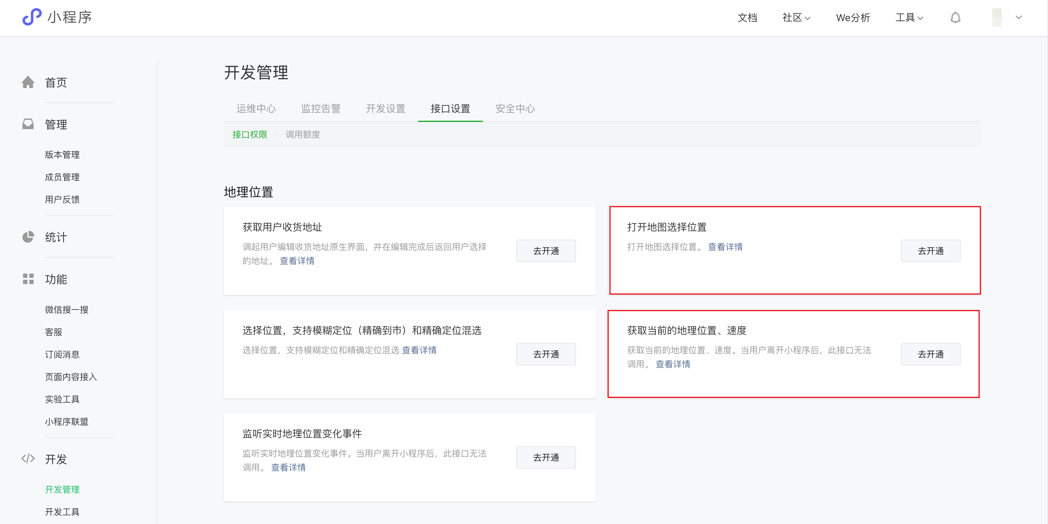
|
|
48
|
-
2. 由于小程序接口限制,小程序下选择用户当前位置,初始化不能获取详细位置。
|
|
49
|
-
|
|
50
|
-
## 异常情况说明
|
|
51
|
-
|
|
52
|
-
浏览器定位失败的几种情况:
|
|
53
|
-
|
|
54
|
-
1)**Browser not Support html5 geolocation**:浏览器不支持原生定位接口,如 IE 较低版本的浏览器等。
|
|
55
|
-
|
|
56
|
-
2)**Geolocation permission denied**:用户禁用了定位权限,需要用户开启设备和浏览器的定位权限,并在浏览器弹窗中点击“允许使用定位”选项。
|
|
57
|
-
|
|
58
|
-
3)**Geolocation permission denied**:浏览器禁止了非安全域的定位请求,比如 Chrome、IOS10 已陆续禁止,这时候需要升级站点到 HTTPS。注意 Chrome 不会禁止 localhost 等域名 HTTP 协议下的定位。
|
|
59
|
-
|
|
60
|
-
4)**Geolocation permission denied**:Access to geolocation was blocked over secure connection with mixed content,也就是在 Https 的页面中引用的 http 的资源。
|
|
61
|
-
|
|
62
|
-
5)**Get geolocation time out**:浏览器定位超时,包括原生的超时,可以适当增加超时属性的设定值以减少这一现象,另外还有个别浏览器(如 google Chrome 浏览器等)本身的定位接口是黑洞,通过其请求定位完全没有回应,也会超时返回失败。
|
|
63
|
-
|
|
64
|
-
6)**Get geolocation failed**:定位失败,Chrome、火狐以及部分套壳浏览器接入的定位服务在国外,有较大限制,失败率高。
|
|
@@ -1,30 +0,0 @@
|
|
|
1
|
-
# 表单电话
|
|
2
|
-
|
|
3
|
-
<TableLayoutView
|
|
4
|
-
componentKey="FormPhone"
|
|
5
|
-
type="description"
|
|
6
|
-
origin="lowCode"
|
|
7
|
-
></TableLayoutView>
|
|
8
|
-
|
|
9
|
-
## 使用说明
|
|
10
|
-
|
|
11
|
-
1. 放入「表单容器」组件后,可实现数据源数据的提交与显示
|
|
12
|
-
2. 当父级表单容器组件已经绑定数据源后,利用「字段绑定」属性可绑定该数据源中的字段,实现新增/查看/更新对应字段的数据
|
|
13
|
-
|
|
14
|
-
## 属性介绍
|
|
15
|
-
|
|
16
|
-
import TableLayoutView from '../../common/tableView';
|
|
17
|
-
|
|
18
|
-
<TableLayoutView
|
|
19
|
-
componentKey="FormPhone"
|
|
20
|
-
type="attribute"
|
|
21
|
-
origin="lowCode"
|
|
22
|
-
></TableLayoutView>
|
|
23
|
-
|
|
24
|
-
## 事件介绍
|
|
25
|
-
|
|
26
|
-
<TableLayoutView
|
|
27
|
-
componentKey="FormPhone"
|
|
28
|
-
type="event"
|
|
29
|
-
origin="lowCode"
|
|
30
|
-
></TableLayoutView>
|
|
@@ -1,35 +0,0 @@
|
|
|
1
|
-
# 单选
|
|
2
|
-
|
|
3
|
-
<TableLayoutView
|
|
4
|
-
componentKey="FormRadio"
|
|
5
|
-
type="description"
|
|
6
|
-
origin="lowCode"
|
|
7
|
-
></TableLayoutView>
|
|
8
|
-
|
|
9
|
-
## 使用说明
|
|
10
|
-
|
|
11
|
-
1. 放入「表单容器」组件后,可实现数据源数据的提交与显示
|
|
12
|
-
|
|
13
|
-
2. 当父级表单容器组件已经绑定数据源后,利用「字段绑定」属性可绑定该数据源中的字段,实现新增/查看/更新对应字段的数据
|
|
14
|
-
|
|
15
|
-
3. 点击选项列表的「绑定数据源」按钮,启用数据源绑定模式,可绑定数组格式的变量,实现选项数据的动态渲染
|
|
16
|
-
|
|
17
|
-

|
|
18
|
-
|
|
19
|
-
## 属性介绍
|
|
20
|
-
|
|
21
|
-
import TableLayoutView from '../../common/tableView';
|
|
22
|
-
|
|
23
|
-
<TableLayoutView
|
|
24
|
-
componentKey="FormRadio"
|
|
25
|
-
type="attribute"
|
|
26
|
-
origin="lowCode"
|
|
27
|
-
></TableLayoutView>
|
|
28
|
-
|
|
29
|
-
## 事件介绍
|
|
30
|
-
|
|
31
|
-
<TableLayoutView
|
|
32
|
-
componentKey="FormRadio"
|
|
33
|
-
type="event"
|
|
34
|
-
origin="lowCode"
|
|
35
|
-
></TableLayoutView>
|
|
@@ -1,30 +0,0 @@
|
|
|
1
|
-
# 地区选择
|
|
2
|
-
|
|
3
|
-
<TableLayoutView
|
|
4
|
-
componentKey="FormMutiRegion"
|
|
5
|
-
type="description"
|
|
6
|
-
origin="lowCode"
|
|
7
|
-
></TableLayoutView>
|
|
8
|
-
|
|
9
|
-
## 使用说明
|
|
10
|
-
|
|
11
|
-
1. 放入「表单容器」组件后,可实现数据源数据的提交与显示
|
|
12
|
-
2. 当父级表单容器组件已经绑定数据源后,利用「字段绑定」属性可绑定该数据源中的字段,实现新增/查看/更新对应字段的数据
|
|
13
|
-
|
|
14
|
-
## 属性介绍
|
|
15
|
-
|
|
16
|
-
import TableLayoutView from '../../common/tableView';
|
|
17
|
-
|
|
18
|
-
<TableLayoutView
|
|
19
|
-
componentKey="FormMutiRegion"
|
|
20
|
-
type="attribute"
|
|
21
|
-
origin="lowCode"
|
|
22
|
-
></TableLayoutView>
|
|
23
|
-
|
|
24
|
-
## 事件介绍
|
|
25
|
-
|
|
26
|
-
<TableLayoutView
|
|
27
|
-
componentKey="FormMutiRegion"
|
|
28
|
-
type="event"
|
|
29
|
-
origin="lowCode"
|
|
30
|
-
></TableLayoutView>
|
|
@@ -1,35 +0,0 @@
|
|
|
1
|
-
# 下拉选择
|
|
2
|
-
|
|
3
|
-
<TableLayoutView
|
|
4
|
-
componentKey="FormSelect"
|
|
5
|
-
type="description"
|
|
6
|
-
origin="lowCode"
|
|
7
|
-
></TableLayoutView>
|
|
8
|
-
|
|
9
|
-
## 使用说明
|
|
10
|
-
|
|
11
|
-
1. 放入「表单容器」组件后,可实现数据源数据的提交与显示
|
|
12
|
-
|
|
13
|
-
2. 当父级表单容器组件已经绑定数据源后,利用「字段绑定」属性可绑定该数据源中的字段,实现新增/查看/更新对应字段的数据
|
|
14
|
-
|
|
15
|
-
3. 点击选项列表的「绑定数据源」按钮,启用数据源绑定模式,可绑定数组格式的变量,实现选项数据的动态渲染
|
|
16
|
-
|
|
17
|
-

|
|
18
|
-
|
|
19
|
-
## 属性介绍
|
|
20
|
-
|
|
21
|
-
import TableLayoutView from '../../common/tableView';
|
|
22
|
-
|
|
23
|
-
<TableLayoutView
|
|
24
|
-
componentKey="FormSelect"
|
|
25
|
-
type="attribute"
|
|
26
|
-
origin="lowCode"
|
|
27
|
-
></TableLayoutView>
|
|
28
|
-
|
|
29
|
-
## 事件介绍
|
|
30
|
-
|
|
31
|
-
<TableLayoutView
|
|
32
|
-
componentKey="FormSelect"
|
|
33
|
-
type="event"
|
|
34
|
-
origin="lowCode"
|
|
35
|
-
></TableLayoutView>
|
|
@@ -1,30 +0,0 @@
|
|
|
1
|
-
# 开关
|
|
2
|
-
|
|
3
|
-
<TableLayoutView
|
|
4
|
-
componentKey="FormSwitch"
|
|
5
|
-
type="description"
|
|
6
|
-
origin="lowCode"
|
|
7
|
-
></TableLayoutView>
|
|
8
|
-
|
|
9
|
-
## 使用说明
|
|
10
|
-
|
|
11
|
-
1. 放入「表单容器」组件后,可实现数据源数据的提交与显示
|
|
12
|
-
2. 当父级表单容器组件已经绑定数据源后,利用「字段绑定」属性可绑定该数据源中的字段,实现新增/查看/更新对应字段的数据
|
|
13
|
-
|
|
14
|
-
## 属性介绍
|
|
15
|
-
|
|
16
|
-
import TableLayoutView from '../../common/tableView';
|
|
17
|
-
|
|
18
|
-
<TableLayoutView
|
|
19
|
-
componentKey="FormSwitch"
|
|
20
|
-
type="attribute"
|
|
21
|
-
origin="lowCode"
|
|
22
|
-
></TableLayoutView>
|
|
23
|
-
|
|
24
|
-
## 事件介绍
|
|
25
|
-
|
|
26
|
-
<TableLayoutView
|
|
27
|
-
componentKey="FormSwitch"
|
|
28
|
-
type="event"
|
|
29
|
-
origin="lowCode"
|
|
30
|
-
></TableLayoutView>
|
|
@@ -1,30 +0,0 @@
|
|
|
1
|
-
# 多行输入
|
|
2
|
-
|
|
3
|
-
<TableLayoutView
|
|
4
|
-
componentKey="FormTextarea"
|
|
5
|
-
type="description"
|
|
6
|
-
origin="lowCode"
|
|
7
|
-
></TableLayoutView>
|
|
8
|
-
|
|
9
|
-
## 使用说明
|
|
10
|
-
|
|
11
|
-
1. 放入「表单容器」组件后,可实现数据源数据的提交与显示
|
|
12
|
-
2. 当父级表单容器组件已经绑定数据源后,利用「字段绑定」属性可绑定该数据源中的字段,实现新增/查看/更新对应字段的数据
|
|
13
|
-
|
|
14
|
-
## 属性介绍
|
|
15
|
-
|
|
16
|
-
import TableLayoutView from '../../common/tableView';
|
|
17
|
-
|
|
18
|
-
<TableLayoutView
|
|
19
|
-
componentKey="FormTextarea"
|
|
20
|
-
type="attribute"
|
|
21
|
-
origin="lowCode"
|
|
22
|
-
></TableLayoutView>
|
|
23
|
-
|
|
24
|
-
## 事件介绍
|
|
25
|
-
|
|
26
|
-
<TableLayoutView
|
|
27
|
-
componentKey="FormTextarea"
|
|
28
|
-
type="event"
|
|
29
|
-
origin="lowCode"
|
|
30
|
-
></TableLayoutView>
|
|
@@ -1,30 +0,0 @@
|
|
|
1
|
-
# 时间选择
|
|
2
|
-
|
|
3
|
-
<TableLayoutView
|
|
4
|
-
componentKey="FormTime"
|
|
5
|
-
type="description"
|
|
6
|
-
origin="lowCode"
|
|
7
|
-
></TableLayoutView>
|
|
8
|
-
|
|
9
|
-
## 使用说明
|
|
10
|
-
|
|
11
|
-
1. 放入「表单容器」组件后,可实现数据源数据的提交与显示
|
|
12
|
-
2. 当父级表单容器组件已经绑定数据源后,利用「字段绑定」属性可绑定该数据源中的字段,实现新增/查看/更新对应字段的数据
|
|
13
|
-
|
|
14
|
-
## 属性介绍
|
|
15
|
-
|
|
16
|
-
import TableLayoutView from '../../common/tableView';
|
|
17
|
-
|
|
18
|
-
<TableLayoutView
|
|
19
|
-
componentKey="FormTime"
|
|
20
|
-
type="attribute"
|
|
21
|
-
origin="lowCode"
|
|
22
|
-
></TableLayoutView>
|
|
23
|
-
|
|
24
|
-
## 事件介绍
|
|
25
|
-
|
|
26
|
-
<TableLayoutView
|
|
27
|
-
componentKey="FormTime"
|
|
28
|
-
type="event"
|
|
29
|
-
origin="lowCode"
|
|
30
|
-
></TableLayoutView>
|
|
@@ -1,30 +0,0 @@
|
|
|
1
|
-
# 文件上传
|
|
2
|
-
|
|
3
|
-
<TableLayoutView
|
|
4
|
-
componentKey="FormUploadFile"
|
|
5
|
-
type="description"
|
|
6
|
-
origin="lowCode"
|
|
7
|
-
></TableLayoutView>
|
|
8
|
-
|
|
9
|
-
## 使用说明
|
|
10
|
-
|
|
11
|
-
1. 放入「表单容器」组件后,可实现数据源数据的提交与显示
|
|
12
|
-
2. 当父级表单容器组件已经绑定数据源后,利用「字段绑定」属性可绑定该数据源中的字段,实现新增/查看/更新对应字段的数据
|
|
13
|
-
|
|
14
|
-
## 属性介绍
|
|
15
|
-
|
|
16
|
-
import TableLayoutView from '../../common/tableView';
|
|
17
|
-
|
|
18
|
-
<TableLayoutView
|
|
19
|
-
componentKey="FormUploadFile"
|
|
20
|
-
type="attribute"
|
|
21
|
-
origin="lowCode"
|
|
22
|
-
></TableLayoutView>
|
|
23
|
-
|
|
24
|
-
## 事件介绍
|
|
25
|
-
|
|
26
|
-
<TableLayoutView
|
|
27
|
-
componentKey="FormUploadFile"
|
|
28
|
-
type="event"
|
|
29
|
-
origin="lowCode"
|
|
30
|
-
></TableLayoutView>
|
|
@@ -1,30 +0,0 @@
|
|
|
1
|
-
# URL 地址
|
|
2
|
-
|
|
3
|
-
<TableLayoutView
|
|
4
|
-
componentKey="FormUrl"
|
|
5
|
-
type="description"
|
|
6
|
-
origin="lowCode"
|
|
7
|
-
></TableLayoutView>
|
|
8
|
-
|
|
9
|
-
## 使用说明
|
|
10
|
-
|
|
11
|
-
1. 放入「表单容器」组件后,可实现数据源数据的提交与显示
|
|
12
|
-
2. 当父级表单容器组件已经绑定数据源后,利用「字段绑定」属性可绑定该数据源中的字段,实现新增/查看/更新对应字段的数据
|
|
13
|
-
|
|
14
|
-
## 属性介绍
|
|
15
|
-
|
|
16
|
-
import TableLayoutView from '../../common/tableView';
|
|
17
|
-
|
|
18
|
-
<TableLayoutView
|
|
19
|
-
componentKey="FormUrl"
|
|
20
|
-
type="attribute"
|
|
21
|
-
origin="lowCode"
|
|
22
|
-
></TableLayoutView>
|
|
23
|
-
|
|
24
|
-
## 事件介绍
|
|
25
|
-
|
|
26
|
-
<TableLayoutView
|
|
27
|
-
componentKey="FormUrl"
|
|
28
|
-
type="event"
|
|
29
|
-
origin="lowCode"
|
|
30
|
-
></TableLayoutView>
|
|
@@ -1 +0,0 @@
|
|
|
1
|
-
{ "label": "表单", "position": 20 }
|
|
@@ -1,31 +0,0 @@
|
|
|
1
|
-
# 卡片布局
|
|
2
|
-
|
|
3
|
-
<TableLayoutView
|
|
4
|
-
componentKey="Card"
|
|
5
|
-
type="description"
|
|
6
|
-
origin="lowCode"
|
|
7
|
-
></TableLayoutView>
|
|
8
|
-
|
|
9
|
-
## 使用说明
|
|
10
|
-
|
|
11
|
-
垂直布局组件可以通过在其自带的插槽中插入组件,实现标准的纵向布局效果。
|
|
12
|
-
|
|
13
|
-
|
|
14
|
-
|
|
15
|
-
## 属性介绍
|
|
16
|
-
|
|
17
|
-
import TableLayoutView from '../../common/tableView';
|
|
18
|
-
|
|
19
|
-
<TableLayoutView
|
|
20
|
-
componentKey="Card"
|
|
21
|
-
type="attribute"
|
|
22
|
-
origin="lowCode"
|
|
23
|
-
></TableLayoutView>
|
|
24
|
-
|
|
25
|
-
## 事件介绍
|
|
26
|
-
|
|
27
|
-
<TableLayoutView
|
|
28
|
-
componentKey="Card"
|
|
29
|
-
type="event"
|
|
30
|
-
origin="lowCode"
|
|
31
|
-
></TableLayoutView>
|
|
@@ -1,41 +0,0 @@
|
|
|
1
|
-
# 普通容器
|
|
2
|
-
|
|
3
|
-
<TableLayoutView
|
|
4
|
-
componentKey="Container"
|
|
5
|
-
type="description"
|
|
6
|
-
origin="sourceCode"
|
|
7
|
-
></TableLayoutView>
|
|
8
|
-
|
|
9
|
-
## 使用说明
|
|
10
|
-
|
|
11
|
-
普通容器存在多种使用场景,对于应用的搭建有着重要的作用
|
|
12
|
-
|
|
13
|
-
### 使用普通容器进行组件样式的统一控制
|
|
14
|
-
|
|
15
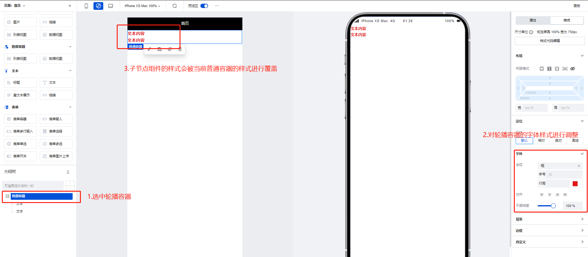
|
-
普通容器常被作为其他组件的父级节点进行使用,当普通容器的样式属性修改时,其子节点的组件也会随之进行修改
|
|
16
|
-
|
|
17
|
-
|
|
18
|
-
|
|
19
|
-
### 使用普通容器进行组件的循环遍历展示
|
|
20
|
-
|
|
21
|
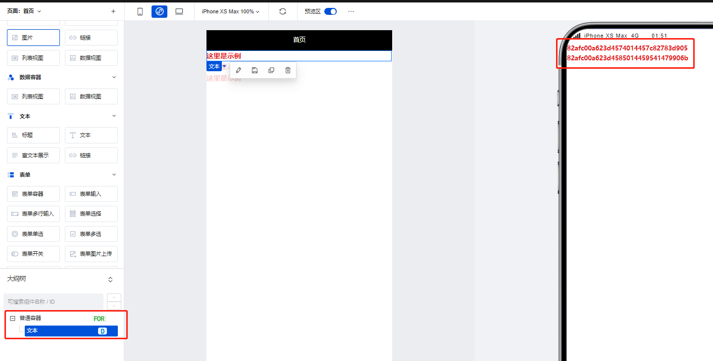
-
我们可以将普通容器绑定循环后,实现其子节点组件的循环展示,如下图所示,具体操作方式可参考文档: [组件循环说明](https://cloud.tencent.com/document/product/1301/58434)
|
|
22
|
-
|
|
23
|
-
|
|
24
|
-
|
|
25
|
-
## 属性介绍
|
|
26
|
-
|
|
27
|
-
import TableLayoutView from '../../common/tableView';
|
|
28
|
-
|
|
29
|
-
<TableLayoutView
|
|
30
|
-
componentKey="Container"
|
|
31
|
-
type="attribute"
|
|
32
|
-
origin="sourceCode"
|
|
33
|
-
></TableLayoutView>
|
|
34
|
-
|
|
35
|
-
## 事件介绍
|
|
36
|
-
|
|
37
|
-
<TableLayoutView
|
|
38
|
-
componentKey="Container"
|
|
39
|
-
type="event"
|
|
40
|
-
origin="sourceCode"
|
|
41
|
-
></TableLayoutView>
|
|
@@ -1,31 +0,0 @@
|
|
|
1
|
-
# 页脚容器
|
|
2
|
-
|
|
3
|
-
<TableLayoutView
|
|
4
|
-
componentKey="Footer"
|
|
5
|
-
type="description"
|
|
6
|
-
origin="lowCode"
|
|
7
|
-
></TableLayoutView>
|
|
8
|
-
|
|
9
|
-
## 使用说明
|
|
10
|
-
|
|
11
|
-
当组件放置在页脚容器中时,组件位置便会固定展示在页面的底部。
|
|
12
|
-
|
|
13
|
-
|
|
14
|
-
|
|
15
|
-
## 属性介绍
|
|
16
|
-
|
|
17
|
-
import TableLayoutView from '../../common/tableView';
|
|
18
|
-
|
|
19
|
-
<TableLayoutView
|
|
20
|
-
componentKey="Footer"
|
|
21
|
-
type="attribute"
|
|
22
|
-
origin="lowCode"
|
|
23
|
-
></TableLayoutView>
|
|
24
|
-
|
|
25
|
-
## 事件介绍
|
|
26
|
-
|
|
27
|
-
<TableLayoutView
|
|
28
|
-
componentKey="Footer"
|
|
29
|
-
type="event"
|
|
30
|
-
origin="lowCode"
|
|
31
|
-
></TableLayoutView>
|
|
@@ -1,31 +0,0 @@
|
|
|
1
|
-
# 网格布局
|
|
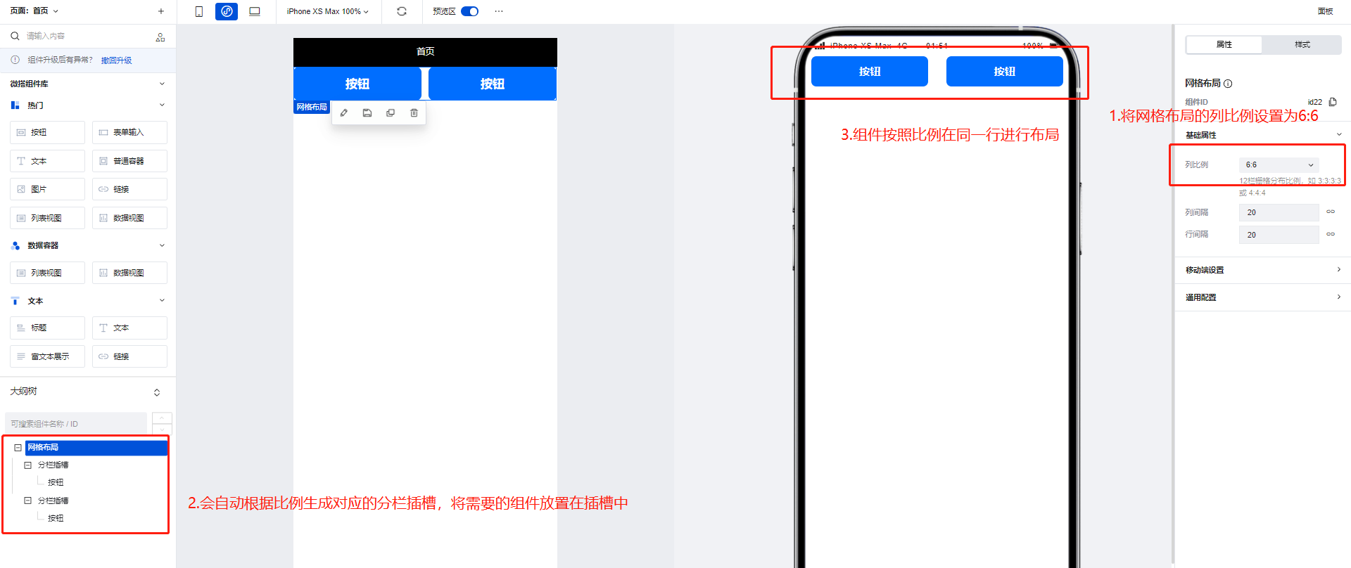
2
|
-
|
|
3
|
-
<TableLayoutView
|
|
4
|
-
componentKey="GridLayout"
|
|
5
|
-
type="description"
|
|
6
|
-
origin="lowCode"
|
|
7
|
-
></TableLayoutView>
|
|
8
|
-
|
|
9
|
-
## 使用说明
|
|
10
|
-
|
|
11
|
-
网格布局组件可以通过配置区生成对应比例的插槽,用于帮助更好的实现横向的排列效果。
|
|
12
|
-
|
|
13
|
-
|
|
14
|
-
|
|
15
|
-
## 属性介绍
|
|
16
|
-
|
|
17
|
-
import TableLayoutView from '../../common/tableView';
|
|
18
|
-
|
|
19
|
-
<TableLayoutView
|
|
20
|
-
componentKey="GridLayout"
|
|
21
|
-
type="attribute"
|
|
22
|
-
origin="lowCode"
|
|
23
|
-
></TableLayoutView>
|
|
24
|
-
|
|
25
|
-
## 事件介绍
|
|
26
|
-
|
|
27
|
-
<TableLayoutView
|
|
28
|
-
componentKey="GridLayout"
|
|
29
|
-
type="event"
|
|
30
|
-
origin="lowCode"
|
|
31
|
-
></TableLayoutView>
|
|
@@ -1,31 +0,0 @@
|
|
|
1
|
-
# 页头容器
|
|
2
|
-
|
|
3
|
-
<TableLayoutView
|
|
4
|
-
componentKey="Header"
|
|
5
|
-
type="description"
|
|
6
|
-
origin="lowCode"
|
|
7
|
-
></TableLayoutView>
|
|
8
|
-
|
|
9
|
-
## 使用说明
|
|
10
|
-
|
|
11
|
-
当组件放置在页头容器中时,组件位置便会固定展示在页面的顶部,常用于展示标题。
|
|
12
|
-
|
|
13
|
-
|
|
14
|
-
|
|
15
|
-
## 属性介绍
|
|
16
|
-
|
|
17
|
-
import TableLayoutView from '../../common/tableView';
|
|
18
|
-
|
|
19
|
-
<TableLayoutView
|
|
20
|
-
componentKey="Header"
|
|
21
|
-
type="attribute"
|
|
22
|
-
origin="lowCode"
|
|
23
|
-
></TableLayoutView>
|
|
24
|
-
|
|
25
|
-
## 事件介绍
|
|
26
|
-
|
|
27
|
-
<TableLayoutView
|
|
28
|
-
componentKey="Header"
|
|
29
|
-
type="event"
|
|
30
|
-
origin="lowCode"
|
|
31
|
-
></TableLayoutView>
|
|
@@ -1,25 +0,0 @@
|
|
|
1
|
-
# 垂直布局
|
|
2
|
-
|
|
3
|
-
<TableLayoutView
|
|
4
|
-
componentKey="Layout"
|
|
5
|
-
type="description"
|
|
6
|
-
origin="lowCode"
|
|
7
|
-
></TableLayoutView>
|
|
8
|
-
|
|
9
|
-
## 属性介绍
|
|
10
|
-
|
|
11
|
-
import TableLayoutView from '../../common/tableView';
|
|
12
|
-
|
|
13
|
-
<TableLayoutView
|
|
14
|
-
componentKey="Layout"
|
|
15
|
-
type="attribute"
|
|
16
|
-
origin="lowCode"
|
|
17
|
-
></TableLayoutView>
|
|
18
|
-
|
|
19
|
-
## 事件介绍
|
|
20
|
-
|
|
21
|
-
<TableLayoutView
|
|
22
|
-
componentKey="Layout"
|
|
23
|
-
type="event"
|
|
24
|
-
origin="lowCode"
|
|
25
|
-
></TableLayoutView>
|
|
@@ -1,31 +0,0 @@
|
|
|
1
|
-
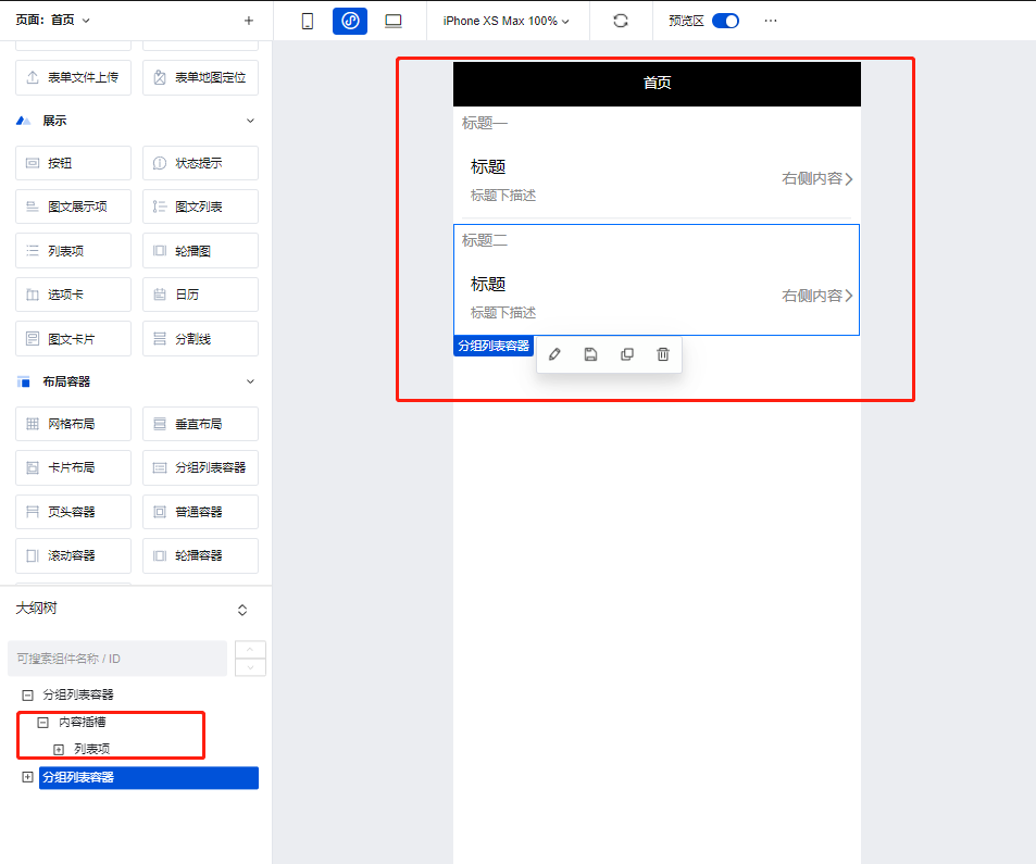
# 分组列表容器
|
|
2
|
-
|
|
3
|
-
<TableLayoutView
|
|
4
|
-
componentKey="List"
|
|
5
|
-
type="description"
|
|
6
|
-
origin="lowCode"
|
|
7
|
-
></TableLayoutView>
|
|
8
|
-
|
|
9
|
-
## 使用说明
|
|
10
|
-
|
|
11
|
-
使用分组列表容器的自带插槽即可快速的实现列表的分组效果,常与**列表项**组件配合使用。
|
|
12
|
-
|
|
13
|
-
|
|
14
|
-
|
|
15
|
-
## 属性介绍
|
|
16
|
-
|
|
17
|
-
import TableLayoutView from '../../common/tableView';
|
|
18
|
-
|
|
19
|
-
<TableLayoutView
|
|
20
|
-
componentKey="List"
|
|
21
|
-
type="attribute"
|
|
22
|
-
origin="lowCode"
|
|
23
|
-
></TableLayoutView>
|
|
24
|
-
|
|
25
|
-
## 事件介绍
|
|
26
|
-
|
|
27
|
-
<TableLayoutView
|
|
28
|
-
componentKey="List"
|
|
29
|
-
type="event"
|
|
30
|
-
origin="lowCode"
|
|
31
|
-
></TableLayoutView>
|
|
@@ -1,37 +0,0 @@
|
|
|
1
|
-
# 滚动容器
|
|
2
|
-
|
|
3
|
-
<TableLayoutView
|
|
4
|
-
componentKey="ScrollView"
|
|
5
|
-
type="description"
|
|
6
|
-
origin="sourceCode"
|
|
7
|
-
></TableLayoutView>
|
|
8
|
-
|
|
9
|
-
## 使用说明
|
|
10
|
-
|
|
11
|
-
滚动容器可以实现页面或功能模块的滚动效果,当滚动容器内组件内容占用的总宽度/高度大于滚动容器本身的宽度/高度时,便会出现滚动条,通过滑动滚动条滑动来查看容器内的全部内容,示例如下:
|
|
12
|
-
|
|
13
|
-
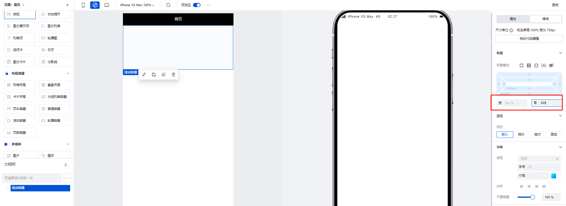
1. 拖入一个滚动容器组件,将高度设置为 300
|
|
14
|
-
|
|
15
|
-
|
|
16
|
-
|
|
17
|
-
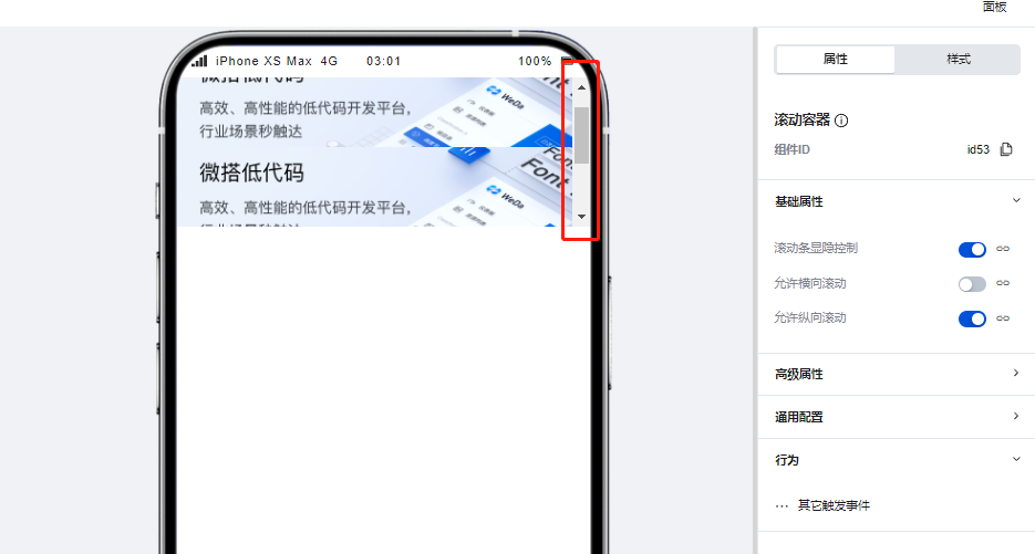
2. 在滚动容器中添加三个图片组件,每个图片组件的高度设为 200,这样容器内的组件高度便大于了容器本身的高度,滚动条出现。
|
|
18
|
-
|
|
19
|
-
|
|
20
|
-
|
|
21
|
-
## 属性介绍
|
|
22
|
-
|
|
23
|
-
import TableLayoutView from '../../common/tableView';
|
|
24
|
-
|
|
25
|
-
<TableLayoutView
|
|
26
|
-
componentKey="ScrollView"
|
|
27
|
-
type="attribute"
|
|
28
|
-
origin="sourceCode"
|
|
29
|
-
></TableLayoutView>
|
|
30
|
-
|
|
31
|
-
## 事件介绍
|
|
32
|
-
|
|
33
|
-
<TableLayoutView
|
|
34
|
-
componentKey="ScrollView"
|
|
35
|
-
type="event"
|
|
36
|
-
origin="sourceCode"
|
|
37
|
-
></TableLayoutView>
|
|
@@ -1,57 +0,0 @@
|
|
|
1
|
-
# 轮播容器
|
|
2
|
-
|
|
3
|
-
<TableLayoutView
|
|
4
|
-
componentKey="Swiper"
|
|
5
|
-
type="description"
|
|
6
|
-
origin="sourceCode"
|
|
7
|
-
></TableLayoutView>
|
|
8
|
-
|
|
9
|
-
## 使用方法
|
|
10
|
-
|
|
11
|
-
### 通过数据源数据/变量控制对轮播图的展示内容进行控制
|
|
12
|
-
|
|
13
|
-
当存在需要使用数据进行轮播图内容管理的场景下,我们可以使用轮播容器组件实现,操作方式如下:
|
|
14
|
-
|
|
15
|
-
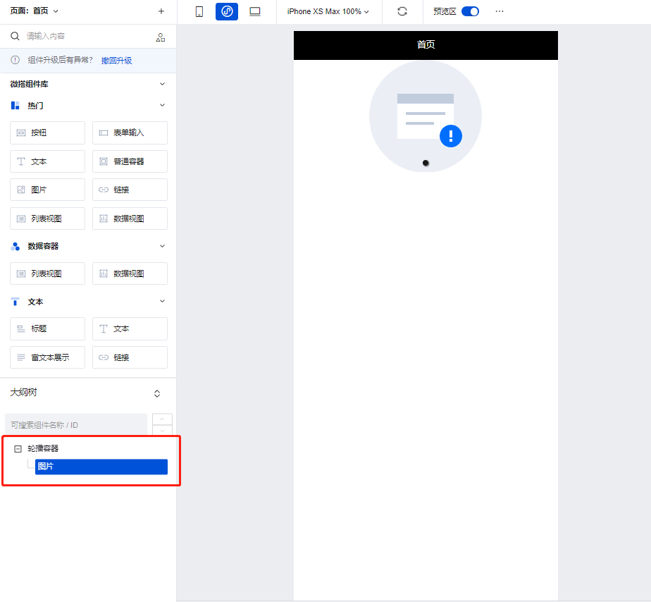
1. 在编辑区中添加一个轮播容器组件,并将图片组件添加轮播容器的子节点下
|
|
16
|
-
|
|
17
|
-
|
|
18
|
-
|
|
19
|
-
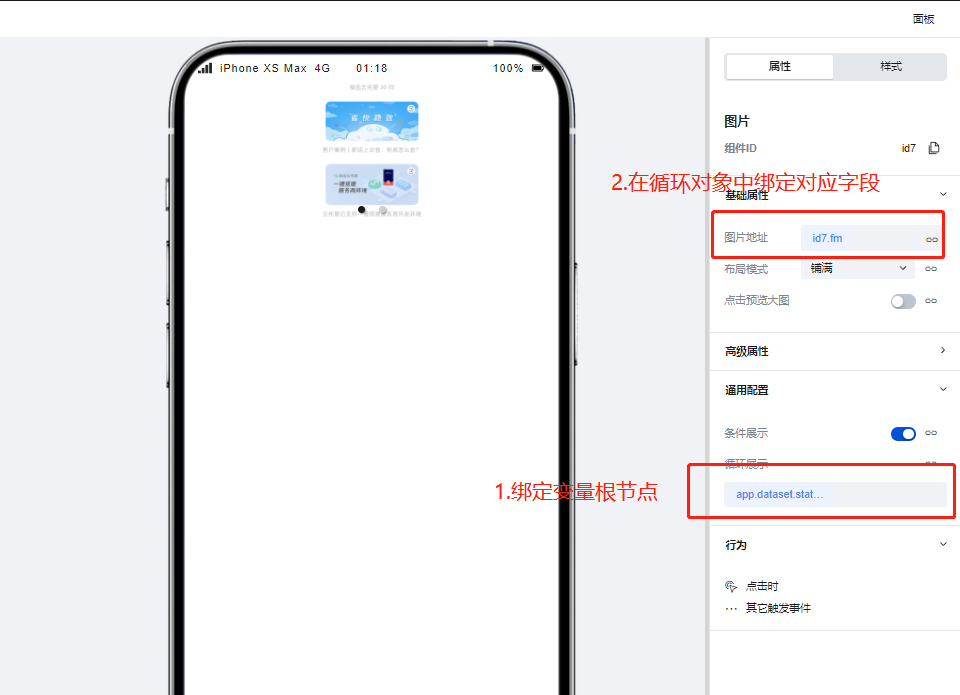
2. 为图片组件通过绑定循环功能,绑定用来控制轮播图内容的循环/普通变量,绑定完成后轮播图即可根据变量中的数据进行渲染
|
|
20
|
-
|
|
21
|
-
|
|
22
|
-
|
|
23
|
-
### 使用轮播容器实现高级的轮播场景
|
|
24
|
-
|
|
25
|
-
我们可以使用轮播容器实现更为复杂的轮播场景,如下图所示:
|
|
26
|
-
|
|
27
|
-
|
|
28
|
-
|
|
29
|
-
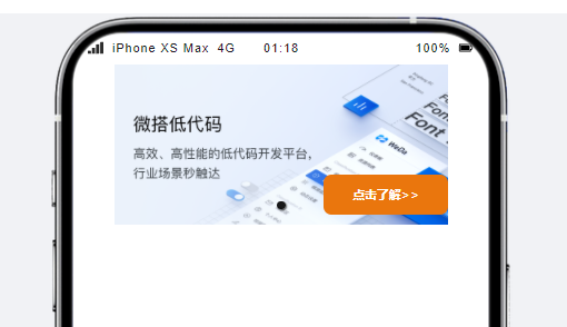
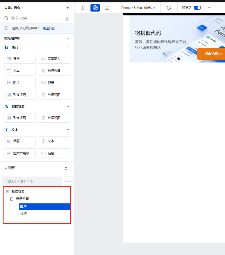
1. 为轮播容器的子节点下添加普通容器组件,并在普通容器组件的子节点下添加图片以及按钮组件
|
|
30
|
-
|
|
31
|
-
|
|
32
|
-
|
|
33
|
-
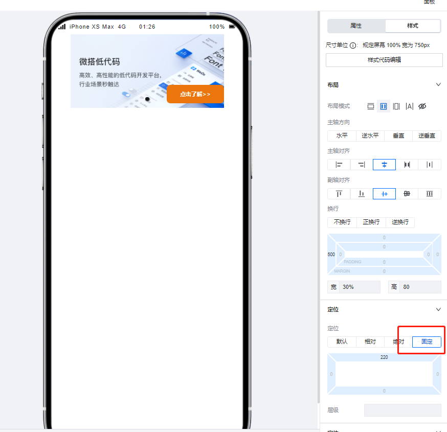
2. 设置按钮组件的定位模式为**固定**,并进行位置的调整后即可实现类似的复杂轮播场景。
|
|
34
|
-
|
|
35
|
-
|
|
36
|
-
|
|
37
|
-
## 属性介绍
|
|
38
|
-
|
|
39
|
-
import TableLayoutView from '../../common/tableView';
|
|
40
|
-
|
|
41
|
-
<TableLayoutView
|
|
42
|
-
componentKey="Swiper"
|
|
43
|
-
type="attribute"
|
|
44
|
-
origin="sourceCode"
|
|
45
|
-
></TableLayoutView>
|
|
46
|
-
|
|
47
|
-
## 事件介绍
|
|
48
|
-
|
|
49
|
-
<TableLayoutView
|
|
50
|
-
componentKey="Swiper"
|
|
51
|
-
type="event"
|
|
52
|
-
origin="sourceCode"
|
|
53
|
-
></TableLayoutView>
|
|
54
|
-
|
|
55
|
-
## 组件使用限制
|
|
56
|
-
|
|
57
|
-
需注意,由于小程序端样式限制问题,轮播容器中的图片高度不得设置为 auto,否则将无法渲染。
|