oh-my-design-cli 0.1.1 → 0.1.2
This diff represents the content of publicly available package versions that have been released to one of the supported registries. The information contained in this diff is provided for informational purposes only and reflects changes between package versions as they appear in their respective public registries.
- package/README.ko.md +3 -2
- package/README.md +3 -2
- package/package.json +3 -3
- package/references/Claude-Design-Sys-Prompt.txt +0 -421
- package/references/airbnb/README.md +0 -23
- package/references/airbnb/preview-dark.html +0 -234
- package/references/airbnb/preview.html +0 -233
- package/references/airtable/README.md +0 -23
- package/references/airtable/preview-dark.html +0 -165
- package/references/airtable/preview.html +0 -164
- package/references/apple/README.md +0 -24
- package/references/apple/preview-dark.html +0 -420
- package/references/apple/preview.html +0 -414
- package/references/baemin/README.md +0 -19
- package/references/bmw/README.md +0 -23
- package/references/bmw/preview-dark.html +0 -211
- package/references/bmw/preview.html +0 -210
- package/references/cal/README.md +0 -23
- package/references/cal/preview-dark.html +0 -449
- package/references/cal/preview.html +0 -575
- package/references/claude/README.md +0 -24
- package/references/claude/preview-dark.html +0 -803
- package/references/claude/preview.html +0 -826
- package/references/clay/README.md +0 -23
- package/references/clay/preview-dark.html +0 -316
- package/references/clay/preview.html +0 -315
- package/references/clickhouse/README.md +0 -24
- package/references/clickhouse/preview-dark.html +0 -834
- package/references/clickhouse/preview.html +0 -786
- package/references/cohere/README.md +0 -24
- package/references/cohere/preview-dark.html +0 -803
- package/references/cohere/preview.html +0 -807
- package/references/coinbase/README.md +0 -23
- package/references/coinbase/preview-dark.html +0 -164
- package/references/coinbase/preview.html +0 -163
- package/references/composio/README.md +0 -24
- package/references/composio/preview-dark.html +0 -958
- package/references/composio/preview.html +0 -933
- package/references/cursor/README.md +0 -24
- package/references/cursor/preview-dark.html +0 -393
- package/references/cursor/preview.html +0 -383
- package/references/dcard/README.md +0 -12
- package/references/dcard/_research/forum-1440px.png +0 -0
- package/references/dcard/_research.md +0 -77
- package/references/elevenlabs/README.md +0 -23
- package/references/elevenlabs/preview-dark.html +0 -252
- package/references/elevenlabs/preview.html +0 -251
- package/references/expo/README.md +0 -24
- package/references/expo/preview-dark.html +0 -533
- package/references/expo/preview.html +0 -533
- package/references/ferrari/README.md +0 -23
- package/references/ferrari/preview-dark.html +0 -1162
- package/references/ferrari/preview.html +0 -1122
- package/references/figma/README.md +0 -24
- package/references/figma/preview-dark.html +0 -822
- package/references/figma/preview.html +0 -832
- package/references/framer/README.md +0 -23
- package/references/framer/preview-dark.html +0 -902
- package/references/framer/preview.html +0 -883
- package/references/freee/README.md +0 -12
- package/references/freee/_research/vibes-storybook-1440px.png +0 -0
- package/references/freee/_research.md +0 -77
- package/references/hashicorp/README.md +0 -24
- package/references/hashicorp/preview-dark.html +0 -1202
- package/references/hashicorp/preview.html +0 -1193
- package/references/ibm/README.md +0 -24
- package/references/ibm/preview-dark.html +0 -443
- package/references/ibm/preview.html +0 -428
- package/references/intercom/README.md +0 -23
- package/references/intercom/preview-dark.html +0 -185
- package/references/intercom/preview.html +0 -184
- package/references/kakao/README.md +0 -18
- package/references/karrot/README.md +0 -18
- package/references/kraken/README.md +0 -23
- package/references/kraken/preview-dark.html +0 -169
- package/references/kraken/preview.html +0 -168
- package/references/lamborghini/README.md +0 -23
- package/references/lamborghini/preview-dark.html +0 -303
- package/references/lamborghini/preview.html +0 -381
- package/references/line/README.md +0 -12
- package/references/line/_research/home-1440px.png +0 -0
- package/references/line/_research.md +0 -65
- package/references/linear.app/README.md +0 -24
- package/references/linear.app/preview-dark.html +0 -383
- package/references/linear.app/preview.html +0 -373
- package/references/lovable/README.md +0 -24
- package/references/lovable/preview-dark.html +0 -349
- package/references/lovable/preview.html +0 -348
- package/references/mercari/README.md +0 -12
- package/references/mercari/_research/home-1440px.png +0 -0
- package/references/mercari/_research.md +0 -77
- package/references/minimax/README.md +0 -24
- package/references/minimax/preview-dark.html +0 -1262
- package/references/minimax/preview.html +0 -1248
- package/references/mintlify/README.md +0 -24
- package/references/mintlify/preview-dark.html +0 -409
- package/references/mintlify/preview.html +0 -398
- package/references/miro/README.md +0 -23
- package/references/miro/preview-dark.html +0 -174
- package/references/miro/preview.html +0 -173
- package/references/mistral.ai/README.md +0 -24
- package/references/mistral.ai/preview-dark.html +0 -806
- package/references/mistral.ai/preview.html +0 -805
- package/references/mongodb/README.md +0 -23
- package/references/mongodb/preview-dark.html +0 -260
- package/references/mongodb/preview.html +0 -259
- package/references/notion/README.md +0 -24
- package/references/notion/preview-dark.html +0 -372
- package/references/notion/preview.html +0 -364
- package/references/nvidia/README.md +0 -24
- package/references/nvidia/preview-dark.html +0 -374
- package/references/nvidia/preview.html +0 -366
- package/references/ollama/README.md +0 -24
- package/references/ollama/preview-dark.html +0 -678
- package/references/ollama/preview.html +0 -678
- package/references/opencode.ai/README.md +0 -24
- package/references/opencode.ai/preview-dark.html +0 -366
- package/references/opencode.ai/preview.html +0 -357
- package/references/pinkoi/README.md +0 -12
- package/references/pinkoi/_research/browse-1440px.png +0 -0
- package/references/pinkoi/_research.md +0 -115
- package/references/pinterest/README.md +0 -23
- package/references/pinterest/preview-dark.html +0 -233
- package/references/pinterest/preview.html +0 -232
- package/references/posthog/README.md +0 -23
- package/references/posthog/preview-dark.html +0 -699
- package/references/posthog/preview.html +0 -749
- package/references/raycast/README.md +0 -23
- package/references/raycast/preview-dark.html +0 -606
- package/references/raycast/preview.html +0 -688
- package/references/renault/README.md +0 -23
- package/references/renault/preview-dark.html +0 -406
- package/references/renault/preview.html +0 -606
- package/references/replicate/README.md +0 -24
- package/references/replicate/preview-dark.html +0 -828
- package/references/replicate/preview.html +0 -831
- package/references/resend/README.md +0 -23
- package/references/resend/preview-dark.html +0 -355
- package/references/resend/preview.html +0 -354
- package/references/revolut/README.md +0 -23
- package/references/revolut/preview-dark.html +0 -234
- package/references/revolut/preview.html +0 -233
- package/references/runwayml/README.md +0 -24
- package/references/runwayml/preview-dark.html +0 -664
- package/references/runwayml/preview.html +0 -665
- package/references/sanity/README.md +0 -24
- package/references/sanity/preview-dark.html +0 -990
- package/references/sanity/preview.html +0 -1135
- package/references/sentry/README.md +0 -24
- package/references/sentry/preview-dark.html +0 -626
- package/references/sentry/preview.html +0 -951
- package/references/spacex/README.md +0 -23
- package/references/spacex/preview-dark.html +0 -221
- package/references/spacex/preview.html +0 -220
- package/references/spotify/README.md +0 -23
- package/references/spotify/preview-dark.html +0 -231
- package/references/spotify/preview.html +0 -230
- package/references/stripe/README.md +0 -24
- package/references/stripe/preview-dark.html +0 -428
- package/references/stripe/preview.html +0 -419
- package/references/supabase/README.md +0 -24
- package/references/supabase/preview-dark.html +0 -977
- package/references/supabase/preview.html +0 -955
- package/references/superhuman/README.md +0 -23
- package/references/superhuman/preview-dark.html +0 -973
- package/references/superhuman/preview.html +0 -951
- package/references/tesla/README.md +0 -23
- package/references/tesla/preview-dark.html +0 -947
- package/references/tesla/preview.html +0 -925
- package/references/together.ai/README.md +0 -24
- package/references/together.ai/preview-dark.html +0 -892
- package/references/together.ai/preview.html +0 -897
- package/references/toss/README.md +0 -19
- package/references/uber/README.md +0 -24
- package/references/uber/preview-dark.html +0 -1120
- package/references/uber/preview.html +0 -1119
- package/references/vercel/README.md +0 -24
- package/references/vercel/preview-dark.html +0 -368
- package/references/vercel/preview.html +0 -367
- package/references/voltagent/README.md +0 -24
- package/references/voltagent/preview-dark.html +0 -487
- package/references/voltagent/preview.html +0 -766
- package/references/warp/README.md +0 -23
- package/references/warp/preview-dark.html +0 -500
- package/references/warp/preview.html +0 -533
- package/references/webflow/README.md +0 -23
- package/references/webflow/preview-dark.html +0 -147
- package/references/webflow/preview.html +0 -146
- package/references/wise/README.md +0 -23
- package/references/wise/preview-dark.html +0 -230
- package/references/wise/preview.html +0 -229
- package/references/x.ai/README.md +0 -24
- package/references/x.ai/preview-dark.html +0 -356
- package/references/x.ai/preview.html +0 -407
- package/references/zapier/README.md +0 -24
- package/references/zapier/preview-dark.html +0 -380
- package/references/zapier/preview.html +0 -372
|
@@ -1,357 +0,0 @@
|
|
|
1
|
-
<!DOCTYPE html>
|
|
2
|
-
<html lang="en">
|
|
3
|
-
<head>
|
|
4
|
-
<meta charset="UTF-8">
|
|
5
|
-
<meta name="viewport" content="width=device-width, initial-scale=1.0">
|
|
6
|
-
<title>Design System Inspired by OpenCode.ai</title>
|
|
7
|
-
<link rel="preconnect" href="https://fonts.googleapis.com">
|
|
8
|
-
<link rel="preconnect" href="https://fonts.gstatic.com" crossorigin>
|
|
9
|
-
<link href="https://fonts.googleapis.com/css2?family=IBM+Plex+Mono:wght@400;500;700&display=swap" rel="stylesheet">
|
|
10
|
-
<style>
|
|
11
|
-
:root {
|
|
12
|
-
--oc-dark: #201d1d;
|
|
13
|
-
--oc-light: #fdfcfc;
|
|
14
|
-
--oc-gray: #9a9898;
|
|
15
|
-
--oc-dark-surface: #302c2c;
|
|
16
|
-
--oc-border-gray: #646262;
|
|
17
|
-
--oc-light-surface: #f1eeee;
|
|
18
|
-
--oc-input-bg: #f8f7f7;
|
|
19
|
-
--accent: #007aff;
|
|
20
|
-
--accent-hover: #0056b3;
|
|
21
|
-
--accent-active: #004085;
|
|
22
|
-
--danger: #ff3b30;
|
|
23
|
-
--danger-hover: #d70015;
|
|
24
|
-
--danger-active: #a50011;
|
|
25
|
-
--success: #30d158;
|
|
26
|
-
--warning: #ff9f0a;
|
|
27
|
-
--warning-hover: #cc7f08;
|
|
28
|
-
--warning-active: #995f06;
|
|
29
|
-
--text-primary: #201d1d;
|
|
30
|
-
--text-secondary: #9a9898;
|
|
31
|
-
--text-muted: #6e6e73;
|
|
32
|
-
--text-caption: #424245;
|
|
33
|
-
--border-warm: rgba(15, 0, 0, 0.12);
|
|
34
|
-
--border-tab: #9a9898;
|
|
35
|
-
--border-outline: #646262;
|
|
36
|
-
--font-mono: 'IBM Plex Mono', ui-monospace, SFMono-Regular, Menlo, Monaco, Consolas, 'Liberation Mono', 'Courier New', monospace;
|
|
37
|
-
}
|
|
38
|
-
* { margin: 0; padding: 0; box-sizing: border-box; }
|
|
39
|
-
body {
|
|
40
|
-
background: var(--oc-light);
|
|
41
|
-
color: var(--text-primary);
|
|
42
|
-
font-family: var(--font-mono);
|
|
43
|
-
font-size: 16px; font-weight: 400; line-height: 1.50;
|
|
44
|
-
-webkit-font-smoothing: antialiased;
|
|
45
|
-
}
|
|
46
|
-
|
|
47
|
-
/* NAV */
|
|
48
|
-
.nav {
|
|
49
|
-
position: sticky; top: 0; z-index: 100;
|
|
50
|
-
display: flex; align-items: center; justify-content: space-between;
|
|
51
|
-
padding: 12px 32px;
|
|
52
|
-
background: var(--oc-light);
|
|
53
|
-
border-bottom: 1px solid var(--border-warm);
|
|
54
|
-
}
|
|
55
|
-
.nav-brand { font-size: 14px; font-weight: 700; color: var(--text-primary); text-decoration: none; }
|
|
56
|
-
.nav-links { display: flex; gap: 24px; list-style: none; }
|
|
57
|
-
.nav-links a { font-size: 14px; font-weight: 500; color: var(--text-secondary); text-decoration: none; transition: color 0.15s; }
|
|
58
|
-
.nav-links a:hover { color: var(--accent); }
|
|
59
|
-
.nav-cta {
|
|
60
|
-
display: inline-block; background: var(--oc-dark); color: var(--oc-light);
|
|
61
|
-
padding: 4px 20px; border-radius: 4px; font-size: 14px; font-weight: 500;
|
|
62
|
-
text-decoration: none; font-family: var(--font-mono); transition: opacity 0.15s;
|
|
63
|
-
}
|
|
64
|
-
.nav-cta:hover { opacity: 0.85; }
|
|
65
|
-
|
|
66
|
-
/* HERO */
|
|
67
|
-
.hero { padding: 96px 32px 80px; text-align: center; }
|
|
68
|
-
.hero h1 {
|
|
69
|
-
font-size: 38px; font-weight: 700; line-height: 1.50;
|
|
70
|
-
color: var(--text-primary); margin-bottom: 16px;
|
|
71
|
-
}
|
|
72
|
-
.hero p { font-size: 16px; font-weight: 400; line-height: 1.50; color: var(--text-secondary); max-width: 600px; margin: 0 auto 32px; }
|
|
73
|
-
.hero-buttons { display: flex; gap: 12px; justify-content: center; flex-wrap: wrap; }
|
|
74
|
-
.btn-primary {
|
|
75
|
-
display: inline-block; background: var(--oc-dark); color: var(--oc-light);
|
|
76
|
-
padding: 4px 20px; border-radius: 4px; border: none;
|
|
77
|
-
font-family: var(--font-mono); font-size: 16px; font-weight: 500; line-height: 2.00;
|
|
78
|
-
text-decoration: none; cursor: pointer; transition: opacity 0.15s;
|
|
79
|
-
}
|
|
80
|
-
.btn-primary:hover { opacity: 0.85; }
|
|
81
|
-
.btn-secondary {
|
|
82
|
-
display: inline-block; background: transparent; color: var(--text-primary);
|
|
83
|
-
padding: 4px 20px; border-radius: 4px; border: 1px solid var(--border-outline);
|
|
84
|
-
font-family: var(--font-mono); font-size: 16px; font-weight: 500; line-height: 2.00;
|
|
85
|
-
text-decoration: none; cursor: pointer; transition: all 0.15s;
|
|
86
|
-
}
|
|
87
|
-
.btn-secondary:hover { border-color: var(--text-primary); }
|
|
88
|
-
.btn-accent {
|
|
89
|
-
display: inline-block; background: var(--accent); color: #ffffff;
|
|
90
|
-
padding: 4px 20px; border-radius: 4px; border: none;
|
|
91
|
-
font-family: var(--font-mono); font-size: 16px; font-weight: 500; line-height: 2.00;
|
|
92
|
-
text-decoration: none; cursor: pointer; transition: background 0.15s;
|
|
93
|
-
}
|
|
94
|
-
.btn-accent:hover { background: var(--accent-hover); }
|
|
95
|
-
.btn-danger {
|
|
96
|
-
display: inline-block; background: var(--danger); color: #ffffff;
|
|
97
|
-
padding: 4px 20px; border-radius: 4px; border: none;
|
|
98
|
-
font-family: var(--font-mono); font-size: 16px; font-weight: 500; line-height: 2.00;
|
|
99
|
-
text-decoration: none; cursor: pointer; transition: background 0.15s;
|
|
100
|
-
}
|
|
101
|
-
.btn-danger:hover { background: var(--danger-hover); }
|
|
102
|
-
|
|
103
|
-
/* SECTIONS */
|
|
104
|
-
.section { padding: 64px 32px; max-width: 1000px; margin: 0 auto; }
|
|
105
|
-
.section-label { font-size: 12px; font-weight: 500; color: var(--text-muted); text-transform: uppercase; margin-bottom: 8px; letter-spacing: 0.5px; }
|
|
106
|
-
.section-title { font-size: 38px; font-weight: 700; line-height: 1.50; margin-bottom: 32px; }
|
|
107
|
-
.section-divider { border: none; border-top: 1px solid var(--border-warm); margin: 0; }
|
|
108
|
-
|
|
109
|
-
/* COLORS */
|
|
110
|
-
.color-grid { display: grid; grid-template-columns: repeat(auto-fill, minmax(155px, 1fr)); gap: 12px; margin-bottom: 24px; }
|
|
111
|
-
.color-swatch { border-radius: 4px; overflow: hidden; border: 1px solid var(--border-warm); background: #ffffff; }
|
|
112
|
-
.color-swatch-block { height: 72px; width: 100%; }
|
|
113
|
-
.color-swatch-info { padding: 10px 12px; }
|
|
114
|
-
.color-swatch-name { font-size: 13px; font-weight: 700; margin-bottom: 2px; }
|
|
115
|
-
.color-swatch-hex { font-size: 12px; color: var(--text-secondary); }
|
|
116
|
-
.color-swatch-role { font-size: 11px; color: var(--text-muted); margin-top: 3px; }
|
|
117
|
-
.color-group-label { font-size: 14px; font-weight: 700; color: var(--text-caption); margin: 24px 0 10px; }
|
|
118
|
-
|
|
119
|
-
/* TYPOGRAPHY */
|
|
120
|
-
.type-sample { margin-bottom: 28px; padding-bottom: 24px; border-bottom: 1px solid var(--border-warm); }
|
|
121
|
-
.type-sample:last-child { border-bottom: none; }
|
|
122
|
-
.type-meta { font-size: 12px; font-weight: 500; color: var(--text-muted); margin-top: 8px; }
|
|
123
|
-
|
|
124
|
-
/* BUTTONS */
|
|
125
|
-
.button-row { display: flex; gap: 16px; flex-wrap: wrap; align-items: center; }
|
|
126
|
-
.button-item { text-align: center; }
|
|
127
|
-
.button-label { font-size: 12px; font-weight: 500; color: var(--text-muted); margin-top: 8px; }
|
|
128
|
-
|
|
129
|
-
/* CARDS */
|
|
130
|
-
.card-grid { display: grid; grid-template-columns: repeat(auto-fit, minmax(280px, 1fr)); gap: 20px; }
|
|
131
|
-
.card { background: #ffffff; border-radius: 4px; padding: 24px; border: 1px solid var(--border-warm); transition: border-color 0.15s; }
|
|
132
|
-
.card:hover { border-color: var(--border-outline); }
|
|
133
|
-
.card h3 { font-size: 16px; font-weight: 700; margin-bottom: 8px; }
|
|
134
|
-
.card p { font-size: 14px; color: var(--text-secondary); line-height: 1.50; }
|
|
135
|
-
.card-badge { display: inline-block; font-size: 12px; font-weight: 500; padding: 2px 8px; border-radius: 4px; margin-bottom: 12px; }
|
|
136
|
-
|
|
137
|
-
/* FORMS */
|
|
138
|
-
.form-group { margin-bottom: 20px; max-width: 400px; }
|
|
139
|
-
.form-label { display: block; font-size: 14px; font-weight: 500; color: var(--text-primary); margin-bottom: 6px; }
|
|
140
|
-
.form-input {
|
|
141
|
-
width: 100%; background: var(--oc-input-bg); color: var(--text-primary);
|
|
142
|
-
border: 1px solid var(--border-warm); padding: 20px; border-radius: 6px;
|
|
143
|
-
font-family: var(--font-mono); font-size: 14px; outline: none;
|
|
144
|
-
transition: border-color 0.15s;
|
|
145
|
-
}
|
|
146
|
-
.form-input:focus { border-color: var(--accent); }
|
|
147
|
-
.form-input--focus { border-color: var(--accent); }
|
|
148
|
-
.form-input--error { border-color: var(--danger); }
|
|
149
|
-
.form-state-label { font-size: 11px; color: var(--text-muted); margin-top: 4px; }
|
|
150
|
-
|
|
151
|
-
/* SPACING */
|
|
152
|
-
.spacing-row { display: flex; align-items: flex-end; gap: 10px; flex-wrap: wrap; margin-bottom: 24px; }
|
|
153
|
-
.spacing-item { text-align: center; }
|
|
154
|
-
.spacing-block { background: var(--oc-dark); border-radius: 2px; margin-bottom: 6px; height: 28px; }
|
|
155
|
-
.spacing-value { font-size: 11px; font-weight: 500; color: var(--text-muted); }
|
|
156
|
-
|
|
157
|
-
/* RADIUS */
|
|
158
|
-
.radius-row { display: flex; gap: 14px; flex-wrap: wrap; align-items: center; }
|
|
159
|
-
.radius-item { text-align: center; }
|
|
160
|
-
.radius-box { width: 64px; height: 64px; background: var(--oc-dark); margin-bottom: 6px; }
|
|
161
|
-
.radius-label { font-size: 11px; font-weight: 500; color: var(--text-muted); }
|
|
162
|
-
.radius-context { font-size: 10px; color: var(--text-muted); }
|
|
163
|
-
|
|
164
|
-
/* ELEVATION */
|
|
165
|
-
.elevation-grid { display: grid; grid-template-columns: repeat(auto-fit, minmax(200px, 1fr)); gap: 20px; }
|
|
166
|
-
.elevation-card { background: #ffffff; border-radius: 4px; padding: 20px; text-align: center; }
|
|
167
|
-
.elevation-label { font-size: 14px; font-weight: 700; margin-bottom: 4px; }
|
|
168
|
-
.elevation-desc { font-size: 11px; color: var(--text-muted); }
|
|
169
|
-
|
|
170
|
-
/* FOOTER */
|
|
171
|
-
.footer { padding: 32px; text-align: center; border-top: 1px solid var(--border-warm); font-size: 14px; color: var(--text-secondary); }
|
|
172
|
-
.footer a { color: var(--accent); text-decoration: underline; }
|
|
173
|
-
|
|
174
|
-
@media (max-width: 768px) {
|
|
175
|
-
.hero h1 { font-size: 28px; }
|
|
176
|
-
.nav-links { display: none; }
|
|
177
|
-
.section { padding: 48px 20px; }
|
|
178
|
-
.section-title { font-size: 28px; }
|
|
179
|
-
.card-grid { grid-template-columns: 1fr; }
|
|
180
|
-
}
|
|
181
|
-
</style>
|
|
182
|
-
</head>
|
|
183
|
-
<body>
|
|
184
|
-
|
|
185
|
-
<nav class="nav">
|
|
186
|
-
<span class="nav-brand">awesome-design-md</span>
|
|
187
|
-
<ul class="nav-links">
|
|
188
|
-
<li><a href="#colors">Colors</a></li>
|
|
189
|
-
<li><a href="#typography">Typography</a></li>
|
|
190
|
-
<li><a href="#buttons">Buttons</a></li>
|
|
191
|
-
<li><a href="#cards">Cards</a></li>
|
|
192
|
-
<li><a href="#forms">Forms</a></li>
|
|
193
|
-
<li><a href="#spacing">Spacing</a></li>
|
|
194
|
-
</ul>
|
|
195
|
-
<a class="nav-cta" href="#">Get Started</a>
|
|
196
|
-
</nav>
|
|
197
|
-
|
|
198
|
-
<section class="hero">
|
|
199
|
-
<h1>Design System<br>Inspired by OpenCode</h1>
|
|
200
|
-
<p>A design token catalog generated from DESIGN.md. Every color, font, component, and spacing value -- visualized in monospace precision.</p>
|
|
201
|
-
<div class="hero-buttons">
|
|
202
|
-
<a class="btn-primary" href="#">Install OpenCode</a>
|
|
203
|
-
<a class="btn-secondary" href="#">View on GitHub</a>
|
|
204
|
-
</div>
|
|
205
|
-
</section>
|
|
206
|
-
|
|
207
|
-
<hr class="section-divider">
|
|
208
|
-
|
|
209
|
-
<section class="section" id="colors">
|
|
210
|
-
<div class="section-label">01 / Colors</div>
|
|
211
|
-
<h2 class="section-title">Color Palette</h2>
|
|
212
|
-
|
|
213
|
-
<div class="color-group-label">Primary</div>
|
|
214
|
-
<div class="color-grid">
|
|
215
|
-
<div class="color-swatch"><div class="color-swatch-block" style="background:#201d1d"></div><div class="color-swatch-info"><div class="color-swatch-name">OpenCode Dark</div><div class="color-swatch-hex">#201d1d</div><div class="color-swatch-role">Background, buttons</div></div></div>
|
|
216
|
-
<div class="color-swatch"><div class="color-swatch-block" style="background:#fdfcfc"></div><div class="color-swatch-info"><div class="color-swatch-name">OpenCode Light</div><div class="color-swatch-hex">#fdfcfc</div><div class="color-swatch-role">Primary text</div></div></div>
|
|
217
|
-
<div class="color-swatch"><div class="color-swatch-block" style="background:#9a9898"></div><div class="color-swatch-info"><div class="color-swatch-name">Mid Gray</div><div class="color-swatch-hex">#9a9898</div><div class="color-swatch-role">Secondary text</div></div></div>
|
|
218
|
-
<div class="color-swatch"><div class="color-swatch-block" style="background:#302c2c"></div><div class="color-swatch-info"><div class="color-swatch-name">Dark Surface</div><div class="color-swatch-hex">#302c2c</div><div class="color-swatch-role">Elevated surface</div></div></div>
|
|
219
|
-
</div>
|
|
220
|
-
|
|
221
|
-
<div class="color-group-label">Surface & Border</div>
|
|
222
|
-
<div class="color-grid">
|
|
223
|
-
<div class="color-swatch"><div class="color-swatch-block" style="background:#f1eeee"></div><div class="color-swatch-info"><div class="color-swatch-name">Light Surface</div><div class="color-swatch-hex">#f1eeee</div><div class="color-swatch-role">Light background</div></div></div>
|
|
224
|
-
<div class="color-swatch"><div class="color-swatch-block" style="background:#f8f7f7"></div><div class="color-swatch-info"><div class="color-swatch-name">Input BG</div><div class="color-swatch-hex">#f8f7f7</div><div class="color-swatch-role">Form inputs</div></div></div>
|
|
225
|
-
<div class="color-swatch"><div class="color-swatch-block" style="background:#646262"></div><div class="color-swatch-info"><div class="color-swatch-name">Border Gray</div><div class="color-swatch-hex">#646262</div><div class="color-swatch-role">Outline borders</div></div></div>
|
|
226
|
-
<div class="color-swatch"><div class="color-swatch-block" style="background:#6e6e73"></div><div class="color-swatch-info"><div class="color-swatch-name">Text Muted</div><div class="color-swatch-hex">#6e6e73</div><div class="color-swatch-role">Muted labels</div></div></div>
|
|
227
|
-
</div>
|
|
228
|
-
|
|
229
|
-
<div class="color-group-label">Accent</div>
|
|
230
|
-
<div class="color-grid">
|
|
231
|
-
<div class="color-swatch"><div class="color-swatch-block" style="background:#007aff"></div><div class="color-swatch-info"><div class="color-swatch-name">Accent Blue</div><div class="color-swatch-hex">#007aff</div><div class="color-swatch-role">Primary accent</div></div></div>
|
|
232
|
-
<div class="color-swatch"><div class="color-swatch-block" style="background:#0056b3"></div><div class="color-swatch-info"><div class="color-swatch-name">Accent Hover</div><div class="color-swatch-hex">#0056b3</div><div class="color-swatch-role">Hover state</div></div></div>
|
|
233
|
-
<div class="color-swatch"><div class="color-swatch-block" style="background:#004085"></div><div class="color-swatch-info"><div class="color-swatch-name">Accent Active</div><div class="color-swatch-hex">#004085</div><div class="color-swatch-role">Active state</div></div></div>
|
|
234
|
-
</div>
|
|
235
|
-
|
|
236
|
-
<div class="color-group-label">Semantic</div>
|
|
237
|
-
<div class="color-grid">
|
|
238
|
-
<div class="color-swatch"><div class="color-swatch-block" style="background:#ff3b30"></div><div class="color-swatch-info"><div class="color-swatch-name">Danger</div><div class="color-swatch-hex">#ff3b30</div><div class="color-swatch-role">Error, destructive</div></div></div>
|
|
239
|
-
<div class="color-swatch"><div class="color-swatch-block" style="background:#30d158"></div><div class="color-swatch-info"><div class="color-swatch-name">Success</div><div class="color-swatch-hex">#30d158</div><div class="color-swatch-role">Success state</div></div></div>
|
|
240
|
-
<div class="color-swatch"><div class="color-swatch-block" style="background:#ff9f0a"></div><div class="color-swatch-info"><div class="color-swatch-name">Warning</div><div class="color-swatch-hex">#ff9f0a</div><div class="color-swatch-role">Caution, alerts</div></div></div>
|
|
241
|
-
<div class="color-swatch"><div class="color-swatch-block" style="background:#424245"></div><div class="color-swatch-info"><div class="color-swatch-name">Text Secondary</div><div class="color-swatch-hex">#424245</div><div class="color-swatch-role">Captions on light</div></div></div>
|
|
242
|
-
</div>
|
|
243
|
-
</section>
|
|
244
|
-
|
|
245
|
-
<hr class="section-divider">
|
|
246
|
-
|
|
247
|
-
<section class="section" id="typography">
|
|
248
|
-
<div class="section-label">02 / Typography</div>
|
|
249
|
-
<h2 class="section-title">Typography Scale</h2>
|
|
250
|
-
|
|
251
|
-
<div class="type-sample"><div style="font-size:38px; font-weight:700; line-height:1.50;">Heading 1 -- Hero</div><div class="type-meta">Heading 1 -- 38px / 700 / 1.50 / Berkeley Mono</div></div>
|
|
252
|
-
<div class="type-sample"><div style="font-size:16px; font-weight:700; line-height:1.50;">Heading 2 -- Section Title</div><div class="type-meta">Heading 2 -- 16px / 700 / 1.50 / Berkeley Mono</div></div>
|
|
253
|
-
<div class="type-sample"><div style="font-size:16px; font-weight:500; line-height:1.50;">Body Medium -- Navigation links, interactive text, and button labels live here.</div><div class="type-meta">Body Medium -- 16px / 500 / 1.50 / Berkeley Mono</div></div>
|
|
254
|
-
<div class="type-sample"><div style="font-size:16px; font-weight:400; line-height:1.50;">Body Regular -- Standard paragraph text for descriptions, documentation, and general content across the interface.</div><div class="type-meta">Body Regular -- 16px / 400 / 1.50 / Berkeley Mono</div></div>
|
|
255
|
-
<div class="type-sample"><div style="font-size:16px; font-weight:500; line-height:1.00;">Body Tight -- Compact Labels</div><div class="type-meta">Body Tight -- 16px / 500 / 1.00 / Berkeley Mono</div></div>
|
|
256
|
-
<div class="type-sample"><div style="font-size:14px; font-weight:400; line-height:2.00;">Caption -- Footnotes, metadata, and small supplementary text with relaxed line-height for readability.</div><div class="type-meta">Caption -- 14px / 400 / 2.00 / Berkeley Mono</div></div>
|
|
257
|
-
<div class="type-sample"><div style="font-size:14px; font-weight:400; line-height:1.50; font-family:var(--font-mono);">$ opencode --help</div><div class="type-meta">Code -- 14px / 400 / 1.50 / Berkeley Mono (monospace)</div></div>
|
|
258
|
-
</section>
|
|
259
|
-
|
|
260
|
-
<hr class="section-divider">
|
|
261
|
-
|
|
262
|
-
<section class="section" id="buttons">
|
|
263
|
-
<div class="section-label">03 / Buttons</div>
|
|
264
|
-
<h2 class="section-title">Button Variants</h2>
|
|
265
|
-
<div class="button-row">
|
|
266
|
-
<div class="button-item"><a class="btn-primary" href="#">Install OpenCode</a><div class="button-label">Primary Dark</div></div>
|
|
267
|
-
<div class="button-item"><a class="btn-secondary" href="#">View on GitHub</a><div class="button-label">Secondary Outline</div></div>
|
|
268
|
-
<div class="button-item"><a class="btn-accent" href="#">Learn More</a><div class="button-label">Accent Blue</div></div>
|
|
269
|
-
<div class="button-item"><a class="btn-danger" href="#">Delete</a><div class="button-label">Danger</div></div>
|
|
270
|
-
<div class="button-item"><span style="display:inline-block; background:var(--success); color:#ffffff; padding:4px 20px; border-radius:4px; font-size:16px; font-weight:500; font-family:var(--font-mono);">Success</span><div class="button-label">Success</div></div>
|
|
271
|
-
<div class="button-item"><span style="display:inline-block; background:var(--warning); color:#ffffff; padding:4px 20px; border-radius:4px; font-size:16px; font-weight:500; font-family:var(--font-mono);">Warning</span><div class="button-label">Warning</div></div>
|
|
272
|
-
</div>
|
|
273
|
-
</section>
|
|
274
|
-
|
|
275
|
-
<hr class="section-divider">
|
|
276
|
-
|
|
277
|
-
<section class="section" id="cards">
|
|
278
|
-
<div class="section-label">04 / Cards</div>
|
|
279
|
-
<h2 class="section-title">Card Examples</h2>
|
|
280
|
-
<div class="card-grid">
|
|
281
|
-
<div class="card">
|
|
282
|
-
<div class="card-badge" style="background:rgba(0,122,255,0.1); color:var(--accent);">AI Agent</div>
|
|
283
|
-
<h3>Terminal-Native Coding</h3>
|
|
284
|
-
<p>An open source AI coding agent that runs in your terminal. No IDE required -- just you, your code, and the command line.</p>
|
|
285
|
-
</div>
|
|
286
|
-
<div class="card" style="border-color: var(--border-outline);">
|
|
287
|
-
<div class="card-badge" style="background:rgba(48,209,88,0.1); color:var(--success);">Open Source</div>
|
|
288
|
-
<h3>Multi-Provider Support</h3>
|
|
289
|
-
<p>Works with Anthropic, OpenAI, and other LLM providers. Choose the model that fits your workflow and budget.</p>
|
|
290
|
-
</div>
|
|
291
|
-
<div class="card">
|
|
292
|
-
<div class="card-badge" style="background:rgba(255,159,10,0.1); color:var(--warning-hover);">CLI</div>
|
|
293
|
-
<h3>Context-Aware Editing</h3>
|
|
294
|
-
<p>Understands your entire codebase context. Make changes across multiple files with natural language instructions.</p>
|
|
295
|
-
</div>
|
|
296
|
-
</div>
|
|
297
|
-
</section>
|
|
298
|
-
|
|
299
|
-
<hr class="section-divider">
|
|
300
|
-
|
|
301
|
-
<section class="section" id="forms">
|
|
302
|
-
<div class="section-label">05 / Forms</div>
|
|
303
|
-
<h2 class="section-title">Form Elements</h2>
|
|
304
|
-
<div class="form-group"><label class="form-label">Email Address</label><input class="form-input" type="text" placeholder="you@example.com"><div class="form-state-label">Default (warm border, 20px padding)</div></div>
|
|
305
|
-
<div class="form-group"><label class="form-label">API Key</label><input class="form-input form-input--focus" type="text" value="sk-ant-..."><div class="form-state-label">Focus (accent blue border)</div></div>
|
|
306
|
-
<div class="form-group"><label class="form-label">Invalid Key</label><input class="form-input form-input--error" type="text" value="invalid-key-format"><div class="form-state-label">Error (danger red border)</div></div>
|
|
307
|
-
</section>
|
|
308
|
-
|
|
309
|
-
<hr class="section-divider">
|
|
310
|
-
|
|
311
|
-
<section class="section" id="spacing">
|
|
312
|
-
<div class="section-label">06 / Spacing</div>
|
|
313
|
-
<h2 class="section-title">Spacing Scale</h2>
|
|
314
|
-
<div class="spacing-row">
|
|
315
|
-
<div class="spacing-item"><div class="spacing-block" style="width:1px"></div><div class="spacing-value">1</div></div>
|
|
316
|
-
<div class="spacing-item"><div class="spacing-block" style="width:2px"></div><div class="spacing-value">2</div></div>
|
|
317
|
-
<div class="spacing-item"><div class="spacing-block" style="width:4px"></div><div class="spacing-value">4</div></div>
|
|
318
|
-
<div class="spacing-item"><div class="spacing-block" style="width:8px"></div><div class="spacing-value">8</div></div>
|
|
319
|
-
<div class="spacing-item"><div class="spacing-block" style="width:12px"></div><div class="spacing-value">12</div></div>
|
|
320
|
-
<div class="spacing-item"><div class="spacing-block" style="width:16px"></div><div class="spacing-value">16</div></div>
|
|
321
|
-
<div class="spacing-item"><div class="spacing-block" style="width:20px"></div><div class="spacing-value">20</div></div>
|
|
322
|
-
<div class="spacing-item"><div class="spacing-block" style="width:24px"></div><div class="spacing-value">24</div></div>
|
|
323
|
-
<div class="spacing-item"><div class="spacing-block" style="width:32px"></div><div class="spacing-value">32</div></div>
|
|
324
|
-
<div class="spacing-item"><div class="spacing-block" style="width:40px"></div><div class="spacing-value">40</div></div>
|
|
325
|
-
<div class="spacing-item"><div class="spacing-block" style="width:48px"></div><div class="spacing-value">48</div></div>
|
|
326
|
-
<div class="spacing-item"><div class="spacing-block" style="width:64px"></div><div class="spacing-value">64</div></div>
|
|
327
|
-
</div>
|
|
328
|
-
</section>
|
|
329
|
-
|
|
330
|
-
<hr class="section-divider">
|
|
331
|
-
|
|
332
|
-
<section class="section" id="radius">
|
|
333
|
-
<div class="section-label">07 / Radius</div>
|
|
334
|
-
<h2 class="section-title">Border Radius Scale</h2>
|
|
335
|
-
<div class="radius-row">
|
|
336
|
-
<div class="radius-item"><div class="radius-box" style="border-radius:4px"></div><div class="radius-label">4px</div><div class="radius-context">Default (buttons, cards)</div></div>
|
|
337
|
-
<div class="radius-item"><div class="radius-box" style="border-radius:6px"></div><div class="radius-label">6px</div><div class="radius-context">Inputs</div></div>
|
|
338
|
-
</div>
|
|
339
|
-
</section>
|
|
340
|
-
|
|
341
|
-
<hr class="section-divider">
|
|
342
|
-
|
|
343
|
-
<section class="section" id="elevation">
|
|
344
|
-
<div class="section-label">08 / Elevation</div>
|
|
345
|
-
<h2 class="section-title">Elevation & Depth</h2>
|
|
346
|
-
<div class="elevation-grid">
|
|
347
|
-
<div class="elevation-card" style="border: none; background: var(--oc-light-surface);"><div class="elevation-label">Level 0: Flat</div><div class="elevation-desc">No border, no shadow</div></div>
|
|
348
|
-
<div class="elevation-card" style="border: 1px solid var(--border-warm);"><div class="elevation-label">Level 1: Subtle</div><div class="elevation-desc">1px rgba(15,0,0,0.12)</div></div>
|
|
349
|
-
<div class="elevation-card" style="border-bottom: 2px solid var(--border-tab);"><div class="elevation-label">Level 2: Tab</div><div class="elevation-desc">2px solid #9a9898</div></div>
|
|
350
|
-
<div class="elevation-card" style="border: 1px solid var(--border-outline);"><div class="elevation-label">Level 3: Outline</div><div class="elevation-desc">1px solid #646262</div></div>
|
|
351
|
-
</div>
|
|
352
|
-
</section>
|
|
353
|
-
|
|
354
|
-
<footer class="footer">Maintained by <a href="https://github.com/VoltAgent/voltagent" target="_blank" rel="noopener noreferrer" style="text-decoration:none;"><img src="https://github.com/VoltAgent.png?size=32" alt="VoltAgent" width="14" height="14" style="border-radius:3px;vertical-align:-2px;margin-right:3px;">VoltAgent</a> team</footer>
|
|
355
|
-
|
|
356
|
-
</body>
|
|
357
|
-
</html>
|
|
@@ -1,12 +0,0 @@
|
|
|
1
|
-
# Pinkoi Inspired Design System
|
|
2
|
-
|
|
3
|
-
[DESIGN.md](./DESIGN.md) extracted from the public [Pinkoi](https://en.pinkoi.com) website. Pinkoi does not publish an official design system or brand kit, so this reference is **reverse-engineered from the live production CSS** as of 2026-04-17. Colors, fonts, button variants, and shadow recipes are extracted directly from Pinkoi's CSS bundles served via `cdn02.pinkoi.com`. See [_research.md](./_research.md) for source detail and confidence per item.
|
|
4
|
-
|
|
5
|
-
## Files
|
|
6
|
-
|
|
7
|
-
| File | Description |
|
|
8
|
-
|------|-------------|
|
|
9
|
-
| `DESIGN.md` | Complete design system documentation (9 sections) |
|
|
10
|
-
| `_research.md` | Sources used, extraction methodology, and confidence per item |
|
|
11
|
-
|
|
12
|
-
Use [DESIGN.md](./DESIGN.md) as a reference for AI agents (Claude, Cursor, Stitch) to generate UI that looks like the Pinkoi design language — Asia's cross-border design marketplace with bold-700 typography, locale-aware font stacks, conservative 4px radii, and the signature skeuomorphic colored button shadows.
|
|
Binary file
|
|
@@ -1,115 +0,0 @@
|
|
|
1
|
-
# Research Sources for Pinkoi
|
|
2
|
-
|
|
3
|
-
추출 일자: 2026-04-17
|
|
4
|
-
스킬: `omd:add-reference` (5-tier methodology)
|
|
5
|
-
입력 URL: `https://en.pinkoi.com`
|
|
6
|
-
|
|
7
|
-
## Tier 1 — Official Design System
|
|
8
|
-
|
|
9
|
-
**Status: NOT FOUND**
|
|
10
|
-
|
|
11
|
-
Checked patterns (HEAD requests + content verification):
|
|
12
|
-
- `https://pinkoi.design` — DNS not resolving
|
|
13
|
-
- `https://design.pinkoi.com` — DNS not resolving
|
|
14
|
-
- `https://pinkoi.com/design`, `/design-system`, `/styleguide`, `/brand` — All return 200 due to SPA catch-all routing, but content is the homepage (no DS docs)
|
|
15
|
-
- `https://en.pinkoi.com/about/brand` — redirects to /about, brand storytelling page only
|
|
16
|
-
|
|
17
|
-
GitHub search: no official `pinkoi/*` org. All repos are third-party scrapers, clones, or unrelated. No public design tokens repository.
|
|
18
|
-
|
|
19
|
-
WebSearch (`"Pinkoi" "design system" site:pinkoi.com`): no DS documentation surfaces.
|
|
20
|
-
|
|
21
|
-
## Tier 2 — Brand / Press Kit
|
|
22
|
-
|
|
23
|
-
**Status: NOT FOUND**
|
|
24
|
-
|
|
25
|
-
`/about` page contains company storytelling, mission ("Design the way you are"), milestones (founded Taipei 2011, expanded to JP/HK/Bangkok). No color codes, font specs, logo guidelines, or token files.
|
|
26
|
-
|
|
27
|
-
## Tier 3 — Engineering / Design Blog
|
|
28
|
-
|
|
29
|
-
**Status: REFERENCED for context, no DS-specific articles**
|
|
30
|
-
|
|
31
|
-
- `medium.com/pinkoi-engineering` — publication exists, but archive listing (verified via WebFetch) shows no design-system, design-tokens, Storybook, or component-library articles. Topics covered: Pinzap e-commerce, design patterns (software), Android, Jetpack Compose, Python CSV, Socket.IO, team efficiency.
|
|
32
|
-
- General references to internal DS work appeared in tech career talks, but no public token publication.
|
|
33
|
-
|
|
34
|
-
## Tier 4 — Live Site Recon
|
|
35
|
-
|
|
36
|
-
**Status: PRIMARY SOURCE for this reference (Tier 1-3 yielded nothing tokenizable)**
|
|
37
|
-
|
|
38
|
-
Pages inspected:
|
|
39
|
-
- `https://en.pinkoi.com` (English homepage)
|
|
40
|
-
|
|
41
|
-
CSS bundles fetched directly from CDN (`cdn02.pinkoi.com/media/dist/`):
|
|
42
|
-
- `core-53a12ed32ae4ca90fb40.css` (193 KB) — primary tokens, button system, components
|
|
43
|
-
- `utilities-393a3cafa4749e418720.css` (13 KB) — utility classes
|
|
44
|
-
- `react-common-modules-51d0e94fa5fc0b1616a1.css` (6 KB) — shared React components
|
|
45
|
-
- `postinit-04a59acb1b98b69099c4.css` (64 KB) — late-loaded styles
|
|
46
|
-
|
|
47
|
-
Extraction method: `curl` + `grep` for `font-family`, hex colors, `border-radius`, `box-shadow`, `font-size`, `font-weight`, `padding`, media queries, button class definitions.
|
|
48
|
-
|
|
49
|
-
### Extracted Artifacts (high confidence)
|
|
50
|
-
- **Color palette** — hex frequency analysis across 4 CSS bundles (top 30 captured), full neutral scale derived
|
|
51
|
-
- **Semantic button variants** — `.m-br-button--{primary,secondary,danger,purchase,green,login,*-plain}` confirmed with full state matrices (hover/active/visited)
|
|
52
|
-
- **Skeuomorphic button shadow recipe** — directly extracted from production CSS
|
|
53
|
-
- **Locale font stacks** — 5 distinct stacks confirmed (default, TC, SC, JP, TH)
|
|
54
|
-
- **Border-radius scale** — frequency: 4px (21x), 2px (18x), 50% (15x), 5px (11x), 3-10px (rare)
|
|
55
|
-
- **Font-weight distribution** — 700 (37x), 400 (16x), 500 (12x), 600 (2x) → bold-heavy verdict
|
|
56
|
-
- **Card grid system** — `.m-card-product` class confirms 6-column layout (`calc(16.66667% - 12px)`)
|
|
57
|
-
- **Breakpoints** — 767/768, 1037, 1200, 1248 (from media queries)
|
|
58
|
-
|
|
59
|
-
## Confidence
|
|
60
|
-
|
|
61
|
-
### High Confidence (extracted from production CSS, exact values)
|
|
62
|
-
- All hex colors in §2 Color Palette
|
|
63
|
-
- Button variants and state matrices in §4
|
|
64
|
-
- Skeuomorphic shadow recipes in §6
|
|
65
|
-
- Locale font stacks in §3
|
|
66
|
-
- Border-radius and font-weight scales
|
|
67
|
-
- Breakpoints in §8
|
|
68
|
-
|
|
69
|
-
### Medium Confidence (inferred from extracted patterns + general e-commerce conventions)
|
|
70
|
-
- Z-index hierarchy in §6 (logical inference, not directly extracted)
|
|
71
|
-
- "Coral reserved for purchase" rule in §7 (inferred from semantic variant naming `--purchase`, not stated by Pinkoi)
|
|
72
|
-
- Image hover/swap behavior in §8 (typical e-commerce pattern, not verified)
|
|
73
|
-
- Touch target sizing — extracted padding values, but no explicit accessibility guideline confirmed
|
|
74
|
-
|
|
75
|
-
### Low / Inferred (verify if used in production)
|
|
76
|
-
- "Bold-heavy is the brand's voice" framing in §1 — derived from CSS frequency, not from official brand voice docs
|
|
77
|
-
- Promotional red (`#e63349`) vs danger red (`#d72136`) distinction — both exist in CSS but the "sale tag" use case is inferred
|
|
78
|
-
|
|
79
|
-
## Notes
|
|
80
|
-
- Pinkoi's design system is **internal-only**, with no public documentation. This reference is reverse-engineered from the live English site as of 2026-04-17.
|
|
81
|
-
- Site serves locale-specific subdomains (`en.`, `jp.`, `tw.`, `hk.`, `th.`). CSS bundles are shared across locales — extracted tokens apply universally.
|
|
82
|
-
- No dark mode detected in core CSS bundles.
|
|
83
|
-
- Brand identity refresh dated 2019 (logo file `pinkoi_logo_2019.svg`) — current system reflects post-refresh design language.
|
|
84
|
-
- This reference may drift if Pinkoi ships a CSS rewrite. Recommend re-running `omd:add-reference https://en.pinkoi.com` annually.
|
|
85
|
-
|
|
86
|
-
## Playwright MCP Verification (2026-04-17, after Self-Review)
|
|
87
|
-
|
|
88
|
-
After fixing the 3 errors via Self-Review (using only static CSS extraction), Playwright MCP was installed and used to verify computed styles on the live site at 1440px viewport. **All major claims confirmed:**
|
|
89
|
-
|
|
90
|
-
- Body: `rgb(255,255,255)` bg, `rgb(57,57,62)` text (`#39393e`), Helvetica Neue stack ✓
|
|
91
|
-
- Headings: H1/H2/H3 all weight 700 ✓
|
|
92
|
-
- Heading colors: H1 `#39393e`, secondary H2 `#66666a`, accent H2 `#2cac97` ✓ — confirms semantic color usage
|
|
93
|
-
- `--purchase` button base bg: `rgb(241,108,93)` = `#f16c5d` ✓ (matches corrected value)
|
|
94
|
-
- `.m-card-product` confirmed exists; cards have transparent bg, no border, no radius, no shadow ✓
|
|
95
|
-
- Nav links: 13px weight 400 `#39393e` ✓
|
|
96
|
-
- Link color: `rgb(46,144,183)` = `#2e90b7` ✓
|
|
97
|
-
|
|
98
|
-
**Additional insight discovered via Playwright (added to §3):**
|
|
99
|
-
Pinkoi's heading hierarchy is **weight-driven, not size-driven**. Most headings render at 14–16px (same as body) and rely on weight 700 + color shifts for hierarchy. This is the opposite of SaaS convention (32–48px headlines). Reflects commerce-density priority.
|
|
100
|
-
|
|
101
|
-
Screenshot saved: `_research/browse-1440px.png` (full-page at 1440px on `/browse`).
|
|
102
|
-
|
|
103
|
-
## Self-Review Corrections (2026-04-17, post-initial-draft)
|
|
104
|
-
|
|
105
|
-
The first DESIGN.md draft contained 3 substantive errors caught during browser-verification self-review. All fixed in the current file:
|
|
106
|
-
|
|
107
|
-
1. **Button base/hover/active colors were swapped.** Initial draft listed hover values as the "primary" base color. Correct mapping (verified from full CSS rules):
|
|
108
|
-
- `--primary` base `#10567b`, hover `#064162`, active `#003354`
|
|
109
|
-
- `--purchase` base `#f16c5d`, hover `#e56051`, active `#da5648`
|
|
110
|
-
- `--green` base `#2cac97`, hover `#289c8a`
|
|
111
|
-
- `--danger` base `#e63349`, hover `#d72136`, active `#c41428`
|
|
112
|
-
|
|
113
|
-
2. **Skeuomorphic shadows misattributed to the primary button system.** They actually appear only on legacy `.m-button-{pink,gray,green,unfav}` classes (favorite hearts, follow-shop type CTAs). The modern `.m-br-button--*` system is **flat with `1px solid <same-as-bg>` borders** and no shadow. §1, §6, §7, §9 rewritten accordingly.
|
|
114
|
-
|
|
115
|
-
3. **`#e63349` was framed as "promotional sale red".** It is actually the **error/danger red** — used in form validation (label, textarea border, input icon, error note), required-field asterisk (`.s-required:after`), `--danger` button base, `.g-info.g-warn` text, and Weibo button bg. There is no separate "sale color" in the CSS — discount badges (`.card-discount-badge`) use shape (asymmetric `border-radius: 2px 0 2px 0`) and shadow, not a dedicated red.
|
|
@@ -1,23 +0,0 @@
|
|
|
1
|
-
# Pinterest Inspired Design System
|
|
2
|
-
|
|
3
|
-
[DESIGN.md](https://github.com/VoltAgent/awesome-design-md/blob/main/design-md/pinterest/DESIGN.md) extracted from the public [Pinterest](https://pinterest.com/) website. This is not the official design system. Colors, fonts, and spacing may not be 100% accurate. But it's a good starting point for building something similar.
|
|
4
|
-
|
|
5
|
-
## Files
|
|
6
|
-
|
|
7
|
-
| File | Description |
|
|
8
|
-
|------|-------------|
|
|
9
|
-
| `DESIGN.md` | Complete design system documentation (9 sections) |
|
|
10
|
-
| `preview.html` | Interactive design token catalog (light) |
|
|
11
|
-
| `preview-dark.html` | Interactive design token catalog (dark) |
|
|
12
|
-
|
|
13
|
-
Use [DESIGN.md](https://github.com/VoltAgent/awesome-design-md/blob/main/design-md/pinterest/DESIGN.md) to use as a reference for AI agents (Claude, Cursor, Stitch) to generate UI that looks like the Pinterest design language.
|
|
14
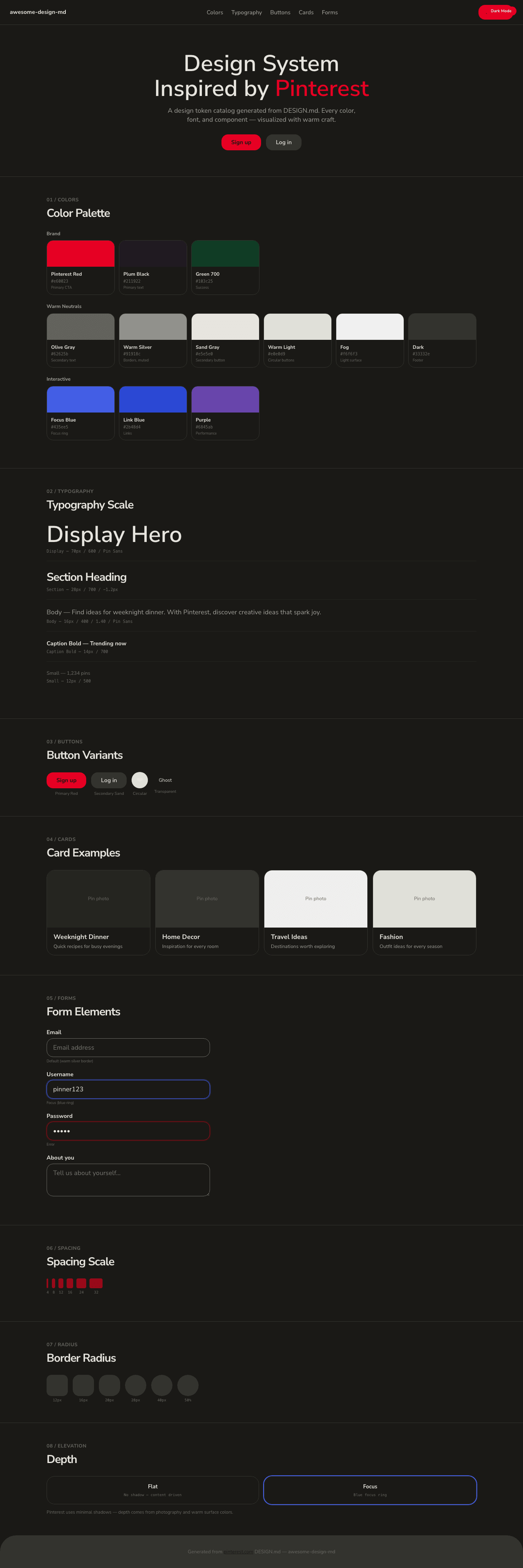
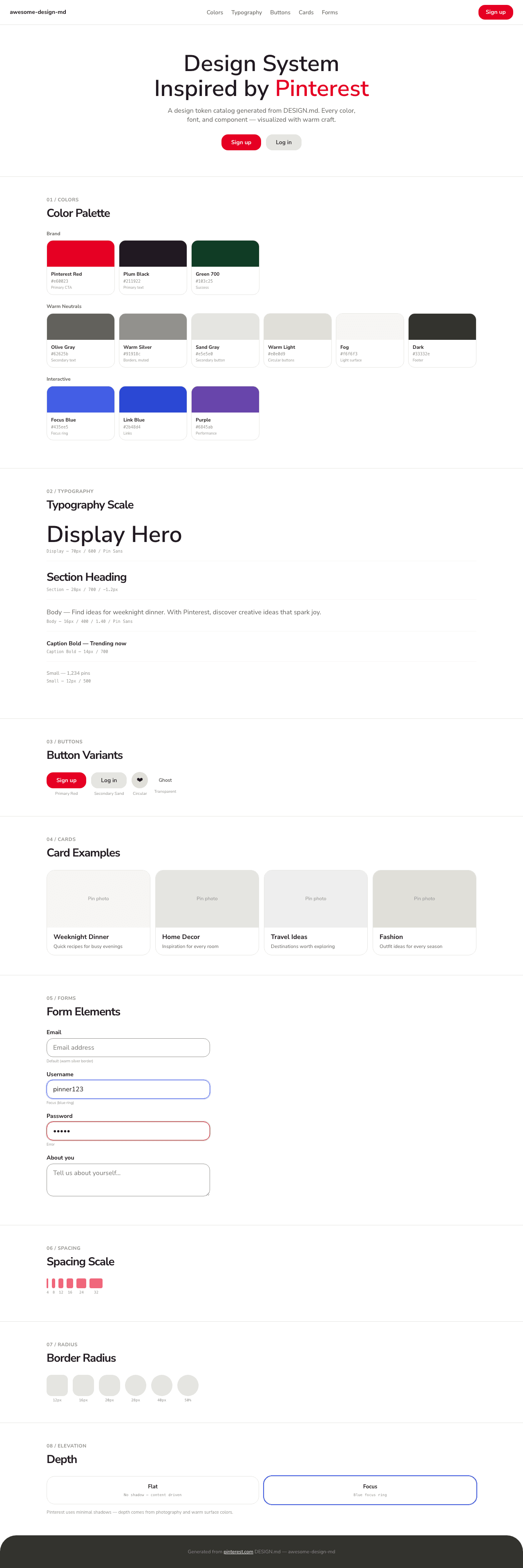
|
-
|
|
15
|
-
## Preview
|
|
16
|
-
|
|
17
|
-
A sample landing page built with DESIGN.md. It shows the actual colors, typography, buttons, cards, spacing, and elevation, all in one page.
|
|
18
|
-
|
|
19
|
-
### Dark Mode
|
|
20
|
-
|
|
21
|
-
|
|
22
|
-
### Light Mode
|
|
23
|
-
|