oh-my-design-cli 0.1.1 → 0.1.2
This diff represents the content of publicly available package versions that have been released to one of the supported registries. The information contained in this diff is provided for informational purposes only and reflects changes between package versions as they appear in their respective public registries.
- package/README.ko.md +3 -2
- package/README.md +3 -2
- package/package.json +3 -3
- package/references/Claude-Design-Sys-Prompt.txt +0 -421
- package/references/airbnb/README.md +0 -23
- package/references/airbnb/preview-dark.html +0 -234
- package/references/airbnb/preview.html +0 -233
- package/references/airtable/README.md +0 -23
- package/references/airtable/preview-dark.html +0 -165
- package/references/airtable/preview.html +0 -164
- package/references/apple/README.md +0 -24
- package/references/apple/preview-dark.html +0 -420
- package/references/apple/preview.html +0 -414
- package/references/baemin/README.md +0 -19
- package/references/bmw/README.md +0 -23
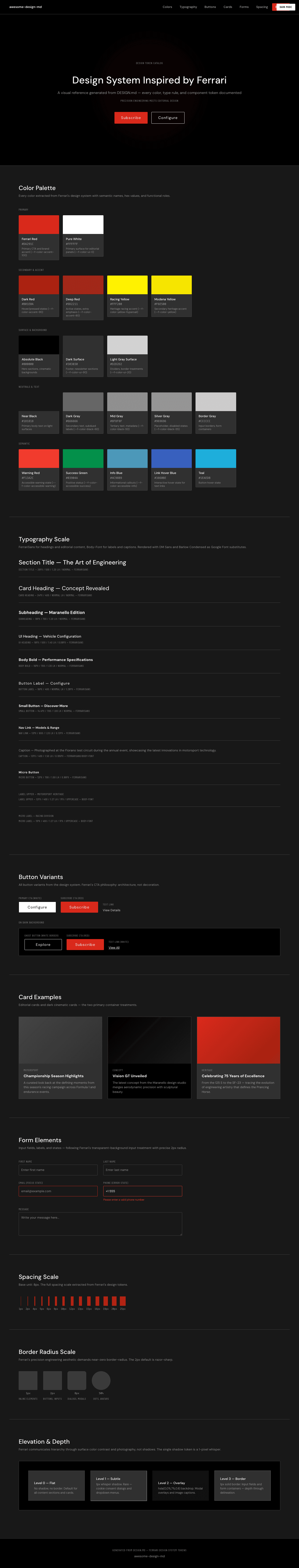
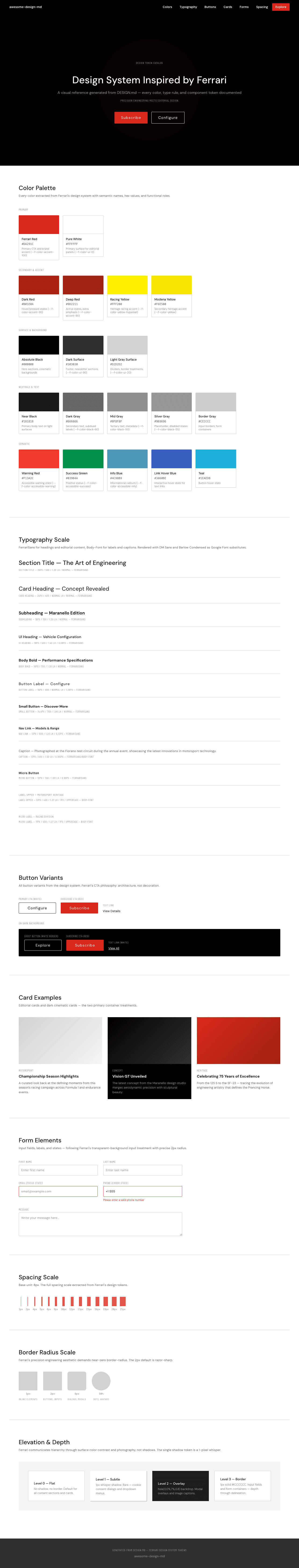
- package/references/bmw/preview-dark.html +0 -211
- package/references/bmw/preview.html +0 -210
- package/references/cal/README.md +0 -23
- package/references/cal/preview-dark.html +0 -449
- package/references/cal/preview.html +0 -575
- package/references/claude/README.md +0 -24
- package/references/claude/preview-dark.html +0 -803
- package/references/claude/preview.html +0 -826
- package/references/clay/README.md +0 -23
- package/references/clay/preview-dark.html +0 -316
- package/references/clay/preview.html +0 -315
- package/references/clickhouse/README.md +0 -24
- package/references/clickhouse/preview-dark.html +0 -834
- package/references/clickhouse/preview.html +0 -786
- package/references/cohere/README.md +0 -24
- package/references/cohere/preview-dark.html +0 -803
- package/references/cohere/preview.html +0 -807
- package/references/coinbase/README.md +0 -23
- package/references/coinbase/preview-dark.html +0 -164
- package/references/coinbase/preview.html +0 -163
- package/references/composio/README.md +0 -24
- package/references/composio/preview-dark.html +0 -958
- package/references/composio/preview.html +0 -933
- package/references/cursor/README.md +0 -24
- package/references/cursor/preview-dark.html +0 -393
- package/references/cursor/preview.html +0 -383
- package/references/dcard/README.md +0 -12
- package/references/dcard/_research/forum-1440px.png +0 -0
- package/references/dcard/_research.md +0 -77
- package/references/elevenlabs/README.md +0 -23
- package/references/elevenlabs/preview-dark.html +0 -252
- package/references/elevenlabs/preview.html +0 -251
- package/references/expo/README.md +0 -24
- package/references/expo/preview-dark.html +0 -533
- package/references/expo/preview.html +0 -533
- package/references/ferrari/README.md +0 -23
- package/references/ferrari/preview-dark.html +0 -1162
- package/references/ferrari/preview.html +0 -1122
- package/references/figma/README.md +0 -24
- package/references/figma/preview-dark.html +0 -822
- package/references/figma/preview.html +0 -832
- package/references/framer/README.md +0 -23
- package/references/framer/preview-dark.html +0 -902
- package/references/framer/preview.html +0 -883
- package/references/freee/README.md +0 -12
- package/references/freee/_research/vibes-storybook-1440px.png +0 -0
- package/references/freee/_research.md +0 -77
- package/references/hashicorp/README.md +0 -24
- package/references/hashicorp/preview-dark.html +0 -1202
- package/references/hashicorp/preview.html +0 -1193
- package/references/ibm/README.md +0 -24
- package/references/ibm/preview-dark.html +0 -443
- package/references/ibm/preview.html +0 -428
- package/references/intercom/README.md +0 -23
- package/references/intercom/preview-dark.html +0 -185
- package/references/intercom/preview.html +0 -184
- package/references/kakao/README.md +0 -18
- package/references/karrot/README.md +0 -18
- package/references/kraken/README.md +0 -23
- package/references/kraken/preview-dark.html +0 -169
- package/references/kraken/preview.html +0 -168
- package/references/lamborghini/README.md +0 -23
- package/references/lamborghini/preview-dark.html +0 -303
- package/references/lamborghini/preview.html +0 -381
- package/references/line/README.md +0 -12
- package/references/line/_research/home-1440px.png +0 -0
- package/references/line/_research.md +0 -65
- package/references/linear.app/README.md +0 -24
- package/references/linear.app/preview-dark.html +0 -383
- package/references/linear.app/preview.html +0 -373
- package/references/lovable/README.md +0 -24
- package/references/lovable/preview-dark.html +0 -349
- package/references/lovable/preview.html +0 -348
- package/references/mercari/README.md +0 -12
- package/references/mercari/_research/home-1440px.png +0 -0
- package/references/mercari/_research.md +0 -77
- package/references/minimax/README.md +0 -24
- package/references/minimax/preview-dark.html +0 -1262
- package/references/minimax/preview.html +0 -1248
- package/references/mintlify/README.md +0 -24
- package/references/mintlify/preview-dark.html +0 -409
- package/references/mintlify/preview.html +0 -398
- package/references/miro/README.md +0 -23
- package/references/miro/preview-dark.html +0 -174
- package/references/miro/preview.html +0 -173
- package/references/mistral.ai/README.md +0 -24
- package/references/mistral.ai/preview-dark.html +0 -806
- package/references/mistral.ai/preview.html +0 -805
- package/references/mongodb/README.md +0 -23
- package/references/mongodb/preview-dark.html +0 -260
- package/references/mongodb/preview.html +0 -259
- package/references/notion/README.md +0 -24
- package/references/notion/preview-dark.html +0 -372
- package/references/notion/preview.html +0 -364
- package/references/nvidia/README.md +0 -24
- package/references/nvidia/preview-dark.html +0 -374
- package/references/nvidia/preview.html +0 -366
- package/references/ollama/README.md +0 -24
- package/references/ollama/preview-dark.html +0 -678
- package/references/ollama/preview.html +0 -678
- package/references/opencode.ai/README.md +0 -24
- package/references/opencode.ai/preview-dark.html +0 -366
- package/references/opencode.ai/preview.html +0 -357
- package/references/pinkoi/README.md +0 -12
- package/references/pinkoi/_research/browse-1440px.png +0 -0
- package/references/pinkoi/_research.md +0 -115
- package/references/pinterest/README.md +0 -23
- package/references/pinterest/preview-dark.html +0 -233
- package/references/pinterest/preview.html +0 -232
- package/references/posthog/README.md +0 -23
- package/references/posthog/preview-dark.html +0 -699
- package/references/posthog/preview.html +0 -749
- package/references/raycast/README.md +0 -23
- package/references/raycast/preview-dark.html +0 -606
- package/references/raycast/preview.html +0 -688
- package/references/renault/README.md +0 -23
- package/references/renault/preview-dark.html +0 -406
- package/references/renault/preview.html +0 -606
- package/references/replicate/README.md +0 -24
- package/references/replicate/preview-dark.html +0 -828
- package/references/replicate/preview.html +0 -831
- package/references/resend/README.md +0 -23
- package/references/resend/preview-dark.html +0 -355
- package/references/resend/preview.html +0 -354
- package/references/revolut/README.md +0 -23
- package/references/revolut/preview-dark.html +0 -234
- package/references/revolut/preview.html +0 -233
- package/references/runwayml/README.md +0 -24
- package/references/runwayml/preview-dark.html +0 -664
- package/references/runwayml/preview.html +0 -665
- package/references/sanity/README.md +0 -24
- package/references/sanity/preview-dark.html +0 -990
- package/references/sanity/preview.html +0 -1135
- package/references/sentry/README.md +0 -24
- package/references/sentry/preview-dark.html +0 -626
- package/references/sentry/preview.html +0 -951
- package/references/spacex/README.md +0 -23
- package/references/spacex/preview-dark.html +0 -221
- package/references/spacex/preview.html +0 -220
- package/references/spotify/README.md +0 -23
- package/references/spotify/preview-dark.html +0 -231
- package/references/spotify/preview.html +0 -230
- package/references/stripe/README.md +0 -24
- package/references/stripe/preview-dark.html +0 -428
- package/references/stripe/preview.html +0 -419
- package/references/supabase/README.md +0 -24
- package/references/supabase/preview-dark.html +0 -977
- package/references/supabase/preview.html +0 -955
- package/references/superhuman/README.md +0 -23
- package/references/superhuman/preview-dark.html +0 -973
- package/references/superhuman/preview.html +0 -951
- package/references/tesla/README.md +0 -23
- package/references/tesla/preview-dark.html +0 -947
- package/references/tesla/preview.html +0 -925
- package/references/together.ai/README.md +0 -24
- package/references/together.ai/preview-dark.html +0 -892
- package/references/together.ai/preview.html +0 -897
- package/references/toss/README.md +0 -19
- package/references/uber/README.md +0 -24
- package/references/uber/preview-dark.html +0 -1120
- package/references/uber/preview.html +0 -1119
- package/references/vercel/README.md +0 -24
- package/references/vercel/preview-dark.html +0 -368
- package/references/vercel/preview.html +0 -367
- package/references/voltagent/README.md +0 -24
- package/references/voltagent/preview-dark.html +0 -487
- package/references/voltagent/preview.html +0 -766
- package/references/warp/README.md +0 -23
- package/references/warp/preview-dark.html +0 -500
- package/references/warp/preview.html +0 -533
- package/references/webflow/README.md +0 -23
- package/references/webflow/preview-dark.html +0 -147
- package/references/webflow/preview.html +0 -146
- package/references/wise/README.md +0 -23
- package/references/wise/preview-dark.html +0 -230
- package/references/wise/preview.html +0 -229
- package/references/x.ai/README.md +0 -24
- package/references/x.ai/preview-dark.html +0 -356
- package/references/x.ai/preview.html +0 -407
- package/references/zapier/README.md +0 -24
- package/references/zapier/preview-dark.html +0 -380
- package/references/zapier/preview.html +0 -372
|
@@ -1,533 +0,0 @@
|
|
|
1
|
-
<!DOCTYPE html>
|
|
2
|
-
<html lang="en">
|
|
3
|
-
<head>
|
|
4
|
-
<meta charset="UTF-8">
|
|
5
|
-
<meta name="viewport" content="width=device-width, initial-scale=1.0">
|
|
6
|
-
<title>Design System Inspired by Expo</title>
|
|
7
|
-
<link rel="preconnect" href="https://fonts.googleapis.com">
|
|
8
|
-
<link rel="preconnect" href="https://fonts.gstatic.com" crossorigin>
|
|
9
|
-
<link href="https://fonts.googleapis.com/css2?family=Inter:wght@400;500;600;700;800;900&family=JetBrains+Mono:wght@400;500;600&display=swap" rel="stylesheet">
|
|
10
|
-
<style>
|
|
11
|
-
:root {
|
|
12
|
-
--color-expo-black: #000000;
|
|
13
|
-
--color-near-black: #1c2024;
|
|
14
|
-
--color-link-cobalt: #0d74ce;
|
|
15
|
-
--color-legal-blue: #476cff;
|
|
16
|
-
--color-widget-sky: #47c2ff;
|
|
17
|
-
--color-preview-purple: #8145b5;
|
|
18
|
-
--color-cloud-gray: #f0f0f3;
|
|
19
|
-
--color-pure-white: #ffffff;
|
|
20
|
-
--color-widget-dark: #1a1a1a;
|
|
21
|
-
--color-banner-dark: #171717;
|
|
22
|
-
--color-slate-gray: #60646c;
|
|
23
|
-
--color-mid-slate: #555860;
|
|
24
|
-
--color-silver: #b0b4ba;
|
|
25
|
-
--color-pewter: #999999;
|
|
26
|
-
--color-light-silver: #cccccc;
|
|
27
|
-
--color-dark-slate: #363a3f;
|
|
28
|
-
--color-charcoal: #333333;
|
|
29
|
-
--color-warning: #ab6400;
|
|
30
|
-
--color-destructive: #eb8e90;
|
|
31
|
-
--color-border-lavender: #e0e1e6;
|
|
32
|
-
--color-input-border: #d9d9e0;
|
|
33
|
-
--color-focus-ring: #2547d0;
|
|
34
|
-
--font-body: 'Inter', -apple-system, system-ui, 'Segoe UI', Roboto, Helvetica, Arial, sans-serif;
|
|
35
|
-
--font-mono: 'JetBrains Mono', ui-monospace, SFMono-Regular, Menlo, Monaco, Consolas, monospace;
|
|
36
|
-
/* Light mode */
|
|
37
|
-
--bg-page: var(--color-cloud-gray);
|
|
38
|
-
--bg-card: var(--color-pure-white);
|
|
39
|
-
--bg-nav: rgba(240,240,243,0.92);
|
|
40
|
-
--text-primary: var(--color-near-black);
|
|
41
|
-
--text-secondary: var(--color-slate-gray);
|
|
42
|
-
--text-muted: var(--color-silver);
|
|
43
|
-
--border-color: var(--color-border-lavender);
|
|
44
|
-
--border-subtle: rgba(224,225,230,0.5);
|
|
45
|
-
--section-label-color: var(--color-expo-black);
|
|
46
|
-
}
|
|
47
|
-
|
|
48
|
-
* { margin: 0; padding: 0; box-sizing: border-box; }
|
|
49
|
-
|
|
50
|
-
body {
|
|
51
|
-
background: var(--bg-page);
|
|
52
|
-
color: var(--text-primary);
|
|
53
|
-
font-family: var(--font-body);
|
|
54
|
-
font-size: 16px;
|
|
55
|
-
line-height: 1.4;
|
|
56
|
-
-webkit-font-smoothing: antialiased;
|
|
57
|
-
}
|
|
58
|
-
|
|
59
|
-
/* NAV */
|
|
60
|
-
.nav {
|
|
61
|
-
position: sticky;
|
|
62
|
-
top: 0;
|
|
63
|
-
z-index: 100;
|
|
64
|
-
display: flex;
|
|
65
|
-
align-items: center;
|
|
66
|
-
justify-content: space-between;
|
|
67
|
-
padding: 16px 40px;
|
|
68
|
-
background: var(--bg-nav);
|
|
69
|
-
backdrop-filter: blur(12px);
|
|
70
|
-
border-bottom: 1px solid var(--border-color);
|
|
71
|
-
}
|
|
72
|
-
.nav-brand { font-family: var(--font-body); font-size: 18px; font-weight: 700; letter-spacing: -0.3px; display: flex; align-items: center; gap: 8px; color: var(--color-expo-black); }
|
|
73
|
-
.nav-brand svg { width: 24px; height: 24px; }
|
|
74
|
-
.nav-links { display: flex; gap: 32px; align-items: center; }
|
|
75
|
-
.nav-links a { color: var(--text-secondary); text-decoration: none; font-size: 14px; font-weight: 500; transition: color 0.2s; }
|
|
76
|
-
.nav-links a:hover { color: var(--color-near-black); }
|
|
77
|
-
.nav-cta {
|
|
78
|
-
background: var(--color-expo-black);
|
|
79
|
-
color: var(--color-pure-white);
|
|
80
|
-
padding: 8px 20px;
|
|
81
|
-
border: none;
|
|
82
|
-
border-radius: 9999px;
|
|
83
|
-
font-size: 14px;
|
|
84
|
-
font-family: var(--font-body);
|
|
85
|
-
font-weight: 600;
|
|
86
|
-
cursor: pointer;
|
|
87
|
-
}
|
|
88
|
-
.nav-status {
|
|
89
|
-
display: flex;
|
|
90
|
-
align-items: center;
|
|
91
|
-
gap: 6px;
|
|
92
|
-
font-size: 12px;
|
|
93
|
-
font-weight: 500;
|
|
94
|
-
color: var(--text-secondary);
|
|
95
|
-
background: var(--color-pure-white);
|
|
96
|
-
border: 1px solid var(--color-input-border);
|
|
97
|
-
border-radius: 9999px;
|
|
98
|
-
padding: 4px 12px 4px 8px;
|
|
99
|
-
}
|
|
100
|
-
.nav-status-dot {
|
|
101
|
-
width: 8px;
|
|
102
|
-
height: 8px;
|
|
103
|
-
border-radius: 50%;
|
|
104
|
-
background: #22c55e;
|
|
105
|
-
}
|
|
106
|
-
|
|
107
|
-
/* HERO */
|
|
108
|
-
.hero {
|
|
109
|
-
position: relative;
|
|
110
|
-
text-align: center;
|
|
111
|
-
padding: 120px 40px 100px;
|
|
112
|
-
overflow: hidden;
|
|
113
|
-
}
|
|
114
|
-
.hero h1 {
|
|
115
|
-
font-family: var(--font-body);
|
|
116
|
-
font-size: 60px;
|
|
117
|
-
font-weight: 700;
|
|
118
|
-
line-height: 1.10;
|
|
119
|
-
letter-spacing: -3px;
|
|
120
|
-
margin-bottom: 24px;
|
|
121
|
-
color: var(--color-expo-black);
|
|
122
|
-
position: relative;
|
|
123
|
-
}
|
|
124
|
-
.hero p {
|
|
125
|
-
color: var(--text-secondary);
|
|
126
|
-
font-size: 18px;
|
|
127
|
-
line-height: 1.4;
|
|
128
|
-
margin-bottom: 40px;
|
|
129
|
-
position: relative;
|
|
130
|
-
}
|
|
131
|
-
.hero-buttons { display: flex; gap: 16px; justify-content: center; position: relative; }
|
|
132
|
-
.btn-primary-pill {
|
|
133
|
-
background: var(--color-expo-black);
|
|
134
|
-
color: var(--color-pure-white);
|
|
135
|
-
padding: 12px 28px;
|
|
136
|
-
border: none;
|
|
137
|
-
border-radius: 9999px;
|
|
138
|
-
font-size: 16px;
|
|
139
|
-
font-family: var(--font-body);
|
|
140
|
-
font-weight: 600;
|
|
141
|
-
cursor: pointer;
|
|
142
|
-
}
|
|
143
|
-
.btn-standard {
|
|
144
|
-
background: var(--color-pure-white);
|
|
145
|
-
color: var(--color-near-black);
|
|
146
|
-
padding: 12px 24px;
|
|
147
|
-
border: 1px solid var(--color-input-border);
|
|
148
|
-
border-radius: 6px;
|
|
149
|
-
font-size: 16px;
|
|
150
|
-
font-family: var(--font-body);
|
|
151
|
-
font-weight: 500;
|
|
152
|
-
cursor: pointer;
|
|
153
|
-
}
|
|
154
|
-
|
|
155
|
-
/* SECTIONS */
|
|
156
|
-
.section {
|
|
157
|
-
max-width: 1200px;
|
|
158
|
-
margin: 0 auto;
|
|
159
|
-
padding: 96px 40px;
|
|
160
|
-
}
|
|
161
|
-
.section-title {
|
|
162
|
-
font-family: var(--font-body);
|
|
163
|
-
font-size: 14px;
|
|
164
|
-
font-weight: 600;
|
|
165
|
-
text-transform: uppercase;
|
|
166
|
-
letter-spacing: 2.52px;
|
|
167
|
-
color: var(--section-label-color);
|
|
168
|
-
margin-bottom: 12px;
|
|
169
|
-
}
|
|
170
|
-
.section-heading {
|
|
171
|
-
font-family: var(--font-body);
|
|
172
|
-
font-size: 48px;
|
|
173
|
-
font-weight: 600;
|
|
174
|
-
line-height: 1.10;
|
|
175
|
-
letter-spacing: -2px;
|
|
176
|
-
margin-bottom: 48px;
|
|
177
|
-
color: var(--color-expo-black);
|
|
178
|
-
}
|
|
179
|
-
.section-divider {
|
|
180
|
-
border: none;
|
|
181
|
-
border-top: 1px solid var(--border-subtle);
|
|
182
|
-
margin: 0 40px;
|
|
183
|
-
max-width: 1200px;
|
|
184
|
-
margin-left: auto;
|
|
185
|
-
margin-right: auto;
|
|
186
|
-
}
|
|
187
|
-
|
|
188
|
-
/* COLOR PALETTE */
|
|
189
|
-
.color-group { margin-bottom: 40px; }
|
|
190
|
-
.color-group-title { font-size: 20px; font-weight: 600; line-height: 1.2; margin-bottom: 20px; color: var(--text-secondary); }
|
|
191
|
-
.color-grid { display: grid; grid-template-columns: repeat(auto-fill, minmax(180px, 1fr)); gap: 16px; }
|
|
192
|
-
.color-swatch { border: 1px solid var(--border-color); border-radius: 8px; overflow: hidden; }
|
|
193
|
-
.color-swatch-block { height: 80px; }
|
|
194
|
-
.color-swatch-info { padding: 12px; background: var(--bg-card); }
|
|
195
|
-
.color-swatch-name { font-size: 13px; font-weight: 600; margin-bottom: 2px; }
|
|
196
|
-
.color-swatch-hex { font-family: var(--font-mono); font-size: 12px; color: var(--text-muted); margin-bottom: 4px; }
|
|
197
|
-
.color-swatch-role { font-size: 12px; color: var(--text-muted); line-height: 1.4; }
|
|
198
|
-
|
|
199
|
-
/* TYPOGRAPHY */
|
|
200
|
-
.type-sample { margin-bottom: 32px; padding-bottom: 32px; border-bottom: 1px solid var(--border-subtle); }
|
|
201
|
-
.type-sample:last-child { border-bottom: none; }
|
|
202
|
-
.type-sample-text { margin-bottom: 8px; }
|
|
203
|
-
.type-sample-label { font-family: var(--font-mono); font-size: 12px; color: var(--text-muted); }
|
|
204
|
-
|
|
205
|
-
/* BUTTONS */
|
|
206
|
-
.button-row { display: flex; flex-wrap: wrap; gap: 20px; align-items: flex-start; }
|
|
207
|
-
.button-demo { text-align: center; }
|
|
208
|
-
.button-demo-label { font-family: var(--font-mono); font-size: 11px; color: var(--text-muted); margin-top: 10px; text-transform: uppercase; letter-spacing: 0.55px; }
|
|
209
|
-
.btn-dark-pill {
|
|
210
|
-
background: var(--color-expo-black);
|
|
211
|
-
color: var(--color-pure-white);
|
|
212
|
-
padding: 12px 28px;
|
|
213
|
-
border: none;
|
|
214
|
-
border-radius: 9999px;
|
|
215
|
-
font-size: 16px;
|
|
216
|
-
font-family: var(--font-body);
|
|
217
|
-
font-weight: 600;
|
|
218
|
-
cursor: pointer;
|
|
219
|
-
}
|
|
220
|
-
.btn-white-standard {
|
|
221
|
-
background: var(--color-pure-white);
|
|
222
|
-
color: var(--color-near-black);
|
|
223
|
-
padding: 12px 24px;
|
|
224
|
-
border: 1px solid var(--color-input-border);
|
|
225
|
-
border-radius: 6px;
|
|
226
|
-
font-size: 16px;
|
|
227
|
-
font-family: var(--font-body);
|
|
228
|
-
font-weight: 500;
|
|
229
|
-
cursor: pointer;
|
|
230
|
-
}
|
|
231
|
-
.btn-dark-rounded {
|
|
232
|
-
background: var(--color-expo-black);
|
|
233
|
-
color: var(--color-pure-white);
|
|
234
|
-
padding: 12px 24px;
|
|
235
|
-
border: none;
|
|
236
|
-
border-radius: 32px;
|
|
237
|
-
font-size: 16px;
|
|
238
|
-
font-family: var(--font-body);
|
|
239
|
-
font-weight: 600;
|
|
240
|
-
cursor: pointer;
|
|
241
|
-
}
|
|
242
|
-
|
|
243
|
-
/* CARDS */
|
|
244
|
-
.card-grid { display: grid; grid-template-columns: repeat(auto-fit, minmax(300px, 1fr)); gap: 24px; }
|
|
245
|
-
.card { background: var(--bg-card); border-radius: 8px; padding: 28px; }
|
|
246
|
-
.card-standard { border: 1px solid var(--border-color); }
|
|
247
|
-
.card-elevated { border: 1px solid var(--border-color); box-shadow: rgba(0,0,0,0.08) 0px 3px 6px, rgba(0,0,0,0.07) 0px 2px 4px; }
|
|
248
|
-
.card-glow { border: 1px solid var(--border-color); box-shadow: rgba(0,0,0,0.1) 0px 10px 20px, rgba(0,0,0,0.05) 0px 3px 6px; border-radius: 16px; }
|
|
249
|
-
.card h3 { font-family: var(--font-body); font-size: 20px; font-weight: 600; line-height: 1.20; letter-spacing: -0.25px; margin-bottom: 12px; color: var(--color-near-black); }
|
|
250
|
-
.card p { color: var(--text-secondary); font-size: 16px; line-height: 1.40; }
|
|
251
|
-
.card-label { font-family: var(--font-mono); font-size: 11px; text-transform: uppercase; letter-spacing: 0.55px; color: var(--color-expo-black); margin-bottom: 16px; }
|
|
252
|
-
|
|
253
|
-
/* CODE BLOCK */
|
|
254
|
-
.code-block {
|
|
255
|
-
background: var(--color-near-black);
|
|
256
|
-
border: 1px solid var(--color-dark-slate);
|
|
257
|
-
border-radius: 8px;
|
|
258
|
-
padding: 20px 24px;
|
|
259
|
-
margin-top: 24px;
|
|
260
|
-
font-family: var(--font-mono);
|
|
261
|
-
font-size: 14px;
|
|
262
|
-
line-height: 1.4;
|
|
263
|
-
color: #f2f2f2;
|
|
264
|
-
overflow-x: auto;
|
|
265
|
-
}
|
|
266
|
-
.code-block .keyword { color: var(--color-link-cobalt); }
|
|
267
|
-
.code-block .string { color: #22c55e; }
|
|
268
|
-
.code-block .comment { color: var(--color-pewter); }
|
|
269
|
-
|
|
270
|
-
/* SPACING */
|
|
271
|
-
.spacing-row { display: flex; flex-wrap: wrap; gap: 12px; align-items: flex-end; }
|
|
272
|
-
.spacing-item { text-align: center; }
|
|
273
|
-
.spacing-box { background: rgba(0,0,0,0.06); border: 1px solid rgba(0,0,0,0.12); border-radius: 2px; margin-bottom: 8px; }
|
|
274
|
-
.spacing-label { font-family: var(--font-mono); font-size: 11px; color: var(--text-muted); }
|
|
275
|
-
|
|
276
|
-
/* RADIUS */
|
|
277
|
-
.radius-row { display: flex; flex-wrap: wrap; gap: 20px; align-items: center; }
|
|
278
|
-
.radius-item { text-align: center; }
|
|
279
|
-
.radius-box { width: 80px; height: 80px; background: var(--bg-card); border: 1px solid var(--border-color); margin-bottom: 8px; }
|
|
280
|
-
.radius-label { font-family: var(--font-mono); font-size: 11px; color: var(--text-muted); }
|
|
281
|
-
.radius-context { font-size: 11px; color: var(--text-muted); margin-top: 2px; }
|
|
282
|
-
|
|
283
|
-
/* ELEVATION */
|
|
284
|
-
.elevation-grid { display: grid; grid-template-columns: repeat(auto-fit, minmax(220px, 1fr)); gap: 24px; }
|
|
285
|
-
.elevation-card { background: var(--bg-card); border-radius: 8px; padding: 24px; min-height: 140px; display: flex; flex-direction: column; justify-content: space-between; }
|
|
286
|
-
.elevation-flat { border: none; background: var(--bg-page); }
|
|
287
|
-
.elevation-surface { border: none; background: var(--bg-card); }
|
|
288
|
-
.elevation-whisper { border: 1px solid var(--border-color); box-shadow: rgba(0,0,0,0.08) 0px 3px 6px, rgba(0,0,0,0.07) 0px 2px 4px; }
|
|
289
|
-
.elevation-elevated { border: 1px solid var(--border-color); box-shadow: rgba(0,0,0,0.1) 0px 10px 20px, rgba(0,0,0,0.05) 0px 3px 6px; }
|
|
290
|
-
.elevation-modal { border: 1px solid var(--border-color); box-shadow: rgba(0,0,0,0.15) 0px 20px 40px, rgba(0,0,0,0.08) 0px 8px 16px; }
|
|
291
|
-
.elevation-name { font-size: 16px; font-weight: 600; margin-bottom: 8px; }
|
|
292
|
-
.elevation-desc { font-size: 13px; color: var(--text-secondary); line-height: 1.5; }
|
|
293
|
-
.elevation-level { font-family: var(--font-mono); font-size: 11px; color: var(--color-expo-black); text-transform: uppercase; letter-spacing: 0.55px; margin-top: 12px; }
|
|
294
|
-
|
|
295
|
-
/* RESPONSIVE */
|
|
296
|
-
@media (max-width: 768px) {
|
|
297
|
-
.nav { padding: 12px 20px; }
|
|
298
|
-
.nav-links a:not(.nav-cta-wrapper) { display: none; }
|
|
299
|
-
.nav-status { display: none; }
|
|
300
|
-
.hero { padding: 80px 20px 60px; }
|
|
301
|
-
.hero h1 { font-size: 36px; letter-spacing: -1.5px; }
|
|
302
|
-
.section { padding: 60px 20px; }
|
|
303
|
-
.section-heading { font-size: 28px; letter-spacing: -1px; }
|
|
304
|
-
.color-grid { grid-template-columns: repeat(auto-fill, minmax(140px, 1fr)); }
|
|
305
|
-
.card-grid { grid-template-columns: 1fr; }
|
|
306
|
-
.hero-buttons { flex-direction: column; align-items: center; }
|
|
307
|
-
.button-row { flex-direction: column; align-items: flex-start; }
|
|
308
|
-
}
|
|
309
|
-
</style>
|
|
310
|
-
</head>
|
|
311
|
-
<body>
|
|
312
|
-
|
|
313
|
-
<!-- NAV -->
|
|
314
|
-
<nav class="nav">
|
|
315
|
-
<span class="nav-brand">awesome-design-md</span>
|
|
316
|
-
<div class="nav-links">
|
|
317
|
-
<a href="#colors">Colors</a>
|
|
318
|
-
<a href="#typography">Typography</a>
|
|
319
|
-
<a href="#buttons">Buttons</a>
|
|
320
|
-
<a href="#cards">Cards</a>
|
|
321
|
-
<a href="#spacing">Spacing</a>
|
|
322
|
-
<a href="#elevation">Elevation</a>
|
|
323
|
-
<div class="nav-status"><span class="nav-status-dot"></span> All Systems Operational</div>
|
|
324
|
-
<button class="nav-cta">Sign Up</button>
|
|
325
|
-
</div>
|
|
326
|
-
</nav>
|
|
327
|
-
|
|
328
|
-
<!-- HERO -->
|
|
329
|
-
<section class="hero">
|
|
330
|
-
<h1>Design System<br>Inspired by Expo</h1>
|
|
331
|
-
<p>Auto-generated design token catalog from DESIGN.md</p>
|
|
332
|
-
<div class="hero-buttons">
|
|
333
|
-
<button class="btn-primary-pill">Explore Tokens</button>
|
|
334
|
-
<button class="btn-standard">View Source</button>
|
|
335
|
-
</div>
|
|
336
|
-
</section>
|
|
337
|
-
|
|
338
|
-
<hr class="section-divider">
|
|
339
|
-
|
|
340
|
-
<!-- COLORS -->
|
|
341
|
-
<section class="section" id="colors">
|
|
342
|
-
<div class="section-title">01 / Color Palette</div>
|
|
343
|
-
<h2 class="section-heading">Color Palette & Roles</h2>
|
|
344
|
-
|
|
345
|
-
<div class="color-group">
|
|
346
|
-
<h3 class="color-group-title">Primary</h3>
|
|
347
|
-
<div class="color-grid">
|
|
348
|
-
<div class="color-swatch"><div class="color-swatch-block" style="background: #000000;"></div><div class="color-swatch-info"><div class="color-swatch-name">Expo Black</div><div class="color-swatch-hex">#000000</div><div class="color-swatch-role">Primary headlines, CTA buttons, brand anchor</div></div></div>
|
|
349
|
-
<div class="color-swatch"><div class="color-swatch-block" style="background: #1c2024;"></div><div class="color-swatch-info"><div class="color-swatch-name">Near Black</div><div class="color-swatch-hex">#1c2024</div><div class="color-swatch-role">Body text, softer than pure black for reading</div></div></div>
|
|
350
|
-
</div>
|
|
351
|
-
</div>
|
|
352
|
-
|
|
353
|
-
<div class="color-group">
|
|
354
|
-
<h3 class="color-group-title">Secondary & Accent</h3>
|
|
355
|
-
<div class="color-grid">
|
|
356
|
-
<div class="color-swatch"><div class="color-swatch-block" style="background: #0d74ce;"></div><div class="color-swatch-info"><div class="color-swatch-name">Link Cobalt</div><div class="color-swatch-hex">#0d74ce</div><div class="color-swatch-role">Standard links, interactive signals</div></div></div>
|
|
357
|
-
<div class="color-swatch"><div class="color-swatch-block" style="background: #476cff;"></div><div class="color-swatch-info"><div class="color-swatch-name">Legal Blue</div><div class="color-swatch-hex">#476cff</div><div class="color-swatch-role">Footer/legal links, brighter accent</div></div></div>
|
|
358
|
-
<div class="color-swatch"><div class="color-swatch-block" style="background: #47c2ff;"></div><div class="color-swatch-info"><div class="color-swatch-name">Widget Sky</div><div class="color-swatch-hex">#47c2ff</div><div class="color-swatch-role">Widget branding, lightest accent</div></div></div>
|
|
359
|
-
<div class="color-swatch"><div class="color-swatch-block" style="background: #8145b5;"></div><div class="color-swatch-info"><div class="color-swatch-name">Preview Purple</div><div class="color-swatch-hex">#8145b5</div><div class="color-swatch-role">Beta/preview feature indicators</div></div></div>
|
|
360
|
-
</div>
|
|
361
|
-
</div>
|
|
362
|
-
|
|
363
|
-
<div class="color-group">
|
|
364
|
-
<h3 class="color-group-title">Surface & Background</h3>
|
|
365
|
-
<div class="color-grid">
|
|
366
|
-
<div class="color-swatch"><div class="color-swatch-block" style="background: #f0f0f3; border-bottom: 1px solid #e0e1e6;"></div><div class="color-swatch-info"><div class="color-swatch-name">Cloud Gray</div><div class="color-swatch-hex">#f0f0f3</div><div class="color-swatch-role">Primary page background</div></div></div>
|
|
367
|
-
<div class="color-swatch"><div class="color-swatch-block" style="background: #ffffff; border-bottom: 1px solid #e0e1e6;"></div><div class="color-swatch-info"><div class="color-swatch-name">Pure White</div><div class="color-swatch-hex">#ffffff</div><div class="color-swatch-role">Card surfaces, elevated containers</div></div></div>
|
|
368
|
-
<div class="color-swatch"><div class="color-swatch-block" style="background: #1a1a1a;"></div><div class="color-swatch-info"><div class="color-swatch-name">Widget Dark</div><div class="color-swatch-hex">#1a1a1a</div><div class="color-swatch-role">Dark theme widgets, overlays</div></div></div>
|
|
369
|
-
<div class="color-swatch"><div class="color-swatch-block" style="background: #171717;"></div><div class="color-swatch-info"><div class="color-swatch-name">Banner Dark</div><div class="color-swatch-hex">#171717</div><div class="color-swatch-role">Promo banners, high-contrast surfaces</div></div></div>
|
|
370
|
-
</div>
|
|
371
|
-
</div>
|
|
372
|
-
|
|
373
|
-
<div class="color-group">
|
|
374
|
-
<h3 class="color-group-title">Neutrals & Text</h3>
|
|
375
|
-
<div class="color-grid">
|
|
376
|
-
<div class="color-swatch"><div class="color-swatch-block" style="background: #60646c;"></div><div class="color-swatch-info"><div class="color-swatch-name">Slate Gray</div><div class="color-swatch-hex">#60646c</div><div class="color-swatch-role">Secondary text (305 instances)</div></div></div>
|
|
377
|
-
<div class="color-swatch"><div class="color-swatch-block" style="background: #555860;"></div><div class="color-swatch-info"><div class="color-swatch-name">Mid Slate</div><div class="color-swatch-hex">#555860</div><div class="color-swatch-role">Emphasized secondary text</div></div></div>
|
|
378
|
-
<div class="color-swatch"><div class="color-swatch-block" style="background: #b0b4ba;"></div><div class="color-swatch-info"><div class="color-swatch-name">Silver</div><div class="color-swatch-hex">#b0b4ba</div><div class="color-swatch-role">Tertiary text, placeholders, metadata</div></div></div>
|
|
379
|
-
<div class="color-swatch"><div class="color-swatch-block" style="background: #363a3f;"></div><div class="color-swatch-info"><div class="color-swatch-name">Dark Slate</div><div class="color-swatch-hex">#363a3f</div><div class="color-swatch-role">Borders on dark surfaces, switch tracks</div></div></div>
|
|
380
|
-
</div>
|
|
381
|
-
</div>
|
|
382
|
-
|
|
383
|
-
<div class="color-group">
|
|
384
|
-
<h3 class="color-group-title">Semantic</h3>
|
|
385
|
-
<div class="color-grid">
|
|
386
|
-
<div class="color-swatch"><div class="color-swatch-block" style="background: #ab6400;"></div><div class="color-swatch-info"><div class="color-swatch-name">Warning Amber</div><div class="color-swatch-hex">#ab6400</div><div class="color-swatch-role">Warning states, deep amber for seriousness</div></div></div>
|
|
387
|
-
<div class="color-swatch"><div class="color-swatch-block" style="background: #eb8e90;"></div><div class="color-swatch-info"><div class="color-swatch-name">Destructive Rose</div><div class="color-swatch-hex">#eb8e90</div><div class="color-swatch-role">Disabled destructive actions, gentle alarm</div></div></div>
|
|
388
|
-
<div class="color-swatch"><div class="color-swatch-block" style="background: #e0e1e6;"></div><div class="color-swatch-info"><div class="color-swatch-name">Border Lavender</div><div class="color-swatch-hex">#e0e1e6</div><div class="color-swatch-role">Standard card/container borders</div></div></div>
|
|
389
|
-
<div class="color-swatch"><div class="color-swatch-block" style="background: #d9d9e0;"></div><div class="color-swatch-info"><div class="color-swatch-name">Input Border</div><div class="color-swatch-hex">#d9d9e0</div><div class="color-swatch-role">Buttons, form elements, interactive borders</div></div></div>
|
|
390
|
-
</div>
|
|
391
|
-
</div>
|
|
392
|
-
</section>
|
|
393
|
-
|
|
394
|
-
<hr class="section-divider">
|
|
395
|
-
|
|
396
|
-
<!-- TYPOGRAPHY -->
|
|
397
|
-
<section class="section" id="typography">
|
|
398
|
-
<div class="section-title">02 / Typography Scale</div>
|
|
399
|
-
<h2 class="section-heading">Typography Rules</h2>
|
|
400
|
-
|
|
401
|
-
<div class="type-sample"><div class="type-sample-text" style="font-family: var(--font-body); font-size: 60px; font-weight: 700; line-height: 1.10; letter-spacing: -3px; color: var(--color-expo-black);">Display Hero</div><div class="type-sample-label">Display / Hero — 64px / 700–900 / 1.10 / -3px — Inter</div></div>
|
|
402
|
-
<div class="type-sample"><div class="type-sample-text" style="font-family: var(--font-body); font-size: 48px; font-weight: 600; line-height: 1.10; letter-spacing: -2px; color: var(--color-expo-black);">Section Heading</div><div class="type-sample-label">Section Heading — 48px / 600 / 1.10 / -2px — Inter</div></div>
|
|
403
|
-
<div class="type-sample"><div class="type-sample-text" style="font-family: var(--font-body); font-size: 20px; font-weight: 600; line-height: 1.20; letter-spacing: -0.25px;">Sub-heading</div><div class="type-sample-label">Sub-heading — 20px / 600 / 1.20 / -0.25px — Inter</div></div>
|
|
404
|
-
<div class="type-sample"><div class="type-sample-text" style="font-family: var(--font-body); font-size: 18px; font-weight: 400; line-height: 1.40; color: var(--text-secondary);">Body large text for intro paragraphs and section descriptions with comfortable reading rhythm.</div><div class="type-sample-label">Body Large — 18px / 400–500 / 1.40 / normal — Inter</div></div>
|
|
405
|
-
<div class="type-sample"><div class="type-sample-text" style="font-family: var(--font-body); font-size: 16px; font-weight: 400; line-height: 1.40;">Standard body text for paragraphs, navigation links, and button labels. Inter provides geometric precision at every weight.</div><div class="type-sample-label">Body / Button — 16px / 400–700 / 1.25–1.40 / normal — Inter</div></div>
|
|
406
|
-
<div class="type-sample"><div class="type-sample-text" style="font-family: var(--font-body); font-size: 14px; font-weight: 500; line-height: 1.40; color: var(--text-secondary);">Caption text for descriptions and metadata labels</div><div class="type-sample-label">Caption / Label — 14px / 400–600 / 1.00–1.40 / normal — Inter</div></div>
|
|
407
|
-
<div class="type-sample"><div class="type-sample-text" style="font-family: var(--font-body); font-size: 12px; font-weight: 500; line-height: 1.00; color: var(--text-muted);">Tag / Small Badge</div><div class="type-sample-label">Tag / Small — 12px / 500 / 1.00–1.60 / normal — Inter</div></div>
|
|
408
|
-
<div class="type-sample"><div class="type-sample-text" style="font-family: var(--font-mono); font-size: 16px; font-weight: 400; line-height: 1.40;">npx create-expo-app@latest my-app</div><div class="type-sample-label">Code Body — 16px / 400–600 / 1.40 / normal — JetBrains Mono</div></div>
|
|
409
|
-
<div class="type-sample"><div class="type-sample-text" style="font-family: var(--font-mono); font-size: 14px; font-weight: 400; line-height: 1.40;">import { Camera } from "expo-camera";</div><div class="type-sample-label">Code Caption — 14px / 400–600 / 1.40 / normal — JetBrains Mono</div></div>
|
|
410
|
-
<div class="type-sample"><div class="type-sample-text" style="font-family: var(--font-mono); font-size: 12px; font-weight: 400; line-height: 1.60; text-transform: uppercase; color: var(--text-muted);">REACT NATIVE</div><div class="type-sample-label">Code Small / Tag — 12px / 400 / 1.60 / uppercase — JetBrains Mono</div></div>
|
|
411
|
-
</section>
|
|
412
|
-
|
|
413
|
-
<hr class="section-divider">
|
|
414
|
-
|
|
415
|
-
<!-- BUTTONS -->
|
|
416
|
-
<section class="section" id="buttons">
|
|
417
|
-
<div class="section-title">03 / Button Variants</div>
|
|
418
|
-
<h2 class="section-heading">Buttons</h2>
|
|
419
|
-
|
|
420
|
-
<div class="button-row">
|
|
421
|
-
<div class="button-demo"><button class="btn-dark-pill">Get Started</button><div class="button-demo-label">Primary Pill (Dark)</div></div>
|
|
422
|
-
<div class="button-demo"><button class="btn-white-standard">View Docs</button><div class="button-demo-label">Standard (White)</div></div>
|
|
423
|
-
<div class="button-demo"><button class="btn-dark-rounded">Sign Up Free</button><div class="button-demo-label">Dark Rounded (32px)</div></div>
|
|
424
|
-
</div>
|
|
425
|
-
|
|
426
|
-
<div class="code-block" style="margin-top: 40px;">
|
|
427
|
-
<span class="comment">// Get started with Expo</span><br>
|
|
428
|
-
<span class="keyword">$</span> npx create-expo-app@latest my-app
|
|
429
|
-
</div>
|
|
430
|
-
</section>
|
|
431
|
-
|
|
432
|
-
<hr class="section-divider">
|
|
433
|
-
|
|
434
|
-
<!-- CARDS -->
|
|
435
|
-
<section class="section" id="cards">
|
|
436
|
-
<div class="section-title">04 / Card Examples</div>
|
|
437
|
-
<h2 class="section-heading">Cards & Containers</h2>
|
|
438
|
-
|
|
439
|
-
<div class="card-grid">
|
|
440
|
-
<div class="card card-standard">
|
|
441
|
-
<div class="card-label">Standard Card</div>
|
|
442
|
-
<h3>Border Lavender Container</h3>
|
|
443
|
-
<p>Standard content card with 1px Border Lavender border and 8px radius. White surface clearly lifted from Cloud Gray page background.</p>
|
|
444
|
-
</div>
|
|
445
|
-
<div class="card card-elevated">
|
|
446
|
-
<div class="card-label">Elevated (Whisper)</div>
|
|
447
|
-
<h3>Whisper Shadow Lift</h3>
|
|
448
|
-
<p>Subtle card elevation with whisper-soft shadow. Barely perceptible lift for hover states and highlighted content.</p>
|
|
449
|
-
</div>
|
|
450
|
-
<div class="card card-glow">
|
|
451
|
-
<div class="card-label">Featured (Glow)</div>
|
|
452
|
-
<h3>Standard Elevation</h3>
|
|
453
|
-
<p>Clear floating elevation with generous 16px radius. For feature showcases, product screenshots, and hero content containers.</p>
|
|
454
|
-
</div>
|
|
455
|
-
</div>
|
|
456
|
-
</section>
|
|
457
|
-
|
|
458
|
-
<hr class="section-divider">
|
|
459
|
-
|
|
460
|
-
<!-- SPACING -->
|
|
461
|
-
<section class="section" id="spacing">
|
|
462
|
-
<div class="section-title">05 / Spacing Scale</div>
|
|
463
|
-
<h2 class="section-heading">Spacing System</h2>
|
|
464
|
-
<p style="color: var(--text-secondary); margin-bottom: 32px;">Base unit: 8px. Scale builds from 1px to 144px.</p>
|
|
465
|
-
|
|
466
|
-
<div class="spacing-row">
|
|
467
|
-
<div class="spacing-item"><div class="spacing-box" style="width: 4px; height: 4px;"></div><div class="spacing-label">1px</div></div>
|
|
468
|
-
<div class="spacing-item"><div class="spacing-box" style="width: 8px; height: 8px;"></div><div class="spacing-label">2px</div></div>
|
|
469
|
-
<div class="spacing-item"><div class="spacing-box" style="width: 16px; height: 16px;"></div><div class="spacing-label">4px</div></div>
|
|
470
|
-
<div class="spacing-item"><div class="spacing-box" style="width: 32px; height: 32px;"></div><div class="spacing-label">8px</div></div>
|
|
471
|
-
<div class="spacing-item"><div class="spacing-box" style="width: 48px; height: 48px;"></div><div class="spacing-label">12px</div></div>
|
|
472
|
-
<div class="spacing-item"><div class="spacing-box" style="width: 64px; height: 64px;"></div><div class="spacing-label">16px</div></div>
|
|
473
|
-
<div class="spacing-item"><div class="spacing-box" style="width: 96px; height: 96px;"></div><div class="spacing-label">24px</div></div>
|
|
474
|
-
<div class="spacing-item"><div class="spacing-box" style="width: 128px; height: 128px;"></div><div class="spacing-label">32px</div></div>
|
|
475
|
-
<div class="spacing-item"><div class="spacing-box" style="width: 160px; height: 160px;"></div><div class="spacing-label">40px</div></div>
|
|
476
|
-
<div class="spacing-item"><div class="spacing-box" style="width: 192px; height: 192px;"></div><div class="spacing-label">48px</div></div>
|
|
477
|
-
<div class="spacing-item"><div class="spacing-box" style="width: 256px; height: 256px;"></div><div class="spacing-label">64px</div></div>
|
|
478
|
-
</div>
|
|
479
|
-
</section>
|
|
480
|
-
|
|
481
|
-
<hr class="section-divider">
|
|
482
|
-
|
|
483
|
-
<!-- BORDER RADIUS -->
|
|
484
|
-
<section class="section">
|
|
485
|
-
<div class="section-title">06 / Border Radius Scale</div>
|
|
486
|
-
<h2 class="section-heading">Border Radius</h2>
|
|
487
|
-
|
|
488
|
-
<div class="radius-row">
|
|
489
|
-
<div class="radius-item"><div class="radius-box" style="border-radius: 4px;"></div><div class="radius-label">4px</div><div class="radius-context">Nearly squared</div></div>
|
|
490
|
-
<div class="radius-item"><div class="radius-box" style="border-radius: 6px;"></div><div class="radius-label">6px</div><div class="radius-context">Buttons, inputs</div></div>
|
|
491
|
-
<div class="radius-item"><div class="radius-box" style="border-radius: 8px;"></div><div class="radius-label">8px</div><div class="radius-context">Standard cards</div></div>
|
|
492
|
-
<div class="radius-item"><div class="radius-box" style="border-radius: 16px;"></div><div class="radius-label">16px</div><div class="radius-context">Feature panels</div></div>
|
|
493
|
-
<div class="radius-item"><div class="radius-box" style="border-radius: 24px;"></div><div class="radius-label">24px</div><div class="radius-context">Images, videos</div></div>
|
|
494
|
-
<div class="radius-item"><div class="radius-box" style="border-radius: 32px;"></div><div class="radius-label">32px</div><div class="radius-context">Hero CTAs</div></div>
|
|
495
|
-
<div class="radius-item"><div class="radius-box" style="border-radius: 9999px;"></div><div class="radius-label">9999px</div><div class="radius-context">Pill-shaped</div></div>
|
|
496
|
-
</div>
|
|
497
|
-
</section>
|
|
498
|
-
|
|
499
|
-
<hr class="section-divider">
|
|
500
|
-
|
|
501
|
-
<!-- ELEVATION -->
|
|
502
|
-
<section class="section" id="elevation">
|
|
503
|
-
<div class="section-title">07 / Elevation & Depth</div>
|
|
504
|
-
<h2 class="section-heading">Depth & Elevation</h2>
|
|
505
|
-
|
|
506
|
-
<div class="elevation-grid">
|
|
507
|
-
<div class="elevation-card elevation-flat">
|
|
508
|
-
<div><div class="elevation-name">Flat</div><div class="elevation-desc">No shadow. Cloud Gray page background, inline text.</div></div>
|
|
509
|
-
<div class="elevation-level">Level 0</div>
|
|
510
|
-
</div>
|
|
511
|
-
<div class="elevation-card elevation-surface">
|
|
512
|
-
<div><div class="elevation-name">Surface</div><div class="elevation-desc">White bg, no shadow. Standard white cards on Cloud Gray.</div></div>
|
|
513
|
-
<div class="elevation-level">Level 1</div>
|
|
514
|
-
</div>
|
|
515
|
-
<div class="elevation-card elevation-whisper">
|
|
516
|
-
<div><div class="elevation-name">Whisper</div><div class="elevation-desc">Whisper-soft shadow. Subtle card lift, hover states.</div></div>
|
|
517
|
-
<div class="elevation-level">Level 2</div>
|
|
518
|
-
</div>
|
|
519
|
-
<div class="elevation-card elevation-elevated">
|
|
520
|
-
<div><div class="elevation-name">Elevated</div><div class="elevation-desc">Standard floating shadow. Feature showcases, screenshots.</div></div>
|
|
521
|
-
<div class="elevation-level">Level 3</div>
|
|
522
|
-
</div>
|
|
523
|
-
<div class="elevation-card elevation-modal">
|
|
524
|
-
<div><div class="elevation-name">Modal</div><div class="elevation-desc">Heavy shadow with dark overlay. Dialogs, overlays.</div></div>
|
|
525
|
-
<div class="elevation-level">Level 4</div>
|
|
526
|
-
</div>
|
|
527
|
-
</div>
|
|
528
|
-
</section>
|
|
529
|
-
|
|
530
|
-
<div style="height: 80px;"></div>
|
|
531
|
-
|
|
532
|
-
</body>
|
|
533
|
-
</html>
|
|
@@ -1,23 +0,0 @@
|
|
|
1
|
-
# Ferrari Inspired Design System
|
|
2
|
-
|
|
3
|
-
[DESIGN.md](https://github.com/VoltAgent/awesome-design-md/blob/main/design-md/ferrari/DESIGN.md) extracted from the public [Ferrari](https://ferrari.com/) website. This is not the official design system. Colors, fonts, and spacing may not be 100% accurate. But it's a good starting point for building something similar.
|
|
4
|
-
|
|
5
|
-
## Files
|
|
6
|
-
|
|
7
|
-
| File | Description |
|
|
8
|
-
|------|-------------|
|
|
9
|
-
| `DESIGN.md` | Complete design system documentation (9 sections) |
|
|
10
|
-
| `preview.html` | Interactive design token catalog (light) |
|
|
11
|
-
| `preview-dark.html` | Interactive design token catalog (dark) |
|
|
12
|
-
|
|
13
|
-
Use [DESIGN.md](https://github.com/VoltAgent/awesome-design-md/blob/main/design-md/ferrari/DESIGN.md) to use as a reference for AI agents (Claude, Cursor, Stitch) to generate UI that looks like the Ferrari design language.
|
|
14
|
-
|
|
15
|
-
## Preview
|
|
16
|
-
|
|
17
|
-
A sample landing page built with DESIGN.md. It shows the actual colors, typography, buttons, cards, spacing, and elevation, all in one page.
|
|
18
|
-
|
|
19
|
-
### Dark Mode
|
|
20
|
-
|
|
21
|
-
|
|
22
|
-
### Light Mode
|
|
23
|
-
|