hs-uix 1.6.4 → 1.7.0
This diff represents the content of publicly available package versions that have been released to one of the supported registries. The information contained in this diff is provided for informational purposes only and reflects changes between package versions as they appear in their respective public registries.
- package/README.md +2 -0
- package/common-components.d.ts +152 -0
- package/dist/common-components.js +1385 -77
- package/dist/common-components.mjs +1438 -82
- package/dist/datatable.js +293 -242
- package/dist/datatable.mjs +209 -159
- package/dist/feed.js +939 -0
- package/dist/feed.mjs +927 -0
- package/dist/form.js +173 -102
- package/dist/form.mjs +173 -102
- package/dist/index.js +3588 -1071
- package/dist/index.mjs +3291 -783
- package/dist/kanban.js +286 -225
- package/dist/kanban.mjs +180 -119
- package/dist/utils.js +2906 -2
- package/dist/utils.mjs +2944 -1
- package/feed.d.ts +1 -0
- package/index.d.ts +51 -2
- package/package.json +17 -4
- package/packages/datatable/README.md +1046 -0
- package/packages/datatable/index.d.ts +246 -0
- package/packages/feed/README.md +224 -0
- package/packages/feed/index.d.ts +261 -0
- package/packages/form/README.md +1229 -0
- package/packages/form/index.d.ts +498 -0
- package/packages/kanban/README.md +707 -0
- package/packages/kanban/index.d.ts +367 -0
- package/utils.d.ts +122 -0
|
@@ -0,0 +1,1229 @@
|
|
|
1
|
+
# FormBuilder (hs-uix/form)
|
|
2
|
+
|
|
3
|
+
Declarative, config-driven FormBuilder for HubSpot UI Extensions. Define fields as data, get a complete form with validation, layout, multi-step wizards, and full HubSpot component integration.
|
|
4
|
+
|
|
5
|
+
|
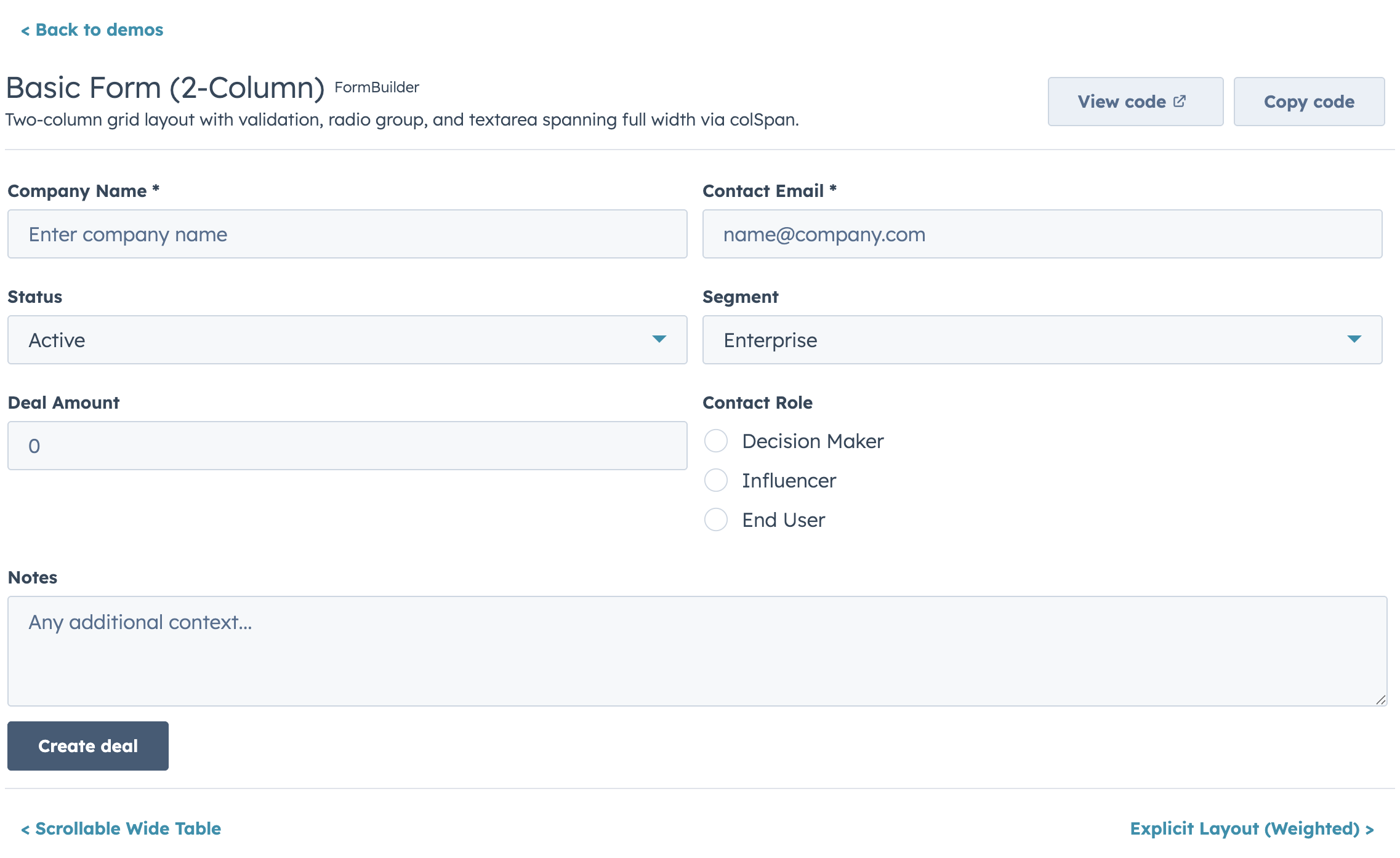
|
6
|
+
|
|
7
|
+
```bash
|
|
8
|
+
npm install hs-uix
|
|
9
|
+
```
|
|
10
|
+
|
|
11
|
+
## Quick Start
|
|
12
|
+
|
|
13
|
+
```jsx
|
|
14
|
+
import { FormBuilder } from "hs-uix/form";
|
|
15
|
+
|
|
16
|
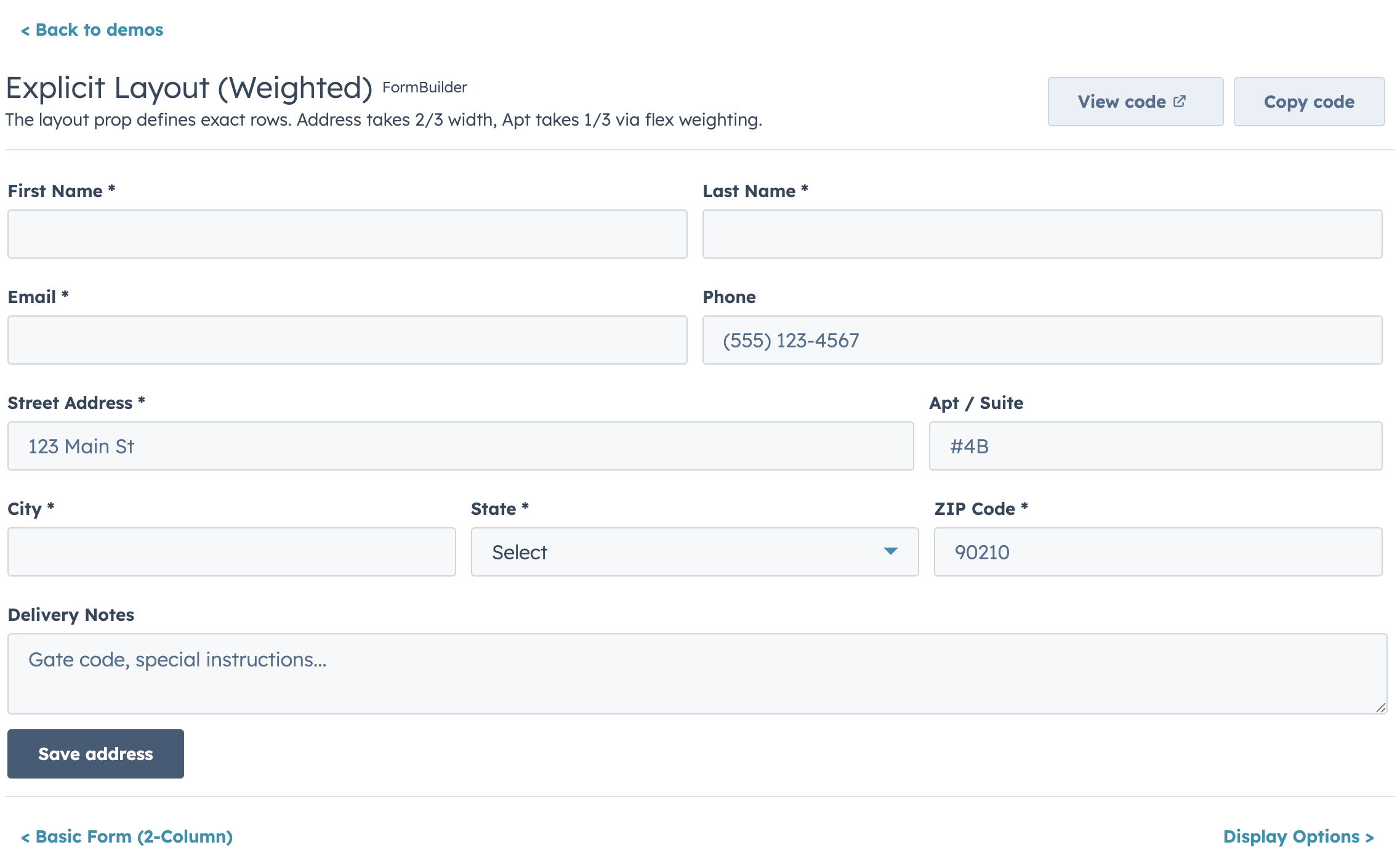
+
const fields = [
|
|
17
|
+
{ name: "firstName", type: "text", label: "First name", required: true },
|
|
18
|
+
{ name: "lastName", type: "text", label: "Last name", required: true },
|
|
19
|
+
{ name: "email", type: "text", label: "Email", pattern: /^[^\s@]+@[^\s@]+$/, patternMessage: "Enter a valid email" },
|
|
20
|
+
];
|
|
21
|
+
|
|
22
|
+
<FormBuilder
|
|
23
|
+
columns={2}
|
|
24
|
+
fields={fields}
|
|
25
|
+
onSubmit={(values) => console.log(values)}
|
|
26
|
+
/>
|
|
27
|
+
```
|
|
28
|
+
|
|
29
|
+
## Field Types
|
|
30
|
+
|
|
31
|
+
Every field maps to a native HubSpot UI Extension component with full prop support:
|
|
32
|
+
|
|
33
|
+
| `type` | Component | Key Props |
|
|
34
|
+
|---|---|---|
|
|
35
|
+
| `text` | `Input` | `placeholder`, `onInput`, `onBlur` |
|
|
36
|
+
| `password` | `Input type="password"` | Same as text |
|
|
37
|
+
| `textarea` | `TextArea` | `rows`, `cols`, `resize`, `maxLength` |
|
|
38
|
+
| `number` | `NumberInput` | `min`, `max`, `precision`, `formatStyle` |
|
|
39
|
+
| `stepper` | `StepperInput` | `min`, `max`, `stepSize`, `precision`, `formatStyle`, `minValueReachedTooltip`, `maxValueReachedTooltip` |
|
|
40
|
+
| `currency` | `CurrencyInput` | `currency` (ISO 4217), `min`, `max`, `precision` |
|
|
41
|
+
| `date` | `DateInput` | `format`, `min`, `max`, `timezone`, `clearButtonLabel`, `todayButtonLabel`, `minValidationMessage`, `maxValidationMessage` |
|
|
42
|
+
| `time` | `TimeInput` | `interval`, `min`, `max`, `timezone` |
|
|
43
|
+
| `datetime` | `DateInput` + `TimeInput` | Composite — all date and time props apply |
|
|
44
|
+
| `select` | `Select` | `options`, `variant` (`"input"` or `"transparent"`) |
|
|
45
|
+
| `multiselect` | `MultiSelect` | `options` |
|
|
46
|
+
| `toggle` | `Toggle` | `size`, `labelDisplay`, `textChecked`, `textUnchecked` |
|
|
47
|
+
| `checkbox` | `Checkbox` | `inline`, `variant` |
|
|
48
|
+
| `checkboxGroup` | `ToggleGroup checkboxList` | `options`, `inline`, `variant` |
|
|
49
|
+
| `radioGroup` | `ToggleGroup radioButtonList` | `options`, `inline`, `variant` |
|
|
50
|
+
| `display` | Custom render | Render-only, no form value or validation |
|
|
51
|
+
| `slot` | Custom render | Alias of `display` — clearer name for injecting JSX between fields |
|
|
52
|
+
| `repeater` | Sub-field rows | `fields`, `min`, `max` — add/remove dynamic rows |
|
|
53
|
+
| `fieldGroup` | Structured rows | `items`, `fields` — fixed predefined rows (no add/remove) |
|
|
54
|
+
| `crmPropertyList` | `CrmPropertyList` | `properties`, `direction` — native HubSpot inline editing |
|
|
55
|
+
| `crmAssociationPropertyList` | `CrmAssociationPropertyList` | `objectTypeId`, `properties`, `filters`, `sort` |
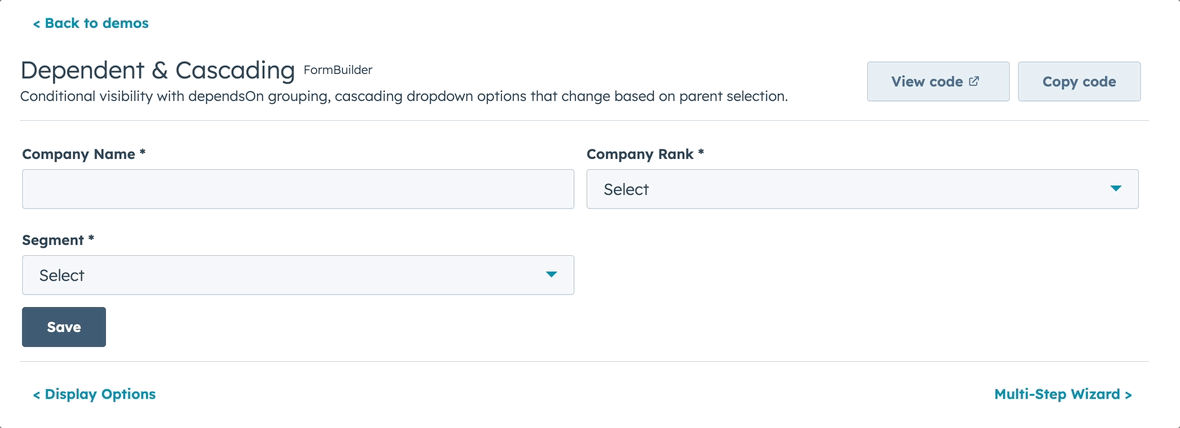
|
|
56
|
+
|
|
57
|
+
All field types share these common props: `description`, `placeholder`, `tooltip`, `required`, `readOnly`, `defaultValue`, `fieldProps` (pass-through).
|
|
58
|
+
|
|
59
|
+
## Layout
|
|
60
|
+
|
|
61
|
+
FormBuilder provides four layout modes. The default is a single full-width column, but HubSpot rarely uses full-width inputs — most forms should use `columns` or `columnWidth` for a tighter layout.
|
|
62
|
+
|
|
63
|
+
### Choosing a Layout Mode
|
|
64
|
+
|
|
65
|
+
| Mode | Prop | Best for | Responsive? |
|
|
66
|
+
|---|---|---|---|
|
|
67
|
+
| **Single column** | *(default)* | Simple forms, sidebars | N/A |
|
|
68
|
+
| **Fixed columns** | `columns={2}` | Most forms — predictable grid | Yes — collapses on narrow viewports |
|
|
69
|
+
| **Responsive** | `columnWidth={200}` | Cards and variable-width containers | Yes — columns fill available space |
|
|
70
|
+
| **Explicit** | `layout={[...]}` | Precise per-row control, weighted columns | No — rows are fixed as defined |
|
|
71
|
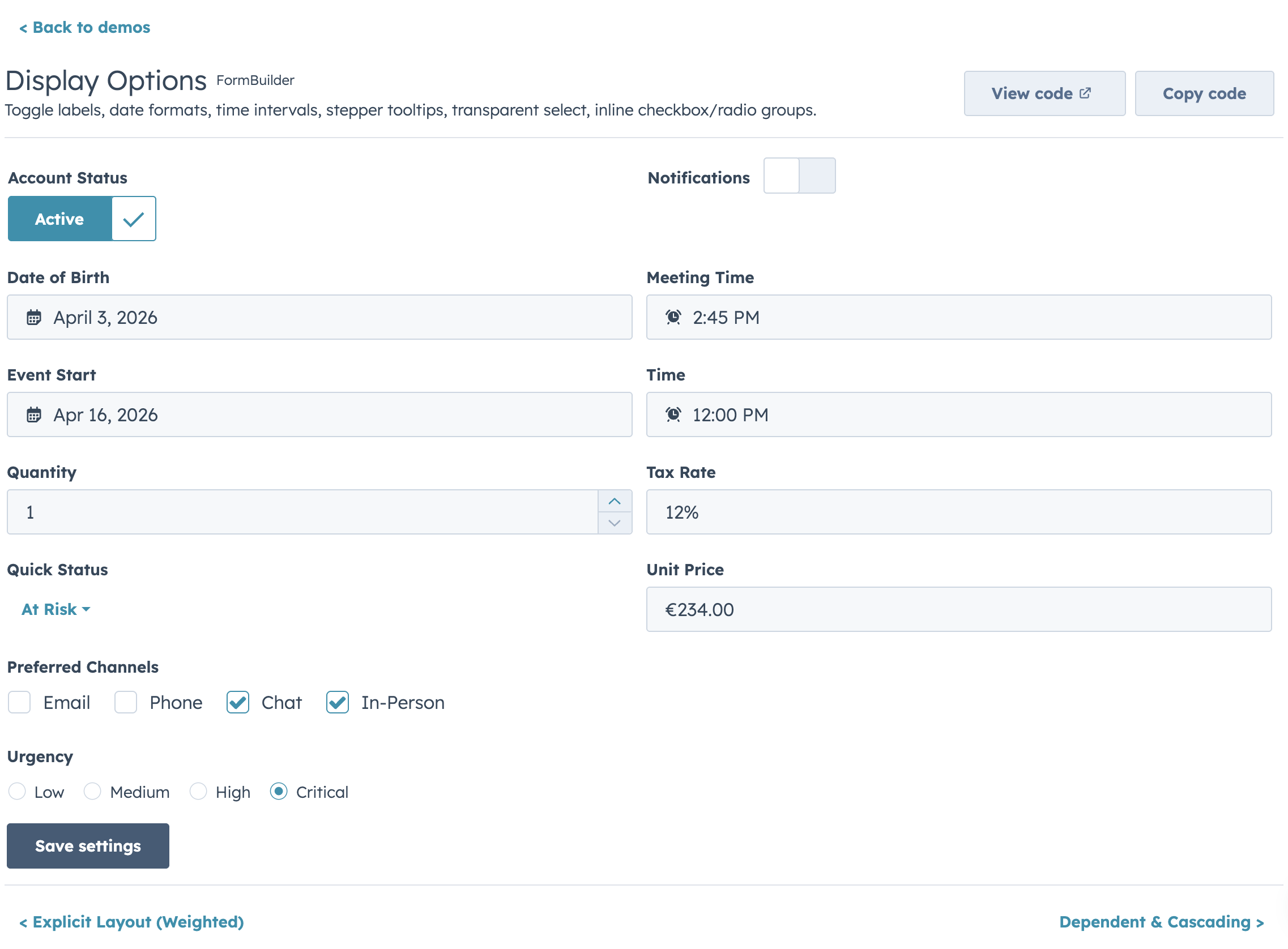
+
|
|
72
|
+
Priority when multiple are set: `layout` > `columnWidth` > `columns` > single-column.
|
|
73
|
+
|
|
74
|
+
### Fixed Columns (recommended default)
|
|
75
|
+
|
|
76
|
+
Set a column count. Fields flow left-to-right, top-to-bottom, and columns collapse to single-column on narrow viewports.
|
|
77
|
+
|
|
78
|
+
```jsx
|
|
79
|
+
<FormBuilder columns={2} fields={fields} />
|
|
80
|
+
```
|
|
81
|
+
|
|
82
|
+
#### Spanning columns
|
|
83
|
+
|
|
84
|
+
Use `colSpan` to span a specific number of columns, or `width: "full"` to always span all columns regardless of the column count:
|
|
85
|
+
|
|
86
|
+
```jsx
|
|
87
|
+
const fields = [
|
|
88
|
+
{ name: "firstName", type: "text", label: "First name" }, // 1 column
|
|
89
|
+
{ name: "lastName", type: "text", label: "Last name" }, // 1 column
|
|
90
|
+
{ name: "bio", type: "textarea", label: "Bio", colSpan: 2 }, // spans 2 columns
|
|
91
|
+
{ name: "notes", type: "textarea", label: "Notes", width: "full" }, // always full width
|
|
92
|
+
{ name: "city", type: "text", label: "City" }, // 1 column
|
|
93
|
+
{ name: "state", type: "select", label: "State", options: STATES }, // 1 column
|
|
94
|
+
];
|
|
95
|
+
|
|
96
|
+
<FormBuilder columns={2} fields={fields} />
|
|
97
|
+
```
|
|
98
|
+
|
|
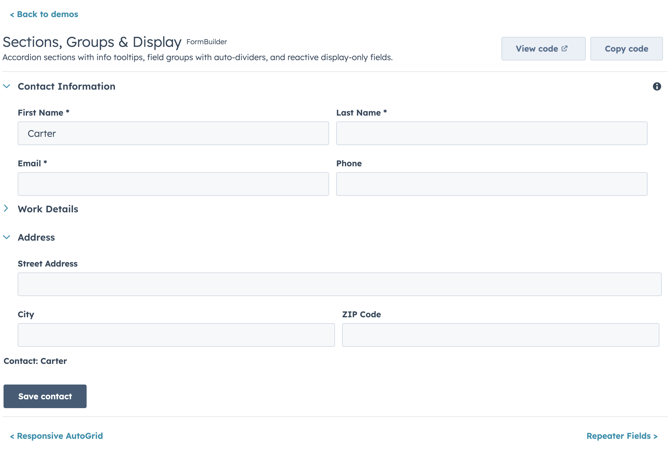
99
|
+
- `colSpan: N` — span exactly N columns (capped at the column count)
|
|
100
|
+
- `width: "full"` — span all columns without knowing the count. Prefer this over `colSpan` when the form's column count might change.
|
|
101
|
+
|
|
102
|
+
Partial rows get empty space (fields don't stretch to fill).
|
|
103
|
+
|
|
104
|
+
### Responsive (AutoGrid)
|
|
105
|
+
|
|
106
|
+
Set `columnWidth` in pixels. Columns fill the available space and collapse automatically on narrow screens using HubSpot's `AutoGrid` component.
|
|
107
|
+
|
|
108
|
+
```jsx
|
|
109
|
+
<FormBuilder columnWidth={200} fields={fields} />
|
|
110
|
+
```
|
|
111
|
+
|
|
112
|
+
With `columnWidth={200}`, a 400px card shows 2 columns; a 600px page shows 3. Use `maxColumns` to cap the number of columns:
|
|
113
|
+
|
|
114
|
+
```jsx
|
|
115
|
+
<FormBuilder columnWidth={200} maxColumns={3} fields={fields} />
|
|
116
|
+
```
|
|
117
|
+
|
|
118
|
+
> **Note:** `colSpan` and `width: "full"` are not supported in AutoGrid mode — all fields get equal width. If you need per-field column control with responsive behavior, use `columns` instead.
|
|
119
|
+
|
|
120
|
+
### Explicit Layout
|
|
121
|
+
|
|
122
|
+
|
|
123
|
+
|
|
124
|
+
Define exact row structure with the `layout` prop. Each inner array is a row.
|
|
125
|
+
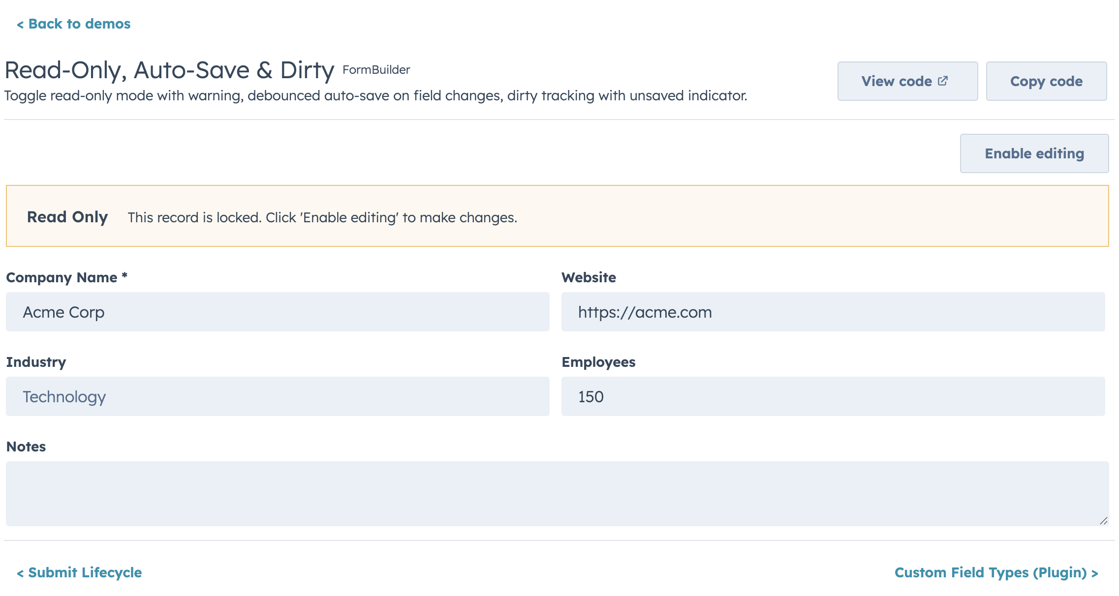
|
|
126
|
+
```jsx
|
|
127
|
+
<FormBuilder
|
|
128
|
+
layout={[
|
|
129
|
+
["firstName", "lastName"], // 2 equal columns
|
|
130
|
+
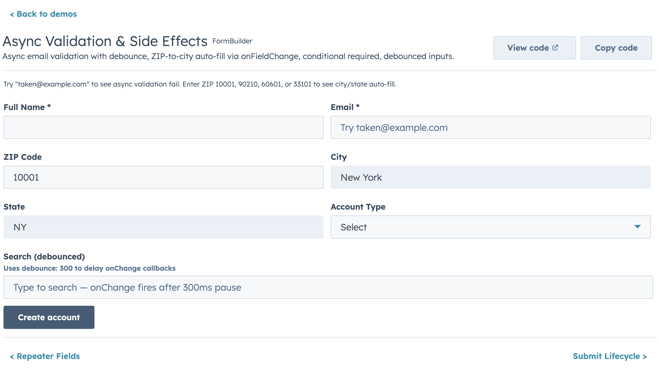
["email"], // full width
|
|
131
|
+
["city", "state", "zip"], // 3 columns this row
|
|
132
|
+
]}
|
|
133
|
+
fields={fields}
|
|
134
|
+
/>
|
|
135
|
+
```
|
|
136
|
+
|
|
137
|
+
Weighted columns use object entries:
|
|
138
|
+
|
|
139
|
+
```jsx
|
|
140
|
+
<FormBuilder
|
|
141
|
+
layout={[
|
|
142
|
+
[{ field: "address", flex: 2 }, { field: "apt", flex: 1 }], // 2:1 ratio
|
|
143
|
+
]}
|
|
144
|
+
fields={fields}
|
|
145
|
+
/>
|
|
146
|
+
```
|
|
147
|
+
|
|
148
|
+
Fields not listed in `layout` are appended full-width at the end, so you never accidentally lose a field. Explicit layout rows do not collapse on narrow viewports — each row renders exactly as defined.
|
|
149
|
+
|
|
150
|
+
## Validation
|
|
151
|
+
|
|
152
|
+
Built-in validators run in order, first failure wins:
|
|
153
|
+
- Required check (`required`)
|
|
154
|
+
- Default type/shape checks (enabled by default via `useDefaultValidators`)
|
|
155
|
+
- Pattern + length/range checks (`pattern`, `minLength`, `maxLength`, `min`, `max`)
|
|
156
|
+
- Custom validators (`validators`, then `validate`)
|
|
157
|
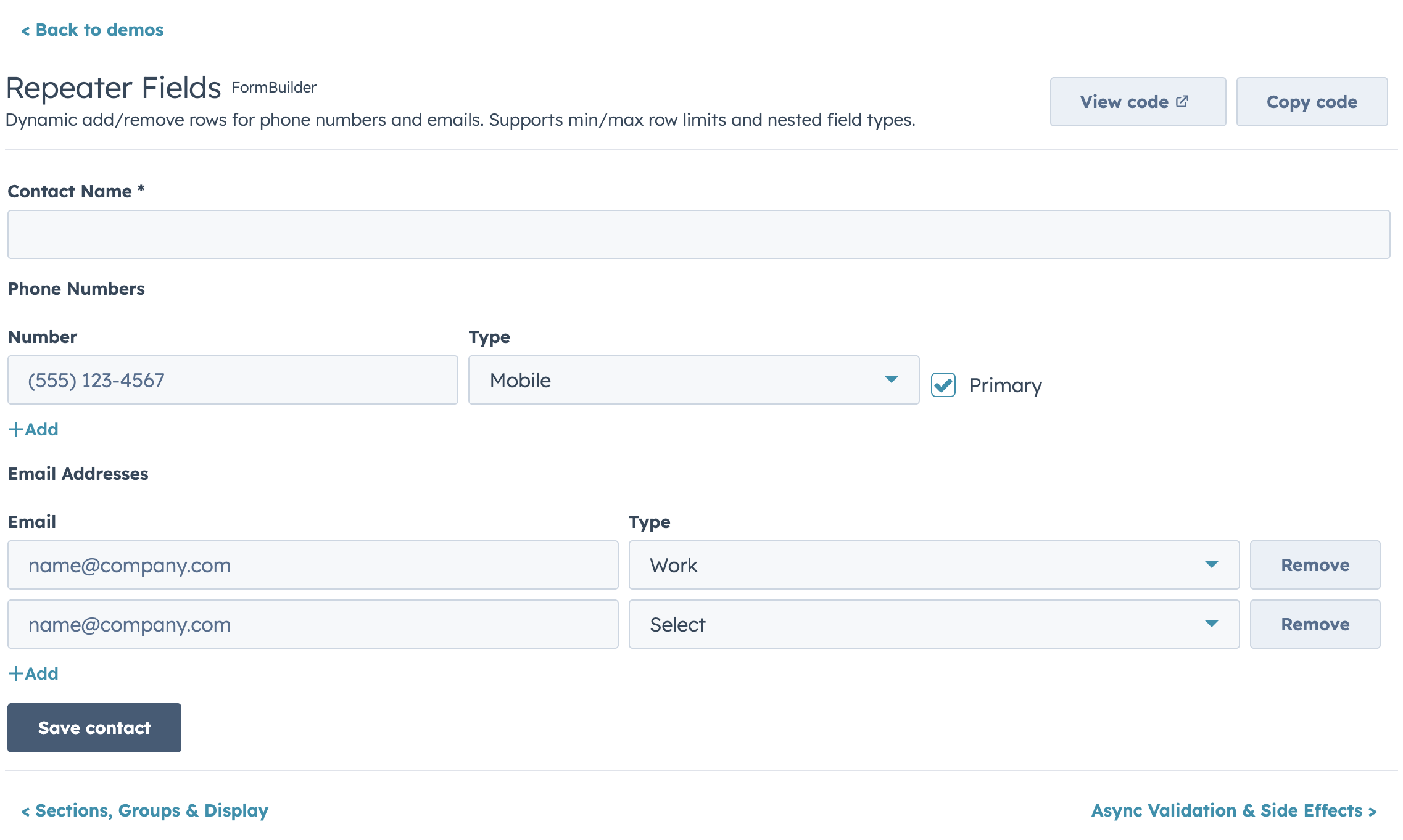
+
|
|
158
|
+
```jsx
|
|
159
|
+
{
|
|
160
|
+
name: "email",
|
|
161
|
+
type: "text",
|
|
162
|
+
label: "Email",
|
|
163
|
+
required: true, // 1) required
|
|
164
|
+
pattern: /^[^\s@]+@[^\s@]+$/, // 2) built-in pattern
|
|
165
|
+
patternMessage: "Enter a valid email",
|
|
166
|
+
minLength: 5, // 3) built-in length
|
|
167
|
+
maxLength: 100,
|
|
168
|
+
validators: [ // 4) custom sync validators
|
|
169
|
+
(value) => value.endsWith("@example.com") ? true : "Use your company email",
|
|
170
|
+
],
|
|
171
|
+
validate: async (value, allValues, { signal }) => { // 5) custom async validator
|
|
172
|
+
const exists = await checkEmailExists(value, { signal });
|
|
173
|
+
if (exists) return "Email already in use";
|
|
174
|
+
if (value === allValues.confirmEmail) return true;
|
|
175
|
+
return "Emails must match";
|
|
176
|
+
},
|
|
177
|
+
}
|
|
178
|
+
```
|
|
179
|
+
|
|
180
|
+
Set `useDefaultValidators={false}` to run only your custom validators for a field.
|
|
181
|
+
For async validators, prefer `async` functions so they run only in the async validation phase.
|
|
182
|
+
|
|
183
|
+
### Validation Timing
|
|
184
|
+
|
|
185
|
+
| Prop | Default | When |
|
|
186
|
+
|---|---|---|
|
|
187
|
+
| `validateOnChange` | `false` | Every keystroke (onInput) |
|
|
188
|
+
| `validateOnBlur` | `true` | Field loses focus |
|
|
189
|
+
| `validateOnSubmit` | `true` | Submit attempt |
|
|
190
|
+
|
|
191
|
+
### Date/Time Validation Messages
|
|
192
|
+
|
|
193
|
+
DateInput supports custom messages for out-of-range dates:
|
|
194
|
+
|
|
195
|
+
```jsx
|
|
196
|
+
{
|
|
197
|
+
name: "startDate",
|
|
198
|
+
type: "date",
|
|
199
|
+
label: "Start date",
|
|
200
|
+
min: { year: 2024, month: 1, date: 1 },
|
|
201
|
+
max: { year: 2025, month: 12, date: 31 },
|
|
202
|
+
minValidationMessage: "Date must be in 2024 or later",
|
|
203
|
+
maxValidationMessage: "Date must be before 2026",
|
|
204
|
+
}
|
|
205
|
+
```
|
|
206
|
+
|
|
207
|
+
## Controlled vs Uncontrolled
|
|
208
|
+
|
|
209
|
+
**Uncontrolled (default):** FormBuilder manages its own state.
|
|
210
|
+
|
|
211
|
+
```jsx
|
|
212
|
+
<FormBuilder
|
|
213
|
+
fields={fields}
|
|
214
|
+
initialValues={{ firstName: "John" }}
|
|
215
|
+
onSubmit={(values) => save(values)}
|
|
216
|
+
/>
|
|
217
|
+
```
|
|
218
|
+
|
|
219
|
+
**Controlled:** Parent owns the values.
|
|
220
|
+
|
|
221
|
+
```jsx
|
|
222
|
+
const [values, setValues] = useState({});
|
|
223
|
+
|
|
224
|
+
<FormBuilder
|
|
225
|
+
fields={fields}
|
|
226
|
+
values={values}
|
|
227
|
+
onChange={setValues}
|
|
228
|
+
onSubmit={(values) => save(values)}
|
|
229
|
+
/>
|
|
230
|
+
```
|
|
231
|
+
|
|
232
|
+
Validation errors can also be controlled:
|
|
233
|
+
|
|
234
|
+
```jsx
|
|
235
|
+
const [errors, setErrors] = useState({});
|
|
236
|
+
|
|
237
|
+
<FormBuilder
|
|
238
|
+
fields={fields}
|
|
239
|
+
values={values}
|
|
240
|
+
errors={errors}
|
|
241
|
+
onValidationChange={setErrors}
|
|
242
|
+
onChange={setValues}
|
|
243
|
+
onSubmit={save}
|
|
244
|
+
/>
|
|
245
|
+
```
|
|
246
|
+
|
|
247
|
+
### Surfacing submit-time validation failures
|
|
248
|
+
|
|
249
|
+
By default, when `validateOnSubmit` is on and a required field is invalid, FormBuilder writes the errors and silently aborts the submit. If the invalid field lives inside a collapsed accordion section, the error marker is hidden and the submit button looks broken.
|
|
250
|
+
|
|
251
|
+
Two opt-in props handle this:
|
|
252
|
+
|
|
253
|
+
```jsx
|
|
254
|
+
<FormBuilder
|
|
255
|
+
fields={fields}
|
|
256
|
+
sections={sections}
|
|
257
|
+
openSectionOnValidationFail
|
|
258
|
+
onValidationFail={({ firstInvalidField, fields, errors }) => {
|
|
259
|
+
addAlert({ type: "danger", title: "Please fix the highlighted fields." });
|
|
260
|
+
}}
|
|
261
|
+
onSubmit={save}
|
|
262
|
+
/>
|
|
263
|
+
```
|
|
264
|
+
|
|
265
|
+
- `openSectionOnValidationFail` — auto-opens the accordion section that contains the first invalid field.
|
|
266
|
+
- `onValidationFail({ errors, fields, firstInvalidField })` — fires whenever submit-time validation blocks submission, so consumers calling `formRef.current.submit()` from custom buttons can surface their own toast/alert. Each entry in `fields` includes `{ name, label, sectionId }`.
|
|
267
|
+
|
|
268
|
+
## Ref API
|
|
269
|
+
|
|
270
|
+
Access form methods imperatively — essential for modals, panels, and any UI where buttons live outside the form:
|
|
271
|
+
|
|
272
|
+
```jsx
|
|
273
|
+
const formRef = useRef();
|
|
274
|
+
|
|
275
|
+
<FormBuilder ref={formRef} fields={fields} onSubmit={save} />
|
|
276
|
+
|
|
277
|
+
// Later:
|
|
278
|
+
formRef.current.submit(); // trigger validation + submit
|
|
279
|
+
formRef.current.validate(); // { valid: boolean, errors: {} }
|
|
280
|
+
formRef.current.reset(); // reset to initial values
|
|
281
|
+
formRef.current.getValues(); // current form values
|
|
282
|
+
formRef.current.isDirty(); // true if values changed
|
|
283
|
+
formRef.current.setFieldValue("email", "new@test.com"); // programmatic update
|
|
284
|
+
formRef.current.setFieldError("email", "Taken"); // programmatic error
|
|
285
|
+
formRef.current.setErrors({ email: "Taken", phone: "Invalid" }); // bulk set errors
|
|
286
|
+
```
|
|
287
|
+
|
|
288
|
+
Use `submitPosition="none"` to hide the built-in buttons and drive the form entirely via ref.
|
|
289
|
+
|
|
290
|
+
## Submit Lifecycle
|
|
291
|
+
|
|
292
|
+
The full submit flow: validation → `onBeforeSubmit` → `onSubmit` → `onSubmitSuccess` / `onSubmitError`.
|
|
293
|
+
|
|
294
|
+
```jsx
|
|
295
|
+
<FormBuilder
|
|
296
|
+
fields={fields}
|
|
297
|
+
onBeforeSubmit={(values) => {
|
|
298
|
+
// Return false to cancel submit
|
|
299
|
+
return window.confirm("Save changes?");
|
|
300
|
+
}}
|
|
301
|
+
onSubmit={async (values) => {
|
|
302
|
+
// If this throws or returns a rejected promise, onSubmitError fires.
|
|
303
|
+
// If it resolves, onSubmitSuccess fires with the return value.
|
|
304
|
+
return await saveRecord(values);
|
|
305
|
+
}}
|
|
306
|
+
onSubmitSuccess={(result, { reset, values }) => {
|
|
307
|
+
// result = whatever onSubmit returned
|
|
308
|
+
showToast("Saved!");
|
|
309
|
+
}}
|
|
310
|
+
onSubmitError={(error, { values }) => {
|
|
311
|
+
// error = whatever onSubmit threw
|
|
312
|
+
showToast(`Failed: ${error.message}`);
|
|
313
|
+
}}
|
|
314
|
+
resetOnSuccess={true} // auto-reset after successful submit
|
|
315
|
+
/>
|
|
316
|
+
```
|
|
317
|
+
|
|
318
|
+
If `onSubmitError` is not provided and `onSubmit` throws, the error re-throws (so you can catch it in a parent). The `loading` state is managed automatically during the async submit — all fields disable and the submit button shows a spinner.
|
|
319
|
+
|
|
320
|
+
## Conditional Visibility
|
|
321
|
+
|
|
322
|
+
Fields can show/hide based on other field values:
|
|
323
|
+
|
|
324
|
+
```jsx
|
|
325
|
+
const fields = [
|
|
326
|
+
{ name: "hasCompany", type: "toggle", label: "Has company?" },
|
|
327
|
+
{
|
|
328
|
+
name: "companyName",
|
|
329
|
+
type: "text",
|
|
330
|
+
label: "Company name",
|
|
331
|
+
visible: (values) => values.hasCompany === true,
|
|
332
|
+
},
|
|
333
|
+
];
|
|
334
|
+
```
|
|
335
|
+
|
|
336
|
+
## Conditional Disabled
|
|
337
|
+
|
|
338
|
+
Like `visible` and `required`, `disabled` accepts a function to conditionally disable fields based on other field values. The field stays visible but greyed out:
|
|
339
|
+
|
|
340
|
+
```jsx
|
|
341
|
+
const fields = [
|
|
342
|
+
{ name: "acceptWalkins", type: "toggle", label: "Accept walk-ins" },
|
|
343
|
+
{
|
|
344
|
+
name: "walkinHours",
|
|
345
|
+
type: "text",
|
|
346
|
+
label: "Walk-in hours",
|
|
347
|
+
disabled: (values) => !values.acceptWalkins,
|
|
348
|
+
},
|
|
349
|
+
];
|
|
350
|
+
```
|
|
351
|
+
|
|
352
|
+
## Dependent Properties
|
|
353
|
+
|
|
354
|
+
|
|
355
|
+
|
|
356
|
+
Dependent fields are grouped in a HubSpot Tile container below their parent. Use `dependsOnConfig` to define the relationship and `visible` to control when the dependent field appears:
|
|
357
|
+
|
|
358
|
+
```jsx
|
|
359
|
+
const fields = [
|
|
360
|
+
{ name: "dealType", type: "select", label: "Deal type", options: DEAL_TYPES },
|
|
361
|
+
{
|
|
362
|
+
name: "contractLength",
|
|
363
|
+
type: "number",
|
|
364
|
+
label: "Contract length (months)",
|
|
365
|
+
dependsOnConfig: {
|
|
366
|
+
field: "dealType", // parent field name — determines tile placement
|
|
367
|
+
display: "grouped", // "grouped" (in Tile below parent) or "inline" (normal position)
|
|
368
|
+
label: "Contract details", // tile header text
|
|
369
|
+
message: (parentLabel) => `These properties depend on ${parentLabel}`, // info tooltip
|
|
370
|
+
},
|
|
371
|
+
visible: (values) => values.dealType === "recurring", // when to show
|
|
372
|
+
},
|
|
373
|
+
];
|
|
374
|
+
```
|
|
375
|
+
|
|
376
|
+
`dependsOnConfig` controls **where** the field renders (grouped in a Tile below the parent). `visible` controls **whether** it renders. They work together: the Tile only appears when at least one dependent field is visible.
|
|
377
|
+
|
|
378
|
+
You can combine `dependsOnConfig` with `disabled` for fields that should always be visible but only editable when a condition is met:
|
|
379
|
+
|
|
380
|
+
```jsx
|
|
381
|
+
{
|
|
382
|
+
name: "renewalDate",
|
|
383
|
+
type: "date",
|
|
384
|
+
label: "Renewal date",
|
|
385
|
+
dependsOnConfig: { field: "dealType", label: "Renewal settings" },
|
|
386
|
+
disabled: (values) => values.dealType !== "recurring",
|
|
387
|
+
}
|
|
388
|
+
```
|
|
389
|
+
|
|
390
|
+
## Cascading Options
|
|
391
|
+
|
|
392
|
+
Options can be a function that receives all form values:
|
|
393
|
+
|
|
394
|
+
```jsx
|
|
395
|
+
const fields = [
|
|
396
|
+
{ name: "category", type: "select", label: "Category", options: CATEGORIES },
|
|
397
|
+
{
|
|
398
|
+
name: "subCategory",
|
|
399
|
+
type: "select",
|
|
400
|
+
label: "Sub-category",
|
|
401
|
+
options: (values) => SUB_CATEGORIES[values.category] || [],
|
|
402
|
+
},
|
|
403
|
+
];
|
|
404
|
+
```
|
|
405
|
+
|
|
406
|
+
## Multi-Step Wizard
|
|
407
|
+
|
|
408
|
+
Enable with the `steps` prop:
|
|
409
|
+
|
|
410
|
+
```jsx
|
|
411
|
+
<FormBuilder
|
|
412
|
+
fields={allFields}
|
|
413
|
+
steps={[
|
|
414
|
+
{ title: "Contact Info", fields: ["firstName", "lastName", "email"] },
|
|
415
|
+
{ title: "Company", fields: ["company", "role"] },
|
|
416
|
+
{ title: "Review", render: ({ values, goBack }) => (
|
|
417
|
+
<ReviewPanel values={values} onEdit={goBack} />
|
|
418
|
+
)},
|
|
419
|
+
]}
|
|
420
|
+
showStepIndicator={true}
|
|
421
|
+
validateStepOnNext={true}
|
|
422
|
+
onSubmit={handleSubmit}
|
|
423
|
+
/>
|
|
424
|
+
```
|
|
425
|
+
|
|
426
|
+
Each step can have per-step validation:
|
|
427
|
+
|
|
428
|
+
```jsx
|
|
429
|
+
{
|
|
430
|
+
title: "Passwords",
|
|
431
|
+
fields: ["password", "confirmPassword"],
|
|
432
|
+
validate: (values) => {
|
|
433
|
+
if (values.password !== values.confirmPassword) {
|
|
434
|
+
return { confirmPassword: "Passwords must match" };
|
|
435
|
+
}
|
|
436
|
+
return true;
|
|
437
|
+
},
|
|
438
|
+
}
|
|
439
|
+
```
|
|
440
|
+
|
|
441
|
+
## Display Options
|
|
442
|
+
|
|
443
|
+
|
|
444
|
+
|
|
445
|
+
### Boolean Fields
|
|
446
|
+
|
|
447
|
+
```jsx
|
|
448
|
+
// Toggle with custom ON/OFF text
|
|
449
|
+
{ name: "active", type: "toggle", label: "Status", size: "md", textChecked: "Active", textUnchecked: "Inactive" }
|
|
450
|
+
|
|
451
|
+
// Toggle sizes: "xs", "sm", "md"
|
|
452
|
+
// Label positions: "inline", "top", "hidden"
|
|
453
|
+
{ name: "notify", type: "toggle", label: "Notifications", size: "sm", labelDisplay: "inline" }
|
|
454
|
+
|
|
455
|
+
// Small checkbox
|
|
456
|
+
{ name: "agree", type: "checkbox", label: "I agree to terms", variant: "small" }
|
|
457
|
+
|
|
458
|
+
// Inline checkbox group
|
|
459
|
+
{ name: "colors", type: "checkboxGroup", label: "Colors", options: COLORS, inline: true }
|
|
460
|
+
|
|
461
|
+
// Radio group with small variant
|
|
462
|
+
{ name: "size", type: "radioGroup", label: "Size", options: SIZES, inline: true, variant: "small" }
|
|
463
|
+
```
|
|
464
|
+
|
|
465
|
+
### Date & Time
|
|
466
|
+
|
|
467
|
+
```jsx
|
|
468
|
+
// Date formats: "short", "long", "medium", "standard", "YYYY-MM-DD", "L", "LL", "ll"
|
|
469
|
+
{ name: "dob", type: "date", label: "Date of birth", format: "long" }
|
|
470
|
+
|
|
471
|
+
// Timezone: "userTz" (default) or "portalTz"
|
|
472
|
+
{ name: "deadline", type: "date", label: "Deadline", timezone: "portalTz" }
|
|
473
|
+
|
|
474
|
+
// Time interval (minutes between dropdown options)
|
|
475
|
+
{ name: "meetingTime", type: "time", label: "Meeting time", interval: 15 }
|
|
476
|
+
|
|
477
|
+
// Full datetime with all options
|
|
478
|
+
{ name: "eventStart", type: "datetime", label: "Event start", format: "medium", timezone: "portalTz", interval: 30 }
|
|
479
|
+
```
|
|
480
|
+
|
|
481
|
+
### Number & Currency
|
|
482
|
+
|
|
483
|
+
```jsx
|
|
484
|
+
// Percentage display
|
|
485
|
+
{ name: "rate", type: "number", label: "Tax rate", formatStyle: "percentage", precision: 2 }
|
|
486
|
+
|
|
487
|
+
// Stepper with boundary tooltips
|
|
488
|
+
{ name: "quantity", type: "stepper", label: "Qty", min: 1, max: 99, stepSize: 1,
|
|
489
|
+
minValueReachedTooltip: "Minimum 1 item", maxValueReachedTooltip: "Maximum 99 items" }
|
|
490
|
+
|
|
491
|
+
// Currency (ISO 4217 code)
|
|
492
|
+
{ name: "price", type: "currency", label: "Price", currency: "EUR", precision: 2 }
|
|
493
|
+
```
|
|
494
|
+
|
|
495
|
+
### Select
|
|
496
|
+
|
|
497
|
+
```jsx
|
|
498
|
+
// Standard dropdown
|
|
499
|
+
{ name: "country", type: "select", label: "Country", options: COUNTRIES }
|
|
500
|
+
|
|
501
|
+
// Transparent (hyperlink-style) dropdown
|
|
502
|
+
{ name: "status", type: "select", label: "Status", options: STATUSES, variant: "transparent" }
|
|
503
|
+
```
|
|
504
|
+
|
|
505
|
+
## Buttons
|
|
506
|
+
|
|
507
|
+
```jsx
|
|
508
|
+
<FormBuilder
|
|
509
|
+
fields={fields}
|
|
510
|
+
onSubmit={save}
|
|
511
|
+
labels={{
|
|
512
|
+
submit: "Save record",
|
|
513
|
+
cancel: "Discard",
|
|
514
|
+
back: "Previous",
|
|
515
|
+
next: "Continue",
|
|
516
|
+
}}
|
|
517
|
+
submitVariant="primary"
|
|
518
|
+
showCancel={true}
|
|
519
|
+
submitAlign="end"
|
|
520
|
+
onCancel={() => actions.closeOverlay()}
|
|
521
|
+
loading={isSaving} // controlled loading state
|
|
522
|
+
disabled={!canEdit} // disables entire form
|
|
523
|
+
submitPosition="bottom" // "bottom" | "none"
|
|
524
|
+
/>
|
|
525
|
+
```
|
|
526
|
+
|
|
527
|
+
Use `submitPosition="none"` with the ref API for custom button placement.
|
|
528
|
+
|
|
529
|
+
`submitAlign` controls the default single-step button row alignment (`"start" | "end" | "between"`). By default, FormBuilder preserves the existing behavior: `"between"` when `showCancel` is true, otherwise `"start"`.
|
|
530
|
+
|
|
531
|
+
`labels` provides a single i18n object for button text, and `renderButtons` can fully replace the default button row.
|
|
532
|
+
|
|
533
|
+
## Form-Level Alerts
|
|
534
|
+
|
|
535
|
+
```jsx
|
|
536
|
+
<FormBuilder
|
|
537
|
+
fields={fields}
|
|
538
|
+
onSubmit={save}
|
|
539
|
+
error="Something went wrong. Please try again."
|
|
540
|
+
success="Record saved successfully!"
|
|
541
|
+
/>
|
|
542
|
+
```
|
|
543
|
+
|
|
544
|
+
For centralized alert config:
|
|
545
|
+
|
|
546
|
+
```jsx
|
|
547
|
+
<FormBuilder
|
|
548
|
+
fields={fields}
|
|
549
|
+
onSubmit={save}
|
|
550
|
+
alerts={{
|
|
551
|
+
addAlert: actions.addAlert,
|
|
552
|
+
errorTitle: "Save failed",
|
|
553
|
+
successTitle: "Saved",
|
|
554
|
+
}}
|
|
555
|
+
/>
|
|
556
|
+
```
|
|
557
|
+
|
|
558
|
+
## Dirty Tracking
|
|
559
|
+
|
|
560
|
+
```jsx
|
|
561
|
+
<FormBuilder
|
|
562
|
+
fields={fields}
|
|
563
|
+
onSubmit={save}
|
|
564
|
+
onDirtyChange={(isDirty) => {
|
|
565
|
+
// e.g., show unsaved changes warning
|
|
566
|
+
}}
|
|
567
|
+
/>
|
|
568
|
+
```
|
|
569
|
+
|
|
570
|
+
## Custom Render Escape Hatch
|
|
571
|
+
|
|
572
|
+
For fields that need custom rendering:
|
|
573
|
+
|
|
574
|
+
```jsx
|
|
575
|
+
{
|
|
576
|
+
name: "rating",
|
|
577
|
+
type: "text", // type is required but ignored when render is set
|
|
578
|
+
label: "Rating",
|
|
579
|
+
render: ({ value, onChange, error, values }) => (
|
|
580
|
+
<MyCustomRatingWidget value={value} onChange={onChange} hasError={error} />
|
|
581
|
+
),
|
|
582
|
+
}
|
|
583
|
+
```
|
|
584
|
+
|
|
585
|
+
## fieldProps Pass-Through
|
|
586
|
+
|
|
587
|
+
For any HubSpot component prop not exposed as a first-class field config, use `fieldProps`. For wrapper-level attributes (like `aria-*` on the `<Form>`), use `formProps`.
|
|
588
|
+
|
|
589
|
+
```jsx
|
|
590
|
+
{
|
|
591
|
+
name: "search",
|
|
592
|
+
type: "text",
|
|
593
|
+
label: "Search",
|
|
594
|
+
fieldProps: { testId: "search-input", onFocus: () => trackEvent("search_focused") },
|
|
595
|
+
}
|
|
596
|
+
```
|
|
597
|
+
|
|
598
|
+
## Sections (Accordion Grouping)
|
|
599
|
+
|
|
600
|
+
|
|
601
|
+
|
|
602
|
+
Group fields into collapsible accordion sections:
|
|
603
|
+
|
|
604
|
+
```jsx
|
|
605
|
+
<FormBuilder
|
|
606
|
+
fields={fields}
|
|
607
|
+
sections={[
|
|
608
|
+
{ id: "basic", label: "Basic Info", fields: ["firstName", "lastName", "email"], defaultOpen: true },
|
|
609
|
+
{ id: "social", label: "Social Links", fields: ["facebook", "instagram"], defaultOpen: false, info: "Optional links" },
|
|
610
|
+
]}
|
|
611
|
+
onSubmit={handleSubmit}
|
|
612
|
+
/>
|
|
613
|
+
```
|
|
614
|
+
|
|
615
|
+
Fields not listed in any section render after all sections. Sections can be combined with multi-step forms.
|
|
616
|
+
|
|
617
|
+
### Per-Section Columns
|
|
618
|
+
|
|
619
|
+
Each section can override the form-level column count:
|
|
620
|
+
|
|
621
|
+
```jsx
|
|
622
|
+
<FormBuilder
|
|
623
|
+
columns={1}
|
|
624
|
+
fields={fields}
|
|
625
|
+
sections={[
|
|
626
|
+
{ id: "images", label: "Images", fields: ["profileImage", "bannerImage"] },
|
|
627
|
+
{ id: "social", label: "Social Links", fields: ["facebook", "instagram", "twitter", "linkedin"], columns: 2 },
|
|
628
|
+
{ id: "hours", label: "Business Hours", fields: ["acceptWalkins", "hoursSchedule"], columns: 1 },
|
|
629
|
+
]}
|
|
630
|
+
onSubmit={handleSubmit}
|
|
631
|
+
/>
|
|
632
|
+
```
|
|
633
|
+
|
|
634
|
+
The Social Links section renders in 2 columns while the rest of the form stays single-column.
|
|
635
|
+
|
|
636
|
+
### Section Render Slots
|
|
637
|
+
|
|
638
|
+
Inject arbitrary content before or after a section's fields with `renderBefore` and `renderAfter`:
|
|
639
|
+
|
|
640
|
+
```jsx
|
|
641
|
+
sections={[
|
|
642
|
+
{
|
|
643
|
+
id: "images",
|
|
644
|
+
label: "Images",
|
|
645
|
+
defaultOpen: false,
|
|
646
|
+
fields: ["profileImage", "bannerImage"],
|
|
647
|
+
renderBefore: ({ values }) => (
|
|
648
|
+
<Text variant="microcopy">Upload or paste a hosted image URL.</Text>
|
|
649
|
+
),
|
|
650
|
+
renderAfter: ({ values }) => (
|
|
651
|
+
values.profileImage
|
|
652
|
+
? <Image src={values.profileImage} width={100} />
|
|
653
|
+
: null
|
|
654
|
+
),
|
|
655
|
+
},
|
|
656
|
+
]}
|
|
657
|
+
```
|
|
658
|
+
|
|
659
|
+
Both callbacks receive `{ values, errors }` — the current form state.
|
|
660
|
+
|
|
661
|
+
## Field Groups (Dividers)
|
|
662
|
+
|
|
663
|
+
Lightweight non-collapsible grouping with auto-inserted dividers:
|
|
664
|
+
|
|
665
|
+
```jsx
|
|
666
|
+
const fields = [
|
|
667
|
+
{ name: "name", type: "text", label: "Name", group: "contact" },
|
|
668
|
+
{ name: "email", type: "text", label: "Email", group: "contact" },
|
|
669
|
+
// Divider + label auto-inserted here
|
|
670
|
+
{ name: "company", type: "text", label: "Company", group: "company" },
|
|
671
|
+
];
|
|
672
|
+
```
|
|
673
|
+
|
|
674
|
+
By default the group key is rendered as the header text. Use the `groups` prop to customize per-group rendering — including a friendly label, hiding the divider, hiding the header, or rendering a fully custom header:
|
|
675
|
+
|
|
676
|
+
```jsx
|
|
677
|
+
<FormBuilder
|
|
678
|
+
fields={fields}
|
|
679
|
+
groups={{
|
|
680
|
+
contact: { label: "Contact Info" },
|
|
681
|
+
company: {
|
|
682
|
+
label: "Company Info",
|
|
683
|
+
showDivider: false,
|
|
684
|
+
renderHeader: (group) => (
|
|
685
|
+
<Text variant="microcopy" format={{ fontWeight: "demibold" }}>
|
|
686
|
+
{group}
|
|
687
|
+
</Text>
|
|
688
|
+
),
|
|
689
|
+
},
|
|
690
|
+
}}
|
|
691
|
+
/>
|
|
692
|
+
```
|
|
693
|
+
|
|
694
|
+
Per-group options:
|
|
695
|
+
|
|
696
|
+
| Option | Type | Description |
|
|
697
|
+
|---|---|---|
|
|
698
|
+
| `label` | `string` | Override the displayed header text (defaults to the group key) |
|
|
699
|
+
| `showLabel` | `boolean` | Hide the header entirely. Defaults to `true` |
|
|
700
|
+
| `description` | `string` | Microcopy rendered underneath the group label. Ignored when `renderHeader` is provided or `showLabel` is `false` |
|
|
701
|
+
| `showDivider` | `boolean` | Hide the divider above this group. Defaults to `true` |
|
|
702
|
+
| `renderHeader` | `(group, fields, values) => ReactNode` | Fully custom header renderer |
|
|
703
|
+
|
|
704
|
+
## Display & Slot Fields
|
|
705
|
+
|
|
706
|
+
Render-only fields with no form value, no validation, and not included in submit values. Use `type: "display"` or its alias `type: "slot"` (clearer when injecting JSX between fields):
|
|
707
|
+
|
|
708
|
+
```jsx
|
|
709
|
+
{
|
|
710
|
+
name: "mapPreview",
|
|
711
|
+
type: "display",
|
|
712
|
+
render: ({ values }) => {
|
|
713
|
+
const url = buildMapsUrl(values.address, values.city, values.zip);
|
|
714
|
+
return url ? <Link href={url}>Preview in Google Maps</Link> : null;
|
|
715
|
+
},
|
|
716
|
+
}
|
|
717
|
+
```
|
|
718
|
+
|
|
719
|
+
Combine `type: "slot"` with `visible` to inject conditional content (warnings, hints, banners) anywhere in the field list:
|
|
720
|
+
|
|
721
|
+
```jsx
|
|
722
|
+
{
|
|
723
|
+
name: "_addressWarning",
|
|
724
|
+
type: "slot",
|
|
725
|
+
visible: (vals) => isAddressIncomplete(vals),
|
|
726
|
+
render: () => <Tag variant="warning">Incomplete address</Tag>,
|
|
727
|
+
}
|
|
728
|
+
```
|
|
729
|
+
|
|
730
|
+
Display fields can also interact with the form via `setFieldValue` and `setFieldError`:
|
|
731
|
+
|
|
732
|
+
```jsx
|
|
733
|
+
{
|
|
734
|
+
name: "fileUpload",
|
|
735
|
+
type: "display",
|
|
736
|
+
render: ({ values, setFieldValue, setFieldError }) => (
|
|
737
|
+
<CrmPropertyList
|
|
738
|
+
properties={["profile_file_id"]}
|
|
739
|
+
direction="column"
|
|
740
|
+
onChange={(fileId) => setFieldValue("profileFileId", fileId)}
|
|
741
|
+
/>
|
|
742
|
+
),
|
|
743
|
+
}
|
|
744
|
+
```
|
|
745
|
+
|
|
746
|
+
## Read-Only Mode
|
|
747
|
+
|
|
748
|
+
|
|
749
|
+
|
|
750
|
+
Lock the entire form with an optional warning message:
|
|
751
|
+
|
|
752
|
+
```jsx
|
|
753
|
+
<FormBuilder
|
|
754
|
+
fields={fields}
|
|
755
|
+
readOnly={isPremiumAccount}
|
|
756
|
+
readOnlyMessage="This is a premium account. Editing is disabled."
|
|
757
|
+
onSubmit={handleSubmit}
|
|
758
|
+
/>
|
|
759
|
+
```
|
|
760
|
+
|
|
761
|
+
Sets all fields to `readOnly`, hides submit/cancel buttons, and shows a warning Alert. The ref API still works.
|
|
762
|
+
|
|
763
|
+
To keep specific fields editable while the rest of the form is locked, set `alwaysEditable: true` on the field — it overrides the form-level `readOnly`:
|
|
764
|
+
|
|
765
|
+
```jsx
|
|
766
|
+
<FormBuilder
|
|
767
|
+
fields={[
|
|
768
|
+
{ name: "owner", label: "Owner", type: "text" },
|
|
769
|
+
{ name: "internalNote", label: "Internal note", type: "textarea", alwaysEditable: true },
|
|
770
|
+
]}
|
|
771
|
+
readOnly
|
|
772
|
+
/>
|
|
773
|
+
```
|
|
774
|
+
|
|
775
|
+
## Async Validation
|
|
776
|
+
|
|
777
|
+
|
|
778
|
+
|
|
779
|
+
`validate` and entries in `validators` can return a Promise. The field shows a loading indicator while validation runs:
|
|
780
|
+
|
|
781
|
+
```jsx
|
|
782
|
+
{
|
|
783
|
+
name: "email",
|
|
784
|
+
type: "text",
|
|
785
|
+
label: "Email",
|
|
786
|
+
validate: async (value, allValues, { signal }) => {
|
|
787
|
+
const exists = await checkEmailExists(value, { signal });
|
|
788
|
+
return exists ? "Email already in use" : true;
|
|
789
|
+
},
|
|
790
|
+
validateDebounce: 500, // debounce async calls (ms)
|
|
791
|
+
}
|
|
792
|
+
```
|
|
793
|
+
|
|
794
|
+
Async validators run after sync validators pass. Pending requests are versioned and prior requests are aborted when supported (`signal`).
|
|
795
|
+
Validation gates (`submit`, `next step`) also trigger async validators for untouched visible fields before proceeding.
|
|
796
|
+
|
|
797
|
+
## Conditional Required
|
|
798
|
+
|
|
799
|
+
`required` can be a function:
|
|
800
|
+
|
|
801
|
+
```jsx
|
|
802
|
+
{ name: "businessType", type: "multiselect", label: "Business Type",
|
|
803
|
+
required: (values) => values.accountType === "business" }
|
|
804
|
+
```
|
|
805
|
+
|
|
806
|
+
## Value Transforms
|
|
807
|
+
|
|
808
|
+
### Per-Field Transforms (`transformIn` / `transformOut`)
|
|
809
|
+
|
|
810
|
+
When storage format differs from display format, use per-field transforms to bridge the gap:
|
|
811
|
+
|
|
812
|
+
```jsx
|
|
813
|
+
const fields = [
|
|
814
|
+
{
|
|
815
|
+
name: "startTime",
|
|
816
|
+
type: "text",
|
|
817
|
+
label: "Start time",
|
|
818
|
+
transformIn: (raw) => to12Hour(raw), // "14:00" → "2:00 PM" (on load)
|
|
819
|
+
transformOut: (display) => to24Hour(display), // "2:00 PM" → "14:00" (on save)
|
|
820
|
+
},
|
|
821
|
+
{
|
|
822
|
+
name: "website",
|
|
823
|
+
type: "text",
|
|
824
|
+
label: "Website",
|
|
825
|
+
transformIn: (url) => url?.replace(/^https?:\/\//, ""), // strip protocol for display
|
|
826
|
+
transformOut: (handle) => handle ? `https://${handle}` : "", // add protocol for storage
|
|
827
|
+
},
|
|
828
|
+
{
|
|
829
|
+
name: "isActive",
|
|
830
|
+
type: "toggle",
|
|
831
|
+
label: "Active",
|
|
832
|
+
transformIn: (raw) => raw === "true", // string → boolean
|
|
833
|
+
transformOut: (val) => String(val), // boolean → string
|
|
834
|
+
},
|
|
835
|
+
];
|
|
836
|
+
```
|
|
837
|
+
|
|
838
|
+
`transformIn` runs once during initial value computation (storage → display). `transformOut` runs at submit time before `transformValues` (display → storage). The form internally works with display values, so validation runs against the display format.
|
|
839
|
+
|
|
840
|
+
### Transform Initial Values
|
|
841
|
+
|
|
842
|
+
Reshape raw API data into the form's field structure on load:
|
|
843
|
+
|
|
844
|
+
```jsx
|
|
845
|
+
<FormBuilder
|
|
846
|
+
initialValues={rawCrmProperties}
|
|
847
|
+
transformInitialValues={(raw) => {
|
|
848
|
+
const values = { ...raw };
|
|
849
|
+
// Parse a JSON blob into individual fields
|
|
850
|
+
const hours = JSON.parse(raw.business_hours || "[]");
|
|
851
|
+
for (const entry of hours) {
|
|
852
|
+
values[`hours_${entry.day}_start`] = entry.opensAt;
|
|
853
|
+
values[`hours_${entry.day}_end`] = entry.closesAt;
|
|
854
|
+
}
|
|
855
|
+
return values;
|
|
856
|
+
}}
|
|
857
|
+
transformValues={(values) => {
|
|
858
|
+
// Reverse: individual fields back to JSON for save
|
|
859
|
+
}}
|
|
860
|
+
fields={fields}
|
|
861
|
+
onSubmit={save}
|
|
862
|
+
/>
|
|
863
|
+
```
|
|
864
|
+
|
|
865
|
+
Runs once in `computeInitialValues`, before per-field defaults and `transformIn`. Combined with `transformValues` for the save side, this creates a clean load ↔ save pipeline for API-backed forms.
|
|
866
|
+
|
|
867
|
+
### Transform Values (Submit)
|
|
868
|
+
|
|
869
|
+
Reshape the aggregate form values before submission:
|
|
870
|
+
|
|
871
|
+
```jsx
|
|
872
|
+
<FormBuilder
|
|
873
|
+
fields={fields}
|
|
874
|
+
transformValues={(values) => ({
|
|
875
|
+
...values,
|
|
876
|
+
fullName: `${values.firstName} ${values.lastName}`.trim(),
|
|
877
|
+
})}
|
|
878
|
+
onSubmit={(transformedValues, { reset, rawValues }) => {
|
|
879
|
+
await serverless("save", { parameters: transformedValues });
|
|
880
|
+
}}
|
|
881
|
+
/>
|
|
882
|
+
```
|
|
883
|
+
|
|
884
|
+
### Success / Error Callbacks
|
|
885
|
+
|
|
886
|
+
```jsx
|
|
887
|
+
<FormBuilder
|
|
888
|
+
onSubmit={saveRecord}
|
|
889
|
+
onSubmitSuccess={(result, { reset, values }) => {
|
|
890
|
+
actions.addAlert({ type: "success", message: "Saved!" });
|
|
891
|
+
}}
|
|
892
|
+
onSubmitError={(err, { values }) => {
|
|
893
|
+
actions.addAlert({ type: "danger", message: err.message });
|
|
894
|
+
}}
|
|
895
|
+
resetOnSuccess={true}
|
|
896
|
+
/>
|
|
897
|
+
```
|
|
898
|
+
|
|
899
|
+
### Confirmation Before Submit
|
|
900
|
+
|
|
901
|
+
Intercept submit for review/confirmation:
|
|
902
|
+
|
|
903
|
+
```jsx
|
|
904
|
+
<FormBuilder
|
|
905
|
+
onBeforeSubmit={async (values) => {
|
|
906
|
+
return await showConfirmDialog(); // false cancels, true proceeds
|
|
907
|
+
}}
|
|
908
|
+
onSubmit={handleSubmit}
|
|
909
|
+
/>
|
|
910
|
+
```
|
|
911
|
+
|
|
912
|
+
## Field-Level Side Effects
|
|
913
|
+
|
|
914
|
+
Change handlers on field definitions that can update other fields:
|
|
915
|
+
|
|
916
|
+
```jsx
|
|
917
|
+
{
|
|
918
|
+
name: "zip",
|
|
919
|
+
type: "text",
|
|
920
|
+
label: "ZIP Code",
|
|
921
|
+
onFieldChange: async (value, allValues, { setFieldValue }) => {
|
|
922
|
+
if (value.length === 5) {
|
|
923
|
+
const geo = await lookupZip(value);
|
|
924
|
+
setFieldValue("city", geo.city);
|
|
925
|
+
setFieldValue("state", geo.state);
|
|
926
|
+
}
|
|
927
|
+
},
|
|
928
|
+
}
|
|
929
|
+
```
|
|
930
|
+
|
|
931
|
+
## Repeater Fields
|
|
932
|
+
|
|
933
|
+
|
|
934
|
+
|
|
935
|
+
Add/remove rows for dynamic lists:
|
|
936
|
+
|
|
937
|
+
```jsx
|
|
938
|
+
{ name: "phones", type: "repeater", label: "Phone Numbers",
|
|
939
|
+
fields: [
|
|
940
|
+
{ name: "number", type: "text", label: "Number" },
|
|
941
|
+
{ name: "type", type: "select", label: "Type", options: PHONE_TYPES },
|
|
942
|
+
],
|
|
943
|
+
min: 1, max: 5 }
|
|
944
|
+
```
|
|
945
|
+
|
|
946
|
+
Repeater sub-fields now validate on blur/onChange like top-level fields. Optional row reordering is available via `repeaterProps.reorderable` (with customizable move controls).
|
|
947
|
+
|
|
948
|
+
## Field Groups (Structured)
|
|
949
|
+
|
|
950
|
+
Fixed structured groups for patterns like weekly schedules, multi-address forms, or per-region settings. Unlike repeaters, items are predefined — no add/remove.
|
|
951
|
+
|
|
952
|
+
```jsx
|
|
953
|
+
const fields = [
|
|
954
|
+
{
|
|
955
|
+
name: "businessHours",
|
|
956
|
+
type: "fieldGroup",
|
|
957
|
+
label: "Business Hours",
|
|
958
|
+
items: [
|
|
959
|
+
{ key: "monday", label: "Monday" },
|
|
960
|
+
{ key: "tuesday", label: "Tuesday" },
|
|
961
|
+
{ key: "wednesday", label: "Wednesday" },
|
|
962
|
+
{ key: "thursday", label: "Thursday" },
|
|
963
|
+
{ key: "friday", label: "Friday" },
|
|
964
|
+
],
|
|
965
|
+
fields: (item) => [
|
|
966
|
+
{ name: `hours_${item.key}_start`, type: "text", label: "Start", placeholder: "9:00 AM" },
|
|
967
|
+
{ name: `hours_${item.key}_end`, type: "text", label: "End", placeholder: "5:00 PM" },
|
|
968
|
+
],
|
|
969
|
+
showItemLabel: true, // render item.label as row header (default true)
|
|
970
|
+
},
|
|
971
|
+
];
|
|
972
|
+
```
|
|
973
|
+
|
|
974
|
+
Each item's sub-fields get their own top-level form values (e.g. `hours_monday_start`, `hours_monday_end`), so they work with `initialValues`, validation, `transformIn`/`transformOut`, and `transformValues` like any other field.
|
|
975
|
+
|
|
976
|
+
## Custom Field Types
|
|
977
|
+
|
|
978
|
+
|
|
979
|
+
|
|
980
|
+
Register custom renderers with full FormBuilder integration:
|
|
981
|
+
|
|
982
|
+
```jsx
|
|
983
|
+
<FormBuilder
|
|
984
|
+
fieldTypes={{
|
|
985
|
+
imageGallery: {
|
|
986
|
+
render: ({ value, onChange, error, field }) => (
|
|
987
|
+
<ImageGalleryInput urls={value} onUpdate={onChange} error={error} />
|
|
988
|
+
),
|
|
989
|
+
getEmptyValue: () => [],
|
|
990
|
+
isEmpty: (v) => v.length === 0,
|
|
991
|
+
},
|
|
992
|
+
}}
|
|
993
|
+
fields={[
|
|
994
|
+
{ name: "photos", type: "imageGallery", label: "Photos", required: true },
|
|
995
|
+
]}
|
|
996
|
+
/>
|
|
997
|
+
```
|
|
998
|
+
|
|
999
|
+
Plugin renderers must use HubSpot components (`@hubspot/ui-extensions`).
|
|
1000
|
+
|
|
1001
|
+
## CRM Data Components
|
|
1002
|
+
|
|
1003
|
+
Embed native HubSpot CRM components directly in forms. These are hands-off -- HubSpot handles inline editing and auto-saving. No form value, no validation.
|
|
1004
|
+
|
|
1005
|
+
```jsx
|
|
1006
|
+
// Current record's properties
|
|
1007
|
+
{ name: "contactInfo", type: "crmPropertyList",
|
|
1008
|
+
properties: ["lastname", "email", "phone"],
|
|
1009
|
+
direction: "row" }
|
|
1010
|
+
|
|
1011
|
+
// Associated record's properties
|
|
1012
|
+
{ name: "companyInfo", type: "crmAssociationPropertyList",
|
|
1013
|
+
objectTypeId: "0-2",
|
|
1014
|
+
properties: ["name", "domain", "city"] }
|
|
1015
|
+
```
|
|
1016
|
+
|
|
1017
|
+
Works well in multi-step wizards where some steps capture new data via form fields and others display/edit existing CRM properties.
|
|
1018
|
+
|
|
1019
|
+
## CRM Prefill
|
|
1020
|
+
|
|
1021
|
+
Map CRM property values to form initial values with `useFormPrefill`.
|
|
1022
|
+
|
|
1023
|
+
**Direct pass-through** — when your field names match the CRM property names exactly, no mapping is needed:
|
|
1024
|
+
|
|
1025
|
+
```jsx
|
|
1026
|
+
import { FormBuilder, useFormPrefill } from "hs-uix/form";
|
|
1027
|
+
import { useCrmProperties } from "@hubspot/ui-extensions/crm";
|
|
1028
|
+
|
|
1029
|
+
const { properties } = useCrmProperties(["firstname", "lastname", "email"]);
|
|
1030
|
+
const initialValues = useFormPrefill(properties);
|
|
1031
|
+
|
|
1032
|
+
<FormBuilder fields={fields} initialValues={initialValues} onSubmit={save} />
|
|
1033
|
+
```
|
|
1034
|
+
|
|
1035
|
+
**Explicit mapping** — when your field names differ from CRM property names:
|
|
1036
|
+
|
|
1037
|
+
```jsx
|
|
1038
|
+
const { properties } = useCrmProperties(["firstname", "lastname", "email"]);
|
|
1039
|
+
const initialValues = useFormPrefill(properties, {
|
|
1040
|
+
firstName: "firstname",
|
|
1041
|
+
lastName: "lastname",
|
|
1042
|
+
email: "email",
|
|
1043
|
+
});
|
|
1044
|
+
|
|
1045
|
+
<FormBuilder fields={fields} initialValues={initialValues} onSubmit={save} />
|
|
1046
|
+
```
|
|
1047
|
+
|
|
1048
|
+
## Auto-Save
|
|
1049
|
+
|
|
1050
|
+
Debounced auto-save on field changes:
|
|
1051
|
+
|
|
1052
|
+
```jsx
|
|
1053
|
+
<FormBuilder
|
|
1054
|
+
fields={fields}
|
|
1055
|
+
autoSave={{ debounce: 1000, onAutoSave: saveDraft }}
|
|
1056
|
+
onSubmit={save}
|
|
1057
|
+
/>
|
|
1058
|
+
```
|
|
1059
|
+
|
|
1060
|
+
Only fires when the form is dirty. Debounce defaults to 1000ms.
|
|
1061
|
+
|
|
1062
|
+
## Debounced Fields
|
|
1063
|
+
|
|
1064
|
+
Delay onChange for search-as-you-type fields:
|
|
1065
|
+
|
|
1066
|
+
```jsx
|
|
1067
|
+
{ name: "search", type: "text", label: "Search", debounce: 300 }
|
|
1068
|
+
```
|
|
1069
|
+
|
|
1070
|
+
## Server-Side Validation
|
|
1071
|
+
|
|
1072
|
+
Map API error responses to field errors via the ref API:
|
|
1073
|
+
|
|
1074
|
+
```jsx
|
|
1075
|
+
try {
|
|
1076
|
+
await saveRecord(values);
|
|
1077
|
+
} catch (err) {
|
|
1078
|
+
formRef.current.setErrors(err.errors);
|
|
1079
|
+
// err.errors = { email: "Already exists", phone: "Invalid format" }
|
|
1080
|
+
}
|
|
1081
|
+
```
|
|
1082
|
+
|
|
1083
|
+
## Props Reference
|
|
1084
|
+
|
|
1085
|
+
### FormBuilder Props
|
|
1086
|
+
|
|
1087
|
+
| Prop | Type | Default | Description |
|
|
1088
|
+
|---|---|---|---|
|
|
1089
|
+
| `fields` | `FormBuilderField[]` | required | Field definitions |
|
|
1090
|
+
| `onSubmit` | `(values, { reset }) => void \| Promise` | required | Called on valid submit |
|
|
1091
|
+
| `initialValues` | `Record<string, unknown>` | `{}` | Starting values (uncontrolled) |
|
|
1092
|
+
| `values` | `Record<string, unknown>` | - | Controlled values |
|
|
1093
|
+
| `onChange` | `(values) => void` | - | Change callback (controlled) |
|
|
1094
|
+
| `errors` | `Record<string, string>` | - | Controlled validation errors |
|
|
1095
|
+
| `onFieldChange` | `(name, value, allValues) => void` | - | Per-field change |
|
|
1096
|
+
| `validateOnChange` | `boolean` | `false` | Validate on keystroke |
|
|
1097
|
+
| `validateOnBlur` | `boolean` | `true` | Validate on blur |
|
|
1098
|
+
| `validateOnSubmit` | `boolean` | `true` | Validate all before submit |
|
|
1099
|
+
| `onValidationChange` | `(errors) => void` | - | Validation state callback |
|
|
1100
|
+
| `onValidationFail` | `({ errors, fields, firstInvalidField }) => void` | - | Called when submit-time validation blocks submission. `fields` and `firstInvalidField` carry `{ name, label, sectionId }` |
|
|
1101
|
+
| `openSectionOnValidationFail` | `boolean` | `false` | Auto-open the accordion section containing the first invalid field on submit-time validation failure |
|
|
1102
|
+
| `steps` | `FormBuilderStep[]` | - | Enables multi-step mode |
|
|
1103
|
+
| `step` | `number` | - | Controlled step (0-based) |
|
|
1104
|
+
| `onStepChange` | `(step) => void` | - | Step change callback |
|
|
1105
|
+
| `showStepIndicator` | `boolean` | `true` | Show StepIndicator |
|
|
1106
|
+
| `validateStepOnNext` | `boolean` | `true` | Validate before Next |
|
|
1107
|
+
| `submitVariant` | `"primary" \| "secondary"` | `"primary"` | Button variant |
|
|
1108
|
+
| `showCancel` | `boolean` | `false` | Show cancel button |
|
|
1109
|
+
| `onCancel` | `() => void` | - | Cancel callback |
|
|
1110
|
+
| `submitPosition` | `"bottom" \| "none"` | `"bottom"` | Button placement |
|
|
1111
|
+
| `submitAlign` | `"start" \| "end" \| "between"` | auto | Default single-step button-row alignment. Defaults to `"between"` when `showCancel` is true, otherwise `"start"` |
|
|
1112
|
+
| `loading` | `boolean` | - | Controlled loading state |
|
|
1113
|
+
| `disabled` | `boolean` | `false` | Disable entire form |
|
|
1114
|
+
| `labels` | `{ submit?, cancel?, back?, next? }` | - | Button label i18n object |
|
|
1115
|
+
| `renderButtons` | `(context) => ReactNode` | - | Custom button-row renderer |
|
|
1116
|
+
| `columns` | `number` | `1` | Fixed column count (Flex+Box grid) |
|
|
1117
|
+
| `columnWidth` | `number` | - | AutoGrid responsive column width (px) |
|
|
1118
|
+
| `maxColumns` | `number` | - | Cap on column count when `columnWidth` is set (AutoGrid mode) |
|
|
1119
|
+
| `layout` | `FormBuilderLayout` | - | Explicit row layout |
|
|
1120
|
+
| `groups` | `Record<string, FormBuilderGroupOptions>` | - | Per-group rendering options keyed by group name (`label`, `showLabel`, `showDivider`, `renderHeader`) |
|
|
1121
|
+
| `gap` | `string` | `"sm"` | Spacing between fields. HubSpot tokens: `"flush" \| "extra-small" \| "small" \| "medium" \| "large" \| "extra-large"` (or shorthand `"xs" \| "sm" \| "md" \| "lg" \| "xl"`) |
|
|
1122
|
+
| `showRequiredIndicator` | `boolean` | `true` | Show * on required fields |
|
|
1123
|
+
| `noFormWrapper` | `boolean` | `false` | Skip `<Form>` wrapper |
|
|
1124
|
+
| `autoComplete` | `string` | - | Form autoComplete attribute |
|
|
1125
|
+
| `formProps` | `Record<string, unknown>` | - | Pass-through props to `<Form>` |
|
|
1126
|
+
| `sections` | `FormBuilderSection[]` | - | Accordion field grouping |
|
|
1127
|
+
| `fieldTypes` | `Record<string, FieldTypePlugin>` | - | Custom field type registry |
|
|
1128
|
+
| `readOnly` | `boolean` | `false` | Lock all fields |
|
|
1129
|
+
| `readOnlyMessage` | `string` | - | Warning alert in read-only mode |
|
|
1130
|
+
| `showReadOnlyAlert` | `boolean` | `true` | Whether the read-only Alert banner renders above the form |
|
|
1131
|
+
| `showInlineAlerts` | `boolean` | `true` | Whether form-level `error` / `success` / read-only Alerts render inline (disable if you pipe them through `alerts.addAlert` instead) |
|
|
1132
|
+
| `renderReadOnlyAlert` | `({ title, message }) => ReactNode` | - | Custom renderer for the read-only alert |
|
|
1133
|
+
| `renderFieldError` | `(error, field) => ReactNode` | - | Custom renderer for per-field validation errors |
|
|
1134
|
+
| `alerts` | `{ addAlert?, readOnlyTitle?, errorTitle?, successTitle? }` | - | Grouped alert config |
|
|
1135
|
+
| `error` | `string \| boolean` | - | Form-level error alert |
|
|
1136
|
+
| `success` | `string` | - | Form-level success alert |
|
|
1137
|
+
| `defaultCurrency` | `string` | `"USD"` | Form-level default ISO 4217 currency code for `currency` fields |
|
|
1138
|
+
| `transformValues` | `(values) => values` | - | Reshape values before submit (after per-field `transformOut`) |
|
|
1139
|
+
| `transformInitialValues` | `(rawValues) => values` | - | Reshape raw initial values on load (before per-field `transformIn`) |
|
|
1140
|
+
| `onBeforeSubmit` | `(values) => boolean \| Promise` | - | Intercept submit |
|
|
1141
|
+
| `onSubmitSuccess` | `(result, helpers) => void` | - | Post-submit success |
|
|
1142
|
+
| `onSubmitError` | `(error, helpers) => void` | - | Post-submit error |
|
|
1143
|
+
| `resetOnSuccess` | `boolean` | `false` | Auto-reset after success |
|
|
1144
|
+
| `autoSave` | `{ debounce?, onAutoSave }` | - | Debounced auto-save |
|
|
1145
|
+
| `onDirtyChange` | `(isDirty) => void` | - | Dirty state callback |
|
|
1146
|
+
| `ref` | `Ref<FormBuilderRef>` | - | Imperative ref |
|
|
1147
|
+
|
|
1148
|
+
### Field Props
|
|
1149
|
+
|
|
1150
|
+
| Prop | Type | Applies To | Description |
|
|
1151
|
+
|---|---|---|---|
|
|
1152
|
+
| `name` | `string` | All | Unique field identifier |
|
|
1153
|
+
| `type` | `FormBuilderFieldType` | All | Field type |
|
|
1154
|
+
| `label` | `string` | All | Field label |
|
|
1155
|
+
| `description` | `string` | All | Helper text |
|
|
1156
|
+
| `placeholder` | `string` | Most | Placeholder text |
|
|
1157
|
+
| `tooltip` | `string` | Most | Tooltip next to label |
|
|
1158
|
+
| `required` | `boolean \| (values) => boolean` | All | Required validation (supports conditional) |
|
|
1159
|
+
| `readOnly` | `boolean` | All | Prevent editing |
|
|
1160
|
+
| `alwaysEditable` | `boolean` | All | Stay editable even when FormBuilder-level `readOnly` is set (per-field escape hatch) |
|
|
1161
|
+
| `disabled` | `boolean \| (values) => boolean` | All | Disable this field (supports function for conditional disable) |
|
|
1162
|
+
| `defaultValue` | `unknown` | All | Default value |
|
|
1163
|
+
| `colSpan` | `number` | All | Columns to span (with `columns` prop) |
|
|
1164
|
+
| `width` | `"full"` | All | Span all columns regardless of column count |
|
|
1165
|
+
| `visible` | `(values) => boolean` | All | Conditional visibility |
|
|
1166
|
+
| `dependsOnConfig` | `{ field, display?, label?, message? }` | All | Grouped dependent config alias |
|
|
1167
|
+
| `validate` | `(value, allValues, context?) => true \| string \| Promise` | All | Custom validation (sync or async) |
|
|
1168
|
+
| `validators` | `Array<(value, allValues, context?) => true \| string \| Promise>` | All | Additional custom validators (run before `validate`) |
|
|
1169
|
+
| `useDefaultValidators` | `boolean` | All | Enable/disable built-in type/shape validation (default `true`) |
|
|
1170
|
+
| `validateDebounce` | `number` | All | Debounce async validation (ms) |
|
|
1171
|
+
| `debounce` | `number` | All | Debounce onChange callback (ms) |
|
|
1172
|
+
| `loading` | `boolean` | All | Field-level loading indicator |
|
|
1173
|
+
| `group` | `string` | All | Divider-based field grouping |
|
|
1174
|
+
| `onFieldChange` | `(value, allValues, helpers) => void` | All | Cross-field side effects |
|
|
1175
|
+
| `transformIn` | `(rawValue) => displayValue` | All | Storage → display transform (on load) |
|
|
1176
|
+
| `transformOut` | `(displayValue) => rawValue` | All | Display → storage transform (on save) |
|
|
1177
|
+
| `fields` | `Field[] \| (item) => Field[]` | repeater, fieldGroup | Sub-field definitions (array for repeater, function for fieldGroup) |
|
|
1178
|
+
| `items` | `Array<{ key, label? }>` | fieldGroup | Predefined items to generate rows |
|
|
1179
|
+
| `showItemLabel` | `boolean` | fieldGroup | Show item labels as row headers (default `true`) |
|
|
1180
|
+
| `repeaterProps` | `RepeaterProps` | repeater | Repeater controls (labels, custom add/remove, reorder) |
|
|
1181
|
+
| `pattern` | `RegExp` | text, textarea, password | Regex validation |
|
|
1182
|
+
| `patternMessage` | `string` | text, textarea, password | Custom pattern error |
|
|
1183
|
+
| `minLength` / `maxLength` | `number` | text, textarea | String length limits |
|
|
1184
|
+
| `min` / `max` | `number \| DateValue \| TimeValue` | number, stepper, currency, date, time | Range limits |
|
|
1185
|
+
| `minValidationMessage` / `maxValidationMessage` | `string` | date | Custom range error text |
|
|
1186
|
+
| `options` | `Option[] \| (values) => Option[]` | select, multiselect, checkboxGroup, radioGroup | Dropdown/toggle options |
|
|
1187
|
+
| `variant` | `string` | select, checkbox, checkboxGroup, radioGroup | Visual style |
|
|
1188
|
+
| `inline` | `boolean` | checkbox, checkboxGroup, radioGroup | Horizontal layout |
|
|
1189
|
+
| `currency` | `string` | currency | ISO 4217 code |
|
|
1190
|
+
| `precision` | `number` | number, stepper, currency | Decimal places |
|
|
1191
|
+
| `formatStyle` | `"decimal" \| "percentage"` | number, stepper | Number format |
|
|
1192
|
+
| `stepSize` | `number` | stepper | Increment amount |
|
|
1193
|
+
| `minValueReachedTooltip` / `maxValueReachedTooltip` | `string` | stepper | Boundary feedback |
|
|
1194
|
+
| `rows` / `cols` | `number` | textarea | Visible dimensions |
|
|
1195
|
+
| `resize` | `"vertical" \| "horizontal" \| "both" \| "none"` | textarea | Resize behavior |
|
|
1196
|
+
| `size` | `"xs" \| "sm" \| "md"` | toggle | Toggle size |
|
|
1197
|
+
| `labelDisplay` | `"inline" \| "top" \| "hidden"` | toggle | Label position |
|
|
1198
|
+
| `textChecked` / `textUnchecked` | `string` | toggle | Custom ON/OFF text |
|
|
1199
|
+
| `format` | `string` | date, datetime | Date display format |
|
|
1200
|
+
| `timezone` | `"userTz" \| "portalTz"` | date, time, datetime | Timezone context |
|
|
1201
|
+
| `interval` | `number` | time, datetime | Minutes between time options |
|
|
1202
|
+
| `clearButtonLabel` / `todayButtonLabel` | `string` | date, datetime | Date picker button labels |
|
|
1203
|
+
| `properties` | `string[]` | crmPropertyList, crmAssociationPropertyList | CRM property names to render |
|
|
1204
|
+
| `direction` | `"column" \| "row"` | crmPropertyList, crmAssociationPropertyList | Layout direction passed to the native component |
|
|
1205
|
+
| `objectId` | `string` | crmPropertyList | Override the CRM object ID (defaults to the current record) |
|
|
1206
|
+
| `objectTypeId` | `string` | crmPropertyList, crmAssociationPropertyList | Object type ID (e.g. `"0-1"` contacts, `"0-2"` companies, `"0-3"` deals) |
|
|
1207
|
+
| `associationLabels` | `string[]` | crmAssociationPropertyList | Limit to associations matching these labels |
|
|
1208
|
+
| `filters` | `Array<{ operator, property, value }>` | crmAssociationPropertyList | Filter the associated records |
|
|
1209
|
+
| `sort` | `Array<{ columnName, direction: 1 \| -1 }>` | crmAssociationPropertyList | Sort associated records |
|
|
1210
|
+
| `render` | `(props) => ReactNode` | All | Custom render escape hatch. Helpers: `{ value, onChange, error, values, setFieldValue, setFieldError }`. (`allValues` is also passed but deprecated — use `values`.) |
|
|
1211
|
+
| `fieldProps` | `Record<string, unknown>` | All | Pass-through to HubSpot component |
|
|
1212
|
+
|
|
1213
|
+
### Ref API
|
|
1214
|
+
|
|
1215
|
+
| Method | Returns | Description |
|
|
1216
|
+
|---|---|---|
|
|
1217
|
+
| `submit()` | `Promise<void>` | Trigger validation + submit |
|
|
1218
|
+
| `validate()` | `{ valid, errors }` | Validate all visible fields |
|
|
1219
|
+
| `reset()` | `void` | Reset to initial values |
|
|
1220
|
+
| `getValues()` | `Record<string, unknown>` | Current form values |
|
|
1221
|
+
| `isDirty()` | `boolean` | Whether values differ from initial |
|
|
1222
|
+
| `setFieldValue(name, value)` | `void` | Set a field value programmatically |
|
|
1223
|
+
| `setFieldError(name, message)` | `void` | Set a field error programmatically |
|
|
1224
|
+
| `setErrors(errors)` | `void` | Batch set field errors (server-side validation) |
|
|
1225
|
+
|
|
1226
|
+
## Peer Dependencies
|
|
1227
|
+
|
|
1228
|
+
- `react` >= 18.0.0
|
|
1229
|
+
- `@hubspot/ui-extensions` >= 0.12.0
|