hs-uix 1.6.4 → 1.7.0
This diff represents the content of publicly available package versions that have been released to one of the supported registries. The information contained in this diff is provided for informational purposes only and reflects changes between package versions as they appear in their respective public registries.
- package/README.md +2 -0
- package/common-components.d.ts +152 -0
- package/dist/common-components.js +1385 -77
- package/dist/common-components.mjs +1438 -82
- package/dist/datatable.js +293 -242
- package/dist/datatable.mjs +209 -159
- package/dist/feed.js +939 -0
- package/dist/feed.mjs +927 -0
- package/dist/form.js +173 -102
- package/dist/form.mjs +173 -102
- package/dist/index.js +3588 -1071
- package/dist/index.mjs +3291 -783
- package/dist/kanban.js +286 -225
- package/dist/kanban.mjs +180 -119
- package/dist/utils.js +2906 -2
- package/dist/utils.mjs +2944 -1
- package/feed.d.ts +1 -0
- package/index.d.ts +51 -2
- package/package.json +17 -4
- package/packages/datatable/README.md +1046 -0
- package/packages/datatable/index.d.ts +246 -0
- package/packages/feed/README.md +224 -0
- package/packages/feed/index.d.ts +261 -0
- package/packages/form/README.md +1229 -0
- package/packages/form/index.d.ts +498 -0
- package/packages/kanban/README.md +707 -0
- package/packages/kanban/index.d.ts +367 -0
- package/utils.d.ts +122 -0
|
@@ -0,0 +1,1046 @@
|
|
|
1
|
+
# DataTable (hs-uix/datatable)
|
|
2
|
+
|
|
3
|
+
[](https://www.npmjs.com/package/hs-uix)
|
|
4
|
+
[](https://www.npmjs.com/package/hs-uix)
|
|
5
|
+
[](https://github.com/05bmckay/hs-uix/blob/main/LICENSE)
|
|
6
|
+
|
|
7
|
+
A drop-in table component for HubSpot UI Extensions. Define your columns, pass your data, and you get search, filtering, sorting, pagination, inline editing, row grouping, and auto-sized columns out of the box.
|
|
8
|
+
|
|
9
|
+
|
|
10
|
+
|
|
11
|
+
## Why DataTable?
|
|
12
|
+
|
|
13
|
+
If you've built tables with HubSpot's `Table`, `TableRow`, and `TableCell` primitives, you know the drill: wire up search, sorting, pagination, and filtering yourself, then spend an hour tweaking column widths that still look wrong. DataTable does all of that for you.
|
|
14
|
+
|
|
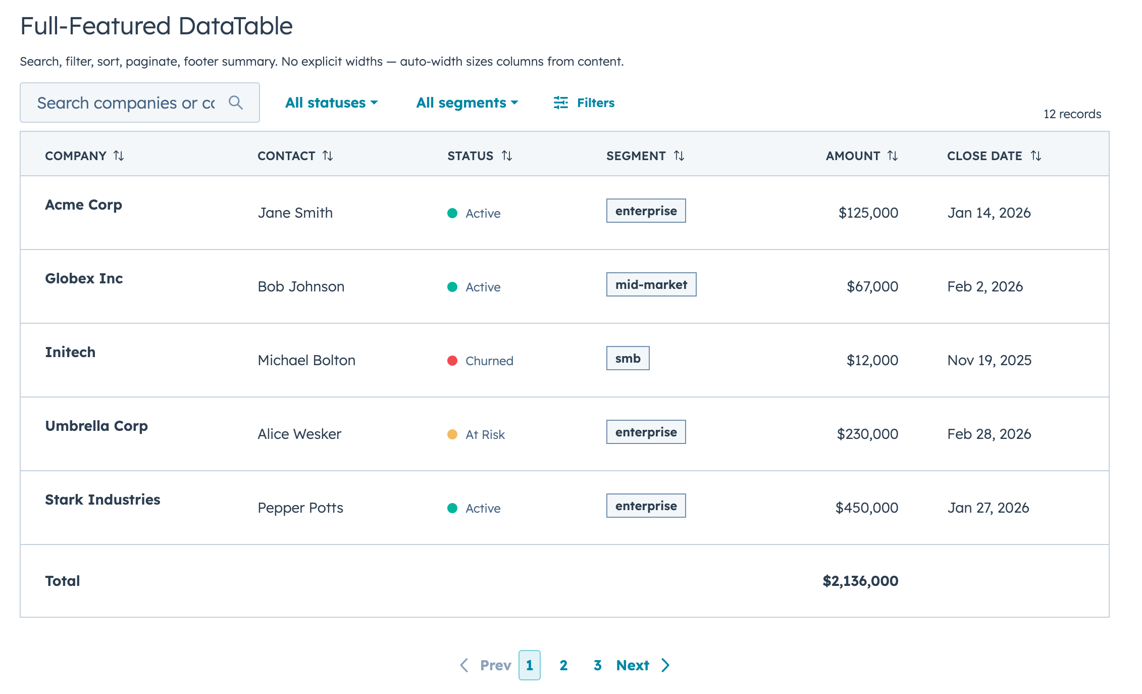
15
|
+
The column sizing alone is worth it. DataTable looks at your actual data (types, string lengths, unique values, whether a column has edit controls) and picks widths automatically. Booleans and dates get compact columns, text gets room, and editable columns are never too narrow for their inputs. You don't configure any widths unless you want to.
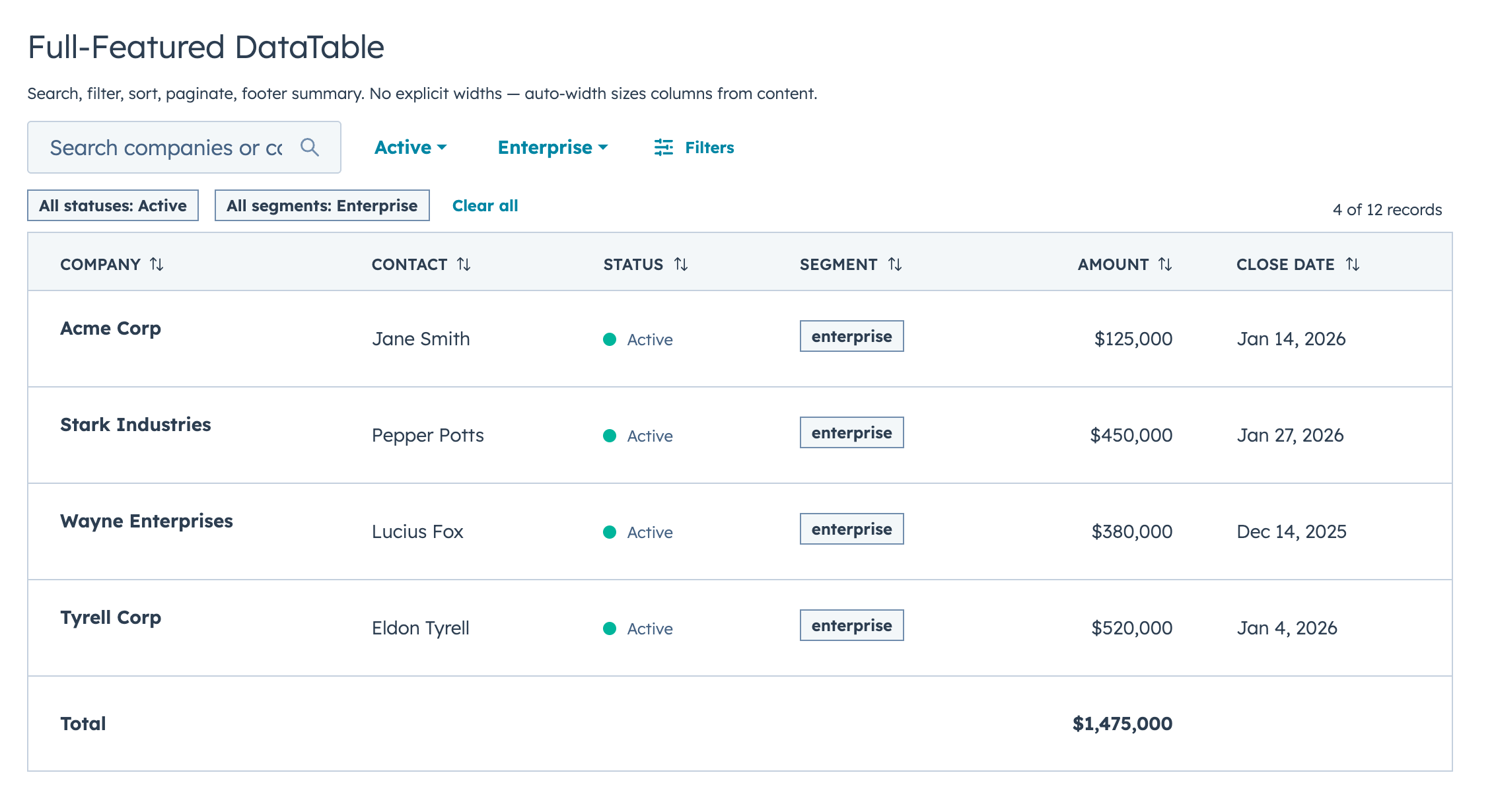
|
|
16
|
+
|
|
17
|
+
```jsx
|
|
18
|
+
const COLUMNS = [
|
|
19
|
+
{ field: "name", label: "Company", sortable: true, renderCell: (val) => val },
|
|
20
|
+
{ field: "status", label: "Status", renderCell: (val) => <StatusTag>{val}</StatusTag> },
|
|
21
|
+
{ field: "amount", label: "Amount", sortable: true, renderCell: (val) => formatCurrency(val) },
|
|
22
|
+
];
|
|
23
|
+
|
|
24
|
+
<DataTable data={deals} columns={COLUMNS} searchFields={["name"]} pageSize={10} />
|
|
25
|
+
```
|
|
26
|
+
|
|
27
|
+
That's a searchable, sortable, paginated table with auto-sized columns in 5 lines of config.
|
|
28
|
+
|
|
29
|
+
## Features
|
|
30
|
+
|
|
31
|
+
- Full-text search across any combination of fields, with optional fuzzy matching via Fuse.js
|
|
32
|
+
- Select, multi-select, and date range filters with configurable active badges and clear/reset controls
|
|
33
|
+
- Click-to-sort headers with three-state cycling (none, ascending, descending)
|
|
34
|
+
- Client-side or server-side pagination with configurable page size, visible page buttons, and First/Last navigation
|
|
35
|
+
- Collapsible row groups with per-column aggregation functions
|
|
36
|
+
- Row selection via checkboxes with client/server-aware "Select all" behavior and optional parent callback for dataset-level selection flows
|
|
37
|
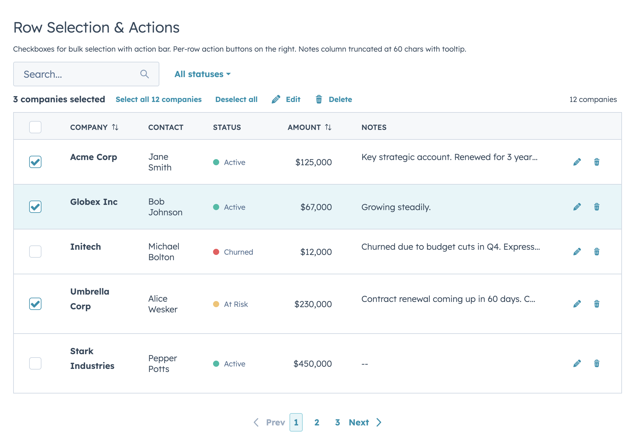
+
- Selection action bar with selected count, select/deselect all, and custom bulk action buttons
|
|
38
|
+
- Per-row actions via `rowActions` (static array or dynamic function), with optional hide-on-selection behavior
|
|
39
|
+
- Two edit modes (discrete and inline/full-row) supporting 12 input types, with per-column validation and automatic boolean-to-select conversion
|
|
40
|
+
- Separate edit callbacks for committed values (`onRowEdit`) and live input (`onRowEditInput`)
|
|
41
|
+
- Auto-width column sizing based on data analysis, with manual overrides when you need them
|
|
42
|
+
- Optional text truncation helpers (`truncate: true` or `truncate: { maxLength }`)
|
|
43
|
+
- Customizable record label (`recordLabel`) that flows into row count, selection bar, loading, and empty states
|
|
44
|
+
- Configurable row count display with custom text formatting and bold option
|
|
45
|
+
- Configurable table appearance (`bordered`, `flush`, `scrollable`)
|
|
46
|
+
- Column-level footer for totals rows — static labels or functions computed from filtered data
|
|
47
|
+
- Works with `useAssociations` for live CRM data (contacts, deals, tickets, etc.)
|
|
48
|
+
- Server-side mode with loading/error states, search debounce, controlled state, and a unified `onParamsChange` callback
|
|
49
|
+
- Built-in empty state when no results match
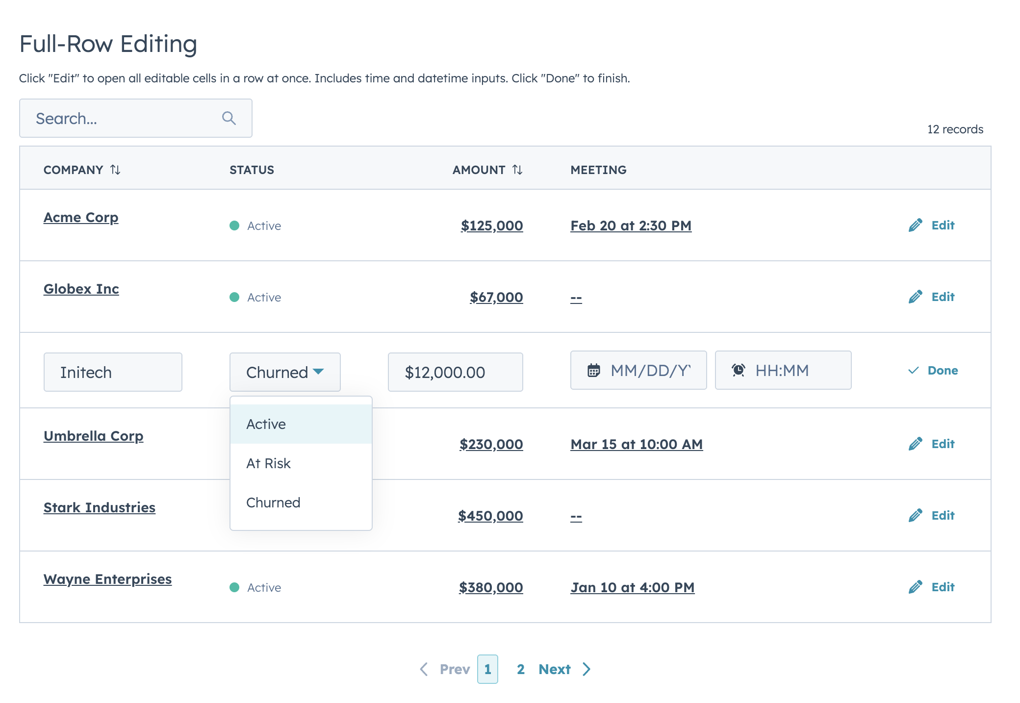
|
|
50
|
+
|
|
51
|
+
## Installation
|
|
52
|
+
|
|
53
|
+
```bash
|
|
54
|
+
npm install hs-uix
|
|
55
|
+
```
|
|
56
|
+
|
|
57
|
+
Import it in your card:
|
|
58
|
+
|
|
59
|
+
```jsx
|
|
60
|
+
import { DataTable } from "hs-uix/datatable";
|
|
61
|
+
```
|
|
62
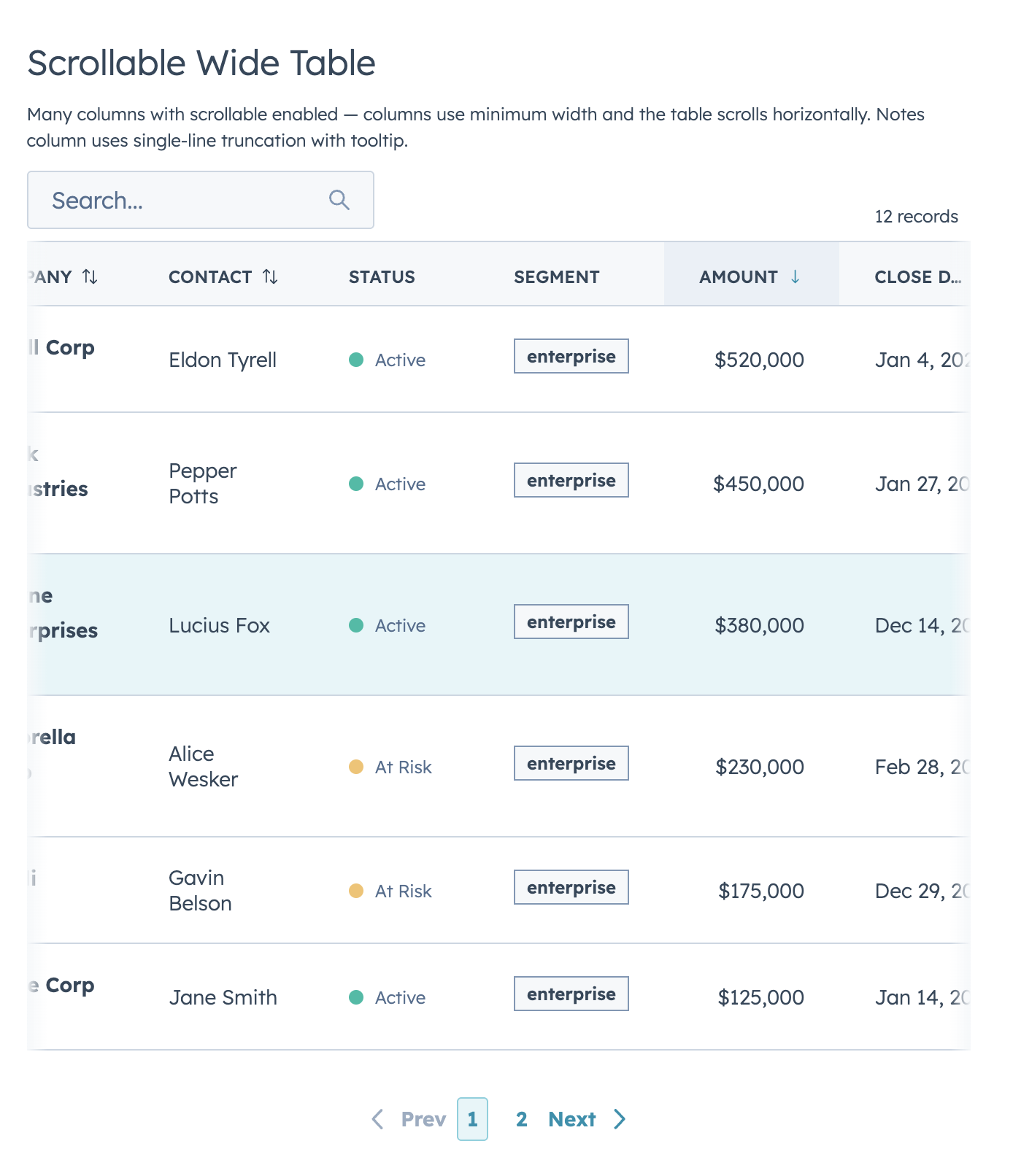
|
+
|
|
63
|
+
Requires `@hubspot/ui-extensions` >= 0.12.0 and `react` >= 18.0.0 as peer dependencies (already present in any HubSpot UI Extensions project).
|
|
64
|
+
TypeScript declarations are bundled with `hs-uix` (`datatable.d.ts`).
|
|
65
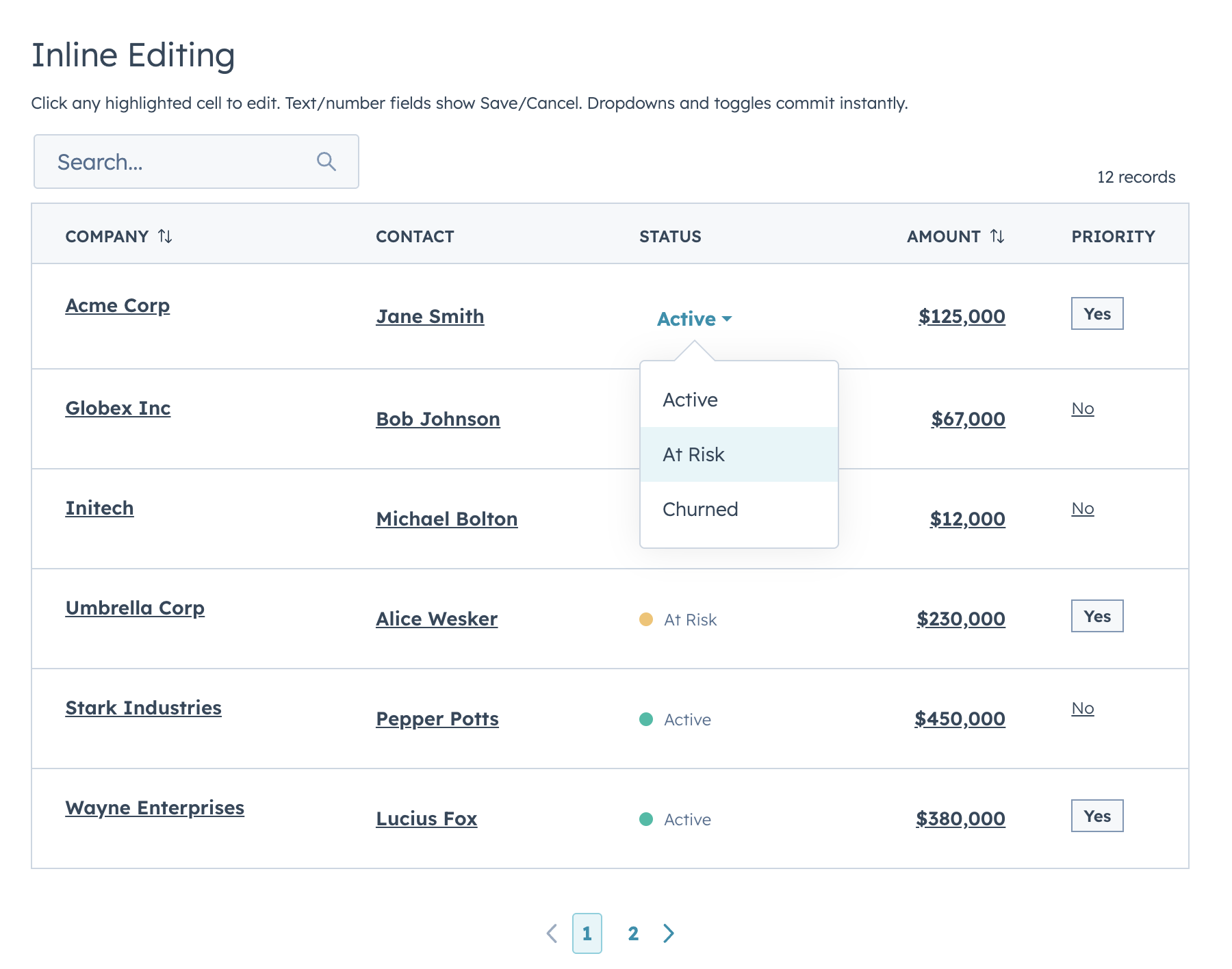
|
+
|
|
66
|
+
---
|
|
67
|
+
|
|
68
|
+
## Examples
|
|
69
|
+
|
|
70
|
+
### Basic table with search and sorting
|
|
71
|
+
|
|
72
|
+
Define your columns with `renderCell`, pass your data, and the table handles sizing, search, and sorting.
|
|
73
|
+
|
|
74
|
+
```jsx
|
|
75
|
+
import React from "react";
|
|
76
|
+
import { Flex, Text, hubspot } from "@hubspot/ui-extensions";
|
|
77
|
+
import { DataTable } from "hs-uix/datatable";
|
|
78
|
+
|
|
79
|
+
const CONTACTS = [
|
|
80
|
+
{ id: 1, name: "Jane Smith", email: "jane@acme.com", role: "VP Sales" },
|
|
81
|
+
{ id: 2, name: "Bob Johnson", email: "bob@globex.com", role: "Engineer" },
|
|
82
|
+
{ id: 3, name: "Alice Wesker", email: "alice@umbrella.com", role: "CEO" },
|
|
83
|
+
];
|
|
84
|
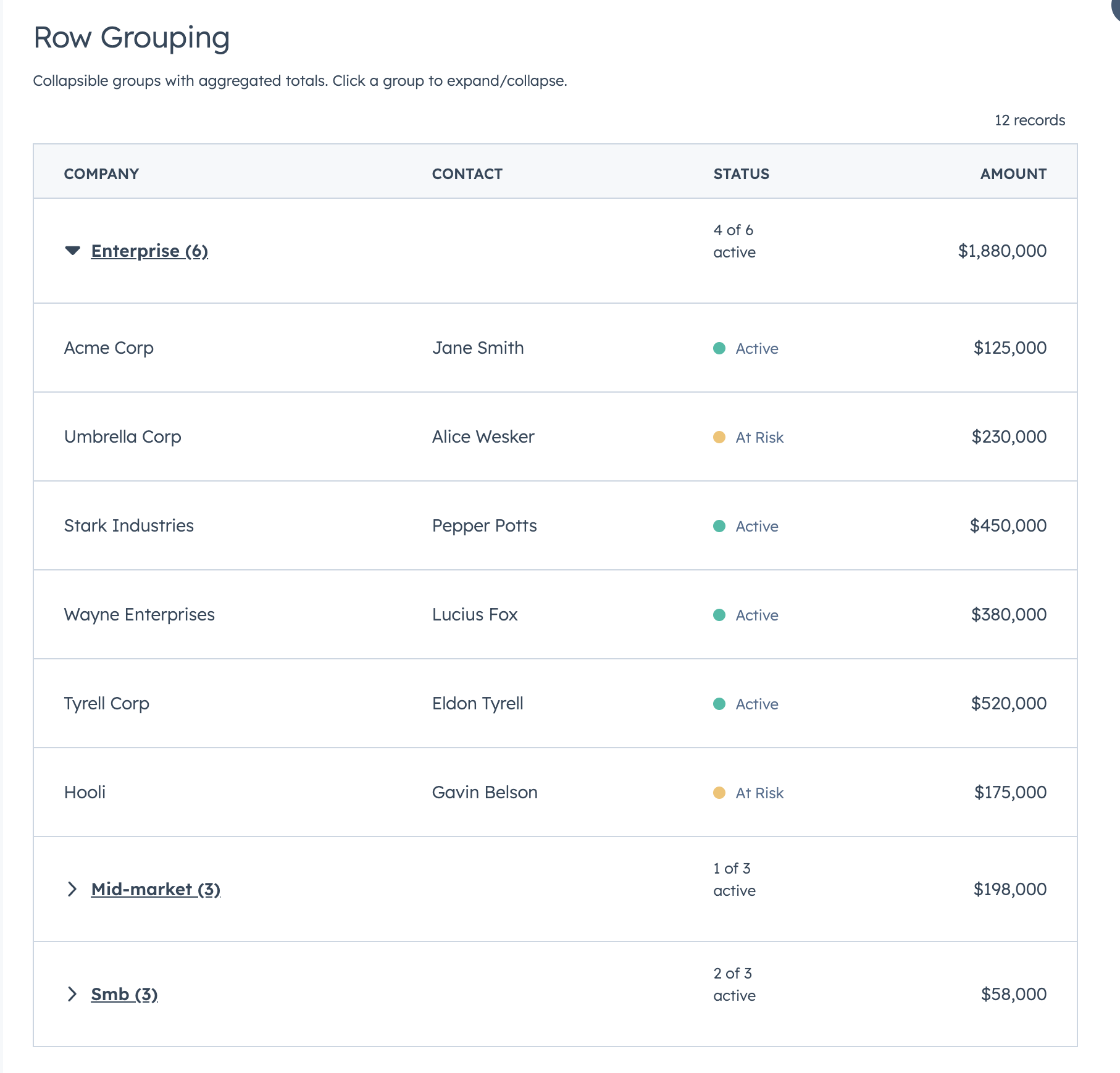
+
|
|
85
|
+
const COLUMNS = [
|
|
86
|
+
{
|
|
87
|
+
field: "name",
|
|
88
|
+
label: "Name",
|
|
89
|
+
sortable: true,
|
|
90
|
+
renderCell: (val) => <Text format={{ fontWeight: "demibold" }}>{val}</Text>,
|
|
91
|
+
},
|
|
92
|
+
{ field: "email", label: "Email", sortable: true, renderCell: (val) => val },
|
|
93
|
+
{ field: "role", label: "Role", renderCell: (val) => val },
|
|
94
|
+
];
|
|
95
|
+
|
|
96
|
+
hubspot.extend(() => (
|
|
97
|
+
<DataTable
|
|
98
|
+
data={CONTACTS}
|
|
99
|
+
columns={COLUMNS}
|
|
100
|
+
searchFields={["name", "email"]}
|
|
101
|
+
searchPlaceholder="Search contacts..."
|
|
102
|
+
pageSize={10}
|
|
103
|
+
defaultSort={{ name: "ascending" }}
|
|
104
|
+
/>
|
|
105
|
+
));
|
|
106
|
+
```
|
|
107
|
+
|
|
108
|
+
> You can also use `renderRow` for full row control instead of `renderCell`, but `renderCell` is required when using `selectable`, editable columns, or `groupBy`.
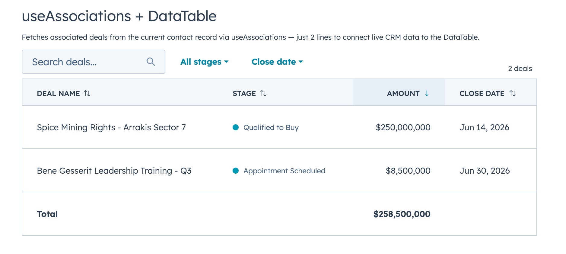
|
|
109
|
+
|
|
110
|
+
---
|
|
111
|
+
|
|
112
|
+
### Filters, sorting, and footer totals
|
|
113
|
+
|
|
114
|
+
|
|
115
|
+
|
|
116
|
+
When more than 2 filters are defined, the first 2 appear inline and the rest are tucked behind a **Filters** button with a funnel icon. Active filters display as removable chips with a "Clear all" option by default. Hiding the badges via `showFilterBadges={false}` also hides the "Clear all" button by default — set `showClearFiltersButton={true}` to keep the reset without chips. Footer totals are declared directly on the column — a static string or a function that receives the filtered data.
|
|
117
|
+
|
|
118
|
+
```jsx
|
|
119
|
+
import React from "react";
|
|
120
|
+
import { Text, StatusTag, Tag, hubspot } from "@hubspot/ui-extensions";
|
|
121
|
+
import { DataTable } from "hs-uix/datatable";
|
|
122
|
+
import { AutoStatusTag, AutoTag, KeyValueList, SectionHeader } from "hs-uix/common-components";
|
|
123
|
+
import { formatCurrency, formatDate, sumBy } from "hs-uix/utils";
|
|
124
|
+
|
|
125
|
+
const DEALS = [
|
|
126
|
+
{ id: 1, company: "Acme Corp", status: "active", segment: "enterprise", amount: 125000, closeDate: "2026-01-15" },
|
|
127
|
+
{ id: 2, company: "Globex Inc", status: "active", segment: "mid-market", amount: 67000, closeDate: "2026-02-03" },
|
|
128
|
+
{ id: 3, company: "Initech", status: "churned", segment: "smb", amount: 12000, closeDate: "2025-11-20" },
|
|
129
|
+
{ id: 4, company: "Umbrella Corp", status: "at-risk", segment: "enterprise", amount: 230000, closeDate: "2026-03-01" },
|
|
130
|
+
];
|
|
131
|
+
|
|
132
|
+
const COLUMNS = [
|
|
133
|
+
{ field: "company", label: "Company", sortable: true, footer: "Total",
|
|
134
|
+
renderCell: (val) => <Text format={{ fontWeight: "demibold" }}>{val}</Text> },
|
|
135
|
+
{ field: "status", label: "Status", sortable: true,
|
|
136
|
+
renderCell: (val) => <AutoStatusTag value={val} /> },
|
|
137
|
+
{ field: "segment", label: "Segment", sortable: true,
|
|
138
|
+
renderCell: (val) => <AutoTag value={val} /> },
|
|
139
|
+
{ field: "amount", label: "Amount", sortable: true, align: "right",
|
|
140
|
+
footer: (rows) => formatCurrency(sumBy(rows, "amount")),
|
|
141
|
+
renderCell: (val) => formatCurrency(val) },
|
|
142
|
+
{ field: "closeDate", label: "Close Date", sortable: true,
|
|
143
|
+
renderCell: (val) => formatDate(val) },
|
|
144
|
+
];
|
|
145
|
+
|
|
146
|
+
const FILTERS = [
|
|
147
|
+
{
|
|
148
|
+
name: "status",
|
|
149
|
+
type: "select",
|
|
150
|
+
placeholder: "All statuses",
|
|
151
|
+
options: [
|
|
152
|
+
{ label: "Active", value: "active" },
|
|
153
|
+
{ label: "At Risk", value: "at-risk" },
|
|
154
|
+
{ label: "Churned", value: "churned" },
|
|
155
|
+
],
|
|
156
|
+
},
|
|
157
|
+
{
|
|
158
|
+
name: "segment",
|
|
159
|
+
type: "select",
|
|
160
|
+
placeholder: "All segments",
|
|
161
|
+
options: [
|
|
162
|
+
{ label: "Enterprise", value: "enterprise" },
|
|
163
|
+
{ label: "Mid-Market", value: "mid-market" },
|
|
164
|
+
{ label: "SMB", value: "smb" },
|
|
165
|
+
],
|
|
166
|
+
},
|
|
167
|
+
{
|
|
168
|
+
name: "closeDate",
|
|
169
|
+
type: "dateRange",
|
|
170
|
+
placeholder: "Close date",
|
|
171
|
+
},
|
|
172
|
+
];
|
|
173
|
+
|
|
174
|
+
const SUMMARY = [
|
|
175
|
+
{ label: "Open deals", value: DEALS.length },
|
|
176
|
+
{ label: "Pipeline", value: formatCurrency(sumBy(DEALS, "amount")) },
|
|
177
|
+
];
|
|
178
|
+
|
|
179
|
+
<SectionHeader
|
|
180
|
+
title="Companies"
|
|
181
|
+
description="Open deals worth tracking in the current pipeline."
|
|
182
|
+
/>
|
|
183
|
+
|
|
184
|
+
<KeyValueList items={SUMMARY} />
|
|
185
|
+
|
|
186
|
+
hubspot.extend(() => (
|
|
187
|
+
<DataTable
|
|
188
|
+
data={DEALS}
|
|
189
|
+
columns={COLUMNS}
|
|
190
|
+
searchFields={["company"]}
|
|
191
|
+
searchPlaceholder="Search companies..."
|
|
192
|
+
filters={FILTERS}
|
|
193
|
+
pageSize={5}
|
|
194
|
+
defaultSort={{ amount: "descending" }}
|
|
195
|
+
/>
|
|
196
|
+
));
|
|
197
|
+
```
|
|
198
|
+
|
|
199
|
+
Hide badges but keep reset:
|
|
200
|
+
|
|
201
|
+
```jsx
|
|
202
|
+
<DataTable
|
|
203
|
+
data={DEALS}
|
|
204
|
+
columns={COLUMNS}
|
|
205
|
+
filters={FILTERS}
|
|
206
|
+
showFilterBadges={false}
|
|
207
|
+
showClearFiltersButton={true}
|
|
208
|
+
/>
|
|
209
|
+
```
|
|
210
|
+
|
|
211
|
+
#### Custom filter functions
|
|
212
|
+
|
|
213
|
+
Override the default filter logic for any filter. This is useful for range-based filters or computed values:
|
|
214
|
+
|
|
215
|
+
```jsx
|
|
216
|
+
const FILTERS = [
|
|
217
|
+
{
|
|
218
|
+
name: "amount",
|
|
219
|
+
type: "select",
|
|
220
|
+
placeholder: "Deal size",
|
|
221
|
+
options: [
|
|
222
|
+
{ label: "Under $50K", value: "small" },
|
|
223
|
+
{ label: "$50K - $200K", value: "medium" },
|
|
224
|
+
{ label: "Over $200K", value: "large" },
|
|
225
|
+
],
|
|
226
|
+
filterFn: (row, value) => {
|
|
227
|
+
if (value === "small") return row.amount < 50000;
|
|
228
|
+
if (value === "medium") return row.amount >= 50000 && row.amount <= 200000;
|
|
229
|
+
return row.amount > 200000;
|
|
230
|
+
},
|
|
231
|
+
},
|
|
232
|
+
];
|
|
233
|
+
```
|
|
234
|
+
|
|
235
|
+
---
|
|
236
|
+
|
|
237
|
+
### Row selection with bulk actions
|
|
238
|
+
|
|
239
|
+
|
|
240
|
+
|
|
241
|
+
Add checkboxes with a select-all header (selects current page). When rows are selected, a compact action bar appears above the table showing the selected count, a "Select all" button, "Deselect all", and any custom action buttons you define.
|
|
242
|
+
|
|
243
|
+
- Client-side mode: action-bar "Select all" selects all matching rows across pages.
|
|
244
|
+
- Server-side mode: action-bar "Select all" selects current page rows for visual feedback and optionally fires `onSelectAllRequest` so the parent can trigger a true dataset-level select-all flow.
|
|
245
|
+
- Uncontrolled selection memory persists across pages and resets on search/filter/sort changes by default. Use `selectionResetKey` to force a reset when dataset identity changes.
|
|
246
|
+
|
|
247
|
+
Requires `renderCell` on each column.
|
|
248
|
+
|
|
249
|
+
```jsx
|
|
250
|
+
import React, { useState, useMemo } from "react";
|
|
251
|
+
import { Flex, Heading, Text, StatusTag, hubspot } from "@hubspot/ui-extensions";
|
|
252
|
+
import { DataTable } from "hs-uix/datatable";
|
|
253
|
+
|
|
254
|
+
hubspot.extend(() => <SelectableTable />);
|
|
255
|
+
|
|
256
|
+
function SelectableTable() {
|
|
257
|
+
const [selected, setSelected] = useState([]);
|
|
258
|
+
|
|
259
|
+
const selectionActions = useMemo(() => [
|
|
260
|
+
{ label: "Edit", icon: "edit", onClick: (ids) => console.log("Edit", ids) },
|
|
261
|
+
{ label: "Delete", icon: "delete", onClick: (ids) => console.log("Delete", ids) },
|
|
262
|
+
{ label: "Export", icon: "dataExport", onClick: (ids) => console.log("Export", ids) },
|
|
263
|
+
], []);
|
|
264
|
+
|
|
265
|
+
const columns = [
|
|
266
|
+
{ field: "name", label: "Company", sortable: true,
|
|
267
|
+
renderCell: (val) => <Text format={{ fontWeight: "demibold" }}>{val}</Text> },
|
|
268
|
+
{ field: "contact", label: "Contact", renderCell: (val) => val },
|
|
269
|
+
{ field: "status", label: "Status",
|
|
270
|
+
renderCell: (val) => <StatusTag variant={val === "active" ? "success" : "warning"}>{val}</StatusTag> },
|
|
271
|
+
];
|
|
272
|
+
|
|
273
|
+
return (
|
|
274
|
+
<Flex direction="column" gap="sm">
|
|
275
|
+
<Heading>Companies</Heading>
|
|
276
|
+
<DataTable
|
|
277
|
+
data={COMPANIES}
|
|
278
|
+
columns={columns}
|
|
279
|
+
selectable={true}
|
|
280
|
+
rowIdField="id"
|
|
281
|
+
recordLabel={{ singular: "Company", plural: "Companies" }}
|
|
282
|
+
onSelectionChange={setSelected}
|
|
283
|
+
selectionActions={selectionActions}
|
|
284
|
+
searchFields={["name", "contact"]}
|
|
285
|
+
pageSize={10}
|
|
286
|
+
/>
|
|
287
|
+
</Flex>
|
|
288
|
+
);
|
|
289
|
+
}
|
|
290
|
+
```
|
|
291
|
+
|
|
292
|
+
Each action in `selectionActions` receives the array of selected row IDs when clicked. You can optionally set `icon` (any HubSpot Icon name) and `variant` (Button variant) on each action.
|
|
293
|
+
|
|
294
|
+
Server-side selection example:
|
|
295
|
+
|
|
296
|
+
```jsx
|
|
297
|
+
<DataTable
|
|
298
|
+
serverSide={true}
|
|
299
|
+
data={pageRows}
|
|
300
|
+
totalCount={totalCount}
|
|
301
|
+
columns={columns}
|
|
302
|
+
selectable={true}
|
|
303
|
+
selectedIds={selectedIds}
|
|
304
|
+
onSelectionChange={setSelectedIds}
|
|
305
|
+
onSelectAllRequest={({ selectedIds, pageIds, totalCount }) => {
|
|
306
|
+
// Keep page-level visual selection in sync, then trigger dataset-level selection flow
|
|
307
|
+
requestSelectAllMatchingRows({ selectedIds, pageIds, totalCount });
|
|
308
|
+
}}
|
|
309
|
+
selectionResetKey={`${query.search}|${JSON.stringify(query.filters)}|${query.sort?.field || ""}:${query.sort?.direction || ""}`}
|
|
310
|
+
/>
|
|
311
|
+
```
|
|
312
|
+
|
|
313
|
+
---
|
|
314
|
+
|
|
315
|
+
### Row actions and full-row "Edit/Done" flow
|
|
316
|
+
|
|
317
|
+
|
|
318
|
+
|
|
319
|
+
Use `rowActions` to append an actions column on the right. You can pass a static action list or a row-aware function.
|
|
320
|
+
|
|
321
|
+
```jsx
|
|
322
|
+
function DealsTable() {
|
|
323
|
+
const [rows, setRows] = useState(DEALS);
|
|
324
|
+
const [drafts, setDrafts] = useState({});
|
|
325
|
+
const [editingRowId, setEditingRowId] = useState(null);
|
|
326
|
+
|
|
327
|
+
const handleCommittedEdit = useCallback((row, field, value) => {
|
|
328
|
+
setDrafts((prev) => ({
|
|
329
|
+
...prev,
|
|
330
|
+
[row.id]: { ...(prev[row.id] || row), [field]: value },
|
|
331
|
+
}));
|
|
332
|
+
}, []);
|
|
333
|
+
|
|
334
|
+
const saveRow = useCallback((rowId) => {
|
|
335
|
+
const draft = drafts[rowId];
|
|
336
|
+
if (!draft) return;
|
|
337
|
+
setRows((prev) => prev.map((r) => (r.id === rowId ? draft : r)));
|
|
338
|
+
setDrafts((prev) => {
|
|
339
|
+
const next = { ...prev };
|
|
340
|
+
delete next[rowId];
|
|
341
|
+
return next;
|
|
342
|
+
});
|
|
343
|
+
setEditingRowId(null);
|
|
344
|
+
}, [drafts]);
|
|
345
|
+
|
|
346
|
+
return (
|
|
347
|
+
<DataTable
|
|
348
|
+
data={rows.map((r) => drafts[r.id] || r)}
|
|
349
|
+
columns={columns}
|
|
350
|
+
rowIdField="id"
|
|
351
|
+
editingRowId={editingRowId}
|
|
352
|
+
hideRowActionsWhenSelectionActive={true}
|
|
353
|
+
onRowEdit={handleCommittedEdit}
|
|
354
|
+
rowActions={(row) => editingRowId === row.id
|
|
355
|
+
? [{ label: "Done", icon: "success", onClick: () => saveRow(row.id) }]
|
|
356
|
+
: [{ label: "Edit", icon: "edit", onClick: () => setEditingRowId(row.id) }]}
|
|
357
|
+
/>
|
|
358
|
+
);
|
|
359
|
+
}
|
|
360
|
+
```
|
|
361
|
+
|
|
362
|
+
This pattern keeps edits local while the row is in edit mode and only persists to your real data source when the user clicks **Done**.
|
|
363
|
+
|
|
364
|
+
If you also enable row selection, set `hideRowActionsWhenSelectionActive={true}` to hide per-row actions while the selected-row action bar is visible.
|
|
365
|
+
|
|
366
|
+
---
|
|
367
|
+
|
|
368
|
+
### Text truncation
|
|
369
|
+
|
|
370
|
+
Use column-level `truncate` when you want safer defaults for long text fields.
|
|
371
|
+
|
|
372
|
+
```jsx
|
|
373
|
+
const columns = [
|
|
374
|
+
{ field: "company", label: "Company", renderCell: (val) => val },
|
|
375
|
+
{ field: "notes", label: "Notes", truncate: true, renderCell: (val) => val },
|
|
376
|
+
{ field: "summary", label: "Summary", truncate: { maxLength: 120 }, renderCell: (val) => val },
|
|
377
|
+
];
|
|
378
|
+
```
|
|
379
|
+
|
|
380
|
+
- `truncate: true` uses single-line truncation with full text in tooltip.
|
|
381
|
+
- `truncate: { maxLength }` truncates by character count with `...` and tooltip.
|
|
382
|
+
- Truncation is skipped while a cell is actively being edited.
|
|
383
|
+
|
|
384
|
+
---
|
|
385
|
+
|
|
386
|
+
### Scrollable wide tables
|
|
387
|
+
|
|
388
|
+
|
|
389
|
+
|
|
390
|
+
When you have many columns, set `scrollable={true}` to allow horizontal overflow instead of squishing columns. Columns without explicit widths fall back to `"min"` width, keeping each column compact and letting the table scroll.
|
|
391
|
+
|
|
392
|
+
```jsx
|
|
393
|
+
<DataTable
|
|
394
|
+
data={data}
|
|
395
|
+
columns={manyColumns}
|
|
396
|
+
scrollable={true}
|
|
397
|
+
pageSize={10}
|
|
398
|
+
/>
|
|
399
|
+
```
|
|
400
|
+
|
|
401
|
+
---
|
|
402
|
+
|
|
403
|
+
### Inline editing — discrete mode
|
|
404
|
+
|
|
405
|
+
|
|
406
|
+

|
|
407
|
+
|
|
408
|
+
In discrete mode (the default), editable cells appear as dark links. Click to open the input. The cell reverts to display when you click away, keeping the last committed value. Select/date/toggle-type inputs commit and close instantly on change. Text-like inputs commit via HubSpot `onChange` (typically blur/submit), and can stream live input through `onRowEditInput`.
|
|
409
|
+
|
|
410
|
+
```jsx
|
|
411
|
+
import React, { useState, useCallback } from "react";
|
|
412
|
+
import { Text, StatusTag, Tag, hubspot } from "@hubspot/ui-extensions";
|
|
413
|
+
import { DataTable } from "hs-uix/datatable";
|
|
414
|
+
|
|
415
|
+
const STATUS_COLORS = { active: "success", "at-risk": "warning", churned: "danger" };
|
|
416
|
+
const STATUS_LABELS = { active: "Active", "at-risk": "At Risk", churned: "Churned" };
|
|
417
|
+
|
|
418
|
+
hubspot.extend(() => <EditableTable />);
|
|
419
|
+
|
|
420
|
+
function EditableTable() {
|
|
421
|
+
const [data, setData] = useState(DEALS);
|
|
422
|
+
|
|
423
|
+
const handleEdit = useCallback((row, field, newValue) => {
|
|
424
|
+
setData((prev) =>
|
|
425
|
+
prev.map((r) => (r.id === row.id ? { ...r, [field]: newValue } : r))
|
|
426
|
+
);
|
|
427
|
+
}, []);
|
|
428
|
+
|
|
429
|
+
const columns = [
|
|
430
|
+
{
|
|
431
|
+
field: "company", label: "Company", sortable: true,
|
|
432
|
+
editable: true, editType: "text",
|
|
433
|
+
renderCell: (val) => <Text format={{ fontWeight: "demibold" }}>{val}</Text>,
|
|
434
|
+
},
|
|
435
|
+
{
|
|
436
|
+
field: "status", label: "Status",
|
|
437
|
+
editable: true, editType: "select",
|
|
438
|
+
editOptions: [
|
|
439
|
+
{ label: "Active", value: "active" },
|
|
440
|
+
{ label: "At Risk", value: "at-risk" },
|
|
441
|
+
{ label: "Churned", value: "churned" },
|
|
442
|
+
],
|
|
443
|
+
renderCell: (val) => <StatusTag variant={STATUS_COLORS[val]}>{STATUS_LABELS[val]}</StatusTag>,
|
|
444
|
+
},
|
|
445
|
+
{
|
|
446
|
+
field: "amount", label: "Amount", align: "right",
|
|
447
|
+
editable: true, editType: "currency",
|
|
448
|
+
renderCell: (val) => formatCurrency(val),
|
|
449
|
+
},
|
|
450
|
+
{
|
|
451
|
+
field: "priority", label: "Priority",
|
|
452
|
+
editable: true, editType: "checkbox",
|
|
453
|
+
renderCell: (val) => val ? <Tag variant="default">Yes</Tag> : <Text variant="microcopy">No</Text>,
|
|
454
|
+
},
|
|
455
|
+
];
|
|
456
|
+
|
|
457
|
+
return (
|
|
458
|
+
<DataTable
|
|
459
|
+
data={data}
|
|
460
|
+
columns={columns}
|
|
461
|
+
rowIdField="id"
|
|
462
|
+
onRowEdit={handleEdit}
|
|
463
|
+
searchFields={["company"]}
|
|
464
|
+
pageSize={10}
|
|
465
|
+
/>
|
|
466
|
+
);
|
|
467
|
+
}
|
|
468
|
+
```
|
|
469
|
+
|
|
470
|
+
> `align` is automatically stripped from cells and headers when input controls are visible, since HubSpot input components don't respect the parent cell's text alignment. You can still set `align` on editable columns and it applies correctly in the display view.
|
|
471
|
+
|
|
472
|
+
---
|
|
473
|
+
|
|
474
|
+
### Inline editing — inline mode
|
|
475
|
+
|
|
476
|
+

|
|
477
|
+
|
|
478
|
+
In inline mode, all editable cells always show their input controls. This mode is also used for full-row editing when `editingRowId` is set. Set `editMode="inline"` to enable always-visible inputs.
|
|
479
|
+
|
|
480
|
+
```jsx
|
|
481
|
+
<DataTable
|
|
482
|
+
data={data}
|
|
483
|
+
columns={columns}
|
|
484
|
+
rowIdField="id"
|
|
485
|
+
editMode="inline"
|
|
486
|
+
onRowEdit={handleEdit}
|
|
487
|
+
pageSize={5}
|
|
488
|
+
/>
|
|
489
|
+
```
|
|
490
|
+
|
|
491
|
+
**Supported `editType` values:**
|
|
492
|
+
|
|
493
|
+
| editType | Component | Commit Behavior |
|
|
494
|
+
|---|---|---|
|
|
495
|
+
| `text` | Input | Commit on `onChange` (HubSpot: usually blur/submit); optional live input via `onRowEditInput` |
|
|
496
|
+
| `textarea` | TextArea | Commit on `onChange` (HubSpot: usually blur/submit); optional live input via `onRowEditInput` |
|
|
497
|
+
| `number` | NumberInput | Commit on `onChange` (HubSpot: usually blur/submit); optional live input via `onRowEditInput` |
|
|
498
|
+
| `currency` | CurrencyInput | Commit on `onChange` (HubSpot: usually blur/submit); optional live input via `onRowEditInput` |
|
|
499
|
+
| `stepper` | StepperInput | Commit on `onChange` (HubSpot: usually blur/submit); optional live input via `onRowEditInput` |
|
|
500
|
+
| `select` | Select | Instant on change |
|
|
501
|
+
| `multiselect` | MultiSelect | Instant on change |
|
|
502
|
+
| `date` | DateInput | Instant on change |
|
|
503
|
+
| `time` | TimeInput | Instant on change |
|
|
504
|
+
| `datetime` | DateInput + TimeInput | Emits `{ date, time }` updates as either control changes |
|
|
505
|
+
| `toggle` | Toggle | Instant on change |
|
|
506
|
+
| `checkbox` | Checkbox | Instant on change |
|
|
507
|
+
|
|
508
|
+
Use `editProps` to pass additional props to the edit component (e.g., `{ currencyCode: "EUR" }` for `CurrencyInput` or `timeProps` for datetime time input options).
|
|
509
|
+
|
|
510
|
+
---
|
|
511
|
+
|
|
512
|
+
### Row grouping with aggregations
|
|
513
|
+
|
|
514
|
+
|
|
515
|
+
|
|
516
|
+
Groups are collapsible. Click a group header to expand or collapse it. You can define aggregation functions per column, and groups start expanded by default.
|
|
517
|
+
|
|
518
|
+
```jsx
|
|
519
|
+
import React from "react";
|
|
520
|
+
import { Text, StatusTag, hubspot } from "@hubspot/ui-extensions";
|
|
521
|
+
import { DataTable } from "hs-uix/datatable";
|
|
522
|
+
|
|
523
|
+
const STATUS_COLORS = { active: "success", "at-risk": "warning", churned: "danger" };
|
|
524
|
+
|
|
525
|
+
const formatCurrency = (val) =>
|
|
526
|
+
new Intl.NumberFormat("en-US", { style: "currency", currency: "USD", maximumFractionDigits: 0 }).format(val);
|
|
527
|
+
|
|
528
|
+
const COLUMNS = [
|
|
529
|
+
{ field: "company", label: "Company", renderCell: (val) => val },
|
|
530
|
+
{ field: "contact", label: "Contact", renderCell: (val) => val },
|
|
531
|
+
{ field: "status", label: "Status",
|
|
532
|
+
renderCell: (val) => <StatusTag variant={STATUS_COLORS[val]}>{val}</StatusTag> },
|
|
533
|
+
{ field: "amount", label: "Amount", align: "right",
|
|
534
|
+
renderCell: (val) => formatCurrency(val) },
|
|
535
|
+
];
|
|
536
|
+
|
|
537
|
+
hubspot.extend(() => (
|
|
538
|
+
<DataTable
|
|
539
|
+
data={DEALS}
|
|
540
|
+
columns={COLUMNS}
|
|
541
|
+
groupBy={{
|
|
542
|
+
field: "segment",
|
|
543
|
+
label: (value, rows) => `${value.charAt(0).toUpperCase() + value.slice(1)} (${rows.length})`,
|
|
544
|
+
sort: "asc",
|
|
545
|
+
defaultExpanded: true,
|
|
546
|
+
aggregations: {
|
|
547
|
+
amount: (rows) => formatCurrency(rows.reduce((sum, r) => sum + r.amount, 0)),
|
|
548
|
+
status: (rows) => {
|
|
549
|
+
const active = rows.filter((r) => r.status === "active").length;
|
|
550
|
+
return <Text variant="microcopy">{active} of {rows.length} active</Text>;
|
|
551
|
+
},
|
|
552
|
+
},
|
|
553
|
+
}}
|
|
554
|
+
pageSize={30}
|
|
555
|
+
/>
|
|
556
|
+
));
|
|
557
|
+
```
|
|
558
|
+
|
|
559
|
+
You can also provide static values per group instead of aggregation functions:
|
|
560
|
+
|
|
561
|
+
```jsx
|
|
562
|
+
groupBy={{
|
|
563
|
+
field: "region",
|
|
564
|
+
label: (value) => value,
|
|
565
|
+
groupValues: {
|
|
566
|
+
"North America": { revenue: "$2.1M" },
|
|
567
|
+
"Europe": { revenue: "$1.4M" },
|
|
568
|
+
},
|
|
569
|
+
}}
|
|
570
|
+
```
|
|
571
|
+
|
|
572
|
+
---
|
|
573
|
+
|
|
574
|
+
### Auto-width
|
|
575
|
+
|
|
576
|
+
On by default. DataTable scans up to 50 rows and picks widths based on what's in each column. Disable with `autoWidth={false}` if you want full manual control.
|
|
577
|
+
|
|
578
|
+
The heuristics:
|
|
579
|
+
|
|
580
|
+
| Data Pattern | Header Width | Cell Width |
|
|
581
|
+
|---|---|---|
|
|
582
|
+
| Booleans (`true`/`false`) | `min` | `min` |
|
|
583
|
+
| Dates (ISO format) | `min` | `auto` |
|
|
584
|
+
| Numbers | `auto` | `auto` |
|
|
585
|
+
| Small enums (5 or fewer unique values, 15 chars or less) | `min` | `auto` |
|
|
586
|
+
| Text | `auto` | `auto` |
|
|
587
|
+
|
|
588
|
+
A few things to know:
|
|
589
|
+
- Editable columns (except checkbox/toggle) never get `min` headers, since input components need room.
|
|
590
|
+
- `align` is stripped from headers and cells when input controls are showing, because HubSpot inputs ignore parent text alignment.
|
|
591
|
+
- In discrete edit mode, the active cell switches to `auto` width while the input is open.
|
|
592
|
+
|
|
593
|
+
Manual overrides always take priority. You can set `width` (applies to header and cells) and `cellWidth` (cells only):
|
|
594
|
+
|
|
595
|
+
```jsx
|
|
596
|
+
// Header and cells both use "max"
|
|
597
|
+
{ field: "name", label: "Name", width: "max" }
|
|
598
|
+
|
|
599
|
+
// Header tight around label, cells expand to show full values
|
|
600
|
+
{ field: "name", label: "Name", width: "min", cellWidth: "max" }
|
|
601
|
+
|
|
602
|
+
// Disable auto-width for a specific column
|
|
603
|
+
{ field: "notes", label: "Notes", width: "auto", cellWidth: "auto" }
|
|
604
|
+
```
|
|
605
|
+
|
|
606
|
+
---
|
|
607
|
+
|
|
608
|
+
### Row count customization
|
|
609
|
+
|
|
610
|
+
Use `rowCountText` when you want full control over the row count label.
|
|
611
|
+
|
|
612
|
+
```jsx
|
|
613
|
+
<DataTable
|
|
614
|
+
data={products}
|
|
615
|
+
columns={columns}
|
|
616
|
+
pageSize={25}
|
|
617
|
+
rowCountText={(shownOnPage, totalMatching) =>
|
|
618
|
+
`Showing ${shownOnPage} of ${totalMatching} products`
|
|
619
|
+
}
|
|
620
|
+
/>
|
|
621
|
+
```
|
|
622
|
+
|
|
623
|
+
`rowCountText` callback args:
|
|
624
|
+
|
|
625
|
+
- `shownOnPage`: number of data rows on the current page
|
|
626
|
+
- `totalMatching`: total rows matching the current query/filter state
|
|
627
|
+
|
|
628
|
+
In server-side mode, `totalMatching` maps to `totalCount` (or `data.length` if `totalCount` is not provided).
|
|
629
|
+
|
|
630
|
+
Hide the built-in count entirely with `showRowCount={false}`:
|
|
631
|
+
|
|
632
|
+
```jsx
|
|
633
|
+
<DataTable
|
|
634
|
+
data={products}
|
|
635
|
+
columns={columns}
|
|
636
|
+
showRowCount={false}
|
|
637
|
+
/>
|
|
638
|
+
```
|
|
639
|
+
|
|
640
|
+
If you want a title above the toolbar, pass `title`:
|
|
641
|
+
|
|
642
|
+
```jsx
|
|
643
|
+
<DataTable
|
|
644
|
+
title="Delay causes"
|
|
645
|
+
data={delayCauses}
|
|
646
|
+
columns={columns}
|
|
647
|
+
rowCountText={(shownOnPage, totalMatching) => `${totalMatching} records`}
|
|
648
|
+
/>
|
|
649
|
+
```
|
|
650
|
+
|
|
651
|
+
When `title` is set, DataTable renders a simple demibold title row above the toolbar. The built-in row count stays inline with the toolbar controls on the right.
|
|
652
|
+
|
|
653
|
+
---
|
|
654
|
+
|
|
655
|
+
### useAssociations
|
|
656
|
+
|
|
657
|
+
|
|
658
|
+
|
|
659
|
+
Connect live CRM data to a DataTable in two lines. The `useAssociations` hook from `@hubspot/ui-extensions/crm` fetches associated records from the current CRM record — pass the results straight into DataTable.
|
|
660
|
+
|
|
661
|
+
```jsx
|
|
662
|
+
import { Text, StatusTag, hubspot } from "@hubspot/ui-extensions";
|
|
663
|
+
import { useAssociations } from "@hubspot/ui-extensions/crm";
|
|
664
|
+
import { DataTable } from "hs-uix/datatable";
|
|
665
|
+
|
|
666
|
+
const fmt = (val) =>
|
|
667
|
+
new Intl.NumberFormat("en-US", { style: "currency", currency: "USD", maximumFractionDigits: 0 }).format(val);
|
|
668
|
+
|
|
669
|
+
const STAGE_COLORS = {
|
|
670
|
+
appointmentscheduled: "info", qualifiedtobuy: "info", presentationscheduled: "warning",
|
|
671
|
+
decisionmakerboughtin: "warning", contractsent: "warning", closedwon: "success", closedlost: "danger",
|
|
672
|
+
};
|
|
673
|
+
|
|
674
|
+
hubspot.extend(() => <AssociatedDeals />);
|
|
675
|
+
|
|
676
|
+
function AssociatedDeals() {
|
|
677
|
+
const { results, isLoading } = useAssociations({
|
|
678
|
+
toObjectType: "0-3",
|
|
679
|
+
properties: ["dealname", "dealstage", "amount", "closedate"],
|
|
680
|
+
});
|
|
681
|
+
|
|
682
|
+
if (isLoading) return <Text>Loading...</Text>;
|
|
683
|
+
|
|
684
|
+
const deals = results.map((a) => ({
|
|
685
|
+
id: a.toObjectId,
|
|
686
|
+
dealname: a.properties.dealname,
|
|
687
|
+
dealstage: a.properties.dealstage,
|
|
688
|
+
amount: Number(a.properties.amount) || 0,
|
|
689
|
+
closedate: a.properties.closedate,
|
|
690
|
+
}));
|
|
691
|
+
|
|
692
|
+
return (
|
|
693
|
+
<DataTable
|
|
694
|
+
data={deals}
|
|
695
|
+
columns={[
|
|
696
|
+
{ field: "dealname", label: "Deal Name", sortable: true, footer: "Total" },
|
|
697
|
+
{
|
|
698
|
+
field: "dealstage", label: "Stage", sortable: true,
|
|
699
|
+
renderCell: (val) => <StatusTag variant={STAGE_COLORS[val] || "default"}>{val}</StatusTag>,
|
|
700
|
+
},
|
|
701
|
+
{
|
|
702
|
+
field: "amount", label: "Amount", sortable: true, align: "right",
|
|
703
|
+
footer: (rows) => fmt(rows.reduce((s, r) => s + r.amount, 0)),
|
|
704
|
+
renderCell: (val) => fmt(val),
|
|
705
|
+
},
|
|
706
|
+
{
|
|
707
|
+
field: "closedate", label: "Close Date", sortable: true,
|
|
708
|
+
renderCell: (val) => val ? new Date(Number(val)).toLocaleDateString() : "—",
|
|
709
|
+
},
|
|
710
|
+
]}
|
|
711
|
+
searchFields={["dealname"]}
|
|
712
|
+
recordLabel={{ singular: "Deal", plural: "Deals" }}
|
|
713
|
+
defaultSort={{ amount: "descending" }}
|
|
714
|
+
/>
|
|
715
|
+
);
|
|
716
|
+
}
|
|
717
|
+
```
|
|
718
|
+
|
|
719
|
+
**Tips:**
|
|
720
|
+
|
|
721
|
+
- **Object type IDs**: `0-1` Contacts, `0-2` Companies, `0-3` Deals, `0-5` Tickets.
|
|
722
|
+
- **Timestamps**: HubSpot returns dates as millisecond epoch strings — use `new Date(Number(val))`, not `new Date(val)`.
|
|
723
|
+
- **Column-level `footer`**: Static strings or `(rows) => ReactNode` functions. DataTable handles alignment automatically.
|
|
724
|
+
- **Stable references**: Define filter configs with `filterFn` at the module level. HubSpot's remote renderer releases inline function references between renders.
|
|
725
|
+
|
|
726
|
+
---
|
|
727
|
+
|
|
728
|
+
### Server-side mode
|
|
729
|
+
|
|
730
|
+
If your data comes from an API or you have too many records to load at once, turn on `serverSide={true}`. DataTable still renders all the UI (search box, filter dropdowns, sort headers, pagination buttons), but it skips client-side processing and fires callbacks instead. You handle the fetching.
|
|
731
|
+
|
|
732
|
+
You pass `data` with just the current page of results, and `totalCount` with the total number of records so pagination works (e.g., "Showing 1-25 of 247"). Wire up callbacks to re-fetch whenever the user interacts with the table. You can use individual callbacks or the unified `onParamsChange` for less boilerplate.
|
|
733
|
+
|
|
734
|
+
```jsx
|
|
735
|
+
import React, { useState, useEffect, useCallback } from "react";
|
|
736
|
+
import { Text, StatusTag, hubspot } from "@hubspot/ui-extensions";
|
|
737
|
+
import { DataTable } from "hs-uix/datatable";
|
|
738
|
+
|
|
739
|
+
const COLUMNS = [
|
|
740
|
+
{ field: "name", label: "Company", sortable: true,
|
|
741
|
+
renderCell: (val) => <Text format={{ fontWeight: "demibold" }}>{val}</Text> },
|
|
742
|
+
{ field: "email", label: "Email", sortable: true, renderCell: (val) => val },
|
|
743
|
+
{ field: "status", label: "Status", sortable: true,
|
|
744
|
+
renderCell: (val) => <StatusTag variant={val === "active" ? "success" : "warning"}>{val}</StatusTag> },
|
|
745
|
+
{ field: "createdAt", label: "Created", sortable: true,
|
|
746
|
+
renderCell: (val) => new Date(val).toLocaleDateString() },
|
|
747
|
+
];
|
|
748
|
+
|
|
749
|
+
const FILTERS = [
|
|
750
|
+
{
|
|
751
|
+
name: "status",
|
|
752
|
+
type: "select",
|
|
753
|
+
placeholder: "All statuses",
|
|
754
|
+
options: [
|
|
755
|
+
{ label: "Active", value: "active" },
|
|
756
|
+
{ label: "Inactive", value: "inactive" },
|
|
757
|
+
],
|
|
758
|
+
},
|
|
759
|
+
];
|
|
760
|
+
|
|
761
|
+
hubspot.extend(({ runServerlessFunction }) => (
|
|
762
|
+
<ServerSideTable runServerlessFunction={runServerlessFunction} />
|
|
763
|
+
));
|
|
764
|
+
|
|
765
|
+
function ServerSideTable({ runServerlessFunction }) {
|
|
766
|
+
const [data, setData] = useState([]);
|
|
767
|
+
const [totalCount, setTotalCount] = useState(0);
|
|
768
|
+
const [loading, setLoading] = useState(true);
|
|
769
|
+
const [error, setError] = useState(null);
|
|
770
|
+
const [params, setParams] = useState({ page: 1, pageSize: 25 });
|
|
771
|
+
|
|
772
|
+
const fetchData = useCallback(async (nextParams) => {
|
|
773
|
+
const merged = { ...params, ...nextParams };
|
|
774
|
+
setParams(merged);
|
|
775
|
+
setLoading(true);
|
|
776
|
+
setError(null);
|
|
777
|
+
|
|
778
|
+
try {
|
|
779
|
+
const result = await runServerlessFunction({
|
|
780
|
+
name: "fetchContacts",
|
|
781
|
+
parameters: merged,
|
|
782
|
+
});
|
|
783
|
+
setData(result.records);
|
|
784
|
+
setTotalCount(result.total);
|
|
785
|
+
} catch (err) {
|
|
786
|
+
setError(err.message || "Failed to load data.");
|
|
787
|
+
} finally {
|
|
788
|
+
setLoading(false);
|
|
789
|
+
}
|
|
790
|
+
}, [params, runServerlessFunction]);
|
|
791
|
+
|
|
792
|
+
// Initial load
|
|
793
|
+
useEffect(() => { fetchData({ page: 1, pageSize: 25 }); }, []);
|
|
794
|
+
|
|
795
|
+
return (
|
|
796
|
+
<DataTable
|
|
797
|
+
serverSide={true}
|
|
798
|
+
loading={loading}
|
|
799
|
+
error={error}
|
|
800
|
+
data={data}
|
|
801
|
+
totalCount={totalCount}
|
|
802
|
+
columns={COLUMNS}
|
|
803
|
+
searchFields={["name", "email"]}
|
|
804
|
+
searchPlaceholder="Search contacts..."
|
|
805
|
+
filters={FILTERS}
|
|
806
|
+
pageSize={25}
|
|
807
|
+
page={params.page}
|
|
808
|
+
searchDebounce={300}
|
|
809
|
+
onParamsChange={(p) => fetchData(p)}
|
|
810
|
+
/>
|
|
811
|
+
);
|
|
812
|
+
}
|
|
813
|
+
```
|
|
814
|
+
|
|
815
|
+
#### What each callback receives
|
|
816
|
+
|
|
817
|
+
| Callback | Arguments | When it fires |
|
|
818
|
+
|---|---|---|
|
|
819
|
+
| `onSearchChange` | `(searchTerm: string)` | User types in the search box (debounced if `searchDebounce` is set) |
|
|
820
|
+
| `onFilterChange` | `(filterValues: object)` | User selects/clears a filter. Object shape: `{ status: "active", category: ["a", "b"] }` |
|
|
821
|
+
| `onSortChange` | `(field: string, direction: "ascending" \| "descending" \| "none")` | User clicks a sortable column header. `"none"` means sort was cleared. |
|
|
822
|
+
| `onPageChange` | `(page: number)` | User clicks a pagination button |
|
|
823
|
+
| `onParamsChange` | `({ search, filters, sort, page })` | Fires on any of the above changes. `sort` is `{ field, direction }` or `null`. |
|
|
824
|
+
| `onSelectAllRequest` | `({ selectedIds, pageIds, totalCount })` | Server-side only: user clicks selection-bar "Select all". |
|
|
825
|
+
|
|
826
|
+
#### Key differences from client-side mode
|
|
827
|
+
|
|
828
|
+
| Behavior | Client-side (default) | Server-side (`serverSide={true}`) |
|
|
829
|
+
|---|---|---|
|
|
830
|
+
| Filtering | DataTable filters `data` in memory | Skipped, you filter on the server |
|
|
831
|
+
| Sorting | DataTable sorts in memory | Skipped, you sort on the server |
|
|
832
|
+
| Pagination | DataTable slices the full array | DataTable renders controls, you fetch the right page |
|
|
833
|
+
| `data` prop | Full dataset | Current page only |
|
|
834
|
+
| `totalCount` prop | Not needed (computed from data) | Required for pagination to work |
|
|
835
|
+
| Search | DataTable searches `searchFields` in memory | Skipped, `onSearchChange` fires and you query the server |
|
|
836
|
+
| Selection action-bar "Select all" | Selects all matching rows in-memory | Selects current page rows + optional `onSelectAllRequest` callback for dataset-level selection |
|
|
837
|
+
| Footer | `footer` receives all filtered rows | `footer` receives current `data` (the current page) |
|
|
838
|
+
| Grouping | Works on full in-memory dataset | Works on whatever `data` contains (current page) |
|
|
839
|
+
|
|
840
|
+
#### Tips
|
|
841
|
+
|
|
842
|
+
- Reset to page 1 when search, filters, or sort change, otherwise the user can land on an empty page.
|
|
843
|
+
- Use `searchDebounce={300}` to avoid firing a request on every keystroke. The search input updates immediately for responsive UI, but the callback is delayed.
|
|
844
|
+
- Use `onParamsChange` instead of wiring up 4 individual callbacks — it receives a single object with all current state on every change.
|
|
845
|
+
- Set `loading={true}` while fetching and `error={errorMessage}` on failure. DataTable shows a `LoadingSpinner` or `ErrorState` in place of the table automatically.
|
|
846
|
+
- Use `searchValue`, `filterValues`, and `sort` props to externally control the table state (e.g., deep-linking to a pre-filtered view or resetting after an action). `sort` accepts `{ field, direction }` or `{ [field]: direction }`.
|
|
847
|
+
- Use `selectedIds` (controlled selection) to persist selection memory across page fetches.
|
|
848
|
+
- Use `selectionResetKey` to clear uncontrolled selection when dataset identity changes (for example, when switching tabs or query scopes).
|
|
849
|
+
|
|
850
|
+
---
|
|
851
|
+
|
|
852
|
+
## API Reference
|
|
853
|
+
|
|
854
|
+
### DataTable Props
|
|
855
|
+
|
|
856
|
+
| Prop | Type | Default | Description |
|
|
857
|
+
|---|---|---|---|
|
|
858
|
+
| `data` | Array | *required* | Array of row objects |
|
|
859
|
+
| `columns` | Array | *required* | Column definitions (see below) |
|
|
860
|
+
| `renderRow` | `(row) => ReactNode` | — | Renders a full `<TableRow>`. Omit to use column-based rendering via `renderCell`. |
|
|
861
|
+
| `title` | `ReactNode` | — | Optional table title shown as demibold text above the toolbar. When set, the built-in row count stays inline with the toolbar controls. |
|
|
862
|
+
| `searchFields` | string[] | `[]` | Fields to search across |
|
|
863
|
+
| `fuzzySearch` | boolean | `false` | Enable fuzzy matching via Fuse.js |
|
|
864
|
+
| `fuzzyOptions` | object | — | Custom Fuse.js options (threshold, distance, etc.) |
|
|
865
|
+
| `searchPlaceholder` | string | `"Search..."` | Placeholder text for search input |
|
|
866
|
+
| `filters` | Array | `[]` | Filter configurations (see below) |
|
|
867
|
+
| `showFilterBadges` | boolean | `true` | Show active filter chips/badges below the filter controls |
|
|
868
|
+
| `showClearFiltersButton` | boolean | `showFilterBadges` | Show "Clear all" filters reset button when filters are active. Defaults to the value of `showFilterBadges`, so hiding the chips hides the reset button too unless you set it explicitly |
|
|
869
|
+
| `pageSize` | number | `10` | Rows per page |
|
|
870
|
+
| `maxVisiblePageButtons` | number | — | Max page number buttons to display |
|
|
871
|
+
| `showButtonLabels` | boolean | `true` | Show First/Prev/Next/Last text labels |
|
|
872
|
+
| `showFirstLastButtons` | boolean | auto | Show First/Last page buttons (auto-enabled when > 5 pages) |
|
|
873
|
+
| `showRowCount` | boolean | `true` | Show "X records" / "X of Y records" text |
|
|
874
|
+
| `rowCountBold` | boolean | `false` | Bold the row count text |
|
|
875
|
+
| `rowCountText` | `(shownOnPage, totalMatching) => string` | — | Custom row count formatter. `shownOnPage` is current-page row count; `totalMatching` is total rows matching current query/filter state. |
|
|
876
|
+
| `bordered` | boolean | `true` | Show table borders |
|
|
877
|
+
| `flush` | boolean | `true` | Remove bottom margin |
|
|
878
|
+
| `scrollable` | boolean | `false` | Use `"min"` fallback widths for unspecified columns to allow horizontal scrolling instead of column squish |
|
|
879
|
+
| `defaultSort` | object | `{}` | Initial sort state, e.g. `{ name: "ascending" }` |
|
|
880
|
+
| `groupBy` | object | — | Grouping config (see below) |
|
|
881
|
+
| `footer` | `(filteredData) => ReactNode` | — | Footer row renderer |
|
|
882
|
+
| `emptyTitle` | string | `"No results found"` | Empty state heading |
|
|
883
|
+
| `emptyMessage` | string | `"No {pluralLabel} match..."` | Empty state body. Uses `recordLabel` plural by default. |
|
|
884
|
+
| `recordLabel` | `{ singular, plural }` | `{ singular: "record", plural: "records" }` | Entity name used in row count, selection bar, loading, and empty states. Automatically lowercased. |
|
|
885
|
+
| `selectable` | boolean | `false` | Enable row selection checkboxes |
|
|
886
|
+
| `rowIdField` | string | `"id"` | Field name for unique row identifier |
|
|
887
|
+
| `selectedIds` | Array | — | Controlled selection — array of row IDs. When provided, overrides internal selection state. |
|
|
888
|
+
| `onSelectionChange` | `(ids[]) => void` | — | Called when selection changes |
|
|
889
|
+
| `onSelectAllRequest` | `({ selectedIds, pageIds, totalCount }) => void` | — | Server-side only. Fired when action-bar "Select all" is clicked. |
|
|
890
|
+
| `selectionActions` | Array | `[]` | Bulk action buttons: `[{ label, onClick(ids[]), icon?, variant? }]` |
|
|
891
|
+
| `selectionResetKey` | string \| number \| object | — | Optional reset key for uncontrolled selection memory. When it changes, selection clears. |
|
|
892
|
+
| `resetSelectionOnQueryChange` | boolean | `true` | Whether uncontrolled selection resets when search/filter/sort changes |
|
|
893
|
+
| `rowActions` | Array \| `(row) => actions[]` | — | Per-row action buttons shown in a right-side actions column |
|
|
894
|
+
| `hideRowActionsWhenSelectionActive` | boolean | `false` | Hide per-row action column while selected-row action bar is visible |
|
|
895
|
+
| `editMode` | `"discrete"` \| `"inline"` | `"discrete"` | Edit mode: click-to-edit or always-visible inputs |
|
|
896
|
+
| `editingRowId` | string \| number | — | Full-row edit mode. When set, editable cells for that row render inline controls. |
|
|
897
|
+
| `onRowEdit` | `(row, field, newValue) => void` | — | Called when an edit value is committed |
|
|
898
|
+
| `onRowEditInput` | `(row, field, inputValue) => void` | — | Optional live input callback (validation/drafts) for text-like edit controls |
|
|
899
|
+
| `autoWidth` | boolean | `true` | Auto-compute column widths from content analysis |
|
|
900
|
+
| `serverSide` | boolean | `false` | Enable server-side mode |
|
|
901
|
+
| `loading` | boolean | `false` | Show a loading spinner in place of the table |
|
|
902
|
+
| `error` | string \| boolean | — | Show an error state. String value is used as the title. |
|
|
903
|
+
| `totalCount` | number | — | Total record count (server-side) |
|
|
904
|
+
| `page` | number | — | Current page (server-side, controlled) |
|
|
905
|
+
| `searchValue` | string | — | Controlled search term (server-side) |
|
|
906
|
+
| `filterValues` | object | — | Controlled filter values (server-side) |
|
|
907
|
+
| `sort` | object | — | Controlled sort state. Accepts `{ field, direction }` or `{ [field]: "ascending" \| "descending" \| "none" }`. |
|
|
908
|
+
| `searchDebounce` | number | `0` | Milliseconds to debounce `onSearchChange` callback |
|
|
909
|
+
| `resetPageOnChange` | boolean | `true` | Auto-reset to page 1 on search, filter, or sort changes |
|
|
910
|
+
| `onSearchChange` | `(term) => void` | — | Search callback (server-side) |
|
|
911
|
+
| `onFilterChange` | `(filterValues) => void` | — | Filter callback (server-side) |
|
|
912
|
+
| `onSortChange` | `(field, "ascending" \| "descending" \| "none") => void` | — | Sort callback (server-side). `"none"` indicates cleared sort. |
|
|
913
|
+
| `onPageChange` | `(page) => void` | — | Page callback (server-side) |
|
|
914
|
+
| `onParamsChange` | `({ search, filters, sort, page }) => void` | — | Unified callback fired on any interaction change |
|
|
915
|
+
| `onEditStart` | `(row, field, currentValue) => void` | — | Fires when editing begins on a cell |
|
|
916
|
+
| `onEditCancel` | `(row, field) => void` | — | Fires when editing is cancelled without commit |
|
|
917
|
+
| `showSearch` | boolean | `true` | Show/hide the search input |
|
|
918
|
+
| `showSelectionBar` | boolean | `true` | Show/hide the selection action bar when rows are selected |
|
|
919
|
+
| `filterInlineLimit` | number | `2` | Max filters shown inline before overflow into the "Filters" button |
|
|
920
|
+
| `labels` | `DataTableLabels` | — | Override hardcoded UI strings for i18n (selection bar, filter button, date range, loading/error states) |
|
|
921
|
+
| `renderSelectionBar` | `(context) => ReactNode` | — | Replace the default selection action bar |
|
|
922
|
+
| `renderEmptyState` | `(context) => ReactNode` | — | Replace the default empty state |
|
|
923
|
+
| `renderLoadingState` | `(context) => ReactNode` | — | Replace the default loading spinner |
|
|
924
|
+
| `renderErrorState` | `(context) => ReactNode` | — | Replace the default error state |
|
|
925
|
+
|
|
926
|
+
### Column Definition
|
|
927
|
+
|
|
928
|
+
| Property | Type | Description |
|
|
929
|
+
|---|---|---|
|
|
930
|
+
| `field` | string | Key in the row object |
|
|
931
|
+
| `label` | ReactNode | Column header text |
|
|
932
|
+
| `description` | ReactNode | Optional help text. Renders an info icon next to the label that reveals a tooltip on hover. |
|
|
933
|
+
| `sortable` | boolean | Enable sorting on this column |
|
|
934
|
+
| `sortOrder` | `unknown[]` | Custom sort order for enum-like values. Values are sorted by their index in this array; anything not listed falls to the end. |
|
|
935
|
+
| `sortComparator` | `(aValue, bValue, rowA, rowB) => number` | Custom comparator that replaces the default per-type comparator for this column. |
|
|
936
|
+
| `width` | `"min"` \| `"max"` \| `"auto"` \| `number` | Column width (header + cell fallback). Numeric value is treated as fixed width in pixels. |
|
|
937
|
+
| `cellWidth` | `"min"` \| `"max"` \| `"auto"` | Cell-only width override (numeric values are not supported) |
|
|
938
|
+
| `align` | `"left"` \| `"center"` \| `"right"` | Text alignment (auto-stripped when inputs are visible) |
|
|
939
|
+
| `renderCell` | `(value, row) => ReactNode` | Custom cell content renderer |
|
|
940
|
+
| `truncate` | `true` \| `number` \| `{ maxLength?: number }` | Optional text truncation helper with tooltip. Number is treated as `maxLength`. |
|
|
941
|
+
| `footer` | `ReactNode` \| `(rows) => ReactNode` | Column-level footer content. Static label (e.g. `"Total"`) or a function that receives the filtered rows. |
|
|
942
|
+
| `editable` | boolean | Enable inline editing for this column |
|
|
943
|
+
| `editType` | string | Input type (see supported types above) |
|
|
944
|
+
| `editOptions` | Array | Options for select/multiselect edit types. Auto-generates Yes/No options for boolean fields if omitted. |
|
|
945
|
+
| `editValidate` | `(value, row) => true \| string` | Validation function. Return `true` if valid, or an error message string. Invalid values block the edit from committing. |
|
|
946
|
+
| `editProps` | object | Additional props passed to the edit input component |
|
|
947
|
+
|
|
948
|
+
### GroupBy Definition
|
|
949
|
+
|
|
950
|
+
| Property | Type | Description |
|
|
951
|
+
|---|---|---|
|
|
952
|
+
| `field` | string | Field to group rows by |
|
|
953
|
+
| `label` | `(value, rows) => ReactNode` | Custom group header label |
|
|
954
|
+
| `sort` | `"asc"` \| `"desc"` \| `(a, b) => number` | Group sort order |
|
|
955
|
+
| `defaultExpanded` | boolean | Whether groups start expanded (default `true`) |
|
|
956
|
+
| `aggregations` | `{ [field]: (rows, groupKey) => ReactNode }` | Per-column aggregation functions for group headers |
|
|
957
|
+
| `groupValues` | `{ [groupKey]: { [field]: ReactNode } }` | Static values per group per column |
|
|
958
|
+
|
|
959
|
+
### Filter Definition
|
|
960
|
+
|
|
961
|
+
| Property | Type | Description |
|
|
962
|
+
|---|---|---|
|
|
963
|
+
| `name` | string | Field name to filter on |
|
|
964
|
+
| `type` | `"select"` \| `"multiselect"` \| `"dateRange"` | Filter type |
|
|
965
|
+
| `placeholder` | string | Placeholder/label text |
|
|
966
|
+
| `options` | `{ label, value }[]` | Options for select/multiselect |
|
|
967
|
+
| `chipLabel` | string | Label prefix for filter chips |
|
|
968
|
+
| `filterFn` | `(row, value) => boolean` | Custom filter function |
|
|
969
|
+
|
|
970
|
+
### Input Validation
|
|
971
|
+
|
|
972
|
+
Add an `editValidate` function to any editable column. It receives the current value and the full row, and should return `true` if valid or an error message string. Invalid values show inline errors and are blocked from committing.
|
|
973
|
+
|
|
974
|
+
If you need live draft handling (for example, optimistic form state or custom keystroke-level validation), use `onRowEditInput` alongside `onRowEdit`.
|
|
975
|
+
|
|
976
|
+
```jsx
|
|
977
|
+
const columns = [
|
|
978
|
+
{
|
|
979
|
+
field: "name",
|
|
980
|
+
label: "Company",
|
|
981
|
+
editable: true,
|
|
982
|
+
editType: "text",
|
|
983
|
+
editValidate: (value, row) => {
|
|
984
|
+
if (!value || value.trim() === "") return "Company name is required";
|
|
985
|
+
if (value.length < 2) return "Must be at least 2 characters";
|
|
986
|
+
return true;
|
|
987
|
+
},
|
|
988
|
+
renderCell: (val) => <Text format={{ fontWeight: "demibold" }}>{val}</Text>,
|
|
989
|
+
},
|
|
990
|
+
{
|
|
991
|
+
field: "amount",
|
|
992
|
+
label: "Amount",
|
|
993
|
+
editable: true,
|
|
994
|
+
editType: "currency",
|
|
995
|
+
editValidate: (value, row) => {
|
|
996
|
+
if (value === null || value === undefined) return "Amount is required";
|
|
997
|
+
if (Number(value) < 0) return "Amount cannot be negative";
|
|
998
|
+
if (Number(value) > 1000000) return "Cannot exceed $1,000,000";
|
|
999
|
+
return true;
|
|
1000
|
+
},
|
|
1001
|
+
renderCell: (val) => formatCurrency(val),
|
|
1002
|
+
},
|
|
1003
|
+
];
|
|
1004
|
+
```
|
|
1005
|
+
|
|
1006
|
+
Validation works in both edit modes. In discrete mode, errors display inline as the user types (via `onInput`). The edit is blocked from committing until the value passes validation, and while a validation error is active the input can't be dismissed via blur. The user has to fix the value before they can leave the cell. In inline mode, each cell tracks its own validation state independently and invalid values are blocked from firing `onRowEdit`.
|
|
1007
|
+
|
|
1008
|
+
---
|
|
1009
|
+
|
|
1010
|
+
## Limitations
|
|
1011
|
+
|
|
1012
|
+
These come from HubSpot UI Extensions itself, not DataTable:
|
|
1013
|
+
|
|
1014
|
+
| Limitation | Details |
|
|
1015
|
+
|---|---|
|
|
1016
|
+
| No sticky headers | HubSpot's `Table` component doesn't support sticky/fixed headers. Long tables scroll the headers out of view. Use `pageSize` to keep tables short. |
|
|
1017
|
+
| No column resizing | Users cannot drag to resize columns. Widths are fixed to `"min"`, `"max"`, or `"auto"`. |
|
|
1018
|
+
| No drag-and-drop | No row reordering or column reordering via drag-and-drop. |
|
|
1019
|
+
| No virtual scrolling | All visible rows are rendered to the DOM. For large datasets (500+ rows), use server-side mode with pagination. |
|
|
1020
|
+
| No pixel widths | `TableCell` `width` only accepts `"min"`, `"max"`, or `"auto"`. Numeric pixel values are silently ignored by HubSpot. |
|
|
1021
|
+
| Input alignment | HubSpot input components (Input, NumberInput, CurrencyInput, etc.) ignore parent `text-align` CSS. DataTable strips `align` when inputs are visible so headers and cells stay consistent. |
|
|
1022
|
+
| No multi-column sort | Only one column can be sorted at a time. |
|
|
1023
|
+
| No row expansion | No expand/collapse for individual row detail views. Row grouping works, but per-row expansion does not. |
|
|
1024
|
+
| No export | No built-in CSV/Excel export. You'd need to implement this in a serverless function. |
|
|
1025
|
+
| Validation on select/toggle/checkbox | `editValidate` only shows error UI on text-based inputs (text, number, currency, textarea, stepper). Select, toggle, and checkbox commit immediately and don't show `validationMessage`. |
|
|
1026
|
+
|
|
1027
|
+
---
|
|
1028
|
+
|
|
1029
|
+
## Roadmap
|
|
1030
|
+
|
|
1031
|
+
Planned for future releases:
|
|
1032
|
+
|
|
1033
|
+
- Column visibility toggle so users can show/hide columns
|
|
1034
|
+
- Expandable rows with detail content below each row
|
|
1035
|
+
- Click-to-copy on individual cell values
|
|
1036
|
+
- Conditional formatting to color-code cells based on value rules
|
|
1037
|
+
- Per-column filter dropdowns in the header row
|
|
1038
|
+
- Keyboard navigation (Tab between editable cells, Enter to commit, Escape to cancel)
|
|
1039
|
+
- Async validation via `editValidate` returning a Promise
|
|
1040
|
+
- Multi-column sort with priority ordering
|
|
1041
|
+
|
|
1042
|
+
---
|
|
1043
|
+
|
|
1044
|
+
## License
|
|
1045
|
+
|
|
1046
|
+
MIT
|